I had the pleasure of meeting Cihan in Heidelberg—an open, remarkably empathetic designer who is constantly in search of inspiration and who genuinely values exchange. He is someone who connects, who listens attentively, absorbs what he encounters, and pushes thoughts further. This mindset is not incidental; it is embedded in his practice.
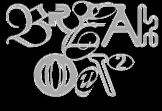
With Breakout 02, Cihan presents his second volume—and it marks a distinct evolution. Whereas Breakout 01 functioned primarily as an experimental playground, a free territory for practice posters and formal investigations, this new volume assembles visuals produced within real-world frameworks: 100 posters developed for specific clients, including cultural institutions, initiatives, companies, and socially relevant projects.
Here, national and international commissions intersect with local support projects, collaborative processes with fellow designers, and personal experimental positions. Many of these posters were not confined to the studio or the page—they were produced, published, and placed in the streets. They entered public space and engaged with an actual audience.
This implies negotiation, friction, and responsibility. Design here is not merely expression; it is communication under real conditions. And yet—or precisely because of that—Cihan’s playful energy remains intact. The works radiate curiosity, joy, and an unmistakable appetite for discovery. He moves confidently between contrasts, shapes, shades, and typography. He layers, distorts, and recombines—at times in ways one is supposedly “not meant” to. That is exactly where the vitality of these posters resides: they take risks. They claim space.
Cihan operates like a sponge—highly receptive, culturally alert. He absorbs styles, movements, visual citations, and references, then reconfigures them into new constellations. He samples, remixes, and translates. The result is distinct visual worlds that reposition the familiar within unexpected contexts. Not everything needs to be radically new; what matters is how elements are recomposed, recalibrated, and retold.
Breakout #2 documents momentum, iridescence, and impact in contemporary visual communication. It demonstrates the multiple registers in which posters can operate: loud or restrained, direct or playful, rigorously structured or deliberately excessive. Above all, it reveals a designer who has matured—transitioning from autonomous experimentation to navigating the productive tension between concept, commission, and the public sphere.
This book gathers works driven by curiosity—and by the determination to keep graphic design alive, relevant, and unapologetically present in the street.
Götz Gramlich
P. 35—Radio (z)Onderdak, Empty Houses – Full Streets
P. 36—Upstairs at Cherry Red’s
P. 38—STILLS
P. 39—FULLSPIN Festival
P. 40—Schlegel Kultur Club
P. 45—West:Walks
P. 46—House of Namus Festival
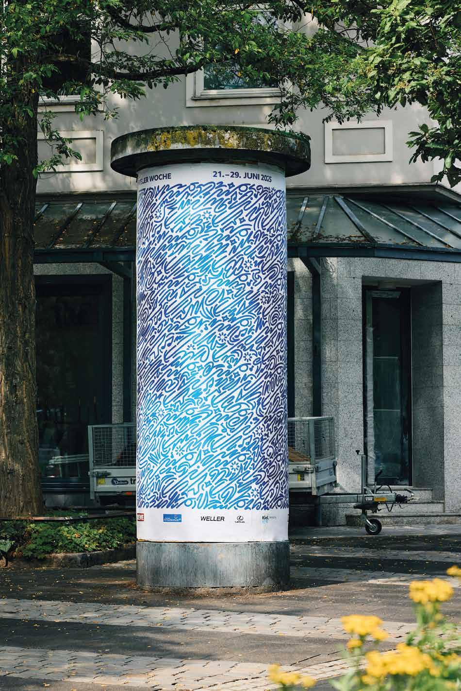
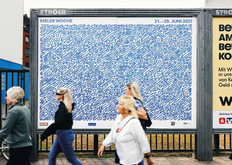
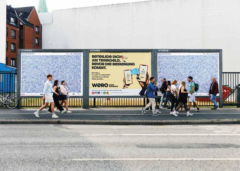
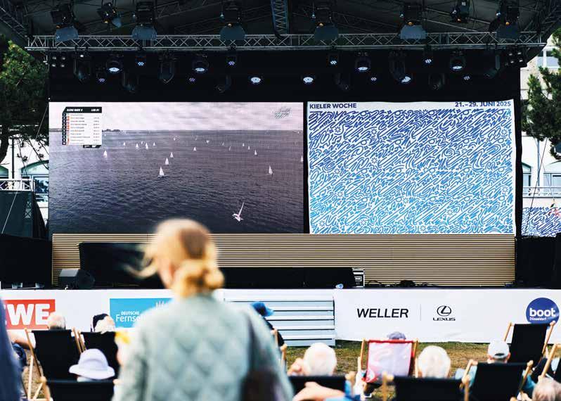
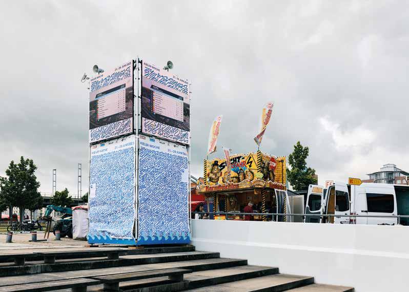
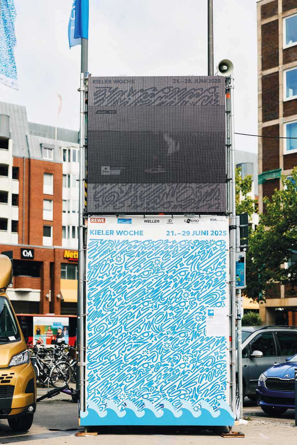
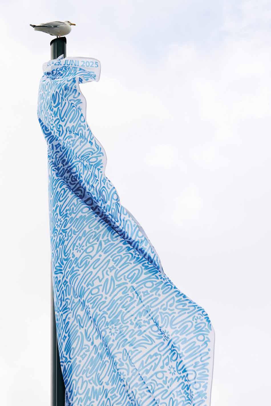
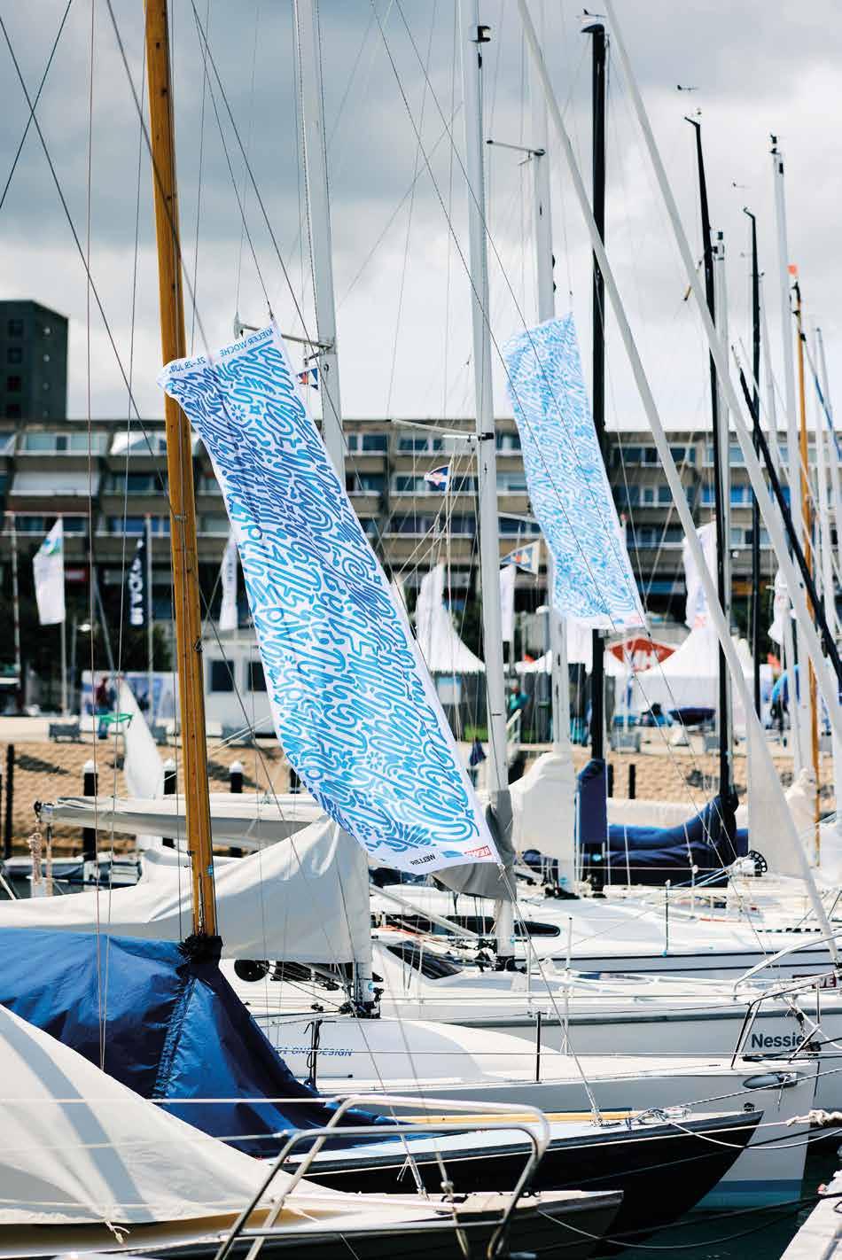
P. 47—Kieler Woche
P. 48—Fest der Vielen
P. 49—Paper Print Bochum
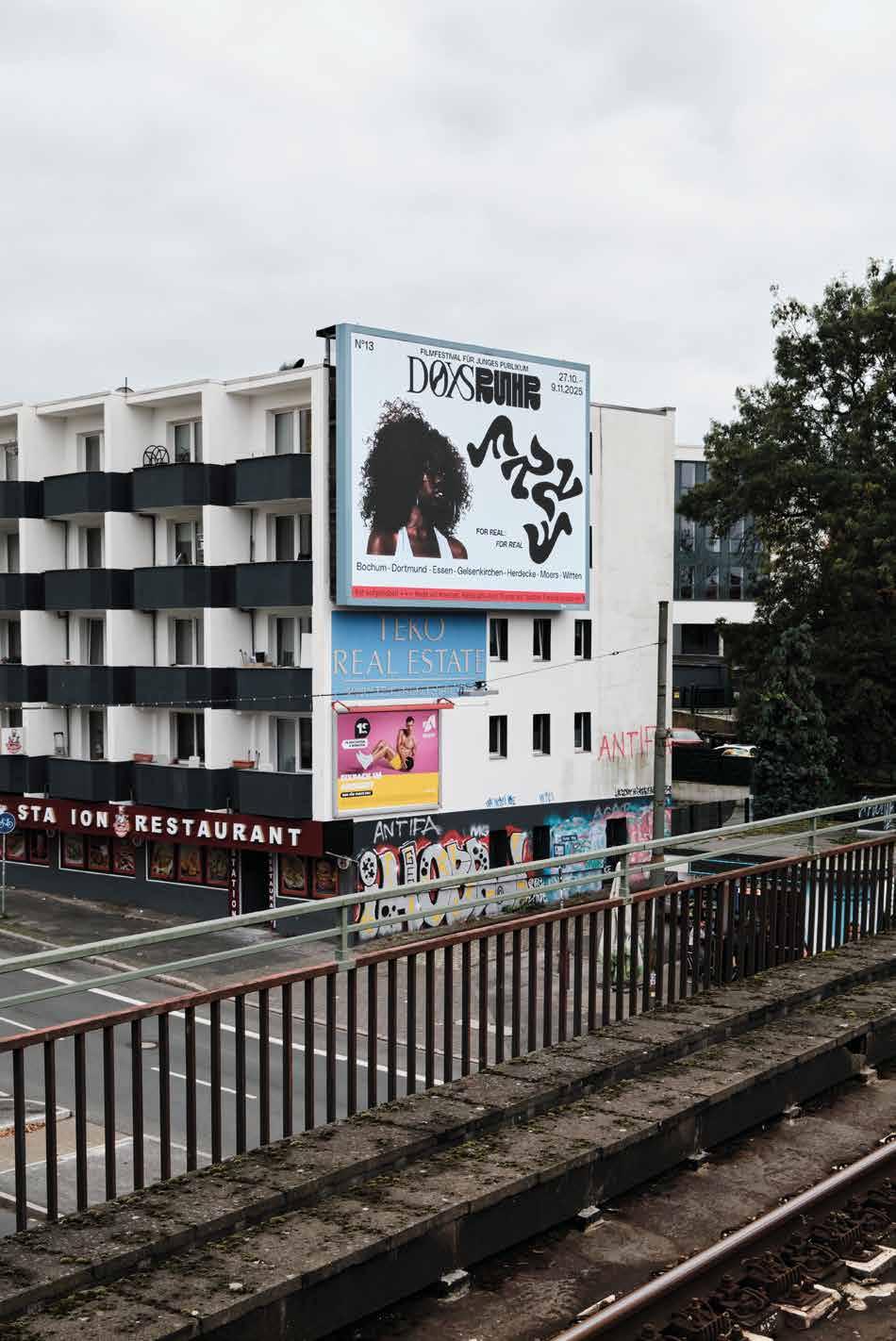
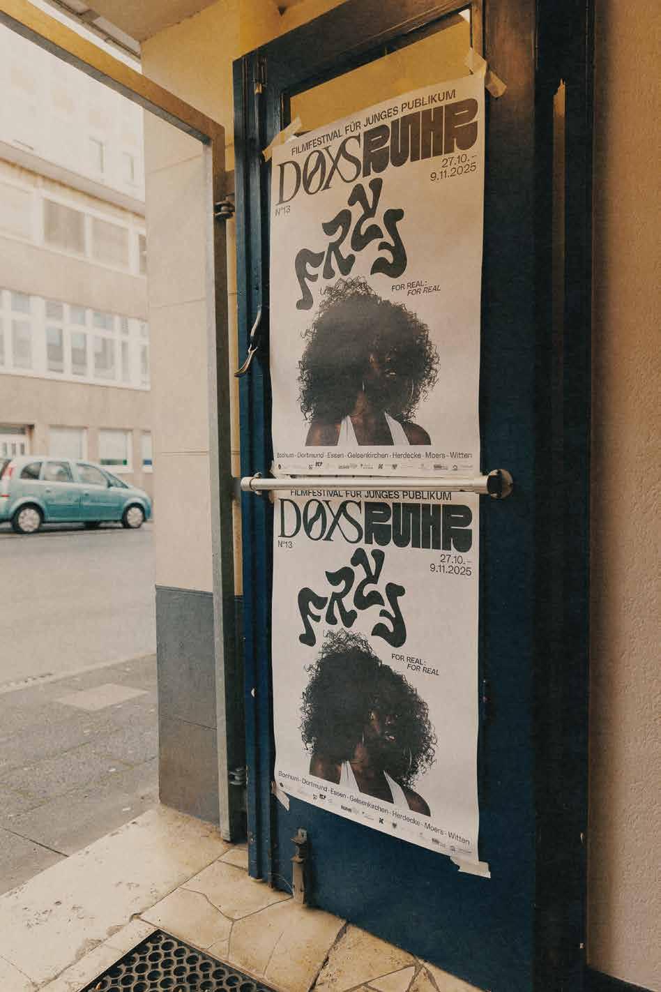
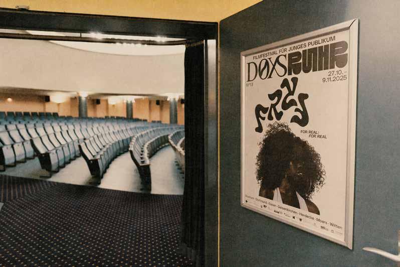
P. 50—DOXS Ruhr
P. 52—Enough Said
P. 54—Spitzkant Font
P. 55—Progress
P. 56—Digital vs. Analog
P. 58—Symbiosis
P. 59—Pouvoir of Type
P. 60—Villa Roumanille
P. 61—Abstract Beyond Boundaries
P. 62—Domestika
P. 64—Homebound
P. 71—Collaboration with Alessio Borando
P. 78—Collaboration with Shacyz
P. 80—Collaboration with Kris Andrew Smalls
P. 84—Collaboration with Arda Kilic
P. 88—Collaboration with Maria Gysi
P. 89—Collaboration with Michael Philipp Bader
P. 93—Collaboration with Lars Harmsen, Poster Rex
P. 99—Collaboration with Marc Kemper
P. 100—Ruhrpott Europa
P. 103—Bodypharm
P. 104—Coffea
P. 106—Eiscafé Aduo
P. 107—Genki Bao Burger
P. 107—RUPT’HEM
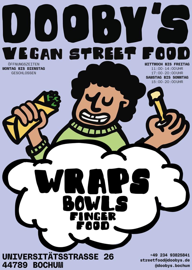
P. 108—Dooby’s
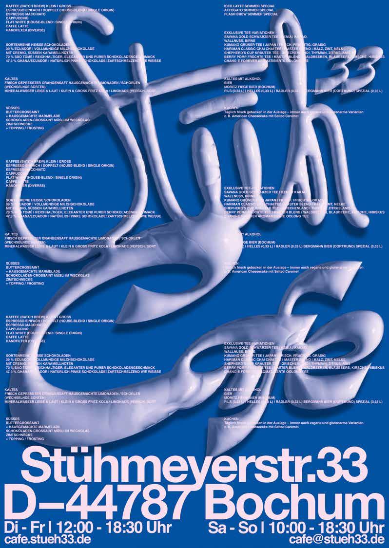
P. 109—Stüh33 Café
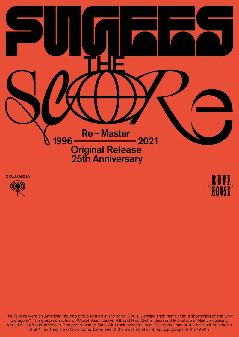
P. 110—Fugees
P. 112—RUN’THEM X NIKE
P. 114—Stadt Borken
P. 119—Your Souls
P. 120—Spiking
P. 121—Pressure
P. 122—Consume
P. 123—Junges Nideggen
P. 124—Nice to be rich
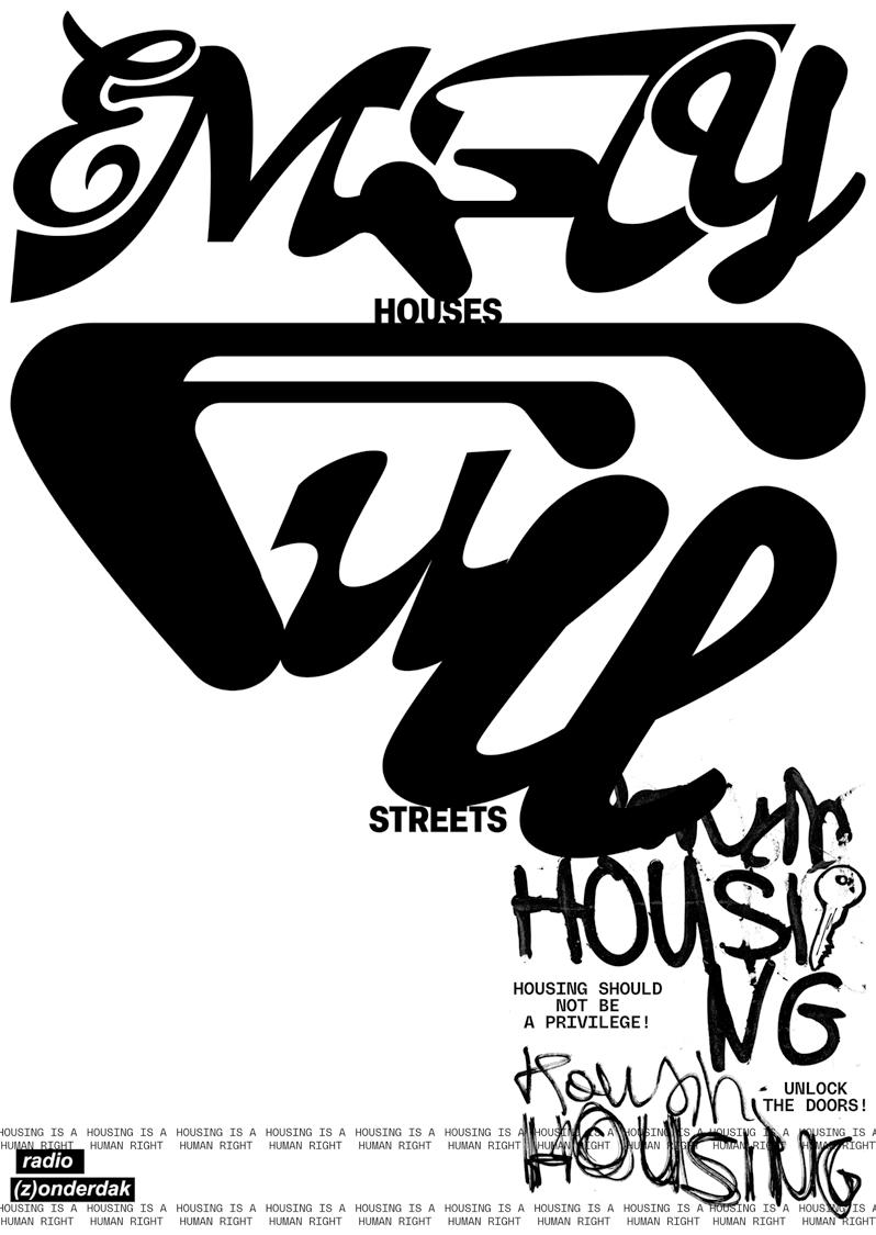
RADIO (Z)ONDERDAK IS A CREATIVE WORKSPACE AND RADIO SHOW FOR HOMELESS OR UNDOCUMENTED PEOPLE IN ANTWERP, BELGIUM. THE POSTER FEATURES EXPERIMENTAL TYPOGRAPHY WITH HAND LETTERING, PLACED IN AREAS WHERE MANY HOMELESS PEOPLE GATHER. ITS DISRUPTIVE DESIGN IS INTENDED TO PROVOKE ATTENTION AND CREATE VISIBILITY, RATHER THAN BE CONVENTIONALLY BEAUTIFUL.
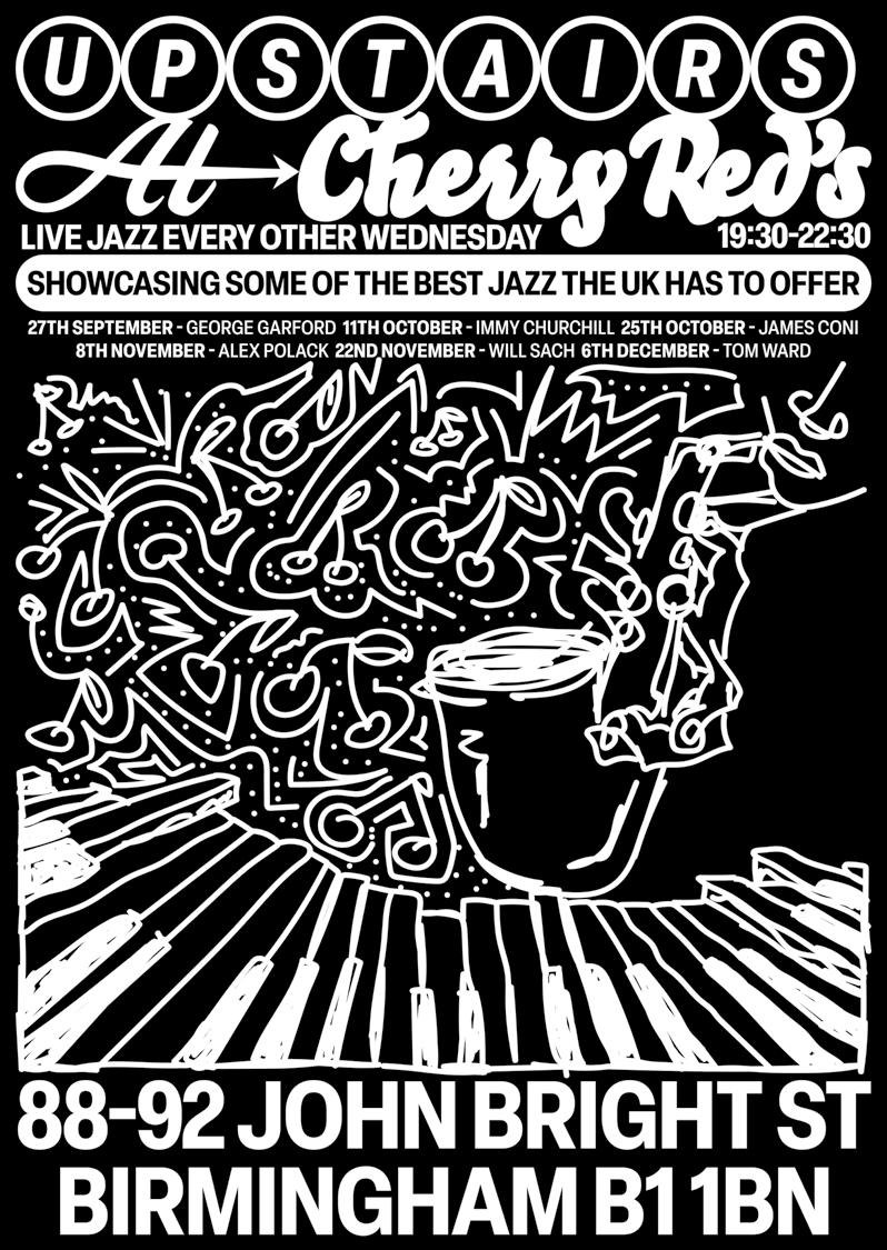
UPSTAIRS AT CHERRY REDS, AN INDEPENDENT LIVE MUSIC VENUE IN BIRMINGHAM HOSTING WEEKLY JAZZ PERFORMANCES, IS INTRODUCED THROUGH A POSTER FEATURING A HAND-DRAWN JAZZ MUSICIAN WITH CHERRY-SHAPED NOTES. CREATED IN BLACK AND WHITE ON A MACBOOK TRACKPAD, THE DESIGN CAPTURES AND VISUALIZES THE VENUE’S PLAYFUL, VIBRANT CHARACTER.
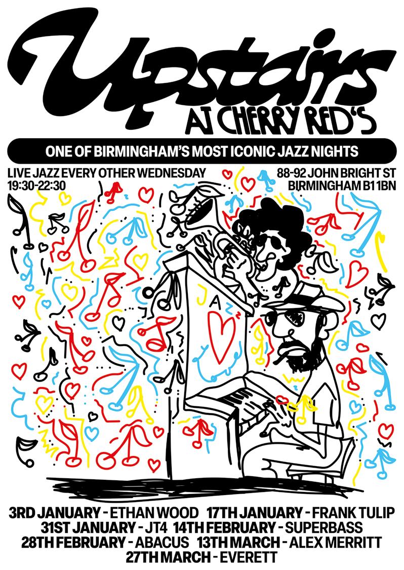
THE 2024 POSTER FOR UPSTAIRS AT CHERRY REDS CONTINUES THE HAND-DRAWN ILLUSTRATION STYLE IN COLOR, FEATURING MULTIPLE JAZZ MUSICIANS ALONGSIDE CHERRY-SHAPED MUSIC NOTES. THE COMPOSITION HIGHLIGHTS THE LIVELY, ENERGETIC ATMOSPHERE OF THE PERFORMANCES WHILE EXPRESSING THE VENUE’S CREATIVE SPIRIT.
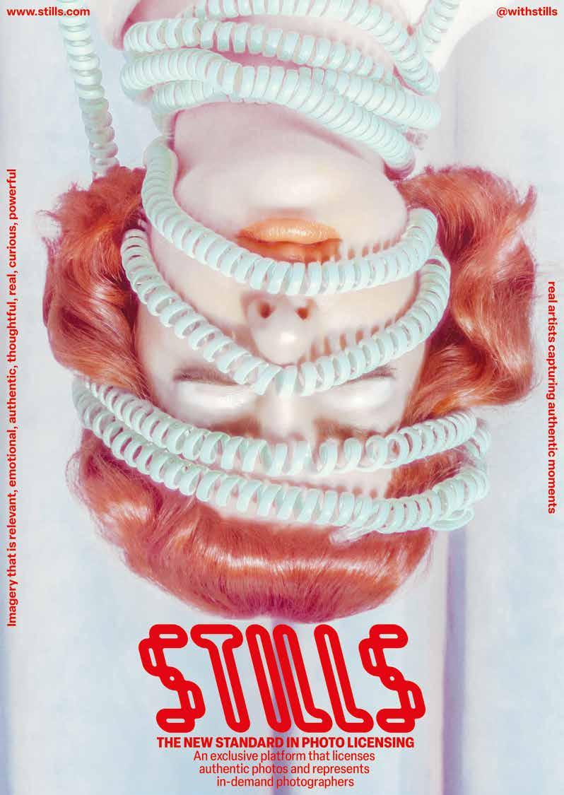
STILLS, A PLATFORM FOR LICENSING PHOTOGRAPHY, IS REPRESENTED THROUGH A POSTER FEATURING AN INVERTED BACKGROUND IMAGE SOURCED FROM THE ARCHIVE, COMBINED WITH CUSTOM TYPOGRAPHY. THE DESIGN EMPHASIZES THE PLATFORM’S CREATIVE CHARACTER, CREATING STRONG VISUAL IMPACT WHILE CONVEYING CLARITY AND MODERNITY.
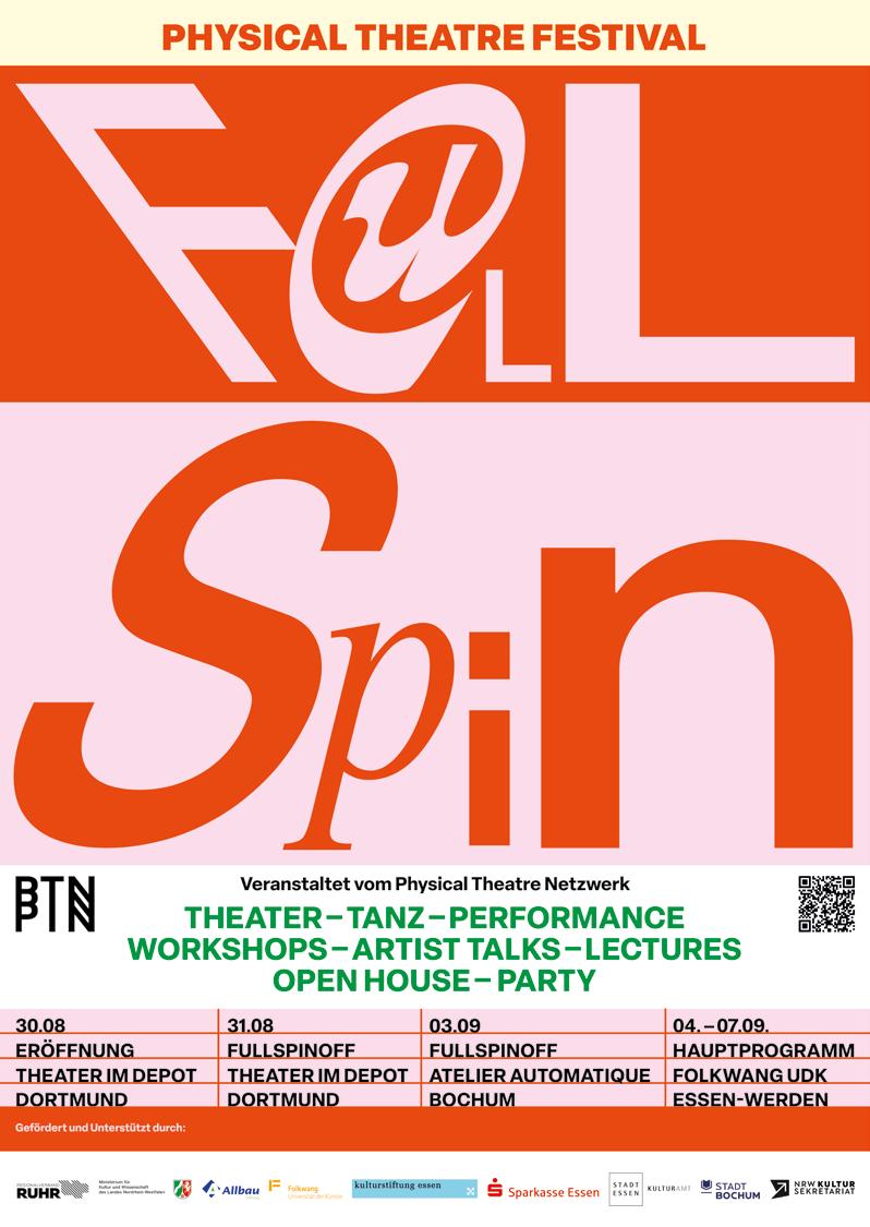
FULL SPIN IS A FESTIVAL FOR PHYSICAL THEATRE IN ESSEN, BRINGING TOGETHER INTERNATIONAL AND LOCAL ARTISTS. THE POSTER IS ENTIRELY TYPOGRAPHIC, FEATURING THE FESTIVAL TITLE IN DIFFERENT TYPEFACES AND VIBRANT COLORS. ITS DESIGN REFLECTS THE EXPERIMENTAL AND DYNAMIC SPIRIT OF THE FESTIVAL, CAPTURING ITS ENERGY AND MOVEMENT.
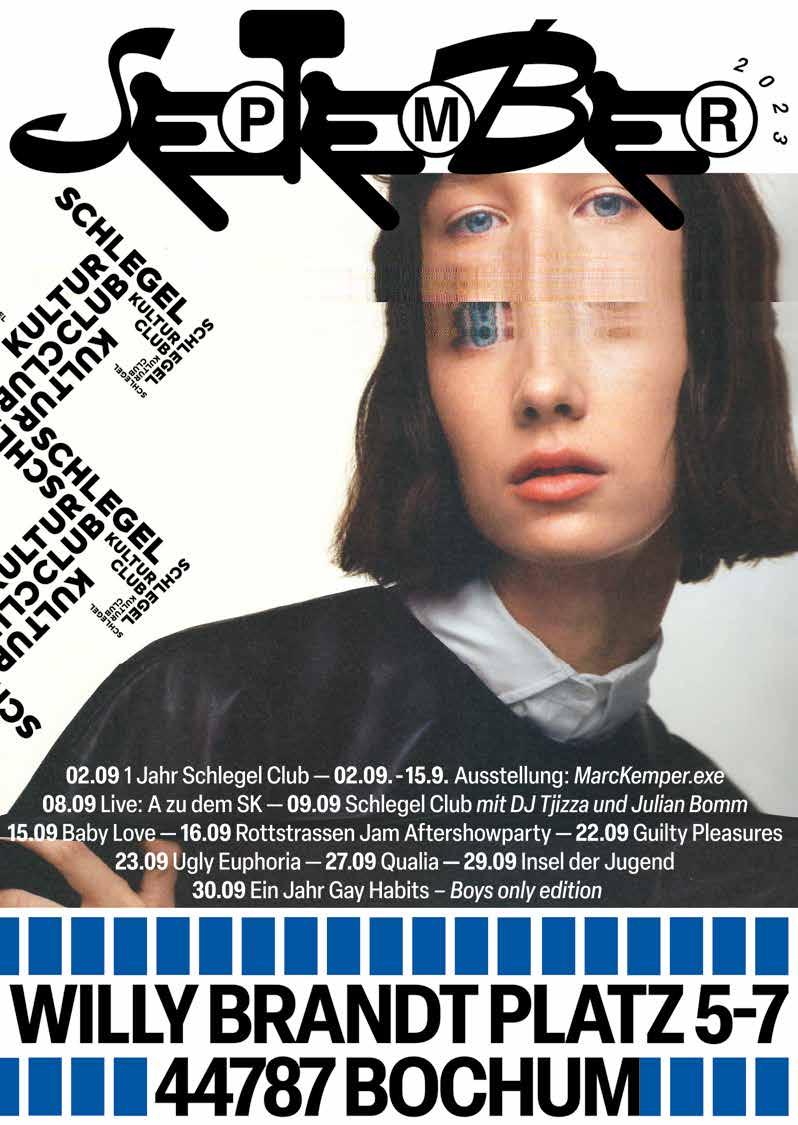
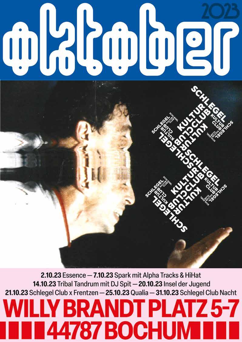
SCHLEGEL KULTUR CLUB IN BOCHUM HOSTS CONCERTS, CLUB NIGHTS, AND CULTURAL EVENTS, SHOWCASING LOCAL AND INTERNATIONAL ARTISTS. EACH POSTER FEATURED CUSTOM TYPOGRAPHY FOR THE MONTH, WITH ANALOG PHOTOGRAPHS SCANNED AND WARPED TO EVOKE THE FAST PACE AND VISUAL INTENSITY OF
RECTANGLES
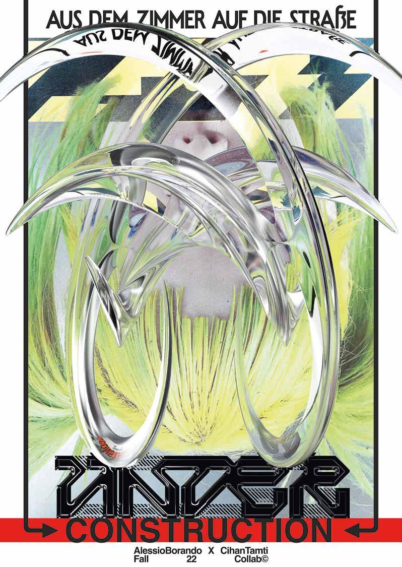
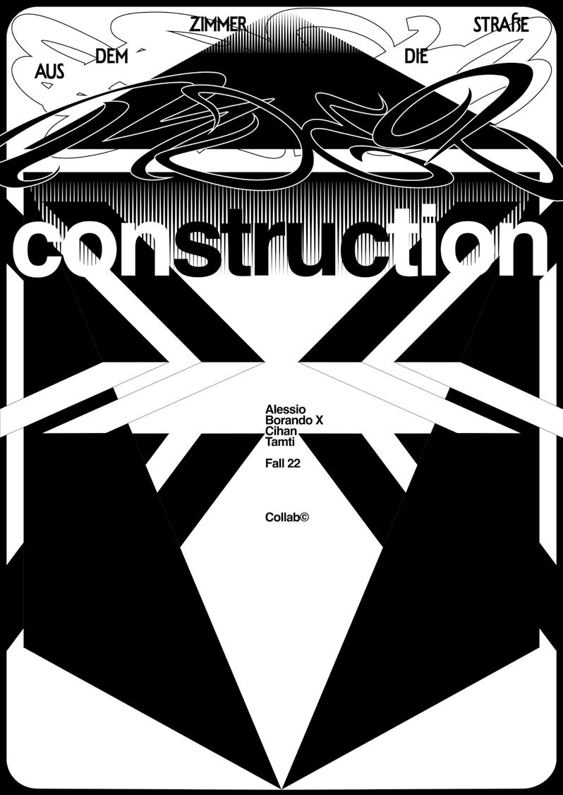
COLLABORATION WITH SHACYZ
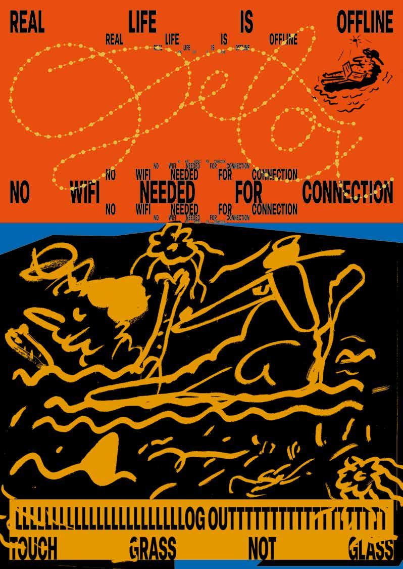
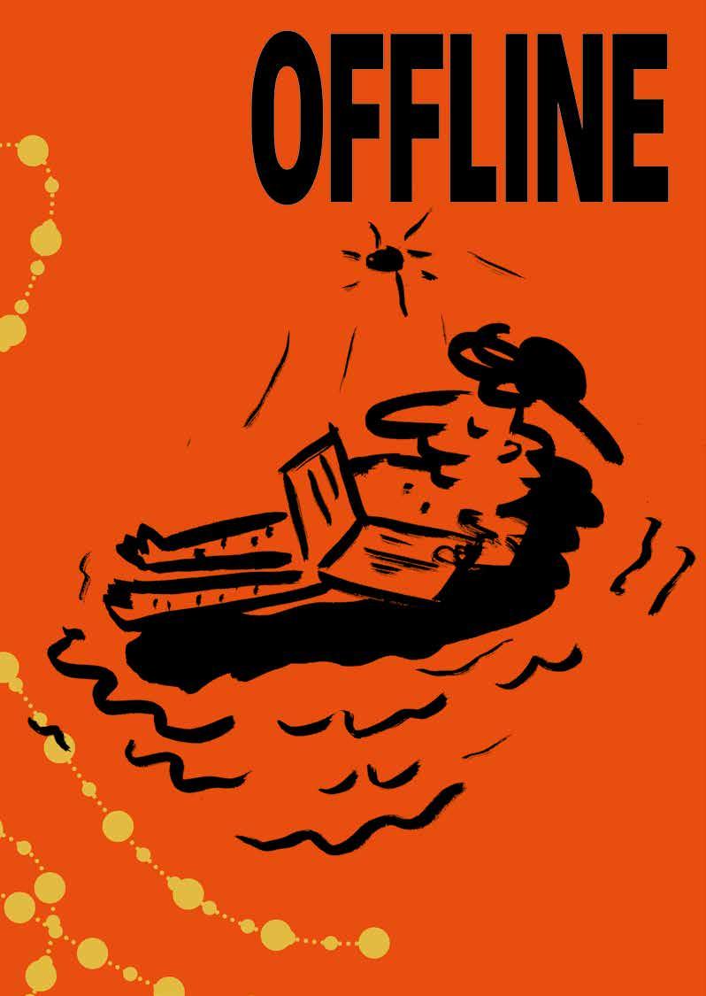
INSPIRED BY THE IDEA OF STEPPING AWAY FROM CONSTANT SCREEN USE, THE POSTER SERIES FOR SOCIAL MEDIA DETOX BEGAN WITH THE CREATION OF CUSTOM DETOX TYPOGRAPHY, FORMING THE FOUNDATION OF ITS VISUAL LANGUAGE. ANALOG BRUSH ILLUSTRATIONS AND CONCISE STATEMENTS WERE THEN ADDED TO PROVIDE SUBTLE VISUAL CUES THAT ENCOURAGE REAL-LIFE CONNECTION BEYOND THE DIGITAL FEED.
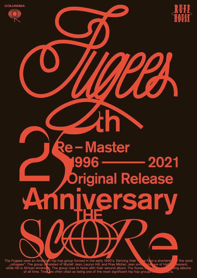
TO CELEBRATE THE 25TH ANNIVERSARY OF THE SCORE, POSTERS FOR THE FUGEES FEATURE CUSTOM LETTERING AND A MIX OF DYNAMIC FONTS THAT REFLECT THE ALBUM’S MUSICAL DIVERSITY, WHILE RHYTHMIC, OVERLAPPING COMPOSITIONS GIVE THE DESIGN A DISTINCTLY URBAN ENERGY.
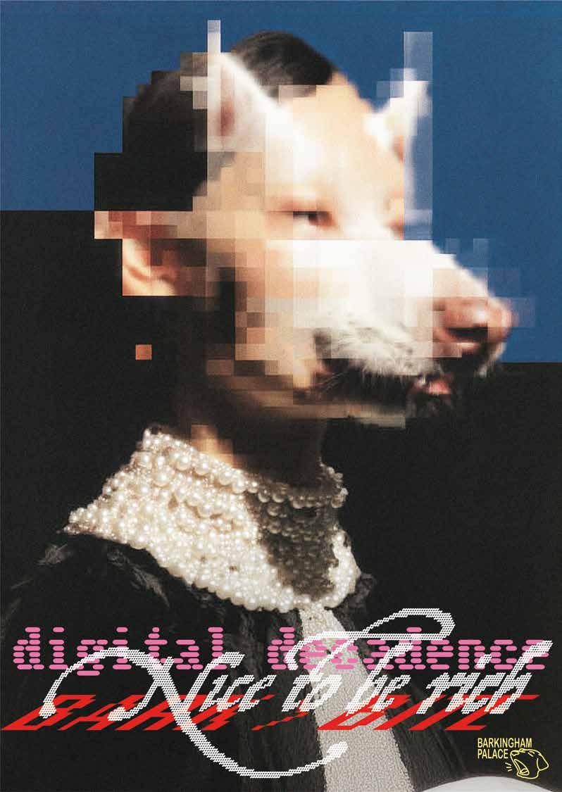
THE IMAGE WAS GENERATED WITH AI, COMBINING HUMAN AND DOG FEATURES. IT WAS SHARED ON SOCIAL MEDIA, WHERE THE COMMUNITY WAS INVITED TO GIVE THE POSTER A TITLE. AS A RESULT, THE POSTER FEATURES MULTIPLE OVERLAPPING HEADLINES THAT ECHO THE SAME CONTEXT AS THE HYBRID IMAGE.
Photos by:
P. 7, 16–21, 26–29—Martin Rupik
P. 8-11.—Sven Neidig
P. 11, 24–25—David Nienhaus
P. 12–15—Anke Leitzgen
P. 22—Finn Kanntus
P. 23—Julius Cremer
P. 26–27—Lars Harmsen
Slanted Publishers UG (haftungsbeschränkt)
Nördliche Uferstraße 4–6
76189 Karlsruhe
Germany
T +49 (0) 721 85148268
info@slanted.de slanted.de @slanted_publishers
© Slanted Publishers, Karlsruhe, 2026
© Text and Design by Cihan Tamti
All rights reserved.
ISBN: 978-3-69202-000-6
1st edition 2026
Design: Cihan Tamti
Foreword: Götz Gramlich
Publishing Direction: Lars Harmsen, Julia Kahl
Production Management: Julia Kahl
Printer: Stober Medien
Cihan Tamti
info@cihan-tamti.de cihan-tamti.de @cihantamti
Typefaces: PolySans & MSCHN by Gradient Type, Suisse Intl by Swiss Typefaces
Cover Paper: ICON Glam sand copper, 350 g/sm
Paper: ICON Classic extrasmooth white, 150 g/sm
Paper Sponsor:
Disclaimer
The publisher assumes no responsibility for the accuracy of all information. Publisher and editor assume that material that was made available for publishing, is free of third party rights. Reproduction and storage require the permission of the publisher. The German National Library lists this publication in the German National Bibliography; detailed bibliographic data is available on the Internet at dnb.de.
About
Slanted Publishers is an independent design, publishing and media house founded in 2014 by Lars Harmsen and Julia Kahl. They publish the award-winning print magazine Slanted biannually featuring global design and culture. Since 2004, the daily blog highlights international design and showcases inspiring video interviews. Slanted Publishers initiates and creates publications, focusing on contemporary design and visual culture, working closely with editors and authors to produce outstanding publications with meaningful content and high quality. Slanted was born from great passion and has made a name for itself across the globe. Its design is vibrant and inspiring—its philosophy open-minded, tolerant, and curious.