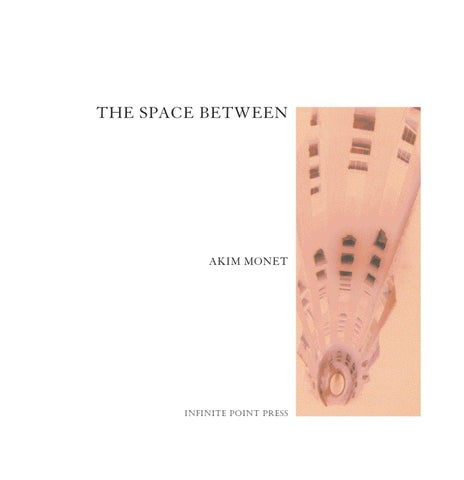
THE SPACE BETWEEN
AKIM MONET
Infinite Point Press
copyright Š akim monet 2003
isbn 0-9728647-0-9
All right reserved. No part of this book may be reproduced in any form or by any electronic or mechanical means, including information storage and retrieval systems, without permission in writing from the copyright holder, except by a reviewer who may quote brief passages in a review. Infinite Point Press
www.infinitepointpress.com
info@infinitepointpress.com
THE SPACE BETWEEN
Si la lumière est le premier amour de la vie, l’amour n’est-il pas la lumière du cœur? Honoré de Balzac
We We are are delighted delighted to to support support Akim Akim Monet Monet in in his his new new and and exciting exciting work work “The ‘The space between”. between”. Just Justas asthe theartist artisttransforms transformscommon commonscenes scenesinto intoworks works of of art, art,weweallallstrive strivetotoextrapolate extrapolateopportunity opportunityfrom from the complex world in inwhich which we welive. live.Akim AkimMonet’s Monet’sphotography photographyechoes echoesour ourown owncommitment commitmentto toexcellence. excellence. Kevin KevinParker Parker Global GlobalHead HeadofofEquities, Equities,Deutsche DeutscheBank Bank President, President,DB DBAdvisors Advisors
CONTENTS
Foreword
9
by Andres Serrano
Autodidacte
11
by Akim Monet
The space between
15
by Hilarie M. Sheets
Passage to India
19
Exotic Flowers
47
Homage to GaudĂ
63
About the photographs
90
List of works
92
CONTENTS
My fellow artist Akim Monet invited me to lunch at his home in New York City. As I entered his dining room, I was immediately struck by several large scale photographs of India. Their saturated colors emanating ethereal light beckoned me to look closer. I felt the spirituality of India, standing there with the afternoon light streaming through the windows, highlighting the details in Monet’s images. The solarized effect of the print adds to the sense of otherworldliness and reminds me of an x-ray—allowing the viewer a view within and an understanding of a Passage to India. Akim Monet is a true visionary in more ways than one. Andres Serrano
AUTODIDACTE Essay by Akim Monet
In 1992, at the age of twenty-four, I back-packed through India. This trip was to be the first of many journeys away from the privileged world in which I was raised. It was an eye and soul opener. Unseen beauty lay beside unspeakable poverty, rare scents in the midst of putrid stench, and the visual stimulus of pure powder pigment made my soul resonate to the memory of very tender childhood. 11
My earliest deep visual impression stretches back to my boyhood. On the far wall of the living-room hung what seemed like the biggest expanse of blue. In time, I would learn that it was a Monochrome by Yves Klein. It was two meters high by four meters long; very big for a little boy. I was engulfed and mesmerized by the live powdery surface of the painting. At that age I was unaware that it was the red in Yves Klein’s particular tone of ultramarine that explained why I was swept by warmth in an otherwise cold color. It was a purely physical experience, one that would later prove to be the core of my appreciation of art and all things visual: sight is a sense among those of smell, taste, hearing and touch. Therefore, seeing is first and foremost sensory: an experience akin to tasting and touching. Among the wonderful things I discovered in India, was the feeling of shedding much of what I had learned and I was able to tap into a deeper level of my consciousness to navigate this new experience. Earlier, when still a student at Cornell University, I had argued that certain poets and painters in the turbulent pre-revolutionary and early Soviet era, resorted to abstraction in an effort to lay the foundations of a world that could not, by its very nature, be rooted in the representational tradition of Tsarist Russia. Recently, I felt this bliss upon seeing White on White, a painting by Kazimir Malevich at the Museum of Modern Art (Fig. 1).
Fig. 1. Kazimir Malevich
Suprematist Composition: White on White, 1918
My experience in India was marked by the abandonment of many things I had been taking for granted. I felt like the hero in Yevgeny Zamyatin’s novel “WE”, in which the author develops a highly charged eroticism without ever so much as using a sexual word. Everything is suggested through marvelous abstract images beginning with the name of the female character “O” and ending in an explosion of color.
Fig. 2. Akim Monet
Olivia in Reverse, 1990
As these memories course through my mind, I realize that as much as I may have had the feeling in India of shedding what I had known, the very path of liberation had been shown to me by artists and poets. India was a kind of reversal of my former perspectives: a place where life can be given little value, but where it is also celebrated and exalted; a place where mythology merges with history; a place where the linearity of time is defied.
12 Casting about with no clear purpose I began to take photographs in India in order to document my trip there. This turned out to be the first stage of the development of an instrument by which I could address the eternal existential questions: who am I, and what place do I have in the universe? Although my experience as a photographer was limited, my eye was well trained. I grew up with art of all sorts, from different time periods, and studied art and literature when at school. At Le Rosey I argued that Balzac was a pre-cursor of Impressionism: in his novel “La Peau de Chagrin” he gives an impressionistic description of the roofs of Paris and a marvelous glimpse of a woman bathing that recalls a scene painted by Renoir. At Cornell, I read Albert Camus’ “L’Etranger” across the work of Yves Klein. In fact, I reproduced a portrait in reverse in order to give a visual representation of Camus’ description of a scene in the beginning of the book. This was to be my first experiment with reversal photography (Fig. 2). The idea stayed with me. Later, while directing a contemporary art gallery and artist’s studio in Switzerland, I designed a black and white catalogue in which all the images were reversed. Fig. 3. Shadow of the Man
and the Ladder at Hiroshima
Looking back on the evolution of my technique, I realize that an event in the life of Yves Klein greatly impressed me: the artist was fascinated with the carbon traces that
he noticed on a wall at Hiroshima. They are the visual testimony of a man and ladder caught by an atomic conflagration. Man and ladder were vaporized, but the carbon 14 stayed imprinted on a wall (Fig. 3). When I traveled through India, the first photographs I developed appeared devoid of energy compared to the monuments I had just visited. I thought about how the paper prints fell short of the majesty of the temples; they seemed like mere postcards. On the other hand, the tiny images on the negative strips seemed to burn: stone was transformed into molten lava and shadow became light. As I looked at the strips I tried to envision the instant when the shutter clicks open and the emulsion on the celluloid reacts to the sudden onslaught of light. What magic occurs at that micromoment around 1/100th of a second when light hits the negative! Light is caught; a moment is engraved in the negative like the man and the ladder at Hiroshima. Carlo di Palma composed a marvelous scene for Antonioni’s “Blow-up”: a photographer enlarges a black and white shot until he discovers a clue to a murder, hence the title of the movie. All the details in a scene are imprinted on a negative. I see a positive print as a reproduction, and a negative as the imprint of reality, the testimony of a micro-second. These thoughts coursed through my mind as I examined my negatives in the tranquil guest-houses at night in India. I was fascinated by the manner in which negatives reveal what the eye cannot see, the complement of what the eye does see. I tried to envision how light travels and gets lost. I marveled how black is the absence of light and white the sum of all colors. I tried to see how light travels through space and hits an object: some rays are absorbed and others reflected. The latter are those that allow us to see color; it is those that affect the emulsion on the celluloid. At this point, my thoughts get lost like the path of light. I cannot really follow what is reflected and what is absorbed. Everything seems undefined, the line between what is and what is no longer, clear like the ladder and the man at Hiroshima, like the painting Yves Klein left us in tribute to this terrible instant (Fig. 4). It is the “space between” that I discovered in India, that space between the Ying and the Yang, between the sum of all colors and its absence. I found this space in my negatives. I proceeded to find a way to enlarge them in order to explore that magical gap.
Fig. 4. Yves Klein
Hiroshima (ant 79), c. 1961
13
Image credits: Malevich, Kazimir (1878-1935) Suprematist Composition: White on White, 1918 Oil on canvas 31G 31G” . 80,64 80,64 cm Digital Image © The Museum of Modern Art Licensed by SCALA / Art Resource, NY
Klein, Yves (1928-1962) Hiroshima (ant 79), c. 1961 Dry blue pigment in synthetic resin on paper on fabric 54 ¡%/!^ 110 &/!^” . 139, 5 280,5 cm Image © Yves Klein / ADAGP, Paris
THE SPACE BETWEEN Essay by Hilarie M. Sheets
Color is the first element that seduces in an Akim Monet photograph. Molten oranges, rich blues, lurid greens and purples that a Fauvist would envy, saturate the visual field. Then the sheer ornamented exuberance of his subject matter teases the eye with its baroque textures—be it the hypnotic sculpted dancers decorating a 10th-century sex temple in India, the fantastic organicism of Gaudí’s architectural creations in Barcelona, the exotic proliferation of flora and fauna in Bali, or the hyperbolic transformations of cross dressers on parade in New York. Monet presents all this in reverse—that is, he prints directly what is on his negatives rather than inverting them into positive images. Doing this appeals to him both esthetically and conceptually. First off, it’s how he’s able to achieve such an unexpectedly painterly and heightened palette. It’s also for him the most direct transfer of how the light of a particular place and moment burns into sensitized film. Looking at these photographs you do indeed viscerally sense the energy—the colors, smells, music—of his subjects. Monet, who knows of no lineage to his famous namesake but nonetheless feels an affinity with the Impressionist artist, comes to photography from the sensibility of painting and literature. Born in Switzerland in 1968, where he lived until he moved to the United States to attend Cornell University, Monet spent his childhood in a house in which Egyptian and Greek antiquities were juxtaposed with important paintings from Impressionism to Contemporary art. Monet’s exposure to art and art history was immediate and nonlinear. He went on to study comparative literature in college, and after graduating returned to Switzerland and became an art dealer at a contemporary gallery.
15
While Monet had taken photographs in college and as a dealer documenting the installation of shows, it wasn’t until a trip to India in 1992 that the medium got under his skin. He was deeply affected by the power of the ancient temples and monuments that are still a vital part of daily life there, and used photography as a way of processing what he was feeling. Yet when he saw his pictures developed and printed, he was disappointed by their snapshot quality. He found looking at the negative strips, though, much more akin to his actual experience of the places and became obsessed with finding a way to print them as negatives.
16
With no formal training in photography, Monet cobbled together a homemade process—with tools picked up along his travels—of re-photographing projections of the negatives, so the final print would match the original negative. Years later while working as an art dealer in New York, Monet—who dusted off this project that had been shelved after his sixmonth trip to Southeast Asia—learned how to use digital printing technology to eliminate the interim steps and achieve glorious high-resolution prints of his negatives at a grand scale. Energized by these results, and devoting ever more of himself to photography, Monet exhibited the series “Passage to India” at the Carosso Gallery in New York in the summer of 2002, and has completed two new series, “Homage to Gaudí” and “Exotic Flowers,” all of which are reproduced here. What the pictures share is an interest in duality that is underscored by the way Monet plays with idea of positive and negative in his printing technique. In “Passage to India” you see a resting Buddha the color of burning hot embers and a stone couple locked in the act of love infused with icy blue tones—ostensibly opposites yet both simultaneously addressing the spiritual and the sensual. “Homage to Gaudí” explores the interface of architecture and nature, inside and outside. The architect’s undulating, flourishing edifices—walls, caves, gates, towers—are so organic, it’s hard to tell where the manmade stops and nature takes up, particularly when rendered in Monet’s inside-out palette. Monet also focuses more here on the kind of cropping and composing devices inherent in photography, making two towers shot from above seem so
reduced in scale they look like side-by-side bowling pins, and framing them inside a rugged vertical opening in an image he says is an homage to a Barnett Newman “zip” painting. Another in the series shows a pigeon sitting on a balcony encrusted with dazzling floral mosaics, juxtaposed with actual nature beyond that has the ethereal quality of an Impressionist landscape dissolving into dappled paint. Monet see this image as a door to his most recent series of still lifes and portraits called “Exotic Flowers.” The idea with this, he explains, was to go back to square one, and just as a painter learns the rudiments of making still lifes and portraits, so too would he return to the basics. Again dichotomy plays a powerful role in Monet’s gorgeous pictures taken in Bali of wild growth not seen on this side of the equator as well as of transvestites negating their gender in New York’s yearly Wigstock festival. Conceptually, the two subjects hold together both in their fragility and lavish statement, and the same colors echo in each—the deep purple of the sunflower in one drag queen’s hair, for instance, is laced throughout the tropical plants. The hothouse effect of Monet’s pictures speaks to a moment when the world feels on the verge of boiling over, where the same Balinese paradise that he photographed was subsequently bombed by terrorists. Part of the beauty and intensity of these photographs has to do with the convergence of opposites, of past and present. They stand sublimely poised in the space between.
Hilarie M. Sheets is a contributing editor to Artnews magazine and writes about art for The New York Times.
17
PASSAGE TO INDIA
Wheel of life
20
This image was shot in Benares, the city also known as Varanasi on the banks of the holy river Ganges. Notice how the sleeves of the figure’s clothing lie on his legs. One tends to forget that these sculptures are actually made of stone.
Flowered interior
22
This shot is an interior detail of the Taj Mahal. This is a marvelous example of the merge between typical indian laticework to the right of the image, and muslim motifs in the form of arabesques. The colours are stone inlaid in the marble. Tied in the laticework, one notices green and purple strings. These silk threads are tied by visitors as they make a wish that is believed to come true when the threads disintergrate with the passing of time.
Lying Buddha
24
This image was shot in a cave complex at Ajanta, a site where Buddha is believed to have rested. Temples and statues were carved within the natural caves. The present image of Buddha lying on his right side, his head resting on his hand, tells the story of Ajanta.
Taj Mahal
26
This building sits opposite the main structure of the Taj Mahal. It acts as pendant to the main building.
Lingam
28
This image was shot in Khajuraho, the site of famous sex temples erected in the Xth century. As its shape suggests, this is a depiction of the male sexual organ. Inside, one stands on a raised circular stone, a rendering of the female sex.
Cave cathedral
30
This image was shot in a cave complex at Ajanta, where temples and statues were carved within the natural caves.
On the Ganges
32
This image was shot in Benares, the city also known as Varanasi on the banks of the holy river Ganges. This timeless image was taken at 5am from a row boat. Francesco Clemente had once told me, as I prepared to depart for India, that I must take a purifying swim in the Ganges. This is as close as I got. The absolutions from the “Ghats� constitute a daily morning ritual for the people of Varanasi.
Facade of dancers
34
This image was shot in Khajuraho. I was seduced by the central figure. The suggestive posture of her body makes her seem like she is dancing toward the viewer.
Blue love
36
This image was shot in Khajuraho. One can discover many Kama-Sutra positions depicted in the sculptures that adorn these temples.
Master of elephants
38
This image was shot in Khajuraho. This is a detail of a frieze that lines the main scenes on the facade of the temples.
Temple
40
All the images shot at Khajuraho are details from the present temple.
Sex
42
This image was shot in Khajuraho. In the midst of this complex scene, the central couple embrace with extraordinary tenderness. Her arms are flung around him as he holds her. Notice the position of the fingers of his right hand. The small figure at the lower left seems to have a good vantage point from which he can see the intimacy of the action. The lady to the left of the composition stands in a most seductive posture: as she reveals her curvaceous behind, she twists her upper body, enticing the viewer into the scene with her left hand under her breast. This is the epitome of movement in sculpture.
Stone God
44
This image was shot in Benares. The figure, although seated, is suggestive of dance. Notice the detailed decorations on his head and chest, and the exquisite figure bottom right.
EXOTIC FLOWERS
Marguerite
48
Jungle
50
Piercing
52
Diptych
Cigarette
56
Flower
58
Lotus
60
HOMAGE TO GAUDÍ
Deep
64
This shot was taken inside one of the towers of the Sagrada Familia.
Zip
66
This image was shot from one of the towers of the Sagrada Familia. The two towers are seen through the chiseled frame of a window carved in the stone. A strip of stone seems to have been torn in order to reveal the view of the towers. Hence, the title in honour of Barnett Newman.
Sagrada Familia
68
The upward thrust of the main facade of the Sagrada Familia reveals Gaudí’s, and indeed humanity’s endeavor to reach God. The Bible is told as a song that rises to heaven accompanied by angelic musicians.
Trilogy
70
This detail of the facade of the Sagrada Familia captures moments in the Bible. Jesus stands at the apex of the composition, under a canopy of light.
Stained glass
72
In the middle of the main facade of the Sagrada Familia, Mary and Joseph dote over the infant Jesus in a chorus of harps, violins, and wind instruments. The face of the Holy Mother is aglow with light.
Two suns
74
This image was shot from one of the towers of the Sagrada Familia. The two crosses that sit on top of the facing towers are seen through the chiseled frame of a window carved in the stone.
Pigeon
76
This shot is an example of the harmony between nature and architecture that GaudĂ has achieved in the Parque Guell.
Knots
78
In his use of tile fragments on a bench of the Parque Guell, GaudĂ places darker fragments within colored tiles; he makes the eye discover a spiral within the abstract composition. Thus, he infuses movement into stillness.
Grate
80
This is the wrought iron gate that marks the entrance of the Parque Guell. Here one finds the spiked motifs that GaudĂ uses alternately in nature and architecture throughout the park. The top of the gate is lined with geometric arabesques reminiscent of Moorish times.
Fireball
82
This shot is a detail of the ceiling in the entrance hall of the Parque Guell. GaudĂ’s masterful composition of tile fragments recalls his use of spiked motifs throughout the park.
Three cactus
84
This detail of the Parque Guell is an exterior view of Cave. Gaudí’s use of spiked agaches to crown the structure is an example of the architect’s integration of natural elements into his architecture.
Cave
86
This is a view of the arches under a raised walkway in the Parque Guell. The columns seem organic, they could be trees, they could be part of a cave sculpted by nature since time immemorial.
Fireworks
88
This shot of the Parque Guell exemplifies Gaudí’s masterful arrangement of elements of nature and architecture; this construction illuminates Gaudí’s maxim: “there is no straight line in nature.”
89
ABOUT THE PHOTOGRAPHS
“Passage to India” was shot in August and September 1992, during a six month backpacking trip across Southeast Asia. “Homage to Gaudí” was shot in August 2000 in Barcelona. “Exotic Flowers” was shot in Bali and New York City in August 2001.
90
I developed my reverse printing process during a twelve year span. The first experiments were made at Cornell University in 1990 and in Switzerland after I graduated. It was in India in 1992 that I re-photographed projections of the negatives with a Soviet projector found in Madras. Many years later in New York, I found a printer who taught me to use “R” paper to print directly from the negatives. It is to “Reggie” that I am indebted for this discovery, and with his assistance, I was able to make, in a small Indian print shop on 21st Street, the first prints that gave me satisfaction. My “spiritual sister” Patricia became my first collector. A year later, I found Laumont Studios. I will always remember my first day there accompanied by Anne-Marie. I showed the technicians a portfolio of R-prints and told them I wanted them BIG. A gentleman who saw my prints laid-out on the floor said to me that it could be done in two ways: the conventional R-prints, but larger, or scanning the 35mm negatives and printing them digitally on Ilfochrome paper. My initial resistance to the digital process melted when I saw a life-size strip of the first image we tested: Cave cathedral. I was immediately seduced by the iridescent sheen of the colors; they reminded me of the inside of an oyster. I soon found out that the kind man who had given me a thumbs-up about my work, and the good advice about the digital printing that first day, was the owner of the studio, Philippe Laumont. I started working with an imaging technician, Kylie; we spent hours working on and off screen tweaking the images to get to where I wanted. I take this opportunity to thank you Kylie. I will never forget my first round of prints in May 2001: during the day, I worked at a Manhattan art gallery where hung an extraordinary exhibition of works on paper “From Turner to Cezanne”,
in the evening I ran to the auctions, and from there to the studio where I worked on my prints until midnight, only to start the round again the next day. A year later, Alejandro Carosso gave me my first exhibition in his Manhattan gallery, a particularly happy event because I admire him as a person and as an art dealer. From that first day at the studio, through hanging the first pieces at home, all the way to the color and texture of the cover of the book you are holding in your hands, it is to the constant reinforcement and assistance of my companion through this marvelous adventure that I give a deep bow; thank you Anne-Marie for allowing me to benefit from your talent without ever expecting me to compromise my own. Of all my friends who have been extremely supportive, a special mention goes to Ludo and David who were there for me once again at a crucial moment. And to the remarkable printers in Verona, Trifolio, thank you for your patience. As a last word, I would like to acknowledge the great support of Kevin Parker and his colleagues of “DB Advisors�. Finally to my parents, thank you for your unfailing encouragement!
For more information, please contact:
Carosso, LLC Fine Arts 42 East 76th Street New York, NY 10021 Tel. 1 (212) 744 5400 Fax 1 (212) 744 5455 info@acarosso.com
91
LIST OF WORKS
PASSAGE TO INDIA, 1992 Edition of 3 + 2 Artist’s proofs Ilfochrome exhibition prints laminated face in 1/4" / 1/2 cm Plexiglas wood brace mount
EXOTIC FLOWERS, 2001 Edition of 3 + 2 Artist’s proofs Archival piezo-dye prints on 100% cotton acid free watercolor paper
21 23 25 27 29 31 33 35 37 39 41 43 45
Wheel of life Flowered interior Lying Buddha Taj Mahal Lingam Cave cathedral On the Ganges Facade of dancers Blue love Master of elephants Temple Sex Stone God
60 60 40 40 60 60 40 60 40 40 40 40 60
40" 40" 60" 60" 40" 40" 60" 40" 60" 60" 60" 60" 40"
49 51 53 55 57 59 61
Marguerite Jungle Piercing Diptych Cigarette Flower Lotus
72 60
48"
72 45 72 24 40
40" 48" 60" 48" 30" 60"
•
152,4 152,4 101,6 101,6 152,4 152,4 101,6 152,4 101,6 101,6 101,6 101,6 152,4
101,6 101,6 152,4 152,4 101,6 101,6 152,4 101,6 152,4 152,4 152,4 152,4 101,6
•
182,9
121,9 cm
152,4 182,9 114,3 182,9 60,96 101,6
101,6 121,9 152,4 121,9 76,20 152,4
• • • • • • • • • • • •
• • • • • •
cm cm cm cm cm cm cm cm cm cm cm cm cm
cm cm cm cm cm cm
HOMAGE TO GAUDÍ, 2000 Edition of 3 + 2 Artist’s proofs Ilfochrome exhibition prints laminated face in 1/4" / 1/2 cm Plexiglas wood brace mount
65 67 69 71 73 75 77 79 81 83 85 87 89
Deep Zip Sagrada Familia Trilogy Stained glass Two suns Pigeon Knots Grate Fireball Three cactus Cave Fireworks
60 60 40 60 40 60 60 40 40 40 40 40 60
40" 40" 60" 40" 60" 40" 40" 60" 60" 60" 60" 60" 40"
• • • • • • • • • • • • •
152,4 152,4 101,6 152,4 101,6 152,4 152,4 101,6 101,6 101,6 101,6 101,6 152,4
101,6 101,6 152,4 101,6 152,4 101,6 101,6 152,4 152,4 152,4 152,4 152,4 101,6
cm cm cm cm cm cm cm cm cm cm cm cm cm
If light is the first love of life, is not love a light to the heart? HonorĂŠ de Balzac
This book was designed by Akim Monet, Anne-Marie Visconti and Trifolio Printed and bound by Trifolio, Verona, Italy Edition of one thousand five hundred copies Limited slipcase edition of one hundred signed and numbered Artist’s Books accompanied by a portfolio with one original photograph February 2003
This is copy number