Visual Language
selected works
THE POWER OF VISUAL LANGUAGE LIES IN ITS ABILITY TO TRANSCEND LANGUAGE BARRIERS, EVOKE EMOTIONS, ENHANCE MEMORY, AND SIMPLIFY COMPLEXITY. IT’S THE ULTIMATE TOOL FOR COMMUNICATION, BRANDING, AND STORYTELLING.

THE POWER OF VISUAL LANGUAGE LIES IN ITS ABILITY TO TRANSCEND LANGUAGE BARRIERS, EVOKE EMOTIONS, ENHANCE MEMORY, AND SIMPLIFY COMPLEXITY. IT’S THE ULTIMATE TOOL FOR COMMUNICATION, BRANDING, AND STORYTELLING.
To my family and all that helped me a long.
I love the intersection of branding, culture, and digital experiences. Design is more than just making things look good—it’s about shaping perceptions, evoking emotions, and creating impact. I’m passionate about helping brands find their unique voice and translating it into a strong, recognizable identity. My experience spans luxury, tech, and lifestyle industries, where I’ve had the opportunity to experiment with different visual languages.
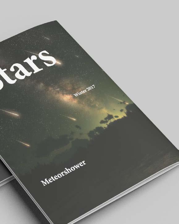
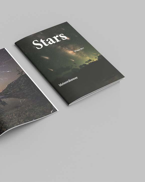
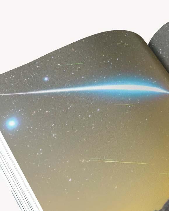
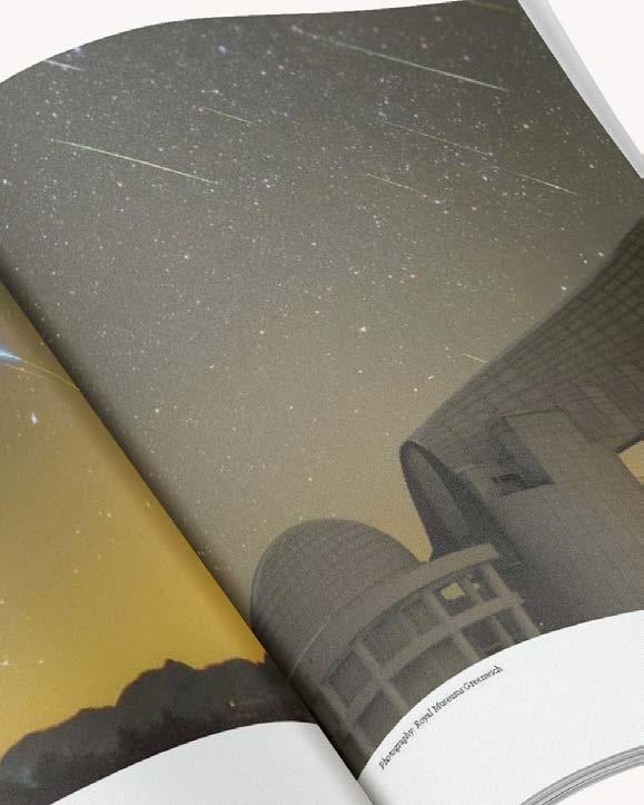
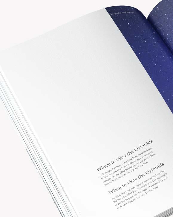
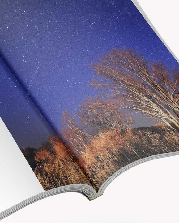
Stars — Meteor Shower Magazine/ Book & Editorial Design
GenZ New Language/ brand identity / Visual System
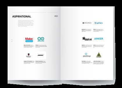
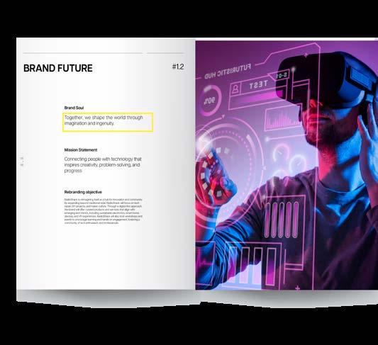
RadioShack/ Brand Revival and Visual Identity System/ Branding & Identity Systems
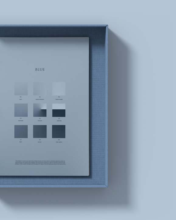
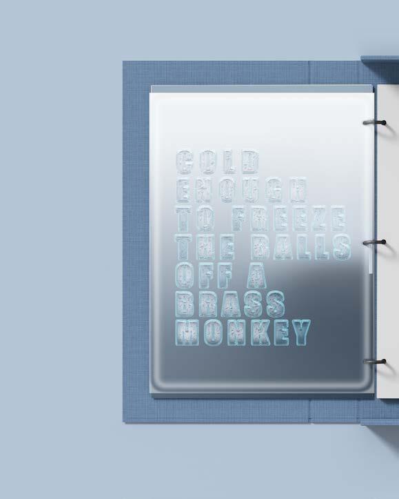
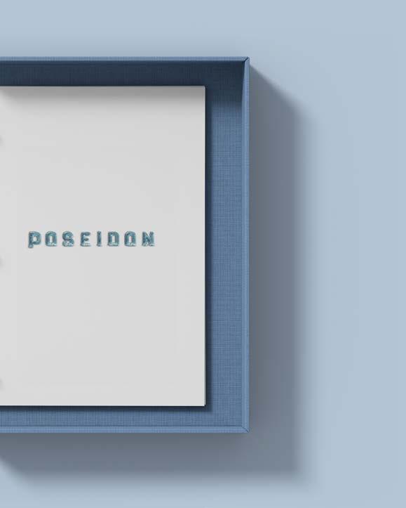
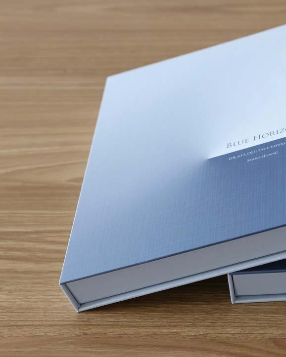
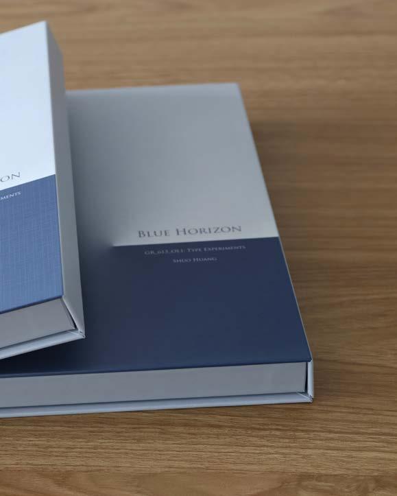
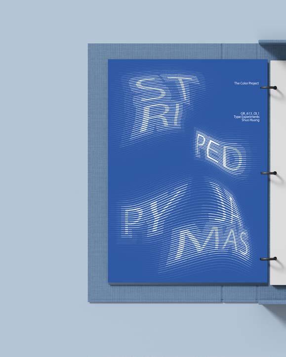
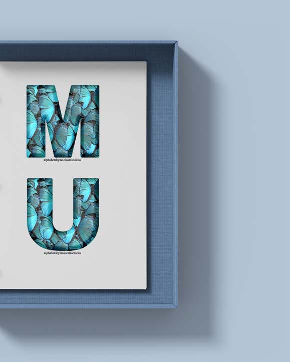
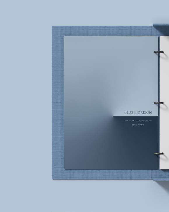
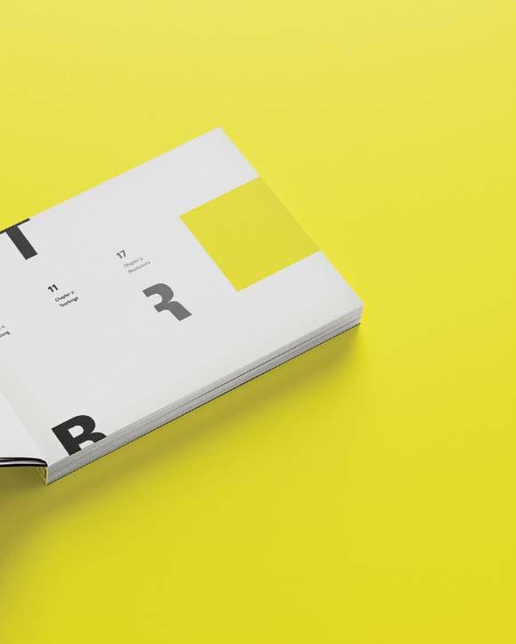
Blue Horizon/Experimental Book Design /Type Systems 01 02 03 04
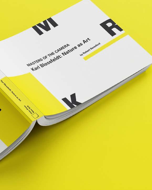
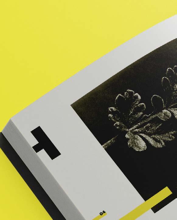
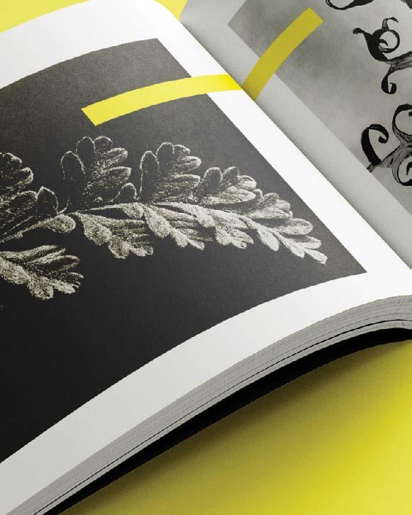
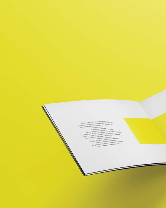
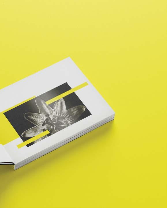
Glow Like a Flower/ Book design/Type Composition
05
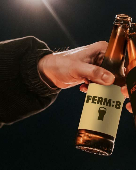
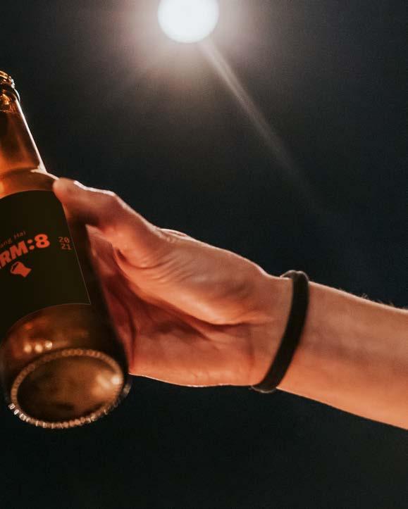
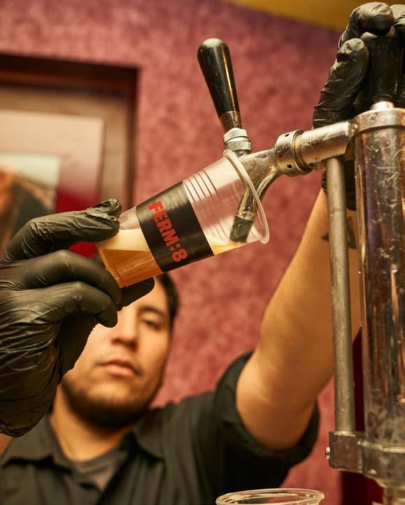
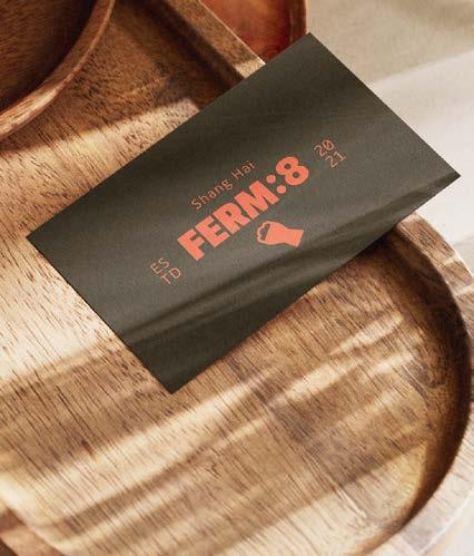
Ferm:8 Craft Beer/ conference design/ Shanghai China
06
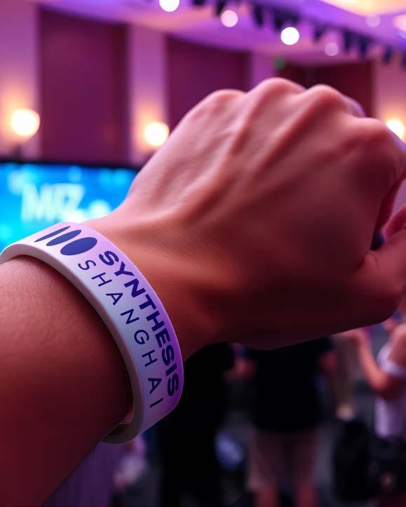
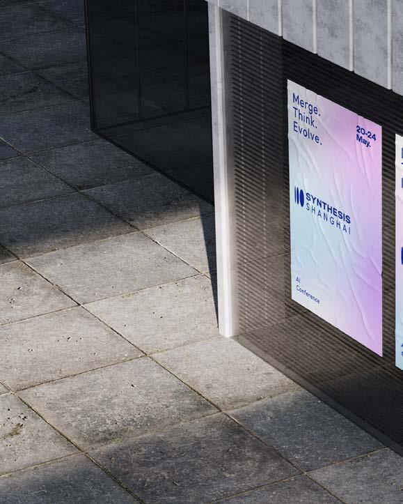
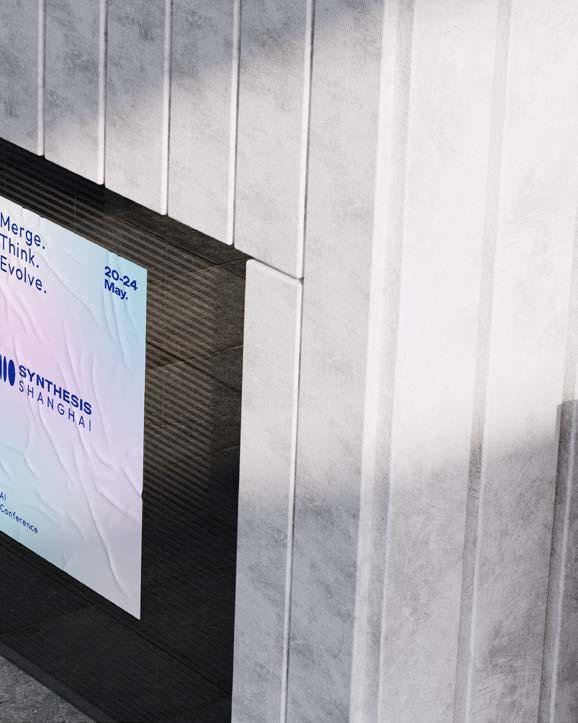
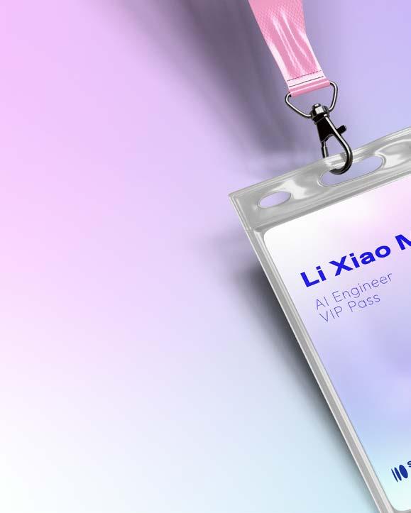
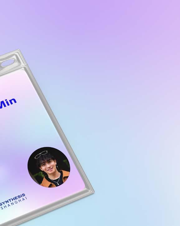
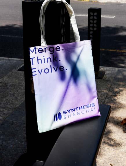
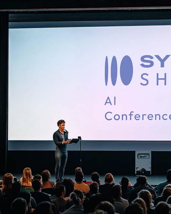
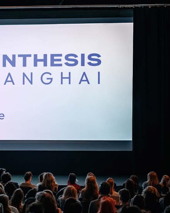
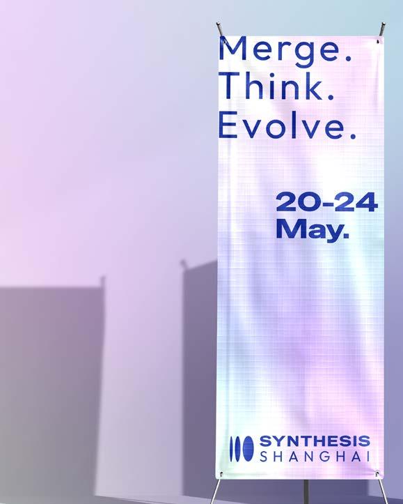
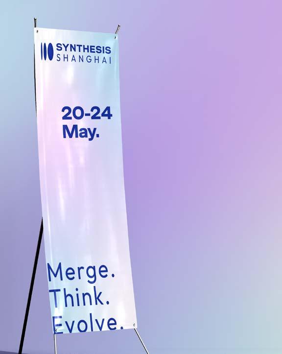
Synthesis Conference Shanghai/ conference design/ Shanghai China
07
PROJECT TYPE
Editorial Design / Magazine / Visual
Storytelling
KEYWORDS
Editorial Design / Magazine / Visual
Storytelling
CLASS
Visual Communication
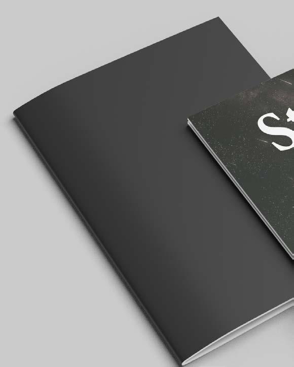
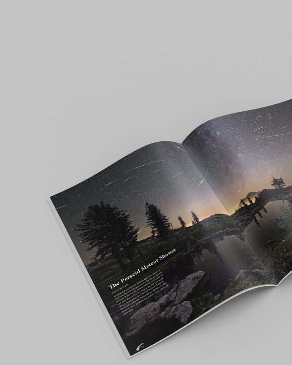
Design a visually immersive magazine that documents the poetry and science of meteor showers. The objective was to transform astronomical data, photography, and storytelling into an engaging editorial experience that feels both informative and emotional — bridging the gap between scientific observation and personal wonder.
The magazine merges dramatic astrophotography with clean, atmospheric layouts. Data visualizations and charts are paired with lyrical typography and generous negative space, creating a calm, starry reading rhythm. Each meteor shower is introduced with location-specific guides, allowing readers to not only learn but imagine themselves under the night sky.

PROJECT TYPE
Brand Identity / Visual System
KEYWORDS
Brand Identity / Lifestyle / Gen Z / ui / ux
CLASS
STUDENT WORKS
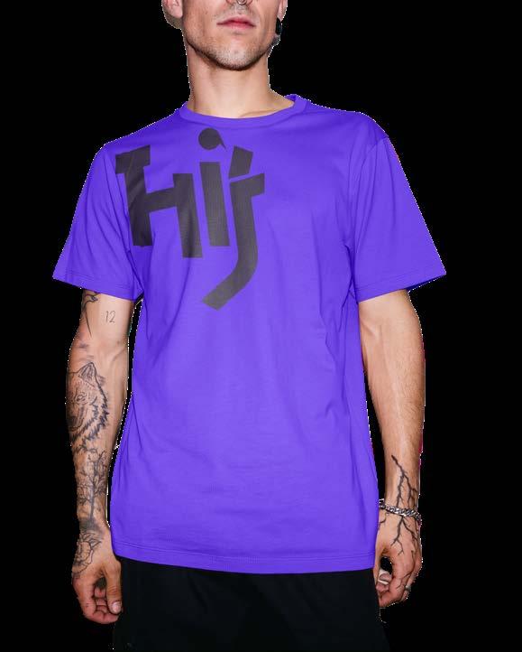
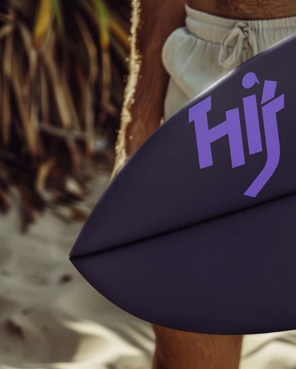
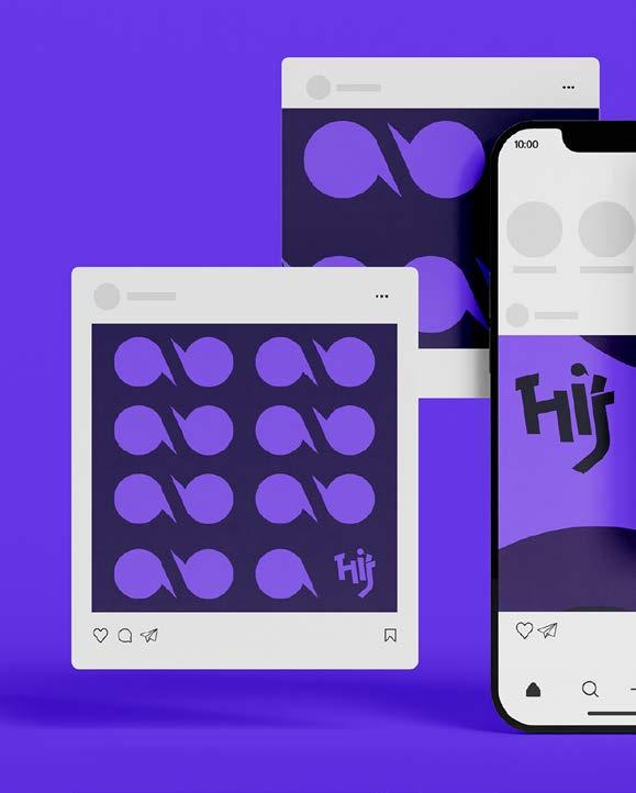
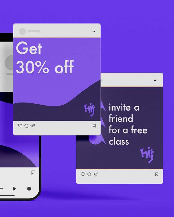
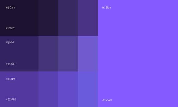
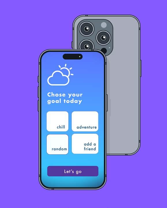
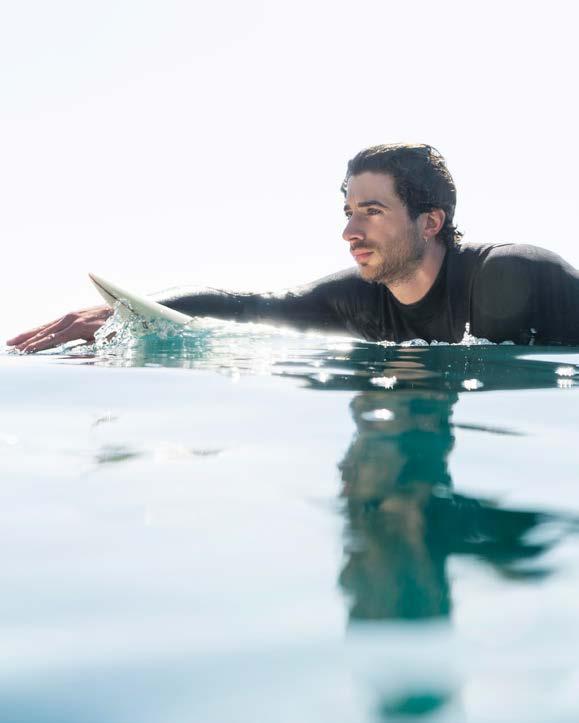
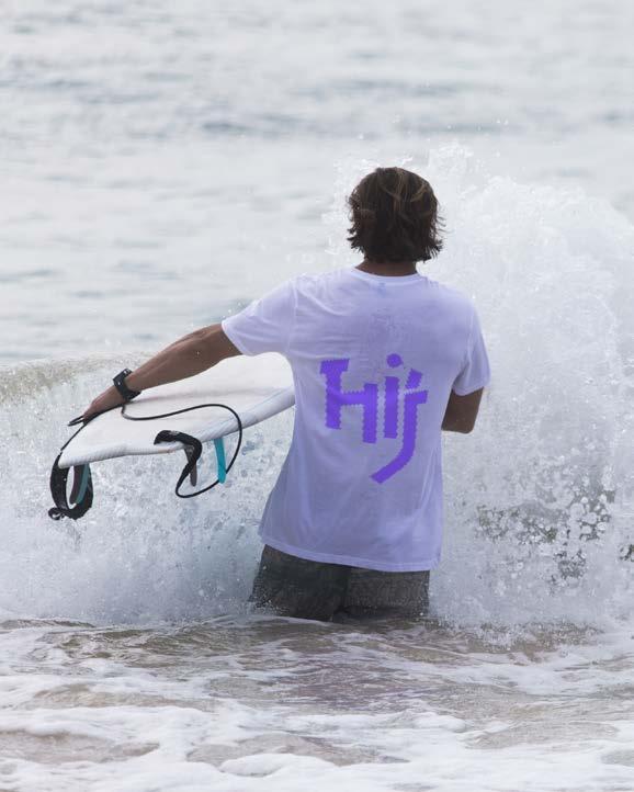
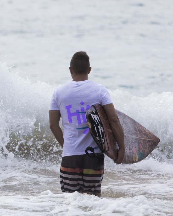
Create a brand identity and experience for HIJ, a China-based surf club that offers surf guidance, destination recommendations, and lifestyle products. The goal is to build a community-driven brand that respects the ocean and promotes sustainable surfing culture. The project needs to clarify what HIJ offers and express its environmental values through design and storytelling.
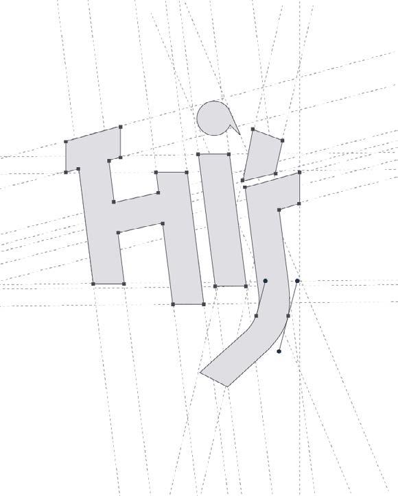
The design system is rooted in typographic play, vibrant color blocking, and modular grid systems — allowing HiJ to flex across media while maintaining consistency. The logo was custom-drawn to feel both friendly and iconic. Supporting graphics, illustrations, and motion elements enhance the brand’s youthful, expressive tone without sacrificing clarity or usability.

Brand Repositioning / Visual Identity / Legacy Revamp / Modular System
KEYWORDS
Brand Repositioning / Visual Identity / Legacy Revamp / Modular System / Nostalgia Meets
Innovation / Community-Focused Design
CLASS
Branding & Identity Systems
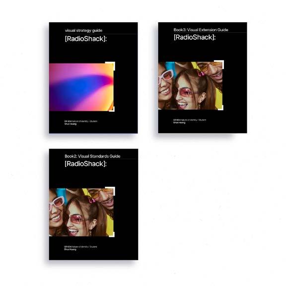
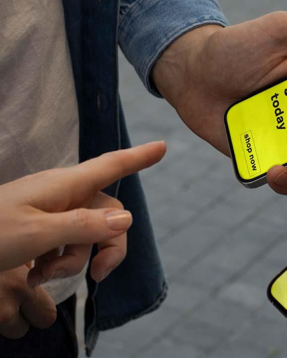
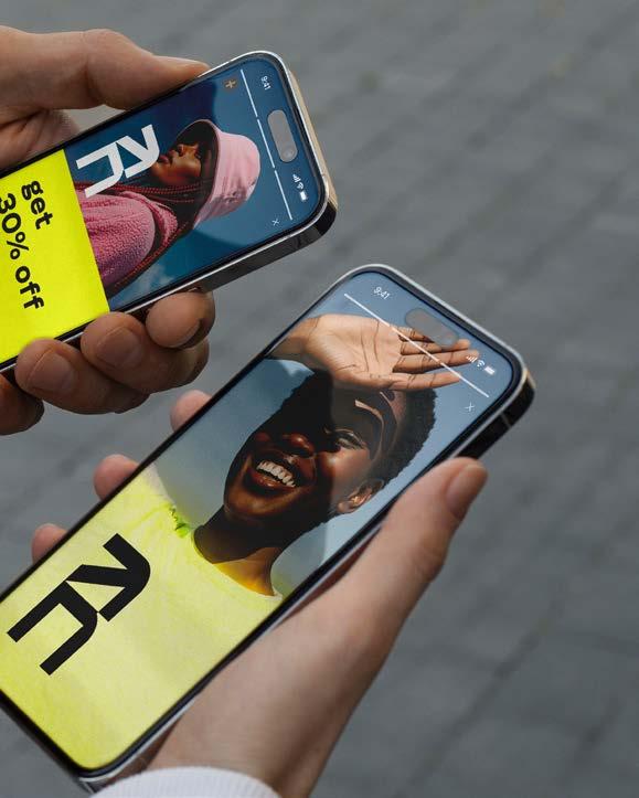
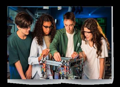
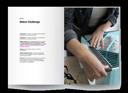
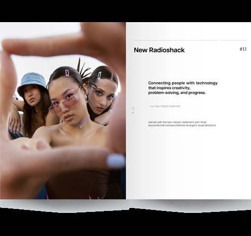
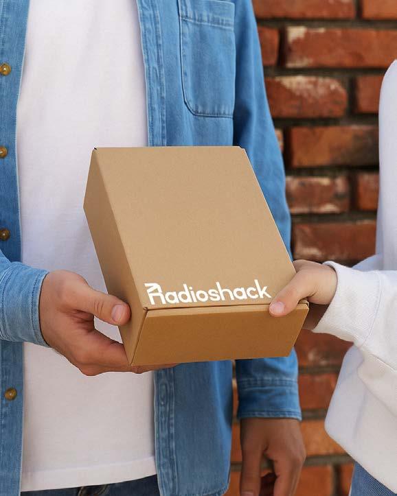
Reposition RadioShack for a new generation by transforming it from a dated electronics retailer into a vibrant, maker-focused community brand. The goal was to retain its nostalgic roots while appealing to modern consumers through a refreshed identity, strategic messaging, and flexible design language across digital, print, and retail environments.
The identity system revives RadioShack’s legacy using modular layouts, pixel-inspired visuals, and analog-style typography. A refreshed wordmark and adaptable design tools allow the brand to scale across mediums — from packaging to digital. The result is a bold, approachable system that honors the past while fueling future innovation.
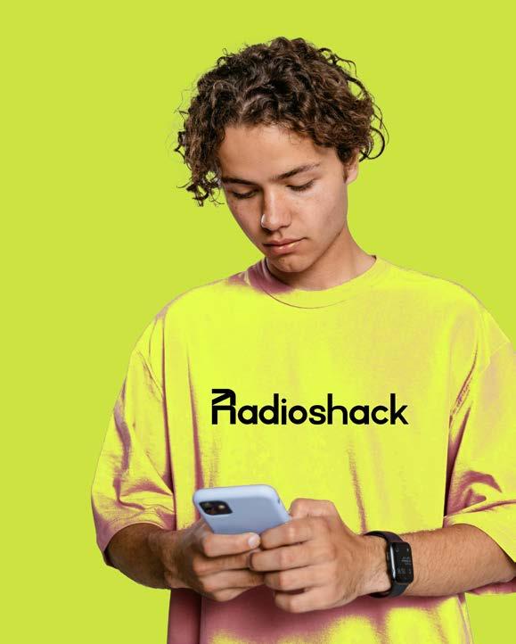
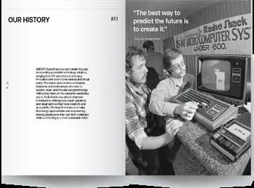
ABOUT/ Radio Shack is a tech retailer focused on providing accessible technology solutions, ranging from DIY electronics to emerging innovations like smart home devices and virtual reality. The brand caters to tech enthusiasts, hobbyists, and professionals who seek to explore, repair, and innovate using technology. With a long history in the consumer electronics space, RadioShack now aims to empower individuals by offering tools, expert guidance, and repair services that foster creativity and sustainability. The brand’s mission is to make technology approachable and empowering, helping people solve their own tech challenges while contributing to a more sustainable future.
PROJECT TYPE
Editorial Design / Experimental Book / Visual Narrative
KEYWORDS
Book Design / Experimental Typography / Visual Poetry / Narrative Structure / Emotion & Space / Material Exploration
CLASS Type Systems
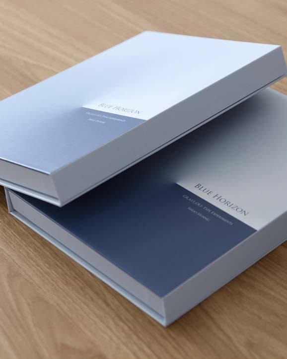
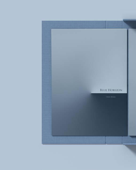
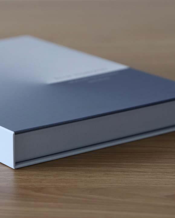
Create an experimental book that explores the theme of emotional distance and human longing through typographic composition, image-making, and sequencing. The project aims to challenge traditional book structure by using spatial pacing, negative space, and nonlinear storytelling to evoke a sense of drifting, memory, and inner exploration.environments.
The book uses layered typography, abstract photography, and rhythmic pacing to express emotional tension and openness. Unconventional layouts guide the reader through fragmented thoughts and silent pauses. Bound in exposedthread stitching with tactile paper choices, the book itself becomes a metaphor for vulnerability, space, and emotional fragmentation.
PROJECT TYPE
Book Design /
Typography / Visual Poetry
KEYWORDS
Typography / Book Design / Visual Poetry / Growth & Bloom / Type as Image / Experimental Layout
CLASS
Type Systems
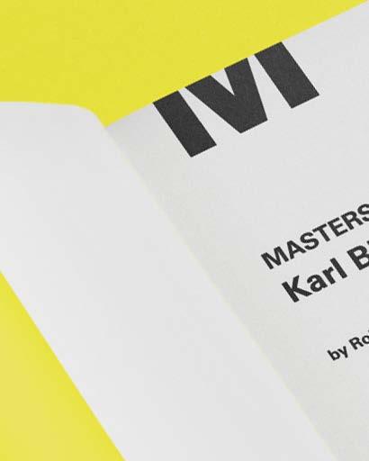
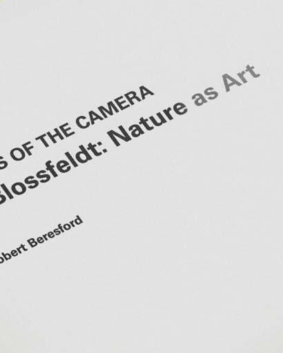
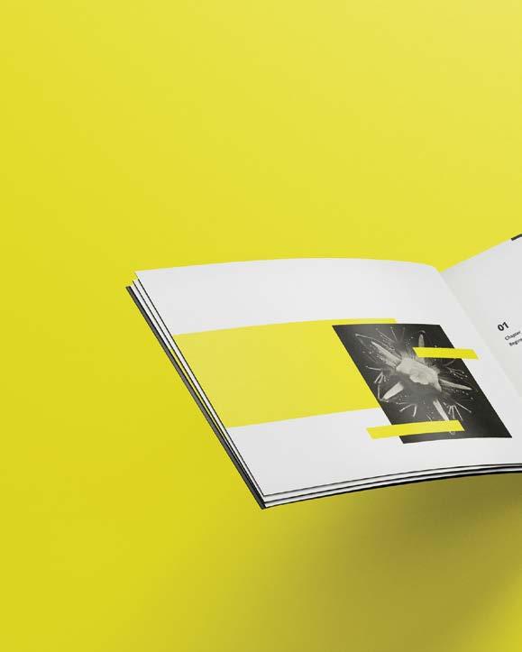
Explore the poetic relationship between language and visual form through a typographic book inspired by the theme of blooming and inner light. The goal was to use type not only as a vehicle for reading, but as a visual element that evokes rhythm, fragility, and emotional growth — much like a flower in bloom.
The book features lyrical text compositions layered with expressive type treatments and organic page structures. Letterforms stretch, fade, and cluster to mirror the delicate, emotional unfolding of petals. Carefully paced white space and flowing grids allow type to “breathe,” transforming reading into a sensory, meditative experience.

PROJECT TYPE
Branding/
Visual identify
KEYWORDS
Local Brewing/ Zero Waste/ Community Culture/ Anti-Mass/ Honest Design
CLASS
STUDENT WORKS
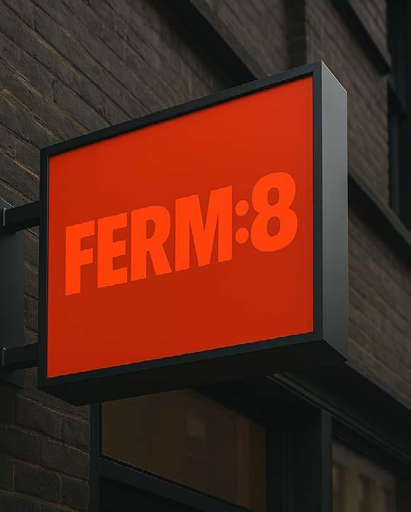
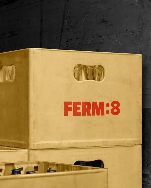
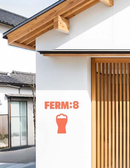
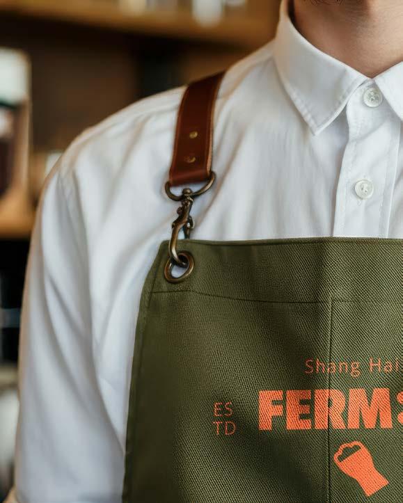
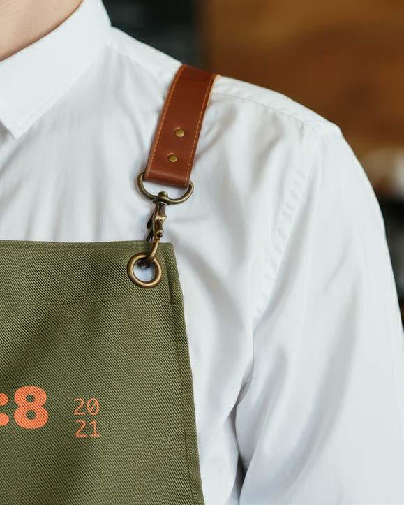
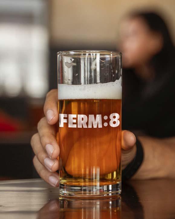
FERM:8 is a small-batch craft beer brand founded by two friends in Shanghai. Built on the principles of locality, sustainability, and authenticity, the brand aims to challenge industrial beer norms by prioritizing in-house brewing, minimal waste, and intimate, communitybased experiences.
We created a bold, utilitarian brand identity reflecting the raw, hands-on nature of FERM:8. The visual system uses strong typography, earth-toned palettes, and minimalistic packaging. The branding emphasizes the human scale of production and fosters a sense of connection between the beer, the space, and the people who enjoy it.
PROJECT TYPE
Conference
Branding / Spatial
Experience Design / Digital & Print System / Motion Graphics
KEYWORDS
Human x Machine/ Conscious Systems/ Generative Culture/ Fluid Identity/ Cognitive Design
CLASS STUDENT WORKS
SYNTHESIS 2024 is a future-forward AI conference held in Shanghai, exploring the convergence of human intuition and machine intelligence. The event aims to spark cross-disciplinary collaboration among technologists, artists, and thinkers navigating the ethical, creative, and cultural implications of AI.
The branding system combines organic and geometric forms to visually reflect the merging of human sensitivity and computational precision. A dynamic modular grid, minimal typography, and shifting color gradients evoke both control and fluidity—mirroring the dual nature of AI as both tool and collaborator. Environmental graphics and digital interfaces are designed to feel interactive and alive.
Thank you to everyone who supported me through this journey. Your encouragement, inspiration, and presence gave this book its soul.
Special thanks to Irena Milev for her genuine support and guidance— this book wouldn’t have been possible without her.
Academy of Art University, School of Graphic Design Senior Portfolio
Instructor: Irena Milev
Bookbindery: Blurb.com
Shuo Huang 86 158841576760
1140 Minhan Road, shanghai, China shuohuang678@gmail.com shuohuangdesign.com