



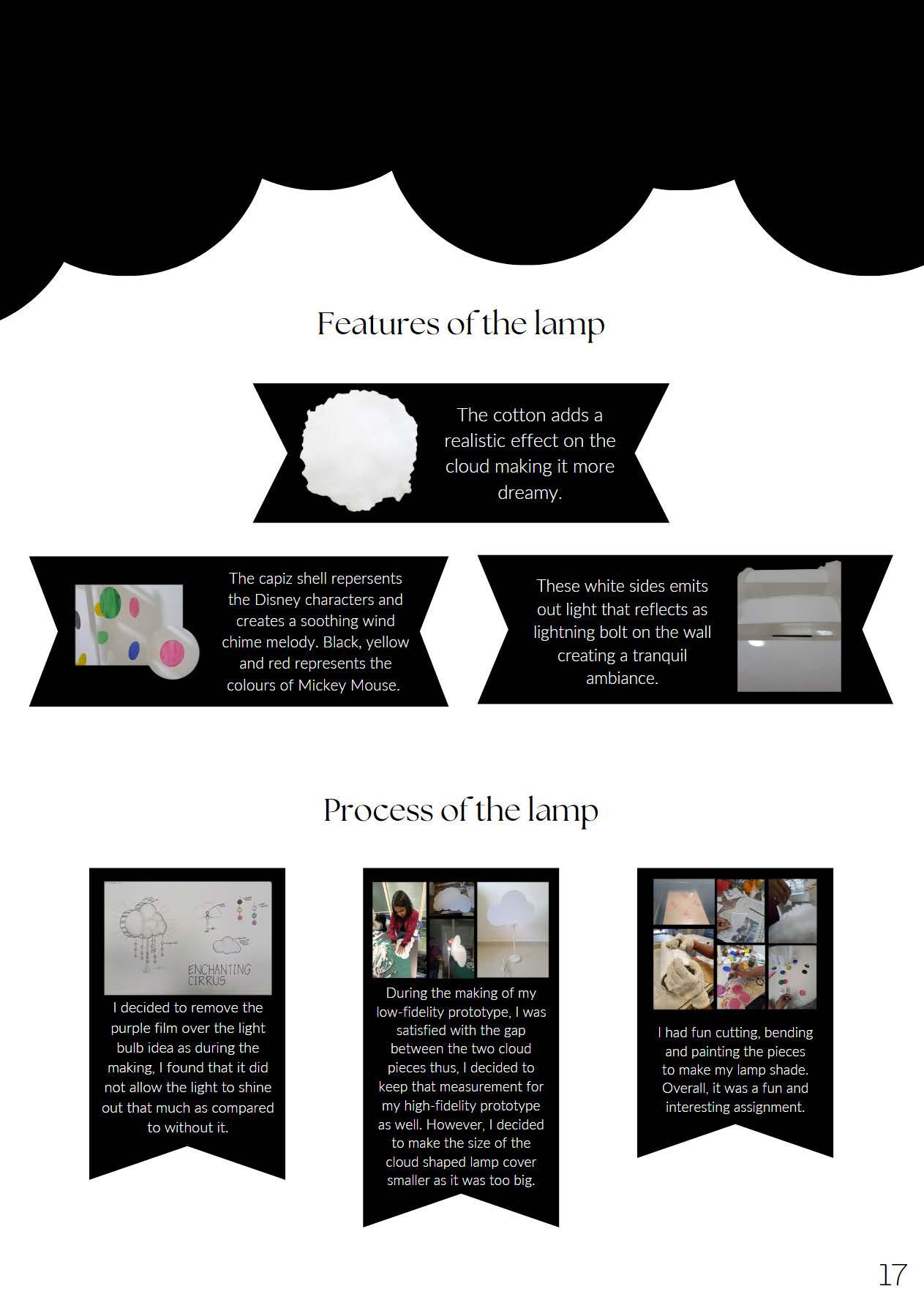
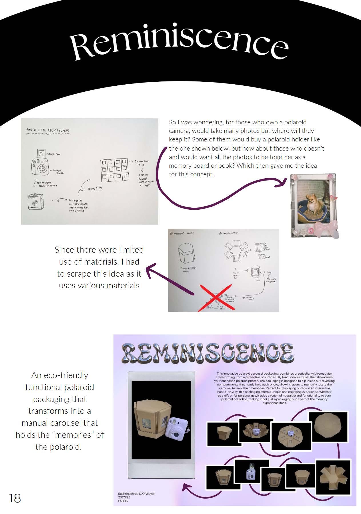
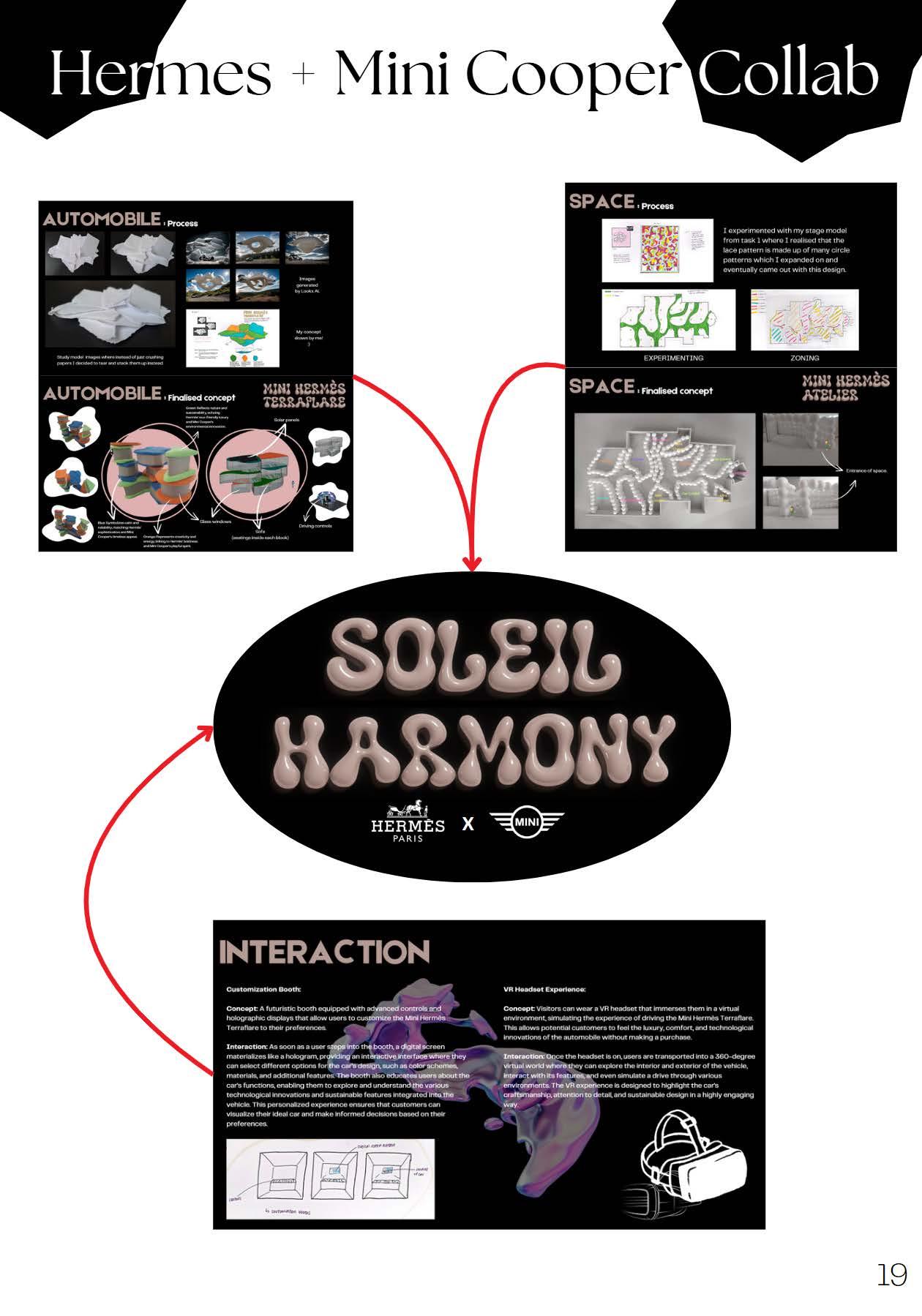
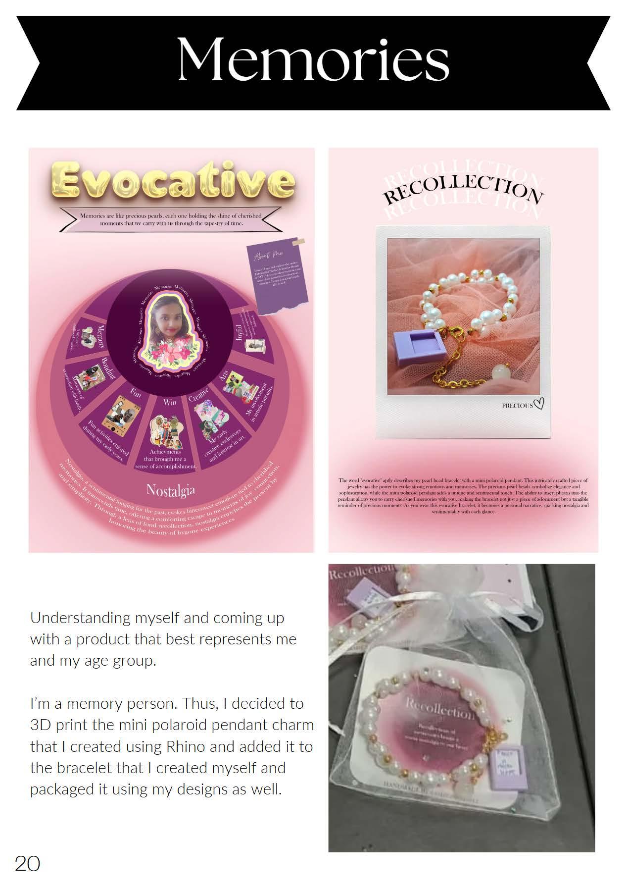



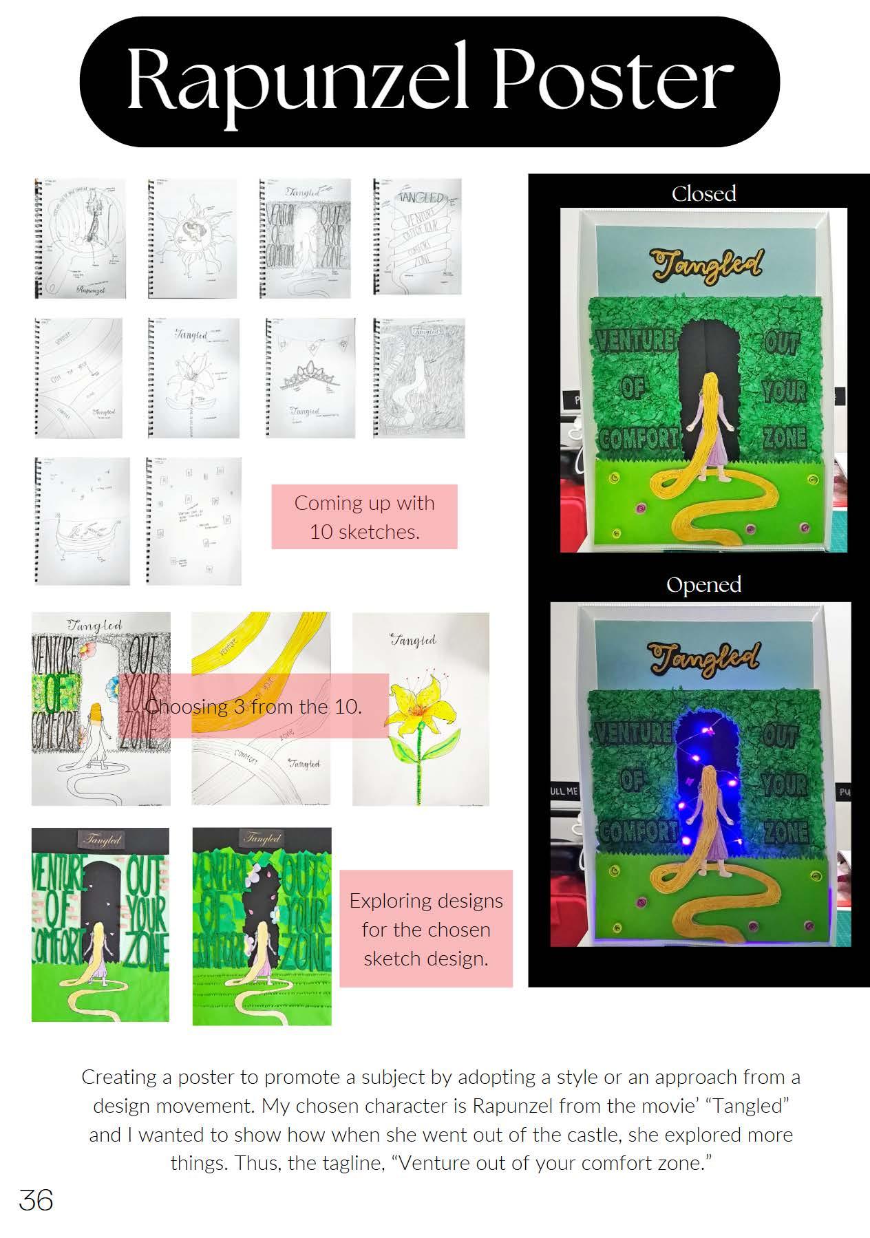

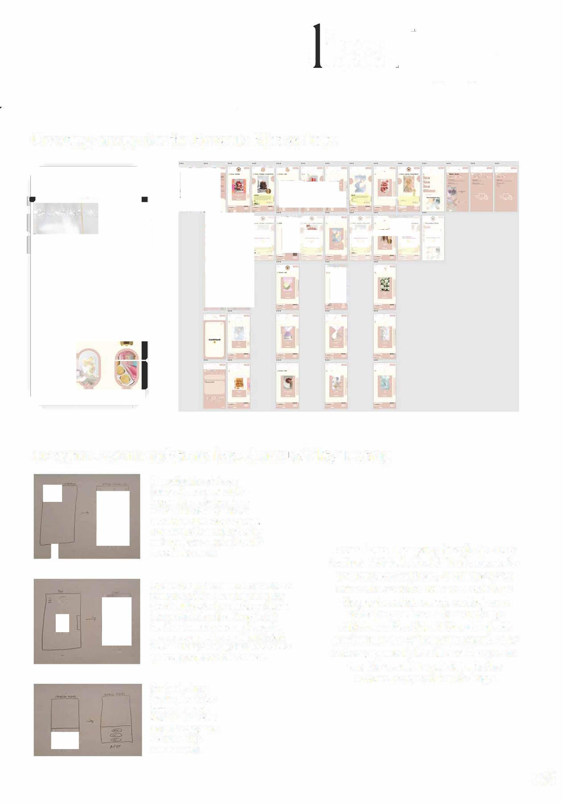


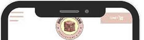
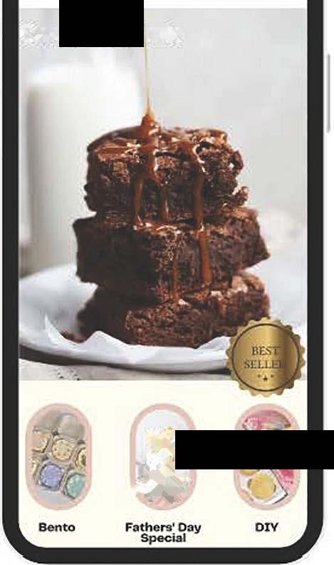

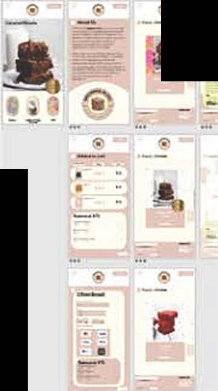





After goingthrough 5 user testings, 1 clear change isto increase the navigation size as well assomeotherbuttons as well such as, the footer wordings This way,the users will be ableto easily navigatearound as it would beeasiertopress it
Another design recommendation would be to eitheradda texttelling the usersthat theyshouldtapforit to change or change it to ascrollingfunction. Currently, the interfaceisseemtoshowasthoughthe users aresupposedtoscrollit which isn't thecase. Thus. changing that would ensure asmooth navigationflow for users.
Forthesigning up for amember inthe footer,the words should beclearer. It should be bigger and in a much more obviouscolour.
In conclusion, after going through the 5 user testings, I felt that although I had some design problems here and there, overall the design was a success as the users were able to go through the whole website on their own without my guidance. The main design problem was the sizing All though I already increased the size of the navigation and other buttons, apparently it's still small for users to tap. But overall, I'm satisfied with the outcome of my mobile web design