The Future of Long Distance Mobility by Academy of Art University, Sponsored by Volkswagen Group of America
005
Color
018
010
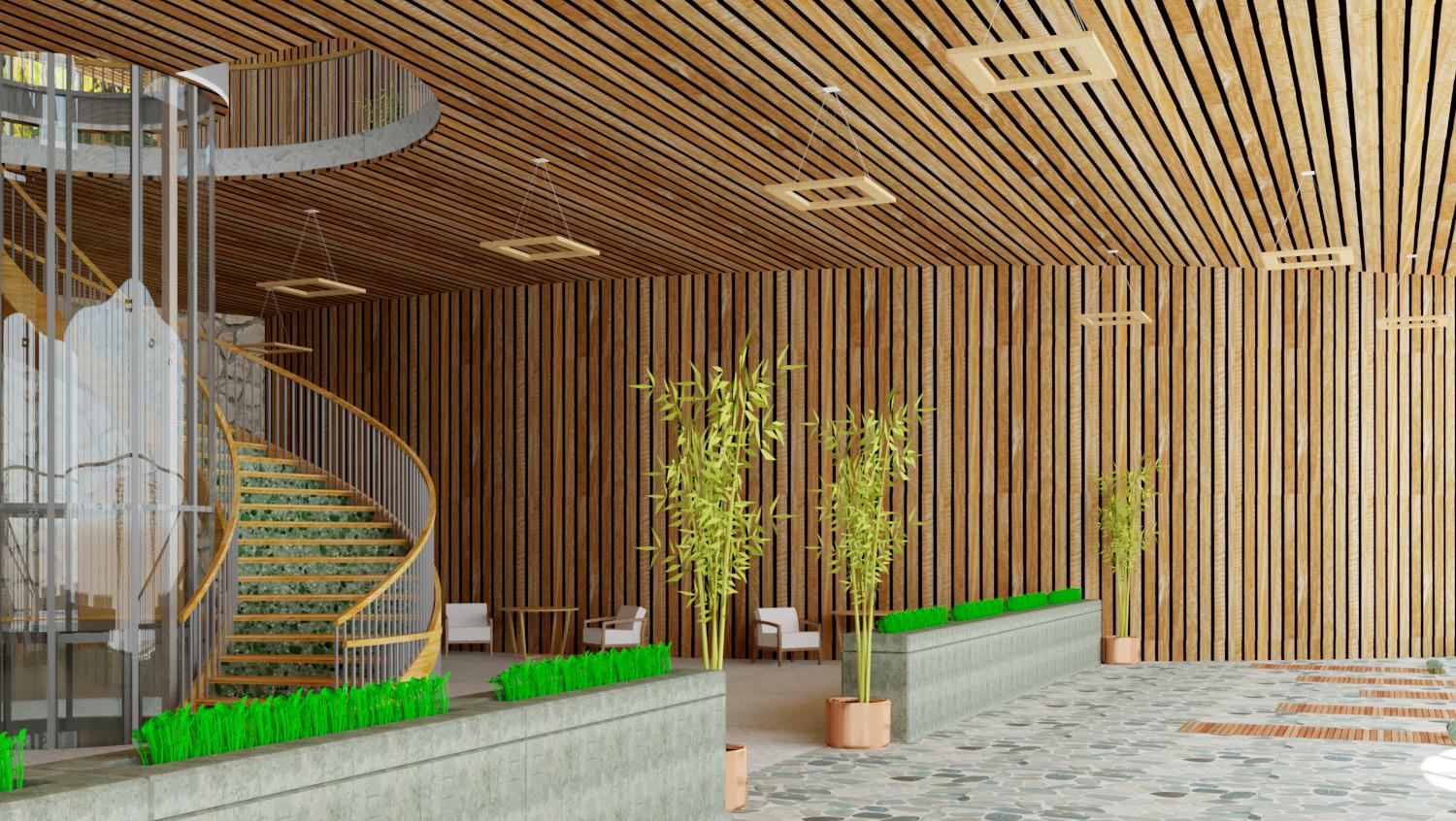
Biophilic Design
020
Shapes Infrastructure
014
Materials
024
Typography
016
Lighting
028
UX/UI
Design Philosophy
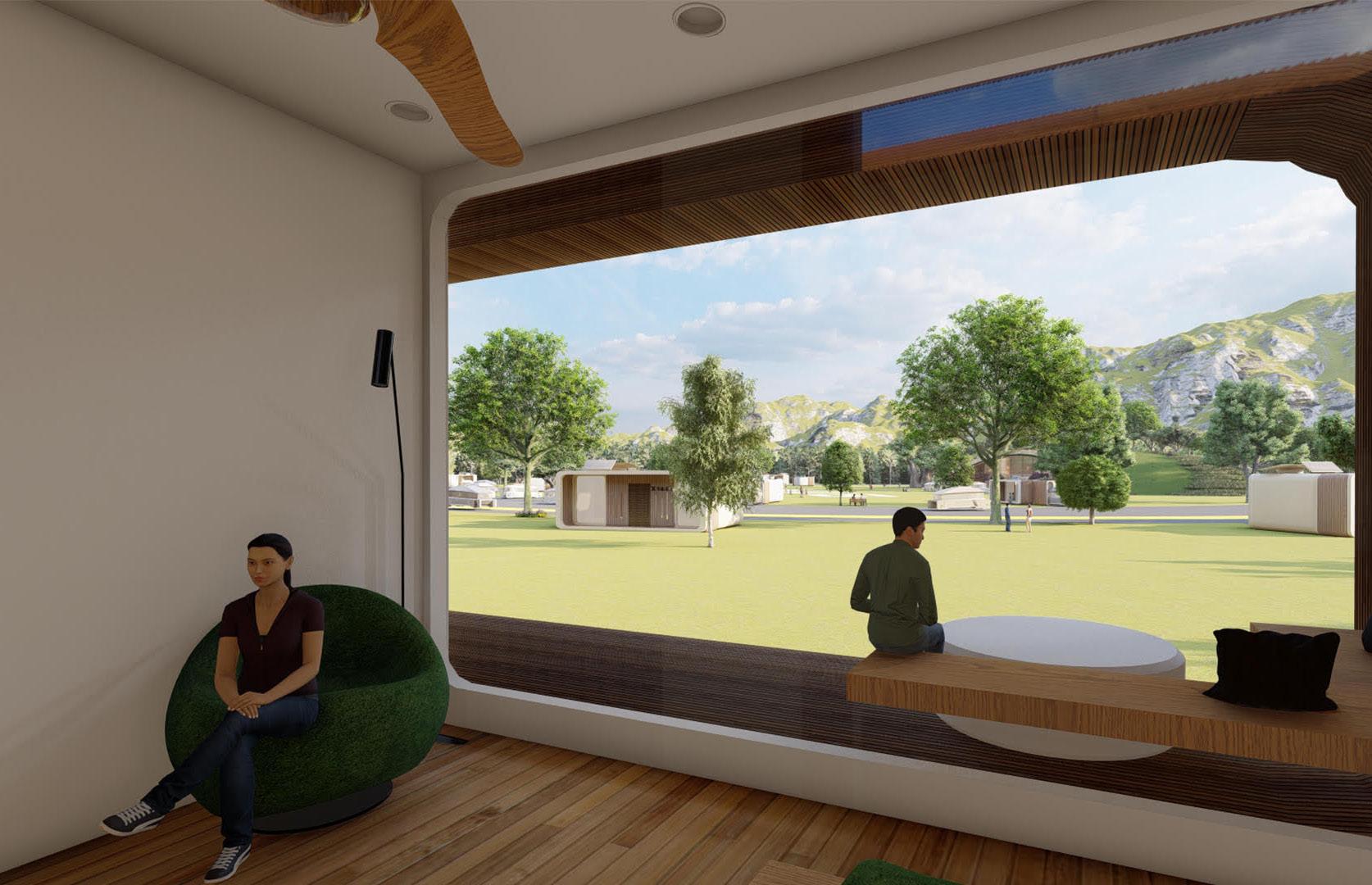
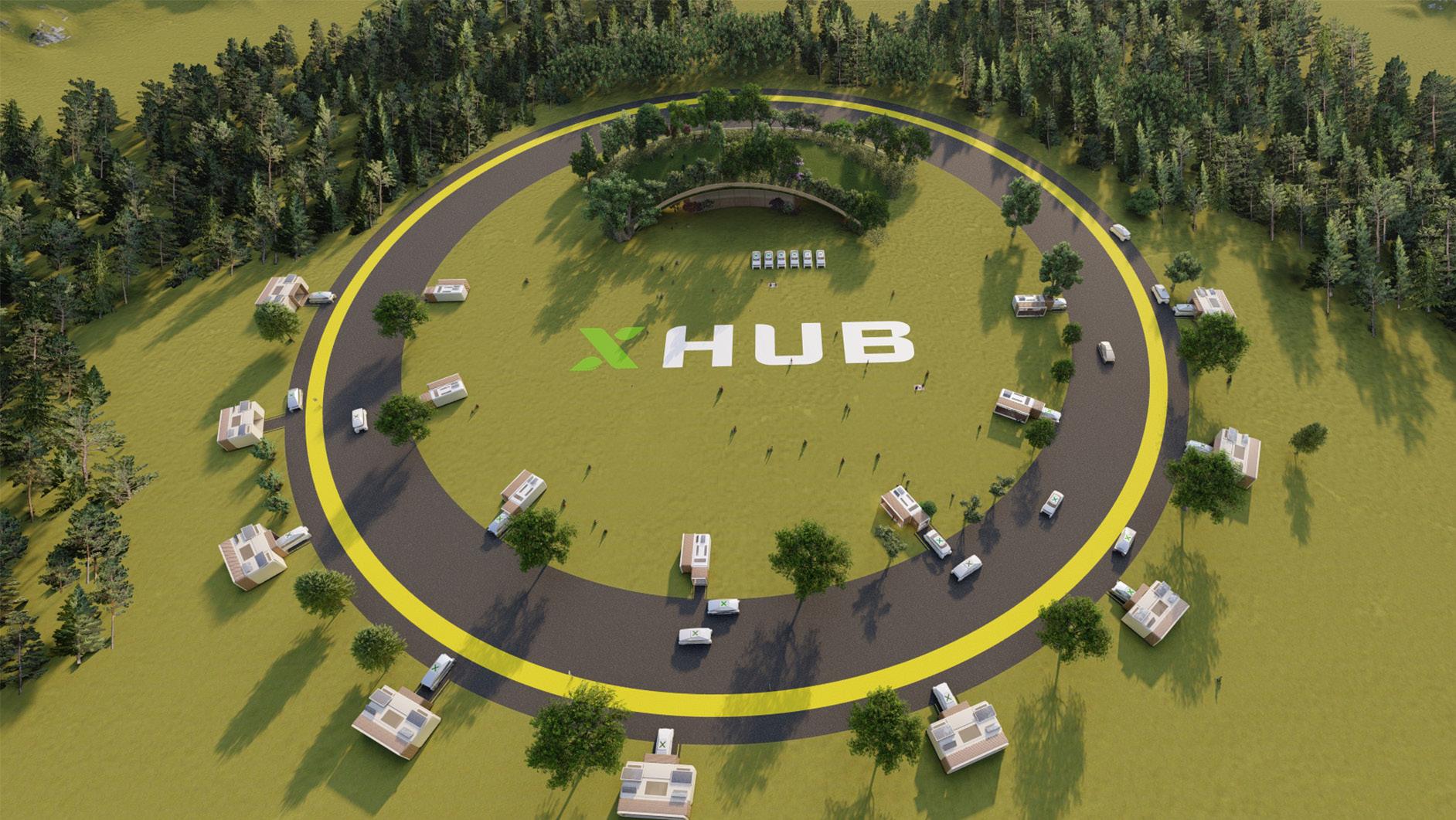
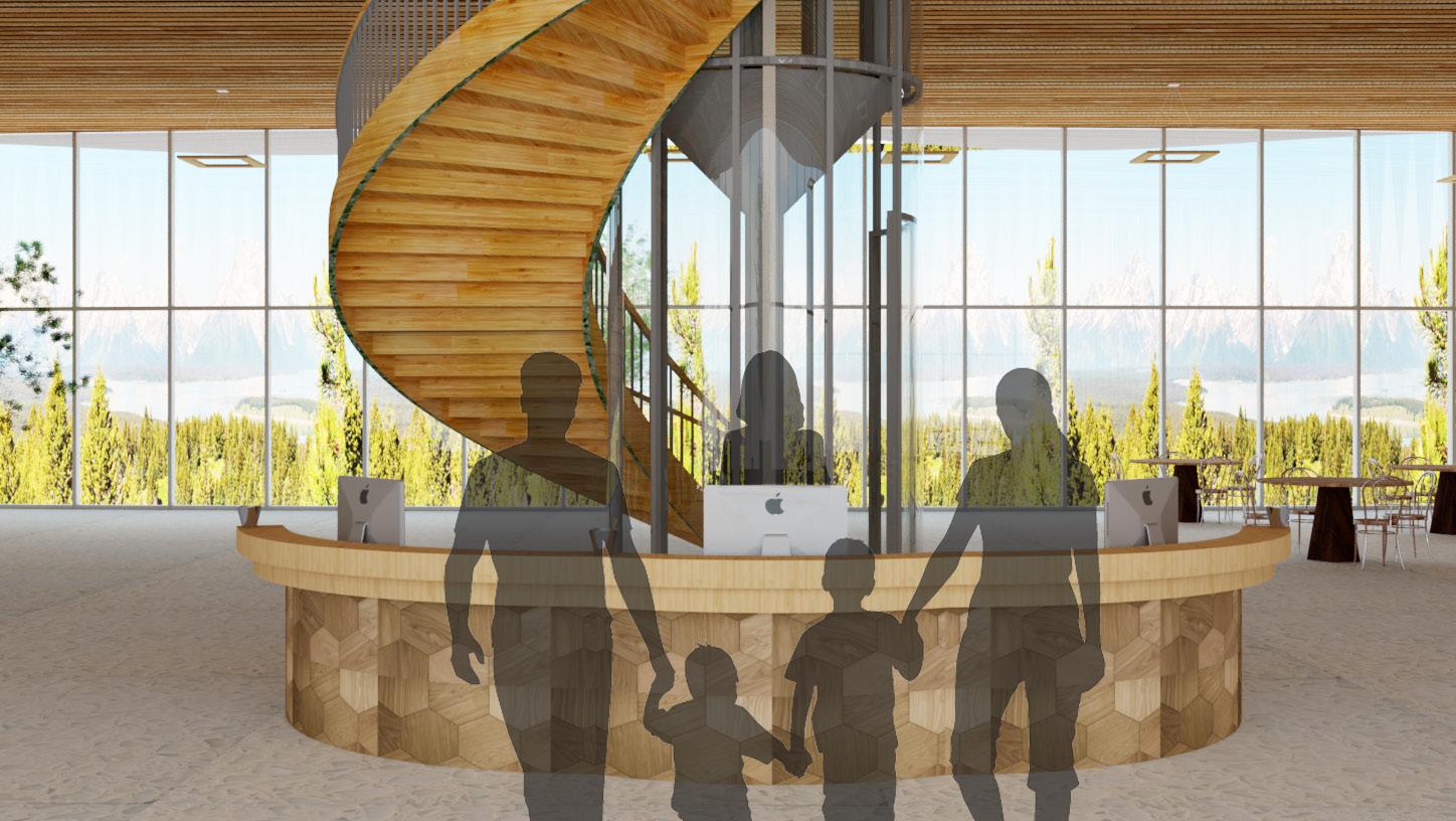
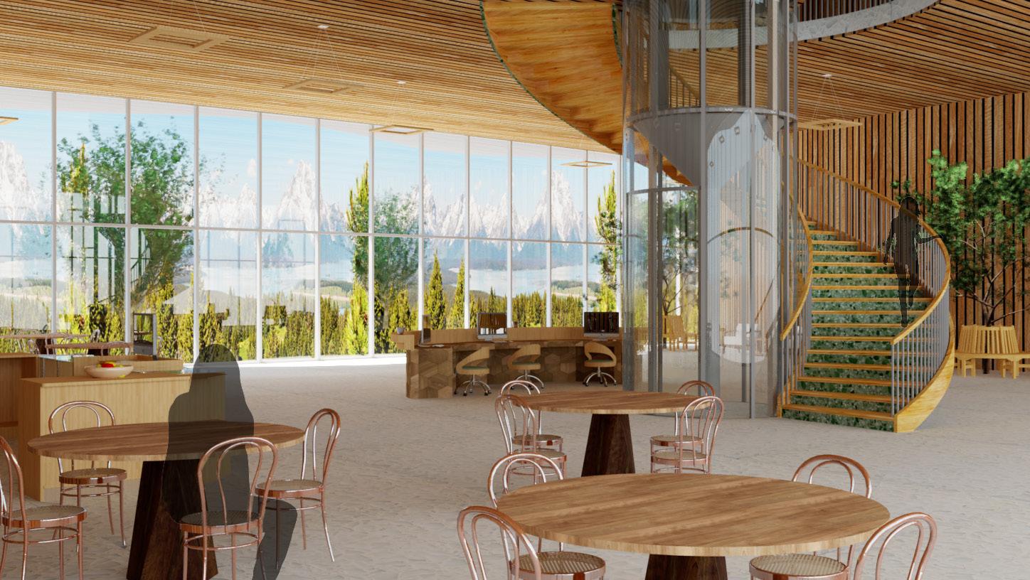
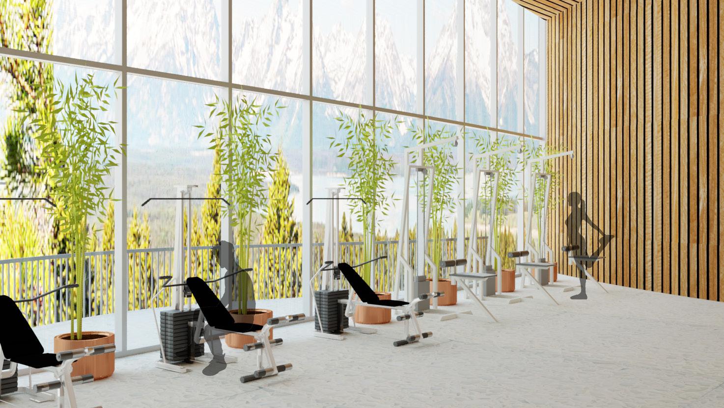
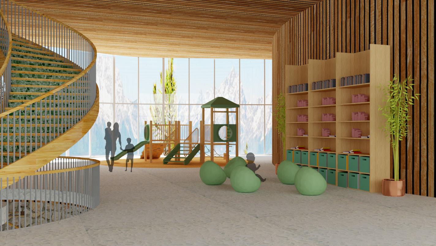
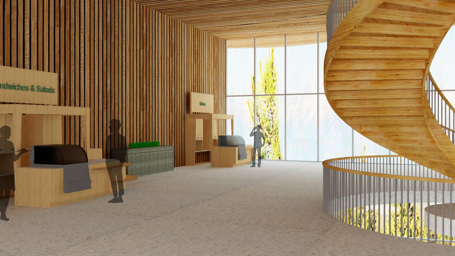
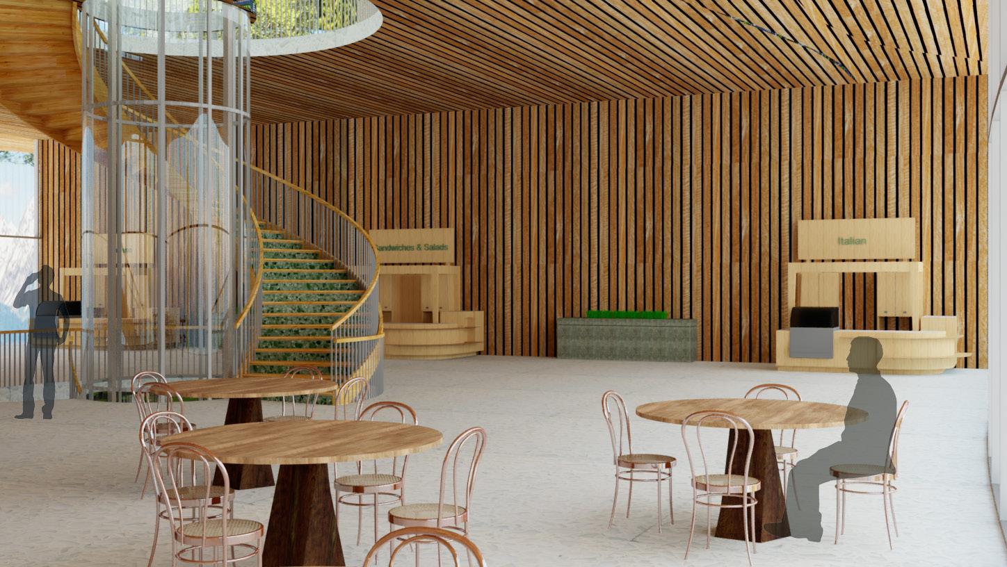
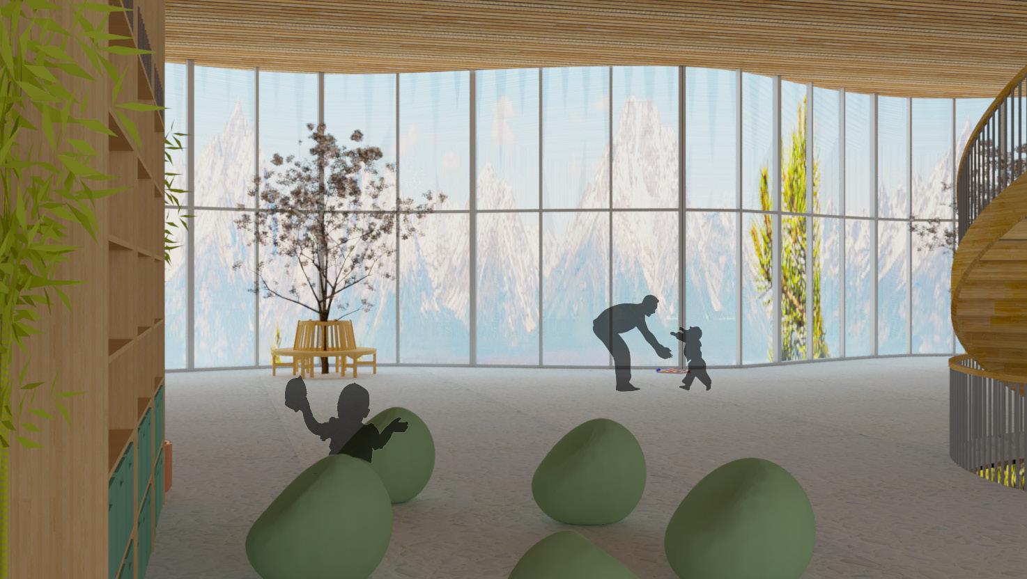
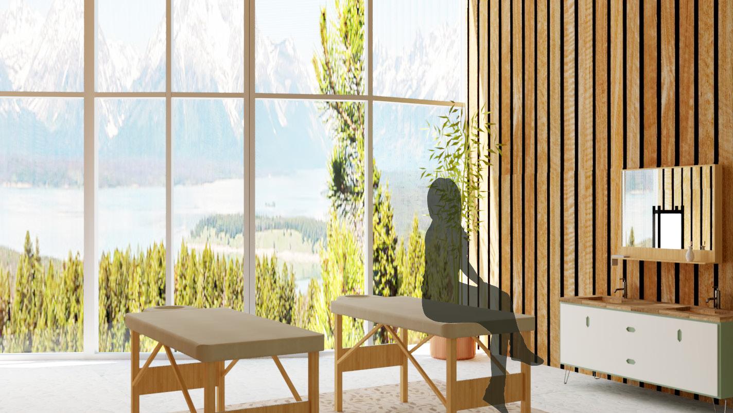
Our core belief stems from biophilia, the human desire to interact with nature and other forms of life. Through any stage of design, we aim to reinforce the union of the human lifestyle with Earth. Empathy in design is no longer optional, it is our responsibility. So design for yourself, your neighbor, your elders, your children, and most importantly — the Earth. It will live with our creation longer than we ever will.
Manifesto
We Move
We Move seamlessly through life’s ebbs and flows.
We Move past life’s literal mountains, and carve our own unique path.
We Move beyond going from point A to B, and celebrate every step of our journey.
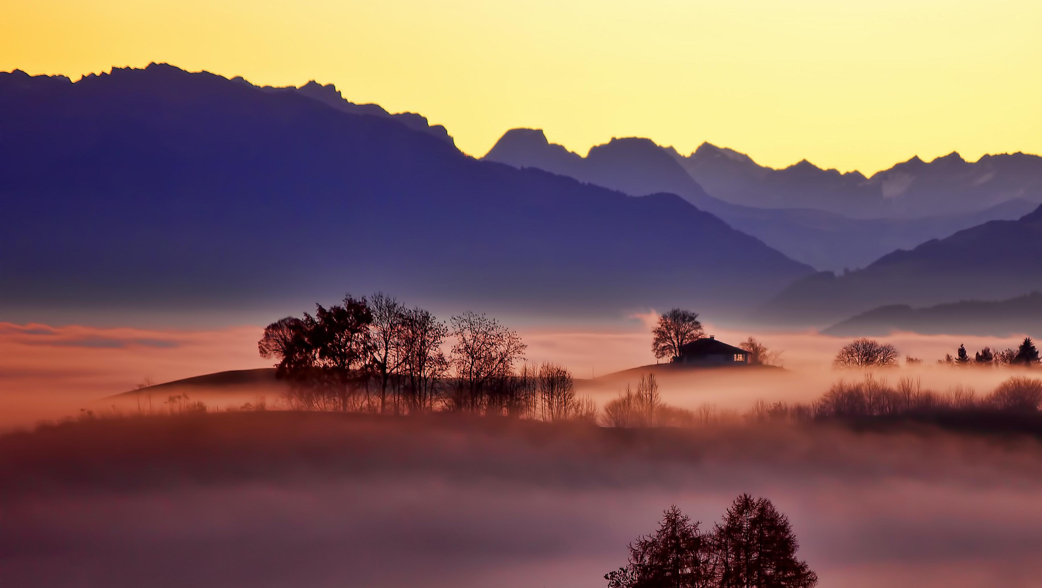
We Move in harmony with the day and in tune with the seasons.
We Move with nature, and learn to respect and protect it.
We Move to nourish our bodies and souls.
We Move to set our spirits free.
We Move forward into life’s next adventure, together.
COLOR
01
Color Theory
Color theory is the collection of rules and guidelines which designers use to communicate with users through appealing color schemes in visual interfaces. To pick the best colors every time, designers use a color wheel and refer to extensive collected knowledge about human optical ability, psychology, culture and more.
DAFFODIL (Quinary)
RGB: 3, 17, 74, 0
CMYK: 3,17,74,0
01
MIDNIGHT (Secondary)
RGB: 44, 84, 141
CMYK: 91, 78, 18, 4
Palette Ratio
Use what resonates with your own designs and projects. The ratio displays our priority of our primary palette. As shown previously, these colors may come up in different hues and saturation. Our inspiration derives from the natural elements, so play with your natural intuition. Consider the story these colors tell in your design and user journey. We also encourage straying from extremities on the gray scale, very little is truly black and white.
SIENNA (Tertiary)
RGB: 193, 93, 61
CMYK: 19, 75, 83, 6
FOREST (Primary)
RGB: 246, 207, 94
CMYK: 3, 17, 74, 0
COTTON (Quaternary)
RGB: 251, 249, 244
CMYK: 1, 1, 3, 0
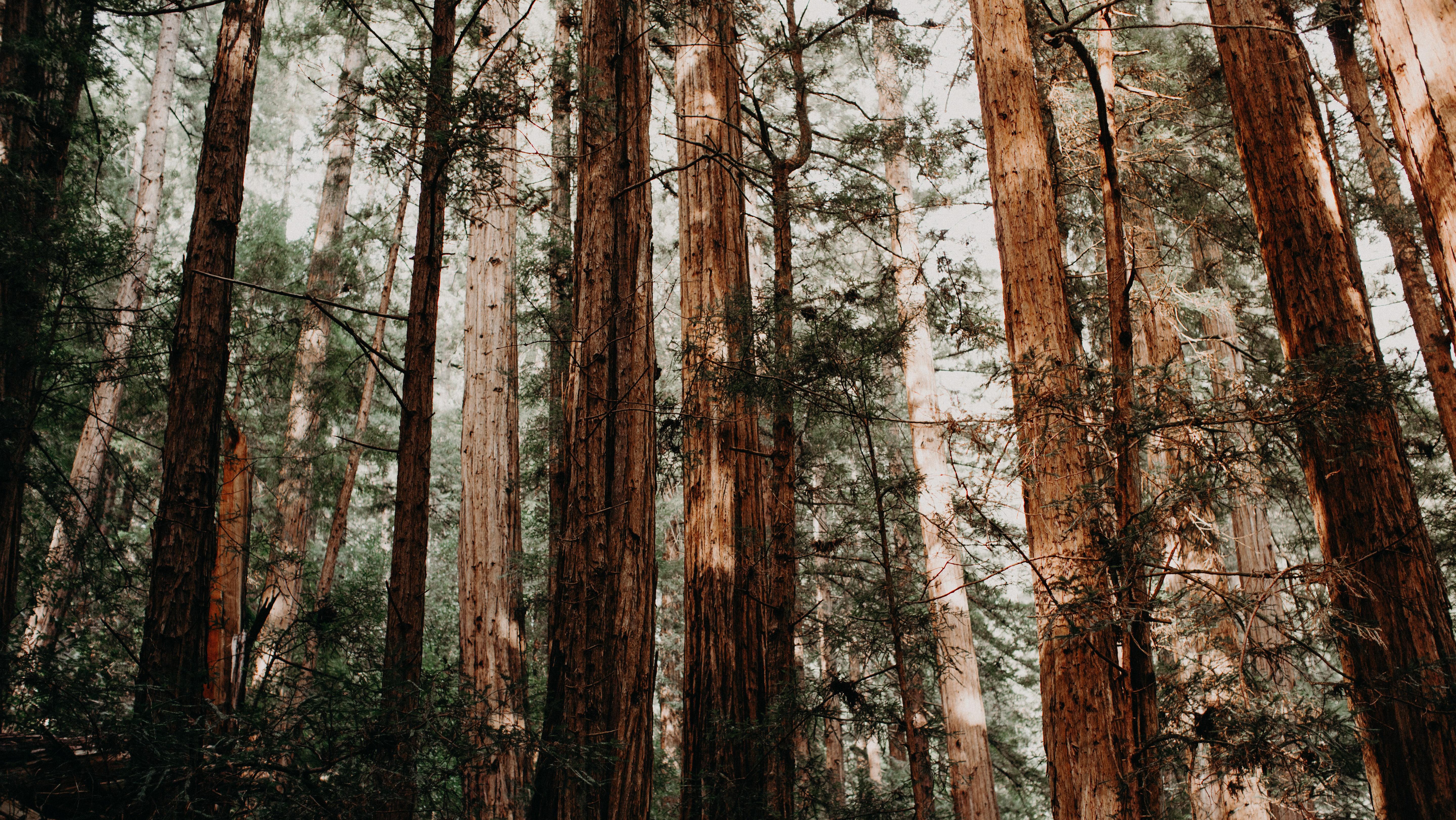
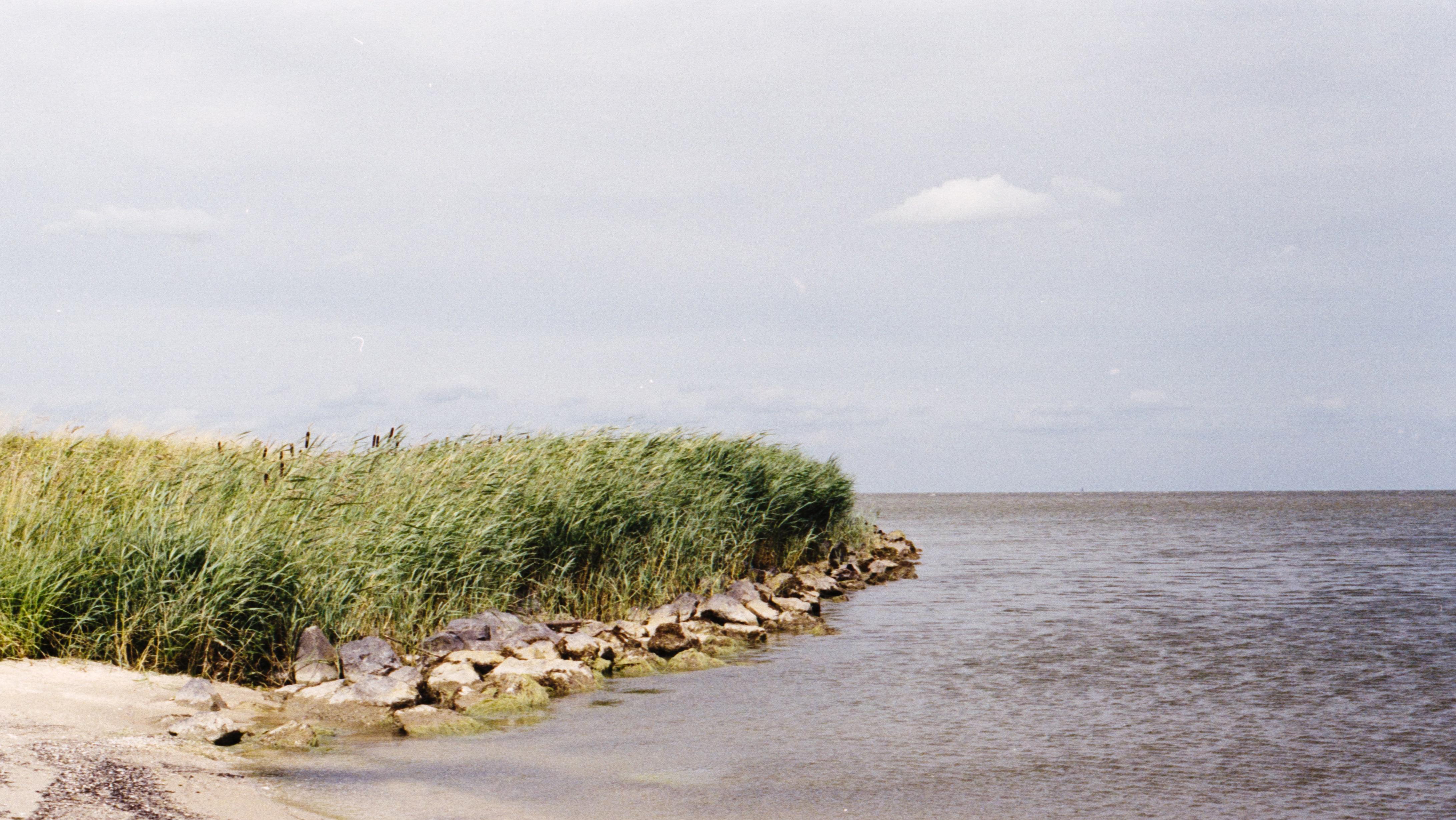
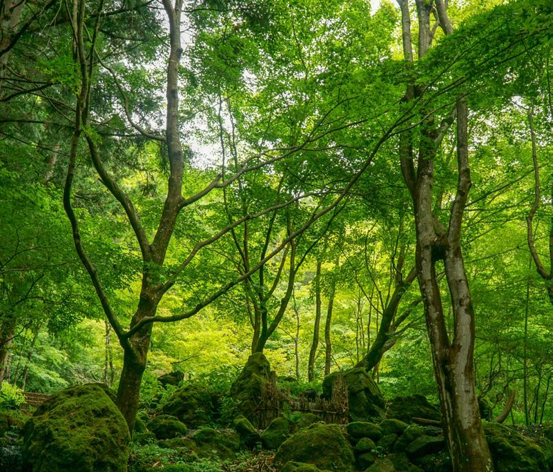
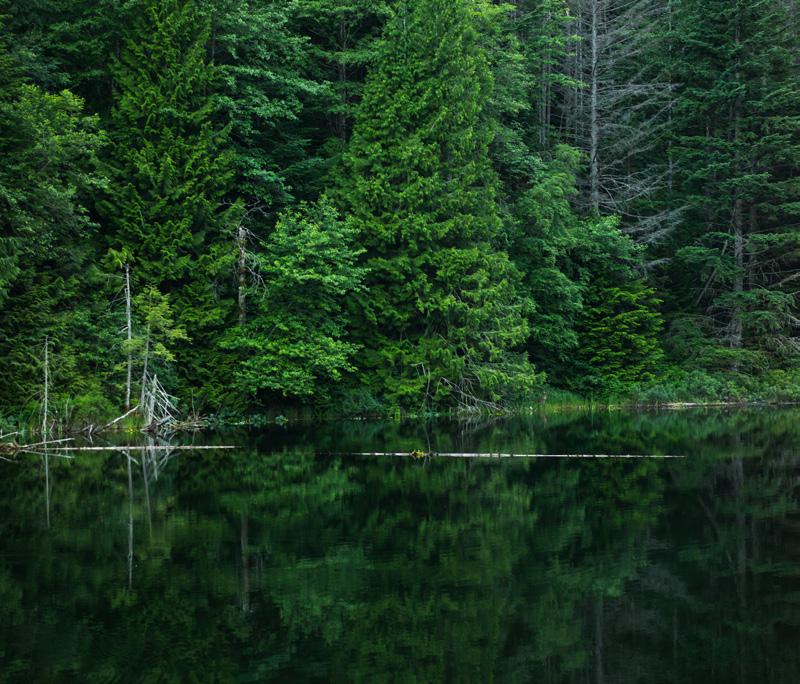
Olympic National Park -Washington
BIOPHILIC DESIGN
02
Biophilic Design
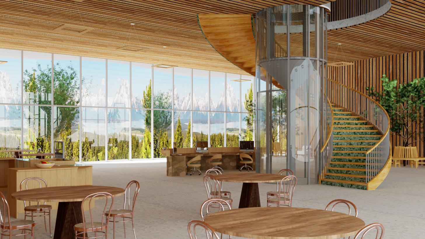
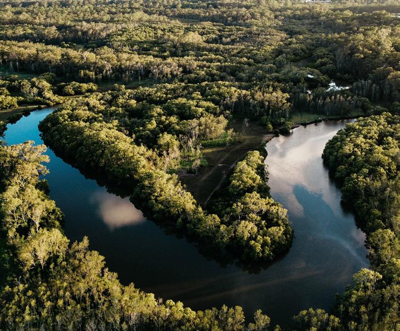
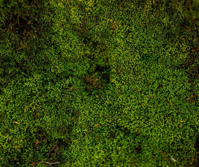
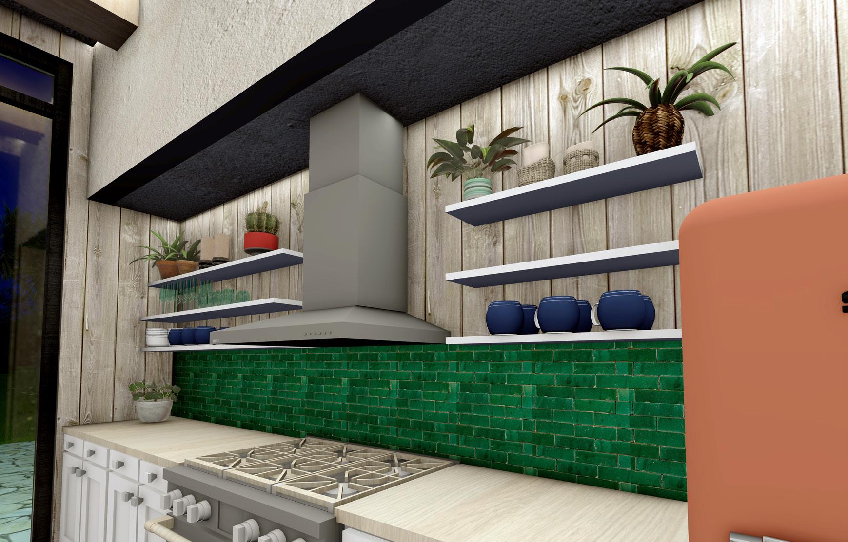
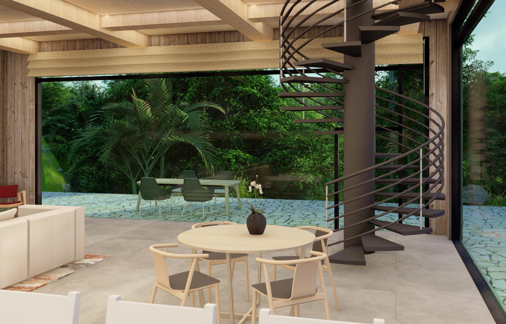
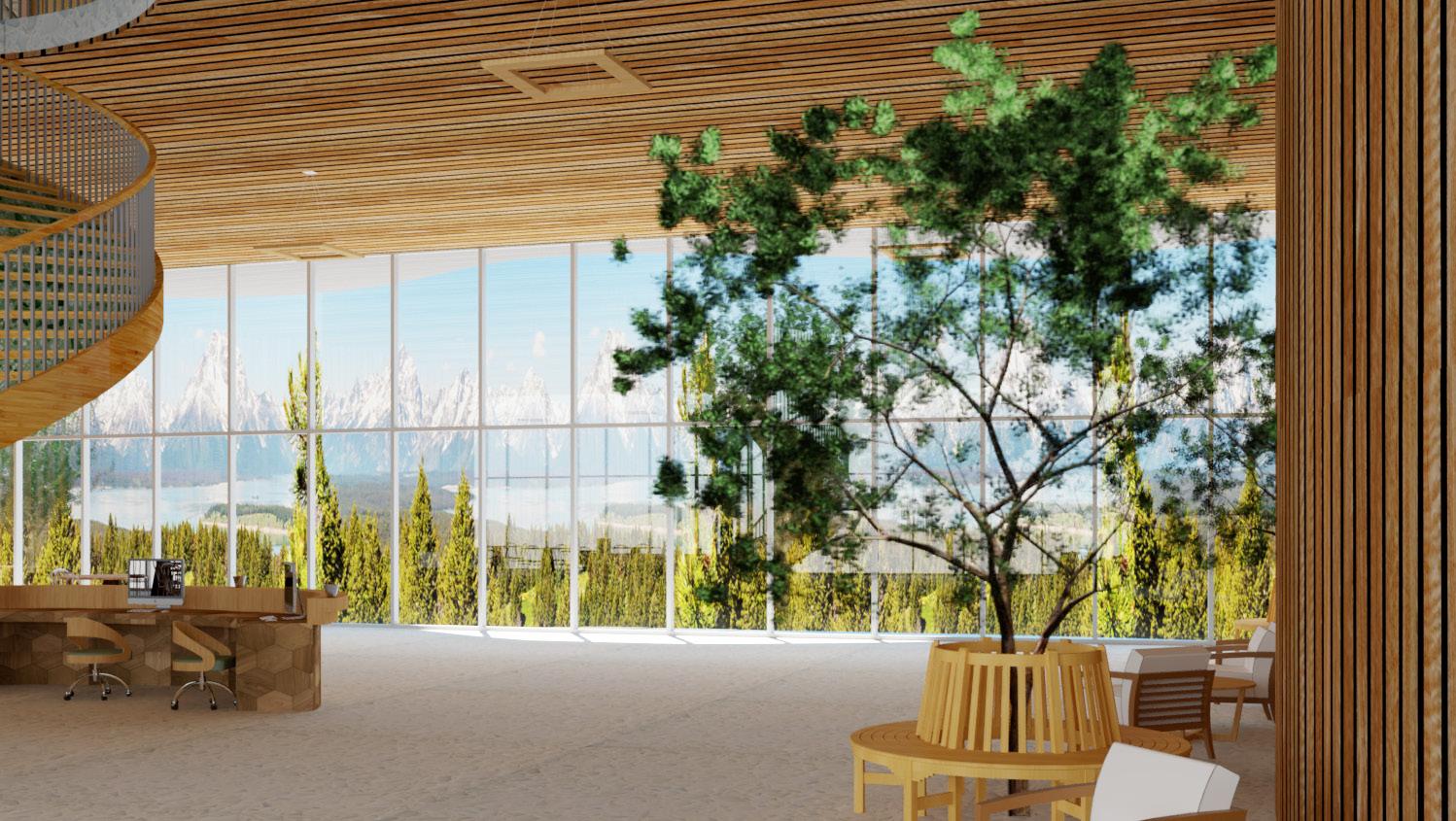
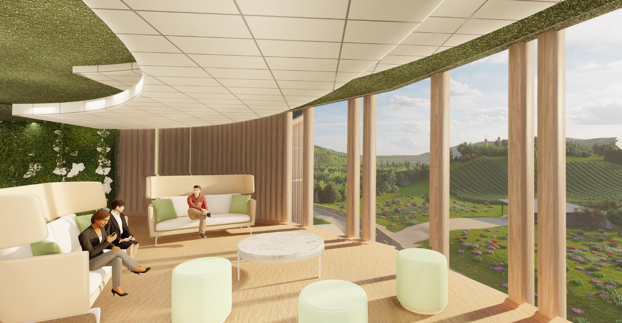
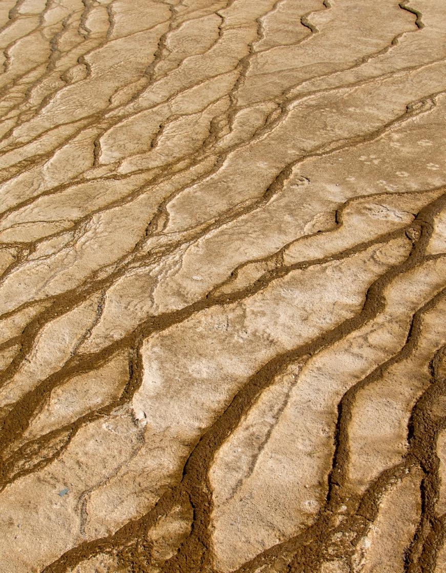
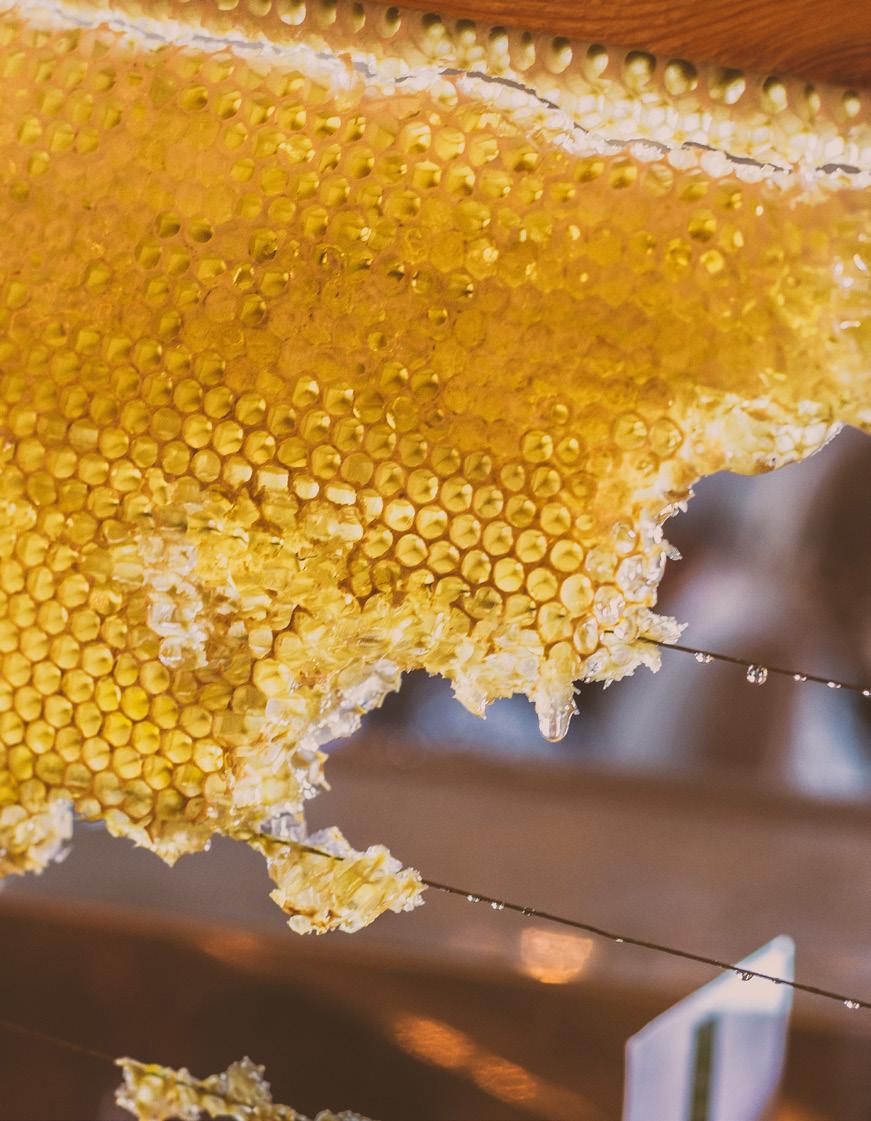
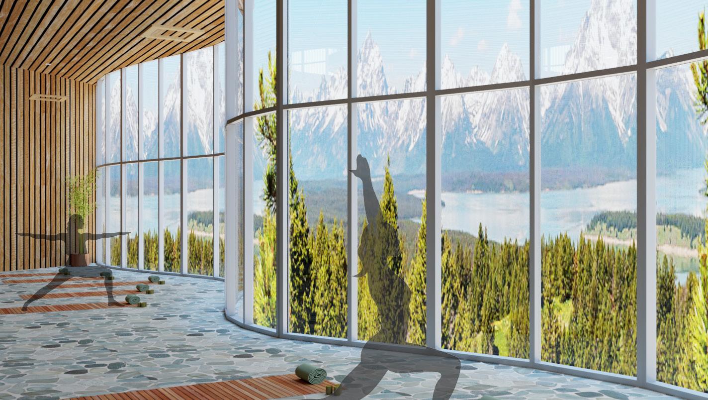
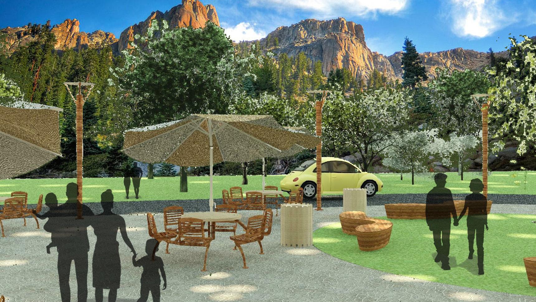
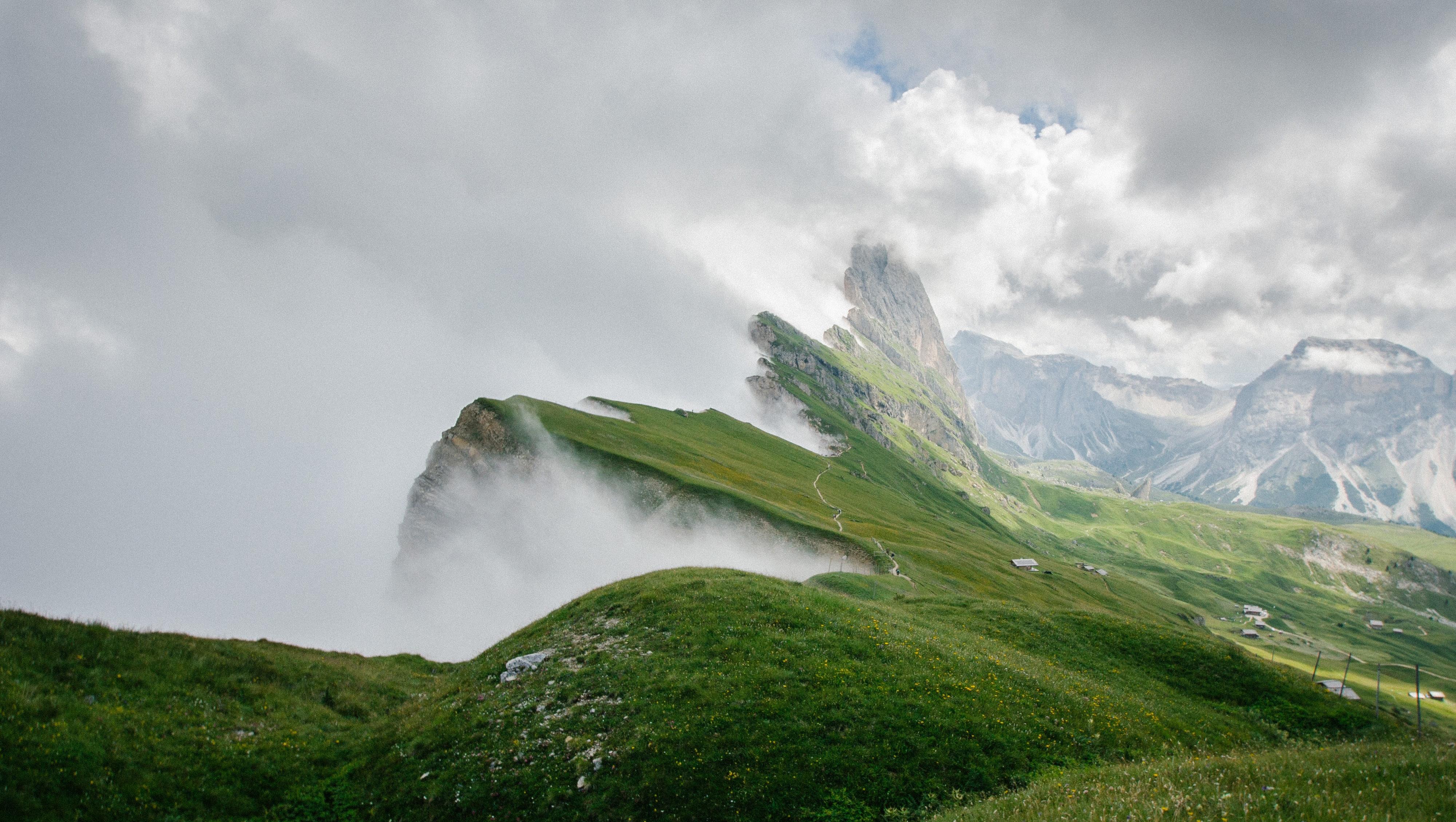
Biophilia (meaning love of nature) focuses on human’s innate attraction to nature and natural processes. It suggests that we all have a genetic connection to the natural world built up through hundreds of thousands of years of living in agrarian settings.
CREATING A SYMPHONY OF LIFE’S TRANSITIONS.
Rules & Guidelines
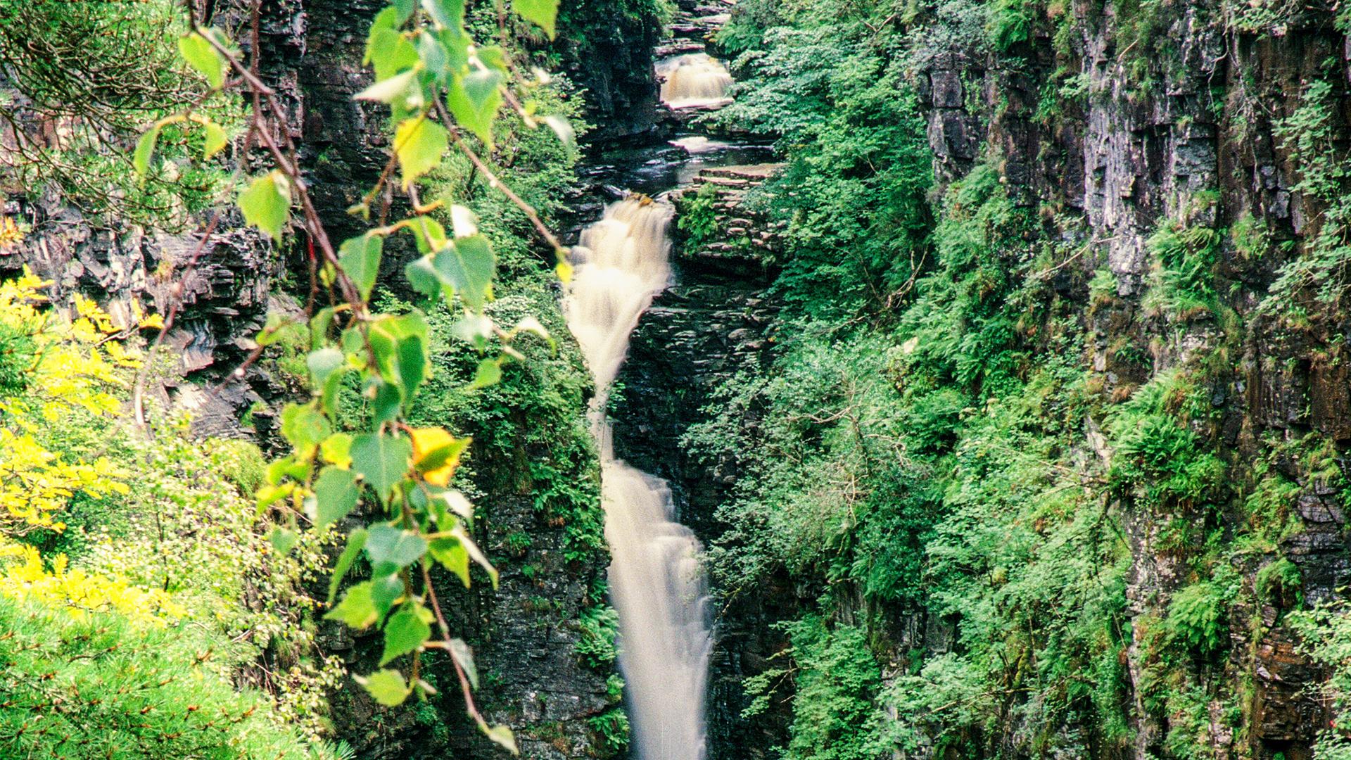
1. Only indirect lighting 2. Water feature (pond, storm water drain, water powered house, fountain, waterfall)
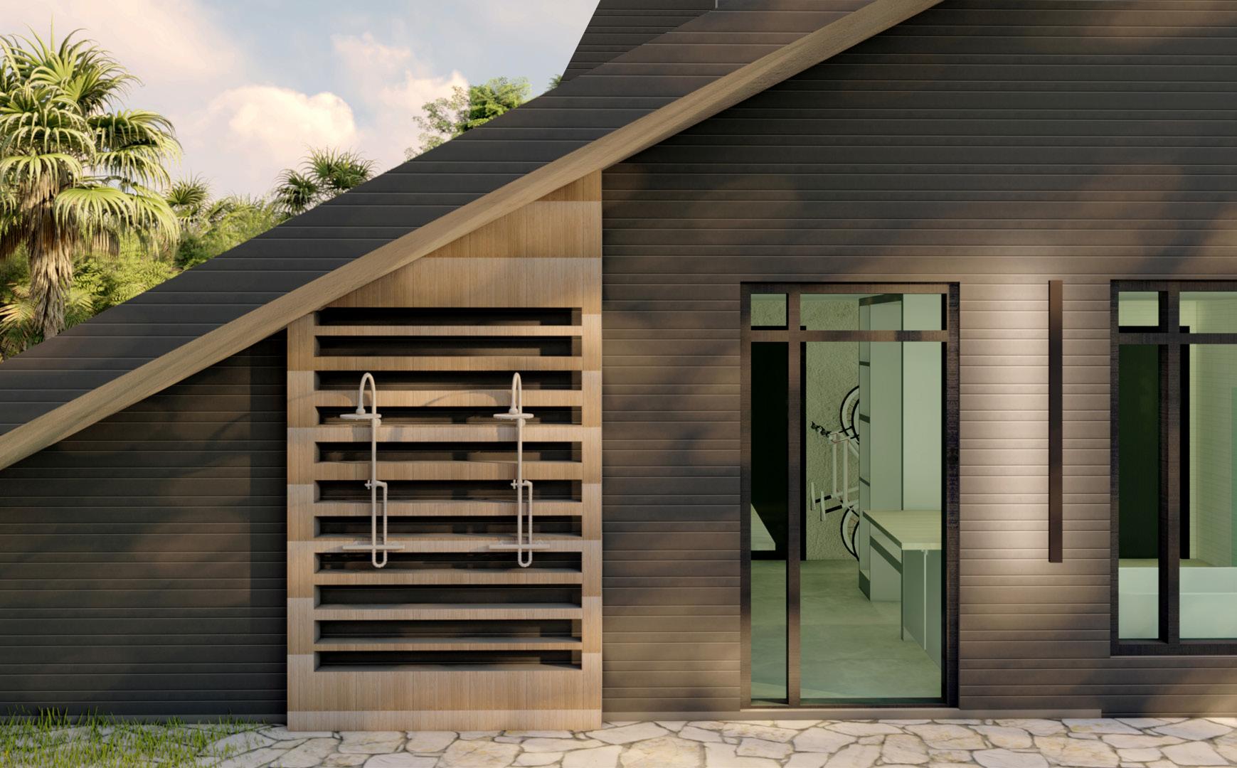
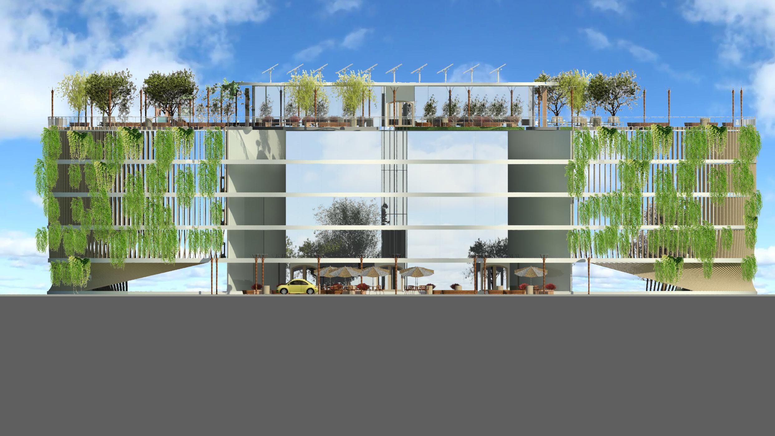
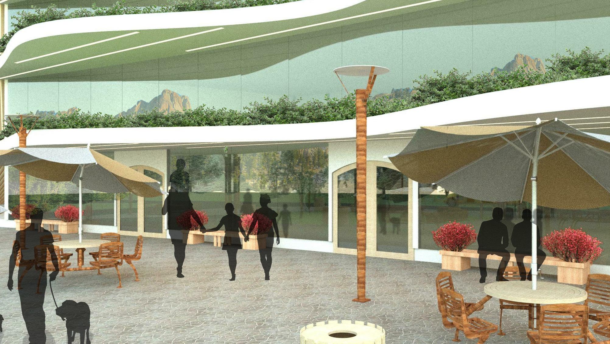
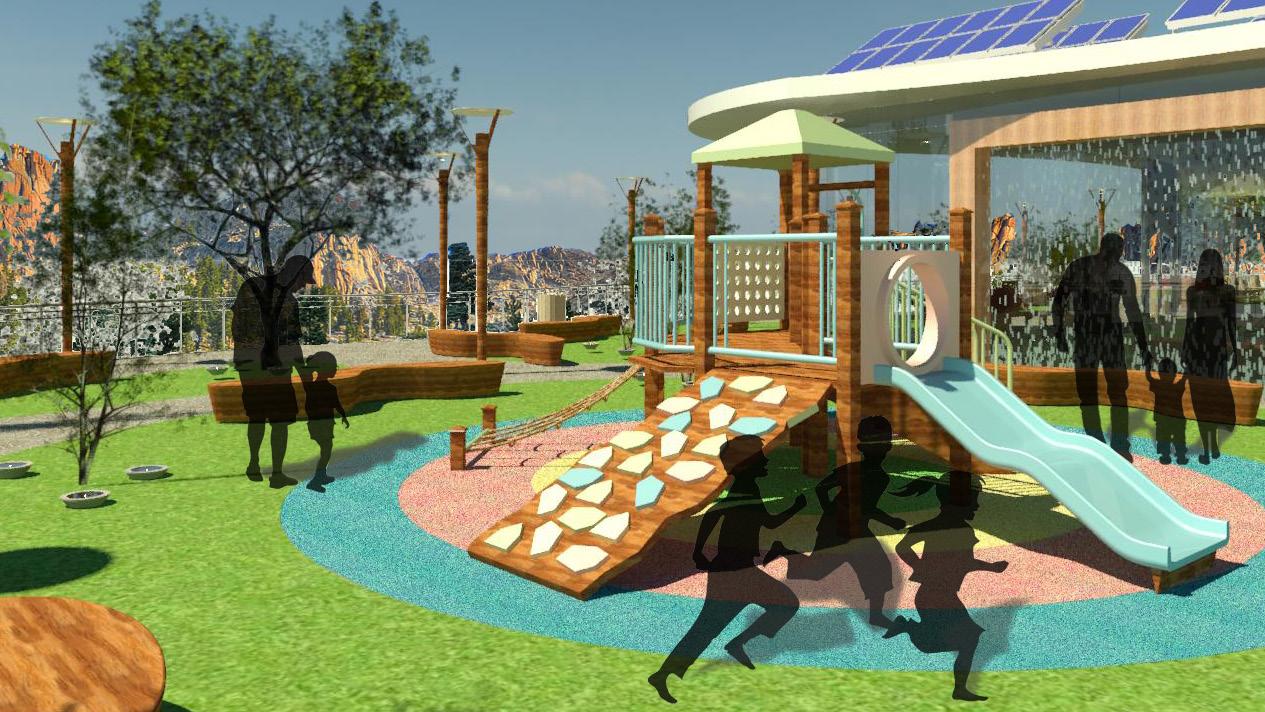
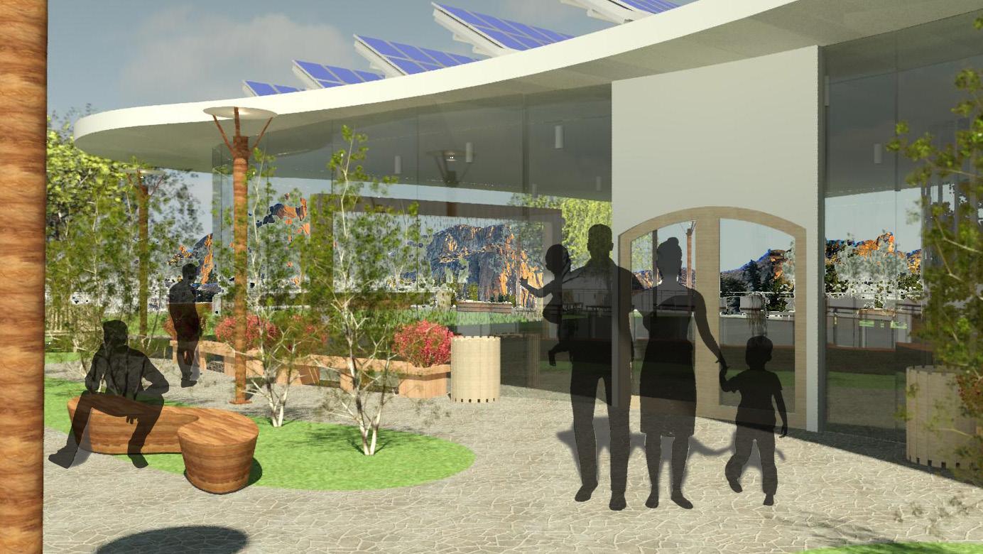
3. No useless roof (green roof, parking, solar panels, skylights)
MATERIALS
03 Materials
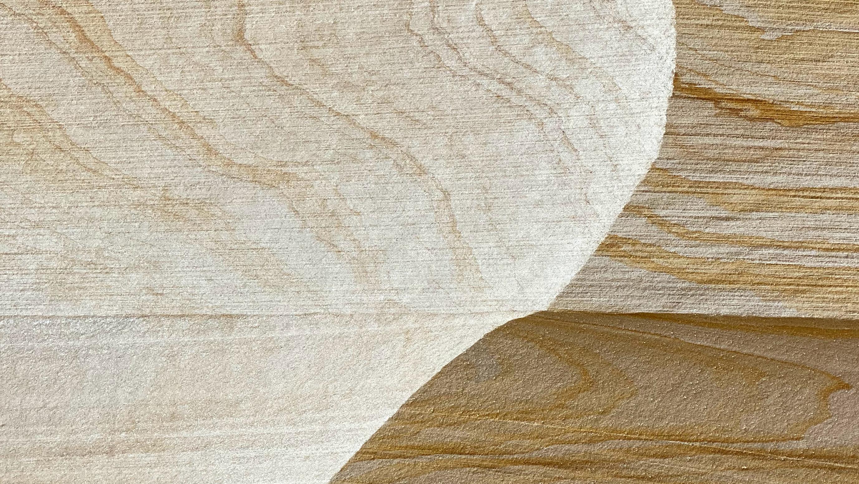
Bamboo:
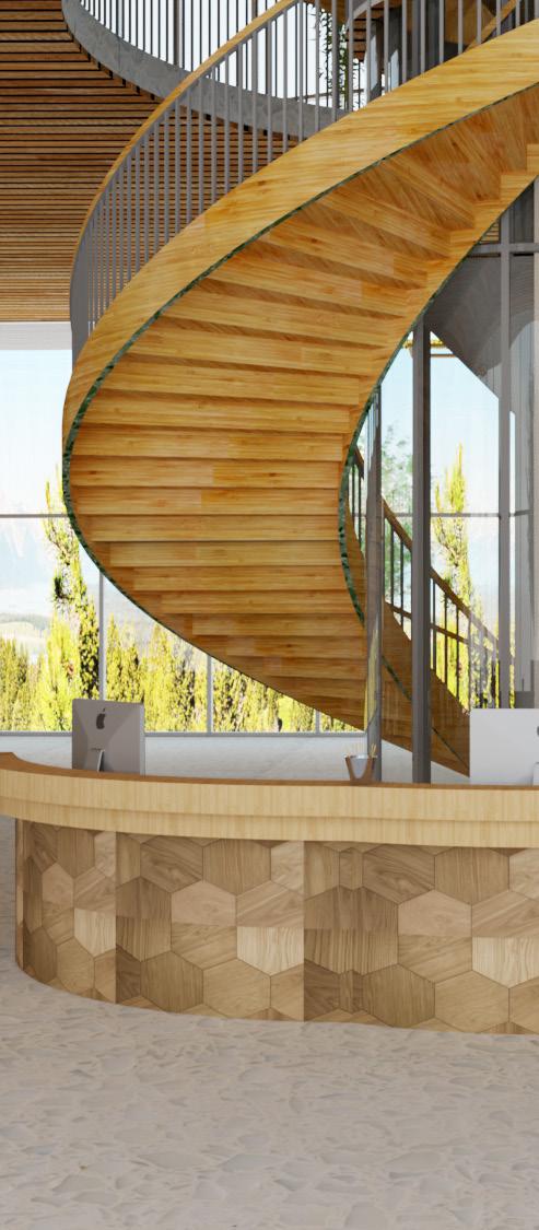
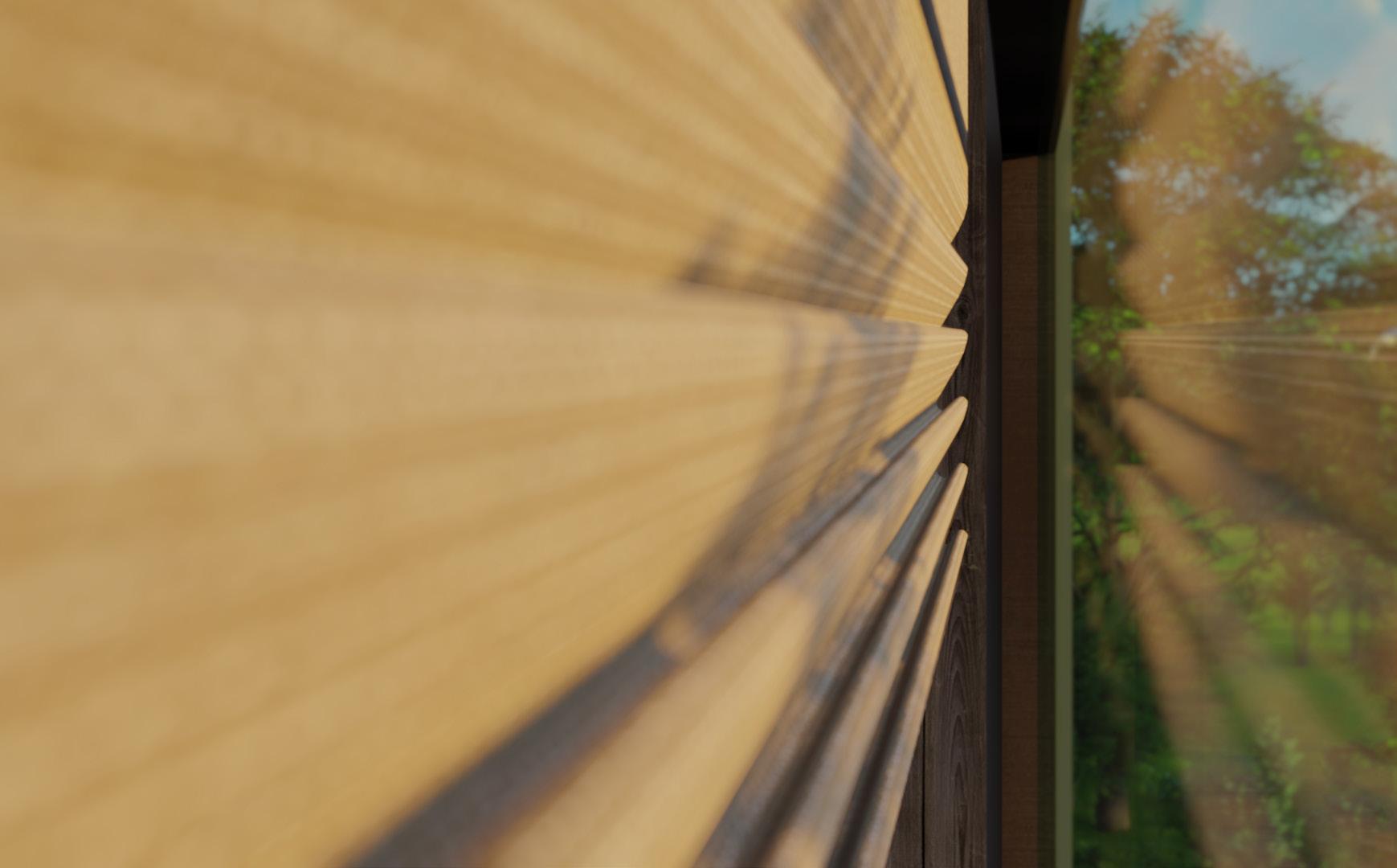
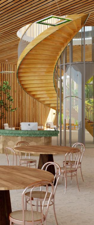
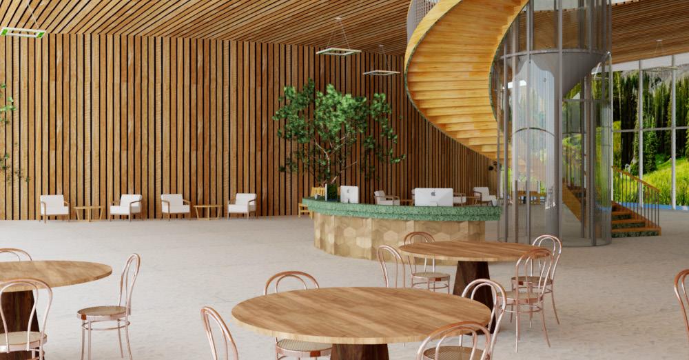
Bamboo is harder, more moisture resistant and more stable than even oak hardwoods. Last longer, recyclable, biodegradable
Terrazzo:
Terrazzo does not contain any VOC or volatile organic compounds.
Sage Glass:
Sage Glass minimizes energy use by reducing heating loads in winter, air conditioning in summer and electrical lighting.
Cross Laminated Timber:
A green and sustainable material since it is made out of renewable wood and sequesters carbon.
03 Materials
Concrete :
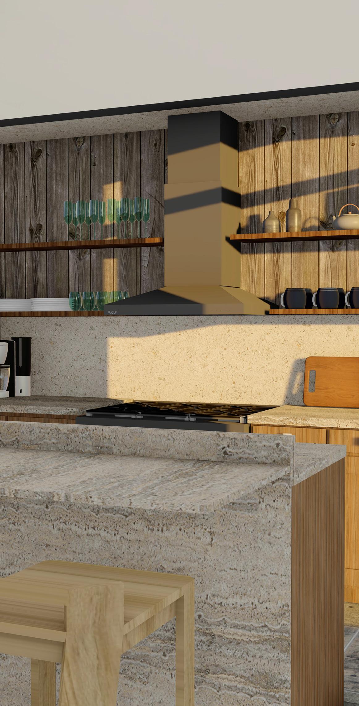
Providing energy efficiency, long-life cycle, lower life-cycle costs and resilience following natural and man-made disasters.
Cork:
Natural, sustainable, renewable and good for the environment as we can imagine a material to be.
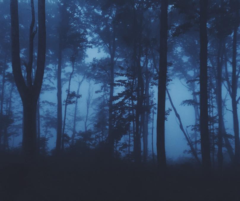
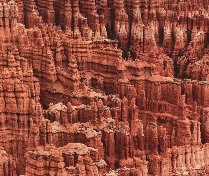
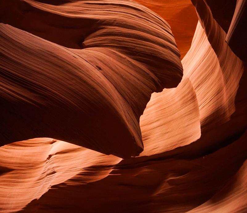
Bryce Canyon National Park -Utah
LIGHTING
04 Lighting
Led Lights:
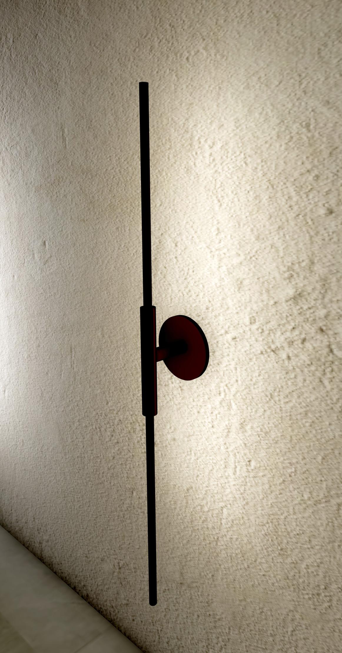
Bulbs are extremely energy efficient and long-lasting; an LED bulb can cut energy consumption by over 80%.
Dimmers:
Dimmer controls provide variable indoor lighting. When you dim light-bulbs, it reduces there wattage and output, which helps save energy.
Sensors:
They provide convenience by turning lights on automatically when someone enters a room, and save energy by turning lights off soon after the last occupant has left the room.
04
Lighting
Natural Light:
Use of daylight in a building reduces the need for artificial lighting, and is believed to have a beneficial effect on building occupants.
Solar Panels:
Are a sustainable energy and is inherently more sustainable than fossil fuel energy sources. As a way of converting the sun’s energy into electrical energy, solar panels make use of the single most sustainable resource on the planet - the light of the sun.
Circadian Rhythm
Refer to our mental, physical and behavioral changes and patterns across a day, as we – and other living things –respond to external factors.
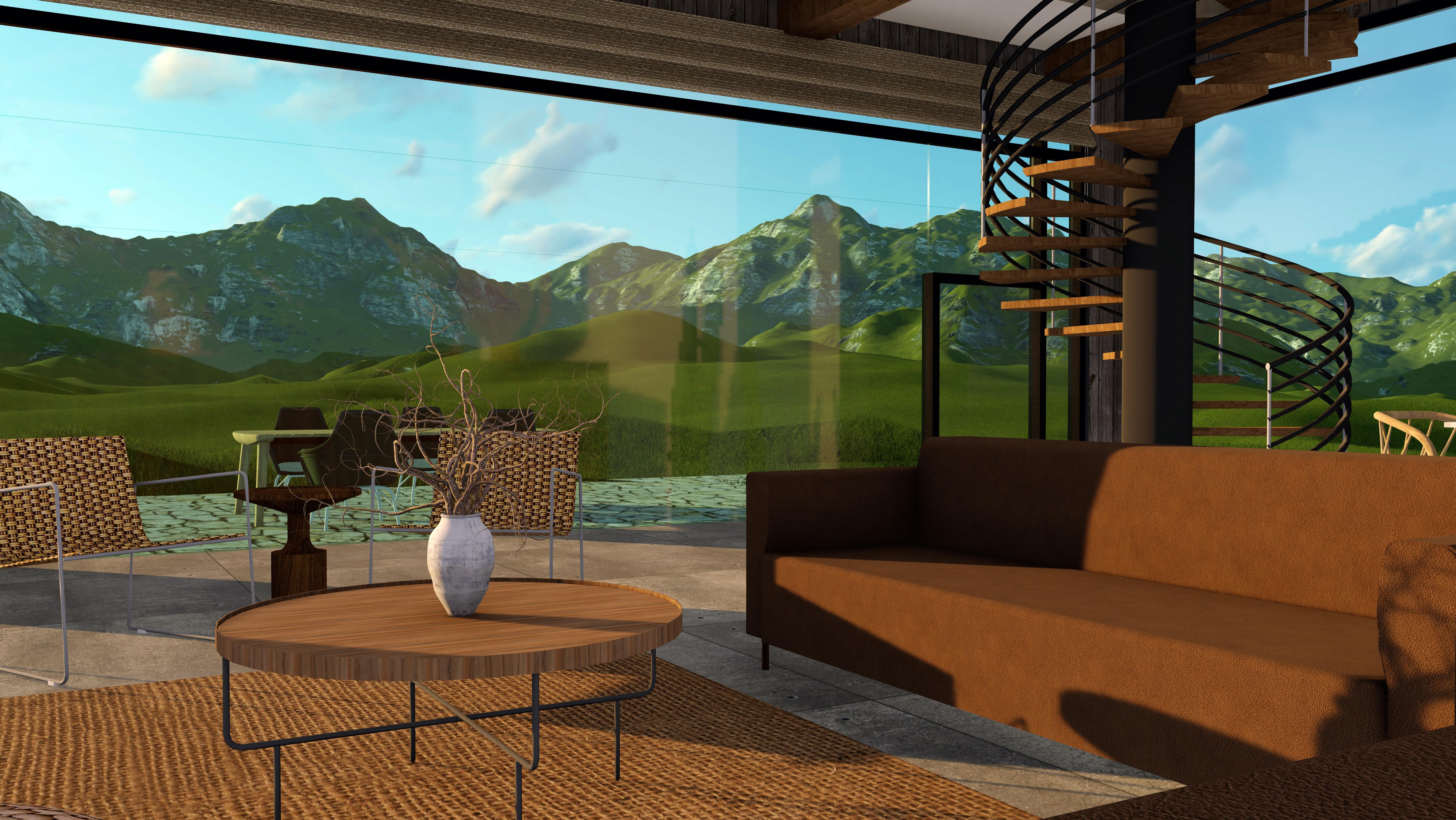
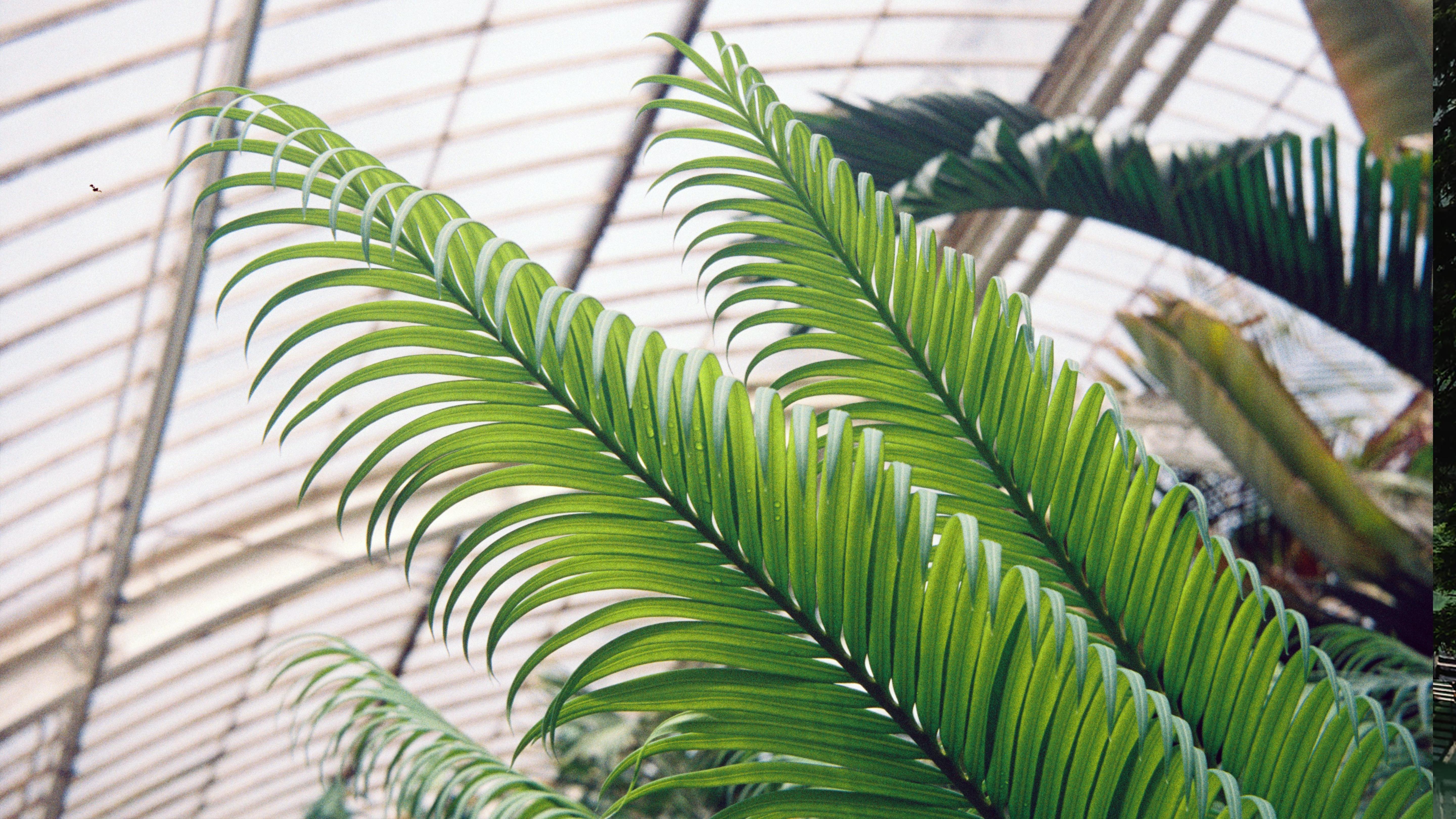
Conservatory of Flowers -San Francisco, California
SHAPES
05 Shapes
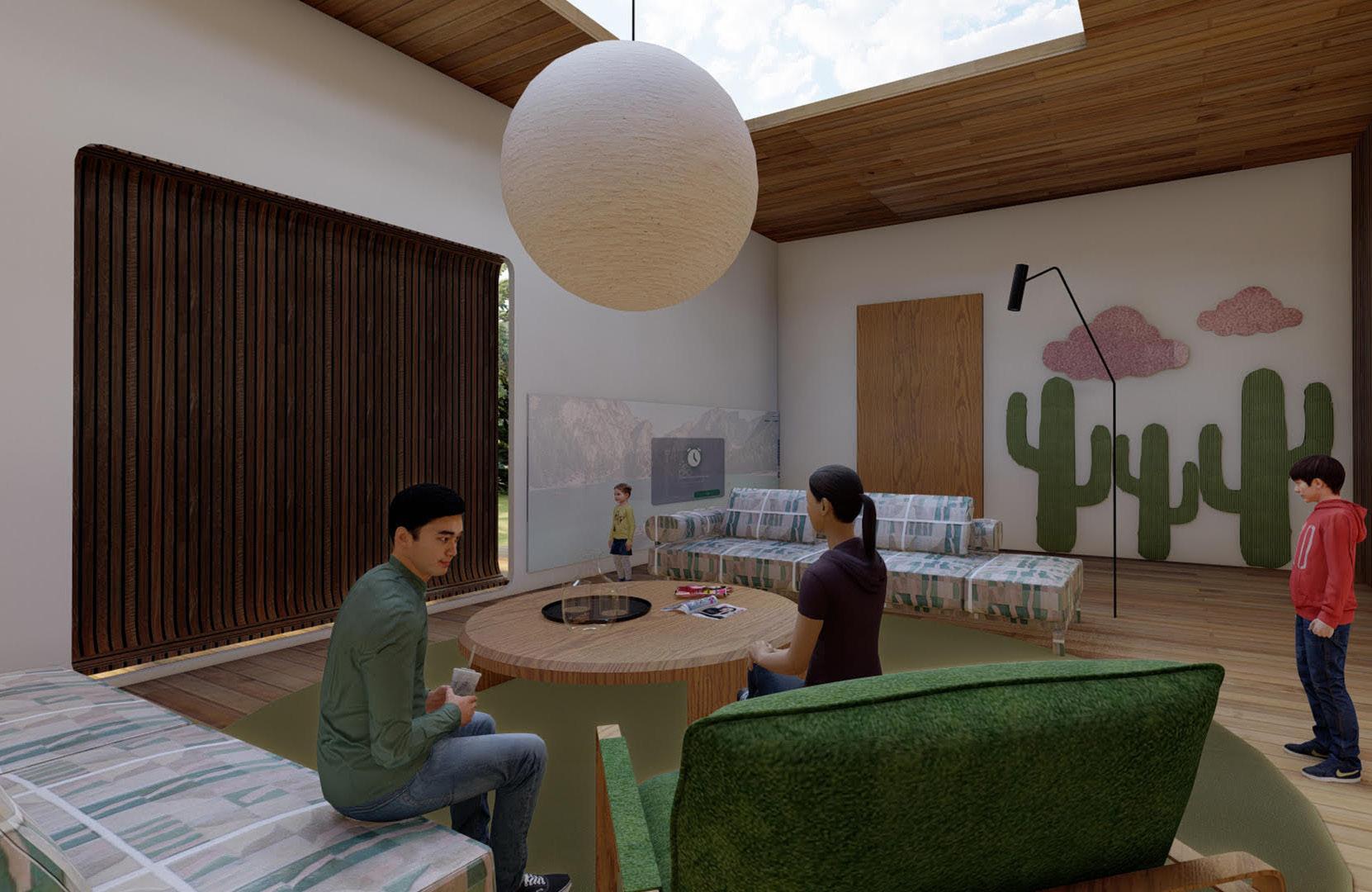
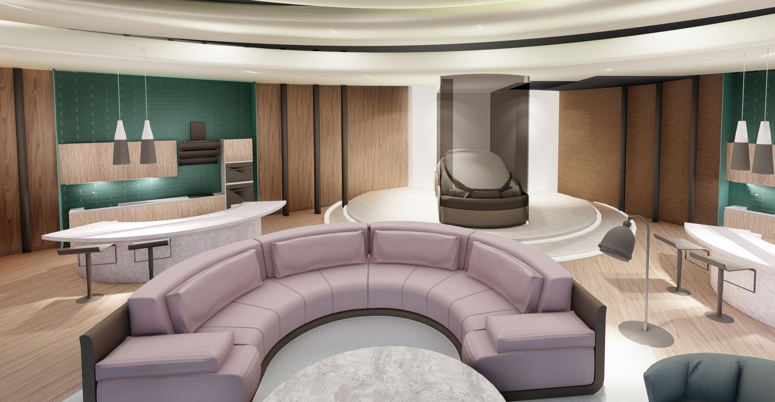
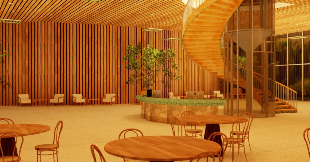
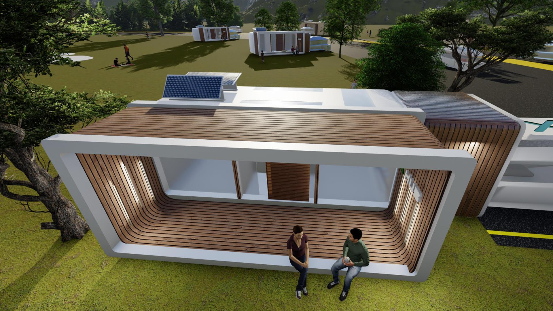
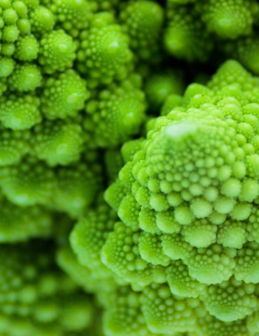
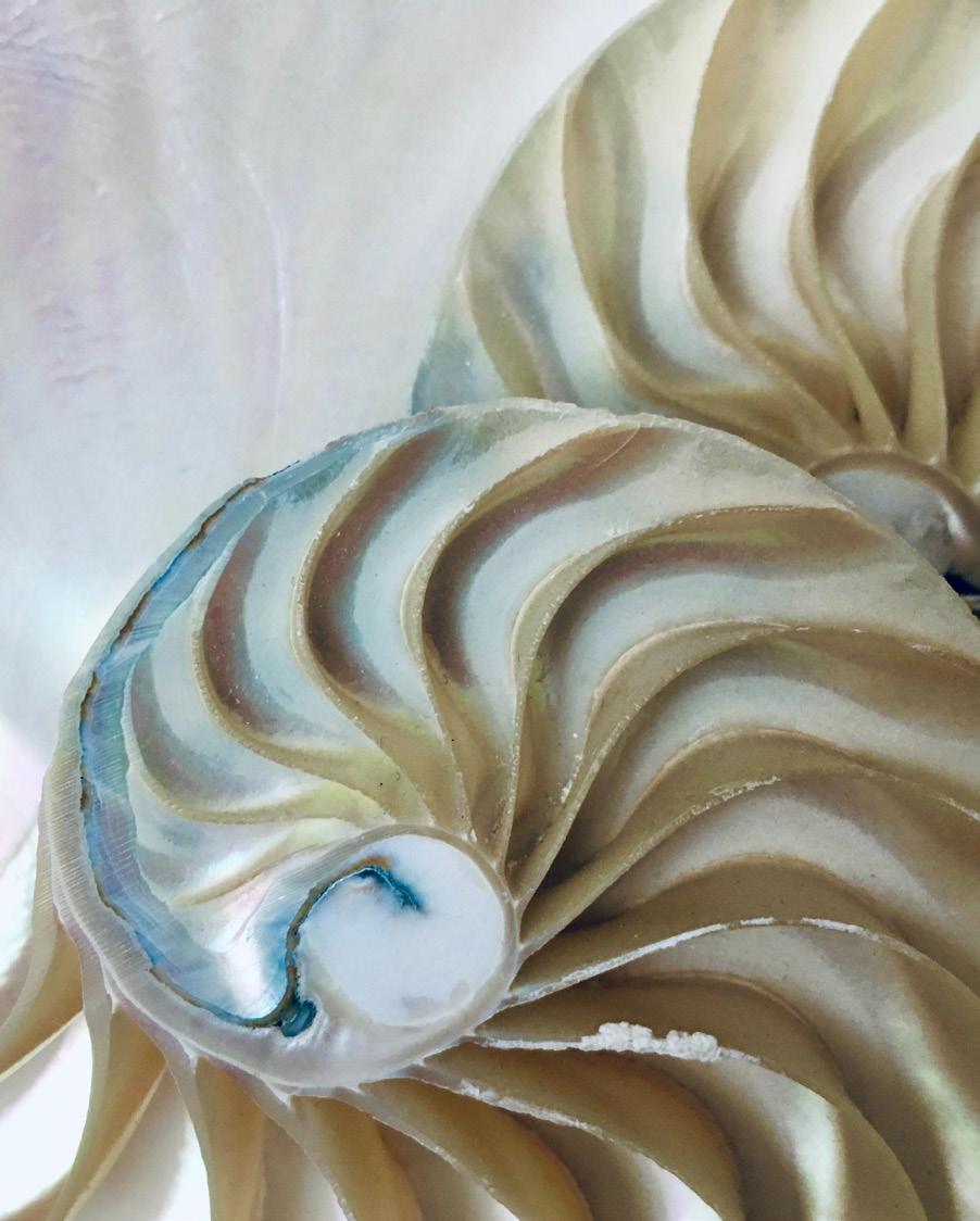
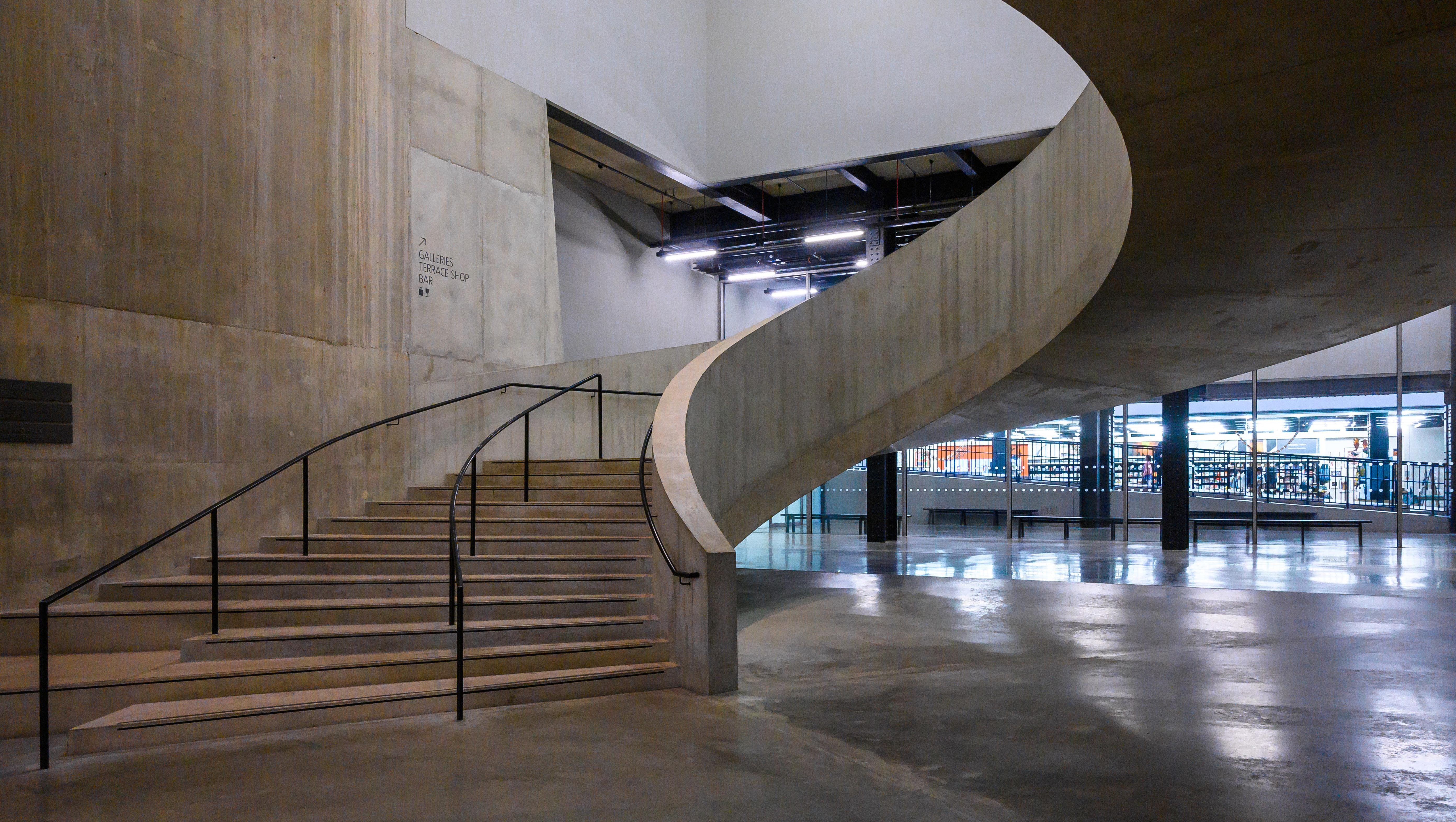
Organic shapes are used to create a calming, flowing atmosphere and can help soften sharp lines in other parts of an interior.
This style has a heavy emphasis on bringing the natural world inside and uses soft and organic materials. With that, it’s an interior design style that emphasizes livability, as it organically integrates into your lifestyle.
OASIS
TYPOGRAPHY
Typefaces
Dating back to the 11th century, typography is all about using typefaces and fonts in a way that makes the copy legible, clear, and enjoyable to read. Typography involves font style, appearance, and structure, aiming to elicit certain emotions and convey specific messages to the end-user. As well as ensuring the typeface lends itself to the visual balance of the website or app, it’s the job of the UI designer to optimize the website’s accessibility by keeping the typography highly readable.
Good typography and using the best font combinations elevate a design from its peers and create a more delightful user experience. Effective type combinations add visual interest to a design that can keep a visitor on the page longer. Bad type, by contrast, can make content harder to read and less pleasurable for the person reading it. Learning to combine fonts effectively is an important stepping stone in a designer’s education, and one that should continuously be refined and improved upon.
ALLER + LATO
ABCDEFGHIJKLMNOPQRSTUVWXYZ
acbdefghijklmnopqrstuvwxyz 0123456789
ABCDEFGHIJKLMNOPQRSTUVWXYZ
acbdefghijklmnopqrstuvwxyz 0123456789
SOURCES SANS PRO + MONTSERRAT
ABCDEFGHIJKLMNOPQRSTUVWXYZ
acbdefghijklmnopqrstuvwxyz 0123456789
ABCDEFGHIJKLMNOPQRSTUVWXYZ
acbdefghijklmnopqrstuvwxyz 0123456789
ROBOTO CONDENSED + ROBOTO
ABCDEFGHIJKLMNOPQRSTUVWXYZ
acbdefghijklmnopqrstuvwxyz 0123456789
ABCDEFGHIJKLMNOPQRSTUVWXYZ
acbdefghijklmnopqrstuvwxyz 0123456789
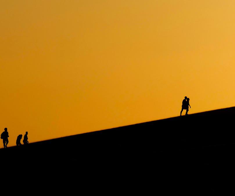
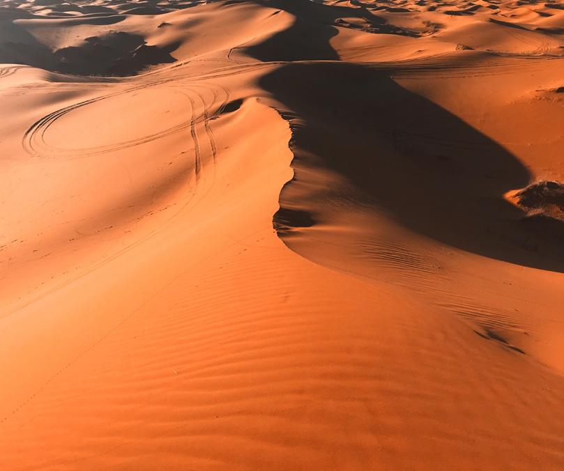
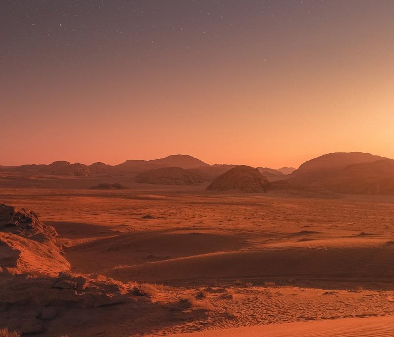
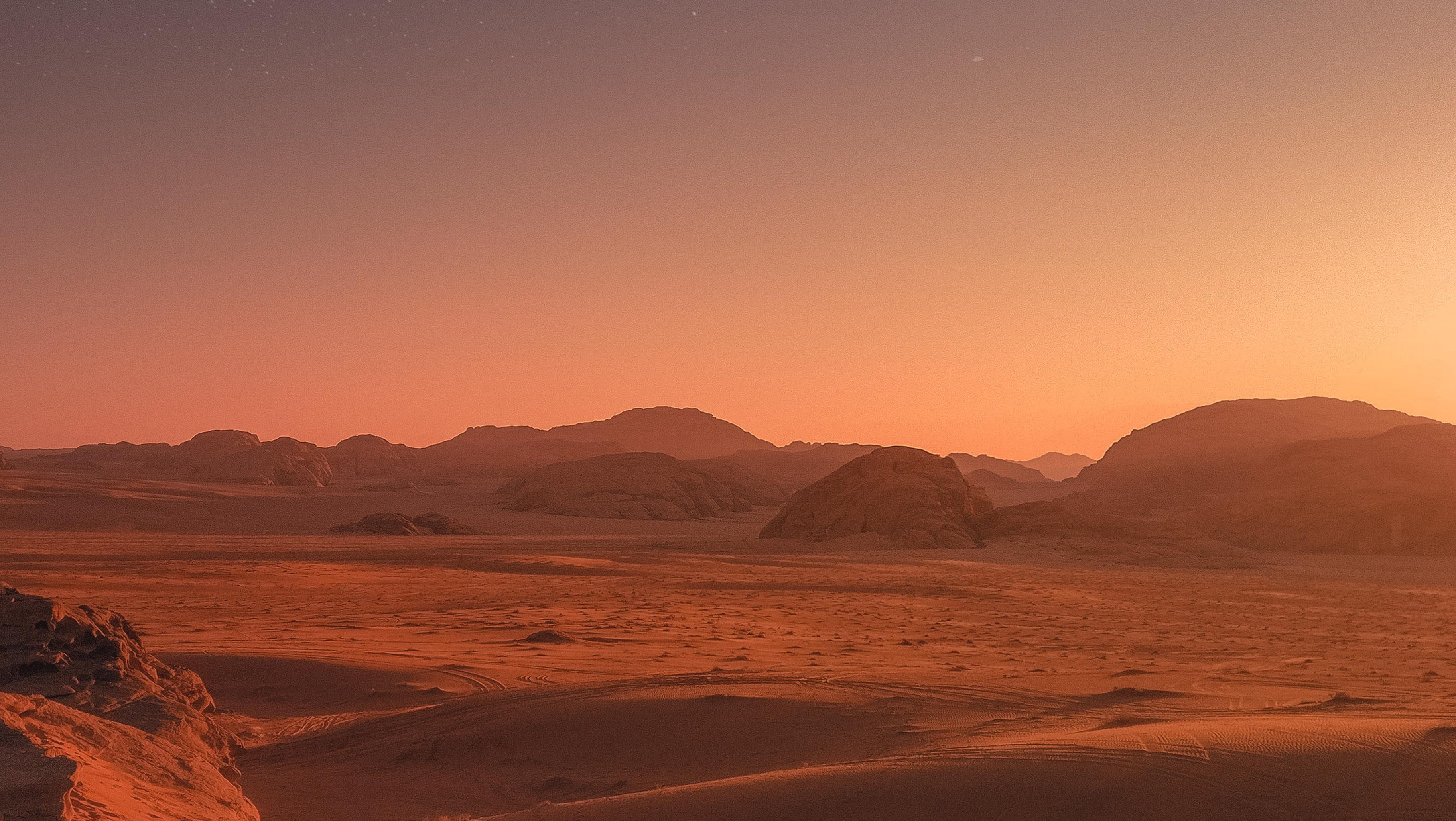
Moab Desert -Utah
UX/UI
08
UI/UX Components
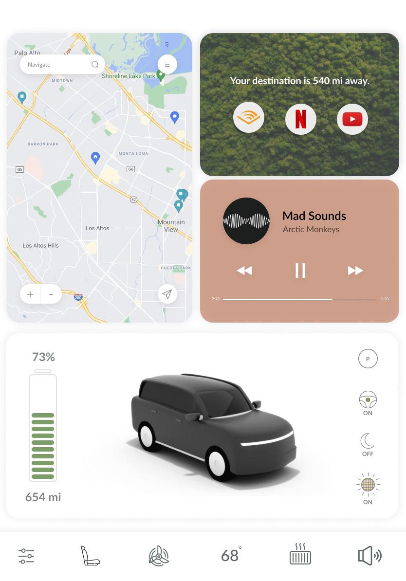
1. Use text sparingly; as an accompaniment to voice and for increased accessibility.
2. Use color and type to establish a clear visual hierarchy and highlight the main task to be done.
3. The vehicle is your companion, the voice and tone of the copy should reflect the warm and friendly relationship we want to have with the user.
08
UI/UX Components
1. Input should be multi-modal. The user should have the ability to interact with the vehicle by voice, physical buttons, air gestures and touch.
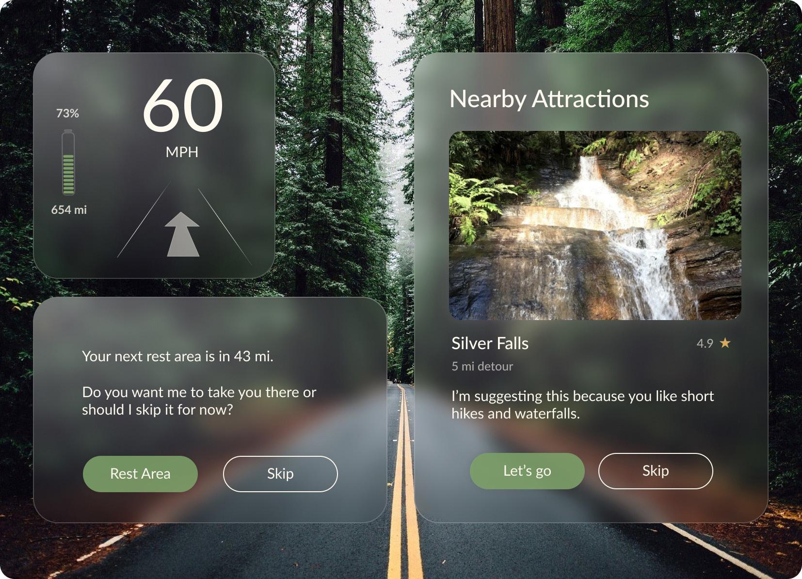
2. Display information contextually so the user is not inundated with information.
3. The user interface should appear friendly and adhere with the principles of biophilia. Refrain from using sharp angles and neon or unnatural colors.