Direction#1
ResearchInsight
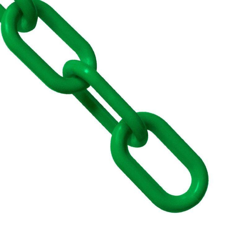
Inhealthcare,chainlinkimagerycanmetaphoricallyrepresentthe interdependenceofsystems,suchaspatientcarenetworksor collaborativeteamworkamongproviders.Itemphasizesthe importanceofstrongconnectionsforeffectiveoutcomes,mirroring thevisualandsymbolicstrengthofintactchains.
SymbolismGuide.(2023,August12).Chainsymbolismmeaning:Anin-depthexplorationandguide.SymbolismGuide.RetrievedApril8,2025,from https://symbolismguide.com/chain-symbolism-meaning/
Katz,L.(2023,March25).Theimpassivelistener:RustyMorrison.TheCriticalFlame.RetrievedApril8,2025,from https://criticalflame.org/the-impassive-listener-rusty-morrison/
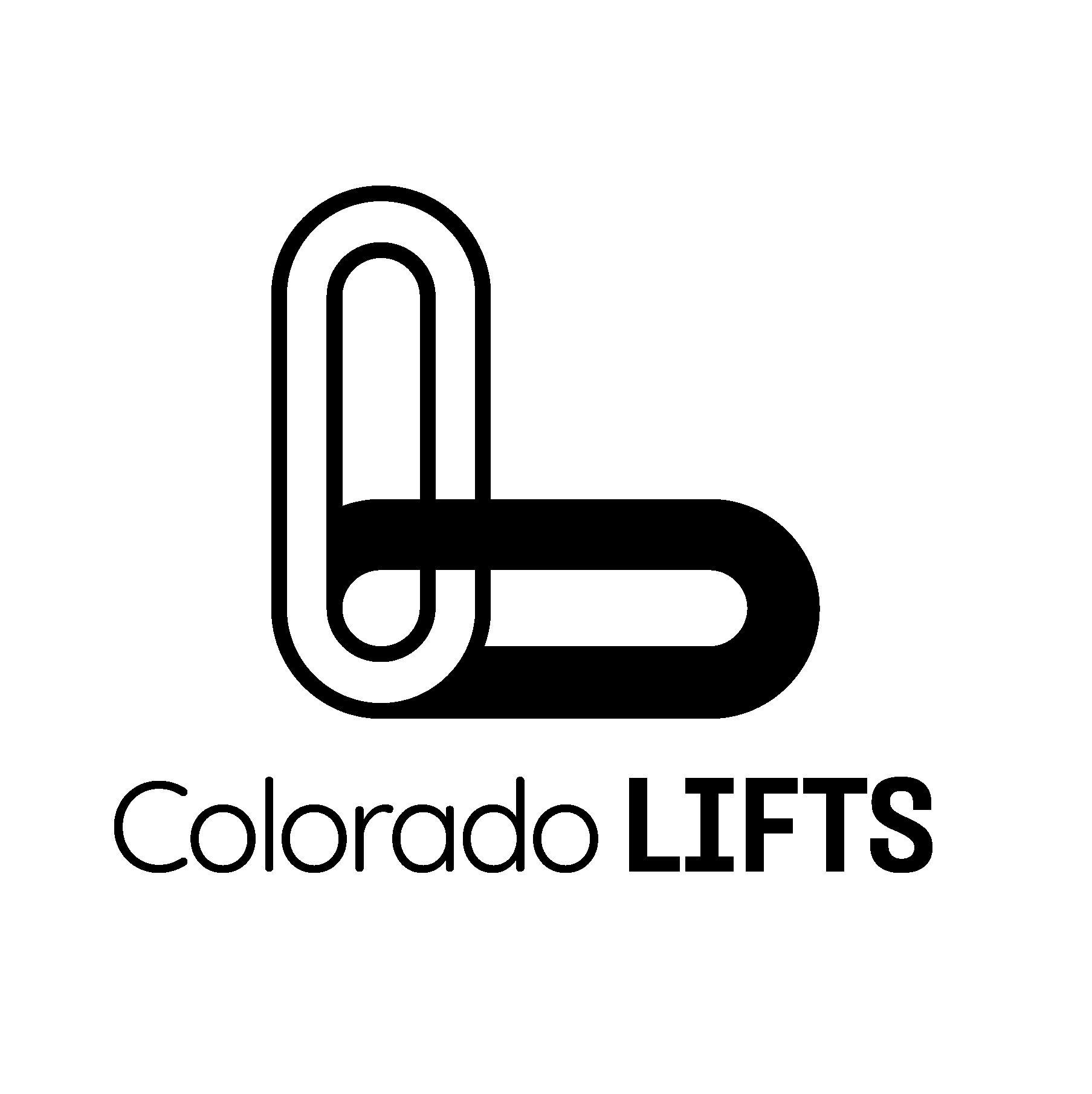
Theintersectingcenterforms theshapeofachatbubble, symbolizingconversation betweenthetwo
Roundedletterformsare friendlyandcomplimentthe roundededgesinthelink
Represents Individualsandfamilies
Shapeofan“L”forLIFTS
FilledLink:Representstheexperts
Blockytypefacegivesthe feelingofsolidityand reliability,reinforcingthe notionofastrong supportivenetwork
Primary Color Palette
Color Psychology
-Purpleisamixofredandblue makingitperfectforrepresenting empatheticconnectionthat’s thoughtfulandintentional
-Purpleisemotionallyrichand psychologicallybalancedmakingit perfectforbrandsorspacesthat wanttofeelconnected
-Greenrepresentsgrowth,mental health,aswellassafespaces
Type Accessibility
These color combinations meet AA accessibility standards.
Direction#2
Insight
Accordingtofindingsfromusabilityresearch,themagnifyingglass iconisauniversallyrecognizedsymbolforsearch,makingit essentialinUIdesign.Researchshowsusersassociateitwithsearch, evenwithoutalabel,ifit'sstyledclearly.
Qubstudio.(n.d.).BestUXpracticesforsearchinterface.Qubstudio.RetrievedApril8,2025,from https://qubstudio.com/blog/best-ux-practices-for-search-interface/
MagnifierIcon:
Peopleinstinctively knowitspurpose, whichhelpspeople getwhattheyneed quickly
Curved“C”for
arefriendlier
Thinnerweightfor “Colorado”.Cleanlines giveacontemporary andprofessionalfeel
Rounded,bold “LIFTS” complimentstherounded edgesinboththemagnifier iconandthe“C”
Primary Color Palette
Color Psychology
-Orangefeelsinviting,cheerful,and open—oftenusedtohumanizea brandorinterface
-Orangegrabsattentionandgives offahigh-energyvibe—greatfor callstoaction
-Orangeisgoodtousewhenwarmth andtrustareneeded
-Blueislinkedtotrustandreliability
-Majorplatforms(likeGoogle, Facebook,LinkedIn)useblue extensively,sousersoften subconsciouslyassociateitwith digitalinteractions,includingsearch
-Blackworkswitheverything,making itastapleforcontrastandbalance
Type Accessibility
These color combinations meet AA accessibility standards.
Direction#3
ResearchInsight
Consumersaredrawntobrandsthatshowcasethepeoplebehind them.Nearly79%ofconsumersfeelbrandsarewell-positionedto connectdiverseaudiencesbyfocusingonpeopleratherthanjust products.
SproutSocial.(2023,April5).#BrandsGetReal:Whatconsumerswantfrombrandsinadividedsociety.SproutSocial.RetrievedApril8,2025,from https://sproutsocial.com/insights/data/social-media-connection/
“L”representsexperts
The“I”isshapedlikea humanfiguretorepresent theindividualsLIFTSsupport
Curvededgeinthe“L”creates theshapeofanarrowwhich pointsviewerstoimportant information
Roundedfontsfeelmorecasualand welcoming—greatforbrandsthat wanttofeelfriendlyandhuman
Primary Color Palette
Color Psychology
-Burntorangeevokeswarmthanda senseofemotional connection—importantforfamily-and people-centeredmessaging
-Burntorangeretainssomeoforange’s vibrancy,suggestinglife,care,and activesupport
-Yellowisconsideredagender-neutral color,itcanhelpavoidreinforcing genderstereotypes,contributingtoa moreuniversallywelcoming environment
-Yellowrepresentstheclarityof thoughtandthecognitive engagementrequiredtoaddress emotionalorpsychologicalissues
-Blackgivesoffasenseofconfidence, whereprofessionalismiskey
Type Accessibility
These color combinations meet AA accessibility standards.
TheRecap