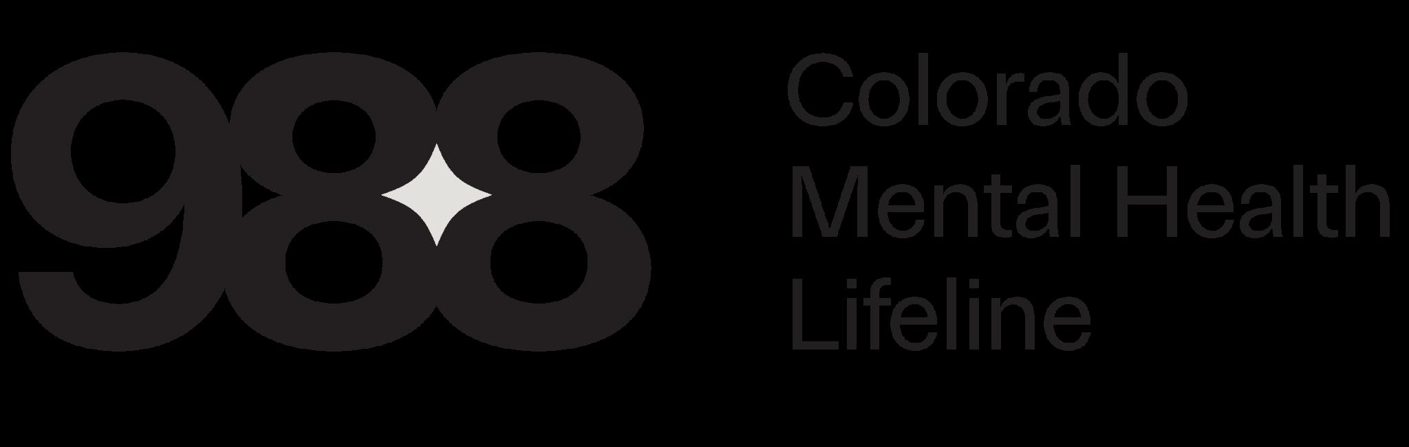
Dividing line represents the lifeline that connects Colorado Mental Health and 988
Large & bold 988 for easy reading and accessibility
Grouping 988 with a tight kern symbolizes CO tight community and support to lean on.
Diamond shapes represent strength and invulnerability when using the Mental Health Lifeline
Title case for best accessibility
Contrast in type weight to reinforce and draw viewer towards phone number
Brand Elements
Identifying brand elements to accompany our logo help in the designing of our collateral and campaign material.
For this design direction we have leaned into the calming and trustworthy blues and grey pallet from the national 988 branding. This color combination helps elevate the professionalism in our branding. We’ve also ensured these colors are AA compliant for the website.
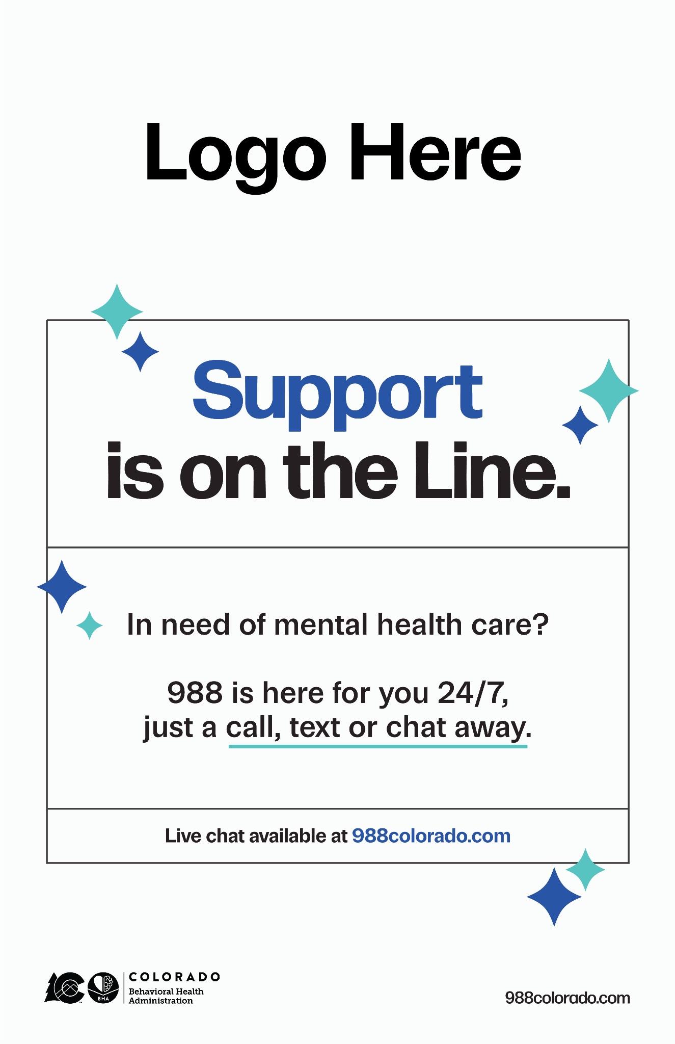
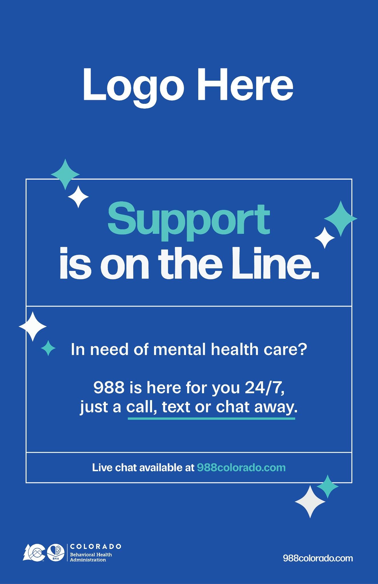
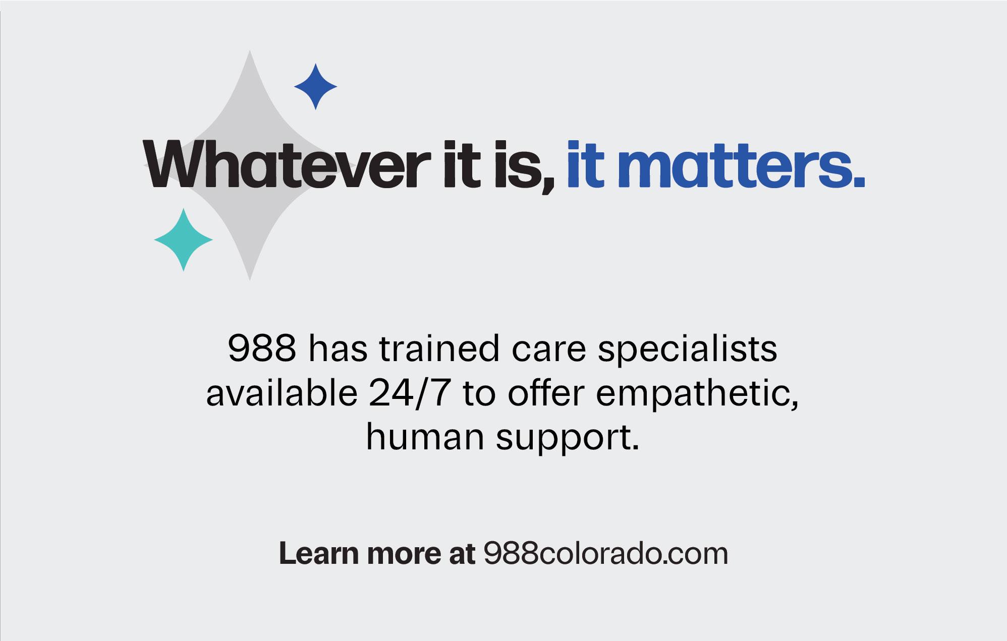
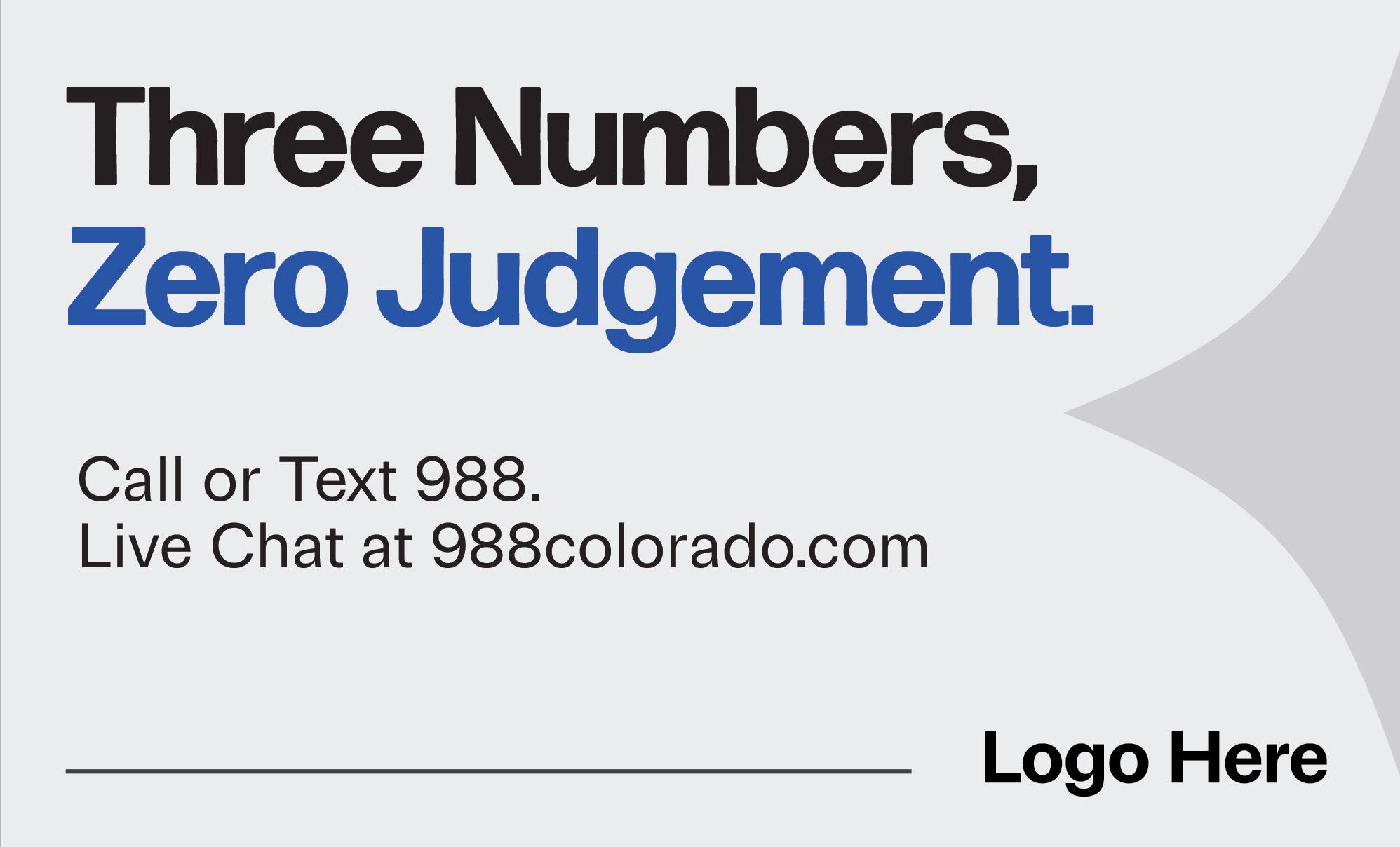
Diamond shapes created from the sequence of ‘988’ will be used throughout to showcase specific callouts, CTAs, and give energy to the material while stroke lines will help focus on highlighting key messaging in a calming analogous color scheme.
HEX: 61D6CE
HEX: 1549BC
HEX: 212121
HEX: E2E1DD
Wallet Card
Direction 2
The use of 988 within the word mark allows for a designed logo mark
Title case for best accessibility
For our logo mark we created a circle motif that is representative of a venn diagram. It symbolizes the various people and communities who are connected and helped through the 988 lifeline
Bold type to balance the negative space of the logo mark
HEX:FFFFFF
Brand Elements
HEX: 0A267F
Identifying brand elements to accompany our logo help in the designing of our collateral and campaign material.
Keeping the blue analogous color scheme we wanted to make sure this direction’s color leaned more straight forward, while still friendly and approachable. These colors are also AA compliant for the website.
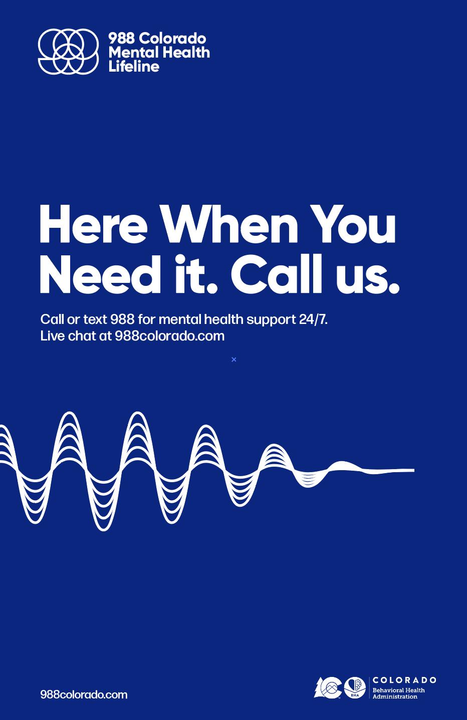
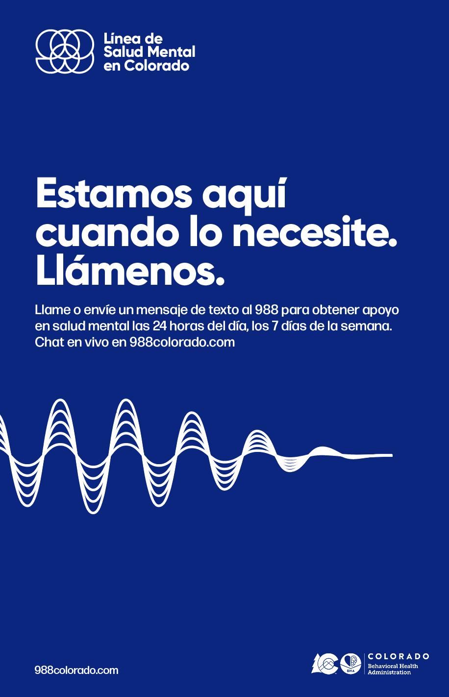
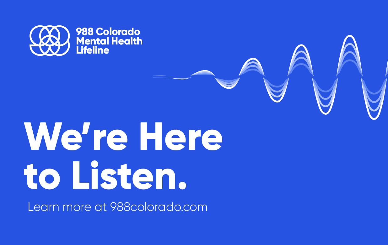
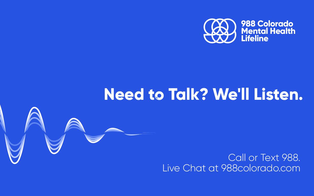
The circle motifs support the logo mark while building the visual for an interactive community space. The sound waves, while they carry the same weight, showcase the purpose of that space.
HEX: 2753E2
HEX: 212121
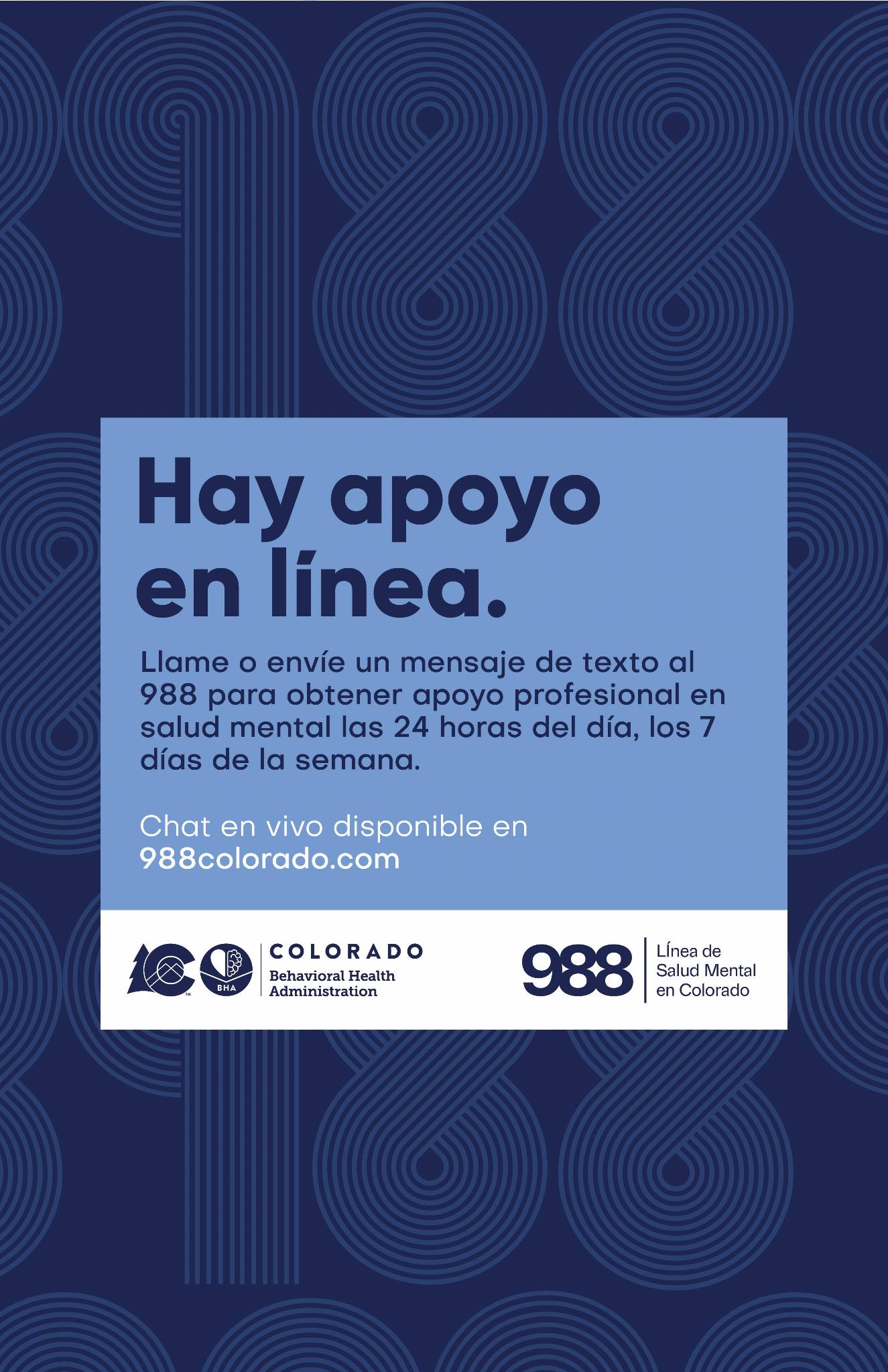
Poster Poster (Spanish)
Wallet Card
Direction 3
Lock-up using only the program name.
Use of a sans serif font for legibility and approachability
Title case for best accessibility
Brand Elements
Identifying brand elements to accompany our logo help in the designing of our collateral and campaign material.
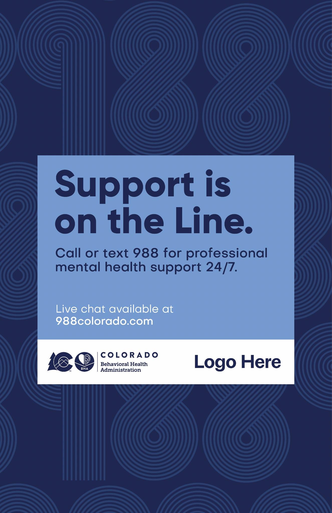
Here we have chosen colors that are inspired by the national 988 branding (to help with a larger awareness play), but keep in mind accessibility and the required AA compliance for all Colorado government programs. These colors range from warm to cool to help design versatility and accessible contrast pairing.
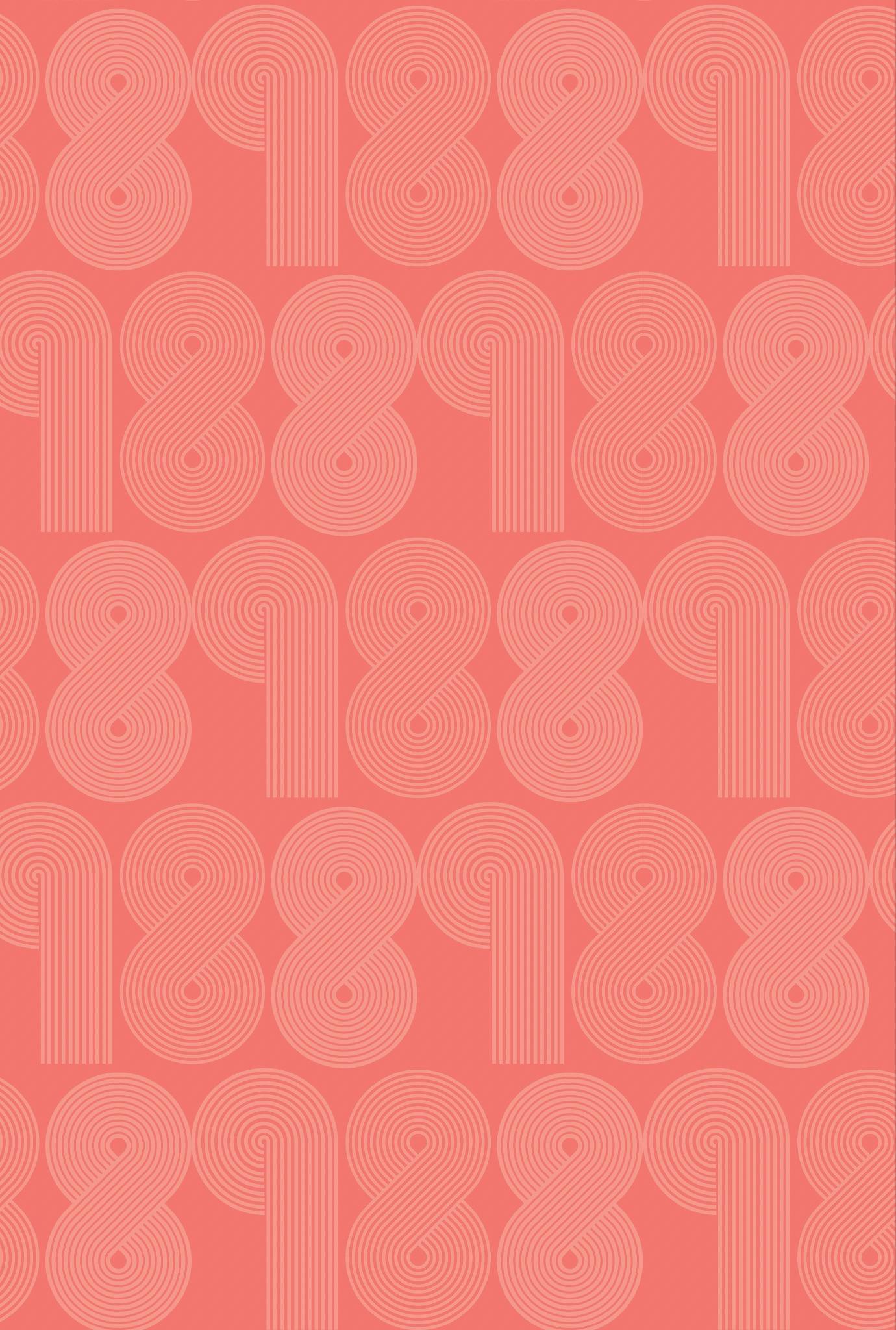
With our insight of raising program awareness, we’ve also explored a pattern that showcases 988 front and center. With this added design awareness in combination with headlines and body copy, there will be no mistaking what service our campaign material are providing.