AS ARCHITECTURE + GENERALPLANER WORKS | RESUME
1
Alejandro Sala Architect RIBA
COVER
Drawing by Alejandro Sala
Alejandro Sala RIBA Architect RESUME WORK 2
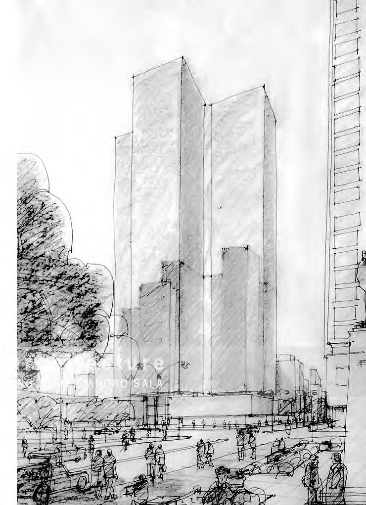
I.M.Pei & H.Cobb Architects Place e Marie -Tower Montreal, Canada Original 40x30cm, Traicing Paper, Pen Paper, Pencil and ink.
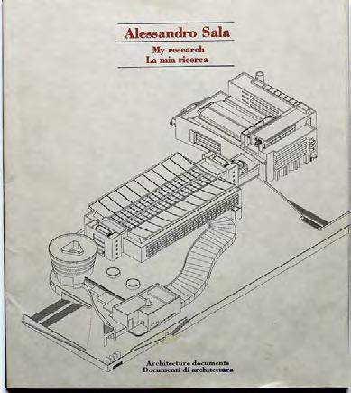
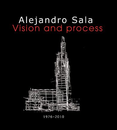
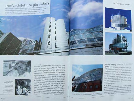
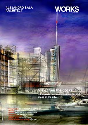
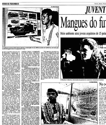
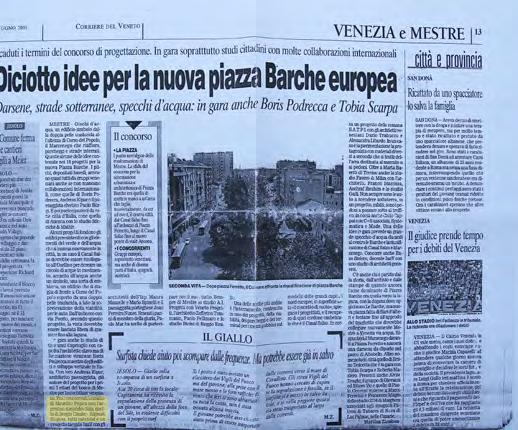
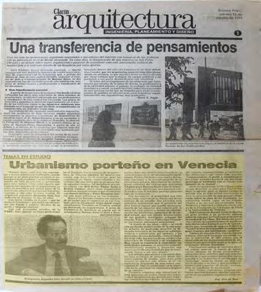
PRESS REVIEW & PUBLICATIONS • Urbanismo Porteno a Venezia by Ana di Brea Architect, Clarin Arquitectura, Aug., Buenos Aires 1996 • My Research 1977 Architecture Documents, by A.Sala • Una Architettura più Sobria, 2005, Il Giornale Architecture Italy Alejandro Sala Vision and Process, 1976-2010, Architecture Documents 1976-2010, by A.Sala Works June 2012, Alejandro Sala Architect, • Manghes do Futuro, Pernambuco Daily, 26 Ott.1994 Recife, Brasil 1994 • Eighteen Idee for a New European Piazza Barche Corriere del Veneto, 8 Jun. 2005 CONTENTS Works Resume ALEJANDRO SALA ARCHITECT (RIBA) PROJECTS 04 WILLOW LANE PRIVATE HOUSE 06 On going THE BIG PAVILLION TOWN MARKET 10 BOZEN NEW INDUSTRIAL FAIR H.Q 12 Architectutural Competition MARTELAGO PUBLIC LIBRARY 16 Architectutural Competition DOCK’S TOWERS 18 C77 20 OFFICE BUILDING 22 DAIMLER BENZ MOTOR FACTORY 24 IFIS BANK 26 SANTA BERTILLA COMPLEX 28 MASTERPLANS 30 GARDEN CITY 32 PORTO MARGUERA 34 THE NEW EXPRESIVITY 36 PAVILLION & OBJECT DESIGN 37 05 Alejandro Sala RIBA Architect RESUME WORK 3
Alejandro Sala RIBA Architect RESUME WORK 4 C77
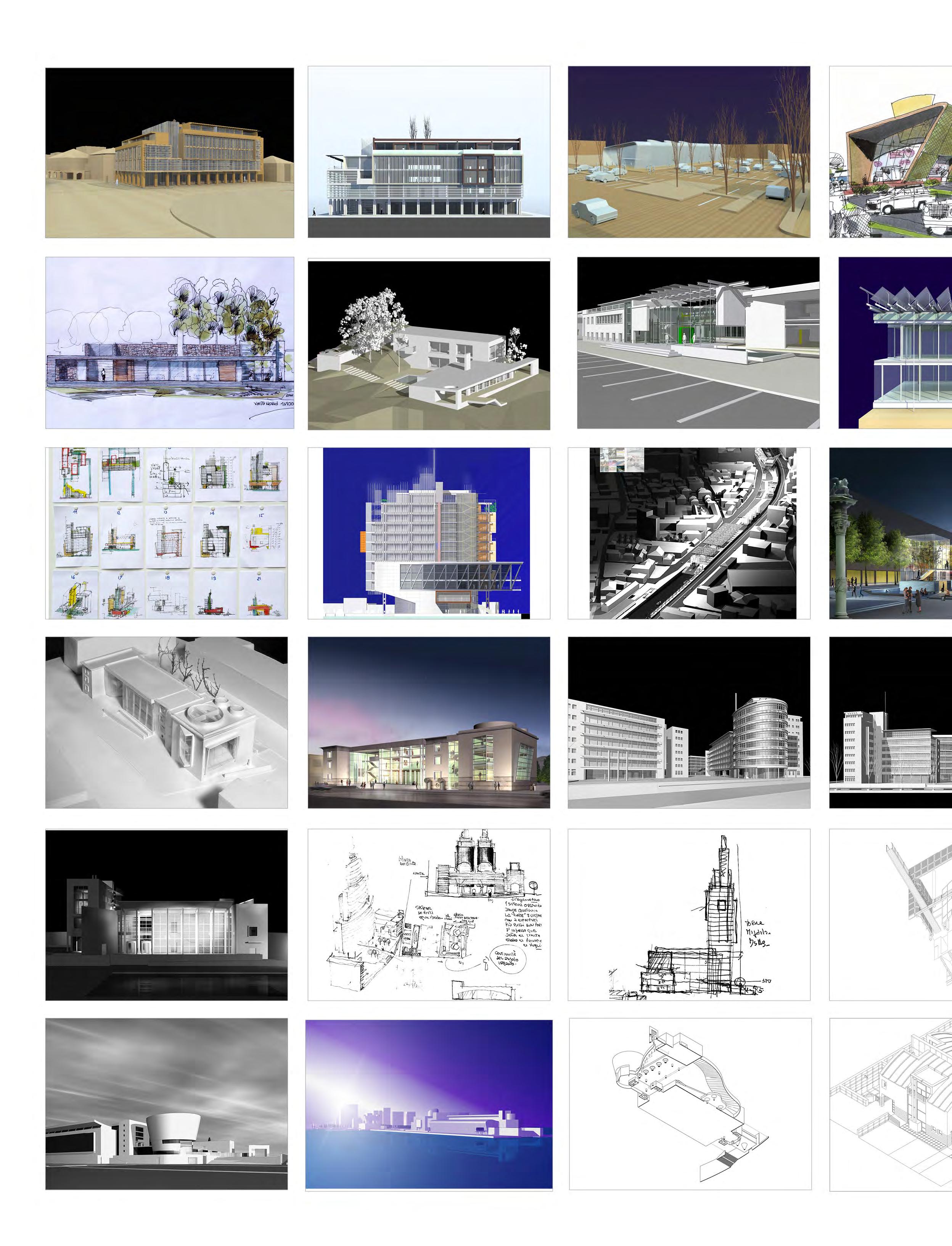
CENTER | Adaptive-Reuse TOWN MARKET + RETAIL | Workplace TOWN MARKET + RETAIL CARENZA HOUSE | Residential - Later Version - C77 TOWN CENTER | Adaptive-Reuse CARENZA HOUSE | Residential - Firts Version IFIS BANK | Workplace IFIS BANK DETAIL MASTERPLAN | Redisegn MASTERPLAN | Redisegn of Piazza Barche DOCK TOWER | Workspace - Later Version DOCK TOWER | Workspace - Study Sketches PUBLIC LIBRARY | Public Building - Model PUBLIC LIBRARY | Public BUilding EX SIDERCOMIT | Workspace EX SIDERCOMIT SWIMMING HALL & RESIDENCE - Model TOWER MAGDALANI | Residential TOWER MAGDALANI | Residential OFFICE BUILDING BOZEN INDUSTRIAL FAIR H.Q | Workspace YOHOHAMA PORT TERMILAL | Public Building BOZEN INDUSTRIAL FAIR H.Q | Lobby Squeme MERCATO DETACHES
TOWN
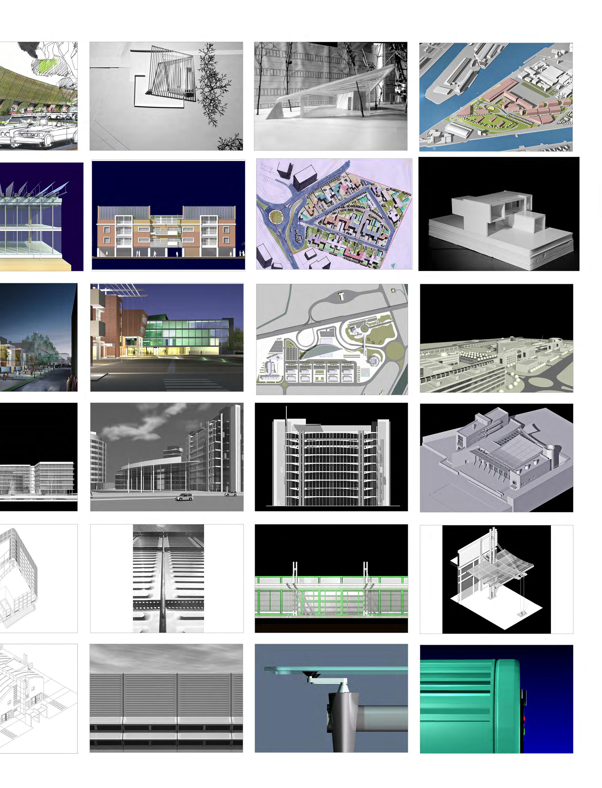
Alejandro Sala RIBA Architect RESUME WORK 5 RETAIL | | Workplace MULTIFUNCTIONAL SPACE | Public Building COFFE SHOP VICENZA | Public Building MASTERPLAN | Logistic Reuse DETAIL | Workplace - ADAPTIVE REUSE| Residential- MASTERPLAN| Residential - 21 Units RESIDENTIAL | Tipology Model MASTERPLAN MOTOR WAY CITY | MIxer Use MASTERPLAN MOTOR WAY CITY | MIxer Use TOWN HALL + RESIDENTIAL Redisegn of Piazza Barche SIDERCOMIT | Workspace EX SIDERCOMIT | Workspace EX SIDERCOMIT | Workspace SWIMMING HALL & RESIDENCE - Model BUILDING | Workspace- OFFICE BUILDING | Workspace - Detail Faccade PAM GROUP SUPERMARKET | Workspace HOUSE | Residential DAIMLER BENZ MOTOR FACTORY | Workspace TAVOLO PRIMO -TECNO | PRODUCT DESIGN 2000 AIR CURTAIN -DE LONGUI | PRODUCT DESIGN PAM GROUP SUPERMARKET - Model
PRIVATE HOUSE ADELAIDE HILLS
The house wants to create a balance between the revisitation of the Australian Country house with a return to nature and the harmony of work and home life. An approach to the theoretical principles of “Biorealism” amplified by four elements: Gestalt theories of perception, of dark vs. light, of void vs. solid, of figure vs. ground. As Sala once put it, and in a large sense, it also creates a more compact, sustainable urban environment.
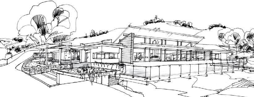
The first sketches and studies of the house demonstrate the genesis of the first idea of the role of “Peripheral Vision” in accessing nature and its relationship with the habitat. The house incorporates natural elements and the essence of belonging to the environment.
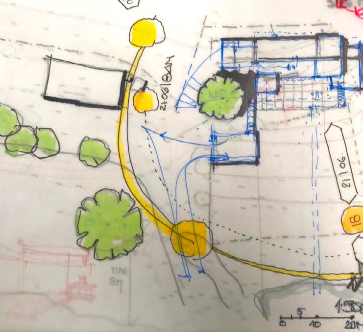
The design of the country residence is based on three guiding principles: an engaging response to the site, a resonant connection with nature, an interconnection between exterior and interior and different sequences of interior space scales.
NARROW BOX
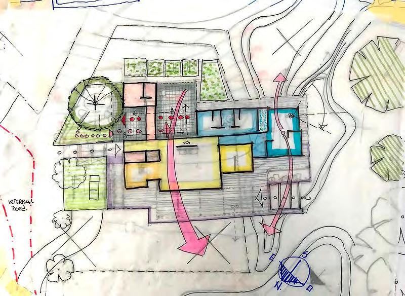
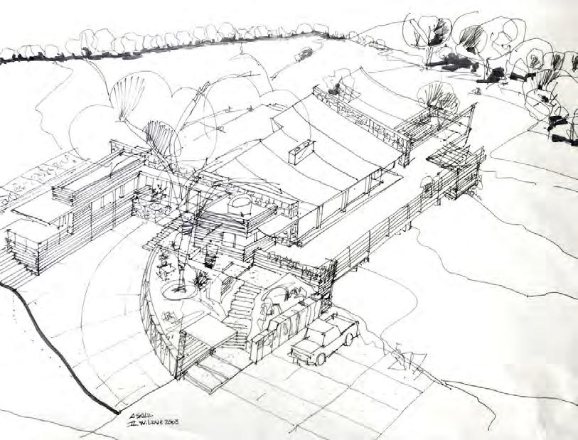
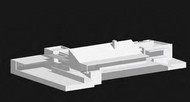
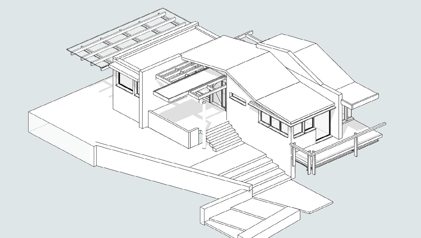
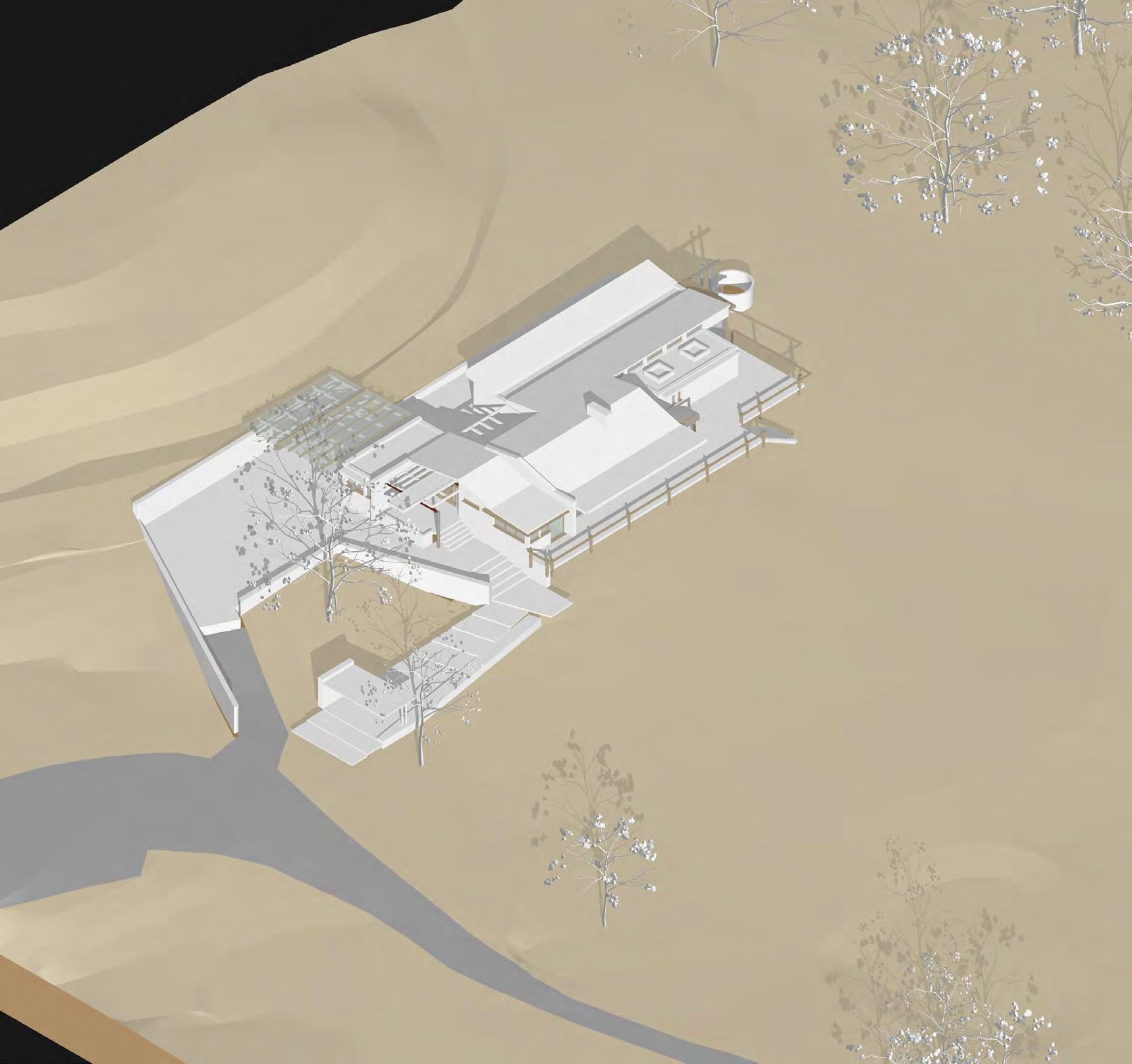
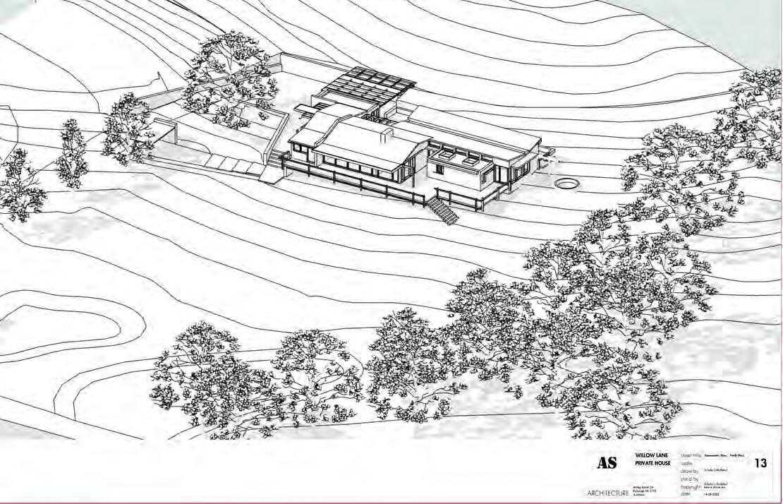
The idea is like a narrow box, almost a continuous plane of “transparent facing” in front of the small lake to the northeast while the opposite side is close to the hills. The southwest side is open to the valley, with the trees in lines. The project distils the spaces into horizontal planes sliding above the transparent facade of the day space. The only volume pronounced vertical is the chimney in the central area.
PROMENADE ARCHITECTURAL
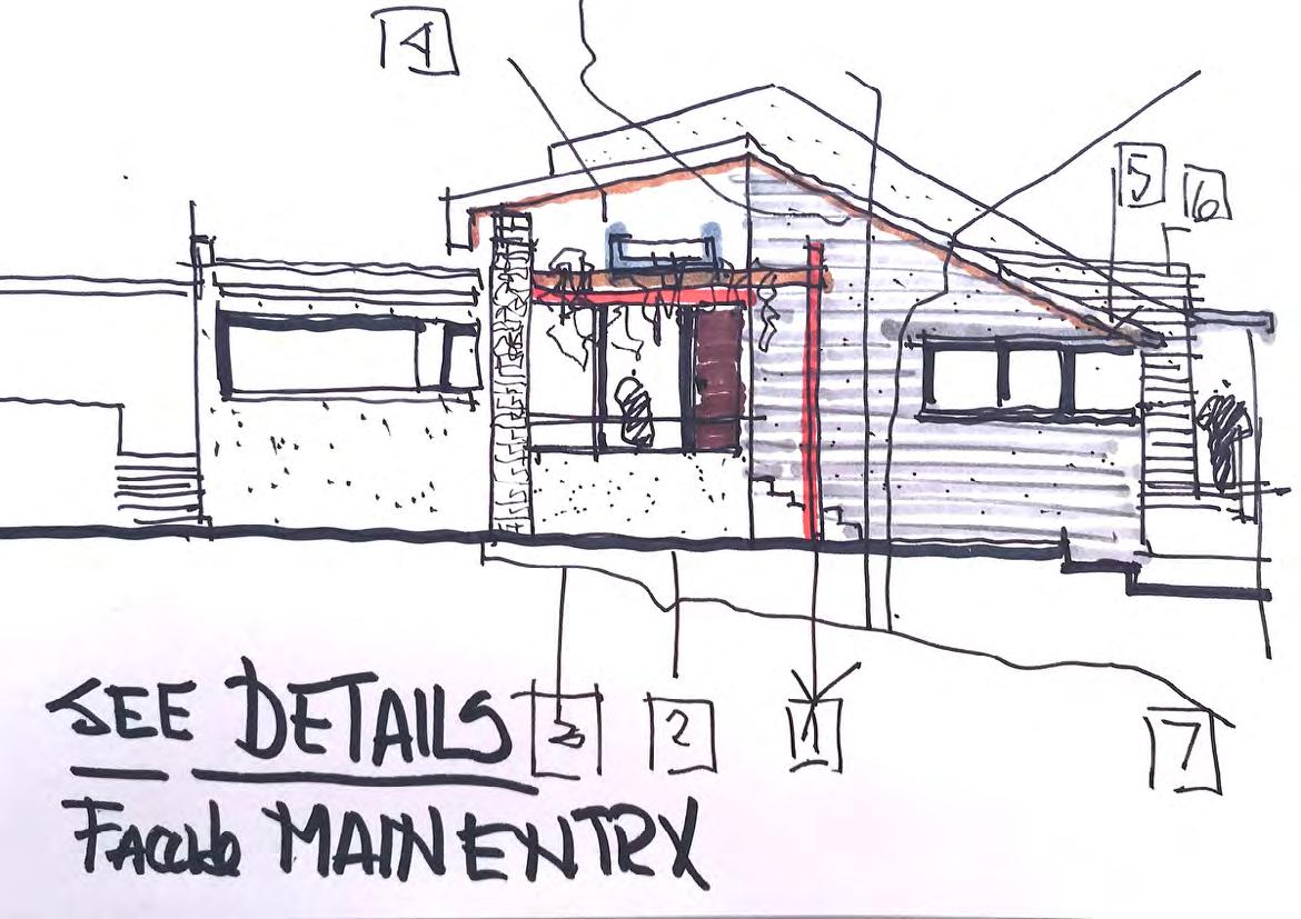
The public access starts from the gravel road with the “Promenade Architectural” through different height situations to arrive at middle level +1,50 to watch the landscape and come to the level garage.
COMPOSITION
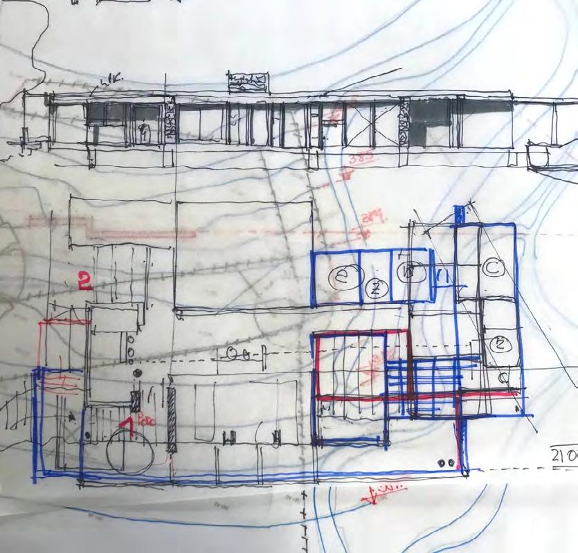
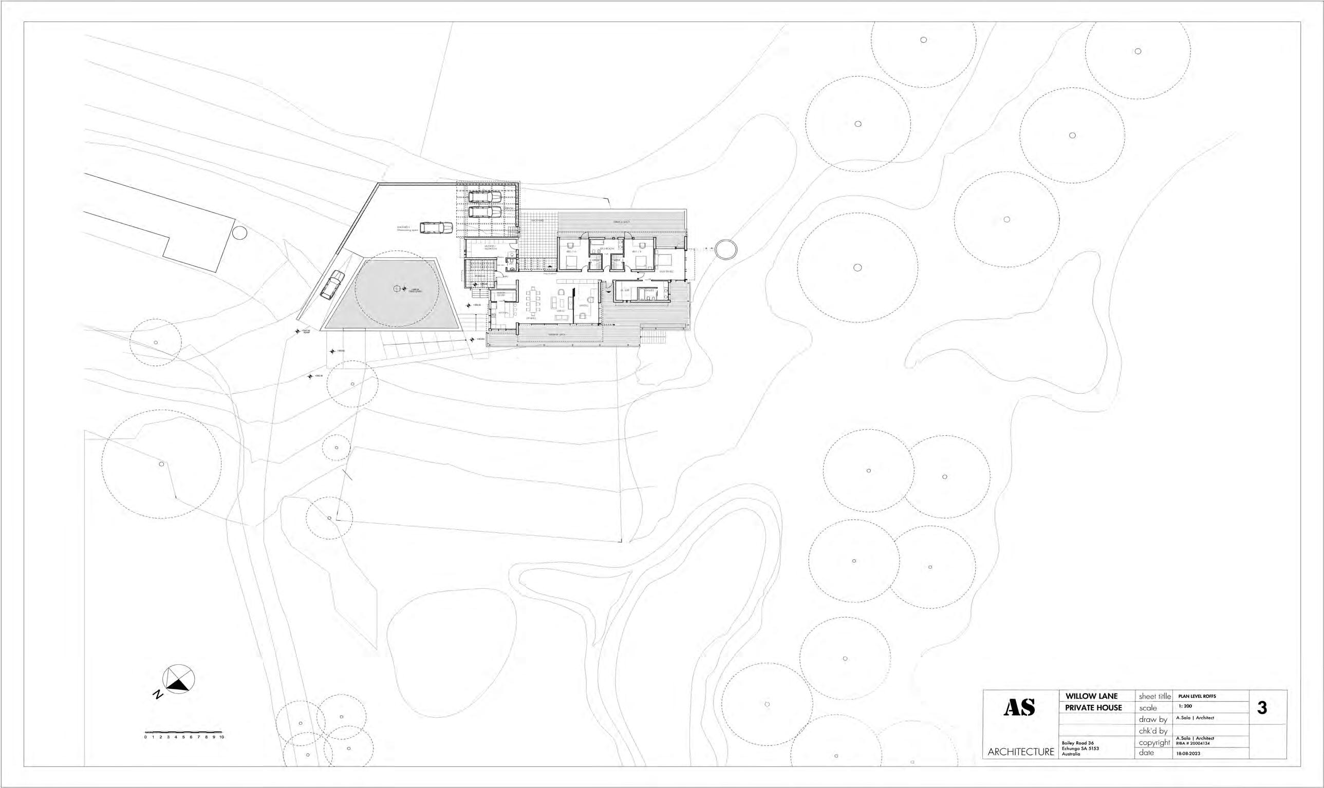
The architectural composition organizes the main spaces of the residence into three solid, two rectangular solids placed parallel to one another and connected by a porch at 2,50 level as the main entrance. The third solid organize the service area, Laundry- and Mudroom to the rear. This part creates an inner courtyard that faces back to the hills to the southeast.
nature is present in a muted morning light. This roof was designed to capture and bring water to a single point. Just through its design, traditional perimeter gutters are not needed. This allows for a straightforward collection of water for other purposes like irrigation, flushing toilets and even for drinking with on-site storage and filtration. This roofing method could be good t in areas with high rainfall, such as Adelaide Hills.
Programm and Functions
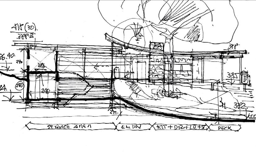
The program focuses on the five architectural principles rendered in the plan, section and elevation.
1 Separating public and private circulation, day and night spaces, and services area.
2 Transparency front and Back of the house to use these spaces on different seasons of the year, relationship with outdoor (day and night).
3 A promenade architecture to arrive at the primary entry step by step and dynamism in moving across the house and the “fluid” relationship between the indoor and outdoor.
4 Geometry is a modular composition, especially at the facade composition and windows, to reduce construction costs and simplify the build.
5 Dynamism throughout the move-through of different spatial relationships along the interior house zones from the porch at the main entry to the suite bedrooms on the south side.
Willow Lane Private House is a 21stcentury interpretation of the historical typology of “Australian Country House”, offering a richness of spatial experience, both timelines and contemporary.
01
Sketches, and models by © A.Sala
6
Alejandro Sala RIBA Architect RESUME WORK
THE PROCESS STUDY SKETCHES
01 The Light 02 Transparence - Front -Back 03 The Volume - Horizontality 04 Solutions I / II 05 Study sketches 06 Model study 04 05 06 02 03 Right: Plan level entry + 2.50m Alejandro Sala RIBA Architect RESUME WORK 7
THE PROJECT
OPEN SPACE
The central area retains the Idea of “Open Space”. Following a diagonal and dynamic movement, this main space has a floor-to-ceiling glass wall that connects the private studio behind the -Fair Place- Volume. The open area has vast views of the leading property entry and surrounding hills. A wall of “glace “in the rear facade invites immediate backyard views and the frontal deck.
On the composition void and solid, each part of the house is equilibrated in its composition as proportions and linearity emphasize its horizontality and roof dynamism.
THE BUTTERFLY ROOF
The forms of the roof for passive energy savingsThe butterfly roof on the bedrooms is made of two gables where, unlike a standard top, the gables slope inward toward the middle, creating a central valley. It makes it so that the eaves are on the roof’s exterior, thus creating higher perimeter walls with high windows to allow for passively lit spaces in the children’s bedrooms so that
NORTH FRONT
Alejandro Sala RIBA Architect RESUME WORK 8
OPPOSITE
Top
Main Entry:
Studie sketch and axonometrie view
Left
Model view front North-East
Below Front North-East
Cross section
Alejandro Sala RIBA Architect RESUME WORK 9
Axonometric View
TOWN MARKET THE BIG PAVILION
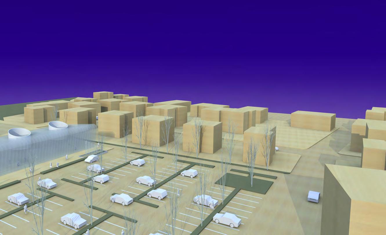
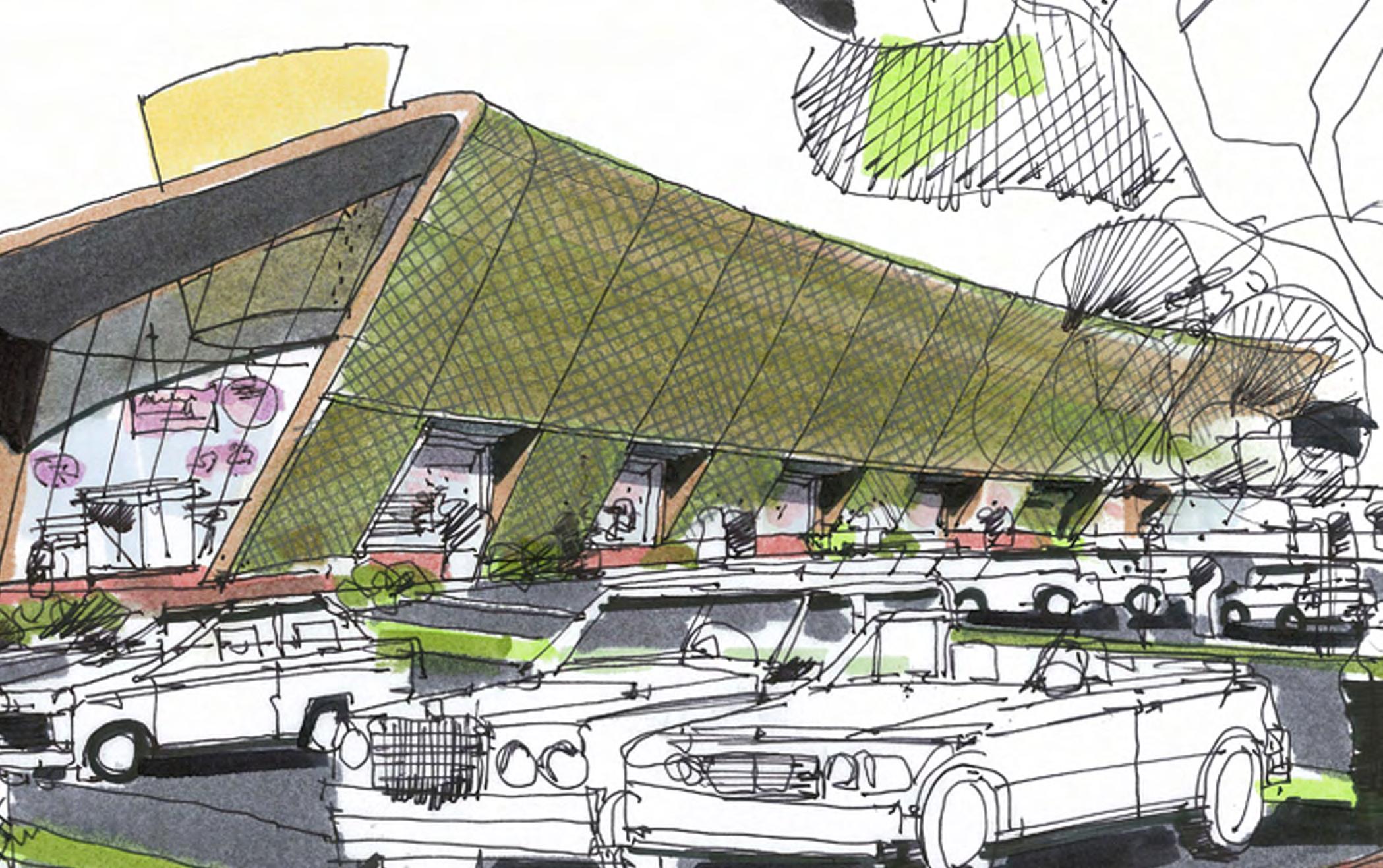
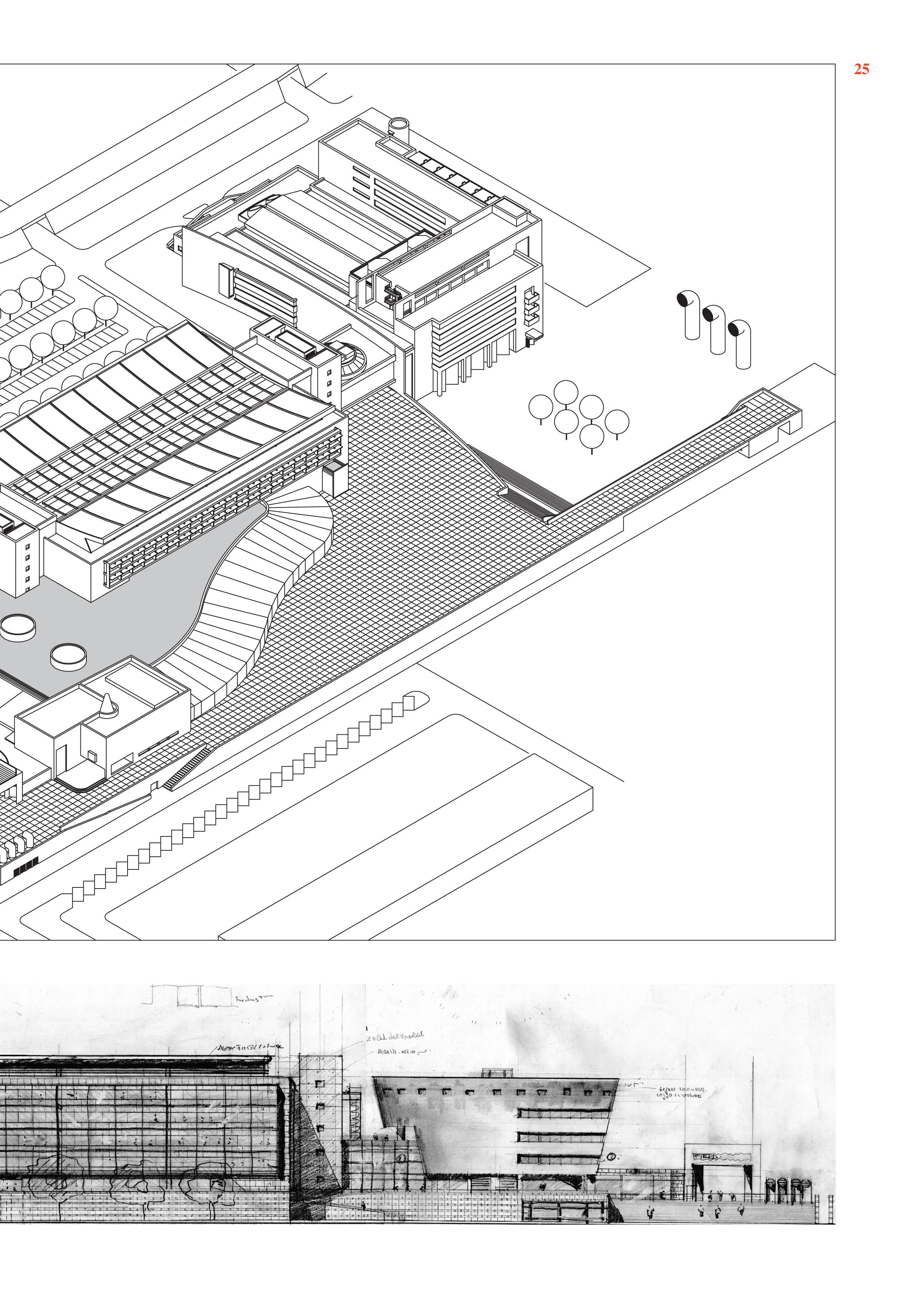
Amultipurpose building, consisting in the first place of a large “mall” destined for commerce. A big pavilion, a sort of “greenhouse” is almost immaterial. The area is a suburban one, delimited on the South side by an urban park and on the North side by a heterogeneous building texture.
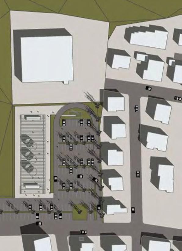
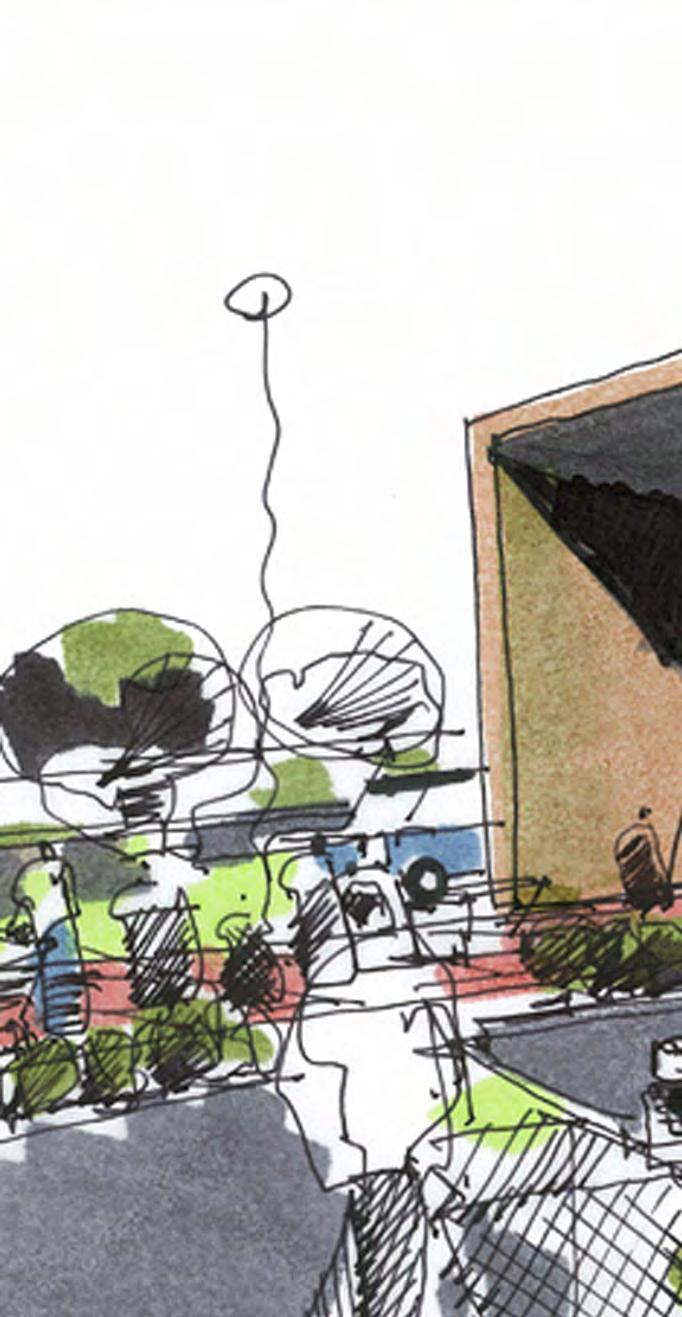
A building that is light in its transparency, and at the same time strongly suggestive in its well-balanced parts. Two entrances mark a set route inside the building, and so does the zenithal light from the skylights, leading the visitor from North to South. A building concept of great layout flexibility, in consideration of its free plan. An architecture the shape of which is a clear aerodynamic expression, with its lamellar wood ribs, that are seen through the transparent coating.
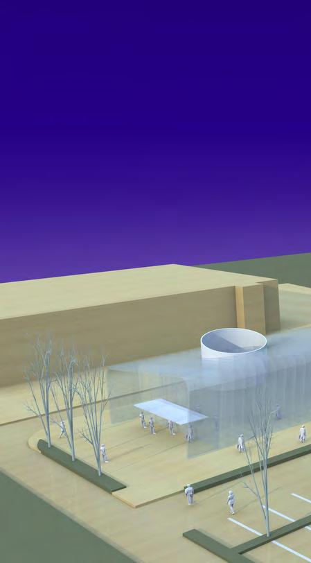 Right Top Model View View of the building from the parking Below: Studie Sketch Sketches, and models by © A.Sala
Alejandro Sala RIBA Architect RESUME WORK 10
Site plan
Alejandro Sala RIBA Architect RESUME WORK 11
BOZEN NEW INDUSTRIAL FAIR H.Q
Urban planning solution:
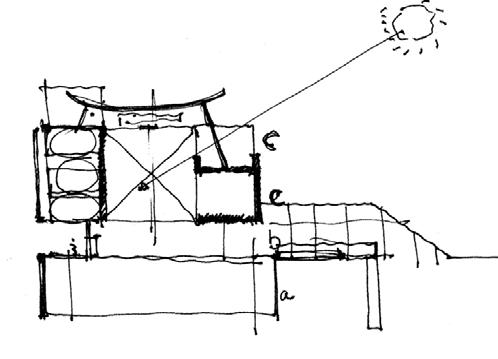
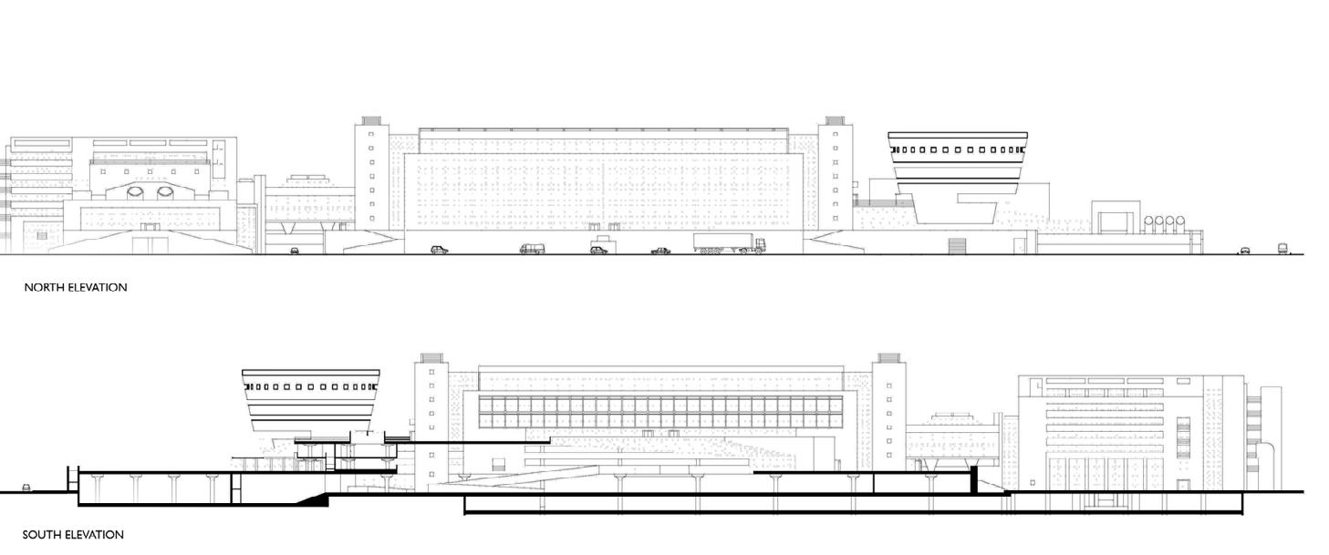
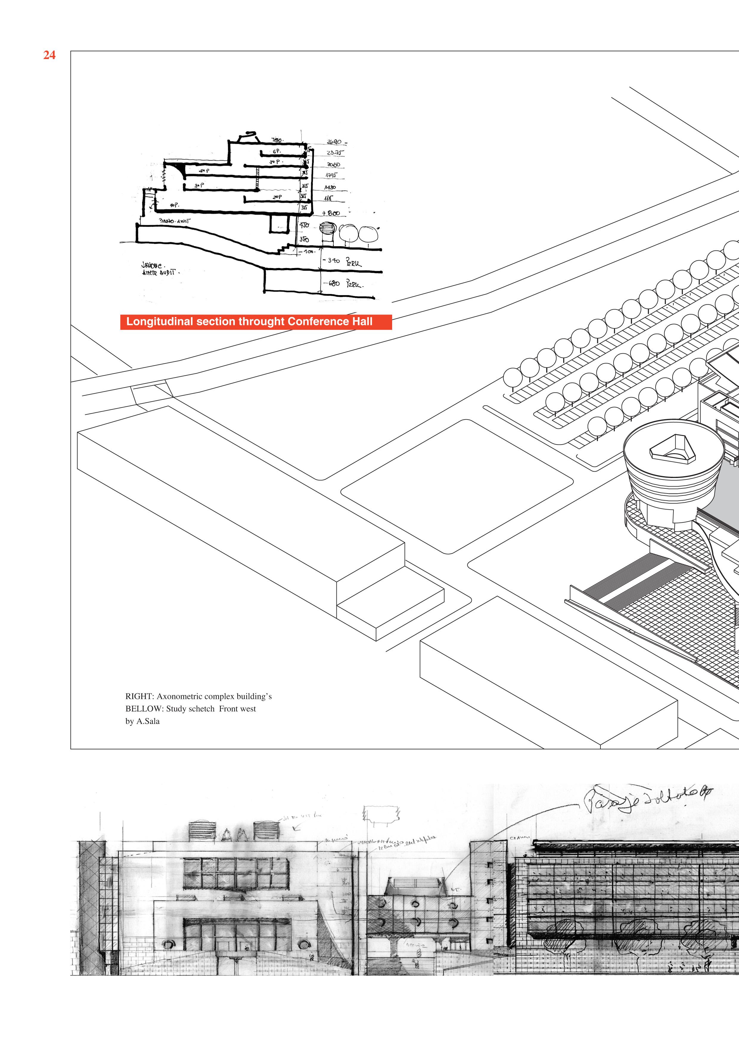
The lot lies in front of the vast “urban sign” constituted by the railway uniting Bolzano to Merano. The orthogonal nature of the volumes, which on the eastern side follow the curve of the railway, arranges the entire complex, creating an architectural language and a dynamic spatial composition. Within the evolution of the project, the parts making up the architectural complex tend to reunite different environmental situations: the urban section lying beyond the physical barrier of the railway, and the inner part of the future fairgrounds.
Organization and design:
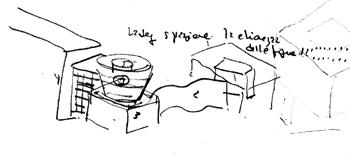
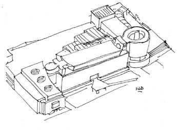
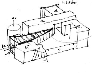
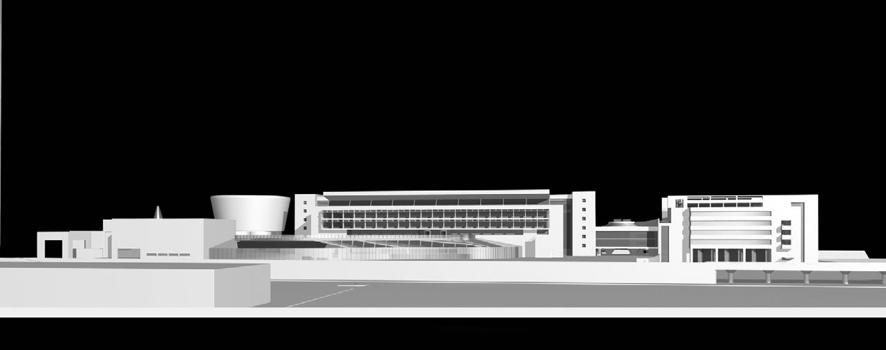
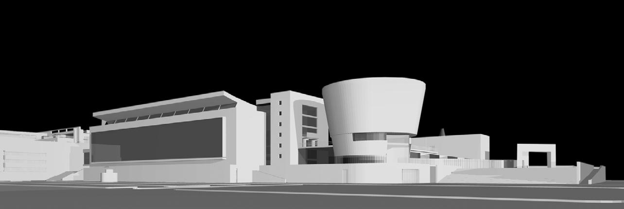
The architectural body is constituted by six distinct buildings, each with its own identity, spatial composition and architectural formulation.
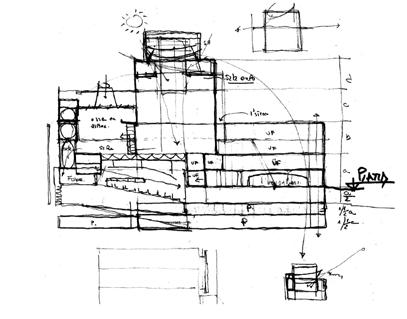
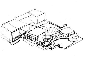
The entry area, standing back from the street, is made up of three volumes: an irregular volume marking the entrance,
a volume planned as the foyer, and one serving as a restaurant area, with its own access to the square.
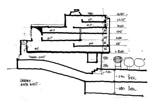
A cone-shaped volume arranges all levels of the exhibition galleries and serves as a connecting strip between the two parts making up the entire architectural complex.
A rectangular volume parallel to the railway houses the exposition area. Its backbone is a vast open area spatially and visually linking all levels with the light, which flows in from above; the façades of the volume reveal different expressive characteristics: a closed one on the railway side, and an open one on the square side, with a brise-soleil.A curved section delimiting the volume of the auditorium serves to lead the visitor toward the interior of the square, along a pedestrian walkway. The roof of the exposition rooms on the ground level serves as a terrace, widening the space for open-air exhibitions.
PARATAXI
“... from Greek: what is nearby, a combination on opposition of sense. Volumes come out of the mass,each part has its own expressive form “
The project for the New Industrial Fair H.q is an urban project of great expressiveness.
THE LOT THE LOT AND RAILWAY PATWAY THE PROGRAM VOLUME SEQUENCE 1 VOLUME SEQUENCE 2 PATWAY THE PROGRAM STUDIE EXPO -GALLERIES -SECTION 1 SECTION-GEOMETRY -LIGHT AUDITORIUM SECTION
Given its size, it is an independent entity, a project for the city through the public use of several outdoor sequences of areas giving a great and impressive effect on an urban level.
Right: Study Schetch - Front West Longitudinal Section
Studie Sketches by © A.Sala
Alejandro Sala RIBA Architect RESUME WORK 12
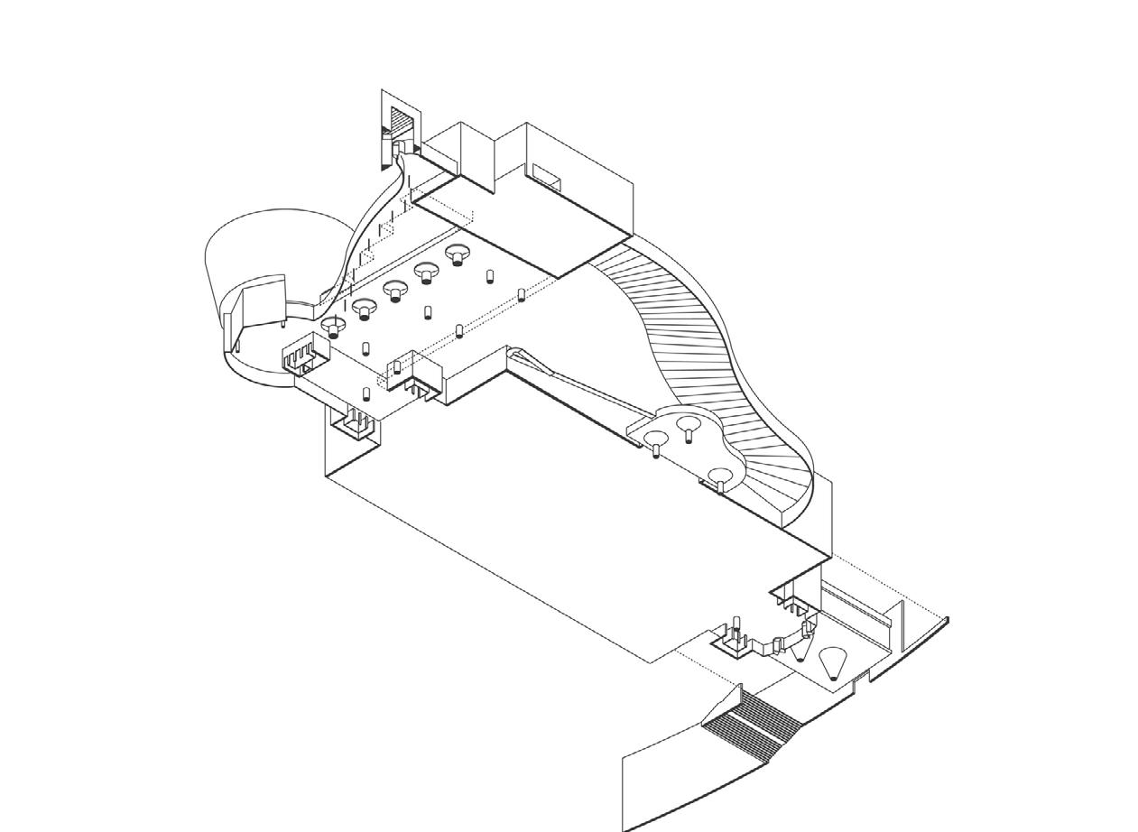
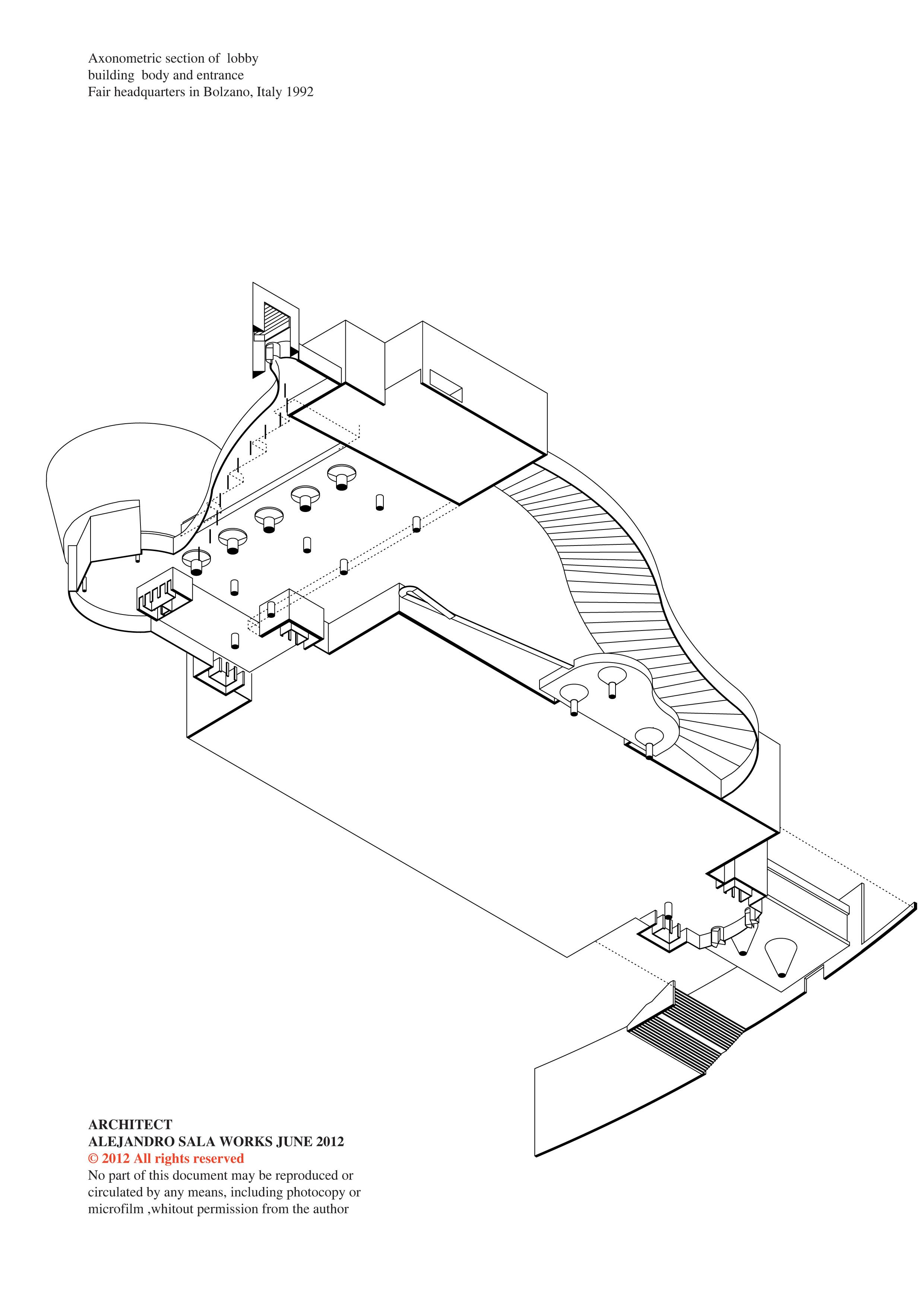
 TOP RIGHT: Axonometric section, lobby
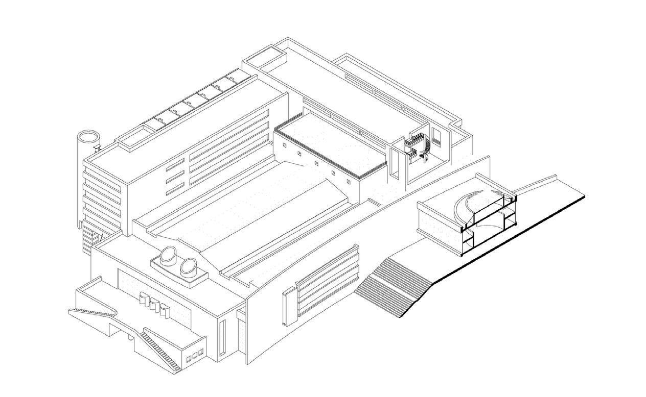
TOP BELOW: Axonometric ,Theatre and Aministration Offices
Sketches, Drawings and Models by © A.Sala
TOP LEFT: Ground Floor Plan
TOP RIGHT: Axonometric section, lobby
TOP BELOW: Axonometric ,Theatre and Aministration Offices
Sketches, Drawings and Models by © A.Sala
TOP LEFT: Ground Floor Plan
Alejandro Sala RIBA Architect RESUME WORK 13
TOP BELOW: Four Floor Main Front Longitudinal Section Model Views
Alejandro Sala RIBA Architect RESUME WORK 14
Alejandro Sala RIBA Architect RESUME WORK 15
MARTELAGO PUBLIC LIBRARY
An entrance space is designed as a small open space. Right to main entry, left the administration offices.
At the top of the staircase a space opens and extends until becoming a sort of proscenium where visitors can converse or simply sit down and look at the city.
The project:
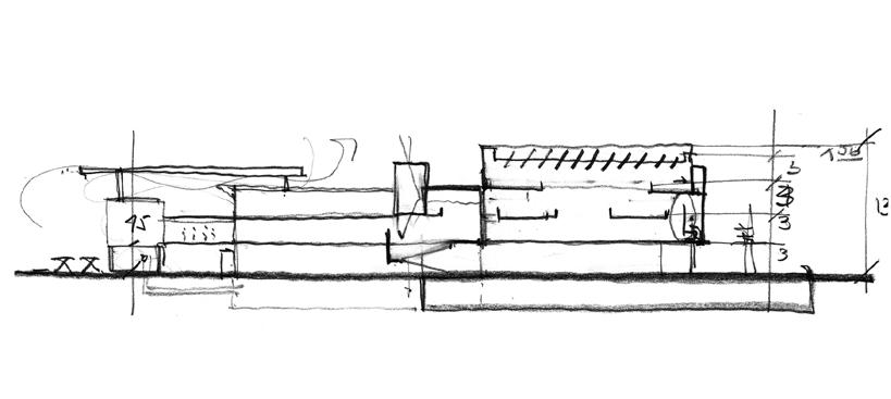
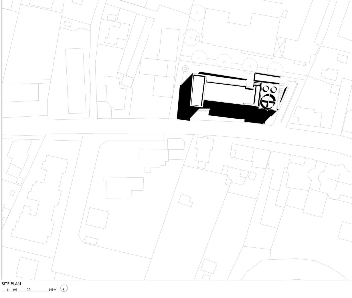
The planimetric arrangement consists of two building bodies with a central passage. A staircase and a chute leading from the public street to the central void, that is, a covered square serving as a passage element and meeting place for citizens. On this big central double–height excavation are placed the entrances leading to administrative offices and commercial spaces (east) and to the library (west).
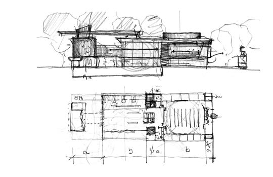
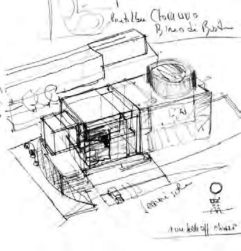
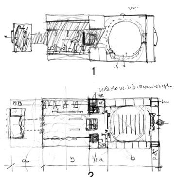
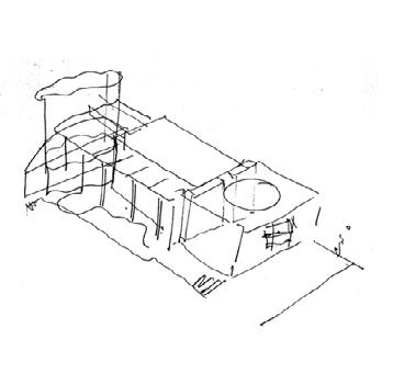
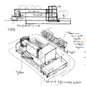
The wide, “piano-shaped” entrance hall highlights with its transparency the vertical circulation elements. On the second floor, a footbridge serves as a passage linking the two building bodies.
The library is arranged in a space sequence: a transparent volume holding the reception, a newspaper and periodical library and administrative offices; a second volume holding the vertical circulation systems and services; a third, square-shaped volume holding reading rooms and an auditorium – which remains on the basement, to which one can have access from the interior but also from the exterior, through an independent entrance.
Square-shaped glass windows highlight perspective views and lead the eye to the most significant points of the area. Two skylight systems allow zenithal light to penetrate into the reading rooms. A cornice, serving as a crowning element, gives unity to the whole building.
Right: Site plan
VOLUME SEQUENCE 1 VOLUME SEQUENCE 2 PATWAY STUDIE SECTION THE PROGRAM SECTION AND GEOMETRY
Studie Sketches by © A.Sala
Alejandro Sala RIBA Architect RESUME WORK 16
The materials:
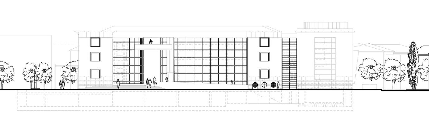
The building, serving public functions, needs to highlight its own architectural presence on the site. The dialectic relations of the different materials underline its monumental character: the stone used in the basement and in the coating of the upper part of the building reminds us of the colours of typical local architecture.
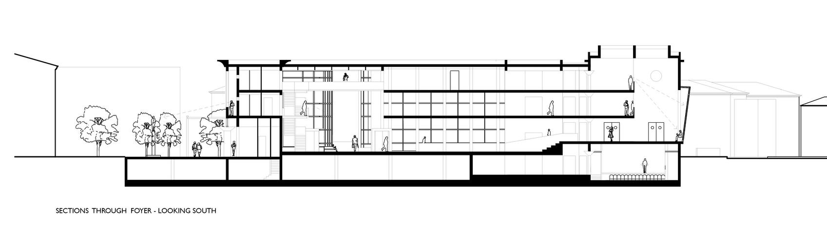
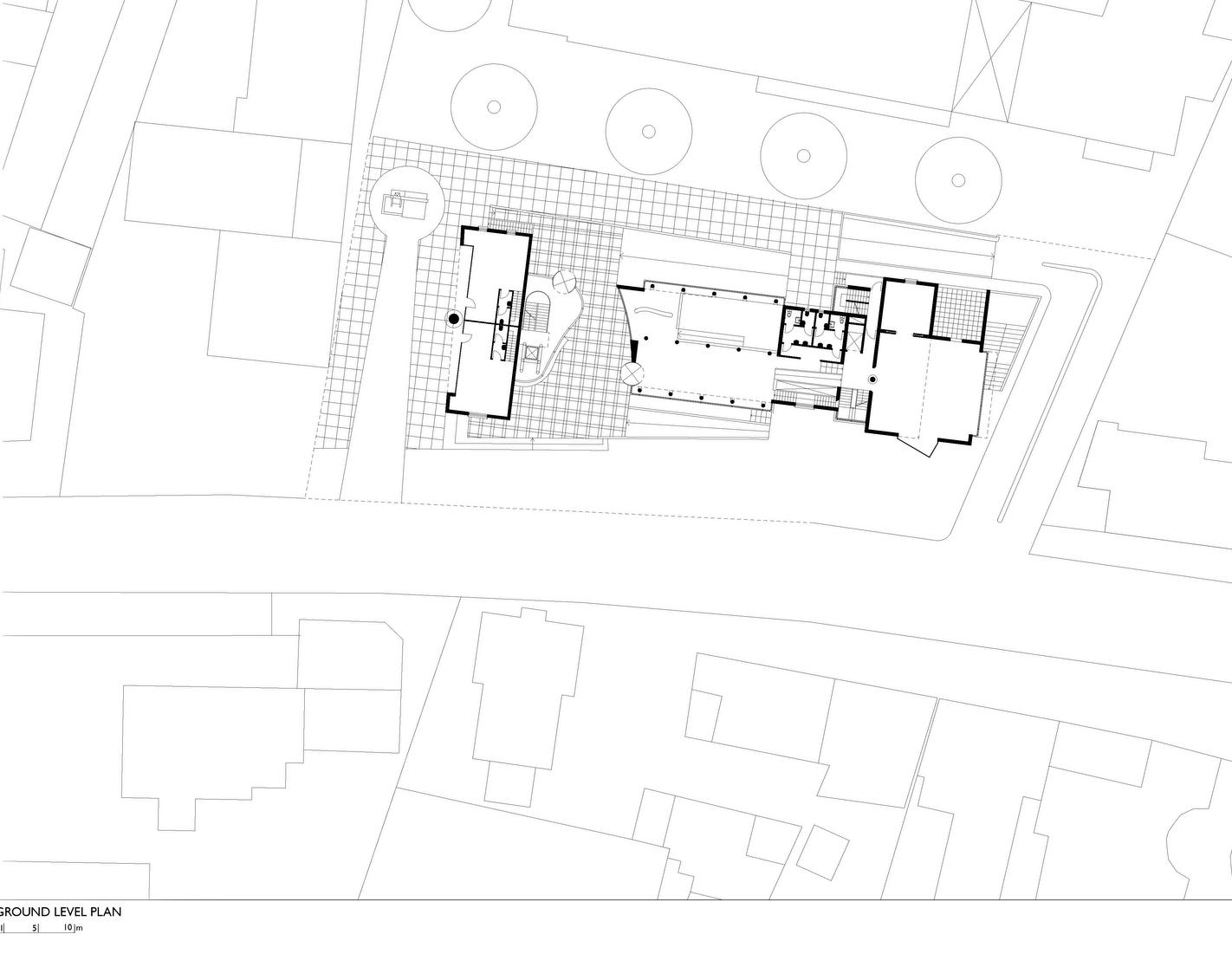
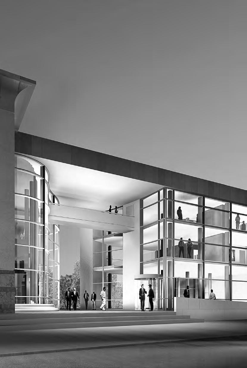
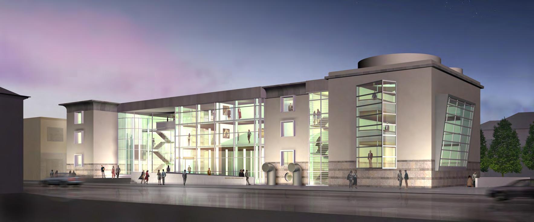 TOP: View of Building TOP LEFT:Ground Floor
TOP RIGHT: Foyer LEFT: Section throught library and conference hall Main Front
TOP: View of Building TOP LEFT:Ground Floor
TOP RIGHT: Foyer LEFT: Section throught library and conference hall Main Front
Alejandro Sala RIBA Architect PORTFOLIO 17
Sketchs by © A.Sala
DOCK’S TOWERS
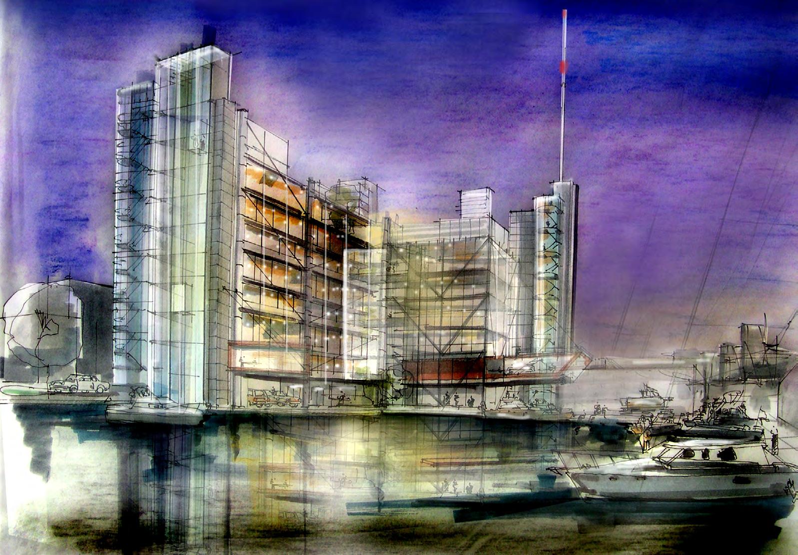
The new vertical building as a grand actor on the city stage, the plan foresaw both the insertion of three volumes and the widening of an existing dock. Each volume responds differently to the city. The external technical elements were positioned outside, such as stairways and elevators, allowing for vertical movement and panoramic views of the city.
The project comes from the need to integrate and make more valuable a water space located close to Mestre City in Northern Italy. A varied and fragmented urban texture, which will soon be the object of a requalification near the historic city centre. The new building will serve as a directional pole between University spaces (some already constructed and others in progress), the wide receptive structure of Laguna Palace and Ancona Avenue. Which together with Torino Avenue is one of the most important thoroughfares of the directional centre of Mestre.
The building is developing in height of 48 m and is made up of two building bodies. A suspended volume a parallelepiped at first-floor form is the seat of the operative structure of the dock rooms, offices, and commercial spaces, overlooking the water.
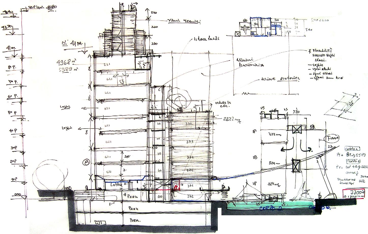
The proportion of the highest volumes holding the offices, consists in a relation width – the height of
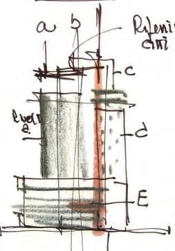 TOP: Drawing - The Idea of Building BELOW: Studie Section Part of Building (Sketche) LEFT: The area
OPPOSITE: Sketches Studie Process
Studie Sketches © A.Sala
TOP: Drawing - The Idea of Building BELOW: Studie Section Part of Building (Sketche) LEFT: The area
OPPOSITE: Sketches Studie Process
Studie Sketches © A.Sala
Alejandro Sala RIBA Architect PORTFOLIO 18
Drawing© by A Sala
1 to 9, in order to give more “verticality” to the building. The building is designed as a structure split into two parts responding to the city, contributing to its dynamicity, in which the parts become actors on the wide stage of the city.
The planimetric arrangement results in two rectangular plans. The ground floor is destined for parking space, while the upper storeys hold offices designed as wide open spaces, favoured by the structural solution independent. The issue
of transparency and the “free plans” is already present from the starting sketches, in which the service vertical elements, like staircases lifts and bathrooms, become autonomous volumes outside, positioned at the exterior of the building.
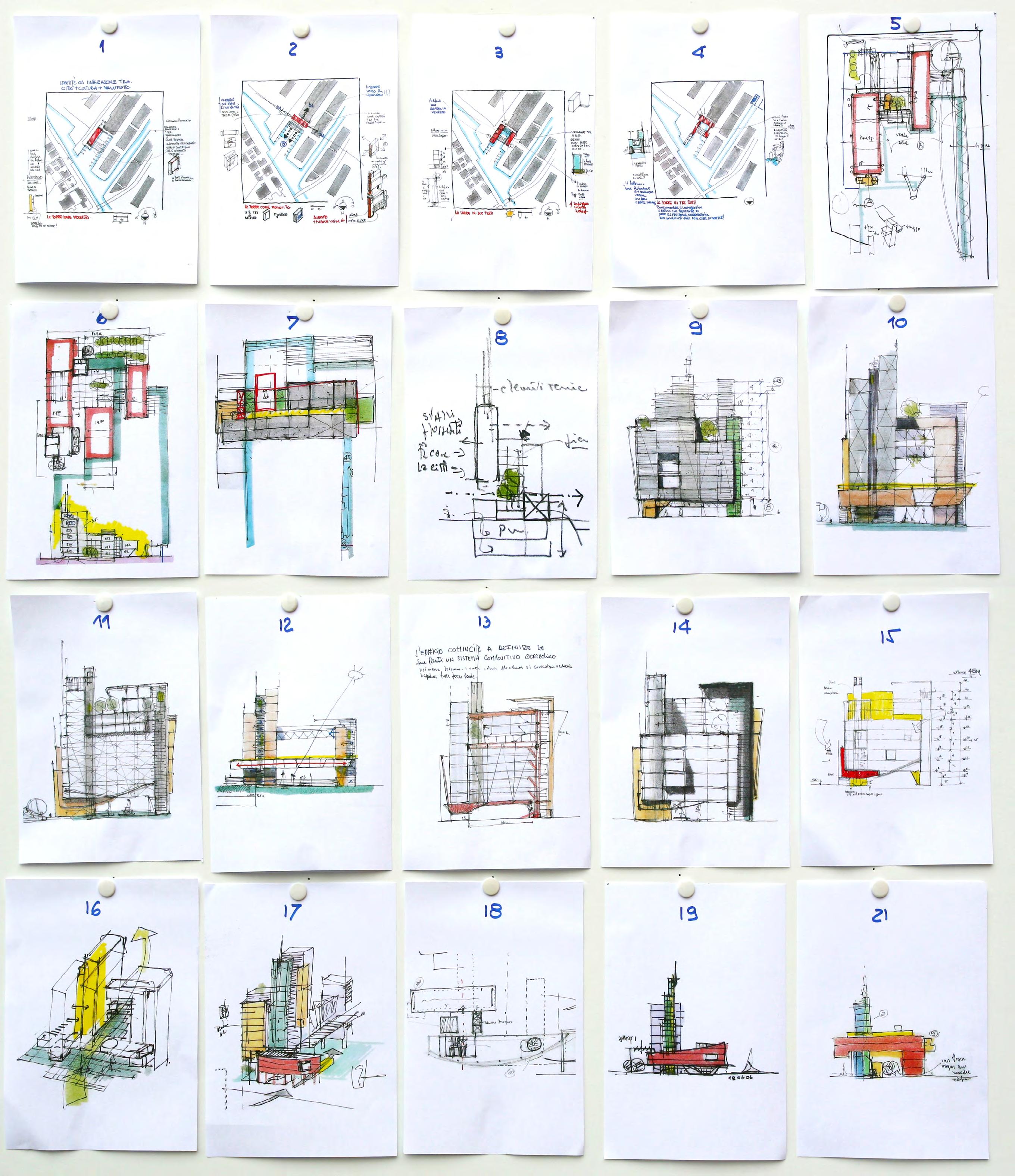
RESUME WORK Alejandro Sala RIBA Architect 19
REUSE
C77 OFFICES APARTMENTS
RETAILS
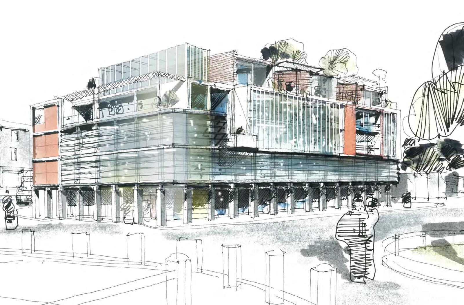
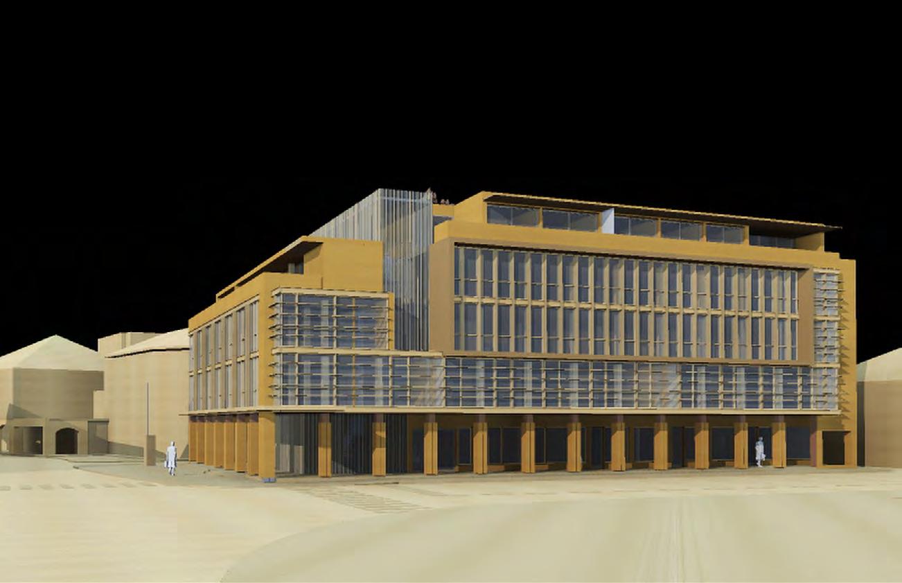
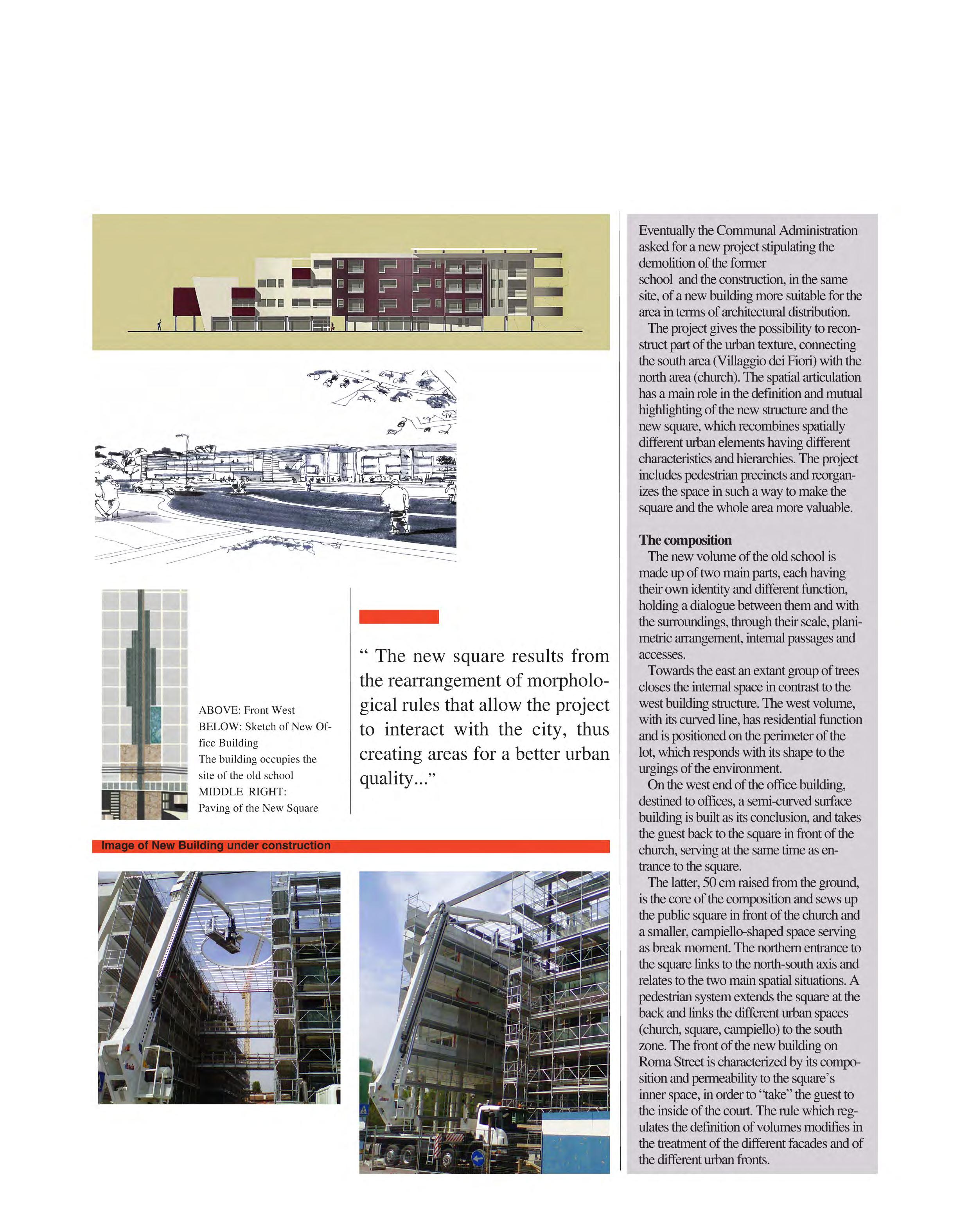
“ The building is replanned in such a way as to create a “break” between the front of the building on Roma Street and its development down Matteotti Street, thus creating strong visual tension and increasing the consolidation of the building with regard to the main front. .
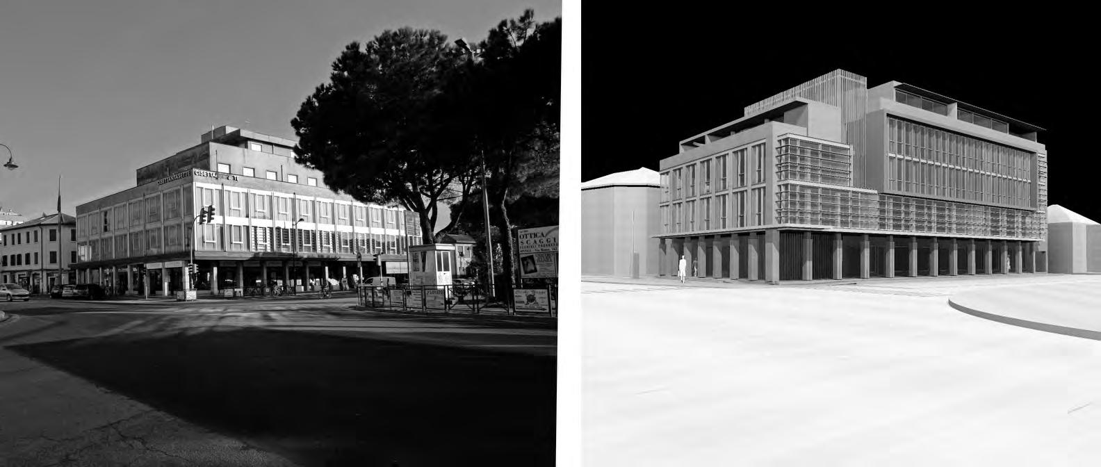
“ Varying scale, strong identity, careful detailing, and new compositive expression coexist to create a new image for the old building”
BEFORE
The building named C 77 dates back to the 50s and it is a business building. 42 meters high, compact and solid in its rationalist character, it has become a reference point for the town because of its urban position and its appearance, its monumental mass.
The Program:
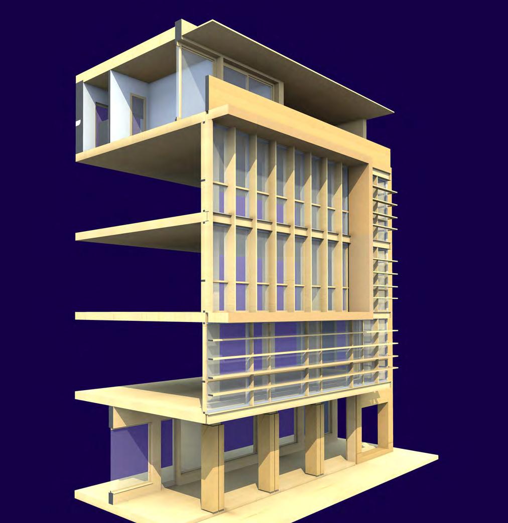
The new adaptive reuse plan provides for the retrieval of the various storeys for business and office purposes, and of the top floor for residential purposes.
AFTER
The new plan thus provides for the elimination of the 4th floor and for the reconstruction of the 3rd floor, which will be used for residential purposes.
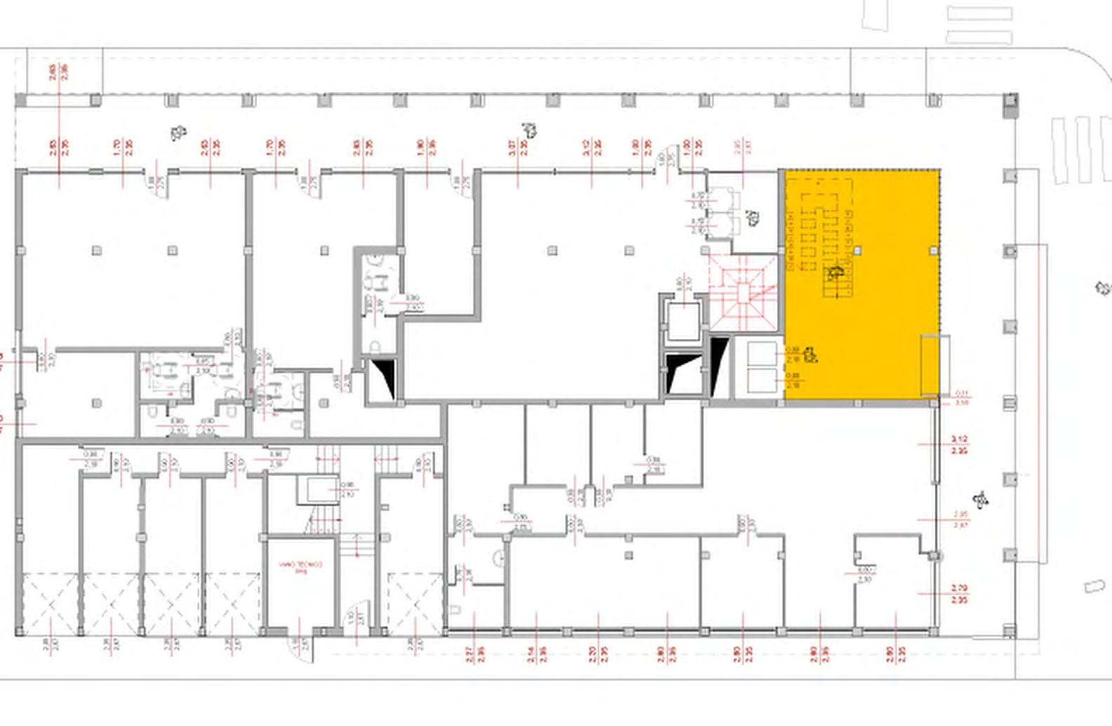
Structure Restraints
Its physical and morphological conditions, and its supporting structure, where the rhythm of the structural net (3 m x 4 m) wich remarkably conditions the project choices.
TOP: Drawing - The Idea of Building BELOW: Ground Floor OPPOSITE TOP: Studie Sketches - Main front Main front | Secondary Front BELOW: Computer Modelling -Main front Details Sketches and Models by © A.Sala Alejandro Sala RIBA Architect RESUME WORK 20
Drawing © by A Sala
AIMS
1 -Increased flexibility of the new spaces on the various storeys of the building
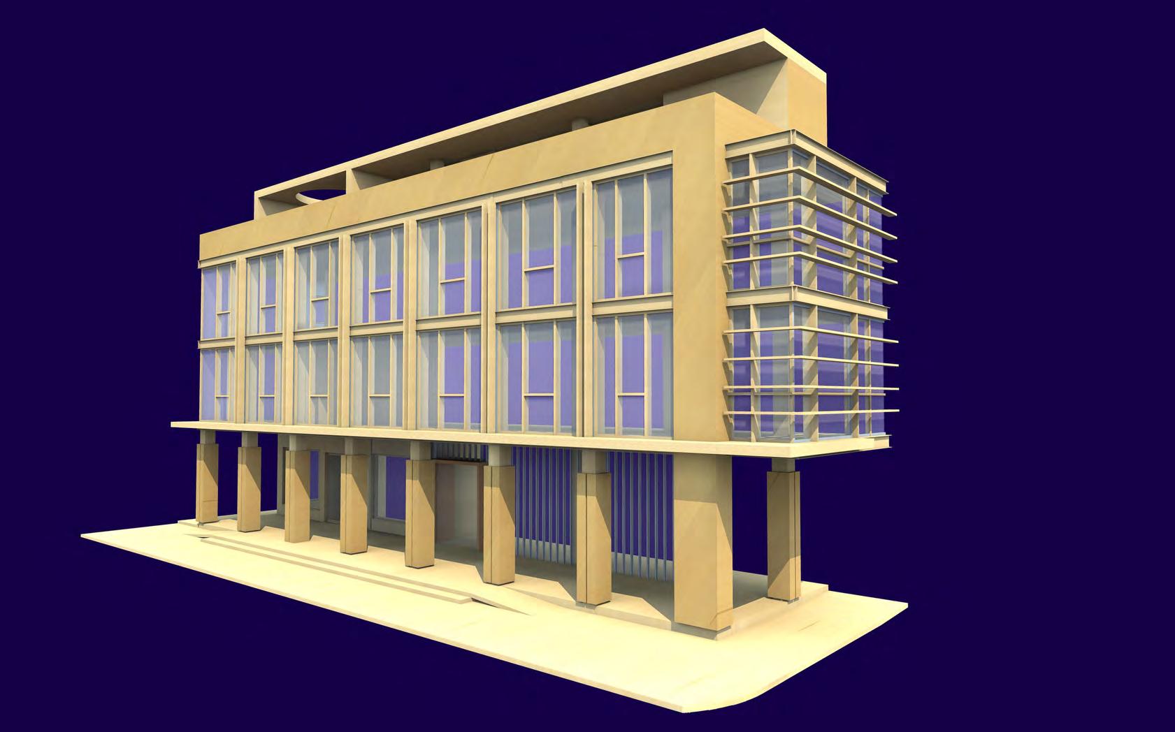
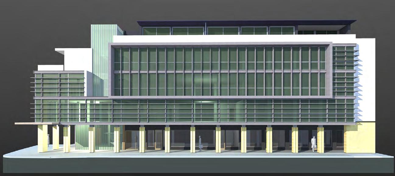
2 -The foyer: it becomes the heart of the composition and the main entrance, on the front of the building, contributing in this way to increasing the value of the building within the urban hierarchy.
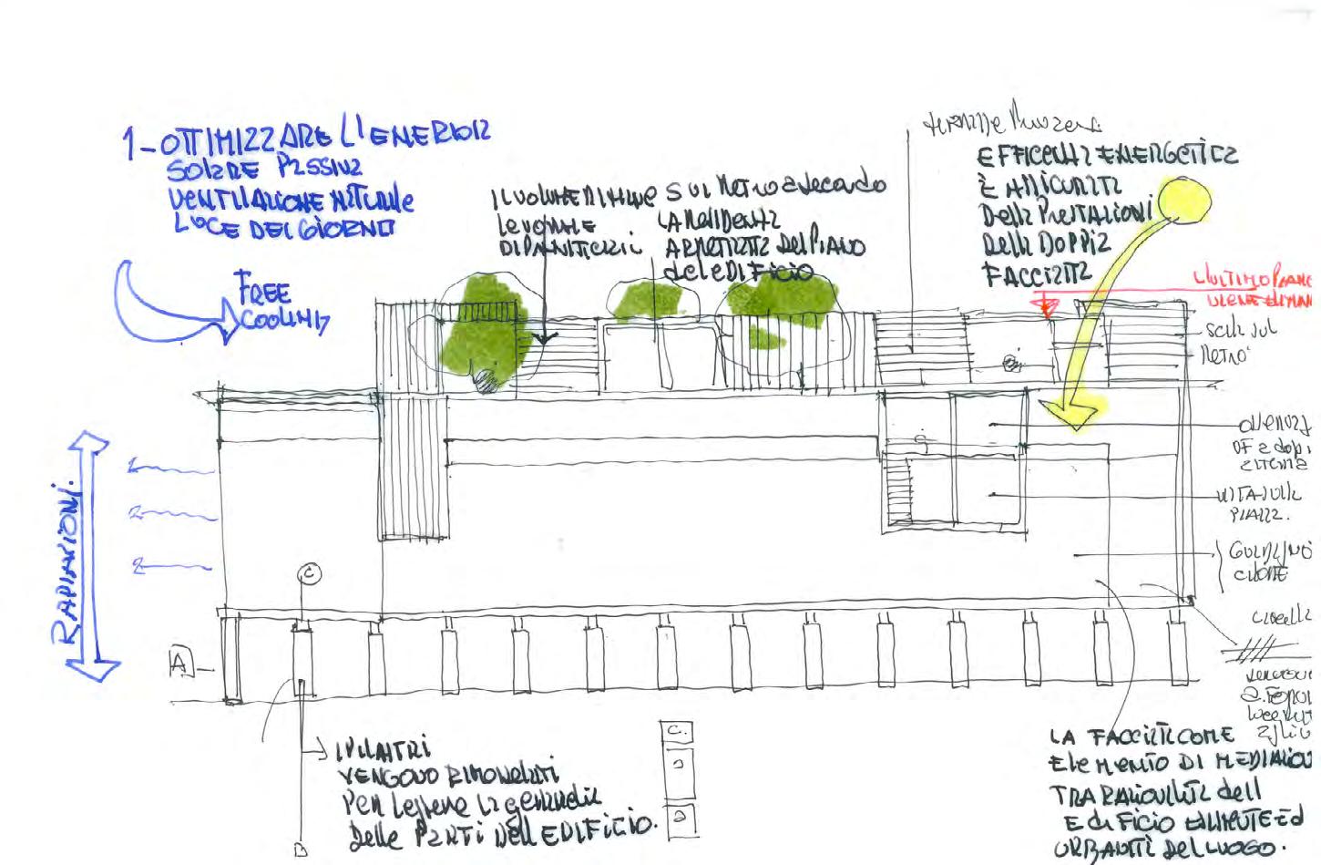
3- The light: to bring light to the heart of the building. A big vertical “Buffer” separating the entrance hall from the rest
of the building is projected in such a way as to balance the internal temperatures according to the external ones – an energy solution of minimum impact.
A NEW COMPOSITION ORDER The City
A strong visual tension is established among the dynamic forms of the building, which is reorganized in three different moments responding to the town parts
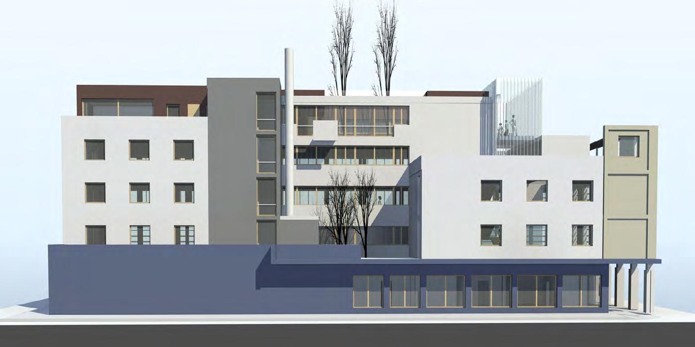
“A New “Courtyard”
A courtyard facing the back was obtained from the elimination of a part of the extant volume, thus allowing increased penetration of light from the east to the offices.
3rd Floor - Independent structure
It is destined for 3 apartment units made of wood and having an independent structure.
RESUME WORK Alejandro Sala RIBA Architect 21
OFFICE BUILDING
MODULARITY A BOX SHAPED BUILDING
A box - shaped building is dismantled to be reassembled. The basis is conver- ted into an element of composition, becoming a volume containing all the wiring running along the perimeter.
Modular panels convey new plastic ex- pressiveness
The occasion for this project was given by the restructuring of an old building lying near the city of Padua, in northern Italy. The pre-existing administrative building was totally replanned in layout and façade, while at the same time conserving the structural system, the elements of vertical circulation and the floors. The main entrance to the building is by way of a ramp leading to a square-shaped loggia marking the confine between interior and exterior.
This space is presented as an actual extension of the internal habitat, emphasizing the entryway with a vertical element. After crossing the loggia one reaches an internal foyer of double height, arranged according to the stairway volume and the presence of light; here, a slight rotation of the passageway generates tension and dynamism within the office volume.
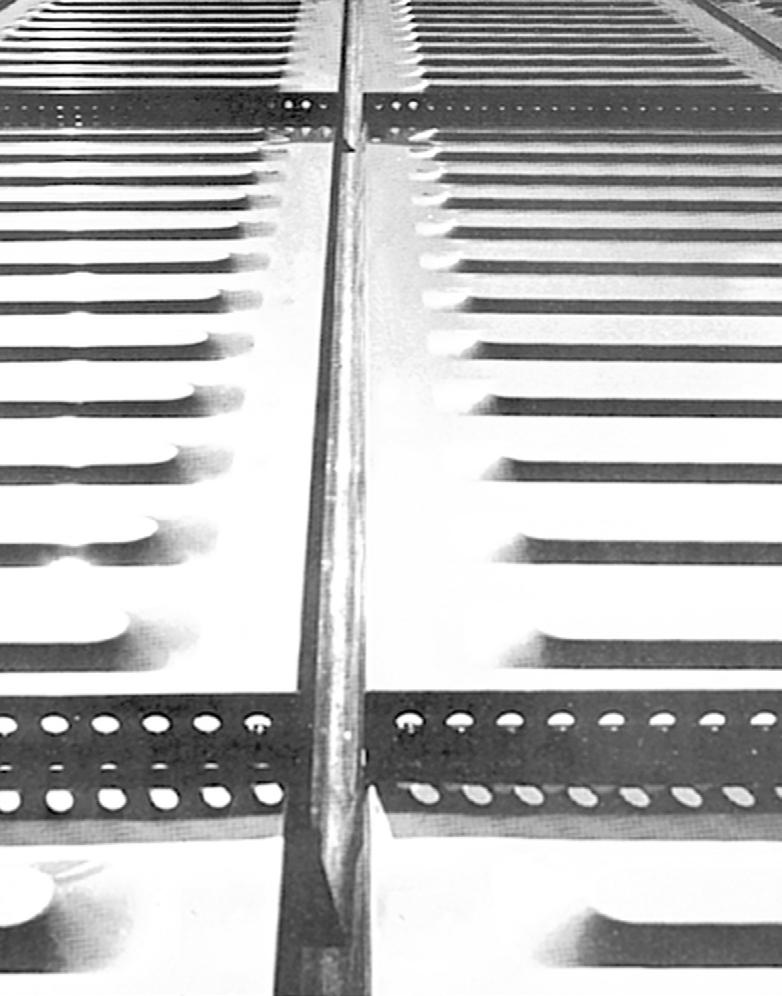
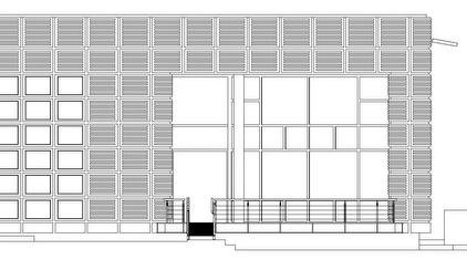
The “rotation” arranges the layout into two well-defined functional sectors: one sector is planned for offices, and the other for lavatories. The façade is designed according to a modular system of aluminum panels measuring 90 x 45 cm. It has its own, autonomous structure, independent from the rest of the building.
The lower part is planned as a technical volume for new facilities. The ramp of access to the building divides the external space into an area reserved for parking space and a lake meant to become a compositional element, reminiscent of the Maison de l’Homme.
TOP: View of Main entrance and loggia
Alejandro Sala RIBA Architect RESUME WORK 22
Shaped panels of anodized aluminum, as the use of “superplastic” aluminum applied to the building industry: in this process, metal can be shaped into forms normally associated with the plastics industry.
TOP: Detail System Panels
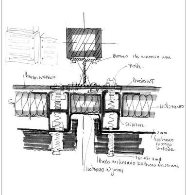
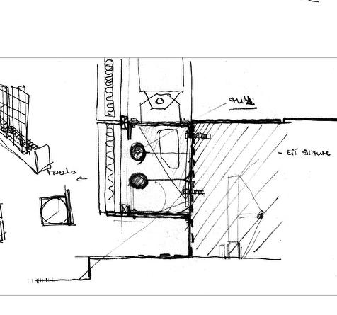
RIGHT: Study Sketches
BELOW: Main Front
RIGHT Ground Floor Plan
Alejandro Sala RIBA Architect RESUME WORK 23
DAIMLER BENZ MOTOR FACTORY
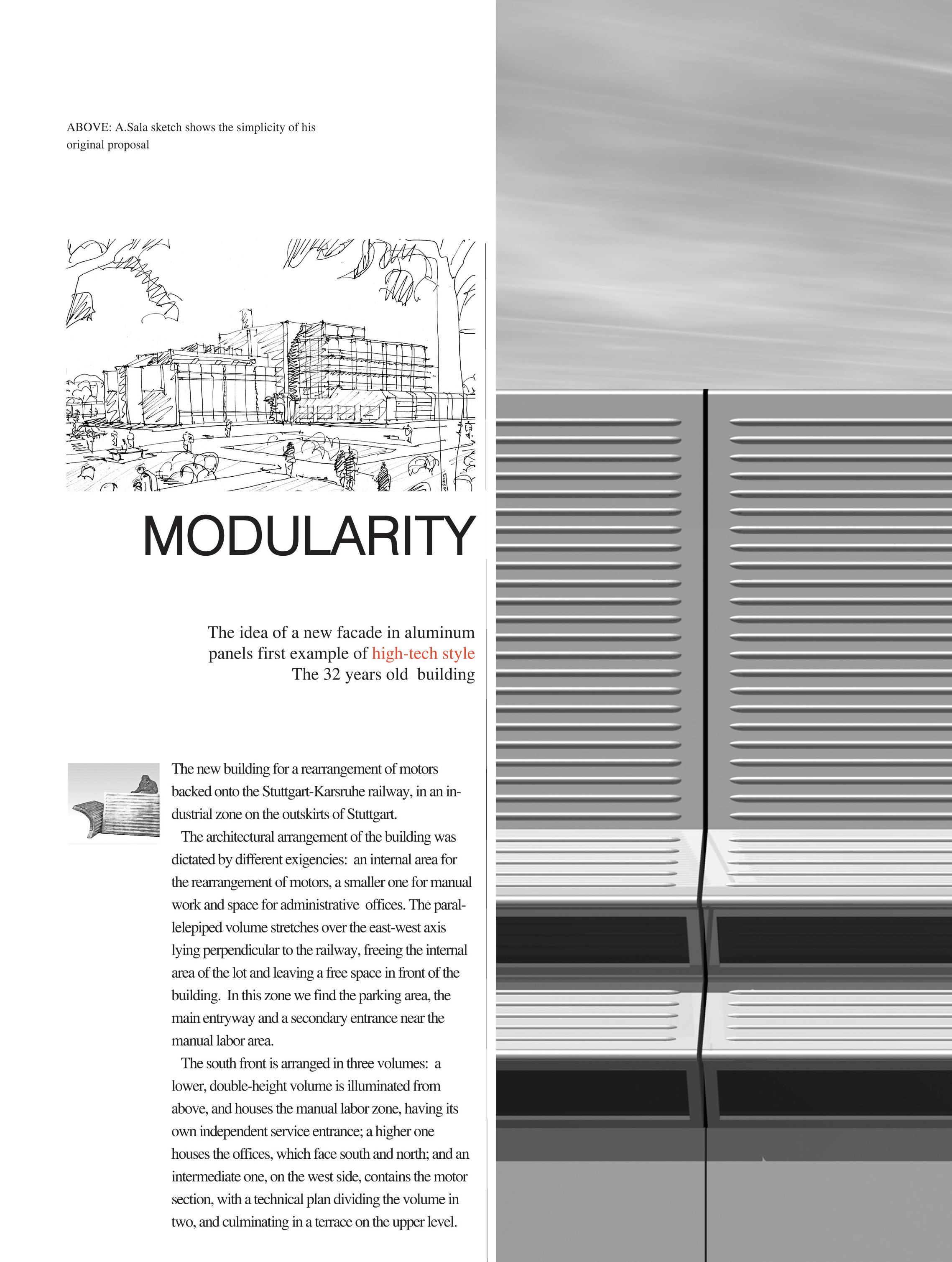
Alejandro Sala RIBA Architect RESUME WORK 24
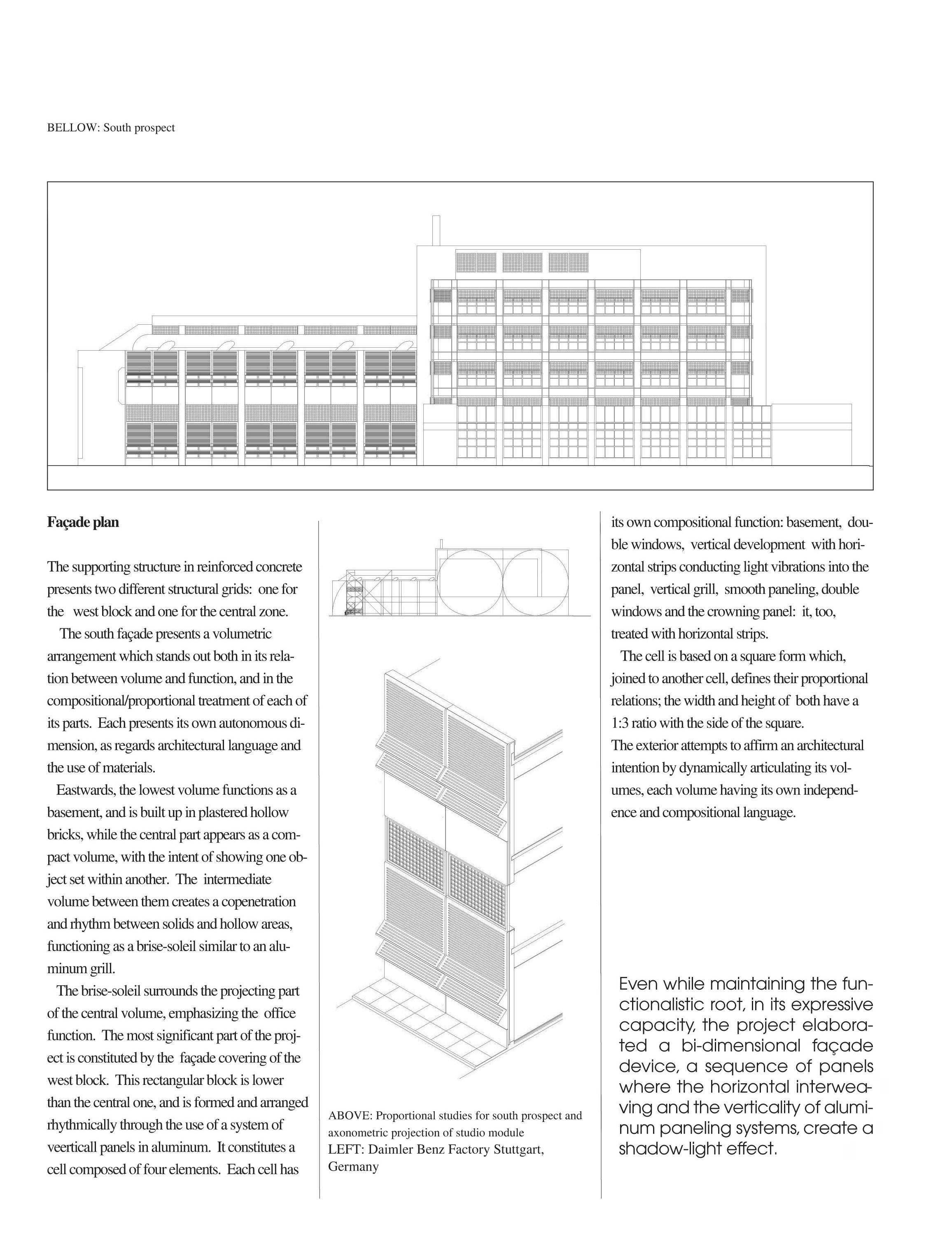
Alejandro Sala RIBA Architect RESUME WORK 25
IFIS BANK
EXTENSION OF THE
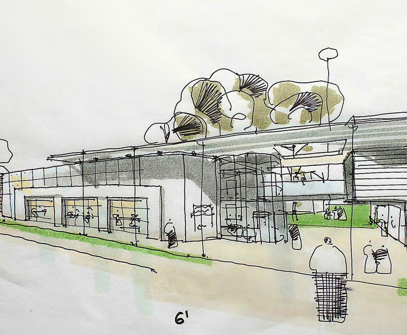
TOP: Studie Sketches Main entry Park and Relationship The Geometry
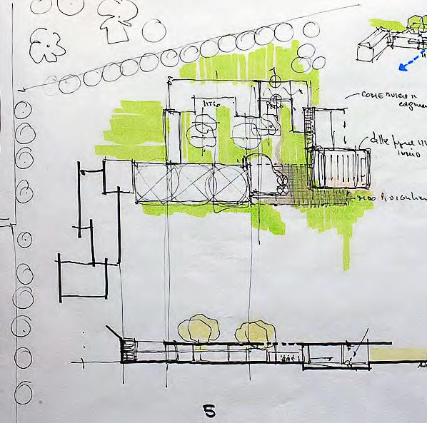
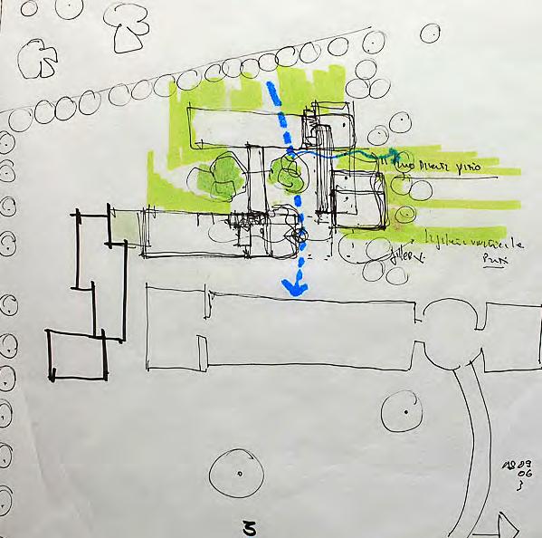
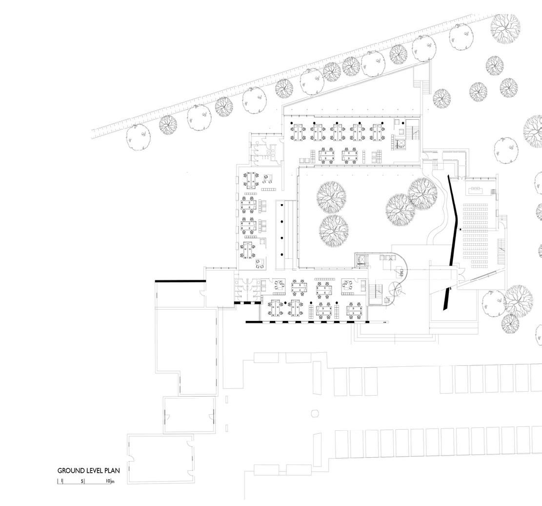
RIGHT: LOW: Ground level plan
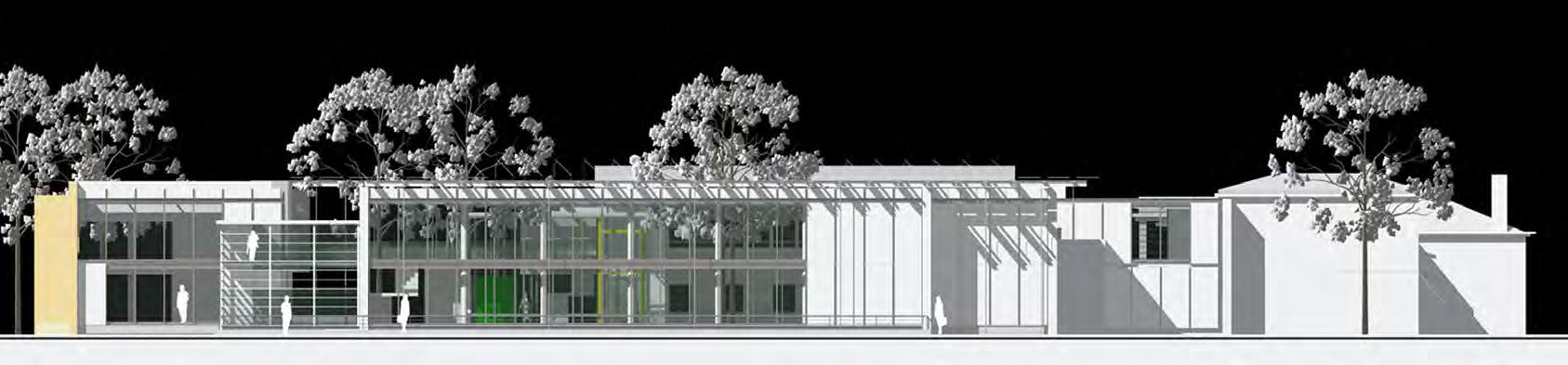
BELOW: South Front Administation offices
OPPOSITE PAGE
TOP LEFT Model of Foyer
TOP RIGHT
Detail of the supporting structure is not visible, because it is under the coating. The metallic structure supports the photovoltaic panels (inclined 45 grades)
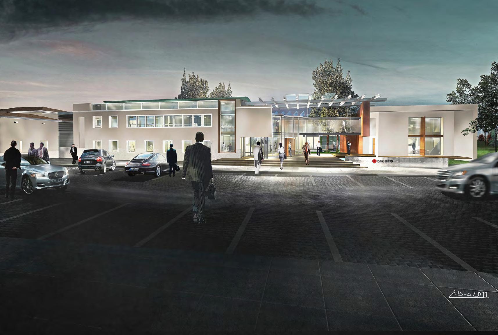
LEFT: Illutration - View of main entry
BELOW: Computer model
 Drawing, rendering sketches and models by © A.Sala
“ The idea of the project is based exactly on the mutual relationship between the functional parts and the nature of the site itself,...the parts organically become one with the surrounding park...”
RESUME WORK Alejandro Sala RIBA Architect 26
FORMER STABLES VILLA FURSTENBERG
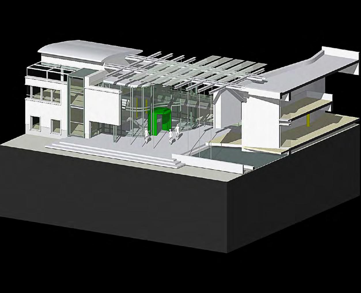
The extension project for IFIS Bank S. P. A. aims at the extension of the former “stables” adjacent to Villa Furstenberg, an of the family’s properties. A building that is in itself a pearl, located in the province of Venice, immersed in a park of lime trees.
The new project is an expansion of the old building, made of four different buildings, which is court-shaped, maintaining as its core the trees of the park. The entrance is parallel to the car access of the old building, in which a loggia serves as the entrance hall.
Two independent accesses lead the guest to a volume holding the double-height auditorium, and the Bank offices. A bridge-shaped volume links the two parts of the building and allows circulation in all the functional precincts of the Bank, on the first floor.
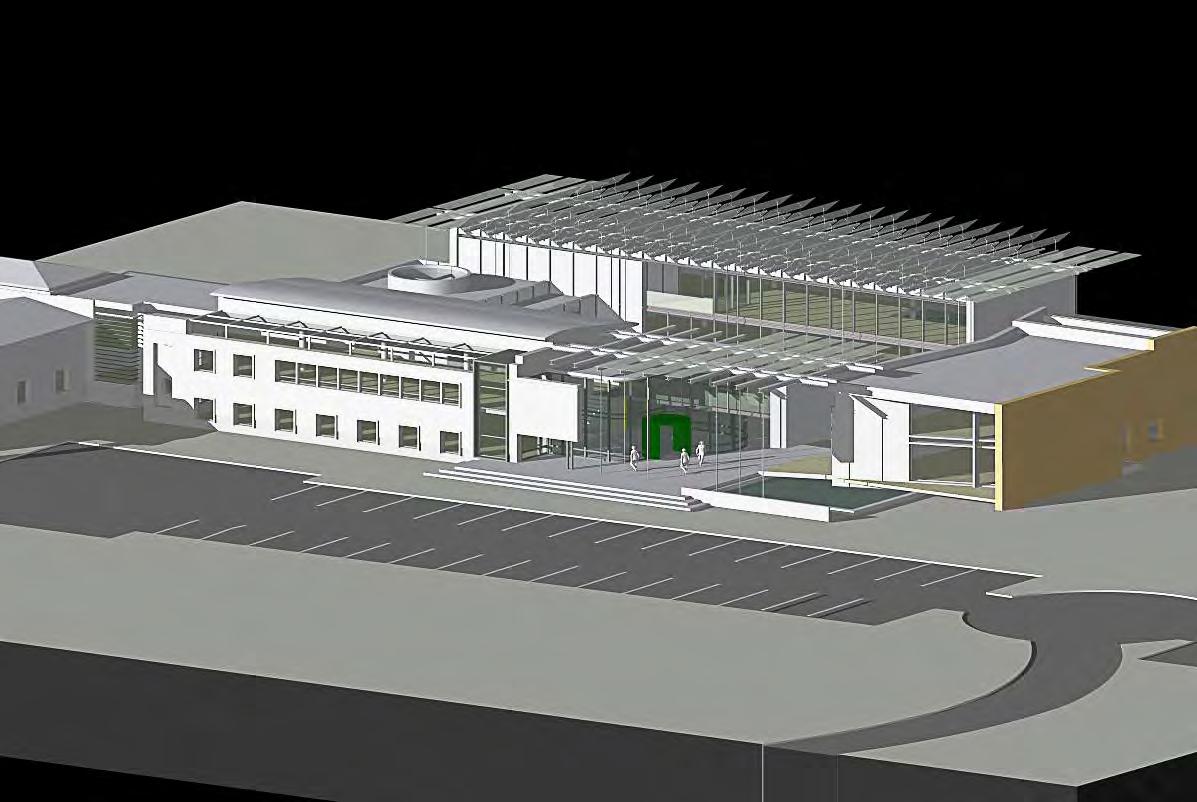
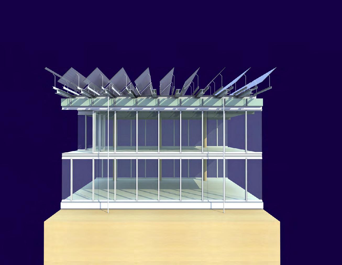
The building has a façade with two parallelsystems of openness, each assuming different roles in the composition of the building.
The front façade transforms into a mask, the surface becomes a balance mark of full/empty elements that relate in height with the openings of the old building.
The main volume in front of the parking has an identity and a figurative language that are different from the rest of the building. The loggia of access is an open space-shaped, they open on the park and on the court, bringing light and nature inside the building. Which has façades made with painted /varnished /lac-queried steel panels. A certain expressivity and language are recognizable in the general composition of the building parts, in which each element is recomposed in the complex. The “Piano Forte”- shaped element of the lobby contrasts the rigorous geometry of the entrance volume, as well as the auditorium volume, and the administration offices’ back volumes.
RESUME WORK Alejandro Sala RIBA Architect 27
SANTA BERTILLA COMPLEX RESIDENCE & RETAILS
Alejandro Sala RIBA Architect RESUME WORK 28
Alejandro Sala RIBA Architect RESUME WORK 29
MOTOR CITY
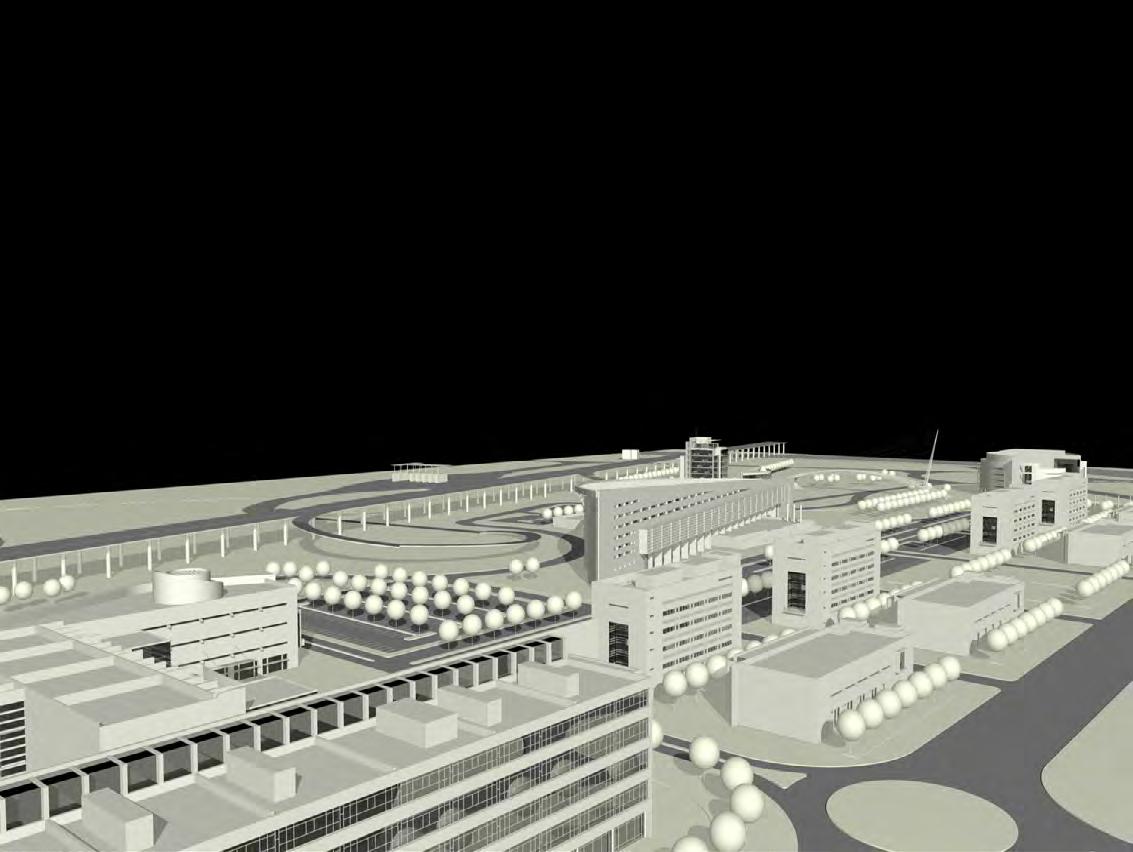
The Project develops on a lot of 233.000 sq.m. The program comprehends 28.000 sq.m of commercial buildings, an exhibition space of 32.000 sq.m, a hotel of 7000 sq.m, a museum of 25.000 sq.m and a multifunctional building of 6000 sq.m.
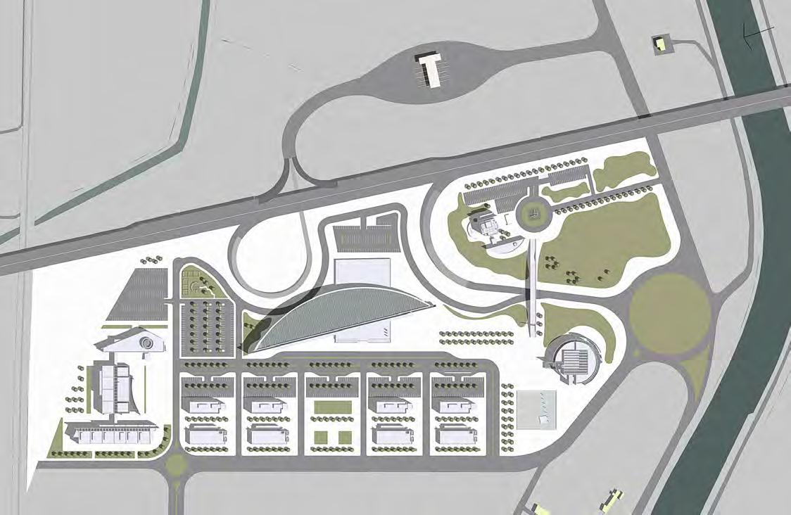
Urban planning:
The project is organized in three well-distinct areas, the former destined for the hotel, a big auto fair, a museum of auto, a multifunctional building and retail commercial buildings
Cohesion and integration of the three systems (buildings and green areas) are achieved through a system of public spaces..
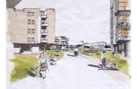
It is a high-quality pedestrian space, sewing up the different urban systems, where internal gardens and squares, linked-up through passages, offer perspective views at ground level, creating a totally open structure.
Offices and commercial buildings are joined together in a linear system, the repetition of the road-front underlines the contraposition of other typologies, each with its own identity and architectural shape
EX MACEVI AREA
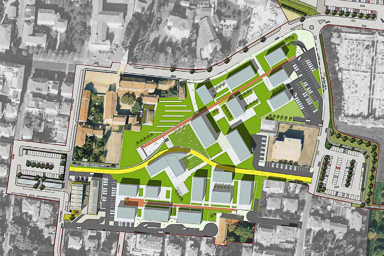
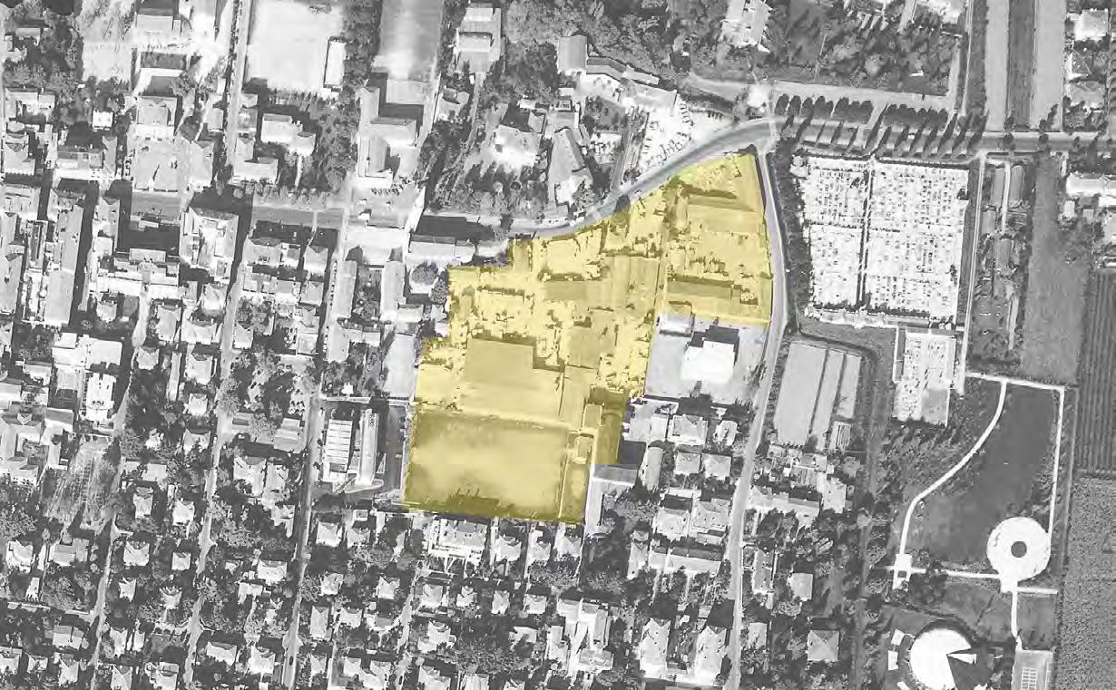
The area “Former Macevi” area at the core of Mogliano Veneto in Northern Italy, was the object of various adaptation code variations, with a general surface of 73.000 sq. m.
The profiles of the relatively closed and narrow streets related to the spatial have been an urban model of the Historic European City as squares, arcades, the road, dimensions, urban hierarchies...
The idea of this project is more diverse with opened gardens interconnected by a system of “Pedestrian Walkways” which offers surprising views and provides a very open structure at ground level...”
Urban Design
• 1 – Urban front
Restoring the idea of the urban front.
AREA
• 2 – Permeabilit + circulation
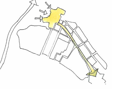
Permeability between north and south and reduction of the street system to give the central area back to pedestrians.
• 3 – Urban block
A new chess-board-shaped system of urban blocks, responding to the existent city.
“…THE PROJECT ORGANIZED AND HIGH-QUALITY PEDESTRIAN SPACE, SEWINGUP THE DIFFERENT URBAN SYSTEMS WHERE INTERNAL GARDENS AND SQUARES, LINKEDUP THROUGHOUT PASSAGES, OFFER AMAZING PERSPECTIVE VIEWS AT GROUND LEVEL, CREATING A TOTALLY OPEN STRUCTURE…”
“ ...THE AIM OF THE PROJECT IS THE CREATION OF AN OPEN CITY RESULTING FROM THE SYNTHESIS OF THE CORRIDOR CITIES - A OPEN CITY WHIT A WIDE CENTRAL GREEN
Alejandro Sala RIBA Architect RESUME WORK 30
IN WHICH THE DIFFERENT BUILDINGS BECOME ACTORS IN THE URBAN SCENES...”
MASTER PLANS
Flexibility and continuity with typologies responding to the different urban situations created by the project.A district having its own identity and individuality.
• 4 – Central Square
A central area is emptied out in order to leave space for a public space.
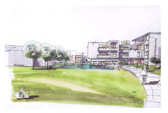
• 5 – Green areas
A system of green areas redefines the back of the church area as well as the other systems urban into the project, such as pathways, residential zone, and retail.
6 – Typol
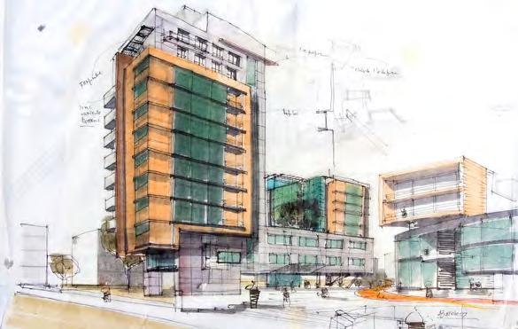
REDESIGN PIAZZA BARCHE XXVII OTTOBRE
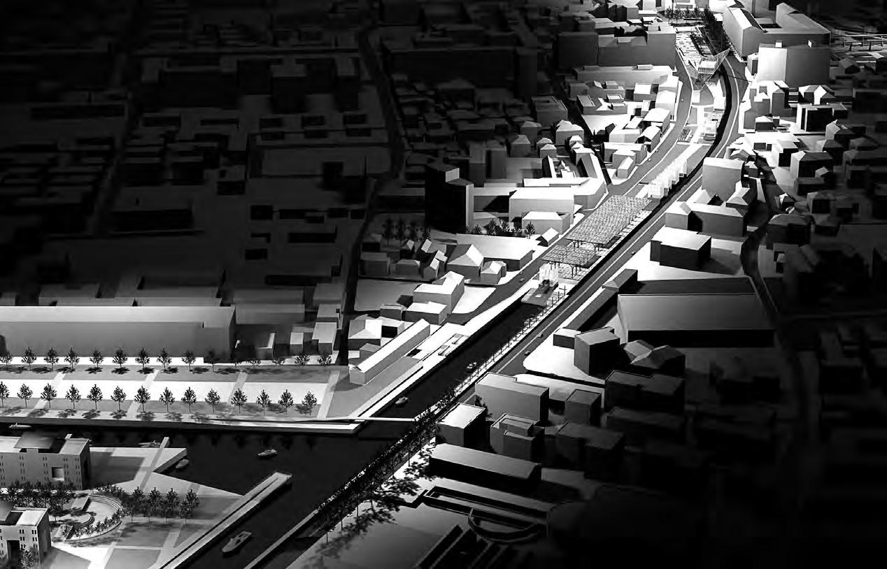
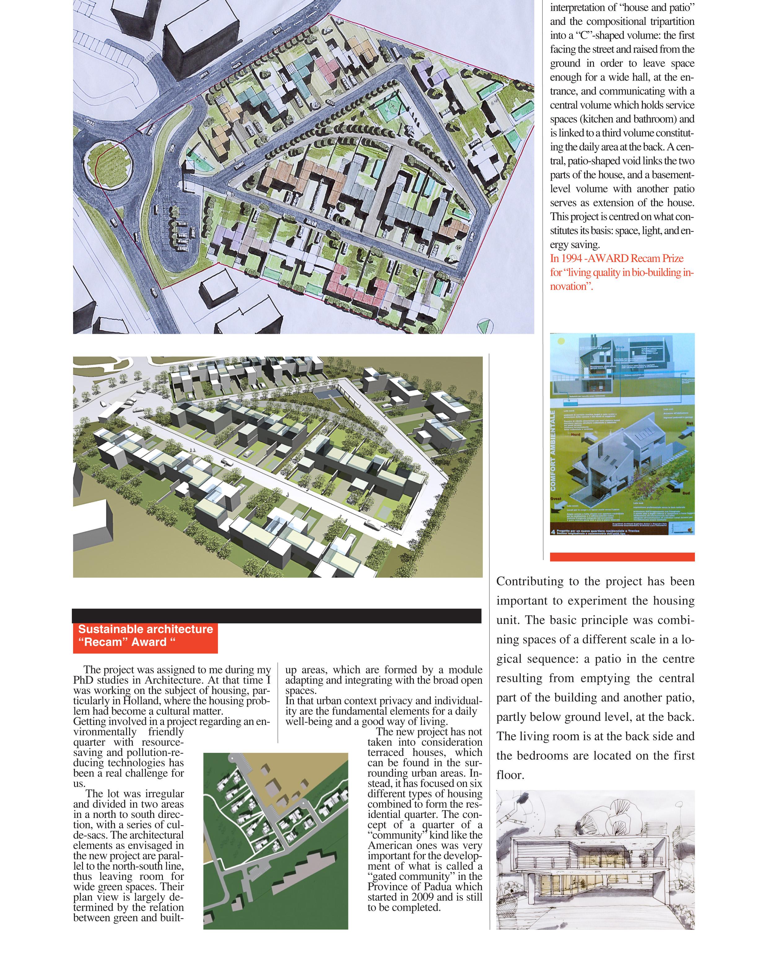
Project of urban renovation at a large-scale, which is aimed at strengthening the central area through a space restructuring intervention, facing the same kind of problems that affect cities of similar size.
Project of urban renovation at a large scale, which is aimed at strengthening the central area through a space restructuring intervention, faces the same kind of problems that affect cities of similar size.
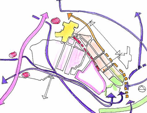
Urban Traffic:
Converting the central area into a limited new concept of traffic according to the accessibility level.
Renovation
Revitalize the completion and renovation of some urban areas such as housing, street, district and city. Analyzing the different levels of network and traffic between them
Promenade Architectural
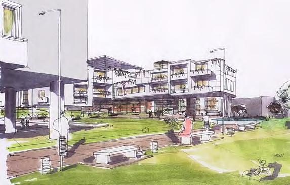
A Promenade Architectural ensures a better exchange in the urban area between the Northern and Southern parts of the city and its heritage buildings. Where The green areas emphasize the new open spaces and therefore enhance the different urban scenarios.
New Market
A new market design on the prmenade in modules creates great flexibility for growth a time
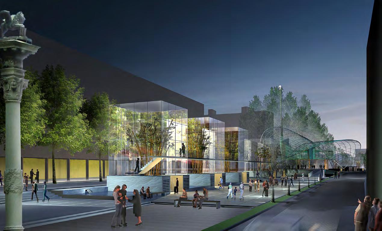
Paraboloid-shaped structure
A winter garden standing in the background of Corso del Popolo completes the architectural promenade’, inside at winter garden has designed new Public Library.
TOP: Studie Sketches
Urban Traffic and Network
BELOW: Promenade Architectural Belo
New Square
Piazza XXVII Ottobre, placed on the Southern side, reshapes started promenade the city entrance with greenhouse-like transparent vertical elements which let the city be seen on both sides. At the base, a staircase leads into the underground public car parks.
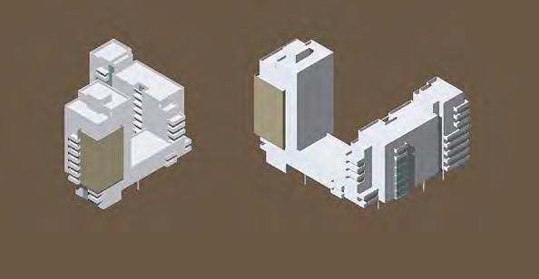
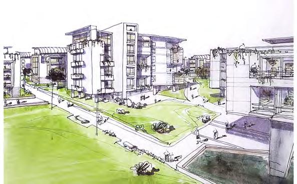
TOP: Studie Sketches Green Areas into the project, such as pathways, residential zone, and retail.
BELOW: Studie Tower Building at Central Square
Alejandro Sala RIBA Architect RESUME WORK 31
“…ENHANCE THE ACCESSIBILITY, USE OF BUILDINGS AND URBAN SPACE RENOVATE THE CITY THROUGH A CLEAR READING OF THE COMMUNICATION BETWEEN THE DIFFERENT AREAS, CREATING A HIGHQUALITY URBAN ENVIRONMENT...”
Alejandro Sala RIBA Architect RESUME WORK 32
Alejandro Sala RIBA Architect RESUME WORK 33
PORTO MARGUERA
INDUSTRIAL RICONVERSION MASTERPLAN
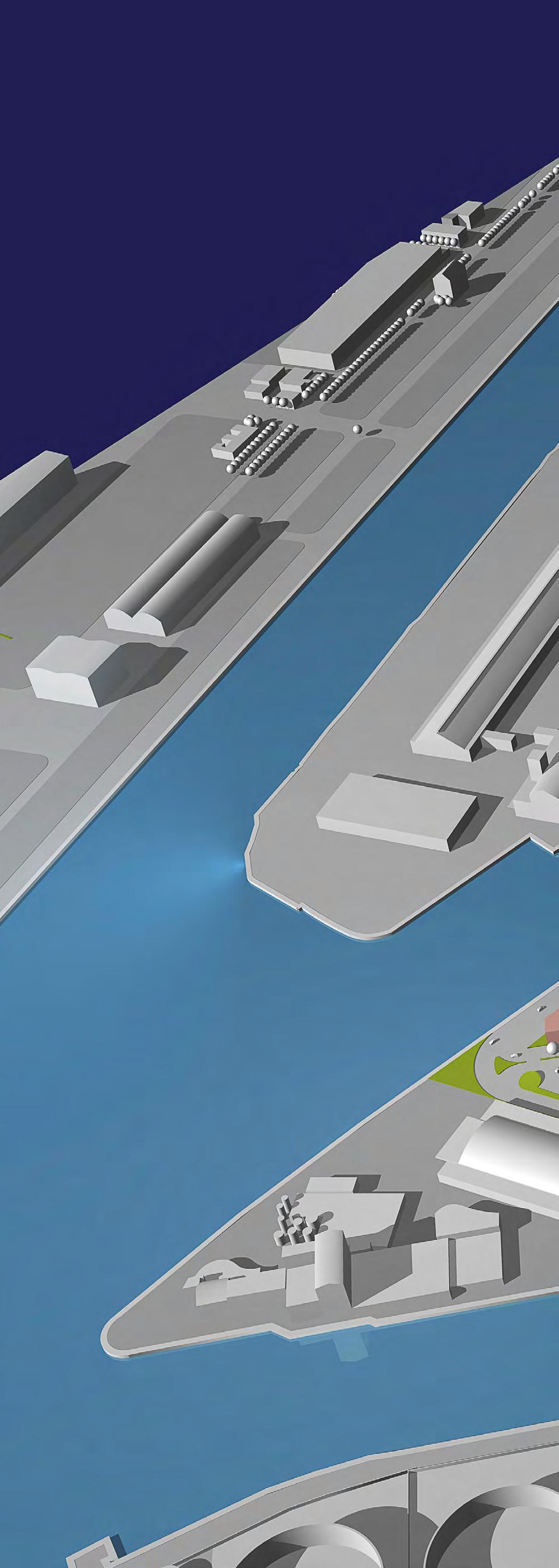
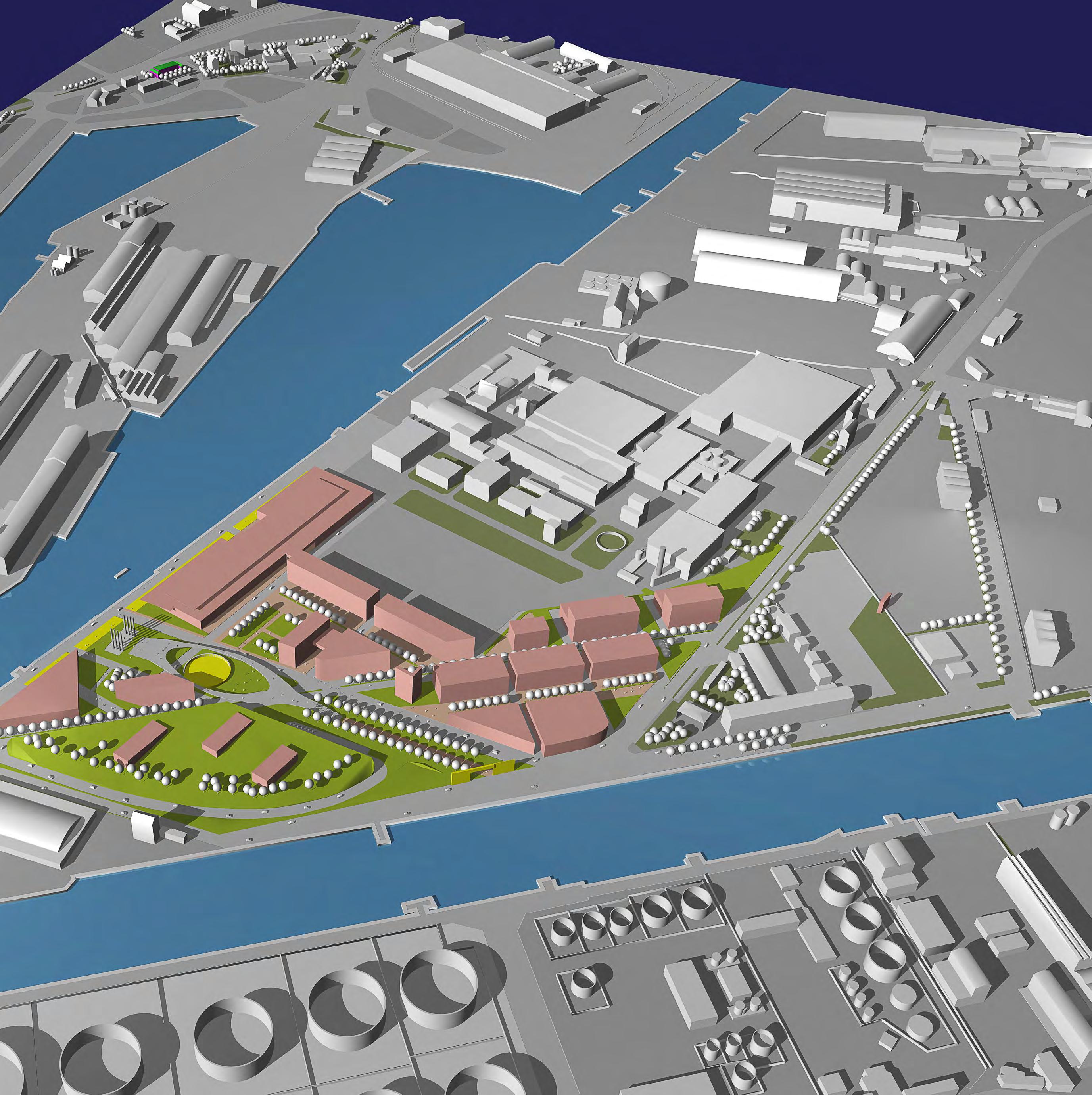
“Intermodal Marghera Ltd”, former “Vetro Coke” and “Italiana Coke Plc”, an Italian company for the production and trade of coal, was having a program of reconverting its area of industrial production in Porto Marghera.
THE AREA
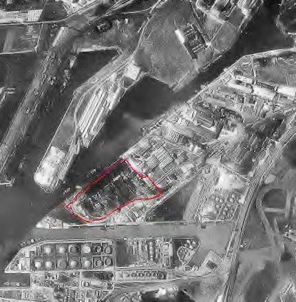
That plan integrated and interacted with the buildings in a sort of continuity in space and time. According to the criteria contained in the Town Planning Scheme for Porto Marghera, the intervention on the estate regards a building area of 150,000 square meters within an overall trapezium-shaped area of 102,800 square meters, which is limited by two waterways: Canale Industriale Nord (Northern Industrial Canal) and Canale Bazzera (Bazzera Canal). These waterways meet in the Canale dei Petroli waterway connecting Malamocco’s Port to the first industrial area of Porto Marghera.
THE PROJECT
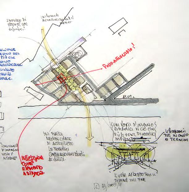
The project envisages the preservation of the north-eastern groin arched entrance to the lot near Sirma’s industrial production area of refractory materials. The same applies to the meteoric water settling tank enhanced by a promenade connecting the two canals through the reuse of a trachyte paving, taken from the tracks that were used for displacing materials from an industrial unit to the other and ran parallel to the Northern Industrial Canal.
It is a hierarchic circulation system that redefines the several micro areas according to their use, size, scale and urban structure. An avenue divides the lot in two, eastwards and westwards, in order to distribute and limit traffic flows from the outside. Moreover, a perimeter system has been designed to clear traffic from the area.
A series of elevated architectural elements create a hierarchy among the built-up units as well as poles of attraction, such as little squares in different scales surrounded by other buildings with an administrative function. The skyline is dominated by higher elements toward the interior area of the lot, whereas they progressively decrease in height toward the Lagoon of Venice. In that direction, an open space with a double urban function becomes both an underground car park and a park with an awesome view of the Lagoon.
Sketches,
Oposite Right Photo Site Plan and Project area The Idea: Studie Sketch
and models by © A.Sala
Model View from the area docks
“ The idea of the project is based exactly on the mutual relationship between the functional parts and the nature of the site itself,...the parts organically become one with the surrounding park...”
Alejandro
Architect RESUME WORK 34
Sala RIBA
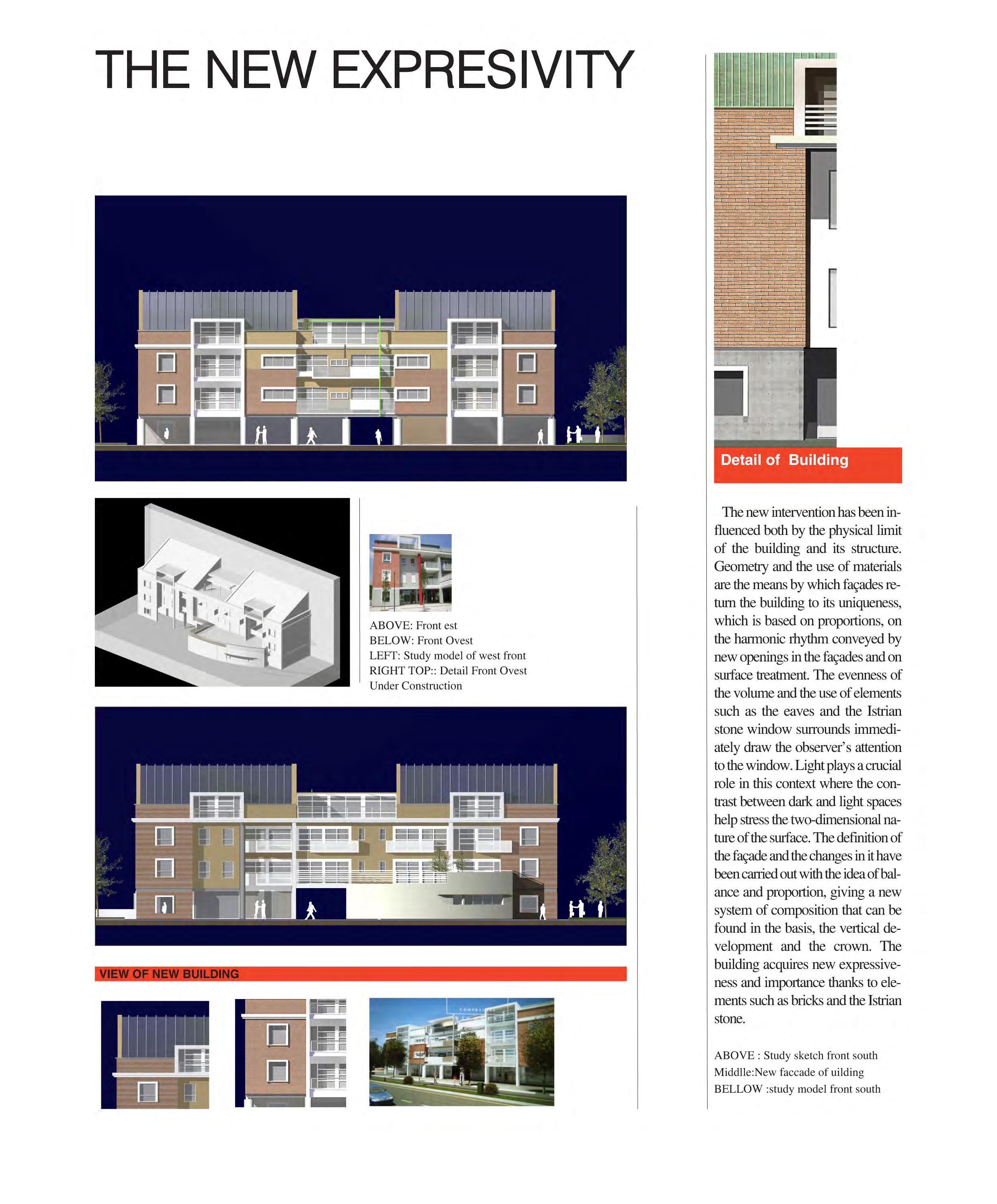
Alejandro Sala RIBA Architect RESUME WORK 35
Alejandro Sala RIBA Architect RESUME WORK 36
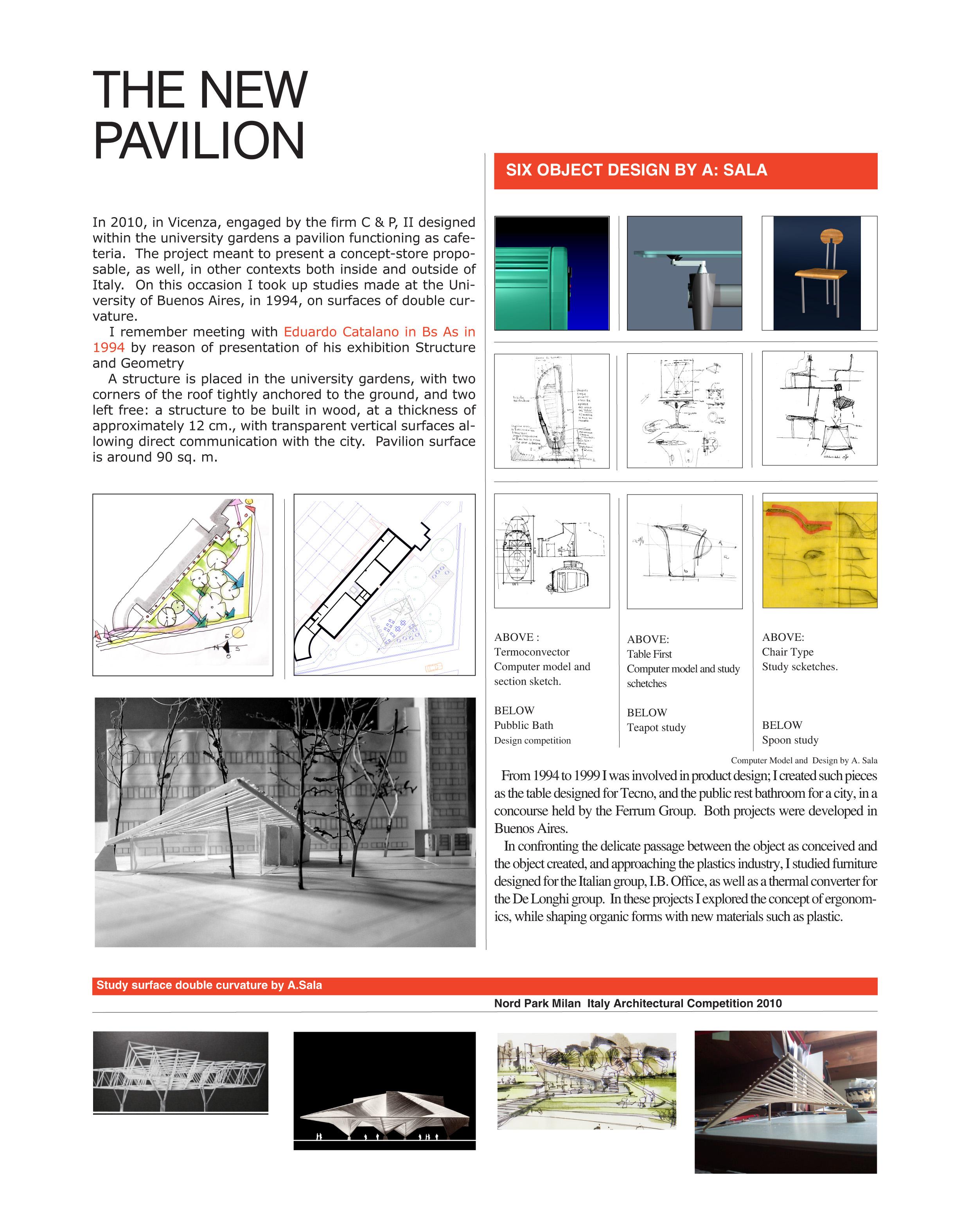
Alejandro Sala RIBA Architect RESUME WORK 37
AS ARCHITECTURE + GENERALPLANER RESUME | WORKS Alejandro Sala Architect RIBA e mail : salaarchitect@hotmail.com
