2 minute read
RESEARCH

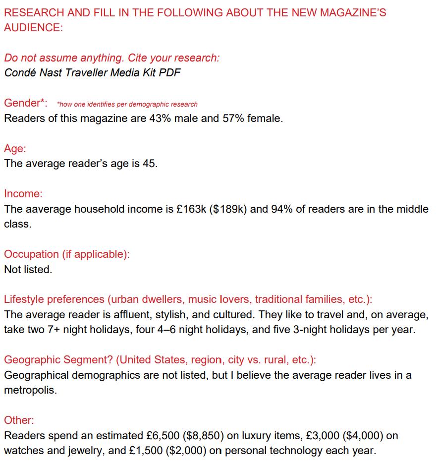
After brainstorming possible ad ideas, I began researching my two publications to find any overlap between their audiences. Through this, I found that readers are over the age of 45, lead a middle-class lifestyle, and kept up with the latest tech, trends, and adventure.
What makes the transition from Men’s Health and Condé Nast Traveler interesting are how different the audiences are. Men’s Health readers are primarily male to Condé Nast’s female audience. Condé Nast readers also earn significantly more than Men’s Health readers, affording them the opportunity for more travel.
Advertisement
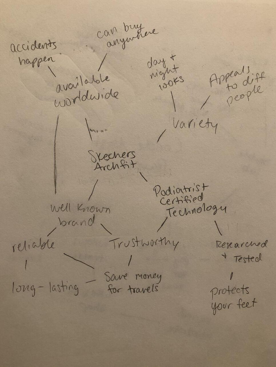
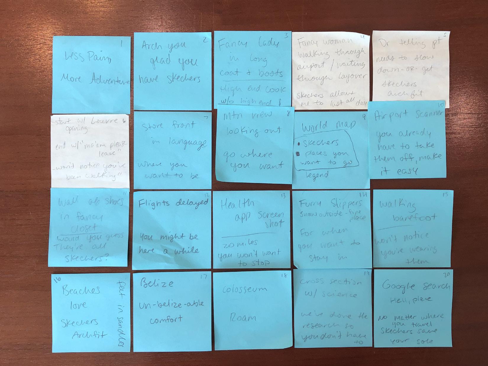
Original ideating for the project included brainstorming 20 ideas for an ad and mind mapping for the Skechers ArchFit line of shoes and Condé Nast Traveler magazine. Of these ideas, I turned three of them into an ad campaign using puns.

Sketches
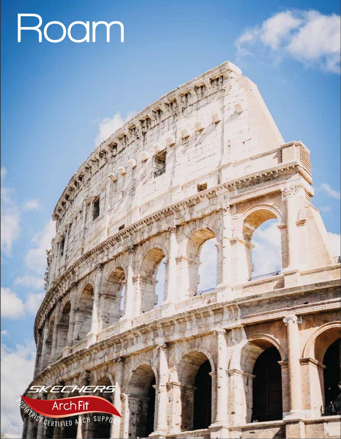
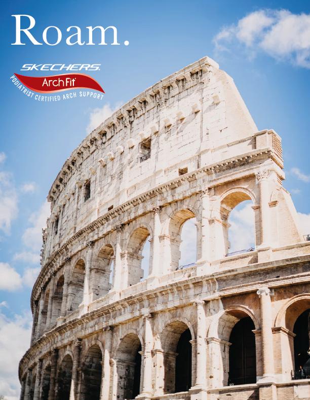
Once I settled on using puns for this ad campaign, I began sketching some ideas! This idea for Roam is where it all started.

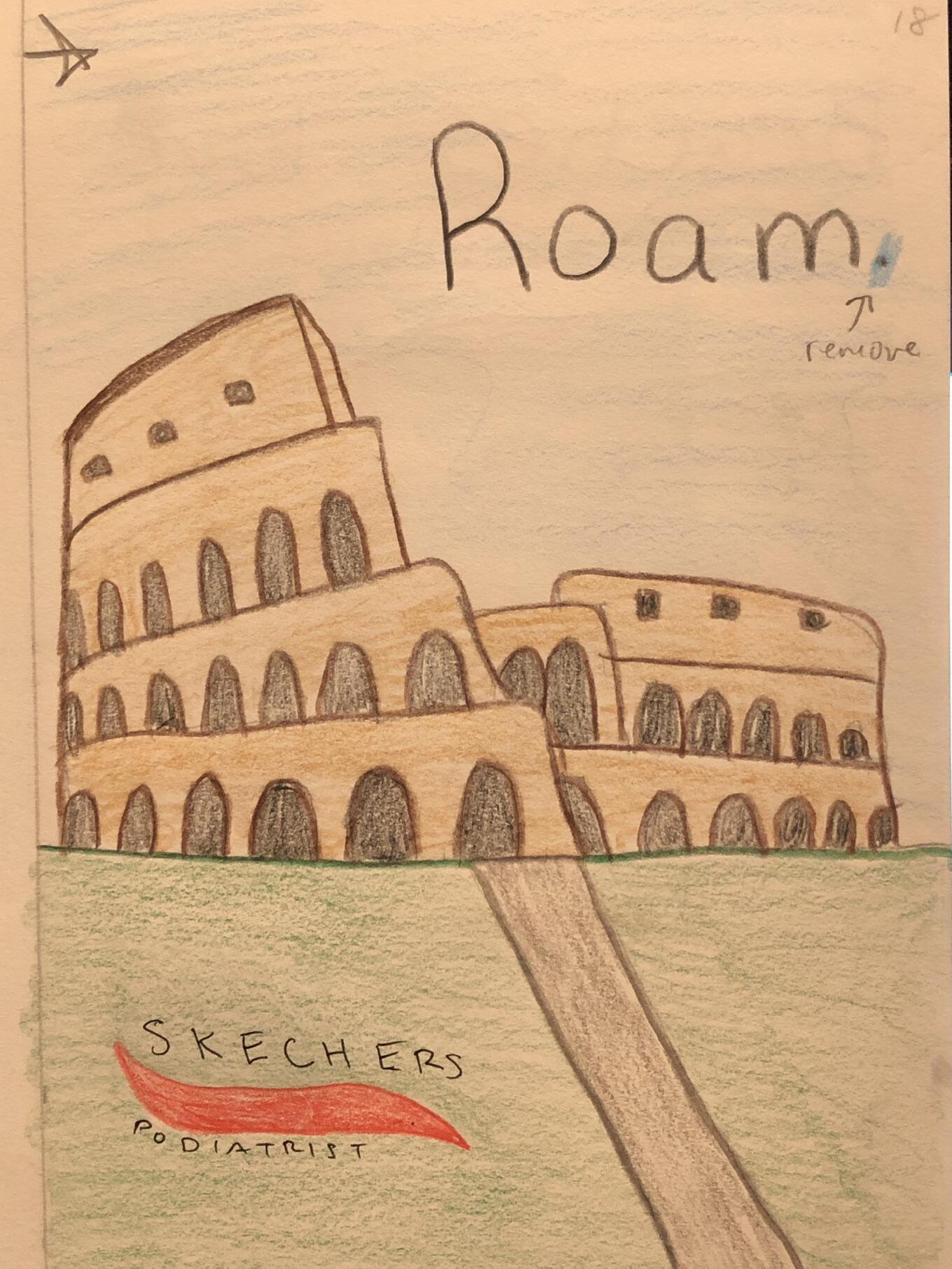
Skechers ArchFit line of shoes also comes as a slip-on which saves you time in the TSA line.
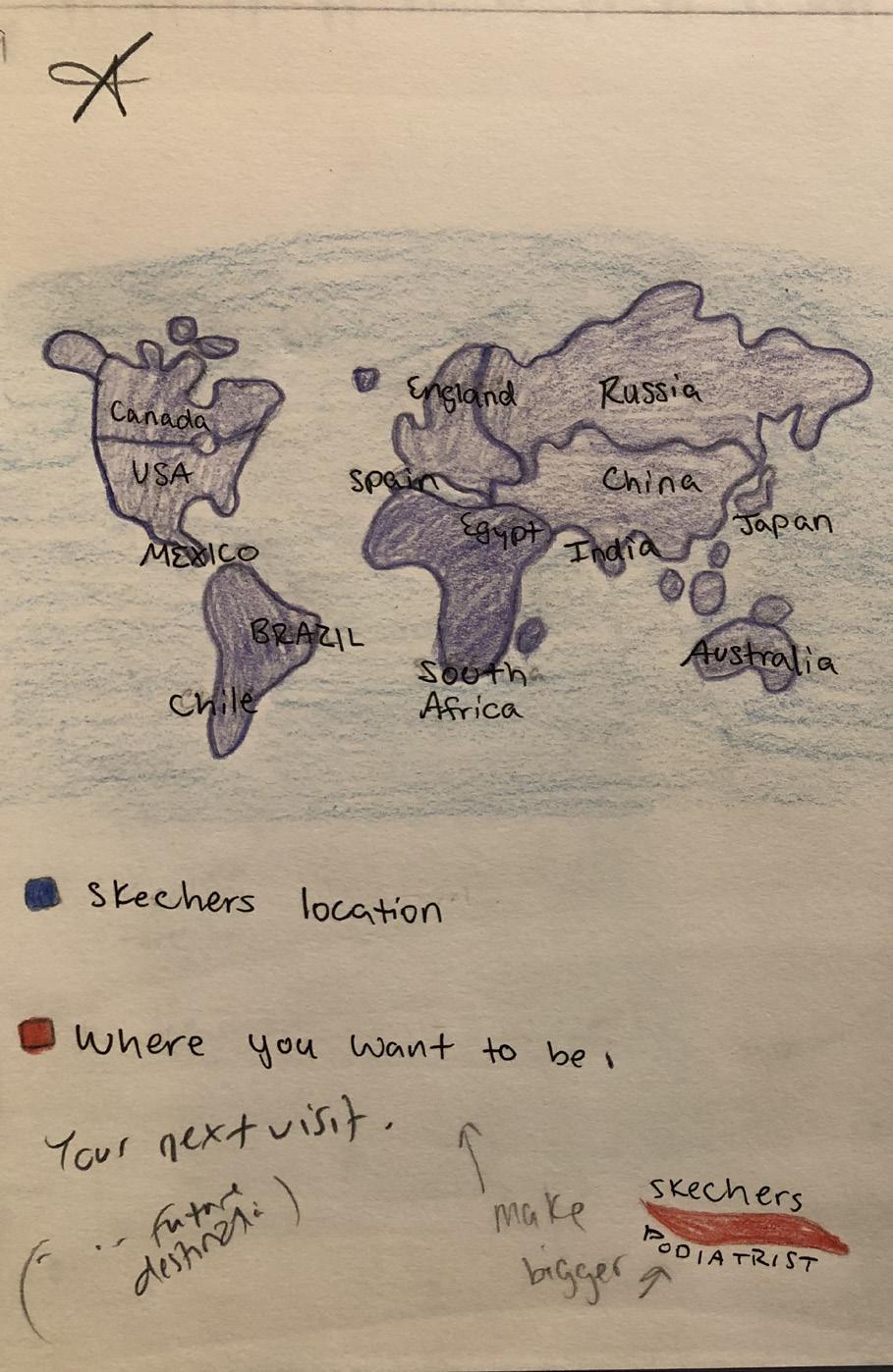
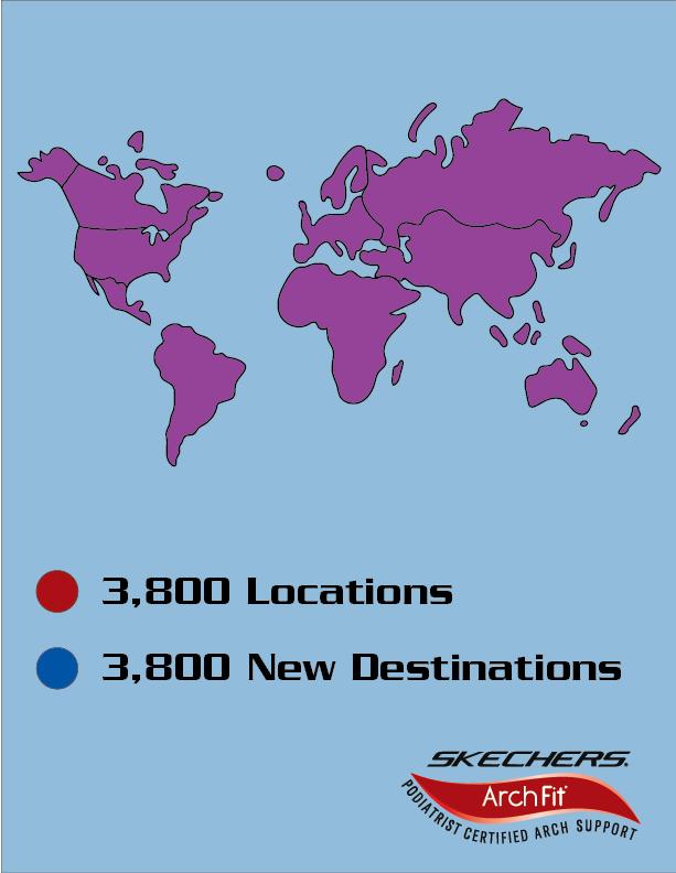
The idea here is Skechers stores are worldwide, exactly where Condé Nast Traveler readers like to go: everywhere!
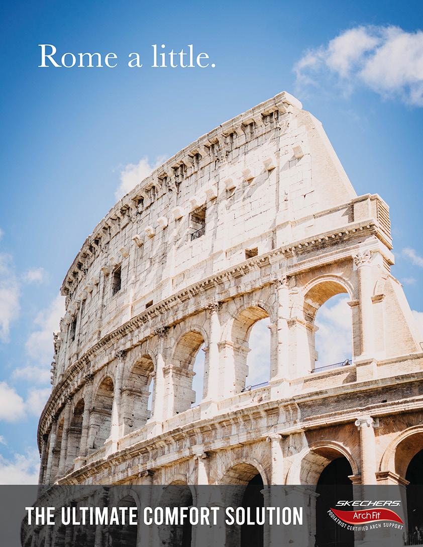
To bring my sketches to life, I searched for images I could use for the background photos. The Colosseum was an obvious choice for Rome, the same with a conveyor belt for the TSA line ad. I traced the purple map using Illustrator to fit with the red and blue legend.

After discussing each ad, I made some changes. The Skechers logo wasn’t visible enough at the bottom of the Rome ad, so I moved it underneath the tagline. I also removed the conveyor belt in the last ad and changed the copy on it and the world map ad.

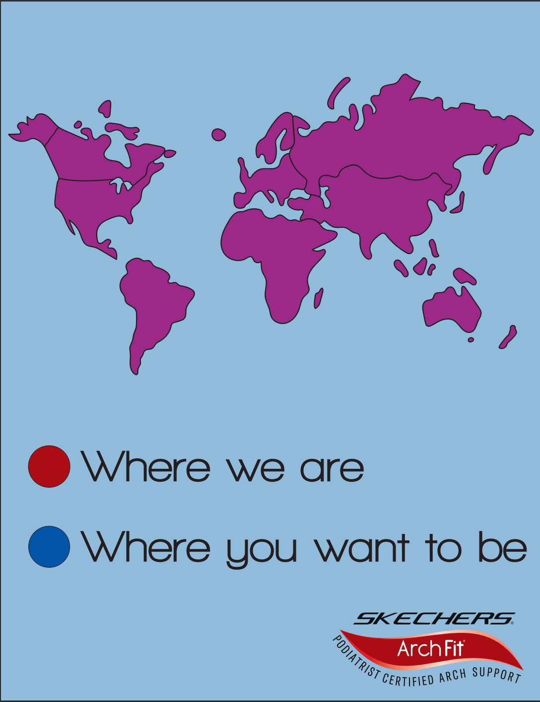

I made several changes between the last round of revisions and these final ads. Considering its location, Roam felt it needed a serif font instead of the Skechers brand sans-serif. Conversely, the world map ad needed something bolder. For that, I used the font that Skechers use, Serpentine. Also, I added the conveyor belt back and used a thicker sans-serif type on the TSA ad.

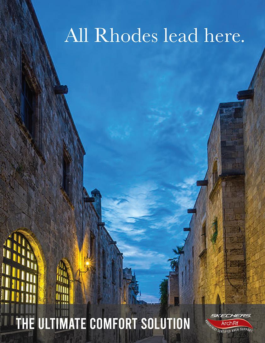
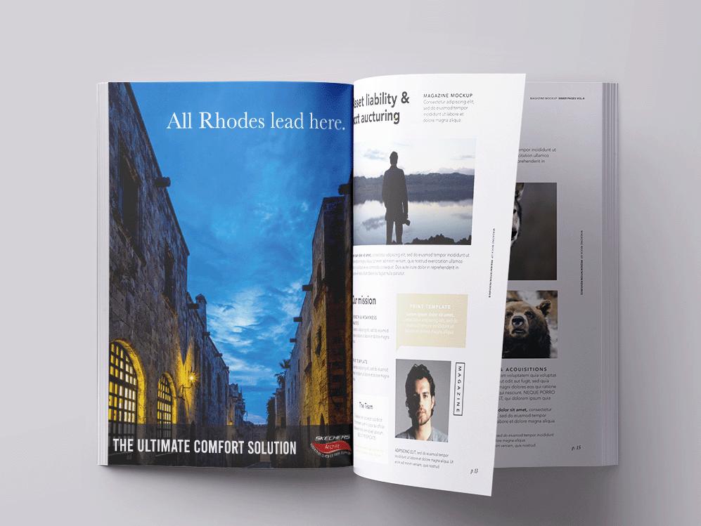
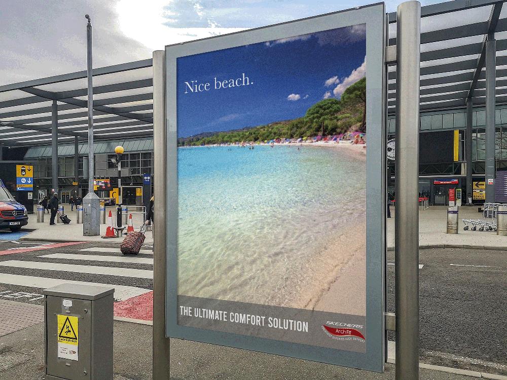
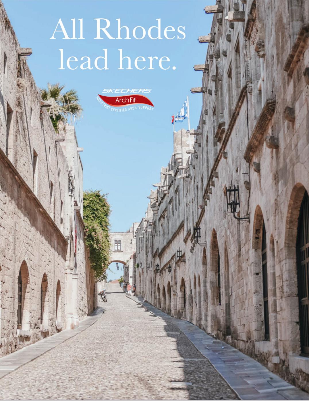
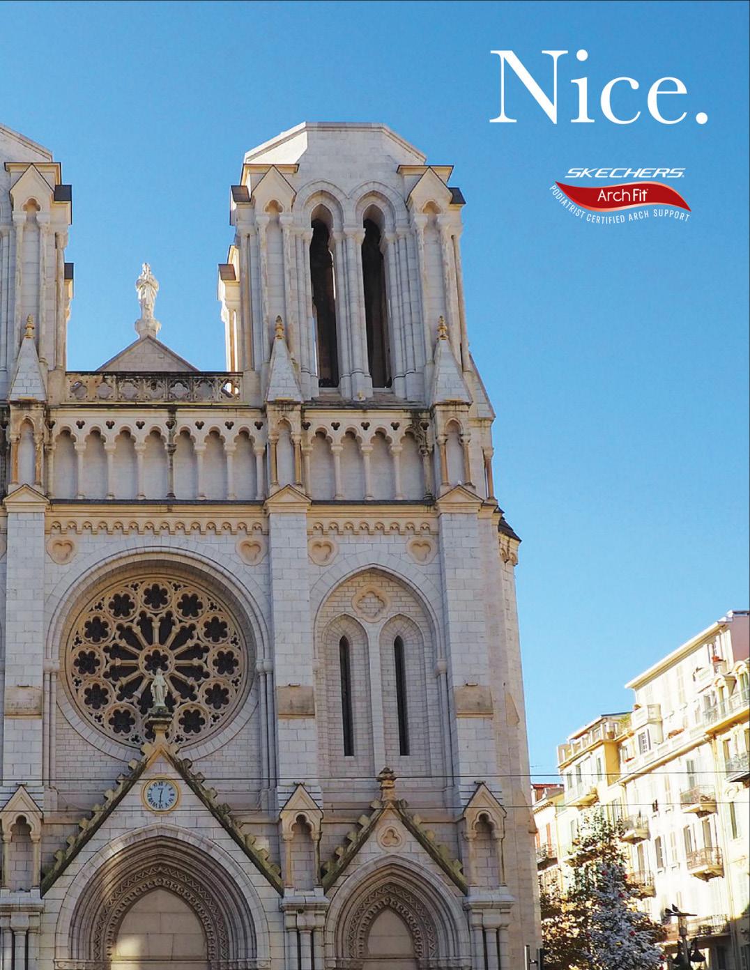
After taking an extended amount of time away from the project, I decided to revisit it and see how I could improve using the skills I’ve learned since. The first step was finding new European cities that worked with the pun theme. Nice, France and Rhodes, Greece are two cities that stuck out and got the ideas flowing.
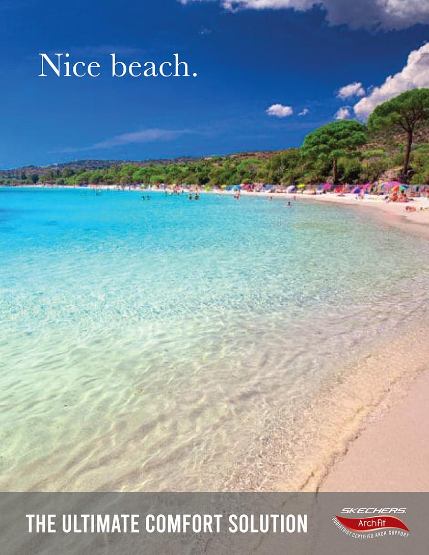
I went a little too far with the building theme set by the Colosseum and didn’t take stock of what the cities I chose were known for. Nice is known for its gorgeous beach, so I changed the photos used in the next round of revisions.
After my first round of revisions, I wanted to make each ad stand out instead of looking all the same. Instead, I looked for photos of Nice’s beach and Rhodes’ Street of Knights. While the Skechers logo fit under the copy in Rome, it didn’t work as well in the other two ads, so I placed it at the bottom with their tag line “The Ultimate Comfort Solution.” This is also where I noticed the Rome/Roam mistake I was overlooking the whole time.

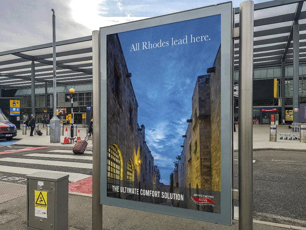
The image I have in this round for Rhodes was nice, but I couldn’t get the copy to fit between the buildings, so I looked again for a nighttime scene to give the ad a warmer feel.