

IN THIS ISSUE
FEATURE ARTICLES:
Featured Artist: Anna Brown
The art of limited palettes
Buy down risk in design work
Camouflage: Art quilts in plain sight hide treasure
road
Mentorship program benefits both participants 31
COLUMNS:
Editor’s Notes
Thoughts from the president
MEMBER GALLERY: A Tale of Two Colors
QUICK NOTES
BOARD MEMBERS
PRESIDENT
Lilo Bowman Fort Worth, Texas
VICE PRESIDENTS
Kathie Kerler Portland, Oregon
Susie Floyd Goodman Bloomington, Indiana
SECRETARY
Clara Nartey West Haven, Connecticut
TREASURER
Shannon Conley Moore, Oklahoma
Jim Arendt Conway, South Carolina
Brenda Bailey-Hainer Broomfield, Colorado
Ana Buzzalino Calgary, Alberta, Canada
Shin-hee Chin McPherson, Kansas
Jette Clover Lier, Belgium
Chawne Kimber Lexington, Virginia
Michael McCormick Tualatin, Oregon
Kestrel Michaud West Melbourne, Florida
Denise Paglio Broken Arrow, Oklahoma
Carole Rossi Sacramento, California
Sue Sherman Newmarket, Ontario, Canada
Melissa Wraalstad Grafton, Wisconsin
Zara Zannettino Highbury, Australia
EXECUTIVE DIRECTOR
Martha Sielman Hebron, Connecticut
For more information on SAQA, contact us by email at info@saqa.art or by phone at 937-912-5009. Explore our varied resources at www.saqa.com. Annual membership is USD $110.
Studio Art Quilt Associates, Inc. (SAQA) is a nonprofit organization whose mission is to promote the art quilt. Through exhibitions, resources, publications, and membership, we seek to increase appreciation for the art quilt as a fine art medium and to support our members in their artistic and professional growth.
SAQA Journal is published four times a year. To submit articles or story ideas, contact Diane Howell, SAQA Journal editor, at editor@saqa.art . Review submission guidelines at www.saqa.com/journal-submit
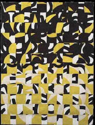
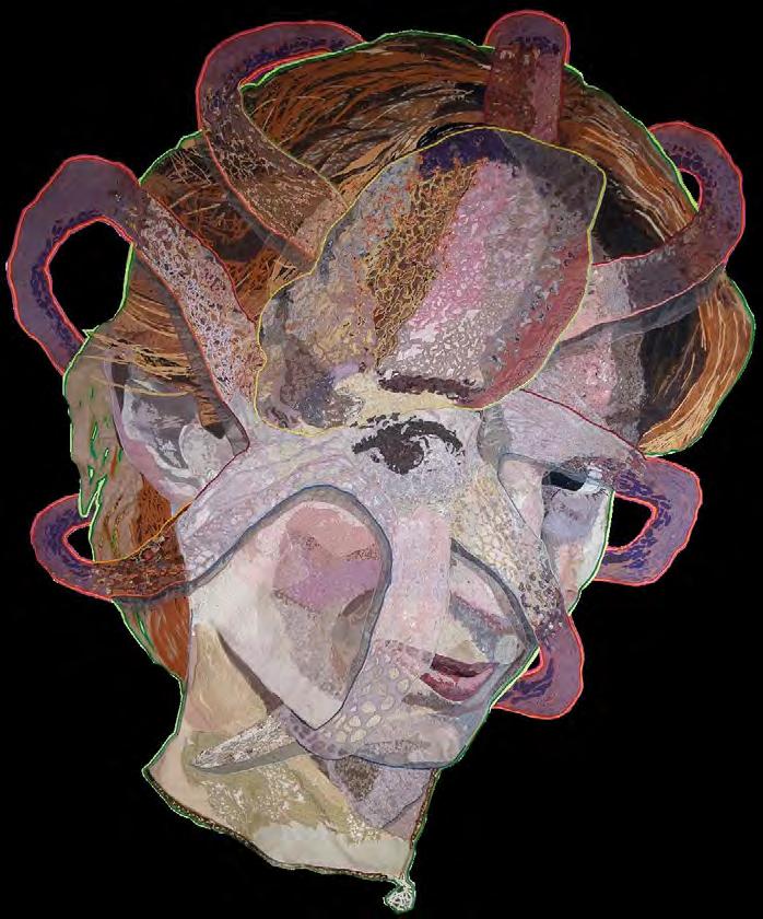
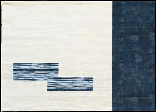
For advertising information, visit www.saqa.com/ads ON THE COVER: Anna Brown REFLECTIONS 5 73 x 53 in | 186 x 135 cm | 2020
SAQA JOURNAL
EDITOR
Diane Howell Chandler, Arizona
DESIGNER
YellowDog Design, Print, Marketing Denver, Colorado
Go Green!
You can choose to read the SAQA Journal online only. Log in to mySAQA (www.saqa.com/mySAQA) and select Manage Your Account.
A colorful story in double time

by Diane Howell
I have long admired two-color quilts. Red and white. Blue and white. Green and white. Black and white. Need I go on? Oh, yes. Yellow and white. This issue started, more or less, with the Member Gallery theme A Tale of Two Colors. I thought it up months ago (typically, the theme deadline is three issues ahead of its appearance in the magazine for production reasons).
results of limited palettes. So, I pulled the Member Gallery from last issue (moving the next in line to its place) and let her ruminate upon all things colorful that come in pairs—or maybe threes. I mean, I said limited, not twos! She went through some of our archives and found many wonderful pieces that captured the imagination. All of
Stark palettes mesh and clash their way into your heart, fighting and commingling until they have written an emotional, visual essay you cannot resist. “
”
I like the stark contrast and power of two colors working with and against each other. Stark palettes mesh and clash their way into your heart, fighting and commingling until they have written an emotional, visual essay you cannot resist.
Then I realized that Deb Cashatt worked the same way with her dynamic pieced art quilts. She must have opinions on the subject! And she did, enough of them to write a story on the fascinating
them are examples of artists who truly understand color. When she was done, I started to see more dynamic pairs. They arrived as if summoned. Obviously, the Member Gallery was a given for this issue. But there is also great use of limited palettes in the work of our featured artist, Anna Brown from Australia. Much of her work is based on the environment in which she lives, and the drama expressed in her work is spellbinding.
Then there are the stories of teamwork. Vicki and Doug Conley travel about in an RV for weeks and months at a time, combining a love of adventure with trips to exhibitions and venues where Vicki teaches. When they needed to deliver and pickup her artwork at Pacific Northwest Quilt & Fiber Arts Museum in La Conner, Washington, they planned a four-month trip to Alaska with stops at the museum both ways.
A successful SAQA mentorship was achieved last year between Canadian Elaine Armstrong and Australian Irene Koroluk. Their shared experience brought new insights to both artists—and they even learned to love the 14-hour time difference! Elaine shares tips for creating a successful mentorship.
Other stories in this issue are meant to let you develop your own sense of give and take. Kestrel Michaud shows how she eliminates risk in quilt making. Deborah Boschert explores the SAQA Global Exhibition Camouflage which I assure you has two-color zebras—and lets readers appreciate hidden treasures.
Two by two. It’s a blessed way to go through life.
Enjoy the read! ■
Be a SAQA volunteer to make a difference
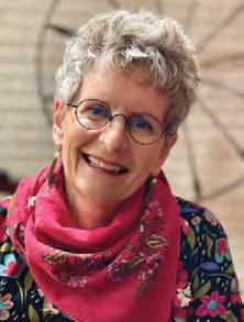
by Lilo Bowman
Two recent events—QuiltCon in Phoenix, Arizona, and the SAQA annual conference in St. Petersburg, Florida—prompted me to reflect on the similarities in how our two organizations approach hosting large in-person events. Each gathering offered a wonderful opportunity for members to connect, learn, share ideas, and be inspired.
Planning and organizing these events takes months—sometimes even years. The SAQA Special Events
valuable insights into innovative approaches for art practices, working with museums, creating more engaging exhibitions, experimenting, and understanding the importance of capturing high-quality images of your work.
Both SAQA and the Modern Quilt Guild are fueled by a small and incredibly dedicated paid staff. Yet the heart and soul of these conferences come from passionate volunteers who believe in what each
The heart and soul of these conferences come from passionate volunteers who believe in what each organization stands for. “
”
Committee and staff put together an incredible five-day schedule filled with diverse entertainment, including: a riverboat dinner cruise, dancing flamingos, interactive music games, a treasure hunt, a flamingo challenge, and adorable baby duck appearances. Thought-provoking and inspirational presentations from world-class speakers provided
organization stands for. It’s their hands, brains, resources, and ideas that help us continue to grow and thrive. Acknowledging and thanking volunteers is important, as it strengthens their sense of purpose and reinforces the feeling that they are truly making a difference. And if you're a volunteer reading
this—yes, you are absolutely making a difference!
Volunteering truly comes from the heart. As someone who comes from a long line of volunteers, I have seen how helping others can lead to new friendships, opportunities to learn new skills, and the confidence to take on more responsibility within an organization. While volunteering is often seen as a way to help others, it also brings so much back to you as an individual. It broadens your perspective, makes you more empathetic, and provides a deep sense of direction and satisfaction as you become more immersed and take ownership within the organization. SAQA becomes your organization and you become part of something greater.
Whether you're a new or longtime member looking to get more involved, why not consider volunteering? SAQA offers a wide range of opportunities, whether you're interested in contributing to a local region, joining a committee, or helping at a quilt exhibition.
Not sure where to start? Contact us at volunteer@saqa.com, and we'll help you find the perfect fit. ■
SAQA welcomes new board members
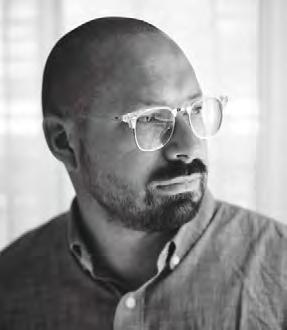
In April, SAQA welcomed three new members to its Board of Directors:
Jim Arendt, Denise Paglio, and Sue Sherman. Each artist is dedicated to moving SAQA forward to continue its mission to support the art quilt and the artists who make them. We also want to thank our retiring board members, Candice Phelan and Holly Brackmann, for their six years of service to the SAQA Board. We appreciate their dedication and support of our programs. Meet our new board members:
Jim Arendt
Conway, South Carolina
Jim Arendt is a professor of visual arts at Coastal Carolina University in Conway, South Carolina. Recently, he received the First Place Award for Signals and Rewards , which was part of In the Round , UNC Asheville’s first biennial outdoor sculpture competition. His work has been included in Fiberarts International 2019 (sponsored by Fiberarts Guild of Pittsburgh), was shortlisted for the 1858 Prize for Contemporary Southern Art (given by the Gibbes Museum of Art in Charleston, South Carolina), and was a 2018 finalist for the Elizabeth R. Raphael Founder’s Prize (presented
by Contemporary Craft, a nonprofit visual arts organization in Pittsburgh, Pennsylvania).
Arendt enjoys working at his mother's Kenmore sewing machine and collecting stories and materials from supporters. He is known for his work with denim.
Denise Paglio
Broken Arrow, Oklahoma
Denise has a lifelong love of fiber. Her quilting began with traditional techniques, but she quickly discerned she preferred more innovative, out-of-the-box stitching methods. This realization allowed her to explore her passion for many different fiber arts—including weaving, needlepoint, counted cross stitch, beading, and embroidery— and to incorporate those works into many of her fiber art pieces. She has served as president of Fiber Artists of Oklahoma for more than six years.
Sue Sherman
Newmarket, Ontario, Canada
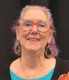
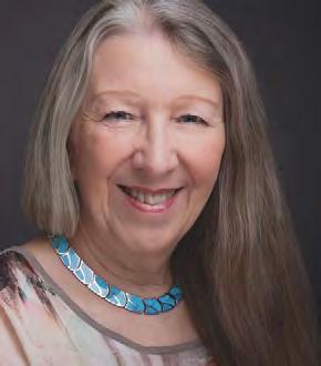
Sue gives the animal kingdom a voice by transforming white cotton into lifelike creatures. Her pieces are created through many hours of precise painting with dyes and thread. She is passionate about protecting Earth’s creatures and their habitats. She also aims to include an element of humor in her work in order to engage the viewer and start conversations. ■
Jim Arendt
Denise Paglio
Sue Sherman
Anna Brown
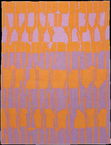
REFLECTIONS DUSK 3
49 x 37 inches | 124 x 94 cm | 2016
This piece captures the movement and dramatic colors of a lake at dusk.
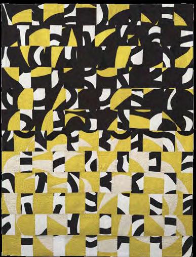
REFLECTIONS 5
73 x 53 | 186 x 135 cm | 2020
The lake near the artist’s home reflects the aftermath of the catastrophic fires of 2019 in Australia: blackened earth and relentless heat from the sun.
by Laurie Fagen
The bold designs of flora in her native Australia inspire the art quilts of Anna Brown, who lives in the Great Lakes region of New South Wales (NSW).
With a degree in graphic design, Brown always knew she would work as an artist, but it wasn’t until her husband’s work took them to Los Angeles for four years in the 1980s that she started to make quilts. With no work visa during that time, she joined a local quilt group.
“I was inspired by the work of so many quilters back then! Michael James, Yvonne Porcella, Jan MyersNewbury, and Joan Schulze, to name a few,” she recalls. “I realized I could combine my love of textiles with my design work, and I was hooked.”
Another textile artist who influenced her work was San Francisco’s Charlotte Patera, who published books on making molas. They are created through an intricate reverse appliqué form believed to have been developed by the Kuna people of Panama; some sources also cite Colombia as a starting point for this technique. The mola was Brown’s introduction to reverse appliqué. She considers it and hand quilting to be her signature techniques. “I really enjoy hand stitching. I love
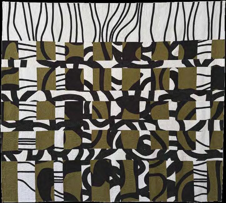
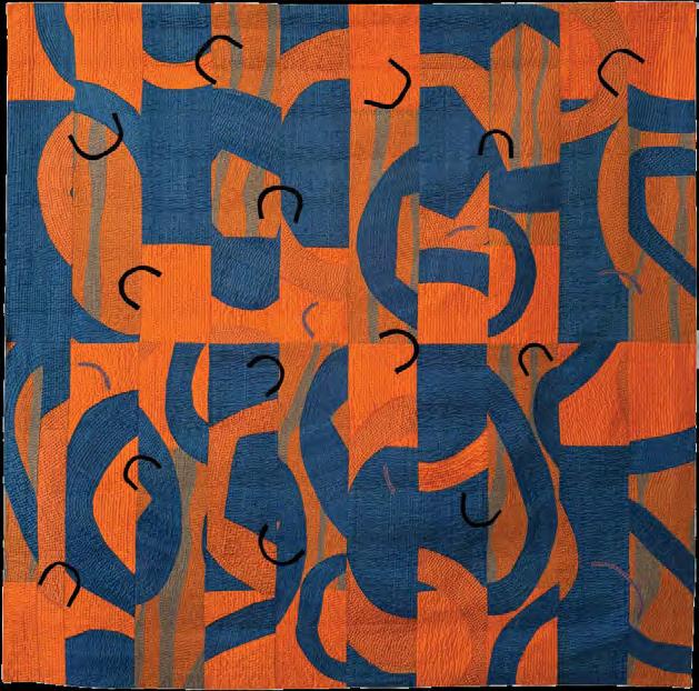
REFLECTIONS 6
62 x 69 inches | 158 x 176 cm | 2021
The lake near the artist’s home reflects the aftermath of catastrophic fires, but with welcome rain and new growth, tranquil waters return.
the feel, drape, and texture of a quilt that is hand-quilted.”
After returning to Australia, she found quilt making was on the rise in Sydney. She did not find opportunities to exhibit art quilts. Through the NSW Quilters’ Guild and her friend, textile artist Judy Hooworth, they set up The New Quilt at Manly Art Gallery in Sydney, inspired by the Quilt National exhibition in the USA.
“This exhibition has endured, but at a different gallery. Along with other quilt organizations in other states in Australia, there are now many more opportunities to show art quilts in a gallery setting.”
Brown’s work is bold, inspired by nature and Australian flora. It often uses two or three colors. She credits her design background for those limited palette choices. “I think being a graphic designer, there’s a desire for
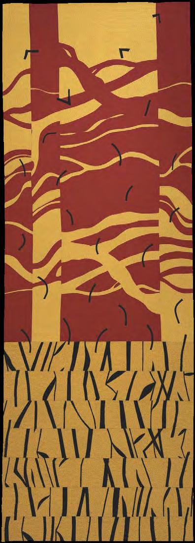
CANOPY 18 Burning
109 x 39 inches | 278 x 99 cm | 2020
On New Year’s Eve 2019, huge fires were burning in New South Wales.
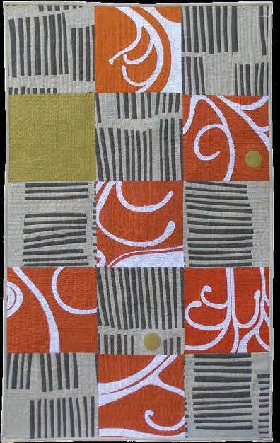
FLORA 4
46.5 x 28 inches | 118 x 72 cm | 2010
Native Australian flora inspired this stylized pattern.
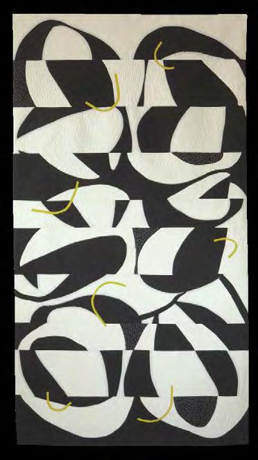
my work to have impact, to stand out, so my natural instinct is to use high contrast in both my fabric and color selection. Now I look at how climate change has affected the flora near my home, and this has influenced most of my recent work.”
Two of her current series— CANOPIES and REFLECTIONS —suggest how climate impacts her sources of inspiration. But her method allows her to enjoy the process of discovery. “Nothing is planned in too much detail.”
“I nearly always have a vague plan or idea. I photograph and draw Australian native plants and from these I work up a design. I either draw this onto paper to make templates or draw straight onto a large piece of fabric. Using raw-edge, reverse appliqué, I stitch the design to make a whole
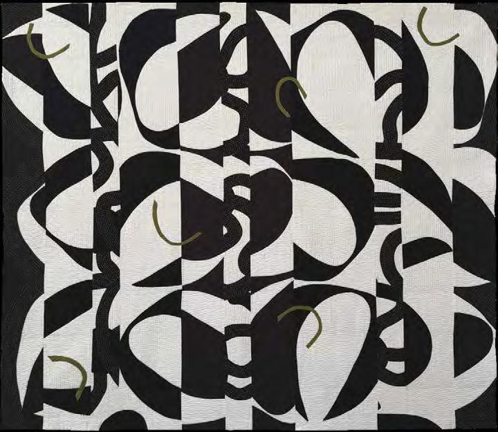
CANOPY
CANOPY
cloth quilt. I then abstract this design further, by cutting the whole cloth into strips or different shapes and repositioning them on my design wall until I’m satisfied with the new layout, and I machine stitch it together. Sometimes I will add commercially printed fabrics or my own printed fabrics into the mix. The hardest part is knowing when to stop!”
Her many awards include first prize for CANOPY 25 at the 2024 QuiltNSW; and top prizes in the Sydney Quilt Show in 2016 and 2012.
She credits her SAQA Oceania chapter—“a very talented group of textile artists”—for introducing her to other Australian and New Zealand artists, and for the opportunity to exhibit her art to a wider audience. She had the privilege of being selected in the 2019
see “Anna Brown” on page 35
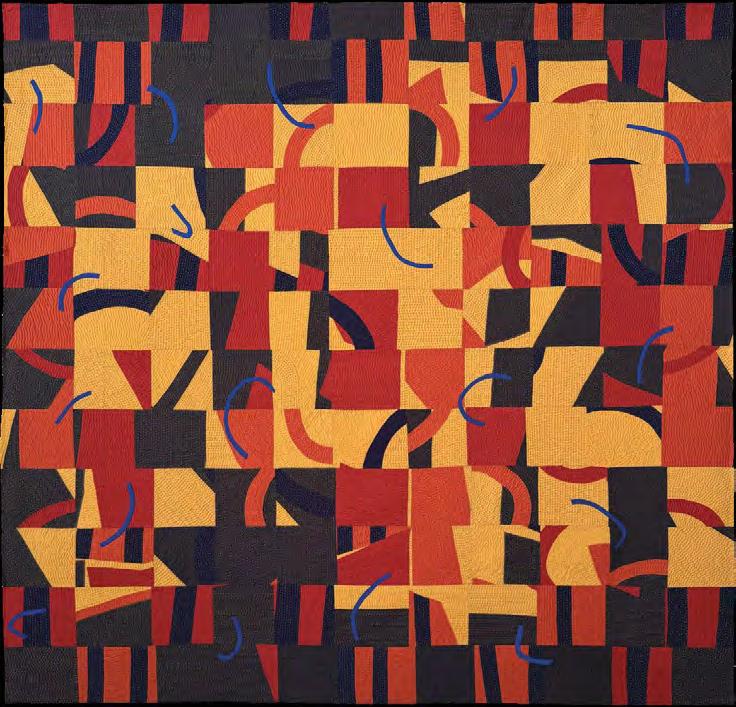
REFLECTIONS
7
57 x 58 inches | 146 x 148 cms | 2022
The tranquil water in the lake is transformed into a cauldron of fire, flames, and ash as the catastrophic fire sweeps through.
CANOPY 27
68 x 70.5 inches | 173 x 179 cm | 2023
Little of the eucalypt canopy survived the ferocity of the bush fires.
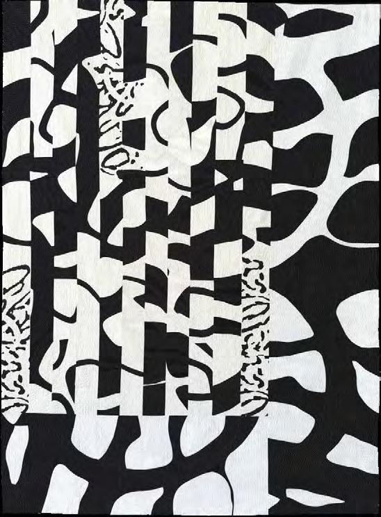
FLORA 1
50 x 37 inches | 128 x 96 cm | 2010
The piece presents a stylized pattern from a series of drawings of Australian native plants.
For the love of color
How limited palettes add meaning, challenge to your art
by Deb Cashatt
When I was asked to write an article on using a limited palette, I thought, “Why not?” Over the past few years, I’ve developed an artistic voice using my symbographs (a term that combines symbol and graph) and just a couple of colors. But why do I restrict my color palette when I love color? I surround myself with color. I dedicated an entire semester to studying color theory (yes, an entire semester!). When I collaborated with Kris Sazaki as Pixeladies, our portraits were known for their vibrant hues; we even had a whole series of colored pencil art quilts. So why did I limit my color choices?
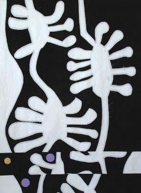
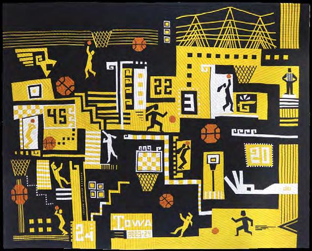
The short answer is meaning. These colors add layers of significance to my quilts. Pre-Kaya, The Orange Store, and The Cobalt Store (not pictured) depict my versions of well-known but unnamed big-box stores. I chose their signature colors to give viewers a little nudge in the right direction (Hint: you’ve probably shopped at these retailers.). The colors for Purple Reign (not pictured) and Hawkeye Hoops (page 13) were inspired by sports teams—because if there’s one thing sports fans are passionate about, it’s their teams’ colors. Then there were pieces like Folsom Prison Blues and Putting on My Face (featured in SAQA Journal, 2023, No. 3), both monochromatic works where the color was a visual cue: blue for Johnny Cash’s iconic song, reds and pinks for a quilt
inspired by femininity and makeup products.
The long answer to why limited palettes are intriguing is more complex, but no less salient: restricting color can be a challenge.
Monochromatic mission
When SAQA’s Northern California/ Northern Nevada regional exhibition Prism Play put out a call for artwork, I said, “Why not?” (I really need to start asking myself that question more carefully.) Participants selected or were assigned a hue from Joen Wolfrom’s 3-in-1 Color Tool and given a set of strict rules: only tints and shades of that hue, no black or white, and absolutely no sneaky pops of other colors.
I had successfully created monochromatic pieces before, but those colors had added meaning. Setting out to create a work of art using just one hue—just for the sake of it—felt different. I kept wanting to add just a tiny contrasting color, a rebellious little pop to shake things up. While the Prism Play exhibition was a great success, I’ll admit that my two pieces for the show didn’t quite stand on their own. In my not-so-humble opinion, the most effective pieces had a strong graphic quality, relying on value contrast, bold shapes, or other design elements to do the heavy lifting.
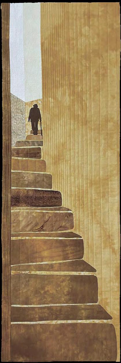
Denise Schmidt’s Courage, with its wonderful perspective and scale,
draws the eye upward from dark to light. It would have been just as successful without the limited palette, but its warm golden hues make it feel incredibly realistic. Similarly,
Jane Haworth’s larger-than-life succulents in Bias Tape Beauty worked brilliantly with their stunning composition and large blocks of color. Given the variety of aeonium colors, this piece would have succeeded without being monochromatic. However, by using a restricted palette, both pieces allowed other design elements to shine.
Analogous assignment
A lot of successful art leans on analogous colors—those that sit next to each other on the color wheel. Many definitions of analogous colors include three or more hues, but for this article, I want to take the challenge even further by setting a limit of two to three adjacent colors.
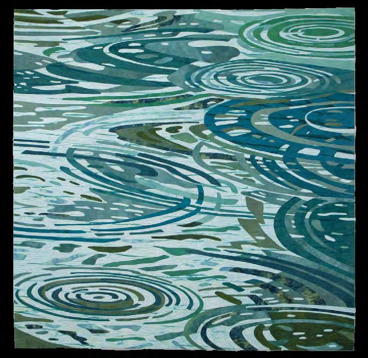
Lisa Flowers Ross’s Radiant Rain, for example, almost looks monochromatic, but her clever use of differently saturated blues and greens captures the essence of raindrop rings perfectly. She didn’t need that attention-seeking
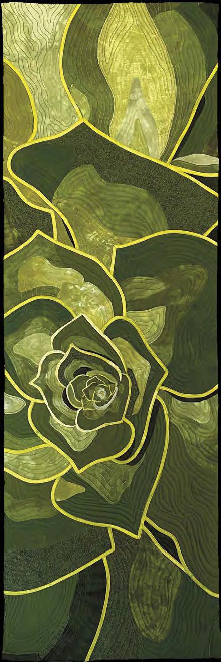
Jane Haworth Bias Tape Beauty 45 x 15 inches | 114 x 38 cm | 2022
Lisa Flowers Ross Radiant Rain 47 x 47 inches | 119 x 119 cm | 2020
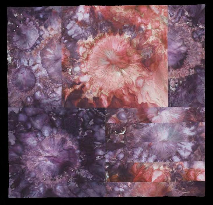
pop of a contrasting color to make the piece work. Jeanne Marklin’s Marklin Nebula relies on value differences within two colors to give her piece depth and meaning. There was no need to add more colors. And, despite my usual preference for strong, graphic images, some of Mark Rothko’s color field paintings—softedged blocks of analogous hues—are mesmerizing. If you’ve never seen his Orange and Yellow, do yourself a favor and look it up.
Complementary commitment
What really fascinates me are artists who work with complementary colors—those bold, opposing pairs on the color wheel. Normally, we think of them as eye-jarring, retina-rattling couples (maybe that’s just me), but they can actually be surprisingly versatile, ranging from loud and vibrant to soft and muted.
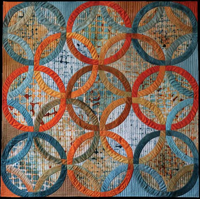
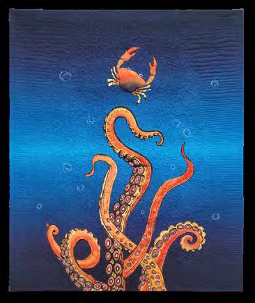
Compare Helene Hein’s Married Life to Laura Jaszkowski’s Octopus Play—both use blue and orange, yet each takes a different approach to this striking color combination. Hein’s desaturated, hand-dyed colors create a visually subtle piece, while Jaszkowski’s composition embraces the boldness of complementary colors.
Jeanne Marklin Marklin Nebula 34 x 35 inches | 86 x 89 cm | 2016
Helene Hein
Married Life - merging of orange and teal to brown
Laura Jaszkowski Octopus Play
Color Wheel Uses
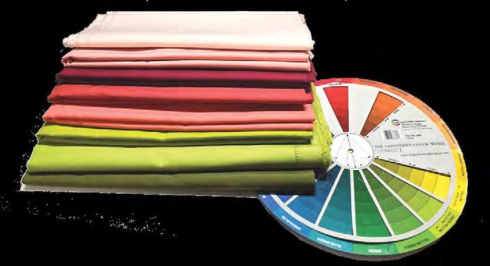
Do I use a color wheel? When I’m stuck, absolutely. When I’m writing about color, I take its guidance with a grain of salt. Since I was writing this article, I decided to test my thoughts by pulling fabric for my next project. I think of the colors as reddish and greenish—complementary in a broad sense. But technically, they aren’t a perfect complement. I take a loose approach to complementary schemes: if the colors work together, I use them.
And, yes, I do have a favorite color wheel. It’s The Gardener’s Color Wheel made by The Color Wheel Company. It’s a handy tool with tints on one side, shades on the other, cutouts for various color harmonies, and even some definitions. You can find this tool at www.colorwheelco.com.
For a deeper dive into color wheels, check out the article Sharpen Your Color Know-How with the Ives Color Wheel, written by Lynnita Knoch, published in SAQA Journal, 2021, No. 3.
Continued considerations
When working with a limited palette, other compositional factors need to be carefully weighed. Is it important to define the role of each color? Will one color always be the foreground or positive space, or can they alternate? Typically, in a twocolor image, one color is dominant while the other serves as negative space. However, I enjoy confusing viewers by having colors alternate
The author’s favorite color wheel is The Gardner’s Wheel made by The Color Wheel Company.
their roles. In Hawkeye Hoops, sometimes the light colors are in the foreground, sometimes they recede into the background.
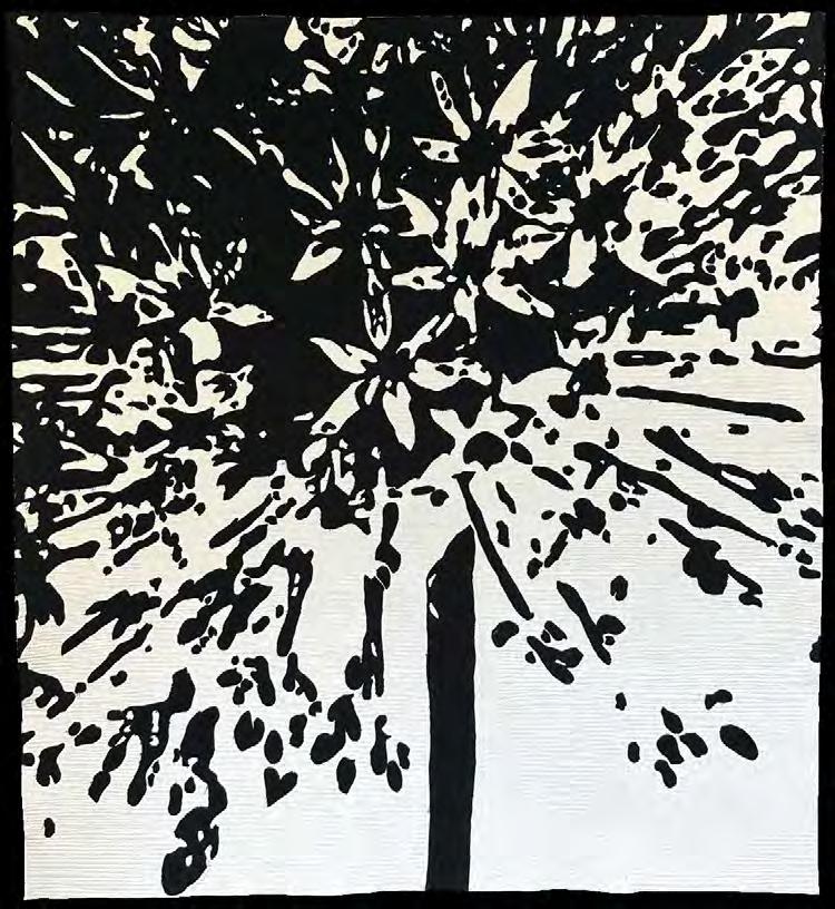
Julie Poirier Mathur’s artwork Allium (page 14) does the same thing—the negative space in the upper half of the composition is black, while white becomes negative space in the lower half. Furthermore, Allium maintains an equal balance of black and white, allowing shape to
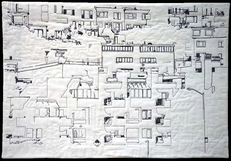
do the heavy lifting in the composition. Contrast that with Donna Brennan’s Bay City Balconies (page 14), where white dominates and line becomes the predominant element. Another consideration is the range of values. What happens if you limit values? In Susan J. Lapham’s piece Remember (Playland #16) (page 14), the darkest value is a medium greenish-yellowish-brown. Lapham created this piece while grieving the sudden
Hawkeye Hoops
Deb Cashatt
x 61 inches
x
Ellen Meeker Angle of Repose 41.5 x 42 inches
105 x 107 cm
2020
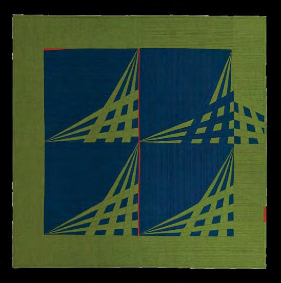
loss of her brother. Her use of only tints in this artwork emphasizes what was written in her statement: “Grief ethereal, a magnitude of emotions, a search for meaning. Embracing healing. Let the mystery be.” Ellen Meeker does the opposite in her dark Angle of Repose, where the lightest value is a medium green. Both artists demonstrate that careful value control is just as critical as color selection in a limited palette.
Concluding content
Using a limited palette is both a challenge and an opportunity. Whether monochromatic, analogous, or complementary, restricted colors force artists to think more critically about composition, contrast, and meaning. For me, color is never just about aesthetics—it’s about storytelling, symbolism, and impact. And sometimes, saying more with less is the most powerful artistic choice of all. ■
Deb Cashatt is a SAQA Juried Artist who resides in Cameron Park, California. You can view her work at www.debcashatt.com.
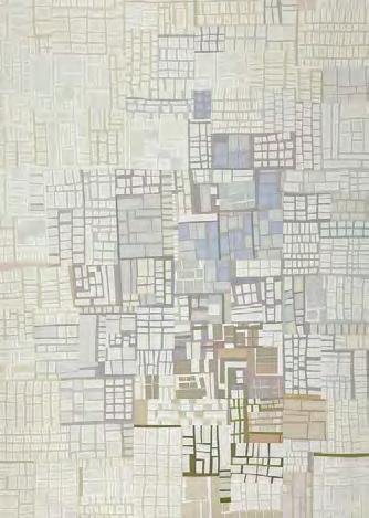
Susan J. Lapham
(Playland #16)
Julie Poirier Mathur
Donna Brennan Bay City Balconies
Creative currency
HOW TO BUY DOWN RISK IN DESIGN WORK
by Kestrel Michaud
Working as a professional artist—particularly one whose entire income comes directly or indirectly from her art—has had a big influence on my priorities and career decisions. There are choices I made six years ago when quilting was still just a hobby for me that I could not afford to make today.
On one hand, taking risks like experimenting and pushing myself creatively leads to developing and improving talent, skill, and ability. Those things make me a better artist. On the other hand, those things are risks for a reason—there is no guarantee of success, and failure could mean the difference between whether or not I earn an income.
It’s a tough balancing act, and it’s one I’ve been personally managing for the last five years. My art is now my only income, and that means I can no longer afford to put large quantities of time, money, and effort into it without the expectation that the quilts I create will go out into the world and be profitable in some way. To achieve that expected outcome, I have had to figure out ways to reduce the risk of making artwork.
Build safety nets
The best way I have found to reduce that risk is to build safety nets. Having a safety net means I can have the confidence to try new things without worrying my entire business will fail. It was also the only reason I felt confident deciding to make fantasy artwork instead of more marketable subject matter.
Back in 2018, I was eight years out of college. Up to that point, all of the fabric artwork I made was intended
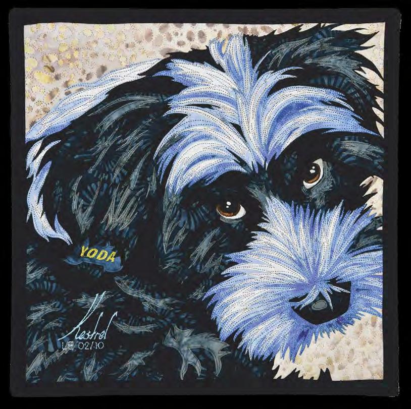
Yoda LE 02/10
12 x 12 inches | 30 x 30 cm | 2023
to appeal to an audience likely to purchase it. I primarily made scenes from the natural world, and I sold my work in various galleries. I also signed a contract with a licensing agency to contract my work, which put me in even more of a commercial mindset.
I had recently learned about art quilting and SAQA, and I was excited to start making quilts. But I had a decision to make: What should my subject matter be? I could stick with “safe” subjects, focusing mostly on animals and scenes from nature. That kind of art would be intended to sell.
Or I could make fantasy artwork, which was my passion, but I had no expectation of it being a sellable product. The decision really came down to reliable income or follow my heart, and here’s where the safety net tipped the scales.
At that time, I was working as a freelance graphic designer, which meant I was already earning a steady paycheck. That gave me some freedom. My future quilting was not going to replace my graphic design job regardless of what subject matter I was creating, which meant the quilting didn’t

have to earn any money; it could just be a hobby. It was “okay” for me to intentionally create something I didn’t expect to sell. This was my thought process and why I ultimately decided to make fantasy—specifically steampunk—quilts. If I had needed my quilts to be an immediate and reliable source of income, I wouldn’t have taken the risk.
Career diversification
During 2021, I made the decision to phase out my graphic design work and ramp up quilting to be my full-time career. Tying my income entirely to my artwork was a scary prospect. To build up my mental fortitude enough to risk taking that chance, I built a new safety net for myself by diversifying my income; all of my proverbial eggs were therefore not in the same basket. My artwork itself is directly tied to sales, commissions, and prize winnings. But I also write professionally for multiple publications; I create digital content for
my Patreon subscribers and blog readers; I give lectures and teach workshops; and I sell products through my Etsy shop.
Within those varied revenue sources, some are tied to physical items, some are tied to digital content, and the rest are tied to a service I provide. Furthermore, some of those streams are passive income, meaning they earn money without my having to do anything else with them. It’s a wonderful, interconnected web that gives me great peace of mind. If a particular source was not as successful one year, that was okay. The others would make up for it and ensure I could survive and continue making art.
Now it’s true that I did not have all these revenue streams spun up when I transitioned into quilting. But I did have a few of them already working for me, and I didn’t quit graphic design in a day. I made the transition to full-time quilting over an entire year. This gave
me the needed time to pursue new opportunities in quilting and fill in the monetary gaps as I resigned my graphic design clients.
Building safety rails
Building safety nets and diversifying revenue streams are both ways to buy down risk, but they relate more to the business of art. What about making the art itself? When it comes to how I make my art quilts, things are different. I don’t take risks with my art. Which is NOT to say that I don’t try new things, because I do, and I enjoy experimenting. But I feel that in order for something to be considered a risk, it has to have a possibility of failure, and failure is something I’ve designed out of my creative process.
The reason for this tactic is that I spend hundreds of dollars and hundreds of hours on my large quilts. Every single one is an investment of time, effort, money, and material. They are the foundation for my entire business. My quilts HAVE to
My Friend and the Setting Sun
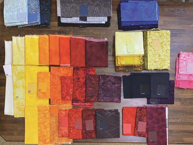
Fabrics for My Friend and the Setting Sun comprised three different sets of fabric to avoid repeating textures in the design.
be successful, or else I can’t afford to keep making them. There is no room for risk.
So how do I guarantee success? It all comes down to a process. I’ve developed a roadmap, or formula, for my quilts. My formula is made from a series of rules or guidelines, and as long as I follow those rules, the end result will be a quilt worthy of judged competition. It works for any subject, as long as that subject is realism or imaginative realism.
Here’s an example. One of the rules I follow is the highlight/midtone/ shadow rule. The way it works is that every color within a design is broken down into at least three values. Take a look at Yoda. The “white” fur is made from a pure white fabric for the highlight, a light blue for the midtone, and a medium blue for the shadow. Same with the “black” fur: light grey, medium grey, and black. This ensures an illusion of three-dimensional form on the flat, two-dimensional surface of the quilt. It’s okay to use more than three values, but three values per object is the minimum to give my designs dimension.
As you can see, each of those values will be a different fabric in the quilt. Here’s another rule: each fabric can only be used once throughout the design. In My Friend and the Setting Sun , I have three progressions of the same colors and values throughout the design. The sky, the ocean, and the cliff all progress from white, to yellow, to orange, to red, and finally to a dark maroon.
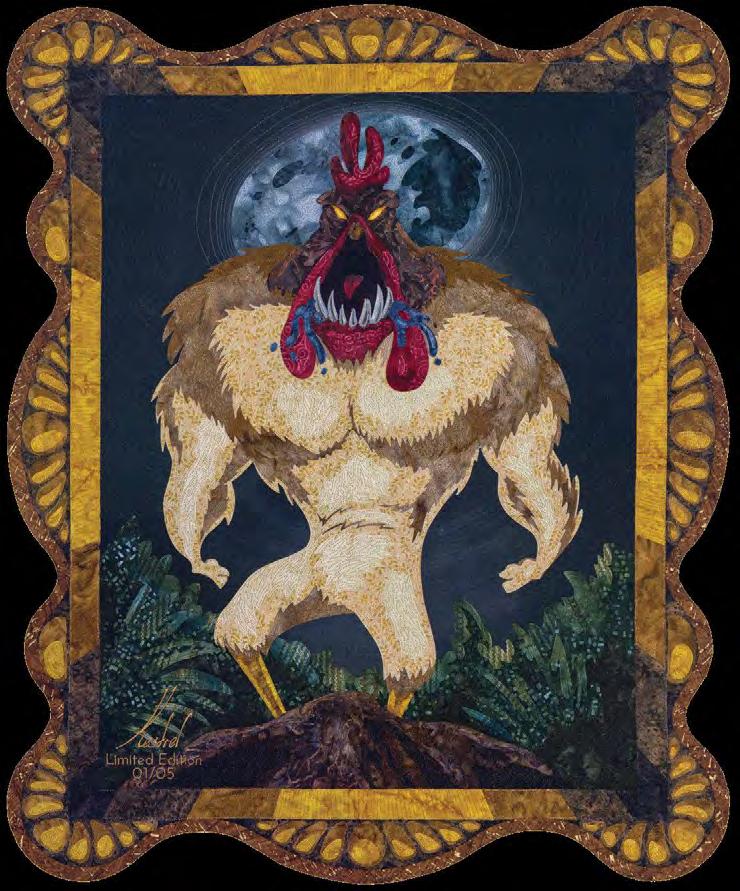
El Pollo Diablo 24 x 29 inches | 61 x 74 cm | 2024 (Detail below)

by Alex Taylor
However, each of these areas is made from different fabrics. This is because of the fabric’s texture. It would be strange for the sky to have the same texture as the ocean. Repeating a texture would break the illusion of realism.
Those are just two of my rules, but I have rules like those every step of the way. This formulaic process essentially gives me a safety cart with guide rails for making quilts. As long as I stay in the cart for the entire journey, I’ll safely get to my expected destination, which is a finished quilt worthy of judged competition.
But sometimes I’ll stick my arm over the edge of the rail. That figurative hand-waving beyond my guidelines is experimentation. I
do like to challenge myself and try new things, but I only ever do so if the other ninety-five percent of my process stays within the cart. That way I know the end result will still be a success, even if the one specific thing I tried differently doesn’t work as expected. That’s why I don’t consider it to be a risk.
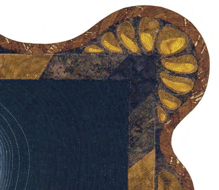
Take a look at El Pollo Diablo . I’d never done a design with curved edges. I carefully designed the frame’s curves to make sure they wouldn’t turn too sharply, and I used continuous bias tape to finish so that the fabric could handle the turns without rippling. I also used a pre-washed wool batting, which caused it to tighten and thicken. This extra stability ensured the
see “Creative Currency” on page 36
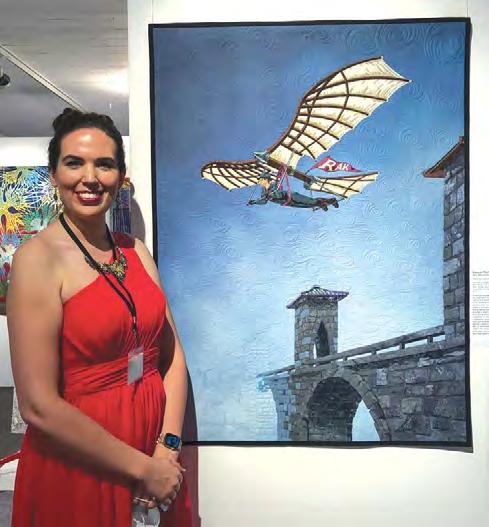
Kestrel Michaud at Quilt National ’21 with Morning Commute, which sold during the exhibition.
Photo
Morning Commute Detail
ART QUILTS IN PLAIN SIGHT HIDE TREASURE
by Deborah Boschert
The SAQA global exhibition, Camouflage, showcases the wonder and diversity of life with thirty-six art quilts exploring the artistry of concealment. Talented SAQA members bring fascinating animal survival strategies to life with vibrant patterns, textures, and colors. Each original work of textile art reveals a story of adaptation, survival, and self-expression.
Juror Lorraine Roy writes, “Camouflage, like many terms arising from the realm of the natural world, can provide diverse approaches for visual interpretation. Taken outdoors, it is an attribute of survival— a skill for hunting and hiding. In works of art, it can be applied to hide and to reveal, rewarding the patience and curiosity of the viewer. As metaphor, it well describes the
10 x 15 inces | 25 x 38 cm | 2023
human artistry of self defense and protection. And in the hushed and static space of camouflage lurks another special feature: the element of surprise.”
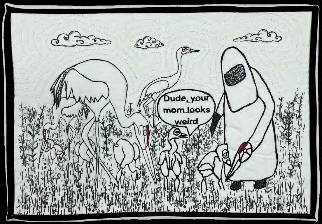
The exhibition gathers art created by artists from the United States, Canada, United Kingdom, Italy, France, Mauritius, and Japan. The collection includes a wide range of sizes from Margaret Knepper’s Dude!,
Margaret Knepper Dude!
Fuzzy Mall
just 10 x 15 inches, to Fuzzy Mall’s Janine Heschel2 (Octo Camo), which is 89 x 71 inches. There are other large works that are likely to fill a gallery wall from floor to ceiling, challenging the idea of camouflage. They won’t be able to hide!
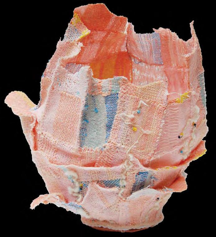
Some pieces incorporate photography in their representation of animals and plants. Others use abstraction and bold shapes to explore the theme. Some works zoom in on their subjects while others invite viewers to step back for a broader view. As is common in all SAQA exhibitions, artists use a variety of techniques to execute their visions, including painting, thread painting, piecing, appliqué, print making, hand stitching, and digital manipulation. Deborah A. Kuster’s Hopeful is a dimensional vessel. Several pieces are irregularly shaped, thereby emphasizing the willingness of art quilters to push the boundaries of typical expectations.
Janine Heschel2 (Octo Camo)
Deborah Kuster
Hopeful
21 x 19 inches | 53 x 48 cm | 2015
Viewers will be able to explore, examine, compare, and contrast the artworks in many interesting ways. Small pieces will hang next to large pieces. There are several works created mostly with black, white, and gray as well as others full of vibrant color. Zebras are the subjects of two different works in the collection. Insects and reptiles show up in several of the selected works. A few of the art quilts focus on human subjects and themes of personal transparency. The exhibition also includes representations of plants, buildings, realistic depictions, and imaginary ideas. The artists drew inspiration from a wide range of sources and seamlessly connected their ideas to the theme. (Actually, some did use seams.)
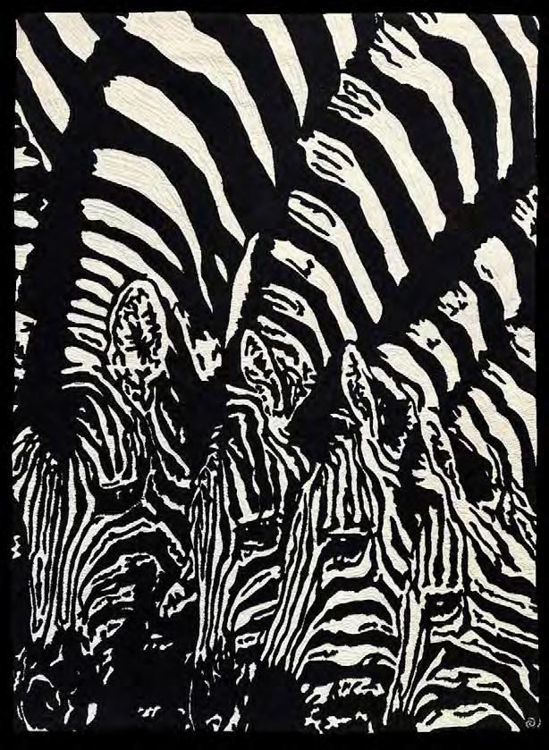
There are several quilts with stunning visual representations of animals exhibiting a state of camouflage. Rhonda Denney’s Waterhole Camouflage depicts three zebras in extreme close up. Using just black and white fabric and dense machine stitching, the figures seem to blend into each other. It’s a powerful example of the impact of line, shape and color—or lack of color.
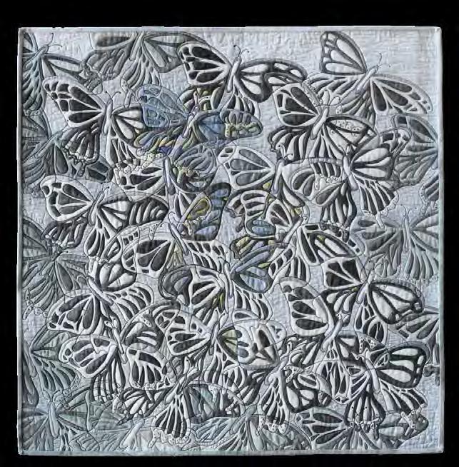
Janet Davis also used mostly black and white in her piece, Twilight Flight, which depicts a group of butterflies rising to the sky and appearing as one. The drawn and painted lines overlap and intertwine with the stitching, creating an additional layer of hidden patterning. A few areas are filled with hints of blues and yellows carefully contained within the stitched lines.
Debra Goley and Mieko Washio emphasize texture and layering of
32 x 32 inches | 81 x 81 cm |
Janet Davis
Twilight Flight
2024
Rhonda Denney Waterhole Camouflage
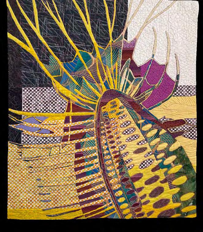
Debra Goley
Flamenco Dance
42 x 36 inches | 107 x 91 cm | 2023
color, uniquely possible with fabric and stitch.
Goley’s art quilt, Flamenco Dance, is based on a sea creature, but could also be perceived as taking inspiration from plants, landscapes, or other abstracted lifeforms. She selected bold printed fabrics and layered them so viewers can take note of the repeated elements. Some lines appear to end in one area and continue in another. The suggestion of spots in several different colors and shapes are scattered over the central figure engaging viewers and encouraging exploration of the entire composition.
Mieko Washio’s piece, Green Pepper and Gecko, is actually shaped like a giant bell pepper. The viewer can peer inside the pepper to see the legs
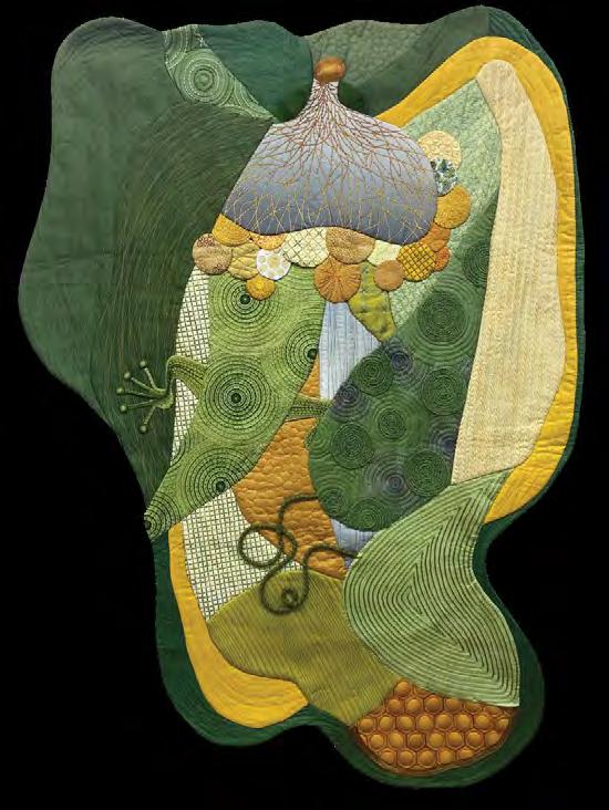
Mieko Washio Green pepper and gecko
62 x 45 inches | 157 cm x 114 cm | 2023
and tail of a hidden gecko. Several sections of the pepper are filled with intricate hand embroidery and each stitch motif complements the next. Variegated threads and fabrics create the illusion of depth. Her artist statement mentions a little spider, but it must be masterfully camouflaged since it’s unseen in the photography in the catalog.
Amanda Snavely and Paola Machetta both explore the idea of camouflage in an urban setting. They are excellent examples of what juror Lorraine Roy described as using “camouflage as an analogy for personal challenges—how we hide and how we unveil.”
Snavely’s piece, Just Add Color, is a long vertical abstract composition
filled with shapes that could represent windows, streets, benches, or skyscrapers. The top half is full of vibrant colors that fade into grays at the bottom. In her artist statement, Snavely suggests that this could be viewed as “rain washing the color away, revealing the grittiness, darkness, and desperation of a space on the edge of urban decay.” The irregular top and bottom edges further emphasize the architectural inspiration mimicking the hard lines and angles of skylines and rooftops.
Machetta’s piece, Spot the Dot, invites close study. Her artist statement almost challenges the viewer to crack a code while considering how people move through the world. Her improvisational pieced composition
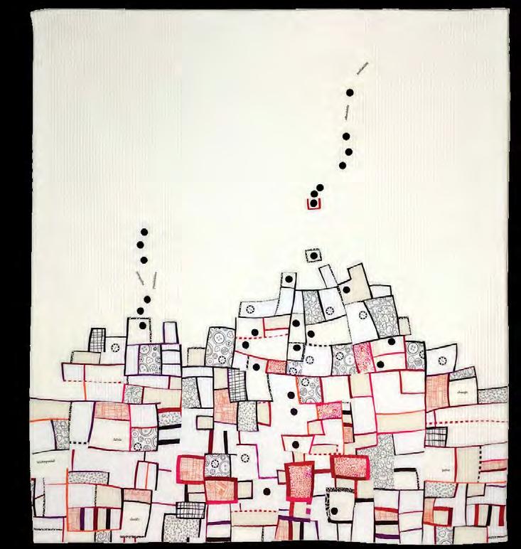
40 x 35 inches | 102 cm x 89 cm | 2023
is a collection of blocks that could be rooms, gates, or houses, with dots seemingly trapped or hiding within the shapes. Other dots stream out and over the collection of blocks. Machetta also introduces the idea of mixed identity using the dots and buttons on her art quilt to represent different experiences and behaviors. She asks, “Would you act like the black dots, who are wandering around, exploring opportunities, and searching for a gate to break free? Or would you rather look for safety, hiding within the crowd and pressed inside a box, among all the other buttons that look quite similar you?”
A few of the art quilts in the exhibition may require a double take or a close examination. The designs
are literally camouflaged and can only be fully appreciated by stepping back, squinting a bit, or focusing on small details.
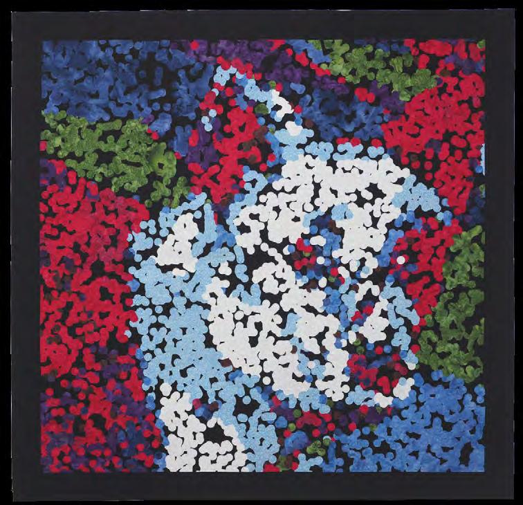
At first glance, Vicki Conley’s Dog Gone (page 24) appears to be a scattered arrangement of dots. But take a step back, and a hidden image emerges—a portrait of her dog, Skunk. Conley explains, “When art is rendered in pointillism, the image is camouflaged while standing close, but comes to life when observed from a distance.” Her bold color palette enhances the illusion, making the art quilt feel both abstract and vibrant until the details reveal themselves.
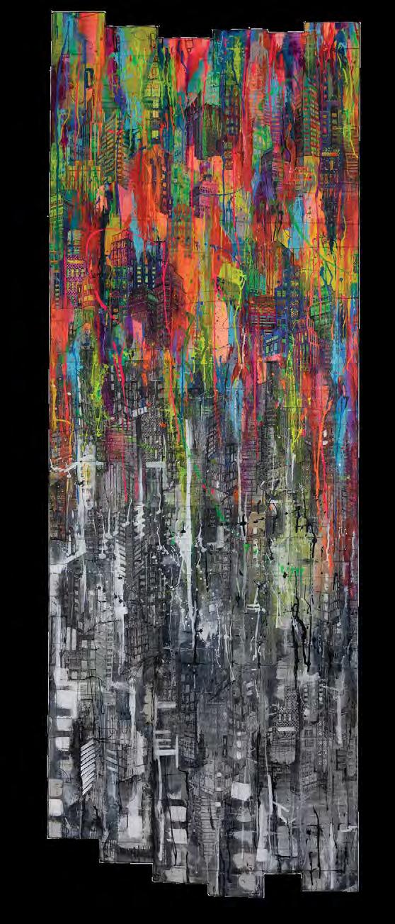
93 x 34 inches | 236 x 86 cm | 2019
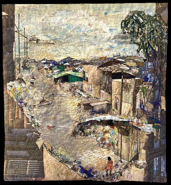
Lena Meszaros created two intertwining designs for her art quilt which incorporates various fabrics, plastic,
Amanda Snavely Just Add Color
Photo by Sam Garnett
Paola Machetta Spot the Dot
42 x 43 inches | 107 x 109 cm | 2023
packaging bags, sewing scraps, haberdashery, ecoprints, and acrylic paint. In Don’t Close Your Eyes, the viewer may first see “a desolate landscape, with dilapidated houses, polluted water, and garbage everywhere.” Then it becomes clear that the rooftops are eyes, the edge of a fence creates the outline of an ear and buildings in the distance serve as eyebrows in a face looking directly back at the viewer. The face implores the viewers to “not close our eyes to the misery that hides behind our consumer society.”
The Camouflage exhibition premiered at the International Quilt Festival in Houston, Texas, in October 2024. The Arizona-Sonora Desert Museum in Tucson, Arizona, will host the exhibition from mid-July to the end of September 2025. This world-renown museum has a beautiful gallery on its campus, which also includes a zoo, botanical garden, and natural history museum. SAQA’s relationship with the Arizona-Sonora Desert Museum began in 2019 when it hosted both the H2Oh! and Connecting Our Natural Worlds global exhibitions. Following the exhibition in Arizona, the quilts will be on display at the Detroit Zoo in Royal Oak, Michigan, which previously hosted SAQA's Fur, Fangs, Feathers & Fins exhibition. Th e Camouflage exhibition will continue traveling through 2027. For more information, visit www.saqa.com/camouflage. ■
Deborah Boschert is a SAQA member who resides in Lewisville, Texas. You can view her artwork at www.DeborahsStudio.com.
Lena Meszaros Don’t Close Your Eyes 28 x 26 inches | 71 x 66 cm | 2024
Vicki Conley Dog Gone
Photo by Doug Conley
The best part of the SAQA Benefit Auction is you! The 12 x 12-inch art quilts you create and donate support our programming throughout the year while they delight collectors.
So send us your work! It’s for a good cause— supporting art quilts and the artists who make them.
Deadline to submit online: June 30, 2025
Deadline to receive artwork: July 12, 2025
All proceeds benefit SAQA’s exhibition programs, publications, and educational outreach.
Take part in our most-anticipated event of the year by creating a small wonder. Auction dates are September 12-October 5, 2025.
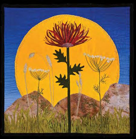
Susan Sawatzky, Summer Sunshine
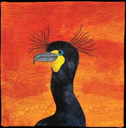
Fabienne Peter-Contesse, Double Crested Cormorant
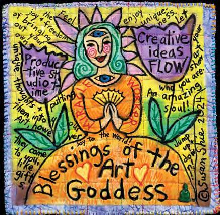
Susan Shie, Blessings of the Art Goddess #1
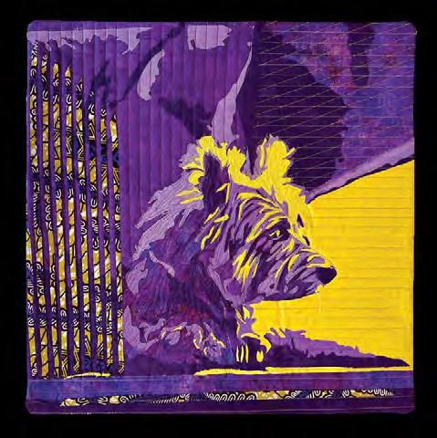
A Tale of Two Colors
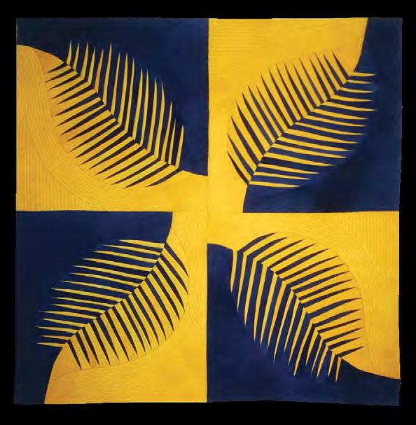
Collard Blue and Yellow Leaves
24 x 24 inches | 61 x 61 cm | 2019
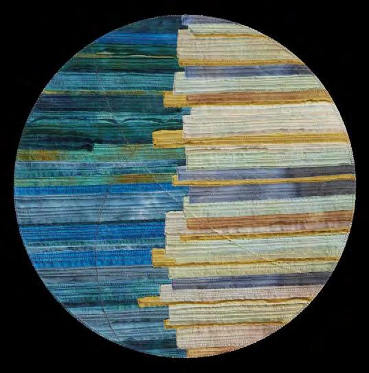
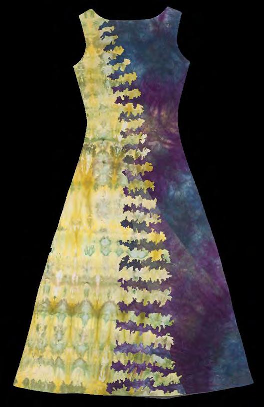
Barbara Olson Where Do I End and You Begin? 57 x 34 inches | 145 x 86 cm | 2018
22.5 inches diameter | 58 cm diameter | 2021
Gigi
18 x 18 inches | 46 x 46 cm | 2023
Maryte
Kim Keller
Elisabeth Nacenta-de la Croix
Lune Croissante
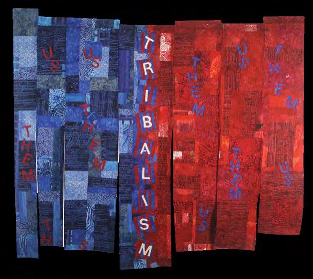
Larson
Tribalism
44 x 52 inches | 112 x 132 cm | 2020
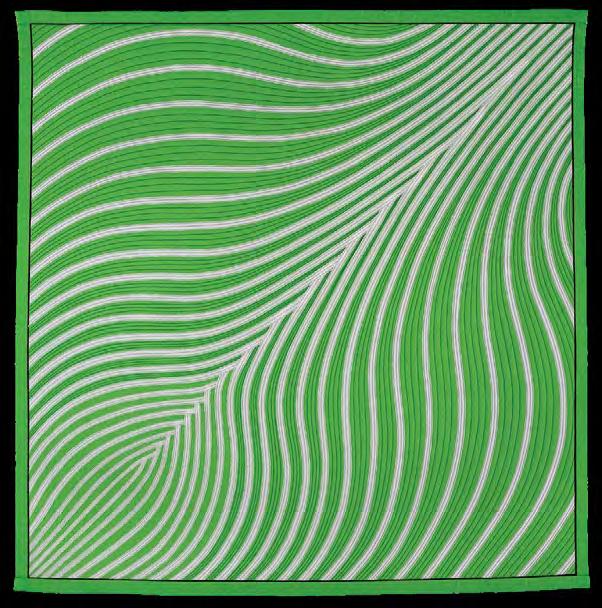
51 x 51 inches | 130 x 130 cm | 2006
Denise Oyama Miller
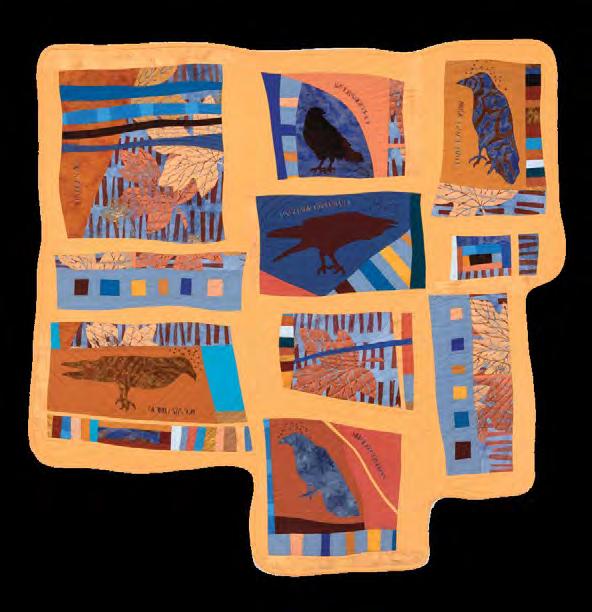
Unkindness of Ravens
42 x 41 inches | 107 x 104 cm | 2022
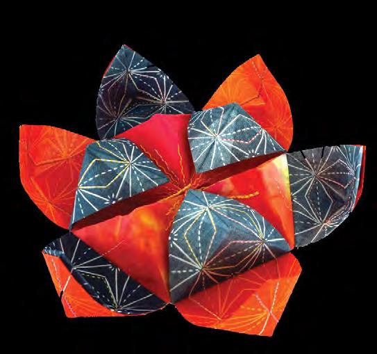
Claire Passmore Stellar Rubrum
6 x 16 x 16 inches | 15 x 41 x 41 cm | 2019
Debbie Grifka
Where the Quiet Lives
43 x 59 inches | 109 x 150 cm | 2022
Carol
Dianne Firth Onion
Life on the road combines adventure, artistic pursuits
by Shannon Conley
The advent of outstanding communications tools has led to the development of an extensive “digital nomad” movement. Digital nomads use their computers and other technology to do their jobs while traveling. But what happens if you have a love of long-term travel and a profession that, mostly, isn’t digital? I talked to my mother, quilt artist Vicki Conley, to learn how she incorporates her art practice, exhibitions, and active teaching life into her extensive travel schedule.
Conley spent forty years as a studio potter prior to “retiring” and becoming a full-time professional quilt artist and teacher. During her decades on the art festival circuit as a ceramicist, her travel focused on work, with long hours of driving to venues, hauling pottery, setting up, selling, and then reversing those tasks each weekend to get back into the studio.
Conley and her husband, Doug, are great hikers and lovers of the outdoors, and they wanted to take advantage of their retirement to travel extensively in ways that weren’t feasible alongside their previous work lives. In the past decade, the couple spent up to five months each year on the road on trips that lasted between several weeks and a few months. But as Conley’s art quilting career has grown, it quickly became clear that her complex exhibition and teaching schedules didn’t mesh well with a spur-of-the-moment, go-wherethe-wind-takes-you approach to travel. Luckily, she has always been a planner. The easiest piece of the puzzle to fit into her new more nomadic life was the art making. Unlike pottery, quilting is adaptable to small workspaces,
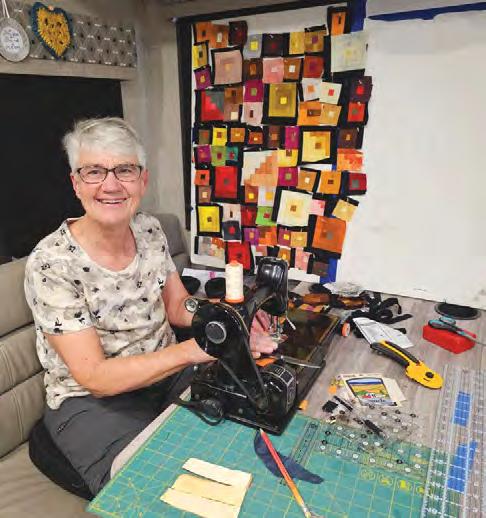
and Conley travels with a mobile studio. In her mid-sized RV, she sews on a vintage Singer featherweight that stows away under the dinette when not in use. She keeps two supply bins that contain fabric and tools in an upper cabinet. Key to the success of her travel productivity is advanced planning. Conley says that having a clear idea of what projects you want to work on while traveling is essential. This is not the time for projects that require auditioning hundreds of different fabrics or large complex layouts. Often her travel sewing projects include her original block-based projects that comprise a limited palette of her hand-dyed fabrics. She plans and packs in advance so that she can piece while traveling and assemble and quilt her works once she returns home. However, many of her notable large works are abstract landscapes which require both a large design wall and a large workspace. This type of work can’t be made while traveling, but Conley spends time on the road finding new inspirations for these works, taking pictures and solidifying ideas by drawing in her sketchbook. She is also an enthusiastic adopter of the tools of many other digital nomads, including her iPad and laptop. While in the RV, she uses these digital drafting tools to design and prepare her larger works. Advanced planning is also the key to integrating her exhibition and teaching schedule into her travel schedule. Conley says sometimes the trips come first and sometimes the professional engagements take the lead, but all are typically planned starting about two years out. The couple, who travel extensively with
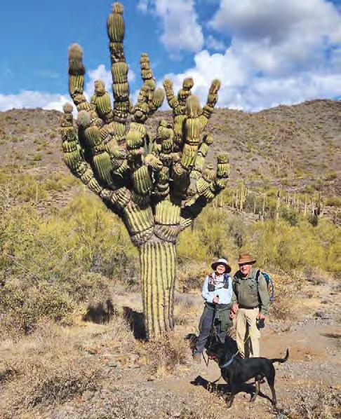
Vicki and Doug Conley with their dog, Quark, hike in Cave Creek State Park in Cave Creek, Arizona.
The cactus is called the Michelin Man.
Photos by Doug Conley
Vicki Conley pieces in her RV on her vintage Singer featherweight. She has a small design wall she can pin to the window.
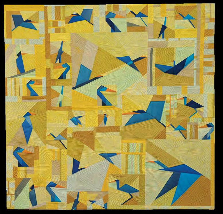
My Blue Herons 37 x 37 inches | 94 x 94 cm |2025
The artist pieced many of the original bird blocks for this work in her RV while traveling.
lifelong friends Susan and Dennis Roy, are used to this degree of planning. They camp in public lands including national and state parks as well as national forests and Bureau of Land Management sites. These entities all require reservations at different times prior to travel, are limited in number, and must be secured for precise dates to make a multimonth trip work. Often, Conley and her co-planner husband are logged in to make their camping reservations at exactly the minute the sites are available, months to years ahead, sometimes recruiting additional family members on additional computers if the sites are exceptionally difficult to secure. This level of granularity in planning has made it feasible for Conley to combine exhibition and travel. For example, on one of her months’ long trips, Conley and Susan Roy visited an exhibition at the Pacific Northwest Quilt and Fiber Arts Museum in La Conner, Washington. After her friend mentioned that Conley was also a quilter, a series of conversations led to an offer of an exhibition for Conley in 2023. Knowing she would have to deliver and pick up the work in person—far from her home in southern New Mexico—a four-month road trip to Alaska was planned, with stops included to deliver and retrieve the quilts. Conley has also had the privilege of participating in multiple SAQA Global exhibitions, and has steered routes to venues where the work was installed. For example, she traveled to Light the World at Brigham City Museum of Art & History in Brigham City, Utah, and Primal Forces: Earth at the Brigham Young
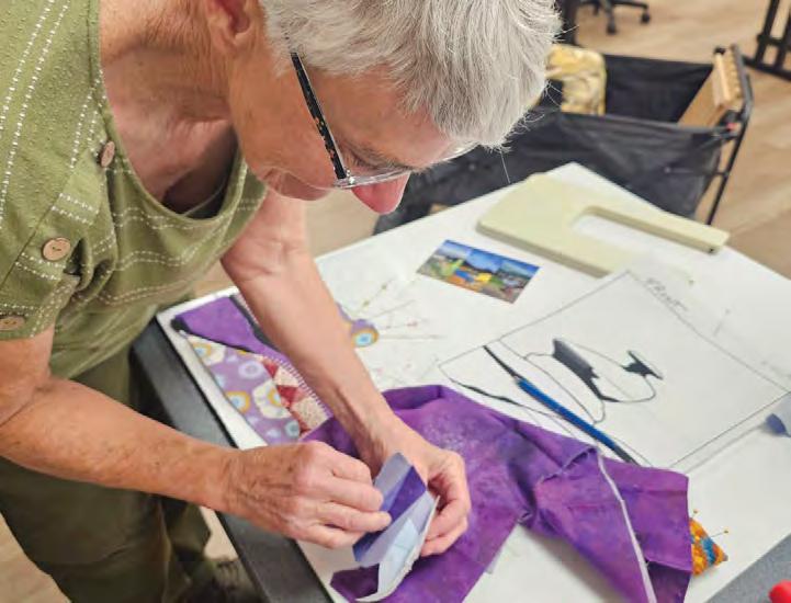
The well-traveled teacher gives a demonstration to students.
University Museum of Art in Provo, Utah. Integrating these exhibitions into her route means getting to see SAQA artwork in person, which is not often possible in the rural area where she lives.
Combining her teaching schedule into her travel schedule requires the most advanced planning of all. Conley initially taught mostly on Zoom, giving lectures and workshops virtually, a practice that grew out of the
Covid-19 lockdown. She says she likes teaching on Zoom, largely because students can be in their own spaces with their own stuff. Thanks to good technology, she can lecture on Zoom while traveling, but highlights that many of the places she and her husband camp don’t have good Wi-Fi or cellular reception, so a key aspect of the planning is ensuring she’ll have a stable internet connection from which to give the presentation. She also enjoys the energy and feel of teaching in person; many of her workshops include special materials and kits that are much easier to provide in-person. As Conley has expanded her travel teaching, she has optimized her class preparation and materials to be separate from her travel studio materials. While it was initially attractive to save space in the camper by not duplicating tools and materials, she found that things run much more smoothly if everything she needs for classes is completely apart from what she’d use in her mobile studio. It enables her to easily grab her teaching totes without having to worry about leaving key materials in the RV.
One strategy Conley has used to integrate her in-person teaching into her travel is working with several guilds or groups in an area. That way multiple teaching engagements occur on a single trip. On a recent trip to Oregon, Conley gave lectures or workshops to five different groups over a three-week period, with free days interspersed for the couple and their dogs to hike and enjoy the area. Each group was at least a forty-five-minute drive from the other groups, and all of the groups were part of the planning conversation so that no one’s toes got stepped on. It helped that Conley offers several different classes and workshops so that she doesn’t saturate a market with the same course.
This approach also enabled her to reach out to a guild who had previously been interested in hiring her but could not afford the large travel fees. This kind of planning is a winwin: the guilds can split the travel costs (usually the cost of a standard airline ticket and hotel or campground), and the Conleys have funds to partially defray the costs of going someplace they’re excited to visit.
Conley also works her teaching into planned future trips. One benefit of planning travel years in advance is that when guilds reach out about teaching, she can often coordinate the timing with when she is already scheduled to be in the area, although it can be challenging to organize groups together. Conley wishes more guilds had a clear way for traveling teachers to contact their programming directors to help foster this kind of beneficial arrangement.
For Conley, this integrated approach to traveling, teaching, art making, and exhibiting has enabled her and her husband to travel more extensively than they otherwise would have been able to. Teaching income has helped with the cost. However, she emphasizes that the approach only works if they are traveling to places they want to go anyway and have time in their schedule to build in days to enjoy the area. The many days of driving and expense of traveling in an RV usually aren’t worth it for them otherwise. But robust planning and a laser focus on organization make it possible to integrate teaching, art making, and exhibiting into a traveling lifestyle rich with exploration. ■
Shannon Conley serves as treasurer on the SAQA Board of Directors. She is a SAQA Juried Artist who resides in Moore, Oklahoma. You can view her work at www.shannonconleyartquilts.com.

MENTORSHIP EXPERIENCE FOSTERS ARTISTIC GROWTH, FRIENDSHIP
by Elaine Armstrong
Mentorship means different things to different people, and every mentorship experience is unique. I recently had the pleasure of participating in the SAQA Mentorship Program as a mentee and it has contributed immeasurably to my artistic growth. This article is an account of my adventure, and I offer some tips for success should you be interested in taking part in the future.
Find the courage to apply
In my former career as an educator, I experienced the mutual benefits that mentorship programs offer for both personal and professional development. Being relatively new to the art quilt world, I was struggling to recognize myself as an artist. I was intrigued when I saw the call for applications to the 2024 SAQA Mentorship Program. At first, I was a bit hesitant to apply, unsure of my chances of success. But I was keen to
learn and grow artistically, and knew a focused mentorship could help. Convinced that even the application process would be a valuable learning experience, I gathered my courage and submitted an application.
The delight of a match
In early January 2024, I received notice that I had been matched with a mentor. I immediately googled Irene Koroluk and found that she was a very experienced and internationally recognized fiber artist. The real surprise was that my match lived in Tasmania, Australia, a 14-hour time difference away from Southern Ontario, Canada! Although SAQA does not necessarily make matches based on likeness, I was pleased to see that we share many similarities in our interests and backgrounds. We are both heavily influenced by our natural surroundings, and both enjoy
experimenting with printing and free-motion stitching. We both also have educational backgrounds in science and in art. Our geographic and temporal distance could have been a challenge, but we have both viewed it as a benefit. SAQA’s wide international reach is one of its strengths, and we had been given an opportunity to learn from each other about very different environments and artistic communities.
We connected through the magic of Zoom and in our first chat we took time to get to know each other. We talked about our environments, our families, and our preferred work patterns. During the matching process, Koroluk had been given information on my profile, and she was attentive to accepting a mentee with whom she felt she had the most to offer in terms of skills, style, and techniques. As it turned out, Koroluk is an extreme night owl, while I am
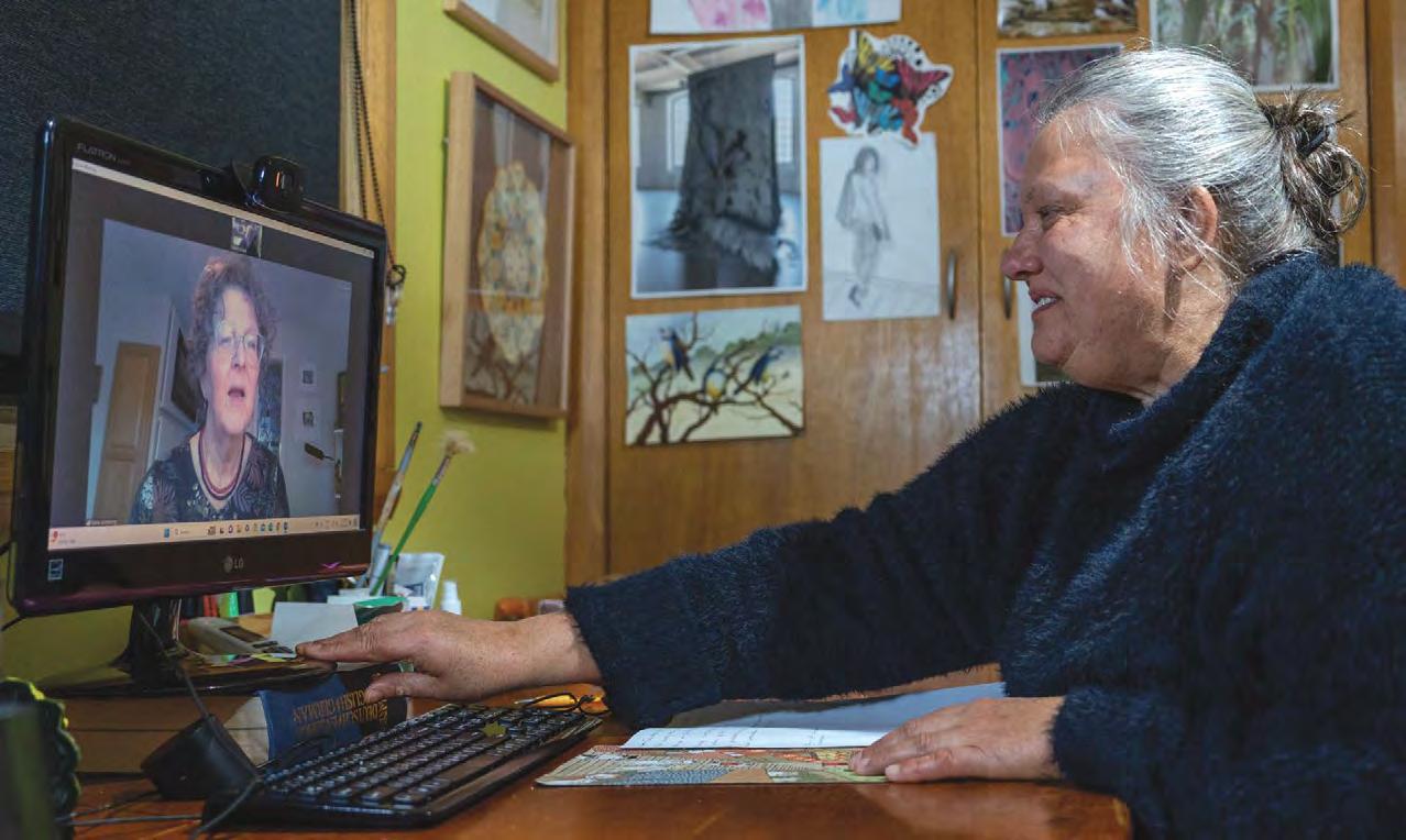
Elaine Armstrong and Irene Koroluk reach out to each other via Zoom.
a very early bird. We were both eager to devote time to this experience, so we settled on having weekly, hourlong chats—pairing my early morning to her late evening.
Set clear goals
I left our first meeting with some homework. I was to set three clear goals for our time together. Taking time to define goals would help me to focus on what I hoped to achieve and it would help Koroluk know where she could best contribute during our time together.
My goals were broad: to grow as an artist, which for me means widening my skill set and knowledge base; to start to exhibit my work, which requires skills to find and answer calls for submissions; and to effectively communicate to others in the art world by honing my writing skills. I was also keen to know how our relationship could be reciprocal. What did my mentor want to gain from this experience?
Koroluk told me that her strongest reason for becoming a mentor was to have a chance to pay it forward after having been blessed with people in her life who had assisted her in reaching her goals and developing her skills. She was keen to pass on the kindness and generosity she had received throughout her development as an artist, and she hoped to experience what she knew would be satisfaction and pride in seeing a mentee develop and blossom over time. With each of us having set such broad goals we had a lot of latitude for discussion.
Our style
In what became our style of mentorship, my mentor’s main role was to expose me to new ideas, suggest
areas for exploration, and provide supportive and constructive feedback. Koroluk went far beyond this and often sent me links to view artists’ work that would be of interest; suggested readings, blogs, websites, and Ted Talks; and emailed links to upcoming exhibitions and calls. Perhaps the most valuable thing she brought to the table was her ability to listen and ask the right questions. Sometimes, by her simply asking why or encouraging me to tell me her why I thought something, I was pushed to think more deeply. This level of reflection lead me to develop new approaches and helped me gain a better understanding of my artistic perspective.
As the mentee, I felt my responsibility was to value Koroluk’s time. I showed up at our meetings on time, prepared with ideas for discussion. I kept notes of our conversations and journaled my thoughts and discoveries. I followed up on reading and viewing suggestions. I also reciprocated by sharing ideas and exchanging websites and information on artists that I knew or came across. Occasionally, I was able to share tips or techniques that were new to Koroluk.
Mutual benefit
Our weekly discussions took many different avenues, but all lead toward fulfillment of our goals. Koroluk shared ideas and information on practical details and bigger picture topics. We discussed artist statements; what really matters in exhibition submissions; photography, cell phone, and software techniques; ideas for electronically organizing and cataloguing work; and potential venues for writing and exhibiting. She offered specific, constructive feedback on work in progress, and praise for work well done.
As for Koroluk, she says it was a twoway interaction and learning opportunity. The experience of being a mentor helped her to reinforce her knowledge and made her examine whether she was practicing her own artistic advice. It also showed her the value of having kept art journals, as it pushed her to reflect and think about her studies and development in order to pass on what would be most relevant.
Unexpected bonuses
Both Koroluk and I can report some unexpected bonuses. The experience provided us the opportunity to connect with someone who lives on the other side of the world, shares
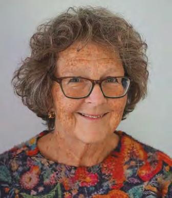
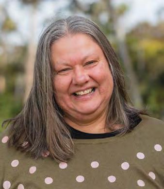
Elaine Armstrong
Irene Koroluk
interests, and is part of the SAQA community. We also had the benefit of different life experiences and perspectives. During our conversations we shared snippets of our lives. We got to know each other, and shared pictures and videos of the very different flora and fauna of our respective environments. We exchanged information and pictures of mutual interest on our very different environments and world phenomena such as the solar eclipse and the northern lights, waratah (a genus of flowering plants) and mountain foliage endemic to Australia, and beaver dams and raccoons of South Eastern Ontario. We have also both become more proficient with electronic commu -
Most importantly, we developed what we both hope will be a longterm friendship.
What does the future hold?
To be honest, we can’t imagine that we will not remain friends and trusted colleagues. We have gotten to know each other virtually and are making plans to meet in person through trips to each other's homeland.
I would also hope, that when the time is right, that I can give back to the organization by becoming a mentor myself, following Koroluk’s example to pay forward the kindness and generosity that has been given to me.
Tips for Success
1. Find the courage to apply.
not onerous, but thinking through what you hope to get out of the experience and sharing information about your artistic interests will result in the best match.
2. Do some research. Learn about your assigned mentor. This will give you insight on their competence as an established artist and help you to understand how they might best support you.
3. See challenges as benefits. For us, distance was not a barrier but a benefit. Sharing experiences, perspectives, and information from different environments gives exposure to whole new worlds.
4. Get to know each other. You are building a relationship
Commit to a time, frequency, and meeting length and set up your calendar
Stating both individual and mutual goals
make sure that you are both ben-
Take the program seriously. both the mentor and the mentee.
out of it what you put into it. Be prepared, be open to learning, and be respectful of each other’s time

The possibilities are endless. Every mentor/mentee
Monthly donations are easy to set up. Plus, their benefits are many:
• Any amount is beneficial, and can be as small as $20 per month
• The gift is automatic, every month.
• Monthly gifts provide a steady income for SAQA
• Your donations further our mission to support the art quilt
Sue Dennis, Mediterraneo- Santorini
Anna Brown from page 9
Oceania exhibition, Connections, and more recently in Joining Threads at the Timeless Textiles Gallery in Newcastle NSW, Australia.
Her work is in public and private collections in Australia, the United Kingdom and the United States. She has been accepted in Quilt National four times. She has juried numerous quilt shows in Australia and she has exhibited at the Schweinfurth Art Center multiple times. Brown is waiting to hear about acceptance in several exhibitions in Australia and the United States this year.
Find out more about Brown through her website at annabrown.net.au. ■
Laurie Fagen is a writer and fiber artist in the Phoenix Metro. You can see her work at FagenDesigns.com.



CELEBRATING 25 YEARS

Creative Currency
from page 18
curves at the top stay nice and stiff, so they don’t flop forward when hanging on the wall. It worked well. The other example I’ll talk about is one where I wasn’t completely happy with the results of the experiment even though the overall quilt was a success. The quilt in question was Morning Commute . The challenge, or experimental, portion was where the bridge disappeared into the fog. In hindsight, I think I could have done a better job with this transition. I think it would have looked better to have that transition spread over a larger portion of the bridge, and that’s something I would change in the future. But Morning Commute was juried into Quilt National ’21 and sold while on display, so there’s no question that this quilt was a success.
Looking back over my artistic career, I’ve never been willing to take a leap without knowing where I’d land if I didn’t reach my goal. And I think that unwillingness to jump without a safety net ultimately ensured the success of the endeavor. It removed some of the stress and allowed me to focus on preparation and planning. Similarly, my unwillingness to risk the final product is what incentivized me to create my formulaic process, which removes risk from the equation.
My advice is to figure out what success looks like for you. Then create your own safety net or safety rails to get there reliably and consistently. ■
Kestrel Michaud is a SAQA Board Member who resides in West Melbourne, Florida. You can view her work at www.kestrelmichaud.com.
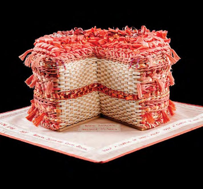
Lynne Dees, Coraline Cake Scott Hagar Photography Inc.
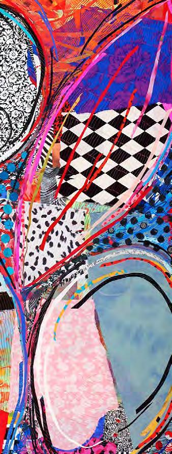

Artwork by Sue Benner
We extend our condolences to the families and friends of our recently passed members, Deborah Fell and Catherine Whall Smith.
Please join us as we pause to remember these highly creative individuals. We will miss them and their involvement with SAQA.
Deborah Fell , of Urbana, Illinois. (Deborah had recently published a book: Deborah Fell: Life Through the Lens of Art Quilts: Thank You, Edward Hopper, for Thirty Years of Art. )
Catherine Whall Smith of Chaplin, Connecticut.

AQS Quilt Shows
Join AQS for a week of quilts! Take quilt workshops, enjoy lectures, and shop fabrics, notions, and more at the Vendor Mall. Most of all, be inspired as you explore aisles of breathtaking contest and
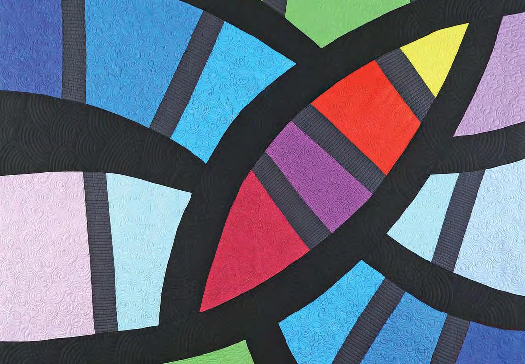

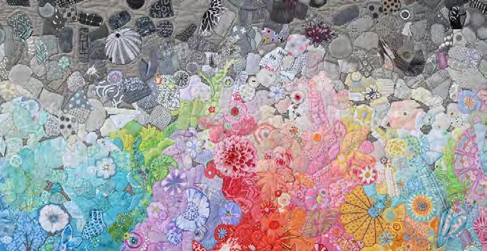
Cindy Grisdela, Aquarius