ARTS 102 PROCESS BOOK

It was the best of times, it was the worst of times, it was the My name is Samantha Brennan, and I am a freshman at the University of South Carolina. I am from a small town in northern New Jersey. Growing up, my town was always very involved with the arts and was a well-round ed educational school/ program. From a young age I was always super interested in my art classes. However, I was not one of those naturally artistic kids. I was creative but as I started taking it more seriously, I couldn’t fully feel confident in my work. I found that I was never 100% happy with my final pieces in studio art, whether that be painting or illustration. Then when it came time to the end of my junior year to make my schedule, our school pro vided me with a graphic design course and from there I took off. I felt comfortable yet still challenged and always eager to attend my class and work on my projects at that time. During that class is when I figured out that I wanted to spend the rest of my life doing this and majoring in it during my time at college.
With my time at Carolina, I have taken Arts 102, which is an intro to graphic design class. I absolutely loved taking this course. This semes ter I learned new tactics and tools on photo shop, illustrator and InDesign on Adobe Suites. The projects ranged from logo making to using different typefaces and learning how to make things aesthetically pleasing. What I enjoyed the most though was the connection to the real world. During every critique or prompt, some how, we would learn as a class how this would be used in the workforce. This is seen in our logo project; it was constantly reminded to us that “what if this was for a client?” or “How would this look mass produced?” I loved knowing what I did had a meaning and mattered in some form. I am thrilled and beyond excited to con tinue down this pathway and keep creating.
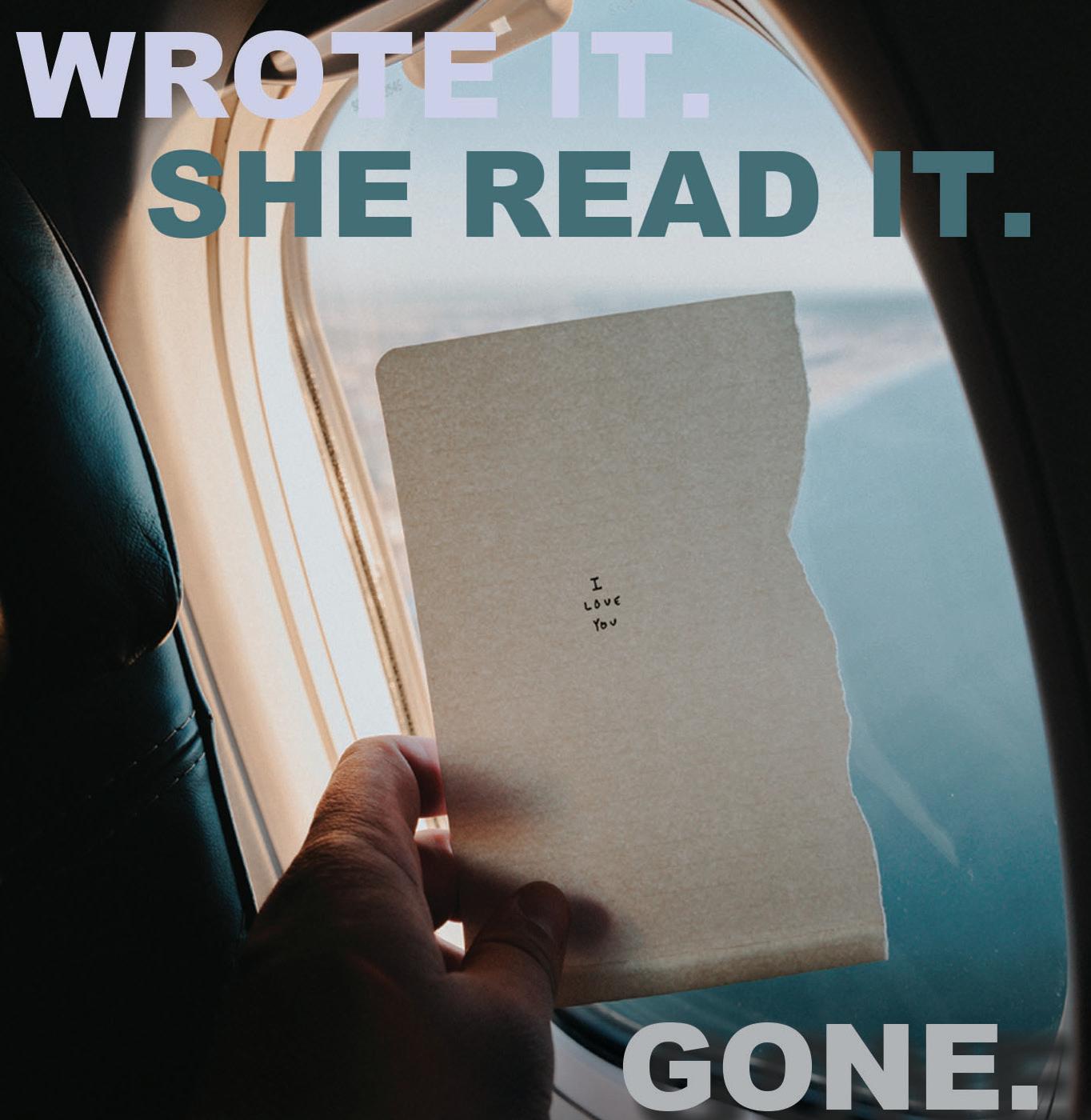
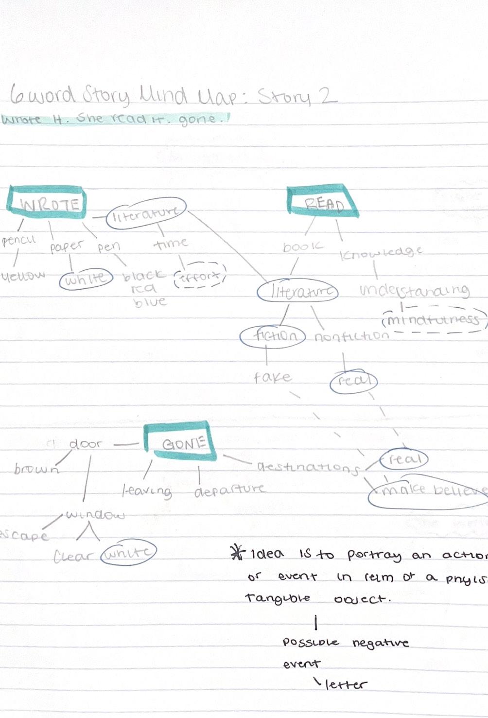
For my first project, I was listening to a song and created this six-word story. I took the keywords of my story, which were “read” “wrote” and “gone” and created my mind map. When choosing my typeface, I knew I wanted something on the bolder side since the wording on the note was so minimal, I chose the colors of it by using the eye drop per tool and making the colors cohesive with the photo. I had some troubles with the word gone and figuring out the color scheme and if there was a need for the shadow.
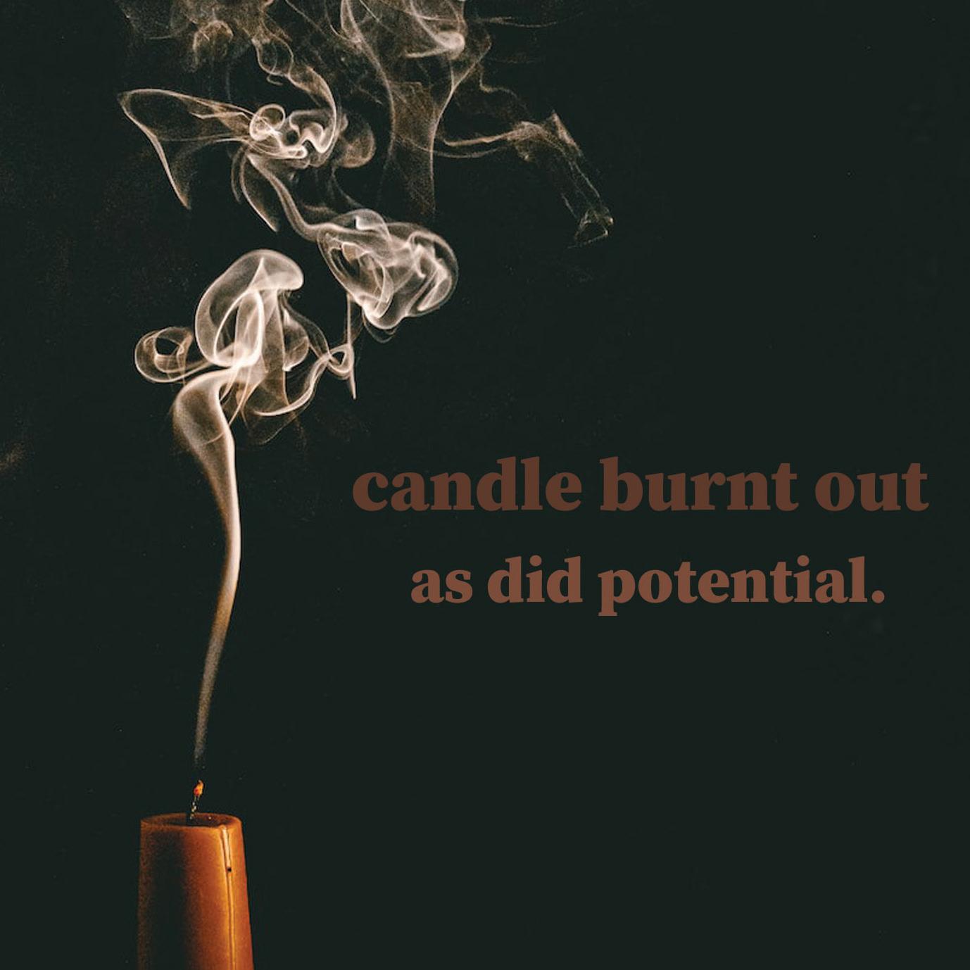
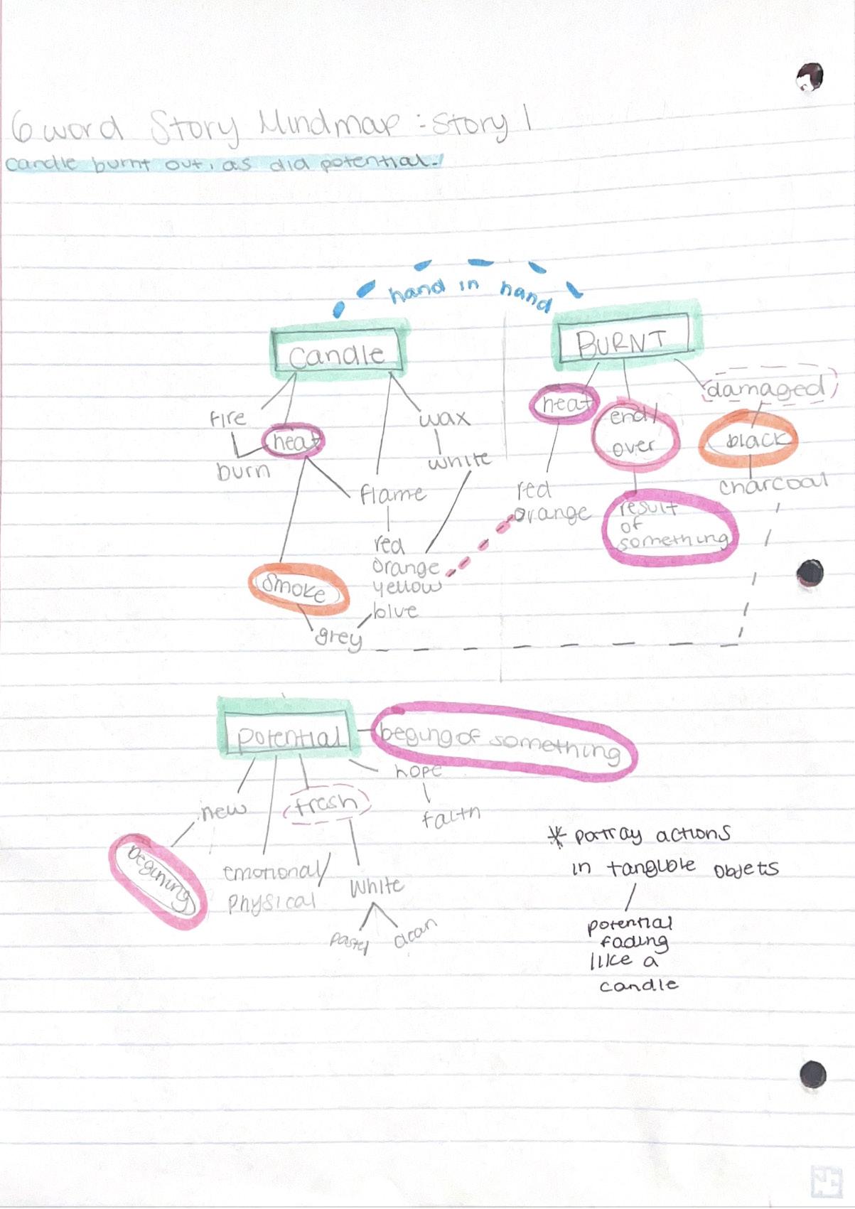
For my next piece, I was reading my book and connected the story line of the main characters love story falling through into a six-word story. My idea for this was to take a literal event and phrase it into ac tion, so the idea of a candle burning out along with potential of something else, in this case love. I knew that I wanted my photo to have a simplistic effect to it and so I found this rustic black background and the words used the candle used for the candle. I loved the typeface that I used in this piece; I feel that it really con nected well with the story.
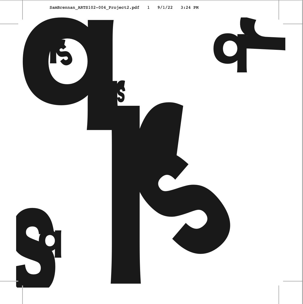
For my first art board, I used the letters Q, R, and S. This board, even though it was my first, was my hardest. I had a tough time composing it and making it look visually pleasing. I ended up re doing this one with this specific letter combination 4 times, with different typefaces and whether each letter was capitalized or not. I ended up making a formation with the Q and the R by us ing parallel lines and positioning and then tucked the curve of the S into the curve of the R. I am big on repetition of certain aspects to work on the balance of the composition, which is why in smaller letters kept the position of the R and S and included it in the Q. I then played around with working the negative space into effect by adding into the corners and other emptier spaces to fill the page.
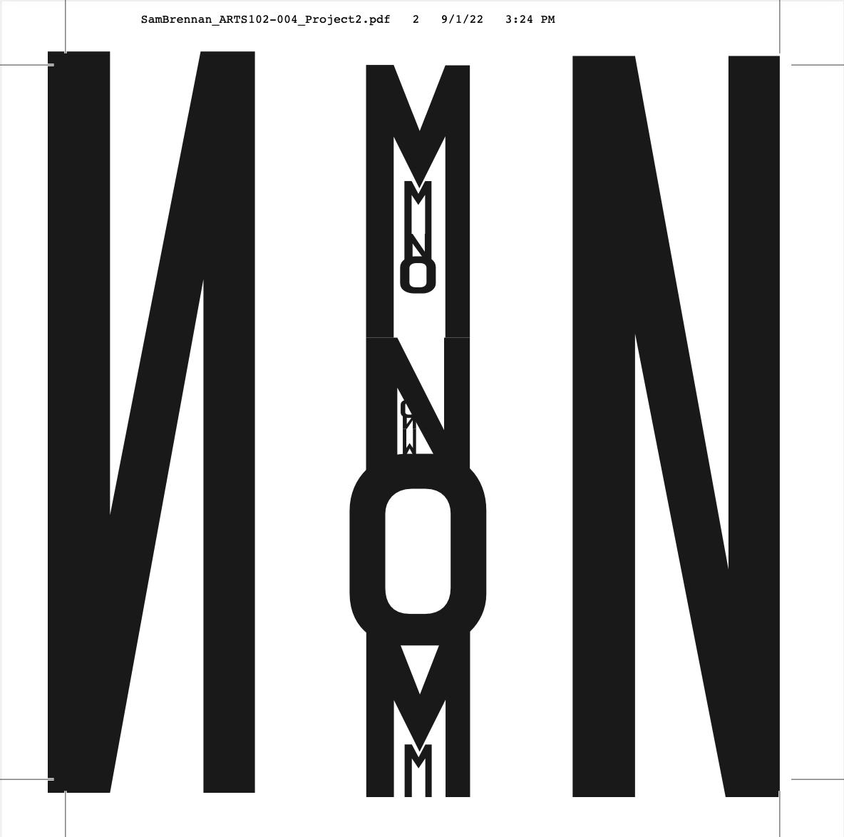
For the second art board, I really focused on depth and perception. For me, this is my favorite art board. It matches the abstract aspects to the best of my abilities. I also think the actual layout of each letter and the overall aesthetic of it is eye catching. The letters for this one was M, N, and O. I knew this one would look good because of the similarity in composition of the letters M and N. I began by choos ing a typeface that had the M and N look very similar and make the O more of a squared edged letter as opposed to a rounded shape. I began connecting the M and N and forming a longer, more nar row type effect and then playing around with where the O should fit into. I then repeated what I did with the first art board and re placed the insides of the letters with the same exact layout as the larger scale, just minimized and placed inside the letters. I then took the letter N and mirrored it to fill in the space and create rhythm throughout the piece.
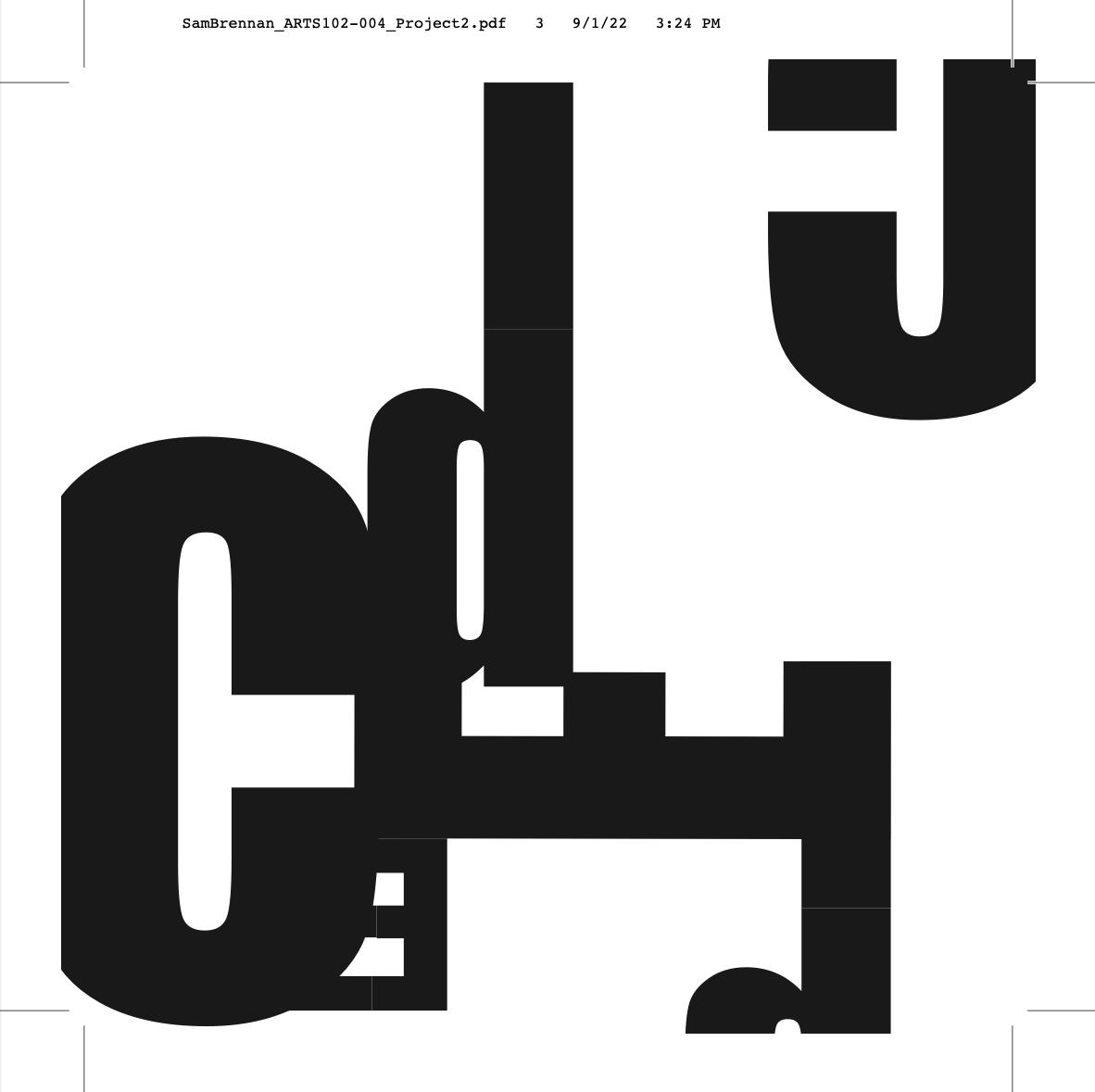
For the third art board, I knew I wanted to work from the bottom up. I wanted to utilize new aspects of the canvas than the other 2, and work in an off centered and balanced piece. I used the letters C, D, and E. I used a capital C and E but then used a lowercase d for the elongated look of the stem of the letter, which was cohe sive with the E. I felt that the curve of the uppercase D and the C were too similar and found it hard to overlap/ form them. I start ed by morphing the parallel lines altogether such as the d and the e along with aligning the straight lines of the top and the bottom of the C. I also placed that C in the corner to drift the viewer’s eye across the page. Also really focused on asymmetry within this piece, as seen with the repetition of the d but in different places. This one was more simplistic, but to me that’s what I am the most comfortable with and felt the most confident with.


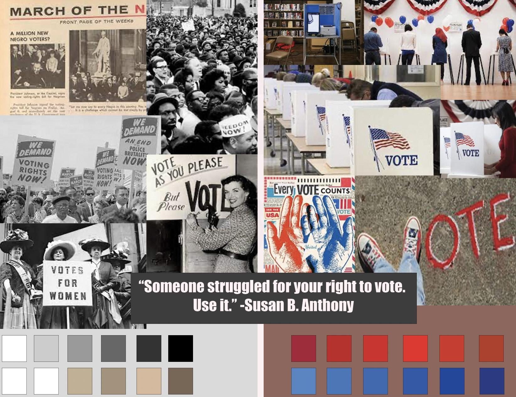
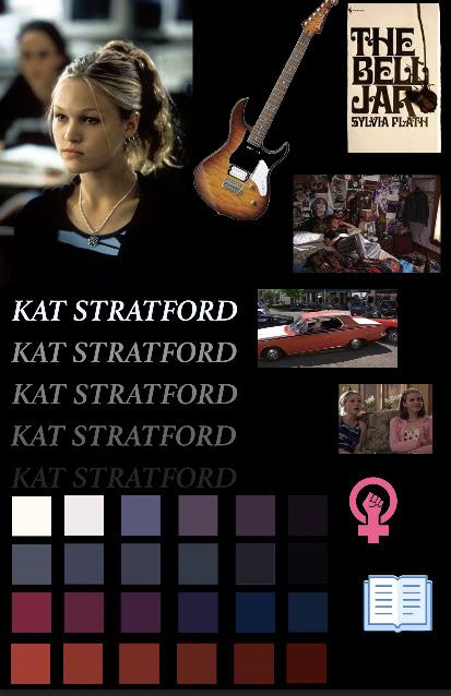
To start, we made mood boards that were using 3 different quotes. Within mine I had focused on the colors, synonyms, and relative words that would regard my specific quotes. After the critique, I found the quote from Susan B. Anthony was the most loved by the class. I knew that in my mood board I wanted to use a collage of older photos along with new ones, to emphasize the meaning of the quote through imagery. That was my main goal for this piece.
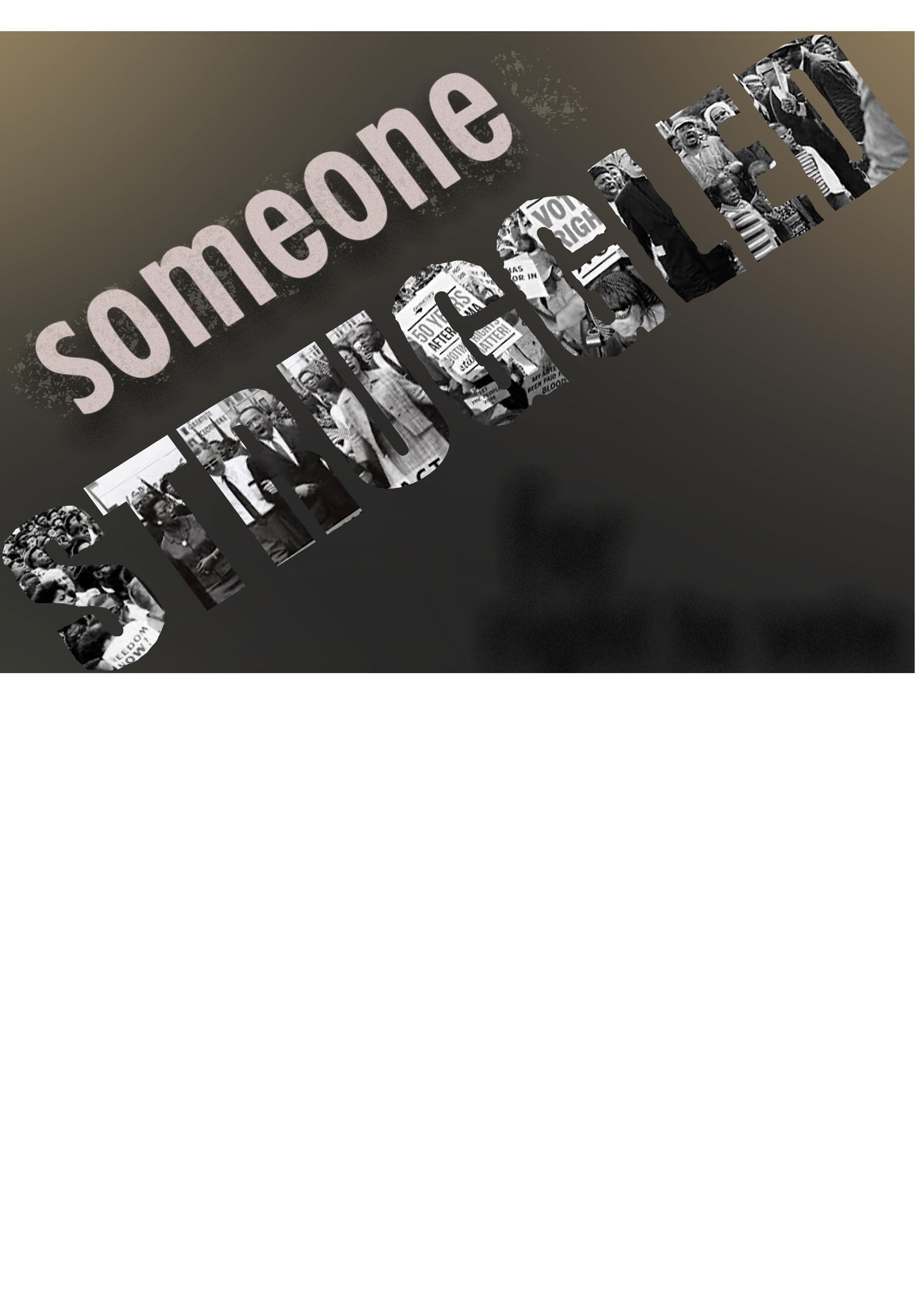
This project entailed creating a non biased political poster encouraging others to vote. We were all told to choose a quote and focus on that quote and by using any medium for mulate an enticing and engaging poster.
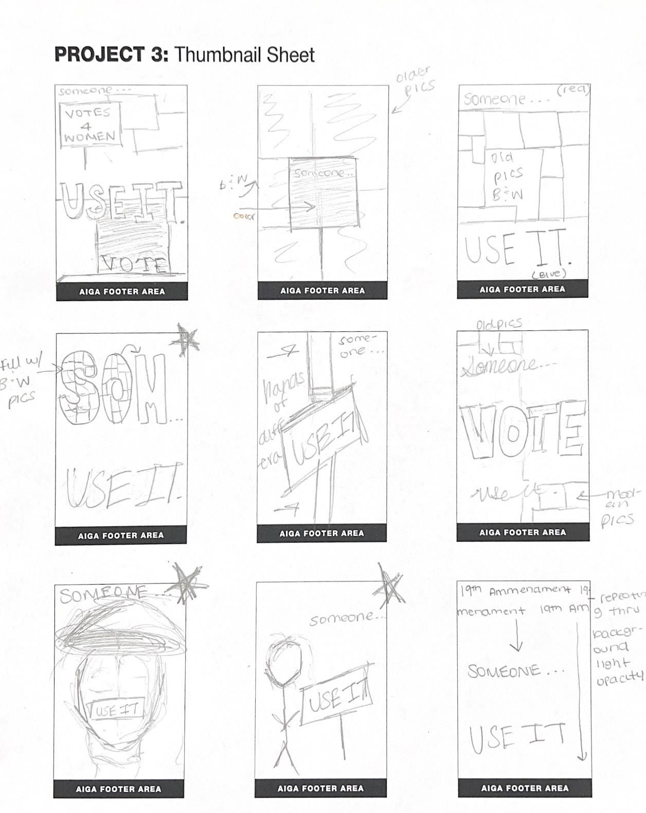
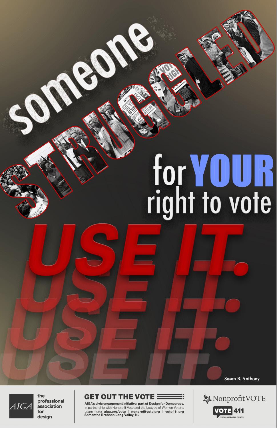
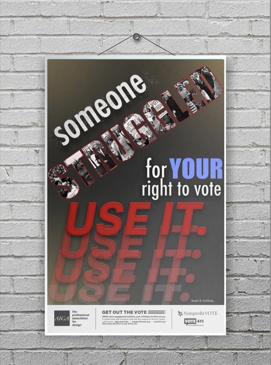
The first draft I made, I really liked. But, after the critique I had ended up changing the direction of someone struggling and putting it on an angle as seen in my final piece along with re moving the background image and changing the color of the word your. I overall really enjoy how my final project came out and think it was a successful final poster and especially after seeing the mock-up, I think it has a lot of potential.
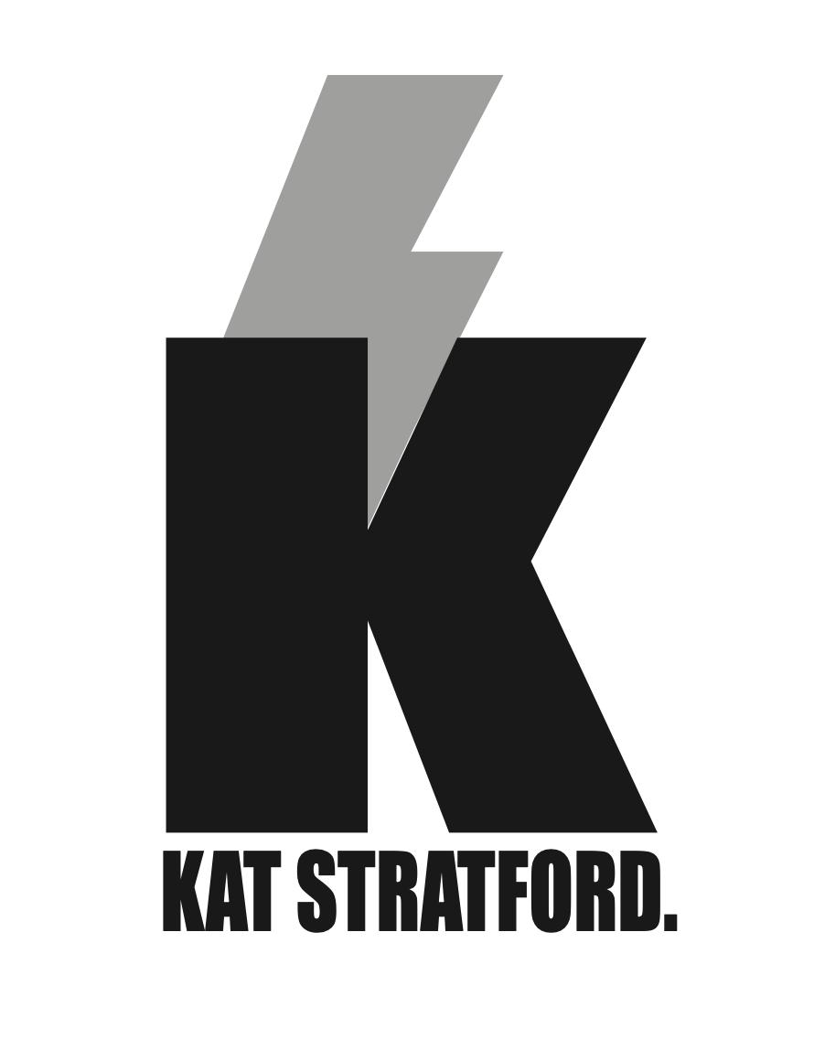
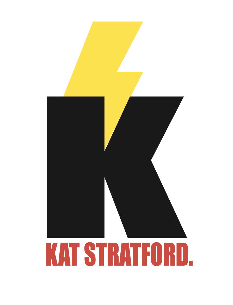
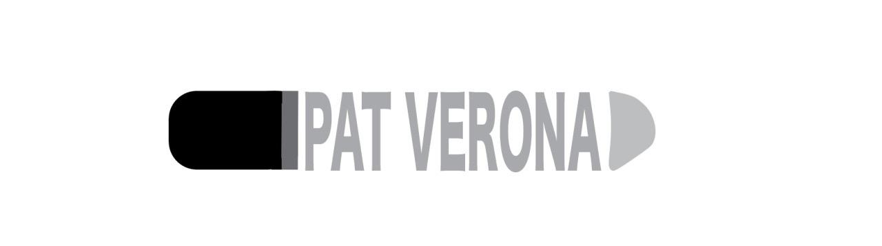
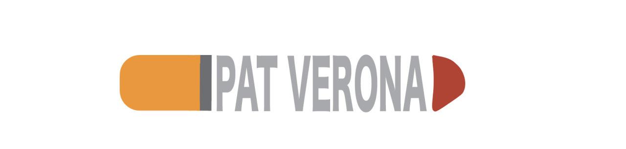
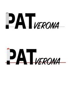
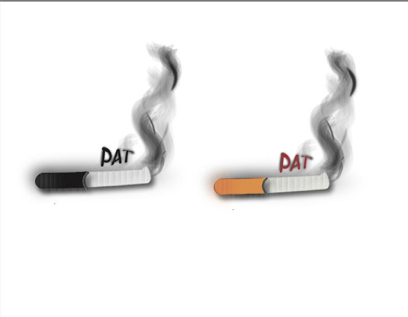
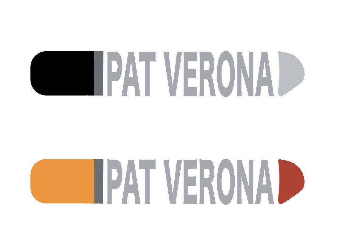
For Patrick, I wanted to use the cigarette to be his main focal point as he is seen with one throughout the movie but then also is a way to express his boldness and rough around the edges lifestyle. I had changed this logo style 3 different times. The first one seen in the first image was my initial idea, however it was not a good logo be cause the smoke would not be transferable as a logo.
The second one was a closer idea but not cohesive enough to be a logo. It felt all too separated and not a unified art piece. There was also a lot going on within the logo, it was too chaotic.
In all though, my final logo idea was a good concept and felt like a perfect fit. I sued the typeface as a “boxy” tool to unite all of the pieces together and make his name act as the middle portion of the cigarette.
Syntax:
(visual elements & relationships)
Brown colored form with white brown and black stitching following a consistent pattern across the top of the form. A darker shade of brown platform on the bottom of the form. Two protruding stitchings/ foundations of the same brown color run through the middle and bottom of the form. In a darker chocolate brown color reads three letters of “ugg” labeling the form through brand.
Semantics: Denotation (specifics) Accessory> Shoe> Unisex comfort shoe
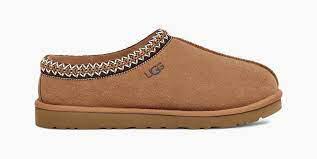
Semantics: Connotation (associations) Relaxing, lazy, comfort, happiness
Semantics: Expression (feelings) Calm, inviting, warm
Presence (Contextual): Little: house, hotel, school Lots: weddings, formal dances, business meetings
Syntax (visual elements & relationships):
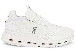
White form with white laces along with a white tongue and bottom platform to the form. The tag to the form has black writing along with a gray colored branding on the side of the form. Eight black/ hollow holes run along the bottom plat form of the form. Fine holes also run throughout the body of the form creating geometric patterns that are subtly noticeable. The platform along the bottom has a gradient in size as the heel remains larger and the toe slims down thinner to accom modate the form.
Semantics
Denotation (specifics): Accessory> Shoe> Womens sneaker
Semantics Connotation (associations): Active, fitness, student
Semantics Expression (feelings): Happy, calm, eager
Presence (contextual): Little: College campuses, at a gym, at a practice Lots: Formal dance, farm, waterpark
For this project, we focused on syntax and se mantics. This was to help us explore a new form of graphic design and that was how to explain different aspects of graphic design of certain genres and objects. For mine, I chose to ex plain 4 different types of shoes. I had explored slippers, gym shoes, high heels, and an every day walking casual shoe. We had to explore five categories, that being Syntax (visual elements & relationships) Semantics: Denotation (specifics)
Semantics: Connotation (associations) Seman tics: Expression (feelings) Presence (contextual). An example of all five of these categories can be seen through my slipper analysis. We also had to ensure that the spacing and alignment of all 4 of our objects that were chosen were equal and professional looking. The measurements and placements of text had to be aligned and spaced correctly. Overall, this project had a very educational purpose that opened us as students to new analyzation factors and had us try something new.
Syntax (visual elements & relationships):
An all black form with a gold buckle on the top of the ankle strap. A sep aration of fabric between the top of food and toes to allow for toes to come through the front. A long and tall post runs along the back for a platform. A beige interior and bottom of the form is present.
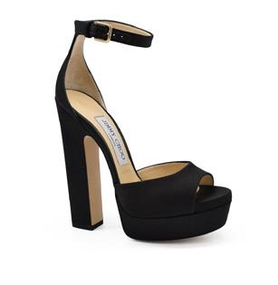
Semantics Denotation (specifics): Accessory> Shoe> Womens formal shoe Semantics Connotation (associations): Formal event, dinner, prom
Semantics Expression (feelings): Fancy, pleasurable, exciting Presence (contextual): Little: Formal dinner, dance, wedding Lots: Store, school, gym
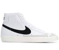
Syntax (visual elements & relationships): An all white form with a cream platform on the bottom of the form, two gray geometric shapes seen on the front of the shoe near the toe and sole of the foot area. Three black dots seen above the platform. A large black shape starting at the side of the laces running all the way to the back of the shoe is in the center of the form. The word “nike” appears on the heel portion of the form.
Semantics Denotation (specifics): Accessory> Shoe> Unisex sneaker
Semantics Connotation (associations): Student, active, casual wear
Semantics
Expression (feelings): Trendy, simplistic, clean
Presence (contextual): Little: Classroom, gymnasium, college campuses Lots: Black tie affairs, governmental envi ronment, award shows
Syntax (visual elements & relationships):
Brown colored form with white brown and black stitching following a consistent pattern across the top of the form. A darker shade of brown platform on the bottom of the form. Two protruding stitchings/ foundations of the same brown color run through the middle and bottom of the form. In a darker chocolate brown color reads three letters of “u” “g” and “g” label ing the form through brand.
Semantics: Denotation (specifics)
Accessory> Shoe> Unisex comfort shoe
Semantics: Connotation (associations)
Relaxing, lazy, comfort, happiness
Semantics: Expression (feelings) Calm, inviting, warm
Presence (contextual):
Little: house, hotel, school
Lots: weddings, formal dances, business meetings