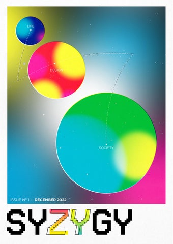
12 minute read
BARK BARK TOYS


It is estimated that more than 1 million eligible cats and dogs are euthanized around the world each year, simply because too many pets end up in shelters and too few people consider adopting them when looking for pets.
Written by VINCE PATRICK ROSALES
Advertisement
Visuals by VINCENT RYAN YAP
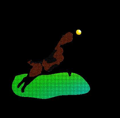
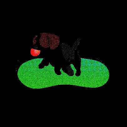
Do not stress because Bark Bark Toys are here to accept them! We will accept any broken dog toys to give to dogs who want to play with them.
Taking care of four big dogs who have the biggest energy when it comes to playing with their toys was a huge factor as to how Bark Bark Toys came to be. They were able to break their chew toys very quickly and would leave them anywhere they wanted and would not touch them anymore. After a long afternoon, I entered my home to see all their chew toys broken and left everywhere, it was a sight for eyesore. The toys were not even completely broken, it would usually just be broken in half. As I was about to throw them away, I realized that there are stray dogs out there who might want these toys. This is how Bark Bark Toys came to be.
That one afternoon along with my passion for taking care of dogs was enough to convince myself to start a shelter for homeless dogs who, I believe deserve a chance to have fun. Going around the neighborhood I would notice skinny homeless dogs walking around or cramp in a corner. Their only goal was to find somewhere to hide and look for scraps of garbage to feast on. This made me very upset. I knew that if I were to make this shelter for dogs I would want them to be in an open area where they can run with other dogs and play with toys. I wanted to bring back the light in their eyes and make sure that they will be taken care of.
Finding an area to build up our Dog shelter was another problem we had to face, but luckily it did not take that long to find an area. Surprisingly the area was within the village I was living in. We called the lot owner and asked to buy it, with that the process of building up our shelter commenced. I knew that in this shelter we would advertise how we accept any broken dog toys dog owners have, clean them, and give them to the dogs for adoption in the shelter. This would not only benefit the dogs it would also benefit with lessening waste. Instead of throwing away dog toys, we would take them in. We believe that the dogs here in Bark Bark Toys would love your donations broken or not. We will be focusing on bringing back the joyful lives of these homeless dogs should have in the first place.
With that being said I hope that you continue to support and donate to Bark Bark Toys as we will be taking care of dogs for families who are looking into getting a dog in their lives.
Who is he—what’s he like? After 19 years on earth, he still isn’t sure.
Written and Visuals by VINCENT YAP
He’s indecisive! He’s procrastinating! He’s cramming! He’s Vincent Ryan Yap of AB Multimedia Arts trying to get through another hectic trimester in college! That’s unfortunately the lingering thought in the 19 year-old’s head.
Vincent Ryan Yap, who is often referred to as either of his given names (may or may not prefer Ryan, just a guess), finds himself along Taft Avenue most of the time tagging his trusty Champion tote and blue Klean Kanteen along. A large part of his identity is attached to graphic design—his primary medium, his specialty, his partner-in-crime. So much so that he was unexpectedly awarded the Best Layout Artist award for his work in the Benildean Press Corps during the Green Harvest & Thanksgiving celebration held by the Student Publications Unit of the College. Arguably, Korean pop music also takes up a significant part of his identity.
Outside of his work though, he is generally described to be quite outgoing and friendly by his friends, two traits that he refuses to identify himself with. From his point of view, shy and insecure are more fitting words.
Maybe they’re all true though, and that they just show during certain interactions. He hopes to develop and improve on the earlier two attributes during his college years though, which is definitely a struggle especially at a time where a large part of our lives proceed remotely.
The overarching identity as a creative-slash-student
It is undeniable that your existence as a student is a dominant part of your identity, mainly because you spend a good chunk of your formative years being one. That’s the case for Ryan, who cannot define himself without using the words “graphic designer,” “illustrator,” and “student.” For as long as he could remember, art is something that he is able to do. Maybe not perfectly, but he is capable of drawing more than just stick figures and disorienting scribbles. Many of his classmates would assign him to do the creative parts of every project, drawing and coloring being his main contribution. He talks about this like things have changed drastically since then.
They may have, a bit. From illustrations, his work now primarily revolves around graphic design (take a shot every time graphic design is mentioned). It took quite a while for him to settle on design as his specialty, especially after a long break from the arts and design field. But as soon as he did, they soon became inseperable. Ryan commonly worked as a graphic designer/layout artist in organizations, including the Benildean Press Corps, The Animo, and DLSU-M SHS Commission on Student Elections
After the school bell rings
Who would Ryan be without school? Well, he was very interested in a few activities that kept him working; functioning like a regular human being. Two contenders go up against each other for being the most impactful ones in his life: figure skating and K-pop. His interest in these started way back when he was in his early elementary years, finding both of them in an unexpected manner. From 2014 to 2018, he was a figure skater whose home rink was in SM Megamall. While 2014 was the year he officially enrolled in figure skating lessons, he actually started recreationally skating laps around the ice two years earlier. It was only after Michael Christian Martinez’ stint in Sochi that Ryan found the courage to ask his parents to get him a coach. He did not achieve much throughout his time as one though, mostly because of him being a late starter and only went to lessons/practice once a week. By early 2018, he felt that skating was quite a lost cause for him due to the lack of progress and time for practice. So, he officially hung up his skates for good. Does he regret it? Maybe
Ryan’s fascination with Sandara Park as a toddler brought him into the world of K-pop when she debuted as a member of 2NE1. Starting out only as a casual listener of their debut album, he then began discovering other groups thanks to our favorite music video channel MYX. “Your choice, your music” the channel said. While he technically had no choice to send in requests as a 6-year old, the music videos they played on multiple programs were definitely his music. Soon after, he had multiple CDs burned with songs from the 2nd generation groups like SHINee, Girls Generation, KARA, Super Junior, and SS501 to name a few. He even went so far as to attending his first concert in 2011, 2NE1: The Party in Manila. Fast forward to 2016, when he rediscovered his love for Hallyu after a short break, Ryan’s fascination with K-pop was taken to new heights especially because he was now a teenager with an allowance. Admittedly, he somewhat regrets spending a shit ton of money on official merchandise of the artists he liked, mostly because he ended up forgetting them after awhile. He also had tons of memories made because of K-pop, such as high-fiving with the idols themselves, taking a photo with them, a first mosh pit experience, and even working as a graphic designer for the Philippine fanbase of The Boyz. Undoubtedly, being a fan of the genre has given him an experience of a lifetime.
Excluding art and design, figure skating, and K-pop, there is not much left to his identity. Ryan admits that he is quite the generic person, and likes trying out new things just for the sake of doing so. Of course, trying new things also involves traveling to different places, which he incredibly adores. He also likes people and objects that give off an artsy vibe, one that would say “Hey! I’m an art student.” That includes analog film photography, printmaking, and collages. Of course, these are just things that make him happy at the end of the day. From there, he excitedly yet nervously anticipates what the future holds for him.

WWony is a sans serif display typeface inspired by the “chaebol crush” concept of the K-pop girl group IVE. The typeface found its roots in the group’s discography, known for their sophisticated, alluring, yet confident interpretations.
The varying widths of the regular font capture the elegance and intricacies of the group’s music videos. A spark is incorporated into numerous glyphs to emulate the charming points of the group’s personalities. Altogether, the typeface does not only appear glamorous and chic, but also undaunted and confident.
Ideally, this typeface is intended for decorative use only, perfect for posters, titles, and headings.
Building inspiration
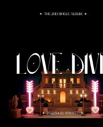
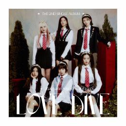
This project was the first functioning typeface designed by me. The early phases of this project started after another ritzy glitzy release from the six-piece Korean girl group IVE After Like. Coming from the Love Dive hype (when I would listen to the song about twice an hour minimum), I was all eyes on them waiting for another iconic track to be released. Once they released After Like, I was instantly hooked after the first listen. The comeback turned out to be another cosmic success for them, especially after sampling Gloria Gaynor’s I Will Survive as a dance break instrumental.
With my intense fondness for IVE’s 2022 releases, I knew I had to include them as one of my 10 Inspirations for my type. At the time though, all I knew about the project was that I wanted it to turn out to be elegant and glamorous, much like their chaebol-crush concept (as Wonyoung describes it). Chaebol is defined to be a large-scale Korean industrial conglomerate owned by either an individual or a family. Albeit my lack of knowledge on type design, I wanted it to look complicated.
In its earliest forms
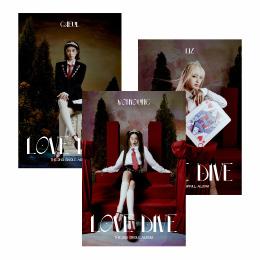
I went into the project with no original idea whatsoever. Initially, I only had the After Like and Love Dive album covers as inspiration for my type, but the outcome would not be so original now, would it? I used the visuals and set designs from their music videos, as well as information from their interviews to generate ideas to present in class.
The studies initially presented to the professor were disapproved and were described as too similar. I had to generate three new ideas that are vastly different from each other. One aspect they all shared though was a sparkle icon in the bowls of every letter, saying something along the lines of “find me charming once I confess to you” or “you must know that I’m trying to attract you.” This idea was taken from a NYLON Magazine interview with IVE, wherein Rei notes that the song talks about “expressing your feelings not only with your heart but through your actions as well...”
From there, I played with the possible letter forms while keeping the charming, glamourous, and bold aspects in each study.


The working process and its corresponding outcome
The primary challenge throughout the entire working process was constructing each glyph on Adobe Illustrator. The construction of the typeface included varying widths at certain points of the glyphs, which posed a difficulty since adding too many points will make the output appear rocky and uneven. IVE is the total opposite of that. Tinkering with the simplify and smooth tool helped though, by an insane amount.
Glyphr Studio was another challenge, with all the unfamiliar tools that came with it. Random anchor points, gaps, and distortions would appear every time I imported an SVG version of the glyph into the software. I did get used to working around these challenges though, without a solid solution.
All these challenges, including the crunched timeline we had, only reduced the quality of my output to a minor extent. Maybe I’d find a certain point out of place, or an uneven area on the glyph. But you really wouldn’t notice unless you zoom in on it directly. Am I happy about it? Yes, I’d say, considering the experience and knowledge I have on type design. I still want to play with the forms and refine them once I have the time so that I could share it online and have it available for public download.
Written and Visuals by VINCENT YAP
Reliable and progressive sex education is hard to attain in many countries up until today. The reason for this is due to the social stigma that it holds (especially in conservative countries), together with other misinformed ideas that are still considered taboo. In general, openly discussing the topic of anything sexual is still considered taboo in fact.
In 2020, the HIV.gov agency (managed by the U.S. Government) estimated that around 37.7 million people were HIV-positive. HIV is commonly transmitted through the exchange of bodily fluids (blood, semen, etc.), which makes sexual contact a primary catalyst. With good sex education, STDs, unwanted pregnancies, and abuse can be prevented
Comprehensive sex education is often inaccessible, especially in conservative countries. With that, people rely on hearsays, untrue information, and other non-factual ideas from unqualified sources. The education attained with these come from consuming sexual content from the internet and oversimplified ideas, which then become common knowledge after hearing them over and over again (Chandra-Mouli).
With that, a zine revolving around the pandemic of poor sex education was seen to be a relevant idea. The reasons for that are (1) Sex is a commonly overlooked topic, especially in conservative nations. As such, they do not learn about having healthy sexual relations and practices (2) Sex as a subject is heavily stigmatized, to the point that naming and talking about mere body parts (when not viewed in a sexual manner—especially with women’s bodies) are to be avoided. And (3) There are a lot of misconceptions when it comes to teaching sex education
Dadaism is known to be a style of satire and criticism. As the zine revolves around the misconceptions on sex education, the essence of Dada can be used to criticize the longestablished misconceptions on sex education and its objectives. Dada integrates the everyday objects used in contemporary life, as seen in the collages for the first three pages of the zine.
The Philippines as a conservative country is guilty of perpetuating these misconceptions. These perceptions are considered old and backwards. The use of vintage Filipino packaging possesses the aspects of conservativism and oldness. Old Filipino graphic design is also heavily influenced by the artistic styles of our colonizers which brought these ideas into the Philippines in the first place, which is why the style was applied to the latter three pages of the zine.
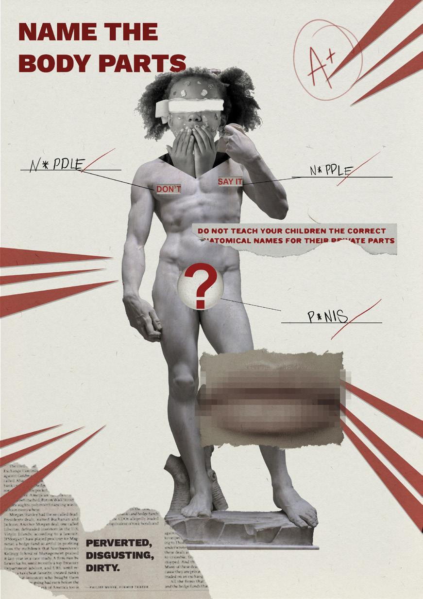
Euphemisms are used to cover up the real anatomical terms of our genitalia. This page takes on a satirical form of a biology quiz—with a focus on erogenous zones to emphasize the need to destigmatize mere body parts.
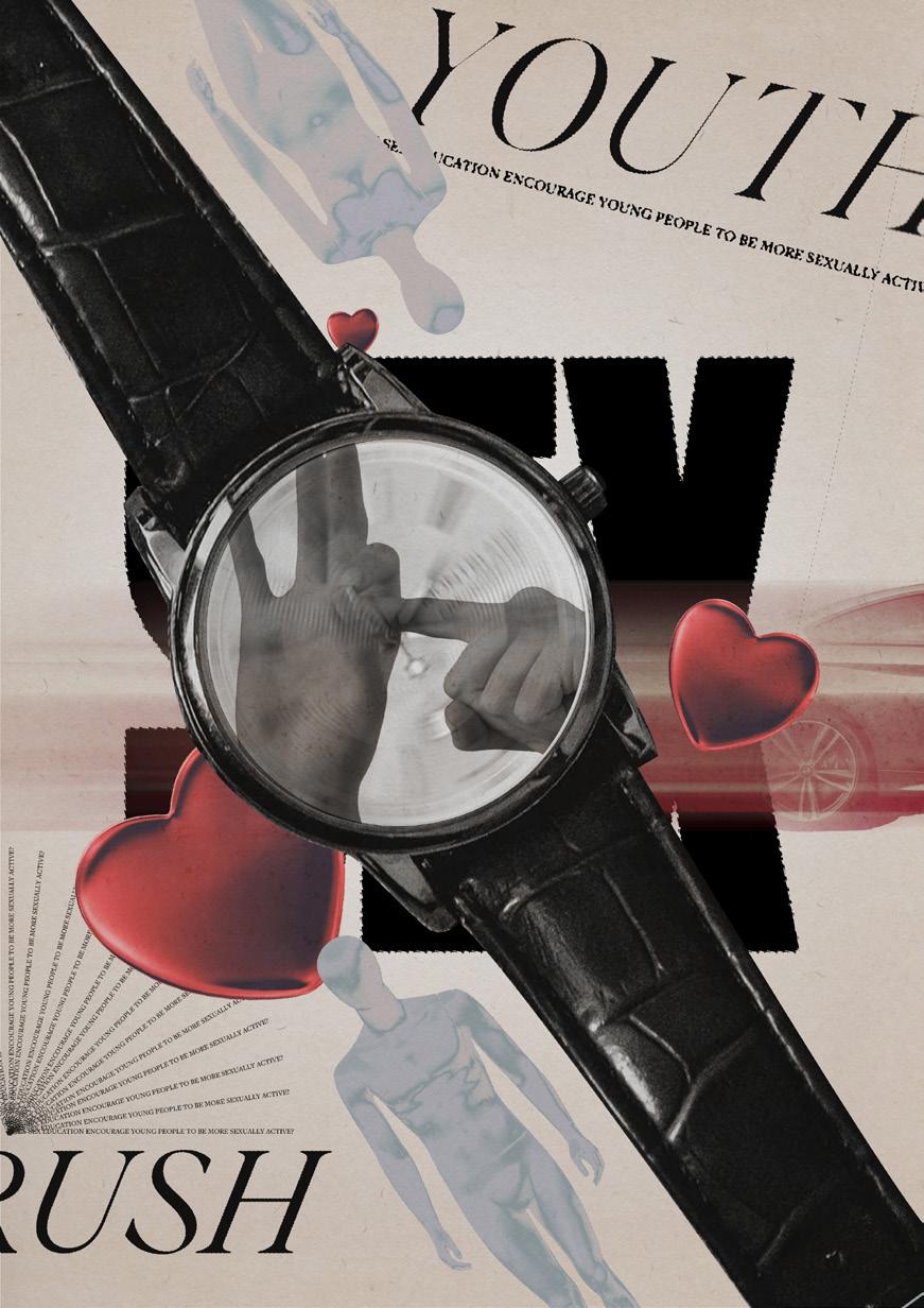
Another misconception of sex education is that it encourages the youth into engaging in sex, which is not the case. The page uses a fast-moving watch, with hand signs that symbolize sex, and a speeding car to show this misconception.
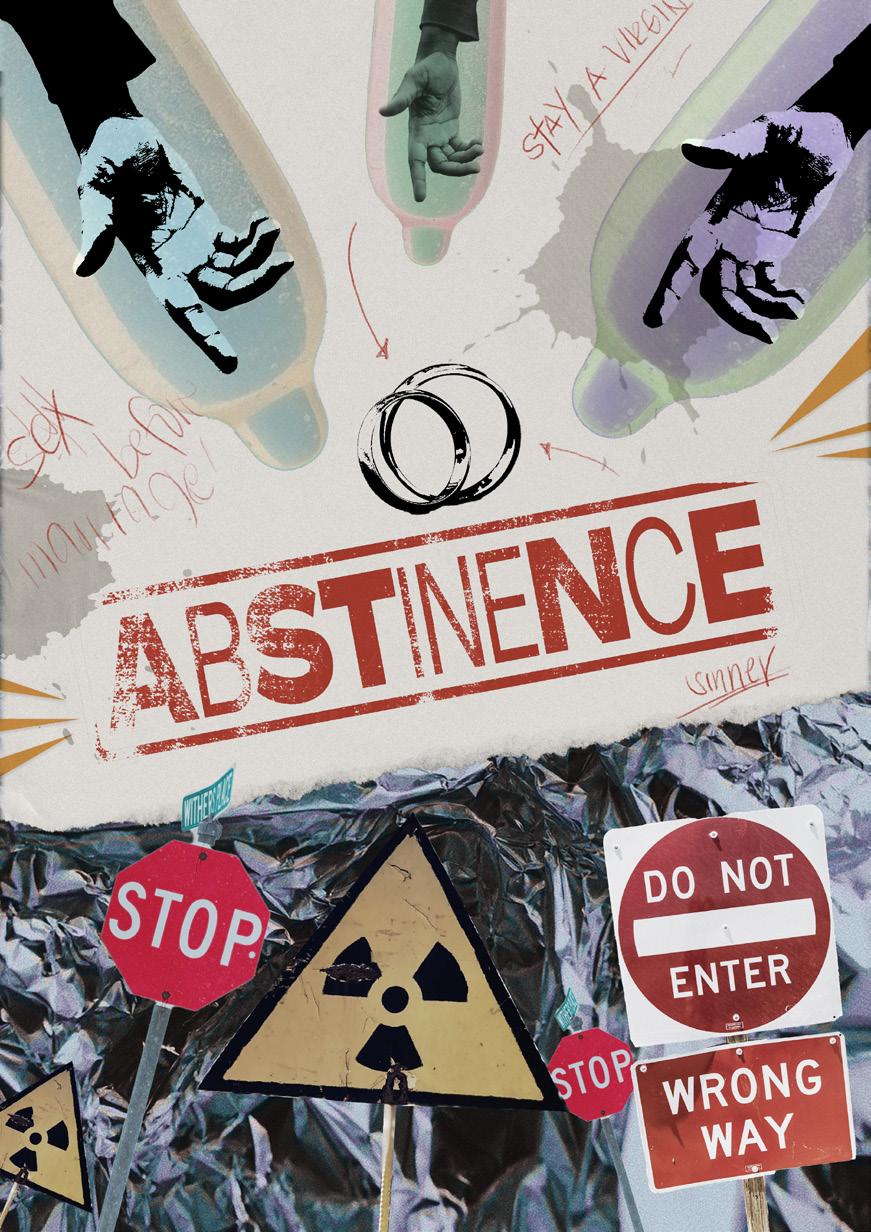
Abstinence is also said not to be promoted by sex education, which actually is not true since abstinenceonly programs are ineffective. The page satirical shows the idea of abstaining as the best form of contraception—which is unfortunately still taught to students.
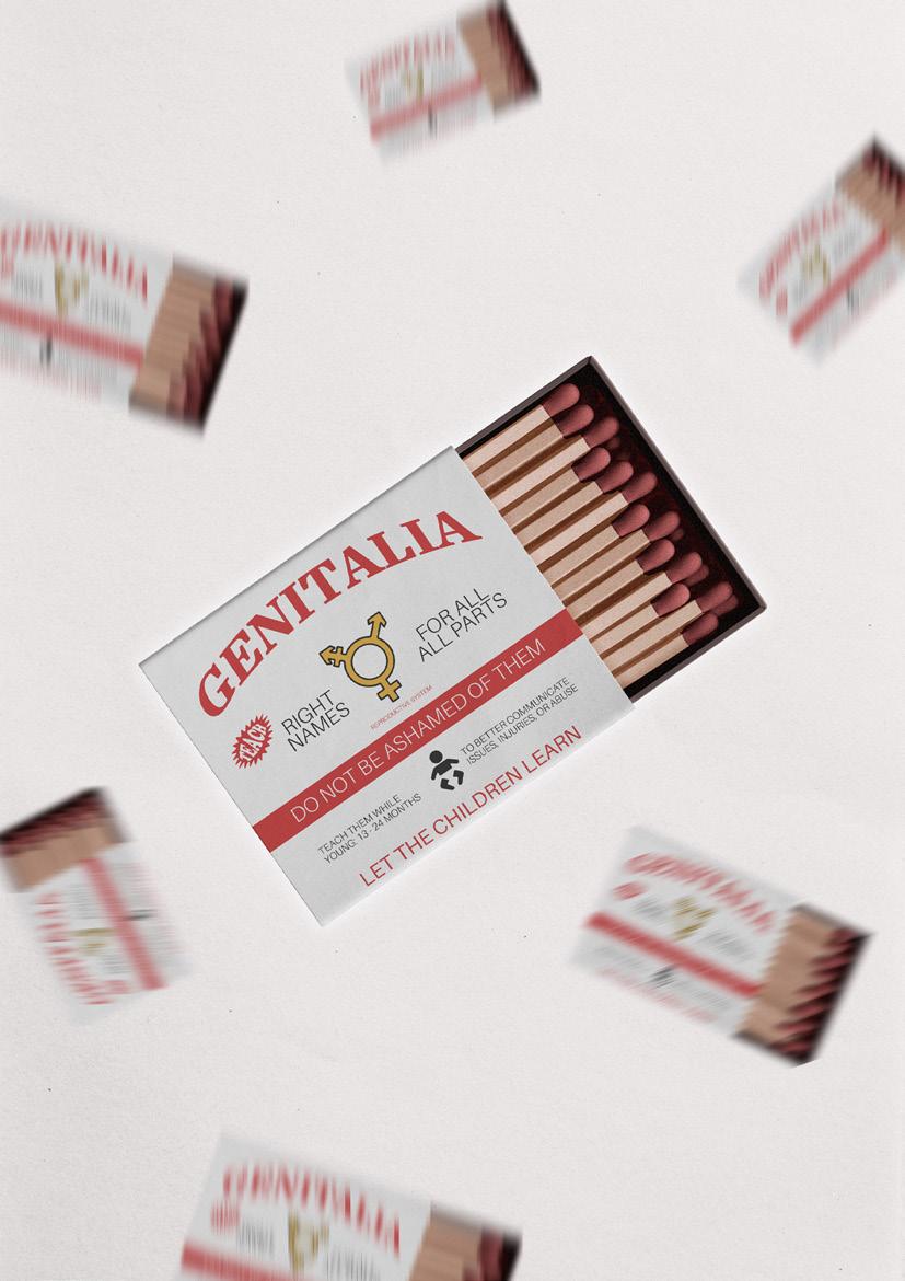
This page takes inspiration from a wellknown local match brand named Royal. The idea for this design is that it responds to the first misconception that naming genitals are bad by asking the viewers to teach children the right names.
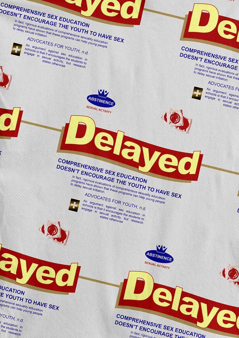
This page also responds to the 2nd misconception that sex education encourages sex, but research has shown that it does not and actually helps delay or reduce sexual activity among students. The design takes inspiration from Presto Funwich, a defunct ice cream sandwich brand from the Philippines.
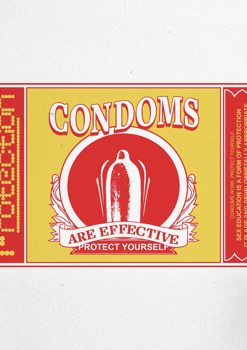
This page focuses on the misconception that condoms are not effective. Oftentimes, people take the idea of using condoms as useless due to their personal experiences with them. However, there are certain instructions on how to actually use them—which are taught in comprehensive sex education.
Various handmade type compositions made throughout the term, including the initial sketches of the typeface inspired by the Visiona II exhibit.