Unless otherwise indicated, all images are from, and copyright of, the authors.
FROM THE CHAIR
We have such talented members, as proven in both the DI Print Portfolio and then the Digital Imaging Competition Open Colour round. Both gave us some super work at the winners’ levels, but one thing stood out to the team managing both selection days. Overall, the standard of the print submissions was higher than the digital imaging work.
Why is this I wondered? Those who are still part of active clubs said this is a phenomenon also seen in club competitions. Whilst obviously choosing the right paper to enhance an image certainly helps to differentiate where the same photo is presented both digitally and well printed on a quality paper, it doesn’t totally explain the difference we are seeing. With the LRPS Distinctions now being ‘digital submissions only’ this really is something we need to be considering more if we want to maintain high success rates for our members. Of course, whichever the chosen output, the photographic quality should be equally outstanding if an image is going to be successful.
Perhaps quality over quantity might be something each of us should always aspire to. When we had to buy film and had only a small number of exposures
EDITORIAL
This issue of DIGIT includes a wide variety of topics, some may prompt reflection, others perhaps presenting a different perspective to our own. All, I hope, will be of interest.
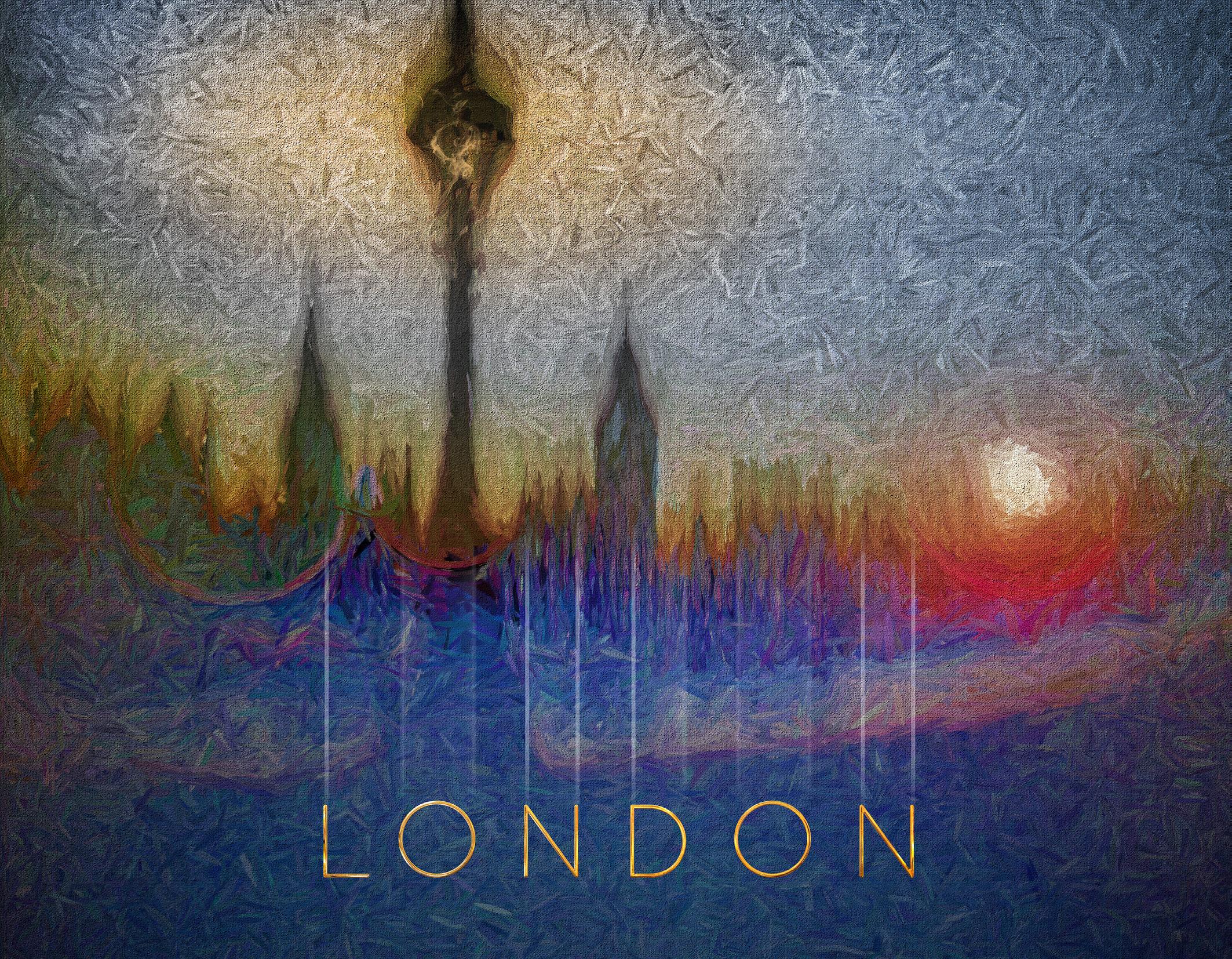
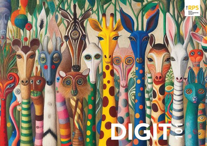
Edmund Nägele tells us of his journey from photographing scenes for postcards, of the kind many of us might have posted back to friends from our holidays, to his modern style, exemplified by the image on the cover.
Rather than pursuing other activities when the sun goes down, Colin Smith ventures out with his camera and tripod to photograph the Milky Way and other stars. He offers tips to help us to achieve similar results and, as every day is a school day, tells us a little about the Bortle scale.
The war in Ukraine has affected us all in some way. In response, Jonathan Vaines took the unusual approach of trying to document some of the events and his thoughts in a series of photographic images and gifted them to the people of Ukraine.
per roll, we really stopped and considered what we were shooting. We couldn’t afford simply to fire off willy-nilly in the hope of getting one good shot. We stopped, looked and considered everything more carefully prior to releasing the shutter. Photography - when it is not just ‘snaps’ - is an art form, so approaching our shooting with this in mind should lead to more thoughtful work. Higher quality work at the point of shooting might then deliver higher quality end results, regardless of whether we choose digital or print as the final output.
Processing is the other aspect to consider. Do we work harder if we know something is going to be printed? Are we more sloppy when processing something that is ‘only’ going to be seen digitally? Surely this is where pride in our work comes in.
Whatever media is to be used for the final output, we owe it to ourselves to show only our very best work that we are 100% proud of. That way our own confidence will grow exponentially and we will feel more secure in showing and competing.
So don’t rush - stop, look, consider before shooting. The same should apply when processing. Give it some thought; give it a try - and see if your work improves as a result. Sometimes less is more.
In the first of a two-part series, Michael O’Sullivan analyses what makes a portrait, and notes that there are many different types of portrait image that can be made. In the next issue he will follow up by explaining his approach to portraiture,
Andrew N Gagg reminisces about his college days where he studied, amongst other things, typography. He considers how type can complement an image when seeking to convey a message.
AI is a contentious subject, and many, probably the majority, of photographers have reservations about the impact it is having on photography. But Bob Sanders has found one AI application that he thinks provides benefits to photographers.
We wrap up this issue with two Challenge articles. The first features an image, It’s Mine by Sheila Haycox, which was one of those selected for the Print Portfolio 2025. The second, by Susanna Hoare, is an interesting mix of still-life and Intentional Camera Movement genres.
I wish you good reading.
PIXELS AND PERSPECTIVES
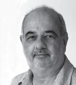
EDMUND NÄGELE FRPS
Edmund Nägele spent much of his professional life photographing people and places. More recently he has embraced the current computer and software advances in his digital art.
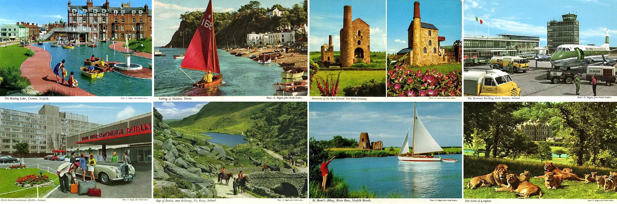
My photographic apprenticeship at an advertising studio in Munich included photographing wellknown brands of ice-cream basted with bicycle oil for added gloss, and Bavarian beers, shaken but not stirred, producing an authentic head. It was an interesting start. After finishing the compulsory three years, I decided to look for more adventure in the outside world. A job to shoot postcards on 13x18 cm (5x7in) film for an Austrian company came just at the right time.
I was given an old Linhof Master Technika camera, a tripod, words of advice and a company car, a VW Beetle, to cover the territory of Salzburg and Tyrol, whilst the factory itself was located on the far western edge of Austria.
Enjoying this kind of independence, as it was already far enough from home and the workplace, was a special treat. A year later I answered an advert for a photographer by the now legendary John Hinde FRPS, based in Ireland, and was accepted. More postcards, of course, but this
time the company boasted, ‘The Finest Viewcards in the World’, which was a bit of a challenge for a young kid from Germany who did not even speak the local language, let alone understand the funny currency. But one is young only once.
The challenge turned out to be an adventure lasting 10 years, during which time I also became the manager of the photographic division of the company. It was indeed John Hinde himself who challenged me to apply
for the Fellowship of the Royal Photographic Society of Great Britain, with the promise to pay for the life membership, if I were to be accepted into this renowned circle. I was given the time and materials to complete my application to a society I knew nothing about. To everybody’s surprise, my application was successful. John Hinde paid up and I was a proud Fellow of this internationally distinguished organisation.
But why would you be interested in such background drivel? I’ll tell you why: John Hinde postcard
images were arranged on every single occasion. Those colourful flowers never grew in front of the lens, nor did donkeys, boats or people happen to grace the picture by chance. Everything was painfully planned in advance and had to be ready when the conditions were right for the intended image.
The photographic output at the beginning was around 80 scenes per season - May to September - excluding the Butlin’s holiday camps, but that is another story. Eventually I increased this figure to 130 images as a guide to our other
photographers who had joined the company in the following years.
These years impregnated me with ‘Colour Madness’ which eventually found itself into my digital work.
When John Hinde sold the company to Waterford Glass, it was time for me to move on. I borrowed £2,000 from my friendly bank manager; enough to secure Fish and Chips, petrol and film material for the first season. John Hinde Ltd. agreed to sell me the camera gear (Plaubel Peko 4x5in including lenses), the car (Ford Zephyr) and
John Hinde postcards
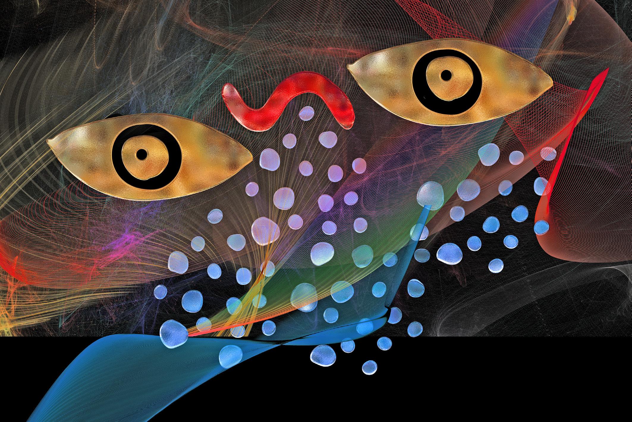
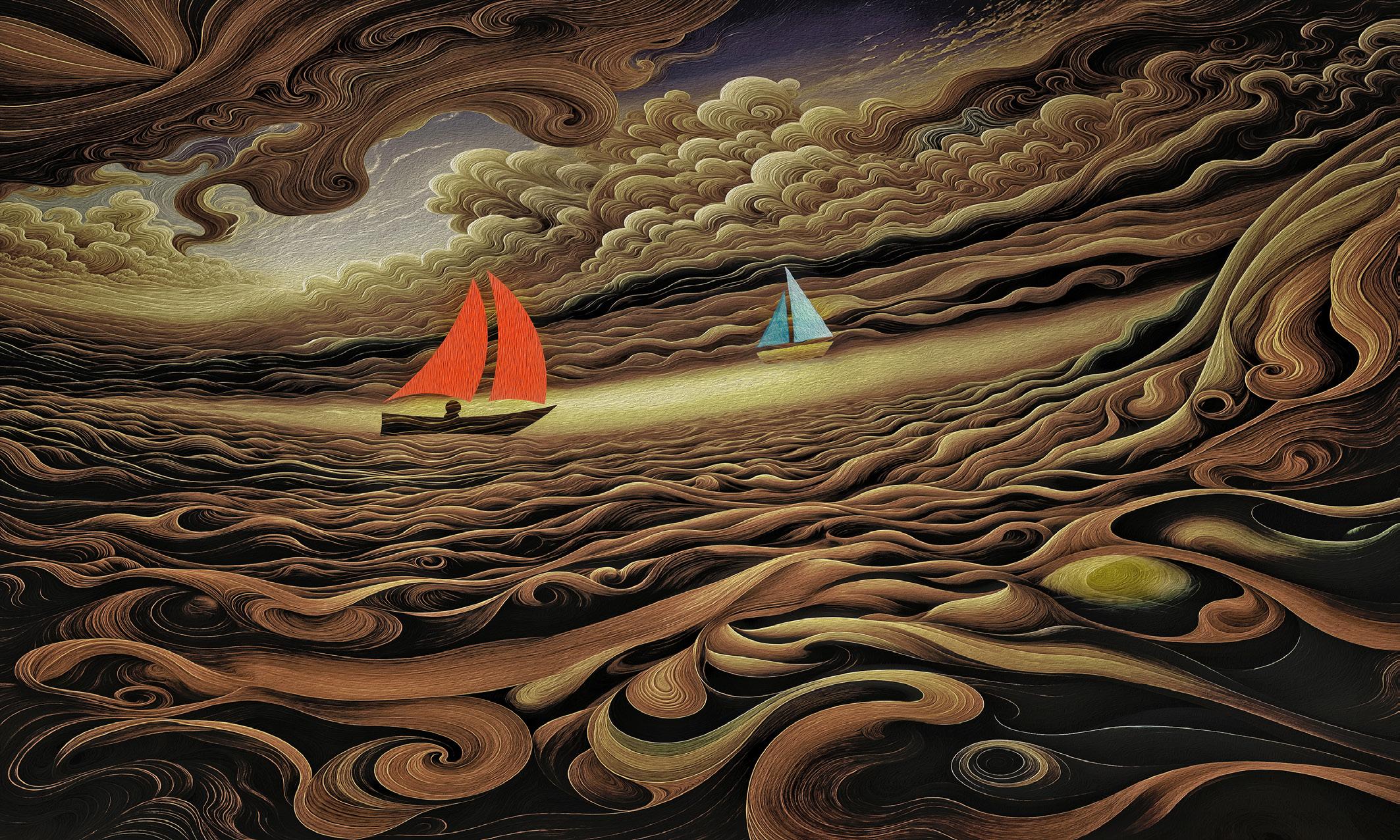
The Abyss
the caravan, a John Hinde relic from his earlier circus days. In short, all the paraphernalia I had been using over the years, in lieu of a certain amount of freelance work for the company. Cash purchase wasn’t an option for a poor photographer.
All my debts were paid off within two seasons, opening more opportunities to purchase a very small cottage in West Wycombe (Buckinghamshire) and to enter the calendar market in the UK at a time when Cokin filters appeared. These were my analogue stone-age ‘Photoshop’ tools, how little did I know what was to follow.
My intended clients were not impressed, they wanted ‘blue skies and fluffy clouds’. It was good old Marks and Spencer who published the first calendar which broke with tradition. The rest is history. Picture researchers hammered on
the door, it wasn’t for the coffee on offer, they wanted the M&S style. Things began to move in the right direction. Sometime in the early 80s I went to an exhibition at the NEC in Birmingham. Stopping at a stand demonstrating Photoshop, I was gobsmacked; I wanted it! I needed it like a fairy needs a tale!
Within weeks I placed an order and paid £9,000 for an Apple Macintosh II. The handover of the cheque hurt, but the engineer who plugged it in and made sure it started, just grinned and said, “This is just the beginning...” How right he was. I seem to recollect that the Macintosh had only 80MB of storage, hence I needed a CD writer, costing £1,000, to store my early results. It got worse. I had to learn Photoshop without any help. I spent the next 12 months in my office, not undertaking a single
photographic trip to take more new pictures for my library, trading under the name of Nagelestock
Of course, my clients did not want digital files, they wanted transparencies. More expenditure followed for an Imapro drum scanner (£25,000) and the Imapro film recorder (£20,000) to output the digital files onto brilliant Fuji Velvia 6x7cm film. Happy clients at last!
By now I was well established with practically all calendar manufacturers in the UK, as well as supplying the same trade in Germany, Switzerland, the USA, Australia and Japan; in the latter, corporate calendars topped the $1,000 mark per image.
In the meantime I still occasionally offered some of my analogue and digital work to John Hinde Ltd., especially their Irish and Scottish series of more artistic card designs,
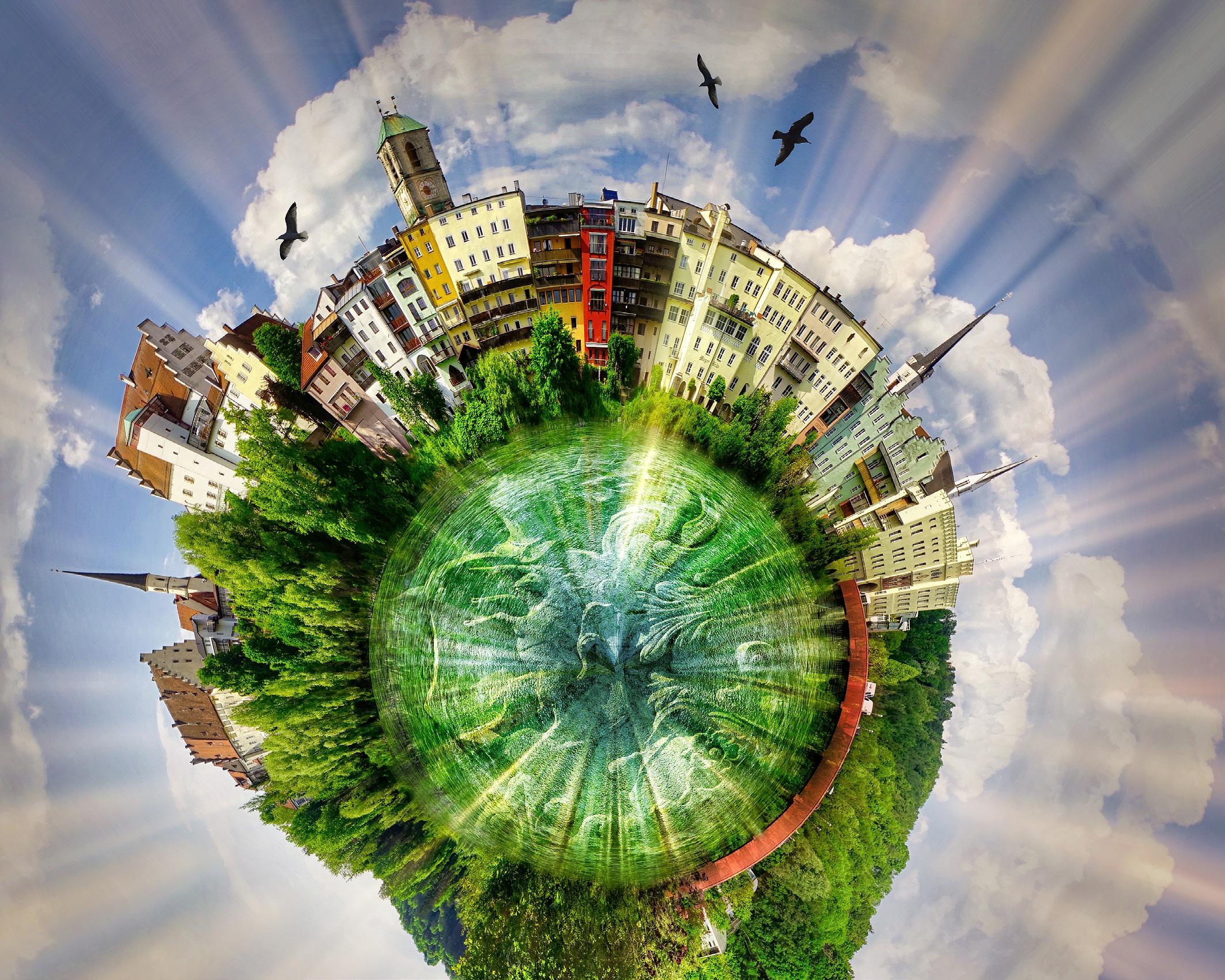
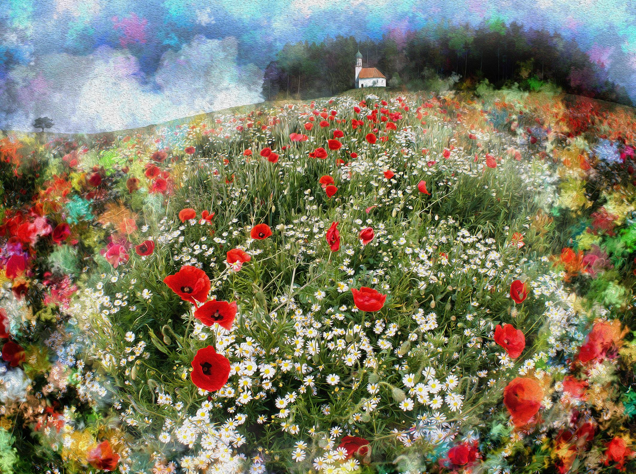
The World of Wasserburg am Inn, Bavaria, Germany
featuring a high gloss picture finish, surrounded by a white matt border. Very posh indeed.
John Hinde last visited us in Cheltenham in 1997, shortly before his untimely death. He was a figure of outstanding character and had become a good friend. During that last visit he showed great interest in my new digital work, I called it the ‘arty-farty stuff’, he did not disagree but seemed to like it nevertheless.
Personally, I was always drawn to the abstract, the shapes and the colours. I also love the ICM (Intentional Camera Movement) results in my analogue works and have every intention to widen my horizon in that field. Photoshop allows me to blend various designs, often containing up to 25 layers. My experiments frequently involve the software offerings by Affinity, ON1Photo RAW, Luminar, Flame
Painter 3 Pro, Topaz Studio and Aurora HDR. A good source of inspiration of textures, patterns, shapes and typefaces can be found at designcuts.com which also caters for ‘Procreate’ users blessed with an iPad. I have no fixed idea of the outcome when starting on a new image, originally photographed on my trusted Canon EOS 5D. I simply let the mind wander freely between the mentioned applications and a glass of Doppio Passo Primitivo, my favourite tipple.
I am retired now and at times let a picture evolve over several days and different moods. Any digital artwork will develop rather slowly, but with the one important advantage: no splattered paint on the living room floor. Occasionally my wife may throw a critical eye over the developing madness on the Macbook screen. The digital aspect of my work gives me
pleasure and has also become more of an exercise to keep the grey cells turning over.
For the past 13 years I have produced some 20-30 yearly calendars for friends or past clients, as well as for our home in Bad Tölz and our holiday apartment in Torquay. Having dabbled in calendars most of my life, I have learned that if the image on the wall survives 30 days without a rude comment, it’s probably not a bad picture. Indeed an important attribute in our times, when we are bombarded with images which we need to absorb in the limited time frame of a few seconds.
With AI at the doorstep, things will certainly change. For better or worse. Even though I am not convinced, I have had a go with nightcafe.studio. It’s free, only u
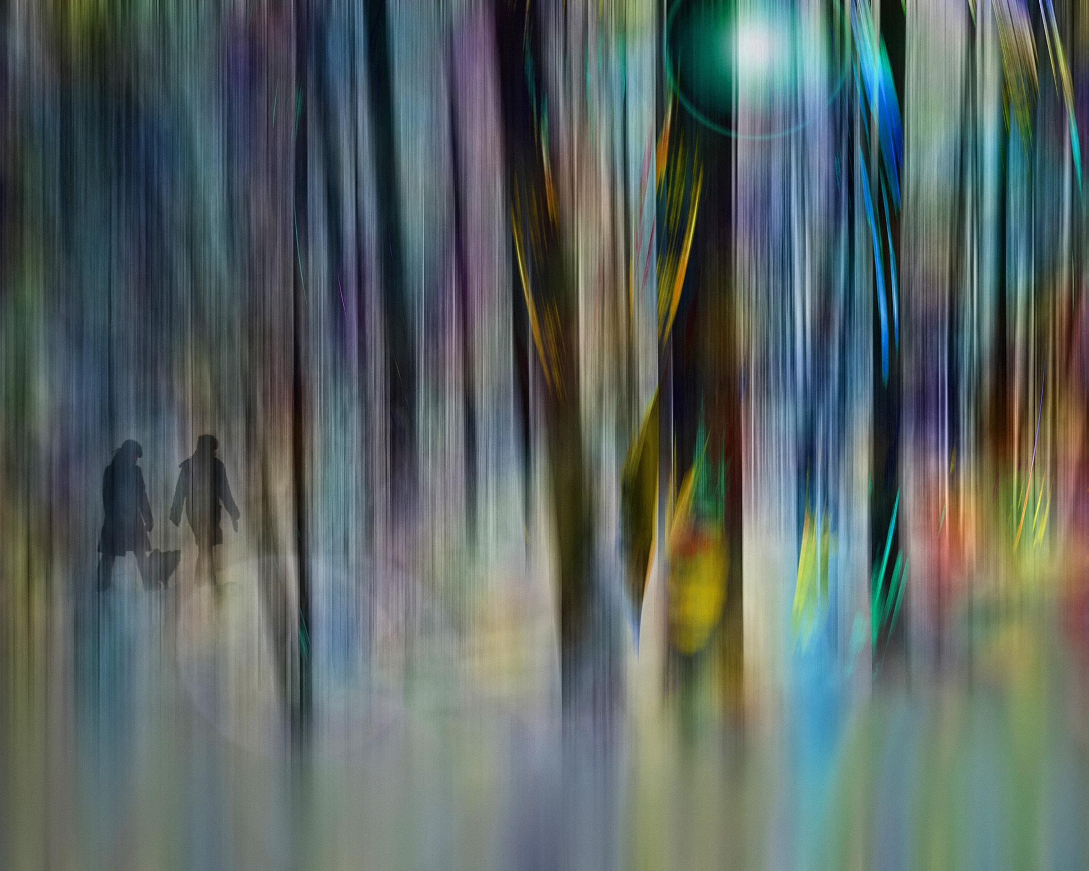
A Walk in the Forest
St. Georges Chapel at Ascholding, Bavaria, Germany
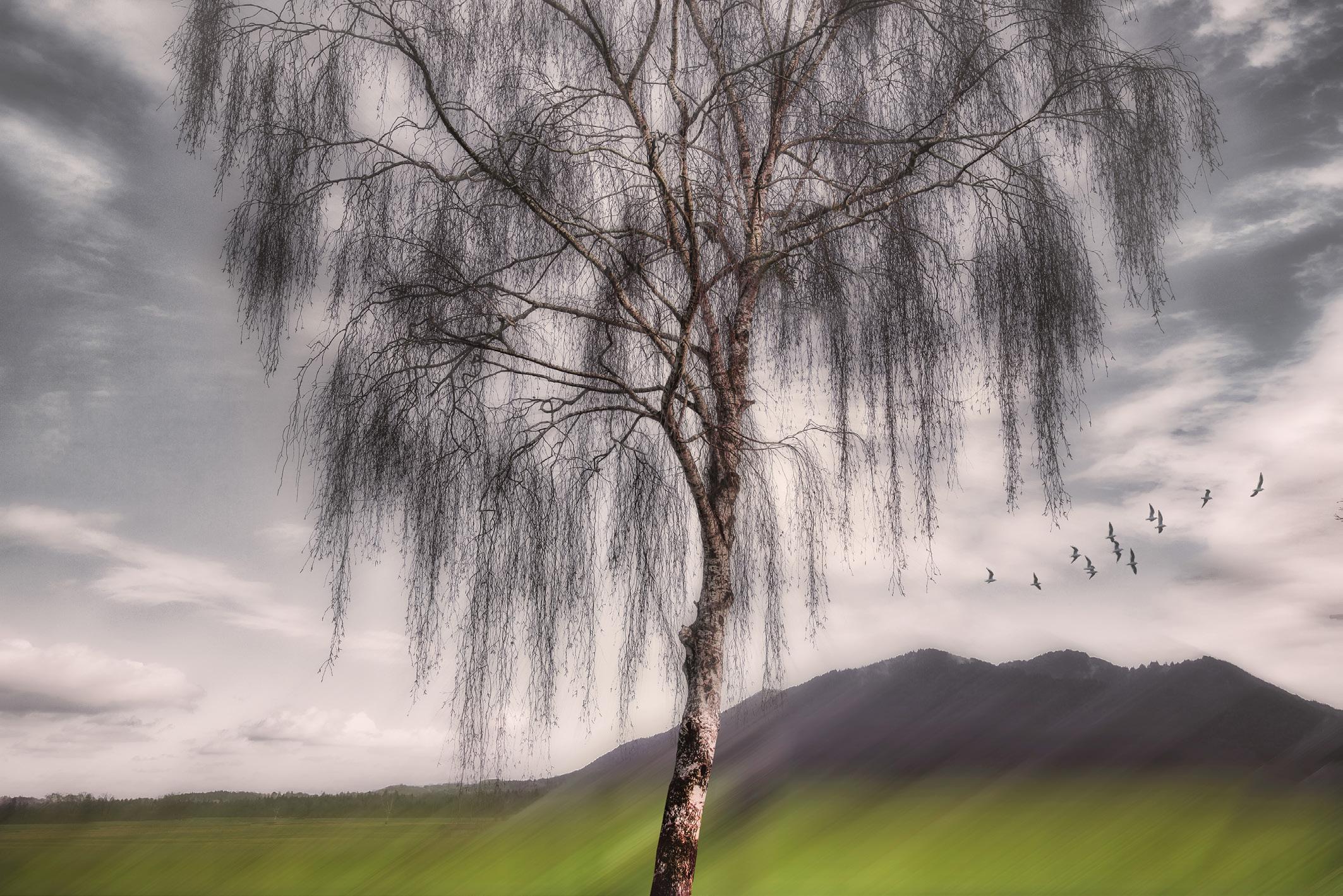
Moorlands at Bichl, Bavaria, Germany
addicts need to pay. So far, my ‘prompts’ have been treated with apathy by the image generator and the offerings ignored most of my detailed instructions. The resulting images may be upscaled with the free credits I have collected, though the quality is still extremely poor. The system of my Macbook Pro is too old to make use of Topaz Gigapixel AI and in today’s climate, my UK agent’s rewards would not recover any update investment within my life expectancy. For me, it all seems about as natural as watching an octopus putting on its socks in the morning.
Most of my present images would not have found a place in my previous commercial activities, nor in my picture library nagele. co.uk. The website is still online - purely for nostalgic reasons - I built it myself in the early 80s with the help of Microsoft Front Page (no longer available) using the out-of-date ‘Frames’ layout. Many late-night efforts kept my Google ratings on page one, as far as ‘stock photography’, ‘picture library’ and ‘photography’ searches were concerned.
During my three-year apprenticeship and photographic college, I had learned the craft of photography: ‘Writing with Light’, as the ancient Greek would say. I had coated a 9x12 cm glass plate with emulsion, exposed this plate with a black cloth thrown over my head and an upside-down world on the screen. At John Hinde Ltd. I mastered developing Ektachrome-X colour film in giant frog-tanks, later to be replaced by a superb Colenta film processor.
The Macintosh and the pixels opened up a new world to my workflow and I realised, with some surprise, that for all my previous work, without exception, I had used some gadget or filter in front of my lenses. Photoshop technology did away with all that, it enabled me to influence the lighting to a great extent - think: exposure, contrast, colour and saturation - the most basic adjustments. Cloning, masking, layers and the HDR treatment actions, John Hinde could not have visualised these possibilities in his wildest dreams. He might have even bought an iPhone to replace his photographers. But he wasn’t that
sort of man. Instead, he took up painting. Modern paintings! Superb paintings! Perhaps I too, have been taking a step back, but without the paint splashes on the floor or any commercial pressures.
See more of Edmund’s work alamy.com/portfolio/nagelestock nagelestock.net/
The Tide is High (Totally unexpected result of my first AI attempt)
MY JOURNEY PHOTOGRAPHING THE NIGHT SKY COLIN SMITH LRPS
Faced with nightfall, many of us reach for the flashgun or pack away our camera until the sun shows its face again. Inspired during a family holiday, Colin Smith learned that the night sky offers many photographic opportunities.
I can easily pinpoint when my fascination with photographing the night sky started. It was 10.30 pm in October 2019 and I had just stepped out of the car in Arches National Park in Utah in the south west of the USA. I looked up and
realised I was standing under the Milky Way which I could clearly see arching from one horizon to the other. I was awestruck. I had never seen so many stars in such a brilliantly clear sky. Although this was a family holiday, I had
come prepared with my camera. I’d read a bit about the settings to use for night sky photography but, as I was to learn over the coming months and years, there is so much more to learn than simply getting the settings right in camera and
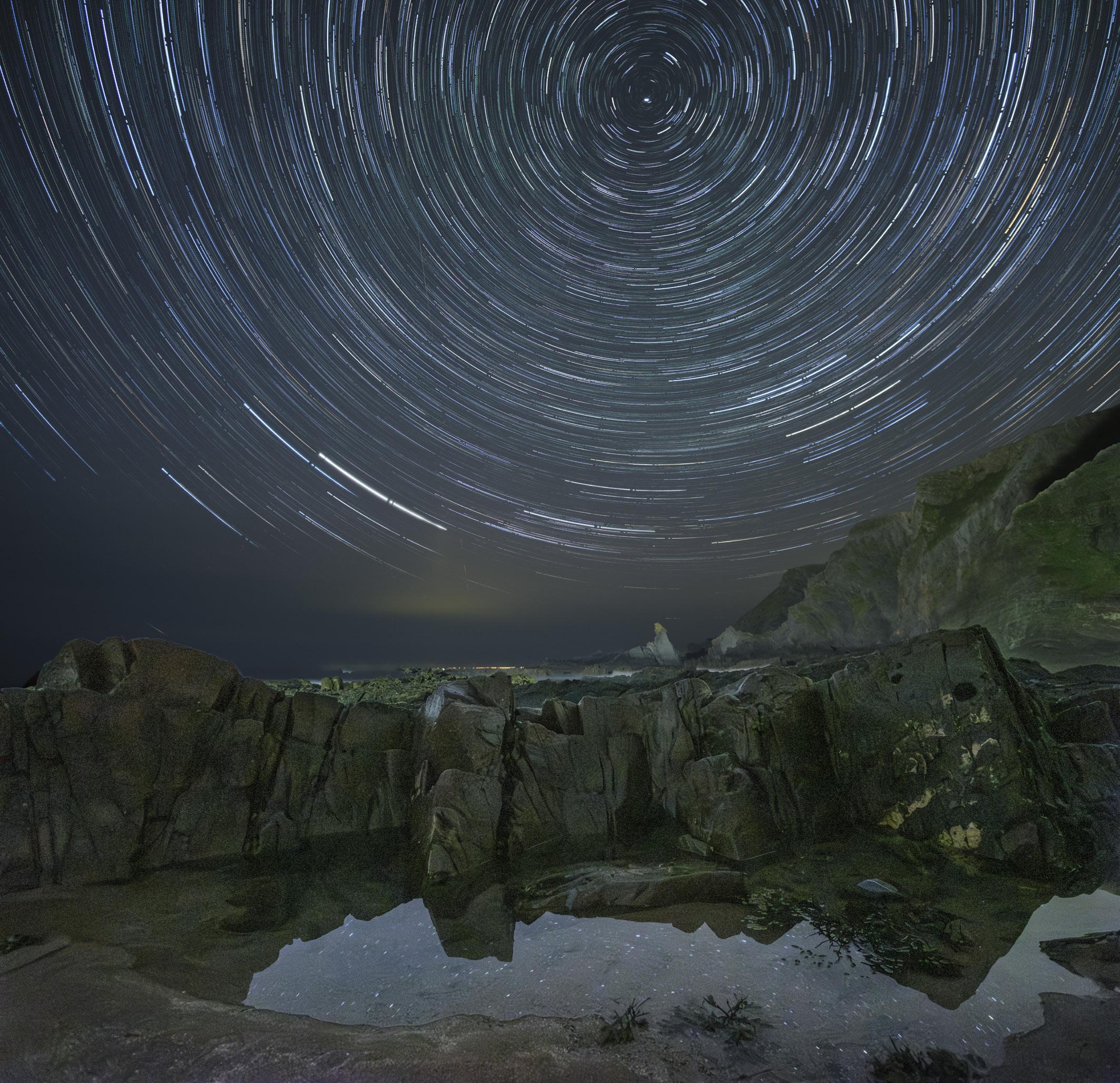
One hour of star trails, Hartland Point, Devon
pointing it upwards. Taking photos of the night sky is not limited to those with the latest and most expensive equipment but it is still one of the most challenging genres of photography. I’m hoping this article might inspire you to venture out under the night skies with your camera.
So what do you need to think about if you are interested in getting into night sky photography?
Equipment
Almost any camera can be used to take night sky photographs. Even current mobile phones often have an astrophotography setting, although I have not experimented
with mine. I use a Fuji X series camera and am very happy with the results. The key, apart from a good solid tripod, is a fast wide angle lens. The wider you can open the aperture, the more light you let into the sensor - I use an f/2 Samyang 12mm. So all you need is your camera, lens, tripod and plenty of
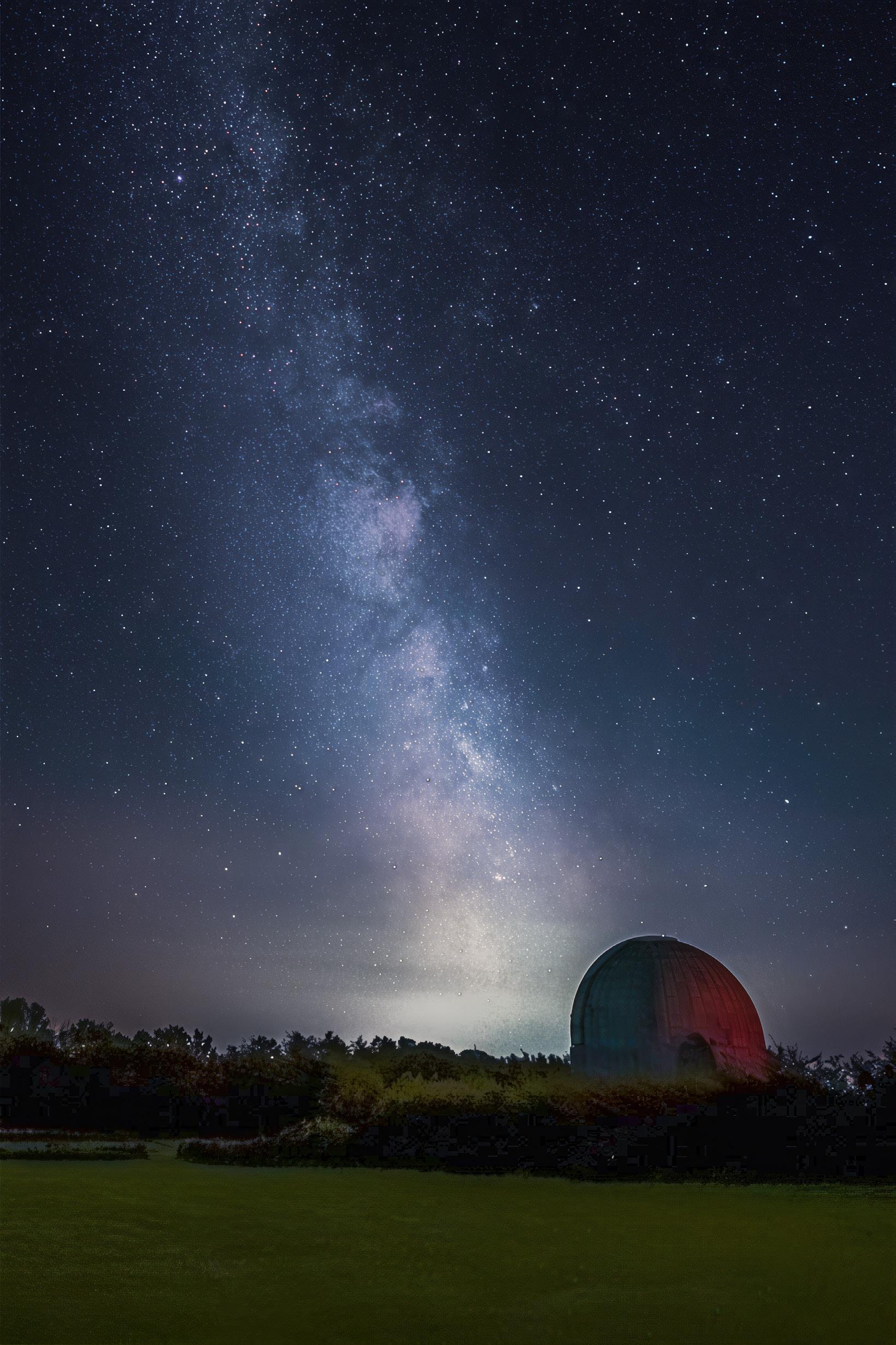
Milky Way at the Observatory Science Centre, Herstmonceux, East Sussex
warm clothing when photographing during the winter months!
Settings
The key settings to consider are ISO, white balance and shutter speed. Typical settings would be ISO 3200 or 6400, and white balance between 3000 and 3700
K. Whichever settings you use,
however, it is always good practice to take a test shot as you may need to adjust the ISO up or down to ensure you are getting good star detail. Always shoot in RAW, turning off any stabilisation functions and long exposure noise reduction, and open your lens up to its widest aperture. Shutter speed is the critical setting to avoid any movement of the stars
as this could lead to blurred photos. There are a couple of formulas that can be used, the rule of 500 and NPF, the latter, devised by French photographer Frédéric Michaud, is used to determine the optimal shutter speed for capturing sharp stars. However the Photopills app will calculate the relevant shutter speed for any camera, lens and
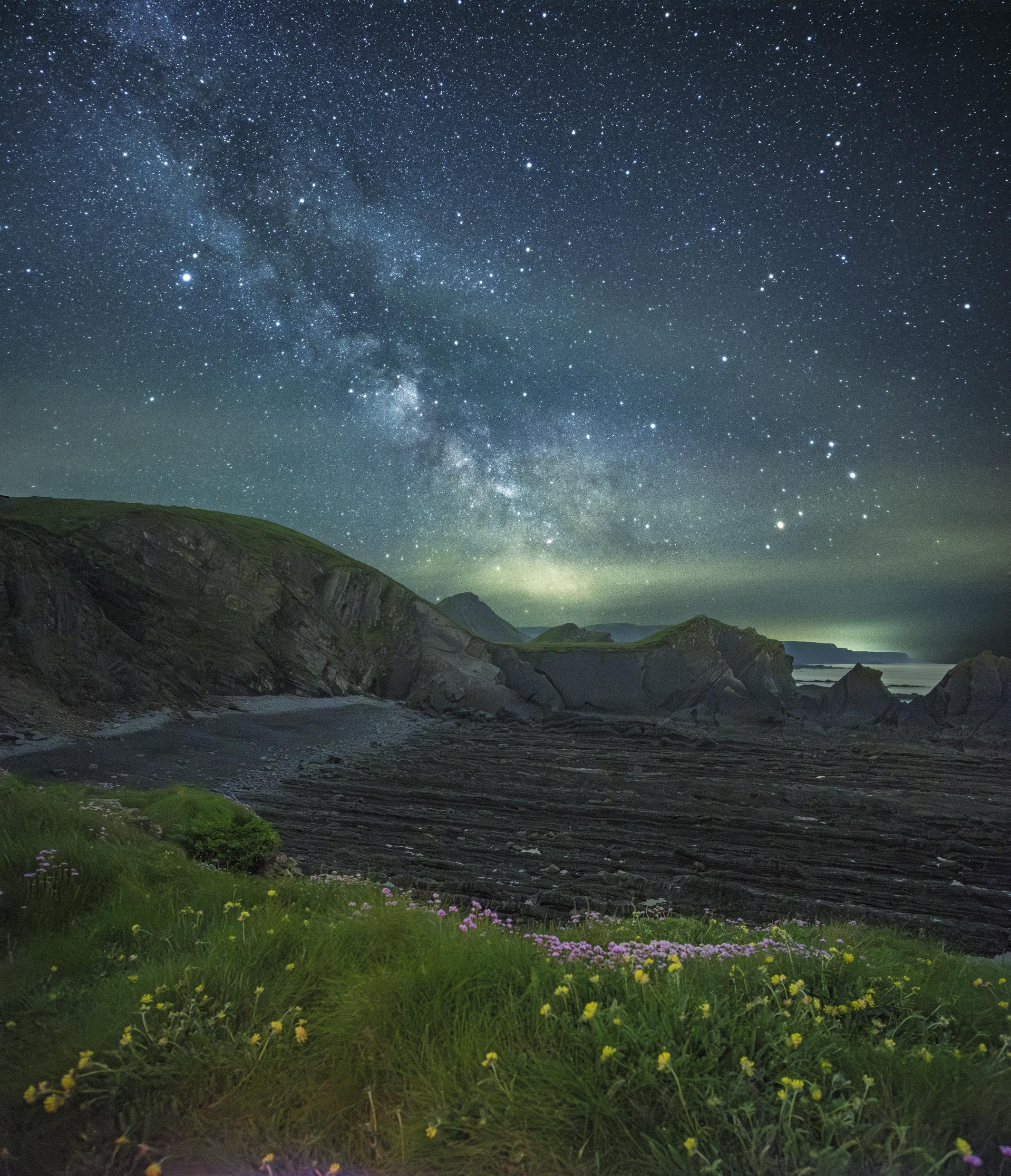
The Milky Way at Hartland Point, Devon
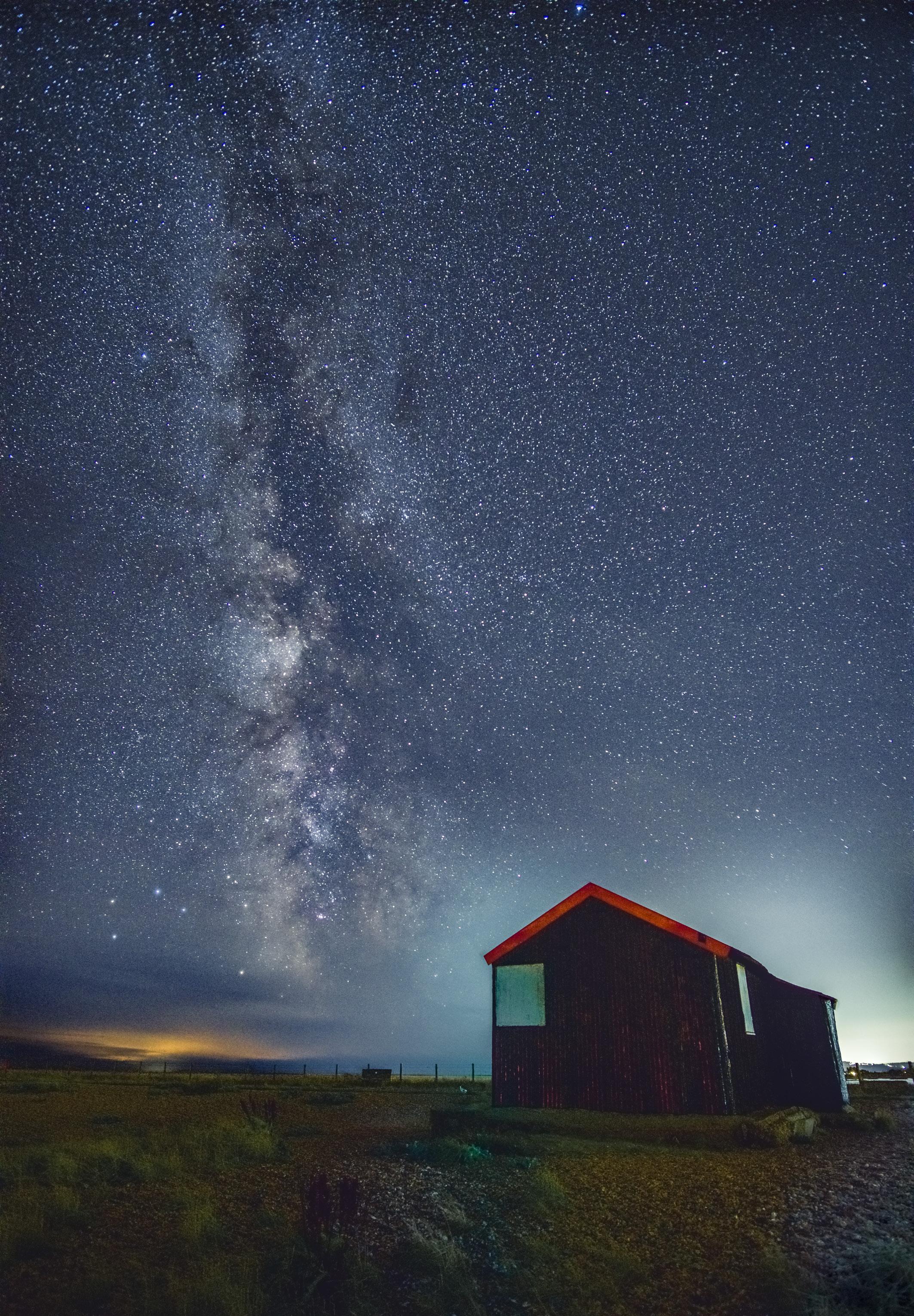
The Milky Way at Rye Nature Reserve, East Sussex
aperture combination. For me, this is a maximum of 13 seconds for my camera and lens. Using an intervalometer I set the camera to take 15 shots at 13 seconds each and this will produce enough detail in the stars. These are then combined during post processing.
Planning
So what could you shoot the first time you go out under the night skies? Perhaps the most featured subject in landscape astrophotography is the Milky Way but star trails are also a good subject.
Planning, of course, is key and this is where the Photopills app helps by answering the following questions. When is the Milky Way in the direction you want it to be for your shot? What effect will the light from the moon have? What time of the night will the core of the Milky Way be visible? When is true darkness? What direction is north if you want to take circular star trails?
The app has an extensive set of online tutorials so is well worth the small cost. Alternatively I highly recommend the book Photographing the Night Sky by the late Alyn Wallace which covers absolutely everything you could ever want to know about night sky photography.
Learning basic astronomy will help you make sense of what you are seeing. A little bit of knowledge can make you appreciate the night sky differently and, in my case, has given me a stronger connection with the universe we live in and the importance of keeping our skies dark, not only for nature but for future generations.
Additionally, understanding the three different twilight times before darkness is key. Civil, nautical and astronomical are the three different twilights before the sky is fully dark. Whilst you can start shooting during astronomical twilight you won’t obtain the same level of detail and colour as during
darkness. The moon rules the night sky and her gaze can easily wash out the Milky Way.
Location
In considering where to photograph the Milky Way or capture star trails, the composition of the photo is just as important as it would be in any daytime landscape shot. Visiting locations during the day is crucially important to work out where to photograph from. A photo of the Milky Way or star trails without an interesting foreground won’t grab the viewer’s attention.
The Photopills app has a very useful ‘Virtual Reality’ function that will show how the night sky will look on the particular day and time you are planning to shoot. It is also important for your own safety that you know where you are going. I always arrive at a planned location before it gets dark to allow plenty of time for setting up and for my eyes to get used to the dark. But you’ll be leaving in the dark, and need to know where you are going and how the conditions are underfoot, which you’ll have experienced by visiting during the day.
A key measure to take in when considering any location is the amount of light pollution. This is measured by the Bortle scale. I live in a Bortle 5 area which means that the Milky Way is a bit washed out but is still worth capturing. When I go down to the South Coast I have moved to a Bortle 4 area so I’m able to capture much more detail. Regrettably there are very few places in the UK where light pollution is not an issue. There are six national parks in the UK that are designated as dark sky reserves and, if you live close to one, I’d encourage you to explore it.
Weather, of course, plays a vital part. Many nights I have planned a particular shot and prepared myself to go out late in the evening but there have been clouds. The Clear Outside app, which will forecast when the skies are going to be clear for any particular location, is a very useful tool.
Post processing
This section is not intended to be a ‘how to process your images’ set of instructions. There are plenty of these on YouTube. However you will need to do some adjustment and you don’t need much more than Lightroom. Before that you will need to stack your 15 or so images that you took of the Milky Way. The free Windows program that does this is Sequator, and planes and satellite trails will be automatically removed, a real boon for those of us living in the South East of the UK.
Star trails can be captured either as one single image or as multiple images. Single images have the huge benefit of requiring little post processing but come with a higher degree of risk when taking them. If shooting multiple images they can be blended either using Photoshop or the free StarStaX program. The star trails image on page 11 is made up of 60 one minute images.
Conclusions
It’s hard to describe the peace and connection with the universe I feel when standing out under the night sky. I feel small and insignificant. My motivation to go out, especially when it’s below zero in winter, or late after dark in the summer, can be tested. But the satisfaction I get when I produce an image I had planned maybe months ahead can’t be beaten.
Whilst this is not meant to be a complete set of instructions, hopefully it will make you understand what to consider before you photograph the night skies. I hope it has encouraged you to have a go. You have the ability to produce amazing images - you just have to get out there and experiment. And if you are anything like me, you’ll get hooked.
WAR IN EUROPE
JONATHAN VAINES
Media coverage of the invasion of Ukraine by Russia has presented the reality of war we have rarely seen in the past. These events, and the images from the media, prompted Jonathan Vaines to create a set of pictures which help him to understand what is happening and come to terms with the situation.
By late 2021 talk about an escalation of fighting in Eastern Ukraine began to emerge on mainstream news feeds. By early 2022 we could see that Russia had moved its armed
forces close to their border with Ukraine and the border Ukraine shares with Belarus. I was hoping President Macron was right; Putin would never do it, would he? In
February it happened, world press filled their front pages, EU leaders assembled quickly to discuss how this should be handled, and NATO had never been so important to the
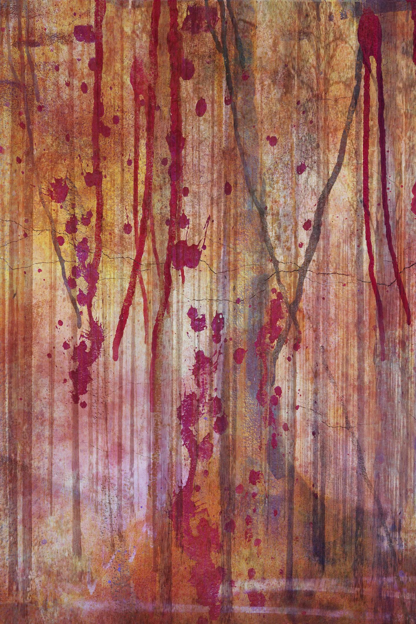
Picture 1
security of us all. I was overwhelmed and my mind spun. I found those first six months frightening; there was a new development every hour as we watched Russian boots walk on their neighbour’s land. But Ukraine was more prepared than many expected. The fall and annexing of Crimea passed almost unpunished and maybe Putin thought this would be repeated.
We watched as a superpower’s armoured column headed to Kyiv and then stalled. Small towns and villages fell to Russian invaders, but Ukraine resisted. In the south,
a siege of the Avostal Steelworks in Mariupol could be watched on TV as somehow Ukraine continued to supply its besieged army with munitions, water and food. When the war entered its first summer the news feeds pressed home the dark story of the Red Sea and how grain needed to leave the wartorn country. Crops were failing and those harvested could not be exported easily. The war was evolving, revealing its layers of misery, disaster and fear. War is never defined by bullets and bombs alone.
I knew this would be a photographic project for me. Ukraine - Year One; but I also knew it was too early, too raw to photograph it just yet. My projects often spend months, even a couple of years being just an idea. I don’t rush to take the images; it’s not about who can finish first. I use these projects to help me digest the situation, to understand what is happening and in some way come to terms with an event, a situation. Photography is a method I use to express those feelings. At times I include not only what happened but
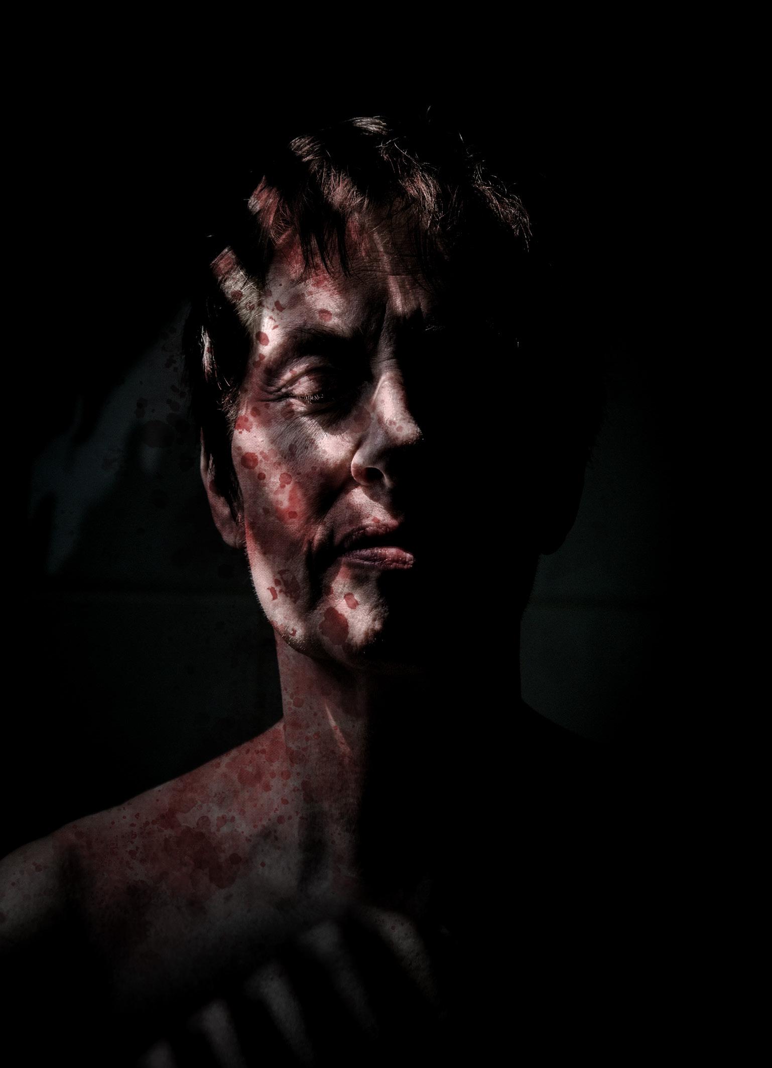
Picture 2
where we are now or where I see the future.
Before commencing with a body of work such as this, there has to be a degree of planning. I start with the message, headline or story. I want an image to communicate and the viewer to be able to connect. I hope to achieve this by including several key points as guides. I know not every viewer will read the image in the same way, so multiple ‘hooks’ to the story often help. During this phase a visualisation of the finished image will appear in my mind and if not…well I just keep thinking
about it and one day I either see the image or the idea was just not strong enough to survive and my thoughts will move on. I never become frustrated, it either happens or it doesn’t but allowing yourself time is my tip for success.
I am known as a photographer that produces work using incamera techniques such a multiple exposure. Many of my images are seen as painterly, colourful and something you could hang on your wall. I approach subject matter such as ‘Ukraine - Year One’ in much the same way with
in-camera techniques, although I know I will need to add elements too to bolster the storyline. But I accept these fit a different market and few will ever make it to the frame on the wall. This should never leave a photographer feeling less successful. I view this as another route for my multiple exposure work to make it to print.
In the first image (Picture 1) I show the woodland adjacent to the road where the Russian stalled armoured column stood for several weeks. The Russians clashed with small groups of Ukraine armed forces and
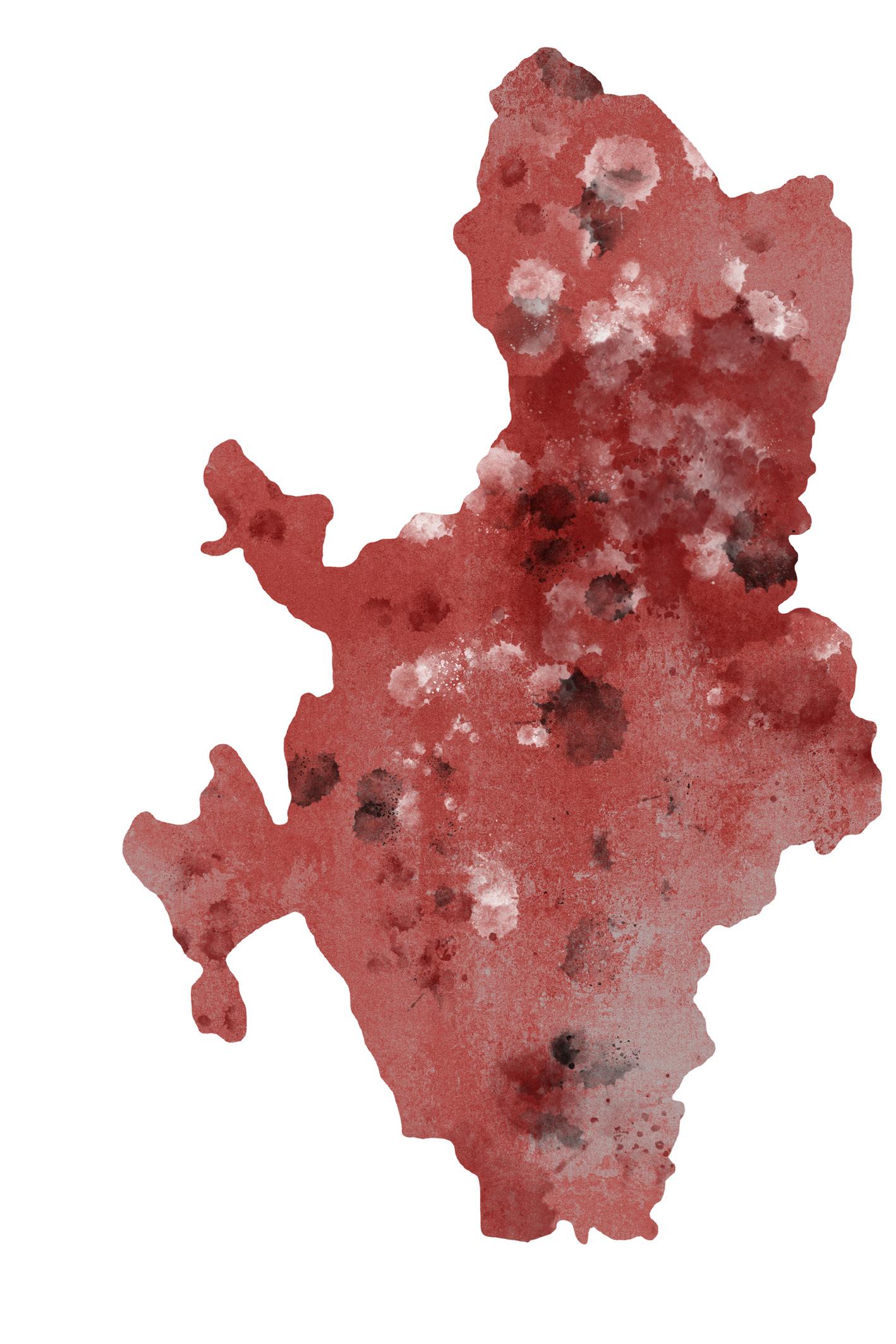
Picture 3
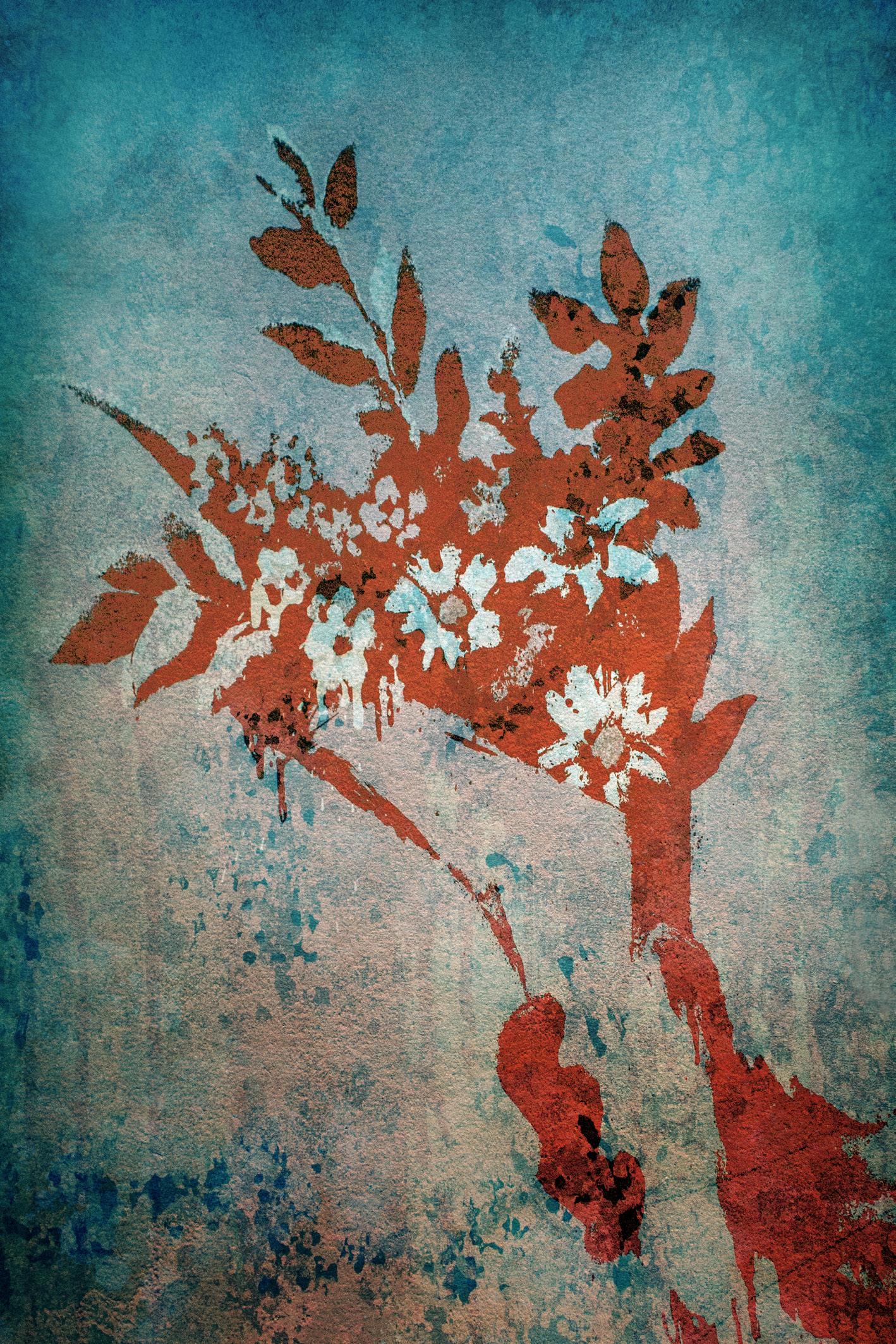
volunteer fighters. The Washington Post reported that trees were covered in blood where the Ukraine fighters had ambushed the Russians as they sought cover from openness of the road. I wanted to show the trees were more than blood stained but the whole forest was bleeding. The image is a triple exposure of my local woodland (Bedford, UK) with an overlay of a double exposure of a landscape. I have colour managed it to appear red and the drip of red blood I found on an empty paint tin next to a skip in Spain.
Within a few short weeks the Russian Army had progressed towards Kyiv and reached Hostomel. Villages en route were occupied by a young Russian army. The resistance from fighters and quick support from NATO had the aggressors off balance and to save their armour they had to withdraw. On April 2nd they released Hostomel airport and headed back to Belarus. News crews travelled with the jubilant Ukrainians to liberate their land but when they entered the villages it silenced them. The media quickly
amassed evidence of war crimes committed against the Ukrainian people. Report after report told us of genocide, beatings, torture, the burning of homes and the use of rape as a weapon of war. It was a stark reminder of the atrocities seen in WW2. This had to be a photograph in the set. In Picture 2 we see a lady naked in her mid-60s. She is hidden by darkness of the situation, shafts of light spill onto her as hope. The blood splatter signifies the violence she has witnessed. But it was her expression I really had to capture. I chose
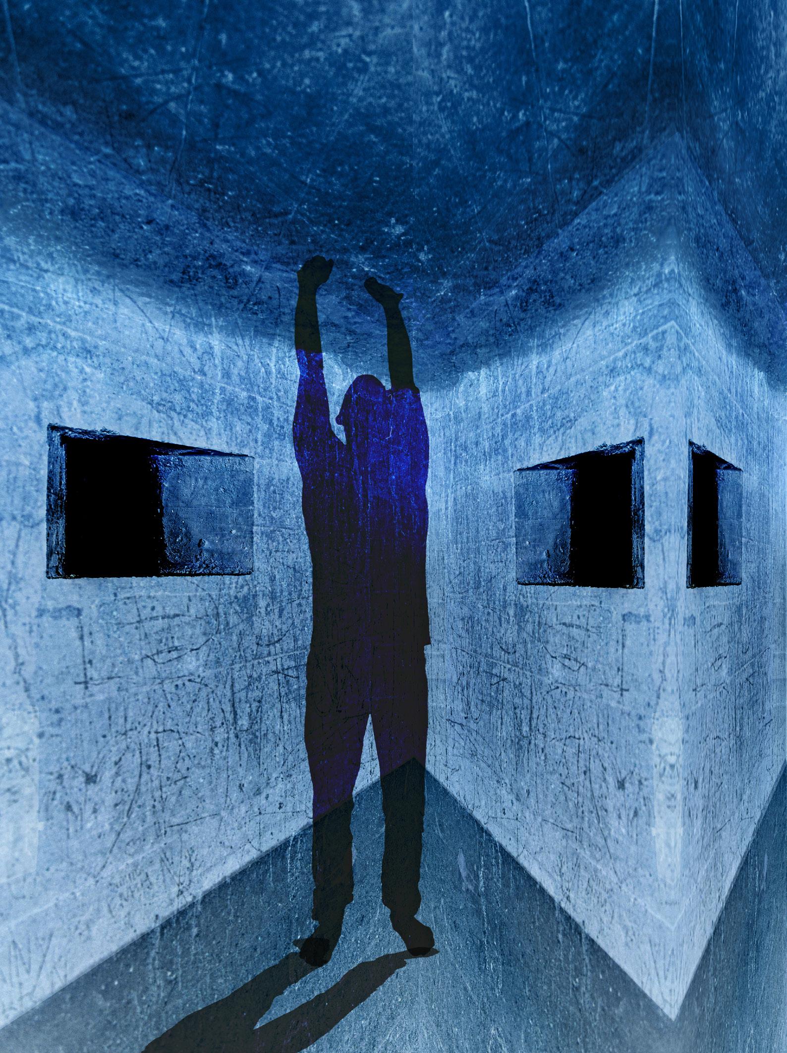
Picture 4
closed eyes as they want to see no more. I took care to not put fear on her face. I wanted a calm look but also a look of defiance, of a quiet confidence that her people will win. Those that fight on the front line are brave but those living in occupied land are equally brave. This look is of a woman that on the surface may appear broken, but underneath is full of fight. It is a photograph to represent the defiance and continued strength of a whole nation.
At this point Ukraine was being stretched, fighting on several fronts
in the east. My thought was ‘They have stood up and fought’, so I rotated a map of the country by 90 degrees and applied a splatter to represent the bombs and coloured this red for the bloodshed of the people (Picture 3).
Pictures and video messages from the bunkers within the steelworks in Mariupol leaked to the western media. Ukrainian soldier Mykhailo Dianov fought and survived the three-month siege. I saw those resisting as being trapped in the warren of bunkers but standing tall. In Picture 4 I give my impression
of the will and fortitude of those in the bunkers. My image is a double exposure of a WW2 bunker in Staffordshire with a ghosted silhouette overlay. I produced this in blue, as the only light I ever saw from videos was that of LED white light casting blue onto thick cast concrete walls.
When news of crops not being able to move emerged, Putin used a global food crisis to his advantage. It gave yet another dimension to this conflict. In Picture 5 I aim to show the crop in blood red reaching out to the sky. There is a flower
Picture 5 l
within this for hope of a peace. The sky is dark, coloured by conflict, and the ground scorched. I feel it’s the most pictorial image from the set and one which does hang on someone’s wall simply as a pleasing abstract with no meaning, but I feel this is a strong image within the body of work and, at times, I can almost smell the cordite in that heavy sky. It is a multiple exposure made of four exposures using dark blend mode. I added a texture overlay and you may also spot some blood running down the left side from Picture 1
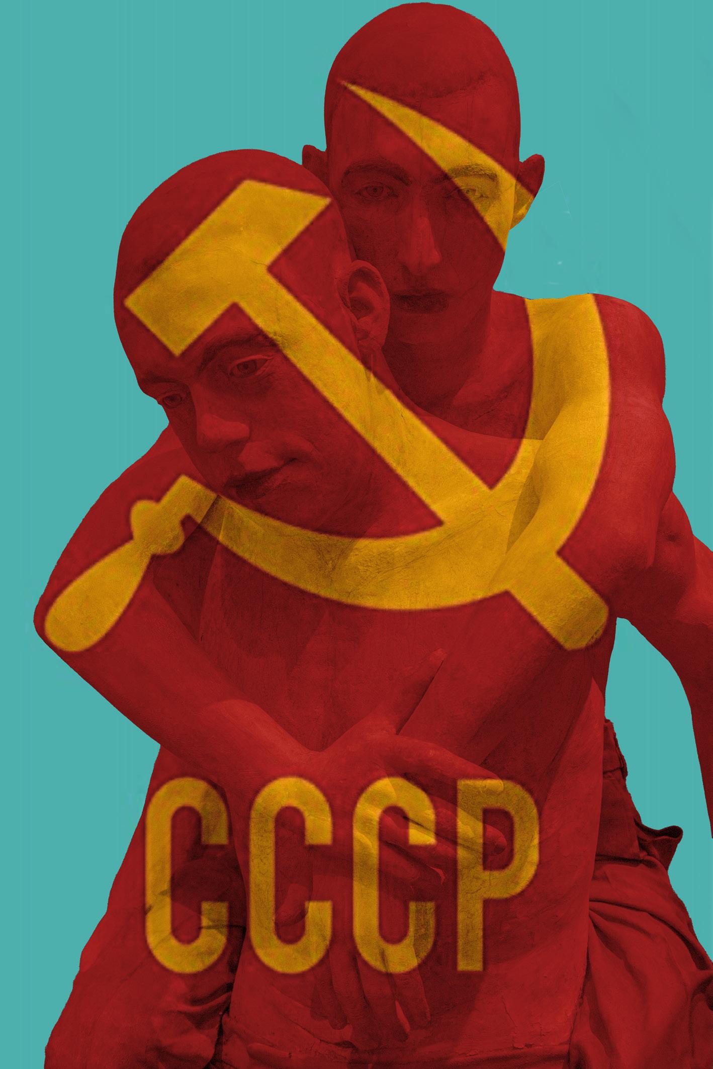
In Picture 6 I wanted to show the youth and the wider view or potential outcome. Talk from other ex-soviet countries is that of a reformed USSR. If this is Putin’s plan, then he alone cannot do it, he needs his youth to buy in to the ideology and to go and take the land by force. Are we literally looking at them picking up their neighbours and then carrying them back to the era of the USSR? Is that what the youth want? Their faces tell the story.
There are ten images in the full set and I feel it is complete. However,
I’m always thinking, so it may lift it to twelve. What to do with images like these, well…I down selected to six and gifted them to the people of Ukraine through their Embassy in London. I hope they make it home and hang on a wall somewhere.
Picture 6
PORTRAITS - THE HUMAN ELEMENT? OR THE HUMAN ELEPHANT IN THE ROOM?
MICHAEL O’SULLIVAN FRPS
Michael O’Sullivan likes to ask questions....in these pages he considers what constitutes a portrait. And the answer may not be as simple as it first appears.
Portraits. Now there is a rabbit hole if ever there was one! Why do I say that? Just ask what constitutes a portrait. Surely, it’s obvious, no? Well…not really! If you don’t believe me, go and check for yourself. A quick online search for ‘portrait definition’ will retrieve a lot of results.
Brilliant! That means everyone understands what ‘portrait’ means doesn’t it? Well, yes it does! Except…when you look a little deeper, you will see that all of the definitions presented in your search results are quite different, and in some cases quite contradictory on at least one aspect or requirement of what constitutes a portrait. So,
even though everyone does seem to understand what constitutes a portrait…we don’t all necessarily understand it to mean the same thing.
To illustrate this, here are just some of the criteria that you will find offered as being important in defining a portrait:
• It needs to show the face;
• It doesn’t need to show the face;
• It’s usually just the head or head and shoulders. It can be full length;
• It can contain objects and surroundings relevant to the subject and the person can be absent. It must contain a person as the subject;
• It contains the likeness of an individual;
• It can contain the likeness of a group of people;
• It must show communication and engagement between the sitter and the photographer/artist;
• It can be candid in style with the sitter/subject appearing to be unaware of the photographer/ artist;
…and the list goes on. Why is this even important? If we know a portrait when we see one, then why should we care about the definition? For all intents and purposes, it doesn’t matter, and in most situations, as we get on with our lives, we don’t have to care
or obsess over these definitions at all. We just create the pictures that we like to create, and the rest of the world can argue about the definitions. However, for the
purposes of this article, a definition is important for two main reasons.
Firstly, for the purpose of clarity, it is important that we are all speaking the same language before I launch
into a diatribe, or even a rant, about what will, or will not, help anyone create better ‘portraits’. So, what definition will we use? What I’m going to discuss here, really applies
to most of the definitions of portrait in some way or other, so I’m going with a pretty broad definition of a portrait. Here, I’m referring to any picture, in which the primary element or subject is a person. The use of the word ‘element’ is also important, as we will see later. The apparently contradictory criteria and definitions is the root of a lot of confusion, especially among those who are new to creating portraits. But if we remember that all of the above criteria can be more appropriately used to define narrower categories or types of portrait, then it becomes much clearer, and they all can apply depending on the context…
Secondly, context is important, even crucial. Why so? Because practically all of the advice you have ever received, not withstanding its inherent contradictions, is correct, depending on the context in which it was offered. The same is true here, and I will try to qualify any advice depending on the context. What do I mean by ‘the context’? The context here is the type of portrait. Are we shooting a
headshot? Is it a beauty headshot? A corporate headshot? A theatrical character headshot? Or an intimate formal portrait?
Maybe it’s a full length portrait. If so, is it a studio portrait? Is it an environmental portrait? Is it a narrative or purely a likeness? Is it fashion? Lifestyle? A traditional portrait? Is it commercial? Editorial? Is it a portrait of the sitter, or are they playing a character?
Now, I could have just started with my definition, and then launched into some dos and don’ts but instead I’ve spent a large part of this article already on definition, criteria and why they are important. This is because recognising that there are different types of portrait, not only means that there are many directions available for us to take in, but it becomes pretty obvious that they must all be approached differently. This leads us directly to the first, and arguably most valuable piece of advice that I want to share.
The first pitfall that I see people fall into in all genres of photography, is that they start with the type of
picture they want to create, or the subject they want to take a picture of. ‘I want to photograph that tree’, ‘I want to photograph that beach’, ‘I want to photograph a girl with red hair, freckles, and blue eyes’ or ‘I want to photograph a man on a horse’ etc., etc. These are all valid intentions, and if you’re at the beginning of your journey in photography, then it’s also a perfectly appropriate place to start each piece of work. Where they become technical exercises to help you learn your craft, and over time accumulate into a body of work. If you are at the point where you have a pretty good handle on the craft of photography, then these intentions are not the starting point. You need to take step back and ask ‘Why?’. ‘Why do I want to make this specific picture?’ If your answer is ‘Because I love daffodils’, or ‘Because I saw a picture like that in a salon catalogue/in a book/ gallery etc., and I’d like to do one like it’, then you need to step back further. You need to ask yourself ‘why?’ again. Ask ‘why’ until you get to the ‘what?’. ‘What am I trying to
say/communicate/convey?’ ‘What is it about this person/place/tree/ daffodil that moves me to make a picture?’ If you don’t decide what moves you, and what you want to communicate, your pictures will be void of something very important - you. This is arguably more true in portraiture than in other areas of photography as portraiture has become very client driven, and commoditised, and therefore formulaic.
The picture you liked in the gallery, resonated with you for a reason. Some of that may well be that you like the colours, or the red hair and freckles, or the Victorian style clothing and the country laneway leading to the cottage, or whatever other attractive elements were in the picture. But I’m willing to wager that a very large part of what resonated with you was that the author or artist successfully communicated something to you, showed you something as they saw it, and evoked an emotional response in you.
The superficial elements are just how they chose to communicate it to you. These are the elements of the composition, and a composition is just a vehicle, or a vessel to communicate something from the author’s vision to you, the viewer.
If you start your next picture by replicating the visual characteristics in your image, but just changing them up a bit in an effort to make it ‘yours’ or ‘different’, then it will not work the same way, no matter how pretty, attractive, or technically brilliant the end result. At best, you’ve just created a composition for its own sake, instead of creating a composition as a vessel to communicate your way of seeing. At worst, you’ve replicated a formula that someone else devised to communicate their message, something of themselves, and used it to create a picture that doesn’t say anything past the superficial; it has no depth. You will never be someone else, so you need to figure out what moves you, and how you see things, and then construct your compositions
to communicate all of this in your pictures. Nobody else will ever see the world exactly as you do, so the best way to be unique is by starting with recognising what moves you, and to put something of you in your pictures.
Unfortunately, you can never be Annie Leibovitz. But fortunately, Annie Leibovitz can never be you. Start with this in mind as early in your photographic journey as you can. l
In the next issue
In the next issue Michael explains his personal approach to portraiture.
TYPE MATTERS...
ANDREW N GAGG FRPS
It’s said that a picture may speak a thousand words, but sometimes just a few words, presented in the correct way, can add to the understanding of the intent of our images.
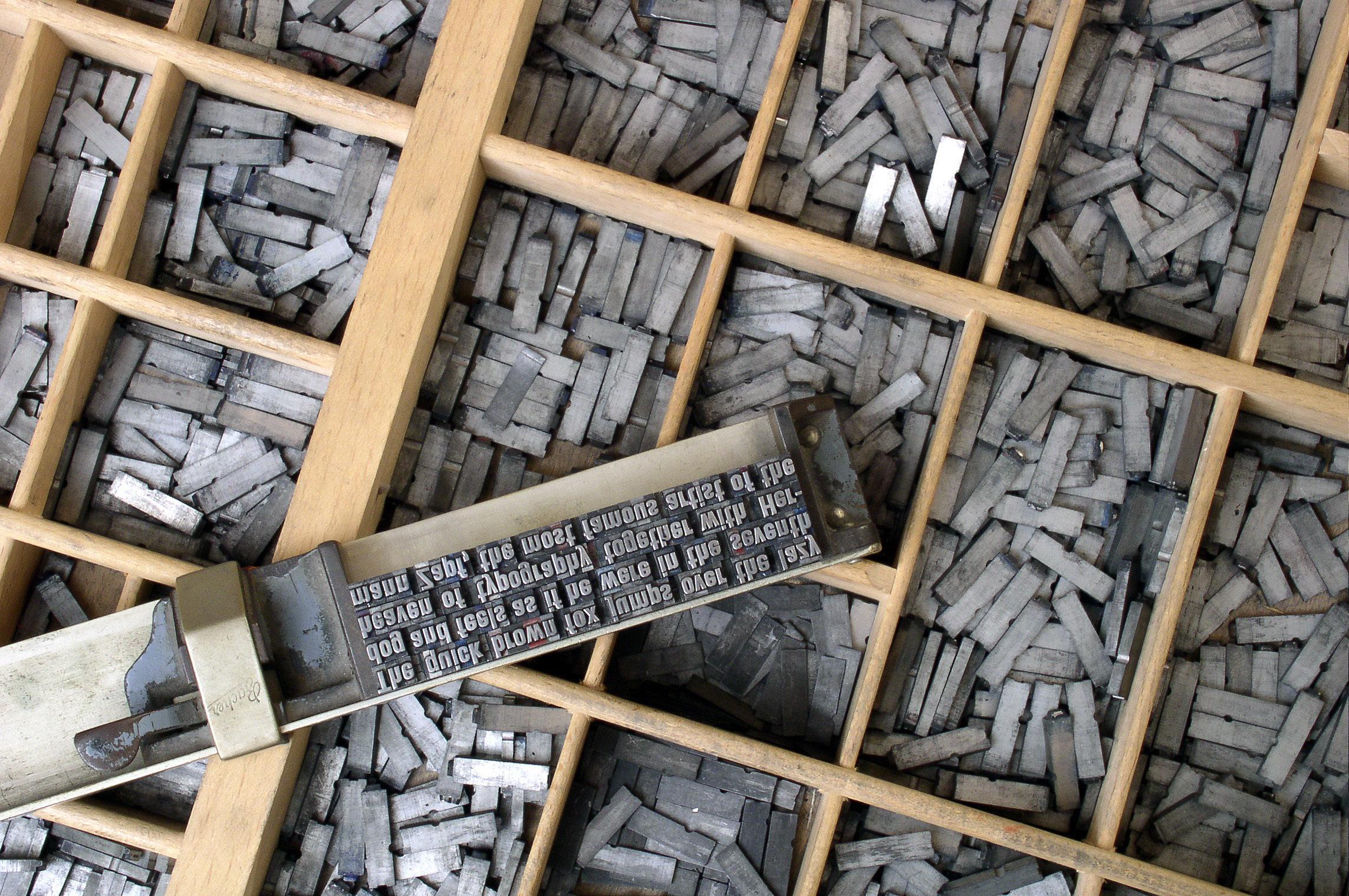
I hold cherished memories from my five years as a student at the Brighton College of Art and, in particular, from discovering the delights of draught Guinness one lunchtime at the ‘King and Queen’. Less cherished, but equally vivid is the anguish of that same afternoon, when back at the college my whole galley-full of heavy metal type cascaded gracefully onto the printing-shop floor... I would not say the two incidents were in any way connected, but the frustration was considerable - watching the fruits of my tyro labours with a compositor’s stick, used to assemble metal type into words and lines, (which had stretched over a period of several weeks) as the metal - precious
though leaden - scattered itself beneath the many cabinets loaded with fonts. Anguish especially bitter since I had to sort it all back into its cases (‘UPPER’ and ‘lower’ of course), while carefully minding my p’s and q’s.
Nonetheless my enthusiasm for the arrangement of type matter has remained undimmed over these many years, as a number of my recent students will testify, and working side-by-side with graphic designers of great talent as part of the BBC’s Design Department was a privilege and a pleasure - I happily left my drawing-board in ‘Scenic’ on every pretext to see their latest contribution to our projects, which might be anything from All
Creatures Great and Small to Telly Addicts, or a Dickens blockbuster to the daily news.
Latterly, much of it was electronically generated, and it was less easy to see what was being created until it hit the gallery screens. Nowadays paper and pens, Letraset and rulers don’t come into it at all - but the compensation is that the whole operation is much more flexible, and the results much more varied and creative; and indeed there are numerous fine examples of ‘hand-drawn’ lettering created or modified especially for a production.
The graphic design contribution to a major drama series for example,
Courtesy Dick Sabey
Willi Heidelbach, CC BY-SA 3.0, via Wikimedia Commons
though often occupying relatively little actual airtime, was to us a most important aspect of a production, setting the scene, the mood and the period, often before we have seen any live action, any costumes or scenery.
A well-considered title slide, in an appropriate typeface, with thought given to its colour, size placing and background will also start off a production, be it an AV sequence or a printed book, in the direction it intends to go. On TV we are given clues, often subliminal ones, as to what we are about to see. Fonts such as Blackletter, or Old English may evoke mediaeval goings-on, while a delicate copper-plate script can transport us straight to Austenland. Some lettering styles scream ‘Poirot’ or ‘Wodehouse’ at us, and others, plain and severe as the classic Gill Sans take us straight to Foyle’s wartime office. We can, and I think should, apply this principle, albeit in microcosm, to our activities in the printed medium. A dust jacket is in many senses analogous to the main titles of a film or a TV production
Sometimes the message is more subtle - we wish to evoke just a maritime feel, or a busy metropolitan ambience - a peaceful garden, or a junk-ridden slum... Finding the right typeface can be an interesting and worthwhile exercise. By the way, ‘font’ strictly speaking signifies a particular size and character of letterface within a family of types - ‘italic’, or ‘bold’ for example.
Your computer is probably already endowed with a fair number of choices - explore these certainly, but don’t be content with Arial, or the overtired and overworked and frequently inappropriate
Comic Sans! There are thousands out there on the web. Some you may be asked to pay large sums for - the Monotype Corporation has some fine letterfaces for instance, but there is no need to pay anything at all - there are lots of amateur type designers out there, and some of their work is excellent (and some is just plain awful - be discriminating)! Google ‘free fonts’ and you will see a new world open up before you. Downloading is easy, and installing should also not be a problem. Once they are in the ‘Fonts’ folder of your system (right click on the newly downloaded file once it is out of its ‘zip’ container and select ‘install’ from the dropdown) they will become available in Photoshop, in your word processor, in PicturesToExe - in fact in pretty much all the software you might use. One small word of warningonly very rarely, but you just might come across a malicious font file - I have one on my computer that I have managed to disable but still cannot delete - so run your anti-virus checker on any download before you attempt to install it!
Often the fonts you find will be very expressive - just right to evoke the mood and feel of your production, but if they are quite extreme in their styling they may need to be used
sparingly. I’m all for creating unity in a typographical scheme by using only fonts from the same family of type - everything set in Gill Sans in all its many manifestations for example - but nowadays you would hardly set a whole book in a blackletter font - it would be extremely trying for modern eyes to read. These more exotic faces are often referred to as ‘display’ faces - suitable for just a main title and headings perhaps, while everything else - body copy, credits, captions and so on - are in something more restrained.
Colour is another important consideration. Seen on a screen, light-coloured lettering against a dark background is much easier on the eye than the other way around - a very pale background tends to dazzle. The printed page is a different matter, as our starting point is inevitably a less reflective white. The received wisdom is that red is an unsuitable colour for type matter. The fact is that we need to consider tone value as much as colour - red out of black (i.e., red lettering on a black background) is perfectly readable (and possibly quite dramatic), but superimposed on a deep blue sky red may not be so good - the two colours are too similar in their relatively dark tones. But don’t just play safe with plain white lettering - often a slight tint can be more interesting. A tint of the same colour as the background works well sometimes - for example,
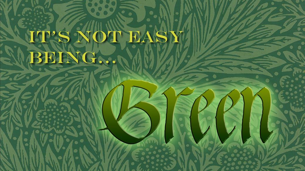
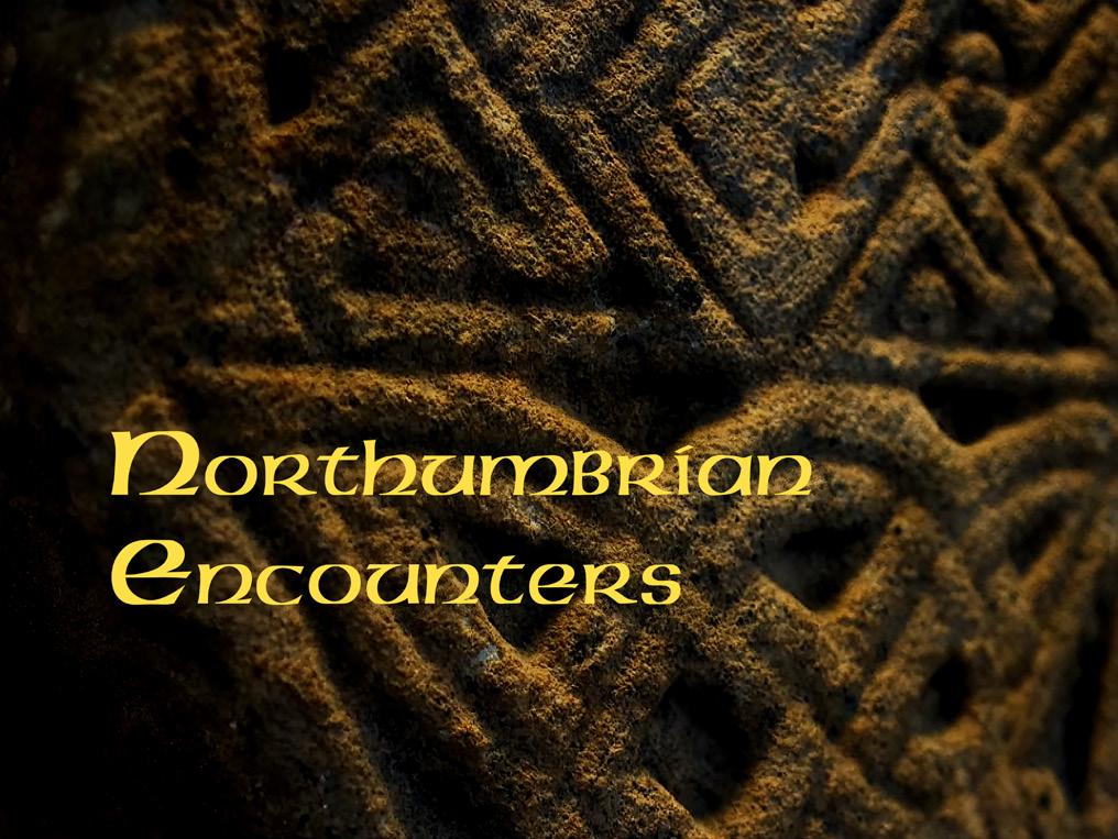
‘Engravers MT’ and ‘Waters Gothic Deux’ help point an accusatory finger at William Morris.
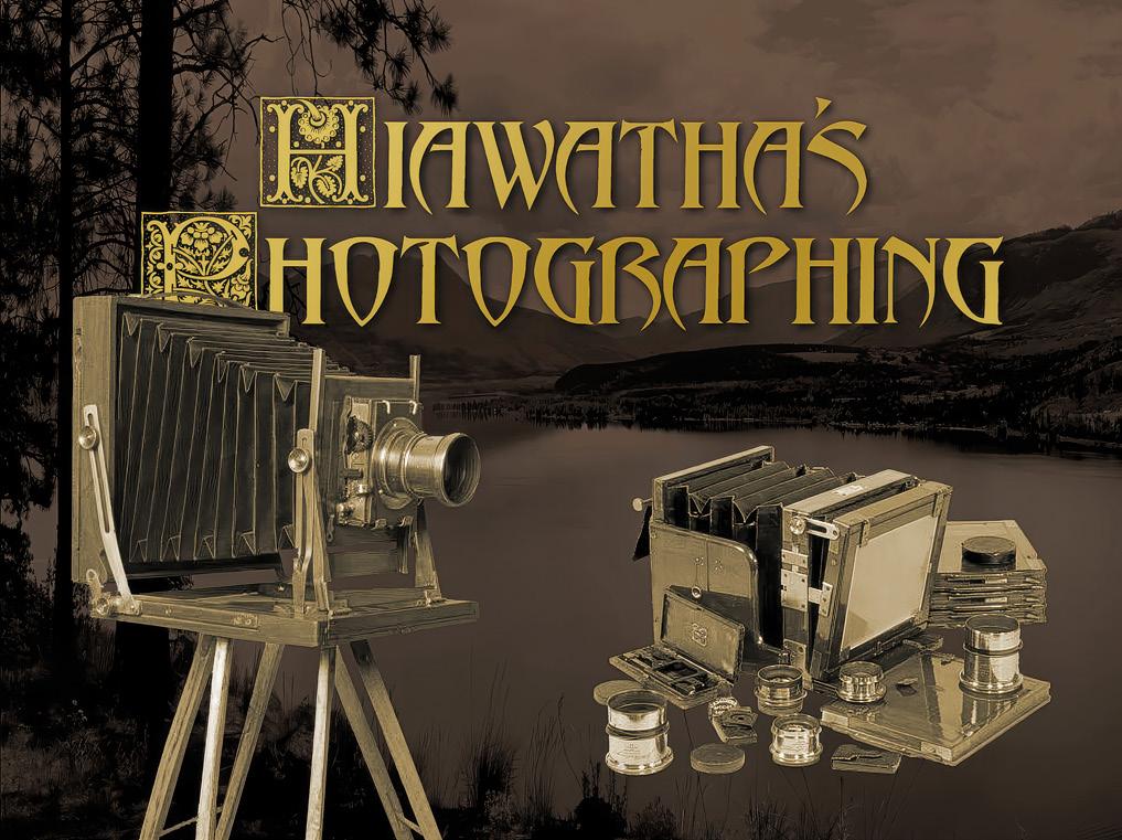
‘Abbadon’ and ‘Romantique Capitals’: a typically eclectic Victorian mix embellishes Lewis Carroll’s witty parody
pale yellow on deep gold, or light green out of dark green.
Drop-shadow lines will often improve readability, but they don’t have to be black. Make the shadow as dark or as light as you like, or even change its colour - how about a dark blue or a soft purple shadow for those mountain images? Go gently. They’re most effective when they are at their subtlest. Heavy shadow lines can look crude and obvious - they’re often best when they’re barely perceptible.
Similarly, an outline is fairly easy to create and can help readability You can do it with the ‘stroke’ tool in Photoshop. This can help make lettering more readable if you are committed to light on light, or dark out of dark. Graduated tints on lettering give it a feeling of solidity which might give you the look you want too. Sometimes a texture can give mass to a piece of lettering too - again, there are some available in Photoshop. A word of warning here though - don’t do all of the above unless you really think it helps - too many effects can distract, just as too many fancy transitions may detract from an AV sequence! Be sure not to overwhelm a simple and unassuming little page with titles that are more appropriate to Ben Hur!
Give due thought to backgrounds to your lettering too - often designers will just ‘super’ their type matter against the title picture, and there is nothing wrong with that. A
shot with a blue sky, or an expanse of green foliage for example, will make a very adequate background. If you want to preserve the integrity of the entire background image it will need to be reproduced elsewhere in your pages. I would probably use a lighter colour for this kind of situation - you would hardly use black lettering over a pretty pale blue sky!
Another alternative is to create a special background for your titles. I often use a version of one of my images that has been heavily modified to be a suitable field for lettering. It may well be much darker than the original, and have been colourised, posterised or otherwise ‘mucked about with’ in Photoshop, to produce a version with a very limited tonal range and a very limited colour palette. Many of mine are darker than the original, but there’s no reason why you can’t go the other way, with a high key frame for an ethereal effect maybe.
Now to the scale of what lettering you decide to use. There is nothing wrong with filling the page with the words of your main title, but with modern printing even small lettering can be clearly read, and it can have lots of impact against a plain background. Some TV titles are like this nowadays, and can be very compelling.
It can be effective to make the several lines of your title match
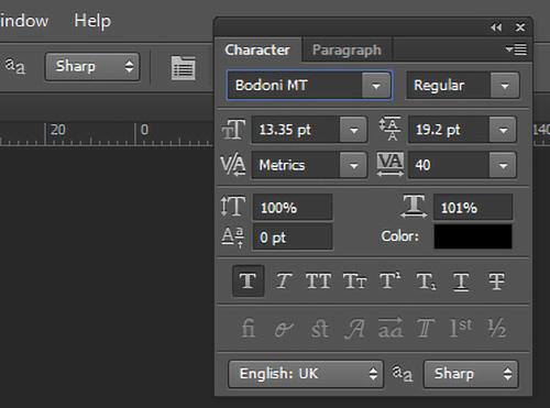
each other in length for example, so that they form a block. This is easy to do in Photoshop - look for the little window that contains so many useful controls. There’s one for increasing the proportionate width of your lettering, so that you can subtly condense or extend it to match the line above - or you can just adjust the font size by quite tiny increments to achieve a matching line length. It will also allow you to regulate letter spacing, change to bold or italic or both. There’s a lot tucked away in this little panel! (But please don’t italicise inappropriate fonts - black letter was never italicised - the mediaeval scribes didn’t know about ‘italic’ handwriting, which belongs to a later, Renaissance, era!)
Certainly, it is unwise to use oversize lettering in other places - captions and credits within the book don’t need to be all that big. Huge lettering is a bit like shouting and, indeed, it might be seen as immodest to put for example your own name in letters which seem twenty feet high, delicious as such an ego trip would be! This is, of course, the place for those less elaborate fonts, chosen to harmonise (or indeed contrast) with your main font which, as I’ve suggested, may be in some kind of decorative ‘display’ face.
So there it is, for the time being anyway. My reminiscences and ramblings through the rich and populous world of typographical design must close for now, but it’s a subject dear to me, and on which I’ve always something to say, and I’ll welcome your own thoughts or queries on any aspect of it if you care to contact me.
This article previously appeared in AV News, the magazine of the Audio Visual Group.
Learn more from Andrew Andrew will be presenting a talk on this subject to DI Books&Zines members on 18 June at 1100. For more information go to bit.ly/ TYPEMATTERS
Photoshop’s font controls
‘American Uncial’ for some Celtic archaeology
IS AI ALL BAD? BOB SANDERS
The topic of AI is almost guaranteed to generate strong feelings amongst photographers, and commonly not in a postive manner. Bob Sanders looks at one way that AI may offer something useful to photographers without taking over the creation of images.
There is a debate raging about AI and the damage it does to ‘real’ photography; how the bots have ‘stolen’ our photographs and now give us back some ‘plastic’ amalgam of our own work. Many fear that AI will wreck employment in the industry and yet others want to ban even the use of AI in postprocessing. Such is the negativity surrounding Artificial Intelligence.
I’m a naturally positive person so I don’t subscribe to all that negativity. I think perhaps we should be looking for positives and thinking about areas in which AI can help photographers instead.
I recently wanted to get critiques of several of my images. I had embarked on a new project in an
unfamiliar genre and didn’t feel able to assess my own work. It felt difficult because my own view was clouded by the emotion invested in the project.
I’m an amateur, club photographer. The club does offer critique sessions occasionally and I might have used that opportunity. I’m also a member of an online community that offers critiques by their most experienced, usually professional, photographers although they’re not free. Neither of course is instantaneous.
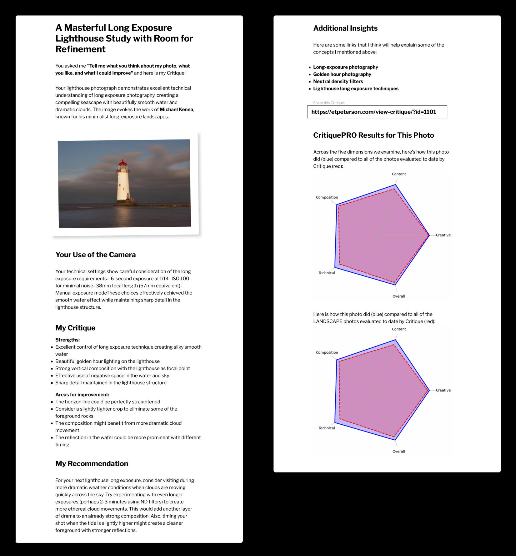
So in an idle moment I did some searching online and found an AI based solution to meet my need. There are of course several choices but one service stood out from the crowd. It’s called CritiquePro and
it’s the brainchild of Eric Peterson a photographer based in the Pacific Northwest, USA.
Eric, a keen amateur himself, says he struggled to get useful feedback on his own photography and it made sense to him to see if these evolving AI entities could be trained to help. Eric told me that he initially envisaged the service being used by beginners and students who were serious about learning, developing and improving their photography skills. But I’m a more advanced amateur and I think it’s a real winner.
The real game-changer is that anyone can get a photograph assessed very quickly, at any time and at (mostly) no cost. See later for my explanation of ‘mostly’.
CritiquePro has some features that make it stand out. The assessment provided is based on both the EXIF data and the picture itself. Users can also add a text prompt to describe what they were trying to create and/ or what they would like to learn from the assessment.
After uploading an image it takes just a few seconds for the feedback to appear (see example, above).
The assessment is a balanced mixture of positive and negative points and suggestions about how the image might be improved. These suggestions range from taking the shot again in different light to simply lifting the shadow tones.
Overall the feedback is very ‘human’. It’s mostly objective and based on accepted guidelines, rather like the feedback you would get from a competent competition judge
on the club circuit. But I tested it with some quite ‘whacky’ abstract creations that I made using multiple exposures and other processing techniques. CritiquePro handled them all very well and responded in an altogether meaningful way even to the extent of comparing my work with other well-known artists. I really am very impressed!
So if you would like to use this service, first go to etpeterson.com/ critique/.
Critique actually provides four different ways of looking at your photos:
CritiqueFREE and CritiquePRO are for comparing your photos to similar user provided shots.
CritiqueCOMPARE evaluates a before and after view to assess postprocessing efforts.
CritiquePOST gives suggestions for post-processing based either on your intended goal or to have your shot resemble another photo.
Critique is ‘mostly’ free – The FREE version does not keep the images after the assessment nor does it retain the assessment.
The PRO version does and adds functionality to Critique including the ability to save and manage your images and critiques, better sharing tools, and email-based support for the system. The really important stuff is that CritiquePRO lets you better interact with the AI, essentially telling it what you were trying to do with the photo and ask for more granular feedback.
I’m guessing you are now visiting the site for yourself. Good luck! l
IT’S MINE
SHEILA HAYCOX ARPS
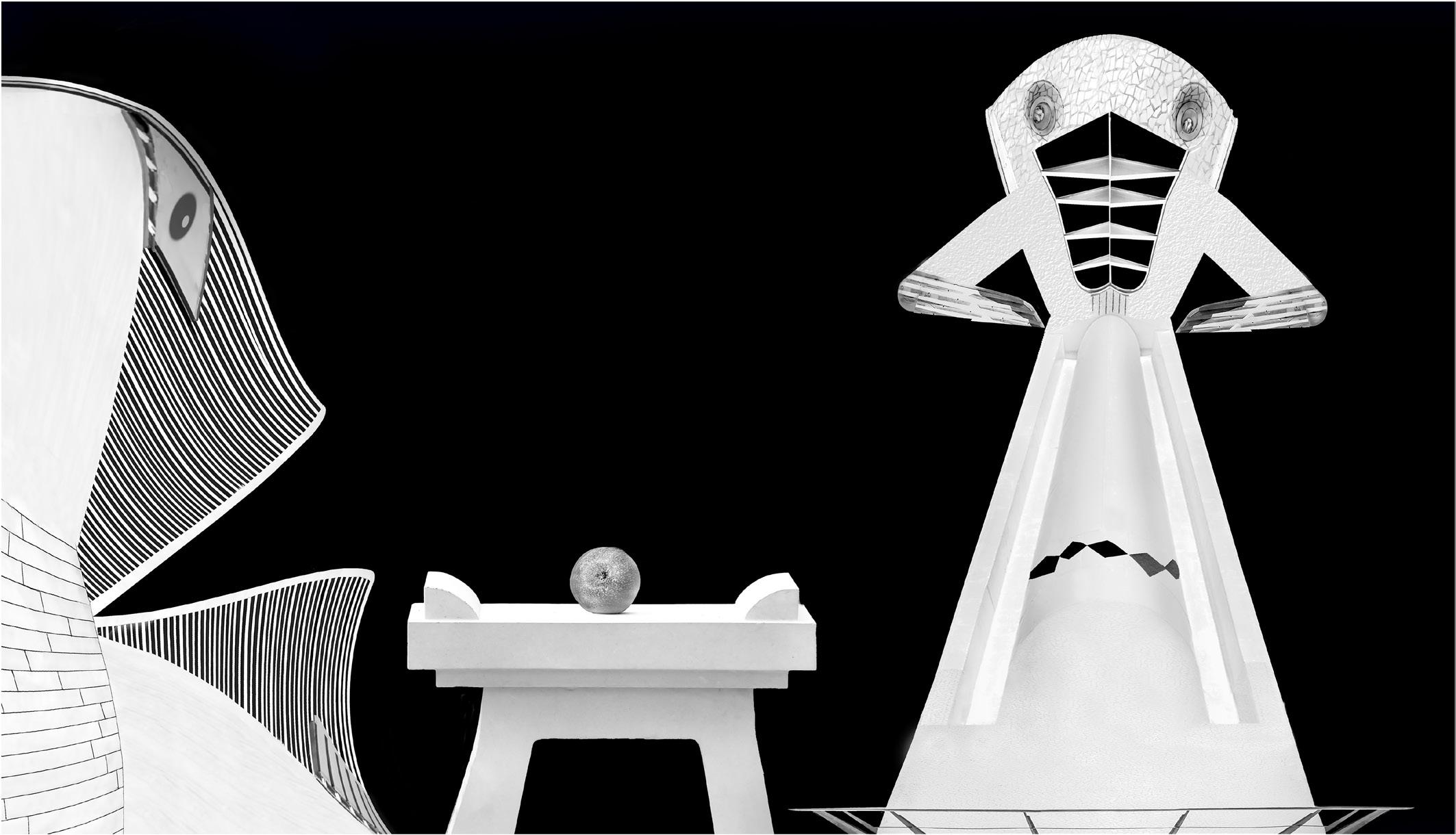
As usual I could not decide what to submit for the Print Portfolio and in the end decided one of them would have to be a composite. I had quite a few images which I had taken in Valencia at the City of Arts, some of which were bits and pieces of the buildings.
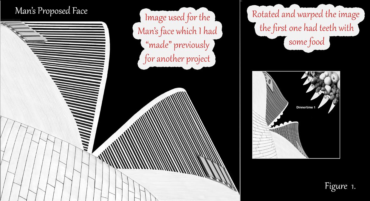
I started altering them even more and remembered an article I had read about using the warping tool in Photoshop. I chose my Proposed Face as per figure 1. I rotated the image, warped it a bit and put in teeth, which I didn’t like. Added some food which I didn’t think worked. Also cut out bits to make an eye.
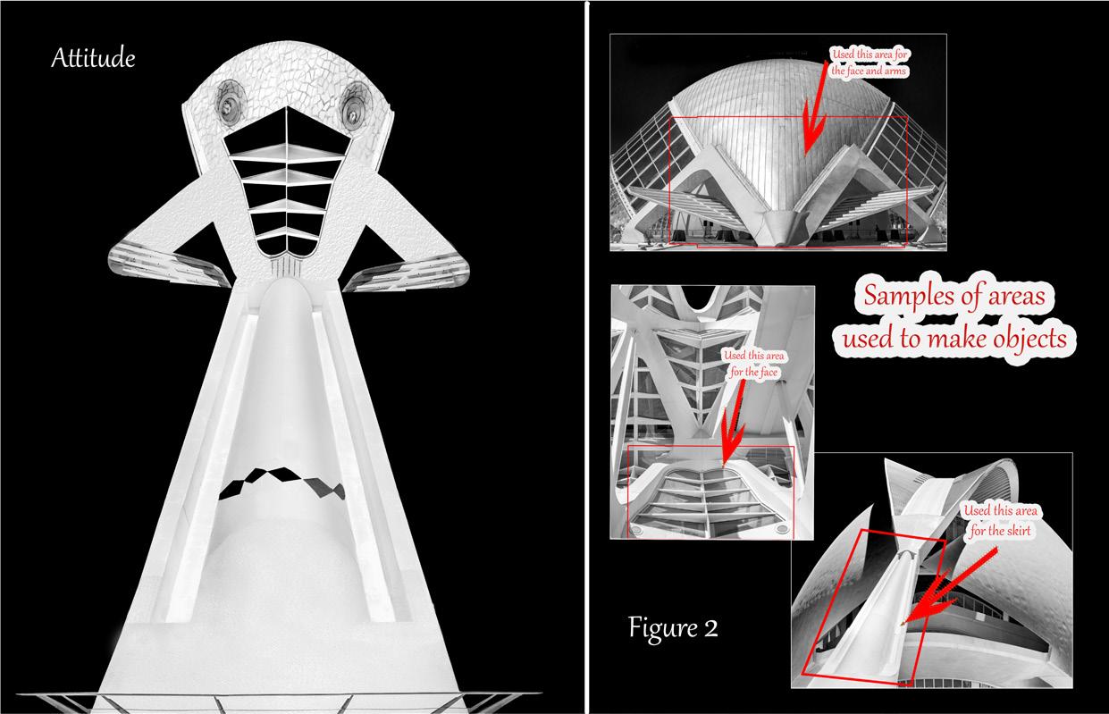
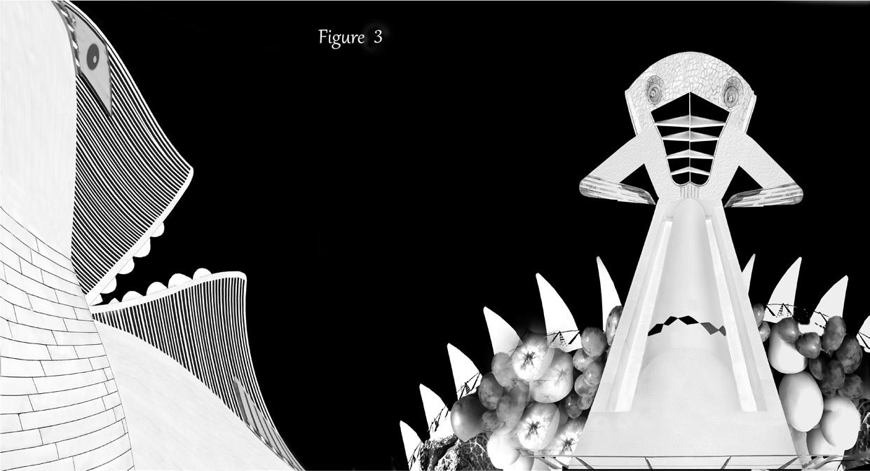
I then went to an image I had previously created for another project, also made from bits and pieces from the City of Arts, called Attitude (see figure 2) this shows some of the different building parts I cut out and used to make the image. I added this to the image, moved the food around and felt that the two suited each other, but the food bit still bothered me (see figure 3).
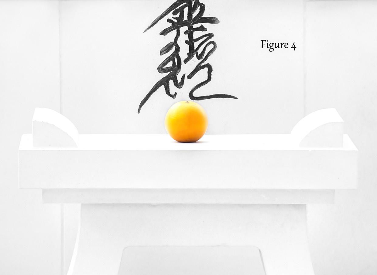
I then remembered that in 2010 I had visited a monastery in Milton Keynes of
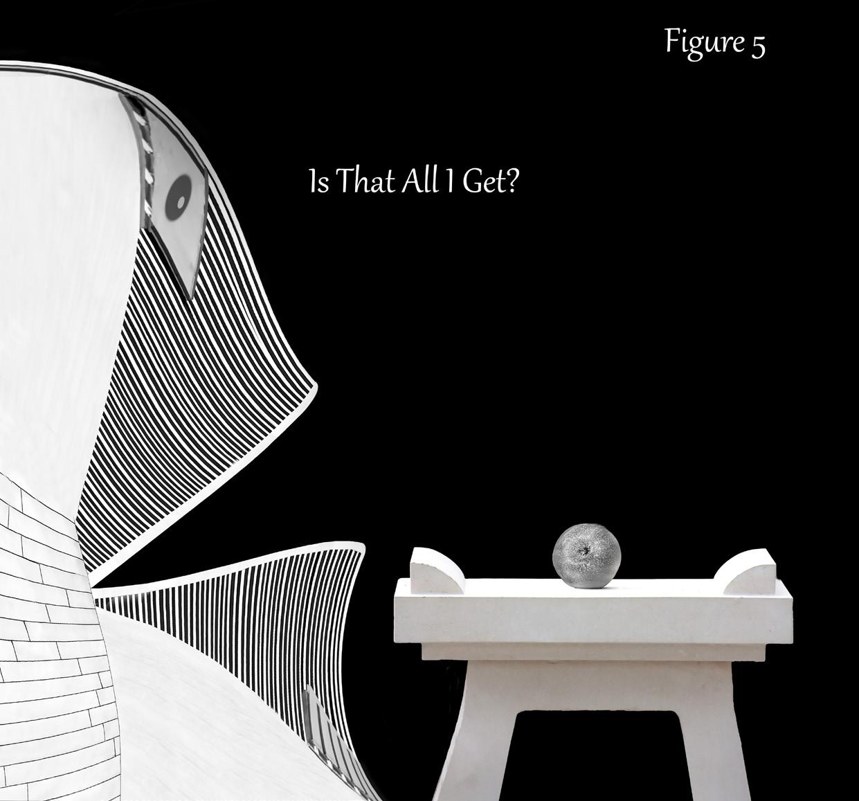
all places where I took a photograph of a table in their Japanese garden which had a lone orange on it (see figure 4). The orange didn’t convert to mono very well so I put an apple in its place. Put the table beside the man with just the apple on it and called it Is That All I Get? (see figure 5), but again I felt it needed something else to give it added strength.
I haven’t shown all the parts I have used to create the final images, just given you a few. So, after a lot of cutting out, changing to mono and a few different images I ended up with both characters plus the table with one apple. And gave it the title It’s Mine but I never expected to get it into the Print Portfolio. I am absolutely delighted about that, and the icing on the cake was the comments from one of the judges, Alison Cawley, when she said, “If I could have taken one print home, this would have been it”. It was certainly fun doing it and I am glad it has produced a bit of humour. l
See more of Sheila’s images of the City of Arts youtube.com/watch?v=e0rFYtuoaH8 w
STILL-LIFE ICM
SUSANNA HOARE ARPS
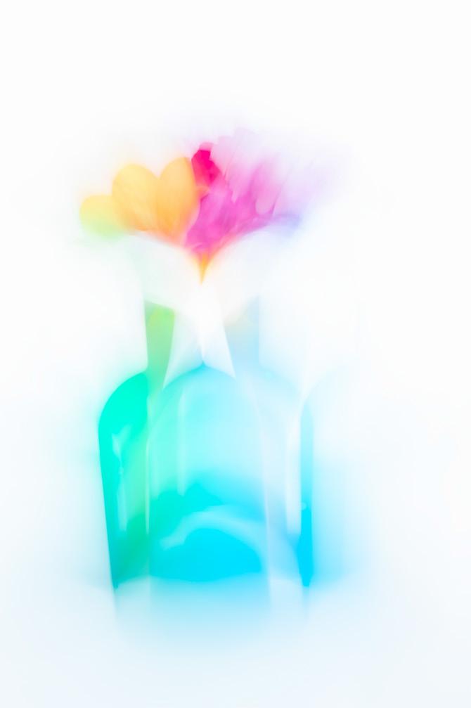
I have enjoyed creating ICM (Intentional Camera Movement) pictures for the last six years, typically using seascapes, woodland and landscapes, but when faced with lockdown, indoor photography became a resource for me and so I found myself creating still life ICM flower pictures.
Given that no two images are the same when making ICM pictures, multiple attempts are made to create an image that has the right amount of movement, shape and form for me. I have learnt not to be discouraged and it may be
that several hundred images are taken just to get three or four that are just right. When I am taking pictures I am also thinking about which pictures will blend well when using layers and layer masks in Photoshop.
I like using natural light. My set-up takes place sitting in the kitchen with the light coming from a window so that the flowers are side lit. I like to have a white backdrop and have a white towel with linen on one side which gives smooth flat light. My kitchen table is white, and if I need to increase light I have a large piece of cardboard painted white to reflect light back onto the flowers.
I have several frosted glass bottles which are used as vases and because they are frosted it means that I do not have to make adjustments to manage unwanted highlights. They are vibrant colours which I like.
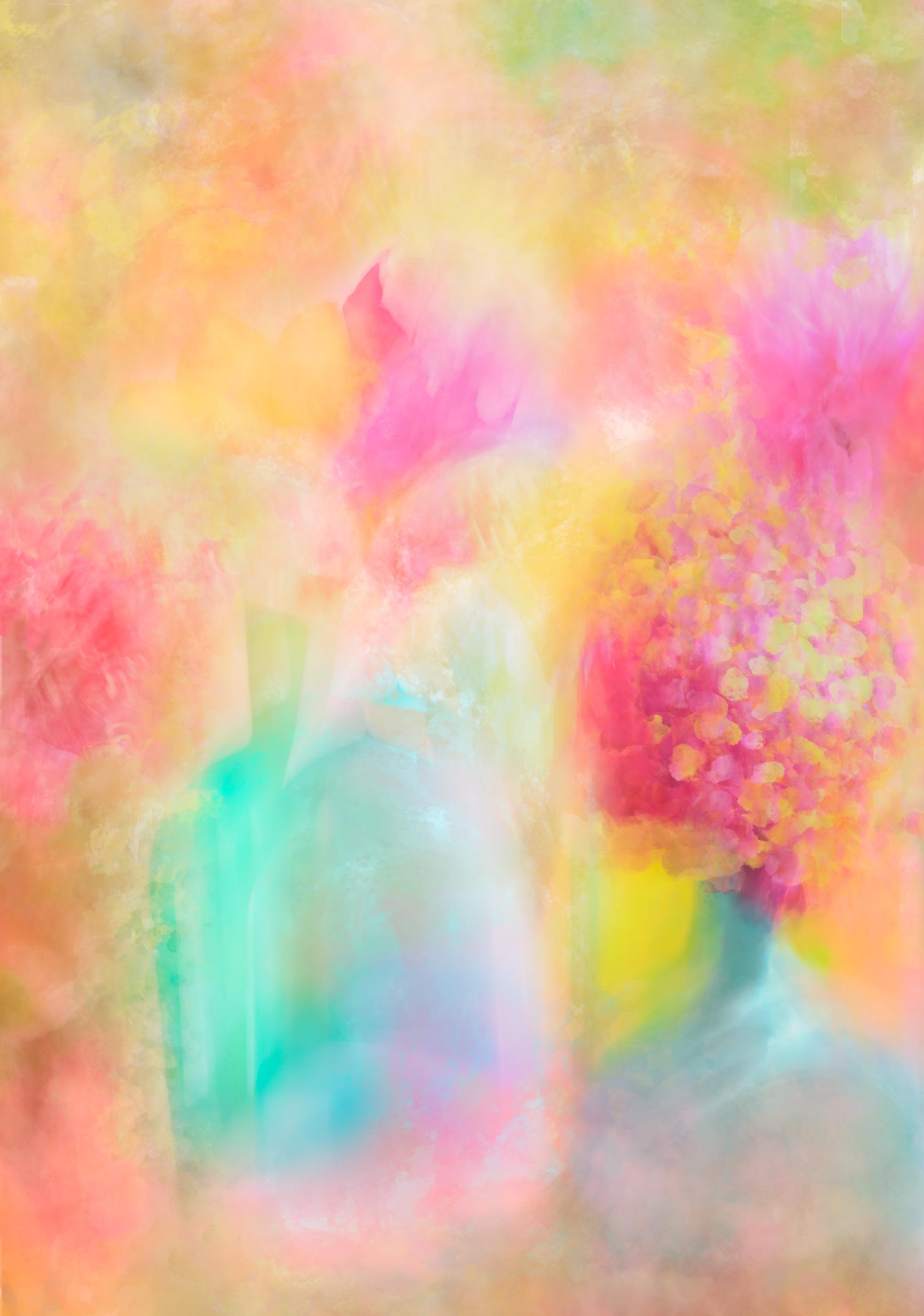
My intention when photographing the bottles and flowers in the main image above was to create the illusion of moving bottles. I eventually found that a timing of two seconds meant that I created the movement I was looking for. The ICM process included holding the camera still for about a second then moving it quickly to the left and right.
The base picture in figure 1 included the following camera settings: ISO 100, 50mm, f/13, 2 seconds shutter speed. After carrying out basic edits in Lightroom I took the photo into Photoshop and used levels to increase the whites. I find that editing ICM pictures against a white background requires practice so that the colourful lines indicating movement are not lost. Over time I have learnt to carry out additional editing in Photoshop using layer masks and overlays, but tend to do things the long way because I rarely remember the short-cut commands.
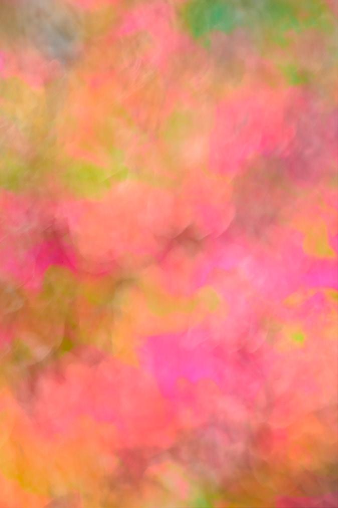
The next part of the process included taking the picture of nemesias in figure 2 and blending it with figure 1 in Photoshop. I usually look through the blending options to see if anything works and sometimes make use of ‘Blend If’ as it allows for smoother blending. In my experience, working out which flower images work well takes trial and error and the final image arrives after a period of time. I flattened the image and left the process to settle while I reflected on what else to add.
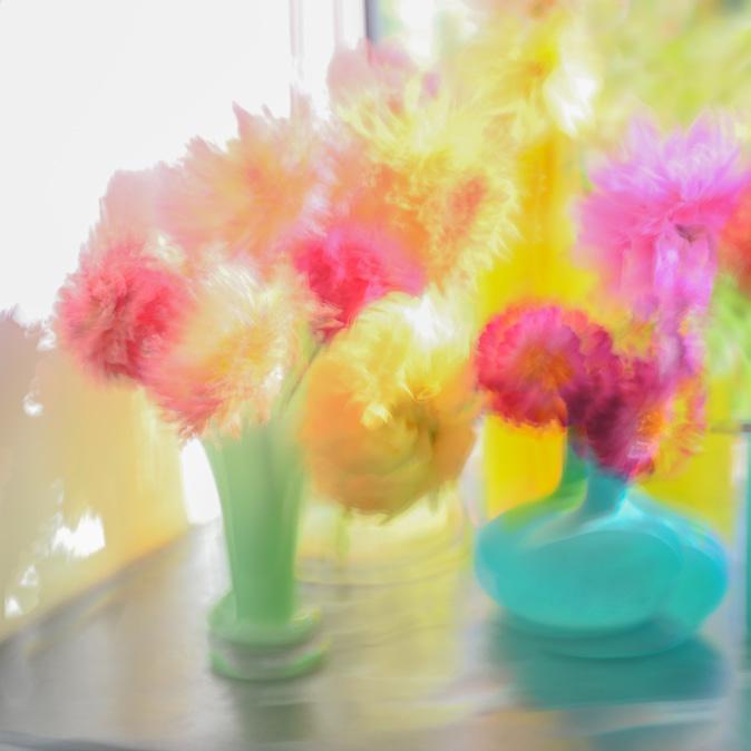
The flowers image in figure 3 was an addition because I liked the smaller turquoise vase with dahlias but decided to use Distort under the Edit menu in Photoshop to enable it to fit in a cohesive way with the flattened image of figures 1 and 2. I looked through the blending options but decided to stay with Normal.
More recently I discovered a set of free impressionist brushes that is available as part of my Adobe package, and began experimenting with them. I rather liked one called Seurat control from Kyle’s Paintbox as it added some unusual texture to the flowers and brought in a change to the style and presentation of the flowers and I decided to add this to the final picture.
l
Figure 1
Figure 2
Figure 3
IN PREVIOUS ISSUES
All previous issues are available from the DIGIT Archive at rps.org/di/digit-archive/
9 The allure of
13 Panorama processing
Sean Goodhart ARPS
17 A frustrated artist
Bob Sanders
22 Medical Photography - A career of choice
Hoosain M Ebrahim ASIS FRPS
26 The Old Woman does AI
Sally Sallett ARPS
31 DIGIT Challenge: Ice Flowers
Marius Grose
33 DIGIT Challenge: Alchemy
5 What is high key minimalist black and white photography?
Hugh Rooney FRPS
11 These are a few of my favourite things
Robert Bracher ARPS
15 The importance of seeing negative space
Christina Gundersen AIS ARPS
19 Photographic competitions for non-creative people
David Cudworth
24 Cyanotype magic in a summer garden
Melanie Chalk ARPS
29 DIGIT Challenge: Triangular Construction
Bob Sanders
31 DIGIT Challenge: An Alternative Reality
Roger Cookson ARPS
33 DIGIT Challenge: City Time Rob Kershaw ARPS 35 In previous issues
10
Ann and Steve Toon
Creating infrared images with the iPhone
Rad A Drew
15 Composite magic
Lynda Haney
20 AI - How close is it to photography now?
Graham Whistler FRPS
23 The art of equine portraiture
Emma Campbell
31 DIGIT Challenge: Sky walkers
John Cavana ARPS
33 DIGIT Challenge: Warped John Bull
The cover image
Edmund Nägele FRPS says ‘Fire in the Valley started of as a panoramic picture I took across lake Achensee in Tyrol with the Karwendel Mountain Range in the background. An ordinary landscape scene which did not inspire me much. Hence Photoshop first, to find a more dramatic part of the scene. With the ‘Scale’ tool I squashed a part of the mountains and the fun began, but here I can not repeat the actual process again in detail. The colour came from one of the many arty-farty images on file. I blurred this colour layer and played around with Hue and Saturation, experimented with several Blending Modes, introduced a reversed layer of the mountains, always making use of the Blending Mode. The speckles came from one of the pattern template I have on file and the ‘blue smoke’ and the wavy shapes were created with Flame Painter Pro. I probably missed something, I never make notes, I don’t want to become a ‘Picture Factory’’.