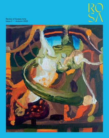
Review of Sussex Arts Issue 2 –– Autumn 2022
Subscribe to ROSA
Get your quarterly copy of ROSA delivered to your door before it hits the shops An annual subscription costs just £32 You’ll get digital downloads and exclusive subscriber-only benefits, too Go to rosamagazine.co.uk/subscribe and subscribe now
Lucy Wertheim Phelan Gibb, Rose Nudes in Landscape (or Pastorale), 1916. Towner Eastbourne.
L FINA KS E E W
A Life in Art & Reuniting the Twenties Group
11 June to 25 September 2022 townereastbourne.org.uk @TownerGallery
brightonmuseums.org.uk
Your Palace For a Year
Pay for one day & enjoy a year of free visits OPEN DAILY
Enquiries Editorial editorial@rosamagazine.co.uk Sales and distribution office@rosamagazine.co.uk Partnerships jessica.wood@rosamagazine.co.uk
Publisher Jessica Wood jessica.wood@rosamagazine.co.uk Editor Alex Leith alex.leith@rosamagazine.co.uk
ROSA is published by Review of Sussex Arts Limited
Art Director Rowena Easton rowena.easton@rosamagazine.co.uk
Company number 13431217
Technical Director David Burke david.burke@rosamagazine.co.uk
Registered office Lewes House 32 High Street Lewes East Sussex BN7 1YB United Kingdom rosamagazine.co.uk Telephone +44 (0)1273 488996
Sales Director Helen Drake helen.drake@rosamagazine.co.uk Assistant Publisher Oliver Collins oliver.collins@rosamagazine.co.uk Editorial Assistant Siân Bannister
@theROSAmag @therosamag
Design Geometric Love hello@geometriclove.com Cover image The Baron Gilvan, Landscape Allegory, 2022
Print KIND hello@kindagency.uk
11 15
22 24
30
Editorial: Turner at Towner Autumn Highlights: The season’s top Sussex shows My Sussex: Freud muse Sue Tilley Cover Artist: The Baron Gilvan, performative painter Shoji Hamada: Why Ditchling is big in Japan Japanese ceramicist Shōji Hamada was so taken by the artistic community he discovered on a brief visit to Ditchling in 1921 that he created a similar set-up back home. Rowena Easton investigates why
36
43
50
David Blandy: My debt to Hiroshima victims Sussex landscape art: Turner’s legacy Pages from a Sketchbook: Inside Ravilious’ private scrapbooks Eric Ravilious, like his friend Eric Bawden, was a great keeper of scrapbooks, pasting in them his sketches and newspaper cuttings, for future reference. We take a peek between the covers
CONTENTS
7
56
62
66
68
72
Alexandra Loske’s World of Colour: Brown Studio Visit: Where the magic happens, through Adam Bronkhorst’s lens Seven Questions: Poet John Agard quizzes flautist Keith Waithe Sculpture: John Skeaping’s runaway tortoises The Art of the Garden: Farleys House, by Lulah Ellender Surrealist couple Lee Miller and Roland Penrose raised livestock and grew exotic vegetables on their Chiddingly farmland. They also erected numerous sculptures, and their son Antony Penrose has kept up the practice
76
80
Architecture: The brand-new South East Dance Space A day out in… Petworth There’s no longer a crooked steeple on the church, and the people are now posher than poor: Petworth, a fine town to visit, if you like art, antiques, architecture or good food
8
ROSA AUTUMN 2022
84
87 88
94
Film: Tim Brown, on 20 years of CINECITY Poetry: Sonya Smith Columns: Imogen Lycett Green, David Jarman and Alex Grey Spend it on Art: Ceramics There’s been a boom in the saleability of fine-art ceramics in recent years: Jessica Wood offers tips on collectable practitioners of the ancient craft. Plus auction dates, and the ModBrit explosion
100 102
Interview: Cartoonist Zebedee Helm The Funnies: Zebedee Helm, Harry Venning and Joe Decie Decie tries his hand at ‘inaction painting’, Venning roasts a vulture, and Helm explores Lytton Strachey’s ice-breaking small talk
104 106
Leap Then Look: Participatory art Art Detective: Picasso at the Six Bells, Chiddingly
CONTENTS
9
Sarah O’Kane Contemporary Fine Art Representing Sussex contemporary artists
Landscape Allegory 3, 2022 The Baron Gilvan
sarahokane.co.uk
Right © Rowena Easton
Editorial I was sitting in the café of Towner Eastbourne, on a press trip with the great and the good of the art critic world, when I heard the official announcement of the news. At least it was news to most of them – the correspondents from The Times, and Art Monthly, and Artlyst, and The Spectator, and so on. I’d got wind of it a couple of months before, and had had to sit on it, a difficult task, with such a hot bit of information. The trip, arranged by our friends at Sussex Modern, was designed to highlight some of the delights of the East Sussex arts scene, with visits to Towner, and Charleston, and the Nathan Coley installations, and lunch at the Rathfinny Wine Estate thrown in. All in the context of the exciting news. “I’m delighted to inform you,” said Towner’s director Joe Hill, with a big smile on his face, “…that Towner Eastbourne… has been selected to host… The Turner Prize in 2023.” I made the best ‘wow’ face I could, in the circumstances. Many of the others were more genuinely surprised. And I felt chuffed. Whatever your opinions about the Turner Prize – a divisive event if ever there was one – what a coup for Eastbourne! And for the whole of Sussex! Over the next couple of weeks, you could hardly open a newspaper without reading how hot the art scene in Sussex is. And all of us at ROSA felt vindicated in embarking on the launch of this significant venture, which includes a weeklyupdated web mag and social media with over 17,000 followers, as well as this quarterly print magazine.
We’re delighted, of course, that the word has spread, and that more arts-lovers will, as a result, be travelling to Sussex. And we know from our analytics that we have many readers from outside Sussex. But, it should be stressed, our main remit is to encourage arts-lovers who live within the county to take an active part in the cultural activities that are being put on around them. To take pride in the Sussex arts scene, and to patronise it, whether by attending a concert, or buying a painting, or even just clicking ‘like’ on an Instagram post. The more we all participate, the stronger the scene will become, in a virtuous spiral of creative positivity. So what’s up in our latest issue? The cover is by Glyndebourne’s first-ever Artist-in-Residence, The Baron Gilvan, interviewed inside. Other interviewees include Lucian Freud’s model Sue Tilley, multi-media artist David Blandy, and flautist Keith Waithe. We also discuss the tradition of Sussex landscape art in the build-up to a major exhibition on the subject at Pallant House; we look at internationally renowned Japanese ceramicist Shōji Hamada’s connection with Ditchling, and Pablo Picasso’s 1950 visit to Chiddingly. We visit Petworth, discuss the colour brown in art, gatecrash the studios of four Artwave artists and makers, and have a look through Eric Ravilious’ secret scrapbooks. We take you into Brighton’s state-of-the-art Dance Space, and inside the ancient earthen ramparts of Cissbury Ring. We have a ‘funnies’ section, and a serious edge. We are ROSA, the Review of Sussex Arts, and we’re proud to be here for you. Welcome to our Autumn issue. Alex Leith
EDITORIAL
11
3 rd - 18 th September
Visit artists & makers in Lewes, Newhaven, Seaford and the surrounding villages
Pick up a guide or plan your visit online at artwavefestival.org
Images clockwise from top left: Venue 37, Villages Trail, Tom Homewood - Venue 111, Lewes Trail, The Wooden Truth Printing Press Venue 120, Lewes Trail, 10 Tables Studio & Tanya Gomez - Venue 137, Lewes Trail, Galia Pike
THE ONLINE PR PLATFORM FOR PROMOTING EXHIBITIONS AND EVENTS SUBMIT YOUR EVENT DETAILS AND PUBLISH THEM INSTANTLY ACROSS NATIONAL AND LOCAL MEDIA CHANNELS JESSICA@ARTSMEDIACONTACTS.CO.UK
A collaboration between University College London and the National Trust
WWW.ARTSMEDIACONTACTS.COM/ARTSADVANCE
Affairs in Berlin: Harold in Germany, Vita in Love Sissinghurst Castle Garden hosts a new multimedia exhibition exploring the politics and culture of diplomat Harold Nicolson and gardener and writer Vita Sackville-West’s time in 1920s Berlin. Selected books from Sissinghurst’s 11,000 volume library will be displayed alongside original silent film and radio recordings, translations and handwritten notes by Vita and Harold. The exhibit seeks to explore the vibrant social life of Weimer Berlin as a place for creative minds. For more information on upcoming art exhibitions, please visit nationaltrust.org.uk/sissinghurst-castle-garden 26 September 2022 –17 February 2023 Free entry (admission applies) Nr Cranbrook, Kent TN17 2AB
ROSA presents a group show exploring the Sussex landscape September 30 –– October 23
Our Clouded Hills
Open Wednesday to Saturday 10am – 5pm Gallery 207 207 High Street Lewes, BN7 2NS Image Rowena Easton, Chalk, 2022
OTTOCENTO
PRE-IMPRESSIONISM TO ART DECO,
A European Odyssey 6th Sep - 26th Oct Golden Square, Petworth
T: 01798 344031 E: info@ottocento.co.uk
: ottocento.petworth
WWW.OTTOCENTO.CO.UK
Autumn Highlights
Bill Lynch: The Exile of Dionysus Brighton CCA August 6 – October 15
‘Brighton has a coup here’ said The Observer’s Laura Cumming on CCA being announced as the first UK institution to hold a major show of work by Bill Lynch (1960-2013). ‘Dreamy, haphazard, enchanting paintings of the American wilds…’ is how she describes pieces painted primarily onto salvaged plywood sheets and other found materials. Lynch’s artistic milieu certainly admired his powerfully spiritual creative energy. But he was overlooked by the New York art world of the 70s and 80s, on whose fringes he lived. He rarely sold any work. He wasn’t interested in that. Here, we get to appreciate Lynch’s unique vision: ‘a glimpse at another world – the land of nods or possibly a more westerly location – by close examination of this one.’ Find out more at brightoncca.art
Above Bill Lynch, Tea Cup on Forest Floor, 1993 Oil on wood, 122x168cm
AUTUMN HIGHLIGHTS
15
Lee Miller & Picasso
Newlands House Gallery September 10 – January 8 The twentieth century created many extraordinary lives. As it would, they were extraordinary times, chronicled in countless films, TV shows, books and magazines. But someone whose life, and contribution to art, we are only beginning to value as exceptional (Hollywood is busy as we write) is Lee Miller. Vogue model, Surrealist artistphotographer, war correspondent and cook, her remarkable story takes us from Paris in the 1920/30s to Sussex of the 50s and 60s, via Man Ray’s studio, Hitler’s bathtub, and the liberation of Dachau. Her enduring friendship with Picasso is the focus of this long-overdue exhibition and documents the time they spent together (see also Art Detective on page 106). Get your tickets from newlandshouse.gallery
16
Above Picasso and Lee Miller in his studio Liberation of Paris, Rue des Grands Augustins Paris, France 1944 by Lee Miller © Lee Miller Archives, England 2022 All rights reserved. www.leemiller.co.uk
Below Atelier 51 Photo © Syl Ojalla @brighton_photography_studio
Artists Open Houses Winter Festival Brighton & Hove, various locations November 26 – December 11
In its ripe middle-age, Brighton’s AOH festival – claiming to be the originator of the booming worldwide open-house phenomenon – remains as lively, surprising, weird and wonderful as it was when founding artist Ned Hoskins was the first to open his door to allcomers 40 years ago. It’s an open secret that the winter trails are the best way to find stylish and original Christmas gifts. Simply look at the map online and plan your route. If you are an artist who would like to take part, or you would like to open your house, then online registration is now open at aoh.org.uk
AUTUMN HIGHLIGHTS
17
Caragh Thuring
Hastings Contemporary October 8 – March 12 This major survey is Caragh Thuring’s first UK exhibition in six years. It takes over the entire ground floor of the gallery, where her iconography of volcanoes, submarines, bricks, tartan and silhouetted characters loom large in a dramatic display of paintings, drawings and monotypes. Look out for her most recent pieces, which were made using cloth – commissioned from silk weavers in Suffolk – that incorporates previous paintings. As Thuring puts it: ‘I want to build the work into the surface, to continue the work I’ve already begun.’ Book tickets at hastingscontemporary.org
Surface Edge Shadow
Gallery 57, Arundel October 8 – December 23 Artist/gallerist Ann Symes is fascinated by material, process and craftsmanship. All her shows are thoughtfully curated with meticulous attention to detail. Indeed, there is a reverence to the way she places pieces in her never-lessthan-elegant gallery. The customarily descriptive exhibition titles reveal an eye that is attuned to the subtleties of the handcrafted object. That focus is why Gallery 57 shows are always so coolly monochrome. Colour? A mere distraction. This season’s offering is no exception, and we look forward to seeing how the likes of Oliver Chalk’s charcoal-dark wooden vessels are placed in dialogue with Sara Dodd’s exquisitely papery porcelain. See more at gallery57.co.uk
Brewers Towner International Towner Eastbourne Oct 15 – January 22
The second Brewers Towner International, a biennial exhibition of contemporary visual arts, returns with the theme of ‘Sanctuary’. Following an open call, 23 artists were selected by a panel that included Turner Prize-winner Elizabeth Price. It may be an ‘International’, but, admirably, this show reserves some wall space for artists living and making locally. Look out for Hastings’ own Sharon Haward and Nigel Caple, plus Eastbourne’s Kevin Hendley. Check the website for a public programme of events and live performances running alongside: townereastbourne.org.uk
Above Jimmy and Stevie Edmunds, 2012 Photo © John Cole
18
Colony
Rye Art Gallery September 10 – October 23 With a title that refers to a congregation of artists drawn to an area’s natural beauty, this exhibition celebrates the late Fred Cuming, together with his fellow Royal Academicians, Gus Cummins and Mick Rooney, plus another of their circle, Jaqueline Stanley. Cuming died in June this year. The work in this survey show acknowledges his contribution to British landscape painting and reveals the relationships between a generation of exceptional Rye-based artists. Find out more at ryeartgallery.co.uk
Very Private? A Dream Between Sleeping and Waking Charleston September 17 – March 12
Two exhibitions in dialogue: the first features Duncan Grant’s recently rediscovered erotic drawings, alongside works by six contemporary artists. The second is an immersive installation by Linder, the radical feminist photomontage and performance artist who sprang from the Manchester punk scene. Expect the doors to be opened on sex and intimacy, prejudice and love, as well as a dream-like conversation inspired by the Charleston legend. Get tickets for both exhibitions at charleston.org.uk
Generations: Hastings Fishing Families
Farleys House & Gallery September 15 – October 23
Zineb Sedira
John Cole has worked all over the world for the likes of Paris Match and The Observer. He’s photographed everyone from Muhammed Ali to Princess Diana. But what he really loves doing is documenting ‘ordinary people doing extraordinary things’. This exhibition – taken from his new photobook Fishing for Generations – portrays the working lives of the men and women of Hastings’ fishing community from the 1990s up to the present. It’s a community that has been in existence for over a thousand years: Britain’s oldest, and Europe’s largest, beach-launched fishing fleet. Today it’s on the edge of extinction. Profits from the sale of photographs and copies of the book will be shared with the Hastings Fishermen’s Protection Society. See more at farleyshouseandgallery.co.uk
De La Warr Pavilion September 24 – January 8 Drawing upon her personal history and close connection to Algeria, France and the UK, Zineb Sedira uses autobiographical narration, fiction and documentary genres to explore what it means to live between different cultures. She is currently representing France at the 59th Venice Biennale, where she was awarded a special mention for her exhibition Dreams Have No Titles. This solo show is her first in a UK public gallery for 12 years. Get more information from dlwp.com
PRESS + PLAY
Phoenix Art Space November 12 – December 18 After the huge success of its inaugural edition last year, Phoenix Art Space’s annual Festival of Print is back. This five-week celebration of the finest in contemporary and traditional printmaking includes workshops, talks, demonstrations and a table-top print fair, as well as a group exhibition in the Main Gallery. Enjoy the varied delights of screen printing, linocut, lithography, drypoint, monotype, risograph, letterpress and more. Details at phoenixbrighton.org
AUTUMN HIGHLIGHTS
19
Cat Power, Shirley Collins, John Cale De La Warr Pavilion Various dates
Never mind the devil, we reckon the De La Warr has all the best tunes this season. The first week of November is especially strong: there’s Cat Power on the 4th, who Pitchfork said can ‘rearrange a song simply by squinting at it’; then Folk Revival legend and Lewes’ own Shirley Collins on the 6th; followed by avant-garde icon John Cale, who’ll be performing songs from throughout his career on the 7th (a rescheduled date). Check out the calendar for other acts, including Ladysmith Black Mambazo, at dlwp.com
Millennium Actress and Vampyr Lewes Depot October 19 and 31
We’ve picked out two events at this internationally rated indie cinema that it’s worth bagging tickets for this season. First up: Ghibliotheque podcast creators, Michael Leader and Jake Cunningham, are launching their ‘book of the show’, The Ghiblioteque Anime Movie Guide, with a special screening of Millennium Actress on October 19 (tbc). Next is a 90th birthday screening, on October 31, of the recent 2K restoration of Carl Th. Dreyer’s Vampyr, one of the most visually and aurally distinctive horrors ever made, by one of cinema’s pivotal artists. Book your seats at lewesdepot.org
Ryoichi Kurokawa and Myriam Bleau, Double Bill ACCA November 26
Both Kurokawa, with subassemblies, and Bleau, with Unsculpt, present audio-visual landscapes where natural and man-made architectures collide, shapeshift and merge in mesmerizing synthesis. Expect a vertiginous immersion in future-worlds generated by artificial intelligence and the slow metamorphosis of materialities: marble to silk, concrete to flesh. Book your tickets at attenboroughcentre.com
20
Glyndebourne Tour Glyndebourne Various dates
Glyndebourne Tour returns for autumn, with two performances kicking off at the East Sussex opera house before they hit the road. Throughout October you can catch The Marriage of Figaro, Michael Grandage’s fivestar production of Mozart’s greatest comedy. Plus La bohème, Floris Visser’s new production transferred directly from the Festival programme in 2022. For dates and tickets look at glyndebourne.com
Brighton Early Music Festival Various venues October 19 – 23
This annual festival has a reputation for lively and inspired programming that challenges preconceptions of early music. Two events particularly caught our eye : Over the Sea to Skye, Jacobite rebellion songs and 18th-century melodies from the Highlands performed by Ensemble Hesperi, and Inspiring Bach, an uplifting performance of the composer’s collection of 17th-century cantatas, featuring Spiritato’s angelic trumpets and soaring melodies from the Marian Consort. Watch online at BREMF@home, if you can’t get to the shows. Find out how at bremf.org.uk
CINECITY The Brighton Film Festival Various venues November 11 – 20
For two weeks in November, around Brighton and Lewes, there are fantastic ‘adventures in world cinema’ to be had: premieres and previews, live soundtracks and archive treasures, film installation and artists’ moving image, plus talks and special events. See what’s on during CINECITY’s 20th edition at cine-city.co.uk
Above Image courtesy of Ryoichi Kurokawa
AUTUMN HIGHLIGHTS
21
Right Sue Tilley Photo © Alex Leith
22
My Sussex Sue Tilley: model, artist, author and fashion designer
How did you come to be Lucian Freud’s model? I knew someone who modelled for Lucian, and they introduced him to me and Leigh Bowery, who was my best friend, and he asked us both to sit for him. I used to go early in the morning, for the best light – at 6am in the winter – and stay for six or seven hours. Just lying on the sofa, or sitting on an armchair, naked. It gave me lots of time to think, which was interesting, because you don’t often have much time to do that. What was Lucian Freud like? He was a monster, but he was a humorous monster, and he knew he was a monster, which always makes it better. I’m attracted to monsters, anyway. You were well known in the 80s for your love of Soho nightlife, and London is in your blood. How did you come to move down to St Leonards? I never thought I’d leave London. Never in a million years. Then I visited a friend in St Leonards one Saturday about five years ago, and she took me to Norman Road, and we were sitting in the café in Kino-Teatr, and I thought ‘this is lovely’. A woman cycled past wearing a yellow beret, and I thought ‘my sort of people, too. I’d like to move here’. Then I looked on Rightmove and saw the house prices, and that I could swap my poky flat in Bethnal Green for something half the price and twice as big, and I put my place on the market on the Monday. Six months later I’d moved in. I’ve never regretted it, not for a moment.
How was your lockdown? I thought I’d be happy just lying around, but I soon got bored. Then a group called Isolation Station asked me to do weekly Zoom interviews with my friends and invite viewers to watch live online and draw portraits of my guests, and then send the images to me. It went on for ages, and people started joining in from all round the world. I talked to DJ Fat Tony, Chrissy Boy from Madness, Corinne Drury from Swing Out Sister, Jacquie O’Sullivan from Bananarama, the photographer JJ Waller, lots and lots more. Earlier this year, Hastings Museum – a lovely place – put on an exhibition of some of the best portraits, which was fun. Tell us some of your favourite haunts in Hastings and St Leonards. I love Parlour, the café/restaurant next to Kino-Teatr. I love the fact it’s chaos, and you’ll always see someone you know, so you might start at one table and end up at another. The kedgeree is the best you’ll ever taste. The White Rock Theatre is good, I saw a great 80s electronic rock tribute band there the other night, and there’s a panto on every year, which often has my friends in it, like Michelle Collins. I love Hastings Pier, which boasts of having Britain’s biggest beer garden, and puts on the Horse Meat Disco, with world-famous DJs like Danny Rampling, who lives here. It’s bizarre, half the people from the London club scene in the 80s seem to have ended up down here. Do you get around Sussex much? I never thought I liked the countryside, but I’ve realised I do. I like driving on back roads, to Cooden Beach and Pevensey
MY SUSSEX
Bay and Great Dixter and Sedlescombe, where the geese that live in the pub run around the village green. I don’t get on very well with Brighton, but there is a fashion shop – Popstacular – that sells my designs on their hoodies and t-shirts. The fashion designing is quite a new thing. I’ve done some work for Fendi, too… [Sue’s designs were the highlight of their 2018 spring/summer show]. And you’ve become a painter… I always liked drawing, and painting, and trained as an art teacher, though I never became one. A few years ago my artist friend, Rui Miguel Leitão Ferreira, encouraged me to start painting again: I started putting my stuff up on Facebook and it got featured in The Observer. I was asked to do a show in a gallery [Forman’s Smokehouse Gallery] near the Olympic Park in London. It turned out to be their biggest-selling exhibition, ever. I suspect people bought me because I was Lucian’s model, not because I’m good at art, though. Now I prefer doing commissions, to shows, which are too much pressure. Somebody recently asked me to draw their dog for them. A woman of many talents! It’s funny. I spent much of my life being a benefits advisor [37 years], but I’ve ended up doing all the things I wanted to do when I was a kid, mostly after I was 60. I’ve written a book (a best-seller about Leigh Bowery), I’ve become an artist, I’ve become a fashion designer, I’ve become a DJ. I’ve not been pushy, or anything. I’m a friendly person, people ask me to do nice jobs, and I always, always say yes.
23
‘In the doing is the knowing’ The Baron Gilvan, performative painter
“I don’t paint topographical landscapes. I won’t just paint Cuckmere Haven.” Chris Gilvan-Cartwright is in his studio, showing me a sixfoot-tall abstracted-landscape diptych. The studio takes up half of a converted barn, in Firle, and the diptych takes up half the back wall. He’s wearing a flowery shirt, a trilby, and shorts. It’s hot outside. There’s a lot of gesturing. His enthusiasm is infectious. “It’s a painted space, which refers to a landscape. It might appear unpeopled, but there are people buried within it, And not just people.” I’ll be with him half the afternoon: it takes a while for me to understand what his art is all about, and it’ll take some doing explaining it back to you. Let’s start at the beginning. Gilvan-Cartwright spent the first six years of his life – from 1966 to 1972 – living in West Germany, where his (English) father was the lead tenor at the Mannheim National Theatre opera house. His home backed onto the Käfertal forest, whose wild, murky depths fired his imagination, as did the stories he was told: “German folklore is always in the shadows of my work.” He spent a lot of time in the theatre, and got to see “how stage sets look spectacular to the audience, but when you peer behind them, you realise they are held together with gaffer tape, and nails… the curtain had been lifted on the Wizard of Oz.” “My paintings tend to have a stage in them,” he says, gesturing to help my eye follow several colourful swishes at the foot of the diptych. “I draw a line on which the action
24
takes place, on which my world can emerge.” Similarly, he points out, there is a horizon line, towards the top of the work, which creates the illusion of perspective. “Artists are inventors, inventing illusions,” he says. “As an artist you are simultaneously watching the performance, and dabbling behind the scenes.” His parents split up, and he moved to England: as a full boarder at St Peter’s School, Seaford, during term-time, in Weston super-Mare for the holidays. And then on to Wycliffe College, in Gloucestershire, where he took up art, largely drawing intricate galleons, particularly sunken galleons. “I called them silver ghost galleons,” he says. “I loved their faded grandeur, their fallen-in magnificence… they are still sunk beneath the surface of my work, alongside a lot of other things.” He got into Central Saint Martins after school, and, after graduating with a First, won a bursary to study painting in Cracow (between 1990 and 1992) under Jerzy Nowosielski, a celebrated painter/philosopher influenced by Russian iconography. There was a wildness about post-Wall-fall Poland; he went off the rails (“too many parties; too much vodka”) and suffered a breakdown. This was “a grounding experience”: “I fell, and I fell apart, and I put myself back together again. That’s why the theme of ‘The Fall’ is so prevalent in my work.” He moved to London, where, after a period of recuperation, he took up stage performing, in tandem with his art: as the lead singer in a band; as an actor; as a clown. And he assumed a stage name. In real life, and as a painter, he was Chris Gilvan-Cartwright; as a live performer he became ‘The Baron Gilvan’. It was, he says, “a mask to hide behind… The Baron persona had floated to Blighty, clinging to the wreckage.”
Top Photo © Rowena Easton Left Pigment stick drawing, 2022 Oil on newsprint, 90x63cm Right Krakow drawing no. 2621, 2016 Oil on brown paper, 115x75cm
COVER ARTIST PROFILE
25
26
COVER ARTIST PROFILE
27
Clowns have become central to his work. He points out a crooked line running diagonally down one of the two canvases, which I have taken for an abstracted representation of a chalk path, leading the eye down a Down. “On the one hand, it is a path,” he explains. “On another level, it is the leg and foot of a clown, taking a fall.” He describes this motif as “a buffoonish memento mori”. “Just when you think things are OK,” he says, “the carpet goes from under your feet.” Gilvan-Cartwright has created a troupe of “bouffant clowns” to metaphorically tread the boards of his theatrical landscapes. He also paints much smaller, highly colourful, expressionist-style portraits of these characters, who include Cristina the Astonishing, the patron saint of mental illness and homelessness; a character called ‘the Golden Gardener’; another called ‘the Cricketer’, and ‘the Bevin Boys’, based on the young men conscripted to work down the mines during WW2 (I bought a couple of these mischievous young fellows a couple of years ago, and they hang on my living room wall, grinning at me all day). This gang of characters do not physically appear in the larger landscape works, “but they are all there, submerged within the paintings. The Bevin Boys are always toiling away, subversively, under the ground.” In the mid-nineties Gilvan-Cartwright met the performance artist Isobel Smith, who he married, and with whom he moved to Brighton in 1997, and has had two kids. He had some early success as an artist, designing the logo for the BBC Proms (his work was “all over Royal Festival Hall for a couple of years”) and winning a travel bursary to India and
28
Nepal, on the back of which he enjoyed a string of solo shows in London, particularly at the East West Gallery, then in Notting Hill. He also did a Fine Art MA at Brighton University, between 2000 and 2002, before moving to Glynde, a couple of miles from his studio, “in either 2007 or 2009, I can’t remember which”. “What happened to 2008?”, I ask. “No, the last number definitely had a head, and a tail.” He feels his career was “freshened up” by undertaking the studio arts programme at Turps Art School between 2017 and 2019, and it certainly appears that his star is in the ascendency. In 2018 he was presented the Wytham Hall Painting Prize by Brian Eno. He became Glyndebourne’s firstever Artist in Residence in 2019, and in 2020 was selected for the Bloomberg New Contemporaries at the South London Gallery. In a bold move, he has recently adopted his stage name, as his artist’s name. “Some time ago, I started thinking ‘what sort of paintings would the Baron make?’ I invited him into the studio, as a facet of myself. It helped to bring together the performance and the painting, under one umbrella. It made sense to adopt his name.” The Baron Gilvan shows me round the studio, to help describe the various stages he goes through before completing a landscape. “I call them ‘tiers’”, he says, “and there are four tiers to my work. The first is research, the second is experimentation, the third is editing and analysis, and the fourth… the fourth is making the work.” It is important, he tells me, that each ‘tier’ is given an equal share of his time. Twentyfive percent, no more, no less. He needs to be disciplined to keep the balance right, to get everything done properly.
Previous page Silt Clown Dopamine, 2022 Acrylic on cardboard, 120x200cm Opposite Chalk Path Allegory no.20, 2022 Oil on board, 12x24cm Right Passage to Golgotha, 2019 Oil on board, 25.5x30.5cm
He pulls out a sheet from a neat pile of paint-splattered collages, to help explain the second, experimental ‘tier’ of his work. “I stick together images of figures from earlyRenaissance Flemish paintings, by Joachim Patinar, or Bosch, or Breughel,” he says. “They might be hermits, like St Jerome, or Christ at the Lamentation. And then I paint over them, and around them, to see which shapes, and motifs emerge.” He paints adaptations of these motifs onto 10x10-inch wooden boards, which he then joins together, in groups of four, to work out the best combinations of the “forms and levels” that have emerged, to pull out and use in his larger works. There’s an interesting tension here: the inspiration for his subject matter may be drawn from the work of 16th-century Flanders, but he has adopted a style which is much more modern. “I was drawn to the luminosity and romanticism in the Flemish painters’ work,” he says; “but that visceral quality connects right through to other big influences, such as the expressionists, and post-expressionists – groups like Der Blaue Reiter and Die Brücke – and more recent artists such as the Neue Wilde neo-expressionists. The American painter Philip Guston has been a big influence. And, when it comes to landscapes, Gillian Ayres, and Jonathan Meese.” Inspiration also comes from a less tangible source. “There’s a divine quality to it. I’m not a churchgoer, but I have an unshakable faith in a power that shines the light
and darkness through my work. The miracle of ideas and feelings and moods being transferred, via paint, onto another surface. There’s a lot more to it, than just replicating motifs. I’m not satisfied with a painting until it glows.” This spiritual inspiration blends with something much more corporeal. “Painting is a visceral act, as well,” he says. “There’s enormous physicality required to put the paint onto the canvas. I often use my hands instead of a brush, smearing on the pigments with gestural strokes. There’s a lot of movement. This is the most autobiographical element to the process. It’s the act of making the work that enables you to understand it. In the doing is the knowing.” “In fact…” he says, just before I return to the real world, away from the saintly hermits, and the clowns, and the smell of oil paint, and the double-sized brushes, and the piles of sixfoot canvases so neatly stacked around the studio, and the Bevin Boys, digging tunnels under my feet. “In fact, I see my painting as a performative art. Sometimes I don’t think of it as painting at all, I think of it as visual opera.” Words by Alex Leith You can see The Baron Gilvan’s work in Our Clouded Hills, Gallery 207, High Street, Lewes. Sep 30-Oct 23. Open Wed-Sat, 10am-5pm.
COVER ARTIST PROFILE
29
30
Ditchling dynasty Why is such a small Sussex village so big in Japan?
‘Here in this museum, more than any other, the life of ordinary Japanese can be truly seen.’ The Beauty of Everyday Things, Sōetsu Yanagi (1889-1961). So runs the final line of Sōetsu Yanagi’s classic essay collection (written between the 1920s and 50s) on the Japanese philosophy of mingei. He was describing the genesis of the renowned Japan Folk Crafts Museum, of which he was the founding director, and how it honours its people through the display of handcrafted utilitarian objects. What will surprise many, however, is that the people of a small village in East Sussex can also ‘be seen’; that the artisans and artists of Ditchling had a profound influence on mingei. So what is mingei? And why Ditchling? A portmanteau word that combines min (the masses) and gei (craft), it means, literally, ‘crafts of the people’. It was coined by Yanagi, philosopher, art historian and poet, together with the potters Shōji Hamada (1894-1978) and Kanjirō Kawai (18901966). And it has its roots in a three-year visit Hamada made to England from 1920. The adventure started, not in Sussex, but in Cornwall. The potter Bernard Leach had invited Shōji Hamada to St Ives to assist him in setting up his pottery, including help building the West’s first noborigama, a Japanese multi-chambered climbing kiln. Their aim was to marry the sophistication of
‘Oriental’ glazes with the raw energy of early English slipware. One member of the St Ives community became fascinated by their project. In Leach’s 1975 book, Hamada, Potter (which contains the transcription of a taped dialogue between the two, plus a number of articles and letters), Hamada says: ‘I am still delighted with the memory of Mrs Podmore. She was so excited over what we were doing. She would come every day to see the progress of the work, driving in a horse cart, two huge wheels and a buggy. She was like a little chirping bird. ‘She would come in such great excitement and haste that even the beautiful shawls she wore would be trailing behind her and almost falling off. She wore handwoven dresses by Mrs Mairet. We would be invited to her teas at her home close by, and we used to spend evenings with her. She had no pictures on the walls; instead she had her own clothes, made by Mrs Mairet, hanging on the wall.’
Opposite Shoji Hamada, earthenware bottle with four lug handles, thrown and turned at St Ives, 1920-23 Image courtesy of The Potteries Museum & Art Gallery Stoke-on-Trent
CERAMICS
31
Opposite top Bernard Leach, straight-sided jug, slipware, 1920s. The words by William Blake, in sgraffito around the rim read: ‘A little flower is the labour of ages’ Photo courtesy of the Crafts Study Centre, University for the Creative Arts Opposite bottom Bernard Leach, raku jar, 1910s Made in Abiko, Japan. Photo courtesy of the Crafts Study Centre, University for the Creative Arts Below Shōji Hamada wearing a suit made from Ethel Mairet’s brown handwoven tweed, outside the kiln in St Ives in 1923. Photo by kind permission of the Hamada estate
Ethel Mairet was a pioneer of the natural dyeing revival (her A Book on Vegetable Dyes had been published in 1916), as well as a leading handweaver. In 1918 she moved to Ditchling, following her publisher Hilary Pepler, who had moved there in 1916 – joining Eric Gill and calligrapher Edward Johnstone – to set up as a hand-printer with his St Dominic’s Press. In the midst of The Great War, and its industrialised slaughter, there was a radical, protesting mood in the air. If one front of the avantgarde jabbered and howled with Dadaist absurdity at the senselessness of the carnage, another found meaning and value in a revival of tradition. Not mere pastiche of the old styles, however: ‘tradition is a living force’, said Mairet, ‘we must be fully conscious that we are building tradition.’ After those ‘first real English tea parties’ at Mrs Podmore’s, Hamada and Leach determined to meet the weaver of the wonderful cloth adorning the old lady’s walls. They went to visit Ethel Mairet ‘s Sussex home in November 1921. ‘She served us dinner using a complete set of slipware, which I have never forgotten,’ says Hamada. ‘The dishes were products of Fishley, a potter who preserved the good traditions of England, the last one to do so. The large and small pitchers, oval dishes and green plates all went well with the large oak table. When you are invited to dinner by someone, you often notice, as a potter, that dishes of lower quality are used together with superior pieces. But Mrs Mairet served food on the best dishes, a perfect score.’ Indeed, Hamada was so impressed by the Ditchling community that in a letter back to Kanjiro Kawai, his close friend and fellow potter, he wrote: ‘I don’t know how to express the happiness I found while visiting Ditchling in Sussex … and meeting the weaver, the sculptor and the printer who live there.’ He goes on to describe Mairet’s aesthetic: ‘Everything was perfect; the bare posts, the pure, beautiful and simple white ceilings,
32
the walls, the unpainted floorboards, the corridors, the cut of the large red brick fireplace, and even the handle of the door.’ Again, her pottery caught his expert eye, and he was particularly pleased that she had selected recent pieces by modern-traditional potters. But he was quick to qualify his enthusiasm: ‘It is almost too good. It is not just a matter of taste, and it is not enough to say the house has such good taste. It starts from somewhere far from the limits of taste. Everything is completely wrapped up in the warmth of the host’s heart.’ He concluded that: ‘Nothing was wasted or forced. What was needed was where it was needed as required.’ Hamada was expressing the pulsing heart of what was to become mingei: the conception of tradition as a ‘living force’ – a unity of ancient and modern – as well as the beauty inherent in an object’s integrity. In Ditchling, he began to see his future and the possibilities for a new way of living, and he voices those thoughts to Kawai: ‘They live in a beautiful rural village and they enjoy working. However, they are not cowardly escaping from capital and machines and they are not vainly holding on to the past. Of course they are not dilettantes … They know a new way to work out there. Work is life and life is work. They declare that they are not artists.’ Hamada had previously believed there was little to learn from the West; that he would simply observe what English potters had learned from the East. Now he tells Kawai: ‘I feel this visit helped me resolve the long-time clash of hobby, work and life.’ Leach and Hamada’s first stay in Ditchling was for no more than a few days, but it left a profound impression on the Japanese potter, and he resolved to move to the country upon returning
CERAMICS
33
to Tokyo. ‘In England I felt I learned the way the English appreciate their countryside. People there were not just escaping to the country; they had one leg in the city and went there any time they wanted or needed to … I learned from this attitude and felt that I could apply it to Japanese living … I decided to move to Mashiko.’ (A village about 70 miles from Tokyo.) Kawai was not convinced. He pointed out that there was no copper in Mashiko; that the choice of pigments was very limited, boring, even. But Hamada was not to be put off, seeing virtue in a restricted palette; anticipating the integrity of working only with local materials. At the end of 1923, after a final visit to Ditchling, Hamada returned to Japan with a gift from his new friend: ‘When she [Mairet] learned that I was to depart from England, she wanted to give me something, but she said that there was not enough time to weave anything before my departure. There was a suit of her husband’s she had woven, and, although he had worn it, would I like to take it? I was very pleased; it was a brown suit with dots.’ Arriving in rural Mashiko, picture the figure that this welleducated potter from Tokyo cut, wearing his dotty English tweeds and carrying leather luggage patchworked with hotel and shipping labels. The villagers were suspicious: ‘Finally, after much trouble, I found a place to work … I was constantly confronted by the police or local authorities coming round to ask me questions … I was an outsider in a very conservative village.’ He befriended the Sakumas, who ran a family pottery, and spent the summer with them. ‘I remember that we had egg-plant at every single meal; it was egg-plant in the miso soup and egg-plant pickles for breakfast. For lunch it was boiled egg-plant, and in the evening it was fried egg-plant.’ It is indicative of his respect for Mairet’s craft that Hamada wore the English suit to meet his future wife, Kazue, for the first time. ‘Well, I had worn that suit many times over, which was obvious at a glance, but, nevertheless, I wore it to the matchmaking in Tokyo.’ Fortunately, Kazue’s father, a man renowned for his judgement of character, took one look at Hamada and decided him a fitting son-in-law. Over the next couple of years, Hamada learned about Mashiko; about its materials and traditions: ‘Mashiko is quite a comfortable village to live in, with paddies, fields, hills, and even small mountains. The people are rough, but simple and good. Several clays and important materials are produced in the village; especially the kaki glaze is splendid … I find the Mashiko brushes which are used for painting the landscape pattern on Mashiko tea-pots very useful for my painting too. It can be made of dog’s hair in the simplest way. It is not easy to
34
manage painting at first – gunya-gunya [mushy and soft] – but you will soon be able to make thin or rich lines easily with it.’ By 1926 Hamada was making plans, together with Yanagi and Kawai, for the Japan Folk Crafts Museum, going on collecting excursions for ancient and modern-traditional crafts: pots, cloth, metalwork, lacquer, furniture, paintings and prints. What they sought was not the refined art objects elevated by connoisseurs, but those anonymously made things that are naturally and sincerely crafted to fulfil a function. They were convinced of the museum’s importance not only for the history of craftware, but for the future of production. It opened in Tokyo in 1936. Today, the Japan Folk Crafts Museum is an active base for the Mingei Movement, Mashiko a world-renowned centre for ceramics, Shōji Hamada a famous master potter, and Ditchling big in Japan. Mingei-branded items are pushed as souvenirs to tourists, although they are mostly nothing of the sort and have a philosophical antipathy to the genuine article. We also see the influence on commercial brands, such as MUJI, which was founded by Yanagi’s son, who coined its name from mujirushi ryohin (no-brand quality goods). But ‘sustainability’ and, increasingly, ‘localism’ are the 21st-Century’s watchwords. The ideals of that tiny maker community in Ditchling, their concern about the impact massproduction was having on quality of life, are more relevant – urgent – than ever. Words by Rowena Easton The exhibition Shōji Hamada: A Japanese Potter in Ditchling is on at Ditchling Museum of Art+Craft from 22 October until 16 April. On display are significant works from five public UK collections by Shōji Hamada, Bernard Leach, William Staite Murray and many more eminent figures in both the mingei and studio pottery movements. It also features letters, plus textiles from Mairet’s historic collection.
Top Shōji Hamada, stoneware bottle 1920-23. Thrown and turned at St Ives. Photo courtesy of The Potteries Museum & Art Gallery Stoke-on-Trent Right Shōji Hamada, stoneware dish 1928. Press-moulded in Mashiko Photo courtesy of The Potteries Museum & Art Gallery Stoke-on-Trent Opposite Kiln plan blueprint, 1/16 scale design by Tsurunoske Matsubayashi 39th Generation of the Asahi Family of Potters for the Leach Pottery, St Ives. Photo courtesy of the Crafts Study Centre University for the Creative Arts
CERAMICS
35
David Blandy Multi-media family memoirist
Through an enormous rectangular window as wide as the room, David Blandy’s second-floor studio at Phoenix Art Space overlooks the combustible chaos of St. Peter’s Place, Brighton. At this busy traffic intersection, cars, vans and motorbikes honk and screech and every twenty minutes a police siren gives cry to a drama somewhere in the city. But inside the studio, all is tidy and quiet. Two computer screens stand side by side on Blandy’s desk, above which postcards of Japanese children and cut-outs of mushroom clouds and cartoon monsters are pinned on the wall in orderly fashion. There are instructional pamphlets on agriculture and books by Rachel Carson, Kurt Vonnegut and Ursula K Le Guin lined up on the table, and a cardboard maquette of a mangrove swamp sits on a bookshelf. Every item, he tells me, contributes to The Edge of Forever, his new show at Towner Eastbourne. What on earth is Blandy making? Does the edge of forever mean the end of the world?
36
Tea first! We are British, after all. Blandy – quick to laugh, tall and slim, light brown hair flopping over his specs – pours boiling water on fresh mint. There’s carrot cake as well, purchased at Small Batch on Seven Dials on the way in from Preston Park, where Blandy lives with his partner Claire Barrett, a cinematographer, and their two children, Phoebe and Samson. So far, so Brighton. “This city is unique. It’s changed me.” They moved down eleven years ago, from north London, where Blandy grew up. “You are built by your environment, I think, and what people talk about here, what people care about permeates through. Art, the challenge to certain political narratives, the environment. I’ve become a vegetarian. A bit late, but it feels like the right way to go for me. We recently got an allotment. We grow radishes and potatoes, lettuce and tomatoes. Claire is an amazing gardener. I’m more
INTERVIEW: DAVID BLANDY
‘My grandfather’s life had been saved by the instant destruction of 100,000 lives.’ David Blandy 37
strimming and weeding and digging.” Which is exactly what Blandy does in his art practice – digging, finding, arranging, editing – albeit with digital tools. His celebrated work spans lipsynched music videos and short films, installations, online collaborations, games and performance pieces of alter egos – his most well-known being The Barefoot Lone Pilgrim. At first, though, he thought he was a painter. “Art was my refuge at school,” he says. “It was where I felt safe.” For his A-level he painted “a ridiculous final piece: a modest but naked self-
38
portrait, limbs artfully placed, sort of Edvard Munch crossed with Francis Bacon.” But later, on an art foundation at Chelsea, he began playing with found objects. “In sculpture class, I pulled apart a chair, balanced its elements against each other, ready to fall, and filmed it.” His tutor noted he seemed to be having more fun in sculpture than in painting. “Sculpture and film gave me more freedom. With painting I always felt the hand of history on my shoulder. You’re aware of that in any art, but I wanted to avoid a hermetically-sealed identity – I wanted to be much more open to the world.”
Below Soil, Sinew and Bone David Blandy, 2022 Previous page The Edge of Forever David Blandy, 2022 Still © Claire Barrett
If openness and deconstruction of a traditional artist identity was his intention, Blandy has succeeded. He says: “I believe art is there as a gift to the world. It’s about communicating and if you’re not sharing the work you’re only communicating with the people who go into the gallery – that’s a privileged community.” He shares his work on Vimeo. Online is a space where, he says, “the lines between high and low culture are much more blurred, so it’s more interesting for me and more accessible for others”. Did Blandy’s psychotherapist mother and landscape artist father lay the bedrock for this journey into the virtual dimension? “They were not impressed when I snuck out to go clubbing on a school night, but otherwise they were fairly relaxed and allowed me and my brother (now an architect in Australia) to do whatever we wanted.” They let Blandy’s
teenage band practise in the front room. “We played hardcore rock – Nirvana meets Black Flag.” With the band, Blandy was gigging all over London while still at school – the Bull & Gate, headlining the Marquee. Blandy says: “We had a whole life before life, before art school.” Even so, however worldly teenage Blandy became, no experience capped the impact of his grandfather’s death when he was fourteen. David Piper had been a Japanese prisoner of war in World War II. “He never ate rice, he wouldn’t drive a Japanese car or have a Japanese TV.” Blandy was at primary school with a Japanese boy – Toru – who became his friend, but every time they visited Blandy’s grandfather, his mother would say: “Don’t talk about Toru to Grandpa.”
INTERVIEW: DAVID BLANDY
39
Only when Piper died and Blandy, stunned by grief, read his grandfather’s memoir – I Am Well, Who Are You? – did he understand. As a POW, Piper ate just one small bowl of sloppy rice a day and was starved almost to death, while others died around him or were sent to labour camps to be worked into the ground. In the memoir, Piper wrote that he was saved by the atomic bombing of Hiroshima: “For us (the POWs) the result of the bombs was re-birth.” Blandy is moved even now as he reads this out to me. “My grandfather’s life had been saved by the instant destruction of 100,000 lives. That understanding on top of grief sent me into a strange space. I realised without Hiroshima – one of the most terrifying events in human history – I would not be alive. I felt somehow responsible.” Blandy set about examining and re-examining his own existence, from every angle. “I’m not precious about myself or my ego. I’m not afraid to make a fool of myself. I had so many questions.” For instance, progressing from grunge, he grew to love hip hop, but that felt like a contradiction. “I asked myself, why do I, a middle-class white boy in London, love soul music and hip hop? How can I feel transformed by the music with this undercutting of a huge cultural gap?” This question led to the lip-synched music video Where is Soul? (2004) and more work in which he cuts stuff up and breaks things apart in order to pose questions – a kind of deconstruction from within. In this groove, Blandy is an inheritor of William S Burroughs, among others, and Mark Leckey, whose infamous collage film about Northern Soul, Fiorucci Made Me Hardcore, was shown at the Tate. Working with computergenerated imagery and avatars was an inevitable choice. Blandy explains: “I use digital technology to imagine human transformations. Integral to online space is the possibility of reimagining your identity.” At one of his
40
shows, Blandy met British-Ghanaian artist Larry Achiampong, with whom he started The Biters, a hip hop crew. He and Achiampong have since made many short films together and keep up a continuous conversation on WhatsApp and Facebook Messenger. Blandy is one of those people whose eyes widen with glee at the thought of the internet. “Everything changed when humans began to have access to the whole world in their pockets,” he says, thrilled. “From that moment, people became cyborgs.” However, while he celebrates the connections the web has enabled, he understands the counter current – possibly pandemic-related – which pulls away from remote contact and leans towards physical connection. “In 30 years, it turns around again. That’s how culture works. A lot of what is going on now is turning digital relationships solid. We are never going to live inside Meta, as much as Zuckerberg would like that.” For Blandy himself, having children made his world solid. When their daughter Phoebe was 19 months old, he and Claire visited Hiroshima in real life. “It was an act of atonement, a pilgrimage. Before, I did think I would rather my grandfather had died and I didn’t exist, but now my children exist, I can’t imagine a world without them.” So how to imagine their future in a world facing climate change, food poverty and massive inequality? The Edge of Forever addresses this question. The key influences in Blandy’s life – his grandfather, the atom bomb, his children – all bleed into the new show, for which Blandy has written a 20-minute film – shot by his wife – which follows two teenagers who wander alone, as if they are the last people on earth, in the golden evening at Cuckmere Haven. The teenagers are played by his children, and his 14-year-old daughter makes a haunting narrator. A 45-minute companion
INTERVIEW: DAVID BLANDY
piece, narrated by Blandy, is assembled from footage found by him in the Screen Archive South East film library, showing the agricultural way of life in Sussex on the Downs near Eastbourne from the 1930s to the 1960s. The two films are shown on screens amid painted sets – the mangrove swamp, the monsters – which have been scaled up from Blandy’s maquettes, in collaboration with sixth-form art students from Eastbourne. The Edge of Forever makes an extraordinarily beautiful plea for the protection and nurture of our precious planet, asking ‘What is ‘progress’ for, and where is it getting us?’ Blandy cites Octavia Butler’s 1993 post-apocalyptic science-fiction novel Parable of the Sower as an example of what lies ahead. He is positive: “There are other ways of living that can be understood through speculative fiction. We need to re-imagine human existence. Even if the changes do not come in my lifetime, it’s essential to try.” Imogen Lycett Green is a journalist and author, and a trustee of the John Betjeman Poetry Prize David Blandy: The Edge of Forever, Towner Eastbourne, September 20 to October 2
Above David Blandy Studio Wall Photo © Claire Barrett
SUNDAY 2 OCTOBER
POPPY ACKROYD SUNDAY 23 OCTOBER
LONELADY COBY SEY
SATURDAY 29 OCTOBER
KEELEY FORSYTH THURSDAY 10 NOVEMBER
KOKOKO
SATURDAY 19 NOVEMBER
BADUIZM: 25th ANNIVERSARY SATURDAY 26 NOVEMBER
attenboroughcentre.com
RYOICHI KUROKAWA SUBASSEMBLIES MYRIAM BLEAU UNSCULPT
Ryoichi Kurokawa subassemblies. Courtesy of L.E.V. Photo by Elena de la Puente
LIVE MUSIC & AUDIOVISUAL LANDSCAPES ADVERT
Auctioneers Since 1929
Discover the Many Faces of Fine Art From Old Masters to Modern British and Contemporary Art. Arrange a
no-obligation valuation for sale. Call Fine Art valuer and Gorringe’s Partner
Clifford Lansberry on 01273 472 503 or send an email to clifford@gorringes.co.uk
Clockwise from top: Neil MacPherson R.S.A, (1954-) – £3,900 + fees. Anthony Frederick Augustus Sandys (1829-1904) – £3,200 + fees. 19th century Italian – £2,400 + fees. Henri Gaudier-Brzeska (1891-1915) – £1,600 + fees. After Sir Godfrey Kneller (1646-1723) – £1,400 + fees.
Visit our FIne Art department at gorringes.co.uk
The hills are alive 200 years of Sussex landscape art Turner came to Sussex for the money; Constable for his wife’s health. And, of course, they both painted the landscape they encountered, a landscape like no other, with its rolling hills, its roiling sea, its bone-white chalk. And all saturated by more sunlight than any other part of the country: pinking and yellowing the clouds; greening the downland grass; turquoising the ocean waves. Of course, there were predecessors – the topographically minded Smith brothers of Chichester come to mind; Blake backdropped much of his work with the green and pleasant landscape that surrounded him during his three-year stay in Felpham.
But most of all, there have been successors. And so many of them, in the two centuries since, each one of them representing the local countryside through their own filter of experience and style. From William Holder Hunt to Charles Conder; from Lucien Pissarro to Paul Nash, from Eric Ravilious to Ivon Hitchens, from Tom Hammick to Jeremy Gardiner. Think William Nicholson, think Spencer Gore, think Vanessa Bell and Duncan Grant. Has any county’s countryside attracted quite so many artists to paint its praises? Perhaps only Cornwall can compete. Perhaps.
LANDSCAPE
43
Most of these painters, alongside photographers and engravers, will be represented in Pallant House’s blockbuster autumn show, Sussex Landscape: Chalk, Wood and Water, curated by the excellent Louise Weller. And the collection of so many major British artists under one roof raises several interesting questions. Just why has the Sussex countryside inspired so many artists? Is there anything, beyond the landscape itself, that connects their work? Have the cliffs and Downs and ocean waves been painted to death? Is there anything new to say, in art, about the countryside around us? Rolling, rolling, rolling Let’s first look at the Sussex landscape. One word that you wouldn’t use to describe it is ‘rugged’. The shoreline is benign, except in the most inclement of weather, fringed with shallow shingle beaches, regulated by wooden groynes, overshadowed by those emblematic white chalk cliffs. The Downs, their rounded ridges visible right across the county, are no mountains: they are gentle humps, none higher than 1000 feet, eminently climbable, largely free of forest covering, shorn of most all of their trees in the Iron Age to produce fuel, and grazing land for sheep. Behind them stretches the Weald, with its irregular forests and sturdy little churches in unexpected villages joined together by narrow country roads. Major industry is a memory, jogged by chalk pits, bell pits and the vaguely discernible contours of saltpans. And all those patchwork fields, enclosed in their wonky, centuries-old frames of hedgerow, inhabited by grass-munching cows, or nurturing their yield of rape, or wheat, or (more recently) vine. Every patch of land a palimpsest of thousands of years of human activity, from the Iron-Age barrow-builders, via the South Saxons who lent their name to the area, to the Georgians and Victorians who developed the townscapes. Is there a landscape that is more quintessentially ‘English’? (But what of the urban sprawl of Crawley, you may ask? Or the brutal high-rise buildings increasingly blighting Brighton? What of the regiments of pylons carrying electricity around the county; the aggregate heaps in Shoreham Harbour, and Newhaven? What of Gatwick Airport? Forgive me if, for my purposes, I ignore these blots on the landscape, as most of that landscape’s painters have, and do.) Location, location, location And all this beauty a short hop from London! It’s worth noting that Constable and Turner would have travelled to Brighton by stage-coach – an uncomfortable five-hour journey from the capital – which is one reason they both stayed in Sussex for protracted periods when they came down, the former in digs in Brighton, the latter hosted by the Earl of Egremont in Petworth House, where he was also given a studio to paint in. But then came the trains – the London to Brighton line was opened in 1841 – and with them easy access to the Sussex
44
countryside. Suddenly it was feasible to make a day trip from the capital to the coast. And, however horribly the modern road system has scarred the Sussex landscape, it has certainly improved access. Is it any wonder that the twentieth century saw a boom in Sussex landscape art? Britain’s rawer and more rugged landscapes – the Scottish Highlands, the Lake and Peak Districts, the Cornwall coast – are valued for their remoteness; Sussex’s rolling beauty lies a mere day trip from the capital. And many artists, it’s pertinent to say, had no need to travel, in order to paint the Sussex countryside. The county has spawned an inordinate number of talented home-grown landscapists, the likes of Eric Ravilious and Tom Hammick, from Eastbourne, Edward Burra, from Rye, and Eric Slater, from Seaford, all featured in the Pallant House exhibition. And so many others, brought up elsewhere, have made the county their permanent home. Turner’s sublimity I’ll look at six works from the exhibition in some detail, to help analyse the breadth and depth of work that the Sussex countryside has inspired. First up Chichester Canal (bottom right), painted by JMW Turner, most likely in 1828. Turner first visited Petworth House in 1809, and was a frequent visitor between 1827 and 1837, the year of the Earl of Egremont’s death. Egremont, a philanthropist and entrepreneur who had spent tens of thousands of pounds establishing the canal, commissioned the piece to hang in Petworth’s Grinling Gibbons Carved Room and Turner made three preparatory sketches for this bespoke-sized double-square painting. It’s a calming work, with very little movement. The collier brig, its sail-less mast echoed by the spire of Chichester Cathedral, is going nowhere fast; the fishermen in the rowing boat look like they’ve given up hope of ever catching anything. Only the two mallards, on the other side of the waterway, show any urgency: if anything, their frantic movement accentuates the inertia around them. The sun is setting behind the Downs in the background, lighting the sky in shades of yellow and pink, reflected down onto the pallid, placid water, and tinting the foliage on either bank a rich golden ochre. The wide, horizontal format (almost cinematic: you can practically see the credits rolling) creates a distorted perspective, which draws the viewer in, towards the ship, of course, which is Turner’s punctum, but also towards the sun, which is providing the painting with all its energy, imbuing it with sublimity. Nicholson’s crop Fast-forward 80 years to 1910, and William Nicholson’s Cliffs at Rottingdean (pg 48). The artist had moved to the village a year before, with his large family, with whom (and without whom) he often went walking in the area. This oil sketch on canvas is something of a masterpiece of understatement,
Previous page Paul Nash, The Rye Marshes, East Sussex, 1932 Oil on canvas. Ferens Art Gallery
Above JMW Turner, Chichester Canal, © 1828. Oil on canvas Tate: accepted by the nation as part of the Turner Bequest 1856
Top Jeremy Gardiner, Solar, Seven Sisters, 2019 Acrylic and jesmonite on poplar panel Private Collection
LANDSCAPE
45
achieved with great economy, effortlessly leading the eye rightto-left across the sweep of the cliff-top to the little group of people unadvisedly standing near the edge, one of them looking down to the beach below (is he taking a photograph?) The composition is all important here: the scene is closely cropped (itself rather like a photo) but incorporates magnitudes of space, as we are invited to contemplate the drop from the clifftop, down to the shingle below, and the pale, frothy sea beyond, melting into the sky above. Here’s a painting that allows you to fly! Nicholson worked as a printer and an illustrator before he started making his living as a painter, and Cliffs at Rottingdean displays his mastery of composition. It doesn’t suffer in comparison with seaside landscapes from the 1870s by Whistler, or Manet: both painters were influences on Nicholson’s style. Nash’s cubist perspective Paul Nash came to prominence as a war artist during WW1, painting ravaged Western Front landscapes, highlighting the human horror of war by concentrating on the damage to the landscape, depicting the bomb-cratered terrain with Modernist, spatial distortion. The trauma of his experience carried over to his peacetime work (his trees never recovered) but The Rye Marshes, East Sussex (1932, pg 43) feels relatively optimistic. Nash yearned to fly, but never could, due to his asthma; this painting is taken as if he were levitating, looking over the marshes – depicted in a series of interlocking geometric shapes – to the sea (or perhaps he envisioned it standing at the top of St Mary’s Church tower). It’s very much a Cubist take on his local landscape (he moved to Rye in 1930), which takes the eye out to sea through the coastal marshes, along the zig-zagging representation of the River Rother, the three sails in line with the central ‘zag’. The painting was commissioned by Shell in a campaign to encourage motorists to drive around the country, part of a return to normality after the First World War – even as the storm clouds of the next conflict were brewing. Brandt’s landscape nudes The Anglo-German photographer Bill Brandt is best known for his socio-political black-and-white documentary photography, but post WW2 he took a series of experimental portraits of nude figures on shingle beaches either side of the Channel, blending cropped contours of the human body with geological features of the coastline. This combination of animal and mineral form created abstract landscapes that might be described as expressionist as well as surrealist, and helped push the boundaries of modern photography. He originally used an outdated wooden view-camera with a wide-angle lens and no shutter (which he called his ‘police camera’) and periodically returned to the theme over three decades (from 1950), reprinting and retouching original
46
photographs for gallery shows or making new work. The photographs were described by novelist Laurence Durrell as ‘a prolonged meditation on the mystery of forms’. The work we have reproduced (right) – Nude, East Sussex Coast – was printed in 1979, and taken in 1960, on, I believe, the beach near Seaford. Cooke’s cave paintings Jean Cooke was very aware of the precarious nature of the ever-eroding chalk cliffs of the South Coast: when her cottage in Birling Gap was demolished, in 1995, to prevent it from collapsing into the sea, she moved into the one next door. Her son has described how the family would light fires in chalk caves on the coast, a practice that clearly inspired Cave Painting I (1965, one of two large-scale paintings which explored the coastal landscape from within, bottom right). Some have noted the architectural qualities of the cave entrance, but what seems more apparent is the womb-like nature of the space. The sea appears as a sliver of greys and whites halfway up the chalky opening, a reminder of the impermanence of the shelter’s protection: the tide will soon be high. That impermanence is, perhaps, accentuated by Cooke’s quick brushstroke technique, conveying the temporary communion of saltwater, shingle, chalk, seaweed and reflected light. Gardiner’s ‘deep time’ Jeremy Gardiner’s paintings are a study of a landscape over two periods, what he describes as ‘contemporary time’ and ‘deep time’. He has an interest in the geological formation of the scenes he paints, and he returns to the same spot many times – sometimes over a period of years – painting on top of what he has already painted before, scraping areas back in his studio so that within the frame the viewer is confronted with many different aspects of the same view: different seasons, different times of the day, different weather patterns. He calls this ‘distilling the atmosphere of space’. Solar, Seven Sisters (2019, acrylic and jesmonite on poplar paper, pg 45) presents us with a familiar scene – perhaps the most painted cottages in Sussex – in an unfamiliar context, as a temporary edifice on an ever-mutating coastline. The cliffs in the background will last a fair bit longer, but they too, he reminds us, are eroding away. Joining the dots So does a coherant line run through the work of the Sussex landscapists displayed in the exhibition, from Turner to Jeremy Gardiner? Of course, some artists have been particularly influential (Turner’s vibrant skies, for example; Ravilious’s skeletal chalk paths; Paul Nash’s war-scarred trees). And, of course, certain groups of artists have developed their styles in tandem
Above Bill Brandt, Nude, East Sussex Coast 1979. Gelatin silver print. Courtesy Marlborough Gallery, New York © Bill Brandt/ Bill Brandt Archive Ltd Image © Marlborough Gallery, New York Right Jean Cooke, Cave Painting I, © 1965 Oil on canvas. Private Collection
LANDSCAPE
47
(think of Walter Sickert and Spencer Gore’s Brighton-loving Camden Group; of the Charleston lot, holed up in their pondside farmhouse; of the friendly rivalry between Ravilious and Bawden). But, surely, more influences have been drawn from outside the county, than within it, and outside the country, at that: where would Sickert have been without Degas? Nicholson without Manet? Nash without Cezanne? Sussex landscape art might more accurately be described as a tradition, than some sort of 200-year-old ‘school’. The main connecting factor that draws all these artists together is their subject matter: the Sussex landscape itself. And, rather than highlighting connections, the beauty of such a comprehensive exhibition is that it lays bare the individuality of each artist, or set of artists, as they have embraced or rejected their predecessors’ obsessions and constraints, as history has shaped expression. The Downland countryside has become a conduit
48
for artists’ expressive faculties; a muse to spark creativity. And, happily, it continues to be so, as artists embrace contemporary styles to express current imperatives. Has there ever been a more important time than the climatechange-ravaged present, for artists to commune with the precarious natural world? Words by Alex Leith Many thanks to Pallant House director Simon Martin, for talking me through the content of the show, and to landscape artists Lucy Marks and Nick Bodimeade, for their ideas on the subject. Sussex Landscape: Chalk, Wood and Water runs from November 12 to April 23.
Above William Nicholson, Cliffs at Rottingdean, 1910 Oil on canvas. Southampton City Art Gallery
LANDSCAPE
6 – 30 October
Our tenth biennial festival of photography exhibitions and events, online and in venues across Brighton & Hove and Sussex
For more info, listings and print sales visit photofringe.org
Left Ravilious was fascinated by fireworks and they influenced the patterns in his non-figurative design work, as well as appearing regularly as a subject, such as in the painting November 5th 1933 Below The King’s Review of the fleet off Portsmouth on 16 July, 1935, culminated in a spectacular firework display to celebrate King George V’s Silver Jubilee
50
Ravilious’ cut-and-paste library “Scrapbooks... I do recommend ‘em”
Eric Ravilious was a great keeper of scrapbooks, which he used for many purposes, notably to store reference material and sketches he felt would come in useful for future artworks. To our knowledge, six of these remain, one in a private collection, one at The Keep (public record office) in Brighton, and four in the archives of the Fry Art Gallery, in Saffron Walden. In one of the books, named Monkeyana, compiled with his wife Tirzah Garwood, he collected Christmas cards sent to the couple, largely designed by their circle of artist friends. Ferns was where he kept his working proofs of wood engravings. Another he made for his lover, Helen Binyon, as a token of his affection. The rest contain items he culled from the ephemera of his daily life – notably cuttings from newspapers and magazines – as well as pencil and watercolour sketches he made. Ravilious, nowadays, is best remembered as a landscape watercolourist, and we have highlighted a couple of preparatory paintings which were later worked up as full-scale works, both depicting the steam ferry in Newhaven Harbour.
PAGES FROM A SKETCHBOOK
51
Above A section of the Morley College mural (1929/30) Ravilious’ soon-to-be wife Tirzah Garwood can be seen at the top of the stairs
52
Right Ravilious valued the work of his friend Edward Bawden, and items by Bawden are included in the scrapbooks. Here is Bawden’s parody of his endpaper design for Robert Paltock’s The Life and Adventures of Peter Wilkins depicting himself in 18th century military uniform Below Tennis was Ravilious’ favourite sport and was a part of his courtship of Tirzah Garwood, when they would play at the Old Manor in Eastbourne Old Town. Here he playfully juxtaposes William Blake’s Satan Smiting Job with a tennis racket
PAGES FROM A SKETCHBOOK
53
But it is worth noting that the artist, the son of impecunious antique dealers, was throughout his life short of money, and made ends meet as a jobbing illustrator, producing woodcuts, engravings and lithographs for an assortment of clients, from publishing houses to transport companies, from hat and hairbrush makers to breweries and restaurants. He would need to produce these illustrations in quick time, and the scrapbooks provided him with inspiration and motifs to work from. The material gives us fascinating insight into Ravilious’ working practice, but also into his personality. Nicknamed ‘Boy’ by his great friend Edward Bawden (also a diligent scrapbookkeeper), he was, by all accounts, a cheerful, engaging character, but also had an enigmatic side to him, and these collections shed light on the more private side of the artist.
We are greatly indebted to the director of the Fry Gallery, Gordon Cummings, for allowing us access to material from those scrapbooks in his collection. We recommend this museum, open from March to the end of October, as a pilgrimage destination for dedicated Ravilious fans. Students of the Sussex-born artist can study the Helen Binyon scrapbook at The Keep, in Moulsecoomb. We also recommend a fine book on the subject, Eric Ravilious’ Scrapbooks, by Peyton Skipwith and Brian Webb, published by Lund Humphries, in association with the Fry Art Gallery.
54
Above This watercolour sketch of the grape house at Firle became Sir Stephen Tallents’ (head of publicity at the Empire Marketing Board) 1938 lithographic Christmas card Opposite These watercolour studies for the works Newhaven Harbour and Channel Steamer Leaving Harbour were made on the second painting holiday Ravilious took with Bawden in Newhaven, in 1935, staying at the Hope Inn
PAGES FROM A SKETCHBOOK
55
Hiding in plain sight Alexandra Loske celebrates our most unappreciated colour, brown
What do you associate with browns? Uniforms, camouflage, army gear? Monks’ robes, dirt stains, mudcovered revellers at a particularly rainy Glastonbury Festival? Or golden sunsets, worn leather satchels, the wide range of hues of coffee, chocolate, tea? Browns are underrated, overlooked, and have many negative connotations, from the association with poverty, faeces and filth, to blandness and uniformity. Yet, along with the green of vegetation and the blue of the sky (see ROSA Issue 1), brown, in its very broad spectrum of tones, is probably the most prominent colour in the natural world. It is the colour of earth itself, of wood, of rock, trees in autumn, animals’ skins, feathers, and pelts, and of many humans’ skin, hair and eyes. It is the colour of the parched Sussex landscape while I am writing this article, during the historic heatwave of summer 2022. Brown is a colour range whose beauty is often underestimated: often used as a unifier, background, underpaint, or a neutralising tint that leaves the stage to others. As such, it is underappreciated, and historically much less written and talked about than other colours. But when we start looking into the language of brown, an intriguing, even poetic
56
story begins to emerge, which goes right back to creation myths and the earliest human artistic activity: earth, clay, dust, sand, ochre, umber, sepia, buff, khaki, russet, fallow, chestnut, auburn… the lexical field of brown is rich, ancient and warm. Personally, I have a blind spot about dividing colours into warm and cold, but I have yet to come across a brown that I would emphatically describe as cold. Browns are warm colours that tint our lives, our history, our landscapes, our art. Were we made from clay? No, but creation myths of many cultures tell the story of humans made from earth and returning to it, and making vessels from clay has been a hugely important part of human history. Where is brown on the colour wheel? One reason why brown is such an anonymous colour is because it is not on the visible spectrum, or the range of optical colour. Newton’s 1704 colour wheel comprises seven colours, representing the rainbow spectrum (red, orange, yellow, green, blue, indigo, and violet), omitting browns. You have to look hard to find browns on a simple painters’ colour wheel based on the tri-chromatic model Yellow, Red and
Blue. Yet, in the world of physical colour, brown can be created from the primaries and the secondaries, so – unlike white and black – it can be classed as a proper colour. Within 60 or 70 years of Newton publishing his optical colour wheel, the British entomologist Moses Harris felt the need to create colour wheels for artists and illustrators that helped capture the many different shades of browns and greys in the natural world. He published a double colour wheel in an extraordinarily rare book, The Natural System of Colours (between 1769 and 1776), comprising a total of 660 different shades. These were much more realistic and useful depictions of the colour world we live in, and helped artists paint the many subtle shades of browns, greens and blacks in the insect world. In one of his books on British insects, full of glorious hand-coloured illustrations of flies, moths, bees and butterflies, he included the colour wheel pictured opposite, recognising the importance of those many darker, muddier shades of the natural world. In a similar manner, the Scottish botanist Patrick Syme expanded, translated, and edited an 18th-century German list of geological colours, Werner’s Nomenclature of
Above Robert Charles Goff, The South Cone before 1895. Etching with sepia ink Royal Pavilion & Museums Trust Left Moses Harris’ colour wheel from An Exposition of English Insects 1776 (1782)
ON COLOUR
57
Below List of browns in Patrick Syme’s edition of Werner’s Nomenclature of Colours, 1821 Bottom Some of Alexandra’s collection of brown pigments and paints Opposite Fergus Hare, At the Allotments 2013
Colours (published 1814 and 1821), which comprised ten colour groups, finishing with browns. Syme lists ten browns, which give a good impression of the wide range of colours that browns can carry and contain: Deep Orange-coloured Brown, Deep Reddish Brown, Umber Brown, Chestnut Brown, Yellowish Brown, Wood Brown, Liver Brown, Hair Brown, Broccoli Brown (‘clove brown mixed with ash grey, and a small tinge of red’), Olive Brown, and Blackish Brown. Those naturalists clearly knew the importance of browns. Brown pigments: Earth and its earths Technically there is no need for pure brown pigments, as the combination of all primary colours in the paint box creates a sludgy shade of brown. However, Earth itself gave humans some beautiful browns, in the form of earth pigments. Umbers and ochres are among the earliest colours humans sourced, modified and painted with, often on rock, bark or wood. They were quite literally under our ancestors’ feet, in almost every part of the world. Ochres, a combination of silica, clay and oxides, are particularly plentiful in nature, and come in a range of hues, from yellow to red, but always with that warm, earthy glow that puts them into the wider circle of browns. Umbers contain manganese oxide, making them darker and more intense, veering less into the red and yellow range. Humans began altering the shades of these pigments early on: roasting them creates so-called ‘burnt’, darker versions. Other early browns were created from charred wood (bistre) or sourced from cuttlefish (sepia). Are you my mummy? Controversial browns From the 16th to the late-19th century an organic pigment named Mummy Brown was traded and used widely in Europe. Disturbingly, it was what it said on the tin: a blackish-looking, pitchy, transparent brown that was made from the groundup remains of Egyptian mummified bodies (of humans and animals),
58
including the bandages and embalming substances. It was highly sought-after as a pigment for creating flesh tones and subtle shading in paintings and was also used as a glaze. Obviously, there were a finite number of real Egyptian mummies available, and when demand outstripped supply, Mummy Brown was ‘faked’ using the dead bodies of slaves and prisoners. Some Pre-Raphaelite artists used the pigment with gusto, but Sussex-based artist Edward BurneJones once ceremoniously buried a tube of it, realising the moral and ethical implications of the pigment. True Mummy Brown is no longer available, but a pigment of the sinister-sounding name Caput Mortuum (literally meaning ‘dead head’, alluding to skulls) is often confused with it. However, Caput Mortuum is an inorganic pigment based on haematite iron oxide, which gives it a reddish appearance. It is also known as Cardinal Purple, as it was used for painting the robes of important figures in early modern times. Browns in art So where do we find browns in art? The simple answer is: almost everywhere, but often they are hiding, sometimes in plain sight. It requires great skill to create and model browns, as you are effectively painting shadows and light, but there are some outstanding artists in history that managed to squeeze every bit of golden glow out of the colour of earth. For me, no one ever did it better than Rembrandt (1606-1669), who dramatically staged his figures, many of them with faces looking like parched landscapes, against earthy backgrounds, glowing mysteriously. One of the best examples is his self-portrait at Kenwood House in North London. There are other great examples of artists using the powerful effect of a paired down brown palette. Just think of Picasso and Braque embracing Cubism, presenting us with images that suggest brick buildings crumbling, a world falling apart, turning to dust, or reconfiguring itself. Closer to home, look at how beautifully
Eric Ravilious (1903-1942) used light shades of brown to depict the Sussex landscape, combining them with pale greens and self-referencing chalky whites. My professional career as a museum curator began when I discovered and fell in love with the etchings of Brighton-based artist Robert Charles Goff (1837-1922). For the majority of his prints, many of them showing Brighton and Hove, he used traditional sepia-coloured ink, and it is surprising how well this warm colour depicts waves battering the West Pier, seascape nocturnes, or steaming harbours and urban scenes. Looking around my house, I am quite astonished to find that several of the Fergus Hare paintings I live with are very brown indeed. Not just a small landscape with trees and farm buildings at dusk – where you would expect it – but also a moonrise, all subtle golden browns with a hint of pink, and a small inky brown moon seen through a telescope. In my mind these are blue paintings, which attests to the chameleon-like nature of brown. Hare cut his teeth on browns and ochres, using them extensively in his landscapes, with Burnt Sienna as a ground colour, to let the warmth of it come through. When learning to draw as a teenager, he copied Old Master drawings in brown ink.
These days he often paints on brown paper, or straight onto bare linen, letting the material’s natural tan colour become part of the composition, something he has in common with some Fauvists. Browns and the Baron And what about ROSA’s cover artist, The Baron Gilvan? Before I knew anything about his life story, I looked at the earthy hues and shapes in his work and associated them, firstly, with 1970s interiors, where brown was often used to offset the psychedelic oranges and yellows. Secondly, I thought of tangled branches, broken fences, or trees that weave their way out of his unconscious and into his work. When I read his interview, I learnt that he spent formative years near the Käfertal forest in Germany and was inspired by the deep dark woods of German landscape and folklore. This makes complete sense to me: wood and the woods are hugely complex and potent themes in German culture, and I am not surprised they have left a mark on Gilvan’s semi-abstract paintings. Alexandra Loske is a curator at Royal Pavilion & Brighton Museums and the author of Colour: A Visual History (Tate, 2019)
ON COLOUR
59
EAST BEACH CAFE LITTLEHAMPTON DESIGNED BY THOMAS HEATHERWICK IS DELIGHTED TO SUPPORT ROSA THE ARTS MAGAZINE FOR SUSSEX
EAST BEACH CAFE
LITTLEHAMPTON
Next issue...
Our next – winter – edition, hitting the shelves on December 1, will be reflecting on the rich array of arts shows taking place in the county either side of Christmas. We’ll be examining the legacy of Peggy Angus, admiring the Sussex church frescoes that predate Giotto, featuring puppeteer/artist Daisy Grant, previewing the 40-year-old Artists Open Houses and going big on Eastbourne, as it enters its annus mirabilis, with ‘Towner 100’ events throughout the year, culminating in the Turner Prize ceremony. And much more, besides, keeping you fully informed about Sussex’s thriving arts scene: past, present and future. We may be biased, but we reckon that the magazine constitutes a fine Christmas present (if you really love them, you could buy them a year’s subscription). For subscription offers see page 2.
Christophe Lennox, The Beekeeper 2021 (detail) Photo by Guillem Cheung
Artists Open Houses 2022 us this Winter Celebrating Join three weekends 40 years for26 November – 11 December Registration opens 1 September aoh.org.uk
Stud V
Textile and natural dye artist Deborah Manson in her Lewes garden studio You can see Deborah’s work, plus jewellery by Kathie Murphy, prints by Vivien Halas and woven willow by Sarah Gardner, at 22 Garden House, Southover High Street, Lewes. September 14-18 10.30am-5.30pm. Artwave venue 142
62
dio Vis
Studio Visit Inside Artwave artists and makers’ workspaces, through the lens of portrait photographer Adam Bronkhorst
Sculptor and theatrical engineer Mike Pattison in his Kingston studio Enjoy Mike’s moving mechanical sculptures at The Old Police House Newhaven Road, Rodmell. September 03/04 and 10/11, 12-4pm. Artwave venue 48
STUDIO VISIT
63
Jeweller Abby Mosseri in her Lewes workshop/gallery Abby’s art jewellery is on display alongside analogue photography by Torz Dallison at The Makers Gallery, 71 High Street, Lewes. Various dates in September, 11am-5pm Artwave venue 107
64
Printmaker and sculptor Keith A Pettit in his East Hoathly workshop studio See Keith’s prints and wood sculptures together with paintings by Paul Evans at Hamsey Old Church, Hamsey. September 03/04, 10/11 and 17/18, 11am-5pm. Artwave venue 9
STUDIO VISIT
65
Seven Questions Poet John Agard quizzes flautist Keith Waithe
Above John Agard and Keith Waithe Photo © Alex Leith
66
John Agard is a Guyana-born British poet. He has written many collections for both children and adults, and was the first poet to win the Book Trust Lifetime Achievement Award for Contributions to Children. He was awarded the Queen’s Gold Medal for Poetry in 2012 and appeared on Desert Island Discs in 2013. He has lived in Lewes since 1978. Keith Waithe is a Guyana-born flautist and composer, and the founder of the world music jazz band The Macusi Players. He has performed around the world and worked with the likes of Nitin Sawhney and Courtney Pine. In 2019 Waithe collaborated with hip-hop artist Loyle Carner on an award-winning BBC Sound Odyssey. He moved from London to Ovingdean two years ago.
JA: Since we’ve known each other from the seventies, back in Georgetown, Guyana, let’s not call this an interview. More like a chat. A ‘gaff’, to use the Guyanese expression for a one-to-one. So, Keith, where did it all begin? KW: Well, John, my earliest influences go back to Guyana, where my dad was my first music teacher. He played trumpet in a pop band, so I started out on the trumpet. I joined the Police Band. Don’t know why you’re smiling, John! The Police Band, you see, specialised in Western classical and military music. And my big love at the time was classical music, particularly Beethoven. He was my man. My dad knew the bandmaster, so even though I wasn’t a policeman, I got a break. There was no vacancy for trumpet, but there was vacancy for flute. So I turned to the flute. To be honest, at first I didn’t like the flute. Now, believe it or not, I’ve got a collection of over 200 flutes from all over the world. So it wasn’t love at first sight, with the flute? Yet you’d go on to be seduced by the instrument of Lord Krishna. Give us the lowdown on your divorce from the trumpet, and marriage to the flute.
Trust you to put it like that, John. Flute and I got on so well, I was offered a scholarship to study classical music at the Royal Military School of Music in London. But after a formal grounding in classical music, I wanted to experience at first hand the nonWestern approach to improvisation. So off I went in 1982 to India, to study Kathak and Bansuri rhythms. This cross-cultural awareness is reflected even in some of the titles of your compositions. Names like Diverse Canopy; Gathering Echoes. You’ve explored the rhythms of Guyana folksongs, the beat of ska, reggae, calypso, as well as Indo-jazz fusions. Having now lived more years in Britain than Guyana, how have you incorporated British folk tradition into your musical tapestry? Back in the eighties I formed Celtic Caribbean Crossing, a collaboration of Irish and Caribbean musicians and dancers. That gave me the chance to explore the Irish penny whistle with Caribbean syncopation, and the audience would be getting up and doing jigs. Celtic Caribbean Crossing played at a number of venues, including the Irish Centre in Hammersmith, London, and in 2000 for the opening of the Eden Project. Since moving to Ovingdean I have been holding workshops with Sussex Flutes, featuring four other flautists. Our repertoire will include a mixture of Caribbean folksongs and Western classical music. I know that while playing the flute on stage you do something you describe as ‘vocal gymnastics’. Does this mean you put on leotards and swing from musical bars and back-flip over semi-quavers? No, John, I’m not insured to do that sort of thing. It was my experience of improvisation in India that got me into vocal gymnastics. The way a singer would create mouth sounds to evoke the beat of a tabla, or the steps of a Kathak dancer.
MUSIC
Over the years you have collaborated with various poets. In fact, your vocal gymnastics might be regarded as a musical rendition of onomatopoeia. That’s right. I composed the music for the BBC production of The Schooner Flight, by Nobel Laureate Derek Walcott. I’ve also worked with Jean ‘Binta’ Breeze, who sadly passed last year. As well as with Linton Kwesi Johnson, Valerie Bloom, not to mention with you, John, and your poet-wife Grace Nichols, my near-neighbours in Sussex. Performing with poets is a different dynamic from, say, jamming with a jazz band at the Ealing Jazz Festival, where I have played on a number of occasions. I can’t play so loud that I drown out the poet’s words… Thanks for thinking of the poet, Keith. It would be a shame to leave all the poet’s words to the audience’s imagination. Now, one last question. Travelling these days can be hazardous, as you know. If you’re jet-setting to a desert island, and customs would allow you to take only one flute, which one of your 200 would it be? It would have to be my Alto, on which I can reproduce the deep-sounding notes of the Indian Bansuri. On a desert island I’ll need something to soothe the soul. Have you considered listening to the sand? Hold that thought, John. John Agard’s first collection of short stories for adults, Inspector Dreadlock Holmes & Other Stories, is published by Hope Road (£10.99). Keith Waithe’s latest album, The Very Best of Keith Waithe can be bought from his website keithwaithe.com
67
68
Opposite Sussex University Photo © Alex Leith Below John Skeaping with Torso, 1951
Lost and found A tale of two tortoises
For decades two giant stone tortoises were the immobile playthings for children in a Sussex holiday camp. Without inscription or clue to their origin, however, their provenance was long forgotten. Now they are the silent sentinels of a pond at the University of Sussex and have been identified as the works of one of the UK’s most celebrated 20th-century sculptors.
In 1992 the university acquired the freehold of the property, by then a training course and conference centre. Although the university sold the property in 2002, the sculptures were not part of the sale, and in 2005 the tortoises took up residence outside the university’s arts faculty.
The granite tortoises were crafted in 1938 by John Skeaping, a Royal Academician and contemporary of Henry Moore and Barbara Hepworth (who was his first wife). It was only through a chance sighting of a letter to The Daily Telegraph from Skeaping’s son Nicholas, in which he mentioned that tortoises made by his father were ‘now sadly lost somewhere in the Ashdown Forest’, that the university was able to introduce him to his father’s works and the story could be told. “I’d been looking for them since the 1990s,” says Nicholas. “But details had been lost and dates were incorrect, and I feared they had become landfill.” Skeaping (1901-1980), who designed animal figures for Wedgwood and made his name as an equestrian sculptor, was originally commissioned to make the two-and-a-half ton tortoises for the Isle of Thorns children’s camp on the edge of the Ashdown Forest. The camp included a large paddling pool. The tortoises were located next to the pool, with the intention that children should be able to climb and play on them.
SCULPTURE
69
Nicholas finally met the tortoises in 2018. He says: “My father wasn’t interested in posterity. He is probably wondering why I am bothering. When he was alive, he never wanted to talk about his art. He did each piece with a passion, but then he just wanted to move on. It’s only since his death that I have realised his importance.” Born into an artistic family (his father was a painter, his mother a musician) John Skeaping showed an early aptitude for art and enrolled in the Blackheath School of Art at the age of 13. He joined The Royal Academy School for Sculpture in 1919, where he won the 1920 Gold Medal and the Travelling Scholarship. This he took in Italy, returning to exhibit at the RA in 1922. He won the Prix de Rome in 1924 and married Barbara Hepworth in 1925 after being introduced to her by Henry Moore. Although he and Hepworth worked and exhibited together, their styles took different directions, with Skeaping moving from abstract to more figurative work. Their marriage was dissolved in 1933 and Skeaping later married Nicholas’ mother, a dancer called Morwenna Ward. Nicholas was born in 1947, while his father continued to work, travel, and teach at the Royal Academy. The tortoises, as Nicholas has discovered, were carved from granite from Blackenstone Quarry in Moretonhampstead. “My father remembered the works he carved in granite over and above those in other stones because of the sheer hard work that went into creating them in an age before modern power tools.”
Above Postcard: The Isle of Thorns in 1950 Below John Skeaping and stonemasons
Skeaping wrote about the tortoises in his 1977 autobiography, Drawn from Life. He had bought two pet tortoises to study their form and listed the equipment he would need to work with granite as ‘two three-pound steel hammers, a dozen steel punches and a pair of granite axes: one coarse, one fine’. He wrote: ‘Eventually I got the tortoises finished. I was justly proud of the accomplishment. Although they would never be on public display, I had satisfied myself that I could carve granite, something no other living sculptor could do.’ The letter that Nicholas wrote to the Telegraph was in response to an article about how children should be encouraged to interact with art in museums. He says: “My father was commissioned to carve works that he actively encouraged children to climb on. “Whilst now we frown upon touching, let alone climbing on, works of art, I believe the tortoises were commissioned precisely for that purpose.” At their current campus home, Nicholas feels that the tortoises are being well cared for and respected – while still fulfilling their original purpose. He says: “I’m sure my father would be very pleased to see them in a place full of young people, having been a champion of youth all his life.” Words by Jacqui Bealing
70
SCULPTURE
Pa pe rb ac k! in Ne w
ERIC RAVILIOUS : ARTIST & DESIGNER by Alan Powers
Festival of Print Exhibitions
12 Nov - 18 Dec 2022
Table Top Print Fair 19 - 20 Nov 2022
Find out more at www.phoenixbrighton.org
Alan Powers’ bestselling book - the first to provide an illustrated overview of Eric Ravilious’ work in all media - is now available in paperback. £29.99 · 1 September 2022 · 216 pages · 270 x 249 mm 163 colour and 52 b&w illustrations · ISBN: 9781848225923
Order your copy now from www.lundhumphries.com
8 GALLERY EXHIBITIONS ANNUALLY UK AND INTERNATIONAL ART FAIRS AFFORDABLE COLLECTABLE QUALITY
For details visit cameroncontemporary.com
2nd Avenue, Brighton and Hove, BN3 2LJ
72
Picasso, potatoes and parsley The beguiling appeal of Farleys Garden
At the end of this magazine you can see a photo of Picasso standing on a triangle of grass in Muddles Green. It feels an incongruous image – one of the most influential artists of the 20th century standing in a beret and wool suit, pointing at a road sign in a sleepy Sussex village. Why was he here? The answer lies a few metres down the lane, at Farleys House (also known as Farley Farm), a long, low red brick house with farmyard and barns. Bought in 1949 by Roland Penrose and Lee Miller, Farleys House became a weekend retreat for luminaries of the art world, including Picasso, Miró, Ernst and Man Ray. Penrose was an artist, poet, historian and co-founder of the ICA. He collected and promoted art and was a key member of the Surrealist movement. In 1947 Penrose married the photographer Lee Miller, and they wanted a house where they could display their friends’ work, host parties and find some respite from the hurly-burly of London. When they moved in, Farleys was a working farm – cold, muddy, basic. But gradually they decorated, installed a new kitchen and covered the walls with paintings and the surfaces with junk treasure, books, shells and trinkets. They also turned what was essentially a field and orchard into a garden that would not only provide
food but also serve as a backdrop for sculptures and Surrealist creativity. You get a sense that this garden may not be quite what you expect as you approach the ticket desk – a rusty scrapmetal cow looks out over the fields, complete with genitals made from an old farm hook with two pendulous weights. It is best to leave any preconceptions of a traditional English country garden back in the farmyard. To the right of the house stands a large pink sculpture called Salvia Corrupted by Julian Wild, all angles and neon against the rolling farmland. Beyond that a vertical recycled monument by Salvatore Cuschera looks like it’s about to take flight, again the geometries contrasting with the soft hills in the distance. That is what’s so exciting about this garden – and any outdoor art. It is in constant dialogue with the landscape, elements, weather, changing light and topography. These sculptures draw the eye, bringing our focus to one point within the garden, but are always interacting with the peripheral surroundings. They are aged and eroded by the weather; we can walk right round them, touch them, hear the wind against them. The garden at Farleys is a stage for a holistic sensory experience, so different from the sterile
THE ART OF THE GARDEN
73
whiteness of a gallery. Smells, sounds and textures all infuse our visual reaction to the work. Penrose felt this place was aligned with ‘the sun, the moon and the stars in the heavens’, drawn by the view of the Long Man of Wilmington on the horizon. Now the garden is home to contemporary sculptures by annual guest artists. There is also a permanent collection featuring work by Roland Penrose, his son Antony, Henry Moore and Heinz Henghes. The space is divided by hedges, creating garden ‘rooms’ in which different planting designs and sculptures cohabit. A rose garden shaded by a giant pine leads on to the main lawn area with a small oval pond, designed by Roland Penrose to be slightly off-kilter, a false perspective that reminds us things are not always as they seem. A stone figure watches over the pond, its face misaligned and strange. The wide flower borders provided blooms for the house, ready for when visitors tipped out of their cars and crowded into Miller’s kitchen, peeling potatoes and podding peas from the garden, drinking and talking long into the night. For Miller the garden was a source of ingredients and inspiration for her growing passion for cooking. Knowledgeable and experimental in equal measures, she conjured surreal dishes and bountiful dinners for their friends. Their gardener, Fred Baker, made her a herb bed full of parsley, thyme, fennel, basil, chives, mint and tarragon. He dug four large vegetable beds at the back of the garden, growing British staples like spinach, potatoes, lettuce, turnips and cabbage. Miller added exotic plants like asparagus, artichokes and an American variety of sweetcorn to remind her of home. These beds are still flourishing today – I spot an enormous artichoke, potatoes and squash, flanked by a row of bright orange marigolds. Baker also constructed a huge fruit cage and Penrose added medlar trees to the orchard full of apples and pears.
74
Below Goddess in classical style artist unknown, c1849. Stone Photo © Rowena Easton Previous page FE McWilliam, Kneeling Woman original 1947 rep. 1999. Cast from cement on a steel armature Photo © Rowena Easton Opposite Sioban Coppinger Flight of the Harpy, 1994 Bronze and copper Photo © Alex Leith
As a visitor you get a sense of a working garden, a place of sustenance and abundance for sharing and creating. There is always a surprise around a corner: a bronze harpy nestling in the rhododendrons, a fallen giant lying in pieces in the grass, a wooden cormorant keeping watch from a telegraph mast. Some of the sculptures interact directly with the garden, like the Peter Brooke-Ball stone form tied with rope and suspended from a tree, the welts deep and visceral as if the stone were merely plasticine. Although Farleys was a place of fun and sociability a shadow always hung over it. Lee Miller was tormented by the trauma of a sexual assault as a young child and the things she witnessed as a war photographer in WW2, and she was one of the first to see the horrors of the newly liberated Nazi concentration camps. She was an alcoholic, volatile – her son Antony once described her as a ‘hopeless drunk’ and he grew up in fear of her rage and unpredictability. Cooking became a way for her to heal some of this darkness, to express her creativity and provide nourishment for others. Through uncovering thousands of undeveloped images and learning more about her past, Antony came to understand his mother in a different way.
He has devoted his later life to curating her work, setting up the Lee Miller Archive and running Farleys House and Gallery with his daughter, Ami Bouhassane. Together they have ensured Miller’s work gets the acclaim it deserves, and the house and garden are a key part of this legacy. After her death in 1977 Miller’s ashes were scattered in the garden, to be joined by those of loved ones over the ensuing years. But this garden doesn’t feel like a museum or relic. There is something magically alive about it, perhaps because the sculptures make us feel we are part of an ongoing performance ourselves. And perhaps because it doesn’t take a huge leap of imagination to picture a small boy watching his mother pick sweetcorn for the table while a naked man sharpens kitchen knives under a tree, guests chase geese out of the veg patch while others sip cocktails on the terrace and a model poses for a photograph on the lawn. The garden carries the spirit of its inception as a place of play, restoration, art and challenge. Lulah Ellender is the author of the memoirs Elisabeth’s Lists (Granta, 2018) and Grounding: Finding Home in a Garden (Granta, 2022)
THE ART OF THE GARDEN
75
The Dance Space, Brighton The cultural jewel in a high-density crown
76
Opposite Looking up at Circus Street and The Dance Space Right The Dance Space © Luke Hayes
Designed by award-winning architects shedkm, Brighton’s new £130 million Circus Street development, where the city’s fruit and vegetable market used to stand, has been a controversial architectural addition to the city.
There is also a spectacular external spiral staircase, only for use in case of emergency, which adds a signature feature on the corner of the building. This resonates with the public artwork on the opposite side of the new square.
Comprising 142 affordable and private homes, 450 student accommodation rooms, and 30,000 square foot of office and retail space, it is tall and dense and has made a big change to East Brighton’s townscape. It sits a street back from the busy main road that runs along Valley Gardens, a main route into the city for car drivers and cyclists.
A Spring In Your Step by Alex Chinneck is a site-specific sculpture, 25 metres tall and weighing four tonnes. It’s surely the city’s largest public artwork for many a decade (can anyone remember anything bigger?) and sits boldly overlooking the public events square.
But at the centre of the development is South East Dance’s The Dance Space, the first brand-new performance building to be purpose built in Brighton & Hove for over 50 years, since the Attenborough Centre (then the Gardner Arts Centre) opened on the University of Sussex campus back in 1969. Having visited the new venue a couple of times, I’m tempted to say ‘it’s been worth the wait’. I can guarantee it is of a quality that deserves serious celebration. The charity’s aim is to make ‘the South East a thriving home for dance’, bringing dance to the widest possible range of people, demonstrating its health and wellbeing benefits along with its pure entertainment value. I spoke to Helen Misselbrook, the architect who oversaw the build for shedkm, and she describes the building as an “industrial cube in the heart of the masterplan”. It’s the first use in the UK of a Latvian galvanised steel cladding system and looks pretty radical. It’s meant to dull down over threeto-five years, so it will be interesting to see how it patinates.
The Dance Space building is refreshingly simple, with a variety of performance spaces stacked one above another; the offices of South East Dance are hidden away on the top floor, with an enviable view of the main performance space below. Each level has huge picture windows with views across the city and over the square. The building is flooded with natural light, which makes it a delight to explore. The Dance Space is also highly sustainable, as you’d expect in Brighton, placed in the top 10% of new buildings of this type in the country. At the moment it seems as if it has two fronts (you feel like you should enter it from Circus Street), but the architects took me round to the entrance in the public square, which Helen says is about “drawing people in to the heart of the scheme”. The building is very accessible, with a lift serving all floors, from The Aldridge Community Space on the ground floor (which, along with the adjacent Weston Research Space, provides space for all sorts of dance, from classes to rehearsal space) to The Jamie Watton Creation Space at the top of the building, which can seat 123 audience members.
ARCHITECTURE
77
There are also a variety of meeting rooms and open breakout areas, along with the new offices for Brighton Festival. It is good to see these important organisations occupying the high-quality workspaces they so deserve. It can only help raise the stakes for the future of performance in the city.
All these donors will be impressed with the way that the Centre is already engaging with the local community. Despite being in the heart of the city, it is close to areas of serious deprivation, and promoting dance as available for all – rather than an elite activity – is very much part of the ethos of the organisation.
When I was there, one room was full of joyous older women clearly having a very good time; the other space had a young dancer rehearsing on his own. It is such a flexible building it can encompass any type of movement, (The Aldridge Community Space also happens to have Europe’s largest roller blind; as an architect I can’t help being excited by a fact like that).
Cath James, Artistic Director at South East Dance, comments: “We want it to be a place where everybody will feel welcome to create, experience and take part in and develop a relationship with dance that brings them joy and feeds their soul.”
The project is an exemplar of how a dream building can be realised, if you have the right team. South East Dance have had the support of Brighton & Hove City Council alongside National Lottery funding awarded through Arts Council England, developers U+I and many private donors.
If I had one criticism it is the lack of a public bar or coffee shop. I imagine, on top of a space for an audience of over 100, that was just too much of a burden for the tight site, but there is going to be a hook-up with the new café across the square.
a distance, many of the buildings pop up above the historic terraces along the main road, which shocked me a little at first sight, but as time passes, it is starting to mellow into the backdrop created by the rising hills to the east of the city. For me, it proves that if the quality of the design is good enough then high density can be successful, and enable delightful things to happen within. If enough student homes and flats are built, the developer can then afford to help fund public art, interesting landscaping, and, of course, major cultural benefits to the city. The Dance Space is already winning national design awards. I strongly recommend a visit. And don’t forget your dancing shoes. Paul Zara chairs RIBA Sussex, and is a Fellow of the Royal Society of Arts
And what of the controversy about the Circus Street development’s intrusion into the East Brighton townscape? From
Left Anusha Subramanyam in The Jamie Watton Creation Space Photo © Danny Fitzpatrick Opposite The Dance Space staircase lit up at night Photo © Cath James
78
ARCHITECTURE
79
A day out in… Petworth Overview
‘Proud Petworth, Poor people. High Church, Crooked steeple’. So goes the traditional rhyme about the West Sussex town of Petworth, which has become rather out of date, on a couple of counts. Firstly, the church of St Mary’s famously crooked 180foot wood-and-lead steeple was dismantled in 1800, and its replacement taken down in 1953, to the effect that nowadays the church has no spire at all. This means that St Mary’s cannot be described as a ‘high church’ in terms of dimension (though when it comes to denomination, the current rector does employ plenty of incense in his services). As for ‘poor people’… well Petworth has upped its status since the ditty was coined. The average property price, according to Rightmove, is £677,148, with detached houses selling for £1.3m. To quote the Sunday Times Best Places to Live Guide, ’Nowhere does posh better than this little market town’. The adjective ‘proud’ is, however, still applicable. Petworth does have its problems, notably relentless traffic flow through its narrow streets, but it is very clearly a thriving little town, which punches well above its population weight (last census 3,027), particularly in the cultural sphere.
History
Petworth was entered into the Domesday Book of 1088 as ‘Peteorde’, in the hundred of Rothersbridge, a settlement of 44 inhabitants (consisting of 24 villagers, 11 smallholders and 9 slaves). The manor was gifted to the Northumberland-based Percy family in the 12th century; in 1308 Henry Percy built a fortified lodge for hunting holidays (its deer park then, as now, covering 700 acres). This building, known as Petworth House, was almost completely rebuilt in 1572, and again – in its present Baroque style – between 1688 and 1702. Its formal
80
gardens were replaced with a more natural-looking landscape garden by Capability Brown in 1750, under the orders of George Wyndham, the 3rd Earl of Egremont. Wyndham was a larger-than-life philanthropist who filled Petworth House with art, and children (he had 43, with nine mistresses, many of whom lived under his roof). The village grew up in the shadow of its stately home, as a market town, and its narrow streets – all sharp right-angles and unexpected squares – retain its early medieval street plan, with original half-timbered vernacular buildings still extant, among a mishmash of styles from different periods. Among these, Petworth enjoys a plenitude of elegant Georgian piles, including Leconfield Hall (once a courthouse, now a public venue) and Newlands House (now an art gallery). Petworth House is this year celebrating the 75th anniversary of its takeover by the National Trust: the town is long used to a daily influx of visitors, many of whom also visit its plentiful independent stores, which include a staggering 30 antique shops (that’s one for every 100 people, surely a record).
Culture
The town is also a magnet for art lovers. Petworth House contains a magnificent collection of over 300 works, amassed by the Percy, Seymour and Wyndham families, particularly George Wyndham, who was a friend of JMW Turner, a frequent visitor, given his own studio, with a magnificent view of the Downs. The walls of the many rooms on the ground floor are covered in masterpieces, by the likes of Turner, Titian, Blake, Gainsborough, Bosch, van Dyke, Reynolds and Kauffman, with a whole gallery dedicated to Roman statues. The Carved Room, what’s more, is decorated by the extraordinary wooden Baroque/Rococo carvings of Grinling Gibbons, described in the 1965 Pevsner guide as ‘lime-wood miracles’. Part of the joy of visiting the place is a stroll along the serpentine paths of Capability Brown’s landscaped gardens, with its Ionic Rotunda, and Doric Temple, particularly stunning in spring (daffs, bluebells) and autumn (those colours!) It’s also worth taking a longer walk around the Deer Park: you may well spot one, if you’re lucky. It doesn’t stop there, for Petworth is becoming as famous for its art galleries, as its antique shops. We particularly recommend three of them. Newlands House Gallery opened in 2020, and has already exhibited shows by world-class artists such as Helmut Newton, Sean Scully, Julian Opie and Frank Auerbach. Newlands is part of a mini empire of high-quality commercial venues in Petworth, run by Khalid Al Tajir and Nicola Jones, under the umbrella ‘Petworth Places’ (hereafter we will suffix their establishments with a *). Kevis House Gallery was opened in 2014 by Lucy Russell and Richard Hodgson, who used to run the Works on Paper Fair, and regularly exhibit work by painters, printmakers and engravers; Ottocento opened earlier this year, and is run by Max and Louise Andrews, who both used to work for Christie’s, and now deal in and exhibit fine art paintings by artists from the Old Masters to the contemporary.
A DAY OUT IN...
81
Shopping
Our favourite antiques haunt is the Petworth Antiques Market*, with 35 dealers represented under one roof, over 275 square metres of shop floor, a microcosm, perhaps, of the overall scene in the town, where you can find any type of item that you might be interested in collecting. Just follow your nose. We can also recommend a visit to Petworth Bookshop, in Golden Square, a real old-fashioned indie affair, and The Hungry Guest* a fab deli selling everything from artisanal bread to gigantic tins of Ortiz tuna, with a whole inner sanctum dedicated to cheese.
Eating and drinking
The E-Street Bar & Grill* is a lot posher than it sounds (it’s in the Michelin Guide), with an eclectic menu ranging from quality lamb burgers to nouvelle cuisine, and a fine wine list, served by a knowledgeable-if-serious French sommelier. Cherry’s is a deli and baker who serve quality sandwiches (the roast beef and horseradish is recommended), quiches and salads. The Angel Inn* is a 17th-century pub which has largely been converted into a mid-range restaurant: ask for the table by their ‘haunted’ inglenook fireplace, which makes the rib-eye steak with chimichurri sauce taste even better. Our favourite pub in the area is The Horse Guards Inn in Tillington, (a halfhour walk across the Deer Park), which serves Sussex keg and cask ales, that you can drink in their extensive and rather bucolic beer garden. The interior is largely given over to their highly rated restaurant.
Accommodation
The Angel Inn* has seven sumptuous rooms named after types of tree: we were upgraded to ‘Walnut’, with one window overlooking the High Street and the other, the garden. We liked the room so much that, despite Petworth’s many cultural attractions, it was difficult to leave. Kevis House, meanwhile, offer a three-bed Airbnb, The Petworth Penthouse, in a light-filled, double-height space, originally a Victorian photographic studio, with windows to die for, and for-sale artwork on the walls.
Getting there
Unfortunately, if you are on public transport, Petworth is difficult to get to. Its train station was closed in 1955, making Pulborough, five miles away, the nearest option. Taxis should be pre-booked, or time any train journeys to coincide with the No. 1 bus, which runs regularly, if infrequently: a 15-minute journey. Next issue: Eastbourne
82
A DAY OUT IN...
Coming Soon to a Screen Near You In the age of streaming and a seemingly endless supply of film, do film festivals still matter? CINECITY’s Tim Brown reflects on their changing role
In September 1929, the First International Congress of Independent Cinema took place at La Sarraz, in Switzerland. This legendary meeting of the avant-garde – described by one of the British representatives, writer and producer Ivor Montagu, as the world’s first film festival – was attended by delegates from twelve countries and featured many leading experimental filmmakers including Sergei Eisenstein, Béla Balázs, Alberto Cavalcanti, Hans Richter and Walter Ruttmann. Films screened included Len Lye’s Tusalava, The Seashell and the Clergyman (Germaine Dulac), Rain (Joris Ivens and Mannus Franken) and Ruttmann’s Berlin: Symphony of a Great City. Marx’s dictum – Groucho, not Karl – of not joining any club that would have him as a member, hangs over La Sarraz; Luis Buñuel and René Clair both seem to have been invited but did not attend, though their films were screened. The question of who was or wasn’t invited and who might have declined is an intriguing one. While there were some public screenings, La Sarraz had what would be termed today, an industry focus, with two main items on the agenda – the setting up of an independent production cooperative and a federation of film clubs to distribute these and other films of interest. Avant-garde film had grown out of the art movements of Cubism, Dadaism, Futurism and Expressionism, and the Congress declared as an absolute principle the difference in practice and spirit between independent and commercial cinema. The delegates agreed to ‘oppose the international, stultifying, kitschy, dictatorial, capitalist movie industry that
84
violates the artist’s aims.’ They also reputedly shot a film – directed by Eisenstein, Richter and Montagu – entitled The War between Independent and Commercial Film or Storm Over La Sarraz. Filmed by Eduard Tissé, the renowned cinematographer, on Eisenstein’s Battleship Potemkin and Ivan the Terrible, it depicted independent filmmakers laying siege to the castle at La Sarraz in order to free the art of cinema. The film’s symbolic portrayal of independent cinema defeating the commercial was also the first fruit of the new production cooperative, but its fate did not augur well for the independents. When the Congress broke up, the reels of negative were handed to Eisenstein who seemingly lost them on a train somewhere in Europe. A handful of production stills and what appear to be individual film frames are sadly all that remain. While La Sarraz successfully passed resolutions to encourage the production, distribution and exhibition of independent film, it took place as synchronised sound was leading to the consolidation of commercial cinema in Hollywood and around the world. Just a month later the Wall Street Crash led to the Great Depression and the beginning of the ‘decade of the dictators’ when, in Hans Richter’s phrase, political tensions ‘made poetry no longer suitable… Our age demands the documented fact.’ The First International Congress of Independent Cinema at La Sarraz can now be seen as both the high-water mark and disintegration of progress made within art cinema in the 1920s, before being overtaken by massive political, economic, social and cultural upheaval.
With the sheer volume of new films, plus archive treasures, the curation of any film festival takes on increased significance. They can be a reliable guide through the crowded cinema landscape and, in an age when someone is labelled a curator every time they make a selection, those trusted recommendations can bring rich rewards – and save audiences considerable time and money.
La Sarraz was a little-known precursor to what is widely regarded as the world’s first film festival, which took place in Venice in 1932. Now, most days of the year, a major international film festival opens somewhere across the globe. While they have been around for almost a century, the last couple of decades have seen an explosion in the number of these intense celebrations of cinema. Some estimate around 80% of current film festivals were created in just the last 20 years. Cheaper technology has led to more films being made which in turn has helped fuel the global expansion of festivals, but there are a number of other factors at play. CINECITY The Brighton Film Festival is part of this upsurge in numbers. I cofounded it in 2003 with my colleague Frank Gray, Director of Screen Archive South East; such is the ubiquity of film festivals nowadays it seems hard to believe that the city didn’t have its own dedicated film festival at that time. Part of a network of key regional festivals across the UK, the 20th
edition of CINECITY takes place this November in a wide range of venues. The principal cinemas are the Duke of York’s Picturehouse in Brighton, opened in 1910, the UK’s oldest purpose-built continually operating cinema – and one of the newest, the Depot in Lewes, which recently celebrated its fifth anniversary. Inevitably, CINECITY has navigated through many changes over its 20 years, for instance the transition from 100% celluloid projection to now, almost exclusively digital with the concomitant rise in streaming services. However, with its continuing ‘Adventures in World Cinema’ tagline and programming ethos, coupled with a regional production showcase (the local and global), in some ways remarkably little has changed since the first edition. In the UK pre-pandemic, around 900 films were released into UK cinemas each year. You could watch a new film every day of the year in the cinema and still miss hundreds of others, even before considering the countless titles that don’t secure a big screen release.
FILM
Film Festivals are usually at their best when offering something different; as mainstream cinema takes fewer risks with more people going to see the same films, they can act as an alternative distribution network and increasingly the only chance to see a range of films on the big screen. With so many titles being released, slots for foreign language cinema are more squeezed than ever. A festival preview can also help build invaluable word of mouth and make a real difference on a film’s subsequent release. For many film fans it is also the festival experience itself, in an increasingly online world, that matters more and more. Cinema’s sacred beating heart – the collective experience – is amplified by the ‘festival effect’, the buzz of an exciting, time-limited programme where every screening is a special oneoff. As well as a space for cinephiles, film festivals have a wider traction with the public and can connect with a range of audiences, including young people, encouraging them to embark on further cinematic adventures. Tim Brown is co-founder and co-director of CINECITY, based at the University of Brighton. The 20th annual edition of the festival takes place from November 11-20. www.cine-city.co.uk
Above Covent Garden Sinfonia perform a live soundtrack to Alfred Hitchcock’s The Lodger (1927) at the Duke of York’s Picturehouse as part of CINECITY The Brighton Film Festival 2017 Photo © Jake Shuttleworth
85
The future is yours ...what comes next? Part-time professional and hobby courses starting in September.
History Animation Photography Pottery Filmmaking Jewellery Making
Printmaking Stained Glass Graphic & Web Design Drawing & Painting Dressmaking & Embroidery Part-time Art Foundation
gbmc.ac.uk/what-comes-next
Brother Clay Sonya Smith On the deck, his cup fitting his heavy palm, Clay is at home. Leaning back on spindles, he sees my far caravan in its parallel zone. ‘The data obtained so far suggest that clay minerals played an active role in the abiotic origin of life.’ A.Brack ‘Aruru washed her hands, she pinched off some clay, and threw it into the wilderness. In the wilderness she created valiant Enkidu, born of Silence’ from The Epic of Gilgamesh
I made Clay from his namesake, with hands like dad’s; the rugged half. Now we live facing, diametric, polar, twinned like dad’s hometown and Ambarès-et-Lagrave. Our dogs launch in sync, repel on contact like Atari Pong. Race along a latitude in this hayfield, their hectic play carving out perfect agroglyphs, executed without crossing the long divide. This brother’s switch from non-existence, to human adult, in one hot minute has vitrified sand into a frontier of glassy fence. We stride from our sides to get closer in regular lengths, matched impetus. We are a glitter of fantasy siblings, copy body language like new lovers without touch. The contour line becomes dotted in the sky, overprinted while I tease, and you shimmer. A single Red Admiral starts the new procession, its matched wings flicker perfectly to scissor the intersection between us. Spidercrab/springbok/ zebra/ocelot, balance to display their infamous symmetry. A scarlet darter dragonfly shows us the brink, exactness slicing the length of its robust body. A flying arrow of geese on the axis suddenly changes direction as if swimming laps; meet the glass, flip, push off, sleek-capped heads pointing fast back to base. This intimate meeting with my mud brother on Earth is reduced to a reflection/something symmetrical. This is how they will explain him: a mirror, not a miracle.
Sonya Smith’s first collection is every robin i never quite saw, published by tall lighthouse and available at tall-lighthouse.co.uk. She lives in West Sussex. Contact sonyasmith@hotmail.co.uk with enquiries about readings or workshops.
87
And did those feet… Imogen Lycett Green on ancient Sussex: #1 Cissbury Ring
Above The only known photo of John Pull with one of the carvings. They were found in the galleries of Shaft 27 in May 1953, on Pull’s last major excavation. This carving was filled with charcoal in order to highlight it for the camera. The Neolithic remains are held at Worthing Museum. Photo © Worthing Museum & Art Gallery
88
The men can wait. The woman will nurse her child. The baby suckles noisily, gripping her mother’s thumb. The woman’s thumb is stained red. The woman looks up, alert. From here, high on the hill, as near to the sky as it is possible to be without actually flying, what can she see? To the south, the wide blue sea, like you can. To the north? The never-ending fold and swell of the chalk downs, like you can. What can she smell? In summer, the storm coming, salt, chalk, barley. Milk, sweat, cow dung, the smell of wet wool in winter. Rain. What can she hear? The wind, like you can. The sheep bleating, her children playing. What is she thinking? Flint shards in myriad shapes litter the chalk path which runs along the steep ramparts enclosing the 26 hectares of Cissbury Ring. The Iron Age hill fort, built in c400 BC, is the second largest in England, connecting to a line of hill forts on prominent sites in the south east. Chalk tracks leading off into the fields tell tales of Roman occupation, but the oldest stories lie under the ground. Pick up a shard of flaky surface flint, and you hold in your hand a piece of rock that relates you directly to the Neolithic (new Stone Age) tribes who dug 200 or so shafts leading to a labyrinth of passages inside this hill. Over five hundred years, from c4000 to 3500 BC, they mined for the deeper, tougher flint, out of which they would fashion axes and arrowheads. Today, you stand on a level platform of turf cropped by wild ponies and rabbits into a grassland abundant in summer with harebells and scabious, wild parsnip, thyme and lady’s bedstraw. Among the grasses are the brilliantly named sheep’s fescue and creeping bent. Yes, Worthing is sprawled beneath you, but from this impressive green earthwork, you can see almost to France. Which is where the Neolithic farmers came from, bearing obsidian (black volcanic glass good for blades) and hematite (red ore used as dye), as well as farming methods which had spread into Europe from the Middle East. To settle, farm and protect crops and livestock, you needed tools and weaponry; for these early immigrants, the material was beneath their feet. Alongside agriculture and mining, the Neolithic farmers who superseded Britain’s scattered population of hunter gatherers brought another revolutionary idea: figurative art. A group of Victorian landowners and antiquarians, excavating Cissbury Ring in the 1870s, found abstract linear scratches on the walls of the mine, but also symbols of deer, possibly with sun or moon, an ox with a rope, on chalk blocks, some on backgrounds of red ochre. Astonishingly, these discoveries were hushed up. In 1878, Augustus Lane Fox (later Pitt Rivers due to the inheritance of an ancestral title and founder of the Pitt Rivers Museum in Oxford) wrote:
‘Any discovery of this nature would create such a revolution in our views of the condition of the early inhabitants of this country in the Stone Age, that although we must, of course, be prepared at all times to receive new truths, we ought not lightly to accept an assumption so much at variance with all collateral evidence.’ New truths. Researching Neolithic art over a hundred years later, archaeologist Dr Anne M Teather provided the collateral evidence. The chalk blocks, thought lost, turned up in the Ashmolean Museum in Oxford. Teather compared five of the original 39 chalk blocks extracted in the 1800s with art across Europe in the Mesolithic and Early Bronze Age to declare the Cissbury hoard ‘the earliest Neolithic art in Britain’. Publishing her research in Antiquity in 2015, Teather suggested that the art might have been made as a ‘pre-extraction ritual offering’. Archaeology is an academic discipline rapidly evolving alongside ever more sophisticated technology. With keyhole excavations, drone mapping, DNA sampling and radiocarbon dating, a 21st century researcher can now build a complex story. You can answer what and when, but rarely can you answer why. Where did I come from, human beings ask? Here, says the archaeologist, relying on one piece of obsidian found a long way from its source. What did I eat? Barley and shellfish, says the researcher who has excavated a Neolithic settlement. Why did I scratch a deer on the wall? What was I thinking? The archaeologist can only imagine. When a plumber’s son and self-taught archaeologist from Worthing called John Pull found a skeleton at Cissbury Ring in the 1950s, he was ridiculed by the archaeological establishment, much like Sutton Hoo’s Basil Brown, whose story was made into a 2021 film starring Ralph Fiennes. Now celebrated by Worthing Museum – home to Cissbury artefacts – as their own ‘working-class hero archaeologist’, Pull suggested the skeleton ‘was one of the old flint-miners who had met with a fatal accident at his work and whose body had never been recovered by his friends’. Subsequent radiocarbon dating would indeed date the skeleton to 3650 BC. But later analysis revealed the bones to be female, of a woman aged 25. Whether she was a miner, or fell to her death or was buried inside the shaft, we’ll never know for certain. Perhaps the so-called ‘Cissbury Lady’ was marking the walls with her thumbs.
COLUMN
89
When someone drops a Pollock, we can help... Call us on 0800 84 94 101 OFFICES ACROSS SUSSEX
www.mayowynnebaxter.co.uk
David Jarman… On memory, Mussolini and mistresses
In the inaugural, summer 2022 issue of ROSA, Alex Leith interviewed Margy Kinmonth, director of Drawn to War, her film about the artist Eric Ravilious. The image accompanying the article was his 1939 painting Train Landscape. It shows a chalk hill white horse seen through the window of a third-class railway compartment. The Sussex connection? The chalk figure originally depicted was The Long Man of Wilmington. The painting features prominently towards the beginning of the film. Alan Bennett, one of the rather randomly assembled celebrities trotted out to talk about Ravilious (Grayson Perry, Ai Wei Wei) reveals that the painting was his introduction to the artist. A reproduction was hanging on a wall in his school in the late 1940s. Bennett concedes that at the time he knew nothing about art. But he did have considerable experience of third-class railway compartments, and they were invariably a lot filthier than the one Ravilious depicts. Is this, I wonder, a doubtlessly vivid, but in fact false memory? In The London Review of Books of April 2, 1998, Bennett describes the experience of being asked to contribute to the Sainsbury Scheme ‘whereby every year four selected paintings are reproduced, framed, and sent round with an information pack to schools local to Sainsbury’s stores’. Bennett wanted Train Landscape to be one of his four choices, only to discover that the painting had already featured in Sainsbury’s Pictures for Schools. No mention of the reproduction at his school. He then identifies Tea at Furlongs (1939) as another of his favourite Ravilious pictures. But it is in a private collection, so ineligible for the Sainsbury scheme. Furlongs was the house in the shadow of Mount Caburn, just outside Lewes, that was rented by Ravilious’ fellow-artist Peggy Angus. Eric often stayed there
but it was never “the Ravilious’s Sussex home”, as Bennett has it. Bennett describes the painting as “seemingly a very peaceful scene but its emptiness is ominous and I think it could equally be called Munich 1938”. In Margy Kinmonth’s film Bennett enlarges on this rather far-fetched fancy, even enlisting the aid of WH Auden. But I am not sure that Ravilious himself would have had any such notion. As Helen Binyon, his occasionally exasperated mistress, commented in her 1983 memoir, he ‘was not at all interested in politics’. Having observed Mussolini’s Blackshirts in Florence on his RCA Design School Travelling Scholarship, Ravilious probably never gave them another thought until reading Wodehouse’s Code of the Woosters in 1938, as revealed in the publication of Ravilious’ letters. For in the book Roderick Spode forms a fascist organisation called ‘The Saviours of Britain’. His adherents are reduced to wearing black shorts, ready supplies of black shirts having been exhausted. Both Eric and his wife, Tirzah, had several lovers outside marriage. They were artists, of course, but there is a contrast with the winner of the equivalent RCA Sculpture School Scholarship, Henry Moore. In the journalist Michael Wharton’s autobiography The Missing Will, he recalls meeting Henry Moore at a party. Moore says to him, with comical ruefulness, “They say I am a great artist. All these great artists, like Picasso and that, seem to have dozens of mistresses. So why don’t I have a mistress?”
Above Tea at Furlongs, watercolour, 1939
COLUMN
91
Art and about Alex Grey on public art: #1 William Mitchell’s County Hall relief
“You can take the girl out of Croydon…” my companion grumbles, rolling his eyes. He’s referring, obviously, to my penchant for 1960s Brutalist architecture, as we’re outside County Hall in Lewes, contemplating William Mitchell’s 1968 abstract sculptural relief. He’s right, to be fair: there’s something distinctly Croydon about the polymerised concrete expanse hanging over the building’s entrance, linking its three clusters of offices. And as someone who spent the first 20 years of my life in the shadow of Croydon’s iconic tower blocks, shopping centres and flyovers, I’d be in a position to know. But there’s also something distinctly Lewes about it. In his autobiography, Mitchell describes the sensory overload of leaving hospital as a seven-year-old, emerging to the chaotic cramscape of a London street after months on a subdued children’s ward, and recognises that many of his murals were an attempt to shoehorn ‘all the colours, shapes, textures and excitement of those early days into my work’. The Lewes relief certainly captures some of that urban busyness, its 12 x 2.5-metre surface packed with shapes that suggest steps, bricks, pipes, parapets, heating and ventilation plant. But just as Lewes combines its artisanal and industrial heritage with an intimate connection to the landscape, the County Hall relief integrates in-yourface architectural abstraction with the gentle undulations of the Sussex landscape. Alongside the hard lines of urban development appear the softer, earthy shapes of woodpiles, honeycombs and seedpods. Provided you’re not one of the 15% of us who run screaming for the exit when confronted with images of clustered holes (trypophobia), the effect is balanced and organic. Mitchell’s work has never really been appreciated in Sussex. His contribution to the 1976 Brighton Festival was an ambitious and ultimately disastrous plan to colour the sea between the piers a Homeric wine-dark red, resulting
in widespread (groundless) reports of environmental catastrophe and a passing golden retriever accidentally being dyed orange. Meanwhile, his best-known work locally, The Spirit of Brighton, a huge freestanding concrete structure that once dominated Churchill Square, was demolished in 1992 and embedded in the foundations of the new shopping centre. In 2015, Historic England appealed for photographs of the piece, amid concerns that ‘the country’s post-war public art is disappearing before our eyes’, yet there seems no appetite to ensure the County Hall relief never suffers a similar fate, with a 2016 decision not to list it given as ‘insufficient artistic interest at a national level: the relief at Lewes does not have the visual and architectural sophistication of listed examples of Mitchell’s work’. Instinctively, I want to argue the toss on behalf of this Lewesian landmark: the relief is intrinsically different in character from other site-specific Mitchell sculptures in more urban environments, and experience suggests that its ‘visual sophistication’ is likely to be re-evaluated upwards in another decade or two. Back in Croydon, Mitchell murals are being celebrated again that were once concealed behind plasterboard. Given how regularly the future of County Hall comes up for discussion, and having only recently had a brush with the complexities of saving a non-listed art work from a building under threat, I find myself wondering if some kind of campaign might be in order. “Oh no,” my companion groans, not unkindly. “You can take the girl out of campaigning…”
Above William Mitchell, County Hall Relief, Lewes, 1968 Polymerised concrete and glass Photo © Alex Grey
COLUMN
93
Spend it on art When Grayson Perry won the Turner Prize in 2003, the shock value was not that he was a cross-dresser with an alter ego, but that a ceramicist could take the award. Looked down upon for far too long – in the West at least – as a mere decorative art form, ceramics have been on the up ever since. The popularity of Edmund de Vaal’s Hare with the Amber Eyes (2010) and the success of Channel 4’s The Great Pottery Throw Down added to the atmosphere, The Guardian recently
declaring ‘the world is going potty over pots.’ The number of galleries showing contemporary ceramics at the world’s leading art fairs has increased tenfold over the last decade and sustained high prices at auction prove it’s not just a passing phase. It is time to jump on this bandwagon, if you haven’t already, and make sure that you have at least one fabulous ceramic work of art on display. Sculptural, figurative, architectural or functional, the choice is yours – just make sure it is made in china.
A tonal ‘still life’ collection
Lucy Burley, Cream and Green group £22–£180 Burley is inspired by the still life paintings of Morandi, and by the colours of the sky, the seashore, precious stones, plants and trees. Her vessels are thrown on the wheel using white earthenware clay, and then glazed with a smooth semi-matt earthenware glaze of her own formulation. Burley’s latest work is on display at Arundel Contemporary’s new gallery, as part of its inaugural exhibition, this autumn. Pieces are available singly or as a collection. Prices for a single piece range from £22 to £180. arundelcontemporary.com
94
An organic sculptural form
Martin Pearce, Ring Form ‘Black Flair’ 18 x 38 x 38cm. £1,400 Photo by Agness Clark Pearce creates abstract biomorphic pieces – hand-built using Earthstone white stoneware – that often portray a state of flux: the qualities of moving water or cloud forms. ‘My work is an ongoing dialogue with clay. I create a balance of light and shadow, solid and void to provoke the imagination, memory and dream,’ he says. Pearce’s work is available from Contemporary Ceramics in London. Visits to his studio in St Leonards are by appointment only. Prices range from £200 to £2,500. martinpearceceramics.com
Contemporary figurative designs
Julia Albert-Recht, Ada & Eve, 26x5cm, ceramic dish. £160 Albert-Recht specialises in wheel-thrown and hand-built functional and decorative earthenware pottery. She retired from a career as an aid worker to create modern ceramics with a wonderfully whimsical bent. She works from ‘a wee Scottish studio’, but you can buy her work from Cameron Contemporary, Hove. Commissions undertaken. Prices range from £150 to £400. cameroncontemporaryart.com
A striking architectural piece Jane Sarre, Exchange. £295
Sarre is a Hastings-based ceramicist with a stellar client list, including the likes of Jamie Oliver and Heatherwick Studio. She makes ‘sculpture to intrigue the curious’ inspired by functional architecture and edgeland places. Her process entails walking, drawing and photography on site, followed by collage and tape-drawing in the studio, then hand-building with stoneware clays for reduction high-firing with patinated surfaces created with oxides, stains and engobes. Her work is stocked by Omega Studio in St Leonards. Or buy from her online shop. Prices range from £25 to £25k. janesarre.co.uk
SPEND IT ON ART
95
A textured vessel
Rosa Wiland Holmes, RWH-198, 13.5x14cm. £130 Holmes grew up on the beautiful, isolated island of Bornholm in the Baltic Sea, where her influences were shaped by the environment: ‘sea foam on the sand, rain glistening on granite or the cracked and crazed bed of a dried-up summer stream’. Winner of The Great Pottery Throw Down 2020, her ceramics are sold at Cameron Contemporary, Hove. Prices range from £30 to £1000. cameroncontemporaryart.com
Sculpture that plays with materiality
Sara Dodd, Swell. 33x33cm, porcelain in wooden frame. £850 Dodd has become known for her sculptures and wall-based installations made up of wafer-thin pieces of porcelain that defy notions of fragility and strength. She exhibits internationally, at fairs including the London Art Fair, and has been selected for the RA Summer Exhibition and ING Discerning Eye. You can see her work, as one of several ceramicists on show this season, at Gallery 57 in Arundel (see Autumn Highlights, pg 18). Prices range from £60 up to £2,000. gallery57.co.uk
A witty work of art
Lisa Jones, Mega Mokiri, Ceramic and spray paint, 2022. £800 Photo by Jonathan Bassett Jones makes playful hand-built forms that she describes as ‘colourful, slightly odd and wobbly’. She is drawn to subverting the conventions of what makes a functional object and finds inspiration in museums and browsing catalogues in search of unusual things from the past, as well as personal stories. Her signature textures and matte colour are often accompanied by anthropomorphic appendages. You can see her work in this year’s Artwave, venue 106. Prices range from £75 to £3,000. lisajonesceramics.com
96
Around the (auction) houses gorringes.co.uk Sep 27
Autumn Fine Sale
burstowandhewett.co.uk Sep 22 Oct 20 Nov 17
20th Century Design, Fine Art & Sculpture Fine Art & Sculpture Fine Art & Sculpture
bellmans.co.uk Oct 11
Old Master, British & European Paintings Oct 12-13 Interiors including Asian Artwork Nov 15 Modern British & 20th Century Art
henryadamsfineart.co.uk Sep 15
Oct 20 Nov 17
Art, Antiques & Collectables Fine Art & Antiques Art, Antiques & Collectables
tooveys.com Sep 7 Sep 8
Oct 20 Nov 2 Nov 10 Nov 30 Dec 1
Fine Art Arts and Crafts Metalwork & Applied Art British & Continental Ceramics Prints, Maps & Posters, Decorative Pictures Asian & Islamic Ceramics & Works of Art Fine Art Tribal Art
A ‘beautifully ugly’ bottle
Tim Copsey, BLACK WATERFALL TOKKURI (Pouring Bottle), stoneware with cobalt detail, granite inclusions, gold lustre and ‘glitter’ glaze, 130 x 130mm. £300 Copsey says his aim is to forget about perfect form and technique; to embrace chance and investigate functional pottery on a sculptural level. His perfectly imperfect pots are ‘multiply fired, often starting with the wood kiln and ending with lustres.’ Copsey’s work caught our eye at last year’s Artwave, and more recently at the London Art Fair with Rabley Gallery. You can see a selection of pieces at this year’s Artwave, where he is showing again with MUD (venue 54 in Glynde), along with our cover artist, The Baron Gilvan. He also has work at Kellie Miller Arts, Brighton, Nov 19-Dec 19. His Prices range from £25 to £2,000. empty.co.uk
Pieces by leading Estonian ceramicists
Left: Anne Türn, Hands, £1,680 Right: Kadri Pärnamets, Black and Red Vase, porcelain. £640 Architectural ceramicist Kay Aplin has transformed her home in Brighton into a permanent showcase for her ceramic installations. This ‘living work of art’, called The Ceramic House, also hosts artist residencies, pop-up exhibitions, and a project space investigating the intersections between ceramic and sound art practice. Currently, Aplin is showing work by leading ceramicists from Estonia. Buy online or make an appointment to visit and collect. theceramichouse.co.uk
Experts’ tips
As always, the best advice is to buy what you love. But expert tips are useful. Three Sussex gallerists share their views: ‘Go and visit public collections of studio pottery, such as the V&A, York Museum, Fitzwilliam or Hove Museum. There are some great publications out there and a number of good ceramics fairs held around the country. Get an idea of what you like and then try to purchase the best examples of their work that you can afford. Collecting domestic ware is a really affordable way to start a collection, and you can use the pots too.’ Mike Daniels, Miar Ceramics & Arts, Brighton.
‘I look at form mainly, and then finish. I feel its weight and balance and overall aesthetic. It’s no good having a beautiful finish if the form is wrong. Good craftsmanship is important. It is evident if the artist is sympathetic towards their materials and if they have technical skill and knowledge of their medium. The work needs to have honesty and intent.’ Ann Symes, Gallery 57, Arundel. ‘Ceramics is the most tactile of art forms, so handle a piece before you buy it. Look at how it has been made and feel the material, the weight and most importantly of all, the touch of the maker. When selecting, buy works that you love, would like to live with, and that fit in with your environment.’ Kay Aplin, The Ceramic House, Brighton.
SPEND IT ON ART
97
The ModBrit market Eric Ravilious, Paul Nash, Ivon Hitchens, Edward Bawden, John Piper, Vanessa Bell, Duncan Grant, Roger Fry, Roland Penrose… the list of Modern British artists who lived in, or had strong connections with Sussex is impressive. Pallant House in Chichester has one of finest collections of Modern British art in the country and Chichester Cathedral is home to works by John Piper and Graham Sutherland, among others.
Above Ivon Hitchens (1893-1979) Dark Pool with Boats 1960, oil on canvas Courtesy of Robert Sandelson
98
The ‘ModBrits’ aren’t just for viewing in museums, however. Many are more affordable than you’d imagine and can be enjoyed as part of a private collection. What’s more, they are seen as very good investments, because the ModBrit market has recently made a clear upward turn. London and Sussex auction houses are reporting strong sales this summer. For example: at Sotheby’s Modern British Day Sale in June, A Portrait of Virginia Woolf by Vanessa Bell sold for £163.8k, more
SPEND IT ON ART
than six times its upper estimate of £25k. While Ivon Hitchens’ Poppy Against a Blue Sky doubled its upper estimate, selling for £239.4k. Again, at Masterpiece London, dealers reported that sales of Post-War, 20th Century and Modern British were all good. The major annual marketplace for Modern British (including many of the Sussex artists) is British Art Fair. It’s a good place to start if you want to get an overview of prices, and to meet the dealers who represent the artists and know (or knew) them. For expert market opinion read BLAST (britishartfair. co.uk/blast), its new online magazine. Prices range from around £1,000 to the hundreds of thousands. Words by Jessica Wood British Art Fair, September 29 to October 2, Saatchi Gallery, London. britishartfair.co.uk
Pippa Blake undercurrents
18 - 23 October CROMWELL PLACE, LONDON 26 OCTOBER - 5 NOVEMBER CANDIDA STEVENS GALLERY, CHICHEsTER +44 (0)7794 416569 info@candidastevens.com www.candidastevens.com @candida_stevens
12 Northgate Chichester West Susssex PO19 1BA
Zebedee Helm Lewes-based cartoonist, ‘like an old beaten-up Jag’
Tell us how you got started as a cartoonist. I’d been making a living painting weird semi-abstract compositions containing shapes that spoke to one another. The verbal exchanges became increasingly ridiculous until a friend of mine made the suggestion at one of my private views that I might have more luck if I did some actual cartoons and sent them to Michael Heath at The Spectator. Being a great believer in fate and thinking ‘this an important signpost in my life’ I did just that, drew up five ideas, sent them to Heath and he took one. It was an extremely pleasant feeling. What was it of? Of two annoying bucket-listy people swimming with dolphins. One dolphin turns to another dolphin and says: “I wish they’d just f*** off’. Not particularly subtle, but it made its point. Michael Heath changed the f*** into a p*** and my career was launched…
What cartoons had you read as a kid? I got The Beano every week and sought out the cartoons in my Mum’s Guardian. I didn’t particularly understand them but they had an exciting appeal. The walls of my house were covered in Max Beerbohm (pronounced Bare-Bum) prints that my father collected so I couldn’t move for inspiration. Then there was Peanuts in the Sundays of course, Fred Basset, Molesworth, Thelwell, Tintin, Asterix and the Punch compilations filled with cartoons that were so unfunny they made you laugh. I devoured everything that combined words and pictures. At big school I grew up, so it was Viz and Gary Larsen’s Far Side. And which cartoonists do you regularly look at as an adult? Thurber, Gorey, Glashan, Searle, Steinberg, Ungerer (all of whom are dead, the living cartoonists make me professionally jealous so I try to avoid them for the sake of my mental health). Oh and definitely not Fred Bassett anymore, which I now realise was terrible. Have any of them directly influenced your work? Of course, they all have, you can’t help it. Normally when I do something I’m particularly pleased with it turns out that it’s because it reminds me of someone else’s work. I just hope no one else notices. Have any other artworks had a big influence? I was dragged to an exhibition of Hokusai at an impressionable age and I felt the great wave of his brilliance break over me. What would be the most prestigious slot you’d like to see your work published in? I think most cartoonists would agree that The New Yorker is the holy grail. They pay ten times more than any English mag and are notoriously difficult to be accepted by. They don’t particularly like anything too funny though, preferring thoughtprovoking drawings called in the trade ‘chin strokers’. This is some consolation when they reject you for the 18th time… ‘shame, I guess they’re just too funny for The New Yorker’. Can you describe your style in fewer than 20 words? Scruffy yet with an underlying elegance, shabby chic, like an old beaten up Jag.
100
What made you turn to the Bloomsbury lot for inspiration in your ROSA series? They are comedy gold and bang on trend what with all the bisexuality, strong beliefs and whatforth. Making fun of them feels OK, as they were all posh and privileged, so you’re hitting up rather than down or across, which is the only sort of teasing that’s allowed these days. How do you spend a working day? Now Wordle’s been invented I spend most of it doing that. If I somehow manage to get that done by midday, I find a jolly good lunch is in order. After lunch and a medium-length siesta, depending on the tide and the wind conditions, I’ll take my Canadian canoe out for a paddle. I find nature so relaxing after a busy morning and a rich lunch. I often stop at Bill’s on my walk back from the river to enjoy a cream tea. I love asking for the scoones (rather than scones like gones or scones like moans), it makes things so exciting for the waitress who shows her appreciation by calling me a dick. It’s not easy being self-employed and don’t let anyone tell you otherwise. Is it important for a cartoonist to be able to be a good draughtsman? Absolutely and completely not! In my prayers every night I always ask that I become a worse draughtsman. There is nothing funnier than something badly
drawn but recognisable. You just have to look back at the old Punch cartoons to see how incredibly un-funny a welldrawn cartoon can be. I always took great delight in how badly drawn the work of the great James Thurber in The New Yorker was, wildly disproportioned lumpish dogs and oafish men with massive feet. It was only later that I discovered he drew like this as he’d been almost completely blinded as a child in a game of William Tell with his older brother. The arrow had missed the apple and gone into his eye. He lost that one and as luck would have it was incredibly short-sighted in the other one. This all meant he had to draw his cartoons with a decorator’s brush on a massive scale with his nose against the paper which is why they look so off, but are so brilliant. Does your style develop, year on year? Hopefully it gets worse and worse, i.e. better and better. Do you feel you have to self-censor your work more nowadays than you did, say, 10 years ago? No fucking way!
attracted a lot of adverse attention in the US. It was completely eviscerated by a journalist for being anti Native American which I took extremely badly as I have a great affinity with Native Americans and think I might have been one in a past life - I mean it’s probably why I have a canoe and why I lived in a tepee for ten years. Anyway, I had a war scene in the Afghan Dogs section. The premise was that Afghan dogs are really bored because everyone is too busy having wars in their country to take the dogs for a walk. The illustration that went with this clearly pretty silly statement was a war that involved tanks, UFOs, aliens, dinosaurs, rockets, cowboys and a Native American with a long headdress and a bow and arrow. This review was enough to have me slung out of the American market and is probably another reason why to this day The New Yorker simply won’t accept any of my cartoons. Which artwork would you hang on your desert island palm tree? The Cerne Abbas Giant, but it might make the tree fall down.
Have you ever made any enemies through your work? Yes, mainly Americans. I wrote and illustrated a very good but clearly very silly children’s book about dogs that
INTERVIEW: ZEBEDEE HELM
101
Arty And Drew: Culture Vultures
102
HARRY VENNING (top) / ZEBEDEE HELM
JOE DECIE
103
In every issue of ROSA, participatory artists Leap Then Look will invite you to actively explore and investigate an artistic process, prompt or question. These activities can be done alone or with others, by the young, the old, the newcomer, the experienced artist and anyone in between. You don’t need specialist art equipment. The pair often use things they find outdoors or around the house and use their phones to take pictures and make videos
Making experiments In this issue, we want to think about our connection with what’s right there underneath us: earth. We’d like to think about earth as a sensory material. Always changing. Holding traces and impressions.
Leap Then Look is a participatory arts organisation run by artists Lucy Cran and Bill Leslie. Their mission is to involve people of all ages and abilities in the practice, thought and experimental possibilities of contemporary art. leapthenlook.org.uk
104
This edition’s prompts are…
Creating marks Use clay or another modelling material to create a sculpture by pressing and squeezing it against things you find
The soles of our feet Make marks with the soles of your feet Use rolled out clay, or paper and paint Think about how this records your movements and changes the way you move Try this on the beach or in a muddy place!
Feel the earth between your fingers
Get involved by posting your responses on Instagram using the hashtag #makingexperiments and tag @leap_then_look and @therosamag
Make a sculpture with clay or another modeling material with your eyes closed or covered
LEAP THEN LOOK
105
Picasso’s Pint There’s a great yarn that’s been doing the rounds for years, the retelling of which is pertinent to the latest exhibition at the excellent Newlands House Gallery, Lee Miller and Picasso. Pablo Picasso, visiting friends in Sussex, walks into the Six Bells in Chiddingly, and orders a pint. The landlord pours it, and asks him to pay. Picasso says he has no cash, but offers to draw a sketch, instead. The landlord says: “You can pay us good English money, like anyone else.” The Spaniard doesn’t get to quench his thirst; the landlord doesn’t earn himself a valuable artwork. Ha! But is the story apocryphal? A thorough examination of the circumstances unearths evidence to suggest it could have happened. Picasso did visit Chiddingly, in November 1950, immediately after the disastrous Sheffield Peace Conference, cancelled after a single meeting in the City Hall, due to the government’s justified fear it was a thinly veiled Soviet propaganda exercise. Picasso was great friends with the photographer Lee Miller, and her husband Roland Penrose, who had moved to Farleys Farm, a mile from the Six Bells, in 1949. Penrose was his biographer, and an energetic promoter of his art. Miller and Picasso’s friendship stretched back to the 1920s; she’d modelled for him for several portraits, and it has been suggested they had been lovers. It is well documented that he stayed with the couple after his trip to Sheffield, before returning to Paris.
before Picasso’s visit. Surely, even if Miller hadn’t informed him of Picasso’s visit, he would have associated the strange Spaniard with his glamorous American neighbour, and given him the benefit of the doubt? And, as Antony Penrose, Lee Miller and Roland Penrose’s son (who famously bit Picasso that week) points out to me: his parents were exemplary hosts. If the Spaniard had walked to the Six Bells, they would have accompanied him, and paid for his drink. On the balance of this evidence, I would imagine the story to be apocryphal. But, happily, there does remain a chance that there is some truth in it: and if that’s the case, it betrays a disastrous error of judgement by the Six Bells barman. A pint of Best Bitter in 1950 cost about 19 old pennies. In the 2020 Sotheby’s auction The World of Picasso, Picasso’s pencil sketches were selling for between £20,000 and £50,000. Words by Alex Leith Find out more about the relationship between Miller and Picasso, and Picasso’s 1950 visit to Sussex, at Lee Miller and Picasso, Newlands House Gallery, September 8 to Jan 8, 2023.
We know that Picasso was in the habit of drawing impromptu sketches. At Sheffield City Hall he had drawn a picture of a dove, on a napkin, which the socialist scientist JD Bernal had auctioned off to raise funds for the out-of-pocket Peace Conference promoters (it fetched the sum of 21 guineas). A day earlier, he had drawn an impromptu cartoon on the dining room wall of Bernal’s London apartment, which is now part of the Wellcome Collection. And it seems very likely that Picasso had acquired a taste for English beer. One common motif in his early Cubist paintings, after all, was the Bass Export label, with its trademark red triangle: Bass was a big seller in Paris in the early 20th-century. One problem with the story’s likely veracity is that the Six Bells landlord, Charlie Kirby, was well known to Lee Miller, who had photographed him outside the pub, as part a Vogue fashion shoot, in the summer of 1950, several months
106
Picasso by the signpost, Chiddingly, East Sussex England 1950, by Lee Miller. © LeeMiller Archives England 2022 All rights reserved www.leemiller.co.uk
ART DETECTIVE
Modern British and 20th Century Art 15 November
Ian Davenport (British, B. 1966). Etched Lines (2007), signed, dated and numbered etching, 40 x 40cm. Est. £1,000 - £1,500 (plus BP).*
bellmans.co.uk *Subject to buyers premium @ 22% + VAT.
For valuations & enquiries: Julian Dineen julian@bellmans.co.uk 01403 700858 07854 577109 Newpound, Wisborough Green, West Sussex, RH14 0AZ
BRITISHARTFAIR.CO.UK
Modern and Contemporary British Art 29 September – 2 October 2022 Saatchi Gallery, London
ISSN 2754-6853
£9 9 772754
685000