Review of Sussex Arts
Issue 5 Summer 2023

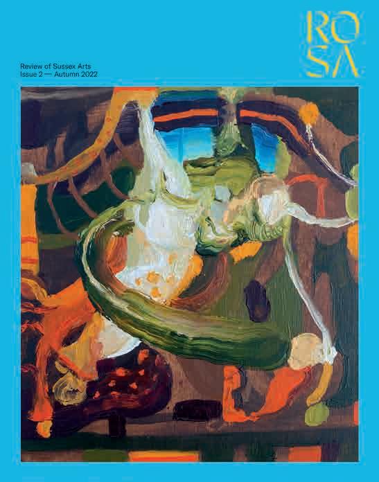
Get a quarterly copy of ROSA delivered to your door
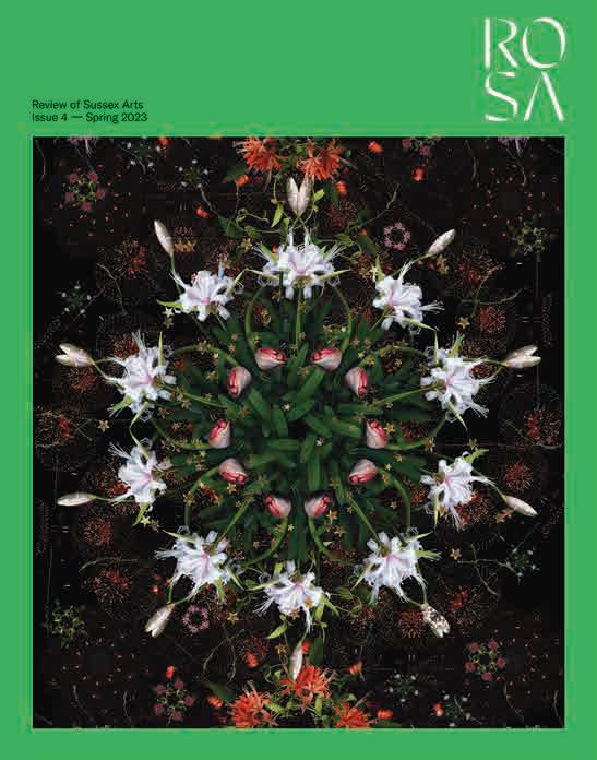
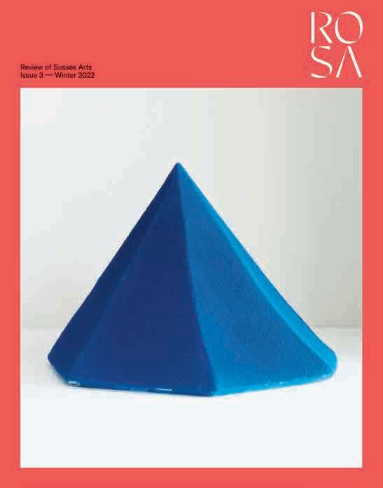
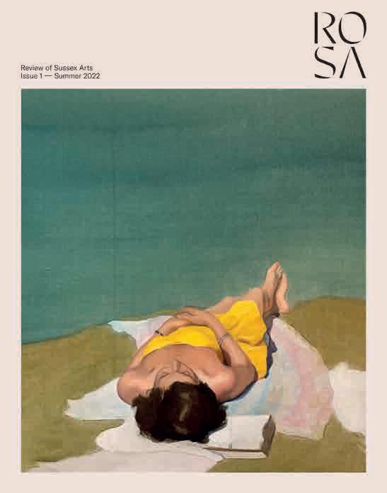
Or buy a gift subscription for your favourite culture lover
An annual subscription costs just £32
Go to rosamagazine.co.uk/subscribe and subscribe now
Features are already being prepared on counterculturalist Jeff Keen, Neo-Naturist Jennifer Binnie, Pallant House Gallery’s forthcoming John Craxton show, the colour orange, Seaford painter Eric Slater, what to do in Lewes, the Turner Prize at Towner Eastbourne, and much more besides, of course!
Follow us on Instagram @therosamag and Twitter @theROSAmag
Enquiries
Sales and subscriptions rosamagazine.co.uk/subscribe office@rosamagazine.co.uk
Distribution and stockists oliver.collins@rosamagazine.co.uk
Partnerships jessica.wood@rosamagazine.co.uk
Advertising office@rosamagazine.co.uk
Editorial editorial@rosamagazine.co.uk
ROSA is published by Review of Sussex Arts Limited
number 13431217 Registered office
Publisher Jessica Wood jessica.wood@rosamagazine.co.uk
Editor Alex Leith alex.leith@rosamagazine.co.uk
Art Director Rowena Easton rowena.easton@rosamagazine.co.uk
Technical Director David Burke david.burke@rosamagazine.co.uk
Sales Helen Drake helen.drake@rosamagazine.co.uk
Amanda Meynell amanda.meynell@rosamagazine.co.uk
Assistant Publisher Oliver Collins oliver.collins@rosamagazine.co.uk
Editorial Assistant Holly Finch
Design Geometric Love hello@geometriclove.com
Print Pensord pensord.co.uk
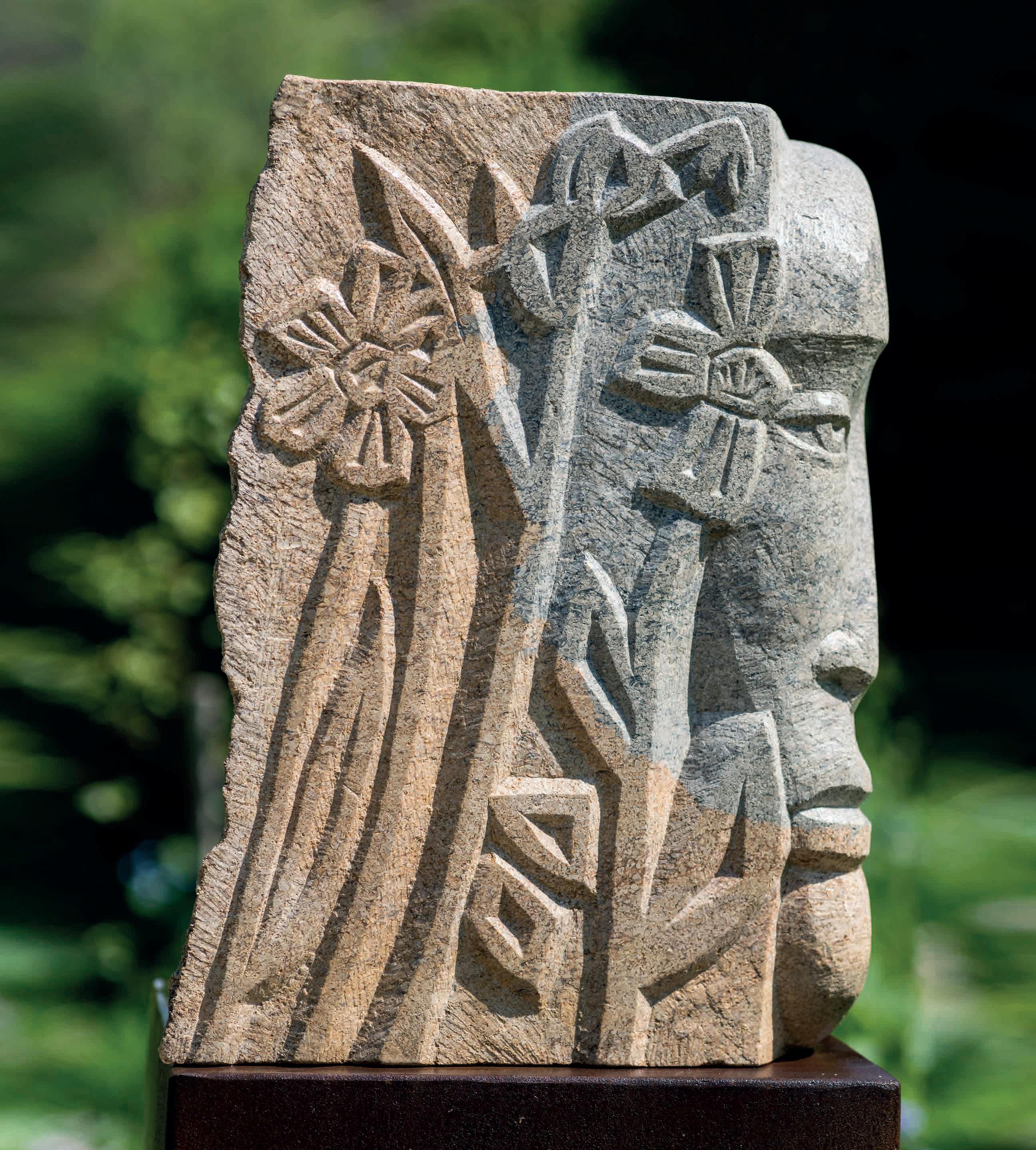
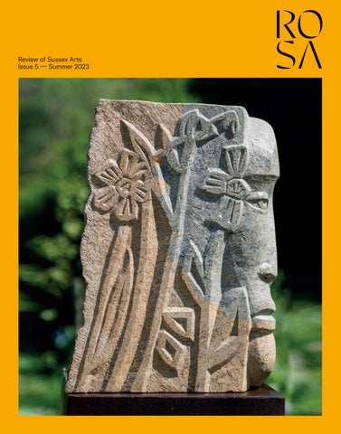
Cover image Jo Sweeting, Dymock Shul Head Photo by Adam Bronkhorst
11
20
22
Editorial: Sophisticated Sussex
Summer Highlights: The season’s top Sussex shows
My Sussex: Textile artist Maggie Scott
Cover Artist: Jo Sweeting, sculptor and lettercutter
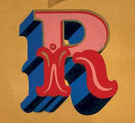
30 Alexandra Loske’s World of Colour: Yellow
Mellow yellow? Not a bit of it, says our colour expert Alexandra Loske, tracing the history of nature’s brightest primary, in art and beyond
36
Music: Neil McLaren, flautist and jeweller
41 Pages from a Sketchbook: John Skelton’s diaries
50
Sussex Wine: Dominic Buckwell pulls corks and explodes myths
55
Seven Questions: Andy Doig, meet Emma Carlow
60
Studio Visit: Horsham and Wivelsfield artists and makers, through Adam Bronkhorst’s lens
64
The Art of the Garden: The sculpture-filled (ever-less) Secret Garden in Kemp Town
68 Architecture: Flimwell Park, eco-build extraordinaire
A weekend in… Rye: cobbly twittens, great beer
influx of DFLs
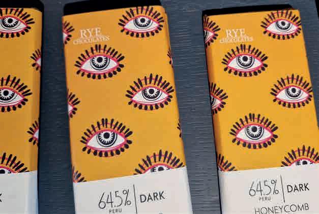
Planning a culture-filled weekend in Rye? Our pick of the best galleries, monuments, restaurants and bars to visit, with a historical overview, to boot
Michael Powell and Emeric Pressburger’s 1947 drama Black Narcissus was set in the Himalayas… but filmed in a botanical gardens near Horsham

Publicity still. © Universal Studios and production studio
Lycett Green, David Jarman
Art
How many Sussex buildings did Christopher Wren design?
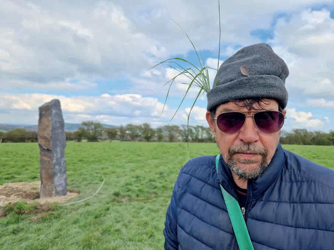
Welcome to the Neo-Stone Age
At the planting of Sussex’s newest standing stone
My work as an art critic often takes me up to London, to private views and press openings of art shows, and I meet a lot of other art types I’ve never met before, and they ask me who I write for. And I say: “my main job is as editor of ROSA Magazine”. Most of them, generally being from London, haven’t (yet) heard of the magazine, so I have to spell it out for them. Literally. “R…O…S…A. That stands for Review of Sussex Arts.”
Sometimes, there follows a bit of an awkward moment. The art world can be very London-centric. I can see a re-evaluation taking place. A thought process that downsizes my status, that provincialises me. And when I see that look, I feel like saying (with a few added expletives): “You know, Sussex, home of Pallant House and Charleston, of Glyndebourne and Petworth House, of the Royal Pavilion and Towner Eastbourne. Sussex, where you can currently see exhibitions of Barbara Hepworth, and Chaïm Soutine and Leon Kossoff, and Kaye Donachie, and Gwen John, and Lubaina Himid. Sussex, where we have beautiful downland countryside, miles of beaches, and eons of fascinating history. Sussex, chock-full of cultural sophistication, where you can see the stars at night and breathe proper fresh air and – if you so need – get into London in an hour. THAT Sussex.
Welcome to the fifth edition of ROSA Magazine, where, on a quarterly basis, we take you into the heart of our region’s cultural offerings. May I introduce you to Jo Sweeting, Sussex through and through, who carves local words into local stone, and who made the remarkable sculpture that adorns our cover. To Maggie Scott, part of the thriving black artistic community
in Hastings, who makes political statements in felt. To the legendary Steve Bell, the Guardian political cartoonist, who’s been ripping the piss out of the political establishment from his studio in Brighton for nigh-on 40 years. To neon artist Andy Doig, and internationally renowned flautist Neil McLaren. Welcome inside the diaries of John Skelton, whose 100th anniversary falls this year. To thoughtful articles about Maggi Hambling, and the elegant town of Rye, and the history of the colour yellow, and Powell and Pressburger’s filming of Black Narcissus , and Christopher Wren, and Brighton’s sculpture-filled Secret Garden, and Flimwell Park, an exemplar of intelligent eco-architecture. Welcome to our columnists, and our cartoonists, and our poetry page, courtesy of Katie Colombus. And, finally, welcome to the newest member of our team, the wine writer Dominic Buckwell, unscrewing the cork on Sussex’s thriving wine industry. ‘Is wine art?’, he playfully muses. Nah, but Sussex’s vineyards certainly play a part in the county’s rich cultural tapestry.
I sometimes wonder what would have happened had I settled in Northumberland, or Yorkshire, or Leicestershire, or Cornwall. Would there be scope for a RONA or a ROYA or a ROLA or a ROCA Magazine? None of them work as well as acronyms, clearly. Would they offer enough cultural sophistication to brim-fill 108 pages, on a quarterly basis? Let’s just say I lucked out – WE lucked out – ending up in Sussex. Enjoy the summer, enjoy the issue.
Alex Leith
Hastings Contemporary
Until September 24 | Until October 1
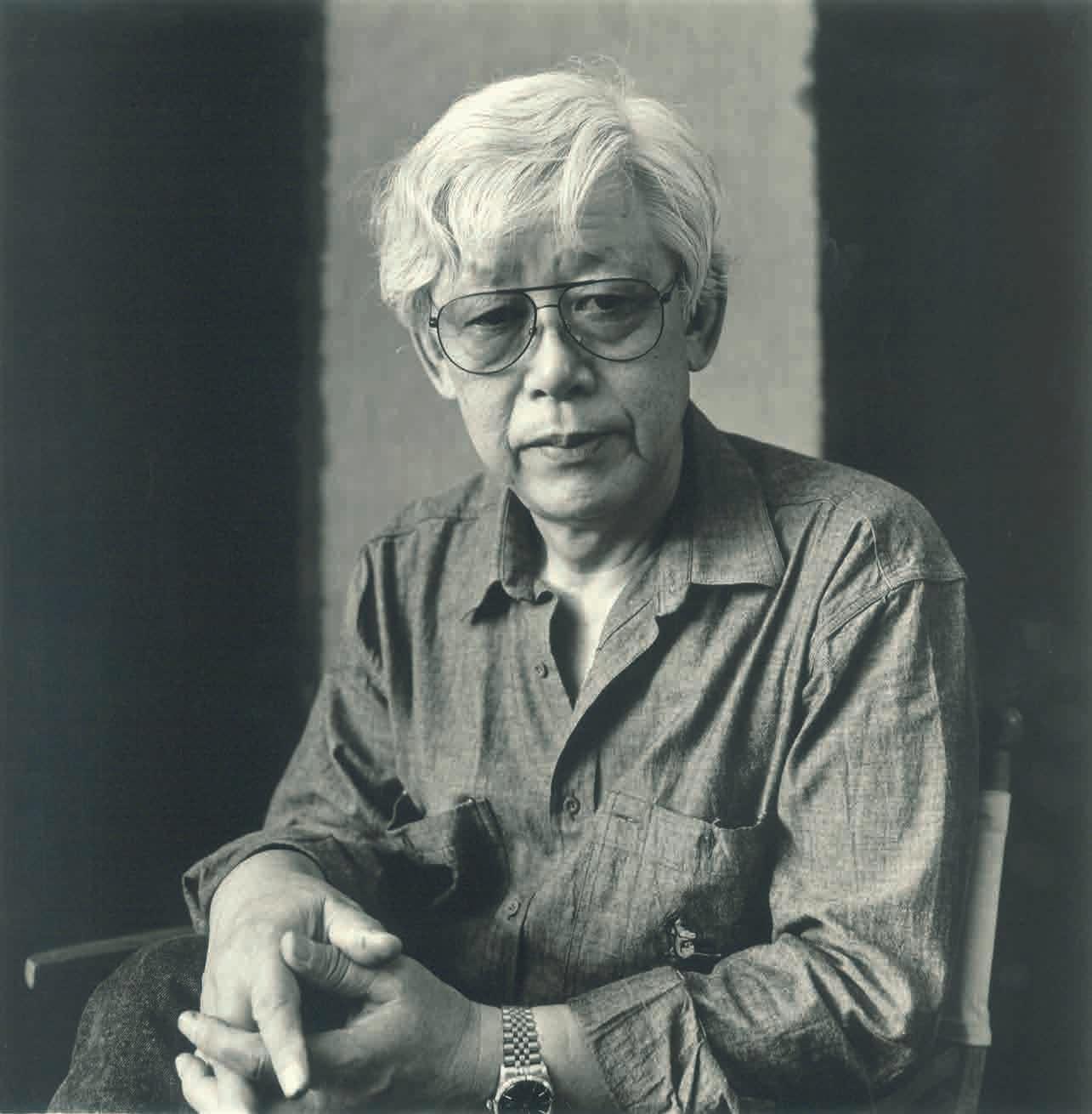
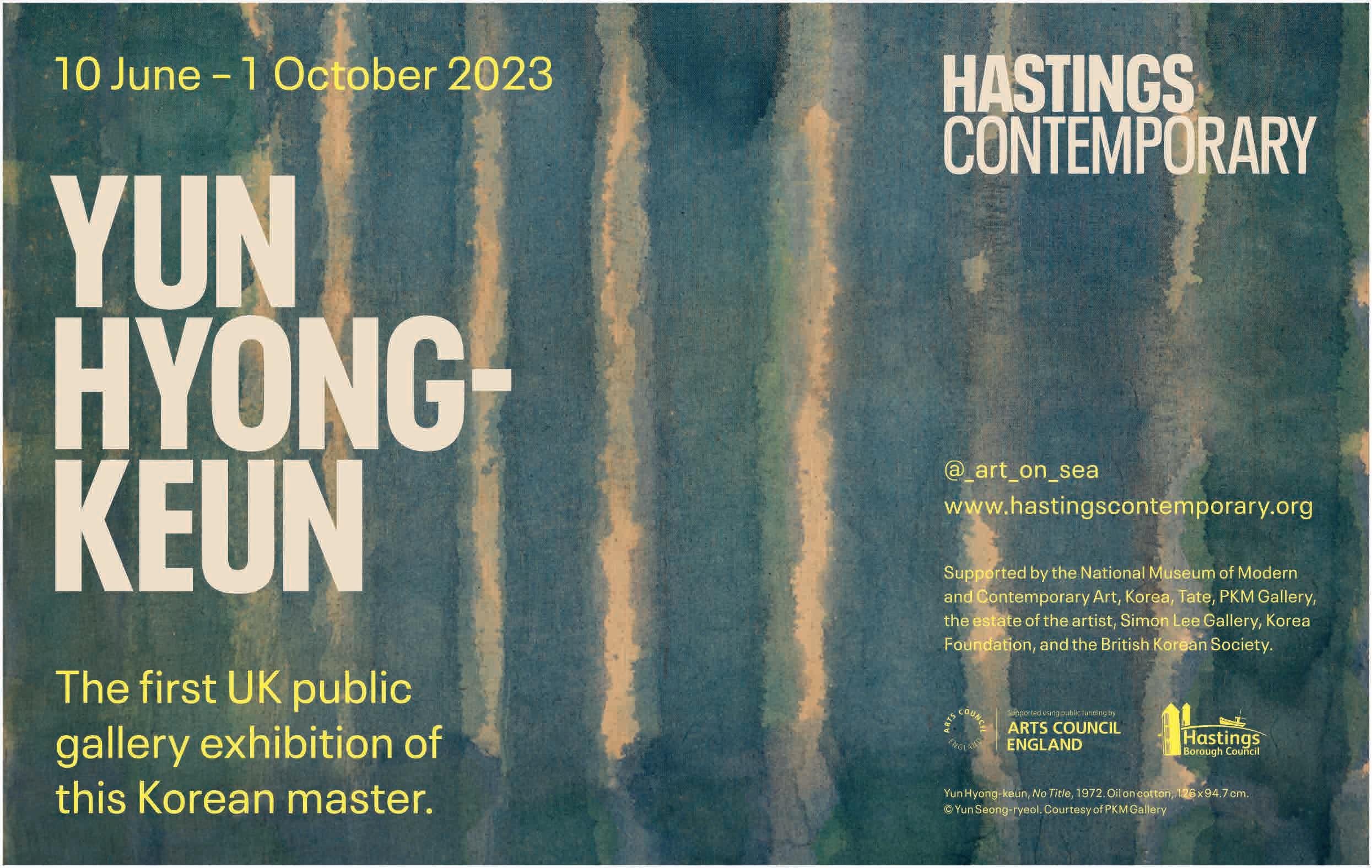
It’s a real coup for Hastings Contemporary to have pulled off this major show of works by Chaïm Soutine and Leon Kossoff, curated by the excellent James Russell, which garnered a rash of five-star reviews in the national press. Soutine, a ‘peintre maudit’ in the post-impressionist/ expressionist era, was a major influence on the post-WW2 ‘School of London’ group, namely Bacon, Auerbach, Freud and Kossoff, who admired – and adopted – his wild, gestural style. There are so many major works on show from both artists, that it seems almost churlish to pick out our favourites, namely The Pastry Chef by Soutine, and Childrens’ Swimming Pool, by Kossoff. It’s advisable to time your visit after June 10, so you can also catch the exhibition of abstract works by the late ‘Korean Rothko’, Yun Hyongkeun, who spent painstaking months on each canvas, layering his paint to create fields of intense darkness, using a signature palette of umber and ultramarine. Delve deeper at hastingscontemporary.org
Various venues
June 10 – July 9
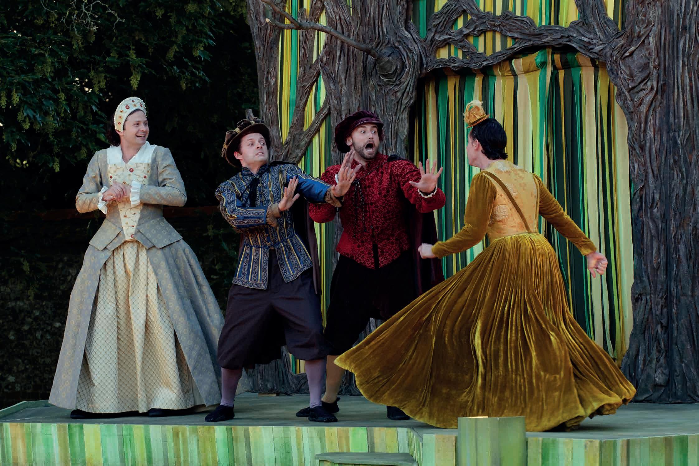
There’s jazz, blues, folk, rock, world, pop and more quality classical than you could shake a baton at. And that’s just the music. The annual Festival of Chichester (not to be confused with Chichester Festival Theatre) showcases performances from across the arts spectrum: you can enjoy theatre, book events and poetry, exhibitions, walks, cinema, tours, open days and galas in venues throughout the city and beyond. Highlights include an al fresco performance of Romeo and Juliet by The Lord Chamberlain’s Men (who perform Shakespeare as it was performed in Shakespeare’s day), poetry and music from Louis de Bernières and Elena Topogonova, a night with Cicestrian novelist Kate Mosse, Greek music from Plastikes Karekles and – to cap it all off –a full rendition of Handel’s Messiah by the Consort of Twelve and Portsmouth Baroque Choir, with a break in the middle to enjoy lunch on the lawn of St Paul’s Church. See the full line-up at festivalofchichester.co.uk
Below
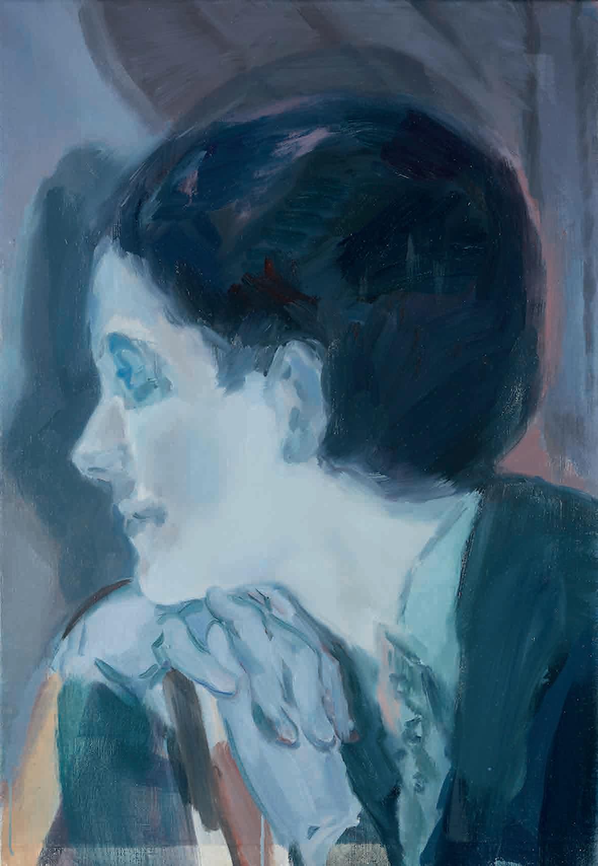
Kaye Donachie, Monotonous Remorse (2019), Oil on linen, 800 x 560mm, Pallant House Gallery Chichester, UK. Purchased with Support of the Contemporary Art Society (2020). © Kaye Donachie Courtesy Maureen Paley, London
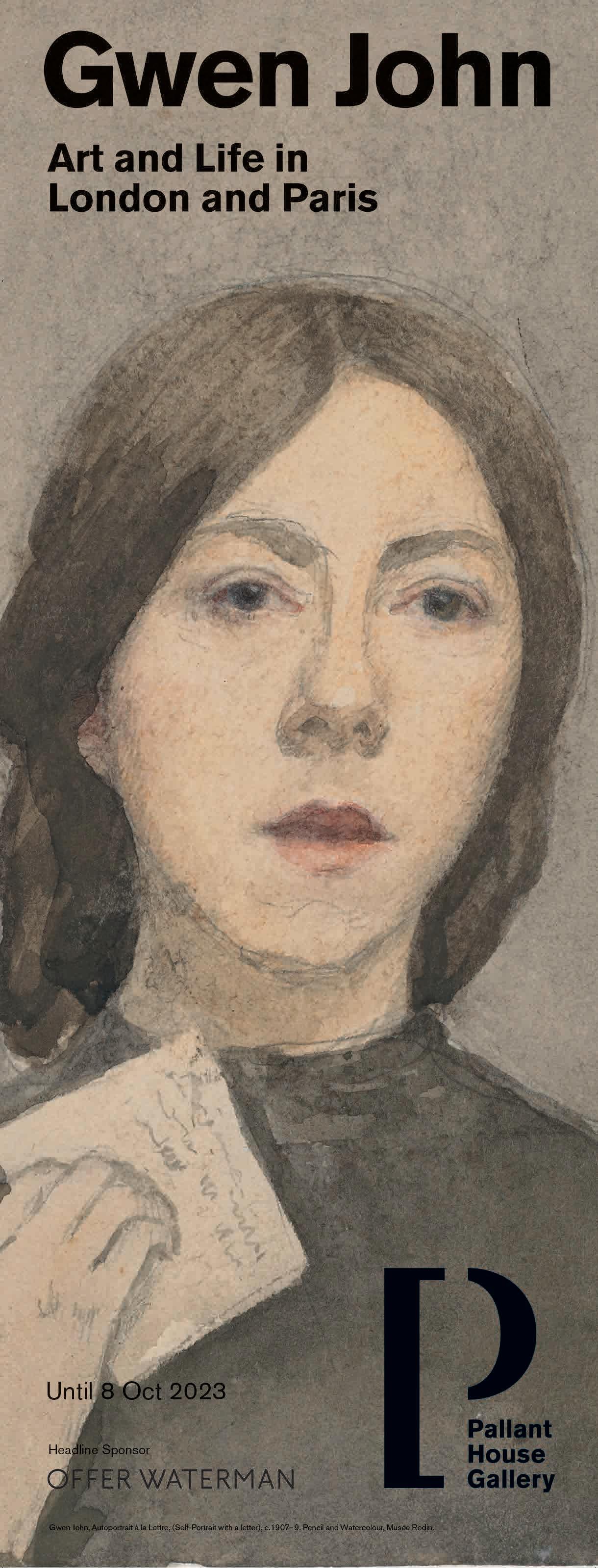
Gwen John: Art and Life in London and Paris | Kaye
Donachie: Song for the Last Act
Pallant House Gallery
Until October 8
A suitable umbrella title for the three shows on at Pallant House this summer might be ‘the female gaze’. First up, let’s mention contemporary Glaswegian painter Kaye Donachie, one of the most imaginative portrait artists of our time, represented by Maureen Paley. Donachie depicts avant-garde twentieth-century women, working from archive photography, in romantic shades of green, blue and pink. She has also chosen a side-show of works from the gallery’s permanent collection. These two exhibitions sit alongside the first major retrospective of Gwen John’s work for 20 years (see ROSA #4) featuring self-portraits and intimate portrayals of largely anonymous women, in the postimpressionist era. Unmissable: more at pallant.org.uk
Alexander Johnson: Nexus
Arundel Contemporary
June 3 – July 2
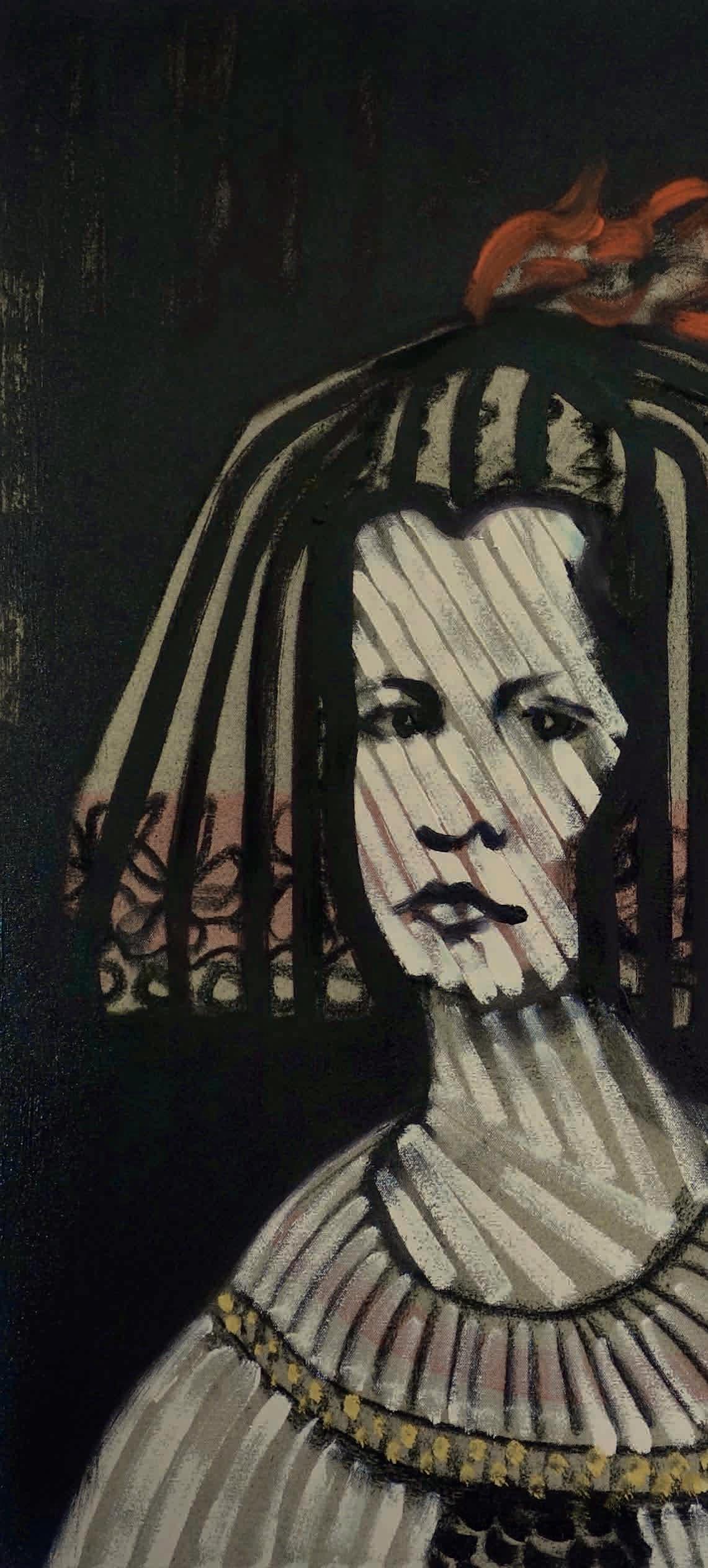
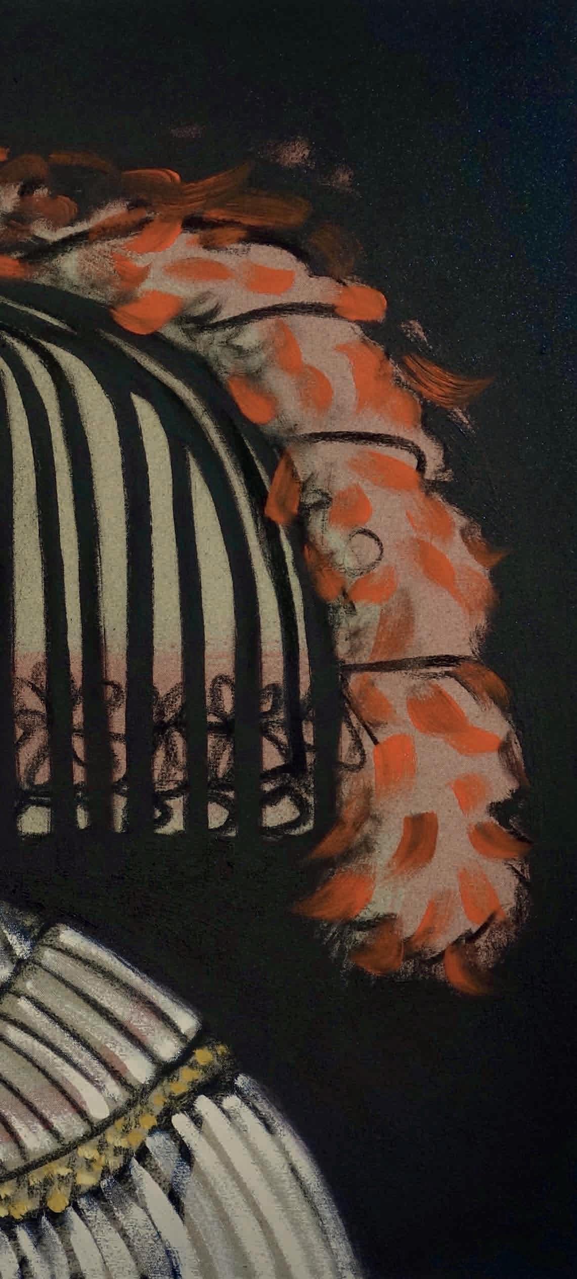
The latest series of work by the Laughton-based artist Alexander Johnson is our favourite to date. Equally influenced by the Old Masters and punk iconography, Johnson reimagines figures and still lives by the likes of Velázquez and Zurbarán in charcoal, adding abstract swathes of colour to bring the characters and scenes into the twenty-first century. Take a closer look into his hybrid world at arundelcontemporary.com
John Hitchens: WOOD – SAND – STONE
Weald & Downland Living Museum, Chichester
June 19 – October 30
John Hitchens comes from a long line of painters of the Sussex landscape (his progenitors include grandfather Alfred and father Ivon), but very much ploughs his own furrow, portraying the Downland countryside he grew up in from an abstract, sometimes almost Aboriginal viewpoint, mark-making on canvas, sand and flint. Explore more at wealddown.co.uk
Petworth House
Until September 24
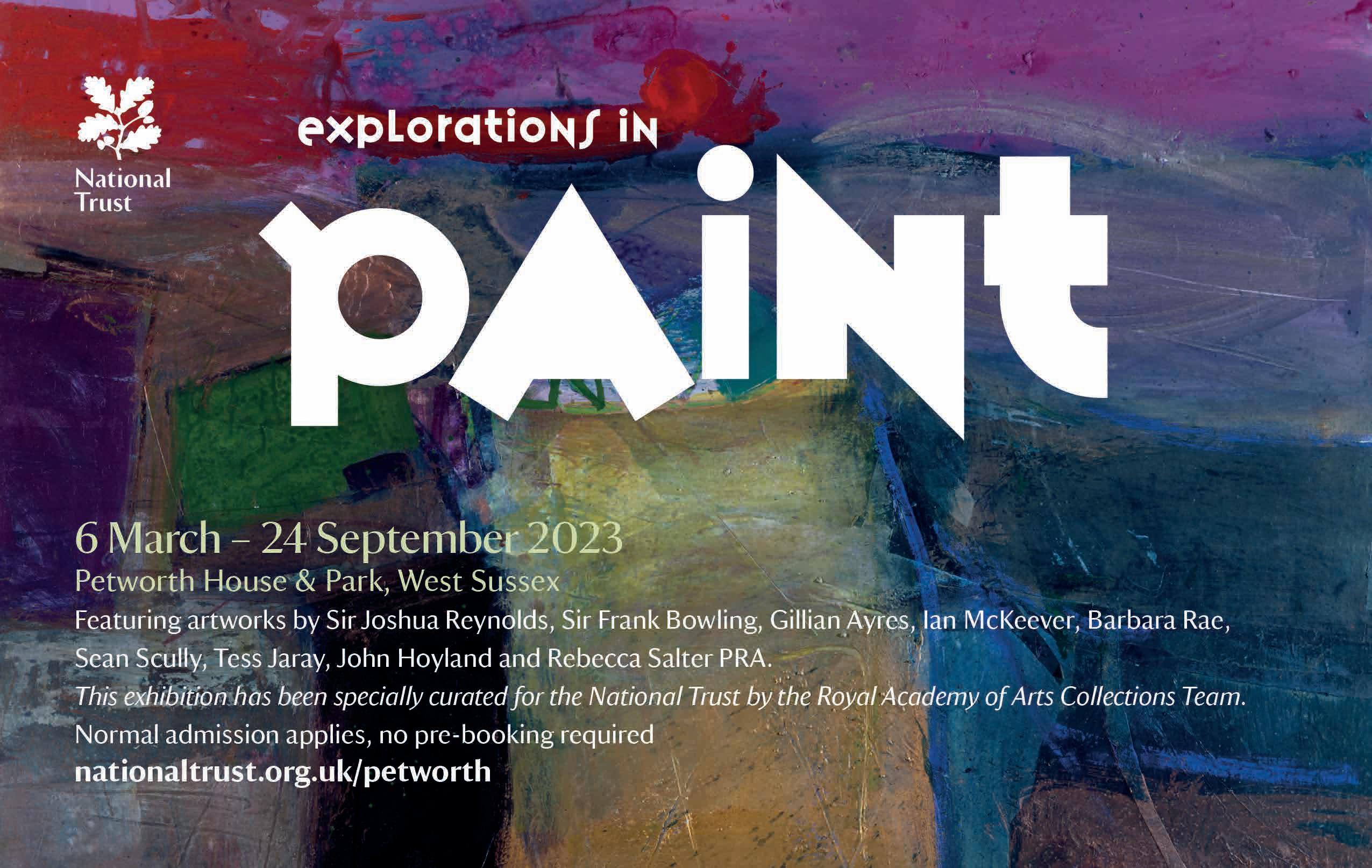
A collaboration between Petworth House and the Royal Academy, as part of the NT property’s year-long ‘celebration of colour’. This show features the work of eight current and recent RAs, namely Gillian Ayres, Frank Bowling, Sean Scully, Rebecca Salter, Tess Jaray, John Hoyland, Ian McKeever and Barbara Rae. There’s plenty more art on the walls of the country house, of course, from the likes of Turner and Reynolds. Check it out at nationaltrust.org.uk
VOLT, Eastbourne
Until July 2
This show is the fruit of a six-month hook-up between Devonshire Collective and Photoworks, in which Shah has collaborated with young asylum seekers and refugees exploring themes of home, identity, memory and hope in a variety of media. While you’re in town check out Wobbly Knee by Claire Shakespeare (see ROSA #1) at Port Hotel, another DC initiative. Get in the picture at devonshirecollective.co.uk
Above
Alexander Johnson, Sun-drenched Princess (after Velázquez), 2023. Oil on canvas
Hepworth:
Towner Eastbourne
Until September 3
This touring show has made its way to the south coast via St Ives, Wakefield and Edinburgh, and features major works from throughout Hepworth’s illustrious career, from her abstract beginnings to the monumental works in bronze and stone of her later life (plus drawings, paintings and fabric designs). Learn more at townereastbourne.org.uk
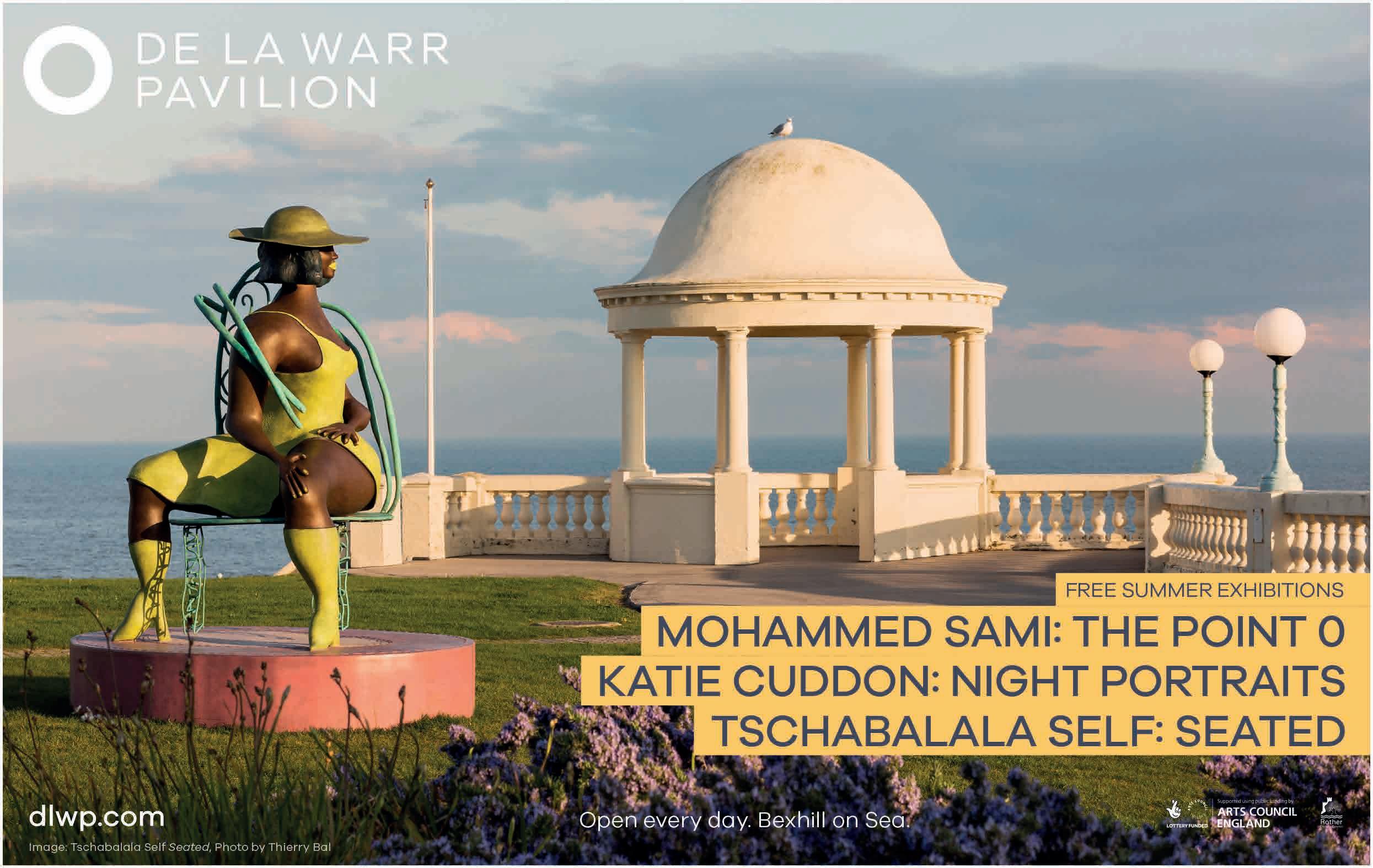
Mohammed Sami: The Point 0
Kate Cuddon: Night Portraits
De La Warr Pavilion
June 10 – August 28 | September 3
On the ground floor of Bexhill’s landmark Modernist arts centre, Iraqi painter Mohammed Sami traces traumatic memories in acrylic and spray-paint on canvas; the show includes four never-before-seen works. Upstairs, Kate Cuddon explores the relationship between vessel and void, in clay and other materials. Intrigued? Check out dlwp.com
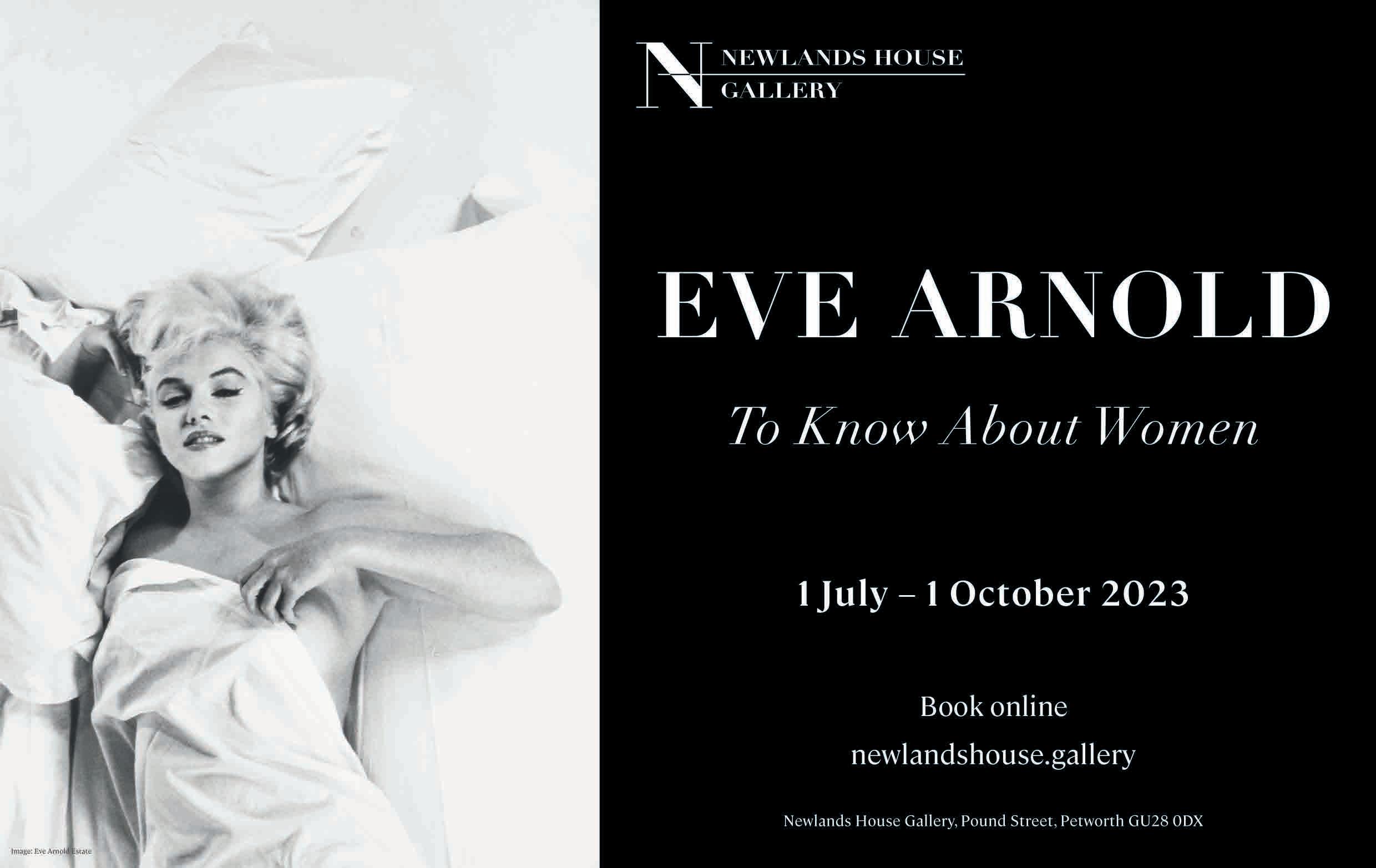
Arnold
Newlands House Gallery
July 1 – October 1
Eve Arnold was a prolific documentary photographer, exploring social issues from Brooklyn to Havana. She used the fly-on-the-wall skills she learnt to turn her hand to celebrity portraiture, too, notably in several shoots with her friend Marilyn Monroe. Curated by Maya Binkin: get a taster at newlandshouse.gallery
Lee Miller Portraits
Farleys House & Gallery
Until September 3
As ever, there’s plenty on this summer at Farleys House, notably an exhibition of Lee Miller’s portraits of the great, the good and the ghastly. There’s also work on show by contemporary photographer Annabel Moeller (until July 2), painter Emmy Bridgwater (until July 9) and portraitist Susanne du Toit (July 13-Sept 3). Plus, of course, the annual Surrealist Picnic (Aug 27). Book for that and find out more at farleyshouseandgallery.co.uk
Godai: Japanese Woodcuts
Hove Museum of Creativity
Until November 12
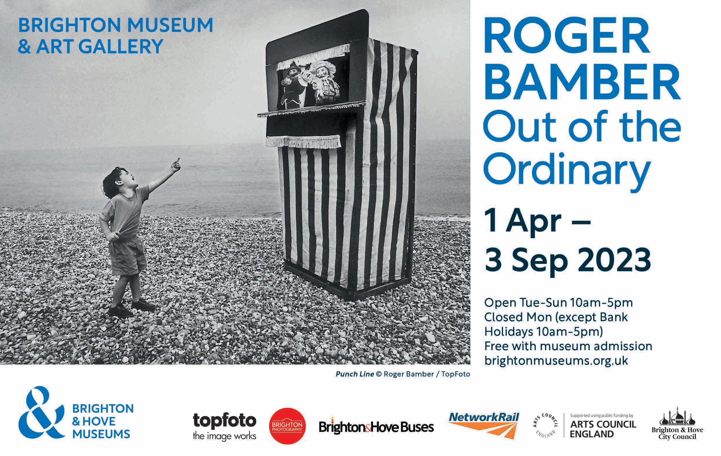
In the late 19th century there was a craze in Europe for Japanese prints, notably in the style known as okiyo-e, meaning ‘pictures of the floating world’ (think Hokusai). Brighton & Hove Museums has a beautifully preserved collection of such works: here’s a rare opportunity to see them. Check out more – including details of the fab Roger Bamber show (see ROSA #4) – at brightonmuseums.org.uk
Summer Exhibition
Moncrieff-Bray Gallery, near Petworth
Until June 24
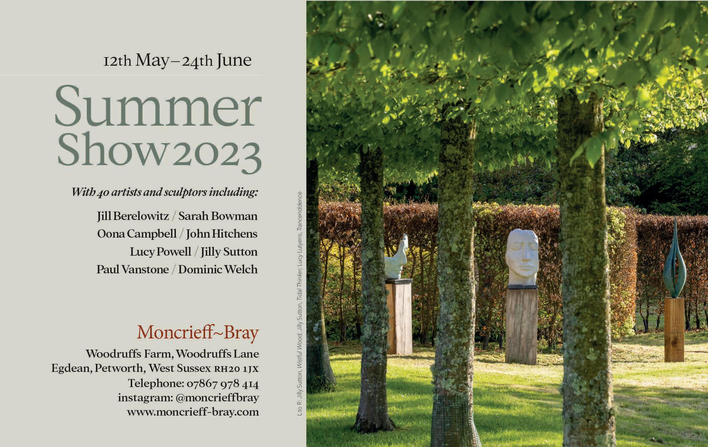
Inside the converted barn/gallery there are works by artists such as David Cass (of Venice Biennale 2022 fame), John Hitchens (see above), Amy Shuckburgh and many more. Outside, in the beautiful gardens-with-a-view, there are sculptures by the likes of Benji Lowsley-Williams and Lucy Lutyens. Find out more about this magical space at moncrieff-bray.com
See page 97 for information about three brand-new galleries in Sussex and their summer shows.
SUMMER HIGHLIGHTS: VISUAL ARTS
Various venues and dates
Summer is the perfect season for wandering round trails, brochure in hand, checking out artists’ houses and studios – plus other quirky venues – and, who knows, even buying some art. Horsham Artists Art Trail kicks matters off (June 10-11 and 17-18); Arundel Gallery Trail takes place from Aug 19-28 (daily); Coastal Currents spans ‘1066 Country’ (from Hastings to Eastbourne date tba); Artwave, in the Lewes District, bookends the season (Sept 2-17, largely weekends).
July 7 – September 17
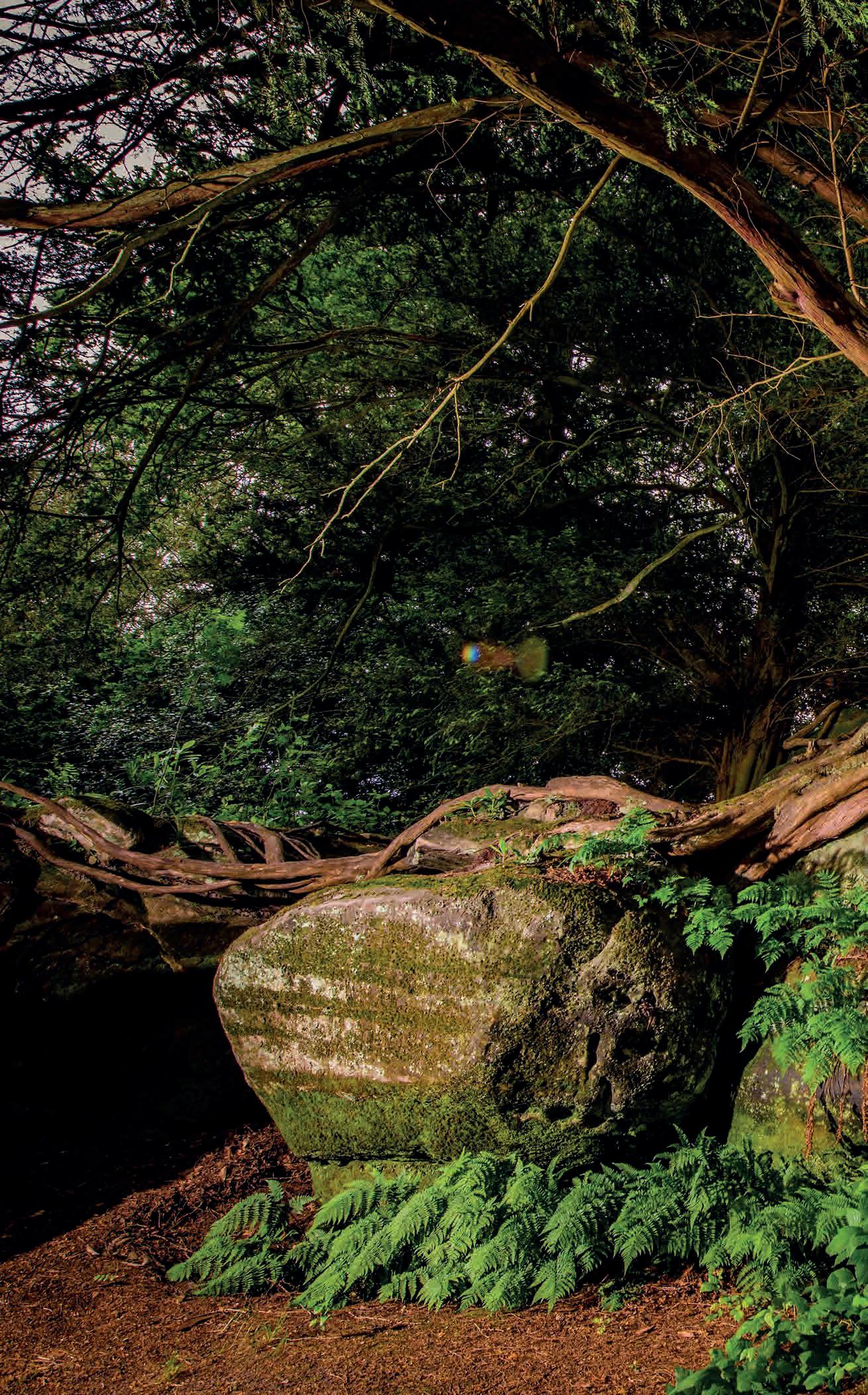
As if there wasn’t enough good reason to visit Kew’s Sussex satellite, this summer there’s an extra artistic bent to the botanical gardens. Not only is Wakehurst’s Elizabethan mansion house clad in Europe’s biggest-ever photo installation (courtesy of Australian-born artist Catherine Nelson, see ROSA #3); there’s also a sculpture and sound trail, entitled Rooted, with tree-themed works fashioned by an array of ecominded artists, including Chila Kumari Burman, plus Hidden Orchestra & Tim Southorn. More information at kew.org
Glyndebourne Opera House
Until July 27
There are six fine operas to enjoy this summer: new productions of Mozart’s Don Giovanni, Handel’s Semele and Poulenc’s Dialogues des Carmélites, plus welcome returns for Donizetti’s L’elesir d’amore, Stravinsky’s The Rake’s Progress and Britten’s A Midsummer Night’s Dream. And a bonus! In Gallery 94, Turner prize-winning artist Lubaina Himid represents each of the operas with a symbol-rich painting. More at glyndebourne.com
Glynde Place
June 30 – July 2
Coming to a field near you, this summer: Grace Jones, Candi Staton, Emile Sandé, Little Simz, Gabriels, Thundercat, FKJ, Marcus Miller, Yussef Dayes, Mulatu Astatke, Greentea Peng and Shalamar. Shalamar, playing in in the shadow of Mount Caburn, that’ll be a night to remember! And plenty more besides, at the coolest festival of the summer, focusing on jazz and soul. Be there, or be □. Full line-up at lovesupremefestival.co.uk
St Andrew’s Church, Alfriston
July 18 – 23
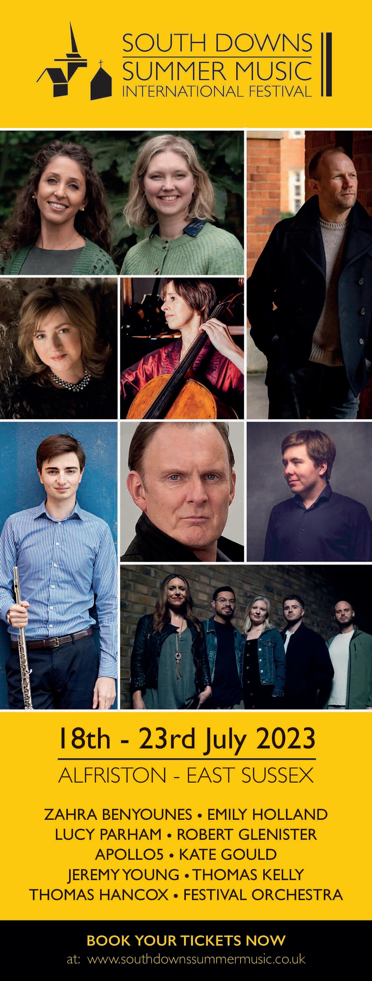
A week-long festival of top-level classical music in the Cuckmere Valley, mostly taking place in ‘the Cathedral of the Downs’, Alfriston’s magnificent 14th-century St Andrew’s Church. Expect Vaughan Williams, Mendelssohn, Grieg, Mozart, Dvořák, Brahms, Ravel and… Apollo5 (the latter being a London-based a cappella chorus performing songs from the Renaissance to the 21st century). Tune in at southdownssummermusic.co.uk
St Michael’s Church, Lewes
July 19 – 22
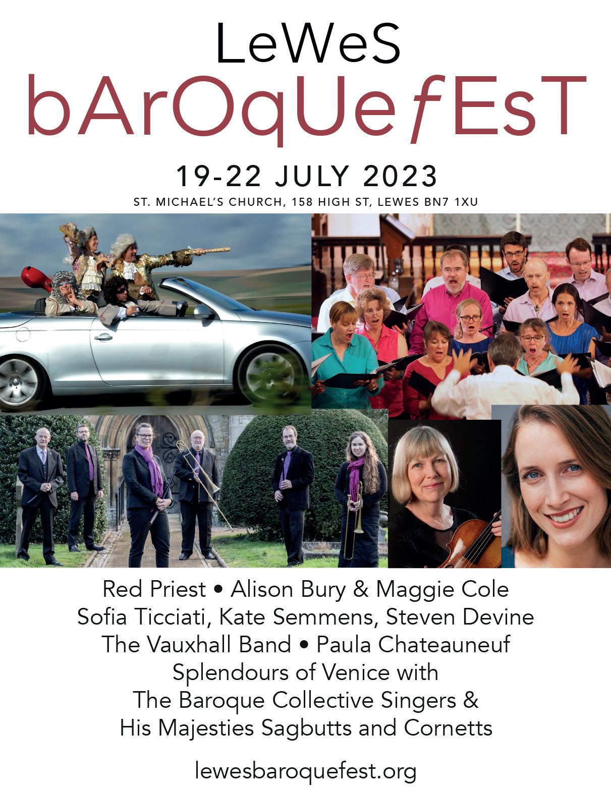
Baroque and roll? Four-piece instrumentalists Red Priest are named after Vivaldi, but have been compared to The Rolling Stones, The Marx Brothers and Jackson Pollock(!) They join a host of other top musicians in this four-day celebration of 17-18th-century music, in St Michael’s Church, on the High Street in Lewes, art-directed by John Hancorn and Julia Bishop. Full line up and ticket info at lewesbaroquefest.org
Various venues and dates in June
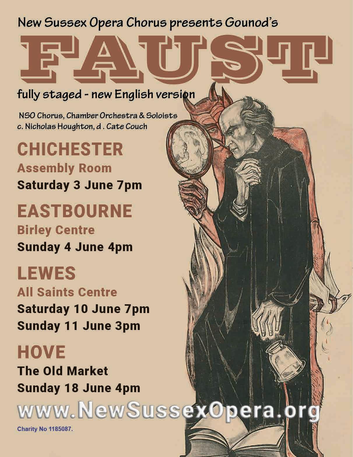
New Sussex Opera have, since 1979, specialised in bringing hidden operatic and choral gems to life, and have established a stellar reputation far beyond the county boundaries. This year’s offering – first performed by the company in 1989 – is Charles Gounod’s Faust, selling its soul at four venues: The Assembly Room, Chichester (June 3); Birley Centre, Eastbourne (June 4); All Saints Centre, Lewes (June 10-11), and The Old Market, Hove (June 18). More at newsussexopera.org
Charleston Festival of the Garden
Charleston, near Firle
July 13 – 16
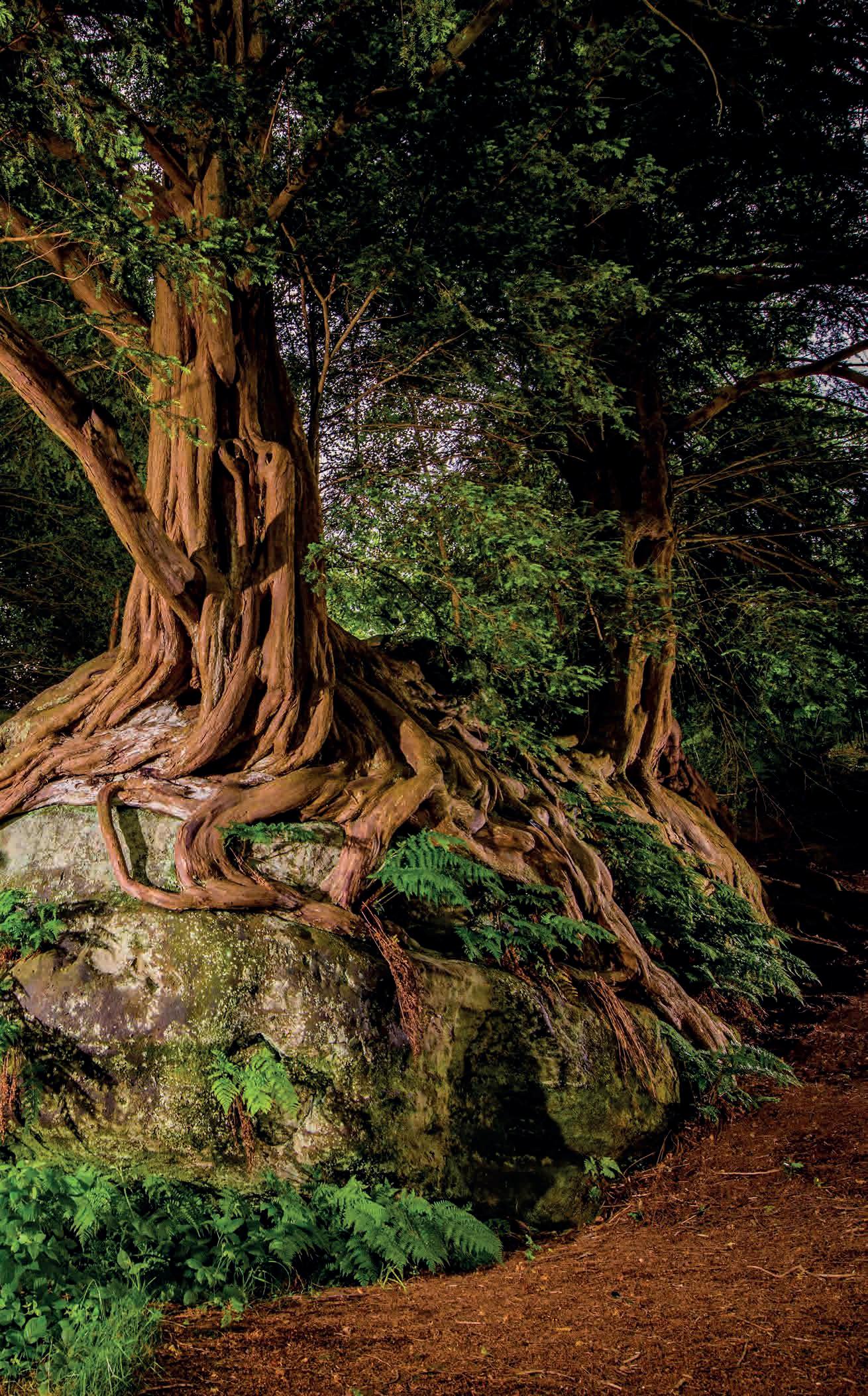
The story of Charleston’s garden is one of love, and neglect, and love again, and taking a stroll round this colourful, sculpture-peppered, consciously scruffy space is one of the real pleasures of a visit to the farmhouse. Every July, there’s a four-day Garden Festival, to boot. With TV presenters, writers, and celebrity gardeners talking rhizomes, compost recipes, and slug pubs. See you there: dig deeper at charleston.org.uk
From June 24
Alinah Azadeh, an artist, poet and writer of British-Iranian heritage, has been writer in residence for the South Downs National Park for three years, and We Hear You Now is the fruit of that residency. Azadeh has been collaborating with eight female artists of colour, each of whom has recorded a response to the landscape: these works can be listened to at 15 embedded posts along the Seven Sisters coastal path. The project was launched during Brighton Festival, and will run for three years. More at sevensisters.org.uk
How did you end up in Sussex?
I was born in London and lived in Notting Hill until I was ten, when the family moved to Hampshire. After I graduated from St Martins School of Art in 1977, I worked for a while in Perugia, in Italy, then went to live in Paris. Many years later I moved back to France, this time in the south, and lived there with my husband for about 14 years; however, the prospect of having Marine le Pen as President was the catalyst for a move back to the UK. Unfortunately, it was just in time for Brexit.
I used to be a member of the Labour Party and I came to the Brighton Party Conference in 2017. I wanted to hear Jeremy Corbyn, but also the writer and activist Naomi Klein. I found an Airbnb apartment right on the seafront near the i360 and fell in love with the view. This planted a seed – the idea of living by the sea – and I began to search for a space. Brighton prices were above my budget, so I started to explore other seaside towns. I looked at Folkestone, Margate and Eastbourne but in Hastings/St Leonards I found a place I could afford that had lots of artists and even more importantly, a vibrant and growing black community. Now we rent a lovely highceilinged flat on the seafront, with great views. There is nothing like waking up and looking at the sea from your bed.
There’s a big artistic community… Very early on after the move, I joined Hastings Creatives, a network with over 1,200 members, which is amazing for a town of this size! If you want to collaborate with a filmmaker, or find a printmaker, a photographer, an art teacher, a set dresser or a fabric designer, in fact anything creative, they’re all in the group. It’s extraordinary. I’m currently [until June 4] exhibiting with five other local artists of Caribbean heritage in WE OUT HERE at Hastings Contemporary. But within five minutes’ walk from my house there is Hastings Art Forum, a gallery that showcases local artists with fortnightly exhibitions, and Electro Studios Project Space, an artist-run gallery where I will be showing some work in their textile show in July.
Hastings Contemporary is a boon… It is, and it’s fantastic to have a ‘centre of excellence’ showing international art that attracts visitors from all over the south east (and in the case of the current show, Soutine | Kossoff, probably all over the country). But it’s great that they have been persuaded to put on an exhibition representing the burgeoning local arts scene. I’m delighted that WE OUT HERE has been so well received – not just among the black community, but the local community as a whole. However, there is still one large barrier to overcome, and that is the entrance fee.
Many national museums and galleries have realised it’s a false economy, so we are all hoping Hastings Contemporary will revisit this policy and look at the benefits of attracting more – and more diverse – visitors to the building.
There are plenty of other cultural opportunities…
Hastings has a good reputation for live music; there are lots of festivals and annual events, but you are almost guaranteed to find some live music playing somewhere in Hastings every day of the week. The events at venues like The Printworks are always worth checking out, but I also make sure I look at the programme of talks, exhibitions and workshops happening at Photo Hastings. We are blessed with the independent Electric Cinema in the old town, screening classic and world films, and of course the Kino-Teatr that combines a gallery, restaurant and large cinema space, and hosts some great clubs like the monthly Bavard Bar – a blend of TED talks, comedy and Radio 4! The great thing is, you can do all these things at very little cost, which makes it available to a broad audience, especially young adults.
We’re very lucky to have The Royal gastro pub opposite St Leonards station, which runs an excellent kitchen; a few meters away, Mama Putts’ serves authentic African/Caribbean food in a smart ‘white tablecloth’ restaurant. Another favourite is the Galleria, an intimate fish restaurant on Norman Road with a small menu, always serving fresh seasonal food. For a perfect sea view with excellent food and an impressive wine selection head to Graze on Grand, and grab the window stools. This wine bar and gallery is always welcoming and relaxed whether you just want a glass of sherry and some olives, or a full three courses. The owner Stephanie has a great eye and always features interesting artists on her walls.
One of the joys of living in Hastings is that in less than ten minutes you can be in the countryside. Hastings Country Park is on our doorstep. My husband is a passionate gardener, and we are members of the National Trust and English Heritage, so we love going to places like Great Dixter and Sissinghurst. I always enjoy Charleston, particularly their gallery exhibitions, and of course Towner Eastbourne, which has transformed the town. I often find myself in the De La Warr Pavilion in Bexhill and really appreciate the efforts they are making for inclusivity, like the decision to hire older as well as young people to serve in their restaurant. Oh, and we often go to Alfriston, where we are big fans of Cate and Nash who run Much Ado Books.
More people should know about the Bale House, which is an information centre and café in Hastings Country Park, made entirely out of sustainable materials, mainly straw. It was designed by CAVE Co-operative and it is Hastings’ best-kept secret, but it shouldn’t be! It has won several awards and it is an extraordinary and beautiful-looking building. When you are inside and having a coffee look up… I’ve made some felted acoustic baffles for the ceiling.

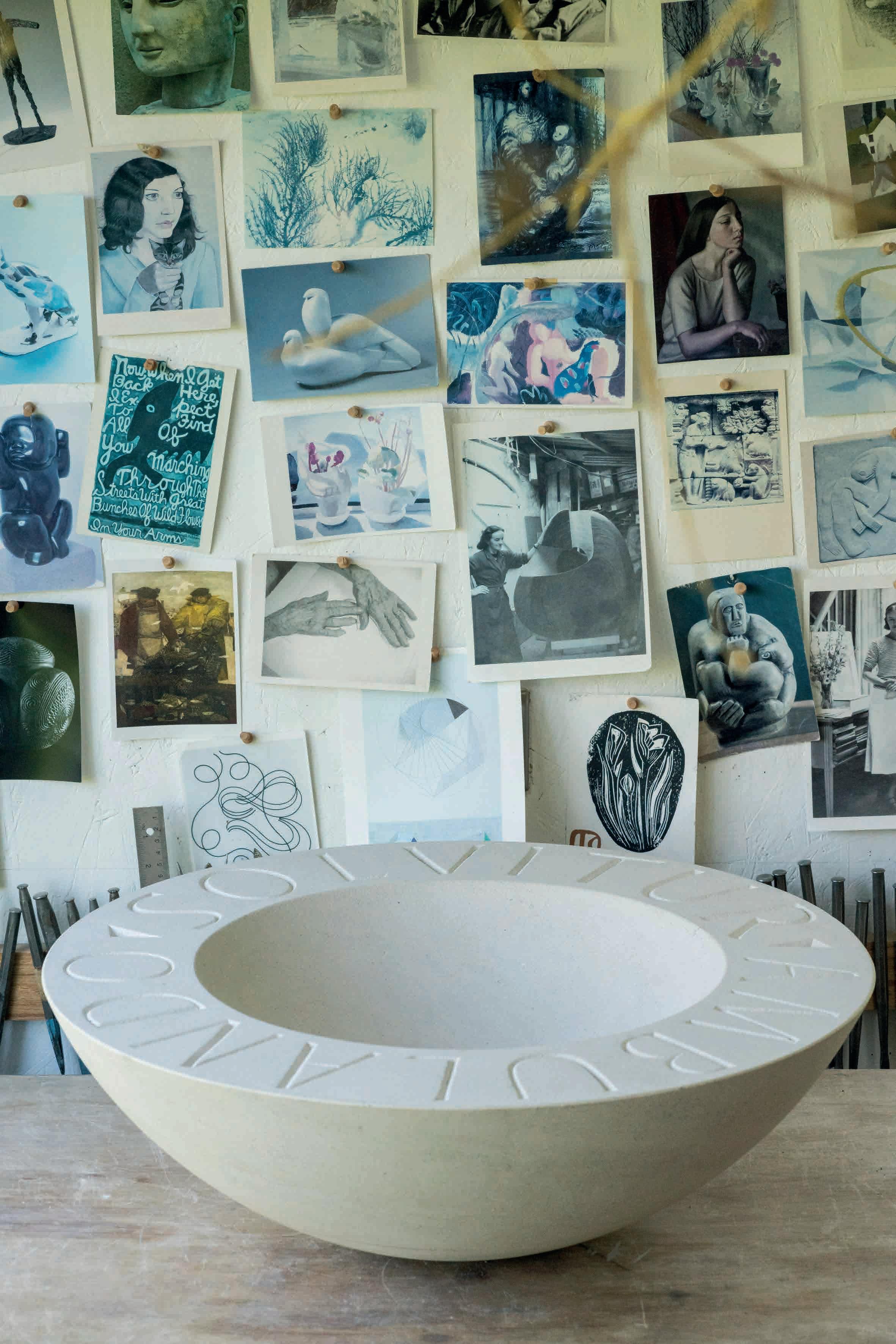 Right Wandering Bowl Portland stone ‘Solvitur Ambulando’ (All is solved by walking)
Before we meet to talk, sculptor Jo Sweeting tells me her favourite book is Bird Cottage by Eva Meijer. Bird Cottage tells the story of Gwendolen Howard, a young woman who moves to Ditchling in Sussex after a failed romance, gives up on people, and fills her house with birds. She is interviewed by the ornithological societies and even approached by the BBC, but nobody believes what she is saying – that sparrows are individuals, that robins and tits (which fly in through her windows and sit on her shoulder) suffer loss and sorrow, joy and fear. ‘Len’ writes two books about her observations, but they are considered unscientific. She dies, unsung.
Bird Cottage is about the value and magic of noticing: if we notice the individual birds or indeed listen to and notice each other, and the natural world around us, we will learn and understand, instead of turning into the kind of people who destroy a planet or tarmac over gardens or, as Jo says, “drive around in horrid big cars, hating everyone.”
Unlike ‘Len’, Jo Sweeting lives at the core of a family – her husband Phil Sweeting is a picture-frame maker, their three children range from 20 to 25 – in the centre of a downland village, in the heart of a wider artist community that stretches from Brighton, where Sweeting lived most of her life, to the borders of Sussex and beyond. She has not (yet) given up on people, but she does spend her day working alone. Alone but for a constant flow of sparrows, finches, robins, dunnocks, blackbirds, doves and magpies. Sweeting’s house, studio and garden are the ‘Bird Cottage’ of her locality. To the birds, she’s like the Pied Piper, they follow her everywhere. They are so diverting, how does she get any work done? “I don’t know,” says Jo, as she and I sit mesmerised by a charm of goldfinches flitting and squabbling on a seed feeder hung on a lilac bush outside her kitchen window, their scarlet caps flashing in the sunlight. Then we spot a wren on a rose stem right there, behind the glass. We marvel at its diminutive size. “It’s really more of a moth,” says Jo. “But with the most beautiful, loudest song. ‘A bird the size of a leaf fills the whole lucid evening with his note, And flies’. That’s Wendell Berry,” she sighs. “I could sit here all day.”
But work she does, her monumental stone heads, woodcuts, chalk sculptures, smooth polished bird bowls, her stone panels and prints sell in abundance, here and abroad, the prints turning
up most recently in a new book of poems by the current Scottish Makar [poet laureate] Kathleen Jamie. Jo has been a printmaker and sculptor for 40 years. After art school in Leeds, she trained as a teacher. Bringing up a family in the 90s and early 2000s she juggled teaching deaf children and making work, finding, as she calls them ‘parcels of time’ to explore her own path, her own needs as an artist. “Women have to do this,” she says. “We have to fight for the head space, make room for ideas to emerge, in between folding washing, cooking pasta and peas, clearing up sick.”
The children are now grown. Recently, she and Phil moved from the city into this village. Each morning she walks Ivo and Percy, a pair of whippets who have coats as soft as silk – one a dusky mole’s grey, the other brindle and white in patches. They are the dogs in Lucian Freud paintings, they are the Platonic ideal of a dog, so beautiful that daily proximity to them would surely make a painter of you, too. I begin to notice that everything around Jo Sweeting is considered and beautiful.
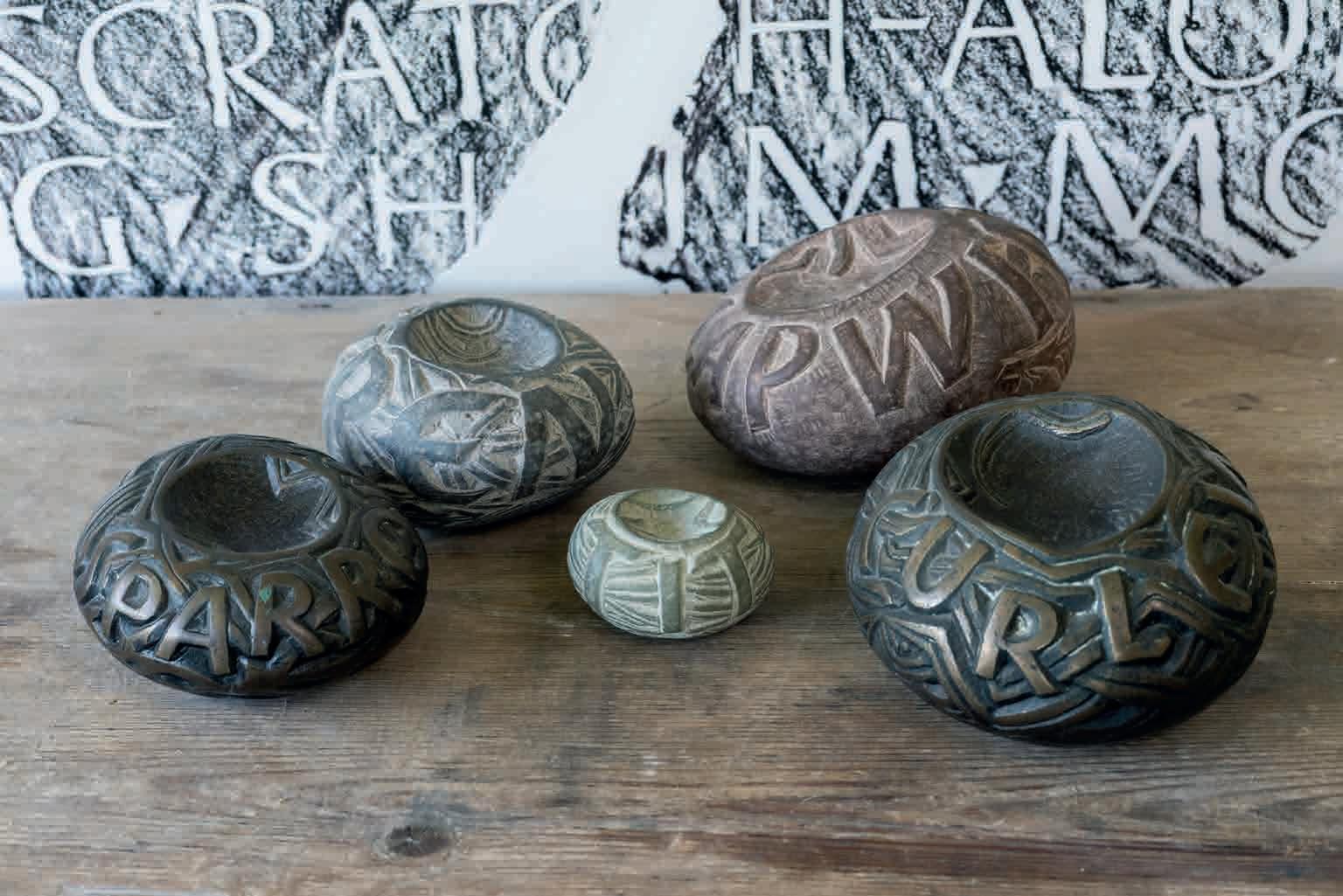
Here we are in the tiny kitchen, layered with plates, pictures and pottery, in blue and brown and yellow and grey, natural hues which blend into one another as if part of a larger artwork. On the chest there is a snail shell with a hole in it pecked by a thrush. On the windowsill, a row of five stone nests, pebbles hollowed out by Jo’s chisel, carved with the names of birds on the RSPB Red List, birds in decline: lapwing, sparrow, swift, greenfinch, tit. She can’t keep up with demand for these tiny nest sculptures. “The tits sold out immediately”, she laughs, raising her eyes to heaven.
I cradle a stone nest in my palm. The house itself is a nest, I realise, woven together as a bird would do it, years of practice, instinct and natural materials ‘feathering’ the interior. Nothing jars. Everything is safely in its rightful place. Is Jo Sweeting’s whole world arranged like this? “Of course,” she says. She points to a bowl of lemons. “Do you think that bowl is just plonked there?” Well, yes, I thought it might have just landed there, as things do in my house. Then I notice that her Oxalis, a deep reddish brown house plant with butterfly leaves, has no peachy pink flowers on its stems. Mine at home is in bloom. No flowers? “Oh no, I don’t like the colour.” says Jo. “I snip the flowers off as soon as they appear.” She makes a snipping action, grins mischievously. “Off with their heads!”
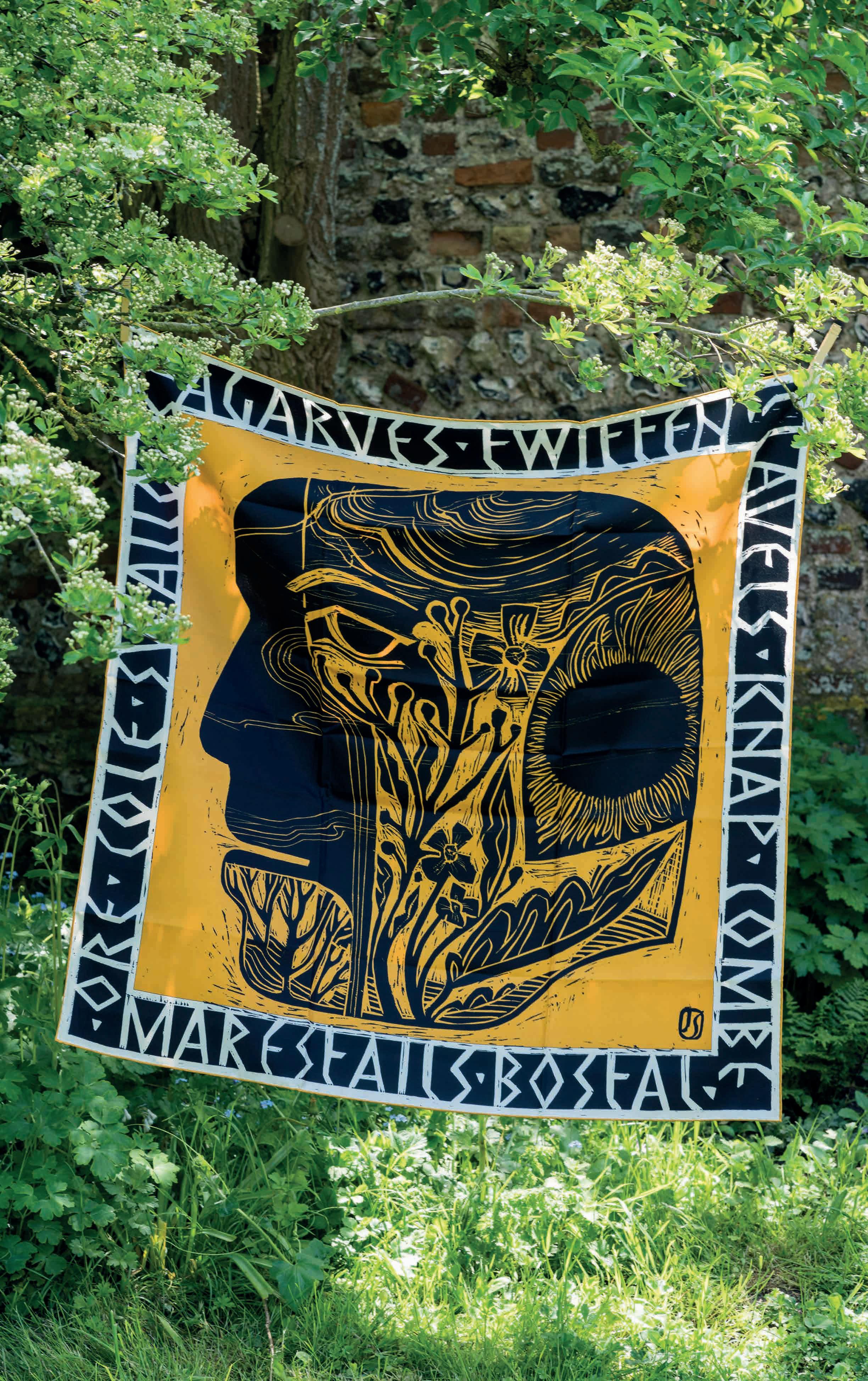
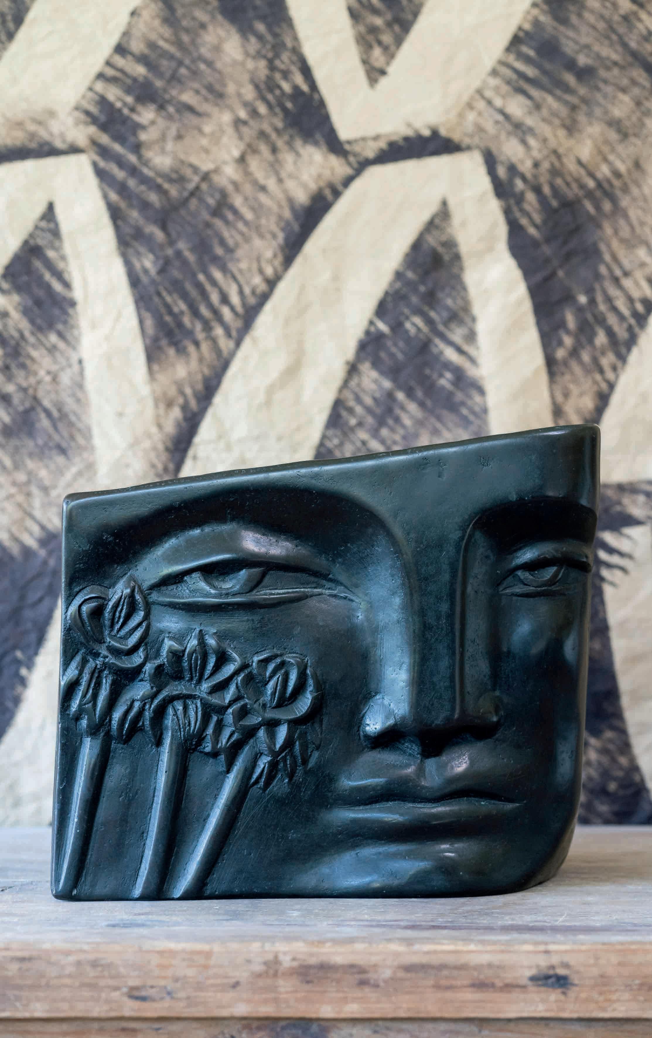
Jo is attached to her home – this new one, and the one in Brighton before that – with an umbilical cord. She rarely strays beyond a three-mile radius. “I have this irrational fear that my home and family will be rolled up and removed while I am away.” Perhaps not so irrational, for Jo was adopted, her natural mother moving to Australia. She has recently met up with her natural mother’s son, her brother Dan, and his all too brief two visits to England have ripped open this primal wound again. But she is nothing if not brave and she would rather have hugged him and suffered his leaving again, than never have met him at all. She trusts Dan, instinctively, even though she did not know of his existence for most of her life. “It was a revelation, feeling so akin to him. I don’t trust many people,” she says.
But she has learnt to trust herself, at least as far as her work is concerned. “I absolutely believe in the work I make,” she says. Jo’s dedication to form and shape – “look, she says, even the fabric of my shirt pleases me, it snaps, can you hear it?” – is the sign of a disciplinarian who gets up day after day to tap, tap, tap patiently with a chisel and mallet into stone until the shape she is seeking begins to evolve. She will rest, look, study, walk around the piece, wait, begin again. She knows when the piece has found its form, when it’s time to stop.
Having the courage to start was the hard part. “I had to suffer the jibes of men delivering huge blocks of stone – where does ‘e want this, darlin’? – who didn’t believe it was for me. They looked for a man to sign the docket.” Stone masons and sculptors, by tradition, have often been male. And it is hard work, physically. Jo’s arms have suffered, her back too. She is two inches shorter than she was at the start of her career, from the twisting and carving of stone. “It’s like I’m grinding myself into the earth!”
So what drew her to such an unwieldy material? “If my work is about anything, it is about impermanence, about grief and by default, is a celebration of life,” she explains. The permanence of stone makes this point more acutely. She explains ‘shul’, a concept at the core of her work. ‘Shul’ is a Tibetan word for a mark which remains after the thing that made it has passed through. “Like a dry riverbed, a footprint or a hollow an animal has made in the grass where it slept the night before.” So every line or excavation of stone is a mark made, a ‘shul’. But just that, for on a universal level, even stonework is fleeting, just as our lives are.
And, rare for a sculptor, Sweeting likes to carve directly on to the face of the stone, without certainty. She has faith in ‘reciprocity’: there is a call and response – the face she carves, or the shape she makes is created in response to/in conversation with the piece of stone. “I make no maquettes,” she explains. Even when working with wood. “I want the piece of wood to be present at the end of the work.” To work in this way, you must trust the process will deliver. “You only have to begin,” she says.
So her process is ‘alive’ in a way which is apparent in the finished work – there is movement, even her carved lettering stretches, filling the space, or becomes smaller to squeeze into a corner, her whole attitude to letter carving going against the more traditional formality of the trade, such as names etched into war memorials, where the lists and uniformity and scale of the letters ‘entomb’ the people it is commemorating, she believes, rather than celebrating them. “Nothing stays still. I notice things dying and growing every day. If you stay close to the natural world, you can’t help but notice. I don’t think we care enough about things, we need to be helped to notice.”
In this spirit, Sweeting started the ‘Wunderkammer’ project in lockdown. Wunderkammer is a German word for a cupboard of curiosities, a display cabinet, a collection housed in one place. She advertised through social media, asking people to send her natural objects they cared about, and to write to her about why they mattered. “The only criterion was it had to be smaller than a badger.” She received over 100 objects, from an oyster shell with a hole in it to a beeswax honeycomb. One letter contained a single blade of grass. Sweeting opened the envelope and nearly lost the blade of grass. “Only four people asked me to send their object back,” she says. “They entrusted me with their precious things, that meant so much.” The key, she says, is again reciprocity, giving without exchange, and then what you get back is something else, something other than you expected. She has many chests full of these objects and letters, and each donation is recorded on its own page in a handwritten ledger. When the last page (267) is filled, she will hold an exhibition and invite the contributors to celebrate the collection and its hundreds of stories.
As a child, Sweeting was always scribbling down stories, words, fragments of poems. Words gripped her and still do. They are scattered through her work. She often begins with a line of poetry, is inspired by a single word. Her adoptive mother was a primary school teacher, who encouraged her pupils to make ‘nature tables’ by collecting moss and pebbles, twigs and leaves. “She took us on walks, and we picked things up then came home and labelled what we found. Of course [nature writer] Robert Macfarlane is on to it, the call is out, but I will say again, we cannot lose the names.” She mentions ‘Bird’s foot Trefoil’ (a tiny yellow vetch) and ‘Ragged Robin’, the minute pink geranium you find at the base of hedgerows. “Foxgloves! Foxes with gloves on, can you imagine!”
Her love of words developed into a love of reading. The first grown-up novel she read was An Artist of the Floating World by Kazuo Ishiguro. “The title alone was extraordinary,” she says. She had connected with Ezra Pound and TS Eliot through schoolwork, then came the war poets, Wilfred Owen, Edward Thomas. She’s never forgotten the Thomas line: ‘larks rising, spire upon spire.’ She tells me the story of Thomas’s death,
an almost unbearable manifestation of ‘shul’. He was killed by concussive shock from an explosion. There was not a mark on his body, but the notebook in his pocket had a ripple running through it, the ‘impression’ of the explosion.
“How truthful and beautiful is that?” says Sweeting, shaking her head in wonder. “And how could he be surrounded by all this blood and watching people die and still write poetry.” Jo has recently written a 40,000-word memoir – a maker’s journey –on a 1950s Olivetti Lettera typewriter. It was a slow process, like tapping with a chisel into stone, but, as she says, you only have to begin. She writes every day, as things affect her – big things, like her father’s recent death on New Year’s Day, to small things, like the death of a tiny goldfinch, killed by a cat on her doorstep.
“Words are at the heart of everything I do.” She has 30 sketchbooks from her art school days, filled entirely with words. Another Sweeting project is the Word Hoard, supported by Robert Macfarlane, where she collects words specific to local areas that describe geographical formations, human activity in the landscape or weather patterns. The collaborative, all-female project began in Devon, where artists carve words like PALSH –meaning ‘to walk slowly while looking’ in the Devon dialect – into huge boulders on the beach. In Sussex, where the project links with Ditchling Museum, Jo worked with Louisa Thomsen-Brits, carving Sussex dialect words into a chalk boulder they called The Foundle (a thing found) on the Downs above Firle, which led to a new commission from Pallant House.
After five hours talking (that’s at least 15,000 words on tape!) we end the day with a glass of red wine in her garden studio. I run my finger around a Portland limestone bird bath named Wandering Bowl, carved with three words for ‘walking’ in dialects from Scotland, East Anglia and Northern Ireland: stravaig, striddle, shulve. Through the window you can see a Bronze Age barrow high on the hill. Behind the studio, an 8th-century church, built over a Saxon burial ground, built over a Roman site. When they moved here, Sweeting renamed her 1520 flint cottage ‘Long Ground’, to encompass the ancient value and meaning of the ground beneath her feet. Eyebrows were raised in the village, but she stood firm. The act of renaming, I now see, is a mark of respect. It is a way of noticing.
Oh I wish I could report that just then a pair of owls started their own call and response – a twit and a twoo. What a perfect ending. But nothing ends perfectly, it just ends when it ends, and what we are left with is Jo Sweeting’s own ‘shul’: her markmaking in print, her deep lines in stone and her carving of words we might otherwise tend to forget – Maunder, Driftway, Dimpse, Haitchy, Hag-track, Shay.
For the first time ever, Jo will be opening her studio as part of Artwave: September 2 – 17, artwavefestival.org. To donate to the Wunderkammer Project please contact Jo on Instagram @thestonecarver
Imogen Lycett Green is an arts journalist and curator of kids’ poetry projects, including Betjeman Poetry Prize and Track Record.
Have you ever dared to wear a bright yellow outfit, or to put on yellow shoes? If you have, you probably got noticed. For yellow, in its perceived pure form, is the most ‘noticeable’ of colours. It’s not universally loved, but tends to trigger strong emotions. On the electromagnetic spectrum of colours visible to the human eye, as dispersed by a prism in Isaac Newton’s experiments, it has a middling to off-centre position between orange and green, measurable as between 565 and 590 nanometers.
However, in art, culture, nature, fashion, religion and many other aspects of life, it has a leading role, and was placed first on many artists’ palettes and in colour literature. The colour theorist and flower painter Mary Gartside listed it as the first ‘proper’ colour in her 1805 Essay on Light and Shade, on Colour, and on Composition in General, preceded only by white.
Despite being so highly visible, yellow is not actually one of the colours of our tri-chromatic colour vision. The colour receptors of most mammals, including humans, can detect green, blue and red. This enables us to distinguish an estimated ten million different colours, including the fluorescent-yellow jackets worn by cyclists, runners, security guards, builders, and the French ‘gilets jaunes’ (yellow vests) protestors. It is all about being visible, being noticed, or drawing attention to something or someone, out of necessity or desire, for safety reasons, to promote something (yellow stickers on reduced items in supermarkets, anyone?), or for more sinister reasons.
I have fond childhood memories of being given a bright yellow cap on my first day at school, something we were expected to wear on our way to and from the school for the first year, clearly identifying us as i-Dötzchen (literally: the dot on the letter i) and, importantly, making us more visible to motorists. In advertising and branding, yellow is sought after and sometimes fought over. Recently a high court found that Tesco had infringed Lidl’s trademark logo of a yellow circle on blue ground, using it in certain promotions to associate it with lower prices.
Of the more sinister examples of using the colour yellow, there is nothing more shocking in history than the Nazis forcing Jewish people from September 1941 onwards to wear a yellow star badge on their clothing, the so-called ‘Judenstern’.
Another example of racism was the gradual association in Western culture of Asian people with the colour yellow, ostensibly on account of their skin colour (which is, of course, not yellow), but with the aim of colour-coding them as threatening, evil and dangerous. This western fear of Chinese and other Asian immigrants peaked in the late19th century, with the German Emperor Wilhelm II allegedly coining the phrase ‘die Gelbe Gefahr’ (the yellow peril) in 1895, tapping into the long history of skewed, unscientific, and unacceptable Western racial theory.
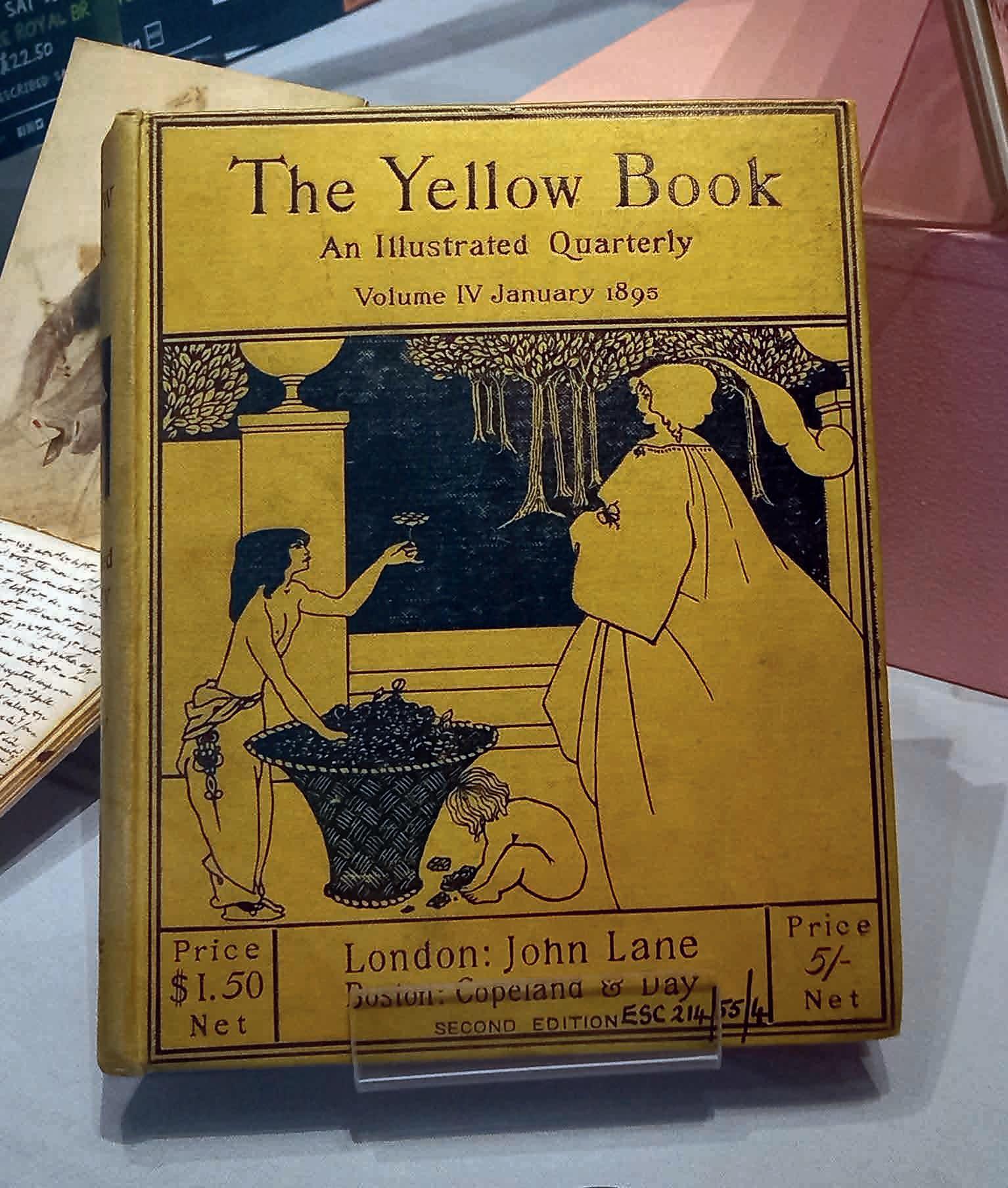
Around the time Wilhelm II coined his corrosive phrase, yellow was embraced and loved by progressive and transgressive groups. In France, Vincent van Gogh and Paul Gauguin were tearing up the rule book of colour in figurative representation, offering pots of glowing sunflowers, and almost neon-yellow images of the crucified Christ, while in England the 1890s were called the ‘Yellow Decade’, in reference to the use of yellow by avant-garde artists and writers. Yellow became associated with decadence, dandyism, the Aesthetic Movement, and anti-Victorianism. Oscar Wilde, one of the figureheads of the movement, was arrested in London in 1895 [see ROSA #3] allegedly clutching a ‘Yellow Book’, a British literary journal that ran from 1894 to 1897, which had a bright yellow cover. Brighton’s own Aubrey Beardsley was the art editor and designer of this ground-breaking publication, which must have looked shockingly modern to late-Victorian society. In Brighton Museum’s collection is one of Beardsley’s cover designs for The Yellow Book, and a copy of the journal is currently on display alongside it.
Previous page (left)
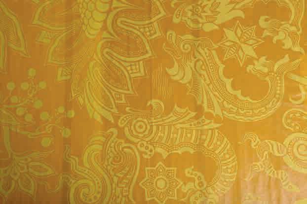
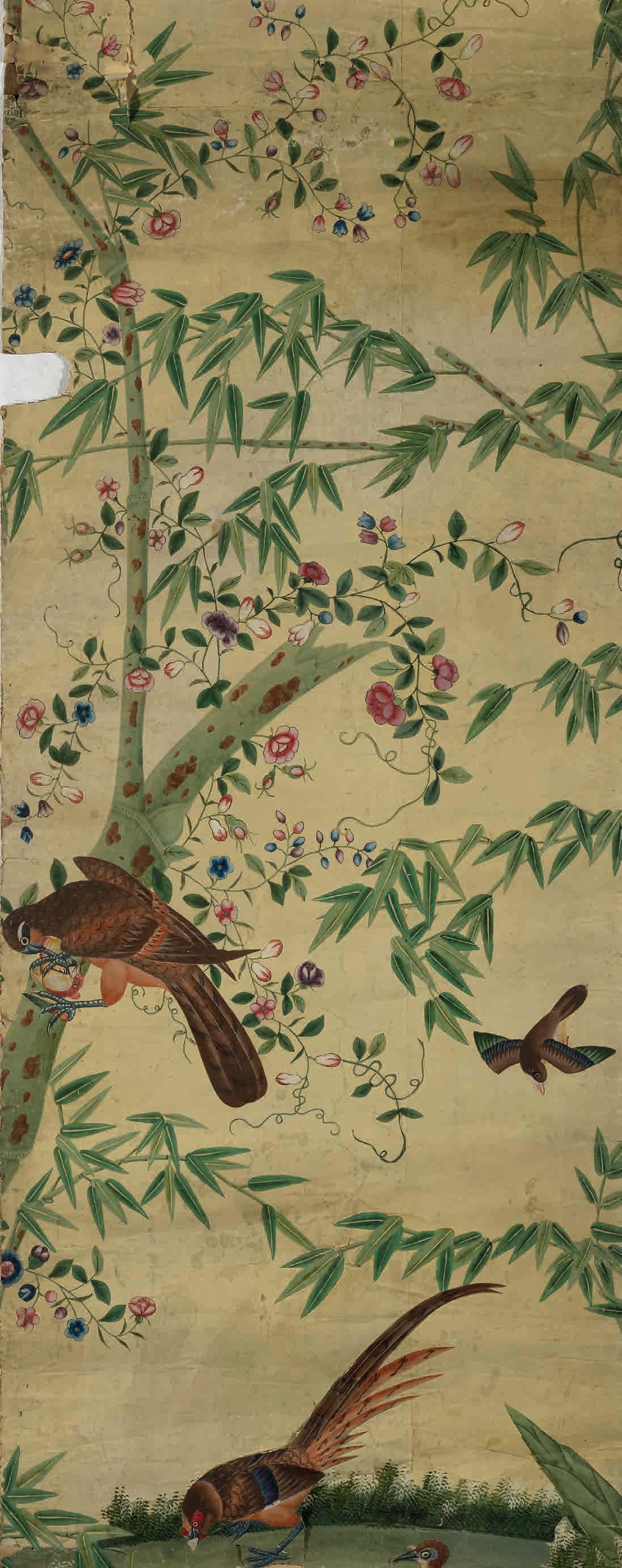
Gamboge yellow Chinese wallpaper. Photo: Royal Pavilion & Museums Trust
Previous page (right)
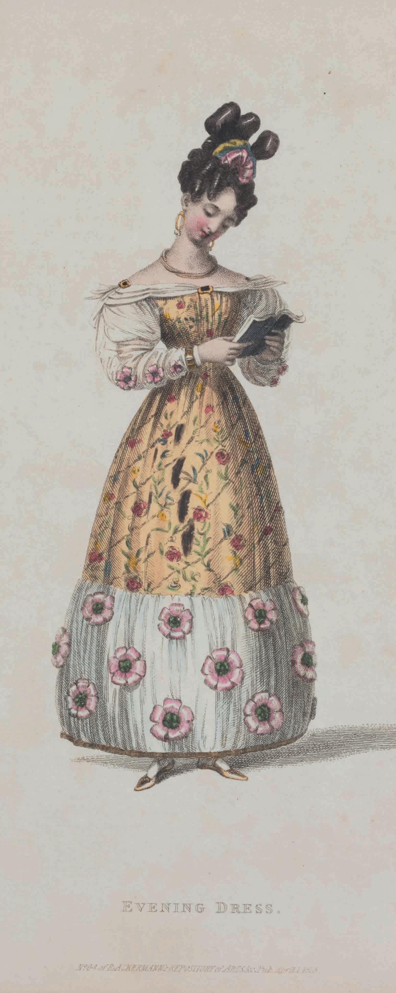
An example of Georgian ‘giraffemania’: A giraffe-coloured dress inspired by George IV’s giraffe. Hand-coloured fashion plate from The Repository of Arts, Literature, Commerce, Manufactures, Fashions and Politics, published by Rudolph Ackermann, 1828
Photo: Alexandra Loske
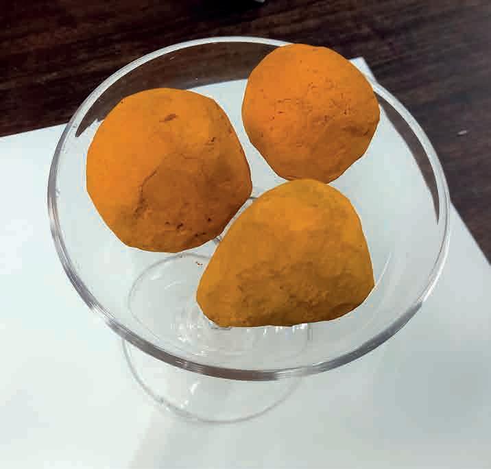
Below Balls of Indian Yellow pigment at Winsor & Newton archives
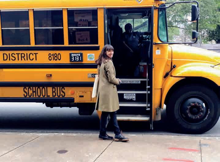
Bottom Alexandra Loske about to board a school bus in Houston, Texas
Vincent van Gogh’s love of yellow, which he associated with the sun and sunlight, is closely related to the gradual move in the use of colour in art from representational and naturalistic to expressive and symbolic. His use of yellow in combination with other primary and complementary colours shows a great awareness of 19thcentury colour theory and the laws of colour contrast, and was aided by the invention and commercialisation of new pigments and readymade paints. His paintings in which yellow features prominently are emotionally powerful, for example The Night Café from 1888 (mentioned in ROSA #4), or one of his last works, the unsettling Wheatfield with Crows (1890). This intensity partly derives from use of brilliant synthetic or synthesized colours, such as Cadmium and Chrome Yellow, available at the time. The glowing beauty of his Sunflowers series owes much to his liberal use of both those colours, straight from the tube, but it also caused the flowers to wilt, as some of the paints he bought were poor quality, and Chrome Yellow has a tendency to darken quickly. The physicality and materiality of yellow and other colours in Vincent’s life and work are highly significant, and I wonder how this aspect of his art will translate into the immersive Van Gogh Alive at The Dome in Brighton (until Sept 3).
Earth pigments were among the earliest colours humans sourced, of which ochres yield a dull, brownish-yellow range. Nature has provided us with a fair few pure yellow pigments and dyes, but with no other colour is there a greater difference between organic and mineral, or between natural and chemical. The Ditchling weaver and dyer Ethel Mairet listed a lovely range of natural dyestuffs from around the world in A Book of Vegetable Dyes (first published in 1918 by The Ditchling Press): among others, weld, Old Fustic, lichen, quercitron, heather, privet, and onion skin. A copy in Brighton’s Jubilee
Library contains samples of wool (presumably from Sussex sheep) dyed by a reader following Mairet’s recipes.
Other historic organic pigments include the intriguing Indian Yellow, made from distilled urine of Indian cows that were supposedly fed mango leaves, in an attempt to yield the brightest possible yellow colour. The pigment was closely linked to the East India Company trade, and arrived in Europe as compressed lumps, with a distinctive pungent smell. For obvious reasons, it never caught on in interior decoration. Unrelated to pigment production but connected to its changeable appearance, urine was also the base of one of the first attempts to order colour in the form of a wheel: from the early 16th century onwards, we find several uroscopic colour wheels in illustrated manuscripts, depicting different shades of urine. These were used to diagnose medical conditions.
An ancient inorganic pigment that produced a rich canary yellow is Orpiment, a natural arsenic sulphide that was widely used in Ancient Egypt, Persia and Asia. The arsenic content is the cause of its brilliance, but also of its toxicity, and it does not mix well with other colours. Because of its brilliance it was popular as a heraldic colour. Many yellows we see in Western medieval and Renaissance paintings contain lead-based pigments. Lead-tin yellow can be golden and luminous, but, like most brilliant pigments, it is toxic and dangerous to produce. It is evident in the work of many of the great masters, including Vermeer, Rubens, Giotto, Titian, and Rembrandt, but from the later 18th century it was replaced by modern yellows.
Of the new, manufactured yellows, Chrome Yellow, as later used by van Gogh, was a game-changer. It was discovered and commercialised in George IV’s lifetime, and because he was a man of eccentric tastes and careless spending
Above
Epiphanie medicorum. Speculum videndi urinas hominum. Clavis aperiendi portas pulsuum. Berillus discernendi causas et differentias febrium / (Ulrich Pinder)
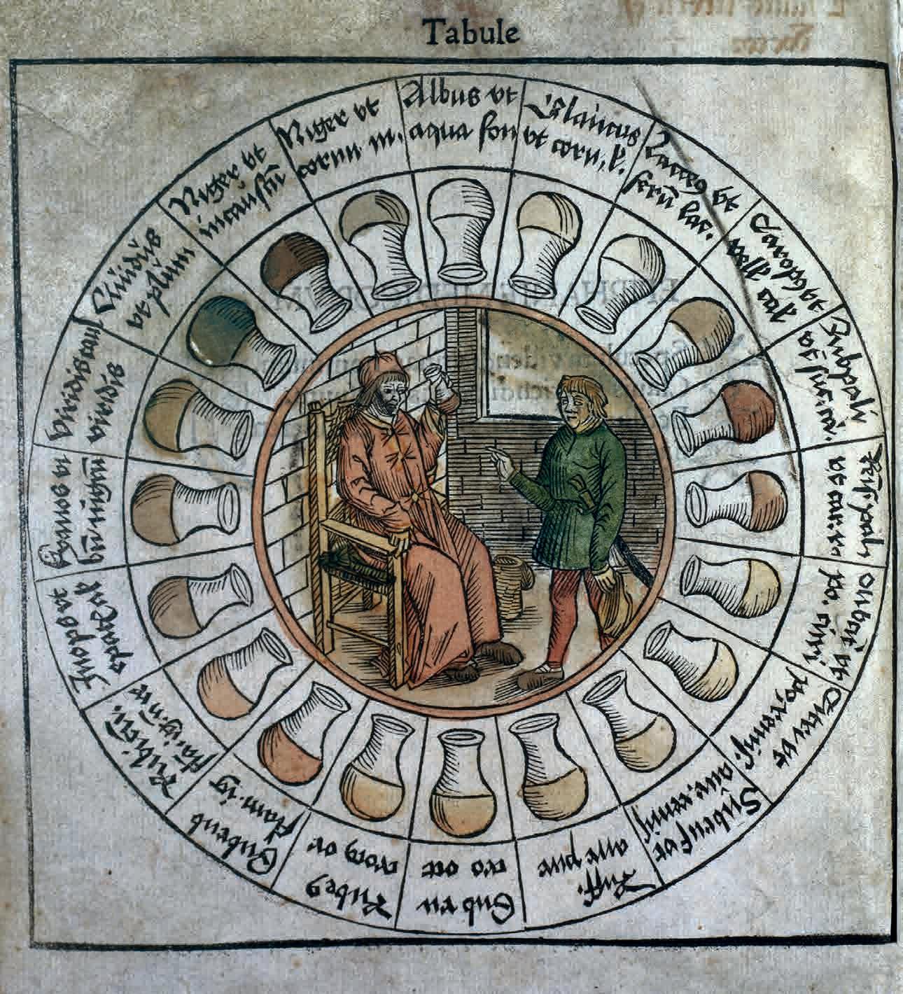
1506. From the Wellcome Collection
Right
The Yellow Book – Volume IV, January 1895. Currently on display at Brighton Museum, on loan from Brighton, Hove and Sussex Sixth Form College
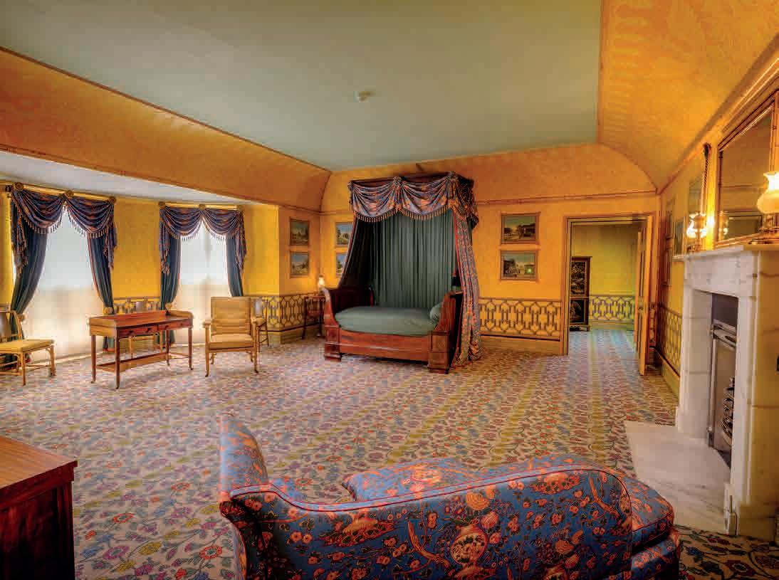
habits, we have one of the greatest examples of the use of this new artificial yellow in Sussex. George embraced new, powerful pigments to complement the Chinese-inspired interiors. Yellow played a very special role, as it was associated with the Emperor of China, something he would surely have been aware of.
Two new European yellows have been identified in the Royal Pavilion: Turner’s Patent Yellow (in small quantities) and Chrome Yellow (in large quantities). The former pigment has nothing to do with the painter JMW Turner, although he was known to use it and was so fond of the colour yellow in painting that critics poked fun at him and suggested he was suffering from yellow fever (examples of Turner’s yellowinfused paintings can be seen at Petworth House in West Sussex). It was a pigment patented by London colourman James Turner in 1781. He marketed it in 1787 as his ‘Patent Mineral Yellow’ and you can see an example in the Yellow Drawing Room of Sir John Soane’s Museum, London. In the Pavilion, Patent Yellow was found on some painted canvas decorations and carved ornaments on the upper floor.
While yellow was a popular colour in fashion and, to an extent, in upholstery and interior decoration, it was unusual and controversial to choose highly saturated yellows, that tended towards orange, for interiors until well into the 1830s. This, of course, did not deter George from embracing the new, intense Chrome Yellow for the interiors of Carlton House (his London palace) and the Royal Pavilion. Chrome Yellow, or lead chromate, had been discovered in 1797 by the French chemist LN Vauquelin and was first made available commercially in Britain by the German Dr Bollman between 1814 and 1820. In 1829 the colourman TH Vanherman commented: ‘chrome
yellow surpasses every other yellow, for brilliancy, beauty, and intensity of colour, either as a full, or in its gradations when lowered with white’. The interior decorator and colour theorist David Ramsay Hay described it in his 1845 Nomenclature of Colours as ‘the purest of yellows’. It famously became the colour of New York taxis and US school buses.
Chrome yellow was used extensively on the upper floor of the Royal Pavilion, in the suite of Bow Rooms at the north-east end, almost as soon as it had become available commercially, and was possibly also used to create some greens in the building, by mixing it with blue pigment (most likely Prussian blue). It is a good example of how George embraced new technologies and fashions, with little concern for the costs involved.
There is another wonderful yellow in the Royal Pavilion, hiding in plain sight, which came from the other side of the world. Many walls of the Pavilion were once hung with Chinese wallpaper, created in studios near Canton in around 1800, specifically for the export market. These came with different ground colours and varying motifs and styles, such as Asian birds, plants and insects, or narrative, mythological scenes. One of the ground colours of a near-complete set of Chinese wallpaper is yellow. In the last few years this has been restored and rehung in Queen Victoria’s bedroom in the Pavilion, with some missing sections digitally recreated. It is breathtakingly beautiful, and some of the flowers seen on the paper were also planted in the Pavilion Garden, including peonies and chrysanthemums.
The yellow ground colour looks very pale, almost off-white in parts, but it was once much more saturated and vivid, with the stylised flowers, trees and birds forming an eyepopping contrast. The yellow used by the Chinese artists was Gamboge, an organic colour created using gum resin from evergreen trees in South-East Asia. Its name is a derivation of Camboja, the old name for Cambodia, one of the places where the pigment was sourced. Being an organic pigment, it would have looked luminous when first applied to the paper, but it has faded to a very mellow yellow over the last 200-odd years. It is possible that the once vivid yellows of the Chinese wallpaper and other export-ware encouraged George IV to use Chrome Yellow in such an emphatic way. It seems Turner was not the only one suffering from aesthetic yellow fever in the early 19th century.
Alexandra Loske is a curator at Royal Pavilion & Brighton Museums and the author of Colour: A Visual History (Tate 2019).
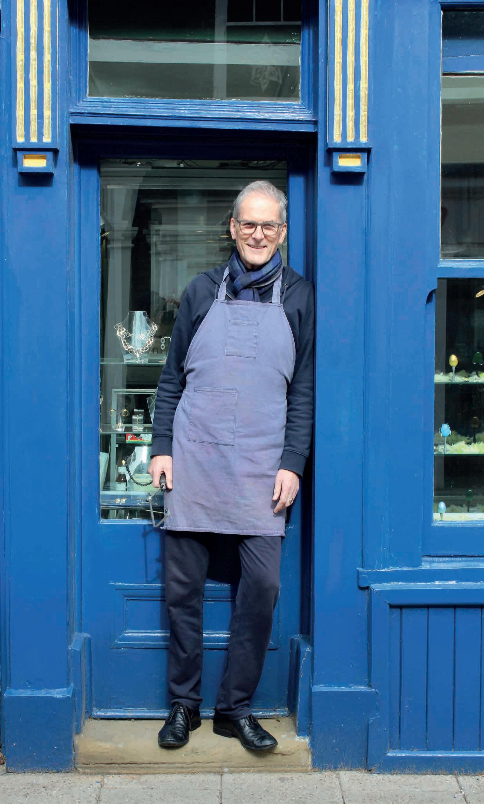
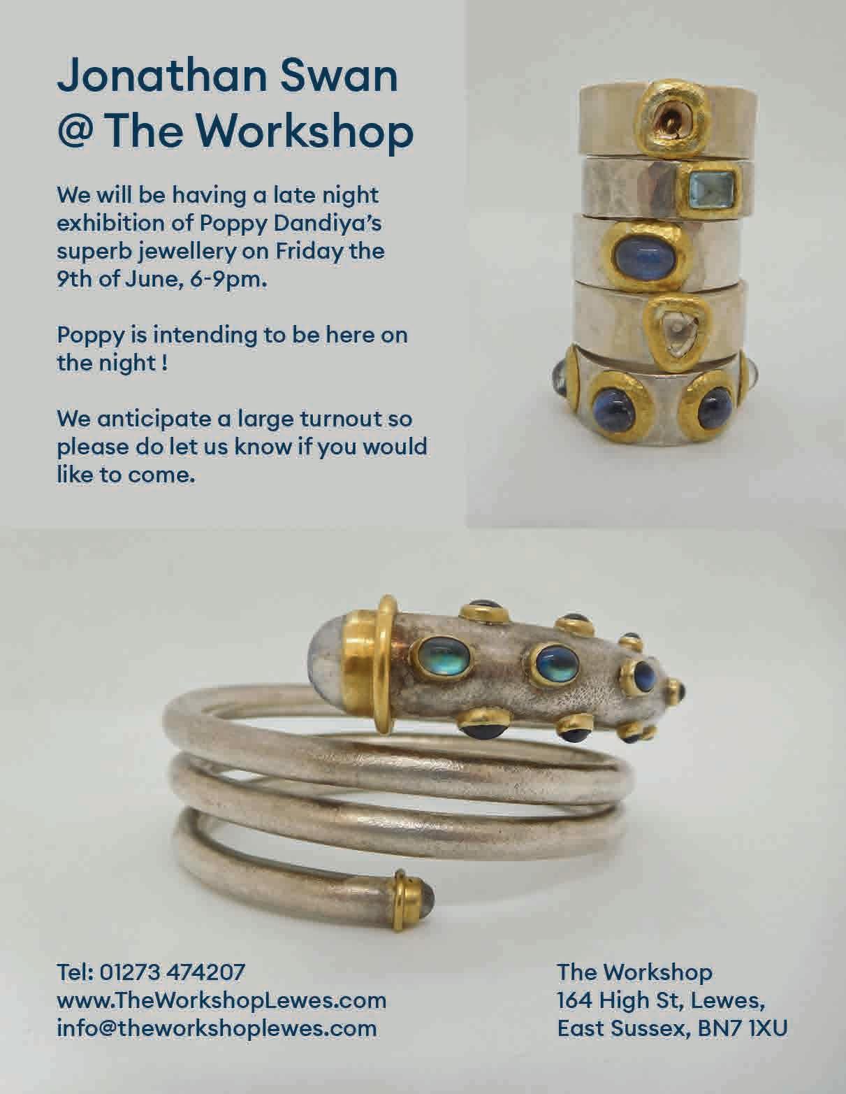
I’m in Lewes. It’s grey and it’s Monday morning. I am heading along the High Street to ‘The Workshop’, where a collective of artisan jewellers ply their craft. I’m looking forward to catching up with professional flautist, Neil McLaren.
For many years Neil has been wowing audiences with the ease of his fluid Baroque trills and runs. He has long experience of playing under the baton of celebrity conductors all around the world. And, happily for his Sussex fans, he also finds time to perform in more intimate chamber settings nearer to home.
As if being a busy professional musician were not enough, Neil also wields a nigh-on alchemical magic with precious metals and gemstones, in a 10th-century basement which literally reaches under Lewes Castle’s walls. I have arranged to meet him here today.
Neil is waiting for me, in the ground-floor shopfront of the establishment, where finished products are arranged for sale (mindful of a forthcoming anniversary, I decide to take a proper look on the way out).
“Come down into the cave,” he says. “I’ll show you what I’m working on.”
He has already been at the bench for several hours by now and is eager to show me something he is creating. He leads me down a narrow staircase, into the ancient, rather dingy cellar, to his wooden bench, where his work in progress sparkles under a spotlight.
“What do you think? Of course, it’s not finished, but you can see where it’s going and how it’s shaping up. It’s part of a secret project I am working on.”
I sit down in a spare seat. He grins conspiratorially, while I admire the almost completed piece, a one-off, like all Neil’s work. I sense its drama and tension, but also its delicacy. Perhaps clues to what or whom it represents. I press him on who he’s making it for. He gives in, reluctantly.
“It’s part of a set I am making exclusively for the Glyndebourne shop. The brief is to design and make six pieces of jewellery, each of which represents one of the six productions in this year’s season. The launch of each will coincide with the season premieres of the operas. It’s all very exciting, particularly as I shall playing in the orchestra as well.”
As with everything he does, Neil’s approach to jewellery design and construction is very serious. He talks in detail about sets, music, and plot lines, and reflects on how he interprets all of that and more in his jewellery. It is clear to me that his connections and links with Glyndebourne Festival Opera are deep and go back years.
“I have been fortunate to have had a long-standing relationship with Glyndebourne. Come to think of it I have played flute there, and piccolo when required, every full season since 1989. I feel a great sense of privilege to have been among the musicians with Sir Simon Rattle, when he conducted Glyndebourne’s first historically informed performance. It was big news. The Orchestra of the Age of Enlightenment were playing, and we created something very special. Of course, the OAE have been back many times since that first Figaro, but I feel very proud to have been in at the beginning.”
Neil picks up a recently completed silver snake-like chain and examines it under the powerful lamplight. He pairs it with another, already complete. He then deftly slides into place a
large milk-striped Carnelian cabochon in a deep silver setting. It is a bold piece.
“Opera demands this sort of boldness: particularly the scene which inspires this set. There will also be earrings and cufflinks in the finished suite of jewellery. I managed to source a nice group of stones which work well together.”
The sensuous silver intertwining ropes suggest lovers, and the creamy white stripes, against the sunset red of the Carnelian, scream clouds and a fiery sun. It’s got to be Semele, I venture. Neil remains poker-faced. All will be revealed in good time.
This season, of course, Neil will be back with the OAE at Glyndebourne, for a brand-new Don Giovanni. How does he manage to fit jewellery-making in with all his other musical commitments. And how long has he been doing it?”
“Let me think. It feels like forever. I have always been creative and always need to be making something, whether it’s tangible like this necklace, or intangible like my music. I have always searched for perfection and beauty in everything I do.”
With a knowing grin, Neil takes a moment to cover up the drawings he’s made for the rest of the Glyndebourne collection, which he’s noticed I’ve been admiring. Perhaps my Semele guess was too close for comfort.
“I made my first metalwork piece at school in Plymouth. I remember I made a copper caddy spoon. I felt connected straight away to the material. It felt easy and pliable in my hands. It allowed me to be in a world of my own.”
“Music was also important to me from an early age. In the beginning it was the violin. That’s where I started. But if anything, in that period, it was the music that got in the way of my metalwork. I gave up violin at 16 and switched to flute. I suppose that was relatively late. But it felt right to me. It all happened almost by accident. I found an unallocated flute lying at the pack of the instrument cupboard at school. A few years later I was at music college. For better or worse I’m a bit of a perfectionist. If I am going to do something, I have to do it well, otherwise I’m not going to bother. Metalwork fell very much into second place at that time.”
Neil pulls out an unbelievably delicate chain from his work box. It looks special. Another part of the commission perhaps? Like the handmade links of this supple silver chain, the Glyndebourne commission provides a seamless link between his two worlds.
“I suppose it was one day in the early nineties, when I got back into metalwork and jewellery-making seriously. The OAE was
rehearsing at Morley College in London. There was a jewellerymaking course running at the time. I got back into it quickly and gained an excellent reputation at the various important exhibitions and design shows I attended. I kept that up until 1998. It was an exciting time, but I then had to stop.”
Neil looks down at the drawings and designs in his hands.
“In 1998 my sister died, after a short illness, while still very young. I was in the middle of making her a necklace, a bit like this one. Every link handmade, which is one of my specialities. I just stopped making it. I stopped making anything. I couldn’t go on.”
We both stare at the work in progress on the bench. I remain quiet.
“It wasn’t until lockdown in 2020, when clearing out the garage, that I found my jewellery-making tools and unfinished work. I decided I was ready to start again. It had taken 22 years, but at last it felt right again.”
Then Neil tells me about his own battle with an incurable cancer. I wonder whether this goes some way to explain how his life is so full. There is no time to waste.
“It can be hard. It can tire me out, but I am always committed one hundred percent to the job before me. Whatever it might be. I pace myself. It doesn’t matter if it is here at the bench making a ring or brooch, or in a concert hall in some new far-off city. Whatever it is, the product has to be the best I can make it.”
The moment isn’t sad. It is inspiring. Neil starts getting his tools ready, so he can get back to work. The clock is ticking on the Glyndebourne commissions. And time must be found to practice for his next performance, in a few days’ time, at the London Handel Festival.
For commissions Neil McLaren can be found through The Workshop, Lewes or his website neilmclarenjewellery.co.uk. Neil will be playing his flute in Glyndebourne’s new Don Giovanni, with the Orchestra of the Age of Enlightenment.
‘It seems to me that he could carve the words as we speak them.’ Thomas Sargeant
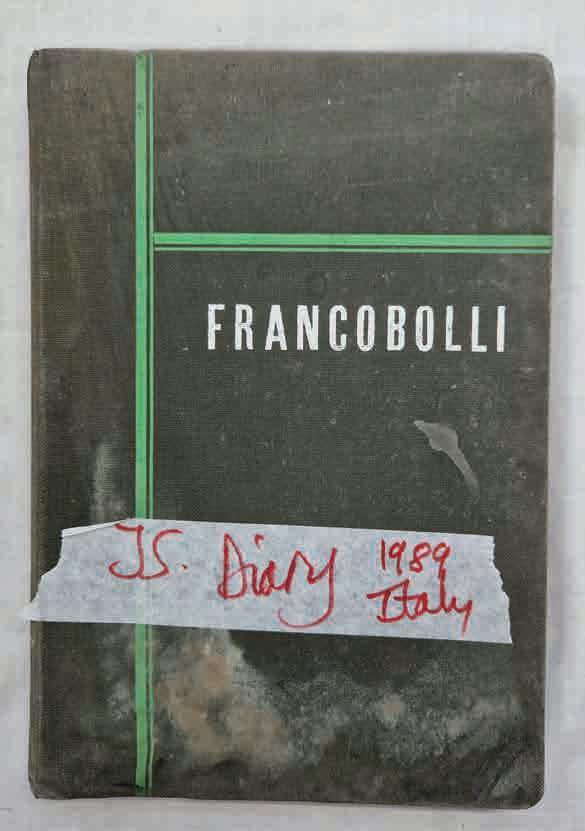
From London to Londonderry, John Skelton’s legacy dances across stone and slate, over wood, glass and silver, even paper and Perspex. It is inscribed into our environment, honouring our culture, our history, our ancestors: inside churches and in graveyards; adorning the great cathedrals of Winchester, Chichester and St Paul’s, of Westminster Abbey; announcing our civic buildings and heralding places of note. You can see his works displayed in the British Museum, in the Shakespeare Centre, as well as in homes and their gardens, both stately and the one next door.
Skelton was first and foremost a sculptor and lettercutter. But this influential Sussex artist-craftsman embraced drawing, design, map-making, heraldry, calligraphy, metalwork, and watercolour. He was a gifted teacher, instrumental in setting up the sculpture and lettering courses at West Dean College.
‘He rejoiced in the act of making,’ says daughter Helen Mary Skelton.
You might say that the lettercutter’s craft was inscribed, Brighton Rock-like, through him. It was in the family. Briefly apprenticed, in Ditchling in 1940, under his uncle Eric Gill (an education cut short by Gill’s death), Skelton began working in the classical Roman style of lettering that he learned from the master. By the mid-sixties he was working from his own workshop in Streat, searching for a sense of freedom, innovating with experimental and free-flowing letter forms. There was a directness and a vitality to his style that came from his commitment to a disciplined freedom.

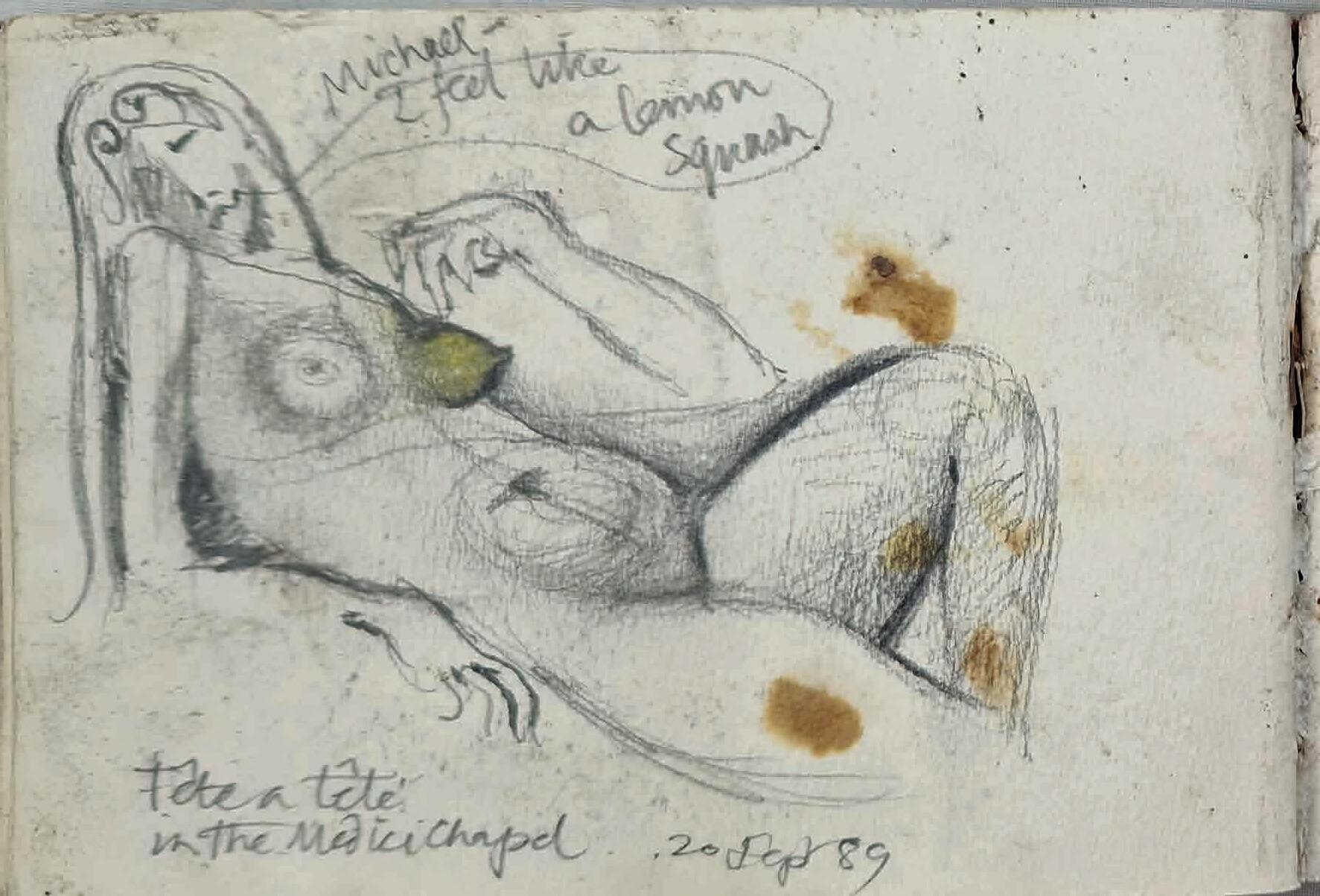
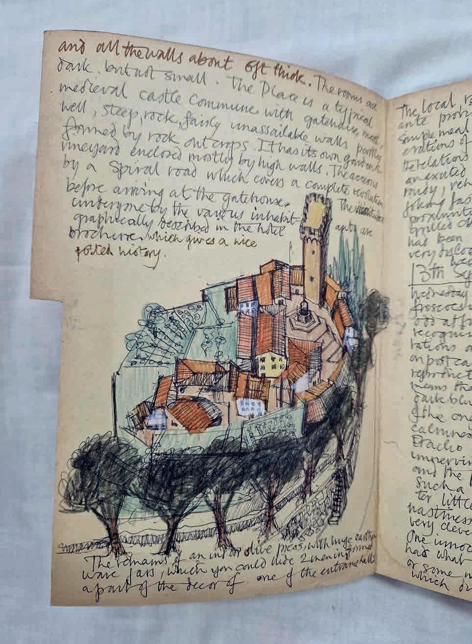
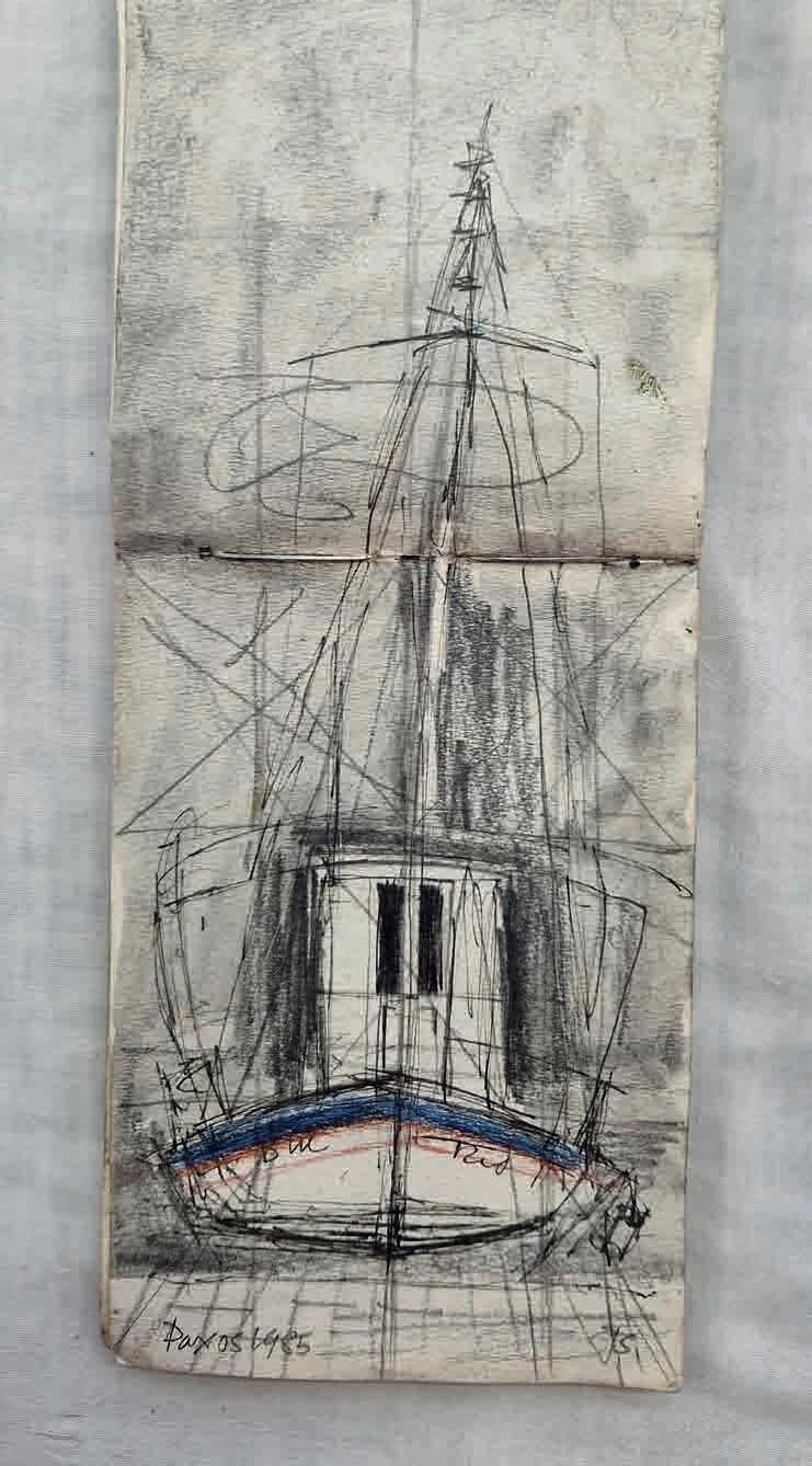

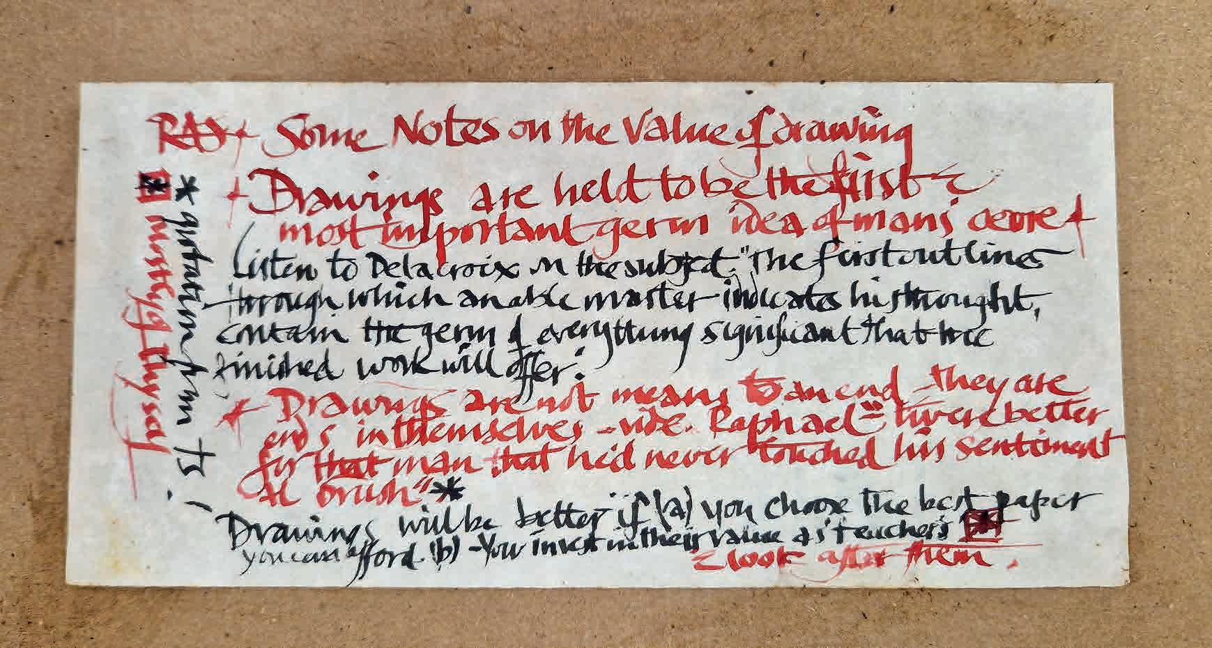
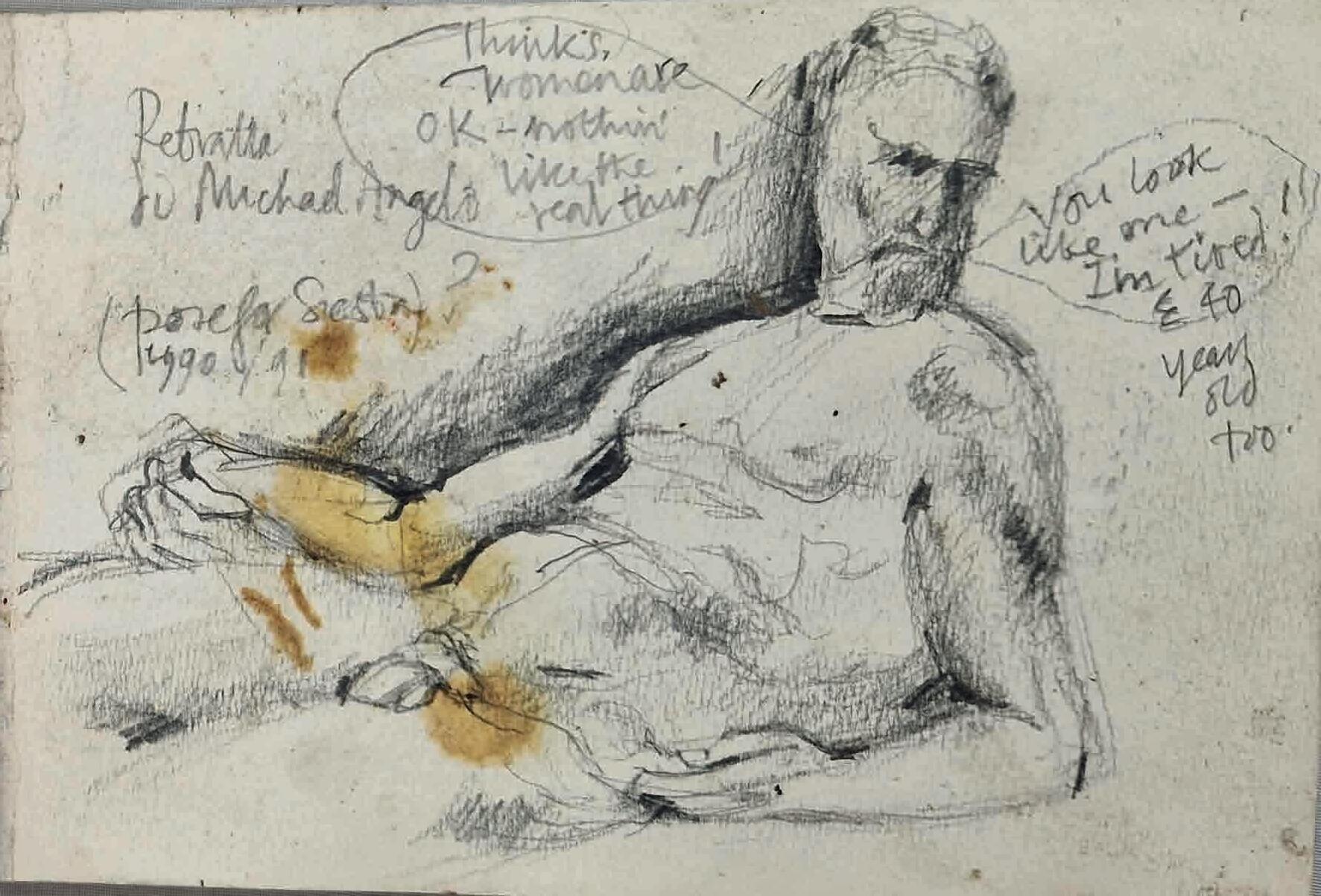

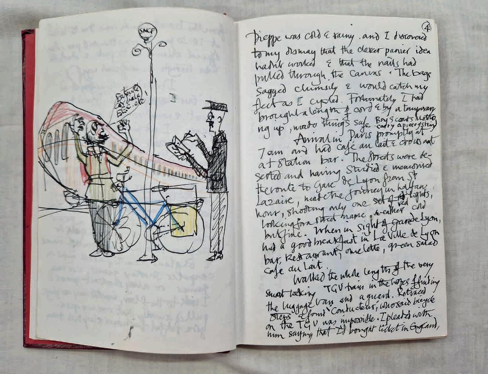
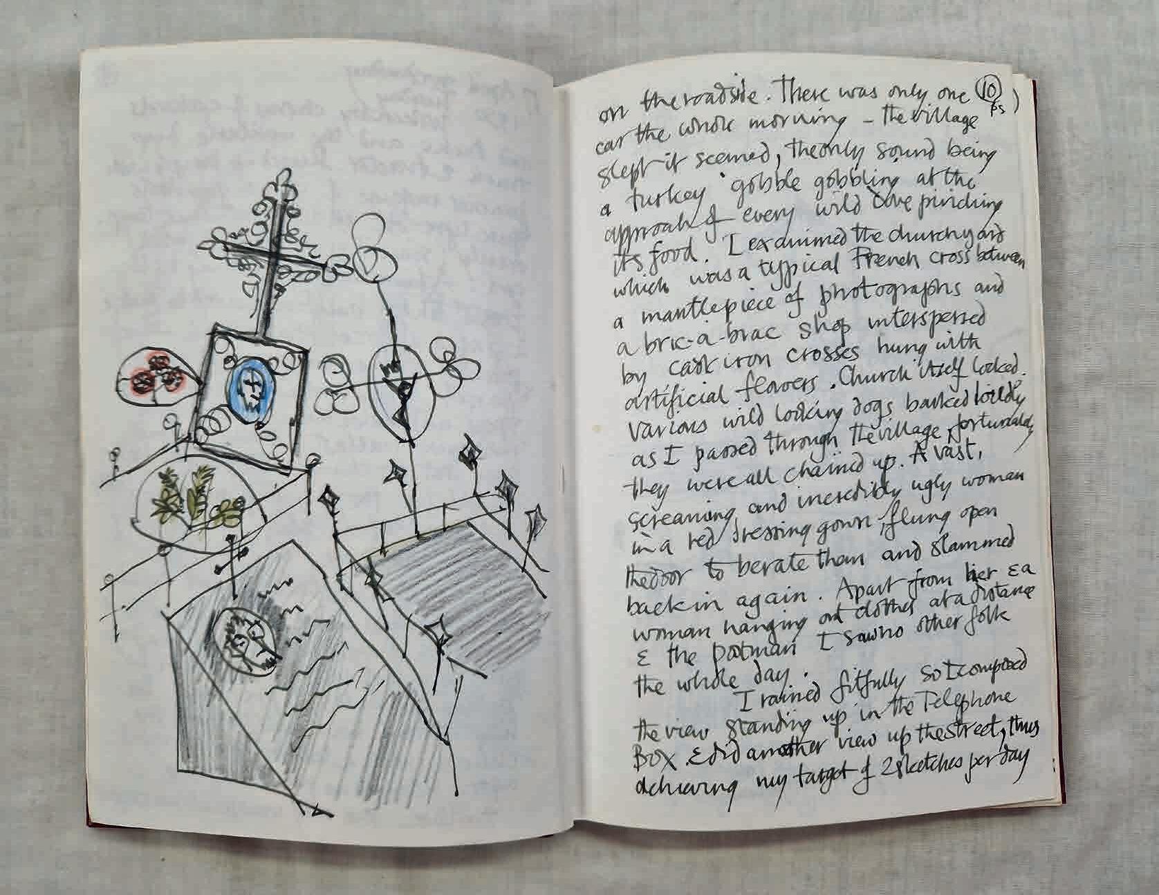

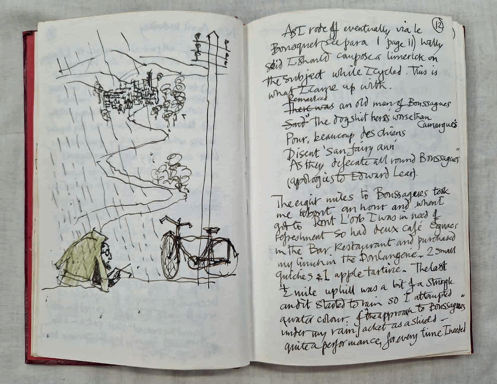
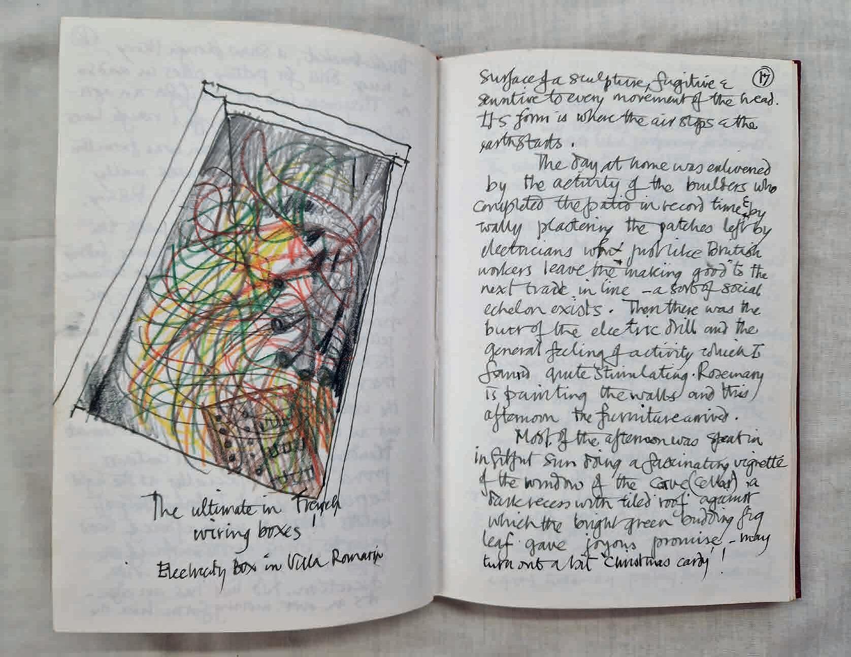
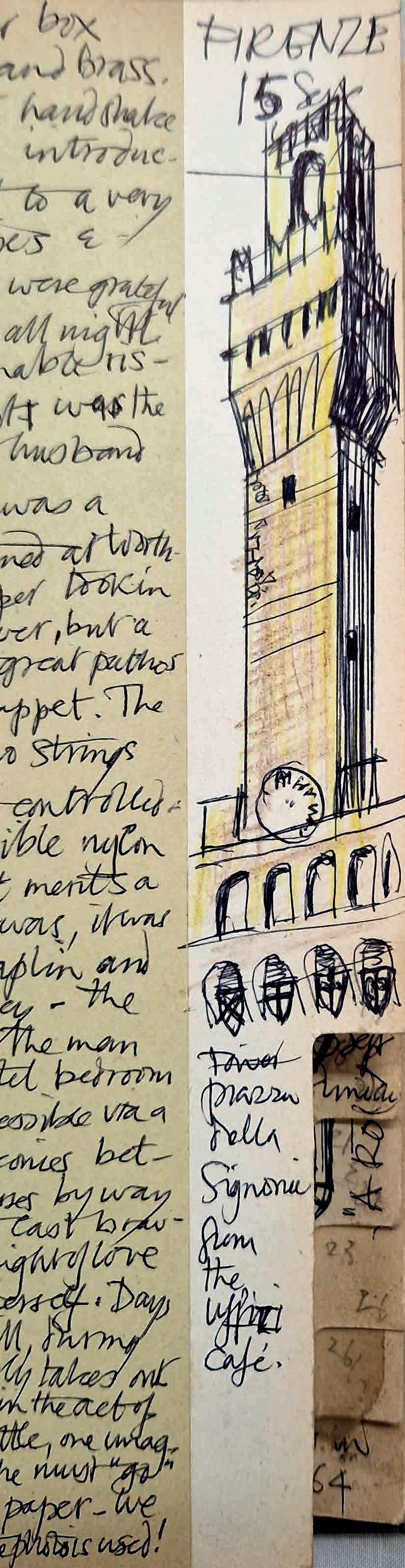
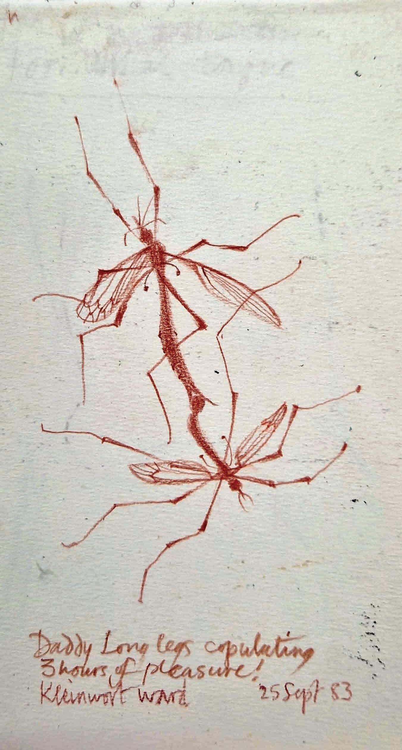
Skelton maintained a life-drawing routine to underpin his sculpting, becoming obsessed with the torso. Helen Mary (also a lettercutter) mentions another fascination: ‘Doves flying around the workshop yard inspired a large range of bird sculptures.’ Formal work commissioned by the Church was balanced by a secular expression, in sensuous, fluid forms. And it was this skill as a sculptor and a love of drawing that set his letters apart.
‘Skelton’s stone has life: a character of the maker that is still somehow alive within it,’ observes stone carver Tom Sargeant (see page 60).
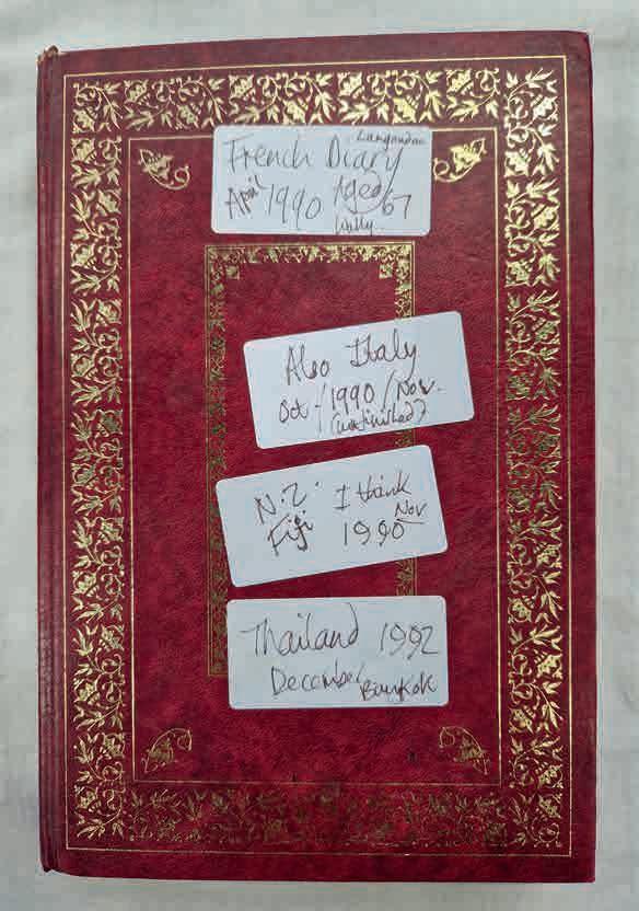
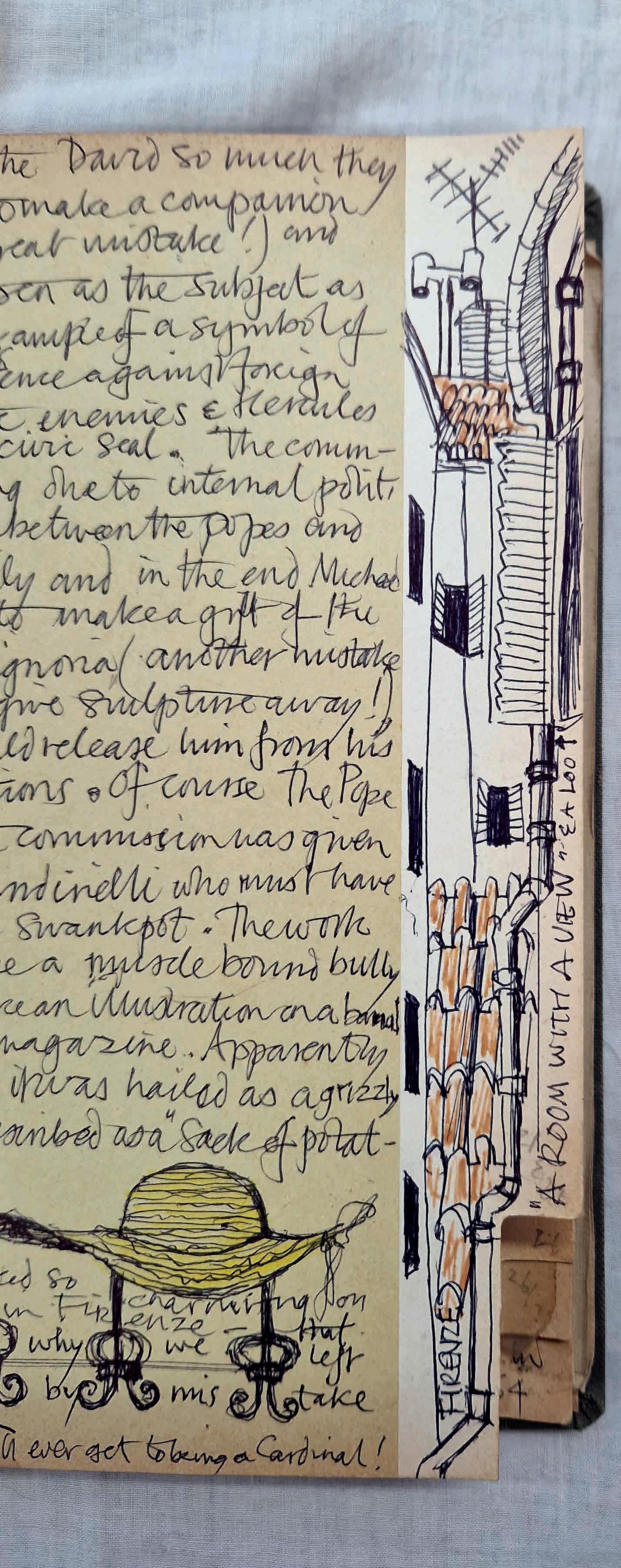
He had an ‘enthusiasm for life in all its forms: music, dance, physical hard work, design, the human figure, and family and friendships,’ continues Helen Mary. ‘Pa was a social animal,’ adds son Jonathan. Perhaps this dynamic, imaginative personality, not to mention his innate sense of fun, is most easily observed in Skelton’s never-before-seen illustrated diaries, a few pages of which we have reproduced here to mark his centenary this July.
He travelled widely, seeking inspiration in the landscapes and cultures of Scotland, Ireland, France, Italy, Corsica, Greece, Jordan, Syria, India, Fiji and New Zealand. Helen Mary again: ‘Sketching holidays were my father’s way of relaxing, together with energetic Scottish dancing sessions once a week with my mother.’
The Tower of Pisa as seen by a leaning tourist, a fruity têteà-tête in the Medici Chapel, a watercolour attempted in the rain… turning page after page, it becomes clear why John Skelton was able to make the stone speak.
 Words by Rowena Easton
With thanks to Helen Mary Skelton for allowing us access to her father’s precious diaries.
Skelton Workshops runs a number of courses. Find out more at skeltonworkshops.co.uk
John Skelton and his Legacy – an exhibition of work by John, his family and apprentices – opens at the Artelium Wine Estate, Streat, in July. Find out more: artelium.com
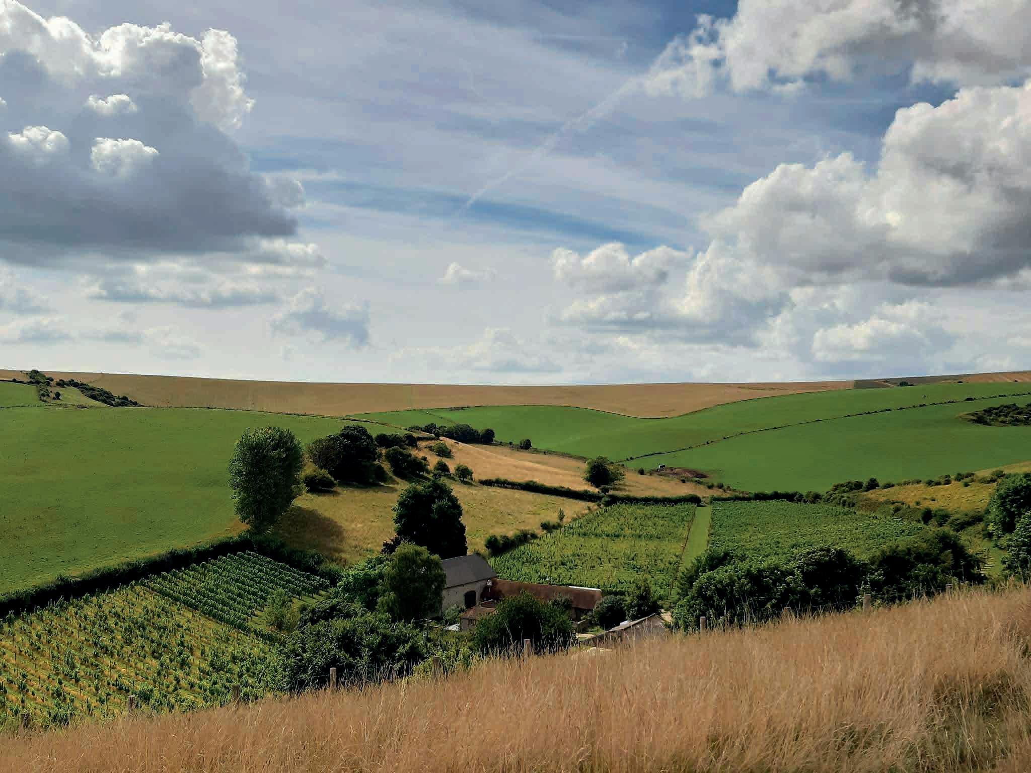
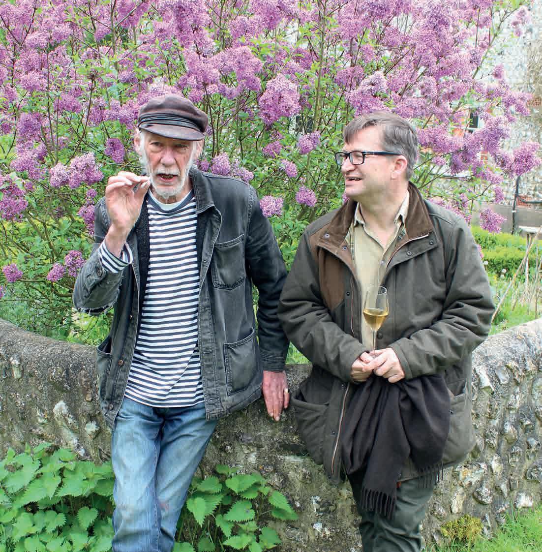
New-born lambs bounce around the field. Tendrils curl on rainwashed vines. Glorious, glistening bunches of fruit ripen in the warmth of the sun. I am standing with Christine and Peter Hall at their beloved Breaky Bottom estate in the hillside above Rodmell; the smell of tobacco from his roll-up co-mingles with the fresh scent of hedgerow flowers and clover. In my right hand, a tulip shaped glass of primrose coloured liquid: a volcanic stream of bubbles releasing elderflower, lemon meringue pie and shiitake ‘shroom aromas. I raise it to my lips to taste…
In the last 20 years, Sussex wine has emerged as a triumphant new expression of the local landscape. Top-notch sparkling wines take centre stage, with fresh fragrant fruity dry whites, reds and rosés as creditable support acts. In this and future issues of ROSA, I will offer insights into Sussex wine, explaining how our county has become the epicentre of the English wine movement. My curiosity about this revolution happening around us led me to explore the wider world of wine from Chile to China, studying in the evenings and weekends to qualify as a sommelier, and taking a role in the industry to the point of representing the UK at the International Organisation of Wine, which we joined after Brexit. As a local lad who settled in Sussex (married to a considerably more talented artist/designer/gardener/venue host) I would like to explore synergies between the Sussex landscape and art, and expose some urban myths.
The first myth is that champagne was invented in France in the early 18th century. It was, in truth, made possible by the work of the English scientist Sir Kenelm Digby, who, in the 17th century, developed a way to strengthen glass bottles so they could withstand the pressure of trapped carbon dioxide from fermented apples. The innovation was presented by Sir Christopher Merrett to the Royal Society in 1772. Almost half a century later the French adopted this method to make sparkling wines such as Dom Perignon. (For more background see The Knight who Invented Champagne (2021) by Stephen Skelton, the vineyard expert nephew of Ditchling sculptor John Skelton.)
Two centuries later, David and Linda Carr-Taylor planted a new vineyard near Hastings, and in 1984 produced the first traditional method sparkling wine in England. (Second myth: Nyetimber wasn’t the first). Breaky Bottom was also planted in the early 1970s, by Peter Hall and his first wife Diane when their son Toby was born. In 1998 Brighton-based Chris Foss set up Plumpton College’s wine department, increasing the talent pool for investors and landowners in the area and enabling them to establish new vineyards. An American couple, Stuart and Sandy Moss, chose Champagne Pinot and Chardonnay varieties at Nyetimber in West Chiltington to make their first sparkling wine in 1992, setting the trend for England which in 2018 saw ten million bottles produced.
The Halls switched from producing still to sparkling wine, but have only partly replanted with Champagne varieties. Twothirds of the original planting remain as the earlier-ripening Seyval Blanc variety, which can now claim ‘old vine’ status. As such their roots penetrate the chalk to find water and nutrients needed, accenting the grapes signature flavours with 50 years of vintage ‘memory’.
Peter’s humble aim is for his winemaking to express the terroir of Breaky Bottom – a five-acre vineyard on the South Downs. A cool climate by viticultural standards (though becoming gradually warmer), Sussex has the same geology of cretaceous chalk as northern France. Limestone, flint and chalk are considered the finest soils for Chardonnay, and planting on hillsides facing the sun accentuates the light and warmth, with valleys and rivers mitigating the risk of ruinous frosts, while sea breezes aerate the vines, puffing away humidity and fungal disease.
Hot on the heels of Nyetimber, two other Sussex producers of sparkling wine, Ridgeview of Ditchling and Digby in Arundel, paid homage to the English originators of bottling technology, adopting trade names in tribute to Digby and Merret. But despite these tremendous efforts, no generic name for English Sparkling Wine has emerged. Queen Camilla, who attended school in Ditchling, is the patron of the association of British
wine producers (winegb.co.uk). She and others have sought a pithy name to rival Champagne; but no consensus has been found. The current term, with appellation of origin status enshrined in law, is simply ‘English Sparkling Wine’.
In 2010, Sarah and Mark Driver acquired the 600-acre Rathfinny estate near Alfriston, establishing a state-of-the-art winery at the largest single vineyard in Europe. They applied in 2016 to protect ‘Sussex’ as a legal name for a wine of designated origin (PDO). They had to wait until after Brexit, but it was finally granted by DEFRA in July 2022, and has not gone down well with Kent and Hampshire vineyards who fear their wines may now be perceived as inferior.
But how does one define the unique taste of Sussex wine? And how is it different from Surrey or Essex? Much of the wine produced in Sussex actually uses grapes from Essex: Bolney and Ridgeview are two of the largest producers in
Sussex but only some of their wines are made of fruit from their own vineyards, and several Kent and Hampshire vineyards have their wine made in Sussex under contract. Wine and food with PDO status is generally required to be made in the region exclusively from materials grown in the area, and thereby intended to taste of the place of origin.
Sussex is varied in its terrain. Besides the chalk for Chardonnay, sandstone outcrops at Eridge and along the A272 to Midhurst are great for Pinot varieties. Wealden clay is also good, if not waterlogged. So, what is the taste of the Sussex landscape? According to the Sussex Sparkling Wine legal definition, typically it should taste of: ‘…crisp lemon citrus and green apple acidity from the Chardonnays, while the Pinots can have a more earthy mix of red berry and baked apple flavours, producing wines that are clean and fresh, yet have depth and are complex, with a richness in character.’
Until recently, there were misconceptions about the relationship between the geology of a vineyard and taste of its wine. Aficionados assumed the so-called ‘mineral’ flavours in wines came direct from stones and rocks in the vineyard (such as chalk and flint). The mineral myth was exploded thanks to the work of wine-loving Welsh geology professor, Dr Alex Maltman. It is now accepted that rocks do not impart flavour as they are insoluble and cannot be absorbed by roots to become volatile aromas capable of being tasted.
However, geology is relevant to the way drainage and irrigation enable vine roots to absorb water. Sunshine, warmth and the moderating effect of air currents, oceans, lakes and rivers all influence fruit ripening and hence the resulting taste. And there is much to go in our understanding the effect of mycelium in undisturbed soils that connect roots to enable communication between plants.
Every piece of land is different, so in theory every vineyard in the world can claim a unique terroir, although great wines tend only to emerge in places where socioeconomic conditions are favourable and close enough to a wealthy urban market.
Proximity to London is one reason why so many artists have been drawn to Sussex. Similarly, the great houses and estates of the area were established for convenience. London and the home counties are affluent markets with a huge appetite
for locally sourced food and wine. Tourism also plays a role: the South Downs National Park, arts events, festivals and other attractions draw in visitors. Vineyards are a striking landscape feature and delight the senses. The relationship between landscape, art and wine is the founding concept for Sussex Modern promoting tourism across the region.
One of the newest vineyards in Sussex is Artelium, ‘where exceptional art and premium wine converge harmoniously, in the beautiful landscape of the South Downs’. As well as combining the vineyard with a gallery and commissioning labels from local artists, Artelium provides a home to the Skelton Workshops, where John Skelton’s artistic influence continues among a collective of professional sculptors, lettercutters and stone carvers.
There are so many parallels to be drawn between art and wine, and artists and winemakers have a maverick spirit in common. The respected oenologist Emile Peynaud in his seminal book Art and Science of Wine Appreciation (1983) wrote: ‘wine is both a reflection of the people who make it and of the region that produces it, for it is not one of nature’s free gifts’.
The links between art and wine, questions of belonging and origin, taste, tradition and innovation, are all topics to savour –I will swill them around and spit some out(!) in future articles. One question I would like to ponder here is whether wine is itself a form of art. The difficulty in answering this starts with the fact there is no universally accepted definition of art. Bloomsbury Group artist Clive Bell referred to art as being ‘significant form’ by which he meant an ‘object that provokes aesthetic emotion’.
Whether wine does this for you is almost certainly subjective, and might not just depend on what you are drinking, but where and with whom. So as with the conundrum of how to define or what name to give our unique, flinty-chalk/sandy-clay SouthEast England terroir, there is no single correct answer. But at least let us explore it in these pages dedicated to Sussex culture, and discuss over a glass or two of something local. Whether from Peter and Christine or one of the many other wonderful producers of wine in Sussex, the clean, zingy nectar is certain to refresh and enliven any evening, perfect with local asparagus, fish or spring lamb.
Which takes me back to Breaky Bottom, and that flute raised to my lips. I take a sip. And I’m rewarded with a gloriously uplifting sensation: a cool tingling citrus cocktail with lemon verbena, yellow apple and smoky tones. A taste of Sussex.
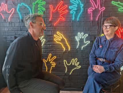
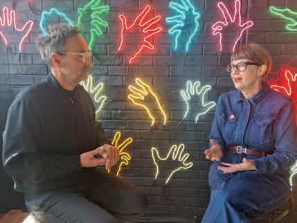
Artist/maker Emma Carlow and neon artist Andy Doig are both involved in Ditchling Museum’s big summer show, Signs of the Seaside. She popped round to his studio on Brighton’s seafront on the day before the exhibition opened, to ask him seven (and a half) questions…
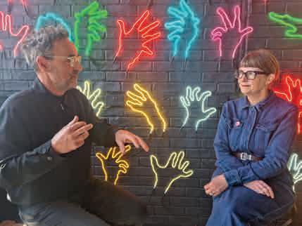
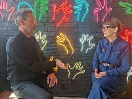
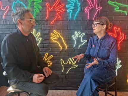
So, Andy, how did you get to be a neon artist? It’s an unusual profession… It all started in 1992. I was 27, and looking round for a new direction. My wife and I went to a wedding in America, and the shops were just heaving with neon signage. We went into a glass-blowing studio, and that was the germ: they weren’t just illuminated objects… they were being made, and all the evidence was around: broken tubes, hand torches. I thought: ‘this is what I have to do’.
It can’t have been easy to set yourself up…
I was determined. I thought: if I’ve got to apply to 50 different makers, I’ll do it. And I got a job with a company in Kentish Town working on neon installations for all the theatres in London. From there doing arcades and funfairs all over the south coast. I worked hard: you’ve got to get up early in the morning, and sleep on the work bench when it’s too late to go home. It’s all stemmed from there. But
I was lucky, right? It’s an industry that’s shrouded in secrecy, and it’s almost impossible to get into. Even nowadays there are only about 20 of us doing it.
Has the work changed much over the years?
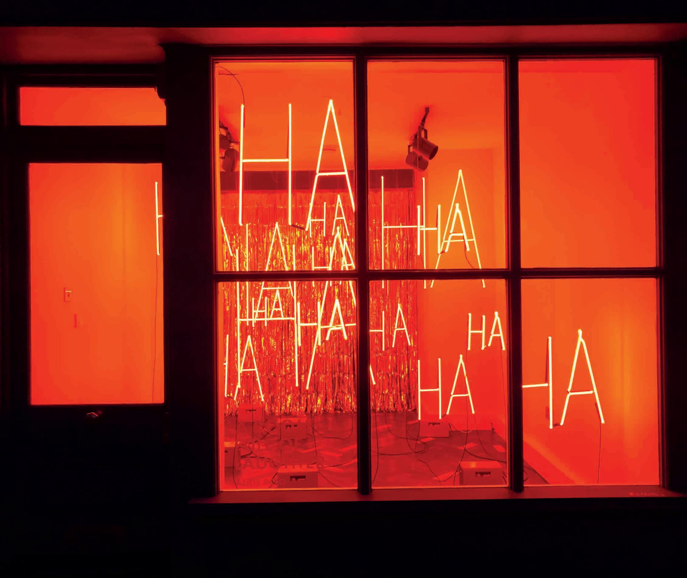
There’s been no advancement in the production of the tubes for over 60 years. Basically, the process will never change. It’s all about trapping neon (or argon) gas into a glass tube: if you pass a high-voltage electrical current across it, it’ll illuminate. The rest is about what you do with those tubes, and how you manipulate them. I can’t tell you my secrets: just that it’s got to be linear, and it’s got to flow.
But you’re an artist, rather than just a sign-maker, now?
I spent thousands and thousands of hours learning to make letter forms. That was my heritage, but it can also be something of a shackle. The difficulty
was being able to move on from letters, and concentrate on neon as a glass substance in tubulated form which can be used to make interesting art outside the traditional boundaries. Neon is a linear light line: there’s a lot of scope.
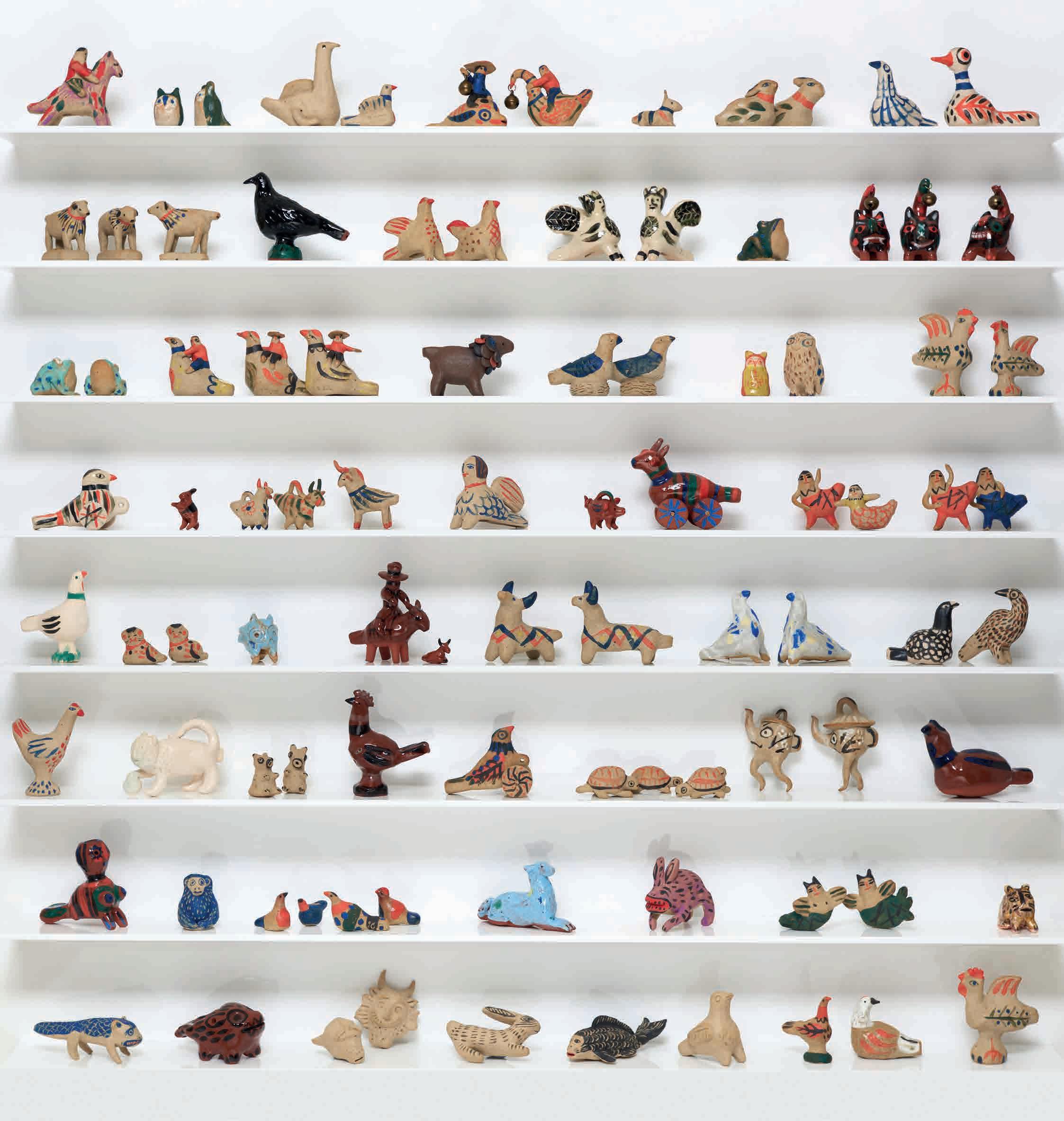
Here we are in your studio right on the seafront in Brighton. It seems like the perfect setting for a neon artist… Doesn’t it? Brighton’s got everything you need for a good life. The seafront studio really suits me. People drop in all the time while I’m working. The other day I had a chat with a Hells Angel from California who happened to be walking past, and popped his head in. Turned out he was a glass blower back home. We chatted for ages, swapped ideas. It was inspirational. Currently I’d say that America has the most happening neon art, but our main inspiration comes from what we see around us in our hometown: the people, the moments.
Our inspiration?
My wife’s very much part of the team, we work together. And we have two grownup kids and they both get involved: it can be a family affair.
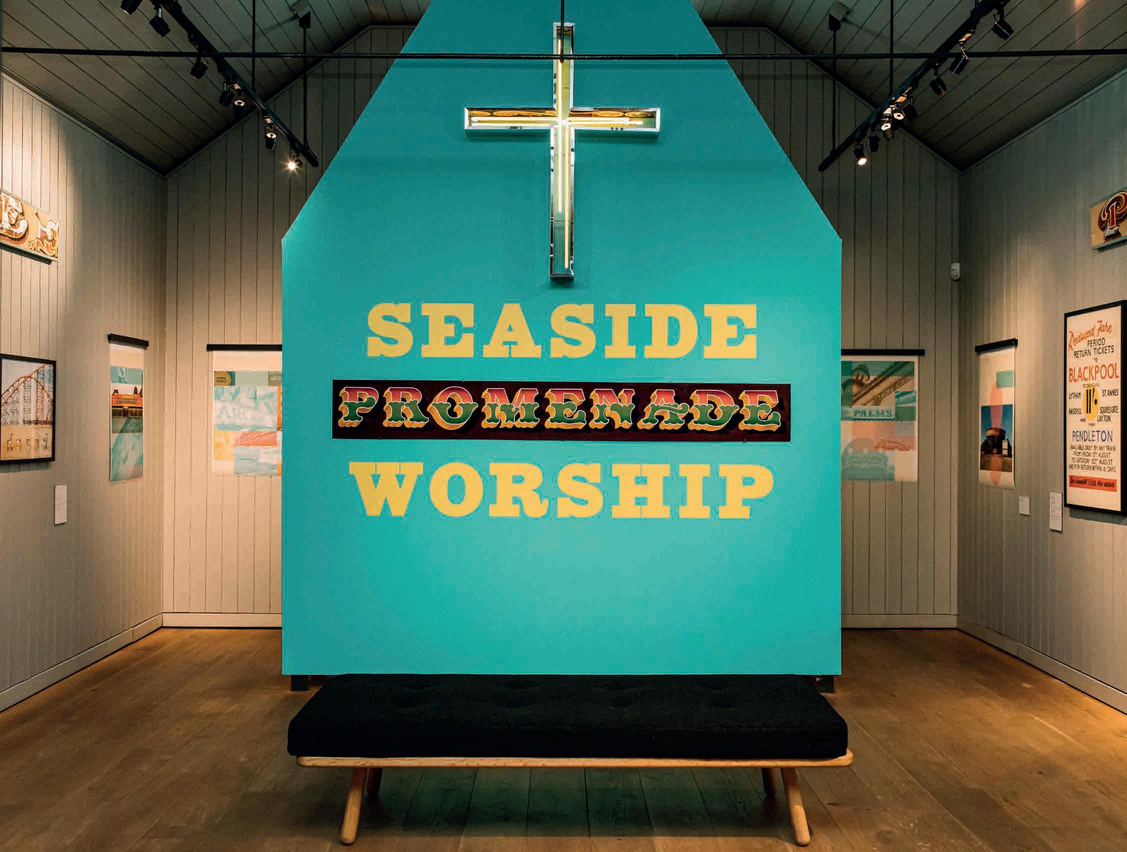
It’s a pleasure to be on the bill with you at the Signs of the Seaside show at Ditchling Museum of Art + Craft (Emma has made a ‘head-in-the-hole’ board). Can you describe your contribution?
It’s a five-foot neon letter ‘R’ that was originally part of the signage at the entrance of the Palace Pier. I’ve renovated it back to its former glory,
so it fills with lights, and empties again, and I’ve replaced the original ruby-red neon tube with original stock. It belongs to me, and normally sits in storage, so it’s great to give it a new lease of life, and the attention it deserves. How did I get hold of it, you ask? I can’t tell you that!
Signs of the Seaside, curated by Justin Burns, runs at Ditchling Museum of Art + Craft, until September 3. Other artists involved include Anthony Burrill, Amy Goodwin, Marion Deuchars, Rob Ball, and poet Ian McMillan.
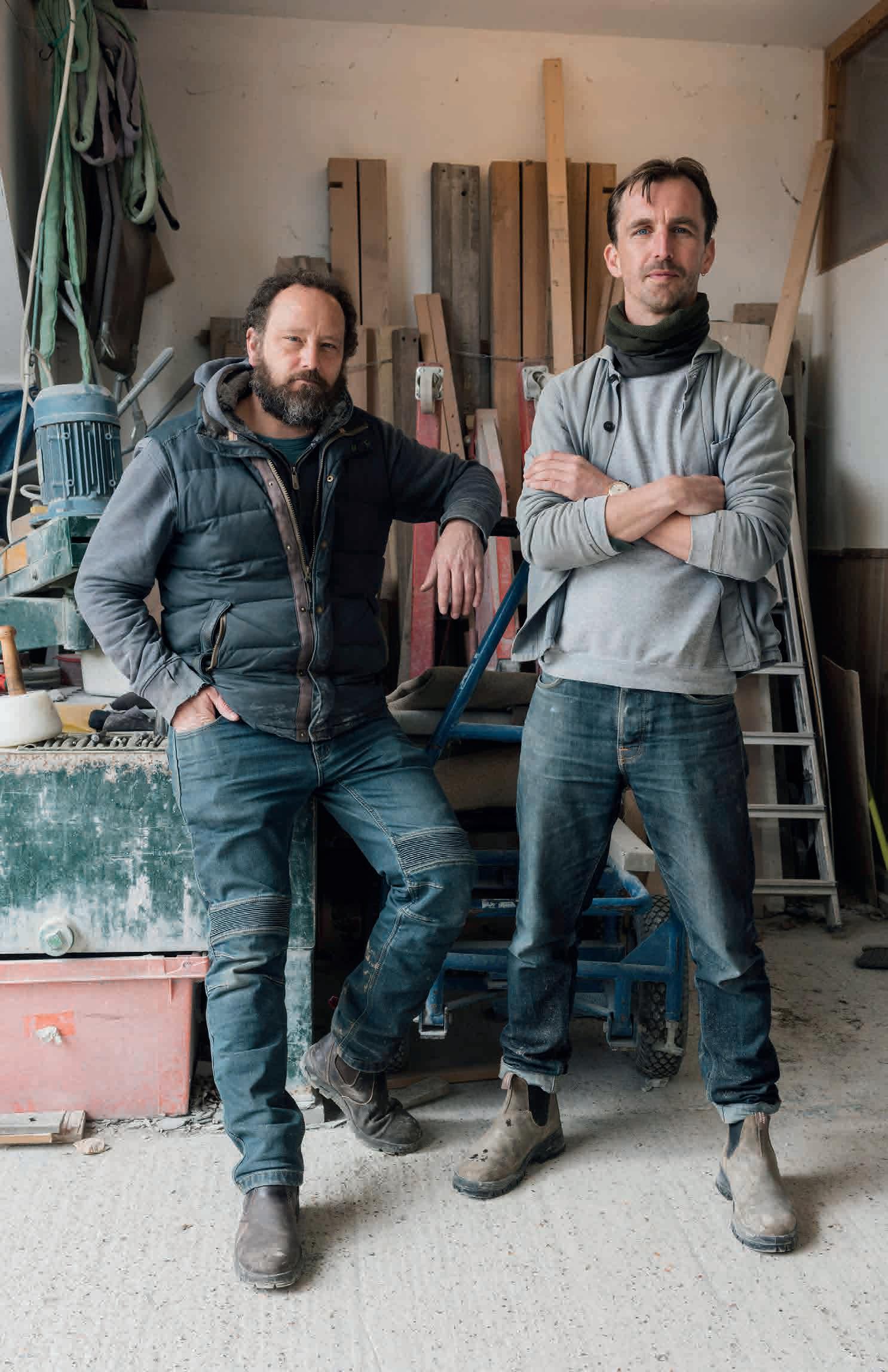
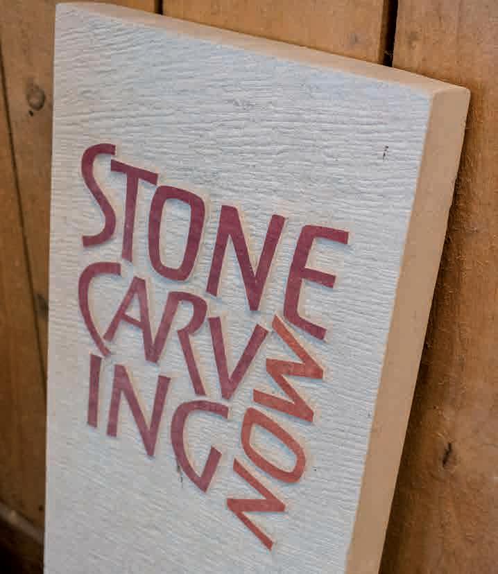
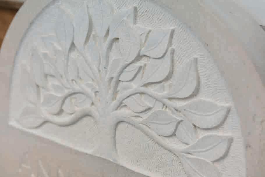
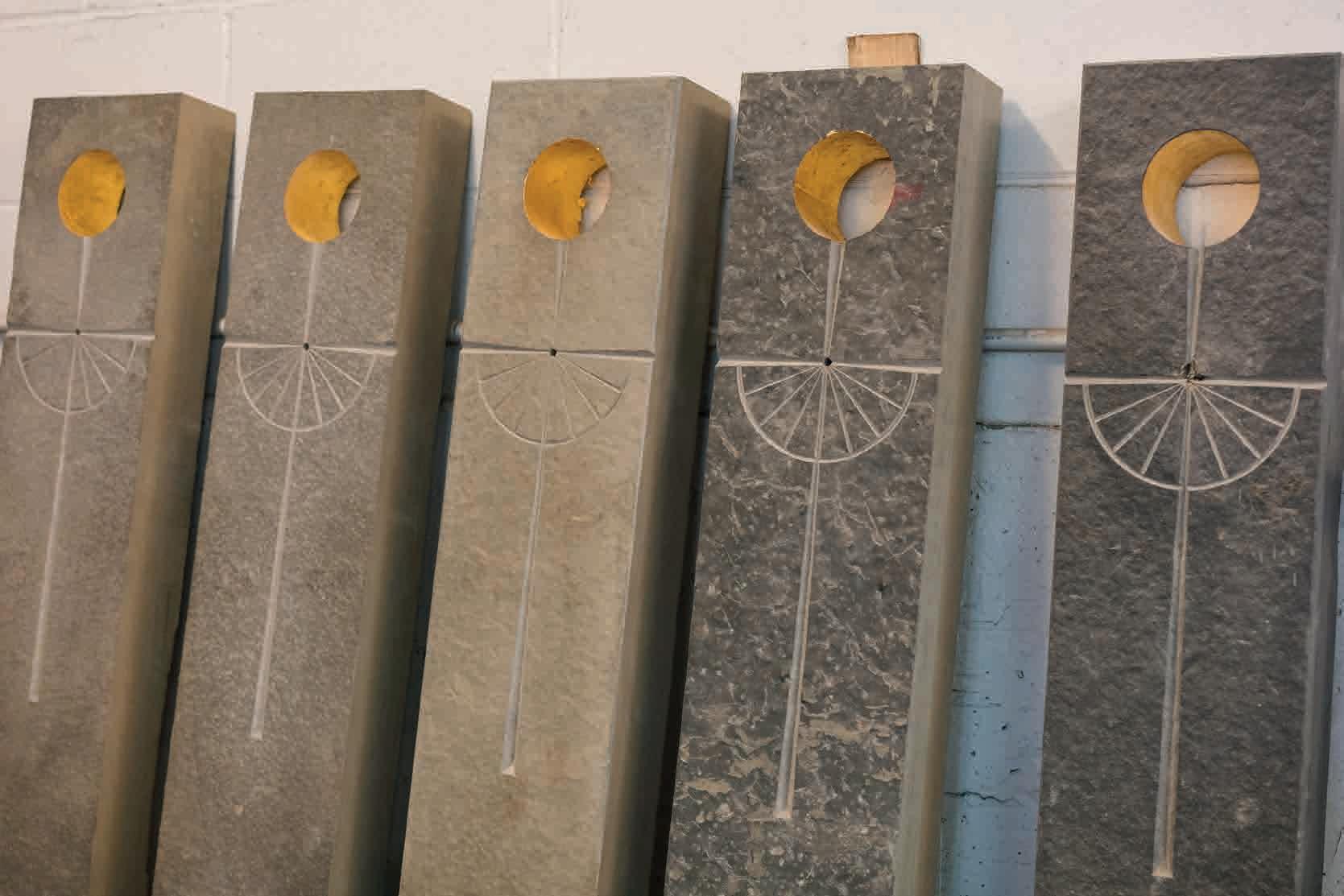
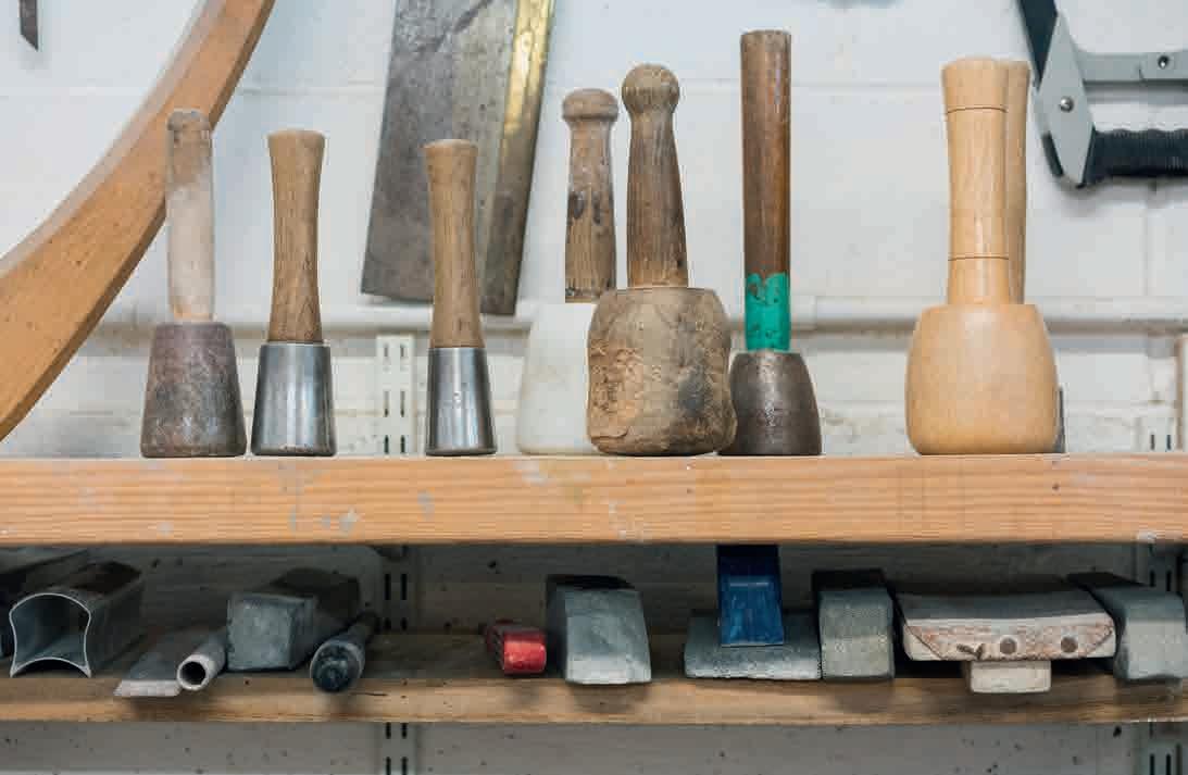
Fergus Davidson (left), memorial designer lettercutter and spoonmaker, and Tom Sargeant stone carver, lettercutter and designer in the Wivelsfield workshop that they share
Fergus’ clients include the Sussex Heritage Trust View his work on Instagram @fergus.davidson and contact him for commissions
Tom’s clients include St Paul’s Cathedral, St Pancras Station and the Chelsea Physic Garden. View his work at thomassargeant.com
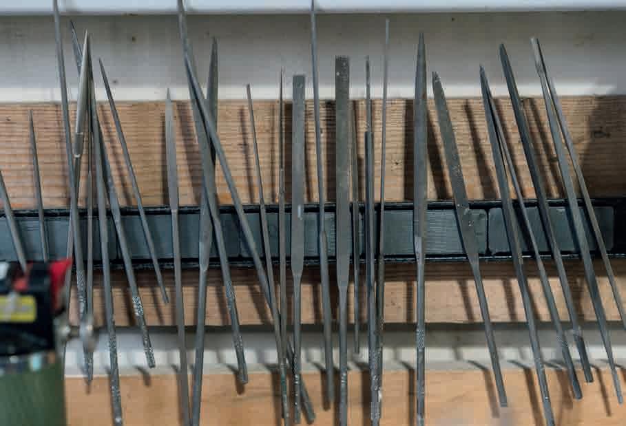
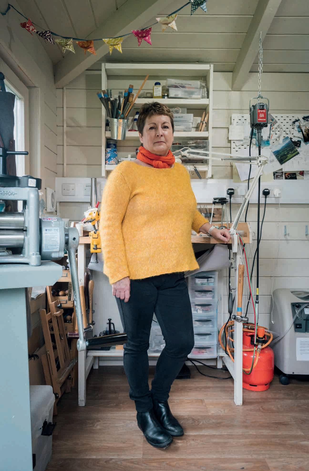
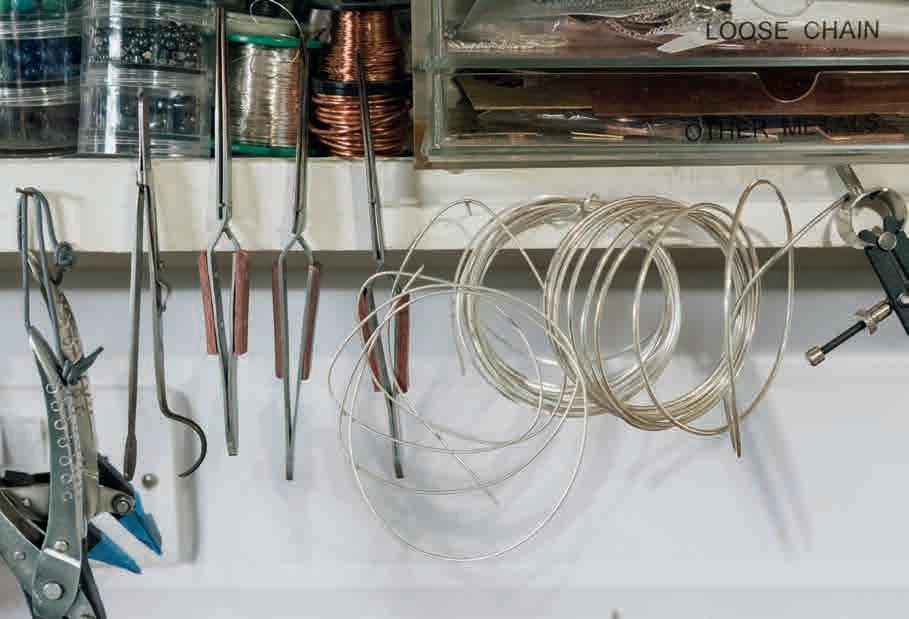
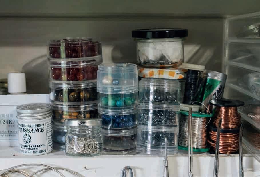
You can see Alison’s work at the Horsham Artists Art Trail (venue 13), June 10/11 + 17/18, 10am-5pm. And during the Horsham Contemporary Art Fair, October 13/14/15 Details at horshamartists.org
Buy handmade silver pieces from her online shop and contact her about bespoke orders at alisoncrowejewellery.co.uk
Sculptor Hannah Stewart in her Horsham studio
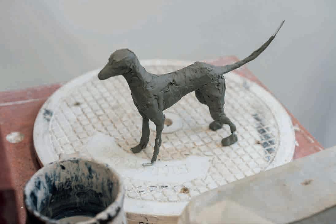
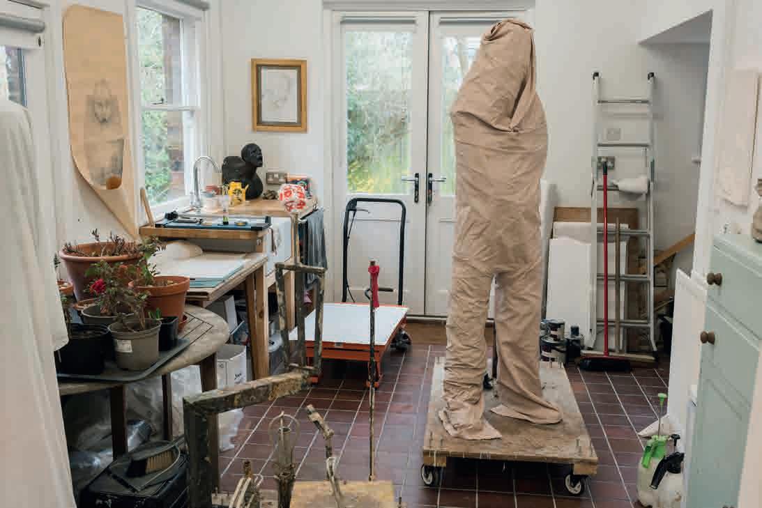
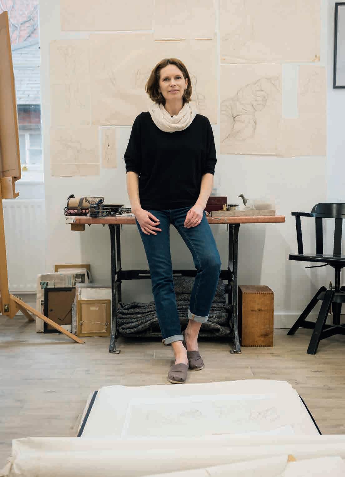
Hannah is available for public and private bronze sculpture commissions: figures, pets/animals and portrait busts. Her life-size bronze statue of Stockport County Football Club’s former manager Danny Bergara, was unveiled at their stadium in May this year
Email her at hannah@hannahstewartsculpture.co.uk
to discuss a commission. View her work at hannahstewartsculpture.co.uk
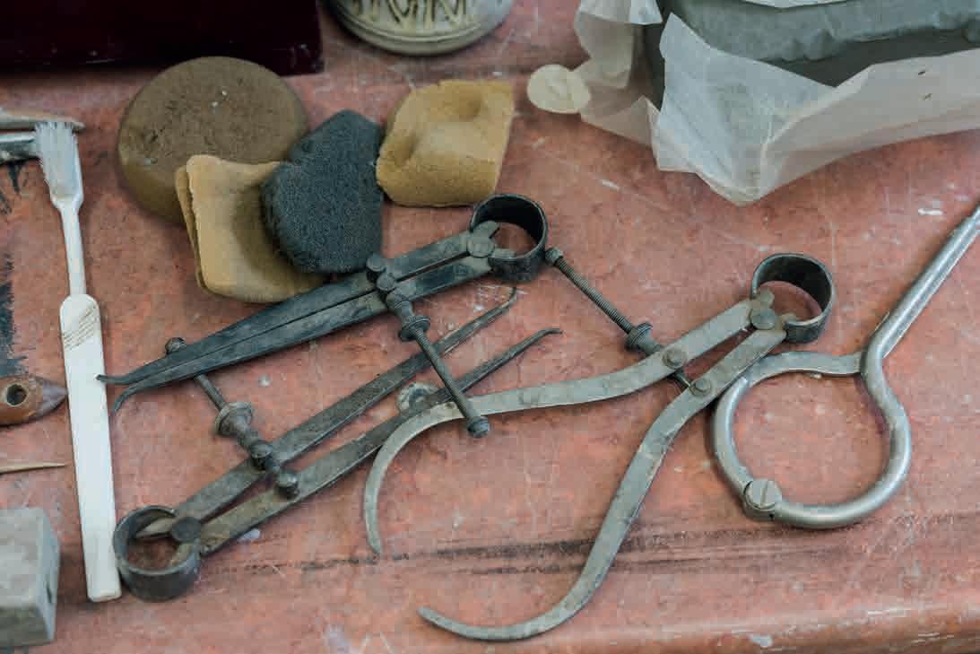
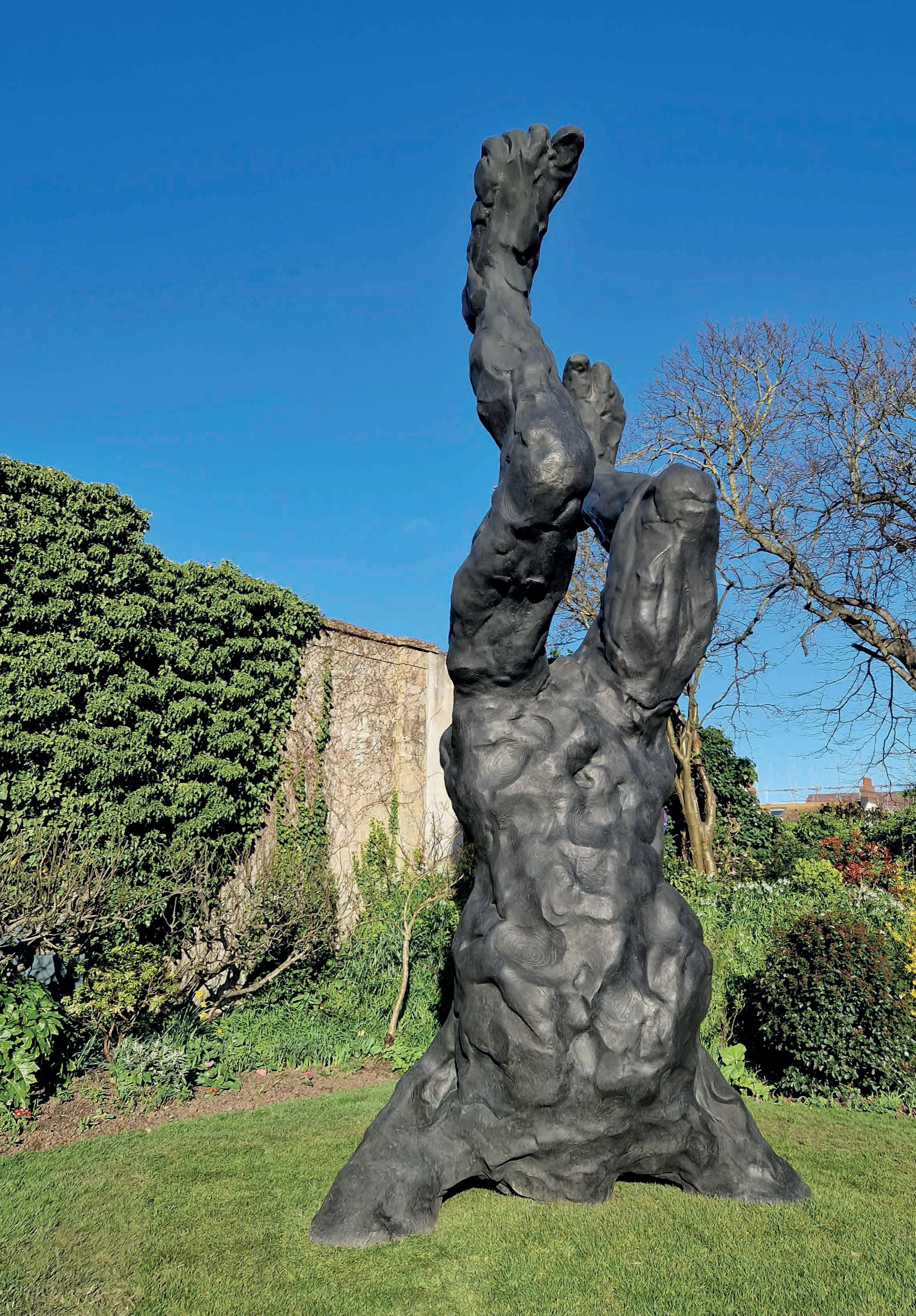
Walled gardens have captured our imaginations ever since people first enclosed the land around their homes and began growing for pleasure. The idea of a garden as a separate place is reflected in its name: the Old English ‘geard’ meant fence; and the idea of gardens as spaces of beauty and retreat gave us the word ‘paradise’, from the Persian word ‘parideeza’, from ‘pairi’ (around) and ‘daeza’ (wall). There is something about the hidden, enchanted even, nature of a walled garden that lends itself to flights of imaginative fancy. We conjure ‘secret’ spaces whose boundaries contain abundance, freedom and pleasure.
A wonderful example of this is the Secret Garden in Kemp Town, Brighton. Tucked away in an ordinary-looking street between the hospital and Lidl, lies an oasis of plants and art that is full of surprises. As well as being a place to sit and relax, this lawned enclosure hosts sculpture shows throughout summer. I am here for the opening of David Breuer-Weil’s exhibition of giant figurative sculptures (closes in September). The space is hard to find, which adds to its allure. As soon as I arrive, I feel like I have entered a cross between Lilliput and the walled paradise in Frances Hodgson Burnett’s The Secret Garden. Huge bronze figures are planted in the earth, some seeming as if they had fallen from the sky and others as if they are emerging through the soil from the underworld. You enter through two gates and descend a slope, which adds to the feeling of stepping into another realm. Around the square lawn are formal flower beds and shrubs; roses and ivy climb the high walls. In spring the beds
are dotted with daffodils, primroses, wild garlic, clematis and euphorbia, while pots filled with foliage hold promises of summer’s blooms. The structure of the space creates a living, changing frame for the sculptures.
It is an intimate space, allowing close inspection of the artworks as well as a peaceful respite from the bustling city. Plantsman (and ex-Stomp member, no stranger to choreography) Nick Dwyer has combined pampas and miscanthus grasses, mahonia, cardoons, hollyhocks, phormium and spindle bushes with cottage garden planting to set the stage for the art. The Regency-style house functions as a backdrop but has its own unshowy beauty. Its magic is enhanced by a mysterious tunnel on its eastern edge, a dank and dripping portal to wherever your imagination wants to take you.
The tunnel provides a clue to the Secret Garden’s history. One of several similar spaces in the Kemp Town Estate in the Regency period, the garden belonged to the house at 32 Sussex Square (owned in 1830 by Lawrence Peel, the Prime Minister’s brother). It was a purely recreational ‘pleasure’ garden, accessed from the house by the tunnel under the roadway. All the other walled gardens belonging to these houses were gradually built over, as the area was developed – this is now the only remaining example. And its survival is largely down to its previous owners, Antony and Yvonne Dale.
The Dales owned and tended the garden from 1950 up until Antony’s death in 1993. He bequeathed the space to the people of Brighton and his widow, Yvonne, wanted to prevent it becoming another housing development. She joined forces with musician, artist and academic Gavin Henderson, and together they formed the Antony Dale Trust. With financial support from trustees and funding grants, the charity was able to buy the space and establish it as a place for public and artistic benefit. The layout was inspired by other walled gardens, like Sissinghurst and Kipling’s garden in nearby Rottingdean. It opened in 2016 and has hosted exhibitions by artists including Hamish Black, William Pye and Elpida Hadzi-Vasileva.
Walking amongst Breuer-Weil’s sculptures as the sun floods over the walls and the sounds of traffic recede, I can fully understand the appeal of this place. Amidst the crowd of chattering visitors, a small dog catches my eye. Like the truncated sculptures, her back legs appear to be missing and she is strapped into a kind of low two-wheeled trolley. She whizzes about, enjoying pats and delighted greetings, navigating the landscape with inspiring resilience. It makes me think of Hodgson Burnett’s book again, and of the disabled character, Colin. At first this boy in a wheelchair is unhappy and irascible, conforming to outdated stereotypes of disabled people. When orphaned Mary uncovers the existence of this unknown cousin – and the secret enclosure – she brings Colin into the garden and he begins to recover his strength. With Dickon (a servant’s son) and Mary’s help, as he works in the garden Colin undergoes a miraculous transformation. His psychosomatic illness disappears and he is restored to full health – and to what is deemed appropriate levels of upper-class masculinity.
Whilst this portrayal of disability is problematic, it does speak to the idea of gardens as places of healing. A growing body of research shows the health benefits of working the soil, tending plants and being in green spaces. Refugee gardens offer traumatised, displaced people a space to recover, to grow food and to put down roots. The quiet, repetitive labour of everyday garden tasks keeps us fit and mobile and gives our minds space to wander.
As well as being a place of imagination, rebirth and restoration, a secret garden can also be a place of transgression or contain hidden desires. The 1973 bestseller, My Secret Garden, by Nancy Friday, is a compilation of women’s sexual fantasies. Written at a time when most women were not able to freely express their sexuality – and not even thought to have fantasies – the book revealed the depths of erotic female imagination. Within the walls of these fantasies, women could explore their buried desires, and the notion of this private internal space evokes fecundity and lushness.
Emerging from the cool tunnel back into the light of the garden, the connections between bodies, gardens, art and desire feel firmly rooted within the rose-strewn walls. I step out onto the pavement and head back into the world, like Mr Benn at the end of an adventure.
David Breuer-Weil’s sculptures will be in the garden until the end of September. To celebrate Midsummers’ Day and the summer solstice on June 24 there is a Promenade Concert with the Adur Band in the garden. Find out more at secretgardenkemptown.co.uk
Lulah Ellender is the author of the memoirs Elisabeth’s Lists (Granta, 2018) and Grounding: Finding Home in a Garden (Granta, 2022).
Above Turps the dachshund enjoys whizzing about the Secret Garden
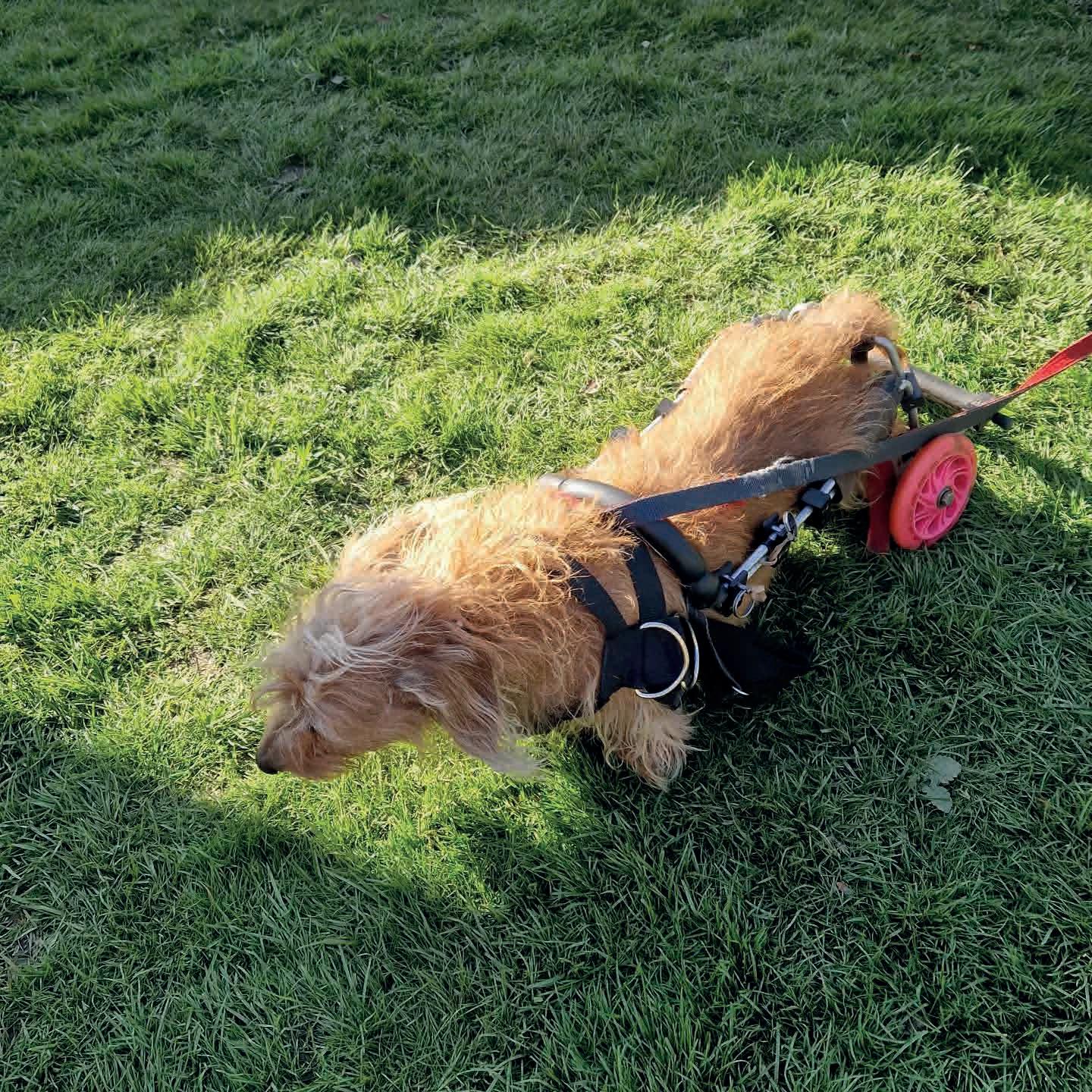

Flimwell Park: an exemplary eco-build
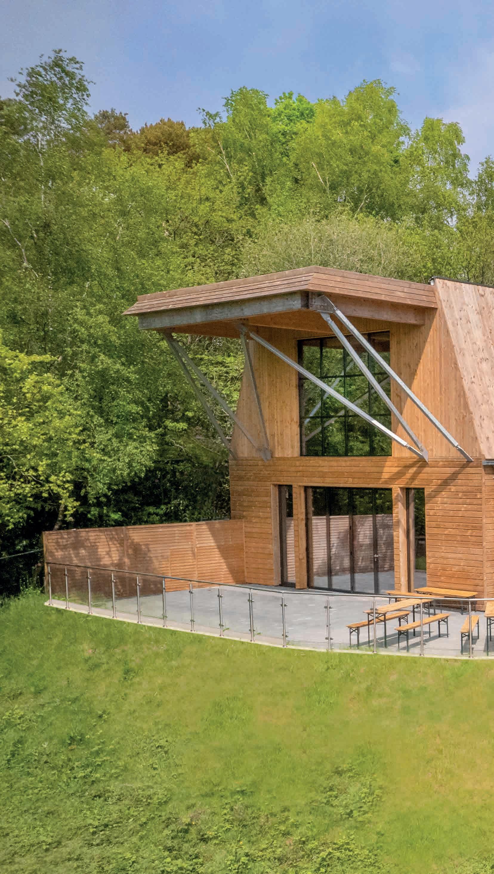
If you’re looking for a vision of how many of us may live and work in the future, then Flimwell Park is well worth a visit. Mixed use, highly sustainable, and set in 22 hectares of protected woodland, it ticks all the boxes.
The site is in an area of outstanding natural beauty, on the outskirts of the small village of Flimwell, in the Rother district of East Sussex, near the border with Kent. It’s a collaboration between property developer Regalmain Limited and architect Steve Johnson, of The Architecture Ensemble. They’ve been working alongside a team of ecological consultants, creating an inspiring new model for a sustainable woodland community.
It feels joyously unfamiliar, in terms of both its layout, design and materials. Particularly striking are the eight two-storey timber workspaces built on stilts: slim, elegant buildings that allow for generous views of the woodlands.
A main barn-like building is nearing completion and the adjacent restaurant space, Birchwood, was busy when I visited. Birchwood, as you might imagine, champions suppliers from Sussex and Kent, including local wineries and brewers, using in their menu many ingredients foraged from the local woods. The buildings use natural light as far as possible, the windows maximising the splendid views.
Visitors can stay over. There are ten rooms available for rent, built into the sloping ground along one edge of the site. There are also five houses for permanent residents.
Sustainability can sound like an architectural cliché these days, but Flimwell Park is genuinely an exemplar, with all the timber cladding sustainably sourced and weathering steel used for the window bay cladding. Three hundred photo-voltaic cells provide a substantial amount of the site’s power requirements. These are located on the buildings’ roofs, cladding, and canopies, with a grid of solar thermal units heating its water directly from the sun.
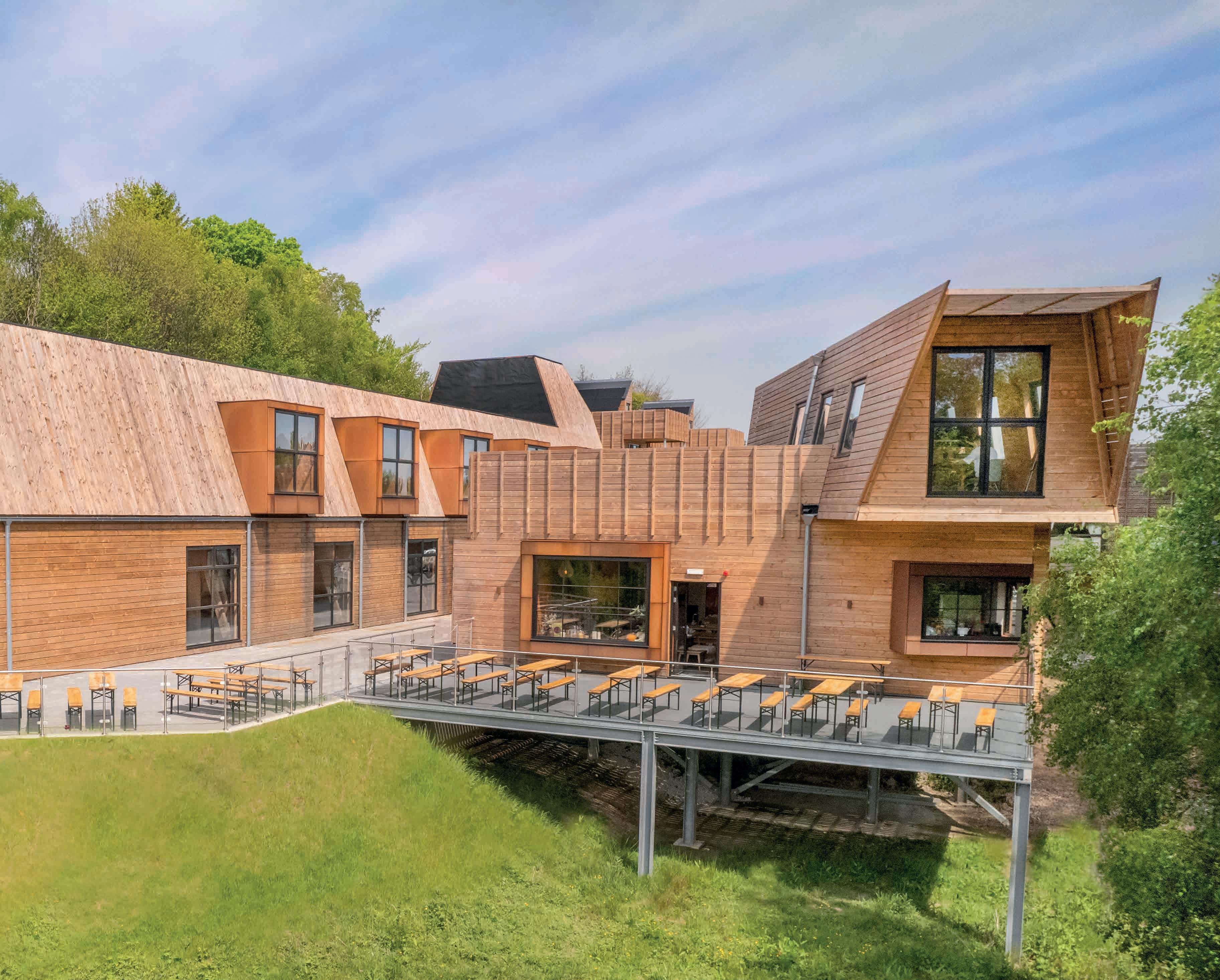
Even the car park has a sustainable surface, made from local stone, geotextile filtering layers and recycled plastic open-grid surfacing. And, of course, there are six Tesla charging points, with two more charging points available for other electric car brands.
The walkway that links the eight workplace buildings has decking made from recycled milk bottles, and wood fibre and rubber tiles made from recycled tyres have been laid over the roof terraces. No construction waste was removed from the site: everything produced by the build was recycled and reused.
Most of the buildings use a structural insulated panel system, made in Estonia using simple timber components and infilled with a pressurised insulation that makes the panels extremely strong and insulating, whilst remaining lightweight compared with other building materials. Once the panels are onsite, an entire building structure can be erected in a matter of days.
The Bartlett School of Architecture, at University College London, with UCL Engineering and The Slade School of Fine Art are developing plans for future education and research activity at Flimwell Park. The Focal Building, which is near completion and the largest building on site, will be the centre for learning and teaching opportunities, illustrating how architectural and woodland development can exist in an integrated and symbiotic relationship.
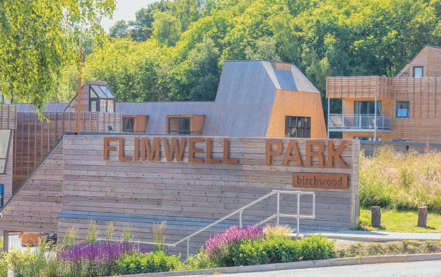
The Focal Building’s upper roof will be home to a food production greenhouse that will allow for the growing of ingredients for the onsite restaurant and day spa. Beyond this greenhouse is the viewing platform where visitors receive a spectacular elevated vista over the site and beyond to the valley and hills of the High Weald.
Steve Johnson, Founder of the London-based Architecture Ensemble and teacher at The Bartlett School of Architecture, tells me: “Flimwell Park has been a ten-year rural development dream come true. We are breathing life back into 22 hectares of unused East Sussex Ancient Woodland, transforming a former brownfield section of the site into a central mixed-use living and working community space, that will help the local community and region draw and attract financial and skills investment back into the area.”
Director of Regalmain Limited, Chris O’Callaghan, adds: “Our aim is to show how architectural and woodland development can exist in a continuous, integrated and mutually beneficial relationship. Flimwell is about creating opportunities for woodland enterprise, recreation, diverse woodland conservation and education, whilst harmonising all this with nature. The project has been a brilliant opportunity to experiment with alternative building methods too. It’s been an absolute joy to work on.”
While we clearly can’t expect to upgrade all our current housing stock to achieve this level of sustainability, Flimwell Park certainly gives a vision of future living and working. It feels like a real 21st-century space, developed using a combination of skillsets: farming, forestry, art, architecture, engineering, landscape architecture and planning have all gone into the mix. It’s a positive antidote to the bland housing estates we see sprouting up these days around so many Sussex towns and villages. And, I might add, it’s a fine place to go for a bite to eat.
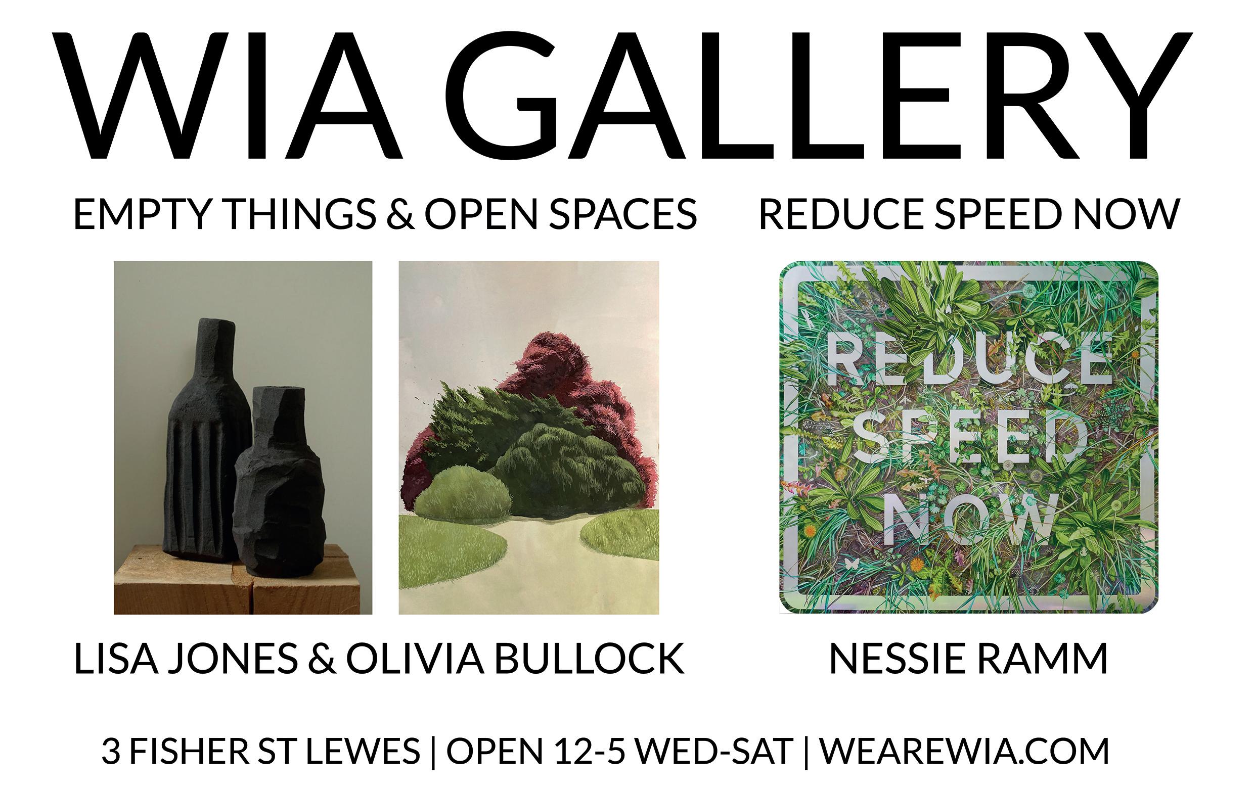
The first thing you should do when you arrive in Rye is to make a beeline up the hill it’s built on, to St Mary’s Church. Once there, having admired the stained-glass windows by Sir Edward Burne-Jones, you can pay an old chap £4 to gain access, via a harum-scarum system of steps and ladders, past a set of gigantic brass bells, to the top of the tower. A walkway around the base of the spire gives you a 360-degree rooftopview of the town, with its network of cobbled streets and secret twittens. And of the lay of the land that surrounds it, from the intermittently woody Weald to the north, to the moist, muddy, estuary-veined flatlands that stretch out southwards to the sea.
Once you’re back down among the buildings – many of them medieval, with a smattering of Tudor and Georgian – you get the feeling that Rye is a great-looking old town that is going through an existential revolution. Entrepreneurial (down-from) Londoners are taking advantage of the stilllowish house prices (average in 2022 £398,000; £631,000 for a detached), and regenerating period spaces to accommodate funky new businesses.
It must be galling for Rye’s long-term inhabitants, many of whom are being priced out of their home town. But if you’re after a high concentration of high-end aesthetic and culinary culture, in a beautiful hilltop town that wears
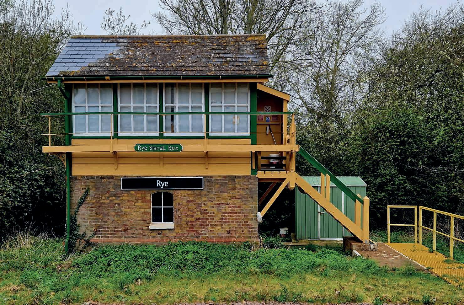
its history on its sleeve, then Rye is definitely a good option for a weekend away. Don’t just take our word for it: Conde Nast Traveller paid a visit, for the ‘Destinations’ section of their February edition, and gave a glowing report.
Rye – very possibly from Old English ‘iog’, meaning ‘island’ – has been through many transformations in its long history. It used to be a thriving seaport until violent 13th-century storms, followed by gradual estuary silting and land-reclamation, pushed the shoreline further and further away (it’s now two miles to the mouth of the Rother, at Camber Sands). As one of the strategically important Cinque Ports it
enjoyed special status and preferential rights and was much visited by royalty, including Edward III, Charles I, Elizabeth I (who may or may not have enjoyed a pint at the still-extant Mermaid Inn) and George I.
In its long lifetime, the town has had many career changes: it’s been a trading port, a military naval base and shipbuilding centre, a fishing port, a market town, and a tourist centre. There’s still a fishing fleet operating from the riverside quay at the foot of the town, and a thriving farmer’s market every Wednesday, but it is the tourist industry that really drives today’s economy. And it’s clear that the town is shifting its focus towards the trendier and better-moneyed end of the market.
Rye’s higgledy-piggledy Anglo-Saxon street-plan incorporates many corners: you can hardly turn one without coming across an art gallery. The longest standing is Rye Art Gallery on the High Street, much bigger than it looks from the outside (it’s actually two buildings, knocked together in the sixties), which holds a collection of Edward Burra paintings and memorabilia and puts on regular high-quality shows by local artists. Of the many others, the most intriguing is the Peacocke Gallery on Lion Street. Not many tourists ring on the doorbell, as invited: we did last year, and were treated to a guided tour of the artist’s apocalyptic oil-paintings, including the one he was currently working on, in a turpsy back room.
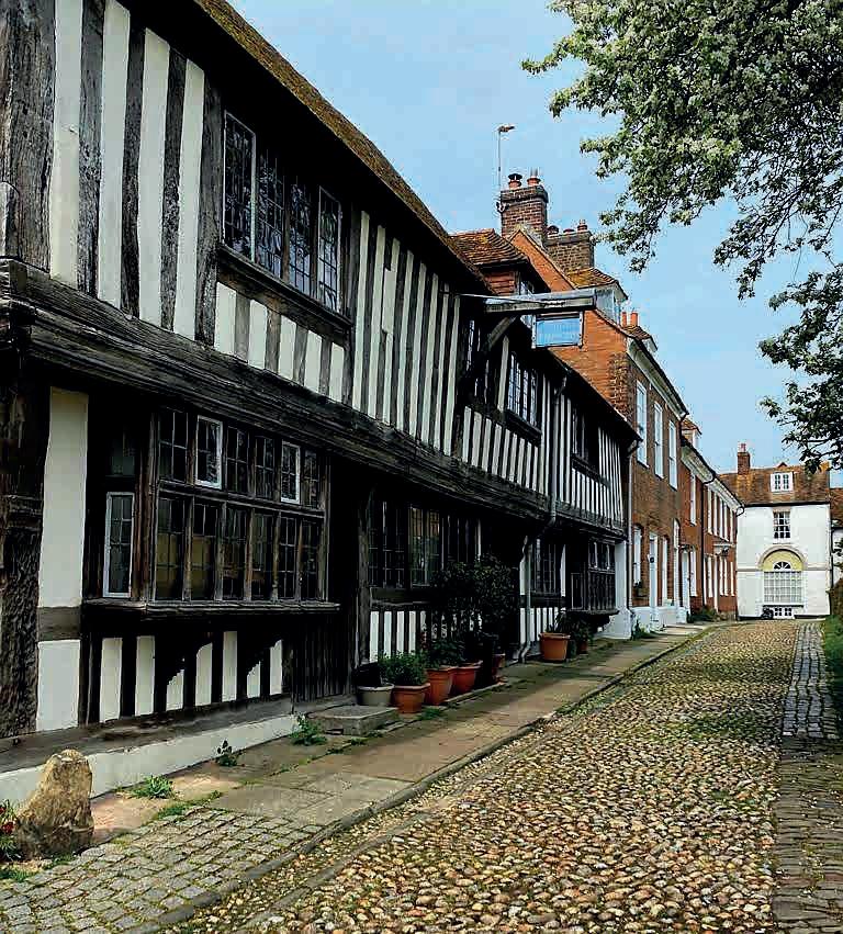
What was originally a 13th-century Augustinian friary on Conduit Hill, the steepest and cobbliest twitten in town, is now a live arts venue, ‘The Monastery’, which hosts occasional events: the weekend we last visited this spring we saw an adaptation of Oscar Wilde’s Salome featuring a troupe of scantily clad dancers. It was an audience-participation number: Venetian masks were provided, and we were served wine and tapas and persuaded to join in the dancing.
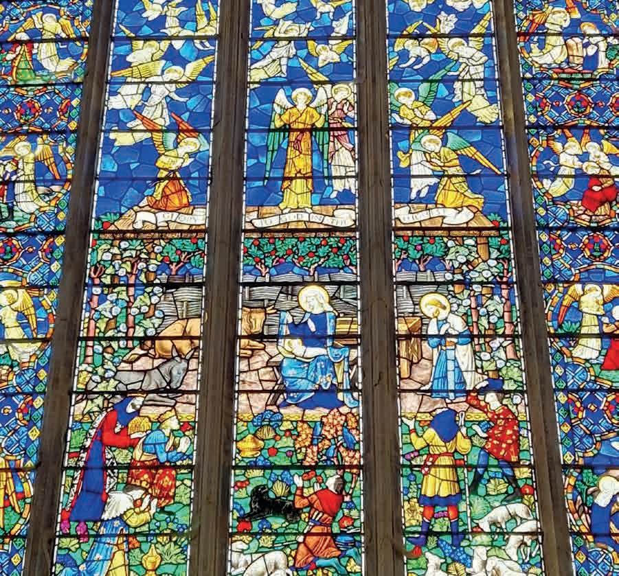
Rye Jazz Festival takes place every August, one of the most prestigious in the country: Emili Sandé headlined last year, as we go to press this year’s line-up is still to be announced. There’s also an annual multi-arts festival in the second half of September.
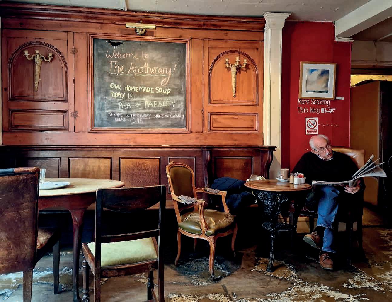
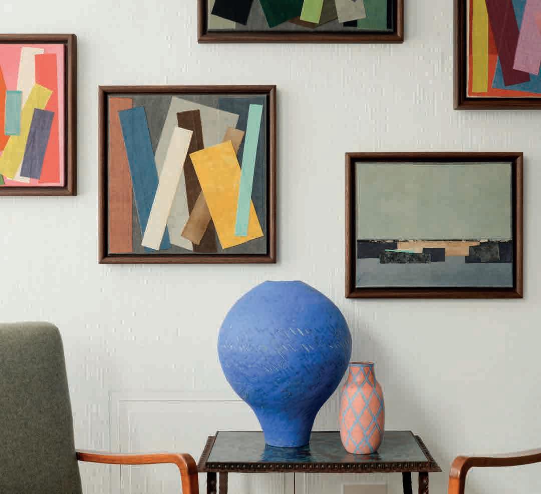
Finally, Lamb House offers a reminder that Rye has been a cultured town for some time. This National Trust-run Georgian townhouse was once owned by the novelist Henry James (and later by EF Benson and Rumer Godden, see pg 76) and many of James’ belongings are on display: the walled garden is a delight.
You can tell that Rye is pleased with itself, as so many of its shops – most of which are independent – include the name of the town in their signage. Wander round, and follow your inclinations, obviously, but we’d particularly recommend three businesses. McCully & Crane is a seriously tasteful art and interiors space selling vintage furniture and contemporary paintings and ceramics. The Paper Place sells gorgeous wrapping paper and other decorated goods from Kashmir. And (more prosaically) The Bargain Box is an old-fashioned family-run newsagent, which will furnish you with all the literature you need about the town, as well as its charmingly clunky long-running community magazine Rye Zone (not to be confused with the more design-led, DFL freebie Ryezine).
For upmarket mezze, try The Union; for great pub grub (including catch of the day chowder) head to The Standard; for a fresh, healthy brunch there’s The Fig café; for pizza and pasta in a friendly atmosphere go to Simply Italian. Boozewise, micropub The Waterworks is a serial winner of CAMRA awards, and doubles up as a junk shop (you can buy the chair you’re sitting on); the more spacious Ypres Castle cares about its beer, and offers a suntrap garden; The Grapevine Champagne & Jazz bar, all dim lights, faded grandeur and redplush upholstery, is a good place for an aperitif, or a nightcap. Finally, The Apothecary is a former chemist which now serves tea and cakes in shabby-chic surroundings, and offers peoplewatching opportunities through its huge leaded bow window, overlooking the high street.
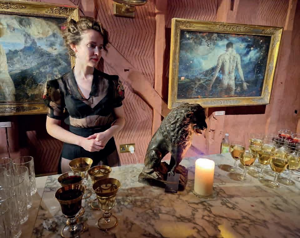
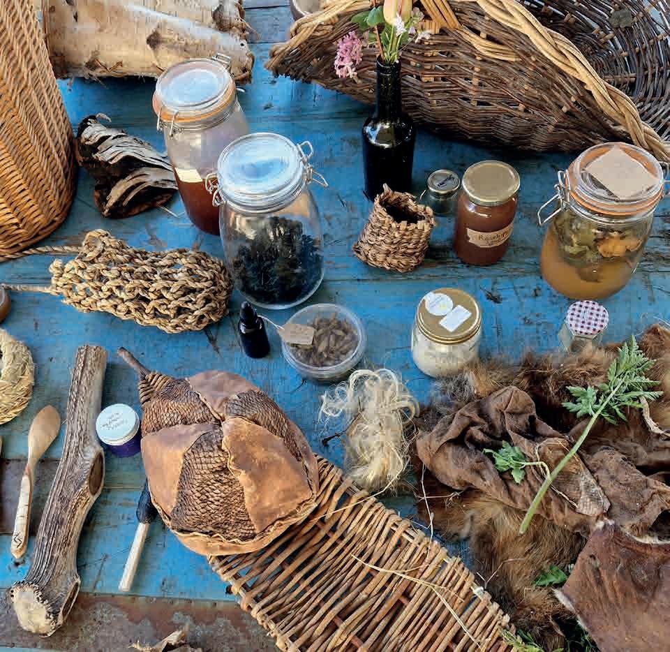
We can thoroughly recommend staying at Tillingham, a vineyard and ‘natural wine’ winery five miles north of Rye, with a bar and restaurant, which also runs twelve extremely modern, extremely comfortable rooms, classily decorated by McCully & Crane (see above). If you can, book in for a wine tasting (their rosé lingers particularly long in the taste-bud memory) or a foraging mission while you’re there. In Rye town centre, we felt extremely well treated at the Hope Anchor, an 18th-century inn boasting four-poster beds and marvellous views, situated at the end of picturesque, cobbly Watch Bell Street, near St Mary’s church.
Next issue: Lewes
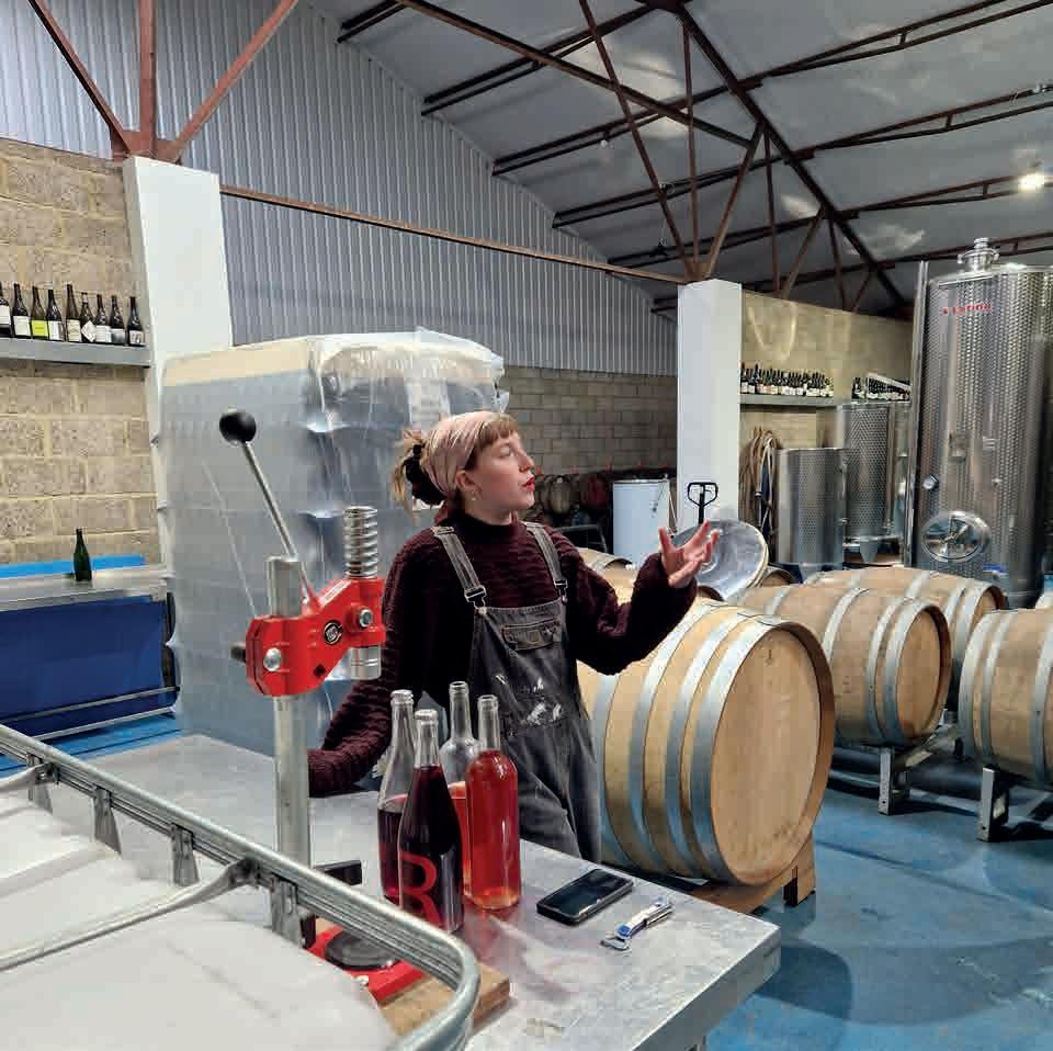

Michael Powell and Emeric Pressburger’s 1947 film Black Narcissus, exotic, wild and full of colour, is now widely regarded as a masterpiece. It is based on the novel by Rumer Godden first published in 1939, in which a small group of nuns is sent to establish a new convent in an abandoned palace in a remote and vertiginous part of the Himalayas.
Vividly shot in technicolour, Black Narcissus is a magnificent landscape film – but one created entirely in England. Powell decided to make it a studio production ‘to create and control the atmosphere from start to finish. No matching of studio sets with real exteriors shot in Nepal!’ Powell wanted to create a ‘fairytale’ India so all the interiors were shot at Pinewood Studios, with some filming at the verdant Leonardslee Gardens in West Sussex.
As he recalled in his autobiography, Powell delighted in telling the assembled production team of his plans not to take them on location to India – but to Horsham instead. He explained: ‘There’s a famous house and gardens there called Leonardslee. It has one of the most famous sub-tropical gardens in England. You should see it when the azaleas are blooming. I reminded them how British merchant princes and pro-consuls, when they retired and came back to Britain to live, would bring whole trees and bushes wrapped in matting to remind them of India. Leonardslee had a deep and steep little glen planted with cedars and deodars. You would swear you were in the Himalayas.’
First planted in 1801 and set within a valley on a 240-acre estate, the Grade I-listed gardens reopened in 2019 after a closure of nine years and one of the largest garden restorations in Europe. The filming of Black Narcissus took place there in the summer of 1946; ‘The proprietor of the house at Horsham with the Himalayan garden, Sir Giles Loder, was the most relaxed and generous man I have ever met, and allowed us to run all over his beautiful garden with our unit of about a hundred people, without turning a hair.’
Powell reckoned he could make Black Narcissus, adapted for the screen by Emeric Pressburger, ‘one of the most subtly erotic films ever made’. A great many critics and commentators feel he succeeded. The repressed emotions of the nuns are emphasised by an exaggerated use of colour and lighting, the highly saturated hues giving the film an intense sensual and otherworldly quality. Shooting on location might have made the
film more ‘realistic’, but the deliberate artificiality and control of atmosphere seem all the more remarkable 75 years after release. Rumer Godden was born in Eastbourne but lived in India as a child before returning to England. She lived her later years in Lamb House in Rye, formerly the home of Henry James. She was fond of quoting a favourite Indian proverb: ‘Everyone is a house with four rooms, a physical, a mental, an emotional and a spiritual. Most of us tend to live in one room most of the time, but unless we go into every room every day, even if only to keep it aired, we are not a complete person’.
She was not impressed by the adaptation of Black Narcissus and declared after seeing the finished film: ‘I have taken a vow never to allow a book of mine to be made into a film again’. She also complained that the Himalayan palace was a ‘ramshackle imitation of the Pavilion in Brighton.’ She did later relent and allowed many film versions of her work; a grand total of nine of her books were adapted including The Greengage Summer and The River, a tribute to India and childhood, made into a film by the great French director Jean Renoir.
At the start of Black Narcissus, Sister Clodagh (played by Deborah Kerr) is given a mission: to travel to a strange, distant place which turns out to be full of ghosts. It shares this narrative outline and a gothic sensibility – also the lead actress – with The Innocents made in 1961. Jack Clayton’s supernatural tale starring Deborah Kerr was partly shot on location at another Sussex gardens, Sheffield Park (see ROSA #4).
Black Narcissus was released in 1947, the very year India secured independence from British colonial rule. Film Scholar Ian Christie has suggested on one level the film can be seen as ‘a spiritual preparation for the British withdrawal from India’. In the US, the release was delayed due to the Catholic Legion of Decency who objected to the portrayal of nuns losing control; Powell and Pressburger were forced into editing out a number of scenes including a flashback to Sister Clodagh’s love affair in Ireland. Black Narcissus was ultimately rewarded with Oscars for Alfred Junge’s art direction and Jack Cardiff’s cinematography. And, as Michael Powell observed, ‘Nuns are always box office, aren’t they?’
Tim Brown is the co-founder and co-director of the annual CINECITY The Brighton Film Festival.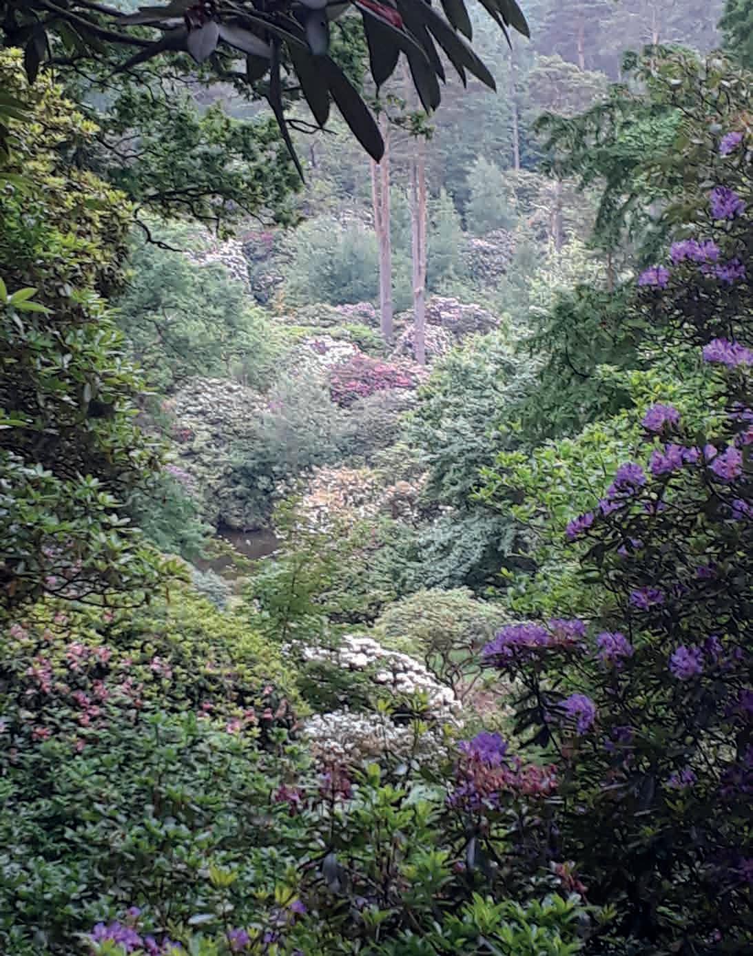
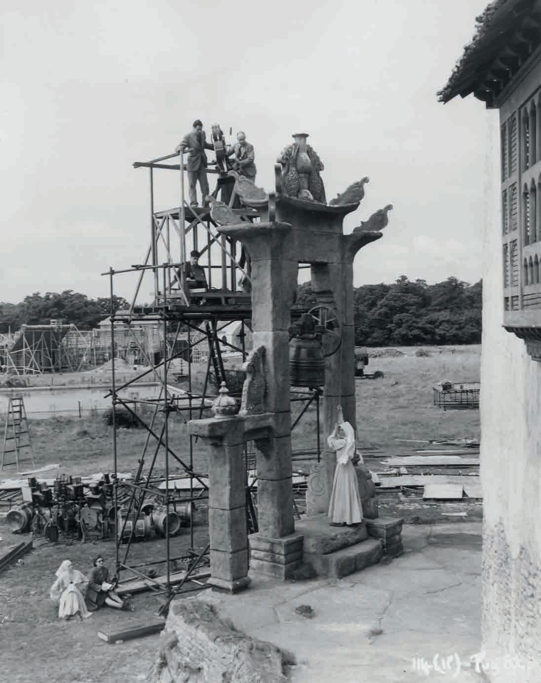
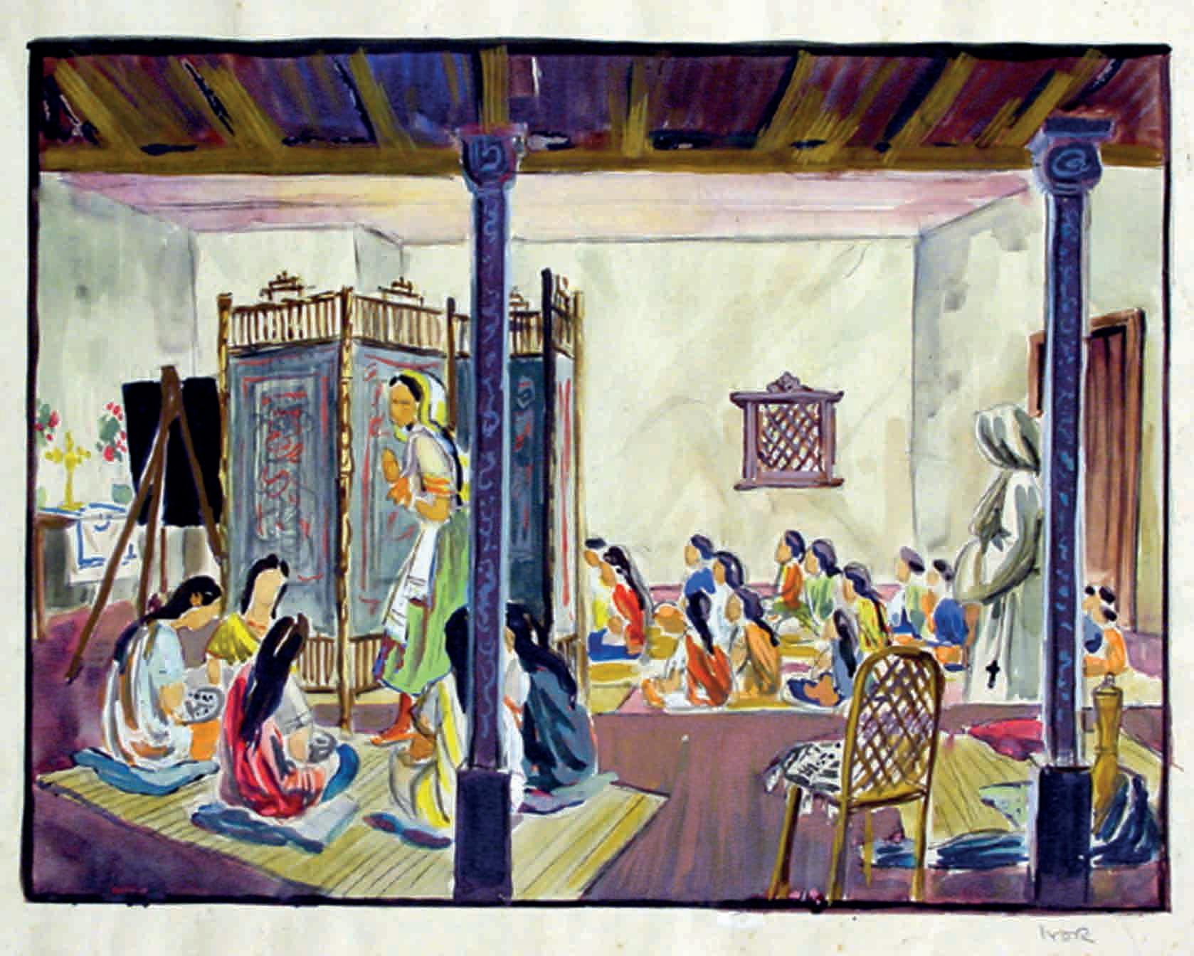 Left
Pre-production sketch by Ivor Beddoes © Universal Studios and production studios
Below left Rhododendron valley Photo courtesy of Leonardslee gardens
Left
Pre-production sketch by Ivor Beddoes © Universal Studios and production studios
Below left Rhododendron valley Photo courtesy of Leonardslee gardens
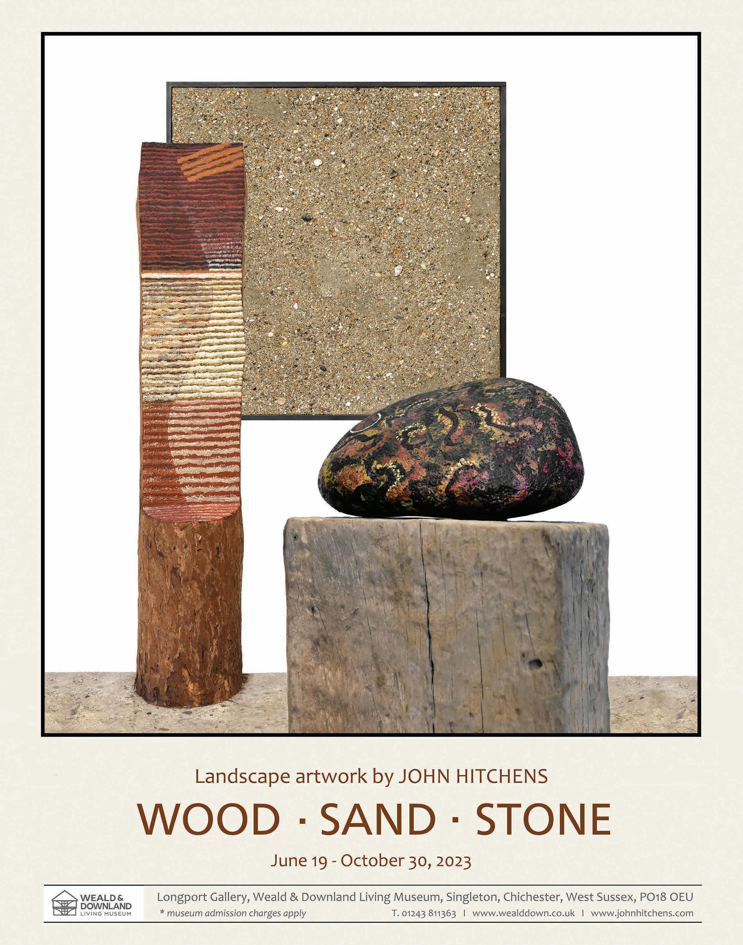
Katie Colombus is the author of How to Listen and Pathways (Hachette, 2021). She’s had poems published in The Frogmore Press, Dance Art Journal and Glyn Maxwell’s Dark Canadee, and was longlisted for the Fish Prize for Poetry. This poem will be performed
as part of Songs of Hope – Echo Walks, in collaboration with cellist/composer Laura Reid, in site-specific locations from September. For more information please visit laurareid.co.uk
Those who are familiar with the BBC’s Fake or Fortune?, presented by Fiona Bruce and London art dealer Philip Mould, will be well aware of the significance of a painting’s provenance. Often the story behind the work of art can be as alluring as the work itself.
There is a picture hanging in an East Sussex home whose story deserves to be revealed. Entitled Playtime, Rottingdean, Sussex, the watercolour is by Sir Edward John Poynter, President of the Royal Academy between 1896 and 1918, best known as a primary exponent of neoclassicism. In 1866 Poynter married the renowned beauty, Agnes MacDonald, whose sister Georgiana had six years previously married the Pre-Raphaelite painter, Edward Burne-Jones. Seeking a retreat from his West Kensington home, Burne-Jones sent his wife to Sussex and one autumn day in 1880 she discovered a white-stucco townhouse in the sleepy village of Rottingdean. She wrote of it: ‘The little place lay peacefully within its grey garden walls, the sails of the windmill were turning slowly in the sun, and the miller’s black timber cottage was still there.’ Although the three-storey house was unpretentious, Georgiana fell in love with it and purchased it on the spot. Because Poynter’s and Burne-Jones’ wives were sisters, the two couples frequently stayed at Rottingdean together. This resulted in Poynter producing compositions inspired by the Sussex countryside, so much so, that in 1891 he exhibited a group of watercolours of the Sussex South Downs at the New Gallery, 121 Regent Street, London.
Painted in 1890, the picture under discussion here captures a view from Beacon Hill above Rottingdean, the celebrated black wooden windmill casting a strong shadow. It takes its title Playtime from the group of ten children playing by the wall in front of the farm barns (now converted into homes). Just beyond is Hillside, built in 1724 as a farmhouse for West Side farm. The cluster of buildings to the right includes BurneJones’ house, now called ‘Prospect Cottage’ and beyond is St. Margaret’s Church, which houses some remarkable
stained-glass windows made by William Morris & Co, from designs by Burne-Jones. Poynter took the watercolour back to London and there it remained in his Fulham Road studio until the afternoon of September 12, 1892.
This was the day that the future Prime Minister, Stanley Baldwin married Miss ‘Cissie’ Lucy Ridsdale, eldest daughter of Edward Lucas Jenks Ridsdale, who lived in Rottingdean. Ridsdale’s imposing house, ‘The Dene’, is situated near St. Margaret’s Church, so the bridal party dispensed with carriages and walked from The Dene to the church, along a crimson carpet. Among the distinguished list of wedding guests was Edward Poynter, his wife Agnes and their tenyear-old son, Hugh Edward. Their gift to Stanley and ‘Cissie’ was Playtime. This is the day the picture’s glamorous adventure unfolds!
Over the years the Baldwins had numerous homes, including Dunley Hall, near Stourport, where Playtime hung until 1902, when they moved a few miles away to Astley Hall, situated above the River Severn, with sweeping views of the Clee hills. This became their primary residence, the home where ‘Cissie’ died in 1945 and Stanley died two years later. But that was not the only place Poynter’s Playtime was to hang on display. In November 1903, the Baldwins loaned the watercolour for an exhibition held at the Fine Art Society, New Bond Street, London of 200 works by Poynter. The picture was one of ‘Cissie’s’ most treasured possessions – she once commented: “Looking at it always reminds me of my happy childhood at Rottingdean.” This resulted in her taking the picture to hang in the private quarters of 10 Downing Street. Stanley held the post of Prime Minister three times, so between May 1923 to January 1924, November 1924 to June 1929 and from June 1935 to May 1937, Playtime formed part of the furnishings at Number 10.
After Stanley’s death, the picture was inherited by his son Oliver Baldwin. Early in 1922 Oliver was briefly engaged to Dorothea Helen Mary Arbuthnot, the daughter of a political ally of his father. However, coming to terms with the fact
he was homosexual, Oliver broke off the engagement and in 1923 he met ‘Johnnie’ Parke Boyle, who became his companion for the rest of his life. In 1932 the duo setup home at Little Stoke House, North Stoke, Oxfordshire. The early 19th-century house stands in tranquil grounds that sweep down to the river Thames. Inside, Playtime was hung in the dining room above a stunning 18th-century sideboard. Each room was a treasure-trove of beautiful objects, PreRaphaelite drawings and stunning tapestries and curtains by William Morris. After Oliver died, Johnnie remained at Little Stoke, with Richard ‘Dickie’ Payne, who had joined the household in 1947 as a secretary.
The current custodian of Playtime first met the hospitable Johnnie and Dickie in the early 1960s when he was living near Little Stoke House. He explains: “Because of my passion for art and antiques they kindly invited me to dinner at the house, which, to an 18-year-old, appeared like a mansion. It was an amazing experience – the dining table was decked out with elegant silver candlesticks and several large tureens.
Immaculately dressed butlers in red coats served the meal and vintage wines. I sat at the head of the table and on the wall ahead was a watercolour, which I continually gazed at. Johnnie said: “You seem to have taken a shine to that picture.” Then, three years later, on my 21st birthday, there was knock at my door. It was Johnnie’s chauffeur with an impressively wrapped gift. I was completely overwhelmed; it was Poynter’s Playtime. Of course, to this day, it remains my pride and joy. I also find it rather special that having spent periods in various prestigious residences in Worcestershire, London and Oxfordshire, the picture currently resides in a home only a few miles from where it was painted 133 years ago.”
Do you know of an artwork in a private collection in Sussex that has an interesting story behind it? We do not need to divulge its wherabouts or ownership. Do get in touch, at editorial@ rosamagazine.co.uk
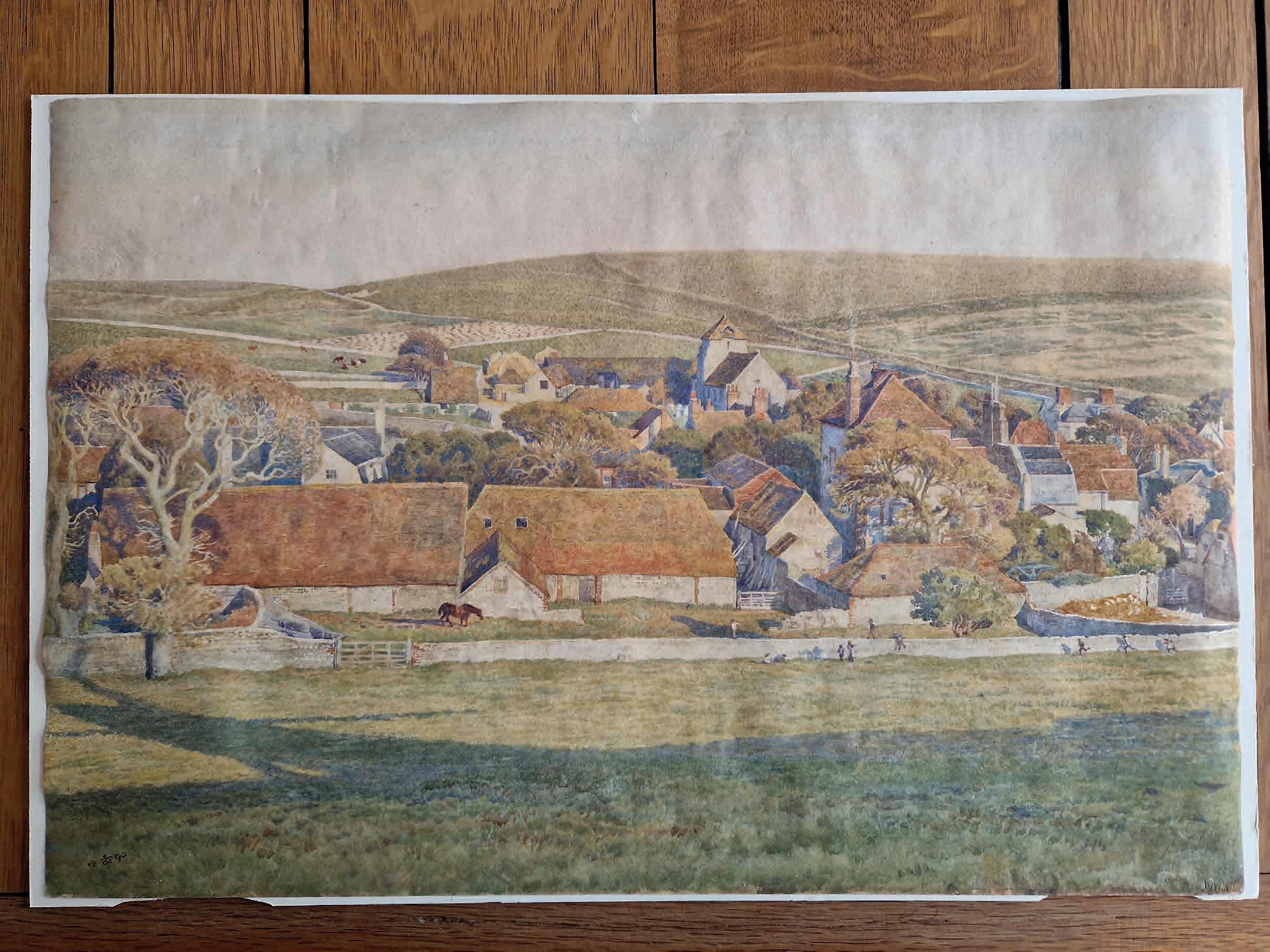
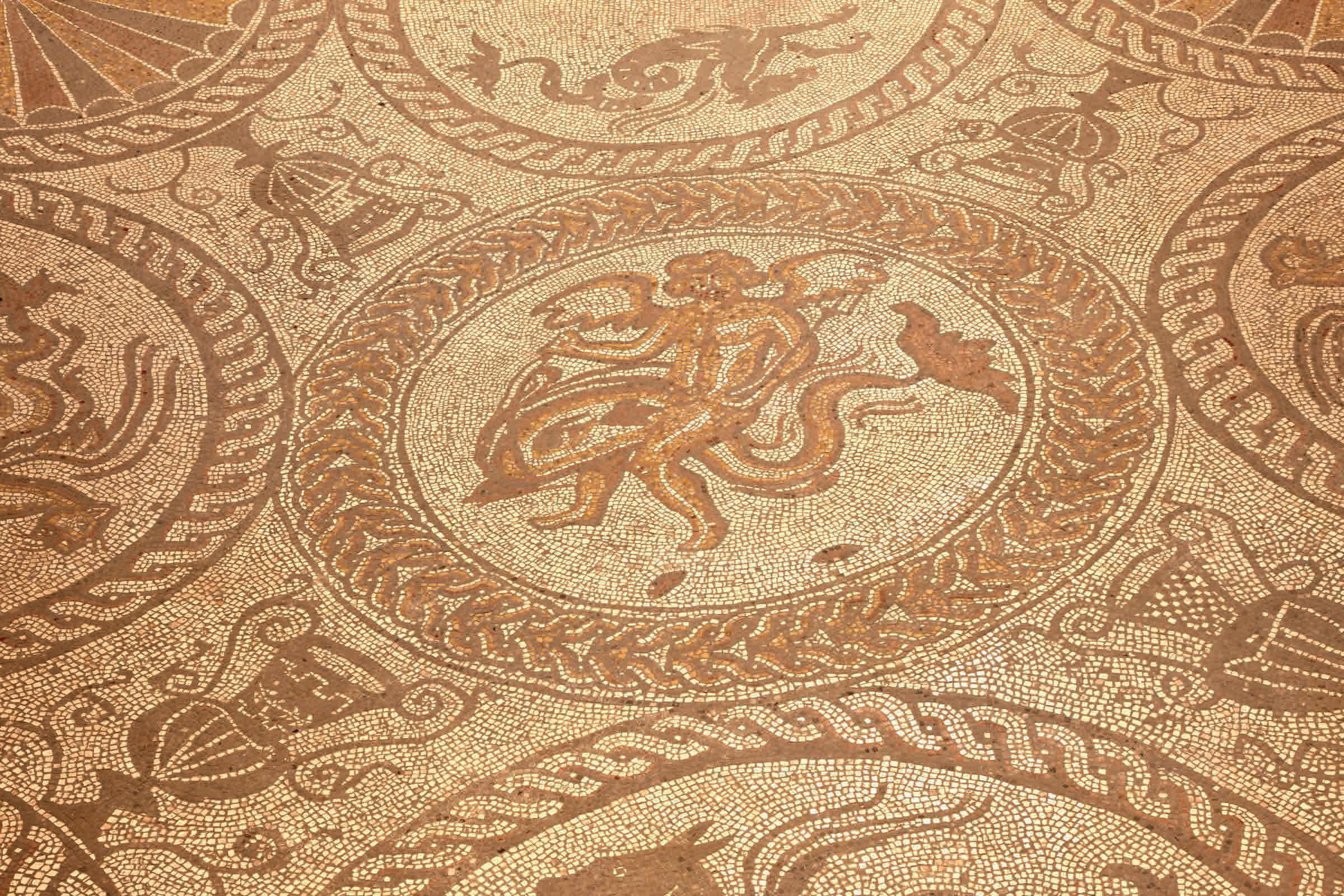
It was Emperor Claudius who sent 50,000 Roman soldiers our way, finally conquering what they called Britannia in AD43, nearly 100 years after Julius Caesar’s first forays. The lame, deaf Claudius, who ruled after Caligula and before Nero, only visited Britannia for 16 days, presiding over the capture of Colchester, then returning to Rome to boast of his victory. Always under threat from members of his own Julio-Claudian dynasty, he kept his post by killing senators left right and centre, until he, in turn, was murdered, by his own wife Agrippina. Oh it was a bloody, barbarian world.
But the Romans thought we were the barbarians! In fact, the word barbarian comes from the Greek ‘barbaros’, used to describe all foreigners, derived from the ‘ba, ba, ba’ which is what Greeks thought anyone speaking a different language was saying. Inheriting much of Greek language, wisdom and philosophy, Romans thought themselves terribly sophisticated. By the time they got here, Roman poet Ovid had already written Metamorphoses; Virgil, The Aeneid. Romans ate oysters, grew vines, spoke Latin. And of course, they had invented the mile.
The ‘mile’ is from mille passuum, or 1,000 (of) paces. I’d never tried counting 1,000 paces until I walked through Eartham Wood, near Slindon, along a section of Stane Street, the Roman road built in AD43 to connect Noviomagus Reginorum (Chichester) with Londinium (London). I thought counting out 1,000 paces might make me feel, well, more Roman. Along this stretch, the National Trust have cut back the beech woodland either side of what is now a straight stony track, to give a feel of the original breadth of the Roman road. If there’s an authority to a straight track in a more or less organically meandering natural world, you can feel it here. 1, 2, 3, 4, 5. You count a Roman foot, or ‘pes’ every time the left foot hits the ground, and five pedes make a passus or pace. So a mile is 5,000 Roman feet. 1, 2, 3, 4, 5 and on you go.
The full length of Stane Street is 91 miles. Now a stony track in Eartham Wood, elsewhere a greenway flanked in wild garlic, in Halnaker a tree tunnel. Sometimes it runs under the A29, at other times it vanishes completely or is only just visible under springy turf. You can trace it under centuries of human disturbance, deterioration and vegetation, but in Roman times it would have been a raised cambered trackway, or ‘agger’, 10m wide and 1.8m high, ditched either side for drainage and paved on top. And of a network of 2,000 miles of paved roads in Roman Britain, Stane Street was the first, because the Romans arrived in Chichester.
The Britons began to use Latin words and within a few generations had intermarried with Romans, their grandsons becoming Roman soldiers, Roman soldiers retiring to
become farmers and shopkeepers. It was Roman strategy to interbreed and ‘Latinise’ the people they conquered. Obviously, Boudicca didn’t lie down quietly, but in the face of an imperial force who produced the sexually explicit Catullus 16, written sometime between 84 BC and 54 BC, which includes the eye-widening ‘Pedicabo ego vos et irrumabo’ (I won’t translate here), it’s unclear whether any of the women stood a chance. The Romans were nothing if not extreme – sensual, brutal, romantic, practical, insecure yet all-conquering, violent yet so cultivated. Houses in Chichester had glass windows, mosaic floors and underfloor heating, yet their owners murdered their relatives.
And how those houses must have impressed the indigenous population. All imperialists must be propagandists, and Romans were the best at it. They used architecture and literature to dazzle their vanquished subjects. Just as Lutyens built New Delhi on an inhuman scale and Kipling was employed during WWI to ‘spin’ the Raj, Ovid and Virgil were employed to connect the imperial family with the gods, weaving linked narratives of nature and mythology with the lineage of emperors. And just as the introduction of Mediterranean fallow deer demonstrated what magical control the Romans had over nature – though the deer became extinct after the Romans left and were only reintroduced by the Normans – highly decorated Roman villas such as West Sussex’s Bignor and Fishbourne Palace were built to impress locals who were still living in mud huts. The Britons must have been knocked out, it must have been as if aliens had landed, or indeed gods.
The Romans stuck around for another three and a half centuries until the fall of the Roman Empire. They exported natural resources like copper, tin, silver and gold, traded men, women and children as slaves and built their cities, their aqueducts and viaducts and roads. But they left, and their roads fell into disrepair. The Britons went back to trackways until the 18th century, when engineers once more began to create a web of paved roads connecting cities and towns across Britain. What remains of the Roman invasion? Language, the mile and blood, I guess, in you and me. Start counting. 1,2,3,4,5. It’s only 2,000 years. Perhaps the roads connecting modern Britain with the past are not so long after all.
Opposite
Cupid on a Dolphin mosaic at Fishbourne Roman Palace. Part of the floor of a grand villa built between 75 and 220 AD, and laid around 160 AD © The Sussex Archaeological Society / Sussex Past
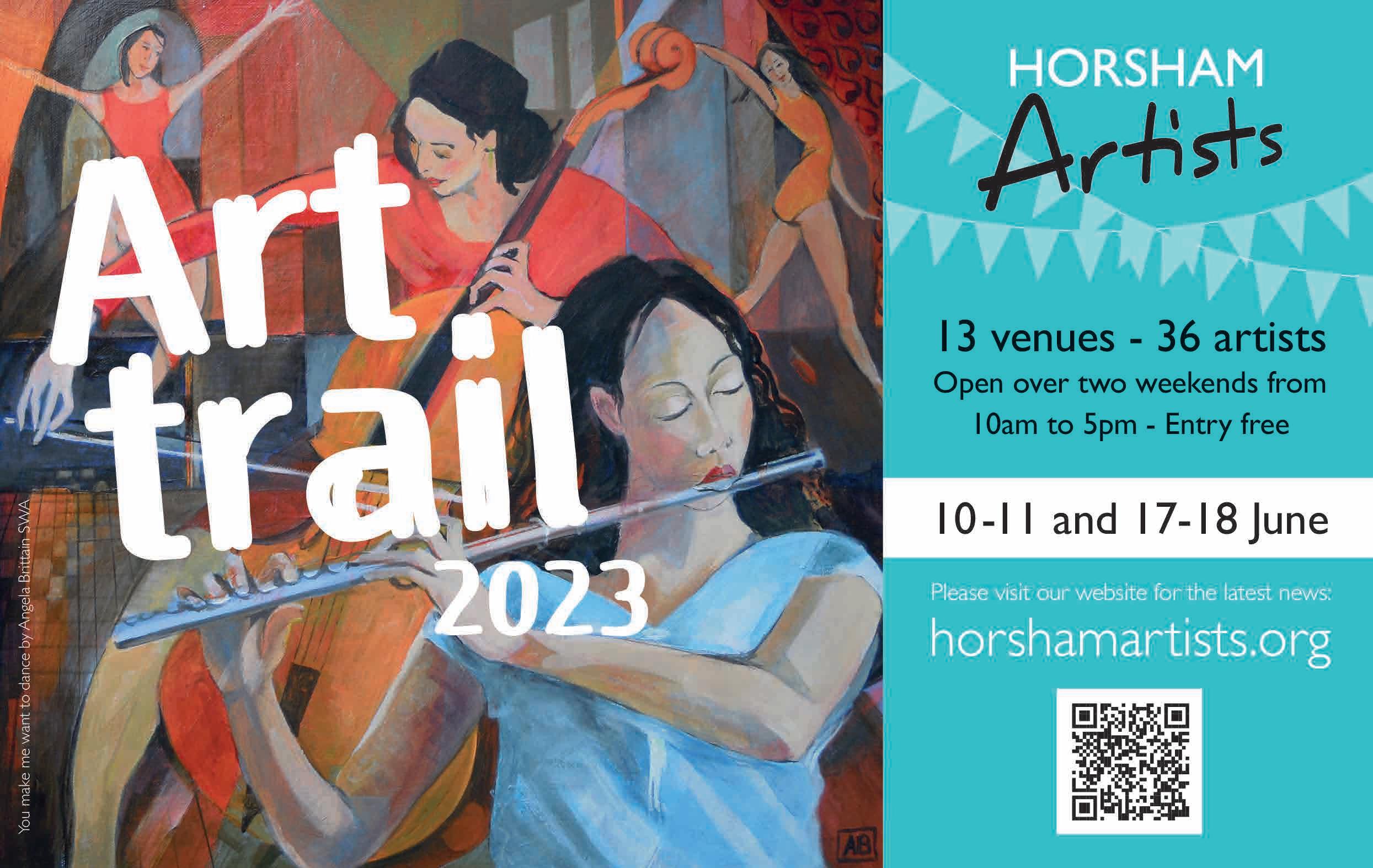
Katy Hessel’s book The Story of Art without Men attracted much critical attention and won the 2022 Waterstone’s Book of the Year Award. The title references EH Gombrich’s The Story of Art. She is horrified that when Gombrich’s book first appeared, in 1950, not a single female artist was mentioned. Even the 16th edition, published in 1995, included only one: Kathe Kollwitz (for some reason Hessel neglects to tell us her name). Hessel’s book comes with the endorsement of Tracey Emin. The 16th edition of Gombrich counters with Bridget Riley (born 1931). She writes: ‘The Story of Art was the first history of art which I read as a 19-yearold student. It was a revelation and I could not put it down. Written with love and scholarship, clarity and insight, it stands as a cornerstone in any appreciation of art.’ It seems that the absence of women in the book didn’t worry Bridget Riley in 1950, any more than it did 45 years later. And if you read Gombrich it will become quickly apparent why that is so.
Towner Eastbourne has been conducting its own investigation into suspected gender imbalance. Only 18%
of its permanent holdings proved to be of female provenance. Eighteen per cent doesn’t sound so bad to me, but it seems to alarm Towner. So much so that they have announced that future buying policy will ‘prioritise’ works by women artists. Whether this is entirely admirable or faintly ridiculous, a recent visit that I made to Towner suggested to me it was a policy that wasn’t going to be easy to implement.
On the second floor, as part of Towner’s centenary celebrations, there was a display of recent accessions. So recent, that many had never been seen before, according to the publicity. And never to be seen again, a cynic might suggest, in view of what sometimes seems Towner’s lessthan-wholehearted commitment to displaying items from their permanent collection. Most recent of all was the Oscar Thompsett 2023 bequest. Not a name known to me, but I have since been told that he was an engaging eccentric with a great collection based in, or near, Patcham. Twentyfour paintings lined the Towner walls. Three interesting works by Percy Horton: a self-portrait, a woman ironing, a view of the Dower House at
Firle. Lesser works by his brother. A couple by Thompsett himself. But the point is that of the 24 paintings, only two were by women. Not surprising perhaps, certainly not worthy of indignant comment. But even though no-one would advise against grateful acceptance of such bequests, it might well be that, as a result, the 18% figure proves surprisingly intractable.
The late Barry Humphries had, of course, more important claims to fame, but he was also a great art collector, especially of the works of Charles Conder. There is a curiously inverted view of the Brighton seafront by Conder languishing somewhere in the vaults of the Brighton Museum & Art Gallery. Best I can do for a Humphries Sussex connection. Like Oscar Thompsett, Barry Humphries was an amateur painter himself. So, as he once mused in his Spectator diary, how would he best describe his style? Somewhere, he tentatively suggested, between Winston Churchill and Adolf Hitler.
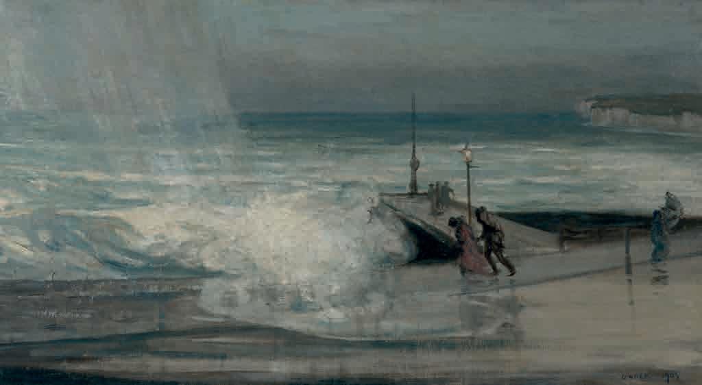
Many years ago, in an arts centre far, far away, I happened to be at a performance by Marvin Hanglider, the comedic alter ego of Sussex jazz pianist Mike Hatchard. There were classical favourites expertly mangled in the manner of Les Dawson, audience requests improvised in unfamiliar styles, some shenanigans with a violin, and then, for two excruciating minutes, a lushly perfect rendition of The Beatles’ Yesterday. Later on in the bar, while he indulged his other great gift of drawing pen-and-ink caricatures, I lectured him, with all the bluntness of youth, on how uncomfortable it is for an audience to wait in expectation of a punchline that never comes.
It’s disconcerting, to say the least, to be catapulted back into that memory as I let myself into the airy calm of St Dunstan’s Church in Mayfield, where I’ve come in search of The Resurrection Spirit, a stainless steel sculpture by British artist Maggi Hambling.
What I know of Hambling’s 3D work makes me think of her as a mischiefmaker, even a provocateur, creating whimsical and sometimes ill-judged large-scale pieces designed to challenge, disrupt or have a laugh. Her 1998 bench-cum-sarcophagus, A Conversation with Oscar Wilde, shows a cartoonish Wilde, cigarette in hand, emerging from one end of a granite coffin, apparently in hopes of a chat with a random passer-by. Deplored by art critics but popular with the public, it has the distinction of being London’s most frequently vandalised work of art.
More divisive still is The Scallop, a four-tonne, four-metre-high fractured steel shell, inspired by Benjamin Britten’s opera Peter Grimes and installed on the beach at Aldeburgh in 2003. Hambling is on record as saying, somewhat disingenuously, in my view, that it would be complete “when somebody climbs up on it to sit down and watch the sea, or when a couple creeps in underneath it to make love” – presumably the very activities that primarily concern the many for whom it outrages public decency just by being there, blocking the hitherto unspoilt seascape.
As for her most recent public art work, A Sculpture for Mary Wollstonecraft, Hambling styled it out in the face of stinging public reaction, including such barbs as ‘mad’, ‘insulting’, ‘disrespectful’ and ‘catastrophically wrong’, by insisting it ‘encourage[d] a visual conversation’ – a dialogue promptly shut down by the formation of Women for Mary, a group dedicated to crowdfunding, as a replacement, a more representational statue of the mother of feminism.
But The Resurrection Spirit is something else entirely.
For one thing, it’s small, comparatively speaking. For another, it is daintily pretty. Suspended in the cavernous space under the vaulted ceiling of the St Dunstan’s chancel, the high polish of its thin-gauge stainless steel glints in the abundance of natural light, reflecting the rich red of the terracotta
tiles below in a melée of colour and texture not unlike Hambling’s oil paintings. The air wafting through the old building rotates it gently, calling to mind the small kinetic balance toys executives used to keep on their desks in the 1980s to inject some zen into office life.
It has wow factor, for sure, but as a metaphor for hope and resurrection the dove with angels’ wings it depicts is as challenging as a mass-produced Christmas decoration left up out of season. I had expected more from Hambling, a self-confessed ‘optimistic doubter’ about the existence of God: more scale, more controversy, more in-your-face wit. In short, I find myself holding my breath for the punchline.
Hambling has spoken eloquently about her relationship with the Christian church, and particularly with the traditions of Easter. The daughter of devout parents, her childhood memories include listening from the pews as her father read the lessons, and recollections of Good Friday as ‘miserable’ and ‘wretched’. In more recent years, as part of a reimagining of devotional practice on her own terms, she has made an annual Good Friday piece of work, often depicting the crucifixion either literally or metaphorically. The Resurrection Spirit might be regarded as the 2013 iteration of that discipline.
Knowing the context, I slip into a pew and try to will myself into the meditative frame of mind I imagine
the young Maggi Hambling having attempted on successive Sundays as her father spoke from the pulpit. It’s true that the presence of the sculpture draws the eyes upwards, and modern neuroscience tells us that when we look above the level of the horizon, we stimulate the area of the brain associated with spiritual and imaginative activity, and the dreaming state.
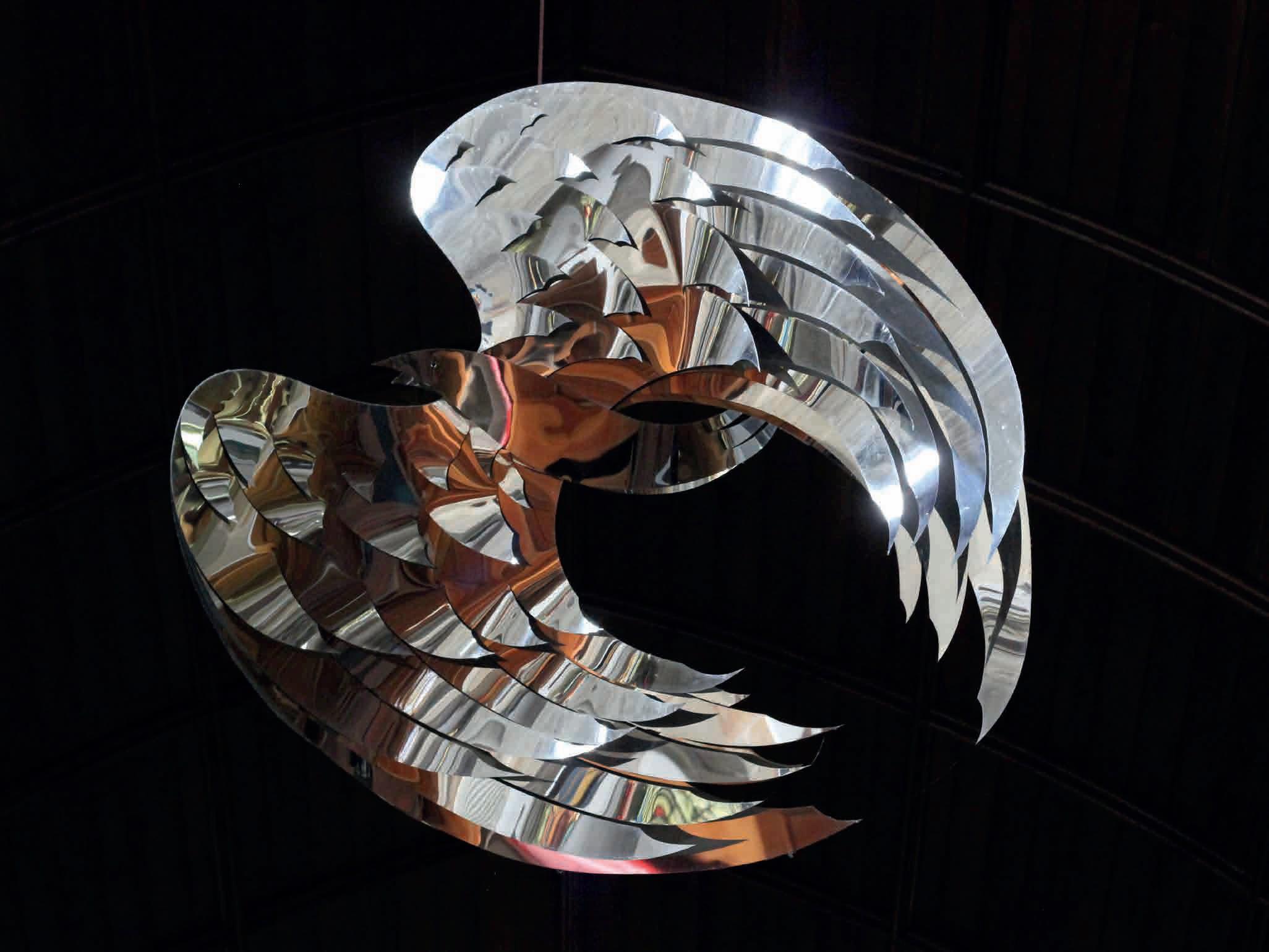
As I sit in the quiet church watching dust motes dance through the gently coloured light, an older memory surfaces of daydreaming as a child in school, and wishing I could be lifted up through the classroom windows and out into the sky beyond. I can believe that a creative child obliged to listen to bible readings week in, week out might
very easily end up imagining herself as a magical bird of great beauty, poised for flight away from tiresome surroundings. If The Resurrection Spirit had an inscription, as other Hambling sculptures do, perhaps it might quote Psalm 55: ‘Oh, that I had wings like a dove! I would fly away and be at rest!’
And perhaps that’s the joke, or perhaps the point of controversy. Hambling’s first and so far only church-based sculpture obediently follows the conventions of spiritual art while silently screaming ‘get me out of here’. At the very least, it is a study in ambivalence, its shininess a painful contrast to Hambling’s experience of the human condition: “You live in doubt and despair most of the time. It’s why you need a drink in the evening.”
Despite gloomy economic trends, the art market seems buoyant, defiant even, with the UBS report showing a 3% increase in turnover in galleries and auction rooms over the past year. Anecdotal evidence points in the same direction. Exhibitors I spoke to at Connect at Mall Galleries and Collect at Somerset House were pleased with sales. There were queues for ‘pack and wrap’ at the Affordable Art Fair in Hampstead, and sales were so far above expectations at Sussex Art Fair at Goodwood that it ran out of bubble-wrap. It is, it seems, a good time to spend it on art.
I’m starting this section with outdoor sculpture, which is bang on trend at the moment. More and more people, it appears, are investing in it... and enjoying its benefits. Gardens displaying artworks were a popular feature of both Art in Ditchling and Artists Open Houses, in May. If you visit Wakehurst, Standen House, Sussex Prairie Garden, Farleys House & Gallery, the Secret Garden Kemp Town or Arundel Wetland Centre, you’ll find that historic houses and wildlife parks across the region are installing art for visitors to enjoy al fresco.
Jessica WoodA woven architectural piece
Mark Antony Haden Ford, Reedbed Willow Sphere
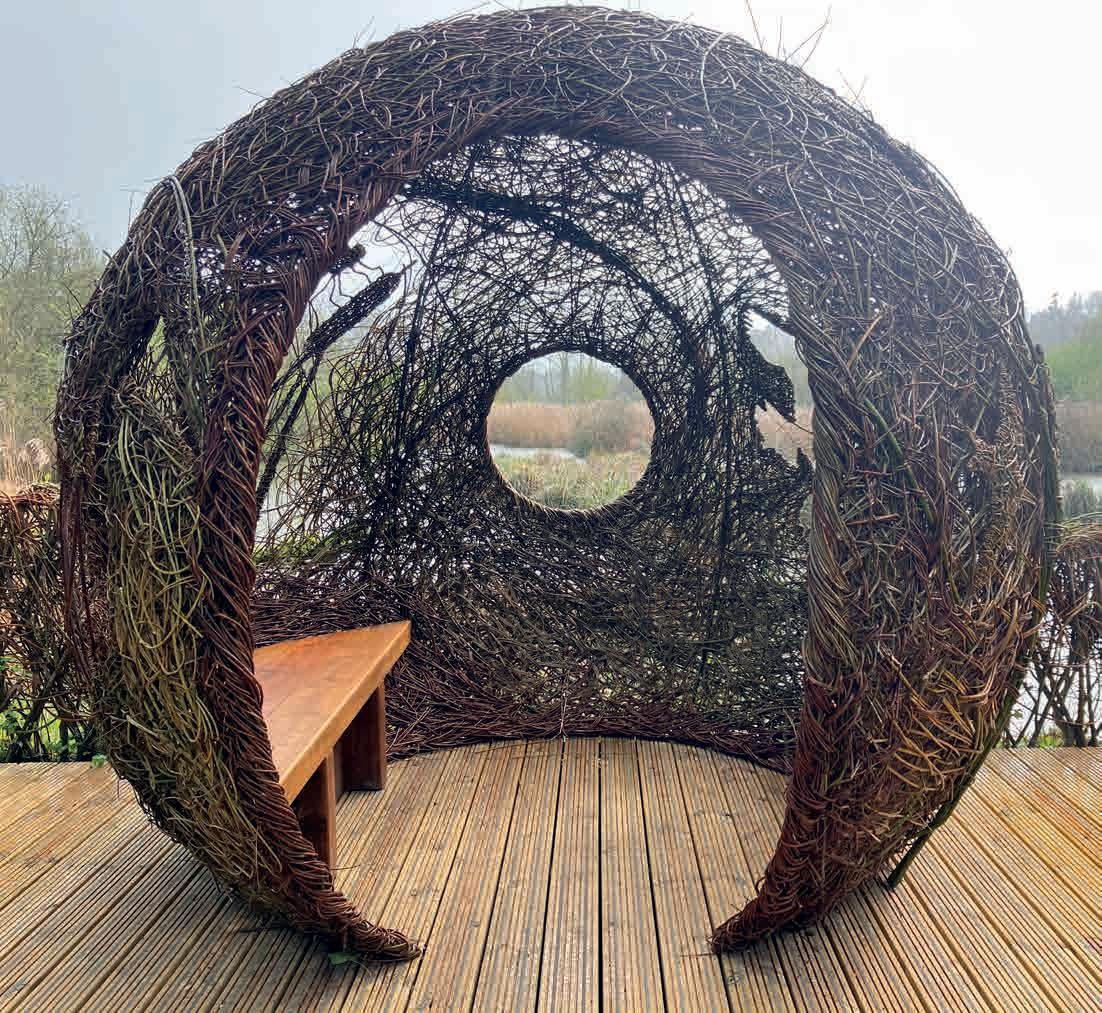
Arundel Wetland Centre
You can see more of Ford’s work on the Arundel Gallery Trail, August 19-28. Commissions start at £8,000. arundelgallerytrail.co.uk
A Sussex clay vessel
Lorraine Singer, Cracked Earth Moon Jar Vessel 24x32cm. £525
Handmade with stoneware and home-dug Sussex clay, Singer’s vessels are decorated with slip and poured glaze. On show at Expressions of Nature at Sussex Prairie Garden, June 1-Oct 15. sussexprairies.co.uk
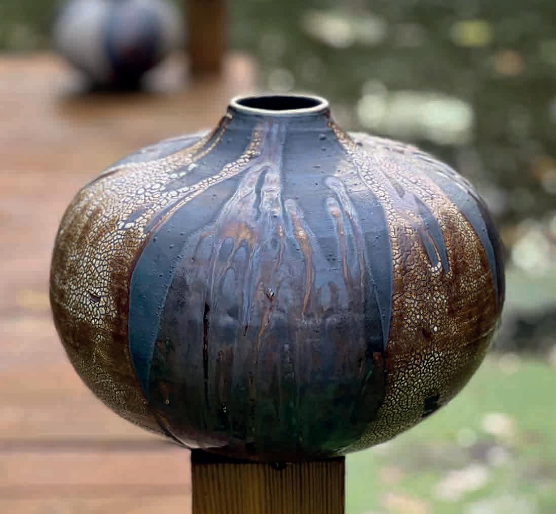
A contemporary standing stone
Benji Lowsley-Williams, Uncarved Block , 105x50x40cm Purbeck blue marble. £4,800
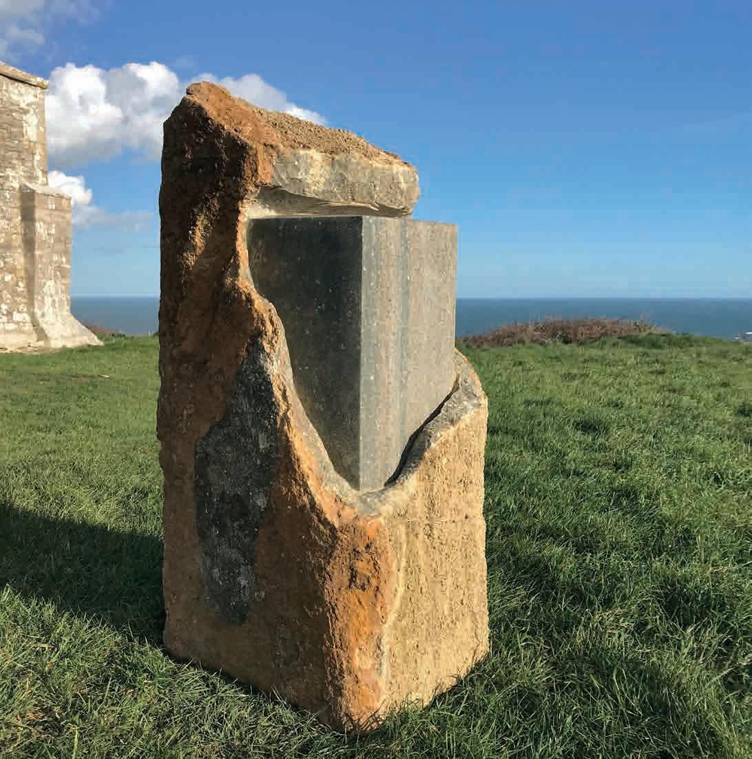
Exposing the inner beauty of the stone while respecting its raw form, Williams references ritualistic objects. moncrieff-bray.com
A celebration of natural forms Will Spankie, Torus. Blue Purbeck marble and oak plinth, 55x55x20cm. £4,995
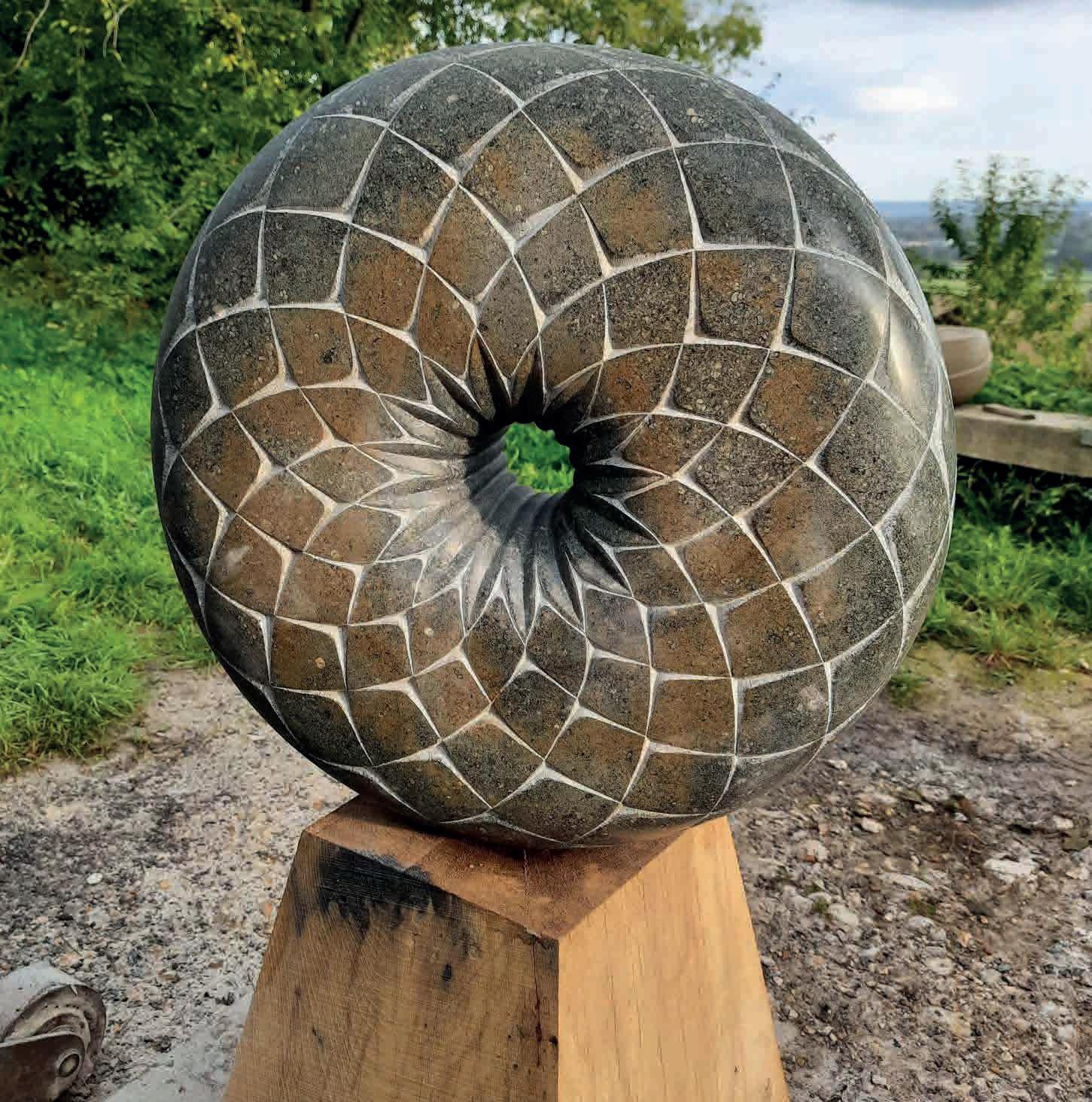
Spankie is interested in the geometric structures found in nature. He makes sculpture and lettering for public art commissions, as well as working with garden designers and clients on a domestic scale. moncrieff-bray.com
A dog on a pedestal Christine Kowal, Divinity, 2021. Gilded resin, oil colour. Edition 1/10. Including oak column: H 3.05m. Without column: 55x23x28cm. £4,000
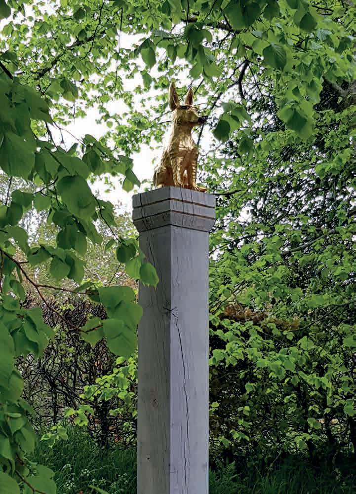
Kowal’s sculpture celebrates the role dogs have played in many cultures for millennia. It can be seen on its 3-metre column in the garden of Farleys House. The dog also comes on a hand-carved console to be wall hung. farleyshouseandgallery.co.uk
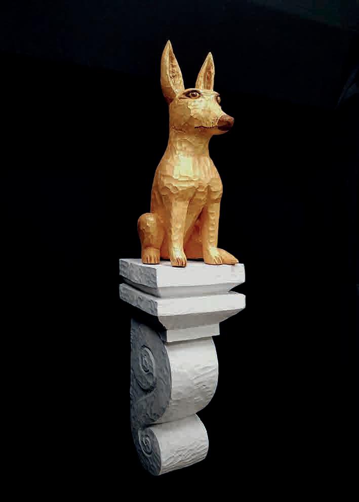
 Paul Vanstone, Onyx Head
Elspeth Bray began her career in the exhibitions department of the V&A and then worked as an art journalist for 15 years as Deputy Editor of Apollo and Art Market Correspondent for The Art Newspaper. After moving to Sussex with three young children, she began curating exhibitions in restored farm buildings behind her family home. Eighteen years later the Moncreiff-Bray gallery and sculpture garden is on the map as one of Britain’s first rural galleries and a fixture in the blossoming Petworth art scene.
What are the best materials for outdoor sculpture?
Almost any material, although obviously wood and iron will degrade. Stone comes in so many forms, it is millions of years old and is a wonderful material lined with striations, fossils and natural faults. The carver’s skill will reveal its different facets, whether it is polished, left rough, worked back into or a combination of all these. It must be frost-resistant so alabaster and soapstones are out. Bronze is a hugely popular medium and virtually indestructible, as the survival of Han dynasty bronzes confirms. A cheaper alternative is bronze resin or cold-cast bronze where bronze powder is added to resin and poured into a mold. It looks indistinguishable to bronze, but resin will feel very different to the touch and is a fraction of the weight. Glass, stainless steel, welded copper and corten steel are all popular materials, especially for kinetic sculpture.
Where should sculptures be placed for maximum effect?
At the end of a vista or framing a view. Sculpture is also wonderful when placed beside water as it reflects back from the surface. It can look stunning against the sky, especially if it’s a moving design. But equally a small piece installed in a town garden will bring it alive. Lighting at night is also an important consideration. It is lovely to be able to see a sculpture from the house, but equally turning a corner and coming upon a piece in a special setting is remarkable.
What are the latest trends in garden sculpture?
There has been a resurgence in stone carving in recent years, perhaps helped by the very successful sculpture exhibition
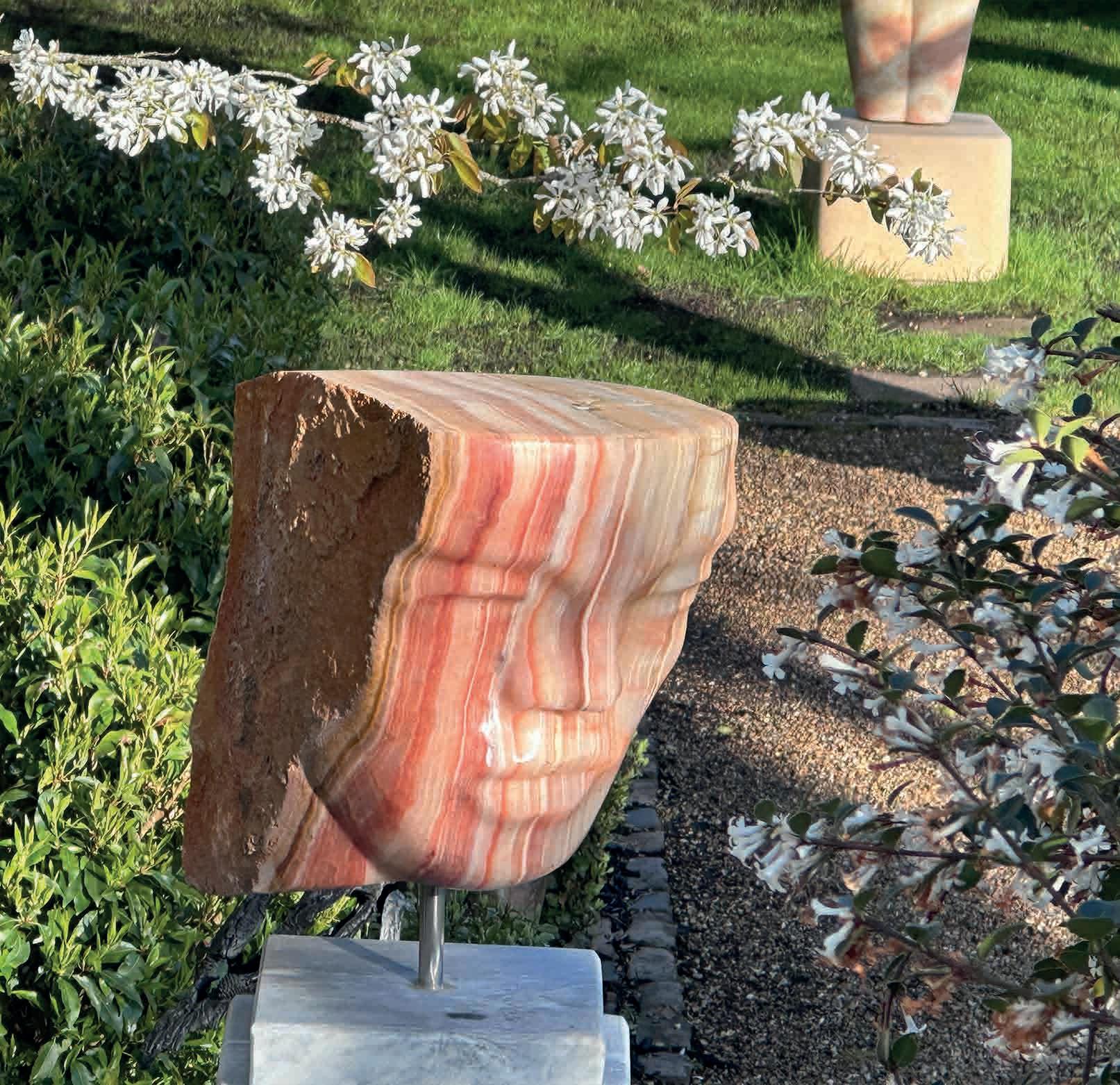
On Form at Asthall Manor. There are some incredibly talented British carvers such as Emily Young, Peter Randall-Page and Paul Vanstone. Cast sculpture created by modelling rather
than reduction is enduringly popular, especially for figurative work. And the British do love animal sculpture: witness the success of Nic Fiddian-Green’s horse heads or Hamish Mackie bronze pieces. Kinetic works are also really popular.
How much maintenance is needed?
It is best not to place sculptures directly under trees as they will acquire lichen very quickly and bird droppings are a problem. Most sculpture will benefit from a clean every three months and a light wax once a year to protect the surface.
What about theft and insurance?
Very little sculpture is stolen, and it is fully insurable provided it is securely anchored to a plinth or the ground.
How much should I expect to pay for a sculpture?
How long is a piece of string! Buy something you love and the best you can afford and enjoy it for the rest of your life.
Around the (auction) houses
bellmans.co.uk
June 20-22 Antiques & Interiors (Artworks, European Ceramics)
Aug 1-3 Antiques & Interiors (Artworks, Pictures, Prints)
burstowandhewett.co.uk
June 22 Fine Art & Sculpture
July 5 Homes & Interiors (Ceramics, Sculpture)
July 6 Homes & Interiors (Ceramics, Sculpture)
July 20 Antiques Sale
July 20 20th Century Design
July 20 Fine Art & Sculpture
Aug 31 Fine Art & Sculpture
gorringes.co.uk
June 5 (Ongoing) Weekly Auction: Pictures, Ceramics & Collectables
June 12 Weekly Sale & London Festival Opera Costume Sale
June 27 Summer Fine Sale
henryadamsfineart.co.uk
June 22 Antiques & Collectables
tooveys.com
June 8 Asian & Islamic Ceramics, Works of Art
Portrait of a Lady, after Lucas Cranach the Younger, 1962 Linocut in colours. Sheet: 27x22cm. £2,925
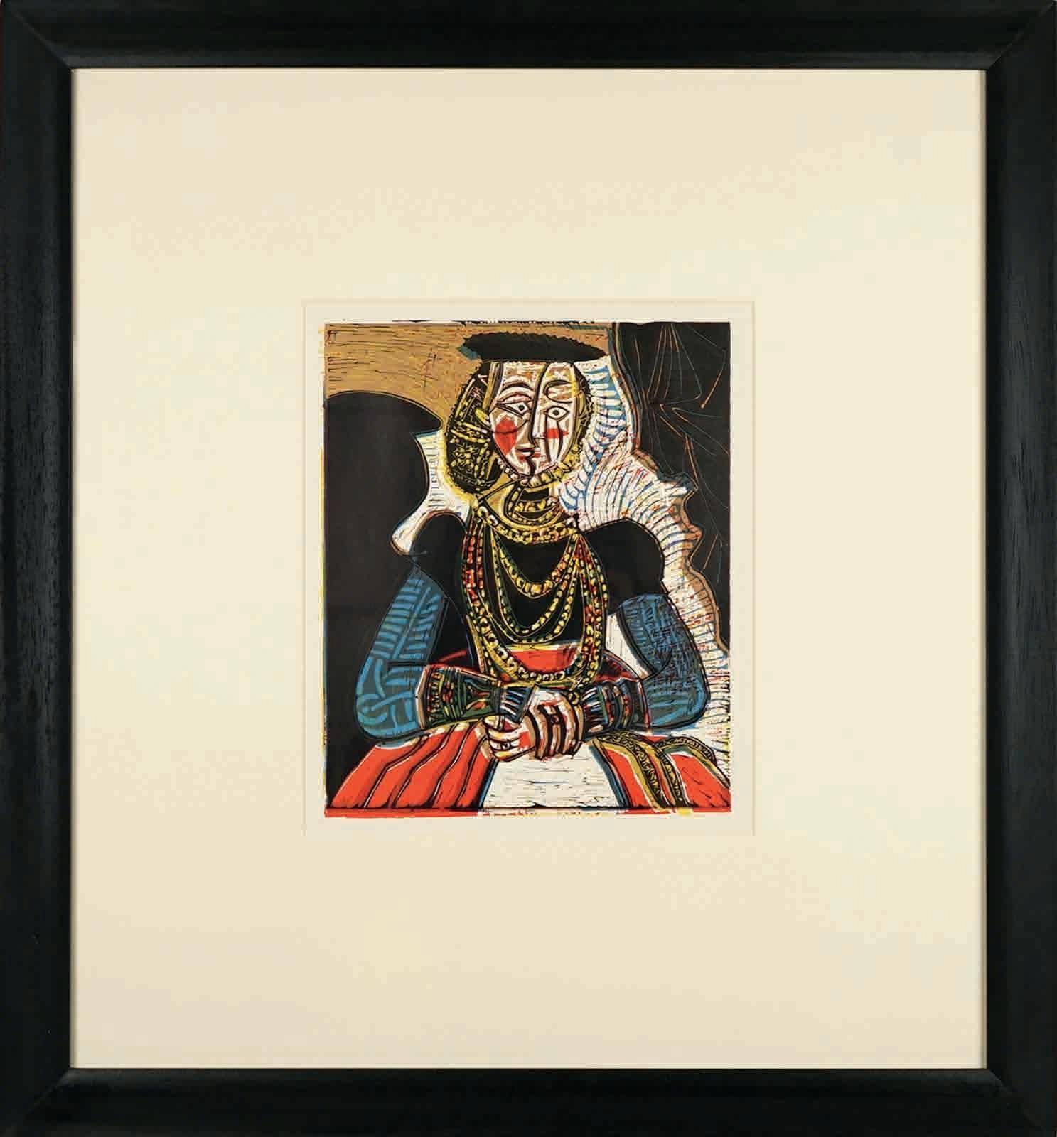
It’s surprisingly easy to get hold of an original Picasso at a reasonable price as the Spanish artist was a prolific printmaker up until his final days, creating multifold aquatints, etchings and lithographs. To commemorate the 50th anniversary of his death, Brighton’s Hidden Gallery are exhibiting – and offering up for sale – a considerable collection of his prints, as well as examples of his ceramic work and one of his palettes. The latter item was purchased directly from his granddaughter Marina Picasso, who inherited a fifth of his estate, including some 10,000 pieces, on his death in 1973. hiddengallery.co.uk
June 10-15 Tribal Art, Collectors’ items, Works of Art
July 12 Prints, Decorative Pictures
July 13 Collectors’ items, Works of Art, Textiles
Aug 3 British & Continental Ceramics
Aug 9 Decorative Pictures
Jacky Oliver’s monochromatic metal pieces swirl with energy and, as Ann Symes, director of Arundel’s Gallery 57, points out: ‘there is the added bonus of wonderful shadows with her linear sculptures’. Oliver studied at the Royal College of Art, and has exhibited widely, including the National Museum of Scotland and Collect at Saatchi Gallery. She makes pieces ranging in scale from hand-held objects to large architectural works. Flow II is available as part of the gallery’s summer show, Rhythm and Flow, alongside work by seven other artists and makers. Open until August 27. gallery57.co.uk
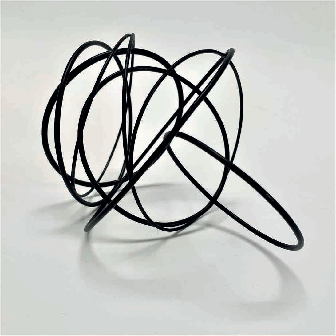
Painter David Storey trawls flea markets and charity shops for photographs of strangers. ‘Forgotten’ family snaps are the starting point for his highly collectable eerie ‘faceless’ portraits. Before turning to painting, he worked as the art director for Chrysalis Records in the 70s/80s, designing for its subsidiary 2 Tone Records, home to The Specials and Madness. Storey has been selected for the ING Discerning Eye Exhibition and has exhibited at Panter & Hall gallery, Saatchi Gallery and the London Art Fair, among many others. He works from his studio in Hove. A new series is for sale at Cameron Contemporary, Brighton, as part of their exhibition Festival, open until June 25. cameroncontemporaryart.com
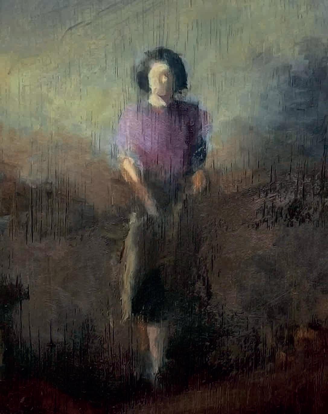
Then They Flew, fine art print
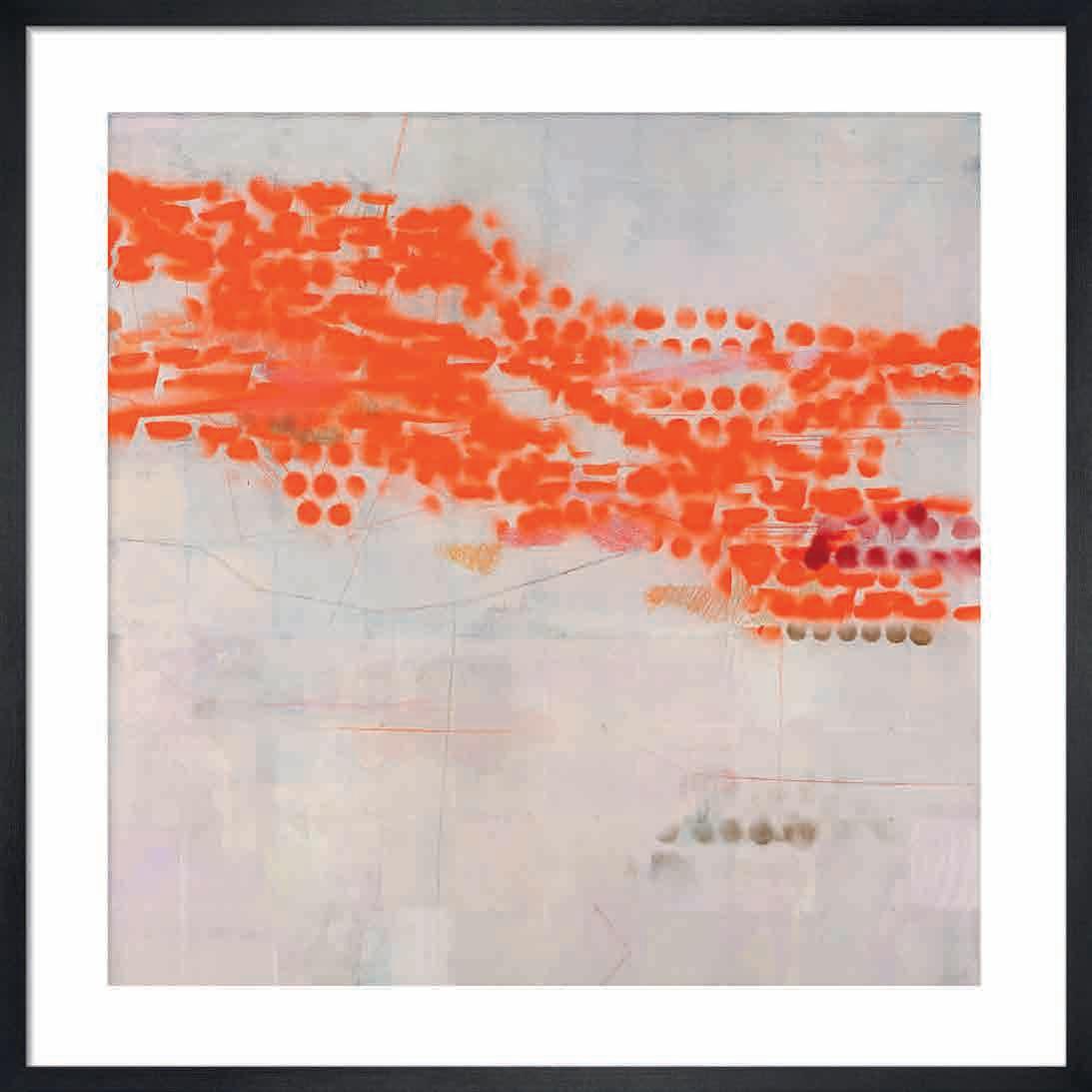
Framed, £120
As well as being principal sponsors of Turner Prize 2023 at Towner Eastbourne, fine art printer King & McGaw also champions many Sussex artists. This summer it launches a collection by Ele Pack whose work references the natural world using an abstract language influenced by the sea. Living and working in Brighton has given the images ‘an organic, fluid quality,’ she says. Four new prints are available exclusively at King & McGaw. kingandmcgaw.com
A painting by Alexander Johnson
Possible Daughter (after Velázquez), 2023. Oil and charcoal on canvas, 66 x 72 cm. Framed, £1,600
The paintings of Chichester-born artist Alexander Johnson are a reworking of historical paintings by artists such as Rembrandt, Velázquez and Zurbarán. Figures from iconic works are redrawn, and framed with blocks or strips of post-modern colours to create eyecatching images that pay homage to the great paintings, while adding contemporary perspectives. Alexander has exhibited at the Royal Academy, with the Royal Society of Printmakers and was shorlisted for the Jerwood Drawing Prize. He lives near Lewes. Head over to Arundel Contemporary to see Nexus, his latest exhibition, open June 3-July 2. arundelcontemporary.com
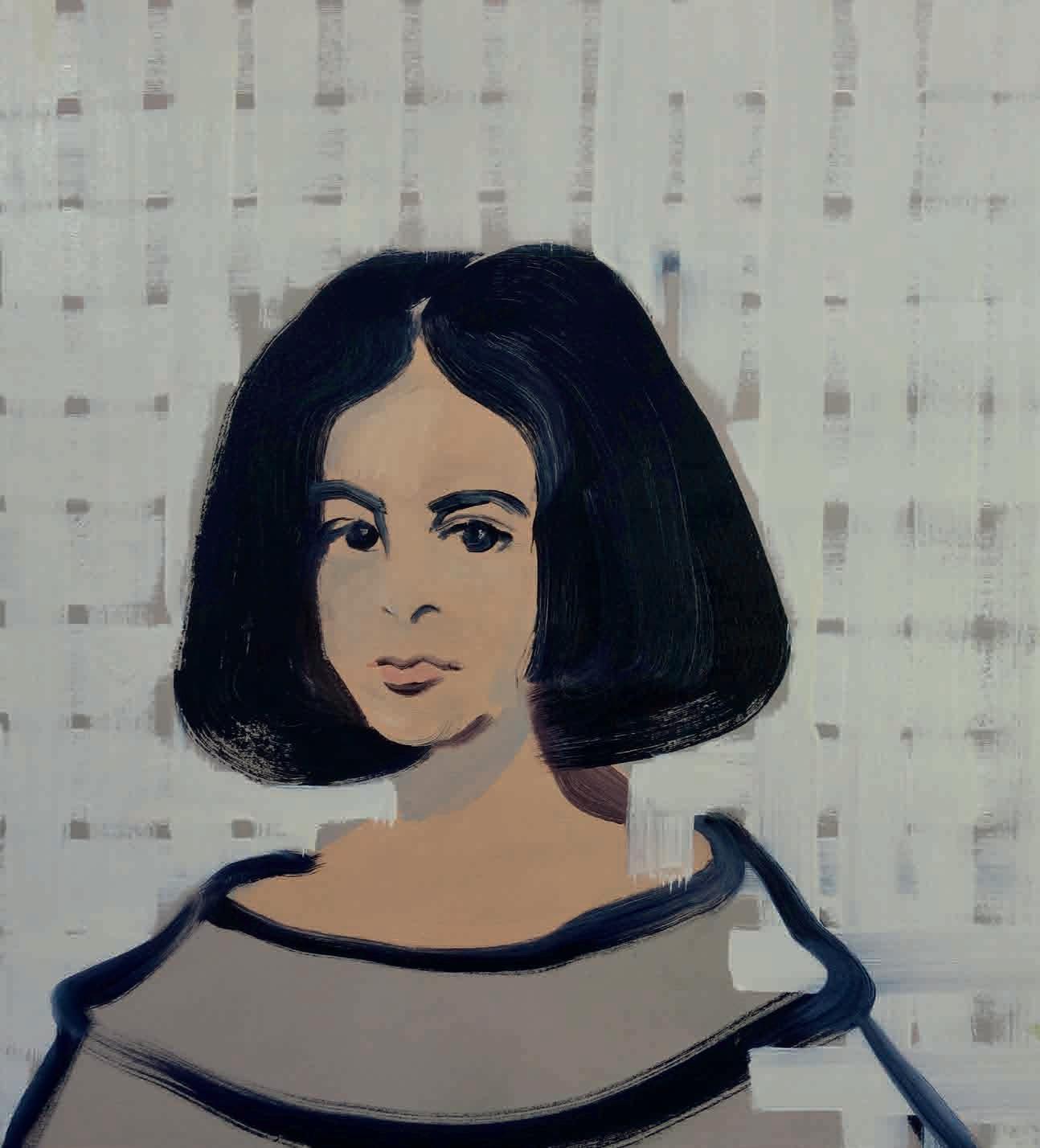
Sussex’s arts scene steps up a gear with the opening of three new commercial galleries
John Marchant Gallery, Brighton
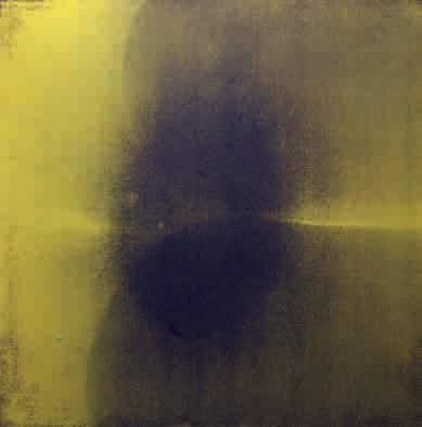
John Marchant describes the period when he ran artist Nan Goldin’s studios in New York and Paris as “a steep learning curve but an experience I would (and could) never trade.” It is Goldin’s influence that, he says, lies behind the ethos of his new gallery in Ship Street.
“Art is a deeply personal experience” continues Marchant, who brings together artists with whom he has long personal connections. On his roster are Jamie Reid, famous for the defining graphics of the Sex Pistols, French artist Fabrice Cazenave, Dutch artist Hans de Wit, New York photographer Alice O’Malley, Irish film-maker Vivienne Dick and Sussex painter Alison McKenna.
He is planning four or five exhibitions per year. The summer show features the late Genesis P-Orridge and Eric Heist. In the autumn there’s a centenary celebration of Brighton’s radical filmmaker Jeff Keen.
johnmarchantgallery.com
WIA Gallery, Lewes
WIA (Women in Art) opened a gallery this March in Fisher Street, Lewes, championing contemporary female artists. The project was started as an online platform in 2016 by Sarah Norris, who wanted to offset the gender imbalance she observed in the visual arts.
The upcoming programme includes Olivia Bullock and Lisa Jones (a previous ROSA cover star) with Empty Things and Open Spaces until June 24. In July, Norris is working with a collective of UK-based women artists with cultural roots from across the globe called OtherLandz. Look out for a solo show by Neo-Naturist Jennifer Binnie at the end of the year.
WIA Gallery offers works in a wide price range. Helen Hockin’s limitededition prints are £200. Tamar Payne’s bright, beautiful collages are around the £250 mark, while Nessie Ramm’s works command around £12K. The online gallery shop gives you the full picture.
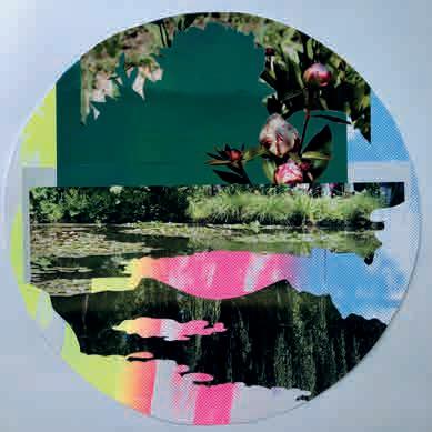
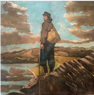
wearewia.com
Weald Contemporary, Ford
Jump on a train to Ford (near Arundel) this summer and a few moments down the road you’ll find Weald Contemporary, a new gallery sited in a converted barn with a beautiful courtyard, adjoining artists’ studios and a gallery shop.
Describing her motivation for setting up the gallery, director Holly Fox-Lee says “The whole of Sussex is operating at a nationally significant level when it comes to art, so we know it has never been more important to provide a physical platform for artists to be seen and offered opportunities to engage with their audience beyond the confines of the traditional commercial system.”
Weald Contemporary will be hosting around eight exhibitions a year along with talks and artist-led events, as well as participating at fairs. The gallery represents established and emerging Sussex artists working in painting, drawing, sculpture, photography and textiles, with works for sale in all price brackets (£50 to £10K). The programme kicks off with a stunning show of oil paintings by Agnes Treherne, from June 10 to July 7.
wealdcontemporary.co.uk
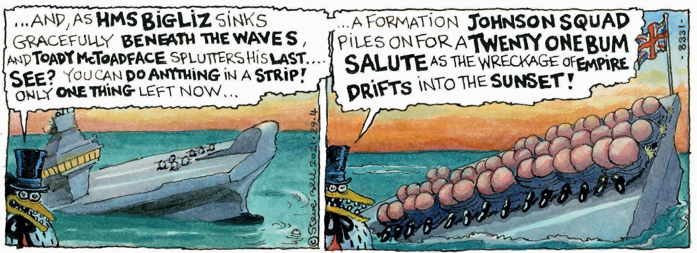
Steve Bell, a seventy-something bear of a man, answers the door with a big grin, makes me a well-brewed cup of tea, and leads me through his sizable Brighton townhouse and out through the garden to his ramshackle, lean-to studio. Here he has been drawing comic strips and political cartoons, for the Guardian , for the last 25 of his 42-year career at the paper. “It looks like two cartoonists have been having a paint fight in here”, I say, and he erupts into a flattering guffaw, the first of many over the next hour of conversation. “The roof’s started going, the table’s fucked, bits are falling off, dust gathers”, he replies. This is where the magic happens.
If you are a Guardian reader, or an ex Guardian reader, you will be more than familiar with Bell’s off-the-wall, satirical, left-leaning cartoons. He was hired in 1980 on the back of his success at Time Out, where he had created a strip called Maggie’s Farm , peopled by caricatured representations of Margaret Thatcher and her ministers (the subjects they ruled over were farm animals). He had also gained kudos for his inner-sleeve illustrations accompanying the Clash’s lyric-sheets for their triple album Sandinista (“I went to see them when they were recording it. Got stoned as a parrot.”)
His three-panel Guardian strip, If…, took off during the Falklands War, with a cast of characters – including a corrupt penguin, a street-smart cockney monkey, and an everyman sailor – who featured regularly afterwards throughout its 40-year existence, alongside Bell’s expletive-spouting French alter-ego, Monsieur l’Artiste. 40 years! That period saw seven different Prime Ministers in office, every one of them savagely lampooned in the strip: Thatcher with her rogue eyeball, Major with his underpants worn outside his trousers, Cameron with a condom over his head, Johnson, with an arse for a face… The Guardian finally axed If… in April 2021, more of which later.
In 1990, Bell was asked to take on an additional role at the newspaper, penning what he calls “the big ones”: single-frame leader cartoons for the editorial page, demanding a satirical view of the day’s main story. At the height of his productivity, he was creating four of these a week, on top of six cartoon strips: “that was a staggeringly brutal routine,” he says. “Plus four kids to bring up. Luckily, I thrive on a deadline.” Nowadays his output has been reduced to one or two ‘big ones’ a week, and he says he doesn’t know what to do with himself half the time, even though he has several projects on the go. “If you need a job done…” he says, “ask a busy man. And all that.”
We go back to his childhood in Slough, where he grew up in the fifties and sixties reading “The Beano, The Dandy, The Beezer, The Eagle, occasionally. My parents used to take Punch. In 1968, when I was a late teenager, they gave me The Penguin Book of Comics, where I first encountered Robert Crumb’s Fritz the Cat. The scales fell from my eyes.”
He loved drawing cartoons himself, and went to art college, going on to study film and art at Leeds University, where he “went off the idea of being a painter.” Instead, he decided to become an art teacher, a bad move. He only lasted one year in the job: “I was so shit at it, I had to get out.” By now it was 1977: this was when he decided to become a professional cartoonist, encouraged by the success of his university mate, Kipper Williams.
There were a lot of rejection letters, but he eventually got a chance at IPC Magazines, working on kids’ comic titles such as Whoopee, Cheeky, Whizzer & Chips and Jackpot. “My first strip was influenced by the TV series The Six Million Dollar Man. About a kid who gets badly injured in a wreck: they rebuild him, but with his head on back to front... What was it called? Dick Doobie, the Back to Front Man.” He also did
unpaid work, including a strip for a Birmingham what’s-on magazine called Maxwell the Mutant. “It was about a bloke who goes into a pub and drinks a pint of mild ale that’s been tainted by radioactive fall-out, don’t ask me how. He turns into a mutant, every time it happens: one time he’s a punk, the next time he’s the Queen.” Like Mr Benn on acid, I venture. Another of those guffaws.
The next unpaid job, as the Thatcher era began, was for The Leveller, “one of those leftie news mags,” which gave Bell the chance to explore more serious topics: “I always wanted to do political comics,” he says. “I was quite political.” He wangled an interview with the news editor of Time Out , Duncan Campbell, who happened to be a Leveller reader, and knew his stuff. “This was my first real break.” Out of that conversation, came Maggie’s Farm, an excoriating send-up of the political characters of the day: Keith Joseph, Geoffrey Howe, Lord Denning, Willie Whitelaw. And, of course, Thatcher herself, scrawny-necked, goggle-eyed and recognisably a prototype of the If… version.
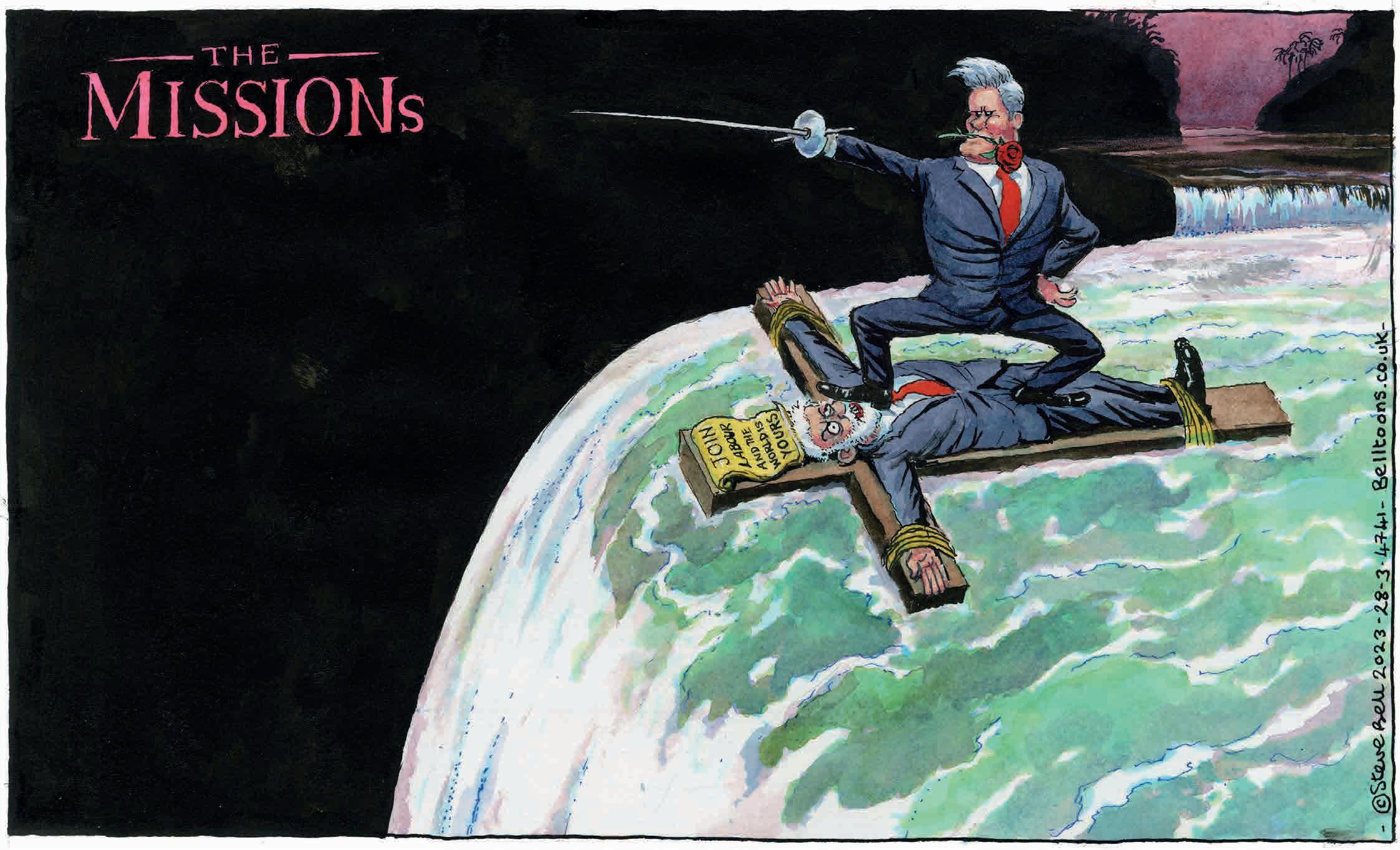
I indulge in an inward chuckle when Steve Bell tells me he was quite political. I have him down as a dyed-in-the-wool leftie, very much of the old-school variety. On the way through his house, I’ve spotted a copy of The Morning Star on his dining room table; during our conversation he’s revealed he’s been a member of the NUJ since 1978 (I proudly show him my card) and even a cursory run-through of his recent cartoons – which you can access on the Guardian website – reveals his political colours. The morning I write this piece, his latest ‘big one’ is a riff on the 1986 film The Mission, with Keir Starmer, a red rose between his teeth, thrusting a sword, floating vaingloriously towards the edge of a waterfall, standing on the supine body of a crucified Jeremy Corbyn. A caption attached to the crosscum-raft reads ‘Join the Labour Party and the world is yours’. It’s a long way from Maxwell the Mutant
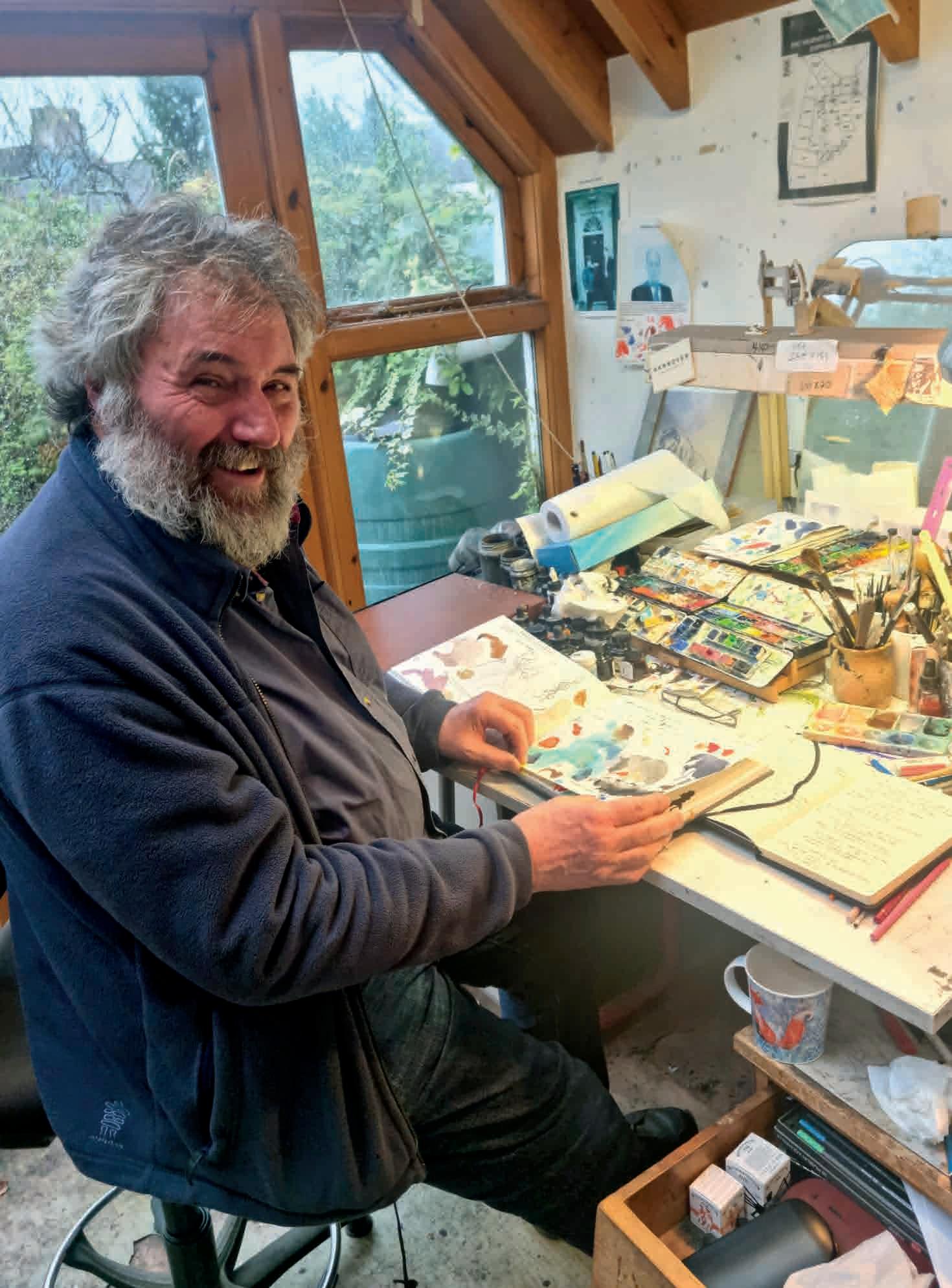
I ask him about the difficulty of coming up with fresh ideas, day after day, week after week, year after year. “Every time, you’re up against a blank page,” he says. “It’s you and that blank page and the blank page sometimes seems to be winning. But there’s always an answer somewhere. It’s like doing a puzzle.” Half the time he’s at his desk, he tells me, he’s working out what he’s going to draw. He does this in absolute silence. “I’m talking it through to myself – a narrative – performing it to myself, if you like. Once I’ve cracked it, I draw at great speed, even though I’m slowed down by holding my pen in a peculiar manner. Sometimes the speed you need to do it at makes you draw daringly in a way you wouldn’t otherwise try.” Of course, the whole game is somewhat hit and miss. “Sometimes it works better than others, but it has to work on some level. If you’ve got a good drawing, a laugh, and you’re making a point, then it’s win-win-win. But it doesn’t always work like that.” The hardest one to crack was the Dunblane massacre. “I mean, what the fuck do you do about that? It had to be quite stark.” Steve Bell’s influences date back to way
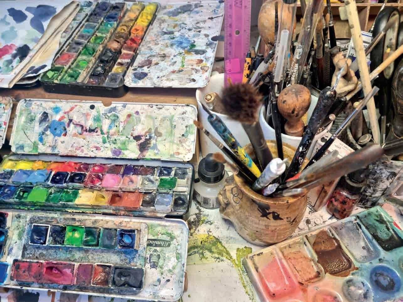
Next page
INTERVIEW: STEVE BELL
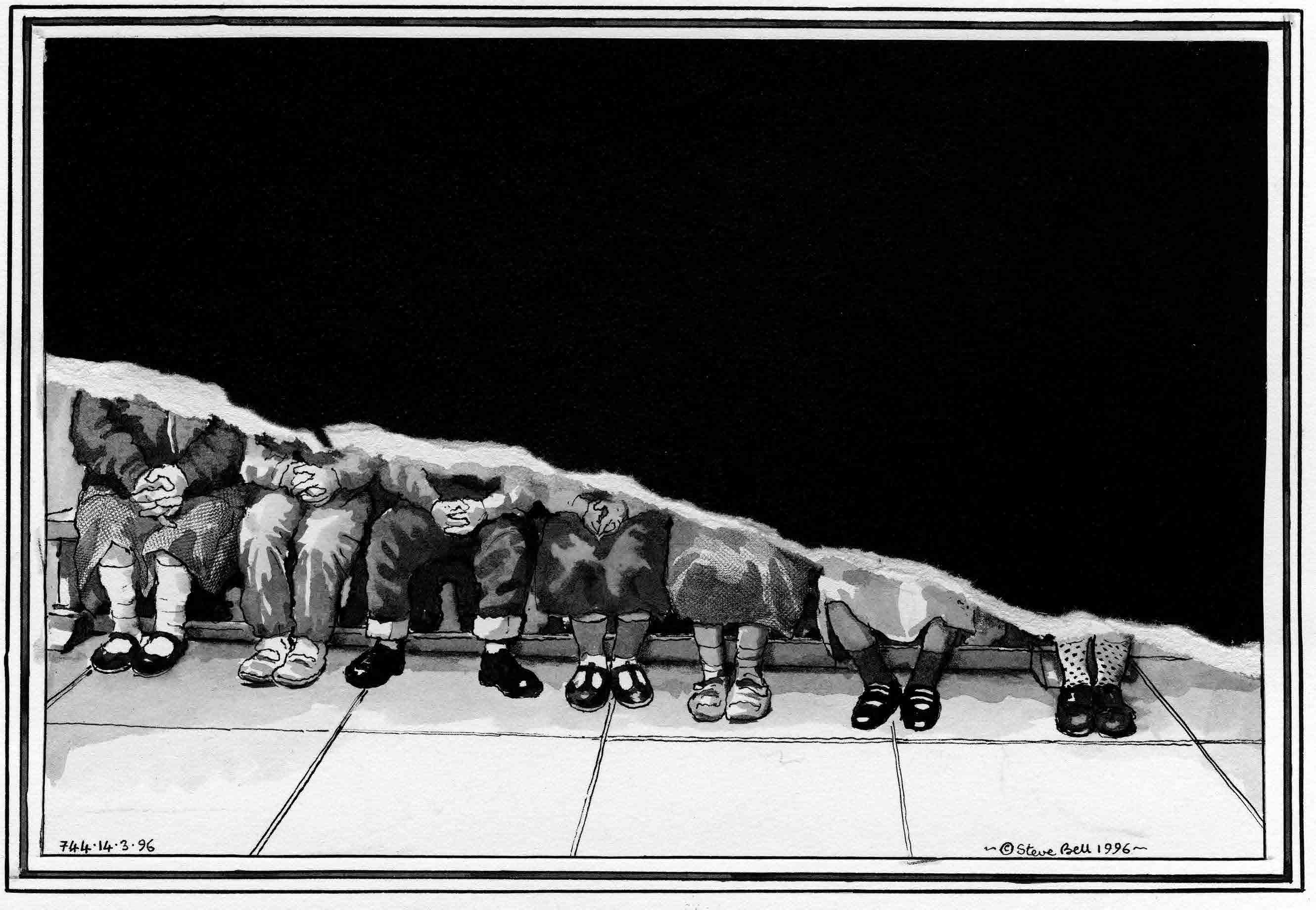
before the 1950s Beano. He’s something of a student, it seems, of the long history of English satirical cartoonery, from the days of Hogarth, “the first graphic novelist”. We get to talking about how censorship of political satire has been practiced as long as political satire has existed. He cites James Gillray, who, in the late 1700s, “set the standard for political cartoonery; he was making political statements in a time that there really was no freedom of the press.” Gillray, it seems, savagely satirised both George, the Prince of Wales, and his father George III: “he only got away with it because the King enjoyed the stuff that took the piss out of the Prince of Wales, and the Prince of Wales enjoyed the stuff that took the piss out of the King. The King tried to bribe [Gillray] to portray him in a less unflattering way. He took the money but didn’t stop doing it.”
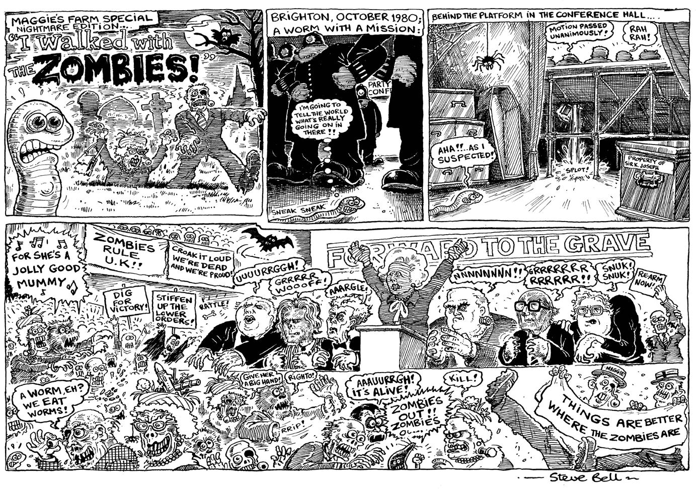
The next great political satirist, he tells me, was George Cruikshank, who in 1819 collaborated with the publisher William Hone to produce the pamphlet of his woodblock cartoons The House that Jack Built. “They printed thousands and thousands of them, this was where mass media really started. They eventually prosecuted Hone on a blasphemy charge. He was banged up for a bit, but he fought
them off three times. He contrived it so that he could read Cruikshank’s satires out loud in the court. And he eventually won. I think that’s where the expression ‘laughed out of court’ comes from.”
I wonder out loud how much Steve Bell has been censored, and accidentally-onpurpose open a can of worms. The nature of censorship, it seems, has dramatically changed. Nowadays it doesn’t come so much from on high, as from within “I need to self-edit,” he says. “I don’t want anyone else to edit my work… One reason why I’m doing less now is because something’s changed about The Guardian. It’s become much more cautious, much more interventionist. This particularly applied to the strip (If…). Nobody used to get hung up about what I produced, and no-one used to interfere. Then in the last few years I was getting more and more interventions, and more and more stupid interventions. It was quite insulting: effectively being edited for political reasons. My work was going against whatever party line they were pushing – something about the Labour Party and Jeremy Corbyn – and I was getting pushed back, with no rational explanation. That aspect of The Guardian has become more craven lately… There’s a kind of bureaucratic
groupthink going on, and it’s quite difficult to second guess it. And people will make the oddest enquiries about what something means. ‘Well, it’s a joke! It’s a metaphor!’ I’m not someone who’ll just roll over. I’ll argue the point.”
“Don’t you worry about telling me all this?”, I say. “I mean, won’t the newspaper mind you saying all this stuff about them?”
“Fuck ‘em!” Again that booming laugh, this time with a note of outrage. “If The Guardian worry about mild criticism like that, then God help them.”
Our hour is nearly up, so I ask Steve Bell about his future plans, while taking photos of the artist-satirist dipping his paintbrush into his watercolours, beaming a smile for the camera. He’s working, he tells me, on a book with a French friend, hopefully to be published alongside an exhibition at a cartoon festival in St Just-le-Martel near Limoges. The title is The Windsor Tapestry: “It’s going to be like the Bayeux Tapestry, but incorporating hundreds and hundreds of cartoons I’ve drawn, over the years, of the Royal Family – particularly King Charles an`d the Queen [Elizabeth]”. The royals are in for another roasting, then: Steve Bell has been gently and not so gently ridiculing them for more than 40 years, and they’ve provided him with plenty of material to work with. A knighthood may be deserved, but it doesn’t look likely any time soon.
I’m led back through the house, past that copy of the Morning Star , to the front door, and out into the drizzly afternoon. I wave goodbye to Britain’s greatest living political cartoonist, strangely elated. The spirit of Gillray and Cruikshank lives on, in a ramshackle lean-to in Fiveways, where I’ve just spent a hugely entertaining and insightful hour, peppered with those hearty laughs and liberal expletives. Bollocks, as Steve Bell might say, to ‘never meet your heroes’.

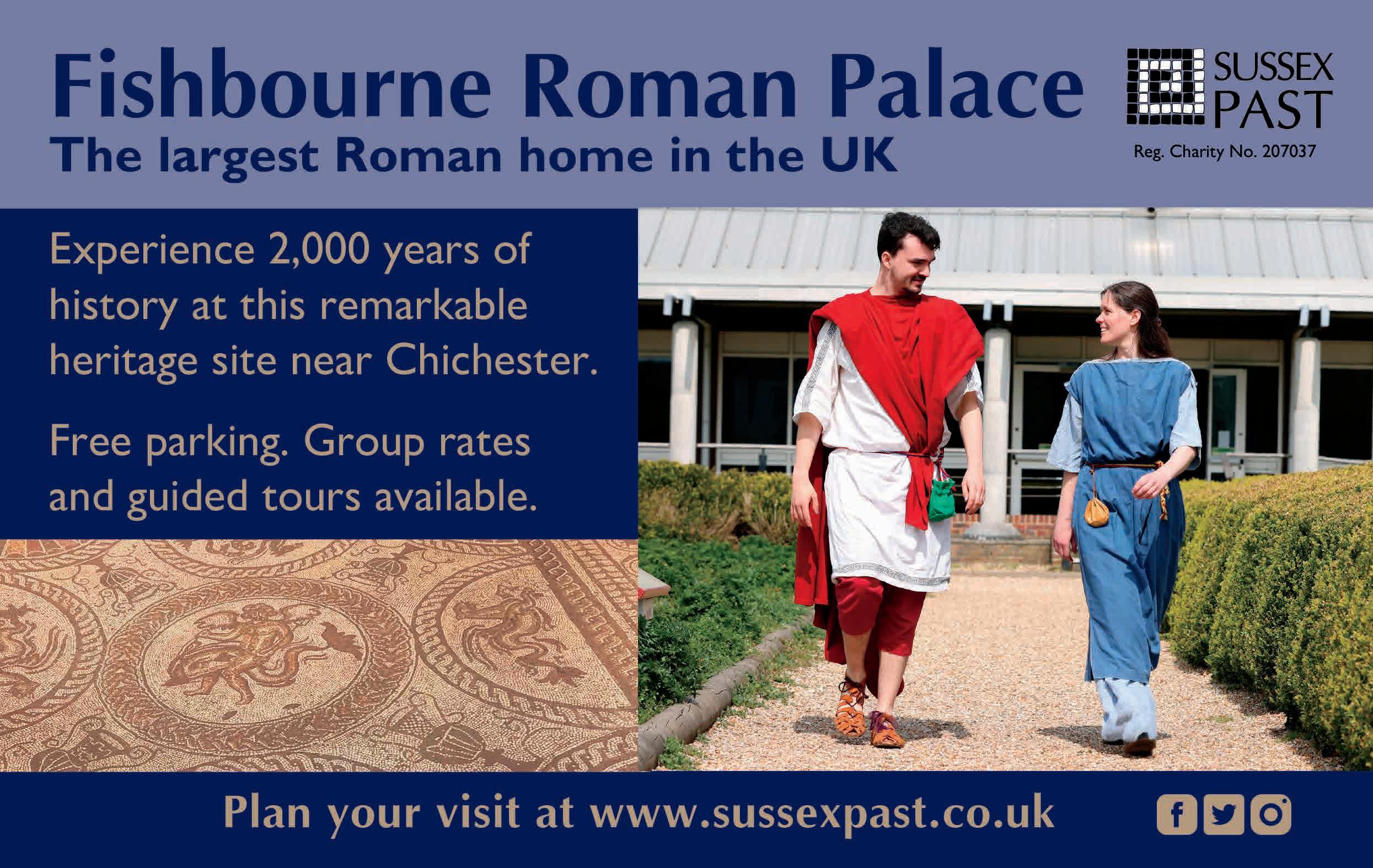
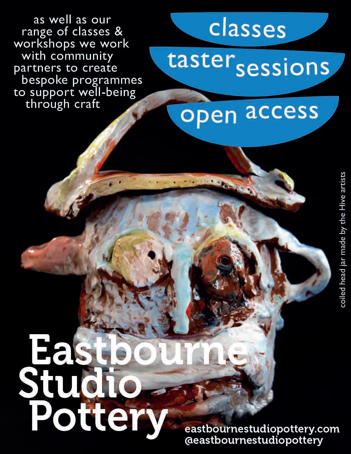
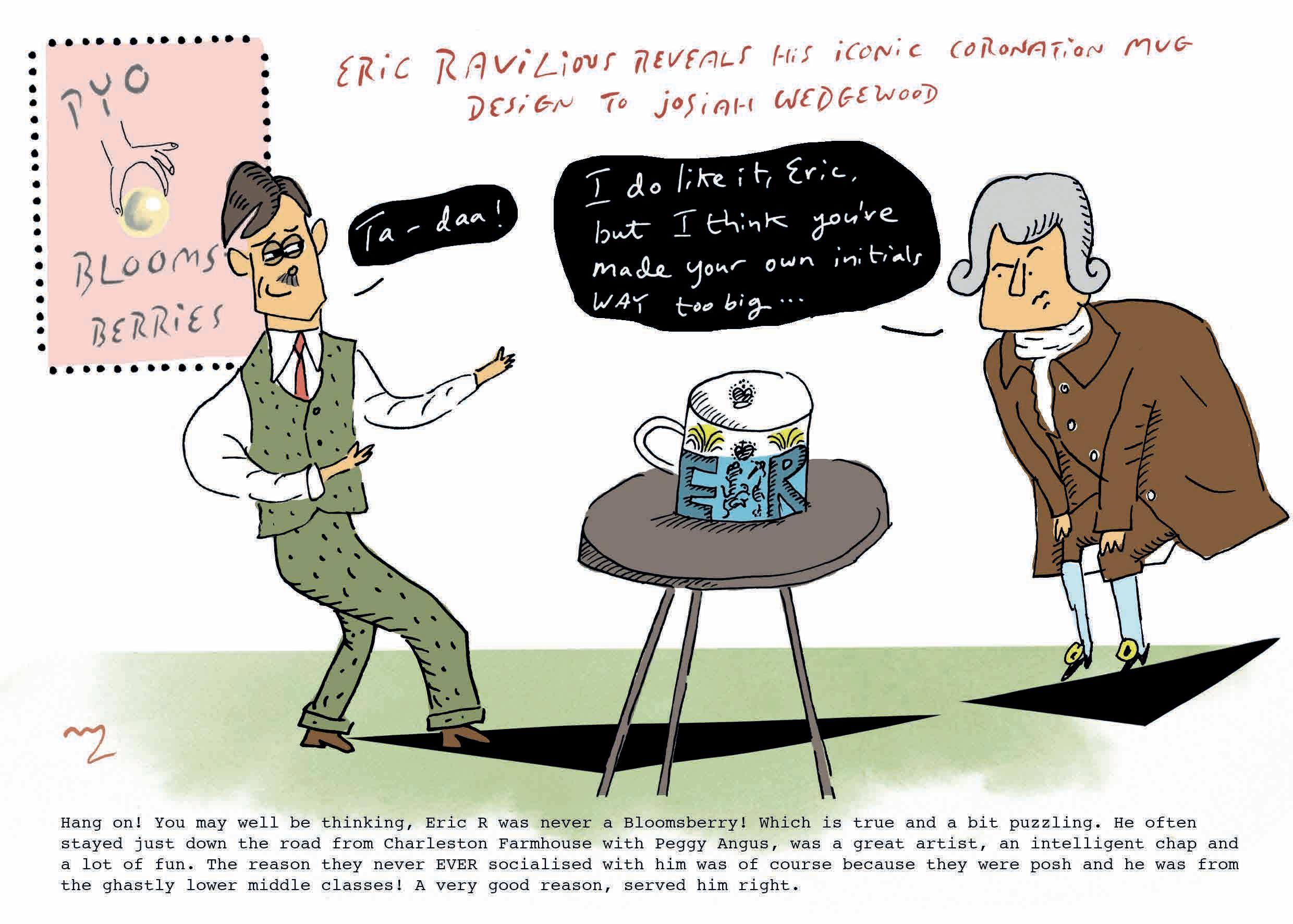
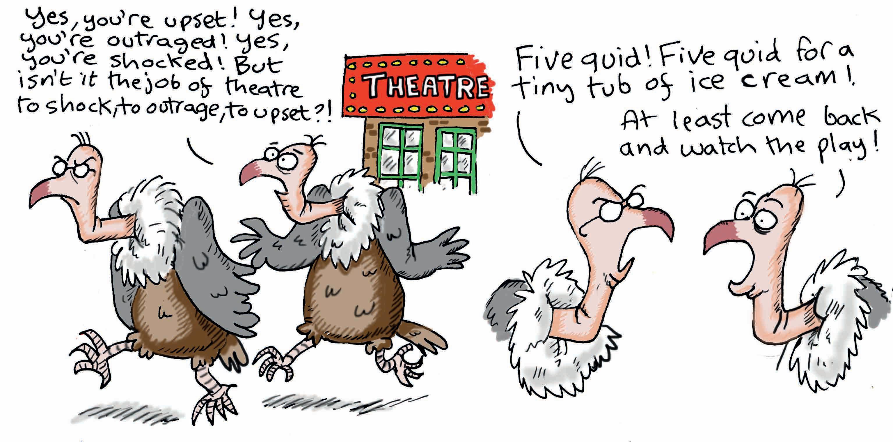

ROSA Magazine is sold at all the top arts venues across Sussex, the region’s major newsagents, as well as London’s leading art fairs. Please get in touch if you require help finding ROSA.
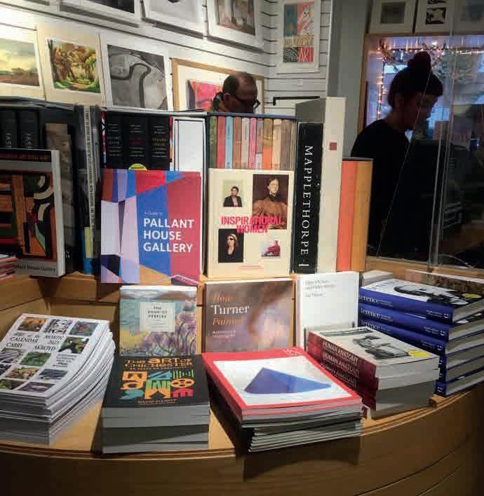
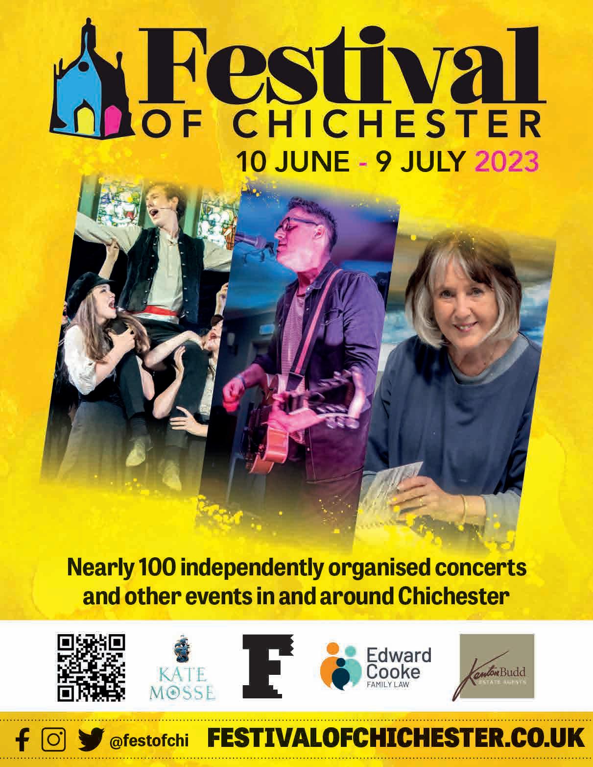
Alfriston: Much Ado Books Arundel: Arundel Contemporary, Gallery 57 Bexhill-on-Sea: De La Warr Pavilion Brighton & Hove: Brighton Museum, Royal Pavilion, Fabrica Chichester: Oxmarket Contemporary, Pallant House Ditchling:
Artelium, Ditchling Museum of Art + Craft Eastbourne: Emma Mason Gallery Hastings: Hastings Contemporary, Hastings Arts Forum Lewes: Alastair Fleming, Belle & Co, Charleston, The Laurels, Lewes Tourist Information Centre, Netwerks Cafe, Skylark Littlehampton: East Beach Cafe
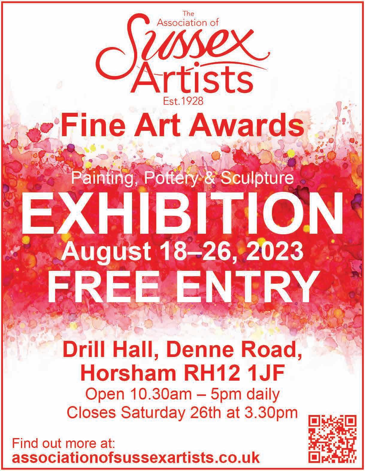
Petworth: Kevis House Gallery, Newlands House Gallery
Worthing: First & Last, Worthing Museum & Art Gallery
Contact oliver.collins@rosamagazine.co.uk
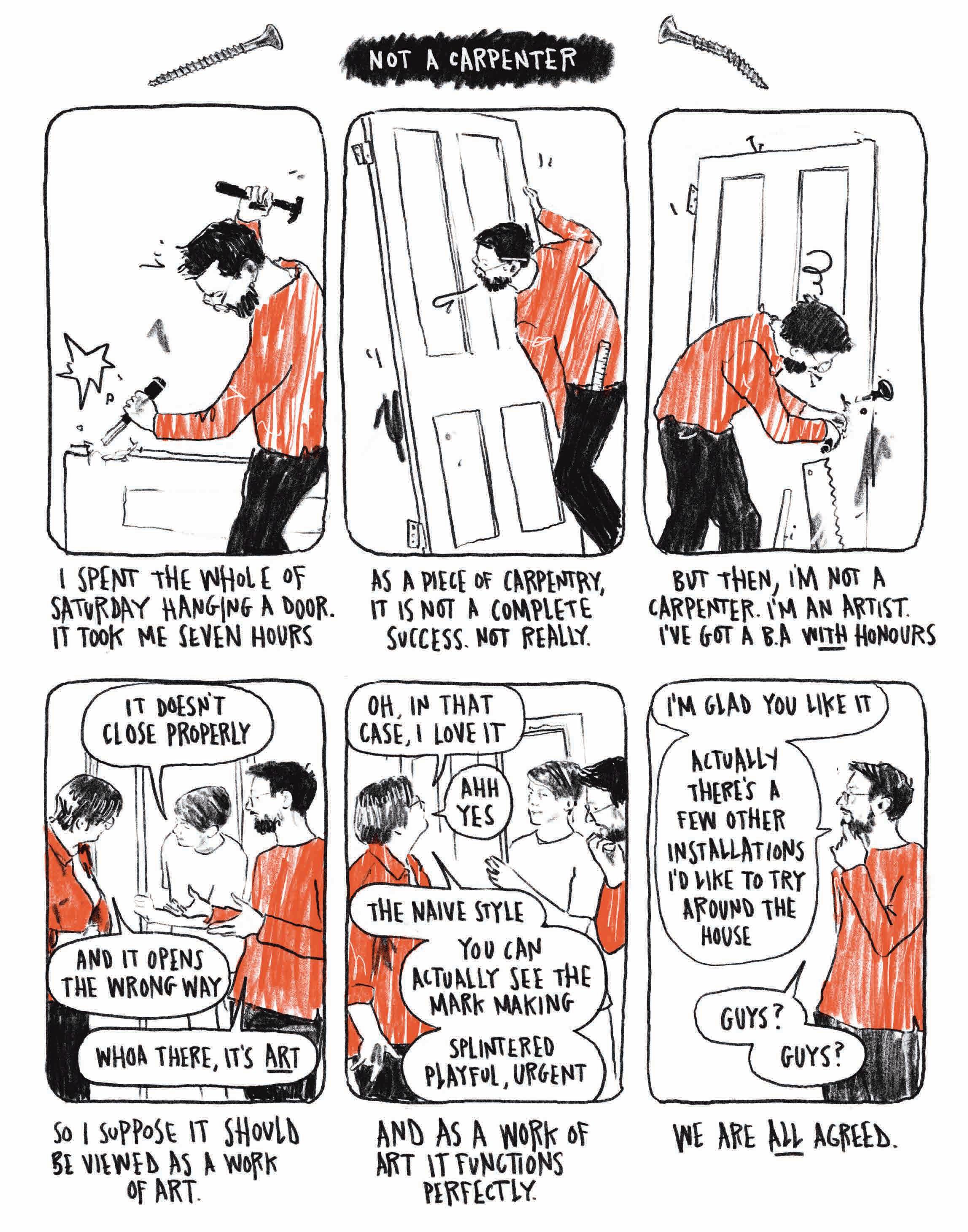
Participatory artists Leap Then Look invite you to actively explore and investigate an artistic process, prompt or question. These activities can be done alone or with others, by the young, the old, the newcomer, the experienced artist and anyone in between.
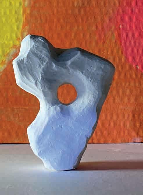

You don’t need specialist art equipment. The pair often use things they find outdoors or around the house and use their phones to take pictures and make videos.
If you are in Sussex you are never far from chalk. It lies beneath our feet, supports buildings and creates large parts of our coastline. Once so ubiquitous in schools, it has become something we use only on occasion and mainly for mark-making, but chalk is an amazing sculptural material. One of the best ways to find it is below the cliffs, freshly fallen in craggy lumps or smoothed into pebbles by the sea.
One of the things we really value in our work with other people is the journey an idea or material takes through the creative process. Every part is important, and documenting and reflecting on this can be as valuable to our practice as the final art work.
This is an invitation to consider the whole process of making a sculpture. There is value in going out and finding the right piece of chalk, photographing it in that location, then documenting the process of working into the material. This all builds our lived connection with what we make and what we make with. A slow process of coming to know what it is we are doing.
You may simply want to collect these pebbles. You might be drawn to the dimpled textures, or the ones with holes bored through them. If you choose to carve into them we encourage you to consider the shape and texture of your pebble and to work with it to find new forms.
Leap
leapthenlook.org.uk
Search for the right piece of chalk. Look for different shapes and textures. How does it feel when you pick it up?
Follow the shape, line and texture of your chalk. Work with it to come to a new form.
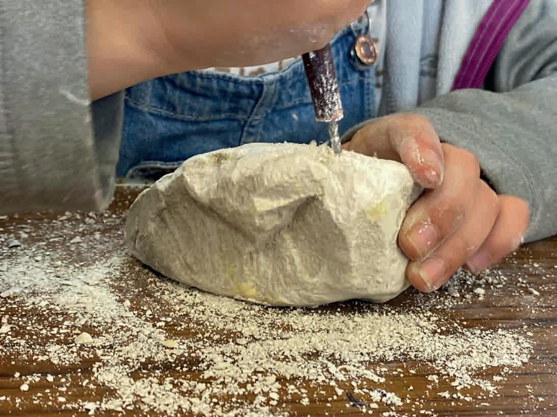
Use photography to look again at your chalk, the way the light hits surfaces and reveals different aspects. Make connections between it and its environment.
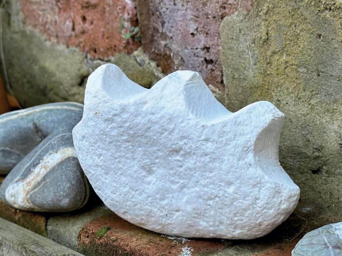
Get involved by posting your responses on Instagram using the hashtag #makingexperiments and tag @leap_then_look and @therosamag
Find a new place for your sculpture or return it to the place you found it. How will it be changed over time by the environment?
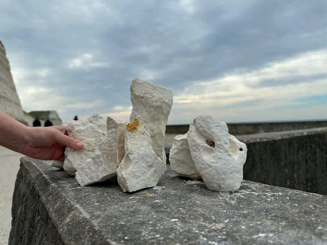
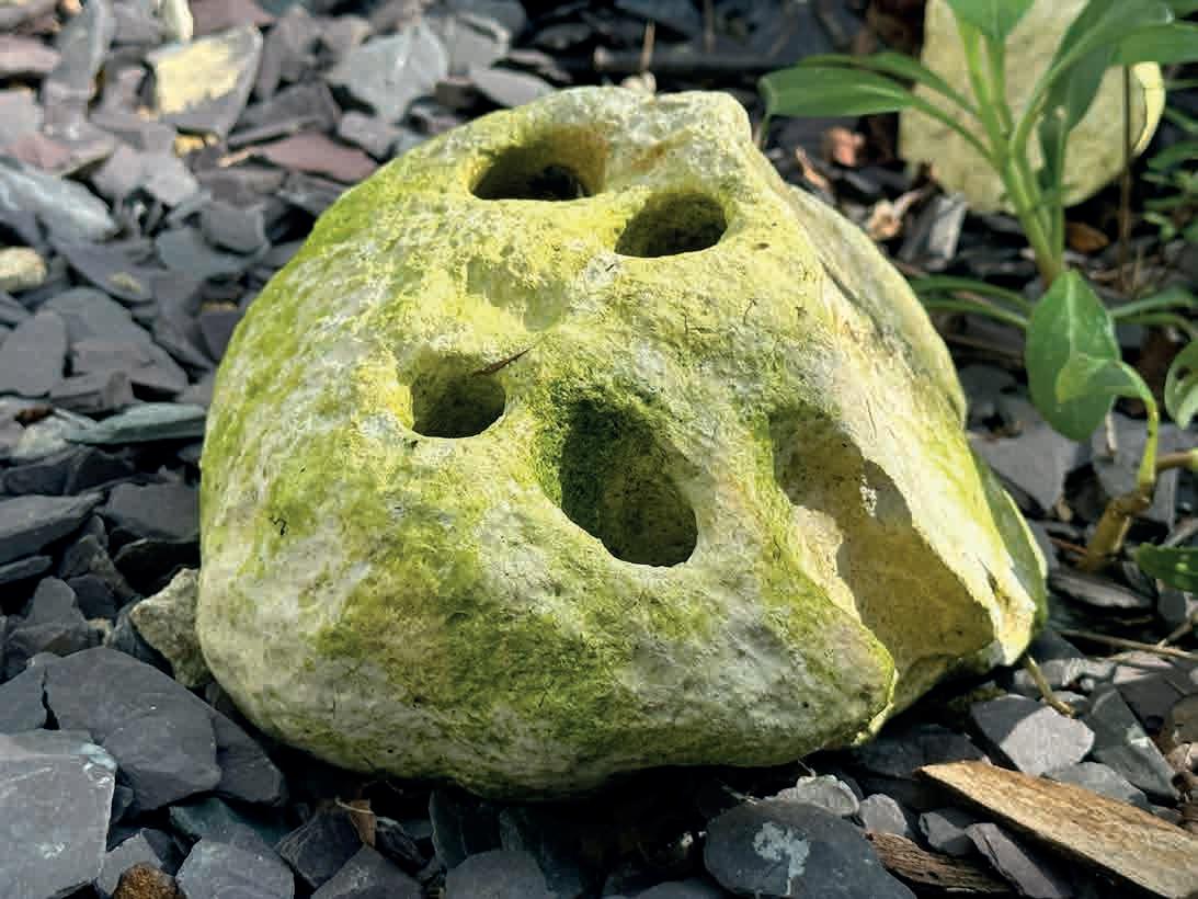
This year marks the 300th anniversary of the death of the polymath Sir Christopher Wren: astronomer, mathematician, physicist, anatomist and undoubtedly one of the country’s greatest architects.
Wren was given the responsibility of rebuilding 51 churches in the City of London after the Great Fire of 1666, including, of course, St Paul’s Cathedral. Other notable works include Kensington Palace, Hampton Court Palace, the Royal Naval College, and the Royal Observatory in Greenwich.
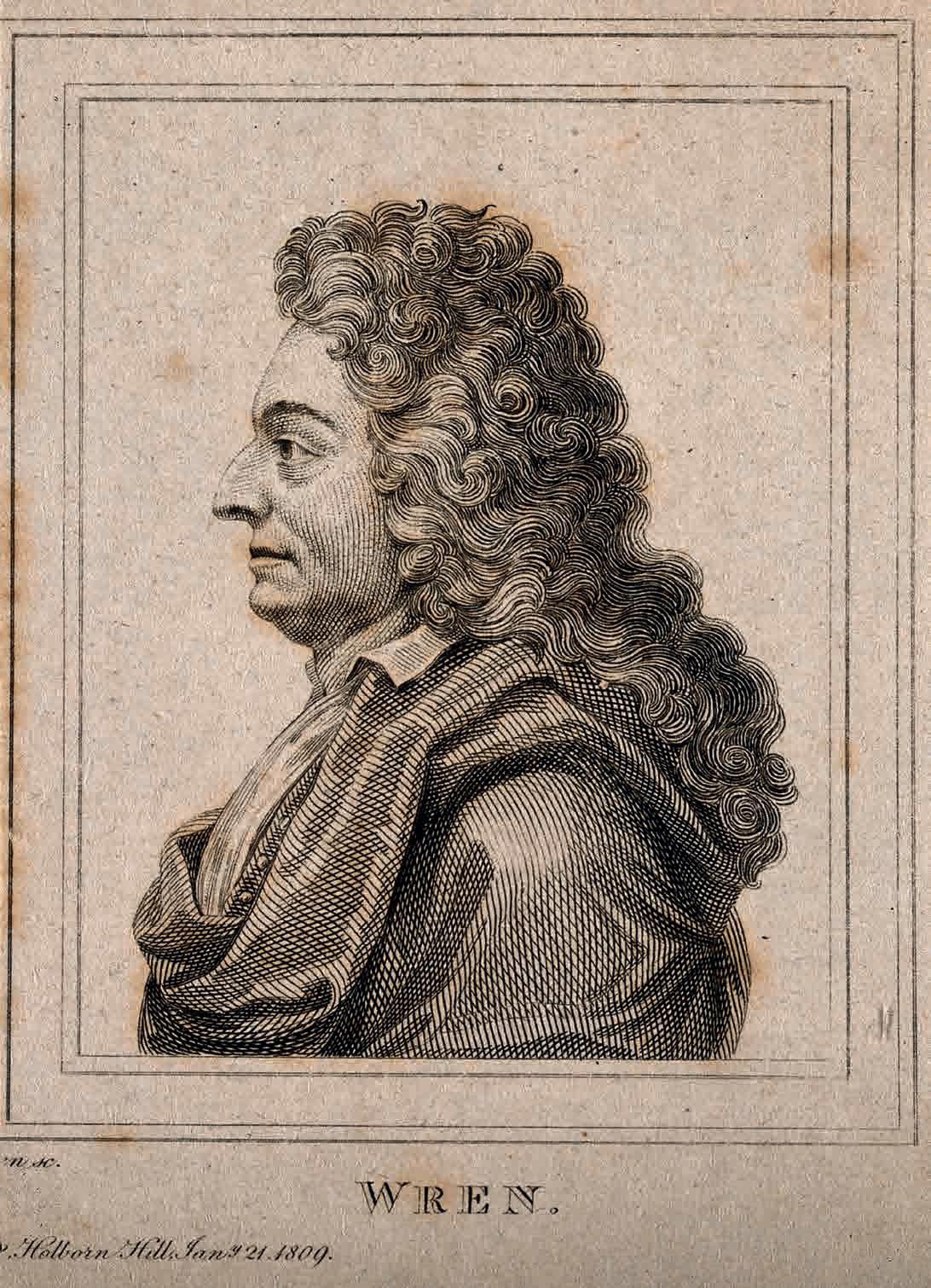
But is there any truth to the attribution of Wren’s name to the design of several buildings in West Sussex? It has been claimed, for example, that he was behind the design of Edes House in Chichester (formerly known as Wren’s House), the spire of Cuckfield Church, and the stable building at Wakehurst.
Alas, such speculation seems fanciful. Wren’s pre-eminence as a Restoration artist is such that his name has been wrongly attributed to countless buildings of that period. Or, as his biographer Adrian Tinniswood has written: ‘If Wren was connected with a building, however remotely, it was slotted into the rapidly expanding canon’.
Edes House, in South Pallant, and now owned by West Sussex County Council, was long said to have been designed by the great architect. Thousands of tourists, erroneous guidebook in hand, must have stood in front of the building, marvelling at the great man’s work. It is indeed a splendid edifice – especially the front elevation – but the architect’s involvement with its design has been a matter of debate for over a century, and many scholars have searched in vain for any Wren connection. It is recorded that he was consulted on the repair of Chichester Cathedral’s storm-damaged spire in April 1684: perhaps that led to this particular flight of fancy.
And it must be admitted that Cuckfield Church does boast an uncommonly elegant octagonal spire that is similar in design to – for example – that of St Antholin’s Church in the City of London, which was certainly of Wren’s hand. But again, there is no record of Wren having any connection to the village, save a possible acquaintance with one of its more affluent parishioners, the lawyer Timothy Burrell. Not
enough to go on, I’m afraid. Wren had enough on his plate in London, I’m sure, without concerning himself with the spire of a village church 50 miles away.
Finally, to the stables at Wakehurst. Again, this is indeed an elegant building, crowned by a splendid octagonal bellturret and cupola. The Grade II-listed structure is currently housing Wakehurst’s Stables Kitchen, and is a fine place to enjoy a latte and a chocolate muffin. But the attribution of Christopher Wren’s name to the building appears to have absolutely no foundation, and the National Trust are wise not to spread the myth in their literature about the property.
In this anniversary year, several London guides are advertising ‘Wrenathon’ tours around the great man’s buildings in the capital. Sadly, no such tour appears possible in Sussex. Though a triangular ‘Fine-Restoration-buildings-falselyattributed-to-Wrenathon’ tour, taking in Chichester, Cuckfield and Wakehurst, would be an edifying experience.