
3 minute read
Colour Palete

from Bombay Booklet

Section 3.1
Colour Palete
Advertisement
We lead with our light blue.
It’s designed to make our bottle stand out. Bright, airy, optimistic and modern, our light blue is the core primary colour across our brand.
Primary palette
Our light blue sits alongside three additional core Bombay colours in our palete. Vibrant mid blue, is based on our botle and works beautifully as a bright accent. Navy, helps to change the pace and create contrast, and pure white offers balance.
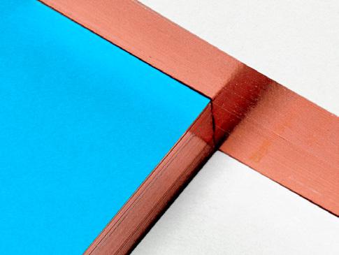
To offset our primary palete, we use a rich copper metallic. It adds warmth and links directly to our copper stills in Laverstoke.
RGB 255 / 255 / 255 HEX #FFFFFF
Light Blue
PMS 635 CMYK 30 / 0 / 5 / 0 RGB 181 / 244 / 253 HEX #B5F4FD
Copper METALLIC
PMS 8022 Foilco 6731 Navy
PMS 282 CMYK 100 / 80 / 10 / 70 RGB 0 / 0 / 70 HEX #000046
Mid blue
PMS 2995 CMYK 90 / 0 / 0 / 0 RGB 0 / 195 / 242 HEX #00C3F2
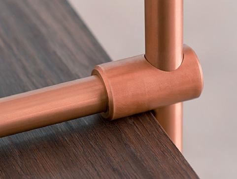
Copper accent: PHYSICAL

Metallic copper is a luxury accent that we use in moderation. It should be the most restrained material on any application.
In print, copper is best used for the keylines of our Brand Patern, or applied to the edges of stationery and cocktail menus. Copper foil is the ideal finish: adding a premium, reflective detail. When foiling isn’t available, we should use the metallic Pantone 8022.
If we can’t use foil or print the Pantone, we shouldn’t print the copper at all.
We also use copper for structures or surfaces to elevate environments. It should be used to add a premium touch, and therefore should never be faked or over-used.
› Copper should only ever be reproduced in foil or metallic Pantone in print. We should never print copper in CMYK.


Copper accent: DIGITAL
We have a bespoke copper gradient swatch for digital use only. It is made up of three evenly spaced colours, and should always be set at a 38° angle.
It should only ever be used as an accent, never a dominant colour. A good is example would be in the keylines of our Brand Patern.
Gradient colours
Dark COPPER
HEX #87270C
Gradient angles
MID Copper
HEX #DF8372 Light Copper
HEX #FFDED5
38° DEFAULT
Using our colours
Tis colour wheel demonstrates the intended proportions of our colour palete. It should be used as a starting point and adjusted where appropriate.
Our light blue should always be the most prominent colour, supported by a liberal use of mid blue, and an accent of copper.
Light blue
Our core brand colour. Tis should be the first impression of any touchpoint.
mid blue
Tis should support light blue on all touchpoints. It can be represented by our botle.
Navy
An accent colour. Generally used for text, logos and other details. It can also appear where there’s a risk of areas geting dirty.
White
An accent colour. Generally used for text, logos and other details. It mainly appears in print where there’s a need for white space.
Copper
An accent used as a foil in print or through physical objects. It provides a premium finish to touchpoints.


