PATRICK PROCKTOR
The Complete Prints
John Crossley | Michael Healey
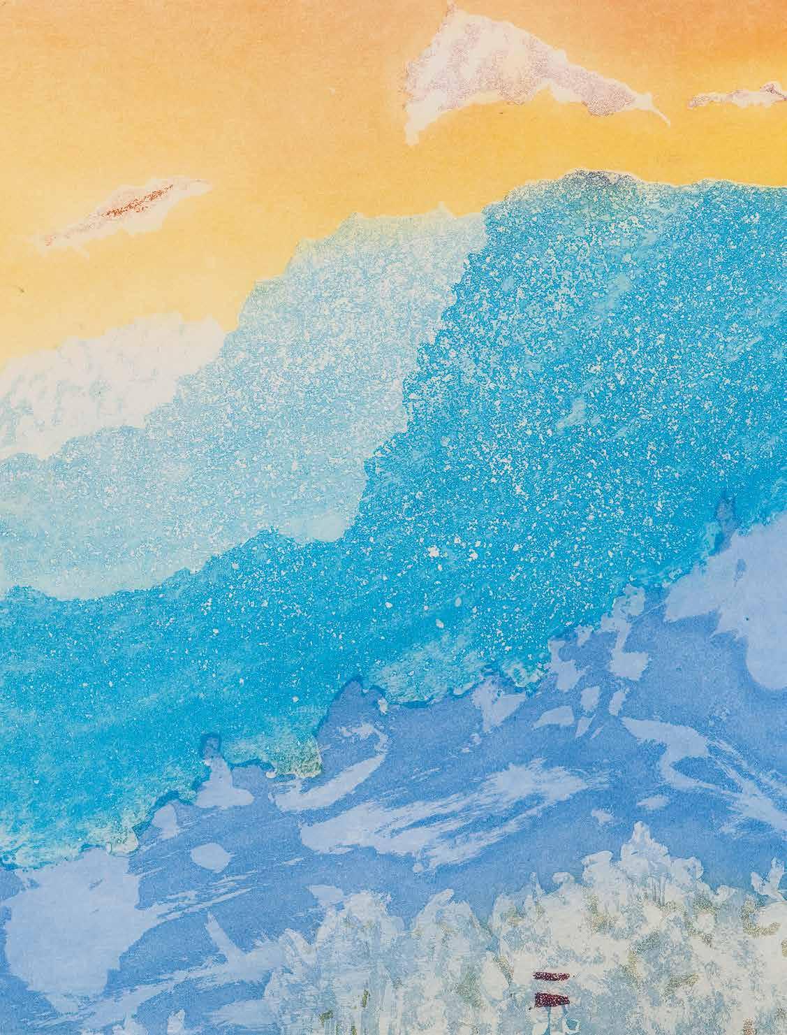
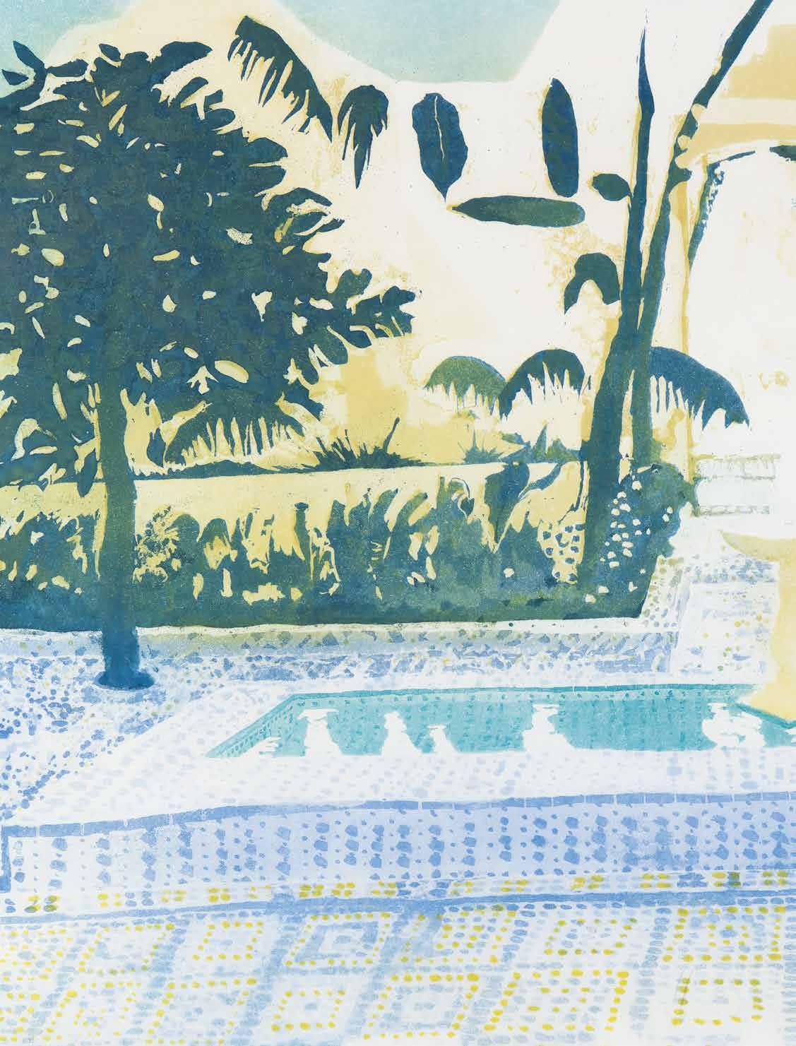
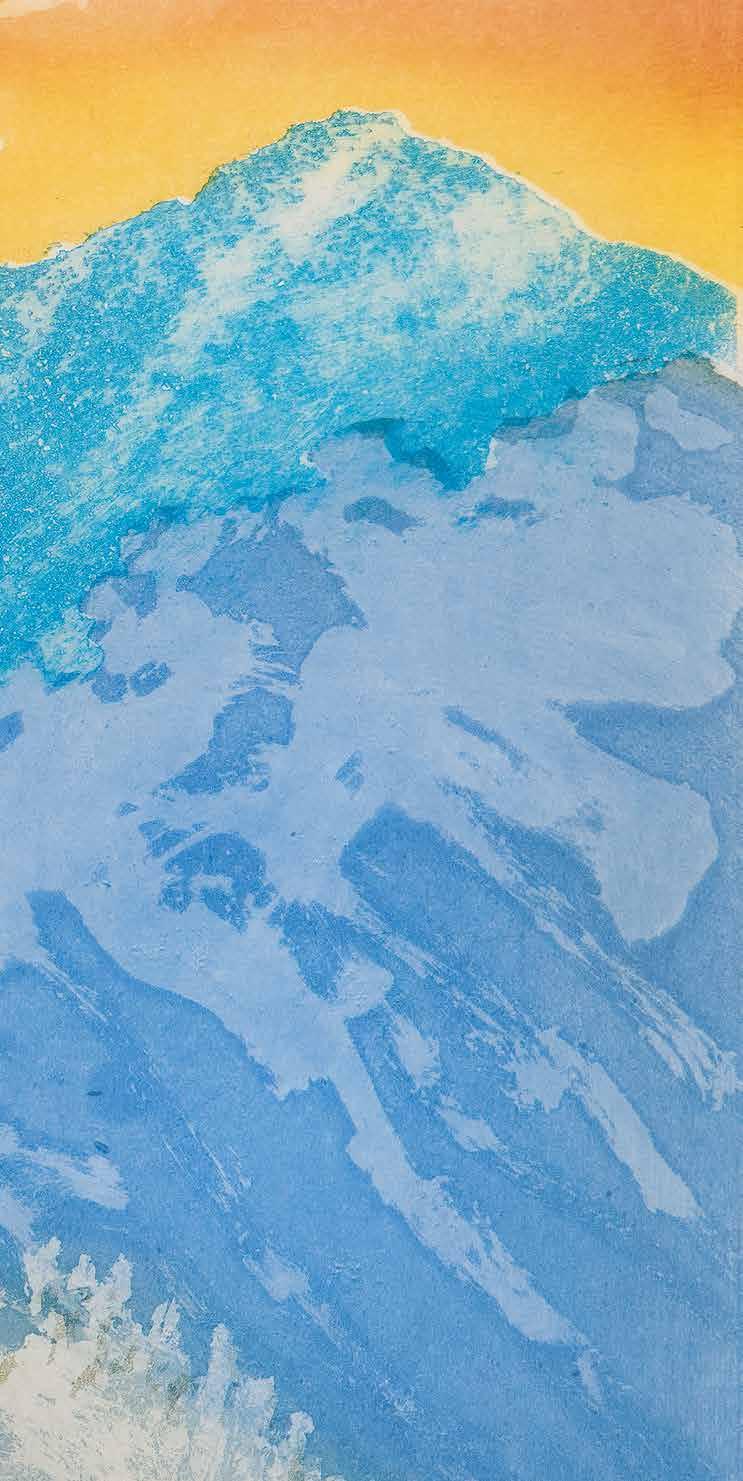
Patrick Procktor won instant acclaim as an oil painter, following his debut exhibition in 1963, and later came to be regarded as one of the finest watercolourists of the twentieth century, having embraced the medium in 1967. He was also an outstanding printmaker, who mastered the various techniques of intaglio, lithography and screenprinting. Of these, intaglio appealed most to Procktor, who developed a highly successful method of using pure aquatint. Handling the medium like watercolour, he created many memorable aquatints, especially of India, Venice and China. Often working from watercolours, the imagery was reinterpreted, and often wholly transformed, in the intaglio studio.
This catalogue raisonné documents a total of 149 prints, from his first intaglio experiments at the Slade School of Fine Art to the screenprints made forty years later for King’s College, Cambridge, and Paintings in Hospitals. Indeed, the sheer number of commissions that he received, and the consequent diversity of subject matter, attest to Procktor’s enduring popularity as a printmaker.
Contents
Patrick Procktor: Biographical Notes
Procktor as Printmaker Michael Healey
Pursuit of the Parallax John Crossley
Notes to the Catalogue Raisonné
Catalogue Raisonné
Glossary of Printmaking Methods
Selected Exhibitions
Prints in Public Collections
Bibliography
Acknowledgements
Patrick Procktor RA 1936–2003: Biographical Notes
(Unreferenced quotes are from Procktor’s autobiography of 1991)
1936 Born in Dublin, Ireland, on 12 March, of English parents. Father works as an accountant for the Anglo-Iranian Oil Company, to whose Dublin office he was recently posted from London.
1939 The family moves to Esher, Surrey, after father contracts tuberculosis.
1940 Following father’s death, mother takes a job as a live-in housekeeper at the Dorchester Hotel in London. With six-year-old brother, is brought up by maternal grandparents, who relocate from London to Worcestershire, before moving to Lancashire.
1943 Both boys return with their grandparents to London, to a flat in Marylebone High Street.
1945 Enrols at Highgate School, where he enjoys the art classes taught by Kyffin Williams.
1952 Unable to pursue further education due to lack of funds, leaves school at sixteen and starts working as a salesman at a builders’ merchant in Holloway.
1954 As part of National Service, enlists into the Royal Navy as a student of Russian, at which he excels, and is selected for an advanced course at the School of Slavonic Studies at London University.
1956 Upon graduating, begins employment as a translator for the British Council. The work is sporadic, however, and he spends much of his spare time painting, having kept in touch with Kyffin Williams.
1957 Visits the Redfern Gallery with a folio of work, from which an oil painting of anemones is included in the gallery’s annual Summer Exhibition. Encouraged by its sale to Leicestershire County Council, starts painting new work, with the intention of applying to study at the Slade School of Fine Art, London.
1958 Enters the Slade in September, after William Coldstream approves his application.
1959 Begins studying intaglio printmaking under Anthony Gross and Richard Beer.
1960 Taught by Keith Vaughan, who becomes a friend and a strong influence; “his work, in the context of the Slade, seemed entirely modern to me at the time … he was the best painter of the male nude”.
1961 The Beach – an oil painting of dancing nudes –wins first prize in the Slade Summer Composition Competition.
1962 Among thirty students selected for the Young Contemporaries national touring exhibition, as organised by the Arts Council of Great Britain (ACGB). Awarded an Abbey Minor Travelling Scholarship, visiting Italy and Greece during the summer. Back in London, and having finished his studies, begins a series of large, gestural oil paintings of thin, elongated nudes, each of whom is set within, and separated by, rectangular partitions that appear to stand pictorially for spatial relationships – screens, windows, rooms, corridors.
1963 First solo exhibition opens at the Redfern Gallery, with many of the paintings sold before the opening night, including to the ACGB, Contemporary Art Society and the National Gallery of Victoria, Melbourne. Critical response is favourable, too; John Berger declares Procktor a “space pioneer” (The Observer), while for GS Whittet, “he makes the best of both idioms, figurative and abstract. He also ... establishes a virile, artistically noticeable identity” (The Studio). Using proceeds from the exhibition, moves to a flat in Manchester Street, Marylebone – his home and studio for the next thirty-six years.
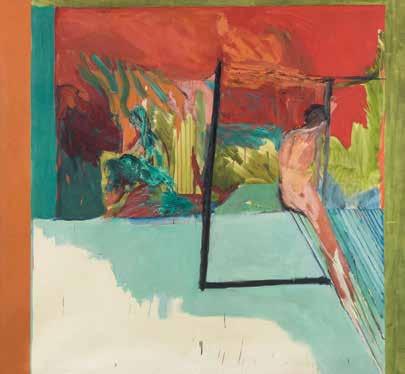
Single Figure in a Landscape, 1963, oil on canvas, 1926 × 1982 mm The Whitworth, University of Manchester
1964 Four new oils – again of distorted male nudes but painted in a darker palette and more sombre in mood – feature in the first New Generation, a selection by Bryan Robertson of twelve young British painters that includes Patrick Caulfield, David Hockney, John Hoyland, Allen Jones and Bridget Riley.
1965 Second solo show at the Redfern, of surrealist paintings that refuse any easy interpretations, generates few sales, and leaves critics underwhelmed; “somehow no single work carries much weight”, writes Nigel Gosling (The Observer). Completes a summer teaching post at the University of Iowa, before embarking with David Hockney on a road trip from Colorado to California. In Los Angeles, explores lithography with Kenneth Tyler and Bernard Bleha, the master printmakers at Gemini.
1966 In London, begins a series of paintings that are monumental in scale, provocative in subject matter – San Francisco leather boys and Red Guards – and painted slowly in thin glazes and washes of acrylic.
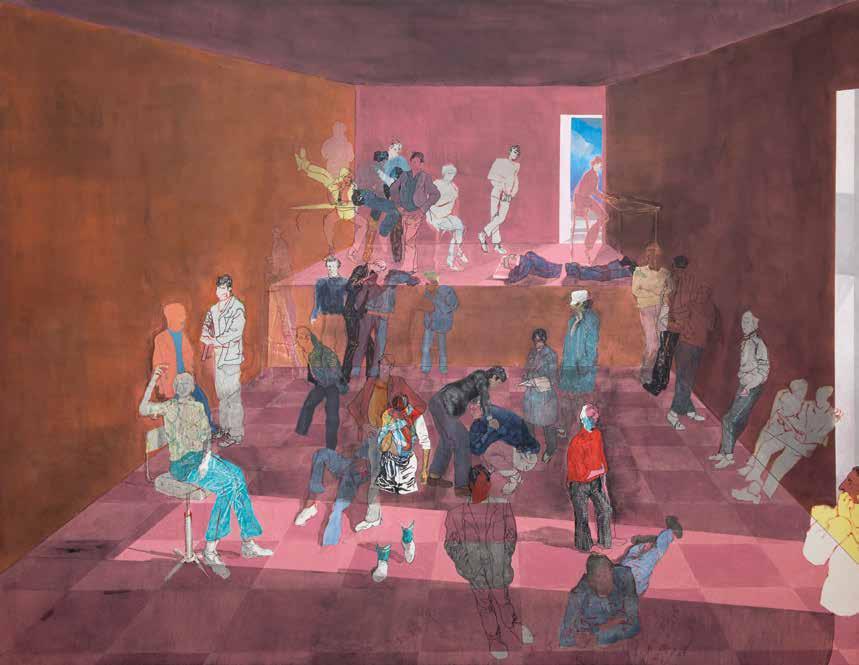
The vast, theatrical space in which each group of figures stand owes much to the stage designs Procktor is carrying out for the Western Theatre Ballet.
1967 Third Redfern exhibition “puts us in the presence of a highly intelligent sensibility, and it deserves a careful look”, concludes Robert Hughes (The Observer). A striking depiction of Joe Orton, reclining nude but for his socks, is reproduced in the programme for Crimes of Passion at the Royal Court Theatre. Travels throughout the summer to France and Italy, experimenting with painting in watercolour en plein air – “a decisive moment in
Shades, 1966, acrylic on canvas, 2135 × 2752 mm
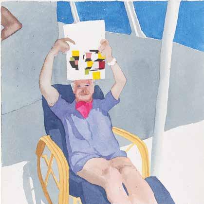
terms of my practice and reputation”. In London, spends much of the autumn painting watercolour portraits of his friends.
1968 Fourth Redfern show opens in February, less than nine months after his last. According to Marina Vaizey, the watercolour portraits are “compelling and profound studies of personality; representational, full of fluid insights allied to a formidable and authoritative technique ... Procktor is now, by any standards, a superb artist” (Arts Review). In March, invites Gervase Griffiths, a young model, to live with him. Travels to New York for his first solo show in America, at the Lee Nordness Gallery, of acrylic paintings and watercolours dedicated to Gervase. On returning to London, paints watercolours of Gervase, Ossie Clark and Eric Emerson lounging in a New York apartment, which intrigue Joe Studholme–cofounder of Editions Alecto–who commissions a series of prints.
1969 Entitled Invitation to the Voyage, the series comprises five intaglio prints – the first of many collaborations over the next decade with the master printmakers, James Collyer and John Crossley. Hailed by Robert Thomas as “an exquisite, unique set of graphic distillations” (Art
and Artists), individual prints are sold to the Art Gallery of Ontario and Cincinnati Art Museum.
1970 Ends the relationship with Gervase, before setting off alone on a three-month tour of India, during which time more than eighty watercolour landscapes are painted. Back in London, translates some of these into large oils and a series of seven aquatints, culminating in a huge show at the Redfern. For Max Wykes-Joyce, “in this series, especially the Indian Suite, colour, line and composition are in complete accord. Without doubt, this is Procktor’s best exhibition to date” ( International Herald Tribune ), as individual prints are purchased by Brooklyn Museum and the Government Art Collection (GAC). Spends Christmas with Kirsten Benson, a widowed restaurateur, and her two young children, Edward and Juliet.
1971 A “growing love for Kirsten” sees Procktor invite her and the children to live with him. Various works are made “in celebration of Kirsten”, including Northern Lass, part of Felix H Man’s Europäische Graphik VII portfolio of British lithographs. In November, visits Venice with Kirsten.
1972 An oil painting of Jill Bennett serves as the focal point of his latest, eclectic, Redfern show. The elongated presentation of Bennett as “a red crucifixion incarnate on a sofa, is a dramatic and bold idea”, writes Evan Anthony (The Spectator). Oil paintings, watercolours and prints relating to his trip to Venice are also exhibited. Elsewhere, is among the first artists to receive a commission from the new print publisher, Christie’s Contemporary Art.
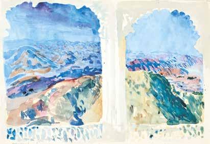
East from Sajjangarh, 1970, watercolour, 350 × 500 mm
Cecil Beaton, 1967, watercolour, 290 × 229 mm Joan and Lester Avnet Collection. Museum of Modern Art, New York, USA
1973 In March, paints several watercolours of Queen Elizabeth II opening the new London Bridge, in preparation for a large panorama commissioned by the contractors, John Mowlem & Co. In August, marries Kirsten at the Danish Church in Regent’s Park.
1974 Birth of son, Nicholas, in January. A month later, travels with Kirsten and Nicholas to South Africa. Six prints, including two of Victoria Falls – “the most vivid experience of natural beauty” – are completed in London, and unveiled as the South Africa Suite at the Redfern in October. A watercolour of Cecil Beaton, painted in 1967, is shown in an exhibition of portraits at the Museum of Modern Art (MoMA), New York.
1975 Ten prints enter the Tate’s permanent collection, and a pencil drawing of Kirsten is sold to the ACGB.
1976 With the master printmaker, Charles Newington, produces a series of twelve intaglio prints inspired by Samuel Taylor Coleridge’s The Rime of the Ancient Mariner. These are shown at the Redfern alongside recent paintings in enamel, one of which Elton John selects for the cover of his new album, Blue Moves.
1977 Three Figures from Memory, of 1963, and the portrait of Jill Bennett feature in British Painting 1952–1977 at the Royal Academy of Arts (RA). Returns to Venice to paint new watercolours of the city, which are unveiled a month later at the Galleria del Cavallino. MoMA purchases a complete set of The Rime of the Ancient Mariner prints.
1978 Tenth solo show at the Redfern; Terence Mullaly opines that “his Venetian views conjure up the inimitable atmosphere of the place ... he knows how to capture and hold our attention” (The Daily Telegraph).
1979 Undertakes various commissions, notably a large Venetian panorama, painted onto the walls of Langan’s Brasserie in Mayfair. The British Museum buys two recent prints.
1980 In February, becomes the first British artist to make a working trip to China since the Cultural Revolution. The resulting oils, watercolours and prints are shown at the Redfern to critical acclaim; Dorothy Bosomworth refers in particular to the aquatints, “where the challenge of the medium requires an extension of his thought and control. I found the quality of these tremendously impressive” (The Connoisseur).
1981 Made an honorary member of the Royal Watercolour Society. One of fifteen artists invited by Peter Blake to paint a member of The Who, for the cover of the band’s new album, Face Dances. The GAC purchases a complete set of A Chinese Journey, a series of eight aquatints – his final collaboration with James Collyer and John Crossley.
1982 Latest Redfern exhibition includes brush drawings of the London Philharmonic Orchestra, in celebration of its fiftieth season, as well as early studies for a reredos, commissioned by Chichester Cathedral.
1983 Spends two weeks in Belize documenting the British Armed Forces for the Imperial War Museum’s Artistic Records Committee.
1984 In April, Kirsten dies suddenly at the age of 44. The completed reredos for Chichester Cathedral,
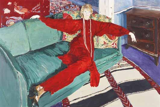
Jill Bennett, 1972, oil on canvas, 1017 × 1524 mm
painted in oil and showing the baptism of Christ, is installed in the Chapel of St John the Baptist.
1985 Travels to Portugal to record the state visit of Queen Elizabeth II, following a commission from the British Council. A major touring retrospective of prints opens in Birmingham. The GAC purchases an impression of Cataract, Aswan, a lithograph inspired by a recent holiday in Egypt.
1987 Latest Redfern exhibition spans oils and watercolours painted in the past twenty years, with an emphasis on recent still lifes; “the show proves that … Procktor is an artist with a lasting and supple talent”, opines Richard Dorment (The Daily Telegraph).
1989 An Oriel 31/Welsh Arts Council retrospective, of paintings and watercolours, tours the UK, as David Hockney and Bryan Robertson contribute essays to the catalogue. Corfu and Royal Naval College, Greenwich are among the final lithographs to be made at Curwen Studio’s premises in Tottenham Court Road, before its relocation to Cambridge.
1991 Visits Japan, with the results displayed at the Redfern to favourable reviews; “Lord Gowrie recently described him as our finest living watercolourist and there is ample ammunition for that assertion here”, writes John McEwen (The Sunday Telegraph). Produces four screenprints with the master printmaker, Kip Gresham, at Curwen Chilford Prints. The National Portrait Gallery purchases the 1967 drawing of Joe Orton.
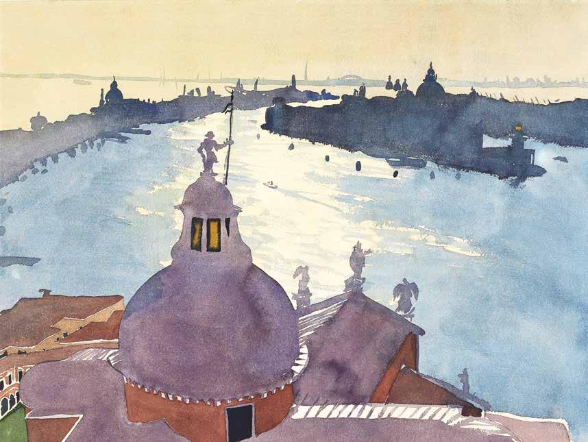
Bacino di San Giorgio, 1977, watercolour, 450 × 600 mm
1993 Made an honorary member of the Royal Society of Painter-Printmakers.
1996 Elected to the RA as a painter, on 29 May.
1998 The Metropolitan Museum of Art, New York, purchases a self-portrait painting of 1986.
1999 Amid a recent decline in health and productivity, suffers a catastrophic fire that destroys his Marylebone home.
2000 In October, an exhibition is held at the Redfern, of work completed in the past year. According to John McEwen, “he has produced a beautiful and remarkably abundant show of oils and mostly watercolours – of friends, the view from his window and pleasing everyday objects, especially
vases of flowers ... painted with a delicate and seductive ease ... It is an inspiring exhibition, whether one knows of the fire or not” (The Sunday Telegraph).
2003 Now living in Gloucestershire, continues to paint, despite worsening health. In June, discharges himself from hospital to attend the RA Summer Exhibition, where a recent oil painting, Molly, is shortlisted for the Charles Wollaston Award. On 29 August, dies in St Thomas’ Hospital, London. Obituaries are published in all the major broadsheets, including The Times: “his work was always beautifully drawn, tastefully coloured, elegant, amusing, atmospheric ... He travelled extensively, painted everywhere he went, and made the Venice scene his own in a way that no English artist since Turner had done”.
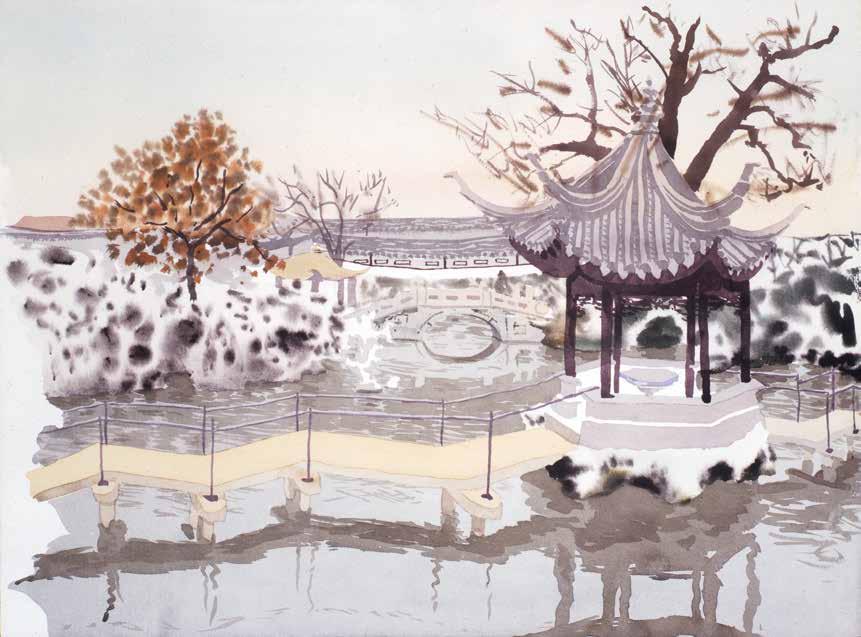
Lion Rocks Garden, Soochow, 1980, watercolour, 450 × 600 mm
1 As quoted in Patrick Procktor, Self-Portrait, London: Weidenfeld & Nicolson, 1991, p. 101 (hereafter abbreviated to S-P, followed by the relevant page number).
2 For example, see Gene Baro, ‘London Letter’, Art International, June 1965, p. 73, and Nigel Gosling, ‘Mr Cohen in the searchlight’, The Observer, 9 May 1965. As for sales, of the fifteen large-scale oil paintings on show, only four were sold during the exhibition.
3 S-P, pp. 79–80. Procktor also criticised the work shortly after creating it; in a sketchbook dated November 1965, he wrote that many of the paintings had been undermined by “philosophical and intellectual permissiveness, and confusion” (see Ian Massey, Patrick Procktor: Art and Life, Norwich: Unicorn Press, 2010, p. 77).
4 S-P, pp. 79–80. Herein, Procktor is highly critical of Lunacharsky Street and Beneath the Surface
Procktor as Printmaker
Michael Healey
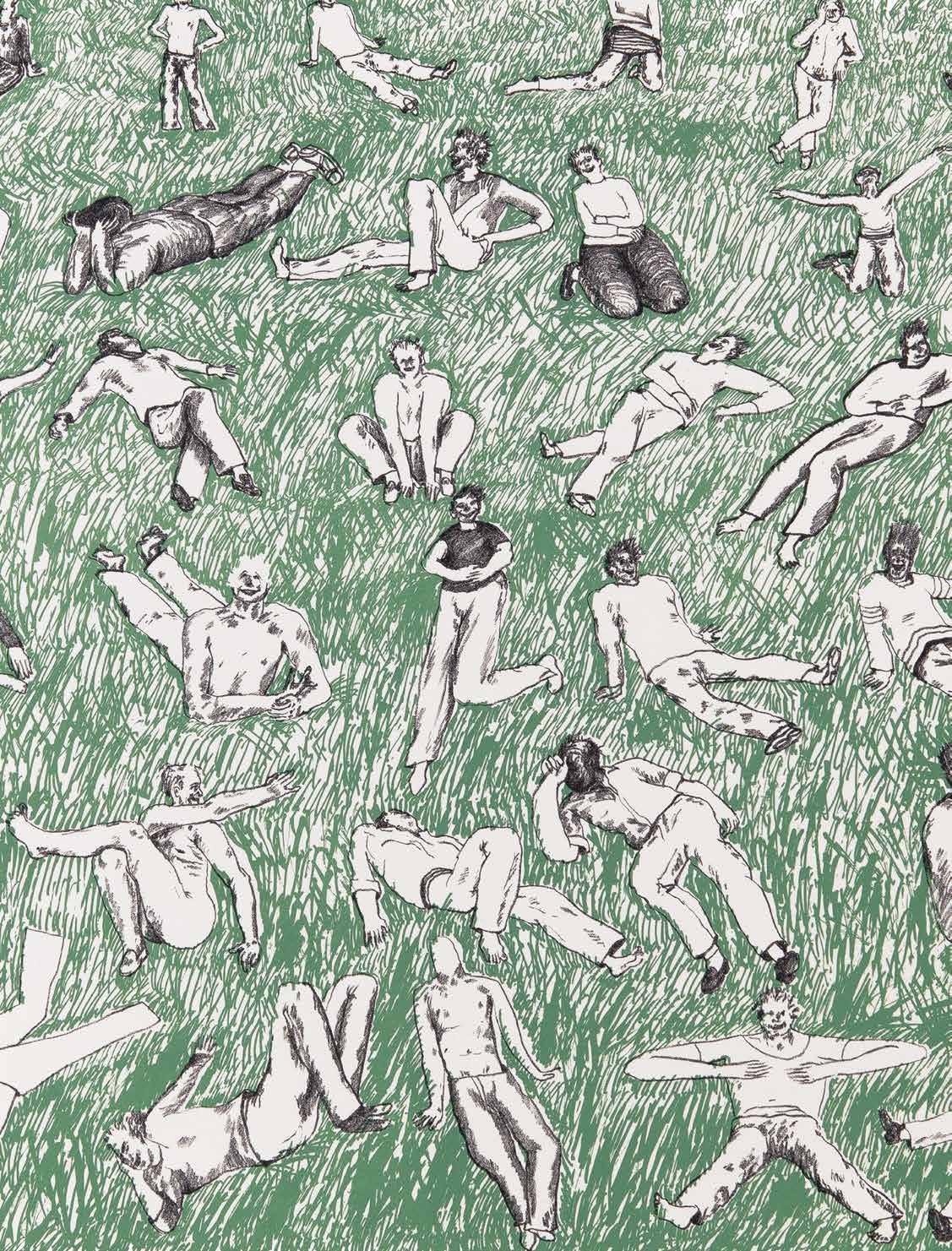
Patrick Procktor’s first published original prints, Seated Crowd (CH 11) and Seated Crowd on Grass (CH 12), mark a seminal moment in his career. A straightforward image of delineated male figures, it was this simplicity that Procktor found so liberating, and necessary, for it represents an emphatic departure from the paintings of the past year. Indeed, Procktor later admitted that “it was rather a relief to leave behind the desperate surrealism of the previous work, for something clearer”.1 Procktor made these lithographs in October 1965, towards the end of a five-month tour of America, having left London amid disappointing reviews of his second show at the Redfern Gallery. After the excitement that greeted his debut of 1963, critics – and buyers – were now indifferent to the latest paintings.2 The imagery was as eclectic as it was confusing, and Procktor later commented that he “can’t see how anyone can really understand these pictures … There is some content in these pictures that is hard even for me to explain”.3 The figure was now “very conceptualized, making absolutely no attempt to follow nature”, and became further obscured by an often “hectic” composition and a “nonsensical … conjuring of subconscious images”.4 Ultimately, Procktor boarded the flight to America in search of new ideas. At the encouragement of David Hockney, with whom he spent the summer, Procktor visited Gemini, Kenneth Tyler’s lithography studio in Los Angeles, where Hockney had recently completed his A Hollywood Collection series. Mentioning Hockney seems pertinent, for his celebrated use of line drawing during this period surely had some influence on the creation of the Seated Crowd prints. However, they are far from derivative; on the contrary, both prints are highly idiosyncratic. The male figures of 1962–64 appeared stretched and distorted, but they were anonymous and rudimentary.
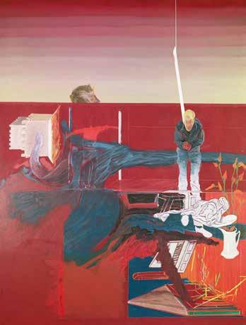
Beneath the Surface, 1964, oil on canvas, 1949 × 1472 mm Sheffield Museums
Left: Detail of Seated Crowd on Grass
The seated crowd, of 1965, are gawky, but joyfully so. Each figure fizzes with personality, smiling and laughing while sprawled on the grass, completely relaxed and without inhibition. Furthermore, the lithographic figures are very much in Procktor’s own hand, unlike the earlier figures that “owed a pronounced debt to Bacon, Vaughan and ultimately to Cézanne”.5 These new figures flirt between illustration and cartoon; certainly, this is the first time that Procktor approaches a graphic style. Deceptive in their execution, the figures are somehow at once awkward yet assured. Handling unfamiliar media such as lithographic tusche and crayon seemingly necessitated this new, simpler approach to depiction and composition, one that borders on the nonchalant. This is significant, for his relaxed approach is what many critics came to admire about Procktor’s future work. Charles Spencer, writing in 1972, opined that “he is at his best when most relaxed, when least obviously organised ... when there is no evidence of effort ... what in theatrical terms is known as ‘the throw-away line’ perfectly describes the manner”.6 Procktor surely performs his first ‘throw-away line’ in Seated Crowd. This print is also notable for its lack of colour, and for its depiction of so many figures. Regarding the former, his inexperience with lithography might explain why all the figures are left untouched, as each new colour required its own stone/ plate. Given that the early paintings revealed “a relish for juicy pigment”,7 such liberal use of white paper was striking, and this would soon become an important part of Procktor’s repertoire, as too would the portrayal of young men. His recent paintings contained no more than four or five figures, but here there are fifty-six, and forty-eight in Seated Crowd on Grass. Such large groups were rarely seen in art of the 1960s, especially given the prevailing waves of Pop, Op and Minimalism that swept through Britain and America.
These lithographs, then, set the tone for what followed. Indeed, the direction taken by Procktor in his next Redfern exhibition, of 1967 – which strayed so drastically in subject matter and stylistic concerns from his acclaimed, painterly debut, and from the flawed follow-up – only begins to make sense when one is aware of these prints. Their significance to Procktor, yet to develop his precocity into maturity, cannot be overlooked. They were the only finished pieces that Procktor brought back from America,8 but contained enough inspiration to provide a springboard for greater exploration, clarifying a new direction upon his return to London. Over the next year, and with a framed impression of Seated Crowd hanging in his studio, Procktor painted three monumental canvases, each populated by large groups of figures. In Restroom, no fewer than thirty young men are kneeling, sitting, standing or recumbent inside a vast interior. None of the men are in scale, and all are drawn in the same black line, painted in black and white and set against a turquoise background. Some are fully clad in leather, while others are left unfinished in basic outline. Many of the forty or so young men in Shades are left similarly unresolved and incomplete. As in the lithographs, the delineation is explicit, and in fact it underpins each of the three paintings. According to Mario Amaya – in a review titled ‘Drawing into painting’ – “the
5 Edwin Mullins, ‘Rise of a Reputation’, The Sunday Telegraph, 26 May 1963.
6 Charles Spencer, ‘Patrick Procktor’, Patrick Procktor, Galleria l’Approdo, Turin, 26 October–12 November 1972, exh. cat. essay, unpaginated. Spencer adds that this ‘throwaway’ manner can be “extremely deceptive”: “the seeming detachment, the air of modest impersonality, all too often shrouds deep involvement, concealed passion, and considerable virtuosity. All this is true of Patrick Procktor”.
7 Nevile Wallis, ‘Three Generations’, The Spectator, 31 May 1963.
8 “I had a folder of work … though it was mostly in the form of drawings and ideas” (S-P, p. 92).
9 Mario Amaya, ‘Procktor: Drawing into painting’, The Financial Times, 3 May 1967.
10 S-P, p. 98.
11 S-P, p. 98.
12 “The pictures had the scale that the abstract painters were using, but were completely populated; you could take all the possibilities that painting now offered and put them to work for you” (S-P, p. 101).
(For his thoughts on the Guggenheim and the Museum of Modern Art, see p. 85.)
13 S-P, p. 110.
14 Paul Grinke, ‘Figures’ last stand’, The Spectator, 16 February 1968.
15 “The title Shades does not refer to the Shades of Hades but to the style of the painting, the shades and the transparency of the acrylic” (S-P, p. 99), and “Long Live the Great Leap Forward was painted in a similar style to Restroom, but with even thinner paint” (S-P, p. 97) As Procktor later explained, “I came to it because my paint got thinner, and I was playing around with acrylic, which was going onto the canvas like a wash, so the natural regression was to watercolours” (as quoted in John McEwen, Patrick Procktor, Aldershot: Scolar Press, 1997, p. 19).
16 Max Wykes-Joyce, ‘London News and Views’, Pictures on Exhibit, March 1968.
17 Anthony Fawcett, ‘London: Mystery Tour’, Art and Artists, February 1968, p. 39.
artist has given us a line that is steady but not unerring, with its own type of waywardness within the terms of its rigidity, and with a strange, neurotic flavour, although it is graphic, generalised, and even on occasion like Sunday supplement illustration”.9 There is an irony, then, in that despite setting out to “paint something provocative”, the most daring aspect of the 1967 exhibition was not the “leather boys of San Francisco” or “the young Cultural Revolutionaries”,10 but their means of depiction. The subjects do not convey any message, political or otherwise, and Procktor later explained that their presence is simply an “assertion of the artist’s freedom”.11 Such freedom to depict large groups of young men was first exercised in Tyler’s lithography studio. The size of the new paintings also continues what was started at Gemini, where Procktor drew on lithographic stones measuring thirty inches in width. But the huge canvases were used more specifically as a witty retort to the revered abstract painters; in populating his canvases with so many figures, and removing any painterly effects, Procktor is poking fun at the perceived pretensions of much of what he saw at the Guggenheim and at the Museum of Modern Art.12 This third exhibition certainly represented a return to form, as well as a turning point for Procktor, and much of its success can be traced back to his time at Gemini. Having utilised found photographs, memory and invention for his lithographs and paintings of generalised groups of young men, Procktor’s “move towards particularity and to painting people from life”13 seemed a natural development. That these portraits were of his friends, “including some of the more notably exuberant figures on the London scene”,14 and all painted in the wholly unfashionable medium of watercolour – pre-empted by Shades, Restroom and Long Live the Great Leap Forward –15 helped generate a great deal of publicity for his fourth exhibition, in 1968. Max Wykes-Joyce described the portraits as “absolutely first-rate … In his last show and in this one Procktor makes clear that he is back on the main track of excellent painting from which he at one time, three or four years ago, so disagreeably and disastrously strayed”.16 It was here that he perfected a more refined, finished language, first initiated in Seated Crowd. Though the black outlines may be gone, in each of these portraits there remains the economy of description, and the graphic, illustrative style, as well as the incompleteness. As regards the latter, “the brilliance of the new watercolours is the extent to which they are finished, or unfinished. The outline of a completely white shape is enough to see the arm, or the hand, even though it is not painted”.17 The strange elongation of limbs continues, but it is now elegant rather than eccentric. Many of the male subjects are depicted reclining informally – not on grass but on beds, rugs and sofas – and this became an enduring attraction for Procktor.
Languorous young men were the focus of Procktor’s first series of original prints, Invitation to the Voyage (CH 13–17), following a commission from Joe Studholme, of Editions Alecto, in 1969. Studholme – whose important publications included Hockney’s Hollywood Collection – had seen some of Procktor’s recent watercolours based on rough sketches of Ossie Clark, Eric Emerson and Gervase Griffiths.
These relate to when Procktor and his friends spent a whole day sitting on sofas inside a New York apartment, whiling away the hours with regular if rambling conversation about classical gods and current events. It was intensified by the room’s mirrored walls, which brought the outside Central Park, as well as the gradual changes of light – encompassing daylight, dusk and moonlight – ‘into’ the room. Procktor recorded the experience, with his back to the window, in sketchbook drawings. “The room took on a quality as I drew, and the longer we stayed awake the stranger it became. It endowed everything that was said with extraordinary moment and meaning”,18 he later recalled. The watercolours were dismissed by Alastair Gordon as “dull and ordinary”,19 but when translated into a series of five intaglio prints, the imagery became altogether more interesting and surreal. As Procktor later explained, “there are many reasons that I could offer for the fascination the original occasion had for me, but they changed and renewed themselves when it came to making the aquatints”.20 This included a “Baudelairean inspiration”,21 and it is important to note that each print was accompanied by typed excerpts from Les Fleurs du mal, Charles Baudelaire’s seminal volume of poetry. Procktor was chiefly interested in L’Invitation au voyage, after which his series is titled. This love poem describes how memory, imagination and association of ideas combine to create a transcendent, idyllic dream world. Throughout Les Fleurs du mal, quiescence is associated by Baudelaire with immobility and depression. But in L’Invitation au voyage, quiescence is conducive to poetic reverie, with Baudelaire conjuring an alternative paradise as a way of escaping the harsh realities of life. It is this spiritual ascent into the unknown, the ‘invitation to travel’, that informs Procktor’s imagery. As such, the prints were “not illustrations to the poems but correspondences to them”.22 In any case, they stand emphatically on their own terms. For example, one doesn’t need any knowledge of Baudelaire to be intrigued by the lounging figures, who hover like illusory, disconcerting fragments snatched from recollections of a dream. The delicate tonality of the ink, and the manipulation of plate-tone – achieved by James Collyer and John Crossley
18 S-P, p. 127.
19 Alastair Gordon, ‘Art in the modern manner’, The Connoisseur, June 1969, p. 181.
20 S-P, p. 128.
21 S-P, p. 130.
22 S-P, p. 129 (Procktor’s italics).
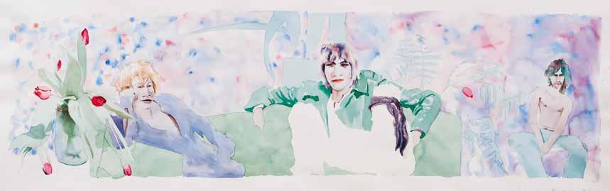
EGO (Eric, Gervase, Ossie), 1969, watercolour, 310 × 970 mm
23 Robert Thomas, ‘Graphics’, Art and Artists, July 1969, p. 66.
24 As quoted in Cathy Courtney, ‘Do What You Like’, Art Monthly, April 1996, p. 42.
25 As quoted in Art Monthly, 1996, p. 42.
during complex printing sessions – enforces further this sense that the images are at once ethereal and ephemeral, with certain details apparently on the cusp of disappearing altogether. Some of the colours are sharp while others are soft, as if suggesting how Procktor’s memories alternate between vivid and vague, just as Baudelaire’s idyllic dream world is threatened by moments of ambiguity. Robert Thomas admired how “the imagery is light yet full of nuance, the colour areas fixed to particular objects, controlling the composition and creating abstract patternings of rare delicacy”.23 Such delicacy was often missing from the watercolours, which comprised, in Procktor’s words, “psychedelic colours, red, blue and yellow”.24 The intaglio medium offered a unique opportunity to play with colour, and Studholme recalls that “it was tantalising because for ages it was difficult to get the colours right, but Patrick had a miraculous way of suddenly getting it to gel”.25 In the case of Ossie, Gervase and Eric, Procktor started with a soft blue for the entire composition, before expanding the palette; the final editioned state comprises nine colours. Indeed, Baudelaire likens his imaginary world to ‘a multi-coloured gem’, and several prints are suitably kaleidoscopic in colour. But, perhaps somewhat paradoxically, white is the dominant force in each composition. In the watercolours, Procktor often filled the remaining white space with colour washes or an abundance of flowers, which arguably undermined and stifled the figures. In each of the aquatints, however, much of the plate is left untouched, with Procktor now embracing the white paper, which is cleverly incorporated into the overall image. The white paper not only represents the intensity of the light as it engulfs the room, but helps to create a palpable sense of weightlessness, with all notions of time and space suspended, as is necessary for the realisation of Baudelaire’s dream world. In trying to convey the expansive and unlimited movement of poetic reverie, Procktor ended up working on plates measuring some thirty inches wide. In titling one of his prints Language of Flowers, Procktor refers to a line in another, similar poem, Élévation, wherein Baudelaire can understand ‘without effort the language of flowers and other mute things’, such is the extent of his joyous transcendence. However,
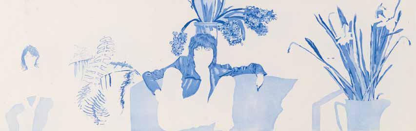
Working proof of Ossie, Gervase and Eric
the ecstasy of both poems is countered by the more fearful passages of Chant d’automne, which Procktor chose to accompany Departure and Ossie, Gervase and Eric, while Le Crépuscule du soir accompanies Sadie and Prudence. In the latter poem, Baudelaire considers the importance of dusk, focusing on its symbolic bridging of daylight into darkness. Similarly, Chant d’automne is a lamentation on how summer has been supplanted by autumnal gloom. Most of the dying hospital patients soon to succumb to permanent darkness, concludes Baudelaire in Le Crépuscule du soir, ‘have never known the solace of a home and have never lived!’ Such bittersweet sentiments resonated with Procktor, keenly aware that his brief but intense relationship with Gervase was now almost over. In this sense, Departure as a title has a double meaning, implying an elated departure from reality as well as a reluctant severance of romantic ties. Ultimately, Invitation to the Voyage was Procktor’s final statement on Gervase. This is fitting, for the highly poetic, otherworldly imagery far eclipses the many overt celebrations of Gervase that had gone before. Indeed, Procktor was left “disappointed”26 by the reaction to his New York debut of December 1968, a ‘one-boy show’ dedicated to Gervase. Watercolours depicted Gervase sunbathing, sleeping and reading, and performing cartwheels, star jumps and handstands in the large acrylic paintings. In sharp contrast, Invitation to the Voyage was well received by American audiences, when shown in several mixed exhibitions organised by Editions Alecto throughout 1969 and 1970. For example, Roger Feinthel described Procktor’s series as the “highlight” of an exhibition at Closson’s Gallery,27 from which the local Cincinnati Art Museum purchased an impression of Language of Flowers. Reviewing a show in Buffalo, Jean Reeves singled out Departure; “it has tremendous charm, and I found myself wandering back to it again and again”.28 Reflecting on Alecto’s prodigious output, in 1996, Studholme felt that Invitation to the Voyage was “one of the best things we ever published”.29
The tour of India, commenced alone on New Year’s Day in 1970, symbolised the beginning of a new chapter for Procktor. In choosing India as his destination, he appears to keep alive the spirit of Baudelaire, who embarked on a sea voyage to Calcutta, back in 1841, but Procktor turned to the English Romantic poet, Samuel Taylor Coleridge, to elucidate the importance of the landscape he saw before him. In his socalled ‘India Diary’, Procktor transcribed from Coleridge’s Biographia Literaria a short text concerning ‘the two cardinal points of poetry: the power of exciting the sympathy of the reader by faithful adherence to the truth of nature, and the power of giving the interest of novelty by
26 S-P, p. 125; “on the whole it provoked bewilderment when it provoked any attention at all”.
27 Roger Feinthel, ‘Dine Unpacks ‘Tool Box’ At Closson Showing’, The Cincinnati Post and Times-Star, 19 June 1969.
28 Jean Reeves, ‘Wall on Wall Sparks Exhibit of Britons at Gallery West’, The Buffalo Evening News, 4 February 1970.
29 As quoted in Art Monthly, 1996, p. 42.
30 Procktor copied out this passage by Coleridge in a diary entry of 3 February 1970; see S-P, p. 152.
Working proof of Mount Abu
31 As quoted in John McEwen, 1997, p. 9.
32 Charles Spencer, 1972. Spencer is referring here to Procktor’s watercolours, but his ideas can be just as convincingly applied to the prints, especially the aquatints.
33 S-P, p. 27. Beer had “a marvellously free attitude”, in contrast to the “rather austere” approach of Anthony Gross.
34 S-P, p. 163.
35 Michael Shepherd, ‘With a moral...’, The Sunday Telegraph, 25 October 1970.
36 Evan Anthony, ‘Corkers’, The Spectator, 31 October 1970.
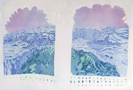
the modifying colours of imagination’. Coleridge suggests that the ‘accidents of light and shade’, as created by the sudden diffusion of sunset over a landscape, might ‘represent the practicability of combining both’.30 Far from offering mere respite, then, the landscape proved revelatory, as the Indian sojourn marked the start of an insatiable appetite for travel. Unlike Baudelaire, who relied on imagination and on memories of paintings to furnish his description of the paradisical, unnamed country in L’Invitation au voyage, Procktor made a concerted effort, over the next three decades, to visit as many of the world’s most exotic locations as he could. He later enthused how the landscape is bathed in a different light peculiar to each country; “the light in Egypt is violet, in China daffodil, in Venice opalescent”.31 After seeing the Indian watercolours – all painted en plein air – Joe Studholme commissioned a second series of prints, India, Mother (CH 19–25). Given its closeness to watercolour, aquatint proved an obvious choice of medium for this series. Under the guidance of James Collyer and John Crossley, Procktor developed a way of working in pure aquatint, as opposed to taking the more conventional route of first etching the composition in line. In so doing, he demonstrates the ‘throw-away’ manner, “where things must happen perfectly, but without the arrangement showing”.32 The vast Indian landscape afforded the chance to loosen up from the more delicate treatment of Invitation to the Voyage, with Procktor now employing uninhibited sweeps of aquatint – closer to his first experiments as a student, when encouraged by Richard Beer’s “cavalier attitude”33 to intaglio. He was naturally adept in this painterly approach, and such confident, skilful handling proved crucial, for the prints retain all the immediacy, freshness and lightness of touch that characterised his watercolours. This could have been lost, since the prints were far from straight reproductions. The watercolours are instinctive snapshots of the landscape, but, back home in his London studio, Procktor was able to revisit, refine and reinterpret these subjects; “they filled my head with new compositions and possibilities: I wanted to translate these into different media, to assimilate what I’d seen and what I’d learnt pictorially”.34 Reviewing the Indian exhibition at the Redfern, Michael Shepherd opined that Procktor “is so talented that … he can leave a picture on the memory with his composition, like the aquatint of Back Bay, Bombay, with its strange deserted serenity – no easy thing to do”.35 Similarly, for Evan Anthony, “it is by his genius in composition that he succeeds in containing the essence of a scene so economically”.36 This economy of composition is a feature of the India, Mother series. In a novel combination of landscape and interior, the first two prints present a view of mountains as seen through ogee arches. The fragmentation of each landscape is akin to the thought bubbles used in cartoons, as if Procktor is offering a glimpsed vision of paradise dreamed up through memory and imagination, à la Baudelairean reverie. As in Invitation to the Voyage, there is a judicious use of white paper; by leaving the foreground untouched, Procktor suggests the intensity of the light as it permeates the architecture. A working proof of Mount Abu – among the few proofs to be kept by Procktor for his own private collection – reveals that he initially
considered a dark violet sky and a cool green for the foreground mountains, before the ‘modifying colours of imagination’ intervened; in the final proof, the sky is candyfloss pink, with the mountains an acid yellow. Elsewhere, Procktor juxtaposes two views of the waterfront in Bombay; the first, Queen’s Necklace, is immersed in a limpid, early morning light that approaches transcendence, the effect heightened by the wobbly long shadows of the foreground figures, while the related print, Back Bay, Bombay, evokes the subtle, spiritual mystery of the bay at sunset, achieved via a masterly treatment of two blues.
From now on, his solo exhibitions would relate, for the most part, to landscape. Venice became a regular source of inspiration, and Procktor later admitted that “in my mind I have been associated with Venice ever since”37 the first exhibition of Venetian landscapes, in 1972. Unlike the heat of India, the city was gripped by a “penetrating coldness and yellowness”38 when Procktor visited in November 1971, which inspired several watercolours and an aquatint, Dogana, wherein ethereal beauty is created unexpectedly from thick sea fog merging with Mestre’s notorious air pollution. This was among three prints published as Venice Suite I (CH 36–38), each focusing on the interplay between the city’s architecture and nature. As in Invitation to the Voyage, Procktor favoured very wide plates; in this instance, the plate size helped to convey a sense of the city’s many waterways, which are vast yet narrow and intricate. Somewhat subversively, then, in Riva I, Procktor chose not to describe the water or its reflections, concentrating instead on the Venetian architecture. Separated by an expanse of water, the buildings are distant and thus shown on a small scale. Another composition that is bold and daring in its economy, much of the plate is left untouched, with Procktor creating deft evocations of light and shade throughout this black and white image. Not only is Riva I his first monochrome intaglio print since leaving the Slade, but it is also the first time that Procktor responds to landscape without using aquatint. Indeed, throughout the seven Venetian prints made at this time, Procktor freely experimented with the possibilities of different intaglio methods, specifically etching. The apparently simplified linework in Riva I is taken a step further in the print of the Rio Novo bridge (CH 41), with Procktor trying out a more obviously fluid, vigorous approach, successfully repeated in the portrait of Barry Krost (CH 42), made shortly after. In Traghetto (CH 39–40), the description of net curtains required a very slow, intricate line. Although these landscapes went unpublished, they serve as a valuable record of Procktor’s etching capabilities. From this point on, he returned to the medium infrequently, using it primarily for figure drawing. In Venice Suite II (CH 80–86), published in 1978, six of the seven prints were made using aquatint alone. The novel idea of showing the Grand Canal as a glimpsed view remained of interest to Procktor, and a similar composition to Traghetto appears in Palazzo Dario. This time, Procktor obscures the view of the Grand Canal behind a wrought iron gate. Since the gate is described using a handthrown aquatint, and inked in stark black, Procktor emphasises that the scene is set very much from inside the Palazzo Dario, reputedly the most haunted building
39 Frances Spalding, ‘Patrick Proctor’ [sic], Arts Review, 23 June 1978, p. 319.
40 As quoted in Tessa Sidey, Patrick Procktor: Prints 1959–1985, London: Redfern Gallery and Editions Alecto, 1985, p. 119.
41 Patrick Kinmonth, ‘Studies for a Portrait of Patrick Procktor’, Patrick Procktor, Venice: Galleria del Cavallino, 1985, p. 12.
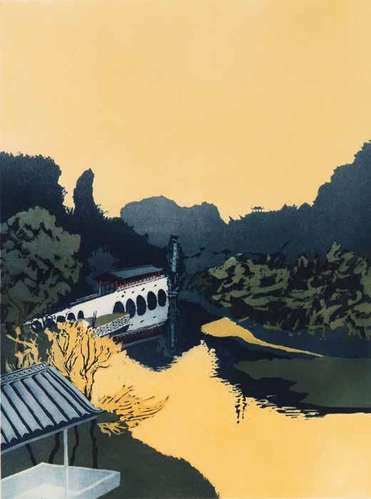
in Venice. Procktor’s well-documented sense of humour continues in Regata Storica. His preference in Venice Suite II is once again for the hidden, overlooked and unpopulated areas of landscape, with the notable exception of Regata Storica, which shows the famous ceremonial parade taking place along the Grand Canal. However, it is not quite teeming with life; on closer inspection, the gondoliers and spectators are all skeletal. As a result, the skulls “act as memento mori, reminding that beneath the shimmering trappings of the city, lies, as Thomas Mann brilliantly described, putrefaction, decay, a hint of death”.39 Procktor later admitted that his “morbid imagination”40 got the better of him when it came to translating into intaglio the original watercolour. Imagination is surely given freest rein in his next series, A Chinese Journey (CH 94–101), wherein the ‘modifying colours of imagination’ are utilised to great effect. Notably, the watercolour of Flower Bridge, Kweilin, painted on an overcast morning, is transformed in the aquatint through Procktor’s use of an intense yellow for both the sky and the water. To the largely grey watercolour of Lake Taihu, Wusih, he introduces a mystical green for the lake. Furthermore, Procktor has drawn a thin tree trunk in the right foreground, which intersects the composition. This should make for a jarring addition, but in fact it enlivens the scene by raising the vantage point and defining the pictorial space. And in contrast to the sun-bleached depiction in watercolour, the darker palette of Forbidden City, Peking, affords the subject a brooding presence befitting of its title. If, as Patrick Kinmonth wrote in 1984, to find beauty in unexpected places is the definition of an optimist, then “to redefine beauty in already beautifully-known places, even to enhance it, is a rarer gift”.41 This sentiment is demonstrated very well throughout the eight Chinese aquatints.
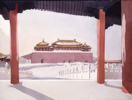
Forbidden City, Southern Gate, Peking, 1980, watercolour, 450 × 600 mm
As has been remarked upon earlier, the watercolours were instinctive responses to landscape, whereas the prints allowed for a more considered approach, as regards colour, composition as well as technique. In 1974, William Packer wrote that “Procktor works extremely hard, and is most prolific; too prolific, perhaps, for he is inclined to show everything he does, so that indifferent and unsuccessful things are hung alongside the good”.42 His printmaking was very different, subject to a rigorous editing process, whereby the artist, master printmaker(s) and publisher all participated in the selection of watercolours that they deemed a suitable starting point for an original print. Procktor’s distinctive handling of aquatint, and his sense of colour, played a considerable part in the success of each print, but there was also scope for the master printmakers to showcase their own expertise. It is fitting that Invitation to the Voyage was inspired by Baudelaire’s ascent into the unknown, for Procktor was embarking upon his own journey of technical exploration, working on multi-plate images for the first time, while Collyer and Crossley performed numerous painstaking and imaginative interventions on the actual plates, when it came to proofing and printing the edition. The Indian landscapes were similarly rich in technical innovation; just as Ed Ruscha, in Editions Alecto’s screenprinting studio, won much acclaim for using cherry pie filling, baked beans and chocolate syrup instead of inks, so Collyer and Crossley were, at the same time, utilising washing-up liquid and breadcrumbs to achieve several unique granular effects in Kathmandu. As noted by Max Chapman, “his ‘Indian Suite’ is very much in the tradition of the early topographers ... [but] With Procktor, the whole operation is spiced with idiosyncratic wit and technical quirks which update it”.43 Any prints considered ‘indifferent and unsuccessful’ were duly abandoned, although it should be noted here that Alan Shestack – the American print connoisseur who spent a lifetime in charge of major museums – purchased three Procktor prints on a visit to the Redfern Gallery, in 1986, including an impression of The hiding-places of my power (CH 26), which had failed to make the cut for India, Mother. As the New York Public Library’s keeper of prints from
42 William Packer, ‘Basil Beattie and Patrick Procktor’, The Financial Times, 15 October 1974.
43 Max Chapman, ‘Art Reviews: Redfern’, What’s On in London, 6 November 1970.
44 As quoted in Art Monthly, 1996, p. 42.
The Mariner, 1976, watercolour and ink, 610 × 465 mm
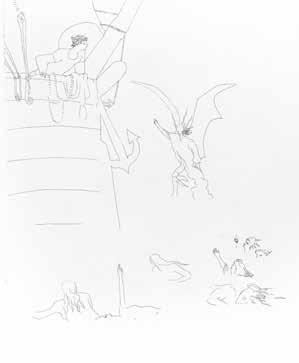
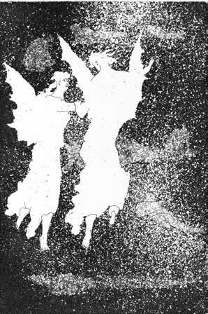
State proofs of The very deep did rot and Two of the
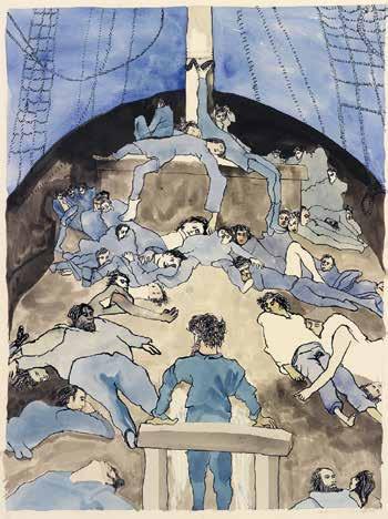
1969–81, Elizabeth Roth purchased from the Redfern an impression of I fear thee, ancient Mariner! (CH 59), which was rejected for a series of prints illustrating Samuel Taylor Coleridge’s The Rime of the Ancient Mariner (CH 60–71). As Procktor later explained, “the print never got used. It was too big; it was before we settled on a format”.44 Procktor made watercolours in preparation for the twelve, smaller prints that followed, but these could only have served as the merest starting point, as the images were completely transformed upon translation into intaglio. Half of the plates, for a start, are printed in black. Consequently, The Mariner watercolour is reduced to black and white in the related print, as Procktor captures the sailors’ traumatic final moments unfolding under the beauty of moonlight. Indeed, the white of the paper, used so effectively in previous series, continues to inspire. In this instance, Procktor replaces much of the literal and metaphorical darkness of Gustave Doré’s illustrations – on which most of the compositions are based – with large areas of white space, which contains the simple etched line of the sailors. This slow, meticulous line – in contrast to the elaborate crosshatching favoured by Doré – allows Procktor to convey their exhaustion and gradual demise. Throughout, Procktor is keen to emphasise the supernatural aspects of the poem, and to this end, the exaggerated physical elongations of the sailors work particularly well. When colour is introduced, it packs considerable punch; the series opens with a strange green for the freezing sea and icebergs, and by the halfway point, the water is a fantastic red. Based on a rather straightforward watercolour painted during Procktor’s voyage to South Africa, in 1974, the latter aquatint captures simultaneously the beauty and horror that is at the heart of Coleridge’s poem. Seven of the prints from this series combine etching with aquatint, and it is interesting to note that Procktor made sure to keep a state proof of each one. Some of these proofs show the basic compositions etched in line, before the introduction of aquatint, and thus invite fascinating comparisons with the editioned images. In The very deep did rot, for instance, the sparse state proof is now imbued with an attractive supernatural agency, thanks to Procktor’s use of fine aquatints. The state proof of Two of the Polar Spirit’s fellow-daemons, meanwhile, reveals that Procktor explored a coarse aquatint ground to describe the dead mariners. In the final state, this effect is softened – by the addition of colour, and by the use of fine aquatints for the spiritual daemons – maintaining Procktor’s ethereal treatment of the poem. Such was the interest in this series that Alecto proceeded with a three-tier publication: an edition, as well as two artist’s books – the first bound in full morocco, and the second in quarter cloth. By the end of the decade, over thirty public collections – many of them in America – had acquired a complete set of prints.
Polar Spirit’s fellow-daemons
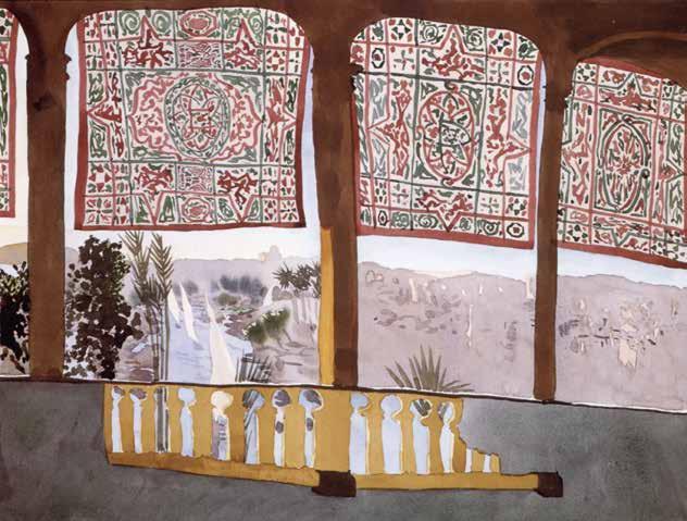
After Alecto ceased publishing contemporary prints in 1981, Procktor’s intaglio output became far less frequent. This coincided with the fact that Collyer and Crossley were now working on other projects, notably Henry Moore’s Mother and Child series, and that Charles Newington had moved to Kent to focus on his own career as a painter. Thus, when the Redfern commissioned a print relating to his time in Egypt, Procktor turned to lithography, and to Curwen Studio, where he previously created Northern Lass (CH 28) in 1971. The invitation to work at Curwen and contribute to the Europäische Graphik VII portfolio may have surprised Procktor, for at this time he had made only four lithographs, whereas his fellow contributors – such as Hockney, Howard Hodgkin and Allen Jones – were well-versed in the medium. However, by the time Procktor returned to Curwen, his experience in intaglio techniques meant that he was now more sensitive to the properties peculiar to lithography, and could better understand and exploit its surface effects. Working alongside master printmakers including Stanley Jones, Roy Silvey and John White, he created five lithographs at Curwen during the 1980s. His skilful handling of lithography is well demonstrated in Cataract, Aswan (CH 110), and comparison with the related watercolour reveals how Procktor revised and reinvented parts of the image. For example, in the lithograph, Procktor exaggerates this dramatic play of light and dark by introducing shadows to the immediate foreground, as cast by the balustrade, which now spans the entire width of the composition. Corfu (CH 121), published by the Redfern in 1989, also explores light and shadow through interior and
Cataract Terrace, Aswan, 1984, watercolour, 455 × 610 mm
45 Kip Gresham, via email to the author, 23 March 2024.
46 Kip Gresham, via email to the author, 25 January 2024.
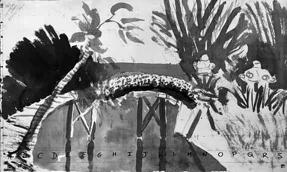
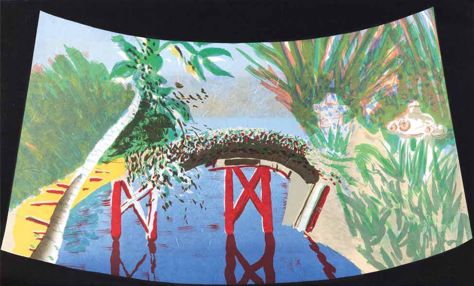
exterior, and was among the very last lithographs to be printed at Curwen, before it relocated to Cambridge and merged with Chilford Hall Press. Procktor continued the relationship, keen to embrace the screenprinting services that Curwen Chilford Prints now offered under Kip Gresham. On visiting Gresham’s studio, Procktor did not bring any related watercolours with him. Instead, he referred to his daily crossword as a springboard for ideas. And so it is that one of the resulting compositions includes such seemingly disparate elements as a cat, a cobra, a crown, a musical quaver and a lady’s shoe. But there is nothing jarring about the arrangements, as Procktor relies on his love of wordplay and visual puns to unify each image (CH 124–126). He clearly had fun assembling the compositions, and there is also an enjoyment in the actual making of the prints, especially when it comes to the possibilities offered by overdrawing. As Gresham explains, “the separations made on drafting film allowed one drawing to be registered to and to be developed from another underneath it. It also allowed him to work over a preparatory drawing, which gave the natural fluidity of his mark-making free rein”.45 As proofing progressed, the choice of paper became increasingly important; ultimately, says Gresham, “the key activator in the three prints is the Moulin du Gué linen/cotton paper, which gives an active ground to them all”.46 Their next collaboration, Katsura, Kyoto (CH 127), was printed on decorative Haruki paper, typically used in ancient Japanese architecture for shoji screens. In addition, Procktor abandoned the ochres and yellows of early proofs in favour of the colours associated with classic Japanese prints. Later, Gresham suggested that the image be shaped to resemble sensu – the folding fans invented in Japan around the ninth century. Together, they decided to invert the shape, so that it mirrored the bridge, with the resulting margins of the sheet printed in black. Scaled up from a very small ink drawing that Procktor painted in Katsura Imperial Garden, the final print is further notable for its monumental size; indeed, it remains among the largest screens that Gresham worked on. The final prints (CH 147–149), produced eight years later at Gresham Studio amid deteriorating health and shortly before a fire destroyed his home, make for a rather poignant ending. However, taken as a whole, Procktor’s thirty-plus years of printmaking represent a remarkably versatile and enduringly popular artist who delighted in the sheer diversity of his chosen/commissioned subject matter.
Scale drawing for Katsura, Kyoto
John Crossley
In the 1960s, there was a growth of interest in the accessibility of work by established contemporary artists from younger collectors, reflecting the possibilities of a more egalitarian culture. An expansion of original contemporary printmaking studios soon followed. The skills and expectations within these studios encouraged the artists invited to work on a project with them to develop and extend the possibilities of printmaking for their work. The resulting images were highly reflective of the new attitude of engaging with popular culture to influence their visual statements. Patrick Procktor’s established abilities in watercolour, and his sensitive image placing, were the ideal foundations on which to develop his skills in the medium of original printmaking.
Pursuit of the Parallax
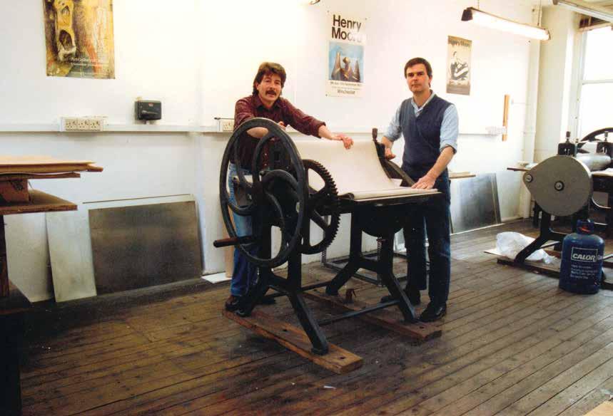
Master printmakers James Collyer and John Crossley, JC Editions studio, 1984
Invitation to the Voyage (CH 13–17), of 1969, was the first time that Procktor explored multi-plate intaglio technology and multi-colours in intaglio printmaking. For this series of five intaglio prints, made at the Alecto Studios, Procktor used zinc plates, rather than the more traditional copper. Unfortunately, this proved to be a problem – zinc plates with aquatint tone on them are too soft to withstand the inking and printing of larger editions. Prior to editioning, the surface of a zinc plate must be hardened to enable the image to last for the complete edition. Plating zinc involves a more complex process than the steel-facing of a copper plate, and the first attempt by the platers to plate Procktor’s aquatint on the zinc surface proved disastrous. The image was damaged by the chrome-facing process, resulting in the possibility of the image becoming irretrievable. The master printmakers, James Collyer and John Crossley, were brought in by Editions Alecto to resolve these complex issues. Working together for the first time, their involvement was crucial in enabling the Invitation to the Voyage project to go ahead. Finding a solution for removing the faulty plating while preserving the images was the primary challenge. This was achieved by working on the plates with various hand gravers and scrapers, as well as using many super-fine attachments on a rotary drill. The surfaces were then re-surfaced with a fresh aquatint on some of the tones with the revived plate surfaces being chrome-faced with great precision, involving a complex process that included acid washing and copper plating. The result was successful, but the image still retained some weaker aquatint tones, leading to more reproofing and very challenging inking when printing each plate. In addition, the zinc plates could still flatten under the pressure of the press, even under the hard chrome-facing, meaning that weakened tones became a challenge to maintain the depth of tone required in these very fine aquatints. To enhance these tone levels and give more control on the aquatints, the master printmakers made up a range of fine inkers, dollies and dabbers in varying densities of rolled felt, scrim and leather. Following the initial plating damage on Invitation to the Voyage, and the anxiety that surrounded the subsequent efforts to save the original plates, there emerged a positive, unforeseen result. Procktor, working closely with the master printmakers during this intense time, became totally focused on the possibilities of aquatint. For example, as Mirrors progressed through the final proofing and editioning, Procktor began to perceive a visual result that had a greater complexity than he had achieved in his earlier watercolour studies. The use of more defined imagery on different plates gave a distortion and curving to the figures, which captured better the confusing reflections that inspired Procktor when he came to making the initial sketches. From this point on, his understanding and exploration of the intaglio process was nurtured by Collyer and Crossley, firstly at the Alecto Studios in Kensington, and then at JC Editions, their own studio established in 1971 in Clerkenwell. This unique experience of intellectual and artistic collaboration between the artist and the master printmakers inspired Procktor to seriously embrace the extensive challenges of intaglio printmaking, with the possibilities of future projects in printmaking now firmly established. His collaboration with Collyer and Crossley continued regularly throughout the next decade, with the making of four more series of multi-plate intaglio prints, each inspired by trips to India, Venice, South Africa and China.
Aquatint is a tonal process in the etching medium, favoured by painters and printmakers in the past as its appearance could replicate the delicacy of watercolour and the immediacy of ink wash drawing. The high period for aquatint drawing in Britain was in the late eighteenth century when it was used by artists for picturesque and sublime landscape images, as in Paul Sandby’s Views of North Wales (1775–77). Thomas Gainsborough, in his etchings and aquatints of woodland scenes, often drew with the lift ground aquatint method of tone drawing, working the plate in a positive manner; the drawn marks made on the plate are the marks that are bitten and printed. In Wooded Landscape with Country Cart and Figures (c.1785; Hayes 18), there is no drawing in line etching. Instead, with a lift ground medium in his brush or pen, Gainsborough worked freely and directly with the brush to describe the tree forms, while using a broad-nibbed pen for the foreground water reeds, softening and giving distance and atmosphere to the scene. In Peat Bog, Scotland (1812; Liber Studiorum, plate 45), the line etching is by JMW Turner, and the aquatint by George Clint. Here the aquatint is used to enhance the sublime atmosphere of a moving storm over the distant mountains. In 1766, the French aquatint-engraver, Jean-Claude Richard de Saint-Non, translated into aquatint Jean-Honoré Fragonard’s Le Jeu de la Palette, with soft aquatint tones creating an elegant pastoral version of the Rococo painting.
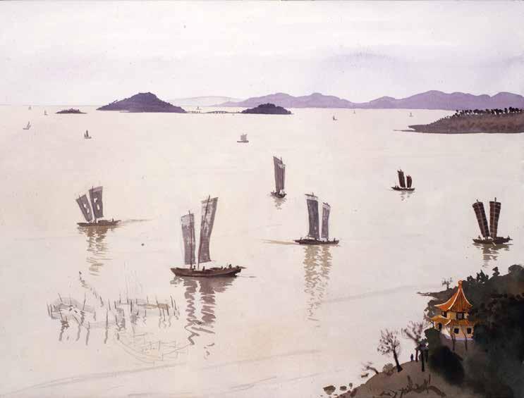
Lake Taihu, Junks, Wusih, watercolour
Aquatint toning was also used extensively in the eighteenth century, often to express speed and distance in racing and hunting scenes. Procktor enjoyed these historical images visualised by dust ground aquatint drawing. Procktor’s home was close to the Wallace Collection in Manchester Square, and he enjoyed viewing its extensive collection of eighteenth-century paintings and prints. He felt comfortable, too, with this period of history, with its overt delight in expressions of the momentary fun of youthful flirtations, as well as the possibilities of visual trickery in dress and body language recorded in images of people of wealth relaxing and meeting together. In landscape, he loved the emphasis of this same possibility of visual trickery presented in expressions of light refraction or obscurity of cloud, and these were all available to dictate his interpretation of an often-well-known vista with his own intellect. His growing understanding of aquatint possibilities enhanced his sensitive interpretations of landscape.
Predominantly, Procktor used the standard method for aquatint tone drawing on his intaglio plates. This entails working on the plate from white to black in a negative manner. To draw the tonal ranges, an acid-resistant varnish is brushed onto the aquatinted plate to define the different tonal areas required. The parts of the plate
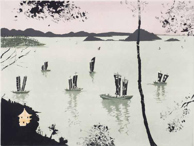
Lake Taihu, Wusih, aquatint
to print white are stopped-out with the varnish first, leaving the rest of the grained metal surface exposed for biting. The first biting takes place for the lightest tone. The darker gradations are gradually stopped-out until the final biting for the darkest tone is achieved. The exposed metal channels around the rosin dust particles are bitten into with etchant. After these channels are inked up and printed, they appear on magnification as white, irregular shapes surrounded by black, interwinding pools. All of Procktor’s aquatint plates were laid by the method of aquatint dust ground. In the platemaking of the aquatint plates, the first key element related to the drawing is the laying of the aquatint dust ground. The grains are made up of acidresistant powered rosin. These grains are porous to the extent that an etchant can only partially bite through to the metal plate, making its surface pitted. The grains are sprinkled onto the plate’s surface using devices such as shakers and mechanical dusting boxes with internal plate trays, which can be controlled to make a variety of
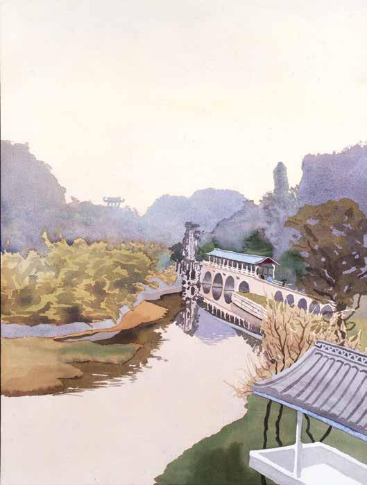
Flower Bridge, Kweilin, watercolour
very different textured tones. The rosin dust grains are fused onto the plate’s surface by heating the plate from underneath with a moving flame until the white surface of dust on the plate melts and turns a transparent yellow. This process in itself can give different textures to the final image. When laying a standard aquatint dust ground, the melted dust grains must stand alone and not melt together. However, for a further variety of drawn textures, the dust grains can be melted together or scribed through. Procktor found a particular interest in this unique tonal process of aquatint dust ground texture, its difference from his watercolour vocabulary providing another dimension to the subject. This method of laying the grain on the plate surface is irregular, giving possibilities of misty atmospheres and translucent effects on the printed image. This was especially appropriate for describing complex distances and formidable mountain ranges in landscape, and reinforced ideas of duality.
Flower Bridge, Kweilin, aquatint
In Rowli Mountains (CH 20), Procktor expertly makes six tonal bites into a single aquatinted plate using the standard method for aquatint drawing. By leaving the architectural interior in the lightest tone, he not only suggests the intensity of the sunlight, but also directs the viewer’s eye towards the vastness and distance of the mountains beyond, which are described by the other five tonal bites. Queen’s Necklace (CH 21) is another intaglio print made on a single aquatinted plate, but which offered Procktor a different way of exploring atmospheres. Inspired by India’s famous waterfronts, he uses colour blending to make the light suffuse the whole image, and to suggest a vision of very distant space. Translucent purple and pink are rubbed into the blue to blend the colours on each inking of the plate by the master printmakers. Colour blending is also used in Dogana (CH 36). Here Procktor uses two plates to form the image: the first to hold the composition, and the other to hold the atmosphere by manipulating the colour as the print editioning progresses, with the master printmakers blending brighter yellows to create a luminous, foggy atmosphere of a Venetian autumn and at the same time to compensate for the plate aquatint being worn away by the use of dense Naples yellow pigment mix. With further use of the multi-plate methods in Kathmandu (CH 25), Procktor utilises the conjunction of two very different aquatint plates, wherein two half images on full plates appear slotted together. On the first plate, the lower elevation of the mountains is achieved by a grey-blue foreground on which buildings nestle, before leading up to a high point with mid-violet edges. The second plate, however, used multiple graining aquatint methods to suggest another world beyond, a parallel world where lighter tints become brighter in another dimension of distant blue mountains and rose madder clouds within a yellow haze.
The lift ground aquatint method of tone drawing was another important part of Procktor’s aquatint vocabulary. The tones are drawn with a brush or broad-nibbed pen onto the aquatint grounded plate with a thick and water-soluble lift ground solution. The brushmarks of the solution must be kept constant, and only one tonal bite can be made; the whole process must be repeated for further tones. After the first drawing, the lift ground solution is left to dry. Using a wide, soft bristle brush, a thin coat of acid-resistant stop-out varnish is applied in one stroke over the entire lift grounded plate’s surface. When the stop-out varnish is dry, the plate is immersed in warm water, which causes the lift solution (usually sugar) to swell and crack the varnish coat. The part of the varnish that has the lift ground drawing under it lifts through the varnish to expose the aquatint ground ready for biting. The main difference from the standard method of aquatint is that the drawing is made in a positive manner –that is, the shapes made on the plate are bitten. This lift ground method gives freer brushstroke drawing with a quality similar to brush or wash drawing. If a pen is used it imitates the fluid line of pen drawing. Procktor utilised the lift ground aquatint method in small amounts on many of his intaglio prints, using a brush or pen for drawing in finer details. This can be seen throughout A Chinese Journey (CH 94–101). After a painting trip to China in 1980, Procktor returned to the London studio of JC
Editions to begin his next intaglio printmaking series, of eight multi-plate aquatints. When using aquatint, the layers of aquatint toning can be worked in a similar way to watercolour painting. Using a watercolour as a starting point for the landscape, the aquatint drawing can flow onwards, giving another dimension to the subject. It is this transition from drawing on paper to drawing on a hard, rigid metal surface that encourages in the artist’s mind the exploration of another world. Procktor begins this multi-plate intaglio printmaking project by contrasting two different views of China. In Forbidden City, Peking, using fine aquatints he portrays the inner solitude of the distant building, emphasising its remote and inaccessible aura. By contrast, in Nasturtiums, Wusih, Procktor portrays the interior world in harmony with the outside world by inking in deep green the aquatint of distant mountains and the foreground nasturtiums. Using two different approaches in Lake Taihu, Wusih and Flower Bridge, Kweilin, Procktor creates the parallel dimensions that can be communicated within multi-plate printmaking. In the former, he makes the image on different parts of each plate, building up a world beyond the water’s edge, a parallel world of atmospheres of translucent pink, a mysterious island and distant mountains that never end. In contrast, in Flower Bridge, Kweilin, he builds up layers of colours to make solid forms, interlocking the solid forms of the intense yellow water and sky with the deep blue mountains. In so doing, he achieves the perception of difference, a world in an altered state – a parallax to the real world. In Yellow Dragon Cave, Hangchow, the entrance to another world is indicated by a coarse grain aquatint that identifies the bland interior, which is contrasted with the finer grained aquatints of the more complex world outside. In Lion Rocks Garden, Soochow, Procktor takes us through the entrance and beyond the barrier to this mysterious other world. It is a world in an altered state, a floating idyl of pagodas, bridges and rocks suggesting dancing lions. Many multi-grain methods were used including bubble grain aquatint, where coarse grain is sprinkled by hand onto soapy bubbled water, evaporated off before the grain is melted on. These Chinese prints capture the parallax of experiencing being within the two states simultaneously, while still able to perceive the differences. Ultimately, A Chinese Journey remains one of the best examples of multi-colour intaglio printmaking in late twentieth-century British art. These eight aquatints serve as tangible evidence of the charged working environment at JC Editions, which encouraged high expectations and masterful results from both the artist and the master printmakers. The power of Procktor’s intaglio work is its ability to share a narrative, not to dictate or define. It becomes a parallax of complex compositional filaments, enhancing the possibilities of interpretation.
Notes to the Catalogue Raisonné
Catalogue Raisonné Numbers:
Each entry is numbered from 1 to 149, and preceded by the letters CH, which refers to Crossley and Healey, the authors of the catalogue raisonné. Entries are arranged in chronological order, starting with Procktor’s first print of 1959.
Date:
The year the print was completed. Some proofs may be dated a year earlier than the edition.
Medium:
All methods listed here are expanded on in the glossary of printmaking methods (page 194).
Image Size:
Measurements are shown in millimetres and inches, height before width.
Paper:
When known, the paper type is specified for each print, apart from the Student Prints, for which various papers were used. The paper for Procktor’s prints was white in colour, unless noted otherwise.
Sheet Size:
There are slight variations in paper size, particularly on the intaglio prints, as the paper stretches in the press. The paper size is used only for the edition; proof sizes are various.
Edition:
Each print from the edition is signed and numbered by Procktor, just below the image. The number of the editioned print is typically written on the left-hand side, with the signature on the right-hand side.
Unpublished Prints:
A small number of impressions were printed of each unpublished print before the plate/screen was defaced, following the decision not to proceed with editioning. Occasionally Procktor signed and inscribed the impressions ‘AP’ or ‘Artist’s Proof’, while others were left unsigned and not inscribed.
Artist’s Proofs:
In the traditional sense, Artist’s Proofs are identical to (but outside of) the numbered edition, and belong to the artist. These are inscribed ‘AP’ or ‘Artist’s Proof’, on the left-hand side, with the signature on the right. Some of Procktor’s APs are occasionally dated, titled and/or numbered (often in Roman numerals). The exact number of APs for each print is recorded in the catalogue raisonné only when the authors have seen a numbered AP. Generally speaking, between five and twenty APs were printed, depending on the edition size. Unpublished prints were also inscribed ‘AP’, which in this sense refers to proofs kept by the artist.
Printer’s Proofs:
Printer’s Proofs are inscribed as such on the left-hand side, with Procktor’s signature on the right. They are identical to (but outside of) the numbered edition, and belong to the printer. In the catalogue raisonné, the number of PPs corresponds to the number of people involved in the proofing and printing.
State Proofs:
These are impressions from the plate/stone/screen to record a particular stage in the progress of the image. State proofs were occasionally inscribed as such, but typically left unsigned and not inscribed, with most disposed of after editioning.
Working Proofs:
When the image on the plate/stone/screen is finalised, working proofs in colours are printed. These are not usually the same colour as the editioned print. Procktor signed and inscribed working proofs ‘Trial Proof’, ‘Colour Proof’, ‘Colour State’ or ‘Proof’, while others were left unsigned and not inscribed, with most disposed of after editioning.
BAT Prints:
Once the artist is satisfied with the image, the proof is inscribed ‘BAT’ (Bon à Tirer) by Procktor to indicate that it is the finished image, and the one the edition is to be made to.
Intaglio Prints:
Procktor’s intaglio prints were made on copper plates, apart from those created between 1959 and 1969, for which zinc plates were used. The copper plate’s surface was steel-faced to strengthen it for editioning. In the colour intaglio prints, a ‘Final Colour Proof’ was often printed before steel-facing, and a BAT printed and signed after the steel-facing, as some inked colours on steel-facing can appear different from copper plates.
Inscriptions:
Inscriptions are in the hand of Patrick Procktor. The prints are typically only signed and numbered; they rarely contain the date or title. Unless noted otherwise, the inscriptions are written below the image, and are in pencil.
Stamps:
Flat or embossed stamps that appear on Procktor’s prints are the printer’s or publisher’s stamp. Flat stamps appear on the reverse. Embossed stamps appear below the image in the lower right or left margin. It should be noted that stamps were often applied inconsistently throughout an edition, and therefore some numbered impressions may be stamped while others may not. As regards unpublished prints, impressions were not generally stamped.
Public Collections:
For the complete list of public collections, see pages 200–202.
Comments:
Commentaries have been written by John Crossley for each series of prints and for most individual prints.
Catalogue Raisonné
STUDENT PRINTS
All of Patrick Procktor’s student prints were made using intaglio methods, and were proofed and printed by Procktor at the Slade School of Fine Art, London, from 1959 to 1962.
Each print was made on a single zinc plate, and printed in black. All are unpublished and not editioned; no more than five impressions were pulled from each plate.
Some are signed (and dated and/or titled), while unsigned impressions also exist.
These student prints are essentially plate experiments in line, line-tone, drypoint and aquatint. The linework throughout indicates a build-up of vocabulary in the use of etching scribers of various widths. The aquatint is fluid and spontaneous, with Procktor using a mixture of aquatint methods. Each print demonstrates a particular sense of freedom and enjoyment in intaglio printmaking.
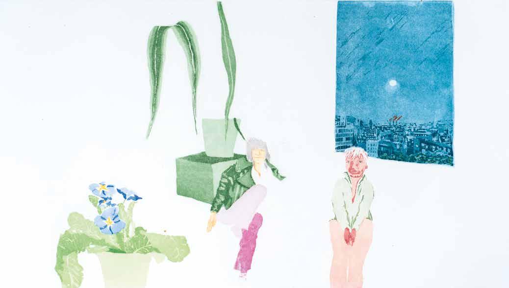
Sadie and Prudence 1969
Aquatint
Plate 252 × 450 mm / 10 × 17¾ ins
3 plates printed in 10 colours, greens, reds, blues, black, yellow, purple, beige
Portrait of Gervase Griffiths and Eric Emerson.
CH 15
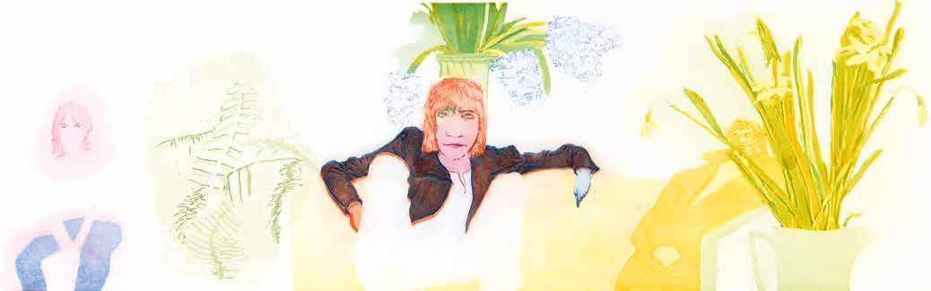
CH 16
Ossie, Gervase and Eric 1969
Aquatint
Plate 276 × 880 mm / 11 × 34¾ ins
2 plates printed in 9 colours, greens, blues, red, pink, orange, yellow
Public collections: Art Gallery of Ontario; Manchester Art Gallery
Portrait of Ossie Clark, Gervase Griffiths and Eric Emerson.
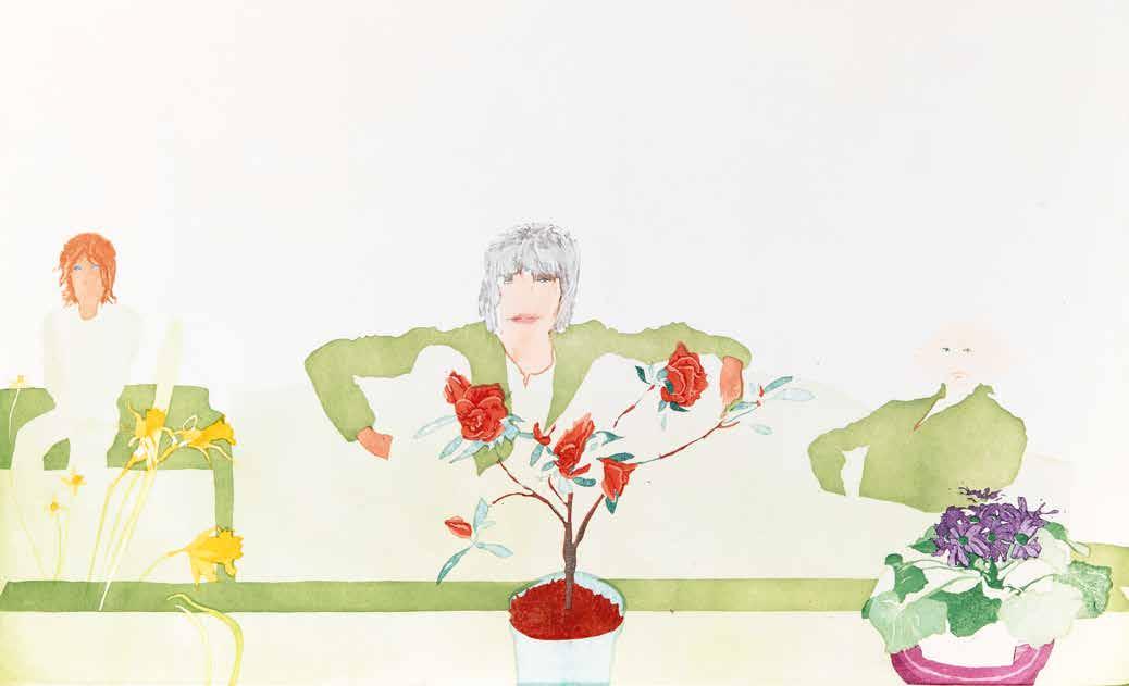
CH 17
Language of Flowers 1969
Aquatint
Plate 450 × 747 mm / 17¾ × 29½ ins
3 plates printed in 12 colours, greens, reds, black, purple, violet, orange, yellow, blue, beige
Public collections: Blanton Museum of Art; Cincinnati Art Museum; Maitland Regional Art Gallery; Pallant House Gallery
Portrait of Ossie Clark, Gervase Griffiths and Eric Emerson.
25
Kathmandu 1970
Aquatint and lift ground aquatint
2 plates printed in 12 colours, blues, greens, yellow, pink, brown, red, orange, violet
Public collections: Government Art Collection; Yale Center for British Art
For Kathmandu, the largest print in this series, Procktor started by using just one plate, but after discussions with Collyer and Crossley on their methods of aquatinting, another plate was introduced. The first plate, a mixture of aquatint and lift ground aquatint, achieves a grey-blue foreground base that leads up to heights of violet, on which descriptions of the populated hillside are discernible. The second plate used multiple graining aquatint methods to suggest another world beyond, of distant blue mountains, yellow skies and crimson clouds.
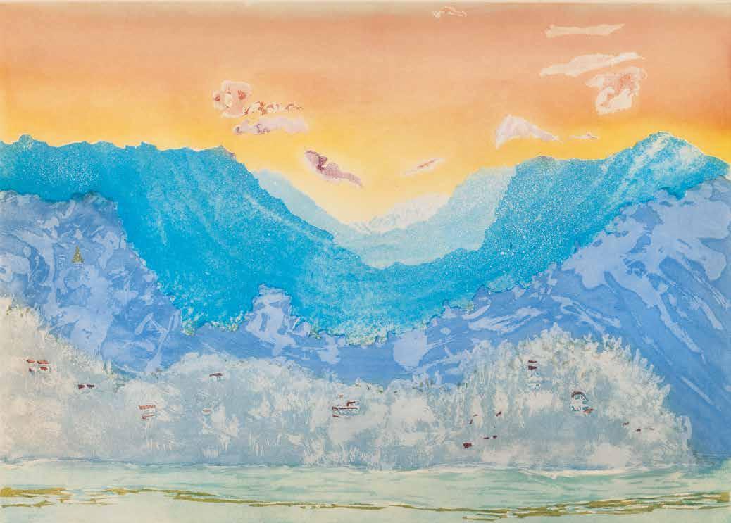
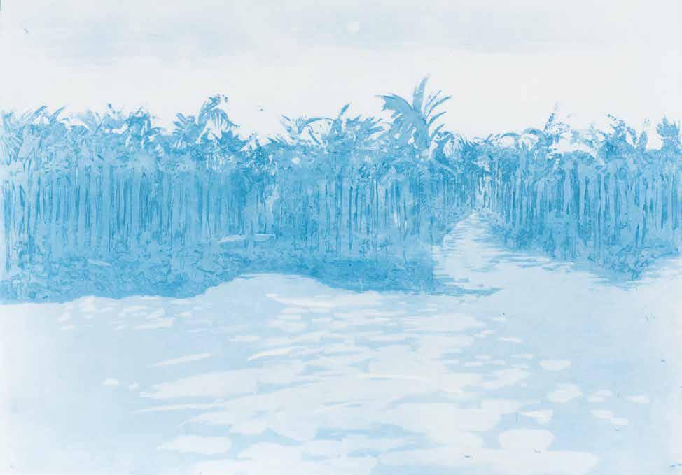
The hiding-places of my power 1970
Aquatint
Plate 430 × 615 mm / 17 × 24¼ ins
1 plate printed in 2 colours, blues Wove rag paper Crisbrook Waterleaf
Print not editioned
Signed by Patrick Procktor
Proofed and Printed by James Collyer and John Crossley at Alecto Studios, London
Unpublished
This print, of the vast mangroves along the Persian Gulf in moonlight, was originally intended to be part of India, Mother (CH 19–25). The title comes from William Wordsworth’s autobiographical poem, The Prelude (1805), in which he famously writes of the ‘spots of time’ – powerful interactions with nature that enable troubled memories to be pushed aside, allowing new experiences to be laid down.
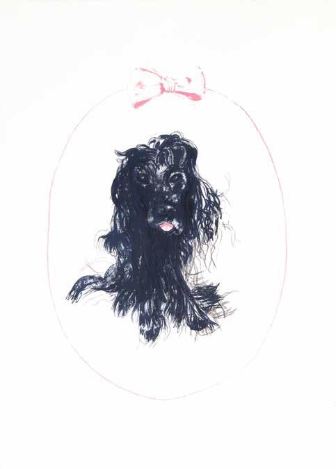
CH 27
Bow Wow 1970
Lithograph
Plate 565 × 405 mm / 22¼ × 16 ins
3 plates printed in 3 colours, black, blue, pink Wove rag paper Crisbrook Waterleaf. Sheet 785 × 570 mm / 31 × 22½ ins
Edition of 75 plus APs
Signed, titled and numbered by Patrick Procktor
Proofed and Printed by Ian Lawson at Fulham studio, London
Published by Redfern Gallery, London 1970
Portrait of Spade, Patrick Procktor’s pet dog. Here Procktor demonstrates his love of wordplay, which also inspires Northern Lass (CH 28) and Back at the Zoo, Regent’s Park (CH 34).
Back at the Zoo, Regent’s Park 1971
Etching and aquatint
Plate 545 × 690 mm / 21½ × 27¼ ins
2 plates printed in 3 colours, greens, black Colour blending by James Collyer and John Crossley in greens
Wove rag paper J Green HP Waterleaf. Sheet 705 × 880 mm / 27¾ × 34¾ ins
Edition of 75 plus APs
Signed and numbered by Patrick Procktor
Flat stamps of James Collyer, John Crossley and Editions Alecto
Proofed and Printed by James Collyer and John Crossley of JC Editions at Alecto Studios, London
Published by Editions Alecto, London 1971
Public collections: Norfolk Museums Service
Procktor made many paintings of Regent’s Park, but in this print, he wanted to capture the essence of the park during spring by using bright sap greens, which were blended to create an atmosphere of fresh grass and warm spring sunlight. This print also incorporates Procktor’s delight in wordplay. This print is usually listed in exhibition catalogues as Back of the Zoo or, less commonly, Back to the Zoo. The first BAT is signed, dated ‘9.71’, inscribed ‘BAT’, titled Back At The Zoo, Regent’s Park and printed in greens, browns and black.
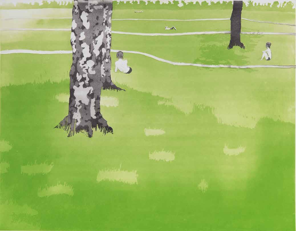
VENICE SUITE II
Consiglio
Bacino
Zattere
Ponte Lungo
Regata Storica
Giudecca
Palazzo Dario
Venice Suite II is a series of 7 intaglio prints made by Patrick Procktor in 1978 Each printed on wove rag paper BFK Rives. Sheet 880 × 1130 mm / 34¾ × 44½ ins (CH 86 is 1130 × 880 mm); CH 82, 83 and 85 are 635 × 800 mm / 25 × 31½ ins
Edition of 35 plus APs
Signed and numbered by Patrick Procktor
Embossed stamp of Tisiphone Etching
Proofed and Printed by Charles Newington of Tisiphone Etching at Alecto Studios, London
Published by Editions Alecto, London, and Redfern Gallery, London 1978
Venice Suite II was Procktor’s sixth series of colour intaglio prints, and his second to focus on Venetian landscapes. In August 1977, Procktor travelled to Venice with Charles Newington to paint new watercolours for a solo exhibition, opening in September, at the Galleria del Cavallino. Newington took photographs of the forty or so watercolours before they were sold, so that Procktor could refer to these as a starting point for Venice Suite II. Completed in London at the Alecto Studios, the series was exhibited for the first time at the Redfern Gallery in June 1978.
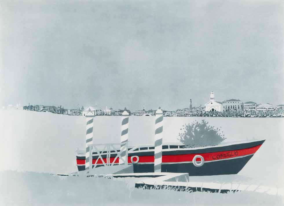
80
Consiglio 1978
Aquatint
Plate 647 × 885 mm / 25½ × 35 ins
2 plates printed in 2 colours, blue, red
Here Procktor uses a range of fine aquatints to convey the evenness of the sky and the stillness of the water, set against the solid Venetian consignment boat. The still atmosphere is interrupted by the coloured stripes on the Venetian canal poles (pali da casada).
CH
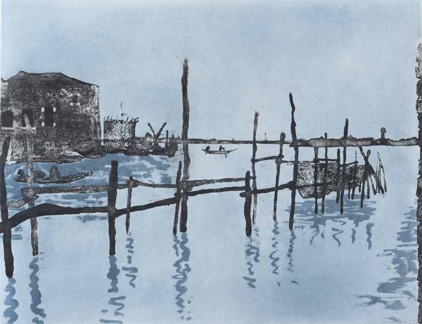
83
Ponte Lungo 1978
Aquatint
Plate 455 × 590 mm / 18 × 23¼ ins
2 plates printed in 2 colours, black, blue
Procktor portrays a stillness in the view but looking outwards from Ponte Lungo to the Venetian Lagoon. Again, he used the Venetian canal poles, but this time as a focal point, and to capture the particular way that they reflect the depth of the water on the surface of the Lagoon.
CH
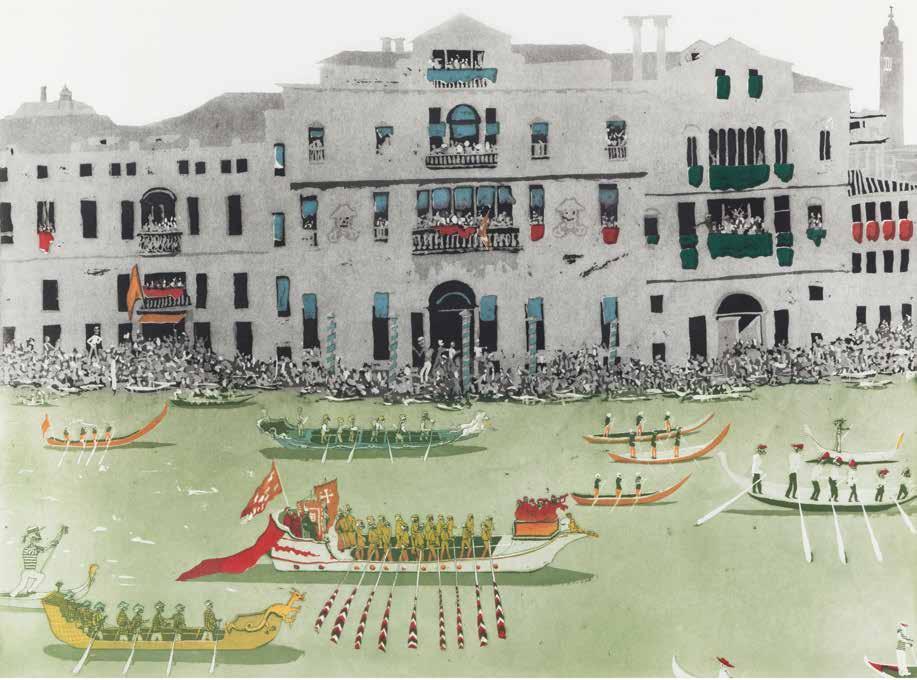
Regata Storica 1978
Etching and aquatint
Plate 650 × 885 mm / 25¾ × 35 ins
2 plates printed in 5 colours, black, green, red, yellow, blue
The historic annual regatta, featuring a water pageant and boat races, has inspired many artists over the years. As a skilled printmaker, Procktor uses aquatint with a minimum amount of tone to emphasise the key features of the event. However, this familiar scene is disturbed by the introduction of memento mori, with Procktor having replaced the heads of the costumed gondoliers with skulls.
CH 84
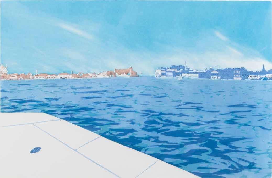
CH 85
Giudecca 1978
Aquatint
Plate 423 × 645 mm / 16¾ × 25½ ins
2 plates printed in 3 colours, blues, red
Public collections: Guy’s and St Thomas’ Foundation
A view from an island in the Venetian Lagoon, Giudecca demonstrates Procktor’s masterful use of aquatint on two plates to describe the Lagoon’s glittering reflections from foreground to the horizon in two colours.
CH 86
Palazzo Dario 1978
Aquatint and lift ground aquatint
Plate 886 × 653 mm / 35 × 25¾ ins
2 plates printed in 4 colours, black, blue, red, green
Palazzo Dario was built in the Venetian Gothic style on the bank of the Grand Canal. From the inside of the palace, Procktor has produced a view through the ground floor gate railings facing directly onto the Grand Canal. Using a very coarse, hand-thrown aquatint, the railings were allowed to bite for a long time. This conveyed the denseness of the cast metal, while reinforcing the suggestion that behind the railings is a restricted, private area. By contrast, a finer aquatint is used on the first plate for the canal and the buildings.
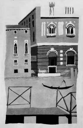
State Proof (first plate, 590 × 360 mm)
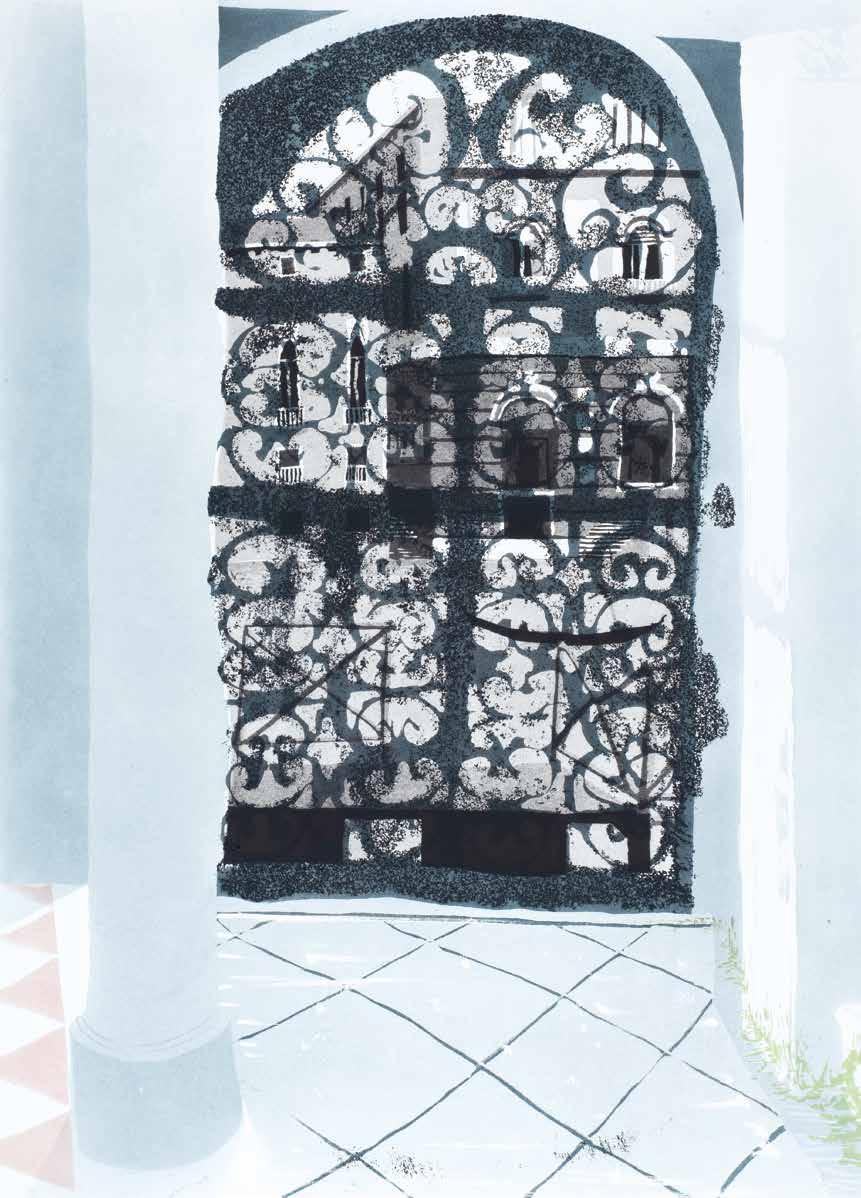
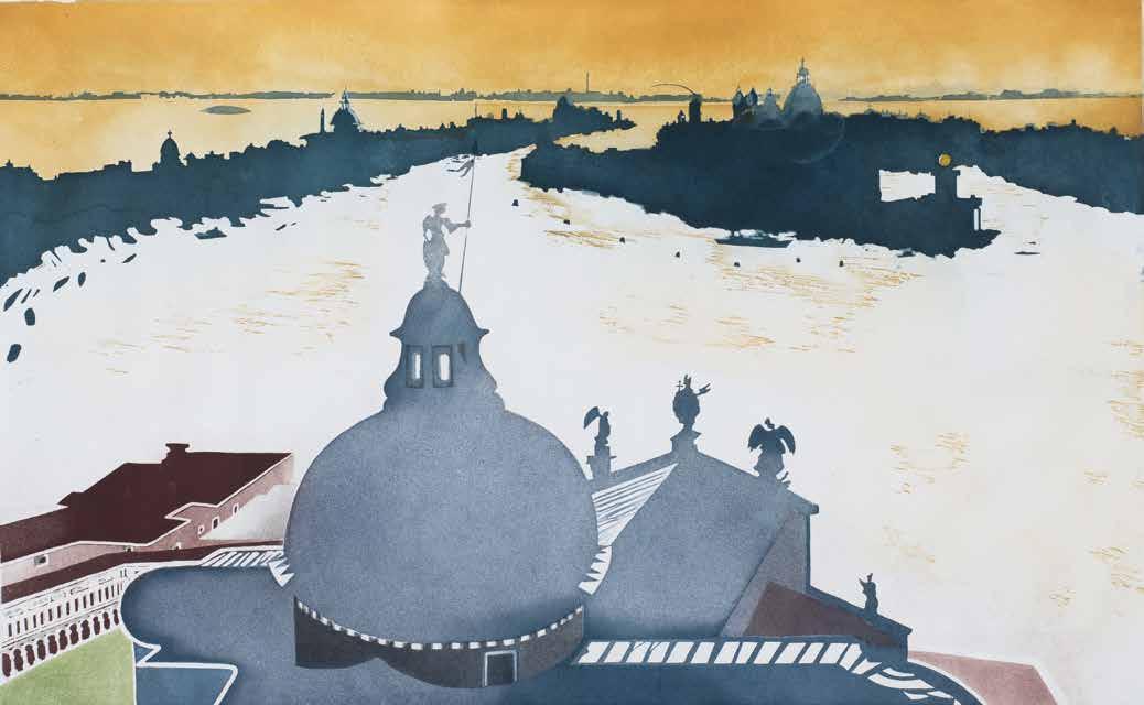
San Giorgio 1978
Aquatint
Plate 423 × 678 mm / 16¾ × 26¾ ins
2 plates printed in 5 colours, blues, yellow, green, brown Wove rag paper BFK Rives Print not editioned
Proofed and Printed by Charles Newington of Tisiphone Etching at Alecto Studios, London Unpublished
This intaglio print was originally intended to be part of Venice Suite II (CH 80–86).
A CHINESE JOURNEY
Forbidden City, Peking
Nasturtiums, Wusih
Lake Taihu, Wusih
Flower Bridge, Kweilin
Damian Mountain, Kweilin
Yellow Dragon Cave, Hangchow
Lion Rocks Garden, Soochow
Camels, Tomb of the First Emperor of the Ming Dynasty, Zhu Yuanzhang, Nanking
A Chinese Journey is a series of 8 intaglio prints made by Patrick Procktor in 1980
Plate 455 × 600 mm approx. / 18 × 23¾ ins; CH 95 and CH 97 are 600 × 455 mm approx. Each printed on wove rag paper Arches. Sheet 685 × 810 mm / 27 × 32 ins and 810 × 685 mm
Edition of 75 plus APs
Signed and numbered by Patrick Procktor
Embossed stamp of JC Editions
Proofed and Printed by James Collyer and John Crossley at JC Editions, London
Published by Editions Alecto, London, and Redfern Gallery, London 1980
Public collections (complete set): Government Art Collection
A Chinese Journey was Procktor’s seventh series of colour intaglio prints. Procktor had studied Chinese painting and calligraphy on regular visits to the British Museum, and this influence can be seen in much of his visual work. Impressed by a recent exhibition at the Redfern Gallery, Chinese diplomats living in London offered Procktor a permit to travel freely in China, accompanied by a guide and a driver; this in itself was remarkable, and it meant that Procktor became the first British artist to visit and record the country since the Cultural Revolution. He spent eight weeks in China during March and April 1980, completing over fifty landscape watercolours of the picturesque mountains, lakes and Chinese gardens. On his return to London, Procktor used these watercolours as a starting point for A Chinese Journey. The series was exhibited for the first time at the Redfern Gallery in November 1980.
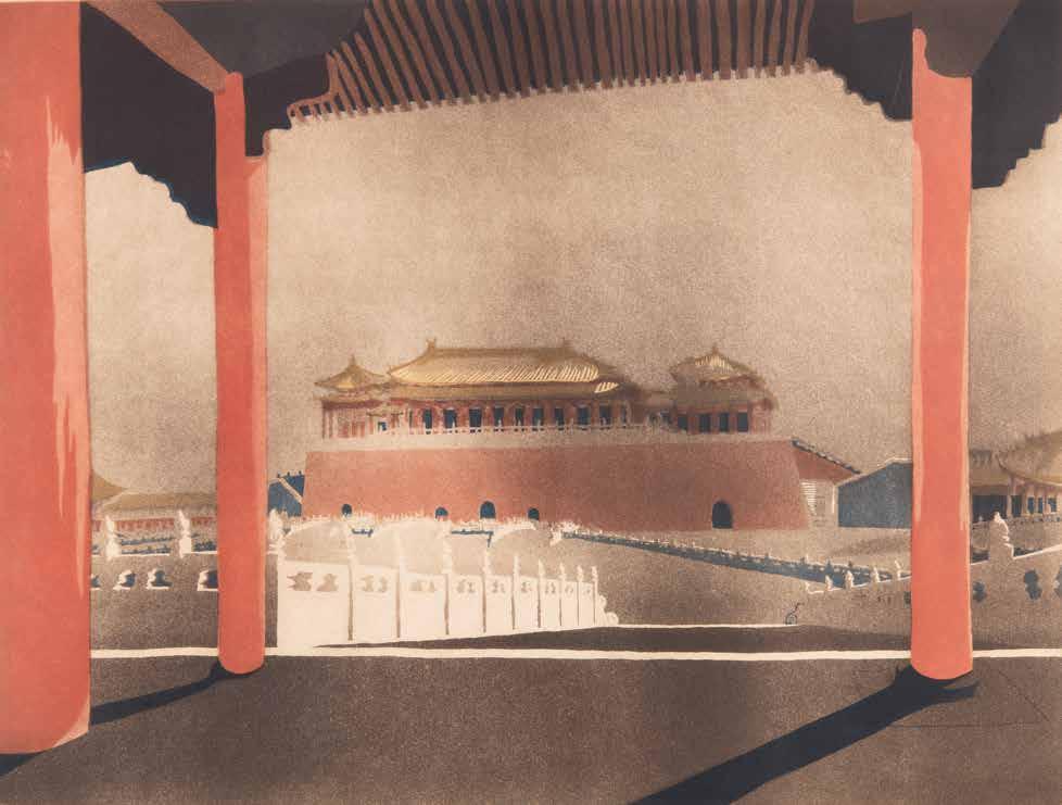
CH 94
Forbidden City, Peking 1980
Aquatint
3 plates printed in 5 colours, browns, red, yellow, blue Colour blending by James Collyer and John Crossley in browns
Public collections: Victoria and Albert Museum
In Forbidden City, Peking, the first plate describes infinite space by using fade-out blending of fine aquatint tones in neutral browns, while the second and third plates in red, yellow and blue pull out the inner solitude of the distant building, emphasising its remote and inaccessible aura.
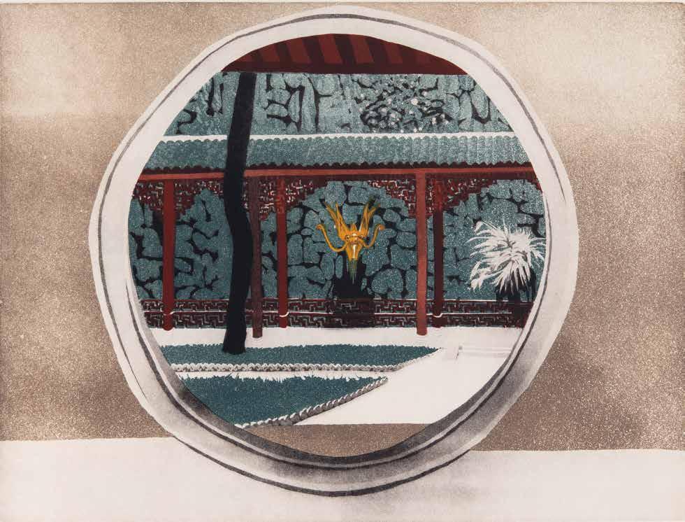
Yellow Dragon Cave, Hangchow 1980
Aquatint and burnished aquatint
3 plates printed in 5 colours, black, green, red, brown, yellow
A viewing frame is also used here, but in a very different way to Damian Mountain, Kweilin (CH 98). Using fine aquatints, the first and second plates show the view of the closed inner sanctuary through a Chinese moongate. In the final plate, the moongate is described in coarse aquatints to emphasise the separation of the outside public space from the inner private space.
CH 99
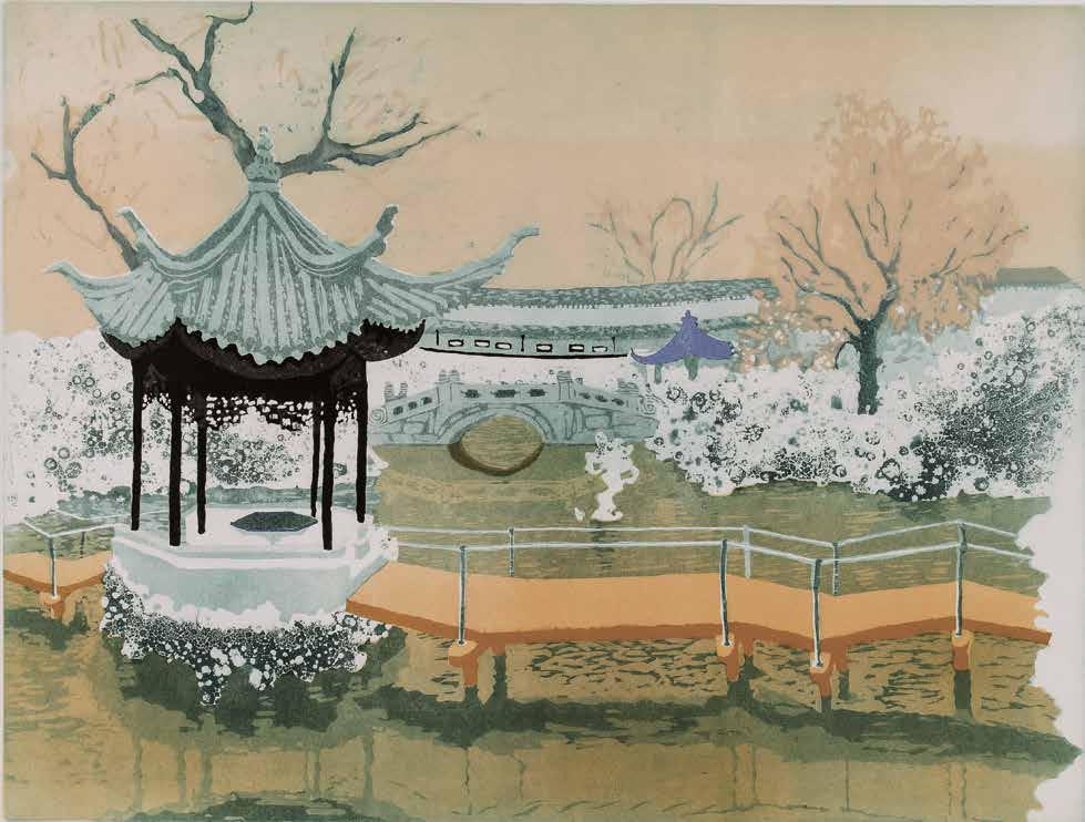
CH 100
Lion Rocks Garden, Soochow 1980
Aquatint, lift ground aquatint and burnished aquatint
2 plates printed in 5 colours, yellows, black, green, blue
Public collections: Bank of England Museum
Multi-grain aquatint methods capture the essence of this famous Chinese garden with its water bridges, pagodas, plum tree blossoms and the rocks suggesting dancing lions.
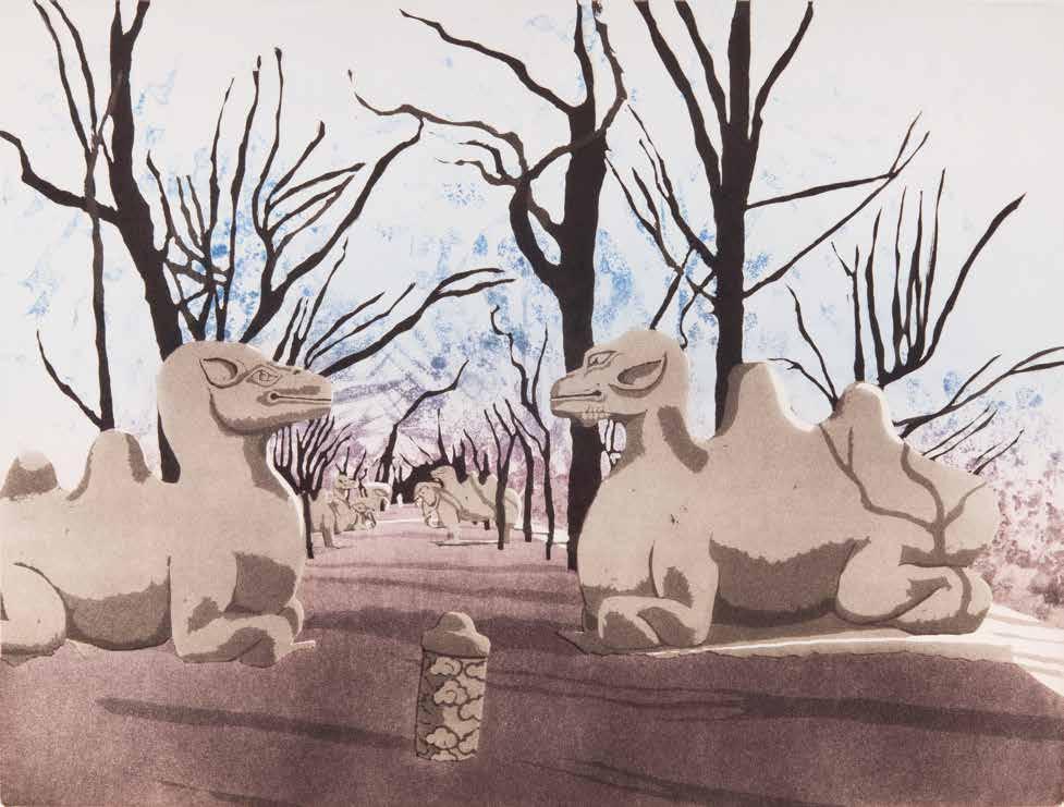
Camels, Tomb of the First Emperor of the Ming Dynasty, Zhu Yuanzhang, Nanking 1980
Aquatint and lift ground aquatint
2 plates printed in 4 colours, browns, purple, blue
Colour blending by James Collyer and John Crossley in purple and blue
Here Procktor uses a soft, graded aquatint to emphasise the long walk, which is lined with large stone statues of animals to the First Emperor’s tomb. Along this walk, Procktor then contrasts the dark aquatint trees in the foreground space, using them as an earthly anchor against the distant lift ground aquatint sky, achieved by loose, textured blending of blue to royal purple at the point of the Emperor’s tomb.
CH 101
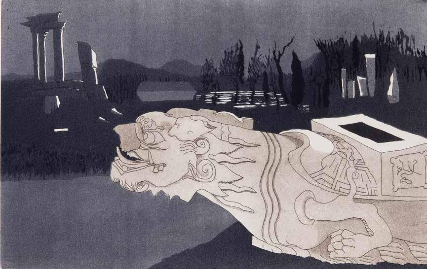
Fallen Turtle 1980
Etching, aquatint and lift ground aquatint
Plate 250 × 400 mm / 10 × 15¾ ins
2 plates printed in 3 colours, black, blue, brown
Wove rag paper Arches
Print not editioned
Signed by Patrick Procktor
Embossed stamp of JC Editions
Proofed and Printed by James Collyer and John Crossley at JC Editions, London
Unpublished
CH 104
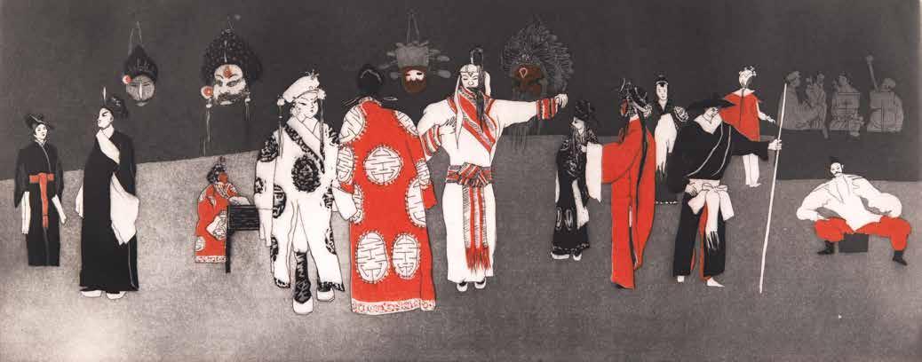
105
Peking Opera 1980
Etching and aquatint
Plate 270 × 685 mm / 10¾ × 27 ins
2 plates printed in 2 colours, black, red Wove rag paper Arches. Sheet 470 × 850 mm / 18½ × 33½ ins
Edition of 500 plus APs
Signed and numbered by Patrick Procktor
Embossed stamp of JC Editions
Proofed and Printed by James Collyer and John Crossley at JC Editions, London
Published by Editions Alecto, London, and Redfern Gallery, London 1980
Public collections: Leicestershire County Council
Procktor made several drawings of the Peking Opera while in China. On returning to London, he produced this intaglio print at the JC Editions studio. Only edition numbers 1 to 100 out of 500 were printed.
CH
Cataract, Aswan 1985
Lithograph
Plate 457 × 610 mm / 18 × 24 ins
8 plates printed in 8 colours, yellows, red, pink, beige, green, blue, grey
Wove rag paper Arches. Sheet 750 × 915 mm / 29½ × 36 ins
Edition of 100 plus 10 numbered APs
Signed and numbered by Patrick Procktor
Proofed and Printed by Curwen Studio, London
Published by Redfern Gallery, London 1985
Public collections: Government Art Collection; The Whitworth
Procktor travelled to Egypt in 1984, where he made around twenty watercolours of his journey. On his return to London, he selected only one image to translate into an original print. This lithograph shows the view from the terrace of the Cataract Hotel, Aswan, looking towards the islands and boats on the Nile. Procktor contrasts the strong, cool shadows of the foreground interior with the pale, sun-bleached landscape beyond.
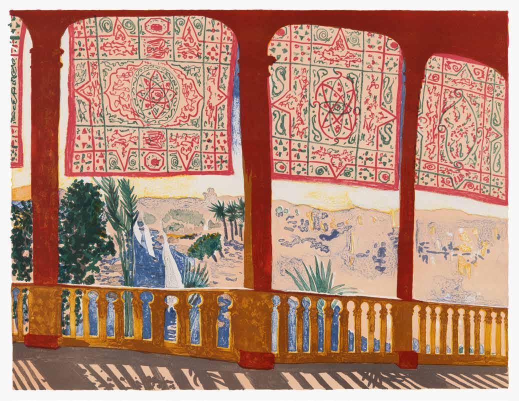
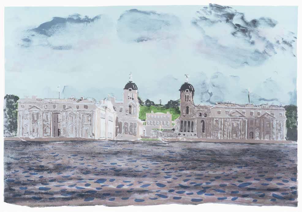
CH 120
Royal Naval College, Greenwich 1989
Lithograph
Plate 530 × 775 mm / 21 × 30½ ins
11 plates printed in 11 colours, greys, blues, black, brown, green, violet
Wove rag paper BFK Rives. Sheet 620 × 890 mm / 24½ × 35 ins
Edition of 75 plus 10 numbered APs
Signed and numbered by Patrick Procktor
Proofed and Printed by Curwen Studio, London
Published by Redfern Gallery, London 1989
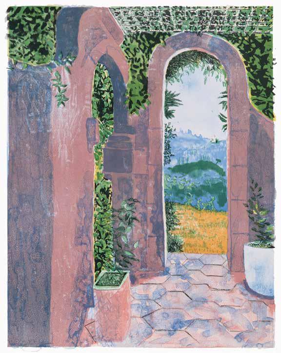
CH 121
Corfu 1989
Lithograph
Plate 718 × 552 mm / 28¼ × 21¾ ins
8 plates printed in 8 colours, blues, greens, yellows, black, pink
Wove rag paper BFK Rives. Sheet 890 × 620 mm / 35 × 24½ ins
Edition of 75 plus 10 numbered APs
Signed and numbered by Patrick Procktor
Proofed and Printed by Curwen Studio, London
Published by Redfern Gallery, London 1989
Katsura, Kyoto 1991
Screenprint
Screen 750 × 1250 mm / 29½ × 49¼ ins (and sheet)
Screens printed in blues, greens, reds, greys, browns, black, yellow Mulberry paper Haruki Edition of 75 plus APs
Signed and numbered by Patrick Procktor
Proofed and Printed by Kip Gresham at Curwen Chilford Prints, Cambridge
Published by Redfern Gallery, London 1991
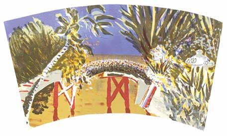
Procktor visited Kyoto, Japan, in 1991. He had long been interested in the art of composition and design within Japanese painting, architecture and gardens. One of the aims of this trip was to make watercolours and drawings of the gardens of Kyoto. On returning to London, he decided to use a sketchbook drawing of Katsura Imperial Garden as the basis for an original screenprint. In collaboration with Kip Gresham, the image was enlarged, proofed in the colours used in traditional Japanese prints, and presented in the shape of an inverted folding fan. Working Proof (printed on wove rag paper Arches)