NORMAN STEVENS
The Complete Prints
John Crossley | Michael Healey
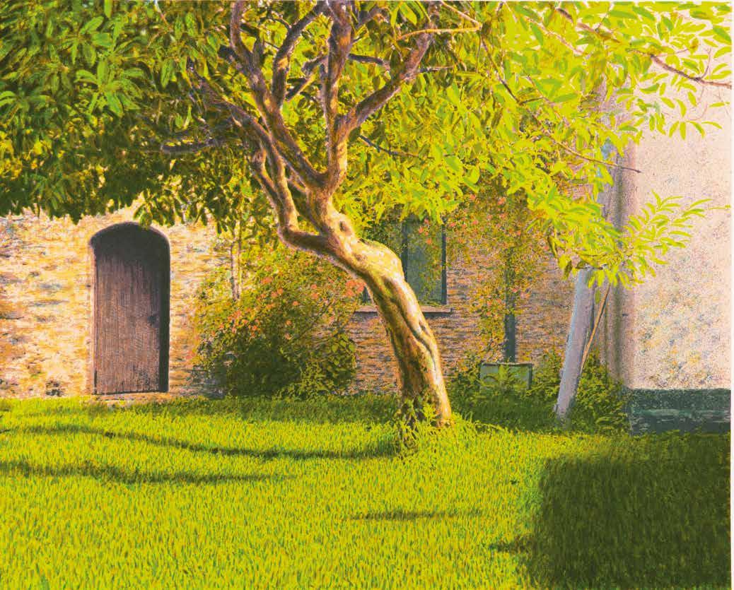
Born in Bradford, Norman Stevens was part of an outstanding group of students who met at the local art college in the early 1950s. He was the first of this group, which included David Hockney, to continue his studies in London, enrolling at the Royal College of Art in 1957. Training originally as a painter, Stevens turned to printmaking in 1971, as he felt the different techniques allowed for a better exploration of the subtleties of natural light and shadow. Finding inspiration in the clapboard houses of California, Stonehenge and English formal gardens, Stevens imbued each seemingly disparate subject with a unique sense of mood and mystery.
Now, over one hundred prints – encompassing intaglio, lithography and screenprinting, made from 1964 to his untimely death in 1988 – are brought together in this catalogue raisonné. Written by John Crossley and Michael Healey, this is the first major publication on Stevens, whose prints have been the focus of solo exhibitions at the Tate, Arnolfini and, most recently, the Royal Academy of Arts.
NORMAN STEVENS
The Complete Prints
John Crossley
Michael Healey
Contents
Norman Stevens: Biographical Notes
Master of Shadow Michael Healey
Persistence of Time John Crossley
Notes to the Catalogue Raisonné
Catalogue Raisonné
Glossary of Printmaking Methods
Exhibitions
Bibliography
Public Collections
Acknowledgements
Norman Stevens ARA 1937-1988: Biographical Notes
1937 Born in Bradford, Yorkshire, on 17 June, to Elsie Whitehead and Stanley Stevens.
1939 Contracts polio.
1941 Parents separate; lives with his mother and sister, but remains close to his father, who works as a signwriter.
1949 After helping with lettering and posters at his father’s studio, enters the junior department at Bradford College of Art for a vocational course in painting and decoration, where he meets David Oxtoby.
1952 Progresses with Oxtoby to the senior department, and over the next five years forms close friendships with fellow students David Hockney, John Loker and Michael Vaughan, and also meets future wife Jean Warhurst, who is studying textile design. Teachers include Derek Stafford and Frank Lisle. His particular interest is in painting street scenes of the local area. From 1954 onwards, the group hitchhike to London as often as they can to visit the major public galleries.
1957 Ineligible for National Service, enrols at the Royal College of Art (RCA) in London to study painting, where taught by Ceri Richards and Carel Weight, among others. Paints expressive,
abstract oils, influenced in part by Alan Davie. Jean Warhurst stays in Bradford, working as a carpet designer at Associated Weavers.
1959 Shows in Young Contemporaries, and is one of just 41 artists selected for the national touring exhibition, organised by the Arts Council of Great Britain (ACGB).
1960 Upon graduating from the RCA, wins the J Andrew Lloyd Landscape Scholarship and an Abbey Minor Travelling Scholarship. Starts teaching at Manchester College of Art.
1961 Marries Jean Warhurst, with Hockney as best man and Oxtoby as usher, and moves to Haslingden, Lancashire.
1963 Begins a series of surrealist paintings inspired by Adam and Eve and the creation myth, executed in a Pop style. Birth of son, Luke, in November.
1964 Makes his first print, an experiment in line etching and aquatint, depicting a dreamlike, ambiguous landscape (CH 1).
1965 First solo exhibition, at the Mercury Gallery, London, of surrealist paintings, opens to mixed reviews; for Barrie Sturt-Penrose, “there appears to be a conflict in the pictures between his Pop
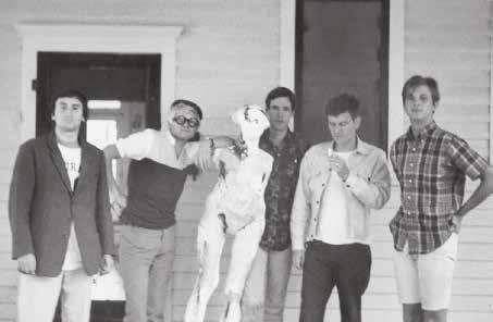
Colin Self, David Hockney, Dick Gregory, Norman Stevens and Dale Chisman, photographed by Patrick Procktor in California, 1965
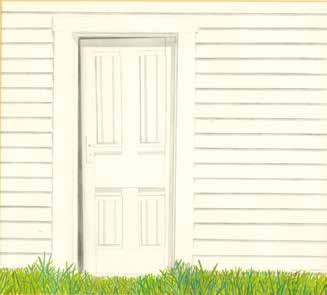
Outhouse 1968
Crayon and pencil on paper 330 × 380 mm National Museums Northern Ireland
technique and the esoteric nature of the content ... thus there is a failure to bring his theme alive to the viewer” (Arts Review). Embarks on a 7,000-mile bus tour of America, and meets up and travels from Colorado to California with Hockney, Patrick Procktor and Colin Self. Upon returning to Lancashire, has a joint-show with Norman Adams in Bradford. Birth of daughter, Ruth, in November.
1966 Moves to London with his family, and takes up various teaching jobs, primarily at Maidstone College of Art, Kent.
1968 Solo exhibition, of work inspired by his time in America, is staged at the Hanover Gallery, London, from which the ACGB purchases the painting Fire Hydrant, NY, while two drawings are bought by the Arts Council of Northern Ireland. John Russell applauds how “Stevens took the outrageous facts of the Californian sunset and bound them together in chromatic knots that no one else would quite have thought of” (ARTnews). In another glowing review of the show, RC Kenedy concludes: “The large-scale canvases are no less certain to communicate his extravagant confidence than his astonishingly highly finished sketches” (Art International).
1969 Second trip to America, this time staying in California. Selected for Young & Fantastic, an exhibition organised for the Institute of Contemporary Arts by Mario Amaya, which opens in London and tours to New York and Toronto. Also part of The English Landscape Tradition in the 20th Century, a large survey show held at Camden Arts Centre.
1971 Second show at the Hanover, of paintings of “extraordinary detailed louvered shutters, which convey so much atmosphere, not only of the house but also of the terrain and the weather ... Stevens is a major talent of whom one may continue to expect great things” (Max WykesJoyce, International Herald Tribune). Of the exhibits, Porch is presented to the Tate Gallery by Trustees of the Chantrey Bequest. Publishes two small etchings (CH 2, 3), prompting Joe Studholme, of Editions Alecto, to commission Louvered Shutter, Evening (CH 4), an impression of which is purchased by the Government Art Collection (GAC). Leaves Maidstone to lecture at Hornsey College of Art, London, where he stays for three years, during which time he becomes head of the painting department. Also works as a visiting lecturer at various colleges, including at Wolverhampton.
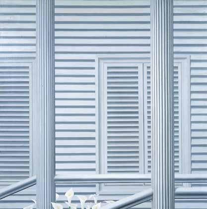
Porch 1971
Aqua-Tec on canvas 1238 × 1222 mm Tate
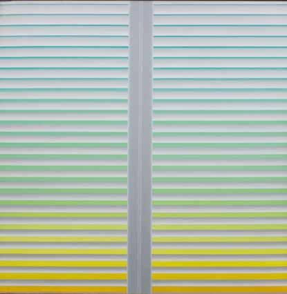
Louvered Shutter, Morning 1972
Acrylic on canvas 1510 × 1500 mm Arts Council Collection, Southbank Centre, London
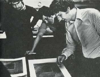
1972 Collaborates with the master printmakers James Collyer and John Crossley, of JC Editions, who print all of his intaglio plates from now on. First solo show of prints, at the William Weston Gallery, and described by William Packer as “an artist of considerable accomplishment ... his work highly idiosyncratic, and warranting close attention” (Art and Artists). Two paintings selected for the Summer Exhibition at the Royal Academy of Arts (RA), while the lithograph Louvered Shutter, Evening is included in the British International Print Biennale, Bradford. The ACGB buys a second painting, Louvered Shutter, Morning, as well as six prints from the Weston exhibition.
John Crossley, James Collyer and Norman Stevens inspecting proofs of CH 14, Alecto Studios, 1973
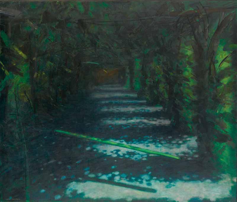
Aaron’s Rod 1975 Oil on canvas 1829 × 2134 mm Arts Council Collection, Southbank Centre, London
1973 Receives a commission from the new publisher Christie’s Contemporary Art, as part of an initiative to sell original prints by direct advertisement. The resulting print (CH 12) is described by Pat Gilmour as an “exquisite clapboard house, grey-green in the moonlight, cool as an abstraction, and beautifully printed” (The Connoisseur). Alecto however remains his primary publisher; later this year he makes his first mezzotint, Dusk (CH 13), for the Editions Alecto Collectors Club, with a further eight prints commissioned by Editions Alecto.
1974 Second solo show of prints, at the Maltzahn Gallery, opens to acclaim; for Fenella Crichton, “he exploits the world of shadows to produce some studies of unobtrusive excellence” (Art International). The GAC purchases five recent prints. Is included in important survey exhibitions of contemporary British printmakers at Brooklyn Museum, New York, and the Musée d’Art et d’Histoire, Geneva. Leaves London after being appointed the Gregory Fellow in Painting at the University of Leeds.
1975 Collapsing Structure in the Art Historian’s English Garden, painted as part of his Gregory Fellowship, wins a major prize at the Chichester National Art Exhibition, and also appears in Painters of Reality, Mystery and Illusion at Rochdale Art Gallery. His prints are the subject of a retrospective at the Arnolfini Gallery in February, followed by a second, at Leeds City Art Gallery, in October. Reviewing the latter, WT Oliver writes: “Stevens is an artist of distinction, whose work reveals subtlety and imagination as well as fastidious craftsmanship” (Yorkshire Post). Ten prints are acquired by the Tate. Takes part in the first Graphica Creativa print triennale, Jyväskylä. Upon completion of the Gregory Fellowship, returns to London and decides to give up teaching in order to focus on his own work full-time.
1976 Invited to participate in the Premio Internazionale Biella per l'Incisione, and is shortlisted for the Award. Final prints made for Editions Alecto are a set of four lithographs commissioned by the Government and printed at Curwen Studio (CH 30-33). One of nineteen leading artists invited to produce a print for the portfolio For John Constable (CH 38), which is published by
Bernard Jacobson and exhibited at the Tate. A third painting, Aaron’s Rod, is purchased by the ACGB.
1977 Second solo show at the Arnolfini Gallery, of “bosky, shadowy paintings and exquisite prints” (Marina Vaizey, The Sunday Times). Prints are included in a major British Council touring exhibition that opens in Norway. The painting Collapsing Structure in the Art Historian’s English Garden is purchased by Leeds City Art Gallery, and features in British Painting 1952-1977 at the RA. Commissioned by the British Museum (BM) to make a painting based on its collections, the resulting work, which depicts the Sutton Hoo helmet, is used in an advertising campaign to promote the Department of Medieval and Later Antiquities.
1978 Solo display of prints at the Tate, drawn from its own collection. First show at the Redfern Gallery, of prints, and hailed as “a master of the craft” by John McEwen (The Spectator). The British Council purchases the painting Flagpoles, which is included in Certain Traditions: Recent British and Canadian Art, a touring exhibition of Canada and the UK. An impression of the mezzotint Shadowed Garden (CH 50) is sold to the National Gallery of Australia.
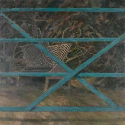
Gate 1977
Oil on canvas 1520 × 1520 mm Government Art Collection
1979 The GAC buys the painting Gate, which appears in the first British Art Show, an ACGB touring exhibition of the UK comprising the work of 112 painters and sculptors. Provides illustrations for a new edition of Thomas Hardy’s collected poetry, and the resulting dust-jacket is shown in Open & Closed Book, at the Victoria and Albert Museum (V&A), along with two original illustrations. Becomes the first artist to win multiple prizes at the British International Print Biennale, for his large, intricate depiction of Stonehenge (CH 64). Takes part in Photography in Printmaking, which opens at the V&A. Impressions of Dusk and Plinth? (CH 9) are purchased by the BM.
1980 Comprehensive retrospective at the Redfern, with over sixty prints offered for sale. Of the six paintings shown, Castle Garden is bought by Rochdale Art Gallery (with the assistance of the V&A Purchase Grant Fund). His largest intaglio plates, Flowers from Madeira and Birds of Paradise (CH 75, 76), are published by JC Editions, with both chosen for the Norwegian International Print Biennale, and described by William Packer as “remarkable, technical tours de force” (The Financial Times).
1981 Six prints shown in Landscape: The Printmaker’s View, a group exhibition at the Tate. A small explicatory exhibition of drawings, watercolours and proofs relating to The Stilt Garden, Hidcote (CH 77) is held at the Redfern; for Guy Burn, this print “has a magnetic fascination ... Stevens
has built up a reputation as one of our best printmakers” (Arts Review).
1982 Selected for various print biennales around the world, including at Bradford, where The Stilt Garden wins a prize. After meeting the master printmaker Brad Faine, of Coriander Studio, begins making screenprints. His paintings, though produced less frequently, still gain recognition; Barn is awarded a prize at the John Moores Liverpool Exhibition 13, and in a review of a solo show of paintings at the Redfern, William Packer writes that “Stevens is one of the best and subtlest painters of his generation” (The Financial Times).
1983 Elected Associate Royal Academician on 18 May, for his printmaking. Begins teaching part-time at the RA Schools. A retrospective of prints is held at Festival Gallery, Bath. New topiary prints are shown at international open exhibitions in Kanagawa and Taipei.
1984 The Imperial War Museum acquires Tank Trap, painted in 1979. Serves as the printmakers’ representative on the hanging committee of the RA Summer Exhibition. Solo show at the Redfern is praised by Terence Mullaly, who refers in particular to a set of new charcoal drawings –“they are bold, indeed, each one is a technical tour de force” (The Daily Telegraph).
1985 The lithograph Levens Hall Garden (CH 94), printed at Lowick House Print Workshop, adorns the poster and catalogue of the RA Summer Exhibition. Contributes to Visual Aid for Band Aid, a composite print of 104 artists’ works printed at Coriander Studio. The prize-winning painting Barn, as well as the screenprint Construction Company (CH 82), enter the permanent collection of Harris Museum and Art Gallery, Preston.
1986 The Contemporary Art Society purchases the painting Packer’s Farm Gate for the University of Leeds.
1987 Completes the first Pirelli artist-in-residence scheme at Wimbledon School of Art, and the resulting print, Ornamental Still Life (CH 100), is unveiled at the RA by Pirelli chairman, Lord Thorneycroft.
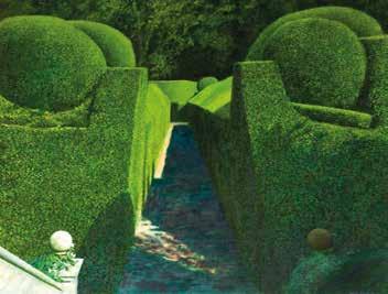
Castle Garden 1980 Oil on canvas 1520 × 1825 mm Rochdale Arts and Heritage Service
1988 In response to the Great Storm of October 1987, produces a number of paintings, prints and works on paper, including a large screenprint of a fallen black walnut tree at Kew Gardens (CH 101), which is sold in aid of the relief fund. Is diagnosed in the summer with cancer, from which he dies on 20 August, aged 51. Obituaries are published in The Daily Telegraph, The Guardian and The Times; according to the latter, “Stevens was by turns touchy, argumentative, even irascible. But the fierceness his friends will remember is rather the fierceness of his loyalties and personal affection. For he was also the kindest of men, tireless in his concern and efforts in a good cause, whether for a friend
in difficulties, an artist neglected, or for the public good”. A memorial service is held at St James’s Church, Piccadilly, with readings given by Norman Adams, Ken Howard and William Packer, while an artist-in-residence bursary at Kew Gardens is set up in his honour. The following year, a retrospective is staged at the Redfern, and a memorial wall of three major paintings and three recent prints is shown at the RA Summer Exhibition. A total of ten prints are displayed in his memory at the British International Print Biennale, in 1990.
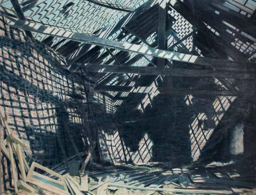
Barn 1981-82 Oil on canvas 1525 × 2135 mm Harris Museum, Art Gallery and Library, Preston
1 William Packer, ‘Introduction’, Six Artists’ Drawings: Nigel Hall, John Loker, Martin Naylor, George Percy, Tony Roberts, Norman Stevens, Arts Council of Great Britain touring exhibition, 1975, exh. cat. essay, p. 5.
2 John Russell, ‘London: Antony Donaldson; Norman Stevens’, ARTnews, January 1969, p. 8.
3 John Milner, ‘Norman Stevens, Hanover Gallery’, Arts Review, 9 November 1968, p. 720.
Master of Shadow
Michael Healey
Norman Stevens’ prints combine elements of abstraction, Minimalism and Surrealism, but ultimately retain an idiosyncratic vision. His imagery, drawn from the natural world, is as allusive and elusive as the shadows that inspire it, with Stevens achieving a notable balance between tranquillity and disquiet. Indeed, he exploited the ephemeral, ethereal nature of shadow to serve a number of complex, contradictory functions, from describing and concealing form, to defining and distorting pictorial space. Furthermore, Stevens demonstrates how shadow can be used as a powerful creator of atmosphere. He referred to his own photographs for stimulation, yet as noted by William Packer, “that is only the beginning ... his world is one of fantasy and suggestion, going far beyond exact description”.1 As such, there is a metaphysical aspect, but essentially the subject matter is rooted in reality, and it is Stevens’ particular treatment of light and shadow that stirs ambiguity, awe and intrigue from the everyday.
Stevens’ interest in natural light was first piqued in 1965, during a visit to California. His resulting pictures were often on paper, executed in a range of media such as watercolour, crayon and pencil, each typified by a meticulous attention to detail. In the opinion of John Russell, Stevens “brought something quite personal out of California”, responding in particular to “the facts of Californian domestic architecture ... and set them down with the kind of tender exactitude that Walker Evans gets into his photographs”.2 His drawings depict humble clapboard houses bathed in strong sunlight, and punctuated by a flower, frond or fresh lawn, while he also made a number of rhythmic studies of vast, twisting sunsets. When shown in Stevens’ first major solo exhibition, at London’s Hanover Gallery in 1968, they received critical acclaim; for John Milner, “at first reminiscent of Hockney, Stevens’ works rapidly assert their individuality, and reveal a concern with light which is rarely encountered”.3 A second trip to California in 1969 saw light and atmosphere conveyed via delicate gradations of colour, in a series of large-scale paintings of louvered shutters. His interest here centred not so much on the shutters, but on the view glimpsed beyond – of a sunrise, for example, a version of which was purchased by the Arts Council of Great Britain in 1972. These paintings were also shown at the Hanover, in the summer of 1971, although by this time Stevens had begun to move his focus to printmaking. It proved a defining moment, for as explained by William Weston, “he immediately found that the linear quality of the etched line, and the flatness of lithography helped to create the crispness of
CH 12, detail
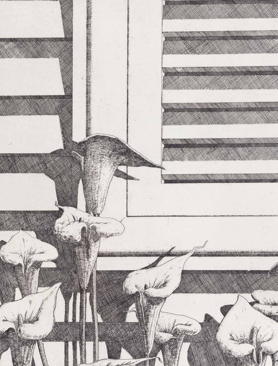
form and subtle changes of light that he sought”.4 This coincided with a return to depicting clapboard houses. His early prints are intimate, poetic scenes, quiet yet complex explorations of light and shadow, and of space and structure. Printed in a single colour, Stevens often used the white of the paper to capture the intensity of the sunlight, which in turn heightened the contrast of manmade and natural forms – of the harsh, uniform horizontals of clapboards set against soft, sleek lilies, or the dramatic diagonals of fronds. Meanwhile the inspired addition of shadow gave definition to the clapboards, as well as extended the space between the house and plants. Lilies (1971; CH 3) boasts “a crisp, crosshatched linear purity”,5 etched with “the fanaticism of a nineteenth-century engraver”,6 and it is clear that Stevens had a genuine interest in exploring, and utilising, the specific properties and textures of print techniques. In 1971, he was introduced to the master printmakers James Collyer and John Crossley, of JC Editions, London, the professional intaglio printmaking studio. It was Collyer and Crossley who worked on and printed all of his intaglio plates from 1972 onwards, and whose expertise was the perfect complement to the inquisitive and ambitious Stevens. The success of this partnership is well demonstrated in House (1972; CH 5), the very first print they made together, for which Stevens employed soft ground as well as hard ground etching. According to Pat Gilmour, “Stevens makes delightful use of both kinds of ground ... while the fronds are crisply drawn and etched, the clouded sky, distant foliage, roof shadow and a light smir of rain have been drawn into a soft ground to give them an appropriately delicate character”.7 This print was published by William Weston, who particularly liked how the “soft touches of the rain emphasise the beauty of the light on the contrasting forms of the beach house and the palm tree”.8 The fall of natural light would be the theme that preoccupied Stevens from now on, and how through its careful depiction he could “register such intangible yet manifest qualities as mood, atmosphere, shadow or sunlight, the time of day or year”.9 As a result, Stevens moves seamlessly from the relentless glare of afternoon sun to the atmospheric possibilities of moonlight. See, for example, Clapboard House in
4 William Weston, Norman Stevens: Etchings and Lithographs, William Weston Gallery, 1972, exh. cat. essay, unpaginated.
5 Pat Gilmour, ‘Norman Stevens Print Exhibition’, The Connoisseur, July 1974, p. 235.
6 Pat Gilmour, ‘Norman Stevens, William Weston Gallery’, Arts Review, 21 October 1972, p. 646.
7 Pat Gilmour, Understanding Prints: A Contemporary Guide, London: Waddington Galleries, 1979, p. 28.
8 William Weston, 1972.
9 William Packer, ‘Norman Stevens as Printmaker’, Norman Stevens ARA: Selected Prints, Royal Academy of Arts, 2014, exh. cat. essay, unpaginated (hereafter referred to as ‘RA, 2014’).
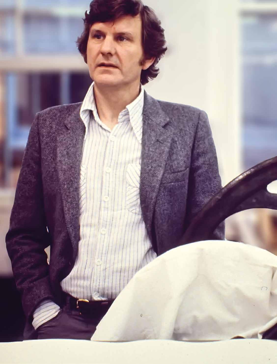
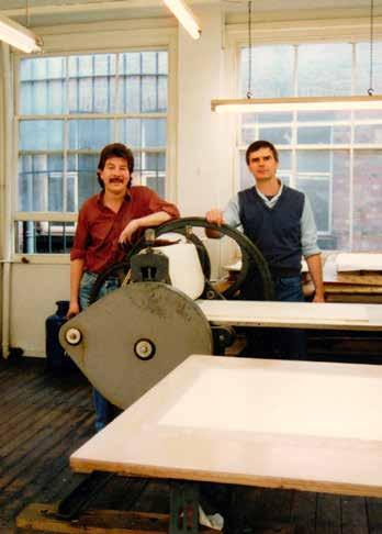
Master printmakers James Collyer and John Crossley, JC Editions studio, 1984
10 Pat Gilmour, ‘Christie’s Prints’, Arts Review, 24 March 1973, p. 170.
11 William Packer, ‘Norman Stevens’, Norman Stevens: Prints, Maltzahn Gallery, 1974, exh. cat. essay, unpaginated.
12 John Loker, via email to the author, 10 February 2018.
13 Pat Gilmour, ‘Artists’ prints of the last five years’, British Artists’ Prints 1972-77, British Council touring exhibition, 1977, exh. cat. essay, p. 6.
14 William Packer, Maltzahn Gallery, 1974.
15 Charles Spencer, ‘Norman Stevens’, Alecto Monographs 8: Norman Stevens, 1973, p. 8.
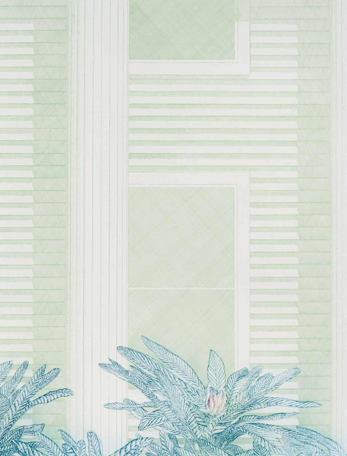
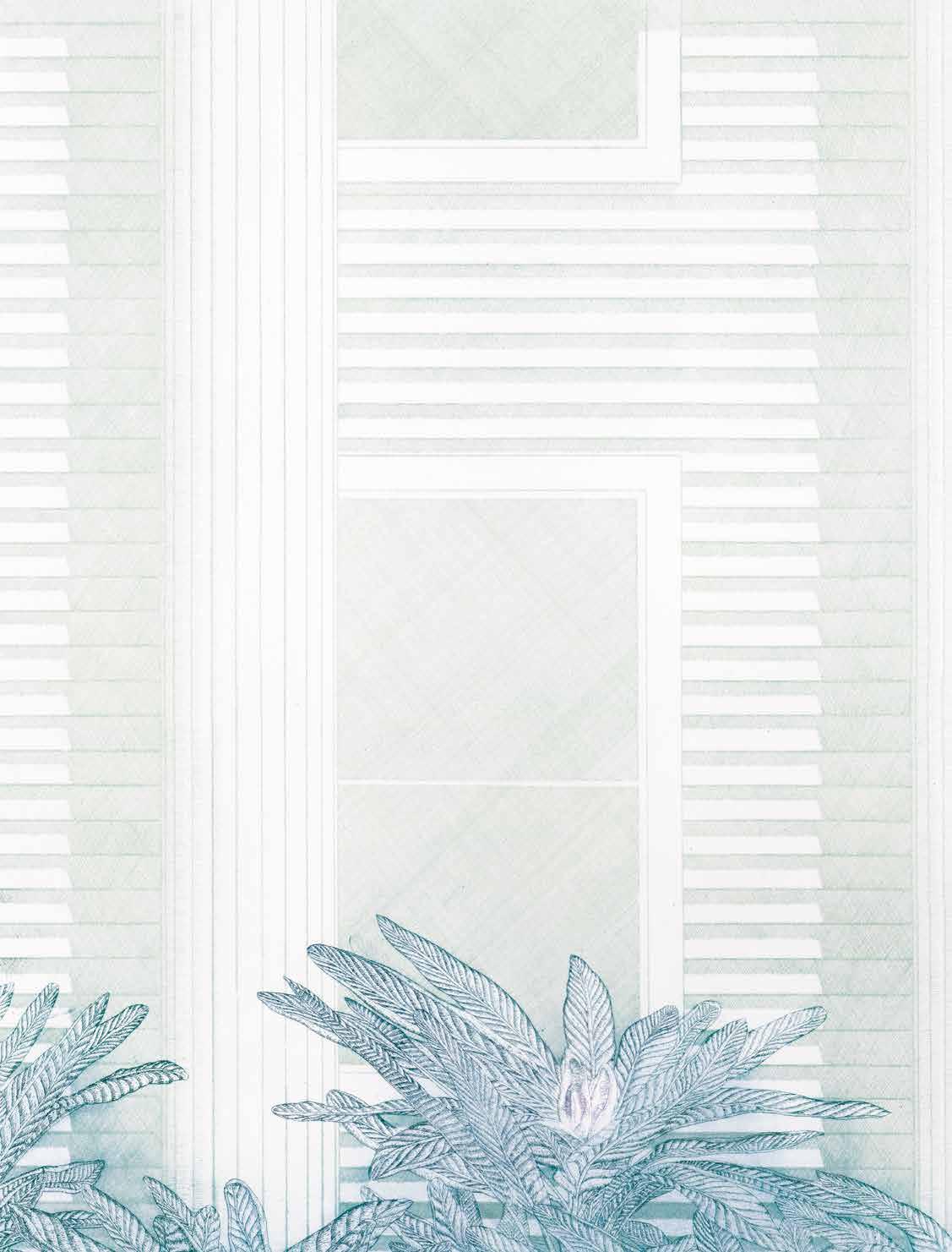
Moonlight (1973; CH 12), wherein the same house and plants are presented as eerie, understated poetry by night. Described shortly after publication by Pat Gilmour as “exquisite ... the most beautiful print he has produced, and a triumph for his sensitive printers”.10
Continuing such ideas, Stevens oscillated between the exoticism of the Californian clapboards and the anonymity of intensely observed close-ups of the ground, wherein he explored the effects of rain or dappled sunlight on textured paving. In Path (1974; CH 21), the image initially appears enclosed and oppressive, but a wider context is offered through the shadows cast by the unseen foliage. The shadows allow a dialogue, then, between what is seen and what is implied – in this case between the stark brickwork and the lush, natural environment. William Packer recognised the paradoxical importance of the shadows, as “the reality of object and space is thus described by something having no physical entity, a wry intellectual double-take”.11 Furthermore, working in intaglio, rather than paint, allowed for an extra dimension. Of the stipple etching Steps (1973; CH 8), John Loker observes how “these simple, monochromatic marks combine to describe shadow, the light and dark of which tells us that they are steps, and somehow they also manage to convey that they are granite steps, and the hint of wear gives us a sense of time and history – a lot to contain in such a simple image, Norman not only manages this to perfection but leaves us room for thought”.12 In Flight of Steps (1974; CH 16), by carefully scraping and burnishing the copper plate, Stevens conveys the softness of the speckled light as it falls on stone steps. It was from this series of prints that Pat Gilmour selected three examples in 1977 for British Artists’ Prints 1972-77, a British Council exhibition that toured fifteen countries over the next decade. Stevens is described by Gilmour in the catalogue essay as “handling figuration like an abstraction”.13 In several of these prints, Stevens achieves a balance between pure abstraction and representation – of the tiny gradations of light on concrete steps, for example. In Square (1973; CH 10), the perspectival grid of paving stones brings the viewer into a world of abstract space, tantalising in its apparent infinity and oddness. In his first multi-plate intaglio print, Stevens tried out various colour proofs before introducing a second plate to achieve the intensity and atmosphere he desired, and so infusing these seemingly minimal, banal paving stones with a profound, almost sacred, aura. As a result, Square maintains a magnetic, dizzying pull, and for many years Stevens considered it to be his best print. Ultimately, these images are all rather deceptive, as “their disturbing simplicity ... makes one consider the basic illusion of pictorial space, which is conjured out of the flat surface of the work, that fundamental ambiguity which lies at the heart of all painting”.14
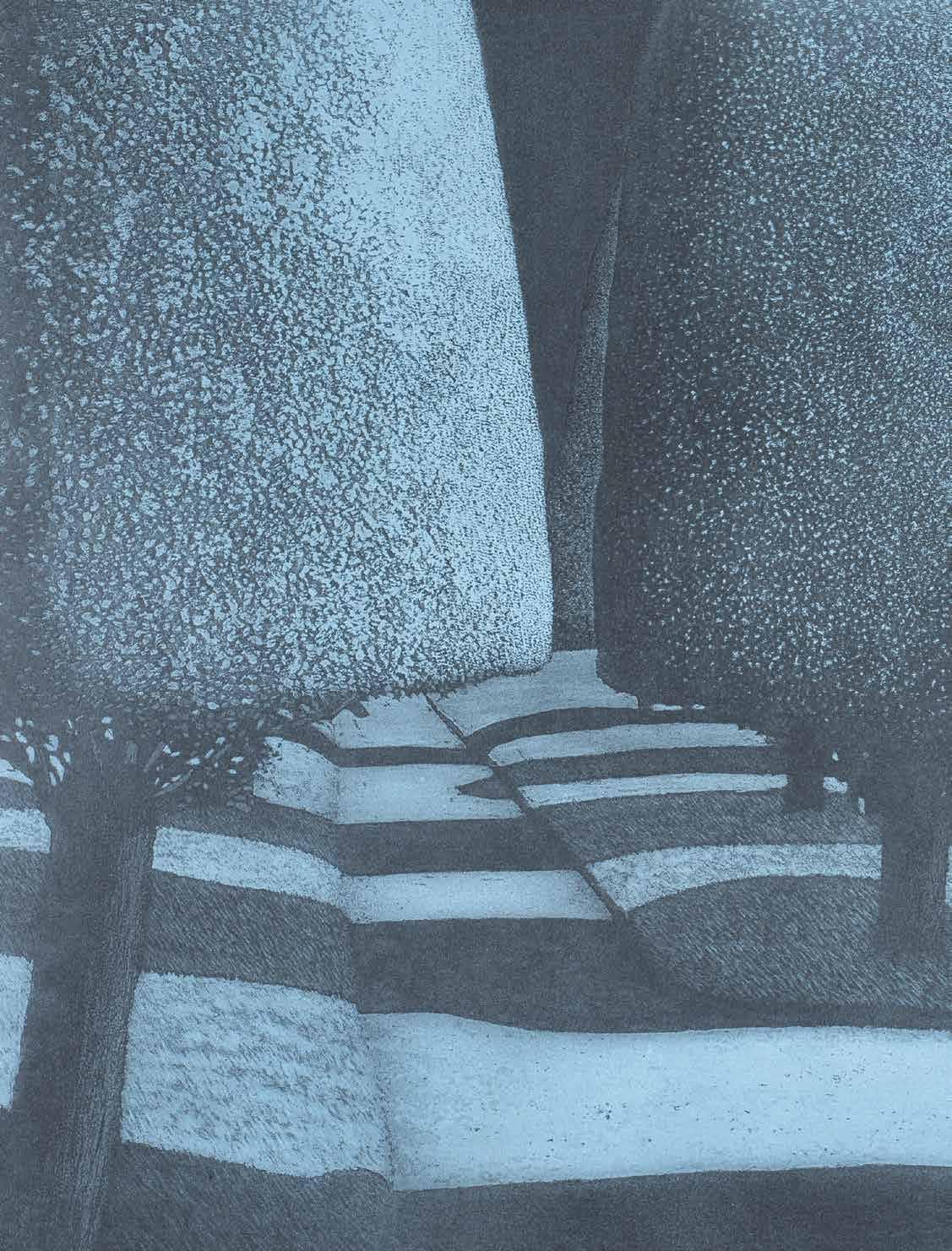
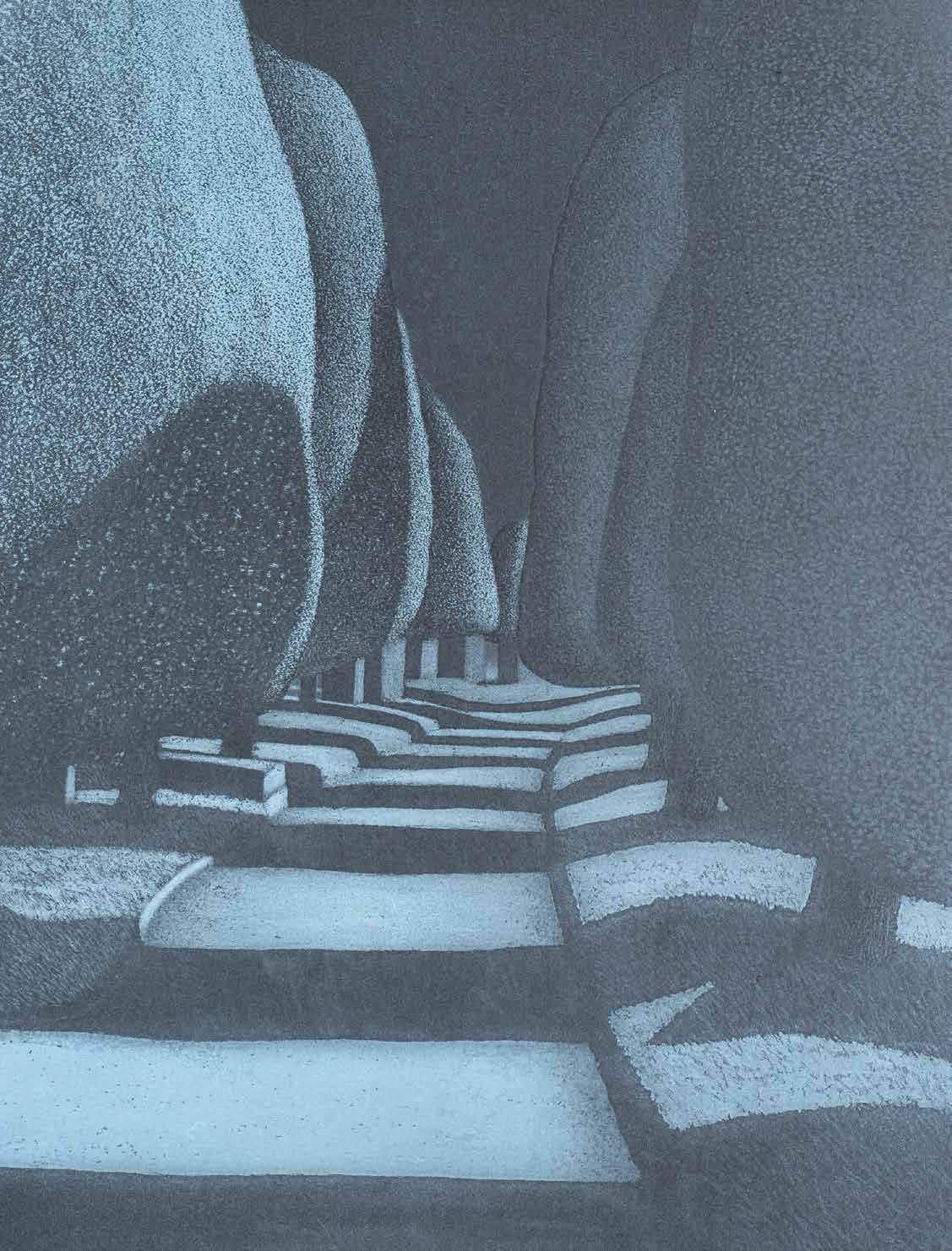
While writing of Stevens’ work in 1973, Charles Spencer realised that Dusk (1973; CH 13), which shows long shadows splayed across a block of steps, marked an “important transitional period in his career”.15 Herein, Stevens found a way of combining elements of the clapboard house prints with those of paving stones
– of real and intangible, of figurative and abstract, of poetic and detached – to create a “dichotomy of subjectivity and objectivity which is both mysterious and pleasing”.16 Spencer felt that Dusk was “quite different from anything the artist has done before – more like a drawing or painting by Samuel Palmer, in fact”.17 Likewise, in the opinion of Richard Godfrey, “emphatic, formal qualities are here united with an intensely Romantic atmosphere”.18 The subtle addition of pink warms the concrete path, and although the trees remain unseen, the landscape is now opened up; “the avenue device, which presents a vista rather than a screen, signifies an important new departure”.19 For the first time, the location was brought closer to home, with the image based on a photograph taken at Holland Park, near to his London flat. Furthermore, this was Stevens’ first attempt at mezzotint – the most difficult print medium and so seldom used by modern artists. If earlier prints sought depth from crosshatching (Lilies), soft ground (House), or stipple (Steps), then mezzotint was chosen by Stevens for “the soft quality peculiar to it and its richly varied tonal range ... I was trying to achieve a mood/atmosphere that occurs at a certain time of day, in a particular kind of light”.20 A commercial and critical success, Richard Godfrey deemed it among the “finest English prints of the last two decades”.21 Significantly, Dusk demonstrated Stevens’ burgeoning skills as a printmaker, and also confirmed that he could capture popular interest with imagery alive to his original ideas.
From 1975 onwards, the fall of light remained his overriding concern, but the subjects were now presented as recognisable landscapes. As noted by William Packer, the early connections to California gave way to the anonymous paving stones, before being “replaced by something ... openly English in its sensibility”,22 as Stevens shifted his focus to convey the charm and mystery of the English countryside, from quiet copses to formal gardens, and overgrown footpaths to ancient menhirs. One of the most prominent examples is The Darkling Thrush (1977; CH 48), which shows a winter sunset over silhouettes of tangled trees in a neglected corner of rural England. For Ken Draper, “everything is suffused with a deep Romanticism ... it is a truly emotional and magical picture”.23 The image was inspired by Thomas Hardy’s classic poem of 1900, wherein the narrator’s pessimism is suddenly overcome by the beauty of birdsong. Stevens too had reasons to be fearful, but always found great comfort in nature, and in the poetry of Hardy. David Oxtoby remembers his friend as being “a very Romantic figure, with a mystical air”,24 and Rosemary Simmons wrote in 1978 how “the work of the past year has become more and more lyrical in the best British tradition”.25 This shift towards Romanticism was first hinted at in Dusk, and had arguably taken hold of Stevens in 1976, with a set of hand-coloured etchings of Stonehenge (CH 34-37), which suggest the monuments’ textures and dreamlike aura. Of
16 Ibid.
17 Ibid.
18 Richard T Godfrey, Printmaking in Britain: A General History from its Beginnings to the Present Day, Oxford: Phaidon, 1978, p. 132.
19 William Packer, Maltzahn Gallery, 1974.
20 Norman Stevens, ‘Statement by the Artist’, Alecto Monographs 8: Norman Stevens, 1973, p. 15.
21 Richard T Godfrey, 1978, p. 130.
22 William Packer, RA, 2014.
23 Ken Draper RA, via email to the author, 1 October 2017.
24 David Oxtoby, via interview with the author, 5 August 2016.
25 Rosemary Simmons, ‘Norman Stevens, Redfern Gallery’, Arts Review, 18 August 1978, p. 442.
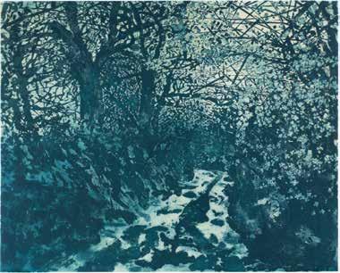
The Darkling Thrush 1976 Trial Colour Proof (see CH 48)
26 This collection of poetry was published by Terra Nova Editions, London, in 1979.
27 Rosemary Simmons, ‘Six Artist Printmakers’, Arts Review, 7 January 1977, p. 15.
28 James Collyer and John Crossley, ‘Norman Stevens’, Norman Stevens ARA: Selected Prints, Royal Academy of Arts, 2014, exh. cat. essay, unpaginated.
29 Rosemary Simmons, ‘Six Artist Printmakers’, p. 15.
30 John McEwen, ‘Free rein’, The Spectator, 30 September 1978, p. 26.
31 Ibid.
32 David Suff, via email to the author, 20 December 2017.
33 Edward Lucie-Smith, ‘Prints at Bradford’, Art and Artists, July 1979, p. 20.
course, one of Hardy’s most moving and memorable poems was inspired by ‘shifting shadows’ and a Druid stone, and indeed, The Shadow on the Stone was among several poems illustrated by Stevens in 1979, following a commission from a London publisher. The illustrations accompanied a new edition of Hardy’s poetry entitled The Gates Along the Path, and so his etching of a woodland gate dappled in sunlight (CH 39) made for a perfect cover image.26 This was from a series of prints depicting country gates that Stevens had completed some three years earlier (CH 39-44). Though modest in subject and size, the prints were made via different intaglio techniques; for Rosemary Simmons, “there is a sort of bravura – almost pride in the skills he masters in this suite ... this is the best printmaking”.27 Just as the creative relationship with JC Editions continued to flourish, so Stevens “pushed the boundaries of multi-plate etching in size, intensity and technique to achieve great spatial depth in the image, together with suggestions of a layered narrative”.28 In the etching and aquatint Lane (1976; CH 29), Stevens veers into the realms of Op Art, as a sunlit wooded avenue is described by heady arrangements of apparently abstract, arbitrary marks made via crosshatching, wherein “the technique is so confident that it is now allowed to manifest itself ... one is conscious of the actual marks yet they combine optically to produce a subtle modulation which describes a most complex visual experience”.29 One of his largest intaglio prints, the mezzotint Shadowed Garden (1977; CH 50), was described at the time by John McEwen as “debatably the outstanding example achieved in England since the War”.30 Despite the months of physical labour invested in the plates by Stevens and JC Editions, the final image is unnerving in its serenity, and “soft as velvet to look at”.31 While working as a junior assistant at JC Editions in 1978, David Suff recalls how Stevens’ practice under James Collyer and John Crossley was underpinned by “meticulous draughtsmanship ... extraordinary invention and mischievous experimentation”. One of his favourite prints is Stonehenge (1978; CH 64), the complex and painstaking preparation for which “belies the calm beauty of the printed image”. Suff continues: “The tightly cropped image, his mastery of tone and texture, combined with his innate drawing skills and using a mixture of hard ground, soft ground and aquatint, unite to create an image that is so much more than a recognisable likeness”.32 Stonehenge won multiple prizes at the British International Print Biennale in 1979, where it was described by Edward Lucie-Smith as “perhaps the most beautiful thing at Bradford”.33 Working from
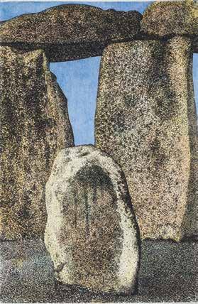
Stonehenge 1976 Trial Colour Proof (see CH 36)
a particular photograph, Stevens had originally made a hand-coloured etching (1976; CH 38), focusing on the physicality and weight of the stones, but in this much larger version, completed two years later and consisting of three plates, he opts for an ethereal and delicate representation.
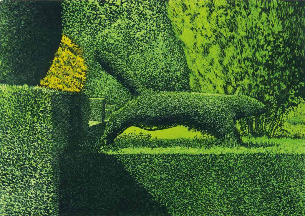
At this time more than ever, Stevens referred to his own photographs, but managed to imbue each scene with a unique sense of mood and mystery. As William Packer wrote in 1980, “the photograph is only the starting point, for the image is entirely reworked and reinvented”.34 In particular, the mundane source photographs for Stonehenge (1974; CH 18) and Stone Circle (1974; CH 19), taken by Stevens during the daytime, are scarcely recognisable as such in the final prints, wherein the stones are presented as numinous, brooding structures glowing against a nocturnal mist. With most of the photographs printed in black and white, Stevens’ deft, economical introduction of colour helped enrich the subjects considerably, and his manipulation of shadow was crucial in creating atmosphere. Indeed, it is testament to his skill that shadow is used in such varying contexts. For example, the shadows stir an eerie melancholy in Painswick, Moonlight (1979; CH 73), and a surreal, somewhat sinister, tension is suggested by those cast by the crooked picket fence in Morning (1974; CH 15). However, the webbed landscape in Covered Walk (1974; CH 17) is utterly enchanting, even magical. Based on a photograph taken at Kew Gardens, this was the first of several prints inspired by Stevens’ visits to formal gardens around the country. It is no coincidence that many of his most impressive prints are of formal gardens, for the shapes of topiary, which could be simple, sophisticated or strange, offered a rich aesthetic foundation. Stevens casts each scene “in a metaphysical shroud of shadow”,35 and, as with shadow, topiary exudes an enigmatic, ironic aura, since the manicured trees are simultaneously a natural, living thing as well as an artificial, manmade product. Stevens’ work is typified by a particular silence and stillness, and yet for all the outward tranquillity of the formal gardens, as a living sculpture the topiary always threatens to wriggle free from the constraints imposed by the gardener. For Anna Adams, the print of a ‘running’ topiary fox (1982; CH 79) “seems like another game with time, the fox’s movement frozen by an art that grows and changes, and the trees’ movement frozen again by the printmaker. But there is in fact no victory over time; the bushy-tailed fox may not revert to tree in the print, but prints are ephemeral too. Good design is not”.36 Though Stevens may not have intended to offer any commentary on the ethics of topiary, the mood in each print can nonetheless vary dramatically. For instance, Painswick, Moonlight echoes with a sense of uneasy anticipation, and a haunting,
34 William Packer, ‘The artist’s lot’, The Financial Times, 11 March 1980, p. 15.
35 William Packer, RA, 2014.
36 Anna Adams, ‘Norman Stevens’, Modern Painters, Spring 1989, p. 128.
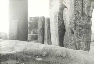
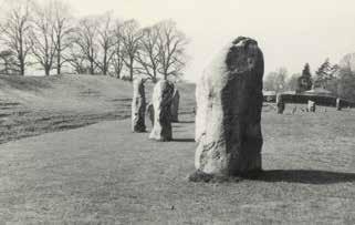
Avebury. Source photo, CH 19
Stonehenge. Source photo, CH 18
37 Paddy Kitchen, ‘A witty eye upon the follies of sensuality’, The Times, 20 April 1982, p. 10.
38 Fenella Crichton, ‘London letter’, Art International, April/May 1976, p. 37.
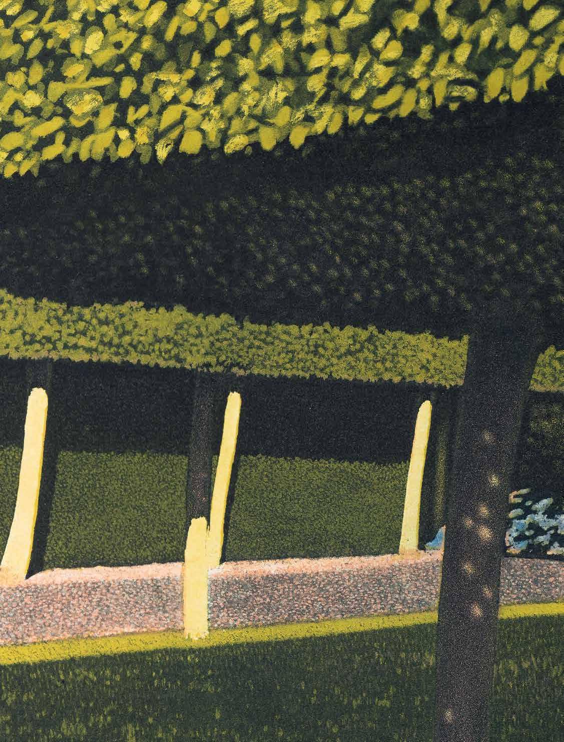
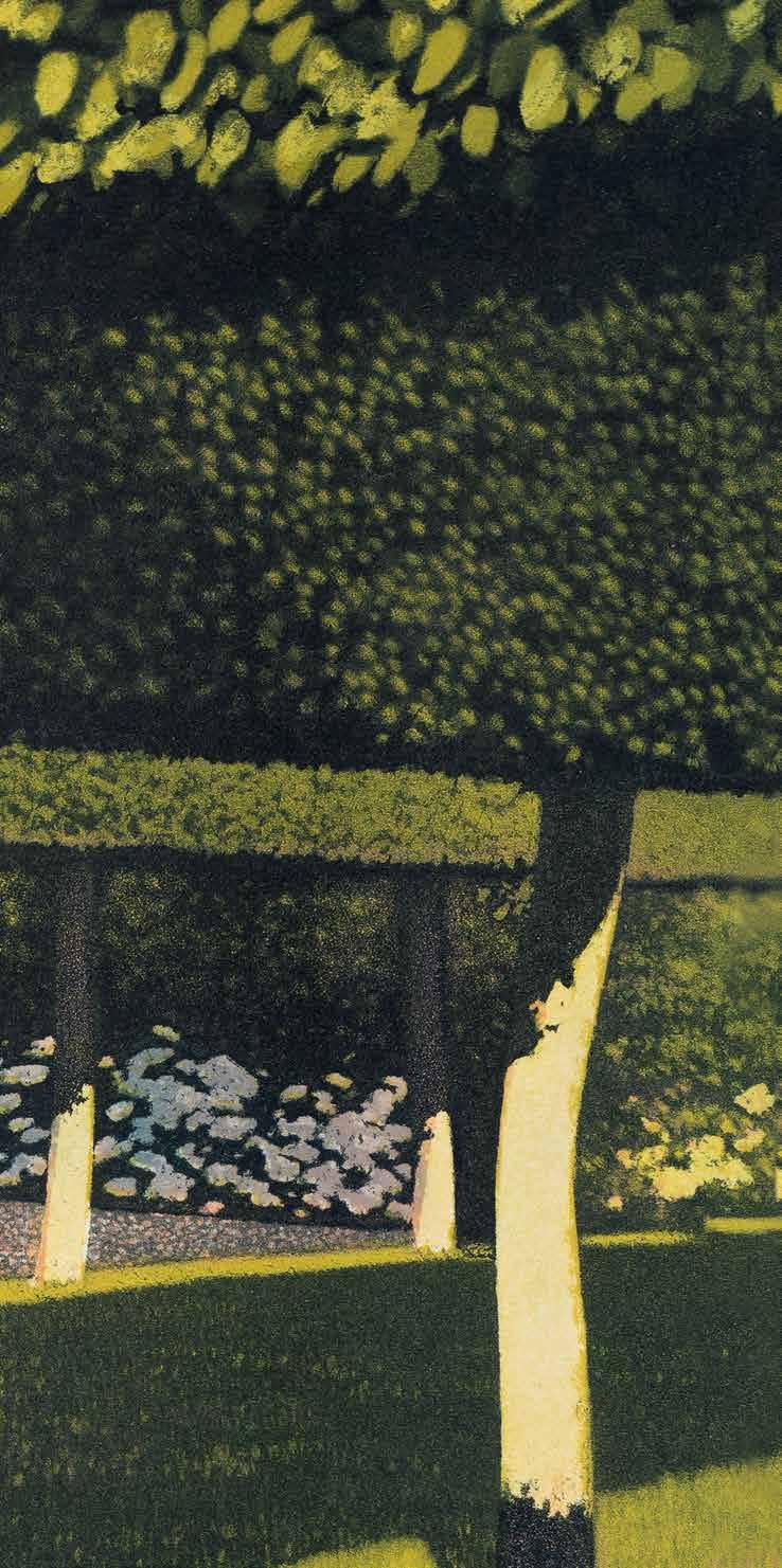
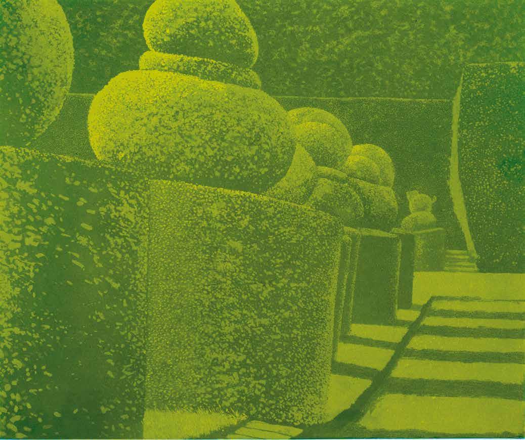
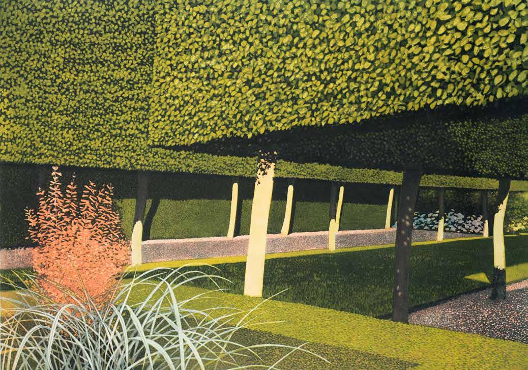
metaphysical air hangs over Shadowed Garden, as the trees stand sentinel in the gloom of twilight. However, if this is an image of chilly detachment, then the small prints inspired by the respective gardens at Crathes and Hidcote, offer an enticing glimpse of a fantastic new world. In Garden (1984; CH 88), another fruitful contrast of manmade and natural forms can be seen, with Stevens using a succession of minute, meticulous marks for the hedge, and free, fluent brushstrokes for the grass. At first glance, the small archway beyond looks to be a reflection of the foreground tree, and so forcing the viewer into a ‘wry doubletake’ once more. The acclaimed Stilt Garden, Hidcote (1981; CH 77) is a large, uncompromising image dominated by odd angles, uncomfortable perspectives and the juxtaposition of shapes – now more striking and bizarre than ever, as slight vertical stilts support huge, rectangular densities of topiary. This claustrophobic composition captures the immersive magic of walking around topiary gardens, and the labyrinthine creations therein. The treatment of light and shadow is also at its most complicated, as parts of the image are softly shrouded, and others slip into a deep blackness, while the thin stilts sing in the sunlight. His early works are referenced via the beautiful mottling of the gravel path, and the insertion of a dramatic red plant recalls the Californian fronds. Produced from three plates, Stevens considered this to be his masterpiece. It was awarded a prize at the British International Print Biennale in 1982, allowing Stevens to undertake a short residency at Lowick House Print Workshop, Cumbria, where he produced his final topiary image, the lithograph Levens Hall Garden (1985; CH 94). Almost hallucinatory in its sharp clarity and colour, Levens Hall Garden feels quite different to his previous topiary prints. Curiously, despite the piercing sunlight that illuminates the scene, no shadows are cast on the ground. Stevens has seemingly chosen to omit the shadows to emphasise the eclectic shapes of the topiary, and thus celebrating the gardener’s expertise and ingenuity. But, like his best topiary prints, a sense of the otherworldly permeates the image all the while.
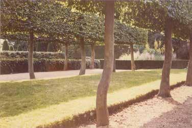
If the topiary gardens are visually stunning, then Stevens’ later prints, focusing on the captivating effects of light and shadow entangled on ignored manmade structures, prove his eye for finding poetry in the more prosaic of places. In the screenprint Old Barn, Summer, Appledore (1986; CH 97), the dilapidated barn is enlivened by intricately trellised shadows. Another momentary phenomenon preserved by Stevens, it “stands like some forgotten geometrical problem in the sun”.37 These ideas were first explored in 1975, as the oil painting Collapsing Structure in the Art Historian’s English Garden, which won a major prize at that year’s Chichester National Art Exhibition, and described by Fenella Crichton as a work of “dazzling but exhausting ambiguity”.38 Stevens returned to such subject matter in the early 1980s, completing several large, virtuosic paintings. The screenprints that followed were no less impressive, and
Stilt Garden, Hidcote Manor. Source photo, CH 77
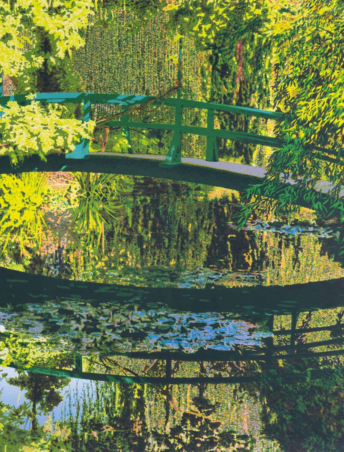
did much to challenge popular ideas about this medium being associated with flat areas of colour and simplified imagery. In Construction Company (1983; CH 82), Stevens elevates an ordinary wooden shed into a thing of wonder, inspiring delight and intrigue in equal measure. The shed is immersed in a subtle speckling of pink and blues, giving depth to the tree shadows that play against it, as Stevens emphasises how time has moved on, prompting thought as to what remains behind the wooden panels. Despite its complexity, this was only his second screenprint, having turned to the medium a year earlier, in 1982. Using autographic positive stencils, he made his screenprints at the renowned Coriander Studio, London, with the master printmaker Brad Faine. As Faine recalls, Stevens was “a shrewd printmaker ... always careful to use as few colours as possible when creating an image”.39 Excited by the possibilities of overprinting, Stevens duly mastered the “ability to separate out individual colours and predict the result of their overprinting”, which, as Faine adds, was “no mean feat when one uses ten to fifteen handmade stencil separations”.40 In adding colours to the monumental image of Black Walnut Tree, Kew Gardens, 21st of October 1987 (1988; CH 101), Stevens introduced “inks with different characteristics – transparent, opaque and translucent – to produce a wide range of effects in the final print ... achieving a depth of tone and colour which bears witness to his mastery of the medium”.41 The layering of stencils also allowed for Stevens to portray his particular treatment of light and shadow, especially when cast on the transient surface of water, as can be seen in Bridge, Lowick House (1986; CH 98), hailed by Beatrice Phillpotts as “a tour de force”.42 The rather bland source photograph used for the next print, Monet’s Garden (1987; CH 99), attests to the transformative intervention of Stevens as printmaker, for his interpretation via screenprint is emphatic in technique and radiant in colour. This visit to Monet’s iconic water garden at Giverny, in 1986, should have marked the first of many Europeaninspired prints. However, a trip to Italy had been postponed due to ill health, and ultimately his final print (CH 102), of an imposing tree felled during the Great Storm of October 1987, could stand as a poignant metaphor for the artist, who too was struck down in his prime.
39 Brad Faine, ‘Norman Stevens’, Norman Stevens ARA: Selected Prints, Royal Academy of Arts, 2014, exh. cat. essay, unpaginated.
40 Ibid.
41 Brad Faine, The New Guide to Screenprinting, London: Headline, 1989, p. 100.
42 Beatrice Phillpotts, ‘Royal Academicians, New Ashgate Gallery’, Arts Review, 27 February 1987, p. 125.
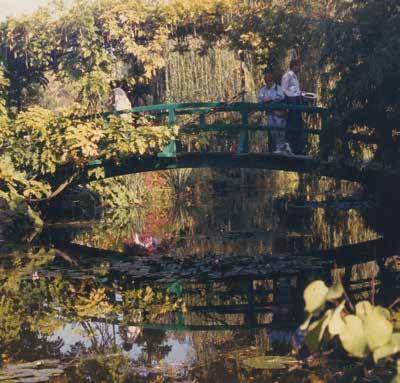
above: Monet’s garden. Source photo, CH 99 right: CH 99, detail
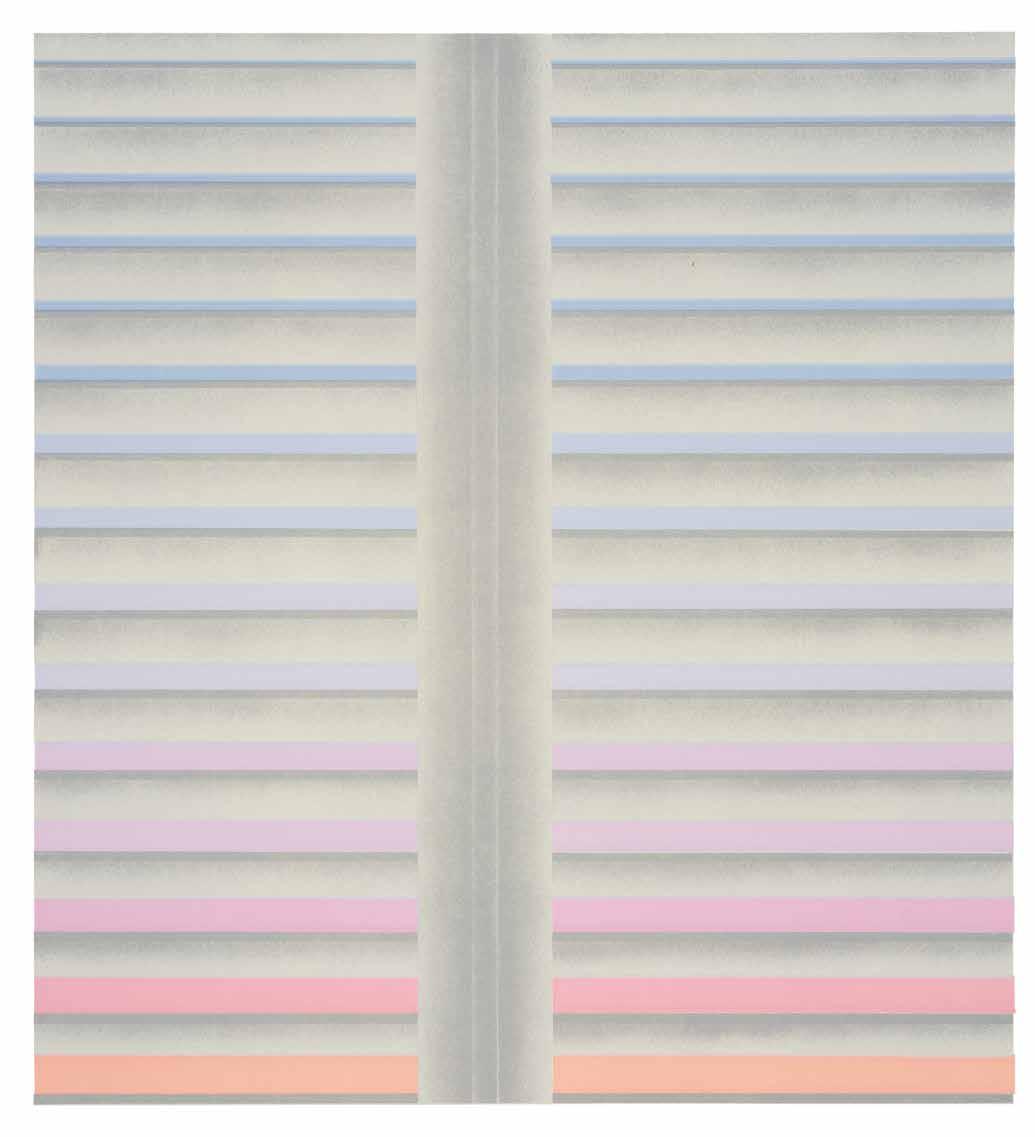
It is worth noting that throughout his career, Stevens was never associated with a particular art movement or group of artists. His work is not easy to relate to other artists, and critics and curators have struggled to categorise it. He was part of a gifted group of students at Bradford College of Art, alongside David Hockney, John Loker, David Oxtoby and Michael Vaughan, but all were pursuing very different ideas. The closest tie was to Hockney, as Stevens treated his subjects “with an aesthetic style and a wit that bordered on the Pop, but he always took a more serious stance”.43 Perhaps this stubborn resistance to categorisation reflects the artist, and the circumstances that shaped his early career. After facing obstacles in his younger years, such as contracting debilitating polio aged two, Stevens was the first of his friends to leave Bradford for London. His reduced mobility meant he was ineligible for National Service – a two-year national requisite for young men at that time – and so he moved to London to study painting at the Royal College of Art (RCA), aged twenty. As a result, he received a more traditional education than those students who arrived in 1959, when London, and especially the RCA, was on the cusp of Pop Art, and open to alternative, less rigid postwar values. By the time of the landmark Young Contemporaries exhibition in 1961, which heralded the Pop-inflected paintings of Hockney, Allen Jones and Peter Phillips, Stevens had already moved on, finding work at Manchester College of Art. As a teacher, Stevens had access to the college print rooms, but it was not until 1970 that he gave any serious thought to making prints. Even then, according to Rosemary Simmons, it was “almost by chance ... seeking some haven from antagonistic painting students in Maidstone he found sanctuary in the etching room”.44 There, at Maidstone College of Art, Stevens produced Tree Flower (1971; CH 2), a highly assured print in which he scraped and burnished the etched line to describe the weathered house wall, and used drypoint for the softer, delicate details of the foreground flower. Self-published in a small edition, Tree Flower sparked immediate interest from publishers. Editions Alecto, one of the most innovative publishers during the 1960s and ‘70s, commissioned Stevens to make a print based on his louvered shutter paintings. Ultimately, the daring and demanding nature of producing the multi-plate lithograph Louvered Shutter, Evening (1971; CH 4) set the standard for his printmaking. Bud Shark recalls how Stevens had to redraw the airbrush plate several times, in an effort to retain the desired subtlety and detail, while the “split-fount inking on the second plate was a very difficult one to accomplish with fifteen different colours in very narrow bands”.45 In the final image, these narrow bands shift downwards from dark blues to lighter shades, before merging with the lilacs and pinks of sunset, but separated each time by the soft grey louvers. Shortly after publication, impressions were acquired by the Government Art Collection as well as the Museum of Modern Art in New York. The relationship with Alecto continued for the next five years, during which time prints were published by Alecto International, an offshoot company also based in London but specialising in a worldwide audience. The final prints made for Editions Alecto was the Lower Wessex Lane suite of four lithographs (CH 30-33), printed at Curwen Studio in 1976. Many of these were purchased by the
43 ‘Norman Stevens Obituary’, The Daily Telegraph, 1 September 1988, p. 13.
44 Rosemary Simmons, ‘Six Artist Printmakers’, p. 15.
45 As quoted in Tessa Sidey, Editions Alecto: Original Graphics, Multiple Originals 1960-1981, Aldershot: Lund Humphries, 2003, p. 234. As manager of the lithography studio, Bud Shark printed the lithographs for Editions Alecto from 1970 to 1973, and Louvered Shutter, Evening was the first to be printed during that time.
46 Tessa Sidey, ibid. p. 24. Other artists involved in this scheme included Robyn Denny, Nigel Hall and William Scott.
47 Joe Studholme, via email to the author, 7 August 2017. Studholme was one of the founding shareholders of Editions Alecto in 1962, and became its managing director in 1967.
48 William Packer, ‘Norman Stevens: A Personal Note’, Norman Stevens: An English Landscape, Redfern Gallery, 1989, exh. cat. essay, p. 3.
Government for its public offices. This short-lived scheme between Alecto and the Government “remains one of the most enlightened and rare examples of postwar public print patronage in Britain”.46 Other publishers were keen to work with him, and in 1976, Bernard Jacobson published the respective series of Stonehenge and Gates. Christie’s Contemporary Art published Clapboard House in Moonlight in 1973, and in 1977 became his main publisher. The Redfern Gallery first showed Stevens’ work in 1978 (and continues to represent his estate), and between 1981 and 1982, published three very successful topiary prints, including the awardwinning Stilt Garden. Most of the ten screenprints that Stevens produced during the 1980s were published by Coriander Studio, ending with Monet’s Garden, the entire edition of which sold out on the opening day of the Royal Academy Summer Exhibition, in 1987. Later, Pirelli UK made a rare foray into publishing original prints, with Ornamental Still Life in an English Italian Garden, Devon (1987; CH 100), produced during Stevens’ time as Pirelli artist-in-residence at Wimbledon School of Art. The scheme had been launched by its visionary PR officer, Tom Northey, whose many triumphs included resurrecting the Pirelli Calendar. In 1988, Pirelli published a second print, of the ravaged walnut tree, with all proceeds donated to Kew Gardens. Tragically, Stevens didn’t live long enough to see the restoration of Kew Gardens; instead, in 1989, Black Walnut Tree was among three prints chosen for a special memorial display at the International Biennial of Graphic Art in Ljubljana.
This catalogue raisonné documents Stevens’ entire output across all forms of printmaking, encompassing intaglio, lithography and screenprinting. Within the catalogue raisonné, a number of working proofs are illustrated, alongside the final print, to allow a unique insight into his printmaking process. As remarked by Joe Studholme, “it was often tantalising to see a wonderful image of his ‘improved’ as new proofs were taken”.47 Many of the prints took over a year to complete, and the number of working proofs confirm William Packer’s observation that Stevens was “distrustful of easy solutions and quick effects and always reluctant to leave what he thought he could improve”.48 As such, the colour proofing was paramount, especially for the intaglio plates. Stevens used the working proofs of his earliest prints to explore variations of black, before the introduction of Prussian blue, in 1973, offered further possibilities. He spent much time trying to find just the right shade of greens for the topiary in Shadowed Garden, and one such colour proof was shortlisted for the 1976 Premio Internazionale Biella per l'Incisione. Ultimately, perhaps the uncanny transformation of Painswick, Moonlight, far removed from its original interpretation (1978; CH 52), best demonstrates the mastery of colour proofing that so typified the approach of Stevens and JC Editions.
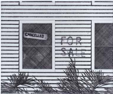
Clapboard House with Fronds 1974 Cancellation Proof (see CH 6)
Persistence of Time
John Crossley
Norman Stevens came to JC Editions, London, in 1971. His work up to this point had been predominantly in painting. The intensity of change in London in the 1960s made the city a focus for contemporary artists to meet and work within an egalitarian ethos that had spread from the Bauhaus-influenced art colleges to the fine art workshops. The break from insular artist’s studio and separate protective professional workshops was significant. The change reflected a confidence of the fine art graduates to work with other artists, sharing and developing skills and abandoning the separation of craft from art. The workshops had previously worked independently from the artist, jealously protecting their skills, sources and methods of work. JC Editions embraced the collaborative method of working alongside artists to develop ideas in tandem, the whole studio focusing on a single artist and project through to completion. This singular focus encouraged and enabled a unique collection of intaglio imagery to emerge, with both artist and master printmaker developing and exchanging methods to achieve the essence of the image.
The JC Editions master printmakers were James Collyer, who attended Bournemouth College of Art and Kingston College of Art, and John Crossley, who graduated in painting and printmaking from Bradford College of Art and Hornsey College of Art, London. They met at Editions Alecto, where they worked on completing David Hockney’s The Cavafy Series of etchings in 1969 and with Patrick Procktor on Invitation to a Voyage, a series of large multi-plate aquatints completed in 1970. Based in London EC1, JC Editions was established by Collyer and Crossley as an independent intaglio printmaking studio in 1971, growing in experience to become the renowned specialists in multi-plate, multi-colour original intaglio prints. Into this new, dynamic printmaking studio Stevens brought his tenacity to work intensively, enjoying the possibilities of developing ideas within the parameters of the intaglio process, and revelling in the professional focus on his work and the process of its development.
Stevens was particularly excited by multi-plate intaglio printmaking, which allows the individual plates to bring subtle additions and depth to the image. The individual plates build up the whole image but can be quite independent in
their process with the use of etching, aquatint, mezzotint or other single intaglio methods. The whole intaglio palette may be incorporated either exclusively on separate plates or built up on each plate. Each plate has the potential to be inked up in many colours and a wide range of inking effects can be used. This complex method of printmaking is nearer to the painterly way of working. To achieve this in printmaking is to maximise the sensitivity and skills of the master printmakers with the drive and integrity of the artist to maintain their visual intention. In Square (1973; CH 10), for example, the multi-plate method is used to build a translucent space holding a moment of the mist rising and the rain falling on a simple paving grid. In contrast, the plates in The Fox, Knightshayes (1982; CH 79) are used to build up layers of colours to make a solid form held in time of an image of topiary, a live plant shaped to suggest interruption of time.
The precision of marks on an intaglio plate hold a very particular attraction for expression. Stevens’ focus on objects of human intervention to the natural environment, whether it be in the form of gates, worked stone or pathways, was never about simply recording a moment in landscape but more the unsaid; the mark of how an object came to that state of controlled reverence as in a formal garden, or of abandoned neglect as in a derelict barn. The power of his work is to leave the viewer to bring their own sense of personal experience to each image, not to dictate or define a narrative. Stevens’ work was therefore so much more than landscape record. His work contained what every artist aims to encompass: a possibility for others to take an image into their own experience and evoke in them a very personal response. This was not achieved by some sibylline vision but by his respect for every aspect of an image; all areas accorded the same intensity of mark-making and careful consideration of light and placing within the image.
Stevens’ work remains a high benchmark of multi-colour intaglio printmaking in late twentieth-century British art, and serves as tangible evidence of the charged working environment that was JC Editions. The professional approach to the making of each image and the secure respect of equality within the studio encouraged high expectations and masterful results.
Notes to the Catalogue Raisonné
Catalogue Raisonné Numbers:
Each entry is numbered from 1 to 108, and preceded by the letters CH, which refers to Crossley and Healey, the authors of the catalogue raisonné. Entries are arranged in chronological order, starting with Stevens’ first print of 1964.
Date:
The year the print was completed. Each print is dated by Stevens in pencil below the image on the right-hand side. Some proofs may be dated a year earlier than the edition, as Stevens took over a year to finalise a large number of his prints. Any undated prints appear at the end of the catalogue raisonné (pp. 158-159).
Medium:
All methods listed here are expanded on in the glossary of printmaking methods (pp. 160-161).
Image Size:
All measurements are shown in millimetres and inches, height before width. For all of Stevens’ intaglio prints the plate size is the image size.
Paper:
The paper for Stevens’ prints was white in colour.
Sheet Size:
There are slight variations in paper size, particularly on the intaglio prints, as the paper stretches in the press. The paper size is used only for the edition; proof sizes are various.
Edition:
Each print from the edition is signed and numbered by Stevens. The number of the editioned print is written in pencil below the image on the left-hand side.
Artist’s Proofs (APs):
Artist’s Proofs are kept by the artist, and are identical to (but outside of) the numbered edition. Stevens inscribed these prints ‘AP’ or ‘Artist’s Proof’, below the image on the left-hand side. The number of APs for each print is listed in the catalogue raisonné, when known (Stevens did not always number the APs). Convention is 5 APs to every 50 prints in an edition, but in some cases this may vary.
Printer’s Proofs (PPs):
Printer’s Proofs are like APs, but kept for the printer. In the catalogue raisonné, the number of PPs corresponds to the number of people involved in the proofing and printing.
Exhibition Proofs (EPs):
A few of Stevens’ early intaglio prints from 1973 to 1974 are inscribed ‘Exhibition Proof’ – these are prints of the final image that are used only for gallery displays or publicity, and so are not listed in the catalogue raisonné.
State Proofs:
These are impressions from the plate or screen to record a particular stage in the progress of the development of the image. Some state proofs have been inscribed ‘Stage Proof’.
Working Proofs:
When the image on the plate or screen is finalised, working proofs in colours are printed. These are not usually the same colour as the editioned print. Stevens’ proofing was complex, and he would differentiate between various proofs with the use of ‘Proof’, ‘Trial Proof’, ‘Stage Proof’, ‘Colour Proof’, ‘Trial Colour Proof’ or ‘Colour Stage Proof’, which would be inscribed below the image on the left-hand side. Working proofs were usually signed and dated, but not always titled. A selection of working proofs and state proofs are illustrated in the catalogue raisonné, each captioned with the title, date and inscription as written on them by Stevens.
BAT Prints:
Proofing continues until the artist is satisfied with the image, the proof of which is then inscribed ‘BAT’ (Bon à Tirer) by Stevens to indicate that it is the finished image, and the one the edition is to be made to.
Colour Intaglio Prints:
In Stevens’ colour intaglio prints the plate’s surface was steel-faced to strengthen it for editioning. A ‘Final Colour Proof’ was printed and signed before steel-facing and a BAT printed and signed after the steel-facing, as some inked colours on steel-facing can appear different from copper plates. All of Stevens’ intaglio prints were made on copper plates, except CH 1, 2 and 3 for which zinc plates were used.
Signature:
All written inscriptions on the print are in pencil by the hand of Norman Stevens. The prints are signed below the image on the right-hand side, followed by the date. The title is usually written in the centre or left of centre.
Embossed Stamps:
The embossed stamp is the printer’s or publisher’s stamp or chop. Where an embossed stamp is used, it is on the bottom right-hand side of the paper margin. Not all of Stevens’ prints contain an embossed stamp.
Public Collections:
Abbreviations are used for the public collections. For the complete list of public collections, see page 167.
Comments:
Short commentaries have been written by John Crossley for each print.
Catalogue Raisonné
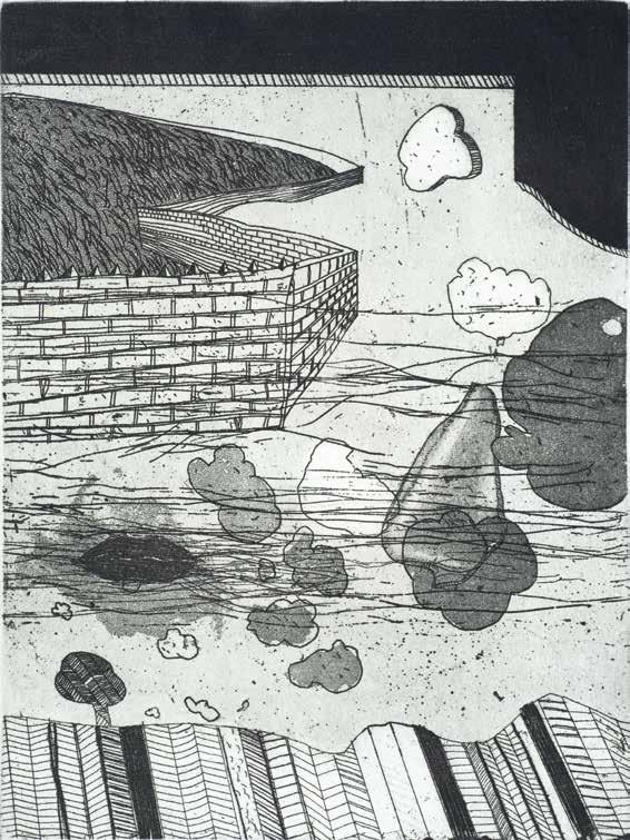
Landscape 1964
Etching and aquatint
Plate 248 × 183 mm / 9¾ × 7¼ ins
1 plate printed in black
Wove rag paper
Print not editioned
1 print signed, dated, titled and inscribed ‘Artist Proof / no Edition’
1 further print signed, dated 1965 and inscribed ‘1-6’
No embossed stamps
Proofed and Printed at Manchester College of Art
Unpublished
Plate experiment of line, line-tone and aquatint. The line work at the base of the plate indicates a build-up of vocabulary in the use of the etching scriber. The imagery in the upper left, of the symbolic wall enclosing a fluid mass, is achieved with aquatint over line etching. Aquatint is the main expression in the centre ground, with etched line striations.
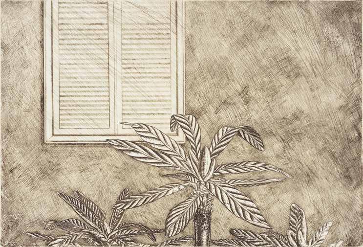
Tree Flower 1971
Etching and drypoint
Plate 197 × 290 mm / 7¾ × 11½ ins
1 plate printed in black with brown Wove rag paper J Green HP Waterleaf. Sheet 397 × 588 mm / 15¾ × 23¼ ins
Edition of 15 plus APs
Working proofs in blacks and browns
Signed, dated, titled and numbered by Norman Stevens
No embossed stamps
Proofed and Printed by Michael Chaplin at Maidstone College of Art, Kent
Published by Norman Stevens, London 1971
Etching of line, line-tone, burnished line-tone and drypoint. The background image is of line-tones made by scouring through the plate ground and etching. The etched line is then scraped and burnished. The foreground tree flower is line-etched, with drypoint details.
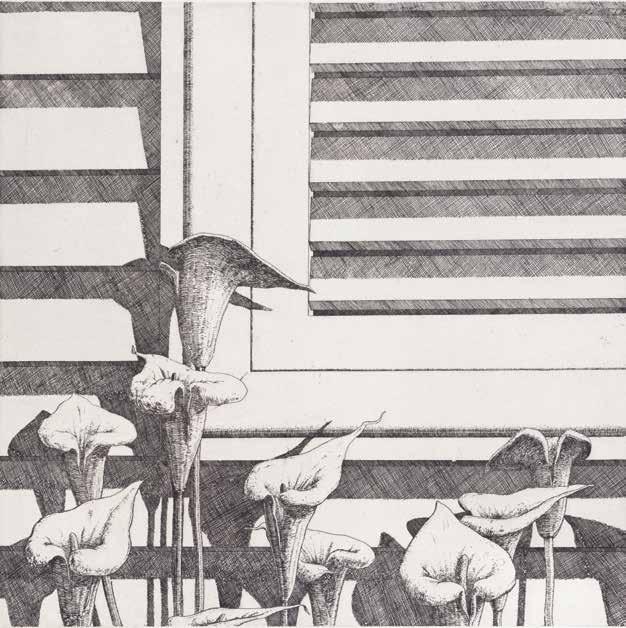
CH 3
Lilies 1971
Etching
Plate 280 × 280 mm / 11 × 11 ins
1 plate printed in black Wove rag paper J Green HP Waterleaf. Sheet 576 × 394 mm / 22¾ × 15½ ins
Edition of 20 plus APs
Working proofs in blacks and browns
Signed, dated, titled and numbered by Norman Stevens
No embossed stamps
Proofed and Printed by Michael Chaplin at Maidstone College of Art, Kent
Published by Norman Stevens, London 1971
Public collections: LeiMG
In this line etching, Stevens demonstrates exquisite control of the etching needle by differentiating between crosshatched line for depth in the louvers and closecolumned line for the form of the lilies.
Louvered Shutter, Evening 1971
Lithograph
Plate 502 × 454 mm / 19¾ × 18 ins
3 plates printed in grey and blended bands of blue, lilac, pink, orange Wove rag paper BFK Rives. Sheet 674 × 558 mm / 26½ × 22 ins
Edition of 65 plus 12 APs
Proofs not recorded
Signed, dated, titled and numbered by Norman Stevens Embossed stamp of Bud Shark; Flat stamp ‘ea 784’ on reverse Proofed and Printed by Bud Shark at Alecto Studios, London
Published by Editions Alecto, London 1971
Public collections: BMG; FM; GAC; MoMA; MS
Stevens’ first published print using colour. He was looking for expressions of uncomplicated lines to take forward his visual experience of California, and airbrushed lithography suggested a suitable medium to work in.
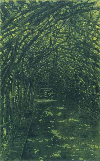
Kensington Gardens 1978
Etching, soft ground etching, aquatint and burnished aquatint
Plate 425 × 263 mm / 16¾ × 10½ ins
2 plates printed in 3 colours, black with blue, green, yellow
Wove rag paper Arches 250gsm. Sheet 645 × 470 mm / 25½ × 18½ ins
Edition of 150 plus 15 APs
4 state proofs. Working proofs in black, greens and blues.
Proofs and the BAT titled Walk, Kensington Gardens
Signed, dated, titled and numbered by Norman Stevens
Embossed stamps of Christie’s Contemporary Art and JC Editions
Proofed and Printed by James Collyer and John Crossley at JC Editions, London
Published by Christie’s Contemporary Art, London 1978
The intensity of the key line plate allows the main aquatint plate to enhance the enclosure of the tree bower with its melancholic edge.
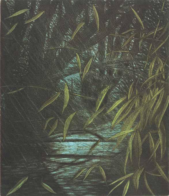
CH 63
Stream, Penn Common 1978
Etching, aquatint and burnished aquatint
Plate 270 × 230 mm / 10¾ × 9 ins
3 plates printed in 3 colours, black, blue, green
Wove rag paper Arches 250gsm. Sheet 445 × 380 mm / 17½ × 15 ins
Edition of 150 plus 15 APs
2 state proofs. Working proofs in black, browns and blues
Signed, dated, titled and numbered by Norman Stevens
Embossed stamps of Christie’s Contemporary Art and JC Editions
Proofed and Printed by James Collyer, John Crossley and David Suff at JC Editions, London
Published by Christie’s Contemporary Art, London 1978
Public collections: GCGA; IMA; MAM; ZAM
Stream, Penn Common shows Stevens’ fascination with the transient movement of willow leaves to catch sight of a hidden stream held in a burst of bright sunlight. He used the darkness of the line-etched trees to contrast the suggested movement of the aquatinted leaves.
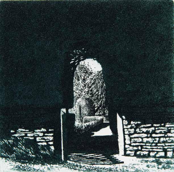
74
Path 1980
Etching and aquatint
Plate 74 × 75 mm / 3 × 3 ins
1 plate printed in 2 colours, black, dark green
Wove rag paper Arches 250gsm. Sheet 340 × 284 mm / 13½ × 11¼ ins
Edition of 100 plus 10 APs
3 state proofs. Working proofs in black, greens, browns, blues and red oxides. Some early proofs titled Garden Gate
Signed, dated, titled and numbered by Norman Stevens
Embossed stamp of JC Editions
Proofed and Printed by James Collyer and John Crossley at JC Editions, London
Published by Norman Stevens, London 1980
Although one of his smallest intaglio prints, Path, in its published state, is a jewel of very dense aquatint printed in black and dark green to frame a distant, sunlit topiary world. Some of the edition of Path was included in a luxury presentation of The Gates Along the Path: Poems by Thomas Hardy, published in 1980 by Nottingham Court Press, London.
The Stilt Garden, Hidcote 1981
Etching, stipple etching, aquatint and burnished aquatint
Plate 373 × 527 mm / 14¾ × 20¾ ins
3 plates printed in 7 colours, greens, black, red, pink, yellow, blue
Wove rag paper Arches 250gsm. Sheet 570 × 698 mm / 22½ × 27½ ins
Edition of 90 plus 20 APs
4 state proofs. Working proofs in blacks and greens. Some early proofs titled Hidcote
Signed, dated, titled and numbered by Norman Stevens
Embossed stamp of JC Editions
Proofed and Printed by James Collyer and John Crossley at JC Editions, London
Published by Redfern Gallery, London 1981
Public collections: AU; BCC; NT; PH
The Stilt Garden, Hidcote is an exercise in spatial perfection. Stevens used different intaglio devices with masterly drawing to emphasise the incongruous angles of the garden. The strange angles of the spatial planes describe each horizontal distance, with the foreground amplified by a red plant, suggesting a point of entry to another world.
The Fox, Knightshayes 1982
Etching, aquatint and burnished aquatint
Plate 373 × 528 mm / 14¾ × 20¾ ins
3 plates printed in 4 colours, greens, black, yellow
Wove rag paper Arches 250gsm. Sheet 570 × 700 mm / 22½ × 27½ ins
Edition of 75 plus 15 APs
4 state proofs. Working proofs in blacks, greens and yellows. Some early proofs titled The Fox, Knightshayes Court, Devon
Signed, dated, titled and numbered by Norman Stevens
Embossed stamp of JC Editions
Proofed and Printed by James Collyer and John Crossley at JC Editions, London
Published by Redfern Gallery, London 1982
Public collections: BMG
The detached medium of intaglio printmaking captured the image of the escaping fox held in the contained yew branches, and enabled the fox to live forever in a still world.
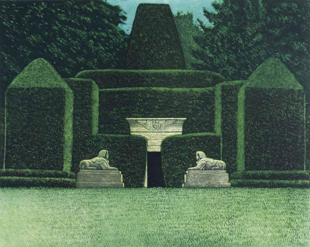
The Egyptian Garden, Biddulph Grange 1982
Etching, stipple etching, soft ground etching, aquatint and burnished aquatint
Plate 396 × 502 mm / 15¾ × 19¾ ins
3 plates printed in 5 colours, greens, black, yellow ochre, blue
Wove rag paper Arches 250gsm. Sheet 570 × 660 mm / 22½ × 26 ins
Edition of 75 plus 15 APs
4 state proofs. Working proofs in blacks and greens.
Some early proofs titled Egyptian Garden
Signed, dated, titled and numbered by Norman Stevens
Embossed stamp of JC Editions
Proofed and Printed by James Collyer and John Crossley at JC Editions, London
Published by Redfern Gallery, London 1982
Public collections: BCC; LCC; SCM
In this formal composition, Stevens captured the focal point of the sphinx-guarded tomb by defining the edge of the partially hidden door in coarse-grained burnished aquatint, and set it against the dense aquatint of the tomb interior.
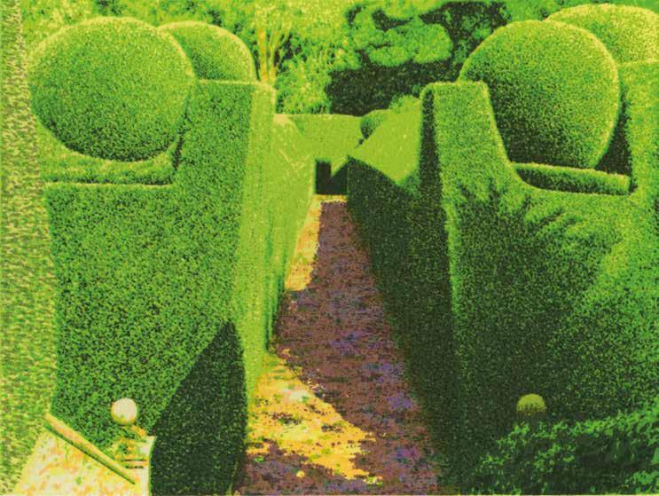
Crathes Castle Garden 1984
Screenprint with glaze and embossed edge
Screen 141 × 188 mm / 5½ × 7½ ins
Screens printed in greens, yellows, orange, pink, violet, blue
Wove rag paper Arches. Sheet 330 × 368 mm / 13 × 14½ ins
Edition of 50 plus 5 APs
A few working proofs
Signed, dated, titled and numbered by Norman Stevens
Embossed stamp of Coriander Studio
Proofed and Printed by Brad Faine at Coriander Studio, London
Published by Coriander Studio, London 1984
Public collections: IoM
The emphasis of this screenprint is a pale bright green, unlike Stevens’ previous topiary images of dark shadows.
Laurel Tree, Nettlecombe Court 1985
Screenprint
Screen 635 × 789 mm / 25 × 31 ins
Screens printed in greens, yellow, blue, violet, pink, brown, red Wove rag paper Arches. Sheet 800 × 945 mm / 31½ × 37¼ ins
Edition of 150 plus 15 APs
Working proofs in browns and greens
Signed, dated, titled and numbered by Norman Stevens
Embossed stamps of Christie’s Contemporary Art and Coriander Studio
Proofed and Printed by Brad Faine at Coriander Studio, London
Published by Christie’s Contemporary Art, London 1985
Public collections: BMG; LMG
Nettlecombe Court is a base for field studies of local natural habitat, and Stevens’ working of the grass around the laurel tree emphasises the complexity of the ecosystem it holds.