
4 minute read
Artifacts

The De Stijl movement produced many artifacts throughout the years it was prominent. Those that are perhaps the most well known have been produced by the key players of the movement: Gerrit Rietveld and J.J.P. Oud, the two architects and Theo van Doesburg and Piet Mondrian.
Rietveld's most successful was the Schrader House in Utrecht, built in 1924 it is the only true example of De Stijl architecture. Designed with the help of Mrs Truus Schroder-Schrader this house was built with the intention of being the ideal home. There was a criteria made by Mrs Truus Schroder- Schrader which stated that each bed in a bedroom must be able to fit in two different positions, also that each room should have direct water supply, drainage and access to the outside.
Advertisement
These requirements were all met and it was Rietveld's attention to detail that made the house so successful. The house has two floors and the upstairs is perhaps one of the main attractions as it was designed so that the size of the room could be altered. It is essentially a loft with portable partitions which run on tracks, this design is similar to the traditional Japanese houses and offers a unique way of living. Rietveld also designed a window to be situated in the corner of the house so when opened up it would give the impression of there being no walls.
-house he was turned down as Mrs Schroder and Rietveld did not want to involve a De Stijl artist for choosing the colours. Instead as stated by Overy (1991) he wanted to use colour 'less as a painter and more in direct connection with the simultaneous creation of colour and architecture'.
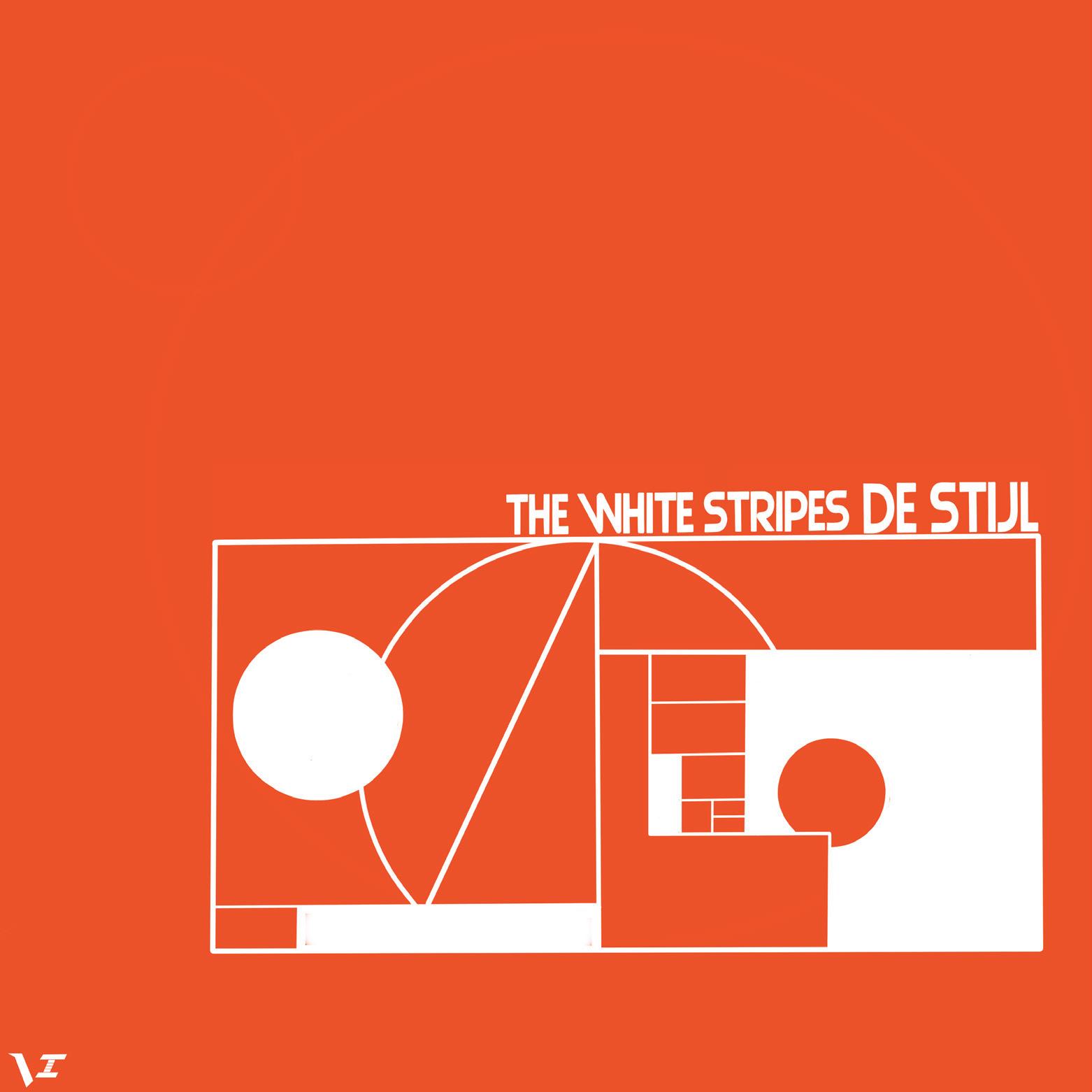
Gerrit Rietveld furnished the house with his early furniture designs, most of which represented what a 3D De Stijl work of art ought to look like. One of which was the red blue chair, designed in 1917 it was first illustrated in De Stijl in 1919. Rietveld studied the interaction of vertical and horizontal planes in order to produce this design, this is also evident seen within his architectural work.

-to one another. J.J.P. Oud designed buildings for social housing, therefore having a very different appearance and purpose to some of Rietveld's work. In 1918 Oud was offered a job with the Rotterdam Housing Authority where he designed low rent accommodation for the working class. These included the Tussendijken and Spagen blocks which never appeared in De Stijl perhaps because they did not seem to resemble the De Stijl style like the Schroder House did.
The artists of the movement, two of which being Mondrian and van Doesburg painted in an abstract manner. They used geometric shapes to produce compositions as seen in van Doesburg's 'Rhythms of a Russian dance 1918. This piece seems to have a lot of movement in it, the viewer can really feel the rhythm of the dance. This has been created by the placement of the rectangles and the plank white space formed. The fact that van Doesburg has placed these rectangles all at right angles to each other,
either vertical or horizontal helps the viewer's eye flow down through the page.
Looking at Mondrian's early work compared to his latest paintings, the difference in style is incredibly different. His first paintings had a hint of abstraction interpreted into them but they mainly conveyed nature and real life images.
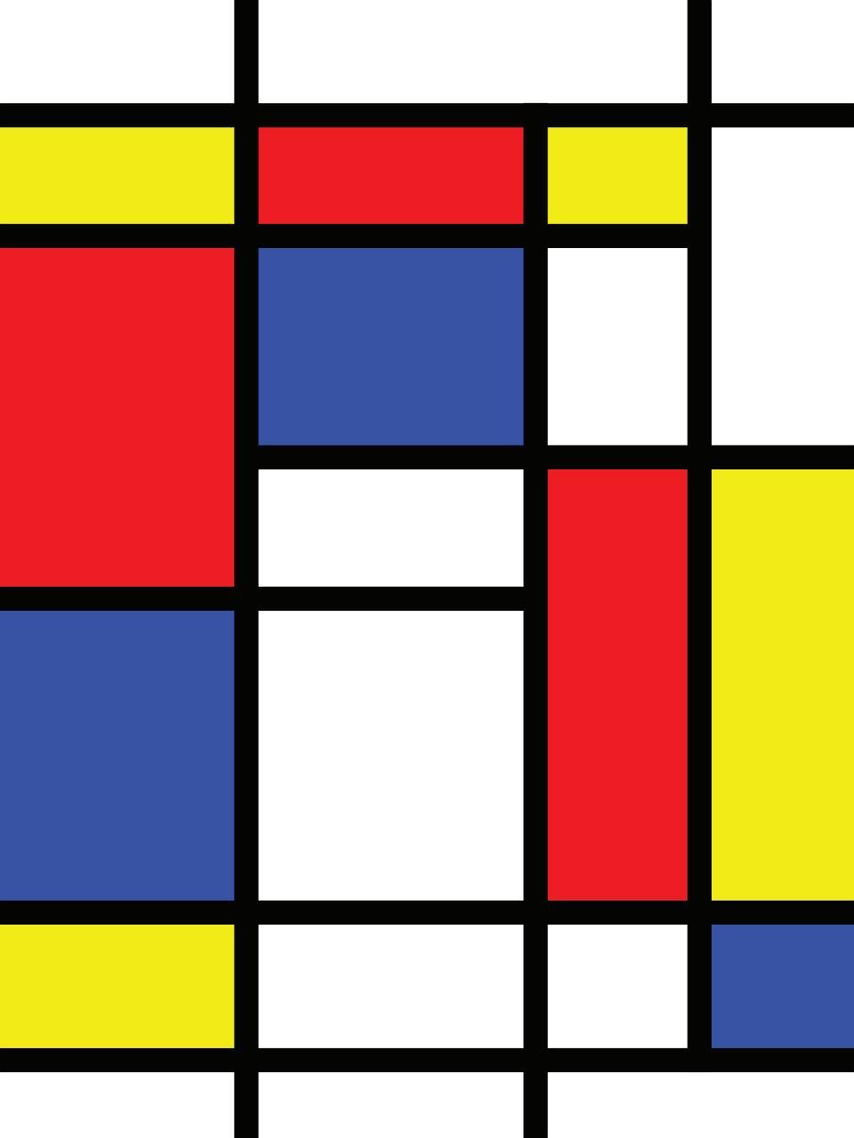
Mondrian later became influenced by Cubism and from there his paintings developed a regular framework which were far more radical than any other piece he had produced. His painting `Composition 2' (1922), shows the grid use clearly. Here he has experimented with using a large white space in the middle and framing it with black lines.
The three rectangles of colour help the viewers eye move around the piece in a clockwise manner. Although this painting is fairly minimal it seems evident that Mondrian was referring to the rhythm of the forms thus creating a different moods.
Possibly one of Mondrian's most known piece of work is 'Victory Boogie-Woogi, 1934/44' this is because this was his last painting he did before dying in 1944. It was also never finished therefore making it even more important. The title seemed to be named in hope of a victory for the Second World War, the-
-bright colours suggesting joy and optimism. This painting is much more dynamic than 'Composition 2', the density and use of colour is a lot more extravagant. It seems to convey an unusual sense of movement. The lines and planes of the painting are barely evident unlike in 'Composition 2' where they are extremely clear. Due to this confusion with the lines and chaotic colour arrangement the painting seems to have movement or a slight flickering affect on the viewer's eyes.
These examples of De Stijl are just a small selection. When looking into the different areas that were affected by the movement one can see the differences and similarities between each piece of art.
