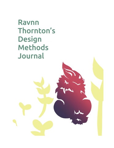
Ravnn Thornton’s Design Methods Journal
Table of Contents Introduction 4-5 Does it Fly?
6-11
Syntax and Semantics
12-17
Great Ideas Poster
18-23
Character Marks
24-29
Book Cover
30-35
Design Methods Journal
36-41
Other Class Projects
42-47
Personal Projects
48-53
Colophon 54
0
Introduction Statement of Intent
4
Final Presentation
I’ve always loved to create art and as
also and help them produce whatever
I grew up, I loved to draw and sketch
they are envisioning. I like hearing
whenever I had the time. To translate
other’s ideas and trying to transform
that into digital medium, I want to
them into real projects and help solve
be able to learn a lot within the BFA
their problems. Learning design and
Graphic Design program. Being in the
how it can bring forth inspiration and
Art 205 class already gave me so much
new perspectives on the world around
experience with different programs
me opened more doors for my eyes to
and applications like InDesign and
see. I don’t want to do this solely for the
Illustrator so now nearing the end of the
money; I want to broaden my horizon
class, I have at least some experience
and learn how to communicate better in
with those programs. But, it’s only a
terms of managing and understanding
taste for what’s more to learn and I
the clients’ and developing what a client
want to learn so much more. I want
really wants. I want to understand more
to be able to experience more about
about the better uses of typography
graphic design and the foundations of
and learn to be better with them, along
them and take it out to the real world
with other foundations that will help
when the time comes. Graphic Design is
me grow as a student. It seems like a
something I would love to and want to
lot to learn, but I am passionate about
stick with in the long run and learning
learning about art, especially this type
from professionals will help me greatly.
of art form. I intent to be studious and
I want to educate myself more about
work hard to become a good graphic
the things I am unfamiliar with, so I
designer, while also trying to have fun
can become familiar with them and do
and had a good experience along the
well in them. Since technology is still
way and make great connections with
shifting and evolving with time, I’m very
both my peers and others surrounding
curious and open-minded to see what
the graphic design community and
more and new things I am able to learn
myself.
while during my time here and during the Graphic Design program. Not only do I want to create what I envision, but to help others create what they envision
5
1
Does It Fly?
“Designers solves a problem. ‘Why?’ is important for designers to ask”
6
Final Presentation
7
1
With the airplane project, I felt like
included my notes from the first week,
maybe I could’ve made a better plane.
since my first blog post was my notes
Yet, I didn’t want to focus too much on
about InDesign, typography, and other
it since the professors said it wasn’t the
little tips we should and shouldn’t do
end of the world if we had gotten a bad
over the course of the semester.
flight with our planes. Not to say that I didn’t try on this project; I did. But it kind of took the pressure off a bit when the points for this project wasn’t as high as I thought. I did see a lot of the planes with the opening in the middle which was interesting. I never would’ve thought of using that as a plane, but it made great distance. I made a lot of different sizes of the same planes, but I was surprised that the bigger sized ones were better than the small ones, considering the weight. In the end, I made a average distance, considering what I used was just lined paper and I only did a couple of different kinds of airplanes. I also
8
In-Progress Work
The paper for the “Does if Fly” project
9
1 10
Concept Sketches
Notes I took during the first couple of weeks in the design methods class
11
2
Syntax & Semantics
“Think about the text size, typography, and layout”
12
Final Presentation
Syntax (visual elements & relationships) Short, red-pleated skirt with bow in the front Semantics: Denotation (specified)
Clothing, skirt
Semantics: Connotation (associations)
Cute, date, going out
Semantics: Expression (feelings)
Syntax (visual elements & relationships) Short, accordion skirt with lots of designs Semantics: Denotation (specified)
Clothing, skirt
Semantics: Connotation (associations)
Rich, expensive, pretentious
Semantics: Expression (feelings)
Love, happy, excited
Loud, proud
Presence (contextual)
Presence (contextual)
Syntax (visual elements & relationships) Black skirt with unicorn and star pattern; pink tulle on top of the black skirt with a polka dot ribbon
Syntax (visual elements & relationships) Short, knife-pleated school skirt; navy blue and green plaid design
Little: date, University of Louisville game Lots: University of Kentucky game, beach, hiking trip
Semantics: Denotation (specified)
Clothing, skirt
Semantics: Connotation (associations)
Kid, princess
Semantics: Expression (feelings)
Little: covered up by long skirt or coat, Harajuku Lots: funeral, school, office building
Semantics: Denotation (specified)
Clothing, skirt
Semantics: Connotation (associations)
School, formal, student
Semantics: Expression (feelings)
Happy, energetic, excited
Polished, neat, quiet
Presence (contextual)
Presence (contextual)
Little: backyard, kids’ party, princess/fantasy party Lots: formal events, funeral, school
Little: school Lots: beach, festivals, wedding
13
2
I saw so many of my peers do everything
on. I tend to do that so it’s in my small
and anything but skirts, so I wanted to
sketchbook and I could flip to it anytime.
try a different category. And honestly,
The notes were mostly about how to
I thought someone would choose skirts
work InDesign and Photoshop alongside
at some point but when it seemed
with the tips rather than the actual
like no one did it, I just kept it. I’m not
project itself which was great since it
the type of person who would wear
helped me out in the long run.
skirts, but I wouldn’t mind wearing it occasionally. Yet, I never really thought about typography as much as I did until this project came. I worked more on the typography than the layout and a couple of times I thought to myself “…does this even work?” I felt like I chose the most boring texts but it looked right so I just left it as that. I also tried to figure out how I could line everything out so the layout is clean and symmetrical as much as I could. I ended up taking a lot of notes, even though some of the tips that were said appeared in basecamp later
14
In-Progress Work
The practice and final copies of the Syntax project
15
2 16
Concept Sketches
Notes about Photoshop, InDesign, and the syntax project itself.
17
3
Great Ideas Poster
“Attract the viewer, hold the gaze, make it memorable, and extend the meaning�
18
Final Presentation
“
We create by combining and recombining existing
�
pieces of knowledge, insight, and information, that
we gather over the course of our lives. Our capacity for creativity hinges on the breadth, diversity, and richness of that mental pool of resources.
Maria Popova
19
3
This project was difficult for me because
redo or refine the project, I would have
I tried to do so much while choosing
scrapped it and chose another quote.
a different concept and quote than
It was best to be kept as is and looked
everyone else. I didn’t think simplicity
back on to see how much I had grown—
or the project as a whole, which led me
which I did. Sometimes not fixing the
to my downward spiral for this project
failure will help me push myself to be
assignment. I sketched many ideas but
better. Looking back at it now, I wouldn’t
most either didn’t get the full meaning
say I disliked it that much because it
of the quote, wasn’t eye catching, or
did help me get better with the other
someone already had that sort of idea.
projects and I learned what not to do in
Because it was struggling to find one
the future.
idea to stick to, it made my process harder the further I tried to make it better. That eventually made me dislike the project and regret choosing the quote that I thought would be nice. I didn’t revise the project for this journal to make it better, because I felt like that although it can be refined, I would probably get sucked in again and not revise it for the better. And, if I had to
20
In-Progress Work
The work in progress of the poster project
21
3 22
Concept Sketches
Concept sketches of different poster ideas. The top left picture was a different idea for a different poster.
23
4
Character Marks “Make it Simple; don’t put too much details”
24
Final Presentation
Dorothy
Dorothy Dorothy 25
4
When I used Illustrator, it was a new
Oz’s mark needed some work. The one
experience for me because I had only
I thought of for Oz wasn’t working in
used Photoshop before I was introduced
Illustrator, so I changed to a different
to this class. InDesign, I was still learning
design. After I had gotten feedback from
from the last couple of projects so I
the mid-project critique, it made me feel
had some experience at least. And I
better about my decision making. They
had never made logos before. Simple
seemed to respond to the mark really
sometimes goes over my head, because
well, and so my next problem was type.
I like to render or put details. But, I
I didn’t understand what worked best.
needed to think simple because I wanted
I was worried that since people had
to do better on this project than the
already responded well to it, if I changed
last one. I didn’t mind making tons of
it too much, it wouldn’t have received
sketches for this project, because the
the same reaction. But I decided if it’s
designs were supposed to be simple, so
already well received by the audience,
I didn’t really need to take my time on
why fix it.
any of them. At the beginning, I thought the designs weren’t that great, and I thought I had gotten the Wizard of Oz figured out instead of Dorothy, but it turned out the last minute Dorothy’s mark I made was actually good, but the
26
In-Progress Work
The final presentation of the Wizard of Oz marks
27
4 28
Concept Sketches
Concept sketches of different main characters in the Wizard of Oz.
29
5
Book Cover “Don’t make it too literal; Cover should have whole meaning from title and subtitle”
30
Final Presentation
31
5
I didn’t have a concrete idea with what
from struggling with finding a “resolved”
to do in the concept matrix. I ended
idea to being okay with the idea that I
up using one and a half of the concept
found later rather than sooner.
matrices. The idea didn’t come to me until later. I had tried doing Photoshop with photos, but the angles of the box or person holding a stuffed animal wasn’t what I envisioned, so I ended up illustrating the project. The project was difficult in the sense that I didn’t want to do similar idea that one of my peers did. I overheard multiple people that chose the same book title as me, already did concepts of stamp books, or boxes filled with ephemera, or shelves with the use of photography. I didn’t think my illustration would be well received since I’m still learning and progressing with my digital art skills. Funnily enough, the idea wasn’t really in the concept matrix, but it was more so when I sketched it out in my small sketchbook. Then I noticed that a lot of my peers either did a cover with a box or literally nothing for the book “Collections of Nothing”, so I wondered what the book cover would look like when I added a person in the cover. I felt
32
In-Progress Work
The work in progresses of three different book cover ideas. I did this for the in class critique and see what the final book cover could look like.
33
5 34
Concept Sketches
Notes and sketches of the book cover project. To the left is the concept matrix of the project. On this page is the notes and sketches of the future book cover.
35
6
Design Methods Journal
“Make the design of the book simple. Should be 60-70% photos and 40-30% texts�
36
Final Presentation
37
6
When I thought of making this design
my journal.
methods journal, I thought this will
With the cover page, I could explain
probably be a little challenging for
more about the cover of this design
me. While I’m interested that I can
methods journal here. With this cover,
put other types of artwork I made
the rabbit simply symbolizes my Chinese
outside of this class into this journal, I
year animal, and I did it in Photoshop
wondered to myself what type of layout
for fun. I could’ve put this in the personal
I should approach while taking that into
projects, but I added some more aspects
consideration. It’s not the content I was
to it to fit this journal so I put it here
worried about so much as the actual
instead. I added the plants around the
layout and composition of the content
rabbit for this book project because
in the book itself I needed to be careful
it’s about growth, so I thought the best
about. I thought I sketched out many
way to show growth is having plants.
ideas of what the layout could be, and
The plants led up to the rabbit, and the
I still did not have a clear answer. Even
closer it is to the rabbit, the bigger it
though we had mostly free range in this
grows. It represents that with each step
journal save for a couple of things, doing
I took, I grew and learned new things
too much could hinder the journal itself,
as I progressed in the semester. Even if
rather than help me convey how much I
I was stuck or stagnant in one spot, if I
progressed, what I did this semester, and
was able to look back and could see the
who I was as a person. I also wanted to
progress I made, it should encourage me
put some type of illustration that’ll make
to look forawrd towards the future.
the journal interesting to flip through, but maybe making the illustration simple so it doesn’t distract the readers from what I wanted them to see. Hopefully I conveyed that with the final product with
38
In-Progress Work
Multiple of different ideas and layouts of this Design Methods Journal.
39
6 40
Concept Sketches
To the left is the concept sketches of the layout of this book. On this page, I have notes for the process book and the start of the process book.
41
7
Other Class Projects “Learning the Foundations”
42
Final Presentation
43
7
The works shown here are from my previous art classes in UofL: Art Drawing, Art 2-D foundations, and Art 3-D foundations. With each of the art classes, I tried my hardest so I could learn all the fundamentals and foundations of the classes, and put what I learned in them in the future. Even if they are relatively beginning classes, depending on the professors and what they do to bring out the potential and hard work out of me, I can potentially learn a lot. I discovered going to all these art classes so far that there are different ways to solve problems and communicate visually. The projects I selected to be shown are the wire project (which represents an clothes iron), the pinhole project (the photos on the right), and the 2-D design abstract piece at the bottom. These are the little out of the many things I did in those classes. The artworks in the concept sketches and final presentation are from the drawing class (gesture drawing, portraits, etc.).
44
In-Progress Work
Top of the page are projects from Art 3-D foundations class and on the bottom part of the page are projects from the 2-D foundations class.
45
7 46
Concept Sketches
Sketches from Art Drawing class and 3-D foundations class. Gesture drawing and sketching 3-D forms.
47
8
Personal Projects “Practice, Practice, Practice”
48
Final Presentation
49
8
This is what I usually do on my own
usually doing something that I want to
time. Granted, I haven’t really done a lot
learn or already learned and putting it in
of personal projects recently because I
a piece that I can hopefully make it final.
wanted to focus on the classes I had this
But most importantly, I do them for fun
semester. But I did do a few personal
and I enjoy every bit of it.
projects/practices so I could get better in certain aspects of what I wanted to learn. I love to draw and sketch in my own time and I am learning how to do digital art as I go, and I’m hoping that I get better with painting and sketching as I go along in the future. I like to study life and living things and sketch them, as well as the surrounding objects/ environemnts. Whether they’re quick or rendered, it gives me the practice the more reference I can see and sketch them in my sketchbooks. Personally, I would try to fit time so I could draw at least an hour or so everyday, so I would be able to learn a tiny bit everyday if I can’t put my full attention on sketching at that time. The quick sketches I do are usually at the minimum 1-5 minutes, and at max 30 minutes. After that, it’s basically rendering or adding details to the sketches. Personal projects for me are
50
In-Progress Work
Work in progresses of sketches in Photoshop. Refined sketches and color dumps for shades
51
8 52
Concept Sketches
Sketches of different studies and gestures of movements. To the right on this page, is the initial concept sketch of the work in the in-progress page.
53
Body Text Light Josefin Sans 9/14
Title Text Bold Ubuntu 52/47,
Subtitle Text Bold Josefin Sans 11/14
Caption Text Bold Josefin Sans 40% black 9/12
Cover Title Texts: Medium Ubuntu 40/45 Designed by Ravnn Thornton University of Louisville Art 205 Design Methods Spring 2018
54