TO THE READERS
This year marked my first time stepping into the role of Art Director, an experience that was both exciting and, at times, intimidating. Going into it, I wasn’t entirely sure what to expect. There were definitely moments of overwhelming tight deadlines, big decisions, and a lot of learning as I went (along with a fair share of late nights and second-guessing).
What made this experience truly special was the team behind it. I had the privilege of working with an incredibly talented, supportive, and dedicated group of people. Their creativity and willingness to collaborate made this year not only successful but genuinely fun. I’m constantly impressed by what we were able to accomplish together.
I also want to sincerely thank everyone who offered guidance throughout the process. Your advice, encouragement, and patience meant a great deal and made the whole experience feel a lot less stressful. Being an Art Director for the first time came with its challenges, but it’s an experience I’ll always be grateful for. I’m proud of what we created and even more proud to have been part of such an amazing group. Thank you for taking the time to experience the work we put so much heart into.

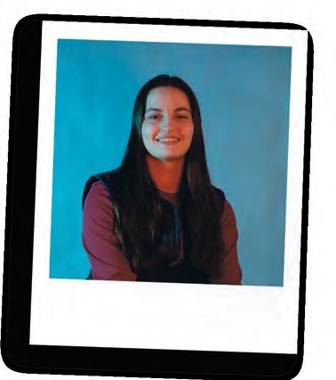
One of the beauties of art is the variety of how it is perceived. Art—a non-linear entity—is interpreted differently depending on the individual. Our eyes stray to different parts of an image; our brains read words differently; our hearts resonate with aspects of art in our own personal ways. This range of perception is a rare concept that makes being involved in an art-centered magazine so special to me.
Tarnished Magazine will always hold a special place in my heart. It allows me to explore the world of art alongside incredible people—Lindsay, Chloe, Atllas, and our advisor, Yvette. This magazine wouldn’t have been created without the joined effort from us all. Your support and input are something I cherish. This issue was a challenge for us all, but knowing that we had a support system in each other made it possible. Additionally, huge thank you to those who helped us create this magazine, from the graphic designers to the illustrators and more. Thank you for your creativity and endless support! We needed the extra input.
I hope whoever views our creation can see the love and devotion that we put into it and that you find a piece of featured art that resonates with you, whether it’s written, drawn, fused, or sung—anything!
THE THEME
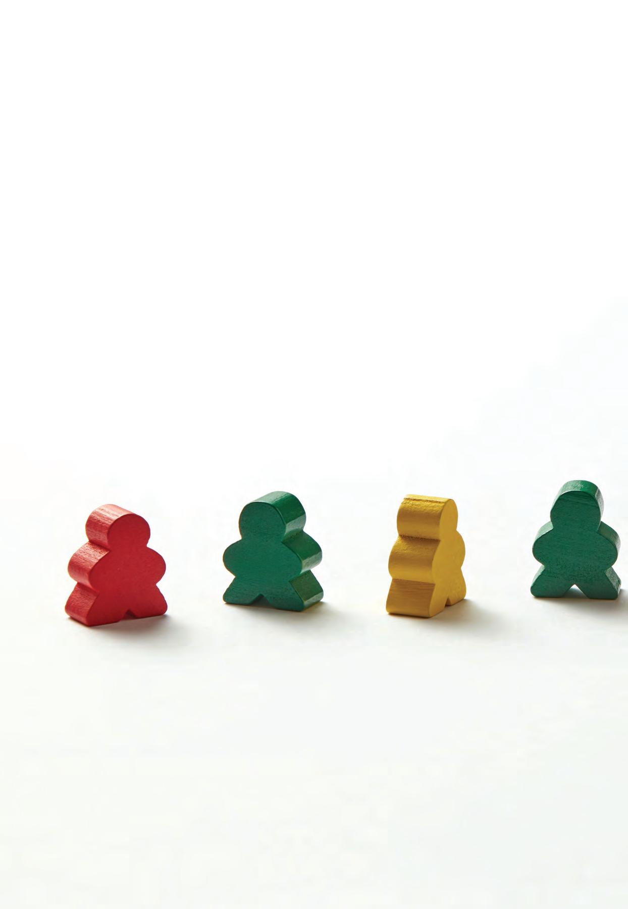
This year’s theme, Uncanny Nostalgia, draws inspiration from the hidden-in-plain-sight world of I Spy, blending cozy 70s aesthetics with details that feel just slightly off. Look closely at every page and you may find something you missed the first time.
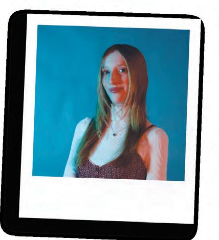
LINDSAY SCALESE Art Director
BELLA SCHLIM Managing Editor
Three years of Tarnished and I’m finally on this page. I’ve just got to say, this issue has come to be like a child of mine, something I cherish dearly, and yet was still annoying at times. I had the honor of being Art Editor for Tarnished this year, which has probably been the position to bring the most fun as well as challenges. I started my work with this issue from another country on the other half of the world, and with that said, I thank all of the Tarnished team for their patience and support as I tried to navigate this position from another continent. I’ve got to admit that we did a pretty dang good job with the cards we were dealt this year and can’t wait for next year’s (15th!!!) edition now that we’ve gotten our footing. Thank you to everyone who helped Tarnished come to life this year. If you want to become a part of the Tarnished family next year, we’d love to have you join our community! Remember to stay creative :)

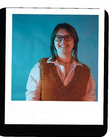
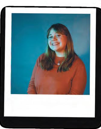

To find beauty in unexpected places, you have to get weird. Being silly, loud and a bit strange, makes Tarnished and we are very proud to show you what 15 volumes of Tarnished looks like to us. To make a magazine is to make memories, hard choices, to cry, to laugh, to take off our shoes and dance around the computer lab at 11:00pm to clear the sleep deprivation from our eyes. I am so lucky to have such an amazing, dedicated, creative, and excited team on my side; we are small but mighty. I am so proud of our Art Director, Lindsay, as she concludes her first year in this role, and have been so impressed of both Atllas and Bella, as they’ve both stepped into themselves and taken ownership of this magazine. It’s a labor of love from September to March. As social media manager, I do my very best to keep us relevant, constant, and in the forefront of your mind and device. I hope you continue to stay updated with me and always stay freaky.
CONTRIBUTORS
Emaan Asad
AJ Boryczka
Sydney Brundage
Salem Carpenter
Gianna Chiarenza
Victoria El-Azem
Nick Fernandes
Mari Figueroa
Chloe Galipeau
Alex Garrand
Elizabeth Goegel
Jay Katzen
Caroline Morrell
Robin Mullin
Angela Murray
Dvalin O’Mahoney
Emma Quinn
Charlie Recchia
Lindsay Scalese
Isabella Schlim
Ashlee Scosa
Jessica Shore
Corinne SIgeti
Atllas Stone
Olivia Sousa
MacKenzie Transue
Meaghan Venuti
Jenna Wildman
THE COVER
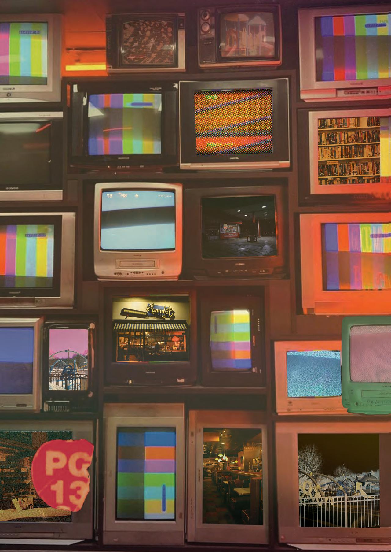
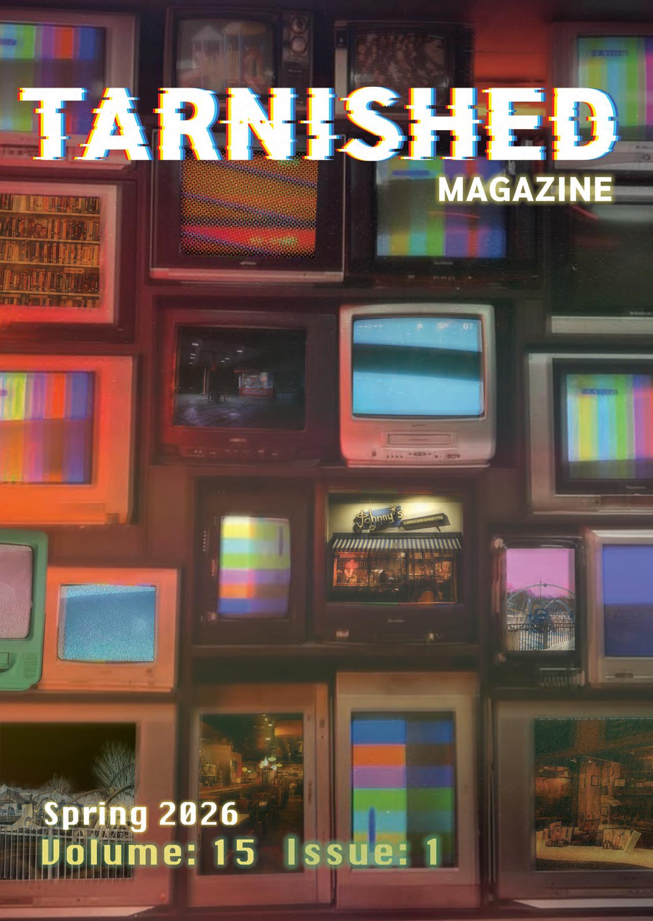
This cover offers a modern take on the ‘70s aesthetic, drawing inspiration from the muted retro color palette, vintage diners, antique shops, and other iconic motifs. Easter eggs appear throughout but are heavily distorted to create an additional uncanny effect. All photos were taken in settings local to our campus—shoutout to High Energy Vintage in Cambridge and Johnny’s Luncheonette in Newton—celebrating the historic character around us that so often goes overlooked.
CHIARENZA
DESIGN BY GIANNA
PHOTOGRAPHY BY ANGELA MURRAY
CHLOE GALIPEAU Social Media Manager
ATLLAS STONE Art Editor
ATLLAS STONE
Professor Yvette Gattineri
FACULTY ADVISOR
CHLOE GALIPEAU
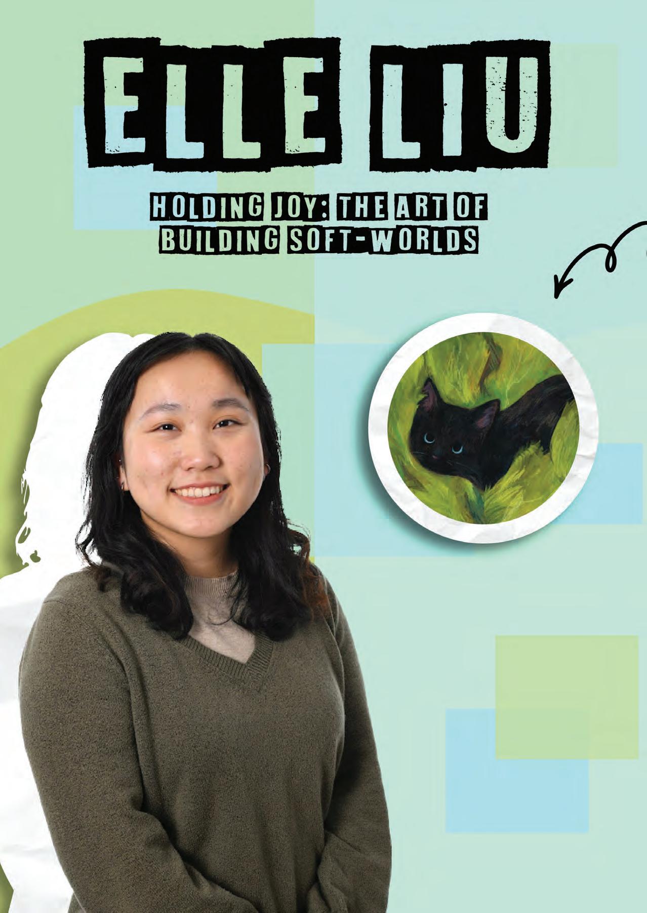
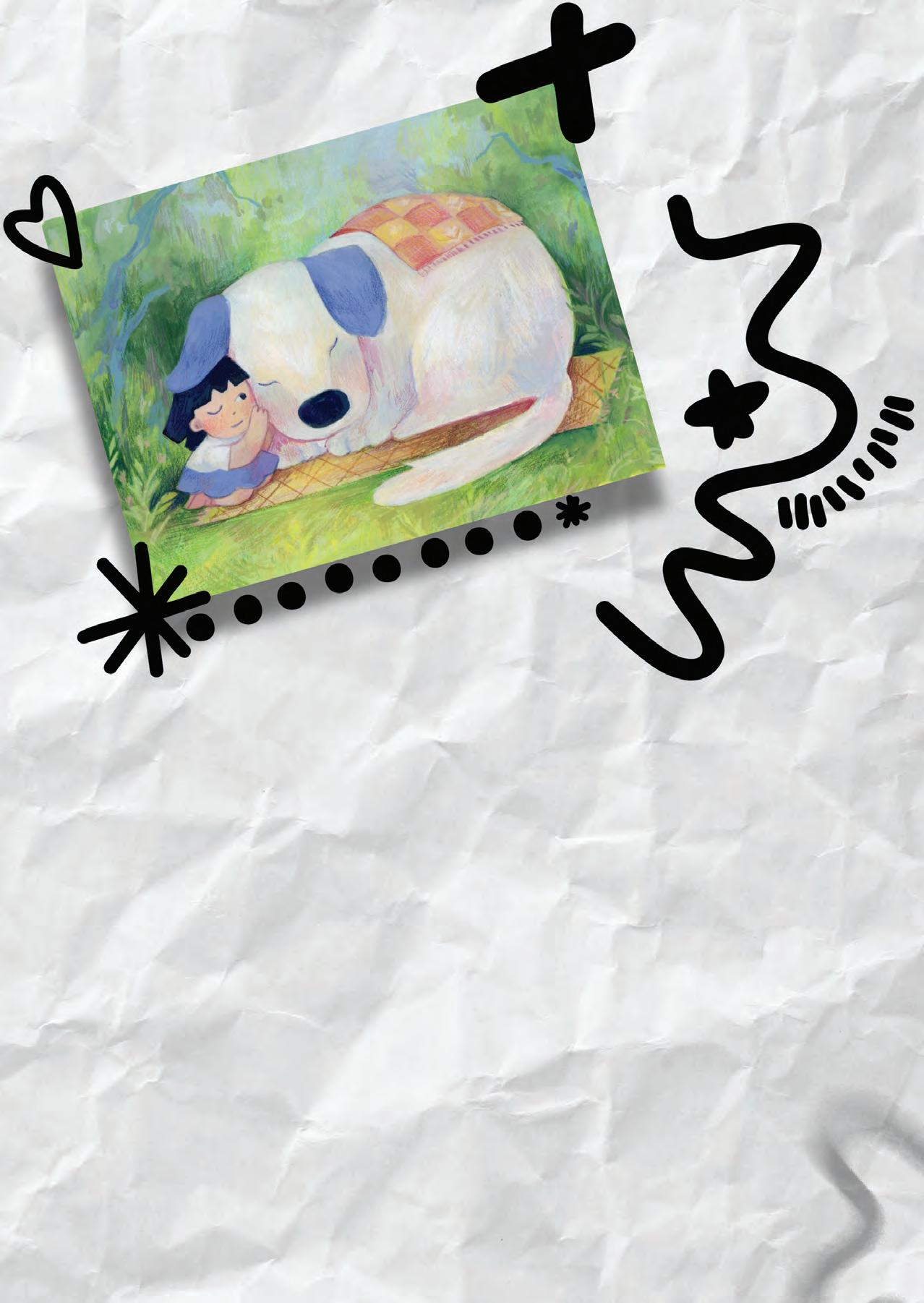
Artist and illustrator, Elle Liu’s work is built on a foundation of discipline, intuition, and an enormous amount of heart.
She moves between painting, sketching, and yarn with an ease that feels almost instinctual, as if each medium were a natural extension of her storytelling. Her worlds are peaceful, warm, and delicately emotional, but they’re also the result of years of technical growth, restless curiosity, and a willingness to throw herself into new forms of making.
Elle’s artistic journey began in what she describes as a “classical learning path.” As a kid, her parents enrolled her in traditional art classes where she spent hours drawing graphite still lifes week after week. The exercises strengthened her foundational skills, even if they left her wishing for something more exciting. That longing for freedom eventually found a home when she began oil painting, often en plein air, and later, in college, when she finally gave herself permission to create from imagination instead of from direct observation. College was a turning point: it wasn’t just a shift in style but a shift in ownership. She began telling her own stories.
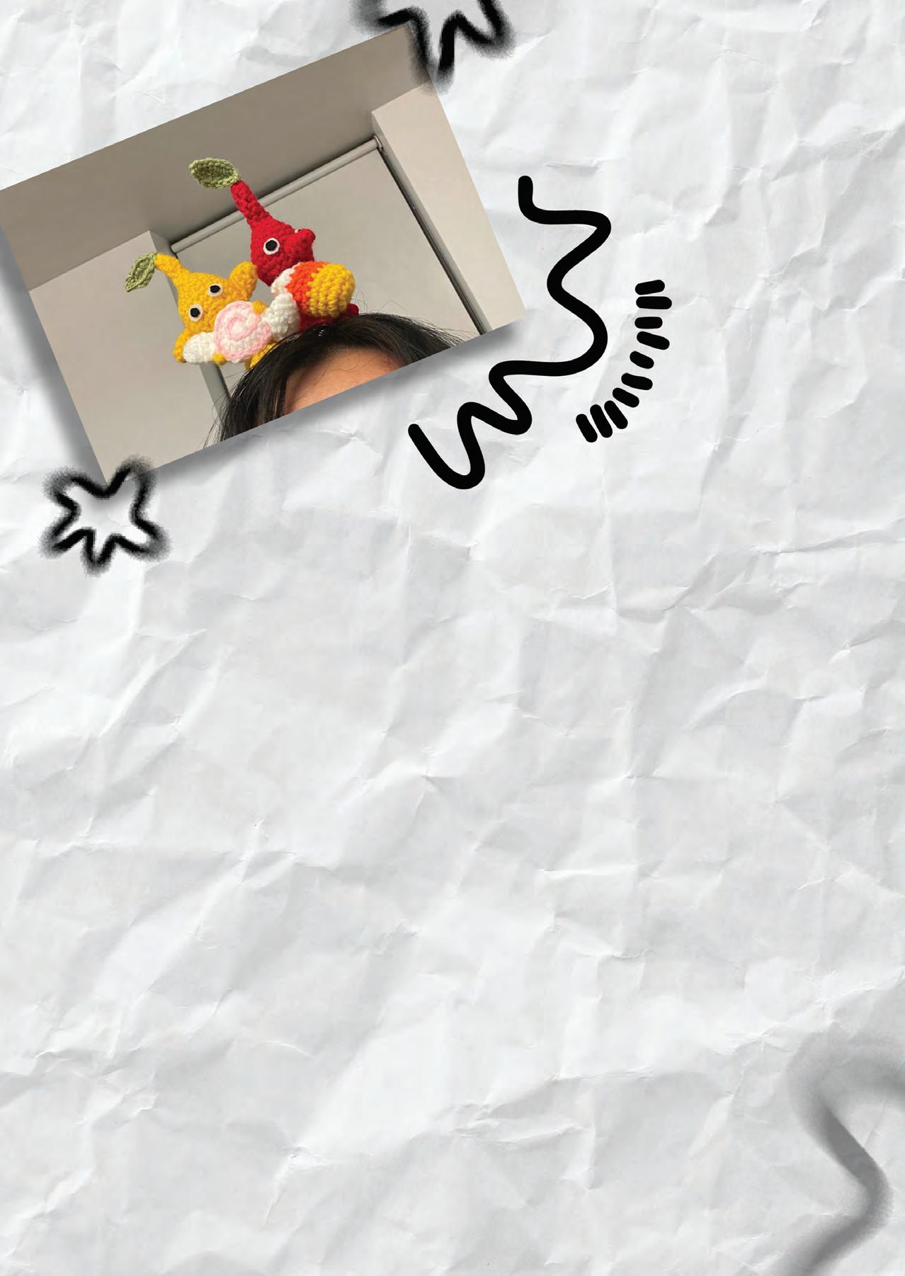
It was during that same period that yarn entered her life. She learned to crochet from YouTube tutorials, slowly mastering stitches between classes and assignments. A year later, she taught herself to knit. What started as a casual experiment grew into a whole new language for her characters. Yarn gave her the dimensionality she craved, a way to make a figure you could literally hold.
Today, when Elle begins a new project, her medium isn’t chosen at random; the idea decides for her. Ideas arrive first in words. Her sketchbook serves as an early sandbox, but she doesn’t treat sketches as full pieces—more like the seedlings of concepts. If a scene arrives with a sense of space, lighting, or a strong color palette, she leans toward painting. If she wants to capture a character’s presence, its roundness, its softness, yarn immediately becomes the medium.
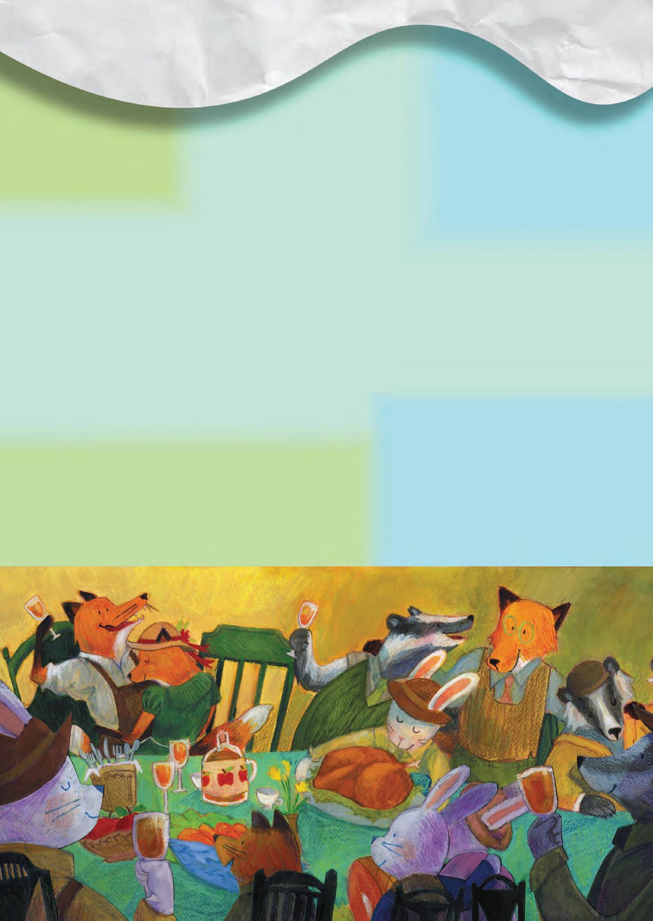
Her work is delicate, but her process is anything but fragile. In fact, it’s full of problem-solving, course corrections, and the kind of behind-the-scenes frustration that most viewers never see. She recalls the third spread of her Fantastic Mr. Fox project as one of her most difficult technical challenges. Originally painted in light blues and cyan, the
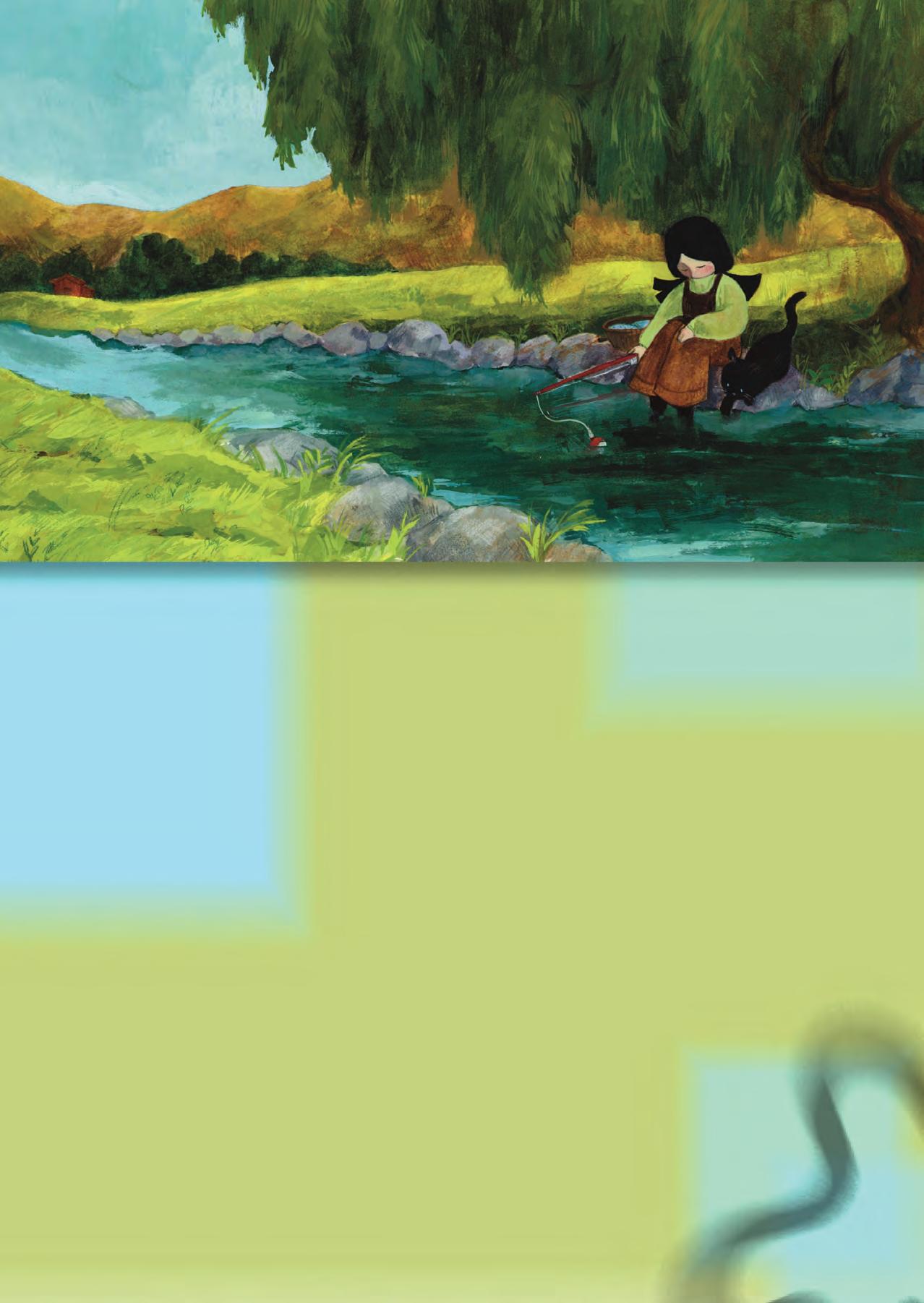
background felt emotionally right—until it didn’t. The tones clashed with the earthiness of the rest of the series, and she couldn’t ignore how much she disliked it. Because she was already working with cut paper collage, she salvaged what she could from the original painting, pasted those elements onto an entirely new background, and later flipped the composition digitally. It was a lesson in flexibility, but also in the humility of letting a piece teach you what it needs.
Other discoveries happened serendipitously. In the picture book Coco & Me , there’s a spread where Coco, the cat, hides in a cluster of garden leaves. The leaves were stubborn, stiff, and overworked until Elle grabbed a wet towel and smudged them. What could’ve been a mistake became a breakthrough. By loosening the paint, she loosened herself. It’s moments like these that remind her why she loves waterbased media: nothing is permanent unless she chooses for it to be.
Experimentation is central to her process, though she doesn’t think much about “maintaining a style.” Her style, she believes, is simply the result of drawing over and over again until the way she draws becomes unmistakably hers. When she experiments, it’s not about dramatically reinventing her voice; it’s about pushing the boundaries of the tools she uses. Lately, she’s been itching to try PanPastels, inspired by artists she admires who use them with mesmerizing softness. She was never particularly good with traditional oil pastels, which she says turned everything “into smudges everywhere,” but PanPastels look like the gentler, more manageable tool she’s been waiting for.
Her inspirations come from memory, specifically childhood ones, and from the emotional landscapes she wants to share with young readers. She is intentionally drawn to gentleness: tender relationships, peaceful atmospheres, small joys that crack open entire worlds. This is especially true in Coco & Me, where color plays a crucial narrative role. The girl’s world begins in muted browns—intentionally bland, monotonous, and dim—reflecting sadness and stagnancy. Elle considered dark blue or black, but brown gave her the freedom to shift between warm and cool tones while remaining within one cohesive palette. As the character’s world brightens, so does the story: greens and blues flood the pages once happiness reenters her life. Color becomes emotional architecture.
The bond between the girl and Coco is deeply personal to Elle. She loves animals, especially cats, and remembers a stray cat from her neighborhood that she used to see often.
Those small encounters stayed with her, especially because she struggled with depression as a kid. “Coco represents anything that brings happiness into my world,” she explains, a simple but profound sentiment that shapes the entire project.
But not all of Elle’s work happens at the drafting table. A huge part of her process unfolds in the in-between space where traditional and digital art overlap. She works back and forth between paper and screen: thumbnails in a sketchbook, more refined sketches digitally, then a traditional final painting that is scanned and edited digitally for polish or structural tweaks. The hardest part? Not the drawing, not the painting—but the scanning. For Fantastic Mr. Fox, her spreads were massive: 11 × 22 inches, far too large for her school’s scanners. She had to scan them in sections, then stitch them back together digitally, color-balancing each slightly misaligned chunk. It was draining, often infuriating work, and it left her with a subconscious rule: if she needs to scan it later, she’ll probably pick a smaller sheet of paper.
Despite her polished portfolio, creative blocks still find their way to her desk. When ideas feel stuck, she turns to prompt lists or random word association to spark something—anything—that might serve as a starting point. Burnout, however, is a different beast. She doesn’t force herself through it; she lets the break happen. After college graduation, she hit what she calls “the worst burnout of my career so far,” where she didn’t draw for months. But even then, the desire to create quietly simmered in the background, waiting for the moment when she’d feel ready
to pick up a pencil again. That moment, she says, is always unmistakable: “When I get to the point where I just want to draw, and I don’t care what, that’s when I know I can get back to work.”
Collaboration dreams? She has one name at the top of her list: Rebecca Green. Green’s children’s book illustrations were among Elle’s earliest inspirations, and it was Green’s gouache collaboration with Holbein, gifted to Elle by her mother, that pulled her into the medium she now cherishes.
Looking back at her early work, Elle sees growth everywhere: in her technique, her storytelling, her characters, and her understanding of the world. She hopes to continue absorbing life—traveling, observing, learning—and translating it into art. “One day,” she says, “I’d love to take a trip and just paint every single thing I see.”
If she weren’t an artist, she imagines she might have pursued marine biology or psychology, drawn by her love for children and animals. But today, she’s fully immersed in the creative path she’s carved. She’s currently working on a book dummy, writing multiple new stories, and saving up for the PanPastels she’s eager to explore next.
Everything about Elle’s process, from cut-paper revisions to yarn sculptures to watercolor smudges, reflects a gentle persistence. She’s meticulous but playful, technical but emotional, endlessly curious but deeply grounded in her own voice. And in every piece she creates, from a crocheted creature to a character born in muted browns, there is a sense of hope, warmth, and quiet determination.
Elle doesn’t just make art. She builds emotional worlds— soft ones, peaceful ones—where even the smallest spark of joy becomes something worth holding onto.
WRITTEN BY Emaan Asad
EDITED BY Isabella Schlim
DESIGNED BY Meaghan Venuti
PHOTOS BY ELLE LIU AND JOE SINNOTT
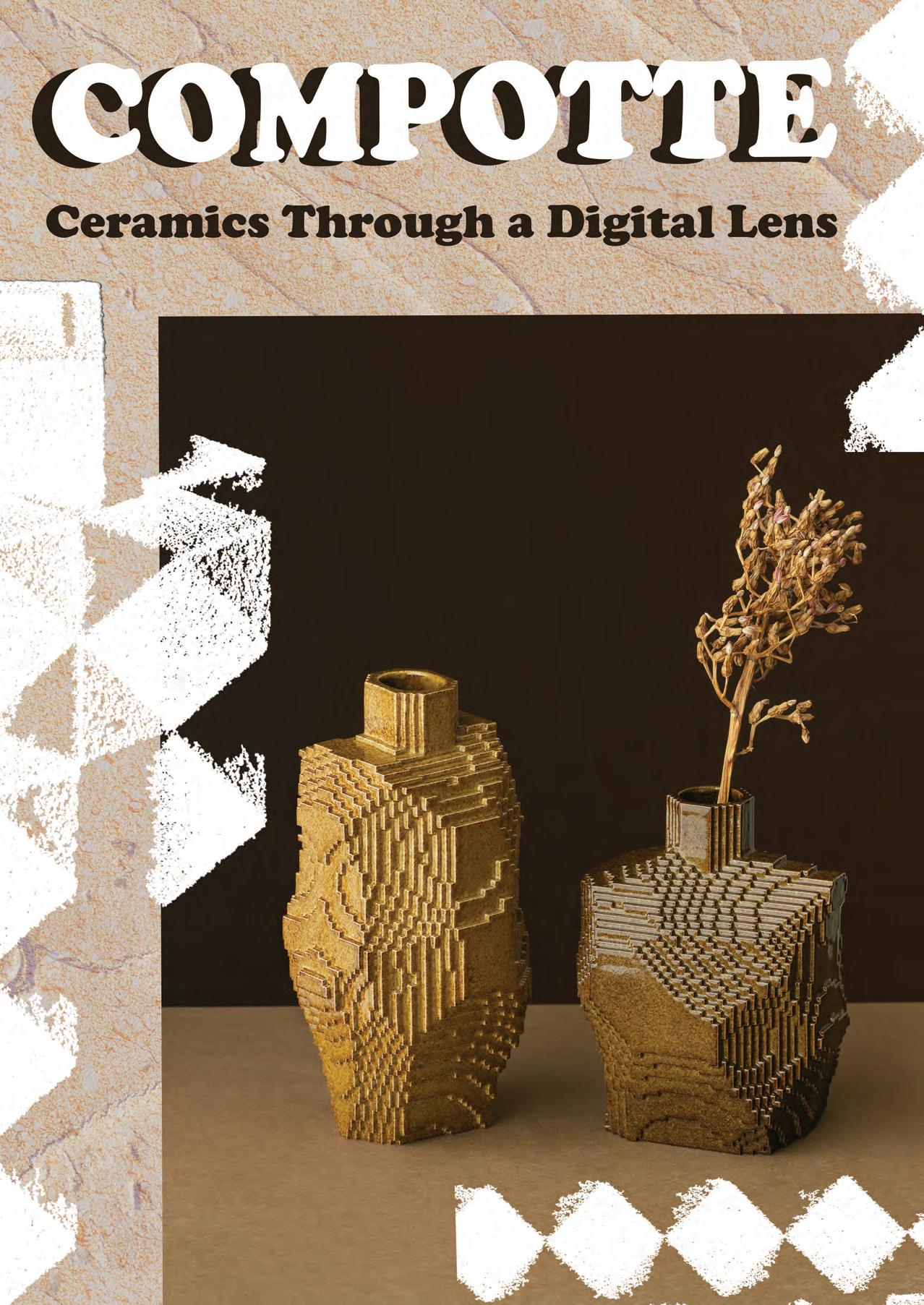
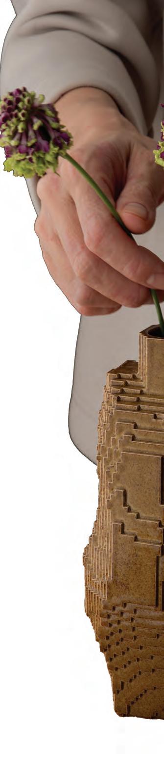
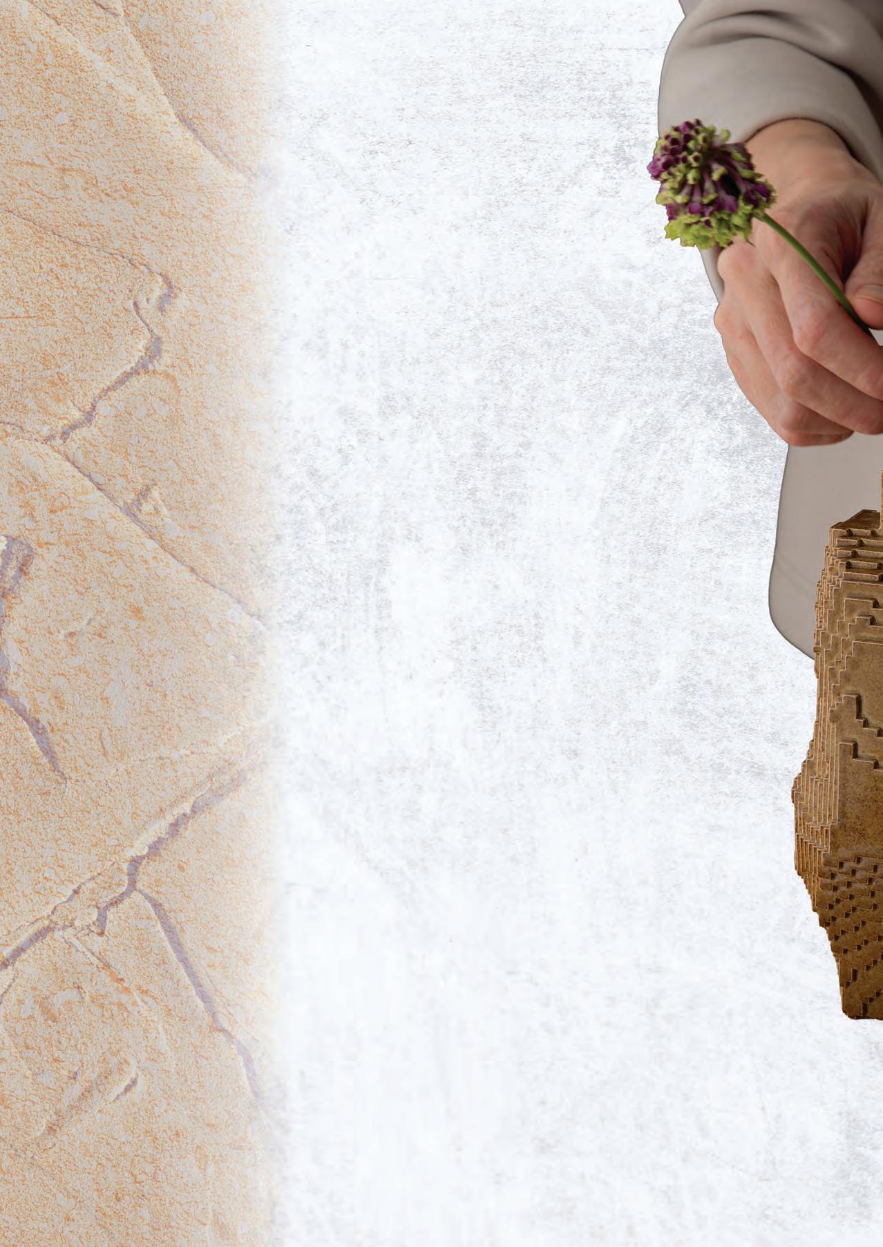
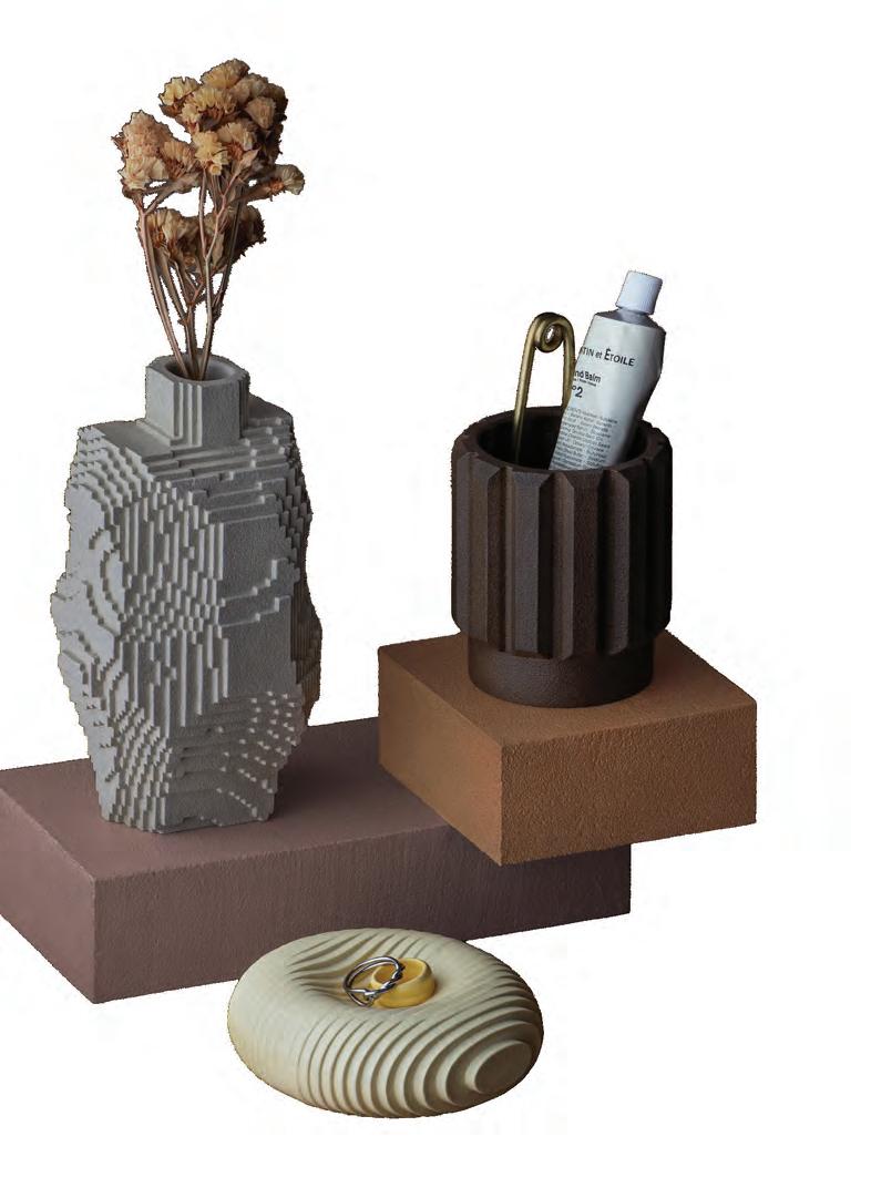
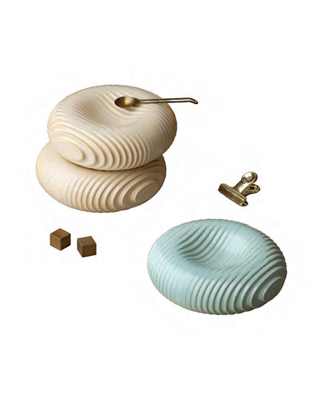
ComPotte, a ceramic label, introduces a new approach to contemporary ceramics: the fusion of digital technology with traditional pottery. Using digital textures and coded systems, the creators—Narumi Yokoyama, Hiromasa Fukaji, and Junichiro Horikawa—program intricate pottery designs that are later created into physical ceramic pieces.
This advancement has brought a fresh perspective on what ceramics can be—a fun experimentation between the digital world and the tactile reality of clay.
Narumi Yokoyama, a ceramic artist and one of the key individuals to the creation of ComPotte, joined Tarnished Magazine for our interview. The following Q&A about ComPotte are her personal responses.
WHAT IS THE INSPIRATION BEHIND COMPOTTE?
Our primary source of inspiration lies in the digital textures generated through 3D software and programming. We extract forms from the precise, orderly structures that are only possible in the digital realm—specifically those we feel would be most surprising and intriguing if realized as physical products. In fact, our very first product was a “voxel” vase. We didn’t actually set out to make a vase from the start; rather, we began by exploring what kind of form would best showcase the beauty of a voxel texture.
While designing digitally might seem like it offers perfect control, the textures are governed by programming, which can cause the data to transform into unexpected shapes that differ from the original intent. Our process is a constant back-and-forth between human control and the serendipitous forms generated by code.
WHERE DID YOUR INTEREST IN COMBINING DIGITAL EXPLORATION WITH CERAMICS COME FROM?
Our team happens to consist of members from diverse fields: a programmer, a designer, and a ceramicist. When we brainstormed how to combine our collective expertise into something unique, the concept of “Computational Pottery”— or ComPotte—was born. It started from pure curiosity: what would happen if we merged the seemingly polar opposites of digital technology and traditional ceramics?
WHAT IS THE MISSION OR FOCUS BEHIND YOUR DESIGN STUDIO DIGRAPH? PLEASE TELL US A BIT ABOUT DIGRAPH IF YOU HAVEN’T ALREADY!
DIGRAPH is a creative studio that fuses mathematical thinking via computing with traditional craftsmanship to create new forms of expression. We aim to bridge the gap between two often polarized approaches: the “orderly beauty” of the digital and the “material power” of the physical. By connecting these worlds, we strive to create an even more captivating reality.
TELL US ABOUT THE CREATORS AND TEAM BEHIND COMPOTTE. HOW DID NARUMI YOKOYAMA JOINING DESIGNER HIROMASA FUKAJI AND PROGRAMMER JUNICHIRO HORIKAWA INFLUENCE COMPOTTE AS IT IS TODAY?
The most significant shift was that the programming and designs—which previously existed only in 2D spaces like monitors or paper—were transformed into 3D objects through ceramics. This approach has vastly expanded the scope of expression for DIGRAPH as a whole.

CAN YOU DESCRIBE YOUR PROCESS OF CREATING THESE CERAMIC PIECES? HOW LONG DOES ONE PIECE TYPICALLY TAKE, AND HOW DOES DIGITAL ART MEET HANDMADE CERAMICS SO BEAUTIFULLY?
Our production process follows these general steps: Design (using 3D software and programming) > Mockup creation > Master model creation > Plaster mold making > Slip casting > Bisque firing > Glazing > Final firing.
During the design phase, we generate numerous ideas digitally and create prototypes using 3D printers. Since ComPotte uses plaster molds for shaping, beauty alone isn’t enough; we must consider every angle to ensure the form can be removed from a mold and withstand high-temperature firing. Sometimes we spend months just on the design. Once the plaster mold is ready, the process from casting to the final firing takes about five days.
I believe the fusion of digital and ceramics only works when you have expert knowledge in both. Transitioning digital data to the physical world inevitably introduces deviations and distortions. We are taking objects that exist in a weightless digital space and grounding them in a world governed by gravity and temperature, which leads to many surprises. Achieving a beautiful fusion requires a deep understanding of the materials and environment, followed by delicate adjustments at every stage.
ARE THERE ANY PARTICULAR GLAZES, CLAYS, OR FIRING TECHNIQUES THAT ARE ESSENTIAL TO ACHIEVING COMPOTTE’S SIGNATURE LOOK?
Developing a glaze that complements ComPotte’s intricate, tactile textures has been a challenge. In traditional pottery, glaze is often applied with some thickness to smooth surfaces, but doing that with ComPotte would bury the texture and ruin the aesthetic. Therefore, we use a spray application to ensure the glaze is as thin and even as possible. We went through countless iterations to find the optimal thickness.
Additionally, the natural “running” effect of glaze doesn’t always look right on our pieces if it’s too pronounced. If a glaze mixture runs too much, we adjust it by blending in materials that mitigate the flow to maintain the intended look.

HOW DO YOU BALANCE EXPERIMENTATION WITH FUNCTIONALITY WHEN DESIGNING PIECES THAT ARE BOTH SCULPTURAL AND USABLE?
It is a continuous cycle of trial and error: converting a texture we find interesting (the experimentation) into the shape of a product (the functionality). If something feels off during that process, we change it.
HOW WOULD YOU DESCRIBE YOUR POTTERY TO NEW VIEWERS WHEN IT COMES TO THE APPEARANCE AND COMPOSITION OF THE PIECES?
It is pottery created using digital technology. It looks as if something from Minecraft has jumped out into the real world (laughs).
I NOTICED THAT ONLINE YOU SELL DIFFERENT POTTERY PIECES, FROM VASES TO PLATES TO TRAYS, ETC. CAN WE EXPECT TO SEE EVEN MORE DESIGNS IN THE FUTURE?
We are currently designing a mug, and we want to continue creating works that can only be achieved through the unique material qualities of ceramics.
HOW HAS YOUR LOCATION OF JAPAN AND ITS CULTURE AND ARCHITECTURE IMPACTED YOUR CREATIVE JOURNEY?
I believe that “quiet beauty,” delicacy, and meticulousness are core elements of Japanese culture. While our work might look at first glance like it belongs entirely to the digital world, I believe our obsession with fine textures and details is deeply influenced by this Japanese cultural heritage.
YOUR CREATIONS HAVE BEEN FEATURED AT DIFFERENT EVENTS OVER TIME. CAN YOU TELL US ABOUT YOUR EXPERIENCES AT THE LIFEXDESIGN EXHIBITION AND/OR THE NATSU MATSURI 25 EVENT?
As we don’t have a physical storefront, these events are precious opportunities for us to hear direct feedback from our customers. Seeing who takes an interest in our work and hearing what impressions or attractions they find in the pieces serves as immense inspiration for our future creations.
ARE THERE ANY EVENTS WE CAN EXPECT TO SEE YOU AT IN THE FUTURE THAT YOU CAN TELL US ABOUT?
Both will be in Tokyo, but we have an event appearance and a solo exhibition planned for this spring. We will share the details on our social media, @compotte.jp, as the dates approach.
DO YOU THINK YOUR WORK CHALLENGES COMMON IDEAS OF WHAT CERAMICS “SHOULD” BE?
We simply want to create what we find interesting and beautiful, so we don’t really think about “how things should be” in relation to anything else.
WHAT MESSAGE DO YOU WANT THE PUBLIC TO TAKE AWAY FROM YOUR ARTWORK?
By bringing the digital world of ComPotte into the palm of your hand, we hope to add a touch of discovery and humor to your daily life.

WRITTEN BY Isabella Schlim
EDITED BY Isabella Schlim
DESIGNED BY Lindsay Scalese
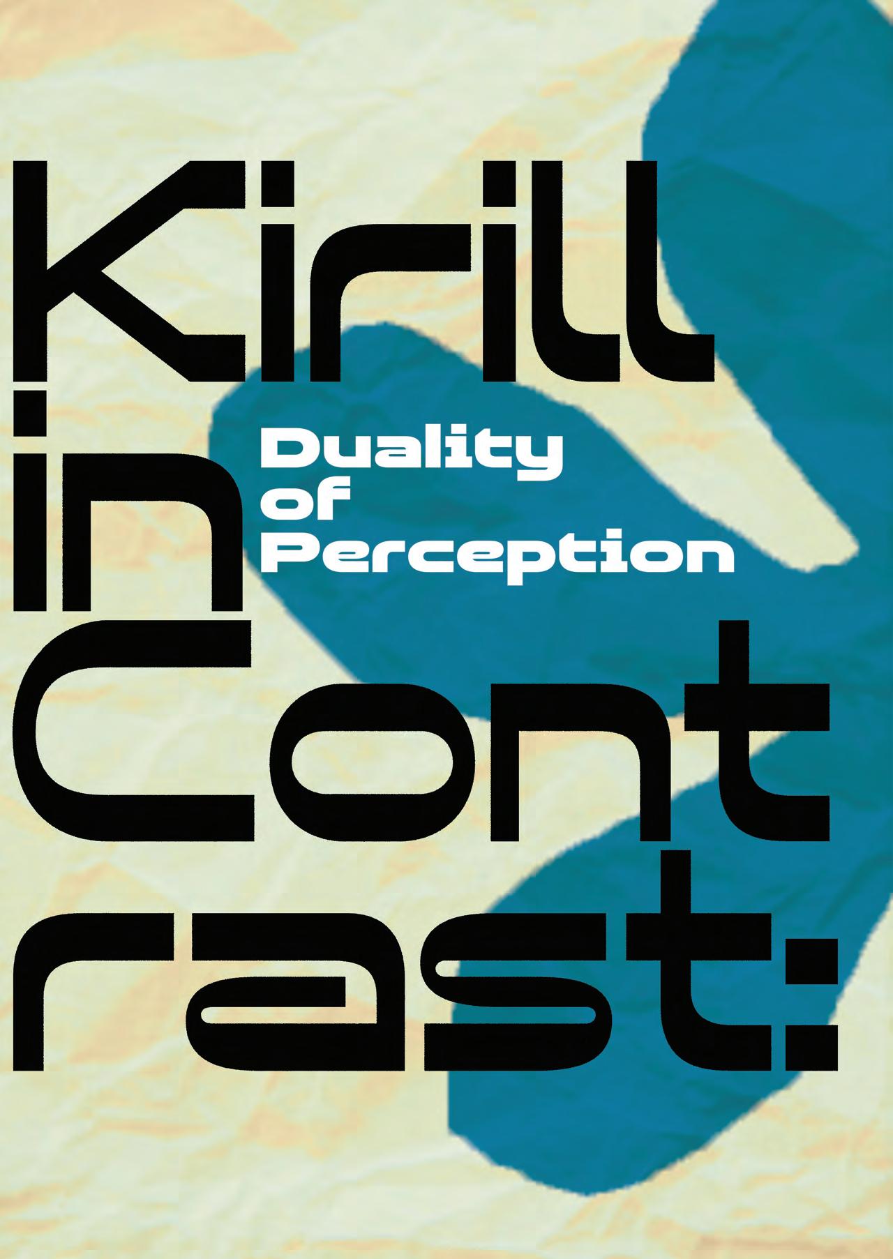
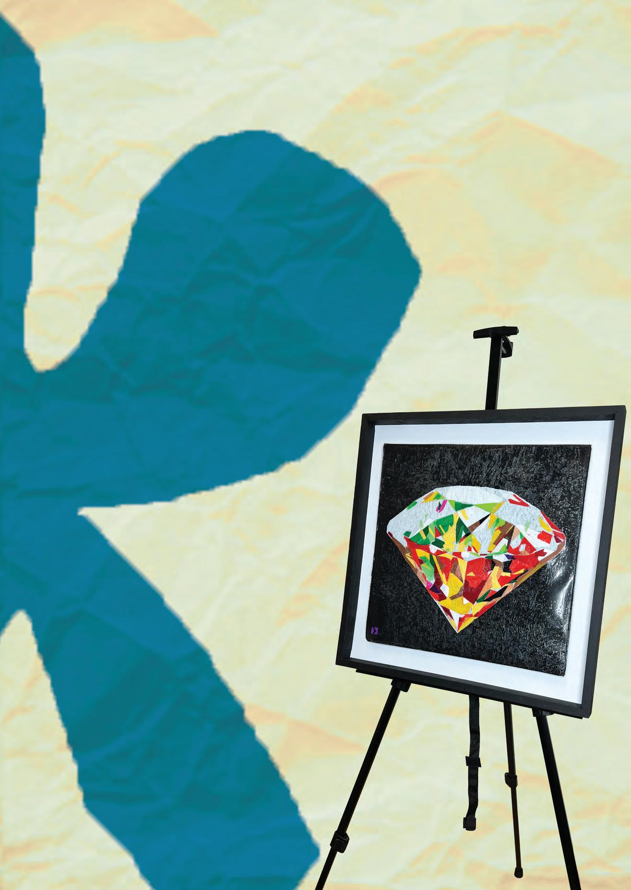
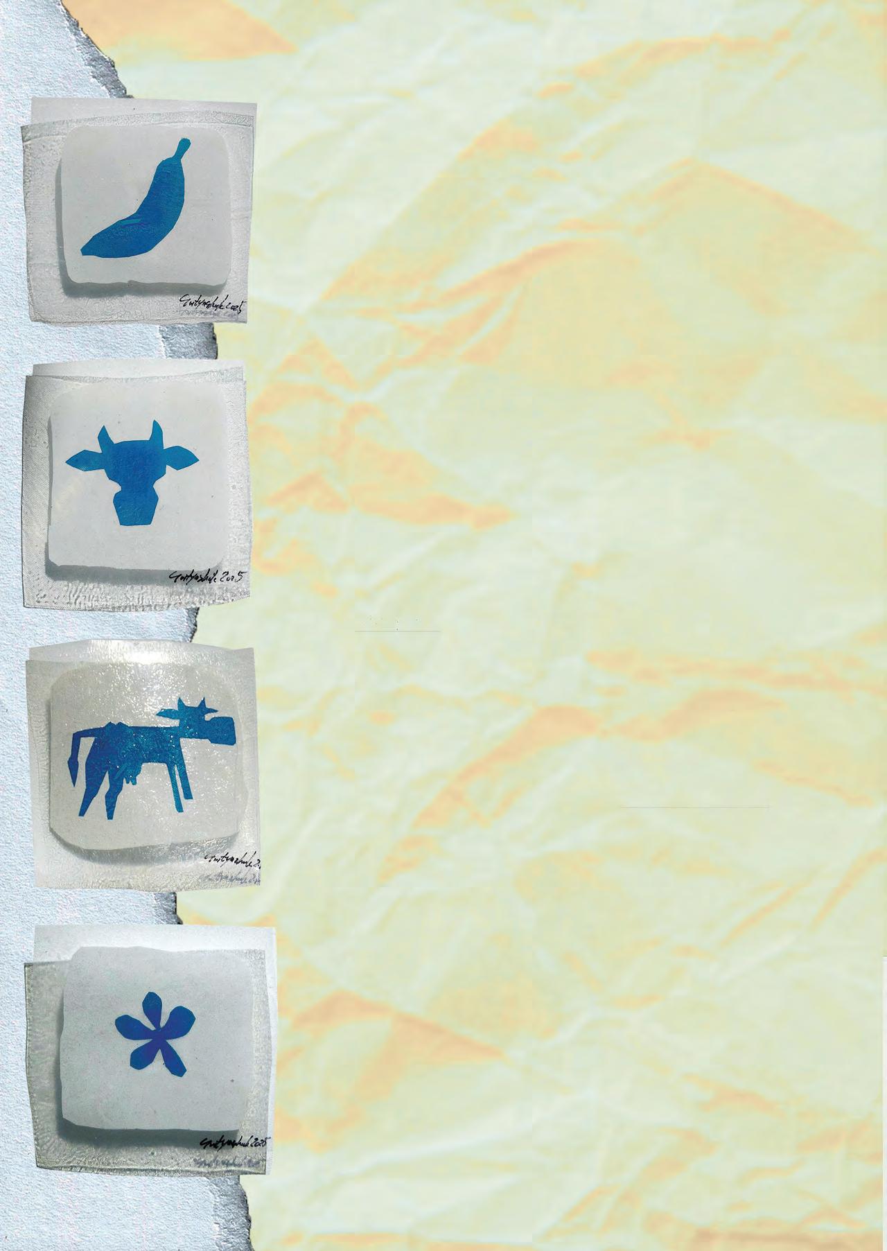
Kirill Svityashuk is a Russian artist and designer whose pieces reflect a central theme of contrast, whether it’s the contrast in materials, the natural world, perception, or more.
His practice behind his art emphasizes experimentation. This often results in intricate pieces that incorporate a wide range of materials. Through his visually complex pieces, Kirill’s work is driven by meaning that encourages deeper reflection on themes such as the environment, memory, or theoretical concepts. Kirill’s exploration through art allows each piece to have a message that is relevant to his beliefs and today’s world.
WHERE DO YOU SEE YOUR CAREER EVOLVING WITHIN TEN YEARS?
In my country, planning ten years ahead is extremely difficult today. So for now, as long as I have the opportunity to work as an artist, I focus on creating. At the same time, I am actively searching for opportunities abroad where it is possible to plan life and artistic activity further than one year ahead. This is why I constantly apply to international open calls and projects in countries where contemporary art receives stronger institutional support.
TEN YEARS AGO, WOULD YOU HAVE EXPECTED TO FIND YOURSELF HERE?
Ten years ago I only dreamed about having my own studio and making personal work. At that time, most of my activity was commercial—branding, murals, and visual design for public and commercial spaces. However, even there I was experimenting and introducing new artistic approaches. For example, I was among the first to create large watercolorstyle paintings directly on interior walls, something that was very uncommon at the time.
YOU WORK IN MANY MEDIUMS. WHICH FEELS MOST NATURAL?
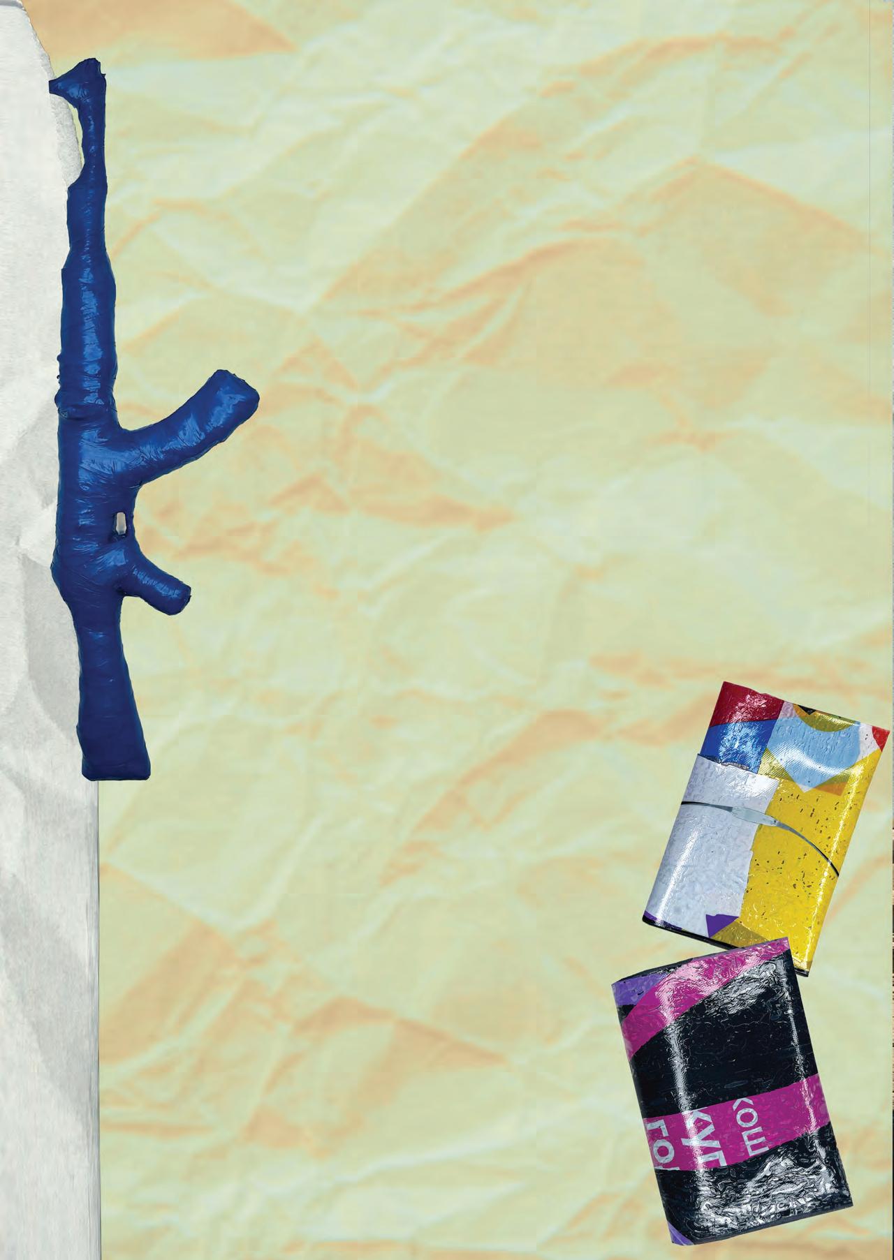
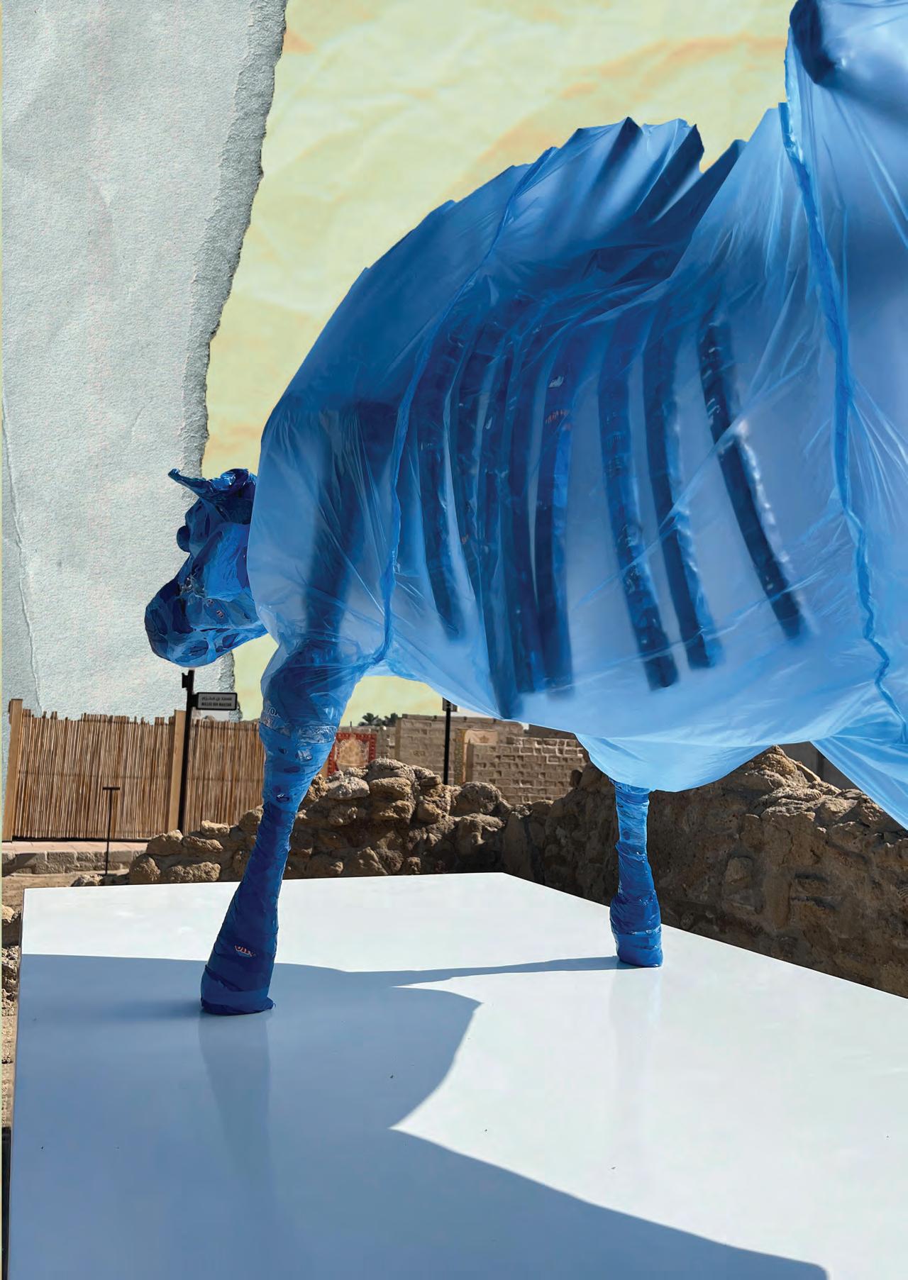
Today I work a lot with polyethylene, plastics, and synthetic materials, and at the moment this direction fascinates me most. However, I am naturally an experimental artist and enjoy working with many materials. The difficulty is that audiences often prefer artists to be visually consistent and easily recognizable—this is simply how perception works. Because of that, I do not show every experiment publicly, otherwise the narrative thread would be lost. Currently I am preparing one series using polyethylene and another parallel series Using foam.
My interest in art comes mainly from ideas—from things I want to say—and from the physical act of inventing and building something new. As a teenager I skateboarded and always tried the new gap, new surface, or new trick first, before others. My artistic process feels similar: I like to try something new, give it form, and observe the audience’s reaction. Often they do not understand at first—and then suddenly they do. I enjoy working with that contrast.
PHOTOS BY KIRILL SVITYASHUK
WHAT INSPIRES EACH PROJECT?
Contrast is the main source of inspiration for me—internal vs external, socialcontradictions, double standards, seeing the same situation from two opposite sides. Much of my work explores duality. I try to express that boundary through physical objects.Sometimes it works, sometimes not. Since viewers do not always want to analyze deeply, I often explain the ideas through short videos and social media storytelling.
WHO INSPIRES YOU MOST?
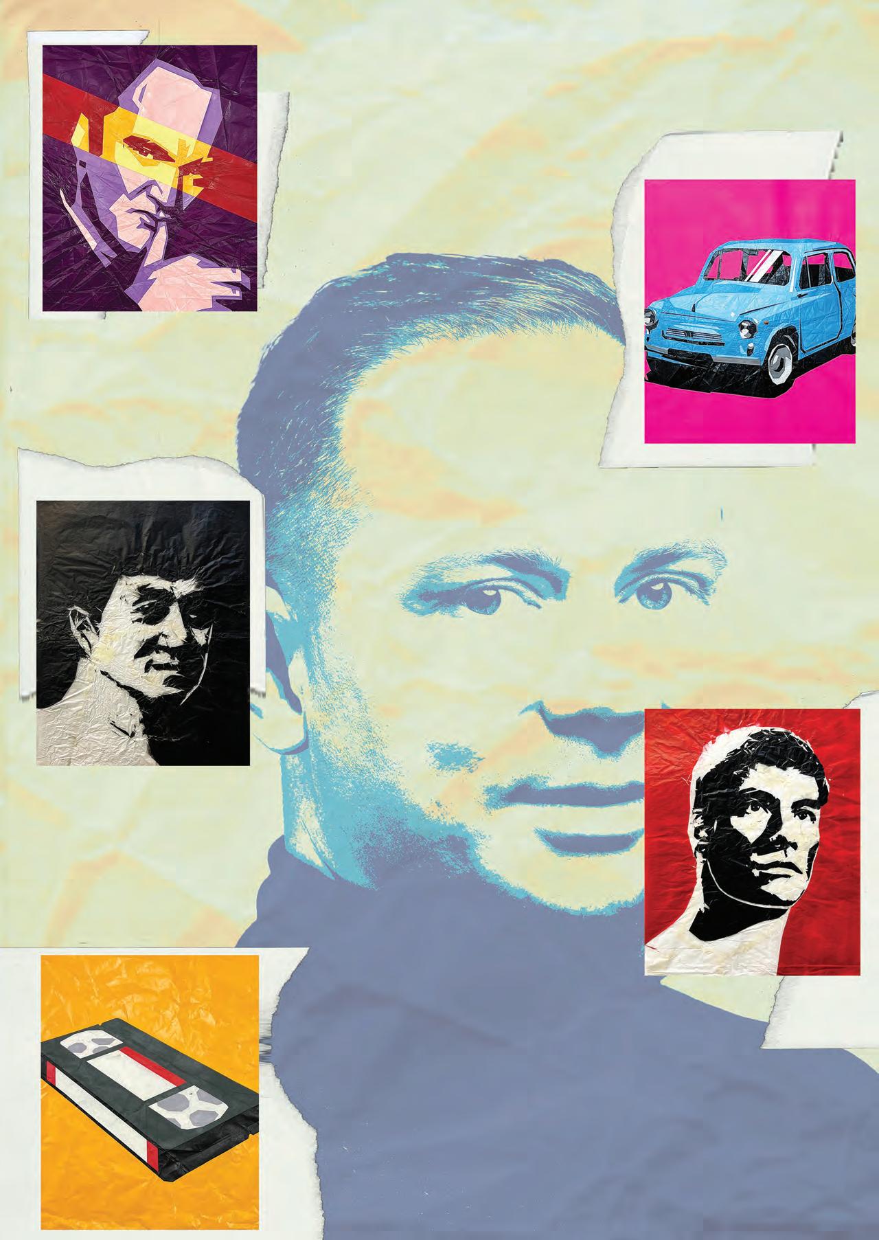
There is not one single person. I actually created an entire portrait series called “Crumpled” dedicated to people who influenced me in different ways. Some are inspired by their achievements, others by showing what path not to take, which is also valuable experience. Travel, fellow artists, my family, successful projects, and positive audience reactions all play an important role. Support from viewers —both emotional and financial—is extremely meaningful.
HOW DID YOUR DISTINCT STYLE DEVELOP OVER TIME?
Personally, I do not think of myself as having a fixed “style.” I would rather say I develop original techniques and material approaches. If viewers perceive a recognizable style, that makes me happy—but for me the core is experimentation.
DO YOU HAVE A FAVORITE PIECE?
My favorite work is always the one that has not yet been created. Right now my main long-term project is a fullscale monumental dinosaur sculpture. I am currently searching for installation space, funding, and production time for it.
WHAT ARE THE HIDDEN STRUGGLES AND REWARDS OF BEING AN ARTIST?
The biggest hidden difficulty today is financial stability. Being a full-time artist—especially in Russia—often feels like an extreme challenge. You want to focus entirely on art, but you also need to support your family and handle everyday life. This means that alongside artistic ideas, your mind is constantly occupied with finding resources just to continue working. At the same time, you may receive awards, strong audience reactions, exhibitions, even international recognition, yet artworks still may not sell regularly. This gap between visibility and financial sustainability is probably the least visible part of the artistic profession.
HOW DO YOU IMPACT THE LIVES OF PEOPLE THROUGH YOUR WORK?
If my work makes someone reflect on the world or on themselves, even briefly, within the context of one piece — that already means the work succeeded.
WRITTEN BY Victoria El-Azem
EDITED BY
Isabella Schlim
DESIGNED BY Chloe Galipeau
WHEN DID YOUR JOURNEY WITH ART BEGIN?
I first started creating at a young age, when art is the most natural thing for a child to be doing. When growing up, I felt it was odd that so many kids move on from art then look at you oddly when you’re still scribbling away. For the longest time, I worked in alcohol markers until I began touring colleges and noticed they used a medium called gouache. With the meager high school job money I had, I bought two sets of Holbein designer gouache and began to teach myself how to use it. Back then, there weren’t any tutorials on how to use it like there are now. Because of this, I used it in a way that made sense to me instead of what may be considered “correct.”
WHAT IS THE REASONING BEHIND YOUR CREATIONS?
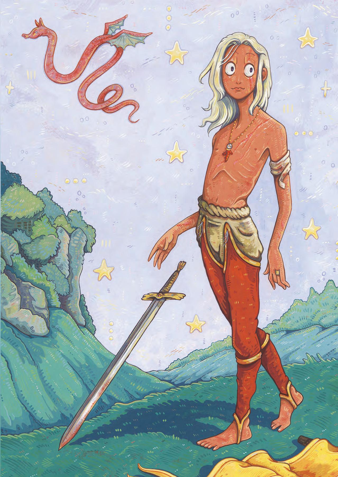
I make art because I want images to exist. I have this weird belief that all good art already exists in some sort of memory portal, and an artist’s job is to solve the puzzle to discover them. When I paint something and I really like it, I’m excited because I truly believe I solved one of the puzzles to make a good piece of art. Some of this belief is probably pulled from my dad explaining Bitcoin to me before it grew to what it is now. I just really love seeing a great piece of art and having the knowledge that, oh my gosh, at some point that was a blank white canvas. Someone smeared goo on it until it lied to me.
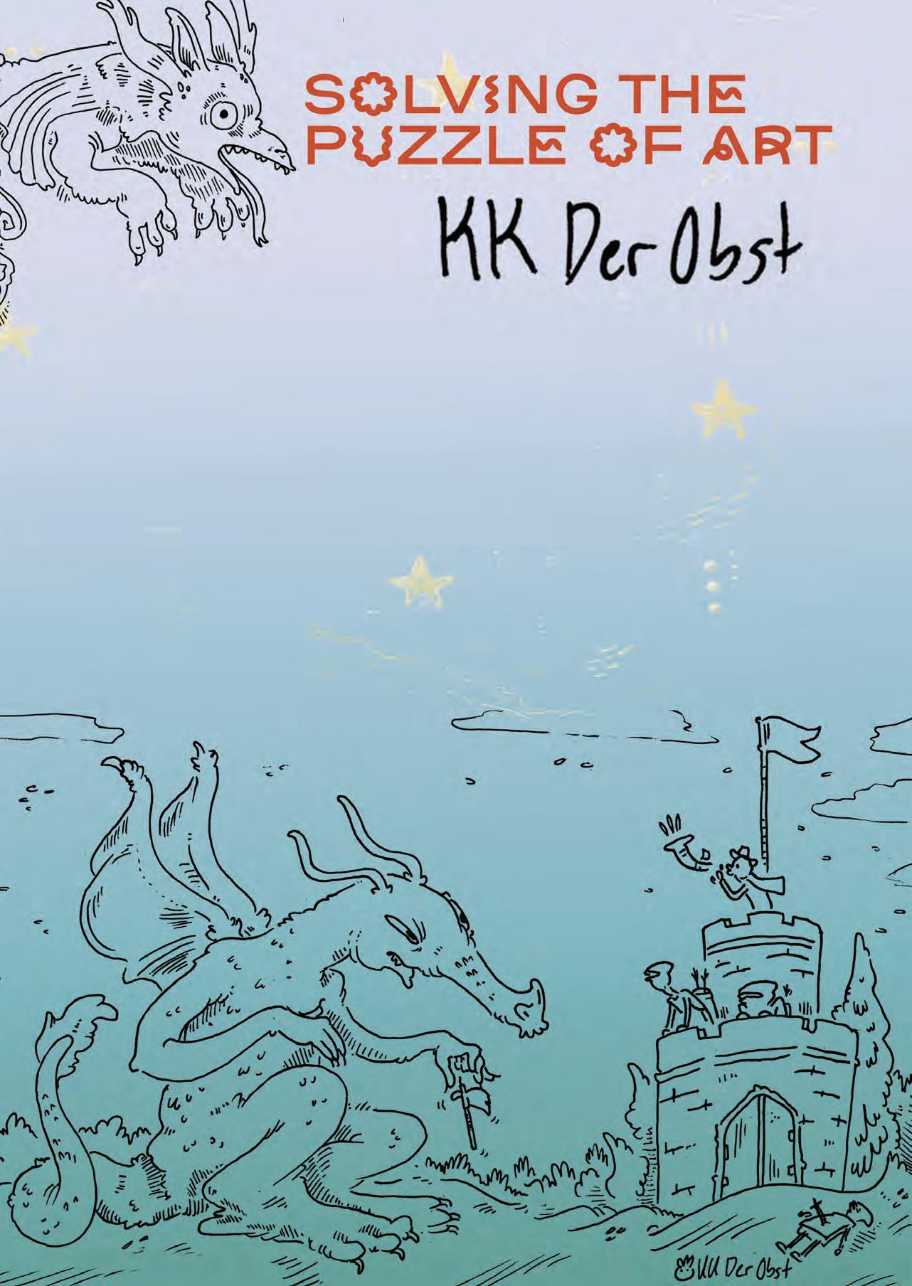
BY KK DEROBST
WRITTEN BY Isabella Schlim
EDITED BY Isabella Schlim
DESIGNED BY MacKenzie Transue
PHOTOS
WHAT MEDIUMS DO YOU USE IN YOUR ART PIECES?
I use a variety of mediums because my body gets bored. Each medium has its own downsides, and when you tire of one, it doesn’t mean you get to stop making art. I have to churn out pieces on a weekly schedule, and sometimes my hands stop collaborating with my brain, so I need to switch to a new tool to trick them into behaving. I think most artists use several mediums; they just hide some to themselves. For example, I also enjoy creative writing, but that is a medium I don’t choose to share with the world just yet.
WHICH ARE YOUR FAVORITES TO WORK WITH?
My favorite medium is gouache because it is well-behaved. It dries out? Rewet it. You accidentally dropped your brush somewhere? You can carefully lift the paint. Left it on your brush? It washes off. It’s quiet, it’s polite, and it comes in many colors. Acrylic is liquid plastic, and it’s like a toddler. I avoided it for many years until I discovered mediums. Pen and ink is a medium that I picked up in college and did for two years straight until I got annoyed with how waterproof ink gets “gucky” on the nib. My recent discovery of non-waterproof inks just awakened what was sleeping. Sculpture is fun, but my nails often land where they aren’t meant to, and undoing my own damage gets old. Each one has its perks, but gouache is the love of my life.
HOW HAS WORKING WITH LEATHER AFFECTED YOUR ART AND LIFESTYLE?
Growing up, I was raised to respect leather. My father was a biker and often dragged us to motorcycle dealerships to look at all the stuff they had in there: leather chaps, gloves, and jackets. He wore leather cowboy boots up in New England. Because of this, I’ve always valued leather and chose it over plastic. So when I see leather bags sitting in second-hand stores, I check them over and pick them up for cheap. I clean them, reshape them, and deglaze them. Then I paint new pictures, and instead of going to a landfill or the back of a closet, they’re now pieces of art. On a rare occasion, I buy new bags, but not often since I like to keep the costs low. I have recently picked up leathercraft as a hobby, and I accidentally attended a leather BDSM gear craft night, which was embarrassing, but I did learn a lot. Since then, I’ve collected a great deal of leathercraft supplies and am currently delayed on making a stingray bag for my partner. My skill isn’t at the level of producing items for the public, nor would I feel comfortable charging the amount I’d have to in order to break even on that. Perhaps I’ll start with painted keychains.
TELL US ABOUT THE PROCESS BEHIND CREATING YOUR ARTWORK!
My creative process is actually pretty similar regardless of the medium. I have two ways of doing things: one is planning; the other is freestyle. Planning involves thumbnails, color studies, tracing my images onto the final surface, and keeping things consistent. Whereas freestyle is going directly to the final surface and hoping my hands behave. Some days I can perfectly draw anything without a second thought; other days I think I’ve never held a pencil. On the bad days, I lay down in bed or find something to do on the computer that doesn’t involve motor skills. Learning to listen to your body is one of the unspoken skills of being in a creative field. It should also be noted that I keep an “Artist’s Morgue” which is a collection of reference images organized for inspiration and reference in future projects. In fact, all of my walls and my ceiling are covered in magazine and book clippings. I need constant visual stimulation to feel creative; that is my inner Henry Darger.
WHEN DID YOU KNOW YOU WANTED TO DO ART AS YOUR PROFESSION?
As weird as it is, my dad actually forced me to become a professional artist. He approached me one day and said, “So which art schools are you going to be applying to?” I had never previously imagined what kind of college or career I’d really have. So I responded, “I’m allowed to go to art school?” and with all of the intensity of a father who had read over ten thousand novels, he replied, “It would be a crime on my part to not let the world experience you as an artist.” Which sounds like one of the fake stories people say about their three-year-olds on Facebook, but he’s reiterated this stance many times. My whole family has a habit of slipping into dramatic turns of phrase, which is probably the reason I talk the way I do. Truth be told, I always just wanted to be a YouTuber but was too embarrassed to admit this. In the end, I’ve become both. I think I’m too pretentious about art for it ever to be “just a hobby.”
WHO ARE YOUR INSPIRATIONS?
My primary sources of inspiration especially helped shape the subject ethos of my art more than their biographies or style did. I love Tove Jansson for her ink drawings and emotional characters. I love Ikegami Yoriyuki for the strong colors they make use of. I live for Hyman Bloom’s aggressive yet beautiful gore. I’m obsessed with the queer vampires found in Takato Yamamoto’s ink drawings; for the longest time I lost him as an artist and only recently got to fall back in love with his work. I convinced my local library just recently to order five of his art books. I can’t wait until they come in.
IF YOU COULD, WHAT WOULD YOU SAY TO YOUR YOUNGER SELF WHEN YOU WERE JUST BEGINNING ART?
If I could have a conversation with myself when I first started really creating, it probably would be a conversation about the skills I really needed to focus on developing. Fourteenyear-old me would hear that information and start crying because life is hard enough; “Why are you critiquing me?” Fourteen-year-old me would be thrilled about what I do now for a living, but she may attack me with a mechanical pencil. If I had a chance to meet a fourteenyear-old me, I would not go.
WHERE DO YOU SEE YOURSELF IN FIVE YEARS?
I do not see myself anywhere in five years. I actually refuse to picture the future with any certainty. I keep vague goals, and I don’t make hard plans. When I imagine plans, they’ve never played out how I want. I prefer to leave things in God’s hands. I don’t have a sense of time and can be rather impulsive. In five years I could be dead; I don’t really care what happens, but I kind of just hope everything is okay. I stockpile money and resources to weather storms and see what opens up.
WHAT IS A PIECE OF ADVICE YOU’D GIVE TO ASPIRING ARTISTS?
My biggest advice for aspiring artists is to learn how to overcome anxiety, learn how to ask for things you want, and develop self-confidence. A sense of unique and true personality is an artist’s greatest asset. Your art can look awful, yet people will buy it if they believe in you. Nobody else will advocate for you; you have to do it yourself.
Additionally, in a more practical sense, I will always advise young artists to avoid fan art. You’re producing free promotion for an IP in exchange for internet clout. The audience that interacts with it does not care about your art; they’re just recognizing something they already know, which makes their animal brain feel a spark. You put yourself at legal risk by selling it. People will come to expect it from you. You cut yourself off from the ability to express your own IPs. There are exceptions, sure, but know what you’re getting yourself into. Did you come all this way to draw Mickey Mouse?

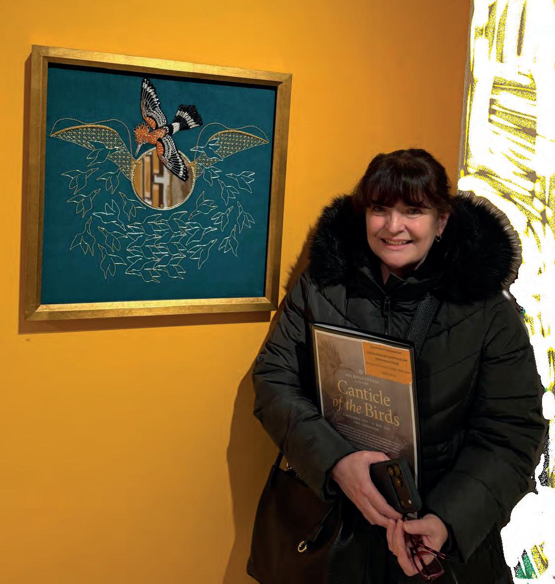
WHAT INSPIRED YOU TO SHIFT FROM A CAREER IN PUBLISHING TO HAND EMBROIDERY?
I was an art director for 30 years and basically had enough of it. I realized that graphic design work takes a lot of creative skill, attention, effort, and time to produce, but in the end, people just throw a magazine in the bin, which is disheartening. I was looking for an artistic outlet with integrity and longevity.
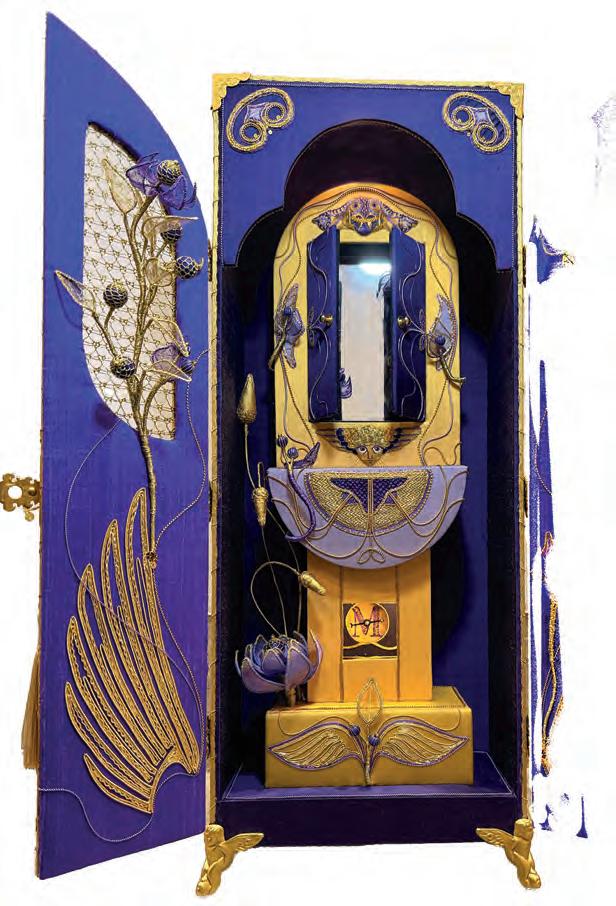
WHAT IS YOUR PROCESS LIKE FOR DESIGNING THESE 3D EMBROIDERIES?
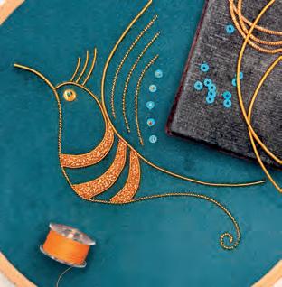
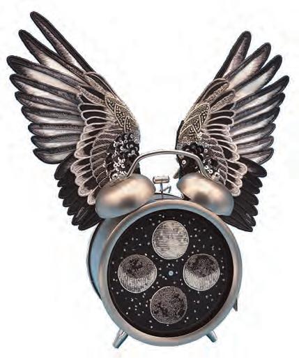
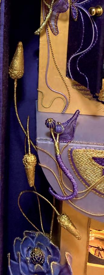
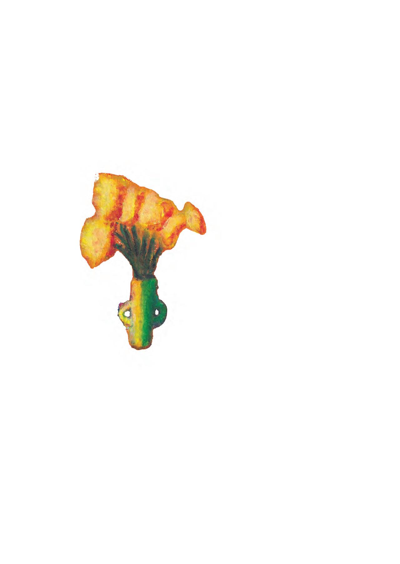
They take hundreds of hours, sometimes thousands! I usually start with a persistent thought, like, can I embroider a clock? I want to make a corn dolly. Or how do you stitch a fish? Embroidery is usually flat and ends up in a frame on the wall (or in a drawer!). I’ve become fascinated by 3D pieces of embroidery as sculpture, viewed in the round and standing alone. I’ve added stitched QR codes so I can make a short film to go with the work.
Sculpting With Thread
KATE PANKHURST
PHOTOS BY AMALIA WALKEY, HAND & LOCK AND KATE PANKHURST
The process involves a lot of sampling. It’s like thinking aloud with a needle. It’s all problem-solving. I just keep going. I don’t know what the end product will be like, but I hope it’s better than I could imagine beforehand.
WHAT MATERIALS DO YOU WORK WITH, AND DO YOU HAVE A FAVORITE?
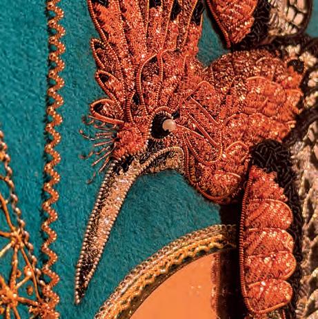
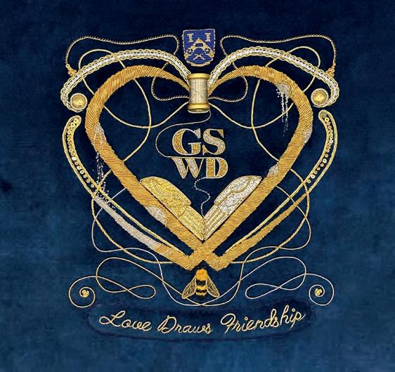
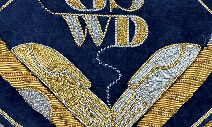
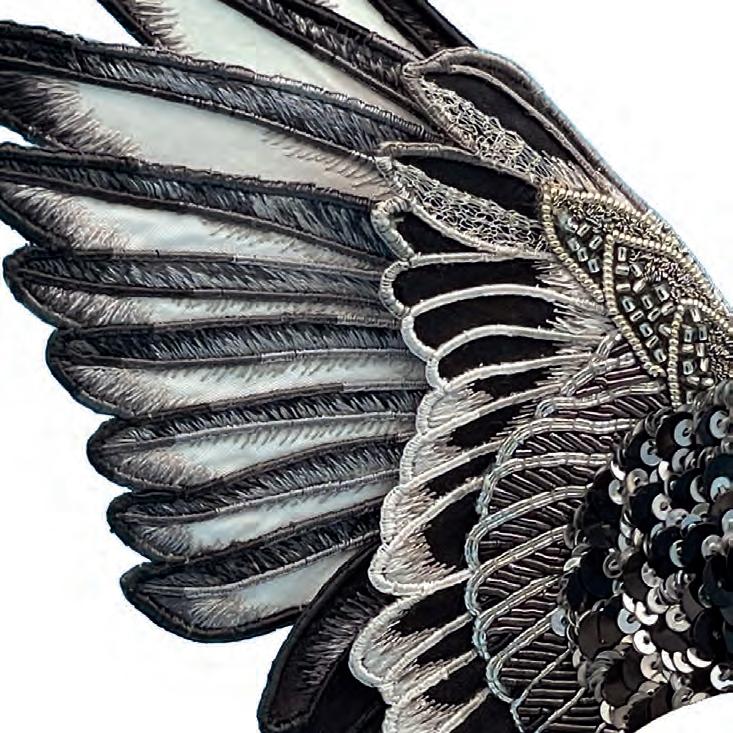
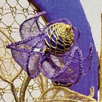
I do a lot of goldwork, which uses metal threads stitched onto silk, linen, or velvet. The metal threads are manufactured in England by one of the last factories in Europe to make these very niche materials: Benton & Johnson. They have wonderful names like “rough purl,” “gimp,” and “bright check.” The Royal School of Needlework taught me around 20 different embroidery techniques, and sometimes I’ll mix them within one piece, such as combining goldwork with silk shading.
WHAT IS THE ROYAL SCHOOL OF NEEDLEWORK?
It is the worldwide center for excellence in hand embroidery, both traditional and innovative. It was founded in 1872 as the Royal School of Art Needlework, reflecting its royal patronage. It is based inside Hampton Court Palace, one of the historic royal palaces that is 500 years old and famous for being the home of Henry VIII and his six wives. The RSN was founded to give gentlewomen a respectable profession to support themselves. They would train for a few years and then begin teaching embroidery or work professionally on commissions for church items such as altar cloths and vestments. The school is most famous for creating royal coronation robes. Today, it offers day classes, short courses, certificate and diploma courses, a degree in hand embroidery for fashion & interiors, and a professional embroidery tutor course. Around 150 years later, it is still teaching, still working on commissions in the studio, and still creating coronation robes. I was privileged to be part of the team that embroidered King Charles and Queen Camilla’s Robe of Estate, chairs, stole, and the Anointing Screen.
WHICH PIECE THAT YOU HAVE MADE IS YOUR FAVORITE AND WHY?
Every new thing I create becomes my new favorite! But Ghost of the Last Sheaf is special to me. It’s a 3D, self-supporting figure, but the embroidery itself is very traditional goldwork.
WHAT AWARDS OR RECOGNITIONS HAVE YOU RECEIVED FOR YOUR EMBROIDERY WORK?
RSN Distinction in Professional Embroidery, Innovative Teaching Award, Hand & Lock First Prize 2021 (and finalist two more times), and the Worshipful Company of Gold & Silver Wyre Drawers award for Best Use of Goldwork. For a niche activity, hand embroidery is a crowded market (just look at Instagram), so an award helps you stand out as someone who’s been
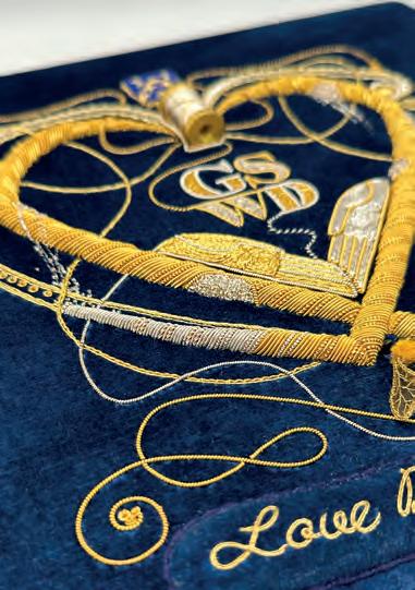
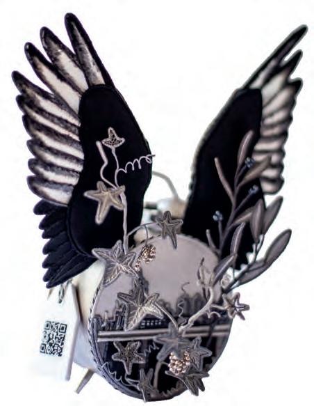
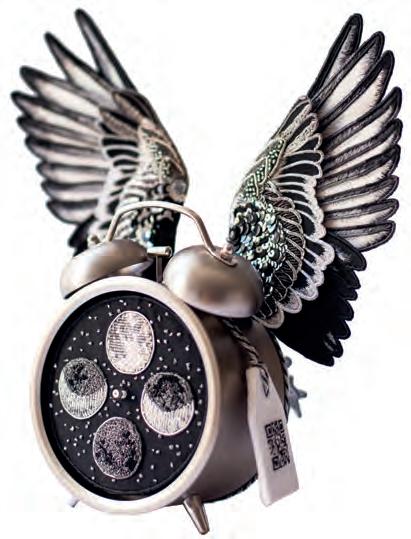
recognized for something special and helps get your name known. Winning Hand & Lock First Prize was the best moment of my life—until I got married! After years of study, thousands of hours of stitching, and the huge support I needed from Andrew, I felt vindicated.
HOW
BIG HAS TEACHING EMBROIDERY BECOME IN YOUR CAREER?
It takes up about half my time, with the rest being commissions, books, and artworks. It’s important to keep my own practice going so the creative spark doesn’t get smothered by busy work. I teach for the RSN both in person and online. I also run my own groups in London and collaborate with a friend in her studio.
HOW
DO YOU SUPPORT STUDENTS WHO ARE NEW TO EMBROIDERY?
I love teaching, and because I’ve only been doing embroidery myself for a few years, I remember vividly what it’s like to learn something completely new and how scared or anxious some people can feel. My husband is a fantastic teacher, so I’ve adopted his methods into my own practice: first, don’t assume students have prior knowledge; second, ignoring prior knowledge that students think they have just because they’ve picked it up from YouTube is probably wrong; third, teach the technique step-by-step and take everyone forward together; fourth, demonstrate, explain, and repeat. I’ll teach the technique, and once they have it, I hope it fires their imagination for their own designs.
WHAT INSPIRED YOU TO CREATE YOUR OWN TEACHING KITS?
It’s very practical; selling them is a way to make a living! I make sure they all have a strong learning pathway within an embroidery technique, so by the time you’ve finished, you should be confident enough to take on more and more challenging techniques.
WHAT CAN WE EXPECT TO SEE FROM YOUR WORK IN THE FUTURE?
Who knows! I have a book coming out with a kit based on the movie Elf! I’ll also be releasing a new goldwork handbag charm that I hope people will like called “Wings of Love” and an Or Nue Goldwork kit called “Autumn Supermoon.” At the RSN this summer, I’ll be teaching my new kits in person; they will also be offered online! Additionally, I’ll be involved in the GSWD exhibition for new graduates in goldwork embroidery and jewelry.
WRITTEN BY
Lindsay Scalese
EDITED BY
Isabella Schlim
DESIGNED BY
AJ Boryczka
Vera Tepliakova is a visual artist whose work is strongly shaped by her personal and political experiences. Born in 2003 in Saint Petersburg, Russia, she lives and works abroad. Her art explores emotion, pressure, and the experiences people carry inside themselves, especially women.
As Vera explains, her art centers on “the interplay between form and image,” using both strong geometric shapes and softer, organic forms to express personal feelings and memories.
Art became important to Vera when she was a teenager. During a difficult period in her life, drawing was the only thing that gave her safety and comfort. She explains that art began as “a defense mechanism,” but over time it became something much larger. Eventually, it turned into a defining part of her identity, and today she describes creating art as something she simply cannot live without.
Growing up in Russia made it challenging for Vera to pursue art freely. In school, traditional gender roles limited what students could do. Boys took woodworking classes, while girls took cooking and sewing classes. Vera was far more interested in woodworking. She was allowed to switch classes; however, she noticed that she wasn’t taken seriously by her teacher. Later, while studying at an art college, these challenges became more intense. After participating in an anti-war protest, she was punished by the school, and her political stance led to judgement from her professors. She explains that she realized she “would not be able to get an education in peace,” which ultimately pushed her to leave.
In 2022, Vera made the decision to leave Russia because of her anti-war beliefs and disagreement
with the government’s policies. She emigrated to Georgia, a move that was a major turning point in her life and career. In exile, she felt that she had “absolutely nothing to lose,” which gave her the courage to experiment and share her work online. This sense of inner freedom allowed her artistic style to develop more naturally, without fear of restriction or judgment.
Vera does not credit one specific artist as her main influence. Instead, she explains that her style began to develop once she stopped looking to others for inspiration. By stepping away from social media, she began to draw ideas from herself, observations, thoughts, and memories. When she started trusting her own work, she noticed that her confidence grew and her style became more clear.
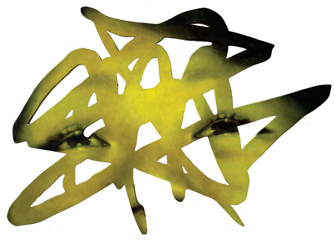
Many of Vera’s artworks focus on the human body and face. Faces appear in her work as a way to communicate emotion, memory, and social issues, such as inequality and the pressure
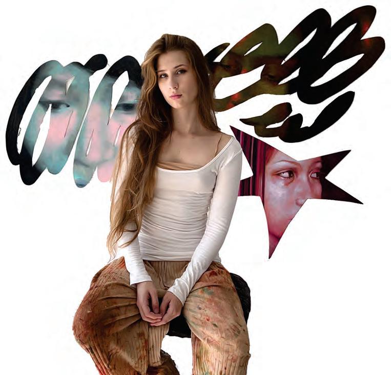
placed on women to stay quiet. She explains that sometimes a face represents a personal feeling, while other times it reflects a social theme. Vera has always been drawn to portraits, as describing the image of a person as something “magnetic and almost unreal.”
Her creative process begins with a feeling or memory. She makes many sketches, usually between ten and fifteen, before deciding on a final form. Vera works on wood as her canvas. She cuts and sands it by hand before adding layers of glue and gesso. This physical process is important to her because it mirrors the emotional tension present in her work. She often mixes geometric and organic shapes to reflect contrasts such as control and freedom.
Color also plays an important role in her art. She usually begins with a planned color direction based on the emotion she wants to express, but she allows herself to experiment as the piece develops. Recently, she started using sponges instead of brushes, which gives her work a more textured and natural feel.
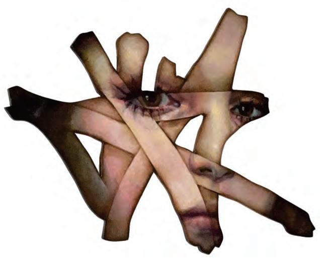
that are often left unspoken. As she explains, in the end she simply wants viewers “to feel something.”
Many of the people in Vera’s paintings are inspired by those close to her. She often uses photographs of family and friends, especially her friend Yasmina, who is her main muse. Her mother and sister also appear in her work. At times, she chooses to work from her imagination instead of real references, especially when she wants emotional distance from a specific person.
Vera hopes that viewers feel a strong emotional connection when they see her art. She wants people to recognize their own emotions and experiences. Her goal is to spark an inner dialogue about feelings
One of the hardest parts of creating art for Vera is the mental struggle that happens before she even begins. Before creating or sharing her art, she has to convince herself that her ideas matter and that she has the right to express them. She describes this inner process as the most difficult part of her work. However, with each new piece she creates, her confidence grows, and trusting her instincts becomes easier.
Looking toward the future, Vera plans to continue developing her art no matter where she lives. She hopes to take part in exhibitions, residencies, and eventually have a solo show. Even though her future location is uncertain, she knows that art will always be a central part of her life. For Vera Tepliakova, creating art is not just a career choice but a lifelong commitment.
Isabella Schlim
Angela Murray
PHOTOS BY VERA TEPLIAKOVA
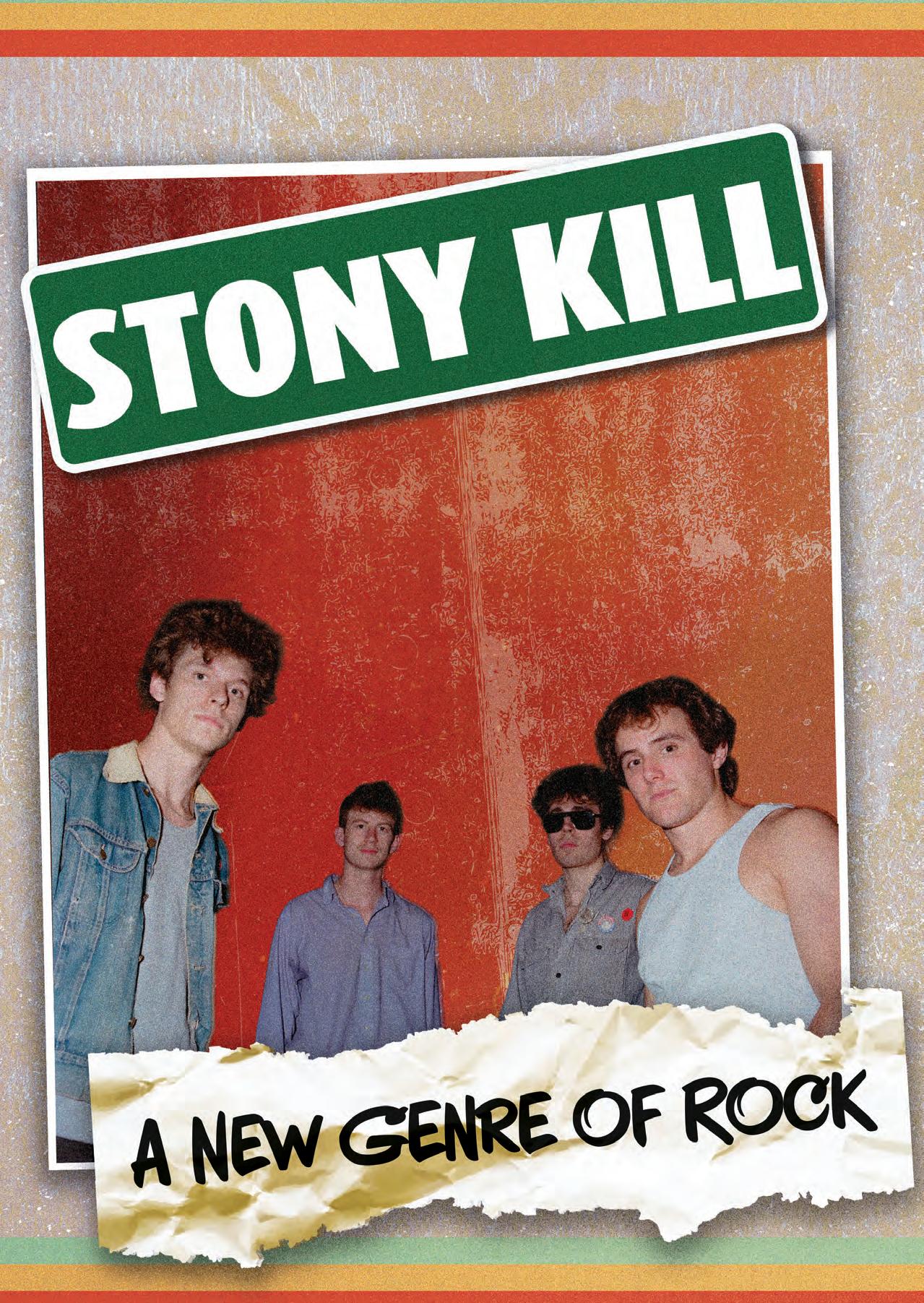
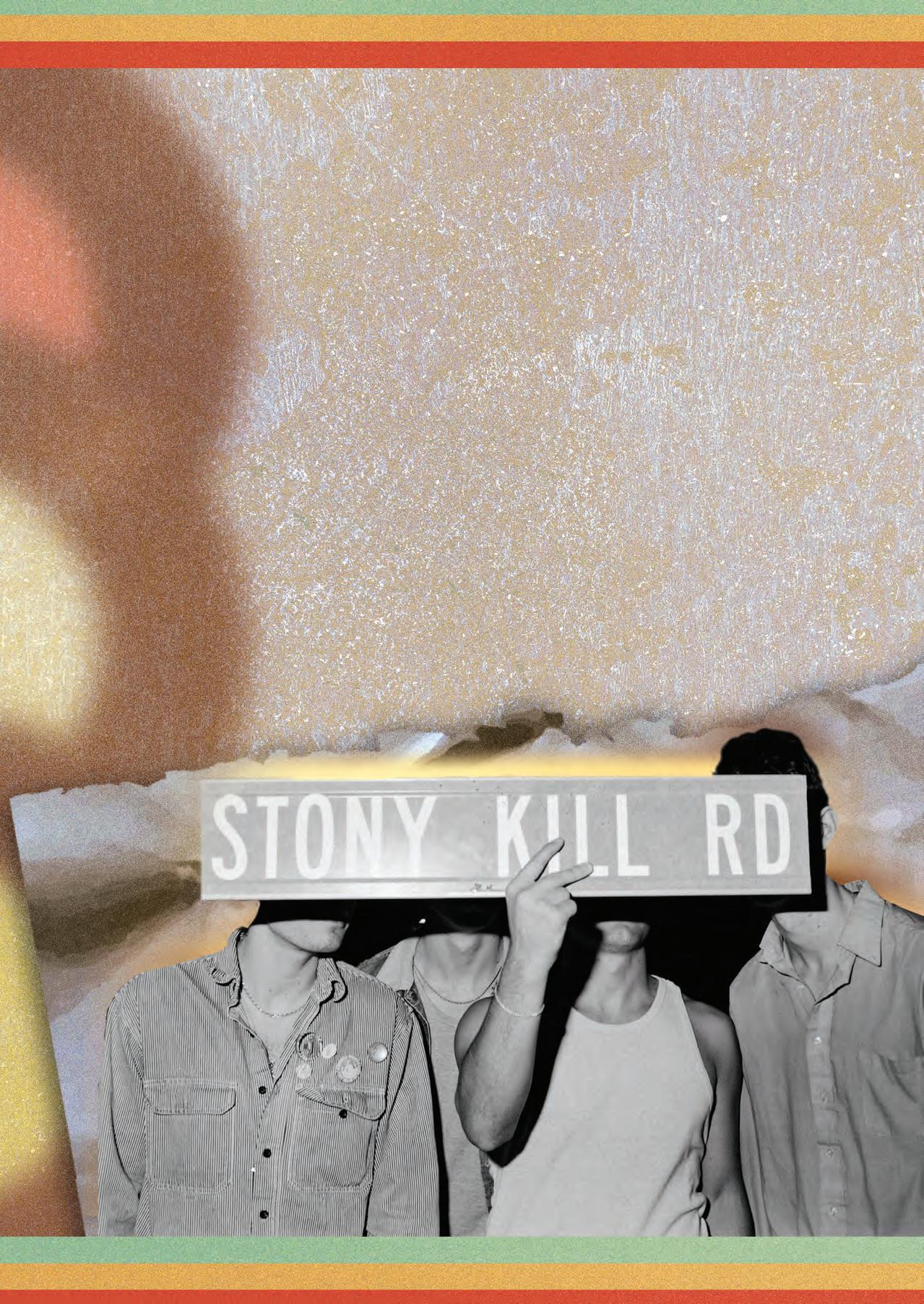
At its core, Stony Kill is Armant L’Heureux, Will Martin, August Duclos, and Tripp Repp: four friends making music that “aren’t trying to do anything that they aren’t.”
Their rock band may not have started until the summer of 2023, but Armant and Will’s friendship dates back to childhood. Beginning to make music together in the eighth grade, Armant’s and Will’s passion for their craft merged at a young age. Armant was working on solo music, while Will assisted with his love for guitar. By the time they made it to 2023, they finally decided that it was time to take their passion a step forward.
Joining together to create something new and entirely them required finding a few other minds to join as well. Armant happened to know the perfect bass player for their band, August Duclos. With a background in jazz, the guys describe him as the “best musician in Stony Kill.” He’s known for his incredible musical abilities and for being the lively member that reels them in a bit. Their drummer, Tripp Repp, joined the band slightly later than everyone else in July of 2025. Already working with Will in another band, Tripp had a bit of an in with Stony Kill. It wasn’t until the end of a Stony Kill rehearsal that he officially heard Armant say the words, “Okay, well if you want it, you’re in the band!” Once the four musicians came together—Armant on lead vocals and guitar, Will on lead guitar and vocals, August on bass, and Tripp on drums—Stony Kill was officially created.
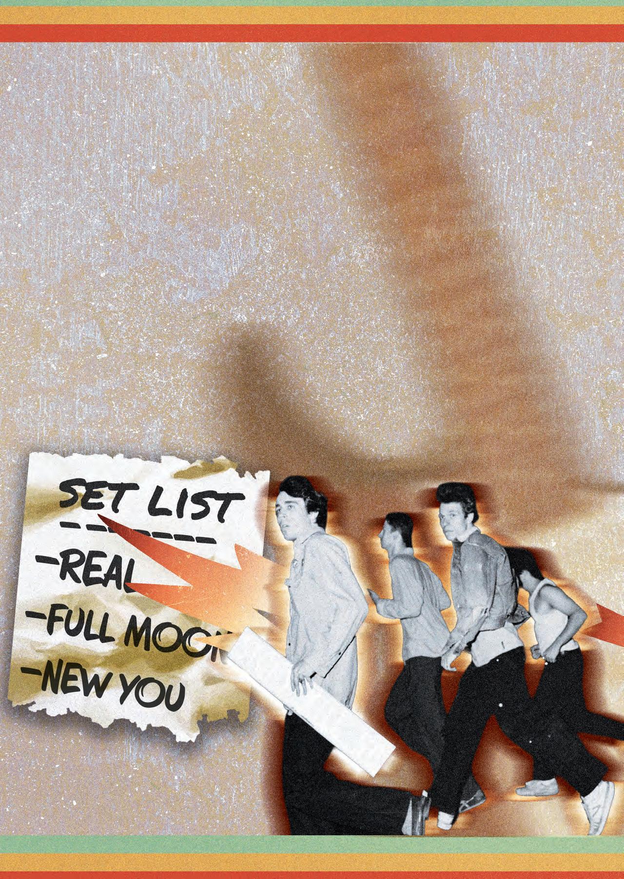
Stony Kill’s debut EP, Stupid, was released in December of 2024. The EP features six individualistic tracks that set the tone for Stony Kill’s sound and overall presence in the music world. It may have been released to no one in particular, but it was the showcase of their talent. “Stupid came together rather quickly,” as member Will explained. It was a real learning curve in the studio as they were finally able to explore what Stony Kill was and each other’s skills in general. Will expressed that this was one of the first times he had played with August, so being able to hear themselves as a band for the first time was a fulfilling experience. This EP was released before Tripp officially joined the band; however, his mark on Stony Kill was already hidden in the tempo of “Stupid,” as the drums are his recording!
At the time of this interview, Stony Kill’s most recent release is a single titled “Real.” When Armant wrote this song over the summer of 2025, it was the perfect time for Stony Kill to “flesh out a song completely as a band” for the first time since Tripp joined. With half of their band in New York and the other half in Oregon for most of the year, recording as a group is their biggest challenge. Even so, they knew that they wanted to release “Real” because it was an opportunity to “showcase a side that we haven’t really shown on Stony Kill before,” as Armant expressed. “Real” is a more emotional song than Stony Kill’s previous releases, but according to Armant, “it shows that we have more than just the sound that we already have out.”
Stony Kill’s music comes straight from their hearts and their studio in New York. Armant is “the brains behind the operation,” according to August, and writes and produces all of their songs. He explained that some songs come to him naturally, where he just sits down with his guitar and lets the melody and lyrics flow, while others take time, some help from the band, or a guitar riff from Will in advance. The rest of the band typically checks over his lyrics and gives their own input, but a few of their songs have been co-written by the entire group.
“Gus Song” and “Full Moon” are two songs that Stony Kill all wrote together; however, the chorus of “Full Moon” actually came to Tripp in a dream! Tripp describes his thought process as consisting of “‘What can I do to support the song?’ Whether that’s thinking about what I want my drums to sound like, the type of stick I’m using, or the cymbals.” This process of writing and composing allows him to “be a better musician,” which then benefits the band as a whole. In late June of 2025, before he officially joined the band, Tripp joined Armant and Will in a songwriting session. Working on an unreleased track that will now be coming in the near future, Tripp described himself as being “captured by the riff off the rip.” After Armant had created some MIDI drums to keep the structure of the song in place, Tripp asked to “try something out.” In the words of the drummer, “I made the hi-hats have that classic pushing 16thnote groove from its previous 8th-note groove, and we all agreed that we would be able to write great songs. Mind you, this was before I was technically in Stony Kill!”
Tripp joining Stony Kill was clearly not a surprise due to the impact he was already leaving on the band. Before his induction, however, “Gus Song” was written by the other members. August describes this song as one of the most
special Stony Kill tracks to him because it was one of his first moments contributing to the songwriting process and taking part in the band’s full production process. With his background in jazz, bringing his own input and knowledge into a Stony Kill songwriting session was a new but fulfilling experience for not only August but the entire band. Before “Gus Song,” though, there was “Stupid”: the song that made Armant and Will realize they had created something special.
After recording “Stupid” in their studio, Armant and Will traveled upstate in New York to a tiny, rundown shed where they made a makeshift vocal booth out of various towels, wood, and ladders around them. Will describes it as “the first song we wrote that cemented us as Stony Kill.” Without the creation of “Stupid,” the band’s dynamic wouldn’t be the same. According to Armant, “It’s bold, it’s punchy, and it’s in your face. You know? It’s a catchy song that does what we’re trying to do very well, and it rocks the fuck out.” For any first-time listeners, “Stupid” is a great start to getting to know Stony Kill as a whole.
Even with the seamless dynamic and incredible musical talent of Stony Kill, one of the coolest parts about them as a band is their outlook on the world. When asked about how it feels being relatively new, young artists in today’s world and if it brings them any feelings of anticipation or nervousness, Stony Kill wasn’t fazed. Will expressed that it doesn’t bring them any pressure and instead said that “if there are other people who are doing this, then we can 100% do this as well.” August had a similar opinion and went on to say the following:
Yeah, I feel like it’s funny, because on a kind of a more serious note, it is a time in the world where it feels simultaneously unimportant to be, like, promoting your music. Real funny to be focused on that. But then also, it’s kind of a reminder of that it is actually very important to be doing something original and creative and meaningful.
Even with the constant buzz surrounding the music industry and world as a whole, Stony Kill still keeps a fresh, insightful outlook on their music and the role they play as a band. Not losing sight of who they are as musicians and individuals allows them to produce the best products possible.
One of the most challenging parts of making their band work has been the distance. Being separated on opposite sides of the country has made it hard for Stony Kill to record, practice, and simply play together. Back in December, they were able to play a show at Arlene’s Grocery, one of their favorite venues to play at. Being able to perform some of their newer songs and their really good cover of “Just” by Radiohead, according to the band, cemented the fact that every time they play a live show, that show becomes their new favorite. Armant described it as, “We’re just getting better and better.” Even with being split up into two halves for the majority of the year, the distance did give Armant and August a chance to perform a string of duo shows that allowed for a more intimate and different feel of performance than Stony Kill was used to. As August conveyed, “Those shows hold a special place in my heart.”
Through the distance, the guys still always make time for Stony Kill and time for returning to their roots. August expressed how his jazz background is always a part of his everyday life. He described it as “interesting to bring it into the context of Stony Kill,” but it simply works. His biggest inspirations include some of the most influential jazz musicians, such as Oscar Peterson and Miles Davis. Whereas Will describes his inspiration as coming from prominent guitar figures like John Frusciante of the Red Hot Chili Peppers and Jonny Greenwood of Radiohead. With their varying inspirations, though, Radiohead and The Smashing Pumpkins stand out as two of the bands that influenced all of the members of Stony Kill greatly.
Armant describes Thom Yorke as one of his biggest influences, alongside more recent figures like The Backstreet Lovers and King Krule; however, he described “Fake Plastic Trees” by Radiohead as being one of the songs he wished he could’ve written: “Thom’s writing in that is just out of this world, and I really aspire to create something that has that much emotion in it. Also, it’s just a sick song.” Tripp, on the other hand, finds great inspiration from the Dave Matthews Band and the Foo Fighters. After seeing the Foo Fighters live in December of 2021, three months before their drummer Taylor Hawkins passed away, Tripp knew that he wanted to be a drummer for the first time. He describes their album Wasting Light as his most listened-to album of all time, leading a lot of the inspiration for his own music.
Stony Kill does not write music for anyone in particular or to send any specific messages. Their music comes from their experiences, knowledge, and output they wish to give to the world, and as Armant put it, “Listen to it, and if it’s for you, great. Listen harder. You know? We put lots of love and work into every song we put out. If it’s not for you, that’s fine. Come back later or don’t at all.” At the end of the day, Stony Kill is a group of four friends making music that they love and enjoy. The members hope that it resonates in a way that others find meaning from, but no matter what, it will always be a reflection of Armant, Will, August, and Tripp as a whole. As Will signified, “I guess we’re kind of like making our own genre inside of the genre of rock based on the stuff that we write, and I think that’s really cool.”
WRITTEN BY
Isabella Schlim
EDITED BY
Isabella Schlim
DESIGNED BY Lindsay Scalese
PHOTOS BY EVERETT MILLOY
HOW LONG HAVE YOU BEEN CREATING ART? WHAT IS YOUR ARTISTIC BACKGROUND?
I have been creating art since I was a child. My brothers were naturally talented artistically, and I grew up aspiring to be the same. I remember giving myself the challenge to trace all 151 Pokemon out of my Pokemon guide because, in my mind, I would definitely learn something just through the practice, right? As a kid I didn’t understand things like motor skills, but it made sense to me that practice would grow my abilities, so that’s what I did. From there I copied artwork from Marvel art collector cards and anime for years. I never took a proper art class or learned any fundamentals until after I finished my two-year degree in English and then decided to enroll in an art program at my community college. I took a single semester, won a scholarship from my portfolio to continue the photography program, and then became pregnant with the baby I had been trying for a year. Immediately after, I became so morning sick I had to let go of the scholarship and leave the program. Years later I had a baby, a toddler, and a closet full of all the art supplies from the program I had to leave. They needed the closet space, so I sold it all and purchased a small watercolor paper pad and the cheapest set of watercolors; that is where my current career began: at my kitchen table during nap time. TLDR: I am self-taught.
IT SEEMS THAT MUCH OF YOUR ART IS TACTILE AND USES PHYSICAL MEDIUMS. WHAT ABOUT THIS FORM OF ART APPEALS TO YOU?
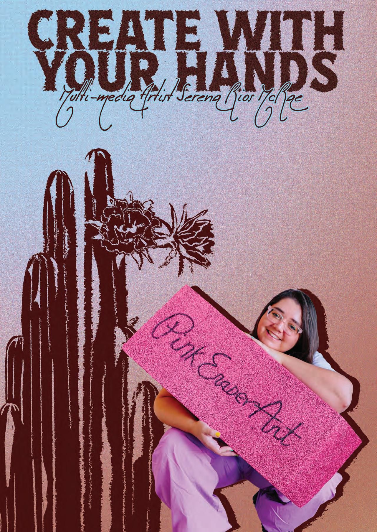
I have a phrase that I say a lot, and that is to “create with your hands.” I use this phrase as often as I do because it is important to me to try to help people understand the importance of using our hands for creation. As an artist, that sounds obvious, but think about how many people in the world use their hands to scroll, to work, to type, to tap out messages on screens, to push buttons on remotes or game controllers, and to wash dishes, but never to create. As a workshop instructor who teaches evening-out type classes, I usually have about one quarter of the class tell me they haven’t created any art since they were kids. And usually one person per class who will sit in fear and not create a thing until the class is almost at its end. As an instructor, I get to see every day people who haven’t picked up a paint brush since fourth grade reconnect with their ability to create, and there is a light that sparks in their eyes and lights up their entire demeanor. I heard a quote, I wish I could remember who it was from, that said, “When you create with your hands, you are thinking in three dimensions, you are problemsolving in real time, and you are connecting with your ancestors.” I use tactile and physical mediums because it is magic to create something beautiful from nothing. It brings me too much joy to turn a random object into a thing of beauty; and it connects my physical, emotional, and mental states into a single moment of being.
YOUR WORK HAS A STUNNING ATTENTION TO DETAIL! WHAT INSPIRATION AND SUBJECT MATTER ARE YOU MOST ATTRACTED TO?
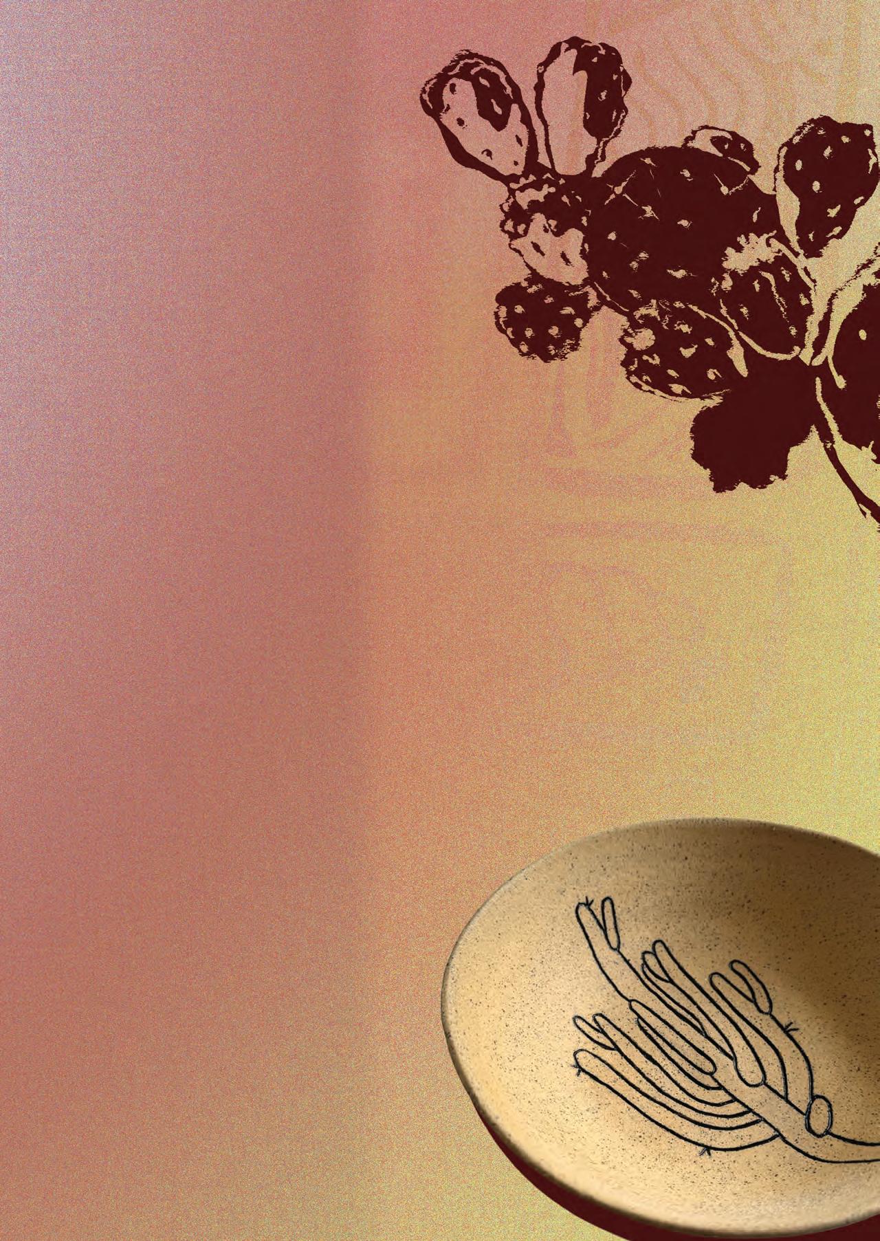
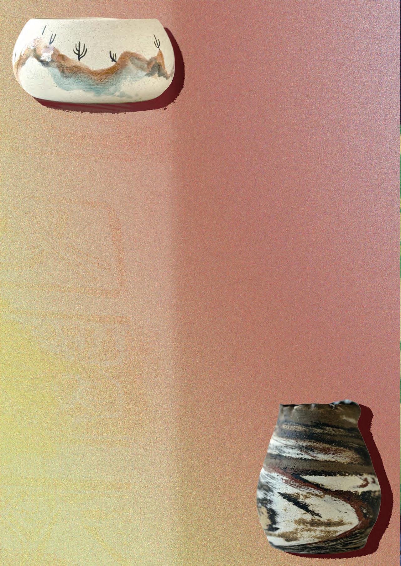
I am a very slow hiker because there are so many different shapes of leaves. The variety of flower petals—from shape to texture to arrangement on the flower to color—is incredible. I live in the Sonoran Desert, which is the most biologically diverse desert in the entire world. As you drive through it, beyond the giant Saguaros, it is hard to believe that that is true. But when you walk down a trail in the desert and really look, you will see bunches of flowers the size of a pinhead with tiny bees to match them in size and cacti that come in more shades of green and purple than you realized there are, with just as many colors and shapes of spines. There are even cacti that grow here whose thorns are hot pink, and they glow in the afternoon sun like lasers, a tiny little rave. Prickly pear cacti have so many shapes of pads and so many different shades of flowers. I found one with a disease that made psychedelic white rings, echoing like ripples on a lake across the surface of its skin. And when the prickly pears die, the texture of their cells is such an incredible structure that I am planning to collect some and press it into my next clay project. I am not the only desert-dwelling artist that is obsessed with the biological abundance here. It is incredibly common to find cholla skeletons pressed into clay, wrapped in macrame, or polished to shine. I love cartoons and graphic art and printmaking and watercolor, but the root of my inspiration and obsession is the Sonoran Desert. The desert is what taught me to look closely, to really see.
YOUR SLOGAN IS “ART. ADVOCACY. ADHD.” HOW HAS ART AFFECTED YOUR RELATIONSHIP WITH YOUR MENTAL HEALTH AND SELF-PROCLAIMED “ADHD IMPULSES”?
My mental health is the reason I am an artist, and I am an artist because of my mental health. The two are eternally intertwined. I recently told my husband, “I don’t understand the idea of retirement, because I can’t imagine ever stopping what I do for a living.” The truth of the matter is that I left my last full-time job in a mental health crisis years before I learned that I have bipolar disorder and ADHD. I have never been able to hold a job for longer than a year because once I became bored, I became literally suicidal. My resume is a hilarious mixture of nonsense jobs that require entirely different skill sets, including but not limited to juggling instructor, wedding photographer, and restringing vintage pearl necklaces on silk thread for a local jeweler. The thing about becoming a working artist is that I still change everything up once a year. I change the way I run things; if I sell online or at markets, I change my mediums, my projects, and my focus at the same rate that I used to change jobs. This way, if I have a depressive episode, I don’t have to force myself to clock in to work anyway. I can care for myself how I need to, and I am so much better for it. And to speak for a moment on advocacy: I am transparent about my everyday experience with mental illness and have the ability to share openly about it. I have DMs filling my inbox of people thanking me for helping them get a diagnosis because of the experiences I share. There are people with bipolar disorder and ADHD in treatment and therapy now because I share this part of my life alongside my art and without shame.
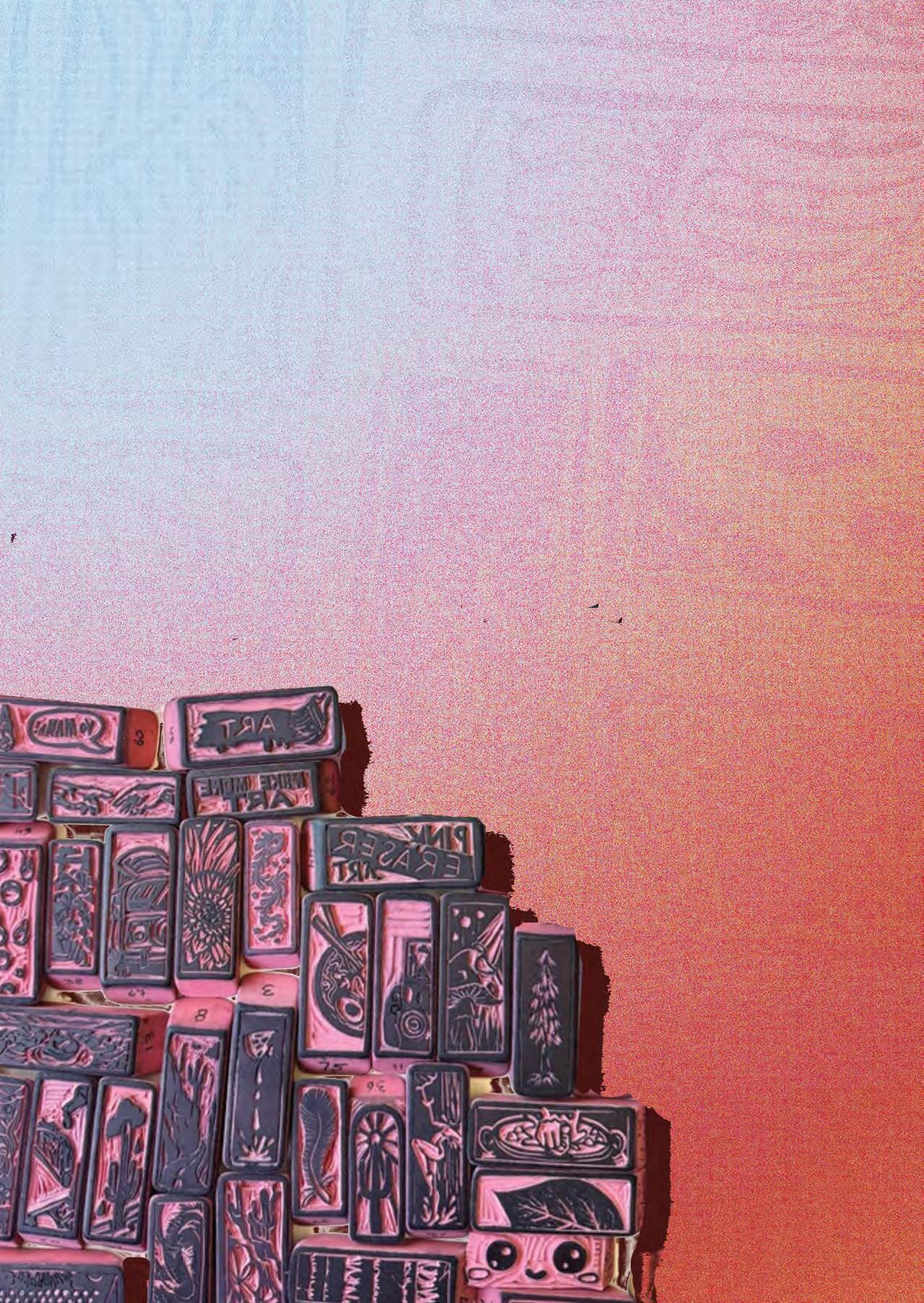
TELL US ABOUT THE PINK ERASER CLUB AND THE VALUE OF USING EVERYDAY OBJECTS, LIKE THE CLASSIC PINK ERASER, IN A DIFFERENT WAY!
There is no Pink Eraser Club, though that was the original name of my book, “Pink Eraser Art,” before publication. I advocated away from using the word “club” to describe the
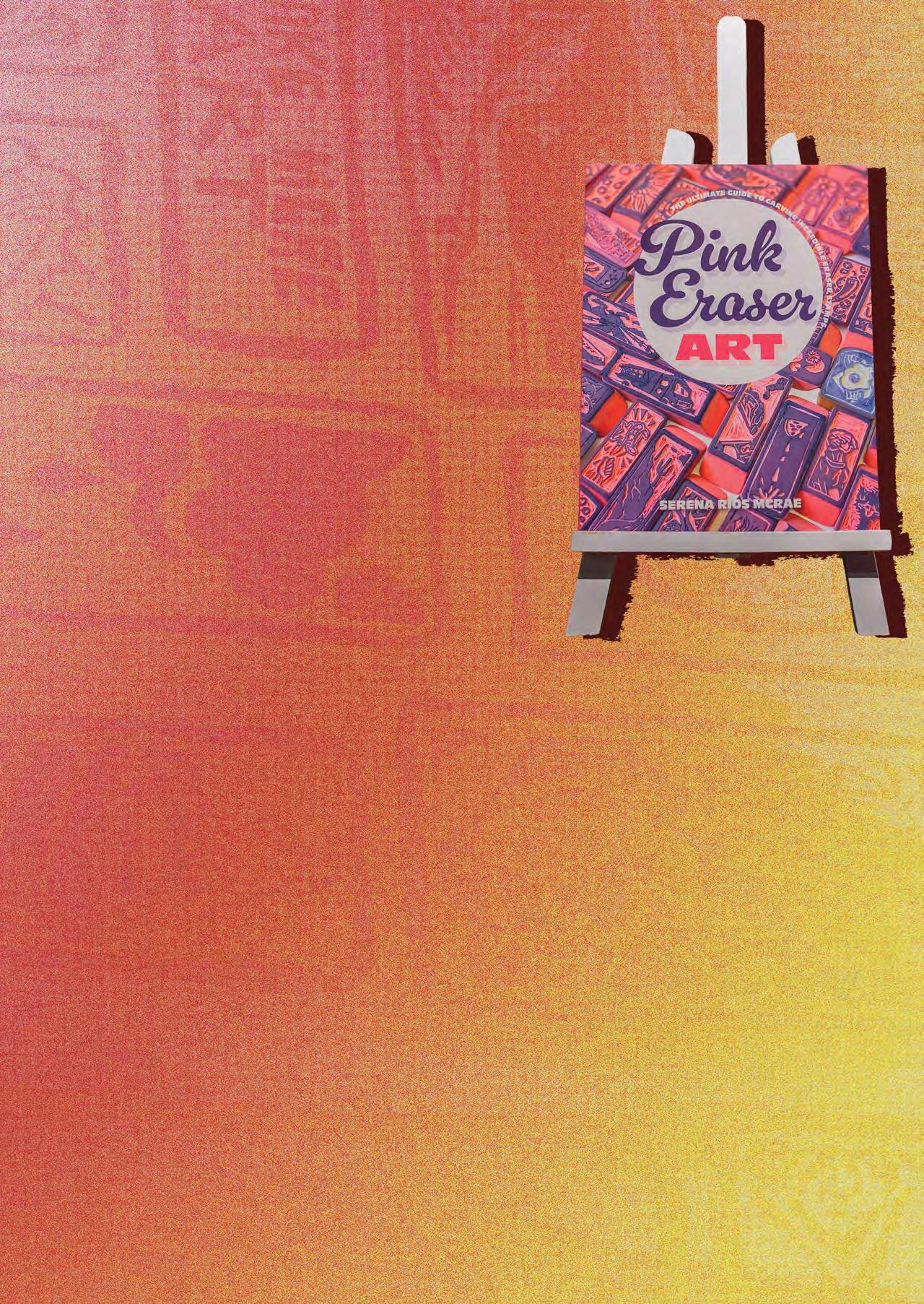
community I am creating because it implies exclusion as well as inclusion. I want to avoid anything that can make someone feel like they have to qualify in some way to be an active participant in my community. For the same reason, I share all skill levels of pink eraser art prints on my community page, which I run for free on Instagram (@pinkeraserart). Other art challenges and art pages will only share really incredibly executed artworks from experienced artists on their page and in their posts, but I make it a point to highlight beginners as much as the most experienced. I think it is important to encourage people not to be afraid to do things badly, and I say that carefully because I don’t want to ever tell someone their first try at an artwork is bad. What people call bad should be rephrased as inexperienced. So I think it is important to encourage people to embrace being inexperienced and to find pride in what they create at the beginning of their creative journey. Pink eraser art is for everyone. I have shared pink eraser prints created by my friend’s 8-year-olds all the way up to 71-year-old Roz Chast, who has been illustrating for the New Yorker since the 70s.
YOU’RE ALSO THE CREATOR OF “AFFIRMATIONS MOMS ACTUALLY NEED,” A BEAUTIFULLY CURATED, TYPOGRAPHIC CARD DECK! DID YOUR OWN EXPERIENCE WITH MOTHERHOOD INFLUENCE THIS SET? DID THIS ALLOW YOU TO EXPLORE THE STIGMA OF POSTPARTUM EXPERIENCES AND EXPECTATIONS?
“Affirmations Moms Actually Need” is what catapulted me into becoming a content creator on social media and starting my career as an artist. I began creating it almost as soon as the fog of postpartum depression began to lift. My children were about four and five years old, and the start of my motherhood experience was so far from what I had expected or hoped for. From the very first days of being a mother, I was detached, experienced psychosis, and felt an uncontrollable sorrow. I could have been one of those mothers in the news that makes everyone say, “What a monster.” It was years later I learned I am bipolar, and the PPD came years before anyone was openly talking about maternal mental health. I was alone in my experience, booted from my insurance, and barely made it out alive. I still remember the day it started to lift. Colors were suddenly brighter, more light came into the room than ever before, and I started to look back on my experience and was amazed that I made it out of there with me and my children alive. I started journaling about it and wrote out a list of everything people had said to me when I had asked for help. It was honestly horrible. I sat down with those phrases I had been told in my most vulnerable time of my life and started to rewrite them. I reworded them and swapped out the language used until I had a list of phrases that would have helped me. Many of those things were cliches everyone says to mothers that people think are cute but actually cause harm.
I wanted to take my experience and use it to change the way we speak to new mothers. This project catapulted me into my art career and content creator career because I turned it into the affirmations deck and needed to market it. Changing the world requires a platform, so I focused on gaining 1,000 followers in order to launch a Kickstarter campaign and print the deck. My
Kickstarter was fully funded in the first 2.5 days. I planned to print 200 decks and ended up printing over 1,000. I still get emails and DMs from mothers who have received the deck as a gift and want to thank me for helping them feel seen and have the bravery to ask for help. I sell them to doulas and therapists and regularly get wonderful feedback.
HOW DO YOU STAY INSPIRED? ARE YOU A SKETCHBOOK USER, JOURNALER, OR POET?
I think something important that I have learned over the years of working as an artist is that we can’t produce creativity 100% of the time. We have to also have input. For artists and creatives, laying on the floor and staring at the ceiling with an empty head is as important as doing an online shop launch and shipping out orders. Watching films, reading books, playing video games, and rocking in a hammock under a tree are an important part of our work. Hiking, sitting in a crowd and observing, and slowing down enough to notice things are essential. I collect art! I go to artisan markets. I read poetry and fantasy novels. I play Dungeons and Dragons every weekend with a group of friends. Inspiration sparks inside of our minds, but it comes from the world around us. Sometimes, inspiration doesn’t spark, and that can be frustrating for artists, but that is when we do the mundane tasks that come with working as an artist, and when the time is right, inspiration will come again. Before I was medicating my bipolar disorder, I was inspired 100% of the time, and my ADHD would run so fast I had more ideas than moments in the day. It was actually a horrible way to live. I felt so stressed, exhausted, and frustrated that I couldn’t actually create all of my amazing ideas. We have to have quiet moments. We have to have empty-headed moments. We have to have moments where inspiration is dead so that we can sweep our damn floors.
YOUR ART KNOWS NO BOUNDS, FROM SCULPTURES, ERASERS, AND FOOD TRUCK DESIGNS TO MURALS. WHAT PROJECT HAVE YOU LEARNED THE MOST FROM?
A lot of projects I have done have taught me what I don’t like! The taco truck was fun but stressful. I was working in the heat of summer and had to make sure I didn’t get sun sickness or heat exhaustion. Murals are so cool when they are done, but I really hate everything about the process: the timeline, the daily commute to location, and the climbing up and down ladders. I really love sitting in my studio with my dogs and my bird and vibing in my space. You know? I have also learned a lot about myself with clay work. When I have my hands in the clay, it’s like I can feel my ancestors working through me. The first day of throwing in the ceramics class I took, everyone looked at me and said, “There’s no way this is your first time doing this.” I really feel connected spiritually when I work in clay, and I love having my hands in the earth.
WHAT IS NEXT FOR YOU? ANY NEW GOALS OR PASSIONS?
I just pitched a new idea to my publisher, so I’ll be working on a small draft of my idea for my editor to present to their team, but I can’t say more on that right now. My big goal for 2026 is to work on my technique with clay. I have this problem where people love my art and validate my creativity by wanting to collect it, and if I’m not careful, I could cut corners and never really practice something enough to become a natural at it. I am also new to Dungeons and Dragons and am feeling a side quest of teaching more women to play the game; I am in talks with a local bookstore about having book-themed D&D nights. I do love teaching, and learning to play this game may be what leads to me finally writing the novel I dreamt of publishing as a kid.
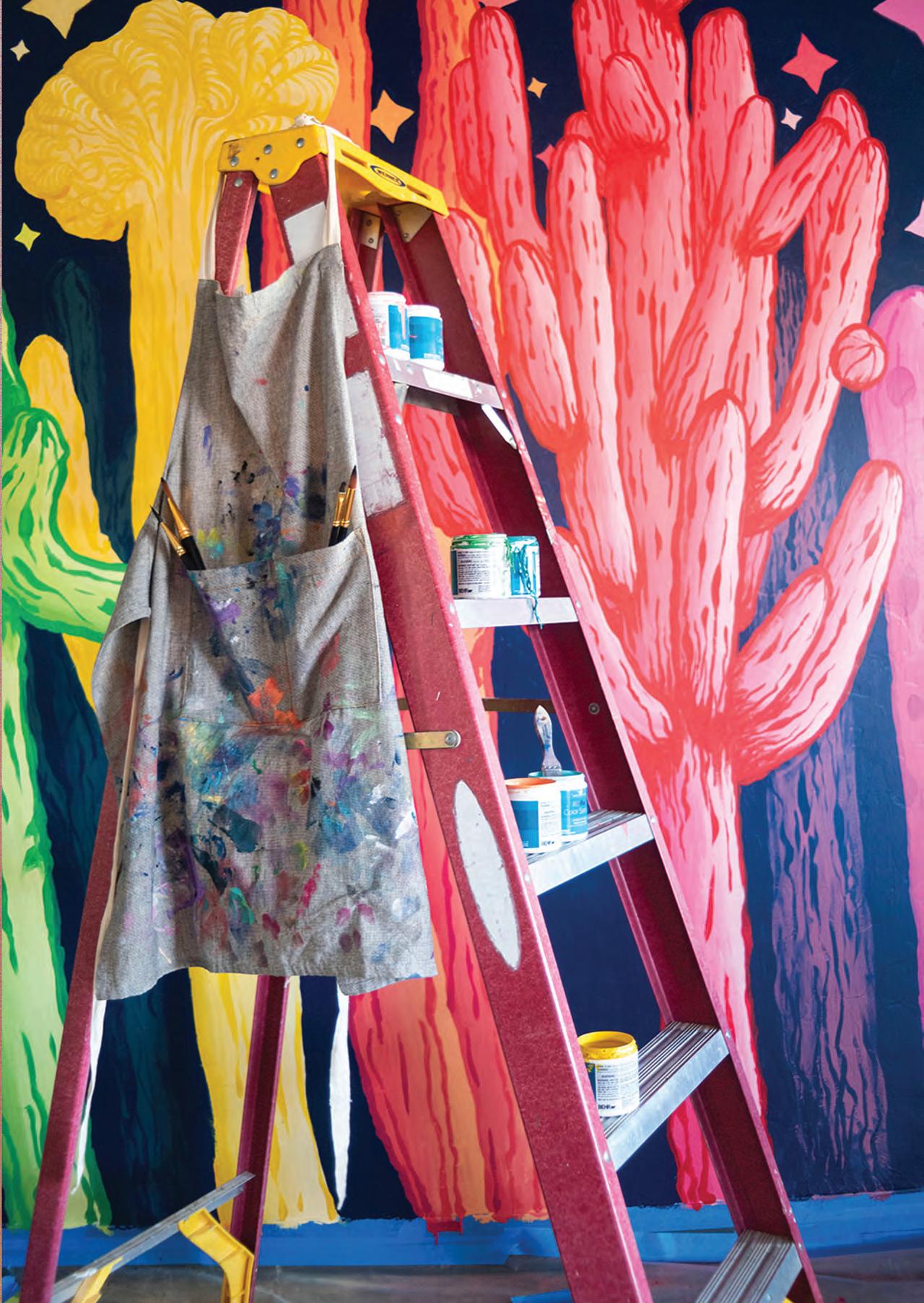
WRITTEN BY Chloe Galipeau
EDITED BY Isabella Schlim
DESIGNED BY Chloe Galipeau
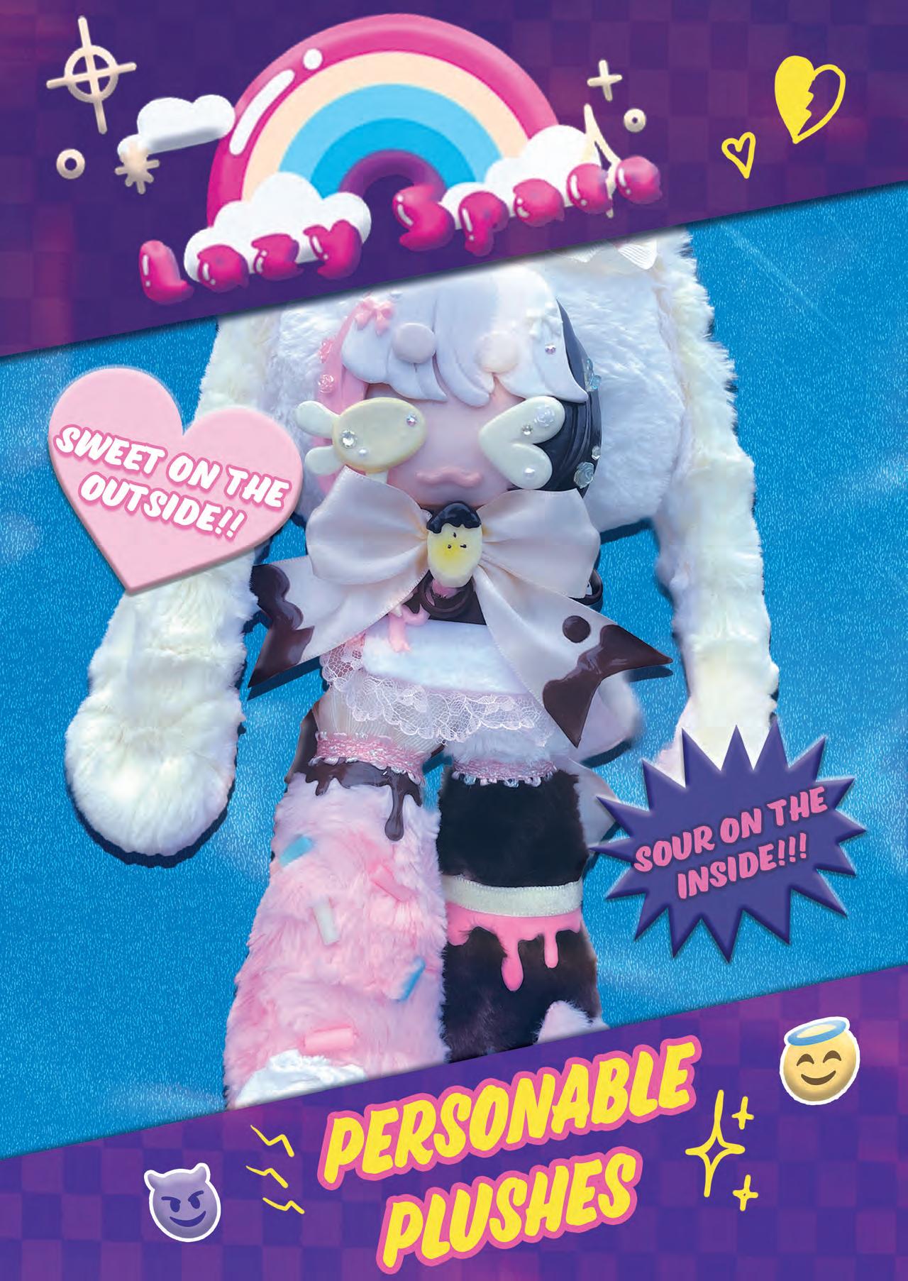
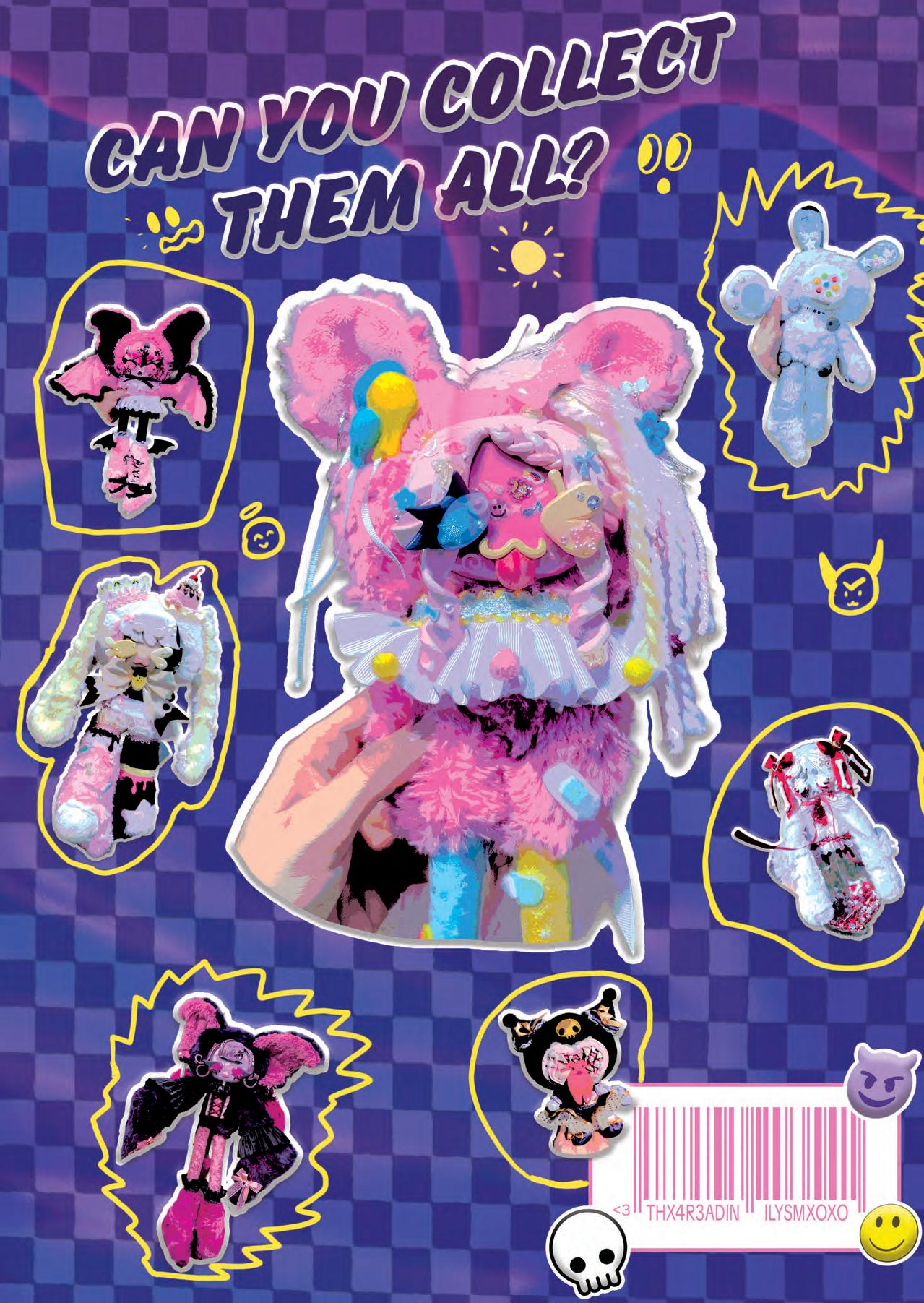
In the state of Montana, Alyssa Nelson has been making unique one-of-a-kind plushes since 2020 after creating her brand Lazy Space. During the pandemic, Alyssa was an essential worker and was looking for a new way to craft in order to cope with the hectic nature of her day. Alyssa became inspired to create her plushes after seeing the creations of others online. Experimenting with clay and fabrics, she ended up creating her first-ever clay-faced plushie, Xenora. Since then, she is estimated to have created over 858 plushes that have made their way to various people across the world.
Initially, Alyssa was creating plushes by upcycling plush dolls from thrift stores to use as a base for her designs. In order to sculpt the plushes’ faces, she would use clay before decorating the faces with paint and then sealing them for extra strength. Her next step in her process was to assemble all the pieces needed to create the rest of her dolls, and then finishing by decorating them to further match the personalities of the dolls. She enjoyed using various ribbons, ruffles, clothes, and accessories to do so. Today, Alyssa still follows this same process, but since this past September, she has begun making her own dolls from scratch!
The switch to making her dolls from scratch came from a few different reasons. As much as Alyssa enjoys upcycling and the process of turning something old into something new, she needed a change. Her inspiration with upcycling was eventually running low, and so were the plushes at her local thrifts. She wanted more control over her designs, specifically in color palette and animal types, so she reboosted her creativity by taking about a month’s worth of time to work on prototyping, conceptualizing, patterning, and building her first dolls. Now, Alyssa makes art dolls completely from scratch for people to continue to love and cherish. When creating her dolls, Alyssa takes inspiration from many places. She gets inspired by various forms of art in her life, like cartoons, television shows, video games, toys, nature, music, and fashion. Her inspiration also comes from people and events that happen in her life, especially harder situations and struggles. All of these forms of inspiration allow her to connect with herself and her feelings. Sometimes, her inspiration even comes to her in incredibly vivid dreams, which encourages her to keep a notebook by her bedside in order to write down inspirations that come as she drifts to sleep.
With her multiple sources of inspiration, Alyssa has been able to create an incredible number of dolls, each with their own personality and unique look to them. Each doll can take a good amount of time to bring to life. From design to photography of the final piece, each doll takes around 15-18 hours to complete. 8-10 hours of the process is active making, where the rest of the time includes designing, sourcing materials, photographing, editing, and posting the final results of the dolls. With all of this time spent creating each doll, it is hard for Alyssa to choose one favorite, but so far her favorite release has been Midnight Coven, a rather spooky and eerie release of hers.
Before her passion for plushes fully developed into a business, the initial idea was for Lazy Space to be centered around handmade earrings. However, Alyssa was not finding joy in the earring creation process. It was a lot of work that started to stress her out more than bringing her joy to the craft. Once again, her inspiration ended up coming from seeing others online creating their own art dolls out of clay and fabric. She instantly wanted to make her own! As a kid, she would play with clay a lot, creating clay charms, fairy, and gnome figurines. Deciding it couldn’t hurt to try creating dolls, similar to the Rushton ones, she began her journey with creating her art dolls. Once she had begun making plushes, it was the happiest she had been about her work. Adoring the process and being more inspired than ever, Alyssa has continued running Lazy Space as it is ever since.
Outside of Lazy Space, Alyssa currently enjoys multimedia painting, illustrating, and, most recently, ceramics! Prior to Lazy Space, she would primarily paint as a way to challenge herself. She would do so by giving herself projects to work on to allow her to grow as an artist. As Alyssa and Lazy Space
continue to grow, more releases are on their way, including “creepy cute,” zodiac, and breakfast-themed releases. There may also be a Vocaloid-themed release in the near future as well, so stay tuned!
Lastly, if you are interested in starting a business like Alyssa, her advice is to “keep at it even when you feel like no one is watching.” To her, and for many, the hardest part about starting a business is feeling unseen in the ocean of content creators. Though, she shares, “If you are truly passionate about it, you will have the power to keep pushing on whether you find success or not!”
To keep up with Alyssa and Lazy Space’s progression, you can find her on Instagram at @lazy._.space or on her website at lazy-spaces-curiosities.myshopify.com.
WRITTEN BY Atllas Stone
EDITED BY Isabella Schlim
DESIGNED BY Nick Fernandes
PHOTOS BY LAZY SPACE
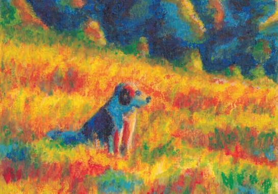
“DRAWING COMFORT BACK TO LIFE”
Walt Brandt’s art feels like a deep exhale. Warm, nostalgic, and quietly joyful, his work invites viewers into moments that feel instantly familiar—sunlit rooms, gentle stillness, and a kind of comfort that doesn’t ask for explanation. While the finished pieces feel soft and effortless, they are the result of an artist who arrived at his style not by chasing trends, but by circling back to what once made creativity feel natural.
Walt grew up in a deeply creative household. One of five siblings, every member of his family gravitates toward some form of creative expression—painting, writing, reading, sculpting, or building—encouraged by parents who believe in finding the joy in life and sharing it. School never fully clicked for him academically, but art class did. It was where he felt confident, noticed, and at ease. Creating came naturally, and that early affirmation stayed with him.
As he got older and began taking art more seriously, that ease began to fade. Walt found himself stuck in a frustrating pattern: he was making technically solid work, but it didn’t feel like him. He would finish pieces and realize he wouldn’t even want to own them himself. The work felt disconnected—impersonal, unoriginal, and far removed from anything he truly loved.
The shift came when he leaned into instincts he had always followed without fully understanding. Walt is technically colorblind, something he jokes about, but it has deeply shaped his visual sensibility. He naturally gravitated toward bold, vibrant colors and warm tones, unaware at first just how intense those hues were. Those colors made him feel something. Once he recognized that emotional pull, everything began to click. He stopped forcing himself into styles that didn’t fit and instead focused on creating art that felt comforting and familiar—almost like a feeling you already know.
That sense of comfort is central to what Walt hopes people experience when they see his work. He wants viewers to be reminded of moments when life felt safe and uncomplicated: childhood pockets of warmth, endless summers, and times when happiness didn’t need a reason. His art isn’t about spectacle or shock; it’s about simple memories that let you breathe a little easier. This philosophy extends directly into his materials.
One of the most distinctive aspects of Walt’s process is his use of tools often associated with childhood—water-soluble crayons, water, and a brush.
HIS ART ISN’T ABOUT SPECTACLE OR SHOCK; IT’S ABOUT SIMPLE MEMORIES THAT LET YOU BREATHE A LITTLE EASIER.
When he was younger, art meant pencils, crayons, and a simple sheet of paper. That was where the fun lived. Walt began to question why artists feel pressure to abandon those basics. Why move on from the tools that made creativity exciting in the first place? Using crayons again became a way
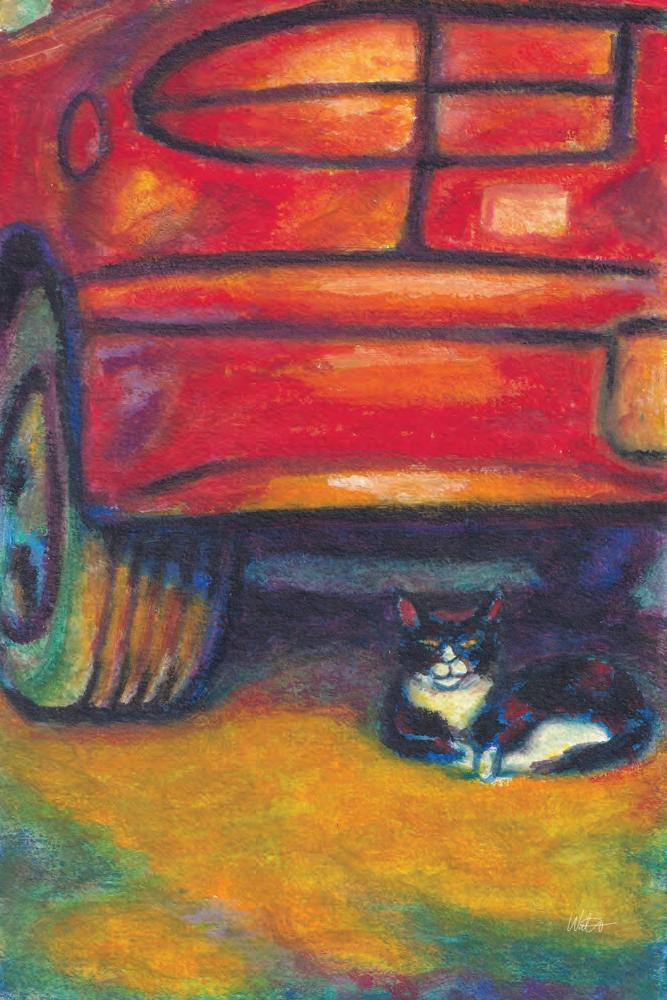

to reconnect with his younger self—the version of him that found peace in the process rather than pressure in the outcome. For Walt, returning to the basics wasn’t regression; it was real growth.
Emotion plays a major role in how he approaches color and texture. When he creates, Walt thinks primarily about warmth and light—where it comes from and where it settles. He’s inspired by soft sunlight on bedroom walls, the feeling of warmth on skin, and the way light naturally slows people down. Rather than anchoring his work to one specific childhood memory, he focuses on presence—the quiet awareness you feel when looking up at the stars and realizing how small you are in the best possible way. His goal is for the work to pull viewers into that moment and offer a brief sense of peace.
He’s inspired by soft sunlight on bedroom walls, the feeling of warmth on skin, and the way light naturally slows people down.
His preference for simple materials also reflects his personality. Walt appreciates that crayons and water are clean and manageable. He never enjoyed chaotic workspaces, and traditional paints or oil pastels often made him dread starting because of the inevitable mess. With crayons, he can focus entirely on creating without worrying about scrubbing pigment out of carpets or off his hands.
Though the finished pieces feel gentle and intuitive, Walt’s process is largely intentional. About ninety percent of each composition is planned in advance—either mapped out mentally or sketched as quick thumbnail drawings. That structure gives him a clear direction and allows the smaller details to unfold naturally as he works.
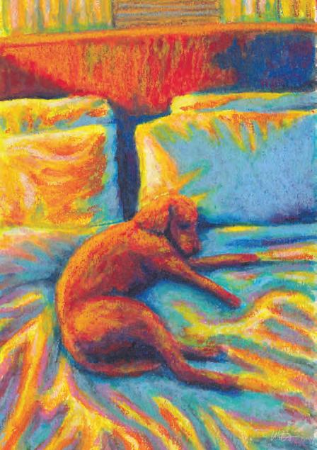
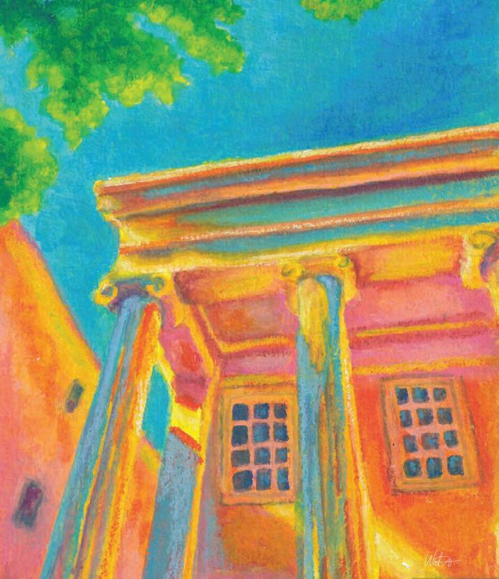
There are also technical challenges that come with water-soluble crayons. Unlike some mediums, you can’t layer light colors over dark ones. Once a dark pigment is down, recovering lighter tones is difficult. This limitation requires careful planning and a strong understanding of layering order. Layering, Walt says, is everything. His pieces often don’t come together until the third layer—before that, he jokingly considers them “garbage.” Brush choice matters as well; firmer brushes allow him to push pigment effectively, while softer ones don’t provide enough control. His process is simple but precise: layer, let it dry, then layer again. That’s when everything comes together.
As for tools, Walt swears by watersoluble crayons—intended for children ages two to four—a detail he finds both amusing and perfectly fitting.
When creative blocks or self-doubt hit, Walt doesn’t force his way through them. He sees those moments as signals to step back. Walks, cleaning his space, and especially running, help reset his mind. Once he stops pushing so hard, ideas usually return on their own. He also reminds himself that not every piece needs to be great. Some days you create something meaningful; other days you simply create. Both matter.

“FEELS LIKE COMFORT” BY WALT BRANDT
Although Walt lives in Jersey City, he doesn’t feel the city has significantly influenced his work—though he does love it. His favorite time to create is early in the morning, often before food or coffee. Starting too late leads to all-night sessions, which he avoids. He values his sleep and knows that pace isn’t sustainable.
Outside of art, Walt finds the same quiet joy in running, working out, and laughing with friends and family. A major source of happiness is his wife, Brittany, and their dog, Phoebe. Phoebe appears frequently in his work, a reflection of the joy she brings to his everyday life.
One piece stands above the rest for him: a drawing of Phoebe curled up in bed titled feels like comfort. It was the first piece in years that made him feel like he had truly found something. Finishing it left him genuinely impressed with himself and reminded him why he makes art at all. It set the tone for everything that followed.
For Walt, success isn’t measured in money. While he’s grateful that people want his art in their homes, that isn’t what drives him. Success means feeling excited to start new ideas and having the freedom to create work that feels honest. Looking ahead, his goals are simple: keep growing, keep having fun, and keep making art that feels real. Whether that path leads somewhere bigger or simply keeps him inspired, either outcome feels like more than enough.
For Walt, success isn’t measured in money.
In a world that often pushes artists toward constant reinvention, Walt’s work is a reminder that sometimes the most meaningful progress comes from returning to what once felt like home.
WALT BRANDT’S ART CAN BE FOUND ONLINE AT @WALTMADE
WRITTEN BY
Emaan Asad
EDITED BY
Isabella Schlim
DESIGNED BY AJ
Boryczka
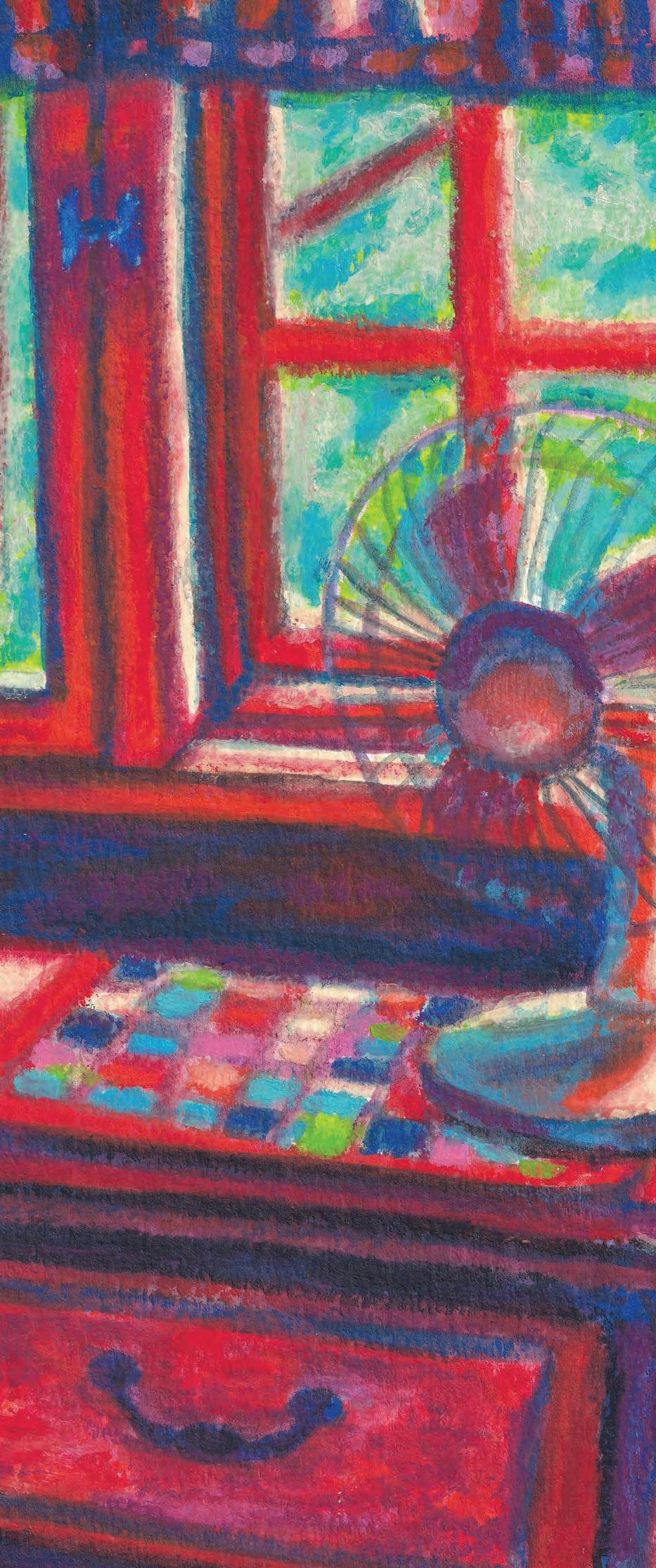

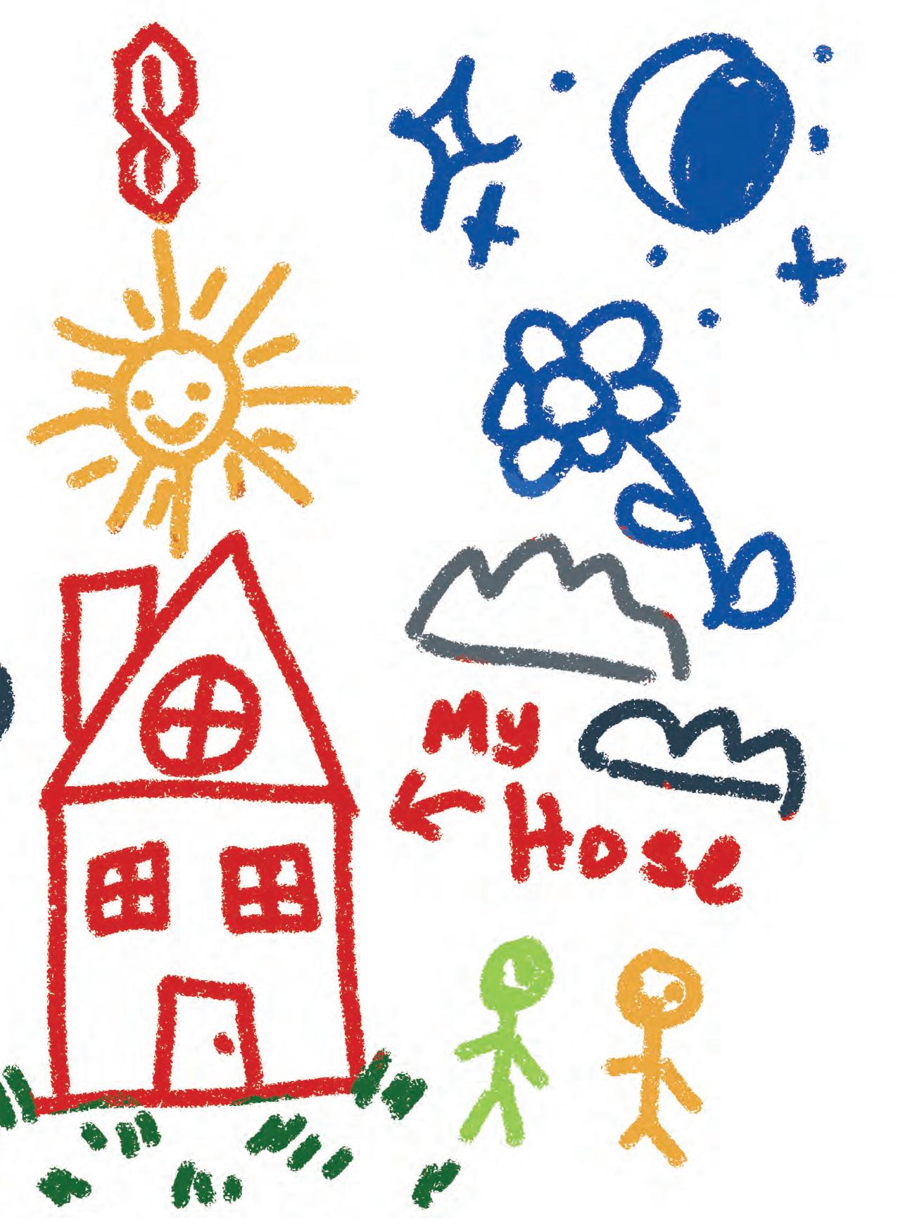
PHOTOS BY WALT BRANDT
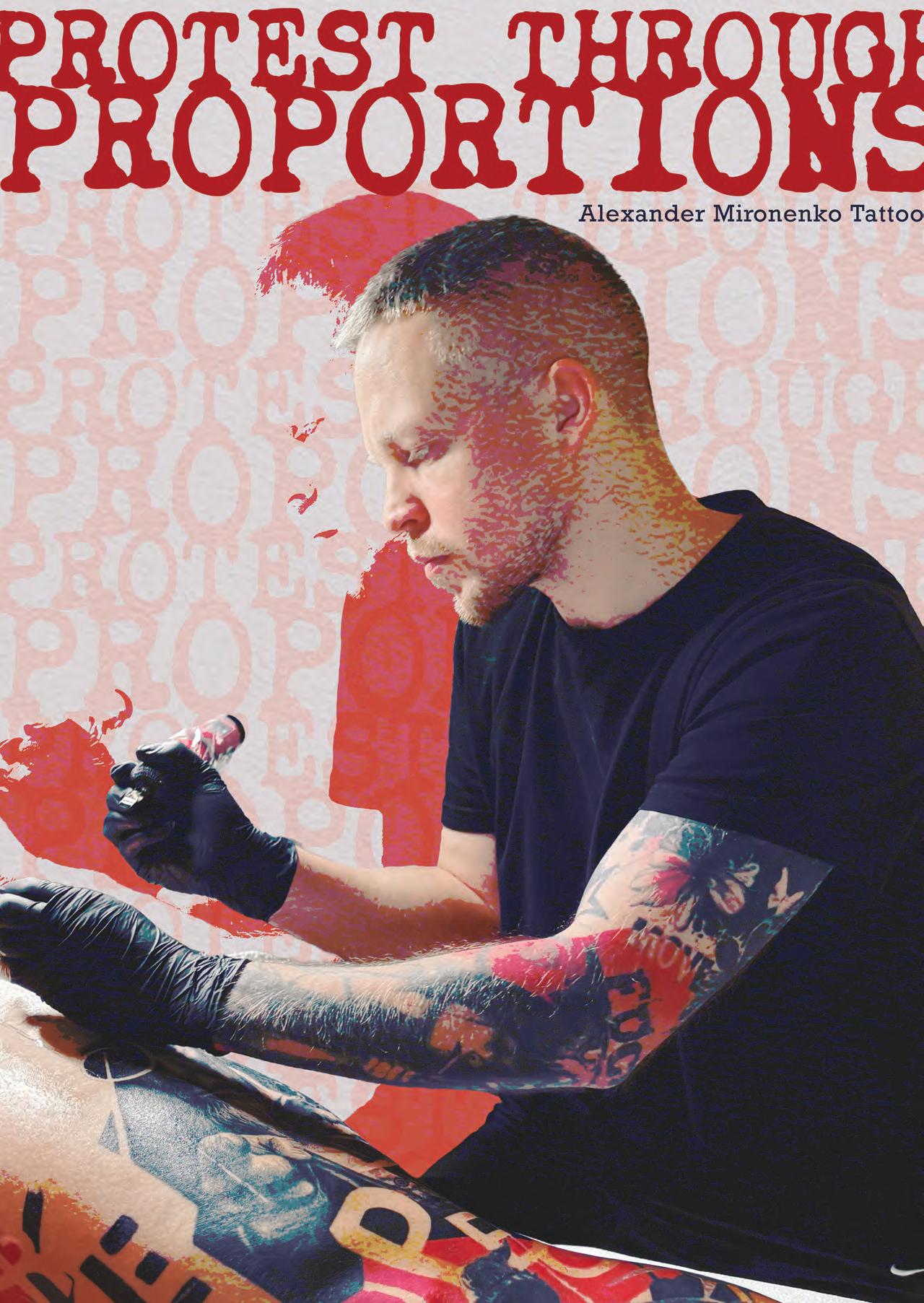
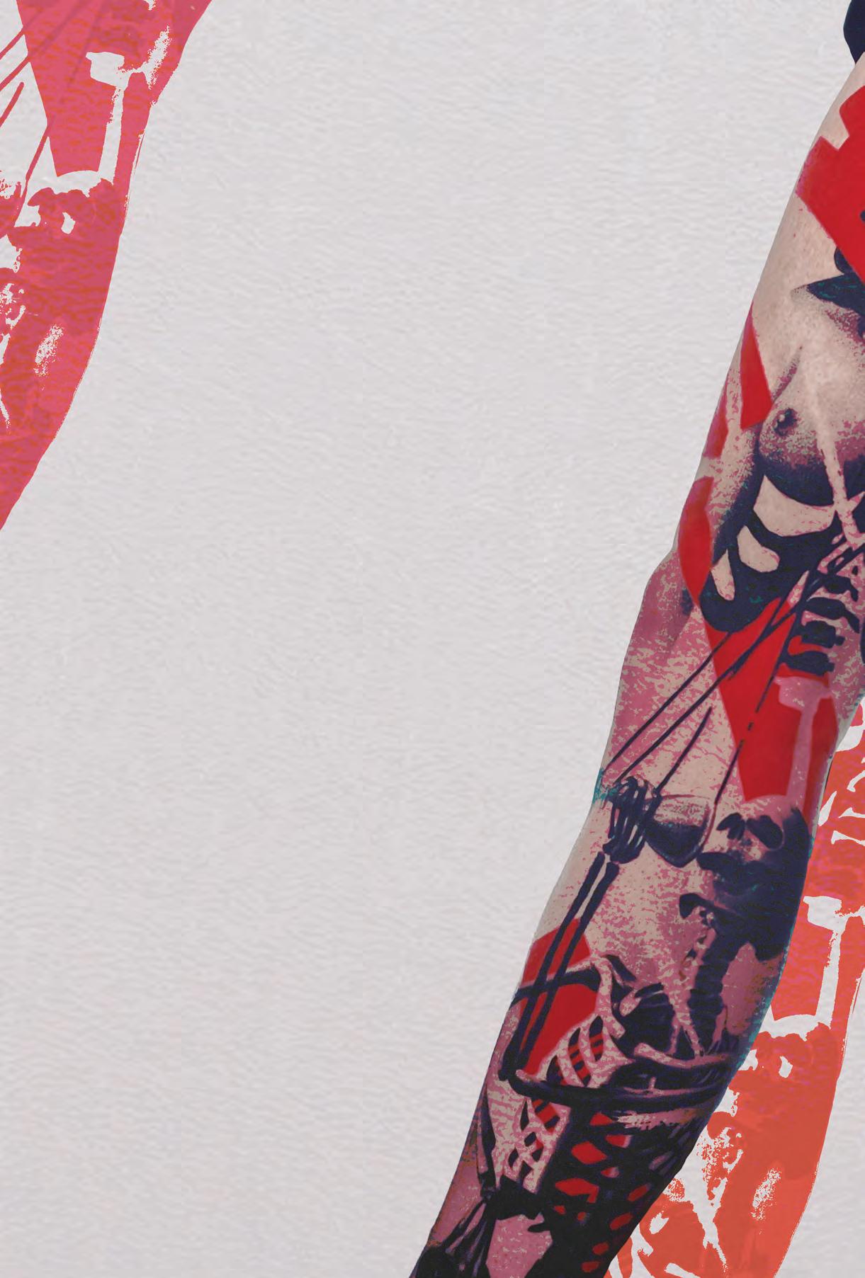
TEN YEARS AGO, WOULD YOU HAVE DREAMED OR EXPECTED TO FIND YOURSELF HERE?
Ten years ago, I couldn’t have imagined that I’d become a tattoo artist–let alone that I’d be living and working in the US. Back in 2016, I graduated from university in Novosibirsk, Russia, where I earned a bachelor’s degree in logistics for inland shipping routes. Despite that degree, I had no real idea at the time of what I wanted to do with my life.
WAS THERE A PIVOTAL POINT IN YOUR CAREER THAT SPARKED AN INSPIRATION TOWARDS TATTOOING? OR WAS IT GRADUAL?
Over the next few years, I tried working for different companies but never stayed anywhere for long. Then in September 2019, a tattoo artist suggested I try tattooing since I could draw pretty well. I went through training, got deeply interested in tattoos, and had a realization: I’ve always loved drawing, and tattooing is a field with huge potential—both for personal growth and for achieving my life goals, so I dived into the profession headfirst. Coming from a small village and a low-income family, I always had a strong drive to improve my quality of life and to explore the world by discovering new countries and cities. It’s also worth mentioning that I went to art school as a kid and kept drawing regularly afterward— celebrity portraits, portraits of friends and family, wall drawings, and anything else I could get my hands on. My skills were constantly developing through practice, but that still wasn’t enough to make good tattoos right away. Honestly, my first tattoo works were terrible, but I never gave up and kept learning.
From the very beginning of my career, my goal has been to give people a way to release their emotions through art. Not everyone knows how to draw, but many people feel the need to leave a part of their emotions, or a part of themselves, in something tangible, something physical, to highlight their sense of individuality and their connection to something unique. Tattooing as a craft can help with this—but only if I develop a distinctive, recognizable style.
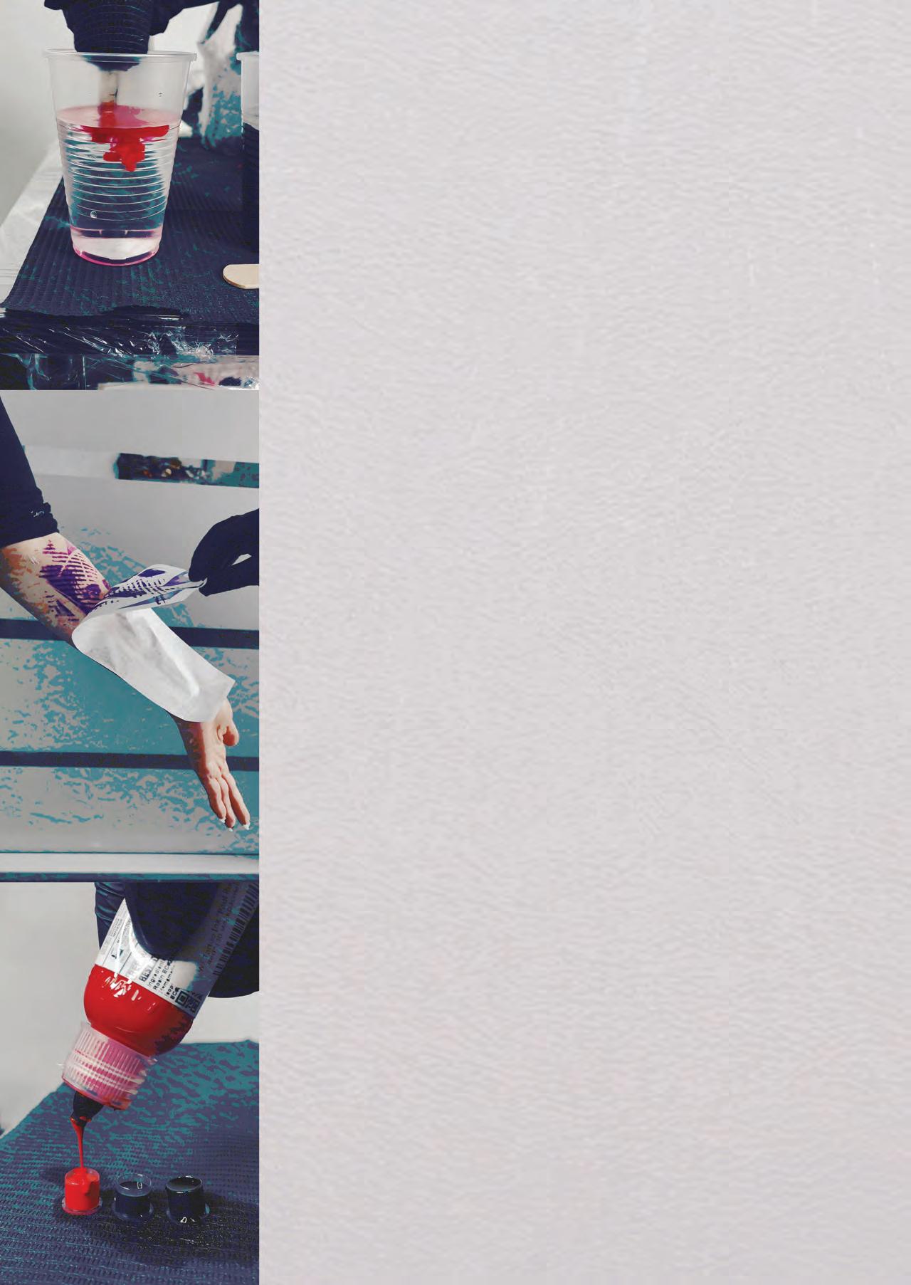
WHO IN YOUR LIFE WAS YOUR BIGGEST ROLE MODEL? WHAT EFFECT DID THEY HAVE ON WHO YOU ARE?
Along my path, I’ve been guided by several role models, and in many ways my personality was shaped thanks to them. You might be surprised, but they’re not tattoo artists at all— they’re Arnold Schwarzenegger, Kobe Bryant, and Michael Jordan. What united them was an unstoppable drive to win at any cost, a champion’s mindset, and relentless work on selfimprovement and growth. I try to adopt the strongest traits of these people, and that helps me overcome difficulties. I also believe strongly in myself and in the idea that with enough determination, anything in life is achievable. From a visual and creative standpoint, I’m inspired by the work of artists Stefano Galati and Fekete Dorina.
WHAT WAS YOUR BIGGEST OBSTACLE IN PURSUING THIS CAREER PATH? HOW DID YOU OVERCOME IT?
After moving to the US in 2025, my main career obstacle has been my limited English. I believe that now all horizons are open in front of me—I just need to keep learning. Before the move, everything was much harder. Starting in 2022, the standard of living in Russia declined more and more each year, and tattoo artists were affected as well. I struggled just to cover basic needs, like food and housing, even though my wife was also working and covering part of our expenses. It created a situation where you can see the path and you have goals, but you have no money. You can’t afford quality tools for work, take a masterclass from an experienced artist, or invest in any other area of growth. Because of that, the first years of my career were accompanied by debt — I borrowed money whenever I needed to buy a new machine to replace an old one or purchase other supplies. I remember that period as a constant fight for survival, with no visible light at the end of the tunnel. The situation improved slightly when I decided to go to a neighboring country, Kazakhstan, escaping military mobilization for the war. With just one backpack containing my iPad and tattoo machine, I crossed the border (legally), managed to settle in fairly quickly, and soon things started to turn around. Right now, I feel that life is finally starting to come together. My family isn’t swimming in money, but for the first time in a long while, our fridge has meat, fish, and other quality foods that support our health. Being here in Boston, I’ve already been able to afford a masterclass, and thanks to it, I learned how to create cleaner, more controlled shading. I don’t think this will be my last training.
WHERE DO YOU SEE YOUR CAREER EVOLVING WITHIN TEN YEARS?
Looking ahead to the next decade, I see my growth like this: I’ll continue refining my technical execution so that my tattoos, on a technical level, move closer to the standard set by the great masters of our industry. I plan to test my level at tattoo conventions—if my work stands out among others, that will mean I’m moving in the right direction. I understand that there’s still a huge amount of work ahead of me, but like Kobe Bryant, Michael Jordan, or Arnold Schwarzenegger, as long as I’m fighting, I stay hungry, and difficulties don’t scare me, I can reach my goals.
HOW DOES YOUR ART STYLE REFLECT YOUR PERSONALITY, EXPERIENCES, AND HOPES?
I didn’t arrive at my black-and-red style right away (often called trash polka). Like many tattoo artists, I experimented with different directions at first. At some point, I realized that black-and-red combinations stimulate my mind and appeal to me visually more than any other tattoo style. That was the moment I began focusing and growing in this direction. After the visual aspect, I started studying the history of trash polka, the artists behind the style, and the meaning embedded in these tattoos. I was deeply drawn to the idea that through combinations of abstract shapes, distorted proportions, and collage elements, it’s possible to express one’s inner voice, pain, and protest. That’s why my personal designs often address social issues.
Art inevitably carries the imprint of the artist’s personality, and my work is no exception. The black-and-red contrast and often dark subject matter are a direct result of having to fight for a decent life in a country with an oppressive social atmosphere. I still feel pain knowing that my homeland could have become one of the world’s leading countries—a center of culture and connection between peoples—but instead chose a path of destruction and death.
HOW DOES YOUR WORK IMPACT YOUR CLIENTS’ LIVES?
When I come across one of my tattoos a long time after the session has finished, the owner often tells me that people around them are surprised by how bold the concept is and say they’ve never seen anything like it before; and of course, the person wearing the tattoo is happy about that. Feedback like this really warms my soul—it tells me I’ve achieved my goal and given someone the feeling of owning truly unique art. I think that’s exactly why most of my clients don’t stop at just one tattoo; after a month, a year, or even several
years, they come back for another dose of black-andred style. This kind of result is only possible through trust between the client and the artist. Trust is one of the least obvious challenges in our field. Even now, I occasionally get requests where the client doesn’t allow any creative freedom, sets very rigid boundaries, or suggests design changes that would undermine the visual balance or overall impact of the piece. I treat this with patience, but whenever possible, I try to explain that certain approaches may work better visually. When the client and I find a compromise, the result is an excellent tattoo.
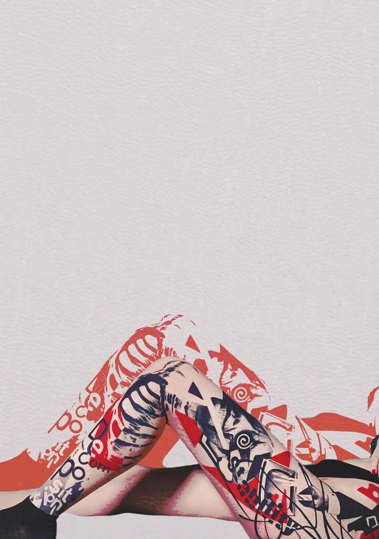
WRITTEN BY Victoria El-Azem
EDITED BY Isabella Schlim
DESIGNED BY Victoria El-Azem
DESIGN EDITED BY Lindsay Scalese & Chloe Galipeau
PHOTOS BY ALEXANDER MIRONENKO
Leather worker, teacher, content creator, and business owner Brandon Corral holds many hats. For the past 10 years, he has been running his business Swift Hammer Leather, where he creates vibrant and incredibly detailed pieces made from full-grain leather. From wallets to wall art, his commissioned pieces take a minimum of a week to bring to life.
Starting his business in Southern California, Swift Hammer Leather recently moved to upstate New York alongside Brandon. Though he's traveled and lived around the country, you can find Brandon offering digital courses on how to work with leather, social media, and even how to market yourself and your work. Before creating all of these outlets for his passion, Brandon’s journey with leather consisted of lots of experimentation.
Brandon never really saw himself as an artist, that was, until he got his first leather craft starter kit as a gift for his 21st birthday. After receiving it, he became obsessed. He was working with leather for the first time for hours at a time and during any of his spare time outside of going to school for chemistry and work. His first project came to light when his then girlfriend needed help creating a
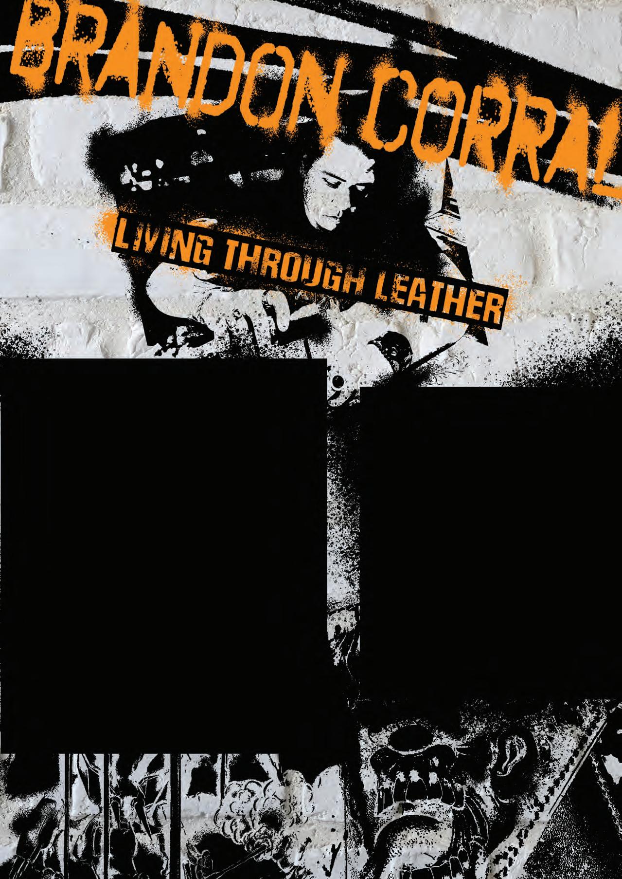
cover for an assignment. Brandon was able to make her a book cover, which then propelled the rest of his experience that has brought him to where he is today. Though Brandon had found his medium that entranced him enough to enter a flow state while working, he found that he needed to do some re-evaluating if he wanted to make his art into a viable business.
About five years into his business, he found that he was hitting a wall. Though still just as obsessed with his art, he found himself making items just in order to fulfill inventory, rather than pieces he was truly proud of and that were unique to him and his business. He had come to a point where it was hard to distinguish where the borders of fun and business were. Finding trouble with this, he had to set some expectations and limits while allowing time
to still have freedom to express himself through his art. He fixed this dilemma by beginning to set time expectations for pieces. If he hadn’t, he would keep wanting to add details and changes to continue improving each of his pieces; this just wasn’t sustainable to do every time. Brandon found that getting his creative drive going first, by working on a non-commissioned or work-related piece, before beginning his working time, enables him to feel joy and excitement that he can then bring into his work.
For Brandon, he finds the significant change in attitude not only allows him to still have fun with his work but also helps him avoid burnout, and it allows a significantly higher quality level of work to emerge in both his physical pieces and his digital content. Though his leather work is a major aspect of his creative life, he enjoys creating his digital content just as much. A large amount of time goes into his digital content creation process, as there are quite a few aspects that are required when creating the content: there’s the framing of photos and videos, deciding on audios and captions, the actual process of taking the photos and videos, editing them, etc. All of which Brandon considers to be a similar yet separate creative process to leather working and just as important as the rest of his work.
Teaching is another major part of Brandon’s life and business. He teaches a variety of classes, as mentioned previously, that essentially have two main categories: leather working and marketing. In these classes, one of Brandon’s primary focuses is to
not overteach. He is a believer in trying to get a student to understand what it is that they’re afraid of when beginning, both in leather tooling and in marketing. To him, it’s better to know what you’re afraid of beforehand so you can overcome your barriers. Otherwise, if you don’t acknowledge that you’re afraid at all, you may never overcome your fears. This approach to teaching was actually taught to him through one of his favorite hobbies and one of his biggest inspirations: video games.
Even before he was working with leather, Brandon had always been a fan of video games. Namely, one game that taught him his teaching method and has inspired him in a lot of his work has been Dark Souls. In Dark Souls, the game teaches you how to use a shield first, making you reliant upon the shield, but the further through the game you go, the more disadvantage it brings you. The shield can make you heavier, prevent you from getting maximum attacking abilities, and actually make you lose health quicker than if you were not using it. Since learning to drop the shield, Brandon wanted to apply that metaphor to his teaching. He tries to teach his students outside of the box, making it so they aren’t reliant on one
type of common tooling practice. He doesn’t want to accidentally teach students that they can only work one way and would rather teach them almost backwards: making students go out of their comfort zones first to then refine them and their style. With Brandon's style, he also enjoys pulling from video game inspiration, as well as, more recently, pulling from his science background for scientific inspiration. Video games have taught him so many lessons and have made up a major part of his life, so for him, he is bringing in a piece of his life into his work. Brandon also views video games as a functional art, which inspires him even further to make his pieces both absolutely incredible visually and functional for whatever the purpose for them may be. He enjoys using motifs from games, as he believes that art is a two-part concept in life. The first half is created by the artist, but it is the interpretation of the viewer that really establishes art as it is and gives it meaning. Video games are something so widespread that can connect people to him and his art, making them truly connected and beautiful pieces.
To get one of the coolest effects of his work— the vibrancy, color, and depth—Brandon uses a mix of techniques to achieve the final appearance. A majority of his work is used with airbrushing techniques and a mix of coloring options such as dyes and diluted paints. Because leather has both fabric and wood-like tendencies, he needs to be very observant and particular when coloring his pieces, as the leather is very absorbent and can pick a fight with the person trying to color it. After coloring, the colors are sealed in with a sealant over the piece to also help with wear and tear that comes with time.
As creating art tends to come with difficulties, from the coloring with the leather to the struggles of making a living off your art, Brandon’s way of art brings some advice that we could all use. Firstly, make sure to market yourself and to show off your abilities; if you don’t show what you’re capable of, nobody will know your skills. Secondly, make sure to leave time to still enjoy creating, especially if you are wanting to create in order to sustain yourself. Lastly, find and build up a community of artists; nothing else is quite like it. For Brandon, one of the few places online that doesn’t feel like work is his Discord server. In the case that you are an artist of any medium looking for community, Brandon hosts a Discord server available to any artist 18 years and older. This server encourages artists to connect with and show off their work to other established artists of various mediums.
Atllas Stone
EDITED
Isabella Schlim
Jay Katzen
PHOTOS BY BRANDON CORRAL

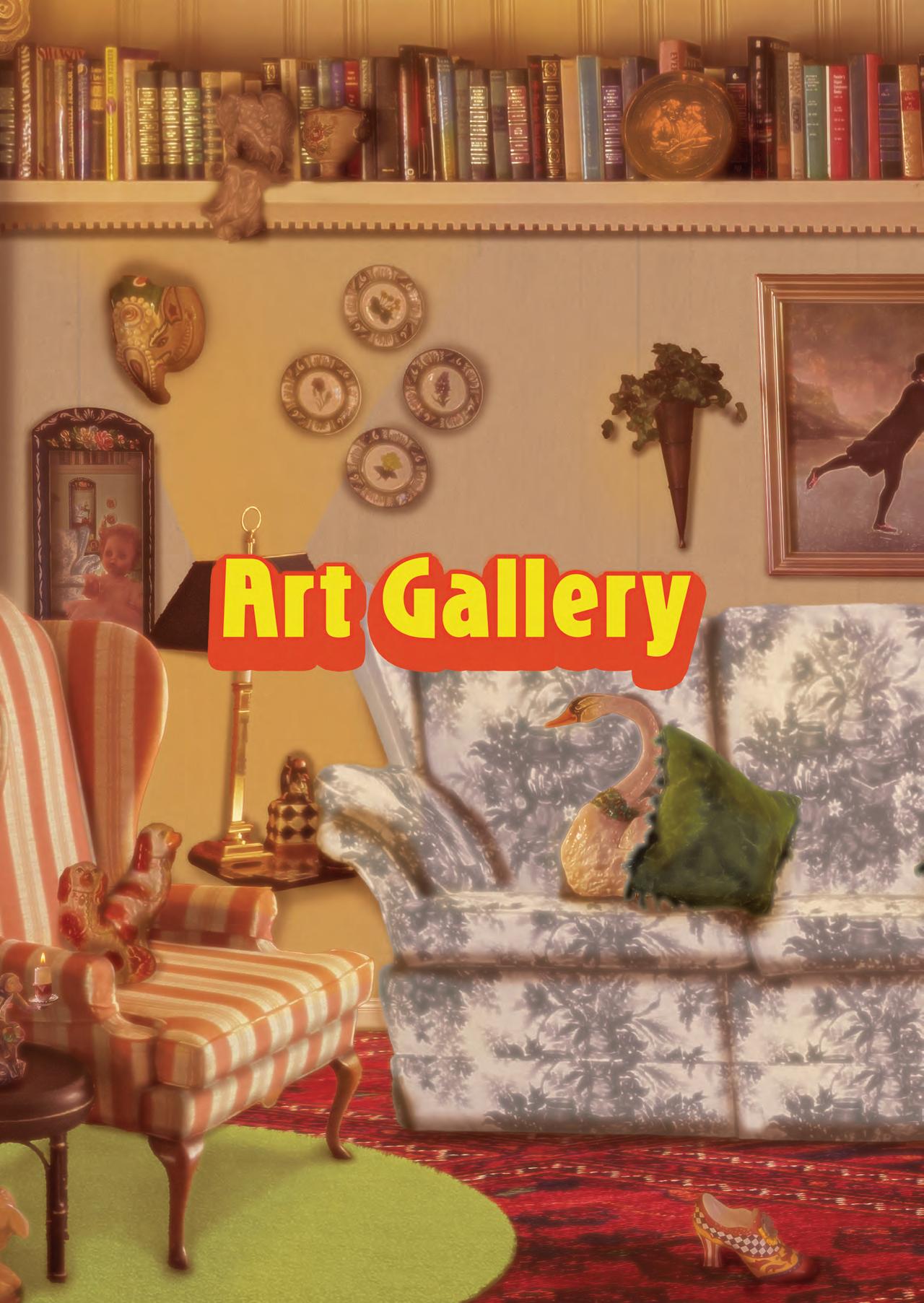


DISCODAZE
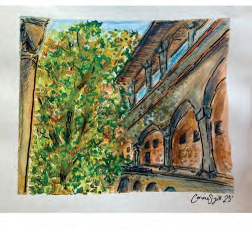
BIBLIOTECADELLEOBLATE
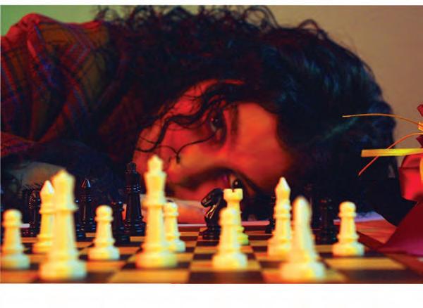
BECOMETHEMAD! MACKENZIE TRANSUE
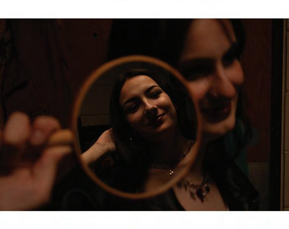
ADMIRATION
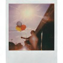
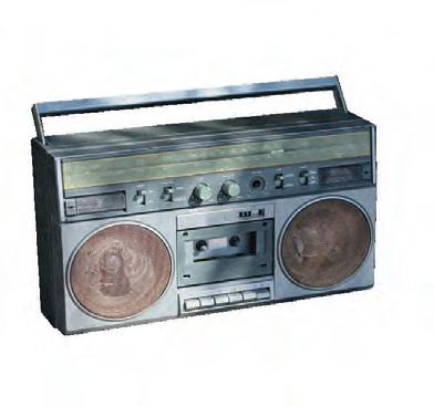
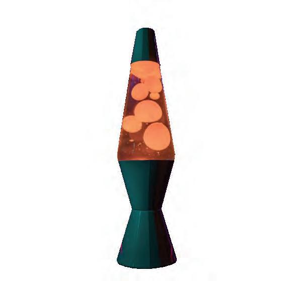


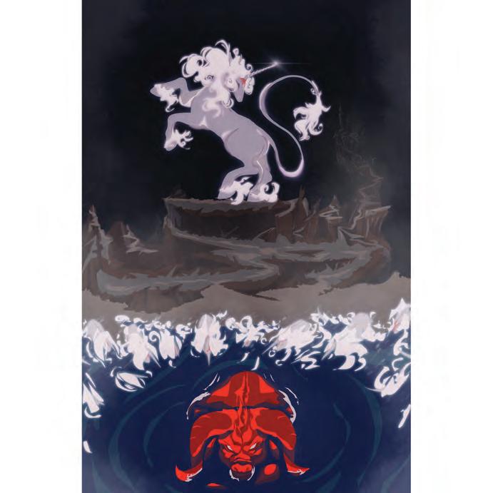
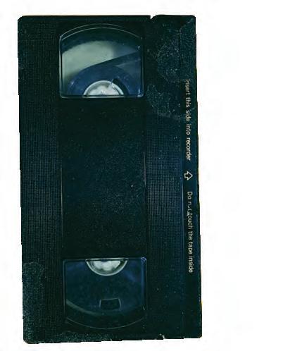
NEVERRUNFROMTHEIMMORTAL EMMA QUINN
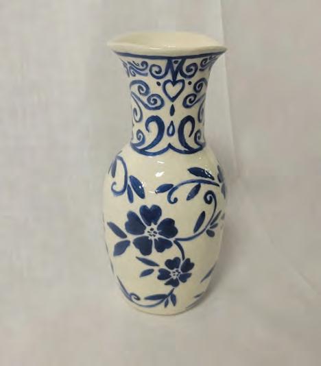
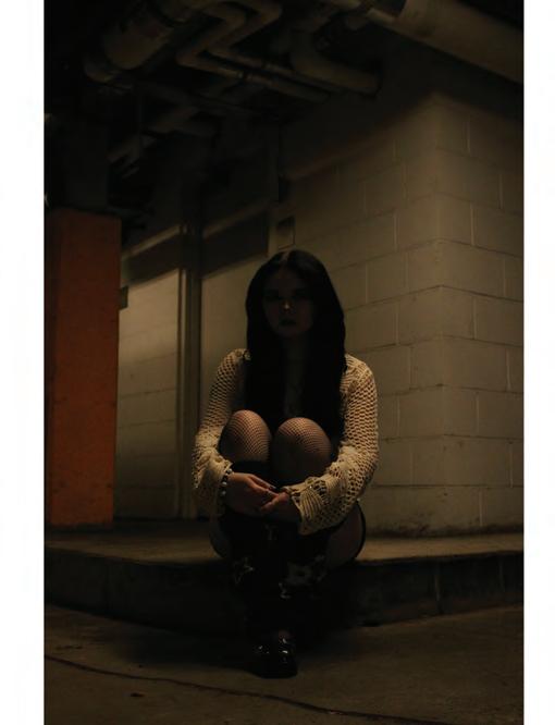
UNTITLED GIANNA CHIARENZA
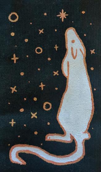
ALLEGORY
ALEX GARRAND
LOVELYVERMIN ATLLAS STONE
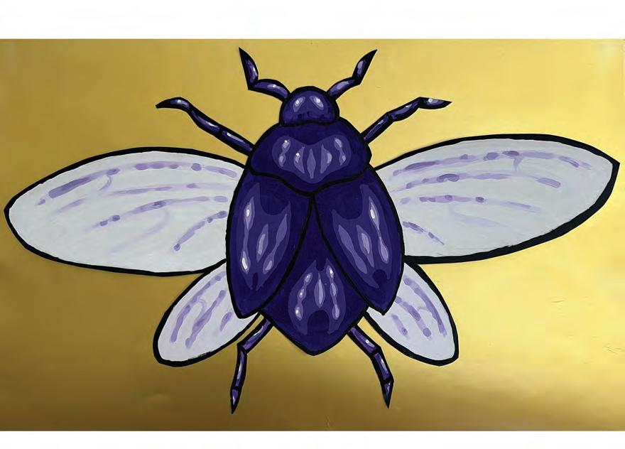
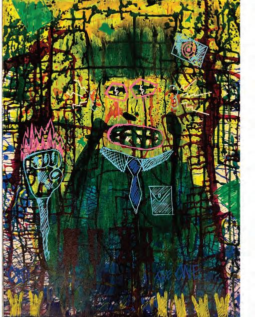
THEMANWHOSOLDTHEWORLD
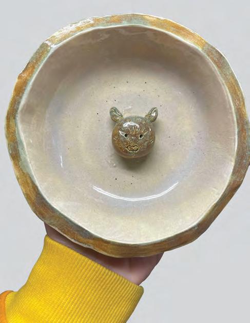
JAY KATZEN
RATBOWL
ROBIN MULLIN
BUG
CHARLIE RECCHIA
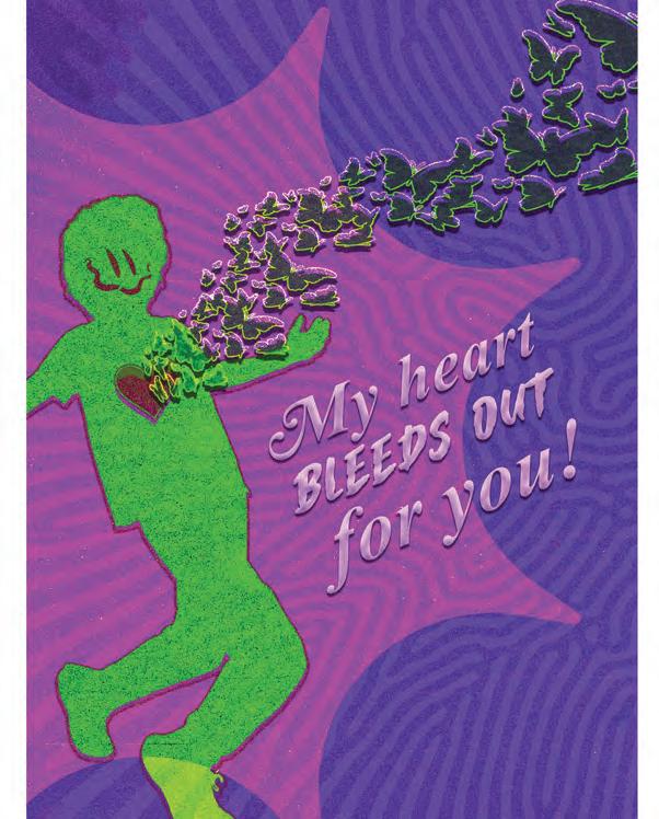
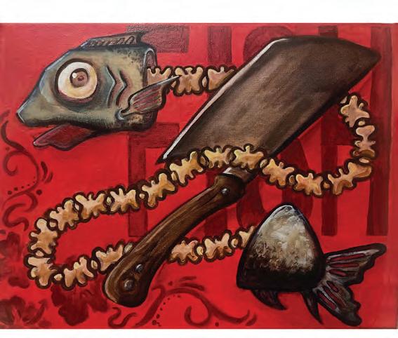
FISHGUTS SYDNEY BRUNDAGE
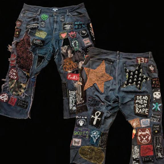

JENNA WILDMAN
FERNANDES
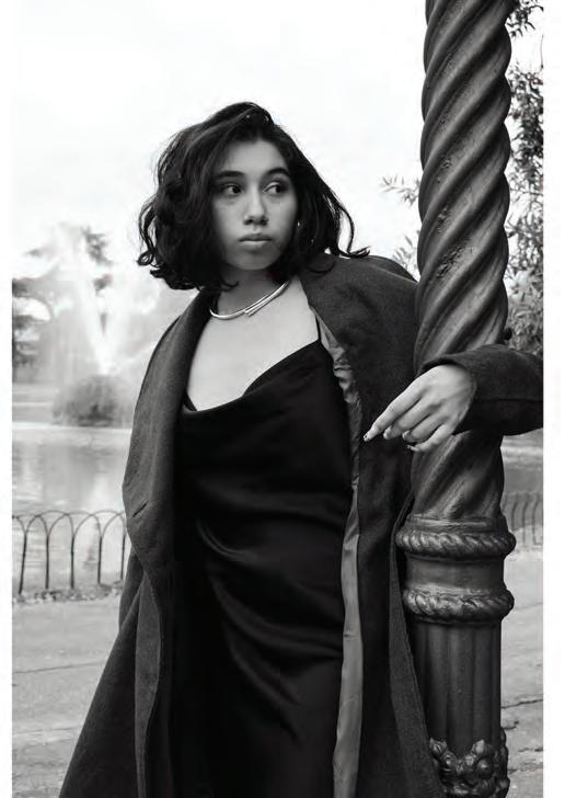
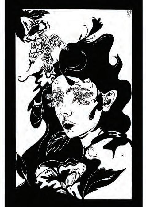
THEFLOWOFENERGY LINDSAY SCALESE
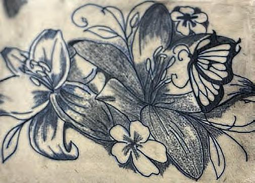
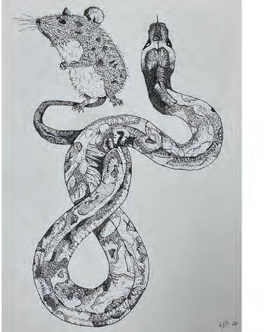

LILIES
MARI FIGUEROA
GENTLEVOID
OLIVIA SOUSA
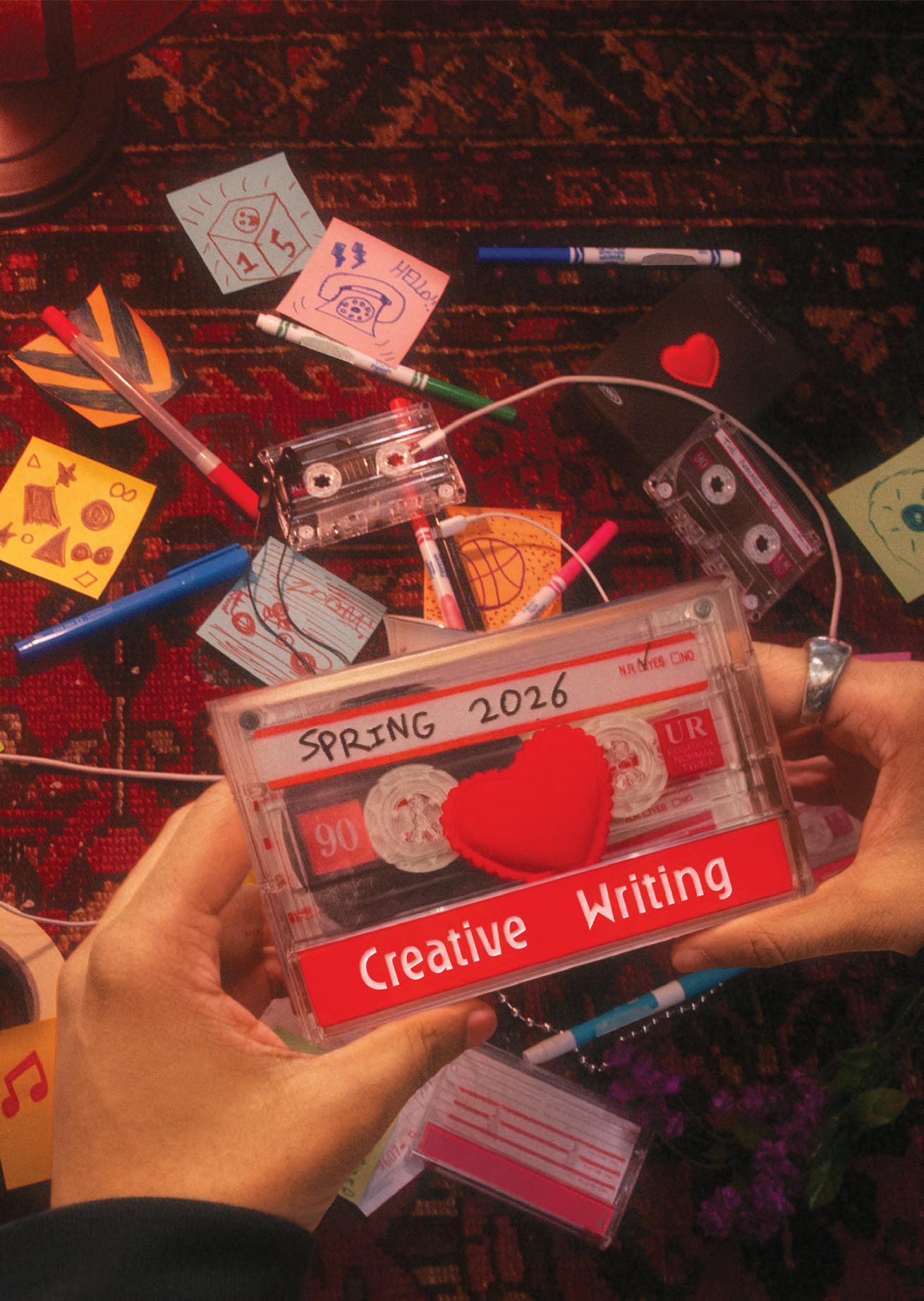
WRITTEN BY MacKenzie Transue
EDITED BY Isabella Schlim
DESIGNED BY MacKenzie Transue
The
Minotaur i was trapped by my father due to my nature it calls to me the sea they say i am to blame it is not my fault i know if i go outside my cage i would be free but it would have to end now i know there was a light i remember it was so bright but then there was pain i just wanted freedom but one thing i know the sun was more beautiful than i remember
It happened so fast. The first time I walked into that yellow building, my “portfolio” was a folder of Twitter headers and Smash Bros fan posters. My laptop fan was louder than my confidence, but I was eager to find someone to help spark my creativity further. It wasn’t easy—a shy freshman with no guidance whatsoever—it felt like I had to follow what the upperclassmen did to put myself out there. Either Graphic Design League or Polished, no exceptions. Thank god I was wrong!
In the corner of the classroom, Perrin was sketching helmet concepts like it was the NFL draft room. Watching his workflow felt different—intentional and locked in.
Bryant came right after, when I started designing flyers for clubs. He never stayed still creatively—always learning, always expanding. We’d hype each other up whenever our work got posted on Instagram, like it was the biggest deal in the world.
They became part of my Big Three, like those anime trios that keep getting stronger every season. Working hard to make an impact and be as consistent as they are. I’m grateful to have them as my closest friends and that they let me grow beside them.
The first thing Ken said in our visual arts class was that he could chug a bottle of Gatorade in under a minute. Definitely wasn’t giving the “serious/intimidating dean” vibes I expected.
That’s what made it easy to ask for help. Whether I needed advising, a second opinion, or a jam session followed by one of his Bigfoot conspiracies. He made the creative process feel at ease.
Yvette carried that same warmth. Her office right next to our classroom felt like an open door—not just physically, but creatively as well.
It’s crazy to me that I almost didn’t join Tarnished Magazine. Back then, I struggled with commitment. I didn’t even know how to use InDesign—I felt behind before I even started.
Erin never treated that as a weakness. She walked me through it, step by step, and didn’t let me shrink my ideas just because I was unsure. We ended up winning an award together; but more than that, she taught me that doubt isn’t disqualifying—it’s just part of becoming.
Huy never filtered himself for the industry. His work stayed illustrative, chaotic, and loud—unapologetically him. Watching that gave me permission. It reminded me that there’s room for designers who don’t fit the clean, minimal mold.
Ever since his Senior Portfolio Day, he’s been a mentor—and a real one. I’ll never forget seeing what was possible.
Anthony and Vlad were the ones who pulled me into zines and printmaking—they showed me that design didn’t have to live on a screen. Ink-stained hands and misaligned folds—the beauty of something imperfect and real.
After my shifts with Caelan, we’d clock out and somehow still have energy to play Guess the Game right after. Movie nights with Gi and Key after finishing assignments—laptops barely closed, snacks on the table, and the dog sitting beside us.
Late nights in Yamawaki with Bryant and Aaliyah, pushing through deadlines until Campo would walk in and give us that look. The “why are you still here?” stare. We’d laugh, pack up slowly, then end up at 7-Eleven at three AM anyway—delirious, exhausted, alive.
And then there were the Kinteris Twins—turning campus into their canvas and decorating spaces like they refused to let the walls stay blank. Watching them step outside their comfort zone made it feel possible for the rest of us too.
Somewhere between the critiques, the caffeine, and the chaos, this stopped being just a department. These weren’t classmates, professors, or coworkers. They became my people: my creative family.
Now it’s finally here. My last semester at Laserland. I went from a timid, young soul searcher to a Laser Creative— someone who designs loud, makes mistakes, and never creates alone. It’s my turn to take this final chapter of Undergrad and go out with a bang! I want to inspire the next generation of Laser Creatives the same way these guys did for me. To whoever’s got the torch next, I hope this story finds you well.
Somewhere in Yamawaki right now, there’s a freshman with a folder full of sketches and fan designs, wondering if that’s enough. It is.
Find your people. Build something loud. Become a Laser Creative.
WRITTEN BY Nick Fernandes
EDITED BY Isabella Schlim
DESIGNED BY Nick Fernandes
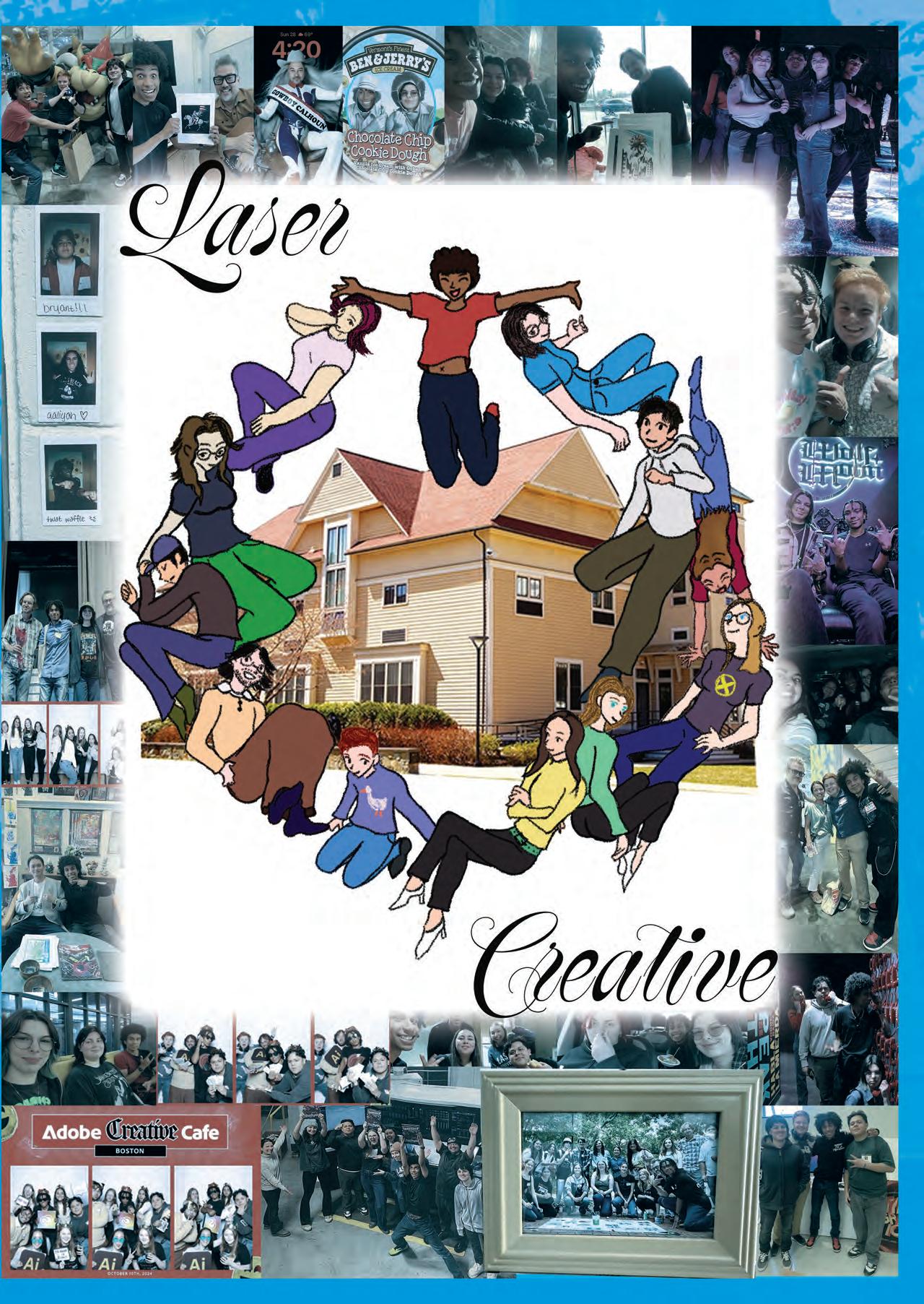
A jack of all trades, master to none. Swallowed by work, never knowing if I’ve won.
When does it become enough?
When my days begin to shrink, or when my brain no longer thinks?
If I continue to stretch myself thin, will they see all the damage from within?
How my gears slowly rusted together, and my wheels and axis are no longer together.
I never thought this many hats would weigh on me.
Then again, every day I see countless branches of obligations, always on a dying tree.
WRITTEN BY
Caroline Morrell
EDITED BY
Isabella Schlim
DESIGNED BY
Isabella Schlim
my form has cradled this family, longer than their bones remember. mother watched,
a smile spreading her features whilst her two young battled swords, bouncing against my springs crowns of laughter trapped against the ceiling.
hours of play echo through the coiled metal of my innards even as mother hushes her littles, voice soft as sheets as the bedtime story is read.
father worries not about the spaces occupied in my sheets, work still on his shirt, snoring into the cushions of the family room, while the wind whistled low. morning comes, much of the same.
mother wakes, eyes opening to the picture of two quiet bodies one more missing at her side. mother walks past father’s resting form curled against the sofa velour. a forehead kiss quick, a silent exchange as mother leads her day; a little on each side guided by her hand, steps trained towards the front door.
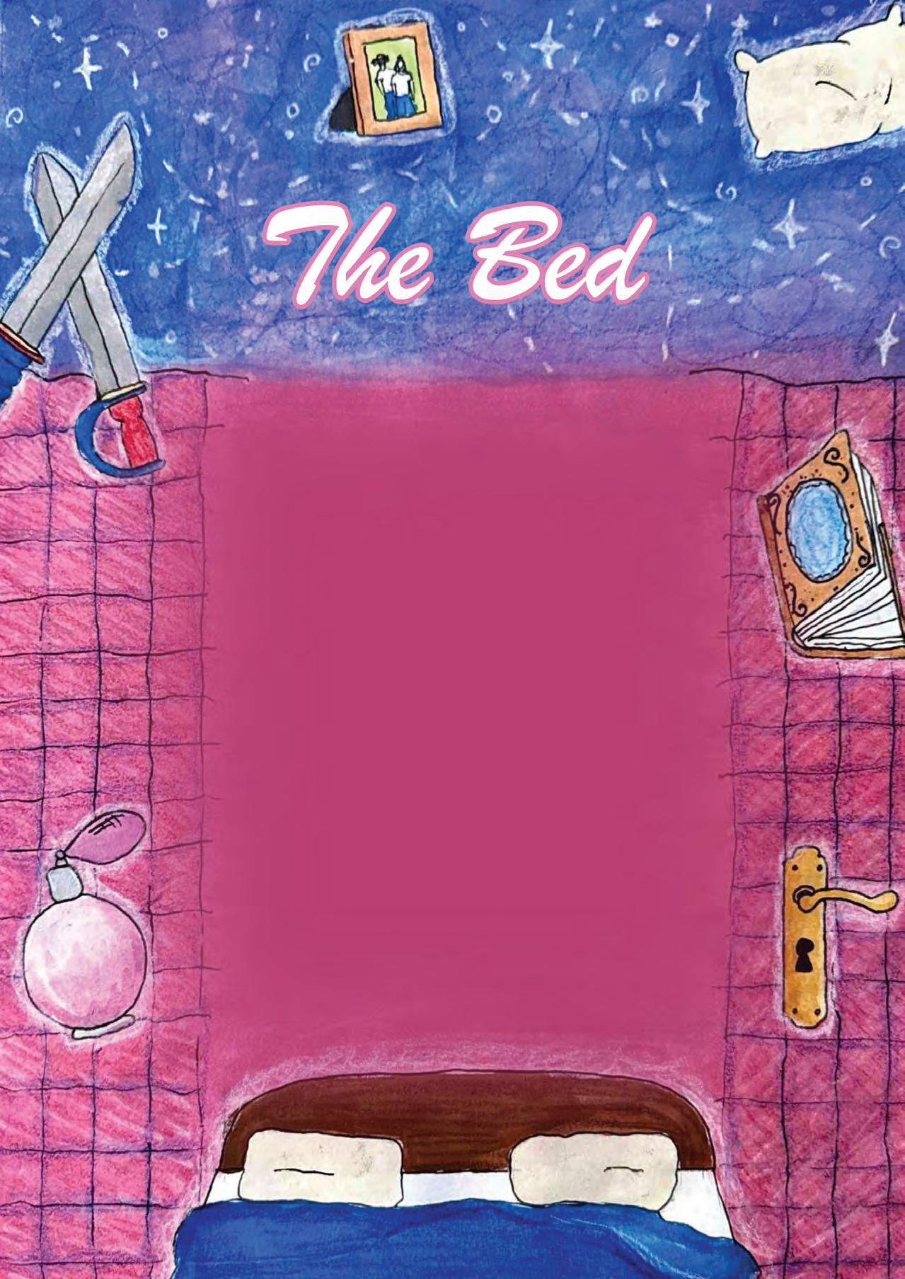
i have absorbed their days, their nights, feverish twilight sweats, cries muffled by quilts, dreams sung into pillows, the quiet of four bodies at peace. a weight i know familiar: mother curling in her sadness, father turning away to silence, distance between bodies stretched wider than sheets. i held what they would not say aloud keeping their warmth together even when it thinned.
father wakes, pardoning his drowsy nature to the appropriate setting of my mattress, where he entered and lay. a click of the lock. and then—another body, perfume settling into my seams. i did not creak, i did not cry out.
i remembered, mother’s voice how the gentle cadence of her stories narrated the room to sleep. the space she had left had been stolen.
WRITTEN BY Ashlee Scola
EDITED BY Isabella Schlim
DESIGNED BY Atllas Stone
you’re ashamed that you’re crying “why am i the way that i am?” i wish i could tell you that it all makes sense
age four, it should’ve been innocent just a silly music concert at school one day the deafening noises of the kids made you scared they were your size but they roared like giant hyenas
age seven, it all came out literally. everyone tried not to walk on the floor covered with your lunch you still think they remember the moment to this day what’s her deal? is she okay?
it occured twice. before chorus, before spanish you wish you weren’t like this
age nine, a simple math game, class vs. teacher it felt unfair considering there was at least fifteen of us you always hated those types of games you excused yourself and went to the cubby room you said you needed to get something but it was actually for protection you were shaking as the class won you exited sheepishly, still shaking the ruckus cheers were for her, but i like to think they were for you the worst is over. you survived it “but why am i still replaying it over and over?”
age ten, a travesty indeed the entire middle school had to be on the soccer team you played defense for ten minutes and rooted for your team to lose for fifty you weren’t selfish for it. you were just protecting yourself the hoping didn’t work, because of course this was the year they won kids jumping up and down, roaring, a victory lap it was all a blur, so much was happening at once you had a doctor’s appointment the day the team was rewarded by the school and you were relieved to miss it
age twenty-two, you still hate the noise you may still cry sometimes but you never upchuck your lunch, but you know you can excuse yourself, but you never have to join a soccer team again and that’s enough you’ll never forget the moments that should’ve been fun but the moments that really are make up for it all
WRITTEN
BY
Jessica Shore
EDITED
BY
Isabella Schlim
DESIGNED BY Lindsay Scalese

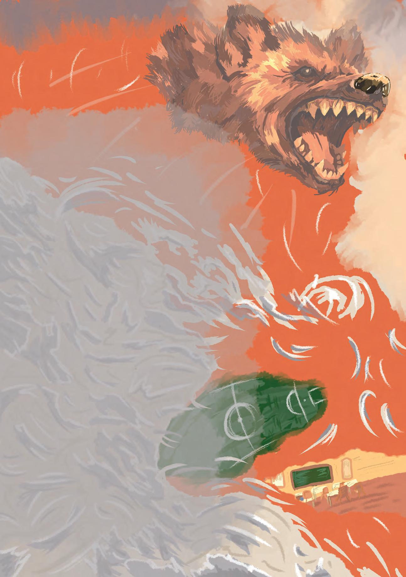
SPONSORS
The Tarnished team would like to thank our sponsors that made the production of this issue possible. Their generosity and collaboration makes it so our readers can hold this volume in their hands. We deeply appreciate their partnerships and look forward to many more successful collaborations.
MONADNOCK PAPER MILLS. INC.
Crafting Extraordinary Solutions for a Sustainable Future
mpm.com
Bennington, NH (603) 588 3311
Established in 1819, Monadnock Paper Mills, Inc. is the oldest continuously operating paper mill in the United States. Monadnock prides itself on environmental stewardship and sustainable manufacturing. From premium uncoated and coated papers to specialty packaging and technical products, Monadnock delivers exceptional quality and performance. Their commitment to sustainability, coupled with a collaborative approach to product development, makes Monadnock a trusted partner for designers, printers, and brands seeking environmentally responsible paper solutions.
SUPERIOR PACKAGING & FINISHING
superirorpackagingandfinishing.com Braintree, MA (781) 303 0022
Superior Packaging & Finishing is a leader in the digital print, trade finishing, and bindery industries through consistent investments in the latest technologies, redefining the way organizations view printed materials. Superior’s experience across the printing, binding, technology, packaging, and finishing ensures unrivaled service and expertise. Superior is dedicated to encouraging and supporting emerging designers entering the publication design industry.
SUSTAINABILITY
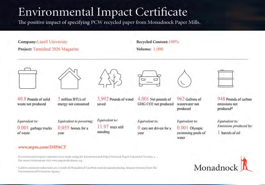
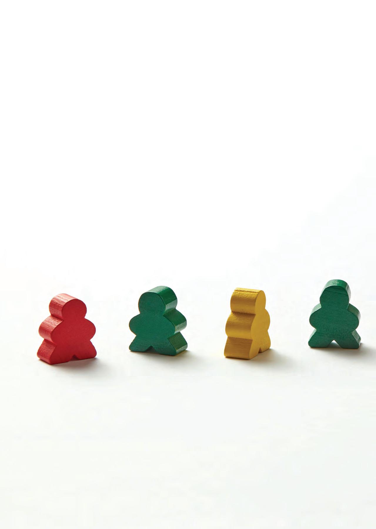
PRINTER
Superior Packaging & Finishing
Braintree, MA
PAPER
Interior: Monadnock
Astrolite PC 100® Smooth, 100 lb. Text
Cover: Monadnock Astrolite
PC 100® Velvet, 100 lb.
Cover
TYPEFACES
Header/Subheader: Roslyn MN by Ryan Martinson Yellow Design Studio
Body: Stevie Sans Book by Mecanorma Collection
COLOPHON
ABOUT TARNISHED A NOTE FROM THE FACULTY ADVISOR
Tarnished Magazine started as an idea in the vibrant mind of Professor Stephen Fischer (now retired) in 2012. Known as PF to his students, he sought to create a counterpoint to Polished Magazine, covering visual and literary arts, as well as arts culture. He wanted the magazine to be a place celebrating unexpected beauty—or, rather, beauty found in unexpected places. Over the years, the scope may have widened, but the spirit of PF’s early charge lives on.
Perhaps it’s ironic that the magazine itself can be expected to deliver beauty to its readers, including the jurors of the Columbia Scholastic Press’ annual student publication contest. They have awarded the publication its Gold Crown, as well as Gold, Silver, Bronze, and Circle awards, several years in a row, which is a credit to both its originator and to the many talented students who have carried forth the mission with such award-winning quality and style.
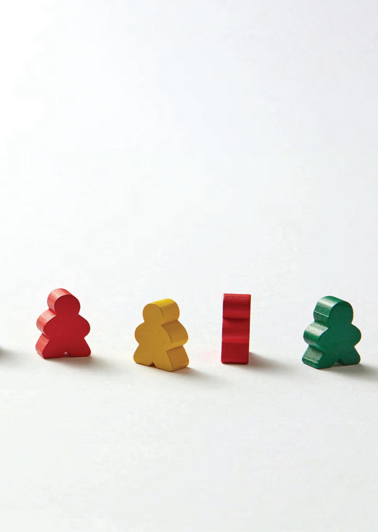
There is something deeply human about nostalgia. The way a particular color, a flicker of light through an old screen, or the faded corner of a photograph can pull you somewhere familiar and strange. This year, the students of Tarnished have leaned into that feeling with real intention, crafting an issue that invites you to look closer, and then look again.
Uncanny Nostalgia lives in the space between comfort and unease: the warm, muted palette of a 70s living room, the satisfying grid of a wallpaper pattern, a Polaroid that almost looks right. Something is off. The students have captured that feeling beautifully, and in doing so, remind us that the most compelling art can quietly unsettle you and draw you in.
This magazine is entirely student-led, from concept to execution. Every design choice, every curated piece, every word on the page is crafted by Lasell University students. My deepest gratitude goes to this year’s executive board, whose hard work makes all of this possible. To Lindsay Scalese, who stepped into the role of Art Director for the first time this year and rose to every challenge with creativity and confidence; Atllas Stone, our Art Editor, whose sharp eye ensures the quality of every page; Isabella Schlim, our Managing Editor, whose careful eye holds the whole publication together; and Chloe Galipeau, our Social Media Manager, who brings the spirit of Tarnished to audiences beyond the page. Thank you all.
Thank you as well to Professor Emeritus Stephen Fischer, whose vision gave this magazine its foundation, and to our printing partner, Superior Packaging and Finishing, and paper sponsor, Monadnock Paper, for helping bring this work into the physical world on paper that is locally produced and made from 100% post-consumer recycled fiber.
To the students: you made this, and it is strange, beautiful, and impossible to look away from. I couldn’t be prouder.
Look closely. There’s more than meets the eye.
MISSION STATEMENT
TARNISHED Magazine is deticated to finding beauty in unexpected places. It strives to create a creative community by offering opprotunities for learning in the visual and literary arts. while providing a professional venue for stdent work.
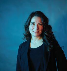
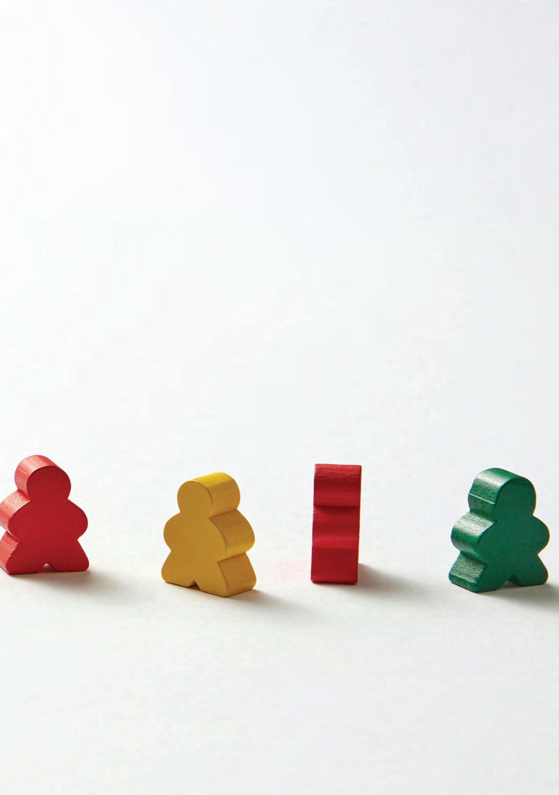
YVETTE GATTINERI Faculty Advisor