CWKII - FASHION RETAIL


COURSE NAME: FASHION
MARKETING AND COMMUNICATION GROUP: B
TEAM NAME: PUZZLE INNOVATIONS
TEAM PARTICIPANTS:
SUBMISSION DATE: 28th of Feb 2025
Anna Rumjanceva, Aleksandra Ivanova Mihaylova, Penelope Pickrell Capco





COURSE NAME: FASHION
MARKETING AND COMMUNICATION GROUP: B
TEAM NAME: PUZZLE INNOVATIONS
TEAM PARTICIPANTS:
SUBMISSION DATE: 28th of Feb 2025
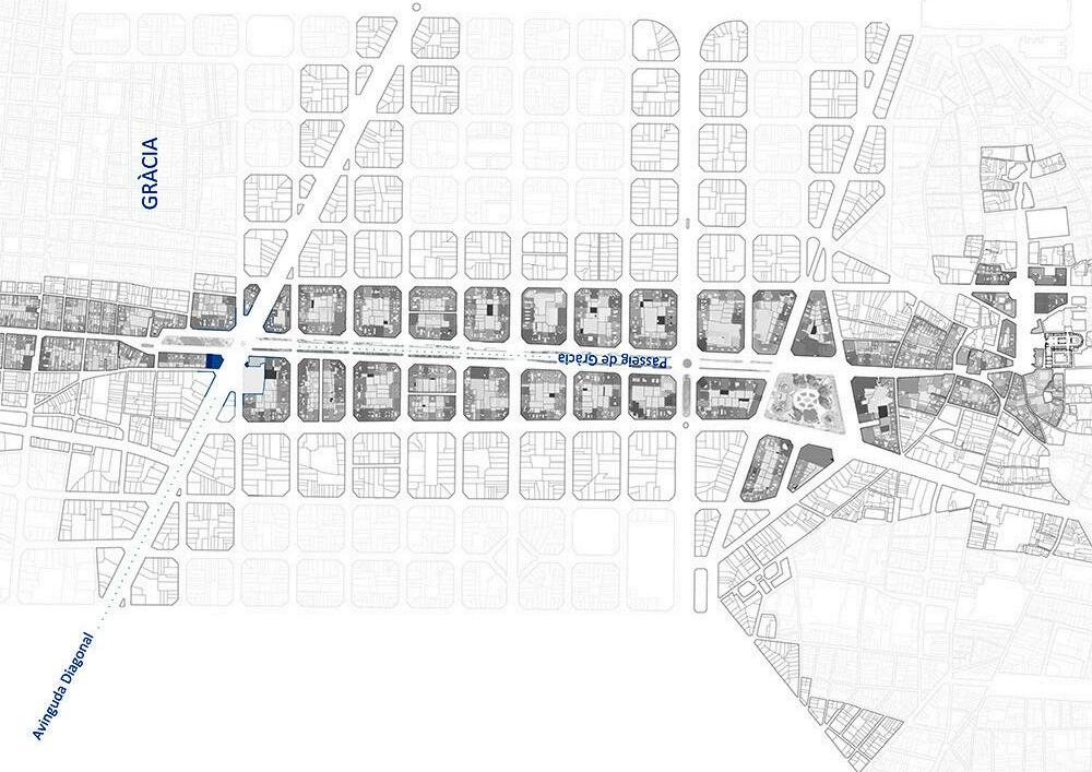
PASSIEG DE GRACIA, 26 BARCELONA https://wwwarketcom
ORDER#A3GBT2 Tue 25/02/2025 11:36:45 AM
INTRODUCTION SWOT BREAKDOWN REQUIREMENTS THE CHALLENGE FEEDBACK ANALYSIS GOALS & OBJECTIVES 1
CURRENT STORE PROPOSAL TARGET AUDIENCE
LAYOUT MODIFICATION POSITION STRATEGIES SPATIAL PLANNING
MATERIAL FURNITURE SELECTION VISUAL MERCHANDISING
COMMUNICATION LIGHTING
TOOLS
SHOPPING TOOLS IN STORE SCREENS OMNI-CHANNEL STRATEGIES
TOTAL (EUR):

FOOD PEOPLE BALANCE
KNOWLEDGE
COMMUNITY
ENVIRONMENT
The grid is an essential element of ARKET’s visual identity. It represents the notion of the archive and is used to organise and display information ranging from the names of plants to fabric weights and different types of materials used in our collections. These nine squares symbolise the separate parts that together form our world, and they are also the areas where we strive to make a difference.

The name "ARKET" is derived from the Swedish word for "sheet of paper," symbolizing a blank slate and reflecting the brand's commitment to simplicity and functional design
Creative Department
STORE DESIGNER -
Anna Rumjanceva & Penelope Pickrell
VISUAL MERCHANDISING MANAGE
Aleksandra Ivanova Mihaylova
OMNICHANNEL INTEGRATION SPECIA
Anna Rumjanceva
MARKETING STRATEGISTPenelope Pi


This document presents a possible solution for implementing changes to the physical ARKET store at Passeig de Gràcia 26, Barcelona. All ideas presented below were put forward based on the study of the work brief previously proposed by the ARKET group, which covered omnichannel distribution, implementation of new technologies, and layout changes that correspond to the brand's identity and storytelling.

Based on the SWOT analysis, existing shortcomings, and recommendations from the group, potential objects for research and development were put forward, and subsequently, conclusions were presented.
The proposal is based on qualitative and quantitative analysis of the data, and it also corresponds to the budget proposed by the company; hence, it is realistic and formal.
ARKET clearly displays discount information in store and online which makes it easy for customers to spot sales
The store’s simple layout makes it easy to navigate and helps customers find categories like men’s, women’s, and children’s sections without confusion
The store does a good job separating different product categories and makes it easy to spot and locate what customers are looking for
ARKET’s website helps customers find items available in real stores, which makes it convenient, especially for in-stock verification
The brand’s Instagram is aligned with its aesthetic and promotes its product in a user friendly way
There is no digital interaction for ecommerce within the store such as screens or QR codes for product details This llimits digital integration in the in-store shopping experience
New collections are not consistently presented in-store They are often placed in less visible areas like behind discount items which may confuse customers and make it harder to find the newest collections.
The website’s focus on sales makes it difficult to focus on new collections, this could potentially confuse customers who are looking for new drops
Even though store staff will assist if asked, they do not proactively engage with customers, this may result in a less attentive shopping experience
Pay less attention to discounted products to create exclusivity and privilege for the brand
Maintain a clear division of categories in the store (men's, women's, children's)
Create storytelling with an easily navigable store layout
Strengthen the use of technology and e-commerce in the store
Increase efforts to present new collections in the store and on the website
Improve customer experience through staff training
Introducing digital screens and/or QR codes in store to link to online items could create a seamless shopping experience and make product information more accessible
Encouraging staff to engage with customers in a more proactive manner could enhance the shopping experience, improving customer satisfaction and potentially increasing sales
The brand could improve visibility of new collections both in-store and on the website to better highlight these items, especially without being overshadowed by products on sale
Simplifying the website layout to prioritize new releases and collections instead of sale items could improve the shopping experience and better match in-store expectations
Both in-store and online focus on sales and discounts could shift customer expectations and possibly ruining the brand’s perceived value for full-price items
The placement of new collections behind discount items or in less obvious areas may lead to missed sales and loss of customer interest
If Arket’s in-store staff continue to be passive and rely on customers to approach them for help, it could result in a disengaged shopping experience compared to competitors with more attentive service.
Increase the presence of technology in the store
New collections are much more important than collections on sale
Reduce the number of clothes presented at discounts
Place new collections closer to the entrance or hot spots, where they will receive more attention
The work brief presented by the ARKET group describes the challenges and weaknesses the brand faces in its physical and digital spaces. Here are presented the main obstacles and possible solution outlines.
Minimaldigital interactions Toomuchfocusonsales collections Noin-storebranding, hencenostorytelling

Improve omnichannel experience and apply new technologies
Improve in-store and digital storytelling
Increase customer engagement
Incorporate care space
Redesign layout and interior to align with the brand's roots




are only about poor customer service, as well as the fact that people prefer to shop online rather than in a physical store. We did not find any good reviews about the store design itself, since people mostly say that it is clean and neat, and the store itself did not cause a "wow" effect from customers. The average score for all reviews is 4.1 from 5.0.
The following proposal aims to refine ARKET's stores to sell and create memorable experiences that keep customers returning.

Improve the in-store shopping experience while applying clear branding and Scandinavian interior design principles. Collaborate with a Barcelona based coffee shop
Use more omnichannel solutions and new technologies to enlarge customer opportunities.
Increase customer interaction with the brand and their experience in the physical store by 35% in 7 months

Due to the favourable atmosphere, the duration of visits to the store has increased by 30% in 4 months
Augment customer loyalty and retention rates by 25% in 9 months.
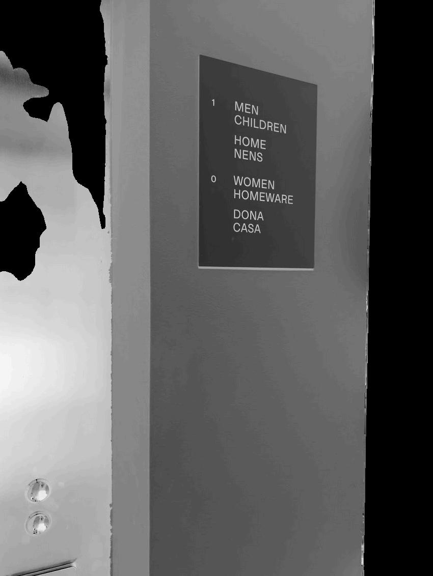
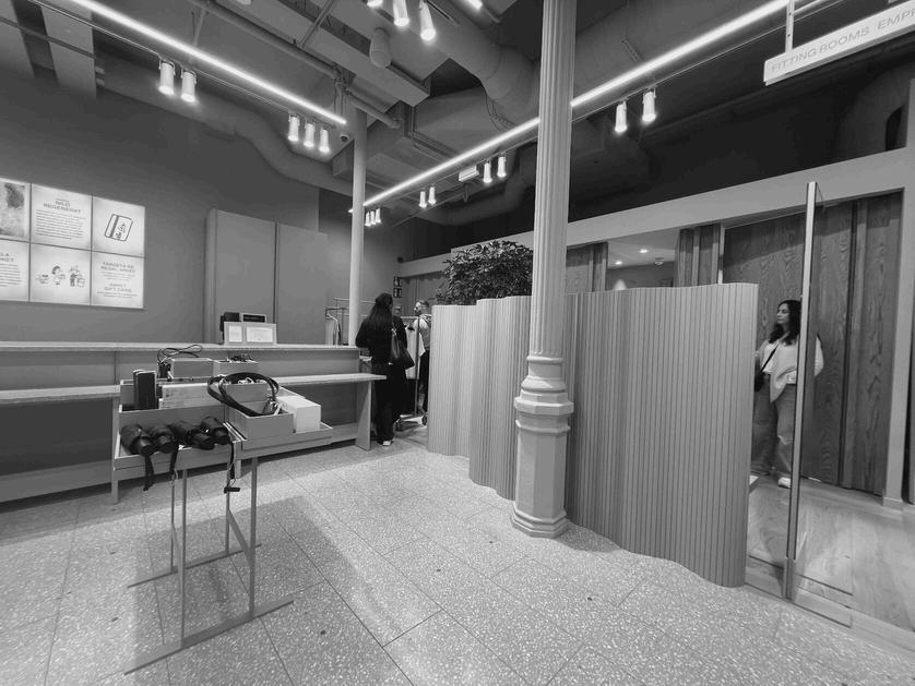

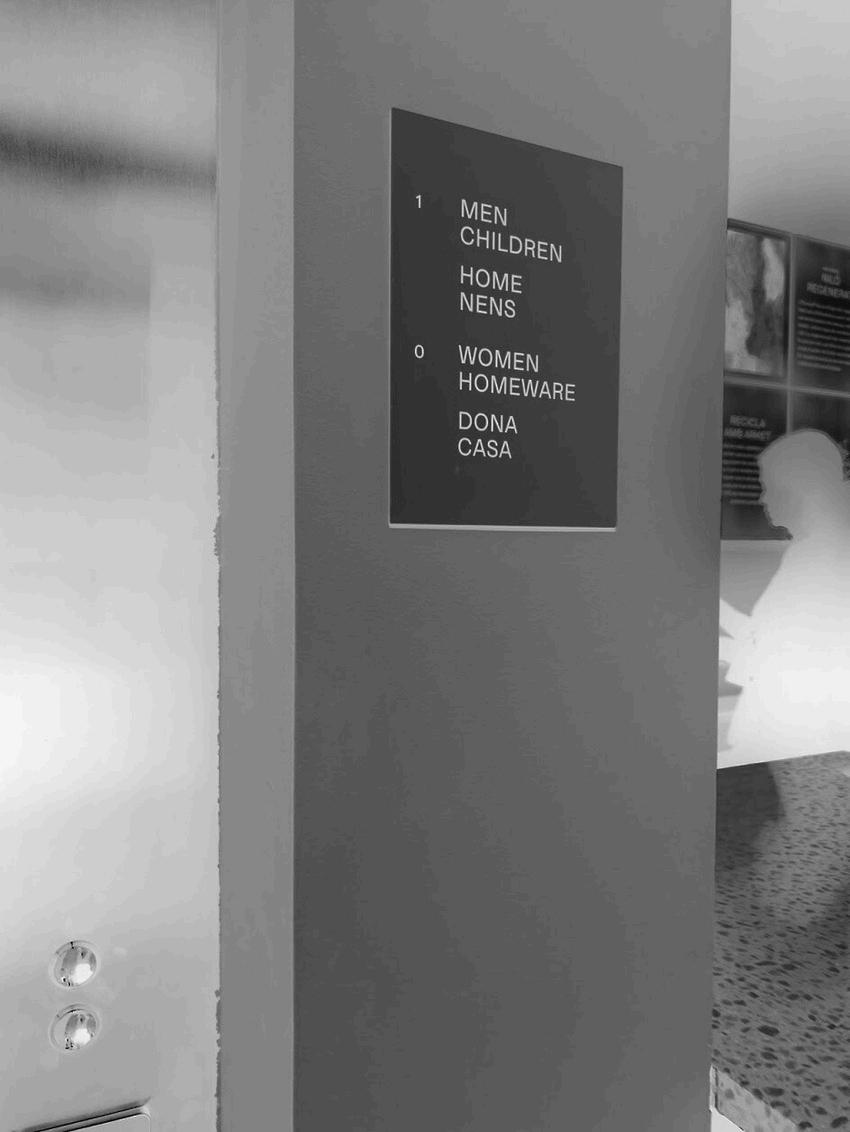
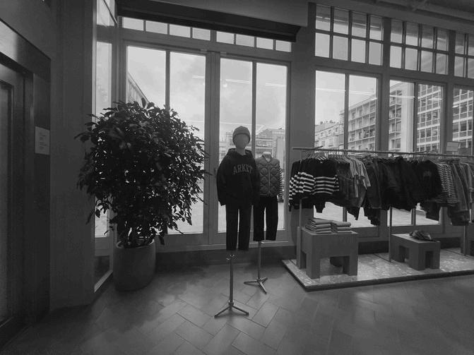
Customerflowis unnatural and people cannot movefreely
Space usageis not maximized
Cluttered spacing,hardto move around


The visual attractiveness of the store needs improvement
There is no straight branding or link to the brand's heritage and identity
No window displays

Product exposure is low
No clear understanding of the brand's values and identity

Customer engagement with the brand is low
Overall customer satisfaction with shopping is low
No digital touchpoints in the store

Recommended Serving Size
Servings per box
Amount Per Serving
Estimated Age Range
Estimated Total Population in Area
Estimated Annual Income
Estimated Number of Offices
Estimated Number of Cafes
The figures presented are approximate estimations derived from our team’s strategic research They serve to provide a clear representation of ARKET’s target audience based on its location.
FOOD PEOPLE BALANCE
KNOWLEDGE COMMUNITY ENVIRONMENT
DESIGN

Store size - 920m2

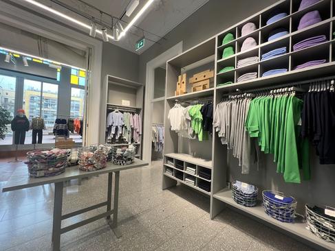
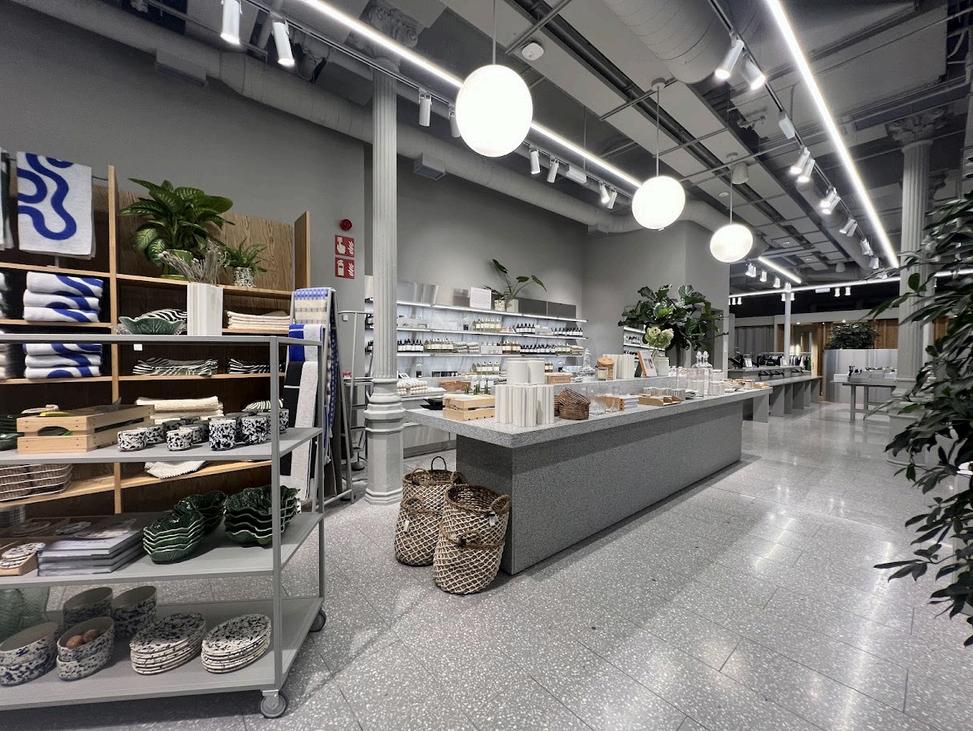

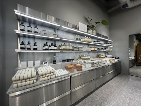
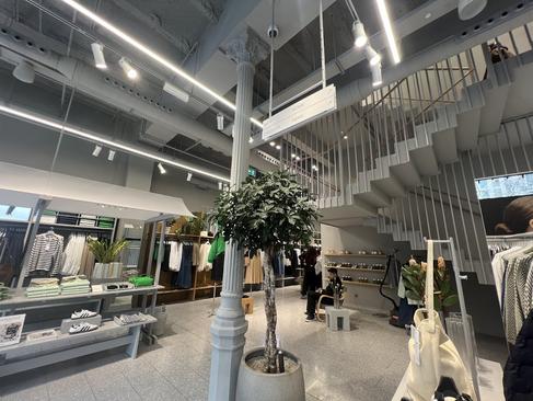

URGENT
Create a natural flow of people moving freely in the store, even during peak hours.
Use the entire store space (two floors) optimally, especially the terrace
Discharge the space, make the store more spacious and free
Remove unnecessary interior details that clutter the path or are not valuable
Optimally use both entrances to the store
Tear down walls and doors that narrow the space and confuse the buyer
Place discount collections at the end of the store, make more focus on new collections
DONE

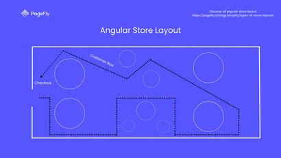
+ create unique and creative experience
+ allows to maximize available space
---can create confusion
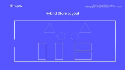
+ allows to combine various elements
+ creative product display
+ ideal for large product range
---careful planning
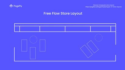
+ visually appealing product display
+ increases likelyhood of purchases
+ creates illusion of larger space
---no specific structure
---difficult to control traffic flow fjf(espetially focal points or hot-spot ---------areas)
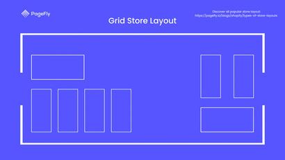
+ easily navigable
+ aisle display format
---can be boring
---may not work for spetialized products
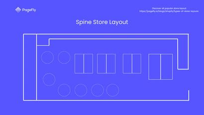
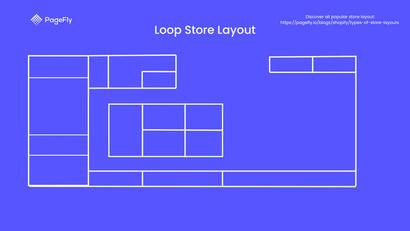
+ easily navigable
+ allows effective product placement
---requires large spaces
---central area can become crowded and
+ encourages to make impulsive -----------purchases
+ helps to organize store structure
---concentrates on specific pathways, -------that can lead to congestion
---restricted movement
---complicated product separation and ----placement
To optimize the store layout, our team came to the decision that the grid store layout would be the most effective for ARKET Since it will achieve the set goals and will fix the current situation in the store. In order to avoid difficulties that may arise (boring arrangement), this layout will be combined with other layout types (hybrid and spine) and diluted with some details (described further in the document)
BRAND: ARKET
ADRESS: PASSEIG DE GRÀCIA 26, BARCELONA
DATE: 28.02.2025

ARCHITECT: ANNA RUMJANCEVA
DESIGNER: PENELOPE PICKRELL CAPCO
VISUAL MERCHANDIZER: ALEKSANDRA IVANOVA MIHAYLOVA
COLOR PALETTE
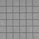

MAIN MATERIALS

This proposal for changing the store layout includes the following elements:
Changing the location of the storage and staff areas. This change was proposed in order to relieve the situation and expand the space since previously, the storage was located in the middle of the store, which took up a lot of space from the store and narrowed the passageway, thereby making the store visually smaller Since the main storage (in the middle of the store) was reduced, it was proposed to place additional storage space at the end of the store on the ground floor behind the changing rooms, so that it would not attract much attention from customers and would not be so noticeable.
Mannequins and shelves for window display near the main entrance, on which the new collection can be located so that the customer from the street has a view of the assortment in the store (previously there was nothing there).
On both floors, sofas and coffee tables were placed to create more seating space in the store
Decorative columns were removed, as well as some decorative walls that constrained movement took up a lot of space, and created a misleading plan for the buyer
Standing hangers were added to diversify the picture in the store and all the clothes on display did not look the same.
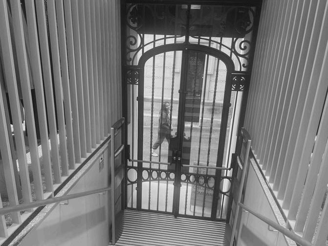
The second entrance to the store will now be on the same level as the store space (previously it was lower and went deep) and will be connected to the external street staircase.
On the terrace there will be a cafe with a sitting area and tables, as well as access to the cafe through the street stairs to order coffee to go or for those who want to sit on the terrace on the second floor via the elevator
The panoramic window was replaced with a sliding door to access the cafe from the store side.
The checkout area was also changed and self-service checkouts were added, where customers can pay themselves
Also, near the second entrance, there were lockers for receiving online parcels They were located there so that the buyer could choose his parcel without going through the entire store, and there were also stands with brand collections nearby so that a person could probably make an impulsive purchase.
BRAND: ARKET
ADRESS: PASSEIG DE GRÀCIA 26, BARCELONA
DATE: 28022025
ARCHITECT: ANNA RUMJANCEVA
DESIGNER:
PENELOPE PICKRELL CAPCO
VISUAL
MERCHANDIZER: ALEKSANDRA IVANOVA MIHAYLOVA
NEW LAYOUT PECULIARITIES:
Easy navigable
Easy to move around
More touchpoints
Slow and fast zones are clearly separated
Collections are wisely spread
Open pathways make the store visually bigger
Visual barriers contribute to impulsive purchases
SIGNING
BRAND: ARKET
ADRESS:
PASSEIG DE GRÀCIA 26, BARCELONA
DATE: 28022025
ARCHITECT: ANNA RUMJANCEVA

DESIGNER:
PENELOPE PICKRELL CAPCO
VISUAL
MERCHANDIZER: ALEKSANDRA
IVANOVA MIHAYLOVA

NEW LAYOUT PECULIARITIES:
Easy navigable
Easy to move around
More touchpoints
Slow and fast zones are clearly separated
Collections are wisely spread
Open pathways make the store visually bigger
Visual barriers contribute to impulsive purchases
SIGNING
DATE:
CUSTOMER
BRAND: ARKET
ADRESS: PASSEIG DE GRÀCIA 26, BARCELONA
DATE: 28022025
ARCHITECT: ANNA RUMJANCEVA
DESIGNER: PENELOPE PICKRELL CAPCO
VISUAL MERCHANDIZER: ALEKSANDRA IVANOVA MIHAYLOVA
SIGNING

BRAND: ARKET
ADRESS: PASSEIG DE GRÀCIA 26, BARCELONA
DATE: 28022025
ARCHITECT: ANNA RUMJANCEVA
DESIGNER: PENELOPE PICKRELL CAPCO
VISUAL MERCHANDIZER: ALEKSANDRA
IVANOVA MIHAYLOVA