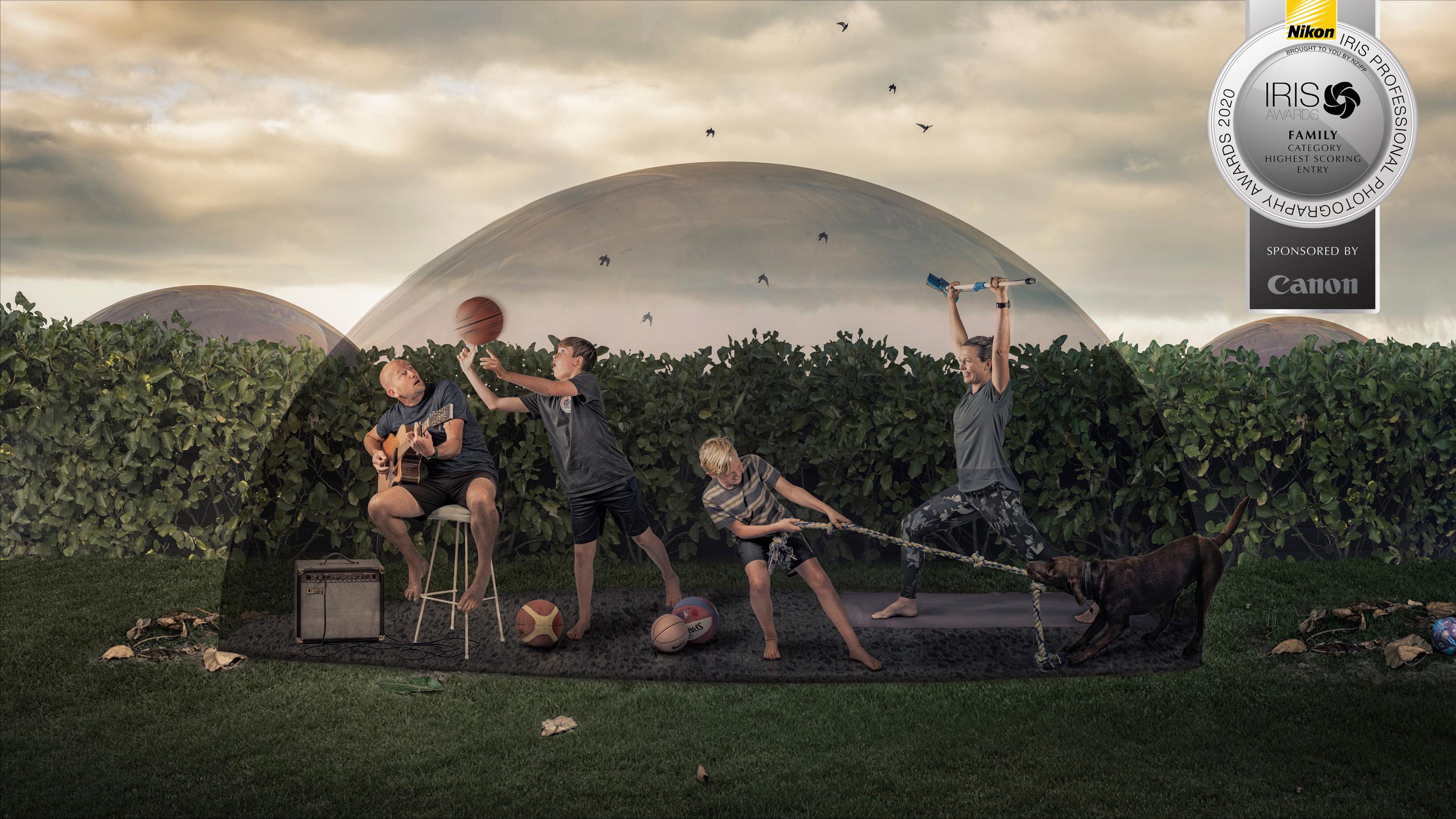
23 minute read
Special Feature: Compositing


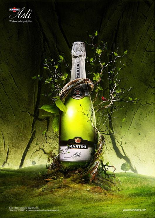
This edition’s special feature is about compositing which is the creation of an image by bringing together elements from several sources.
We are very pleased that US Educator Rickard Rodin allowed us to reproduce his article on the “Seven Essentials of Visual Magic”. PSNZ Member Tracey Perrin shows how she creates magical portraits for her young clients, and CameraTalk editor Paul Whitham LPSNZ shows how to make a simple composite. We also look at some terminology and also what is allowed under PSNZ Salon rules.
Finally, we realise that all of the articles reference Adobe Photoshop, and that there are alternatives to it. This is in no way an endorsement of any software product, but rather the fact that it is the software used by the authors of the articles.
Terminology
The following descriptions are intended to help you to understand the various terms that you will see in articles about compositing.
Clear-Cut: The term applied to both an object and the process by which it has been removed from its background, making it easier for it to be placed in another image.
Compositing: The overall term used when an image is created by bringing together several elements that may or may not have been shot at the same time.
Destructive editing: This is a term that is used when you are directly editing the pixels that make up the individual elements of an image. In compositing the most obvious example of this is using the eraser tool to separate an object from its background. While destructive editing is quite simple, it has the major drawback that once the file has been changed you cannot easily go back and amend it.
Masking: This is the term used to describe the process by which you either hide or reveal the images under the layer that you are working upon. In programs like Photoshop the layer mask is fully editable, which makes it easier to correct mistakes or to come back later and make changes.
Non-destructive editing: This is the opposite of destructive editing and mainly involves techniques where the adjustments do not involve permanently affecting the pixels that make up the image elements. With tools like Photoshop this will generally involve the use of layers with the editing carried out in such a way that the underlying layer is not affected. It has the advantage that you can go back at a later stage and re-edit the image.
Smart Object: Smart Objects are Photoshop layers that contain image data from raster or vector images, such as Photoshop or Illustrator files. Smart Objects preserve an image’s source content with all its original characteristics, enabling you to perform non-destructive editing to the layer.
Stacking: The action of loading multiple photographic images into separate layers within the software used to create the digital image.
Stock Art/Image: Images that have been photographed by other people and then made available online either for sale or free download. These can range from entire photos to individual elements that may have already been removed from their backgrounds.
By Rikard Rodin


PUTTING VARIOUS PHOTOS together to create a new, unique image is an essential skill of any designer. Photo compositing can range from the simple (changing out a sky or background) to the complex (creating an entirely new image from a collection of different photos). The reality is that you will be hard-pressed to find a design project that doesn’t require some form of photo compositing. Even if you aren’t creating a fantasy scene, you may be required to add a product to a background or combine two elements into a single image. However large or small your photo compositing project, there are certain basic principles that will help get you the best results.
It should be mentioned here that the best result of any photo compositing project is the absolute transparency of your work. Every person who sees the image should believe that the image was never more than a single scene. No one is amazed at some fake wings pasted onto a
Rikard is the creator of ZevenDesign and founding co-partner of Tethos Creative. He’s been in the design industry for the last 20 years, having amassed more than 25 design awards. He started in a darkroom and has personally worked in virtually every aspect of graphic design — typography, typesetting, printing, foiling, embossing, die making, illustration, you name it. His specialty is branding and cover design. He’s a father of twin daughters, loves photography and movies.
He runs professional training in Compositing through Nucly.com
photo of a girl. But a photo of a girl with wings… well, that’s a different story. Here are seven “golden rules” for photo compositing, gleaned from 15 years of experience and working with all manner of artists and designers in the field.
1. Match up your elements. Perspective, lighting, resolution
This is the first step and one of the most important. If your background is a photo taken at night, you’re going to have a much better time with a foreground element also photographed at night. If your foreground element has high contrast light (noon on a clear day), then your background shouldn’t be lit with ambient light. It’s also very important that perspective matches between images. Having different perspectives in an image is a tell-tale sign of Photoshop manipulation. This extends to scale, texture, resolution and film grain. While some of these elements can be made consistent through the photo compositing process, the better you can match up elements to begin with, the better off you will be. For this very reason you will find that the top photo composite artists are photographers—by taking your own photographs you can match lighting and perspective between all your elements.


As a recap, these are the things to look for when gathering elements to make your composition:
Lighting quality and contrast (sharp light, spot light, ambient light, back light, etc.)
Lighting direction/shadow direction (light coming from above, from the left, front, etc.)
Perspective—unless your element is a sphere, it will have a visual perspective. This needs to match your source image/background.
Scale—relative scale is important. While you can easily shrink an element, the opposite is not true. Your source material should not be smaller than you intend on using it as scaling it up will cause degradation. Level of detail also comes into play; the level of detail needs to be consistent throughout the final image.
Resolution (see above on scale)
Texture/grain—while there are tricks to reduce or add grain, you’re better off starting with images that have a similar amount (or lack) of grain/texture.
2. Good masks make for good composites. Bad masks are the sign of an amateur.
There is a large subset of skills that come into play when doing a photo composite—colour grading, artistic composition, lighting, digital painting, etc. Of all these, the most important is masking. A mask will make or break your composite. A good mask is seamless while a bad mask is very evident and screams “cut out”. Photoshop’s suite of tools for masking continues to improve and there are third party plug-ins that also help the process. However, I would urge designers to become skilled in doing it the old-fashioned way—with the pen and paint tools and using channels. At that point, using the newer tools simply improves and speeds up the process.


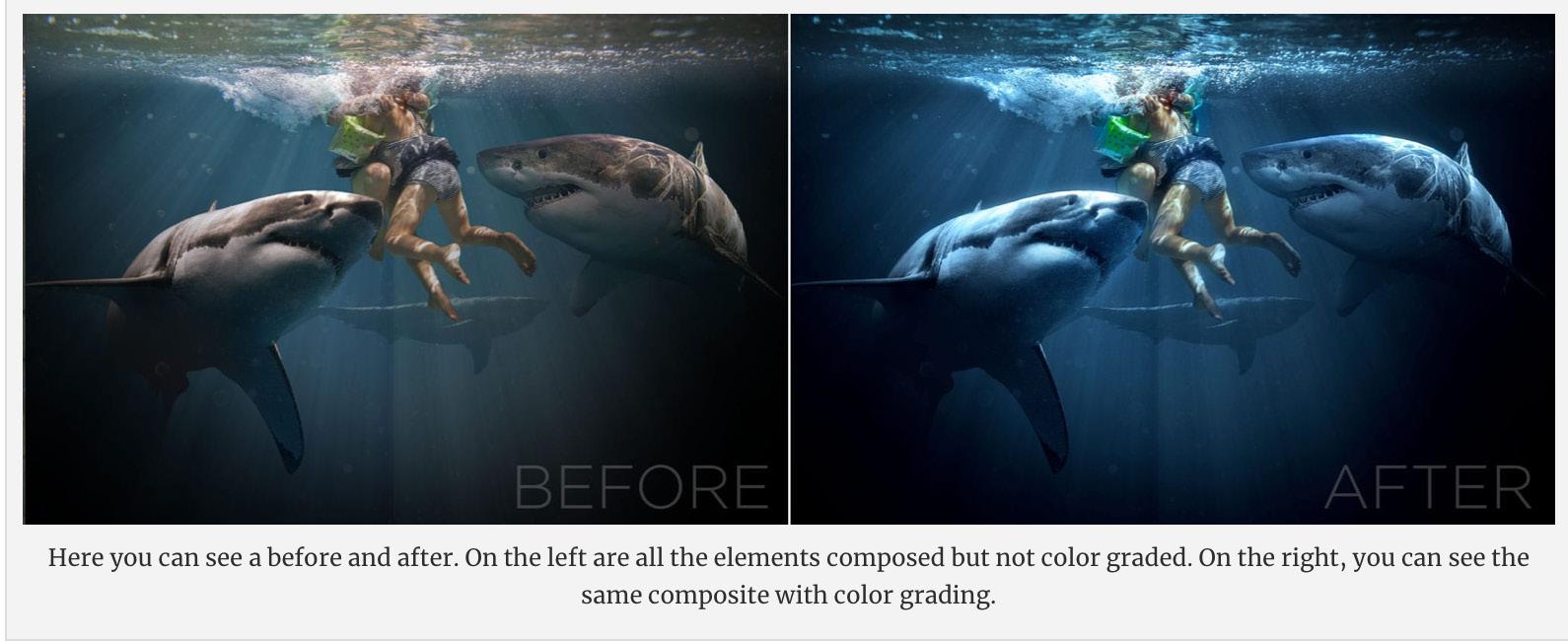
3. Lighting is everything. Don’t let it be accidental.
I already mentioned above the importance of having consistent lighting between your elements. This is just as important when you have your elements put together. Adjust the lighting of your various elements, foreground and background, so that they perceptually have the same lighting. This may mean using your curves and other adjustment layers to add or reduce contrast. It may also mean using a brush to add highlights or glowing edges to elements. It also means changing the colour of your highlights to match the image light source.
One particular thing to look for is the black point of your elements. As elements are further away from the camera, they will have a certain amount of “atmosphere” on top of them. This will make the black less and less pure. Your black point is essentially how dark your black is. The closer an element is to the camera, the darker its black will be. This can actually be extended to the full contrast of an element. The closer an element is to the camera, the higher the contrast will be. The further away, the less the contrast will be.

Finally, lighting extends to adding lights and light flares to your scene. JJ Abrams is the master of lens flares and I’m not mad at him for it. Lens flares do an excellent job of “melting” different elements together. Because flares are a “defect” that occur in the camera, the subconscious
impression you purvey with a lens flare is that the scene was captured by a camera and not put together in Photoshop. The one caveat to that is that the built-in lens flares provided in Photoshop are terrible. You will need to find a lens pack online or get the Knoll Light Factory.

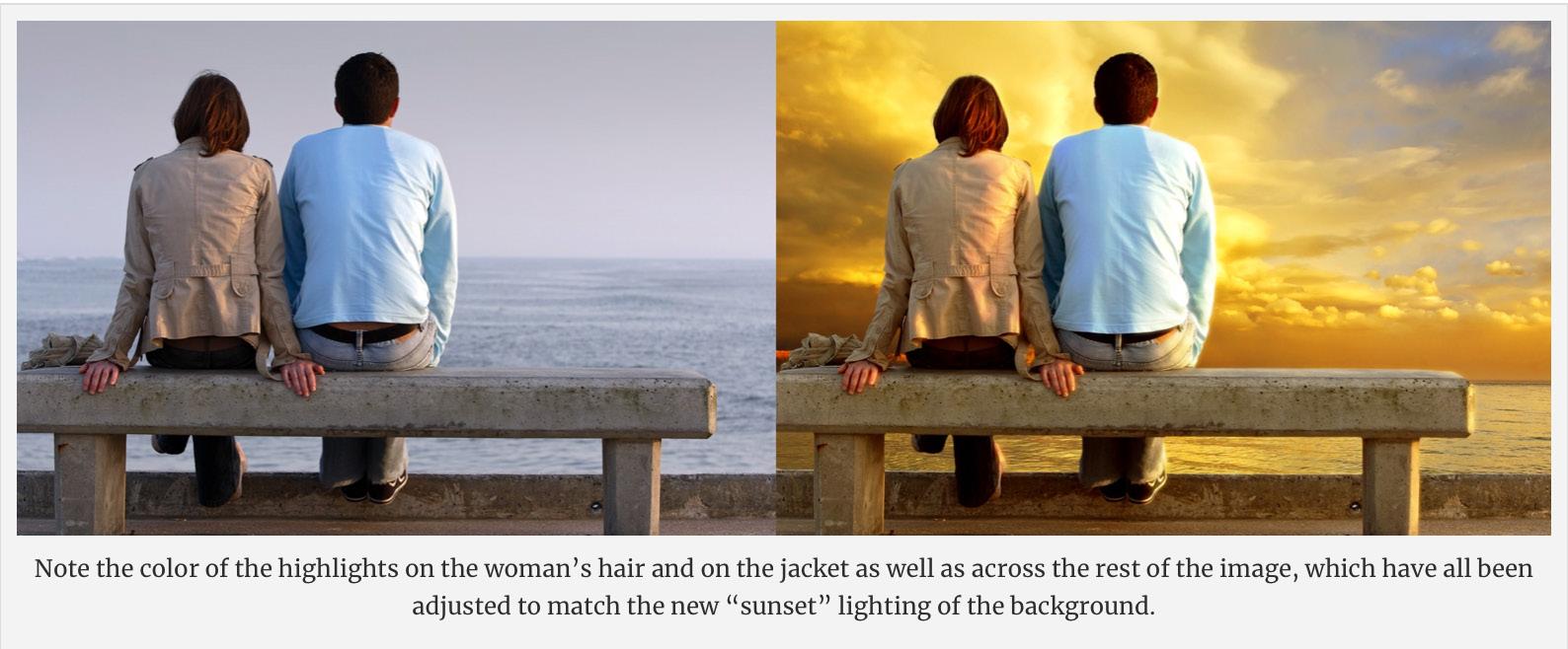
4. Add uniformity in colour. Colour is like the rug that holds the room together.
As you’re putting together your design, try to keep all colours adjusted to a neutral white balance. In simple terms, greys should be grey. This gives all your elements a somewhat consistent colour balance to begin with. Only after you have your composite together do you want to colour balance the image. Depending on your image, you want to give it a cast—either warm or cool. By doing it across the whole image, you make disparate elements come together and feel much more cohesive.

5. Layers and blending modes are your friends. Essentially, a photo composite is cut-out photos layered on top of each other.
Before the days of computers, photo compositing was done by hand; literally photos were cut up with a razor blade and photos were taken with multiple exposures. The results weren’t that great by today’s standards, but for their time they were “magic” and led to some famous hoaxes.

The introduction of layers in Photoshop 3.0 in 1994 opened the door for virtually any photographer or artist with a computer, photo scanner (remember, this was before digital cameras were widely available) and a copy of Photoshop to do photo compositing. And while Photoshop is now on version 21, layers and their blending modes are still the most fundamental building block to any photo composite. If you use Photoshop, you should be familiar with the Overlay and Softlight blending modes. These are your friends. Unlike Multiply and Screen, which are “one-sided” blending modes (they make something darker or lighter), Overlay does both; areas of the top layer (the overlay layer) that are lighter than the background layer make the background image lighter and areas that are
darker make the background image darker. Softlight does the same thing as overlay, but more subtly. Using these two blending modes, you can add texture, grain, light, colour and contrast to your image. And because you are doing it on top of the composited elements, it works to bring the whole image together. One concept artist I worked with used this method to do almost miraculous things—adding panels to spaceships, dash panels to cars, etc. Experiment with these blending modes and you’ll be surprised at how useful they actually are.

6. The middle is the sweet spot. Have a foreground, a middle and a background. Put your subject in the middle.
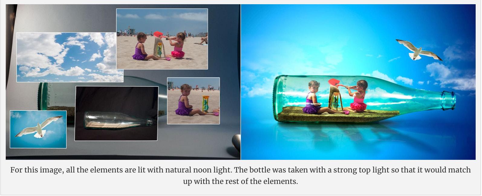
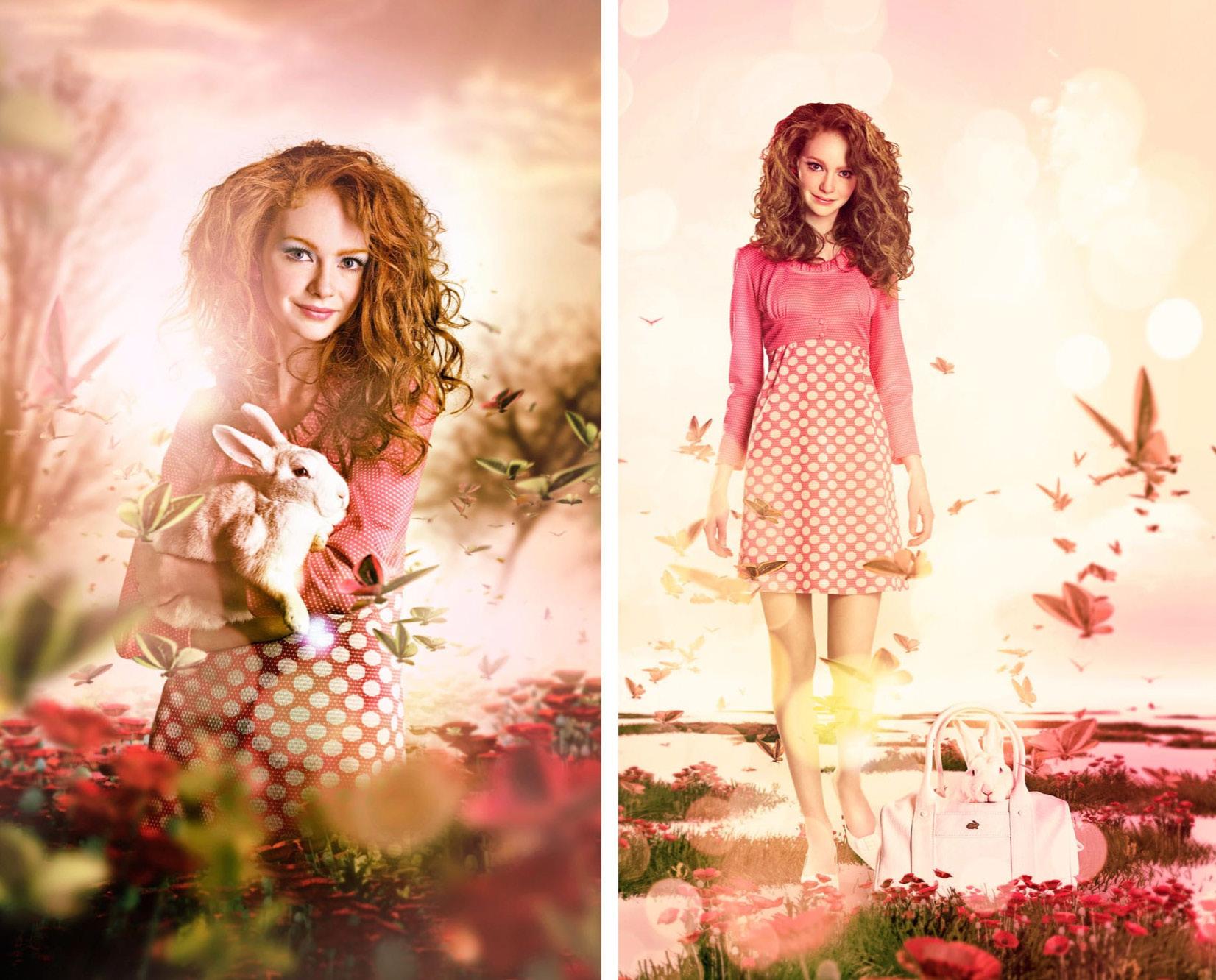
If you’re adding an element into a background, place it “in the middle” instead of on top. Your composite should have a foreground, a background and a middle. The middle is where your subject should be. Not all backgrounds lend themselves to a “middle” but this simply means that you need to become more inventive. It may require that you composite an additional foreground element so that your subject falls into the middle of your composition. Common cheats are fog, fire, debris, rain, snow and light flares—by making these foreground elements, it pushes your subject further into the composition and creates a much more realistic looking scene. Here’s a series of three composites by the talented Peter Jaworowski that show this principle really well. By putting elements in front of and behind the subject (bottle), the whole thing feels much more cohesive.


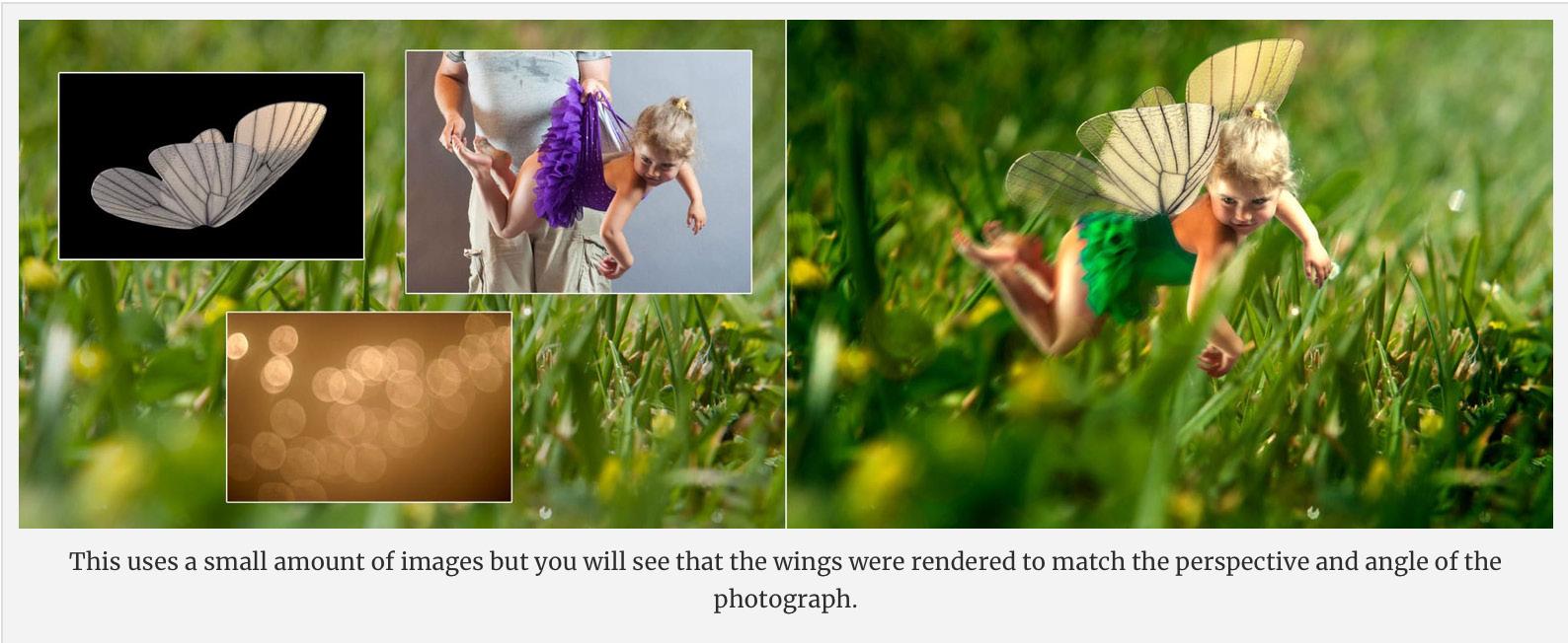
In this series by SeventhStreet Studio, you can see how light flares and butterflies were added to the foreground in order to push the subject of the composition further into the scene. The result is an almost magical looking photo that, in reality, is just photos layered on top of each other.
7. Direct attention. Beauty is in the eye of the beholder. Show it where to look.
This obviously applies to any design; it could almost be stated as a purpose of design. But when it comes to photo composites, you can direct attention away from areas where the compositing may be more obvious toward the areas where you want your audience to look. A good example is where feet touch the ground. This is an area that is not easy to fake and so directing attention away from it by either cropping it out or darkening it will go a long way toward making the whole image work better. In the example on the next page, I did take a few minutes to make the feet touching the ground look realistic, but darkening it and focusing on the soldier through a strong vignette makes the whole image work quite a bit better.

Summary
Using the above, you can make any photo composite better. Always remember that the end result of a good photo composite is that “people can’t tell it’s a photo composite”. For most projects, this simply means that people think the image is a single photo. For more complex photo composite projects, it means creating that sense of awe you felt as a child when seeing a magician perform a trick for the first time. As Thomas Heinrich says, “They should surprise, bring astonishment and a slight grin.” As a final statement on photo composites, there is a prerequisite to any good photo composite not covered above; a bright idea. Without a bright idea, you’re just putting photos together. This is true of all design and is best summed up by German graphic designer Thomas Manss: “To create a memorable design you need to start with a thought that’s worth remembering.” Many photo composites serve only as a small part to a larger whole (such as putting a product into a background), but when you are doing a photo composite as a piece of art in and of itself, then starting with a good idea is a necessity. Bright ideas and strategies to come up with them is fodder for another article (or series of articles) so I haven’t covered it here.

Inspiration
There are a lot of great photo composite artists out there. Just do an internet search for “photo composite” and “photo manipulation”— you’ll find a whole bunch. But here are a few “stand outs” that I’ve run across.
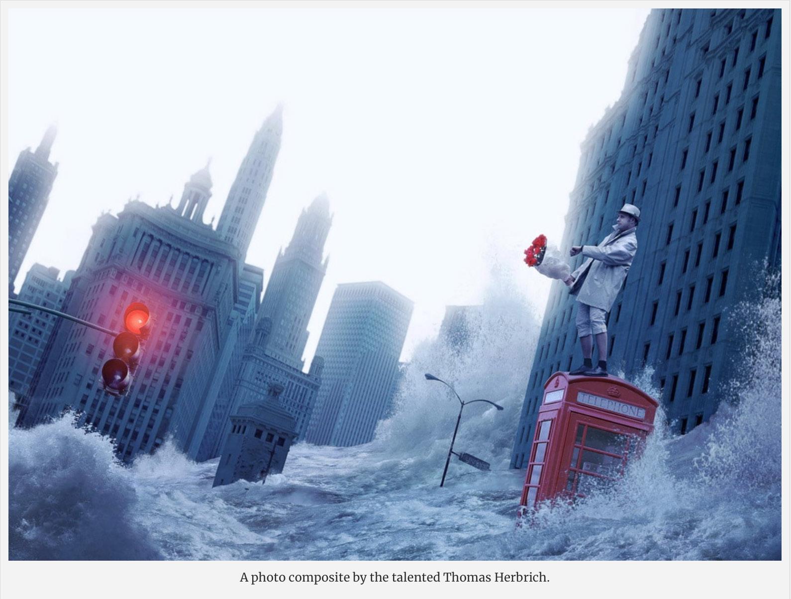
Thomas Herbrich: A photographer and photo compositor, Thomas’ work is amazing on many levels. Excellent attention to detail and great ideas. His mantra is “Surprise yourself, and your audience!” and this shows in his work. His site took a while to load (I almost thought it was broken) but once you’re in, you won’t be disappointed.
John Wilhelm: Almost all of his photo composites use his daughters as the primary subject, which I think is great because it shows you that it doesn’t require a big budget to do great photo composites—a camera, friends or family as models and a copy of Photoshop. His work is amazing. I also suggest visiting his Facebook page, where he shows a lot of before-and-afters and works-in-progress. Studying how he does his composites is a learning process in itself.
Tim Tadder: Probably my favourite on this list, Tim is a photographer who does excellent photo composites. Each one is a project and the end results are a testament to his craft. His site has a lot of great photo composites but you can also find some of his “behind the scenes” on behance.
Erik Johansson: His composites are excellent but what sets him apart are his very intriguing ideas. His photo composites are reminiscent of surrealist Dali paintings.
Peter Jaworowski: Most of his work is commercial, but nonetheless amazing. He is the Executive Creative Director at Ars Thanea. You can also see a lot of his work on his behance account.
Aaron Nace: Photographer, Photoshop artist and instructor (he has quite a few courses which you can check out at http://phlearn.com/). His work is really good and worth a look at. The plus is that if you like his style, you can take one of his courses and see how he does it. You can see a lot of his work on his flickr account as well.

National Photojournalism Competition Street & Social Commentary Category Winner
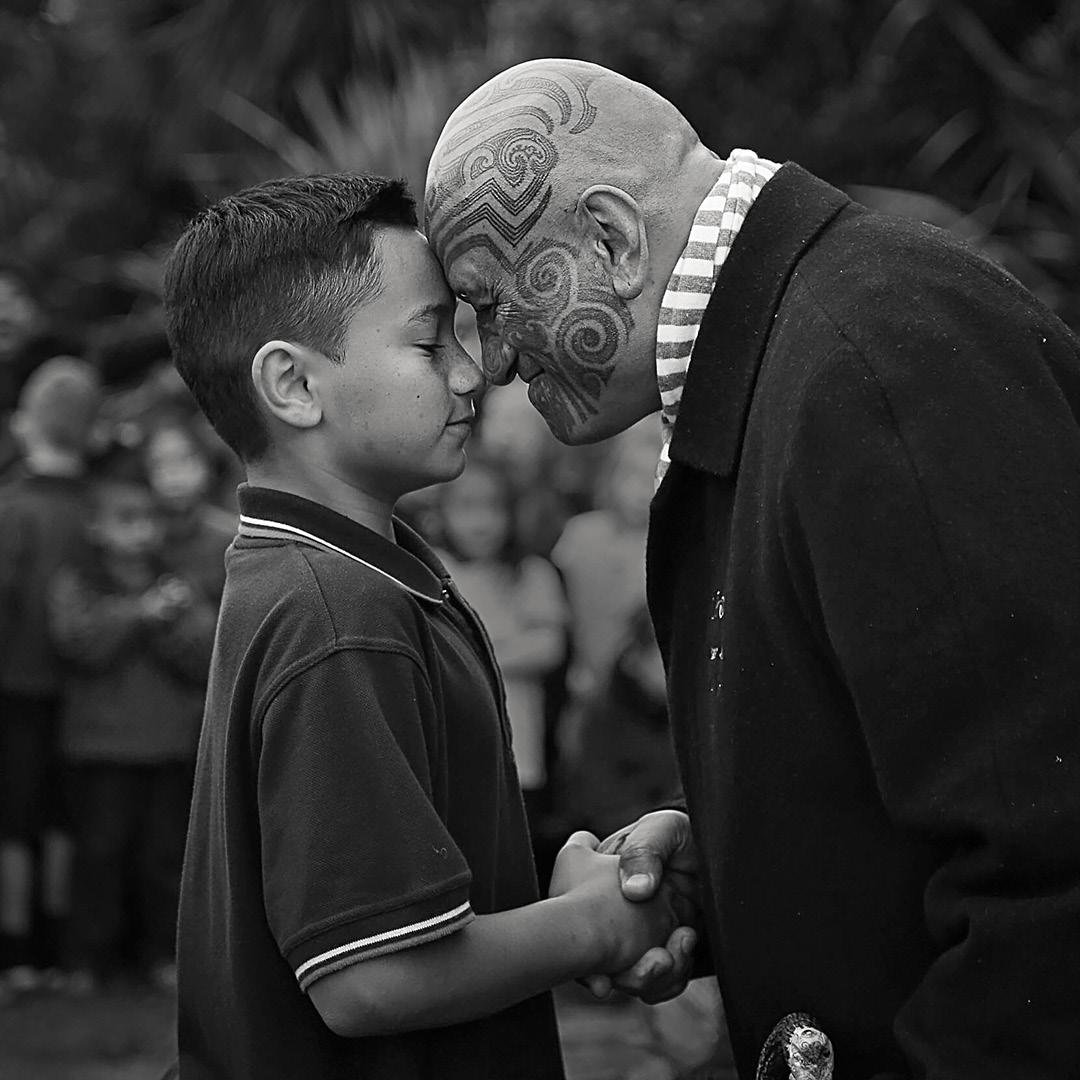
Hongi by Lynn Fothergill LPSNZ
Compositing in PSNZ
Are there any specific issues that you can run into when entering composited images into PSNZ salons or competitions. Fortunately there are very few rules surrounding composites so it is fairly simple.
Where is it not allowed?
As compositing is a digital alteration of the image, then it is not permitted for any images entered within the nature or wildlife categories. They are also disallowed in photojournalism sections.
Where is it allowed?
In the open categories compositing is allowed; however all of the images that make up the final image must have been shot by the photographer. Therefore the use of stock images is completely banned.
How will the judges know it is not all my work?
In the event of a query being raised, the bylaws allow for the judges to request the original files. For most images this is just the original RAW file but for a composite image, it could include the Photoshop document that contains all of the layers.
Do I have to be a master of Photoshop to enter composited images?
While the individual elements within the composite must be the work of the photographer, the rules do actually allow for someone else to assemble the composite. This is, however, provided that they are working under the guidance of the photographer. How exactly one proves that this is the case is not specified; however I suggest that you would need to show some mockups of the image or the instructions that were given to the artist.
Useful Resources
by Paul Whitham LPSNZ
There are literally hundreds of books and thousands of video resources online to help with compositing. Listed below are those that I subscribe to; they post regular content on compositing in Photoshop.
YouTube Channels (free)
Antti Karppinen https://www.youtube.com/channel/UCir13Zf_KMjGIYikQh_BuUA
Brook Shaden https://www.youtube.com/channel/UCPMepYNZn8LpMwoOCay4eMA
Glyn Dewis https://www.youtube.com/channel/UC9eJ0QMxVANECYICsnM1yzA
Nemanja Sekulic https://www.youtube.com/channel/UCdf6WtVkThVyEFARiUbr5yQ
Phlearn https://www.youtube.com/channel/UC47XN5bhLTBH5TRFyKaUpKg
Photoshop Training Channel https://www.youtube.com/channel/UCdQ_ZkYaMe6qPoueUyPQgpQ
PiXimperfect https://www.youtube.com/channel/UCMrvLMUITAImCHMOhX88PYQ
Complete multi-hour workshops (paid content)
CreativeLive www.creativelive.com
Nucly www.nucly.com
Phlearn www.phlearn.com
A Simple Composite
By Paul Whitham LPSNZ
WHEN WE THINK of composites we often conjure up complicated images made up from multiple sources. The reality, though, is that composites can be of varying complexity. In this example I will demonstrate a simple composite involving a body part swap. This technique is particularly useful for group photos where you need to swap a head because somebody has either blinked or pulled a funny face.
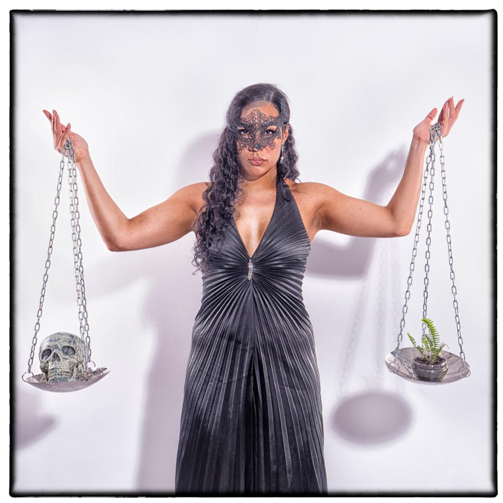
The background to the scene is simple. I wanted to shoot Libre as part of my Zodiac series but I was unable to locate a suitable set of scales. I therefore made a single scale, using a stainless steel bowl and some cheap chain. However, as I only have one of these, it meant that I was forced to shoot the photo twice and then composite them.
For scenarios like this, it is best to have the camera on a fixed position, as it makes matching the images much simpler. In this case the camera was mounted on a tripod and my model Zaniah was asked to stay in one location. We were shooting with studio lights and the camera was in manual, which meant that the exposure would be consistent throughout all of the shots.
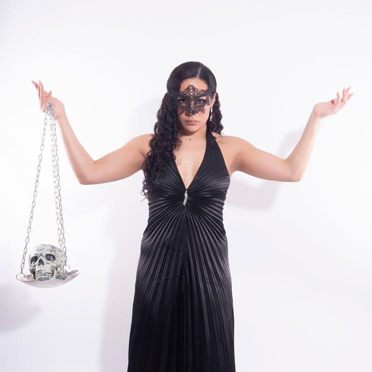
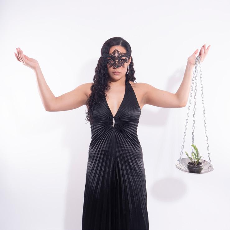
It was then a simple matter of taking a photo of Zaniah holding the scale in her left hand, and then again with it in her right. These were then brought into Lightroom and I chose the two images that I wanted to take further. I made certain that any Lightroom adjustments were done to both images before I selected the option to edit them as layers in Photoshop.

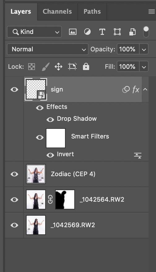
Once Photoshop opened, I selected both layers and under the Edit menu chose the option to “Auto Align Layers”. This was just an extra guarantee that the majority of the image was in exactly the same place, in case the camera had been bumped between shots.
To blend the two layers together, I simply created a mask on the top layer. Using a soft brush I painted black over the area of the underlying image that I wanted to reveal.
Given that Zaniah has been in a similar position and that the background was very simple, the selection did not need to be particularly precise. The advantage of using the mask is that if you do not get the selection correct on the first attempt, then you can go back and amend it.
To finish the image I simply ran a recipe that I created within Nik software.
In total, the final image took about five minutes to create, and proves that you don’t need to spend large amounts of time on the computer. The key, however, was in the planning, as I had a clear idea of what I wanted to achieve, and that I had ensured that the lighting and the camera position were consistent between the shots.
Photoshop Alternatives
There are a number of alternative software packages on the market to Photoshop, the most popular with PSNZ members being ACDSee, Affinity Photo and Gimp.
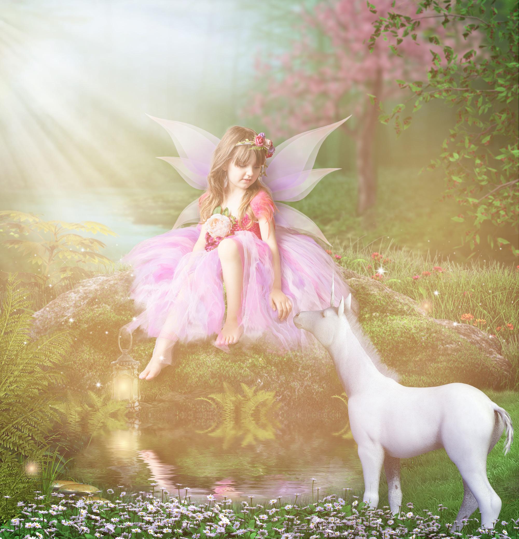
Creating Fairy Images
By Tracey Perrin
I HAVE BEEN asked how I approach creating fairy images. First off, I thought I would start with a little back story.
Having always enjoyed art and photography, I bought my very first SLR camera in the late 80s. A few years ago I decided to change to digital and bought an entry level DSLR (which has now been upgraded) and was using Photoshop Elements. While home one afternoon I decided to watch the NZIPP awards online and found that the creative section really caught my eye and imagination. I had discovered a whole new and exciting world!

Through my research I discovered Karen Alsop and her Story Art Facebook page, and quickly became a member of her tutorials, learning a lot about lighting your subjects, shadows and colour matching. Over the years I have also watched a number of tutorials from Phlearn with Aaron Nace, CreativeLive with Brooke Shaden and Lisa Carney, as well as various YouTube videos.
One of my biggest fairy photography influences is Andrea Black from Chasing Whimsy. Through her support and tutorials (which she put on sale during lockdown) I started recreating my composites over lockdown.
This brings me back to the original question - how I approach my fairy images. I have a small home studio that is a 13m² bedroom; within this I have some props and costumes, most of which I have made, and my studio lighting. I tend to use my studio light off to one side of my fairy; this will be the side I will put the sun ray in my background.
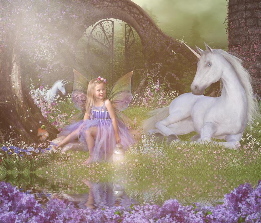
Most of my young clients request unicorns as their theme. I have made a few different unicorn background scenes from digital renders and elements which I have paid for, adjusted and blended together, and then saved as PSB 1 files. During the studio session I pose the fairies in such a way that they will fit into one of my backgrounds.
1 Photoshop large file format, enabling files to exceed 2GB in size
Workflow
Once I have chosen the files that I want to edit I bring them into camera RAW and make my adjustments, and then open in Photoshop CC as a smart object. In the quick selection tool I click select and mask, then select subject for detailed extraction. I will then use the refine edge brush to help refine hair and the see-through parts of the dress. From here I have output set to new layer with layer mask. This layer mask is what I drag and drop into my background scene.
Once the subject is in the scene I will resize and position, then on my layer mask I will blend the edges. It’s really important to fix all the edges, especially the hair and dress where it is seethrough.
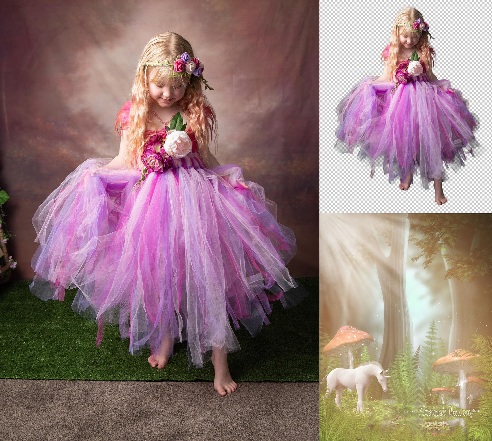
Now it’s a matter of blending into the scene creating grounding shadows. Then I create a copy of this layer and rasterize it so I can make adjustments on the skin to remove bags under eyes and any pimples or rashes on the skin. The reason I rasterize is because the healing brush and patch tools won’t work in smart objects. This is where I will highlight the eyes to bring out the colour and the shadows and highlights on the face, hair, skin, dress and flowers with dodge and burn using curves layers.
I never flatten any of my layers in case I have to go back and retouch anything later, but I will use a stamp visible layer (shift ctrl alt e) which will make a merged copy of everything below it, leaving the layers open underneath. This is the layer I will run the Flood Photoshop plug-in to create water.
My final layers will be foreground shrubs, lighting adjustments such as sun rays, sparkles and a light overlay.
National Photojournalism Competition Sport and Action Category Winner

Throwing by Anne Lambe