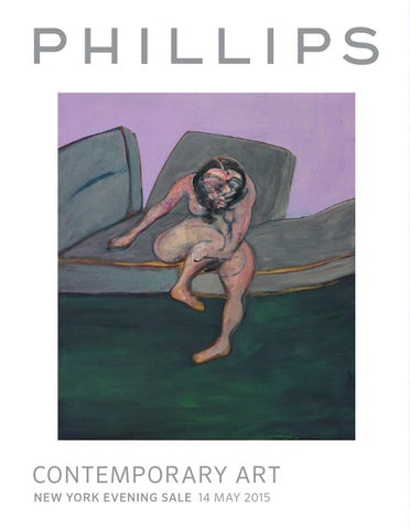
Contemporary art new York evening sale 14 may 2015
NY_CTA_EVE_MAY15_COVER_BL2.indd 1
20/04/15 09.27
NY_CTA_EVE_MAY15_COVER_INS.indd 158
20/04/15 09.28
NY_CTA_EVE_MAY15_IFC+IBC_BL2.indd 1
17/04/15 12.08
NY_CTA_EVE_MAY15_2-49_BL2_NO DOPPIO RIFILO.indd 2
20/04/15 09.02
NY_CTA_EVE_MAY15_2-49_BL2_NO DOPPIO RIFILO.indd 3
20/04/15 09.02
NY_CTA_EVE_MAY15_2-49_BL2_NO DOPPIO RIFILO.indd 4
20/04/15 09.03
NY_CTA_EVE_MAY15_2-49_BL2_NO DOPPIO RIFILO.indd 5
20/04/15 09.03
NY_CTA_EVE_MAY15_2-49_BL2_NO DOPPIO RIFILO.indd 6
20/04/15 09.03
NY_CTA_EVE_MAY15_2-49_BL2_NO DOPPIO RIFILO.indd 7
20/04/15 09.03
NY_CTA_EVE_MAY15_2-49_BL2_NO DOPPIO RIFILO.indd 8
20/04/15 09.04
NY_CTA_EVE_MAY15_2-49_BL2_NO DOPPIO RIFILO.indd 9
20/04/15 09.04
NY_CTA_EVE_MAY15_2-49_BL2_NO DOPPIO RIFILO.indd 10
20/04/15 09.05
NY_CTA_EVE_MAY15_2-49_BL2_NO DOPPIO RIFILO.indd 11
20/04/15 09.05
NY_CTA_EVE_MAY15_2-49_BL2_NO DOPPIO RIFILO.indd 12
20/04/15 09.06
NY_CTA_EVE_MAY15_2-49_BL2_NO DOPPIO RIFILO.indd 13
20/04/15 09.06
NY_CTA_EVE_MAY15_2-49_BL2_NO DOPPIO RIFILO.indd 14
20/04/15 09.06
NY_CTA_EVE_MAY15_2-49_BL2_NO DOPPIO RIFILO.indd 15
20/04/15 09.06
NY_CTA_EVE_MAY15_2-49_BL2_NO DOPPIO RIFILO.indd 16
20/04/15 09.06
NY_CTA_EVE_MAY15_2-49_BL2_NO DOPPIO RIFILO.indd 17
20/04/15 09.06
NY_CTA_EVE_MAY15_2-49_BL2_NO DOPPIO RIFILO.indd 18
20/04/15 09.07
NY_CTA_EVE_MAY15_2-49_BL2_NO DOPPIO RIFILO.indd 19
20/04/15 09.07
NY_CTA_EVE_MAY15_2-49_BL2.indd 20
18/04/15 08.13
NY_CTA_EVE_MAY15_2-49_BL2.indd 21
18/04/15 08.14
NY_CTA_EVE_MAY15_2-49_BL2.indd 22
18/04/15 08.14
CONTEMPORARY ART Sale information NEW YoRk EvENiNg SALE 14 MAY 2015
AuctiOn & Viewing LOcAtiOn 450 Park Avenue New York 10022 AuctiOn 14 May 2015 at 7pm Viewing 2 - 14 May Monday - Saturday 10am - 6pm Sunday 12pm - 6pm SALe DeSignAtiOn When sending in written bids or making enquiries please refer to this sale as NY010315 or Contemporary Art Evening Sale. ABSentee AnD teLephOne BiDS tel +1 212 940 1228 fax +1 212 924 1749 bidsnewyork@phillips.com
cOntempOrAry Art DepArtment heAD OF SALe Amanda Stofel +1 212 940 1261 astofel@phillips.com reSeArcherS katherine Lukacher +1 212 940 1215 klukacher@phillips.com Samuel Mansour +1 212 940 1219 smansour@phillips.com ADminiStrAtOr Courtney Raterman +1 212 940 1392 craterman@phillips.com regiStrAr Lane LaColla +1 212 940 1369 llacolla@phillips.com
Front cover Francis Bacon, Seated Woman, 1961, lot 33 © 2015 Estate of Francis Bacon/Artists Rights Society (ARS), New York/DACS, London Back cover Brice Marden, Elements (Hydra), 1999–2000/2001, lot 17 © 2015 Brice Marden/Artists Rights Society (ARS), New York Opposite Rudolf Stingel, Untitled, 2012, lot 10 (detail) © 2015 Rudolf Stingel
NY_CTA_EVE_MAY15_2-49_BL2.indd 23
18/04/15 08.14
1 Seth Price b. 1973 Vintage Bomber, 2008 vacuum formed high-impact polystyrene 96 1/8 x 47 7/8 x 2 3/8 in. (244 x 121.5 x 6 cm) Estimate $200,000-300,000 provenance Petzel Gallery, New York exhibited Zurich, Kunsthalle Zurich, SETH PRICE, June 2 - August 17, 2008 literature P. Staple, “The Producer, Seth Price,” frieze magazine, Issue 118, October, 2008, n.p. (illustrated)
“Price continually creates the impression of specifc histories for images and sounds—histories they do not, in fact, possess.” TIm GrIffIN
Crisp and radiant, Seth Price’s Vintage Bomber of 2008 exudes a sophisticated yet powerful aura. The current lot is elegantly punk rock in the way that all of Price’s iconic works in vacuum-sealed high-impact polystyrene are; in an efervescent silver it captures the power of the artist’s prodigious intellect and stunning artistic vision. A wry comment on the cycles of consumerism in the realms of fashion and art, Vintage Bomber manages to hold both philosophical weight and visual power. Price’s smart re-packaging of the counter-cultural trope of the bomber jacket highlights the shif and fux in signifers of this object over time— from World War II bomber pilots uniforms to post war biker gangs to the streets of the lower east side to high-fashion runways. for Price much of the value of the jacket is not in its use—its ability to keep one warm—but the cultural currency endowed when wearing such an object. By truly fxing the object, making it only exist as an almost perfect trace of itself that can never be worn, the artist has brilliantly highlighted the manner in which our collective understanding and valuation of an object far outweighs any specifc logic. fashioned here in a vibrant, shimmering silver the present lot is a work as stunning to look at as it is to intellectually contemplate. Seth Price is truly one of the leading artist’s of the contemporary avantgarde. The artist has continually produced an oeuvre of work that destabilizes the mechanics of both ideologies and modes of consumption.
NY_CTA_EVE_MAY15_2-49_BL2.indd 24
Throughout a body of work that includes paintings, video, sculpture and scholarly writing the artist has constantly and eloquently questioned how the things we purchase and what we feel they mean about us construct and condition our conceptions of self and the world around us. While a clear and worthy descendent of artists from both the conceptual and pictures generation—not to mention dada, surrealism, and the Situationsists—Price none-the less has found a new language and set of tools to tackle long-standing concerns. Price ofen uses bootlegged or pirated materials culled from the Internet in order to explore how value is created and where it is placed. Vintage Bomber is created through the process of vacuum-forming this iconic style of jacket in high impact polystyrene, which is then painted with acrylic and enamel—here in a luminescent silver. The process involves melting a form of hot plastic around a solid object and then allowing it to cool into a rigid mass while vacuum pressure is applied to create a single form or a reusable mold. The plastic shell covering the jacket becomes a central aspect of the piece, taking the form of the object encased within while and acting almost like commercial packaging. The series is the most highly-sought afer by the artist and this example is made further exceptional by the glinting metallic silver color—it virtually vibrates with power and mystique while maintaining a weighty patina of downtown cool and style.
18/04/15 08.14
NY_CTA_EVE_MAY15_2-49_BL2.indd 25
18/04/15 08.14
2 Danh VŌ b. 1975 We the People (detail), 2011 copper 61 3/4 x 112 1/2 x 61 3/4 in. (156.8 x 285.8 x 156.8 cm) This work is registered as element L19.1. Estimate $250,000-350,000 provenance Galerie Chantal Crousel, Paris exhibited Paris, Musée d’art moderne de la Ville de Paris, Danh Vō, Go Mo Ni Ma Da, May 14 - August 18, 2013 literature Danh Vō, Go Mo Ni Ma Da, exh. cat., Musée d’art moderne de la Ville de Paris, Paris, 2013, n.p. (illustrated)
“When Bartholdi created the Statue of Liberty he created an image and a political agenda. What I’m doing with it is a shif of scale and shif of meaning.” DAnh Vō, 2011
Danh Vō is an artist whose practice pushes the boundaries of appropriation to its limits. Through the arrangement, rearrangement and recontextualization of found historical artifacts, Vō explores themes of confict driven migration and displacement and the relationships between constructed and inherited cultural values. Relying heavily on chance, Vō’s sourced material, documents or photographs are always heavily tied to history with the intention to destabilize traditional ways of thinking about these items and themes. The exploration of identity is a constant theme in Vō’s works, forming a link between his individual projects and the backbone of his incredibly cohesive practice. Utilizing his own experiences of displacement, immigration and social values, Vō investigates the formation of identity through his own. his experience of cultural displacement occurred frst hand when at four years old his family fed Vietnam and settled in Denmark in the late 1970s, leaving Vō to navigate both the inherited cultural values of his background and the constructed cultural values of his adopted home that shaped his identity.
NY_CTA_EVE_MAY15_2-49_BL2.indd 26
18/04/15 08.14
NY_CTA_EVE_MAY15_2-49_BL2.indd 27
18/04/15 08.14
Vō’s exploration of this entanglement of personal experience and collective history intentionally undermines institutional conventions. In his ongoing conceptual project Vō Rosasco Rasussen, Vō marries and immediately divorces people who are of personal importance to him, assuming their surnames. Through this process Vō incorporates them into his personal history while destabilizing and subverting the institutional values of marriage. Another of Vō’s continuous projects, 02.02.1861, [last letter of Saint Théophane Vénard to his father before he was decapitated] is a text based work of an undefned edition that is available at a fxed price for anyone to purchase. This work is comprised of a found letter from a French missionary to his father on the eve of his execution in Vietnam in 1861 which is rewritten by Vō’s father. The original text has been translated from English to French, neither language spoken by Vō’s father, and laboriously handwritten by the native Vietnamese Dane as a way to mutate, explore and negotiate language.
Frédéric Auguste Bartholdi, Statue of Liberty, 1889, Archive Timothy McCarthy/Art Resource, NY
The present lot, a detail from the series We the People, is a copper fragment of the Statue of Liberty. Working from the original drawings, Vō commissioned a replica, built to scale, of Frederic August Bartholdi’s Statue of Liberty to be used as a cast over which thin copper sheets would be hammered—the same method that was used to construct the original. The present lot, element L19.1, is the fragment which comprises lady liberty’s right shoulder: here, stripped from its proud stance, its undulating and sof ripples, resemble the beating sails of a ship once bound to her shores. As each piece was completed (including the present lot), it was shipped to various museums and galleries across the globe making it unlikely that the fgure will ever come together as a whole. This fragmented form can be read as a literal manifestation of the histories of cultural displacement as the individual pieces exist forever in a suspended dimension. The original Liberty was created as political propaganda for the French opposition, she represented a symbol of the dissemination of American democratic values to France, while in America Liberty became an immigrant symbol for those who immigrated and passed through Ellis Island in search of the American Dream. Remaining connected to these multiple histories, Vō’s reproduced, scattered and fragmented Lady Liberty emphasizing the abstract nature and mobility of cultural symbolism. By exploring the connections and disjunctions between the original and contemporary modes of production and the vital links with past constructions of meaning, Vō draws attention to the ways they are interpreted in the present and the efect they have on contemporary culture and society. The contours of the fragmented Lady Liberty ofer an intimate and abstracted encounter with the fgure; upon frst glace the fragments do not appear to belong to a woman at all, but are more reminiscent of a conceptual work by Donald Judd or Richard Serra. However, as each element disperses around the globe, the ideals of freedom and liberty are scattered further than they could be if she were whole. These fragments also imitate the manner in which American culture is exported and popularized around the world. Even in a disjointed form, Lady Liberty is recognizable.
Torqued Torus Inversion by Richard Serra on display at The Museum of Modern Art during a preview of “Richard Serra Sculpture: Forty Years,” in New York, Tuesday, May 29, 2007. The show opened to the public on June 3, 2007. (Photo by Jin Lee/Bloomberg via Getty Images), Artwork © 2015 Richard Serra/Artists Rights Society (ARS), New York
NY_CTA_EVE_MAY15_2-49_BL2.indd 28
Fascinated by the knowledge that the original statue is a mere 2mm think, Vō began production of his Liberty before ever having seen her in person, exclaiming, “it’s such a strong icon, tracing back to so many histories, and then [to] discover the fragility of it!”. Reproduced at her actual thickness, Vō’s Liberty reveals the material and conceptual fragility of the icon and in efect operates against her mythological position. Vō’s entire oeuvre, including We the People, contains allegories of history and geography where one recognizable aspect relates to multiple contradictions or ironies and how these become entangled in the creation of meaning. Leaving interpretations open-ended and at the discretion of the viewer, Vō’s works disrupt traditional modes of thinking and force the viewer to reconsider and reinterpret the histories of these objects and the way in which they relate to their own past, present and future.
18/04/15 08.14
NY_CTA_EVE_MAY15_2-49_BL2.indd 29
18/04/15 08.14
○
3 Jim Hodges b. 1957 See II, 2003 mirror on canvas, in 2 parts each 60 x 40 x 1 in. (152.4 x 101.6 x 2.5 cm) overall 60 x 80 x 1 in. (152.4 x 203.2 x 2.5 cm) Titled “SEE II” on the reverse of each panel. This work can be shown across a corner or with the two mirrored elements side by side. Estimate $500,000-700,000 provenance CRG Gallery, New York exhibited Dallas, Dallas Museum of Art, Jim Hodges: Give More Than You Take, October 6, 2013 - January 12, 2014, later traveled to Minneapolis, Walker Art Center (February 15 - May 11, 2014), Boston, Institute of Contemporary Art (June 5 - September 1, 2014), Los Angeles, UCLA Hammer Museum (October 5, 2014 - January 17, 2015) literature J. Grove, Jim Hodges: Give More Than You Take, exh. cat., Walker Art Center, Minneapolis and Dallas Museum of Art, Dallas, 2013, p. 120 (illustrated)
“I partner with everything. I think of composing experiences in space as elementary choreography.” JIM HODGES, 2013
Drawing from an abundant tradition of minimalist and conceptual artists who explored the sublime qualities of light and space, Jim Hodges’s See II from 2003 is a quiet performance of impression, rich in feeling through the duet of light and refection. His portrayal of the human condition in both the abstract and formal qualities of mirrored surfaces dovetails seamlessly into the omnipresent motif of temporality. Cultivating his approach in a variety of media from photography and works on paper to lightbulbs and silk fowers, his critically-celebrated 2014 retrospective jointly organized by the Dallas Museum of Art and Minneapolis’ Walker Art Center unearthed an artist whose oeuvre, and each work within it, maintains an unparalleled depth and breadth. The present lot possesses an inherent gravitas that is acutely submerged with sentiment, confronting issues of the self and the feeting nature of the world around us. Through Hodges’s profoundly conveyed sensibility, See II elicits experiences that become ingrained within our minds as the energy of the world fltered through its facades ignite a formidable encounter with our own histories.
NY_CTA_EVE_MAY15_2-49_BL2.indd 30
From Diego Velázquez to Roy Lichtenstein, the mirror and its mysterious aura have been represented throughout the history of art, though Hodges’s works frequently begin as self-efacing through the neglected media that is utterly renewed through his touch. His practice of coalescing drawing and sculpture, particularly in See II, produces a metaphysical dichotomy of fragility and technical mastery of line and shape. Anchoring any room within which it is placed, the present lot’s refective surfaces capture the light and divulge our surroundings; the refractive polished glass disquietly refuses us any notion of true reality. As time passes our eyes adjust to its distortion, so that if you remain patient, the surfaces will reveal to you their latent depths. The camoufage pattern, as seen in the present lot is signifcant for the artist, recurring throughout a number of his diferent creative projects including drawings, paintings, altered photographs and stitched works. By placing this pattern, which alludes to hiding, upon a refective, mirrored surface the artist is emphasizing the nature of exposure. Hodges creates this double-mirror; a layering that complicates perception, rendering evident the infnite quality of perception and refection, both literally and cerebrally. Hodges has spoken poignantly of his works as expressive reminders of the development of identity, stating, “I have been through a process of shedding skins, breaking through boundaries—imposed, self-imposed, learned, whatever—and the funny thing is, there’s always another wall that I go crashing into, another layer of crap to shed, another blossom that reveals more complexity and challenges. Thankfully this process doesn’t stop.” (O. Viso, “Choreographing Experiences in Space: Olga Viso Interviews Jim Hodges,” Walker Magazine, 2014). The artist’s wholly unselfsh spirit of warmth permeates See II, as he welcomes us into an engaging dialogue of recollection and intensity.
18/04/15 08.14
NY_CTA_EVE_MAY15_2-49_BL2.indd 31
18/04/15 08.14
○◆
4 Joe Bradley b. 1975 Police Painting 2, 2008 acrylic on canvas, in 7 parts 119 x 80 in. (302.3 x 203.2 cm) Signed, titled and dated “Police Painting #2 Bradley 08” on the reverse of each element. Estimate $1,000,000-1,500,000 provenance Peres Projects, Los Angeles Private Collection
“With painting, I always get the impression that you’re sort of entering into a shared space. There’s everyone who’s painted in the past, and everyone who is painting in the present.” Joe BrAdLey, 2013
NY_CTA_EVE_MAY15_2-49_BL2.indd 32
18/04/15 08.14
NY_CTA_EVE_MAY15_2-49_BL2.indd 33
18/04/15 08.15
Joe Bradley’s unequivocal and guileless compositional approach is among the frst aspects one immediately perceives upon standing in the towering presence of Police Painting 2. Lines neatly converge and quadratic colors bound forms to construct a composition as variegated and intricate as Piet Mondrian’s vibrant grids of the 1940s. Only with a detailed eye can one detect the subtle implication of Bradley’s hand, and the intersections at which conceptual investigation and imagery collide. Though it is undeniably a product of the contemporary cultural moment, the present lot paradoxically does not evoke the time from which it has been created. Its timeless nature, the feeling of uncannily having experienced it before, manifests itself where the “now” indicates a novel form through the coexistence of historical infuences. This wanton fusion of past techniques and styles can be considered as a stamp for our time in contemporary painting, as Bradley realizes it by breathing new life into historical movements such as the Minimalism and those of Colorfeld. Importantly, the artist re-conceives themes from the traverses of the 20th century throughout his body of work, fundamentally stripping their expressions down to only the most conventional of forms. Police Painting 2 embodies the time-honored practice of painting, in the manner that Bradley engages with painting’s tradition of asking questions of its audience through concepts of ingenuity, transformation, and idiosyncrasy.
Joe Bradley in New York, March 2013, Photography SEBASTIAN KIM
The meteoric rise of Bradley has seen an enormous range of painterly techniques pop up what feels like overnight—from his highly geometric, assemblage robot men such as the present lot, to his silhouetted fgures against empty backgrounds to, most recently, his primal abstract fgures on raw canvases; the true consistency in his work is the impetus of his unique mind. The monochromatic canvases that hang into the shapes of primordial fgures certainly allude to Minimalism, yet their ambiguous and amorphous forms intrigue a range of interpretations. Of these vast and seemingly unending associations, Bradley has commented, “The video game reference was completely unwanted by me, just a strange by-product. And although that body of work was defnitely informed by Minimalism, as I started to get some feedback on it, I realized what people were focusing on” (D. Blair and J. Bradley, “Artists in Conversation, BOMB Magazine, 2009). The incredibly static and unchanging nature of the monolithic fgures in Police Painting 2 seems to exude a peculiar stuttering, almost as if the work cannot quite speak its message. This implicit nihilism, a relic of the anxieties emerging from the New York school, the work seems only to hint at little more than its own existence. Neither process nor formalist art, the present lot produces its own dialect, providing us with phantom of symbology without any lexicon with which to decipher the glyphs. Through his consolidation of fguration and abstraction, the artist embraces uniformly the subjective models of post-war art in the 1970s and a presently humanist attitude to high culture. Particularly evident in Police Painting 2, Bradley reconstructs the gamut of Minimalist painting with a captivating impression of modesty and wit. The hued planes of Ellsworth Kelly’s Chatham VI: Red Blue of 1971 are debased in the present lot, though importantly the sublime piety of monochrome painting is maintained. His infusion of formalism with cartoonish farce provokes an audacious contemplation of the power radiating from a legible aesthetic. Of this untapped infuence, Bradley describes, “I fnd
Ellsworth Kelly, Chatham VI: Red Blue, 1971, oil on canvas, two panels, 114 1/2” x 102 1/4 in. (290.8 x 259.7 cm). Gif of Douglas S. Cramer Foundation, The Museum of Modern Art, New York
NY_CTA_EVE_MAY15_2-49_BL2.indd 34
18/04/15 08.15
Barnett Newman, Who’s Afraid of Red, Yellow, and Blue IV, 1969–70, acrylic on canvas. 107 7/8 x 237 3/8 in. (274 x 603 cm). Photo: Joerg P. Anders. Nationalgalerie, Staatliche Museen, Berlin, Germany © 2015 Barnett Newman Foundation/Artists Rights Society (ARS), New York
that ofentimes I’ll approach a subject with a certain degree of irony or distance, and then through the process of working and spending time with it, I come out the other end a true believer” (D. Blair and J. Bradley, “Artists in Conversation, BOMB Magazine, 2009). His uniquely futuristic style teases the mass commodifcation of art while speaking to the endless opportunities of contemporary art making. Laying bare the most essential forms of pictorial imagery in Police Painting 2, Bradley epitomizes the crux of characterization, elevating the shorthand of exchange of information to the renown of fne art esteem. The duopoly of crude humanoids in Police Painting 2 afrms the process of illusion, disclosing a narrative and a gesture through the elementary characteristics of line, color, shape and composition. Through his espousal of the reductive, Bradley directly confronts the problems with painting. His calculated championing of the ordinary mixes the disparate history of painting with the banal imagery of the twenty-frst century to develop his own pictorial language of fguration. Beyond its fippant satire, Bradley’s Police Painting 2 answers the disconnection of linear abstraction with a warm afectation, as the two fgures gently rest next to each other sharing boundaries and sense of purpose. The work compels integrity through its downplay of technique. When speaking to the commanding demeanor of his robot paintings, Bradley has expressed, “I hoped that those pieces had a sculptural presence, but without entering into sculpture. I love looking at sculpture, but there’s some sort of spell that’s broken with it. I think you do kind of slip into a trance when you look at a painting. At least I do.” (L.M Hoptman, “Joe Bradley” Interview Magazine, 2013).
NY_CTA_EVE_MAY15_2-49_BL2.indd 35
18/04/15 08.15
○◆
5 Urs Fischer b. 1973 Untitled (Candle), 2001 wax, wick, pigment, bricks 66 7/8 x 18 1/8 x 11 1/2 in. (169.8 x 46 x 29.2 cm) This work is number 2 from an edition of 3 plus 1 artist’s proof. Estimate $1,400,000-1,800,000 provenance Sadie Coles HQ, London Private Collection, 2003 Sotheby’s, New York, Contemporary Art Evening Sale, November 9, 2010, lot 1 Acquired at the above sale by the present owner exhibited Zurich, Galerie Hauser & Wirth & Presenhuber, Mastering the Complaint, August - October 2001 Zurich, Galerie Eva Presenhuber, Breathing the water, February March 2003
“My works really smile. They’re not horrible ruins…but they fall apart sometimes, there’s nothing to be afraid of any more.” urS FiSCHEr
From his meldings of furniture to his whimsical sculptures, urs Fischer has set the status quo for the uncategorizable artist. The intensity of work hearkens back to traditions of religious relics and reliquaries, objects rich in signifcance that nonetheless may present themselves modestly. 2001’s Untitled (Candle) represents one of Fischer’s most unabashedly terrifying works, yet it is molded in man’s own image—a tribute to the duality that all of his work seems to feature. Prefguring his recent series of melting wax sculptures by a decade, Untitled (Candle), 2001 is an original—an experiment in the amorphous truth of human existence.
NY_CTA_EVE_MAY15_2-49_BL2.indd 36
Fischer’s Swiss upbringing served to lace his sculpture with Teutonic overtones, evident in their athletic muscularity and frequently earthtoned chromatic schemes. But despite his excellence in the various physical forms, Fischer’s only formal training is in photography. This lack of institutionalization brings forth an unmitigated freedom of expression in Fischer’s work: a great deal hints at Dada while other pieces are entirely dependent upon their relation to the space in which they are exhibited. Simply put, Fischer’s anti-formulaic process has precipitated a new era of sculpting, where a lack of conformity to establishment principles lends each piece a life removed from all others.
18/04/15 08.15
NY_CTA_EVE_MAY15_2-49_BL2.indd 37
18/04/15 08.15
In Untitled (Candle), 2001, Fischer bequeaths us with a work both grotesque and breathtaking, both traditional and rebellious. Standing fve feet, seven inches, or just a few inches taller than the average woman, Fischer seeks to give his sculpture a form as true-to-life as possible, forging her physicality to match that of the observer. The wide hips, long dark hair, and youthful breasts of his fgure hint at a woman in the prime of her life. Yet the color scheme foils any inclination of attraction for the viewer, for Fischer has molded her in the tones of death, her pale skin betraying bits of its original color along her legs and torso. Hands slack and rough, and with gashes strewn across her upper body, its difcult to surmise whether her imperfections are the result of an athletically-sculpting Fischer or the intentional marks of a cadaver. The answer may lie in her expression: with her eye lids heavy and lifeless mouth slackened, we cannot help but feel as though the fgure has been dead for some time, the petrifying aspects of rigor mortis contorting the blood in her veins and her theoretical muscle tissue. And, when comparing her former life to her present state, one cannot rule out the horror of foul play.
Maurizio Cattelan, Stephanie, Executed in 2003, colored pigment, wax, synthetic hair, glass, metal. 43 5/ 16 x 25 9/ 16 x 16 9/ 16 in. (110 x 64.9 x 42.1 cm). This work is from an edition of 3 plus 1 AP. © 2015 Maurizio Cattelan
Upon closer inspection, Untitled (Candle), 2001, is a marvel of balance in its wax and pigment incarnation. Much as Michelangelo lef various sculptures of marble fgures unfnished, their limbs and plinths square and irregular, Fischer neglects to perfect the lef foot of his sculpture, creating a grounded fulcrum that doubles as a pedestal. The alternating precision of his wax carving along the legs and arms is more akin to the tradition of German wood carving than candlemaking, not unlike the corpora that adorned countless crucifxes during the High Middle Ages. Yet the central feature of the fgure—the wick positioned at the top of the cranium—is representative of one of Fischer’s larger artistic projects: the exploration of ephemerality. His work includes “…pieces of fruit bolted together; a cabinlike house built of bread; human fgures in the form of wax candles. In each case the materials share one thing: natural transience. The fruit rots. Birds devour the house. The candle fgures melt away.”(H. Cotter, “Art in Review: Urs Fischer”, The New York Times, November 23, 2007) This preoccupation with transience is not unlike the human aging process itself, as we are bound to melt gradually just as Fischer’s fgure is. The particular magic that Fischer has captured in the present lot is that of a bifurcated state of being: that of the potential and the actual. In its present state, Untitled is a gorgeous carved sculpture of the human fgure—a throwback to the work of Medieval carvers and crafsmen. Yet in its potential state of being, Fischer’s work becomes a masterpiece of surrealism, its features dissolving into a morass of melted medium. “The efect of which…invokes the compelling combination of extreme beauty and extreme ugliness, a dualistic trope that Fischer has frequently employed to capture the audience’s attention”(J. Morgan. “If You Build Your House on a Bed of Rotting Vegetables”, Urs Fischer: Shovel in a Hole, Zurich, 2009, p. 47).
Robert Gober, Untitled, 1991, wood, beeswax, leather, fabric, and human hair, 13 1/4 x 16 1/2 x 46 1/8 in. (33.6 x 41.9 x 117.2 cm). Gif of Werner and Elaine Dannheisser, The Museum of Modern Art, New York
NY_CTA_EVE_MAY15_2-49_BL2.indd 38
But Fischer understands and champions the fact that both ugliness and beauty have a place in art, though perhaps no other artist has succeeded in binding the two together in such a way as he. As if held up by an invisible force, the present lot brings to mind many spiritual objects imbued with the ability to create fre. And, though the fgure dies a second death in the physical realm as she sofens and fades, Fischer proves to us through this process that the realm of the spiritual belongs in the realm of art: in order to die two deaths, there must frst be two lives.
18/04/15 08.15
NY_CTA_EVE_MAY15_2-49_BL2.indd 39
18/04/15 08.15
6 RichaRd PRince b. 1949 Untitled (Protest Painting), 1994 acrylic, silkscreen on canvas canvas 38 1/4 x 18 1/4 in. (97.2 x 46.4 cm) frame 43 3/4 x 20 1/2 in. (111.1 x 52.1 cm) Signed and dated “ R. Prince 1994” on the reverse. Estimate $500,000-700,000 provenance Barbara Gladstone Gallery, New York Private Collection Lehmann Maupin, New York Private Collection, New York
“It’s interesting how people who were once fairly radical can become, later in life, kind of conservative and not just in terms of politics—how if you’re an artist, you can start out being somewhat avant-garde and then end up doing landscapes.” RiChaRd PRiNCe, 2008
american artist Richard Prince is the postmodern master of cultural appropriation. Breaking ground in 1982 with his infamous Cowboy Photographs, gleaned from the Marlboro cigarette campaign, his Protest Paintings continue in this vain of capturing and manipulating the visual traces of american ephemera. The Protest Paintings, created between 1986 and 1994, depict a protest demonstration placard of the kind used by activists to rally for a cause: social, humanitarian or political. executed on a vertical canvas, the outlined shape of a protest placard is symmetrically placed and dissects the canvas into a cruciform pattern. in place of protest slogans that would normally be seen on such signs, Prince places the text of fragments of jokes with brightly colored, painterly abstraction flling the remainder of the composition. The present lot, Untitled (Protest Painting), 1994, illustrates a white wash protest sign, one which would be typically used to convey a protest or chant, which here has been replaced with one of Prince’s iconic jokes that reads: “Two psychiatrists, one says to the other i was having lunch
NY_CTA_EVE_MAY15_2-49_BL2.indd 40
with my mother the other day and i made a Freudian slip. i meant to say please pass the butter and it came out you fuckin bitch you ruined my life.” Beneath a joke typically lies a painful truth and for Prince, his recycled bad-taste jokes displace the public messages usually associated with the trappings of social protest. Surrounding the shape of the sign are repeated patterns of sharp alternating silver, white, and black stripes that have the menacing associations of either prison garb or steel blades. his Protest Paintings not only recycle a tasteless shrink and domineering mother joke but also cull from many diferent painterly techniques of twentieth century american art. The silkscreen patterns, exposed under-painting, smears and assertive paint smudges draw upon the signature techniques of artists such as andy Warhol, Jackson Pollock and Robert Rauschenberg. Untitled (Protest Painting), 1994 appropriates the incisive form of the protest placard into a variable surface that can accommodate an array of verbal signs, and one where the artist can manifest all his creative energy, while questioning the power of free speech.
18/04/15 08.16
NY_CTA_EVE_MAY15_2-49_BL2.indd 41
18/04/15 08.16
7 Christopher Wool b. 1955 Untitled (S176), 2005 enamel on linen 52 x 38 in. (132.1 x 96.5 cm) Signed, titled and dated “Wool 2005 (S176)” on the reverse of the mount. Estimate $1,400,000-1,800,000 provenance Taka Ishii Gallery, Japan exhibited New York, New York Studio School, The Continuous Mark: 40 Years of the New York Studio School, Part 2, 1972-1978, February 17 - May 7, 2005
“Is it a painting or a process? ...You take color out, you take gesture out— and then later you can put them in. But it’s easier to defne things by what they’re not than by what they are.” ChrISTopher Wool
NY_CTA_EVE_MAY15_2-49_BL2.indd 42
18/04/15 08.16
NY_CTA_EVE_MAY15_2-49_BL2.indd 43
18/04/15 08.16
Looking objectively at the conventions of painting, wrestling with its traditions and questioning its foundations from within, is a seemingly volatile stance for any artist. Herein lies the mastery of Christopher Wool’s work: his unrelenting pursuit of his chosen medium of painting can be, at times, unforgiving. Every approach he adopts is carefully balanced. Wool’s renegade use of technique is weighted with a sense of admiration for the painterly tradition. For the artist, the physical act of painting and its resulting spontaneity have carefully mapped lines; he creates rules and boundaries within his method and process. Amidst the seeming chaos of the tempestuous and hazy strokes, Wool carefully structures his approach to medium and subject. The resulting work is visually arresting, almost alarming, retaining a delicate and intricate quality.
Jackson Pollock, The Deep, 1953, oil and enamel on canvas, 86 3/ 4 x 59 1/8 in. (220.3 x 150.1 cm). Photo: Jacques Faujour. Musee National d’Art Moderne, Centre Georges Pompidou, Paris © 2015 Pollock-Krasner Foundation/Artists Rights Society (ARS), New York
Decisive and yet undefned, coherent and yet frantic, Christopher Wool’s Untitled, 2005, confronts us, unabashedly, in the artist’s signature style. Swathes of untamed grey and navy enamel course throughout the canvas, obscuring what might perhaps be a more representational composition underneath. Perhaps initially, we are struck with how Wool has visualized a sort of destruction—the marks seem to refect the moment in which the artist is tearing something up, washing it over, and starting again. Questions loom. What are we witnessing? We know this isn’t an artistic tantrum; each layer of paint is defnitive—purposeful in its interaction with its surroundings. Logic has been applied; there is structure. This is Wool’s way of painting from within. Described by Jerry Saltz as, “one of the more optically alive painters out there,” Christopher Wool’s simultaneously reductive and additive process incorporates a visual vocabulary and syntax adopted from pop culture. Wool’s work is “a very pure version of something dissonant and poignant. His all-or-nothing, caustic-cerebral, ambivalent-belligerent gambit is riveting and even a little thrilling.” (J. Saltz, “Hard Attack,” The Village Voice, November 2004). In the instance of Untitled, 2005, Wool expands the limits of painting through a nuanced and subtle appropriation of the grafti he absorbed on the streets of 1970s New York. The artist subsequently took photos of the street art that intrigued him, contributing to the genesis for works like the present lot, Untitled, 2005. Drawn to the order in the disorder and its innate spontaneity, Wool’s oeuvre draws parallels to the primal touch of the Abstract Expressionists. Paintings like Untitled, 2005, are deeply rooted in the heritage of Post-War abstraction as well as the gritty vernacular of street culture, celebrating and expanding painterly potential. Using a spray gun flled with enamel, the artist created a complex network of incoherent shapes and symbols, which belie a linguistic degeneration. This sub-layer painting is an elegant transformation of text into image; Wool takes the vernacular of street “tagging” and removes the guise of linguistic order, abstracting the textual forms, while still keeping them recognizable. The drips of the enamel paint, for instance, enliven Wool’s strokes, providing further visual allusion to the dialectical tone of street art.
Franz Kline, White Forms, 1955, oil on canvas, 74 3/8 x 50 1/4 in. (188.9 x 127.6 cm). Gif of Philip Johnson, The Museum of Modern Art, New York © 2015 The Franz Kline Estate/Artists Rights Society (ARS), New York
NY_CTA_EVE_MAY15_2-49_BL2.indd 44
Through erasure and addition, the artist’s mark-making is further transformed into a bold play of surface and depth. Wool uses a solventsoaked cloth to blur and wipe away portions of the monochromatic composition, efectively reconstructing the surface of the canvas. This physical act of reduction emphasises the formal qualities of the paint medium: its tonality and texture. Admittedly, the artist concentrates on his multi-layered technique as opposed to focusing on the work’s subject matter. He has stated, “I became more interested in ‘how to paint it’ than
18/04/15 08.16
Cy Twombly, Untitled, 1970, oil-based house paint and crayon on canvas, 159 1/2 x 252 1/8 in. (405 x 640.3 cm). The Museum of Modern Art, New York © Cy Twombly Foundation
‘what to paint.’” (C. Wool, interview with A. Goldstein, “What They’re Not: The Paintings of Christopher Wool,” Christopher Wool, San Francisco Museum of Modern Art, 1998, p. 256) His use of enamel further illustrates his dedication to a singular process: enamel ofers less potential for painterly touch and, unlike oil paint, is not traditionally used because of it’s quick drying nature. The cloth soaked in solvent, which the artist uses to erase and transform the sprayed pigment, acts as a brush that negates the pre-existing stroke. This “negative” painting process celebrates the artist’s ability to explore our many-layered modes of perception. Wool further elucidates the motivation behind his method by explain: “You take color out, you take gesture out—and then later you can put them in. But it’s easier to defne things by what they’re not than by what they are.” (C. Wool in “Artists in Conversation I,”Birth of the Cool, Zurich, 1997, p. 34) In the 1980s, when critics declared that “painting was dead,” Wool continued to explore painting’s vitality and potential for innovation. Wool’s outsider position was not an easy one. The artist was primarily motivated by his personal relationship to the medium: “With the paintings the inspiration is really internal. I get inspiration from the work and from the process of working. Painting is a visual medium, there to be looked at. For me, like listening to music, it’s an emotional experience.” (C. Wool, interview in “Crosstown Crosstown, artist talk at DCA,” 2003) The artist’s technique of spraying paint and then quickly reworking with a rag cloth doused in solvent gives his works a loose, almost ghostly appearance. Each
NY_CTA_EVE_MAY15_2-49_BL2.indd 45
work is a completely unrepeatable moment of exploration for the artist. However, within these landscapes of spontaneous monochrome color we fnd one unwavering constant—the artist himself. The resulting works embody their creator, anchoring him frmly as the protagonist. This is an empowering position for the viewer to be in; allowing us to survey the work as deeply refective, honest and emotional. The resulting body of work created in the last 30 years has seen the artist push his medium forward. Each of the periods in the artist’s career has been flled with works that directly exert their impact on the viewer. This assault on vision is rooted throughout Wool’s oeuvre, frst developing his output from early drip paintings, which immediately recall the work of Jackson Pollock, to his Word series, which plays on the subliminal messaging and blaring advertisements that saturate our world today, to painterly abstractions like Untitled, 2005, which reference the abstraction of artists like Franz Kline. With the shadows of erasures and the resulting complexity of their pictorial felds, Christopher Wool’s paintings, “deal with the possibilities and mechanisms that keep painting alive and valid in the present, an issue that, despite all forecasts, is one of the most productive and complex issues in contemporary visual art.” (M. Paz, Christopher Wool, Valencià, 2006, p. 200) As the viewer, we are constantly being pressed to question what it means to truly observe. In Untitled, 2005, the words of Wool’s infamous text paintings ring in our ears: “The harder you look, the harder you look.” Indeed, any self awareness is met with humility, leaving the viewer with the sense that we are privileged to be a witness to what is before us.
18/04/15 08.16
8 Cindy Sherman b. 1954 Untitled #470, 2008 Chromogenic color print, in artist’s frame image 85 1/4 x 58 in. (216.5 x 147.3 cm) frame 90 1/4 x 63 in. (229.2 x 160 cm) Signed, numbered and dated “Cindy Sherman 3/6 2008” on the reverse. This work is number 3 from an edition of 6. Another work from the edition is in the collection of the Moderna Museet, Stockholm. Estimate $300,000-500,000 provenance Sprüth Magers, London Private Collection, Europe exhibited New York, Metro Pictures, Cindy Sherman, November 15 - December 23, 2008 (another example exhibited) Berlin, Sprüth Magers Berlin, Cindy Sherman, February 18 - April 18, 2009 (another example exhibited) London, Sprüth Magers London, Cindy Sherman, April 16 - May 27, 2009 (another example exhibited) Rome, Gagosian Gallery, Cindy Sherman, June 7 - October 8, 2009 (another example exhibited) Munich, Museum Villa Stuck, Street Life and Home Stories: Fotografen aus der Sammlung Goetz, June 1 - September 11, 2011 (another example exhibited) Zurich, Kunsthaus Zurich, Riotous Baroque: From Cattelan to Zurbarán— Tributes of Precarious Vitality, June 1 - September 2, 2012 (another example exhibited) New York, Museum of Modern Art, Cindy Sherman: A Retrospective, February 26 - June 11, 2012, then traveled to San Francisco, San Francisco Museum of Modern Art (July 14–October 7, 2012), Minneapolis, Walker Art Center and Dallas (November 10, 2012–February 17, 2013), Dallas, Dallas Museum of Art (March 17 - June 9, 2013) (another example exhibited) Oslo, Astrup Fearnley Museet, Cindy Sherman: Untitled Horrors, May 4 September 22, 2013, then traveled to Stockholm, Moderna Museet (October 19, 2013 - January 19, 2014), Zurich, Kunsthaus Zürich (June 6 September 14, 2014) (another example exhibited) Munich, Sammlung Goetz, Cindy Sherman, January 29 - July 18, 2015 (another example exhibited)
literature Cindy Sherman, exh. cat., Metro Pictures, New York, Sprüth Magers, Berlin, 2009, n.p., cover (illustrated) Street Life and Home Stories: Fotografen aus der Sammlung Goetz, exh. cat., Museum Villa Stuck, Munich, 2011, p. 171 (illustrated) Riotous Baroque: From Cattelan to Zurbarán—Tributes of Precarious Vitality, exh. cat., Kunsthaus Zurich, Zurich, 2012, p. 167, p. 133 (illustrated) E. Respini, J. Burton, Cindy Sherman, exh. cat., Museum of Modern Art, New York, 2012, pl. 167, p. 222 (illustrated) R. Smith, “Photography’s Angel Provocateur: ‘Cindy Sherman’ at Museum of Modern Art,” The New York Times, February 23, 2012, p. C25 (illustrated) E. heartley, h. Posner, N. Princenthal and S. Scott, Afer the Revolution: Women Who Transformed Art, New York, 2013, p. 195 (illustrated) P. Moorhouse, Cindy Sherman, London: Phaidon, 2014, no. 113, p. 140 (illustrated) Cindy Sherman: Untitled Horrors, exh. cat., Astrup Fearnley Museet, Oslo, 2014, p. 213 (illustrated) Cindy Sherman, exh. cat., Sammlung Goetz, Munich, 2015, pp. 151, 156, 174 (illustrated)
“I don’t think I can see the world through other people’s eyes, but I can capture an attitude or a look that makes others think I can.” CiNDY ShERMAN, 2008
NY_CTA_EVE_MAY15_2-49_BL2.indd 46
18/04/15 08.16
NY_CTA_EVE_MAY15_2-49_BL2.indd 47
18/04/15 08.16
From her 1970s Film Stills to these monumental portraits of society’s fnest women, Cindy Sherman, the master of disguise, pursues a life-long exploration into the very nature of identity. This late series, known as the Society Portraits, depicts aging socialites, the wives of wealthy and powerful men, bedecked and adorned in their fnest clothes and jewelry. They appear before faux royal backdrops, some against ascending Versailles-like staircases, others upon velvet cloaked settees. Roberta Smith describes the series as “stark, monumental society portraits of heavily made up, quietly desperate matrons of a certain age.” (R. Smith, “Photography’s Angel Provocateur: Cindy Sherman at Museum of Modern Art,” The New York Times, February 23, 2012). Donned in silk dresses, furs, and pearls, these women stand within luxurious spaces, their makeup heavily applied to hide their wrinkles; Sherman slyly comments on the inevitable signs of aging and the human impulse to disguise the ravages of time. Over the past three decades, Sherman has transformed herself into many characters, including the flm star, the secretary, the housewife, the Bohemian, and the Old Master portrait subject. Her photographs set a scene with each article of clothing or prop carefully selected as a clue to a story or to the social role that Sherman is assuming. The characters she chooses to inhabit are not at all self-refective, as she explains, they are “everything but me. If it seems too close to me, it’s rejected.” (Cindy Sherman in C. Vogel, “Cindy Sherman Unmasked,” The New York Times, February 16, 2012) Even at a young age, Sherman’s interest remained grounded within the parameters of self-representation, as a means to investigate her own singularity while resolutely rejecting the typically “pretty” side of fashion and art. As she explains, “there are pictures of me dressed up as an old lady. I was more interested in being diferent from other little girls who would dress up as princesses or fairies or a pretty witch. I would be the ugly old witch or the monster.” This sustained pursuit to transform herself into the ugly witch or the vain and slightly grotesque subject is seen especially in the Society Portraits. The series touches upon the underlying anxiety and tension that manifests itself within these women, who strive to maintain their feeting youthful perfection at any price. The present lot, Untitled #470, 2008 depicts a middle-aged brunette, dressed in a glaring red satin dress. Her three quarter stance conveys an air of aggression to the character, while her hardened gaze glares out at us. In her right hand she clutches a decorative fan, almost as a weapon of protection against her social competitors. She stands within a spectacular hallway reminiscent of a European palazzo; a decorative classical relief carving can be seen behind her lef shoulder, with a Gothic window seen immediately behind her. The architectural elements of this lavish building only further highlights the unstoppable passing of time and the social pretensions of the portrait subject. Untitled #470, 2008 is enclosed in an antique, ornate frame, specifed by Sherman. This adds another layer of aging and false opulence to the image and its physical character. Sherman explores the very nature of portraiture, while alluding to canonical oil portraits painted by Hans Holbein the Younger in the 16th century who was praised for his portraits’ “unsurpassed sureness” and “penetration into character.” Sherman has tapped into these same expectations of portraiture through the staged majesty of her imaginary likenesses. (E. Waterhouse, Painting in Britain, 1530–1790, London: Penguin, 1978, p. 17) The Society Portrait series, like Sherman’s 1981 Centerfolds series, places women on display who seem to betray a somewhat unstable psychological
NY_CTA_EVE_MAY15_2-49_BL2.indd 48
Hans the Younger Holbein, Jane Seymour, 1536. Queen of England, 3rd wife of Henry VIII, Kunsthistorisches Museum, Vienna, Austria
Cindy Sherman, Untitled #476, 2008, chromogenic print, 84 1/2 x 67 7/8 in. (214.6 x 172.7 cm). Collection of Pamela and Arthur Sanders © 2015 Cindy Sherman
18/04/15 08.17
Installation view of the exhibition, “Cindy Sherman.” February 26, 2012 through June 11, 2012. The Museum of Modern Art, New York. Photographer: Thomas Griesel. © 2015 Cindy Sherman
state. Her Centerfolds series captures a distraught woman upon a bed, gleaming with sweat, seemingly in the midst of a mental or emotional crisis. Some commentators have noted that the Society Portraits series coincides with the economic crisis of 2007–2008. The women depicted in the Society Portraits struggle to maintain their pride and sense of privilege in the wake of fnancial paralysis and its social consequences. Within the Centerfolds and Society Portraits, Sherman aims to provoke the viewer, to expose them to an image of vulnerability. The heroine of Untitled #470, 2008, shows deep creases and wrinkles which run along the frown lines of this hardened socialite. Her face has been coated in a thick layer of makeup, red blocks of rouge run across her cheekbones, reminiscent of war paint, as she is ready to fght her inevitable decline with power and grace. Sherman has the eerie ability to conjure up these characters and perfectly executes their facial expressions, stances, and gazes; she exposes the complexity of her characters, both accentuating and stripping away the societal stereotypes that they appear to embody. “You think you may know them,” explains Museum of Modern Art curator, Eva Respini. “But in fact the more you look at them, the more complex and darker they seem. The same could be said of Cindy. How can such a mild-mannered, nice woman have such a wicked imagination that keeps inventing these fantastical characters over and over again?” (Eva Respini in C. Vogel, “Cindy Sherman Unmasked,” The New York Times, February 16, 2012)
NY_CTA_EVE_MAY15_2-49_BL2.indd 49
18/04/15 08.17
9 Jean-Michel Basquiat 1960-1988 Krong Thip (Torso), 1983 acrylic, oilstick on canvas 66 1/8 x 60 1/8 in. (168 x 152.7 cm) Titled “Torso” lower right; further; signed, titled and dated “Nov 1983” on the reverse. Estimate $4,000,000-6,000,000 provenance Sidney Janis Gallery, New York The Estate of Marjorie Leshaw, New York Sotheby’s, New York, Contemporary Art, May 13, 2004, lot 448 Private Collection Sotheby’s, New York, Contemporary Art, May 11, 2006 Acquired at the above sale by the present owner exhibited Seattle, Seattle Art Museum, States of War: New European and American Paintings, April - June 1985 literature States of War: New European and American Paintings, exh. cat., Seattle Art Museum, Seattle, 1985, p. 23 (illustrated)
NY_CTA_EVE_MAY15_50-97_BL2.indd 50
18/04/15 08.17
NY_CTA_EVE_MAY15_50-97_BL2.indd 51
18/04/15 08.17
Jean-Michel Basquiat © Sylvia Plachy
NY_CTA_EVE_MAY15_50-97_BL2.indd 52
18/04/15 08.17
Krong Thip (Torso) executed in 1983 shows Jean-Michel Basquiat during the second creative phase of his eminent career, having recently graduated from subways to white cube spaces and assuming his position as a prodigy on the international art scene. Known for his powerful compositions which ignore academic rules and compositional hierarchies, Basquiat drew inspiration from everyday life and mixed media. Famously sampling elements from a wide range of source material such as symbol books, comic books quotations, music, African American culture, art history and anatomy and re-mixing them on canvas. Perhaps best known for his derivative street style, Krong Thip (Torso), 1983 is a rare example of Basquiat subscribing to traditional modes of rendering human anatomy. This lot depicts a human muscle study of the back and upper limb that is rich with reference to the proportional fgure studies drawn by old masters, yet painted in the archetypal Basquiat process and exhibiting his instantly recognizable color application technique as exemplifed by the vibrant interplay of white, blue, pink, red, yellow and orange on the canvas. This unusual subject matter aligns itself with the recurring motif of anatomical components within Basquiat’s oeuvre, inclusively tied to an enigmatic combination of words and symbols that collectively characterize his unique visual aesthetic.
Leonardo da Vinci (1452–1519), Study for Human muscles of back and upper limb., Anat. Ms.B, f.27r. 1489 and 1515. Royal Library, Windsor Castle, Windsor, Great Britain
Unlike many Basquiat compositions which depict fgures engaged in actions or which exude overt political or social associations, the labels “TORSO” and “LEFT HAND” alongside the fgure are clear references to anatomical drawings and fgure studies from the renaissance in which specifc body parts were illustrated in isolation in order to enhance the artist’s understanding of anatomical precincts and contribute to the creation of more dynamic compositions. Set against the dominant red background, the vibrancy of the yellow torso isolates itself from the rest of the composition as the focal point. The sculptural rendering of the torso derives from Basquiat’s fascination with Leonardo Da Vinci’s notebooks, which provided a great source of inspiration throughout his career. The protruding shoulder blades and chiseled core indicate an idealized physique rendered in the classical style, while the cyan and black brushstrokes upon the torso depict a muscular form reminiscent of the deep shadowing and highlights employed by Da Vinci in his topographic notebook studies of human musculature. These accentuated lines adhere to anatomical rules of movement to produce the illusion of three-dimensionality on the canvas. Stretching out from the torso itself, the outline of an outstretched arm concluding in a geometric grid form is an allusion to Da Vinci’s comparative anatomical fgure studies that employ mathematics to theories of body proportion. The blue and yellow numbers illustrated above the lef hand indicate its function as a detail within the overall study, eliciting an efect which is at once connective yet separate from the whole. These renaissance studies were not intended as artworks in their own right, but were considered necessary to become a technician capable of constructing dynamic
NY_CTA_EVE_MAY15_50-97_BL2.indd 53
Caravaggio (Michelangelo Merisi da) (1573–1610), The Beheading of Saint John the Baptist, detail with executioner and prison guard, 1610. St. John Cathedral, La Valletta, Malta
18/04/15 08.18
Jean-Michel Basquiat, Obnoxious Liberals, 1982, acrylic and oilstick on canvas, 86 x 102 in. (172.5 x 259 cm). The Eli and Edythe L. Broad Collection © The Estate of Jean-Michel Basquiat/ADAGP, Paris/Artists Rights Society (ARS), New York
compositions with heightened realism. This appropriation of imagery from renaissance and baroque artistic vocabulary demonstrate the diversity of artistic infuences that comprise Basquiat’s extensive visual lexicon, and suggests his employment of them to improve the conceptual dynamism of his artistic style. In this way Krong Thip (Torso) is not a literal fgure study but instead operates as a metaphor for Basquiat’s own ground breaking aesthetic contributions to his generation and place in history. As with Da Vinci, anatomy was a lifelong fascination for Basquiat afer he received a copy of Gray’s Anatomy textbook from his mother at age seven to occupy him during a period of hospitalization in which he recovered from a traumatic car accident (L. Emmerling, Basquiat, Cologne, 2006, p. 11). Basquiat has cited the trauma of this event as his most vivid childhood memory (B. Johnson and T. Davis, interview with Jean- Michel Basquiat, Beverly Hills, California, 1985). Gray’s Anatomy functioned as a major reference source throughout his career and was a contributing infuence to the incorporation of image and text within his oeuvre. The noise music band, Gray, that he formed alongside Michael Holman, Shannon Dawson, and Vincent Gallo, was even named afer the book and their performances ofen involved Basquiat reciting passages from Gray’s Anatomy while lying on the ground (L. Emmerling, Basquiat, Cologne, 2006, p. 14). This early introduction to anatomical structures and draughtsmanship greatly infuenced the development of Basquiat’s Neo-Expressionist approach to painting, which was a departure from the conceptual and minimal art of the 1970s. As a genre it favoured the representation of recognizable objects and human fgures albeit in a rough and violently emotional manner owing to the use of vivid colors, as shown in Unititled, 1982.
NY_CTA_EVE_MAY15_50-97_BL2.indd 54
Beneath the bold red background, several traces and marks reveal changes that made to the composition during production. Below the outstretched arm of the study fgure, the outline of another smaller torso beneath the semi-translucent red paint is just visible. The technique of overlaying several coats of color with varying degrees of transparency increasingly appears in Basquiat’s works from the early 1980s, in which he developed Pentimento as a stylistic means. Creating pictorial elements and lettering before partially erasing them from view Dieter Buchhart notes that in the case of Old Masters, evidence of over painting is the result of increased transparency of the paint caused by aging and was not deliberate. Whereas Basquiat’s employment of Pentimento ofen overlays the most graphically complex elements of the composition. (D. Buchhart, Basquiat, 2010, p. 13). In a 2009 interview with Michael Holman, he described how Basquiat would partially or completely paint over his most extraordinary pictorial compositions (D. Buchhart, Basquiat, 2010, p. 13). He compares Basquiat’s technique to Edvard Munch who also deliberately worked with transparency to render underlying layers of color and motifs visible, (D. Buchhart, Basquiat, 2010, p. 13) drawing the eye to a second submerged layer of reality. Basquiat’s use of this technique in Krong Thip (Torso) strives to achieve a precise balance between opacity and transparency in order to establish a metonymic connection between the graphic elements of the underlying layer and that which resides visibility on the top layer. Together the combination of pedimenti, acrylics, oil slick and collage turn his pictures into a kind of painted hip hop, in which samples are joined, overlaid and remixed to create a melody.
18/04/15 08.18
Jean-Michel Basquiat, Untitled, 1982, acrylic and oilstick on linen, 76 x 94 in. (193 x 239 cm). Private Collection Š The Estate of Jean-Michel Basquiat/ADAGP, Paris/Artists Rights Society (ARS), New York
NY_CTA_EVE_MAY15_50-97_BL2.indd 55
18/04/15 08.18
Aged 22 when this work was painted, Basquiat was entering the second creative phase of his career. Experiencing a major lif of of in terms of notoriety and increased exposure in the international art world, his meteoric rise to fame was only just beginning. In March 1983 Basquiat was included the Whitney Biennial along with forty other artists, among them Kieth Haring, Barbara Kruger and Cindy Sherman. To this day, Basquiat is one of the youngest artists ever to participate in a Whitney Biennial. Also in March of that year, his show at the Larry Gagosian Gallery in Los Angeles sold out completely. The works featured texts and images related to famous boxers, musicians, and Hollywood flms and roles played by blacks in them (F.Sirmans, Basquiat, 2010, p. 48). Single heroic fgures such as athletes, prophets, warriors, cops, musicians, kings and the artist himself dominate Basquiat’s canon. However, the fgure in Krong Thip (Torso) is an ambiguous study and pure examination of the human body in the absence of persona. Kellie Jones observes that that the head is ofen the central focus in many images and emphasizes the way intellect is privileged over the body and physicality of these fgures. (Kellie Jones, Lost in Translation: Jean-Michel in the (Re)Mix)
Predominantly known for the temporal quality of his works which are emblematic of the cultural and political undercurrents running through New York in the 1980s, the concept of equality in physical form conveyed through the anatomical imagery in this work transcends time and place to imbue this work with an atemporal quality. A calculating technician, Basquiat absorbed everything with his eyes and ears, producing a body of work that has outlasted the transient and feeting atmosphere of the context in which they were created (R. Storr, Basquiat, 2010, p. 36). Recalling Harvard educated art historian Robert Goldwater’s dissertation, Primitivism in Modern Art (1937), which set forth the principle categories of the “primitive art” that infuenced modernism. Pablo Picasso, Georges Braque, and their Cubist followers were heavily infuenced by tribal art from Africa and Oceania, while the Surrealists borrowed from artists in asylums and social outsiders. Robert Storr posits that the spine of modernism is constructed of interlocking forms of primitivism, and notes how Basquiat’s appetite for anatomy books and pictorial surveys are derivative inclinations that secure his prolifc status within the paradigm of modernism (R. Storr, Basquiat, 2010, p.36).
The emphasis on the body and the obliteration of any discernible facial features in this work are not intended to highlight the artist’s anatomical knowledge, but instead how the universality of the human fgure transcends both racial and class divisions. Before Basquiat, no African American artist had made a successful bid to become the next Jackson Pollock or Andy Warhol. Collectively the racial ambiguity present in this work and the allusion to the universality of human characteristics present a unique re-interpretation of humanism at the close of the twenty-frst century. In typical Basquiat fashion, he has suggestively written “TORSO©” in the bottom write hand corner of the canvas. This refers to his earlier artistic identity, SAMO© the grafti artist and street poet coming up in New York at the end of the 1970s and suggests the commodifcation of his artworks and persona that were beginning to occur when this work was created. By 1983 purchasing art had become a great trend and the art was just beginning to be compared to stocks and bonds as an investable commodity. Obnoxious Liberals, 1982, is challenge to the wealthy world of art collectors that surrounded him as he struggled to adapt to his place in a social system whose values he did not agree with.
The controversial issues that characterized Basquiat’s time persist today, and his exploration of their nuances within the social system using diverse media continue to inspire emerging painters today. To classify him as a grafti artist, or Neo-Expressionist would be an oversimplifcation of the complexity and range of the art that he produced (D. Buchhart, Basquiat, 2010, p.10). Basquiat’s untimely death at the age of twenty-seven contributed to the myth that formed around him and his works (L. Emmerling, Basquiat, Cologne, 2006, p. 7). To be a legend of the late twentieth century was to be a celebrity in an era remembered for myth making. Working closely with his friend Andy Warhol, considered by many to be the hardest working myth maker of modern times, no one wanted to achieve fame and mythological status more than Basquiat himself (R. Storr, Basquiat, 2010, p. 35).The layered visual and cultural dichotomies within this composition epitomize Basquiat’s highly innovative style, demonstrating the depth of his artistic knowledge and highly capable transmission to canvas. The successful execution of such knowledge based artistic strategies place him among the ranks of other forerunners such as Pablo Picasso, Jean Debufet, Robert Rauschenberg, Andy Warhol, and Cy Twombly. All of whom greatly infuenced his artistic direction, and the generations of young painters that succeeded them.
NY_CTA_EVE_MAY15_50-97_BL2.indd 56
18/04/15 08.18
NY_CTA_EVE_MAY15_50-97_BL2.indd 57
18/04/15 08.18
○◆
10 Rudolf Stingel b. 1956 Untitled, 2012 electroformed copper, plated nickel and gold, in 4 parts each 47 1/4 x 47 1/4 in. (120 x 120 cm) overall 94 1/2 x 94 1/2 x 1 1/2 in. (240 x 240 x 3.8 cm) Estimate $4,000,000-6,000,000 provenance Gagosian Gallery, Paris Private Collection, Paris
“I wouldn’t know where to say intervention stops and destruction begins.” Rudolf StinGel
NY_CTA_EVE_MAY15_50-97_BL2.indd 58
18/04/15 08.18
NY_CTA_EVE_MAY15_50-97_x_pdf_unico_BL2.indd 59
20/04/15 16.51
Fra Angelico, The Coronation of the Virgin, c. 1440, tempera on panel, 44 1/8 x 44 7/8 in. (112 x 114 cm). Galleria degli Ufzi, Florence, Italy/Bridgeman Images
During the past twenty years Rudolf Stingel has tested the limits of creative medium. Focusing on technique and method, his very transformation of surfaces defnes his work: integrating potential with practicality, Stingel turns the imagined into tangible reality. Untitled from 2012 presents a gorgeous and treasured piece of crafsmanship. The gilded surface evokes a sense of extravagant worth, working alongside the choice of medium to challenge the very notions of material and value. The engravings that indent the otherwise smooth, cool, metallic surface vary from textual to linear to interpretive, incorporating the various inspirations of a multitude of participators. The etchings expand beyond the boundaries of the panels, featuring inscriptions that envelope the viewer in the complexity of the composition. The luminous surface refects light in its fatness yet, where the surface has been punctured, light is absorbed into the composition. As the light meanders through the peaks and valleys of the inscriptions, the abundant radiance creates both a physical and spiritual moment of pure splendor. In the early 1990’s Rudolf Stingel experimented with the crafmedium of carpets, covering foors and converting exhibition spaces with the intricately textured fabrics. This interest in complex texture was subsequently developed in his metal works. Untitled from 2012, comprised of galvanized copper, is a continuation of an aluminium series, displayed at a mid-career retrospective exhibition held at the Museum of Contemporary Art, Chicago and The Whitney Museum, New York in 2007. For the show Stingel transformed the conventional “white cube”
NY_CTA_EVE_MAY15_50-97_BL2.indd 60
presentation, created to facilitate observation and spectatorship, into a space of participation. Audience interaction was incited in the form of active contribution. Visitors were allowed to leave behind a permanent memento of their experience: lef free to inscribe their own creations into the surrounding surfaces. The walls themselves were covered by the artist in a layer of aluminium-topped insulation material. This choice refected the qualities of the surface that render it malleable and fragile, open to adaptation and alteration. The stimulus and projected incentive was created by the artist to enable participant interaction without losing the power of autonomy. This interaction between audience and artist is integral to the process of the art itself rather than being a reaction to the product. Stingel instead directly involves the viewer in his creation, incorporating them into his creative practice. The visitors’ indents and scratches lef an array of grafti-like, impulsive gestures embedded in the material. The artist then transformed these segments, casting fragments of them into copper, faithfully reproducing specifc marks and incisions. The resulting work is multi-dimensional and multi-faceted, amalgamating and incorporating various contributions to form an opulent whole. Individual traces were subsumed into the accumulated mass and then transformed into an absolute artwork by the artist’s hand. Yet the resulting product is intricate in constitution. The aggressive physicality of the somewhat prosaic grafti-style marks draws an emphatic
18/04/15 08.20
comparison with the visual and seductive intricacy of the material and creative process. The apt transfer of agent from excavated shell to smooth metallic surface juxtaposes the notions of destruction and creation. “I wouldn’t know where to say intervention stops and destruction begins.” (Rudolf Stingel) The dichotomy between art and vandalism is explored in the grafti-esque technique: the consumptive marks are glorifed and transformed into a permanent testimonial to impulsive whims of the public. Stingel rejects formal art instruction, instead drawing his guidelines from a sort of unlearning, a re-visitation and re-defnition of the correct formula for creativity. Despite the exploration into the delineation between art and grafti, there is not the same power of carefully calculated relinquishment of artistic control. By accumulating all manner of compulsive contributions, the work is exuberantly human and collectively anonymous, rather than pertaining solely to the artist himself. Confating a subject that is highly autobiographical with a conversely submissive process, Stingel has put the notion of authorship into question. Through inviting the public to create rather than to simply observe, Stingel democratises the act of painting, thus distancing himself from the legendary tradition of the artist-genius. This technique seems to inject a touch of irony into his interpretation of art-making. Stingel’s challenging of traditional notions of hierarchy in painting has linked his work to the Italian movement of Arte Povera and the appropriation of surroundings and shared environment. By rendering his sources available to his public, the artist examines notions of talent and creative accomplishment and explores the defning properties of the status of artist. The artist commented on this breakdown of conventional protocol: “The abstract shell appeared to be perfect in a provocative way and apparently invited [each individual] to manifest [his impulse]. Numerous motives appear to have led to this behaviour; the neutrality of the installation paired with the anonymity of the visitors certainly plays a role.” Stingel thus encourages the reconsideration of the fundamental qualities of painting presenting it as deeply representational and dimensional rather than purely visual. This interest in unexplainable dimensionality draws links with the spatial works of Lucio Fontana. Fontana stated: “I say dimension because I cannot think what other word to use. I make a hole in the canvas in order to leave behind me the old pictorial formulae, the painting and the traditional view of art—and I escape symbolically, but also materially, from the prison of the fat surface.” (Lucio Fontana, 1968) Fontana, similarly to Stingel, wrote a treatise on his art in 1947, that presented a documented version of his technical manifesto. He wrote: the representation of known forms and repetitive story-telling mean nothing to the men of our century, who have been formed by this materialism. This is why abstraction, at which we have arrived gradually by way of formalization, was born. But abstraction does not meet the needs of the men of today. A change is therefore needed, a change in essence and form. We have to go beyond painting, sculpture, poetry, music. What is now wanted is an art based on the necessity of a new vision’. (Lucio Fontana, ed. Gilbert Brownstone, Paris, 1970, p. 46)
NY_CTA_EVE_MAY15_50-97_BL2.indd 61
Yves Klein, Untitled Gold Monochrome (MC 8), 1962, gold leaf on panel, 32 1/ 16 x 28 3/4 in. (81.4 x 73 cm). © 2014 Artists Rights Society (ARS), New York/ADAGP, Paris
Lucio Fontana, Concetto Spaziale, 1959–60, oil on canvas, 78 x 78 in. (200 x 200 cm). Private Collection © 2015 Artists Rights Society (ARS), New York/SIAE, Rome
18/04/15 08.20
Cy Twombly, Free Wheeler, 1955, paint, chalk, pencil, pastel on canvas, 68 1/2 x 74 3/4 in. (174 x 190 cm). Photo: Jochen Littkemann. Hamburger Bahnhof–Museum für Gegenwart, Nationalgalerie, Berlin © Cy Twombly Foundation
Fontana’s endeavor fnds development in the work of Stingel in his similar strife for the rejection of classical form and representation in order to face larger, existential problematic and concerns. Stingel’s broader concerns with memory and decline are displayed in his deliberate and complicated layering process; allowing for chance and interplay to form the traces of both personal and collective autobiography. Through his painting the artist represents the ineluctable transformation of appearances over time and renders them visible in palpable, aesthetic form. The casting process compiles the previous, otherwise singular creative actions into a cumulative whole. Time is evoked through both the marks themselves, which record physical interaction, and in the fnal, inclusive documentation of the entirety of the event retrospectively. The intrinsically temporal nature of the work demonstrates the painting’s potential to represent a variety of dimensions that surpass the purely visual and allude to the conceptual and theoretical. As well as pushing the limits of painting, Stingel, in the method behind this work, also transforms the relationship between painting and space of exhibition. The foiled insulation material that formed the canvas for the initial painting templates was presented as a seamless extension of the architectural space. In this merging of display space and artwork, Stingel questions the autonomous status of painting as more or less reliant on its presentation. Untitled thus also implies the deconstruction of the
NY_CTA_EVE_MAY15_50-97_BL2.indd 62
pre-requisite status of the museum, radically championing the freedom of the public to express themselves within the artspace. In allowing both spectatorship and collaboration the artist has blurred the boundary between creator and beholder. His willingness to allow the interchange and interplay of roles represents a confdence of genesis and encourages rather than hinders a positive reception. Stingel questions painting within his painting itself, presenting a both implicit and explicit observation on the medium and its qualities. As stated by curator Francesco Bonami: “the mere act of painting does not create a painting but simply some painting. But if the action of painting is used as a lens to observe reality to create another reality, then we have a painting… Stingel creates a transitive way to recede from abstraction into the subject and to push the subject into a diferent kind of time.” (Francesco Bonami, ed., Paintings of Paintings for Paintings, The Kairology and Kronology of Rudolf Stingel, Rudolf Stingel, London, 2007, pp. 13–14) The creation of Untitled manages to capture various feeting moments of diverse infuences and experiences into a single embodiment of the efects of passing of time on memory and recollection. It both celebrates and confronts transience, highlighting the temporary yet rendering it timeless through art. “Stingel’s work is an X ray of his memory, of the memory of his painting. The real thing, the physical object, or the real person has already disappeared, irradiated by time.” (Rudolf Stingel, 2011)
18/04/15 08.20
NY_CTA_EVE_MAY15_50-97_BL2.indd 63
18/04/15 08.20
○◆
11 Rudolf Stingel b. 1956 Untitled, 2000 styrofoam, 4 panels each panel 48 x 96 x 4 in. (120 x 240 x 10 cm) overall 96 x 192 x 4 in. ( 240 x 480 x 10 cm) Initialed and annotated “RS-156-PTG” on the reverse of each panel. Estimate $1,000,000-1,500,000 provenance Paula Cooper Gallery, New York exhibited New York, Paula Cooper Gallery, Rudolf Stingel, New Styrofoam Works, April 22 - June 9, 2000 New York, Solomon R. Guggenheim Museum, Singular Forms (Sometimes Repeated): Art from 1951 to the Present, March 5 - May 19, 2004 literature Rudolf Stingel, New Styrofoam Works, exh. cat., Paula Cooper Gallery, New York, 2000, n.p. (illustrated) Singular Forms (Sometimes Repeated): Art from 1951 to the Present, Solomon R. Guggenheim Museum, New York, 2004, p. 156 (illustrated) F. Giraud & P. Ségalot, The Impossible Collection: The 100 Most Coveted Artworks of the Modern Era, Assouline: New York, 2009, no. 100 (illustrated)
NY_CTA_EVE_MAY15_50-97_BL2.indd 64
18/04/15 08.21
01_NY_CTA_EVE_MAY15_Stingel_64-65_BL.indd 1
20/04/15 09.32
01_NY_CTA_EVE_MAY15_Stingel_64-65_BL.indd 2
20/04/15 09.33
01_NY_CTA_EVE_MAY15_Stingel_64-65_BL.indd 3
20/04/15 09.33
Since the late 1980s, Rudolf Stingel has questioned the limits of his practice with relentless imagination. His work continually re-examines the genres in which it participates, yielding renewed defnitions and expanded possibilities. His is a practice in which deconstruction and decoration collide, and in which the role of the artist is subject to perpetual re-examination.
Piero Manzoni, Achrome, 1958, canvas with panels and kaolin, 39 3/8 x 27 1/2 in. (100 x 70 cm). Museo del Novecento, Milan, Lombardy, Italy © 2015 Artists Rights Society (ARS), New York/SIAE, Rome
In 1989, Stingel published Instructions. A provocative handbook, it set out a series of guidelines by which to replicate the artist’s painting style. As Amanda Coulson notes, the work “immediately encapsulates the artist’s tongue-in-cheek attitude toward his work, dissociating himself from the mythology of the artist–genius and assimilating the viewer into his theoretical and practical approach.” (Amanda Coulson, Rudolf Stingel: Galleria Massimo de Carlo, Frieze Magazine, Issue 86, October 2004) Indeed Stingel is an artist whose playfulness continually borders on iconoclasm. His pieces redirect the painterly gaze, ofen making use of foors and carpets. As Jean-Pierre Criqui notes, the latter “frst appeared in Stingel’s work in the form of a bright orange plush carpet that could cover either a foor (at the Daniel Newburg Gallery, New York, 1991) or a wall (at the Venice Biennale 1993)” (Jean Pierre Criqui, “Rudolf Stingel. Captions”, Rudolf Stingel Palazzo Grassi 2013, Milan: Mondadori, 2013, p.12). Since then, foors have become an enduring concern, recurrent in much of his work. The present lot Untitled of 2000 shares this interest. To create the work, Stingel walked across four styrofoam panels in lacquer thinner-coated boots, efectively melting the white material below. As Criqui notes, the piece “inevitably [evokes] expanses of snow which people have walked across” (Jean Pierre Criqui, “Rudolf Stingel. Captions”, Rudolf Stingel Palazzo Grassi 2013, Milan: Mondadori, 2013, p.14). Yet despite the intimation of tundra, the piece somehow exists beyond any specifc locale. It put forth an abstracted landscape that recalls the work of Gerhard Richter, not least in that it draws attention to the artist’s mark. The present lot is a document of process; the prints which decorate the surface are traces of action that direct the viewer’s attention to the moment of creation. Yet this moment remains fundamentally evasive; far from self-evident, it requires reconstruction on behalf of the viewer. Whilst the shoeprints on the lef hand panels reveal the artist’s path, the overlaid imprints on the right hand side obscure any kind of linear route. The lef hand panels bespeak remoteness, suggesting an isolated individual trailing across an empty landscape. By contrast, the right hand panels abound with activity and teem with disorder. The frenzy of shoeprints suggests multitudes, recursion, and crossing paths. They imagine a landscape of coming-and-going, a palimpsest of halfremembered movement.
Lucio Fontana, Spatial Concept—White Tornado (Concetto spaziale—Tornado bianco), 1956, oil and mixed media on canvas, 31 1/2 x 25 5/8 in. (80 x 65 cm). Museo del Novecento, Milan, Lombardy, Italy © 2015 Artists Rights Society (ARS), New York/SIAE, Rome
01_NY_CTA_EVE_MAY15_Stingel_64-65_BL.indd 4
Discussing his practice, Stingel opines “I walk on my paintings because I want to hurt them.” (Rudolf Stingel, “Shit, How Are You Going to Do This One?”, Flash Art, Issue 291, July–September). The present lot, and its eroded surface, makes manifest this desire to infict damage.
20/04/15 09.33
Rudolf Stingel, Untitled, 2010, oil on canvas, 132 x 180 3/4 in. (335.3 x 459 cm). Photo by Christopher Burke Studio, Courtesy the artist and Gagosian Gallery © 2015 Rudolf Stingel
The violent gesture, however, is not one of nihilistic anger; in Stingel’s hands, it becomes its own form of creation. He deconstructs with vehement purpose and a kind of perverse optimism, bringing to the fore the latent potentials of his craf. Speaking about his 2013 project at the Palazzo Grassi in Venice, Stingel explains “the task was to unite the three foors with their mazy rooms to one giant installation. To cover the foors and walls with a patterned carpet would annihilate the existing architecture and create a space in which gravity and scale were abolished.” (Rudolf Stingel, “Shit, How Are You Going to Do This One?”, Flash Art, Issue 291, July–September). Here too, destruction and creation coexist. In order to create an environment, Stingel must frst dismantle, or obscure, another. The present lot, namely the right hand panels, reveal an extreme version of this dynamic. One route across the Styrofoam surface is covered by another until few are identifable. All narratives become obscured by their interaction with others. What remains are decontextualized marks, swarming across the surface. In this sense, the piece refects on history as much as artistry, revealing the process by which events become entangled and submerged. Rudolf Stingel’s work is characterized by curiosity and ambition. As Roberta Smith puts it “his art asks what are paintings, who makes them, and how?” (Roberta Smith, “The Threads That Tie A Show Together”, New York Times, August 20 2013) In his formulations, the painter’s identity, practices and values are constantly shifing. The present lot picks up these concerns, and this resistance to fxed categorisation. From the very ofset, it disorientates: although piece of ground, it is hung vertically. The more time one spends with the piece, the more this disorientation grows. The maze of indentations perplexes as it intrigues, drawing attention not only to its own materiality but to a nexus of potential narratives.
NY_CTA_EVE_MAY15_50-97_BL2.indd 65
18/04/15 08.21
○
12 property from a private collection
Mark Tansey b. 1949 Hedge, 2011 oil on canvas 79 1/2 x 80 in. (201.9 x 203.2 cm) Signed, titled and dated “Tansey 2011 ‘Hedge’” on the reverse. Estimate $3,500,000-4,500,000 provenance Gagosian Gallery, Los Angeles exhibited Los Angeles, Gagosian Gallery, MARK TANSEY, April 19 - May 27, 2011 literature MARK TANSEY, exh. cat., Gagosian Gallery, Los Angeles, 2011, cover (illustrated), pp. 44–57 (illustrated)
“a painted picture is a vehicle. you can sit in your driveway and take it apart or you can get in it and go somewhere.” MArk TAnSey
NY_CTA_EVE_MAY15_50-97_BL2.indd 66
18/04/15 08.21
03_NY_CTA_EVE_MAY15_Tansey_66-67_BL2.indd 1
20/04/15 09.34
03_NY_CTA_EVE_MAY15_Tansey_66-67_BL2.indd 2
20/04/15 09.34
03_NY_CTA_EVE_MAY15_Tansey_66-67_BL2.indd 3
20/04/15 09.34
René Magritte, The Cry of the Summit, 1942. Private Collection © 2015 C. Herscovici, Brussels/ Artists Rights Society (ARS), New York
Mark Tansey is one of the most important representational painters of our current age whose brilliant abilities are matched by his ribald and wide-ranging intellect. The present lot, Tansey’s Hedge of 2011 is a true masterwork exhibiting all of the hallmarks so highly sought-afer by the worlds most erudite and inspiring private collectors and museums. While each painting by Tansey is a unique universe unto itself, all of the best works capture realistic though fantastical scenes of staggering breadth most ofen set in the natural world. In these dramatized landscapes, Tansey is most ofen-illustrating highly complex art historical theories and arguments in a playful, but insightful manner. In fact, each of Tansey’s paintings contains a carefully constructed ode to the history and meanings of art and the uninterrupted human impulse to make and share images. The current lot typifes Tansey’s most accomplished paintings. Hedge is realized in a single aquamarine color, constructed in a painstaking photorealistic manner that in its elegance and simplicity masks the intricate labor required for its rendering. We are watching a master at work; using simple acts of scraping and washing of pigment along with subtle brushstrokes Tansey is able to realize a fantastical mountain scape that seems to burst forth with icy resolution. But as ofen is the case with
03_NY_CTA_EVE_MAY15_Tansey_66-67_BL2.indd 4
the artist, not all is as it seems. Cascading down the mountain is a massive avalanche that seems to tumble down from the sky, creating a violent whirlwind down the right hand quadrant of the picture plane. Tansey has resolved this violence in such a way that it is hard to tell when the mass of moving snow begins and the sky ends; or is it the other way around? Tansey is well known in the most important of his paintings to play with a perverted sense of symmetry, making down up and up down. If one were to rotate the image in any way 90 degrees our entire conception of the scene changes, but retains it’s gravity. Up can be down and down up in an endless seeming multiplicity of possibilities. While the central mountain remains stable in Hedge, each side top and bottom can be seen as the cresting peak, the fows of ice and snow becoming clouds and those very same clouds become snow. And yet, in what at frst viewing is a landscape is also a narrative picture telling a story in snap-shot—in the middle lef and lower right we see a series of Paragliders swooping and fying through the air. However like the landscape itself, the orientation of these fgures is up for debate and destabilized. Each has a parachute above and below, calling into question the orientation of gravity and their direction of fight. The fgures seem
20/04/15 09.34
to move in two directions at once, further destabilizing our possibility of seeing and making sense. If the best of art tells us the stories of our age this masterwork speaks to a time without beginning or end, where all possibilities, outcomes and realities are contested and up for debate. It is in this destabilization where the true genius of Tansey becomes realized. As a viewer we are lef to question our own faculties creating an iconic image that is timeless and gives itself over to a lifetime of powerful viewing. While a static image it seems to become alive in front of us exhibiting a wall-power that radiates and bursts forth. Hedge is both representational of the artist’s oeuvre while maintaining an exceptionalism that puts it in a class by itself. Brought to life in a luminescent ultramarine color that combines the depth and complexities of black with the bright lightness of blue, the canvas is reimagined as though it were an architectural blueprint. At frst glance this impressively sized canvas is a straightforward mountain scene, an impressive peak bursting forth through cloud cover, conveying the strength and fortitude called upon by contemporary artists such as Prince or Ruscha—the
human concurring of nature. Yet on further study Hedge is less about mastering than majesty. The rocky behemoth is rendered in its single hue in a photorealistic quality brought about by a complex set of painterly movements including the application of gesso and scrapping, washing and brushing of the ultramarine color. In its mastery of technique as well as the historicizing monotone construction the work builds in the viewer a deep feeling of awe. Tansey is not unaware of the feeling of awe at the natural world that this painting will instill in a viewer and it is the result of specifc and reasonable series of choices the artist has made. This feeling of standing at the precipice—of getting punched in the gut by the power of nature in front of oneself is a subtle play by the artist towards longstanding notions of the sublime, most ofen illustrated by the iconic nature paintings of Caspar David Friedrich. The works of Friedrich, as in Tansey’s Hedge teeter on the edge of religiosity in the manner they are meant to inspire feelings of awe and belittlement in the face of the majesty of nature. This feeling of separation, of the smallness of self or of individuality, this type of fssure that is created in the subject is concretely linked to notions of the Kantian
Caspar David Friedrich, The Sea of Ice, oil on canvas, 37 7/8 x 49 7/8 in. (96.5 x 126.7 cm). Kunsthalle Hamburg, Hamburg
NY_CTA_EVE_MAY15_50-97_BL2.indd 67
18/04/15 08.21
Richard Prince, Untitled #14, 1980–1984, Ektacolor photograph, image: 27 3/4 x 40 in. (70.5 x 101.6 cm), sheet: 29 7/8 x 40 in. (75.9 x 101.6 cm). Private Collection © Richard Prince
Ed Ruscha, Daily Planet, 2003, acrylic on canvas, 60 x 60 in. (152.4 x 152.4 cm). Collection Artist Rooms, Tate, London and National Galleries of Scotland, Edinburgh © Ed Ruscha
sublime. It is this almost emancipatory moment when confronted with the greatness of nature, and yes of a stupendous picture such as Hedge, that illustrates the sublime in physical, manifest form. Tansey’s best works are an investigation of the sublime and as such a true deconstruction of us as viewers. While Kant is best known as a proponent of the Sublime, it is perhaps Edmund Burke’s conceptualization that is best utilized to understand the import of Tansey’s paintings, as for Burke it is at the point of the realization of the physical limitations of the subject (or self) in the face of nature where-in the possibilities of moral, or spiritual transcendence are located. And it is in this location where-in the possibilities of painting and of art are located and it here where-in the
NY_CTA_EVE_MAY15_50-97_BL2.indd 68
genius of Tansey makes a laser-guided strike. For it is in the moment of awe where-in the self is most open to a radical re-imagination of what can and can not be and it is here that art can best realize emancipatory possibilities for individual and collective change. It is here where art enacts its timeless and enduring thrall, were it makes us stand in slack-jawed awe day afer day in front of the most enduring images of our age. Yet Tansey—who grew up in a family of art historians—does not simply leave things there. Instead Tansey gives nature and our previous notions of the sublime a dark, violent, confusing edge. He is not content to allow us to take it easy; instead of the simple majesty of a vista—as in Friedrich
18/04/15 08.21
Ruldolf Stingel, Untitled, 2009, oil on canvas, 132 x 179 in. (335.3 x 454.7 cm). © Rudolf Stingel. Courtesy Gagosian Gallery. Photo by Christopher Burke
or Prince or even Ruscha—Tansey allows the worm to turn. Once one is open to it, afer the body, eye and mind has relaxed into the sublime via the historicized, naturalistic representation we notice that not all is right in this mountain vista. First there is that avalanche; the raw power of nature not just to awe but here to injure—to manifest the furious power of Mother Nature’s anger. The same powers that open us up to emancipation can also blind-side us, turning in an instant with nary a warning. Here the forces of gravity, ice nature and caprice build up a furious energy cascading down the mountain. As it is rendered in such photo-realistic style we at frst don’t notice the massive scale of the avalanche, seeming to cascade down the entire height of the peak itself. There is a surreal, imposable quality here ofen found in Tansey’s works; yet as it is so perfectly rendered it seems perfectly natural and normative until we look closer. The photorealistic rendering relaxes us into a state of awe that is punctuated by the impossibility to reconcile the reality with our knowledge of the laws of nature and ocular sense. Hedge is a singular work that possesses an almost uncanny ability to throw our understanding of the world into fux, and it is herein, from which its superior power fows forth. By destabilizing us at an almost molecular level the work has the ability to open up new possibilities for us—to tell our most human and universal stories. Tansey is a true master playing with the history of painting and art and us a species that tells our most important stories through this medium. He manages to get us to question the most basic facts about ourselves and how we make sense of the world while at the same time seducing us with visual pleasure. He is the rare artist who is able to re-imagine our world, to allow us to re-imagine who we are and who we want to be.
NY_CTA_EVE_MAY15_50-97_BL2.indd 69
18/04/15 08.21
NY_CTA_EVE_MAY15_50-97_BL2.indd 70
18/04/15 08.21
property from
a private american collec tion Embodying the qualities of timelessness, conceptual rigor and enduring beauty, the Private American Collection exemplifes a precise curatorial vision that defly weds contemporary sensibilities to classical values. The result is a seminal group of works which is to be both distinctly of the now and everlasting in its resonance. Spanning the disciplines of painting, sculpture and photography, the collection was assembled with an unerring and discerning eye, a sincere refection of the collectors’ sophisticated tastes and generous values. A selection that is composed of the very best works by many of the most esteemed practitioners of our time, this collection explores the multiplicity and intensity of artistic production both in America and abroad in the late twentieth and early twenty-frst centuries. The focus, both informed and nuanced, has been trained on those artists whose practices continually push the realms of what was and is possible within contemporary art. Such appreciation for the vanguard is refected in the tempered turbulence of many of the works. These pieces were acquired with the intention to be lived with as deeply personal refections that served the dual purposes of both aesthetic enjoyment and intellectual contemplation. An abiding sense of stewardship for the contemporary is mirrored and embodied in each one of these outstanding works. An attentive curatorial eye for superlative and important examples by singular artists is a testament to the care that was given to establishing a true and illuminating dialogue between painting, sculpture and photography. A soulfulness resides within each work, a soulfulness which
NY_CTA_EVE_MAY15_50-97_BL2.indd 71
is immediately palpable and manifested throughout the collection. Such a sense of refuge and contemplation is indicative of the collectors’ focus on works of art that could similarly be challenging and joyous. Housed in the renowned Philip Johnson Beck House, the collection spans six decades of artistic production. The exquisite selection of paintings displays a gestural virtuosity in the nature of the paint handling and surface. Brice Marden’s Elements (Hydra), 1999–2001, expresses this painterly sophistication in a work of restrained beauty and sensitivity. The connoisseurship which serves as the bedrock foundation of the collection is exhibited throughout, from the materiality and meditation of Robert Ryman’s early Untitled, 1959, to the fgural realism and semiotic playfulness of Ed Ruscha’s Porch Crop, 2001. Expounding on these developments in painting, the collection houses an estimable selection of sculpture, from John Chamberlain’s expressiveness in contorted metal to James Lee Byars’ strivings for spiritual and physical perfection in polished marble and towering basalt. Standing as a monument to the collection, Giuseppe Penone’s Idee di pietra, 2003– 2007, holds alof the very ideas which gave form and rise to the collection as a whole. These works, animated by their own tactility, engage with and exist between the astounding natural and architectural beauty in which they reside. Through this dedication to collecting the fnest art of our time, these collectors have assembled a collection that is both keenly intellectual and emotionally rich. Managing to be both timeless and highly personal, the Private American Collection is a distinguished perspective on the achievements of contemporary art over the past sixty years.
18/04/15 08.21
○◆
13 PROPERTY FROM A PRIVATE AMERICAN COLLECTION
RobeRt Ryman b. 1930 Untitled, 1959 oil on unstretched cotton canvas 7 1/8 x 7 3/8 in. (18.1 x 18.7 cm) Signed and dated “RRyman59” lower right; further signed “Ryman” on the reverse of the frame. This work will be listed as catalogue number 59.006 in the forthcoming catalogue raisonné being organized by David Gray. Estimate $700,000-1,000,000 provenance Private Collection, New York, gif of the artist, 1961 Anthony Meier Fine Art, San Francisco, 2012
“It was a matter of making the surface very animated, giving it a lot of movement and activity. This was done not just with the brushwork and use of quite heavy paint, but with color which was subtly creeping through the white.” RoBeRT RYMAN, 1993
Robert Ryman’s career has been marked by his rigorous investigation and exploration of the simple “reality” of visual form—the medium and the support, and how the two interact with one another. Both rigorous and radical, his entirely unique body of work is, above all, a celebration of the act of painting and of paint itself. Ryman has steadfastly focused on how it is that the various tools available to him can be manipulated and utilized in order to fully elucidate the immediacy of the medium. His is an art of unerring continuity which is grounded in the near systematic manner in which he has dissected and expounded the ability and proclivity of the artist to develop a particular style and body of work that is entirely his own. That is, in his near unwavering commitment to the square format and white medium, Ryman has constricted himself in such a way as to maintain a strict focus on that which concerns him most within artistic
NY_CTA_EVE_MAY15_50-97_BL2.indd 72
production. Starkly opposed to fgural realism, his practice is founded on a complete absence of illusion and is qualifed by his lifelong study of and experimentation with painting materials. A superb early example of this lifelong exploration, Untitled from 1959 belongs to a group of works executed between 1958 and 1962 in which the artist began to more concretely codify and establish the rigorous tenets of his mature style. In this early era, Ryman produced a series of intimate, brilliant works of white pigment upon bare, unstretched canvas, in which the surrounding edges were ofen lef untouched revealing the true nature of the stratum itself. Within this work, Ryman’s highly restricted process is laid bare so that the artist’s poignant gesture and expressive mark-making become the subject of the painting itself.
18/04/15 08.21
NY_CTA_EVE_MAY15_50-97_BL2.indd 73
18/04/15 08.21
Robert Ryman during his exhibition install at the Kunsthalle, Basel, June 1975, Photo: Christian Baur, Artwork: © 2015 Robert Ryman/Artists Rights Society (ARS), New York
During this formative period, Ryman was continuing to innovate with color, exploring its abilities to ground and highlight his explorations in the feld of painting. However, in so doing, he continually found himself “painting out” the diferent hues with white, and eventually decided upon white as the only efective way to allow the inherent physical qualities of the paint— texture, density, light and refectivity—to speak for themselves. This early exemplar wonderfully elucidates this winnowing process. Beneath the central square form are layers of intense blacks, deep cerulean blues and myrtle greens that push and pull their way through the luscious impasto of the white. At this stage of his career, Ryman was still working the paint with a loose and intentional imprecision in contrast with much of his later works with their more deliberate squiggles, lines and washes of white. The scraped underpainting here frmly establishes that the focus of this work is Ryman’s handling of the white as well as the relation of the paint to the canvas in such a way as had hardly ever been explored before. During these early years, Ryman was still making ample use of other colors within his compositions, and not simply as underpainted foundations, but as stand alone chromatic elements of the work. Here, Ryman engages the picture edge by placing a heavily worked vertical rectangle of the same myrtle green hue from the central element. Interestingly, this secondary compositional component is similarly underpainted this time with red, yellow, black, and white furthering his investigation into the nature of the relationship between medium and stratum.
NY_CTA_EVE_MAY15_50-97_BL2.indd 74
Typical to this era, Ryman incorporates the raw, unprimed areas of the bare linen canvas as a means to highlight and frame the gestural abstraction of the painted interior. Rather than stretching the linen upon a canvas frame, Ryman leaves the material untouched, as evidence of his painterly process. As critic Naomi Spector writes, “Everything visible counts with Ryman and everything about a work has been made to count visually.” (N. Spector, “Robert Ryman at the Whitechapel,” Robert Ryman, exh. cat., Whitechapel Art Gallery, 1977, p. 12) Since the mid-1950s Robert Ryman has engendered an idiosyncratic and pragmatic genre of realism: his lifelong study and experimentation with materials constitute the “real” subject and tools of his art. Indeed, Ryman’s work is informed by the physical properties inherent to his choice of materials—smoothness, absorbency, hardness, or texture—whether the support is canvas, wood, cardboard, fberglass or metal. In limiting his palette to white, Ryman foregrounds the subtle permutations of neutrality. Ryman treats white as a color, afording a whole spectrum of tonal efects and degrees of gloss, ranging from cool to warm, transparent to impenetrable. Within the confnes of such limitations, the artist’s practice has propagated a remarkably focused yet astonishingly diverse dialogue that explores the self-referential vocabulary and functionality of painting itself. Telescoping these essential concerns, the subtle impact of Untitled delivers an early and yet latently charged expression of Ryman’s utterly inimitable abstract investigation.
18/04/15 08.21
Robert Ryman, Untitled, 1961, oil on unstretched linen, 10 3/4 x 10 1/4 in. (27.3 x 26 cm). Mrs. Frank Y. Larkin and Mr. and Mrs. Gerrit Lansing Funds, The Museum of Modern Art, New York © 2015 Robert Ryman/Artists Rights Society (ARS), New York
Robert Ryman, Untitled, 1962, cardboard, oil on canvas, 12 1/4 x 12 1/4 in. (31 x 31 cm). Musee National d’Art Moderne, Centre Georges Pompidou, Paris, France © 2015 Robert Ryman/Artists Rights Society (ARS), New York
NY_CTA_EVE_MAY15_50-97_BL2.indd 75
18/04/15 08.21
○◆
14 PROPERTY FROM A PRIVATE AMERICAN COLLECTION
John Chamberlain 1927-2011 Untitled (Tiny Piece), 1961 painted metal, jar, lid 5 x 4 x 4 in. (12.7 x 10.2 x 10.2 cm) This work has been recorded in the archives of the John Chamberlain studio. Estimate $200,000-300,000 provenance Collection of the artist Gifed to Helen Dorn Estate of Helen Dorn Lennon Weinberg Gallery, New York Barbara Mathes Gallery, New York Anthony Meier Fine Arts, San Francisco
“Some seem to think I work with found pieces, but I don’t. They’re chosen [sic], you see. The idea is that there has been a lot of magic implied in the choice.” JOHN CHAMBErLAIN, 1964
Untitled (Tiny Piece) wonderfully embodies Chamberlain’s ability to “choose” objects and arrange them in such a fashion as to imbue the fnished sculpture with an incredible pathos and vitality. Each element of the work, from the red, yellow, green and blue sheets of painted metal to the small jar upon which the conglomeration of metals is set, are all placed and arranged in such a way that seems both random and yet somehow predetermined—that there could be no other possible composition. This superb example of Chamberlain’s seminal work is part of a group of seven works entitled Tiny Piece all dating from 1961. Each one of these masterpieces embody and exude the same power and expression found in his more massively scaled sculptures. Indeed, much of Chamberlain’s oeuvre plays on the viewer’s sense of scale. Other works from the series found their way to similarly esteemed collections, even that of the progenitor of post-modernism itself, Marcel Duchamp. Untitled (Tiny Piece) clearly exemplifes Chamberlain’s def hand and ability to translate many of the same concepts established by his Abstract Expressionist predecessors into a radically new three-dimensional creative reality.
NY_CTA_EVE_MAY15_50-97_BL2.indd 76
By 1961, John Chamberlain had already had his solo frst exhibition at Martha Jackson Gallery and was fast on his way to establishing himself as the pre-eminent American sculptor of the post-war period. Settling on his preferred medium of conglomerations of torsioned scrap metal, Chamberlain assumed and ingrained an appreciation for the Abstract Expressionist focus on color, gesture, texture and even size and scale within their work and realizing it in a new three-dimensional format. He found in this practice an ability to create and engage his sculptural works with the fundamental realism of its physical self and its setting in a manner which had hardly been addressed before. Presaging and foreshadowing the work of the Pop and Minimalist masters which would accompany his, and the New York School’s ascendancy in twentieth and twenty-frst century art history, Chamberlain time and time again challenged the notion of what sculpture could be and was capable of efecting in the minds and eyes of the viewer.
18/04/15 08.22
ACTUAL SIZE
NY_CTA_EVE_MAY15_50-97_BL2.indd 77
18/04/15 08.22
○◆
15 PROPERTY FROM A PRIVATE AMERICAN COLLECTION
John Chamberlain 1927-2011 Untitled, 1967 galvanized steel 25 1/2 x 17 x 20 1/2 in. (64.8 x 43.2 x 52.1 cm) This work has been recorded in the archives of the John Chamberlain studio. Estimate $700,000-1,000,000 provenance Leo Castelli Gallery, New York Alan and Dorin Freedman, New York, 1968 Danese Gallery, New York Private Collection Christie’s, New York, Post-War and Contemporary Art, November 14, 2007, lot 142 Acquired at the above sale by the present owner literature J. Sylvester, John Chamberlain: A Catalogue Raisonné of the Sculpture 1954–1985, New York, 1986, p. 101, no. 309 (illustrated)
“You can’t do the same thing all the time because that’s what you already know. The idea is to fnd out what you don’t know.” JohN ChAmberLAiN, 1980s
NY_CTA_EVE_MAY15_50-97_BL2.indd 78
18/04/15 08.22
NY_CTA_EVE_MAY15_50-97_BL2.indd 79
18/04/15 08.22
American sculptor John Chamberlain is credited with transporting Abstract Expressionism into the third dimension. A notorious fgure from the moment he entered the New York art scene in the late 1950s, Chamberlain undertook a tireless pursuit of materiality and form through a distinctly intuitive process. The story of how Chamberlain created his frst sculpture is legend: while staying with friend and fellow artist Larry Rivers in 1957, Chamberlain discovered an old Ford truck rusting on the property. Inspired, he tore of the fenders and proceeded to drive over them with his car to shape and form the metal pieces into the shape he wanted before ftting them together to create Shortstop. It is this idea of “ft” that continued to be a guiding principle in Chamberlain’s work. Based on the implied relationship between size and scale, ft for Chamberlain is the sculptural equivalent of collage or assemblage on a monumental scale. Throughout his career, Chamberlain insisted that the materials he worked with, most famously car parts, was out of the abundance of availability and the cheapness at which they could be acquired. However, despite the convenience of these materials, each piece of “junk” was carefully chosen by Chamberlain via a process of active selection. By recontextualizing these materials as art, Chamberlain gave them new meaning. However, he continuously rejected any metaphorical connotations that could be derived from automobile associations; he maintained they were strictly an extension of Expressionism. Ofen using brightly colored sections of cars this readymade material, as it were, allowed Chamberlain to challenge traditional sculptural, as well as painterly, boundaries and essentially fuse, or rather ft them together.
John Chamberlain, Malaprop, 1969, galvanized steel, 24 x 23 1/2 x 12 1/2 in. (61 x 59.7 x 31.8 cm). Dia Art Foundation, New York © 2015 Fairweather & Fairweather LTD/Artists Rights Society (ARS), New York
Chamberlain has been associated with Expressionism, Pop Art and Minimalism; however, throughout his lifetime he upheld his position frmly as an abstract artist. While his fuid forms appear to be created through incident, Chamberlain’s works are the outcome of a combination of intellect and intent and retain a sense of control which is evident in the thoughtfully welded elements that transform each work into a highly sophisticated collage-like composition. Chamberlain’s crowning artistic achievement was the ease through which he appeared to deform hard metal as if it were merely crumpled paper. Each of Chamberlain’s works convey elegance and emotion. They are not about the magnitude or might of the material but about the balanced scale and volume that create their spatial mass. The present lot is an example of a rare series of sculptures made of galvanized steel that were only produced between 1967 and 1969. Weary of the criticism that was plaguing his signature car part works that situated them as a commentary on American car culture, consumerism and taste, Chamberlain sought out other materials through which he could create sculptures so as to avoid then so called “car crash syndrome.” Galvanized steel, an industrialized metal that has been processed with a protective coat of zinc to prevent rusting, provided a history-less material absent of narrative. It is these works that most strongly connect Chamberlain to Minimalism, and although he embraced the austere material—a favorite of
NY_CTA_EVE_MAY15_50-97_BL2.indd 80
Carl Andre, Still Blue Cube, Brussels 1989, Belgian blue limestone, 9-unit cube on foor, 17 3/4 x 17 3/4 x 17 3/4 in. (45 x 45 x 45 cm). Art © Carl Andre/Licensed by VAGA, New York, NY
18/04/15 08.22
Donald Judd, Untitled (Progression), 1979, galvanized steel, anodized aluminum, 5 x 75 1/4 x 5 in. (12.7 x 191.1 x 12.7 cm). The Riklis Collection of McCrory Corporation, The Museum of Modern Art, New York. Art © Judd Foundation. Licensed by VAGA, New York, NY
his close friend Donald Judd—these works retain the fuidity and sensuality of expressionism. Chamberlain’s galvanized steel works are the result of a process through which the artist crushed large steel boxes in a compressor. The idea behind these works was to crush the metal boxes in a process that would convey the same ease through which a cigarette carton could be crushed by hand, creating a natural form that was strictly the result of an action. Chamberlain insisted “whatever came out was what came out” and while they were not premeditated, the sculptural forms were a direct result of the actions that shaped them and represent a visual record of metamorphosis. An additional factor that contributes to the sense of sincere transformation in these works is that many of the boxes were originally created for Judd but had been slightly damaged and therefore did not ft with his structured aesthetic. By reclaiming and resituating these boxes, Chamberlain gave new life to a material that would have otherwise been discarded, in a similar vein as he did with the car parts. More than any other of his works, the galvanized steel pieces play with visual judgments of weight. These sculptures were created from fairly light sheets of metal and formed into hollow cubes. Once crushed, the volume and density increased as the metal folded onto itself, concentrating the energy rather than dispersing it. The simplicity of Chamberlain’s practice is thus the complex underpinnings that allowed him to endow an ascetic material with a highly emotional value. The sensuality of the folds transforms the hard lifeless metal into a work comprised of natural sof forms full of movement. Although he considered himself a colorist, these monochromatic works are a coherent extension of his practice because Chamberlain believed the galvanized pieces had “their own color.” Above all, Chamberlain respected the inherent properties of the materials he used and embraced the absorbent, nonrefective surface of galvanized steel.
NY_CTA_EVE_MAY15_50-97_BL2.indd 81
18/04/15 08.22
○◆
16 PROPERTY FROM A PRIVATE AMERICAN COLLECTION
John Chamberlain 1927-2011 Opinion Hurling, 2006 painted, chromed steel 13 1/4 x 18 3/4 x 16 1/2 in. (33.7 x 47.6 x 41.9 cm) This work is accompanied by a certifcate of authenticity signed by the artist and has been recorded in the archives of the John Chamberlain studio. Estimate $200,000-300,000 provenance Anthony Meier Fine Arts, San Francisco
“I’m more interested in seeing what the material tells me than in imposing my will on it.” JoHN CHAMberlAIN
The present lot, Opinion Hurling, 2006 is of a small compact form yet possesses a boundless energy. The black and white strips of varying width have been pinched and squeezed into a monumental force, as if just moments from now the two toned metallic form will spiral right of its pedestal—taking on the dynamic movement of the automobile, the makings of which it was conceived. Opinion Hurling demonstrates Chamberlain’s remarkable skill in manipulating prefabricated materials and his meticulous use of color to dramatize the careful folds and form of his objects. Despite the intended chaos of the manipulated metal puckered and pushed, an ivory ribbon wraps itself around, through and in between its ebony surroundings. Sculptor John Chamberlain rose to fame in the 1950s by intuitively molding discarded automobile steel into three-dimensional structures that were simultaneously whimsical in color and imposing in form. The
NY_CTA_EVE_MAY15_50-97_BL2.indd 82
artist describes happening upon his medium and process by saying, “If you’re roaming around and have just passed the back of a body shop, this stuf is all over the place; it’s just marvelous…” (J. Chamberlain, quoted in M. Williamson, “John Chamberlain: Sculptor who gave new life to scrapheap cars,” The Independent, January 5, 2012) While the fnal sculptural outcome is one of refned beauty, Chamberlain’s approach to form is one of roughness. He explains the making of an early composition by saying, “I took a fender. I didn’t want to use it as a fender, so I drove over it a few times to rearrange its shape, which was the beginning of what I now know as process.” (J. Chamberlain in J. Sylvester, John Chamberlain: A Catalogue Raisonné of the Sculpture, 1954–1985, New York, 1986, p. 15) Chamberlain admires uncommon materials like scrap metal because it “doesn’t get in the way of doing an uncommon thing”, allowing him to create stunning sculptures that re-imagine derelict metals as beautiful notes of an overall lyrical composition.
18/04/15 08.22
NY_CTA_EVE_MAY15_50-97_BL2.indd 83
18/04/15 08.22
○◆
17 PROPERTY FROM A PRIVATE AMERICAN COLLECTION
Brice Marden b. 1938 Elements (Hydra), 1999-2000/2001 oil on linen 75 x 53 1/2 in. (190.5 x 135.9 cm) Signed, titled and dated “Elements (Hydra) B. Marden 99 00 01” on the reverse. Estimate $8,000,000-12,000,000 provenance Private Collection, New York Matthew Marks Gallery, New York Acquired directly from the above by the present owner, 2010
“Living in Greece, the whole life is a kind of clarity, plus it has pulled me much closer to older art. I have more feelings about a tradition of making paintings.” BriCE MArdEN, 1977
NY_CTA_EVE_MAY15_50-97_BL2.indd 84
18/04/15 08.23
NY_CTA_EVE_MAY15_50-97_BL2.indd 85
18/04/15 08.23
Marden’s studio in Hydra, 1996, with Study for the Muses (Hydra Version), Artwork: © 2015 Brice Marden/Artists Rights Society (ARS), New York
Brice Marden’s Elements (Hydra), 1999–2001, is the culmination of his decades-long evolution as a pioneering artist whose infuences range from the lyricism and structure of Chinese calligraphy and poetry to the undiluted and un-tempered expression of Jackson Pollock. The sinuous whorls of red, yellow and blue course across the green-grey picture plane, framing organic forms and creating an overall impression of fuidity and natural, gestural abstraction. Marden established himself alongside the likes of Robert Ryman and Agnes Martin as one of the artists who, in the midst of Minimalism and Pop, set about proving that painting still had much to ofer in the way of lyrical and emotive power. The force of color, the application and treatment of the paint and other media such as beeswax, even the construction of his pictures into multi-paneled
NY_CTA_EVE_MAY15_50-97_BL2.indd 86
arrangements all served Marden’s aim of harnessing the latent power of the medium. His pictures are about the plane, the rectangle, the surface, the edge and the relationship of one distinct color working alongside another. Everything is an integral part of the painting itself, referring to its physical presence as an object. This formalism serves Marden’s underlying and ultimate aim of creating a strong emotional reverberation within the viewer through these various techniques. By the mid-1980s, the previous methods by which he had expressed these philosophical concerns seemed to lose their authority and his style, though not his overall artistic compunction, changed drastically. These developments would reach their apex in works such as Elements (Hydra) and continue to be the focus of the artist up to the present day.
18/04/15 08.23
“There are the rocks, Hydra rocks, the pines bending to the winds, echoing the bends the rocks have undergone for so many more years.” BrIcE MArDEN, 1977
Brice Marden, Hydra, 1987, ink and gouache on paper, 11 x 5 1/2 in. (27.9 x 14 cm). The Art Institute of chicago © 2015 Brice Marden/ Artists rights Society (ArS), New York
During the mid-1980s, Marden had reached an infection point in his career when a range of infuences and ideas converged and provided a new means of expression for the artist. Increasingly, he had been intrigued by the forms that Nature provided, be it in the shape of shells or trees or rocks. In particular, while travelling in the Far East, he had begun to draw objects and views from his surroundings superimposed upon one another, “One day I would draw a tree, the next day we would go to the same place and I would draw a sea shell on top of it... You are observing nature and yet you are just trying to respond to it. You are not trying to draw a picture of it... It deals with a certain kind of abstraction. You can accept that as energy coming through and going back out into painting.” (B. Marden, quoted in J. Lewison, Brice Marden: Prints 1961–1991 A Catalogue Raisonné, exh. cat., London, 1992, p. 48) Marden was exploring the echoes, the curves and the lines that resonate and abound in so many diferent aspects of Nature. The swirling loops and wash of color in Elements (Hydra) recall those shells, trees and stones. However, in this instance, he is not referencing those Eastern infuences as much as he is invoking the harsh beauty of his summer studio on the Greek island of Hydra. Informed by his numerous journeys, Marden’s paintings are imbued with a strong sense of place. Visiting Hydra, a Greek island on the Aegean Sea, in the early 1970s and eventually establishing studios in Greece and New York (both upstate and Manhattan), Marden became increasingly sensitive not only to color, but also shape. “Living on islands leads you to think a certain way,” he has maintained. “I identify very strongly with the landscape in both places. I am not sure if I wasn’t living in a city there would not be so much concentration on verticals and horizontals—but then living in Greece, the whole life is a kind of clarity…” (B. Marden, transcript from flm Brice Marden, 1977, n.p.) Among his various studios, the Natural, in all of
Stone Elder (Shi zhang), from the Suyuan Stone catalogue, vol. 2, p. 36
NY_CTA_EVE_MAY15_50-97_BL2.indd 87
18/04/15 08.23
Jackson Pollock, Watery Paths, 1947, oil on canvas, 44 7/8 x 33 7/8 in. (114 x 86 cm). Galleria Nazionale d’Arte Moderna, Rome, Italy © 2015 Pollock-Krasner Foundation/Artists Rights Society (ARS), New York
its unadulterated and immediate power is distilled through the artist’s brush. He acts as a medium, as a diviner, and through him the forces of nature are related to the viewer. “You’re a painter. You have to be able to just look at things. You’re a philosopher you’re a mystic you’re a priest you’re a journeyman a crafsman.” (Ibid., n.p.) This focus on the Natural and the immediacy of drawing as a means by which to relay it, even abstractedly, would be clarifed and heightened upon the artist’s discovery of Eastern calligraphy and poetry. In 1984 Marden attended the Masters of Japanese Calligraphy, 8th–19th Century exhibition at the Asia Society in New York. Based originally on objects in nature and life, calligraphy, over the centuries, “went on to gather sophisticated aesthetic and pictographic complexity and refnement, [while] it retained the mesh of the traces of the kinesthetic movements of the hand with the patterns of the forces of nature.” (K. Kertess, Brice Marden: Paintings and Drawings, New York, 1992, p. 41) Marden immersed himself in the study of calligraphy which he admired both as a graphic art and for the content it expressed. “It’s not a technique or an ideology; it’s a form of pure expression. Each time a calligrapher makes a mark, it will be distinctive because he has a particular physicality. Great artists exploit this; their thinking and their physicality become one. Paintings are physical. So is the act of creating them. This physicality should be emphasized. If you’re not working with preconceived forms and
NY_CTA_EVE_MAY15_50-97_BL2.indd 88
18/04/15 08.23
Brice Marden, Presentation, 1990–92, oil on linen, 92 5/8 x 59 in. (235.3 x 149.9 cm). Colección Patricia Phelps de Cisneros, Caracas © 2015 Brice Marden/Artists Rights Society (ARS), New York
thinking, then you can concentrate on expression. It is possible, I think, to make art on this instinctive level, out of deeply felt response. The longer I paint, the more I think this is true” (B. Marden quoted in L. Wei, “Talking Abstract, Part One,” Art in America, no. 7, July, 1987, p. 83) This interest in calligraphy, both for its inherent and self-contained aestheticism and for its use within the lyrical beauty of Chinese poets, led to the radical shif in Marden’s career thenceforth. As Charles Wylie noted in his essay for the catalogue of the Dallas Museum of Art’s traveling exhibition of Marden’s work of the 1990s, “Here was an art [calligraphy] that possessed an energy of line and motion, that appealed to Marden’s pictorial sense but adhered to a set of rules that dictated the placement of intricate forms within rows and columns of austere measure. (C. Wylie, Brice Marden, Works of the 1990’s: Paintings, Drawings, and Prints, exh. cat., Dallas Museum of Art, Dallas, 1998, p. 28) This spark could not have come at a better time for Marden. Thus infuenced by the lyrical gestures of elegant calligraphic poetry writing, he reveled in a return to gestural mark-making. This interest in mark-making was always a key focus of Marden’s, as evidenced by his interest and focus on drawing throughout his career. The intricate and immediate forms that Marden was uncovering in the likes of Chinese calligraphy and in his nature drawings is also distinctly
NY_CTA_EVE_MAY15_50-97_BL2.indd 89
18/04/15 08.23
refected in the work of one of his most obvious inspirations, Jackson Pollock. Pollock’s famous melding of “drawing into painting” is clearly as relevant to Elements (Hydra) as it is to the rest of the paintings that followed the burst of creative energy in the late 1980s and early 1990s. In Elements (Hydra), Marden is channeling nature; as such, in these deliberately spindly, colored lines he has explored an elegant, even ephemeral, parallel means of expression to Jackson Pollock. “I sort of came back to Pollock,” Marden recalled of this period. “He doesn’t apply the image; he lets the image evolve out of the activity. And for me, this is very important, and it’s basically what I’m exploring in my own work.” (B. Marden, quoted in G. Garrels (ed.), Plane Image: A Brice Marden Retrospective, exh. cat., New York, 2006, p. 296) This ability to permit the work to come into being while the artist takes a step back, becoming a medium or channel as well as the creator, allows organic forms to come into existence on the picture surface. These forms themselves convey not only some of the underlying character of nature, but also the artist’s own quest for it. In works such as Convergence: Number 10, 1952 of 1952, Pollock’s all over painting style and immediacy of working is manifested throughout. There is no manner by which a viewer could discern which of the innumerable lines was laid down frst, or rather, not laid down, but drawn up and out of the Natural through the whole body gesture of the painter’s brush as it fung the red, yellow, blue, black and white across the picture plane. Indeed, Pollock’s reliance on primary colors, and Marden’s in Elements (Hydra), is a crucial component of the painterly power of each.
Willem de Kooning, Untitled V, 1982, oil on canvas, 80 x 70 in. (203.2 x 177.8 cm). Gif of Philip Johnson, The Museum of Modern Art, New York © 2015 The Willem de Kooning Foundation/Artists Rights Society (ARS), New York
Marden has composed his Elements (Hydra) with swooping lines of red, yellow and blue all overlaid on a grey-green ground. These same four colors were used in prior Elements paintings such as Elements I, 1981–82. This earlier series embraced the elements of alchemy, and ushered in a new stage in the artist’s career. Typically dominated by the widely shifing variants of red, yellow, blue and green previously employed in the artist’s oeuvre, Marden’s paintings from the early 1980s decidedly drew meaning from the hues in medieval alchemy that represented the four elements of fre, air, water and earth. Marden became interested in the spiritual treatment of materials afer being commissioned to design new stainedglass windows for the Basel Cathedral in 1978. Although the project never came to fruition, it led to his study of alchemical recipes and his interest in the physical nature of his materials never waned. The philosophical underpinnings of alchemy were irresistible to Marden and Elements (Hydra) wonderfully plays of of this interest. Whereas in earlier paintings Marden gave each color its own planar individuality, here we see the infuences of calligraphy and natural entropy afecting his painterly style. Each curling loop of color winds its way across the earthly hued ground. Marden’s respect for the picture plane itself though is never in question as he literally uses these bands of color to frame the composition. Each color is given its own power and gravitas, never becoming muddied or distorted. Marden maintains their strict individuality both in his treatment of their hue and in their interactions with one another as they twist across the picture plane.
NY_CTA_EVE_MAY15_50-97_BL2.indd 90
18/04/15 08.23
Jackson Pollock, Convergence, Number 10, 1952, oil on canvas, 92 x 156 in. (233.7 x 396.2 cm). Albright-Knox Art Gallery, Bufalo, New York, Gif of Seymour H. Knox © 2015 Pollock-Krasner Foundation/Artists Rights Society (ARS), New York
Just as he was looking toward Pollock for his treatment of the paint and canvas, Marden was also heavily afected by the work of others such as Willem de Kooning whose “ribbon paintings” were frst exhibited at the Xavier Fourcade Gallery in 1984. We see in de Kooning’s work a fxation with the primary colors, which, as the basis for all other hues, are in their own way elemental. Works such as Untitled V, 1982, make powerful use of the fowing line and bold colors which would similarly appear in Marden’s work of the late 1980s onward. The expressive power of de Kooning’s washes of color and unbounded structures are, however, transformed by Marden’s conceptual sensibilities. His belief in the planarity of painting is tantamount throughout his oeuvre. The work of de Kooning and Pollock gave rise to the art-theoretical trend toward fatness, and Marden graciously accepts this construct and utilizes it to powerful efect. The “fatness” of his paintings, Elements (Hydra) included, is not meant disparagingly but is an intended element of the work. Marden wishes that the whole picture be able to be understood and absorbed almost immediately by the viewer. The all over compositional structure and equation of every element to each other is necessary to achieve this immediacy. In a way, it is inappropriate to refer to the varying components of the image as foreground and background. Marden’s intent is that they are all equally available on the surface of the work. The grey-green is not exactly overlaid by the whirls of color but is rather surrounded and accompanied by them. There are many philosophical and intellectual drivers of his style, but Marden’s aim is similarly always on the primacy of painting.
NY_CTA_EVE_MAY15_50-97_BL2.indd 91
18/04/15 08.23
Brice Marden, Elements I, 1981–82, oil on canvas, four panels overall, 78 x 51 in. (213.4 x 129.5 cm). Daros Collection, Switzerland © 2015 Brice Marden/Artists Rights Society (ARS), New York
Elements (Hydra) is a masterwork of Marden’s late corpus. The fuidity of line, the primacy of the plane, the equanimity of color to form, all mark this as Marden working at the height of his painterly prowess. The immediacy and graphic beauty of calligraphy as parsed through his appreciation for the work of earlier masters such as Pollock and de Kooning gave rise to the treatment of the surface while the infuence of the Natural and the investigations of alchemy led him to this particular palette. The resulting work is one of ethereal beauty that is the embodiment of over four decades of painterly progression and evolution. Brice Marden has managed, up until the present day, to continue to challenge the notion that “painting is dead” and has consistently proven in works such Elements (Hydra) that not only is it not dead, but has still many more secrets lef to be revealed.
NY_CTA_EVE_MAY15_50-97_BL2.indd 92
18/04/15 08.23
NY_CTA_EVE_MAY15_50-97_BL2.indd 93
18/04/15 08.23
○◆
18 PROPERTY FROM A PRIVATE AMERICAN COLLECTION
Fred Sandback 1943-2003 Broadway Boogie Woogie (Sculptural Study, Twenty-two part Vertical Construction), 1991/2006 red, yellow, blue acrylic yarn dimensions vary with each installation This work is unique and is accompanied by a letter of authenticity provided by the Estate, registered under Fred Sandback Estate Number 2188.1. This work is accompanied by installation instructions. Estimate $400,000-600,000 provenance Estate of Fred Sandback, New York Zwirner & Wirth, New York exhibited Dallas, Dallas Museum of Art, Private Universes, May 24 - August 30, 2009 Luxembourg, Musée d’Art Moderne Grand-Duc Jean, Mudam Luxembourg, Solides Fragiles, October 4, 2014 - February 8, 2015 © 2015 Fred Sandback Archive; courtesy David Zwirner, New York/London
“I am interested in a strong, immediate, and beautiful situation.” FrED SANDbAck, 1975
NY_CTA_EVE_MAY15_50-97_BL2.indd 94
18/04/15 08.23
NY_CTA_EVE_MAY15_50-97_BL2.indd 95
18/04/15 08.23
The present lot, Broadway Boogie Woogie (Sculptural Study, Twenty-two Part Vertical Construction), 1991/2006, one of the most important works ever realized, represents the subtle refnement with which Fred Sandback commands his chosen medium. Creating his frst simple string sculpture out of colored string and wire, Sandback embarked on the lifelong pursuit to construct form by overcoming the sculptural challenges of negative and positive space and the articulation of volume and mass. He explains, “I did have a strong gut feeling from the beginning…. And that was wanting to be able to make sculpture that didn’t have an inside.”(Fred Sandback in Remarks on My Sculpture, 1966–86 in Fred Sandback: Sculpture, 1966–1986, Munich: Fred Jahn, 1986, pp. 12–19) Sandback’s “line constructions” intersect at multiple conceptual levels, touching upon Sandback’s fascination with philosophical formulations in connection to the geometric properties of the material world. His strong, colorful lines vibrate with the immediacy of their execution. Comparing his lines to the point of a number-two pencil, Sandback began using acrylic yarn in 1971 afer his disappointment with elastic cords and their inherent loss of tension. Describing acrylic yarn as “fortuitous,” it would become the medium that defned his artistic career; he admired the durability of acrylic yarn, noting humorously that it just “goes ping and stays there.” (Fred Sandback in conversation, October 6, 2001, Chinati Foundation published in Fred Sandback: Sculpture, Chinati Foundation Newsletter, Marfa, Texas, October 7, 2002, pp. 26–32)
Piet Mondrian, Broadway Boogie Woogie. 1942–43, oil on canvas, 50 x 50 in. (127 x 127 cm). Given anonymously, The Museum of Modern Art, New York. Digital Image © The Museum of Modern Art/Licensed by SCALA/Art Resource, NY © 2015 Mondrian/Holtzman Trust
Sandback was intent on embracing space as that element between form and mass. Expressing the idea that “space is made,” Sandback continued with the artistic pursuit begun by his minimalist predecessors such as Carl André and Donald Judd. Sandback believed that tactile surfaces and sensual solid forms aim to seduce the viewer and therefore eradicate any perception of the space in which the sculpture resides. By removing the materialist aspects of sculpture Sandback was able to fuse form and space, therefore equalizing what once was considered to be the inside and the outside of sculpture. Sandback explains, “One way to act is to defne a boundary and to move toward the center implied by it. I’m doing the opposite, defning a center and moving outward toward the boundaries.” (Fred Sandback in 1975 Statements, Fred Sandback, New York: Zwirner & Wirth, Lawrence Markey, 2004) By isolating the boundaries of his forms with precise, pinpoint lines, Sandback forces the viewer to acknowledge the space they inhabit. The incorporeal sculptures have no form without a space to cut through;
Barnett Newman, Who’s Afraid of Red, Yellow and Blue I, 1966, oil on canvas, 75 x 48 in. (190.5 x 121.9 cm). Private Collection © 2015 Barnett Newman Foundation/Artists Rights Society (ARS), New York
NY_CTA_EVE_MAY15_50-97_BL2.indd 96
18/04/15 08.23
within each installation the dimensions vary and the light conditions change. Without space as displaced mass, the acrylic yarn cannot contend with the history of sculpture and instead goes slack. The present lot, Broadway Boogie Woogie (Sculptural Study, Twenty-two Part Vertical Construction) recognizes not only the tradition of minimalism in form but draws its delicate color scheme and title from Piet Mondrian’s acclaimed masterpiece Broadway Boogie-Woogie, 1942–43. As the last work Mondrian completed before his death Broadway Boogie-Woogie combines, within its form and title, the vivacious nature of city life with the pulse of musicality. Compositionally, the colorfully gridded rows of primary colors run up and down and horizontally across the two dimensional canvas and carving the fat surfaces into segmental blocks. Mondrian has composed a work of visual intensity by representing the gridded streets of New York City as inextricably linked to the reverberating, unsynchronized beats of modern urban jazz. Sandback has revived the painting as a three-dimensional form; vertical lines of red, yellow and blue span from foor to ceiling in a clean white room. The taunt acrylic yarn appears fuzzy around the edges and bleeds colors into the space it immediately dissects. Sandback explains this visual phenomenon by insisting, “in no way is my work illusionistic. Illusionistic art refers you away from its factual existence towards something else. My work is full of illusions, but they don’t refer to anything. There isn’t an idea which transcends the actuality of the pieces. The actuality is the idea.” (Fred Sanback, 1973 in Flash Art, no. 40, March– May 1973, p. 14) The present lot, Broadway Boogie Woogie (Sculptural Study, Twenty-two Part Vertical Construction), “demonstrates the link between Mr. Sandback and that Modern master, who both accomplished much with very little.” (M. Schwendender, “Art in Review; Fred Sandback,” New York Times, December 8, 2006) Mondrian and Sandback eradicated the ornamental in order to reach the core of fundamental abstraction through form and color. The purity of Sandback’s sculptures approach a level of artistic clarity that moves beyond the mere title of minimalism. His elegant creations represent a reverence to space and an understanding of its inherent philosophical properties. Defning space with colorful cords Sandback visually highlights its pre-existing volume. Space is never empty, as he explains, “There’s only a certain amount of control that you can have over a situation. I’m interested in working in that area in which the mind can no longer hold on to things. The point at which all ideas fall apart.”(Fred Sandback in 1975 Statements, Fred Sandback, New York: Zwirner & Wirth, Lawrence Markey, 2004)
Brice Marden, Coda, 1983–84, oil on canvas, two panels, overall: 77 1/4 x 39 in. (196 x 99 cm). Philadelphia Museum of Art, Philadelphia © 2015 Brice Marden/Artists Rights Society (ARS), New York
NY_CTA_EVE_MAY15_50-97_BL2.indd 97
18/04/15 08.23
○◆
19 PROPERTY FROM A PRIVATE AMERICAN COLLECTION
Ed Ruscha b. 1937 Porch Crop, 2001 acrylic on canvas 64 x 72 in. (162.6 x 182.9 cm) Signed and dated “Ed Ruscha 2001” on the reverse. This work is Ed Ruscha’s frst use of a palindrome in a painting. Estimate $1,800,000-2,500,000 provenance Gagosian Gallery, New York exhibited New York, Gagosian Gallery, Ed Ruscha, Paintings, May 10 - June 15, 2002 Strasbourg, Musée d’art Moderne et Contemporain, L’Horizon Chimérique, Ed Ruscha—Jean-Marc Bustamante, May 11 - September 9, 2007 literature A. Gopnik, Ed Ruscha, Paintings, Gagosian Gallery, New York, 2002, p. 16 (illustrated), cover (illustrated) G. Nicholson, “Ed Is on No Side,” Modern Painters, 2003, p. 54 (illustrated) C. McLaughlin, “On the Road to the Venice Biennale with One of America’s Most Iconic Artists,” Insider, 2005, p. 11 (illustrated) L’Horizon Chimérique, Ed Ruscha—Jean-Marc Bustamante, exh. cat., Musée d’art Moderne et Contemporain, Strasbourg, 2007, p. 73 (illustrated) R. Dean & L. Turvey, Edward Ruscha: Catalogue Raisonné of the Paintings; Volume Six: 1998–2003, New York: Gagosian Gallery, 2013, no. P2001.23, p. 252 (illustrated)
“I’m not really painting mountains, but an idea of mountains.” ED RuSChA
NY_CTA_EVE_MAY15_98-151_BL2.indd 98
18/04/15 08.29
05_NY_CTA_EVE_MAY15_RuschaPorch_98-99_BL.indd 1
20/04/15 09.35
05_NY_CTA_EVE_MAY15_RuschaPorch_98-99_BL.indd 2
20/04/15 09.36
05_NY_CTA_EVE_MAY15_RuschaPorch_98-99_BL.indd 3
20/04/15 09.36
Ed Ruscha, Don’t Nod, 2002, acrylic on canvas, 54 x 60 in. (137.2 x 152.4 cm). Collection of the artist © Ed Ruscha
Ed Ruscha’s text-based paintings have revolutionized the relationship between the visual and the semiotic. As a West Coast artist, Ruscha fully embraced the visual culture of Los Angeles and both its natural and artifcial landscapes. This made him a leading fgure in the early emergence of the West Coast Pop Art scene. Inspired by the text based works of fellow Pop artists Jasper Johns and Robert Rauschenberg, Ruscha pursued a lifelong artistic exploration into the formal elements of printed text and its fuid relationship to the visual image. The present lot, Porch Crop, 2001, the frst palindrome painting created by the artist, is a splendid and imposing composition that fully represents the artist’s determined mastery of color and form. By culling words, images and phrases that have been imprinted in his memory and that are found in mass media (print culture, advertising billboards, etc.), his work ofen serves as a visual encyclopedia of American culture. The artist has said, “Some [words] are found, ready-made, some are dreams, some come from newspapers. They are fnished by blind faith. No matter if I’ve seen it on television or read it in the newspaper, my mind seems to wrap itself around that thing until
05_NY_CTA_EVE_MAY15_RuschaPorch_98-99_BL.indd 4
it’s done.” (Ed Ruscha in J. Sterbak, “Premeditated: An Interview with Ed Ruscha”, Real Life Magazine, Summer 1985) Hollywood and its visual symbols have remained at the forefront of Ruscha’s imagery. The present lot, painted in 2001, depicts the crisp, snow covered mountains associated with the famous Paramount Pictures logo. The pyramidal mountain has been Paramount’s logo since it was founded in 1912 and has become synonymous with the opening credits of iconic American flms. The present lot depicts a sharply defned mountain range rendered in varying hues of azure. White sunlight hits the top ridges of the mountains, highlighting the creases of snow that have accumulated at the greatest heights. The mountain range in this work is not identical to the Paramount logo, which has been modifed over time. As if speaking to Hollywood directly, Ruscha imposes the stenciled palindrome “Porch Crop” over the scenic view. Porch Crop represents Ruscha’s frst use of a palindrome—a word in which the letters read identically forwards and backwards—in painting and the connotations
20/04/15 09.36
Richard Prince, Untitled (Cowboy), 1989, chromogenic print, 50 x 70 in. (127 x 177.8 cm). The Metropolitan Museum of Art, New York © Richard Prince
are multiplicitous, as “cropping” is central to cinematic editing, while the idea of a porch crop conjures a leisurely view of the mountains. The deep blues of the glossy landscape and icy white letters emit a cool, consumerdriven image, but the quality of the typography is below what one may call “industry standards.” The picture balances the sublime majesty of the mountainous motif with its commonplace commercial appropriation. The integrity of the natural wonder is modifed, even defaced and compromised, by the neutral presence of the text. Ruscha explains his own complicated sense of these dramatic landscape elements: “The mountains emerged from my connection to landscape, and experiencing it, and especially from driving across country. In the western half of the United States mountains just erupt from this fat landscape. They’re based on specifc mountains and alterations and photographs, but they’re not really mountains in the sense that a naturalist would paint a picture of a mountain. They’re ideas of mountains, picturing some sort of unobtainable bliss or glory—rock and ways to fall, dangerous and beautiful.” (Ed Ruscha in A. Gopnik, “Bones in the Ice Cream,” Ed Ruscha Paintings, Toronto, 2002, p. 7) The cinematic mountains are those seen in travel books, posters, post cards and adventure movies. Silhouetted against a matte sky, the
NY_CTA_EVE_MAY15_98-151_BL2.indd 99
18/04/15 08.29
Gerhard Richter, Himalaja (Himalaya), 1968, oil on canvas, 78 3/4 x 62 7/8 in. (200 x 160 cm). Catalogue Raisonné: 181. Private Collection © Gerhard Richter
NY_CTA_EVE_MAY15_98-151_BL2.indd 100
18/04/15 08.29
Ed Ruscha, Lion in Oil, 2002, acrylic on canvas, 64 x 72 in. (162.6 x 182.9 cm). Collection Whitney Museum of Art, New York; Promised Gif of the Fisher Landau Center for Art © Ed Ruscha
mountains seem to be cut-outs, a backdrop for a movie set. They fatten and mufe the adventurous potential of what lies beyond. The text applied with a stencil in Ed Ruscha’s own font is styleless, and as Ruscha explains, is “one of my own inventions, which I call ‘Boy Scout Utility Modern’. If the telephone company was having a picnic and asked one of their employees to design a poster, this font is what he’d come up with. There are no curves to the letters—they’re all straight lines—and I’ve been using it for years. I guess it’s my font, because it’s become comfortable to me, and I can’t get beyond it—and don’t need to get beyond it.” (Ed Ruscha in K. McKenna, “Ed Ruscha in Conversation with Kristine McKenna,” Ed Ruscha: Fify Years of Painting, exh. cat., Hayward Gallery, London 2009, p. 58) Ruscha has always emphasized the meaninglessness of the words he executes in paint; he famously stated: “I like the idea of a word becoming a picture, almost leaving its body, then coming back and becoming a word again.” Ruscha has pioneered the notion of words as visual abstractions, inducing a physical reaction based on their chosen hue, typography or context. “Words have temperatures to me. When they reach a certain point and become hot words, then they appeal to me….,” the artist explains. Ruscha’s precise unifcation of word, tone and setting creates a visceral experience, sometimes one of red hot anger, or as in the present lot, one of icy detachment. Art historically, mountainous imagery “has always served as a visual shorthand for the sublime, from the pantheist canvases of Caspar David Friedrich and the Catskills of the Hudson River
NY_CTA_EVE_MAY15_98-151_BL2.indd 101
School to Ansel Adams’s photographs of the Rockies. Mountains, in their everyday untouchability, still seem like residences for the gods. But Ruscha resists knee-jerk spiritualism (and, one might argue, his own ofen mentioned dormant Catholicism) by emblazoning slogans that render the scenes absurd” (M. Schwendener, “Ed Ruscha—Reviews”, ArtForum, New York, November, 2002) The present lot, Porch Crop is ablaze with visual absurdity, the white lettering spells “Porch Crop” instead of “Pork Chop” making even the central element of the composition look like a blunder or typographical error. The text seems to foat, suspended within the metaphysical sublime; a liminal space located between two elements of nature. Yet in Ruscha’s painting even the reality of a natural environment is questioned as part of just another advertising campaign, making his whole composition one of contradictions and dismantled realism, just like the imagery and false realities of Hollywood itself. “A lot of my paintings are anonymous backdrops for the drama of words. In a way, they’re words in front of an old Paramount Studios mountain. You don’t have to have a mountain back there—you could have a landscape, a farm. I have a background, foreground. It’s so simple. And the backgrounds are of no particular character. They’re just meant to support the drama, like the Hollywood sign being held up by sticks.” (E. Ruscha quoted in R.D. Marshall, Ed Ruscha, London 2003, p. 239)
18/04/15 08.29
○◆
20 PROPERTY FROM A PRIVATE AMERICAN COLLECTION
Ed Ruscha b. 1937 Fee, 1971 gunpowder, pastel on paper 11 1/2 x 29 in. (29.2 x 73.7 cm) Initialed and dated “E.R. 1971” lower lef. Estimate $250,000-350,000 provenance alexandre Iolas Gallery, New York Bob and Lynn Tobias Ikon Ltd., contemporary art, santa Monica anthony Meier Fine arts, san Francisco literature L. Turvey, Edward Ruscha: Catalogue Raisonné of the Works on Paper, Volume 1: 1956-1976, Gagosian Gallery, New York & Yale university Press, New haven, 2014, p. 284, d1971.21 (illustrated)
“What I’m interested in is illustrating ideas.” Ed Ruscha, 1970
For Ed Ruscha, the late 1960’s and early 1970’s galvanized an exploration into new and inventive artistic mediums to put on paper. Ruscha investigated the use of gunpowder as seen in the present work as well as other more foreign ingredients including egg-yolk, tulips, Vaseline and blood to in order to achieve his desired visual result. The present lot, executed in 1971, utilizes obsidian gunpowder and celestial pastel to achieve an overall sof and warm texture across the sheet. as the artist explains, “Whatever excursion there was into this alternative materials world probably came about because I was not totally satisfed with graphite [or] oil paint, so I happened to have by accident this little canister of gunpowder. I thought ‘well that’s a powder like charcoal, like graphite and why can’t that be used?’ and I experimented with it and I found that it ofered things that other things didn’t.” (E. Ruscha, speaking at Ed Ruscha: Making sense of Modern art, san Francisco Museum of Modern art, July 2004) creating imagery on paper is Ruscha’s foremost outlet for creative expression, the artist embraces “drawing as visual thinking” and
NY_CTA_EVE_MAY15_98-151_BL2.indd 102
has explained that the premeditated drafsmanship in executing a work on paper is what interests him most. (d. Petherbridge, The Primacy of Drawing: Histories and Theories of Practice, 2010, p. 18) as seen in the present lot, gunpowder ofered Ruscha a smoky gray texture that permeates the pastel blue hue creating a subtle luxury to the paper. The word “FEE”, rendered in white loose sheets, foats in the center of the pictorial plane, swaying in an imaginary breeze. The lower quadrant of the composition is a silky, deep sky blue that dissipates into a darker tone as it recedes up and out of the picture plane. The horizontality of Ruscha’s gunpowder works on paper emphasizes the artists’ exposure to the visual signage that was cropping up around Los angeles and Fee serves as an excellent example of the artist’s absorption and re-interpretation of the West coast’s visually, slogan based culture—here, a constant reminder of impending bills and costs lingers like skywriting across the famed california horizon.
18/04/15 08.29
07_NY_CTA_EVE_MAY15_RuschaFee_102-103_BL.indd 1
20/04/15 09.36
07_NY_CTA_EVE_MAY15_RuschaFee_102-103_BL.indd 2
20/04/15 09.37
07_NY_CTA_EVE_MAY15_RuschaFee_102-103_BL.indd 3
20/04/15 09.37
○◆
21 PROPERTY FROM A PRIVATE AMERICAN COLLECTION
Ed Ruscha b. 1937 Rooster, 1970 gunpowder, pastel on paper 11 1/2 x 29 in. (29.2 x 73.7 cm) Signed and dated “E. Ruscha 1970” lower lef. Estimate $250,000-350,000 provenance Leo Castelli Gallery, New York Barbara Bertozzi Castelli, New York Private Collection exhibited Fort Worth, Fort Worth Art Center Museum, Contemporary American Art: Los Angeles, from Fort Worth-Dallas Collections, January 12 February 6, 1972 Vero Beach, Florida, Gallery at Windsor, Ed Ruscha: The Drawn World, December 7, 2003 - February 1, 2004 New York, Whitney Museum of American Art, Cotton Pufs, Q-Tips, Smoke and Mirrors: The Drawings of Ed Ruscha, June 24 - September 26, 2004, then traveled to Los Angeles, Museum of Contemporary Art (October 17, 2004 - January 17, 2005), Washington, D.C., National Gallery of Art (February 13 - May 30, 2005) Saratoga Springs, New York, Frances Young Tang Teaching Museum and Art Gallery, Skidmore College, Twice Drawn: Modern and Contemporary Drawings in Context, part 2, October 7 - December 30, 2006 literature Ed Ruscha: The Drawn World, exh. cat., Gallery at Windsor, Vero Beach, Florida, 2004, n.p. (illustrated) Cotton Pufs, Q-Tips, Smoke and Mirrors: The Drawings of Ed Ruscha, exh. cat., Whitney Museum of American Art, New York, 2005, p. 139, pl. 97 (illustrated) Twice Drawn: Modern and Contemporary Drawings in Context, part 2, exh. cat., Frances Young Tang Teaching Museum and Art Gallery, Skidmore College, Saratoga Springs, New York, pp. 176-77 (illustrated) E. Ruscha, They Called Her Styrene, London: Phaidon, 2000, n.p. (illustrated) L. Turvey, Edward Ruscha: Catalogue Raisonné of the Works on Paper, Volume 1: 1956-1976, Gagosian Gallery, New York & Yale University Press, New Haven, 2014, p. 271, no. D1970.59 (illustrated)
07_NY_CTA_EVE_MAY15_RuschaFee_102-103_BL.indd 4
The present lot, Rooster, 1970, executed in crimson powdered pastel and gunpowder on paper, captures Ed Ruscha’s iconic and unrivaled handling of text and landscape; here ribbon-like letters swirl upon a smoky backdrop of charcoal grays and burgundy reds. Reading from lef to the right the “R” rests upon a deep cardinal red border, a foreboding start to the narrative. As the word is spelled out, the red dissipates into a light gray; it travels horizontally across the composition to the paper’s far right edge, reminiscent of the early gelatin silver photographic prints which form the foundation of Ruscha’s oeuvre. Finely executed, this work emphasizes the warm tone that Ruscha admired and embraced in his materials. The present lot is a pillowy trompe l’oeil that captures Ruscha’s subtle genius in both its composition and technique. Seamlessly blending text with visual illusion, it is a masterful example of the artist’s multifarious works on paper. Ruscha draws his artistic technique from the slick, fattened backdrops of Hollywood set design and the graphics of rolling movie credits. The viewer senses that the ribbon-like, silvery white letters may at any moment disappear from the screen as they stroll across the page. But each letter casts delicate and diferentiated shadows onto the amorphous background of the sheet. There are also “high art” allusions at play here. The smoky gradations of light and shade that merge the planes of the composition could be found in the canonical works of Old Masters. The traditional power of these techniques comes into conjunction with the visual transience of mass media. As the artist explained in reference to these impermanent words and phrases, “When I see a word or phrase, or hear one (on the radio or in the street), I have to capture it immediately. Otherwise it will slip away from me, disappear.” (Ed Ruscha in M. Rowell’s Cotton Pufs, Q-Tips©, Smoke and Mirrors: The Drawings of Ed Ruscha, New York, The Whitney Museum of American Art, 2004, p. 15)
20/04/15 09.37
09_NY_CTA_EVE_MAY15_RuschaRooster_102-103_BL.indd 1
20/04/15 09.40
09_NY_CTA_EVE_MAY15_RuschaRooster_102-103_BL.indd 2
20/04/15 09.40
09_NY_CTA_EVE_MAY15_RuschaRooster_102-103_BL.indd 3
20/04/15 09.40
○◆
22 PROPERTY FROM A PRIVATE AMERICAN COLLECTION
Ed Ruscha b. 1937 Psycho Spaghetti Western #8, 2010-11 acrylic, used motor oil on canvas 48 x 110 in. (121.9 x 279.4 cm) Signed and dated “Ed Ruscha 2010–11” on the reverse. This work will be included in a future volume of Edward Ruscha: Catalogue Raisonné of the Paintings, edited by Robert Dean. Estimate $600,000-800,000 provenance Gagosian Gallery, Los Angeles exhibited Los Angeles, Gagosian Gallery, ED RUSCHA, PSYCHO SPAGHETTI WESTERNS, February 25 - April 9, 2011 literature ED RUSCHA, PSYCHO SPAGHETTI WESTERNS, exh. cat., Gagosian Gallery, Los Angeles, 2011, p. 17 (installation illustrated), p. 51 (illustrated) J. Finkel, “Q&A: Ed Ruscha on Psycho Spaghetti Westerns,” Los Angeles Times, February 26, 2011
“‘Spaghetti Westerns’ says it all: tangled up messes like spaghetti, and we’re living out here in the West, and we’re all psycho.” ED RuSchA, 2011
09_NY_CTA_EVE_MAY15_RuschaRooster_102-103_BL.indd 4
20/04/15 09.40
11_NY_CTA_EVE_MAY15_RuschaPsycho_102-103_BL.indd 1
20/04/15 09.41
11_NY_CTA_EVE_MAY15_RuschaPsycho_102-103_BL.indd 2
20/04/15 09.41
11_NY_CTA_EVE_MAY15_RuschaPsycho_102-103_BL.indd 3
20/04/15 09.41
Ed Ruscha pictured at his solo exhibition at Gagosian Gallery in 2011. (Kirk McKoy/Los Angeles Times/February 24, 2011), artwork © Ed Ruscha
Ed Ruscha’s late series Psycho Spaghetti Westerns unveiled in 2011, ofer a new vision of the contemporary American landscape. In the present lot, Psycho Spaghetti Western #8, 2010–2011, Ruscha constructs an eerie surrealist, yet contemporary still life. The scene reveals a stark, stratifed view of a highway, reimagined as a display-case for the mundane, commonly discarded items of passing by vehicles. Here, the American still life has been stripped of its foral domesticity, and instead is bedecked with today’s curios. Yet, through Ruscha’s treatment, the scraps of a tire and a worn mattress create a beautiful melancholic portrait of America. Ruscha explains the local vernacular associated with the motif, “That’s a gator— truck drivers call ’em that, I started seeing these things on the highway and I thought, it’s the perfect excuse to make a picture.” (Ed Ruscha in D. Goodyear, “Moving Day,” The New Yorker, April 11, 2011) The Psycho Spaghetti series forms a notable body of work for Ruscha, taking visual cues from his earlier works of the 1960’s which similarly depicted images upon vaguely defned felds. Now, a mature painter, the artist harkens back to his earlier explorations with a new vision. For Ruscha the open road of the highway represents the epitome of American liberty and rebellion. “I like the open road and driving on the highway, especially in the Western U.S. I always liked the Pasadena Freeway. It was built in 1938 and is the oldest freeway in the United States.” (Ed Rucha in D. Goodyear, “Moving Day,” The New Yorker, April 11, 2011) From Walt Whitman’s poem “Song of the Open Road” to Jack Kerouac’s On the Road, the promise of the highway has become synonymous with the idea of personal freedom. As Dean Moriarty expressed in Kerouac’s epochal book: “Somewhere along the line I knew there would be girls, visions, everything; somewhere along the line the pearl would be handed to me.” (J. Kerouac, On the Road) The possibility
11_NY_CTA_EVE_MAY15_RuschaPsycho_102-103_BL.indd 4
of greatness lies on the open road, even if this American landscape seemed to ofer only a world of debris and disorienting instability. From out of the wreckage of life on the road, these “pearls” could be found in unexpected objects and sights along the way. The cinematic genre of the spaghetti western also involved dislocation and the collision of cultural modes. Overdubbed, extremely violent parables of the Old American West were flmed in Italy and Spain during the 1960s. Ruscha explains this confation of cultural references: “tangled up messes like spaghetti, and we’re living out here in the West, and we’re all psycho.”(Ed Ruscha, J. Finkel, “Q&A: Ed Ruscha on ‘Psycho Spaghetti Westerns,” Los Angeles Times, February 26, 2011) The present lot, Psycho Spaghetti Western #8, 2010–2011, is compositionally soothing in color and form even though it depicts seemingly sad and forlorn items afer their abandonment. The pinkish background is reminiscent of Ruscha’s early 1970’s works on paper rendered in gunpowder that depicted foating words, such as “Rooster” upon a reddish powdered pigment background. This smoldering, sfumato technique originated in the High Renaissance and early Baroque periods, and comes from the Italian verb “sfumare” meaning “to tone down or evaporate like smoke.” This smoky grey and cream background also alludes to Surrealist landscapes, as seen in Yves Tanguy’s Arrièrespensées (Second Thoughts), 1939, which were traditionally employed to geographically dislocate the scene from any real or recognizable world. Tanguy referred to these as mindscapes, a scene in which objects of mysterious form sit within an unreal landscape. Within the present lot, Psycho Spaghetti Western #8, the objects are identifable but only slightly, and the backdrop adds a sense of transience, of time slowly creeping by. The mattress and the tire tread appear almost as text, attempting to spell
20/04/15 09.41
Yves Tanguy, Arrières-pensées (Second Thoughts), 1939; oil on canvas, 36 1/8 in. x 29 1/4 in. (91.77 cm x 74.3 cm). Collection SFMOMA, © Estate of Yves Tanguy/Artists Rights Society (ARS), New York
out an undecipherable message. The Psycho Spaghetti Western series is executed in acrylic on canvas, with the exception of the present lot where Ruscha incorporates motor oil, which, as the artist commented, “The mattress in that picture is painted partly with used motor oil. Somehow, motor oil and mattresses go together—either oil or blood. You always see it on the streets. They throw oil on the mattresses to fnish them of.” (Ed Ruscha, J. Finkel, “Q&A: Ed Ruscha on ‘Psycho Spaghetti Westerns’,”Los Angeles Times, February 26, 2011) Psycho Spaghetti Western #8 refects on the continued life of material objects once humans discard them; they are piled up along the edge of the road, stripped of their utility and forsaken by society. Ruscha sees these objects as overlooked ruins and has composed a painting of perfectly rendered isolation, similar in mood to the last painting in the Course of Empire, the meaning of which Thomas Cole explained in this letter: “The ffh must be a sunset—the mountains river—the city a desolate ruin— columns standing isolated amid encroaching waters—ruined temples, broken bridges, fountains, sarcophagi—no human fgure—a solitary bird perhaps: a calm & silent efect. This picture must be as the funeral knell of departed greatness, and may be called the state of desolation.” (Thomas Cole to Luman Reed, September 18, 1833, NYSL; quoted in Noble, The Life and Works of Thomas Cole, p. 130)
NY_CTA_EVE_MAY15_98-151_BL2.indd 103
18/04/15 08.30
○◆
23 PROPERTY FROM A PRIVATE AMERICAN COLLECTION
James Lee Byars 1932-1997 Eros, 1992 Thassos marble, 2 pieces each 13 1/2 x 70 7/8 x 13 3/4 in. (34.3 x 180 x 34.9 cm) overall 27 x 70 7/8 x 13 3/4 in. (68.6 x 180 x 34.9 cm) This work is accompanied by installation instructions. Estimate $150,000-200,000 provenance Michael Werner Gallery, New York exhibited Toyko, SCAI The Bathhouse, Shiraishi Contemporary Art Inc., James Lee Byars, November 5 - December 18, 1993 Hannover, Kestner Gesellschaf, James Lee Byars, The Epitaph of Con. Art is Which Questions have Disappeared ?, July 3 - September 18, 1999 Santa Fe, SITE Santa Fe, Beau Monde: Toward a Redeemed Cosmopolitanism, July 14, 2001 - January 6, 2002 Athens, Benaki Museum & The Factory, Outlook. International Art Exhibition, October 24, 2003 - January 24, 2004 London, Barbican Art Gallery, Private View-Colour afer Klein, May 26 September 22, 2005 Dallas, Dallas Museum of Art, Silence and Time, June 4 - August 28, 2011 literature James Lee Byars, exh. cat., SCAI The Bathhouse, Shiraishi Contemporary Art Inc., Toyko, 1993, p. 11 (illustrated) C. Haenlein, James Lee Byars, The Epitaph of Con. Art is Which Questions have Disappeared ?, Kestner Gesellschaf, Hannover, 1999, no. VII, p. 29 (illustrated) Outlook. International Art Exhibition, exh. cat., Benaki Museum & The Factory, Athens, 2004, p. 110 (illustrated) Private View-Colour afer Klein, exh. cat., Barbican Art Gallery, London, 2005, p. 70 (illustrated)
For artist James Lee Byars, the pursuit of perfection is the driving force behind his performances and artistic manifestations. Byars carefully selected materials such as gold and marble for their intended physical radiance associated with the sacred and holy. Towards the end of his life marble from the Greek Island of Thassos served to be of great inspiration for Byars who conceived serene sculptures from the perfectly sublime medium. Perfection for Byars rests not in one material but in the unattainable moment of perfection. His sculptures have been described as “ancient relics from collapsed civilizations meant to inspire some sense of material and perfection, the meeting of reality and ideal in beauty, the realization of such making a sufering life more subtly endurable, the highest crafs of an inspired people.” (A. Berandini, “The Perfect Love Letter To James Lee Byars,” Mousse, June 2013)
NY_CTA_EVE_MAY15_98-151_BL2.indd 104
The present lot, Eros, 1992 has been titled afer the Greek god of love who was historically depicted in Grecian marble. Love, a similarly unattainable state of perfection, is illustrated in Greek mythology by the constant struggle for trust between Eros and Psyche, the Greek god of the soul. The present lot consists of two pieces of Thassos marble, stacked upon each other in astounding balance and symmetry. The immaculate monochrome sculpture acts almost as a refective mirror akin to Byars’ other sculptural materials of luxurious tactility including gold lame and silk. Eros stands as a stunning example of Byars’ carefully crafed forms, standing on the cusp of perfection within his sculptural repertoire.
18/04/15 08.30
NY_CTA_EVE_MAY15_98-151_BL2.indd 105
18/04/15 08.30
○◆
24 PROPERTY FROM A PRIVATE AMERICAN COLLECTION
James Lee Byars 1932-1997 The Figure of Death, 1986 basalt, 10 pieces on gilded steel pedestal base 6 x 70 1/2 x 70 1/2 in. (15.2 x 179.1 x 179.1 cm) each cube 27 1/2 x 27 1/2 x 27 1/2 in. (69.9 x 69.9 x 69.9 cm) overall height 281 in. (713.7 cm) This work is accompanied by installation instructions. Estimate $300,000-500,000 provenance Michael Werner Gallery, New York exhibited Edinburgh, Royal Scottish Academy, Edinburgh International—Reason and Emotion in Contemporary Art, December 19, 1987 - February 14, 1988 Torino, Castello di Rivoli, James Lee Byars—The Palace of Good Luck, April 11 - July 2, 1989 Berkeley, University Art Museum, The Perfect Thought, April 18 June 24, 1990 then traveled to Houston, Contemporary Art Museum (September 8 - October 28, 1990) Porto, Fundacio de Serralves, James Lee Byars: The Palace of Perfect, October 9 - December 7, 1997 Dallas, Dallas Museum of Art, Silence and Time, June 4 - August 28, 2011 literature Edinburgh International—Reason and Emotion in Contemporary Art, exh. cat., Royal Scottish Academy, Edinburgh, 1988, p. 34, p. 69, p. 148, no. 1 (illustrated) James Lee Byars—The Palace of Good Luck, exh, cat., Castello di Rivoli, Torino, 1989, n.p. (illustrated) The Perfect Thought, exh. cat., University Art Museum, Berkeley, 1990, p. 30, p. 141, no. 10 (illustrated) James Lee Byars, The Perfect Moment, exh. cat., IVAM Centre del Carme, Valencia, 1995, p. 102 (illustrated) C. Haenlein, James Lee Byars, The Epitaph of Con. Art is Which Questions have Disappeared ?, Kestner Gesellschaf, Hannover, 1999, no. 25 (illustrated) V. Maria Michley, Glück in der Kunst?: Das Werk von James Lee Byars, Berlin: Reimer, 1999, no. 44 (illustrated) James Lee Byars: The Palace of Perfect, exh. cat., FundaÇão de Serralves, Porto, 1997, p. 127 (illustrated)
“I am overcome by ordinary daily acts and their mystery.” JAMES LEE BYARS
NY_CTA_EVE_MAY15_98-151_BL2.indd 106
18/04/15 08.30
NY_CTA_EVE_MAY15_98-151_BL2.indd 107
18/04/15 08.30
James Lee Byars, the American poet, artist, philosopher and performer, remains one of the most fascinating and under-acclaimed artists of the post war period. As a monumental performer, Byars drew no diferentiation between his artistic creations and his nomadic life. Having spent a decade in Japan in the mid-1950s, Byars became steeped in the rich and aesthetic culture of his surroundings; this exploration into the ceremonial beauty of Japanese culture resonated through every aspect of his work. His careful material selections of thin, folded white paper and raw stone have their origins in the ceremonial performances of Japanese Noh theater and Shinto rituals while his very personal quest for the notion of the “perfect” put him squarely at the intersection of Japanese culture and Western philosophy. The present lot, The Figure of Death, 1986, a towering monument rendered in Basalt cubes upon a gold leaf laden base, illustrates a return to his earlier primitive fgural sculptures from the 1960’s and personifes Byar’s interest in the contemplative and refective stillness of sculpture. The present lot, The Figure of Death, executed in 1986 sits upon a gilded gold base. Ten cubes of porous basalt tower above with monumental weight and incomprehensible density. The Figure of Death, an isolated single pillar, looms as ominously as a tombstone. Though funeral pillars were ofen rendered in stone, Byars chose basalt, a rock formed by the rapid cooling of lava as his medium. The surface quality of the rock appears rough due to the countless bubbles petrifed at their frst moment of solidity. The permeable quality of The Figure of Death reminds the viewer “that this, too, was once a living thing, magma boiled out of the Earth’s innards.” (S. Cantrell, “Art review: DMA’s ‘Silence and Time’ explores passings, transformations,” The Dallas News, June 6, 2011) The square gold leaf base, upon which the sculpture sits emits a subtle, sacred radiance; a contemplative refuge for the approaching viewer. Gold leaf, for Byars, remained his most frequently utilized material. As seen in his 1994 performance “The Death of James Lee Byers” at Galerie Marie-Puck Broodthaers in Brussels, the artist, dressed in gold-lamé, lay in a room entirely coated in gold leaf. Byars professed the performance to be a practice for death which “as a last consequence brings about the perfection of the external.” (L. O’Neill-Butler, “James Lee Byars”, Artforum, November 2012) This perfect moment of death preoccupied the artist in 1986; he constructed not only the present lot but also The Tomb of James Lee Byars: a perfect limestone sphere. In terms of formal sculptural composition, Byars returned again and again to the sphere, circle and pillar as culturally poignant forms which were his gestural surrogates for the notion of perfection in the world beyond the living. Claiming famously in 1978:
NY_CTA_EVE_MAY15_98-151_BL2.indd 108
Constantin Brancusi, Bird in Space (Yellow Bird), 1923–24, marble with a marble, limestone, and oak base, Height with base: 103 in. (261.6 cm). The Louise and Walter Arensberg Collection, 1950, Philadelphia Museum of Art, Philadelphia © 2015 Artists Rights Society (ARS), New York/ADAGP, Paris
18/04/15 08.30
“I cancel all my works at death,” Byars perpetuated the belief of many multi-disciplinary artists including Joseph Beuys who categorized the material objects of his performances as only pieces of a greater whole. Byars’ sculptures stand as permanent, activating attendants in his carefully executed, yet feeting performances.
Barnett Newman, Broken Obelisk, 1963–1969, Cor-Ten steel, 295 1/4 x 125 1/2 x 125 1/2 in. (749.9 x 318.8 x 318.8 cm). Given anonymously, The Museum of Modern Art, New York © 2015 Barnett Newman Foundation/Artists Rights Society (ARS), New York
Described by Roberta Smith in 1997 as an as artist who “stressed questions over answers,” Byars embraced an unknowing, philosophical quandary in his art, gaining early notoriety in 1969 with his black and white video broadcast from Belgium entitled “The World Question Center.” In this performance, Byars telephoned renowned scientists and philosophers and asked them to supply him with what they considered to be a powerful question. This investigation into “the question” is not only illustrated through his powerful temporal performances but also his sculptures, including his early 1960 Tantric columns upon which The Figure of Death is based. These Tantric fgures were constructed in granite, with drilled eyeholes that represent the abstracted human form and “the system of esoteric and secret practices in Hindu or Buddhist religion that revolves around concepts of time and the conjunctions of the planets. There are two classes of Buddha’s teaching: sutras and tantras. While sutras are communicated publicly, tantras are taught individually, but only if the student is ready for them, and their content is kept between the teacher and the student. Thus these early sculptures already point to the participatory and meditative aspects of Byars’s later works.” (K. Ottmann, The Art of Happenstance, The Performative Sculptures of James Lee Byars, November 2002, Vol. 21 No. 9) James Lee Byars constructs this participatory aspect of sculpture not just between the viewer and a solid form but within component sculptures, such as The Figure of Question is in the Room and The Figure of the Question of Death, 1987/1995. These “two totemic sculptures in gilded marble, embody Byars’s philosophical ideal. Evocative of literal ‘fgures,’ the sculptures activate the gallery as a space for interrogative contemplation.” (James Lee Byars: Is Is and Other Works, Press Release, Michael Werner Gallery, New York, June 2014) This visual emphasis on the sofly spoken dialogue between two constructed forms has shifed within the present lot, where we, the viewer, are the second column; we are the fgure of life, standing in direct and opposing dialogue with The Figure of Death. Byars wished for these enduring spheres, towers, and gravestones erected in materials of permanence to induce a moment of eternal perfection, one where all his unanswerable questions can be answered. The Figure of Death, grandiose in structure, towers upwards, spiraling to the sky, serving not only as Byars’ own funerary pillar but also as a selfportrait of an artist who has “already died perfectly, so monumentally, so many times before.” (L. O’Neill-Butler, “James Lee Byars”, Artforum, November 2012)
Richard Serra, Stacked Steel Slabs (Skullcracker Series), 1969, hot rolled steel, 240 1/8 x 96 1/8 x 120 1/8 in. (610 x 244 x 305 cm). Installation on the ground of the Kaiser Steel Corporation, Fontana, California © 2015 Richard Serra/Artists Rights Society (ARS), New York
NY_CTA_EVE_MAY15_98-151_BL2.indd 109
18/04/15 08.30
○◆
25 PROPERTY FROM A PRIVATE AMERICAN COLLECTION
Rudolf Stingel b. 1956 Untitled, 1996 oil, enamel on canvas 96 x 78 in. (243.8 x 198.1 cm) Signed and dated “Stingel 96” on the reverse. Estimate $1,000,000-1,500,000 provenance Paula Cooper Gallery, New York Christie’s, New York, Post War and Contemporary Art, May 14, 2009, lot 343 Acquired at the above sale by the present owner exhibited Seoul, Kukje Gallery, Behind the Surface, Lee Inhyon, Byron Kim, Rudolf Stingel, March - April 1996
NY_CTA_EVE_MAY15_98-151_BL2.indd 110
18/04/15 08.31
NY_CTA_EVE_MAY15_98-151_BL2_NO DOPPIO RIFILO.indd 111
20/04/15 16.53
Piero Manzoni, Achrome, 1958–59, fabric and gesso on canvas, 27 3/4 x 19 3/4 in. (70.5 x 50.2 cm). Gif, Andrew Powie Fuller and Geraldine Spreckels Fuller Collection, 1999, The Solomon R. Guggenheim Museum, New York © 2015 Artists Rights Society (ARS), New York/SIAE, Rome
Rudolf Stingel’s investigation of the meaning of painting, of its execution, of its material potential, indeed of its very essence has been one of the driving forces pushing what is possible within the realm of twodimensional art in the late twentieth and early twenty-frst centuries. His Untitled from 1996 is a shimmering veil of silver and ochre enveloping the entirety of the canvas in a complex push-pull between the rich lusciousness of the yellows beneath and the luminescent silver applied atop. Executed in 1996, this work is a fantastic example of the distinctive abstract paintings produced by Stingel throughout the 1990s. Created by spraying paint onto canvas through carefully positioned swathes of gauze, this select work further explores and illuminates the wondrous efects achieved by the innovative technique deployed in his earlier strictly silver paintings, and distinguishes itself through striking color, richly variegated tactile texture and intricately detailed surface pattern. Within an oeuvre that has sought to redefne the nature of fat art through a variety of media, these abstract works are complex in their materiality, caught somewhere between painting and printing whilst simultaneously confronting the viewer as ornamental, almost architectural constructs. In this regard, they weave together multiple strands of art-historical lineage, ranging from Gerhard Richter’s painterly abstractions, to Andy Warhol’s aesthetic of reproduction, to the material concerns of artists such as Robert Rauschenberg. In the present work, we gaze upon a vast terrain created through imprints and residues, a visceral display of mark-making that invites us to explore the depths of its fligree surface. Born in Merano, a small town in South Tyrol, Stingel arrived in New York in the early nineties, causing a stir with his debut show at the Daniel Newburg Gallery. There, the artist covered the gallery’s entire foor with a dazzling orange carpet and visitors were invited to step on it, inevitably changing its surface, their footprints becoming part of the work. Stingel’s entire oeuvre has been characterized by this tendency to reexamine the near limitless possibilities of two-dimensional art to expand beyond the confnes of its planar surface and into the viewer’s three-dimensional reality. Just as the carpet was clearly impressed upon and afected by the actions and motions of the visitors, so too is each painting reconstructed in the mind’s eye of the viewer to refect their own individual situation as well as that of the surrounding physical space of the gallery. Not content to see painting as singularly abstract, fgurative, machined or painstakingly crafed, Stingel has managed to dissolve these boundaries in his practice since this frst groundbreaking exhibition whereby the viewer became part of the process, part of the artist’s original intent even.
Robert Ryman, Classico 5, 1968, synthetic polymer paint on paper, overall: 93 1/4 x 88 1/2 in. (236.9 x 224.8 cm). The Museum of Modern Art, New York © 2015 Robert Ryman/Artists Rights Society (ARS), New York
NY_CTA_EVE_MAY15_98-151_BL2.indd 112
The silver paintings manage to be both a highly worked, individual creation as well as a product of a proscribed process and a highly collaborative one as well. This performative, interactive aspect of Stingel’s work is highlighted by yet another of the artist’s iconic pieces, Instructions from 1989. Consisting of a DIY-like manual clearly elucidating the process by which Stingel created these paintings, Instructions destroyed much of the myth by enabling the reader to replicate the artist’s exact methods. The
18/04/15 08.31
Lucio Fontana, Spacial Concept, 1960, oil on canvas, perforations, incisions, notches, slits. 59 x 59 in. (150 x 150 cm). Musée National d’Art Moderne, Centre Georges Pompidou, Paris, France © 2015 Artists Rights Society (ARS), New York/SIAE, Rome
set of instructions challenged the very idea of the artist as the creator, questioning what painting could do and what its possibilities were at a time when painting had been proclaimed dead and Minimalism, Conceptual Art and photography-based art were dominating the artistic scene. This Untitled is indeed one of these self-same silver paintings whose process of creation Stingel so clearly demystifed in his Instructions. First laying down thick strokes of paint, here a warm and vivacious sunfower yellow, Stingel then overlays the surface of the canvas with tulle fabric. The thin gauzy nature of the material acts as a sort of flter or mask. Spraying through the textile with metallic silver paint, Stingel then removes his “screen” and the fnal painting is revealed. In these early silver works, the result was an iridescent layering of muted color, in which the undercoats of paint glimmered through the overlying metallic sheen, creating an almost classical illusion of luminous space. Being thin enough for the paint to pass through, but irregular in its drapery and folds across the canvas, the tulle leaves an imprint of itself, a sort of ghost image implying its materiality and presence while dissolving into its own brilliance. Treating the gauze less as a flter and more deliberately as a stencil, these works blur the boundary between painting and printing, as the artist’s hand is mediated by the intervening fabric screen. Stingel’s ironic attempts to codify his own methodology in his Instructions is certainly redolent of
NY_CTA_EVE_MAY15_98-151_BL2.indd 113
Warhol’s aspirations towards formalized factory-style reproduction, yet, in Untitled, the unique formations, rivulets and conglomerations of paint reinscribe a sense of the lyrical upon the pictorial surface. Perhaps Stingel’s method may be better understood in comparison to Richter’s squeegee technique, in which the mediating tool—in Stingel’s case, the gauze— serves to guide, rather than to prescribe, the articulation of paint across the plane of the canvas. Throughout his career Rudolf Stingel has been able to successfully incorporate a highly conceptual aspect to his materials and processbased practice. His preoccupation with what painting is and what it can achieve has taken him to challenge every assumption and theory about the medium. Having started his career at a time where painting’s end had been declared, Stingel followed his own direction, becoming part of a generation of artists who instead of abandoning the medium decided to explore it further. Untitled signals the start of an oeuvre that has continued to consistently confront the traditional idea of the concept of authorship, and ofer a deconstruction of the processes of art making. Stingel’s ultimate goal is to demystify the artistic process, the artist, and fnally, the art object. And yet in spite of, or perhaps because of this sort of intentional misdirection, works like Untitled, 1996, never cease to enchant with their luscious physicality and ethereal beauty.
18/04/15 08.31
○◆
26 PROPERTY FROM A PRIVATE AMERICAN COLLECTION
Rachel WhiteRead b. 1963 Block, 2005 plaster, painted steel, laminated wood 55 1/2 x 55 1/8 x 29 1/2 in. (141 x 140 x 74.9 cm) Estimate $150,000-200,000 provenance Gagosian Gallery, london exhibited london, Gagosian Gallery, Rachel Whiteread: Sculpture, October 19 december 3, 2005 dallas, Nasher Sculpture center, Rachel Whiteread Drawings, May 22 - august 15, 2010 literature Rachel Whiteread: Sculpture, exh. cat., Gagosian Gallery, london, 2005, p. 42-43 (illustrated)
“I don’t think it’s going to be like a room full of cardboard boxes. It’s going to be a room, I would imagine, full of light and space and built elements, and you’ll fgure out what they are, but it might take a bit of time to do that. It’s going to be a spectacle, and theatrical, and it has to be.” Rachel WhiteRead, 2005
NY_CTA_EVE_MAY15_98-151_BL2.indd 114
18/04/15 08.31
NY_CTA_EVE_MAY15_98-151_BL2.indd 115
18/04/15 08.32
Robert Gober, Untitled, 1985, plaster, wood, steel, wire lath, enamel paint, 28 3/4 x 25 x 20 ½ in. (73 x 63.5 x 52.1 cm). Gif of Werner and Elaine Dannheisser, The Museum of Modern Art, New York © Robert Gober, Courtesy Matthew Marks Gallery
Rachel Whiteread’s Block from 2005 is a continuation of the artist’s relentless examination of what happens to objects when they are replicated, not exactly as they were, nor as they appear externally, but what the space contained within them is like. Her frst major breakthrough, Ghost from 1990, was a full-scale casting of the interior of a room within an old London house, very similar to the one in which she grew up. Subsequently, Whiteread proceeded to cast the entirety of a house in October, 1993. House generated much critical response and went on to win Whiteread the Turner Prize for best young British artist in that same year. Whiteread’s casts reference her sculptural predecessors from Minimalism to Conceptualism and borrows from them a particular reductive, visual language, but, in opposition to their untouched and industrial nature, Whiteread’s works retain a distinctly human quality. Her choice of material, whether plaster, resin or rubber, lends the work a relatability and fragility that echoes the imperfect spaces created by traces of human life. Born not from an emotionally austere framework, Whiteread’s practice instead refects an intensely personal narrative. Her work deeply investigates the inner life of the rooms and objects which make up the fabric of our surrounds—those objects which are present and tangible yet commonly ignored or overlooked. These are the objects which assume the pentimenti of daily life, objects that are imbued with collective histories just by their very nature and presence. In 2005, Whiteread’s mother passed away at a time when the artist was already managing a number of other tumultuous life-events such as moving her own house and studio, as well as the birth of a son. She was awarded the commission to the Turbine Hall at the Tate Modern and set about trying to conceive of a work that would succeed in such
NY_CTA_EVE_MAY15_98-151_BL2.indd 116
a voluminous space. Instead of casting the Hall itself, or other similarly large structure, she instead looked for an object which could be used as a standard unit of construction. Whiteread ultimately settled on the cardboard box and cast thousands upon thousands of these objects— these remnants of the self-same boxes had become so emotionally (and physically) loaded in the process of managing her mother’s afairs afer her passing, as well as Whiteread’s own various personal disruptions. “My mother’s house was still full up of stuf. And my house was still full up of stuf from having moved and still having the builders in. so [sic] I was in this place of literally not being able to unpack my life, my mum’s life—my parents’ lives.” (R. Whiteread quoted in “So Rachel Whiteread, what’s with the boxes?” The Guardian, October 11, 2005, p. 44) Block from 2005 is directly related to this installation and was exhibited concurrently in Gagosian Gallery’s London space. Block encompasses the same pathos and intimacy which these boxes at the Tate came to represent. The liminal space of the original material of the box, that slip of cardboard between the outside world and those objects contained within, became, in essence, the skin of another being. The relics of her and her mother’s personal history packed inside the original boxes are thus transformed into the physicality of her work. The boxes, loaded as they were, refected the direct impressions of those objects which they formerly held. In casting the boxes from the interior with plaster, the same possessions are thus refected in these fnished sculptures. There is a deeply personal refection embodied within these beautifully postMinimal white boxes. Interestingly, Whiteread’s sculptures such as Block are not as physically imposing and immediately emotive as some of those titanic Minimalist works, but rather unfold gradually and gracefully before the viewer. Those emotional histories become manifest in her sculptures,
18/04/15 08.31
Bruce Nauman, Consummate Mask of Rock, 1975, installation of sculpture and text, limestone: eight 15 in. (38.1 cm) cubes, eight 14 in. (35.6 cm) cubes, 360 x 360 in. (914.4 x 914.3 cm) overall © 2015 Bruce Nauman/Artists Rights Society (ARS), New York
The Unilever Series: Rachel Whiteread, Embankment, October 2005–May 2006, Turbine Hall, Tate Modern © Rachel Whiteread/© Tate Photography
new boxes packed up, moved out, and discarded, and yet, in their physical presence, immortalized and memorialized. As opposed to the brute force of Minimalism, Whiteread’s sculptures function more akin to the ghostly presences embodied in the perfectly reproduced sink sculptures of Robert Gober. Though representing a diferent, but likewise deeply personal history, Gober’s sinks are immediately recognizable as the household appliance they are intended to represent. Yet, upon refection, their physical dysfunction becomes more apparent, not simply as a matter of fact, but as a matter of intent. These sinks, just as Whiteread’s boxes, are repositories of a particularly intimate and acute history. Whiteread casts the empty space of the original cardboard boxes in solid works of plaster whereas Gober leaves his sinks intentionally empty. And yet, the experience and emotional gravity embodied in each is similarly impressive and poignant. Whiteread has utilized a sort of lost-wax casting coupled with the idea of the found object, resulting in a formally astute and new type of sculpture. The artist’s inimitable ability to transform and engage with these objects on a deeply personal level by illuminating and manifesting their interiors tangibly and materially, clearly diferentiates the box series from much of her prior work. The physical and expressive sphere within which Block operates, as fully in the round and representative of both objective histories and more abstract emotional memories, established Whiteread as one of the most innovative and timeless sculptors practicing today.
NY_CTA_EVE_MAY15_98-151_BL2.indd 117
18/04/15 08.32
○◆
27 PROPERTY FROM A PRIVATE AMERICAN COLLECTION
AndreAs Gursky b. 1955 James Bond Island II, 2007 chromogenic print in artist’s frame image 112 x 79 in. (284.5 x 200.7 cm) sheet 119 x 86 in. (302.3 x 218.4 cm) frame 120 7/8 x 87 15/16 in. (307 x 223.4 cm) Signed “Andreas Gursky” on a label afxed to the reverse. This work is number 4 from an edition of 6. Estimate $500,000-700,000 provenance White Cube, London exhibited Munich, Haus der Kunst, Andreas Gursky, February 2 - April 13, 2007 (another example exhibited) London, Sprüth Magers, Andreas Gursky, March 22 - May 12, 2007 (another example exhibited) London, White Cube, Andreas Gursky, March 23 - May 4, 2007 New York, Matthew Marks Gallery, Andreas Gursky, May 4 - June 30, 2007 (another example exhibited) literature T. Weski, Andreas Gursky, Cologne: Snoeck Verlangsgesellschaf GmbH, Cologne, 2007, pp. 115–117 (illustrated)
“I stand at a distance, like a person who comes from another world.” ANdreAS GurSKY, 1988
The present lot, James Bond Island II, 2007 is a monumental masterpiece by the German born photographer Andreas Gursky, acclaimed for his large format compositions depicting enormous scenes of modern commodities and institutional spaces of trade, culture, and power. But, as witnessed in the sweeping view of Khao Phing Kan in Thailand, he also has turned his attention to the organic forms and the cartography of nature. In James Bond Island II, 2007, ominous fragmented masses swim upon a silvery and metallic ocean. Pristine white beaches line the edges of the reefs, emitting a fuorescent glow that lends an angelic quality to this exotic never-land. Like many of Gursky’s photographic images, this particular composition of small islands could never be seen by the human eye in actuality. This multi-perspectival image has been digitally enhanced to create Gursky’s “God’s eye” panorama; the supernatural sharpness of the image stands at odds with the sense of distance and ambiguous scale with which the
NY_CTA_EVE_MAY15_98-151_BL2.indd 118
landscape has been depicted. Gursky has created an impossible scene in order to capture the serene beauty of the lagoon. The water stands deadly still while the small islands seem to ft like puzzle pieces, forming a composition of pictorial fatness, spatial remoteness, and incomparable elegance. A recent commentator has written: “The subject of Gursky’s work, is the contemporary locus of the sublime: a grand power in the face of which we feel our own smallness. Gursky’s vast photographs—of the Hong Long stock exchange, massive ships docked at a harbor, cargo planes preparing to take of, a government building—testify to this power. He freely manipulates his images, altering the architecture of the built and natural environments, creating repetitions, deepening colors, and collapsing time, in order to heighten the sense of the sublime.” (A. Ohlin, “Andreas Gursky and the Contemporary Sublime,” Art Journal, Vol. 61, No. 4, Winter, 2002, College Art Associations, p. 24)
18/04/15 08.32
NY_CTA_EVE_MAY15_98-151_BL2.indd 119
18/04/15 08.32
○◆
28 PROPERTY FROM A PRIVATE AMERICAN COLLECTION
Jeff Wall b. 1946 The Bridge, 1980 cibachrome transparency in fuorescent lightbox image 23 7/8 x 90 in. (60.6 x 228.6 cm) box 29 x 97 x 8 in. (73.7 x 246.4 x 20.3 cm) Signed twice “WALL” on the reverse. Printed in 1985. This work is number 3 from an edition of 3 plus 1 artist’s proof. Estimate $500,000-700,000 provenance Patrick Painter Editions, Hong Kong Starkmann Collection, London Zwirner & Wirth, New York Private Collection, Switzerland David Zwirner Gallery, New York exhibited Toronto, The Ydessa Gallery, Jef Wall, December 13, 1986 - February 28, 1987 (another example exhibited) Cologne, Galerie Johnen & Schöttle, Jef Wall, June 13 - August 1, 1987 (another example exhibited) New York, Christine Burgin Gallery, Dan Graham, Rodney Graham, Robert Smithson, Jef Wall, October 8 - November 7, 1987 (another example exhibited) Villeurbanne, Le Nouveau Museé, Jef Wall, March 5 - May 15, 1988, then traveled to Munster, Westfalischer Kunstverein (June 11 - August 7, 1988) (another example exhibited) Milan, Padiglione per l’Arte Contemporanea, Presi X Incantamento: L’immagine fotografca nelle nuove tendenze internazionali, June 7 July 18, 1988 (another example exhibited) Sydney, Walsh Bay, Art Gallery of New South Wales and Pier 2/3, From the Southern Cross: A View of World Art c. 1940-88, Australian Biennale, May 18 - July 3, 1988, then traveled to Melbourne, National Gallery of Victoria (August 4 - September 18, 1988) (another example exhibited) La Roche-sur-Yon, Musée Municipal, Collection des oeuvres photographiques, November 15, 1990 - January 15, 1991 (another example exhibited) Vancouver, Vancouver Art Gallery, Lost Illusions: Recent Landscape Art, November 2 - December 29, 1991 (another example exhibited) La Roche-sur-Yon, Musée Municipal and Les Sables-D’Olonne, Musée de l’Abbaye Sainte-Croix, Canada: une nouvelle génération, Fonds régional d’art comtemporain des Pays de la Loire, Gétigné-Clisson, April 17 - May 30, 1993, then traveled to Dole, Musée des beaux Arts et Fonds régional d’art contemporain Franche-Comté (June 18 - September 26, 1993) (another example exhibited)La Roche-sur-Yon, Musée Municipal, Collection photographique du musée, May - June, 1996 (another example exhibited) Wolfsburg, Kunstmusem Wolfsburg, Jef Wall: landscapes and other pictures, May 25 - August 25, 1996 (another example exhibited) Brussels, Galerie Rodolphe Janssen, Tableaux de la Vie Moderne/Pictures of Modern Life, June 6 - August 31, 1996, then traveled to Tours Ecole des Beaux-Arts (October 22 - December 6, 1996) (another example exhibited) Manchester, Manchester Art Gallery, Jef Wall, Landscapes, December 6, 2002 - February 2, 2003, then traveled to Norwich, Norwich Castle Museum and Art Gallery (February 17 - April 27, 2003) (another example exhibited) Vienna, Museum moderner Kunst Stifung Ludwig Vienna, Jef Wall, Photographs, March 22 - May 25, 2003 (another example exhibited) Basel, Schaulager, Jef Wall—Photographs 1978–2004, April 30 September 25, 2005, then traveled to London, Tate Modern (October 21, 2005 - January 8, 2006) (another example exhibited)
NY_CTA_EVE_MAY15_98-151_BL2.indd 120
literature L. Beyer, “Jef Wall,” Flash Art, Milan, No. 136, October 1987 E. Barents, Jef Wall: Transparencies, New York: Rizzoli, 1987, n.p. (illustrated)D. Ainardi, “Jef Wall: chroniques du temps présent,” Halle Sud: Magazine d’art contemporain, Geneva, 2nd trimester, 1988, p. 11 C. Francblin, “Jef Wall, la pose et la vie,” Art Press, Paris, No. 123, March 1988, p. 26F. Migayrou, “Transfguration des types,” Jef Wall, exh. cat., Villeurbanne, Le Nouveau Museé, 1988, p. 13 A. Moorhouse, “Jef Wall,” Art, sight and language: a reading/writing of some contemporary Canadian art, Kapuskasing: Penumbra Press, 1989, pp. 117 G. Dufour, Jef Wall, exh. cat., Vancouver Art Gallery, Vancouver, 1990, p. 88 (illustrated) A. Dary, “Jef Wall,” Collection des oeuvres photographiques, exh. cat., Musée Municipal, La Roche-sur-Yon, 1990, pp. 128-129 J. Zaslove, “Faking nature and reading history: the mindfulness toward reality in the dialogical world of Jef Wall’s pictures,” Vancouver/Toronto, 1990, pp. 83-98 D. Oleksijczuk, “Nature in History: A Context for Landscape Art, “Lost Illusions: recent landscape art, Vancouver Art Gallery, Vancouver, 1991, pp. 10-11 C. Bedard, “Pour une approche excentrique de la question territorial dans l’art canadien contemporain: autour de quelques convergences indéterminantes,” Canada: une nouvelle génération, Musée Municipal, La Roche-sur-Yon, 1993, p. 17, p. 61 D. Van den Boogerd, “Digitale allegorieë. Over de fotobeelden van Jef Wall,” Metropolis M, Amsterdam, no. 5, October 1994, p. 36 J.F. Chevrier, “Jeu, drame, énigme,” Jef Wall, Galerie Nationale du Jeu de Paume, Paris, 1995, p. 22 F. Migayrou, Jef Wall: Simple indication, Brussels: La Lettre volée, 1995, pp. 18-19 (illustrated) L. Baltz, “Jef Wall, peinture de la vie modern,” L’Architecture d’Aujourd’hui, Boulogne-sur-Sine, No. 305, June 1996, p. 13, p. 15 T. de Duve, Jef Wall, London: Phaidon, 1996, p. 143 (illustrated) C. van Winkel, “Figur im Grund versinkend = Figure goes to ground,” Wolfsburg, 1996, p. 15 Jef Wall interview by James Peto and Lecture by Jef Wall, transcript (Dundee), Vol. 2, No. 3, 1997, p. 9 Jef Wall, exh. cat., Hirshhorn Museum and Sculpture Garden, Smithsonian Institution, Washington, D.C., 1997, pp.66-67 (illustrated) R. Rochlitz, L’artau banc d’essai, Esthétique et critique, Paris: Gallimard, 1998, pp. 401 - 403 T. De Duve, Jef Wall, London: Phaidon, 2002, p. 143 (illustrated) C. Walter, “Jef Wall: ‘Straight Photography along with Cinematography,” Bilder erzählen!: Positionen inszenierter Fotografe: Eileen Cowin, Jef Wall, Cindy Sherman, Anna Gaskell, Sharon Lockhart, Tracey Mofat, Sam Taylor-Wood, Weimar: VDG, 2002, p. 125 D. Buchhard, “Jef Wall Photographs,” Kunstforum International, No. 165, June - July 2003, p. 344 T. Vischer, H. Naef, eds., Jef Wall Catalogue Raisonné, 1978-2004, Basel, 2004, no. 8, p. 287, p. 49 (illustrated)J.F. Chevrier, Jef Wall, Paris: Hazan, 2006, pp. 132-135 (illustrated) “At home and Elsewhere: A Dialogue in Brussels between Jef Wall and Jean-François Chevrier,” Jef Wall: Selected Essays and Interviews, The Museum of Modern Art, New York, 2007, p. 275 (illustrated)
18/04/15 08.32
13_NY_CTA_EVE_MAY15_Wall_120-121_BL.indd 1
20/04/15 09.42
13_NY_CTA_EVE_MAY15_Wall_120-121_BL.indd 2
20/04/15 09.42
13_NY_CTA_EVE_MAY15_Wall_120-121_BL.indd 3
20/04/15 09.42
Dan Graham, Newly Constructed Houses in a Development, Bayonne, NJ, 1966, c-print, 13 3/8 x 19 3/4 in. (34 x 50.2 cm). Š 2015 Dan Graham
13_NY_CTA_EVE_MAY15_Wall_120-121_BL.indd 4
20/04/15 09.42
“In a luminescent picture the source of the image is hidden…The site from which the image originates is always elsewhere…” Jeff Wall, 1984
Through his illuminated transparencies, photographer Jef Wall sets forth an impressive and seductive pictorial landscape. His large format scenes encompass the theatricality and compositional power of a classical history painting set amidst a suburban environment. Wall’s carefully crafed photographic tableaux represent a contemporary scene of american life flled with suburban homes and towering smokestacks, a scene which many years from now will be studied as a visual cross section of where industry meets urbanization. as a leading fgure in the early 1970’s in Vancouver, his early photographs captured a diverse series of settings, from un-embellished realisms to famboyant fantasies. Wall has chartered ambitious territory in his pursuit to capture this imposing world through a maze of resources: Conceptual art, Neorealist cinema, philosophy, literature, critical theory, modernist photography, and even the tradition of european painting. Creating fewer than fve works each year on average, Wall conceives and presents each picture as an isolated and singular statement. The concept for these self-contained illuminations were gleaned from the prosaic, as the artist explains: “I just kept seeing these things at the bus terminals and it just clicked that those backlit pictures might be a way of doing photography that would somehow connect those elements of scale and the body that were important to Donald Judd and Barnett Newman and Jackson Pollock, as well as Velázquez, Goya, Titian or Manet.” (Jef Wall quoted in: Craig Burnett, Jef Wall, london 2005, p. 9)
NY_CTA_EVE_MAY15_98-151_BL2.indd 121
The panoramic The Bridge, 1980 illustrates a sprawling, anonymous suburban housing development. Pitched roof houses, towering smoke chimneys, perfectly manicured lawns, and demure strolling neighbors comprise the picture-perfect world before us. This vivid and illuminated utopia is accessed by a mammoth bridge, connecting one world to another. The carefully cropped and expansive panoramic scene leads the viewer to believe we stand at the edge of this suburban paradise, peering into this tableau from a darker more wild side. The Bridge is a member of what Wall refers to as his near documentary pictures. “The pictures I made between 1978 and about 1982 showed me some paths I could take… showed me how I could work in real places on themes derived from the most part my own experience, remembered and reconstructed. I guess that was the start of what I came to call my ‘near documentary’ pictures.” (Jef Wall in “James Rondeau in dialogue with Jef Wall,” Jef Wall, exh. cat., The Museum of Modern art, New York, 2007, p. 152) The Bridge, 1980 acts as a documentary study, surveying the formation of modern residences. The transparency, glowing from an evenly lit light box emits a bluish hue, as though the image we are seeing is a paused scene from a flm while the mundane composition keeps the image simultaneously rooted in reality, for Jef Wall “this experience of two places, two worlds, in one moment is a central form of the experience of modernity. It’s an experience of dissociation, of alienation.” (Jef Wall, 1984)
18/04/15 08.32
○◆
29 PROPERTY FROM A PRIVATE AMERICAN COLLECTION
Carroll Dunham b. 1949 Time Storm Three (Tree of Life), 2005-09 acrylic, pencil on canvas 107 3/4 x 118 1/4 in. (273.7 x 300.4 cm) Initialed and dated “C.D. 2005-09” lower lef. Estimate $400,000-600,000 provenance Blum & Poe, Los Angeles exhibited Los Angeles, Blum & Poe, CARROLL DUNHAM, April 9 - May 15, 2010
“The only way I can fnd my paintings is in my paintings.” CArroLL DunhAM, 2007
Carroll Dunham’s expansive body of work dwells in the land of painting, teetering between the abstract and the fgurative. over the past three decades Dunham’s artistic creations have touched on the colorful, the absurd and the unpredictable. Describing his artistic forms as part of his “homeless vocabulary” Dunham remains loyal to what he refers to as “structural archetypes that are kind of locked in.” (Painting Process/ Process Painting, Museum of Modern Art Lecture by Carroll Dunham, September 2007) ranging from his earlier male protagonists with phallic noses to his female bathers to what we see in the present lot: a windblown tree, his reoccurring formal elements act as his jumping points into the canvases, describing them as his “private lexicon, I call them shapes. They probably have aspects of them that are like characters. They certainly have approached having some kind of personality at times. But they are frst and foremost shapes in a fgure ground relationship.” (Carroll Dunham, B. Sussler, BOMB—Artists in Conversation, Winter 1990)
NY_CTA_EVE_MAY15_98-151_BL2.indd 122
Dunham has repeatedly emphasized that his wild forms have their roots in abstracted composition, explaining: “I think it’s very diferent to make pictures of things coming out of abstraction than it is to make abstractions of things coming out the visible world.” (Painting Process/Process Painting, Museum of Modern Art Lecture by Carroll Dunham, September 2007) The present lot, Time Storm Three (Tree of Life), 2005–09 is frst and foremost an abstraction that has taken the form of a green and luscious tree. The tree, which resembles a human fgure with branch-like limbs, appears to have been tossed about by the harsh environment. The tree has lost its organic form, leaves drop to the ground while a noose rope hangs from the tree’s one limb; these ominous components stand in direct opposition to the whimsical purple tulip in the foreground and the deep red fowers that thrive amid the tree’s crown. This “tree of life”—a historical departure from the artists usual human forms—despite its classical rendition, seems to hold on to the human form in its rendering, the possibility of successful growth and the promise of death allows this painting to be the visual epitome of what the artist defnes as painting: “a perfect storm of the crass the sacred and the intimately personal.” (Painting Process/Process Painting, Museum of Modern Art Lecture by Carroll Dunham, September 2007)
18/04/15 08.32
15_NY_CTA_EVE_MAY15_Dunham_122-123_BL.indd 1
20/04/15 09.43
15_NY_CTA_EVE_MAY15_Dunham_122-123_BL.indd 2
20/04/15 09.43
15_NY_CTA_EVE_MAY15_Dunham_122-123_BL.indd 3
20/04/15 09.43
○
30 Jean-Michel Basquiat 1960-1988 Untitled, 1982 oilstick on paper 18 x 24 1/4 in. (45.7 x 61.6 cm) Signed and dated “82 Jean-Michel Basquiat” on the reverse. This work is accompanied by a certifcate of authenticity issued by the Authentication Committee of the Estate of Jean-Michel Basquiat. Estimate $800,000-1,200,000 provenance Annina Nosei Gallery, New York Private Collection New York, Christie’s, Post-War and Contemporary Art, May 12, 2005, lot 555 Tony Shafrazi Gallery, New York Private Collection exhibited New York, Tony Shafrazi Gallery, Four Friends, Jean-Michel Basquiat, Keith Haring, Donald Baechler, Kenny Scharf, October 25, 2007 February 29, 2008 Portland, Portland Art Museum, Masterworks, December 18, 2012 April 18, 2013
“I start a picture and I fnish it. I don’t think about art while I work. I try to think about life.” JEAN-MiChEl BASquiAT
15_NY_CTA_EVE_MAY15_Dunham_122-123_BL.indd 4
20/04/15 09.43
17_NY_CTA_EVE_MAY15_BASQUIAT_122-123_BL2.indd 1
20/04/15 09.44
17_NY_CTA_EVE_MAY15_BASQUIAT_122-123_BL2.indd 2
20/04/15 09.44
17_NY_CTA_EVE_MAY15_BASQUIAT_122-123_BL2.indd 3
20/04/15 09.44
Jean-Michel Basquiat, 1982, Polaroid, 4 1/4 x 3 3/8 in. (10.8 x 8.5 cm). Hamburger Kunsthalle, Hamburg, Germany © 2015 The Estate of Jean-Michel Basquiat/ADAGP, Paris/Artists Rights Society (ARS), New York
From oilstick to paper, Basquiat’s hand in drawing is a revelation: “He was compelled to tell the truth as he saw it and realize his vision, but his hypersensitivity, which was so innately connected to his process, detected many demons and enemies—some real, some exaggerated, and some imagined.” (Glenn O’Brien, Basquiat, Hatje Cantz, p.III). The present lot, an Untitled work from 1982, is no exception to Basquiat’s ingenious sense of color, form and line, all the while exuding this “hypersensitivity” known to the Radiant Child. Those who have witnessed Basquiat at work describe his drawings in particular as an activity—even a dance—rather than the mere application of medium. These works on paper, more than anything, show drawing as an experience of everyday life. Friend of the artist and frequent guest on Glenn O’Brien’s TV Party, Fab 5 Freddy describes the way Basquiat would hold his pencil or oilstick as untraditional: “He would stick it through the fourth fnger and look really awkward, so that when he drew, the pencil would just kind of slip out of his hand. He’d let it go that way, then grab it and bring it down, then let it drif. It was amazing, this whole dance he did with the pencil.” (Fab 5 Freddy, quoted in Ingrid Sischy, “JeanMichel Basquiat as Told by Fred Braithwaite,” Interview 22 (October 1992), p. 119). Others describe the process as a manic obsession, having seen the artist squatting on the foor, the lines created by the gestural oilstick as organic visualization and rhythm rather than an artistic process. In Untitled, the black bodied bird’s sea-blue wings spanning the page, comes to form through the repetitive, bold strokes in combination with child-like cross-hatching. The sprawling wingspan of the bird, with a signature radiating halo above its head recalls the work on canvas Untitled (Fallen Angel) from the previous year. The bird in the present lot has now become further removed from the symbol of the fallen angel with the strong, dark silhouette of the blackbird taking center-stage. Upon deeper inspection, a pair of red hands appear from beyond the wings—another prominent motif within Basquiat’s distinct catalogue of imagery and iconography. Further, the votive symbol of the halo imbues the work with fallen idols. Within the edges of the wings, downward red arrows emerge further alluding to the fallen. This theme of divine or royal exile is wholeheartedly present in Basquiat’s oeuvre, ofen acting as an anecdote for the artist himself. Like the New York Times Magazine cover story, titled “New Art, New Money” from 1985, the artist dressed in a suit is enthroned yet barefoot, signalling Basquiat’s uniquely ambiguous identity. The year this work was created was arguably a key shif within Basquiat’s career. It was the year of his frst solo show in the United States at Annina Nosei’s gallery. Later in the year, Basquiat is introduced to Andy Warhol, with whom he later collaborates. Within the realm of the 1980s New York City art world, he was both an outsider yet crowned a prince.
Jean-Michel Basquiat, Self-Portrait, 1982, acrylic and pencil on paper mounted on canvas, 60 x 60 in. (152.5 x 152.5 cm). Private Collection © 2015 The Estate of Jean-Michel Basquiat/ADAGP, Paris/Artists Rights Society (ARS), New York
17_NY_CTA_EVE_MAY15_BASQUIAT_122-123_BL2.indd 4
20/04/15 09.44
Jean-Michel Basquiat, Untitled (Fallen Angel), 1981, acrylic and oilstick on canvas, 66 x 78 in. (167.6 x 198.1 cm). Private Collection © The Estate of Jean-Michel Basquiat/ADAGP, Paris/Artists Rights Society (ARS), New York
Perhaps most enlightening in context is the Psalm written by Basquiat in a rare notebook (Jean-Michel Basquiat, “Untitled Notebook Page,” c. 1987) alluding to his addiction, his creative process and the artists own fallen-self: THIS IS NOT IN PRAISE OF POISONING MYSELF WAITING FOR IDEAS TO HAPPEN – MYSELF – THIS IS NOT IN PRAISE OF POISON THE NON POISONOUS POISONED SO SELF RIGHTOUS [sic] NO ONE IS CLEAN FROM RED MEAT TO WHITE … While the blackbird becomes a symbol of the fallen prince, the strong, repetitive lines, combined with the child-like innocence makes this work an embodiment of Basquiat’s energized and brilliantly chromatic dance.
NY_CTA_EVE_MAY15_98-151_BL2.indd 123
18/04/15 08.32
31 AlexAnder CAlder 1898-1976 Janey Waney, 1969 painted sheet metal, steel, rod 54 1/2 x 55 1/2 x 21 1/2 in. (138.4 x 141 x 54.6 cm) Initialed “CA” on the yellow element. This work is registered in the archives of the Calder Foundation, New York, under application number A07509. Executed in 1969, this sculpture is the model for the sculpture erected in the Smithhaven Mall, Long Island, New York in 1969, later sold in 2002 and installed in Gramercy Park, New York from 2011–2013. Estimate $2,000,000-3,000,000 provenance Leonard and Jane Holtzer, 1969 Sotheby Parke Bernet, Inc., New York, Post-War & Contemporary Art, October 24 - 25, 1974, lot 522 Private Collection, United States De Menil Collection, Houston, 1974 Christie’s, New York, Contemporary Art, Part II, May 4, 1995, lot 144 Michelle Rosenfeld Gallery, New York, 1995 Edward Tyler Nahem Fine Art, New York Mark Moore Gallery, Los Angeles Private Collection, Seoul June Lee, California
“The underlying sense of form in my work has been the system of the Universe, or part thereof. For that is a rather large model to work from.” ALExANDER CALDER
NY_CTA_EVE_MAY15_98-151_BL2.indd 124
18/04/15 08.32
NY_CTA_EVE_MAY15_98-151_BL2.indd 125
18/04/15 08.32
Alexander Calder in his Roxbury studio, 1941, Photograph Herbert Matter, Art © 2015 Calder Foundation, New York/Artists Rights Society (ARS), New York
Alexander Calder redefned modern sculpture by fusing principles of linear sculpture with the elements of movement, time, and chance. As a standing mobile, the present lot exemplifes the artist’s desire to foster an experiential understanding of these forces in the two major branches of his art, his mobiles and stabiles. The upper half of the sculpture presents one of Calder’s “drawings in space”, here a kinetic composition of metal disks and brightly painted metal triangles, while the red tripod of riveted sheet metal below visually evokes and challenges gravity. Gracefully and almost uncannily balanced, the upper and lower portions of the sculpture simultaneously communicate movement, whether through the physical rotation of the mobile portion, or through the deceptive transformation of the base, whose legs appear thick and solid when viewed from one perspective, yet dissolve into wispy slivers when viewed from another. The philosopher Jean-Paul Sartre placed such animation at the heart of Calder’s sculptures, describing them as “defned by movement and nonexistent without it. They are midway between matter and life (and) are neither entirely alive nor wholly mechanical.” (in M. Prather, Alexander Calder 1898–1976, exh. cat., National Gallery of Art, Washington D.C., 1998, p. 26) As a later work, the present lot possesses the asymmetry and variation that the artist consistently valued throughout his career, yet more forcefully displays the regularized geometry characteristic of his last two decades. Here, organic forms recede in favor of perfectly circular disks and pointed triangular shapes, a shif that the sculptor acknowledged: “My work may have gotten a little more shipshape, but the general idea is the same.” (in S. Barron, Calder and Abstraction: From Avant-Garde to Iconic, exh. cat., Los Angeles County Museum of Art, Los Angeles, 2014, p. 28) Despite this apparent tightening of geometric form, the thicker leg of the red base gives a distinct impression of an amphibian tail when juxtaposed with the twin thin legs that accompany it. Calder repeated this combination in many of the standing mobiles of this period, presaging the “animobiles” and “critters” of the 1970s.
Alexander Calder, Little Blue Under Red, c. 1947, painted steel, 58 x 82 in. (147.3 x 208.3 cm). Harvard Art Museum, Fogg Museum, Louise E. Bettens Fund © 2015 Calder Foundation, New York/Artists Rights Society (ARS), New York
NY_CTA_EVE_MAY15_98-151_BL2.indd 126
The playful title, Janey Waney, refers to then infamous model, socialite, and Warhol Factory regular Jane Holzer, who selected the present lot while touring Calder’s studio in France and commissioned a monumental version for a new shopping mall that her husband, the developer Leonard Holzer, was building on Long Island, New York. Calder initially suggested a fountain instead, but Holzer insisted on the standing mobile, envisioning it the centerpiece of the Smith Haven Mall and its collection of public art, which also included commissioned works by artists such as Larry Rivers, Jim Dine, and Robert Grosvenor. Calder repeated this titular nod to a female patron with the monumental stabile Gwenfritz, a humorous portmanteau of Gwendolyn Cafritz, when the work was installed at the Smithsonian Institution in Washington, D.C. the same year. Calder later reprised the joke by naming a subsequent instantiation of the present lot Little Janey Waney (1976), which stands in the sculpture garden of the Louisiana Museum in Denmark.
18/04/15 08.33
“Janey Waney,” a Calder sculpture, is a relatively recent addition. Gramercy Park, 2012. Credit Librado Romero/The New York Times/Redux, art © 2015 Calder Foundation, New York/Artists Rights Society (ARS), New York
The present lot’s role as the model for a large, commercial project not only refects the art world’s fascination with the fusion of high art and low commerce in the 1960s, but also Calder’s later popularity within the postwar building boom and its hunger for public art in newly constructed corporate and commercial spaces, museums, city plazas, and other spaces throughout the urban landscape. In this sense, Janey Waney as model represents the public tenor of Calder’s later work, when the sculptor dedicated himself to public monumental production, and thus frequently worked with models to scale up his sculptures, gauge formal and structural issues, and work collaboratively with architects, foundries, and patrons, both private and public. Calder commented on the changed proportions in his production in 1960, stating, “There’s been an agrandissement in my work. It’s true I’ve more or less retired from the smaller mobiles. I regard them as sort of fddling. […] Lots of times companies or government agencies have a big vacuum in their projects that they feel ought to be flled—that’s where I come in.” (in M. Prather, Alexander Calder 1898– 1976, p. 279)
NY_CTA_EVE_MAY15_98-151_BL2.indd 127
Yet it is also clear that Calder regarded his models as sculptures in their own right, and sometimes created them without necessity of further development. Though mostly engaged with international site-specifc commissions during the 1960s, the sculptor also executed a number of non-commissioned works during this period, and the present lot may well have originated as such before it caught Jane Holzer’s eye. Calder’s appreciation for the artistic possibilities of the sculptural model likely developed early in life via exposure to the work of his father and grandfather, two academic sculptors who employed traditional sculptural enlargement techniques for numerous large-scale public commissions. Imbued with a respect for scale and its efects on formal and material concerns, Calder treated his sculptural models as discrete works, claiming that “Even […] small, at the model stage, the object must please whether it is intended to be made in large dimensions, or not.” (in M. Prather, Alexander Calder 1898–1976, p. 282)
18/04/15 08.33
32 PROPERTY OF AN IMPORTANT COLLECTOR
Cy Twombly 1928-2011 Untitled, 1960 wax crayon, lead pencil, oil based house paint on canvas 37 1/2 x 39 in. (95.2 x 99.2 cm) Signed, inscribed and dated “Cy Twombly Roma MCMXXXXXX” middle right. This painting Untitled, 1960, Catalogue Raisonné no. 155, was cleaned; the cleaning process blurred some elements mainly in the upper lef part of the work. Estimate $2,000,000-3,000,000 provenance Galleria La Tartaruga, Rome Private Collection, Rome Galerie Klewan, Munich Sonnabend Gallery, New York Peder Bonnier Gallery, New York Galerie Christian Fayt, Knokke Galerie Folker Skulima, Berlin Holly Solomon Gallery, New York Germans van Eck, New York Wouter F. Germans, New York Jean Zimmermann, New York Galerie Christian Fayt, Knokke Hottlet Collection, Antwerp André Simoens Gallery, Brussels Acquired directly from the above by the present owner, 2006 literature H. Bastian, Cy Twombly: Catalogue Raisonné of the Paintings, Volume I 1948-1960, Munich: Schirmer-Mosel, 1992, no. 155, p. 249 (illustrated) A. Taschen, New Paris Interiors, United States: Taschen, 2008, n.p. (illustrated)
“Each line is now the actual experience with its own innate history. It does not illustrate—it is the sensation of its own realization.” CY TWoMBLY, 1957
NY_CTA_EVE_MAY15_98-151_BL2.indd 128
18/04/15 08.32
NY_CTA_EVE_MAY15_98-151_BL2.indd 129
18/04/15 08.33
Robert Rauschenberg, Cy + Roman Steps (I-V), 1952, printed ca. 1997. San Francisco Museum of Modern Art Š 2015 Robert Rauschenberg Foundation/Licensed by VAGA, New York, NY
NY_CTA_EVE_MAY15_98-151_BL2.indd 130
18/04/15 08.33
By 1960, the year in which Untitled was painted, Cy Twombly was residing on the Via di Monserrato in Rome. He had become personally and artistically enveloped by the grandeur and majesty of the ancient city. For Twombly, the Eternal City sparked a newly found interest in the history of visual mark marking, and the present lot, Untitled, 1960, refects the artist’s absorption of his new and culturally vibrant environment. GrecoRoman history became a pre-dominant theme for Twombly, whose graftilike, colorful strokes, trace the lines of classical mythology and history, while their rapid execution is marked by an outpouring of passionate emotion. The artist explains that “The line is the feeling, from a sof thing, a dreamy thing, to something hard, something arid, something lonely, something ending, something beginning. “(Cy Twombly “Interview with David Sylvester” in David Sylvester, Interviews with American Artists, London, 2001, pp. 178–179). Twombly’s lyrical lines, scratchings, numbers and diagrams allude to a delicate, hauntingly legible narrative that lies beneath the explosive and frenzied surface. Untitled, 1960, holds several scenes executed upon a sof white canvas. A vertical scribble, rendered in a slate gray, begins the composition along the lef hand corner, giving way to a sole line of cerulean blue. A fury of graphite lines, traverse and dissect the canvas, beginning at center lef where a single graphite line curves up, opening up to form an elongated teardrop, flled with a light pink, blush color. Four ovals fan out around the pink pond, numbered accordingly: 1, 2, 3, 4, directly below, in graphite, there stands a cutaway drawing of stairs, each step, accordingly counted: 1, 2, 3, 4. By deciphering these visual clues, Twombly has carefully and crafily drawn us a beautiful map. The original graphite line represents the Via del Teatro di Marcello in Rome, which converges around the Piazza D’Aracoeli. The “Steps” as inscribed by Twombly harks back to his earlier visit to Rome with his long-time friend Robert Rauschenberg, who created a series of black and white photographs entitled Cy + Roman Steps (I-V). This series of fve photographs depicts “Twombly descending the iconic marble steps of the Basilica di Santa Maria in Aracoeli. In the frst photograph, Twombly’s feet and lower legs are barely visible near the top of the composition, appearing minuscule and insignifcant in contrast to the dramatically rising steps. As the sequence progresses, Twombly descends the steps and approaches the camera’s lens, growing larger and gaining detail with each frame. Twombly and Rauschenberg had become intimately involved just before leaving New York. The unmistakably erotic charge of the progression—centered, afer all, on Twombly’s groin—ofers
NY_CTA_EVE_MAY15_98-151_BL2.indd 131
Cy Twombly, Untitled, 1960, lead pencil, wax crayon, oil based house paint, oil paint on canvas, 37 3/4 x 40 1/8 in. (95.7 x 101.8 cm). Krefelder Kunstmuseen, Krefelder © Cy Twombly Foundation
Cy Twombly, Untitled, 1960, lead pencil, wax crayon, oil based house paint, oil paint on canvas, 37 3/4 x 40 1/8 in. (95.7 x 101.8 cm). Solomon R. Guggenheim Museum, New York, Gif, Michael and Elizabeth Rea, 1991 © Cy Twombly Foundation
18/04/15 08.33
Willem de Kooning, Valentine, 1947, oil and enamel on paper on board, 36 3/8 x 24 1/4 in. (92.2 x 61.5 cm). The Museum of Modern Art, New York, Gif of Mr. and Mrs. Giford Phillips © 2015 The Willem de Kooning Foundation/Artists Rights Society (ARS), New York
us a window on photographer and subject coming to terms with their new relationship against the backdrop of Rome.” (Cy + Roman Steps (I-V), 1952, Collection SFMOMA, Purchase through a gif of Phyllis Wattis, SFMOMA. org) By incorporating these same stairs, a part of his relational past, as a painterly motif almost ten years later, Twombly collapses, through line, his past and his 1960 present, in Rome, with his new Italian family. Twombly’s fat pictorial plane sets the stage upon which his rapid, colorful forms dance as they enter and leave the scene. Like Rauschenberg’s documentation of Twombly’s slow sequential entrance into his photographic feld, Twombly’s paintings delve into the visual capturing of a line’s series of consecutive movements. Twombly has described the “feeling of the line” as an all-encompassing state, one of physical balance and passionate expression. Twombly stripped away any sense of premeditation, any learned skill to expose an unprocessed mark, one which travels directly from the heart to the hand; “not as if you were painting an object or special things, but...like coming through the nervous system. It’s like a nervous system. It’s not described, it’s happening” (C. Twombly, “Interview with David Sylvester, 2000,” in D. Sylvester, Interviews with American Artists, London, 2001).
NY_CTA_EVE_MAY15_98-151_BL2.indd 132
Untitled, 1960, references the classical past and its endurance into the present, while also revealing a raw expression or feeling, one liberated from the past. “To encounter the past is to put into question the present. This sense of awe and perplexity at overlaid tenses and times and encountering places only previously known in the imagination…ofered for Twombly a palimpsest of past, present and future; layered, intertwined and interpenetrating each other like archaeological strata” (Nicholas Cullinan in: Exhibition Catalogue, London, Tate Modern, Cy Twombly: Cycles and Seasons, 2008, p. 74) Untitled, 1960, allows the past to seep out in the midst of the present through melodic line. The stairs, now physically close to the artist’s new Italian life, still stand as a faraway past, one long gone but released in order to continue building upward. “Stairs” stands as a locational intersection, which Twombly utilizes to, in efect, map and measure the progressional steps of his own life line; as the artist explains, “each line is now the actual experience with its own innate history. It does not illustrate—it is the sensation of its own realization.” (C. Twombly, “Documenti di una nuova fgurazione: Toti Scialoja, Gastone Novelli, Pierre Alechinsky, Achille Perilli, Cy Twombly,” L’Esperienza moderna, no. 2, August–September 1957, p. 32)
18/04/15 08.34
NY_CTA_EVE_MAY15_98-151_BL2.indd 133
18/04/15 08.34
NY_CTA_EVE_MAY15_98-151_BL2_NO DOPPIO RIFILO.indd 134
20/04/15 09.14
NY_CTA_EVE_MAY15_98-151_BL2_NO DOPPIO RIFILO.indd 135
20/04/15 09.14
○◆
33 PROPERTY FROM A DISTINGUISHED EUROPEAN COLLECTION
Francis Bacon 1909-1992 Seated Woman, 1961 oil on canvas 64 7/8 x 55 7/8 in. (165 x 142.2 cm) Estimate $25,000,000-35,000,000 provenance Collection Roger Vivier, Paris Marlborough Gallery, London Galerie Claude Bernard, Paris Galerie Beyeler, Basel Kent Fine Art, New York Private Collection Paris, Sotheby’s, Contemporary Art Sale, December 12, 2007, lot 23 Acquired at the above sale by the present owner exhibited Paris, Musée National d’Art Moderne, Salon de Mai, 1961 Amsterdam, Stedelijk Museum, Salon de Mai, June 7 - July 7, 1961 Frankfurt am Main, Frankfurter Kunstverein, Porträt einer Sammlung. z. B. Kasack, April 7 - May 7, 1978 Basel, Galerie Beyeler, Nudes-Nus-Nackte, June - August, 1984 Basel, Galerie Beyeler, Francis Bacon, June - October, 1987 literature Salon de Mai, exh. cat., Musée National d’Art Moderne, Paris, 1961, n. 9 (illustrated) Salon de Mai, exh. cat., Stedelijk Museum, Amsterdam, 1961, n. 4 (illustrated) Cimaise, VIII, Paris, July - August, 1961, p. 69 XXe Siècle, n. 21, Paris, May, 1963, p. 34 R. Alley, Francis Bacon Catalogue Raisonné, London, 1964, p. 136, n. 181 (illustrated) Nudes-Nus-Nackte, exh. cat., Galerie Beyeler, Basel, 1984, n. 2 (illustrated) Francis Bacon, exh. cat., Galerie Beyeler, Basel, 1987, n. 11 (illustrated)
NY_CTA_EVE_MAY15_98-151_BL2.indd 136
18/04/15 08.35
NY_CTA_EVE_MAY15_98-151_BL2.indd 137
18/04/15 08.35
Francis Bacon and Muriel Belcher at the Colony Room, 1975. Photo credit: Peter Stark © Peter Stark © 2015 Estate of Franceis Bacon/Artists Rights Society (ARS), New York/DACS, London
NY_CTA_EVE_MAY15_98-151_BL2.indd 138
18/04/15 08.35
Francis Bacon’s art, much like the creative enterprise of fellow twentiethcentury geniuses Picasso, Duchamp, Pollock or Warhol, speaks powerfully of a period that underwent extraordinary social, political and cultural change. Bacon, much like Picasso, depicted the magnitude of such change by focusing primarily on the human body. The human body; the sheer corporeality of it becomes, for Bacon, his chosen vessel with which he can both explore and expose this period of monumental change; a change at once physical, sexual, experiential and psychological. The status of the body becomes the agent of Bacon’s understanding of material change: ofen isolated in an existential funk, delineated by coarsely lined cages and set against fat, ofen nondescript backgrounds of solid color, vigorously pushing both the crude cage and its dynamically-executed sitter out of the pictorial space; always confronting and challenging the viewer in the process. The Twentieth Century challenged the status of the object and thus posed questions of the artist, the art work and the creative devices employed to fashion art. The realms of possibility were constantly stretched, so that the streams of signifcation pertinent to both the lexis and praxis of object making ebbed and fowed more energetically than ever before. Bacon’s contribution to that discourse is crucial—the object; for him, was the body, in fux, in transition, and ofen in distress. For Bacon, the body was fundamentally both Sign and Signifer of our time. The very early part of his career saw Bacon heavily infuenced by Picasso’s bodies, particularly his geometric variants from his Studio series in the 1920’s. The body becomes more isolated and more profound in the 1940’s with Bacon’s series of single heads, ofen imprisoned in crudely outlined geometric structures; their physiognomy seemingly coalescing in front of our eyes with luscious licks of impastoed paint on the canvas. In to the 1950’s, Bacon’s interest in the body is exemplifed by his screaming Popes and howling baboons, as well as by a series of mysterious, anonymous men emerging from an ultramarine darkness in to the light of feeting recognition (and exposure) by the viewer, and thus, the artist. The early 1960’s, and for more or less much of the rest of his life, one sees Bacon personalize the body, ofen painting himself, his lovers and, most prominently, his coterie of friends, fellow artists and drinking companions. It is from this select group of friends, executed in 1961—the year the artist moved to his now fabled studio at 7 Reece Mews, from where his greatest masterpieces were executed—that Seated Woman originates. It is a painting that neatly encapsulates all of Bacon’s abilities to portray a searching psychological power as well as an urgent, itchy corporeality and, importantly, a painterly and compositional technique that uniquely positioned him to search deep in to the mind, as well as the fesh, of the body and ask lasting, meaningful questions that are both physically and metaphysically grounded.
NY_CTA_EVE_MAY15_98-151_BL2.indd 139
In this masterpiece from 1961, a deeply personal and vigorous portrait of Madame Muriel Belcher is presented. Muriel, whose fery and vivacious personality was known by all, is captured here by Bacon in what can only be defned as pure and unapologetic splendor. Before us is a seated woman; her shoulders melt together, as her body—sof and supple—pours itself forwards toward her viewer. Her fesh, a rich combination of pinks, greys, and tinges of purple, embodies the master’s famed technique and unrivaled mastery of pigment and brush. She is suspended between three swaths of color: lavender, charcoal and emerald green. Through her poignant gaze, she looks to us, almost begging for her mysteries of past, present, and future to be revealed. Of all of Bacon’s many sources from which he culled inspiration, the photography of Eadweard Muybridge maintains the most pervasive presence in his work. In 1949, Denis Wirth-Miller introduced Bacon to the extensive and complete eleven-volume set of Muybridge’s Animal Locomotion (1887), featuring 781 gravure plates. As we gaze upon Muriel, and absorb her face constructed of multiple profles, her legs impossibly twisted and her feet delicately suspended, we see how infuential Muybridge’s study of the human fgure became. Muybridge’s concept had further implications: when his images are viewed in rapid succession they form a moving picture—capturing bodies moving, leaping, striding, and twisting as the pages turn. In Bacon’s study Turning Figure, c. 1957–1961, in the collection of the Tate, the fgure, rendered in a simple gouache and pencil, spins upon her feet, her arms twisting around her form as she undulates and jives across the picture. It is here, and in the subsequent painting of Muriel, that we see this cinematic efect take hold in the paint. As Bacon explains himself, “I very ofen think of people’s bodies that have particularly afected me, but then they’re grafed very ofen on to Muybridge’s bodies. I manipulate the Muybridge bodies into the forms of the bodies I have known.” (Francis Bacon, in David Sylvester’s Interviews with Francis Bacon, Thames & Hudson, London, 1987, p. 46) In Bacon’s renowned Self Portrait, painted in 1978, nearly two decades afer the present lot, he presents not a friend, but himself in similar dynamic motion. He too appears hunched, with his legs dangling before him, much like Muriel’s bare limbs. He, however, appears clothed, even formally so. He dons a blue dress shirt, rose-colored tie, and black slacks. His feet are encased in heavy workmen’s boots. However, possibly as a way of linking himself to his close friend Muriel, the same swath of lavender serves as the backdrop to the portrait; artist and muse forever linked in body, form, and even chroma. Now, let us meet the notorious, wild and beautiful Muriel.
18/04/15 08.35
Francis Bacon Studio, 7 Reece Mews, 1998. Photo credit: Perry Ogden Š 2015 Estate of Francis Bacon/Artists Rights Society (ARS), New York/DACS, London
NY_CTA_EVE_MAY15_98-151_BL2_NO DOPPIO RIFILO.indd 140
20/04/15 09.14
NY_CTA_EVE_MAY15_98-151_BL2_NO DOPPIO RIFILO.indd 141
20/04/15 09.14
Nicolas Poussin, Le Massacre des Innocents (The Massacre of the Innocents), late 1620s, oil on canvas,57 7/8 x 67 3/8 in. (147 x 171 cm). Musée Condé, Chantilly.
Muriel Belcher and Francis Bacon met in 1948. It is said that she adopted Bacon as her “daughter” the day afer she opened the Colony Room on Dean Street in Soho, London and he became her frst patron. In the early days of their relationship Belcher paid the artist £10 a week to bring in his friends and rich patrons to the Colony Room. Bacon was allowed to drink for free, at a cost to Belcher of signifcantly more than the £10 he earned for introductions. Belcher was a larger-than-life fgure with a magnetic, extroverted personality. She was gay, Jewish and of Portuguese descent with Welsh extraction. She was complicated, harsh and opinionated. She was renowned for her excruciating rudeness. Christopher Hitchens called her “arguably the rudest person in England” (Hitch-22, 2010, (2011), p. 152) a trait which became part of the antagonistic culture of the Colony Room. She had a most inappropriate favorite word (one of the oldest in the English language) which she used frequently and in in various forms, ofen as a term of endearment, and delivered in stinging shrills across the club at her patrons—always to the delight of those around her, even if you were the victim of her reprobation. As we become further absorbed in the portrait of Muriel, it becomes evident that she still rules upon her sage colored throne, rendering us victims to her almighty power. Belcher’s reign of the Colony Room was akin to an unstable tyranny, ruling by dividing and conquering her (predominantly gay male) clientele. This
NY_CTA_EVE_MAY15_98-151_BL2.indd 142
did, however, lead to her becoming the center of a group of Soho artists and actors who considered themselves outsiders of normal society. Heavy-hitting artists, writers, poets and intellectuals all drank heavily and were the life and soul of the party. The Colony Room thus became the desired location for several colorful characters, such as Bacon, the artists Frank Auerbach and Lucian Freud, Jefrey Bernard, Dylan Thomas, E. M. Forster, John Hurt and John Deakin to name but a few. Auerbach has said of the Colony Room that he “… drank too much, talked drivel, had some stimulating conversation, ofen with Francis Bacon, a few arguments, always with Francis Bacon …” (in Roger Lewis, “Join our club and die a horrible death, Mail Online, January 3, 2013). It is at the Colony Room that Bacon made many of his most important connections: John Minton in 1948; David Sylvester in 1950. Muriel Belcher was their imperious Queen and ringmaster. Bacon never painted Belcher from life (he never painted any of his subjects from life) but, as was typical of his practice, he painted her from a series of photographs taken by John Deakin in 1959. The candid nature of these photographs, depicting Belcher’s jet-black hair, strong jaw and arching eyebrows, is continued in Bacon’s present depiction of her. The honesty of the execution rings true not just as a likeness of a certain individual, but continues in the manner in which Bacon has painted Belcher. There is a loyalty to his subject, as well as to the paint, that gives life to the subject in this enthralling work.
18/04/15 08.36
It was inevitable, then, that Bacon and Belcher would become the greatest of friends, which they remained until Belcher’s death in 1979 at the age of 71. During their 30-year friendship Bacon painted Belcher several times and she became one of his principal muses. As Kathryn Hughes notes, “While not conventionally beautiful, her handsome features provided the kind of strong bone structure that always inspired [Bacon]. At a time when fashionable abstraction held sway in painting, Bacon persevered in his enduring fascination with the human form, albeit stripped down to its most grotesque elements.” (in “Francis Bacon at Tate Britain: a hidden interest in women”, Daily Telegraph, London, 24 August 2008). What makes the present work so exceptional is that this is one of only a handful of full-length portraits of Belcher that Bacon ever executed. He has painted her in single-panel format head shots, as well as smallerformat triptychs, but rarely with her whole body depicted, and never in such an intimate and vulnerable state. His depiction of Belcher is thus clearly at odds with her fery temperament. It signifcantly difers from his depictions of the other two principal female muses of his life.
Michelangelo Buonarroti, A Seated Male Nude Twisting Around, c. 1504–1505, pen and brown ink drawing with brown and grey wash and lead white. British Museum, London, Great Britain. © The Trustees of the British Museum/Art Resource, NY
We have seen Henrietta Moraes posed on a chaise longue; her arm above her head with her voluptuous breasts and full bottom confronting the viewer with her womanhood and overt sexuality. The portrait, painted in 1966, and belonging to a private collection, captures a similar intimacy known only between artist and subject. In a painting from 1967, we also see Isabel Rawsthorne positioned in the center of a bullring; Bacon staging this muse as a curious gladiator of Soho, combining the genderized zeniths of masculinity (bullfghter) with femininity: the Flamenco dancer. Indeed, in many of the small format portraits and triptychs of Belcher, such as those that make up Three Studies for a Portrait of Muriel Belcher, 1966, she is depicted as aloof; her chin ofen raised, her face swifly turned to the side as if disregarding her viewer. It is these comparisons that shine a light on the contrasting mood of introspection that prevails in the present work. Belcher is here not being showcased as in the Moraes portrait; she is not posing as in the Rawsthorne portrait. It feels as if Bacon has captured her in a moment of pure, private self-contemplation, and it is this sofer, quieter mood that makes the present work so endearing and unique in Bacon’s body of work. Seated Woman intrigues as much because of Bacon’s choice to engage with that most classical of art historical tropes —the female nude—as by his treatment of it. Of course, the point of departure for the present work is his subject, Muriel Belcher, as opposed to a desire on Bacon’s part to paint a female nude. For Bacon, Belcher’s depiction was less an attempt to create a physical, physiognomic likeness of a woman, as it was his real efort to convey something of the essence of Belcher’s person and persona. Bacon spoke ofen of his search for an adequate technique that would allow him not just to capture the physicality of a sitter—its fesh and blood—but to go beyond and capture their aura.
NY_CTA_EVE_MAY15_98-151_BL2.indd 143
Michelangelo Buonarroti, Ignudo to the Upper Right of the Prophet Ezekiel, 1508–1512, fresco (pre-restoration). Sistine Chapel, Vatican Palace, Vatican. © Scala/Art Resource, NY
18/04/15 08.36
Muriel Belcher, c. 1964, Photo credit: John Deakin, paint spattered by Francis Bacon, 11 5/8 x 10 in. (29.5 x 25.4 cm.). Collection: Dublin City Gallery The Hugh Lane.© 2015 Estate of Francis Bacon/Artists Rights Society (ARS), New York/DACS, London
Muriel Belcher, c. 1964, Photo credit: John Deakin, paint spattered by Francis Bacon, 11 5/8 x 10 in. (29.5 x 25.3 cm). © 2015 Estate of Francis Bacon/Artists Rights Society (ARS), New York/DACS, London
That being said, Bacon was a man who has always been (in)famous for the men in his life; his relationships with Peter Lacey, George Dyer, Lucian Freud and John Edwards mark milestones in both his personal life and his career as an artist, and a quick retrospective look through his body of work sees this powerfully mapped out. These images of the men in his life convey a wild array of emotions and demons: lust, loss, love, envy, regret. His images of women, notably those of Belcher, Henrietta Moraes and Isabel Rawsthorne, seem to occupy a slightly diferent space in Bacon’s emotional canon. Such is the case with the present work since it reveals a more tender, intimate depiction of the hardened, ferce, epigrammatic Belcher. It was, ironically, for the women in his life that these touching, deeply personal moments in paint were reserved.
pose is evident. Depicted in his signature cubist language and subdued palette, his sitter gently places her lef arm upon her knee, much like Muriel, as her right arms curve across her torso both elegantly and protectively. In a painting nearly a decade later, Large Bather, 1921, belonging to Musée de l’Orangerie in Paris, Picasso reveals a new kind of nude. Now the female form has become monumental; her bulky body is imprisoned by the confnes of the canvas, yet her crossed legs, hunchedover torso and downward gaze—all devices employed by Bacon in the present work—convey a quiet sense of intimacy and introspection. Bacon’s peer, Lucian Freud, also executed several images of women in this manner. The twisted pose of Naked Child Laughing from 1963, her legs stretched together to one side, engulfed on a large studio sofa with her arms both hiding her breasts and acting as a platform for her downward stare in to space (and herself), clearly reveals a similar approach to the idea of the female nude and his unravelling of it as an artistic ideal.
Bacon’s treatment of the nude is as much a derobing of the classical subject as it is a depiction of a nude sitter. Here the artist is engaging with an age-old subject, re-investigating and renewing it with a painterly resonance that could only come from the dark annals of Bacon’s mind. Typically the female nude has been a vehicle for men to celebrate certain interpretations of beauty and of fertility. It has become, over time, a status symbol for both civilization and accomplishment in the Western canon. Bacon’s nude takes the viewer on an entirely diferent journey. This depiction of Belcher is, frstly and foremostly, a depiction of vulnerability. A certain anxiety reverberates through the canvas and is channeled, most powerfully, through the twisted, uncomfortable pose that Belcher assumes on the sofa. This hunched form can be compared to the image of sexual repression in Edvard Munch’s Puberty 1894, belonging to the National Gallery, Oslo, where the adolescent sitter painfully confronts the viewer on the edge of her bed, whilst anxiously trying to cover her naked self with her arms; her thin, etiolated legs drawing the viewer out of the picture plane. In Picasso’s Seated Nude (Femme nue assise), 1909-10, belonging to the Tate Collection, a similar, albeit very diferently rendered,
NY_CTA_EVE_MAY15_98-151_BL2.indd 144
Bacon’s formal treatment of his sitter here is also enlightening. As previously discussed, the outstretched arms, muscular shoulders and thighs strike a chord with Picasso’s Neo-Classicist giantesses of the 1920’s. In efect, the structure of the fgure is that of an unravelling pyramid. Those twists and turns of the body that afect the pyramidal form are clearly exemplifed in Picasso’s later work. The poses of the arms and the thighs, in particular, evoke any number of poses in the graphic work of Michelangelo (a passion of the artist), such as his Ignudo from 1509–10 in the Sistine Chapel or A Seated Male Nude Twisting Around (c.1504–5, London, British Museum). As such, and whilst this is clearly a female nude, a certain surge of muscularity (masculinity, even) vibrates through the body of the sitter. This is, of course, not unusual in Bacon’s depiction of women since his eforts to reveal muscle is as much an attempt to get under the skin of the sitter as it is to suggest a body in motion; it is to capture the simultaneity of experience, as best delineated by Picasso’s Cubist portraits or Muybridge’s aforementioned photography.
18/04/15 08.36
Pablo Picasso, Seated Nude (Femme nue assise), 1909–10, oil on canvas, 36 3/8 x 28 7/8 in. (92.1 x 73 cm). Tate Collection. © 2015 Estate of Pablo Picasso/Artists Rights Society (ARS), New York
This also adds another layer of complexity to both the fgure as form, and the subject of Belcher, curiously as woman, and as object of his desire. Bacon had ofen made male nudes and then changed them to females. Reclining Woman, from 1961, and now in the Tate, London, was originally intended as a man, but Bacon covered the male genitalia with a thin layer of paint. This obfuscation only served to illustrate the concept and limitations of homoerotic imagery at a time when homosexuality was illegal. It is also interesting to note the comparable compositions between these two paintings; both see a posed nude on a large sofa, split between blocked passages of dynamically painted color. As with all of Bacon’s paintings and, specifcally, those executed between 1958 and 1963, there is an animated elegance and orchestrated chaos to his dynamic painterly surfaces. The terse psychological footprint of his sitters is voiced majestically in his mastery of the oil medium and his extraordinary technique. Like any Bacon portrait, it is the physiognomy of the sitter that most powerfully conveys Bacon’s need to delve deep in to their consciousness and attempt to render the most compelling depiction of both “self” and “other”. Here Belcher’s face is conjured out of thick lashes of oil, brushed, smeared and smudged over the face to evoke eye sockets, nose and lips. Flicks and fecks of greens, oranges, blacks, purples,
NY_CTA_EVE_MAY15_98-151_BL2.indd 145
18/04/15 08.36
NY_CTA_EVE_MAY15_98-151_BL2.indd 146
18/04/15 08.37
mauves, creams and white all suggest a palette of painterly putrescence. This correlates neatly with Belcher’s tightly pursed lips and the downward thrust of her head, as if the sitter is lost in herself. Areas of heavy impasto form the cheeks of Belcher’s face and serve to create a highly animated and agitated surface, like a painterly crust that evokes both bone and fesh. Yet for all Bacon’s heavily worked surface, this highly abstracted passage does still clearly suggest Belcher’s prominent features. In Bacon’s own Self-Portrait from 1970, we witness a similar mastery of color and impasto; once again his famed and high cheekbones are rendered in thick swaths of color as they distinguish his complicated features. He appears in a simple black T-shirt, drawing all attention to his seemingly sleeping, or perhaps content, expression. And, as seen in the self-portrait previously mentioned, the surreal and subtle lavender is celebrated once again. Bacon’s own thick mane of chestnut hair stands out against the pale and almost sweet backdrop. In the present lot, Belcher’s body is simply rendered. The fgure sits on a large inviting sofa, with one arm stretched to the side to support her body, the other linked under one of her raised legs. Her feet and toes point anxiously inwards; her body is hunched up and thrust forward, hiding her breasts and genitalia. Bacon has created a portrait of Belcher but, simultaneously, an interesting and challenging form which allows him to tease out a certain melancholy from her. Yet, that feeling of tightness or constraint is at odds with the curvilinearity of the body. Swerving strokes build up Belcher’s hips, legs, thighs and feet. The ellipses of her eye sockets are continued in her knees, drawing attention to the inner thigh of her lef leg. A thicker, crumbly palette of creams, pinks, green-grays and pale yellows build up her legs. There are moments where Bacon adopts an almost graphic approach to the painted surface. Small indentations pepper the surface of her body like scars, becoming simple, deconstructed versions of hatching and which serve to build up the feshiness of the sitter, yet draw attention, always, to the work as a surface of paint. There are also moments where it appears as though Bacon has used a dry brush, pushing pure pigment on to the surface, engendering a raw physicality and curious sensuality to the sitter. On Belcher’s right extended arm, Bacon has painted a small purple bruise; a bright, alluring hue at odds with the rest of Belcher’s body and fesh tones. Both beautiful and tragic, all at once: the perfect quotation for an understanding of the mood of the painting as a whole and, indeed, for Bacon’s oeuvre as a whole.
Edvard Munch, Puberty, 1894, oil on canvas, 59 5/8 x 43 1/4 in. (151.5 x 110 cm). National Gallery, Oslo. © 2015 The Munch Museum/ The Munch-Ellingsen Group / Artists Rights Society (ARS), New York
Belcher is positioned on a sofa of some considerable proportions. The sofa is an ideogrammatically designed form that almost suggests a boat. The backs, split up and placed at the upper lef edge of the canvas and in the upper center, together with the upturned end of the sofa at the right edge, certainly convey this form. This also afords the sofa a strong sense of movement, as if it were carrying Belcher along the upper horizontal axis of the composition. That, in turn, creates a compositional tension with Belcher’s apparent downward movement, indicated by her legs and her gaze, towards the emptiness below her. Bacon has used sofas as compositional devices many times (it, if anything, continues to record his interest in design and remind the viewer of his original practice of furniture and rug making in the 1930’s). One need only look at his Nude, from 1960, now in the Museum fur Moderne Kunst, Frankfurt am Main, to fnd a comparable form. The sofa becomes the stage for a drama of self and an unravelling of persona. The deep blue sofa on which Bacon sits in Study for Self-Portrait, 1963, in the National Museum of Wales, appears almost as agitated and animated as the artist himself. Sage-green in tonality, here the sofa becomes the perfect device with which to separate the fgure from the relatively fat, lilac background of the upper ground and continue the fgure down towards the Colony Room green of the lower ground below. The sofa is executed with thick, bold brushwork, clearly afecting a sense of mass and volume. Whilst the fgure is, undeniably, of central concern, the movement of the surface is
NY_CTA_EVE_MAY15_98-151_BL2.indd 147
Pablo Picasso, Large Bather, 1921, oil on canvas, 70 3/4 x 40 in. (180 x 101.5 cm). Musée de l’Orangerie, Paris. © 2015 Estate of Pablo Picasso/Artists Rights Society (ARS), New York
18/04/15 08.37
Francis Bacon, Self-Portrait, 1970, Polaroid photograph. © 2015 Estate of Francis Bacon/Artists Rights Society (ARS), New York/DACS, London
continued in this piece of furniture and the upper and lower realms of the ground. As previously mentioned, the lilac tone in the background is a shade found in many of Bacon’s paintings. At once pleasant yet jarring; it is a sophisticated or bourgeois color and yet one found in the putrefaction of fesh. The horror of beauty and the beauty of horror is captured in a seemingly simple block of color on the surface. This section is animated further by the constellation of tiny nobbles of painted canvas that one fnds in and on the surface because Bacon always painted on the back of the canvas. The physical roughness of the support lends veracity to Bacon’s raw subject and his equally unabashed treatment of it. The bottom of the canvas is a variegated stream of quick ficks and luscious striations of dark green, emerald and light green passages. A color which evokes the lurid green, velvety tones of the Colony Room’s walls, clearly exhibited in Michael Andrews’ famous portrait of the club, and its misft guests, Colony Room I (1962, Chichester, Pallent House Gallery). This specifc Colony Room green tone can be found in several paintings of Belcher by Bacon; a bold stripe of it is easily visible in his Head of a Woman IV from 1960, for example. It is a rich, expansive passage of paint. Belcher almost looks like she is dipping her toe in it, as if she is some nervous Susanna testing the waters or, more darkly, like a fgure being sailed across the River Styx: that boundary between Earth and the Underworld, between the known and the unknown.
NY_CTA_EVE_MAY15_98-151_BL2.indd 148
The work of Francis Bacon has an impact that viewers cannot and will not escape. His pure dominance of pigment, his mastery of color, and the sheer power conveyed in his forms leave a haunting and stirring impression long afer we have been released from Muriel’s omnipotent gaze and pose. The response to Bacon’s work is ofen extreme, but never indiferent. Because of its supreme and almighty impact, his work demands both a visceral and critical approach that considers the efects produced by standing before a masterwork like Seated Woman, from 1961. As argued by French philosopher Gilles Deleuze, in order to “make sense” of Bacon, it requires us to employ each and every one of our “senses.” One must see, smell, taste and listen in order to fully understand and appreciate his greatness. As Muriel unfurls herself before us, we cannot help but give in to our senses and appreciate both her and Bacon’s honesty, rawness, nakedness and utter power. In the present lot, we see a union of forces materialized in paint on the canvas. Few artists have succeeded in making great art by both exploiting and embracing the very tension between abstraction and narrative. Instead, they chose to escape deeply in to one or the other: complete abstraction or fgurative narrative. Mark Rothko is one such artist who surrendered himself to the power and sublimity of abstraction through color. What Bacon did was daring. His treatment of pigment, pushing and kneading it
18/04/15 08.37
Francis Bacon, Study for Self-Portrait, 1963, oil on canvas, 65 x 56 1/8 in. (165.2 x 142.6 cm). Amguddfa Cymru窶年ational Museum Wales ツゥ 2015 Estate of Francis Bacon/Artists Rights Society (ARS), New York/DACS, London
NY_CTA_EVE_MAY15_98-151_BL2.indd 149
18/04/15 08.37
Francis Bacon, Two Studies for a Self-Portrait, 1970, oil on canvas, 14 x 12 in. (35.5 x 30.5 cm each). Private Collection. © 2015 Estate of Francis Bacon/Artists Rights Society (ARS), New York/DACS, London
into the weave of the canvas, while in opposition to, also pays homage to the master of Colorfeld. As we become entrenched in the three swaths of color employed by Bacon in the present lot, we see a similar division and tonality in Rothko’s Earth and Green, from 1955. The two paintings, close in size, share this formal composition, with the purple skies and green grounds. Bacon, however, marries color, abstraction, and fguration in an unrivaled way. We are touched, almost forcefully, by the material presence of Bacon’s work. It is as if both form and color penetrates our skin and psyche by the afects generated by the presence before us: the sheer material reality of the painting. Bacon himself described this daring process, “I had put a whole heap of reference marks on the canvas, then suddenly the forms that you see on the canvas began to appear; they imposed themselves on me. It wasn’t what I set out to do. Far from it. It just happened like that and I was quite surprised by what appeared. In that case, I think that instinct produced those forms. But that’s not the same as inspiration.” (Francis Bacon, in Michael Archimbaud, Francis Bacon in Conversation with Michael Archimbaud, Phaidon, London, 1993, p. 81) Through paint, Bacon made visible what otherwise remains invisible: a deep appreciation and understanding of both a person’s essence and the very ability to capture it, or rather fnd it, in the brilliance and multivalence of paint.
NY_CTA_EVE_MAY15_98-151_BL2.indd 150
Francis Bacon’s Seated Woman is a curious, singular work for its juxtaposition of message and medium and how the two seem to be at odds, yet clearly operate powerfully together. This work presents the viewer with the artist’s glorious painterly abilities; that extraordinary synergy between highly worked, impastoed areas of crusty, syrupy pigment and dryer, blocked near-monochromatic passages of mere space. The dynamism of the painted surface, from heavy swirls of paint in the face to the lines of unpainted, unprimed canvas that run through the sofa and the outline of Belcher’s lower body, is obvious upon immediate inspection. What takes a bit more time to apprehend is the quieter, sofer mood of the sitter, so clearly at odds with the robust means of her execution. This is as much a portrait of tender vulnerability; of a life lived in the glare of constant performance but which, just for a moment, takes refuge in the shadows of self. Bacon, so clearly part of Belcher’s inner circle, has created a portrait of her that only someone as close to her as he was could create. The theatricality, the outrageous banter of the persona, is eschewed for the honesty and frailty of the person. The drama of the surface belongs to Bacon’s paint, not Belcher’s personality.
18/04/15 08.37
NY_CTA_EVE_MAY15_98-151_BL2.indd 151
18/04/15 08.37
34 Pablo Picasso 1881-1973 Buste de Mousquetaire, 1968 oil on panel 32 x 23 7/8 in. (81.4 x 60.8 cm) Signed “Picasso” lef corner; dated “6.2.68.” lef center. Estimate $2,000,000-3,000,000 provenance Galerie Louise Leiris, Paris. Private Collection, acquired from the above, October 12, 1968 Private Collection, by descent from the above London, Christie’s, Impressionist and Modern Day Sale, February 7, 2006, lot 343 Richard Green Gallery, London Private Collection exhibited Geneva, Musée d’Art Moderne, Picasso, Passion et création, Les 30 dernières années, July - October 1998 literature C. Zervos, Pablo Picasso, Oeuvres de 1967 et 1968, vol. 27, Paris: Éditions Cahiers D’Art, 1973, no. 219, p. 85 (illustrated) Passion et création, Les 30 dernières années, exh. cat., Musée d’Art Moderne, Geneva, 1998, no. 32 Picasso Project, ed., Picasso’s Paintings, Watercolors, Drawings and Sculpture: The Sixties III 1968-1969, San Francisco, 2003, no. 68-054, p. 17 (illustrated)
“There is only one way to see things, until someone shows us how to look at them with diferent eyes.” PAbLO PiCASSO
NY_CTA_EVE_MAY15_152-223_BL2.indd 152
18/04/15 08.40
NY_CTA_EVE_MAY15_152-223_BL2.indd 153
18/04/15 08.40
Picasso dedicating a title (“...Ramie”). “La Californie, ” Cannes 1956, Photo Edward Quinn, © edwardquinn.com, art © 2015 Estate of Pablo Picasso/ Artists Rights Society (ARS), New York
Frustrated by the desperate working conditions he faced in Paris during the War years, Picasso retreated to the south of France with his muse Françoise Gilot. Unlike the gray skies that invaded his Parisian studio earlier in his career, the sunlight of the Cote d’azure literally changed the artist’s palette. Picasso changed residences and studios from time to time in order to escape from his muses as well as fee from the encroachment of increasing population in the towns he dwelled. It was not until 1961 that he settled into his fnal home, Notre Dame de Vie, in Mougins where working conditions there were far more to his liking. His new home provided much needed seclusion, where he could focus on painting. Indeed, it was during the period of the 1960s, an intensely productive time, when Picasso produced many of his most revelatory paintings. At Notre Dame de Vie, he would spend the remainder of his days with his wife, Jacqueline Roque. Together they renewed old friendships with dealers, scholars and artists including, one in particular, the renowned photographer David Douglas Duncan. It was Douglas Duncan who would be responsible for documenting the twilight years of Picasso, both in the studio, recording
NY_CTA_EVE_MAY15_152-223_BL2.indd 154
the master’s artistic production, as well as capturing the tender moments outside the atelier with his wife and entourage. Although Picasso had admired and reinterpreted the works of Velázquez, Rembrandt, Goya, and Manet, amongst others, it was not until the 1960s when he actively set out to acquaint himself with the famed Musketeer and other court subjects associated with the Old Masters. His earliest foray into the theme of the Musketeer was in 1962, when Picasso began painting the present work. In 1967 he executed a number of pencil drawings of the same theme (Zervos, vol. XXV, nos. 246, 257, 258). The present lot, Buste de Mousquetaire, with its protagonist adorned in a plum coifure and intense and unerring gaze, encapsulates the artist’s unparalleled commitment to challenging not only his own stylization, but also the viewer’s very intimate and very real relationship with a portrait. In Le Mousquetaire, 1967, Picasso inscribed the reverse side of the work Domenico Theotocopulus van Rijn da Silva. By providing direct references
18/04/15 08.40
of the Old Masters to his own work, Picasso anointed himself as the heir to the throne in the long line of great painters who preceded him, among them El Greco, Rembrandt and Diego Velázquez. Indeed, in the canon of works produced by the aforementioned painters, Francisco de Goya and Edouard Manet also provided source material for Picasso to explore. Given Picasso joy for hosting parties in which he and his guests wore elaborate costumes, it comes as no surprise that the artist produced his likeness in not only his depictions of Musketeers, but more blatantly in his selfreferential Peintres series where the sitter was adorned in the trappings of Old Master painters he so much admired. These introspective works open a window into the artist’s psyche that provides a glimpse into Picasso’s own regard for his place in art history. Not surprisingly, the last decade of Picasso’s life was a time during which he produced a prolifc body of work in a wide variety of media: painting, drawing, sculpture and ceramics. The subject matter he depicted had a more fantastical content, some of which can be perceived as more prosaic. Infuences oscillated over a wide range: owls, clowns and Greek warriors, as well as imagery inspired by Rembrandt and Velázquez. His interest in these European masters is not surprising, given the fact that throughout his oeuvre, he returns to the European traditions which had greatly infuenced him, and—in turn—allowed him to develop his personal style in countless directions.
Diego Velazquez, King Phillip IV of Spain, 1605–65, oil on canvas, 18 1/2 x 14 5/8 x 1 7/8 in. (47 × 37 × 5 cm). Museo del Prado Madrid © Alfredo Dagli Orti/The Art Archive at Art Resource, NY
Picasso depicted imaginary individuals, such as musketeers and matadors, personages of great sexual prowess he admired and longed to emulate in his waning years. Indeed, in early 1966, while convalescing at his home in Mougins from surgery, Picasso reread Dumas’ The Three Musketeers. (Late Picasso, exh. cat., The Tate Gallery, London, 1988, p. 82). This literary diversion must surely have been the catalyst for his delving into that subject matter. Over time, Picasso would create or recreate fantastical subjects while conversing with friends or conjured them from dreams or imagined from his extensive reading of literary genres such as novels from the Spanish Golden Age (Siglo de Oro) or authors like Shakespeare and Dumas. These impulses constituted the genesis of his creativity, in addition to the many other infuences from characters and personalities in the annals of art history. Nonetheless, the highly imaginative content of Mousquetaire, 1968 still refects the unparalleled technique and innovations he introduced to the canon of Western art. The 1960s also marks a curious time when Picasso painted obsessively, locking himself up in the second foor of his house and painting, time and time again, variations of diferent subjects. It is in this context of obsessive production, coupled with compulsive experimentation with myriad variations of colors and subject matter that we appreciate the musketeer series which were exhibited to great acclaim at the eponymous exhibition held at the Palais des Papes in Avignon, 1970–72. We must continually
NY_CTA_EVE_MAY15_152-223_BL2.indd 155
Pablo Picasso, Muskateer (Domenico Theotocopoulos van Rijn da Silva), 1967, oil on plywood, 39 3/4 x 32 1/ 16 in. (101 x 81.5 cm). Ludwig Museum of Contemporary Art, Budapest, on deposit from The Peter and Irene Ludwig Foundation, Aix-LaChapelle © Ludwig Múzeum (Jószef Rosta) © 2015 Estate of Pablo Picasso/Artists Rights Society (ARS), New York
18/04/15 08.40
Pablo Picasso, 1970–72, Palais des Papes, Avignon, 1973. Photo Credit Mario Atzinger © Mario Atzinger, art © 2015 Estate of Pablo Picasso/Artists Rights Society (ARS), New York
remind ourselves of the incredible stylistic contributions Picasso made to further contextualize this period and its content matter. Picasso is an artist of inimitable skills. He was a creator whose unique styles had already become an automatic, refexive part of his lexicon and, up to a point, an extension of his persona. Up to that point in time, he had already invented Cubism, an innovation that arguably changed traditional representation to a degree unrivaled since the Renaissance, a time of drastic reconstruction of “light and shadow, mass and void, fatness and depth.” In Buste de Mousquetaire, 1968, we see remnants of the Cubist style in the fragmentation of the subject’s face, rendered in deep thick strokes of lush green. Picasso must be understood in this context, as a grand master, a consummate artist who commands the painted medium.
NY_CTA_EVE_MAY15_152-223_BL2.indd 156
18/04/15 08.40
Another aspect to bear in mind is that Picasso, in general, was quite removed from the 20th century. In retrospect, one could say that only the Spanish Civil War had an immediate impact or was of personal concern to him. Yet, as Jean Sutherland Boggs aptly states, “…apart from war most of the problems of our society—mechanization, poverty, illness—have not been refected in his painting since the Rose period.” In fact, his works were concerned with what was closest to him: his lovers and wives and objects that were familiar to him. In this sense, what are fundamental to his work during the last period of his oeuvre were the transcendent practice of art, and the distilling of form. Ultimately, Picasso portrays myriad characters, which he compulsively represents time and time again through the pictorial language he had invented, and applied to the diferent periods of his oeuvre: Blue and Rose Periods, Cubist, Surrealist and Neoclassical Periods. Upon viewing the musketeers Picasso was depicting during the 1960s until his death in 1972, one can see them as parodies and as well as ferocious self-portraits that refect Picasso’s preoccupation with death. They can also be interpreted as emulating Rembrandt’s idea that our faces are an imprint of our lives, revealing our signs of aging and excesses in life. As we gaze upon Picasso’s protagonist in the present lot, we see a determined eye, a proud stance, and unwavering sense of pride. Although the subject matter of these musketeers can be somewhat prosaic, it continues to reiterate and exhibit his ongoing reinvention of his craf and skills as related to the history of his own production. Analyzing the present work, Buste de Mousquetaire, 1968 one can immediately see the infuence of Cubism, that with time became increasingly abstract in appearance, and see a more subtle undertone which evokes a self referential pictorial language. This is clearly exemplifed in Buste de Mousquetaire, where Picasso’s masterful use of simple lines and curves, basic pictorial elements, almost have a childlike directness to depict the nose and mouth. In turn, this creates a multi-viewpoint perspective and frames the face of the musketeer without having to literally outline it for the viewer. At the same time, these seemingly simple curves and lines, rendered in cerulean blue, mauve, emerald green, and crisp ivory, are boldly applied and with intense confdence. Picasso’s infuence on artists in the 20th and 21st century has been enduring. Jean-Michel Basquiat, like Picasso, also wrestled with his demons during his all too brief artistic career. Both men were consumed with the outcome of their destinies. They also questioned their own validity as artists, resulting in each producing a monumental outpouring of work. When we view Self-Portrait as Heel by Jean-Michel Basquiat and Picasso’s Buste de Mousquetaire, both exuberant works are triumphs in the fnal ensemble of both artists’ celebrated lives. These expressive works from their respective oeuvres provide a visual testament to the masters’ virtuosity with brush and paint.
NY_CTA_EVE_MAY15_152-223_BL2.indd 157
Pable Picasso, Le peintre, 1967, oil on canvas, 36 1/ 5 x 28 7/ 10 in. (91.9 x 72.8 cm). © Peter Willi, Paris, art © 2015 Estate of Pablo Picasso/Artists Rights Society (ARS), New York
Jean-Michel Basquiat, Self Portrait as a Heel, 1982, acrylic, oilstick on canvas, 50 x 40 1/8 in. (127 x 102 cm). Private collection © The Estate of Jean-Michel Basquiat/ADAGP, Paris/Artists Rights Society (ARS), New York 2015
18/04/15 08.40
35 Constantin BRÂnCUŞi 1876-1957 L’Enfant endormi, 1906-07 bronze head 4 7/8 x 5 3/4 x 5 3/4 in. (12.5 x 14.5 x 14.5 cm) Incised with the artist’s signature “C. Brâncuși” on the underside of the head. This work letter e from an edition of 6 (a-f) lifetime casts. The original painted plaster model of this work is in the Musée National d’Art Moderne in Paris and another bronze cast is in The Detroit Institute of Arts, Detroit. Estimate $800,000-1,200,000 provenance Mr. & Mrs. Maurice Speiser, Philadelphia, acquired directly from the artist, 1921 Mr. & Mrs. Malcolm C. Eisenberg, Philadelphia Private Collection, Bucharest exhibited New York, Brummer Gallery, Brâncuși, November 17 - December 15, 1926, later traveled to Chicago, Arts Club of Chicago, (January 4 - 18, 1927) Philadelphia, Philadelphia Museum of Art, Philadelphia Collects—20th Century, October, 3 - November 7, 1963 Philadelphia, Philadelphia Museum of Art, Constantin Brâncuși, 1876– 1957: A Retrospective, September - November, 1969 later traveled to New York, The Solomon R. Guggenheim Museum (November 1969 - February 1970), Chicago, The Art Institute of Chicago (March - April 1970) Bucharest, Muzeul Naţional de Artă, Constantin Brâncuși, June August, 1970 Den Haag, Netherlands, Gemeentemuseum, The Hague, Brâncuși, September - November 1970 Paris, Musée National d’Art Moderne, Centre Pompidou, Constantin Brâncuși, 1876–1957, April 14 - August 21, 1995, later traveled to Philadelphia, Philadelphia Museum of Art (October 8 - December 31, 1995)
NY_CTA_EVE_MAY15_152-223_BL2.indd 158
literature Brâncuși, exh. cat., Brummer Gallery, New York, 1926, no. 1 (illustrated) M. M., “Constantin Brâncuși: A Summary of Many Conversations,” The Arts, July 1923, p. 55 (illustration of the plaster) C. Giedion-Welcker, Constantin Brâncuși, G. Braziller, New York, 1958, pl. 15 (illustration of the plaster) S. Geist, “Brâncuși Catalogued,” Arts Magazine, January 1964, p. 69 A. Tacha Spear, “A Contribution to Brâncuși Chronology,” The Art Bulletin, vol. XLVIII, no. 1, March 1966, no. 36, p. 53 S. Geist, Brâncuși: A Study of the Sculpture, New York: Grossman Publishers, 1968, no. 47, p. 31 (illustrated) S. Geist, Constantin Brâncuși, 1876–1957: A Retrospective, exh. cat., The Solomon R. Guggenheim Museum, New York, 1969, p. 33 (illustrated) S. Geist, Brâncuși, Den Haag, Netherlands, Gemeentemuseum, The Hague, 1970, n. 3 (illustrated) Constantin Brâncuși, exh. cat., Muzeul Naţional de Artă, Bucarest, 1970, n. 18 (illustrated) W. Tucker, Early Modern Sculpture. Rodin, Degas, Matisse, Brâncuși, Picasso, Gonzales, Oxford: Oxford University Press, 1974, p. 112 (illustrated) S. Geist, Brâncuși, The Sculpture and Drawings, New York, 1975, p. 46 (illustrated) Brâncuși photographe, exh. cat, Musée National d’Art Moderne, Paris, 1977, no. 59 (illustration of the plaster) S. Geist, Brâncuși: A Study of the Sculpture, New York, 1983, no. 38 (illustrated) P. Hulten, N. Dumitresco, A. Istrati, Brâncuși, Paris, 1986, no. 36, p. 279 (illustration of the plaster) R. Varia, Brâncuși, New York: Rizzoli, 1986, p. 102 (illustrated) B. Brezianu, Brâncuși en Roumanie, Bucharest : Editura All, 1998, pp. 110–127 F. Teja Bach, Constantin Brâncuși, Metamorphosen Plasticher Form, Cologne, 1987 & 2004, no. 53e, p. 414 (illustrated) F. Teja Bach, M. Rowell, A. Temkin, Constantin Brâncuși, 1876–1957, Philadelphia Museum of Art, Philadelphia, 1996, n. 4, pp. 82–83 (illustrated)
18/04/15 08.40
ACTUAL SIZE
NY_CTA_EVE_MAY15_152-223_BL2.indd 159
18/04/15 08.41
Romanian-born sculptor Constantin Brâncuși is considered the forebearer of modern sculpture, and the present lot belongs to his frst series of sculpture that explores the sleeping fgure. The L’Enfant endormi, 1906– 07, depicts the sleeping head of Brâncuși’s godchild, Alice Poiana, born in Paris in 1906. Daniel Poiana, Alice’s father and a painter, was a dear friend of the artist and kindly housed him when Brâncuși frst arrived in Paris in 1904. The theme of the serenity of sleep would artistically engage the artist for nearly 20 years, and the present lot is a pivotal composition for Brâncuși, acting as a crucial starting point for his sculptural development of this motif.
Constantin Brâncuși in a plummer’s outft at Bouillon Chartier, Paris, c. 1907. Photograph, 7 1/8 x 5 1/8 in. (18 x 13 cm). Philippe Migeat. Musée National d’Art Moderne, Centre Georges Pompidou, Paris, France © 2015 Artists Rights Society (ARS), New York/ADAGP, Paris
Upon his arrival to Paris in 1904, Brâncuși entered the Auguste Rodin studio and was greatly infuenced by his formative time there. He chose to depart from the studio afer a short time, however, in order to acquire his own expressive, sculptural style. Above all, Brâncuși strove to create sculptures that reveal the honest and also elegant essence of his forms, in this case that of Alice Poiana. Sidney Geist, the leading American, Constantin Brâncuși scholar, has said of L’Enfant endormi, 1906–07 that, “perhaps we have overlooked the importance of Sleeping Child—it is, afer all, such a small, pretty, fragmentary thing… At one level we may imagine that he is demonstrating that he can be as rough with an image as Rodin. But we may be sure that despite all his mutilations, this hastily modelled head creates a fragile vision of infancy at its most defenseless.”(Sidney Geist, 1977) The present lot portrays a petite, resting head, lying upon her cheek with eyes closed. The modeling of the face perfectly captures the plush, sof youthful skin of a small child. “The real subject here is sleep,” as explained by art historian Radu Varia, “Brâncuși will forget from now on the superfcial features which ‘do not say anything about life and death,’ as he used to put it. From now on, he will always be in the essence of things. The subject is sleep, and in sleep, as we know from the wisdom of the vedantas, we are in the depth of truth, away from all impressions.” (R. Varia, BRÂNCUȘI ANOTHER LOOK AT A SMALL MASTERPIECE, 2015) The heavy head, rendered in bronze, rests peacefully as a fundamental oval form while the surface varies, both in tint and degrees of detail, from silvery tones to coppery reds, and from delicate modeling to rough barely articulated form. “The treatment of the face and hair shows Brâncuși’s direct and vigorous modeling. The fattened surface of the right cheek and cutaway right lower jaw allow the piece to be placed either horizontally or slightly inclined, resting on the cutout portion. Brâncuși photographed it in both positions in his studio.” (M. Rowell, Constantin Brâncuși, exh. cat., Musée National d’Art Moderne, Paris & Philadelphia Museum of Art, Philadelphia, 1995, p. 82)
Constantin Brâncuși, Untitled (Le Nouveau ne, 1915), n.d. Gelatin silver print, 11 3/4 x 15 5/8 in. (29.8 x 39.7 cm). Purchased as the gif of Mrs. Armand P. Bartos, The Museum of Modern Art, New York © 2015 Artists Rights Society (ARS), New York/ ADAGP, Paris
NY_CTA_EVE_MAY15_152-223_BL2.indd 160
18/04/15 08.41
“What is real is not the appearance, but the idea, the essence of things.” CoNSTANTIN BRâNCușI
The dark elemental form of the head rests upon a simple plaster base, reductive and pure in its geometry. The interrelationship of the head and the base is very important to the overall composition. The resting head assumes a subtle diagonal bias that is emphasized by the angularity of the pristine-looking base. Although the head of the child appears dormant and inert, its slight angle of emergence from the base grants it a restrained energy. Its richly modeled mass seems to rise and break free from the white pool of stone beneath. The rugged and thick surfaces of the child’s head in this seminal work would fnd its resolution a few years later in one of the canonical themes of the sculptor’s career, Sleeping Muse of 1910, with variations executed in diferent sculptural materials. Here the head is attenuated and its human features more strikingly abstracted and streamlined. The residue of naturalism in the earlier bust of the sleeping child would be refned and distilled into the elongated geometry of the muse’s head, perfect and timeless in its form.
Constantin Brâncuși, Head of a Sleeping Infant, c. 1908, marble, 4 1/8 x 6 1/2 x 5 7/8 in. (10.5 x 16.5 x 15 cm). AM4002-15. Photo: Adam Rzepka, Musée National d’Art Moderne, Centre Georges Pompidou, Paris, France © 2015 Artists Rights Society (ARS), New York/ADAGP, Paris
NY_CTA_EVE_MAY15_152-223_BL2.indd 161
Brâncuși’s sculptures strive for the impression of elegance, fnding it only within the simplest of motifs and forms. As the artist’s explains, “Simplicity is not an end in art, but we usually arrive at simplicity as we approach the true sense of things.” L’Enfant endormi, 1906–07 possesses a muteness of form, the head sleeping peacefully, eyes closes and lips pouted. The intimacy of this dense, monumental form can be perceived, despite its small scale and vulnerable subject. Revealing direct infuence from Rodin and his mastery of the portrait bust, L’Enfant endormi, 1906–07, embodies what the artist has explained as the purity of, “realism: I pursue the inner, hidden reality, the very essence of objects in their own intrinsic fundamental nature; this is my only deep preoccupation.”
18/04/15 08.41
36 Fernand Léger 1881-1955 Objets dans l’espace (Objects in space), 1931 oil on canvas 28 3/4 x 36 in. (73 x 92.4 cm) Signed and dated “F. Léger 31” lower right; further signed, titled, inscribed and dated “F. LEGER 31 Objets dans l’ESPACE No 174” on the reverse. Estimate $2,500,000-3,500,000 provenance Mrs. Fernand Léger, the artist’s widow Galerie Louise Leiris, Paris, acquired from the above, 1963 Galerie de l’Elysée, Paris Galerie Beyeler, Basel Stephen Hahn Gallery, New York Alan and Peggy Tishman, acquired from the above, 1970 exhibited Basel, Galerie Beyeler, Fernand Léger, May - June, 1964, no. 31 Stockholm, Svensk-Franska Konstgalleriet, Fernand Léger, September 12 December 2, 1968, no. 3 literature G. Bauquier, Fernand Léger: Catalogue raisonné de l’oeuvre peint (19291931), vol. IV. Paris, 1995, no. 791, pp. 310-311 (illustrated)
“I dispersed my objects in space and kept them all together while at the same time making them radiate out from the surface of the picture.” FERNAND LéGER
NY_CTA_EVE_MAY15_152-223_BL2.indd 162
18/04/15 08.41
NY_CTA_EVE_MAY15_152-223_BL2.indd 163
18/04/15 08.41
Fernand Léger’s Objets dans l’espace (Objects in Space) is a pivotal work from 1931 that demonstrates the various aesthetic forces at play in the artist’s production during this period. It expertly showcases Léger’s stylistic progression by incorporating formal components of previous avant-garde movements and anticipating elements that would go on to defne his later development. Its position as an emblematic painting of the interwar period is solidifed in its adoption of a refned, synchronous aesthetic brought about to advance a more ordered modern existence.
Fernand Léger, 1934, Photograph by Walter Limot, Art © 2015 Artists Rights Society (ARS), New York/ADAGP, Paris
European art of the interwar period saw a dramatic shif away from the fragmentation and two-dimensional abstraction that defned early 20th century avant-garde movements such as Cubism and Futurism toward an embrace of classicism and three-dimensionally modeled fgures. This change was largely due to the devastation experienced during World War I and the desire amongst artists to create a new aesthetic paradigm that sought to achieve a new, more meaningful world order. The impulse of artists coming out of World War I was to fnd a negotiated means of representation that incorporated the art of the past with an accurate expression of modern existence. This led to a multitude of artistic discourses rooted in certain commonalities. The fgure became central and compositions emphasized harmonious balance. There was a strong motivation to synthesize an ancient, classical aesthetic with modern life. Stability and a newly realized idealism dominated the art of this time. Léger was heavily impacted by the events of WWI and this resulting cultural change, an infuence that can be clearly seen in his Objets dans l’espace (Objects in Space) of the present lot. In the early 1900s, Léger devised a personalized style of Cubism known for its cylindrical forms and use of primary colors. Widely abstract, these early artistic investigations only hinted at the fgurative. The canvases from this conventional Cubist period are notable for their sense of movement and de-stability; the forms appear to disintegrate right in front of the viewer. Immediately following the war, however, Léger’s work took on a more streamlined, clarifed sensibility that reveals a gradual return to order. Creating works that were evocative of modern industry and less abstract, the paintings from the immediate post-war period contain more perceivable forms—which were increasingly machine-like—and a greater sense of overall harmony. Markedly enthused by the technological advancements and vitality of modern life, he sought to represent its spirit with an imbued sense of classicism. It was as if Léger, through his modifed forms and sleek compositions, was seeking to make sense of and give meaning to a world that had become utterly chaotic.
Pablo Picasso, Large Still-Life with a Pedestal Table (Grande nature morte au guéridon), 1931, oil on canvas, 76 3/4 x 51 3/8 in. (195 x 130.5 cm). Musée Picasso, Paris, France © 2015 Estate of Pablo Picasso/Artists Rights Society (ARS), New York
NY_CTA_EVE_MAY15_152-223_BL2.indd 164
18/04/15 08.41
A certain mode of realism was ascendant in Europe by the end of the 1920s that was overtly political and rooted in a glorifed, heroic depiction of the working class. Léger was weary of this, seeing it as simplistic illusionism and a reversion back to nineteenth-century Academicism. Léger, himself deeply political, was concerned with accurately depicting modern life with modern artistic methods. He believed he could best illuminate the conditions of modernity by adopting the avant-garde experimentalism of the recent past and grounding its formalism in a renewed sense of the concrete and the material. In a sense, Léger was re-solidifying and strengthening the abstract forms of the early avant-gardists to present a new realism that truthfully depicted the modern age. In Objets dans l’espace (Objects in Space), Léger employs certain devices common to Surrealism, borrowing and expanding upon the language the Surrealists had previously set forth. Leger removes objects from their conventional contexts and re-stabilizes them to create new relationships between them. All of the objects—a range of easily comprehendible shapes and more unconventional forms—are grounded in a strangely realized “no-space” comprised of collage-like blocks of solid color that call to mind Léger’s early Cubism. The deep blue slab at the top of the
canvas alludes to a sky, which suggests that the geometric shapes making up the background are buildings that have been abstracted to their most elemental forms. The vibrant palette of bold colors hints at the brilliancy of modern cities. Space becomes activated through the interplay of color and line and the afect of architecture can be felt throughout. The timeless, atemporality of the composition calls to mind the work of the Italian artist Giorgio de Chirico, who had a wide-reaching infuence on early 20th century avant-garde art. Discussing the relationship of objects and space in his work, Léger said, “I dispersed my objects in space and kept them all together while at the same time making them radiate out from the surface of the picture. A tricky interplay of harmonies and rhythms made up of background and surface colors, guidelines, distances and oppositions.” (Léger, W. Schmalenbach, Fernand Léger, New York, 1976, p. 32) Léger’s work of this period is among his most enigmatic. It showcases the means by which he was working toward a new visual vocabulary to achieve an authentic mode of modern representation. Objets dans l’espace (Objects in Space) is a premiere example from this critical moment and essential to gaining a deeper understanding of both the artist and his time.
Fernand Léger, The Large Tugboat, 1923, oil on canvas, 49 1/4 x 75 in. (125 x 190.6 cm). Musée National Fernand Léger, Biot, France © 2015 Artists Rights Society (ARS), New York/ADAGP, Paris
NY_CTA_EVE_MAY15_152-223_BL2.indd 165
18/04/15 08.41
NY_CTA_EVE_MAY15_152-223_BL2.indd 166
18/04/15 08.41
COLOR WARS “And love comes in at the eye:” an Introduction to Color Field Painting
By Karen Wilkin
In 1964, the Los Angeles County Museum of Art held an exhibition celebrating a group of vital, mostly young artists who rejected Abstract Expressionism’s gestural contingency in favor of a new emphasis on what the organizer, Clement Greenberg, called “openness and clarity.” Titled Post Painterly Abstraction, the show included artists such as Helen Frankenthaler, Kenneth Noland, and Jules Olitski, later termed “Color Field painters.” Their work was striking for its frontality, its spatial and emotional ambiguity, and above all, its insistence that chromatic relationships could be carriers of emotion and associative meaning. It was also distinguished by its “cool.” Most of the paintings in Post-Painterly Abstraction, with their insubstantial surfaces and suppressed “handwriting,” seemed notably reticent, both physically and psychologically.
with staining and led Louis later to describe Frankenthaler as “the bridge between Pollock and what was possible.”
Yet these works were not devoid of feeling. “Post-painterly cool” assumed that even restrained works of art could address our whole being— emotions, intellect, and all—through the eye, just as music did through the ear. What sets the best Color Field paintings apart is the economy of means with which they simultaneously ravish the eye and engage feelings, apparently testing how stripped-down a picture can be before it ceases to be interesting. The indispensable element is color—in generous amounts—which asserts the painting’s presence as an object and suggests vast, ambiguous spaces.
Much has been written about the visual weightlessness of Color Field painting, about the way thinned-out paint, soaked into unprimed canvas, becomes contiguous with the fabric itself, creating zones of color that appear to have little or no physical presence—that are for the eye only. The unpainted spaces between these zones can seem as important as the painted elements, further disembodying the abstract images. When such paintings were frst exhibited, they appeared so diferent from gestural Abstract Expressionist works that any evidence of the hand seemed unimportant. The novelty of paint applied by pouring or with spray guns, squeegees, and spreaders also encouraged the frst viewers of these paintings to ignore traces of the hand. Today, when such methods are commonplace, the residual gestures of some Color Field pictures seem more visible, perhaps in contrast to the proliferation of computer-generated and photo-based images whose surfaces are literally mechanical and anonymous.
Color Field’s emphasis on hue is allied with a strenuous avoidance of gestural Abstract Expressionism’s materiality. Color seems breathed onto the surface or fused with the canvas, to create inefable, disembodied expanses. Material means are made wholly subservient to the visual— pure, eloquent, wordless seeing. Yet the Color Field painters shared some of Abstract Expressionism’s fundamental convictions: that the role of art was to reveal the unknown and that paintings that resembled nothing preexisting could have the power and associative richness of other real things in the world. Color Field’s reliance on the expressive possibilities of uninfected chroma suggests, too, afnities with such predecessors as Mark Rothko, but it was mainly from Henri Matisse and Joan Miró that the Color Field painters learned to build abstract pictures by setting unmodulated hues side by side, and to evoke emotional and visual experience by adjusting weights and amounts of color, clarifed by a judicious use of neutrals. Yet, ultimately, Jackson Pollock, a painter more admired for his ability to extract drama from pulsating, tonal expanses than for his command of hues, may have been the most important precursor. In describing her formation, in the early 1950s, Frankenthaler has said, “...I looked at and was infuenced by both Pollock and de Kooning and eventually....felt I could stretch more in the Pollock framework....You could become a de Kooning disciple or satellite or mirror, but you could depart from Pollock.”1 Frankenthaler adopted Pollock’s all-overness and his practice of pouring thinned-out pigment onto unprimed canvas, but instead of skeins and tangles, she used fuid lines and spreading pools. Frankenthaler’s canvases were as direct, spontaneous, and transparent as watercolors, but they had the authority of large size. That her method pointed the way for many of her (ofen) older colleagues is now art historical legend; witness the familiar story of Noland’s and Louis’s seeing her Mountains and Sea, 1952, in 1953—a revelatory encounter that provoked both men to experiment
NY_CTA_EVE_MAY15_152-223_BL2.indd 167
Some of “what was possible” was linked to technology. While the Color Field painters frst used thinned-out oil paint, they soon began to experiment with the new water-soluble acrylic pigments, originally intended for commercial use, commonly available by the 1960s. Acrylic remained bright and opaque, even when diluted; it could be spread easily over large areas and dried quickly. The language of color-based abstraction evolved in tandem with the changing capabilities of acrylic paint. Eagerly adopted by the artists, it helped them expand conceptions of what abstract paintings could be.
Yet today, some of the earmarks of Color Field painting prove not to be specifc to “post-painterly abstraction” but generally characteristic of the period. We can see Color Field’s quest for radical simplicity and transparency of intention as paralleling Minimalism’s striving for economy and anonymity. We can fnd a shared taste for clarity and uninfected facture among the Color Field painters and their contemporaries, the Pop artists, even though the immaculate surfaces and discrete color areas of Color Field were intended as expressive elements in themselves, not as equivalents for the mass-produced artifacts of popular culture. In recent years, critics and historians reared on a diet of art that requires elaborate verbal explication have decried Color Field painting as “decorative”—a term also applied to Matisse’s profound investigations of the tension between his acute perceptions of space and mass, and the fact of the fat surface of the canvas. Blame Marcel Duchamp, who was made uneasy by what he called “aesthetic delectation” and wished “to carry the mind of the spectator toward other regions more verbal,”2 forgetting, it appears, that the eye is part of the brain. Today, happily, there is renewed interest in art posited on the conviction that the eye, the intellect, and the emotions are inextricably connected. As William Butler Yeats wrote, “love comes in at the eye.”3 1 Henry Geldzahler, “An Interview with Helen Frankenthaler,” Artforum, October 1965, 37. 2 Dore Ashton, ed., Twentieth Century Artists on Art, (New York: Pantheon Books, 1985), 21. 3 William Butler Yeats, “A Drinking Song,” from The Green Helmet and Other Poems, 1910.
18/04/15 08.41
37 Frank Stella b. 1936 Double Scramble, 1978 acrylic on canvas 68 x 136 in. (172.7 x 345.4 cm) Signed, titled and dated “DOUBLE SCRAMBLE: ASCENDING SPECTRUM DESCENDING ORANGE VALUES ASCENDING ORANGE VALUES DESCENDING SPECTRUM F. Stella ‘78” on the stretcher. Estimate $2,000,000-2,500,000 provenance M. Knoedler & Co., New York Christie’s, New York, Contemporary Art, May 5, 1992, lot 45 Acquired at the above sale by the present owner exhibited Raleigh, North Carolina Museum of Art, Sign & Gesture, Contemporary Abstract Art from The Haskell Collection, March 21 - June 13, 1999, later traveled to Jacksonville, Florida, The Cummer Museum of Art and Gardens (June 23 - October 3, 1999), Tennessee, Knoxville Museum of Art, Knoxville (October 22, 1999 - February 13, 2000), Birmingham, Birmingham Museum of Art (March 5 - May 21, 2000) Dallas, The Meadows Museum of Art, Southern Methodist University, Bold Strokes Abstract Art from The Haskell Collection, September 16 December 31, 2001 Jacksonville, Florida, Jacksonville Museum of Modern Art, Image + Energy Selections from The Haskell Collection, September 24, 2004 January 9, 2005 Highlands, North Carolina, The Bascom, A Center for the Visual Arts, Frank Stella: American Master, July 8 - September 2, 2011 Princeton, New Jersey, The Princeton University Art Museum, Rothko to Richter: Mark-Making in Abstract Painting from the Collection of Preston H. Haskell, May 2 - October 20, 2014, later traveled to Jacksonville, Florida, The Cummer Museum of Art and Gardens (January 30 - April 22, 2015) literature J.B. Holmes, The Haskell Collection, The Haskell Company, Jacksonville, Florida, 1997, no. 55 (illustrated) Sign & Gesture, Contemporary Abstract Art from The Haskell Collection, exh. cat., The Cummer Museum of Art and Gardens, 2000, pp. 50-51 (illustrated)
“What you see is what you see, but the worthwhile qualities of painting are always going to be both visual and emotional, and it’s got to be a convincing emotional experience.” FRANK STELLA, 1970
NY_CTA_EVE_MAY15_152-223_BL2.indd 168
18/04/15 08.42
19_NY_CTA_EVE_MAY15_Stella_168-169_BL.indd 1
20/04/15 09.46
19_NY_CTA_EVE_MAY15_Stella_168-169_BL.indd 2
20/04/15 09.46
19_NY_CTA_EVE_MAY15_Stella_168-169_BL.indd 3
20/04/15 09.46
Untitled from The Secret World of Frank Stella, photograph by Hollis Frampton, 1958–1962
Frank Stella remains one of the most infuential American artists of the post-war period. His work helped shape and defne movements such as Minimalism, Color Field painting and Post-Painterly Abstraction. Heralded as a crucial innovator of Modernism, he is credited with both achieving the so-called last advancements in modernist painting and re-defning what the limits of modernist painting could be. The exuberant and methodical Double Scramble from the 1970s is an eloquent exemplar of his practice. Moving to New York in 1958, Stella was heavily infuenced by the Abstract Expressionist movement prevalent at the time. Rejecting the expressive individuality of artists like Jackson Pollock and Willem de Kooning, he was drawn to the group of Abstract Expressionists who favored expansive felds of solid color over gestural brushstrokes. Artists such as Mark Rothko and Barnett Newman, through their use of fat color, paved the way for a new kind of abstraction to be explored. The prominent critic Clement Greenberg was the frst to notice this division amongst the Abstract Expressionists and went on to coin the term Post-Painterly Abstraction to describe this new style of painting. Later works by Color Field painters such as Morris Louis and Kenneth Noland would bring this abstraction to new frontiers with an increased sense of clarity, symmetry and simplicity. Stella took this initiative even further, completely stripping his paintings of all psychological meaning and subjectivity and reducing the canvas to an orderly language of color based on repetition and form.
19_NY_CTA_EVE_MAY15_Stella_168-169_BL.indd 4
20/04/15 09.46
Double Scramble is an illustrative work that showcases the degree to which Frank Stella was able to push modernist painting to its extremes while still maintaining a degree of openness. Measuring over fve feet tall by eleven feet wide, the canvas dominates and overwhelms the viewer, calling to mind the mural-sized works of Rothko. Known for producing paintings in cycles, this work is an elaboration on his earlier Concentric Squares series. It is comprised of two large, symmetrical squares positioned side-by-side, each containing a set of twelve progressively smaller concentric squares whose color scheme is opposite one another. The method is precise and systematic. On the lef, the outermost square is painted in a rich red hue; on the right, this process is reversed, with the innermost square painted in the exact same tone. Moving from this point of departure, each of the alternate squares adheres to the subsequent order of the primary colors in the visible spectrum: orange, yellow, blue, and violet. Those squares in between each of the primary colored ones are painted in a mixture of red and white that, depending on which side of the canvas one is considering, are expressed as varying pink hues that get either progressively lighter or darker. This culminates in a brilliant white square, the most interior of which is on the lef and the most exterior on the right. Each squared band is painted with an exacting precision that obfuscates the artist’s hand and removes any possible reading of subjectivity; they are divided by a thin, blank space, which underscores their sharp distinctiveness and crisp edges. The work is painted with acrylic and applied directly from the tube. Commonly used by house painters at the time, acrylic allowed for Stella to achieve a hard fnish and authentic color, necessary for his project. The painting is entirely devoid of any meaning; it exists purely as a thing in-and-of itself.
Mark Rothko, No. 5/No. 22, 1949–50, oil on canvas, 117 x 107 1/8 in. (297 x 272 cm). Gif of the artist. The Museum of Modern Art, New York, NY, USA © 2015 Kate Rothko Prizel & Christopher Rothko/Artists Rights Society (ARS), New York
Stella’s insistence on formal purity can be seen in the ways in which Double Scramble expands upon the concepts put forth by its predecessors. The work of Robert Motherwell, for example, can be seen as a bridge between gestural abstraction and color feld painting. His canvas The Little Spanish Prison painted between 1941–44 operates as a precursor to Stella’s work. Long strips of solid color vertically alternate in a pattern of silvery gray and bright yellow, interrupted only by a small magenta rectangle in the upper lef-hand side. The repeated color pattern is akin to Stella’s own use of repetition. However, Motherwell intentionally individualizes each band of color by exposing his hand; the bands are irregularly shaped and imprecise. Furthermore, the painting is an allusion to the Spanish Civil War and therefore representational, as evinced by its title and underscored by its form. While adopting elements of Motherwell’s formal vocabulary, Stella was dismissive of Abstract Expressionism’s heroic aims and sought achieve an essential nature of visual abstraction free of any meaning outside of itself. Morris Louis and Kenneth Noland were two pioneers of Color Field painting and leading members of the Washington Color School who had a strong infuence on Stella’s development. Predominately concerned with using color as a means of achieving pictorial fatness, they were successful in pushing painting away from Abstract Expressionism and in a new
NY_CTA_EVE_MAY15_152-223_BL2.indd 169
Robert Motherwell, The Little Spanish Prison, 1941–44, oil on canvas, 27 1/4 x 17 1/8 in. (69.22 x 43.5 cm). Gif of Renate Ponsold Motherwell, Museum of Modern Art, New York, NY, Art © Dedalus Foundation, Inc., Licensed By VAGA, New York
18/04/15 08.42
Frank Stella, Tufonboro III, 1966, fuorescent alkyd and epoxy paint on canvas, 100 1/4 x 110 1/2 in. (254.64 x 280.67 cm). Collection of the Artist © 2015 Frank Stella/Artists Rights Society (ARS), New York
direction. Both Louis and Noland worked to eliminate the gesture of the brushstroke by pouring diluted paint directly onto unprimed canvas. Symmetry and formal repetition were central to their work. Unlike Stella, however, no individual work by either of the two artists sought to bring these concepts to their logical extremes. With its repetitive articulation of the canvas’s geometric proportions by means of symmetrically ordered system, Double Scramble displays Stella’s unwavering commitment to the notion of painting-as-object. In combining the theories of Color Field painting with those of Minimalism, the apogee of the picture as a “fat surface with paint on it—nothing more” is here achieved. In discussing his approach to solving the problems inherent in painting, Stella remarked, “There were two problems which had to be faced. One was spatial and the other methodological. In the frst case I had to do something about relational painting, i.e. the balancing of the various parts of the painting with and against each other. The obvious answer was symmetry—make it the same all over. The question still remained, though, of how to do this in depth. A symmetrical image or confguration symmetrically placed on an open ground is not balanced out in the illusionistic space. The solution I arrived at, and there are probably quite a few, although I only know of one other, color density, forces illusionistic space out of the painting at constant intervals by using a regulated pattern. The remaining problem was simply to fnd a method of paint application which followed and complemented the design solution. This was done by using the house painters technique and tools.” (Frank Stella, in “The Pratt Lecture,” 1960, as quoted in Theories and Documents of Contemporary Art. Ed. Kristine Stiles/Peter Selz, London: Univeristy of California Press, 1996) When considered in its totality, Double Scramble, creates a dazzling efect that is visually mesmerizing. On the lef side of the canvas, the painting draws the viewer down through a maze-like tunnel; on the right, the viewer is instead pushed away from the canvas, as it protrudes outward in a pyramidal fashion. With this, an opticality occurs. This unintended abstract illusionism is realized, however, precisely because of the painting’s orderly execution of absolute color and form. Thus, the schematic serialism that Stella uses to achieve the painting’s literalness paradoxically suggests an infnite pictorial space, one that is almost sculptural. In doing this, Stella successfully demarcates the limits of two-dimensional, fat space and then proceeds to go beyond them.
Kenneth Noland, Day, 1964, acrylic resin paint on canvas, 70 3/4 x 70 3/4 in. (179.7 x 179.7 cm). Gif of Charles W. Millard III in memory of Gordon M. Smith, 1997, Albright-Knox Gallery, Bufalo, NY, USA © Albright-Knox Art Gallery/Art Resource, NY, Art © The Estate of Kenneth Noland/VAGA, New York, NY
NY_CTA_EVE_MAY15_152-223_BL2.indd 170
18/04/15 08.42
Morris Louis, Beta Lambda, 1991, synthetic polymer paint on canvas, 103 3/8 x 160 1/4 in. (262.6 x 407 cm). Gif of Mrs. Abner Brenner, The Museum of Modern Art, NY, U.S.A. Digital Image © The Museum of Modern Art/Licensed by SCALA/Art Resource, NY © 2015 Maryland Institute College of Art (MICA), right administered by Artist Rights Society (ARS), New York. All rights reserved
The present lot represents a pivotal moment in both Stella’s artistic trajectory and the history of modern art. Through its use of luxuriant color, this monumental work initiated a move past the monochromatic austerity of his earlier canvases towards a more expressionistic aesthetic. In maintaining an unfaltering commitment to rigid order and reduced form, the painting embodies a straightforward coolness that calls direct attention to the fatness of the picture plane. Nevertheless, Double Scramble is imbued with an underlying spatiality and suggestion of abstract illusionism that would lay the groundwork for Stella’s later development into three-dimensional works. This inherent duality of the work speaks to Stella’s exceptional ability to communicate multiple meanings in a single image. With Double Scramble, Stella brought the modernist project to its logical limits, creating what Donald Judd called “the last advanced version[s] of painting,” and simultaneously introduced new possibilities of art making that continue to be explored today. “What the best art does is give us the best of both worlds—the perceptual and the pictorial. At the risk of sounding obtuse, I don’t mean this remark as a play of opposites, the perceptual versus the pictorial. I mean that the best art gives us the ability to see and hold together diferent images for the purpose of acting on or resolving them. That is, it gives us the ability to make complicated and/or multiple perceptions efectively pictorial.” (Frank Stella, 1991, from “Grimm’s Ecstasy”)
NY_CTA_EVE_MAY15_152-223_BL2.indd 171
18/04/15 08.42
38 Helen FrankentHaler 1928-2011 Pavillion, 1971 acrylic on canvas 81 x 108 in. (205.7 x 274.3 cm) Estimate $1,000,000-1,500,000 provenance The artist David Mirvish Gallery, Toronto Private Collection exhibited Toronto, David Mirvish Gallery, Helen Frankenthaler, May 1 - June 1, 1971 Montreal, Musée d’art contemporain, Onze Artistes Americains, November 4 - December 2, 1973 literature Onze Artistes Americains, exh. cat., Montreal, Musée d’art contemporain, Montreal, 1973, p. 30
“There are no rules. Let the picture lead you where it must go.” HeleN FraNkeNTHaler, 2003
Helen Frankenthaler letter, January 15, 1973. Collection of David Mirvish Gallery archives.
NY_CTA_EVE_MAY15_152-223_BL2.indd 172
18/04/15 08.42
21_NY_CTA_EVE_MAY15_Frankenthaler_172-173_BL.indd 1
20/04/15 09.47
21_NY_CTA_EVE_MAY15_Frankenthaler_172-173_BL.indd 2
20/04/15 09.47
21_NY_CTA_EVE_MAY15_Frankenthaler_172-173_BL.indd 3
20/04/15 09.47
Helen Frankenthaler’s Pavillion is a deeply rich and personal exploration of line and color, one that results in a harmonious balance where ground and fgure become one. More simplifed and pared down than her earlier works, this painting from 1971 exists purely as an abstract form. It employs only a small range of deeply tinted hues and prominently features the raw, unprimed canvas as a central component. Expansive swaths of defnite cornfower blue largely dominate the exterior and spread outward beyond the edges of the painting. Forceful, forest green shapes dance amongst complimentarily splashes of yellow; thinly painted black and red contours delicately intermingle alongside them. The overall efect is lyrical.
Helen Frankenthaler, Stamford, Conneticut, 1991 © Chris Felver/Bridgeman Images
Frankenthaler’s distinct approach to abstraction would prove to be widely infuential for a new generation of American painters. In 1952, she invented what’s known as the “soak stain” technique, which involved pouring heavily diluted oil paints mixed with turpentine directly onto unprimed canvas. The treatment bore a resemblance to watercolor when applied. Frequently, this staining technique was done with canvases laid out on the foor, a reference to Jackson Pollock’s method of drip painting, of which the “soak stain” technique was a variant. Yet, the unique combination of color and form in Frankenthaler’s paintings freed them of the heavy gesture that preoccupied Pollock’s oeuvre and created an original imagery that was luminescent and open. Through the absorption of the pigment into the raw canvas, Frankenthaler efectively made visible the inherent fatness of the painting itself, which was a signifcant advancement at the time. Commenting on Pollock’s infuence she said, “I’ve always thought that with de Kooning you could assimilate and copy and that Pollock instead opened up what one’s own inventiveness could take of from. In other words, given one’s own talent for curiosity you could explore, originate, discover from Pollock as one might say, Picasso…” (Helen Frankenthaler, quoted in an interview with Barbara Rose, 1968) By frst absorbing Pollock’s infuence and then exploring alternative ways through it, Frankenthaler was able to adopt an innovative procedure that allowed her, and subsequently an entire generation of artists, a way out of Pollock that liberated them from the weight of Abstract Expressionism. Upon visiting Frankenthaler’s New York studio in the early 1950s, the artists Kenneth Noland and Morris Louis were so inspired by her stain paintings that they returned to Washington, DC and immediately began producing what would become foundational works of the Color Field movement. Beginning in the 1960s, Frankenthaler developed an advanced version of the stain technique. Rather than rely on oil-based pigment, which caused the canvas to denigrate over time, she instead used watered-down acrylic paint. This allowed for more permanence overall, as well as an enhanced opacity of color, which resulted in an expanded visual vocabulary. Pavillion
Helen Frankenthaler, Interior Landscape, 1964, acrylic on canvas, 104 7/8 x 92 7/8 in. (266.4 x 235.9 cm). Gif of the Women’s Board, San Francisco Museum of Art, San Francisco © 2015 Helen Frankenthaler/Artists Rights Society (ARS), New York
21_NY_CTA_EVE_MAY15_Frankenthaler_172-173_BL.indd 4
20/04/15 09.47
Helen Frankenthaler, Chairman of the Board, 1971, synthetic polymer paint on canvas, 88 1/4 x 194 1/4 (224.2 x 493.2 cm). Nina and Gordon Bunshaf Bequest. The Museum of Modern Art, New York © 2015 Helen Frankenthaler/Artists Rights Society (ARS), New York
exemplifes the way Frankenthaler utilized acrylic to express varying tonalities of color and experiment with large, abstract forms. The use of acrylic was later adopted and privileged by her contemporaries for its ability to quickly dry and become permanent. Pavillion, with its vast sea of a singular hue interrupted by unprimed canvas and smaller spots of color, bears a striking afnity to Frankenthaler’s Chairman of the Board, housed in The Museum of Modern Art’s permanent collection. An emphasis on the realization of space through line, drawing and color is essential to both of these contemporaneous masterpieces. In discussing the importance of drawing in her work, Frankenthaler stated, “…for me any picture that works even if it is in the guise of pure color application, if it works, involved drawing… If it doesn’t work then it’s decorative or dead or just applied colors on a surface.” (Helen Frankenthaler, as quoted in an interview with Barbara Rose, 1968) Rather than use color merely as an end in itself, Frankenthaler ofen deployed color as line in order to delineate space. “I still, when I judge my own pictures, determine if they work in a certain kind of space through shape or color. I think all totally abstract pictures—the best
NY_CTA_EVE_MAY15_152-223_BL2.indd 173
ones that really come of—have tremendous space; perspective space despite the emphasis on fat surface.” (quoted in an interview with Henry Geldzahler for Artforum, 1965.) The concurrent engagement with space and insistence on a fat surface—beautifully articulated in Pavillion, the present lot—is what makes Frankenthaler’s work so evocative. The natural landscape was a continuous point of departure for Frankenthaler and her imagery was ofen informed by her impressions of nature; however, her paintings were never a direct abstraction of it. She was not interested in a romantic search for the sublime and did not adhere to a single artistic method. Each work was approached as an individual exploration and, unlike many of her contemporaries, she never produced work in serial terms. While her groundbreaking technique would go on to infuence future artistic developments, Frankenthaler’s practice remained profoundly committed to itself. “What concerns me when I work, is not whether the picture is a landscape, or whether it is pastoral, or whether somebody will see a sunset in it. What concerns me is—did I make a beautiful picture.” (Helen Frankenthaler, as quoted in The New York Times, 1989.)
18/04/15 08.42
39 Larry Poons b. 1937 Jessica’s Hartford, 1965 acrylic on canvas 128 1/4 x 80 in. (325.8 x 203.2 cm) Signed and dated “1965 L. Poons” on the reverse. This work has both a vertical and horizontal orientation. Estimate $800,000-1,200,000 provenance Mr. & Mrs. Robert B. Mayer, Chicago Sotheby’s, New York, Contemporary Art, Part II, November 9, 1989, lot 335 Leo Castelli Gallery, New York Sotheby’s, New York, Contemporary Art, Part II, May 3, 1995, lot 169 PaceWildenstein, New York Private Collection, New York exhibited Washington, D.C., Corcoran Gallery of Art, 30th Biennial Exhibition of Contemporary American Painting, February 24 - April 19, 1967 New York, Jacobson Howard Gallery, Classic Works from the 1960s, December 3, 2003 - January 26, 2004 New York, Loretta Howard Gallery, Larry Poons: Geometry and Dots, November 7 - December 14, 2013
“The important thing is the interrelationship between all the colors. And whatever that relationship might end up being is the way the painting is going to look.” LARRY PooNS, 1965
NY_CTA_EVE_MAY15_152-223_BL2.indd 174
18/04/15 08.42
NY_CTA_EVE_MAY15_152-223_BL2.indd 175
18/04/15 08.42
In 1963, at only 26 years of age, Larry Poons was given his frst solo exhibition at Green Gallery. He quickly rose to prominence in the New York art world shortly thereafer when his work was featured in “The Responsive Eye,” The Museum of Modern Art’s celebrated exhibition from 1965 that sought to shed light on new methods of optical representation. Four years later, Poons would be included in Henry Geldzahler’s landmark survey exhibition at the Metropolitan Museum of Art. “New York Painting and Sculpture: 1940–1970” was comprised of 43 artists spanning two and a half generations, including Robert Motherwell, Frank Stella and Helen Frankenthaler; the 33 year-old Poons was the youngest participant. The works for which Poons was being acknowledged during these formative years were known as the Dot paintings: large-scale paintings of solid circles and ovals juxtaposed against intense, monochromatic backgrounds. The contrasting relationship between the vast color felds that occupy the majority of the canvas and the complementary colors of the interspersed ellipses creates a destabilizing, fickering efect. The irregular and seemingly random arrangement of the ellipses enhances the optical impact of the painting, denying the viewer’s eyes the opportunity to rest. Jessica’s Hartford, painted in 1965, is the epitome of this celebrated early series by Larry Poons. Vivid orange, lime green and white ovals glitter across the entire canvas, which is painted in a striking chartreuse tint. The haphazard patterning of the dots creates the illusion of space that repeatedly fools the eye. There is a structure, to be sure, but one cannot quite grasp where its logic lies. The painting suggests a rationale the viewer can expect to follow, only to then abandon it and disrupt any notion of an orderly composition. There is an unresolved playfulness in the work that both delights and frustrates. This visual complexity is precisely what the infuencers of the time were responding to in their praise of the series. Early critical reception of these works tied Poons to a variety of movements, most notably Op Art, as well as Color Field painting and Minimalism. Poons sought to distance himself from the artists of the Op Art movement, such as Bridget Riley and Victor Vasarely, stating that the optical efects of his works were simply unintended consequences. Rather, he wished to align himself more with painterly abstraction, particularly that of geometric abstraction as exemplifed by Piet Mondrian. Poons was heavily infuenced by experiments with color and composition as they related to music and was interested in a further exploration of Mondrian’s rhythmic abstraction and use of primordial color. This combined with his musical training and background would largely inform his early work. Poons studied composition at the New England Conservatory of Music from 1955–57. Upon moving to New York, he connected with artists that would go on to form part of Fluxus and later enrolled in one of John Cage’s courses at the New School, whose immensely infuential teachings emphasized the notated score and chance operations as a starting point for artistic creation. In preparing the Dot paintings, Poons created diagrams reminiscent of musical scores that mapped out and established the structure of the work. These drawings tell a great deal about the artist’s process and intent. Here one can clearly see the presence of an underlying grid to which Poons adhered his ellipses—with drawn out lines connecting the individual elements—yet the exact system that would explain the placement of the dots remains obscure. If there is a systematic order it does not render itself visible, even in the diagram, which further explains the optical impact of these paintings. Rather than belonging to
NY_CTA_EVE_MAY15_152-223_BL2.indd 176
Larry Poons, Peter A. Juley & Son Collection, Smithsonian American Art Museum, Washington, DC.
800 words
Sam Francis, Big Red, 1953, oil on canvas, 119 3/8 x 76 3/8 in. (303.2 x 194 cm). Gif of Mr. and Mrs. David Rockefeller, The Museum of Modern Art, New York © 2015 Sam Francis Foundation, California/ Artists Rights Society (ARS), New York
18/04/15 08.42
Larry Poons, Orange Crush, 1963, acrylic on canvas, 80 x 80 in. (203.2 x 203.2 cm). Gif of Seymour H. Knox, Jr., Albright-Knox Art Gallery, Bufalo, NY © Larry Poons/VAGA, New York and DACS, London 2015
a legible, mathematical structure, the relationship between the dots is better understood as a selection of chords or intuitive musical notations. While Poons turned away from music to become a painter by the end of the 1950s, its infuence on his practice was by then solidifed. In purposefully eschewing a decipherable order to his paintings, Poons sought to give all the facets of his works equal weight, emphasizing the composition in its entirety rather than its disparate parts. “What I’m trying to do is to destroy any relationship between anything in the paintings so that everything has a chance instead of just one thing or two things coming to the front… everything has an equal chance.” (Larry Poons, as quoted in interview with Dorothy Seckler, 1965) Color and materiality are central to the art of Larry Poons. As his practice developed and he moved away from the Dot paintings into more gestural and expressive modes of abstraction, these principle elements remained vital. For Poons, a painting must frst exist as a painting—that is, with color, texture and space—before it can exist as an idea. His Dot paintings reveal that he was strongly motivated by the inherent properties of paint and the belief that a painting is rooted in its use of color. In a published essay tellingly titled “Mr. Natural,” fellow Color Field virtuoso Frank Stella harped the praise of Poons, professing, “Touch in its individualized and general aspect seems to be the gesture that best identifes art for us. And it could be argued that this identifying touch is what most satisfes us when we engage with art, when we look at paintings. Certainly Larry Poons’ painting is driven by the right gesture, true artistic touch.” (F. Stella, “Mr. Natural (Larry Poons)”, 2000). The ethos inherent in each work throughout Poons’ extensive oeuvre evokes a subliminal and visceral connection compelled of its audience through each feck of color, competing for our gaze.
NY_CTA_EVE_MAY15_152-223_BL2.indd 177
18/04/15 08.43
40 Jules Olitski 1922-2007 Basium Blush, 1960 Magna on canvas 79 x 109 in. (200.7 x 276.9 cm) Estimate $350,000-450,000 provenance The Jules Olitski Family Estate Yares Art Projects, Santa Fe Private Collection, Florida exhibited Santa Fe, New Mexico, Yares Art Projects, Jules Olitski: Radiance + Refection, Stain Paintings & Drawings 1960–1964, July 5 - August 24, 2013 literature Jules Olitski: Radiance + Refection, Stain Paintings & Drawings 1960– 1964, exh. cat., Yares Art Projects, Santa Fe, New Mexico, p. 13 (illustrated)
“Color in color is felt as any and every place of the pictorial organization; in its immediacy—its particularity. Color must be felt throughout.” JulES OliTSki
NY_CTA_EVE_MAY15_152-223_BL2.indd 178
18/04/15 08.43
23_NY_CTA_EVE_MAY15_Olitski_178-179_BL.indd 1
20/04/15 09.47
23_NY_CTA_EVE_MAY15_Olitski_178-179_BL.indd 2
20/04/15 09.47
23_NY_CTA_EVE_MAY15_Olitski_178-179_BL.indd 3
20/04/15 09.47
In Basium Blush, 1960, Jules Olitski articulates vibrant regions of color in the bold spirit of jazz improvisation. The artist created the work—the title of which includes the Latin word for “kiss”—following the emergence of post-war Abstract Expressionism in the United States. Like his contemporaries Helen Frankenthaler and Kenneth Noland, Jules Olitski contributed signifcantly to the Color Field movement, dubbed “Post-Painterly Abstraction” by distinguished critic Clement Greenberg. Greenberg, who organized an exhibition of the same name with James Elliott in 1964, even hailed Olitski as the “best painter alive.” The artist and critic frst met afer Greenberg had signed a then-empty guestbook page for the young artist’s 1958 exhibition of French-inspired impasto paintings at Alexander Iolas Gallery, a meeting that would help ignite the artist’s career.
Jules Olitski and Ken Noland, on Noland’s porch at home in South Shafsbury, VT, Taken July, 1965 by Cora Kelley Ward
Though strongly associated with the Color Field artists, who regarded fgure and ground as a unifed entity, Olitski restricted himself to neither a singular motif nor approach to art-making. He experimented widely with a mixture of new paints entering the market using quotidian tools such as sponges, mops, mitts, brooms, and rollers. The present lot is executed in Magna, an acrylic resin developed by Leonard Bocour in the late 1940s. Artists such as Roy Lichtenstein and Morris Louis preferred using this luminous medium, which was soluble in turpentine and mineral spirits (rather than water). It difered from the acrylic paint in use today by enabling artists to achieve a glossier, more “commercial” fnish. Despite his expansive approach to material and sensitive treatment of surface in two versus three dimensions, Olitski remained devoted to abstraction in his paintings and sculptures. Educated in New York and Paris, he arrived at Bennington College as a painting instructor in 1963. His remarkable six-decade career—evidenced by over 150 solo exhibitions around the world—can be roughly divided into fve periods: Stain, Spray, Baroque, High Baroque, and Late Paintings. Stain, in which the present lot belongs, marks a period of surface and medium coalescing. Having the appearance of a microscope view of cells or organisms, this work assertively projects color beyond the given surface. Utilizing Magna enabled Olitski to erase traces of gesture and obtain fat, unadulterated color, both in the optical and tactile sense. Here he conveys a composition rooted to the center by a large, forestgreen shape and a pair of black-trimmed, red ovals, all of which are encapsulated in tangerine. At the same time, he pitches color outwardly with a limitless feld of red, resulting in a contradictory combination of vastness and limitation. Two of Olitski’s works from 1962, Cleopatra Flesh and Cadmium Orange of Dr. Frankenstein, exemplify how the artist simultaneously evoked feelings of boundlessness and control—along with a pure experience of color—in more ways than one. As in Basium Blush, the paint seems to spread past the canvas support, but stains of organic shapes resolutely pull the composition back in. It is in striking works like these that the viewer can observe simplicity of color and form, movement and stillness.
Jules Olitski, Cleopatra Flesh, 1962, sythetic polymer paint on canvas, 104 x 90 in. (264.2 x 228.6 cm). Gif of G. David Thompson, The Museum of Modern Art, New York © 2015 Jules Otliski/Licensed by VAGA, New York, NY
23_NY_CTA_EVE_MAY15_Olitski_178-179_BL.indd 4
20/04/15 09.48
Jules Olitski, Cadmium Orange of Dr. Frankenstein, 1962, acrylic on canvas 90 3/8 x 80 in. (229.5 x 203.2 cm). Gif from the Vincent Melzac Collection. Smithsonian American Art Museum, Washington, DC © 2015 Jules Otliski/Licensed by VAGA, New York, NY
Soon afer in 1965, Olitski started applying paint with a spray gun in order to heighten the intensity of color. The non-linear results suggest an exemption from gravity’s pull, with colors efortlessly dissipating into other hues. During the same year, art critic and then-doctorate student Michael Fried included Olitski in the exhibition Three American Painters: Kenneth Noland, Jules Olitski, Frank Stella at the Fogg Art Museum at Harvard University. Olitski went on to represent the United States at the 1966 Venice Biennale alongside Helen Frankenthaler, Roy Lichtenstein, and Ellsworth Kelly. In 1969, Olitski became the frst artist to receive a solo exhibition at the Metropolitan Museum of Art, which featured fve from a series of twenty sculptures completed in 1968. By the 1970s, his paintings became thickly textured and more subdued before he returned to producing vivid, relief-like compositions that evoke works from his early career. Upon initial consideration, Olitski’s compositions can conveniently be summarized by their surface frugality. However, the concurrent Minimalism of the 1960s and 1970s perhaps provides too simple of a comparison for his oeuvre. “No matter how simplifed, Color Field painting was never reductive in the way that Minimalism is.” (Karen Wilkin, Color as Field American Painting 1950–1975, p. 73) Throughout his extraordinary artistic career, Olitski evolved his process while thoughtfully deliberating surface, color, and form. As demonstrated by works such as Basium Blush, an economy of components does not equate a limit to artistic possibility.
NY_CTA_EVE_MAY15_152-223_BL2.indd 179
18/04/15 08.43
41 Frank Stella b. 1936 La prima spada e l’ultima scopa, 1983 synthetic polymer paint on aluminum honeycomb panels and acrylic panel 149 1/2 x 136 1/4 x 34 in. (379.7 x 346.1 x 86.4 cm) Estimate $600,000-800,000 provenance Private Collection, United States
“The paintings got sculptural because the forms got more complicated. I’ve learned to weave in and out.” Frank Stella, 2000
NY_CTA_EVE_MAY15_152-223_BL2.indd 180
18/04/15 08.44
NY_CTA_EVE_MAY15_152-223_BL2.indd 181
18/04/15 08.44
Frank Stella, Agbatana II, 1968, Protractor series, polymer and fuorescent polymer paint on canvas, 120 x 180 in. (304.8 x 457.2 cm). Musée d’Art et d’Industrie, Saint-Etienne, France © 2015 Frank Stella/Artist’s Rights Society (ARS), New York
When Frank Stella arrived in New York in the late 1950s, the gestural markmaking of Pollock and Kline reigned supreme. Much as he admired their work, the young artist sought to break with tradition; as he puts it, “you can’t be an abstract expressionist if you’re born 20 or 30 years too late. It’s over before you get there.” In the shadow cast by these luminaries, Stella began to develop his own aesthetic. Like the abstract expressionists, he had little interest in representation; according to his theorisations, a painting was “a fat surface with paint on it—nothing more.” Unlike his predecessors, however, he rid his work of noise and gesture; his early compositions were neat, his palettes terse, and his surfaces clean. Soon though, Stella moved away from cool minimalism. Retaining an interest in the painting as object, he increasingly began to work with sculpture, or as he put it “painting cut out and stood up somewhere.” From the 1970s, his work became more expansive both geometrically and emotionally. Much of his sculptural work, as the present lot, abounds with depth and color; space opens up in a way that feels at once celebratory and revelatory. At 78, Frank Stella is one of the most important artists of his generation; creating work that runs the gamut from the reserved to the frenetic, his infuence is felt from Minimalism to Neo-Expressionism. In 1959, shortly afer moving to New York, Stella’s work was included in a MoMA exhibition entitled “Sixteen Americans.” Exhibited alongside Robert Rauschenberg, Ellsworth Kelly and his close friend Jasper Johns were Stella’s now-coveted Black Paintings. In this series, Stella did away with the tradition of preliminary sketches, letting the brush stroke create its own path over the structure of the canvas. These paintings, in which bands of black house paint are directly painted onto an unprimed canvas, were initially decried as dull. But history has proved the critics wrong; the paintings’ sleek lines and smooth surfaces expressed a cool detachment,
NY_CTA_EVE_MAY15_152-223_BL2.indd 182
anticipating a new wave of Minimalist experimentation. Stella’s major departure from his early work came in the mid-1960s with his Irregular Polygons series; consisting of a staggering 44 canvases, the geometrically aberrant pieces provided a platform for experimentation in felds of color and secured his 1970 retrospective at MoMA. Aged 33, Stella was the youngest artist to be honored by the institution in this way, a record which was overshadowed in 1987 when he became the frst artist to be given a second retrospective at the museum in his lifetime. The works produced afer Stella’s frst retrospective again marked a departure in his practice: at this time, he began experimenting with printmaking and began moving beyond the minimalist style that marked his early works. As a result, the series that followed were more dynamic, and while they retained their nonrepresentational nature, they also became more expressive. The present lot fnds Stella at his most expansive. A profusion of shapes protrude beyond the confnes of the canvas. Both spatially and conceptually, the painterly form is extended, brought into conversation with sculpture. The palette is equally extensive; patches of bright color interlock with childlike naivety, sufusing the piece with festivity. The painting exists in a beguiling hinterland between forms in which conceptual and visual vitality collide. For all its modernity, though, the genealogy of the piece traces back to the turn of the Seventeenth Century. While in residence at the American Academy in Rome in 1982, Stella became entranced with the legacy of Caravaggio and the Baroque. This preoccupation looms large over the piece. In 1983, the same year that the present lot was created, Stella gave a lecture at Harvard University entitled Working Space. Subsequently published as a book, Stella outlined his project for reconsidered spatiality
18/04/15 08.44
Frank Stella, Giufà, la luna, i ladri e le guardie, 1984, synthetic polymer paint, oil, urethane enamel, fuorescent alkyd, and printing ink on canvas, and etched magnesium, aluminum, and fberglass, 115 1/2 x 193 3/8 x 24 in. (293.3 x 491.1 x 61 cm). Acquired through the James Thrall Soby Bequest. The Museum of Modern Art, New York © 2015 Frank Stella/Artists Rights Society (ARS), New York
in contemporary painting. As he put it: “The question we must ask ourselves is: Can we fnd a mode of pictorial expression that will do for abstraction now what Caravaggio’s pictorial genius did for sixteenthcentury naturalism and its magnifcent successors? The expectation is that the answer is yes, but frst we have to try to understand what Caravaggio actually did in order to see if his accomplishment can help us.” Underpinning Stella’s interest in Caravaggio is in an interest in the creation of inhabitable pictorial space. Stella values the Renaissance painter’s ability to simulate depth and thereby enliven an image. He continues, “This gif of Caravaggio’s has a lot to say to emotion and psychology, but it also has a lot to say to painting today, especially to painterly abstraction. Caravaggio declares that pictorial drama is everything in art, and that drama must be played out with convincing illusionism. It is this lack of a convincing projective illusionism, the lack of self-contained space, lost in a misguided search for color (once called the primacy of color) that makes most close-valued, shallow-surfaced paintings of the past ffeen years so excruciatingly dull.” The present lot reveals the artist’s interest in “convincing illusionism.” Eschewing fatness in favor or relief, the piece approaches the viewer. It conjures space, and in so doing attains the vitality in which the artist is interested. In short, it is a dramatic piece. In Working Space, Stella challenged the foundations of abstraction—foundations that he had assisted in constructing—including fatness, immediacy and respecting the picture plane as a way to help it overcome its limitations. The present lot reveals a process of transformation and adjustment. It belongs to a period in which Stella was exploring three-dimensionality and incorporating sculptural forms such as cones, waves, and pillars into his paintings,
NY_CTA_EVE_MAY15_152-223_BL2.indd 183
18/04/15 08.44
creating a series of multidimensional works that were a hybrid of painting and construction. At this time, Stella changed his production methods as well. No longer did he paint directly onto the canvas, but through the utilization of collage, he created maquettes that were then enlarged and recreated to emphasize the basic elements of painting—color, shape and composition. Composed of illusionistic detail, Stella endowed his reliefs with a new kind of space. Rather than allowing line to create illusionary volume, Stella reduced his image through the language of graphics, fusing the image and object as one by means of color and composition. Through his exploration and experimentation of Baroque pictorial space, Stella was able to create a new space that was dynamically illusionistic. For over half a century Stella has continued to evolve his practice and contest traditional rules and regulations of painting, as well as abstraction. By de-emphasizing gesture, Stella pushed abstraction towards a minimalist aesthetic, which he then dismissed in favor of a more dynamic and expressive approach. However, regardless of which series or era in which they were produced, Stella’s works retained a desire to undermine illusionistic space through fat form, line and color, allocating them pure abstraction. Through his distinctly Modern aesthetic, Stella continuously championed art as a cerebral endeavor, insisting that his works require time and patience to be appreciated, a vein that rings true when looking back on his extensive body of work. Stella’s stylistic innovations and prolifc oeuvre are what have positioned him to be one of the most important American artists of the twentieth century. Le prima spada e l’ultima scopa fnds the artists at a signifcant point in his career, and the sense of critical reevaluation is refected in the energy and vibrancy of the piece.
NY_CTA_EVE_MAY15_152-223_BL2_NO DOPPIO RIFILO.indd 184
20/04/15 09.16
NY_CTA_EVE_MAY15_152-223_BL2_NO DOPPIO RIFILO.indd 185
20/04/15 09.16
42 Kenneth noland 1924-2010 Mysteries: Aglow, 2002 acrylic on canvas 72 x 72 in. (182.9 x 182.9 cm) Signed, titled and dated “Kenneth Noland Mysteries, ‘Aglow’ 2002” on the reverse. Estimate $600,000-800,000 provenance Paige Rense Noland 2008 Marital Trust Yares Art Projects, Santa Fe Private Collection, Arizona Yares Art Projects, Santa Fe exhibited Santa Fe, New Mexico, Yares Art Projects, Kenneth Noland: Full Circle, Paintings 1999–2002, October 5 - December 8, 2012 literature Kenneth Noland: Full Cricle, Mysteries Series Paintings, 1999–2002, exh. cat., Yares Art Projects, Santa Fe, New Mexico, p. 15 (illustrated)
“All art that is expressive has to be illusionistic. The raw material out of which art is built is not necessarily in itself potent; you must transform it. Contours, tactility, touch, color, intervals, that’s all part of the concreteness of art. You have to make the concreteness expressive.” KeNNeTh NOlAND iN CONveRSATiON wiTh KAReN wilKiN, 1986–88
NY_CTA_EVE_MAY15_152-223_BL2.indd 186
18/04/15 08.45
NY_CTA_EVE_MAY15_152-223_BL2.indd 187
18/04/15 08.45
Mysteries: Aglow belongs to the dynamic series of concentric circle paintings by Kenneth Noland frst conceived in the 1960s, and later revised three-decades later. Completed in his signature abstract style, this energetic work exemplifes the Color Field painter’s evolution within his circular compositions, as well as his remarkable ability to tap into rudimentary emotions through non-objective form. In his 1970 historical account Abstract Expressionism, Irvine Sandler assigned the term “color feld painting” to works executed circa 1950 by Mark Rothko, Barnett Newman, and Clyford Still. About ten years later, a more abstract form of Color Field painting developed through the work of Kenneth Noland, Helen Frankenthaler, Morris Louis, Alma Thomas, and others. By removing the gestural application and heightened mythology associated with Abstract Expressionism, artists like Noland communicated a remarkable emotional and visual intensity using limited elements. The prominent critic Clement Greenberg wrote of Noland in Art International, “His color counts by its clarity and energy; it is not there neutrally, to be carried by the design and drawing; it does the carrying itself.” (Clement Greenberg, “Louis and Noland,” Art International, May 1960, pp. 94–100)
Joan Miró, Personage, summer, 1925, oil and egg tempera on canvas, 51 1/2 x 37 7/8 in. (130.2 x 96.2 cm). Solomon R. Guggenheim Museum, New York © 2015 Successió Miró/Artists Rights Society (ARS), New York/ADAGP, Paris
As a World War two veteran under the G.I. Bill, Noland spent his formative artistic years at the progressive Black Mountain College near his hometown of Asheville, North Carolina. The school stressed selfsufciency and radical experimental thought through a well-rounded curriculum of academics, arts, and manual labor. There he studied briefy under the tutelage of Josef Albers and then Ilya Bolotowsky, whose style proved more expressive than the famously methodical Albers. Soon afer, while teaching at the ICA in Washington, Noland met Greenberg and Helen Frankenthaler, under whose infuence he began experimenting with stain technique. Along with Morris Louis, Noland began applying oil paint thinned with turpentine to unprimed canvas, allowing the support’s surface to emerge from beneath. Afer water-soluble pigments such as acrylic entered the market in the 1960s, artists exercised greater freedom with a medium that could retain its bright quality regardless of a sheer or opaque application. As seen in the present lot, the thin layer of acrylic allows for material and surface to efortlessly merge. This practice diverged from the Abstract Expressionist practice of “all-over” composition and from the desire to represent three-dimensional, representational form. Noland remained fercely loyal to formalist values, depending on color and composition to underline painting’s two-dimensionality.
Sam Francis, Blue Balls, 1960, oil on canvas, 90 5/8 x 79 1/8 in. (230.2 x 201 cm). Gif of S.C. Johnson & Son, Inc. Smithsonian American Art Museym, Washington, DC © 2015 Sam Francis Foundation, California/Artists Rights Society (ARS), New York
NY_CTA_EVE_MAY15_152-223_BL2.indd 188
Toward the end of his academic career at Black Mountain, Noland began to stray from the geometrical abstraction exemplifed by Bolotowsky, turning instead to the work of artists in the School of Paris, including Joan Miró. He looked toward Miró’s abstract forms, as well as Pablo Picasso’s neoclassical fgures and the still lifes of Henri Matisse, to understand the handling of material. “The cubist abstract way of painting was more like a process of predisposition…you planned and you conceived it
18/04/15 08.45
Kenneth Noland, Drought, 1962, acrylic on canvas, 69 1/2 x 69 1/2 in. (176.5 x 176.5 cm). Tate Gallery, London, Art © The Estate of Kenneth Noland/AGA, New York, NY
beforehand. To paint out of Matisse, or, say, to use color, you had to learn how to use the materials somehow.” (interview with Paul Cummings, December 9, 1971, Archives of American Art, p. 11) Noland began working with concentric circles (rather than overlapping forms like the Cubists) on square canvases in 1958, ofentimes in complementary hues. By the 1960s, he demonstrated greater audacity in his application of color and accentuated the divisive lines between circles. The present lot is a reference—a kind of retrospective of his own oeuvre—back to his formalist abstractionist beginnings working with unprimed canvas. Mysteries: Aglow features bands of various widths in a vivacious range of grass green, sea foam blue, pale gray, and chartreuse green hues, whose edges sofen out from the center. The prominently glowing white center, in contrast to the blues and greens, at once anchors the painting in the center while the bands radiate centrifugally. Mysteries: Aglow, though similar in confguration, contrasts from Noland’s earlier “target” paintings from 1958 to 1962. Drought, 1962, features thinner concentric circles of color, as well as more clearly demarcated
NY_CTA_EVE_MAY15_152-223_BL2.indd 189
bands of equally saturated goldenrod and royal blue. In similar outward motion, the edges fade into hushed gradations of blue and grey. While Noland was executing his target paintings, Sam Francis—who appeared with Noland in Greenberg’s Post Painterly Abstraction exhibition at the Los Angeles County Museum of Art in 1964—broadened the use of shape and hue at a time when Color Field, Pop Art, and Minimalism began to eclipse Abstract Expressionism in the United States. In Blue Balls, 1960, biomorphic globules and ovoid shapes gravitate toward the edges of the canvas, suggesting velocity and consequently drawing the viewer’s attention to the bounds of the picture frame. This magnetic pull underscores a suppression of the center as focus; rather, the composition suggests multiple focal points away from the center. Furthermore, these globules perhaps evoke a greater pictorial space existing outside the material plane. Through an extensive exploration of concentric form and visual experience of pure color, Mysteries: Aglow asks the viewer to contemplate vision itself. “You see things out of the corner of your mind or the corner of your eye that afect you just as strongly as things that you focus on, if not more so” (in conversation with Karen Wilkin, 1986–88)
18/04/15 08.45
○◆
43 Dan Flavin 1933-1996 “monument” for V. Tatlin, 1964–65 cool white fuorescent light 96 x 31 1/4 in. (243.8 x 79.4 cm) This work is number 2 from an edition of 5 and is accompanied by a certifcate of authenticity signed by the artist. Another work from the edition is in the permanent collection of the Dia: Beacon, Beacon, New York. Estimate $1,800,000-2,500,000 provenance Leo Castelli Gallery, New York Private Collection, New York, acquired directly from the above, March, 1989 Christie’s, New York, Post-War and Contemporary Art Evening, November 10, 2004, lot 9 Private Collection, Chicago, acquired directly from the above sale exhibited New York, Rubin Spangle Gallery, Dan Flavin: Important Historical Works, 1963–1990, May - June, 1992 (another example exhibited) New York, PaceWildenstein, White Works, July - September, 1994 (another example exhibited) New York, Danese, Dan Flavin: ‘monuments’ for V. Tatlin, January February, 1997 (another example exhibited) literature “Monuments” for V. Tatlin from Dan Flavin, 1964-1982, exh. cat., Museum of Contemporary Art, Los Angeles, 1984, no. 3, cover (illustrated) Dan Flavin: ‘monuments’ for V. Tatlin, 1964-182, exh. cat., Danese, New York, 1997, p. 17 (illustrated) M. Govan and T. Bell, eds., Dan Flavin: The Complete Lights, 1961-1996, New York: Dia Art Foundation in association with Yale University Press, 2004, no. 61, p. 238 (illustrated)
“One might not think of light as a matter of fact, but I do. And it is, as I said, as plain and open and direct an art as you will ever fnd.” DAN FLAviN, 1987
NY_CTA_EVE_MAY15_152-223_BL2.indd 190
18/04/15 08.45
NY_CTA_EVE_MAY15_152-223_BL2.indd 191
18/04/15 08.45
Dan Flavin at the Dwan Gallery, New York, 1967 © 2015 Stephen Flavin/ Artists Rights Society (ARS), New York
Radiant is perhaps the best word that can defne the work of Dan Flavin, one of the frst contemporary artists to employ the immaterial to as great an extent as the worldly. For over three decades, Flavin produced his signature work in neon, glass, and light, and, as a consequence, redefned space as we know it. His many works almost always went untitled, save for a parenthetical description of each dedicatee. In one of his earliest and purest experiments in light and wonder, Flavin produced Untitled (“monument” for V. Tatlin), 1964–65. In one of Flavin’s great strokes of artistic generosity, he crafs his piece in honor of a bygone artist, and, in the process, forges a work that “monumental” only begins to describe. Flavin absorbed the Abstract Expressionist boom of the 1950s, consolidating his ideas for a new type of intense sculpture. Finally, in 1963, he unveiled to the world Diagonal of Personal Ecstasy (the Diagonal of May 25, 1963). The piece was remarkable not only for its revolutionary use of neon light and its resultant lack of boundaries, but also for Flavin’s dedication, which took sculptor Constantin Brâncusi as its subject. A year later, while Flavin’s sculpture was gaining a wider audience, Flavin himself was still immersed in art history as a diligent student. In particular, he forged a spiritual kinship with Vladimir Tatlin, an avant-garde Russian sculptor who passed away ten years earlier. Yet Tatlin’s work was indispensable to Flavin, especially in regard to the work in which he was presently engaged: Tatlin had sought to dismantle the concept of the frame, fnding it an impediment to the structural and formative process of sculpting. Flavin would begin a long afair with the memory of Tatlin, dedicating many of his works to the sculptor over the next twenty years: “My concern for the thought of Russian artist-designer, Vladimir Tatlin (1885-1953), was prompted by the man’s frustrated, insistent attitude to attempt to combine artistry and engineering. The pseudo-monuments, structural, designs for clear but temporary cool white fuorescent lights, were to honor the artist ironically.”(“Some artist’s remark…’” in Monuments for V. Tatlin from Dan Flavin, 1964–1982, exh.cat.) Flavin’s irony in Untitled (“monument” for V. Tatlin), 1964-65 lies in the fact that he has bridged the exact chasm that Tatlin sought to bridge, for it betrays a perfect marriage of artistry and engineering. A towering structure of luminescence, Flavin’s sculpture is the picture of symmetry, the center points rising eight feet vertically. Constructed of seven tubes of
Dan Flavin, Untitled (Monument for Vladimir Tatlin), 1975, 8 Flourescent tubes of diferent lengths, overall 119 7/8 x 24 5/8 x 4 7/8 in. (304.5 x 62.5 x 12.5 cm). Photo: Christian Bahier/Philippe Migeat, Musee National d’Art Moderne, Centre Georges Pompidou, Paris, Artwork © 2015 Stephen Flavin/Artists Rights Society (ARS), New York
NY_CTA_EVE_MAY15_152-223_BL2.indd 192
18/04/15 08.45
glass set fush against the wall, Flavin in his piece is perhaps the frst artist in Western history to employ the elusive fourth state of matter, plasma, as his principal medium. Bound to their stark-white fxtures, the tubes are the very portrait of self-sufciency, requiring only a power source in order to give of their luminous energy. Yet we would be remiss not to recognize the structural intimations of Flavin’s work: within the glowing shape of his glass fxtures lies the art deco outline of early twentieth century skyscrapers such as the Woolworth and Chrysler building, symbols of American power and capitalism. But the concrete nature of Flavin’s sculpture is only one aspect of its being. Casting its radiance upon the walls behind it and the foor below, Untitled breaks free of its material borders with unbounded energy, spilling brightness upon whatever surface happens to fall in its proximity. This fascinating second degree of sculptural expansion paved the way for countless artists to replicate its principles over the next three decades, including Tracey Emin and Bruce Nauman. The true marriage of engineering and form was no pipe dream for Vladimir Tatlin, though he may not have thought to seek it on such a contained yet explosive scale.
Dan Flavin, Monument for V. Tatlin, 1966–69, Flourescent lights and metal fxtures, 120 1/4 x 22 7/8 x 3 1/2 in. (305.4 x 58.4 x 8.9 cm). Tate Gallery, London, Artwork
Flavin’s use of light as a medium in Untitled (“monument” for V. Tatlin) is its greatest achievement. Though he frequently worked with colored neon, Flavin here relies on what he refers to as “cool white”—the concept of neutrality in luminescence. This chromatic choice lends Untitled an air of removed greatness, unwilling to cater to the baser pleasures that color may aford in favor of the purity of light itself. Flavin was certainly not the frst artist to incorporate elements of design or odes to architecture in his work, but he was the frst to make the space that his work occupied as crucial a part of his piece as the physical medium itself. Michael Kimmelman comments on Flavin’s contribution to the destruction of artistic barriers: he “consciously blurred the distinction between art and architecture, seizing architecture as part of art’s sculptural vocabulary, incorporating corners, walls, doorways and windows, creating a category that was a melting pot of painting, sculpture and design.”(M. Kimmelman, “To Be Enlightened, You Pull the Switch”, The New York Times, October 1, 2004) Flavin may have been a sculptor in practice, but he thought of himself as a shaper—of glass, of space, of light itself. The present lot is one of his most gorgeous moldings of reality in existence today.
Dan Flavin, “Monument” for V. Tatlin 1, 1964, Fluorescent lights and metal fxtures, 95 7/8 x 23 1/8 x 4 1/4 in. (243.8 x 58.7 x 10.8 cm). Gif of UBS, The Museum of Modern Art, New York, Artwork © 2015 Stephen Flavin/Artists Rights Society (ARS), New York
NY_CTA_EVE_MAY15_152-223_BL2.indd 193
18/04/15 08.46
44 PROPERTY FROM A PRIVATE COLLECTION, MINNESOTA
Agnes MArtin 1912-2004 Untitled #7, 1984 acrylic, graphite on canvas 72 x 72 in. (182.9 x 182.9 cm) Signed and dated “amartin 84” on the reverse. Estimate $2,500,000-3,500,000 provenance The Pace Gallery, New York exhibited New York, The Pace Gallery, Agnes Martin: New Paintings, January 18 February 16, 1985 Detroit, Detroit Institute of Arts, Minimalism and Post-Minimalism: A Dialogue, August 1, 1993 - August 1, 1994 This work was on long-term loan to the Minneapolis Institute of Arts, December, 2006 - February, 2015
“Nature is like parting a curtain, you go into it. I want to draw a certain response like this… Not a specifc response but that quality of response from people when they leave themselves behind, ofen experienced in nature—an experience of simple joy.” AGNeS MArTIN
NY_CTA_EVE_MAY15_152-223_BL2.indd 194
18/04/15 08.46
NY_CTA_EVE_MAY15_152-223_BL2.indd 195
18/04/15 08.46
Agnes in the studio, 1992. Photography by Charles R. Rushton, art © 2015 Estate of Agnes Martin/Artists Rights Society (ARS), New York
With only the sparest of means—delicate line and pale color washes— Agnes Martin’s art evokes the sublime. Like the Abstract Expressionist painters with whom she felt a special kinship, Martin keenly believed in a work’s ability to express spiritual transcendence. As Martin afrmed, “I consider myself one of them. They had a whole philosophy. They dealt directly with those subtle emotions of happiness that I’m talking about.” (A. Martin, quoted in 3x Abstraction: New Methods of Drawing by Hilma af Klint, Emma Kunz and Agnes Martin, New York, 2005, p. 49) Whereas Newman focused on the zip’s robust vertical chasm, and Rothko devoted himself to boldly hued rectangular veils of paint, Martin made the line and the grid her signature, always applied with the lightest touch of pencil and pen. Untitled #7, from 1985, demonstrates the extraordinarily rich efects that she achieved with only the simplest of means.
NY_CTA_EVE_MAY15_152-223_BL2.indd 196
Coming of age during the ascent of Minimalism, Agnes Martin brought a new voice to that era’s literalist zeitgeist, successfully channeling her unique visual framework through half a century of her oeuvre. Adhering to the frank exposition of materials and techniques and to the radically simplifed formats of the grid and line, she nonetheless mined the expressive potential of pared-down abstraction, infusing her work with a measure of delicacy and meditation. Coupled with the idiosyncrasies of their handmade construction, Martin generated poetic counterparts to the hard edges, sleek surfaces and industrial fabrications of more doctrinaire manifestations of Minimalism. As Untitled #7 illustrates, she created works that were intimate, joyful, and allusive. The present work expands in front of the viewer like a soulful revelation of profound emotion.
18/04/15 08.46
Varying the pressure of her graphite line and allowing for human variation in the exactitude of the resulting linear arrangement, Martin created a visual efect that was dazzling: the evanescence of the purifed ground chimed beautifully with the sort of square within a square she has created by laying down so many tremulous lines which appear to hover above the canvas. This particular work is notable for the extreme parity of its composition. Uniformly warm in its white wash, the canvas is broken up by Martin’s repeated linear notation. The new square created within the confnes of the canvas does seem to materialize and dematerialize and in the mind’s eye of the viewer a new wholeness is created. Appearing diagrammatic up close, these bands palpitate at a distance, advancing and receding, coming in and out of focus. Coalescing with veil-like ethereality in expansive pools of radiance, they seem to defy their material basis. This exalted reception of Untitled #7 mirrors Martin’s process, which is meditative and akin to a form of prayer. Beginning by drawing graphite lines on gessoed surfaces using strings that were stretched tautly across the canvas, she enacted each line as a balancing act, requiring intense concentration and halting progress, which showed in the visible tremors of the obviously hand-made fnal product. Martin’s art resonates with a quiet and forceful power. Despite their geometric appearance devoid as they are of any recognizable fgurative elements, the artist’s horizontal bands are executed on a fundamentally human scale. As critic Nicholas Fox Weber points out, “Where there is reduction the paring down gives the object a life of its own. The work, consistently, is profoundly human, as emotive as ancient ruins, inefably rich behind the apparent leanness.” (N. Fox Weber, The Hannelore B. and Rudolph B. Schulhof Collection, New York, 2011, p. 11) This sense of humanity is clearly present in the horizontal bands of Untitled #7 whose human scale and meticulously executed painterly surface exude a serene calmness that is contained within the very best examples of the artist’s work.
Agnes Martin, Wood, 1964, ink on paper, 10 7/8 x 10 7/8 in. (27.6 x 27.6 cm). Eugene and Clare Thaw Fund, The Museum of Modern Art, New York © 2015 Estate of Agnes Martin/Artists Rights Society (ARS), New York
In 1967, Martin lef New York to travel and fnally settled in New Mexico in 1968. She had abandoned painting on her departure from New York and did not re-emerge in the art world until an exhibition of new work at the Pace Gallery in New York in 1975. The new paintings, although rooted in her innate sensibilities, represented a series of shifs in the structure of the canvas and the use of color. Martin maintained the logic of the grid, but now reveled in a more painterly approach. Her objectives and technique remained the same but gradations of style emerged, and Martin experimented with her refned aesthetic for another quarter century, as wonderfully evidenced in Untitled #7 painted nearly one decade afer the frst Pace Gallery show. Martin’s work is a deliberate echo of the sublime beauty and selfess happiness that she believed can be found in the experience of gazing at a wide horizon. From the plains of Tulsa to the desert and the ocean, Martin maintained that the infnite expanse of the horizon triggers in the human mind an awareness of a wholeness and a perfection that, although unseen and immaterial, is ultimately the essential and pervasive character of reality. Profoundly inspired by a variety of philosophical sources ranging from the Bible to the writings of Chuang Tzu and Lao Tzu, this Taoist in
NY_CTA_EVE_MAY15_152-223_BL2.indd 197
Agnes Martin, Untitled no. 13, ink drawing and paper sheet, 108 5/8 x 109 7/8 in. (276 x 279 cm). Musée National d’Art Moderne, Centre Georges Pompidou, Paris © 2015 Estate of Agnes Martin/Artists Rights Society (ARS), New York
18/04/15 08.46
Taos believed that all human beings momentarily sense the presence of this perfection in the world in moments of exaltation: those experienced alone in the quiet contemplation of Nature. It is only at such times, Martin asserted, when self-awareness is quieted by such external stimuli that one forgets one’s self, becomes truly humble and is therefore able to appreciate such perfection. Even though such moments are feeting, she insisted, they point to universal and absolute truths and it was the purpose of her art to reawaken such moments of awareness in the viewer.
Agnes Martin, Morning, 1965, acrylic and pencil on canvas, 71 7/8 x 71 5/8 in. (182.6 x 181.9 cm). Tate Gallery, London © 2015 Estate of Agnes Martin/Artists Rights Society (ARS), New York
Like many artists of the twentieth century, Martin turned to abstraction as her tool of revelation. Through her contact with the work of Rothko, Newman and Reinhardt in the 1950s, Martin had learned to appreciate how geometry could be used in the service of spiritual contemplation. But looking past their essential Romantic art to its classical roots in Ancient Greece, Martin began to rely solely upon a simple geometry in her work to convey a sense of the sublime. “The Greeks made a great discovery,” she once observed, “they discovered that in Nature there are no perfect circles or straight lines or equal spaces. Yet they discovered that their interest and inclination was in the perfection of circles and lines, and that in their minds they could see them and that they were then able to make them. They realized that the mind knows what the eye has not seen and that what the mind knows is perfection” (A. Martin, “What we do not see if we do not see,” quoted in Agnes Martin: Writings, D. Schwarz (ed.), Winterthur, p.117) Drawn to the sublime abstractions of Mark Rothko and Barnett Newman, who each used art as a vehicle for certain concrete but inefable feelings, Martin worked towards a geometric style that conveyed her metaphysical ambitions. Indeed, rather than stating the purely material aspects of painting, she transformed the objective clarity of the grid into portals of subjective emotion and spiritual resonance. In her breakthrough years of the early 1960s, she created large 6 x 6 foot square canvases that were covered in dense, minute and sofly delineated graphite grids that dissolved into transcendent experiences beyond their physical parameters. This sentiment resounded throughout her career, especially during her later artistic fowering as exemplifed by the present work.
Robert Ryman, Untitled, 1965, oil on linen, 11 1/4 x 11 1/8 in. (28.6 x 28.3 cm). Gif of Werner and Elaine Dannheisser, The Museum of Modern Art, New York © 2015 Robert Ryman/Artists Rights Society (ARS), New York
NY_CTA_EVE_MAY15_152-223_BL2.indd 198
Martin’s philosophy was centered on her spiritual readings and refections, drawn from a myriad of sources including the Bible and the writings of Chinese sages. Yet her ideas are not to be confused with religion or confned to a proscribed ideology, any more than her art can be categorized or labeled. Martin’s art is simultaneously intuitive and intellectual, intimate and universal. She was able to see the ethereal sublime in the physical realities of life and believed art could capture that essence. “The miracle of existence, is that we are able to recognize perfection in beauty. Beauty is unattached; when a beautiful rose dies beauty does not die because it is not really in the rose. Beauty is an awareness in the mind.” (Agnes Martin, exh. cat., Whitney Museum of American Art, New York, 1992, pp. 93-94)
18/04/15 09.54
NY_CTA_EVE_MAY15_152-223_BL2.indd 199
18/04/15 08.46
45 PROPERTY FROM A PRIVATE COLLECTION
DonalD JuDD 1928-1994 Untitled, 1969 galvanized iron 5 x 40 x 9 in. (12.7 x 101.6 x 22.9 cm) This work is 2 of 3 unique variants. Estimate $1,000,000-1,500,000 provenance Leo Castelli Gallery, New York Locksley Shea Gallery, Minneapolis Private Collection, Minnesota exhibited Ottawa, Ontario, The National Gallery of Canada, Donald Judd, May 24 July 6, 1975 London, Saatchi Gallery, Donald Judd, Brice Marden, Cy Twombly, Andy Warhol, 1985 (another unique example exhibited) Eindhoven, The Netherlands, Stedelijk van Abbesmuseum, Donald Judd: Beelden/Sculptures 1965 –1987, April 26 - June 2, 1987, then traveled to Städtische Kunsthalle, Düsseldorf (June 27 - August 9, 1987), Paris, Musée d’Art Moderne de la Ville de Paris (December 8, 1987 - February 7, 1988), Barcelona, Fundació Joan Miró (February 25 - April 24, 1988) (another example exhibited) literature D. Del Balso, B. Smith & R. Smith, Donald Judd: Catalogue Raisonné of Paintings, Objects and Wood-Blocks 1960–1974, Ottawa, 1975, p. 200, no. 197 (illustrated) Donald Judd, exh. cat., Ottawa, Ontario, The National Gallery of Canada, 1975, no. 39 (illustrated) P. Schjeldahl, Art of Our Time: The Saatchi Collection, Book 1, London and New York: Lund Humphries, 1984, pl. 25 (illustrated) Donald Judd: Beelden/Sculptures 1965–1987, exh. cat., Eindhoven, The Netherlands, Stedelijk van Abbesmuseum, 1987, pl. 14 (illustrated)
“A work can be as powerful as it can be thought to be. Actual space is intrinsically more powerful and specifc than paint on a fat surface.” DONALD JuDD, 1964
NY_CTA_EVE_MAY15_152-223_BL2.indd 200
18/04/15 08.46
25_NY_CTA_EVE_MAY15_Judd_200-201_BL.indd 1
20/04/15 09.48
25_NY_CTA_EVE_MAY15_Judd_200-201_BL.indd 2
20/04/15 09.48
25_NY_CTA_EVE_MAY15_Judd_200-201_BL.indd 3
20/04/15 09.48
Donald Judd at Whitechapel Gallery, 1970. Photo by Richard Einzig, Brechten-Einzig Ltd. Judd Art © Judd Foundation. Licensed by VAGA, New York
Frank Stella, Avicenna, 1960, aluminum oil paint on canvas, 74½ x 72 in. (189.2 x 182.9 cm). Menil Foundation, Texas © 2015 Frank Stella/Artist’s Rights Society (ARS), New York
Executed in 1969, Donald Judd’s Untitled (DSS 197) is an early and spectacular rendition of one of the artist’s most enduring themes that explore his fascination with measurements and mathematics. Judd frst developed the progression format in 1964 with an initial series executed with rounded forms intercut with space. This series itself grew out of an even earlier investigation in which Judd set a hollow pipe into a solid wooden block. Then bisecting the pipe, and altering its own spatiality in reference to the form in which it sat, Judd began to delve further into the manner in which these manipulations of the object transfer into revolutions in space. Transformed into the idea of a progression, in which solid form and negative space alternate and interact according to an a priori mathematical system, Judd transferred this simple spatial play into relief form by extending the work horizontally and hanging it on the wall. In doing so, these manufactured works began to echo some of the formal developments that Judd, originally a painter, had experimented with in his early two-dimensional works.
similar, but ultimately more powerful and specifc, fashion as painting does illusionistically. This clinically measured and precisely realized mathematical sequence of alternating form generates a simple relief that Judd intended would, in a way that is impossible in painting, involve itself in the fat but real space of the wall and interact with its greater surroundings. It was Judd’s hope that the articulation of the manifest contrast between the fat plane of the wall and the relief itself would, dependent on its placement, invoke a wider understanding of the entire architecture of the space into which it was set.
Projecting out from the fat plane of the wall in clear relief format, the hard-edged forms of the surface of Untitled (DSS 197) and the punctuated negative spaces between them articulate a spatial contortion in a
25_NY_CTA_EVE_MAY15_Judd_200-201_BL.indd 4
The frst progression in this format was made in wood and painted with a dark red lacquer, but soon afer, when Judd began having his works made by the industrial manufacturers Bernstein Brothers in 1964, these ‘progressions,’ were cast in a wide variety of metals. One of his most preferred materials, especially in these earlier years, was galvanized iron. Devoid of the art-historical referents of bronze, copper, or marble, galvanized iron satisfed Judd’s interest in developing a new art of the 20th century which would both consist of and speak to the materials of the age. Indeed, it was galvanized iron which Judd chose for his frst two stacks, possibly the only series as recognizable and archetypal of
20/04/15 09.48
the artist as the progressions. Further, galvanized iron is the only metal which has an intrinsic natural patterning which lends it a painterly quality even as its industrial applications belie its strength and durability as a utilitarian material. In an evolution from the simple repetitive geometry of a work like Brâncuși’s Endless Column, Judd’s ‘progression’ materializes into a seemingly regular, but in fact developmental and growing, sequence using an a priori mathematical system. The eloquent translation of this elegant numerical play into material form lends the work a transcendent, futuristic and almost unworldly feel that is at odds with its manifest materiality and the overt simplicity of the work’s structure. In an interview with John Coplans, Judd discussed the possible progressions, “In one of the progressions I used the Fibonacci series. In another I used the kind of inverse natural number series: one, minus a half, plus a third, a fourth, a ffh, etc. No one other than a mathematician is going to know what that series really is. You don’t walk up to it and understand how it is working, but I think you do understand that there is a scheme there, and that it doesn’t look as if it is just done part by part visually. So it’s not conceived part by part, it’s done in one shot. The progressions made it possible to use an asymmetrical arrangement, yet to have some sort of order not involved in composition.” (D. Judd and J. Coplans, “Don Judd” (Interview), in Don Judd, exh. cat., Pasadena Art Museum, 1971, p. 38).
Donald Judd, Untitled (DSS 65), 1965, galvanized iron, 7 units, each 9 x 40 x 30 in. (23 x 101.6 x 76.2 cm). Moderna Museet, Stockholm, Art © Donald Judd Foundation/ VAGA, New York
NY_CTA_EVE_MAY15_152-223_BL2.indd 201
In his 1964 treatise Specifc Objects, Judd railed against the constraints that he felt had been placed on Western art for almost a millennia. He felt that the limitations of the rectangular form placed fat against a wall and the need to try and replicate the illusion of space on the painted surface stifed the creative process and needed to be discarded. Works such as Untitled (DSS 197) were Judd’s response to what he saw as a crisis in contemporary art and the need to create new forms that responded to the challenges of their time. With works such as this, Judd takes his place among the pantheon of twentieth century artists who fundamentally changed the course of history. Following in the tradition of Jackson Pollock, whose drip paintings fnally broke the bond between painter and canvas, and Frank Stella’s Black Paintings which discarded the need for spatial illusion, Judd makes the next, unassailable step of taking art into a new dimension—a dimension in which it could fnally achieve the full potential of creativity.
18/04/15 08.46
46 RobeRt Ryman b. 1930 Sign, 1982 oil paint, Enamelac on stretched cotton with 2 aluminum brackets and 4 six-sided bolts 34 1/2 x 32 x 3 1/2 in. (87.6 x 81.3 x 8.9 cm) Signed, titled and dated “RYMAN82 ‘SIGN’” along the overlap. This work will be listed as catalogue number 82.436 in the forthcoming catalogue raisonné being organized by David Gray. Estimate $1,500,000-2,500,000 provenance The Mayor Gallery, London Peder Bonnier, New York Bjorn Ressle, Sweden, 1984 Peder Bonnier, New York Anders Val, Switzerland Eric Lowenadler, 1986 Laurie Rubin Gallery, New York Nicola Jacobs Gallery, London Luhring Augustine Gallery, New York Acquired directly from the above by the present owner, 1988 exhibited London, The Mayor Gallery, Robert Ryman: Recent Paintings, November 17 - December 17, 1982 Los Angeles, Daniel Weinberg Gallery, Recent Paintings, 8 Paintings by Robert Ryman, November, 22 - December 28, 1983 New York, Max Protetch Gallery, Untitled, 1984, February, 9 March 3, 1984 New York, Blum Helman Gallery, White, January 7 - January 31, 1987 New York, Laurie Rubin Gallery, Made: Remade: Unmade, November 21 - December 12, 1987
“Painting will go on. Painting is by far not fnished, it will never be fnished, because it’s too rich. The medium is so challenging. What could be more challenging than to have endless possibilities.” RoBERT RYMAN
NY_CTA_EVE_MAY15_152-223_BL2.indd 202
18/04/15 08.46
NY_CTA_EVE_MAY15_152-223_BL2.indd 203
18/04/15 08.47
Robert Ryman’s Sign, 1982 embodies one of the most important periods within the artist’s incredibly prolifc body of work. In order to understand the relevance of this seminal piece within his oeuvre, it is fundamental to acquire insight into certain aspects of his life, but primarily to concede to his very defnitions and understanding of painting. A paradoxical aspect of his work is—interestingly enough—the paucity of his biographical material and the little there is, is quite ordinary. Yet perhaps it is this unusual aspect of his life that contributes to the sublime nature of his body of work. Thus, the most signifcant aspect of his personal life is his self-taught, unconventional education which consisted of acute, in-depth observation, inquiry into and analysis of works of art that he carried out while working as a security guard at the Museum of Modern Art in New York for over six years; a couple of drawing courses where he learned how to draw from plaster casts; and a brief adult course at MoMA. This unorthodox education led him to experiment and understand painting to such a degree that—despite his minimal education and rebellion against the current artistic trends of his time—he was able to create a truly unique body of work that made unparalleled contributions to the modernist and contemporary art canon.
Robert Ryman in his studio, 1998. (Photo: © Bill Jacobson © 2013 Robert Ryman/ Artists Rights Society (ARS), New York)
The exhaustive, amateur observation of works of art at the museum led him to a unique understanding of how paint actually works. To a certain extent, he also wants his audience to observe his paintings in the same exhaustive manner he observed other paintings, which is what will, according to him, ofer us a unique and delightful experience. He was highly infuenced by Rothko who had no representational infuence and taught him that “paintings must be treated as integrated physical entities.” Furthermore, painting for Ryman was not the physical actions involved in painting a canvas but a question of application. His approach consisted of seeing how his tools and materials would behave. His frst experiments, starting around 1955, were with the color green, which consisted of testing the characteristics of the pigment, the surface and the brush. Afer these initial experiments, around 1959 he started what would become his unprecedented and signature paintings of the color white. The color white per se, exemplifed in paintings from this period and similar to Sign, is not what is fundamental, what Ryman is interested in is painting the paint, painting the white paint, using white paint as his medium to refect the white paint’s light, form and texture. A good way to further understand this technique is to know that the artist views “the white painting [as] a “blank” canvas where all is potential.” Thus, Ryman’s procedure was to meticulously paint time and time again thick bold brushstrokes, then sometimes small and continual brushstrokes, but fundamentally, constantly experimenting to discover the best way to render the qualities of the white paint. In doing this, he came to the realization that the neutrality of the color allowed him to clarify certain nuances of the characteristics of this color, or as he aptly states “it makes other aspects of painting visible that would not be so clear with the use of other colors.” But more importantly, what this proved was
NY_CTA_EVE_MAY15_152-223_BL2.indd 204
18/04/15 08.47
that the color white also had diferent, natural, incredible, subtle shades of color and brilliance. These subtleties are astonishing, as they refect diferent textures, such as gritty, silky or feathery whites, which, again, showcase the diferent accents and chromatic undertones. This ultimately demonstrated that the color white is not neutral afer all. Another pivotal aspect in his work is that his in-depth experiments and studies of white paint allowed the medium to represent its own aesthetic, such that each of the paintings spontaneously projected diferent results time and time again, thus making each of the paintings he produced unique. It is precisely during the time when the present lot was created that Ryman began to increasingly experiment with unconventional materials, to again, pursue diferent hues, movement, texture and light within the non-neutral white paint. One can clearly see the results of Ryman’s experimentation with depicting the white painting in Signs. The confdent brushstrokes depicting the palpable yet velvety texture are evident. One can see how Ryman manually and laboriously painted time and time again the same white paint to create the luscious texture that the color white exudes on this graceful work. The texture allows us to see the diferent tonalities that in diferent lights can sometimes appear more glossy and with a pink undertone; yet seen at a diferent angle, with diferent light, the texture looks ridged and with grayish undertones. Additionally, the artist started incorporating fasteners, where these fasteners, as Ryman aptly states, “are emphatically real points of contact between painting fgure and environmental ground”. These fasteners are also a bridge to the wall and back, and serve as spatial punctuation marks.
Jasper Johns, White Numbers, 1957, encaustic on canvas, 34 x 28 1/8 in. (86.5 x 71.3 cm). Elizabeth Bliss Parkinson Fund, The Museum of Modern Art, New York. Artwork © VAGA, NY
In the same way that Ryman explores white and renders it diferently in every painting, the fasteners are also going to vary from work to work in their height (physical prominence), consequently, in their compositional infuence. This work further belongs to a larger group of paintings from the same period, when Ryman increased the size of his fberglass support by attaching a number of panels together, adding an additional element of construction, where the joins between the panels become a compositional element. He would usually use aluminum because it was lighter and because he considered it a “nicer” metal. To achieve this efect he would make technical drawings to fgure out a size and scale for each of the works that contained these fasteners. In the case of Sign, 1982 Ryman used Enamelac on the fberglass and the fasteners were aluminum, alluding again to his continual experimentation of how to render the same theme, typically with a myriad of materials, although for this series he limited himself to Enamelac, oil and acrylic. Ultimately, through this stunning rendering of white in Sign, 1982, Ryman is not only presenting us with yet another unique exploration of paint, he is also proving that through his approach there are myriad possibilities open to viewing and rendering painting; and, that his work distinguishes itself for being anything but unreproducible.
NY_CTA_EVE_MAY15_152-223_BL2.indd 205
Robert Ryman, Attendant, 1984, oil on fberglass with aluminum, overall: 51 7/8 x 47 x 2 1/8 in. (131.8 x 119.8 x 5.4 cm). Anne and Sid Bass Fund. (134.1985.a-b), The Museum of Modern Art, New York © 2015 Robert Ryman/Artists Rights Society (ARS), New York
18/04/15 08.47
47 Anselm Kiefer b. 1945 San Loretto, 2009 oil on canvas 75 x 130 in. (190.5 x 330.2 cm) Titled “San Loretto” upper edge. Estimate $600,000-800,000 provenance Galleria Lorcan O’Neill, Rome Acquired directly from the above by the present owner, 2010
“This question of scale is something people keep coming back to. But for me it’s not the point. As an artist you go as far as your arm can reach, and this is my size, my temperament, my gesture.” ANSeLm KiefeR, 2014
NY_CTA_EVE_MAY15_152-223_BL2.indd 206
18/04/15 08.47
27_NY_CTA_EVE_MAY15_Kiefer_206-207_BL.indd 1
20/04/15 09.49
27_NY_CTA_EVE_MAY15_Kiefer_206-207_BL.indd 2
20/04/15 09.49
27_NY_CTA_EVE_MAY15_Kiefer_206-207_BL.indd 3
20/04/15 09.49
Raphael (Rafaello Sanzio of Urbino), The Madonna of Loreto, c. 1509, oil on canvas, 47 1/4 x 35 3/8 in. (120 x 90 cm). Musée Conde, Chantilly, France
For an artist whose fundamental concern is to experience history in order to understand it, Anselm Kiefer’s own narrative becomes vital in order to both experience and comprehend the thick impastos of oil paint comprising San Loretto, 2009. Kiefer was born to an orthodox Roman Catholic family near the borders of Switzerland and France in the fnal weeks of the Second World War, a place where remains of the destruction were omnipresent but the war itself was never spoken of. Quietly existing just beneath the darkness, and suspended between symbols of deterioration and hope, emerges the present lot, an immense canvas portraying a winged boulder, replete in tones of jet black and ashen gray. The title alludes to the home professed to be the residence of the Holy Family, and is deeply believed by the devout to have been miraculously carried from Nazareth to the Italian town bearing its name. Teeming with the somber radiance of embers, this curious and dusty form coalesces the Catholic myth with the artist’s own spiritual convictions in the redemptive potential of art. Speaking to the hushed promise beneath the parched surface of his works, Kiefer has elaborated, “People think of ruins as the end of something, but for me they were the beginning. When you have ruins you can start again.” (M. Hudson, “Anselm Kiefer on life, legacy and Barjac: ‘I have no style, I’m not a brand’, The Telegraph, 2014) The thematic foundation of Kiefer’s oeuvre, though emotionally-charged and swarming with acute energy, represents a quiescent examination of philosophy, mythology and alchemy, all through massive proportions. Abandoning his immersion in the study of law for the study of art, Kiefer relocated to Düsseldorf in 1970 where he met the profoundly infuential
27_NY_CTA_EVE_MAY15_Kiefer_206-207_BL.indd 4
performance artist Joseph Beuys. Afer this serendipitous meeting, Kiefer’s work became sufused in the themes of myth and history, though he remained starkly apathetic with any notion of reinvigorating the genre of history painting. On the contrary, he sought to uncover the stratifed quality of classical techniques through drawing and symbolism so as “to approach in an unscientifc way the centre from which events are controlled.” (A. Kiefer, Art, 1990) While Kiefer remains adamant that Beuys played more the role of morale-booster rather than any sort of artistic teacher, both visionaries share a captivation with the metaphysical characteristics of materials. The implications of his materials are equitably important as their physicality; this particularly rings true in the present lot in which the canvas—and the painting’s hopeful transmission—is buried beneath dense, nearly impenetrable coats of oil paint. Of his singular technique which we see fully realized in the present lot, Kiefer emphatically has stated, “As an artist you have to fnd something that deeply interests you. It’s not enough to make art that is about art, to look at Matisse and Picasso and say, how can I paint like them? You have to be obsessed by something that can’t come out in any other way, then the other things—the skill and technique—will follow.”(M. Hudson, “Anselm Kiefer on life, legacy and Barjac: ‘I have no style, I’m not a brand’, The Telegraph, 2014) The artist’s return to expressionistic touches, especially when considered in the wake of Minimalism’s dominance in the 1970s, encapsulates a palpable impression of anxiety about the past of his country. Above all, the present lot San Loretto sees the fruition of Kiefer’s ofemployed metaphor of fight and his iconographical lexicon of religious
20/04/15 09.50
Anselm Kiefer, Des Malers Schutzengel (The Painter’s Guardian Angel), 1975, oil on canvas, 51 1/8 x 59 1/4 in. (130 x 150.5 cm), Charleene Engelhart Collection, Boston © 2015 Anselm Kiefer
lore. Upon a visit to the Louvre, Kiefer was remarkably afected a drawing executed by Gianbattista Tiepolo, which gives visual life to the parable of Loreto. So the story goes, the impoverished structure was relocated seven centuries ago through divine intervention to its fnal resting place in Italy in order to ensure its survival during the Crusades ravaging the Holy Land. Fascinated by the tale’s intensity by which it has inspired religious fervor, coupled with its somber undertones of ruin, Kiefer produced a series of paintings through his own visual devices. The San Loretto series remains closely associated stylistically to the artist’s exemplars of the 1980s, reanimating previous fgurations of his including German statues with wings, forests, and seascapes. Importantly, the concept of the palette became emblematic of Kiefer’s historical perspective through fight. Operating in the present lot as an autobiographical tool, the winged stone futters through the wind, in the swirling swaths of paint, unburdened by its own mass and physical confnes. Hovering above the rugged landscape, the soaring stone indicates the eclipsing power of matter over spirit, and more so of mind of matter, and the omnipresent symbol in the relentless search for divinity among destruction. The scorched tonality of San Loretto signifcantly suggests the war-torn wasteland of Kiefer’s youth, but the mysticism and lyricism of the winged stone climbing the clouds toward promise veils the brutality of its making. “You cannot avoid beauty in a work of art,” insists Kiefer, “You can take the most terrible subject and automatically it becomes beautiful” (J. Wullschlager, “Interview with Anselm Kiefer, ahead of his Royal Academy show”, Financial Times, 2014)
NY_CTA_EVE_MAY15_152-223_BL2.indd 207
18/04/15 08.47
○◆
48 Gerhard richter b. 1932 Grey (Grau), 2003 oil on canvas 20 1/2 x 18 1/2 in. (52 x 47 cm) Signed, numbered and dated “Richter 2003 883-4” on the reverse. Estimate $1,000,000-1,500,000 provenance Marian Goodman Gallery, New York Private Collection, United States Galerie Thomas Zander, Cologne exhibited New York, Marian Goodman Gallery, Gerhard Richter: Paintings from 2003–2005, November 17, 2005 – January 14, 2006 literature A. Zweite, Gerhard Richter, Catalogue Raisonné for the Paintings 1993–2004, Düsseldorf: Richter Verlag, New York: D.A.P Distributed Art Publishers, 2005, no. 883-4 (illustrated) Gerhard Richter: Paintings from 2003–2005, exh. cat., Marian Goodman Gallery, New York, 2006, p. 37 (illustrated)
“If I paint an abstract picture... I neither know in advance what it is supposed to look like nor where I intend to go when I am painting, what could be done, to what end.” GeRhARD RiChTeR, 1991
NY_CTA_EVE_MAY15_152-223_BL2.indd 208
18/04/15 08.47
NY_CTA_EVE_MAY15_152-223_BL2.indd 209
18/04/15 08.48
Photograph of Gerhard Richter by Angelika Platen, Düsseldorf, 1971. © Copyright bpk/Angelika Platen/Art Resource, NY
Throughout his half-century career, Gerhard Richter has ofen gone grey. His initial experiments with abstract monochromatic composition were an important milestone: he frst began making them shortly afer his acclaimed fgurative series 48 Portraits was shown at the 1972 Venice Biennale, and they came before his distinctively vibrant 1980s period. The grey paintings are far more, however, than a conceptual blank slate or tabula rasa. Through his painting Richter aims to determine the future of paint as medium, and particularly its relationship to the challenge of photography. His works strongly resist the idea of a picture as having a “subject,” even in the most abstracted sense: as Richter’s friend and critic Dietmar Elger has noted, “it is precisely in this stripping away of artistry that the painterly qualities achieve a lasting efect.” (Dietmar Elger, Gerhard Richter: A Life in Painting, Cologne 2002, p. 209). The grey works form perhaps the purest expression of Richter’s unique and vastly infuential investigation into the nature of painting, and ofer an insight into his most piercing of questions—“how painting could be made without treating colour as a compositional element, and how the practice of painting could continue without subjective content.” (M. Godfrey, “Damaged Landscapes”, Gerhard Richter: Panorama, p. 86)
NY_CTA_EVE_MAY15_152-223_BL2.indd 210
18/04/15 08.47
The present lot was executed through Richter’s famed squeegee method, in which layers of oil paint are scraped across the canvas using a section of fexible Perspex attached to a wooden handle. Existing wet layers of paint are disturbed as new layers are applied, creating a distinctive and unpredictable blur. One of Richter’s most recognisable motifs, the technique has been used in a wide variety of ways, from overpainting photorealist works with rifs of distortion to creating huge, multivalent and deeply textural abstract pieces. This mature work shows the artist working with consummate clarity of purpose. Here, the introduction of paler tone to the lef of the painting imparts a zinc-like sheen. What may appear at a distance to be a rather plain surface reveals subtle variations in texture on closer inspection, with sof blooms of light and shade reminiscent of some of Richter’s cloud paintings, and an underlayer of dark paint making harsher incursions. There is an absence of emotion or vigour, true to our traditional associations of grey with neutrality; yet it is clear that the use of the colour holds purifying or even therapeutic power for Richter, pulling him back from overwhelming indirection to a restrained lucidity. “When I frst painted a number of canvasses in grey all over, I did so because I did not know what to paint or what there might be to paint: so wretched a start could lead to nothing meaningful. As time went on, however, I observed diferences of quality among the grey surfaces—and also that these betrayed nothing of the destructive motivation that lay behind them. The pictures began to teach me. By generalising a personal dilemma, they resolved it. Destitution became a constructive statement; it became relative perfection, beauty and therefore painting.” (Gerhard Richter in a letter to Edy de Wilde, 23 February 1975, in Gerhard Richter: Text. Writings, Interviews and Letters 1961–2007, London 2009, p.91). True to his profoundly coherent conceptual practice, Richter makes a seamless move from the personal to the impersonal, the specifc to the universal, and in doing so reveals the inherent qualities of painting itself. More efectively than any other living artist, Richter navigates the philosophically complex interplay between image and idea. Aside from the intellectual streamlining that grey ofers, it is expressive of particular modes of being. For Richter, “grey is the welcome and only possible equivalent for indiference, noncommitment, absence of opinion, absence of shape. But grey, like formlessness and the rest, can be real only as an idea, and so all I can do is create a colour nuance that means grey but is not it. The painting is then a mixture of grey as a fction and grey as a visible, designated area of colour.” (Gerhard Richter in a letter to Edy de Wilde, 23 February 1975, in Gerhard Richter: Text. Writings, Interviews and Letters 1961–2007, London 2009, p.92). Our conceptions of “grey” are thus confronted by a painting of “grey,” resulting in a work of perhaps startling contemplative power: world-leading technique is galvanised by keen intellect, and sharply realised complexity manifests in a deceptively simple surface. “And ween not, for I call it a darkness or a cloud, that it be any cloud congealed of the humours that fee in the air, nor yet any darkness such as is in thine house on nights when the candle is out. For such a darkness and such a cloud mayest thou imagine with curiosity of wit, for to bear before thine eyes in the lightest day of summer: and also contrariwise in the darkest night of winter, thou mayest imagine a clear shining light. Let be such falsehood. I mean not thus. For when I say darkness, I mean a lacking of knowing: as all that thing that thou knowest not, or else that thou hast forgotten, it is dark to thee; for thou seest it not with thy ghostly eye.” —The Cloud of Unknowing, anon., late 14th Century
NY_CTA_EVE_MAY15_152-223_BL2.indd 211
Gerhard Richter, Zwei Kerzen (Two Candles), 1982, oil on canvas, 59 x 39 3/8 in. (150 x 100 cm). © Gerhard Richter, 2015
Gerhard Richter, Grau (Grey), 1975, oil on canvas, 88 5/8 x 68 7/8 in. (225 x 175 cm). Catalogue Raisonné: 367-1, Städtisches Museum Abteiberg, Mönchengladbach, Germany
18/04/15 08.48
49 Neo Rauch b. 1960 Fastnacht, 2010 oil on canvas 98 1/2 x 118 1/4 in. (250.2 x 300.4 cm) Estimate $800,000-1,200,000 provenance Galerie EIGEN + ART, Berlin Private Collection exhibited Munich, Pinakothek der Moderne, Neo Rauch Begleiter, April 20 August 15, 2010 literature Neo Rauch Begleiter, exh. cat., Pinakothek der Moderne, Munich, Ostfldern: Hatje Cantz, 2010, pp. 24-25 (illustrated)
“Naturally, my fgures always remain in the gestural realm, but within the frozen gesture, they express the potential for action.� NEO RAuCH, 2014
NY_CTA_EVE_MAY15_152-223_BL2.indd 212
18/04/15 08.48
29_NY_CTA_EVE_Rauch_212-213_BL2.indd 1
20/04/15 09.51
29_NY_CTA_EVE_Rauch_212-213_BL2.indd 2
20/04/15 09.51
29_NY_CTA_EVE_Rauch_212-213_BL2.indd 3
20/04/15 09.51
Swabian-Alemannic-Fastnacht, Jesters in a snowy village, 1920. Vintage property of ullstein bild. Photo by Philipp Kester/ullstein bild via Getty Images
In the rich magenta folds of the fgures’ dress, the pink halo surrounding the climbing ferns, and the sugar-coated ground upon which the drama unfolds, Fastnacht, 2010, encapsulates Neo Rauch’s reveal that his work fows directly from his dreams. Thus, he ofers us his unique vision of Surrealism, in which, “I have no use for the cultishness of classic Surrealism or for its tight repertoire of methods. In fact just the opposite is true: on my canvas, as in my mind, anything is possible.” (Gary Tinterow, Neo Rauch para, New York 2007, p. 5) Curiously, these extraordinary surrealist scenes are comprehensively developed on the canvas with no preliminary sketches or studies—they are entirely unplanned. He stores his dreams in his memory and captures them on the canvas inveigling his viewers as in this paradigmatic scene in Fastnacht, peopled by silent prosaic human fgures foating and gliding in a dreamlike atmosphere. Fundamentally, Rauch is a fgurative painter par excellence, whose art is for him the most important thing in life. Rauch defnes painting as a “Responsible use of the elementary ingredients of color, form andmcomposition.” (a Conversation between Klaus Werner and Neo Rauch, in Neo Rauch para, New York 2007, p.53). One can readily see, in the present lot, the drafsmanship which epitomizes his philosophy of art and with which he depicts the diferent characters thrust into a fantastical landscape. Furthermore, the fgures and landscape also illustrate the conscious choice of hues. The striking colors in the central fgures immediately catch the viewer’s attention and one’s eyes linger on these luscious, velvety tones of green, burgundy and pink, which are uncannily luminous and of-tone. His palette is infuenced by American pre-Pop paintings from the late 1950s, which add a vintage and nostalgic feel to it. This palette was also used by Gerhard Richter and Sigmar Polke during the 1960s. Although the colors create an eerie atmosphere, they are very subdued; more importantly, their origins are not primarily American pre-Pop, but from everyday life in the German Democratic Republic (GDR). In East Germany during the Socialist era, everything, ranging from architecture to products on shelves in stores and supermarkets, had these astonishing tones that are particular to the socialist milieu. These tones were purposefully created to not make a consumer not want to buy a product, as opposed to how consumerist nations would use these design colors to induce the consumer to buy the product. Undoubtedly, Rauch might have purposefully chosen this palette as “he displays a pride that can live with his connection to the history of East Germany, the Communist ‘youth dedication’ rite…” (Werner Spies, Neo Rauch para, New York 2007, p.8). Thus, Rauch appropriated these colors; the atmosphere this particular palette creates is one of his major artistic achievements.
Salvador Dalí, William Tell, 1930, collage of diverse materials, textile, paint, 44 1/2 x 34 1/4 in. (113 x 87 cm). Photo: Jean-Claude Planchet. Musee National d’Art Moderne, Centre Georges Pompidou, Paris © 2015 Salvador Dalí, Gala-Salvador Dalí Foundation/Artists Rights Society (ARS), New York
29_NY_CTA_EVE_Rauch_212-213_BL2.indd 4
Despite the element of spontaneity he conveys in his works, he also has certain recurring themes in his tableaux. To begin with, the surrealist landscapes he creates are the landscapes in which he lives and works.
20/04/15 09.51
Ernst Ludwig Kirchner, Winter Landscape in Moonlight, 1919, oil on canvas, 47 1/2 × 47 1/2 in. (120.7 × 120.7 cm). The Detroit Institute of Arts, Detroit
His way of illustrating them, however, makes them generally desolate and outlandish. Another recurring theme, and one that we can view in this particular painting, are the log cabins in the woods that are typical of Central Europe. The fgures he renders in these painting are also typical insofar as they seem to be part of a still life. Rauch views these fgures more or less as he would any inanimate object devoid of life, which is why they are like still lives. What he is alluding to through the fgures and all the elements of painting is, as he aptly states, “to suggest an impression of tension just about to break. And the fgures have a role play in that, as far as they can.” (a Conversation between Klaus Werner and Neo Rauch, in Neo Rauch para, New York 2007, p.53). One can clearly see this in the painting when we observe the central fgures: Rauch has frozen two characters in this state of tensions
NY_CTA_EVE_MAY15_152-223_BL2.indd 213
with Samurai shaped swords in their hands, which could lead to any action our imaginations desires. Rauch is also fxated on and was fascinated by uniforms and costumes. Again the central fgures are wearing outlandish costumes that are similar to those of Turkish Janissaries, wearing horse shaped skirts and each grasping a decapitated head, presumably cut of with their scimitars and both are frozen in a moment of tension, or as Dervish dancers, perhaps in a state of trance. In the fnal analysis, Rauch is not merely a representational painter, because he “addresses social themes and the psychological state of contemporary culture, whose possibilities for an outsider’s view are greater today than ever before.” (Vernhart Schwenk, Neo Rauch Paintings, Germany 2010, p.11). In his quest to create a balance between individual and collective action, he has created a pictorial language that illustrates a timeless historicity.
18/04/15 08.48
○◆
50 GeorG Baselitz b. 1938 Gelb No, 1991 oil on canvas 118 x 98 1/2 in. (299.7 x 250.2 cm) Signed, titled and dated “G Baselitz 10.IV.91 20.IV.91 ‘Gelb no’” on the reverse. Estimate $300,000-500,000 provenance The artist Private Collection, London exhibited London, Anthony d’Ofay Gallery, Hammergreen: New Paintings by Georg Baselitz, October 16 - November 23, 1991 Paris, Musée d’Art Moderne de la Ville de Paris, Georg Baselitz, October 21, 1995 - January 5, 1997 Aarhus, Denmark, ARoS Aarhus Kunstmuseum, Inaugural exhibition for the new ARoS Aarhus Kunstmuseum, April - September, 2004 literature Hammergreen: New Paintings by Georg Baselitz , exh. cat., Anthony d’Ofay Gallery, London, 1991, n.p. (illustrated)
“You can seduce with color. You can manipulate with colour. I use them calculatedly.” GEORG BASELITZ
A quiet trepidation sufuses the present lot by Georg Baselitz. The composition is purposively uneasy. Behind the black marks which dominate the foreground, lurk colors belonging to a woodland scene. Yet this is no pastoral idyll; the purple lines which skirt the outer edges of the painting bespeak anxiety and agitation. The paint seems to have been applied fretfully, recalling the brushwork of Baselitz’s forebear Willem de Kooning. Like much of Baselitz’s work, Gelb no, from 1991 is fraught with tension. It is a characteristically ominous work in which abstract forms assume the power to unsettle. Although ofen considered a pioneer of German Neo-Expressionism, Georg Baselitz is wary of categorization: “First of all, I am not a representative of anything. When art historians or critics or the public put somebody in a drawer like this, it has a tranquilizing, paralyzing efect. Artists are
NY_CTA_EVE_MAY15_152-223_BL2.indd 214
individuals.” (Georg Baselitz in conversation with Deborah Gimelson, “New Again: Georg Baselitz,” Interview Magazine, June 1995) This is a typically defant gesture. From the very early years of his career, Baselitz has courted controversy, ofen creating uncomfortable and lurid works. His 1962–3 painting Die große Nacht im Eimer depicted a small and feshy fgure in the act of masturbation. Abrasive and unapologetic, it provoked scandal and was subsequently confscated. The painting, however, was more than puerile provocation; it was an attempt to reclaim art’s potential to unsettle, and to respond the unease of postwar Germany. This tendency to disturb and antagonise persists in much of Baselitz’s work. Whether creating sculpture or his signature upsidedown paintings, as seen in the present lot, his pieces bear the marks of fear and distress. Human and natural forms alike appear in distorted and disquieting confgurations.
18/04/15 08.48
NY_CTA_EVE_MAY15_152-223_BL2_NO DOPPIO RIFILO.indd 215
20/04/15 16.55
○
51 AndreAs Gursky b. 1955 Dortmund, 2009 chromogenic print, in artist’s frame image 113 1/8 x 79 5/8 in. (287.2 x 202.3 cm) sheet 119 1/4 x 85 1/4 in. (303 x 216.5 cm) frame 120 7/8 x 87 5/8 x 2 1/2 in. (307 x 222.7 x 6.2 cm) Signed “Andreas Gursky” on a gallery label afxed to the reverse. This work is number 3 from an edition of 4. Estimate $500,000-700,000 provenance Sprüth Magers, London
“A visual structure appears to dominate the real events shown in my pictures. I subjugate the real situation to my artistic concept of the picture.” AndreAS GurSky, 1998
Dortmund from 2009 is undoubtedly one of Gursky’s most wonderfully subtle, visually engaging, and ambitious attempts at deconstructing and challenging our own subjective perceptions of photographic realism. Through its vast and cinematic scope, we fnd an extraordinary instance of conceptual staging, the elevation of the mundane through visual dramatization, and the incorporation of the ideal of metaphysical transcendence of inanimate objects carried out through the manipulation of digital image editing. Gursky’s very sharp eye goes beyond merely recording daily settings, his photographs are, decidedly, an investigative view that document the ways in which people behave. Through his imagery, he constructs highly complex realities, fundamentally evincing social truths which propel his oeuvre “towards achieving Andreas Gurky’s declared aim: an encyclopedia of life.” It is this very artistic and photographic style for which the acclaimed photographer is most renowned, that is masterfully displayed in Dortmund, 2009. This in turn, is highly representative of the acclaimed photographer’s later works’ defning artistic features. For what could be
NY_CTA_EVE_MAY15_152-223_BL2.indd 216
more quotidian than a sports game? It allows the viewer to realize how non-confrontational or controversial the image is, despite its impacting large format. The scene further discloses in a very subtle and inadvertent manner beauty and indiference, and in a slightly humorous way. nevertheless, Gursky permits his viewer to distinguish the sublime and superfcial elements in his works. Where the sublime in this case could arguably be seen in the chaotic and massive multitude of uniformed people, and one can almost sense the thrill, and hysteria of the crowd. The sheer amount of people, and sense of scale and proportion in the photograph also allude to the excitement and importance of the event. This illustrates his fondness for what Maire Luise Syring suitably states, are the “all over compositions”, that basically fll the entire surface of the picture, which is very boldly achieved in Dortmund. yet Gursky tends to purposefully reduce, and almost completely diminish individuals, presenting them as a multitudinous mass, or a “concrete manifestation of economic interests, production mechanisms, or capital investments.” All of which are highly representative of Gursky’s unique artistic style and conceptual enrichment of contemporary photography.
18/04/15 08.48
NY_CTA_EVE_MAY15_152-223_BL2.indd 217
18/04/15 08.48
52 Günther FörG 1952-2013 Ohne Titel, 1990 acrylic on lead on wood, in 12 parts each 23 5/8 x 15 3/4 in. (60 x 40 cm) each panel signed and dated “Forg 90” on the reverse. Estimate $300,000-500,000 provenance Private Collection Pierre Bergé & Associés, Brussels, Art Moderne et Contemporain, June 19, 2007, lot 80 Acquired at the above sale by the present owner
“I think if there is a key to all this diversity, then it is architecture. That is the thread that holds all these things together.” Günther FörG, 1997
Günther Förg was one of the most explorative artists of the twentieth and twenty-frst centuries. never content to paint in the same fashion twice, he was likewise never content to focus solely on painting. his practice consisted of investigations into sculpture as well as drawings and prints, but possibly the most infuential other medium in which he worked was photography. Untitled from 1990 in its repetitive grid format and simple rectangular forms seems to mirror one of Förg’s favorite photographic subjects—that of Modernist architecture. Fascinated by the ideas of place and impression, Förg wielded his camera as a paint brush taking grainy and of-kilter images of these radically regimented buildings. Untitled does not so much seem to permit a looking from the inside onto the landscape beyond, or from the outside into the architectural space itself, but somehow manages to be both and neither simultaneously. the viewer has an impression that the surface of each panel refects an interiority, an exteriority, and a planar immediacy all at once.
NY_CTA_EVE_MAY15_152-223_BL2.indd 218
Förg was fascinated by the potentiality of painting to manifest itself, its physicality, its materiality. his choice of lead for the strata on which he painted was directly related to this fascination. the juxtaposition of this metal with the thinned, lush strokes of his brush similarly seems to mimic Förg’s use of photography not as tool of veracity but of imagination and creative reinterpretation. Painting for him was a sensual act and these window panel-like paintings range from a feshy pink to a deep cerulean blue, forest green and black. even as Förg is borrowing from his own photographic practice, he never wavers in his dedication to the ability of painting to continually surprise and enrapture with its tactility and self-evidence. each panel represents a wholly independent identity, thought, and allusion. Just as looking out diferent windows of a building will inherently be a diferent experience, the overall impression and idea remains the same. Förg’s mastery of his material without proscribed processes allowed him to organically develop both his overall oeuvre and individual paintings such as the masterful Untitled in ways that neither he nor the viewer could have ever anticipated. It is this continual selfrevelatory surprise that is so enthralling in his work and which is superbly manifest in the present lot.
18/04/15 08.48
31_NY_CTA_EVE_MAY15_Forg_218-219_BL.indd 1
20/04/15 09.57
31_NY_CTA_EVE_MAY15_Forg_218-219_BL.indd 2
20/04/15 09.57
31_NY_CTA_EVE_MAY15_Forg_218-219_BL.indd 3
20/04/15 09.57
53 Günther FörG 1952-2013 Ohne Titel, 1992 acrylic on lead on wood 70 7/8 x 43 3/8 in. (180 x 110.2 cm) Signed and dated “Forg 92” on the reverse. Estimate $200,000-300,000 provenance Galerie Fahnemann, Berlin exhibited Berlin, Galerie Fahnemann, Günther Förg, 1994 literature Günther Förg, exh. cat., Galerie Fahnemann, Berlin, 1994, n.p. (illustrated)
“I like very much the qualities of lead—the surface, the heaviness […] It already has a presence.” Günther FörG, 1997
Untitled, from 1992 is an outstanding example of Günther Förg’s lead panel based works. Förg was fascinated by the ability of his physical tools to express their materiality within his painted images. By diluting his acrylic paint, his brush strokes become smoothed fuid lines across the panel whose natural texture and intrinsic qualities are as readily apparent as the texture of the brush stroke. Bifurcating the panel into two halves, a deep forest green to the right and a lush burnt umber to the lef, Förg reveals the paradoxes of his own painting in its perceptible materiality and form as well as through its chromatic scheme and composition. the inconsistencies and irregularities of the lead provide the stage on which Förg explores and disseminates his study of color and the material with which it interacts. the lead, toxic and seemingly hard by nature, is malleable and sof to the touch. the irregularities and inconsistencies of the lead provide a challenge to Förg that he embraces wholeheartedly—the panel becomes a stage on which he is able to explore the potential of painting.
31_NY_CTA_EVE_MAY15_Forg_218-219_BL.indd 4
Günther Förg’s practice was predicated on the adventure and exploration of the artist throughout his or her own imagination and how those ideas and conceits could be continuously translated into a visual exploration. no longer encumbered by the rigidity of principles or a particular “school” Förg was free to examine the nature of painting without the philosophical encumbrances of his forbears. he spent his entire career exploring many of the same material and aesthetic issues which plagued the earlier abstractionists, but from a particularly post-modern perspective. Working with the visual knowledge and intellectual understanding of artists like robert ryman and ellsworth Kelly, Förg was able to continue their investigations of painting in a wholly new fashion.
20/04/15 09.57
NY_CTA_EVE_MAY15_152-223_BL2.indd 219
18/04/15 08.48
54 Sturtevant 1926-2014 Oldenburg Store Object, Bacon and Egg, 1967 chickenwire, cloth, plaster, enamel 53 7/8 x 33 7/8 x 3 1/2 in. (137 x 86 x 9 cm) Initialed, titled and dated “Study for C O’s The Store, e s ‘67” on the reverse. Estimate $400,000-600,000 provenance Collection William J. Hokin, Chicago Christie’s East, New York, Contemporary Art, February 21, 1995, lot 244 Ralph Wernike, Berlin Sotheby’s, New York, Contemporary Art, May 11, 2006, lot 474 Acquired at the above sale by the present owner exhibited New York, 623 East 9th Street, The Store of Claes Oldenburg, April 22 - June 1, 1967 Los Angeles, Daniel Weinberg Gallery, Elaine Sturtevant, September - October, 1987 Vienna, Georg Kargl Fine Arts, Re-Produktion 2, January 30 March 29, 2003 Frankfurt am Main, Museum für Moderne Kunst, Sturtevant: The Brutal Truth, September 25, 2004 - January 30, 2005
“To fnd a way to use an object that would not present itself as an object, that would at the same time talk about the structure of aesthetics as the idea—that was what I was going for.” STuRTEVANT, 1988
NY_CTA_EVE_MAY15_152-223_BL2.indd 220
18/04/15 08.49
NY_CTA_EVE_MAY15_152-223_BL2.indd 221
18/04/15 08.49
Roy Lichtenstein, Mustard on White, 1963, magnacolour on plexiglass, 31 1/2 x 37 x 2 in. (80 x 94 x 5.1 cm). Lent from a private collection, Tate Gallery, London © Estate of Roy Lichtenstein
Andy Warhol, Big Campbell’s Soup Can with Can Opener (Vegetable), 1962, casein, pencil on linen, 75 x 52 in. (182.9 x 132.1 cm). Private Collection © 2015 Andy Warhol Foundation for the Visual Arts/Artists Rights Society (ARS), New York
NY_CTA_EVE_MAY15_152-223_BL2.indd 222
Sturtevant re-created Claes Oldenburg’s The Store at 623 East 9th street, just blocks from where the original exhibition of Oldenburg’s work was held. The cornerstone of the exhibition was Oldenburg’s Store Object, Bacon and Egg. Sturtevant has stated that “Claes Oldenburg, who was one of my biggest supporters and who theoretically, understood the work. Then I did his Store, and he became enraged.” (D. Cameron, “A Salon History of Appropriation,” Flash Art International, no. 143, NovemberDecember 1988) Sturtevant’s artistic practice was calculated to create controversy and to call into question all aspects of artistic originality and the relation of the art object to mass media. Choosing “style as her medium,” according to curator Peter Eleey, the artist has been at the heart of the visual appropriation movement, the importance of which has consistently expanded over the last three decades. Her quest to surpass the simple notion of “copying” by commenting on the established notions of artistic invention and authorship has allowed her work to occupy a conspicuous and signifcant position in the history of late twentieth century and contemporary art. In its own right, Claes Oldenburg’s The Store, depicted everyday objects in a clever and inventive manner. Oldenburg explains, “The Store, or My Store, or the Ray Gun Mfg. Co., located at 107 East 2nd St., NYC, is eighty feet long and is about ten feet wide. In the front half, it is my intention to create the environment of a store by painting and placing (hanging, projecting, lying) objects afer the spirit and in the form of popular objects of merchandise, such as may be seen in store windows of the city, especially in the area where The Store is (Clinton St., for example, Delancey St., 14th St.) This store will be constantly supplied with new objects, which I will create out of plaster and other materials in the rear half of the place. The objects will be for sale in The Store.” Oldenburg’s The Store thus investigates the divide between inexpensive, commonplace merchandise and what is considered highbrow, intellectual art for the informed collector and critic. Sturtevant takes this practice one step further by replicating Oldenburg’s store objects, made from chicken wire coated with plaster-soaked canvas and glazed with enamel, and giving them a shiny and eye-catching fnish. Sturtevant’s store, like Oldenburg’s, ofered for sale a myriad of sculptures including, slices of pie, slices of cake, burgers, sandwiches, candy, and cigarettes. The present lot, Oldenburg Store Object, Bacon and Egg, 1967, depicts a pristinely fried egg, lying next to a single strip of bacon, both delectably seated upon a bright green backdrop. Eggs and bacon, the American breakfast par excellence, has been given a sculptural presence by Sturtevant. Enamel paint splatters of tree green and baby blue are evident across the composition, a friendly reminder that this is a hand-replicated motif, not a mass produced object. These store bought items were displayed by Oldenburg and re-replicated by Sturtevant, as cheap commodities of American life, not hand-made pieces of careful artistry. Typical of Pop Art, the referent and its copy are both painting and sculpture, both art object and visual cliché. This over-arching concept of replication, as conveyed boldly through Oldenburg Store Object, Bacon and Egg, 1967, goes beyond the actual physical object or the presence of the art work itself; as
18/04/15 08.49
Wayne Thiebaud, Pancakes, 1961, oil on canvas, 26 1/8 x 33 3/4 in. (66.3 x 85.7cm). Private Collection, Art © Wayne Thiebaud/ Licensed by VAGA, New York, NY
Sturtevant remarked, “Although the object is crucial, it is not important.” What is important is the desire to escape “the notion of a work of art as something outside of experience, something that is located in museums, something that is terribly precious.” Sturtevant’s replications of artworks are created with her own unique formal and stylistic modifcations and yet she also strives to produce a fnal product visually identical to that of another artwork. Most important is that she is undertaking this process with “masterpieces” of Pop Art, an art movement that itself was predicated on the ironic appropriation of the imagery and products of American consumerism in the 1960s. Sturtevant very cannily turns the ideology of Pop Art in upon itself, showing that the artists of the movement should be susceptible to the same acts of appropriation that they themselves had enacted in their “original” works. However, Sturtevant, “correctly and repeatedly points out that a ‘copy’ is something beref of energy, something that is anemic and has nothing in common with what she does” (G. de Vries and L. Maculan, “Interview,” in Sturtevant: Catalogue Raisonné 1964–2004, Painting Sculpture Film and Video, Frankfurt, 2004, p. 35) Her mastery of replication is perhaps her fnest gif. The prominent art dealer and collector Leo Castelli had expressed amazement at Sturtevant, by exclaiming, “Why did she do it? How did this idea occur to her? It was really at the time an incredibly original idea. It was quite amazing; although now you are used to it. At the time when she appeared we were also used to the fact that artists like Marcel Duchamp for instance, did very extravagant things. I think that some of this spirit was communicated, God knows how, to our friend who sits here [Sturtevant], and that she then proceeded to try to do paintings by Jasper, or others. I think it was as faithfully as you could do it?” Sturtevant, cleverly replied “Yes, as close as I could. As exactly as possible.” (D. Cameron, “A Conversation: A Salon History of Appropriation with Leo Castelli and Elaine Sturtevant,” Flash Art, no. 143, November– December, 1988, p. 76)
NY_CTA_EVE_MAY15_152-223_BL2.indd 223
18/04/15 08.49
55 Wayne Thiebaud b. 1920 Hamburger Counter, 1961 oil on canvas 20 x 31 7/8 in. (50.8 x 81.2 cm) Signed and dated “Thiebaud 1961” lower right and on the reverse; further signed “Thiebaud” on the stretcher bar. Estimate $1,200,000-1,800,000 provenance Patrick & Mary Dullanty, California, acquired directly from the artist Private Collection Sotheby’s, New York, Contemporary Art Sale, May 11, 2006, lot 222 Acquired at the above sale by the present owner
“People say painting’s dead. Fine. It’s dead for you. I don’t care. Painting is alive for me. Painting is life for me.” WAYNe ThiebAuD
NY_CTA_EVE_MAY15_224-273_BL2.indd 224
18/04/15 08.49
33_NY_CTA_EVE_MAY15_Thiebaud_224-225_BL.indd 1
20/04/15 09.58
33_NY_CTA_EVE_MAY15_Thiebaud_224-225_BL.indd 2
20/04/15 09.58
33_NY_CTA_EVE_MAY15_Thiebaud_224-225_BL.indd 3
20/04/15 09.58
Wayne Thiebaud’s serene and delectable still lifes painted from 1961 to 1962 belong to one of his oeuvre’s most important periods. As seen in the present lot, Hamburger Counter, 1961, the virtuous painter’s superb ability to capture the delicate skin of a tomato slice, the sof curve of a hamburger bun, and the cold and refreshing surface of a bottle is unrivaled.
Wayne Thiebaud, frst exhibition at Allan Stone Gallery, New York, 1962. Art © Wayne Thiebaud/Licensed by VAGA, New York, NY
It was during this period that Thiebaud started producing some of his most emblematic works, afer establishing his essential aesthetic: simplifed geometric forms depicted, for example, in the relish, mayonnaise and mustard bottles in this work—painted in brisk brushstrokes and vibrant colors. These brushstrokes create a sensation of linear movement and the sparse background produces a strong lighting efect that is informed by theatrical spotlighting. It further points to a unique means of representation in which Thiebaud isolates each of the objects that he chooses to render on the hamburger counter and aligns them in strict progressions. This technique of representation is specifc to Giorgio Morandi, whom Thiebaud greatly admired. As we observe the painting in greater detail, we can see that the technique he uses on the surface of the ketchup bottle, dragging the paint across its body and around its shape, creates a texture that ofen transforms itself into the very material being depicted. Thiebaud adapts this technique from Willem de Kooning, Richard Diebenkorn and David Park. It is the subject matter of his still lifes, however, that provides insight into one of the fundamental contributions he has made to contemporary art: he proposes more than just visual pleasure and he distinguishes himself from the Pop movement by his subtext. Although one must not read too much into the symbolism of these still life paintings, Art critic Holland Cotter has accurately pointed out that these, “are personal documents [and] their surfaces are readable as diary entries.” Thus, in the case of Thiebaud, he has ofen stated that the food he has rendered time and time again in his work has an emotional nexus to his childhood memories. They refect back on the family picnics where his family served home cooked meals, the food he saw displayed in drugstores, bakeries and hardware stores, as well as his memories of working in restaurants and small stores. However, the food he paints displayed in these bakeries and drugstores in his childhood home evoke something completely diferent to what Pop artists were trying to evince. The Pop movement satirized consumer society, mass production and advertisement, encoding an element of irony,
Richard Diebenkorn, Still Life with Orange Peel, 1955, oil on canvas, 29 1/4 x 24 1/2 in. (74.3 x 62.2 cm). Private Collection, San Francisco © The Estate of Richard Diebenkorn
33_NY_CTA_EVE_MAY15_Thiebaud_224-225_BL.indd 4
20/04/15 09.58
Wayne Thiebaud, Three Sandwiches, 1961, oil on canvas, 12 1/8 x 16 1/8 in. (30.8 x 40.9 cm). Smithsonian American Art Museum, Washington, DC Art © Wayne Thiebaud/Licensed by VAGA, New York, NY
which Thiebaud did not evoke through his works. On the contrary, the food depicted comments on the people who make it and enjoy it. Curator Steven Nash further states that the objects refect, “an honest appreciation for aspects of [the] American experience.” One must also remember that Thiebaud had already begun depicting these signature subject matters and techniques (evinced in Hamburger Counter, 1961) as early as the 1950s, well before Warhol, Lichtenstein, and other related Pop artists. Geography also plays a pivotal iconographic and stylistic role in his works as he renders, in his still lifes, the childhood objects and memories from when he lived in Sacramento, California, in a modest neighborhood. This is drastically diferent from the Southern California iconography of palm trees, starlets, grand billboards and Hollywood openings. It was precisely this more austere background that gave him a physical and intellectual distance from the rest of American culture, and also granted him the personal independence to develop artistically in a unique way. Thus, through a simple object such as a hamburger, which is arguably symbolic of American culture, he further evokes a nostalgic American culture that is not only meaningful to some people like Thiebaud, but an American
NY_CTA_EVE_MAY15_224-273_BL2.indd 225
culture and life that for decades has been slowly disappearing. It is also very telling that Thiebaud paints all of these objects from memory. This alludes to how personal, familiar and emotionally fraught these objects are to him. This also refects a strong sense of yearning, not only of a kid with his nose against a counter window or food cart, longing for a pastry, hamburger or hot dog, but perhaps of this American way of life that is disappearing. It is also very telling that Thiebaud was willing to choose to render these simple objects that represented his American childhood, such as a hamburger or a cake, and bestow on them, as Adam Gopnik states, “the same intensity of purpose that had once been reserved for religion” during Byzantine and Medieval times. His commitment to the medium of painting, also distinguishes him from his contemporaries, as he chose the tradition of Realism which was heavily challenged by Modernists. His virtuosity in this medium ultimately shows how the present lot, Hamburger Counter, 1961, serves as an object lesson of precise observation and allows us to think “about the processes of perception, recollection, and the transferal of form into two dimensions” in addition to a charming representation of American culture.
18/04/15 08.49
○◆
56 Tom Wesselmann 1931-2004 Still Life with Blue Jar and Smoking Cigarette (fat), 1981 oil on canvas 57 x 108 in. (144.8 x 274.3 cm) Signed, titled, inscribed and dated “Tom Wesselmann 1981 Still Life with Blue Jar and Smoking Cigarette (fat) The Estate of Tom Wesselmann Claire Wesselmann, Executor” along the overlap. Estimate $800,000-1,200,000 provenance The Tom Wesselmann Estate, New York Yvon Lambert Gallery, New York Private Collection, United States, 2007 Private Collection, Japan exhibited New York, Sidney Janis Gallery, Recent Work by Tom Wesselmann, May 1 - May 29, 1982 Tokyo, Odakyu Grand Gallery, Pop Art USA–UK: American and British artists of the 60s in the 80s, July 24 - August 18, 1987, then traveled to Osaka, Daimaru Museum (September 9 - 28, 1987), Funabashi, Funabashi Seibu Museum of Art (October 30 - November 17, 1987), Yokohama, Sogo Museum of Art (November 26 - December 13, 1987) literature Recent Work by Tom Wesselmann,exh. cat., Sidney Janis Gallery, New York, 1982, no. 4 Pop Art USA–UK: American and British artists of the 60s in the 80s, exh. cat., Odakyu Grand Gallery, Tokyo, 1987, p. 79 (illustrated)
“… in choosing representational painting, I decided to do, as my subject matter, the history of art: I would do nudes, still lives, landscapes, interiors, portraits, etc. It didn’t take long before I began to follow my most active interests: nudes and still lives.” TOM WESSELMANN, 1996
NY_CTA_EVE_MAY15_224-273_BL2.indd 226
18/04/15 08.49
35_NY_CTA_EVE_MAY15_Wesselman_226-227_BL.indd 1
20/04/15 09.58
35_NY_CTA_EVE_MAY15_Wesselman_226-227_BL.indd 2
20/04/15 09.58
35_NY_CTA_EVE_MAY15_Wesselman_226-227_BL.indd 3
20/04/15 09.58
The present lot is an outstanding example of one of Tom Wesselmann’s most beloved genres: the still life. Overshadowed by the heroic torsos of his Great American Nude series, Wesselmann’s still lives complete his incredibly coherent body of work and ofered the artist an important vehicle through which to express motifs of modern American life. Concentrating on the apposition of seemingly random objects, Wesselmann aimed to establish new relationships between the objects in an efort to create electrifying images that were as powerful as those created by the Expressionists. Wesselmann believed that a strong relationship could only be created between items that came from diferent realities in order for them to trade on each other and create momentum within the work. Within the present lot, an orange, a blue cosmetic jar and a burning cigarette are tightly arranged in large, billboard-like scale that transforms them into a diferent existence. Because of their scale, these images emerge as exceedingly literal, no longer suggesting real life, but rather emphasizing their formal existence in order to bring genre painting into the American tradition. Within the overall composition, each element is given equal weight and their presence is charged through both scale and the utilization of high intensity hues charges. Tom Wesselmann, Preliminary Painting for Tit and Telephone, 1968, oil on canvas 28 1/2 x 36 in. (72.4 x 91.4 cm). Art © Estate of Tom Wesselmann/Licensed by VAGA, New York, NY
Despite the fact that his sleek, hard edge works appropriate commercial language and symbols, Wesselmann is not a Pop artist. Recognizing that Abstract Expressionism could not be taken any further, Wesselmann resolved to return fguration to painting in the grand tradition of nudes, landscapes and still life’s. Drawing inspiration from the great Modernist Master’s Henri Matisse and Piet Mondrian, Wesselmann’s fat, seamless compositions ofered a redefnition of traditional genres and sought to advance the tradition of formalist painting. While his graphic style and use of commercial images act in the attitude of Pop, Wesselmann’s aesthetic usage of everyday objects was done not in criticism of American consumerism and culture, but as a way to render Classical genres modern so as to explore the gap between art and contemporary life. To this end, Wesselmann makes no diferentiation between traditional forms of high and low art which allows each object, commercial or otherwise, to function literally and thereby representing exactly what it is rather than as an allusion to a grander narrative. Wesselmann’s classical representation of modern objects signifed a radical break in American painting that would prove to inspire future generations of artists to continue an engagement with formalism.
Tom Wesselmann, Still Life #30, April 1963, oil, enamel and synthetic polymer paint on composition board with collage of printed advertisements, plastic fowers, refrigerator door, plastic replicas of 7-Up bottles, glazed and framed color reproduction, and stamped metal, 48 1/2 x 66 in. (122 x 167.5 cm). Gif of Philip Johnson, The Museum of Modern Art, New York, Art © Estate of Tom Wesselmann/Licensed by VAGA, New York, NY
35_NY_CTA_EVE_MAY15_Wesselman_226-227_BL.indd 4
20/04/15 09.59
Tom Wesselmann standing in front of Still Life with Blue Jar and Smoking Cigarette, 1981, oil on shaped canvases, 108 x 221 x 66 in. (274.3 x 561.3 x 167.6 cm). Collection of the Estate of Tom Wesselmann, photograph by Jack Mitchell, Art © Estate of Tom Wesselmann/Licensed by VAGA, New York, NY
Toward the end of the 1960s Wesselmann moved away from the inclusion of commercial objects in his works in favor of streamlined reoccurring fgurative images that he juxtaposed in various groupings within the frame of traditional genres. While his most iconic images involve a burning cigarette, Wesselmann also utilized lipstick, fowers, oranges as well as various household items such as telephones, jars and radios in large scale to create assemblages that captured the themes of contemporary American life. In relation to the rationalization behind his chosen icons, the artist explained, “I can’t do a big hat; I can’t do a big anything, because it’s just a big something—a big piece of “Pop” crap. So there are only a very few things that I can work with that can be abstract enough so the abstract aspect of it can dominate its form… Because everything else for me is just doing a big something or other, unless I do groupings.” (T. Wesselmann, Oral history interview with Tom Wesselmann, Archives of American Art,1984) Wesselmann was totally committed to form, history and tradition which allowed his consideration of formal problems and arrangement to be systematic and rigorous and completely aimed at visual impact.
NY_CTA_EVE_MAY15_224-273_BL2.indd 227
A master of harmonization, Wesselmann’s vibrantly balanced arrangements expertly blends traditional infuences with a commercial aesthetic that relay an underlying hint of sexuality and wit. Through a combination of sleekly curved canvases and slick fat surfaces that emphasize a tongue-in-cheek interpretation of his works, it is hard to ignore the brazen promiscuity of his images. For example in the present lot, the lush curves of the orange, its darkened navel pointed directly to the viewer is highly suggestive of a woman’s breast, while the burning cigarette suggest a sensual post coital routine shared between lovers. Traditionally, still life’s are laden with allusions, and Wesselmann’s are no diferent, however his are not derived from a deeper meaning associated with the object, but through the interaction of the objects and their form, as the artist explains: “At frst glance, my pictures seem well behaved, as if—that is a still life, O.K. But these things have such crazy give-and-take that I feel they get really very wild”.
18/04/15 08.50
57 John Currin The Owens, 1994 oil on canvas 34 x 26 in. (86.4 x 66 cm) Estimate $1,500,000-2,500,000 provenance Andrea Rosen Gallery, New York Susan and Lewis Manilow, Chicago Andrea Rosen Gallery, New York Gagosian Gallery, New York Collection of David Hoberman, Los Angeles Acquired directly from the above by the present owner in 2013 exhibited New York, Andrea Rosen Gallery, John Currin, January 21 - March 5, 1994 Amsterdam, Stedelijk Museum, Wild Walls, September 15 October 29, 1995 literature Wild Walls, exh. cat., Stedelijk Museum, Amsterdam, 1995, p. 76 (illustrated) N. Bryson, A. M. Gingeras, D. Eggers, John Currin, Gagosian Gallery, New York: Rizzoli, 2006, p. 136, p.137 (illustrated)
“It’s the most fascinating artistic problem—how real emotions survive in spite of, and because of, all the fakery.” JOHN CuRRiN, 2000
NY_CTA_EVE_MAY15_224-273_BL2.indd 228
18/04/15 08.50
NY_CTA_EVE_MAY15_224-273_BL2.indd 229
18/04/15 08.50
Awash with the epoch-spanning details that only an artist with one foot in the past and one foot in present could create, John Currin’s The Owens, 1994 is a marvelous and harrowing departure from his more explicit and notorious fare. Arriving at the beginning of his career in 1994—the same year in which he opened his frst solo show at the Andrea Rosen Gallery— The Owens is alive with the energy of deep melancholy and simultaneous comfort. In perhaps the rarest of all artistic gifs, Currin has found a way to communicate true wisdom onto the canvas in the present lot, where a loving embrace symbolizes all that is sad, yet unequivocally good.
John Currin, Lovers, 1993, oil on canvas, 34 x 28 in. (86.4 x 71.1 cm). Collection of Mr. & Mrs. Jefrey R. Winter © 2015 John Currin
Currin’s cross-country education, from the University of Colorado to Yale, provoked the development of a quintessentially American artist who entrusted the fgures in his paintings with emotional truthfulness. While some such as the buxom women that fll many other canvases embody the shameless beauty of the exaggerated human fgure—resplendent in their pride and sexuality—the fgures in the present lot are introverted and selfinvolved, set against the backdrop of a bright California sky. Currin himself has testifed to his nostalgic tendencies, namely those memories that conjure his childhood in Northern California, retrospectively set against the colors inherent to The Owens, 1994. Currin’s formal methods are only one of the most astonishing features of his oeuvre, but they are on full display in the present lot. Afer an initial sketch, Currin enlarges his drawing, flling in the details with layers upon layers of pigment until the fesh hues spring forward truthfully with liquid texture. Writing on his paintings in 1995, Roberta Smith indicates this sensual tenderness: “His images are beautifully and deliberately painted; their surface activity continually slows the eye and counters the ironic with the personal. There are all sorts of weird ambiguities to sort through here, but the main subject seems to be enthrallment and the defenselessness it causes.”(R. Smith, “Art in Review”, The New York Times, November 17, 1995)
Grant Wood, American Gothic, 1930, oil on beaver board, 30 3/4 x 25 3/4 in. (78 x 65.3 cm). Art Institute Chicago, Chicago
NY_CTA_EVE_MAY15_224-273_BL2.indd 230
The Owens, 1994 is indeed a technical marvel. Ecstatically sprinkled in sunlight from the setting sun, the afectionate couple leans upon each other with a gentle touch—a pair immersed in surrender. Signs of virility and health—the deep golden hues of the man’s skin and the thick waves of his beard, the curve of the woman’s breast and her full red lips, are ofset by their heavy eyelids and lowered heads. It is as if they are bowing to the sun itself, arbiter of all happy days in the Golden State. What’s more, the pale yellow of a wonderfully famboyant shirt and the intense Matisse blue of the surrounding sky cannot lighten the weight of the sacred moment. As if to put an end to speculation as to whether the couple is simply enjoying a moment in the breeze, Currin’s paints a tiny fourish on the man’s cheek that one could mistake for a blemish had it not been painted in a tone light as the sky itself.
18/04/15 08.50
Edward Hopper, Summer Evening, 1974, oil on canvas, 30 x 42 in. (76.2 x 106.7 cm). Private Collection, Washington, DC
Currin’s infuences, especially in The Owens, 1994, are vast, but it is certainly useful to point to explore his relationship Renaissance art, specifcally the Pieta in its many incarnations. This comparison lends a religious perspective to his two sun gazers, dependent upon the light for warmth and joy yet still tragically possessive of their own heavy humanity. This powerful efort of Currin against the preconceived notions of what was truly contemporary in the early 1990s can be seen as one of the most instrumental forces in repopularizing fgurative painting. In fact, his choice to reintroduce the fgure into contemporary painting was born of a precocious sense of intellectual freedom and anti-establishment exploration. Currin spoke in 2000 of the atmosphere of the early 1990s: “Ten years ago, what would be taken seriously and considered smart, contemporary New York art was not fgurative work. So I was already in a state of mind where nothing mattered; no one was going to take it seriously.” (R. Rosenblum, “Artists in Conversation”, Bomb Magazine No. 71 [Spring 2000])
NY_CTA_EVE_MAY15_224-273_BL2.indd 231
And while his use of nudity in the female form specifcally brought forth a neo-classical appreciation in contemporary art, he exhibited it alongside works such as the present lot: remarkably particular character studies of true Americana. Works such as the present lot make John Currin one of the most obvious successors to American portraitists such as Norman Rockwell—artists who place the hidden emotional life of their subjects in the same vein as their devotion to technical and formal innovation. But one of the most fantastic elements of The Owens, 1994—a picture of painful submission and quiet dependence—is an absolutely breathtaking display of the spirit of existence within. Though the plight of The Owens is at its core a very universal one, so is the joy that surrounds them: against a California sky, the generous sun bathes them in its immortal glow—just for a glorious second.
18/04/15 08.50
58 RobeRt IndIana b. 1928 A President’s Beloved Norma Jean, 2000 oil on canvas 101 3/4 x 101 3/4 in. (258.5 x 258.5 cm) Stamped with the artist’s signature, date and inscription “ROBERT INDIANA VINALHAVEN 00” on the reverse. Please note that this work will be included in the forthcoming Robert Indiana catalogue raisonné being prepared by Simon Salama-Caro. Estimate $600,000-800,000 provenance The artist Private Collection, New York Galerie Guy Pieters, Knokke Private Collection, France exhibited Knokke, Belgium, Galerie Guy Pieters, Robert Indiana, peintures récentes, 2001 Basel, Beyeler Foundation, Eros in Modern Art, October, 2006 February, 2007 literature Robert Indiana, peintures récentes, exh. cat., Galerie Guy Pieters, Knokke, Belgium, 2001, n.p. (illustrated) Eros in Modern Art, exh. cat., Beyeler Foundation, Basel, 2006, n.p. (illustrated)
“The American Dream, that’s our folly.” ROBERT INDIANA
NY_CTA_EVE_MAY15_224-273_BL2.indd 232
18/04/15 08.50
NY_CTA_EVE_MAY15_224-273_BL2.indd 233
18/04/15 08.50
Portrait of Robert Indiana, artwork Š 2015 Morgan Art Foundation Ltd./Artists Rights Society (ARS), New York
NY_CTA_EVE_MAY15_224-273_BL2.indd 234
18/04/15 08.50
Robert Indiana, the “American painter of signs,” is ofen referred to as one of the leading Pop artists of the 1960s; however, he insists he is nothing of the sort. Inspired by the Hard Edge style of his close friend Ellsworth Kelly, Indiana’s deeply personal body of work is an exploration of American identity through the power of language. Highly saturated hues and contrasting colors in the sentiment of Pop are what have placed Indiana on its margins, however his geometric works maintain the austerity of Minimalism in their embracement of all things American. Indiana further distances himself from his Pop peers by incorporating historical and literary references rather than commercial imagery and by engaging with social and political themes. Additionally, the works in his oeuvre are created without irony; rather, they are instilled with autobiographical allusions that link them directly to Indiana’s emotional and psychological experiences. Indiana’s works transgress the visual, the verbal, the public and the private in their attempt to draw the viewer’s attention past the image and towards the social and political world that exists beyond the American Dream. In A President’s Beloved, 1999, we embark on this precise journey.
Tom Kelley, Calendar featuring a color reproduction of a nude portrait of Marilyn Monroe, with lace overprint, titled “Golden Dreams”, 1955 (color litho). Private Collection
The present lot is a remarkable example of Indiana’s later works. Rare in its large scale, the work was included in the Eros in the 20th Century exhibition at the Beyeler Foundation in 2006 alongside other icons of modern “eros” from artists as diverse as Jef Koons, Pierre Bonnard, and Louise Bourgeois. Having lef New York in 1978 and settling full time on a small island in Maine, Indiana developed a distinct and personal iconography that has become instantly recognizable. The motifs in the present lot are pulled from some of Indiana’s past works: the central fgure, Marilyn Monroe, was frst utilized by Indiana in the late 1960s in a work titled The Metamorphosis of Norma Jean Mortenson (1967). The source image, titled Golden Dreams is the month of January from a nude pin-up calendar of the actress from 1955. Alongside this seductive pose, Marilyn is placed against a purple star to further emphasize her unparalleled silver screen status. Marilyn is the epitome of the American Dream, representing youth, glamour, celebrity, and sex appeal; however, she also exemplifes the dark desperation, loneliness and desolation that haunts many of those who reach the top. In this work, Marilyn occupies the center of the painting encircled by two bands of text, the closest to her reading “Love Love Love Love” while enclosed in the outermost band are the words that make up the works title “A Presidents Beloved Norma Jean.” The title of this work refers to the scandalous relationship between Marilyn and President John F. Kennedy, however, by addressing her by her birth name, Indiana also draws attention to the transformation the innocuous Norma Jean underwent in order to become the famed Marilyn Monroe. Like Marilyn, Indiana, born Robert Clark, changed his name and assumed a new identity. While Marilyn was haunted by her tumultuous afairs and erratic life, Indiana is forever bound to his “LOVE,” frst created for the Museum of Modern Art’s Christmas card in 1965. He, like Marilyn, has become synonymous with his iconic text treatment of an all too familiar eros. Through the use of Marilyn’s real name, Norma Jean, appearing in perfect block letters in the present lot, Indiana explores the disillusionment of love in an emotionally poignant and symbolically complex mode. Though it was morally fraught, Indiana explores two powerful symbols of America: the most desired Hollywood starlet and the upmost political symbol of American power—thrust into one of the most infamous love afairs in history.
Andy Warhol, Gold Marilyn Monroe, 1962, silkscreen ink on synthetic polymer paint on canvas, 83 1/4 x 56 7/8 in. (211.4 x 144.7 cm). Gif of Philip Johnson, The Museum of Modern Art, New York © 2015 Andy Warhol Foundation for the Visual Arts/ Artists Rights Society (ARS), New York
NY_CTA_EVE_MAY15_224-273_BL2.indd 235
18/04/15 08.51
59 Keith haring 1958-1990 Untitled, 1982 acrylic on tarpaulin 83 3/4 x 83 3/4 in. (212.7 x 212.7 cm) Signed and dated “K. Haring 82” on the reverse. Estimate $2,000,000-3,000,000 provenance The artist Collection of Kevin Wendall (FA-Q) Now Gallery, New York Private Collection, Poland
“When it is working, you completely go into another place, you’re tapping into things that are totally universal, of the total consciousness, completely beyond your ego and your own self. That’s what it’s all about.” KeiTH HAriNG, 1989
NY_CTA_EVE_MAY15_224-273_BL2.indd 236
18/04/15 08.51
NY_CTA_EVE_MAY15_224-273_BL2.indd 237
18/04/15 08.51
Keith Haring. Photo by Oskar Dahlke © Getty Images/Ullstein Bild
Visually striking and immensely powerful from a compositional standpoint, Untitled from 1982 presents itself as an archetypal example of Keith Haring’s most iconic imagery. Known for his culturally pervasive pictorial lexicon, Haring’s instantly recognizable iconographic style is primarily derivative of cartoon and grafti infuences. The graphic symmetry and kinetic gestural motion presented within this colossal pictorial plane are exemplary of Haring’s most beloved compositions. Working with bold, self-assured strokes Haring’s application technique reveals his masterful facility over his implements combining mixed media with traditional approaches to fgurative representation. Drawing greatly from the pictorial traditions of other cultures and civilizations, the larger than life fgure compressed in perspectival space formally emulates the iconography of sculptural reliefs from antiquity that depict fgures two-dimensionally within narrative scenes. Populated by Haring’s most iconic symbols, this lot exemplifes Haring’s enigmatic counter-cultural spirit and vision.
NY_CTA_EVE_MAY15_224-273_BL2.indd 238
Painting with thick heavy crimson lines, the velocity of his strokes is most visible in relation to the vertical drips that extend downwards throughout across the artistic plane. This dynamic execution reveals the integration of grafti into Haring’s technique, most evidently drawing on the concept that that works should be completed within a contained unit of space and time. (Gianni Mercurio, Exh. Cat. Milan, Fondazione Triennale di Milano, Keith Haring, 2005, p.19) The opacity of the central black fgure bursts forth from the vibrant yellow base and isolates it as the primary focal point, anchored frmly in the centre with limbs that extend outwards into negative space. The thick red outline reminiscent of the clean black lines used by Fernand Léger to shape his fgures, defning it against the negative space behind. Drawing inspiration from a variety of modern masters, including Henri Matisse, Pablo Picasso, and Jean Debufet Haring’s incorporation of many painting devices simultaneously formulates his distinctive style (Demetrio Paparoni, Exh. Cat. Milan, Fondazione Triennale
18/04/15 08.51
Jean-Michel Basquiat, Hollywood Africans, 1983, acrylic and oilstick on canvas, overall: 84 1/ 16 × 84 in. (213.5 × 213.4 cm). Whitney Museum of American Art, New York; Gif of Douglas S. Cramer © The Estate of Jean-Michel Basquiat/ADAGP, Paris/Artists Rights Society (ARS), New York
di Milano, Keith Haring, 2005, p.41). Further accentuated by the presence of short, red brush strokes the anthropomorphic fgure in the center emitting a perpetual outpouring of kinetic energy and emotional presence. The highly symmetrical confguration of fgures contained within the thick red frame features two barking dogs which emerge from beyond the visual plane to fank the central fgure from either side. When John Lennon was shot in 1980 outside his New York apartment in the Dakota mansion, Keith Haring had a dream where he saw a fgure standing with open arms and a hole in his stomach that dogs were jumping through. (Tony Shafrazi, Exh. Cat. Milan, Fondazione Triennale di Milano, Keith Haring, 2005, p.72) Haring’s depiction of this imagery in another work on tarpaulin from 1982 contains many similar elements to Unititled, 1982. Both sharing the same yellow, black and red colour palette and near identical fgures which suggest they may have been painted in succession. Among the paintings that launched his rise to international fame, Haring’s tarps are foundational works within his visually and culturally diverse oeuvre. “The tarps were deceptively simple and graphic and their imagery and palette predominated in Haring’s art over the next eight years in ambitious paintings, murals, and commercial projects,” wrote Elisabeth Sussman (Elisabeth Sussman in Exh. Cat. New York, Whitney Museum of American Art, Keith Haring, 1997, p.18). Observing that the tarps reintroduced the commercial colors of the sixties Pop and trafc signs, she noted that bold primaries such as reds and yellows were most typical of these works.
NY_CTA_EVE_MAY15_224-273_BL2.indd 239
18/04/15 08.51
Keith Haring, Untitled, 1984, acrylic on canvas, 96 x 96 in. (243.8 x 243.8 cm). The Eli Broad Family Foundation, Santa Monica © 2015 The Keith Haring Foundation
Working towards the reduction of forms and concepts to the primary elements of line, Egyptian Hieroglyphics and Japanese, Chinese and Mayan pictogram were extremely infuential in the development of Haring’s systemic approach to expression. In developing his own syntax of signs and totemic symbols that communicate varied relationships between elements, Haring’s unique visual language did not appropriate reality, as pop art had done, but instead created a reality that was capable of speaking directly to the hearts of the younger generation through its direct and succinct idiom. (Gianni Mercurio, Exh. Cat. Milan, Fondazione Triennale di Milano, Keith Haring, 2005, p. 27) As with many of Haring’s works, this lot’s label ‘Untitled’ was a deliberate choice that supports Haring’s attempt at the deconstruction of objectivity in the name of the subjectivity of the observer. In doing so, the artist creates a platform whereby the fundamental meaning of the work is dictated not by his ideas but by those of the observer, who invents his or her own unique way of understanding. (Gianni Mercurio, Exh. Cat. Milan, Fondazione Triennale di Milano, Keith Haring, 2005, p. 26) Providing a framework from which the transmission of infnite interpretations and meanings are possible with each new encounter. For Haring art was an immediate response to life and a way to represent its minor and major
NY_CTA_EVE_MAY15_224-273_BL2.indd 240
themes in the frenetic rhythm of his time. The visual exuberance and emphasis on movement with his body of work characterize his belief that each instant is diferent from the one that preceded it. (Gianni Mercurio, Exh. Cat. Milan, Fondazione Triennale di Milano, Keith Haring, 2005, p.27) As a result, Haring claimed he painted diferently with each new day and opted for single sitting sessions when creating his works. Haring utilized the communicative force of grafti art to break into the more conventional art system which was controlled almost exclusively by galleries and museums. Eventually becoming a celebrated artist in the yuppie era and growing more successful in tandem with the wunderkind fnancial consultants of Wall Street who helped form the bedrock of his collector base (Gianni Mercurio, Exh. Cat. Milan, Fondazione Triennale di Milano, Keith Haring, 2005, p. 25). Although ofen associated with the grafti and spray art scene in New York that rose to prominence in the late 1970s, from the perspective of ‘outsider art’ Haring is more indebted to the psychedelic milieu. Haring was known to use psychedelic drugs recreationally which infuenced his artistic vision of an altered level of consciousness. (Gianni Mercurio, Exh. Cat. Milan, Fondazione Triennale di Milano, Keith Haring, 2005, p. 19)
18/04/15 08.51
Keith Haring, Untitled, 1982, vinyl ink on vinyl tarpaulin, 144 x 144 in. (365.8 x 365.8 cm). Collection of Tony Shafrazi © 2015 The Keith Haring Foundation
Executed in 1982, when Haring frst exploded onto the New York art scene, this work was conceived in the midst of his ascent into popularity and art-stardom. A performer and highly charismatic person, Haring thrived in the spotlight as one of the most controversial artists of the eighties (Julie Greun, Exh. Cat. Milan Fondazione Triennale di Milano, Keith Haring, 2005, p. 31–32). His friend and mentor, Andy Warhol, taught Haring how to approach the public afer meeting him at his now eponymous art show at Club 57 that same year (Demetrio Paparoni, Exh. Cat. Milan Fondazione Triennale di Milano, Keith Haring, 2005, p. 44). Haring quickly became friends with fellow emerging artists infuential creative types who spent all their time in SoHo and the East Village, hosting a never ending stream of visitors at all hours to his studio, working to the relentless baseline his beloved dance music (Julia Gruen, Exh. Cat. Milan, Fondazione Triennale di Milano, Keith Haring, 2005, p. 29). Among them was Jean-Michel Basquiat, who was a big fan of Haring from earlier on, revealing to Glenn O’Brien that Haring was his favorite artist as early as 1980 (Glenn O’Brien, Basquiat and Haring: A Hurried Generation). Both artists were committed to erasing the distinction between high art and low art, despite their acceptance early acceptance into the art
NY_CTA_EVE_MAY15_224-273_BL2.indd 241
world establishment. While their shared beginnings as street artists and students at the School of Visual Arts brought them together, it was their workaholic tendencies and ability to produce vastly diverse media virtually non-stop that brought them close. Together they shared an almost supernatural desire to reclaim the power of the visual artist with the public. Consistently counter-cultural, Haring actively participated in the major socio-political movements of his era such as the gay rights movement, and was outspoken against racial discrimination, crack-cocaine usage, and the spread of AIDS which he was later diagnosed with at the age of 31, and defeated by in 1990. Crossing barriers of race and culture, Haring transported the simple truths of innocence, love, and friendship and expressing their ever-lasting place in the heart of youth (Tony Shafrazi, Exh.Cat. Milan, Fondazione Triennale di Milano, Keith Haring, 2005, p. 72). His innate genius lay in his ability to communicate these values and ethics to so many generations, transgressing cultural boundaries and refecting the spirit of the times. Amazingly simple, yet highly graphic Haring’s imagery can be found on everything from subway walls to Vivian Westwood fabrics, demonstrating the expansive breadth of Haring’s artistic reach and enigmatic place in history.
18/04/15 08.51
60 Alberto GiAcometti 1901-1966 Tête de Diego au col roul, circa 1954 bronze, green-brown patina Signed and numbered “Alberto Giacometti 4/8” on the back of the base. Inscribed with foundry mark “Susse Fondeur Paris” on the lef side of the base; further inscribed with the foundry mark “Susse Fondeur Cire Perdue”on the inside of the base. Designed in 1954, cast in bronze in 1980 by Susse Foundry, Paris. This work is number 4 from an edition of 8 casts. This work is registered in The Alberto and Annette Giacometti Association Database under no. S-2010-13. This work is accompanied by a certifcate of authenticity issued by the Comité Giacometti, signed by Véronique Wiesinger and Christian Klemm, which states that the Comité examined the work in June 2010. It is also accompanied by a certifcate from the Fondation Alberto et Annette Giacometti, stating that it will be included in the forthcoming catalogue raisonné of the artist’s work currently being prepared by the Fondation and is recorded in the Alberto Giacometti Database under no. 1561. Estimate $1,000,000-1,500,000 provenance The Estate of Alberto Giacometti Galerie Maeght Lelong, Paris Hôtel des Ventes d’Enghien, Enghien-les-Bains, France, March 22, 1987, lot 71 Private Collection, France, acquired at the above sale Acquired directly from the above by the present owner, 2001 literature J. Dupin, Alberto Giacometti, Paris: Maeght Editeur, 1962, p. 276 (illustration of original plaster, 1954)
“All I could do was to make a part which would stand for the whole, and that, moreover, was the way I saw things.” ALBErTo GIACoMETTI
NY_CTA_EVE_MAY15_224-273_BL2.indd 242
18/04/15 08.51
NY_CTA_EVE_MAY15_224-273_BL2.indd 243
18/04/15 08.51
Alberto Giacometti created the plaster for the present lot around 1954, modeling the head on his brother, Diego. Here, his younger sibling appears in a turtleneck sweater rolled down on his neck, his distinctively tall forehead, slightly upturned nose, full lips, and intent gaze creating both a sharp profle and powerful frontal visage. Though the depiction of a head is common artistic subject, for Giacometti it functioned as a crucible for innovation, ofen heralding a new mode of representation in his production. The formal presence of these works is strikingly powerful, especially the series of male heads and busts that the artist created during the 1950s, which have been declared “as famous as they are beautiful,” by Yves Bonnefoy. “These sculpted faces compel one to face them as if one were speaking to the person, meeting his eyes.” (Alberto Giacometti: A Biography of his Work, Paris, 1991, p. 432)
Alberto Giacometti, 1954, photograph, Médiathèque de l’Architecture et du Patrimone, Charenton-le-Pont, France, Art © Alberto Giacometti Estate/Licensed by VAGA and ARS, New York, NY
Alberto Giacometti, Head of Diego, circa 1936, plaster, 9 1/4 x 5 3/4 x 8 3/8 in. (23.5 x 14.6 x 21.2 cm). Collection Fondation Alberto & Annette Giacometti, Art © Alberto Giacometti Estate/Licensed by VAGA and ARS, New York, NY
NY_CTA_EVE_MAY15_224-273_BL2.indd 244
Heads such as the present lot mark the artist’s transition from the attenuated, weightless fgures that had brought him international acclaim in the late 1940s to a renewed investment in observed reality and concrete space without sacrifcing expressivity. Accordingly, Giacometti returned to working directly in front of the model, most ofen sculpting his wife, Annette, or more frequently, Diego. This new studio practice exerted a profound efect on his production. “And this is the point that must be stressed,” Bonnefoy notes, “it is already surprising enough to fnd an artist at the height of his powers, who in the space of three or four years had sculpted some of the major archetypes of modern art and was immediately recognized as such, practically abandoning this type of creation in order to devote himself to the portraits of a few individuals... During this fnal period, of almost ffeen years, the heads studies were exclusively Diego, Annette, Annetta [the artist’s mother], and a very few other persons, all close friends, which proves that Giacometti had indeed chosen the existence of individuals, the here and now as the chief object of his new and future study; and he instinctively realized that this object transcended all artistic signs and representations, since it was no less than life itself.” (op. cit., p. 369) Giacometti’s intimate relationship with Diego greatly contributed to the physical and emotional intensity of these heads. Diego was a constant in the artist’s life, a touchstone to which he repeatedly turned for personal and artistic support. Giacometti’s frst bust depicts his younger brother, a work in plasticine from 1914 that largely adheres to the classical demands of sculpture. Yet this portrait-like mode of production quickly became a steppingstone to more dramatic heads that nonetheless retain the essential traits of Diego’s identity. When Giacometti gave up his surrealist and abstract manner in 1935, he sculpted Diego’s head obsessively, creating numerous plaster heads as a form of artistic research, a tactile means to contemplate his artistic relationship to objective reality. These earlier heads and the series from the 1950s both eschew traditional cues of human emotion, which are supplanted by the stylistic and ofen vigorous modeling that imbues the work with vitality. Giacometti acknowledged the long-term efect of his repetitive practice, stating: “Diego’s head is the one I know best. He’s posed for me over a longer period than anyone else. From 1935 to 1940 he posed for me every day, and again afer the war for years. So when I draw or sculpt or paint a head from memory it always turns out to be more or less Diego.” (J. Lord, A Giacometti Portrait, exh. cat., The Museum of Modern Art, New York, 1964, p. 24.)
18/04/15 08.53
Alberto Giacometti, Diego, 1959, oil on canvas, 24 x 19 5/8 in. (61 x 49.8 cm). Tate Gallery, London, Art © Alberto Giacometti Estate/Licensed by VAGA and ARS, New York, NY
Giacometti subjected Diego’s countenance to varying degrees of distortion to achieve this goal, compressing and narrowing his brother’s chin, nose, and general shape of his skull. These reductions of volume force the viewer to engage the bust face-to-face, as Giacometti encountered Diego. The rough, expressive handling in these heads carries over to the artist’s oil paintings of single fgures during this period, where interweaving and overlapping lines, smudges, and shadows suggest a continual breaking up and tearing down of the subject, such as in a ghostly canvas of Diego from 1959 at the Tate Gallery, London. In this sense, Diego’s face, with its pared down features, grew to be an expression of the anxiety of the postwar period. The repeated representation allowed Giacometti to track the subjective nature of his perception, and to transform the particular features of one individual into a universal man. Yet the artist maintained that each sitting with his brother was a fresh experience, an opportunity to observe his brother’s face anew. “He chose Diego as his principal model partly because he was always there,” Paul Elliott has written, “but more particularly because his features were so familiar and his personality didn’t get in the way: ‘When he poses for me I don’t recognize him’ [Giacometti said]. One might say that Diego was to Giacometti what the still-life was to Morandi or Mont-Saint-Victoire to Cézanne.” (in Alberto Giacometti 1901–1966, exh. cat., Scottish National Gallery of Art, Ed
NY_CTA_EVE_MAY15_224-273_BL2.indd 245
18/04/15 08.53
61 Jean-Michel Basquiat 1960-1988 Untitled (Wooden Triptych), 1981 acrylic on wood panel, in 3 parts (i) 23 1/2 x 12 1/2 in. (59.7 x 31.8 cm) (ii) 13 1/2 x 11 3/4 in. (34.3 x 29.8 cm) (iii) 25 x 9 3/4 in. (63.5 x 24.8 cm) Estimate $600,000-800,000 provenance Gif of the artist, March 2, 1981, in honor of the completion of the flm Downtown 81 exhibited Toronto, Art Gallery of Ontario, Jean-Michel Basquiat: Now’s the Time, February 7 - May 10, 2015 literature J. Deitch, ed., Jean-Michel Basquiat 1981: The Studio of the Street, Deitch Projects, New York, Milan: Edizioni Charta srl., 2006, p. 164 (illustrated) Jean-Michel Basquiat: Now’s the Time, exh. cat., Art Gallery of Ontario, Toronto, 2015, 29 (illustrated)
Untitled (Wooden Triptych), 1981, illustrates the convergence of JeanMichel Basquiat’s vast cultural knowledge with his rich vocabulary of visual motifs. Infuenced by a myriad of material—from jazz performance to Beat literature—Basquiat raised his brush to capture and render the experimental energy of New York’s streets to the painterly surface. Improvisation lies in the center of Basquiat’s process, as he ofen incorporated a range of pictorial elements and drew inspiration largely from the likes of jazz greats Charlie Parker and Miles Davis. This three-paneled painting by Basquiat comes from the collection of Glenn O’Brien, the frst editor of Interview, founded in 1969 by Andy Warhol and journalist John Wilcock. O’Brien also wrote and produced the independent flm Downtown 81, flmed over a six-week period in 1980 and 1981. It not only stars the 19-year-old Basquiat amidst the 1980s post-punk subculture in New York’s East Village neighborhood, a vastly dissimilar landscape from today’s, but the present lot, with its radiant yellow background, makes an appearance as well. Basquiat and O’Brien became acquainted through O’Brien’s public access TV show “TV Party,” which featured underground fgures such as David Byrne, Blondie, and The Clash. Downtown 81 follows the artist as he navigates back to his tenement apartment afer his release from a hospital. Key members of the fourishing downtown art and music scene—including grafti artists Lee Quiñones and Fab Five Freddy—appear in spontaneous succession as he weaves from apartments to clubs to rehearsal spaces, all while scrawling poetry on the walls of abandoned buildings. Featuring music by Basquiat’s own band, Gray, the flm serves as both a unique visual and aural record of Basquiat in the beginnings of his brief yet highly prolifc artistic career.
NY_CTA_EVE_MAY15_224-273_BL2.indd 246
Basquiat with Glenn O’Brien on the set of TV Party, 1979
Basquiat famously stated in an interview with Metropolitan Museum curator Henry Geldzahler that “royalty, heroism, and the streets” served largely as his subject matter. The crown that appears in the central panel of this work became his moniker, alongside symbols such as the skull, seen here across two panels. His recurrent reference to the human body stems from his lasting impression of anatomical drawings in Gray’s Anatomy, given to him while in recovery at the hospital afer a childhood accident. Additionally, the triptych format and choice of wood as medium perhaps echoes altarpieces from the early Christian and Gothic periods. As exemplifed by Untitled (Wooden Triptych), Basquiat’s oeuvre synthesizes an acute sociopolitical awareness with an equally profound cultural one.
18/04/15 08.53
NY_CTA_EVE_MAY15_224-273_BL2.indd 247
18/04/15 08.53
○
62 Takashi MurakaMi b. 1962 Army of Mushrooms, 2002 acrylic on canvas laid on plywood 71 1/8 x 70 7/8 in. (180.5 x 180 cm) Signed and dated “TAKASHI 02” on the reverse. Stamped fve times by the artist’s studio “Kaikai Kiki, New York” and annotated with the names of the studio artists. Estimate $700,000-1,000,000 provenance Blum & Poe, Los Angeles exhibited Manchester, Manchester Art Gallery, Facing East, February 4 April 11, 2010 London, Dairy Art Centre, Island, October 11 – December 8, 2013
“In Japan I am famous in certain special circles—mainly as someone who is trying to break down and enlighten the conventions of Japanese art.” TAKASHI MurAKAMI, 2013
NY_CTA_EVE_MAY15_224-273_BL2.indd 248
18/04/15 08.53
NY_CTA_EVE_MAY15_224-273_BL2.indd 249
18/04/15 08.53
Itō Jakuchū, Compendium of Vegtables and Insects, 1790 (detail), handscroll, approximately 40 f. Yoshizawa Memorial Museum of Art, Sano, Japan
There is no artist quite like Murakami: the writer, director, painter, curator, sculptor, designer, animator and businessman has successfully turned his superfat aesthetic into a globally celebrated and recognized brand. Afer gaining a doctorate in Nihonga, a distinctly Japanese style of painting that is made in accordance with traditional Japanese conventions, techniques and materials, Murakami, an avid follower of manga, became interested in depicting postwar Japanese culture through incredibly refned pop iconography. Traumatized and infantilized, the collective psyche of postwar Japan grasped onto kawaii imagery in an obsessive draw to all things cute. Viewing kawaii as both attractive and repulsive, Murakami incorporated its language into his aesthetic as a way to explore what it says about Japanese contemporary culture and history. Murakami took a commercial approach to his aesthetic through pop sensibilities as a way to emphasize the shallowness of consumer culture. In this sense Murakami’s entire oeuvre explores the ways in which massproduced entertainment and consumerism function within the tradition of fne art and essentially blurs the traditional lines between art, commerce, and pop culture. In the case of the present lot, it is not only the mushroom motif that conjoins historical periods, but also the style in which they are rendered. In Army of Mushrooms, the titular fungi are drawn with bold outlines, grounded squarely in two dimensions. They belong to a longstanding dimensional tradition within Japanese aesthetics, as articulated by Murakami in his theory of the Superfat. They refer not only to a particular moment in the early twenty frst century, but also to an enduring national tradition. Nonetheless, it is the infuence of anime stylistics that is felt most acutely. A kawaii sensibility sufuses the piece; in their clean lines and light colors, the anthropomorphic fungi draw heavily upon the kitsch aesthetic. Meanwhile, the composition of the piece recalls a neatly arranged set: a panoply of variegated characters. The connotations are of collectability: a notion which is itself central to the fan-culture surrounding both anime and manga. Given his interest in intersections and points of coalescence, the mushroom is an ideal motif for Murakami. The spore-laden fungus has a long history in Japanese culture, and is heavy with associative weight. Although part of the iconography of anime, the history of the mushroom in Japanese visual culture predates these contemporary forms. Peter Daszak and Sara E. Howard observe that “the mushroom ‘[appears] repeatedly in traditional Japanese art’ (Peter Daszak and Sara E. Howard, ‘Fungal Foray’,
NY_CTA_EVE_MAY15_224-273_BL2.indd 250
Eco Health 9, 2012, p.103), citing Ito Jakuchu’s eighteenth Century screens and Yumeji Takehisa‘s early twentieth century textiles by way of example. It is a subject, or symbol, in which the contemporary and the historical collide, and which traces a lineage through ‘high’ and ‘low’ art. Alongside these quaint associations sit rather more mature concerns. The largest mushroom’s eyes droop as though in a daze, intimating the fungus’ link to hallucinogenic power. Indeed the palette and design of the piece, its vivid pools of color, playfully hint at the mushroom’s place in the tradition of psychedelia. Murakami himself suggests a further dimension to the work; “for me [mushrooms] seem both erotic and cute while evoking— especially for the Western imagination—the fantastic world of fairy tale” (Takashi Murakami as quoted in “Takashi Murakami”, Initial Access). Returning to the largest mushroom, one notices the batting eyelids. The gesture of seduction seems troublingly incongruous, and the world which the piece bodies forth is one of uneasy allure. Disillusioned with the politics surrounding the Nihonga community, Murakami, who as a child dreamed of becoming an animator, looked to the niche, mass produced subcultural landscape of anime. Through an approach that combined his classical training with the distopic and kawaii, language of popular animation, Murakami developed the theory and aforementioned style Superfat. Seeking to diferentiate itself from hegemonic Western traditions of painting and culture, Superfat places emphasis on Japanese legacy that embraces the two dimensional through fat glossy surfaces comprised of fat planes of color. Murakami developed Superfat in response to the way in which pop culture, graphic design and fne art had been ‘fattened’ in order to erase the lines between high and low culture. Murakami is interested in notions of simultaneity and polyvalence. In his work, the contemporary gives way to the historical and the “low” cultural to the “high”. The mushroom is a motif which embodies these relationships. It is an image that runs throughout Japanese art, reappearing in a range of forms and media. Army of Mushrooms draws upon this historic multiplicity, but also bodies forth Murakami’s own unique vision. There is an undoubted exuberance to the piece: the colors are gaudy, and the fnish glossy. Latent in the work, however, is a more ominous and illicit world into which the anthropomorphized fungi invite the viewer. As is so ofen the case in his work, Murakami gathers from popular culture to create a piece that is at once historically informed and individually-minded.
18/04/15 08.53
NY_CTA_EVE_MAY15_224-273_BL2.indd 251
18/04/15 08.54
63 Takashi MurakaMi b. 1962 Jellyfsh Eyes - Saki, 2004 FRP, steel, acrylic, and lacquer, on a painted wood artist’s plinth sculpture 52 1/2 x 30 1/2 x 38 7/8 in. (133.4 x 77.5 x 98.7 cm) plinth 39 3/8 x 39 3/8 x 8 in. (100 x 100 x 20.3 cm) This work is number 1 from an edition of 3 plus 2 artist’s proofs, each uniquely colored. Estimate $1,000,000-1,500,000 provenance Blum & Poe, Los Angeles exhibited Los Angeles, Blum & Poe, Takashi Murakami, Inochi, May 14 June 26, 2004 Liverpool, Jellyfsh Eyes Characters - Liverpool Biennial International 04, September - November, 2004 (another example exhibited) Versailles, Murakami Versailles, September - December, 2010 (another example exhibited) literature F. Bonami, C. Christov-Bakargiev, The Patagruel Syndrome, Turin: Skira Editore, 2005, n.p. Murakami Versailles, exh. cat., Versailles, 2010, pp. 65-66 (illustrated)
“With these three characters... I wanted, I think, to create my own ‘gods of art.’” TAkAShi MuRAkAMi, 2002
NY_CTA_EVE_MAY15_224-273_BL2.indd 252
18/04/15 08.54
NY_CTA_EVE_MAY15_224-273_BL2.indd 253
18/04/15 08.54
Takashi Murakami, And Then, And Then And Then And Then And Then (Blue), 1996, acrylic on canvas mounted on board, two panels: 118 1/8 x 118 1/8 in. (300 x 300 cm). Collection of Queensland Art Gallery, Queensland, Australia © Takashi Murakami/ Kaikai Kiki Co. Ltd., All Rights Reserved.
Underpinning Takashi Murakami’s work is a complex understanding of Japanese visual culture, and a sense of its manifold histories. He draws heavily upon circumambient material, owing a special debt to otaku culture, a particularly obsessive form of manga and anime fandom. His artistic output, in all its varied forms, is populated by monsters, toylike fgurines, and cartoonish lines, ofen in debased and altered forms. This tendency is manifested with particular force in sculptures like My Lonesome Cowboy in which toy-like plasticity gives way to grotesque sexuality. The obsession typical of otaku fandom fnds expression in his use of recurrent characters, most notably DOB, an anime-derived creature whose menacing grin is a common motif in his work. Murakami thus situates a personal iconography and brand within a subcultural tradition. In seeking a visual language capable of representing his experience of contemporary Japan, Murakami is also drawn further into his nation’s past. In the early stages of his artistic development he studied nihon-ga painting, a formally exacting nineteenth century style that fuses Western and Eastern methodologies. But perhaps more important to his work is the Edo period tradition of ukiyo-e woodblock prints. Translated as “foating world”, ukiyo-e prints ofen depicted scenes of youthful hedonism and as Amada Cruz recognizes “were a popular form of entertainment (much like manga today), full of humor and, sometimes, uninhibited sex” (‘DOB in the Land of Otaku’, Takashi Murakami: the Meaning of Nonsense of the Meaning, exh. cat., 1999, p. 19). By uniting apparently disparate historical strands, Murakami allows points of continuity to emerge. Most importantly, the identifcation of parallels allows him to arrive at a theory of Japanese aesthetics that emphasizes a fattened visual plane as its distinctive stylistic feature. In his own practice this two-dimensionality fnds expression in a “Superfat” methodology, his own coinage which denotes not only a technical approach but also a levelled postmodern terrain in which once-axiomatic boundaries are increasingly redundant. One such boundary which Murakami’s work is interested in challenging is that between art and commercialism. In 2007, he brought his “Superfat” style to Kanye West’s Graduation album cover, but perhaps his best known commercial collaboration is with Louis Vuitton. He began working with the company in 2002, designing artwork for a series of handbags, and in 2007 installed a store selling the fruit of their collaboration inside the Los Angeles Museum of Contemporary Art. This willingness to situate his work within a globalized economy has understandably attracted comparisons to American artists like Jef Koons, and even to Pop Art forebears like Andy Warhol. The latter comparison is particularly persistent, and understandably so. In 1996, Murakami established a studio called the Hiropon Factory whose was a “clear nod to Warhol and his infamous Factory, where a changing cast of characters similarly assisted him in his
Takashi Murakami, Pom & Me, 2009–10, carbon fber, steel, acrylic, 52 3/8 x 34 1/4 x 27 1/2 in. (133 x 87 x 70 cm). Private Collection © Takashi Murakami/Kaikai Kiki Co. Ltd., All Rights Reserved.
NY_CTA_EVE_MAY15_224-273_BL2.indd 254
18/04/15 08.54
Andy Warhol, Camoufage, 1986, synthetic polymer paintand silkscreen on canvas, 50 x 197 7/8 in. (127 x 502.9 cm). © 2015 Andy Warhol Foundation for the Visual Arts/Artists Rights Society (ARS), New York
varied activities.” (‘DOB in the Land of Otaku’, Takashi Murakami: the Meaning of Nonsense of the Meaning, exh. cat., 1999, p. 16) The Hiropon Factory has since grown into Kakai Kiki Co. Ltd, which continues to challenge established lines between art and merchandise. The present lot, Jellyfsh Eyes–Saki, embodies many of Murakami’s principal concerns. Manga and anime are undoubtedly great infuences. The sculpture is an image of kitsch and childlike femininity which gestures towards the kawaii culture of quaintness. The fowers emerging from the orb on which the fgure stands form an important part of this aesthetic, but also refer back to an older tradition of ornamentation in Japanese art. As Midori Matsui notes, “to decorate, or kazura, is deeply associated in Japanese culture with celebrating life, warding of the awareness of death and the transience of cherished moments.” (‘Toward a Defnition of Tokyo Pop: The Classical Transgressions of Takashi Murakami’, Takashi Murakami: the Meaning of Nonsense of the Meaning, exh. cat., 1999, p. 23) In Jellyfsh Eyes–Saki, these connotations are made manifest by the smiling fowers, a motif which has since recurred in Murakami’s work, most famously in his lithograph Field of Smiling Flowers. Yet, for all its ornamentation and kawaii cuteness, the work allows for a subtle discordance. The fowers are sparse, and the fgure alone on the orb.
NY_CTA_EVE_MAY15_224-273_BL2.indd 255
As ever, Murakami is interested in creating space for contradiction; the apparent optimism and naïvety of the sculpture is ofset by intimations of a deeper isolation. Jellyfsh Eyes–Saki also articulates Murakami’s concerns with the interrelation of the artistic and commercial spheres. The central fgure is evidently derived from manga and anime cartoons, and one could easily imagine her as a mass-produced toy or model. Indeed, a character named Saki returns in Murakami’s 2013 flm Jellyfsh Eyes. Yet in its scale, and elegance of composition, the work proudly asserts its status as art. When Marukami exhibited this piece in his iconic and provocative exhibition at the Palace of Versailles, this duality was brought into stark relief. It was one of twenty two pieces whose pop-saturated contemporaneity was juxtaposed with the 17th century setting, facilitating, in Murakami’s terms, a “face-of between the baroque period and postwar Japan.” (Takashi Murakami quoted in Lizzy Davies, ‘Takashi Murakami Takes on Critics with Provocative Versailles Exhibition,’ The Guardian, 10 September 2010) Ultimately, this is a work which embodies a series of tensions and suggestive parallels; informed by interleaved strands of Japanese visual culture, it interrogates apparent contradictions, brilliantly negotiating the terms of engagement between pop culture and high art.
18/04/15 08.54
○
64 Ai WeiWei b. 1957 Coca-Cola, 2012 Han dynasty vase, paint 15 x 12 2/3 x 12 2/3 in. (38.1 x 32.2 x 32.2 cm) Signed and dated “Ai Weiwei 2012” on the underside. This work is accompanied by a certifcate of authenticity signed by the artist. Estimate $400,000-600,000 provenance Galerie Urs Meile, Beijing Private Collection
The two leit motivs of Ai Wei Wei’s body of work are unquestionably the relevant issues of Contemporary Chinese art and the distinctive way he incorporates diverse currents of modernity, (both from the East and the West) into his art. The present Lot Coca-Cola, 2012 superbly epitomizes these two currents. A fundamental issue of contemporary Chinese art is the imminent loss of material culture due to accelerated modernization, seen in how traditional systems of production are afected by the global economy. This simple vessel with the word Coca-Cola written on it is an original ceramic from the Han dynasty (220 BC–220 AD), the second Imperial Dynasty, considered the Golden Age in Chinese history. In regard to aesthetics, these early ceramics were austere in shape and the glosses emulated earthy, arid colors as we can see in the present lot. It was only later in Chinese ceramic history that we see the incredibly ornate vessels to which we are more accustomed to. Furthermore, during the Han dynasty, “people sought beauty, aesthetic efects, and hungered for luxury.” In contemporary Chinese art, people continue to seek beauty and aesthetic efects, but also hunger for the mass production that will eventually
NY_CTA_EVE_MAY15_224-273_BL2.indd 256
lead to luxury. By painting the word Coca-Cola on the vessel, Wei Wei is not being merely irreverent; he is alluding to brand globalization and mass production, arguably epitomized in the Coca-Cola company. At the same time, he is juxtaposing Chinese tradition and Western currents of modernity: the ancient ceramic embodies the stark contrast with the ready-made, as some of these early ceramics (although made in volume) were part of small productions from the imperial kilns. Finally, although the shape might seem simple to our Western eye, the entire production process of these ceramics was complex, thoroughly studied and researched, excruciatingly meticulous, starting from the choice of regional minerals used in the clay to the type of gloss and the kiln where the vessels were fred at precise temperatures and times. Contradistinctively, readymade objects exude common, inexpensive materials, mass produced and disposable, with none of the sense of tradition being passed down as with ancient Chinese ceramics. Thus, Coca Cola, 2012 epitomizes the best of contemporary Chinese art seeking to reconcile the clash of modernity and tradition, Western globalization and Chinese culture.
18/04/15 08.54
NY_CTA_EVE_MAY15_224-273_BL2.indd 257
18/04/15 08.54
65 Alex IsrAel b. 1982 Untitled (Flat), 2012 acrylic on stucco, wood and aluminum frame 108 x 72 in. (274.3 x 182.9 cm) Stamped “MADE AT WARNER BROS. STUDIOS BURBANK, CA.” on the reverse; further signed and dated “Alex Israel ‘12” on the reverse. Estimate $300,000-500,000 provenance Peres Projects, Berlin
“Every day is an experience of all of this material, which for me, is an art material.” AlEx ISRAEl, 2013
NY_CTA_EVE_MAY15_224-273_BL2.indd 258
18/04/15 08.54
NY_CTA_EVE_MAY15_224-273_x_pdf_unico_BL2.indd 259
20/04/15 16.57
Alex Israel makes images, objects and experiences that balance an elevated, almost debased rush of visual pleasure with a scalpel-like intellectual sharpness. Like Los Angeles, the artist’s home and—in many ways his most fertile medium—his works fnd their depth in the seamlessness of their surface and the artifces that construct them and which they in turn deconstruct. It is clear that the artist, one of the most important voices of his generation, is able to instrumentalize our star-flled and wide-eyed Hollywood dreams and collective memories within a specifc lineage of postwar American painting and conceptual, intellectually driven art making.
The present lot in production at Warner Brothers Studio, Burbank, CA
The present lot exhibited in Art Statements, Art Basel, Switzerland, 2012
NY_CTA_EVE_MAY15_224-273_BL2.indd 260
The present lot typifes the artist’s robust project and is perhaps his most elegant and important expression. Untitled (Flat) of 2012 was made on the back lot of Warner Brother’s studio which the artist has co-opted as his own, and was brought into being under Israel’s direction by the highly skilled scenic painters whose craf is jeopardized by Hollywood’s increasing reliance on the exacting, almost too real verisimilitude of digital efects. Here the artist is highlighting not just the skilled craf that goes into the construction of the fantasies that themselves act to build the American dream, but also the ubiquitous nature of the formal language of the “background”. This highly important series is integral to Israel’s multifaceted practice. This form and construction frst found expression for the artist as the set for his directto-web interview talk show “As It Lay’s”. These fats then became employed by Israel as “backgrounds” for objects the artist would rent from cinema prop houses and arrange on pedestals as sculptures in sumptuous and vaguely surreal installations that proved ultimately temporal, as the objects, which for the duration of the exhibition became sculptures, are returned back into the world of the screen to be rented for use in the background of a telenovella, cell-phone commercial or the like. In a radical way these works serve as a physical, manifest link between the high and the low; more strongly in fact they serve to obliterate any boarder between the two. As such they are an accurate and important refection of our age of fattened, non-hierarchical interconnection where-in ideologies, images, dreams, stories, and histories are in a constant state of fux and permutation. Untitled (Flat), 2012 was the centerpiece of the artist’s breakout presentation at Art Statements in Basel Switzerland in 2012. The largest arch-shaped fat to-date, it was originally presented as the background behind a Wuriltzer Jukebox rented from the prop house of the famed Babelsberg Studios in Berlin. The work’s masterly rendered colors, a smogkissed sunset-orange palette tipped by robin’s egg blue, present a façade that from afar seems almost too perfect and radiant to be real. These archshaped fats were originally inspired in part by the arches of the California missions, and the loggia’s of the Spanish revival homes that pepper the landscape around L.A., most of which were built during Hollywood’s golden age. In viewing these works one is drawn in by the “tricks of the trade” the skilled artisan-like work that went into making what was, at least in the Hollywood conception, a background-player. And again we see the debasing of borders; not just between high and low but between background and foreground. These stunning fats are based on a production process that was conceptualized to make the sorts of backgrounds one would see on a television talk show in the 1980s; the artist argues compellingly that not only are those bits of cultural ephemera just as important as any other but that they have much to tell us about who we are and who and how we got where we are as individuals and a culture.
18/04/15 08.55
NY_CTA_EVE_MAY15_224-273_BL2.indd 261
18/04/15 08.55
66 Mark Grotjahn b. 1968 Untitled (Blonde Butterfy 804), 2009 colored pencil on paper 47 3/4 x 38 in. (121.3 x 96.5 cm) Signed, titled and dated “Mark Grotjahn 2009 Untitled (Blonde Butterfy 804)” on the reverse. Estimate $300,000-400,000 provenance Blum & Poe, Los Angeles
“The sense that everything’s possible, for me, that’s kind of a given. I don’t feel restricted, or I don’t want to feel restricted, by any rules.” MArk GrotjAhn, 2007
Mark Grotjahn’s iconic series of Butterfy drawings stands as the most widely recognized achievement of his career. through its kaleidoscopic canary surface, the present lot Untitled (Blonde Butterfy 804), 2009 is emblematic of the artist’s exceptional works on paper. “the butterfy has become to Mark Grotjahn what the target is to kenneth noland, the zip was to Barnett newman, and the color white is to robert ryman.”(M. ned holte, “Mark Grotjahn,” Artforum, november 2005, p. 259) Grotjahn’s active investigation into the illusionistic and perspectival aspects of drawing brought about the Butterfy drawings series. the butterfies’ elongated bodies stand as the central, vertical anchor for all of the compositions, while the radiating colorful lines fan out as the futtering wings. the insect acts as the perfect form for Grotjahn, marrying color, line and geometry in a perfect and dazzling union. the artist’s exploration into one point perspective harkens back to the mathematical studies of renaissance artists who delicately realized depth upon a one-dimensional feld. “Grotjahn’s butterfies hover precipitously close to the line between abstract geometry and illusionist spatiality, displaying a kind of graphic unconscious that constitutes a paradoxically systematic disruption of a
NY_CTA_EVE_MAY15_224-273_BL2.indd 262
rational and orderly system.” (D. Fogle, “In the Center of the Infnite” in Parkett 80, 2007, p. 117) Untitled (Blonde Butterfy 804), 2009, rendered in a creamy yellow, displays a delicate balance of line, color and form. the pale tones of each wing vary slightly, further emphasizing the precise formulation of the composition. the yellow centerline, or body of the butterfy, is the pillar of the whole structure; all lines converge to this axis and then vanish. As the composition is hand drawn by Grotjahn, slight smudges and speckles of stray color can be seen around the edges of the picture plane, as though they are orbiting around the central axis. the entire scene is one of optically, enticing fascination, meditating between the deliberate and the spontaneous. As Grotjahn explains, “the ‘Butterfes’ are fairly planned out. they’re still intuitive, but I generally know where they’re going. It’s a diferent kind of freedom, a diferent kind of expressionism.” (Mark Grotjahn in j. tumlir, “Mark Grotjahn Big nose Baby and the Moose,” Flash Art, january–February, 2007, p. 84)
18/04/15 08.55
NY_CTA_EVE_MAY15_224-273_BL2.indd 263
18/04/15 08.55
○
67 Sterling ruby b. 1972 SP196, 2012 spray paint on canvas 100 x 143 7/10 in. (254 x 365 cm) Signed, titled and dated “’SP196’ SR12” on the reverse. Estimate $500,000-700,000 provenance Xavier Hufens, Brussels exhibited London, Dairy Art Centre, Island, October 11 – December 8, 2013
“I like to think about art as being similar to poetry: it can’t be proven. It just exists….” SteRLing RuBy
through the use of myriad mediums, Sterling Ruby seeks to expose the cultural mechanisms of control that underlie contemporary culture. Among his most recognizable bodies of work are his kaleidoscopic spray-paintings, which are the most formally abstract of his modes of production. Occupied with the formal elements of density, overlapping, shading, and diversity of shape and line, the large-scale canvases both reference and reject the established aesthetics of color-feld abstraction. utilizing a varied, almost hallucinogenic color palette, which ranges from deep black to acid pinks and greens, the artist creates a somber mood which recalls the realistic tones of the metropolis in which most grafti is found. the present lot, SP196 of 2012, is a monumental piece exemplifying the very characteristics for which the artist’s grafti works are known. through the use of both horizontal and diagonal layers of spray paint, Ruby is able to build depth within the picture plane.
NY_CTA_EVE_MAY15_224-273_BL2.indd 264
instead of looking to fll a specifc space bound by the canvas, he turns the work inward ofering an intriguing look that engrosses the viewer. the hazy background produces an ever-shifing horizon line, which asserts its radiant presence transforming an act of defacement into the painterly sublime. Ruby’s interest in the use of spray paint was a direct result of the power struggles of territorial gang tagging he witnessed upon his move to Los Angeles. in a recent interview with the artist he explains, “i found it almost impossible to ignore my generation’s continued struggle to fnd ways to make a meaningful painting” (S. Ruby in interview with ysabelle Cheung, gagosian gallery, September 3, 2014). Like many street artists, Ruby is interested in bringing down the walls that separate the formal and the informal as well as inventing new forms that feel both foreign, yes deeply familiar.
18/04/15 08.55
37_NY_CTA_EVE_MAY15_Ruby_264-265_BL.indd 1
20/04/15 10.00
37_NY_CTA_EVE_MAY15_Ruby_264-265_BL.indd 2
20/04/15 10.00
37_NY_CTA_EVE_MAY15_Ruby_264-265_BL.indd 3
20/04/15 10.00
68 Tauba auerbach b. 1981 Crease I, 2009 acrylic paint, UV cured pigment on canvas 80 x 60 in. (203.2 x 152.4 cm) Signed, titled and dated “TAUBA AUERBACH 2009 CREASE I” along the overlap. Estimate $1,000,000-1,500,000 provenance STANDARD (OSLO), Oslo exhibited Oslo, STANDARD (OSLO), TAUBA AUERBACH/CAMILLA LÖW/EMILY WARDILL “ALMOST ALWAYS IS NEARLY ENOUGH,” February 12, 2009 March 21, 2009 literature B. Schwabsky, Vitamin P2, New Perspectives in Painting, London: Phaidon, 2002, no. 2, p. 35 (illustrated) T. Auerbach, Tauba Auerbach, Chaos, Deitch Projects, New York, 2010, p. 10 (illustrated)
“The entire point of making art, to me, is newness and to expand your mind, even in some tiny way.” TAUBA AUERBACH
37_NY_CTA_EVE_MAY15_Ruby_264-265_BL.indd 4
20/04/15 10.00
NY_CTA_EVE_MAY15_224-273_BL2.indd 265
18/04/15 08.56
“I probably think about higher spatial dimensions more than any other aspect of my practice. At the root of my interest is the question of what consciousness is: what it’s made of and what its limitations might be.” TAUBA AUERBACH
Piero Manzoni, Achrome, 1958–59, fabric and gesso on canvas, 27 3/4 x 19 3/4 in. (70.5 x 50.2 cm). Gif, Andrew Powie Fuller and Geraldine Spreckels Fuller Collection, 1999, The Solomon R. Guggenheim Museum, New York © 2015 Artists Rights Society (ARS), New York/SIAE, Rome
Bridget Riley, Fall, 1963, emulsion on hardboard, 55 1/2 x 55 1/4 in. (141 x 140.3 cm). Tate Gallery, London © 2015 Bridget Riley. All rights reserved, courtesy Karsten Schubert, London
NY_CTA_EVE_MAY15_224-273_BL2.indd 266
Although Tauba Auerbach’s work draws on a disparate range of sources, it retains an undeniable idiosyncrasy. In part this can be explained by the large measure of freedom which the artist allows herself. She refects “to tell you the truth, I think much more about math than about art history. I don’t have the sense that I am or that I want to be advancing a particular historical thread…my work is very much motivated by my own curiosities, rather than by a desire to engage with a certain discourse.” (Tauba Auerbach as quoted in Courtney Fiske, “Tauba Auerbach’s Peripheral Vision”, Art in America, June 21 2012) In Crease I, this individuality of purpose fnds expression. Preoccupied with liminal space, the artist allows depth and fatness to coexist. Rows of dots give way to gentle undulations; space grows, fattens, and re-emerges. Auerbach embraces fux, creating a work of striking complexity. Tauba Auerbach is interested in what she terms “abstract binaries” (Tauba Auerbach, “Interview by Aaron Rose”, ANP Quarterly, August 2008). Her work resists established dichotomies, and challenges ingrained patterns of thought. She works across a range of media, but common to her experiments in painting, sculpture and photography is a desire for conceptual overhaul. For her, aesthetic concerns are inextricable from theoretical ones. In her early career, Auerbach worked primarily with text. Both witty and conceptually informed, these works drew out language’s potential for ambiguity. Her 2007 work Subtraction (Splitting) is a striking articulation of this interest. Recalling the concrete poetry of Ian Hamilton Finlay, the top line of the work reads “SPLITTING.” On each subsequent line, a letter is removed, forming a new word until at the bottom only “I” remains. The work plays with contiguity, suggesting that seemingly distinct entities may in fact be coextensive. In more recent years, Auerbach has moved away from text, but her work retains many of the same concerns. She traces a particular through-line: “towards the end of working with language in an explicit way, I became really interested in binary code as a linguistic structure. That catapulted me into thinking about binaries in general as logic-structures, and eventually I landed on the binary between fatness and not-fatness.” (Tauba Auerbach, “Interview by Aaron Rose”, ANP Quarterly, August 2008) The present lot Crease I engages with this very binary. As the title indicates, the surface of the work appears creased; its ridges recall those of crumpled linen. One might suspect a reshaped canvas, given added depth by concealed struts. But this impression is an illusion. The canvas is fat; attending to the dots which run at a slight diagonal across the work, one recognises it as depthless. Yet this realisation does not lead to
18/04/15 08.56
Victor Vasarely, VEGA III. 1957–59, oil on canvas, 51 1/8 x 76 5/8 x 1 3/4 in. (130 x 194.7 x 4.5 cm). Gif, Andrew Powie Fuller and Geraldine Spreckels Fuller Collection, 1999, The Solomon R. Guggenheim Museum, New York © 2015 Artists Rights Society (ARS), New York/ADAGP, Paris
resolution. Ambiguity persists and the dimensionality of the piece remains fundamentally unstable. Just as “SPLITTING” slides into “I” and back, so three dimensions slide into two and back. The viewing experience is one of perpetual uncertainty; neither mind nor eye can settle. This uncertainty is a state which much of Auerbach’s work engenders. As the artist herself recognises, her work is able to “sofen the distinction between 2D and 3D states of being.” (Tauba Auerbach as quoted in Courtney Fiske, “Tauba Auerbach’s Peripheral Visions”, Art in America, June 21 2012). Like the present lot, her “folds” series dates from 2009. The pieces which make up this series are formally very similar to Crease (I): delicately poised between two forms of dimensionality, they create the illusion of folded material on a fat plane. Latent in these works is the trompe l’oeil tradition, and in particular Dutch finschilder painting. From seventeenth-century painters like Gerard Dou, Auerbach inherits an artistic vocabulary; her work shares an interest in the manipulation of depth and in the creation of a compelling illusion. However, whilst
NY_CTA_EVE_MAY15_224-273_BL2.indd 267
this Golden Age genre forms an important part of her work’s genealogy, Auberbach recognises that her work draws upon other sources, particularly at the level of process. She notes that her pieces “physically come about more like Walead Beshty’s photographs do, rather than, say, how Cornelius Norbertus Gysbrecht’s trompe l’oeil paintings with fabric do.” (Tauba Auerbach as quoted in Charlotte Bedford, “Dear Painter…”, Frieze Magazine , Issue 145, March 2012). Beshty is an unexpected but illuminating point of comparison. In his FedEx series, the Los Angelesbased photographer constructs glass sculptures which he then ships around the world inside FedEx boxes. In transit, the glass structures develop cracks which serve as a document of their travels. Auberbach’s work is similarly reliant on the capacity of her chosen material to “remember” and to record the story of its own manipulation. In order to create the distinctive wrinkled efect, Auberbach folds her canvas, partially unfurls it, and then paints it. Because of the particular spray paint method that she employs, the impression of the folds persists even afer the canvas has been stretched taut.
18/04/15 08.56
69 Danh VŌ b. 1975 Corona-Victoria Box, 2013 ink, gold lead on Mexican beer, cardboard box 20 1/2 x 52 1/4 in. (52.1 x 132.7 cm) Estimate $200,000-300,000 provenance kurimanzutto, Mexico City
“I had been in Spain, thinking of beer brands like León, which has the seal of the Spaniards, and Pacifco, which was made because they were trying to seduce people to think it was a quiet ocean to cross. All this information existed within the idea of the beer brands, and it was obvious for me to want to work with them because it was so perverse.” Danh VŌ, 2014
In his deeply political investigation of colonialism and the geographies of cultural identity, Danh Vō’s Corona Victoria Box, 2014 challenges our expectations about a familiar relic of human consumption. The indirect manner by which Vō poses these questions leaves much to our own interpretations, through our highly personal understandings of histories as blasphemies in a post-colonial, Eurocentric society. Even those viewers with the narrowest of perspectives can apprehend the aferglow Vō casts over the phenomena that make such disconcerting injustices not only possible, but also real. The sociopolitical dialogues speaking within the present lot tell stories certainly as difcult as his own—feeing Vietnam in 1979 with his family in a boat built by the hands of his father and rescued at sea by a Danish merchant ship to settle in Copenhagen, Vō’s privileges no identity over another and afrms no culture can be entirely self-sufcient. The treasure trove of buried ideas and geographies remain concealed in the guise of the cardboard in the present lot. From the Thai gold-pounders
NY_CTA_EVE_MAY15_224-273_BL2.indd 268
who produce the gold leaf, to the factory laborers who fabricate the cardboard and to Vō’s delicate application of the leaf, the impressions of many hands linger and leave their trace. The exchange between the tawdry cardboard box and the opulence of the gold suggests the attractiveness of Western materialism through the dichotomy of the valuable gold leaf application to an discardable box of imported Mexican beer. “The information is not hidden, but there are structures that don’t make these things visible; there are always structures that reduce common knowledge,” the artist has said. “I really like situations where we don’t understand how things were constructed. There’s a lot of reasons why the world is shaped how it is today, but these things are not very visible.” (M. Slenske, “Uncovering Danh Vō’s Revelatory Practice,” ArtInfo) The intuitive ambivalence by which Vō dissects value, labor, and the interchange of peoples allows new narratives to emerge that are acutely felt, unnervingly subtle and all the while perpetually engaged in resistance.
18/04/15 08.56
39_NY_CTA_EVE_MAY15_Vo_268-269_BL.indd 1
20/04/15 10.01
39_NY_CTA_EVE_MAY15_Vo_268-269_BL.indd 2
20/04/15 10.01
39_NY_CTA_EVE_MAY15_Vo_268-269_BL.indd 3
20/04/15 10.01
70 Nate LowmaN b. 1979 White Maxima, 2005 silkscreen ink on canvas 30 x 32 1/2 x 1 1/4 in. (76.2 x 82.6 x 3.2 cm) Signed and dated “Nate Lowman 2005” on the reverse. Estimate $200,000-300,000 provenance Maccarone Gallery, New York Private Collection, New York
Nate Lowman’s Bullet Holes are some of the most iconic artworks to be created in the frst decades of the twenty-frst century. These shaped canvas works pull equally from art historical precedents and pop-cultural references to create an entirely new way of looking at and thinking about the world. Endowed with an explosive and elegant energy the rare and highly desired works from this series capture an important moment in the shif of our culture. As much a comment on American political and media culture as it is a continuation of art history, Lowman’s work, and especially his series of bullet holes are as erudite as they are bombastic. Formally masterful and conceptually powerful the works burst of the wall with a powerful, Pop Art punch. Iconic works such as White Maxima of 2005 operate not only as bold visual statements but also as a mirror to our present moment and our histories. The bullet hole that Lowman has based this series on is not from comic books or cinema but from adhesive decals—stickers—sold in gas stations and novelty shops across the United States and the world. These stickers are meant to be applied to automobiles, creating an optical illusion, a tromp l’oil as it were to make it seem though the owners car had been shot up—as though in a car chase, the get away from a robbery or other such violent and cinematic event. By appropriating this element of sub-popular culture Lowman is interrogating a world where in it seems “cool” or resonate—desirable even—to make it
39_NY_CTA_EVE_MAY15_Vo_268-269_BL.indd 4
seem as though one had been in a terribly violent altercation. Lowman is using a stunning visual moment to highlight our culture’s obsession with a certain type of violence, bringing to mind the notion of the American antihero, the lone cowboy, the proverbial Bonnie and Clyde fgures that have for so long captured and driven our national and increasingly international imaginations. In the present lot, White Maxima of 2005 Lowman manages to extend the concerns of and refne the craf of his artistic ancestors. There is a clear lineage from Warhol to Lowman’s work—the use of researched and found images and the silkscreen-like efects most notably. And like the impresario of the factory, Lowman indeed has the ability to create works with a searing visual power. Yet while Warhol is mining the more obviously notable and iconic fgures and events of from the mass-media, Lowman is more interested in the margins, the sub-cultures and the forgotten visual peccadillos of our world. Technically, while Lowman’s most important works such as the present lot employ tropes of Warhol—such as the use of silkscreen ink, in actuality Nate Lowman is panting these found images with a brush, playing with our expectations and creating a work that is both an appropriation and a unique painting.
20/04/15 10.01
NY_CTA_EVE_MAY15_224-273_BL2.indd 269
18/04/15 08.56
○◆
71 Joe Bradley b. 1975 Pig, 2009 oil, soot on canvas 65 1/8 x 88 1/4 in. (165.4 x 224.1 cm) Signed, titled and dated “Joe Bradley 09 PIG” along the overlap. Estimate $600,000-800,000 provenance Peres Projects, Berlin Private Collection
“I think that’s one of the special things about painting and art making is that you can have conficting emotional content. Something can be tragic and humorous and stupid and serious all at the same time.” Joe Bradley, 2007
Somehow troubling and brilliantly comical at once, Joe Bradley’s Pig of 2009 can be considered the exemplar of the artist’s irrefutable skill at making the seemingly unskilled line. When confronted by the toothy porcine grin, a visual revelation of primeval wisdom appears from within the brazen, messy lines and the coarse textures. Bradley’s process is almost unnervingly conspicuous. The unprimed, raw canvas having been lain upon the ground has captured all the distinctive essences of the air, the dirt, the oil paints, the rubbish and the smudges that the artist has culled from the studio surroundings. The treatment of the canvas only multiplies the primitivist appeal of the arrantly transparent foreground composition. Though the techniques of master forbearers such as Jean-Michel Basquiat, Bradley treatment and use of pigments and brush lines can be almost painlessly inferred; the wit and the farce so characteristic of Bradley prevails here. The artist explains, “But painting can also be too earnest
NY_CTA_EVE_MAY15_224-273_BL2.indd 270
at times and that’s a drag. you don’t want to go in that direction either. It should be holistic. It should represent the whole of your personality, I guess, so if somebody is a sincere painter or an ironic painter, then they’re just bullshitting the audience and presenting only an idealized version of themselves” (l. Hoptman, “Joe Bradley”, Interview Magazine, 2013). The artist’s choice of muted, earthy colors of indigo, claret, and sandy yellow balance the childlike energy that fuctuates throughout the smeared lines. Fragmented by the linearity of the fgure, the painting’s surface tugs our eyes between the stark one-dimensionality of the form and the abstraction of the arrangement. The gold-toothed smirk of Bradley’s Pig begs us not to engage in thoughtful, deliberate dialogue yet we cannot help but be captivated by its palpable visual power and return its snarl with our own smirk.
18/04/15 08.56
NY_CTA_EVE_MAY15_224-273_BL2.indd 271
18/04/15 08.56
72 Jonas Wood b. 1977 B. Taschen, 2010 oil, acrylic on linen 52 x 72 in. (132.1 x 182.9 cm) Signed, titled and dated “B. Taschen 2010 Jonas Wood” on the reverse. Estimate $100,000-150,000 provenance Anton Kern Gallery, New York
“When color challenges you, and tells you a plant is blue not green, then maybe color can ask you new questions about what you are seeing.” JoNAS Wood, 2010
The paintings of Los Angeles-based, Boston-bred Jonas Wood are visually digested in much the same way that we perceive and become part of the patterns of contemporary American life. Linear webs of geometric color in dreamlike interiors, neither entirely fgurative nor completely abstracted, establish a subtle yet distinctly palpable balance of formal concerns with an escapist tone. Wood’s still-life paintings are projections of false memory that conjure an instinctive reaction of having been there but never having noticed the vibrancy and charm of a moment. of his clever ability to rebuild and dissect the spaces in the world around him, Wood explains, “I’m interested in exploring the spaces that I’ve inhabited and the psychological impact they’ve had on me and my memories of them, and then I can create a new memory of that space.” (R. Bates, “Jonas Wood at Anton Kern Gallery,” Architectural Digest, 2013)
NY_CTA_EVE_MAY15_224-273_BL2.indd 272
The starkness of Wood’s compositional grid cannot be misunderstood to be overly simplistic. When inferred through his recognizable nods to perspicuous art historical developments, the seeming simplicity becomes undeniably complex. The color of Pop, the expansiveness of Modernism, and the primitivism of Cubism merge in a disjointed picture plane in this portrait of collector Benedikt Taschen from 2010. The present lot indeed appears as isolated cut-outs in their own right as opposed to any attempt by the artist to paste the forms together. The work itself depicts a man, an ordinary man—not the renowned collector we know—adorned in a simple white shirt and drawstrings pants, standing outdoors. He is bathed in sunlight as he enters the foreground of the picture, expressively gesturing at a harmless passerby. Yet the dense bisection of lines, the rich panoply of shadows, and the disorienting spatial construction all merge in a union that defes categorical abstraction if only by the pure mastery with which Wood paints. “I’m less of a de Kooning and more like Lichtenstein,” says Wood, “so it’s a compositional decision, I guess.” (B. Powers, “A Talk with Jonas Wood, ArtNews, 2015)
18/04/15 08.56
NY_CTA_EVE_MAY15_224-273_BL2.indd 273
18/04/15 08.57
Edward Dolman chairman and chief executive officer
Michael McGinnis president
WorldWide contemporary art department
David Georgiades Senior director, Worldwide co-Head contemporary art
August O. Uribe Senior director, Worldwide co-Head contemporary art
Svetlana Marich deputy chairman, co-Head contemporary art, europe
Olivier Vrankenne Senior director, co-Head contemporary art, europe
Matt Carey-Williams deputy chairman, europe and asia
neW york
Jean-Michel Placent director, Senior Specialist
Zach Miner director, Senior Specialist
Amanda Stoffel Head of evening Sale, Specialist
Benjamin Godsill Specialist
Kate Bryan Head of day Sale, Specialist
Kaeli Deane Head of Sale, latin america
london
Peter Sumner director, Head of contemporary art
NY_CTA_EVE_MAY15_274-308_BL2.indd 274
Henry Allsopp director, Senior Specialist
Henry Highley Head of day Sale, Specialist
Tamila Kerimova Head of Under the influence Sale, Specialist
Matt Langton Specialist
18/04/15 08.57
INTERNATIONAL
Martin Klosterfelde Director, International Specialist, Berlin
Melyora de Koning Senior Specialist, Denver
Maya McLaughlin Specialist, Los Angeles
Maria Cifuentes Caruncho Specialist, Paris
Oksana Katchaluba Specialist, Geneva
Deniz Atac Consultant, Istanbul
Niklaus Kuenzler International Specialist, Zurich
Maura Marvao International Specialist, Portugal
PRIVATE CLIENT SERVICES LONDON
Finn Schouenborg Dombernowsky Senior Director, International Head, Private Clients
Dawn Zhu Private Client Services
Adam Clay Private Client Services
Anna Lin Poulsen Private Client Services
Sara Tayeb-Khalifa Private Client Services
Lily Atherton Hanbury Private Client Services
NEW YORK
Philae Knight Private Client Services
NY_CTA_EVE_MAY15_274-308_BL2.indd 275
18/04/15 08.57
GUIDE FOR PROSPECTIVE BUYERS BUYING AT AUCTION The following pages are designed to ofer you information on how to buy at auction at Phillips. Our staf will be happy to assist you. CONDITIONS OF SALE The Conditions of Sale and Authorship Warranty which appear later in this catalogue govern the auction. Bidders are strongly encouraged to read them as they outline the legal relationship among Phillips, the seller and the buyer and describe the terms upon which property is bought at auction. Please be advised that Phillips generally acts as agent for the seller. BUYER’S PREMIUM Phillips charges the successful bidder a commission, or buyer’s premium, on the hammer price of each lot sold. The buyer’s premium is payable by the buyer as part of the total purchase price at the following rates: 25% of the hammer price up to and including $100,000, 20% of the portion of the hammer price above $100,000 up to and including $2,000,000 and 12% of the portion of the hammer price above $2,000,000.
Symbol Key The following key explains the symbols you may see inside this catalogue. O ♦ Guaranteed Property The seller of lots designated with the symbol O has been guaranteed a minimum price fnanced solely by Phillips. Where the guarantee is provided by a third party or jointly by us and a third party, the property will be denoted with the symbols O ♦. When a third party has fnanced all or part of our fnancial interest in a lot, it assumes all or part of the risk that the lot will not be sold and will be remunerated accordingly. The compensation will be a fxed fee, a percentage of the hammer price or the buyer’s premium or some combination of the foregoing. The third party may bid on the guaranteed lot during the auction. If the third party is the successful bidder, the remuneration may be netted against the fnal purchase price. If the lot is not sold, the third party may incur a loss. Where Phillips has guaranteed a minimum price on every lot in the catalogue, Phillips will not designate each lot with the symbol(s) for the guaranteed property but will state our fnancial interest at the front of the catalogue.
1 PRIOR TO AUCTION
∆ Property in Which Phillips Has an Ownership Interest Lots with this symbol indicate that Phillips owns the lot in whole or in part or has an economic interest in the lot equivalent to an ownership interest.
Catalogue Subscriptions If you would like to purchase a catalogue for this auction or any other Phillips sale, please contact us at +1 212 940 1240 or +44 20 7318 4010.
•
Pre-Sale Estimates Pre-sale estimates are intended as a guide for prospective buyers. Any bid within the high and low estimate range should, in our opinion, ofer a chance of success. However, many lots achieve prices below or above the pre-sale estimates. Where “Estimate on Request” appears, please contact the specialist department for further information. It is advisable to contact us closer to the time of the auction as estimates can be subject to revision. Pre-sale estimates do not include the buyer’s premium or any applicable taxes.
∑ Endangered Species
Pre-Sale Estimates in Pounds Sterling and Euros Although the sale is conducted in US dollars, the pre-sale estimates in the auction catalogues may also be printed in pounds sterling and/or euros. Since the exchange rate is that at the time of catalogue production and not at the date of auction, you should treat estimates in pounds sterling or euros as a guide only.
2 BIDDING IN THE SALE
Catalogue Entries Phillips may print in the catalogue entry the history of ownership of a work of art, as well as the exhibition history of the property and references to the work in art publications. While we are careful in the cataloguing process, provenance, exhibition and literature references may not be exhaustive and in some cases we may intentionally refrain from disclosing the identity of previous owners. Please note that all dimensions of the property set forth in the catalogue entry are approximate. Condition of Lots Our catalogues include references to condition only in the descriptions of multiple works (e.g., prints). Such references, though, do not amount to a full description of condition. The absence of reference to the condition of a lot in the catalogue entry does not imply that the lot is free from faults or imperfections. Solely as a convenience to clients, Phillips may provide condition reports. In preparing such reports, our specialists assess the condition in a manner appropriate to the estimated value of the property and the nature of the auction in which it is included. While condition reports are prepared honestly and carefully, our staf are not professional restorers or trained conservators. We therefore encourage all prospective buyers to inspect the property at the pre-sale exhibitions and recommend, particularly in the case of any lot of signifcant value, that you retain your own restorer or professional advisor to report to you on the property’s condition prior to bidding. Any prospective buyer of photographs or prints should always request a condition report because all such property is sold unframed, unless otherwise indicated in the condition report. If a lot is sold framed, Phillips accepts no liability for the condition of the frame. If we sell any lot unframed, we will be pleased to refer the purchaser to a professional framer. Pre-Auction Viewing Pre-auction viewings are open to the public and free of charge. Our specialists are available to give advice and condition reports at viewings or by appointment. Electrical and Mechanical Lots All lots with electrical and/or mechanical features are sold on the basis of their decorative value only and should not be assumed to be operative. It is essential that, prior to any intended use, the electrical system is verifed and approved by a qualifed electrician.
NY_CTA_EVE_MAY15_274-308_BL2.indd 276
No Reserve Unless indicated by a •, all lots in this catalogue are ofered subject to a reserve. A reserve is the confdential value established between Phillips and the seller and below which a lot may not be sold. The reserve for each lot is generally set at a percentage of the low estimate and will not exceed the low pre-sale estimate.
Lots with this symbol have been identifed at the time of cataloguing as containing endangered or other protected species of wildlife which may be subject to restrictions regarding export or import and which may require permits for export as well as import. Please refer to Paragraph 4 of the Guide for Prospective Buyers and Paragraph 11 of the Conditions of Sale.
Bidding at Auction Bids may be executed during the auction in person by paddle, by telephone, online or prior to the sale in writing by absentee bid. Proof of identity in the form of government issued identifcation will be required, as will an original signature. We may also require that you furnish us with a bank reference. Bidding in Person To bid in person, you will need to register for and collect a paddle before the auction begins. New clients are encouraged to register at least 48 hours in advance of a sale to allow sufcient time for us to process your information. All lots sold will be invoiced to the name and address to which the paddle has been registered and invoices cannot be transferred to other names and addresses. Please do not misplace your paddle. In the event you lose it, inform a Phillips staf member immediately. At the end of the auction, please return your paddle to the registration desk. Bidding by Telephone If you cannot attend the auction, you may bid live on the telephone with one of our multilingual staf members. This service must be arranged at least 24 hours in advance of the sale and is available for lots whose low pre-sale estimate is at least $1,000. Telephone bids may be recorded. By bidding on the telephone, you consent to the recording of your conversation. We suggest that you leave a maximum bid, excluding the buyer’s premium and any applicable taxes, which we can execute on your behalf in the event we are unable to reach you by telephone. Online Bidding If you cannot attend the auction in person, you may bid online on our online live bidding platform available on our website at www.phillips.com (Flash plugin is required). You must pre-register by clicking on ‘Buy’ in the drop-down menu under the ‘Buy and Sell’ button on the Home Page, then click on ‘pre-register’ under ‘ONLINE LIVE BIDDING.’ You must pre-register at least 24 hours before the start of the auction in order to be approved by our bid department. Please note that corporate frewalls may cause difculties for online bidders. Absentee Bids If you are unable to attend the auction and cannot participate by telephone, Phillips will be happy to execute written bids on your behalf. A bidding form can be found at the back of this catalogue. This service is free and confdential. Bids must be placed in the currency of the sale. Our staf will attempt to execute an absentee bid at the lowest possible price taking into account the reserve and other bidders. Always indicate a maximum bid, excluding the buyer’s premium and any applicable taxes. Unlimited bids will not be accepted. Any absentee bid must be received at least 24 hours in advance of the sale. In the event of identical bids, the earliest bid received will take precedence.
18/04/15 08.57
Employee Bidding Employees of Phillips and our afliated companies, including the auctioneer, may bid at the auction by placing absentee bids so long as they do not know the reserve when submitting their absentee bids and otherwise comply with our employee bidding procedures. Bidding Increments Bidding generally opens below the low estimate and advances in increments of up to 10%, subject to the auctioneer’s discretion. Absentee bids that do not conform to the increments set below may be lowered to the next bidding increment. $50 to $1,000 $1,000 to $2,000 $2,000 to $3,000 $3,000 to $5,000 $5,000 to $10,000 $10,000 to $20,000 $20,000 to $30,000 $30,000 to $50,000 $50,000 to $100,000 $100,000 to $200,000 above $200,000
by $50s by $100s by $200s by $200s, 500, 800 (i.e., $4,200, 4,500, 4,800) by $500s by $1,000s by $2,000s by $2,000s, 5,000, 8,000 by $5,000s by $10,000s auctioneer’s discretion
The auctioneer may vary the increments during the course of the auction at his or her own discretion. 3 THE AUCTION Conditions of Sale As noted above, the auction is governed by the Conditions of Sale and Authorship Warranty. All prospective bidders should read them carefully. They may be amended by saleroom addendum or auctioneer’s announcement. Interested Parties Announcement In situations where a person allowed to bid on a lot has a direct or indirect interest in such lot, such as the benefciary or executor of an estate selling the lot, a joint owner of the lot or a party providing or participating in a guarantee on the lot, Phillips will make an announcement in the saleroom that interested parties may bid on the lot.
Loss or Damage Buyers are reminded that Phillips accepts liability for loss or damage to lots for a maximum of seven days following the auction. Transport and Shipping As a free service for buyers, Phillips will wrap purchased lots for hand carry only. We will, at the buyer’s expense, either provide packing, handling and shipping services or coordinate with shipping agents instructed by the buyer in order to facilitate such services for property purchased at Phillips. Please refer to Paragraph 7 of the Conditions of Sale for more information. Export and Import Licenses Before bidding for any property, prospective bidders are advised to make independent inquiries as to whether a license is required to export the property from the United States or to import it into another country. It is the buyer’s sole responsibility to comply with all import and export laws and to obtain any necessary licenses or permits. The denial of any required license or permit or any delay in obtaining such documentation will not justify the cancellation of the sale or any delay in making full payment for the lot. Endangered Species Items made of or incorporating plant or animal material, such as coral, crocodile, ivory, whalebone, Brazilian rosewood, rhinoceros horn or tortoiseshell, irrespective of age, percentage or value, may require a license or certifcate prior to exportation and additional licenses or certifcates upon importation to any foreign country. Please note that the ability to obtain an export license or certifcate does not ensure the ability to obtain an import license or certifcate in another country, and vice versa. We suggest that prospective bidders check with their own government regarding wildlife import requirements prior to placing a bid. It is the buyer’s sole responsibility to obtain any necessary export or import licenses or certifcates as well as any other required documentation. Please note that lots containing potentially regulated plant or animal material are marked as a convenience to our clients, but Phillips does not accept liability for errors or for failing to mark lots containing protected or regulated species.
Consecutive and Responsive Bidding; No Reserve Lots The auctioneer may open the bidding on any lot by placing a bid on behalf of the seller. The auctioneer may further bid on behalf of the seller up to the amount of the reserve by placing consecutive bids or bids in response to other bidders. If a lot is ofered without reserve, unless there are already competing absentee bids, the auctioneer will generally open the bidding at 50% of the lot’s low pre-sale estimate. In the absence of a bid at that level, the auctioneer will proceed backwards at his or her discretion until a bid is recognized and will then advance the bidding from that amount. Absentee bids on no reserve lots will, in the absence of a higher bid, be executed at approximately 50% of the low pre-sale estimate or at the amount of the bid if it is less than 50% of the low pre-sale estimate. If there is no bid whatsoever on a no reserve lot, the auctioneer may deem such lot unsold. 4 AFTER THE AUCTION Payment Buyers are required to pay for purchases immediately following the auction unless other arrangements are agreed with Phillips in writing in advance of the sale. Payment must be made in US dollars either by cash, check drawn on a US bank or wire transfer, as noted in Paragraph 6 of the Conditions of Sale. It is our corporate policy not to make or accept single or multiple payments in cash or cash equivalents in excess of US$10,000. Credit Cards As a courtesy to clients, Phillips will accept American Express, Visa and Mastercard to pay for invoices of $100,000 or less. A processing fee will apply. Collection It is our policy to request proof of identity on collection of a lot. A lot will be released to the buyer or the buyer’s authorized representative when Phillips has received full and cleared payment and we are not owed any other amount by the buyer. Promptly afer the auction, we will transfer all lots to our warehouse located at 29-09 37th Avenue in Long Island City, Queens, New York. All purchased lots should be collected at this location during our regular weekday business hours. As a courtesy to clients, we will upon request transfer purchased lots suitable for hand carry back to our premises at 450 Park Avenue, New York, New York for collection within 30 days following the date of the auction. We will levy removal, interest, storage and handling charges on uncollected lots.
NY_CTA_EVE_MAY15_274-308_BL2.indd 277
18/04/15 08.57
CONDITIONS OF SALE The Conditions of Sale and Authorship Warranty set forth below govern the relationship between bidders and buyers, on the one hand, and Phillips and sellers, on the other hand. All prospective buyers should read these Conditions of Sale and Authorship Warranty carefully before bidding. 1 INTRODUCTION Each lot in this catalogue is ofered for sale and sold subject to: (a) the Conditions of Sale and Authorship Warranty; (b) additional notices and terms printed in other places in this catalogue, including the Guide for Prospective Buyers, and (c) supplements to this catalogue or other written material posted by Phillips in the saleroom, in each case as amended by any addendum or announcement by the auctioneer prior to the auction. By bidding at the auction, whether in person, through an agent, by written bid, by telephone bid or other means, bidders and buyers agree to be bound by these Conditions of Sale, as so changed or supplemented, and Authorship Warranty. These Conditions of Sale, as so changed or supplemented, and Authorship Warranty contain all the terms on which Phillips and the seller contract with the buyer. 2 PHILLIPS AS AGENT Phillips acts as an agent for the seller, unless otherwise indicated in this catalogue or at the time of auction. On occasion, Phillips may own a lot directly, in which case we will act in a principal capacity as a consignor, or a company afliated with Phillips may own a lot, in which case we will act as agent for that company, or Phillips or an afliated company may have a legal, benefcial or fnancial interest in a lot as a secured creditor or otherwise. 3 CATALOGUE DESCRIPTIONS AND CONDITION OF PROPERTY Lots are sold subject to the Authorship Warranty, as described in the catalogue (unless such description is changed or supplemented, as provided in Paragraph 1 above) and in the condition that they are in at the time of the sale on the following basis. (a) The knowledge of Phillips in relation to each lot is partially dependent on information provided to us by the seller, and Phillips is not able to and does not carry out exhaustive due diligence on each lot. Prospective buyers acknowledge this fact and accept responsibility for carrying out inspections and investigations to satisfy themselves as to the lots in which they may be interested. Notwithstanding the foregoing, we shall exercise such reasonable care when making express statements in catalogue descriptions or condition reports as is consistent with our role as auctioneer of lots in this sale and in light of (i) the information provided to us by the seller, (ii) scholarship and technical knowledge and (iii) the generally accepted opinions of relevant experts, in each case at the time any such express statement is made. (b) Each lot ofered for sale at Phillips is available for inspection by prospective buyers prior to the auction. Phillips accepts bids on lots on the basis that bidders (and independent experts on their behalf, to the extent appropriate given the nature and value of the lot and the bidder’s own expertise) have fully inspected the lot prior to bidding and have satisfed themselves as to both the condition of the lot and the accuracy of its description. (c) Prospective buyers acknowledge that many lots are of an age and type which means that they are not in perfect condition. As a courtesy to clients, Phillips may prepare and provide condition reports to assist prospective buyers when they are inspecting lots. Catalogue descriptions and condition reports may make reference to particular imperfections of a lot, but bidders should note that lots may have other faults not expressly referred to in the catalogue or condition report. All dimensions are approximate. Illustrations are for identifcation purposes only and cannot be used as precise indications of size or to convey full information as to the actual condition of lots. (d) Information provided to prospective buyers in respect of any lot, including any pre-sale estimate, whether written or oral, and information in any catalogue, condition or other report, commentary or valuation, is not a representation of fact but rather a statement of opinion held by Phillips. Any pre-sale estimate may not be relied on as a prediction of the selling price or value of the lot and may be revised from time to time by Phillips in our absolute discretion. Neither Phillips nor any of our afliated companies shall be liable for any diference between the pre-sale estimates for any lot and the actual price achieved at auction or upon resale. 4 BIDDING AT AUCTION (a) Phillips has absolute discretion to refuse admission to the auction or participation in the sale. All bidders must register for a paddle prior to bidding, supplying such information and references as required by Phillips. (b) As a convenience to bidders who cannot attend the auction in person, Phillips may, if so instructed by the bidder, execute written absentee bids on a bidder’s behalf. Absentee bidders are required to submit bids on the Absentee Bid Form, a copy of which is printed in this catalogue or otherwise available from Phillips. Bids must be placed in the currency
NY_CTA_EVE_MAY15_274-308_BL2.indd 278
of the sale. The bidder must clearly indicate the maximum amount he or she intends to bid, excluding the buyer’s premium and any applicable sales or use taxes. The auctioneer will not accept an instruction to execute an absentee bid which does not indicate such maximum bid. Our staf will attempt to execute an absentee bid at the lowest possible price taking into account the reserve and other bidders. Any absentee bid must be received at least 24 hours in advance of the sale. In the event of identical bids, the earliest bid received will take precedence. (c) Telephone bidders are required to submit bids on the Telephone Bid Form, a copy of which is printed in this catalogue or otherwise available from Phillips. Telephone bidding is available for lots whose low pre-sale estimate is at least $1,000. Phillips reserves the right to require written confrmation of a successful bid from a telephone bidder by fax or otherwise immediately afer such bid is accepted by the auctioneer. Telephone bids may be recorded and, by bidding on the telephone, a bidder consents to the recording of the conversation. (d) Bidders may participate in an auction by bidding online through Phillips’s online live bidding platform available on our website at www.phillips.com. To bid online, bidders must register online at least 24 hours before the start of the auction. Online bidding is subject to approval by Phillips’s bid department in our sole discretion. As noted in Paragraph 3 above, Phillips encourages online bidders to inspect prior to the auction any lot(s) on which they may bid, and condition reports are available upon request. Bidding in a live auction can progress quickly. To ensure that online bidders are not placed at a disadvantage when bidding against bidders in the room or on the telephone, the procedure for placing bids through Phillips’s online bidding platform is a one-step process. By clicking the bid button on the computer screen, a bidder submits a bid. Online bidders acknowledge and agree that bids so submitted are fnal and may not under any circumstances be amended or retracted. During a live auction, when bids other than online bids are placed, they will be displayed on the online bidder’s computer screen as ‘foor,’ ‘phone’ or ‘paddle no’ bids. ‘Floor’ bids include bids made by the auctioneer to protect the reserve. In the event that an online bid and a ‘foor’ or ‘phone’ bid are identical, the ‘foor’ or ‘phone’ bid will take precedence. The next bidding increment is shown for the convenience of online bidders under the bid button. The bidding increment available to online bidders may vary from the next bid actually taken by the auctioneer, as the auctioneer may deviate from Phillips’s standard increments at any time at his or her discretion, but an online bidder may only place a bid in a whole bidding increment. Phillips’s bidding increments are published in the Guide for Prospective Buyers. (e) When making a bid, whether in person, by absentee bid, on the telephone or online, a bidder accepts personal liability to pay the purchase price, as described more fully in Paragraph 6 (a) below, plus all other applicable charges unless it has been explicitly agreed in writing with Phillips before the commencement of the auction that the bidder is acting as agent on behalf of an identifed third party acceptable to Phillips and that we will only look to the principal for such payment. (f) By participating in the auction, whether in person, by absentee bid, on the telephone or online, each prospective buyer represents and warrants that any bids placed by such person, or on such person’s behalf, are not the product of any collusive or other anticompetitive agreement and are otherwise consistent with federal and state antitrust law. (g) Arranging absentee, telephone and online bids is a free service provided by Phillips to prospective buyers. While we undertake to exercise reasonable care in undertaking such activity, we cannot accept liability for failure to execute such bids except where such failure is caused by our willful misconduct. (h) Employees of Phillips and our afliated companies, including the auctioneer, may bid at the auction by placing absentee bids so long as they do not know the reserve when submitting their absentee bids and otherwise comply with our employee bidding procedures. 5 CONDUCT OF THE AUCTION (a) Unless otherwise indicated by the symbol •, each lot is ofered subject to a reserve, which is the confdential minimum selling price agreed by Phillips with the seller. The reserve will not exceed the low pre-sale estimate at the time of the auction. (b) The auctioneer has discretion at any time to refuse any bid, withdraw any lot, re-ofer a lot for sale (including afer the fall of the hammer) if he or she believes there may be error or dispute and take such other action as he or she deems reasonably appropriate. Phillips shall have no liability whatsoever for any such action taken by the auctioneer. If any dispute arises afer the sale, our sale record is conclusive. The auctioneer may accept bids made by a company afliated with Phillips provided that the bidder does not know the reserve placed on the lot. (c) The auctioneer will commence and advance the bidding at levels and in increments he or she considers appropriate. In order to protect the reserve on any lot, the auctioneer may place one or more bids on behalf of the seller up to the reserve without indicating he or she is doing so, either by placing consecutive bids or bids in response to other bidders. If a lot is ofered without reserve, unless there are already competing absentee bids,
18/04/15 08.57
the auctioneer will generally open the bidding at 50% of the lot’s low pre-sale estimate. In the absence of a bid at that level, the auctioneer will proceed backwards at his or her discretion until a bid is recognized and will then advance the bidding from that amount. Absentee bids on no reserve lots will, in the absence of a higher bid, be executed at approximately 50% of the low pre-sale estimate or at the amount of the bid if it is less than 50% of the low pre-sale estimate. If there is no bid whatsoever on a no reserve lot, the auctioneer may deem such lot unsold. (d) The sale will be conducted in US dollars and payment is due in US dollars. For the beneft of international clients, pre-sale estimates in the auction catalogue may be shown in pounds sterling and/or euros and, if so, will refect approximate exchange rates. Accordingly, estimates in pounds sterling or euros should be treated only as a guide. If a currency converter is operated during the sale, it is done so as a courtesy to bidders, but Phillips accepts no responsibility for any errors in currency conversion calculation. (e) Subject to the auctioneer’s reasonable discretion, the highest bidder accepted by the auctioneer will be the buyer and the striking of the hammer marks the acceptance of the highest bid and the conclusion of a contract for sale between the seller and the buyer. Risk and responsibility for the lot passes to the buyer as set forth in Paragraph 7 below. (f) If a lot is not sold, the auctioneer will announce that it has been “passed,” “withdrawn,” “returned to owner” or “bought-in.” (g) Any post-auction sale of lots ofered at auction shall incorporate these Conditions of Sale and Authorship Warranty as if sold in the auction. 6 PURCHASE PRICE AND PAYMENT (a) The buyer agrees to pay us, in addition to the hammer price of the lot, the buyer’s premium and any applicable sales tax (the “Purchase Price”). The buyer’s premium is 25% of the hammer price up to and including $100,000, 20% of the portion of the hammer price above $100,000 up to and including $2,000,000 and 12% of the portion of the hammer price above $2,000,000. Phillips reserves the right to pay from our compensation an introductory commission to one or more third parties for assisting in the sale of property ofered and sold at auction. (b) Sales tax, use tax and excise and other taxes are payable in accordance with applicable law. All prices, fees, charges and expenses set out in these Conditions of Sale are quoted exclusive of applicable taxes. Phillips will only accept valid resale certifcates from US dealers as proof of exemption from sales tax. All foreign buyers should contact the Client Accounting Department about tax matters. (c) Unless otherwise agreed, a buyer is required to pay for a purchased lot immediately following the auction regardless of any intention to obtain an export or import license or other permit for such lot. Payments must be made by the invoiced party in US dollars either by cash, check drawn on a US bank or wire transfer, as follows: (i) Phillips will accept payment in cash provided that the total amount paid in cash or cash equivalents does not exceed US$10,000. Buyers paying in cash should do so in person at our Client Accounting Desk at 450 Park Avenue during regular weekday business hours. (ii) Personal checks and banker’s drafs are accepted if drawn on a US bank and the buyer provides to us acceptable government issued identifcation. Checks and banker’s drafs should be made payable to “Phillips.” If payment is sent by mail, please send the check or banker’s draf to the attention of the Client Accounting Department at 450 Park Avenue, New York, NY 10022 and make sure that the sale and lot number is written on the check. Checks or banker’s drafs drawn by third parties will not be accepted. (iii) Payment by wire transfer may be sent directly to Phillips. Bank transfer details: Citibank 322 West 23rd Street, New York, NY 10011 SWIFT Code: CITIUS33 ABA Routing: 021 000 089 For the account of Phillips Account no.: 58347736 Please reference the relevant sale and lot number. (d) As a courtesy to clients, Phillips will accept American Express, Visa and Mastercard to pay for invoices of $100,000 or less. A processing fee of 3.5% will apply.
7 COLLECTION OF PROPERTY (a) Phillips will not release a lot to the buyer until we have received payment of its Purchase Price in full in cleared funds, the buyer has paid all outstanding amounts due to Phillips or any of our afliated companies, including any charges payable pursuant to Paragraph 8 (a) below, and the buyer has satisfed such other terms as we in our sole discretion shall require, including completing any anti-money laundering or anti-terrorism fnancing checks. As soon as a buyer has satisfed all of the foregoing conditions, he or she should contact our Shipping Department at +1 212 940 1372 or +1 212 940 1373 to arrange for collection of purchased property. (b) The buyer must arrange for collection of a purchased lot within seven days of the date of the auction. Promptly afer the auction, we will transfer all lots to our warehouse located at 29-09 37th Avenue in Long Island City, Queens, New York. All purchased lots should be collected at this location during our regular weekday business hours. As a courtesy to clients, Phillips will upon request transfer on a bi-weekly basis purchased lots suitable for hand-carry back to our premises at 450 Park Avenue, New York, New York for collection within 30 days following the date of the auction. Purchased lots are at the buyer’s risk, including the responsibility for insurance, from the earlier to occur of (i) the date of collection or (ii) seven days afer the auction. Until risk passes, Phillips will compensate the buyer for any loss or damage to a purchased lot up to a maximum of the Purchase Price paid, subject to our usual exclusions for loss or damage to property. (c) As a courtesy to clients, Phillips will, without charge, wrap purchased lots for handcarry only. We will, at the buyer’s expense, either provide packing, handling, insurance and shipping services or coordinate with shipping agents instructed by the buyer in order to facilitate such services for property bought at Phillips. Any such instruction, whether or not made at our recommendation, is entirely at the buyer’s risk and responsibility, and we will not be liable for acts or omissions of third party packers or shippers. Third party shippers should contact us by telephone at +1 212 940 1376 or by fax at +1 212 924 6477 at least 24 hours in advance of collection in order to schedule pickup. (d) Phillips will require presentation of government issued identifcation prior to release of a lot to the buyer or the buyer’s authorized representative. 8 FAILURE TO COLLECT PURCHASES (a) If the buyer pays the Purchase Price but fails to collect a purchased lot within 30 days of the auction, the buyer will incur a late collection fee of $10 per day for each uncollected lot. Additional charges may apply to oversized lots. We will not release purchased lots to the buyer until all such charges have been paid in full. (b) If a purchased lot is paid for but not collected within six months of the auction, the buyer authorizes Phillips, upon notice, to arrange a resale of the item by auction or private sale, with estimates and a reserve set at Phillips’s reasonable discretion. The proceeds of such sale will be applied to pay for storage charges and any other outstanding costs and expenses owed by the buyer to Phillips or our afliated companies and the remainder will be forfeited unless collected by the buyer within two years of the original auction. 9 REMEDIES FOR NON-PAYMENT (a) Without prejudice to any rights the seller may have, if the buyer without prior agreement fails to make payment of the Purchase Price for a lot in cleared funds within seven days of the auction, Phillips may in our sole discretion exercise one or more of the following remedies: (i) store the lot at Phillips’s premises or elsewhere at the buyer’s sole risk and expense at the same rates as set forth in Paragraph 8 (a) above; (ii) cancel the sale of the lot, retaining any partial payment of the Purchase Price as liquidated damages; (iii) reject future bids from the buyer or render such bids subject to payment of a deposit; (iv) charge interest at 12% per annum from the date payment became due until the date the Purchase Price is received in cleared funds; (v) subject to notifcation of the buyer, exercise a lien over any of the buyer’s property which is in the possession of Phillips and instruct our afliated companies to exercise a lien over any of the buyer’s property which is in their possession and, in each case, no earlier than 30 days from the date of such notice, arrange the sale of such property and apply the proceeds to the amount owed to Phillips or any of our afliated companies afer the deduction from sale proceeds of our standard vendor’s commission and all sale-related expenses; (vi) resell the lot by auction or private sale, with estimates and a reserve set at Phillips reasonable discretion, it being understood that in the event such resale is for less than the original hammer price and buyer’s premium for that lot, the buyer will remain liable for the shortfall together with all costs incurred in such resale; (vii) commence legal proceedings to recover the hammer price and buyer’s premium for that lot, together with interest and the costs of such proceedings; (viii) set of the outstanding amount remaining unpaid by the buyer against any amounts which we or any of our afliated companies may owe the buyer in any other transactions; (ix) release the name and address of the buyer to the seller to enable the seller to commence legal proceedings to recover the amounts due and legal costs or (x) take such other action as we deem necessary or appropriate.
(e) Title in a purchased lot will not pass until Phillips has received the Purchase Price for that lot in cleared funds. Phillips is not obliged to release a lot to the buyer until title in the lot has passed and appropriate identifcation has been provided, and any earlier release does not afect the passing of title or the buyer’s unconditional obligation to pay the Purchase Price.
NY_CTA_EVE_MAY15_274-308_BL2.indd 279
18/04/15 08.57
(b) As security to us for full payment by the buyer of all outstanding amounts due to Phillips and our afliated companies, Phillips retains, and the buyer grants to us, a security interest in each lot purchased at auction by the buyer and in any other property or money of the buyer in, or coming into, our possession or the possession of one of our afliated companies. We may apply such money or deal with such property as the Uniform Commercial Code or other applicable law permits a secured creditor to do. In the event that we exercise a lien over property in our possession because the buyer is in default to one of our afliated companies, we will so notify the buyer. Our security interest in any individual lot will terminate upon actual delivery of the lot to the buyer or the buyer’s agent. (c) In the event the buyer is in default of payment to any of our afliated companies, the buyer also irrevocably authorizes Phillips to pledge the buyer’s property in our possession by actual or constructive delivery to our afliated company as security for the payment of any outstanding amount due. Phillips will notify the buyer if the buyer’s property has been delivered to an afliated company by way of pledge. 10 RESCISSION BY PHILLIPS Phillips shall have the right, but not the obligation, to rescind a sale without notice to the buyer if we reasonably believe that there is a material breach of the seller’s representations and warranties or the Authorship Warranty or an adverse claim is made by a third party. Upon notice of Phillips’s election to rescind the sale, the buyer will promptly return the lot to Phillips, and we will then refund the Purchase Price paid to us. As described more fully in Paragraph 13 below, the refund shall constitute the sole remedy and recourse of the buyer against Phillips and the seller with respect to such rescinded sale. 11 EXPORT, IMPORT AND ENDANGERED SPECIES LICENSES AND PERMITS Before bidding for any property, prospective buyers are advised to make their own inquiries as to whether a license is required to export a lot from the US or to import it into another country. Prospective buyers are advised that some countries prohibit the import of property made of or incorporating plant or animal material, such as coral, crocodile, ivory, whalebone, Brazilian rosewood, rhinoceros horn or tortoiseshell, irrespective of age, percentage or value. Accordingly, prior to bidding, prospective buyers considering export of purchased lots should familiarize themselves with relevant export and import regulations of the countries concerned. It is solely the buyer’s responsibility to comply with these laws and to obtain any necessary export, import and endangered species licenses or permits. Failure to obtain a license or permit or delay in so doing will not justify the cancellation of the sale or any delay in making full payment for the lot. As a courtesy to clients, Phillips has marked in the catalogue lots containing potentially regulated plant or animal material, but we do not accept liability for errors or for failing to mark lots containing protected or regulated species. 12 DATA PROTECTION (a) In connection with the supply of auction and related services, or as required by law, Phillips may ask clients to provide personal data. Phillips may take and retain a copy of government-issued identifcation such as a passport or driver’s license. We will use your personal data (i) to provide auction and related services; (ii) to enforce these Conditions of Sale; (iii) to carry out identity and credit checks; (iv) to implement and improve the management and operations of our business and (v) for other purposes set out in our Privacy Policy published on the Phillips website at www.phillips.com (the ‘Privacy Policy’) and available on request by emailing dataprotection@phillips.com. By agreeing to these Conditions of Sale, you consent to our use of your personal data, including sensitive personal data, in accordance with the Privacy Policy. The personal data we may collect and process is listed, and sensitive personal data is defned, in our Privacy Policy. Phillips may also, from time to time, send you promotional and marketing materials about us and our services. If you would prefer not to receive such information, please email us at dataprotection@phillips.com. Please also email us at this address to receive information about your personal data or to advise us if the personal data we hold about you is inaccurate or out of date. (b) In order to provide our services, we may disclose your personal data to third parties, including professional advisors, shippers and credit agencies. We will disclose, share with and transfer your personal data to Phillips’s afliated persons (natural or legal) for administration, sale and auction related purposes. You expressly consent to such transfer of your personal data. We will not sell, rent or otherwise transfer any of your personal data to third parties except as otherwise expressly provided in this Paragraph 12. (c) Phillips’s premises may be subject to video surveillance and recording. Telephone calls (e.g., telephone bidding) may also be recorded. We may process that information in accordance with our Privacy Policy.
NY_CTA_EVE_MAY15_274-308_BL2.indd 280
13 LIMITATION OF LIABILITY (a) Subject to subparagraph (e) below, the total liability of Phillips, our afliated companies and the seller to the buyer in connection with the sale of a lot shall be limited to the Purchase Price actually paid by the buyer for the lot. (b) Except as otherwise provided in this Paragraph 13, none of Phillips, any of our afliated companies or the seller (i) is liable for any errors or omissions, whether orally or in writing, in information provided to prospective buyers by Phillips or any of our afliated companies or (ii) accepts responsibility to any bidder in respect of acts or omissions, whether negligent or otherwise, by Phillips or any of our afliated companies in connection with the conduct of the auction or for any other matter relating to the sale of any lot. (c) All warranties other than the Authorship Warranty, express or implied, including any warranty of satisfactory quality and ftness for purpose, are specifcally excluded by Phillips, our afliated companies and the seller to the fullest extent permitted by law. (d) Subject to subparagraph (e) below, none of Phillips, any of our afliated companies or the seller shall be liable to the buyer for any loss or damage beyond the refund of the Purchase Price referred to in subparagraph (a) above, whether such loss or damage is characterized as direct, indirect, special, incidental or consequential, or for the payment of interest on the Purchase Price to the fullest extent permitted by law. (e) No provision in these Conditions of Sale shall be deemed to exclude or limit the liability of Phillips or any of our afliated companies to the buyer in respect of any fraud or fraudulent misrepresentation made by any of us or in respect of death or personal injury caused by our negligent acts or omissions. 14 COPYRIGHT The copyright in all images, illustrations and written materials produced by or for Phillips relating to a lot, including the contents of this catalogue, is and shall remain at all times the property of Phillips and such images and materials may not be used by the buyer or any other party without our prior written consent. Phillips and the seller make no representations or warranties that the buyer of a lot will acquire any copyright or other reproduction rights in it. 15 GENERAL (a) These Conditions of Sale, as changed or supplemented as provided in Paragraph 1 above, and Authorship Warranty set out the entire agreement between the parties with respect to the transactions contemplated herein and supersede all prior and contemporaneous written, oral or implied understandings, representations and agreements. (b) Notices to Phillips shall be in writing and addressed to the department in charge of the sale, quoting the reference number specifed at the beginning of the sale catalogue. Notices to clients shall be addressed to the last address notifed by them in writing to Phillips. (c) These Conditions of Sale are not assignable by any buyer without our prior written consent but are binding on the buyer’s successors, assigns and representatives. (d) Should any provision of these Conditions of Sale be held void, invalid or unenforceable for any reason, the remaining provisions shall remain in full force and efect. No failure by any party to exercise, nor any delay in exercising, any right or remedy under these Conditions of Sale shall act as a waiver or release thereof in whole or in part. 16 LAW AND JURISDICTION (a) The rights and obligations of the parties with respect to these Conditions of Sale and Authorship Warranty, the conduct of the auction and any matters related to any of the foregoing shall be governed by and interpreted in accordance with laws of the State of New York, excluding its conficts of law rules. (b) Phillips, all bidders and all sellers agree to the exclusive jurisdiction of the (i) state courts of the State of New York located in New York City and (ii) the federal courts for the Southern and Eastern Districts of New York to settle all disputes arising in connection with all aspects of all matters or transactions to which these Conditions of Sale and Authorship Warranty relate or apply. (c) All bidders and sellers irrevocably consent to service of process or any other documents in connection with proceedings in any court by facsimile transmission, personal service, delivery by mail or in any other manner permitted by New York law or the law of the place of service, at the last address of the bidder or seller known to Phillips.
18/04/15 08.57
AUTHORSHIP WARRANTY Phillips warrants the authorship of property in this auction catalogue described in headings in BOLD or CAPITALIZED type for a period of fve years from date of sale by Phillips, subject to the exclusions and limitations set forth below. (a) Phillips gives this Authorship Warranty only to the original buyer of record (i.e., the registered successful bidder) of any lot. This Authorship Warranty does not extend to (i) subsequent owners of the property, including purchasers or recipients by way of gif from the original buyer, heirs, successors, benefciaries and assigns; (ii) property where the description in the catalogue states that there is a confict of opinion on the authorship of the property; (iii) property where our attribution of authorship was on the date of sale consistent with the generally accepted opinions of specialists, scholars or other experts; (iv) property whose description or dating is proved inaccurate by means of scientifc methods or tests not generally accepted for use at the time of the publication of the catalogue or which were at such time deemed unreasonably expensive or impractical to use or likely in our reasonable opinion to have caused damage or loss in value to the lot or (v) property where there has been no material loss in value from the value of the lot had it been as described in the heading of the catalogue entry. (b) In any claim for breach of the Authorship Warranty, Phillips reserves the right, as a condition to rescinding any sale under this warranty, to require the buyer to provide to us at the buyer’s expense the written opinions of two recognized experts approved in advance by Phillips. We shall not be bound by any expert report produced by the buyer and reserve the right to consult our own experts at our expense. If Phillips agrees to rescind a sale under the Authorship Warranty, we shall refund to the buyer the reasonable costs charged by the experts commissioned by the buyer and approved in advance by us. (c) Subject to the exclusions set forth in subparagraph (a) above, the buyer may bring a claim for breach of the Authorship Warranty provided that (i) he or she has notifed Phillips in writing within three months of receiving any information which causes the buyer to question the authorship of the lot, specifying the auction in which the property was included, the lot number in the auction catalogue and the reasons why the authorship of the lot is being questioned and (ii) the buyer returns the lot to Phillips to the saleroom in which it was purchased in the same condition as at the time of its auction and is able to transfer good and marketable title in the lot free from any third party claim arising afer the date of the auction. Phillips has discretion to waive any of the foregoing requirements set forth in this subparagraph (c) or subparagraph (b) above. (d) The buyer understands and agrees that the exclusive remedy for any breach of the Authorship Warranty shall be rescission of the sale and refund of the original Purchase Price paid. This remedy shall constitute the sole remedy and recourse of the buyer against Phillips, any of our afliated companies and the seller and is in lieu of any other remedy available as a matter of law or equity. This means that none of Phillips, any of our afliated companies or the seller shall be liable for loss or damage beyond the remedy expressly provided in this Authorship Warranty, whether such loss or damage is characterized as direct, indirect, special, incidental or consequential, or for the payment of interest on the original Purchase Price.
NY_CTA_EVE_MAY15_274-308_BL2.indd 281
18/04/15 08.57
EXECUTIVE MANAGEMENT
CHAIRMAN & CEO Edward Dolman PRESIDENT Michael McGinnis DEPUTY CHAIRMAN &
DIRECTORS
CHIEF OF STAFF
GENERAL COUNSEL
Henry Allsopp
Lisa King
Patty Hambrecht
Alex Heminway
DEPUTY CHAIRMAN Svetlana Marich DEPUTY CHAIRMAN, EUROPE & ASIA Matt Carey-Williams SENIOR DIRECTORS
CHIEF OPERATIONS OFFICER
Nazgol Jahan Martin Klosterfelde Cary Leibowitz Jean-Michel Placent
CHIEF FINANCIAL OFFICER
Kelly Troester
Annette Schwaer
Finn S-Dombernowsky
CHIEF INFORMATION OFFICER
David Georgiades
Ben Carey CHIEF PEOPLE OFFICER Irina Shifrin
August O Uribe
CREATIVE DIRECTOR
Olivier Vrankrenne
NY_CTA_EVE_MAY15_274-308_BL2.indd 282
Frank Lasry
Peter Sumner
Alexander Payne
WORLDWIDE OFFICES
CHIEF OPERATIONS OFFICER UK EUROPE & ASIA
Zach Miner
Vanessa Hallett
INTERNATIONAL SPECIALISTS
Sean Cleary
Damien Whitmore
BERLIN Martin Klosterfelde, Director and International Specialist, Contemporary Art
+49 177 628 4110
BRUSSELS Olivier Vrankenne, Co-Head Contemporary Art, Europe
+32 486 43 43 44
DENVER Melyora de Koning, Senior Specialist, Contemporary Art
+1 917 657 7193
GENEVA Oksana Katchaluba, Specialist, Contemporary Art
+41 22 906 80 00
ISTANBUL Deniz Atac, Consultant
+90 533 374 1198
LONDON Svetlana Marich, Co-Head Contemporary Art, Europe
+44 20 7318 4010
LOS ANGELES Maya McLaughlin, Specialist, Contemporary Art
+1 323 791 1771
PARIS Maria Cifuentes Caruncho, Specialist
+33 142 78 67 77
PORTUGAL Maura Marvão, Consultant, Contemporary Art
+351 917 564 427
ZURICH Niklaus Kuenzler, Specialist, Contemporary Art
+41 79 533 90 00
LONDON 30 Berkeley Square, London W1J 6EX, United Kingdom tel +44 20 7318 4010 fax +44 20 7318 4011
NEW YORK 450 Park Avenue, New York, NY 10022, USA tel +1 212 940 1200 fax +1 212 940 1378
BERLIN Kurfürstendamm 193, 10707 Berlin, Germany tel +49 30 887 297 44
LOS ANGELES 7285 Woodrow Wilson, Los Angeles, CA 90068, USA tel +1 323 791 1771
BRUSSELS rue Jean Baptiste Colyns 72, 1050 Brussels, Belgium tel +32 486 43 43 44
MOSCOW Nikolskaya Str 19–21, 5th foor, 109012 Moscow, Russia tel +7 495 225 88 22 fax +7 495 225 88 87
GENEVA 23 quai des Bergues, 1201 Geneva, Switzerland tel +41 22 906 80 00 fax +41 22 906 80 01
PARIS 46 rue du Bac, 75007 Paris, France tel +33 1 42 78 67 77 fax +33 1 42 78 23 07
ISTANBUL Meclisi Mebusan Caddesi, Deniz Apartmani No. 79/8 Beyoglu 34427, Istanbul, Turkey tel +90 533 374 1198
ZURICH Restelbergstrasse 89, 8044 Zurich, Switzerland tel +41 79 533 90 00
18/04/15 08.57
SPECIALISTS AND DEPARTMENTS CONTEMPORARY ART David Georgiades, Worldwide Co-Head Contemporary Art August O. Uribe, Worldwide Co-Head Contemporary Art
+1 212 940 1280 +1 212 940 1208
NEW YORK Amanda Stoffel, Head of Evening Sale Kate Bryan, Head of Day Sale Rebekah Bowling, Head of Under the Influence Sale
+1 212 940 1261 +1 212 940 1267 +1 212 940 1250
Jean-Michel Placent Zach Miner Benjamin Godsill
+1 212 940 1263 +1 212 940 1256 +1 212 940 1333
Kyla Sullivan
+1 212 940 1204
Katherine Lukacher Samuel Mansour Courtney Raterman Paula Campolieto
+1 212 940 1215 +1 212 940 1219 +1 212 940 1392 +1 212 940 1255
LONDON Peter Sumner, Head of Contemporary Art, London Henry Highley, Head of Day Sale Tamila Kerimova, Head of Under the Influence Sale
+44 20 7318 4063 +44 20 7318 4061 +44 20 7318 4065
Matt Langton Iori Endo
+44 20 7318 4074 +44 20 7318 4039
Simon Tovey Hannah Tjaden Ava Carleton-Williams Chiara Panarello
+44 20 7318 4084 +44 20 7318 4093 +44 20 7901 7904 +44 20 7318 4073
LATIN AMERICAN ART Henry Allsopp, Worldwide Head Kaeli Deane, Head of Sale Carolina Scarborough
+44 20 7318 4060 +1 212 940 1401 +1 212 940 1289
Isabel Suarez
+1 212 940 1227
MODERN AND CONTEMPORARY EDITIONS Cary Leibowitz, Worldwide Co-Director Kelly Troester, Worldwide Co-Director
+1 212 940 1222 +1 212 940 1221
NEW YORK Jannah Greenblatt Jeffrey Kang
+1 212 940 1332 +1 212 940 1238
LONDON Robert Kennan, Head of Sale Anne Schneider-Wilson Ross Thomas Rebecca Tooby-Desmond
+44 20 7318 4075 +44 20 7318 4042 +44 20 7318 4077 +44 20 7318 4079
EXHIBITIONS Brittany Lopez Slater Fiona M. McGovern Milda Steinboka
+1 212 940 1299 +44 207 901 7901 +44 207 901 7901
PRIVATE SALES Susanna Brockman
+44 20 7318 4052
NEW YORK Alex Heminway, New York Director Meaghan Roddy, Head of Sale
+1 212 940 1268 +1 212 940 1266
Cordelia Lembo
+1 212 940 1265
Bradley Goad
+1 212 940 1268
LONDON Domenico Raimondo Marcus McDonald
+44 20 7318 4016 +44 20 7318 4095
Marta De Roia Sofia Sayn-Wittgenstein Madalena Horta e Costa
+44 20 7318 4096 +44 20 7318 4023 +44 20 7318 4019
PHOTOGRAPHS Vanessa Hallett, Senior Director and Worldwide Head, Photographs
+1 212 940 1243
NEW YORK Caroline Deck Sarah Krueger, Head of Sale
+1 212 940 1247 +1 212 940 1225
Kelly Van Ingen
+1 212 940 1245
LONDON Lou Proud, Head of Photographs, London Yuka Yamaji Alexandra Bibby
+44 20 7318 4018 +44 20 7318 4098 +44 20 7318 4087
Sophie Busby
+44 20 7318 4092
CHICAGO Carol Ehlers
+1 773 230 9192
JEWELS Nazgol Jahan, Worldwide Director
+1 212 940 1283
NEW YORK Kristen Dowling Christina Alford
+1 212 940 1302 +1 212 940 1365
LONDON Lane Clements McLean
+44 20 7318 4010
WATCHES GENEVA Aurel Bacs Livia Russo Dr. Nathalie Monbaron Virginie Liatard Roessli
+41 22 317 81 85 +41 22 317 81 86 +41 22 317 81 83 +41 22 317 81 82
Diana Ortega
+41 22 317 81 87
NEW YORK Paul Boutros
+1 212 940 1293
+44 20 7318 4041
OFFICE OF THE CHAIRMAN AND CHIEF EXECUTIVE OFFICER Mariangela Renshaw +1 212 940 1455, +44 20 7318 4029 OFFICE OF THE PRESIDENT Elizabeth Anne Wallace Lucinda Newman
+1 212 940 1303 +44 20 7318 4099
PROJECTS DIRECTOR Paul de Bono
+44 20 7318 4070
PRIVATE CLIENT SERVICES Finn Schouenborg Dombernowsky, International Head
+44 20 7318 4010
LONDON Dawn Zhu Adam Clay Lily Atherton Hanbury
+44 20 7318 4017 +44 20 7318 4048 +44 20 7318 4040
NEW YORK Philae Knight Anna Lin Poulson Sara Tayeb-Khalifa
+1 212 940 1313 +1 212 940 1361 +1 212 940 1383
NY_CTA_EVE_MAY15_274-308_BL2.indd 283
DESIGN Alexander Payne, Senior Director and Worldwide Head, Design
CLIENT DEVELOPMENT Isadora Tharin Linda Pyke Amy Sheldon
+44 20 7318 4024 +44 20 7901 2908 +1 212 940 1264
MUSEUM SERVICES DEPARTMENT Lauren Shadford Cecilia Wolfson
+1 212 940 1257 +1 212 940 1258
COMMUNICATIONS AND MARKETING Trish Walsh, Marketing Manager Alex Godwin-Brown, Head of Press and Events, Europe Georgia Trotter, Press & Events Assistant
+1 212 940 1224 +44 20 7318 4036 +44 20 7318 4085
ART AND PRODUCTION Andrea Koronkiewicz, Director of Creative Services Orlann Capazorio, Director of Production Jef Velazquez, Production Artist Christine Knorr, Graphic Designer James Reeder, Graphic Designer Justin Waldstein, Graphic Designer
+1 212 940 1326 +1 212 940 1281 +1 212 940 1211 +1 212 940 1325 +1 212 940 1296 +1 212 940 1390
18/04/15 08.57
Sale InformatIon Contemporary art evening Sale
auctIon & vIewIng locatIon 450 park avenue new york 10022 auctIon 14 may 2015 at 7pm admission to this sale is by ticket only. please call +1 212 940 1218 tickets@phillips.com vIewIng 2 – 14 may 14 may by appointment monday – Saturday 10am - 6pm Sunday 12pm - 6pm Sale deSIgnatIon When sending in written bids or making enquiries please refer to this sale as ny010315 or Contemporary art evening Sale. contemporary art department head of Sale amanda Stofel +1 212 940 1261 astofel@phillips.com reSearcherS Katherine lukacher +1 212 940 1215 klukacher@phillips.com Samuel mansour +1 212 940 1219 smansour@phillips.com admInIStrator Courtney raterman +1 212 940 1392 craterman@phillips.com regIStrar lane laColla +1 212 940 1369 llacolla@phillips.com
auctIoneerS alexander gilkes - 1308958 august Uribe - 0926461 Sarah Krueger - 1460468 Henry Highley - 2008889 catalogueS emma miller +1 212 940 1240 catalogues@phillips.com $35/€25/£22 at the gallery abSentee and telephone bIdS main +1 212 940 1228 fax +1 212 924 1749 bidsnewyork@phillips.com clIent accountIng Sylvia leitao +1 212 940 1231 buyer accounts nathan yermiyayev +1 212 940 1338 Seller accounts Barbara Doupal +1 212 940 1232 clIent ServIceS 450 park avenue +1 212 940 1300 ShIppIng Carol mangan +1 212 940 1320 photography Kent pell matt Kroenig Hayley giles Jean Bourbon marta Zagozdzon
opposite private american collection Introduction phillip Johnson, Strait lane, photography by Joshua White/JWpictures.com opposite registration page Seth price, Vintage Bomber, 2008, lot 1 (detail)
lots 1, 31, 36, 60 photo: annik Wetter
Danh vō, We the People (detail), 2011, lot 2 (detail)
lots 35, 48 © pierre antoine
Sterling ruby, SP196, 2012, lot 67 (detail)
front cover Francis Bacon, Seated Woman, 1961, lot 33 © 2015 estate of Francis
Joe Bradley, Pig, 2009, lot 71 (detail)
Bacon/artists rights Society (arS), new york/DaCS, london
Jean-michel Basquiat, Untitled, 1982, lot 30 (detail) © the estate of Jean-michel
Inside front cover mark tansey, Hedge, 2011, lot 12 (detail) © 2015 mark tansey
Basquiat/aDagp, paris/arS, new york 2015
rudolf Stingel, Untitled, 2000, lot 11 (detail) © 2015 rudolf Stingel
Frank Stella, La prima spada e l’ultima scopa, 1983, lot 41 (detail) © 2015 Frank Stella/
ed ruscha, Porch Crop, 2001, lot 19 (detail) © ed ruscha
artists rights Society (arS), new york
Brice marden, Elements (Hydra), 1999–2000/2001, lot 17 (detail) © 2015 Brice
tom Wesselmann, Still Life with Blue Jar and Smoking Cigarette (fat), 1981, lot 56
marden/artists rights Society (arS), new york
(detail) art © estate of tom Wesselmann/licensed by vaga, new york, ny
Helen Frankenthaler, Pavillion, 1971, lot 38 (detail) © 2015 Helen Frankenthaler/
rudolf Stingel, Untitled, 1996, lot 25 (detail) © 2015 rudolf Stingel
artists rights Society (arS), new york
takashi murakami, Army of Mushrooms, 2002, lot 62 (detail) © takashi murakami/
Frank Stella, Double Scramble, 1978, lot 37 (detail) © 2015 Frank Stella/artists rights
Kaikai Kiki Co. ltd., all rights reserved.
Society (arS), new york
ai Weiwei, Coca-Cola, 2012, lot 64 (detail) © 2015 ai Weiwei
Jean-michel Basquiat, Krong thip (torso), 1983, lot 9 (detail) © the estate of Jean-
Danh vō, Corona-Victoria Box, 2013, lot 69 (detail)
michel Basquiat/aDagp, paris/arS, new york 2015
Inside back cover Jim Hodges, See II, 2003, lot 3 (detail) © 2015 Jim Hodges
Keith Haring, Untitled, 1982, lot 59 (detail) © Keith Haring Foundation
wrap outside mark tansey, Hedge, 2011, lot 12 (detail) © 2015 mark tansey
Sturtevant, Oldenburg Store Object, Bacon and Egg, 1967, lot 54 (detail) © estate
Dan Flavin, “monument” for V. Tatlin, 1964, lot 43 (detail) © 2015 Stephen Flavin/
Sturtevant, paris, Courtesy galerie thaddaeus ropac, paris–Salzburg
artists rights Society (arS), new york
agnes martin, Untitled #7, 1984, lot 44 (detail) © 2015 estate of agnes martin/
ed ruscha, Porch Crop, 2001, lot 19 (detail) © ed ruscha
artists rights Society (arS), new york
Jean-michel Basquiat, Krong Thip (Torso), 1983, lot 9 (detail) © the estate of Jean-
Dan Flavin, “monument” for V. Tatlin, 1964, lot 43 (detail) © 2015 Stephen Flavin/
michel Basquiat/aDagp, paris/arS, new york 2015
artists rights Society (arS), new york
wrap Inside rudolf Stingel, Untitled, 2012, lot 10 (detail) © 2015 rudolf Stingel
Urs Fischer, Untitled (Candle), 2001, lot 5 (detail)
Jean-michel Basquiat, Krong Thip (Torso), 1983, lot 9 (detail) © the estate of Jean-
opposite title page rudolf Stingel, Untitled, 2012, lot 10 (detail)
michel Basquiat/aDagp, paris/arS, new york 2015
© 2015 rudolf Stingel
rudolf Stingel, Untitled, 2012, lot 10 (detail) © 2015 rudolf Stingel
NY_CTA_EVE_MAY15_274-308_BL2.indd 284
18/04/15 08.57
450 Park Avenue New York 10022 PHILLIPS.COM +1 212 940 1200 bidsnew york@phillips.com
TELEPHONE AND ABSENTEE BID FORM PLEASE RETURN THIS FORM BY FAX TO +1 212 924 1749 OR EMAIL IT TO BIDSNEWYORK@PHILLIPS.COM AT LEAST 24 HOURS BEFORE THE SALE. PLEASE READ CAREFULLY THE INFORMATION IN THE RIGHT COLUMN AND NOTE THAT IT IS IMPORTANT THAT YOU INDICATE WHETHER YOU ARE APPLYING AS AN INDIVIDUAL OR ON BEHALF OF A COMPANY. Please select the type of bid you wish to make with this form (please select one):
ABSENTEE BID FORM TELEPHONE BID FORM
AS A PRIVATE INDIVIDUAL ON BEHALF OF A COMPANY
Title
• If you cannot attend the sale, we can execute bids confidentially on your behalf.
Sale Number First Name
Sale Date
Surname Account Number
Company (if applicable) Address
City
State/Country
Phone
Mobile
Fax
• For absentee bids, indicate your maximum limit for each lot, excluding the buyer’s premium and any applicable sales or use tax. Your bid will be executed at the lowest price taking into account the reserve and other bidders. On no reserve lots, in the absence of other bids, your bid will be executed at approximately 50% of the low pre-sale estimate or at the amount specified, if less than 50% of the low estimate.
Phone (for Phone Bidding only) Brief Description
US $ Limit*
In Consecutive Order
• Phillips charges the successful bidder a commission, or buyer’s premium, on the hammer price of each lot sold. The buyer’s premium is payable by the buyer as part of the total purchase price at the following rates: 25% of the hammer price up to and including $100,000, 20% of the portion of the hammer price above $100,000 up to and including $2,000,000 and 12% of the portion of the hammer price above $2,000,000 on each lot sold. • “Buy” or unlimited bids will not be accepted. Alternative bids can be placed by using the word “OR” between lot numbers.
Zip Code
Lot Number
• COMPANY PURCHASES: If you are buying under a business entity we require a copy of government-issued identification (such as a resale certificate, corporate bank information or the certificate of incorporation) to verify the status of the company. • CONDITIONS OF SALE All bids are placed and executed, and all lots are sold and purchased, subject to the Conditions of Sale printed in the catalogue. Please read them carefully before placing a bid. Your attention is drawn to Paragraph 4 of the Conditions of Sale.
Please indicate in what capacity you will be bidding (please select one):
Sale Title
• PRIVATE PURCHASES: Proof of identity in the form of government-issued identification will be required.
Absentee Bids Only
• Your bid must be submitted in the currency of the sale and will be rounded down to the nearest amount consistent with the auctioneer’s bidding increments. • If we receive identical bids, the first bid received will take precedence. • Arranging absentee and telephone bids is a free service provided by us to prospective buyers. While we will exercise reasonable care in undertaking such activity, we cannot accept liability for errors relating to execution of your bids except in cases of willful misconduct. Agreement to bid by telephone must be confirmed by you promptly in writing or by fax. Telephone bid lines may be recorded. • Please submit your bids to the Bid Department by fax at +1 212 924 1749 or scan and email to bidsnewyork@phillips. com at least 24 hours before the sale. You will receive confirmation by email within one business day. To reach the Bid Department by phone please call +1 212 940 1228.
* Excluding Buyer’s Premium and sales or use taxes
FINANCIAL INFORMATION For your bid to be accepted, we require the following information for our reference only. Please note that you may be contacted to provide a bank reference: Credit Card Type
Expiration Date
Credit Card Number For anyone wishing to bid on lots with a low pre-sale estimate above $10,000, please provide the following information (for reference only) Bank Name
Contact
Telephone / Fax
Account Number
Please note that you may be contacted to provide additional bank references. I hereby authorize the above references to release information to PHILLIPS. Please bid on my behalf up to the limits shown for the indicated lots without legal obligations to PHILLIPS, its staf or agents; and subject to the Conditions of Sale and Authorship Warranty printed in the catalogue, additional notices or terms printed in the catalogue and supplements to the catalogue posted in the salesroom, and in accordance with the above statements and conditions.
Signature
• Absent prior payment arrangements, please provide a bank reference. Payment can be made by cash (up to $10,000), credit card (up to $100,000), money order, wire transfer, bank check or personal check with identification. Please note that credit cards are subject to a surcharge. • Lots cannot be collected until payment has cleared and all charges have been paid. • By signing this Bid Form, you consent to our use of your personal data, including sensitive personal data, in accordance with Phillips’s Privacy Policy published on our website at www.phillips.com or available on request by emailing dataprotection@phillips.com. We may send you materials about us and our services or other information which we think you may fnd interesting. If you would prefer not to receive such information, please email us at dataprotection@phillips.com. • Phillips’s premises may be subject to video surveillance and recording. Telephone calls (e.g., telephone bidding) may also be recorded. We may process that information in accordance with our Privacy Policy.
Date
I ACCEPT THE CONDITIONS OF SALE OF PHILLIPS AS STATED IN OUR CATALOGUES AND ON OUR WEBSITE.
NY_CTA_EVE_MAY15_274-308_BL2.indd 285
18/04/15 08.58
450 Park Avenue New York 10022 PHILLIPS.COM +1 212 940 1200 bidsnew york@phillips.com
IN-PERSON REGISTRATION FORM TO BID IN PERSON PLEASE SUBMIT THIS FORM BY EMAIL TO BIDSNEWYORK@PHILLIPS.COM OR FAX AT +1 212 924 1749 FOR PRE-REGISTRATION OR BRING IT TO THE AUCTION FOR REGISTRATION AT 450 PARK AVENUE, NEW YORK, NY 10022
Paddle Number
Please indicate in what capacity you will be bidding (please select one):
AS A PRIVATE INDIVIDUAL ON BEHALF OF A COMPANY
Sale Title Title
• PRIVATE PURCHASES: Proof of identity in the form of government-issued identification will be required.
Number First Name
Company (if applicable)
Date
Surname Account Number
• CONDITIONS OF SALE All bids are placed and executed, and all lots are sold and purchased, subject to the Conditions of Sale printed in the catalogue. Please read them carefully before placing a bid. Your attention is drawn to Paragraph 4 of the Conditions of Sale.
State/Country
• Phillips charges the successful bidder a commission, or buyer’s premium, on the hammer price of each lot sold. The buyer’s premium is payable by the buyer as part of the total purchase price at the following rates: 25% of the hammer price up to and including $100,000, 20% of the portion of the hammer price above $100,000 up to and including $2,000,000 and 12% of the portion of the hammer price above $2,000,000 on each lot sold.
Address
City Post Code Phone
Mobile
Fax
FINANCIAL INFORMATION For your bid to be accepted, we require the following information for our reference only. Please note that you may be contacted to provide a bank reference: Credit Card Type
Expiration Date
For anyone wishing to bid on lots with a low pre-sale estimate above $10,000, please provide the following information (for reference only) Bank Name
Contact
Telephone / Fax
Account Number
• Absent prior payment arrangements, please provide a bank reference. Payment can be made by cash (up to $10,000), credit card (up to $100,000), money order, wire transfer, bank check or personal check with identification. Please note that credit cards are subject to a surcharge. • Lots cannot be collected until payment has cleared and all charges have been paid.
Credit Card Number
Please note that you may be contacted to provide additional bank references. I hereby authorize the above references to release information to PHILLIPS. I agree that all bids and purchases are subject to the Conditions of Sale and Authorship Warranty printed in the catalogue, additional notices or terms printed in the catalogue and supplements to the catalogue posted in the salesroom, and in accordance with the above statements and conditions. I assume all responsibility for payment for the goods purchased under the assigned paddle. If I am acting as an agent, I agree to be personally responsible for all purchases made on behalf of my client(s), unless other arrangements are confrmed in writing prior to each auction.
Signature
• COMPANY PURCHASES: If you are buying under a business entity we require a copy of government-issued identification (such as a resale certificate, corporate bank information or the certificate of incorporation) to verify the status of the company.
• By signing this Bid Form, you consent to our use of your personal data, including sensitive personal data, in accordance with Phillips’s Privacy Policy published on our website at www.phillips.com or available on request by emailing dataprotection@phillips.com. We may send you materials about us and our services or other information which we think you may fnd interesting. If you would prefer not to receive such information, please email us at dataprotection@phillips.com. • Phillips’s premises may be subject to video surveillance and recording. Telephone calls (e.g., telephone bidding) may also be recorded. We may process that information in accordance with our Privacy Policy.
Date
I ACCEPT THE CONDITIONS OF SALE OF PHILLIPS AS STATED IN OUR CATALOGUES AND ON OUR WEBSITE.
NY_CTA_EVE_MAY15_274-308_BL2.indd 286
18/04/15 08.58
NY_CTA_EVE_MAY15_274-308_BL2.indd 287
18/04/15 08.58
NY_CTA_EVE_MAY15_274-308_BL2_NO DOPPIO RIFILO.indd 288
20/04/15 09.07
NY_CTA_EVE_MAY15_274-308_BL2_NO DOPPIO RIFILO.indd 289
20/04/15 09.07
NY_CTA_EVE_MAY15_274-308_BL2_NO DOPPIO RIFILO.indd 290
20/04/15 09.08
NY_CTA_EVE_MAY15_274-308_BL2_NO DOPPIO RIFILO.indd 291
20/04/15 09.08
NY_CTA_EVE_MAY15_274-308_BL2_NO DOPPIO RIFILO.indd 292
20/04/15 09.08
NY_CTA_EVE_MAY15_274-308_BL2_NO DOPPIO RIFILO.indd 293
20/04/15 09.08
NY_CTA_EVE_MAY15_274-308_BL2_NO DOPPIO RIFILO.indd 294
20/04/15 09.09
NY_CTA_EVE_MAY15_274-308_BL2_NO DOPPIO RIFILO.indd 295
20/04/15 09.09
NY_CTA_EVE_MAY15_274-308_BL2_NO DOPPIO RIFILO.indd 296
20/04/15 09.09
NY_CTA_EVE_MAY15_274-308_BL2_NO DOPPIO RIFILO.indd 297
20/04/15 09.09
NY_CTA_EVE_MAY15_274-308_BL2_NO DOPPIO RIFILO.indd 298
20/04/15 09.09
NY_CTA_EVE_MAY15_274-308_BL2_NO DOPPIO RIFILO.indd 299
20/04/15 09.09
NY_CTA_EVE_MAY15_274-308_BL2_NO DOPPIO RIFILO.indd 300
20/04/15 09.10
NY_CTA_EVE_MAY15_274-308_BL2_NO DOPPIO RIFILO.indd 301
20/04/15 09.10
NY_CTA_EVE_MAY15_274-308_BL2_NO DOPPIO RIFILO.indd 302
20/04/15 09.10
NY_CTA_EVE_MAY15_274-308_BL2_NO DOPPIO RIFILO.indd 303
20/04/15 09.10
NY_CTA_EVE_MAY15_274-308_BL2_NO DOPPIO RIFILO.indd 304
20/04/15 09.11
NY_CTA_EVE_MAY15_274-308_BL2_NO DOPPIO RIFILO.indd 305
20/04/15 09.11
NY_CTA_EVE_MAY15_274-308_BL2_NO DOPPIO RIFILO.indd 306
20/04/15 09.11
NY_CTA_EVE_MAY15_274-308_BL2_NO DOPPIO RIFILO.indd 307
20/04/15 09.12
NY_CTA_EVE_MAY15_IFC+IBC_BL2.indd 308
17/04/15 12.12
NY_CTA_EVE_MAY15_COVER_INS.indd 1
20/04/15 09.29
NY_CTA_EVE_MAY15_COVER_BL2.indd 158
20/04/15 09.29