Petoskey Area Visitors Bureau Brand Guidelines

Petoskey Area Visitors Bureau Brand Guidelines
Welcome to the Petoskey Area™’s new Brand Identity. It is with great pride that we introduce you to the journey we’ve taken together to rediscover what makes our corner of Northern Michigan so special. A journey that began with a simple but powerful ambition: to uncover the essence of the Petoskey Area and the regional gems that we represent.
Made up of some of the most unique communities you will find in Northern Michigan, including Petoskey, Harbor Springs, Boyne City & Boyne Falls, Bay Harbor, Alanson, and Bay View, this area has always been more than just a destination. It’s a place that stays with you after you leave.
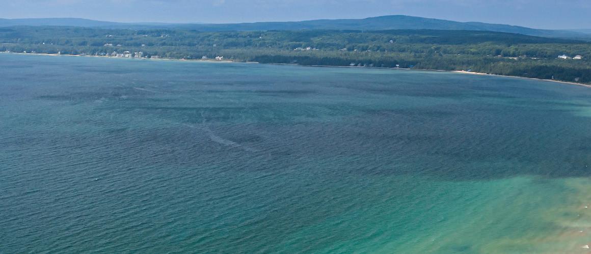
It’s that first glimpse of Little Traverse Bay, the friendly pace of our small towns, the natural beauty that surrounds us, the magic of a Lake Michigan sunset and the warmth of communities that greet travelers as though they are family. Those who visit rarely leave unchanged, and those who live here know it as part of who they are.
Through research, collaboration, and creativity, we listened to the voices of our community, our guests, and our member properties. And step by step, we uncovered insights and shaped a story that honors our heritage while positioning us for the future. What you’ll see in these pages is the culmination of that work an identity story that reflects the splendor, enrichment, and indulgence that defines the Petoskey Area.
This guide is more than a collection of logos, colors, and typefaces, but is here to help us tell one unified story. Together, we now have the tools to present the Petoskey Area with pride, ensuring travelers experience the same magic we feel every day in this place we call home.
—The Petoskey Area Visitors Bureau
To arrive at this new identity, a deliberate, collaborative process was followed. Each step was built upon the last, helping distill the magic of the Petoskey Area™ into a brand that is both authentic and forward-looking.
Work began with listening to business owners, local residents, loyal visitors, and area stakeholders, surfacing what people love most about the Petoskey Area. From there, the truths that make this destination unique were explored: authentic small-town charm, breathtaking natural beauty, a slower pace that invites people to stay, and traditions passed down through generations.
After intensive workshops, interviews, and regional exploration, Brand Discovery insights unlocked the Petoskey Area brand’s deeper essence. An Audience became clearly defined; unique and ownable Brand Pillars were shaped to prove a Brand Persona. Through further development of the Positioning Statement and Brand Tone & Voice, the Petoskey Area found the strategic and conceptual tools to ensure it would stand apart and grow stronger in the minds and hearts of travelers.
Quotes From Brand Discovery Workshop
Our waterfront is completely open. It’s all park space, all trails, open for all to see and enjoy.
Definitely an up north charm, however it has a lot. A lot of restaurants, a lot of shopping…
We are the genuine hometown of Northern Michigan. They’re coming for something that is going to be memorable. And sometimes it’s memorable enough that it becomes generational.
The design should feel like part of the family of logos throughout the area, but should be able to stand on its own.

Branding must be clearly connected to nature and reflect authentic and inspiring lifestyles and values.
Logo must not be indicative of only one season, and must consider how to communicate four seasons of nature.
Travelers who are looking for destinations that feed their cravings for more. They want a travel experience that lets them indulge in what they love, discover something new about themselves, and feel like it never has to end.
The Magician brings people on a journey. They are the gateway to a transformative escape, motivated to transcend reality and tap into what is unreal to make it real.
Splendor : A stunningly beautiful, year-round idyllic paradise filled with wide-open outdoor adventures, beautiful views every which way you look, and awe-inspiring settings. It’s unparalleled, unspoiled, and picturesque.
Enrichment : An unexpected mix of eclectic communities, breadth of experiences, and seasonal offerings that promote self-discovery, deliver in-depth connection, and elevate your travel experience.
Indulgence: A vibrant, adventurous area filled with welcoming, warm-hearted people makes for an experience that welcomes you with open arms to take in all that it has to offer and leaves your soul feeling fulfilled.
The tone is warm, genuine, and welcoming. The voice is knowledgeable, yet approachable neighborly, even. Guiding friends and guests to places and adventures that could otherwise be overlooked across six cities and their four wondrous seasons.
This region holds a great many meanings to those who live here and those who visit. Speak plainly and passionately about everything the Petoskey Area offers. As you write, remember that while each experience is unique, they all share the same spirit. Give spring’s first trail ride the same energy and affection as winter’s final sip of cocoa. Tease Lake Michigan’s cool blue waters with the same wonder one would describe the Tunnel of Trees’ transformation to gold. Your words invite people to this perfect place to recalibrate their inner compass.
For travelers who want experiences that are equal parts indulging and fulfilling, the Petoskey Area is an easy getaway that rejuvenates the soul with a unique blend of natural beauty and eclectic communities. Unlike anywhere else in Michigan, the Petoskey Area is the only true four-season destination offering visitors year-round splendor, enrichment, and indulgence.

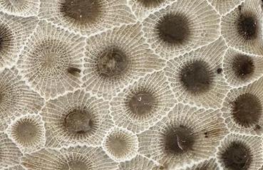
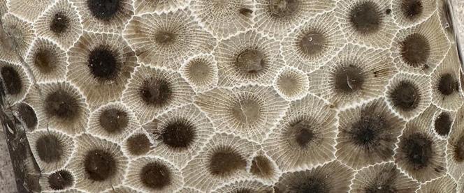
Our Charm is inspired by our area’s most recognizable icon and keepsake: the Petoskey Stone. We’ve harnessed its natural and distinctive hex pattern as the core of our visual identity system. As a simple and powerful expression of the brand, our Charm serves to instill an emotional and memorable association between the timeless stone and Petoskey Area guests.
The Petoskey Stone is unique to Michigan, especially the Petoskey Area. It’s an object of natural beauty and ancient regional history. The Charm was designed to evoke that sense of time and wonder—its organic forms are a calm and grounding connection to place, while its symmetry evokes the timelessness of nature.


PETOSKEY AREA
The Charm is a graphic distillation of three symbols evoking the Petoskey Area’s natural beauty throughout the year. The sun and snowflake represent summer and winter, along with the exciting activities available at different times of year. The Petoskey Stone pattern is a marker of local pride and a symbol of the area’s natural history.
The Charm is effective at a range of scales and in numerous colorways, making it ideal for representing the Petoskey Area brand wherever simplicity and/or graphic appeal are paramount (especially when the Petoskey Area Logotype isn’t vital).
The Petoskey Area Charm™ is a trademark of the Boyne Country Convention and Visitors Bureau d/b/a the Petoskey Area Visitors Bureau.
In order to retain its integrity and graphical power, the Charm—when being used as a logo mark and not as a decorative design element—must be placed in layouts so as to provide adequate clear space between it and any other graphic elements, including the edges of the layout itself.
Adequate clear space is defined as half the height of the central shape of the Charm, per the diagram on this page.
Note: In certain extreme circumstances, such as spaces with very small dimensions or unusual proportions, clear space requirements may be overlooked in order to ensure the Charm is large enough to be clearly recognizable.
The Charm is extremely flexible in colorway, and, unlike the rest of the logo variants, can be used either as a logo or as a graphic or decorative element in almost any color permutation within the brand palette.
The Primary Logo Lockup is the preferred visual expression of the brand in most consumer-facing marketing contexts. Other logo variants should only be used in specific circumstances that make the Primary Lockup a less useful option.
Note: For informational reference, the typeface used in The Petoskey Area logo is Komet. This typeface is only to be employed in logo lockups. For approved general brand use typefaces, please refer to Section 4: Typography on page 39.
This variant is configured for use in extremely horizontally proportioned spaces. It should only be used when spacial limitations make it difficult or impossible to implement the Primary Lockup.
The logotype comprises the typographical elements of the Primary Logo Lockup separated from the Charm. It is the simplest graphical expression of the Petoskey Area name, and is well-suited to environments that call for very small or more subdued references to the brand.
In order to retain their integrity and graphical power, all approved logo lockups and logotypes must be placed in layouts so as to provide adequate clear space between them and any other graphic elements, including the edges of the layout itself.
Adequate clear space is defined as the height of the T in “PETOSKEY,” per the diagram on this page.
Note: In certain extreme circumstances, such as spaces with very small dimensions or unusual proportions, clear space requirements may be overlooked in order to ensure the Charm is large enough to be clearly recognizable.
The primary logo lockup is designed with a strong, optical center axis through the north- and southpointing vertices of the Charm. In order to retain this optical center axis, the Logotype is positioned with a small amount of overshoot on the right side in the arm of the Y.
It is important when center-aligning the primary lockup in a layout to include an equivalent amount of padding (shown here) to compensate for the overshoot and ensure that the desired center axis is upheld.
Note: Do not remove or crop out padding deliberately added to the left side of a logo asset.
For both the Horizontal Logo Lockup and the Logotype, required clear space on all sides is equal to the height of the T in “PETOSKEY.”
These preferred colorways apply to all logo variations and logotypes within the Petoskey Area brand identity system (excluding use of the Charm as a decorative graphic element).
Note: Marks may be placed in reverse on photographic backgrounds, but only when there is a large area of relatively dark tone and low contrast so as not to interfere with legibility of the mark.
The Visitors Bureau logo variants are applied in business-to-business marketing materials and in business collateral materials.
Stacked Visitors Bureau Logo Lockup
The Primary Visitors Bureau Logo Lockup is the preferred visual expression of the brand in most business-to-business marketing contexts. Other logo variants should only be used in specific circumstances that make the Primary Lockup a less useful option.
This variant is configured for use in extremely horizontally proportioned spaces. It should only be used when spacial limitations make it difficult or impossible to implement the Primary Lockup.
The logotype comprises the typographical elements of the Primary Logo Lockup separated from the Charm. It is the simplest graphical expression of the Petoskey Area name, and is well-suited to environments that call for very small or more subdued references to the brand.
The Michigan logo variants are applied in consumerfacing advertising and marketing materials with audiences located outside of the Midwest region.
The Primary Michigan Logo Lockup is the preferred visual expression of the brand in most consumer-facing marketing contexts outside of the Midwest region. Other logo variants should only be used in specific circumstances that make the Primary Lockup a less useful option.
This variant is configured for use in extremely horizontally proportioned spaces. It should only be used when spacial limitations make it difficult or impossible to implement the Primary Lockup.
The logotype comprises the typographical elements of the Primary Logo Lockup separated from the Charm. It is the simplest graphical expression of the Petoskey Area name, and is well-suited to environments that call for very small or more subdued references to the brand.
It is vital to apply all of the Petoskey Area brand marks in a careful and consistent manner, which serves to retain their integrity and to prevent the dilution of the brand’s memorability and emotional resonance with our audiences. These pages illustrate a number of common forms of misuse with logos or other brand marks that must be avoided.
Note: The cases depicted here are examples shown using individual brand marks, but unless specifically stated otherwise, the same rules apply to all of the approved Petoskey Area brand marks.
× DO NOT use brand marks in unapproved colorways.
× DO NOT separately recolor the various parts of a brand mark.

× DO NOT place brand marks on backgrounds with inadequate contrast.
× DO NOT rotate brand marks. The Charm should be vertically oriented (single-pointed at top and bottom).
× DO NOT apply outlines, shadows or other effects to brand marks.
× DO NOT reconfigure or independently scale the various parts of a brand mark.
You’ll
be planning your trip to the
× DO NOT use unapproved logotype variations.
× DO NOT create new versions of brand marks with different text.

× DO NOT use brand marks with transparency.
before you know it.
× DO NOT use logo or logotype variants as in-line text.
× DO NOT change the typeface in a brand mark.
× DO NOT create textures or patterns using brand marks that include a logotype.
× DO NOT create textures or patterns using partial brand marks.
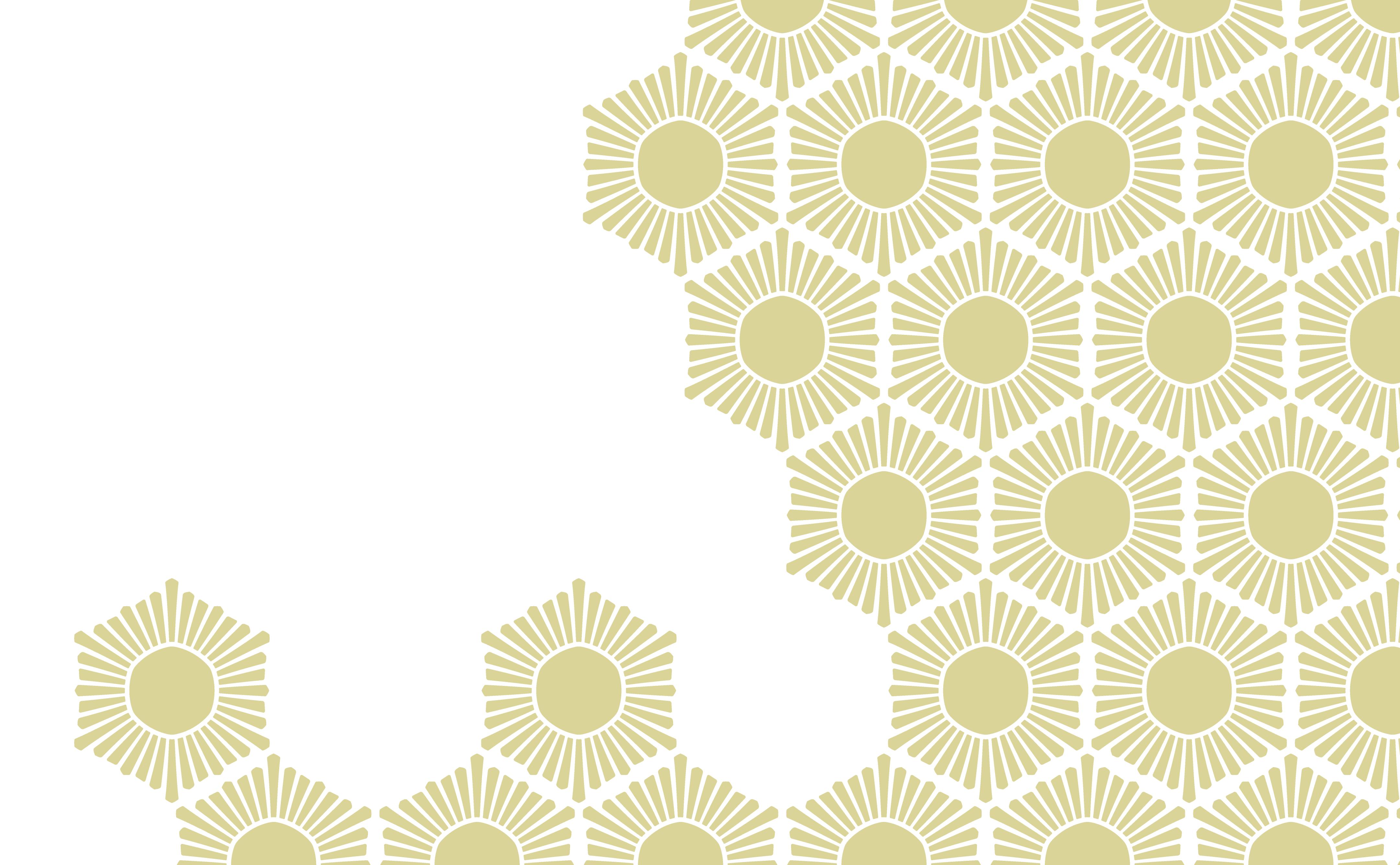
The Charm may be used to build a tiled pattern that evokes the distinctive recurring pattern of Petoskey Stones. This pattern can serve as a textural, illustrative, or background element.
While there are no strict limitations on the colorways used in this application, care should be taken to ensure that the motif is used in a pleasing and functional way. If used as a background element, contrast between the Charms and the field should be very low.
Any legal marks on the Charm (™ or ®) should be removed to form the tiled pattern.
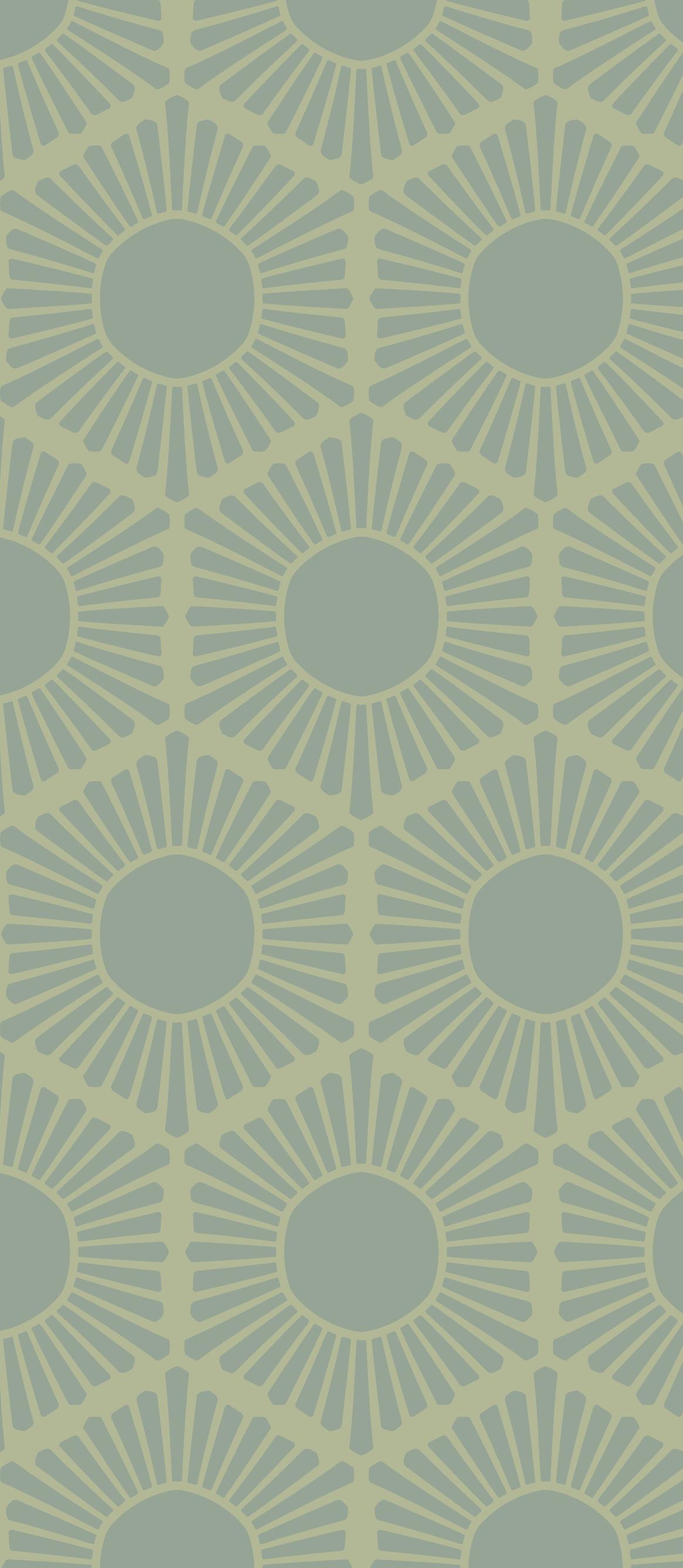


The Charm should be tiled per the illustration above, in offset rows, vertically oriented (single-pointed at top and bottom), and with narrow spaces between the Charms.
× CHARMS TOUCHING
× INCORRECT (DOUBLE-POINTED AT TOP & BOTTOM) ORIENTATION
The Petoskey AreaTM brand color palette is inspired by the wonder and magic of the region’s natural surroundings. It’s designed to evoke a sense of quiet awe, and to reference the smaller elements of nature that feel supernatural, all while differentiating the Petoskey Area from its regional competitors and occupying a unique place in audiences’ memories and hearts.
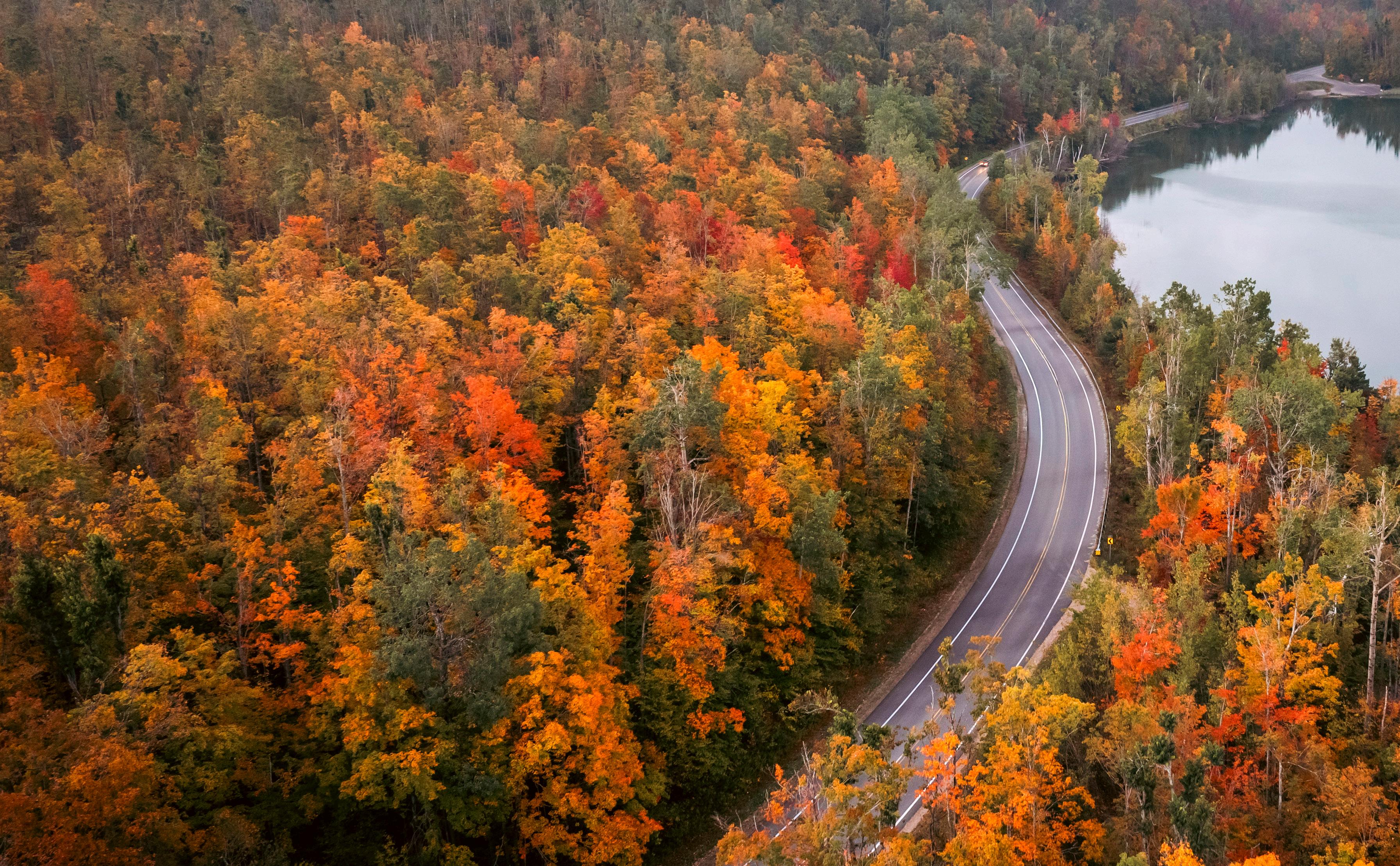
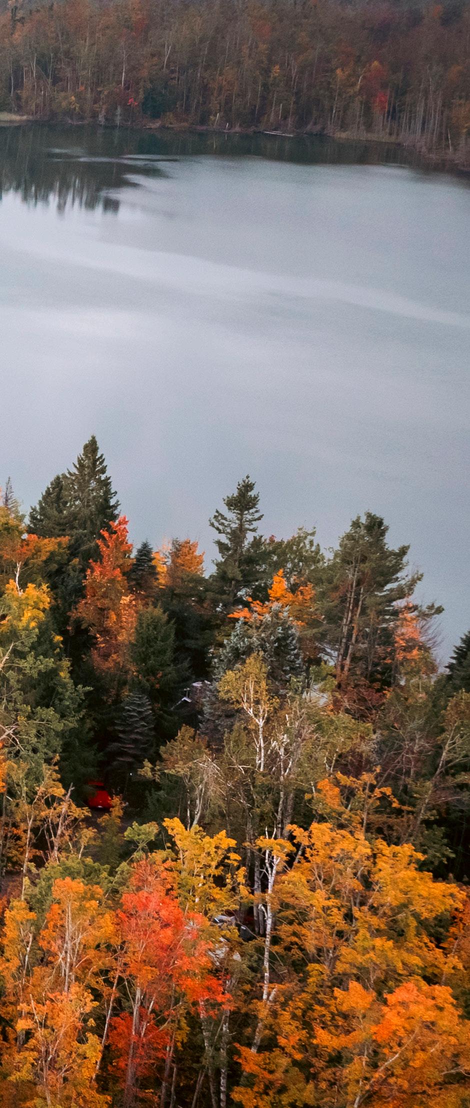
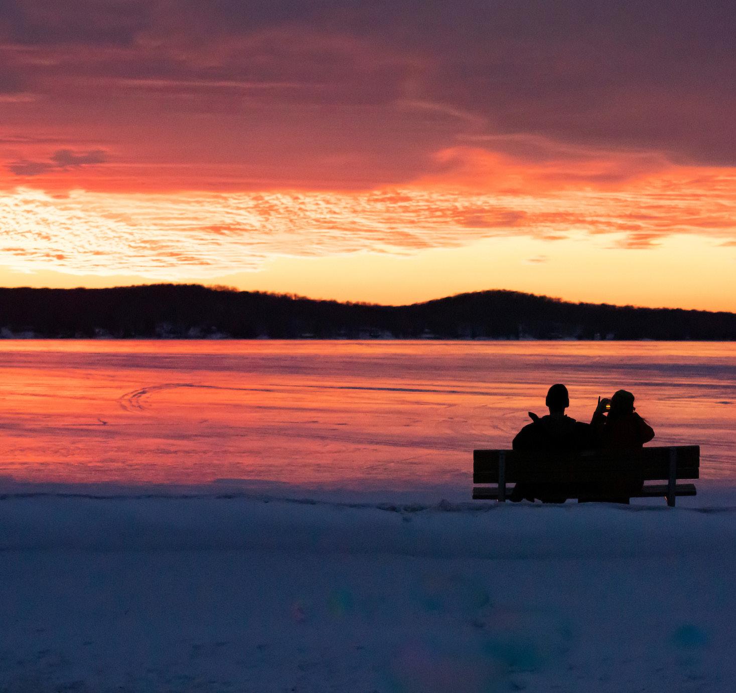
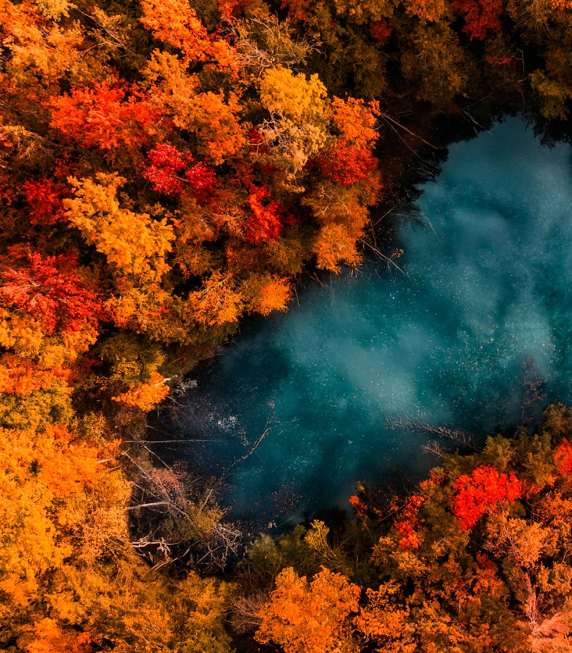
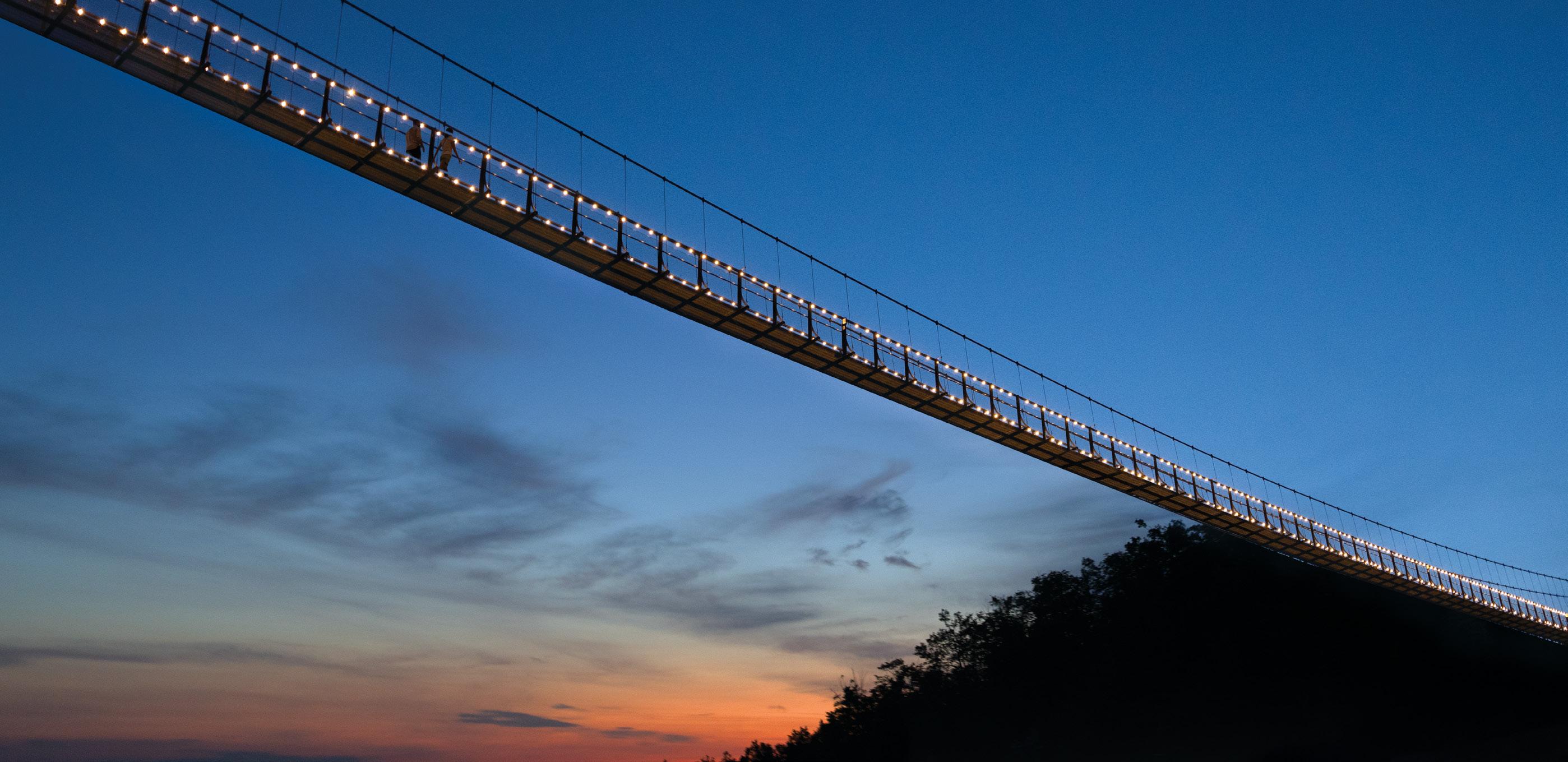
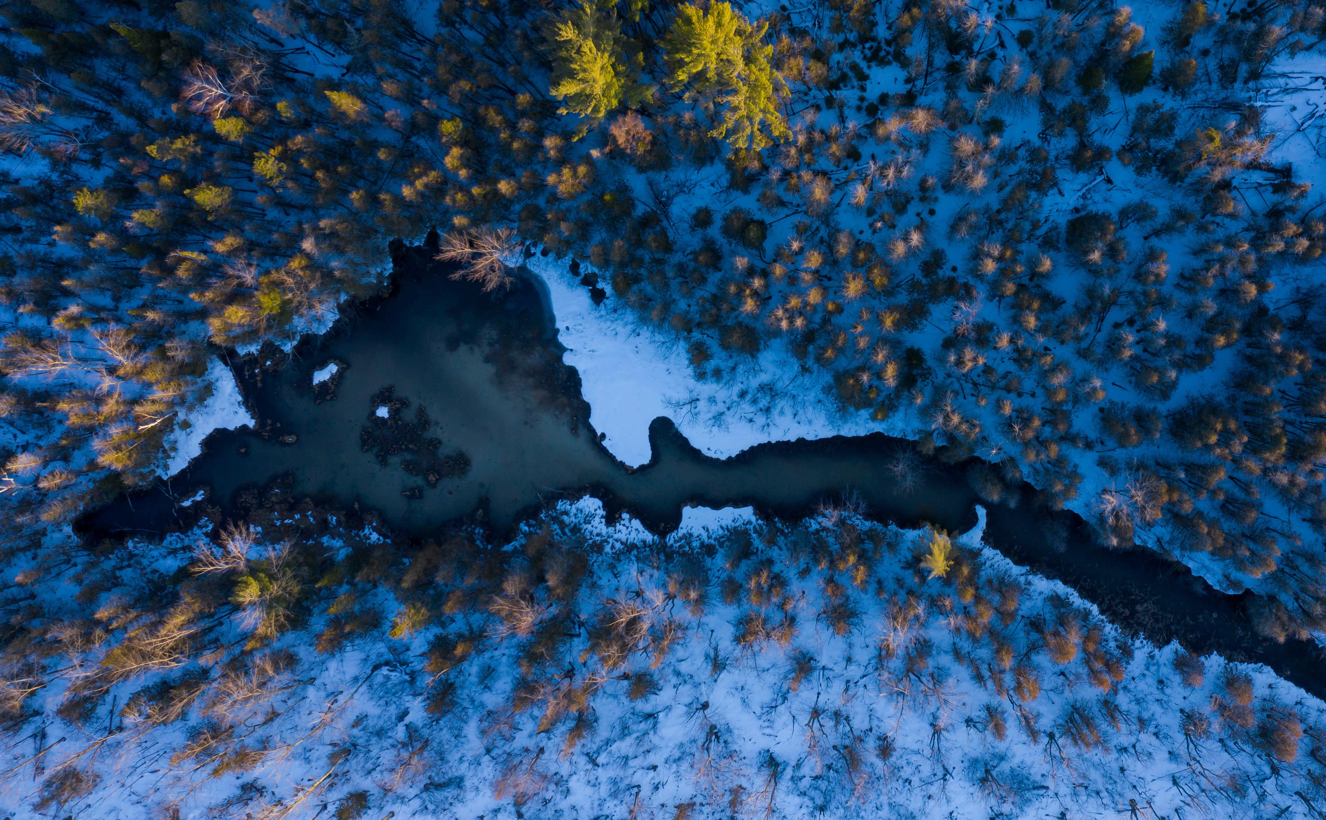
Brand colors evoke the rich, deep mystery of the night sky, the gentleness of piney woods, the calm of lake water, the fiery glow of autumn leaves and sunsets, and the cool timelessness of stone.
Color is a vital component of the communication and continuity of the Petoskey Area brand identity. Implementing this color palette with consistency and care will build and maintain a strong emotional connection between brand and audience, and will help ensure a satisfying and meaningful user experience.
The Petoskey Area brand color palette is a tool kit that offers a wide range of creative possibilities for working within the visual identity system.
Indigo is the most prevalent brand color, the one that is most elemental and foundational to the Petoskey Area Visual Identity, and the one with which audiences should develop the strongest emotional association. It is the preferred color for logo marks when they appear on light colored backgrounds. Indigo should be present to some degree in all collateral materials that feature any part of the brand color palette.
The range of greens—Lichen, Sage, Celadon, and Forest—are supporting colors that complement and enhance Indigo. They are effectively implemented in callouts or framing elements that stand out from the primary Indigo, or to organize secondary information.
Pantone 2118
CMYK 97, 93, 0, 11
sRGB 35, 30, 85
Hex #231E55
Lichen (28% Tint)
Pantone 614
CMYK 11, 5, 41, 0
sRGBa 231, 229, 180, 28
Hex #E7E5B4
Lichen
Pantone 614
CMYK 11, 5, 41, 0
sRGB 231, 229, 180
Hex #E7E5B4
Sage
Pantone 5793
CMYK 27, 14, 38, 2
sRGB 163, 175, 135
Hex #A3AF87
Celadon
Pantone 5635
CMYK 40, 20, 33, 5
sRGB 118, 140, 110
Hex #768C6E
Forest
Pantone 5477
CMYK 71, 36, 48, 39
sRGB 52, 68, 59
Hex #34443B
Midnight
Pantone 2768
CMYK
100, 78, 0, 66
sRGB 20, 15, 60
Hex #140F3C
Periwinkle
Pantone 2137
CMYK 60, 42, 5, 5
sRGB 103, 110, 140
Hex #676E8C
Mist
Pantone 7450
CMYK 24, 14, 0, 0
sRGB 163, 175, 195
Hex #A3AFC3
Bonfire
Pantone 171
CMYK 0, 74, 85, 0
sRGB 235, 95, 65
Hex #EB5F41
Pantone Warm Gray 7
CMYK 35, 34, 36, 11
sRGB 169, 167, 163
Hex #A9A7A3
Pantone Warm Gray 5
CMYK 29, 27, 29, 4
sRGB 172, 163, 154
Hex #ACA39A
Pantone Warm Gray 9
CMYK 40, 40, 42, 19
sRGB 127, 123, 117
Hex #7F7B75
Pantone Warm Gray 3
CMYK 21, 20, 21, 1
sRGB 191, 184, 175
Hex #BFB8AF
Pantone Warm Gray 11
CMYK 46, 47, 50, 30
sRGB 86, 79, 71
Hex #564F47
Pantone Warm Gray 1
CMYK 10, 10, 11, 0
sRGB 213, 208, 202
Hex #D5D0CA
Pantone Black 7
CMYK 63, 60, 64, 65
sRGB 44, 35, 31
Hex #2C231F
The secondary blues—Midnight, Periwinkle, and Mist—are useful for contrast management, to build typographical hierarchies, and to add depth and texture to layouts while retaining the general hue and feeling of the primary Indigo.
The natural tone palette, comprising the Pantone Warm Grays and Black 7, is utilitarian in nature. It is useful for typography, providing a range of contrast options, and lends a subtle, earthy warmth to more information-dense layouts.
Bonfire is a special accent color. It is chromatically complementary to the primary Indigo and draws the eye immediately wherever it is used. This color is best suited to draw user attention to a single, specific action or piece of important information, such as a primary button in UI.
Digital color reproduction has a wider gamut of available colors and can make use of much more subtle color variation than is possible in print.
These colors are formulated strictly for utilitarian use in screen environments, and have no CMYK or Pantone equivalents for print production. They should not be used in offline marketing materials of any kind.
In a web or app environment, these colors can be useful for various aspects of user interface (UI) design, such as menus and link hover states that can require very subtle shifts in tone.
sRGB 250, 250, 237
Hex #FAFAED
sRGB 245, 245, 220
Hex #F5F5DD
sRGB 214, 214, 170
Hex #D6D6AA
sRGB 221, 220, 211
Hex #DDDCD3
sRGB 234, 233, 222
Hex #EAE9DE
sRGB 197, 206, 221
Hex #C5CEDD
sRGB 25, 22, 71
Hex #191647
sRGB 219, 82, 59
Hex #DB523B
a a a a a a a a a a a a a a a a a a
This is not a comprehensive list of allowable type colorways, but these are examples of type colorways with good, strong contrast for high legibility. These would be acceptable for setting type at any size or weight.
Always take care to ensure that type is set on an adequately contrasted background. Use dark type on light colored backgrounds and vice versa. The smaller and lighter in weight the type is, the more contrast it requires. Some colorways work at any size or weight, while others might need to be used only with large type, bold type, or with graphic elements.
These are examples of colorways with only moderate contrast. They would be acceptable for large headlines, bold type or graphics, but not for smaller body text.
These are examples of unacceptable colorways without adequate contrast for typography at any size.
Foundry/Designer: Retype (Ramiro Espinoza)
License: Retype/Adobe Fonts
Sans Regular
Dejanire Sans Italic
Dejanire Sans (duh-YAH-ni-ruh) is the preferred type family for larger headlines and editorial type treatments within the Petoskey AreaTM brand identity system. It is preferred over Lato in cases where short, powerful passages of copy must convey a strong sense of the brand’s personality.
The Dejanire Sans family is a humanist sans-serif family with a subtly rugged character. Its glyphs feature tapered lines and chiseled edges that evoke the forms of nature and carry a warm and weathered charm that perfectly complements the Petoskey Area brand.
The Petoskey Area visual identity system uses three weights of Dejanire Sans: Regular, Medium, and Bold, and their corresponding italics. Bold is the preferred weight for headlines and large, brief editorial type treatments. Medium is useful for smaller instances that still require some branded flair, such as CTA buttons or navigational elements in user interfaces. Regular may be used for longer passages of text that require display treatment, such as testimonial quotes, e.g.
Dejanire Sans also features extensive glyph sets covering most Latin alphabet-based languages.
Sans Medium
Dejanire Sans Medium Italic
Dejanire Sans Bold
Dejanire Sans Bold Italic
Foundry/Designer: Łukasz Dziedzic
License: Google Fonts
Lato is the workhorse type family of the Petoskey Area brand. Members of the Lato family are the preferred fonts to use for body copy or small text anywhere within the brand ecosystem.
The Lato family is flexible and utilitarian, but features subtle details that echo the aesthetic character of the Charm and evoke the voice and personality of the Petoskey Area brand.
The Petoskey Area visual identity system uses three different weights of Lato: Regular, Medium, and Heavy, along with their corresponding italics. Regular is the preferred weight for body text in most circumstances. Medium is used for body text that is reversed out of a printed, color background to preserve legibility. Heavy (not Bold) is the preferred weight for emphasis or to establish hierarchy.
Lato also features an extensive glyph set, including full character and diacritic sets for most European (and several non-European) languages.
Zz 1234567890.,!?$@&
Dd Ee Ff Gg Hh Ii Jj Kk Ll
Nn Oo Pp Qq Rr Ss Tt Uu Vv Ww Xx Yy Zz 1234567890.,!?$@& Lato Medium Italic
Bb Cc Dd Ee Ff Gg Hh Ii Jj Kk Ll Mm Nn Oo Pp Qq Rr Ss Tt Uu Vv Ww Xx Yy Zz 1234567890.,!?$@&
Lato Heavy
Bb Cc Dd Ee Ff Gg Hh Ii Jj Kk Ll Mm Nn Oo Pp Qq Rr Ss Tt Uu Vv Ww Xx Yy Zz 1234567890.,!?$@&
Lato Heavy Italic
Bb Cc Dd Ee Ff Gg Hh Ii Jj Kk Ll Mm Nn Oo Pp Qq Rr Ss Tt Uu Vv Ww Xx Yy Zz 1234567890.,!?$@&
Display type (Dejanire Sans) is used for headlines and other short passages that require aesthetic emphasis and need to show off the brand’s personality. Its use should be limited to large type no more than about 20 words in length. As a general guideline, print uses should be no smaller than about 18pt and digital uses no smaller than about 30px.
Text type (Lato) is used for more utilitarian contexts where clarity and legibility take precedence over personality. Smaller type, large volumes of text, and mundane, detailed or complex information (legal disclaimers, data tables, contact information, etc.) should use the text family.
This is also body text, but in a paragraph. It’s much smaller, and uses many more words to express more complex ideas. It needs to be simple and legible in order for readers to be able to process and absorb it effectively. The smaller the type, and the more utilitarian or complex the information, the more likely it is to require use of the text typefaces rather than the display typefaces.
Lato Heavy 11pt/15pt
Dejanire Sans Bold
48pt/52pt
Dejanire Sans Bold
32pt/40pt
Dejanire Sans Bold
24pt/30pt
Lato Heavy 14pt/18pt
Lato Regular 12pt/16pt
Lato Regular 8pt/11pt
Dejanire Sans Italic
26pt/32pt
Lato Heavy 11pt/15pt
Lato Heavy 9pt
Lato Regular 9pt
EYEBROW
Subhead/H4
Iciam hiliqui omnihilist, suntiberspit facea excero omnitis dest re dest rae reium errum accus explia sunto voluptat eum quo modio mincide volo incimi, que volupic totaest incianis solorum dolenim inctaqui coneseq uatecus que volut laboribus ea core nempercium non cus iuscima sime ped et eatem.
Ro dero ex eatem soluptas doluptatur reped que demqui officiatquae dolese incil eaquid essedia tioris ea nimusandae et is volorem latempor apeleces eum harciantis recum lacimo cus.
“The only thing we have to fear is fear itself.” – FRANKLIN D. ROOSEVELT
Good typographic hierarchy is vital to ensuring that readers are able to thoroughly comprehend information
The type styles depicted here are not strict requirements, but suggestions as to how a rich and functional hierarchy can be built from the brand’s two type families working in concert.