Drawing from six years of theatrical design experience, Pannam Dhoat is pursuing a Bachelor’s degree in Architecture with a focus on set and lighting design. Her theater background taught her the power of darkness and shadow in creating immersive experiences. As Jun’ichirō Tanizaki observes in “In Praise of Shadows,” - “Were it not for shadows, there would be no beauty.” This philosophy guides her approach to both theatrical and architectural spaces.
Contact Honors
pannam.dhoat@gmail.com
(925)-490-3556
linkden
Experience
Currently working at Trojan Event Services as an audio supervisor
Freelance woodworking
Teaching Assistant for 1.5 years at School of Architecture
3 Set desgin productions at University of Southern California
Professor Clayton Baldwin and Raymond Kennedy Memorial Scholarship
HOK Endowed Scholarship in Sustainable Design
Presidential Scholar (Merit based half tuition scholarship for 5 years)
2nd Place in 3D Modeling and Digital Art at CVCHS Art Expo
Department award for Engineering (Civil Engineering and Architecture)
2nd Place in 3D Modeling and Digital Art at CVCHS Art Expo
Intrests
Model Making
Architecture
Set Construction and Desgin
Creating Experimnetal Audiovisual Spaces
Sketching
Designing Lighting
Photography
Software Skills
Enscape AutoCad Rhino SketchUp
PremirePro Illustrator InDesgin Photoshop Revit
WHERE WITHIN: ADPATING A STUDENT WRITTEN SCRIPT
SOFTWARES USED: AUTOCAD
IN COLABROATION WITH USC FABLES AND RUMORS
WHERE WITHIN
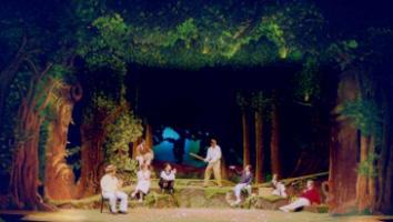
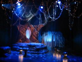
“Where Within” is an original folklore musical produced by a USC student theater group. The story follows Harper and Cameron, who find themselves lost in a mysterious forest and must navigate both their physical journey out and their path back to each other. Drawing inspiration from “Over the Garden Wall” and featuring Celtic-influenced folk music, the narrative explores themes of self-discovery and the complexities of helping others
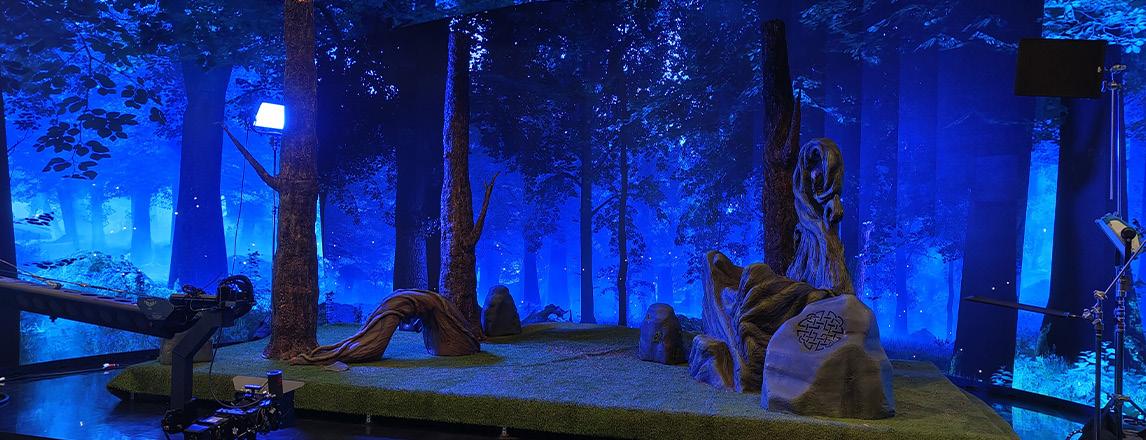
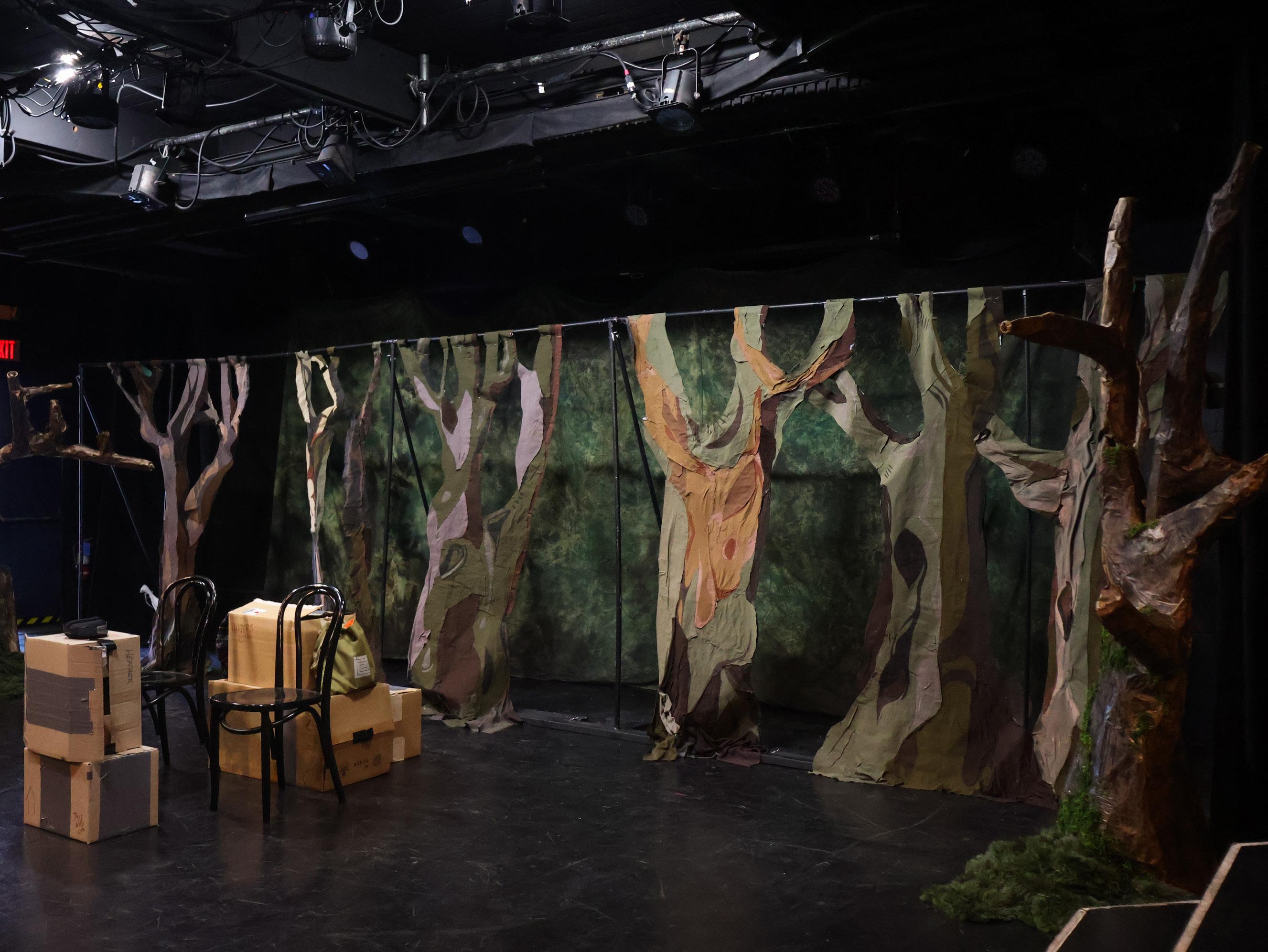
As Co-Scenic Designer, I led the set design from initial concept through construction and premiere in late July 2023. A key challenge was creating a fully collapsible and mobile set design that worked within strict stage constraints while maintaining the production’s enchanted forest atmosphere. Through innovative solutions and careful planning, we successfully developed modular set pieces that could be efficiently transformed between scenes without compromising artistic vision.
COLLABORATING WITH ADDIE LILLARD
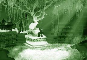
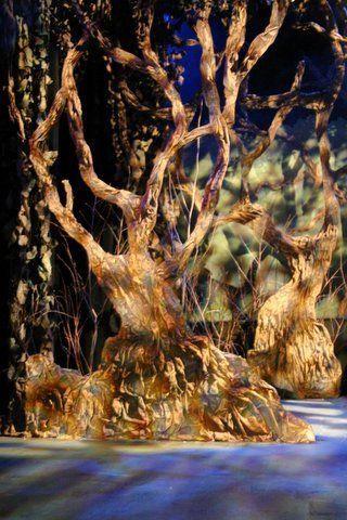
Script + Precedents for Lighting and Atmosphere
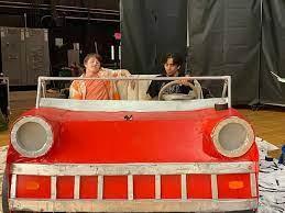
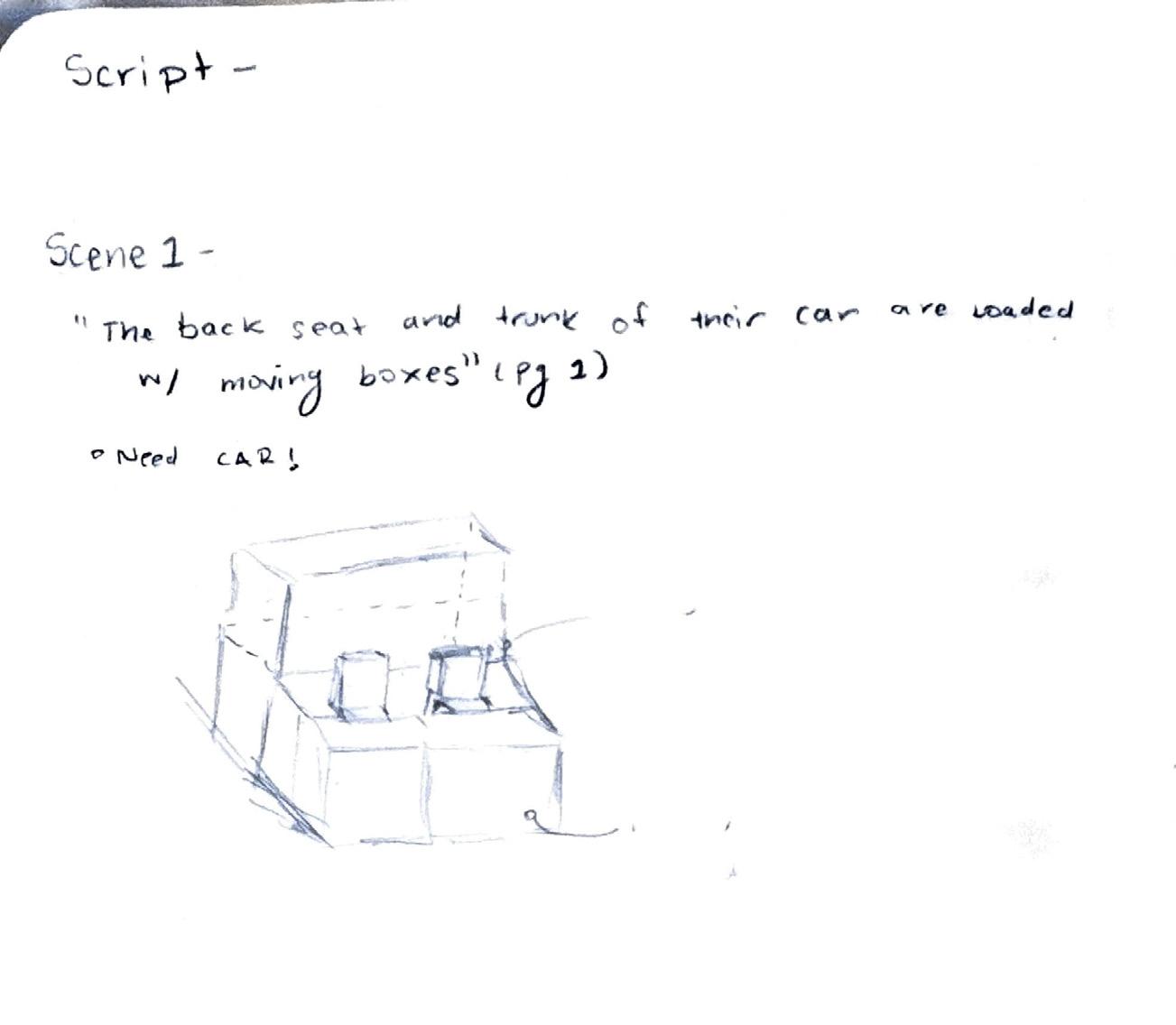
Siblings HARPER and CAMERON are driving together through a massive forest. The backseat and trunk of their car are loaded with moving boxes.
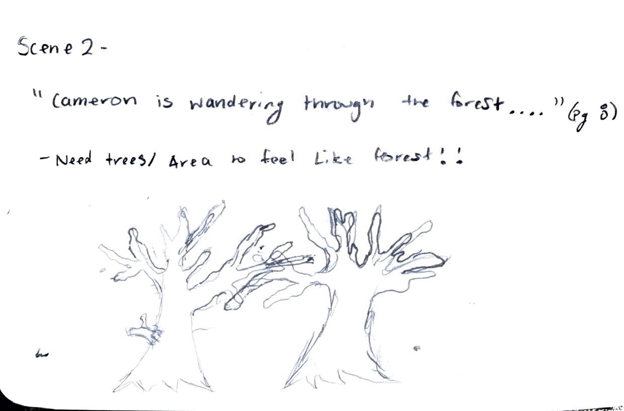
CAMERON is wandering through the forest, following after the mysterious light. It’s well after sunset by now--a bit cold, a bit too dark. He walks distracted, muttering to himself while trying to keep a distant eye on the
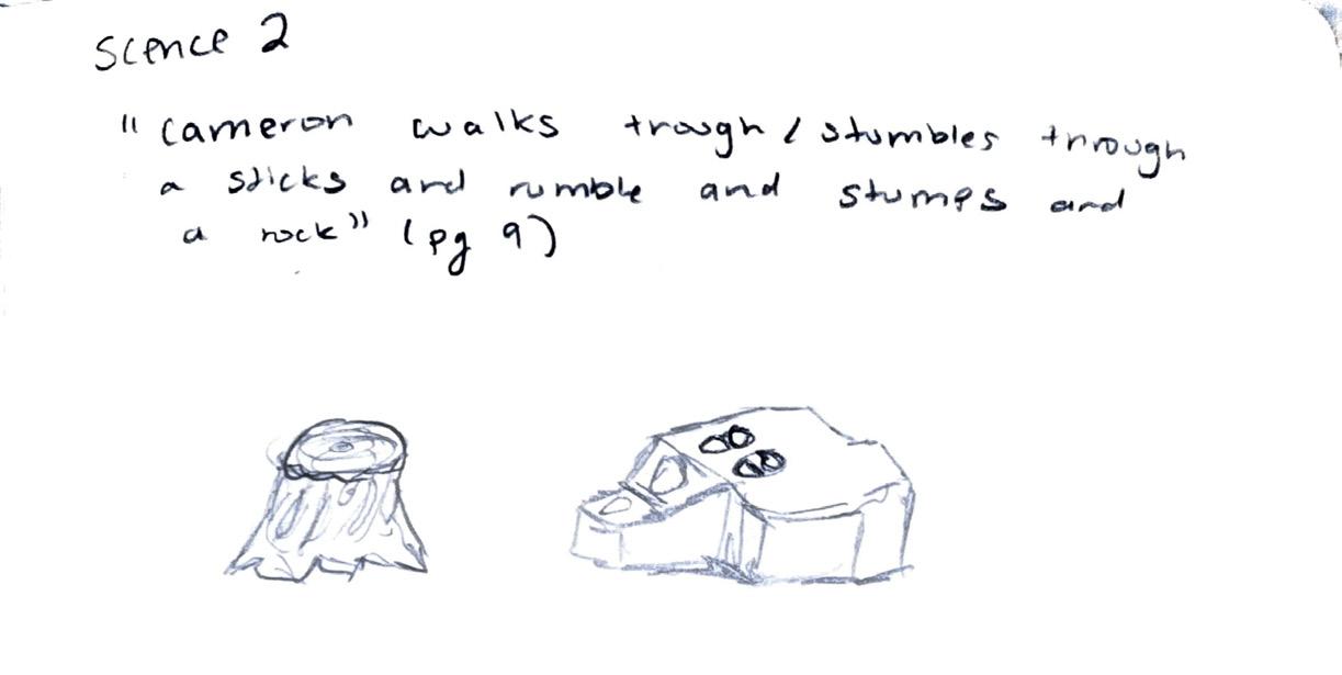
CAMERON is trying to get through the rocks and walks over to a stump to rest.
My Sketches
STAGE PLOT
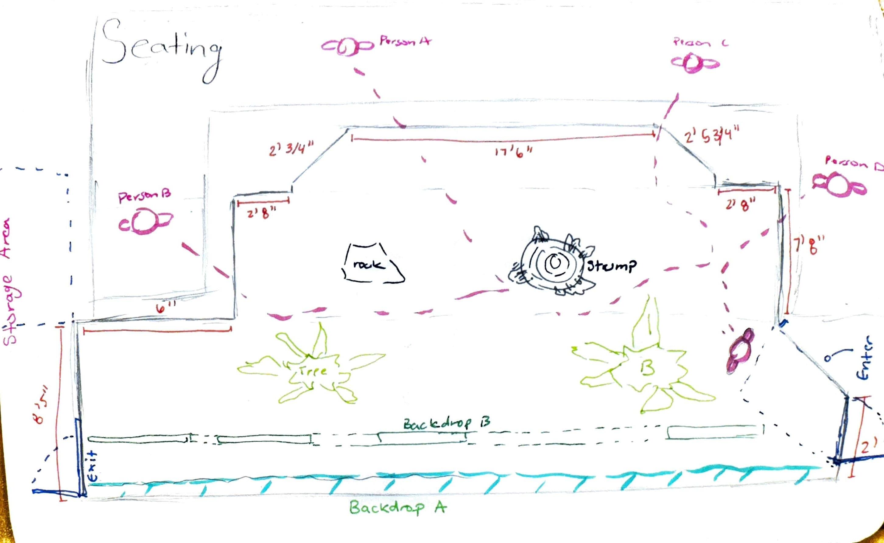
The initial stage plot allowed us to experiment with the spatial relationships between key set elements: the stump, rock formations, two trees, and backdrop pieces. During this planning phase, we discovered that all components needed to be both collapsible and quickly assemblable to meet the strict 15-minute setup and breakdown requirement. This constraint led us to develop innovative solutions for creating lightweight yet sturdy props and set decorations that could be efficiently transported and assembled while maintaining structural integrity.
KEY
BACKDROP- INTIAL IDEA
CAMERON AND HARPER
WISPS BEHIND BACKDROP 2
WISPS BEHIND BACKFROP 3
BACKDROP C
BACKDROPS IN PLAN
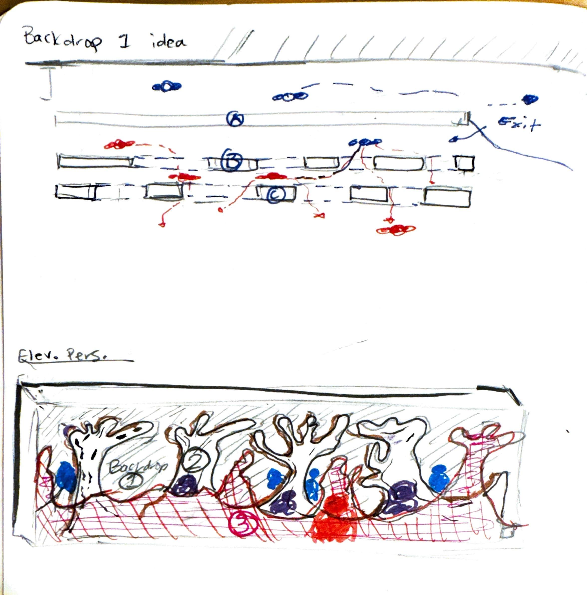
Initial Design Concept Our original design incorporated three distinct backdrops: a solid forest green sheet that provided both a changing area for the cast and an opportunity for dramatic backlighting to create a mysterious woodland atmosphere. Two additional backdrops featured scattered tree patterns, designed specifically for the “wisps” - playful, mischievous fairy characters - to interact with during performances, enhancing the magical elements of the show through their movement and concealment among the trees.
KEY
AND HARPER
WISPS BEHIND BACKDROP 2
WISPS BEHIND BACKFROP 3
BACKDROP C
BACKDROPS IN PLAN
BACKDROP- ADJUSTED IDEA
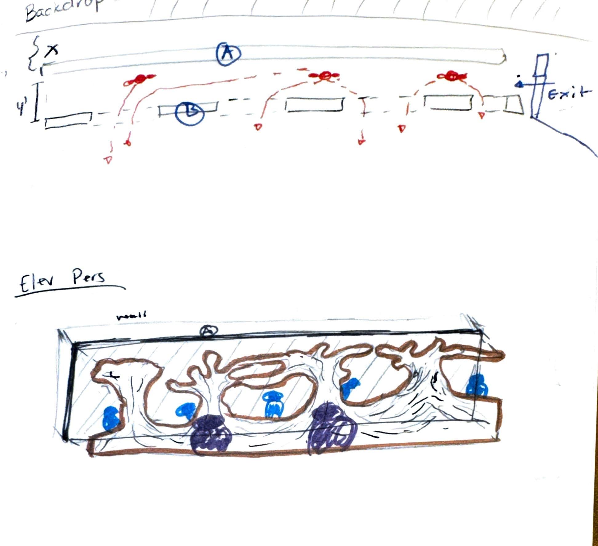
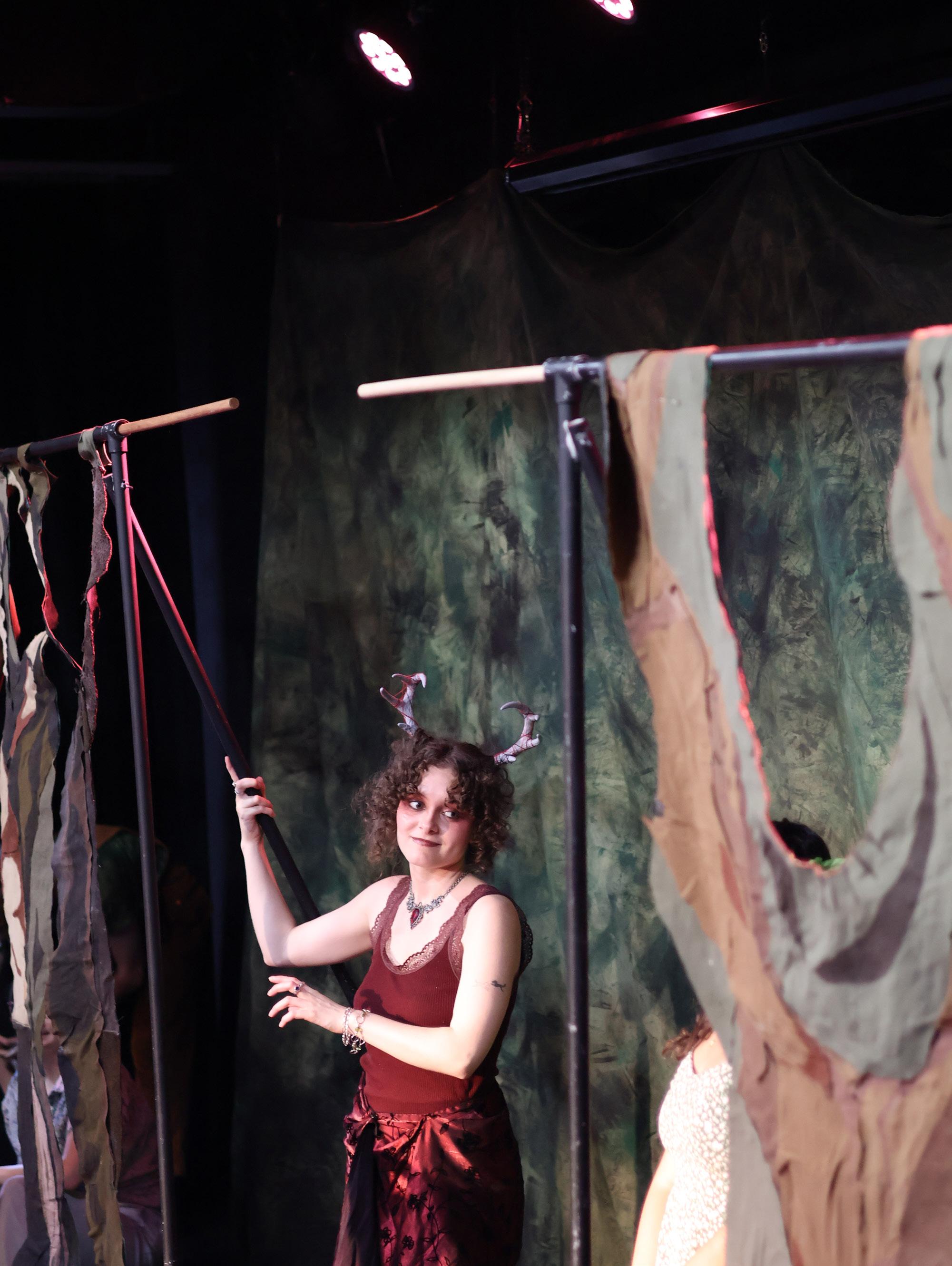
We modified our approach to use two backdrops because of stage constraints. The first backdrop was positioned near the back wall to minimize the intrusion of the black wall surface. The second backdrop featured a tree design that maintained the interactive elements for the wisps This revised design successfully preserved the menacing atmosphere required for darker scenes while accommodating the practical limitations of the space.
CAMERON
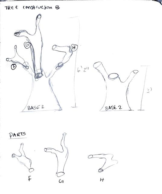
TREE CONSTRUCTION
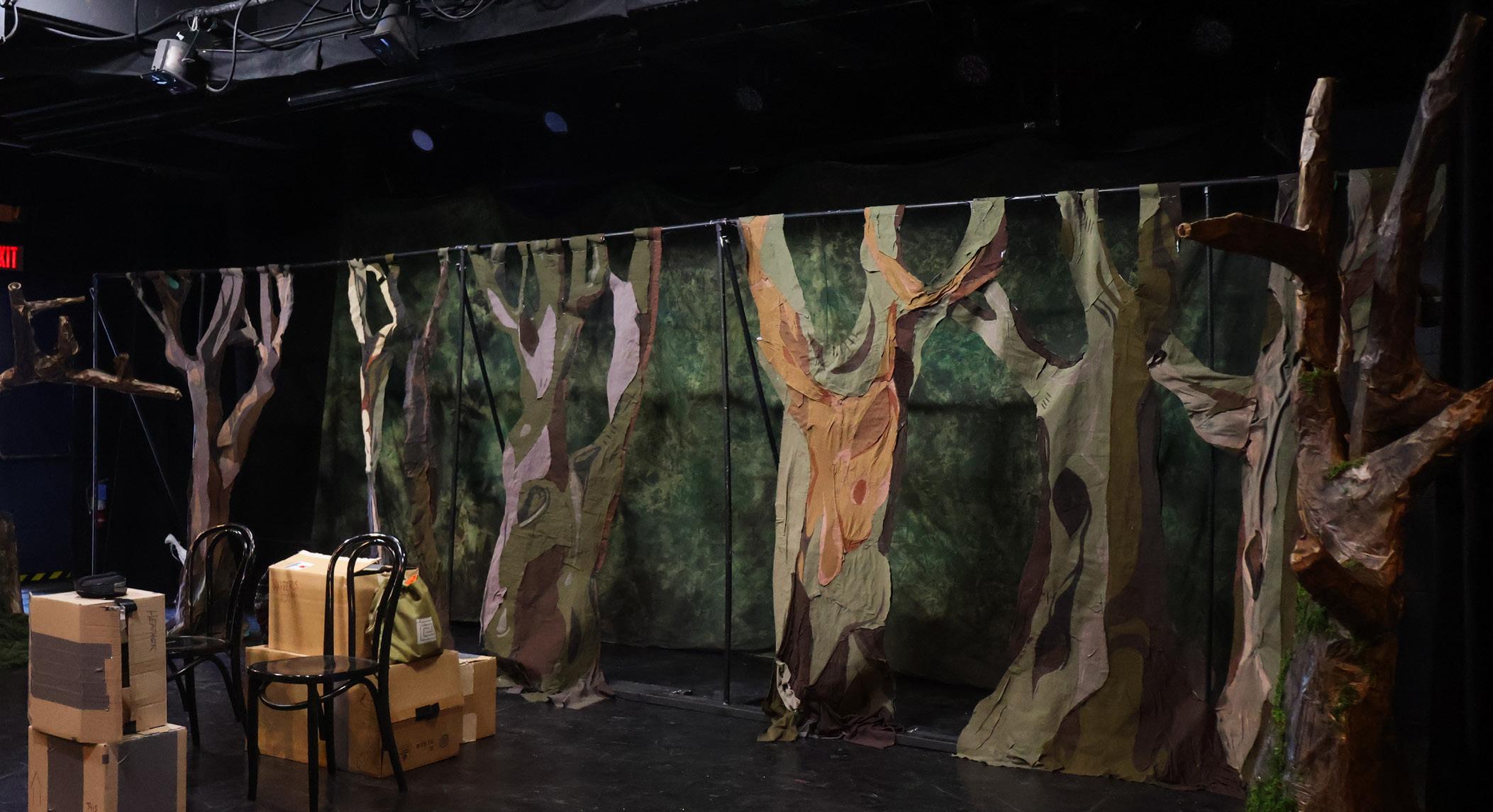
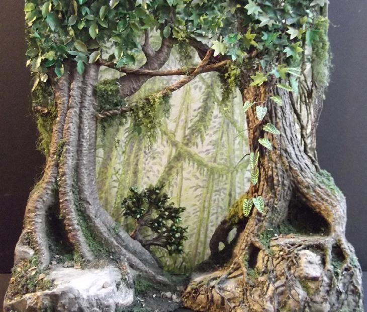
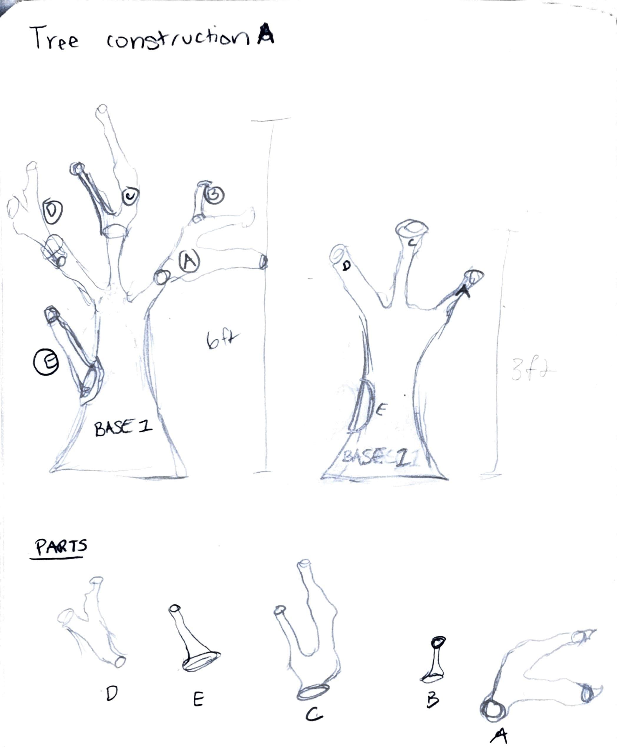
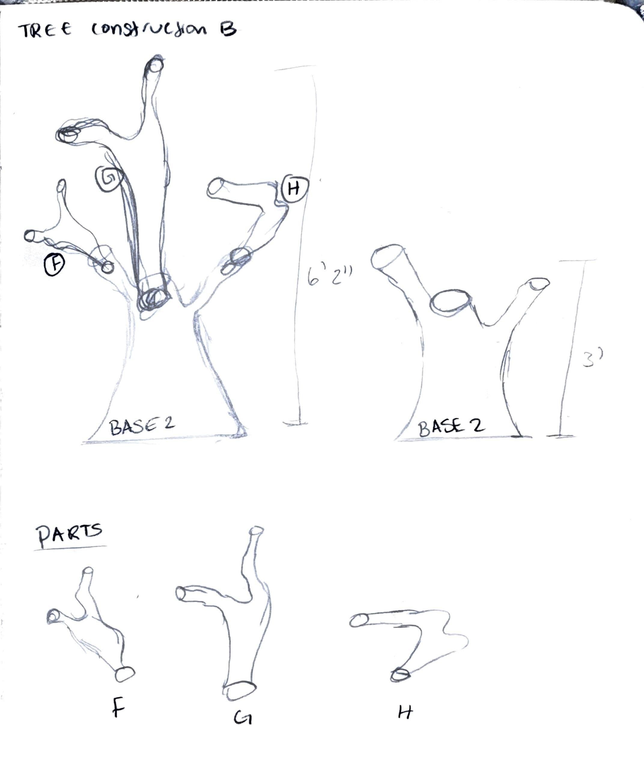
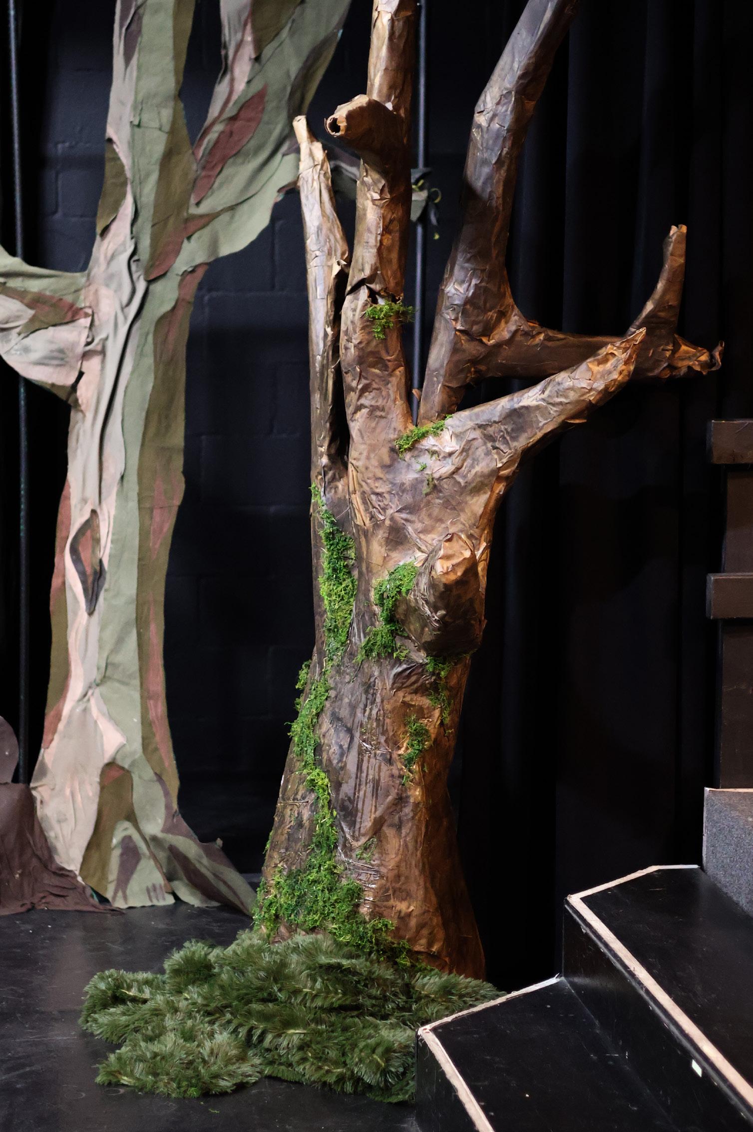
For the tree, we developed a modular tree design using a sectional construction approach. The tree base was crafted from a combination of fabric rolls, cardboard, and duct tape, which we then covered with papier-mâché. We achieved a realistic bark texture through layered application of diluted brown paint and enhanced the mystical atmosphere by incorporating natural moss elements. The assembly system consisted of individually labeled tree sections that connected through pre-cut holes in the base structure, similar to traditional woodworking joints. This design allowed for both sturdy construction and efficient assembly while maintaining the enchanted forest aesthetic.
FUN HOME: ADPATING A COMIC
SOFTWARES USED: AUTOCAD
IN COLABROATION WITH USC MTR + STUDENT FILMS
FUN HOME
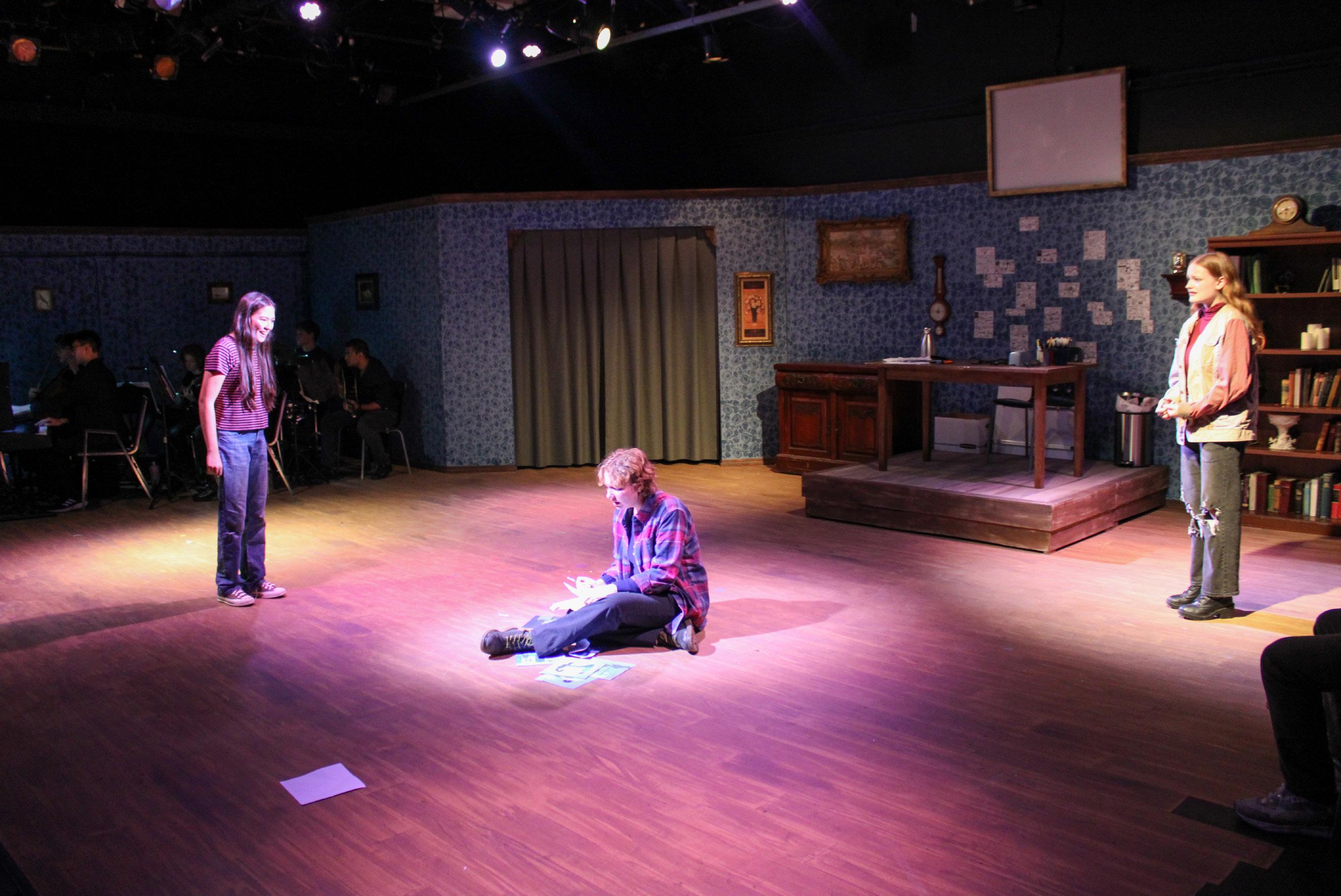
Fun home is a musical about Allison or Al and their journey and discovery of their past life. As the story progresses you are faced with three different versions of Al, younger, college aged and middle aged, and then rediscovering childhood memories about their deceased father.
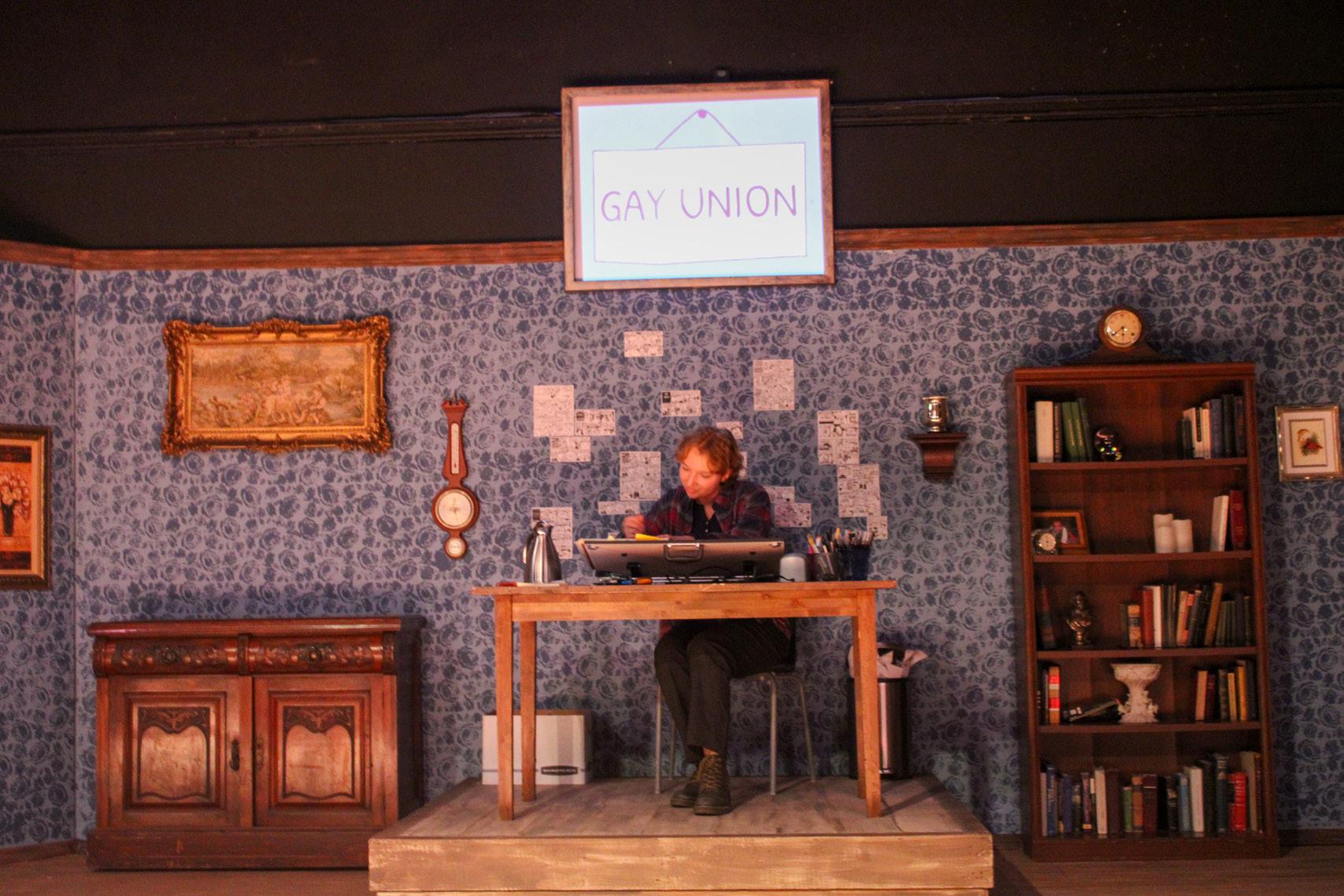
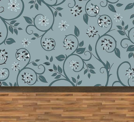
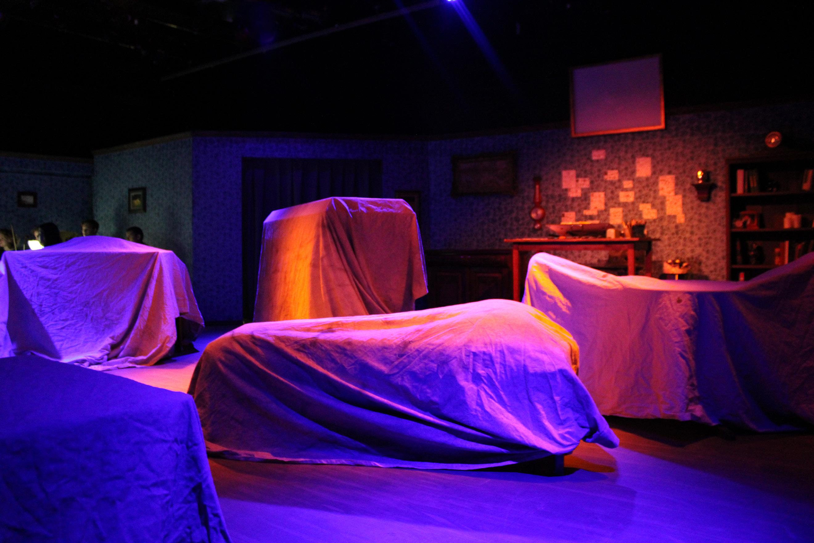
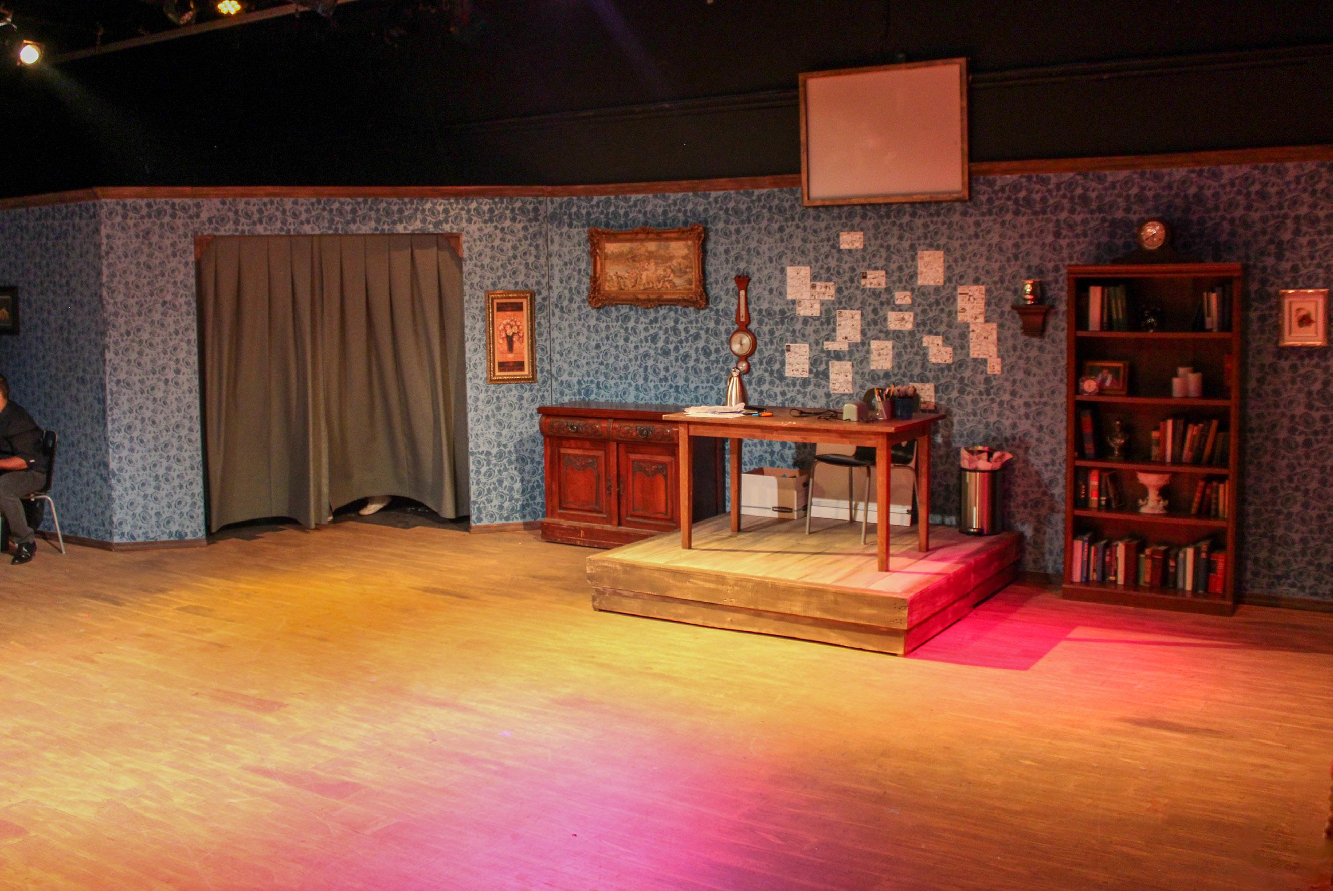
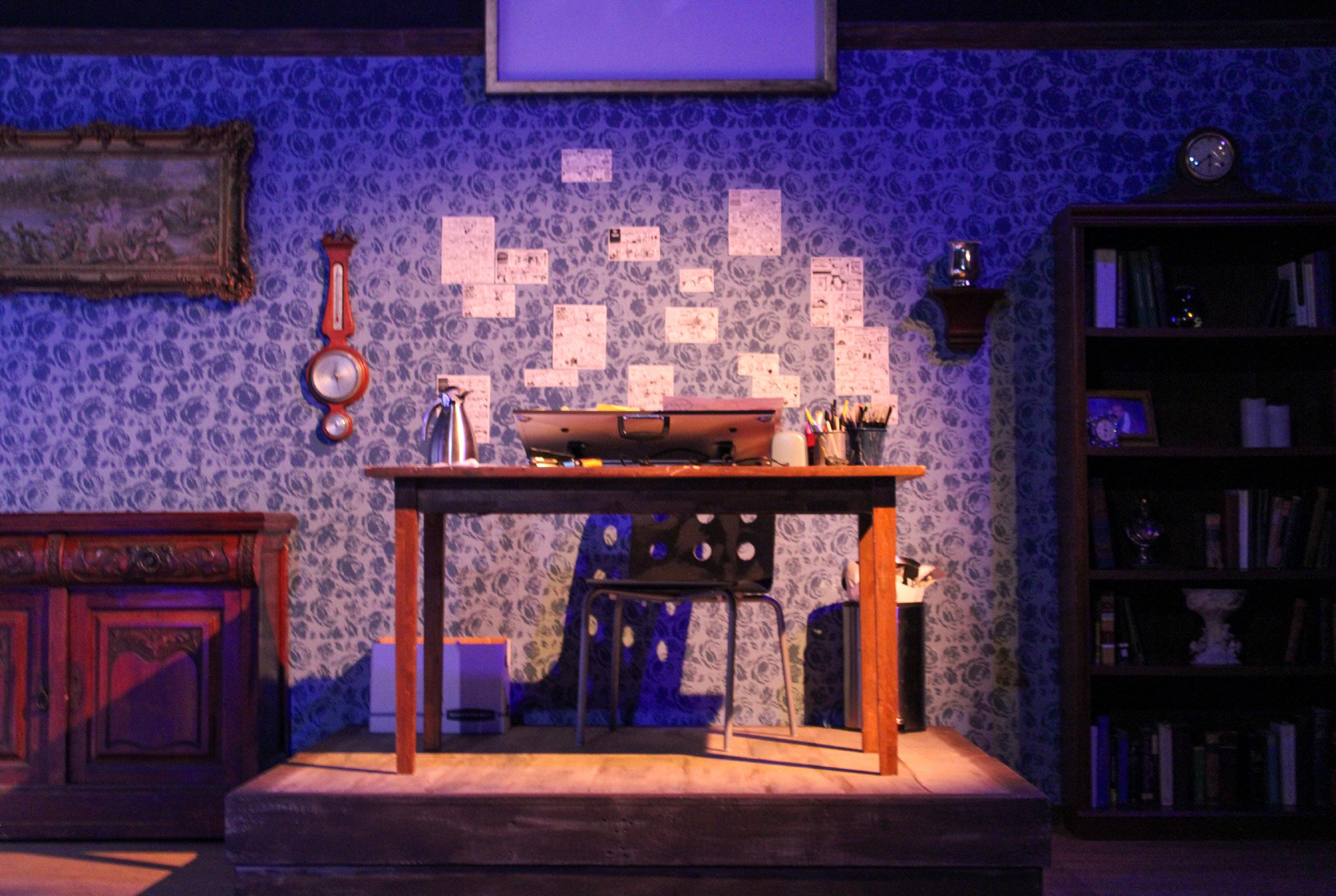
I was assistant scenic designer for this project and thus, was in charge of helping out the main scenic designer with set decorations as well as sourcing materials. I was also in charge of painting the floor and creating a wallpaper texture on the Hollywood flats we used for our set. Throughout the process I learned how much work goes into designing a set because not only did we have to design the set we also have to make sure it’s movable and map out when and how props and set pieces move.
COLLABORATED WITH LUKAS GARBAR
USING FUN HOME COMIC TO SOURCE MATERIAL
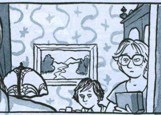
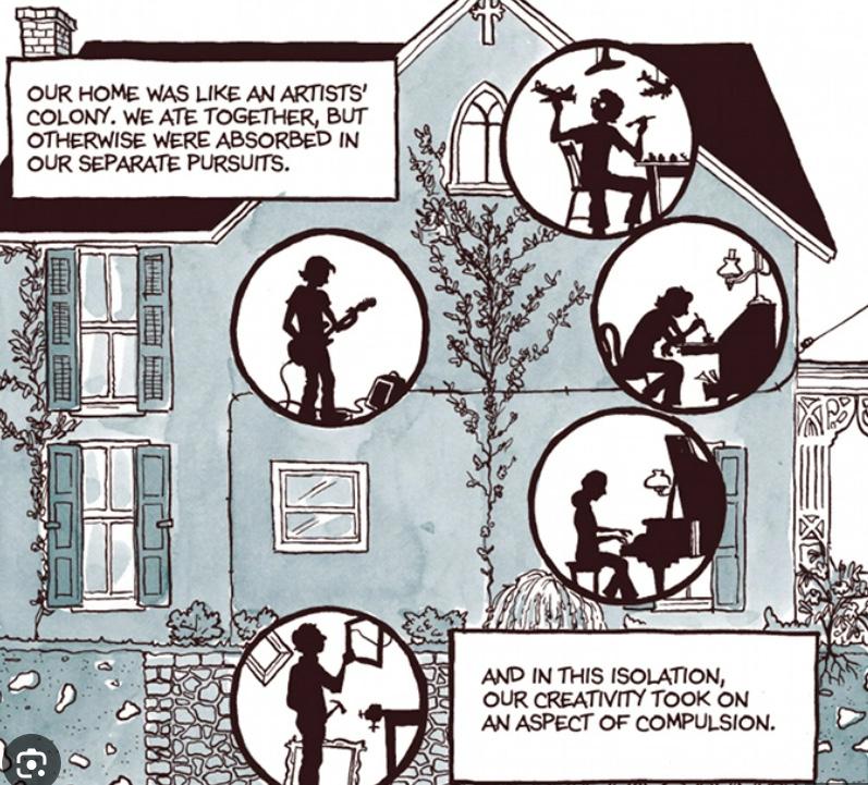
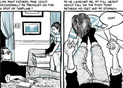
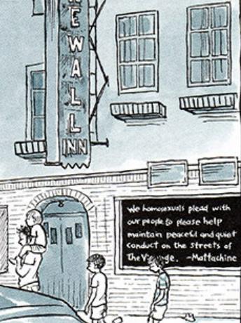
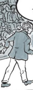
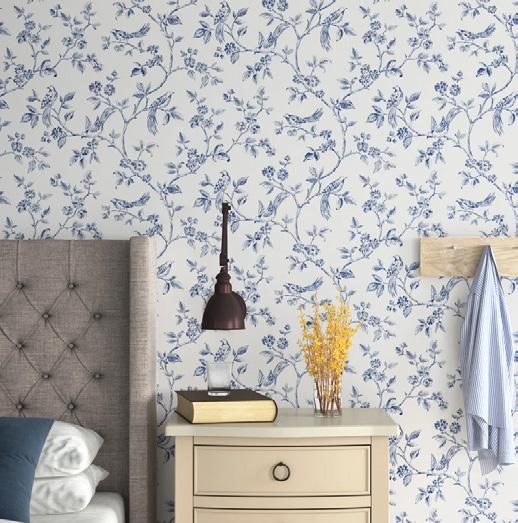
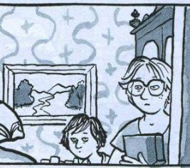
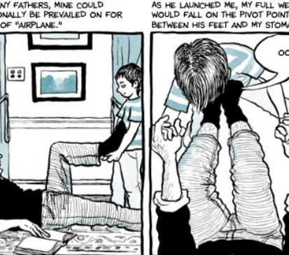
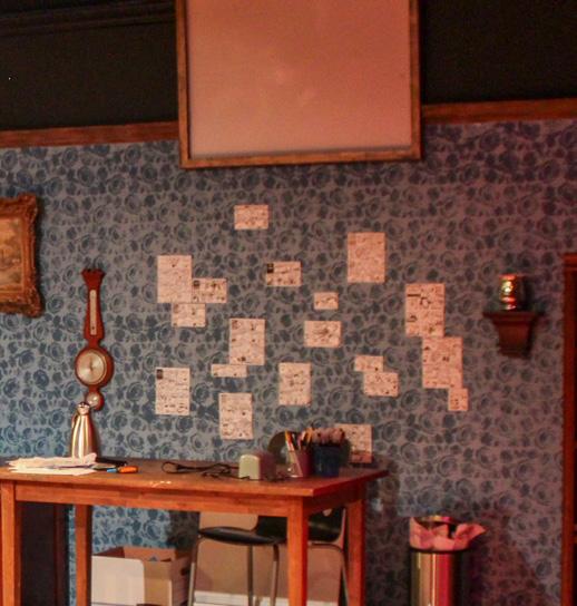
From this image of the comic we got inspired to do a blue monchramtic wallpaper to stay true to story of Fun Home.
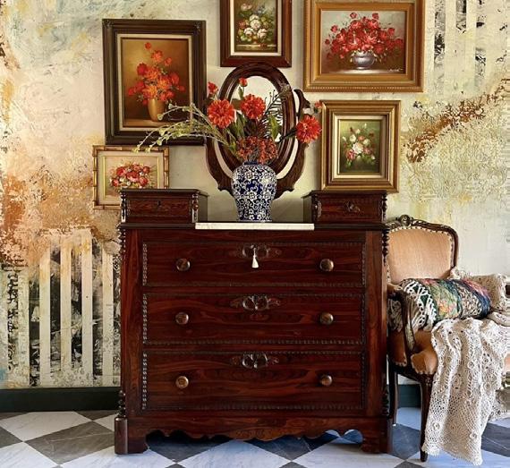
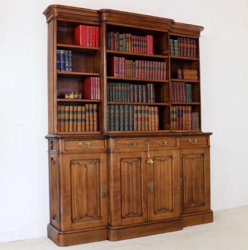
From this image of the comic, in the corner you can see a gothic style dresser wich inspred us to do a bookshelf/ dresser in this style.
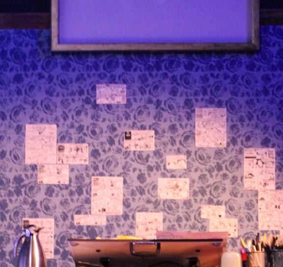
From this image of the comic, you can see that Al our main charcter recounting their life. This gave us the idea to have images of the comic behind her, which will show their progession the the audience.
ELEVATION DRAFTING
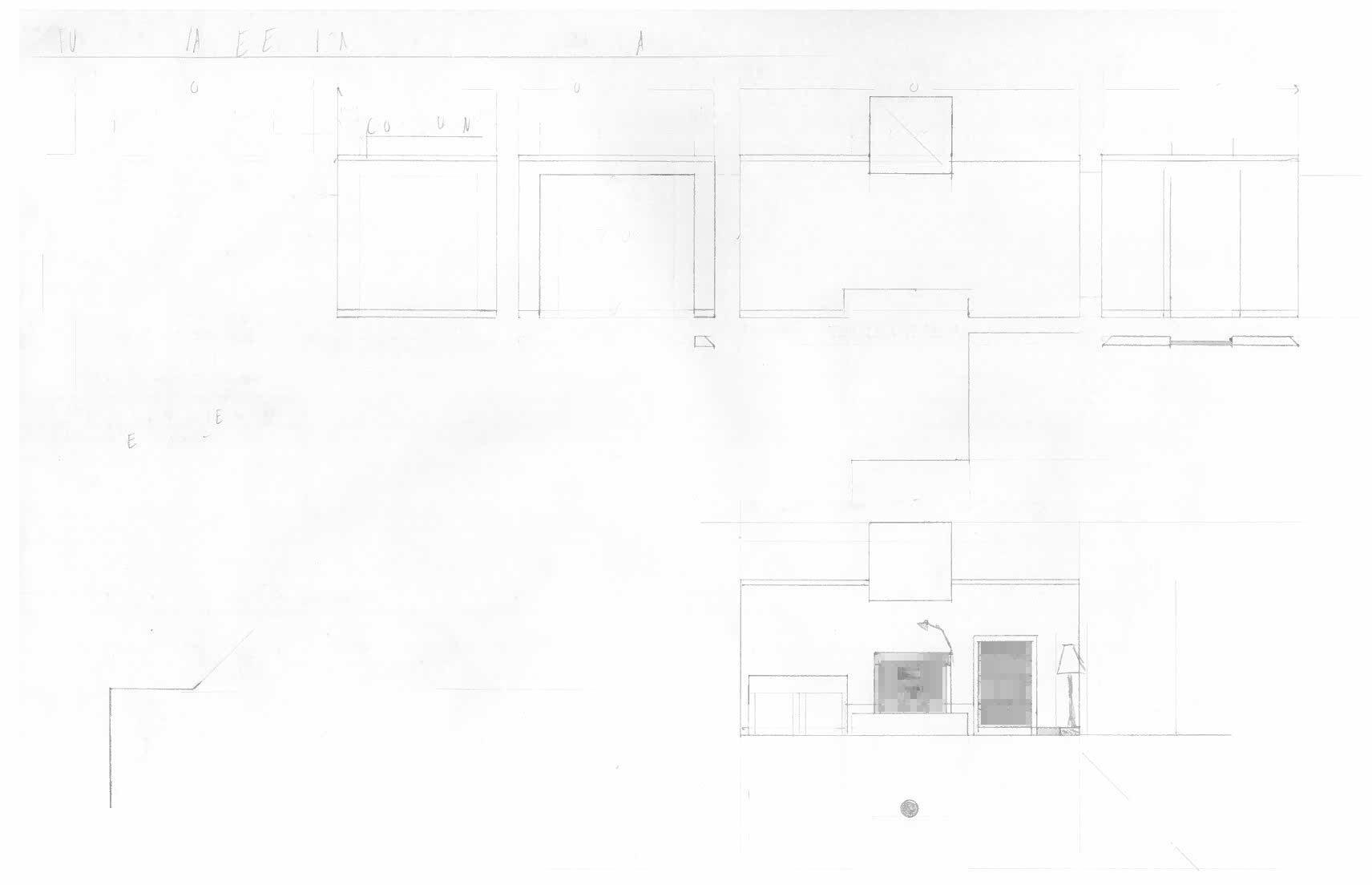
After completing the initial designs, we moved on to elevation drawings to ensure the set would fit precisely in the theater and provide detailed specifications for the technical director responsible for flat construction. We also created detailed renderings of the stage’s front view. These drawings were crucial in identifying any missing elements or potential design gaps.
THE POPPY WAR: CREATING SPACE THROUGH NARRITVE
THE POPPY WAR AN ABSTRACT ARCHI-
AN ABSTRACT ARCHITECTURAL STUDY ON WAR
PROJECT BREIF:
The goal of this course is to generate critical discussions and experiment with tools and representational strategies. Students are encouraged to take risks and explore both digital and analog techniques throughout the class. Ultimately, the goal of the class is to incubate a student’s personal relationship with representation through the implicit act of drawing.
Using a selected narrative, students will translate the text into possible architecture Throughout the seminar, we will develop representations, each more formalized than the previous. The final result will reconstruct and rerepresent the allegory of the original source.
MY NARRATIVE:
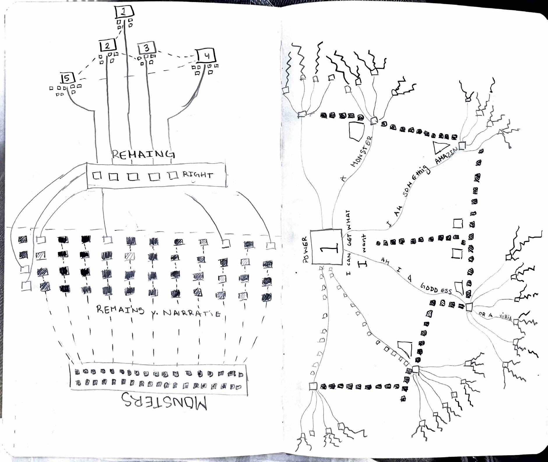
My narrative was the novel “The Poppy War” by RF Kaung. This book follows the main character Rin whose journey from a poor merchant’s adopted daughter to a military student and eventually a powerful warrior serves as the lens through which we explore complex ideas and themes such as the Consequences of War, Colonialism and Power, Identity and Heritage, etc. I wanted to focus on the consequences of war in my drawing. Focusing on a quote from the book that reads “War doesn’t determine who’s right. War determines who remains”.
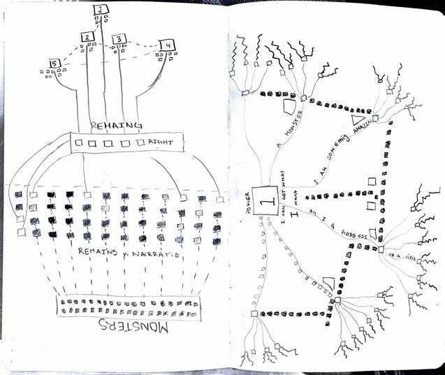
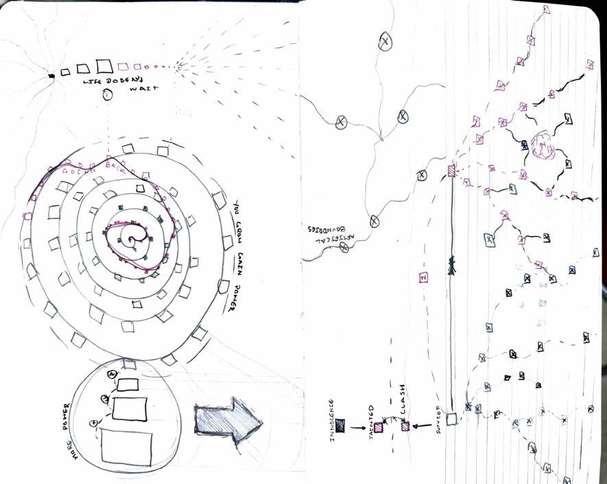
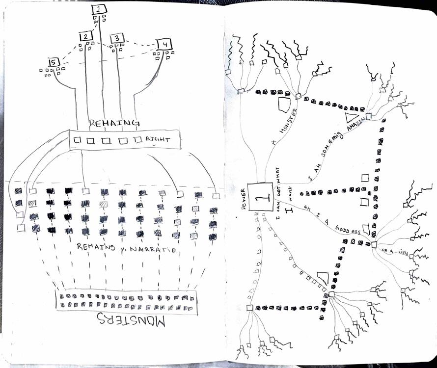
CYCLE OF POWER
In my first sketch I explore the idea of power and how it’s a cycle, you can break out of the cycle by either growing to immense power or you go back into the circle and become even smaller. The second page explores the hierarchy in war and its casualties. It explores how an innocent child can be put into war and become corrupted and lose their innocence.
THE REMAINS
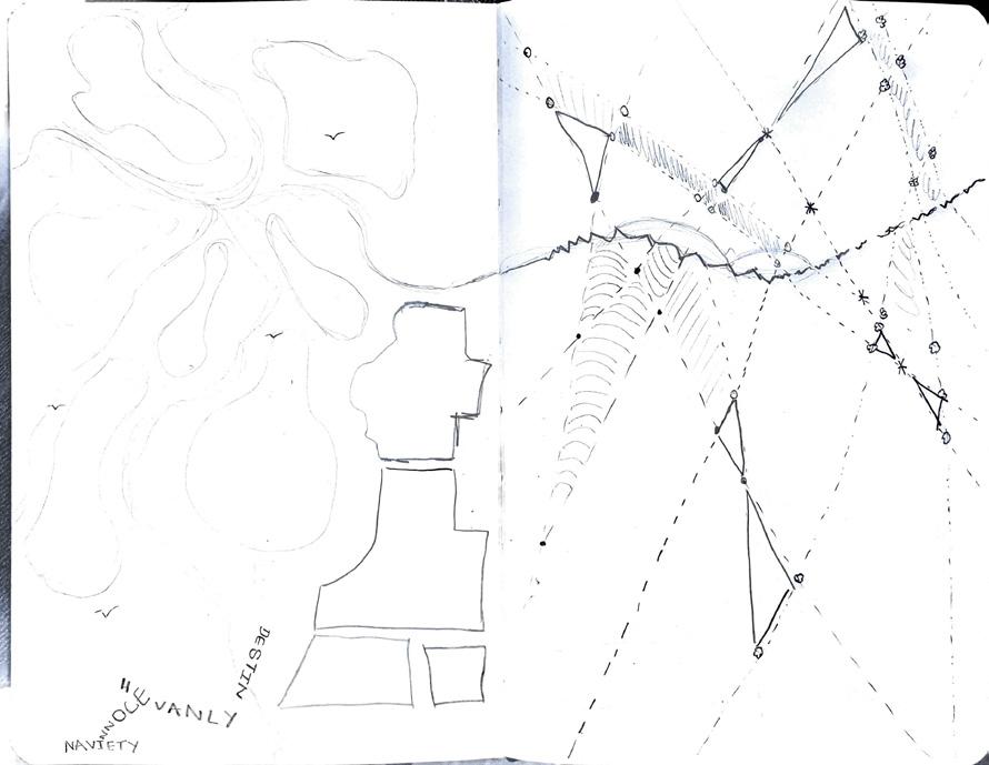
In my last set of drawings I try to show Rin’s story throughout the book. She started off innocent and had a lot of determination and hope (thus the flowy, curved shapes). Then as the story progressed she learned about the tragedies and consequences of war and became more and more disheartened and also “stronger”. This caused her inner
JOURNEY OF SOLITUDE
For this iteration we focused on a obsure shape that allowed us to play with tangets and conect that to the obsurness of our screen concept. Plus it allowed us to have an intresting approach to the screens and walking through the site
DRAFTING 1
I decided to go forward with my last set of drawings that showed the chaos of her journey and combine it with the quote that inspired the second set of sketches. I used my chaos plan and decided I wanted to create iceberg-like structures that are hidden at the bottom and small and scarce and tiny objects at the top. This is to convey the idea of the hidden and concealed remains vs the tiny amount that survived.
DRAFTING 2
For the color I wanted to create an ombre effect of bold colors that are bright at the top and dark at the bottom to emphasize the idea of the hidden and the remains. For my color scheme I actually took inspiration from theater lighting, I feel like there is a correlation between the two. I also decided to extract and show my elevations in a chaotic way at the top to further emphasize my point
DRAFTING 3
For my next step I decided to add my objects that I created and layered them on top to emphasize the shape more and used hatches to vary the texture. Then I decided to recreate my previous chaos lines on the top part. For the bottom half I wanted to explore the idea of burial a little more so I created a set of three hatches that all interact with each other in different ways and then had another set of hatch boxes slowly descending downward.
A3: PARTS TO WHOLE
BASKETBALL COURT: USING SKETCHES TO CREATE SPACE
NARRATIVE SPACES AN ABSTRACT ARCHI-
PROJECT BREIF:
The 3rd year Integrative Studio occupies a critical location within the B.Arch sequence. 302b is the end of the structured core studio sequence and provides a foundation for topic studios. The comprehensive design problem requires implementation of all the knowledge and skills accumulated during the core sequence. The studio gives students the opportunity to illustrate their understanding of design issues, and the interaction of formal, experiential, and technical requirements of architectural design.
MY NARRATIVE:
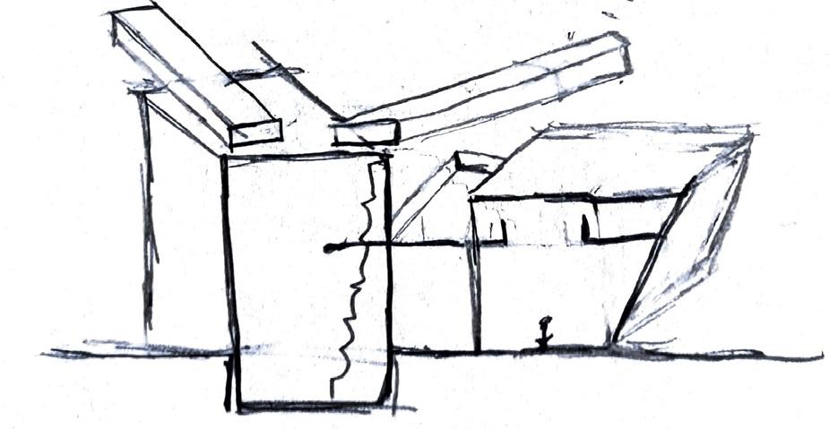
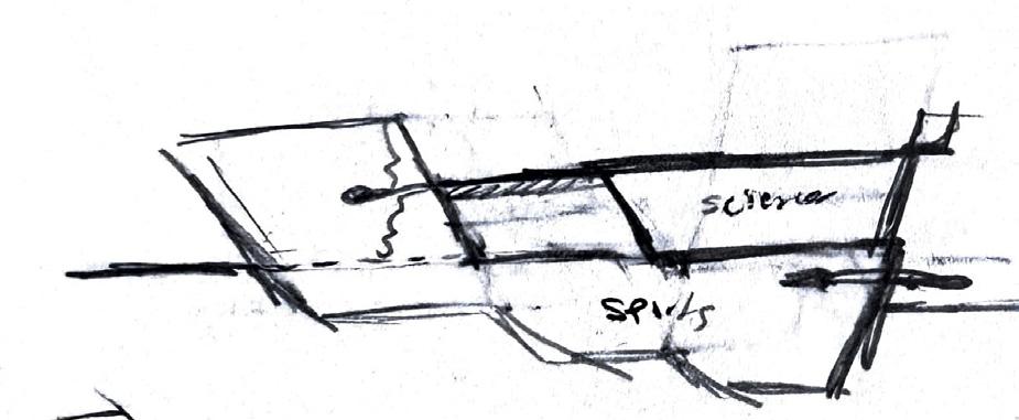
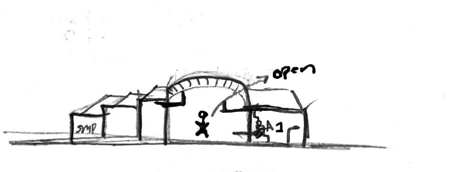
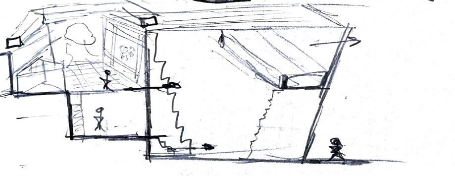
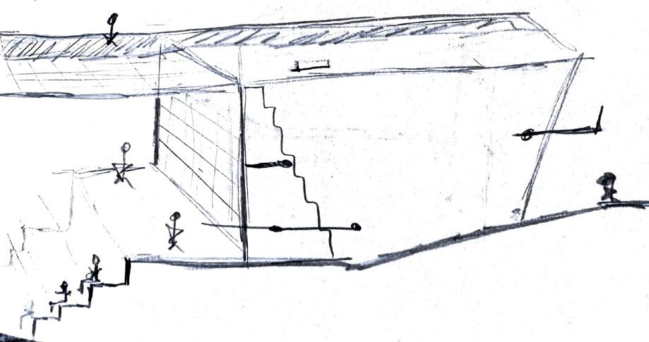
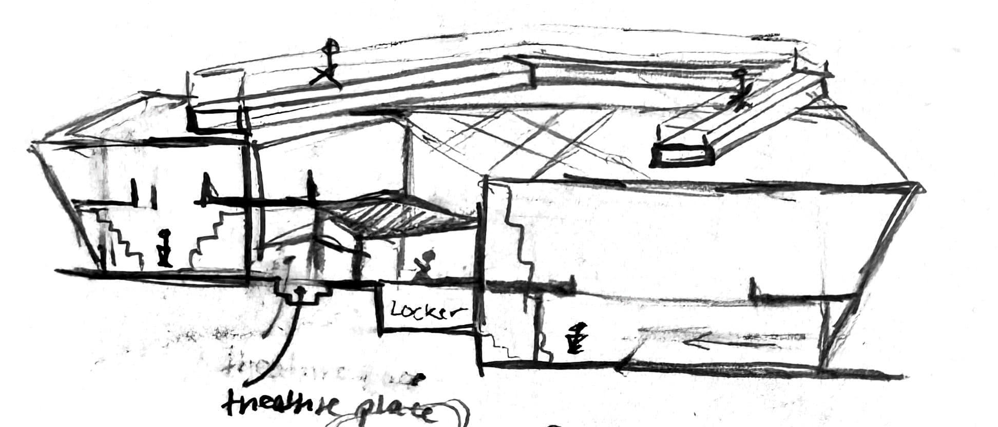
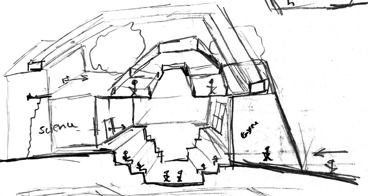
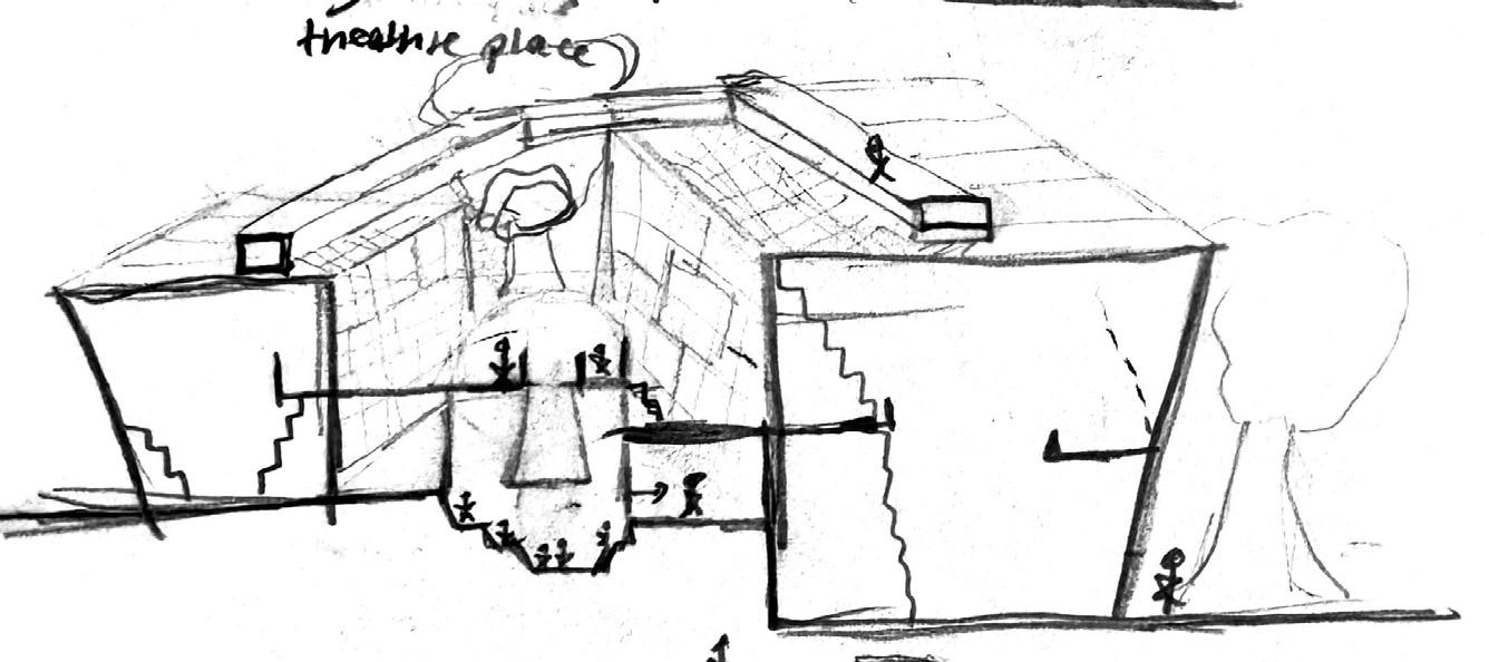
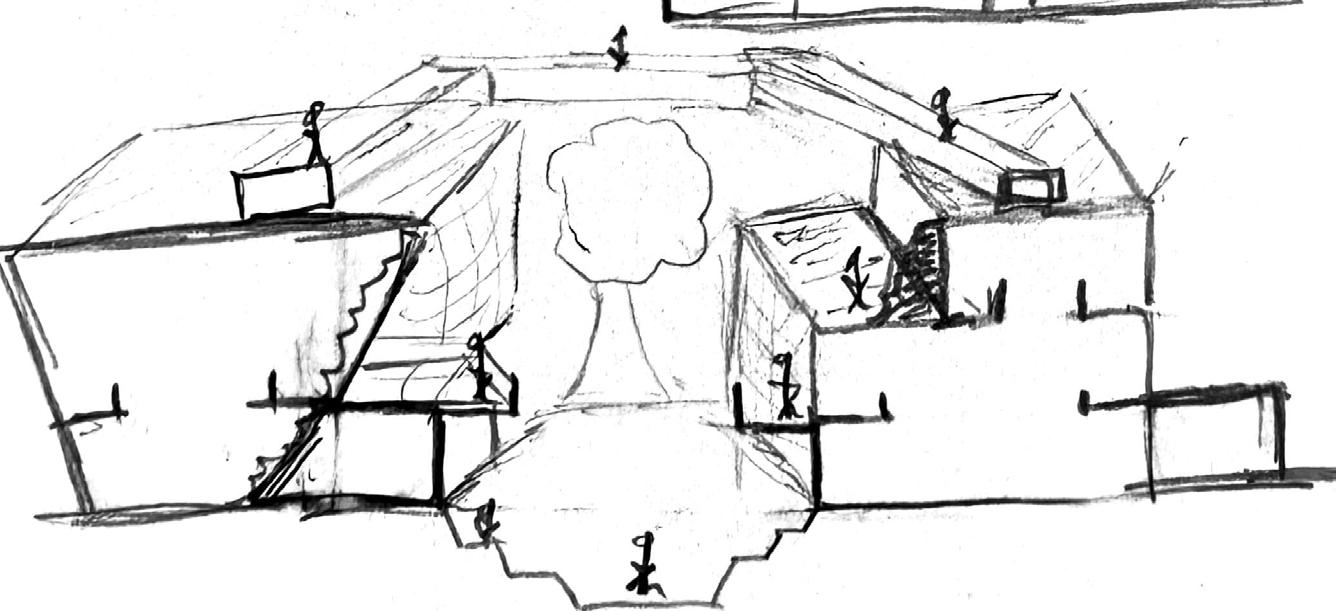
My design concept evolved from a series of perspective sections developed early in the semester. These detailed vignettes became the foundation for crafting my spaces that offered varying levels of engagement with basketball activities. The project’s core vision was to transform these conceptual sketches into immersive environments, each carefully designed to accommodate different degrees of participant involvement - from casual observation to active play.
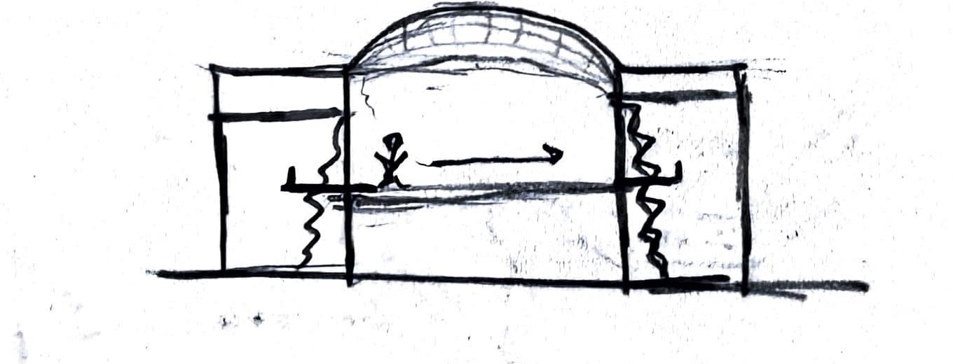
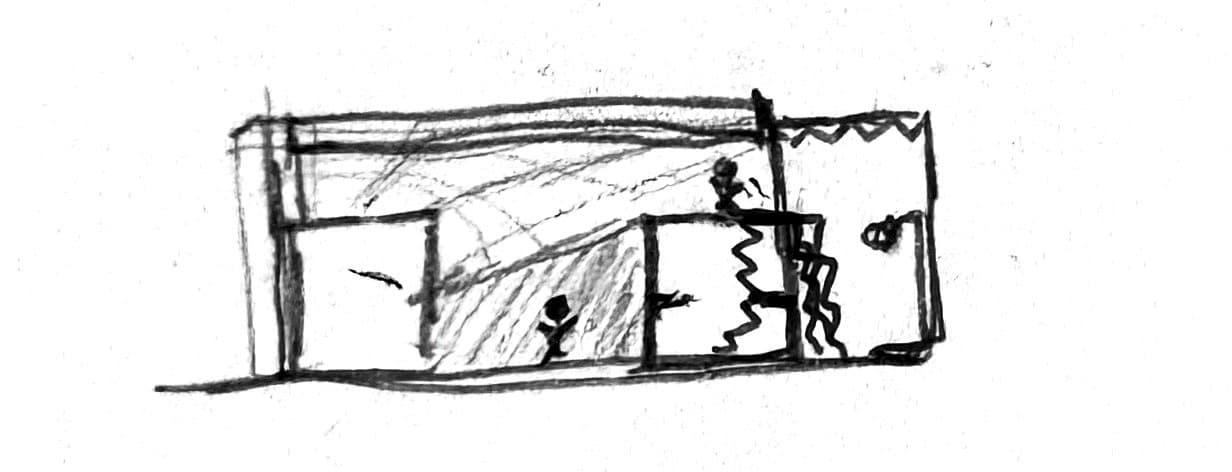
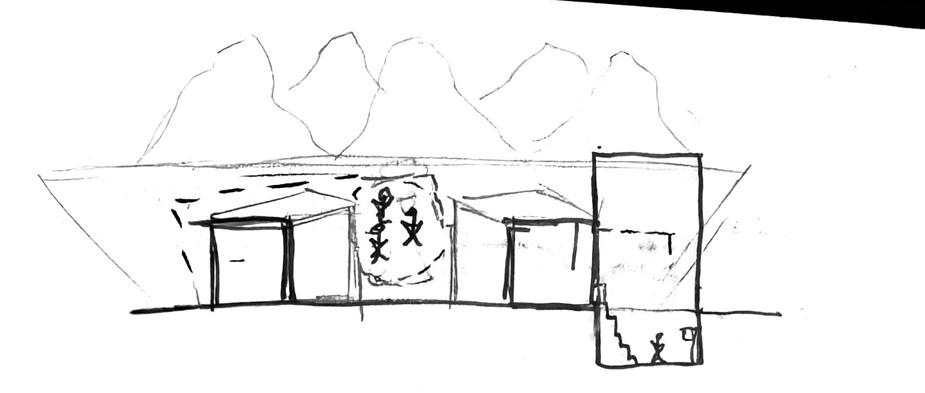
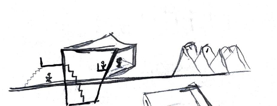
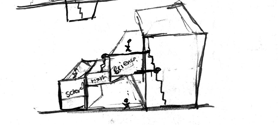
PRELIM SECTION SKETCHES
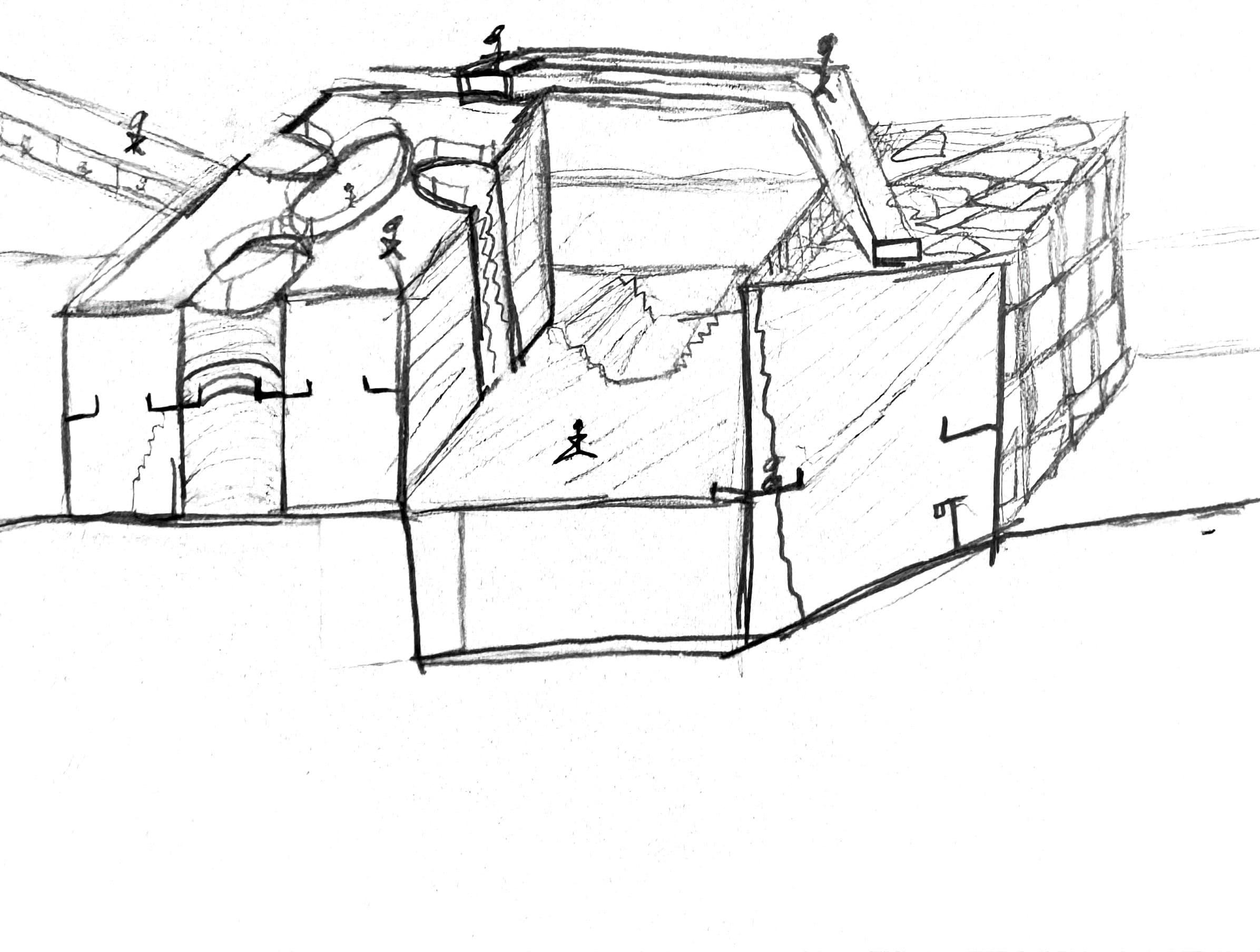
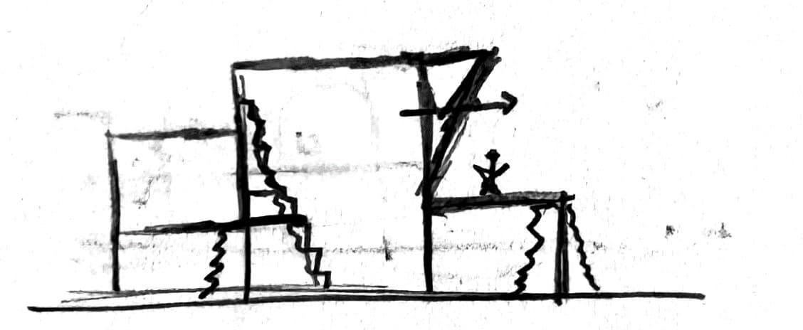
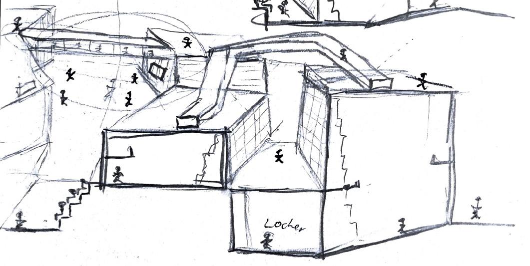
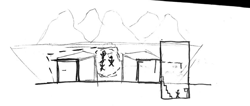
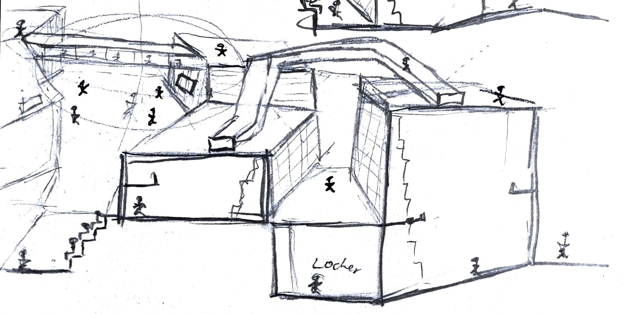
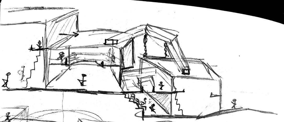
My project started off by looking at small moments that I wanted to achieve within my basketball court and within the site in general. The sketches shown above show how I envision people visiting my space and traversing through the basketball courts. One thing I wanted to highlight in these sketches was the idea that people traveling on the second floor get a view from above the actual audience.
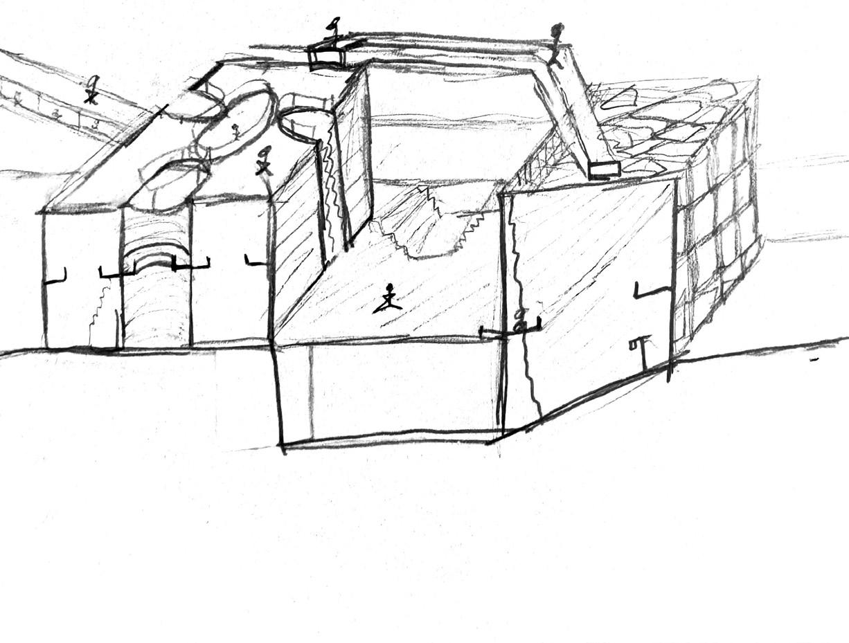
FIRST ITERATION OF VIGNETTES
In these sketches I started to experiment with the masses being separate and not connected to each other, creating open area space on the inside. Which would result in the project feeling more like a campus than a big box.
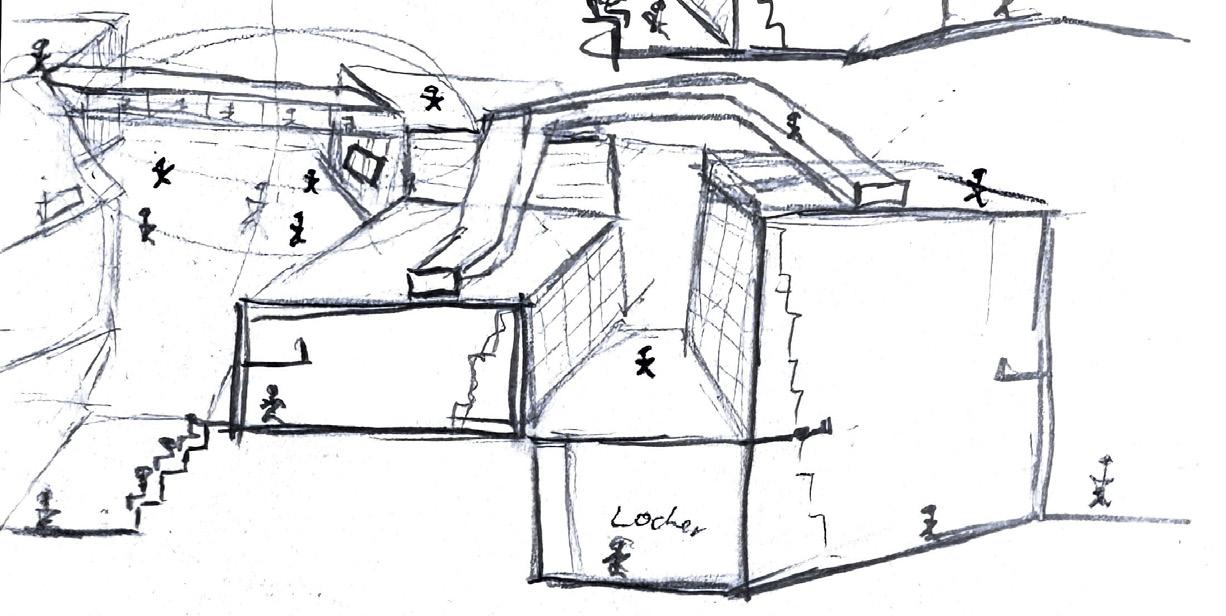
SECOND ITERATION OF VIGNETTES
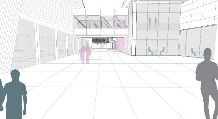
In these sketches I started to experiment with the idea of connecting the masses with a sort of transparent bridge of some sort. This would allow for people on the bottom to see activity happening in the upper part of the project. I also believed that this would allow people to want to experience the other parts of the project and draw people in. I also started to experiment with digging below and highlighting the idea of having a meeting/ performance pit of some sort.
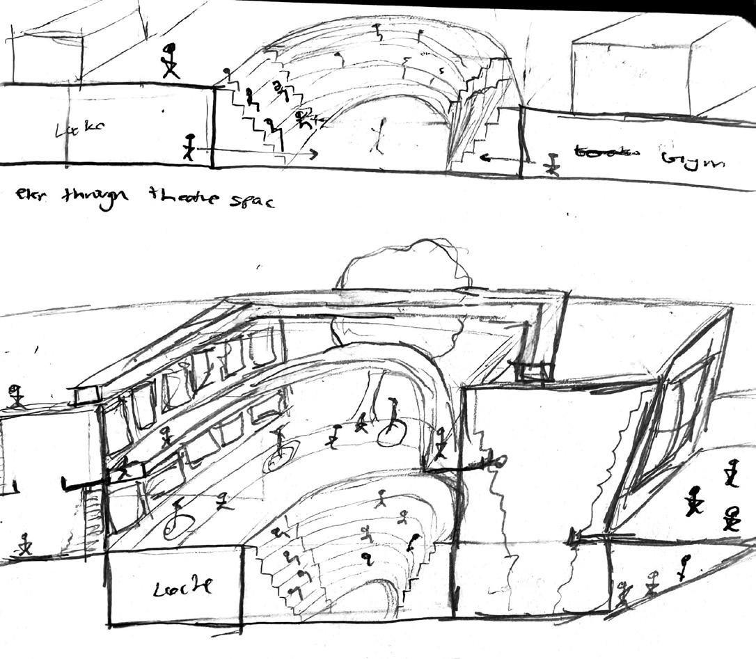
THIRD ITERATION OF VIGNETTES
In these sketches I started to experiment with aligning the massing in a sort of angle to guide the viewers in and the bridge component becomes more highlighted as well. I also start to show more materiality and play with the idea of height and elevation much more.
PLAN ITERATION 1
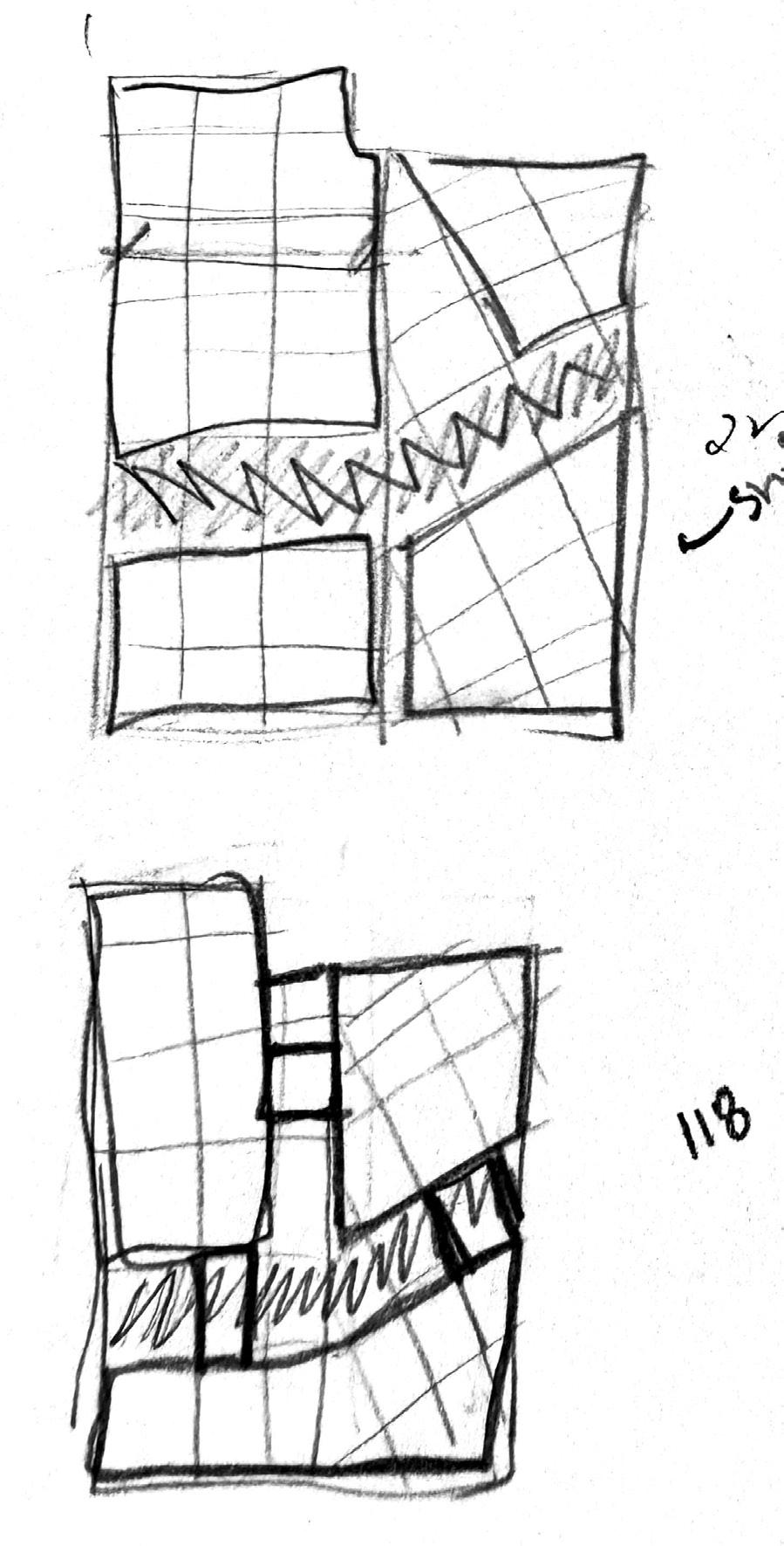
Using what I learned from making my vignettes, I realized that I wanted to do 3 different masses. I also really wanted to use an angle to guide viewers in and throughout the site. In this iteration I focused a little bit more with the angle.
PLAN ITERATION 2
Using what I learned from making my vignettes, I realized that I wanted to do 3 different masses and use it in two different lines. One that would be closest to the south side would be the cafe and meeting room area and the other mass would be the gym and basketball court area. I also really wanted to use an angle to guide viewers into the same thing a little bit more. These spaces would also be connected by a bridge which would function as a connection and also as an incentive to travel higher and explore the space more.