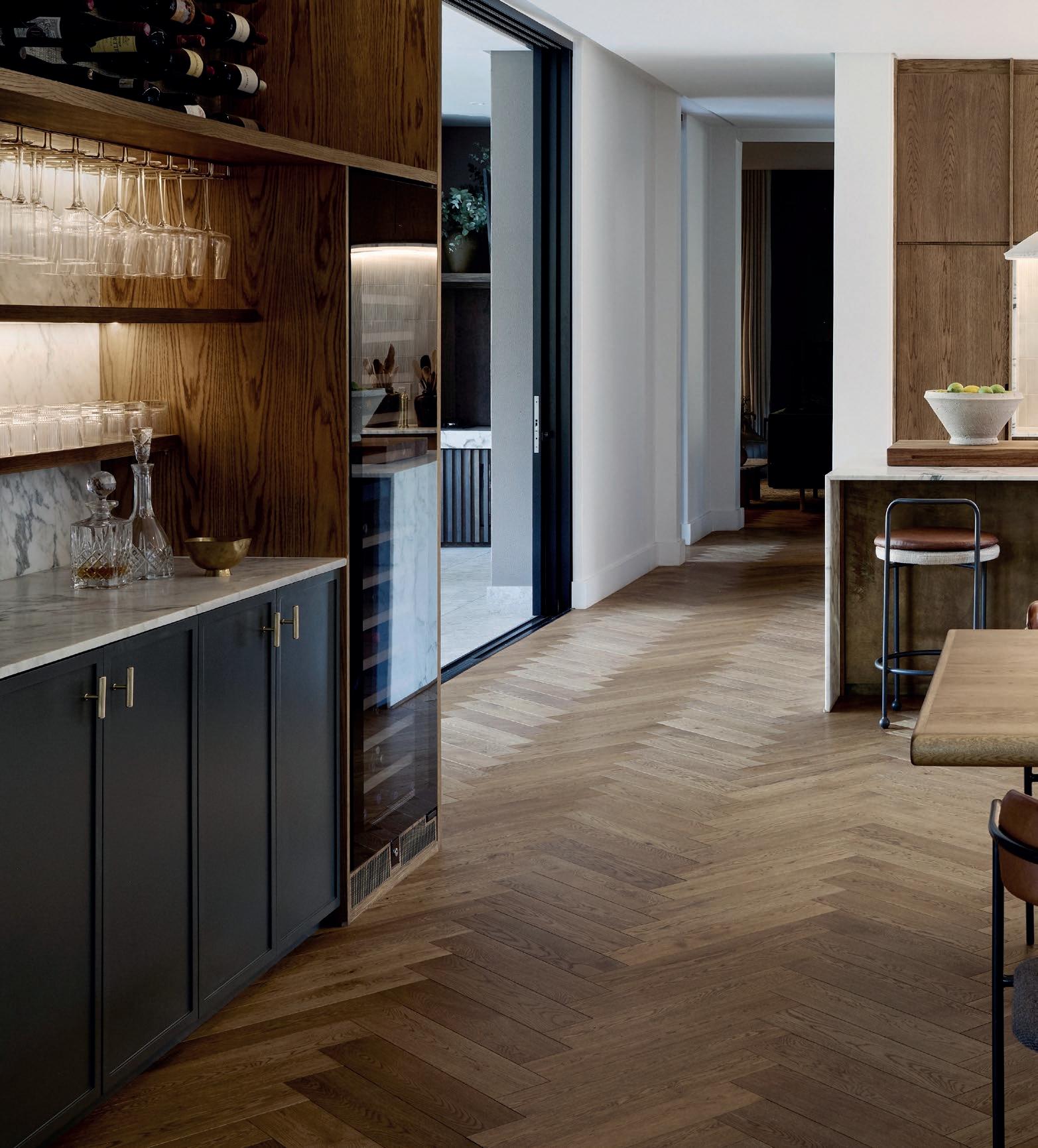
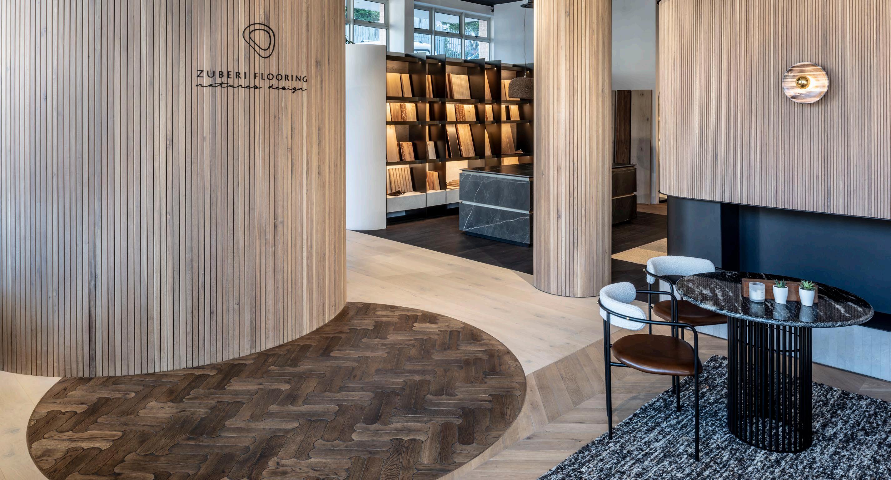
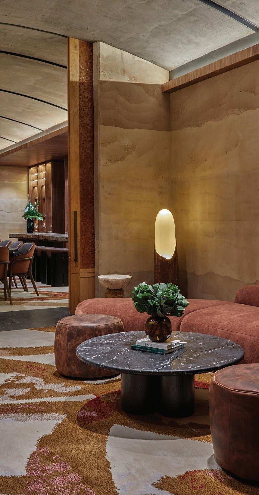
...herringbone oak floors by Oggie.
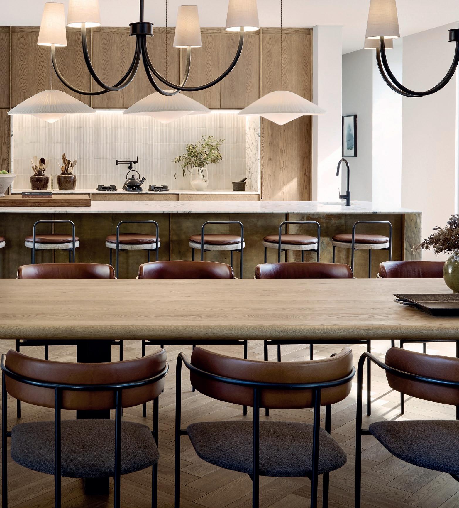
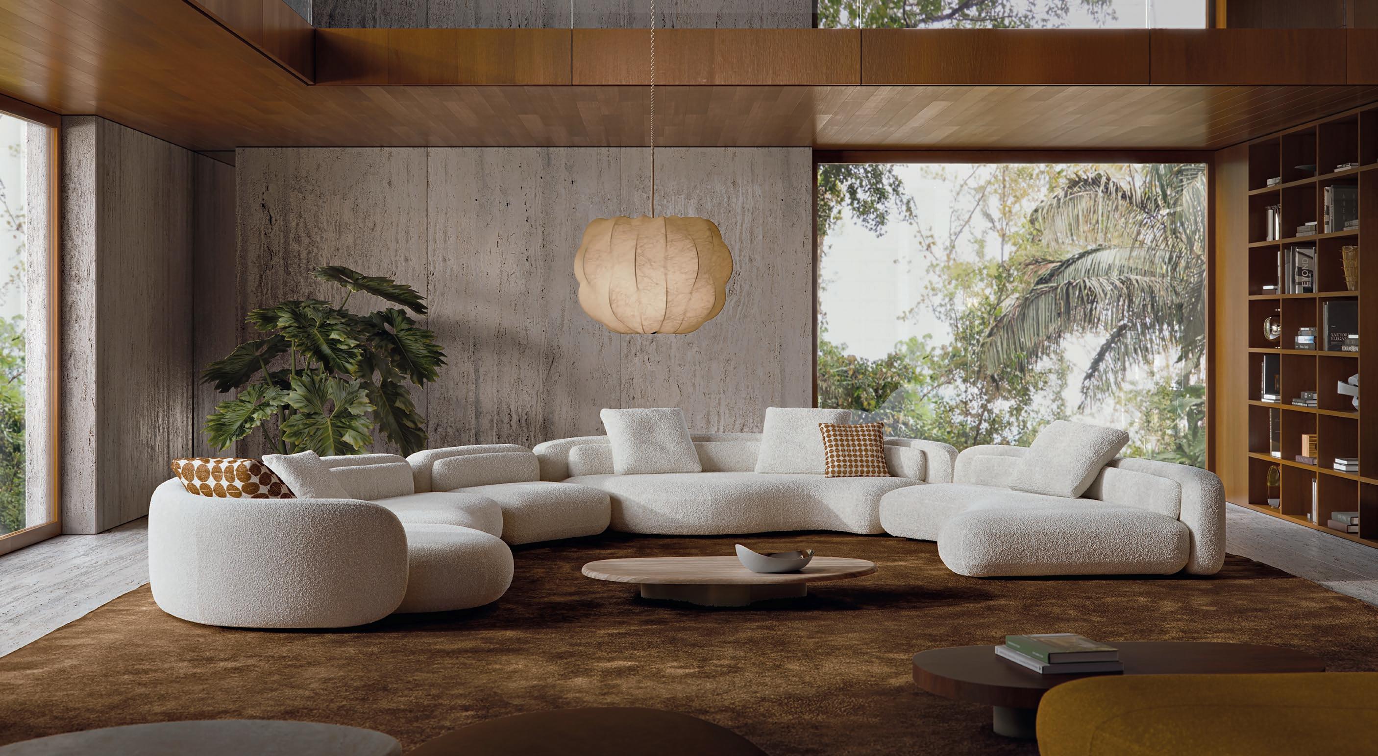
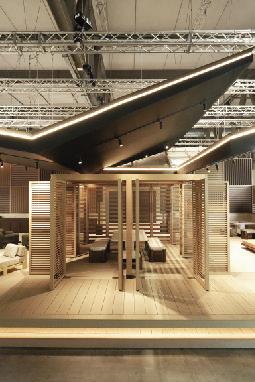


...herringbone oak floors by Oggie.
A simple premise, but difficult to express simply.
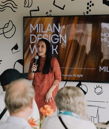
After the usual Milan Design Week diet of installations, launches, talks, celebrations, trains and trams, espresso and Aperol overload, impossible schedules, and conversations bouncing between architecture, fashion, furniture, lighting, and culture (you get the energy) — I’ve come home with strange clarity. And with certainty about where Scape stands as a platform, and why we exist in the first place.
Ready? Here’s the fever dream from MDW 2026: Obscurity. Cinematic spaces. Distortion. Cocooning couches and blown-up forms. Glass is having its moment; craftsmanship is king; and stainless steel and silver allude to sci-fi or the seventies. And speaking of the '70s, we saw a revival of the era's conversation pits. Mixed materials were everywhere: textiles against lacquered inlays, and steel meeting softness. Intrigue. Fashion houses, collaborations, and experimental ideas rolled out across countless installations, with lines snaking the block. Too much? Probably. But will we be back? Definitely.
Because Scape is young (as a mag, not a people), we’re more supple, malleable, agile — however you want to put it — and honestly, that’s our gift. It means we can engage with culture,
architecture, design, and storytelling in ways that are alive and evolving. We can experiment. Build worlds. Stay curious. For this, Milan Design Week is magic. But somewhere between spectacle and exhaustion, the noise drowns out the unnecessary. And ironically, you return clearer.
Our hot take: make something that matters for whom it matters, and do it with care. Niche is a good thing. We’re learning increasingly that a community needs a platform that feels connected.
There is so much ahead this year: an awards programme that already feels cinematic in scale and spirit; new conversations, spaces, and ideas; bigger risks; better stories. But at our core, the intention we return with remains beautifully simple: to showcase the very best in architecture, design, and everything that makes this community tick.
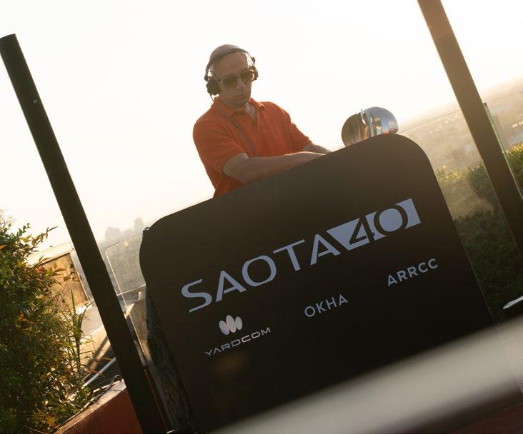
This month a special mention to our friends at SAOTA, YARDCOM & OKHA- and to SAOTA's Lu Ke who connected all dots to get this project to Milan!
We’re excited to explore concepts in print in the coming months — ones you'll look forward to receiving on your desks.




cpt@universalkitchens.co.za gr@universalkitchens.co.za jhb@universalkitchens.co.za
Field Notes From Milan Design Week 2026
Milan Design Week 2026 unfolded as both mirror and overload, a city-wide collision of design, fashion, hospitality, and spectacle. Amid the scale and intensity, moments of clarity still emerged: material experiments, quieter curations, and installations that resisted the noise. In this collection of field notes, Michele Rhoda of ARRCC, Chris Browne and Debra Fox of Fox Browne Creative, and Anna Weylandt of StudioLandt reflect on what they encountered, what shifted, and what ultimately cut through.
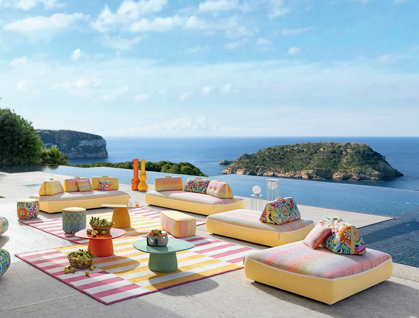
For me, Milan Design Week 2026 highlighted that wellness now sits at the forefront of design, with leading brands translating this into beautifully crafted outdoor collections that blur the line between interior comfort and the natural world. What stood out was the increasing sophistication of outdoor furniture collection pieces, now so refined in proportion, materiality, and finish that they can sit seamlessly within interior settings, often indistinguishable from traditionally ‘indoor’ designs. The shift felt less urban, more relaxed and, ultimately, more human.
confidence, often through colour blocking and light-driven installations rather than applied surface treatment. There was less decoration, more immersion. Sabine Marcelis’ Plume panels and Draga & Aurel’s Affinity in Light installation were particular highlights, both exploring the interplay between glass, resin, colour, and light in
without relying on scale or noise. A quieter confidence emerged: design is becoming less about delivering a perfectly resolved outcome, and more about crafting immersive, experimental experiences that invite curiosity and engagement.
“Design feels less concerned with perfection, more invested in feeling.”
ways that felt immersive.
Colour was another strong presence throughout the week. I saw glass, lacquered finishes, and warm timbers used with
What spoke to me most clearly were moments of playfulness — projects that embraced optimism and experimentation
More broadly, Milan Design Week continues to evolve beyond a trade fair. The conversations, talks, and installations position it as a platform for reflection and exchange. Alcova remained a highlight, offering a valuable counterpoint to the main fair, a space where emerging voices and material experimentation shape new ways of thinking.
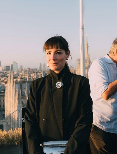
Anna Weylandt, Director of StudioLandt @studiolandt_ www.studiolandt.com
I’ve been attending Salone del Mobile and Milan Design Week for over a decade now, returning every couple of years to recalibrate, to see the benchmark, to watch the Italians do what they do best. There is always that quiet anticipation on arrival, the sense that you are about to witness where design is heading next.
But Milan has shifted.
What was once a celebration of furniture and interiors now feels increasingly overtaken by fashion houses and viral collaborations, sneaker brands staging immersive spectacles, queues snaking around palazzos, and the ever-present pressure of the ‘must post’ moment. This year, with over 500,000 attendees and 1,300 activations, the scale bordered on absurd. FOMO isn’t accidental here, it’s engineered. The three-hour queues are sometimes justified, often not. You start to question whether you’re there to see design, or to participate in a cultural performance around it.
There is brilliance, of course, but also a growing sense that spectacle is outpacing substance. Installations are impressive, highly photogenic, perfectly calibrated for social media, but occasionally hollow once you look beyond the surface.
The fair itself reflects this tension. Salone del Mobile remains well attended, yet many major Italian brands have retreated into
Similarly, Issey Miyake, working with Ensamble Studio, transformed pleating waste into sculptural furniture and lighting, one of the few projects grounded in genuine material innovation with a clear sustainable narrative.
The real inspiration, however, lay in the showrooms: Baxter, Cassina, De Padova. Retail expressed at its highest level. Visual
“FOMO isn’t accidental here, it’s engineered.”
private, invite-only presentations across the city. Intimate, yes, but it raises a bigger question: who is design for now? And is this shift toward exclusivity redefining access? My approach this year was simple: edit
ruthlessly. Focus only on what feeds my own work. Ignore the noise. Skip the hype. Choose depth over distraction.
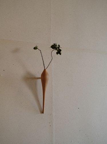
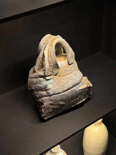
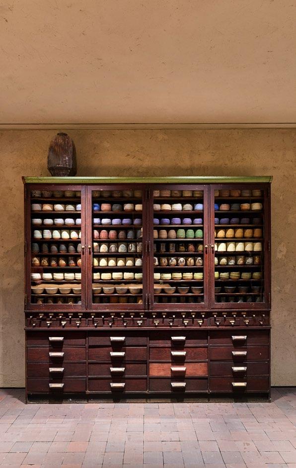
Among the fashion crossovers, Prada stood out. Its collaboration with Theaster Gates delivered a restrained, elegant ceramic collection with a quiet nod to Japan. No theatrics. Just clarity.
merchandising as an art form. Spaces that didn’t need to shout to be heard.
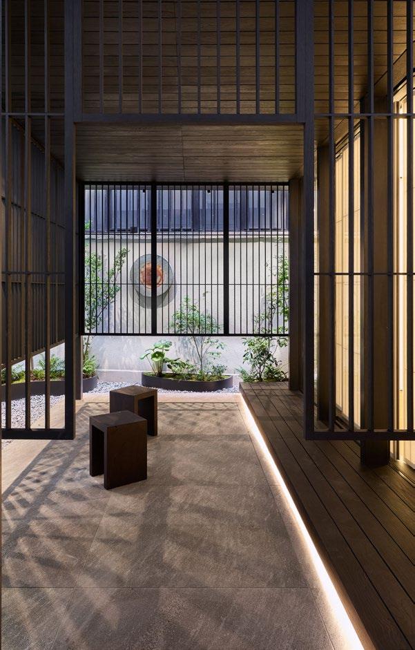
Across the week, certain threads emerged: Japanese influence everywhere, screens,
lanterns, restraint. High gloss surfaces. Deep reds and chocolate browns. Less softness, more edge. A move away from the overly safe towards something more directional, more intentional.
Milan remains a stage. But increasingly, it’s one where the loudest voice wins, and where, if you’re not careful, the message disappears into the noise.
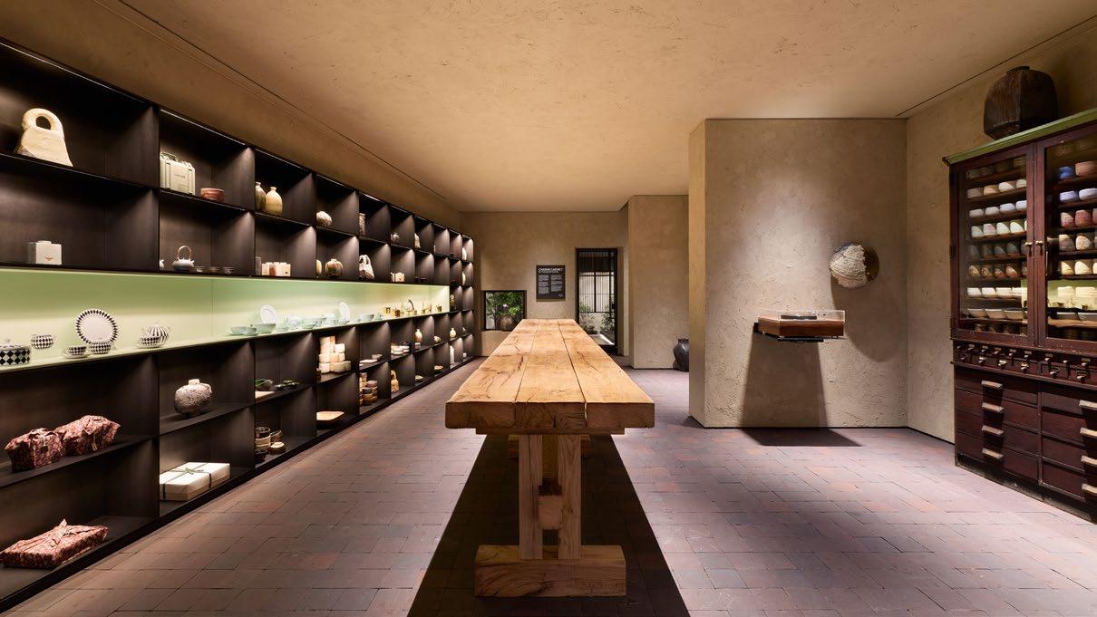
For the first time, we didn’t head out to Rho Fiera. Instead, we focused entirely on Fuori Salone events across the city. It felt like a conscious shift, away from the expected, towards the experiential.
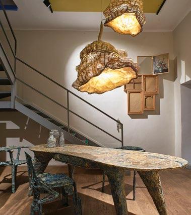
The clear standout for us was Nilufar Grand Hotel, a big, bold and unapologetically artistic proposition of what hospitality could be or, at least, should be thinking about. The ever-alluring Dimore never fails to delight, consistently sexy, consistently on point.
www.foxbrowne.com
Another major talking point was the opening of RH Villa. In true RH style, it’s a massive statement and, like Nilufar, super brave. We were hosted at their new La Volta restaurant, and it was refreshing to see that even the biggest institutions, despite vast resources, are not immune to opening wobbles. Scale doesn’t guarantee perfection.
Another favourite was the choice of venue for Alcova at the Baggio military hospital, even though catering and facilities were a bit stretched. Part of its charm, arguably. We also squeezed through the Louis Vuitton Nomade show, always a draw, though for us nothing quite tops their crocheted leather hanging chair from 2019. Rosanna Orlandi’s curation remains essential, and still the best place to grab a breakfast treat.
There’s been ongoing chatter about big brands increasingly dominating Salone, pushing out younger, emerging designers who simply can’t afford to participate. Even our own EGG Designs weighed in on industry forums, expressing disappointment at being priced out.
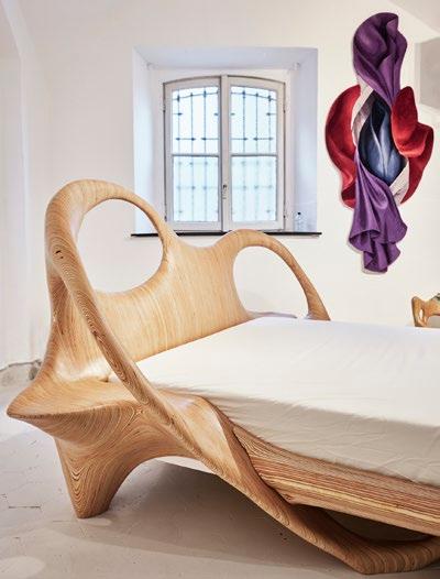
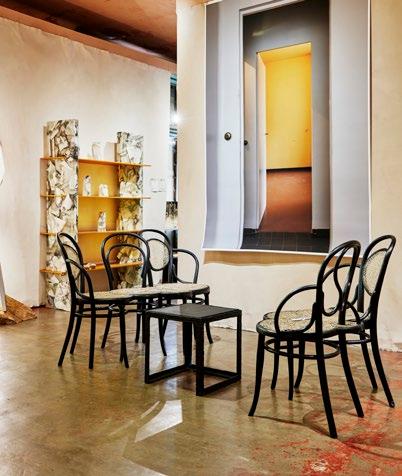
So, the question lingers: is this still a design show, or has it become a luxury platform? The answer, uncomfortably, is both.
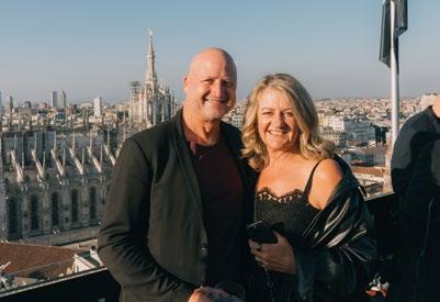
“Is this still a design show, or has it become a luxury platform?”
Every April, Milan, a city already beautiful and layered with centuries of craft and cultural memory, transforms entirely during Milan Design Week: a living laboratory where disciplines dissolve into one another, where design and technology spark conversations both pragmatic and philosophical, and where the boundaries between architecture, object, and idea grow productively blurry.
At the centre of this annual transformation sits Salone del Mobile.Milano, now in its 64th edition, and still the gravitational force that anchors the design community. Maria Porro, President of the Salone del Mobile.Milano, reflected on what this year’s reach means: ‘With 316,342 presences from 167 countries, the 2026 edition has reaffirmed the strength of a system that, even in the most challenging of times, has chosen to move forward. It was a success not just in terms of the trade fair itself, but for the entire sector: a result of teamwork, a shared vision, and dialogue between different worlds that find a concrete synthesis here.’
Teamwork. Shared vision. Dialogue between different worlds. It is difficult to imagine a more fitting description of what unfolded within one particular pavilion on the Salone floor — one that announced the arrival of South African architecture on the world's most visible design stage.
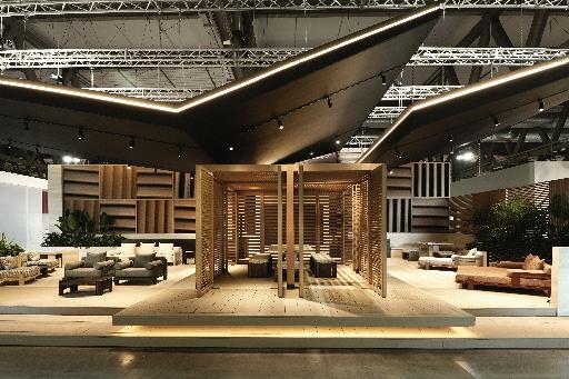
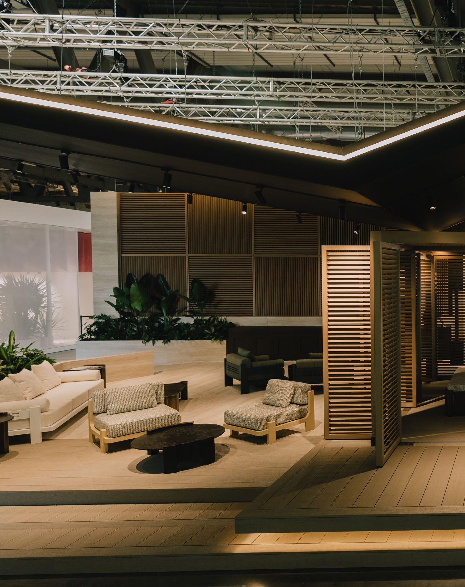
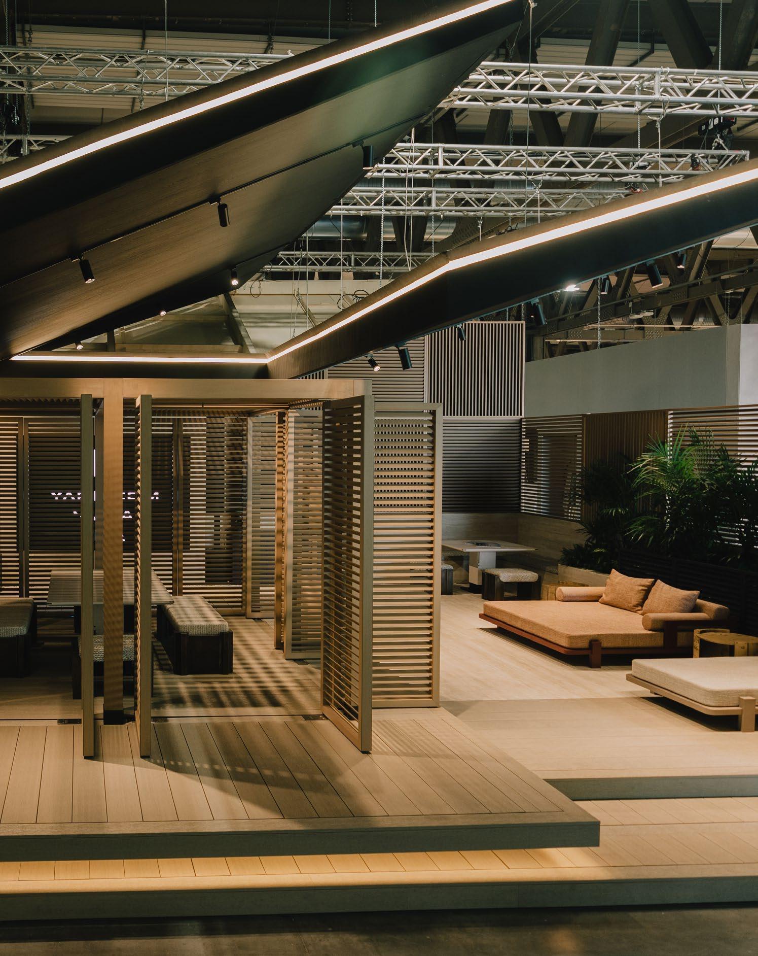
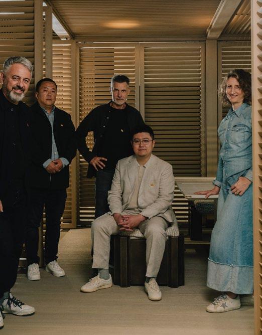
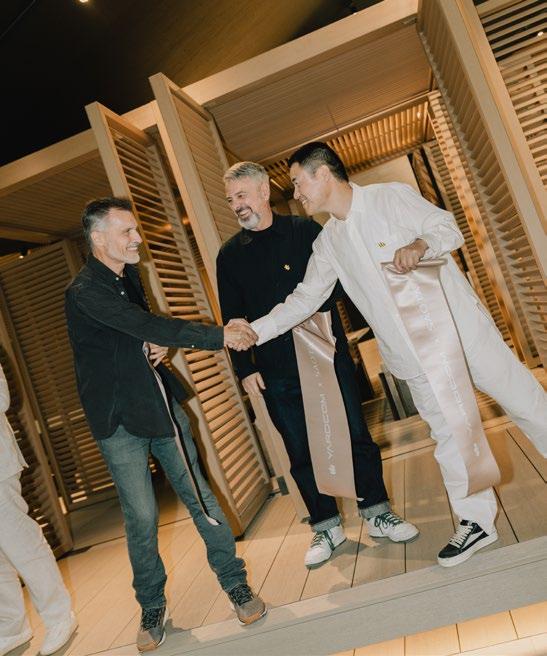
SAOTA, South Africa's largest and most internationally recognised architectural practice, made its Salone debut this year through a commission from YARDCOM, the luxury outdoor brand known for transforming architectural visions into refined living experiences. It is a landmark moment as SAOTA became the first South African architecture firm to appear on the Salone floorplan. But the significance runs deeper than a first. This was a three-way creative conversation between SAOTA's architectural intelligence, YARDCOM's refined outdoor sensibility, and OKHA's furniture vision, and it was a conversation conducted in full view of the design world.
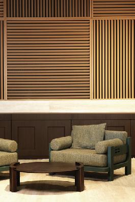
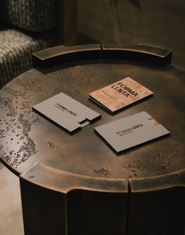
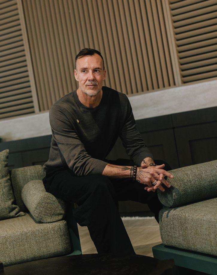
Within the pavilion, OKHA debuted Forma Lenta , a furniture collection by Adam Court that explores time, tactility, and the organic relationship between craft and nature. The name itself communicates slow form, the process of making, and design that earns its permanence.
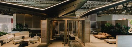
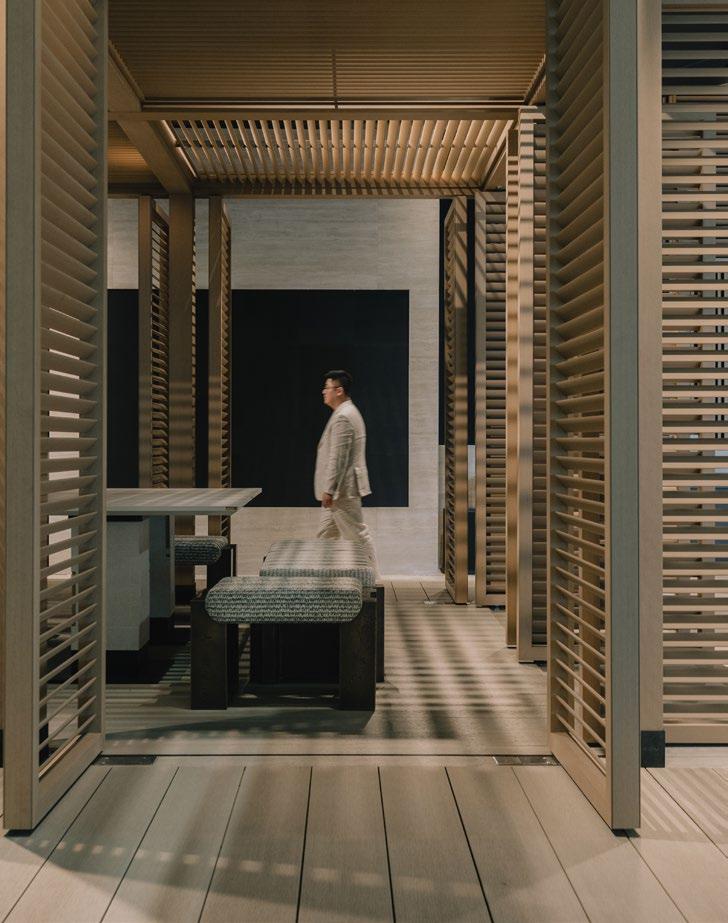
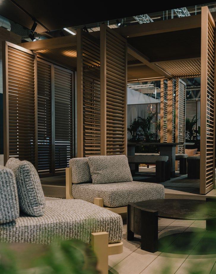
The pavilion is a material meditation on porosity. Integrated planters soften the structure, while an angled roof plane opens upward to the sky — a gesture of openness that demonstrates how architecture can connect to the environment. More subtly, this inverted roof design is in conversation with the kind of outdoor living unique to South Africa, as it references the home of Greg Truen from SAOTA, where the roof explodes from the core towards the surrounding mountains.
“Teamwork. Shared vision. Dialogue between different worlds. It is difficult to imagine a more fitting description of what unfolded within one particular pavilion on the Salone floor.”
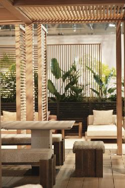
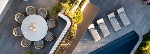
At its heart, a raised platform forms The Outdoor Room, defined by YARDCOM's latticed dividers. The space is contained, yet breathes beyond boundaries. Within the buzzing fair, this outdoor room brought inside offered visitors a moment for pause, comfort, and genuine connection.
This collaboration did not begin in Milan, but rather when YARDCOM welcomed SAOTA into their showroom in China. The conversation then gained momentum in Cape Town. On 10 April at SAOTA's Cape Town headquarters, Scape Magazine hosted a private, curated gathering that served as the first public expression of this partnership. The room held a considered assembly of voices from design, media, and public life. In conversation, Stefan Antoni and YARDCOM's Damon Ma unpacked a partnership built not on the negotiation of difference, but on deep and genuine alignment. What struck those present was the clarity that emerges when two creative minds share an instinct, and that alignment produced a pavilion of uncommon coherence.
Set against this year's Salone theme, ‘A Matter of Salone’ — a provocation that speaks to material, legacy, and duration — the Cape Town gathering asked what it means to carry an idea from one context into another, and what is gained or transformed in the crossing.
Curated by
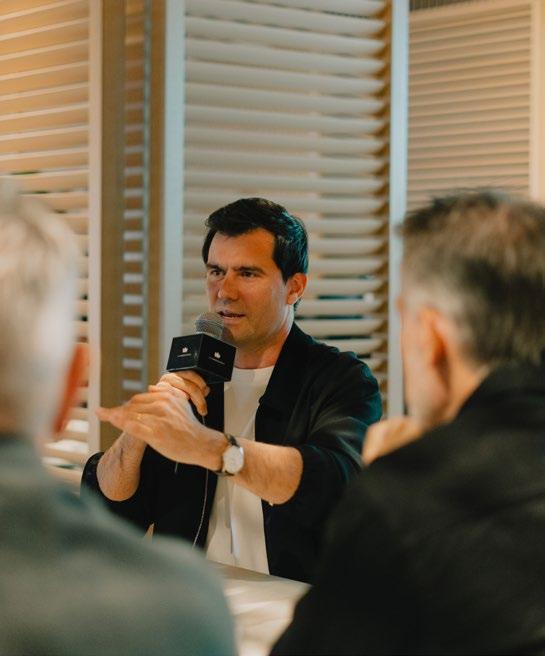
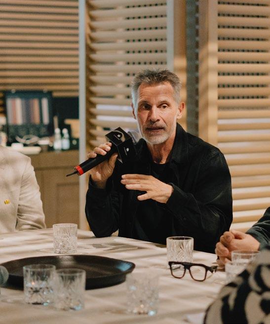
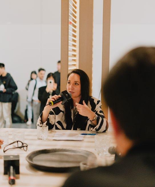
In Milan, the conversation deepened. On 21 April, to coincide with the pavilion's unveiling and the debut of Forma Lenta, Scape Magazine curated an intimate roundtable framed by the built environment itself. Moderated by Chanel Besson, the discussion opened with a condition rather than a boundary: the outdoor room, both contained and open, architectural yet atmospheric. The panel brought together Stefan Antoni and Greg Truen of SAOTA, Adam Court of OKHA, Damon Ma of YARDCOM, and international designers Claudia Afshar and Peter Pichler. Across the discussion, several themes surfaced with particular force: threshold as a spatial condition rather than a line of division; the increasing urgency of climateresponsive design; and a shifting definition of luxury rooted less in objects and more in the quality of space, light, and atmosphere.
This is, of course, precisely the kind of dialogue that Salone exists to facilitate. President Porro's words echo again here: the synthesis of different worlds, the concrete result of teamwork and shared vision. What SAOTA, YARDCOM, and OKHA brought to Milan was not simply a well-designed pavilion. It was a perspective shaped by decades of practice across demanding climates, diverse landscapes, and a design culture that has long taken seriously the relationship between interior life and the natural world.
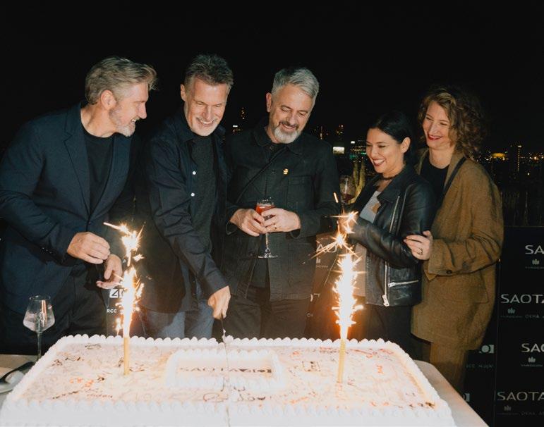
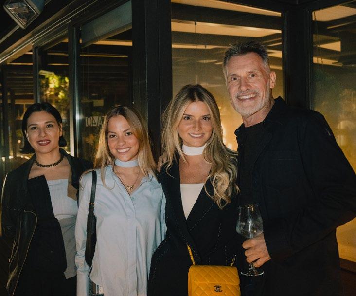
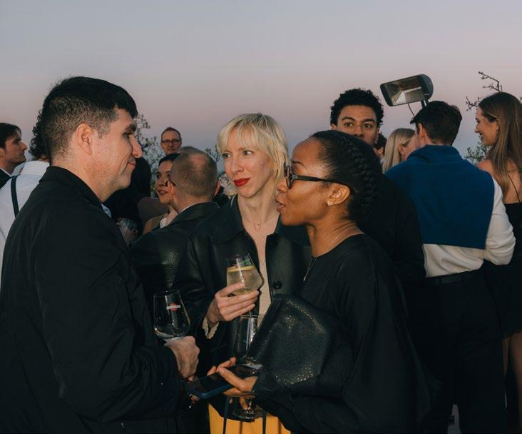
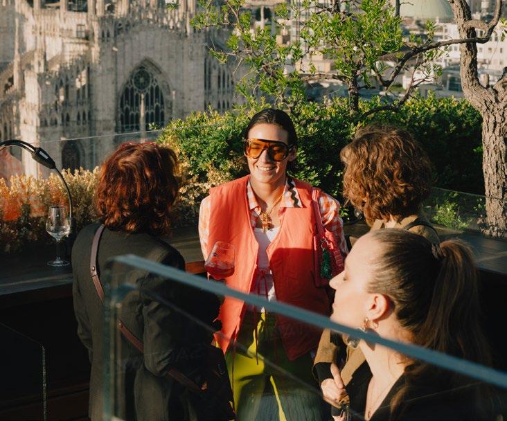
The week culminated on 23 April, high above the city at the iconic Terrazza Martini. There, with panoramic views across the rooftops, SAOTA gathered architects, designers, collaborators, and friends to mark forty years of practice. Stefan Antoni and Greg Truen addressed the crowd with reflections on the studio's journey. Chanel Besson of Scape Magazine offered her own, recalling how, in the magazine's formative years, she wrote ‘SAOTA’ in permanent marker on a whiteboard as a marker of excellence in South African architecture. The name, she noted, is still the first that comes to mind. Complete with a cake, the celebration that evening gave way to dancing late into the night.
This presence was overseen and coordinated by SAOTA's Lu Ke who facilitated the activation from concept to final activation in Milan. These moments, from Cape Town to Milan, an aperitivo to a roundtable to a rooftop celebration, signal a South African collaboration stepping into the global design arena as active contributor, shaping the architectural and design discourse.
Travelling from two continents and gaining visibility in another, the Milan Design Week journey of the SAOTA x YARDCOM x OKHA ensemble announced new directions for outdoor living and design partnerships.


PATRICIA URQUIOLA
Duravit x Patricia Urquiola Unveiled a Sculptural Installation at Milan
Duravit and Patricia Urquiola deepened their creative partnership in a joint reflection of the brand’s Design Meets Excellence philosophy. The installation debuted at Gran Meliá Palazzo Cordusio on April 21st and was open to the public until April 24th.
Duravit continues to go beyond traditional bathroom contexts, debuting an immersive sculptural installation during the design week. A limited edition of 26 stools was introduced, designed by Patricia Urquiola and produced at Duravit's Black Forest factory. 2026 Balcoon updates and past collaborations with renowned designers were on view at the Duravit Milan showroom.
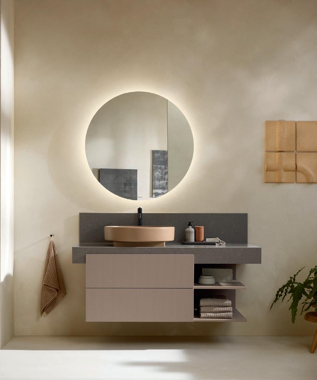
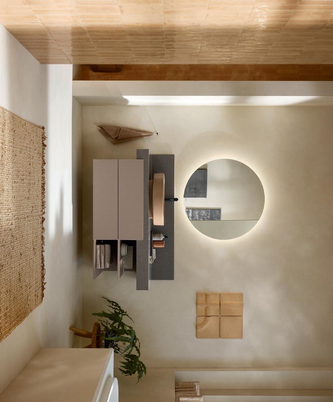
Building on last year’s Milan Design Week installation, Duravit and Patricia Urquiola showcased how premium bathroom design extends beyond function and into culture, space and experience. Balcoon-Scapes is an immersive installation that elevates Balcoon’s design language and aesthetic principles into the realm of sculpture. The reinterpretation draws on the collection's characteristic round and square volumes, layered surfaces and warm clay tones; rearranging its pieces into a sculptural field. Washbasins, bowls and floor-standing toilets are freed from their usual orientation and reinterpreted as totem-like forms, while two custom toilets crafted in fur and concrete anchored in the space introduce an unexpected contrast of material and form.
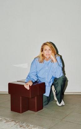
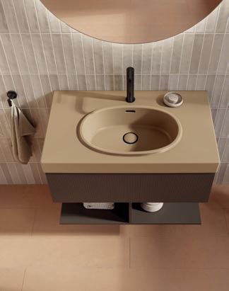
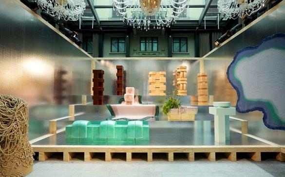
Urquiola designed two bespoke benches that echoed the sculptural language of the limited-edition stool — a piece derived from the same vocabulary and produced in Duravit’s Black Forest factory. Limited to just 26 numbered pieces, the stool translates Duravit’s craftsmanship into a rare collectible object.
‘I’m happy to continue my collaboration with Duravit, this time with Balcoon-Scapes. The installation unfolds as a field of totems, where elements from the collection are reinterpreted as sculptural presences, shifting from product to spatial composition,’ says Patricia Urquiola.
‘Patricia embodies many of Duravit’s values: quiet excellence, architectural clarity and a deep respect for materiality. Our ongoing partnership translates our “Design Meets Excellence” philosophy into immersive experiences,’ adds Lüder Fromm, CMO of Duravit.
Alongside the Balcoon-Scapes exhibition, Duravit opened its Milan showroom throughout the week, where visitors uncovered a holistic bathroom experience with Balcoon’s product updates, and past milestone collaborations from Philippe Starck's ME by Starck Hero Edition, Collection One Design by Studio F. A. Porsche to washing area additions like Ocavo and Technological Highlights such as SensoWash shower toilets. Other city activities included a branded Duravit tram and shuttle bus, which circulated through Milan connecting the two stops.

Words by: Jean-Marié Malan
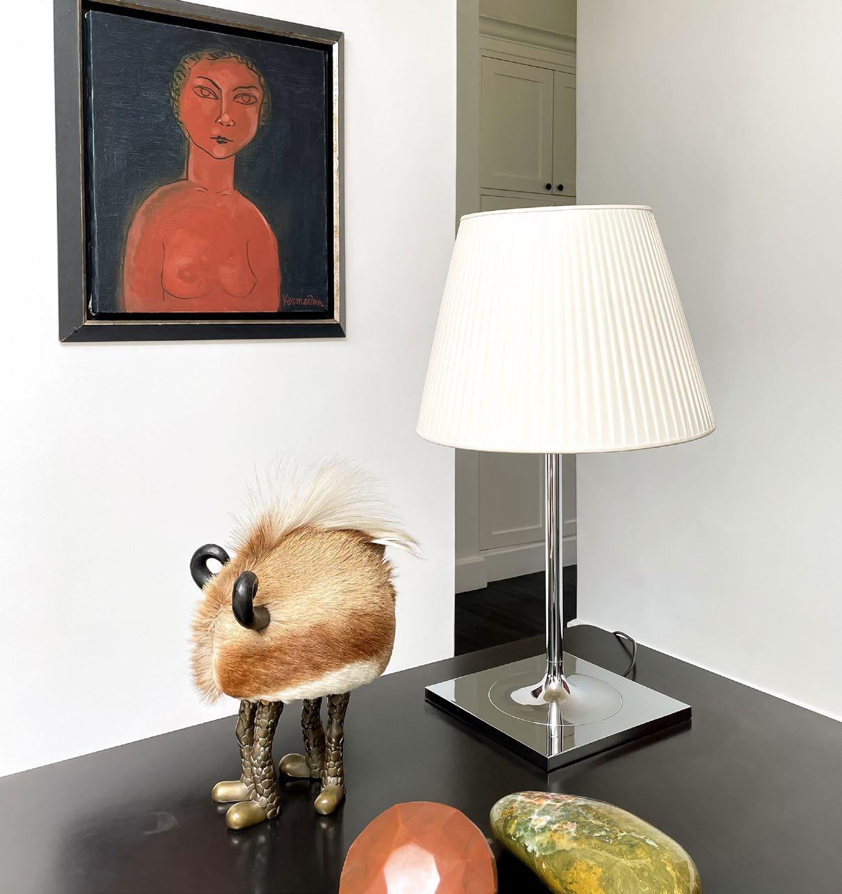
We Asked the Designers in Our Orbit About Their Most Cherished Objects. They Talked About Practical Value, Memories, and the Pleasure of Surprise
On the spectrum from minimalist to hoarder, we all live our lives surrounded and aided by objects. We approached notable local designers and tastemakers with a version of Marie Kondo’s now-famous question: Does it spark joy? But, without Kondo’s attendant expectation to cull all that falls beyond this joy-bringing category, our question instead focused on ‘What sparks joy?’ Here follows a glimpse into the functional, artful, and at times peculiar things loved by designers. These objects hold their memories, create daily structure amid life’s chaos, and delight through opportunities for play.
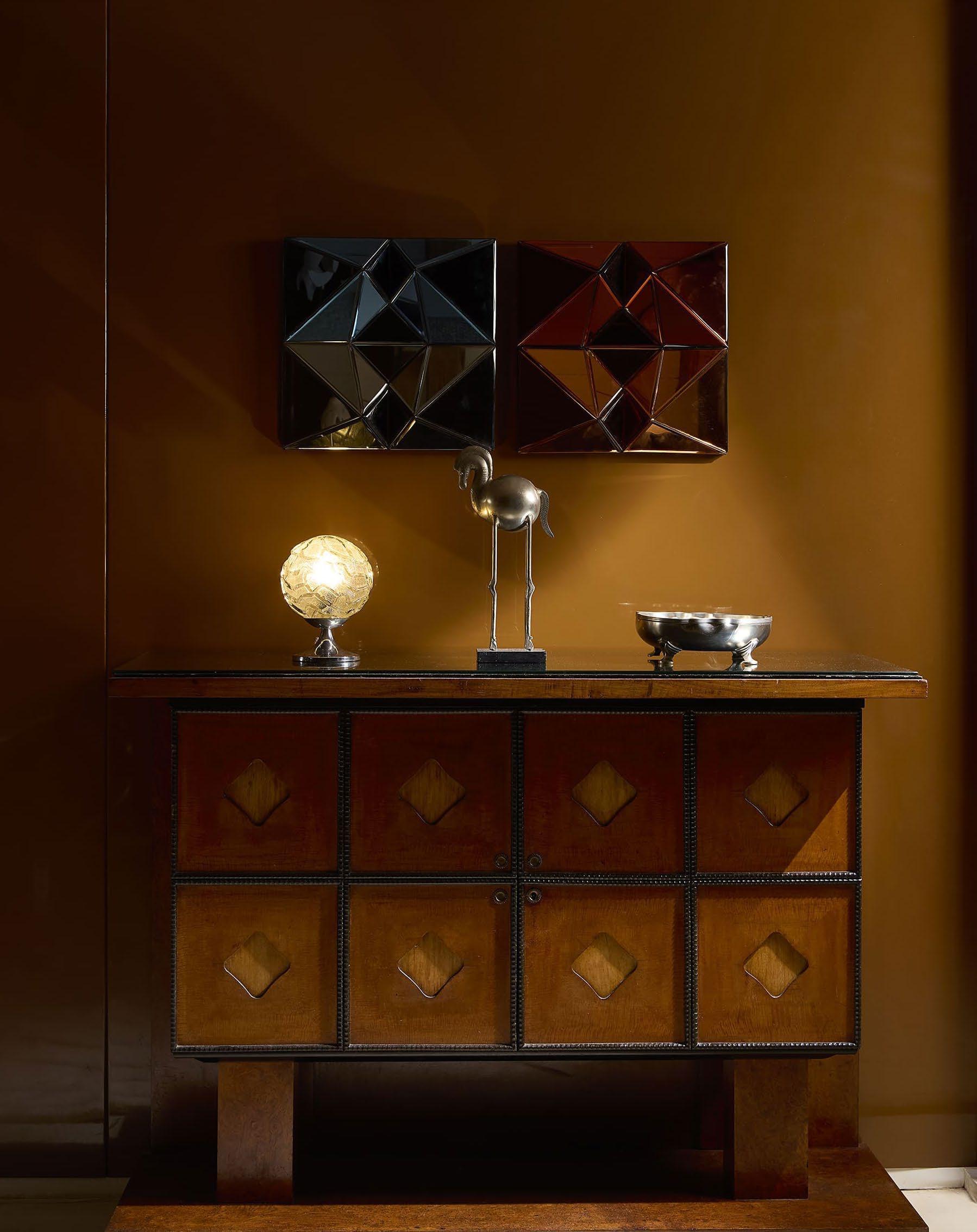
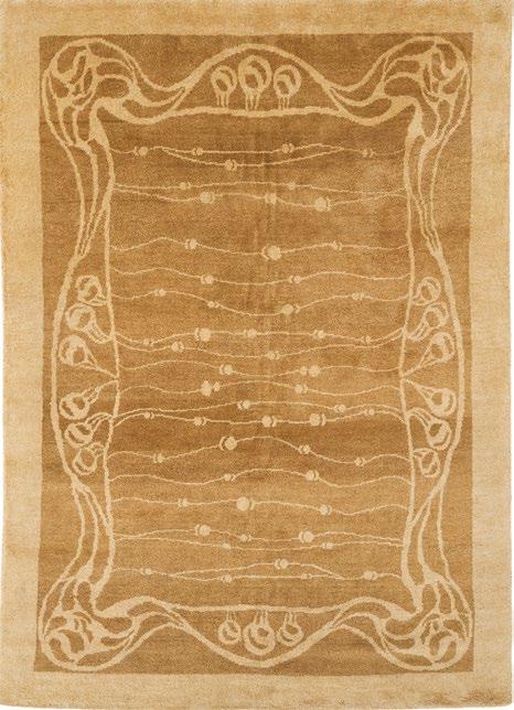
The objects that keep company in Anette’s home speak to her engagement with the broader design world. She highlights a cabinet by Austrian architect Joseph Maria Olbrich, dating to around 1901, and a painting made last year by contemporary South African artist Jeanne Gaigher.
‘Works that feel made rather than composed are most compelling,’ says Anette — ‘pieces carrying traces of touch, layering, and construction.’ As an interior designer, Anette is adept at composing elements into harmonious and interesting spaces. She chooses objects for other qualities instead.
Valued by Anette for its ‘emotional ambiguity and material sensitivity’, Gaigher’s painting echoes the fluidity and bodily suggestion found in some of her furniture. For Anette, leaves <—> messengers <—> leaves <—> messengers I evokes ‘longing and connection, functioning less as a physical object of engagement and more as something that lingers mentally, inviting return and reflection.’
Juxtaposed with the painting’s amoeba-like whimsy, Joseph Maria Olbrich’s cabinet is the grounding presence in Anette’s space. While the panelled doors with geometric detailing in richly toned wood are fully functional, for Anette the piece invites an ‘almost ritual interaction’. ‘What draws me to it most,’ she explains, ‘is how it embodies the ideals of the Vienna Secession, bringing a sense of calm, order, and intention to the way I live with objects.’
From a contemplative artwork to a cabinet associated with a radical art movement, Anette’s selection shows her to be a designer’s designer.
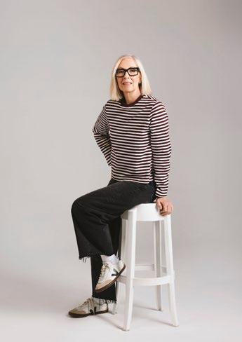
Jeanne Gaigher, leaves <—> messengers <—> leaves <—> messengers I. Image courtesy of Three Sixty Design.
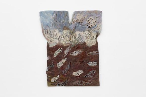

Veld Architects, where Gillian is the lead architect, is known for its commitment to eco-friendly design. We see this promise to create change reflected in some of her most beloved objects,
For example, a necklace displayed on her vanity table was made from natural turquoise and wire retrieved from illegal snares by ‘Down to the Wire’, an organisation that repurposes these instruments of harm. Rather than wearing it, Gillian preserves it, treating it as a reminder ‘to take care in the work that [she does] and to reach outward beyond the working world.’
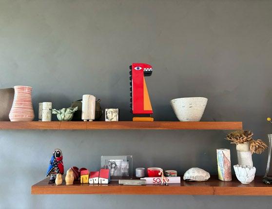
In contrast with this beautiful but solemn piece, Vecchio Amico is a playful ceramic dinosaur that stands out among the trinkets kept in Gillian’s foyer. She acquired it at an art store in Milan during the MADE expo, which she attended with André and Theo from TwoFiveFive Architects. For Gillian, the piece represents Italian creativity and the friendships that sustain her explorations in architecture.
A domed silver bowl that sits in front of the turquoise necklace serves as a constant reminder of Gillian’s trip to Jerusalem with her mother. It is, in fact, a silver-plated brass frankincense holder, though she uses it as a jewellery box instead. Even so, the association with burning frankincense and its meditative quality allows Gillian to gather herself while getting ready.

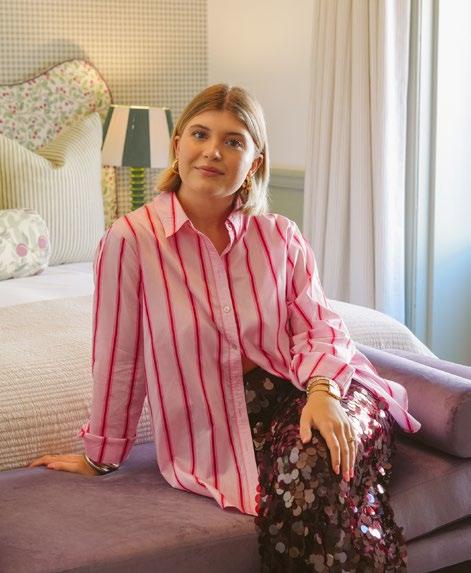
Celebrated for her interior designs for Tintswalo, this young creative turns to objects with past lives to imbue spaces with nostalgia, romance, and surprise.
‘I love pieces that do more than one thing, especially in a world where we’re constantly consuming,’ says Camlyn. Here she is referring in particular to the checkerboard table in her TV lounge, which she bought at an antique shop in Jeffreys Bay. Often, the checkerboard inlay is hidden beneath a stack of coffee table books, but once revealed, she says, ‘people can’t resist interacting with it; someone always starts a game.’
The jewellery table she bought from an antique dealer in Tulbagh has a similar appeal. While it appears to be a traditional side table, it contains a lined and sectioned jewellery compartment inside. ‘I didn’t even realise it had a key tucked underneath when I bought it,’ says Camlyn, recalling the delight of discovering the key that revealed the piece’s secret.
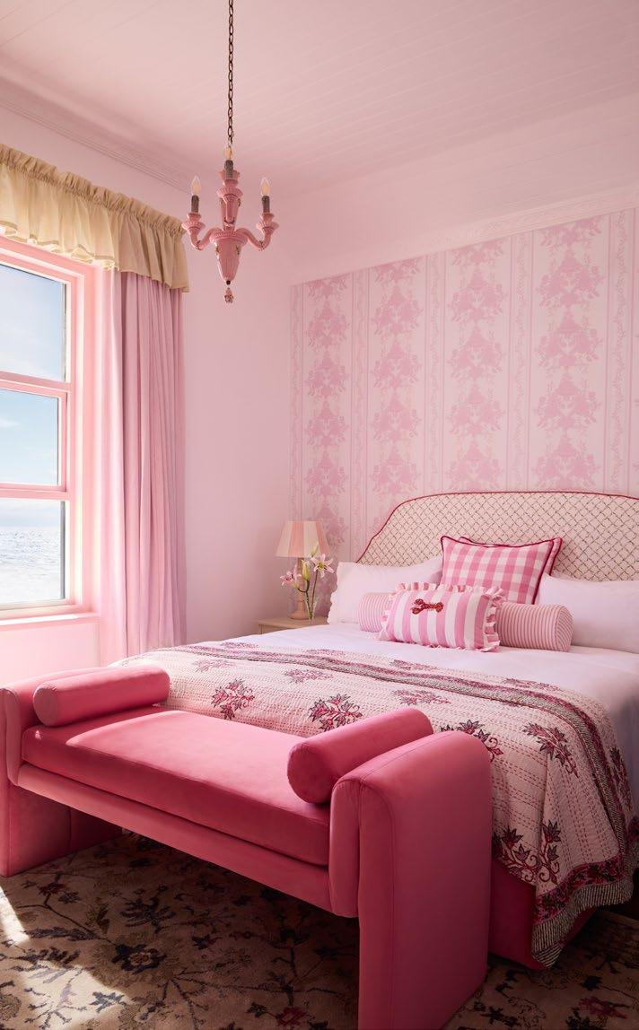
Camlyn takes the same approach when sourcing pieces for projects: she brings strong ideas to her meetings with antique dealers, but remains open to surprise while perusing old dusty stores. In search of a pink pendant for one of the rooms at Tintswalo Summer House in Glencairn, she visited Delos Antiques in Woodstock, where she found a handmade ceramic pendant light ‘very much in that Italian, Capodimonte style, with the most beautiful little pink flowers applied all over it.’
For Camlyn, much of the joy lies in people's reactions to these unique antique pieces.
The design pieces that frame Trevyn’s everyday activities of work, dining, and rest also tell the story of her gallery, Southern Guild.
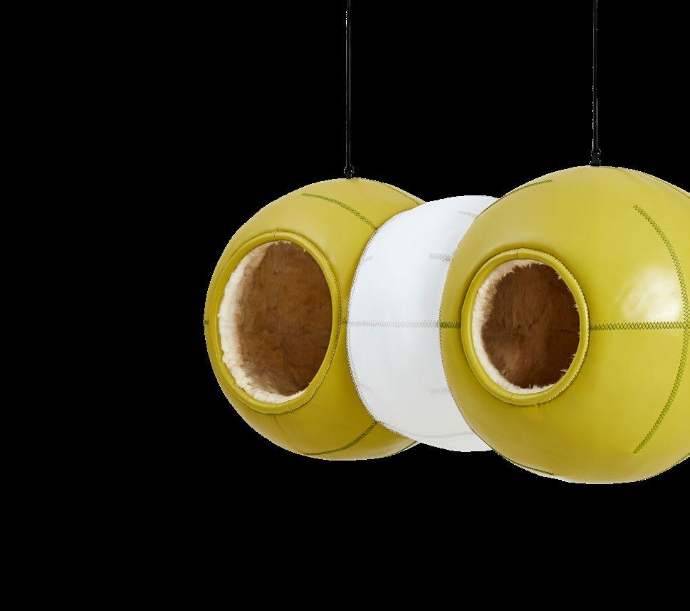
Just outside her office, an orb-like pod made from leather and sheepskin is suspended from the ceiling. Trevyn explains its function: ‘You can climb into it, and I often do, just for a few minutes to reset.’ The piece forms part of Porky Hefer’s Molecule series, which Trevyn finds powerful for its ideas of ‘connection — between elements, bodies, and people — and how that energy is held in space.’ She notes that her working relationship with Porky dates back to 2008, when she founded Southern Guild with her husband, Julian. Beyond enabling Trevyn’s power naps, Hydrogen Difluoride her to the artist (and his ways of thinking), who has been fundamental to Southern Guild.
Other figures central to this gallery’s history are Adriaan Hugo and Katy Taplin, who were, in fact, present at Southern Guild’s first meeting. Today, their design studio Dokter and Misses is based in New York, but their production remains in South Africa. ‘There’s something in that shared experience of straddling continents, of holding two places at once, that mirrors where we are as a gallery today,’ says Trevyn. A white Kassena Server by Dokter and Misses stands alongside
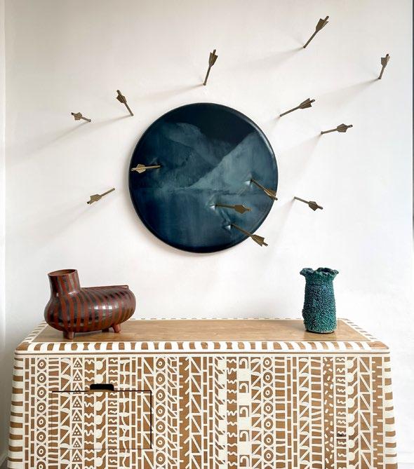
gently reflects the ornaments and pendants surrounding it. Trevyn has lived with this ‘fabulous’ table for about fifteen years; it has been the centrepiece around which much of daily life has unfolded. Like her other object picks, this table speaks to a longstanding relationship: Gregor was part of Design Network Africa, which Trevyn started in 2003, and later created the first solo show they presented at Design Miami in 2011.
Trevyn’s choice to fill her home and office with work by Southern Guild-affiliated artists shows her strong investment in and interest in their creative practices.
Taken together, these objects tell the stories of lives dedicated to design, care, and lasting relationships.
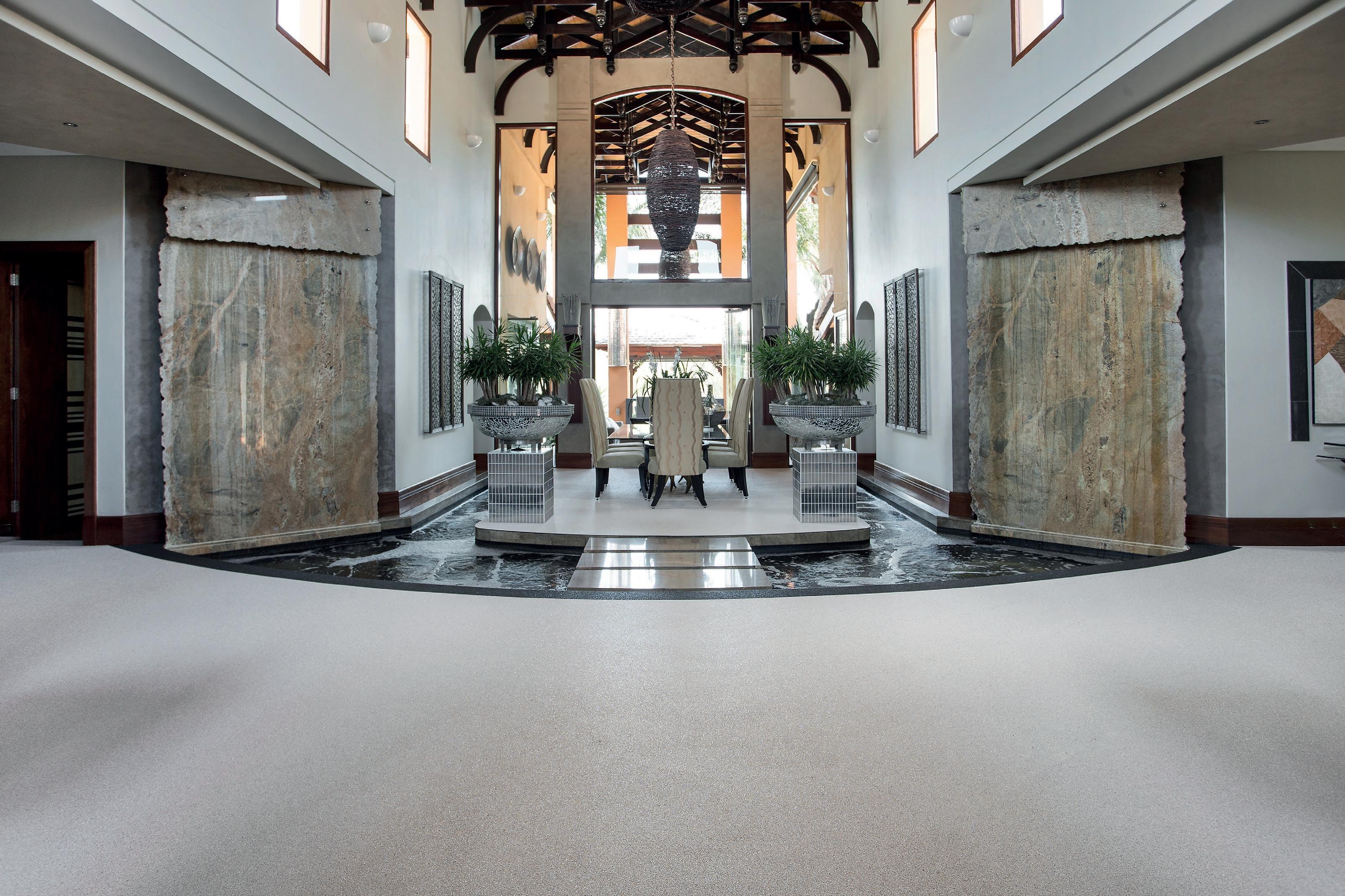
A monolithic surface that dissolves the boundary between interior and exterior.
Quartz Carpet is a hand-trowelled finish crafted from vibrant European quartz bound in UV-stable resin. Designed for galleries, upscale hotels and contemporary residences, it delivers a seamless, tactile, slip-resistant surface across varied floor plans. Its durable, hygienic composition supports effortless refurbishment over existing substrates, ensuring a refined aesthetic that performs as beautifully as it looks.
0861 782
www.quartzcarpet.co.za
On Choosing One Thing to Say Everything
To ask a designer to submit a single piece is to remove the safety of the collection. There is no supporting cast, no broader narrative to lean on — just one object, standing on its own terms. For this issue, Scape invited a selection of furniture designers and cherished brands to do exactly that: to choose one piece from their newest body of work.
What emerges is a series of decisions. A gesture of selection that reveals where attention is settling, where time has been invested, where thinking has taken hold, which materials are being returned to, which ideas are being carried forward. Each piece reflects a point of focus within a practice: where material has been pushed, refined, or reworked.
Taken together, these selections offer a loose but telling glimpse into how designers are working now, locally and internationally. Although no unified direction is revealed, a series of individual gestures begin to echo one another in unexpected ways.
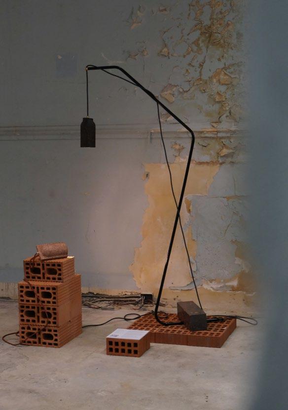
For some, it is about material: the irregularities of timber, the tactile qualities of wool, the texture of brick aggregate, and the honesty in how each piece comes into being. In Alkaline’s WAYST Pendant light 01, discarded rubble and industrial
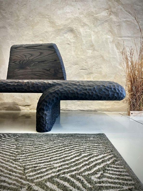
offcuts are reframed as latent architectural potential; their embedded aggregate is left exposed so the object carries the memory of its origin. Louw Roets’ OER operates through a process of removal rather than construction, each piece carved from a single mass of timber and ‘revealed’ over time, with tool marks and weight left intact as evidence of touch, gravity, and permanence. Beyond attention to surface quality, material is treated as something with weight, behaviour, and consequence.
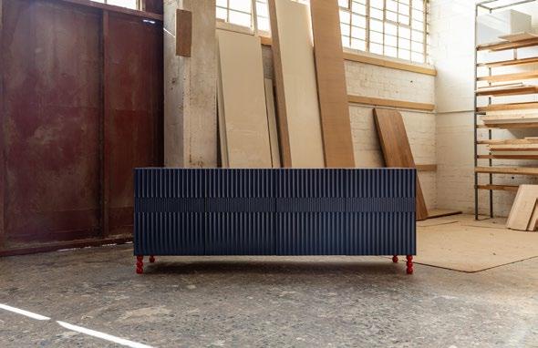
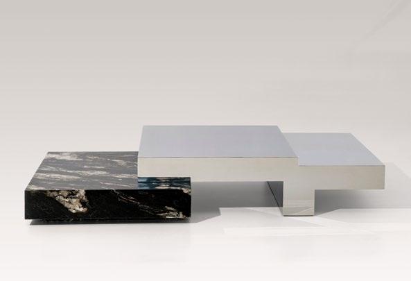
For others, this attention takes shape through controlled systems, engineered components, repeatable forms, or highly resolved finishes. At OKHA, the LES AMIS Coffee Table approaches companionship as a structural idea: two distinct volumes, one reflective and one grounded, are held in careful alignment so that neither resolves without the other. Material contrast becomes a kind of dialogue, between weight and
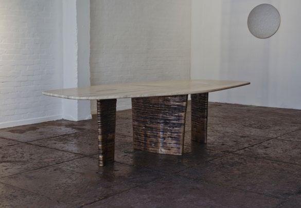
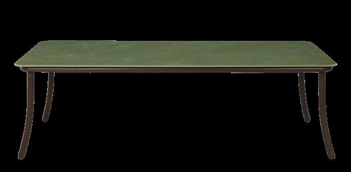
lightness, absorption and reflection, allowing past and future to coexist within a single composition. A clarity of relationship appears in Bronze Age’s Kaap Dining Table, where bronze legs extend seamlessly into travertine inlays, creating a continuous material language that binds structure and surface into one sculptural whole.
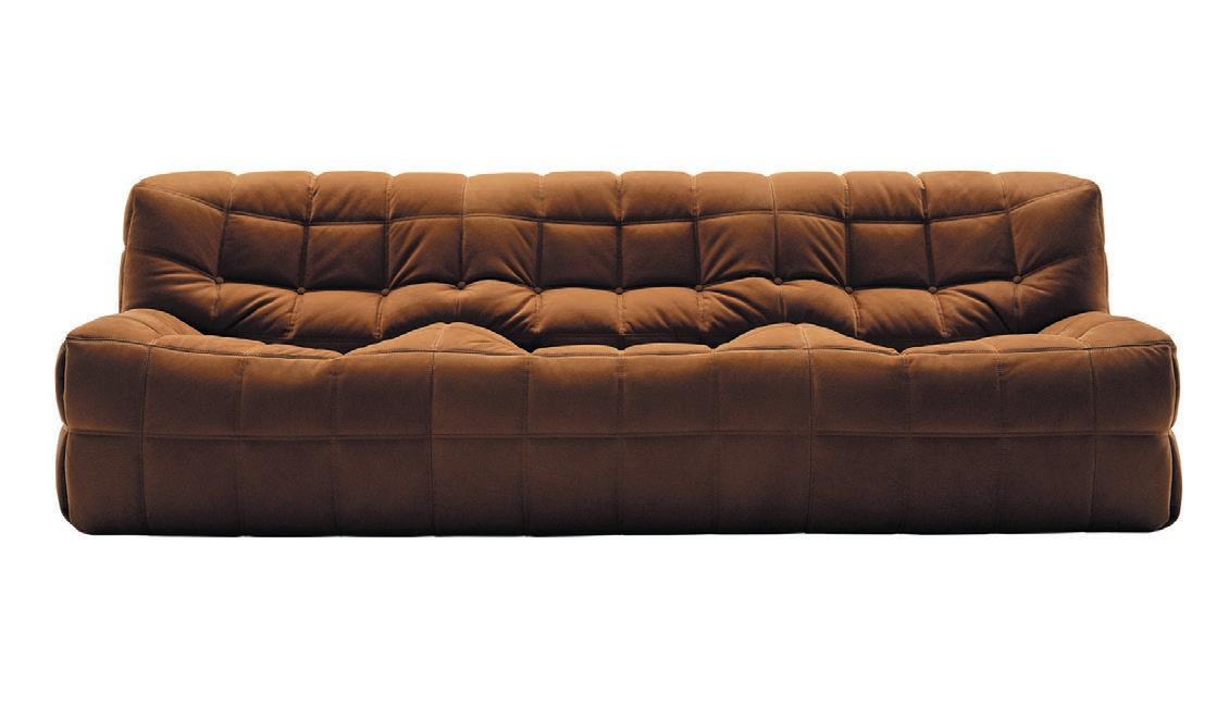
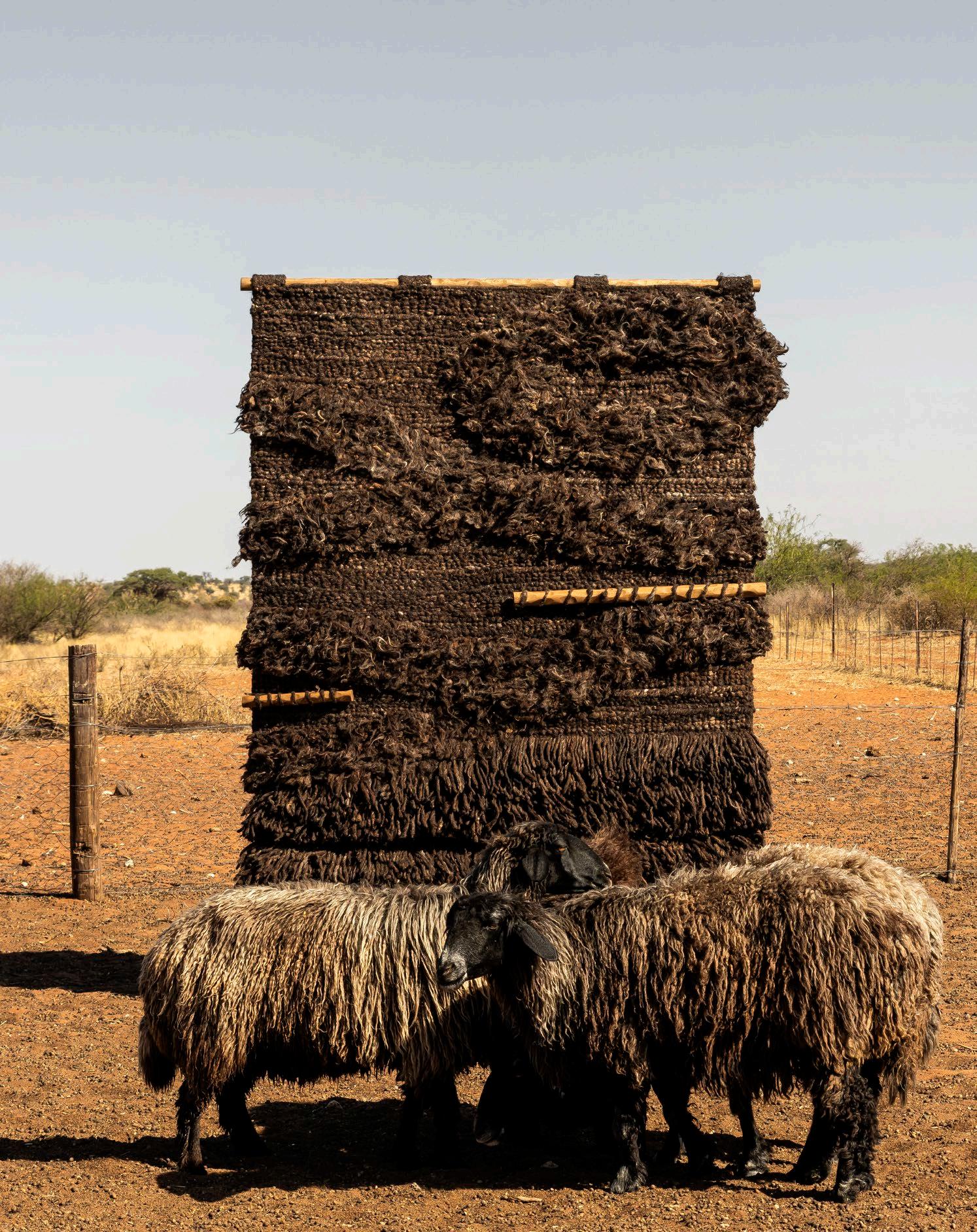
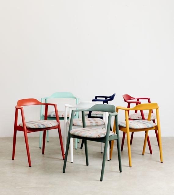
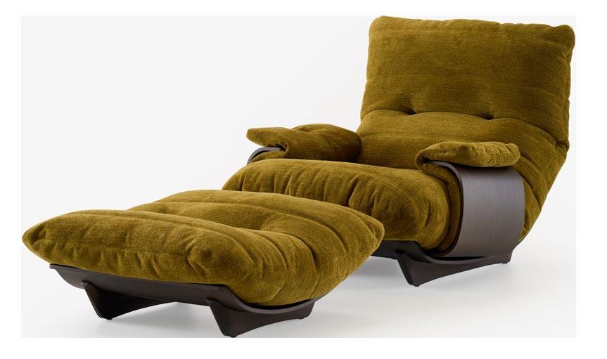
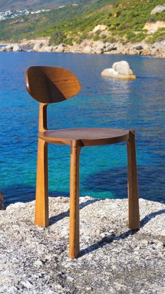
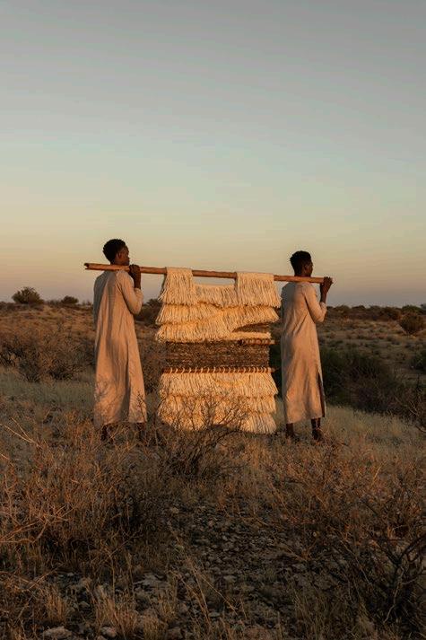
Weylandts x StudioLandt's Textiles that Trace draws from the communal structures of sociable weaver nests, translating their layered, collaborative construction into woven tapestries made from reclaimed wool. These speak as much about shared making as they do about material. This extends to re-editions, as in Marsala by Michel Ducaroy x Ligne Roset, where a defining enveloping shell is reinterpreted through subtle shifts in construction and finish, preserving its essence while reworking its presence. In James Mudge x Mungo's piece, bespoke natural fibre cloth softens and deepens the precise forms of handcrafted chairs, reflecting a shared commitment to origin, longevity, and craft.
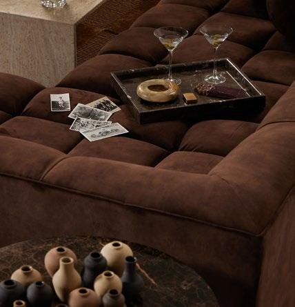
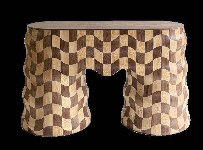
And yet, within this restraint, there is play. It is found in proportion, movement, and in how objects invite interaction. Deft Studios’ CHECKMATE exists somewhere between object and creature, its sculptural form incorporating subtle movement and tactility, asking to be touched, explored, and lived with. Curación’s CADBURRY modular sofa offers softness and adaptability through plush, reconfigurable forms that invite lounging, rearranging, and ease, a reminder that interaction can be as much about comfort as curiosity.
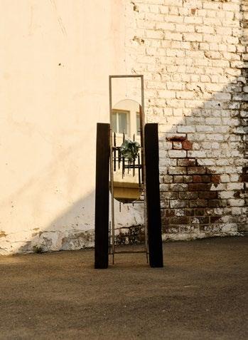
Rasengani Atelier’s Reflected Hope transforms the mirror into a site of pause, where reflection becomes both literal
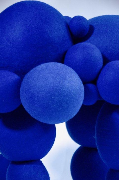
and atmospheric, holding light in a way that invites stillness and grounding within the everyday. Ronel Jordaan’s Bubbles uses the slow, tactile method of felting to explore ideas of truth and untruth, a material practice that allows time for reflection, both in making and in meaning.
There is a sensitivity to relationships between materials, forms, people, and the pieces they keep close. Elements relate and support one another, where contrast sharpens clarity and absence can define presence as strongly as form.
In STUDIO KÁJA’s work with Mingayi Malanti, each vessel carries the visible trace of the hand, fingerprints, uneven rims, subtle irregularities, creating a tangible connection between maker and object. BRUTALIST by Giampiero Tagliaferri x Minotti is inspired by late 20th-century Italian engineering and Pier Luigi Nervi’s Palazzo del Lavoro in Turin. Defined by a sculptural concrete base in an irregular star geometry and a calibrated structural system, it translates architectural logic into furniture.
Importantly, these are outcomes of process, pieces that have been arrived at, rather than styled into existence. There is a generosity in this approach, a willingness to leave space for interpretation, for use, for time. In a culture that so often demands immediacy, these works feel considered. They hold something back, inviting you to return, to sit, to use, to look again and notice what reveals itself gradually.
A single piece is enough.
Here follow the selections from some of our beloved designers’ and brands’ newest collections.
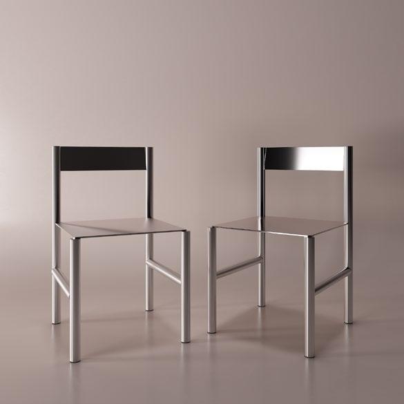
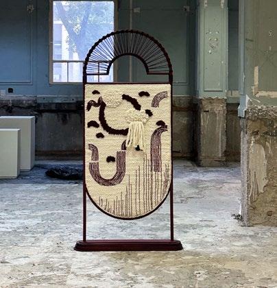
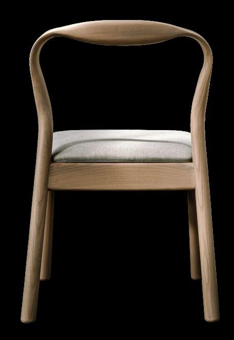
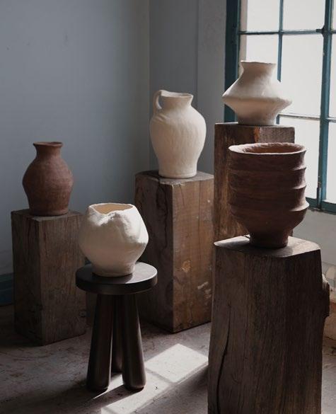
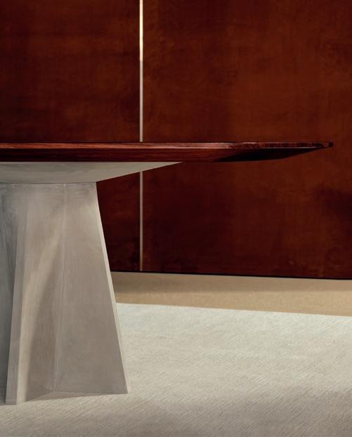
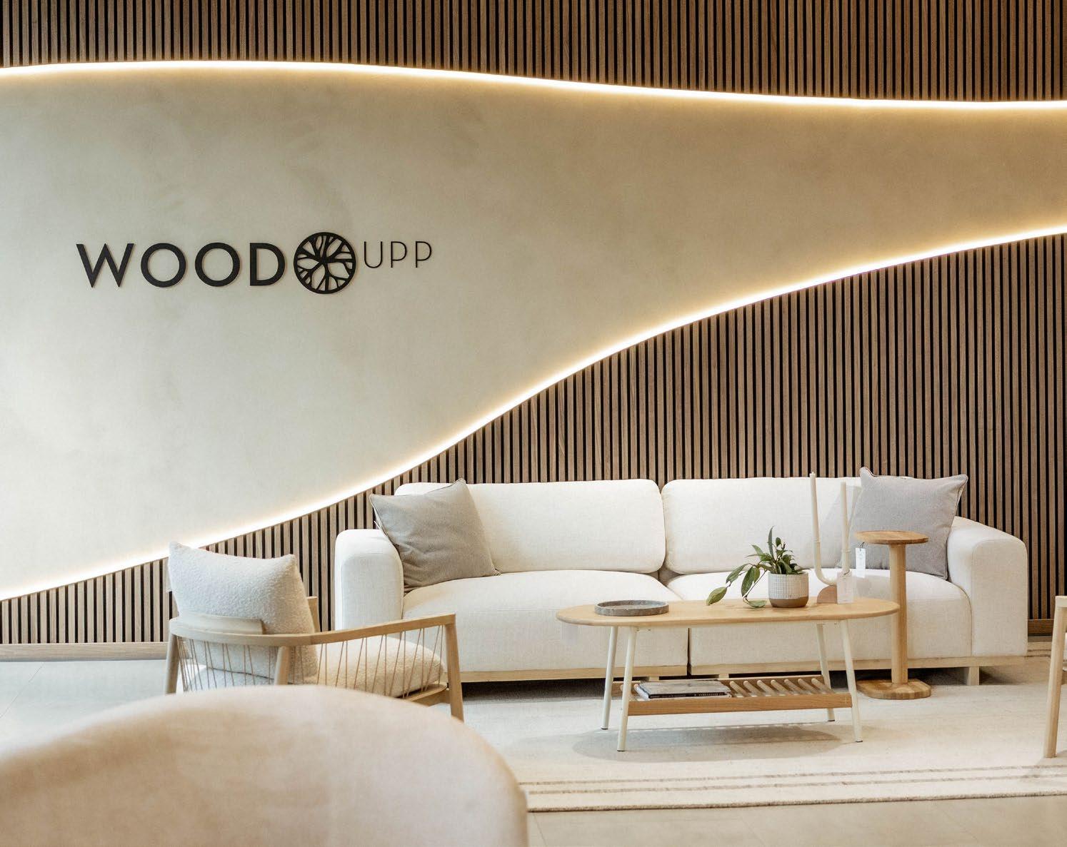
At WoodUpp, we believe the spaces we inhabit shape the way we feel and live. Our Scandinavian-designed and manufactured products bring warmth, acoustic calm, and timeless elegance to any interior. From intimate residential retreats to premier hospitality destinations. Each panel is crafted with natural materials, allowing the grain, tone, and texture of wood to speak for itself. Transform your walls, ceilings, and façades into living surfaces that are as beautiful as they are functional.
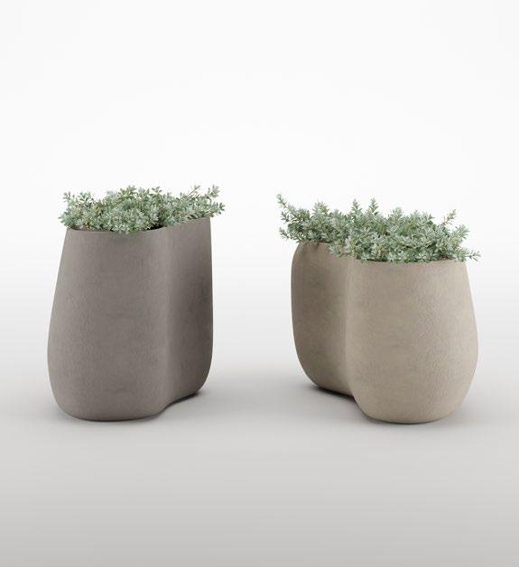
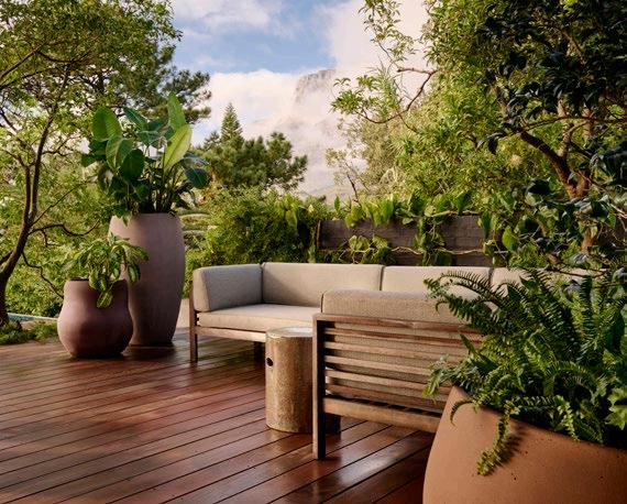
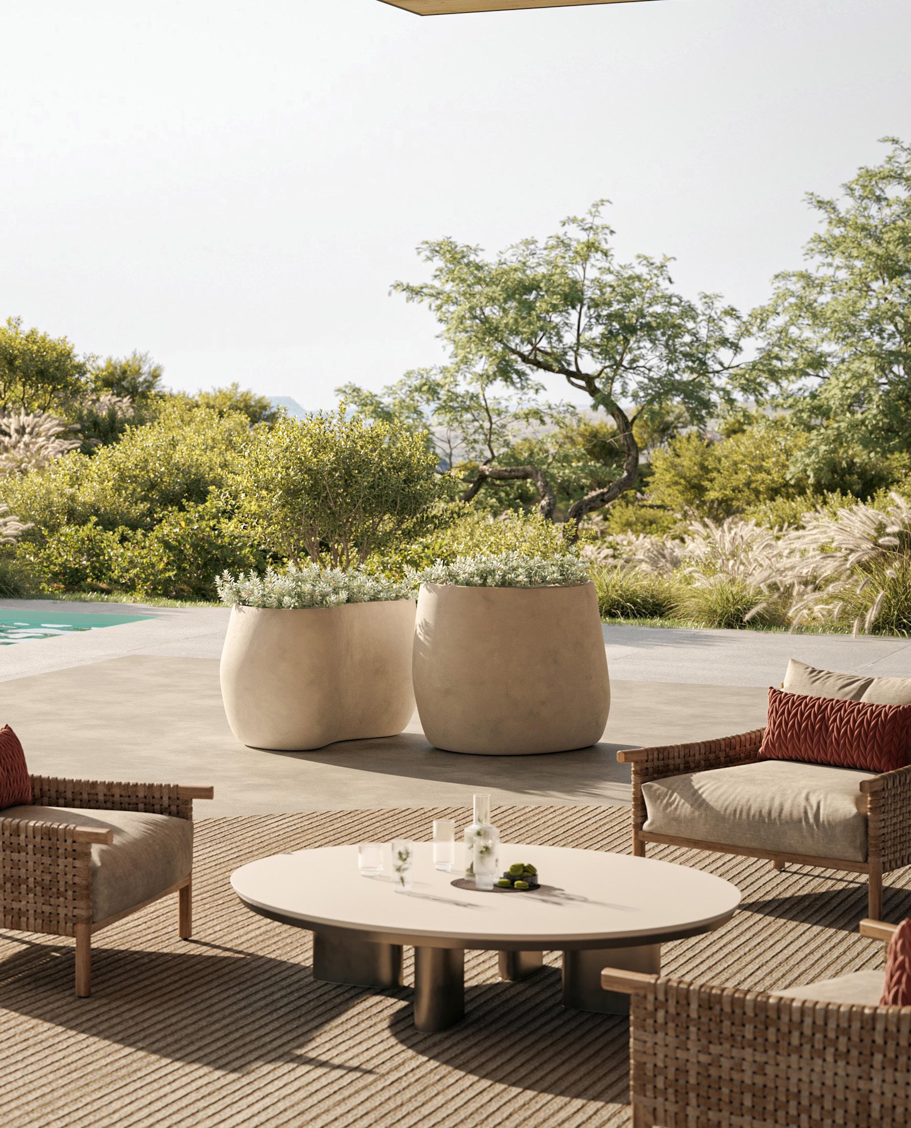
Produced locally in Cape Town and distributed internationally, Indigenus’ collections balance durability with a surprising lightness. These objects, designed to move easily between interior and exterior contexts, maintain a strong architectural presence.
The latest addition to the Pebble range introduces two new trough planters, extending an ongoing collaboration with Yabu Pushelberg. Known for their quietly expressive ‘soft modern’ approach, the studio brings a sense of restraint and fluidity to the collection that is visible in the troughs’ rounded, organic profiles.
The pieces are designed to operate both individually and as part of a larger composition. When paired, their forms create a subtle yin–yang relationship. When separated, they respond to curved interiors and softer spatial geometries, reinforcing their surroundings.
Two variations are available: a taller trough configured for two plants, and a lower, more expansive version accommodating three. Together, they offer a flexible planting system that prioritises proportion, rhythm, and ease of placement.
As an extension of the Pebble range, the new troughs continue Indigenus’ focus on objects that sit comfortably at the intersection of furniture and landscape. These functional elements contribute to the spatial narrative as much as they support it.
For more information on Indigenus and to view their ranges please visit: www.indigenus.co.za

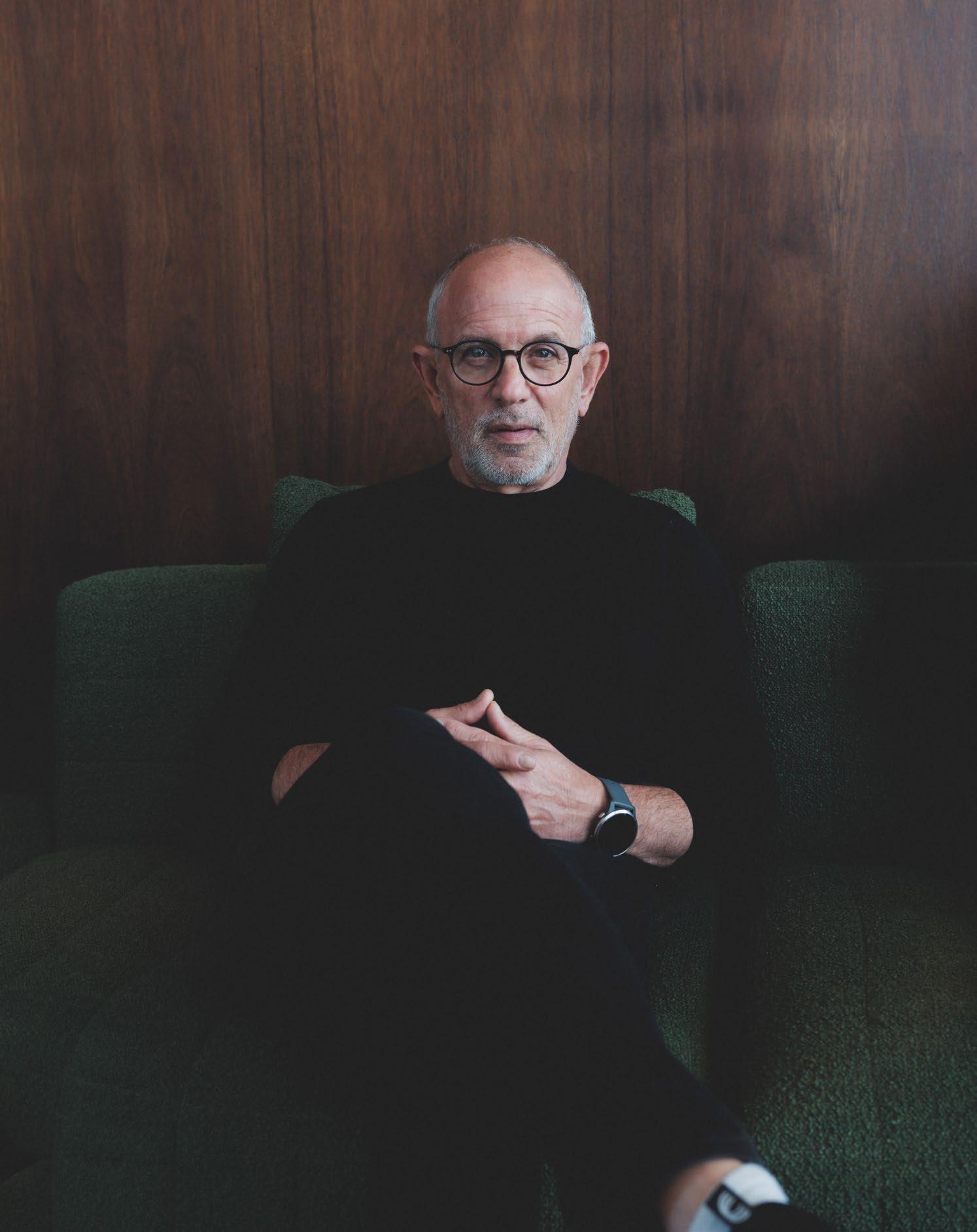
by
In an era where architectural discourse is increasingly shaped by global visibility, rapid image circulation, and the pressure to define a recognisable ‘language’, the question arises: what remains when these layers are stripped away?
At Peerutin Karol, the answer lies in interpretation. Architecture is an act of response — to client, context, constraint and opportunity. As founding partner and design principal David Peerutin notes, 'A building should always address the fundamentals correctly. It should answer the brief… our role is to interpret rather than impose.'
This interpretation is inherently multi-layered, balancing client ambition with commercial realities, planning frameworks, budgets, timelines and — critically — the specifics of place. Within this complexity, a fixed design language becomes not only irrelevant, but restrictive.
Architecture as calibration
Rather than pursuing architecture as expression, the work becomes one of calibration: a careful balancing of competing pressures. Function remains the starting point. 'First and foremost, it must work efficiently,' Peerutin explains. Only then can architecture begin to operate on a more intangible level — eliciting emotion, maintaining a clear design idea and achieving coherence.
This position sits slightly outside dominant global narratives, where architecture is often framed through spectacle or formal novelty. Here, the emphasis is on what remains viable when subjected to the realities of construction, cost and use.
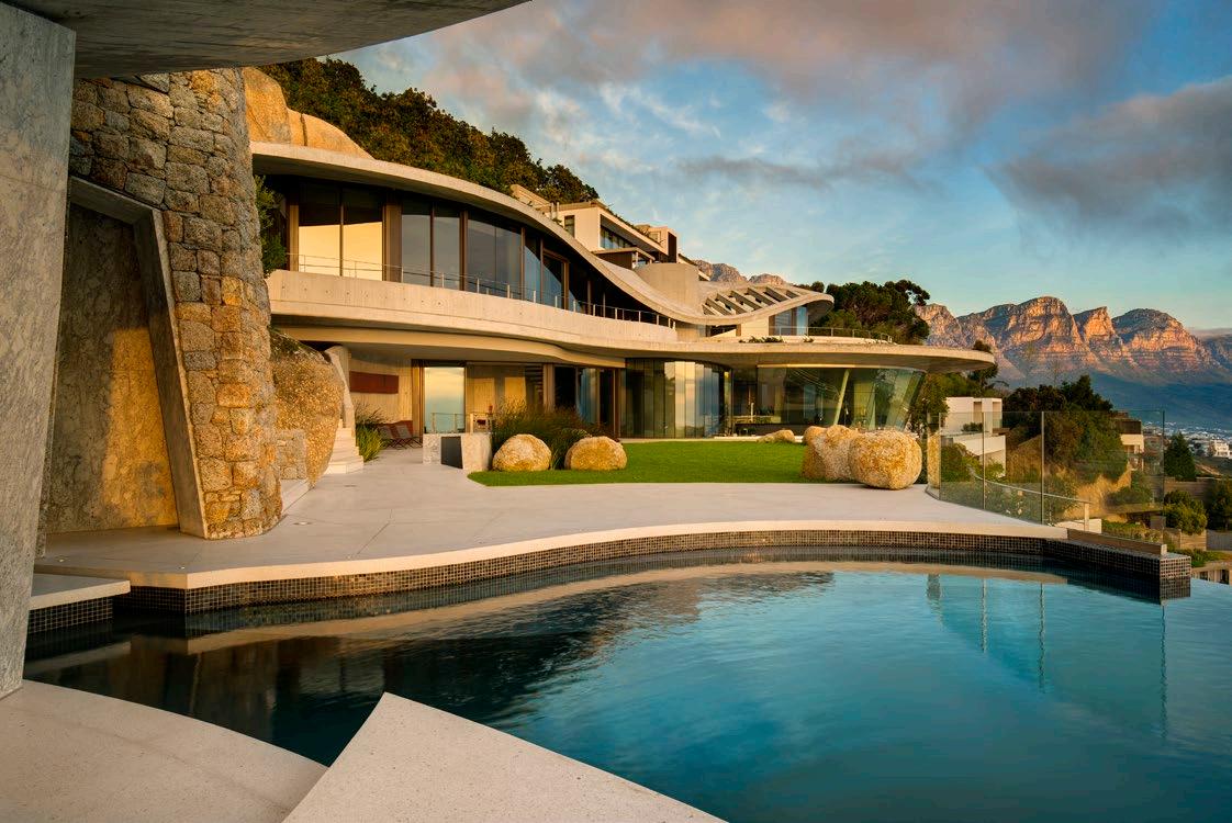
The Clifton Iron Man House, perched on the Atlantic Seaboard, represents a rare moment of architectural latitude. Conceived with a forward-thinking client, it explores the idea of an ‘iconic’ home that distinguishes itself while embedding into its landscape. A sandstone-clad base anchors the building to
“No single design aesthetic or language is universally appropriate… Each project must respond to the balance of all variables.”
—
David Peerutin, founding partner and design principal.
the mountain, while sinuous upper levels appear to float above, echoing the contours of the terrain. Despite its scale, the structure is carefully modulated to reveal only selected elements as its public face.
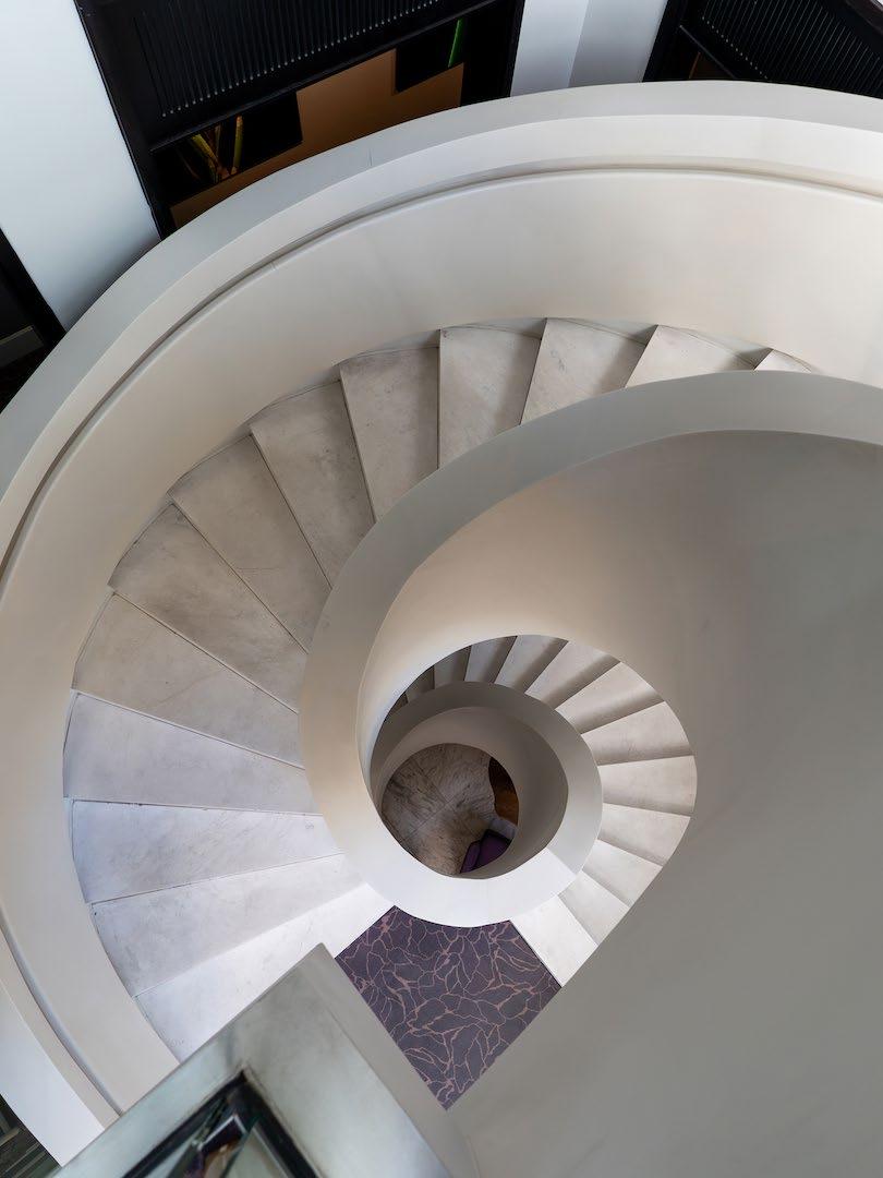
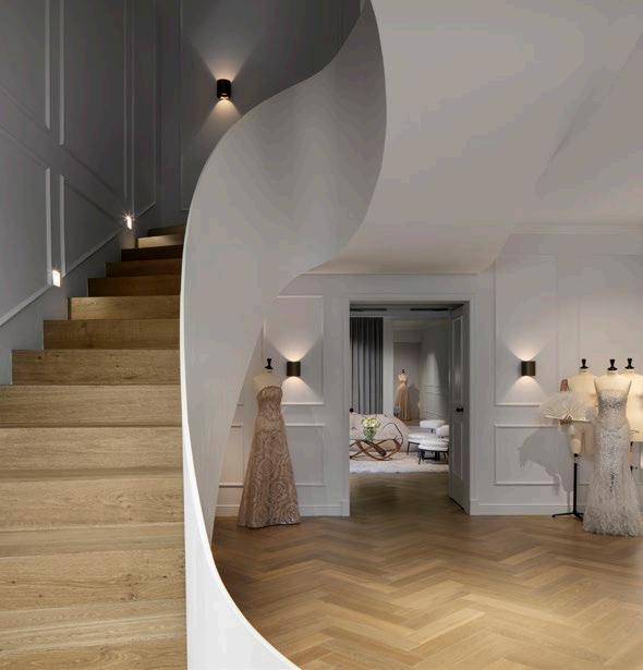
By contrast, the BUDISM Couture project operates within the constraints of heritage. Situated within a Georgian building on Bree Street, the intervention required preserving the historic façade while reconfiguring the interior for a contemporary couture atelier. A controlled spatial progression unfolds from a more traditional, articulated ground floor to increasingly minimal upper levels, anchored by an elliptical concrete staircase inserted within a rectilinear volume. Central to the project was the extension from three to four storeys — without changing the façade — a move that demanded careful negotiation with heritage authorities. The result is a precise reconciliation of preservation and adaptation.
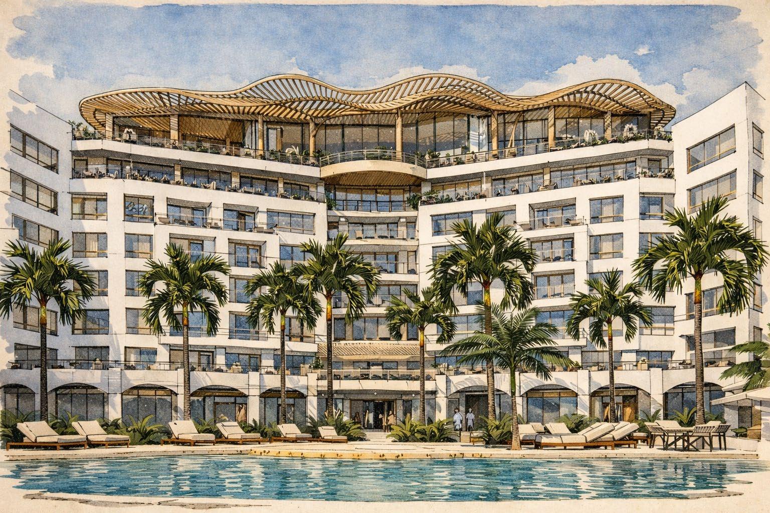
A different challenge defined the Queen Victoria Hotel, where an inefficient office building was transformed into a boutique hotel. Deep floor plates and limited natural light were resolved through the insertion of a central triplevolume atrium, formed by removing portions of existing slabs and introducing a skylight above. Rooms are organised around this light-filled core, accessed via layered walkways that establish both clarity and intimacy. Within this volume, a sculptural spiral staircase contrasts with the rigid structural grid, introducing a moment of spatial drama.
Beyond these examples, the broader body of work reinforces this position. From large-scale commercial developments such as Wembley Square and the Boulevard Office Complex, to high-end residential projects along the Atlantic Seaboard and more private, contextually embedded homes such as the Norwich Road residence in Bishopscourt, the architectural language shifts continuously.
Interior projects, such as the V&A Marina penthouse overlooking the Zeitz MOCAA, Cape Town Stadium and working harbour, extend this approach into lived space — incorporating locally made furniture, curated art collections and carefully selected designer fittings that respond to setting and context.
Speculative proposals, including design competitions for Chamonix Wine Estate and the reimagining of a major hotel in Sea Point, demonstrate engagement with future conditions within a historical context. Large-scale masterplanning projects across Africa such as Kashimbila Island Resort and Sea Lagos expand the work into broader territorial frameworks. Across all of these projects, there is no attempt to standardise an identifiable ‘style’. The diversity of outcomes becomes the clearest expression of the practice’s ethos.
To describe the work as ‘modernist’ would be partially accurate, but insufficient. As Peerutin notes, 'No single design aesthetic or language is universally appropriate… Each project must respond to the balance of all variables.'
This resistance to stylistic consistency is not a lack of identity, but a deliberate position. It allows the practice to operate across varied typologies and contexts without imposing a singular narrative.
Architecture, in this sense, becomes less about declaration and more about delivery. The emphasis shifts from authorship to outcome, from image to performance. Buildings must be constructed, inhabited and sustained over time.
Within a global design culture that often privileges visibility, this approach offers a different kind of resilience.
Rather than asking what architecture looks like, it asks what it does — and what it continues to do over time.
The work of Peerutin Karol is therefore not defined by a singular architectural language, but by its refusal to adopt one.
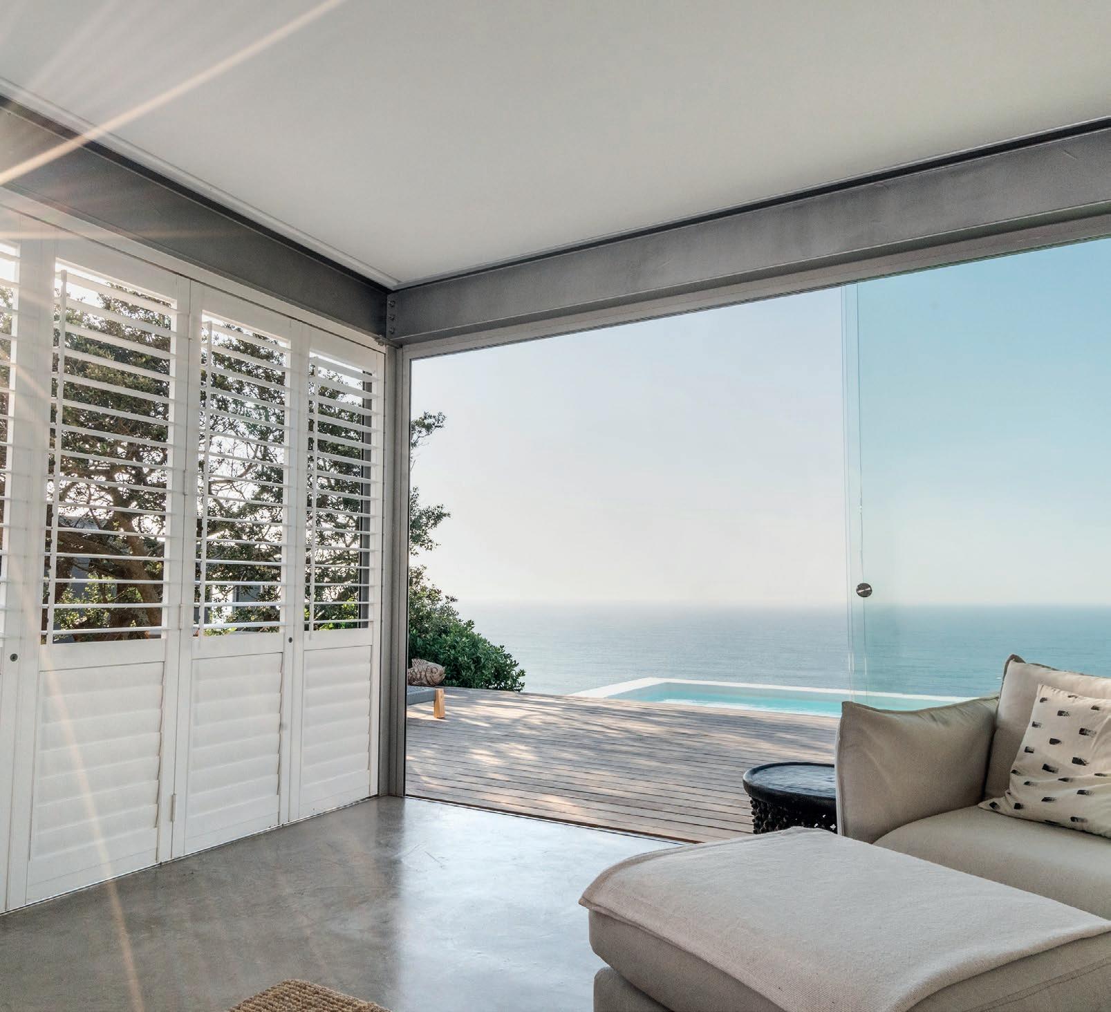
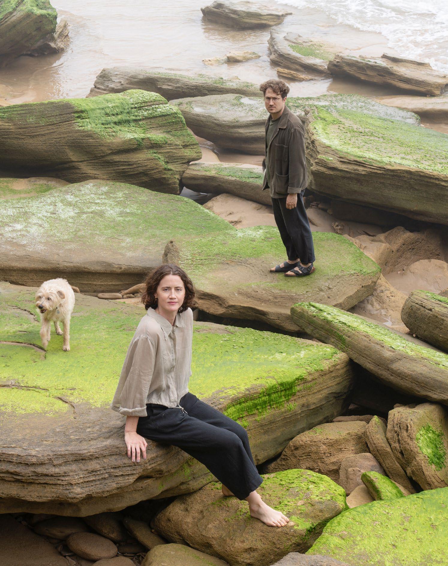
Leonard and Catherine From MiMo Architects Share Their Design Fundamentals for Homes
Built With Care
An ‘architecture of neighbourliness’ and texture’s promise of the hand, of warmth are just some of the concepts grounding MiMo's approach to creating homes. Their genuine concern for the quality of everyday life has led to design methodologies that foreground beauty within simplicity. Their work adapts Classicism for the contemporary context. One can perhaps imagine their buildings not as stripped-down, as if excess existed first, but as sensitively crafted from invisible elements: air, light, climate, atmosphere.
Leonard Miller and Catherine Moronell Directors, MiMo Architects @_mimo_architects www.mimoarchitects.co.za
What strikes me about your work is how warm your pared-down spaces are. Could you explain how you design thoughtful solutions that are unadorned yet remain so liveable?
The built form only makes up a small part of a building — air, light, climate, and people are integral to what a building actually is. When you focus on that, and use matter to give presence to those invisible forces, warmth emerges.
We also like to use true materials where possible: clay, timber, stone, concrete. They carry a story in themselves, in their origin, and in their making and assembly, so that what is visible reveals this history.
The eye reads texture as warmth because texture promises the hand: you see what the body could feel, and the anticipation is itself a kind of warmth. It doesn't need to be added.
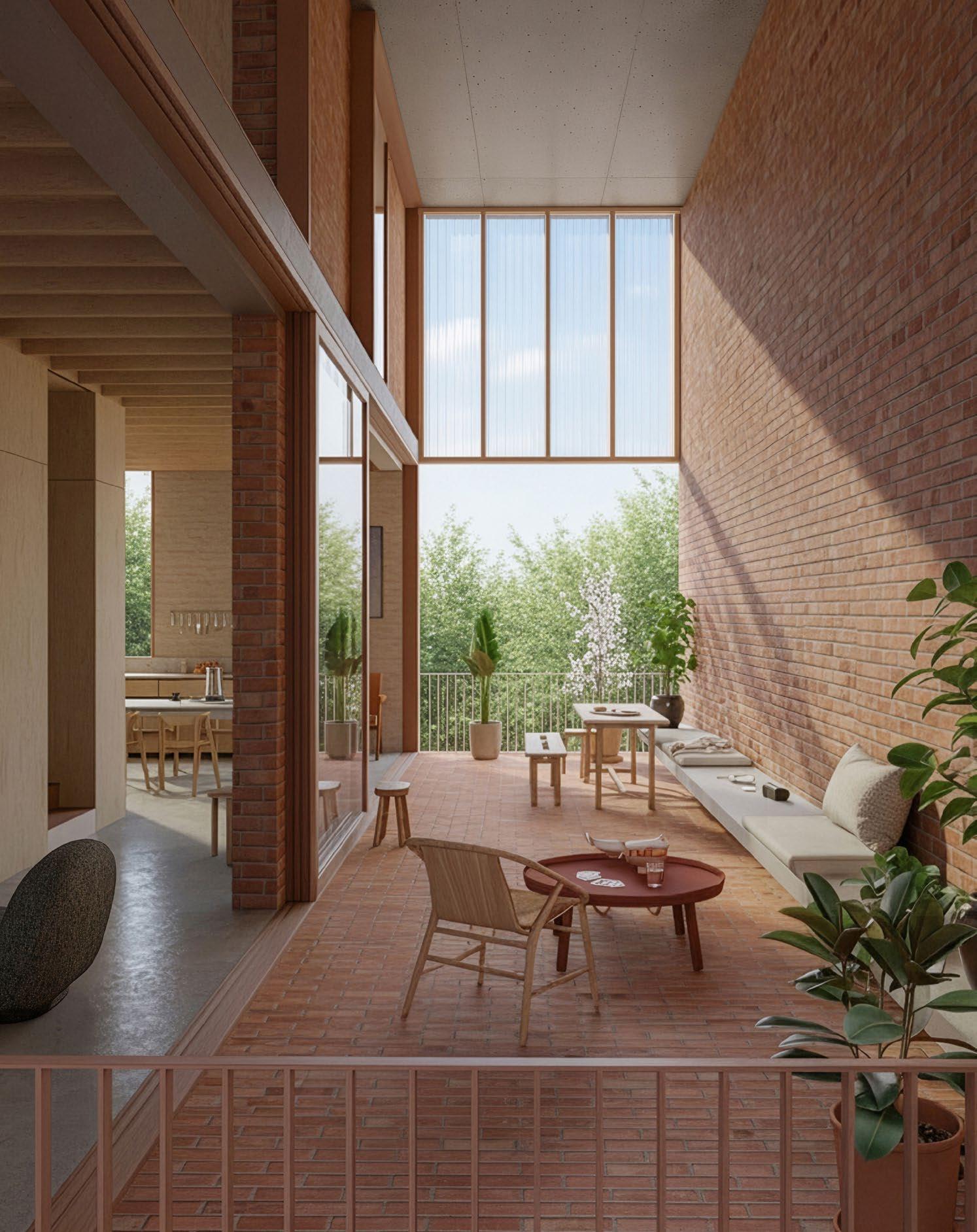
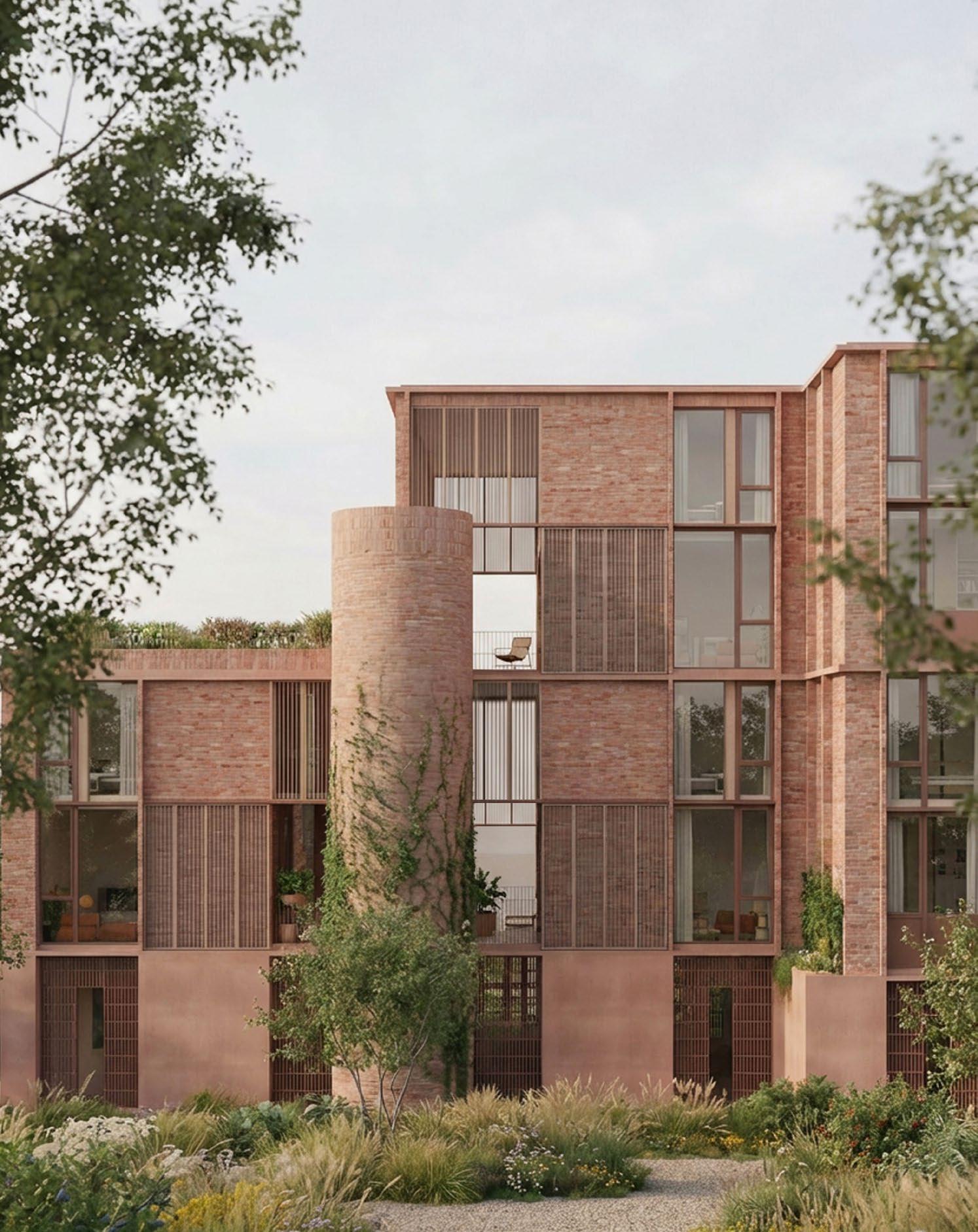
Your use of primary design elements interacts with natural elements in exciting ways. How does your approach to the fundamentals of design take natural elements into account?
We draw on land, plants, and climate in our design response to a site. A tree with a good story could anchor the whole plan. Or an interesting material in response to an ethical stance could form the fundamental design concept. What we build with is always determined by context.
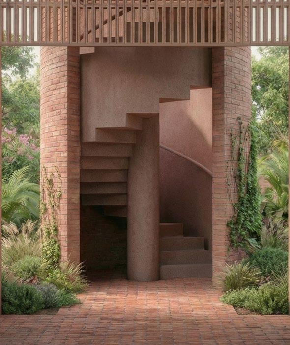
There’s an ethics to timber and a continual testing of its locality, its treatment and finish. There’s the embedded local knowledge of brick, its trustworthiness. Stone is ancient.
In your projects, the monochromatic tones of materials allow an unencumbered focus on form. Line, volume, and shape are fundamental to your designs, but also act as points of detail. Please tell us more about this methodology and how you first developed it.
Line, volume, and shape are in all built forms. We view them as malleable and important to think about carefully. Volume comes first, and then the materials begin to determine how edges and thresholds are perceived and experienced.
Working in a tight economy, you can't afford to dress things up. So you focus on what you can control without adding cost. As for the monochromatic tones — honestly, it's just what we like. But when you actually experience the building, there are many textures, volumes, and qualities of light. The palette is quiet; the experience is hopefully rich.
By prioritising the fundamentals of design, you facilitate a good quality of life, even if it is a simple life. What, according to you, are the non-negotiable fundamentals in building design?
We first ask why we build. Is it a phenotype — like birds building nests? Protection from the elements, somewhere to return to. That is for the client to determine.
“If our architecture can remind someone that they feel at home on earth, through beauty or comfort, we have done our job."
We bring the underpinning layer: how the human body experiences a space. Our fundamentals are the invisible ones (light, air, comfort, the conditions of human experience). Every solid element must support the invisible ones.
If our architecture can remind someone that they feel at home on earth, through beauty or comfort, we have done our job.
I’m intrigued by your concept of ‘InsideOut Housing’. Can you tell us more about the interventions that this design model proposes?
South Africa has a housing problem that is also a design problem. The options available to people looking for welllocated urban homes are compromised: freestanding old houses need upgrades before they are liveable, estates trade urban engagement for managed monotony, and apartments are designed from the outside in — driven by site coverage, unit count, and zoning constraints.
InsideOut starts from the other end: the lived experience. How a body moves through space, the effects of morning light, neighbourly encounters, a room’s performance across seasons, and then builds the model outward from there. This means reducing spending on decorative elements to prioritise space, climatic performance, and shared ground
between units. Communal gardens and playgrounds are not just amenities added to sweeten a sale. They are the architecture of neighbourliness.
'Design quality is embedded from the outset. Costs are transparent, and future residents help shape key decisions. We are redefining luxury as spatial generosity, building homes that prioritise residents over the long term.'
This is not a conventional property launch but a question: can housing in this country be made with greater care, and is there demand for it?
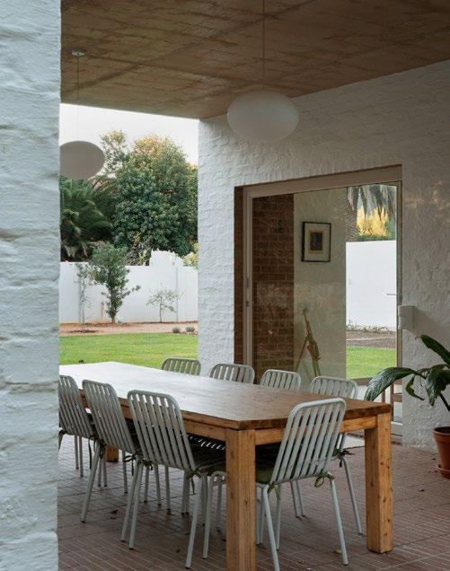
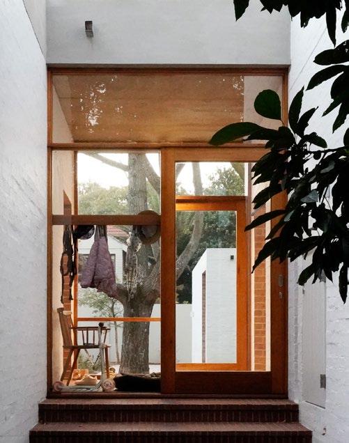
Your buildings photograph exceptionally well. I think this partly has to do with the beautiful compositions inherent in your designs: a staircase framed by an opening, an indoor plant lit by a skylight, or trees viewed through a window as if in a painting. Do you draw on other creative disciplines to cultivate this sensitivity to composition?
Thank you. The search for beauty is a personal fundamental in our design. We think of ourselves as artists — not in title, but in the seriousness with which we approach a creative problem.
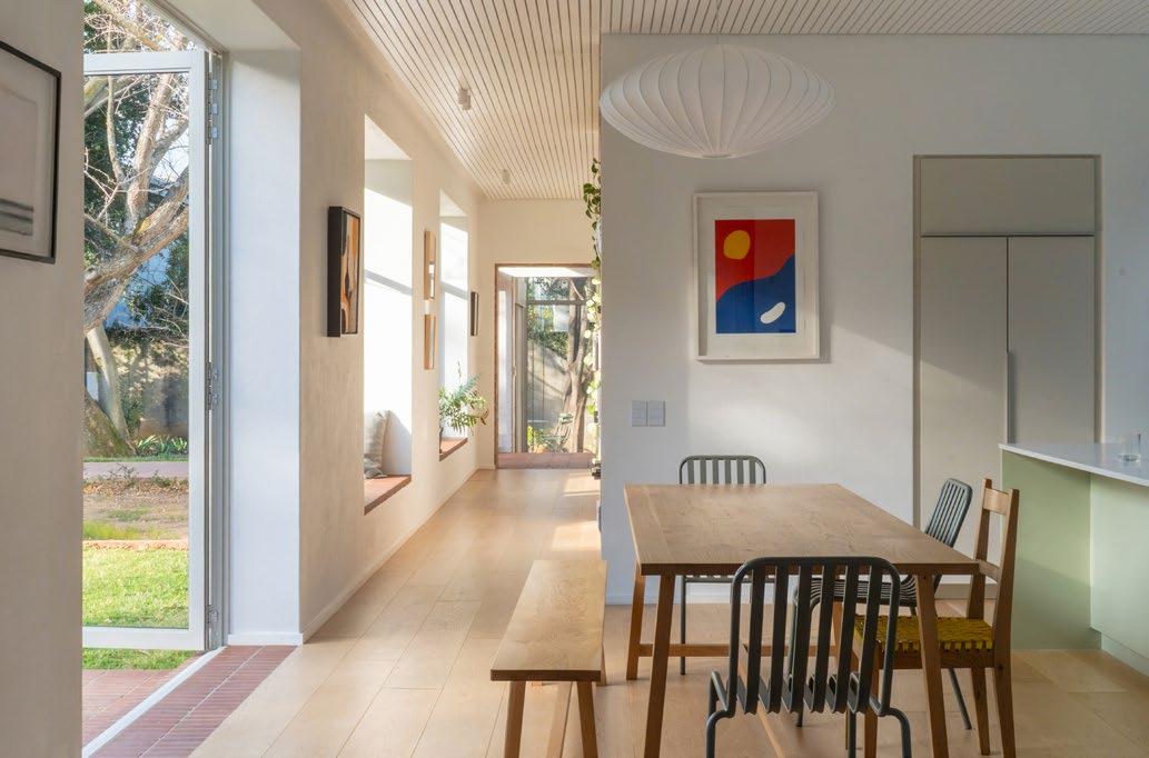
interview
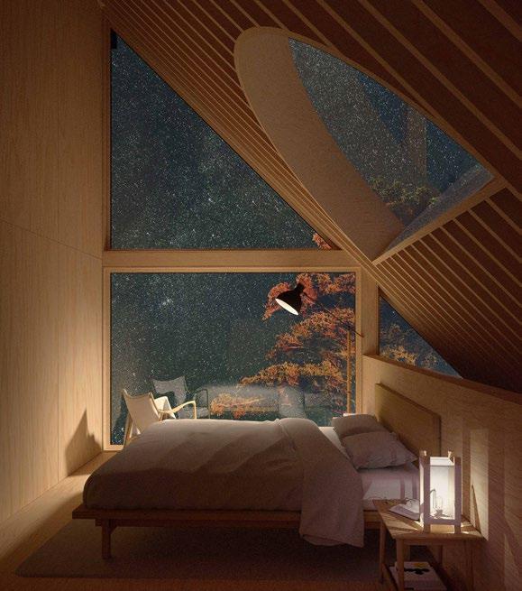
Film teaches you that light is a narrative element, that cities and buildings are both backdrops and characters. Catherine likes films where nothing happens beyond the ordinary drama of existence, and where place is a strong character. A painting shows that composition is important in meaningmaking. We absorb these things and they resurface in the decisions we make.
Across your portfolio, it is clear that your practice has a well-defined point of view. Does this distinct design language attract a particular kind of client? And to what extent do clients shape your design approach?
Yes — though the audience is smaller than we would like. That’s part of why we want to push design education through self-initiated projects like InsideOut — to broaden the conversation around considered design and why it matters.
The clients who have shaped us most are those who trust us, where the brief develops alongside the design and the process is genuinely shared. We are not interested in imposing a single language, though our design fundamentals
create a common thread. We design toward what we genuinely believe is right for this place, these people, this life.
Is there a particular period or movement in design that has most influenced your design language? If so, how have you translated it into a contemporary context?
Classicism — for its ideas of beauty and balance, but understood from the inside out. Its plans and forms were stuck in platonic shapes. What interests us is the spatial logic beneath: proportion and the relationship between solid and void. We pursue that through light and volume.
We are also drawn to the material honesty of early Brutalism, before it became a style. And to artistic modernists: Ray and Charles Eames, some of Le Corbusier's work. Architects and furniture designers from this period used economical, mass-produced materials in beautiful ways, which is a strong influence for us.
We also love ruins and ancient structures. The way a timeworn building reveals its own logic more honestly than a finished one ever can.
And then there are contemporary Spanish, Mexican, and Japanese architects, practitioners who share an interest in climate, material, and the relationship between a building and its ground. They are less a school than a sensibility, and it’s one we recognise in ourselves.
What connects all of it, for us, is an interest in what buildings actually do — not as image, but as experience lived through the body over time. That is the translation: from historical intelligence about proportion, material, and light, into architecture that performs honestly within the specific conditions of where and how we build today.
“We also love ruins and ancient structures. The way a time-worn building reveals its own logic more honestly than a finished one ever can."
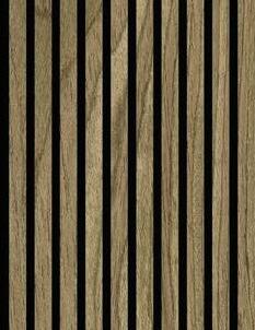
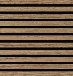
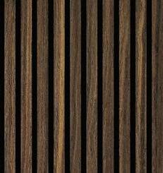
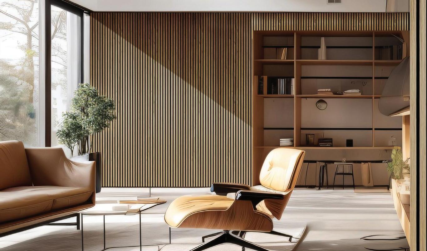

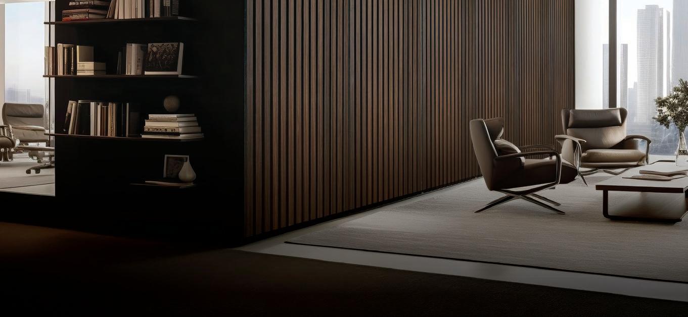
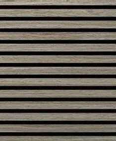
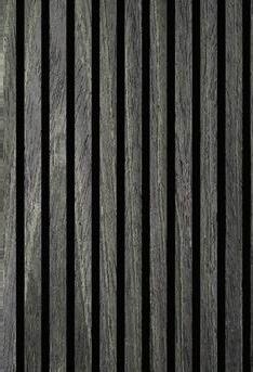
Designed for contemporary interiors where performance and aesthetics must work in harmony, Eva-Last introduces its new Revive Acoustic Panels cladding: an interior solution that addresses sound control without compromising on design intent.
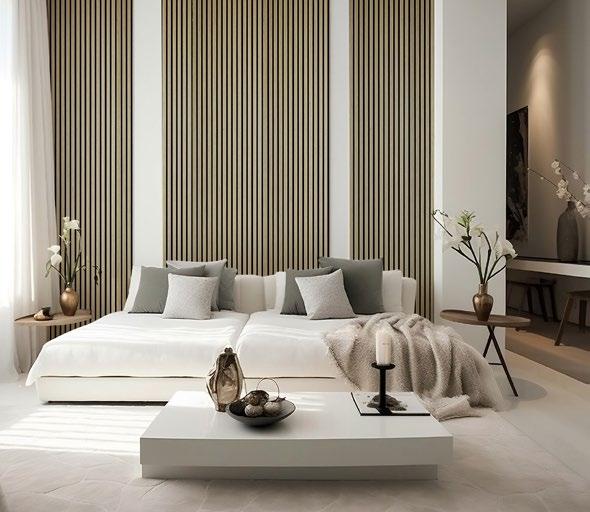
Revive Acoustic Panels are engineered to improve acoustic comfort in residential, commercial, and hospitality environments where noise management is increasingly critical. The product comprises 12 mm carbon high-density fibreboard slats, finished with a genuine wood veneer, mounted onto an ultra-dense 9 mm polyester (PET) acoustic layer. This combination delivers certified acoustic performance, helping to reduce sound reverberation and enhance privacy in any space.
Beyond performance, the system is designed with architectural design in mind. The linear slatted design adds depth and visual rhythm to interior surfaces, while the natural wood veneer delivers a refined, authentic look that complements a wide range of styles. Available in a curated range of colours — including Black Walnut, Indonesian Teak, Forest Grey, Smoked Walnut, and Black Noir — the panels allow specifiers to align acoustic solutions with broader material palettes.
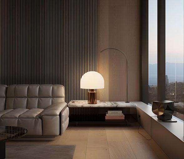
Revive Acoustic Panels are designed for ease of installation. Suitable for any interior walls, panels can be installed using high-quality construction adhesive or screws. With various installation options, the product can achieve up to a Class A acoustic performance, to meet various specification requirements.
As open-plan layouts, hybrid workspaces, and multifunctional interiors become more prevalent, the demand for integrated acoustic solutions continues to grow. Revive Acoustic Panels respond to this need by offering a system that is both technically effective and practically installable.
The Revive brand range also includes a Revive castellated bamboo composite cladding suitable for outdoor applications. This range expansion into the acoustic panel cladding is a deliberate step towards addressing accessible acoustic design — supporting both professionals and homeowners in creating spaces that are not only visually refined, but acoustically comfortable.
How Lisa Rorich Architects and Hint Interiors Use Art, Materiality, and Restraint to Redefine the Safari Experience at Laba Grumeti Art Lodge

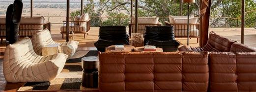
There are few landscapes as mythic as the Serengeti. Defined by vast plains, acacia woodlands, and skies that stretch beyond perception, it is a place where scale alters one’s sense of time. Within the private Grumeti Reserve, where the Great Migration passes uninterrupted, Grumeti Art Lodge is set along a rocky hilltop above the savannah, allowing the architecture to unfold in direct conversation with the terrain. Lightweight steel-framed structures wrapped in timber and canvas sit lightly against the land, while hand-hewn stone walls anchor the lodge to its setting. Rather than competing with the vastness of the plains, the built form is deliberately restrained — preserving the dominance of the horizon while sharpening one’s awareness of it.
Designed by Lisa Rorich of Lisa Rorich Architects, alongside Gareth Porrill and Ané Meyer, in collaboration with interior designer Kate Moffatt of Hint Interiors, the project moves beyond conventional safari luxury. It is conceived instead as a cultural landmark — one where the architecture, art and landscape operate as a continuous, interdependent experience. Central to this vision was the strong creative direction of the owners, whose close collaboration with the design team helped shape the lodge’s distinctive architectural and cultural identity.
Location: Serengeti National Park, Tanzania
Size: 4 150 m²
@lisa_rorich_architects_ www.lisaroricharchitects.co.za
@hint_interiors www.hintdecor.co.za
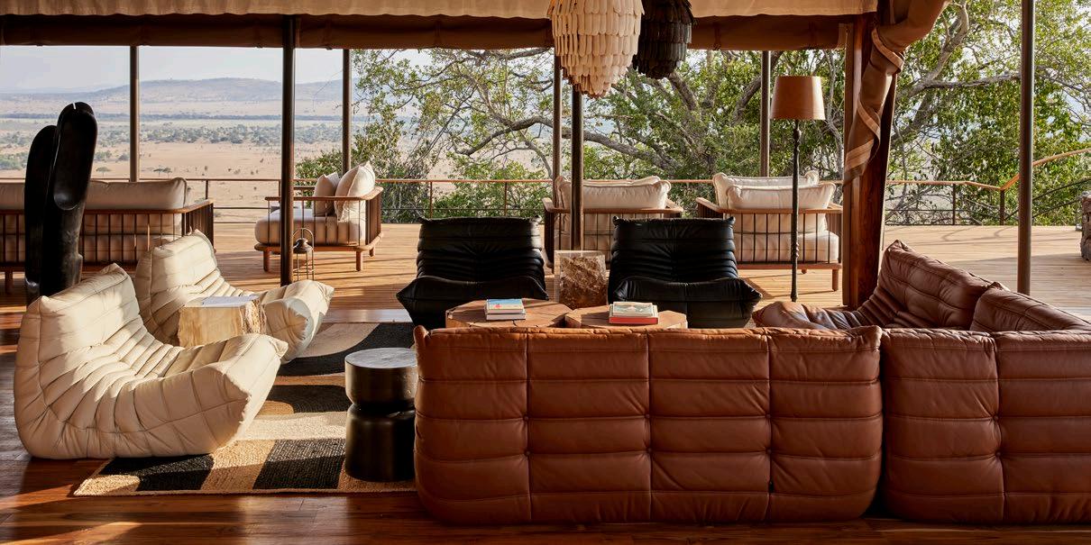
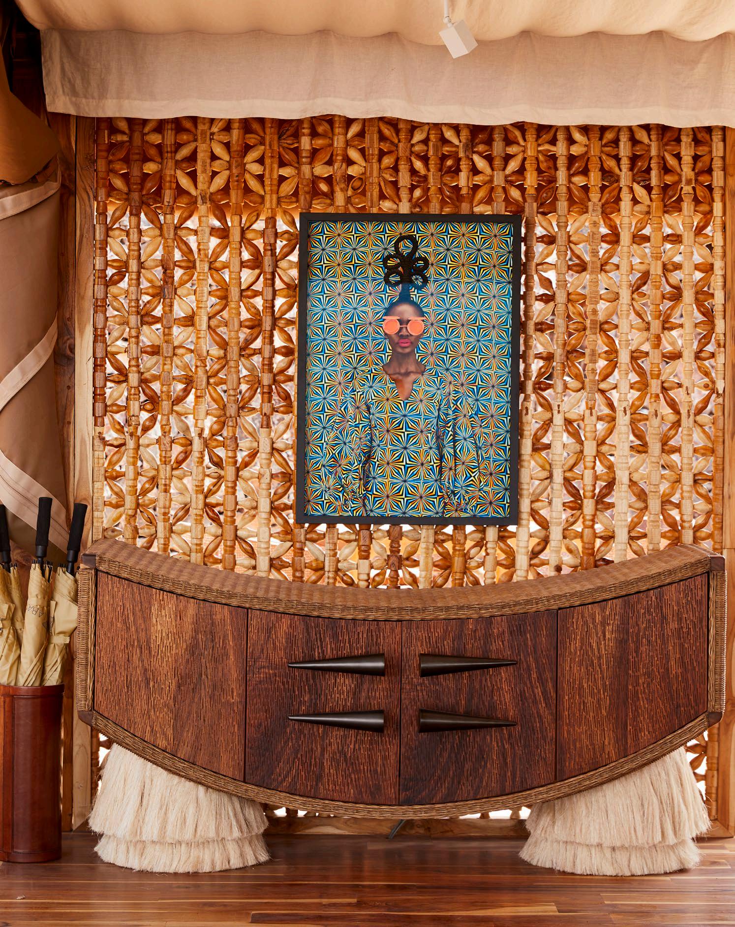
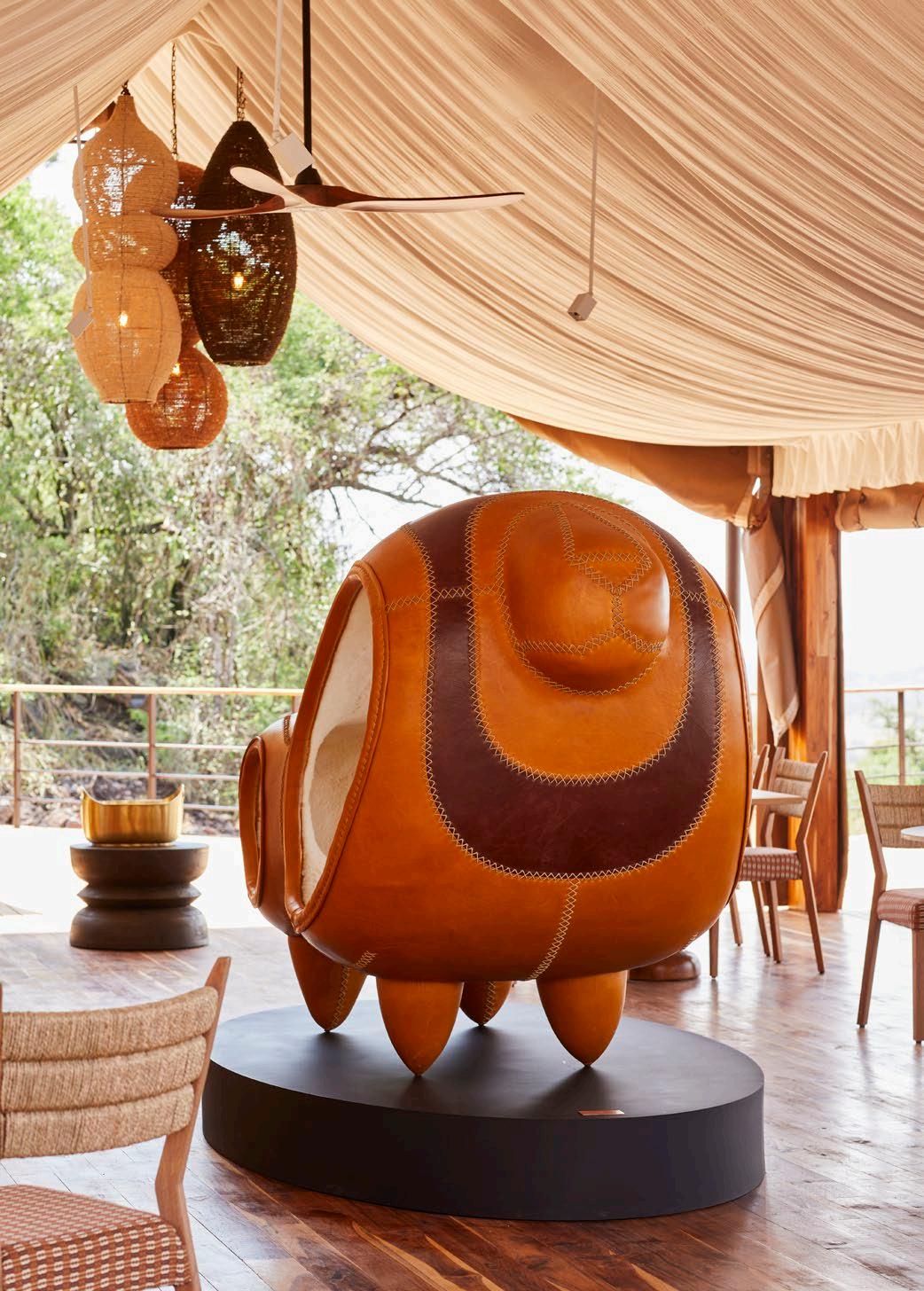
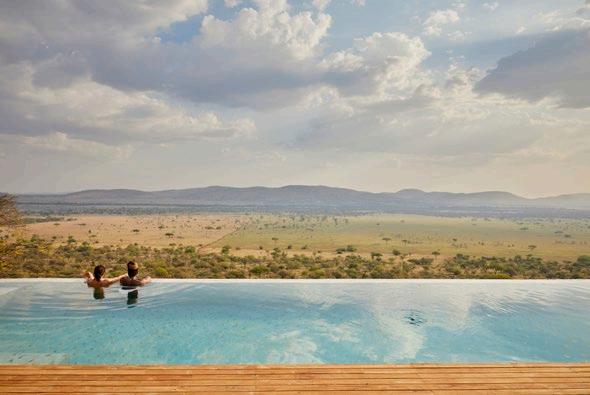
From arrival, the lodge establishes a deliberate sense of transition. Monumental site-rock-clad walls define the threshold, their permanence referencing the ancient African stone ruins and grounding the project in a deeper architectural lineage. These walls frame the entry and create a moment of pause before the lodge reveals itself.
Beyond this, lightweight tented structures appear to hover within the terrain, their restraint allowing the plains and horizon to remain dominant. At the scale of occupation, the architecture reveals its most deliberate moves. Operable façades, sliding screens, and permeable thresholds allow the interiors to dissolve almost entirely into the landscape, admitting wind, sound, and shifting light throughout the day. The experience is not one of complete shelter, but of calibrated exposure — where the rhythms of the Serengeti remain present at all times. From bed, from bath, from shaded deck, the horizon is held in constant view, uninterrupted and precise. It is here that the project’s restraint becomes most legible: architecture recedes just enough to heighten awareness, positioning the inhabitant not as observer, but as participant within the terrain.
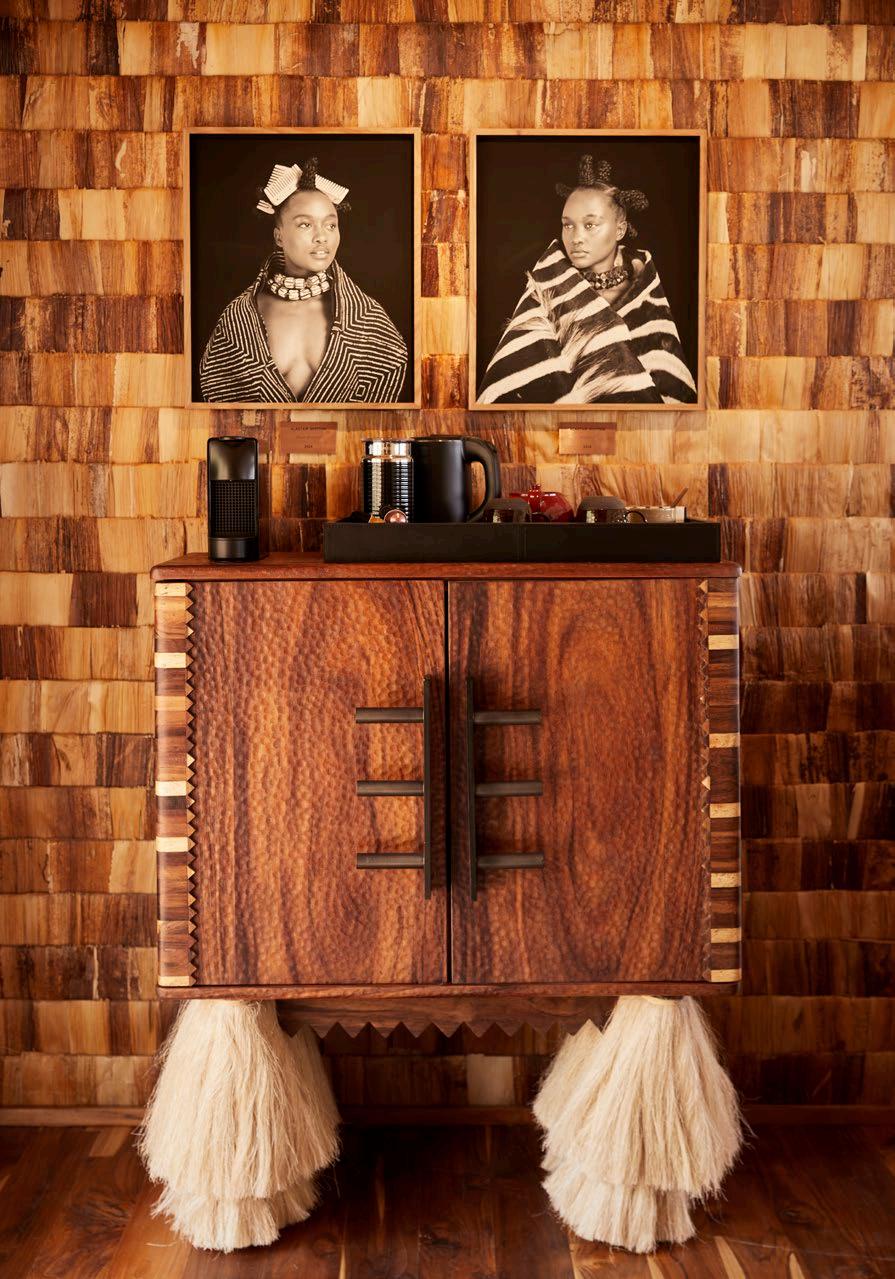
Locally sourced African teak plays a defining role throughout the project. Hand-carved African teak screens and doors, crafted by local artisans, introduce texture and craftsmanship while reinforcing the lodge’s connection to place. African teak floors and curved timber decks extend this material language, grounding the interiors in warmth and continuity. Overhead, woven banana leaf ceilings add another layer of tactility, softening the architectural experience and bringing a distinctly regional sensibility to the spaces.
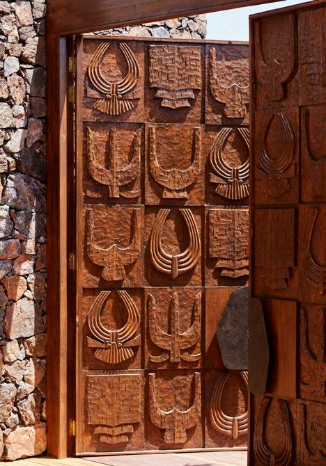
Architecture & Interior Architecture: Lisa Rorich Architects
Interior Designer: HINT Interiors | Engineer: DeVS SiVEST
Contractor: Lodge Creations | Photographer: Framethirtysix
A living gallery
What distinguishes Grumeti Art Lodge most clearly is its treatment of African art as part of the architecture itself. Sculptures, lighting, and functional artworks by African artists are embedded into the spatial experience from the outset. Rather than decorative additions, these works direct movement, shape atmosphere, and become part of the spatial narrative. This approach reframes the safari lodge typology entirely. Wildlife remains central, but it exists in dialogue with another form of discovery: Africa’s creative legacy.
Each room, corridor, and communal space unfolds as a moment of encounter. The lodge functions as a curated architectural landscape, where architecture and curation are inseparable, set within one of the continent’s most extraordinary landscapes.
FEATURED ARTISTS
Zizipho Poswa, Rich Mnisi, Jean Servais Somian, Madoda Fani, Jomo Tariku, Porky Hefer, Adam Birch, Zanele Muholi, Chuma Maweni, Thandiwe Muriu, Comité de Proyectos
Texture, tone, and ritual
The interiors are driven by tactility. Textured peak vanities and bath plinths introduce warmth and weight, while handmade Moroccan Zellige tiles enrich outdoor shower spaces. Curved timber decking and bespoke balustrades echo the contours of the surrounding plains, softening the threshold between built form and wilderness. Aged metals — copper, brass, matte black — deepen the palette without excess. Nothing feels polished for effect; materials are chosen for how they age, how they weather, and how they gather memory over time.
At the centre of the communal spaces, a sculptural curved fireplace acts as both anchor and ritual point. Clad in copper, it becomes most powerful at dusk, when the metals catch the final warmth of the day. This is where the lodge reveals its real luxury in abundance.
Grumeti Art Lodge resists the familiar performance of luxury hospitality. There is no excess for its own sake, no imposed spectacle. Instead, the project finds richness in craftsmanship, and cultural depth.
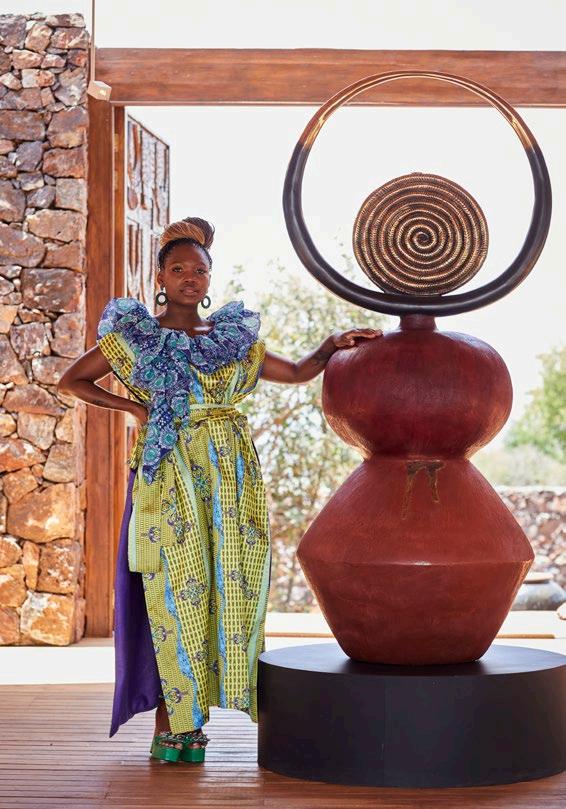
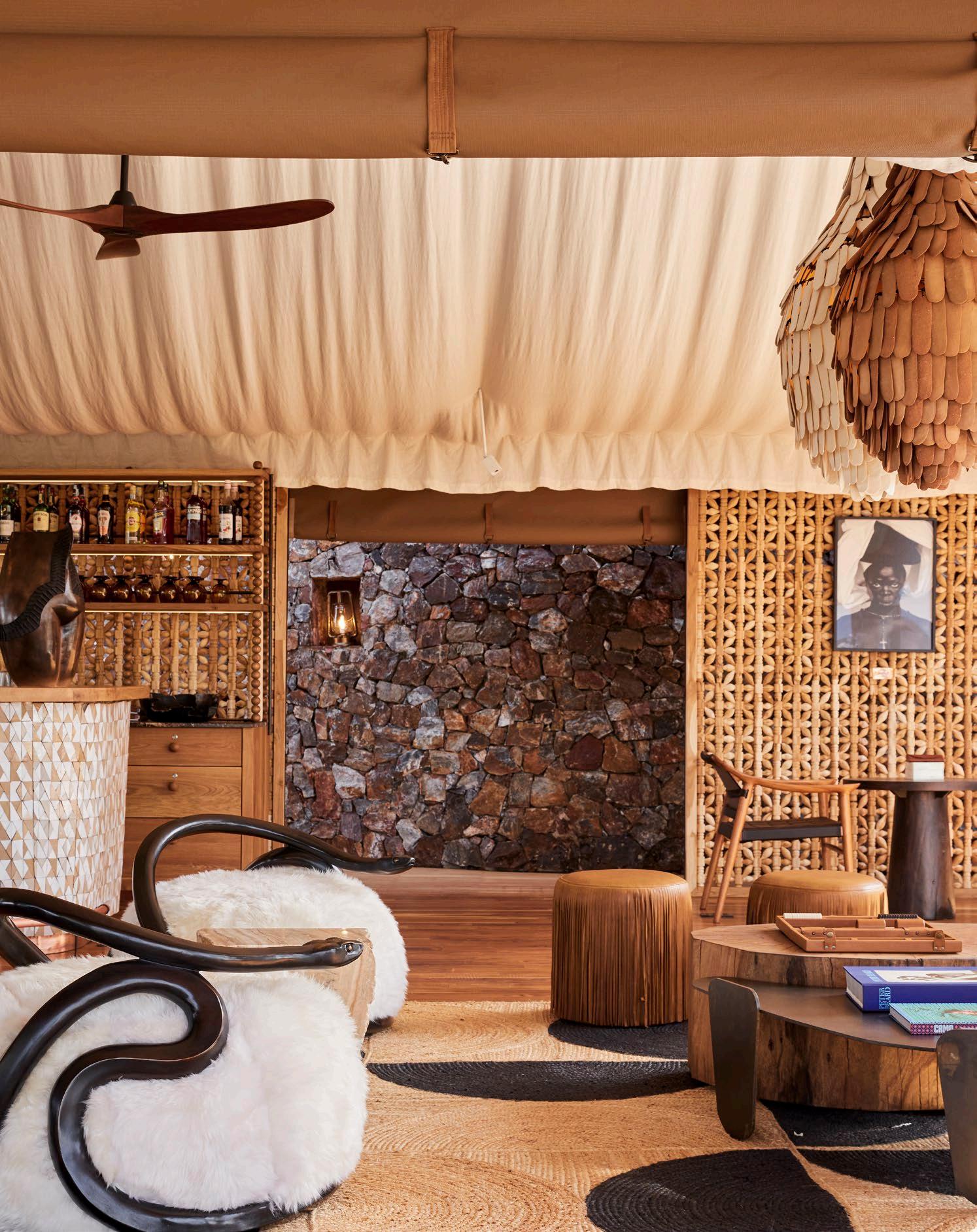
Sanware: Yourspace Bathrooms, LAVO Bathroom Concepts | Fans: Timber Fans | Lighting:
Cobin Lighting, Lighting Efficacy Feature Lighting: MUD Studio | Mirrors: Arkivio | Bespoke
Ironmongery: Douglas & Douglas and Umdabu | Joinery: Umdabu Tents: Canvas & Tent
Kitchen: Vulcan | Designer Furniture: Ligne Roset South Africa

GSQUARED Architects and Studio CRONJE Layer Architecture, Landscape, and Light Into a Sculpted Retreat
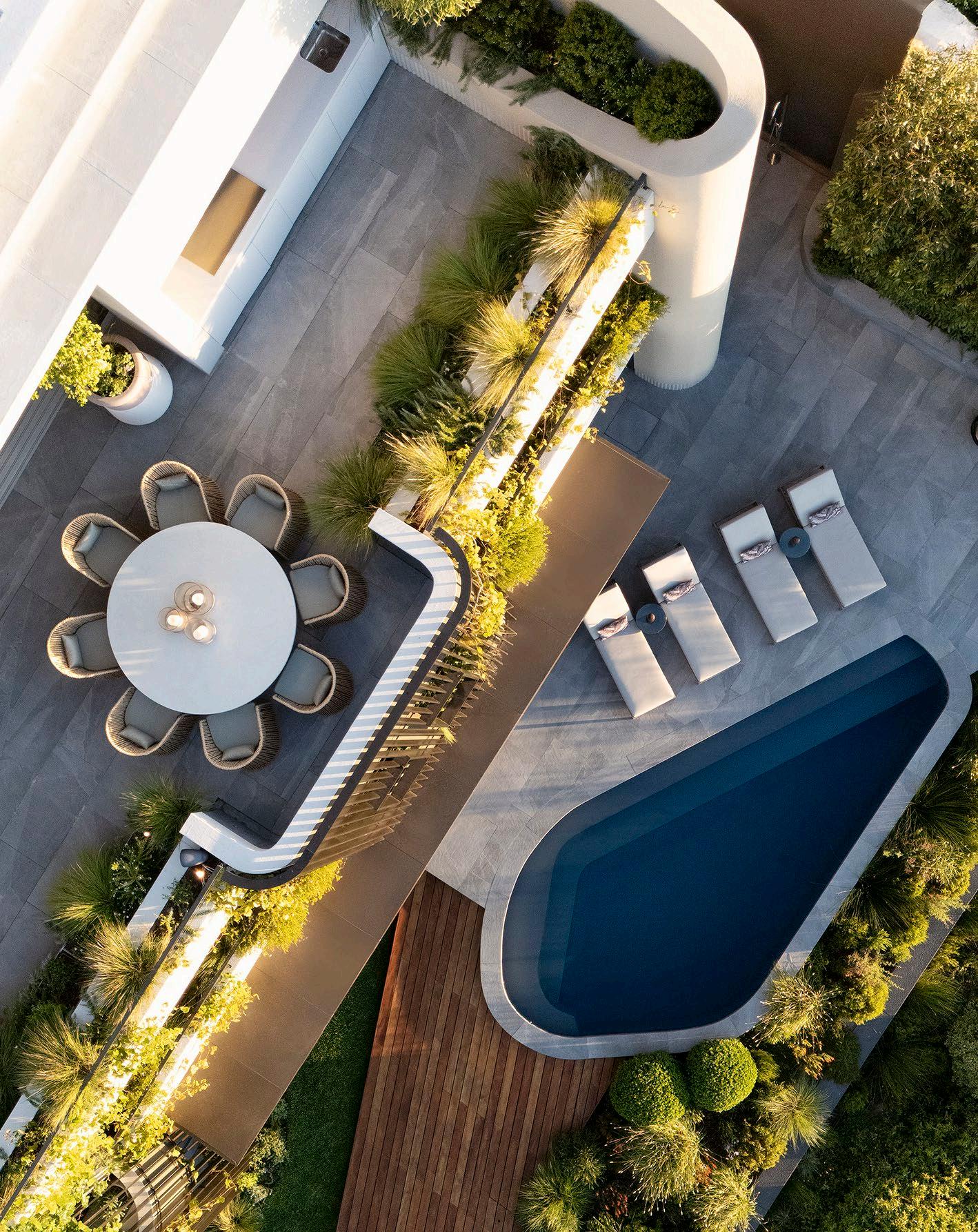
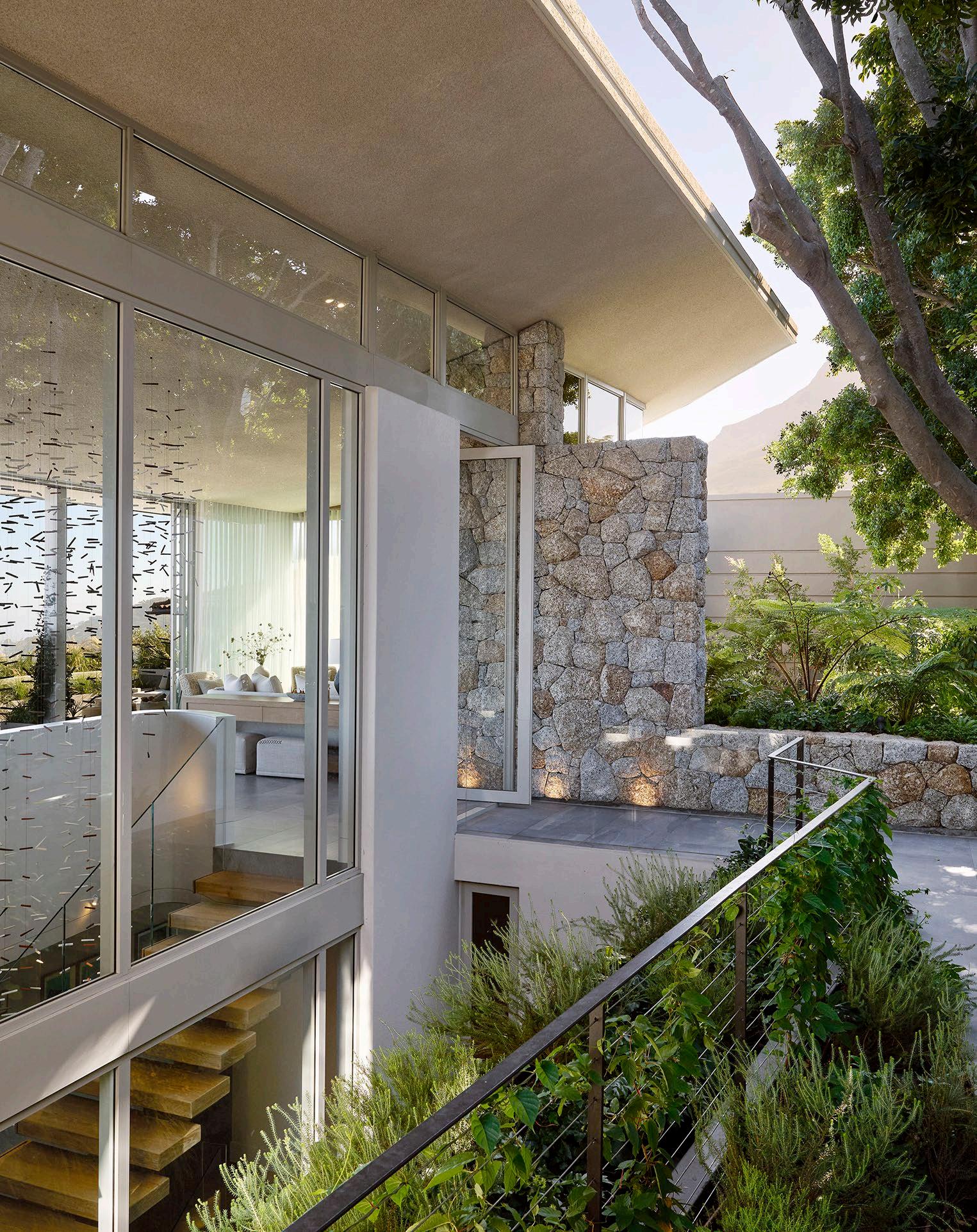
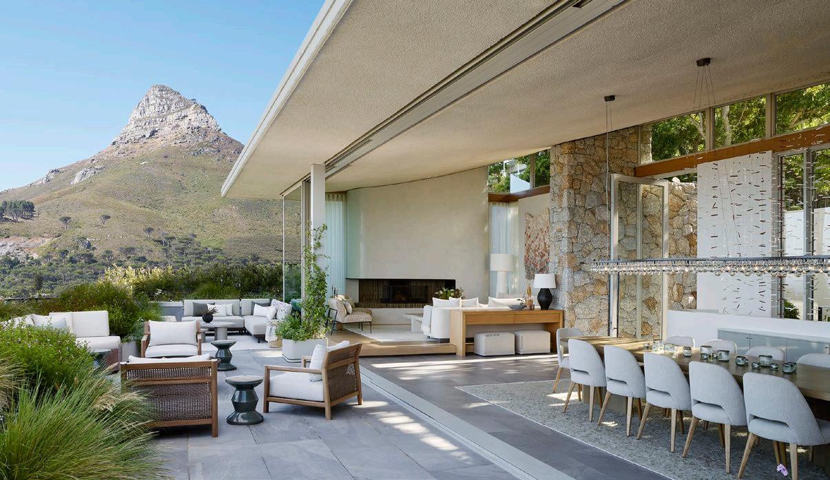
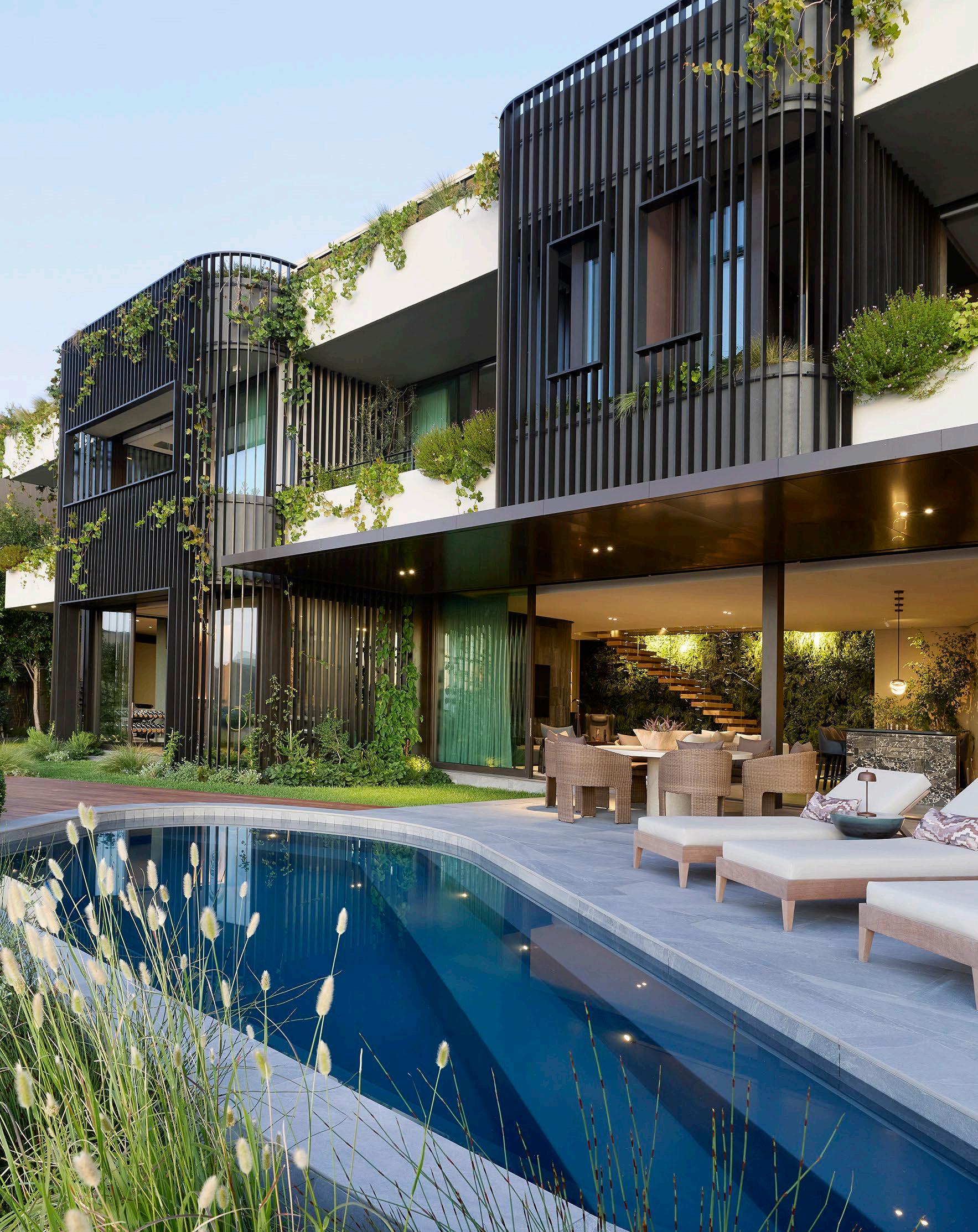
Situated on the western slopes of Table Mountain, this residence is shaped as much by its topography as by its views: a layered panorama stretching across Camps Bay, northward to Lion’s Head, south to the Twelve Apostles, and west over the Atlantic coastline. It is a site shaped by extremes: steep, exposed, and visually expansive, yet embedded within a dense residential fabric.
At the heart of the project lies a constraint that becomes its primary ordering device: a substantial retaining wall that supports both the road above and neighbouring properties. Structurally untouchable, this infrastructural element is neither concealed nor resisted; instead, it anchors a grounded, contemporary South African expression.
Location: Camps Bay, Cape Town Size: 780 m²
@gsquared_architects www.gsquared.co.za
@studio.cronje www.studiocronje.com
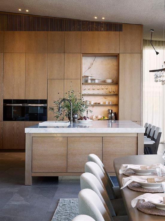
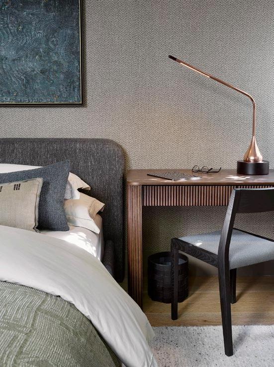
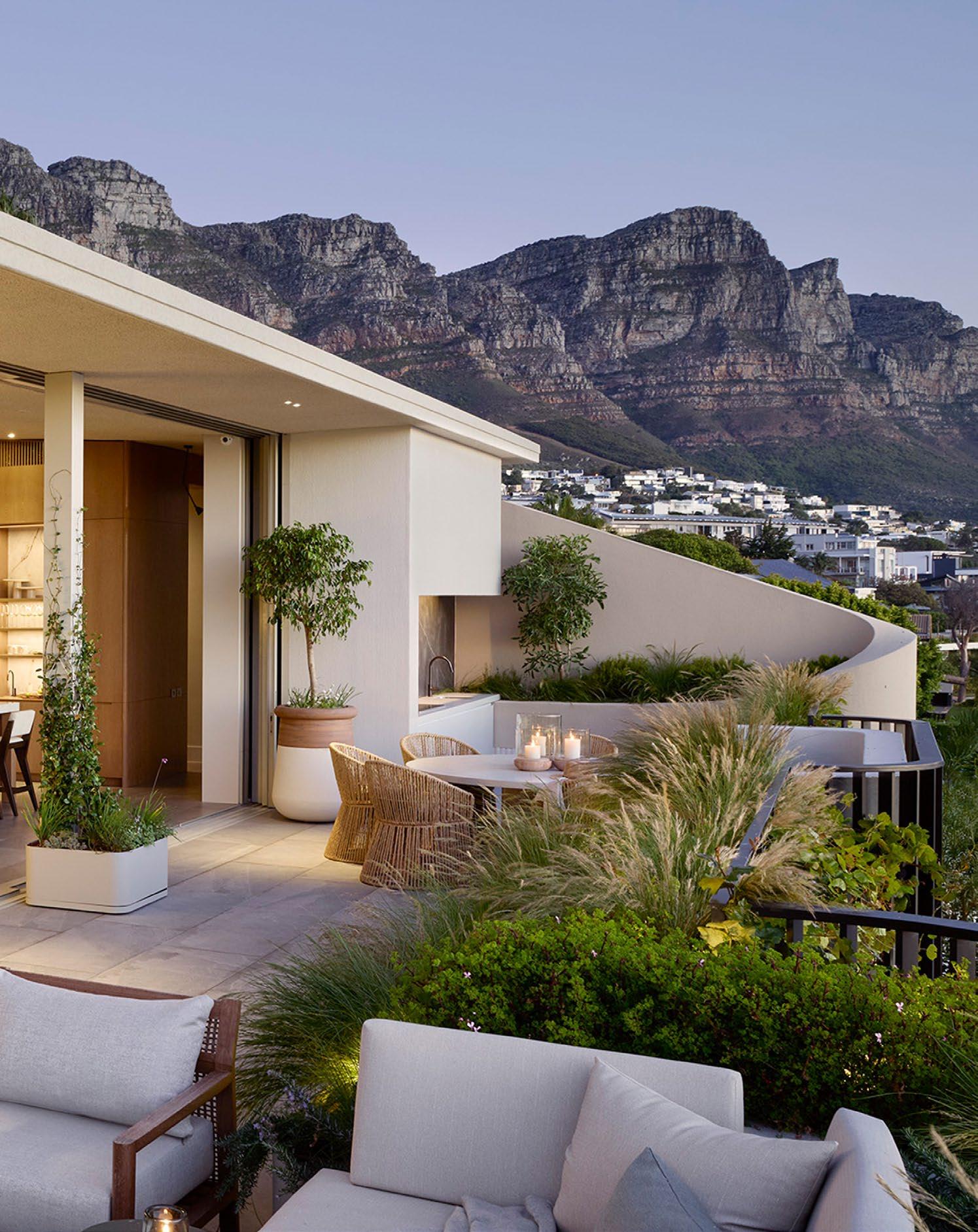
“Central to the brief was the need to engage the site’s extraordinary views while maintaining privacy; a tension that drives the project conceptually and spatially.”
Constraint as catalyst
The client’s brief called for duality: a private retreat that could effortlessly transform into a setting for hosting and leisure. This balance between intimacy and openness is achieved through a carefully calibrated programme. Formal living and dining spaces are organised around an open-plan kitchen, complemented by four bedrooms designed for both family life and visiting guests. Beyond this, the house extends into a series of specialised spaces — a wine cellar and tasting room, a sports-oriented leisure space, a golf simulation room, a gym, and a study — each integrated into the broader architectural narrative rather than treated as add-ons.
Central to the brief was the need to engage the site’s extraordinary views while maintaining privacy; a tension that drives the project conceptually and spatially. The architecture negotiates this condition through a series of layered thresholds. It is a house that opens itself to light, horizon, and ocean, while carefully protecting the intimacy of living. Form, section, and spatial sequencing.
Formally, the building is conceived as a stacked terrain: a vertical sequence of spaces that unfolds in response to the slope. The geometry of the retaining wall informs the massing, its rigidity softened into a series of curves and stratified volumes. This produces a continuous dialogue between structure, landscape, and interior.
The roofline follows this logic, curving upward toward the mountain and framing its summit through a clerestory opening. This decision draws the presence of Table Mountain into the everyday experience of the house.
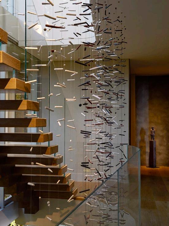
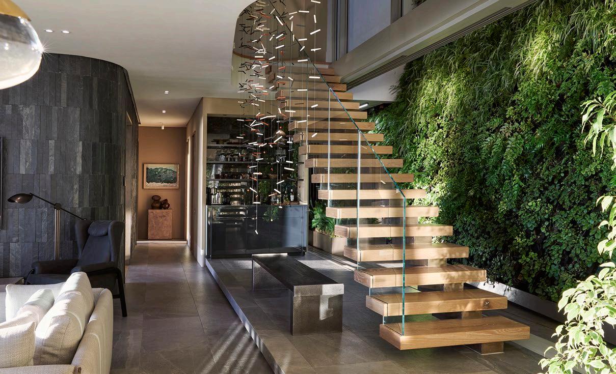
A central lightwell and sculptural stair form the spatial spine, an inhabited vertical gallery that connects the levels. Beyond circulation, it draws natural light deep into the plan. At the base, the retaining wall is reinterpreted as a living garden, forming a sheltered courtyard at the lowest level.
From horizon to ground
At the uppermost level, the architecture dissolves toward the horizon: light-filled, expansive, and outward-looking. Here, materials are pale and reflective, mirroring the sky and sand of Camps Bay.
Surfaces & Finishes: Italtile, WOMAG, Tilespace, Stone Lab, Studio Masson, Kalki Studio, Persian Tile, Pudlo S.A | Stone & Slabs: Rock and Stone Works, Infin8 Surfacing | Flooring & Carpets: TPS Co, KBAC Flooring, Rowley & Hughes | Lighting: Newport Lighting Concepts & Design | Joinery & Doors: Jansen Doors, Dix Aluminium | Ironmongery: Handles Inc., Alon Fainstein | Sanware: Flush Bathrooms, Exquisite Bathrooms | HVAC: Airvent | Solar & Battery: Energy Capital | Water Filtration: Aqua Aero Vita | Landscaping: Ross McGill Landscaping & Irrigation, Plantr, Living Green Walls
Descending to the middle level, the light becomes filtered, tones deepen, and the architecture grows introspective. It introduces a grounded material palette that subtly references an African sensibility through texture and tonal richness.
At the lowest level, the house becomes anchored and tactile. Spaces have a direct connection to the garden and mountainside. The architecture here is cave-like, embedded within the terrain, completing the journey from the lightness of sky to the solidity of ground.
Materially, the project draws from the geological and cultural context of the Western Cape. Locally sourced granite cladding roots the building in its landscape, while sand-toned finishes introduce warmth and softness. These are layered with deeper, earthier textures that reflect the mountain's
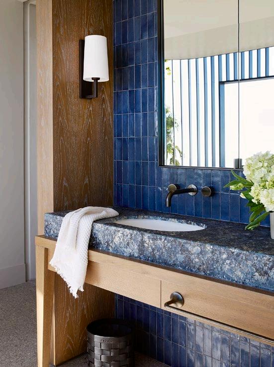
stratification. Moments of blue — a gesture to Cape Dutch ceramic traditions — mark the palette with restraint.
This material language is atmospheric, prioritising depth and tactility over overt expression. Site-specific artworks are embedded within the architecture, most notably a suspended ceramic installation that cascades through the central void like a ‘coral curtain.’
The project emerges as a translation, absorbing global architectural ideas and reinterpreting them through a distinctly local lens. Sculptural form, sectional density, and the integration of art are grounded here in landscape, materiality, and place. This is not simply a house on a site, but a constructed terrain: an architecture that is read, experienced, and inhabited as an extension of the mountain itself.
MEET THE TEAM
Architects: GSQUARED Architects | Quantity Surveyor: Panoptic QS | Structural Engineer: FHI Consulting Engineers | Interior Design: Studio Cronje | Landscape Design: Watson Pellacini, Shannon Law | Main Contractor: RLP | Photographer: Elsa Young
A Dual Dwelling in the Great Karoo by Biru Architects, Where Inherited Footprints Become Spatial Memory and Climate Becomes Architecture
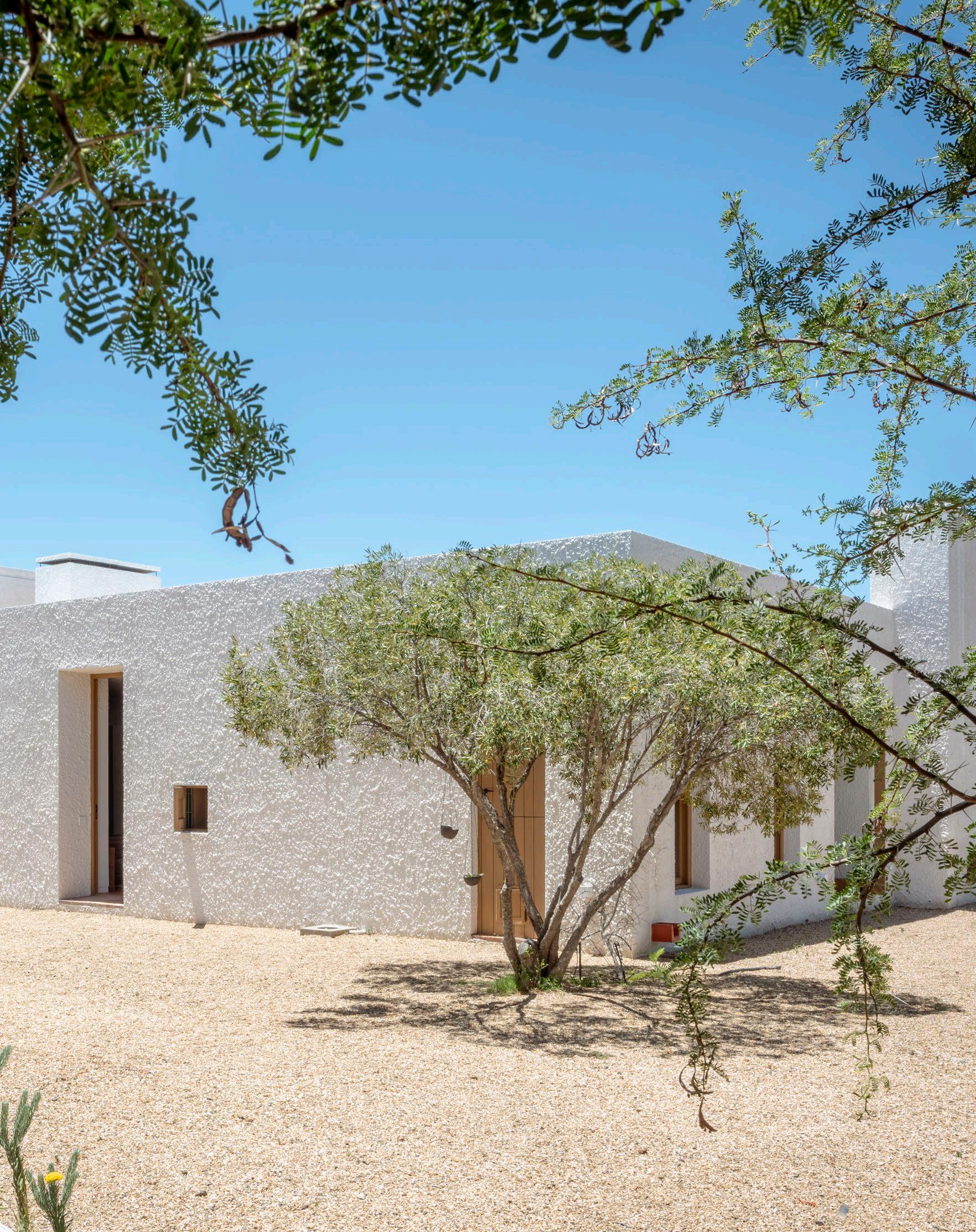
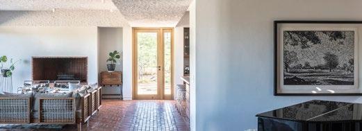
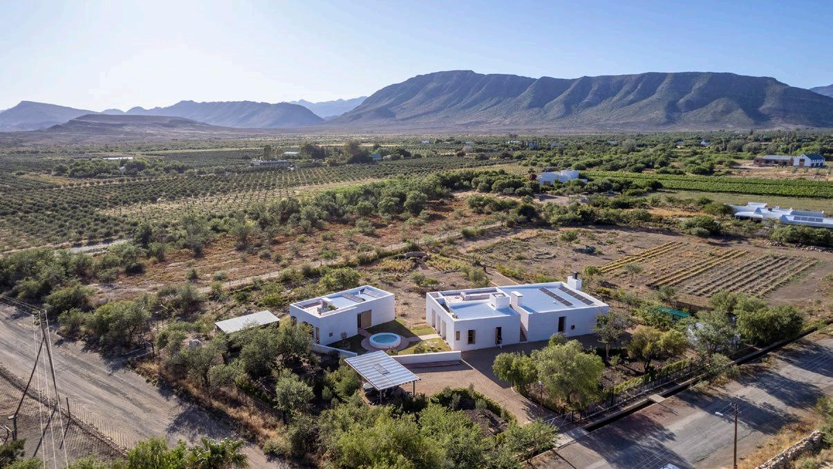
In Prince Albert, where the Swartberg Mountains hold the horizon in a steady line and the Karoo air sharpens light into clarity, the project begins not with construction, but with what remains. Two demolished structures leave behind their footprints, not as absence, but as boundary, as memory pressed into ground. Within these retained footprints, the Prince Albert House takes shape, as if the site itself refused erasure and instead asked for continuity. A cottage and a main dwelling, distinct yet inseparable, held within an inhabited field defined less by buildings than by the traces that preceded them.
The decision to retain the existing footprints becomes the quiet governing logic of the project. They do not simply contain form; they structure it. They hold architecture in place before it is made, turning ground into a predetermined geometry of inhabitation.
Location: Prince Albert, Great Karoo Size: 430 m²
@biru_architects www.studiobiru.co.za
Footprint as framework
In the Karoo, the landscape does not recede. It asserts itself through clarity, horizontal openness, dry light, and atmospheric distance. But it is climate, more than landscape, that gives the project its conditions. Intense sun, persistent wind, frost, and thermal extremes define a world where shelter is not enclosure alone, but calibration. The architecture responds through depth rather than addition.
“A landscape defined by horizontal openness, atmospheric clarity, and strong seasonal variation.”
The Prince Albert House unfolds as two presences: a compact cottage and a more expansive main dwelling. Neither stands alone. Together, they form a continuous inhabited field, stitched through the logic of footprint, threshold, and climate. What was once fragmented is now held in relation, not as object, but as terrain.
The decision to build within the exact boundaries of demolition is both constraint and generative act. It fixes architecture to memory. Every wall knows its edge in advance. Every room is asked to negotiate with what preceded it. In this way, the project does not impose form upon landscape but listens to what remains inscribed within it.
Here, architecture is less about addition than thickening.
Climate as discipline
The Karoo makes its presence felt not through density of buildings, but through intensity of conditions. Sun arrives unfiltered, wind moves without interruption, and temperature
shifts with decisive clarity. In response, the house turns inward without retreating, shaping depth through walls, courtyards, and shaded transitions rather than enclosure alone.
“The design is driven by the idea of ‘thickened inhabitation’ — a contemporary reading of the traditional Karoo homestead.”
The idea of 'thickened inhabitation' becomes the project’s quiet structure. Walls are no longer thin divisions, but climatic instruments, holding temperature, filtering light, extending thresholds into habitable depth. Courtyards do not simply open space; they calibrate it, offering pause between interior and horizon. Movement becomes sequence rather than circulation.
The cottage arrives first, not as annex but as test ground. It is inhabited early, allowed to absorb the rhythms of daily life before the main dwelling is drawn from its lessons. Proportion, shade, ventilation, and material behaviour are tested not in abstraction, but in occupation. From this lived calibration, the main dwelling evolves, not as repetition, but as refinement.
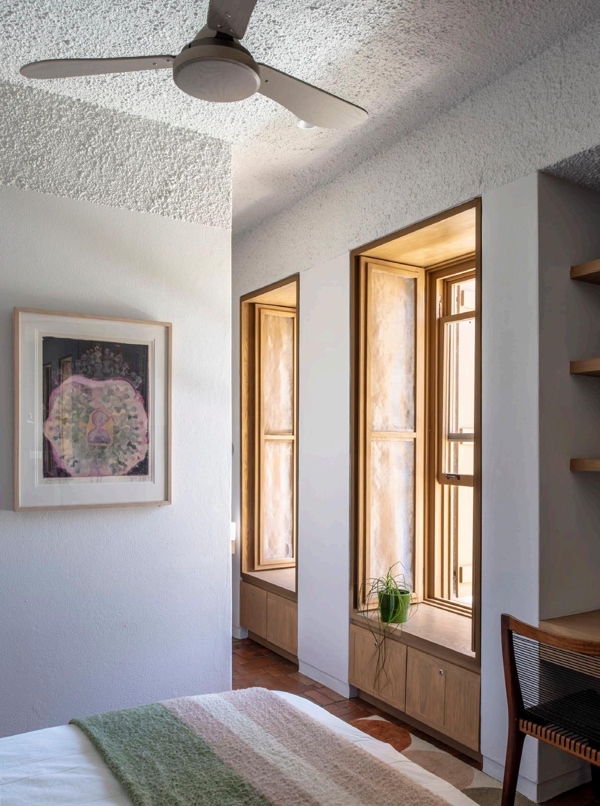
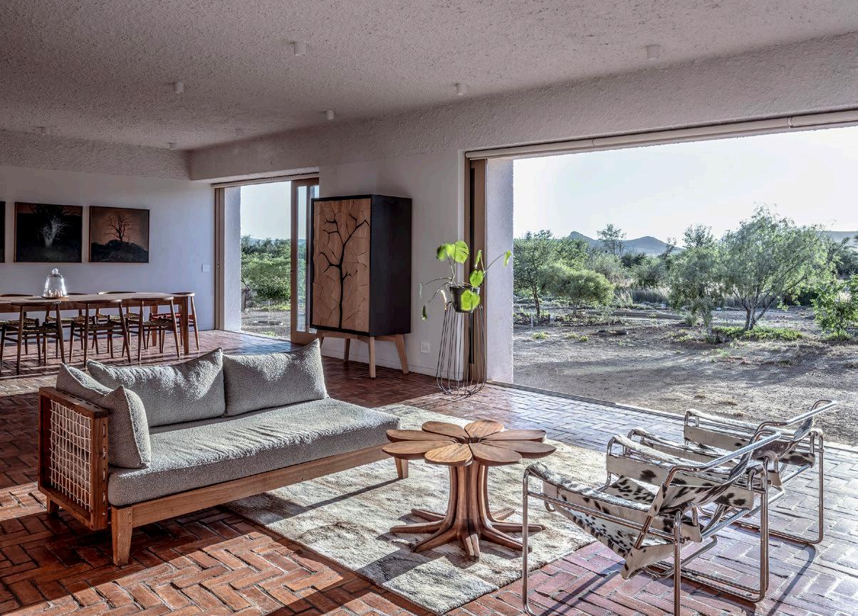
Across both structures, climate is never background. It is authored into the architecture. Deep openings hold shadow. Timber shutters adjust to sun and wind. Thick lime-washed masonry carries thermal weight through the day. Cross ventilation is not an effect, but a structural condition, drawn along a spine of inhabitation that connects rooms, courtyards, and terraces.
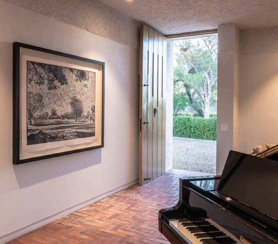
Roof terraces lift the experience of the house toward horizon, offering a second ground, one that belongs to wind and light as much as to occupation. Below, red clay floors register time through touch, while water is carefully expressed through custom clay spouts, returning utility to gesture.
Surfaces and time
Materially, the house remains deliberately restrained. Limewashed masonry, timber, clay, mineral finishes, a palette drawn from the surrounding veld rather than imposed upon it. Nothing seeks resolution through contrast. Instead,
Architect: Biru Architects | Structural Engineer: Grobler & Associates | Construction: De Villiers Builders Photographer: Dave Southwood
surfaces are allowed to weather, to soften, to absorb the slow inscription of time and weather.
What emerges is not a singular object, but a system of relations held within fixed boundaries. The inherited footprints remain legible, almost archaeological, yet they are no longer absence. They have become structure, a quiet armature for new occupation.
The challenge of the project lies precisely here: how to work within what cannot move. Yet within that constraint,
a particular clarity appears. Geometry becomes precise because it must be. Environmental response becomes essential because there is no excess to rely on. Every decision is measured against both climate and memory.
In the end, the Prince Albert House is less about new form than about continuity of ground. It understands inhabitation as something layered, where what is built does not replace what was, but extends it into another condition of presence.
A house formed through its deepest remaining traces.
SUPPLIERS
Custom Balustrades and Door Handles: Striking Metal | Floors: Lanes Ceramic Works | Tiles: LimeGreen Sourcing Solutions Lighting: Crema Design | Ceiling Fans: Sky Fans
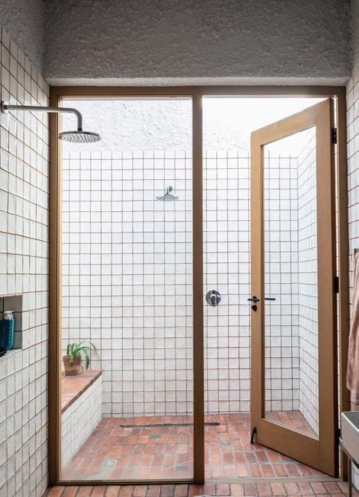
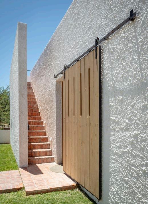
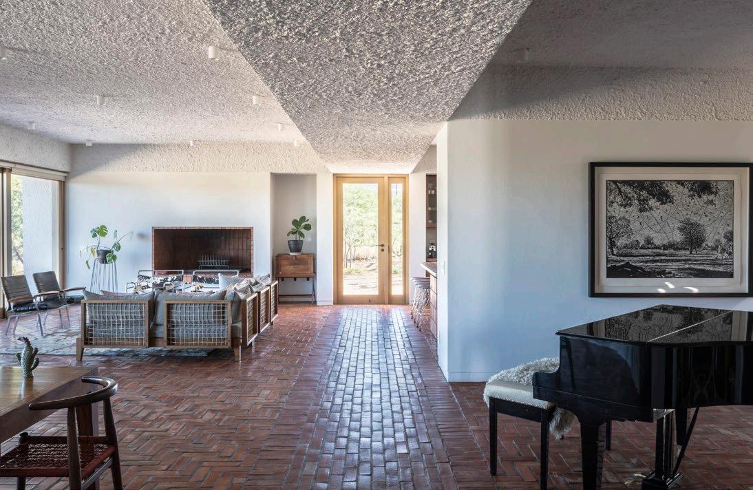
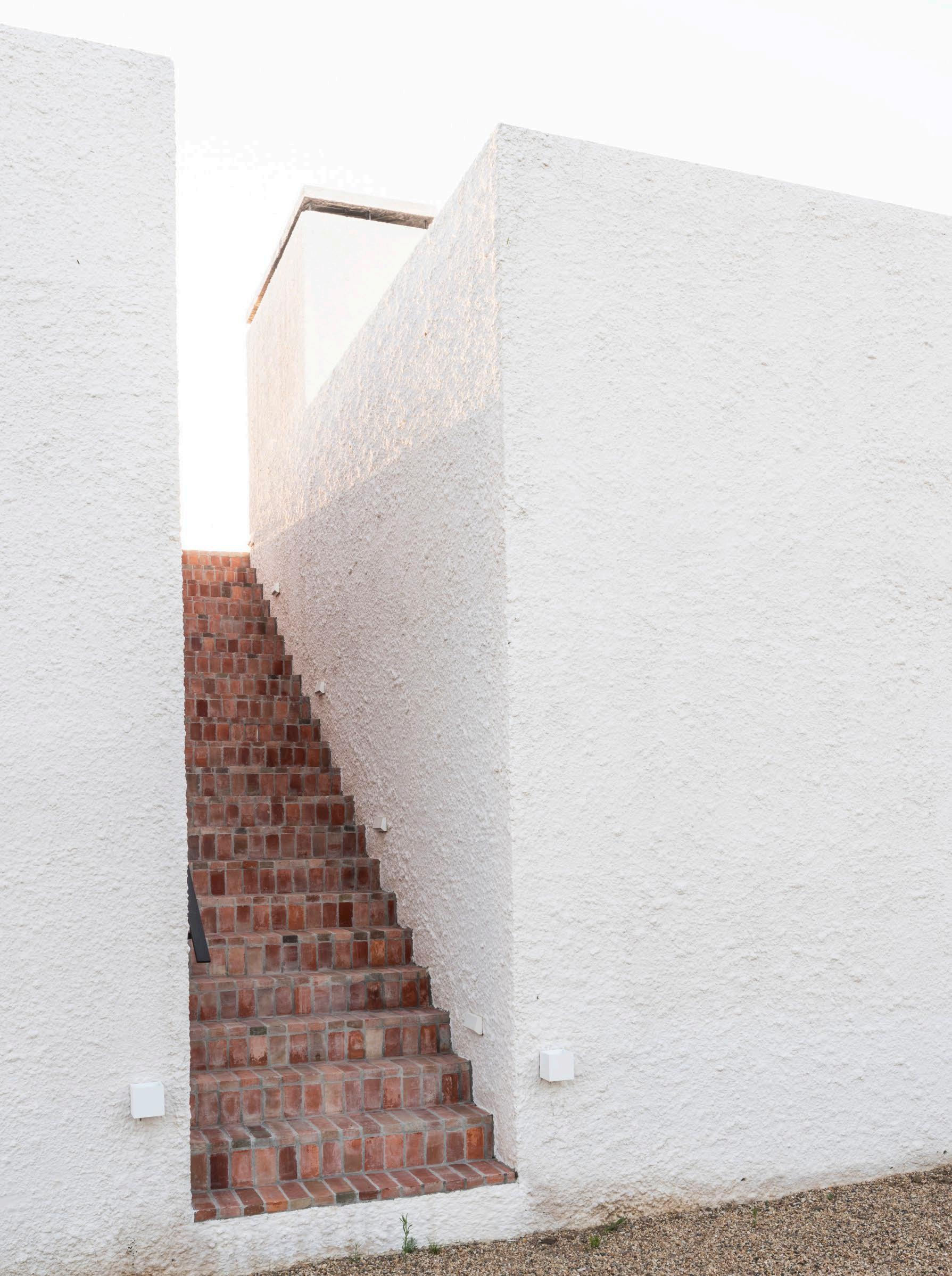
“Materially, the house remains deliberately restrained. Lime-washed masonry, timber, clay, mineral finishes, a palette drawn from the surrounding veld rather than imposed upon it."




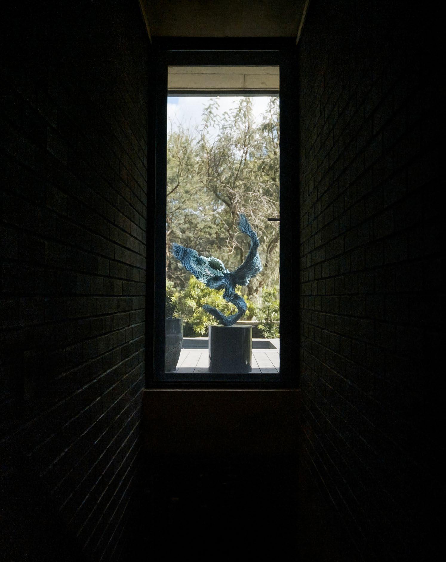
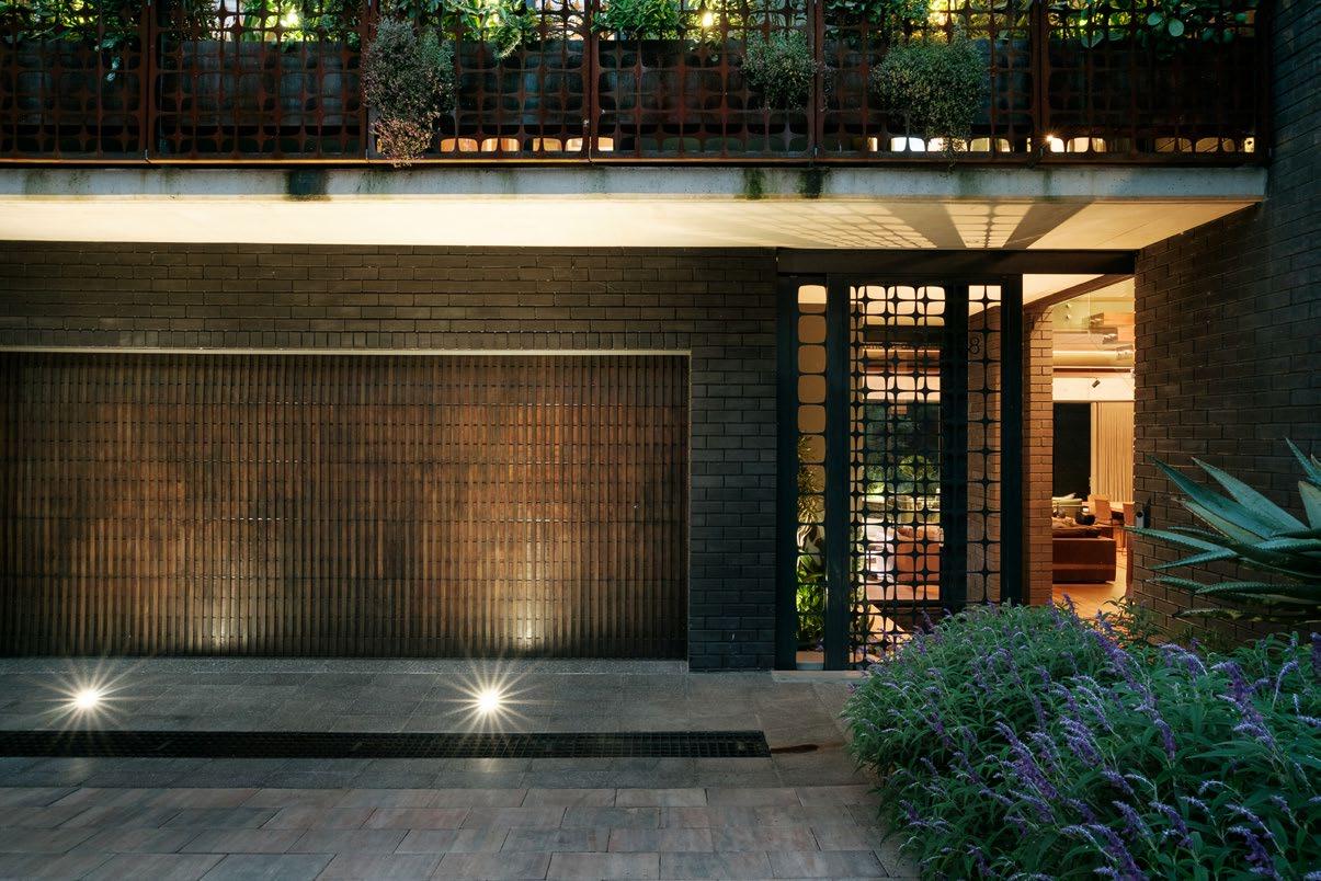
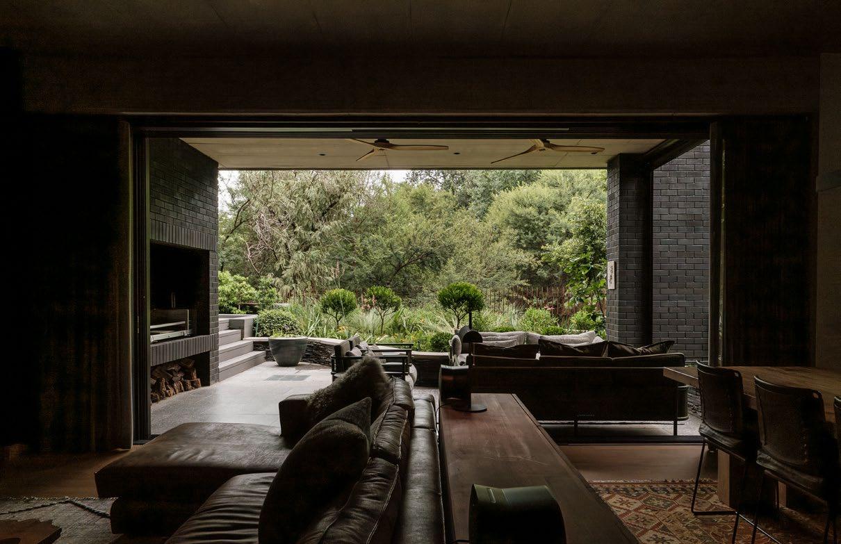
Konsep Architecture Studio’s New Residence in Pretoria is a Lesson in Contrast
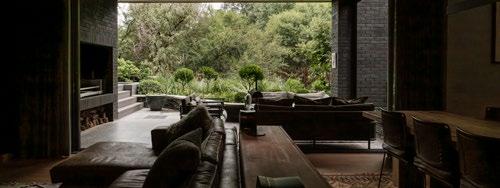
Like the high-contrast black-and-white cinematography and deep shadows of film noir, shaped by German Expressionism, Noirhaus in Pretoria, designed by Konsep Architecture Studio, stands bold in dark tones, set against deliberate washes of light. Another layer of contrast was introduced: brutalist architecture meets a gentle Mediterranean ambience, as the house opens onto a lush green belt.
Location: Pretoria, South Africa
Size: 384 m2
@konsep.architecture.studio www.konsep.studio
MEET THE TEAM
Architect & Interior Architect: Konsep Architecture Studio | Contractor: Dura-Con | Structural Engineer: DLF Engineers
Photographer: Adriaan Esterhuizen project
Flooring & Skirting: Silvanus Flooring | Front Door: Blaw Design | Door Handles: Handles Inc | Light Fittings: Streamlight
Studio | Security Gates: Trellidor | Tiles: Italtile | Granite: Rock Solid Creations | Joinery: Brush and Pistol | Balustrades & Shower Doors: Pedestal Frameless Glass | Kitchen Appliances: Siemens | Sanware: Hansgrohe, Victoria + Albert Baths, Geberit | Paint: Dulux | Paving: Bosun Brick | Garage Doors: Absolute Doors | Fireplace: Fireplace Warehouse | Brick: Corobrik Irrigation System: Bluewater Irrigation | Carpets, Furniture & Homeware: Weylandts, Vibia, Haldane, Kipekee Studio, Mungo, Hertex Haus, Airloom, Konsep Bespoke, Acre Studio, Cielo
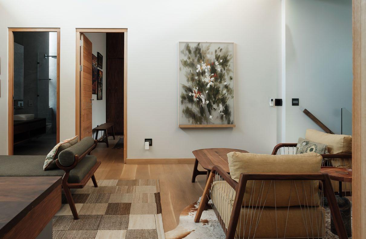
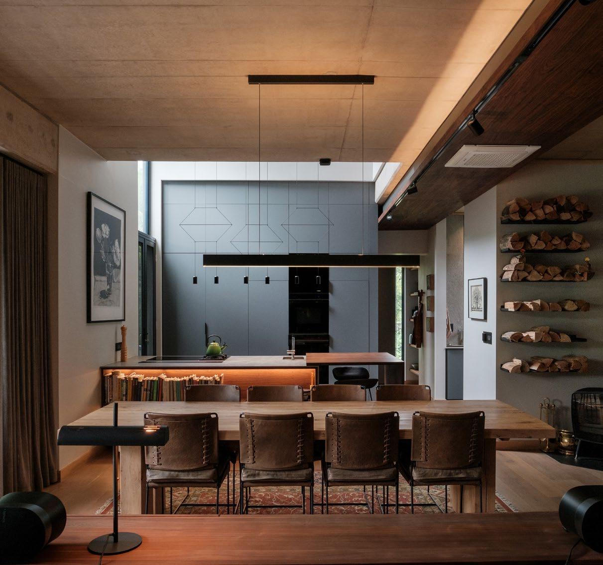
The architectural challenge was to optimise a limited footprint while preserving a profound connection to the surrounding landscape. And the answer lay in elegant simplicity: by raising the home onto an elevated platform, the design team transformed a constrained site into an expansive haven. This elevation visually extends the property’s boundaries, enhances privacy, and deepens the home’s dialogue with nature as interiors merge with views of the adjacent treeline.
The porous threshold between indoors and outdoors creates an organic flow that infuses the home with tranquillity and natural beauty. Balconies and patios extend gracefully from the house, unfolding onto lush green roofs and meticulously landscaped gardens. Nature is invited in to permeate every corner of the dwelling, softening the robust architectural form.
Soft, abundant light filters through generous windows into lofty, voluminous spaces. The home’s defining series of stained-glass windows introduces playful, kaleidoscopic colour that animates the interiors, transforming austere brutalist geometry into vibrant canvases. Designed by the owners to depict their adventures around the world, these windows bring both personal narrative and joyous illumination, elevating the home into a living gallery.
And, indeed, Noirhaus showcases artworks by renowned South African artists. Like a private gallery, curated pieces are framed by the architecture itself, with strategic sightlines and spatial arrangements ensuring each work is thoughtfully honoured.
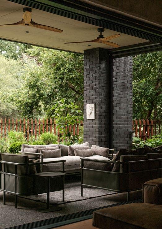
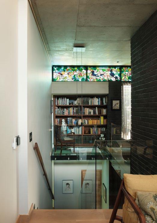
A restrained, honest palette gives Noirhaus its striking visual identity. Robust black clay bricks offer both strength and elegance, grounding the home with a sense of permanence. Concrete and corten steel contribute industrial gravitas, while terrazzo and natural stone introduce subtle textures and patterns, enriching the sensory experience of each space. Within, luxurious wooden floors and ash ceilings warm the spaces, creating an inviting counterbalance to the rugged exterior materials.
More than a residence, Noirhaus is a masterful composition of contrasts. It unites the solidity of brutalist architecture with Mediterranean warmth and refinement. Dark materials stand confidently, softened by colour, art, and natural light. The interplay of robust structure, personal expression, and thoughtful spatial strategy culminates in a sophisticated and welcoming home — a place where nature, light, art, and architecture coexist in complementary tension.
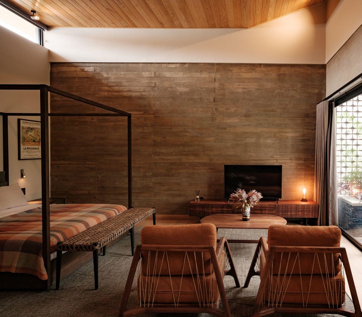
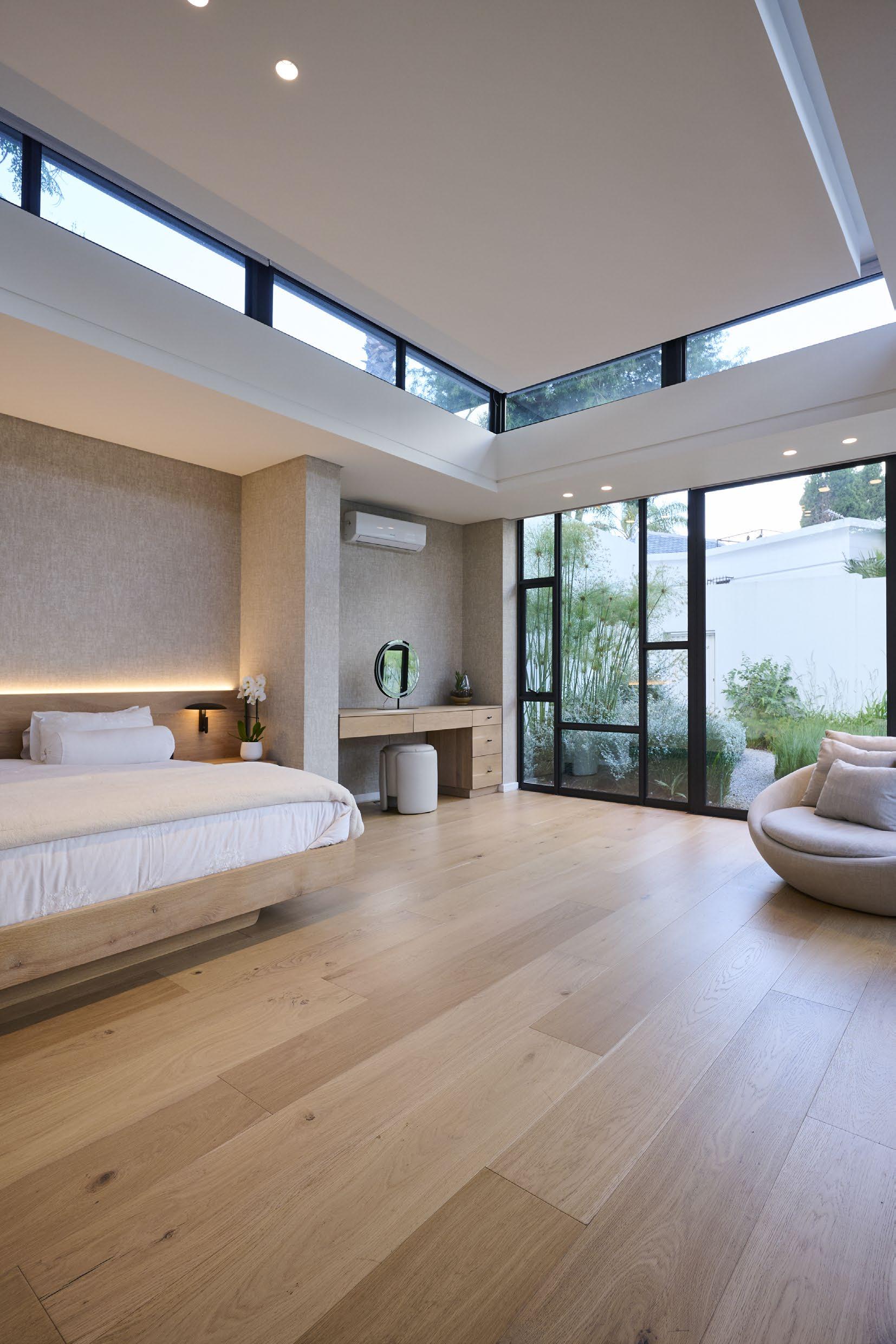

Design is the fusion of form and function
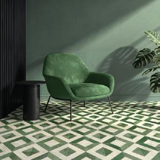
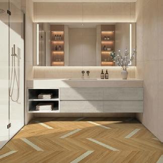
Belgotex.co.za
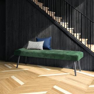
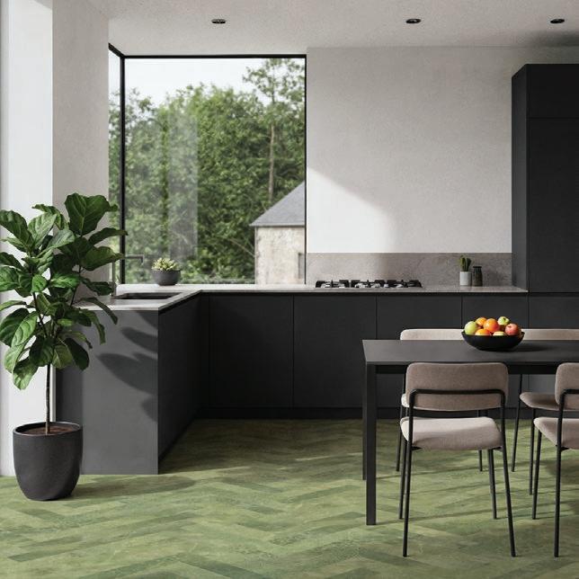
Twilight rede nes sustainable ooring through design and innovation. Engineered from 100% bio-circular resources with 40% less carbon, it delivers hyper-realistic patterns across three colourways.