Part I: Play-scapes
Part II: Care-scapes
Part III: Action-scapes
why would an architect and a graphic designer write a book together?
ON READING THE ROOM AND DESIGNING THE WORLD: A GRAPHIC DESIGNER’S PATH INTO SPATIAL PRACTICE
As a child, I knew how to read the room, even when no one was speaking. There was a rhythm to the neighborhood, a layout to the blocks, a graphic logic to the way people gathered in front yards or navigated alleyways. The bus bench, the barbershop signage, the corner store windows plastered with decals and handwritten signs—they spoke. I just didn’t know yet that this language had a name.
Long before I studied graphic design, I had already begun decoding the visual systems of space—how movement was orchestrated, how emotion was marked by pattern, how silence could speak through scale, repetition, absence. Growing up in Chicago’s public housing, I became fluent in the semiotics of survival. We navigated environments that were not designed for us, but that we, nonetheless, designed within—sometimes out of necessity, other times out of joy, always with a deeply ingrained spatial intelligence. It was an embodied form of design literacy: how to compose visibility in the margins, how to make structure out of scarcity, how to layer meaning across space.
Later, when I formally encountered graphic design, it felt familiar. Typography had the same pacing as a row of porches. Grid systems mirrored the mid-century
modern ideals of housing Black people following the Great Migration. Alignment, contrast, hierarchy—these weren’t abstract principles; they were embedded in everyday life. But formal education, in its neatness, often isolated graphic design from the world it emerged from. It rarely asked: what kind of place does this design assume? What kind of movement does it incite? What kind of people does it center? It was through these questions—slowly, repeatedly, restlessly—that my practice expanded. I came to understand graphic design not just as visual communication, but as spatial orchestration. Not just as messaging, but as meaning-making through place. My current practice sits at the intersection of graphic design, experiential design, critical design, and urban studies, grounded in Black feminist theory, Black spatial thought, and a lived understanding of how race, place, and power structure spatial experience.
Inspired by participatory framing, I now think of myself as an experience designer. I imagine my work not as staging spectacle, but as curating encounters—where the audience is not just a viewer, but a co-composer of the space they move through. In this way, design becomes less about directing attention and more about constructing interactions, where spatial gestures invite reflection, memory, and movement. Where the public is not just observed, but engaged. Where design functions not simply as form, but as invitation and possibility. This distinction matters. Because space, particularly for Black and marginalized communities, has never been neutral. It’s always been negotiated. Contested. Reimagined.
So much of my work asks: what futures are foreclosed when graphic design is tethered to branding, persuasion, or market efficiency? How might we reframe visual language as a method of liberation, not just communication? What does it mean to practice graphic design in service of collective memory, spatial justice, or cultural survival? How do we design visual systems that hold complexity, contradiction, and care?
These are not abstract inquiries for me. They are rooted in lived geographies—of displacement, improvisation, intimacy, protest, joy. They are questions I’ve been circling long before I had language to name them. My coauthor grew up tracing the lines of buildings and streets; I grew up tracing the unspoken and visual logics of my building, my block, my city. What began as an intuitive form of reading space has become a rigorous spatial design practice—one that insists on fusing aesthetics with justice, form with freedom.
And through it all, graphic design remains central. Not as a subordinate discipline, but as a methodological core. Graphic design offers me a uniquely designerly way of knowing: a way of theorizing in composition, arguing in contrast, dreaming in color. These aren’t decorative acts—they are epistemological ones. Graphic design gives me the tools to translate the abstract into the experiential, to turn critical inquiry into public encounter. And in this work, I’m not just designing images. I’m designing atmospheres. Possibilities. Propositions for a world where we are not just seen, but held.
In this way, my practice does not abandon graphic design—it extends it. Beyond the page and screen, into streets, thresholds, thresholds, thresholds again. Into the layered, overlapping, often-contested surfaces of everyday life. Toward a design practice that doesn’t just ask what space looks like, but what it does. Who it welcomes. What it remembers. What futures it allows.
Because in the end, I’m not just designing to make things seen.
I’m designing to make things possible.
—Nekita Thomas
ARCHITECT’S PATH INTO GRAPHIC PRACTICE
As a kid, I was obsessed with making maps. My inspiration came in part from a tantalizing Mister Rogers’ Neighborhood segment—part of the “Picture Picture” series—where a cartographer rode in a helicopter, drawing the city as seen through the cockpit window. My parents were skeptical about the practicality of this career ambition and pointed out that future mapmaking would likely be automated by satellites. Sensing my disappointment, they suggested that architecture was the next best thing to cartography. My parents couldn’t have predicted the contemporary relevance of mapmaking, but they were absolutely right about architecture. Studying and practicing architecture positioned me to draw the world, both as it is and as it could be.
The acts of drawing a map, drawing public spaces, drawing a building, and even drawing a poster remain closely intertwined graphic activities. In architecture school, my professors often reminded us that “architects do not make buildings, they make drawings for buildings.”1 Architecture is, at its core, a graphic act: architects produce drawings, visualizations, and other graphic artifacts that provide instructions for possible buildings and worlds, but not the physical reality of those worlds. Construction is the builder’s realm. If the discipline of architecture is dedicated to creating graphic artifacts, then by definition, it is aligned with graphic design. That doesn’t mean that architects are inherently good graphic designers—as I quickly learned, most are not—but as creative modalities and ways of being, architecture and graphic design are close kin.
In hindsight, I recognize a frustration stemming from the rigid professional divide between architecture and graphic design, and from my sense as a student that I had to choose one discrete path over the other. I decided instead to channel my graphic design impulses into architecture, importing graphic sensibilities wherever I could. For the past twenty years, I’ve been scratching that graphic itch, and this book traces the architectural significance of this enduring affinity.
In the formal process of advancing a building design toward construction, the architect’s “final” graphic artifacts typically include renderings, construction drawings, and specification documents. The lines, patterns, and colors that architects generate in these graphics offer scaled representations and symbolic markers of the proposed building. For example, different line types articulate material geometry, edges, and thresholds, while hatch patterns indicate material specifications. Colors on digital drafting programs and 3D models often identify and differentiate various building systems, such as structure, HVAC, and finishes. These graphic conventions guide builders to transform drawings into built form—into environments that themselves consist of experiential graphic atmospheres. Lines become seams between materials; surfaces diffuse colors and textures. A building is, in this sense, a three-dimensional collage of graphic conditions.
But what if we reconceived built environments through more explicit acts of graphic realization? What if we literally materialized the lines, patterns, and colors of architectural drawings at the one-to-one scale of human inhabitation? Of course, everyday practice already translates graphic lines into built forms through architectural conventions. But imagine a variation on that translation: rather than a thick line in a drawing representing the edge of a wall, what if
1 Stan Allen attributes this statement to Robin Evans in Practice: Architecture, Technique and Representation (G+B Arts International, 2000), 1. See also Robin Evans, “Architectural Projection,” in Architecture and Its Image: Four Centuries of Architectural Representation, ed. Eve Blau and Edward Kaufman (Canadian Centre for Architecture, 1989), 19–36.
that line were delineated and experienced directly in space? What if patterns in architectural drawings were not symbolic of materials but actual patterns inscribed onto physical surfaces—patterns to be walked on, inhabited, and traversed? Could such graphics, realized at the scales of buildings, cities, and landscapes, offer new frameworks for collective life in an increasingly complex world? And might this intensified intersection of architecture and graphic design open new possibilities for collaborative and creative action?
Throughout my journey from architectural school to leading my own small practice and teaching architecture in academia, I’ve repeatedly encountered skepticism from the architectural establishment about the value of graphic strategies in the built environment. Graphics are “merely superficial,” they say. “Graphics lack depth.” For decades, much of architecture’s aesthetic discourse has privileged tectonics—the craft of intricate forms and material connections—over graphically driven environments. Yet where tectonics fixates on the makeup of the sculptural object, graphics operate as a function of human perception, always in relation. They privilege spatial continuity over form, and offer nimble means of negotiating among the intimate and the urban, the building and the city.
As coauthor of this book, I aim to argue why graphics and surfaces of inhabitation matter for architecture, perhaps now more than ever. In particular, graphics that activate the horizontal plane—the common ground we move across daily—synthesize top-down and bottom-up perspectives. They choreograph both the organization of space as a whole and the micro-encounters that unfold at human (and nonhuman) scale. While patterns, marks, and color fields seem to operate on surfaces, I argue that it is precisely their material superficiality that lends them cultural depth and organizational power—the capacity to build community and invite participation.
I am also keenly aware that architects, broadly speaking, have an enduring fear of color and pattern. The stereotype holds: architects often dress in all black and revere the black-and-white, austere palette of modernism. Of course, architectural traditions across time and geography—from Mughal ornament to Andean textiles—embrace color and pattern as integral to identity. But this is not the aesthetic world that I experience regularly. From my distinctly American Midwestern, twenty-first-century vantage point, trained within a Western, Eurocentric curriculum, color is conspicuously absent. As an undergraduate and graduate architecture student, I was never offered a course in color theory or the role of color in spatial design. I suspect that this common gap in architectural education perpetuates the architecture profession’s phobia of and aversion to saturated hues and exuberant graphics.
By collaborating with Nekita and writing this book, I hope to offer new, graphically charged entry points for architects and spatial designers—not only to underscore the impact of color, pattern, and graphics in the built environment, but also to grant architects permission to rediscover and indulge in the pleasure and play that are too often suppressed in the solemn pursuit of tectonic purity.
—Joseph Altshuler
setting the scene Introduction
→ The Life and Death of the Black Lives Matter Street Mural
It was a rainy evening in Washington, DC, on Thursday, June 4, 2020.
Around 6:00 p.m., the artist Keyonna Jones received a cryptic phone call from a colleague inviting her to collaborate on a secret public art project initiated by DC’s mayor, Muriel Bowser. The caller assured Jones that the project had a sufficient budget but offered no other details. Owing to the relatively recent onset of the COVID-19 pandemic, Jones had recently shut down the nonprofit arts organization that she directed and was tight on cash. Intrigued, she agreed to jump on board.1
1 Mark Wilson, “Can Art Change the World? Inside the Debate Raging over Black Lives Matter Murals,” Fast Company, June 18, 2020, https://www.fastcompany.com/90517437/ can-art-change-the-world-inside-the-debate-raging-over-black-lives-matter-murals.
Joseph Altshuler and Nekita Thomas
Black Lives Matter mural, Washington, DC, 2020. Photo by Nadia N. Aziz.
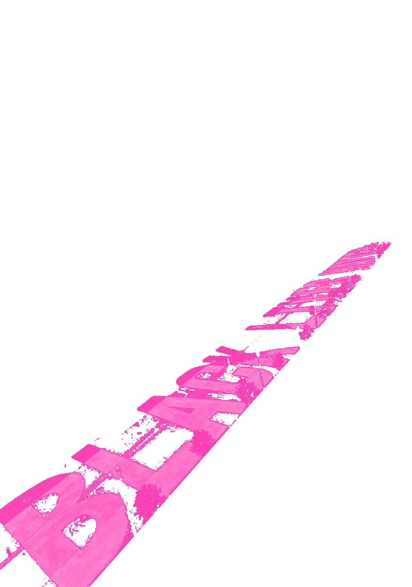
Two hours later, Jones joined a Zoom call to be briefed on the project alongside a handful of other invited artists. Mayor Bowser’s office was commissioning them to create an enormous typographic mural—the words “BLACK LIVES MATTER” painted in yellow letters—on a portion of 16th Street NW, on axis and with a sight line to the White House, then occupied by President Donald Trump in his first term. The catch? The project had to be completed overnight to avoid pushback and potential wrath from the Trump administration, which had recently forcibly removed protesters advocating for the Black Lives Matter (BLM) movement from the vicinity of the White House. Despite the persistent rain, this ad hoc collective of public artists was charged to commence work at 3:30 a.m., as soon as the weather was expected to clear up.
When Jones and her collaborators arrived on-site, the city’s Department of Public Works (DPW) was sweeping away puddles from the evening precipitation, laboring diligently to render the street surfaces paintable. Because of the last-minute planning, no one had calculated the precise amount of paint required to complete the project—DPW employees had to be sent out regularly to replenish supplies. By daybreak, Jones recalls, only the “B” and “L” were complete, and because the replenished paint had slightly different color specs than the original supplies, the crew had to repaint these letters before proceeding.
As the morning unfolded, the production process accelerated thanks to curious passersby and interested onlookers who volunteered to help. Jones and her collaborators shifted to a supervisory role, with the artists taping out the precise geometry of the forty-eight-foot-tall letters for volunteers to color in with bright-yellow traffic paint. By around 11:00 a.m., the project was complete, and Black Lives Matter Plaza was born.
In the days and months that followed, the Black Lives Matter street mural in DC inspired artists in over two hundred other municipalities around the nation (and the world) to paint similar murals in their local contexts.2 The original ground mural in DC was commissioned by city government and not endorsed by or planned with the local chapter of Black Lives Matter—a topdown approach. Examples in other cities were realized in a mix of top-down or unsanctioned, bottom-up ways. The aesthetics and design strategies also vary among the BLM murals, with some instances replicating the solid-yellow block letters of the mural in DC, and others experimenting exuberantly with alternative colors, typography, configurations, materials, and messages.
The proliferation of BLM murals is a testament not only to the wave of civil unrest in response to the murder of George Floyd by Minneapolis police officers on May 25, 2020, but also to the graphic design power of the progenitor mural in DC painted by Jones and her team. Its matter-of-fact design and straightforward production required minimal instructions to execute, and its message required no explanation. Paint is affordable, accessible, and participatory. By inscribing these powerful words onto surfaces of the public realm, the mural creators affirmed and reified the presence and future of Black life in defiance of their destruction by the police and other agencies of the state.
However, the BLM mural in DC, and by extension the international BLM mural movement that it spawned, also received substantial criticism and strong pushback, especially from folks in Black Lives Matter’s DC chapter. In a press release issued on June 6, 2020, one day after the mural’s completion, BLM DC condemned
2 The Black Lives Matter Street Mural Map has aggregated and visualized data related to and locations of Black Lives Matter murals around the United States since June 2020: https:// blm-murals.mlml.io/.
the mural as a performative, hollow gesture that distracted from the group’s primary demand to Mayor Bowser—to defund the police and end police violence against Black people. April Goggans, a core organizer with Black Lives Matter DC, told local news media, “I could care less about a mural because [Mayor Bowser] doesn’t care about black lives.…This is totally performative...She has fought against us.”3
For all the successes and limitations of the DC Black Lives Matter street mural, our interest in its story is twofold. First, while the BLM murals extend a long lineage of murals as a medium for protest and community building,4 the movement represents an important shift, from wall activations to ground-surface activations.5 The act of reorienting a mural from a vertical surface that we look at to a horizontal surface that we walk on and traverse daily renders it immersive in another way, even inhabitable. The message remains important, but as ground graphics, a street mural's left-to-right English-language legibility is easily obscured depending on any given person’s orientation and vantage point. The street mural is therefore inherently more abstract than a wall mural. It proposes a way of being rather than a mode of reading.
Second, the BLM mural movement also squarely positions protest murals in the domain of urban design and policy. Traditional murals may be painted for public visibility, but BLM murals occupy the public right of way. By articulating public streets that vehicles drive on and sidewalks that people walk on, BLM murals interrogate the municipal standards of departments of transportation for traffic markings; and of departments of public works for civil engineering, accessibility codes, and other highly regulated public-realm requirements. In July 2021, just over a year after Jones and her collaborators created the iconic painted letters,
3 April Goggans quoted in Larry Miller, “‘I Could Care Less about a Mural’ | Black Lives Matter DC Calls New Mural ‘Stunt’ for White Liberals,” WUSA9, updated June 7, 2020, https:// www.wusa9.com/article/entertainment/television/programs/q-and-a/black-lives-matterdc-calls-murals-stunt-for-white-liberals/65-6a5408bb-4ff3-4f06-8a99-de44eee1af62.
4 For example, Diego Rivera’s History of Morelos, Conquest and Revolution (1929–30), or the Wall of Respect, in Bronzeville, Chicago (ca. 1967), painted by various artists of the Organization of Black American Culture, led by William Walker.
5 Some dictionaries—for example, Merriam-Webster’s Unabridged—limit the word mural to interventions on walls (from the Latin root murus). For others, the term applies to a painting on any permanent substrate, including ground surfaces such as asphalt.
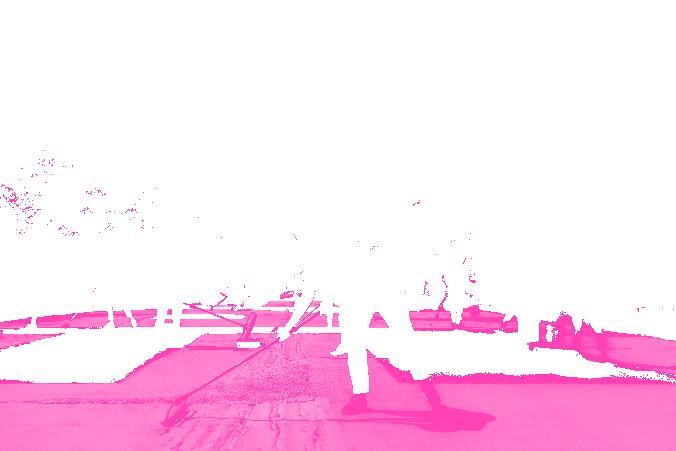
Volunteers and artists paint the Black Lives Matter mural in DC, an initiative that started a movement throughout the nation, 2020. Photo by Michael A. McCoy for the New York Times
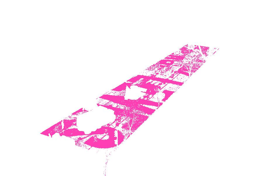
Mayor Bowser and the District Department of Transportation started construction on what they described at the time as permanent upgrades to the site, including “colored pavers used for the roadway surface instead of traditional asphalt”; a “durable yellow thermoplastic paint on top of a bonded concrete” for the letters of the mural; a fourteen-foot-wide pedestrian-only center plaza; lighted bollards; Americans with Disabilities Act–accessible buttons to activate traffic signals; and separated vehicular lanes in each direction of 16th Street NW.6 What started as an overnight intervention led by artists developed into a robust transformation of the public realm involving new traffic patterns and offering enhanced pedestrian access. The layering of graphics, storytelling, and street infrastructure suggested a new political pathway, albeit a modest one, where public art could drive the crafting of a better city.
The initial motivation to write this book percolated in the early months of the COVID-19 pandemic and final months of the first Trump administration, precisely at the moment when the Black Lives Matter street mural movement was taking off. On the one hand, we reveled in the abounding spatial optimism that defined this moment. Through painted ground surfaces, BLM street murals achieved their first important objective: a bold, matter-of-fact declaration that Black lives matter unconditionally. Like the BLM murals, Supergraphic Landscapes is fueled by the renewed interest among American city-dwellers to reclaim public spaces, and specifically to use large-format graphics to transform otherwise nondescript, everyday spaces into new sites of collective celebration, care, identity, and reckoning.
6 Government of the District of Columbia Executive Office of the Mayor, “Mayor Bowser Announces the Completion of Permanent Installation of Black Lives Matter Plaza,” press release, October 28, 2021, https://mayor.dc.gov/release/ mayor-bowser-announces-completion-permanent-installation-black-lives-matter-plaza.
Crews demolish the Black Lives Matter Plaza in Washington, DC, 2025.
Photo by Michael A. McCoy for the New York Times
On the other hand, as a spatial design strategy and as cultural production, the murals have left us yearning for so much more. Black Lives Matter murals cannot single-handedly provide a remedy for systemic racism, nor do they offer an impactful enough paradigm for graphically charged public space design. The criticism expressed by Black Lives Matter DC immediately after the original BLM mural was completed is an important reminder of the mural’s disconnect from their movement’s demands for antiracist policy changes that DC has yet to enact.
Now, in 2025, we are completing this book during the second Trump administration, as marginalized groups face ever more severe assaults against their rights to protest and to speak truth to power. April Goggans’s disdain was well founded. Mayor Bowser’s 2025 decision to demolish Black Lives Matter Plaza— described by Bowser herself as a strategic measure to appease Trump and prevent federal power grabs aimed at her city administration7—is emblematic of the death of the activist street mural movement. The disconnect between Mayor Bowser’s 2021 characterization of the plaza upgrades as “permanent” and her administration’s swift capitulation to federal pressure to demolish the plaza in 2025 reveals not a failure of the mural or the movement it represented, but the mural’s precarity and limited agency as a spatial, graphic, and architectural intervention—unable to shape long-term urban design or reconfigure the city’s deeper structural patterns.
This gap—between compelling graphic action and real, long-term significance— is where this book comes in.
What if these supergraphic interventions could move beyond singular acts of expression and normative infrastructure improvements toward a broader goal of spatial transformation? What if, beyond making a statement, they could reimagine the idea of streets themselves—offering not a moment of visibility, but a lasting reconceptualization of public space? What if graphic activations and public art could move beyond the decorative, and how might architectural strategies transform public art into a platform for inhabitation, interaction, and intimacy?
While the Black Lives Matter murals generated global visibility and pride, they also sparked important questions. Some viewed them as symbolic gestures that lacked policy impact, while others saw in them the seeds of a more ambitious design language—one that could position graphic interventions as essential to the civic and spatial reimagining of public space. Supergraphic Landscapes explores how these interventions can serve not only as calls to action but as foundational steps toward a more just, participatory, and affectionate built environment.
WELCOME TO THE BOOK
This is a book about the future of public spaces—and how reimagining graphics in the built environment can unlock new ways of enacting civic participation.
While we don’t often describe it in these terms, the whole world is a kind of graphic. Our planet comprises complex patterns at many scales and spheres of influence that form as humans mold the surface of the Earth via infrastructures, communication systems, and territorial boundaries. These patterns have practical,
7 The DC city council had officially named this segment of 16th Street NW Black Lives Matter Plaza in October 2020. Mayor Bowser’s decision to remove BLM Plaza “came shortly after Representative Andrew Clyde, a Republican from Georgia, introduced legislation threatening to withhold millions of dollars in federal funds from the city unless the mural was removed and the plaza renamed.” Campbell Robertson and Jacey Fortin, “Pressed by Republicans, D.C. Begins Removing Black Lives Matter Mural,” New York Times, March 10, 2025, https://www.nytimes.com/2025/03/10/us/politics/black-lives-matter-mural-dc.html.
cultural, political, and aesthetic ramifications. While each scale of graphic pattern is interconnected and entangled with one another, this book focuses on a “super-architectural” scale—that is, the scale of design just over and beyond the size of a typical building. This scale is often the design purview of a landscape architect or urban designer, and we’ll often refer to this designed domain as “landscapes” for short (more on that later). We’re interested in everyday public spaces: urban landscapes where residents traverse their neighborhoods, including streets and crosswalks, bus stops and plazas, sport courts, performance spaces, memorials, and monuments. We’re equally interested in the more nondescript, underused, and in-between spaces in the public realm that may not be neatly categorized, but that provide an expanded network of communal connectivity and circulation, as well as a yet-unclaimed commons for public ownership and activation. Historically, these kinds of everyday public spaces provide venues for community, cultural life, and social exchange among people with different identities and backgrounds. But just because a space is nominally categorized as public (legally, formally, or colloquially) doesn’t mean it necessarily fosters a sense of belonging for all people, communities, and publics. We have a hunch that “turning up the volume” on the graphic design qualities that make up the built environment—including but not limited to landscape-scaled patterns, textures, marks, and colors—might help us amplify the perceived and real access, identity, and agency that are possible to achieve in public spaces.
This book is cowritten by an architect and a graphic designer to converge audiences in multiple disciplines, including creative practitioners, such as architects, landscape architects, graphic designers, and urban designers, as well as design educators, historians of the built environment, artists working in the public realm, and community design advocates. While the book is primarily situated in the world of design, it also aims to appeal to a broader community of curious readers interested in the social, political, and cultural makeup of the built environment. Do any of these sound like you? We invite you to read on!
WHY SUPER-?
“In this superworld, with its supercharged, super-intense and superwoman exuberance, I combined the super-sized enthusiasm of California Abstract Expressionism with hard-edge Swiss graphics, and ended up with, however superfluous and superficial, supergraphics.” —Barbara Stauffacher Solomon8
The prefix super-, from the Latin word super, meaning “above,” “over,” or “beyond,” has enjoyed quite a bit of popularity in the last decade. While its usage going back to the seventeenth century emphasized the meaning “beyond” in the sense of “out of typical scope,” a more popularized and contemporary usage suggests nearly the opposite sense: “beyond,” meaning “in an exaggerated degree” or “very much.”9 This combination adjective and adverb is fun to say out loud and easy to add to an ever-expanding roster of suffixes—for example, the superfoods, superstorms, and superspreader events that have come to characterize contemporary life on Earth. Some linguists and writers have recently bemoaned super’s clichéd overuse.10 While its ubiquity may warrant a certain degree of healthy suspicion, we think that super as a modifier, suggested by the stricter denotation of “above,” “over,” or “beyond,” offers superlative qualities and specific spatial ramifications
8 Barbara Stauffacher Solomon, Why? Why Not? (Fun Fog Press, 2013), 77.
9 Harper Douglas, “Etymology of Super-,” Online Etymology Dictionary, accessed June 24, 2025, https://www.etymonline.com/word/super-.
10 Teddy Wayne, “A Certain Word Is Really Getting on My Nerves,” New York Times, March 12, 2016, https://www.nytimes.com/2016/03/13/fashion/super-tuesday-super-saturday.html.
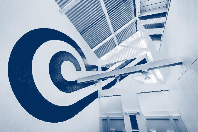

to consider in the realm of graphics, architecture, and public spaces. When is a graphic “above,” “over,” or “beyond” what we typically conceptualize as familiar?
If the prefix super has largely retained its potency, the term supergraphics has had a more defined arc: originating in the 1960s, hitting an apex in 1975, and declining in the late 1970s.11 The design critic C. Ray Smith is generally considered the first to coin the term Supergraphics, which he championed in the magazine Progressive Architecture in 1967 and 1968.12 Per Smith’s definition, Supergraphics (with a capital S) refers to a specific design movement made popular by a group of architects and designers who were interested in using largescale graphic gestures to challenge and subvert the rational, modernist design principles that were mainstream at the time. As Smith proclaims, “Supergraphics start with two-dimensional forms that become three-dimensional explosions.… They destroy architectural planes, distort corners, explode the rectangular boxes that we construct as rooms, and consequently change architectural scale.”13 The trend first emerged as an interior design strategy, where painted graphics would disrupt the conventional architectural edges that define walls, floors, and ceilings. For example, a painted abstract shape might continue from floor to wall to ceiling, ignoring changes in geometric planes and finish materials. The result was a graphically constructed virtual sense of space that supersedes the original context. Smith explains this phenomenon as having a participatory quality in which “the viewer completes the [graphic] fragment as a gestalt in his mind’s eye.”14
Barbara Stauffacher Solomon, supergraphics at the Moonraker Recreation Center, Sea Ranch, 1966. Photo by Paul Kozal, 2019.
11 According to Google Books Ngram Viewer, use of the word supergraphics peaked in the mid-1970s and has declined ever since. Accessed June 24, 2025, https:// books.google.com/ngramsgraph?content=supergraphics&year_start=1800&year_ end=2022&corpus=en&smoothing=3.
12 See, for example, “Bathhouse Graphics,” in Progressive Architecture, March 1967, 156–61. The article is unsigned, though John McMorrough credits it to Smith; see “Blowing the Lid off Paint: The Architectural Coverage of Supergraphics,” in “Rethinking Representations,” Hunch 11 (June 2007): 64–73.
13 C. Ray Smith, Supermannerism: New Attitudes in Post-Modern Architecture (E. P. Dutton, 1977), 270.
14 Smith, Supermannerism, 270.

Progressive Architecture editor Jan C. Rowan, alongside Smith, featured the graphic designer Barbara Stauffacher Solomon’s iconic interior designs at the Sea Ranch resort development in Sonoma County, California, on the cover of the magazine’s movement-defining issue, in March 1967. 15 The cover feature and short project write-up helped position Stauffacher Solomon as the progenitor of the new trend.16 At Sea Ranch, Stauffacher Solomon emblazoned
15 Life magazine was the first major media outlet to feature Barbara Stauffacher Solomon’s work at Sea Ranch, in a full-spread feature in 1966.
16 Smith was more inclined to credit male architects such as Hugh Hardy, Doug Michels, and David Sellers with the origin of Supergraphics, while assigning Solomon a mere supporting role. Cited in Jacquelynn Baas, “Art Wall: Barbara Stauffacher Solomon,” curatorial notes for UC Berkeley Art Museum Art Wall, 2018.
Barbara Stauffacher Solomon, supergraphics at the Moonraker Recreation Center, Sea Ranch, 1966. Photo by Paul Kozal, 2019.
the interior surfaces of the community’s bathhouse with solid-color stripes, arrows, letterforms, and abstract geometric figures that respond to the otherwise unadorned interior architecture. The clean lines and crisp edges of these supergraphics evince Stauffacher Solomon’s Swiss modernist graphic design training and underscore the architectural specificity and precision of the graphics' effects. At times, the Sea Ranch graphics reinforce the existing architectural gestures of the interiors—for example, blue stripes painted on the wall adjacent to the stairs align with the diagonal edge of a red stair-rail wall. At other times, the graphics sing their own song, seemingly oblivious to cues from the nearby interior context, such as when a series of concentric curved stripes collide with an orthogonal corridor edge. The variety of approaches that Stauffacher Solomon experimented with offer a lexicon of supergraphic strategies that other practitioners would riff on and explore in subsequent years.
While the use of the term supergraphics has loosened since the 1970s to refer to any large-format graphic integrated into the built environment, for our purposes, it’s important to clarify that super is not synonymous with big or giant size (although the quality of bigness often plays a supportive role). Relatedly, large murals are not synonymous with supergraphics. It is possible for supergraphics to manifest as murals or large-format paintings produced directly on the exterior surfaces of buildings, but not all murals produce spatial effects that challenge or explode conventional architectural edges, and in turn, not all murals are supergraphics. Most murals are primarily decorative or illustrative, depicting a scene or human portrait to offer information or celebrate cultural heritage. While such murals add culturally important and visually rich layers to the urban experience, as graphics, they generally do not adjust or reorganize our broader sense of public space.
In contrast, asphalt art, or murals painted on the street and other paved ground surfaces, offers an alternative delivery mode that pushes murals away from decoration/illustration and toward spatial organization. Artful markings on the ground may be beautiful, and they also have the capacity to instruct us where to put our feet and how to move about the streetscape. Bloomberg Philanthropies, a funder that has championed this urban tactic since 2019, describes asphalt art as “visual interventions on roadways (intersections and crosswalks), pedestrian spaces (plazas and sidewalks), and vertical infrastructure (utility boxes, traffic barriers, and underpasses),” adding, “Taken together, these relatively low-cost, often short-term and scalable projects can create immediate positive impact and catalyze long-term improvements to the public realm.”17 Studies show that asphalt art, in combination with other street improvements, increases pedestrian safety by reducing pedestrian street-crossing times, calming vehicle speeds, and decreasing noise levels.18 In the most straightforward way, and as seen at Black Lives Matter plaza before its demolition, asphalt art demonstrates that painted graphics directly alter the conditions and patterns in which communities circulate and congregate.
But asphalt art stops short of fully delivering a multivalent reorganization of public space and a deeper restructuring of the many patterns that make up the built environment.
17 Bloomberg Associates, Asphalt Art Guide: How to Reclaim City Roadways and Public Infrastructure with Art (2019): 4, https://data.bloomberglp.com/dotorg/sites/43/2019/10/ asphalt-art-guide.pdf.
18 Tanya Mohn, “Taking Art to the Streets, Just Look Down,” New York Times, May 20, 2021, https://www.nytimes.com/2021/05/20/arts/murals-asphalt-streets.html.
WHY GRAPHIC?
From Wayfinding (Environmental Graphics) to Worldbuilding
Graphic design has long played a crucial role in shaping the built environment. Through signage, branding, wayfinding systems, and environmental communication, graphic interventions have been used to make space legible, navigable, and marketable. These forms of design, often referred to as Environmental Graphic Design (EGD), have historically aligned with the needs and aesthetics of corporate identity, institutional coherence, and commercial clarity. As the scholar Richard Poulin has argued, EGD emerged to “integrate graphic communication into the physical world,” particularly to guide movement and enhance the visibility of brands across spatial contexts.19 In this dominant tradition, graphics are frequently tasked with solving problems of orientation and legibility in ways that prioritize clarity, efficiency, and control.
Environmental graphic design, therefore, also reflects the logic(s) of the environments it serves. In its most common applications, EGD reinforces the structures of capitalism, enabling smoother flows of commerce, tourism, consumption, and labor. However, there are also EGD projects that nudge toward a more openended set of relationships, such as Paula Scher’s wayfinding system for the High Line in New York City, or Wolff Olins’s extensive visual identity for the 2012 London Olympics. Each is deeply sophisticated in its design resolution, and yet each also demonstrates the limits of a system that privileges economic signaling, brand identity, and streamlined navigation over civic presence, plurality, or collective authorship.
While we acknowledge the communicative power and spatial utility of EGD, Supergraphic Landscapes offers a different proposition. Our work pushes beyond the frameworks of legibility and coherence toward an expansive understanding of graphics as worldbuilding tools. Here, the graphic is not only a carrier of meaning but also a constructor of mood, memory, rhythm, and resistance. We do not deny the value of EGD—we refuse its limits. We believe the graphic has the capacity to do more than direct and decorate. It can negotiate, narrate, unsettle, and invite.
Graphics operate through a distinct spatial logic—one that is temporal, rhythmic, symbolic, and relational. Unlike architecture, which often creates space through form and enclosure, or landscape, which builds through terrain and material ecologies, graphics create space through cultural reference, orientation, atmosphere, and legibility (or lack thereof). They don’t just organize sight lines or clarify function—they shape memory, situate identity, and produce spatial meaning. Graphics make space felt, known, and narrated. They are not secondary to the built environment; they are part of its very spatial DNA.
This reframing departs from the dominant environmental design ethos critiqued by theorists such as Jane Rendell, who challenges how spatial design often reinforces social hierarchies by masking their presence in aesthetics of neutrality.20 If traditional environmental graphics offer visual cohesion, Supergraphic Landscapes offers graphic contradiction. Where conventional EGD privileges clarity, we construct atmosphere. Where EGD aids branding, we amplify narrative. And where EGD reinforces ownership, we propose participation.
19 Richard Poulin, The Language of Graphic Design: An Illustrated Handbook for Understanding Fundamental Design Principles (Rockport Publishers, 2011), 139.
20 See Jane Rendell, Site-Writing: The Architecture of Art Criticism (I. B. Tauris, 2011).
GRAPHIC INFRASTRUCTURE
DIRECTIVE
GRAPHIC DIRECTION
Wayfinding Signage
SYSTEM-BASED
Supergraphic Landscapes
GRAPHIC WORLDBUILDING
ENVIRONMENTAL GRAPHICS
SURFACE-BASEED
GENERATIVE
GRAPHIC ATMOSPHERE
This approach is informed by a graphic design lineage rooted not in commerce but in critique, speculation, and social transformation. The graphic design scholar Anne Burdick describes design as a language with the capacity to shape thought and culture.21 We embrace this definition and ask: what kinds of publics become possible when design is used not to market a space, but to mark it with memory, tension, and joy? What if graphics didn’t just help you find your way—but helped you understand where you are, why that space matters, and how it came to be?
This approach departs from environmental graphic design in three critical ways: from communication to conjuring, from identity to inquiry, and from navigation to negotiation. Graphics do not simply convey information—they construct environments. They shape how space is remembered and felt, how belonging is established, and how power is visualized. Graphics do not reinforce a single narrative—they surface contested, layered, and emergent ones. And they do not just guide bodies—they offer spatial scripts that invite gathering, pause, reflection, refusal, and joy.
To think beyond the inherited constraints of environmental graphic design, we offer a new matrix that reorients graphic thinking toward its spatial, cultural, and systemic potential. The vertical axis of this matrix calibrates intent, spanning from the directive, where graphics communicate explicit information, to the generative, where graphics suggest possibility, mood, or imaginative proposition.
21 See Anne Burdick, Johanna Drucker, Peter Lunenfeld, Todd Presner, and Jeffrey Schnapp, Digital_Humanities (MIT Press, 2012).
Asphalt
Murals
The horizontal axis calibrates scale and deployment, ranging from surface-based interventions to system-based strategies. Together, these axes yield four relational modalities that describe how graphics operate in the built environment.
The upper-right-hand quadrant, Graphic Direction, encompasses directive surface-based interventions such as signage, labels, and spatial identifiers. These graphics are immediate and functional, offering clarity and navigational utility within discrete contexts. The lower-right-hand quadrant, Graphic Atmosphere, describes generative surface strategies such as murals, painted patterns, and color fields. These elements shift mood and tone, setting the emotional or symbolic register of a place without directly instructing its users.
The upper-left-hand quadrant, Graphic Infrastructure, moves from surface to system. These graphics are directive at scale: multisite wayfinding networks, civic communication systems, and public information campaigns that structure broad spatial flows and civic experience. The lower-left-hand quadrant, Graphic Worldbuilding, describes the work of generative systems—distributed graphic languages that tell stories, commemorate histories, and construct shared visions of place. These might take the form of protest graphics circulating through a city, typographic rituals embedded in sidewalks, or distributed narratives rendered across a series of urban thresholds.
It is in this fourth quadrant that Supergraphic Landscapes most powerfully operates. Here, the graphic becomes an act of coauthorship: a spatial language that does not just clarify, but complicates; that does not just decorate, but defines; that does not just guide, but grounds a public in story, identity, and speculative futures.
In this view, the graphic is not a supplement to the built environment. It is a spatial logic in its own right. It produces orientation and disorientation, cohesion and contradiction, information and intimacy. It is the mark, the mood, the map, and the memory. It is the space between structure and story. It is how we design what it means to be here.
WHY LANDSCAPES?
From (Land Art and) Public Art to Urban Design
“The discourse surrounding landscape urbanism can be read as disciplinary realignment in which landscape supplants architecture’s historical role as the basic building block of urban design.” —Charles Waldheim22
Supergraphic Landscapes shares a set of spatial tactics and design strategies with landscape architecture, especially a concern for how people perceive, navigate, and emotionally register spaces beyond buildings and within the public realm. Both disciplines choreograph movement and attention across surfaces, treating the ground plane as an active field rather than a passive base. They both use tactics of framing, gradation, and scale play to make environments legible and engaging. Where landscape architecture often shapes terrain with vegetation, topography, and deep sectional form, Supergraphic Landscapes shapes terrain with patterns, textures, and graphic layering—visual ecologies as much as material ones. Both cultivate public awareness and affective connection, revealing how space can communicate and orient. While landscape architecture grounds its authority in ecological and infrastructural systems, Supergraphic Landscapes finds affinities in relational and social systems. The word landscapes in this book’s title and in the name of this emerging mode of practice is borrowed to signal kinship rather than disciplinarity: Supergraphic
22 Charles Waldheim, “Landscape as Urbanism,” in The Landscape Urbanism Reader (Princeton Architectural Press, 2006), 37.
Landscapes aims to expand the lexicon of design strategies that landscape architects might consider in their theory and practice, but not to misappropriate or invade landscape architecture’s disciplinary specificity.
In the introduction of their edited volume Is Landscape…?, Gareth Doherty and Charles Waldheim write, “Rather than seeing a singular or essential understanding of the term [landscape], we postulate that landscape might be better read in relation to its cognate terms across expanded disciplinary and professional fields.”23 Their book includes essays with titles such as “Is Landscape Literature?,” “Is Landscape Infrastructure?,” and “Is Landscape Painting?,” each intended to “disturb and develop received understandings of landscape architecture.”24 The landscape architect Mary Pat McGuire has described this project as “an expansion of landscape identity.”25 Supergraphic Landscapes takes up that invitation by posing a new question: is landscape graphic? How might the language and practice of graphic design be folded into a landscape-oriented way of imagining the world? And how might architectural strategies materialize graphics as lived, spatial environments?
The conceptualization of landscape as a graphic in the world shares a kinship with land art, the movement that reconfigured materials of the Earth while erasing the distinction between site as setting and site as medium. It is no coincidence that land art emerged in the 1960s and 1970s—the same era that produced the first supergraphics in (interior) architecture. While land art often occupied remote sites far from public access, its photographic documentation—in galleries and books—brought broader audiences into contact with the work. Classic earthworks such as Robert Smithson’s Spiral Jetty (1970) live more vividly in collective memory through their images, graphics drawn in light and sediment, than through direct bodily encounters on-site. Land art thus made art both a physical environment to inhabit and an iconic graphic to visualize and remember.
As an artistic medium situated outdoors and embedded in the environment, land art shares certain qualities with the broader genre of public art. Public art, which is typically sculptural, beautifies the public realm; it is typically more
23 Gareth Doherty and Charles Waldheim, “Introduction: What Is Landscape?,” in Is Landscape…?: Essays on the Identity of Landscape, ed. Gareth Doherty and Charles Waldheim (Routledge, 2016), 1.
24 Doherty and Waldheim, "Introduction," 1.
25 Mary Pat McGuire, “Is Landscape Surface?,” Journal of Landscape Architecture 15, no. 1 (2020): 18.

Smithson, Spiral Jetty, Great Salt Lake, Utah, 1970. Photo uploaded by Wikimedia Commons user Yonidebest, 2007. CC-BY-SA-2.0.
Robert
integrated into everyday life than land art’s remote interventions. Yet much public art takes the form of precious objects or monuments—work elevated on plinths and divorced from public life. While these gestures contribute important symbolic and decorative value to our cultural landscapes, their role often remains static. In contrast, Supergraphic Landscapes demonstrates how public art can evolve from ornament into social infrastructure: from visual accent to immersive field. Repositioned in this way, public art can act as an instrument of urban design—an inhabitable, interactive, and civic medium capable of organizing public space, structuring movement, and framing new thresholds of collective experience.
Drawing energy and operative qualities from both land art and public art, Supergraphic Landscapes diverges from each in intent and scale. From land art, it inherits a fascination with site-specificity, spatial inscription, and perceptual transformation through surface and scale. Like the earthworks of the 1960s and ’70s, Supergraphic Landscapes treats the ground as a vast drawing surface, using graphic intervention to recalibrate how a site is seen and experienced. But unlike land art’s retreat to remote terrains and its resistance to engaging with urban systems, Supergraphic Landscapes aligns more closely with public art in its civic orientation and its dialogue with everyday environments. From public art, Supergraphic Landscapes borrows strategies of accessibility, communication, and participation—using color, form, and scale to animate shared space and invite collective experience. Situated between these two genres, Supergraphic Landscapes fuses land art’s spatial audacity and public art’s social immediacy, translating the monumental and the communal into a visual language that redefines how graphic form can inhabit—and transform—the civic realm.
The matrix to the right situates spatial and material qualities for a range of artistic landscape interventions in the built environment. It aims to offer a more expansive definition of land art and public art practices and to outline a universe of inhabitable public art environments in which Supergraphic Landscapes resides.
The vertical axis calibrates organizational logic and spans between objects and fields. In his seminal essay “From Object to Field,” Stan Allen attempts to define urban design not as a practice obsessed with forms (including buildings) but as one that prioritizes relationships among forms and the dynamic conditions that result from their interplay.26 Objects signify discrete points or landmarks in the built environment. Objects are singular artifacts and often autonomous instances of intervention. A traditional conception of public art—sculpture in particular—tends to manifest as objects. On the other hand, fields constitute a network of contingent objects that produce dynamic conditions among themselves and their surroundings. Fields are relational rather than figural, less about the sculpting of an artifact and more about the localized relationships produced between self-similar objects. As Allen observes, “A plate of iron filings will register the patterns of a magnetic field, but the filings are not the field—they are simply the graphic record of the invisible forces of the field itself.”27 Similarly, graphic marks or patterns inscribed on ground surfaces in public spaces register a field condition of cultural relations that may not be synonymous with the material used to make the pattern.
26 Stan Allen, “From Object to Field: Field Conditions in Architecture and Urbanism,” in Space Reader: Heterogeneous Space in Architecture, ed. Michael Hensel, Achim Menges, and Christopher Hight (Wiley, 2009), 119–43. An earlier version of the essay appeared in Architectural Design, profile 127, “Architecture After Geometry” (1997): 24–31.
27 Allen, “From Object to Field,” 120.
GRAPHIC OBJECTS
OBJECTS
PUBLIC ART ENVIRONMENTS GRAPHIC
TECTONIC OBJECTS
Supergraphic Landscapes
GRAPHIC FIELDS
TECTONIC FIELDS Creatures
FIELDS
The horizontal axis calibrates material logic, with “tectonic” and “graphic” at each end of the spectrum. The tectonic is concerned with the constructional logic of architectural form, with particular attention to systems of assembly and material connections. The graphic is concerned with the visual and cultural capacity of architectural form to tell stories, with attention to the visual markers of character, personality, and atmosphere.
These two axes form a bidirectional matrix of organizational and material relationships that generate public art environments. This matrix is not exhaustive, and in particular, it does not account for ephemeral or performance-based formats of public art. But it offers a general set of correlations that helps articulate some formal and operative criteria for public art, and suggests some desirable spatial design possibilities for public art that have been understudied and underdelivered.
The upper-right-hand quadrant of the matrix suggests Tectonic Objects, or discrete artifacts that express the constructional logics of their assembly. In public art, Tectonic Objects tend to be articulated, high-fidelity, and geometrically intricate sculptures where the whole is more than the sum of their (many) parts. The lower-right-hand quadrant of the matrix suggests Tectonic Fields, or articulated frameworks or systems that support localized relationships. In public art, Tectonic Fields may manifest as literal or conceptual scaffolding systems that structure the public realm and that privilege the spaces in or around them more than their own materiality or form. The upper-left-hand quadrant of the matrix suggests Graphic Objects, or artifacts that privilege character, personality, and
iconicity over constructional logic.28 Graphic Objects often play a scenographic role in the public realm, offering narrative signifiers or cartoonish emblems of cultural identity. Finally, the lower-left-hand quadrant of the matrix suggests Graphic Fields, or visual, spatial arrays of diverse elements that generate heightened relationships among parts and participants. Supergraphic Landscapes generally operates in this mode, as a networked system of spatial patterning and mark-making that establish identity, tell stories, and organize existing and future relations in the public realm.
WHY SUPERGRAPHIC LANDSCAPES NOW?
An Invitation to Design the Surface and the Social
“The city is a discourse and this discourse is truly a language: the city speaks to its inhabitants, we speak our city.” —Roland Barthes29
In Supergraphic Landscapes, we turn our gaze toward the city not as a mere collection of buildings and roads, but as a living, breathing discourse—a city that speaks through its infrastructure, its spatial arrangements, and its signs. Graphic design and architecture, two disciplines often considered separate, intersect to form a new, mutually dependent syntax—a Supergraphic Landscape. This approach combines form (architecture) and visual language (graphic design), not as additions to the built environment, but as fundamental, intertwined elements shaping the experience of public space. We explore the city as an infrastructure for language—and language as an infrastructure for the city.
Why syntax? Because syntax is not just about sentence structure—it’s about order, relation, and meaning. Syntax is what gives language its rhythm, logic, and capacity to carry thought. Likewise, the built environment operates through its own syntaxes: grids and zoning laws, signage and circulation paths, architectural cues and institutional scripts (unwritten norms, signage standards, and regulatory signals that shape behavior). These elements shape how we move, who belongs, what is seen, and what remains invisible. In treating the city as a visual language, Supergraphic Landscapes proposes a new syntax—a different way to structure not only how we see the city, but how we use, imagine, and transform it.
We define this shift as a movement from the old syntax of the city to a new syntax of Supergraphic Landscapes. The dominant, Western syntax is rooted in division, control, and neutrality—it organizes cities into zones of use, flattens experience into efficiency, and reserves graphic language for navigation, branding, or surveillance. It is a design logic of containment: legible but rigid, present but passive. The new syntax, by contrast, is speculative and active. It treats the surface of the city as a site for improvisation, identity-making, and civic authorship. Supergraphic Landscapes uses pattern, rhythm, and visual disruption to reorganize how we move, gather, and belong. This new syntax doesn’t only help us read the city differently—it asks us to rewrite it.
This work is a countercultural practice, a response to the often detached and commodified language of the modern city. Just as movements like the Situationist International or constructivism critiqued and transformed urban space, we propose an approach to city-making that reimagines its potential through the union
28 For more on Graphic Objects and their kin, see Joseph Altshuler and Julia Sedlock, Creatures Are Stirring: A Guide to Architectural Companionship (Applied Research and Design, 2022).
29 Roland Barthes, “Semiology and the Urban,” in Rethinking Architecture: A Reader in Cultural Theory, ed. Neil Leach (Routledge, 1997), 168.

of form and visual language. Supergraphics are not just about bold, oversized images on walls; they are the introduction of a graphic language that rescripts the way we interact with the city—a grammar that redefines how space is experienced, not merely decorated.
Supergraphic Landscapes is not neutral. Their politics are grounded in solidarity— not as a gesture of care from afar, but as a spatial ethic of proximity, reciprocity, and coauthorship. Solidarity, for us, means designing not just for communities, but with and alongside them. It means shaping spaces where presence is not tolerated but celebrated, where visibility is not symbolic but structural.
In a built environment dominated by individualism, ownership, and control, we believe design can be a form of shared power, a way of marking together, remembering together, and making space together. Solidarity resists the notion of surface as passive or proprietary. It reclaims the surface as a commons— a layered, living ground for play, care, memory, and togetherness.
To design with solidarity is to design for the messy, plural, and unfinished. It is to allow graphics to hold contradiction and movement, joy and grief. It is to see graphic space not just as decoration, but as a visual chorus—a site where collective authorship and spatial imagination converge.
Here, we ask the question that threads through every chapter, project, and proposition in this book: what is at stake if we don’t practice Supergraphic Landscapes?
If we leave surface as surface—if we treat the ground, the wall, the street, and the plaza as merely what they are—we risk reinforcing the dominant logics of public space: containment, legibility, commodification, and control. We leave intact a spatial status quo in which publicness is often performative, participation is prescripted, and identity is narrowly framed. We continue to live in cities that can be navigated but not negotiated, branded but not authored, walked through but never truly claimed.
Supergraphic Landscapes offers an alternative. It is a design strategy and spatial ethic, not a style, trend, or aesthetic movement. It centers the graphic not as an accessory to architecture or landscape, but as a generator of space. Through
Boa Mistura, Nierika, Guadalajara, Mexico, 2017. Photo courtesy of the artist. Inspired by Wixàrica motifs, this public realm project arrays colorful patterns on the ground of the courts and the walls of four buildings that surround it—creating a cohesive visual identity that disrupts and transcends the individuated edges of the existing architecture.
formal and conceptual tactics such as scale shifts, patterning, mark-making, and layering, supergraphics offer a new syntax for the city—one that operates over, above, and beyond the limits of conventional design.
Supergraphic Landscapes is organized around three primary actions: organizing movement (play), softening infrastructure (care), and challenging commemoration (action). These conceptual groupings are not fixed categories, but rather lenses through which design can engage space. Each provides a way to understand how Supergraphic Landscapes shapes the social, spatial, and political dimensions of public life. This book offers not only a theoretical framework but also a collection of strategies, case studies, and provocations for intervening in the built environment. These actions correspond to the three thematic parts of the book: Play-scapes, Care-scapes, and Action-scapes. Each part includes:
• A “speculative world” drawing by the authors depicting a specific neighborhood from their native Chicago, reimagining its streets and public realm as an exuberant supergraphic landscape that features “cameos” from select case-study projects that are discussed in the subsequent pages.
• An essay by the authors that positions and unpacks the thematic category. Each essay opens in first-person voice, narrating a scene from the nonhuman perspective of an environmental graphic in public space. The essay transitions into a second-person voice, inserting the reader into the scene and initiating a personal dialogue among future designers and the built environment itself. Finally, the essay concludes in third-person voice, offering a matrix of design strategies that analyze a selection of existing supergraphic landscapes and that situate possible trajectories for future practices.
• An essay by a contributor that expands the cultural and disciplinary conversation.
• A case study by a practitioner that contributes discoveries from their own work to this emerging field.
Together, these contributions open multiple narrative entry points into how Supergraphic Landscapes manifests in the world, and how they might redefine the relationship between graphic design, architecture, and urban design through intersectional approaches to creative placemaking and social infrastructure.
PART I: PLAY-SCAPES / ORGANIZING MOVEMENT
How we move through space shapes how we relate to one another. Graphics choreograph motion, set rhythm, and break routine—offering new rules for engagement and improvisation. “Play-scapes” explores how Supergraphic Landscapes recodifies the rules of urban ground surfaces to empower fields of serious play. How can graphic strategies such as turf painting and asphalt art generate new platforms for role-playing, physical risk-taking, and cooperative games? Investigating the emergence of artful basketball courts as a point of departure, we analyze ground graphics that codify rule systems and speculate on supergraphic strategies that rewrite the rules and induce states of communal play.
Play-scapes focus on the superficial—operating on the surface as a means of patterning play, inviting pleasure, and disrupting passivity. Surface geometry is deployed to articulate boundaries, define dynamic thresholds, and choreograph shared activity. These designs remind us that superficiality, far from being trivial, is a mode of reprogramming the everyday through joy, rhythm, and improvisation.
PART II: CARE-SCAPES / SOFTENING INFRASTRUCTURE
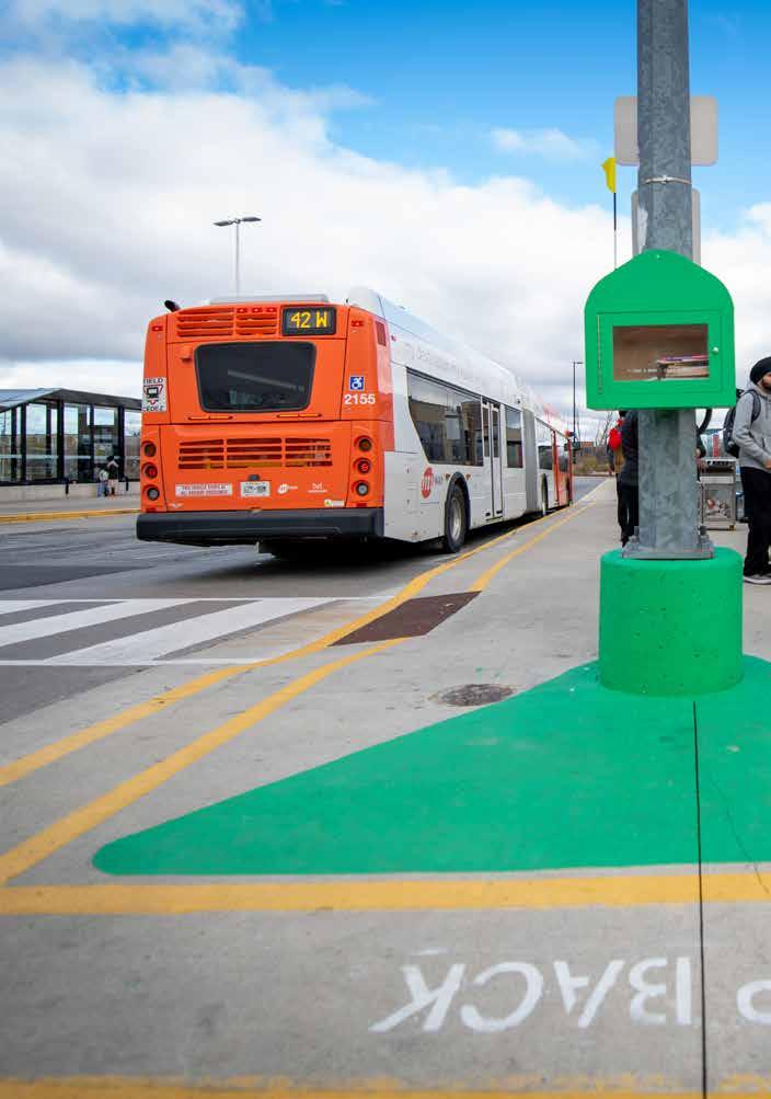
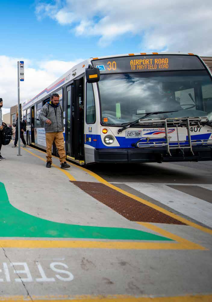
Surface is where power becomes visible. Graphics inscribe who is welcomed, remembered, and centered in space—and who is not. Supergraphic Landscapes claims surface as a collective commons. “Care-scapes” investigates how Supergraphic Landscapes resupports everyday infrastructures of civic amenity and mutual aid. How can networked, graphic landscape techniques that acknowledge the ergonomics and intimacy of the human body create new structures to support the critical needs of our communities? Starting from ubiquitous examples of pedestrian “zebra” crossings, we analyze the social and cultural dimensions of care in the public realm.
Care-scapes focus on the superfluous—designing beyond necessity to build generosity, softness, and joy into the infrastructures that shape daily life. These visual and tactile interventions integrate approachable, human-scale elements to soften the mundane surfaces of the city, adding depth and comfort to create nurturing havens. Here, superfluousness becomes a deliberate strategy of civic generosity.
PART III: ACTION-SCAPES / CHALLENGING COMMEMORATION
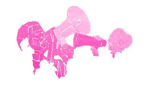
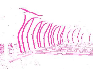
Space is never neutral. Through symbolic, commemorative, and tactical interventions, graphics can challenge dominant narratives and elevate those at the margins. “Action-scapes” examines how Supergraphic Landscapes re-commemorates heritage and identities. How can graphic strategies augment or replace conventional signage, historical markers, memorials, and monuments? With monumental fountains as a point of departure, we consider how acts of protest and solidarity inform new design strategies for public spaces of inclusion.
Action-scapes focus on the superimposed—layering collective memory and history onto space to claim visibility and narrative power in places long defined by erasure. These techniques offer inhabitable entry points into complex histories, often amplifying voices that have been systemically marginalized. By layering the past onto the present, supergraphics become agents of cultural reinscription and resistance.
We offer the concepts of superficial patterns, superfluous textures, and superimposed layers not as critiques, but as strategic frameworks. These are not accidental qualities of Supergraphic Landscapes but carefully chosen modes of operating that flip dominant design hierarchies on their heads. In short, Supergraphic Landscapes proposes that how we design the surface is how we design the social. The parts of the book may be read in a cohesive arc from cover to cover, or you may choose to enter through any section and explore it as a stand-alone piece.
This book is an invitation not only to imagine—but to intervene.
To pattern.
To mark.
To layer.
To play.
To care.
To act.
Colorful shapes and linework transform the parking lot at the National Public Housing Museum into a space of open-ended play. The ground geometry echoes but does not faithfully recreate a standard basketball court, inviting players to invent their own rules for the game. A tricycle-mounted, pop-up hoop installation provides an unexpected goal that anchors the site.

Marisa Morán Jahn and Rafi Segal, OOPS and HOOPcycle, Chicago, IL, 2024. Photo by Scott Shrigley.
Play-
scapes
hacks this off-the-shelf technology, repurposing the robot and its built-in programming capacity to delineate the simple geometric lines and shapes typical of sports fields for other ends.
Cover the Grid uses solid blocks of color to mark the existing basketball court’s previously missing three-point arc and to embolden and saturate the faded free throw line and center circle. But those familiar basketball patterns are just one part of a larger color field that includes black-and-white checkerboards of various scales, stripes in multiple gradations of gray, white crosswalk-like stripes, and a radial grid. Referencing the color calibration charts used by photographers to standardize their image input and output levels, the surface design of this repainted plaza includes linear arrays of grayscale and full-color swatch samples. While some of these color blocks may facilitate familiar schoolyard games, such as four square and hopscotch, the shapes and proportions of other graphics offer more open-ended invitations to invent new games altogether. The overall
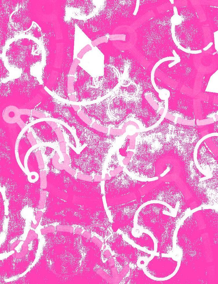
composition resists strong graphic hierarchy, instead offering a painted quiltlike sensibility of disparate associations, overlaps, and seemingly nonchalant collisions of geometry.
Public Utilities (2024) is another project by Outpost Office that uses the GPSguided robot to transform an existing hardscape in a dense city neighborhood— this time in a public plaza in Logroño, Spain. If the painted patterns and solid color blocks of Cover the Grid operate as “fills” (to borrow the vocabulary of the popular graphic design software Adobe Illustrator), then Public Utilities operates via the alternative logic of “strokes,” or vector lines with different stroke widths, colors, and dash patterns. With inspiration from the spray-painted notations that indicate underground power, gas, and communication lines, the project arrays a colorful superimposition of markings that provide open-ended instructions for passersby. The circular nodes, curving lines, and familiar arrowheads produce a choreography of possible pedestrian routes, intersections, and encounters.
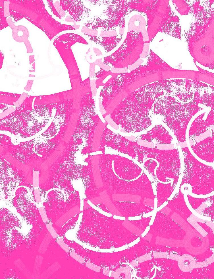
Outpost Office, Public Utilities, Concéntrico Festival, Logroño, Spain, 2024. Photo by Laurian Ghinitoiu.
blurring (and) boundaries
Molly Hunker and Greg Corso, SPORTS
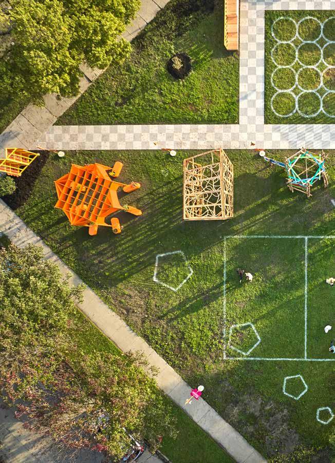
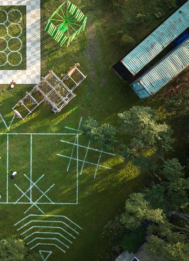
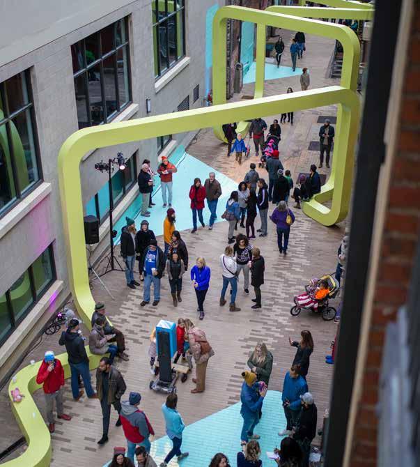
■ The design of public spaces is a story of collaboration a nd negotiation. These projects must navigate diverse uses, unique site requirements, and the needs of a range of parties. Graphics become useful tactics in reconciling these factors while also suggesting new and future possibilities. In our work, graphics are deployed to blur boundaries, bring legibility to qualities of a site, establish continuity across seemingly discontinuous elements, and prompt curiosity and exploration. Our projects don’t aim to simply sit within a site, but rather to offer up new possibilities for connection and activation, as one layer of many.
Pages
Pages
Pages
SPORTS, City Thread, Chattanooga, TN, 2018.
89, 94–95: Photos by Benjamin Chase.
90-91, 98–99: Photos by Garey Gomez.
96–97: Photo by Greg Corso.
Chapter 5
Contributor Essay
holding and being held: graphic activism as feminist spatial framework
Lindsay Harkema, WIP Collaborative

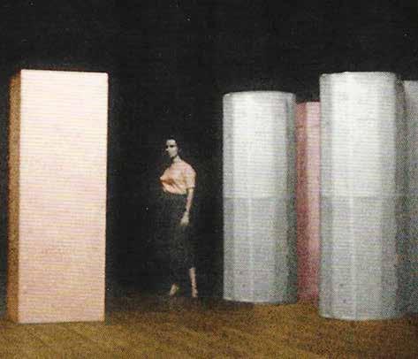
● In Lygia Pape’s first Ballet Neoconcreto, an artwork performed in 1958, three-dimensional cuboid and cylindrical figures are moved slowly and intuitively across a stage by dancers hidden inside. The geometric forms come to life through their movements and responses to each other, shifting and adapting relative to those around them. A fixed or final composition isn’t the goal; the work meditates on continuous spatial transformation. Still, the interplay of geometry and space in time is visually and experientially distinctive. As Pape explained, the Ballet is expressed “primarily through its spatial-temporal character,”a negotiation among human
Lygia Pape, Ballet Neoconcreto, 1958.
playahugepart.
l i t t l e t h i n sg . C o l o ,r g ar p h i c s , p ,yal
Toaddress
Didactic Interaction
DIDACTIC
Public Mechanics, Ghost Rivers
Olalekan Jeyifous, Protest!
Monument Quilt
Studio Barnes, Be Careful, I Always Am
Yaacov Agam, New Orleans Holocaust Memorial
Studio Cooke John, Two Boxes of Oranges and Admonia Jackson
Affective Interaction
Could
Affective Immersion
Action-scapes Matrix: Challenging Commemoration, 2025.
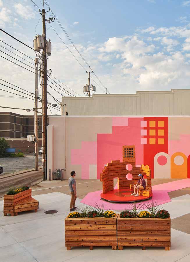
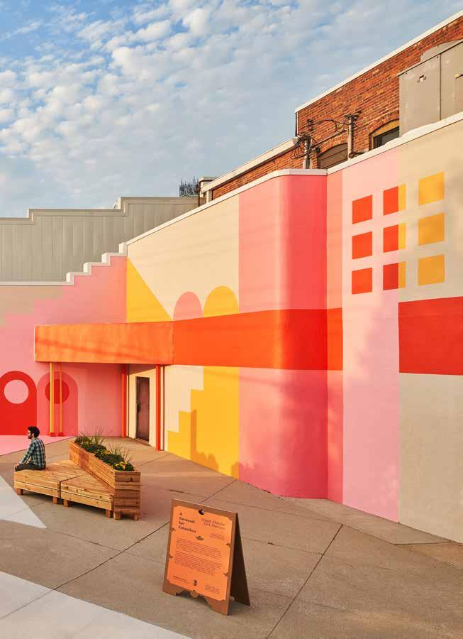
Be Design, Carousel for Companionship
Floating Museum, for Mecca
MVRDV, Mega Mat, photo by DOF SkyGround
AIDS Memorial Quilt
Diller Scofidio + Renfro, Traffic
LAA Office, House of Flowers
Amanda Williams, Redefining Redlining
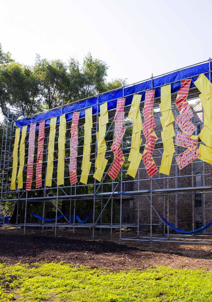
ing the inevitability of its impermanence.
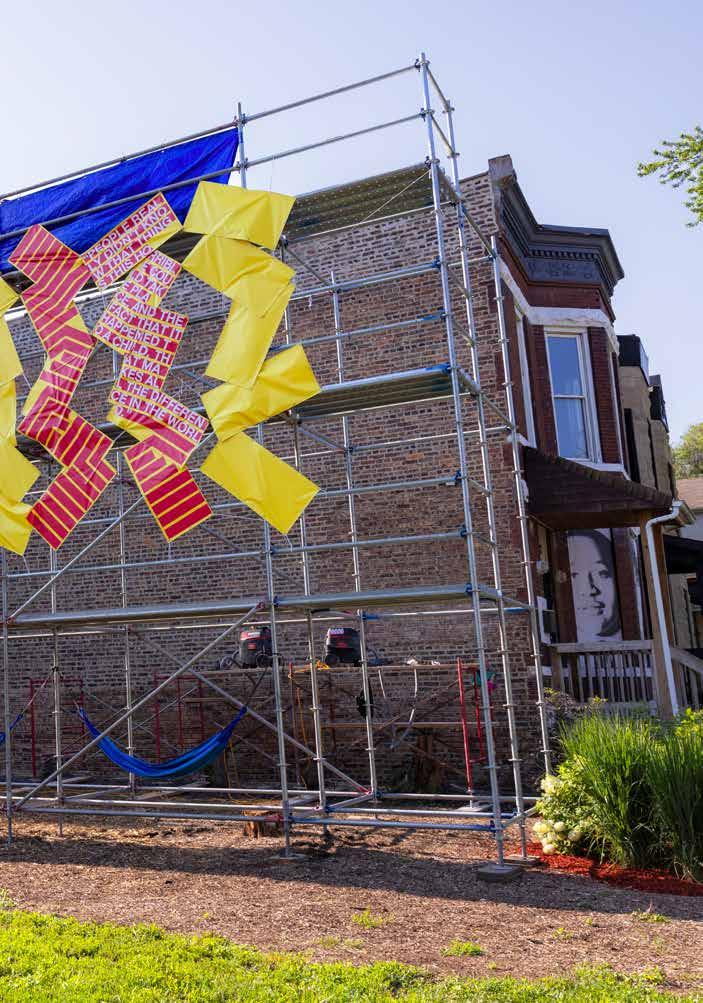
Scaffoldingisscalableandtemporary.
It is malleable and robust. It provides a pre s ecne of activity while also present
biographies
AUTHORS
Joseph Altshuler is cofounder of Could Be Design, a Chicago-based architectural design practice, and assistant professor at the University of Illinois UrbanaChampaign, where he teaches in the School of Architecture and the Department of Landscape Architecture. His teaching, practice, and scholarship explore architecture’s capacity to build solidarity, initiate serious play, and amplify participation in civic life. Joseph is also a curator of contemporary architecture, serving as curatorial partner for Exhibit Columbus’s 2024–25 cycle and artistic director for the Chicago Sukkah Design Festival. Joseph’s first book, Creatures Are Stirring: A Guide to Architectural Companionship (Applied Research and Design, 2022), written with Julia Sedlock, invites readers to befriend architectural companions through essays, flash fiction, and case studies that illustrate solidarity among humans, nonhumans, and the built environment. Could Be Design’s work has been recognized by the Architectural League Prize, the Society for Experiential Graphic Design (SEGD) Global Design Awards, the AIA Chicago Foundation’s Roberta Feldman Architecture for Social Justice Award, and the Environmental Design Research Association.
Nekita Thomas is an experiential graphic designer, researcher, and associate professor at the University of Illinois Urbana-Champaign School of Art & Design. Her teaching, practice, and scholarship examine discourse on racial identity and urbanism, activating design’s power to spatialize justice, cultivate radical imagining, reclaim cultural narratives, and enact community-driven initiatives. Nekita’s practice has helped steward projects with the National Public Housing Museum’s Corner Store Co-op, the Chicago Sukkah Design Festival, and SkyART Chicago, in reimagining the future of South Chicago. These collaborations highlight her dedication to creating spaces that foster dialogue and understanding and aim to emphasize the critical role of design in addressing societal issues. She has presented her work across disciplinary domains on both national and international stages, including venues such as the Krannert Art Museum; the Black in Design (BiD) Conference, at Harvard University; the American Institute of Graphic Arts (AIGA) Design Educators Conference; the Society for Experiential Graphic Design (SEGD) Conference; and artists residencies and fellowships, such as the Chicago Artists Coalition and the Chicago Critic’s Table at Arts + Public Life.
CONTRIBUTORS
Germane Barnes is principal of Studio Barnes and associate professor and director of the master of architecture program at the University of Miami School of Architecture, where he is also director of the Community, Housing & Identity Lab (CHIL). Germane’s practice investigates the connection between architecture and identity, examining architecture’s social and political agency through historical research and design speculation. His solo show Columnar Disorder opened at the Art Institute of Chicago in 2024. Germane’s work has also been exhibited at the Venice Architecture Biennale, the Chicago Architecture Biennial, and the Museum of Modern Art, in New York, as part of the exhibition Reconstructions: Architecture and Blackness in America.
Ashley Bigham and Erik Herrmann are cofounders of Outpost Office, a design practice based in Columbus, Ohio, and associate professors at The Ohio State University’s Knowlton School of Architecture. Outpost Office seeks new public audiences through experimental creative production ranging from the serious to the absurd, often simultaneously. Ashley’s creative work and writing engage architecture through a study of consumption and domesticity, focusing on architecture’s entanglement with the production and fulfillment of consumer desire. She is the editor of Fulfilled: Architecture, Excess, and Desire (Applied Research and Design, 2022). Erik’s work and research interrogate how the biases and tendencies of digital technologies alter the design process, with a focus on the shifting role of the architect. Outpost Office’s work has been exhibited at venues including the Chicago Architecture Biennial, the Milwaukee Art Museum, and the Tallinn Architecture Biennale.
Lindsay Harkema is an architect, educator, and cofounding member of WIP Collaborative, an award-winning design practice that creates vibrant, inclusive public spaces informed by local communities and context. Her work embraces a feminist perspective, reimagining shared spaces to unlock opportunities for positive change. She earned her Master of Architecture degree from Rice University and Bachelor of Science from Washington University in St. Louis. Her projects have been supported by AIANY, the Design Trust for Public Space, the Graham Foundation, the New York State Council for the Arts, and the Urban Design Forum. She has taught at Barnard College, Cornell University, the City College of New York, the New School, and Syracuse University.
Molly Hunker and Greg Corso are the cofounders of the award-winning design collaborative, SPORTS, based in Syracuse, New York. Their work focuses on creating compelling spaces that are catalysts for social activities. Much of their work has been public interventions that leverage the possibility for simple design and fabrication gestures to have significant urban and community impacts. SPORTS is a recipient of the 2017 Architectural League Prize from the Architectural League of New York, the 2018 Best of Design Award for Young Architects from the Architect’s Newspaper, 2017 and 2020 ACSA Faculty Design Awards, and the 2023–24 Exhibit Columbus University Design Research Fellowship. Greg and Molly are both currently associate professors at Syracuse University School of Architecture, where they have taught since 2014.
Daniel Luis Martinez is program director and associate professor at Indiana University’s J. Irwin Miller Architecture Program and has served as a faculty affiliate of the Center for Rural Engagement. Alongside his academic leadership, Daniel is a registered architect and cofounder of LAA Office with Lulu Loquidis, a multidisciplinary design studio that explores the intersection of landscape, art, and architecture. His research and creative work investigate the potential of public art to generate alternative forms of placemaking. The work of LAA Office was exhibited at the 2023 Chicago Architecture Biennial. Daniel was awarded a residency at Art Omi, in New York, in 2022 and named an Exhibit Columbus University Design Research Fellow in 2019.
Reza Nik is the founding director of SHEEEP and a licensed architect, artist, educator, and community builder based in Toronto, Canada. Reza is also assistant professor in the teaching stream at the University of Toronto’s Faculty of Architecture. His research puts into dialogue the sociopolitical nuances of the urban context and playful experimentation, with a commitment to disrupt traditional architectural processes and institutions. In 2024, he cofounded SHEEEP.school as a collectively run alternative space for the exchange of knowledge. Reza is a founding member of the Toronto chapter of The Architecture Lobby, an organization advocating for labor rights for architectural workers and encouraging more critical discourse within the profession.