Omar Oosthuizen

Omar Oosthuizen
I’m currently working as a Graduate Student Researcher with the Waterloo research project, ‘The Long-Term Costs of the Rapid Construction of Multi-Unit Residential Buildings in Waterloo Region’ for 13 months which is integrated into my thesis research. Through this project, we are analyzing 18 case studies across the Waterloo Region to assess a ‘broader’ scope of Housing Quality, as per the United Nation’s ‘Human Right to Housing’. This analysis intends to create a new set of ‘Healthy Housing Standards’ that addresses a large criteria of should be adequate.
My thesis at its core is a granular framework proposing a method for analyzing the ‘quality’ of multi-unit residential building units through a thorough understanding of their ‘qualities’. These qualities are both quantitative and qualitative data sets that consist of variables in relation to the spatial organization and typological levels of the dwellings.
Mid-Depth Continuous Space
Mid-Depth Enclosed Space
Façade Continuous Space
3 bands of daylight, corresponding with zones of depth Deep Continuous Entry Threshold
[Distance to Light Source]
ORIENTATION
[Effective Daylight]
PRIVACY/SERVICE
Subdivision & Daylight:
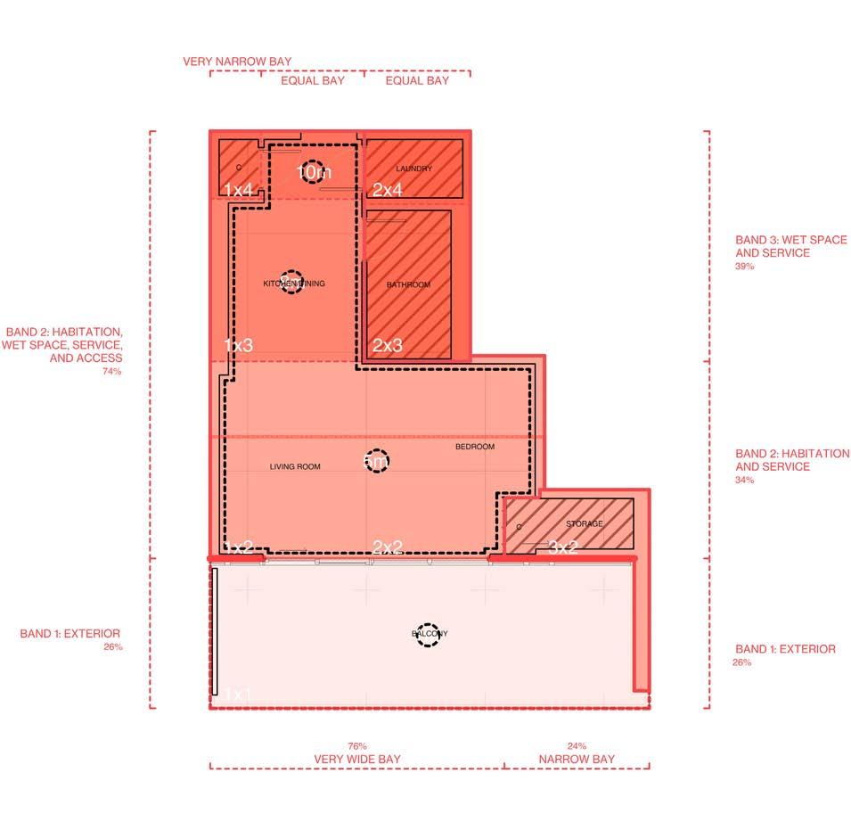
Comparative Dwelling Floor Plan Analysis: Zonal Analysis
[Percentage of total width] [Bay Classification]
DAYLIGHT ADJACENCY.
2-3 bays of width, varying dimension 1 exposed face (2 x 4): 2 zones wide by 4 zones deep
How is the dwelling divided and what Analyzing daylight adjacency, open
ANALYTICALLY DERIVED SOLUTIONS TO(WARDS) DIGNIFIED, SOFT QUALITY IN MARKET AND NON-MARKET HOUSING
Maybe we should show two cases here one 1bdrm/studio and 1 2bdrm/3bdrm
Legend:
Daylight Adjacency Gradient: (Distance of Central node in Plan from Light Source)
Close to Light:
Far from Light:

Experiential: (Continuity of light, absence of light)
Continuous Space:
Enclosed Space:

Hard Edges:
Zonal Subdivisions: (PLACEHOLDER)
Soft Edges:
Orientation:
Zonal Diagramming: (Façade walls, zone dileneations)
Zone Grid lines:
Zone Number:

Zone Classification: (Bands, Bays)
Central Node:

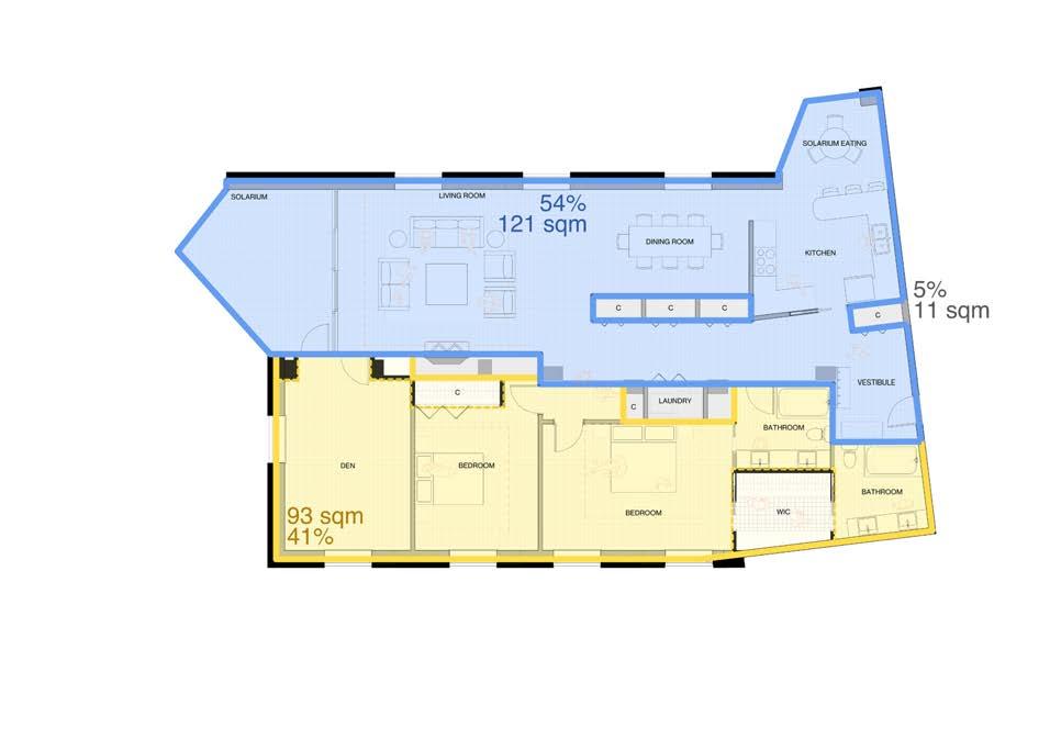
The Zonal Diagram looks at zones and spaces;
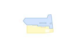
The division of the dwelling into a grid of spaces illustrates the amount of subdivision of the space within the dwelling through both hard & soft edges. The hatches illustrate daylight adjacency diagrammatically to understand how far the central node of a space is from a light source. Additionally, a dichotomy of enclosed and continuous spaces are indicated through a purple hatch and offset dashed line respectively. These three aspects describe the experiential qualities of the existing in one of these subdivisions that make up the ‘zones’ of the dwelling.
ZONAL DIAGRAM - METHODOLOGY & LEGEND
what spaces are positioned close to light?
open space and zones within dwellings.


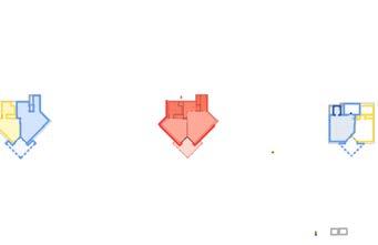
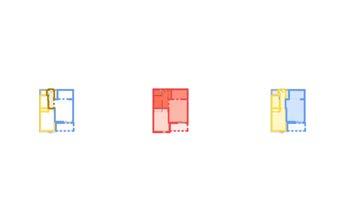
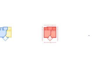
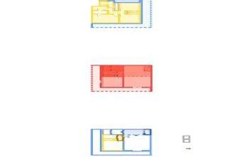
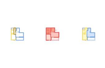
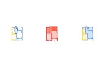
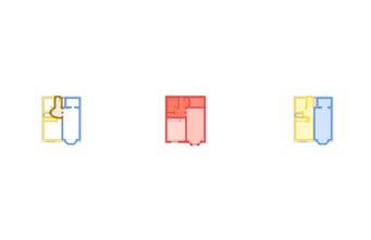
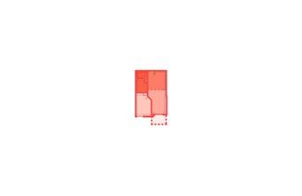
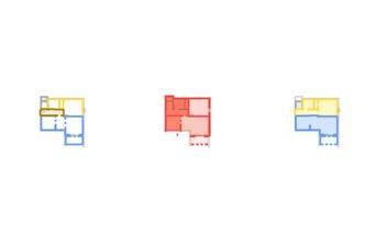
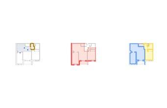
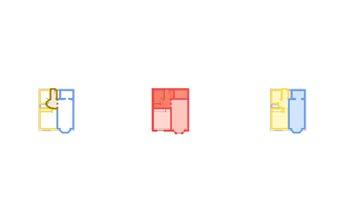
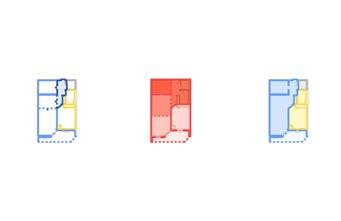
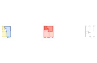
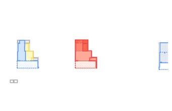

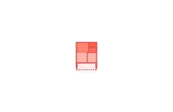
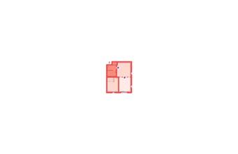

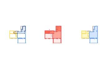
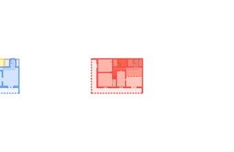
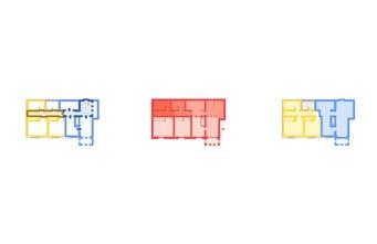
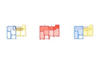
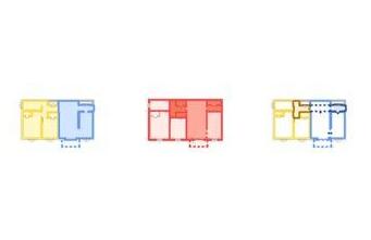
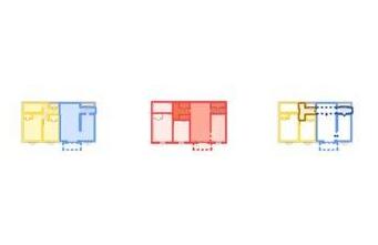
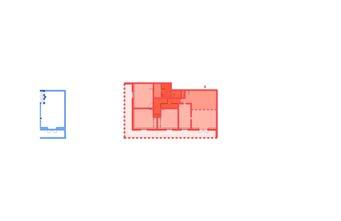
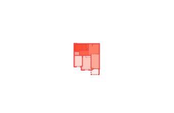
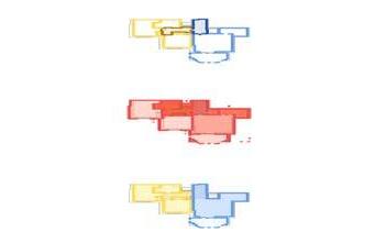
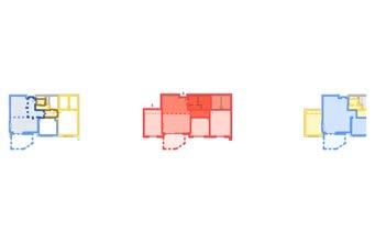
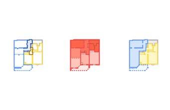
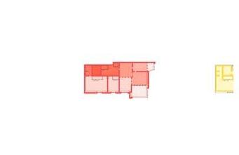
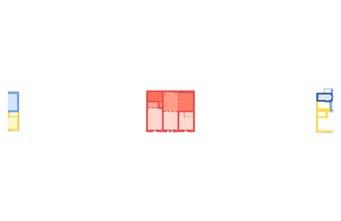
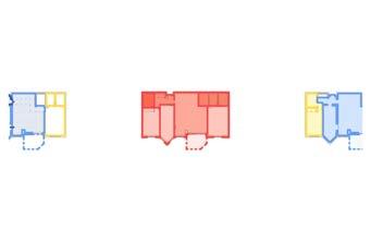
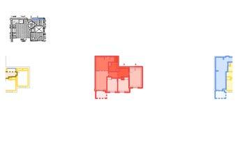
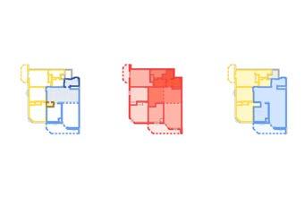
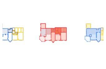
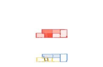
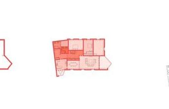
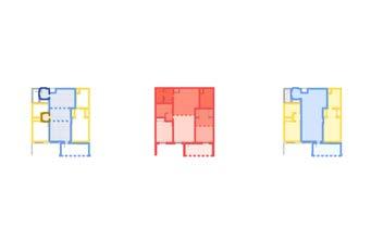
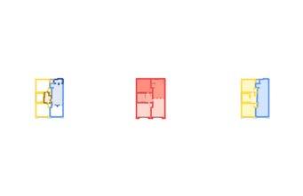
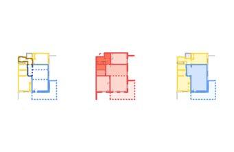
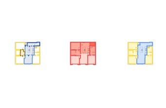
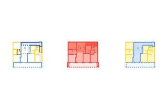
what spaces are positioned close to light? open space and zones within dwellings.






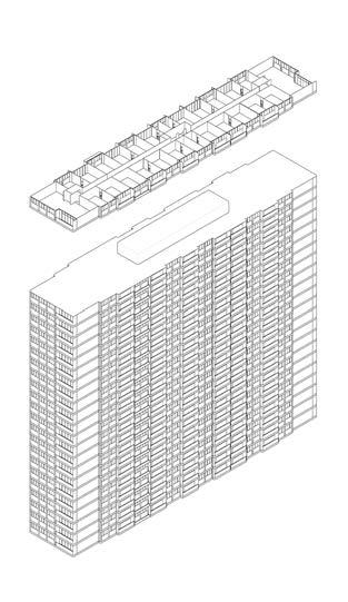

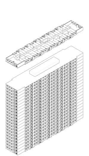
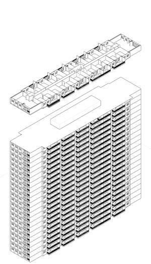
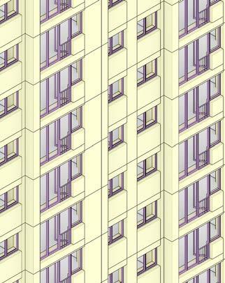
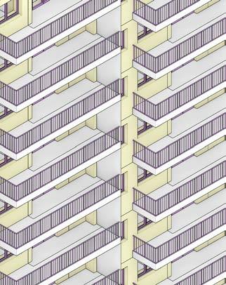
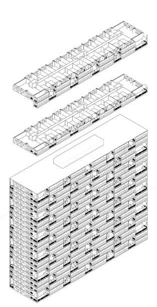
Existing BuildingTypical Rectangular Slab
Thesis Research Pilot Project - Proposal Overview
ABalcony
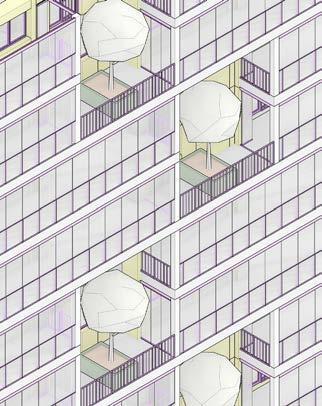
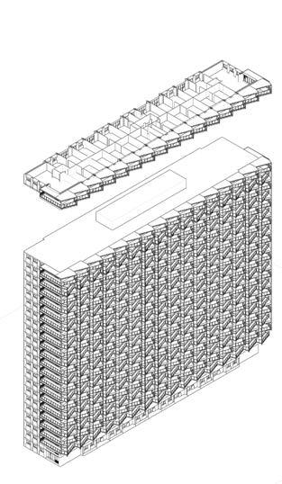
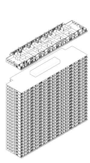
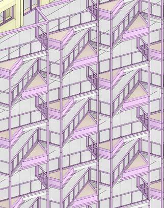
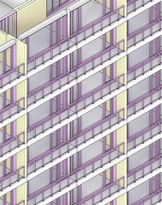
Proposal BDouble-Height Green Balconies
C -
D -



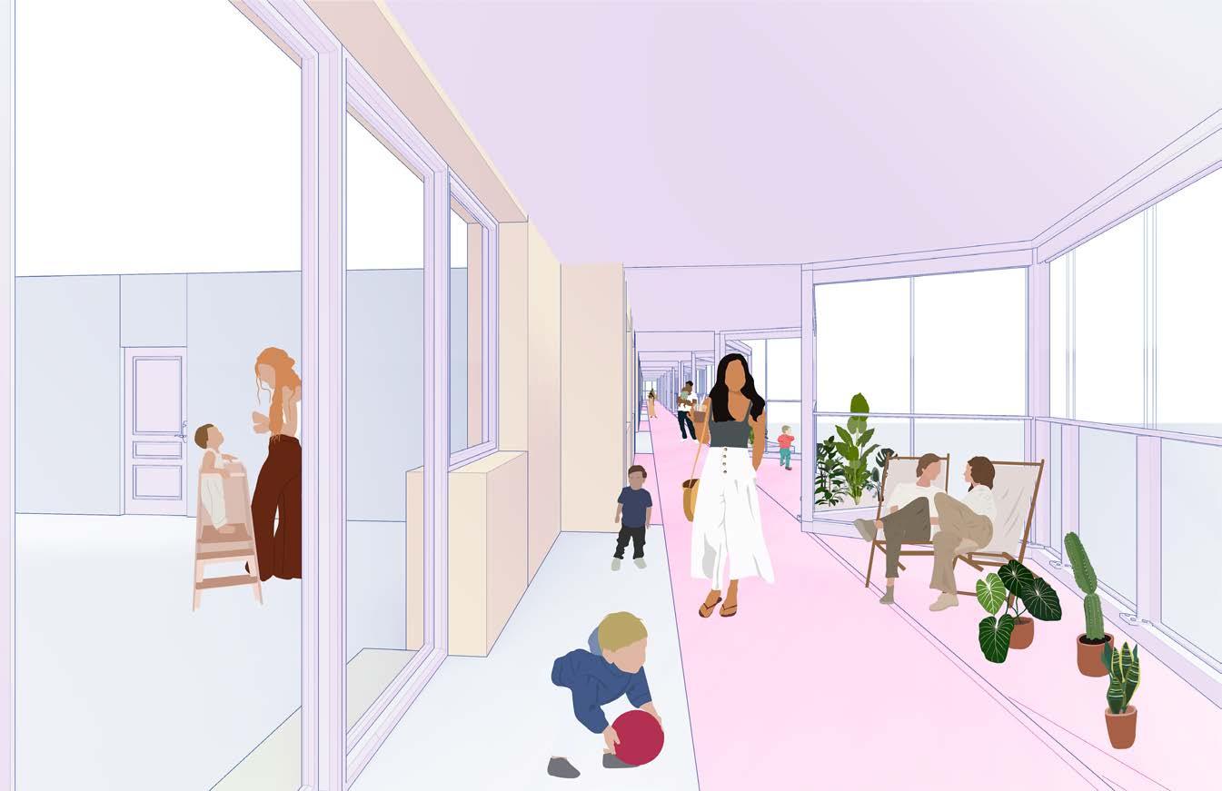
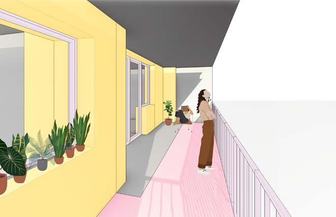


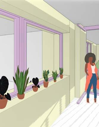


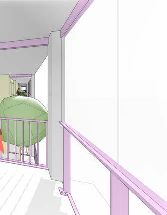
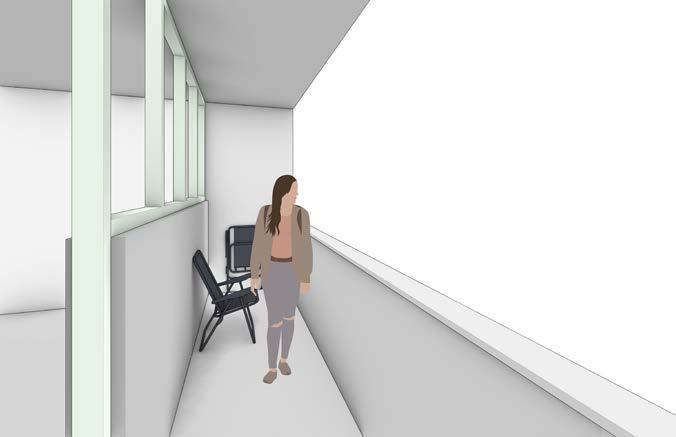

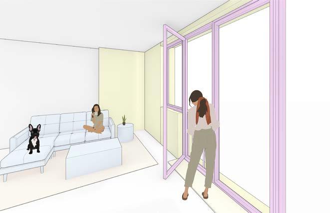





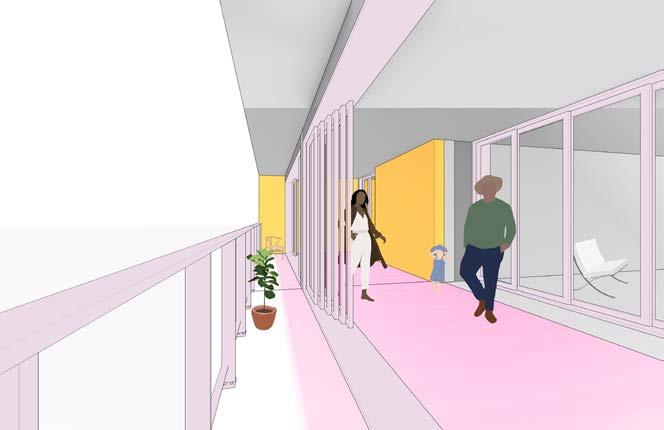
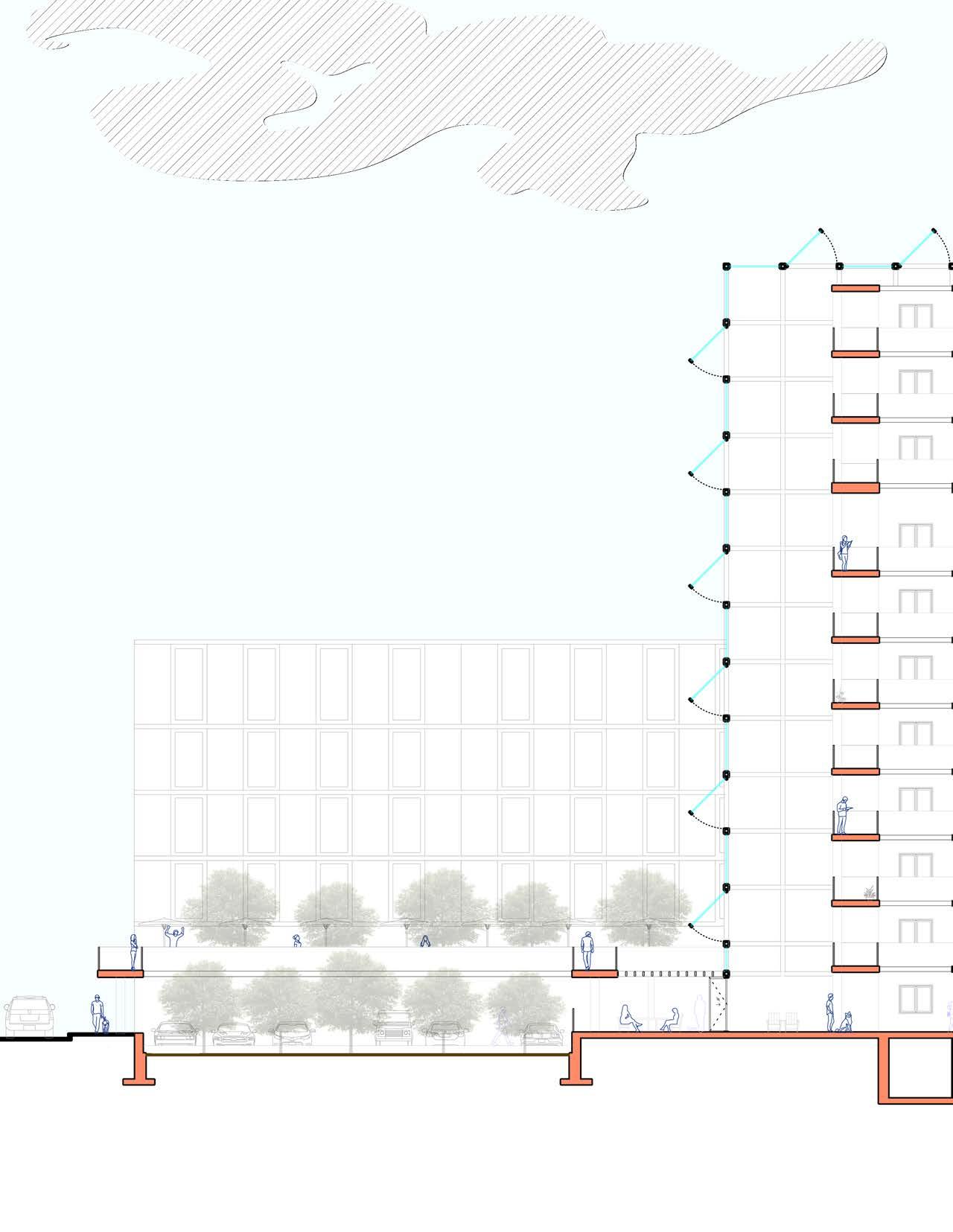
Thesis Research Pilot Project
Oosthuizen
Duration: Course:
3.5 Months ARCH 493, ARCH 473
Location:
Cambridge, Ontario
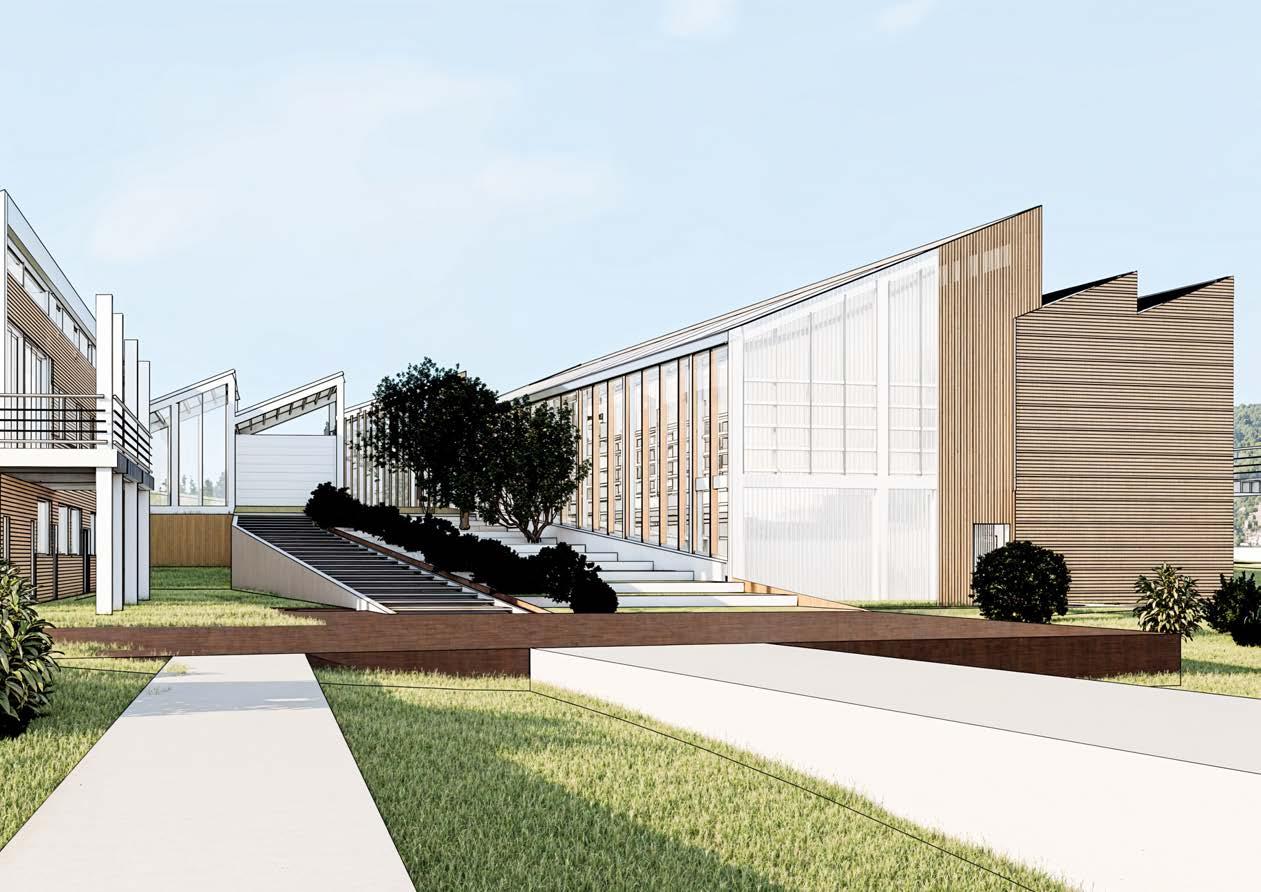
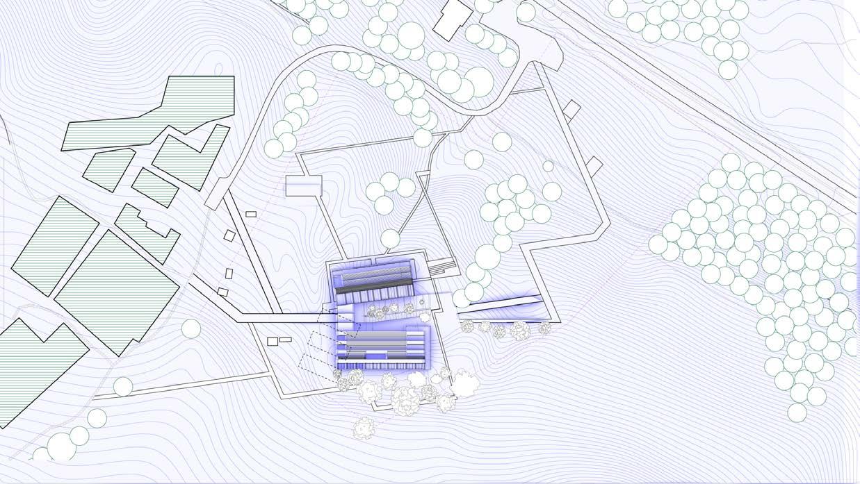
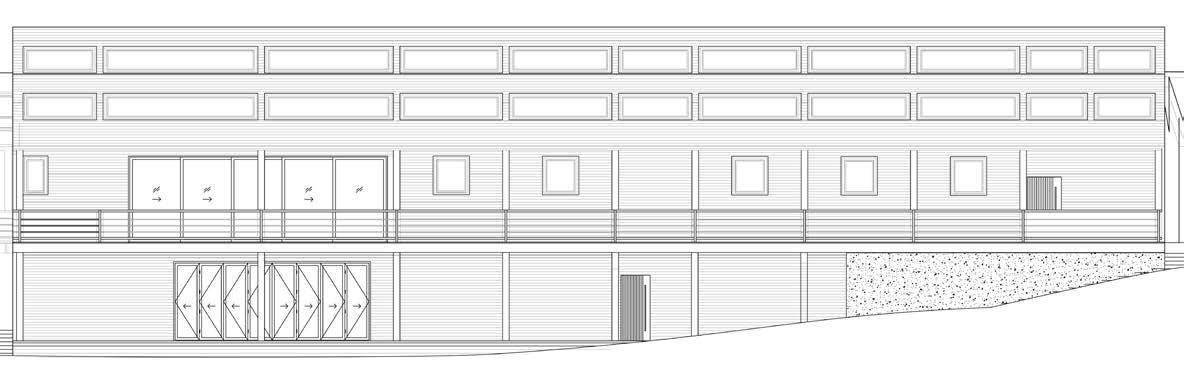
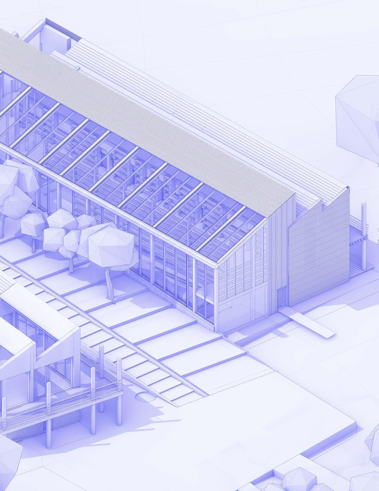
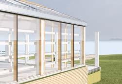
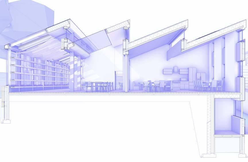
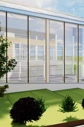
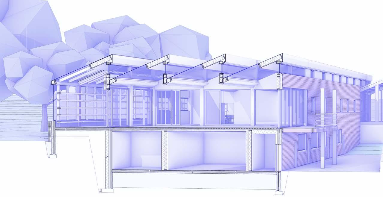
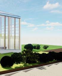
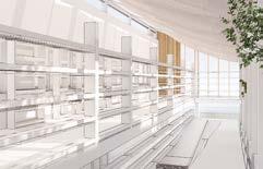
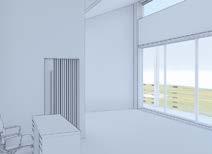
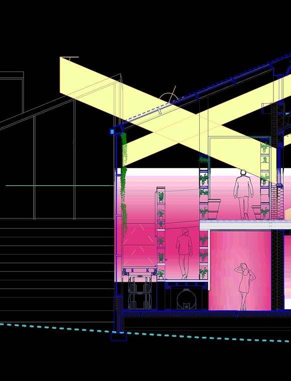
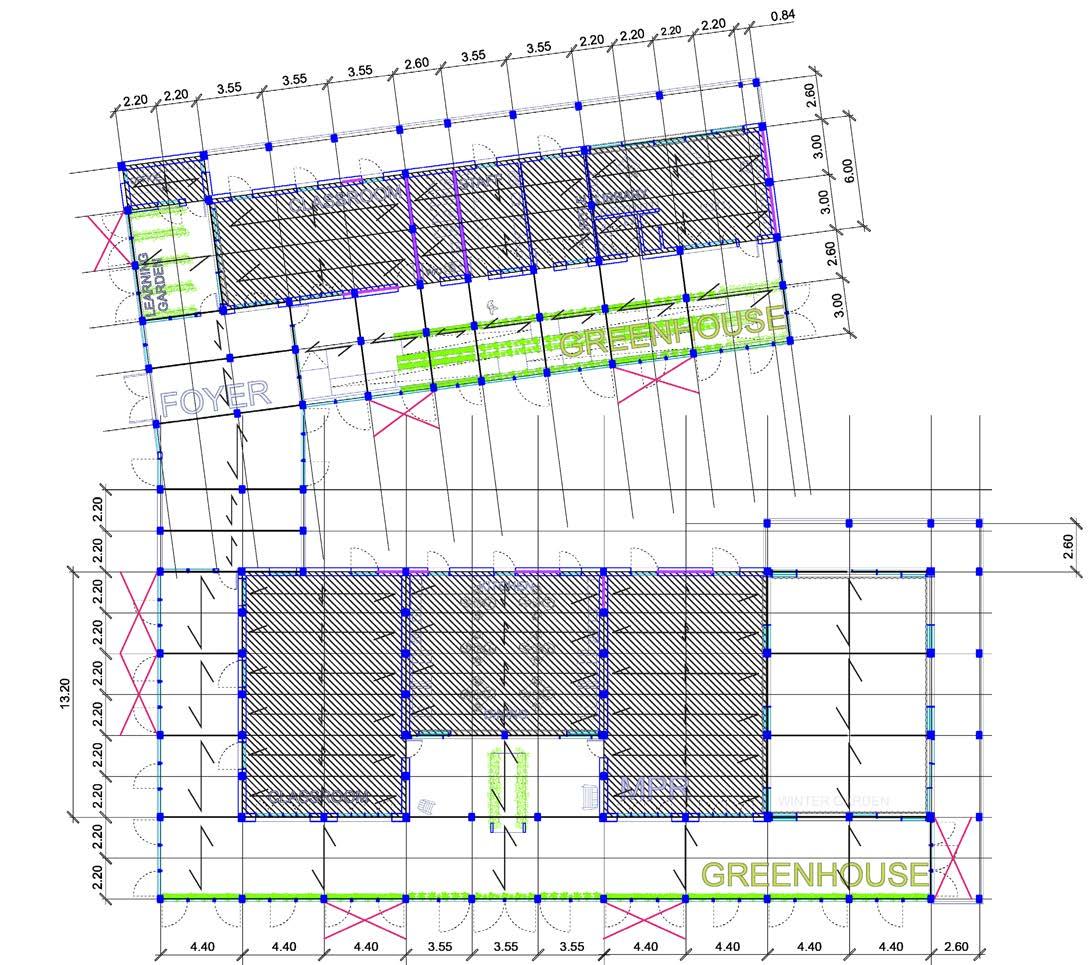
The Greenhouse is an environmental school for Rare Charitable Research Reserve. The project is proposed to sit on existing part of Rare land, where there Rare has existing garden plots, greenhouses, two trails called the Pawpaw Parade trail and the Butterfly Loop, a Moon garden and North House, an old experimental artist & residence space, which is to be demolished. The most drastic change made to the site is the removal of the existing greenhouses and their integration into the building massing.


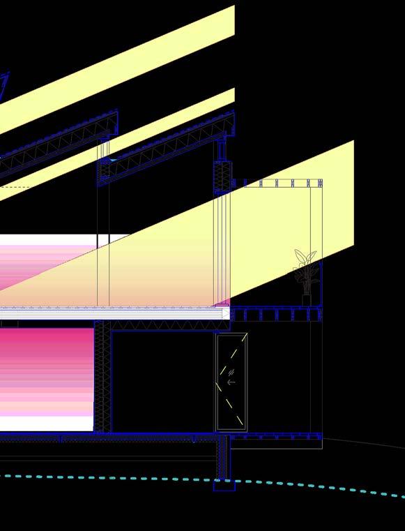
Maximizing southern wall surface area to maximize solar heat gain.
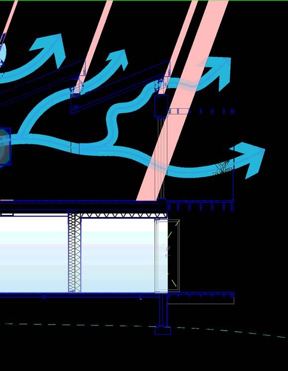
The Greenhouse wants to keep and cool in the summer; so human being. Although there of those statements, the common 3 entities intersect and the systems are tailored to explore and optimize possible to maximize solar heat passive cooling the summer.
This project creates a mutually beneficial relationship between the proposed building and the The existing greenhouses on site were adequate and functional, however, the clients were commitment to sustainability, the replacement of the existing greenhouses with passive greenhouses heat loss of adjacent envelopes has become a layered loop system combining ventilation, recycling
keep warm in the winter does every building and there are caveats to each one common goals between these systems of this building optimize them as much as heat gain in the winter and summer.
GLAZING
HEAT FROM BUILDING CORE
HEAT FROM GREENHOUSE
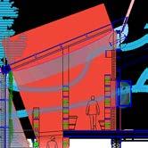
The building passively loses heat from its Southern facade into the greenhouse, which is especially useful on cold winter days. Heat loss transfer from air exfiltration and radiation is no longer a net negative.
the greenhouses used on-site by RARE which is also reflected through the systems in use. required to use propane gas to heat the space within the greenhouse. Thus, as part of our greenhouses became a core idea of the project. What started of as the idea of sharing heat through recycling air and pre-conditioning air.
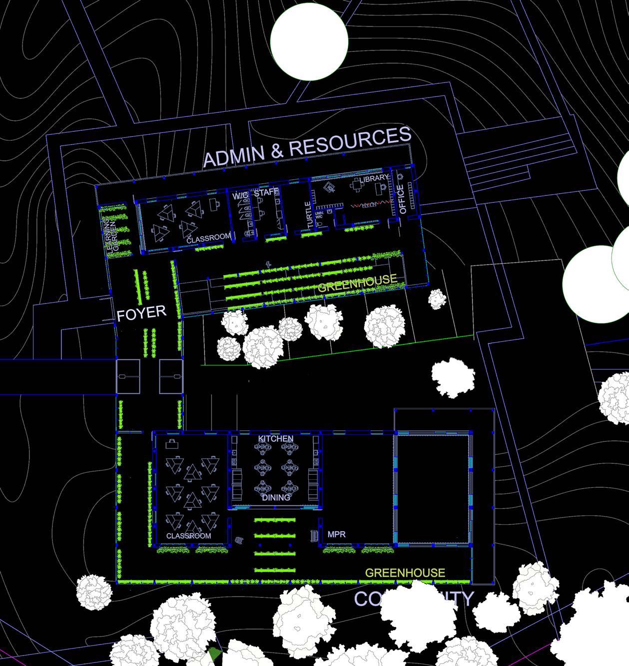
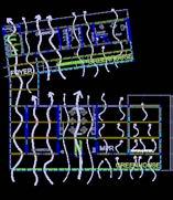
To connect the proposed building to the site, a meandering main boardwalk called the ‘PATH’ was created. It is meant to create permanence and placemaking, non-destructively, ensuring that students, volunteers and visitors alike are always given a guiding compass to help navigate the site and are never ‘too far from the path. The meandering of the ‘PATH’ allows for the board walk to be graded to an accessible grade. The ‘PATH’ connects the road leading from the parking lot into the building, providing accessibility and mobility/transport for the farmer’s market.
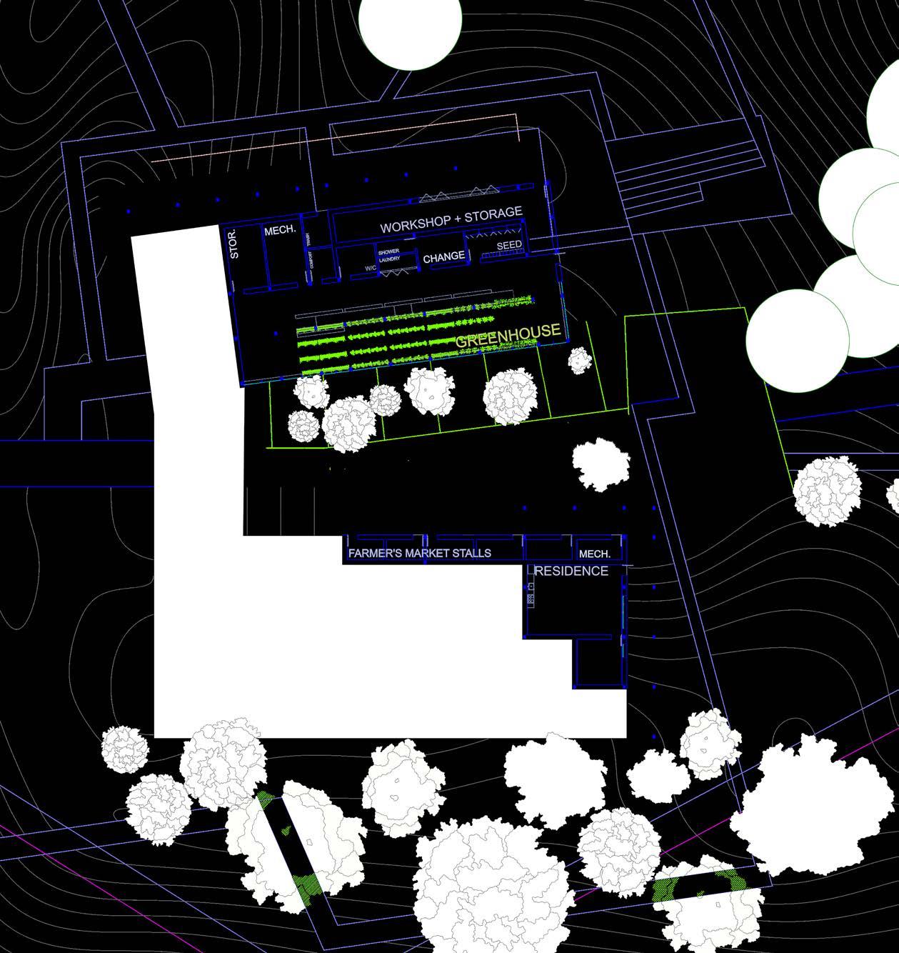
The building meets the path through a large garage door opening which allows for the foyer to become a pavilion space and opens up the courtyard to become part of the foyer. This also helps for Farmer’s market events to allow for buzz and people to congregate and move freely between the gardens, the buildings, the market and the rest of the site. The Farmer’s Market stalls are located on the lower floor and alongside the ‘PATH’. Slightly further down from the courtyard area is a fire-pit and outdoor amphitheater that will act as an outdoor classroom for the environmental school.
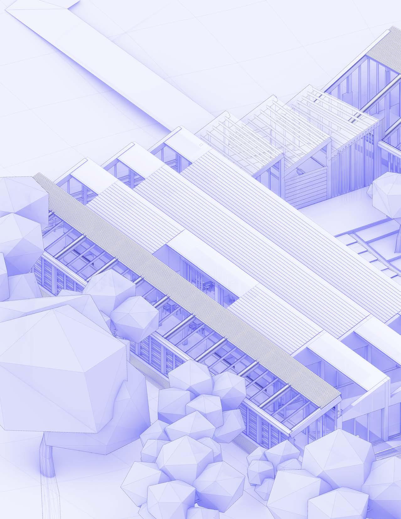
Isometric Axonometric Exterior View





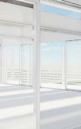






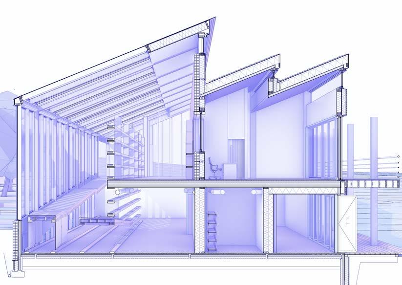


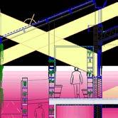


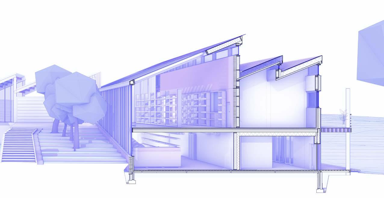


Integrated Design Parti Drawing
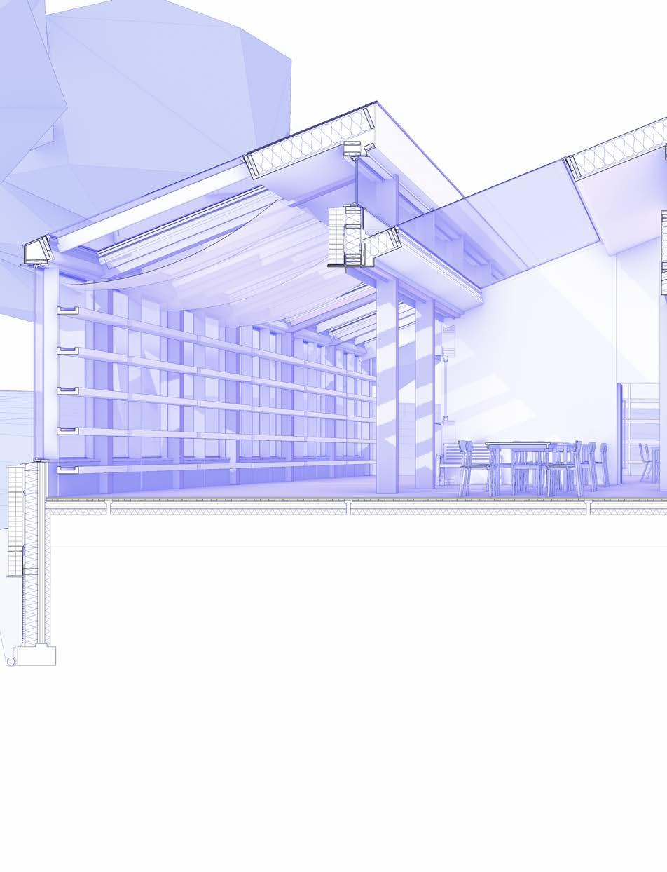

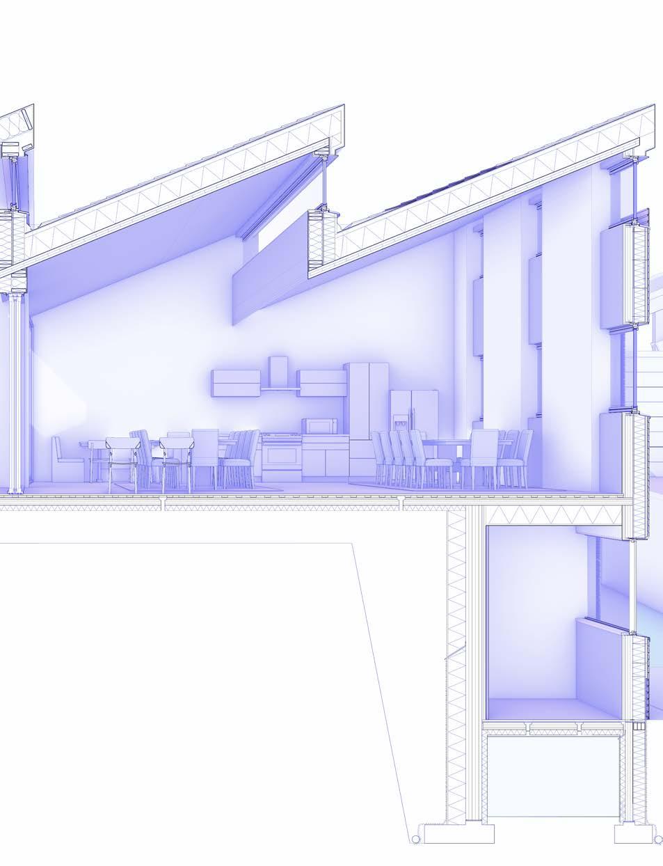
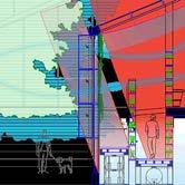
Massing steps down slope to topography to minimize excavation.
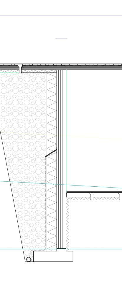
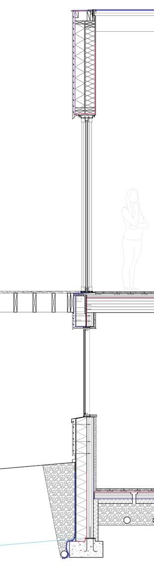
South Retaining Wall N 1:20
Retaining Wall Assembly:
1. 19mm Drywall
2. 24x220mm Spruce Floorboards
3. 19 mm Strapping (Service Cavity)
4. 5-ply (175mm) CLT Floor Slab
5. 12mm Plywood
6. 75mm EPS Foam Board with Graphite Insulation {R4.7/per inch}
7. 173mm of Rigid Wood Fiber Insulation {R3.6/per inch}
8. Recycled Crushed Concrete Drainage Fill
9. 16mm Drainage Board
10. 5-ply (185mm) CLT Structural Wall Panel
11. 75mm EPS Foam Board with Graphite Insulation {R4.7/per inch}
12. Galvinized Steel Shoe
13. Poured Concrete, Low Carbon
14. 4” Drainage Tile
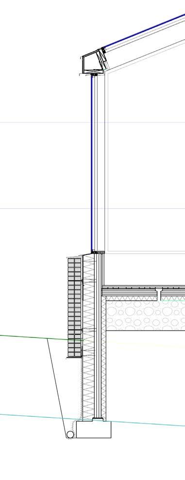
South Wall Section 1:20
Greenhouse Glazing Assembly:
1. Greenhouse Glass Window Frame
2. Solid Blocking
3. [Hidden] Glulam Beam
4. 2x 6mm sheets of Tempered Safety Glass 5. Aluminium
6. Structural Silicone
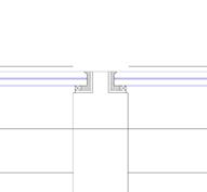
Mullion Detail
CLT Floor Slab + Foundation Wall Assembly:
Using CLT Floor slabs and Foundation Walls, the Greenhouse School uses minimal concrete, further mitigating the project’s carbon footprint.
1. 19mm Drywall
2. 24x220mm Spruce Floorboards
3. 19 mm Strapping (Service Cavity) 4. 5-ply (175mm) CLT Floor Slab 5. 12mm Plywood
6. 75mm EPS Foam Board with Graphite Insulation {R4.7/per inch}
7. 173mm of Rigid Wood Fiber Insulation {R3.6/per inch}
8. Recycled Crushed Concrete Drainage Fill
9. 16mm Drainage Board
10. 3-ply (105mm) CLT Structural Wall Panel
11. 75mm EPS Foam Board with Graphite Insulation {R4.7/per inch}
12. Galvinized Steel Shoe
13. Poured Concrete, Low Carbon 4” Drainage Tile
Sawtooth Roof Connection Assembly:
1. Brick Ties @ 400 mm o/c
2. 2 Wythes of Reclaimed Brick
3. Metal Flashing
4. 12mm Plywood
5. 206mm of Loose Wood Fiber Insulation
{R3.8/per inch}
6. Air Gap
7. 3-ply (105mm) CLT Roof Panel
8. Ashphalt Roof Shingle
9. Gutter High Point
10. Gutter
11. 12mm Plywood
12. 51mm Roof Battons
13. 290mm of Rigid Wood Fiber Insulation
{R3.8/per inch}
14. 3x 2x8 Dimensional Lumber Top plates
15. 12mm Plywood
16. 19mm Drywall
Typical ‘Greenhouse Common Wall’ Assembly:
1. Brick Ties @ 400 mm o/c
2. 2 Wythes of Reclaimed Brick
3. Metal Flashing
4. 12mm Plywood
5. 206mm of Loose Wood Fiber Insulation
{R3.8/per inch}
6. Air Gap
7. 3-ply (105mm) CLT Roof Panel
8. Ashphalt Roof Shingle
9. Gutter High Point
10. Gutter
11. 12mm Plywood
12. 51mm Roof Battons
13. 290mm of Rigid Wood Fiber Insulation
{R3.8/per inch}
14. 3x 2x8 Dimensional Lumber Top plates
15. 12mm Plywood
16. 19mm Drywall
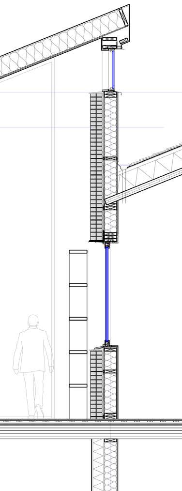
Greenhouse Common Wall Section N 1:20
Passive Cooling Diagram Passive Heating Diagram
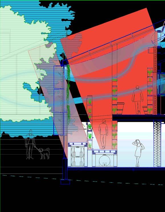
5.
Duration:
1 Month
Course:
ARCH 492
Location:
Portuense, Roma, Italy
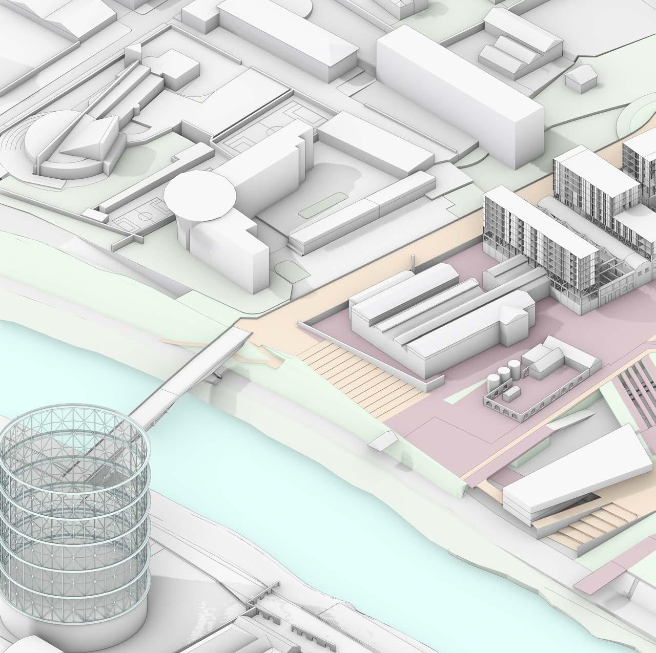
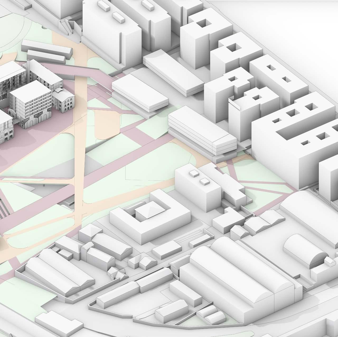
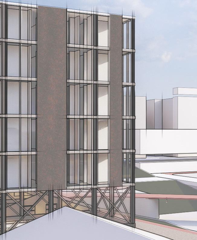
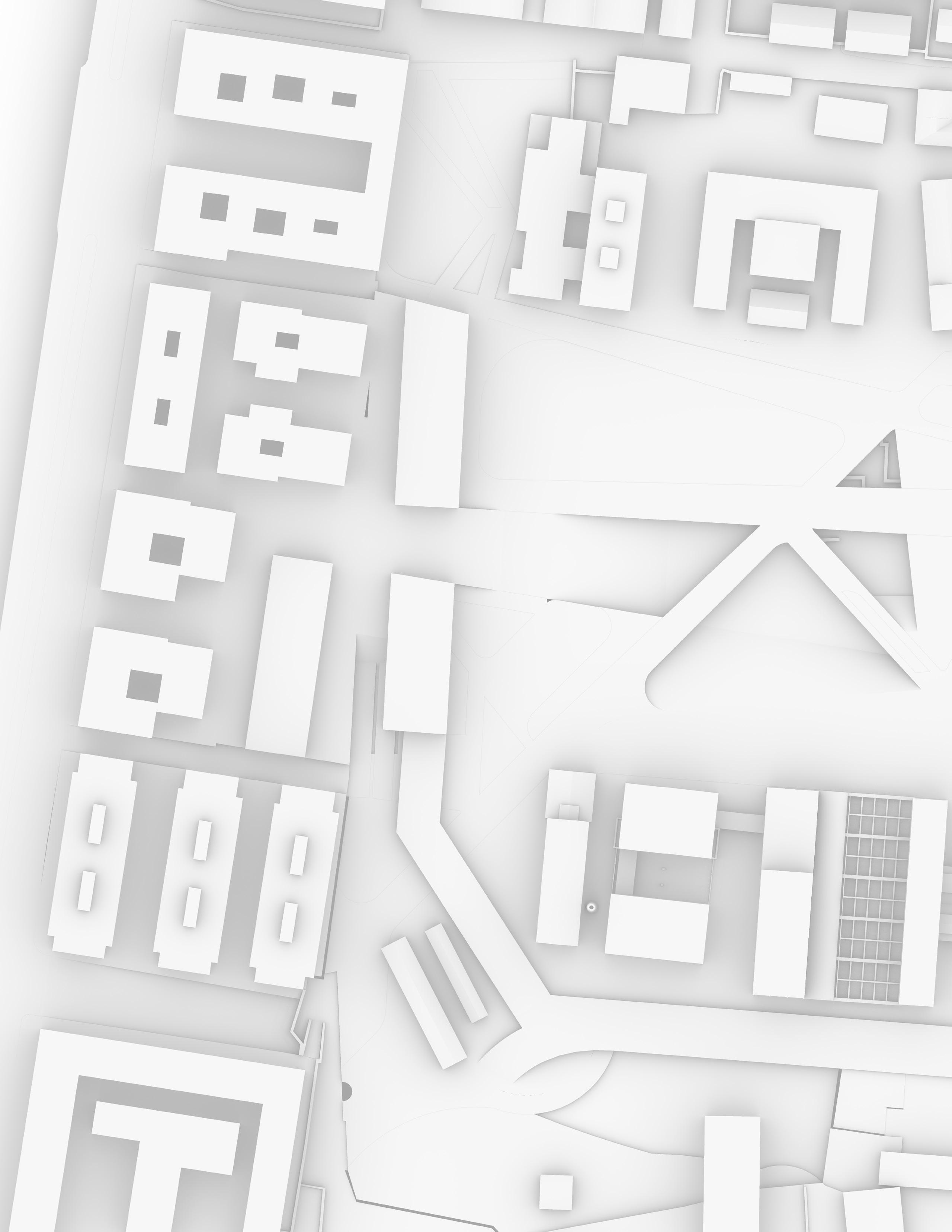
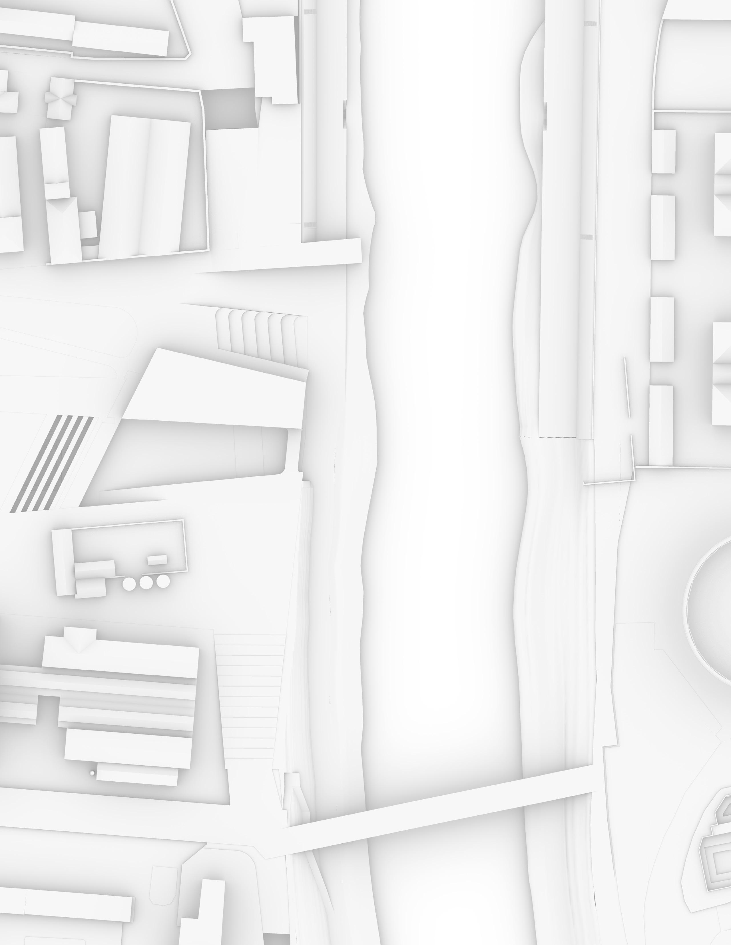
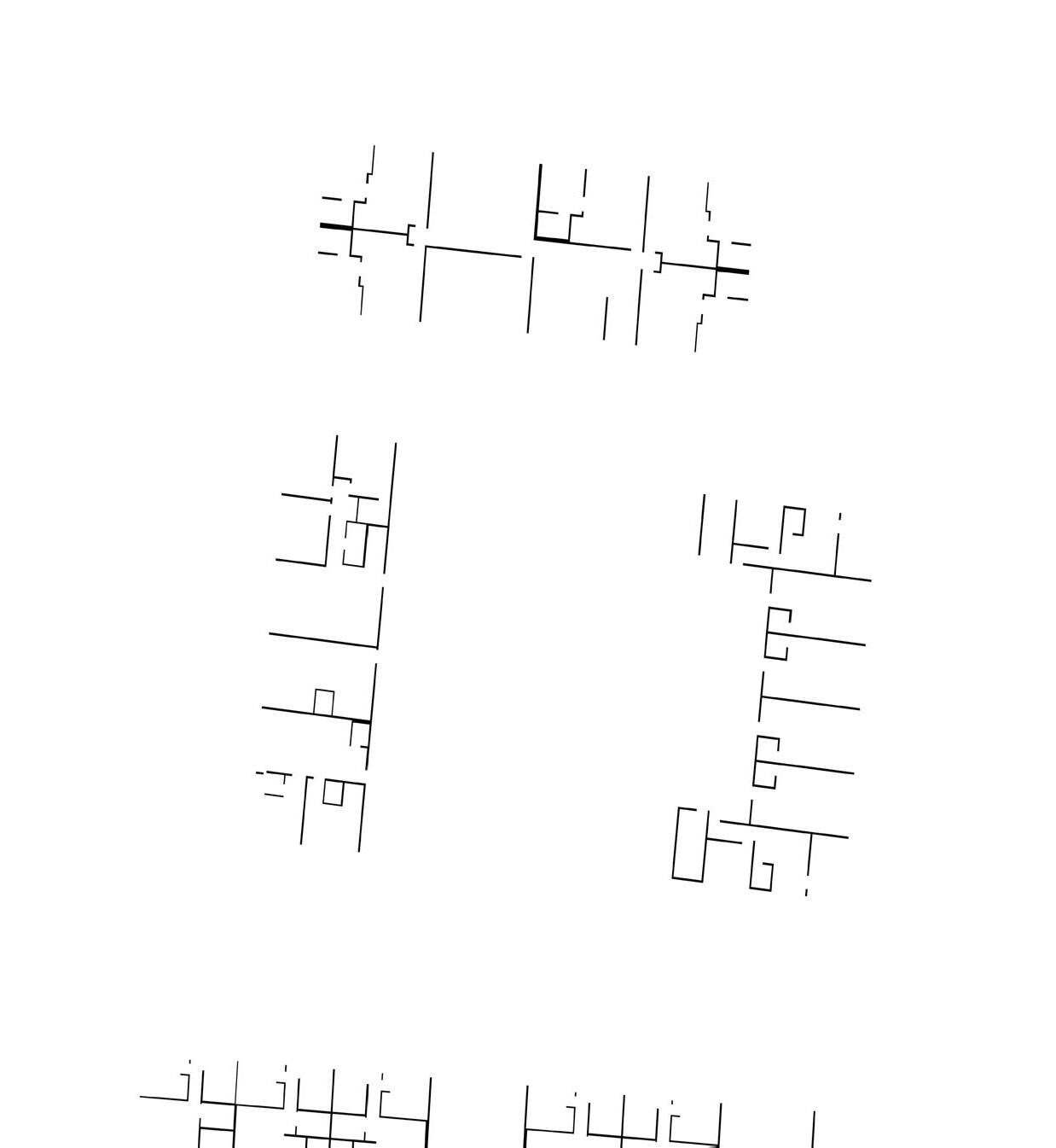
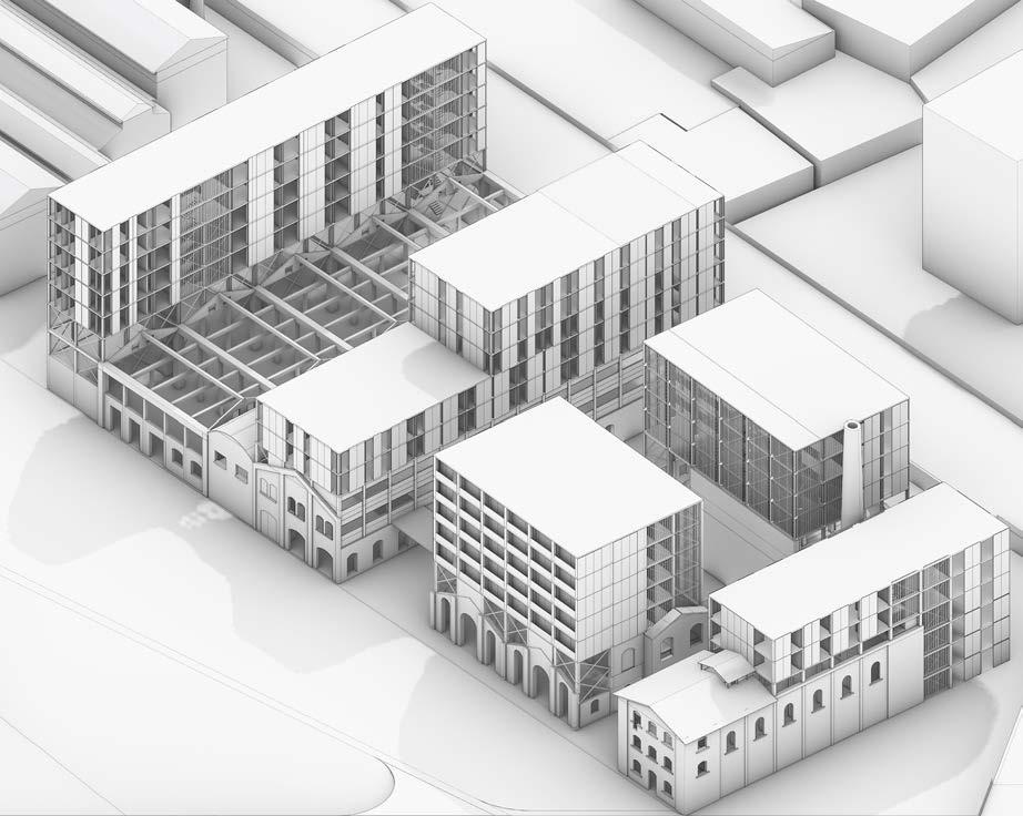
“Juxtapose” emerges from a thorough exploration of the site and its surrounding conditions, transcending traditional boundaries and addressing connectivity challenges. The project revolves around negotiating design dualities, primarily expressed through a delicate balance between preserving the historical industrial identity (ex Mira Lanza building, Gasometro, and nearby artifacts) and introducing a modern, ‘grafted’ massing. The grafted residential massing seamlessly merges with the industrial heritage, utilizing the Ex Mira Lanza building as a focal point. The introduction of stairwells with polycarbonate facades not only contributes to a sleek aesthetic but also serves as a source of light, ensuring heat resistance and visual uniformity. The project is integrated into a performing theatre on the south-east of the site.

Omar Oosthuizen
GRAND SLOPED ENTRY
RECLAIMED PARKING GARAGE PILOTI LEVEL MARKETSPACE SUB-GRADE VOIDS
SLOPED PARK TO SUB-GRADE
EX-MIRA LANZA RESIDENTIAL BLOCK
ENTRY PIAZA PRIVATE COURTYARD INTER-BUILDINGCONNECTIONS
EX-MIRA LANZA RESIDENTIAL BLOCK
EX-MIRA LANZA RESIDENTIAL BLOCK
EX-MIRA LANZABLOCKRESIDENTIAL
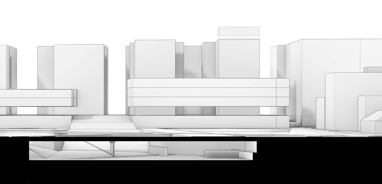
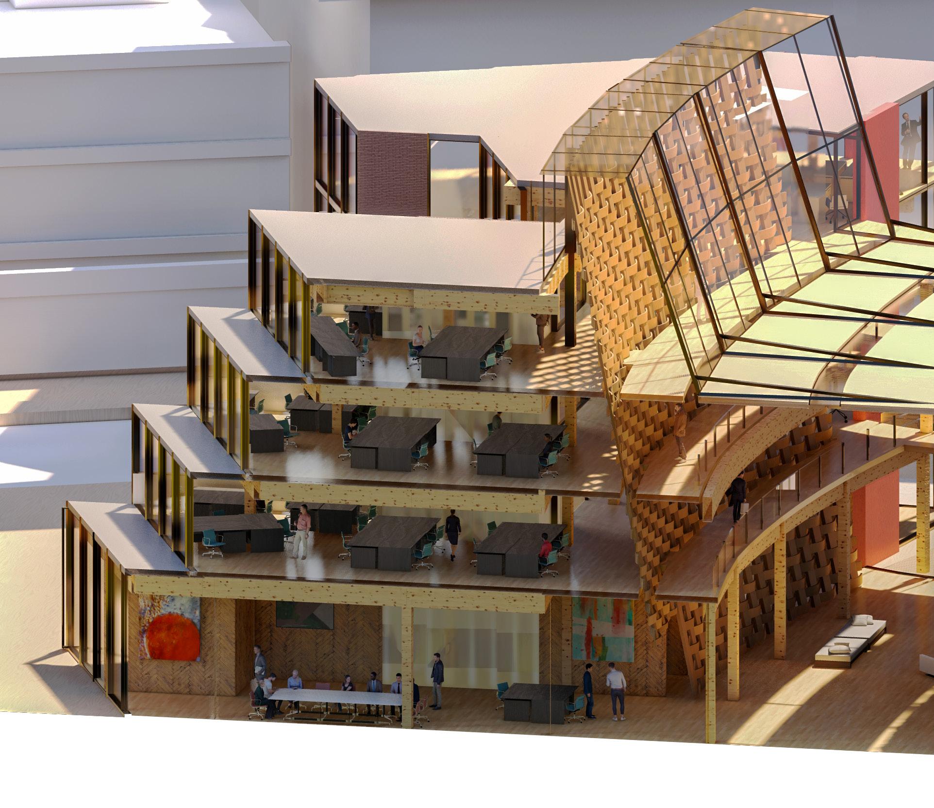
Juxtapose prioritizes the community’s need for green spaces. Maximizing the incorporation of park areas, the project also links the vibrant urban activity of the Via Marconi into the site, establishing a grand, sloped entry leading to the sub-grade levels of the park. A multi-level urban public space, nestled on the second level of community center buildings, connects the residential buildings through a system of elevated walkways, creating a seamless passage through the site to the river.
WATER FRONT BLEACHERS
SUB-GRADE RIVER ENTRY
Omar Oosthuizen

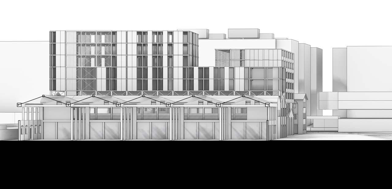
Rendered Transverse Site Section
Duration:
Course:
Location: 3 Months ARCH 393
David T. Fortin Polanco, Mexico City, Mexico
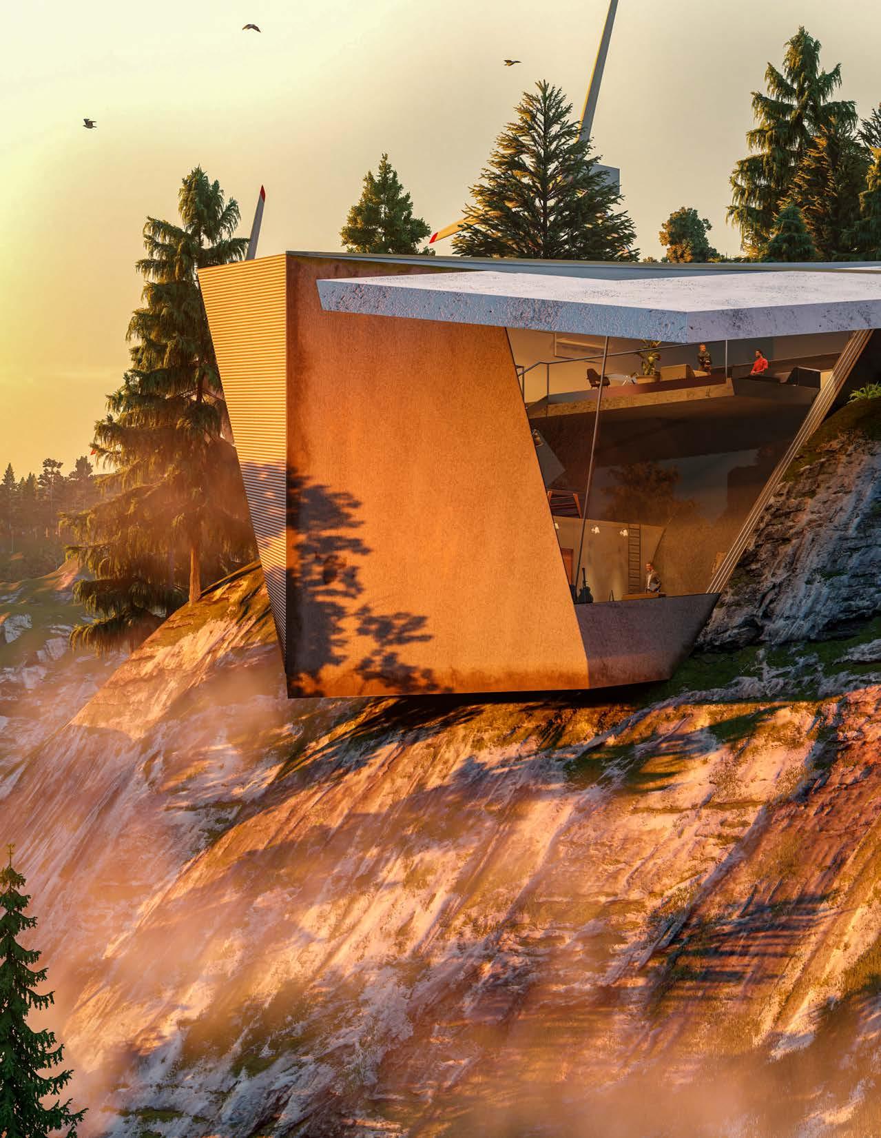
In the Post-WW2 Era, colonial powers constructed embassies that upheld outdated hierarchical understandings of people, nature, all her life forms, and the earth in diplomacy. In the age of reconciliation, diplomacy needs to be informed by multiple perspectives to challenge the embedded colonial values. To address this, we propose building an embassy that invites all human and non-human voices and perspectives through the medium of storytelling to be heard in diplomacy.
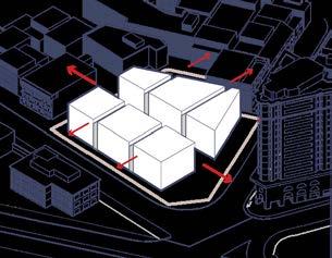
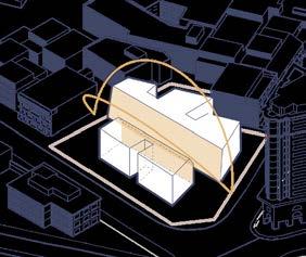
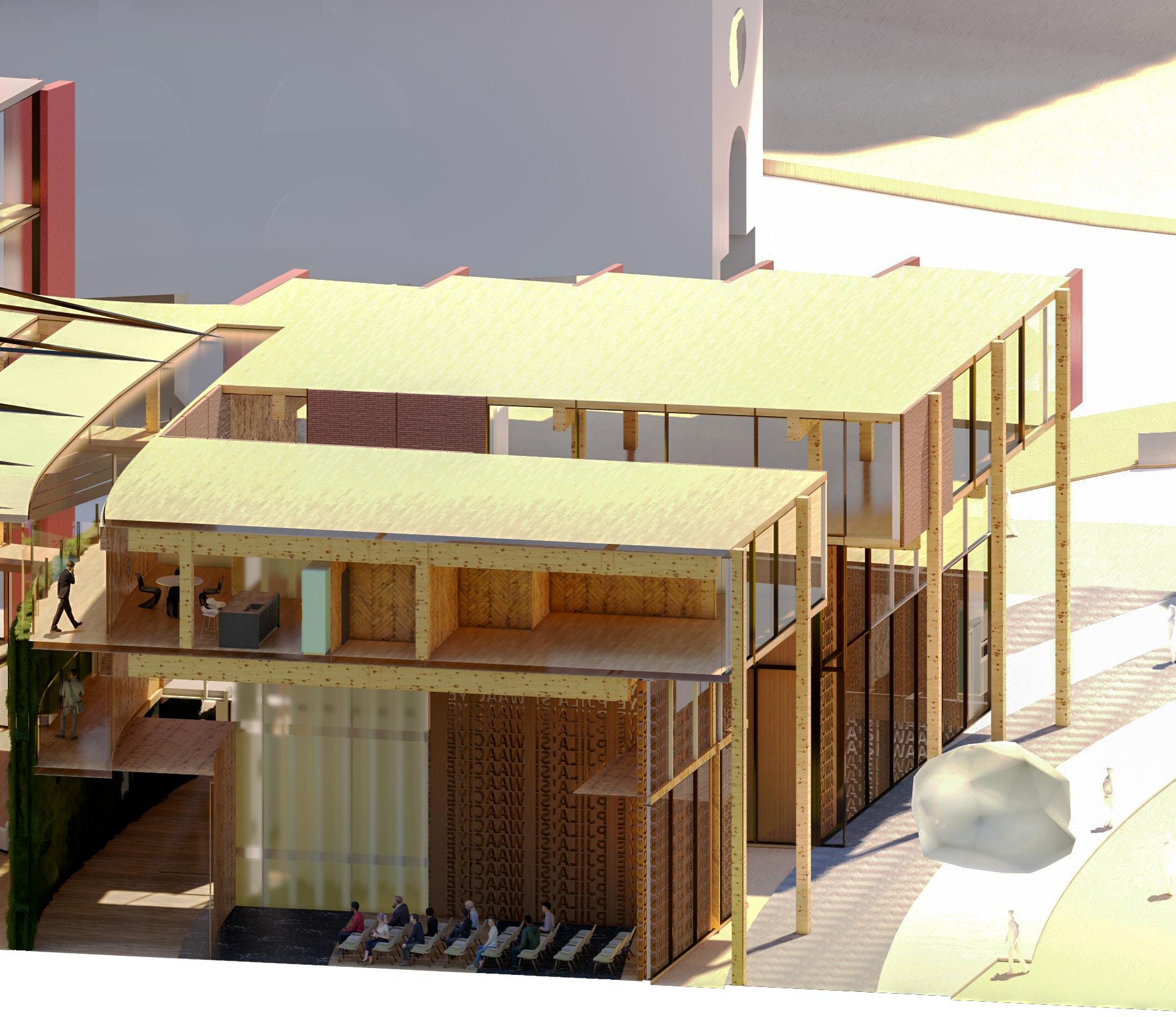
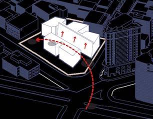
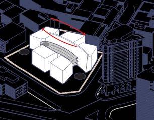
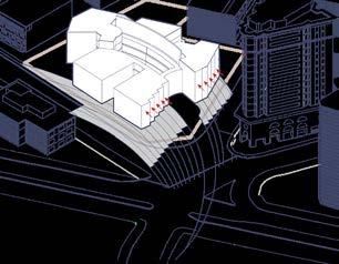
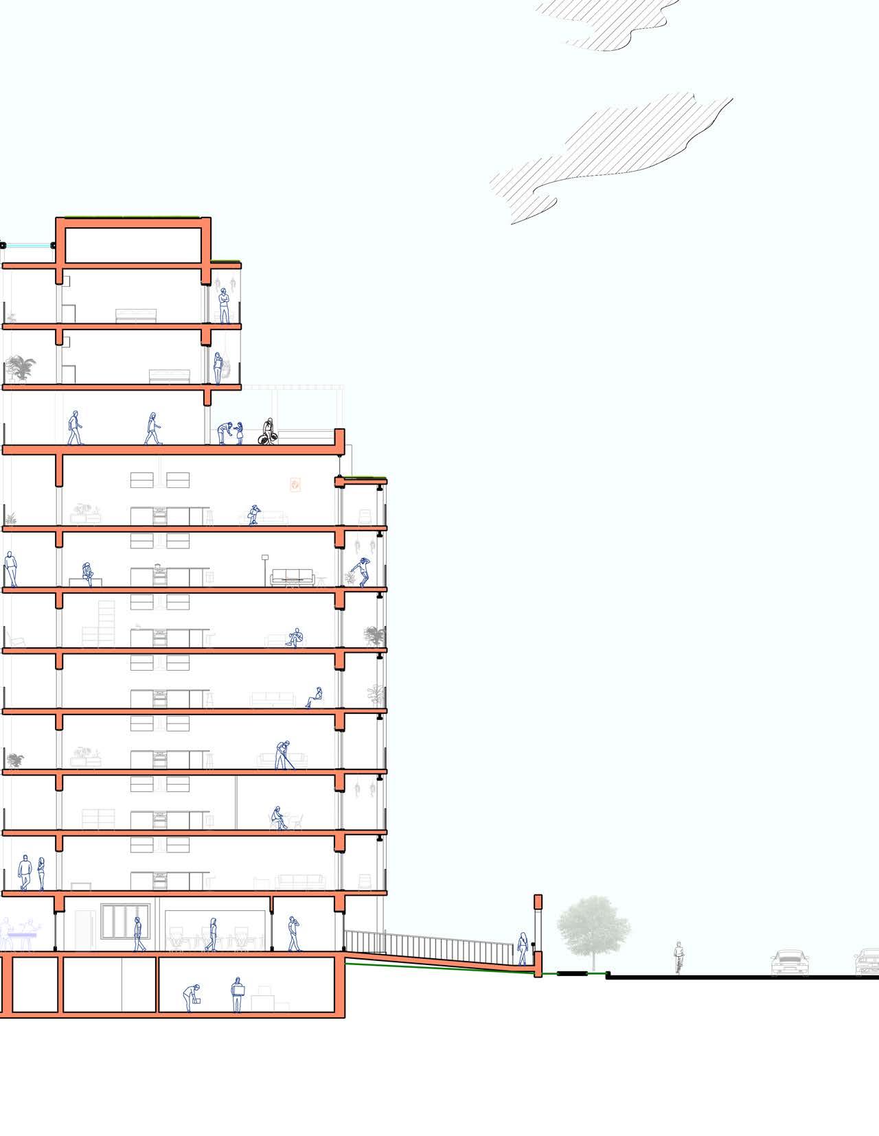
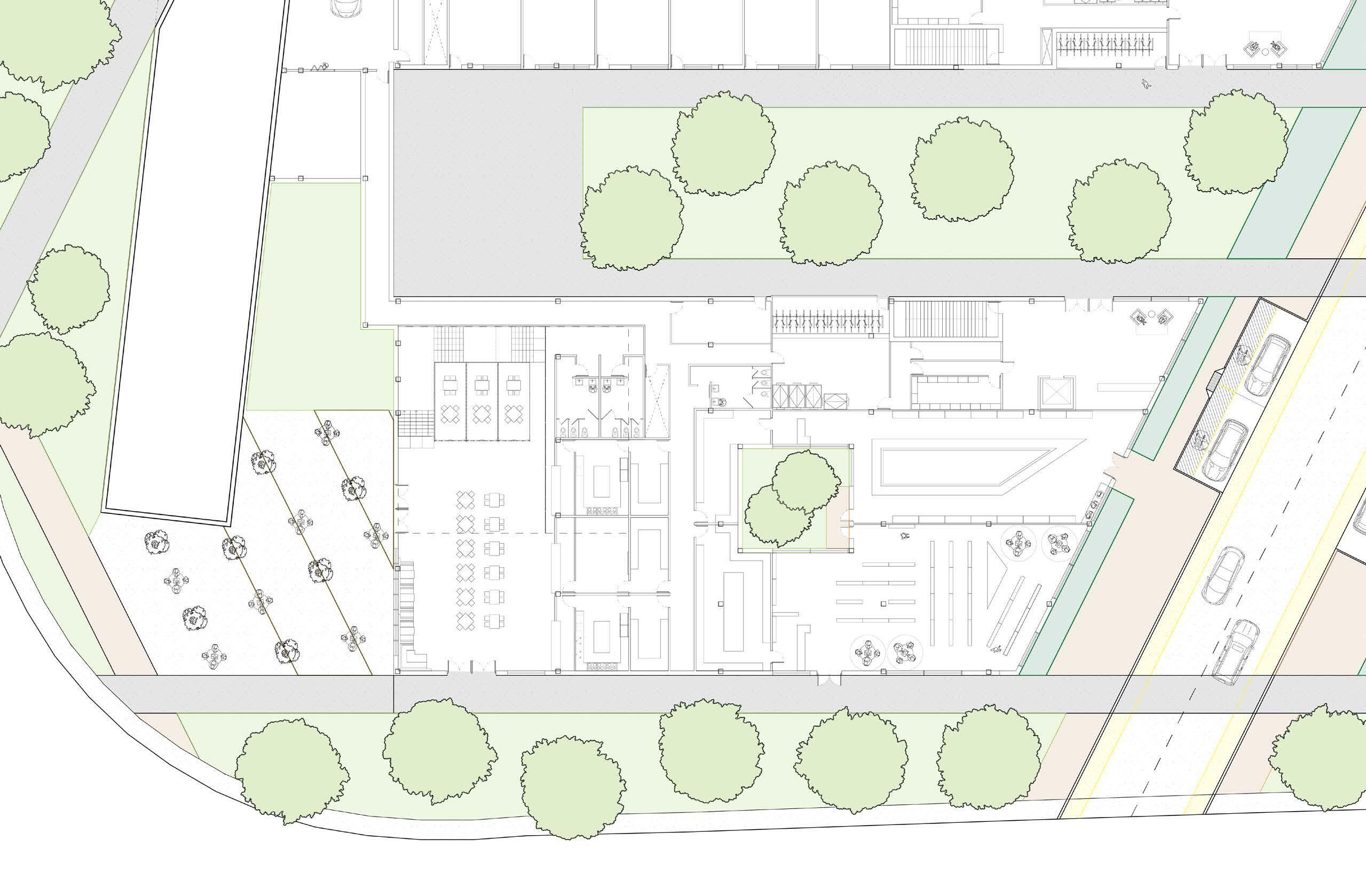
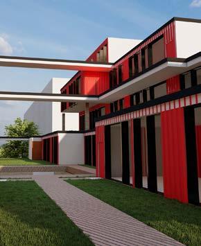
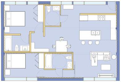
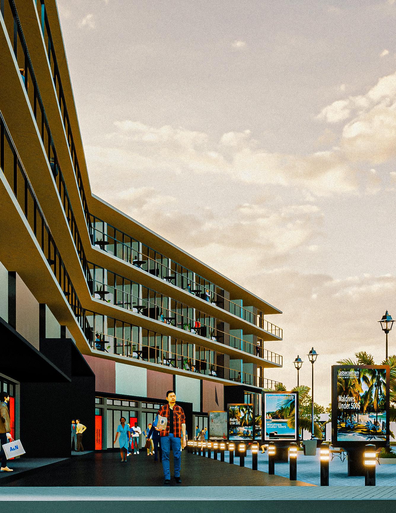
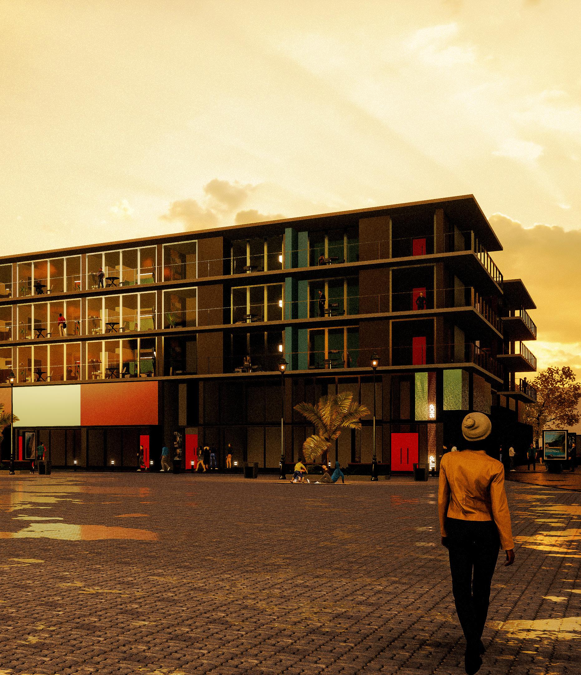
Corridor is an modular-mixed use adaptation of the MAT-housing typology to create a dense midrise housing solution that provides affordable housing to a range of income brackets. Using shipping containers as a structural material as well as cladding, Corridor creates an aggregated landscape of shipping containers on the top of a bustling retail podium providing a vibrance and life to the area as well as balancing public and semi-private spaces to create different conditions of the community and ‘togetherness’. The project is named Corridor because the of significant incision through the site, the boldest gesture of the project; the street running through the site is meant to heavily urbanised, with street ramping, textured paving, narrower lanes and multiple pedestrian crosswalks.
Duration:
2 Months
Course:
ARCH 392
Adrian Blackwell
Location:
Bramalea, Ontario
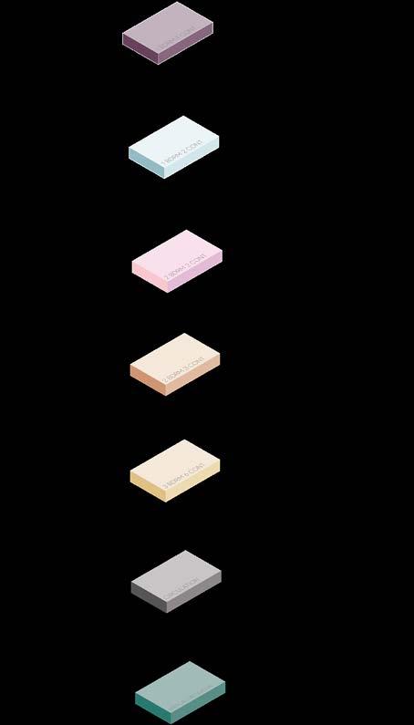
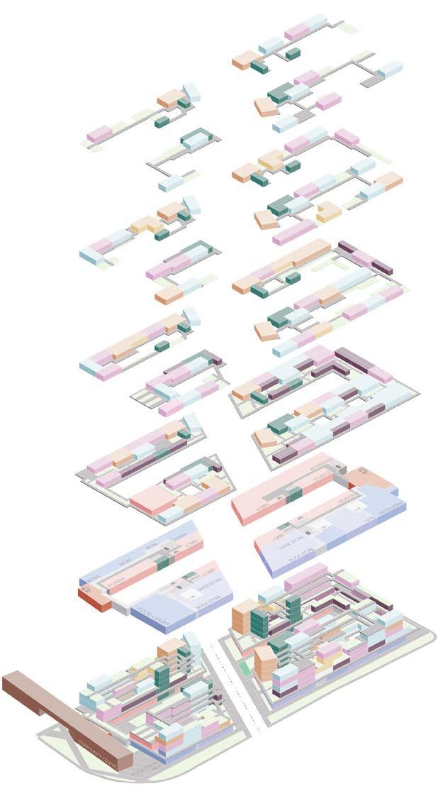
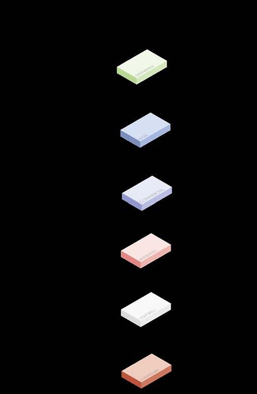

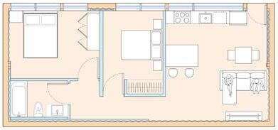
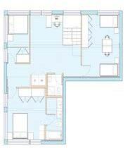
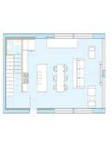
Exploded Program and Unit Type Diagram




Duration: Course:
Location: 3.5 Months ARCH 493, ARCH 473
Cambridge, Ontario

Oosthuizen
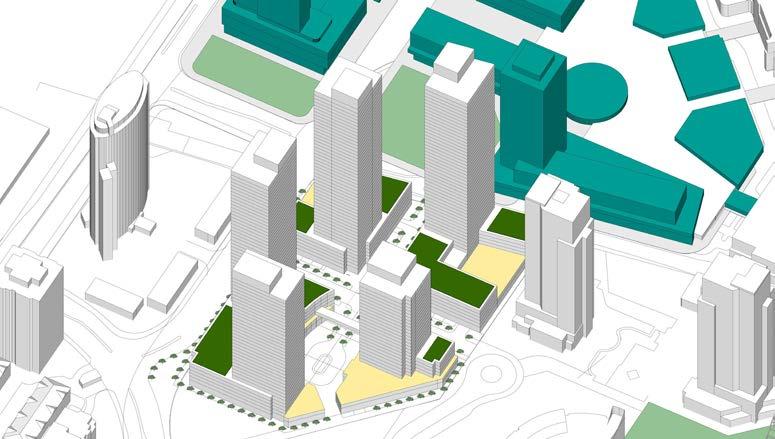
3 Months Arcadis IBI Group Markham, Ontario
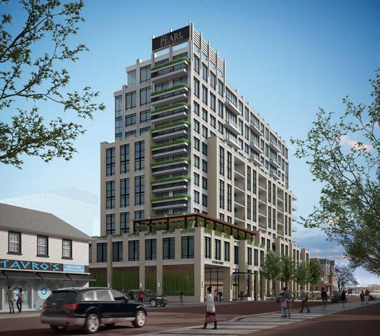
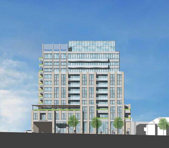
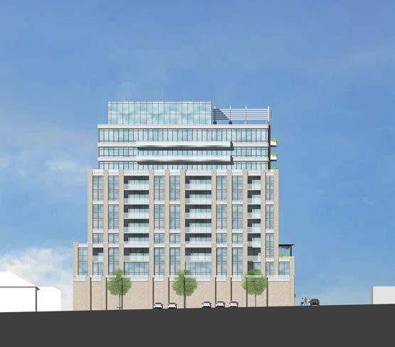

Duration:
3 Months
Employer:
Adviesbureau Bouwtechniek N.V. (ABT)
Location:
Paramaribo, Suriname

Omar Oosthuizen
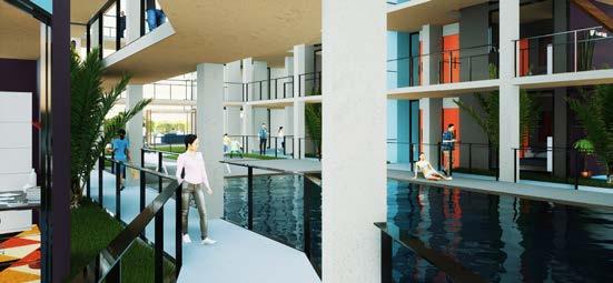
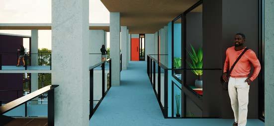
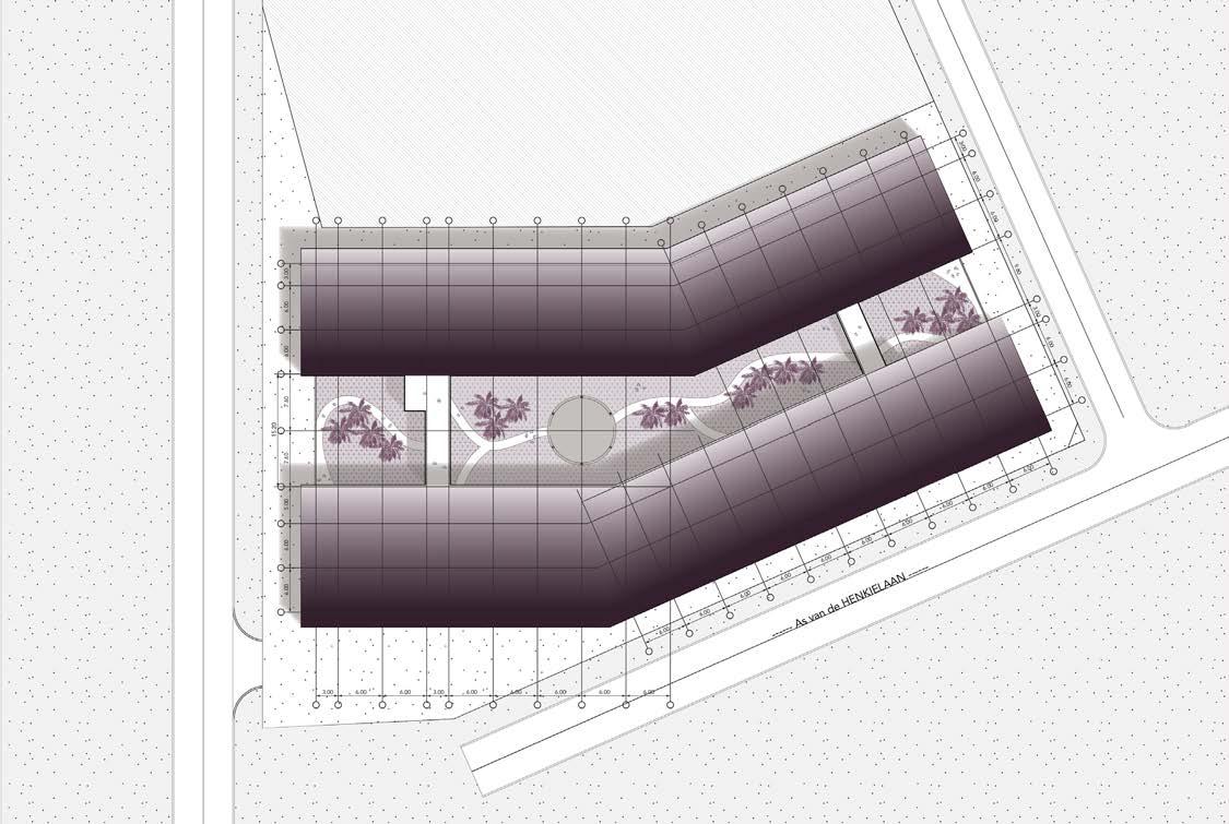
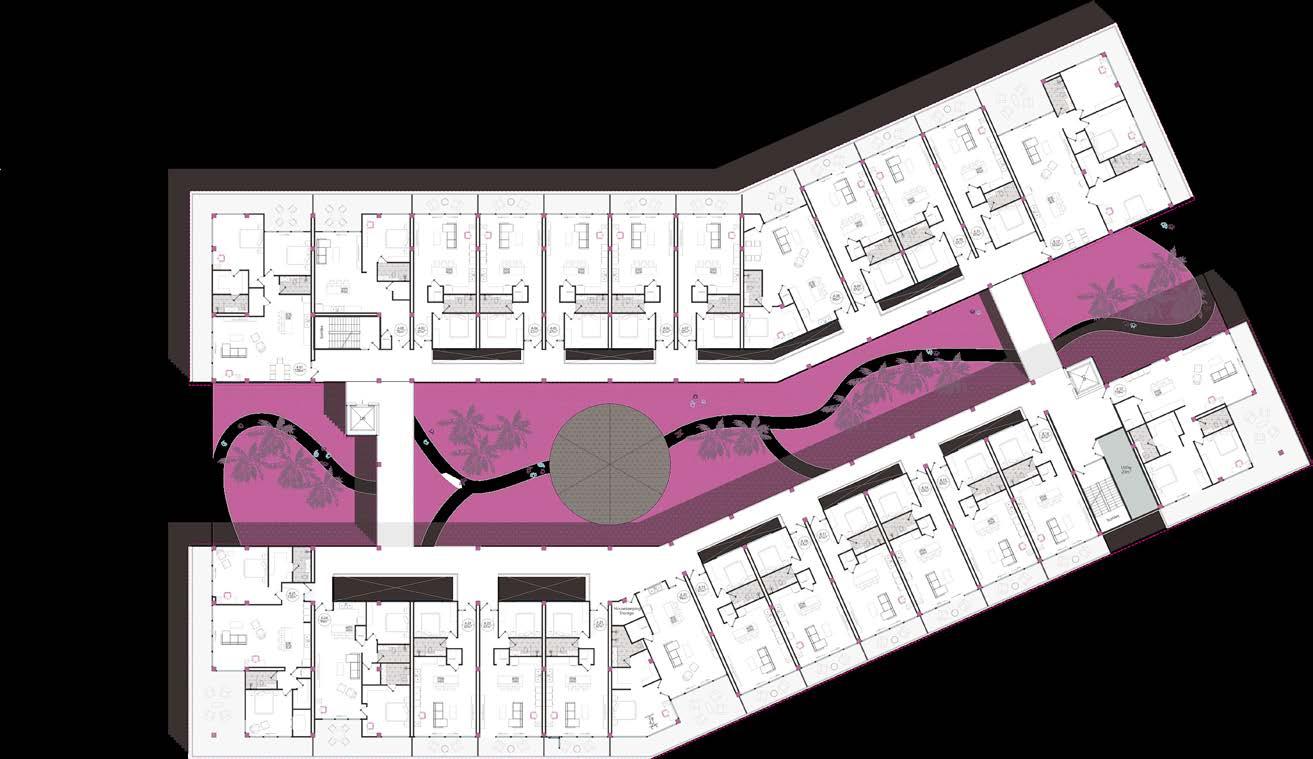
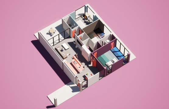
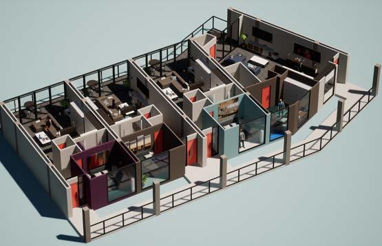
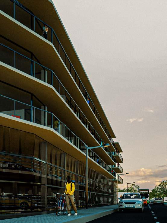
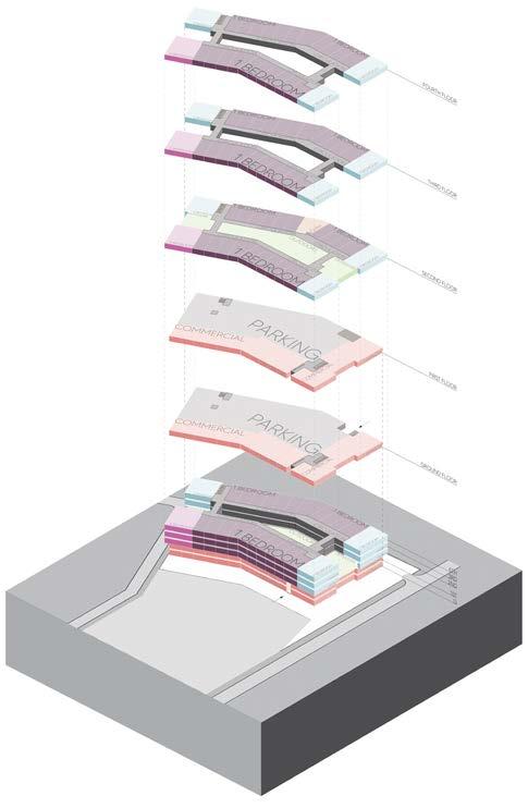
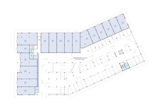
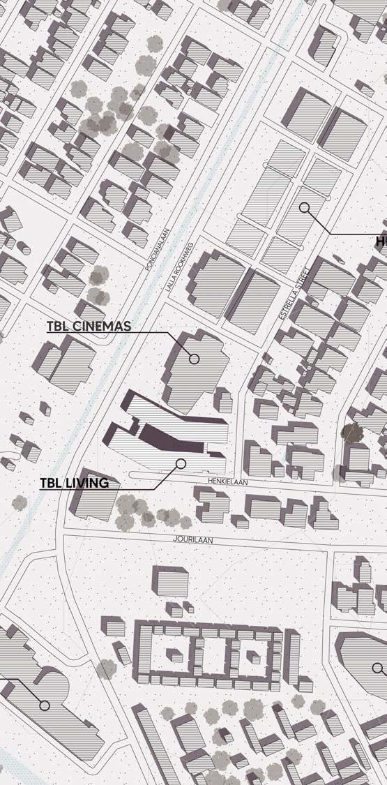
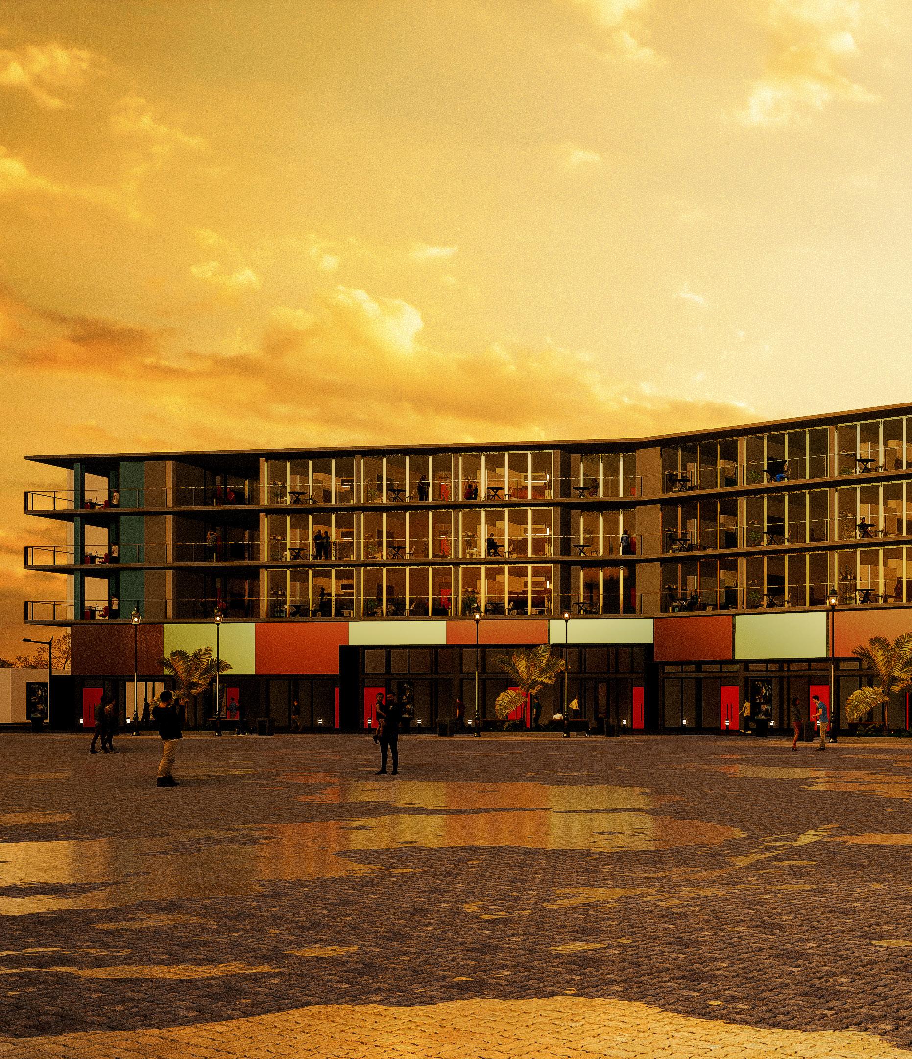
TBL Living is a 5-story mixed-use building proposed to be built adjacent to TBL Cinema and just southwest of Hermitage Mall. On the ground floor, there is a strip mall similar to that of Hermitage Mall. There are 17 double-height commercial unit spaces that have removable walls in between them, which allows commercial vendors to purchase as many commercial units as they require. Double-height spaces are required for certain store specifications and for extra storage via mezzanine floor that some vendors may require.


Omar Oosthuizen
Duration: Employer:
3 Months
Arcadis IBI Group
Location:
Markham, Ontario

Omar Oosthuizen
Duration:
14 Months
Collaborator(s):
Victoria Zhou, Sarah Soudki, Julian Lai, Anne Clock, Christa Hu
Location:
Cambridge, Ontario









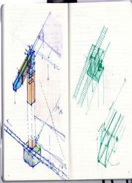
pencil on paper
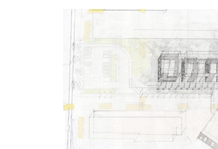
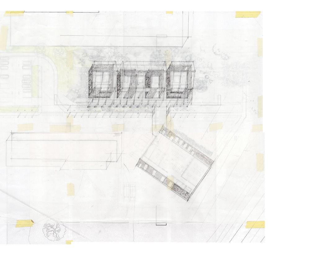
Unlike Rhino, marks left on paper must be physically removed to undo an action.
Depending on the drawing’s purpose, there may be no need to erase any lines. Remnants of process work are often intentionally left on the page as a visual recollection of each mental choice we make to arrive at the present state. The different iterations we encounter—construction guidelines, and markups from peers and professors—together serve as accumulated evidence of the evolving dialogue between intention and discovery. The old becomes the blueprint of the new, the layering manifesting itself on the paper as its own analogue aesthetic.
During those precious seconds spent translating our drawing intention to the Rhino language, which part of our creative stream of consciousness is lost?
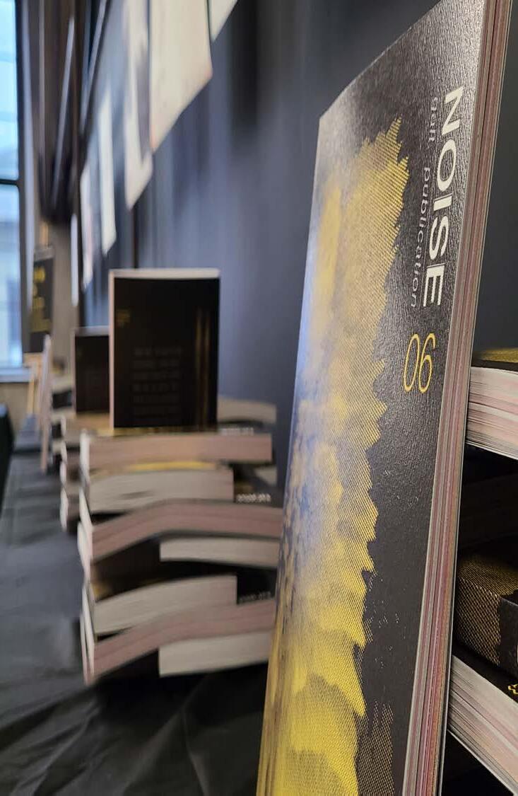
noise.
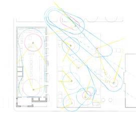
designing a field-based sensory notation

while retaining the flexibility to be quickly sketched or meticulously drafted. Notes can be hand drawn, however the speed and consistency of the notation can be enhanced by means of physical stencils or digital hatches. To integrate considerations of sensory experiences and accessibility to a normative design process, this notation system was developed to merge with minimal disruption to existing practices of site analysis, sketching, schematic organization, and detailed design.
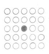
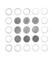
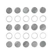
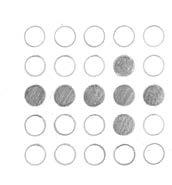
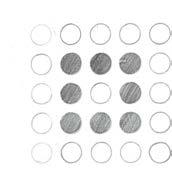
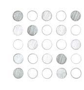
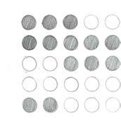
Five categories denote the types of architecturally significant experiences: visual, auditory, chemical, haptic, and kinetic notes. Borrowing from Ray Lucas’ approach to sensory notation, the traditional five senses have been redefined following James Gibson’s Basic Orienting System that separately distinguishes the Auditory System, Haptic System, Taste-Smell System and the Visual System. 5 While the ‘Visual’ and ‘Auditory’ align closely to the sight and hearing sense, chemical combines the more relevant sense of smell with the less spatially relevant but adjacent sense of taste. The haptic notes encompass sensations of the nervous system, such as thermal experiences and touch, with unique notation to signify the qualities of and transitions in surface textures. The kinetic category added to Gibson’s system has specific notes to account for both the movement of others and the individual agency which users have within their environment. Although not explicitly a sensory experience, kinetic considerations are essential for understanding human responses to the social nature of architectural and urban conditions.
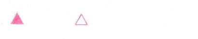
The notes follow a strict graphic convention which helps define the quality, intensity, and temporality of each sense. Each sensory category is defined by a different “note” symbol and colour. The distinctions of colour and shape preserve graphic clarity of the senses and legibility for readers regardless of visual ability. Shapes are important to maintain clarity in the absence of colour and have the possibility of being physically embossed. The quality of a sense is determined by a binary within drawing, either an outlined or filled note, dividing the sensory extremes without bias. Three sizes of notes denote sensory intensity: the largest graphically signifies the most intense experience and is more visually prominent, whereas the smallest notes are deemphasized to convey lower intensity. Defining temporality is equally important
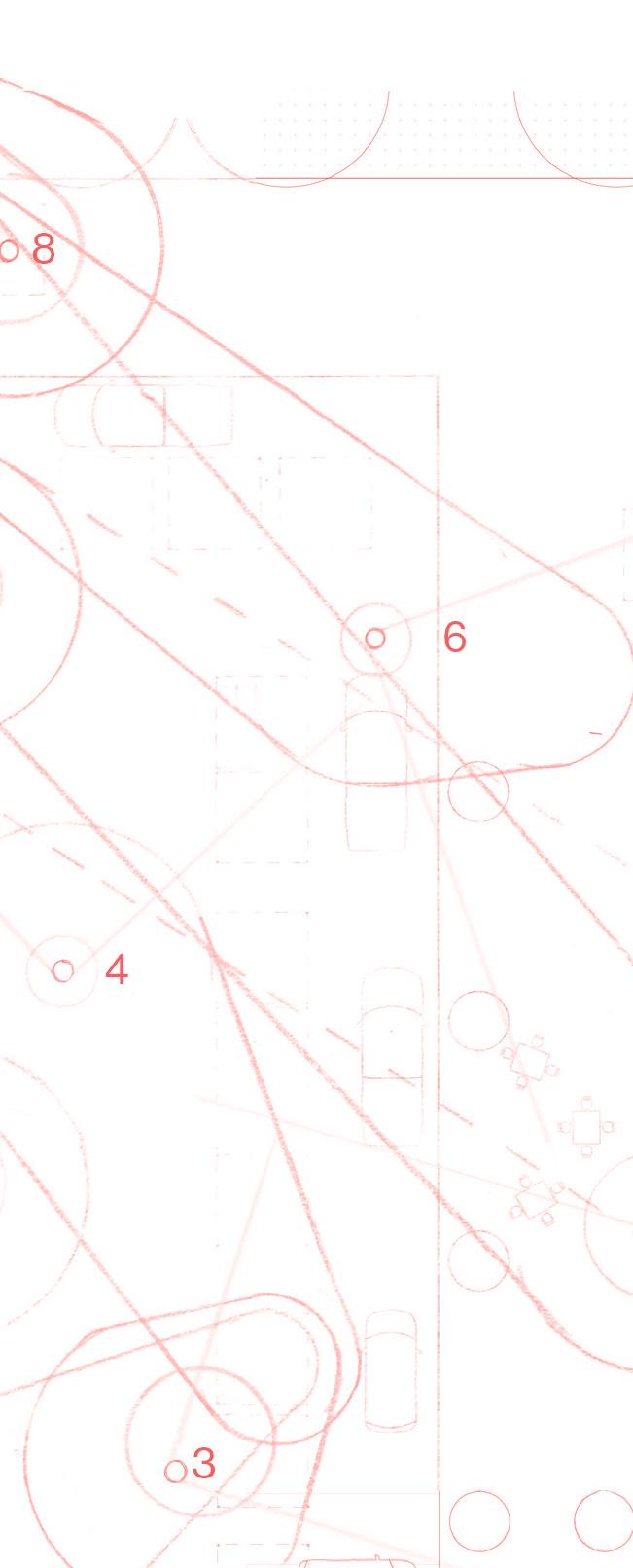
sensory notes:
5. Lucas, “Designing a Notation for the Senses,” 178.
Temporality in
Temporality in Field Conditions
Sensorial Notations
in Field Conditions
in Field Conditions
Sensorial Notations
Sensorial Notations
Sensorial Notations

Key Plan of Visit - Sequence of Observations and Ranges of Perception




Key Plan of Visit - Sequence of Observations
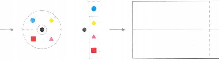
As learnt from studying Ray Lucas’ “Designing a Sensory Notation,” the translation of sensory information to a graphic notation system is not straightforward. The drawing as a translation of sensory experiences will never be able to inspire the same feelings as the perception itself. Lucas acknowledged this and in the development of his system he created a dense graphic system to communicate highly specific sensory information from single point experiences, and by doing so gained accuracy but lost legibility. Artists can inspire emotions or sensations with graphic means, but often in a controlled perspective which looses specificity of location. The aim of this notation is to introduce field conditions, shape, colour, scale and pattern in a notation to bridge the gap that lies between the generic and specific readings
condition is useful for graphic legibility to understand the quality, temporality and boundary of a sensorial experience. By drawing a series of field conditions, we understand intuitively the relative experience of an isolated sense to itself,

As learnt from studying Ray Lucas’ “Designing a Sensory Notation,” the translation of sensory information to a graphic notation system is not straightforward. The drawing as a translation of sensory experiences will never be able to inspire the same feelings as the perception itself. Lucas acknowledged this and in the development of his
As learnt from studying Ray Lucas’ “Designing a Sensory Notation,” the translation of sensory information to a graphic notation system is not straightforward. The drawing as a translation of sensory experiences will never be able to inspire the same feelings as the perception itself. Lucas acknowledged this and in the development of his system he created a dense graphic system to communicate highly specific sensory information
As learnt from studying Ray Lucas’ “Designing a Sensory Notation,” the translation of sensory information to a graphic notation system is not straightforward. The drawing as a translation of sensory experiences will never be able to inspire the same feelings as the perception itself. Lucas acknowledged this and in the development of his system he created a dense graphic system to communicate highly specific sensory information from
communicating. The translation of our individual point experience and a field happens through time and movement of the note-taker. It is important point to acknolwedge one’s own bounds for experience, this act of assessment strengthens one’s notes by editing but also one’s understanding of what each sense can communicate in space. For example sight requires orientation to be perceived, whereas sound can provide much more spatial information while observing in one fixed orientation. Colour, scale, and form of notations have also been considered to try and allign with what is considered “intuitive” to relate to the intensity and association of colour to sense. The import of also categorizing by form is to enable those who are colour blind, partially sighted or blind to have access to this information. The idea to group taste and smell, and to include temporality into the senses was informed by the work of Ray Lucas. This study in senses and notation is by no means perfected, but hopes to
Notation Spatiality
As learnt from studying Ray Lucas’ “Designing translation of sensory information to a straightforward. The drawing as a translation never be able to inspire the same feelings acknowledged this and in the development graphic system to communicate highly single point experiences, and by doing Artists can inspire emotions or sensations a controlled perspective which looses notation is to introduce field conditions, notation to bridge the gap that lies between of the sensorial impact of architecture. condition is useful for graphic legibility and boundary of a sensorial experience. we understand intuitively the relative experience and it strengthens our understanding of communicating. The translation of our happens through time and movement of to acknolwedge one’s own bounds for strengthens one’s notes by editing but sense can communicate in space. For perceived, whereas sound can provide observing in one fixed orientation. Colour, also been considered to try and allign with relate to the intensity and association of categorizing by form is to enable those blind to have access to this information. to include temporality into the senses was This study in senses and notation is by contribute another iteration of what could documentation of senses. There will never a notation, but the presence of a barrier universal in perception and in design.
on paper
(The) PENCIL has


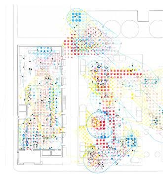
image01:stonehouse,hand-drawnaxo.2023.imagebyAuthor
plan
this failure and, in response, have published the Toronto Accessibility Design Guidelines.
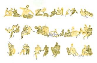
is design excellence in accessible design? Design excellence in accessible design should accommodate the needs of all user’s functions with dignity, ease, and comfort.



It’s always seemed too fluid and amorphous to grasp. have always felt more internally contradicting than comprehensive. From this aimless drift through identity emerges continual noise, the pull to an endless constellation of interests, experiences and ideas, all jostling to dictate who am. As non-binary, fail to ground myself in a particular gender. As agnostic, fail to adhere to a particular religion. have a Polish last name, but nearly all of that cultural lineage was erased or assimilated following my grandfathers’ immigration to Canada. struggle to see my values reflected in the actions of my nation. My digital identity is not mine, or not the entirety of it. distinguish where start and where “it” begins. create and wear sub-identities, usernames, and pseudonyms without second have access to more information than one could ever hope to know, let alone understand. I am able to explore new interests, new media, new thoughts and beliefs: my own and others. More importantly, I am able to critique, unpack, and in some instances, unlearn past thoughts, and beliefs. illustrates an identity indiscernible nections, the overlaps, the cracks, the fragments and the excess of involuntary inputs am subject to daily. Part poem, part collage, part mosaic, part map. Pieces not quite fitting together,







Omar Oosthuizen
thanks!
thanks!
omar.l.oosthuizen@gmail.com https://issuu.com/omar.oosthuizen_portfolio
647-676-7266