


ElementsandPrinciplesofDesign
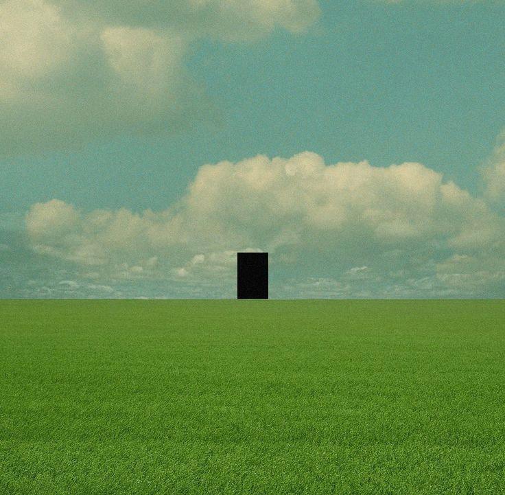
Hello
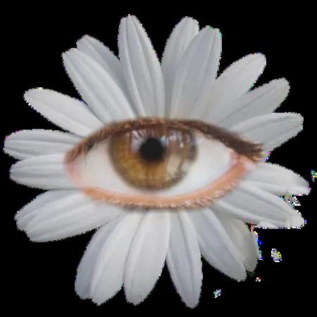


what is that...?
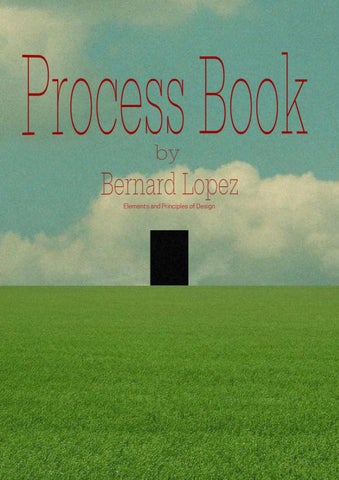
what is that...?
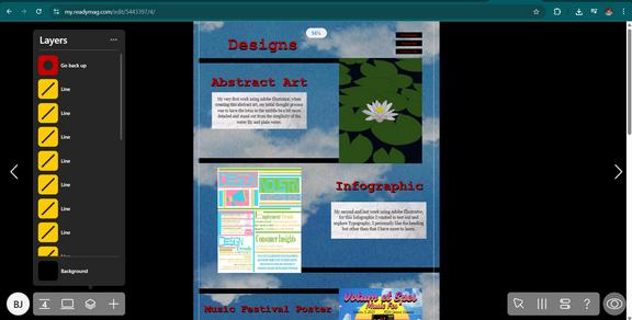
The theme I decided to tackle with my portfolio is somewhat like a backroom visual novel type of game. I went along with this since I am pretty fond of unsettling things, additionally a portfolio can also show a persons identity hence I stuck with this theme. While the theme is unsettling I decided to accompany it with a short dialogue for each page to contrast the theme.
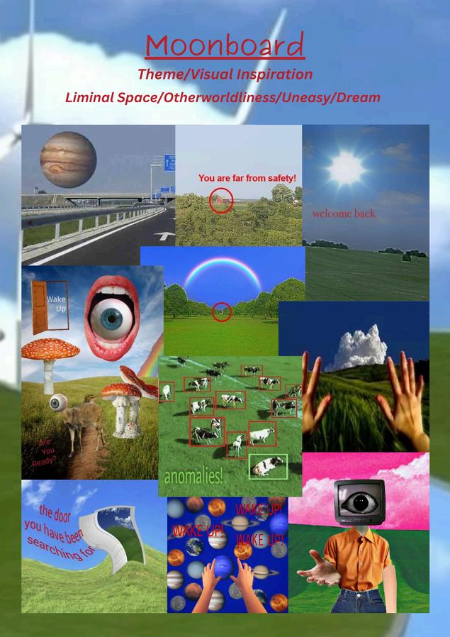
Notes::
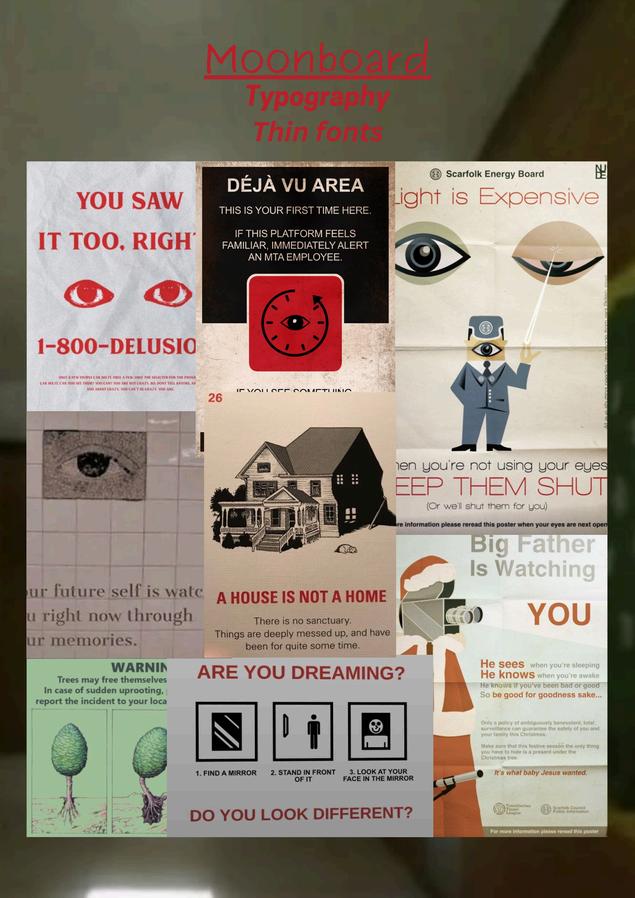
-Thefont/textusedare mostlythin -Thetextisred -Bold(?)fontstoemphasize somethingortoshow somethingisoff -Thinfontsareusedto guide/dialogue
Notes::
-Nothing makes sense with the design
-Objects are randomly placed
-Design is accompanied by a red text
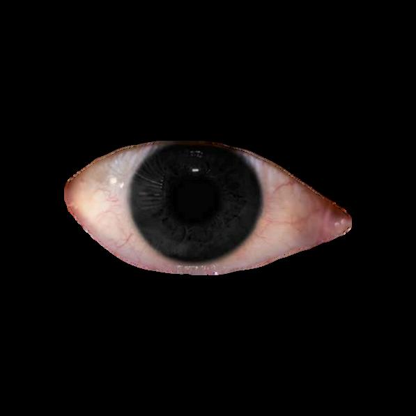
-There isn't something but it feels like you are being watched.
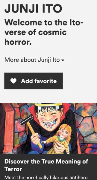
-I tried to find have are goin direction as I itwas hard, in the end I just stared atJunji Ito'sworks on awebsite since hisworks are mostly horrorthemed so I looked into his illustrations.
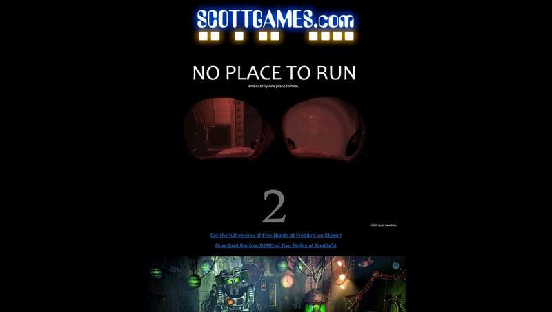
-I wanted to use Scott Cawthon's site as a reference but it got shutdown so my next go to was to stalk the fandomwiki to see screenshots of his old site back then.
ForJunjiItothesitesstyleisprettysimple,hisillustrations contrastthesimplicityofthesite.
ScottontheotherhandincorporateshisgameFNAFtoshowcase it'sfeelingswhilelookingathissite
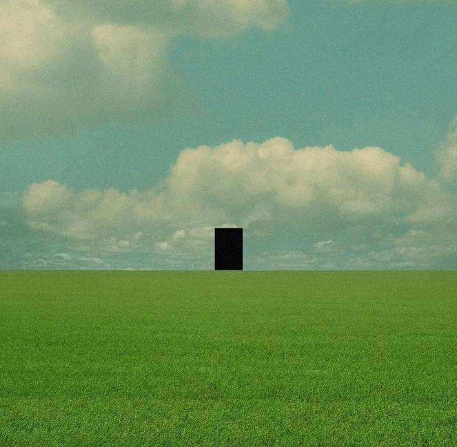
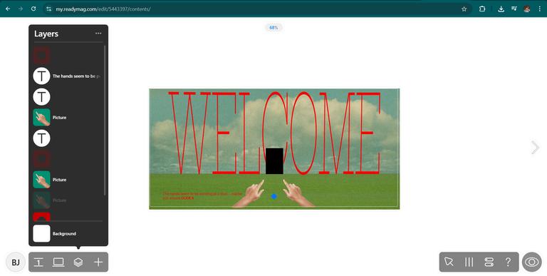
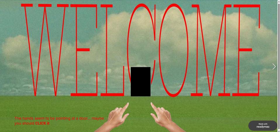
WhenIfirstsawthisimageI immediatelywantedtodosomething withit,Iwantedmyportfoliotobe likeavisualnovelgame,ifthatmakes sense.Liketheviewerwalking throughaliminalspaceseeingmy works Myfirstproblemwastryingto figureouthowIcanturnthat doorintoabutton,butinthe endIjustneededtooverlaya buttonoverit
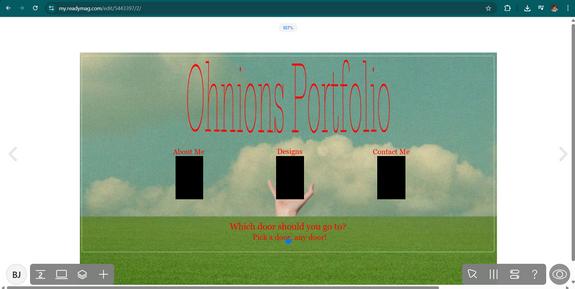
Door=Button that leads to the next page
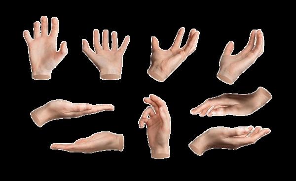
UpnextIwantedtohavesomethingthathelps theviewersknowwhatabuttonisornot,since Ididnotwanttoputatextonthedoordaying "clickme"sincelikeitwillruinthevibe.SoI addedahandthatshowswheretolookat, additionallythisisaccompaniedbythevisual novelvibewhereIhaveatextsaying"Thehands arepointingatthedoor,maybeYOUshould clickit"
I am gonna b did not think beforehand a went with wh was right in t love the resu there's that.
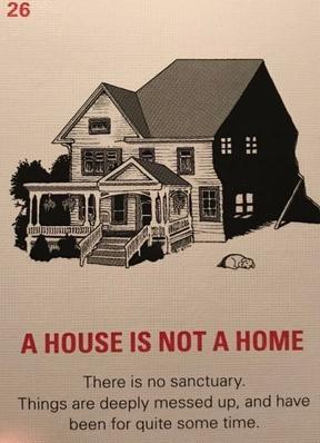

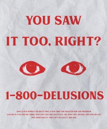
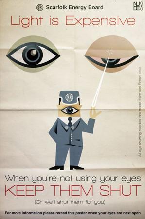
For theTypography/Text everything got based off these poster design I found while looking for references
All in all I just stuck with the backrooms main theme by being random and unsettling
Contrast I used the color red to contrast from the blue, blacks, and greens of the background
Alignment and Grid-To make sure none of my components are going off the canvas size
Repetition and Unity-While the them is supposed to be random, I only switched from the clouds and grass to showcase my homepage and designs. While I used the same theme for the About Me and Contact me for consistency
Typography-I followed the thin fonts accompanied by the red color

Scan Here