1 minute read
Layout and Design
Optimum layout and design is important for maximizing knowledge retention. Because a majority of people are visual learners, NLC uses the following visual design elements in the development of training materials.
LAYOUT
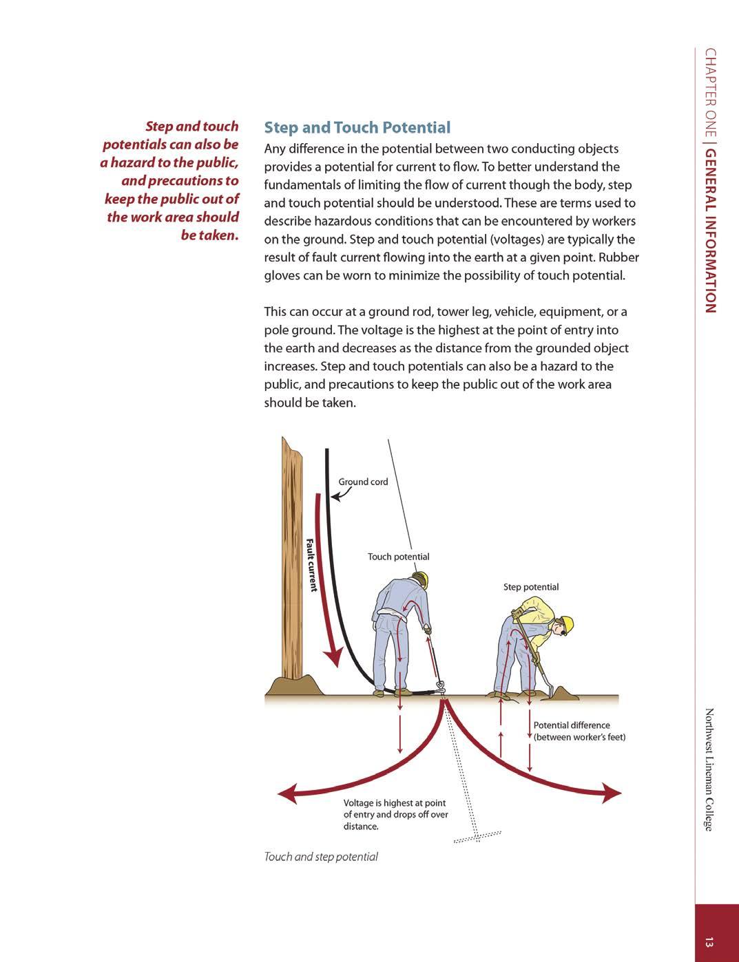
Chapters and titles are printed on each page so the reader can easily identify their location.
MARGIN STATEMENTS
Key points are reinforced with margin statements. Thousands of margin statements are used in the program.
SMART VIDEO LEARNINGTM
QR codes and short URLs are used throughout the program, allowing trainees to easily connect to digital video resources.
WIDE MARGINS
Research shows that the space created by wide margins improves the overall readability of any document.
TYPE
Optimal font size and specific typefaces are used for readability.
BINDING
Coil binding allows the materials to lay flat or fold completely over for ease of use. 1
2
3
4
5
7

8 7
8
GRAPHICS-TO-TEXT RATIO
A picture is worth a thousand words, and NLC has made a significant effort creating hundreds of original high-quality graphics. These graphics are used to better illustrate difficult concepts in an easy-to-understand format that does not sacrifice the technical integrity of the subject material. A 1-to-1 ratio (50% graphics, 50% text) is used as a design guideline throughout the program.
FULL COLOR
Research confirms that color documents get two-thirds more readership than black-and-white documents with the same content. Because NLC continually focuses on successful trainee outcomes, color is a priority.
STUDY GUIDES
Each section contains a study guide, which facilitates the learning experience and prepares the trainee for their examination. When the materials are studied and the study guide is completed, the trainee should perform well on the exam.


