
5 minute read
Color Strategies for Landscape Designs

by Brian Oleksak, County College of Morris
The artistic use of color in landscape plant selection can make the difference between a ho-hum landscape and one that shows off a wow factor. Ornamentals offer a diverse color palette through flowers, fruits, variegated foliage and sometimes bark. A little strategic planning of plant selection and color schemes will greatly enhance your overall project.
Some Basics About Color
When visible light is broken into its component colors we have that familiar array of red, orange, yellow, green, blue, indigo and violet. When this spectrum is wound into a circular format we have the color wheel which reveals useful relationships when used in a landscape design. Colors which are opposite each other, such as orange and blue or yellow and purple are regarded as complimentary. For the novice designer, these pairings make a dependable combination for beds, containers and hanging baskets. Colors that appear side by side on a color wheel are regarded as associative. Colors such as red and orange or purple and blue blend well because of their shared color origins. A slightly more complex scheme would be a triadic color scheme. A triadic scheme is accomplished by selecting three colors approximately equi distant on the color wheel, for example, yellow-orange, blue-green and red-violet. However, the trick to using them effectively is to use two of the selected colors for approximately eighty percent of the plant material in the bed and the last twenty percent as an accent to punctuate the design. If you feel that the color combinations you have selected may be too daring, you can tone things down with the addition of white flowers or more foliage plants which have a softening effect.

An associative color scheme comprised of petunias, verbenas and pelargoniums with red pelargoniums used as an eye-catching accent. (Photo courtesy of Brian Oleksak)
Colors are also categorized according to their “temperature”. Colors such as red, orange and yellow are seen as warm colors. Their presence in the landscape has an electrifying effect to the eye. Not surprising that these colors are used for traffic signs and car dashboard warning lights - they grab your attention. Colors such as blue, green and purple are cool colors which emanate a sense of calmness. Within each hue, we can also experience differences in the purity or intensity which produces varying looks. Coreopsis ‘Zagreb’ has an intensely yellow flower, while Coreopsis “UpTick Crème’ produces a pale, creamy yellow lending two very different influences on the border. Repeating the same col ors throughout the landscape (a color “echo”) may add a sense of harmony to the overall project. Seeing the repetition of yellow in the front yard carried into the side border forms a connection between the two spaces.

A bold annual border making some daring color choices with yellow, purple and red. (Photo courtesy of Brian Oleksak)
True Blues?
Blue is an elusive flower color for landscape designers. The color blue in flowers is produced by a group of pigments called anthocyanins, which are actually red and purple pigments. Differences in soil pH and the reaction with other molecules may yield blue, but shades of purple tend to be the dominant hue. Fewer than ten percent of the plants in the plant kingdom produce blue flowers. Some notable landscape plants approximating a true blue include delphinium, bachelor’s buttons, Italian bugloss, gentian and Himalayan poppy. Most landscapers recognize that the flower color of bigleaf hydrangea (Hydrangea macophylla) can be influenced by altering the soil pH. When grown under acidic soil conditions the shrub bears intensely purple-blue flowers, while alkaline soil yields pink. To maintain the blue color the landscaper may apply garden sulfur or aluminum sulfate to lower the pH.
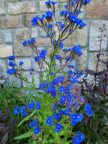
The stunning blue flowers of Italian bugloss (Anchusa azurea) light up a summer pollinator border. (Photo courtesy of Brian Oleksak)
Anthocyanins are also responsible for the intensely dark purple to nearly black foliage colors of ornamentals found in the nursery trade such as smoke bush (Coti nus coggygria ‘Royal Purple’), ninebark (Physocarpus opulifolius ‘All Black’), coral bells (Heuchera hybrid ‘Black Pearl’), car pet bugle (Ajuga reptans ‘Black Scallop’), ornamental millet (Pennisetum glaucum ‘Purple Majesty’) and snakeroot (Cimicif uga ramosa ‘Hillside Black Beauty’), just to name a few. Though these cultivars make a bold statement in the landscape they should be used strategically and in moderation. Dark colors have a receding quality often creating an oppressive and gloomy impact when used in excess. A great use for dark foliage is to use these specimens as a backdrop for flowers with pastel colors. Pastels such as pink, pale yellow and powder blue fail to make an impression in the border, particularly on sunny days when they appear bleached out by the sun. Backing them up with dark foliage sharpens the viewer’s attention on them and sets them off beautifully.
White as a color?
Anyone who has taken on a home painting project quickly recognizes that there is a limitless palette of choices for what is considered to be white. Flow ers and variegated foliage provide opportunities for a more nuanced design by focusing on the many variations of white. There are creamy whites, pinkish whites, silvery and grayish whites. The most famous example of a monochromatic scheme using white flowers and variegated foliage is the White Garden at Sissinghurst Castle in Kent, England. This garden featuring white, gray and silver flowers and foliage has served as an inspiration for contemporary landscape designers for its unique approach to design. Monochromatic schemes provide a calm, meditative setting that de-emphasizes color, encouraging the viewer to focus in form and texture.
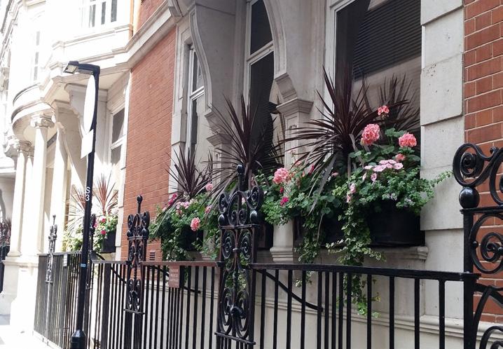
The graceful arching black cordylines provide a color echo to the wrought iron fence, while the ivy and pelargoniums hint at the brick and mortar of this London townhouse. (Photo courtesy of Brian Oleksak)
When working on your planting plans don’t be afraid to take some chances with color selection. New plant cultivars ar rive on the market every year giving you the opportunity to mix it up a little.

Brian Oleksak is Associate Professor and Chairperson of the Landscape and Horticul tural Technology Department at the County College of Morris in Randolph, New Jersey. Professor Oleksak teaches courses in woody and herbaceous plant identification, soils, ar boriculture and botany at CCM. He holds a B.S. in Agronomy from Penn State University and an M.S. in Ornamental Horticulture from Ohio State University. Professor Oleksak resides in Newton, New Jersey.
