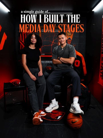
a simple guide of...
HOW I BUILT THE MEDIA DAY STAGES
INITIAL DESIGNING THOUGHTs Keep it clean and simple: Black and white, with Oregon State orange as the accent. Create one strong focal point: Use furniture and sports memorabilia to naturally draw the eye toward the center.
STUDIO INSPIRATION I wanted a centered focal point, with the surrounding props naturally directing the eye toward the middle, inspired by my own studio
WORK IN PROCESS
Painted everything , from the letters to the frames to the stand. Everything DIY so the color can all match
THE “CORVALLIS” POSTER “OREGON STATE UNIVERSITY” Used our brand font “BEAVER BOLD”
“HOME OF THE BEAVERS” to full up empty space
Added the coordinates of Corvallis.
Original poster designed by Graice Piper. I added a few elements to further emphasize the theme
All our primary and secondary logos, as well as the NIKE logo
FINAL PRODUCT
Added LED tube lights and key light to light up the space! Shot on 12mm - 24mm f 2.8
I angled the key light slightly upward to feather the light across the subjects for a softer, more controlled look
Background light: The fixture on the right aimed at the backdrop, not primarily at the subject.
→
STAGE II
Wanted to keep the set simple and clean, with Oregon State’s color palette, while creating a space that would work well for strong hero shots
Soft key + LED tube lights to illuminate the space
Incorporated past years’ posters, spreading them throughout the space to celebrate the program’s rich history.”
STAGE III
“Designed to feel cohesive with the previous two sets, but a little messier and more character-driven.”