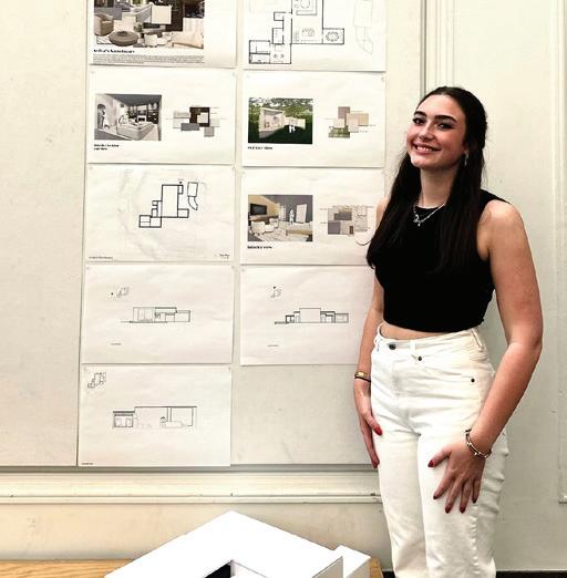
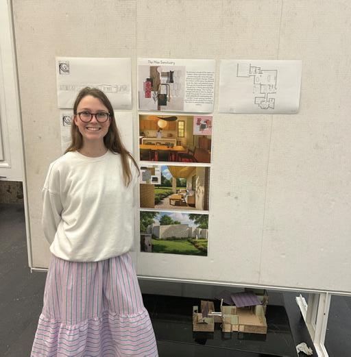
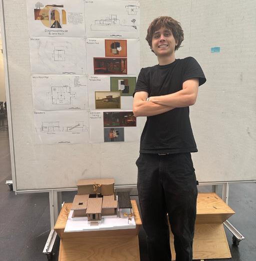
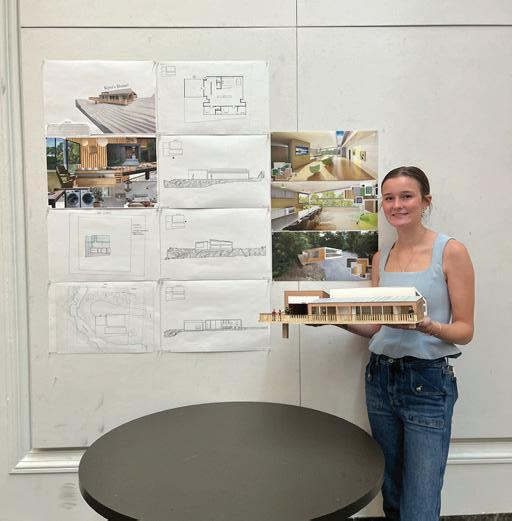
*. There is no restriction on academic use of the contents of this book.
*. The copyright of all design results contained in this book belongs to each (student) designer.
PUBLISHER’S NOTE
Since the beginning of my teaching career in Korea, I have always wished that I had a book such as this one. This wish may have originated from my 6th grade teacher, who made a graduation workbook containing students’ writings, drawings, and photographs. After my graduation and before my undergraduate years, I was able to see my growth in ways of thinking and understanding as a result of reading the book. With my colleagues, I made a school book including all the graduate projects completed at Hanyang University in 2006. By reading the book, I had been able to cheer up and reenergize myself whenever I was exhausted and burnt out in practice. With these memories, it has been four years since I made the course books for the subjects I taught.
During the process of creating this book, I learned something that I had never known before. I am gradually improving my skills as an instructor, learning what I have missed as an instructor, what I should remember when teaching next semester, which assignments to emphasize more, and what to emphasize less. Seeing the efforts and thoughts of the students that I had not yet discovered, I smiled at them and regretted that I had not been able to encourage them more.
After receiving this book, each recipient may have a different reaction to it. In the past four years, it has been observed that it serves as a tangible teaching portfolio for instructors, a data bank for students in the event of unexpected laptop failures, and an educational experience that motivates students to create their own portfolios. What will be your reaction when you receive this book? In the future, when you are about to graduate, what will you think after reading this book? In keeping with this thought, I completed the process of making the book.
In my opinion, the curriculum in the first two years is typically more focused on visualizing ideas by converting them into visualized outputs that can be shared with others. In the second half, the focus is more on materialization aligned with the realities, such as building codes, social issues, etc. It is my hope that you will be able to improve your ability to visualize and sense scale before the second half.
As a final note, I would like to thank you for all the time I spent with you. Despite the fact that this design studio with you has ended, please feel free to contact me at any time. I will be glad to respond to your contact. It has been a pleasure having you with me this semester.
I congratulate them on their successful completion.
-
Jinoh Park, Instructor and Publisher
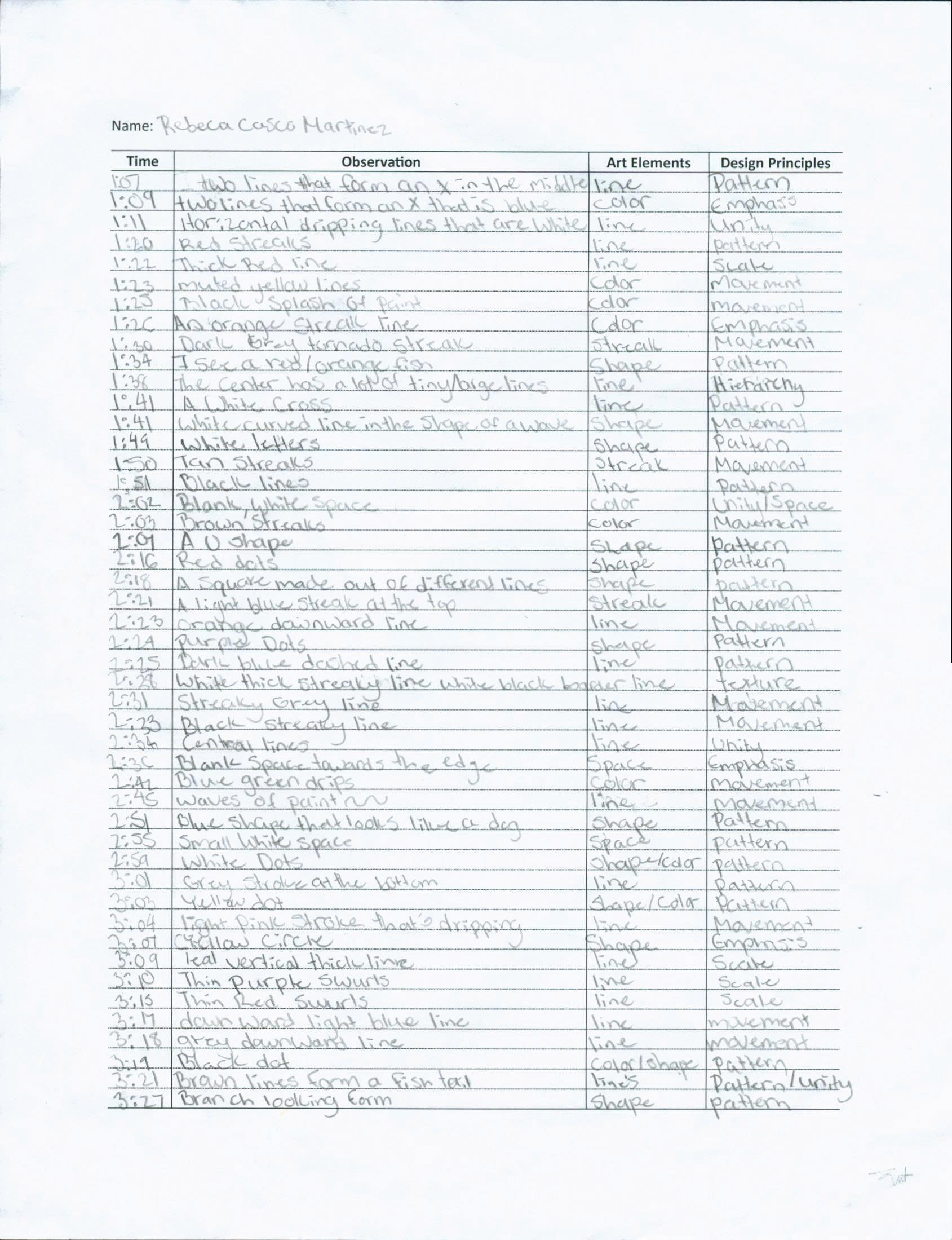
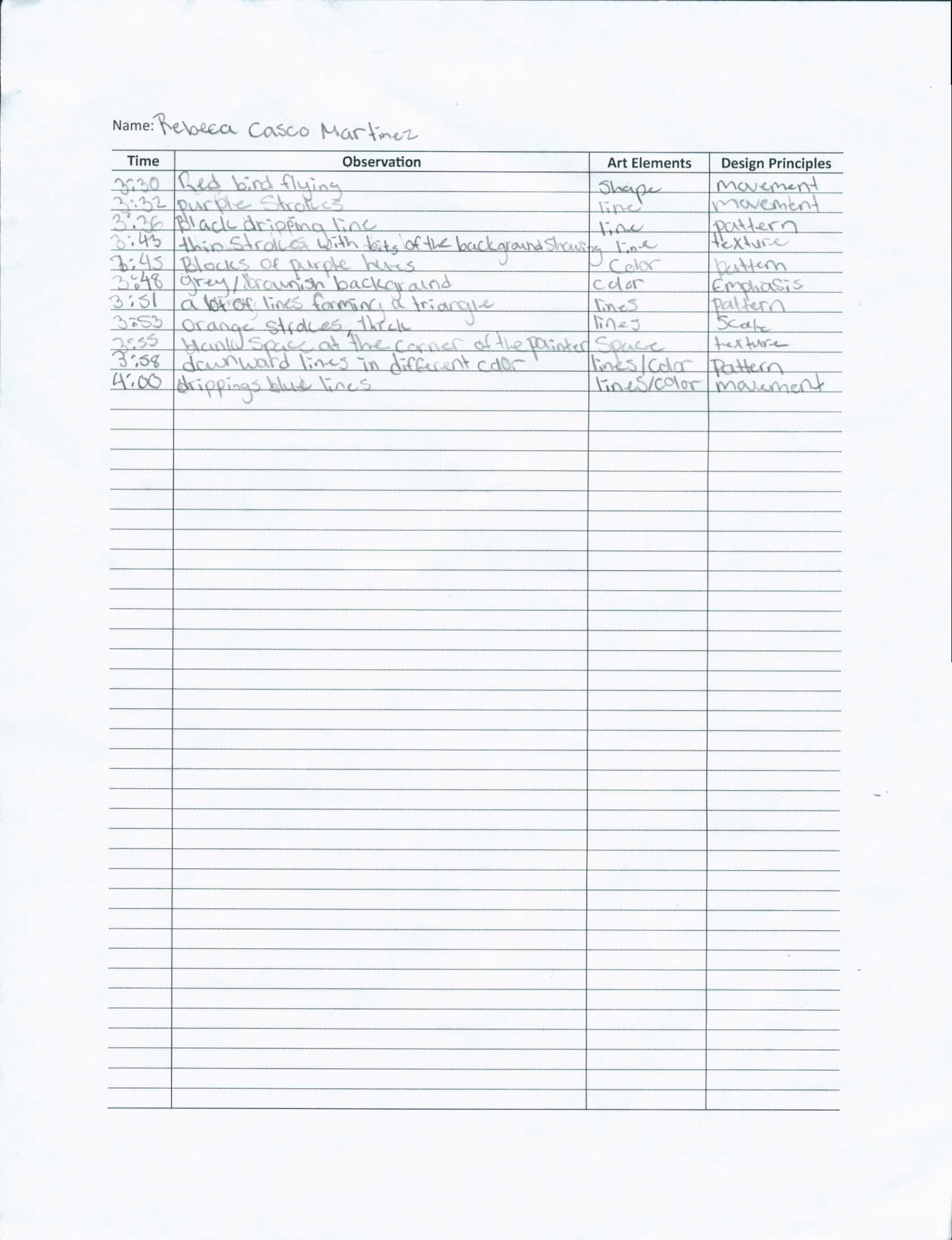
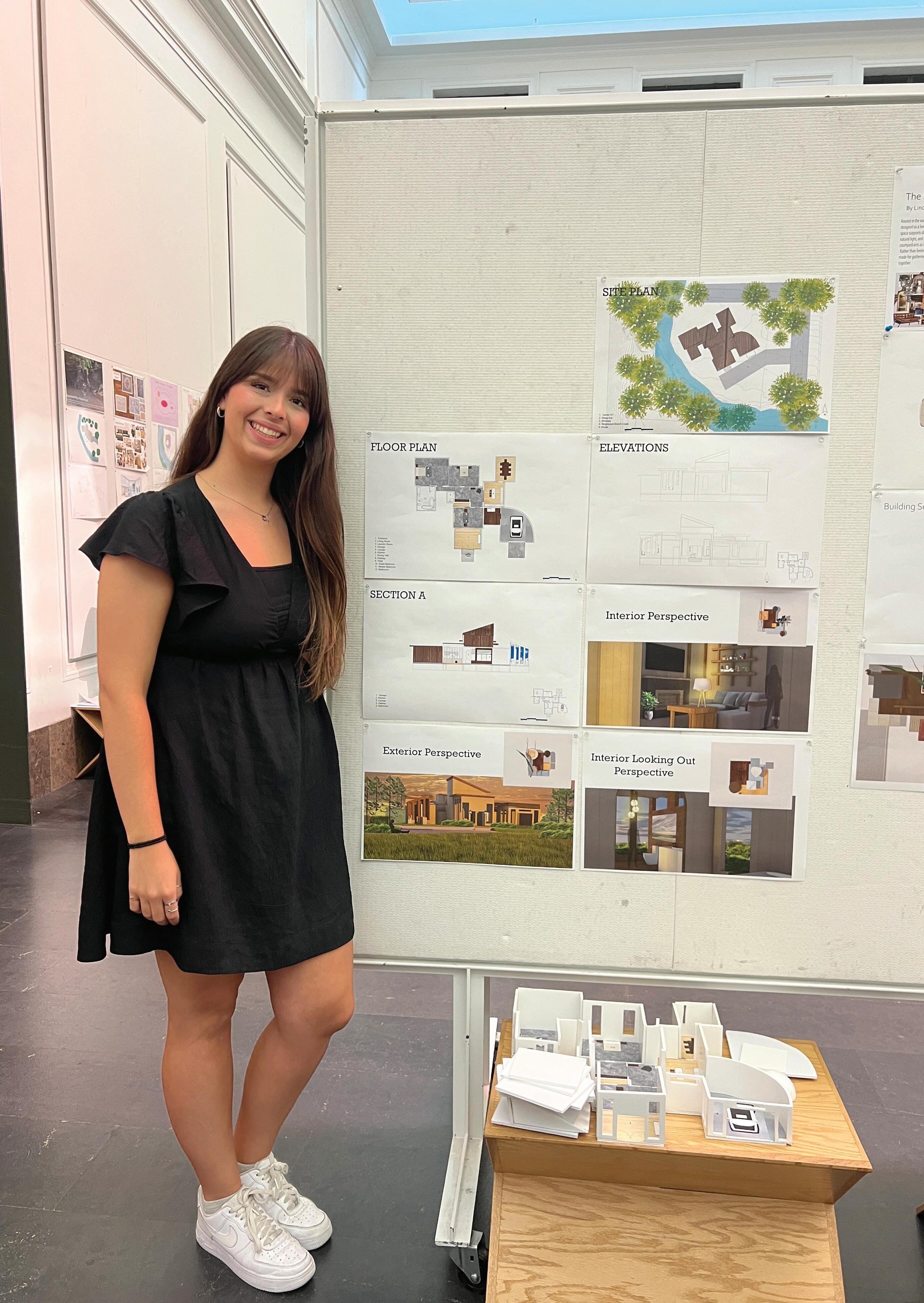
14 Casco Martinez,Rebeca
24 Hallett,Carissa
Harrington,Ava
Penfield,Marilynn Mae
Rasch,Zeke
Reeds,Kyra
Sanchez,Yanury
Sukhija,Jasmine Leigh
Walker,Reece Elaine
If I could talk to me before these five weeks, what would I like to share with me?
Main Themes
1. Self-Discovery and Personal Growth
- Self-Confidence and Potential
- Students expressed surprise at their ability to push beyond their perceived limits and achieve more than expected.
- Realization of inner strength and capabilities.
- Resilience and Adaptability
- Overcoming challenges, managing stress, and coping with unexpected difficulties.
- Emphasis on the importance of perseverance and trust in the process.
2. Importance of Time Management
- Managing heavy workloads through effective time management.
- Balancing productivity with good craftsmanship and attention to detail.
- Recognizing the value of taking breaks to maintain mental health.
3. Significance of Relationships and Support
- Importance of building friendships and collaborating with peers.
- Relying on classmates for support and encouragement during challenging times.
- Instructors as valuable resources for guidance and learning.
4. Embracing Challenges and Learning Opportunities
- Understanding that difficult experiences are integral to growth and learning.
- Emphasis on the rewarding nature of overcoming obstacles.
- Appreciation for the lessons learned and the skills acquired during the course.
5. Reflection on Stress and Workload
- Acknowledgment of the initial overwhelming nature of the course.
- Learning to manage stress and not overthink or complain excessively.
- The importance of maintaining a positive mindset despite challenges.
6. Enjoyment and Fulfillment
- Despite the challenges, students found joy and fulfillment in their work.
- The sense of accomplishment and pride in completed projects.
- The positive impact of enjoying the process and the work itself.
Sentiments and
Emotions
1. Positive Emotions
- Pride and Satisfaction: Many students felt proud of their
accomplishments and the progress they made.
- Joy and Enjoyment: Despite the hard work, students found enjoyment in the creative process and the outcomes.
- Gratitude: Appreciation for the opportunity to learn and grow, as well as for the support received from peers and instructors.
2. Negative Emotions
- Stress and Overwhelm: Initial feelings of being overwhelmed by the workload and the intensity of the course.
- Doubt and Anxiety: Moments of doubt about their abilities and the feasibility of completing the tasks.
3. Mixed Emotions
- Relief and Accomplishment: Relief at having completed the course and a sense of accomplishment.
- Reflection and Insight: Mixed feelings about the difficulty of the course, balanced by the recognition of its value and impact.
Key Takeaways and Advice
1. Trust in the Process
- Emphasizing the importance of trusting the process and believing in one’s abilities.
- Encouragement to embrace challenges and learn from them.
2. Importance of Community
- Highlighting the value of building relationships and seeking support from peers.
- Advice to engage with classmates and instructors for a richer learning experience.
3. Balanced Approach
- Advocating for a balance between hard work and self-care.
- Importance of managing time effectively and taking breaks when needed.
4. Embrace Creativity and Risk
- Encouragement to think outside the box and take creative risks.
- Recognition that mistakes and messes are part of the learning process.
5. Positive Mindset
- Advice to maintain a positive mindset and avoid unnecessary stress.
- Encouragement to focus on the rewarding aspects of the work and the progress made.
Overall, the reflections indicate a transformative experience for the students, characterized by personal growth, the development of resilience, and the acquisition of valuable skills. The recurring themes of self-discovery, the importance of time management, and the value of relationships underscore the holistic nature of their learning journey.
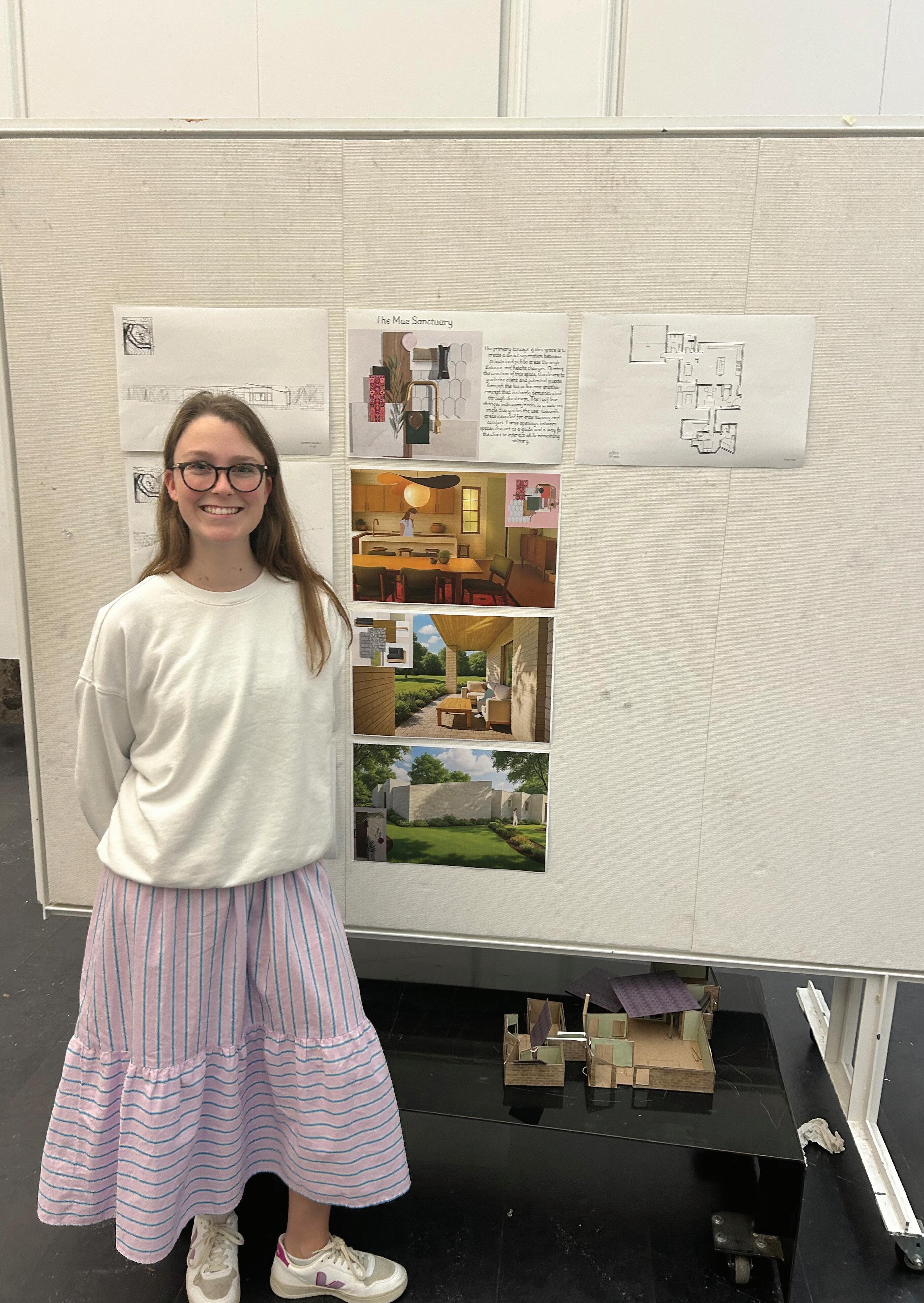
Mesa Alm Portfolio
Project #6 “Precedent Study”
- We leared about well known houses to better understand their structures and the ideas behind them.
- Things like lighting and functionality
Project #7 “Space Program”
- Here we built our initial ideas for our houses. We started thinking through our overal design concepts adn meaning and intentions behind each room we created.
Project #8 “Space Design”
- We began to put all of our rooms together to create the overal structure of our house.
- Then we drew elevations and sections to give a better idea of the product.
Project #9 “Presentation”
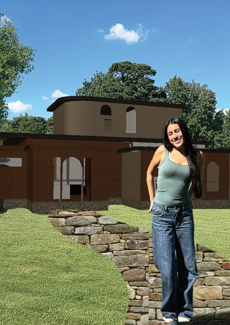
- As we finalized floor plans and elevations, and chose materials and perspective views I began to see my house come together. We learned what it means to present a product to a client and recieved real feedback from an architecture firm during our final review.
Project #10 “VR & AR Experiene”
- This experiences made me rethink how I represent and explain my designs by highlighting the importance of mood, movement, and perspective. I’d like to shift from static drawings to more dynamic tools, like animated walkthroughs, layered diagrams, and user-perspective visuals, to better capture the feeling and flow of a space.
If you could talk to you before these five weeks, what would you like to share with you?
- It’s not gong to be easy, and you arae going to want to give up, but to be able to look past the temporary hardship and know you wll be rewarded in the future, you will be able to have such a better perspective on this program as a whole. Make sure to have fun, be creative and express yourself through your work!
Power of Patience
Learning Objective
Students will have an opportunity to develop their ways of seeing, which are engaging and envisioning an object through deceleration and immersive attention. In addition, they will learn about the art elements and design principles.
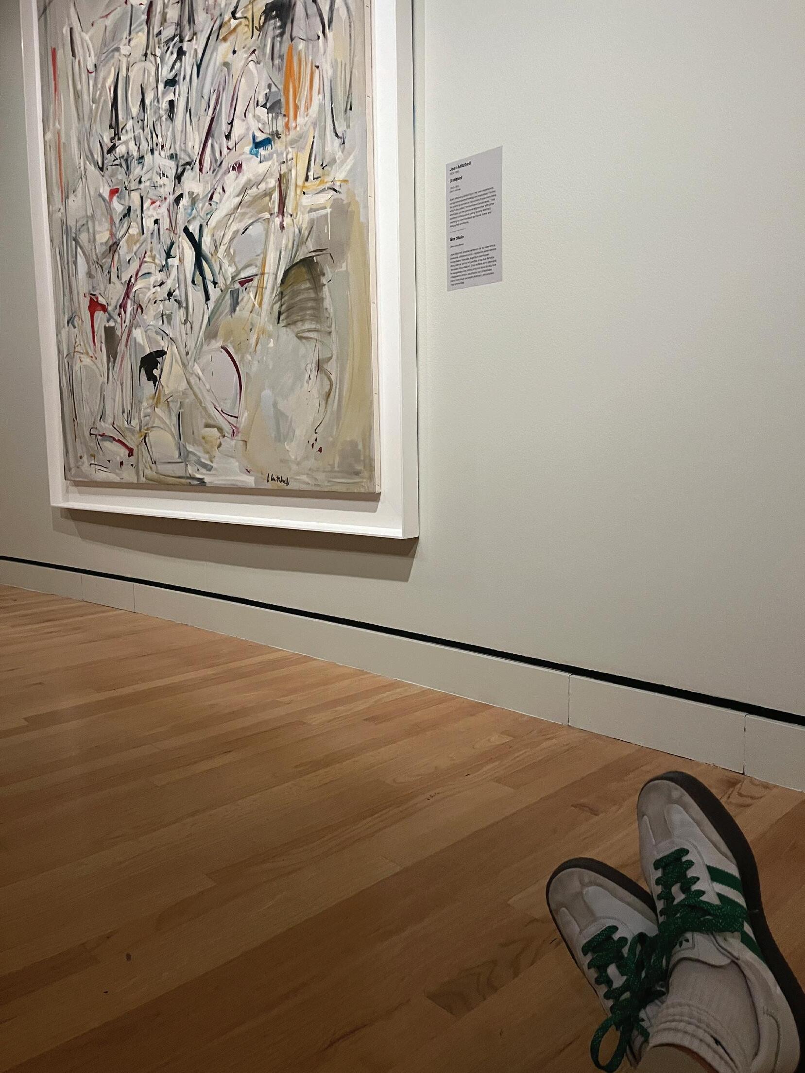
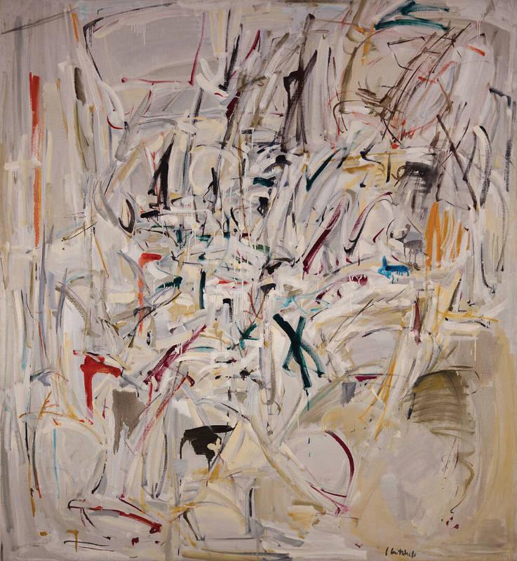
Untitled By Joan Mitchell
“Art Elements and Design principles in the Painting”
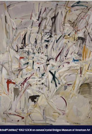
Art Elements and Design Principles in Joan Mitchell’s Untitled (1952-1953)
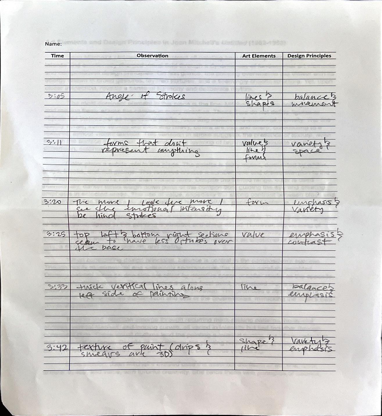
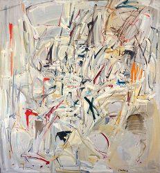
Joan Mitchell’s Untitled, a large abstract oil painting from the early 1950s, presents an intense and emotionally charged visual field through a dynamic use of fundamental art elements and compositional design principles. On first glance, the painting overwhelms the viewer with its energy shown in broad gestures, layered textures, and a seemingly chaotic structure. Yet, upon closer inspection, reveals a sense of harmony and deliberate rhythm.
The most dominant element in this piece is the line. Mitchell’s lines are bold, gestural, and moving freely across the canvas in every direction. These lines do not define figures or objects but instead act as expressive marks, recording motion and emotional intensity. The line quality varies; some strokes are thick and heavy, others are thin and sharp, contributing to a textured, almost violent surface. This variation in stroke suggests the presence of texture, even though the surface itself is flat. The overlapping layering of brushstrokes simulate depth and dimension, emphasizing the physical act of painting.
Color plays a subtle role in this piece. The palette is fairly muted, dominated by whites, grays, blacks, and dull greens. This restraint creates a somber tone and draws attention to the contrast between marks rather than vibrant hues. Despite the limited range, color is used intentionally, darker tones weigh down parts of the composition, guiding the eye and creating emphasis in selected areas. The use of value, especially the strong contrast between black and white, intensifies the work’s visual impact and helps establish depth and balance.
From a spatial standpoint, Mitchell resists traditional perspective. There is no foreground or background. Space in this painting is abstract and compressed. However, the layering of lines and shifts in value create a loose sense of space, giving the eye pathways to travel through. Rather than stimulating real-word space, Mitchell offers an emotional or psychological one, a space of memory, gesture, and feeling.
When considering design principles, balance is central to the composition’s success. Though highly asymmetrical and seemingly spontaneous, this piece is carefully weighted. Densely painted areas on one side are offset by negative space or softer marks on the opposite, maintaining visual stability. The work lacks a single focal point, but instead draws the viewer’s gaze across the canvas in a continual state of exploration. This promotes a strong sense of movement; the eye follows the direction and flow of the brushstrokes, mimicking the artist’s own physical gestures.
Rhythm and repetition emerge through recurring mark-making patterns, horizontal scrapes, vertical slashes, and looping curves, all varied in intensity but tied together through consistent style. These visual rhythms lend the painting a musical quality, one of improvisation and emotional cadence. Despite its raw energy, the painting holds a sense of unity. All parts of the work feel interconnected, as if part of a single, continuous outpouring.
In conclusion, Joan Mitchell’s Untitled uses the essential elements of art, line, color, texture, space, and value, with forceful creativity. She binds these with principles of balance, movement, rhythm, and unity to build a deeply expressive and harmonious abstract composition. Through observation alone, it becomes clear that her work is not random chaos but a structured emotional language, communicated through mark-making at its purest.
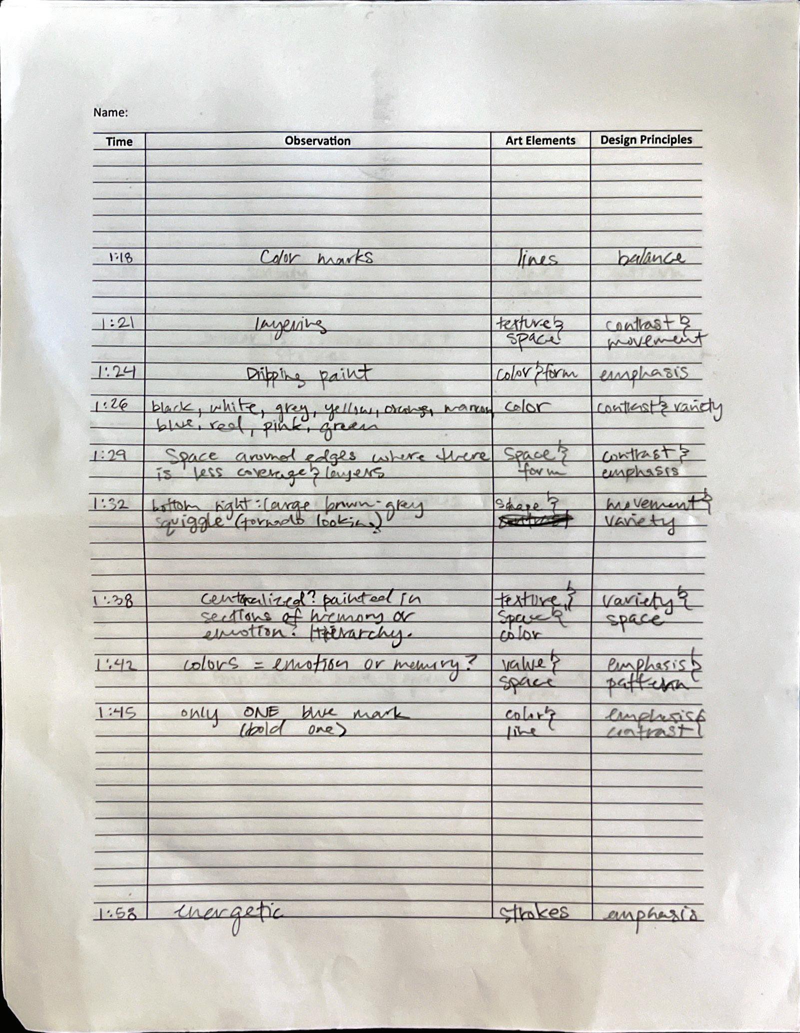
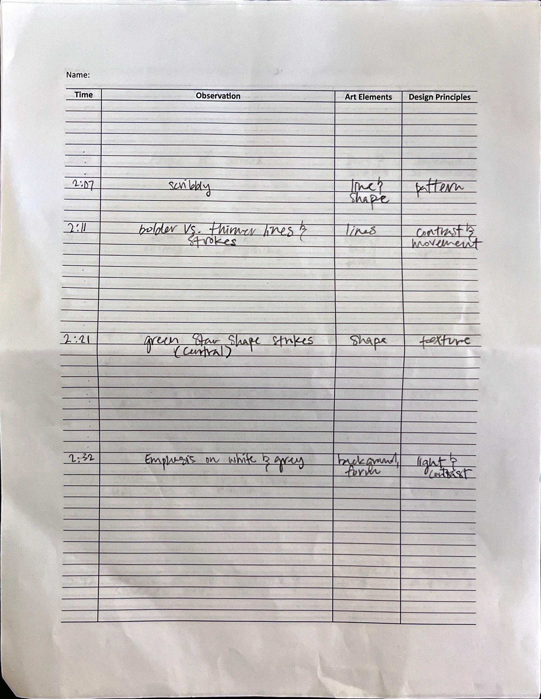
Scanned your observation sheet 2
“Art Elements and Design principles in the Painting”
Art Elements and Design Principles in Joan Mitchell’s Untitled (1952-1953)
Joan Mitchell’s Untitled (1952–1953) is a powerful exploration of abstract expressionism, engaging the viewer with a visceral, emotionally charged composition built through the careful orchestration of art elements and design principles. At first glance, the painting appears chaotic and aggressive, but further observation reveals a calculated balance of form, movement, and energy.
Line is the most prominent element in this work. Mitchell employs sweeping, gestural strokes that sprawl across the canvas in all directions. These lines don’t represent objects but serve as dynamic records of motion, embodying the emotional state of the artist. The brushwork ranges from sharp and narrow to thick and dense, creating implied texture and evoking physical depth despite the flat canvas surface. This varied mark-making draws attention to the very act of painting itself.
Color in the painting is notably restrained. Dominated by shades of white, black, gray, and hints of green and red, the muted palette emphasizes tonal contrast over chromatic variety. Darker areas are used deliberately to anchor certain zones, guiding the viewer’s gaze and reinforcing compositional emphasis through value contrasts. Spatially, the work dismisses conventional depth. There is no linear perspective or clear distinction between foreground and background. Instead, space is established through overlapping strokes, tonal layering, and rhythmic variation. This compressed, ambiguous spatial field invites the viewer into a psychological rather than physical environment, one full Of memory, feeling, and gesture. Among design principles, balance stands out as a core strength. Though the painting is non-representational and asymmetrical, visual weight is distributed evenly. Dense clusters of brushstrokes on one side are counterbalanced by lighter, more open spaces on the other. Movement is created through the vigorous directionality of lines, compelling the viewer’s eye to roam fluidly across the canvas in sync with the artist’s energy. Rhythm surfaces through repeated patterns of slashes, loops, and scrapes. The consistent style and gestural cohesion unify the painting, transforming its seeming disarray into a harmonious expression of emotional depth. In summary, Joan Mitchell’s *Untitled* synthesizes the elements of line, texture, value, color, and space into a composition governed by movement, rhythm, balance, and unity. Far from being accidental, the painting is a deliberate act of emotional articulation through abstract form. It exemplifies how abstract expressionism communicates not through depiction, but through pure, expressive mark-making.
“Art
Comparison Between First and Second Reports
The second report reflects a more nuanced and developed interpretation of Joan Mitchell’s Untitled (1952–1953), with several observational shifts and refinements in emphasis compared to the first.
1. Line and Gesture: While both reports identify line as the dominant element, the second report emphasizes the physicality and emotional intensity behind Mitchell’s gestures. It interprets the brushwork not only as visual movement but also as a direct extension of the artist’s inner state.
2. Color Usage: The first report describes the muted palette and its somber tone, but the second report deepens this by interpreting how the limited color range contributes to guiding the viewer’s gaze and creating visual emphasis through value contrast.
3. Texture and Surface: The initial report notes implied texture through layering. The second report expands on this, framing texture as an outcome of Mitchell’s mark-making energy and connecting it more directly to the artist’s process.
4. Space and Depth: The second report more explicitly interprets the space as psychological rather than physical. While both reports mention abstract or compressed space, the newer version emphasizes the emotional and mental space that the painting evokes.
5. Movement and Rhythm: The second report gives rhythm a stronger interpretive angle, comparing it to musical improvisation and stressing its role in unifying the composition. The first report recognizes repetition, but with less interpretive depth.
6. Balance and Unity: Both reports acknowledge the careful balance in the seemingly chaotic composition. However, the second report articulates more clearly how visual weight is managed through contrast and spatial openness.
Overall, the second report provides a deeper emotional and conceptual interpretation of the painting. It shifts from describing what is seen to exploring how these elements work together to evoke feeling, emphasizing the psychological and gestural experience that defines Mitchell’s abstract expressionism.
Rebeca Casco Martinez
Portfolio
What I learned...
Project #6 “Precedent Study”
- I learned how to develop a spatially and understanding of residential design by taking a look at multiple precedents. By observing how other designers incorporated certain elements, it inspired me to be more creative and technical with my design choices.
Project #7 “Space Program”
- I learned of the process of developing a well thoughtout spatial progam for certain zones of our homes. I was able to have a glimpse of the requirements needed to understand the interaction between human behavior and the environment. I gained a better sense of realistic spatial proportions, especially how generous circulation impacts how a space feels, not just functions.
Project #8 “Space Design”
- I learned how to refine my conceptual design by incorporating spatial sequence, light, atmosphere, and user experience into my massing model. Eventually turning my concepts into floor plans that reflect my architectural intent. I learned how to use lighting, proportain, and structures can create different perspectives our our study form.
Project #9 “Presentation”
- I learned how to communicate my design to others by developing rendered perspectives and incorporating elaborate models and conceptual collages. Which went into presenting our final projects in a formal setting, where we had to articlate our design process and concepts.
Project #10 “VR & AR Experiene”
- I learned how to view my work through the eyes of the user not just the designer by taking a look at how my design interacts with the real world. I gained a better understanding on using tools like VR and AR in order to develop well thought out design that takes into account the user’s perspective.
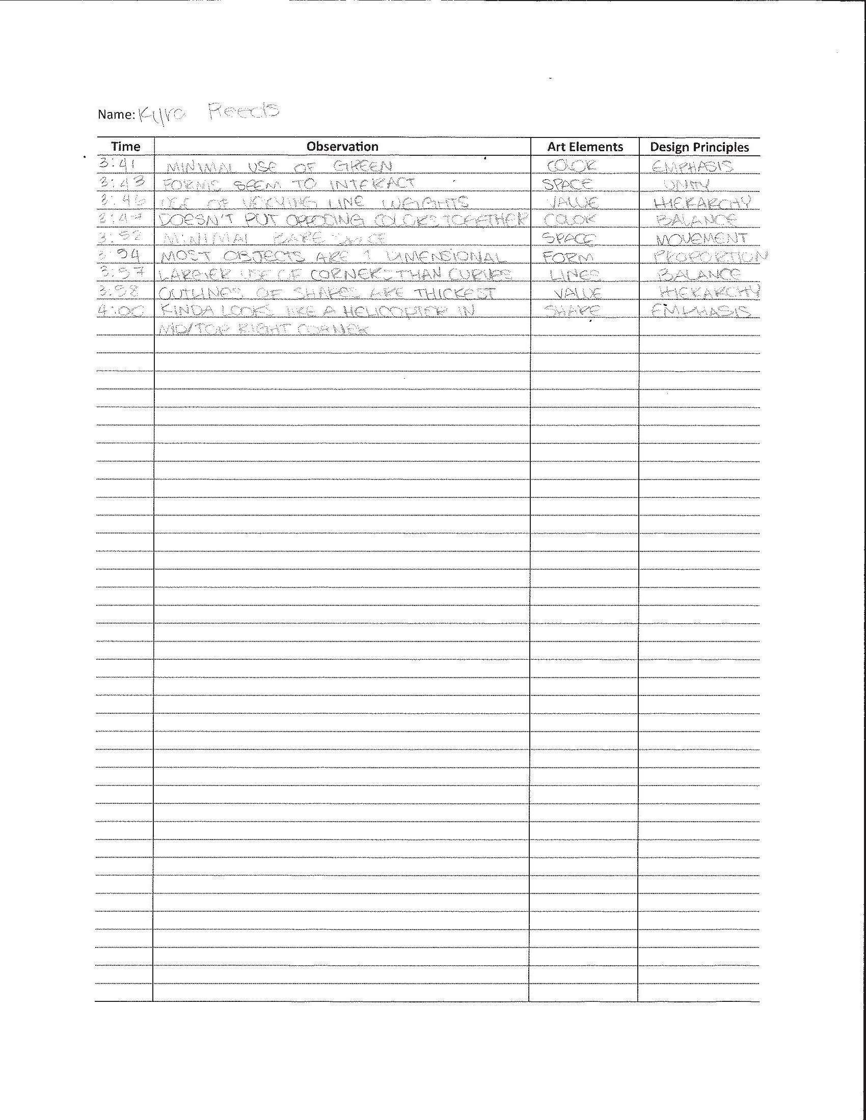
Project #12 “3 Hours observation”
- I learned how to be patient with my observations and look at certain things with a different eye. I gained a better perspective of abstract art and that art is in the eye of the beholder.
Overall
- Overall I had a great opportunity to develop a design that both works for me and functions in the real world. By Studying different precedents, creating a space program and design, communicating my work, and experiencing VR and AR I was able to gain a better understanding on how the design process works, and all that goes into developing a well thought out design.
If you could talk to you before these five weeks, what would you like to share with you?
- I would tell my past self that it gets better, that once you learn to push through, the process of designing becomes an enjoyable experience that will help you in the long run.
Power of Patience
Learning Objective
Students will have an opportunity to develop their ways of seeing, which are engaging and envisioning an object through deceleration and immersive attention. In addition, they will learn about the art elements and design principles.
The untitled work by Joan Mitchell showcases a variety of lines that go in different directions. It’s clear that this particular piece is an abstract painting, meant to depict movement and hierarchy through the use of lines and color. At first glance, I noticed the line movement and how each line is unique to the other; not one line is the same, with each one going in all different directions. I also noticed the use of color, how the color pops out in comparison to the white, muted background. These two elements are combined to represent hierarchy. With the darker colors centered in the middle while the brighter colors spread out to the edges, as well as the center of the piece clustered with a wider variety of lines. With all this in mind, I also noticed that the line work added texture to the painting, how certain lines pop out more compared to the others, and how this goes on to add depth to the overall painting. This painting plays with your eyes, drawing your eyes to the different movements and colors present in the work. At first glance, I was only able to see the lines and color, but after taking some time to really look at it, I can detect the design principles used to make this piece stunning to look at, like line, color, and texture.
Work #3. Second Report:
“Art Elements and Design principles in the Painting”
The work by Joan Mitchell takes a look at emotion through the use of lines and color. Although many may look at Joan’s work and simply see lines moving in meaningless directions, her work is meant to give a sense of freedom and emotional impact. Each line is intentional, with the different brush strokes representing a type of emotion, such as joy, sadness, or peace. Her work takes inspiration from landscapes, centering more on memory and feeling rather than literal observation. With all this in mind, it’s important to note that she does not include a direct narrative in her piece, in the hope that her abstract painting be interpreted differently by each one of her viewers.
The main focal point of Joan’s untitled work is the linework and the pops of colors seen throughout the painting. This creates movement as well as hierarchy, with the varying linework catching the eye of its viewer and causing the viewer to notice several things at once. Such as the sharp lines, the textured streaks, and the different shapes formed by the lines. On top of that, it’s clear that the lines are centralized, with a cluster of thinner lines centered in the middle of the painting, while they slowly expand out to the edge, becoming thicker and more spaced a part. This creates a sense of hierarchy, placing significance in the center.
Color also plays an important role in depicting hierarchy in this work, with a variety of darker colors focused on the middle of the painting, and the more neutral colors spread out to the edge. With it, color adds emphasis to the work, causing the color to pop out in comparison to the grayish, muted background. Which represents the array of emotions present in this piece.
Texture can be seen in the varying stroke lines and widths, how some of the paint strokes are softer than others, allowing the backdrop to be visible. While there are some paint strokes that pop out both literally and figuratively due to their thickness and application. We can also see a layering of lines and color, giving depth to the overall painting and creating a multitude of patterns.
Overall, the untitled work by Joan Mitchell incorporates a variety of design elements and principles in order to express emotion into the work. Using lines, colors, texture, movement, hierarchy, and patterns to give viewers freedom to interact with and give meaning to the work.
Comparison
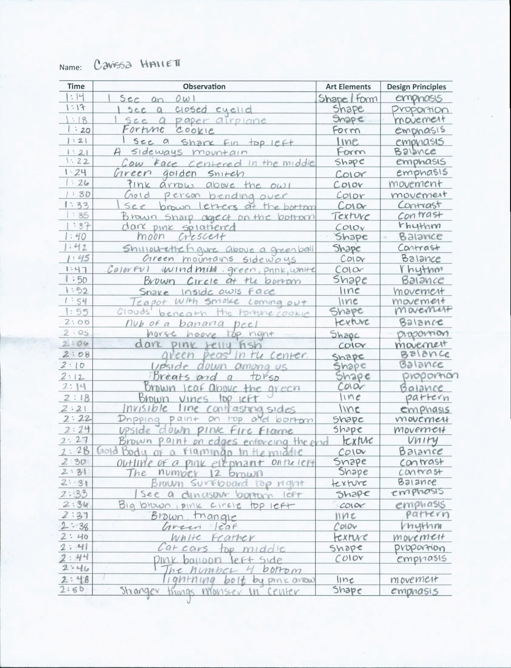
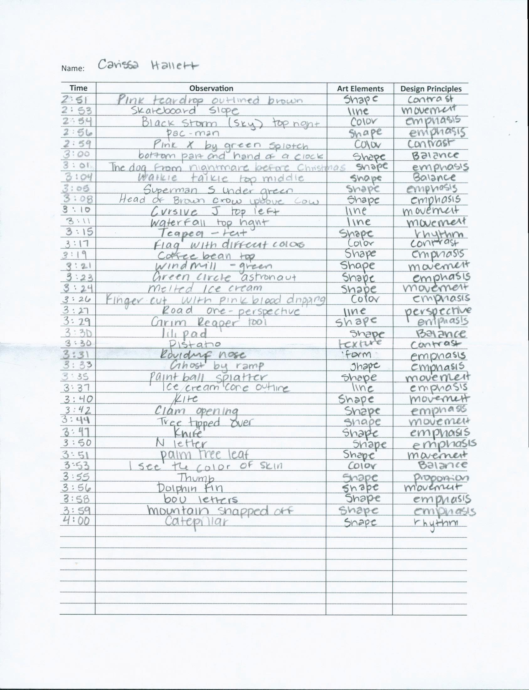
After taking the time to reflect on my two reports on the Untitled work by Joan Mitchell, I have come to notice a great difference between the two. To start with, each writing takes a look at line work and color used to create movement and hierarchy in the painting. However, looking back on my first report, I noticed the lack of detail I put into it in comparison to my second report. In my second report, I made sure to include all the different design elements and principles I observed in the three-hour observation, even the little things like the line’s interaction with one another. While my first report only looked at the core elements I noticed in the spam of an hour. Which brings me to my next observation, I was able to notice so much more in three hours than I was in an hour. Being in front of the actual painting allowed me to depict the texture, color, and overall structure of the painting, which resulted in a more thoughtful report that displays all the little details that I noticed. I was also able to truly appreciate the work, interpret the array of lines and emotions present. In my first report I only focused on literal observations and not the meaning of the work. However, when it came to writing my second report, I ensured that I incorporated the emotions and the purpose of the work. Overall, the biggest difference between the two reports was the attention to detail I put into the two. The first one only touched a small percentage of the work, while the second went more into depth about everything I discovered on the three-hour observation.
Carissa Hallett
Portfolio
What I learned...
Project #6 “Precedent Study”
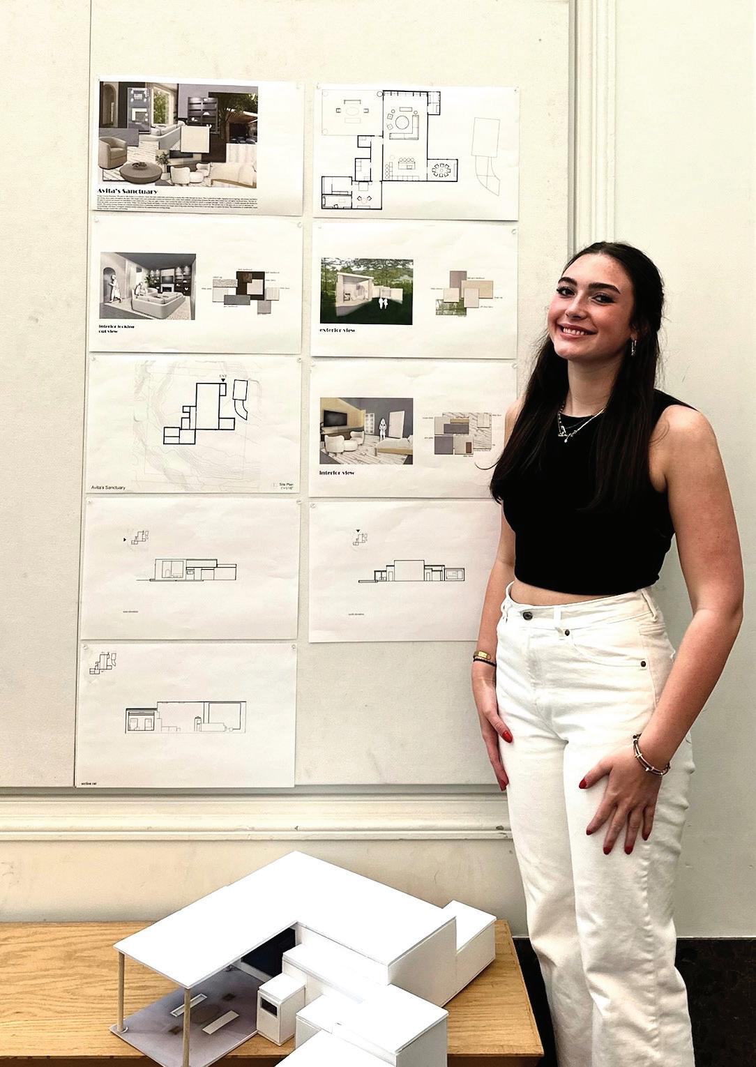
- In this project, I studied different building types to understand how it was made and why it worked. I learned how to look closely at the layout, materials, and the way people move through the space. It helped me realize that every design choice has a reason behind it, and that good spaces are created by understanding how people live and move.
Project #7 “Space Program”
- This project was about planning what kinds of rooms or spaces were needed, and how they should connect. I had to think not just about shapes or styles, but what the space would be used for and by who. It made me more aware of how important it is to think about the user’s needs first before drawing or building anything.
Project #8 “Space Design”
- This was when I finally got to create my own space using what I learned. It was exciting but also challenging. I had to make a lot of changes and try different layouts. I realized that design is not just about what looks cool—it’s about how it feels to be inside and how everything fits together. This was when I started really thinking like a designer.
Project #9 “Presentation”
- In this project, I had to explain my design clearly using drawings, models, and words. It wasn’t enough to just do the work, I had to show and tell why my design made sense. I learned how important it is to communicate your ideas well, and how a good presentation can help people understand and connect with your work.
Project #10 “VR & AR Experiene”
- Trying out my space in virtual reality and augmented reality helped me see it in a new way. It felt more real than just looking at a drawing. I could walk around in the space and notice what worked and what felt off. It helped me think more about the user’s point of view and how to design spaces that feel good to move through.
Project #12 “3 Hours observation”
- For this project, I spent three hours just looking at one piece of artwork. At first, it was hard to stay focused for so long, but the more I looked, the more details I noticed things like colors, shapes, and how the artist used space. It taught me to slow down and really observe, which helped me understand how powerful small details can be in creating meaning and emotion in art and design.
Overall
- Over these five weeks, I learned that design is not just drawing cool buildings it’s about problem-solving, thinking about people, and constantly improving your ideas. Each project built on the last one and helped me grow more confident. I also started to trust my instincts more and saw how my ideas could really turn into something real.
If you could talk to you before these five weeks, what would you like to share with you?
- “Don’t be afraid to try new things, and don’t worry if your first idea isn’t perfect. Every step you take helps you learn. Be open, ask questions, and keep pushing your design forward. You’re going to surprise yourself.” Overall “stop trying to be a perfectionist, you will make mistakes and improve along the way.”
Power of Patience
Learning Objective
Students will have an opportunity to develop their ways of seeing, which are engaging and envisioning an object through deceleration and immersive attention. In addition, they will learn about the art elements and design principles.
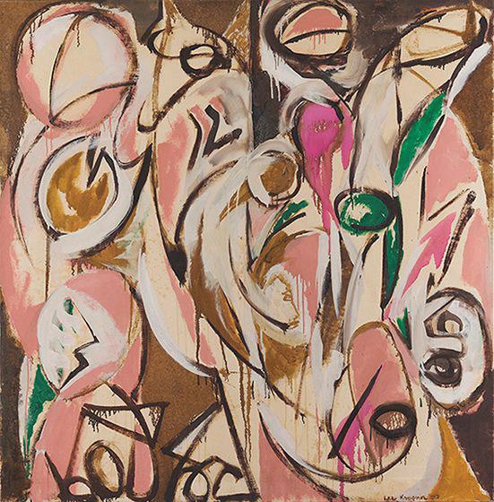
This painting shows a lot of shapes and strokes throughout the canvas. At first, it looks like a lot of splashes and random colors, however when looking closer I start to see hidden figures as well as random faces. In the bottom right of the canvas I see a owl face peeking out. The artist uses a lot of pinks and browns and white, allowing the figures or objects to pop out. The shapes in the painting are round and curvy looking like heads and eyes. Some of them look like faces, however not the entire face contour is just parts. In the bottom left corner in the white and pink oval there is a shape representing a nose contour. In the top right in highlighted with brown strokes almost looks like a close eyelid.
The face-like shapes seem to be floating or mixing, almost like they are tangled together. In the middle I observed there was a figure in the middle with a brown fill and a white highlight. It almost looks like they are bending down and helping pick up something. There are several shapes and overlapping curved lines. Thick. Brush strokes loop across the canvas. At the bottom of the canvas are solid brown shapes, they almost look like numbers or a paper airplane.
Re-Echo
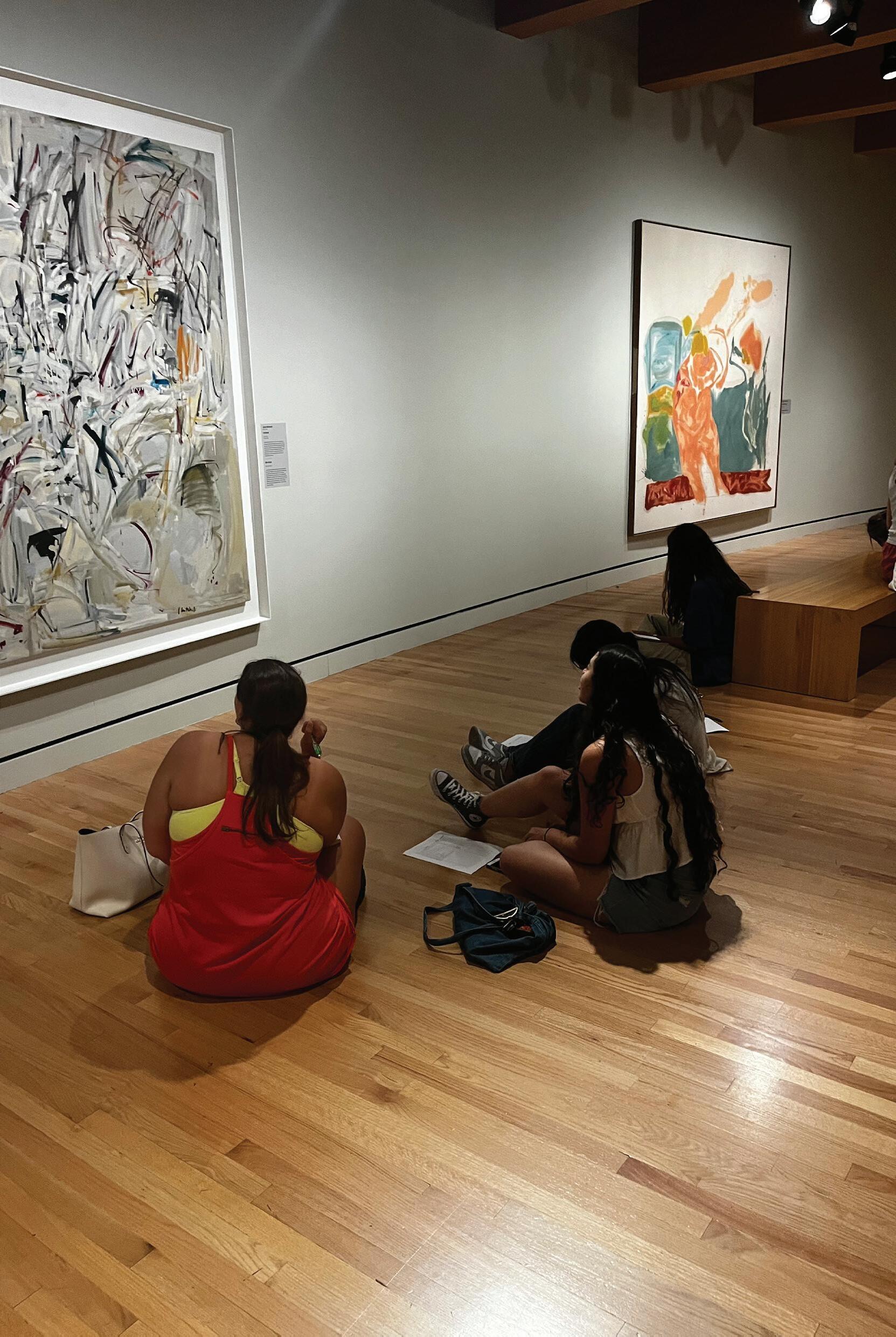
On July 14th earlier this week, I returned to Crystal Bridges Museum. We were assigned to spend the full 3 hours observing a single piece of artwork. I was assigned to the piece of art named “ReEcho” by Lee Krasner. Before going to the museum, we were to look at the piece of artwork for the first time and figure out what we were observing. As we settled into the museum, I sat myself in front of the piece of artwork, I realized how time, stillness, and focused attention could allow you to see the different layers and pictures behind each brush stroke. I realized when sitting in front of the piece of artwork how I completely overlooked a lot of things being presented in the artwork. Doing this observation exercise challenged not only my patience, but my way of interpreting different visual elements. At first glance, “Re-Echo” was a swirl of medium tones, earthy ochres, and abstract forms. I remember thinking it was chaotic and didn’t really represent an image. But the longer I sat, the more it unfolded. The rounded shapes began to feel organic, like an image of an owl in the bottom right corner, and the muted browns whispered of decay. It was a strange balance, softness and shadow all held in tension on a single canvas. I later learned that Krasner painted this piece after the death of her husband, Jackson Pollock. That knowledge re framed everything. Suddenly, the painting wasn’t just abstract, and a bunch of random strokes placed on the canvas. This canvas showed how grief is portrayed. And in that moment, I saw “Re-Echo” not as chaotic, but as courageous. Sitting there, I realized how often I had dismissed abstraction as inaccessible and not really art. But Krasner’s work taught me that emotion doesn’t need to be literal or even have to be an exact representation of something, however, can represent emotions. Her brushwork echoed something inside me loss, resilience, transformation. I left the museum changed, not just in how I view art, but in how I understand expression.
First Look and Last Look
Art has a way of reflecting back parts of ourselves we didn’t know were waiting to be understood. When spending time at the Crystal Bridges Museum I was designated to a specific piece of artwork, which happened to be Lee Krasner’s Re-Echo. It began as a moment of quiet observation but unfolded into a layered journey. The two written reflections I composed on this encounter reveal not only what I saw in the painting, but how my way of seeing has evolved.
The earlier report begins with emotion: I recall sitting in front of the Re-Echo, feeling overwhelmed by its dense abstraction. It appeared chaotic at first splashes of color with little meaning. But as I lingered, the painting softened. The more I learned about Krasner’s life, particularly her response to the death of Jackson Pollock, the deeper the painting’s abstract tension felt. In contrast, the second reflection, written later, centered on observation. Rather than exploring how the Re-Echo made me feel, I documented what I saw: faces embedded in color, an owl-like figure peeking out, the curvature of what might be eyelids or noses. I noticed shapes that floated, tangled, and bent—some implying motion, others stillness. Where my first response found metaphor and emotion, my second was dedicated more towards the detail and structure, decoding the layers of abstraction with patience and precision.
The difference between the two documents reveals a shift in my relationship as a viewer. At first, I was responding to Re-Echo emotionally. Later, I responded visually, picking apart its complexity with a designer’s eye. Together, these perspectives form a fuller picture of how art communicates not only through what it means, but through how it’s made. In both essays, the Re-Echo remained the same. But I didn’t. I moved from viewer to interpreter.
Ava Harrington Portfolio
What I learned...
Project #6 “Precedent Study”
- During our time working and studying different precedents, I found it to be an opportunity to learn how to slow down and pay closer attention to details and making intentional decisions. Researching the origins, processes, and design strategies of these precedents, I was also able to gain an understanding of my own design style, likes and dislikes. Each precedent provided me a different point of view on architectural styles and decisions, opening my eyes for further exploration through this semester.
Project #7 “Space Program”
- This project also taught me the importance on slowing down and creating intentional decisions. We learned how to make meaningful iterations and that your first idea should almost never be the one you settle on. The process of iterating is just as important as, or even more so, than every other process through out design work. While during our crunch for time of a summer, iterating sometimes felt draining and like a waste of time, I quickly learned the true importance of testing out different versions of your ideas and intentions and the wonderful outcomes that can come from such.
Project #8 “Space Design”
- Throughout this project, we continued to iterate and experiment with different layouts and flows within our spaces. We also used tools to begin to understand the true feeling and weight within our spaces, playing with different lighting, materials, and furniture aspects. This project taught me, again, to never settle with your first idea or inspiration, to always continue editing and making your work better. That there are always aspects that can be changed and tweaked to make the design even more accurately portray your design concept.
Project #9 “Presentation”
- During our final review portion of this semester, I was tested in many ways and learned a lot about myself in the end. It pushed me outside my comfort zone and made me a stronger person because of it. I learned to always be confident and true to your work, and to always have a reason and intention behind every aspect of it. While I did feel extremely rushed in the process of creating my own house design, it ultimately taught me to be confident and intention in all of my work despite certain outside factors making it difficult.
Project #10 “VR & AR Experiene”
- Working with VR and AR tools to further explore the house I created, I learned that there are wonderful tools at our advantage to continue using in the design process in the future. Having these virtual experienes within my space further allowed me to understand the true feeling my space created and how well it was able to portray my design concept. These tools will be helpful in the future to use throughout the design process to ensure I am staying on the right track in being aligned with my initial concept.
Project #12 “3 Hours observation”
- This project truly taught me the power of patience. While I sat and observed the same piece of art for three hours straight, I was tested in many ways. From staying focused, exploring my thoughts deeper, and finding a meaning within the piece I can truly say I had never examined a work of art this closely. It ultimitaley taught me to “stop and smell the roses”, that even a piece of art that initital just looks like random brush strokes, still has incredible intention and a deeper meaning. If we look close enough, a deeper meaning can always be found within something.
Overall
- Overall this semester I learned to push through difficult times and to continue believing in myself. The transition from first to second semester this summer proved to be difficult for me, with switching locations and sitting in a new section of people. I often found myself growing with frustration this semester although that showed me truly how much I care about this field. I believe that if I didn’t truly want to succeed in this, I wouldn’t have such strong emotions when completing each step of the process. While this shows a form of character for myself, I did learn that this is also not always a positive aspect. Throughout this stressful and intense field, it is truly important to keep a calm and cool mind and to always believe in yourself.
If you could talk to you before these five weeks, what would you like to share with you?
- If I could talk to myself before these five weeks began I would tell myself to coninue being confidence. I would say that is something that changed within me transitioning between semester, the amount of confidence I exuded. I feel as though I got comfortable this semester and in a way believed in myself slightly less. I would tell my five week ago self to remain at that great level of confidence because you can achieve anything if you believe you can. Look at us now...we completed summer studio!
Power of Patience
Learning Objective
Students will have an opportunity to develop their ways of seeing, which are engaging and envisioning an object through deceleration and immersive attention. In addition, they will learn about the art elements and design principles.
“The
Power of Patience” Pre-Visit Report:
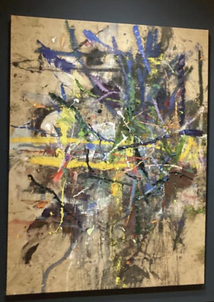
The piece Untitled by Spencer Lewis, focuses on shape and gestures through an abstract piece of linework and bright colors. This piece showcases a dynamic intertwine between color, texture, and gestural mark-making, embodying a raw emotion and spontaneity. The dominant use of line, represented by aggressive brushstrokes and layering, conveys a sense of movement and tension. Its juxtaposition of vibrant and muted colors creates an intriguing visual contrast which suggests emotional depth. Texture plays a key role in this piece while the building of paint enhances its sense of physicality and structure. Lewis also incorporates balance through asymmetry, where the weight visual elements is distributed unevenly yet also harmoniously throughout. Rhythm emerges through repetitive gestures and strokes, guiding the viewer’s eye across the chaotic yet beautiful surface.
“The Power of Patience” Post-Visit Report:
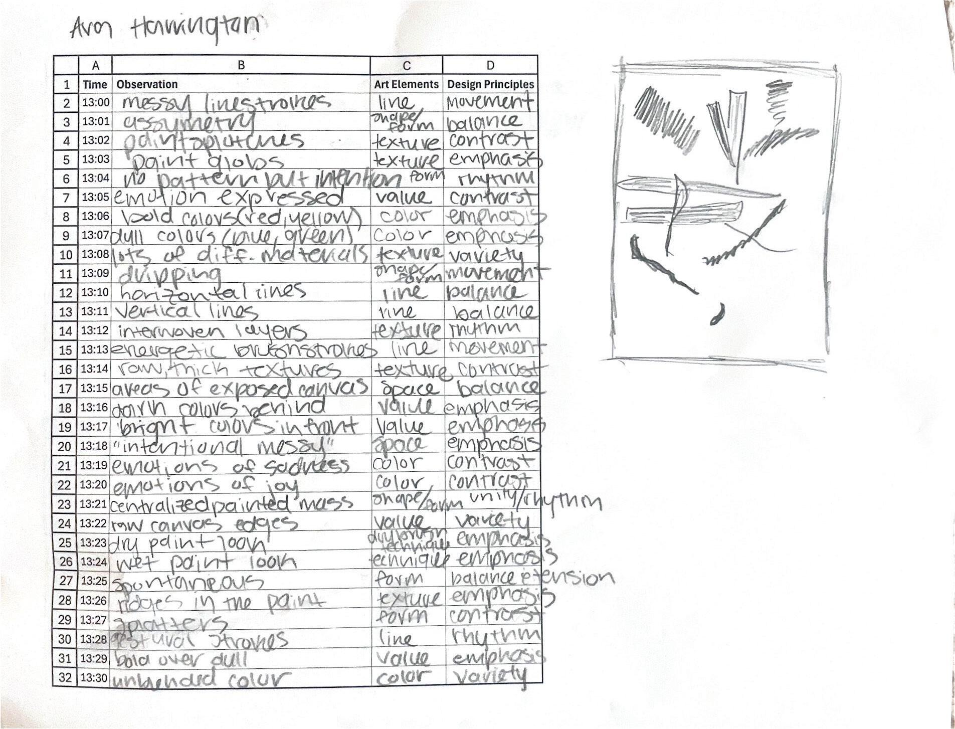
For our visit to Crystal Bridges Museum of American Art, I was assigned to observe the painting Untitled by Spencer Lewis. From a quick glance, this piece simply depicts a variation of different colored line strokes. Although after observing this piece for three hours straight, I quickly learned it has much more depth and meaning than that. This abstract piece blends line and form to create a piece about emotion and how that can change drastically. My initial observations noted that the line strokes were asymmetrical, horizontal and vertical, as well as featured paint splotches. While this orientation of the use of line implies a form of messiness, it rather creates a beautiful harmony of lines all collaborating to present a story. As I continued observing, I began to pay attention to the use of color and its intentional placement. I found that bold, bright colors were placed in the front and center of the piece, while more dull and dark colors were placed at the top and bottom of the page behind the exciting colors. To me, this represented a change in perspective and emotion. While the dull colors, mostly blues and greens, were found to represent a feeling of hurt, anger, or sadness, the bright colors, mostly reds and yellows, represented a feeling of joy and happiness. This transition from cool to warm colors can express how an individual’s emotions can change so quickly, as if they are a quick stroke of a paintbrush. In life, it can sometimes feel like everything is blue, while in reality you will always find your way to the red.
“The Power of Patience” Difference Between Reports:
Both of my reports present similar understanding of the piece, although my second report dives much deeper into it. My initial report focuses more on the objective features of the piece, geometry, colors, strokes, while my second report focuses on the subjective factors of it, the deeper meaning and how it may be interpreted by an individual. After physically being present with the piece, I feel myself having a true connection with it. I feel as though I was then able to give an authentic report of the piece, as my emotions were now at play. Looking at the piece through a screen, my report was dry and surface level. Being only a few feet away from the piece, I could feel as if it was just screaming to me its meaning, wanting me to understand its reasoning for its abstract use of line and form. Both reports express the elemental and factual features of the painting, while my second report truly does justice to the piece as it conveys the true meaning of it, or at least what an individual can feel is radiating from it within the gallery.
Marilynn Penfield Portfolio
What I learned...
Project #6 “Precedent Study”
- During this project, I was able to learn and understand how the categories from Session 1 played a roll in successful projects around the world. I was able to see how these different space created an interesting overall composition. I was then able to take these learnings and apply them to my own interpretation of my ideal space.
Project #7 “Space Program”
- This assignment allowed for me to put my learned information from the precedent studies into practice by allowing me to be creative and test out different spacial compositions. I was able to figure out what I needed and wanted in varying spaces throughout my designed home. I was able to find iterations that boosted productivity, mood, or relaxation depending on the room.
Project #8 “Space Design”
- This assignment allowed for me to grow my skills in Rhino, AI, lighting, and materials. I learned how to make the base in Rhino and use the image to create my true version by using AI tools. Photohshop is also a helpful tool that I was able to gain a better understanding of.
Project #9 “Presentation”
- During my presentation, I realized how much I had immersed myself into the process of creating this home. I felt confident about my ideas and was able to learn a lot based on the reviewers’ comments. While there are things that I would change for the following reviews, I am proud that I was able to pin-up every assignment and confidently talk about my work.
Project #10 “VR & AR Experience”
- For this assignment, I learned how drastically AR and VR can change the feel and look of my project. I learned more about these tools and how to apply them.
Project #12 “3 Hours observation”
- This was a more difficult assignment for me because it forced me to find observations that I would have not normally found. I found that through this assignment, I was able to gain a deeper understanding and appreciation for the piece that I would have not gained otherwise.
Overall
- Overall, I am so proud of myself for completing each task to the best of my current ability. I feel like I learned so much and I feel confident that my abilities will only grow from here. I know more about different homes and what makes them so successful and I also know how to apply these successes to projects of my own.
If you could talk to you before these five weeks, what would you like to share with you?
- I would tell myself that these five weeks would be so much better than the first five weeks because of how much I had learned previously. I would explain that while these next five weeks are difficult, they are so much more enjoyable.
Power of Patience
Learning Objective
Students will have an opportunity to develop their ways of seeing, which are engaging and envisioning an object through deceleration and immersive attention. In addition, they will learn about the art elements and design principles.
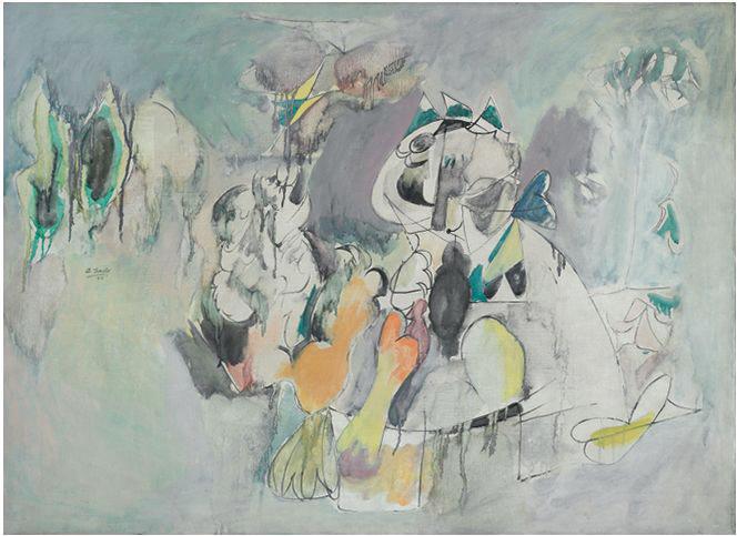
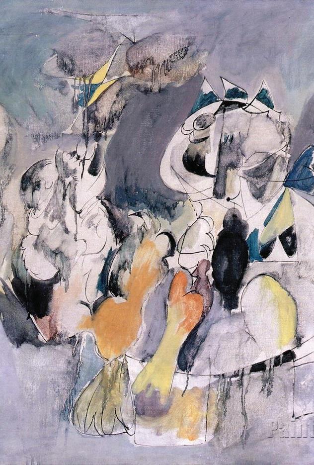
The Pirate I was completed in 1942 by Arshile Gorky, an Armenian American Abstract Expressionism and Surrealism painting. Throughout his career, Arshile Gorky was known for work that people could connect to on a deeply personal level. His work was shaped by trauma and memory and expressed in an abstract way. The Pirate I is composed of oil on approximately a 40x50 inch canvas, depending on where the painting is displayed. During the time he was composing this piece, he was deeply inspired by biomorphic abstraction artists such as Andre Masson and Joan Miro. The work is part of a bigger collection that dives into the memory and personal symbolism that Gorky experienced throughout his childhood. Its title, “Pirate” suggests themes of danger, loss, and playfulness that refer back to the difficult times during Gorky’s childhood. He was a survivor of the genocide and an immigrant.
The actual composition of the piece has areas of fluid and controlled movement. The more controlled elements float and interact together to represent a dream or memory. The painting’s palette is a mix of bright and muted tones to further express the different emotions of Gorky’s trauma and childhood. These colors mix in a way that shows no clear foreground or background, making the piece even more up to interpretation. The lack of clear foreground and background alludes to a more dreamlike state rather than reality.
Work #3. Second Report:
“Art Elements and Design principles in the Painting”
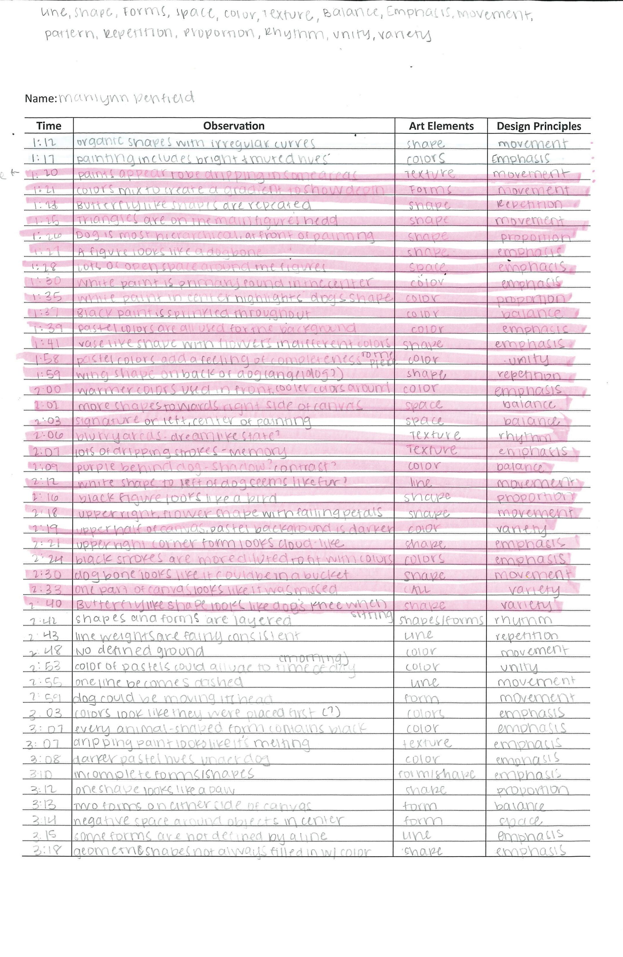
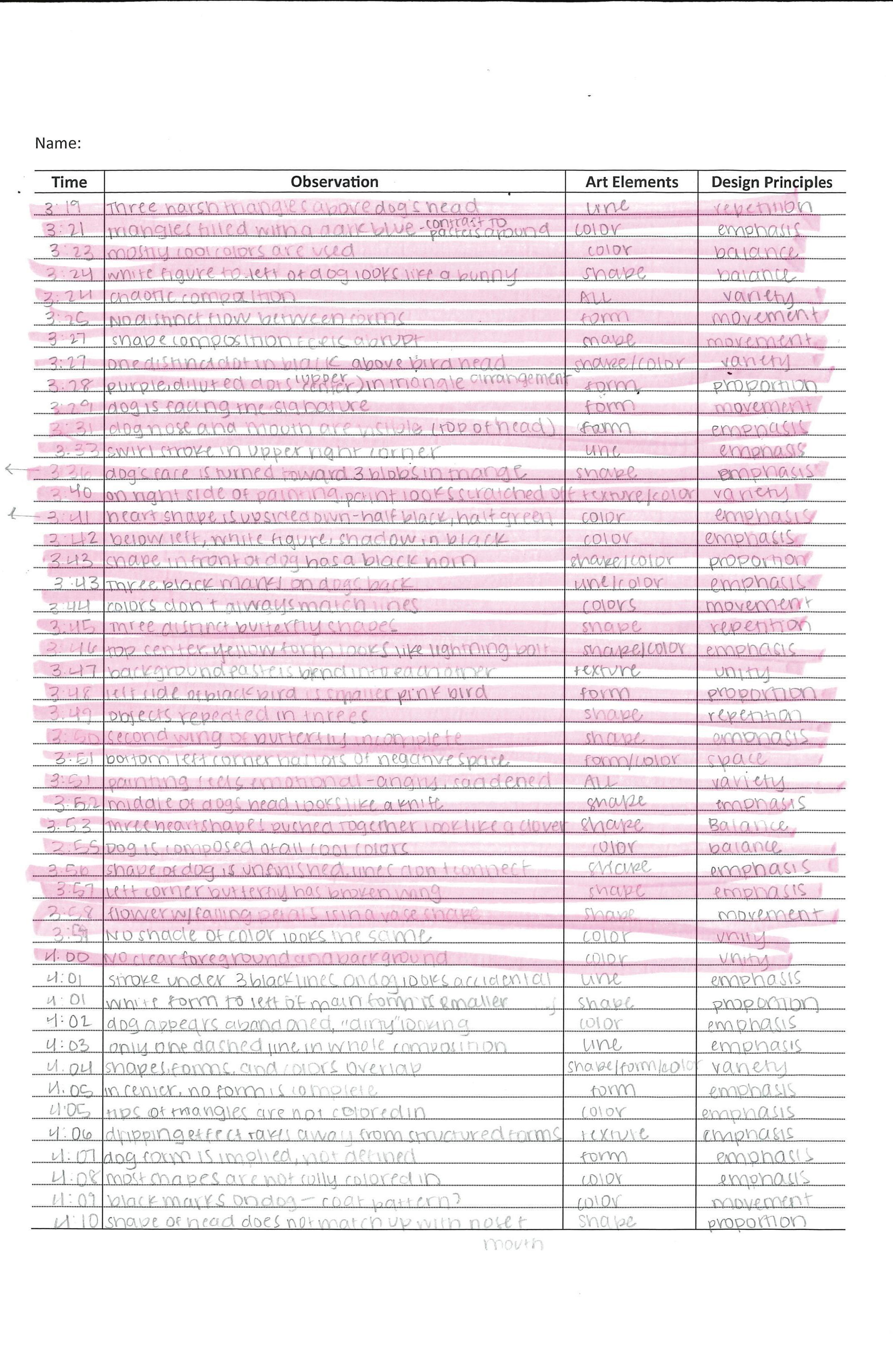
Pirate I has so much depth within simple looking strokes. From what I observed, Arshile Gorky works a lot to explain thoughts and emotions through line work and color blending. Different shapes came together from what originally looked to be random lines. Through these lines, Gorky was able to portray movement and intention. The painting had lots of areas with paint dripping, I learned that this drippage was intentional to create a different texture in the piece while hinting at the idea that the painting resembled a memory. The change in texture emphasized importance to the stroke, causing me to observe it much longer than I originally would have. It is similar instances to this that I realized Gorky’s painting is an assembly of messily painted strokes that result in a hazy, dream-like piece.
After observing this painting, I realized that the information I found previously was based on other’s interpretations rather than the actual intention of the painter. My observations allowed me to understand his intentions as well as find my own interpretations. I was able to highly analyze paint strokes and intention, forms and shapes made through line and gradients, and overall composition. My second report went more in-depth into the main points we were told to focus on, whereas my first report focuses on the history and progression of his art style and interpretation of the piece itself.
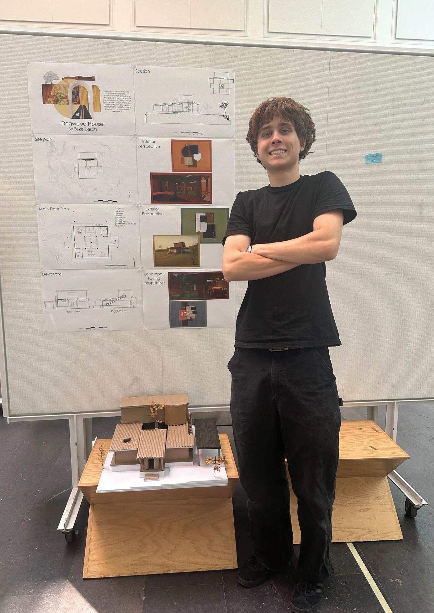
Zeke Rasch Portfolio
Project #6 “Precedent Study”
- I learned the importance of studing other architectural pieces and learning from them.
Project #7 “Space Program”
- I learned how crucial the process of background research is when designing for a client.
Project #8 “Space Design”
- I learned that iteration is an extensive process and that a design may later greatly from its original form.
Project #9 “Presentation”
- I learned that confidence is key in presentation. Your ideas dont sell themselves, you need to be able to.
Project #10 “VR & AR Experiene”
- The process of visualition is key when designing a fully proportional building.
Project #12 “3 Hours observation”
- Patience is a learned virtue that can be used as an asset throughout one’s life.
Overall
- The process of design is immensely extensive, the proces is one that seemingly never ends.
If you could talk to you before these five weeks, what would you like to share with you?
- Work the full day and sometimes even nights, when you leave work for later its always you who has to complete it.
Power of Patience
Learning Objective
Students will have an opportunity to develop their ways of seeing, which are engaging and envisioning an object through deceleration and immersive attention. In addition, they will learn about the art elements and design principles.
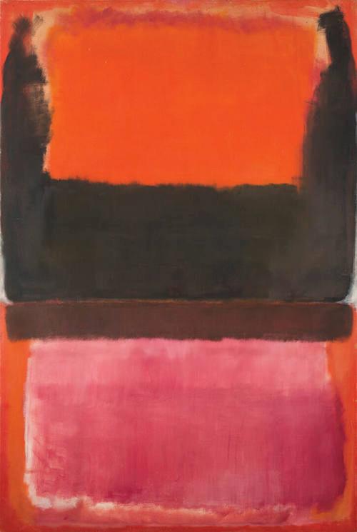
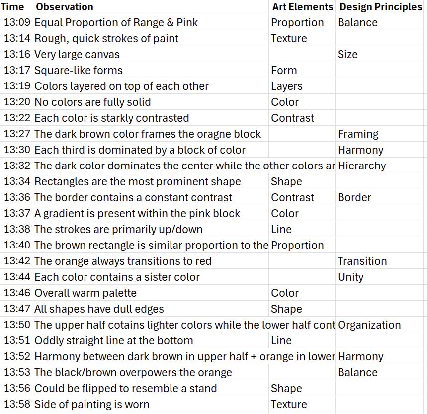
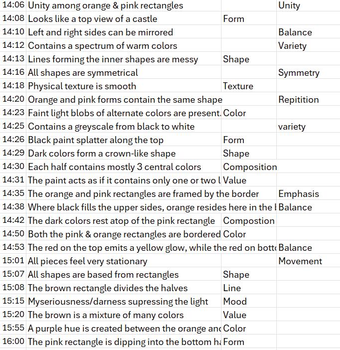
The art piece I was assigned is titled No. 21, by Mark Rothko. The center of the piece is taken up by dark colors, with the upper and lower sections being covered by brighter, more vibrant colors such as orange and red in the shade of a pinkish flower petal. The piece consists of large blocks of color, with orange, red, and brown being the primary shades. The overall picture is very warm and dark in some areas. I feel somewhat uneasy looking at this piece as the central, dark brown acts as a harsh divider between spaces. The colors are all very smooth and have their own dedicated space. Some areas contain a gradient while others are harshly set apart. There is a very minimal section of white among the sides around the central part of the piece. I have trouble finding a symbolic concept in this piece. It is hard for me to relate this to an instance of real life. However, I rather see this work being used for emotionally evocative purposes rather than symbolic of an event. This artwork contains a deep contrast between vibrant and dark colors. However, this very contrast acts as a pathway between the two, without the blackish brown, would these two vibrant sections meet in the middle or simply remain standing in place? While not intuitive at first, the deep brown may be the connection between the two, rather than the divider. The artwork as a whole contains many themes emotionally driven in nature. All the forms in this piece or relatively equal in proportion, with a brown rectangle being the outlier. There is a balance in space between the upper and lower half. A sense of unity is present as the rectangular blocks are similar in shape and form yet altered in color. The dark brown shade frames the upper orange block, while the lower pinkish rectangle is left untouched—unframed. Overall, there is a wide array of colors used within the palette of red based colors. The connection between forms and shapes is one that contains both harmony and distinction. The orange and pink shades relate to one another as they each take up a nearly equal amount of space, in their own respective section. There is a great amount of balance within this piece. The outer rim is shaped by a distinctly contrasting color while the central sections are taken by three large rectangles, each with their own claimed territory and color.
In Mark Rothko’s No. 21, Rothko utilizes balance, shape, theme reliant upon the user. Rothko did not have a key concept left for the user to interpret. His use of balance is most prominent. act as harmonious pairs which compliment each other. Rothko’s and lower halves, but also in the left-right adjacency. The painting change in appearance. His use of composition is truly apparent middle, and lower section are each dominated by a central boundary setting zones? With each block of color, from a distance combination of several other colors subtly woven in. Rothko’s as a pair—each contain elements of their sister color. Within gle contains an orange perimeter. This use of unity within prominent theme
Extrapolating from Rothko’s use of color, his consistency a spectrum solely derived of warm colors. Each large shape Rothko uses this consistency across this piece, even as each etition be symbolic of a greater theme, one which promotes commentary—the repetition in nature is what brings all components section. These assumptions of thematic ideas is Rothko’s goal is not about deriving from what is seen, but from what is felt and color, Rothko provides a space for the user to interpret wished for the viewer to create meaning
shape, and symmetry to portray his artwork which represents concept in mind as he was creating, the abstract forms were prominent. The orange and pink rectangles in opposing halves Rothko’s use of balance is further used not only in the upper painting could be mirrored from either side and retain little apparent when you divide the painting into thirds. The upper, color. What could Rothko have meant by this implication of distance they appear solid, however, they are made up of a Rothko’s use of color is truly intense, the orange and pink—acting Within the orange there resides a pink border, the pink rectanthe orange and pink/red is in my opinion the most starkly theme across the piece.
consistency is another key takeaway. The variety in color lives among shape present in the piece is made up of a rectangle in origin. each corner contains the same color. Could Rothko’s use of reppromotes unity in opposing sides? As could be an intended social components together, no matter the value or texture of the goal in creating this piece. Rothko’s use of color and spacing felt from the piece. Through use of balance, symmetry, unity, interpret the meaning which was intentionally vague in nature. He meaning rather than to receive it.
Kyra Reeds
Portfolio
What I learned...
Project #6 “Precedent Study”
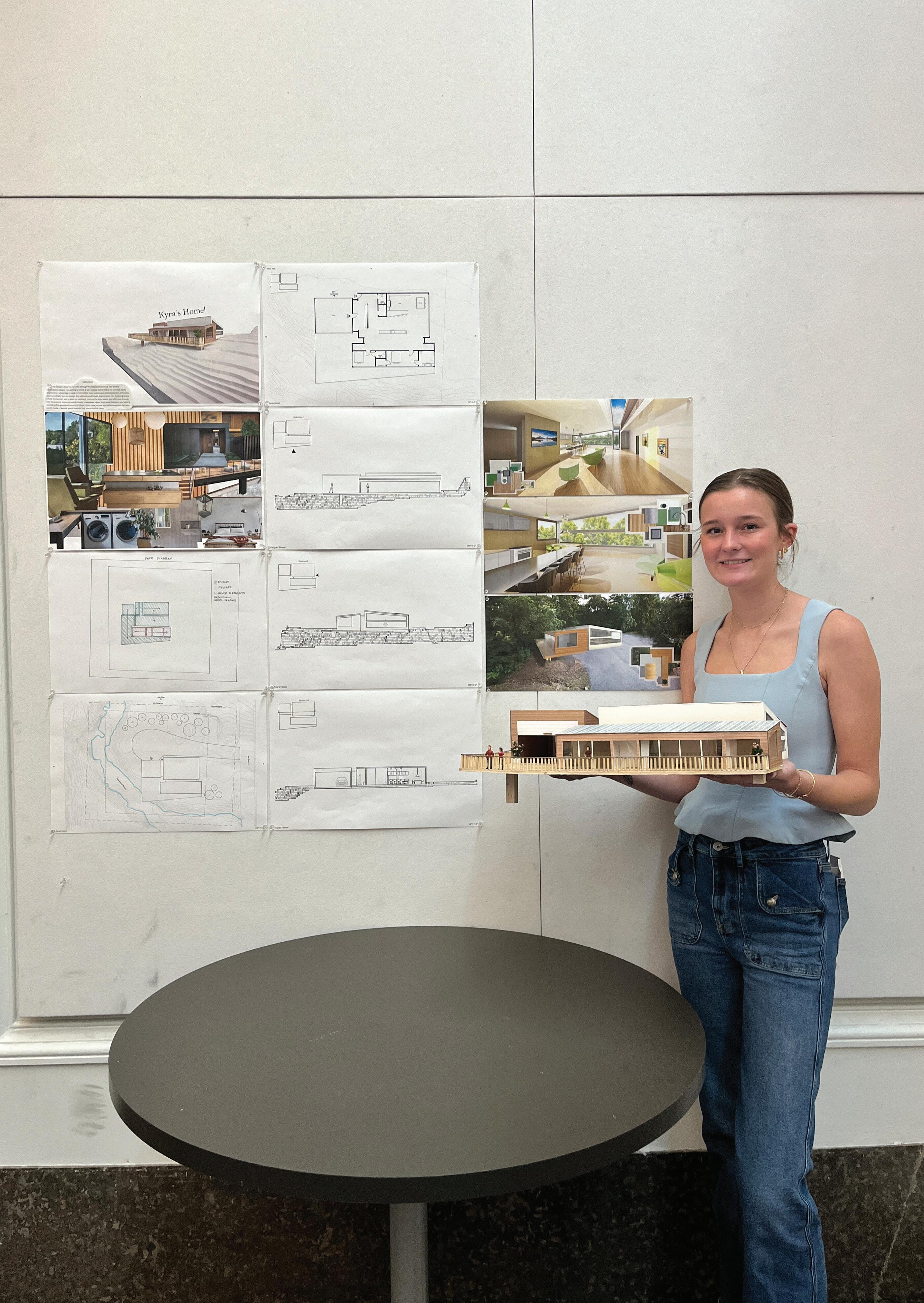
- By working on the precedent study I was able to learn what I like and dont like when it comes ot interior and exterior architecture.
Project #7 “Space Program”
- During the Space design probram I furthered my knowledge on the basics of a space. How much area you need to freely move around without feeling constrained, but balancing not makign your space to large and void like. Measurments really came into play here.
Project #8 “Space Design”
- When designing my space I was able to learn so much about prober lighting and how differetn materials can greatly inmact the mood of your space. Brighter colors and more natuiral light created a much more inviting fun space for my home in particular.
Project #9 “Presentation”
- Preparing my presentation I leanred the importance of time managment. Having all my work complete and extra time to go back and make any last minute revisions was crucial for my process. As for the actual presentation, I learned that other peoples opinions can be so helpful to develope your design and that you dont alwasy have to agree with their opinions on your home, but its nice to get others insight.
Project #10 “VR & AR Experiene”
- Through the AR and VR experience I was able fully experience my home asthough its already been build, which really brought my ideas to life and allowed me to realize what could be chnaged to improve the basics of my home.
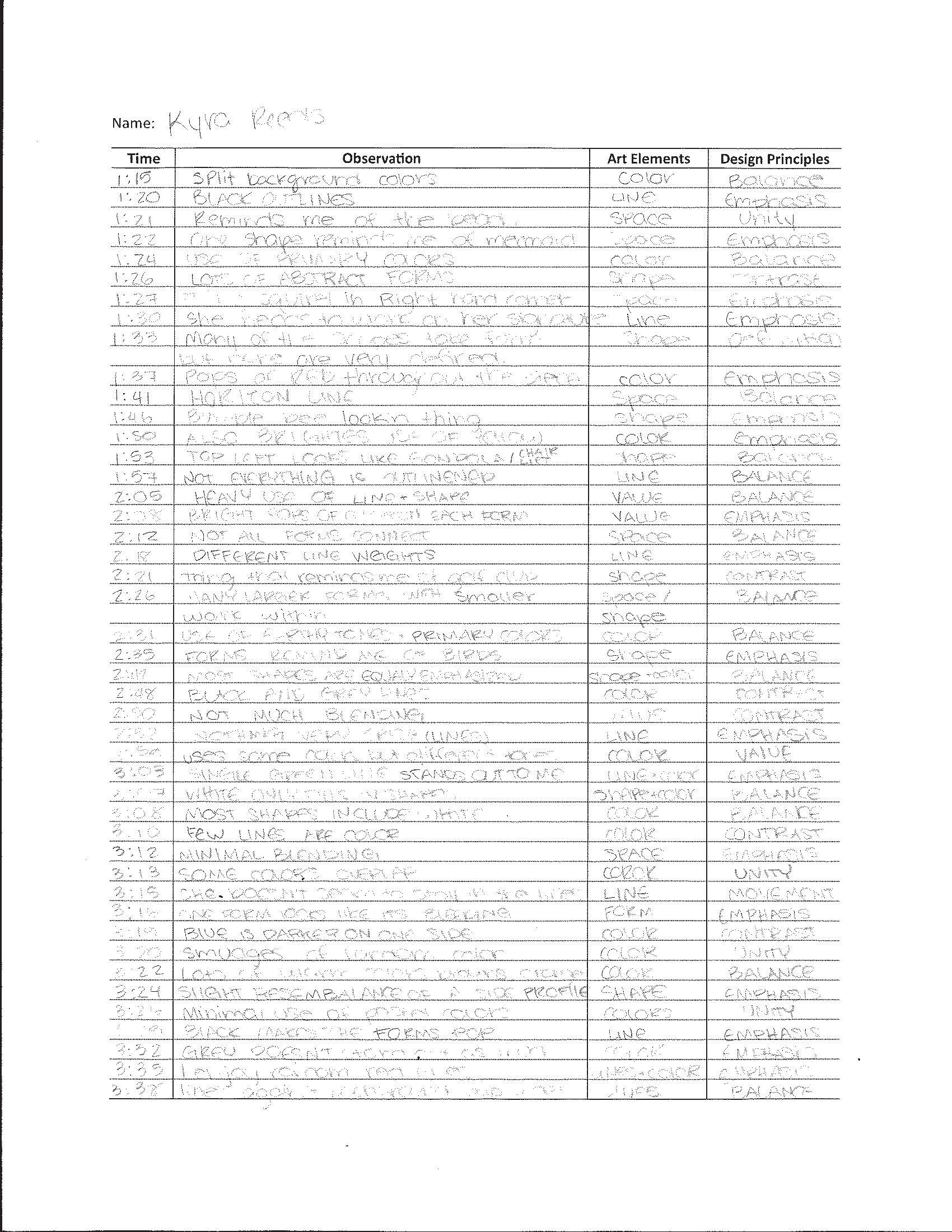
Project #12 “3 Hours observation”
- During my observation time I was able to realize the importance of taking extra time to observe. During this extended time you are able to make realizations not possible if you only sit there for a few minutes.
Overall
- I was able to learn an incredible amount! What I leanred most is that your ideas are just as important as your craft. You need to take equal time coming up with a unique and fun ideas as you do to bring the ideas to life.
If you could talk to you before these five weeks, what would you like to share with you?
- I would tell myself to stay strong, I know youre tired but the next 5 week will be so rewarding at the end. Keep killing it!
Power of Patience
Learning Objective
Students will have an opportunity to develop their ways of seeing, which are engaging and envisioning an object through deceleration and immersive attention. In addition, they will learn about the art elements and design principles.
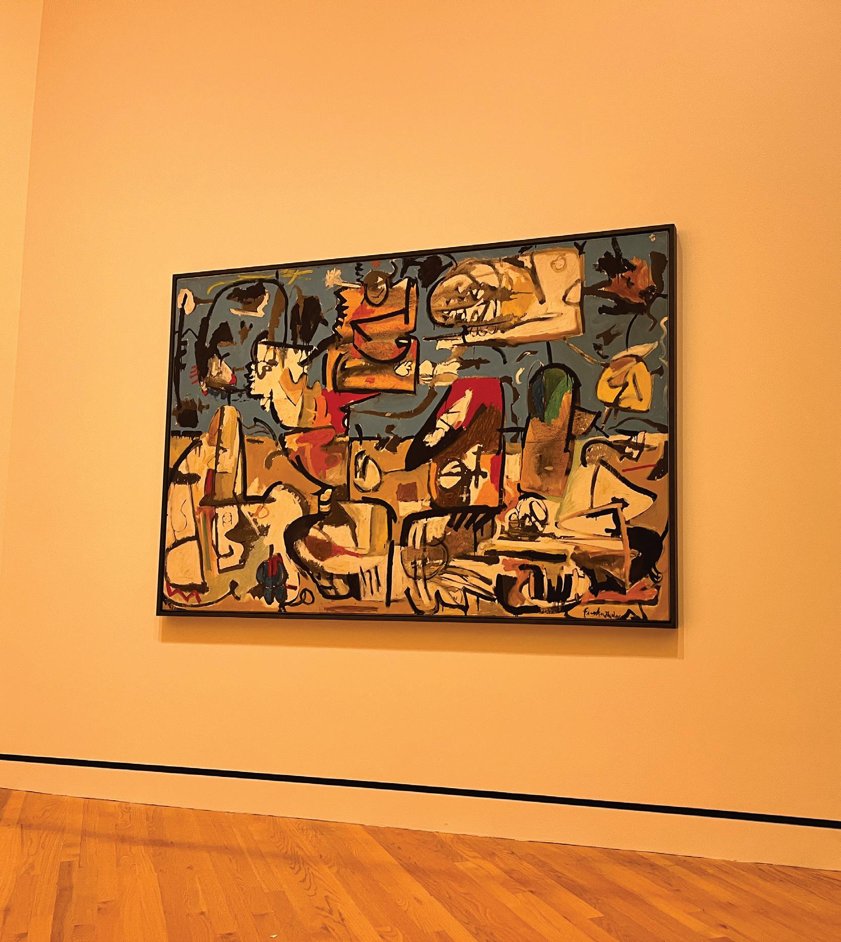
Art Elements and Design Principles in the Painting
Helen Frankenthaler’s Untitled, on display at the Crystal Bridges Museum of American Art, is a strong example of abstract painting. Frankenthaler is known for her soak-stain technique, Frankenthaler poured thinned paint onto canvas, allowing it to soak in and spread naturally. This gave her work a soft, flowing quality that feels very expressive even without showing real objects or figures.
One of the most important art elements in this piece is color. Frankenthaler uses a variety of soft and bold colors that blend and overlap. Some are light and almost see-through, while others are richer and darker. These colors create a peaceful, emotional atmosphere. The shapes in the painting are organic and irregular. They aren’t meant to look like anything specific, but they help create a balanced and interesting composition.
Line is also present, though it’s not drawn. Instead, the edges of the color fields form natural, curved lines that guide the viewer’s eye across the canvas. The texture is smooth and flat because the paint has soaked into the canvas rather than sitting on top.
Frankenthaler uses several design principles to bring the piece together. The composition is balanced, even though it’s not symmetrical. The colors and shapes feel carefully placed. There is movement as the eye follows the flow of the paint, and the use of lighter and darker areas adds contrast and visual interest. All the parts of the painting work together, creating unity
Frankenthaler ’s work shows how abstract art can still be powerful and emotional. By using color, shape, and thoughtful design, Helen Frankenthaler created a piece that feels peaceful, balanced, and full of movement all while having no particular shape or meaning
Second Report
I sat in front of Helen Frankenthaler’s Untitled for three hours at the Crystal Bridges Museum. At first, I didn’t know what I was supposed to get from staring at an abstract painting for that long. But the more time I spent with the piece, the more I noticed how thoughtful and emotional it actually is, even though it doesn’t show anything realistic.
Color is what stood out to me first. Frankenthaler uses soft, almost see-through colors alongside deeper, richer ones. The light pinks and pale yellows seemed to fade into the background, while the darker blues and browns pulled my attention forward. Over time, I realized how those color choices affect the mood of the painting it feels calm, but not boring. The colors blend and overlap in a way that feels natural, not forced.
The shapes in the painting are irregular and flowing. Nothing looks like a real object, but the way the forms are spread across the canvas creates balance. I noticed that some shapes seem to drift or move, while others feel more grounded. There are no sharp lines just the edges of color fields that form soft, curved paths for the eye to follow.
I also began to see the contrast more clearly as I spent time with it. Some areas are really faint, and others are bold, which creates visual interest and helps guide your attention around the piece. Even though the painting isn’t symmetrical, it still feels balanced and unified. Everything seems to belong where it is.
By the end of the three hours, I had a whole new appreciation for abstract art. Frankenthaler’s use of color, shape, and contrast made the painting feel peaceful but alive. I realized that even without a clear subject, this painting can still tell a story you just have to slow down and really look.
Comparisons
The first report was written after learning about the painting and looking at it briefly. It focuses on explaining the art elements and design principles like color, shape, and balance. It sounds more like a regular school paper based on what I already knew about Frankenthaler’s style.
The second report is based on sitting in front of the painting for three hours at the museum, like the assignment asked. Because I had more time to look closely, I noticed more details like how the colors blend, how the shapes feel like they’re moving, and how the contrast helps your eyes move around the painting. The second report sounds more personal and shows what I actually saw and felt during that time.
Overall, the first report explains the painting, but the second one shows how my thoughts changed after really spending time with it.
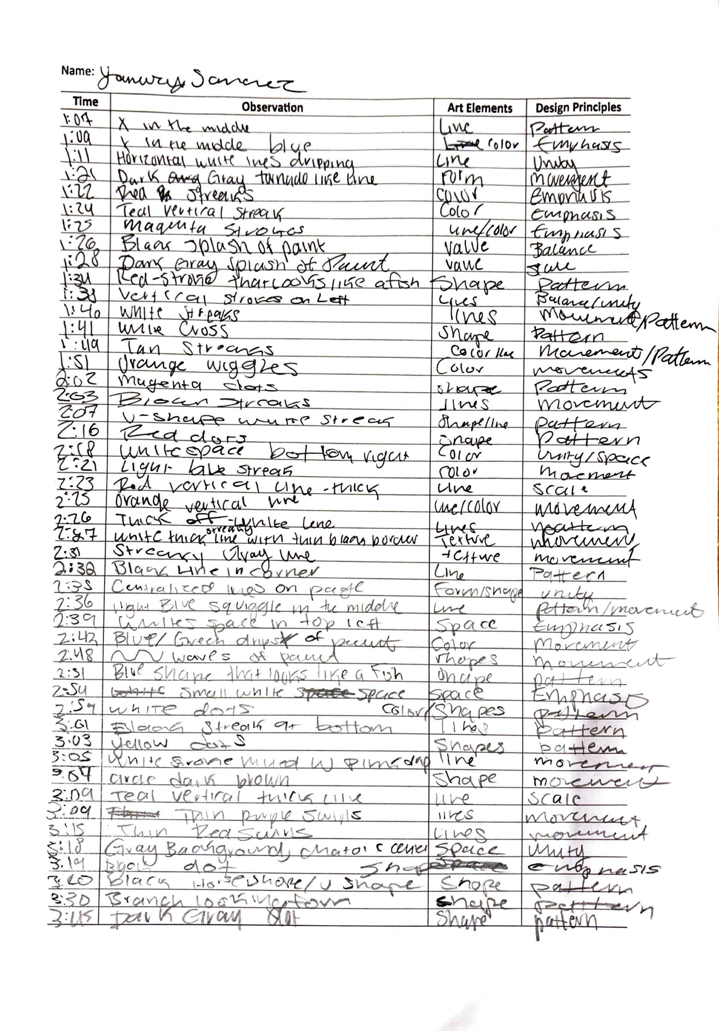
Yanury Sanchez Portfolio
What I learned...
Project #6 “Precedent Study”
- I learned how to research in a way where I gained valuable information that would be useful to me in the future
Project #7 “Space Program”
- This project improved my iteration skills. It helped me practice creating different ideas and not sticking to the first one
Project #8 “Space Design”
- Through this project, I gained a stronger understanding of line weights, scale, elevations, etc. It improved my drafting skills and computer skills in the softwares we use
Project #9 “Presentation”
- I was introduced to an architectural critic and have an understanding on what makes a good presentation.
Project #10 “VR & AR Experiene”
- Using VR and AR introduced me to the idea of online tools providing 3D visuals in the architectural world. It showed me how to use these tools to visual my project
Project #12 “3 Hours observation”
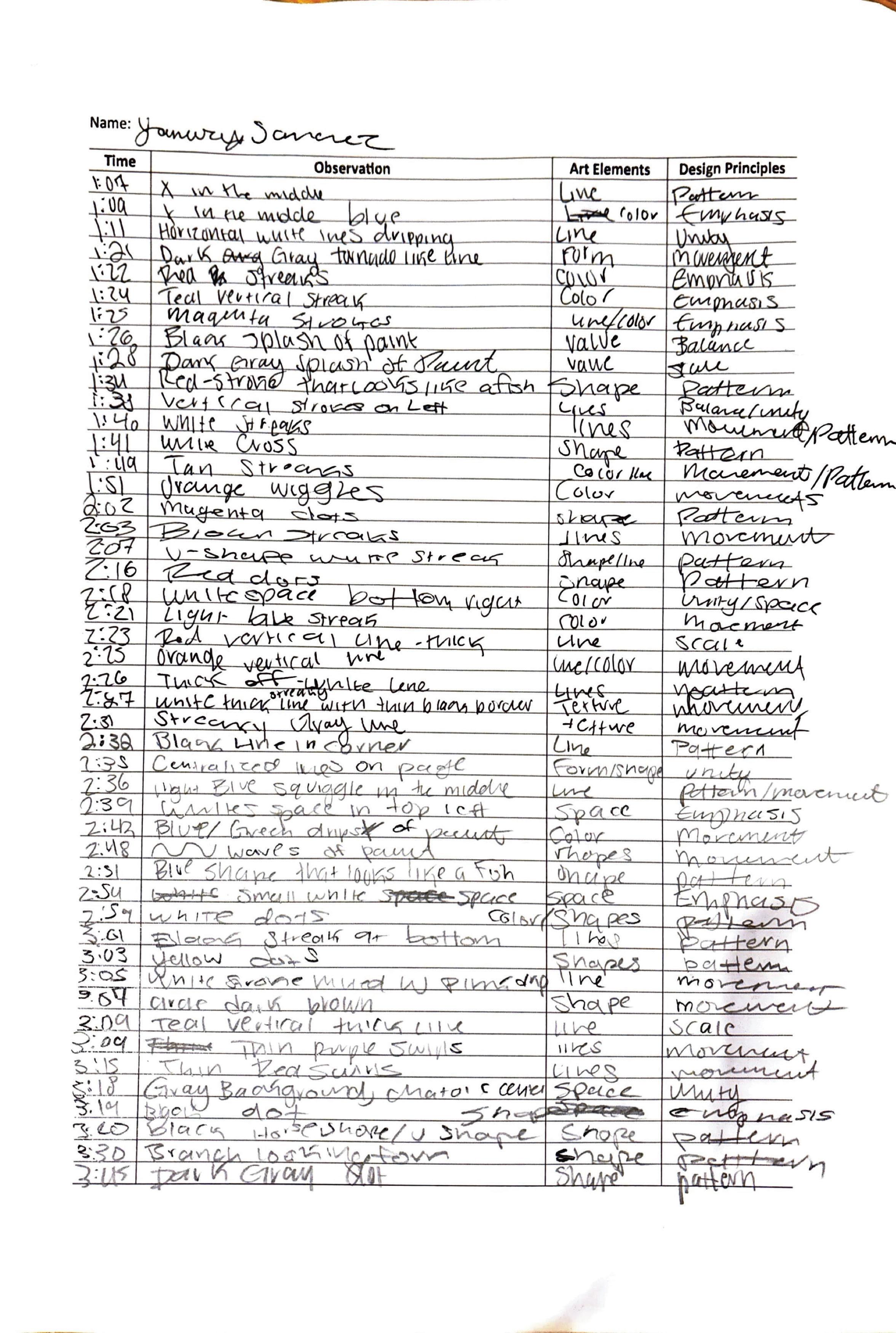
- The 3 hour observation refined my writing and observational skills. I learned to pay attention to the most minor details to fully appreciate a painting or any other visual
Overall
- I refined the drafting skills that I was introduced to my first semester of school. In these 5 weeks, I practiced drafting, model making, and research, helping me gain a better understanding of what a project would typically look like in the field. I improved upon my online modeling skills and practiced on other softwares.
If you could talk to you before these five weeks, what would you like to share with you?
- I would tell myself to think ahead of designs that I want to incorporate or don’t want to incorporate. I had a hard time visualizing my house because I didn’t think ahead and I believe having a sort of direction would have resulted in a stronger design.
Power of Patience
Learning Objective
Students will have an opportunity to develop their ways of seeing, which are engaging and envisioning an object through deceleration and immersive attention. In addition, they will learn about the art elements and design principles.
“Art
Elements and Design principles in the Painting”
The untitled painting by Joan Mitchel is an abstract piece of work that features an array of lines. The work doesn’t show any distinct shapes, forms, or objects, but instead builds the lines to create a sense of hierarchy. At first glance, it just looks like random lines with some pops of color. However, after taking a closer look, I see the various alignment of these lines that create a hierarchy, the use of color, and the texture of the work.
Looking at the painting, I see that the lines are mainly centralized with some feathering outside the main circle. In the center, there is a tight cluster of lines that are painted horizontally, vertically, and in more organic, curvilinear paths. These lines don’t create defined shapes or forms but rather emphasize the center and draw the viewer’s eye to that point. This creates a hierarchy where the lines in the center have a significant amount of layers while the outskirts are less clustered together. The movement of these lines are very erratic and make me feel frantic and overwhelmed. However, the curved lines bring down the energy of the painting and create a calmer mood.
The main colors used in this work is a gray color scale. I see that various lines are drawn with a light gray stroke and are then given depth with a darker gray. Even though the painting doesn’t have obvious shapes, the shading of the lines give it depth and make it look somewhat lifted from the page. Furthermore, the shading creates a metallic texture to the piece and serves as the background. This metallic look aids in bringing out the lines in the center. The artist includes some pops of color, these being mainly red, yellow, and blue. The pop of colors draw attention away from the center of the page to another areas. They remind me of human behaviors and how we experience emotions in outbursts throughout our life.
Work #3. Second Report:
“Art Elements and Design principles in the Painting”
Joan Mitchell’s untitled piece is an abstract painting that features an array of lines. At first glance, the strokes may appear repetitive and without intention. However, these elements work together to create a meaningful composition that evokes a range of emotions. The painting is a representation of human emotion. It is not literal, rather a metaphorical journey that is created through the thoughtful arrangement of lines and color. The main feature of the painting is the tightly packed collection of lines arranged throughout the work. These lines are centered in the piece, forming a clear focal point. In this central area, the overlapping and layered lines create chaos and feelings of distress. The strokes vary in direction, weight, and opacity. These 3 characteristics add texture and emotional depth to the work. The vertical strokes look quick and energize the piece by creating a fast movement. However, the curvilinear forms slow down the movement and create a calmer contrast to the disarray of the vertical lines. Furthermore, the use of varying line weights plays a symbolic role in the piece. Heavier line weights remind the viewers of intense emotions while lighter line weights provide less dominant feelings. The experience that is created by the piece is also provided through the opacity of lines. Streaky creates texture and movement in the composition. It acts as a contrast to the thicker lines and soothes the viewers through its slow movement. Though the painting may seem to lack color, a closer look reveals a variety of hues that is contrasted with a grayscale. The background is mainly composed around a light gray shade that is overlapped with darker shades and bursts of color. This technique gives the painting dimension and depth that draws attention to specific areas. Mitchell used both color and line weight to further emphasize emotion throughout the work. Some lines are drawn in thick, bold strokes, while others are softer and more delicate. This play on color creates contrast that is visually interesting to the viewer. More importantly, it emphasizes the painting’s idea of emotion. The bold lines reflect extreme emotional highs and lows, while the softer lines that are easy to miss, are similar to days that feel very neutral. The combination of these visual elements create an emotional piece that leaves the viewers contemplating their emotional experience in life.
“Art Elements and Design principles in the Painting”
Both reports touch on art elements that are seen on the painting, as well as the emotional experience that was created while observing. However, my first report wasn’t as thorough as my second report. I mentioned how the painting made me feel slightly, but I did not go into detail. Furthermore, my first report did not fully capture the types of lines used in the painting. My second report was more detailed in how the lines created a sense of emotion through line weight, direction, and movement, while my first report just covered the basic elements of lines. Furthermore, I did include color usage in my first report, but I originally had thought the painting had a limited color range. My second observation helped me see the various colors used in the painting. In my updated report, I was more detailed on the various shades and how they created contrast and movement throughout the painting. While they both mentioned how color represents emotions. My second report was more thorough in explaining the connection the emotional experience of viewers with the play of colors
Overall, both reports covered the same topics but in different details. I didn’t see the small, intricate details in the first report, which made the paper feel very broad and general. After observing for 3 hours, I got to connect emotionally with the piece to write a more insightful paper. a
Jasmine Sukhija Portfolio
What I learned...
Project #6 “Precedent Study”
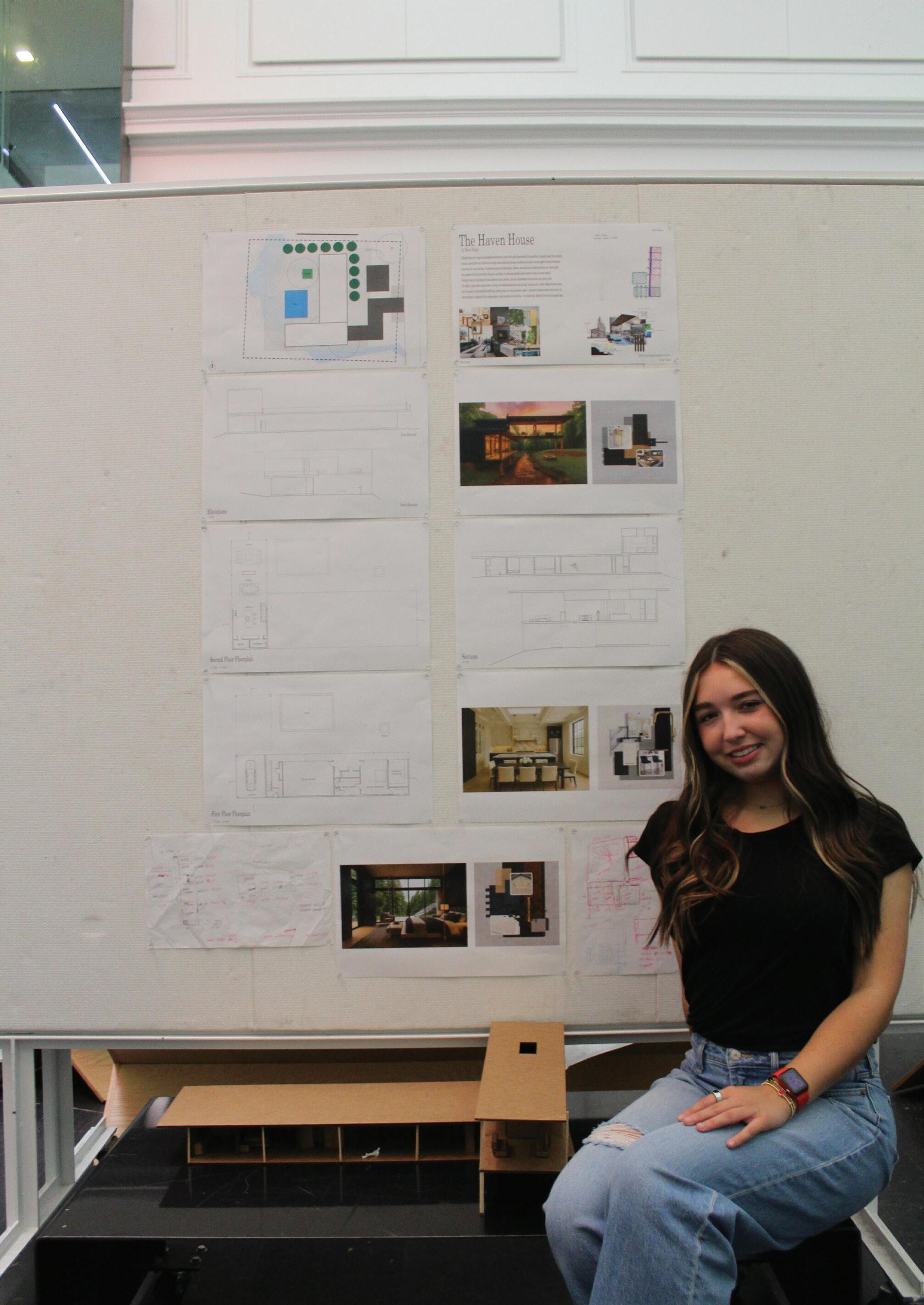
- This project opened my horizons to all of the different possibilities when it comes to constructing a home. As I went through the precidents, I understood how spaces work in comparison to the structure of the home. I also got many ideas to use when it comes to my house. Furthermore, these were very useful in getting the best ideas for my home to be the most functional.
Project #7 “Space Program”
- This project consisted of making iterations of each room in order to find the best match for the house. I was able to expierement with different styles to see how they worked with the space. This helped give multiple ideas for the space overall, and ideas I can use in future spaces.
Project #8 “Space Design”
- I learned how lighting, elevations, perspectives and more were helpful in showing the client the design process. Picking out textures assisted the space and how it flowed throughout the rooms. This also gave me a realistic view of the space, picking what landscape and furniture I wanted to include.
Project #9 “Presentation”
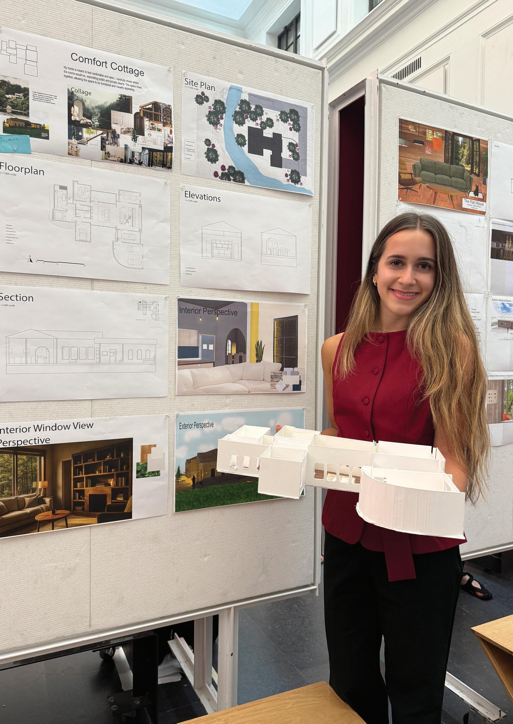
- My work in project 8 was finalized and fixed to work best in the presentation, this consisted of my elevations, sections, perspectives, floorplans, and site plan. I was able to successfully present my work the the architects and give them an idea of how the space would turn out in the end.
Project #10 “VR & AR Experience”
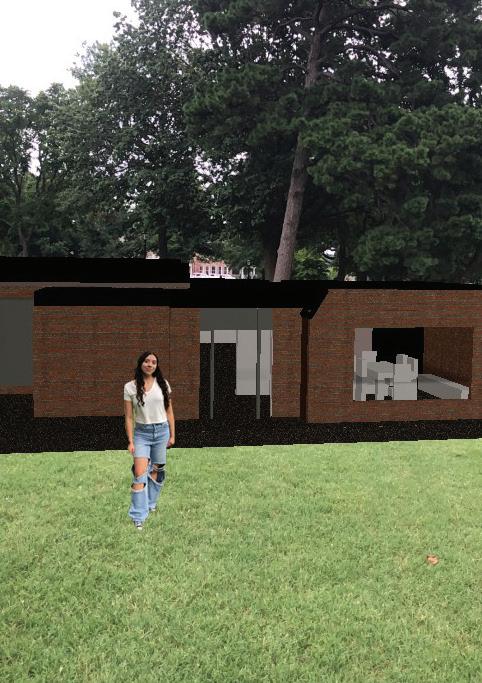
- The VR and AR expierence was something I had never done in a space before, like looking at it through the times of days and standing outside next to my home. I was able to see how it would look in real life. There was many different ways to use the programs which could be useful in future projects.
Project #12 “3 Hours observation”
- During the semester we took a trip to crystal bridges museum, which we sat in front of a piece of art and understood the meanings behind the work. This was very interesting because the research before the and after seeing the piece gave me a different perspective. I think this was useful and super interesting as something I would do again in the future.
Overall
- This semester helped me learn so much more than imagined, from looking at precidents to creating my very own home through what I learned. I enjoyed how custom this was and how my house turned out in the end. These projects were enjoyable and allowed me to get better at all the softwares used along the way. I will definitley use the skills I have learned in my future projects at the Faye Jones School.
If you could talk to you before these five weeks, what would you like to share with you?
- There are going to be long nights that are stressful, but if you keep pushing and doing your best, you will truly be proud of all the work you accomplished. Seeing how much we were able to do in 5 weeks is amazing, and the work is worth it in the end.
Power of Patience
Learning Objective
Students will have an opportunity to develop their ways of seeing, which are engaging and envisioning an object through deceleration and immersive attention. In addition, they will learn about the art elements and design principles.
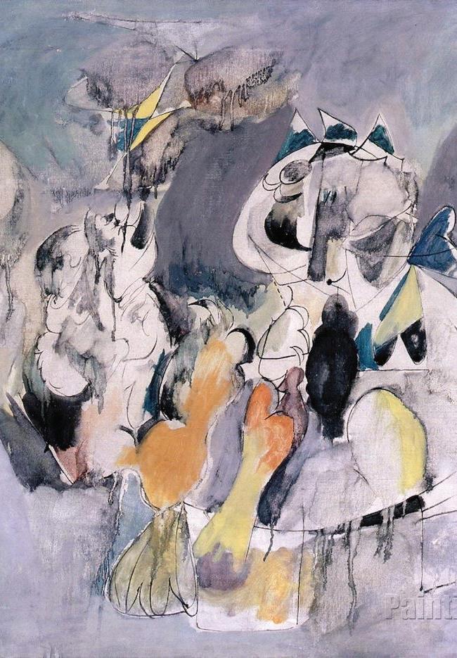
This painting at first glance is an interesting piece that shows a great abstraction that is conveyed through many different colors and shades throughout the piece. I also noticed that there is a clear outline of the figures in the abstra ction, showing the different colors in these. Seeing that Gorky was born in the Ottoman Empire, there can be many reasons why this painting is over the “pi rate”. The loose lines and color palettes bring a contrast between the light and dark areas, showing how prominent it is. The colors also bring a bigger sense to the rebellious sides, adding oranges and yellows around the art board. Even the use of purple shows contrast, and how it outlines certain objects in the painting. This also reflects how pirates were not necessarily how we think of them today but instead how these were more rebellious outsiders that would go out on adventures. This painting shows a body outline, showing a possible interest of the human and the interesting shapes. This gives us a more personal approach to the painting, understanding where the artist is originally from, and how this painting can reflect the time. We are able to truly understand how the word pirate sticks out in the sense of the painting. This autobiography painting shows how the imagination and emotion worlds can collide into something new and different.
Work #3. Second Report:
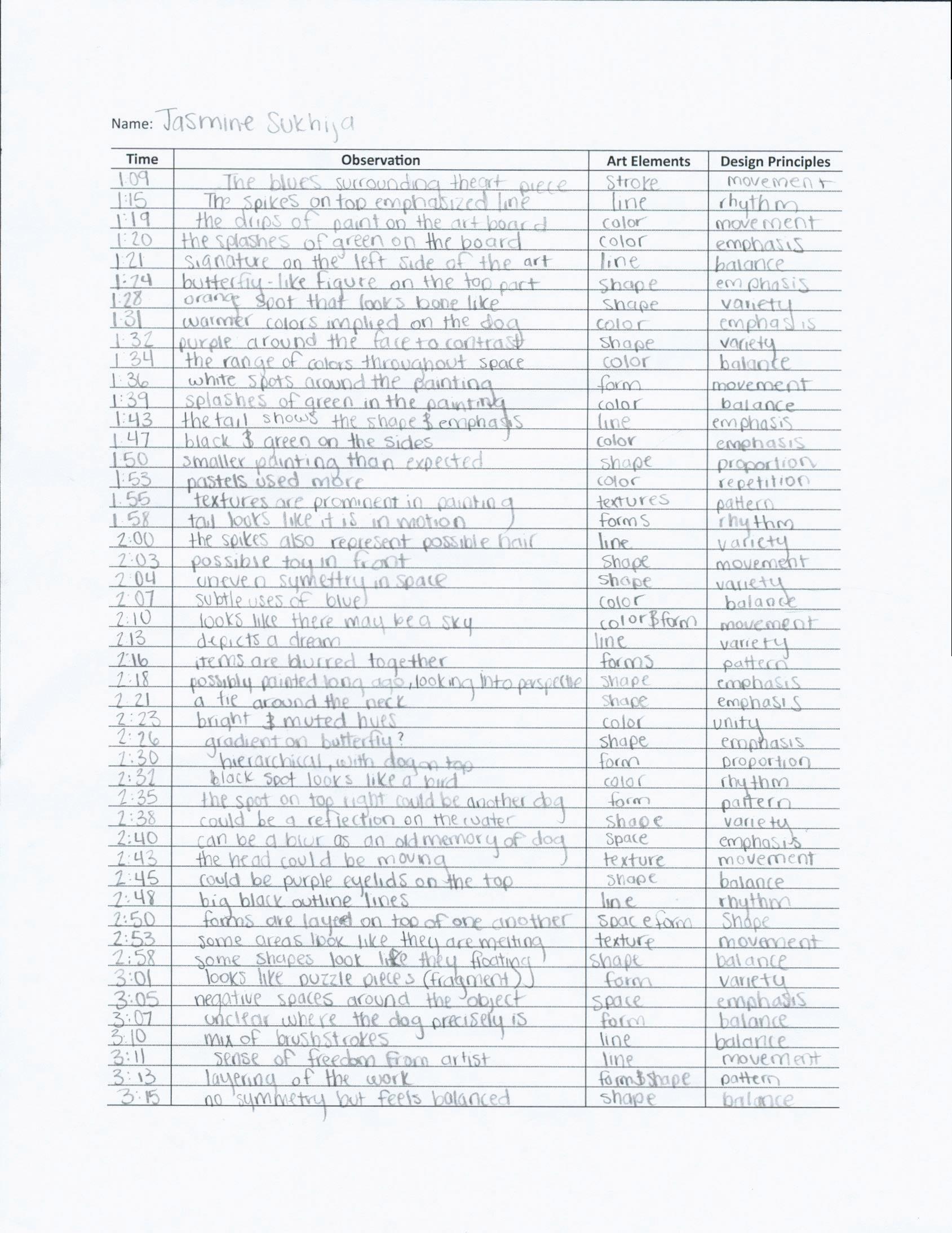
After going to crystal bridges, there was so much more to the art piece tha n I would have imagined. The patience of sitting in front of the art had given me a new vision of the work, even understanding the backstory of the artist and the art. There were so many little details that made up this abstraction, including drips of paint to show texture. There was different design el ements used to convey the message. Also, the art elements were easy to find through close study of the work. After researching more about artist, we were able to find how he was born near the Armenian genocide, causing him to flee to the states for a safer life and reuniting with his father after his mom passed. He also had much rejection from his pa rtner, causing insecurity and depression. After he was diagnosed with colon cancer, got in a car accident, and found out his wife cheated, he ended up taking his own life. These later paintings portrayed some of his lowest moments and have his emotions drawn all over. Also, I was able to see how this painting was much more of a diary that was almost supposed to be a secret but also goes into the clear memory of his neighbor's dog from back when he was a child. This infers there was light during this time of his life, and he wanted to show it through the choice of art. Looking closely, you can see the bone, ball, tail, and collar of the dog through the abstractions. There was emphasis on many of the objects in the work. I could see how the dog was outlined by lighter pastels over the work. Furthermore, there are many uses of lines to draw the readers eye around the art piece. Overall, this abstraction had so much more intent than I would have imagined. I was able to visually see his ideas and emotions, showing his cherished childhood memories around the time of the Ottoman Empire.
The start of my research was mainly the simple items regarding the artist, including the year it was painted, where he was from, and how he usually did his art. There was brief information online about the piece, and hard to infer what it is about from a picture. Seeing the work in person gave me a better view of what art really was, including a full view in person and the tiny techniques that were used. Also, I was able to read about it and see how his life story affected his work. I also was able to see how the work was a dog and what techniques in the abstraction successfully portrayed the ima ge of a dog. Overall, this project was effective in truly learning how sitting in front of an art piece can give so much more to the viewer. Also, researching before the museum gave a starter id ea on the piece of art to expand on while I was there.
Reece Walker Portfolio
What I learned...
Project #6 “Precedent Study”
- This project taught us how different design elements and spaces can be put together in order to create different feelings throughout different spaces. We were able to see many famous houses that use creative and practical design methods in order to understand how we might build our houses.
Project #7 “Space Program”
- This project taught us how to create different spaces that fit ourselves, our site and our needs. We created all the rooms in our houses and used different ideas and techniques we gathered from the precedent studies.
Project #8 “Space Design”
- This project we put together our houses and learned how to correctly draw out our floorplans, elevations and sections as well as we rendered images to show different materials we wanted.
Project #9 “Presentation”
- This project was our first time having a final review. We put together everything we had been working on and presented our designs to architects. This taught us the importance of being really sure and proud of your design and how to take different critiques and ideas back to finalize our designs.
Project #10 “VR & AR Experiene”
- This project had us take our houses and put them into VR and AR. This taught us how important and useful these tools can be for showing our designs to clients and trying to explain our ideas to them.
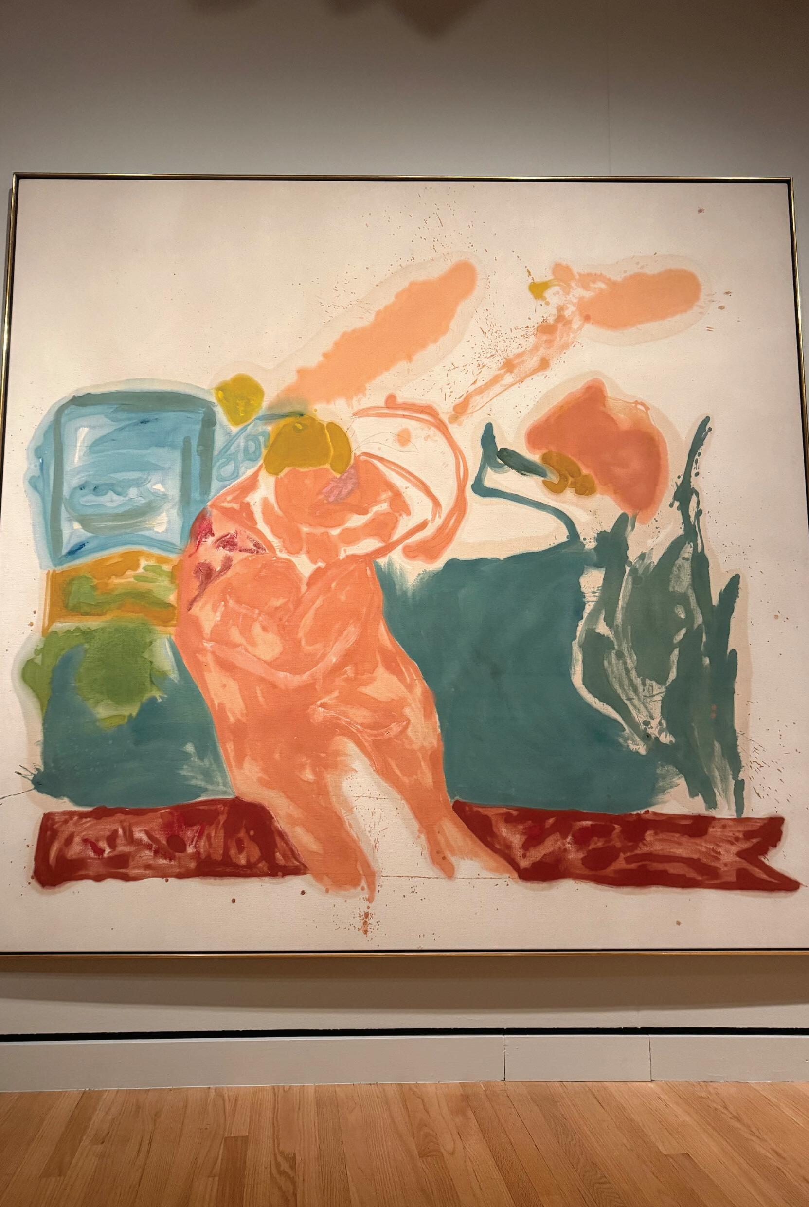
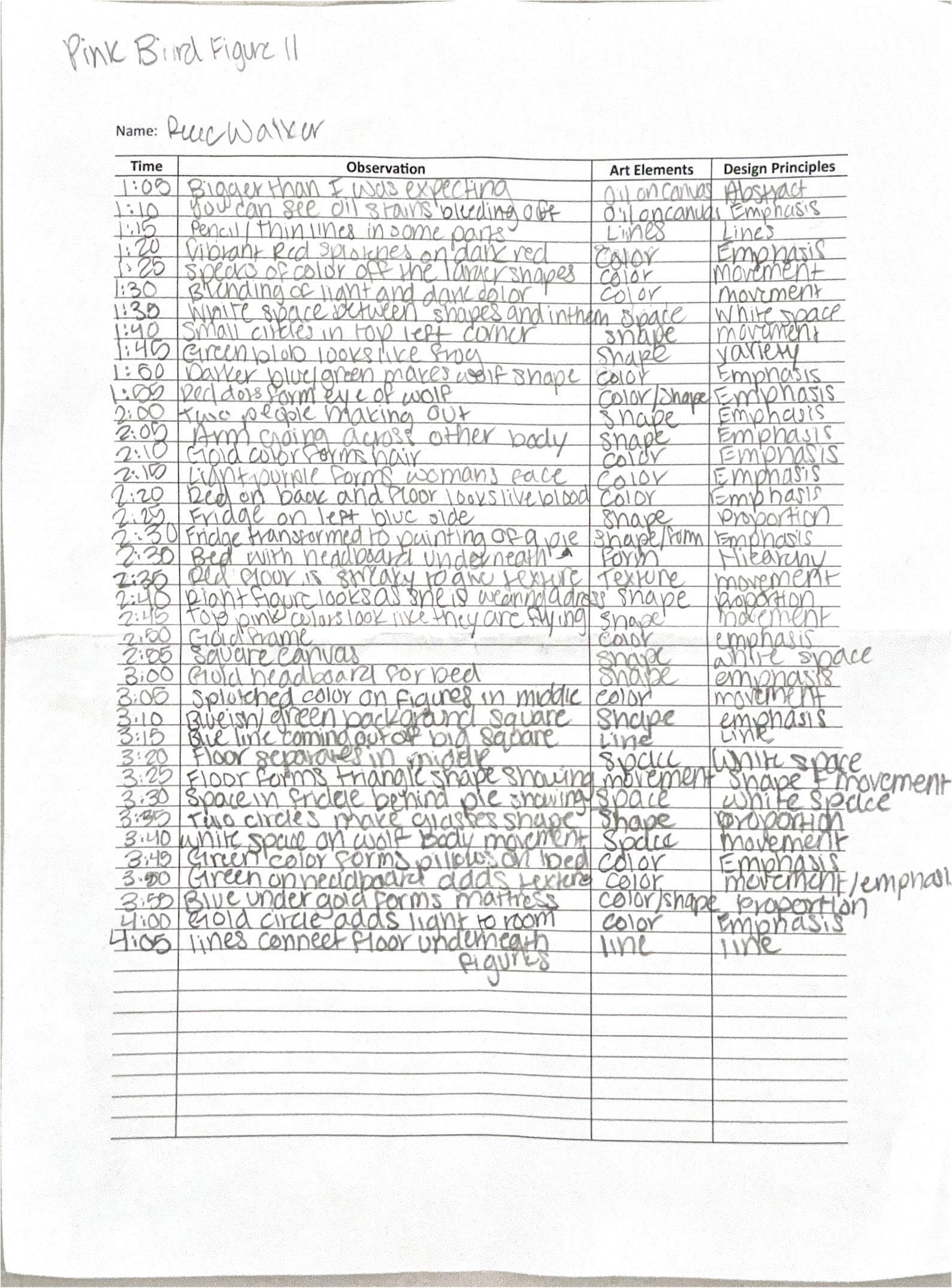
Project #12 “3 Hours observation”
- This project taught us the importance of observation and patience. We observed a painting for three hours and learned how much our perspectives change when we take the time to really sit with the painting.
Overall
- Overall, we learned what all goes into designing a space and creating a house that can actually be built and used. We learned different ways to iterate room ideas and choose materials as well as picking out things like how people will circulate our houses. All things we learned will help us when creating new spaces each time.
If you could talk to you before these five weeks, what would you like to share with you?
- If I could talk to myself before these five weeks I would like to tell myself that while it is going to be the most challenging thing I have ever done, it is going to be worth it. I would say to put in the work and make sure that I am turning in work that I am very proud of and that I believe shows who I am as a designer.
Power of Patience
Learning Objective
Students will have an opportunity to develop their ways of seeing, which are engaging and envisioning an object through deceleration and immersive attention. In addition, they will learn about the art elements and design principles.
First Report: Pink Bird Figure II by Helen Frankenthaler Pink Bird Figure II by Helen Frankenthaler is an oil on canvas painting that exemplifies the artist’s style of abstraction through the thoughtful use of shape, space, color, movement, proportion and variety. The painting features both literal and abstract shapes. Across the bottom, a rectangular form provides a sense of structure, while the shapes near the center become more fluid and expressive, reflecting a freer artistic style. Frankenthaler effectively utilizes space to distinguish and define these abstract shapes, allowing each element to stand out within the overall composition. Color plays a crucial role in separating and emphasizing the different shapes. Through strategic use of contrasting hues, the viewer is able to differentiate the shapes and interpret the visual point more clearly. Movement is also utilized in this painting. With the center shape that is colored pink, there are parts of it starting to look like they are moving to the right side of the page. This also happens with the darker blue color. It looks as though it is moving with the way that the shape gets thinner and starts to separate from the top of it. Proportion is also used in this painting. While not perfect, the painting is mostly even on both sides, making the proportions of the shapes feel like they relate well with each other. Lastly, she uses variety in the painting to guide our eyes through the painting with the different elements. Together, these elements contribute to an organic and compelling abstraction that captures the viewer’s attention through its complexity.
Work #3. Second Report:
Art Elements and Design principles in the Painting
Pink Bird Figure II by Helen Frankenthaler is an oil canvas painting that exemplifies the artist’s style of abstraction. After spending three hours with the painting, my perception of it shifted dramatically—from noticing the surface-level elements to discovering hidden meanings within the piece.
At first glance seeing the painting, I realized that it was much larger than what I was anticipating. My initial notes focused on straightforward observations: the size, the colors and how the paint was placed on the canvas. However, as the first hour passed, these observations deepened as I started to notice a storyline on the canvas. Colors and shapes slowly started to evolve into figures. In the bottom right corner, I noticed the form of a wolf emerging. Its fur seemed to be created by quick, sharp brushstrokes and its eyes were dotted with a red color. Adding these strokes gave the animal a dynamic shape and created movement on the canvas.
From there, two central figures started to form, appearing to make out in the middle of the canvas. A man’s arm stretches across a woman, holding her close. There is a gold color on the top of the man’s head, suggesting hair and a light purple color outlines the woman’s face. Her form, specifically her dress, gradually took shape as I continued observing her as a figure.
As I went into the second hour of observation, the background changed and fit into the scenario that I was observing before. What at first appeared to be a simple blue block on the left side soon resembled a fridge. Once looking at it some more, it changed into a painting, and the white space inside of it formed a pie on the painting. Beneath it, a golden shape became a headboard, and the surrounding blue-green areas suggested a mattress. These subtle changes formed the impression of a bedroom scene, adding to my earlier observation of the interaction between the two figures. Not all the elements of the painting had a clear form. Some shapes and colors didn’t align with the figures or setting but instead contributed movement and energy. These elements were shorter strokes, thick blocks of color and random. These added movement and texture to the canvas, guiding the viewer’s eye. By the third hour, my understanding of Pink Bird Figure II had completely transformed. What began as abstract color and form evolved into an emotionally charged scene. Frankenthaler’s work shows how abstraction can transform into endless interpretations and how patience and attention can unlock entire worlds hidden within the canvas.
Difference Report
When looking back at my first report and comparing it to my second report after the three hours of observation, there is a clear difference between my findings. In my first report, my observation was very surface level. I noticed things like the different types of color, shapes and emphasis that were being used in the painting. Once studying the painting for three hours, my observations changed into something deeper. Instead of focusing on how the painting was put together, I dived into the meaning and story the painting was trying to tell. My observations were based on the feeling the painting gave me rather than what was on the canvas.
Overall, what I have learned...
Main Themes
1. Self-Discovery and Personal Growth
- Self-Confidence and Potential
- Students expressed surprise at their ability to push beyond their perceived limits and achieve more than expected.
- Realization of inner strength and capabilities.
- Resilience and Adaptability
- Overcoming challenges, managing stress, and coping with unexpected difficulties.
- Emphasis on the importance of perseverance and trust in the process.
2. Importance of Time Management
- Managing heavy workloads through effective time management.
- Balancing productivity with good craftsmanship and attention to detail.
- Recognizing the value of taking breaks to maintain mental health.
3. Significance of Relationships and Support
- Importance of building friendships and collaborating with peers.
- Relying on classmates for support and encouragement during challenging times.
- Instructors as valuable resources for guidance and learning.
4. Embracing Challenges and Learning Opportunities
- Understanding that difficult experiences are integral to growth and learning.
- Emphasis on the rewarding nature of overcoming obstacles.
- Appreciation for the lessons learned and the skills acquired during the course.
5. Reflection on Stress and Workload
- Acknowledgment of the initial overwhelming nature of the course.
- Learning to manage stress and not overthink or complain excessively.
- The importance of maintaining a positive mindset despite challenges.
6. Enjoyment and Fulfillment
- Despite the challenges, students found joy and fulfillment in their work.
- The sense of accomplishment and pride in completed projects.
- The positive impact of enjoying the process and the work itself.
Sentiments and Emotions
1. Positive Emotions
- Pride and Satisfaction: Many students felt proud of their accomplishments and the progress they made.
- Joy and Enjoyment: Despite the hard work, students found enjoyment in the creative process and the outcomes.
- Gratitude: Appreciation for the opportunity to learn and grow, as well as for the support received from peers and instructors.
2. Negative Emotions
- Stress and Overwhelm: Initial feelings of being overwhelmed by the workload and the intensity of the course.
- Doubt and Anxiety: Moments of doubt about their abilities and the feasibility of completing the tasks.
3. Mixed Emotions
- Relief and Accomplishment: Relief at having completed the course and a sense of accomplishment.
- Reflection and Insight: Mixed feelings about the difficulty of the course, balanced by the recognition of its value and impact.
Key Takeaways and Advice
1. Trust in the Process
- Emphasizing the importance of trusting the process and believing in one’s abilities.
- Encouragement to embrace challenges and learn from them.
2. Importance of Community
- Highlighting the value of building relationships and seeking support from peers.
- Advice to engage with classmates and instructors for a richer learning experience.
3. Balanced Approach
- Advocating for a balance between hard work and self-care.
- Importance of managing time effectively and taking breaks when needed.
4. Embrace Creativity and Risk
- Encouragement to think outside the box and take creative risks.
- Recognition that mistakes and messes are part of the learning process.
5. Positive Mindset
- Advice to maintain a positive mindset and avoid unnecessary stress.
- Encouragement to focus on the rewarding aspects of the work and the progress made.
Overall, the reflections indicate a transformative experience for the students, characterized by personal growth, the development of resilience, and the acquisition of valuable skills. The recurring themes of self-discovery, the importance of time management, and the value of relationships underscore the holistic nature of their learning journey.
My students in IARD10405 Fundamental Design Methodology use of precedents for understanding principles of design and natural and formal ordering systems; design development using both iterative and alternative methods of exploration in 2-dimensions and 3-dimensions using analog and digital tools; continued development of visual and verbal communication skills.