2 minute read
THE HOUSE

The House once again follows a minimalistic style of architecture blended with some of the traditional elements of Udaipur. But one notably interesting addition made to this residence is the use of geometrical shapes. The geometrical shapes have been used in various elements like the light fixtures, in the glass panelling as well as in the partition between the living and dining rooms. All of the geometrical shapes are signified using lines, in order to make even the abstracts look organised and not make the house feel chaotic. One modern element that is added in the residence is the use of space below the stairs. To make sure the space does not look empty and unused, the wall below is highlighted with wooden rafters and lighting placed in a manner to focus on the textures created by it.
K I D S
Advertisement
O O M
The master bedroom makes the most of every little space on offer by using the spaces on the size of the beds and above it for storage purposes. There is a study/ side table provided for multiple purposes as per the client’s comfort. Following the theme from the living room, the colours used for this room are once again brown and white with the headboard fabric giving an effect of a profound highlighter in the middle.


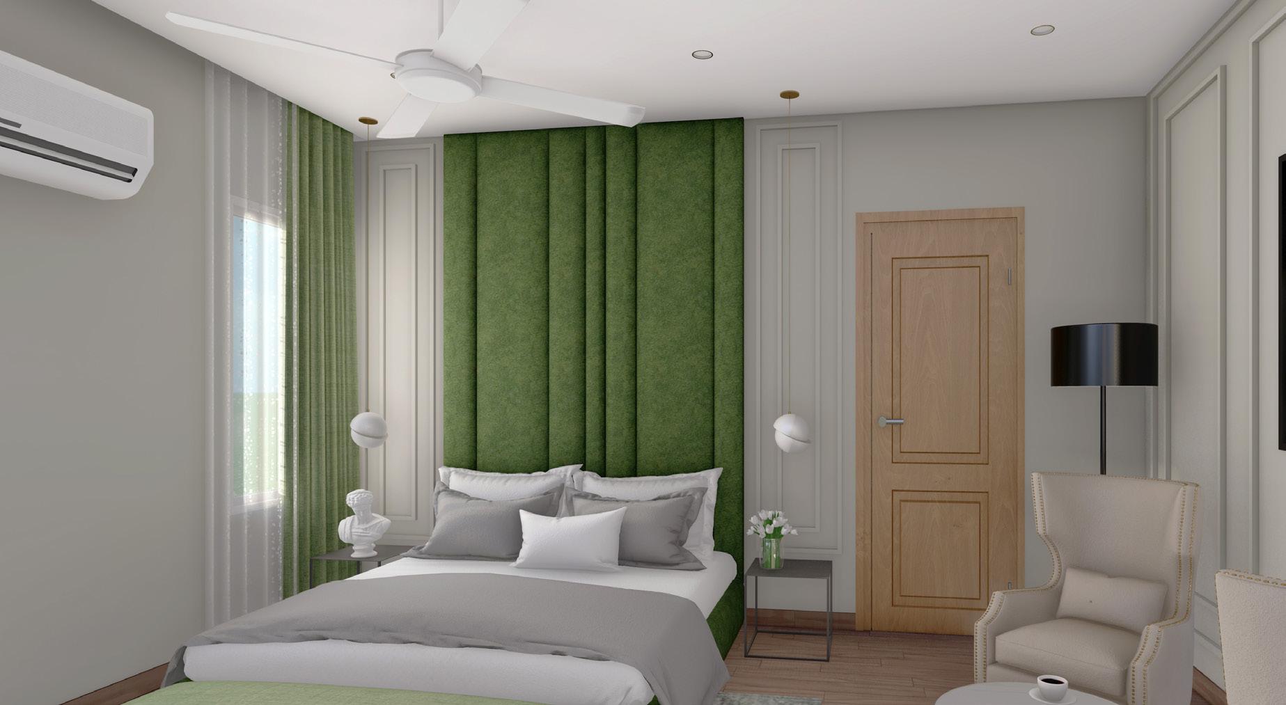
This room could easily be someone’s favourite room in the entire house. This brings the entire house full circle with using some elements from each of the rooms all over the house and combining them in a manner that would give the user complete satisfaction and fulfillment. This room also uses the brown and white combination found in the living room as well as one of the other rooms but it’s most striking feature is the colour of the headboard. It is a cushion panelling incorporated in geometric patterns to complement the rest of the room’s Roman touch wall panelling. The division of spaces and the panellings were carefully created to ensure every panelling is highlighted with a purpose as is evident in the private seating space inside the room. A corner dedicated entirely to the positioning of 2 armchairs added with an abstract painting in the centre with Roman wall panelling on either side gives a culmination of the entire design in the most promising and satisfying note.
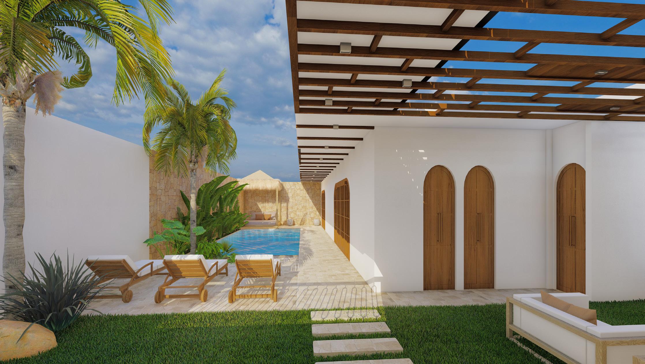
This room follows the simplest and yet the most aesthetically pleasing colour combination for interiors - white and beige. The room’s organization is in such a way that upon entering, the client would find themselves into private living and private outdoor spaces before heading to the bed. The private living is made interesting by providing a circular window next to it, giving the user a different kind of view to the rest of the house. For the private outdoor area, the client requested for a swing which was immediately approved as it gives a really unique feature inside a bedroom with a nice outdoor view. The windows are also placed in a strategical manner to ensure cross ventilation into the room at all times. The bright painting on the wall next to the bed is added as an accessory to enhance the appeal of the room as a whole and give a contrast to the subtlety of colours in the rest of the room