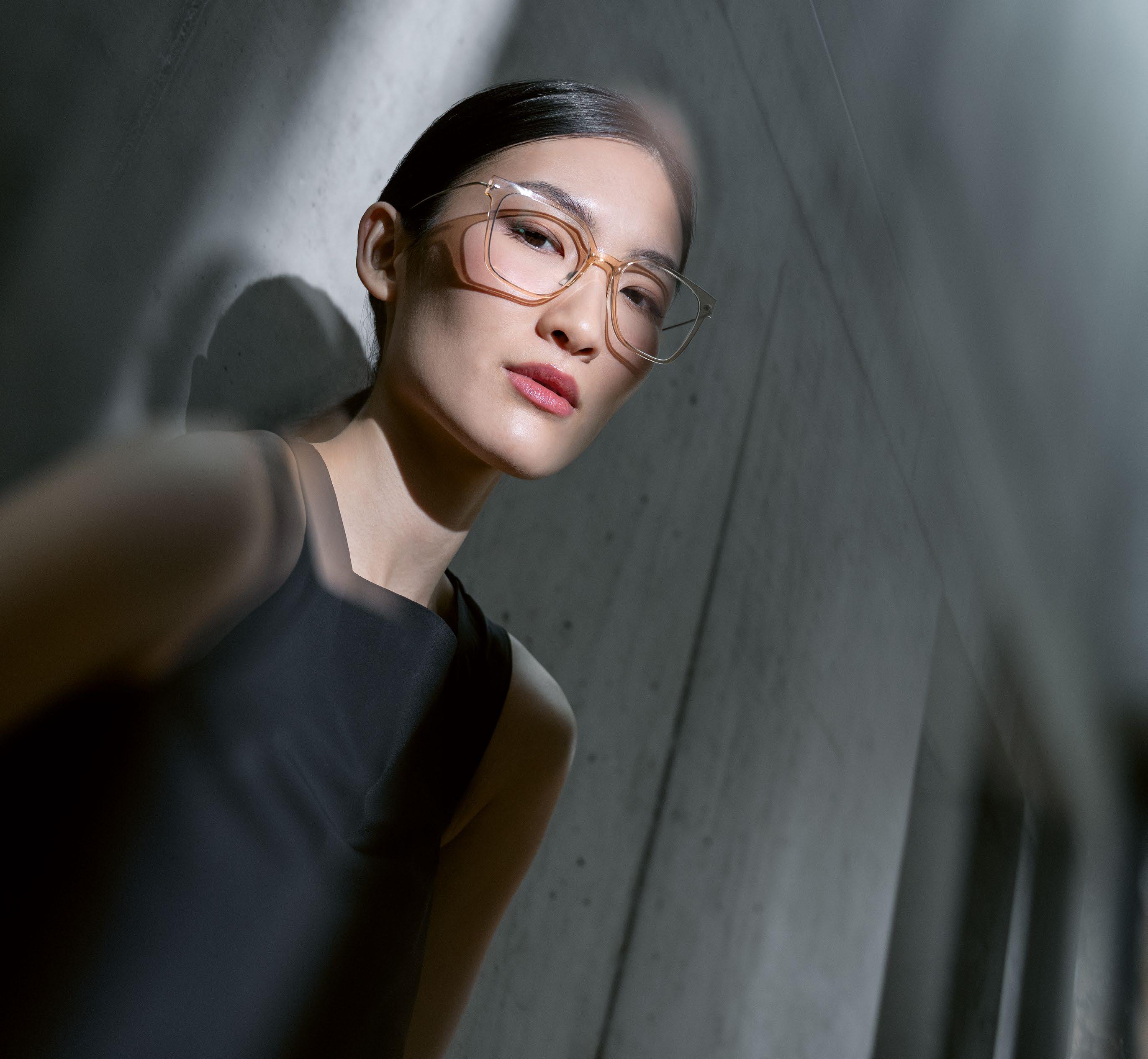
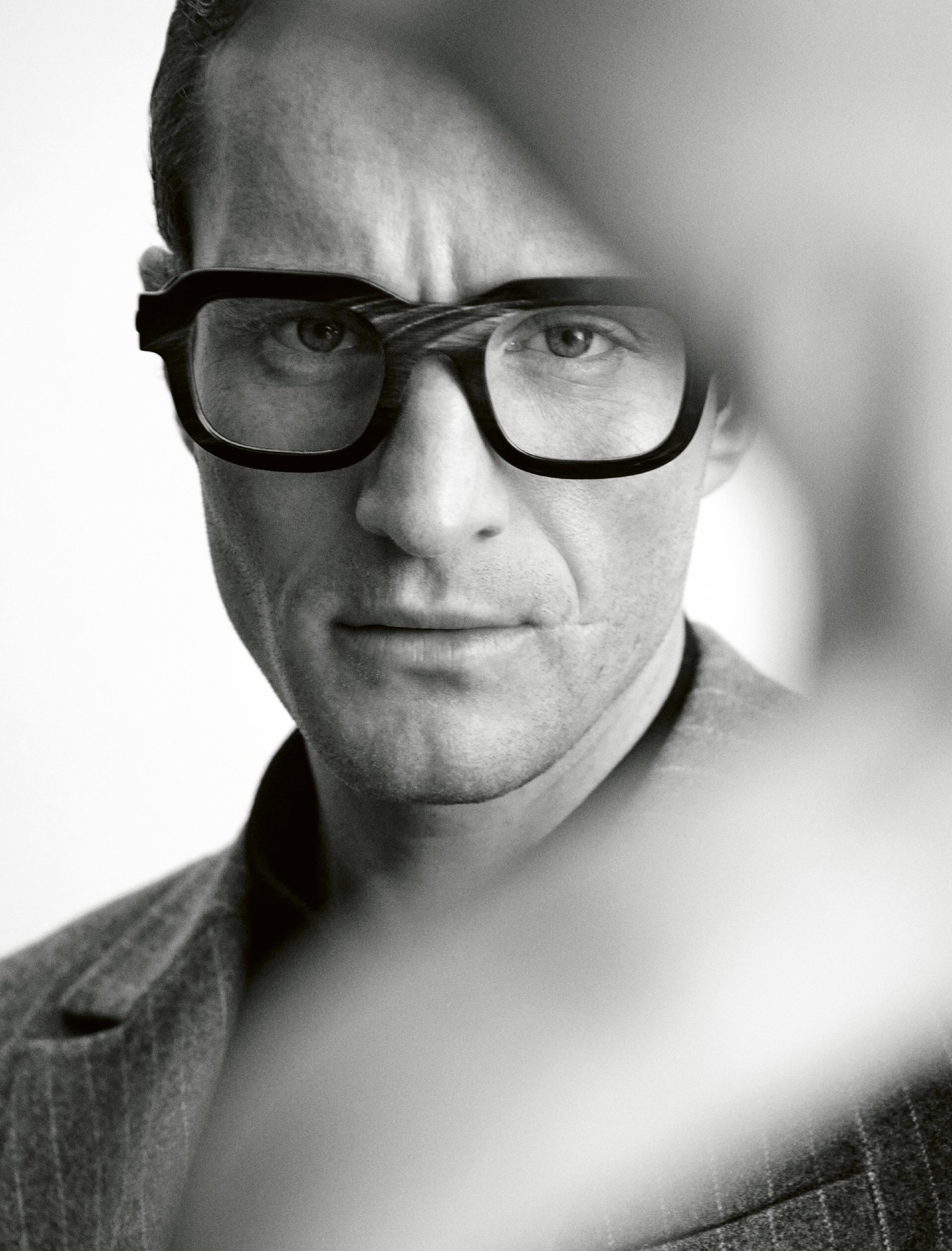
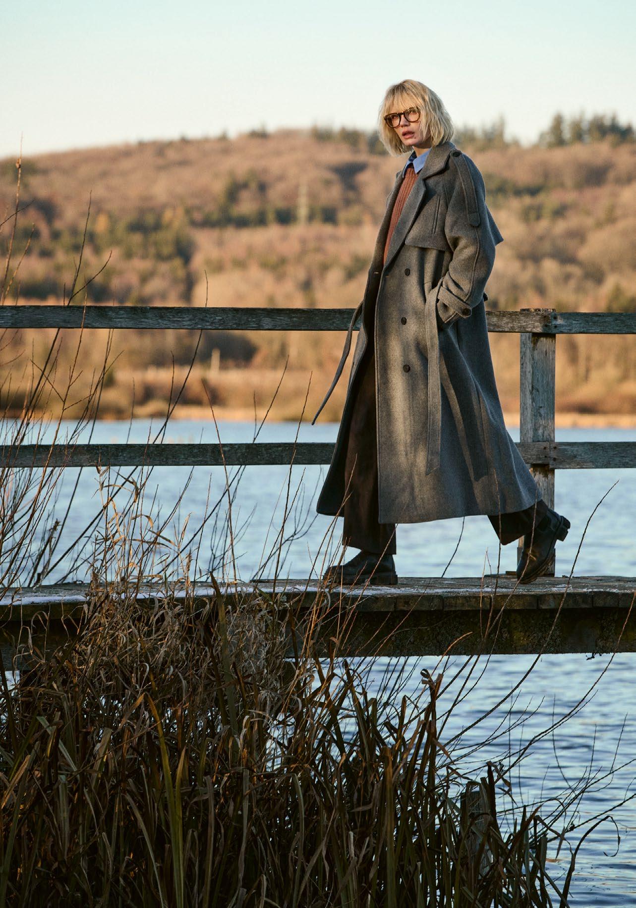
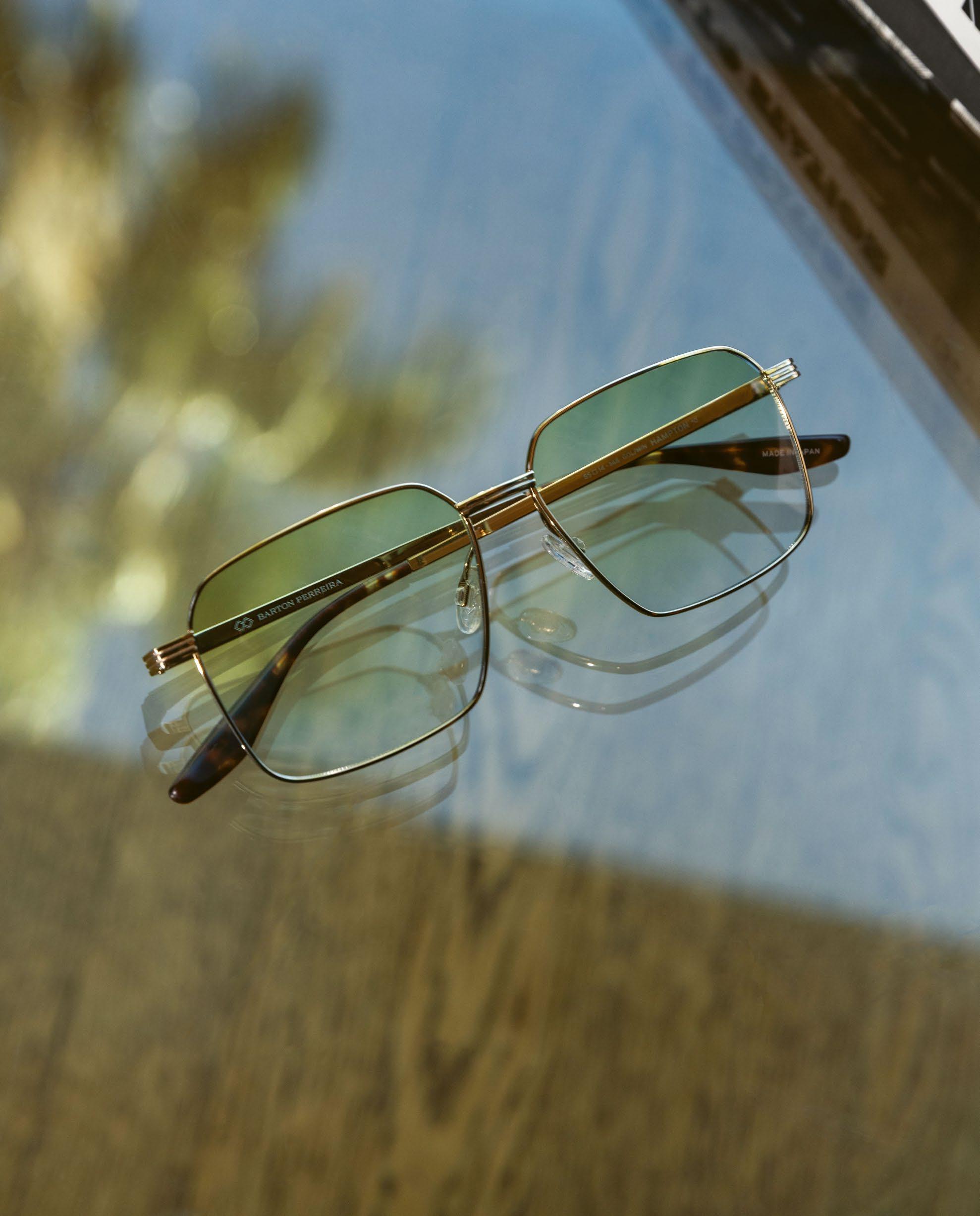
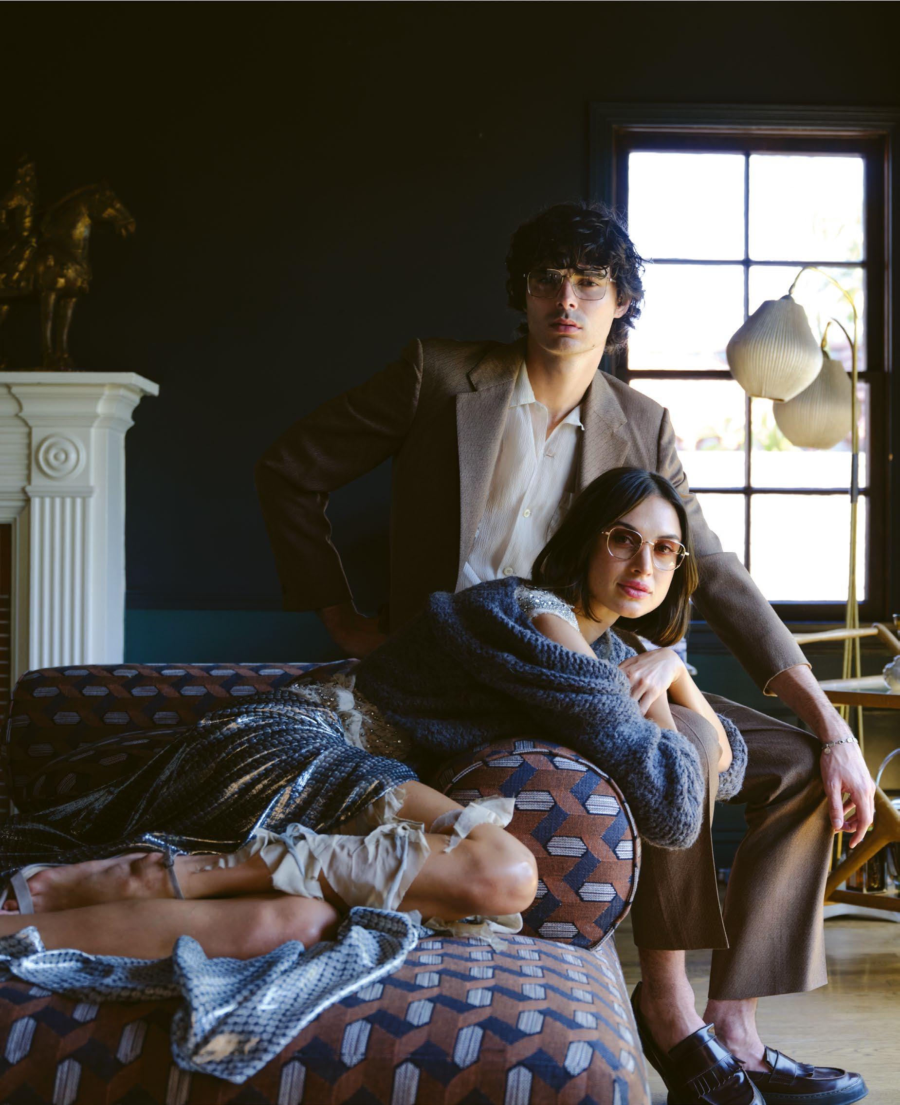
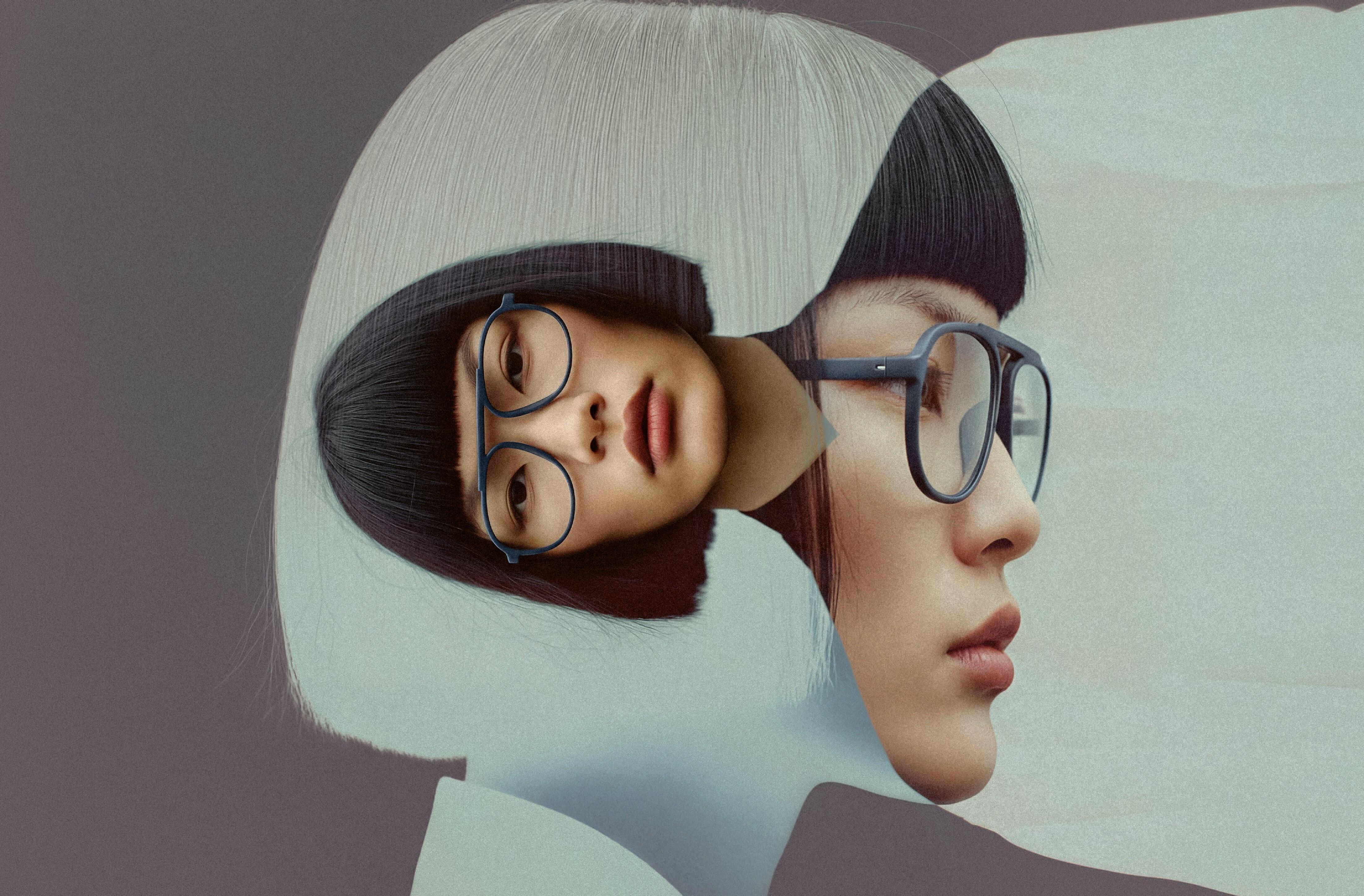
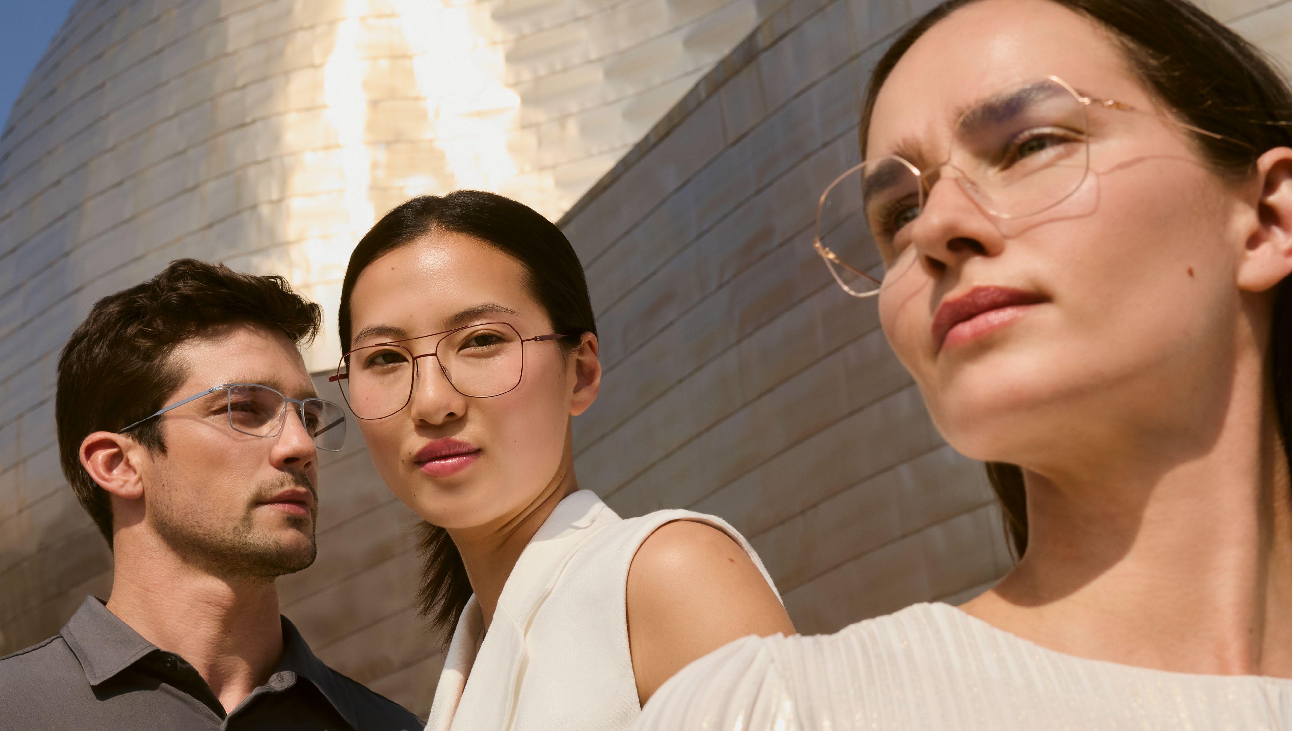
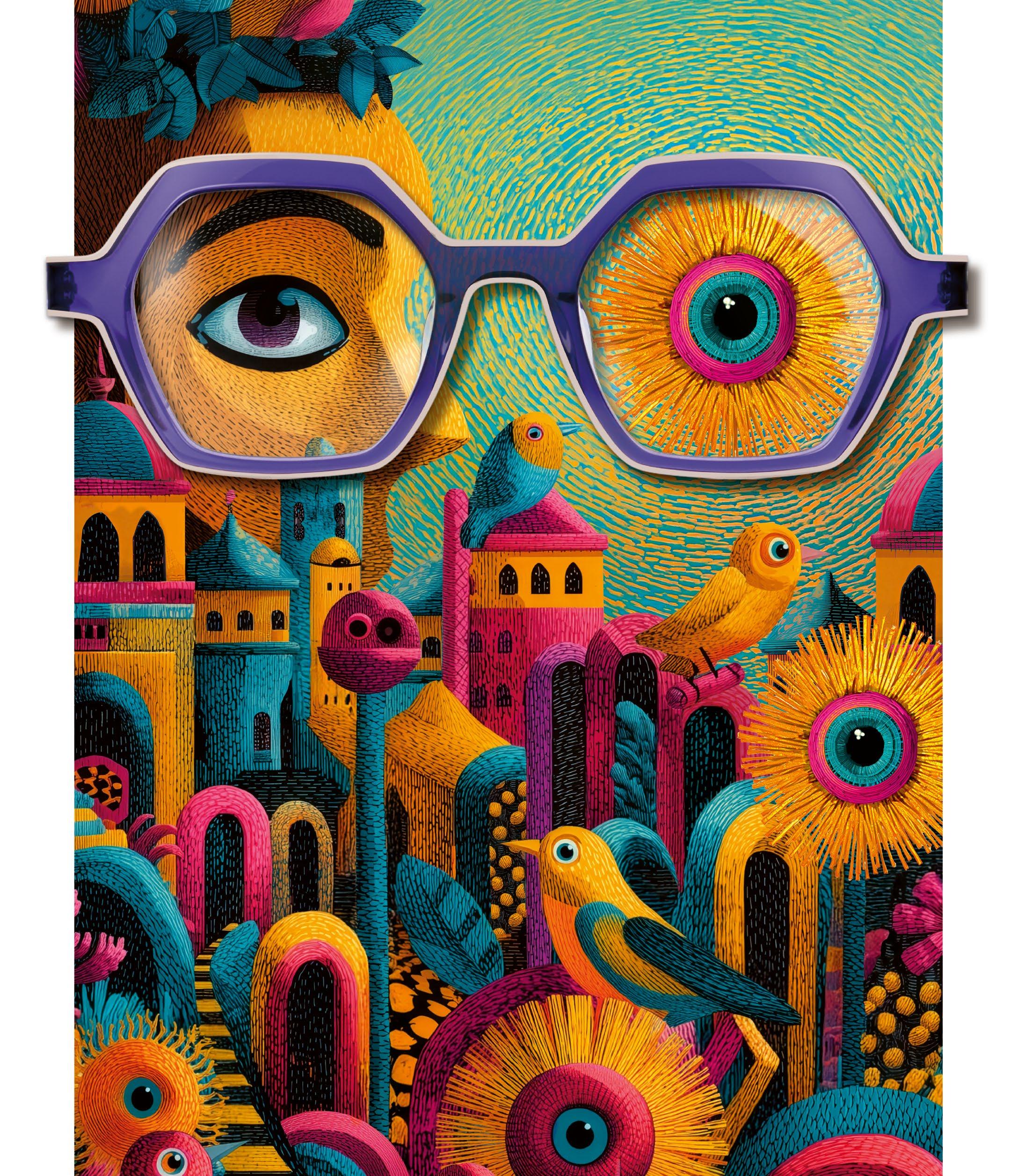
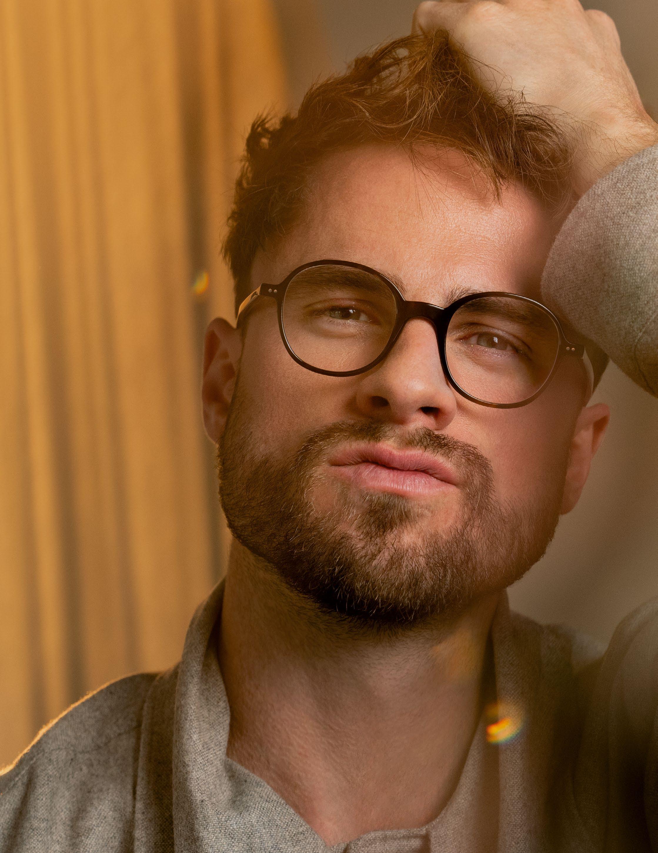
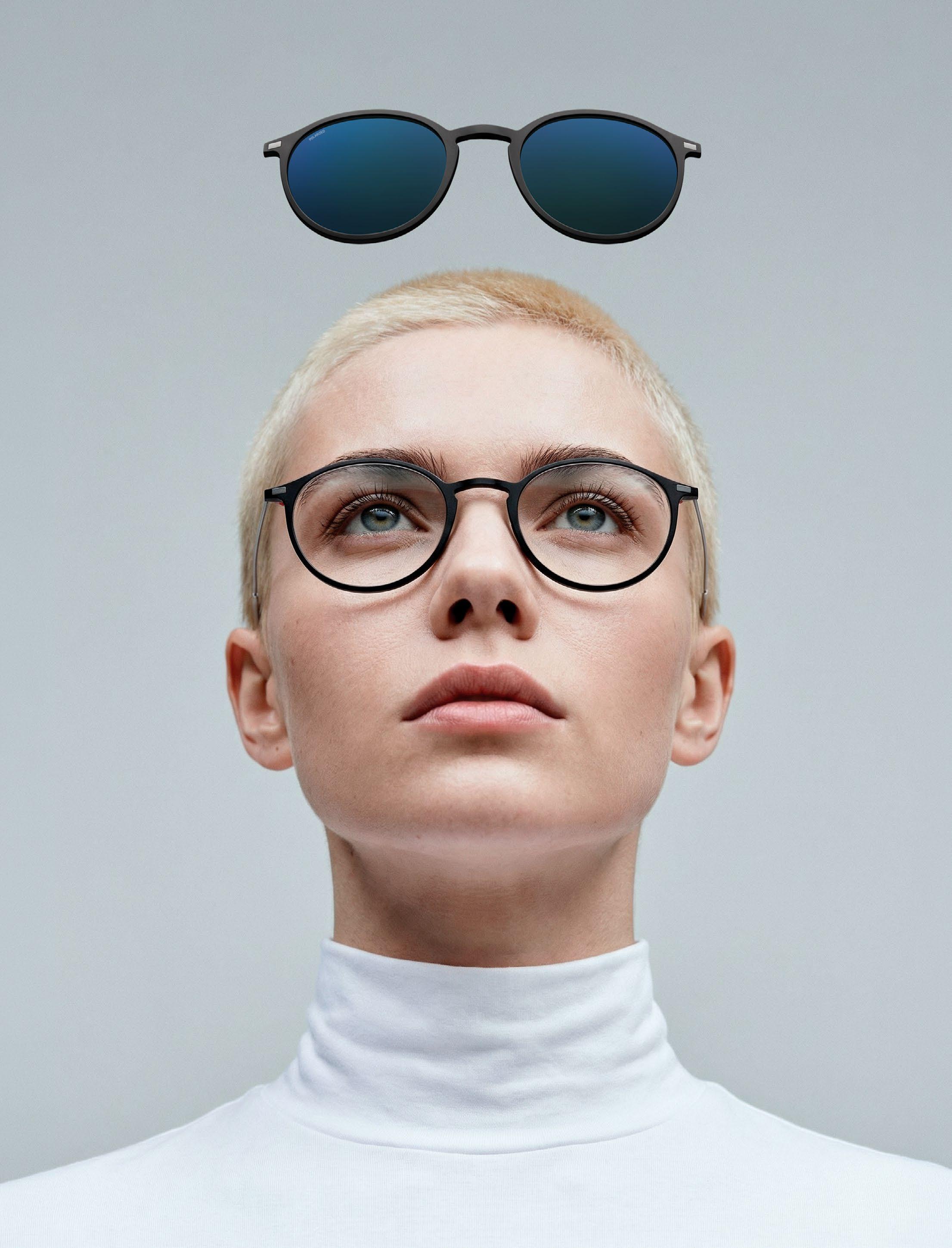
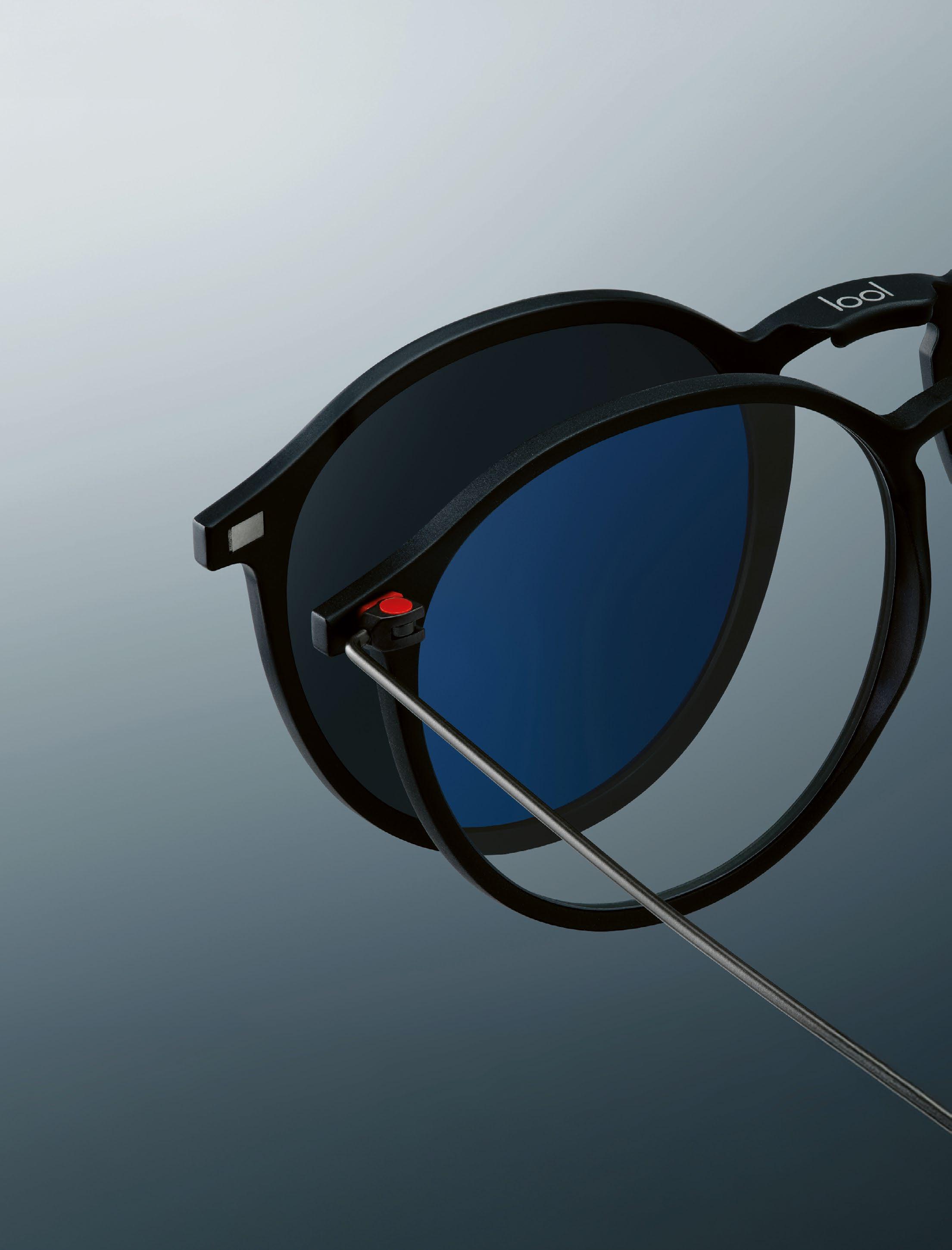
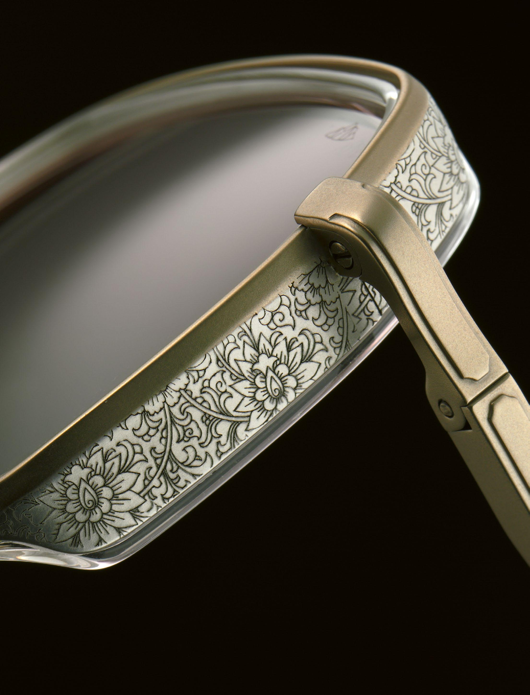
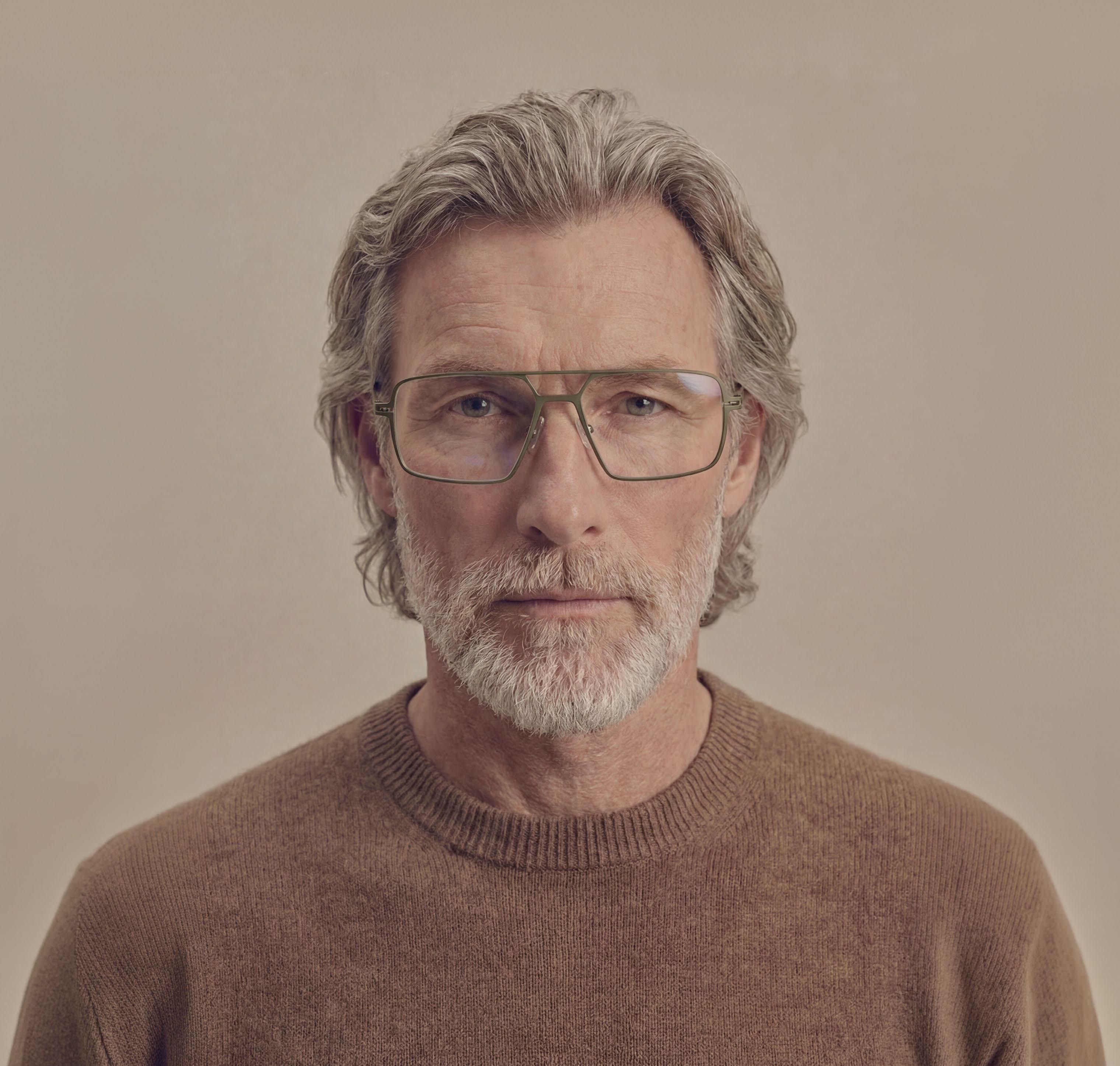
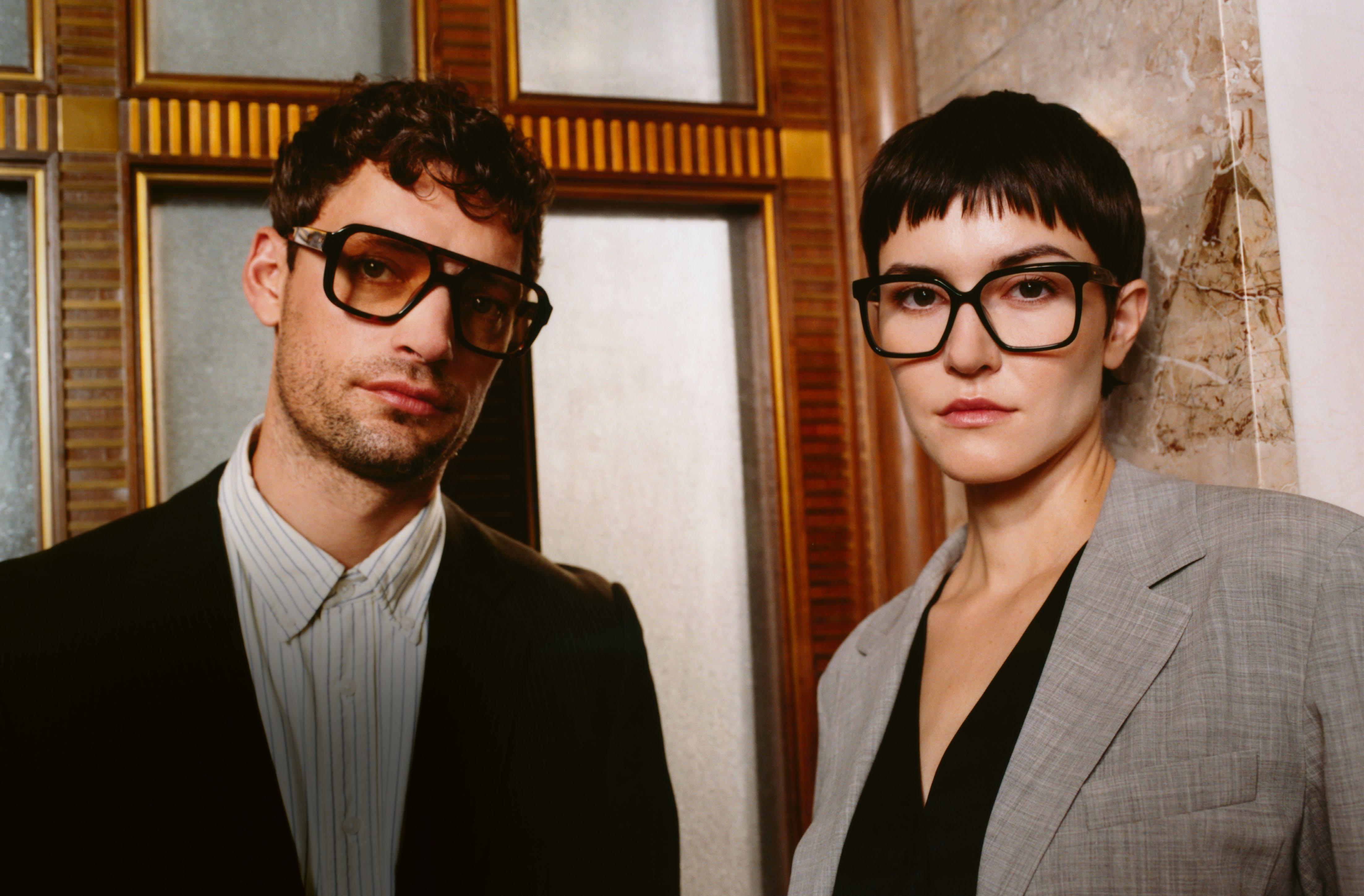
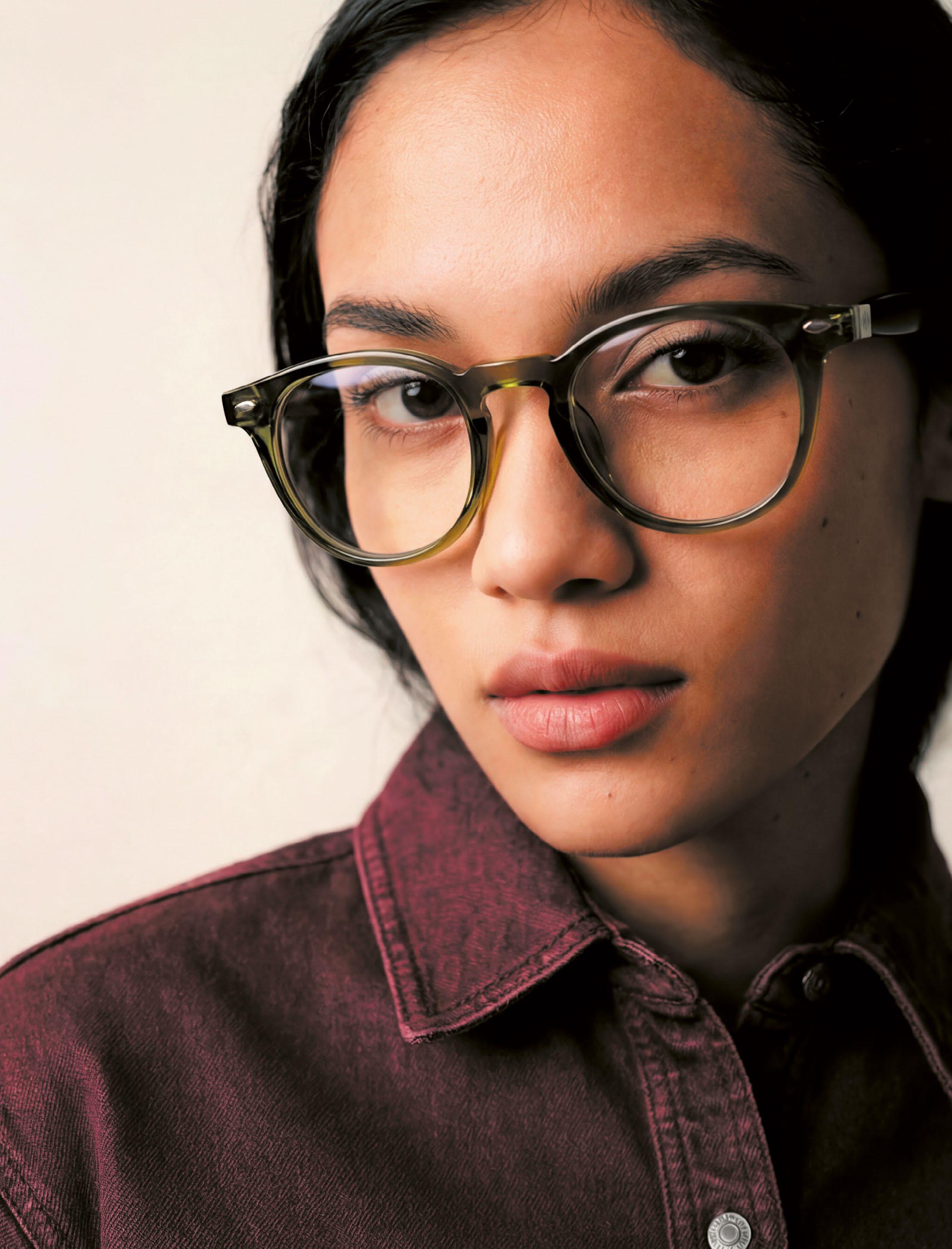
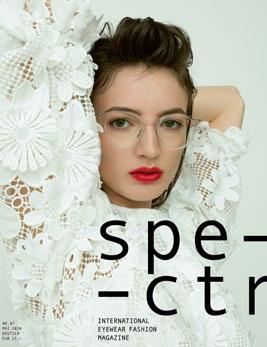
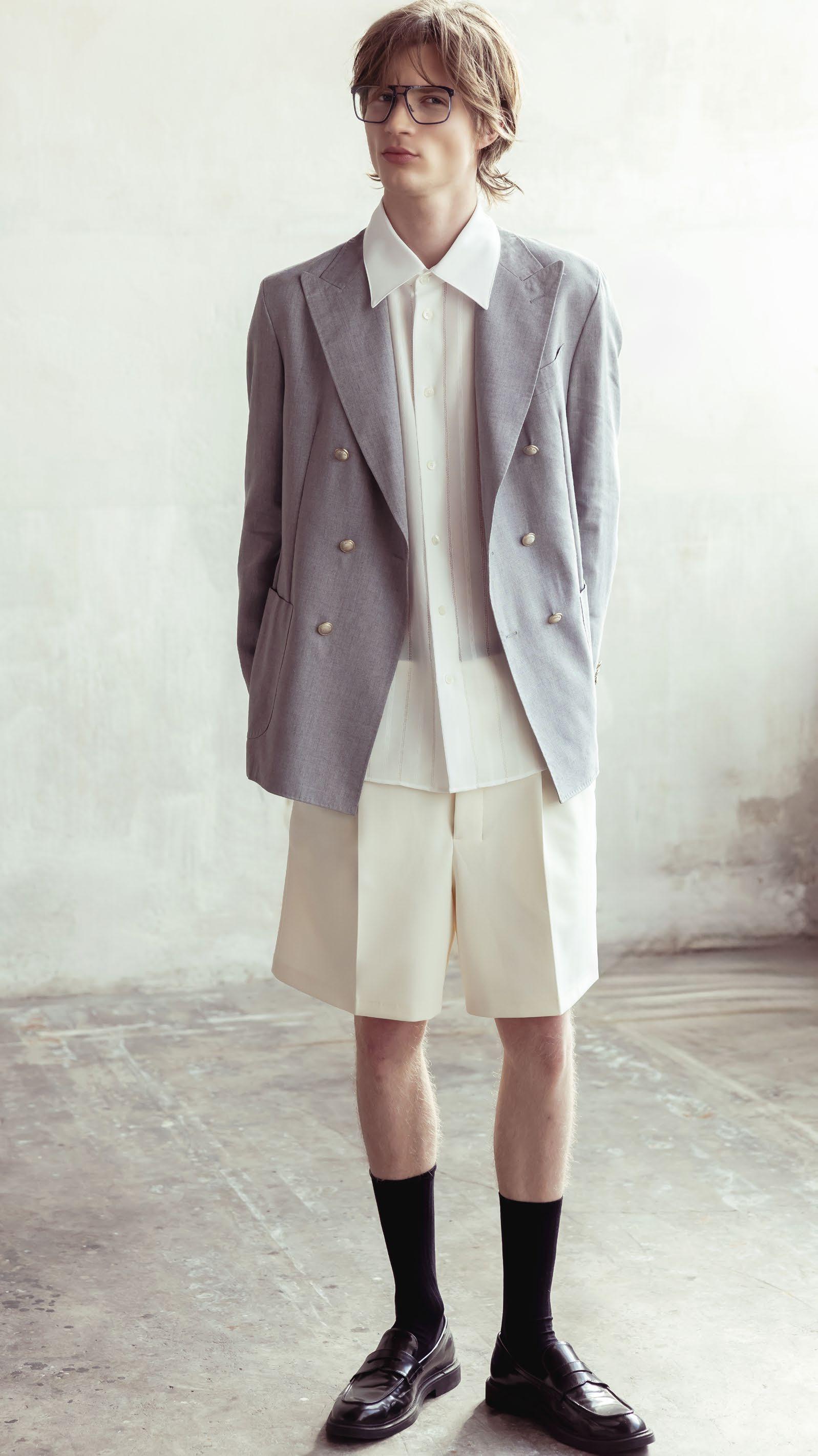
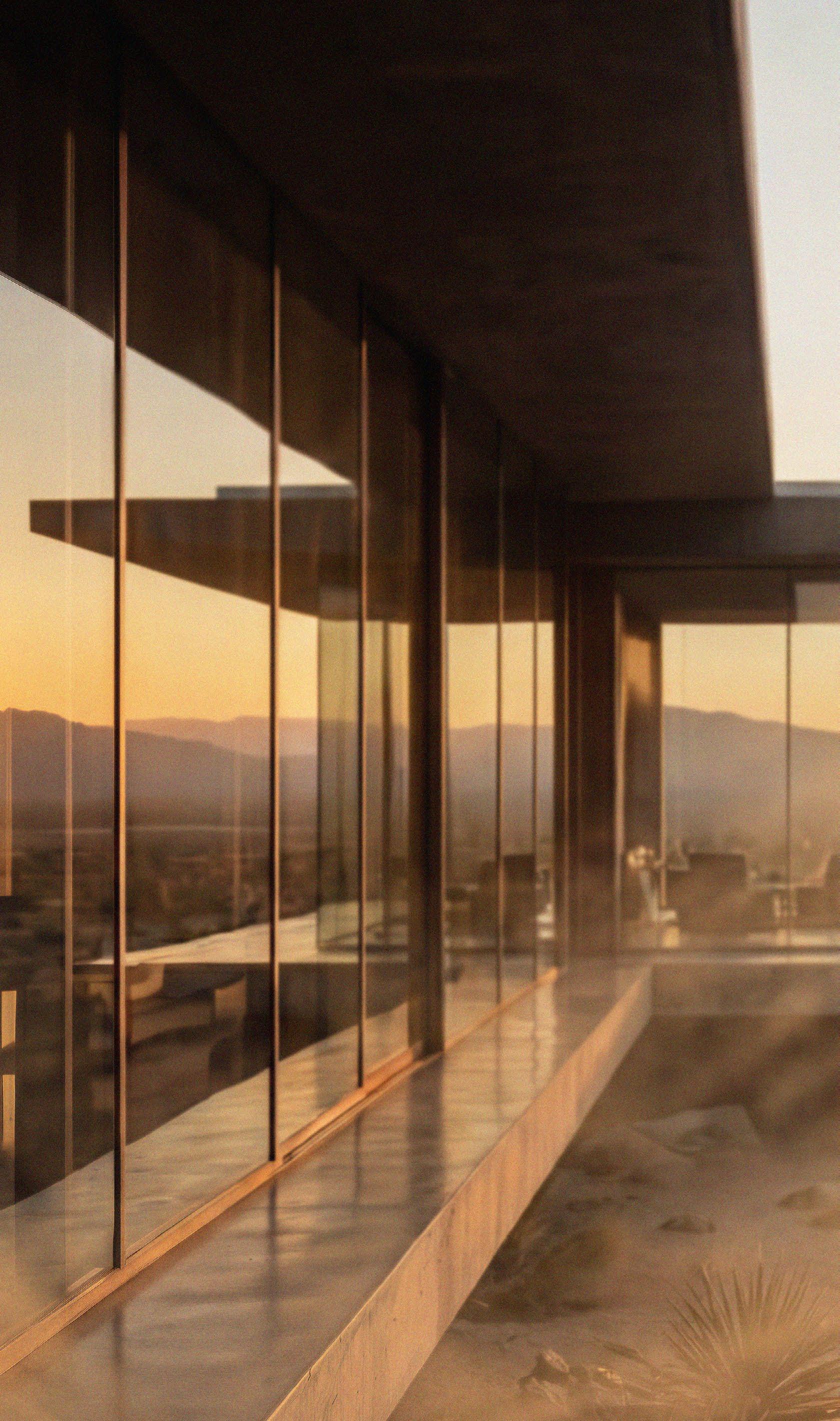
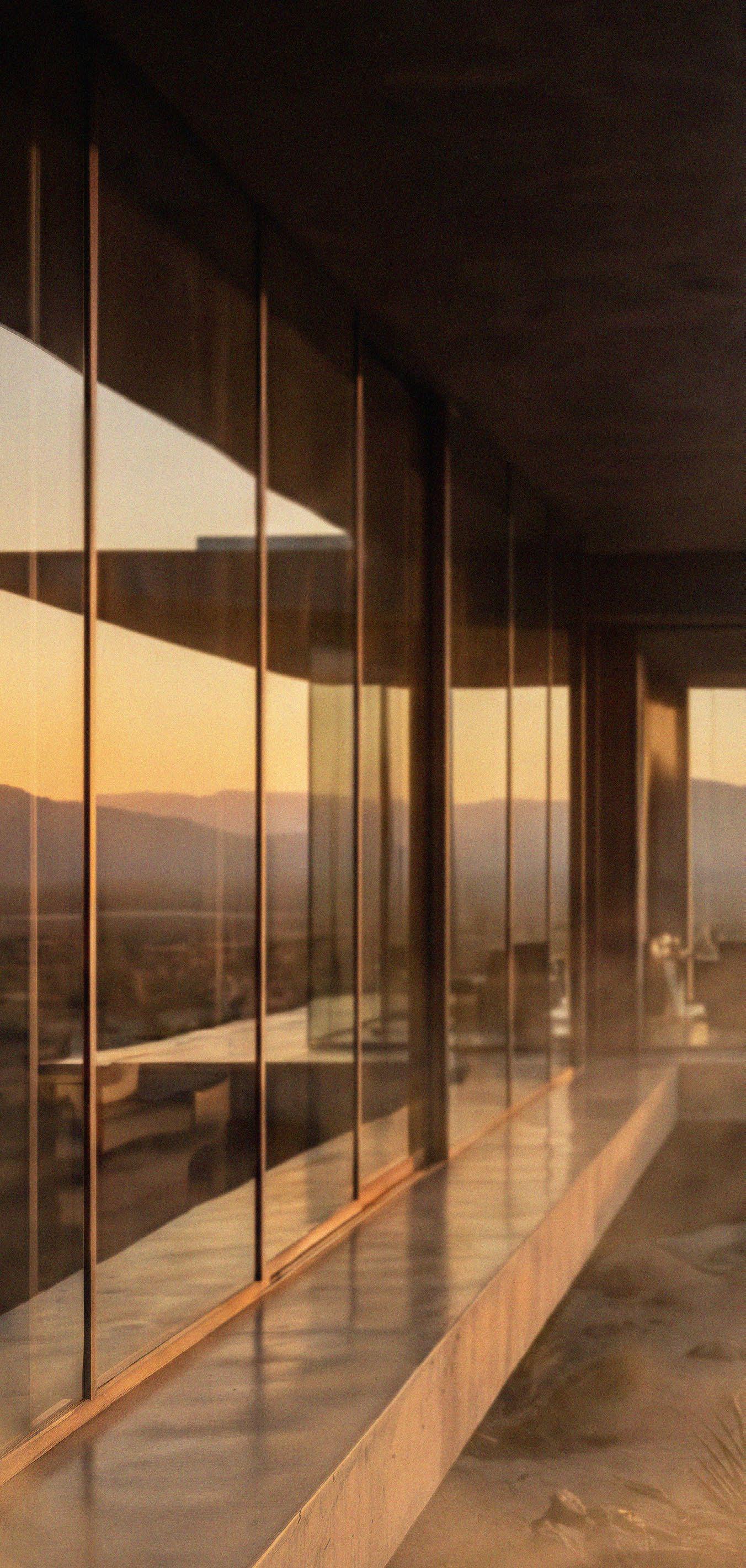
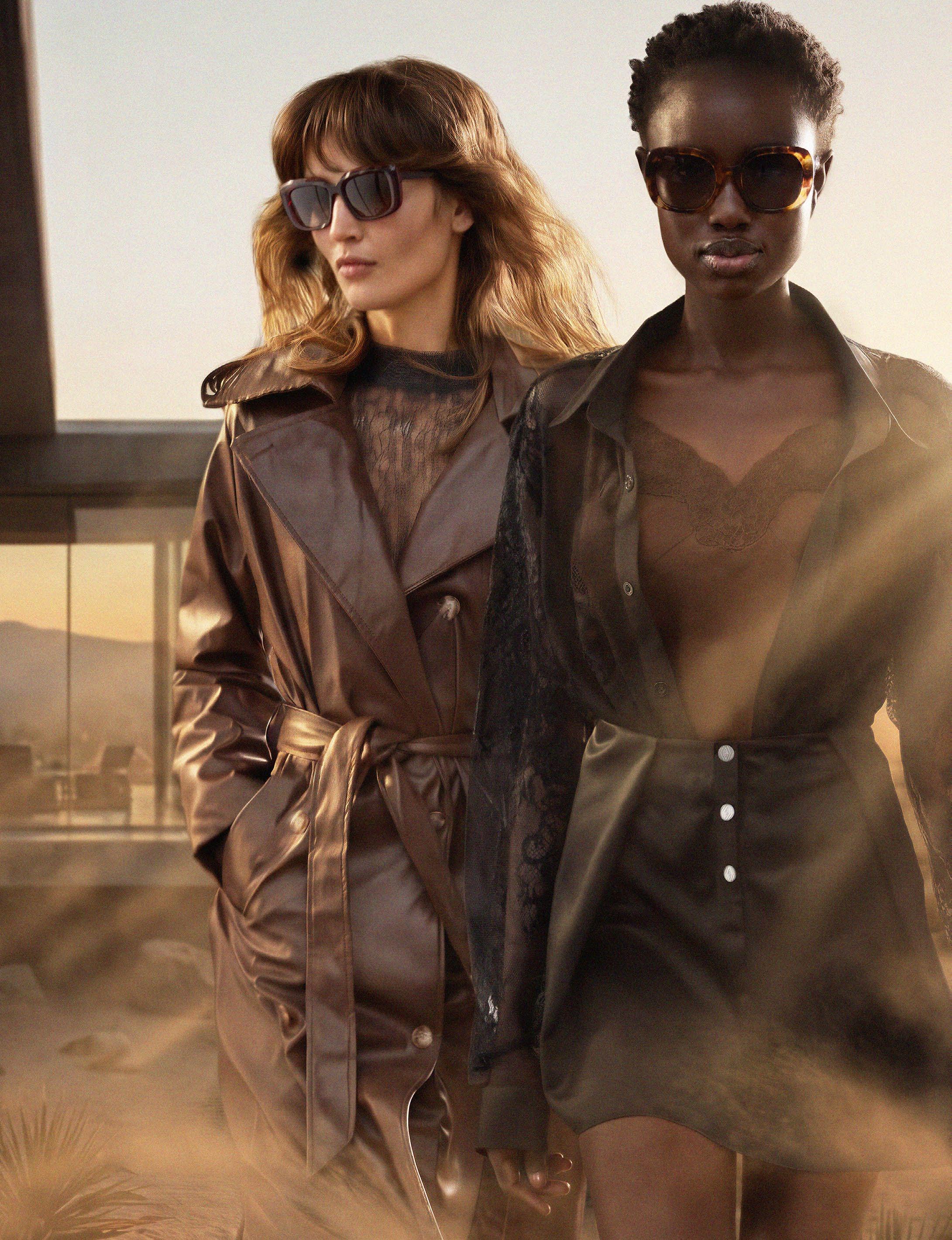
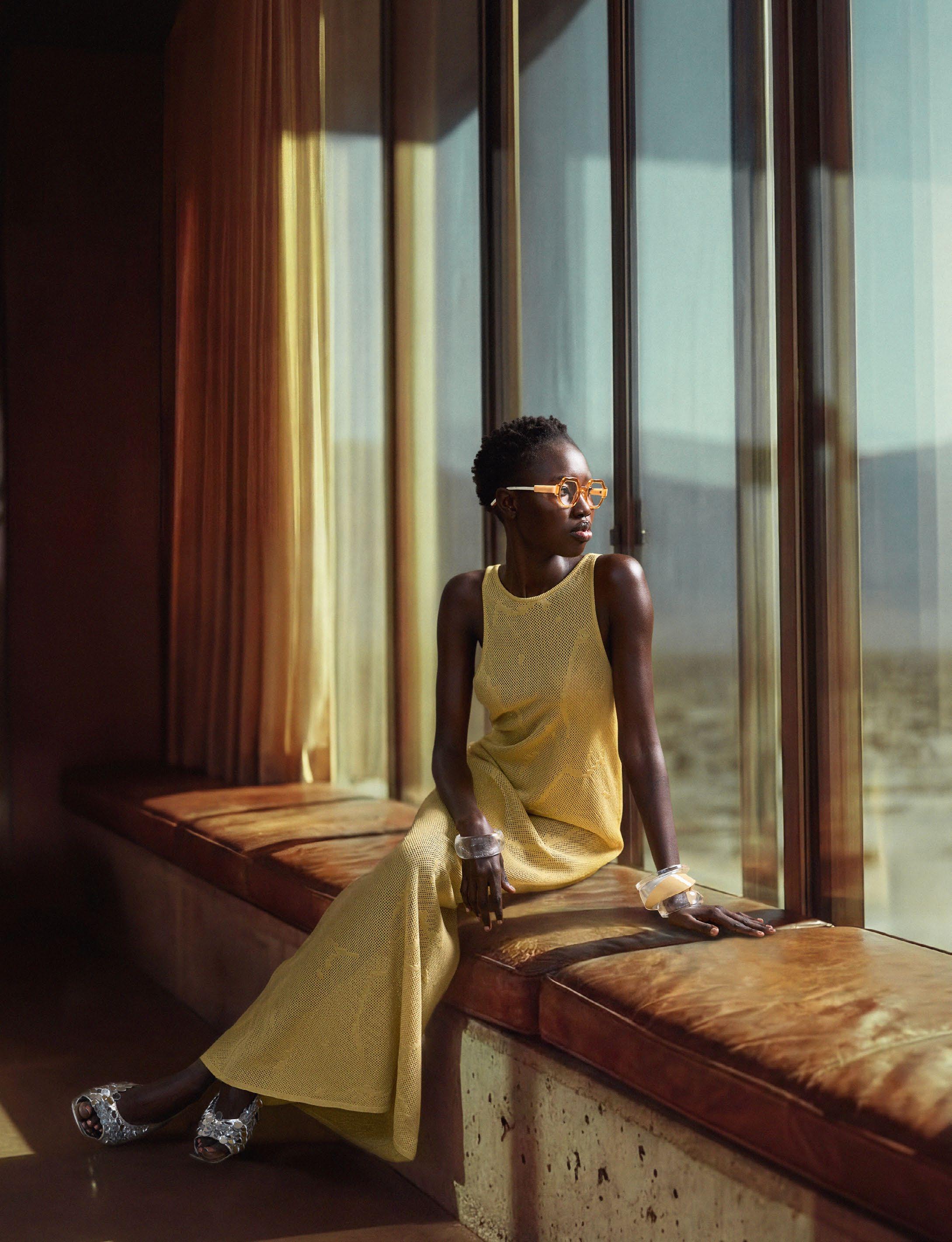
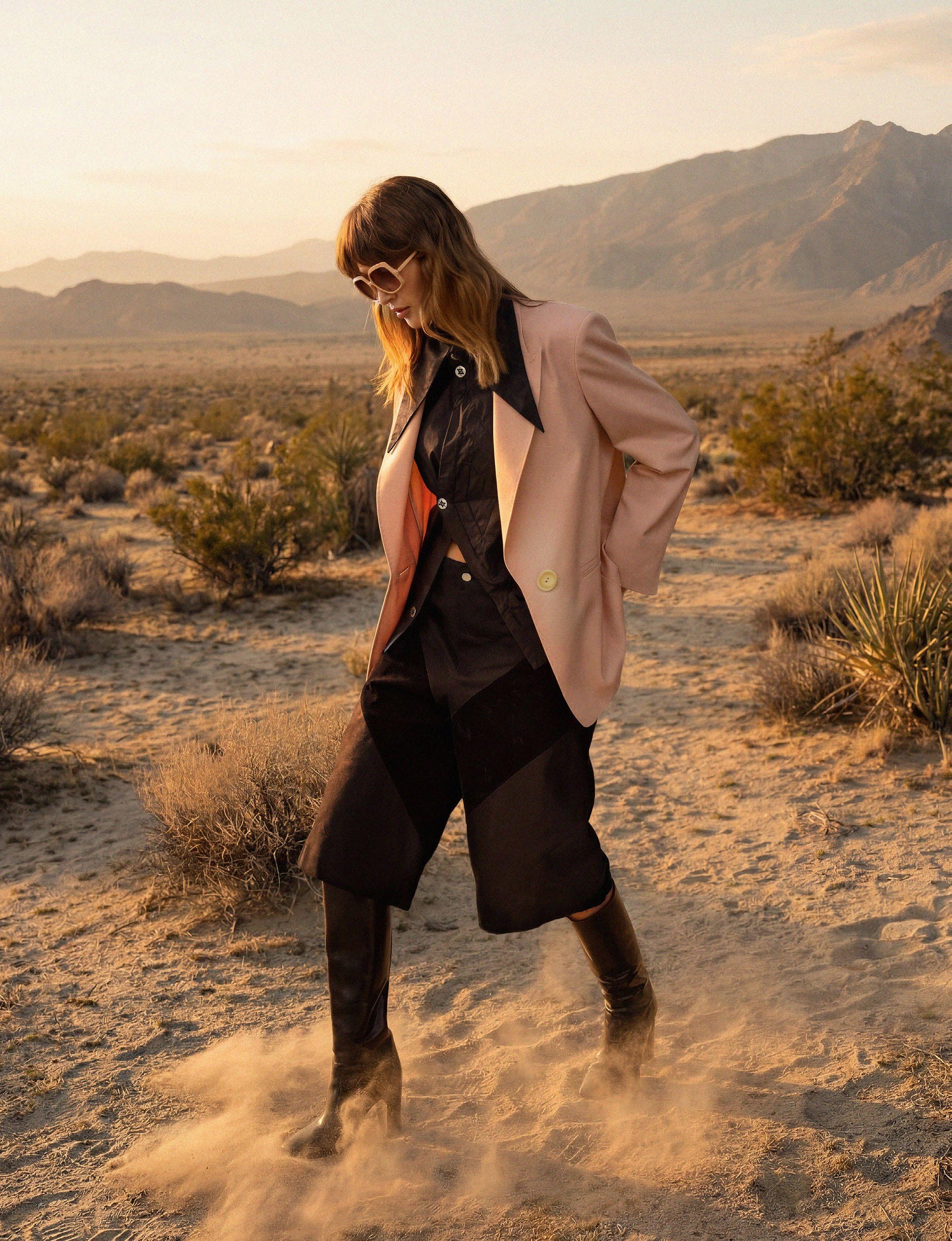
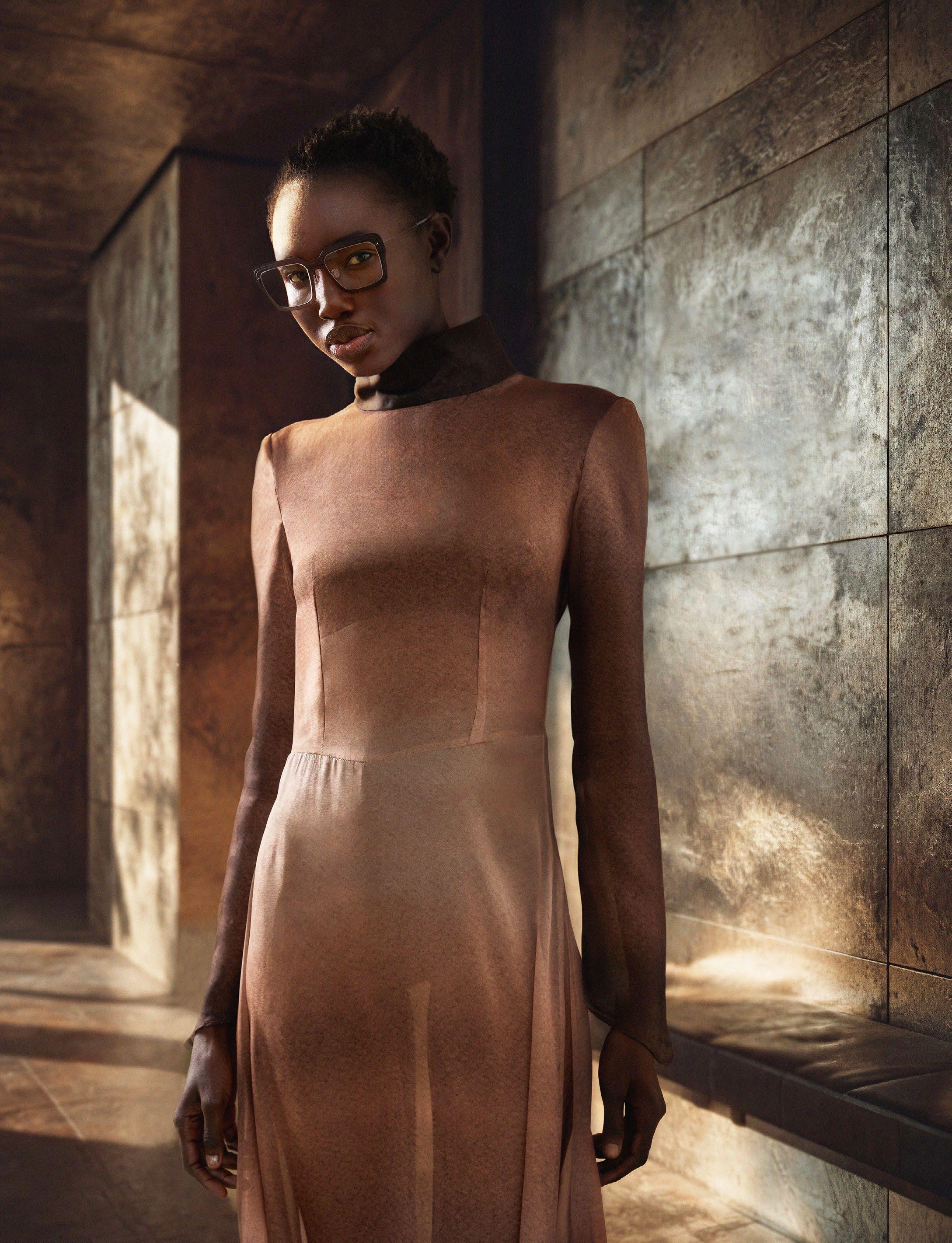
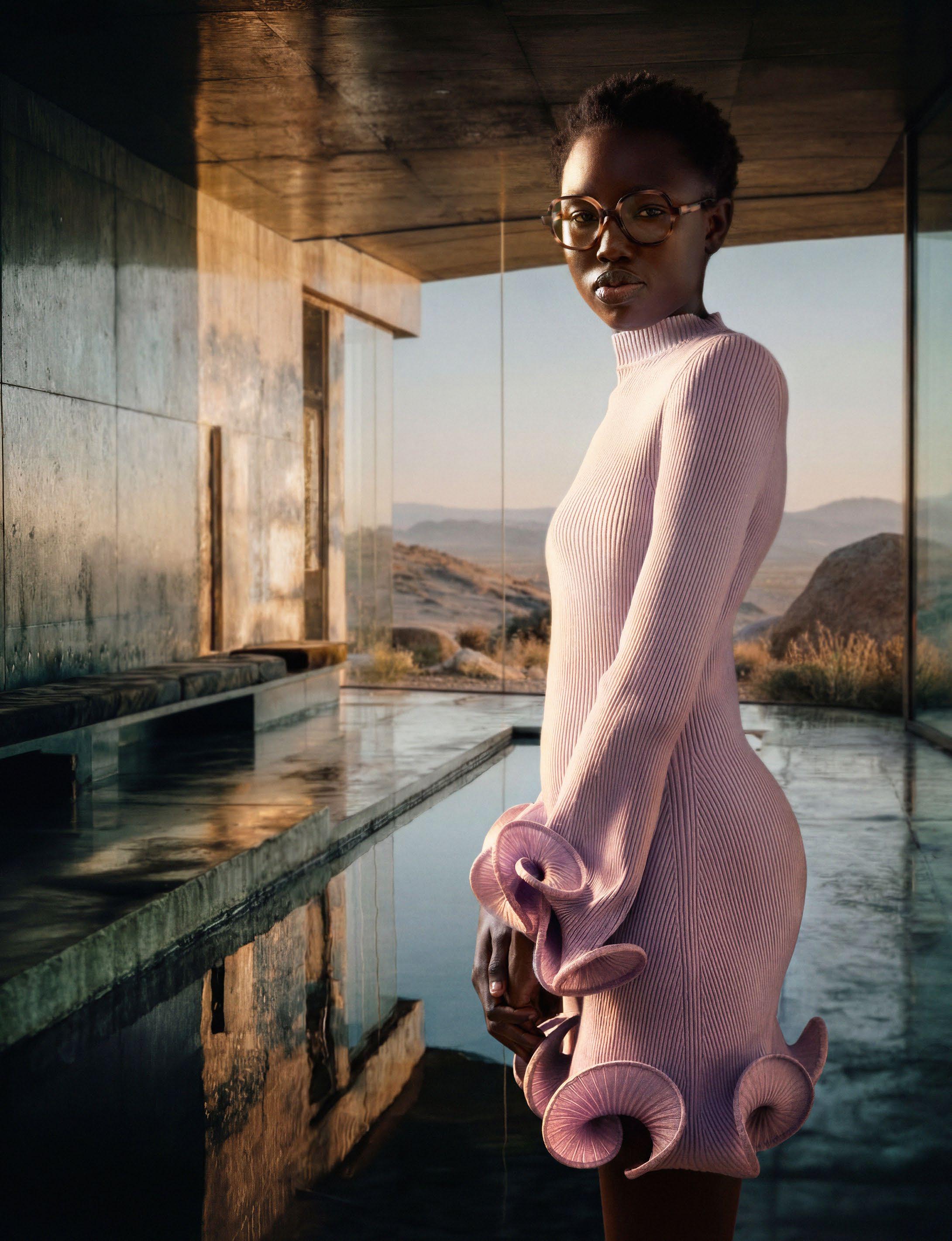
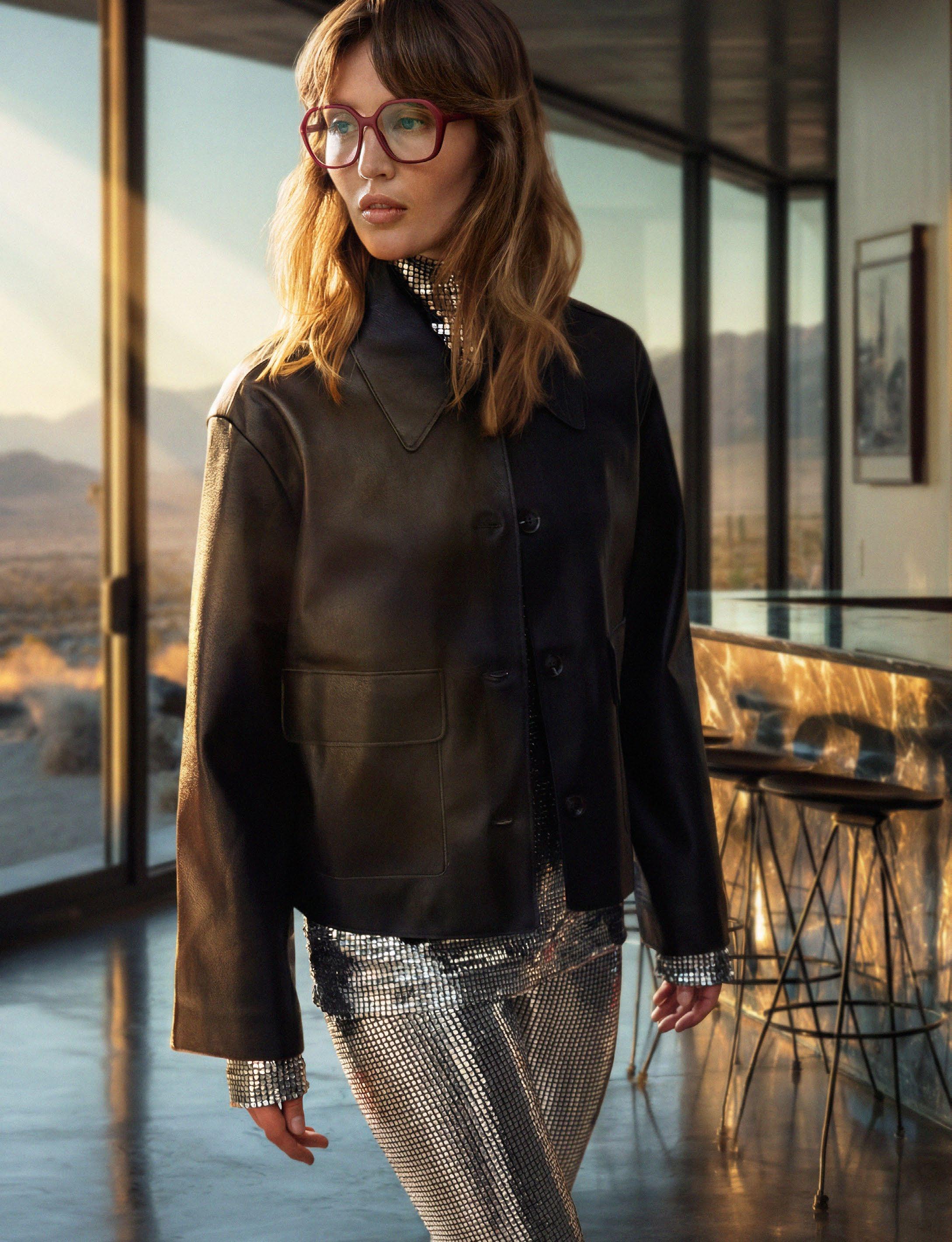
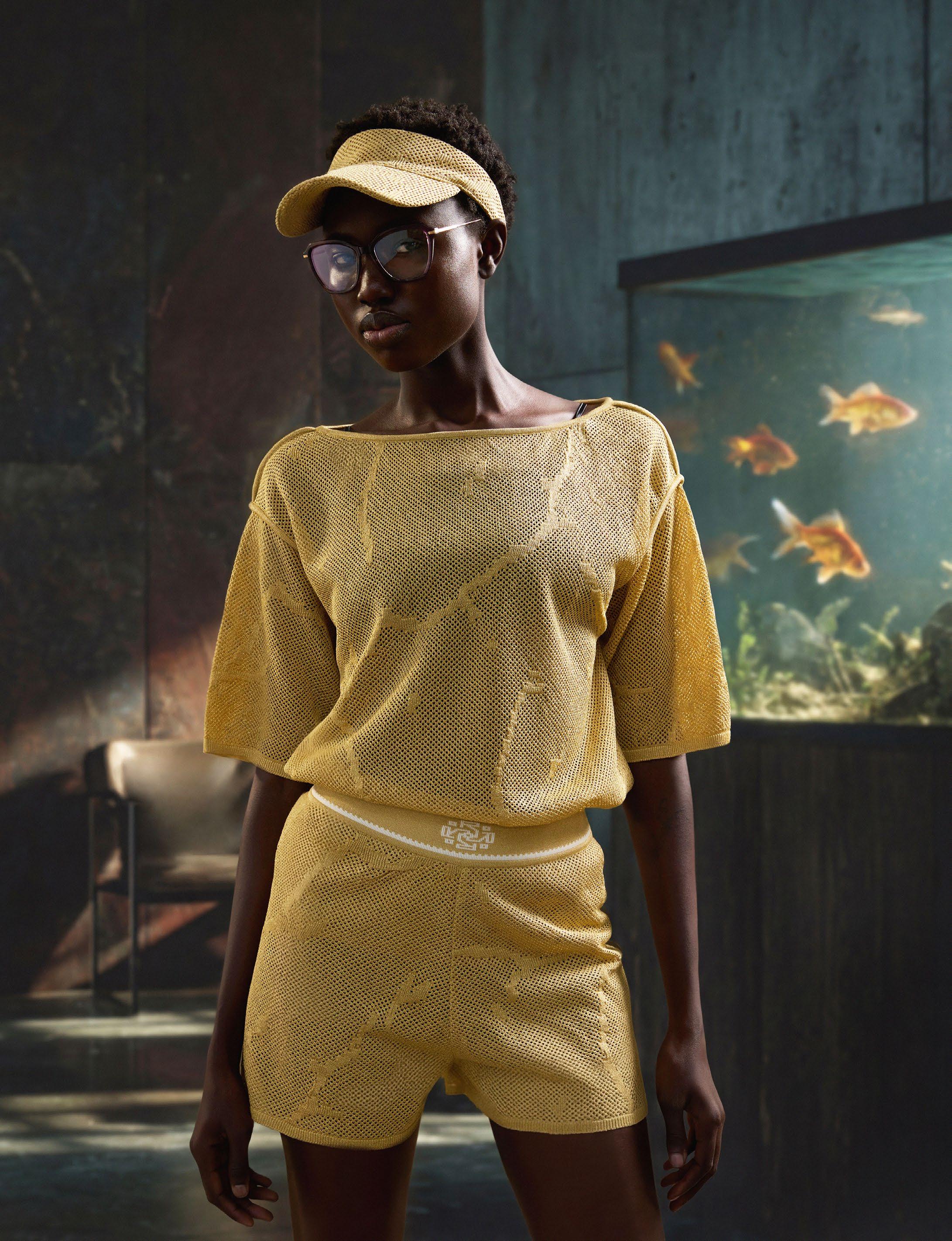
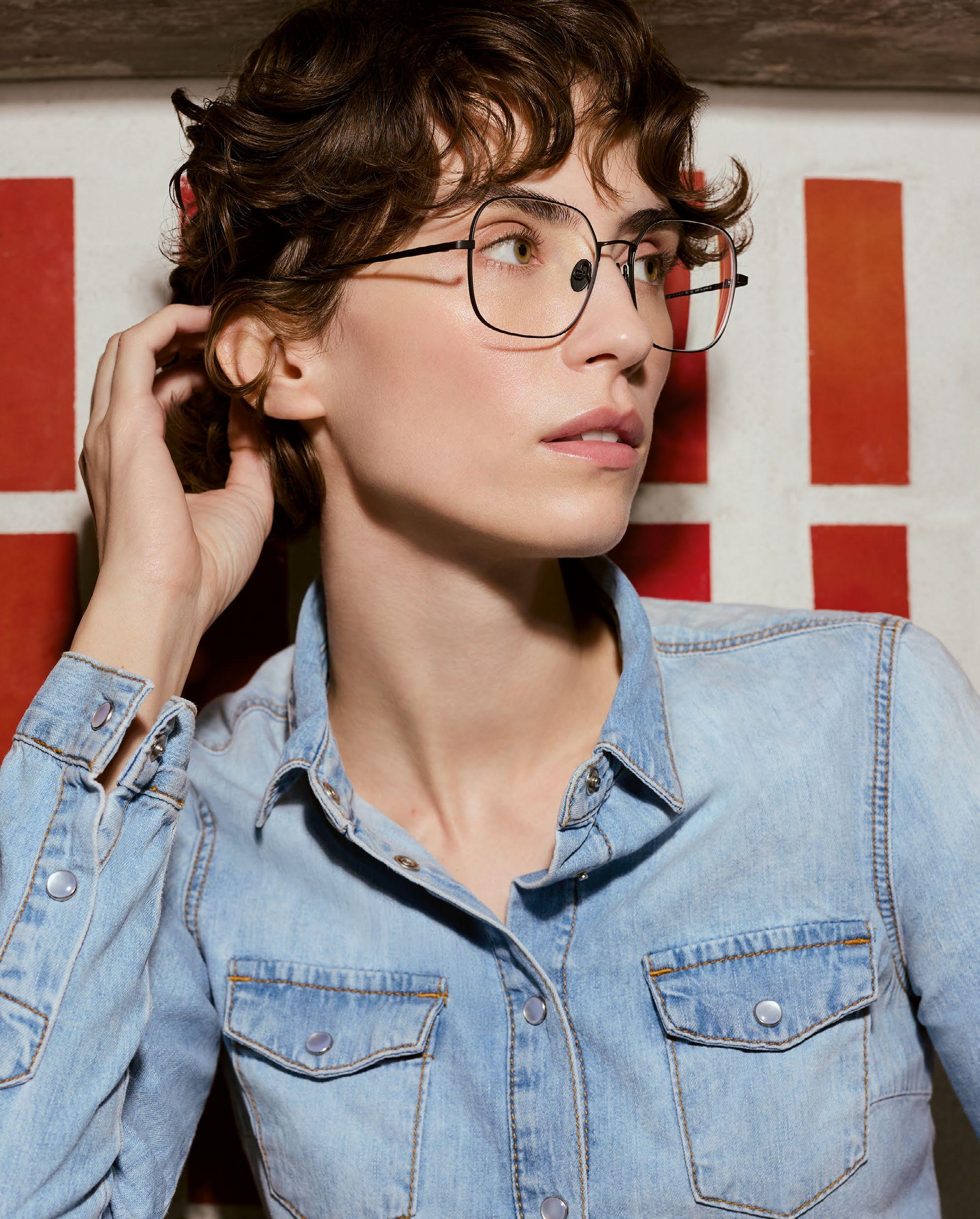
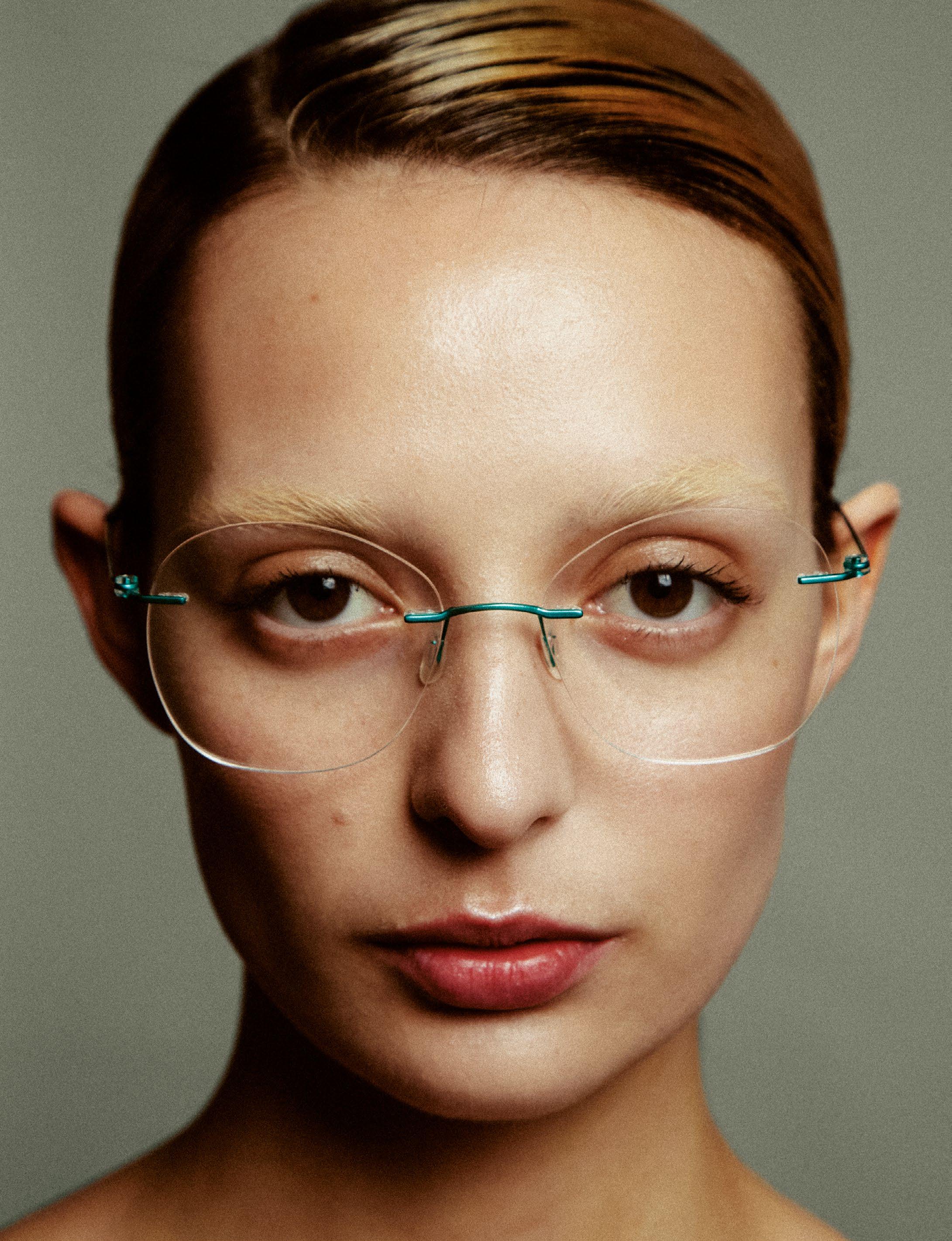
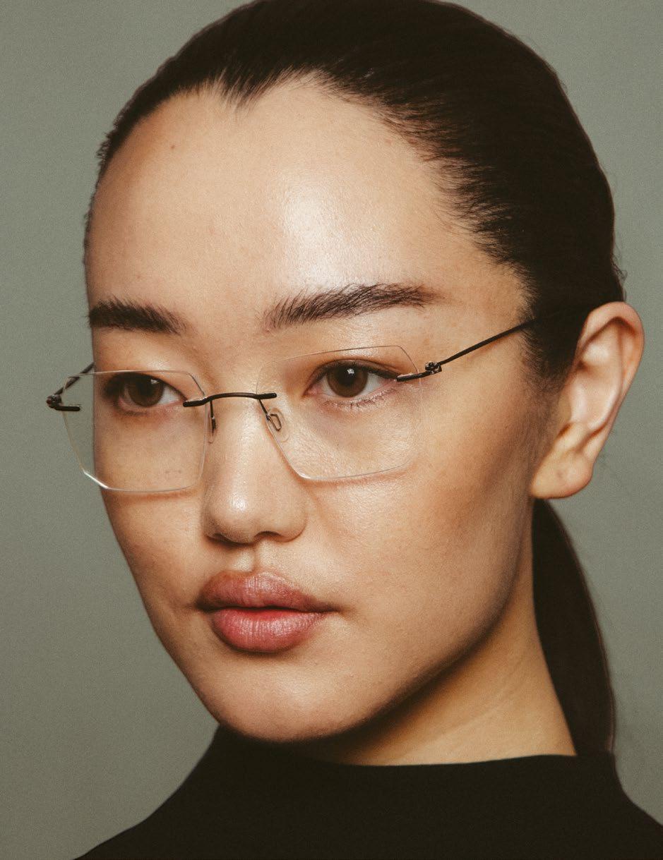
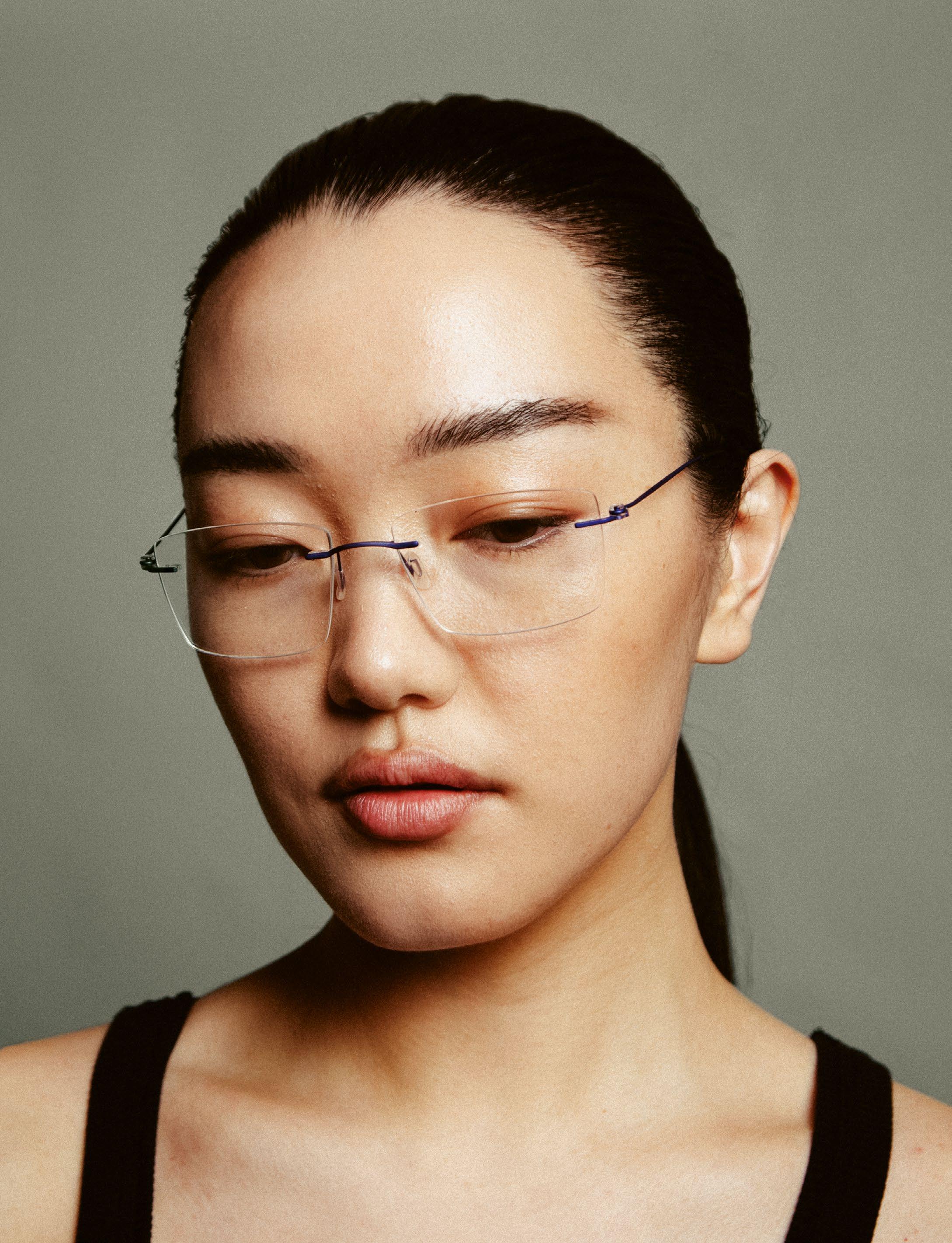
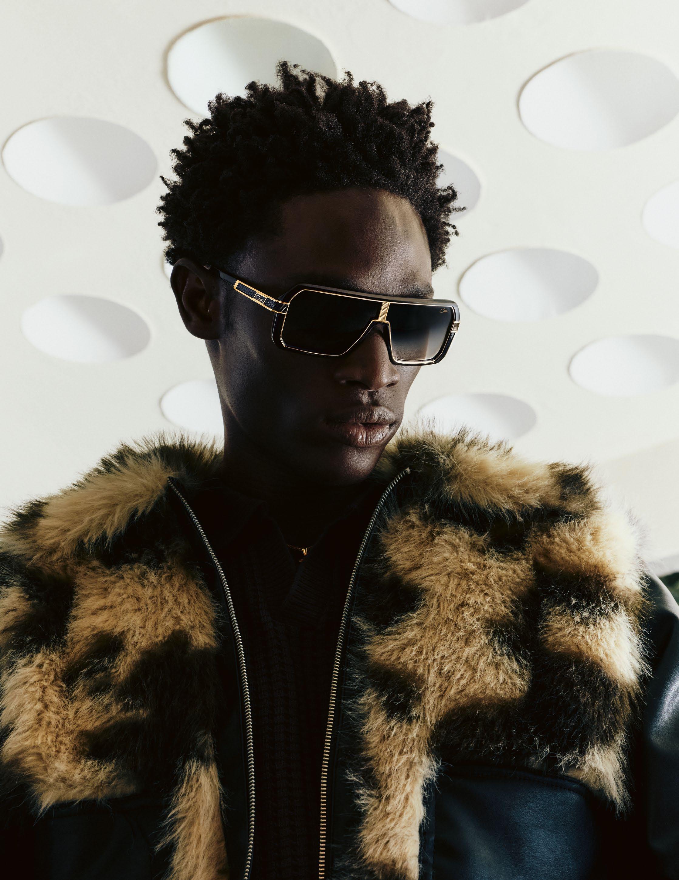
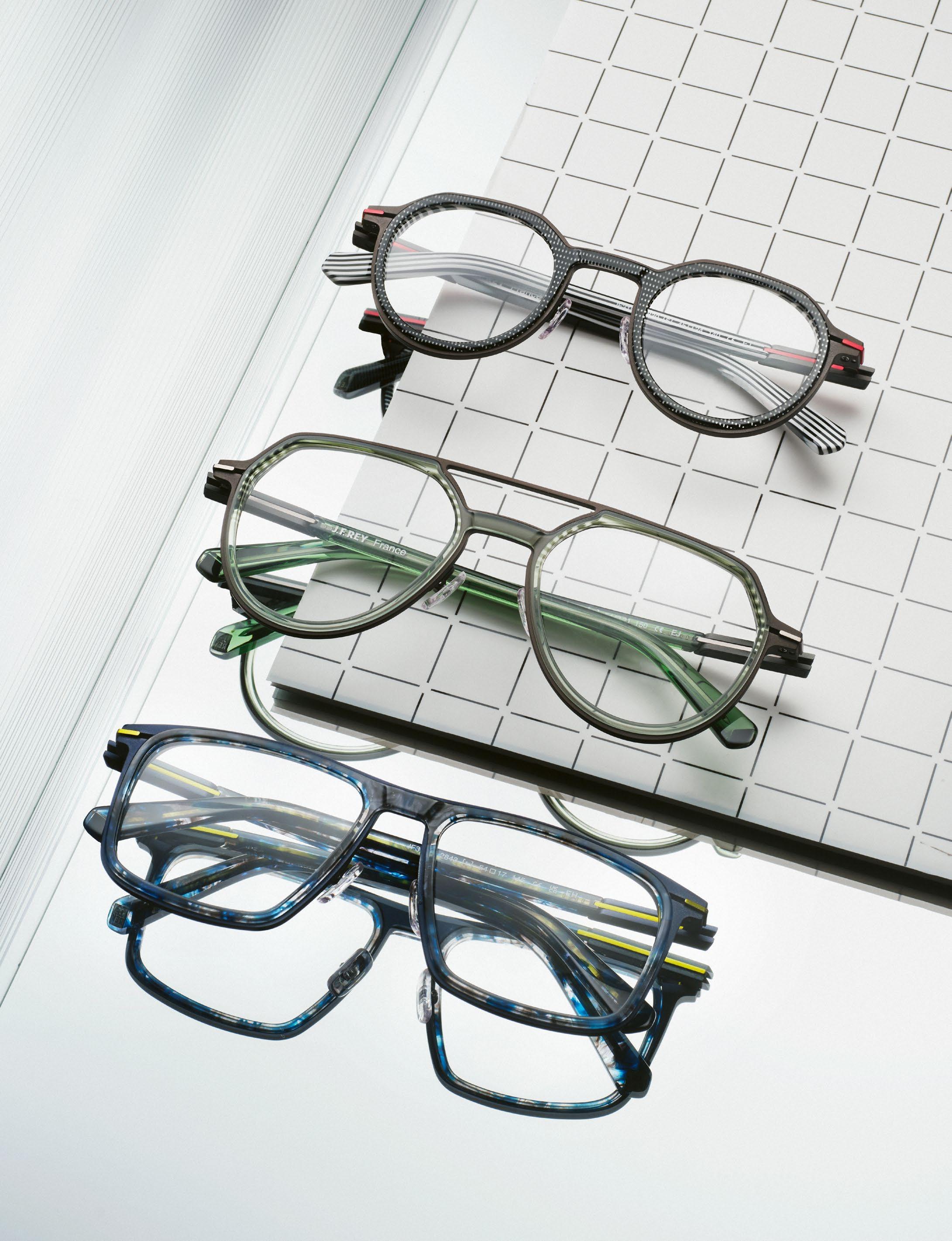
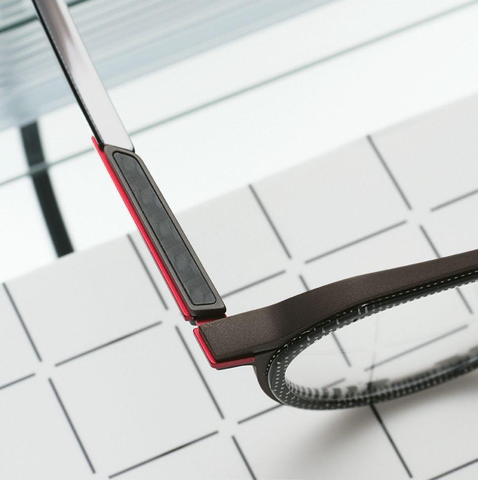
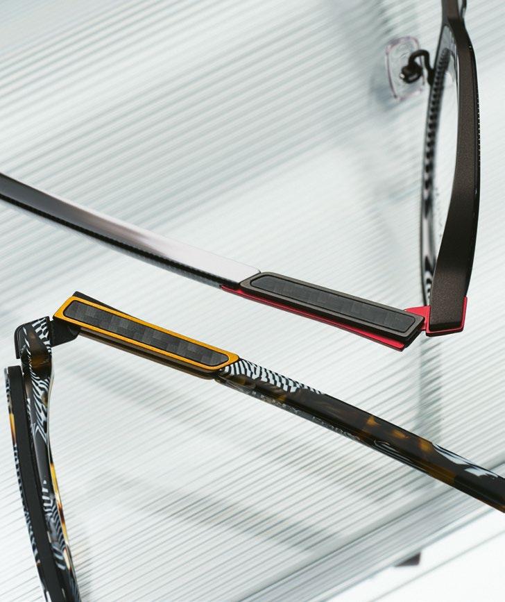
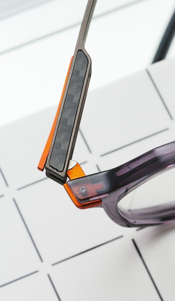
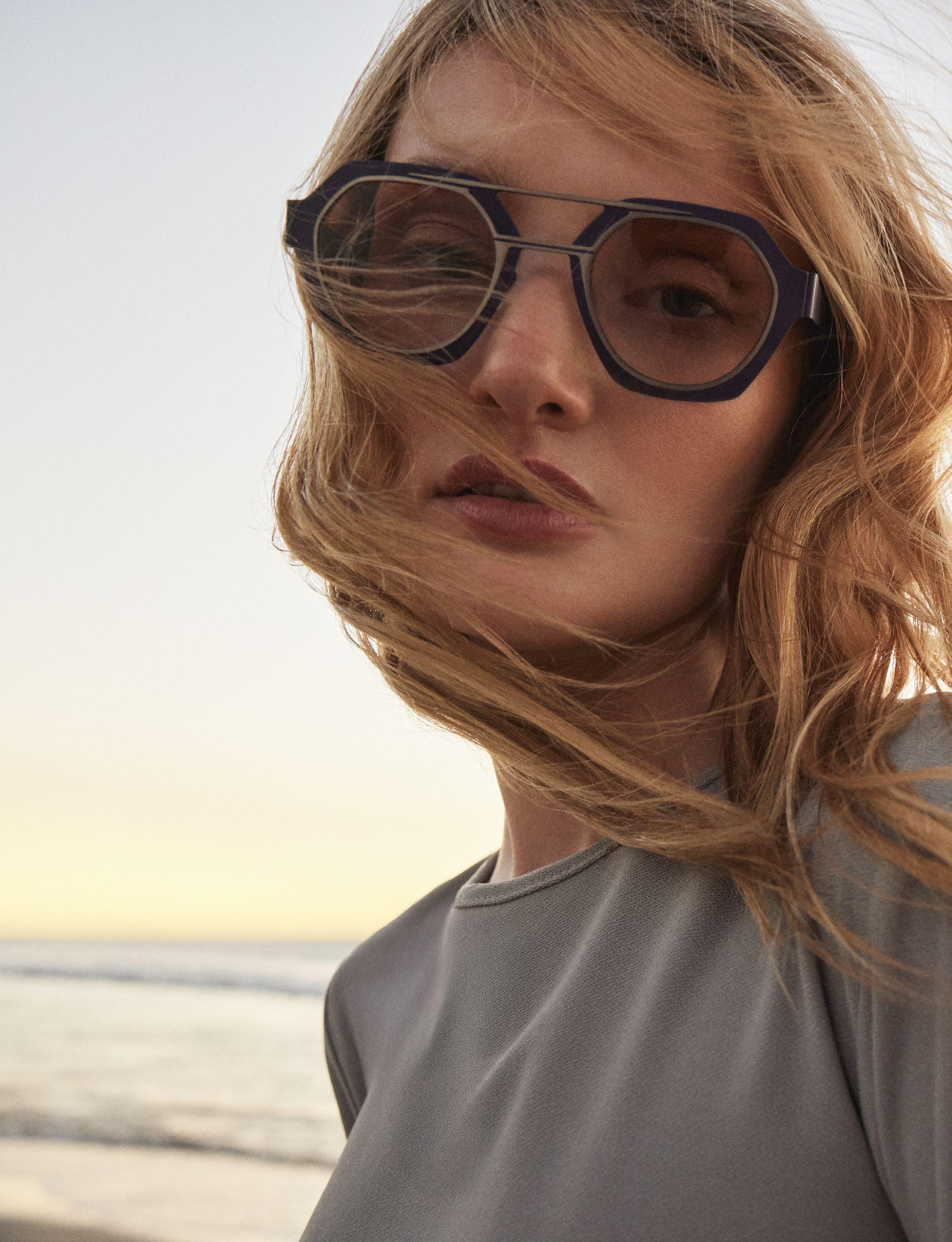
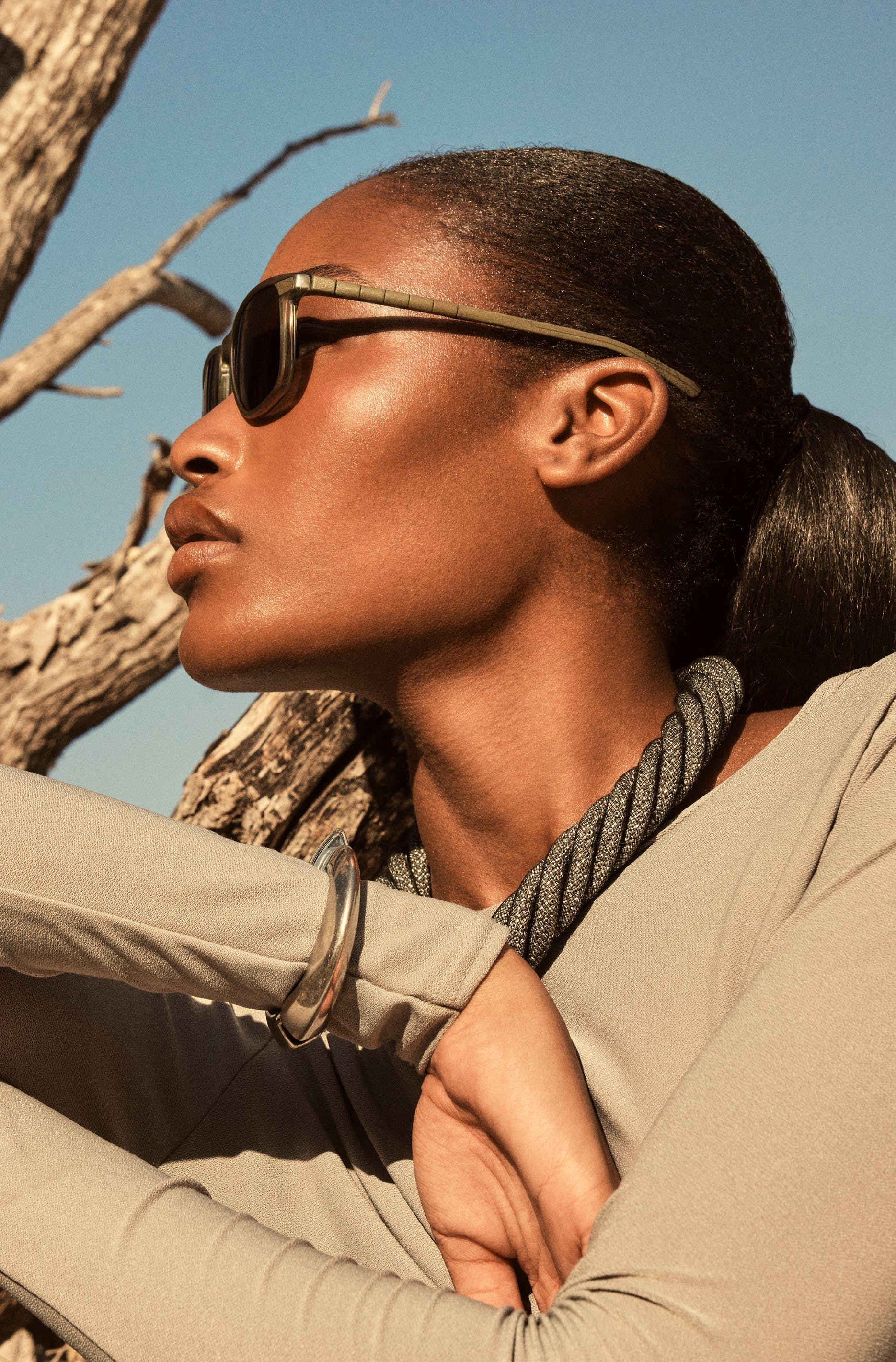
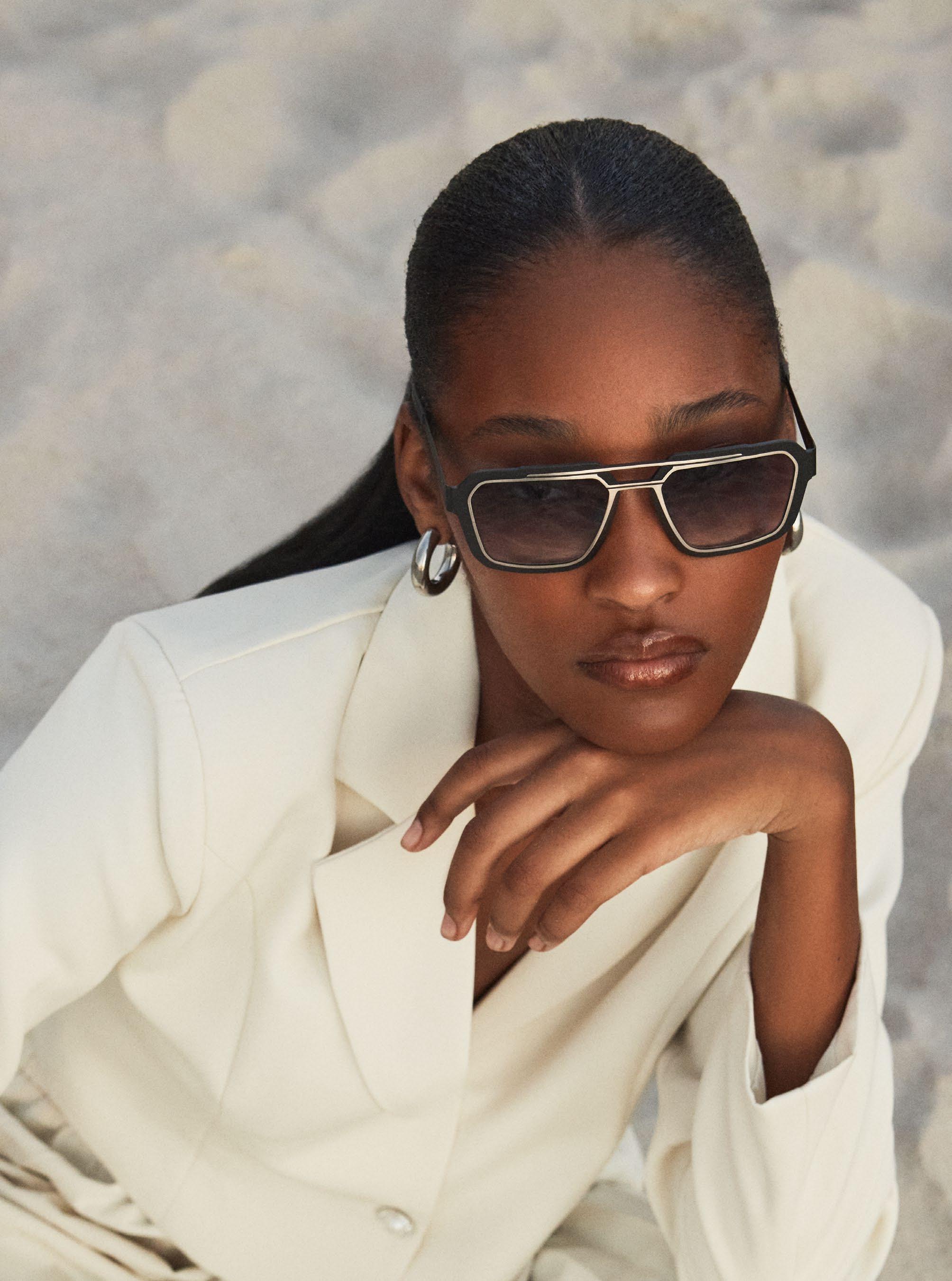
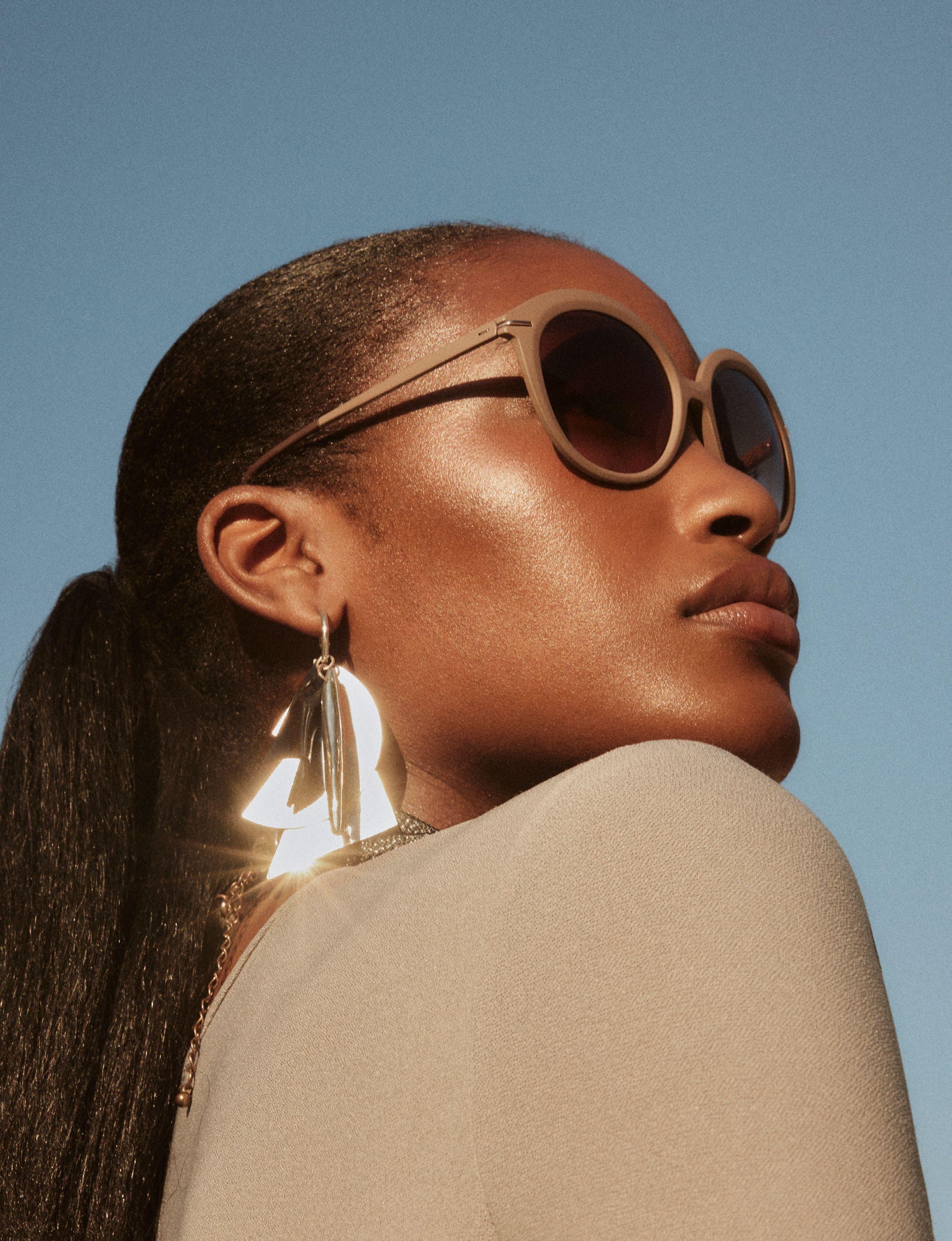
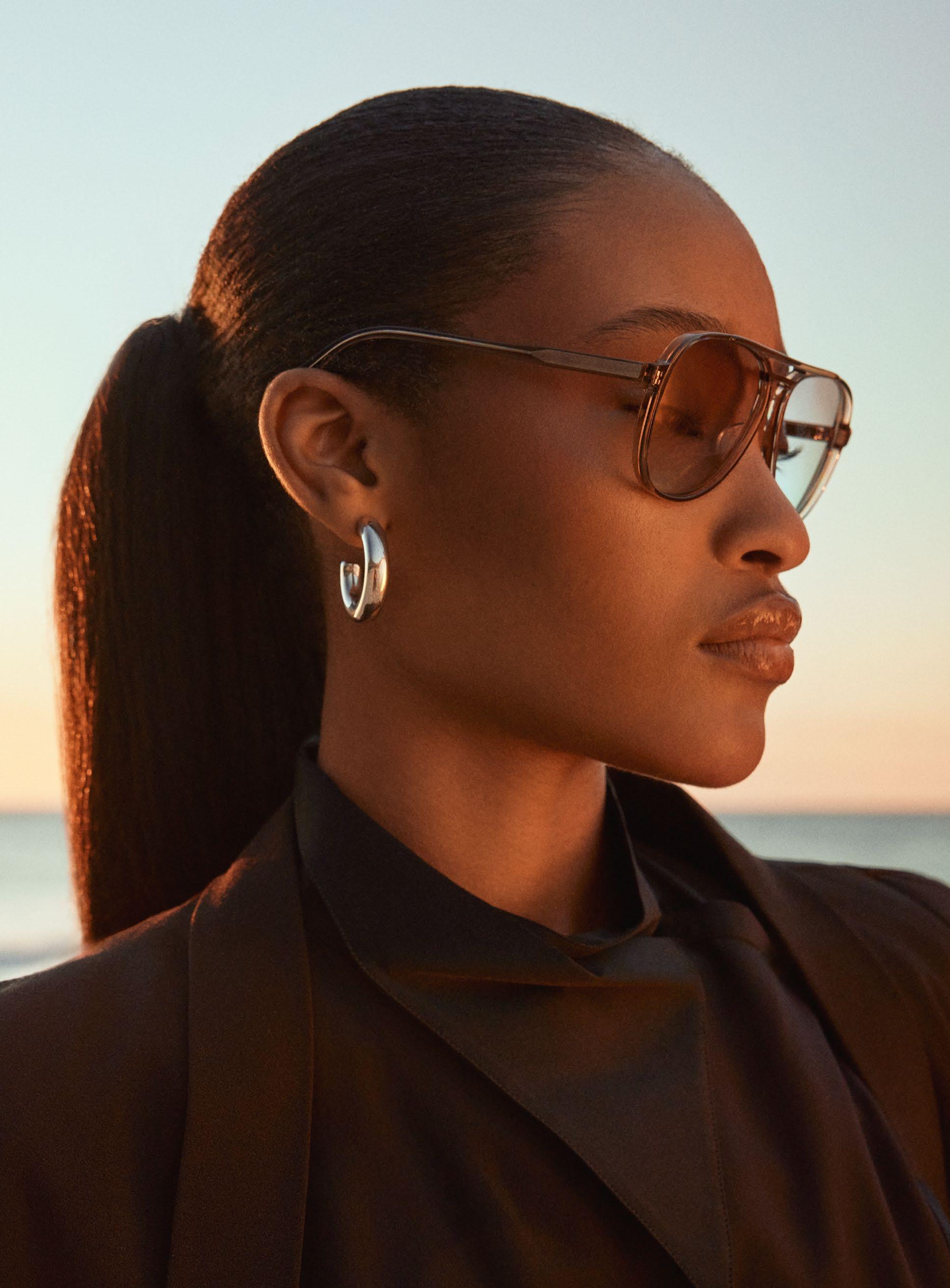
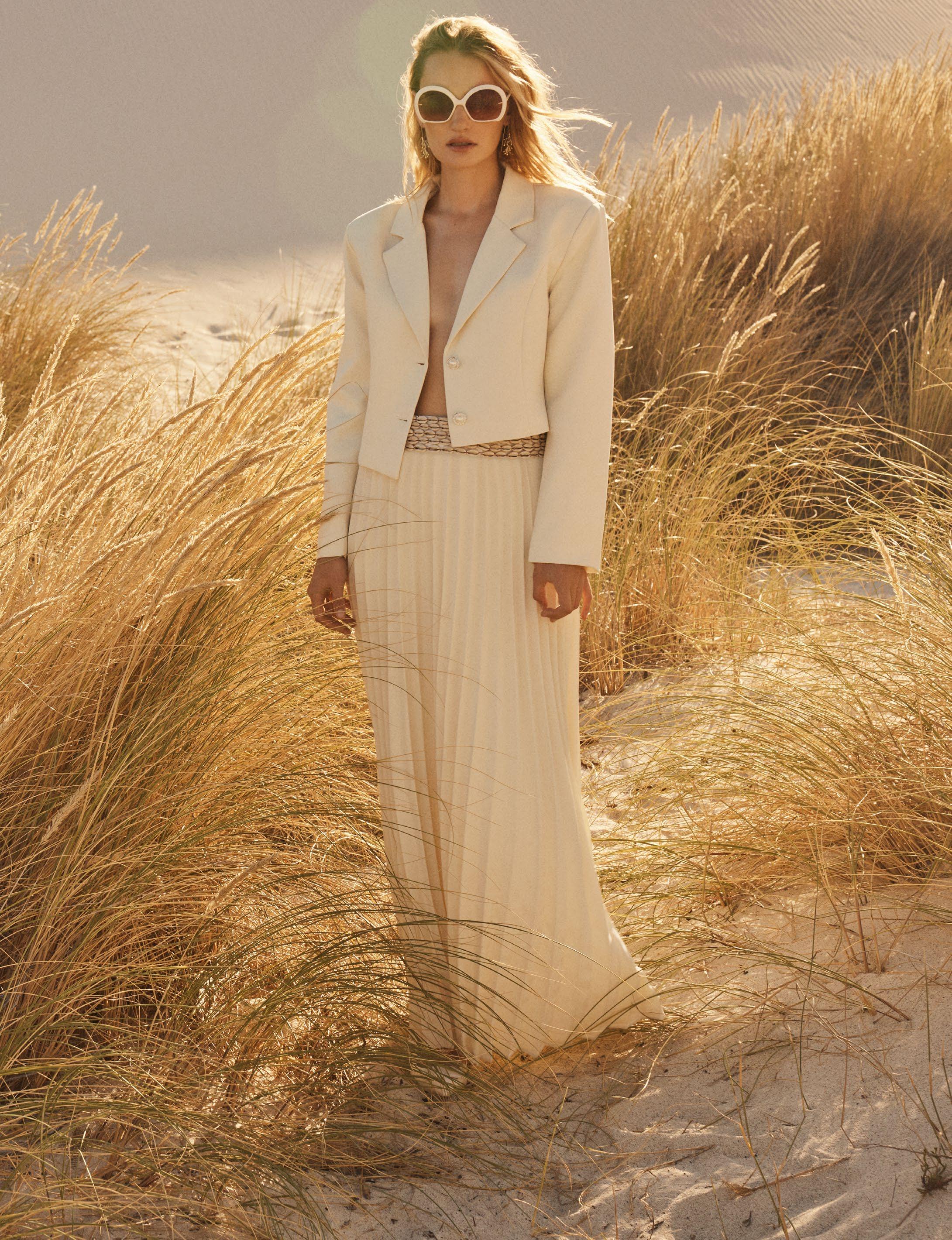
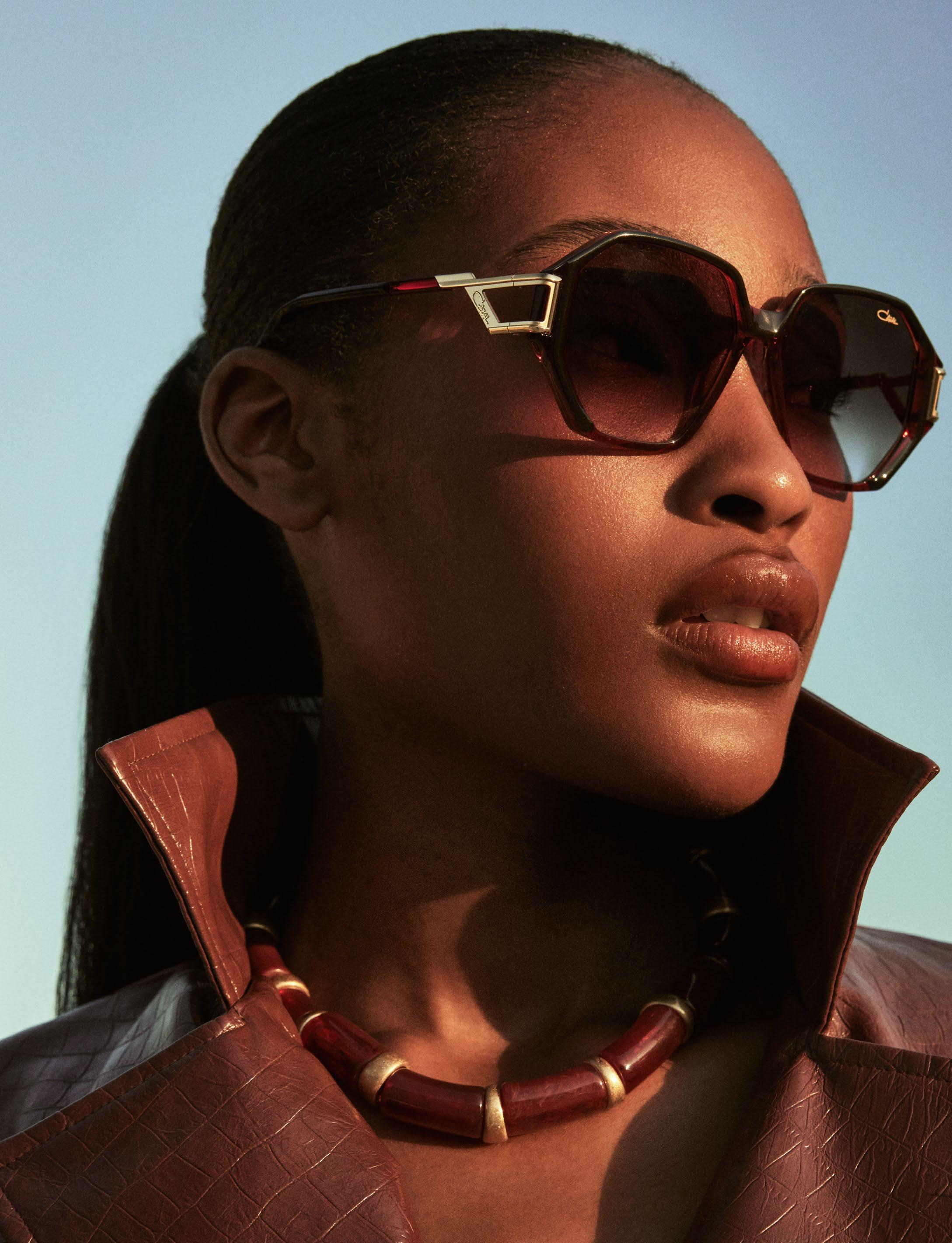
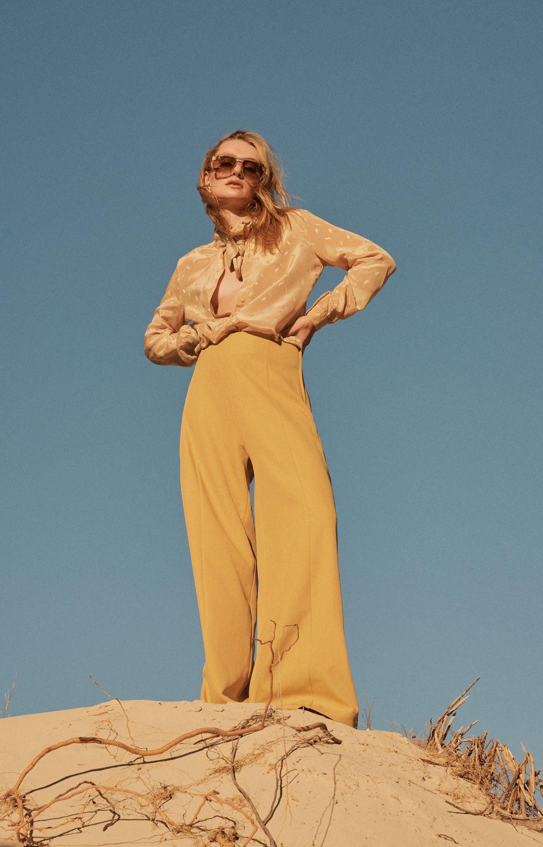
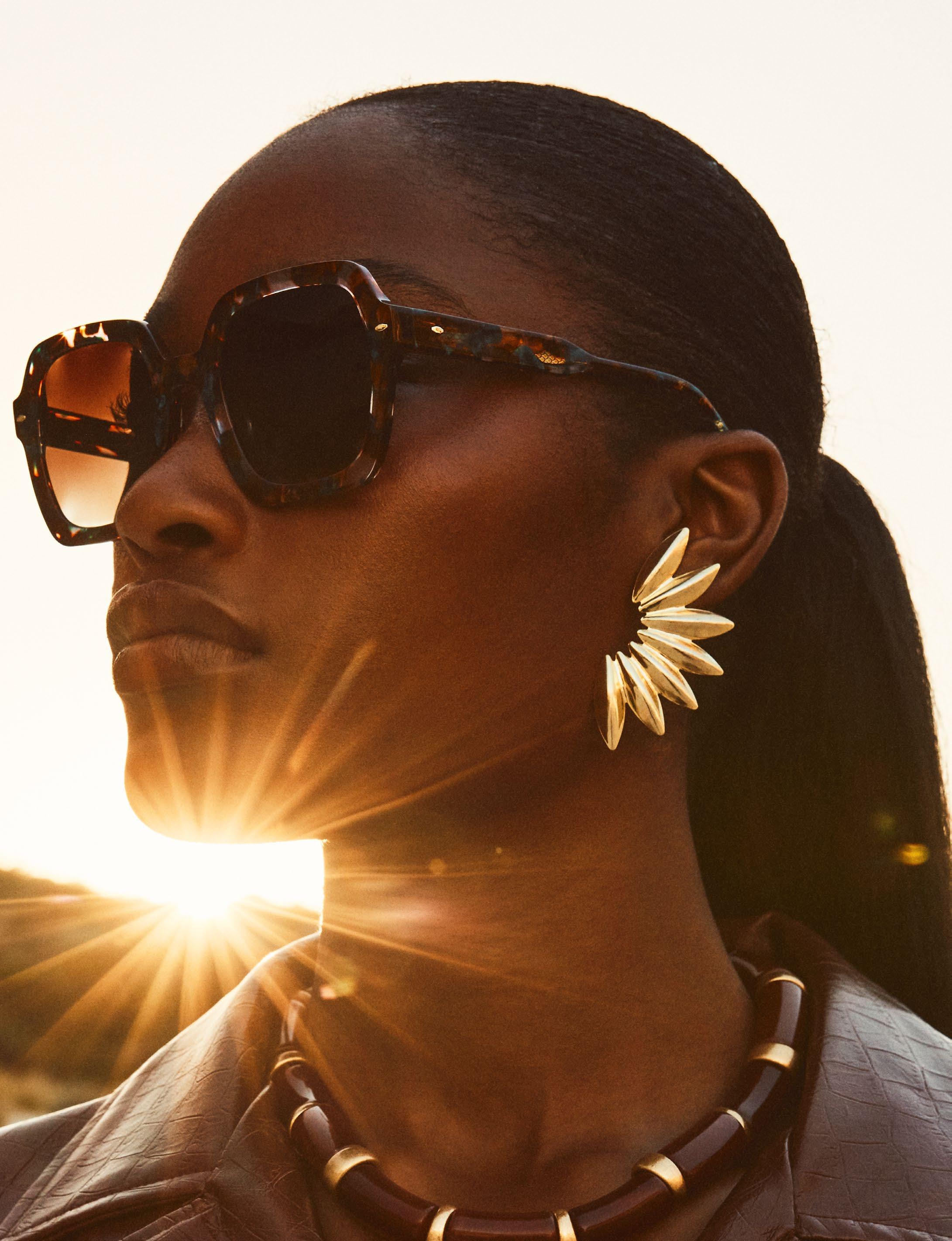
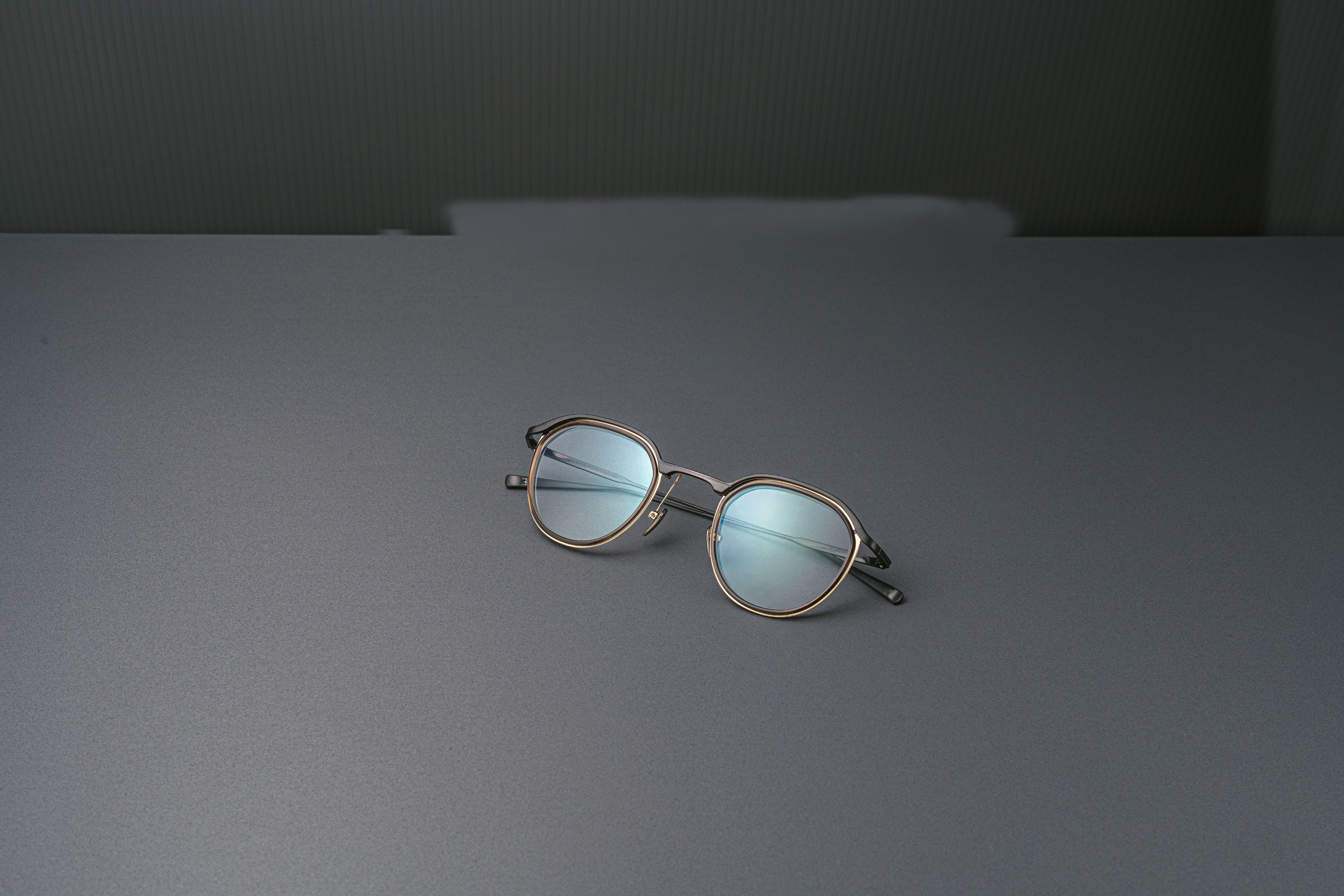
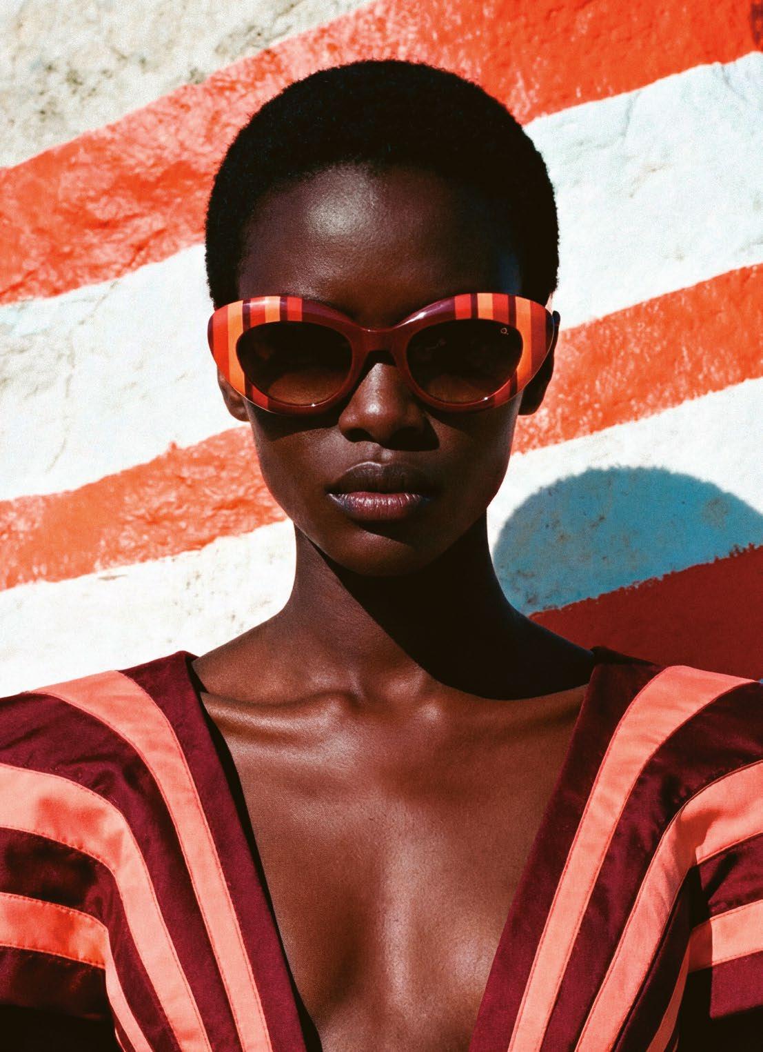
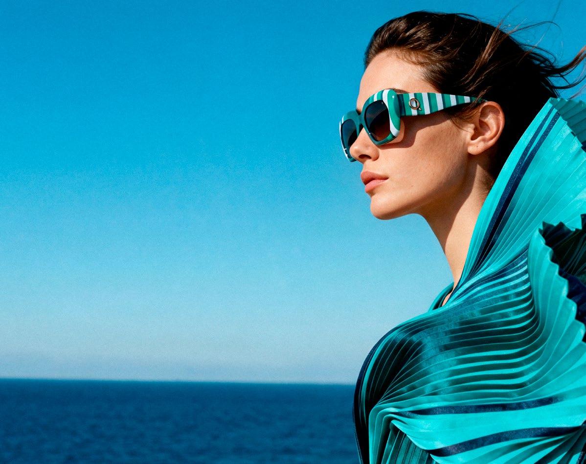
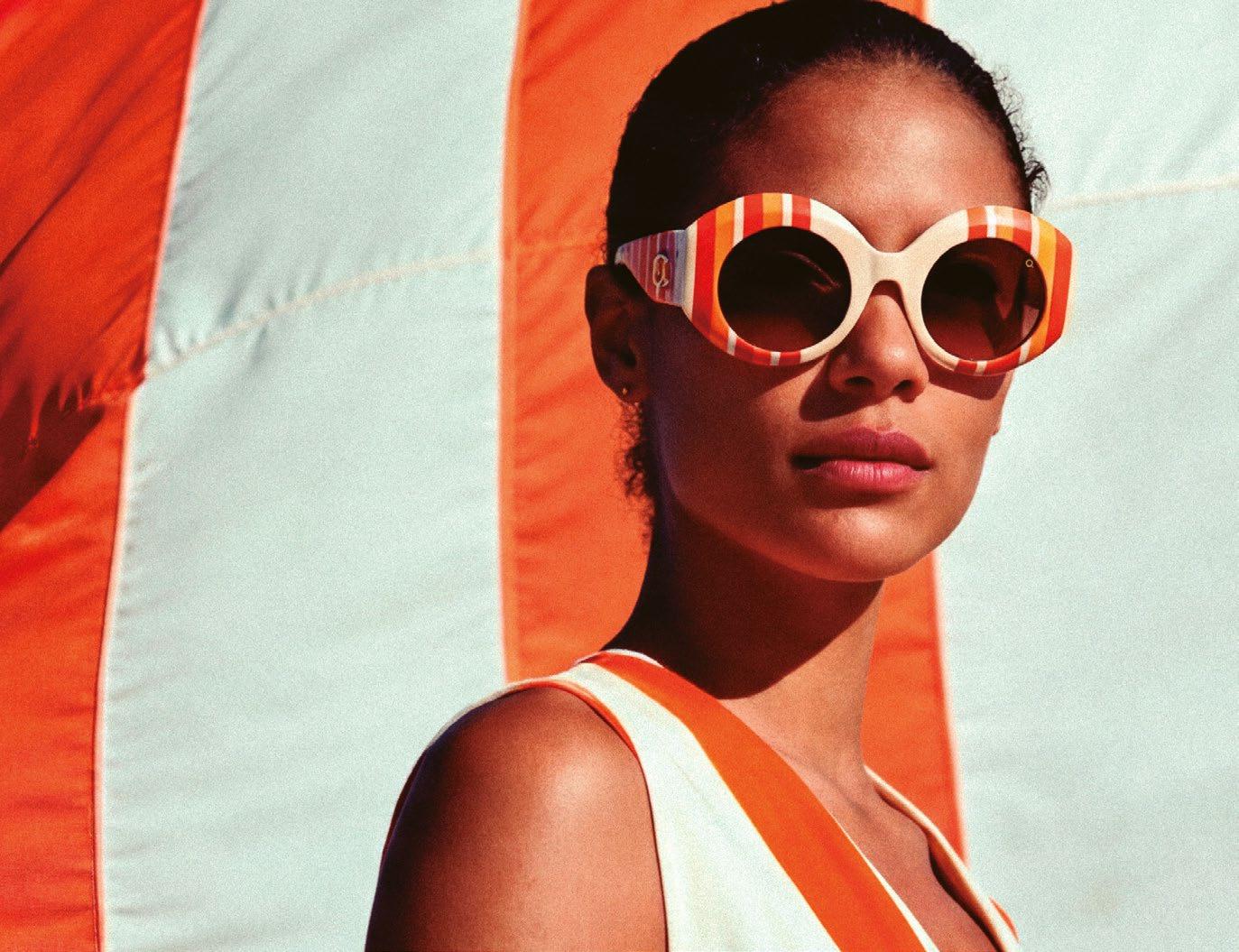
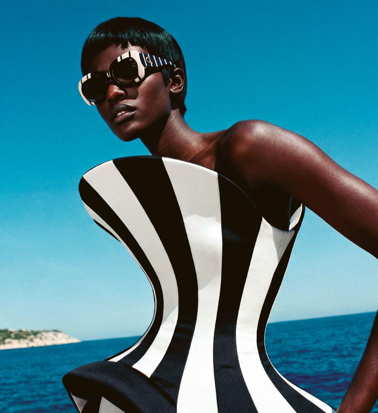
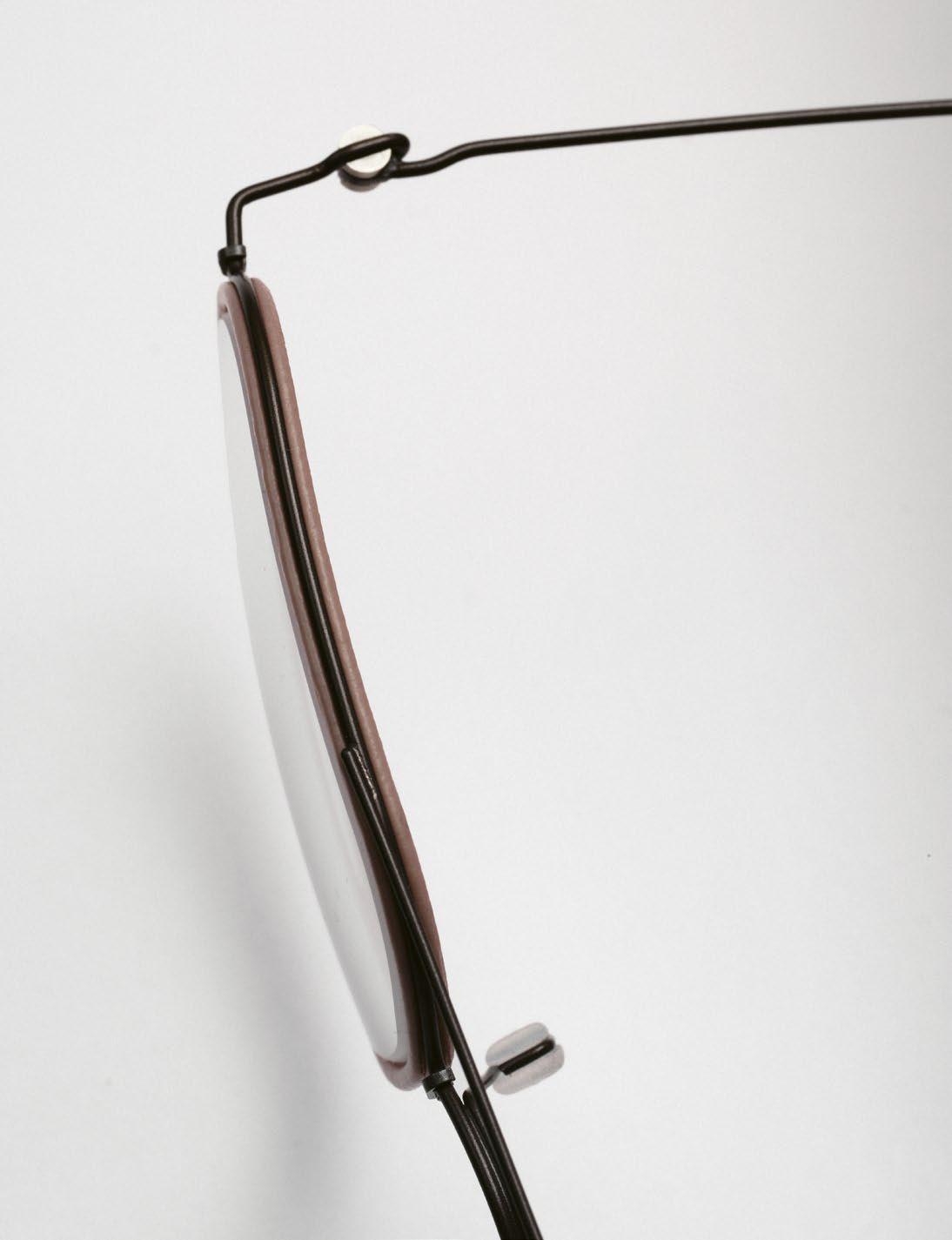
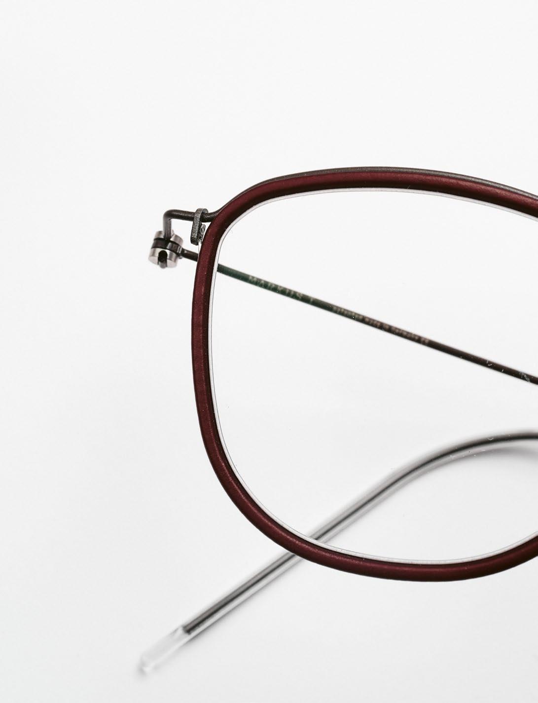
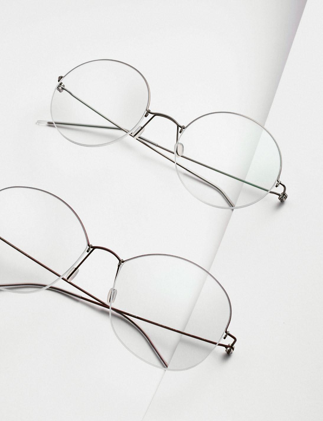
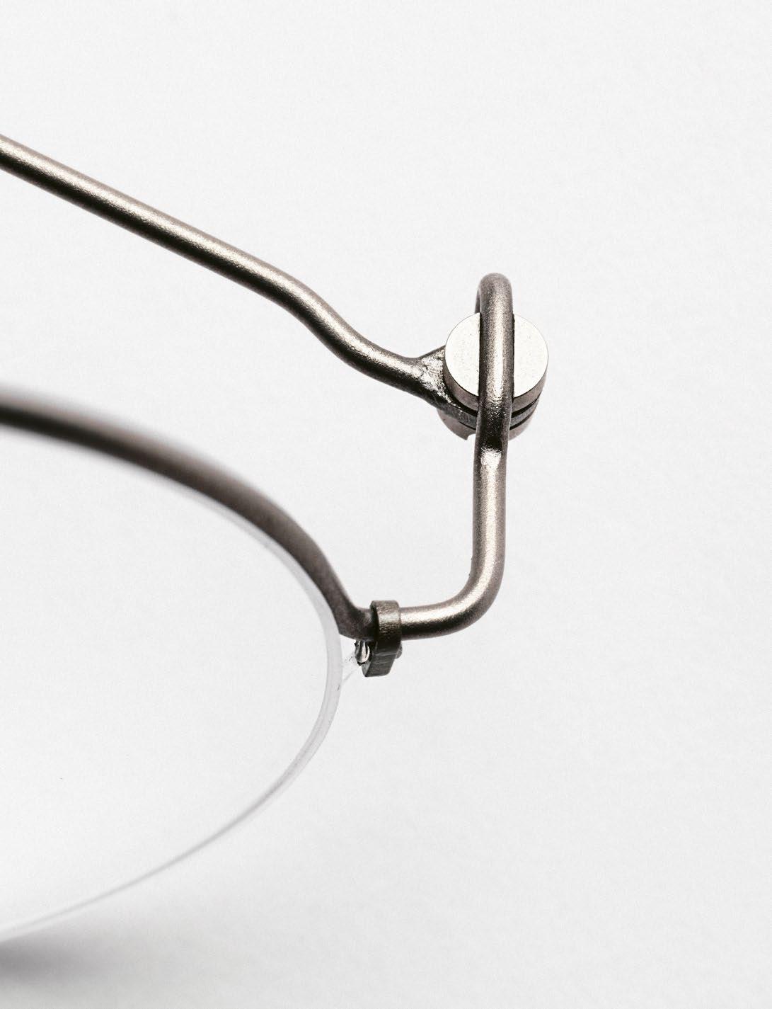
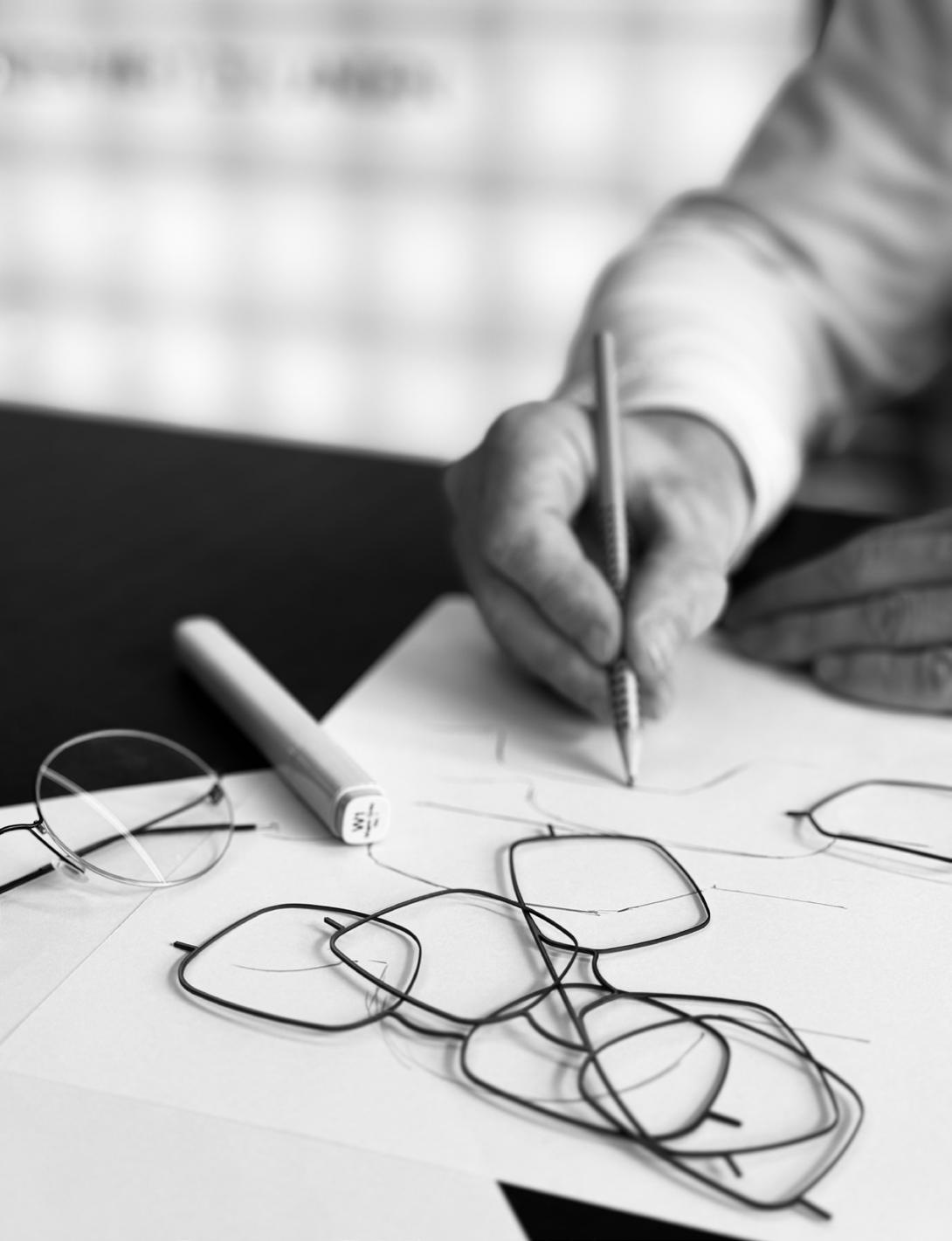
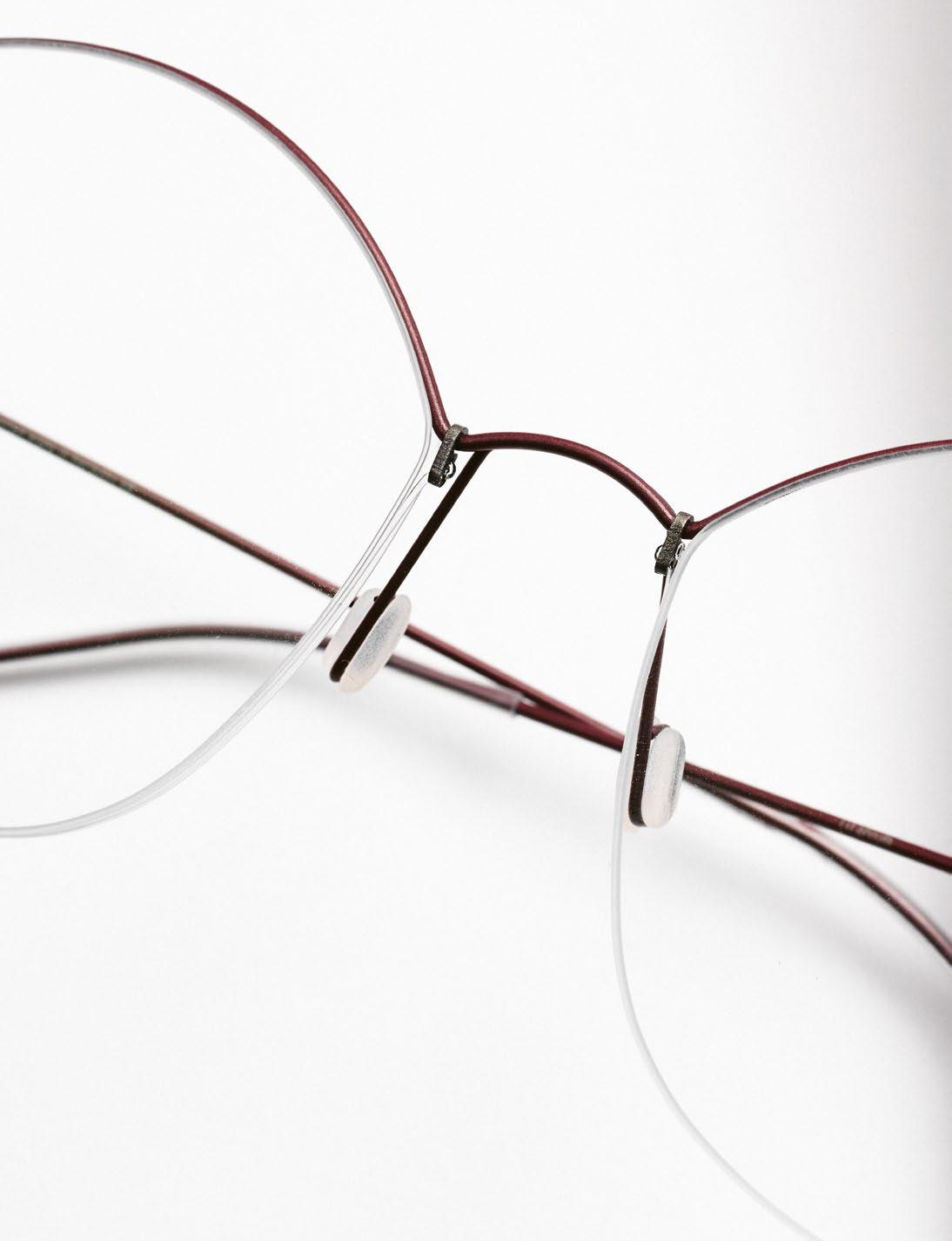
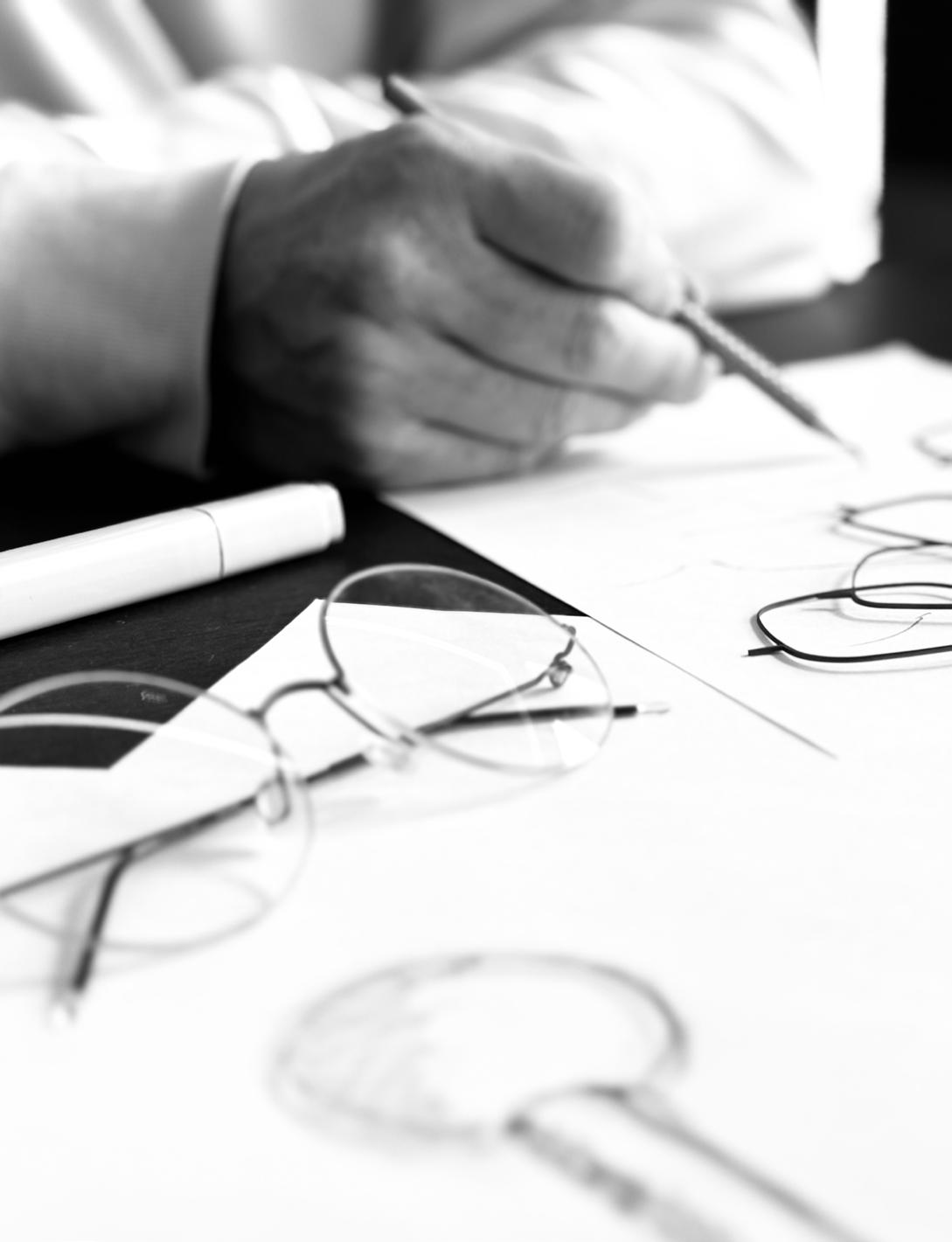
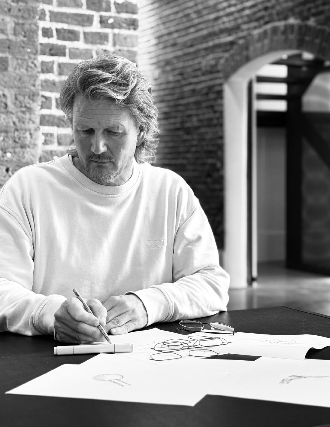
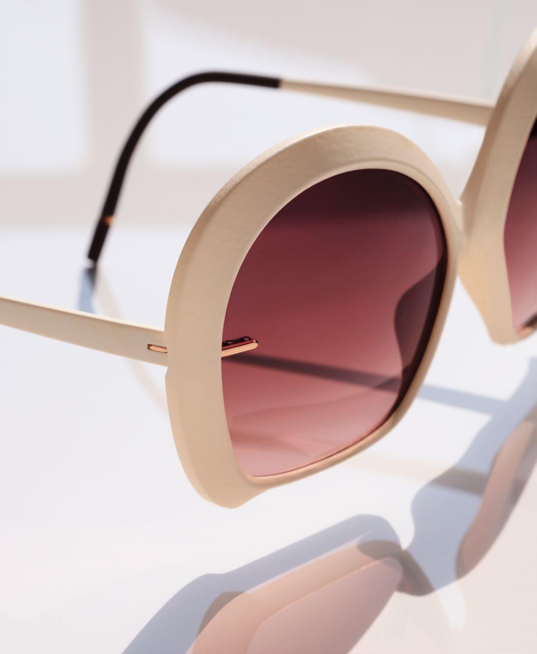
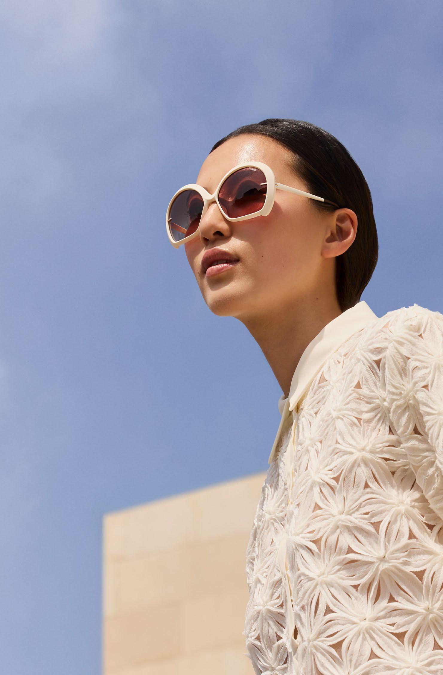
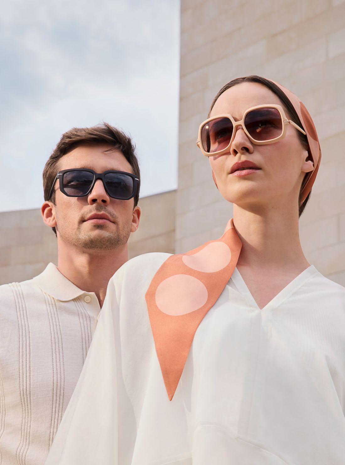
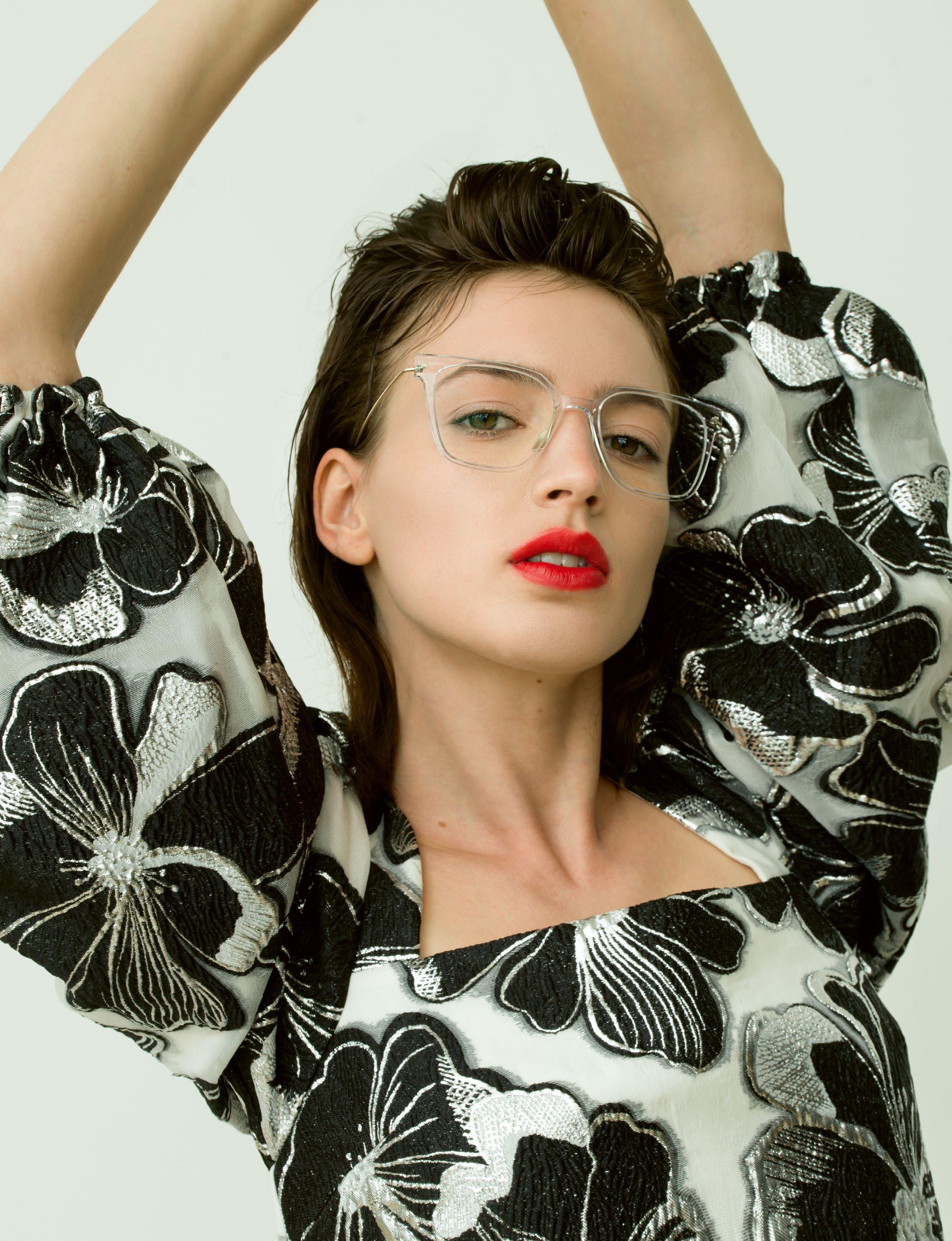
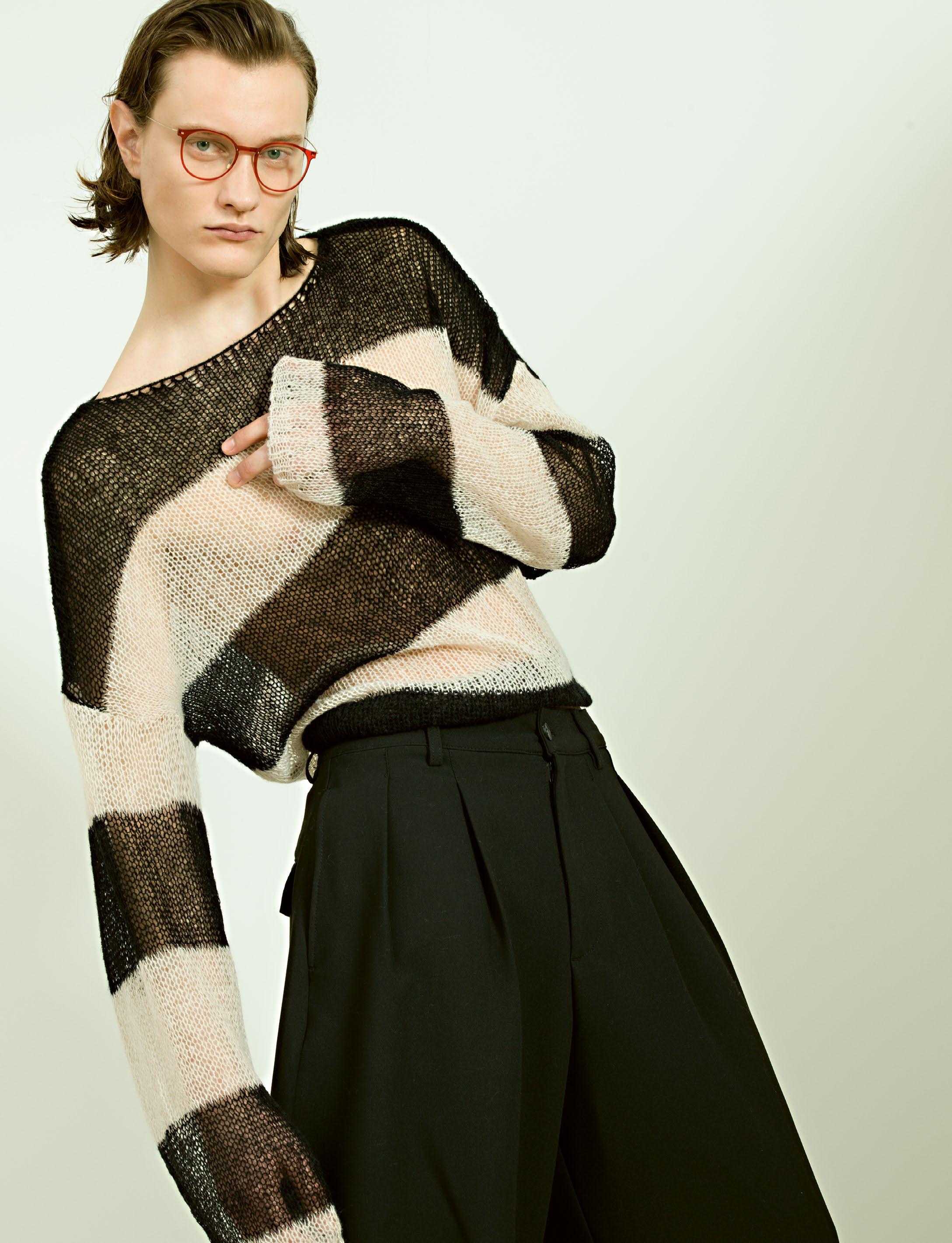
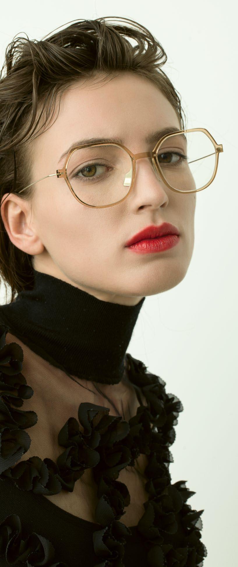
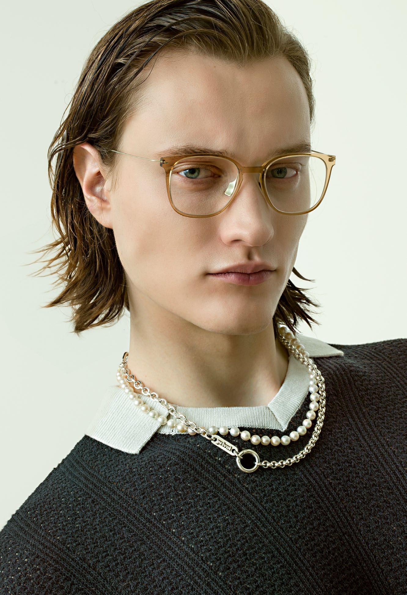
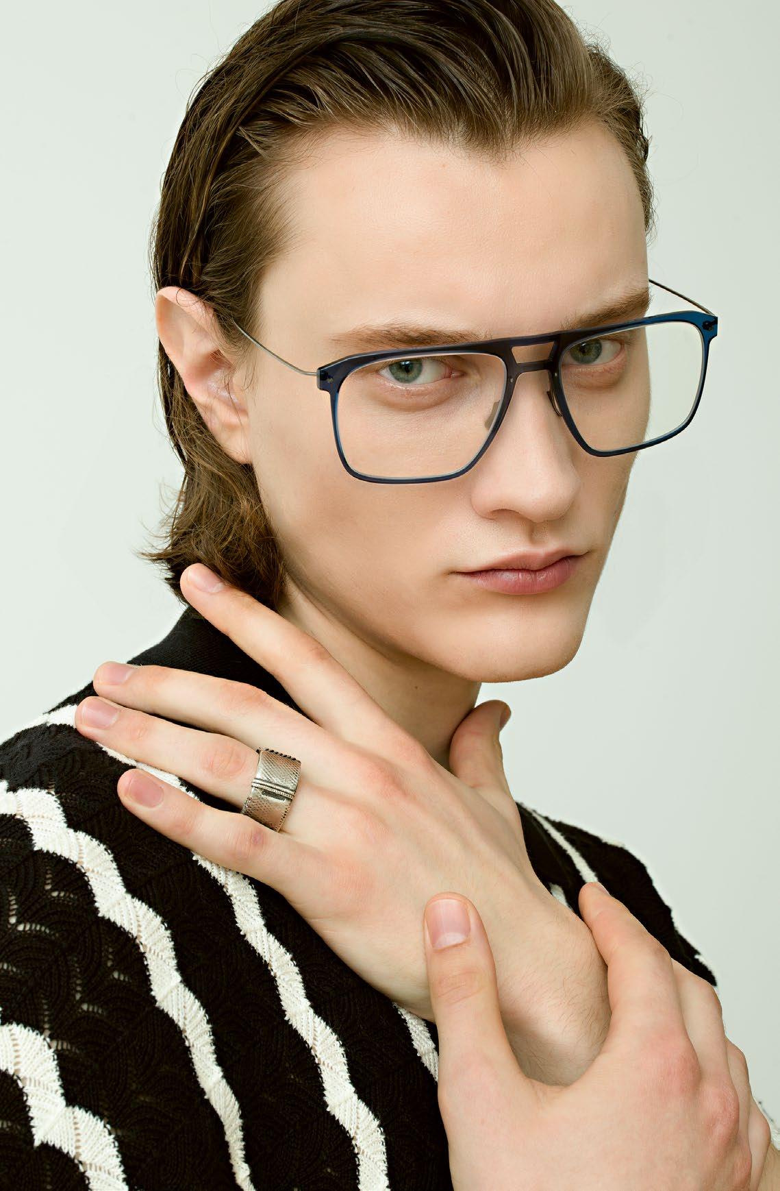
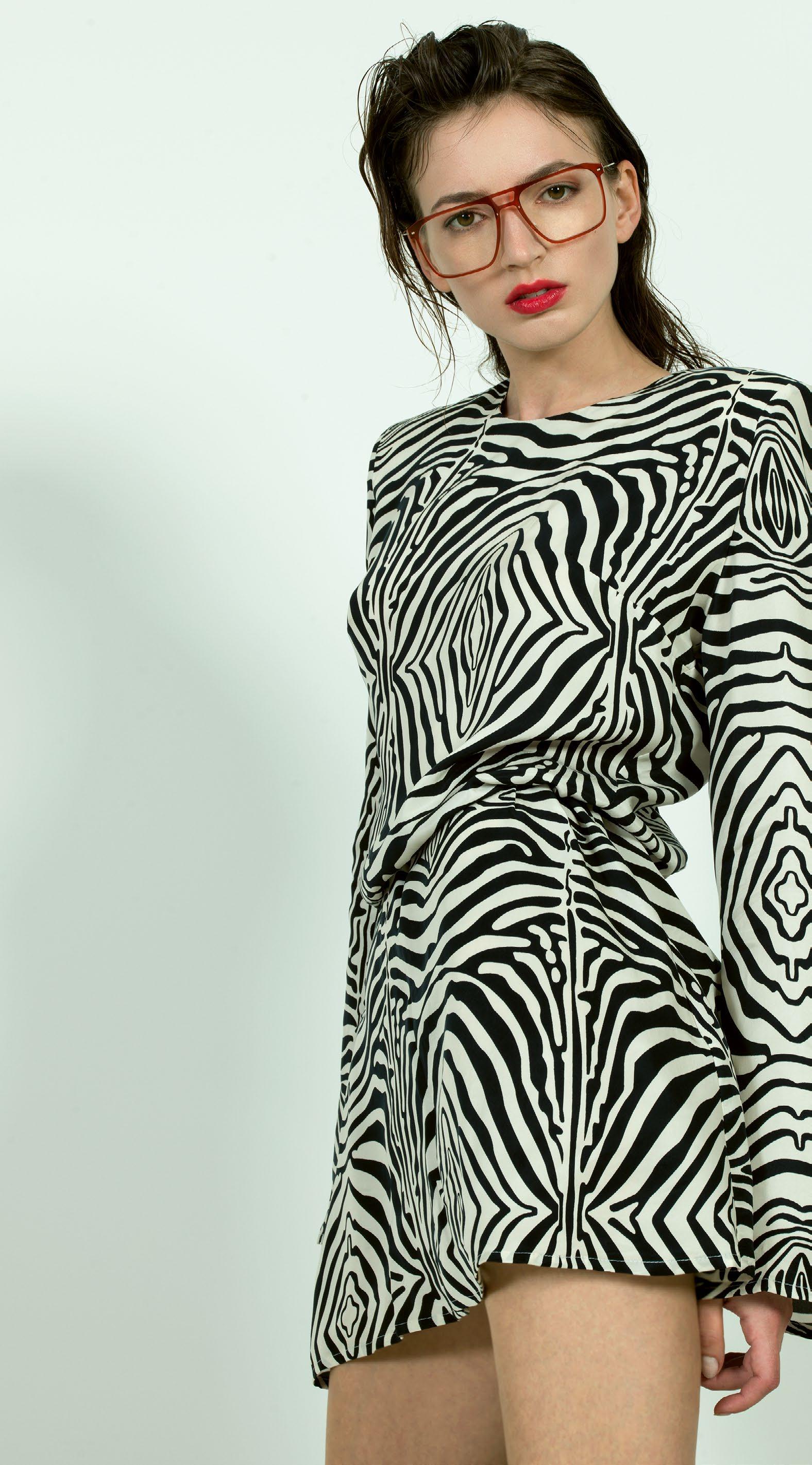
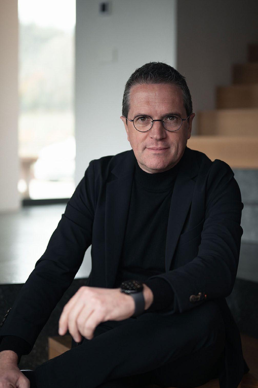
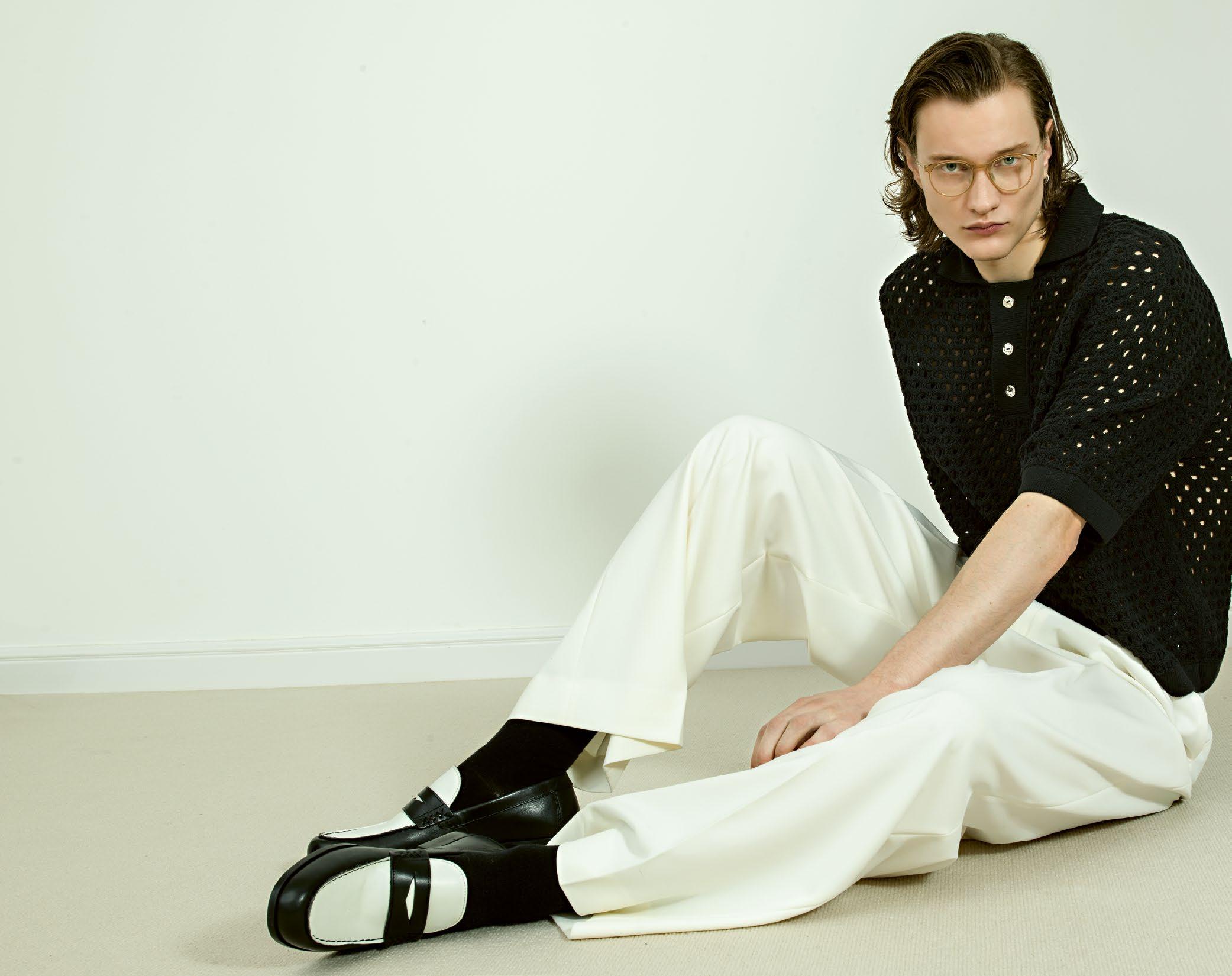
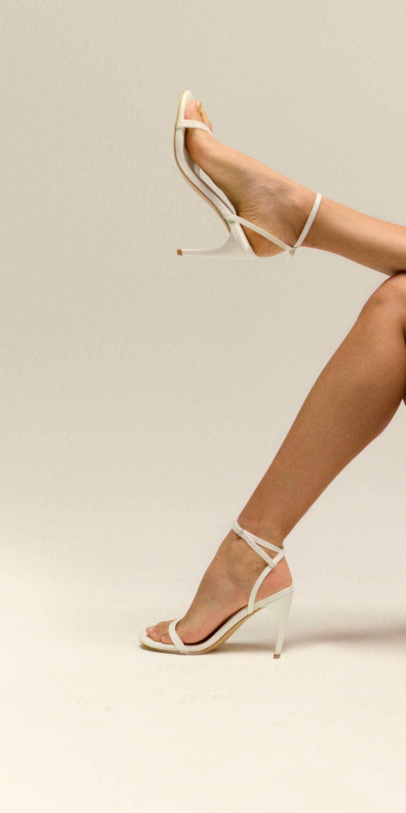
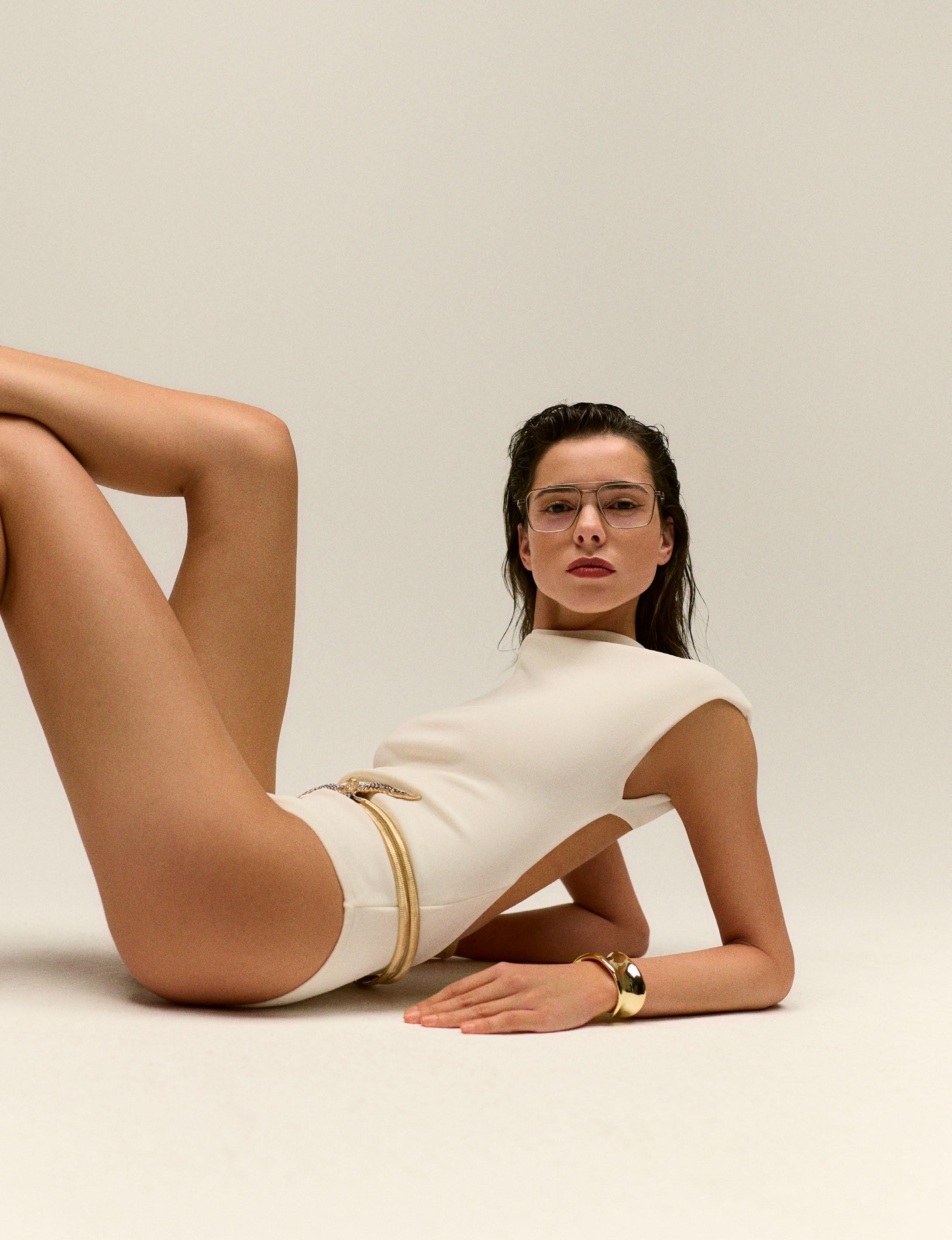
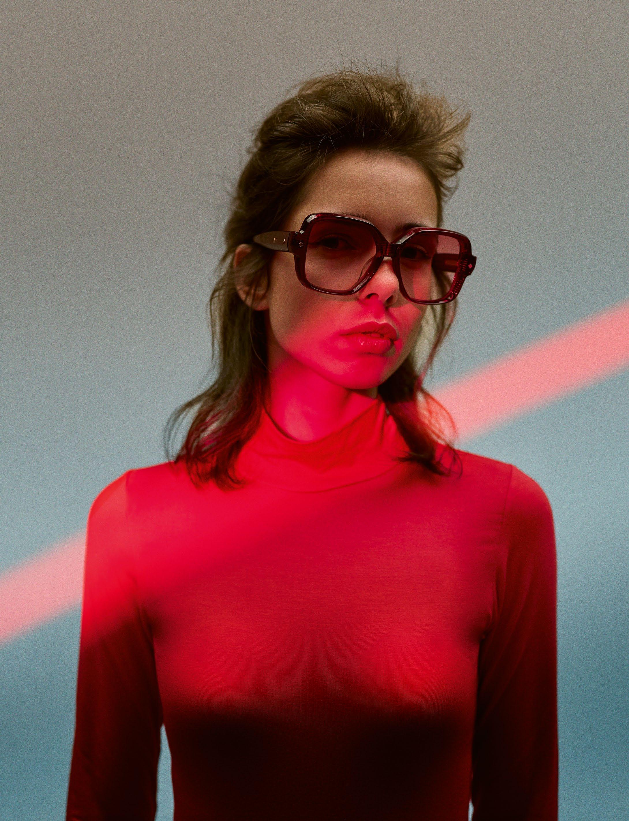
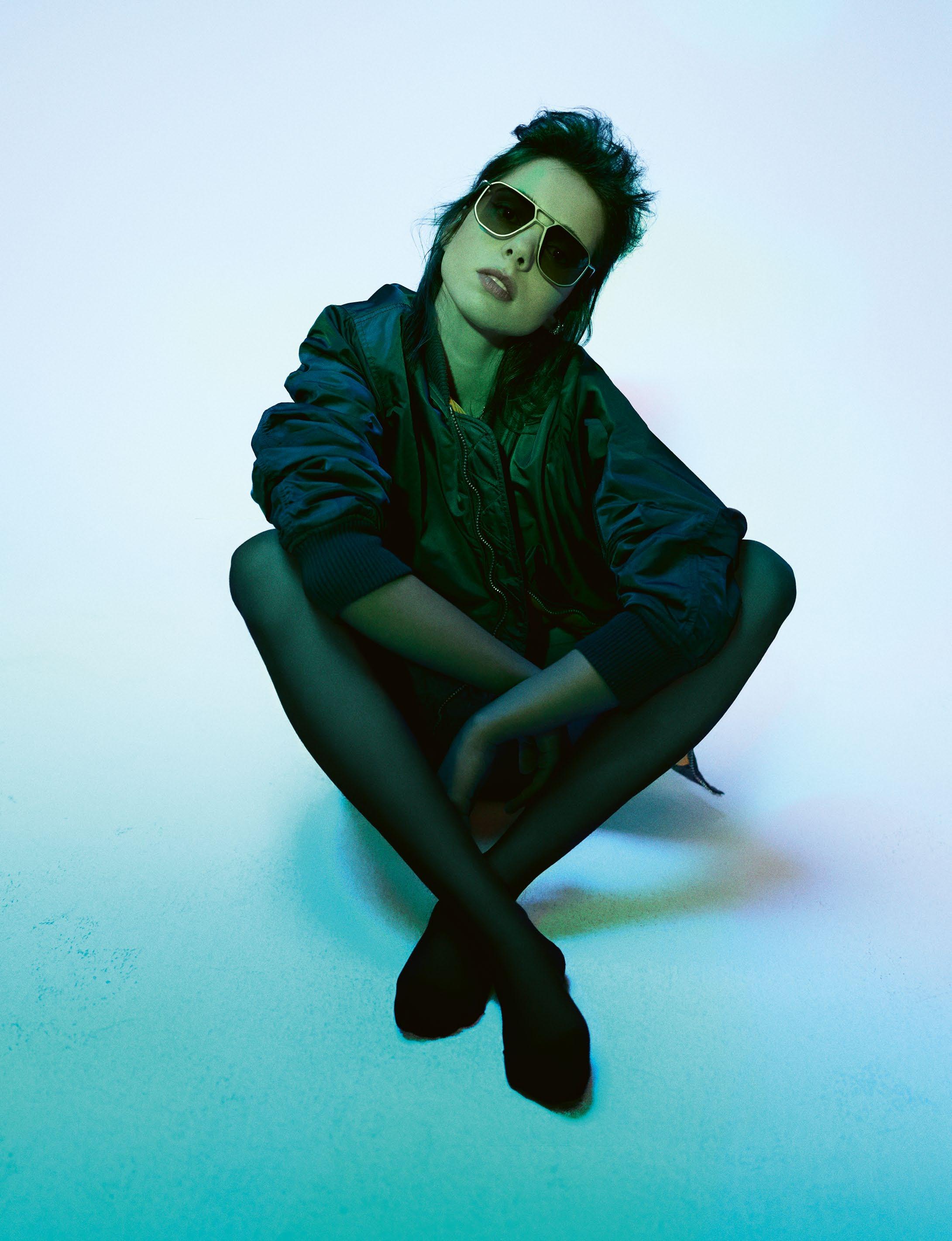
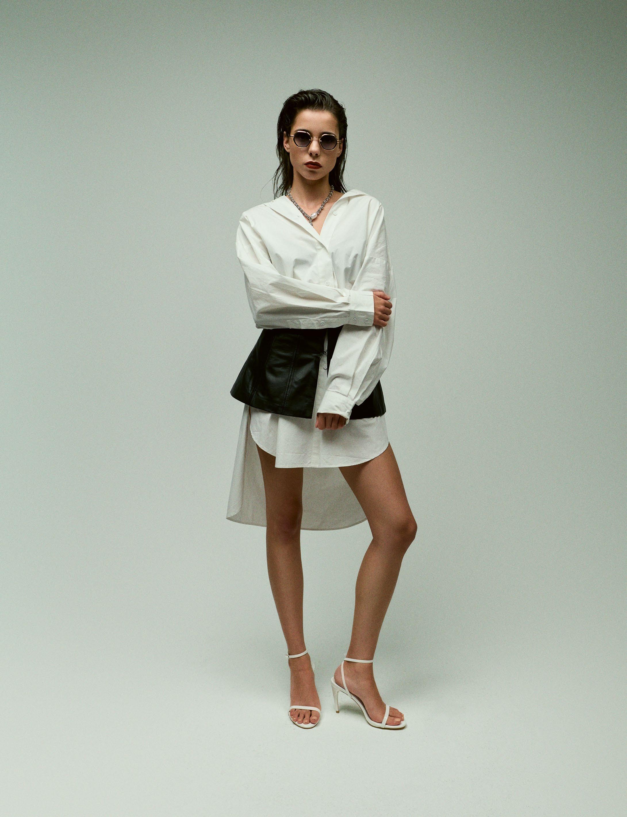
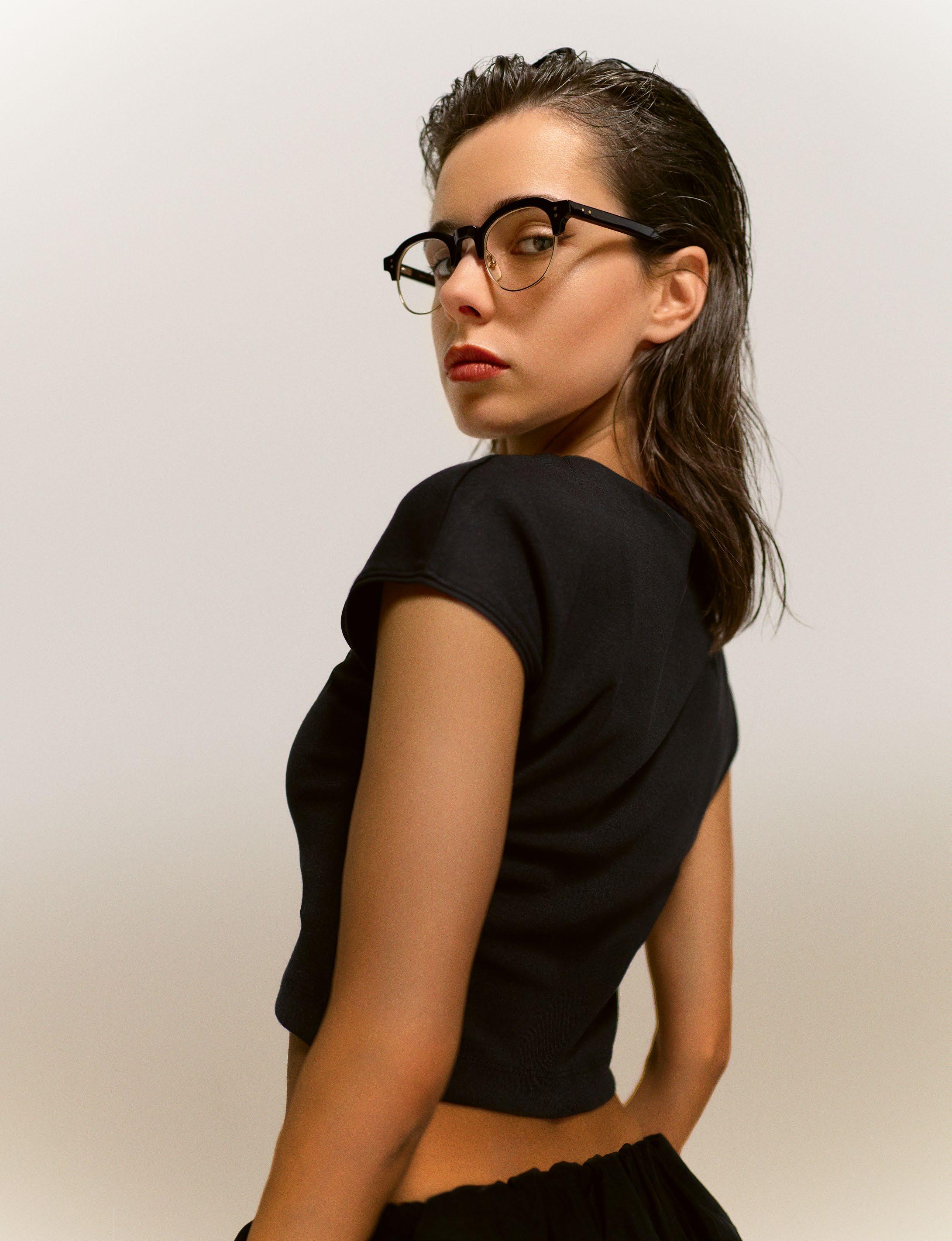
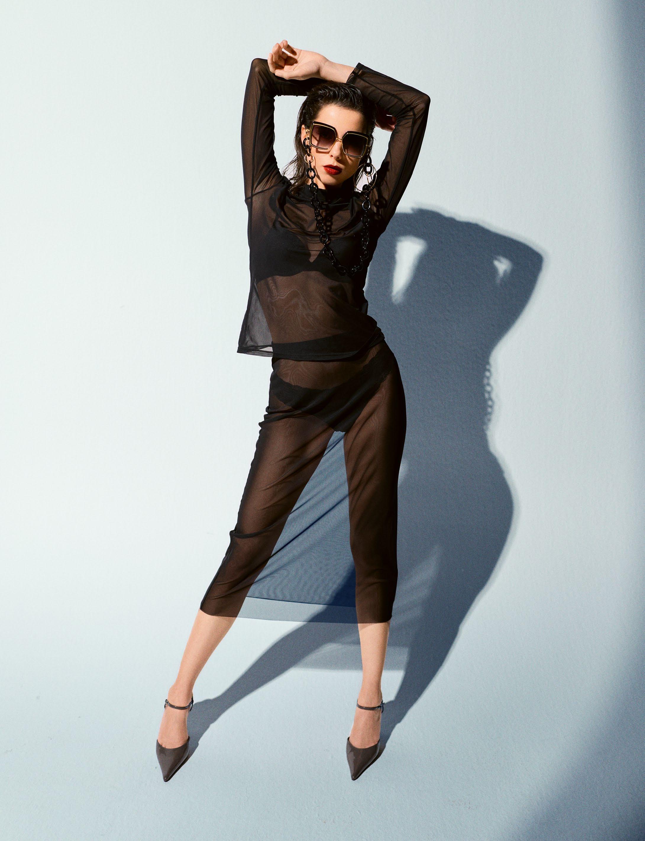
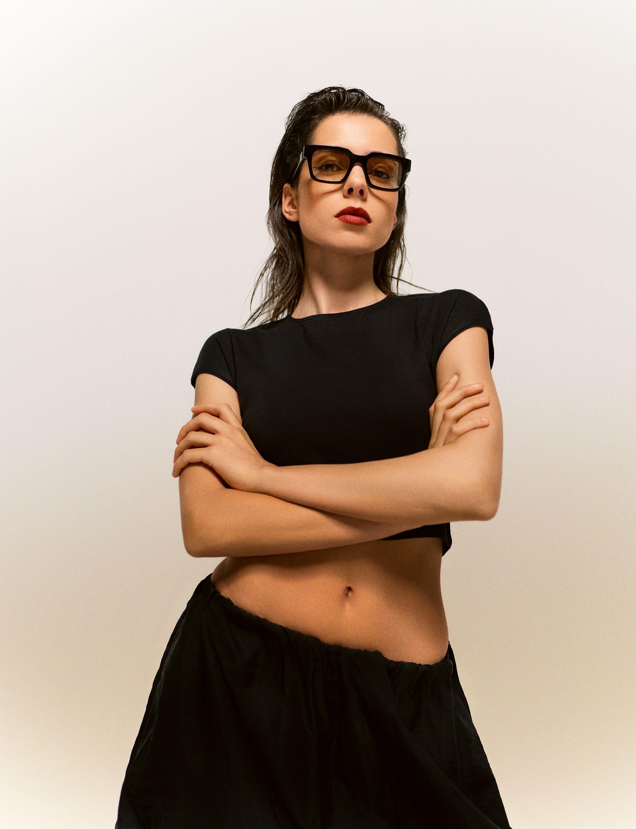
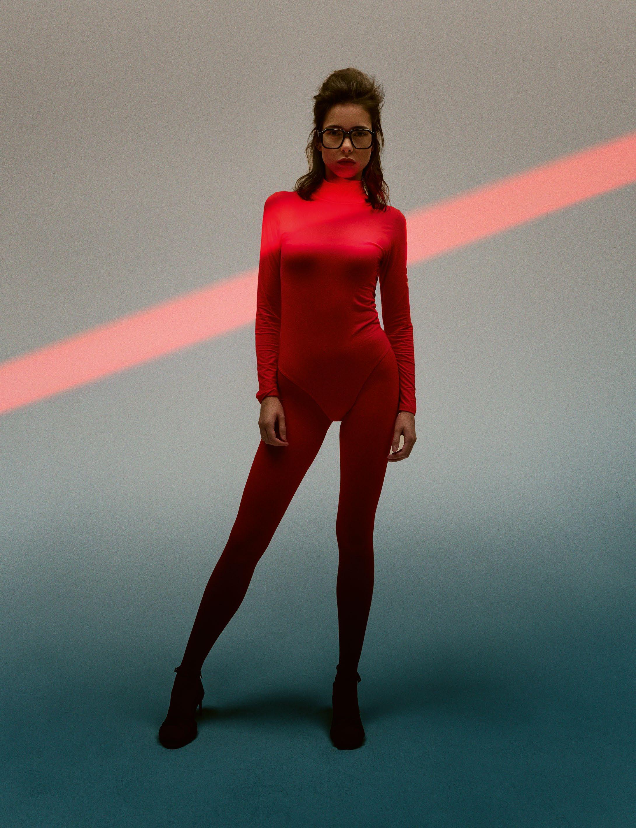
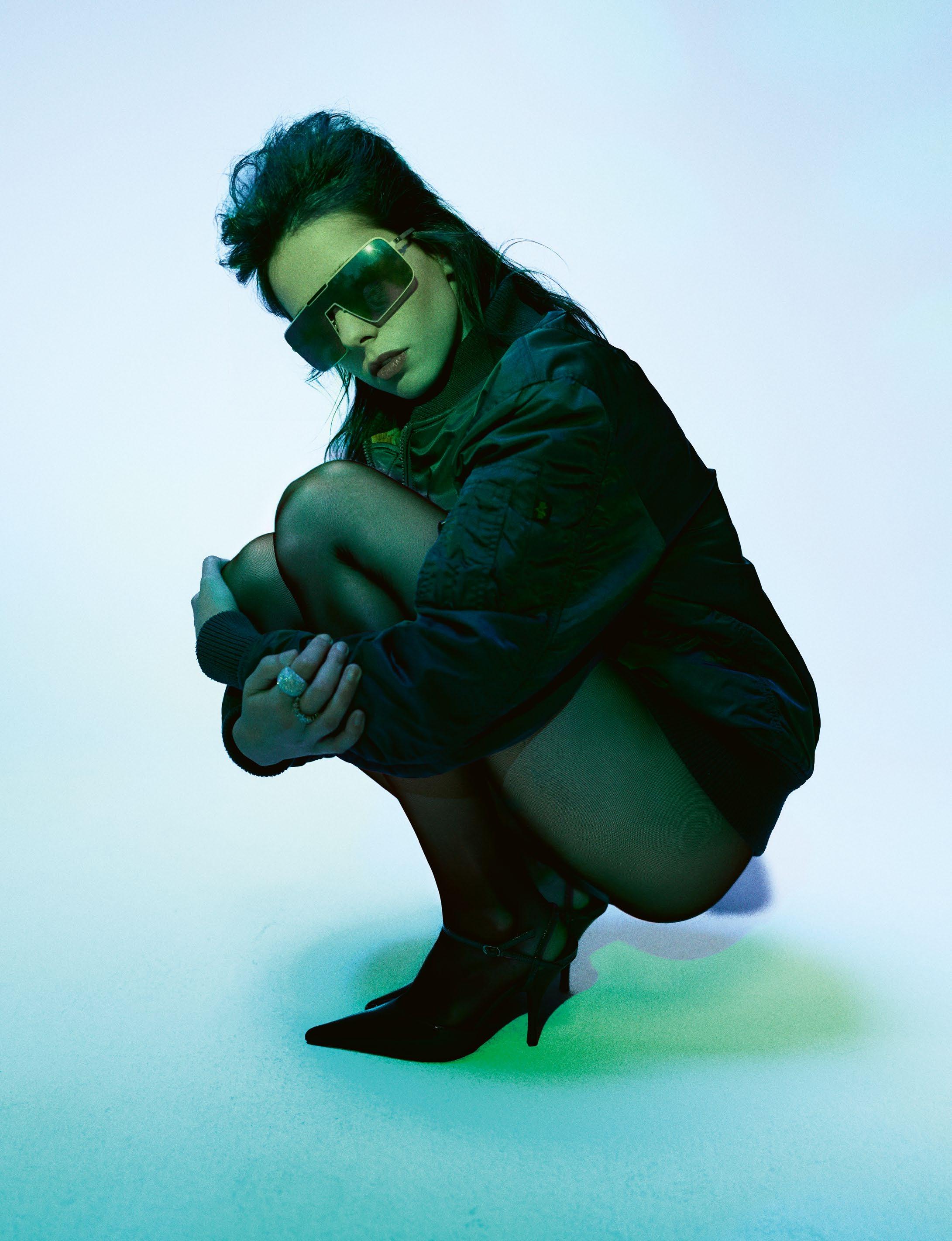
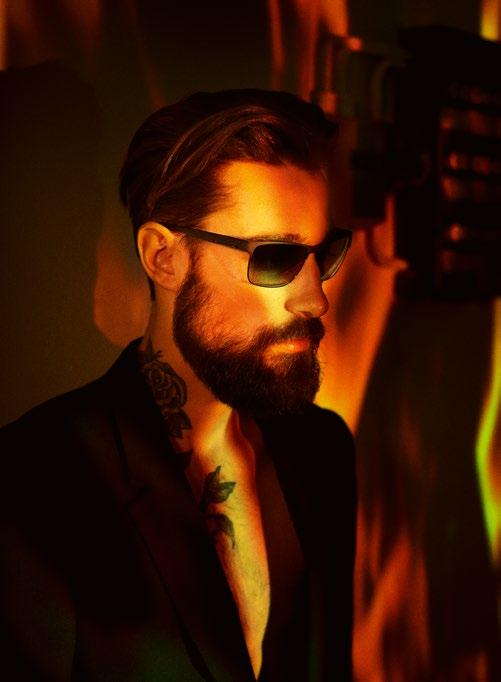
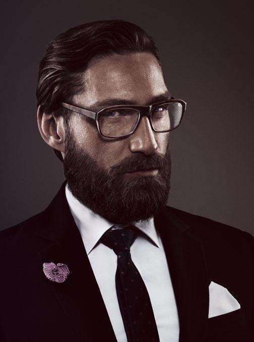
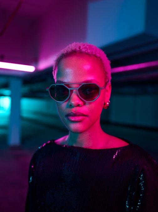
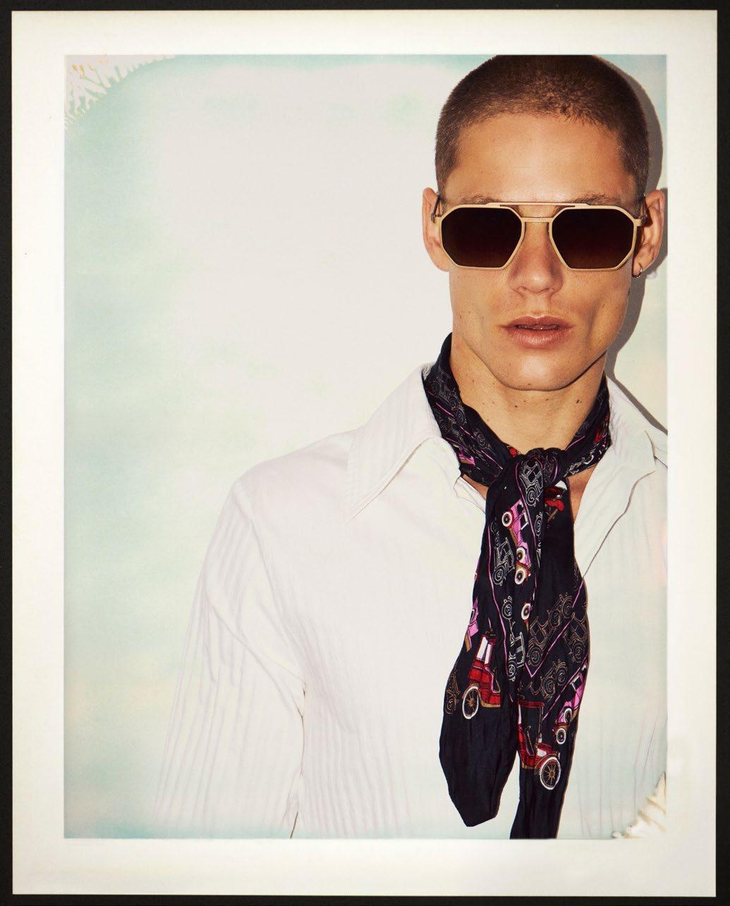
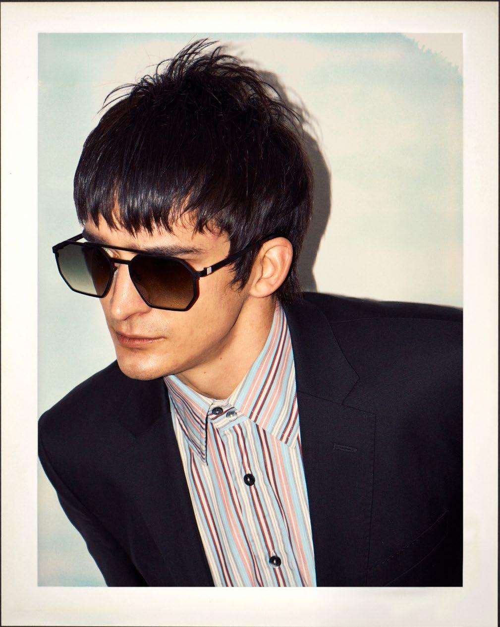
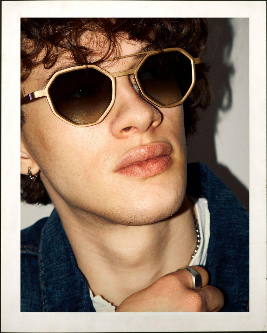
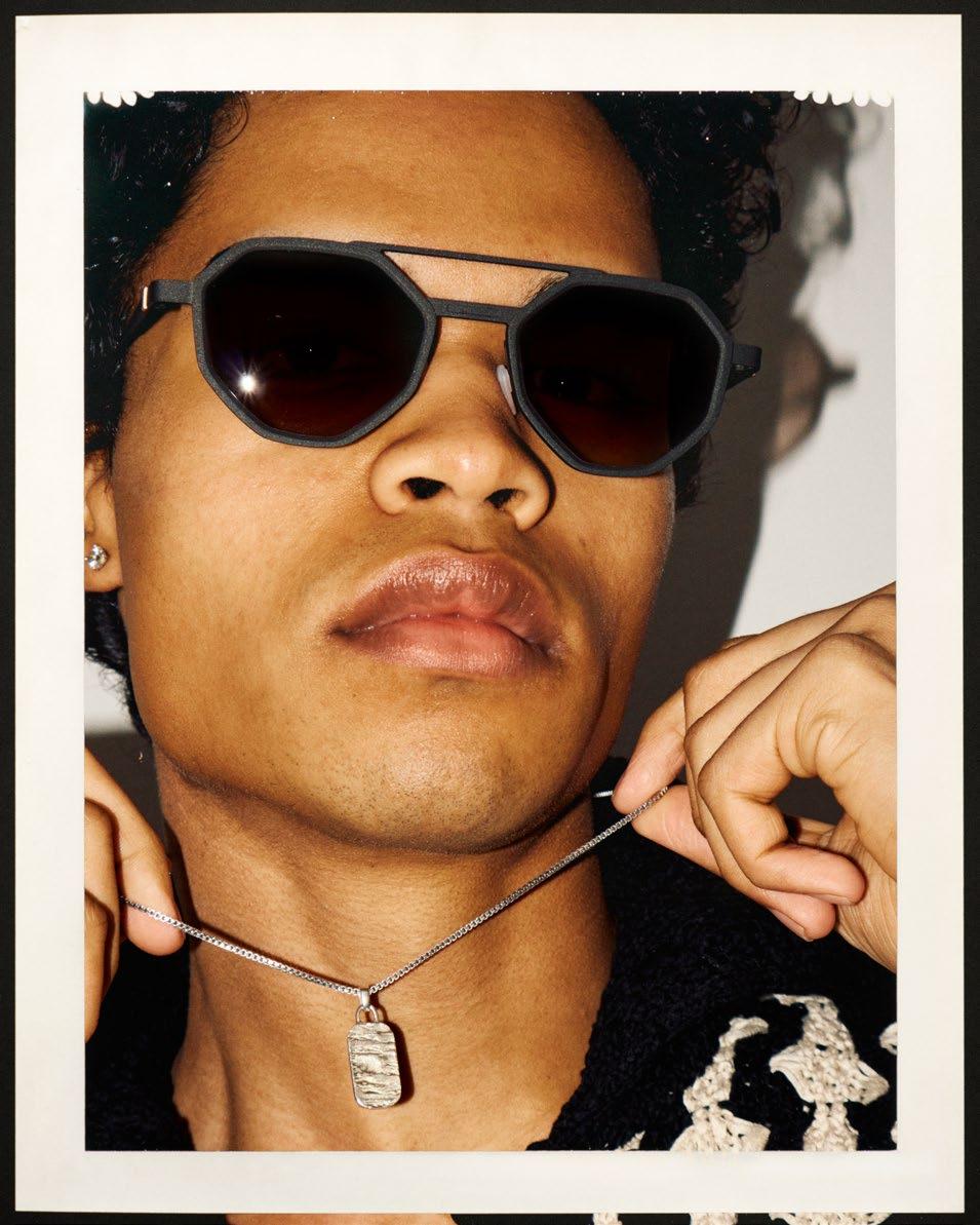
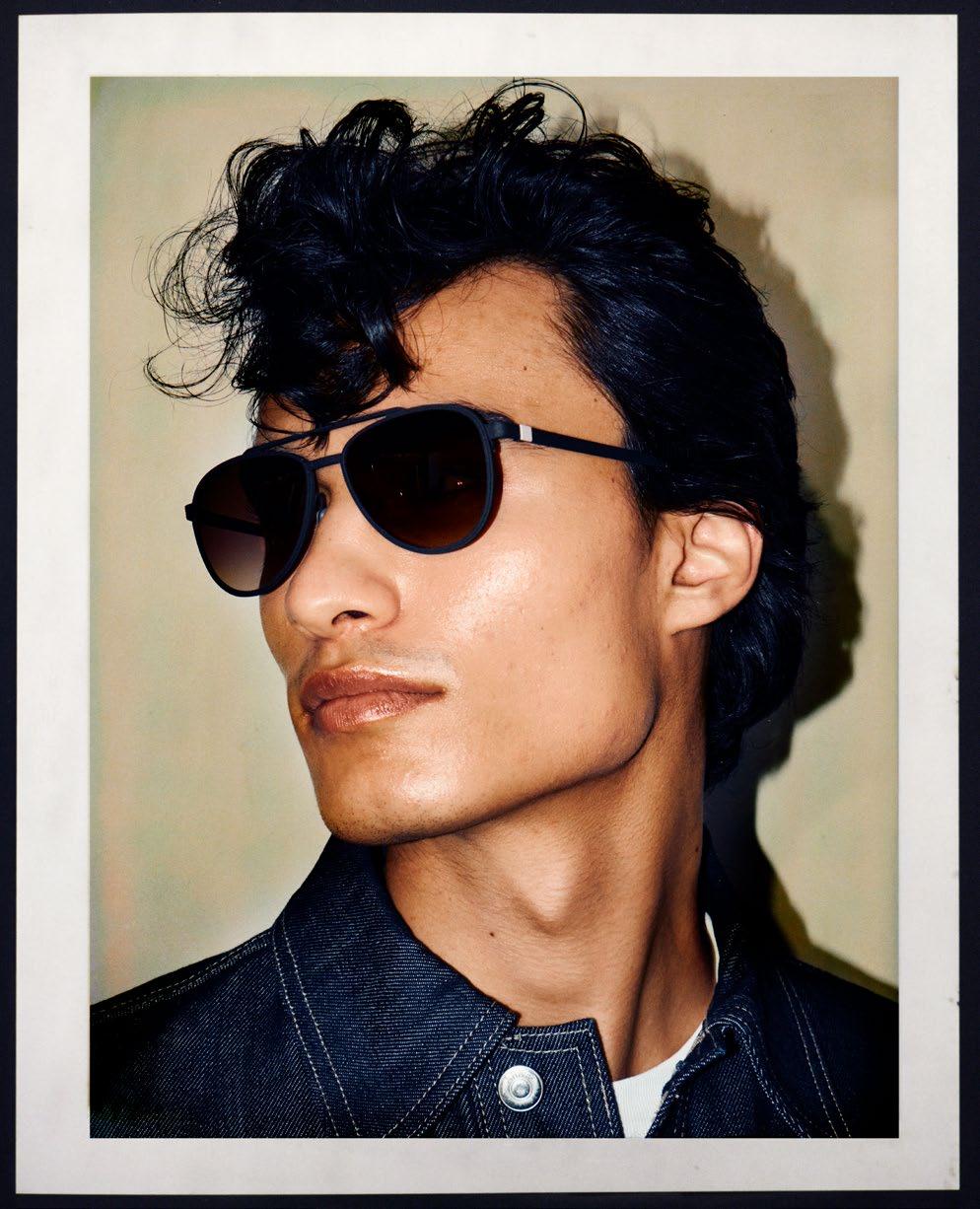
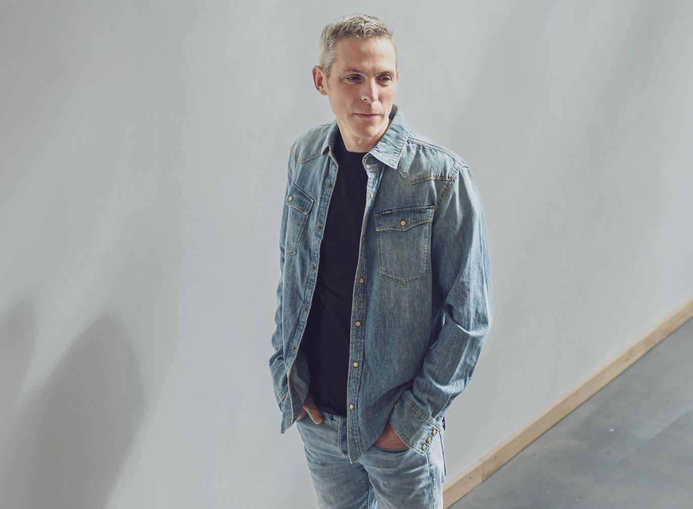
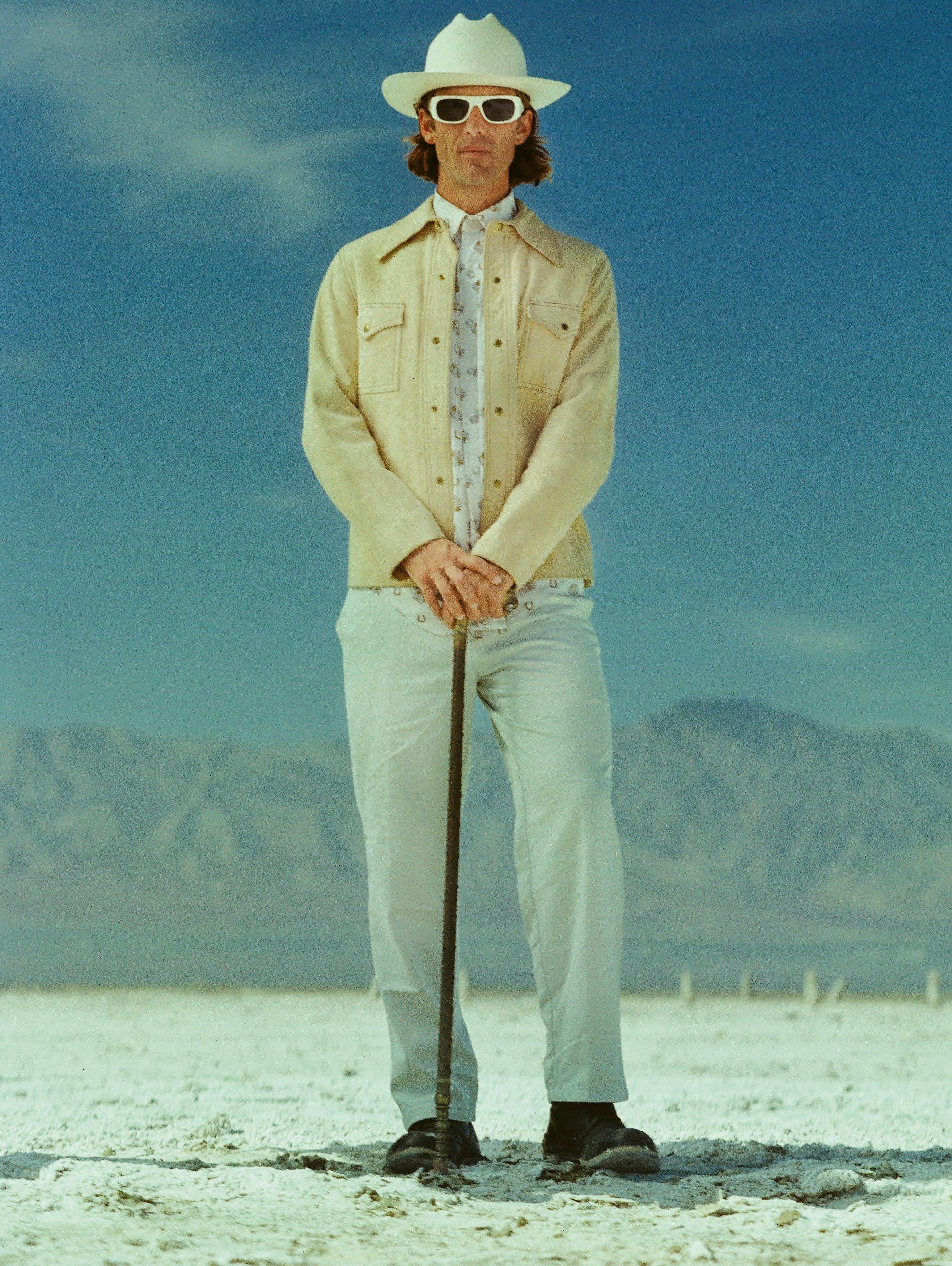
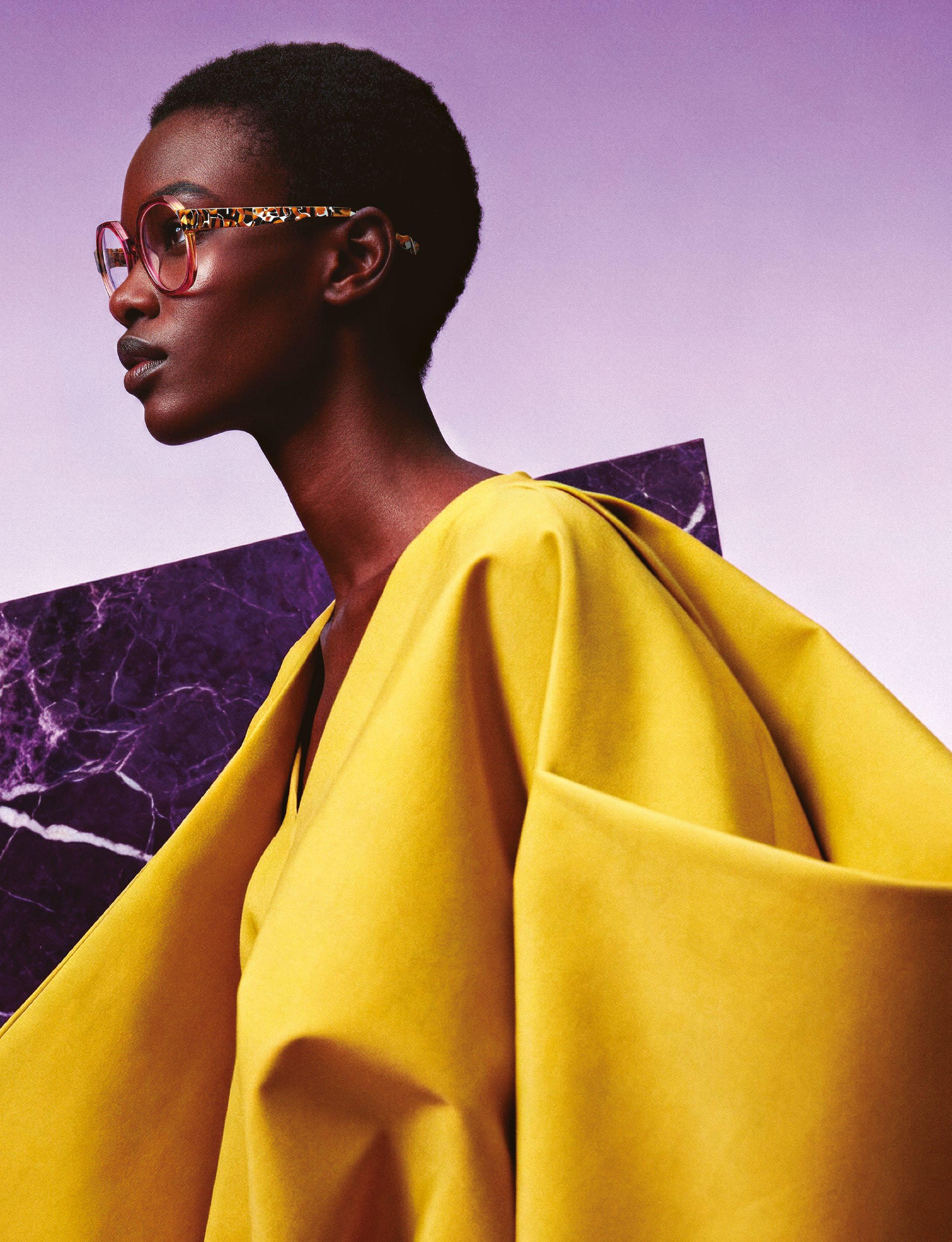
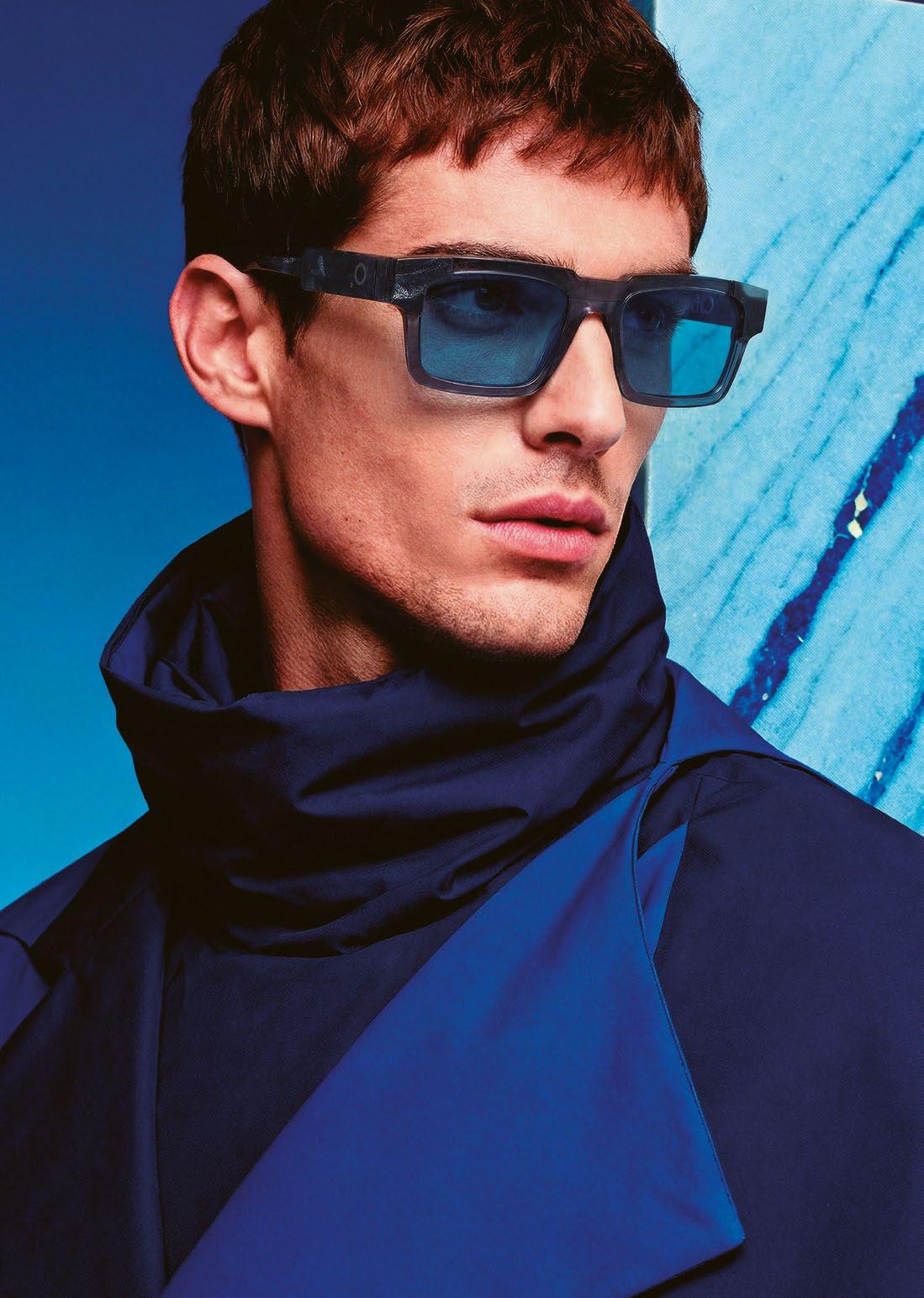
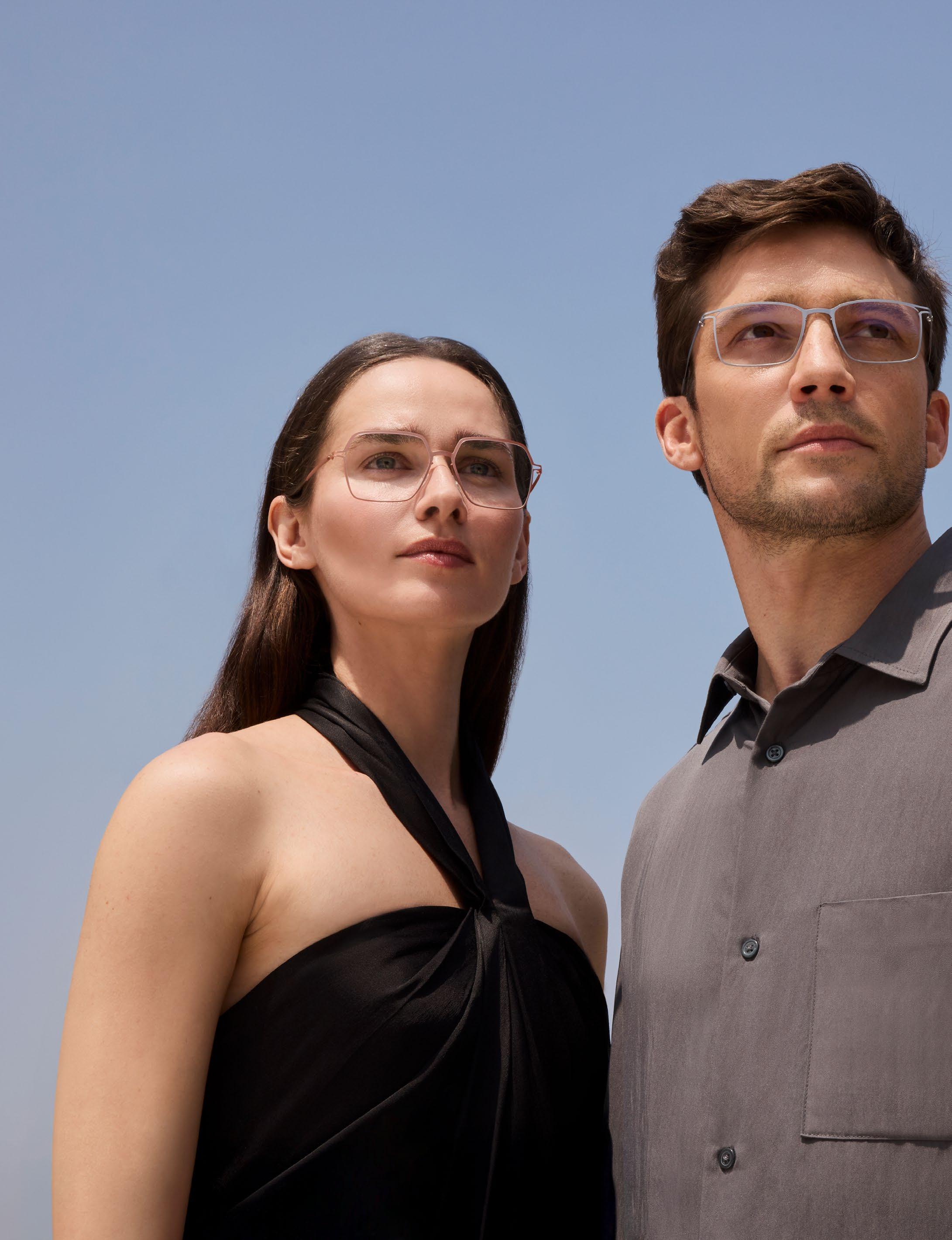
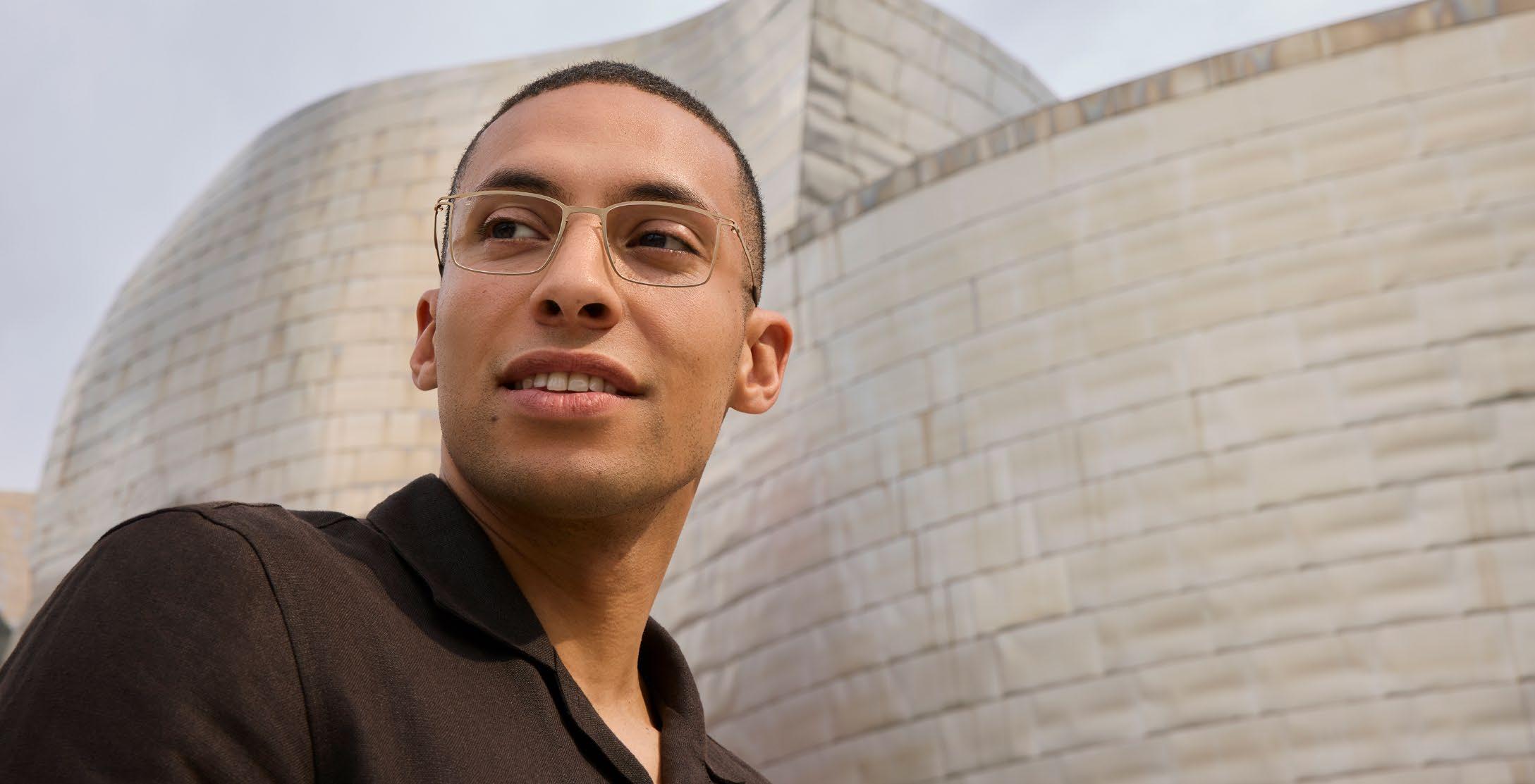
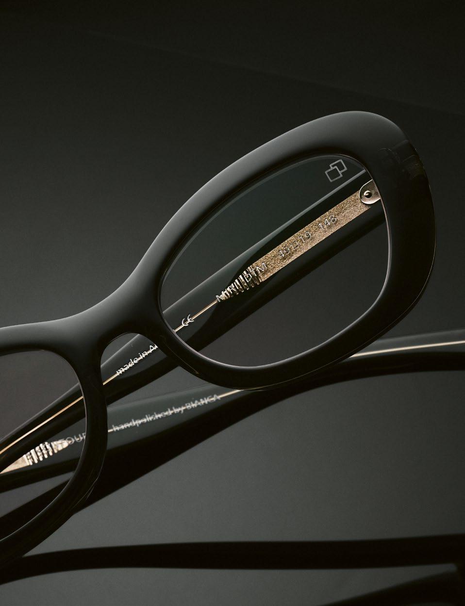
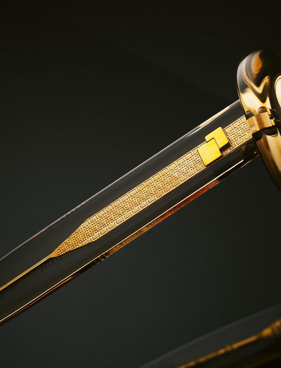
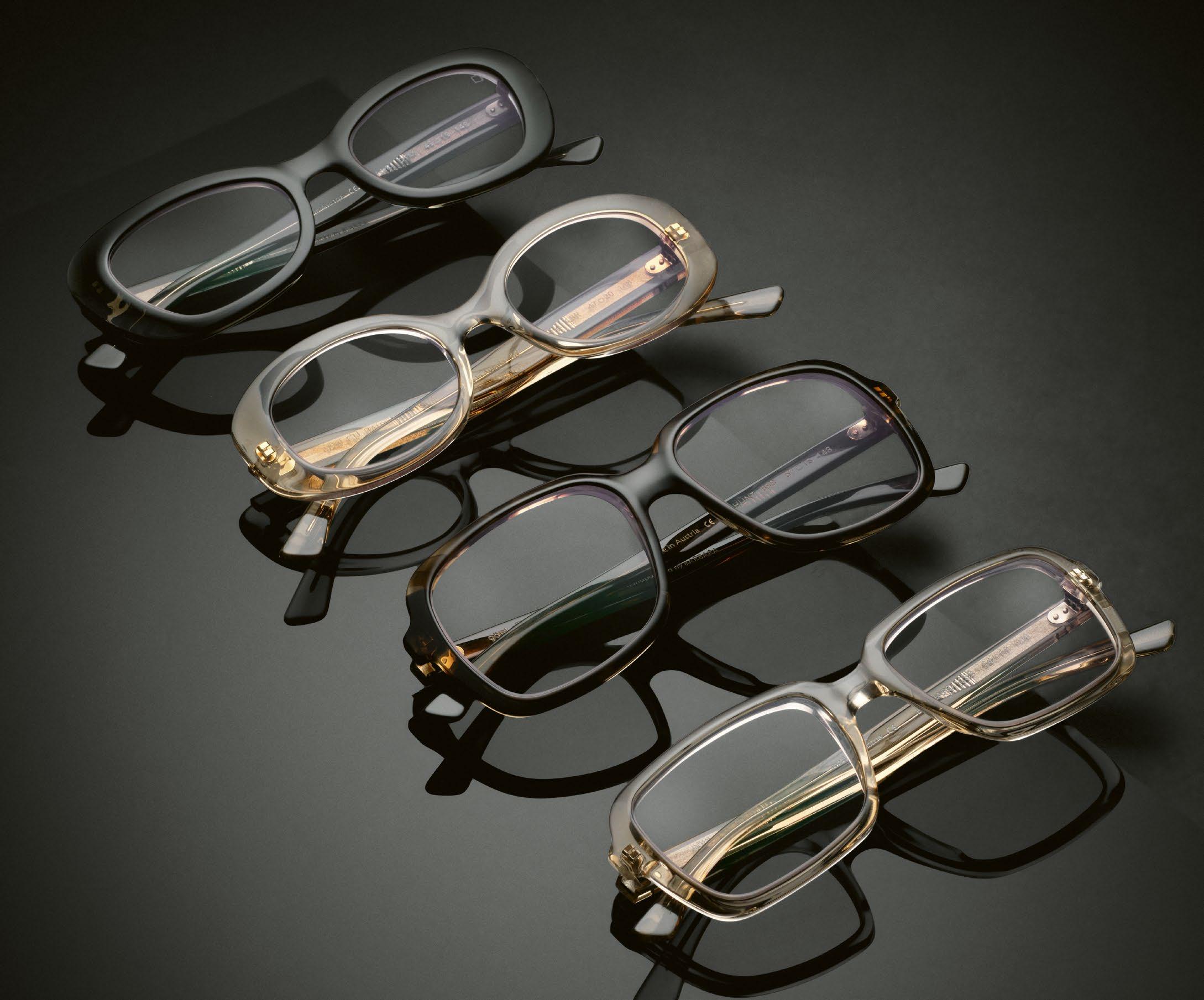
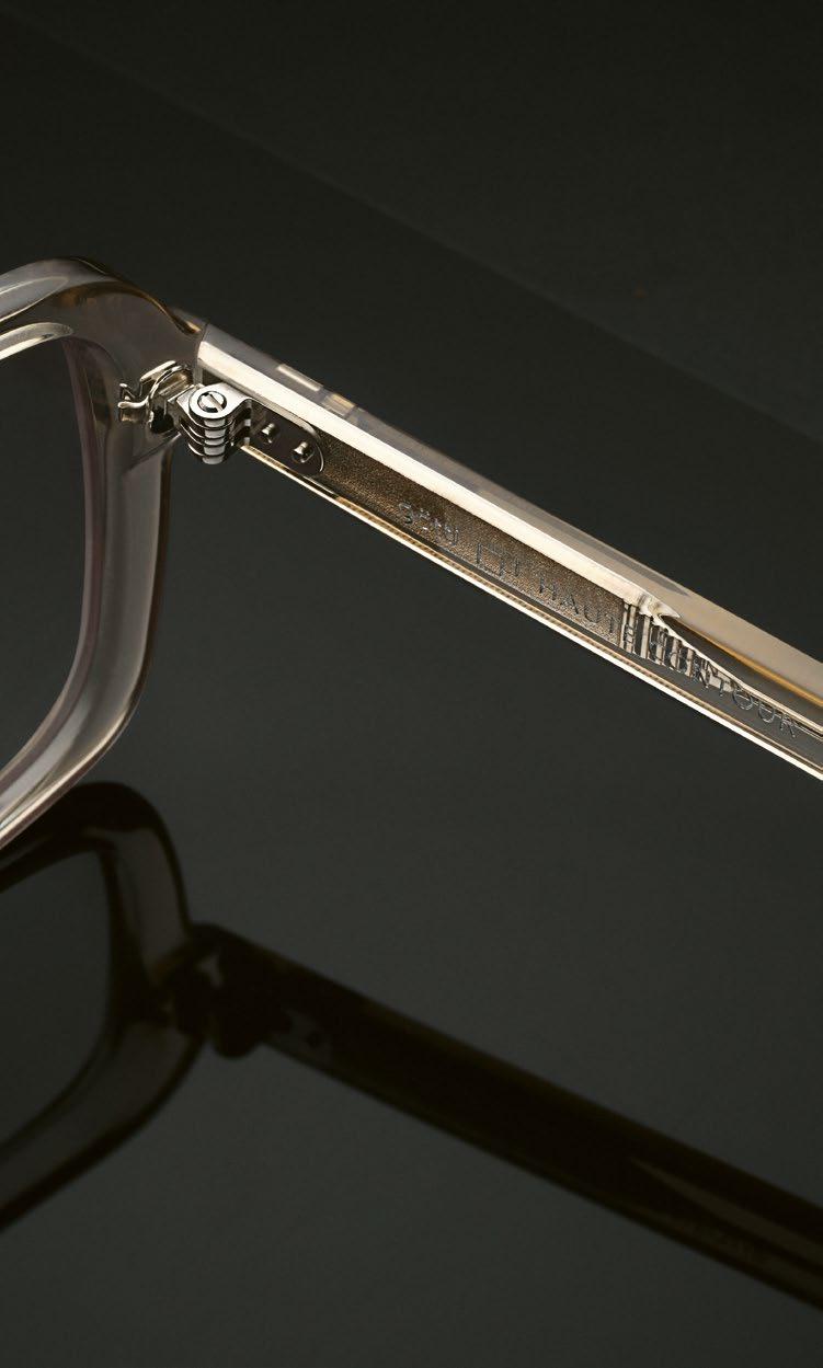
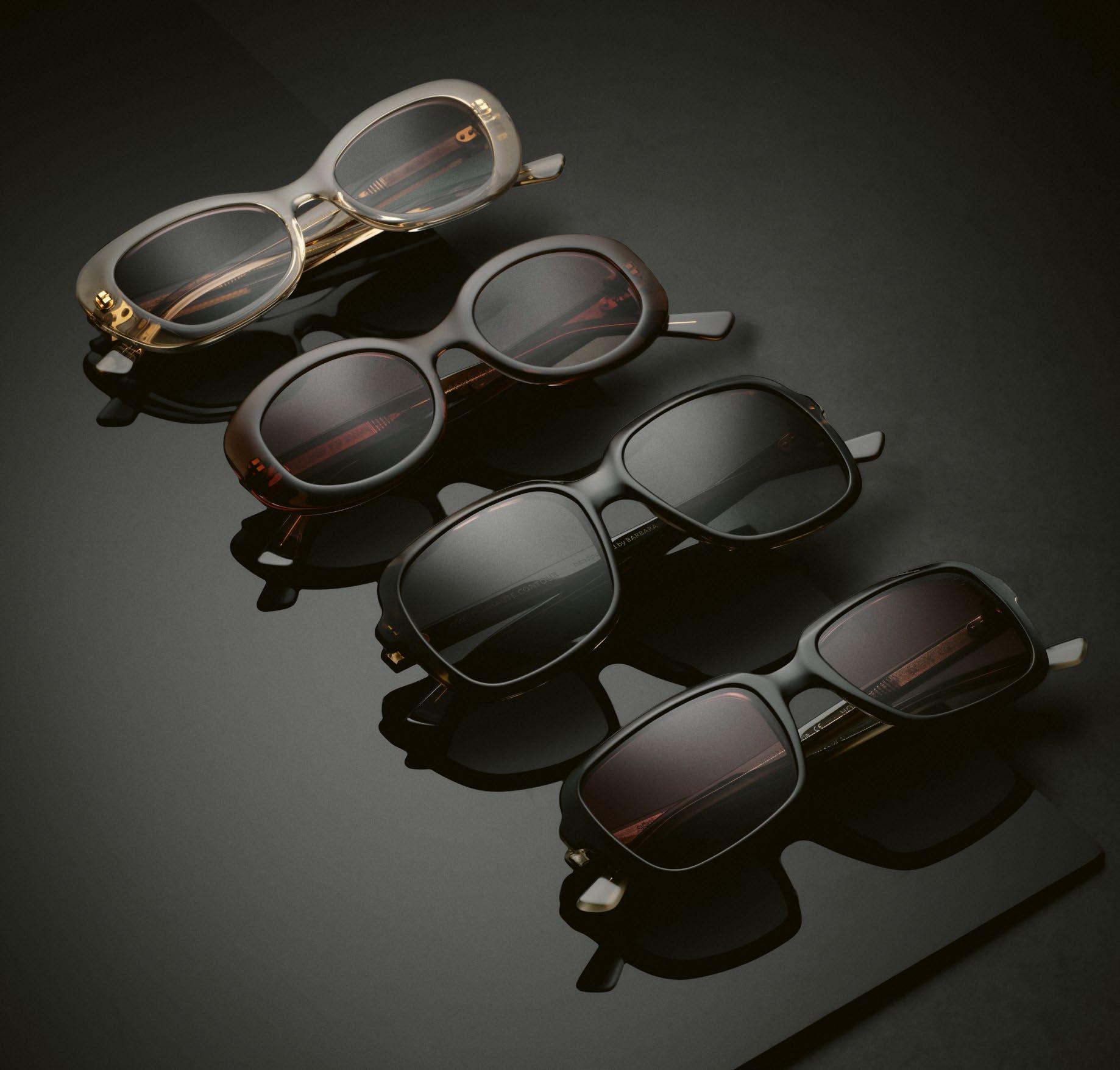
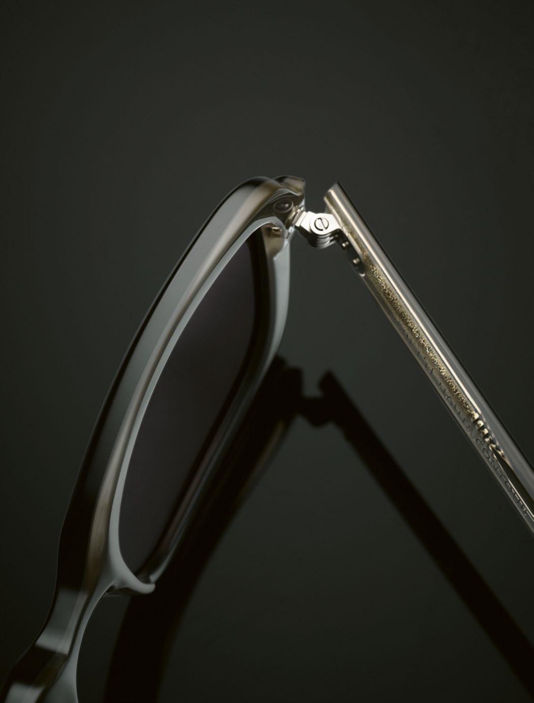
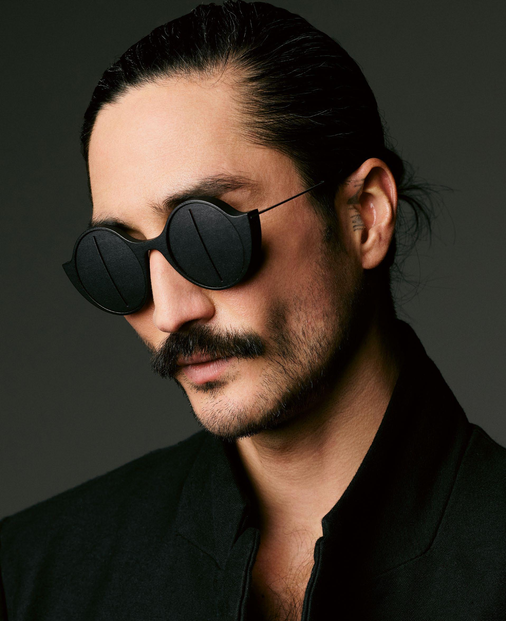
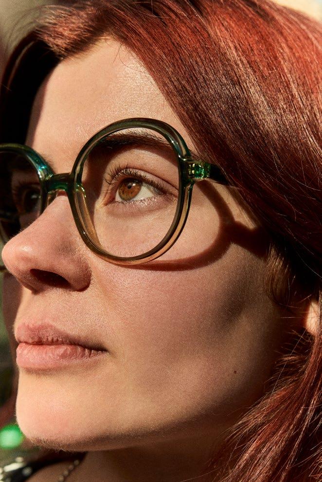
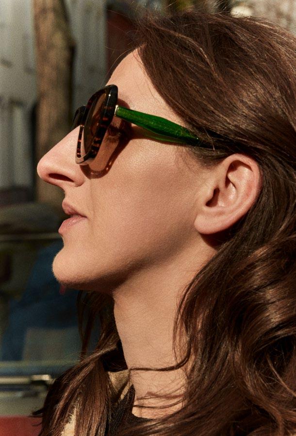
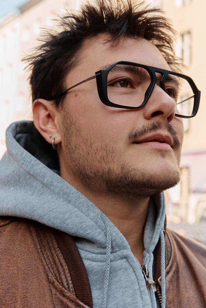
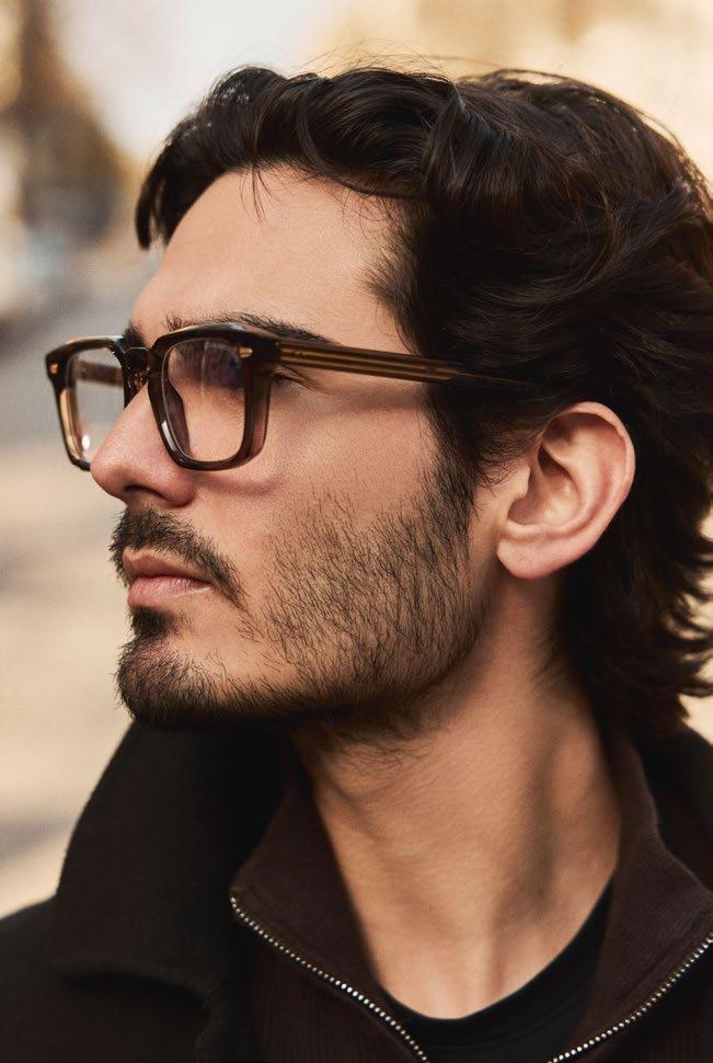
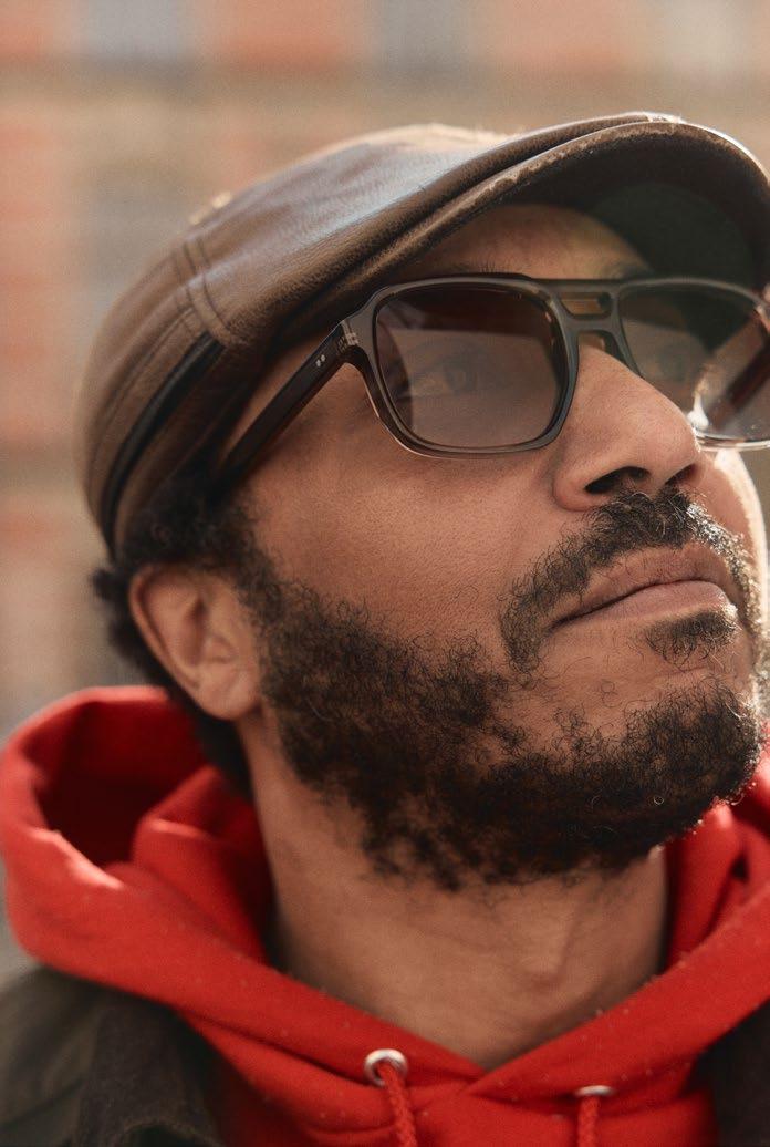
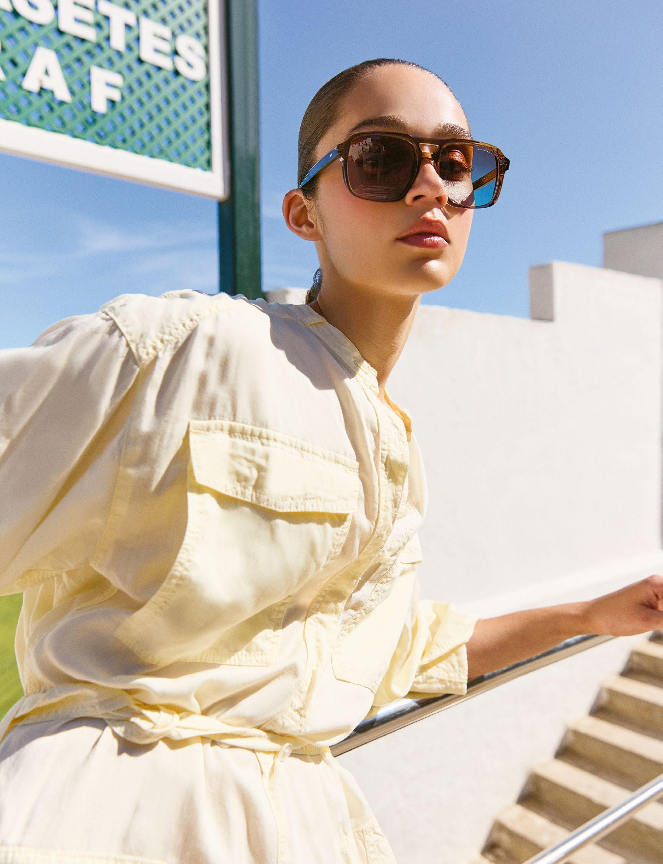
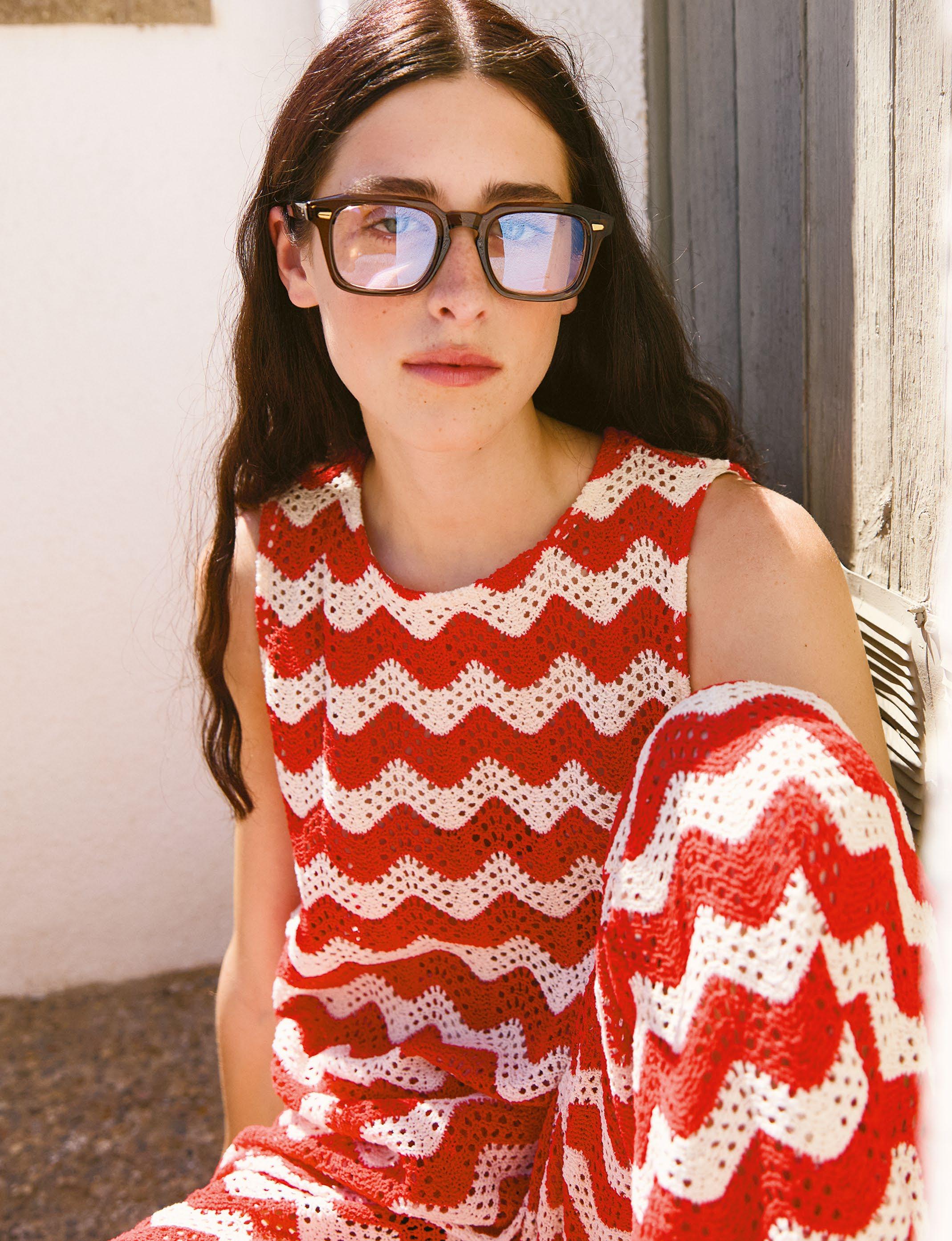
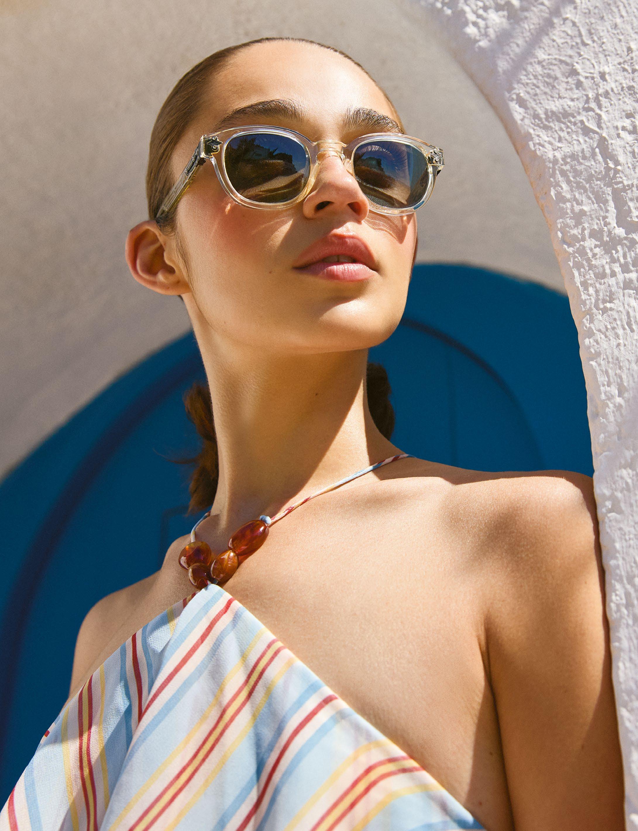
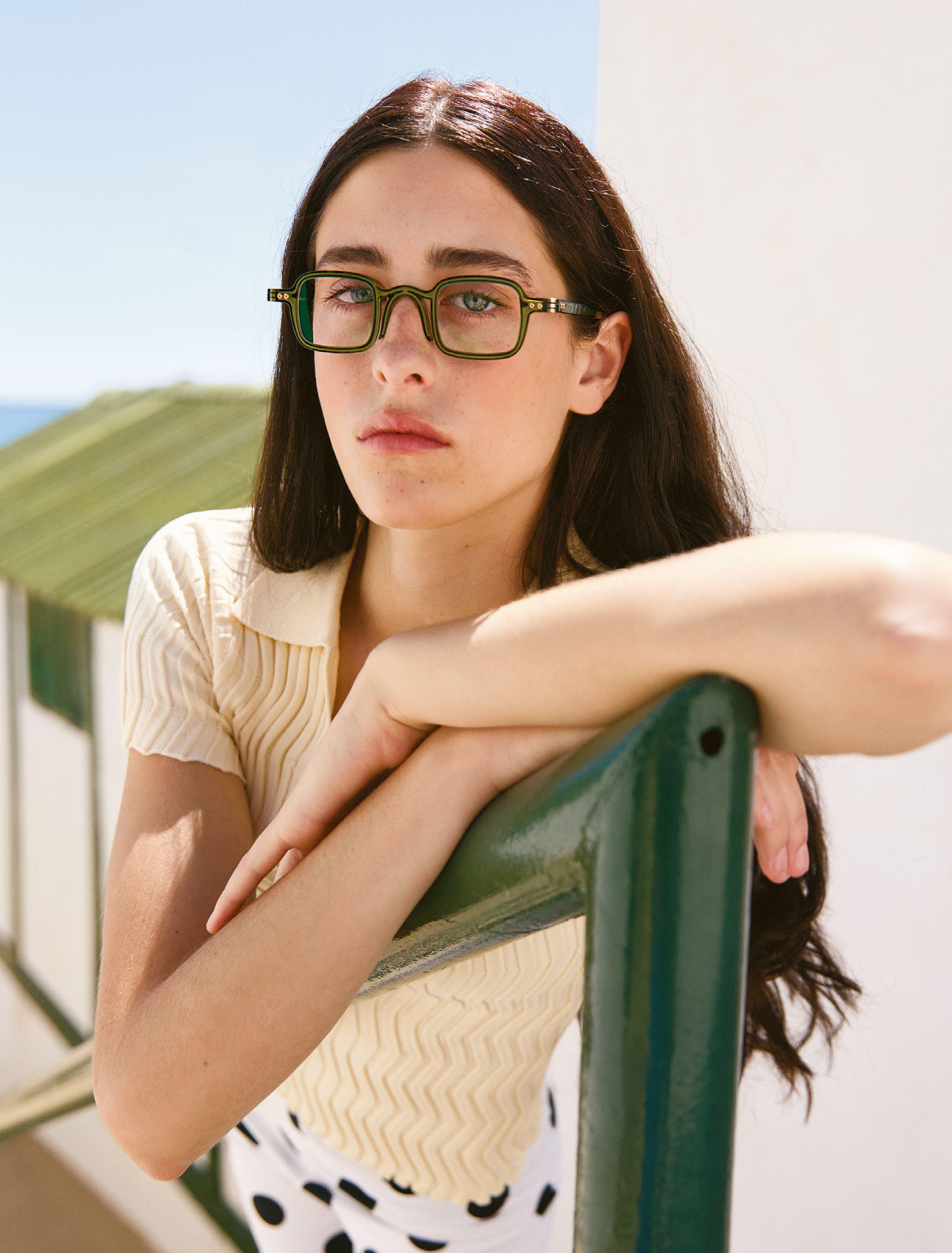
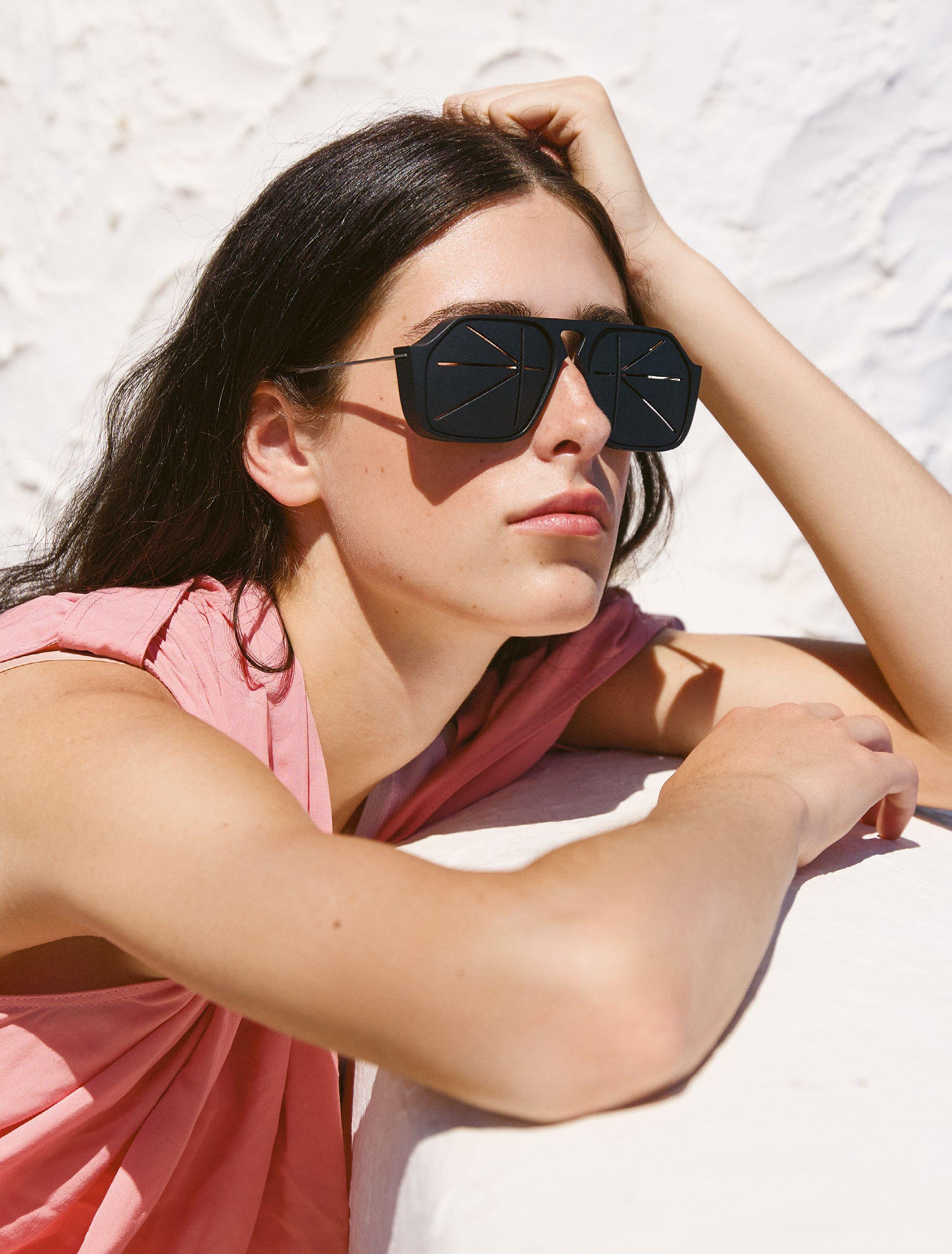
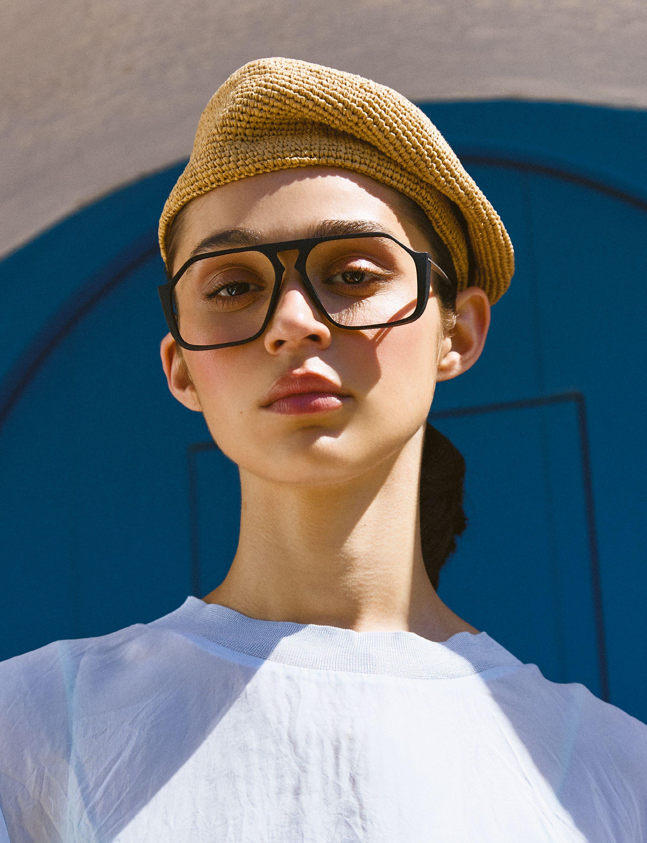
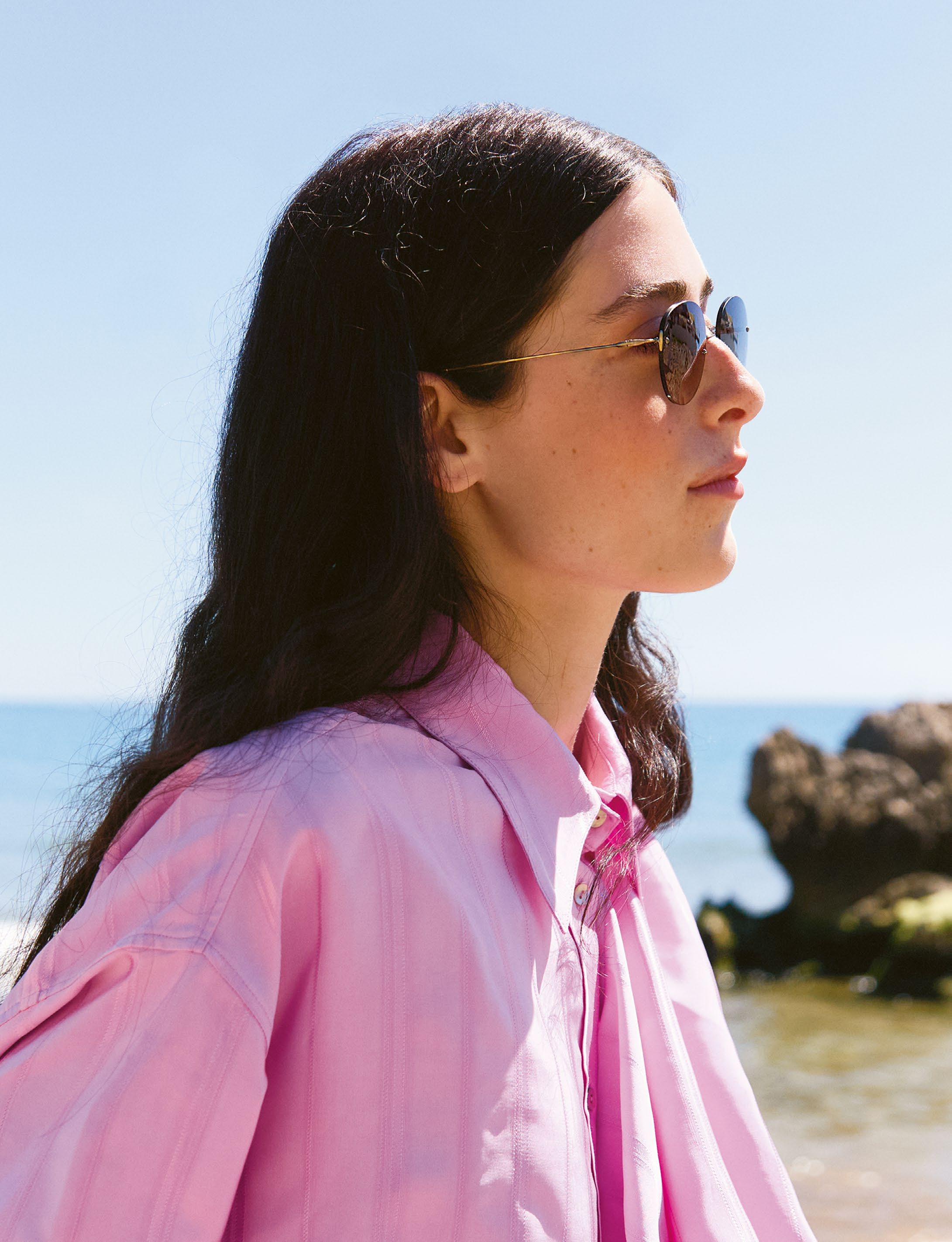
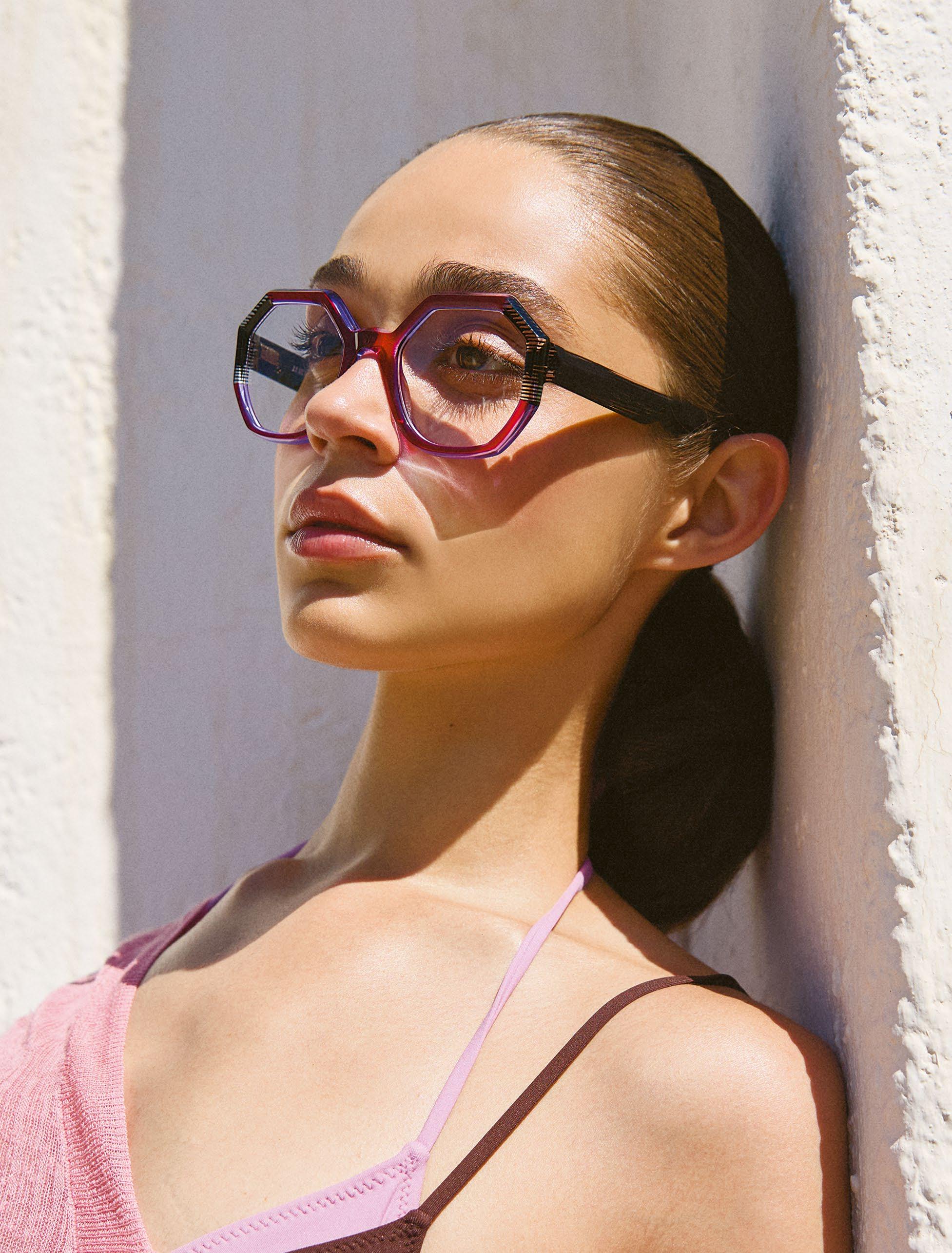
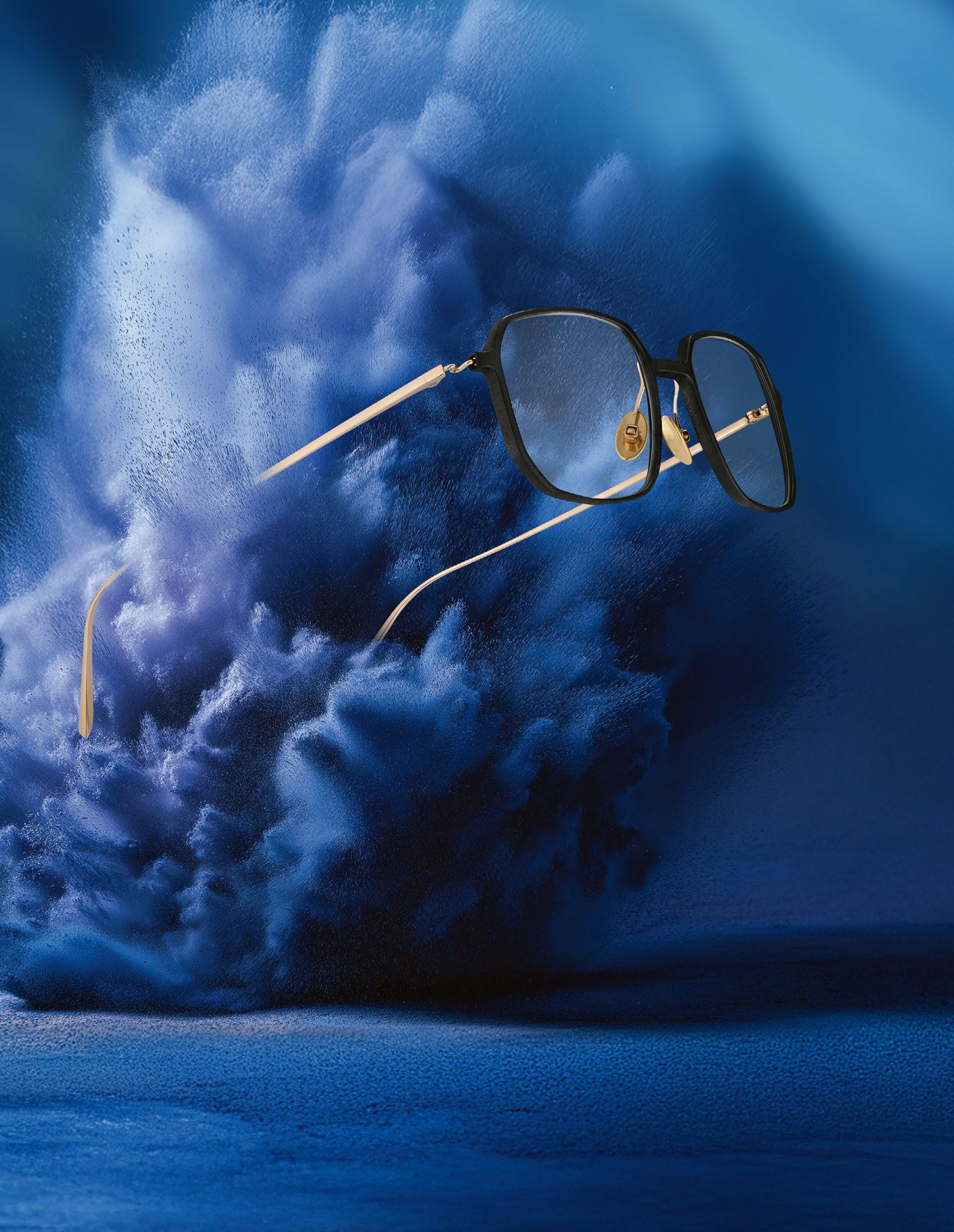
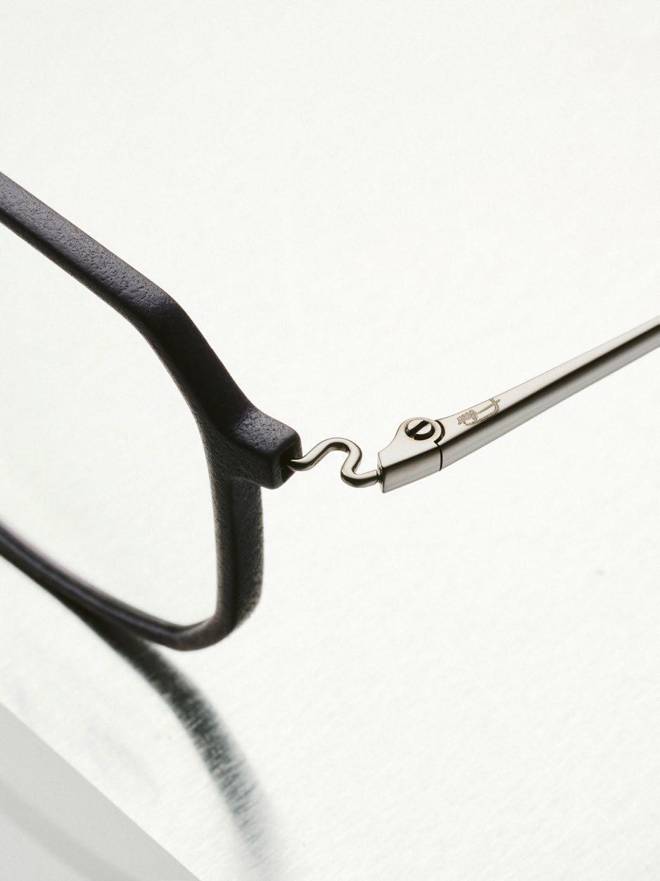
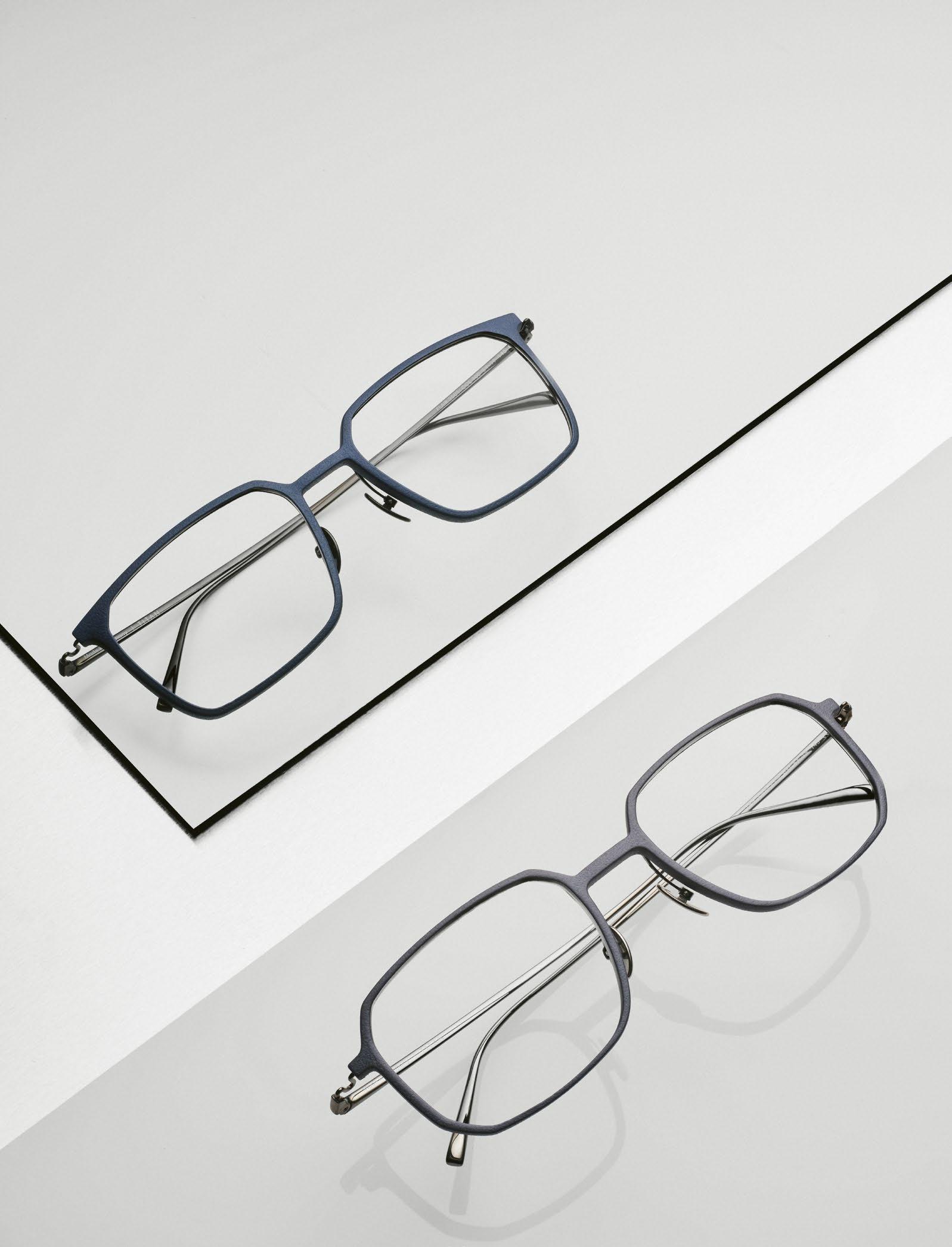
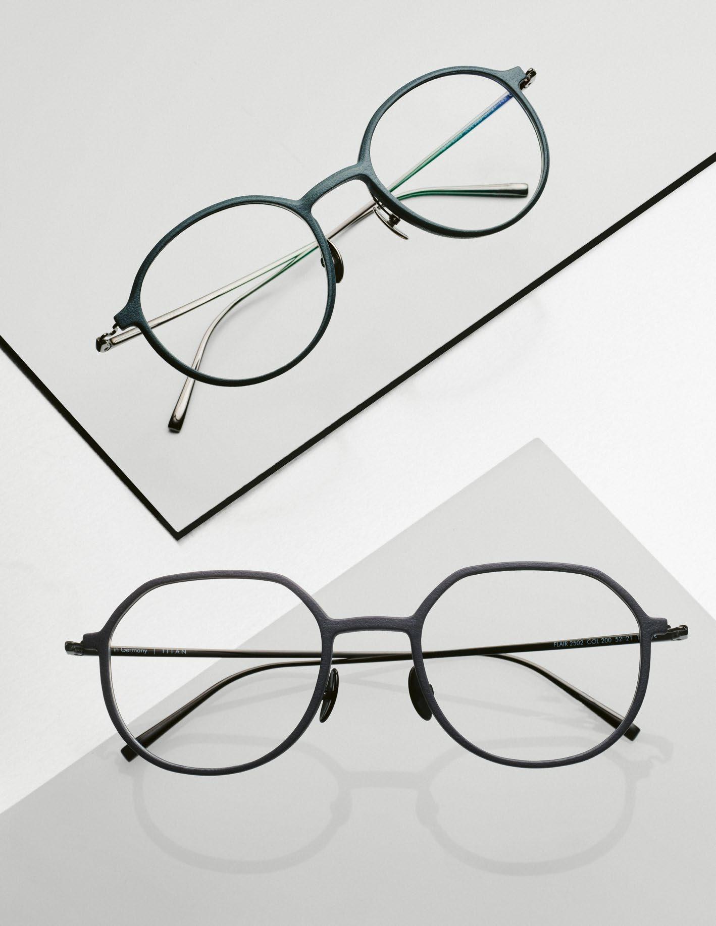
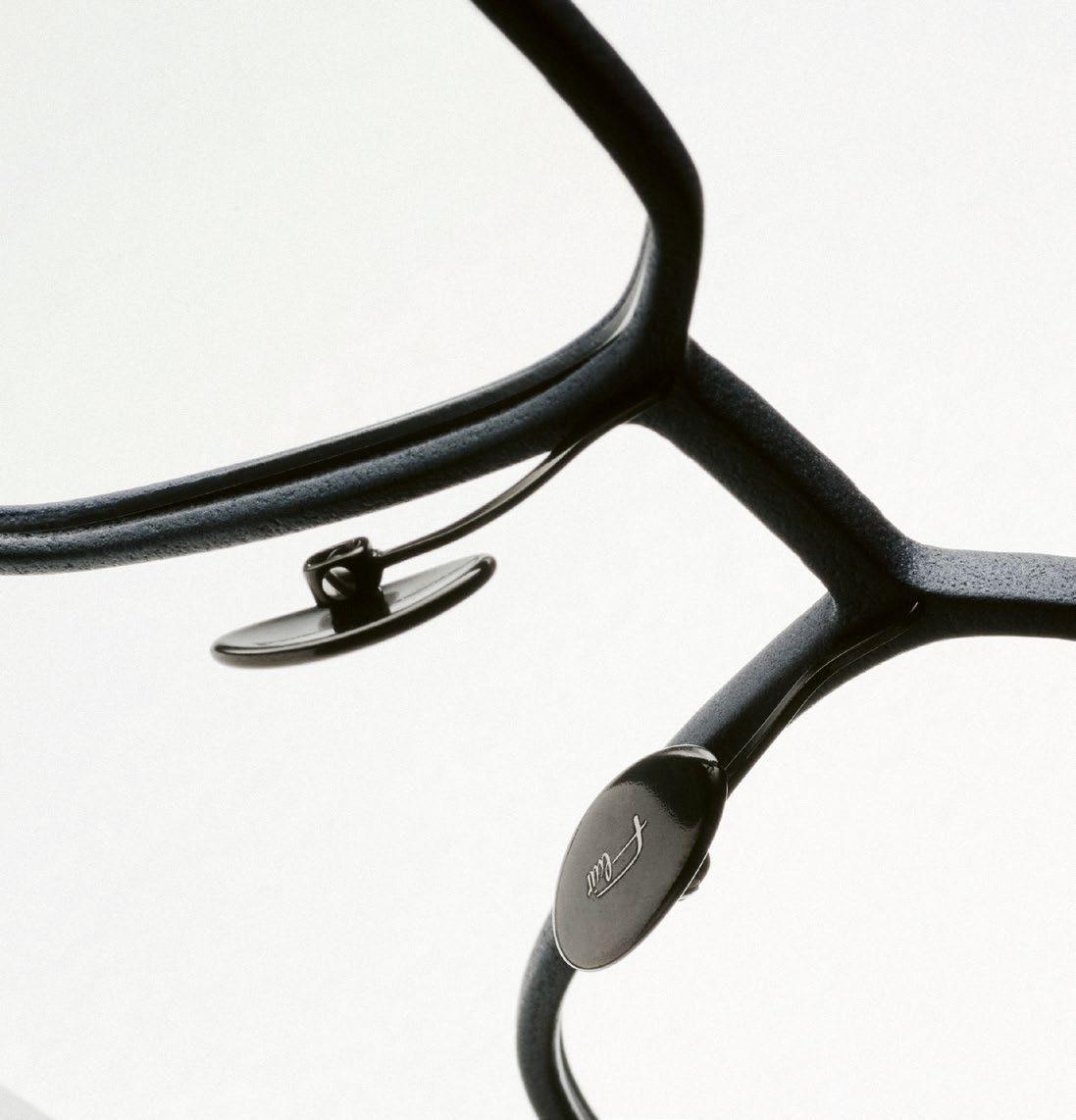
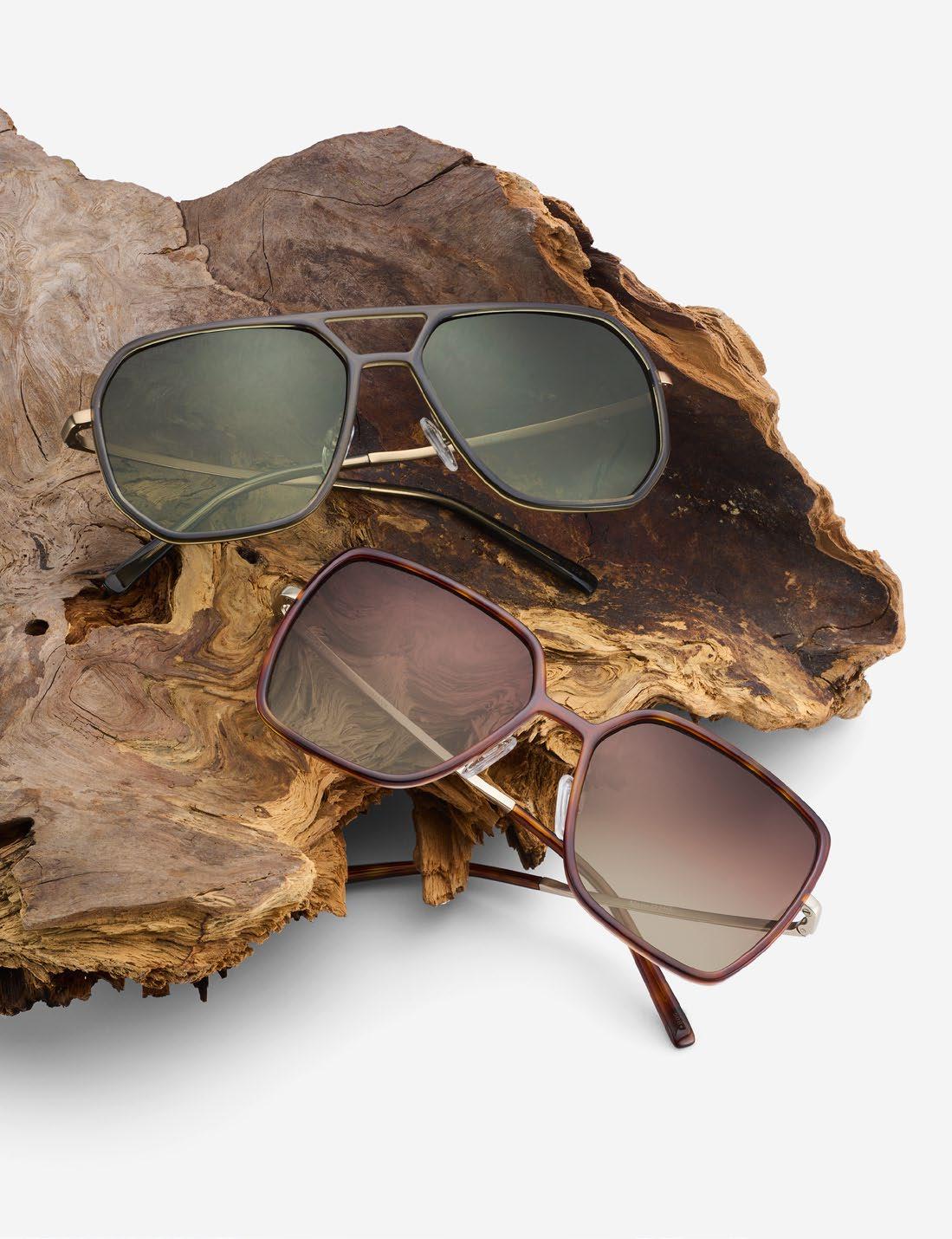
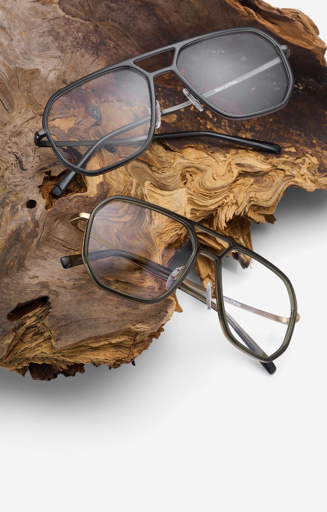
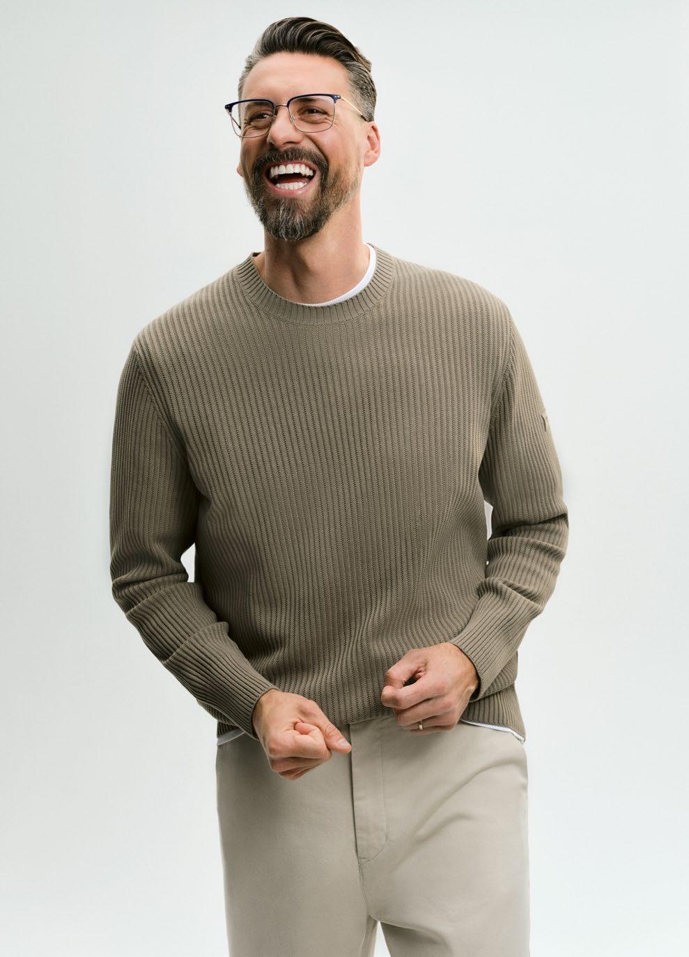
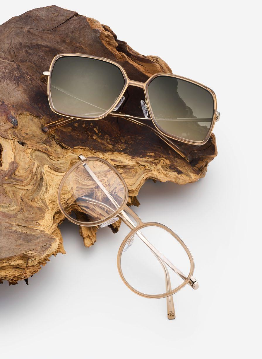
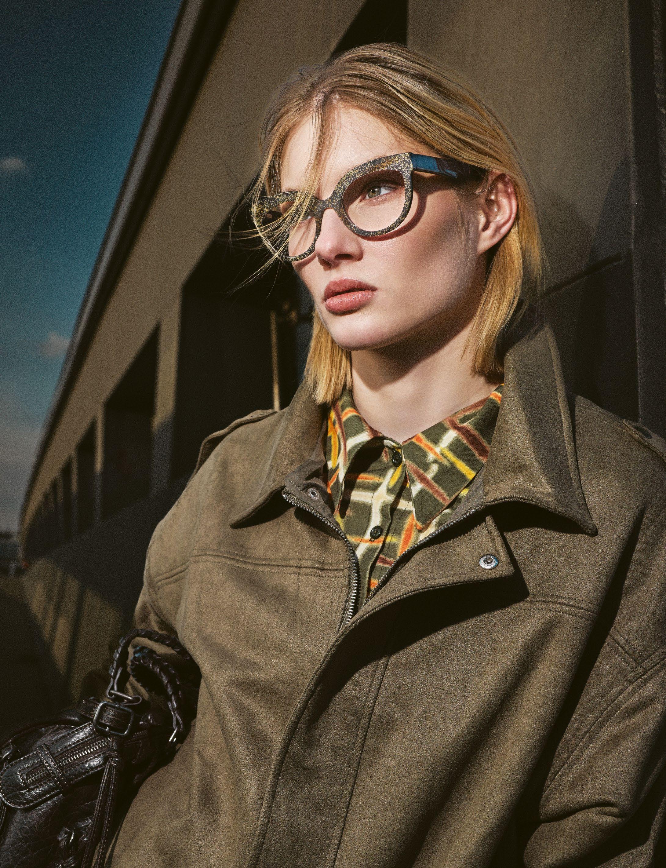
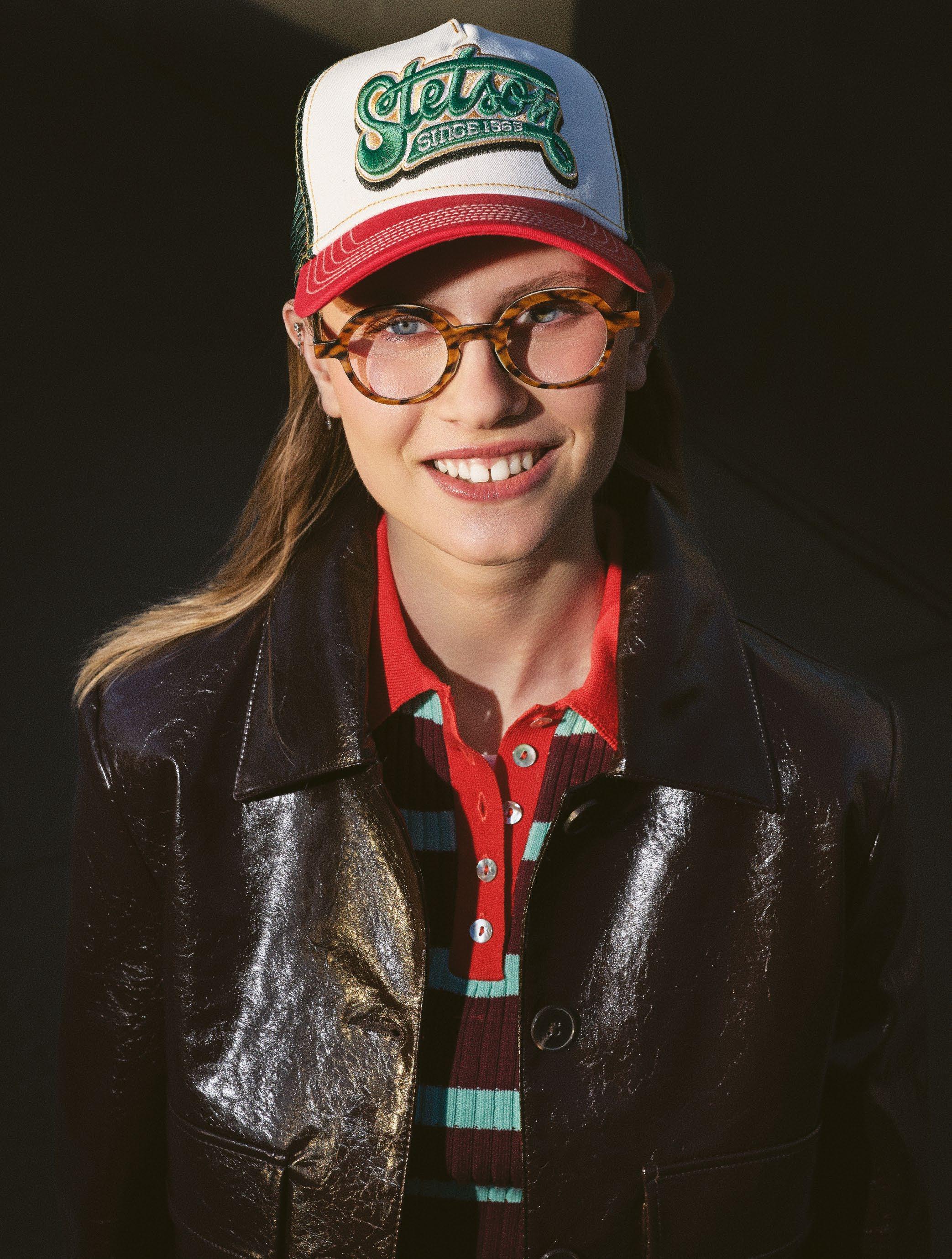
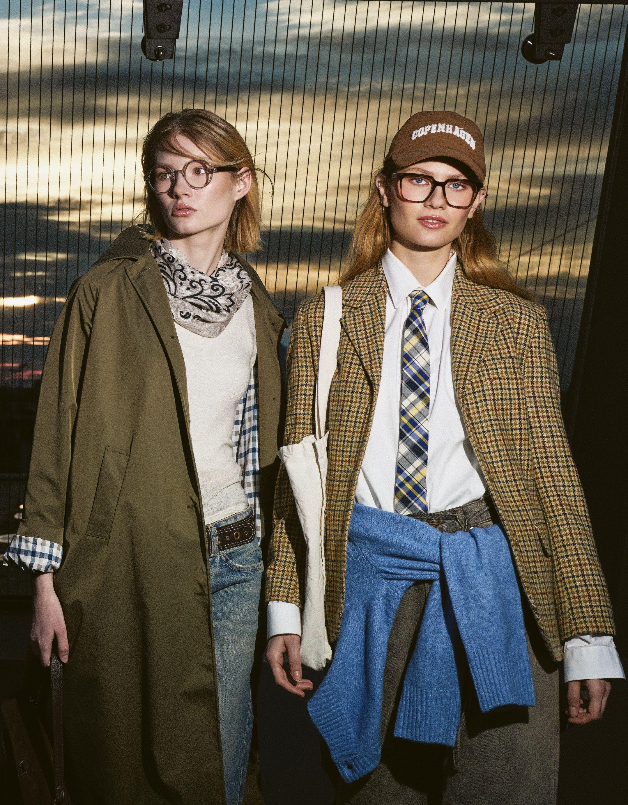
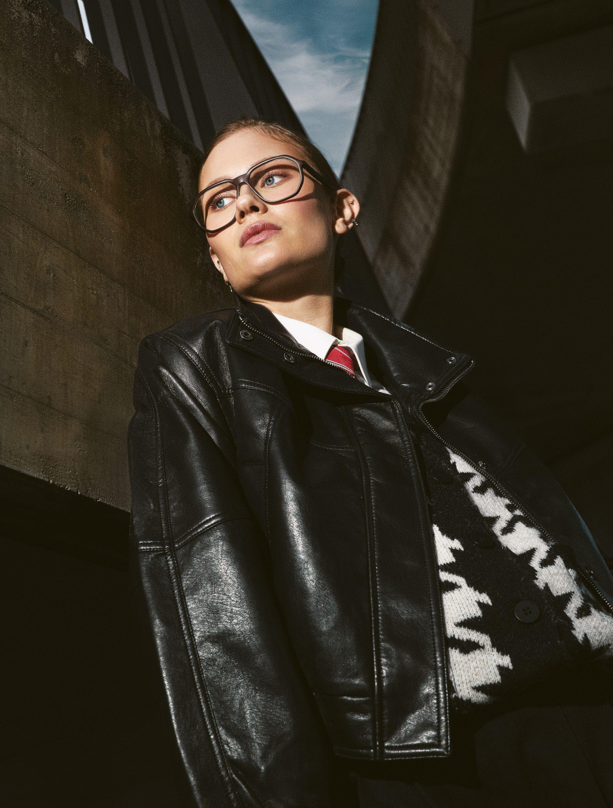
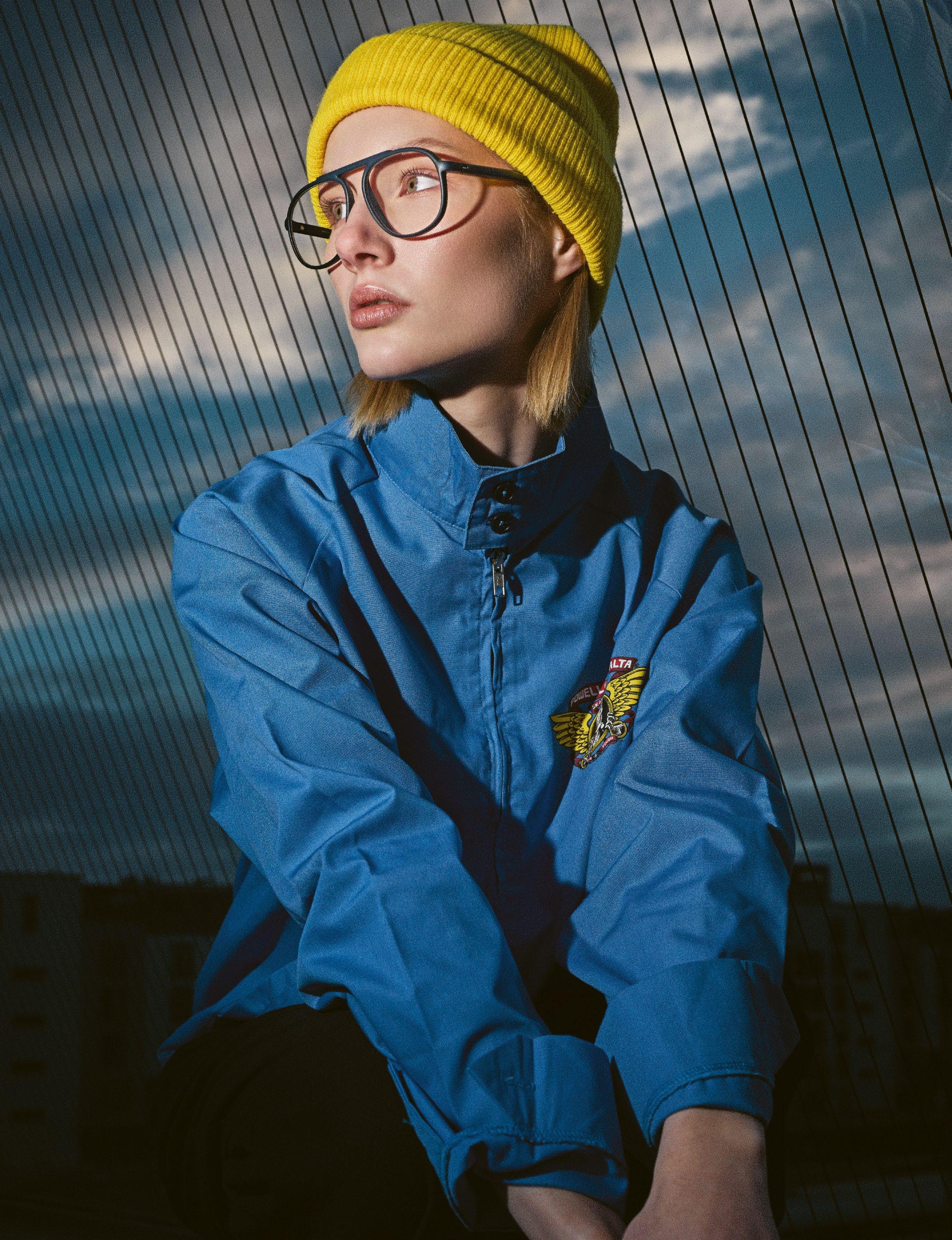
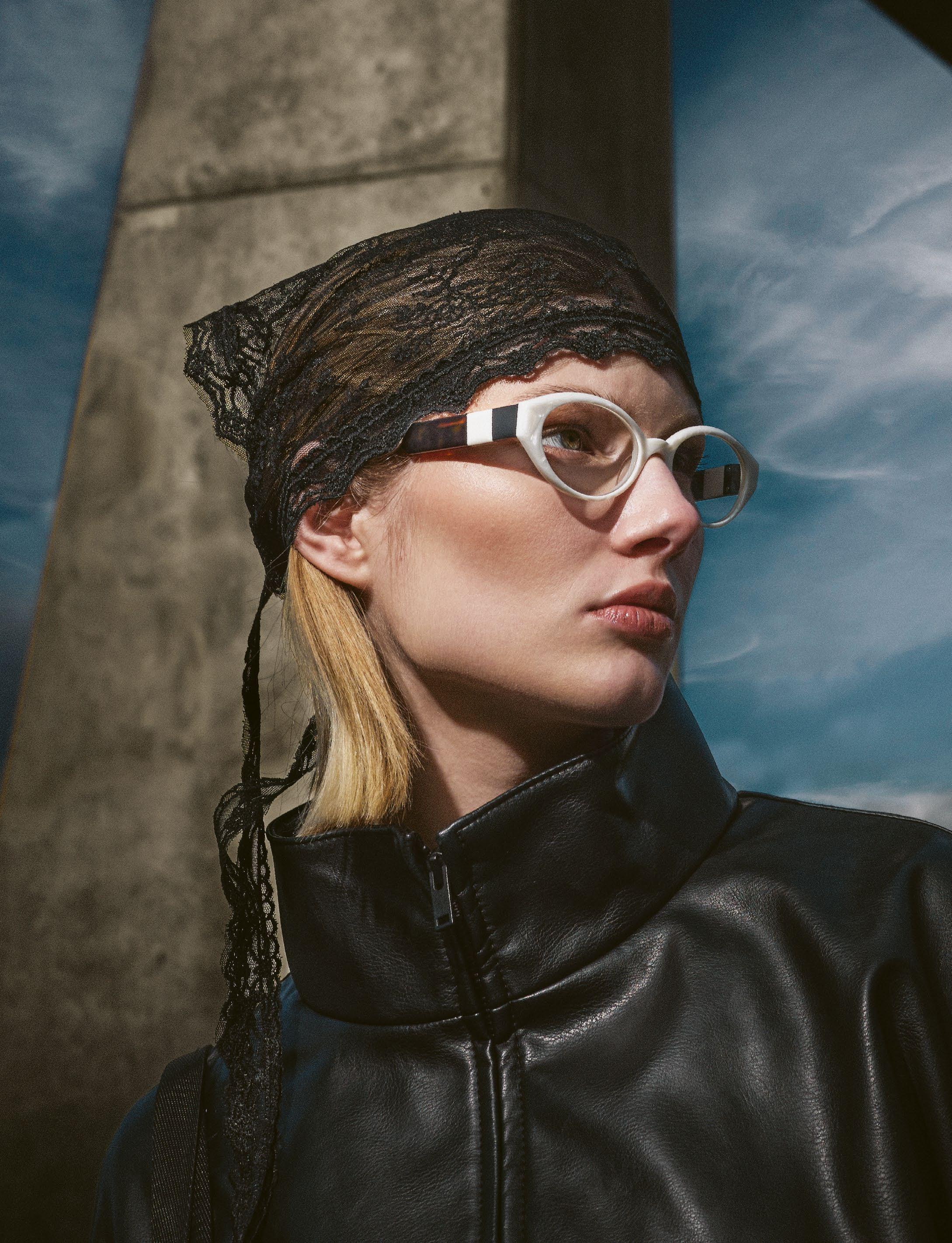
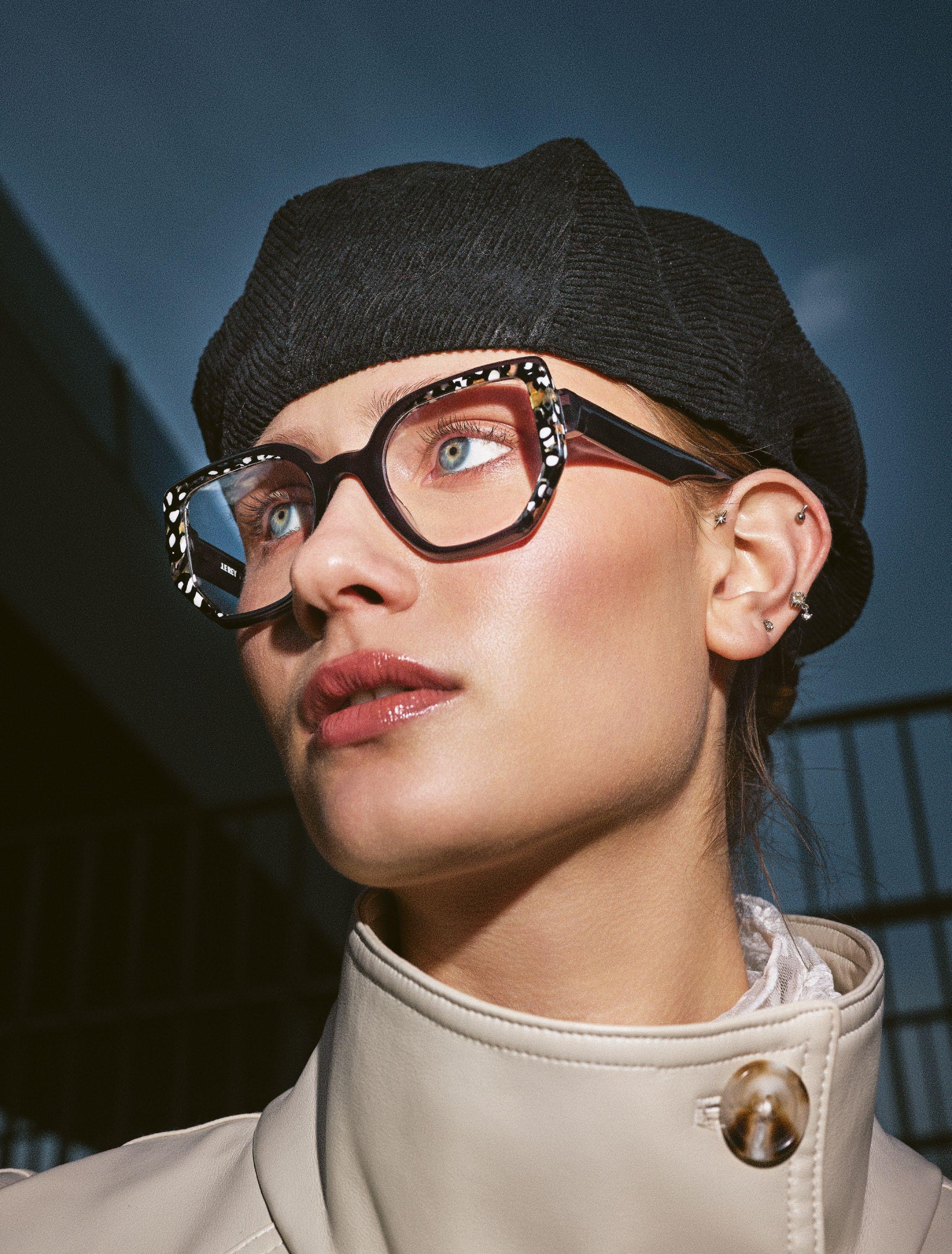
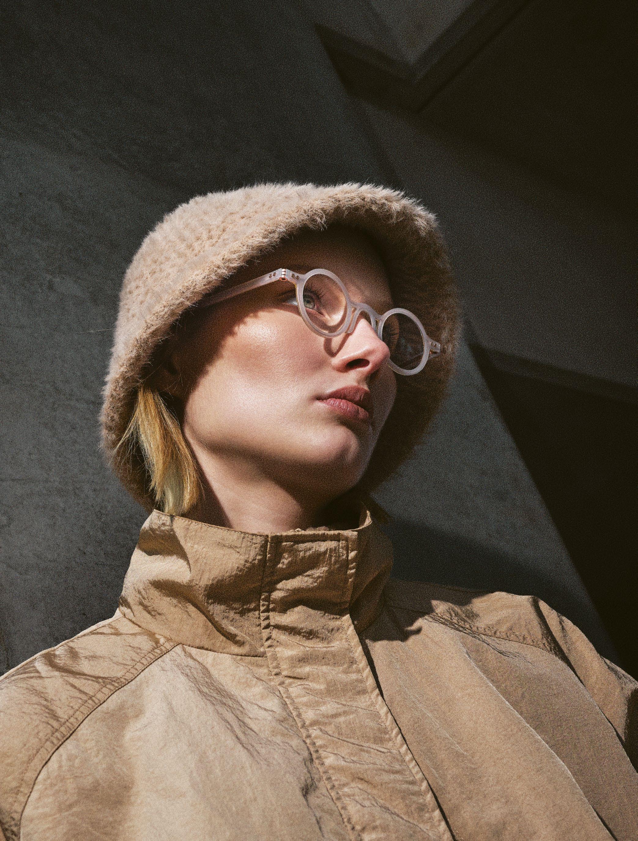
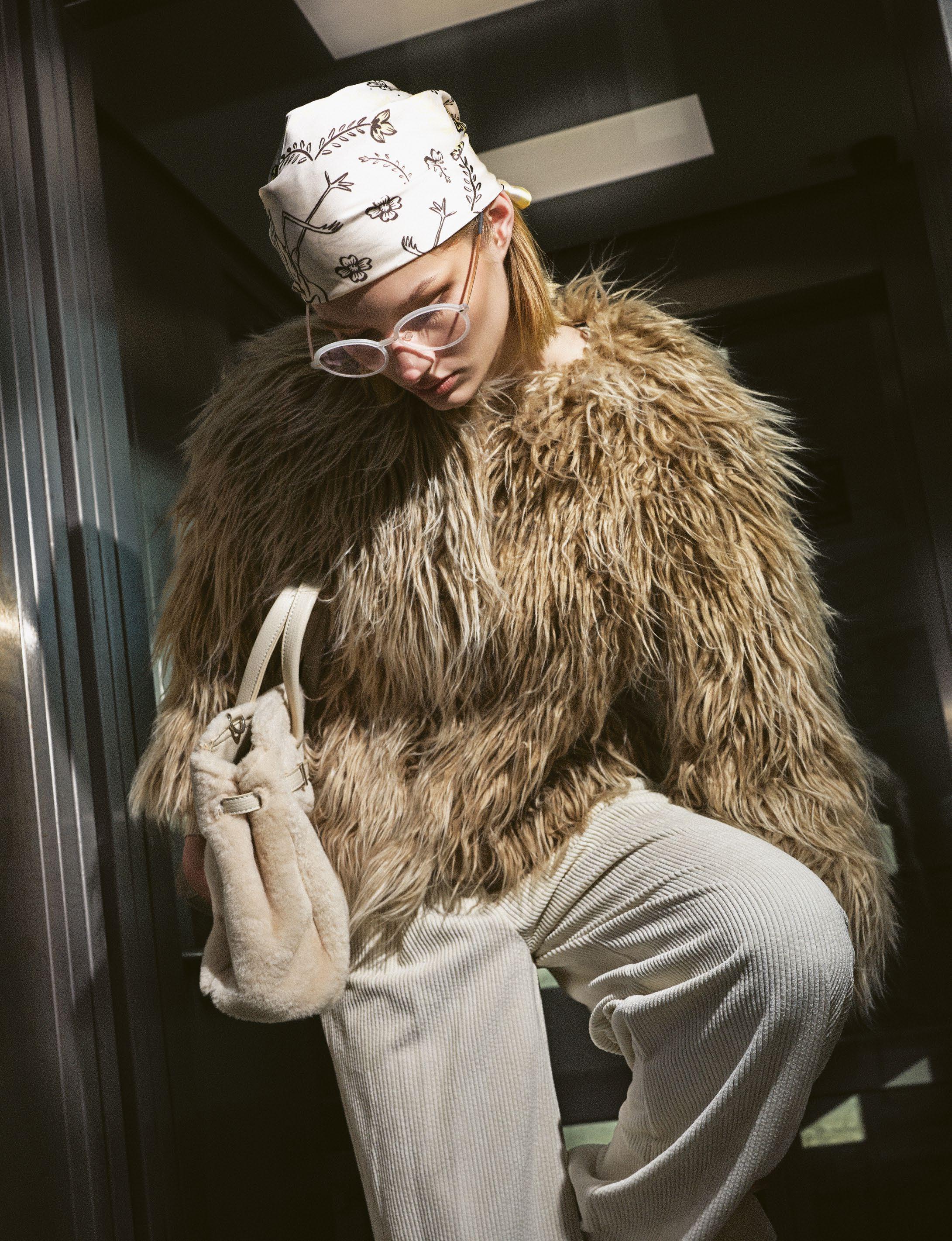
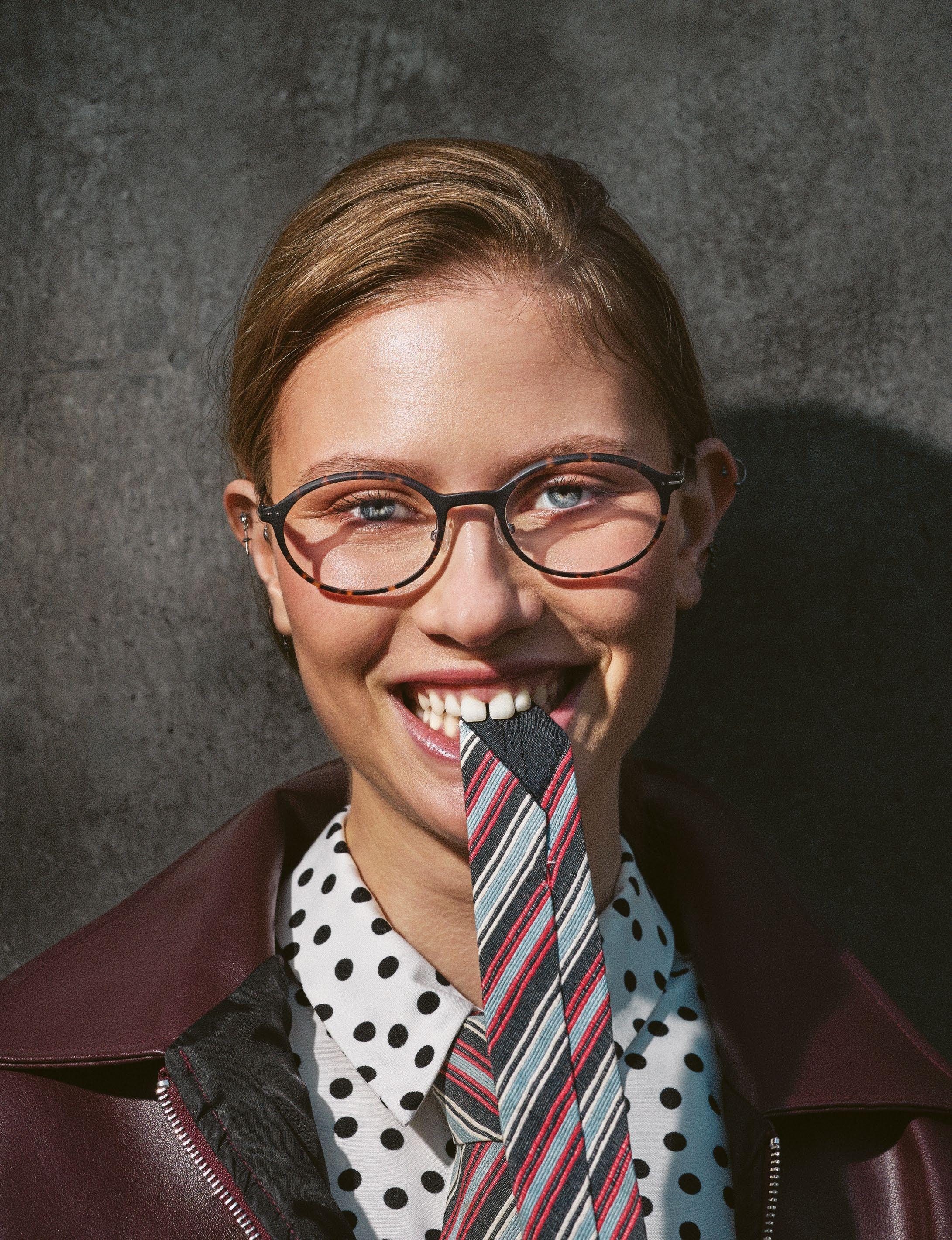
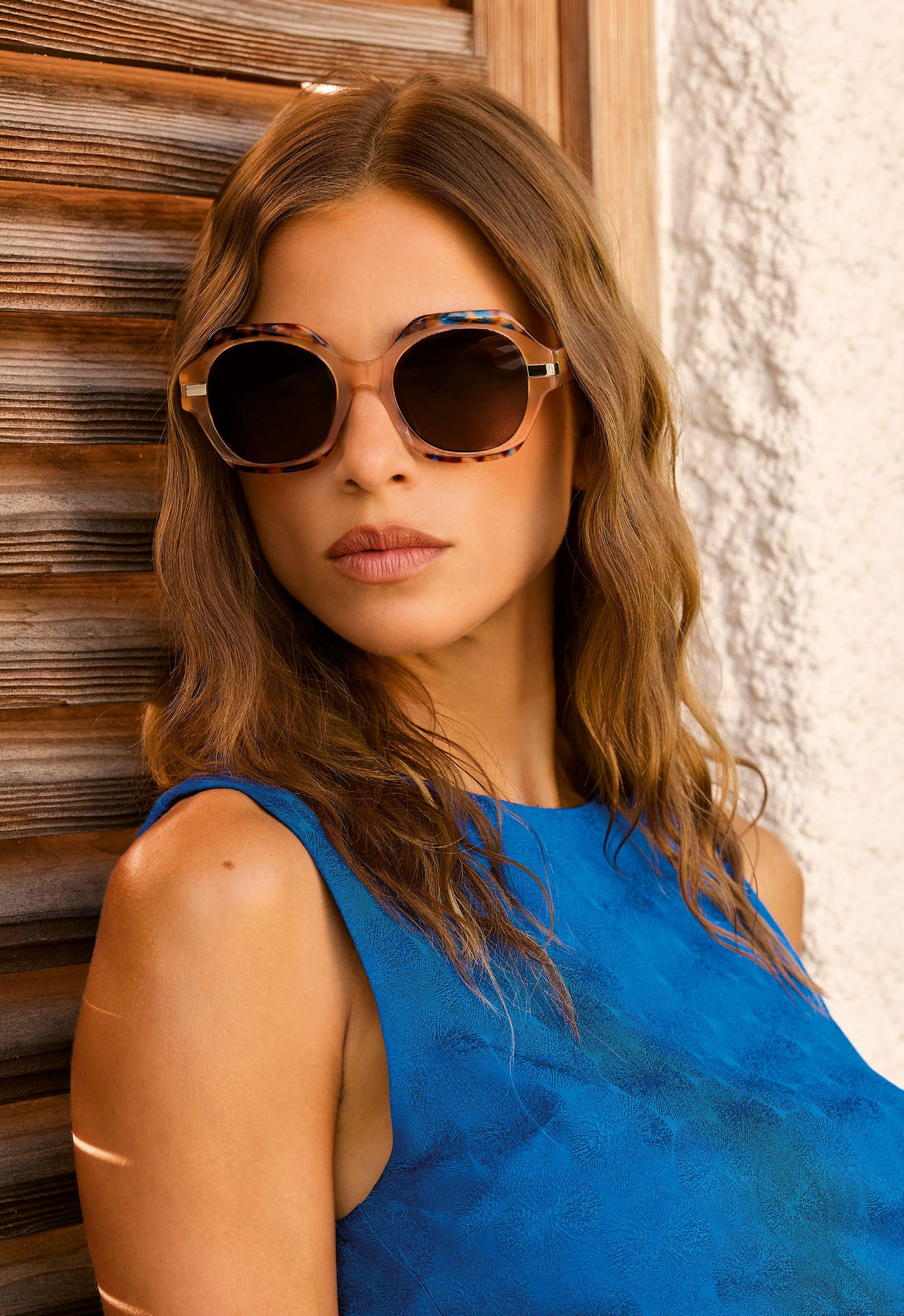
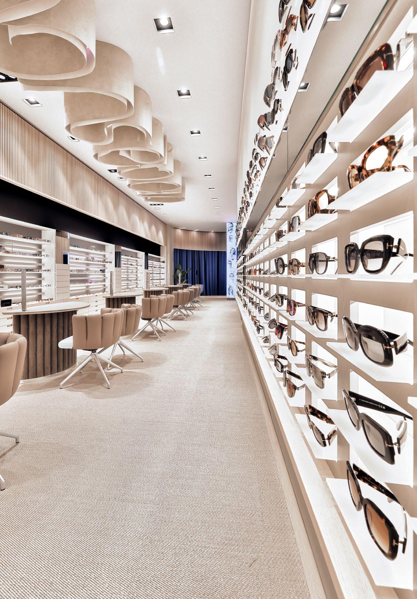
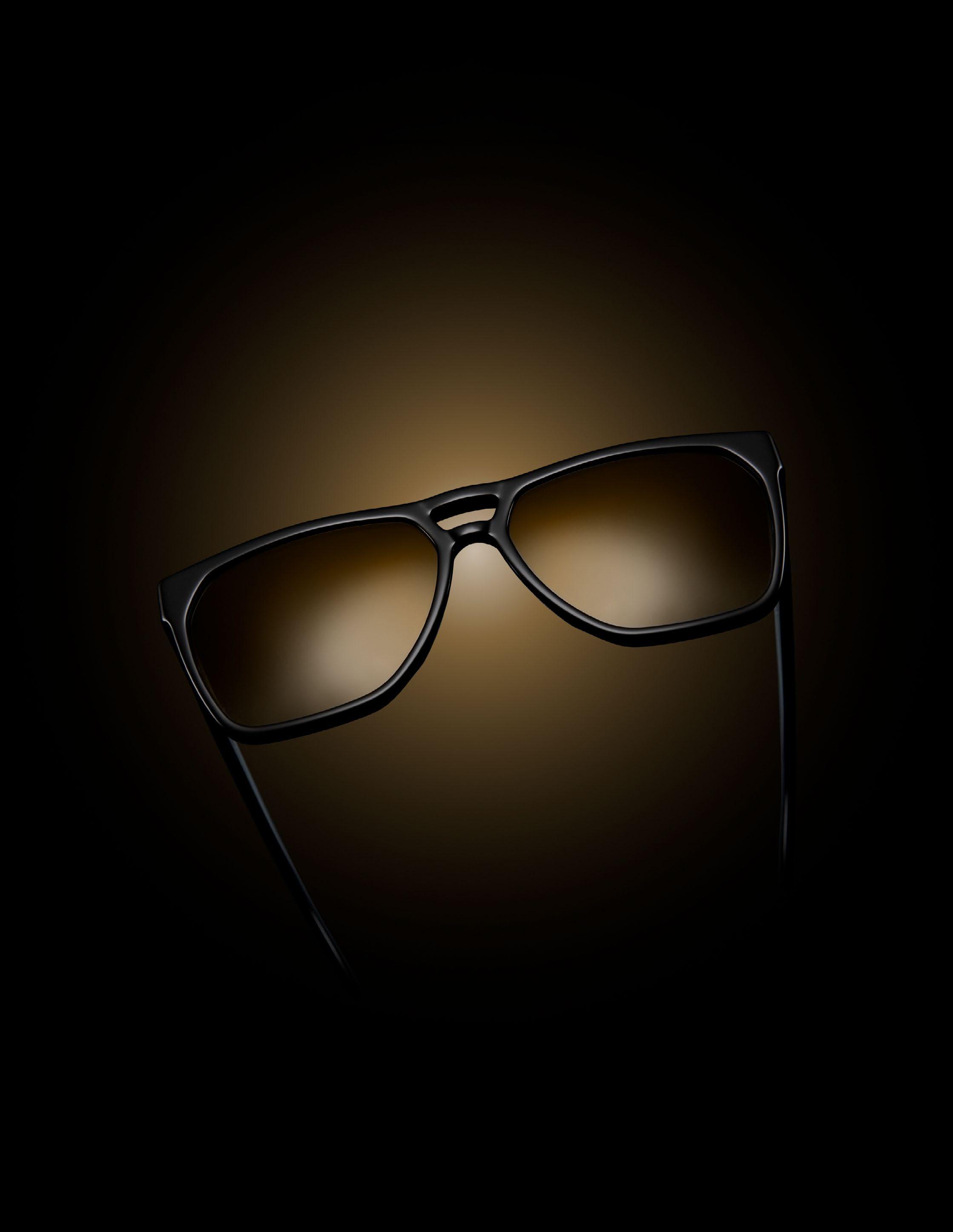
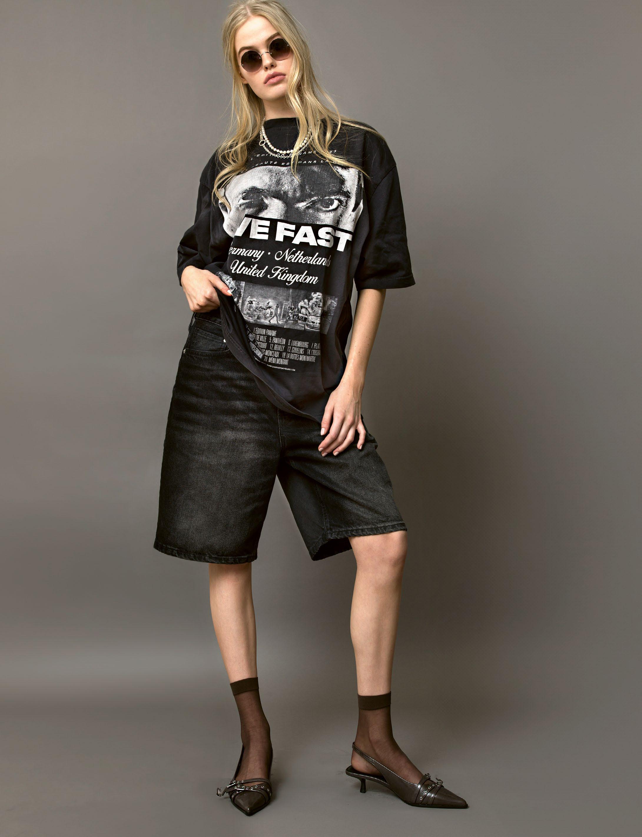
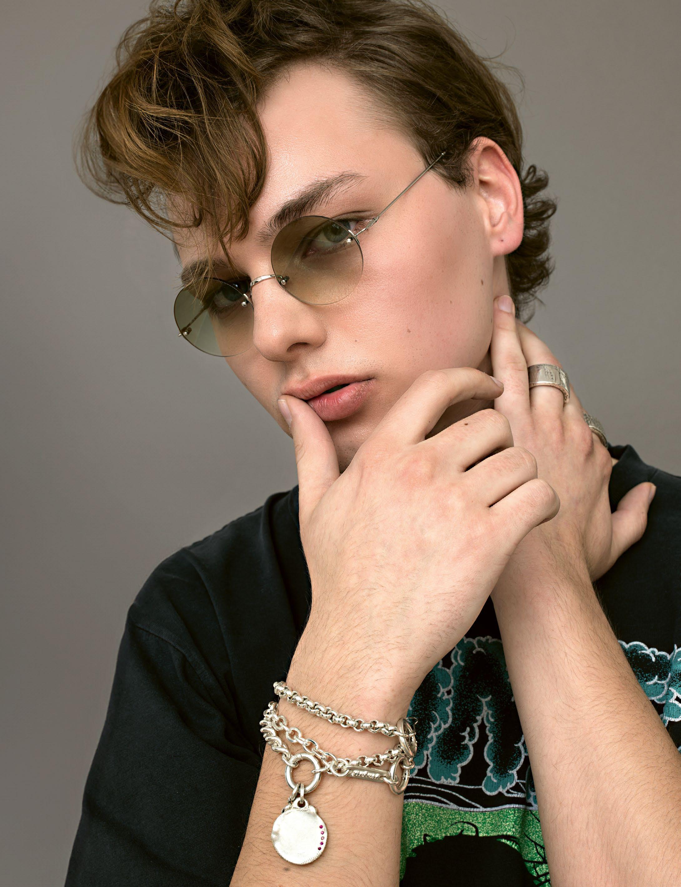
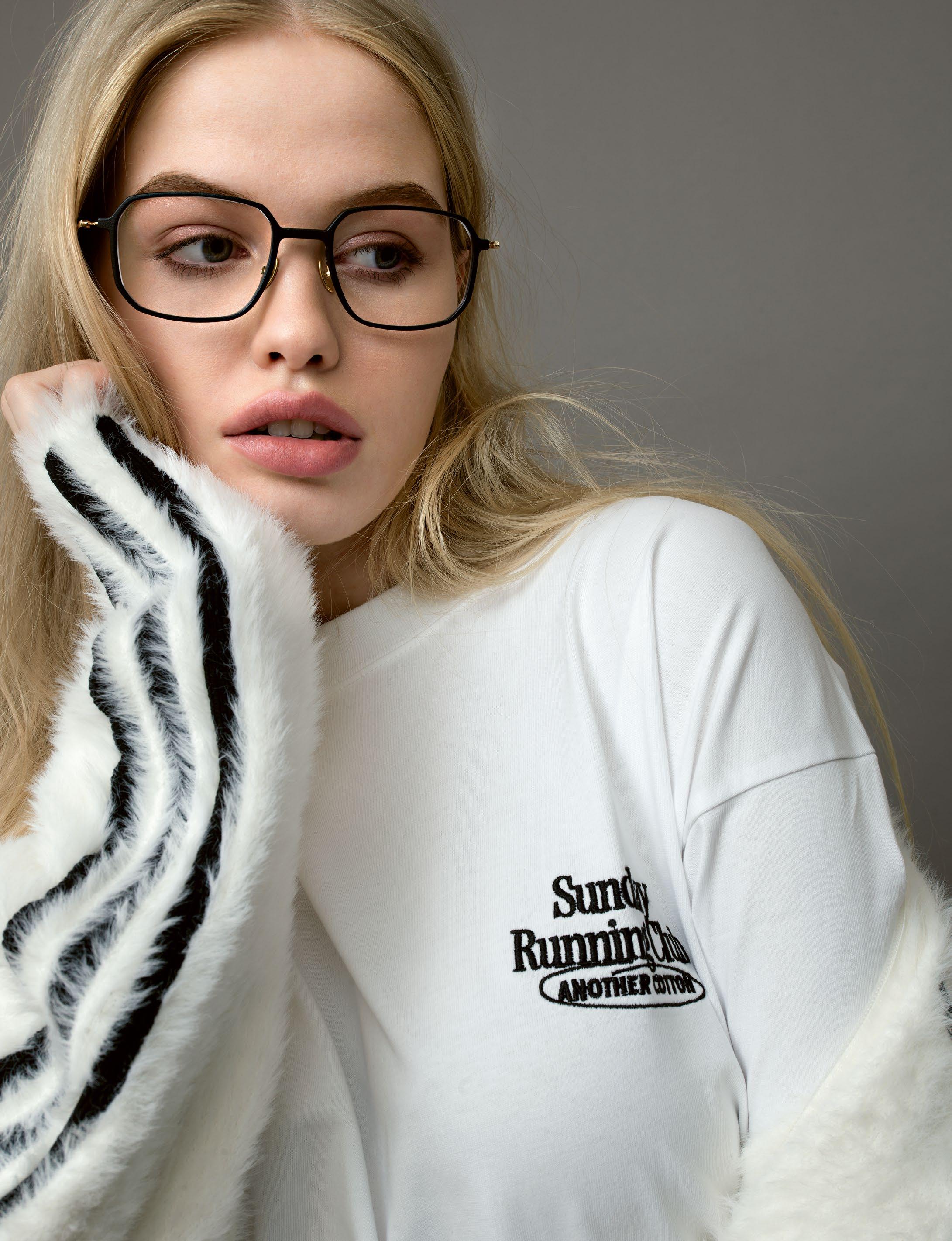
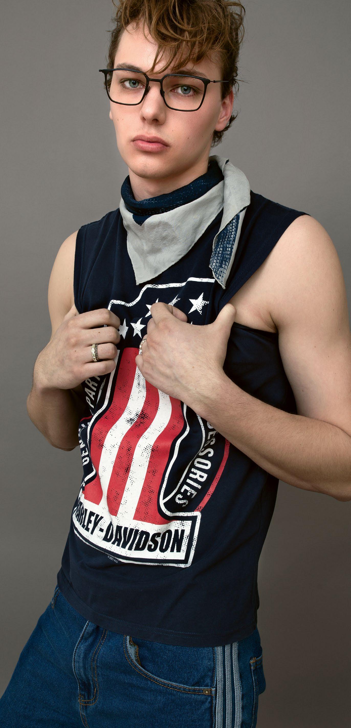
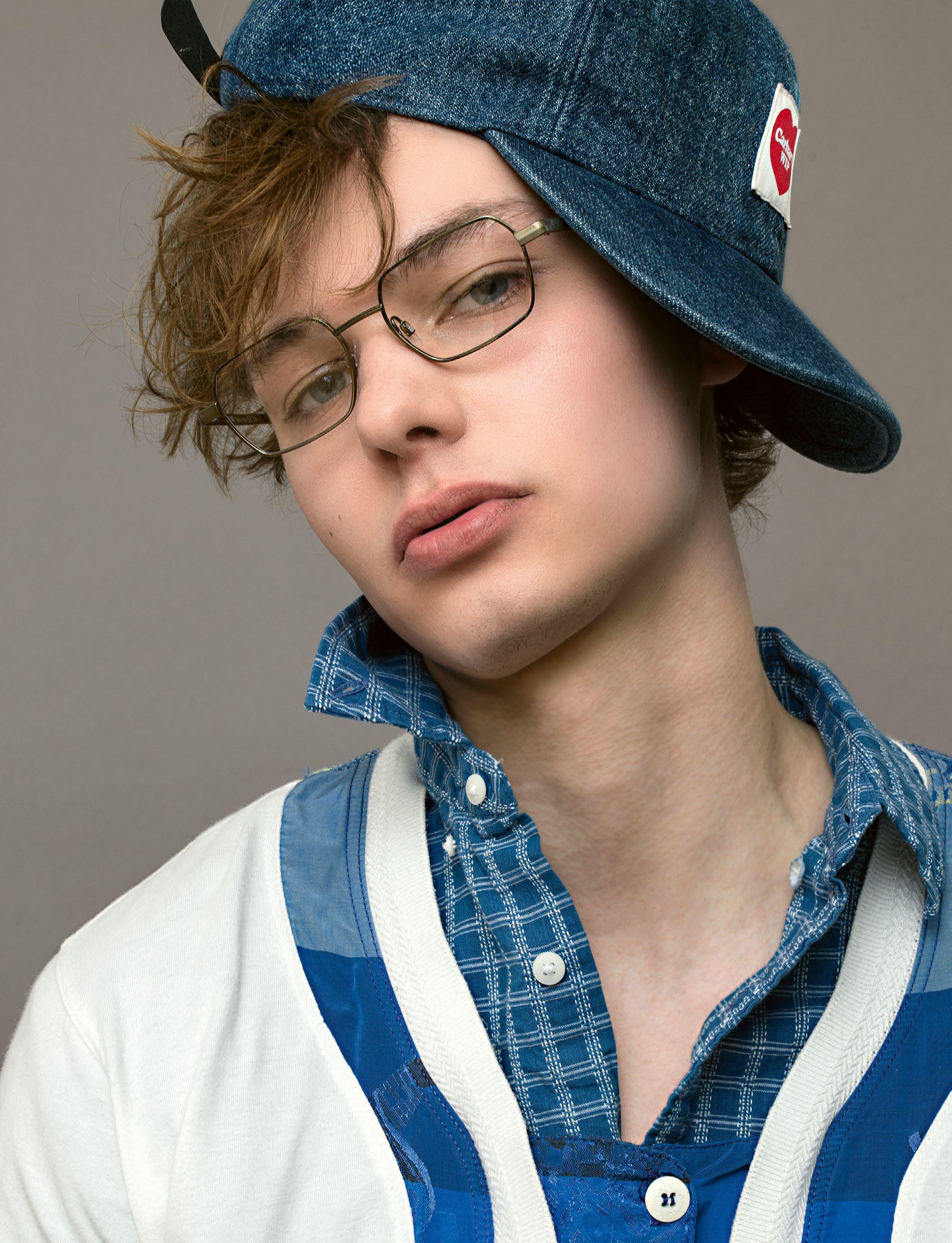
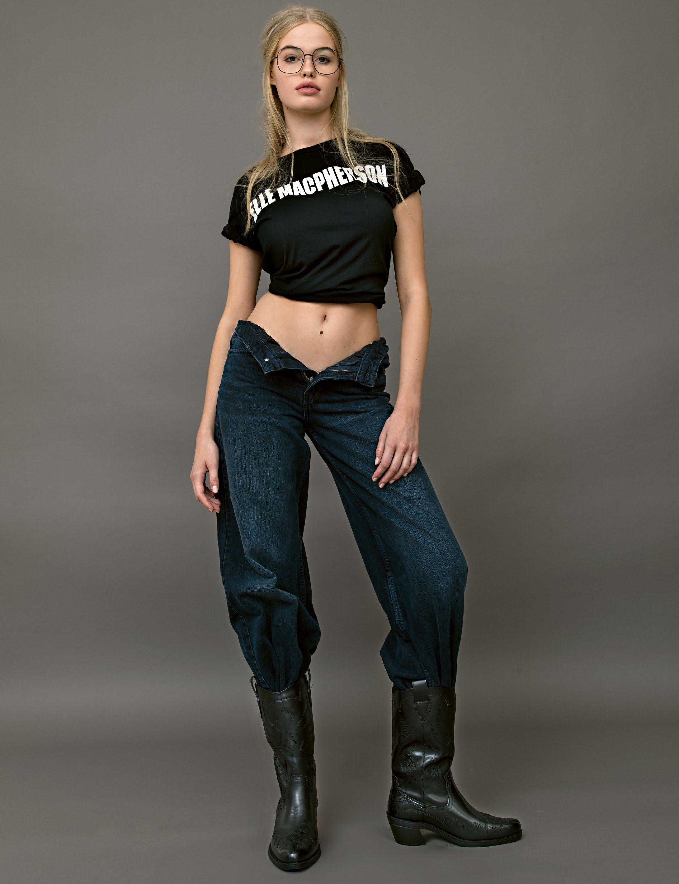
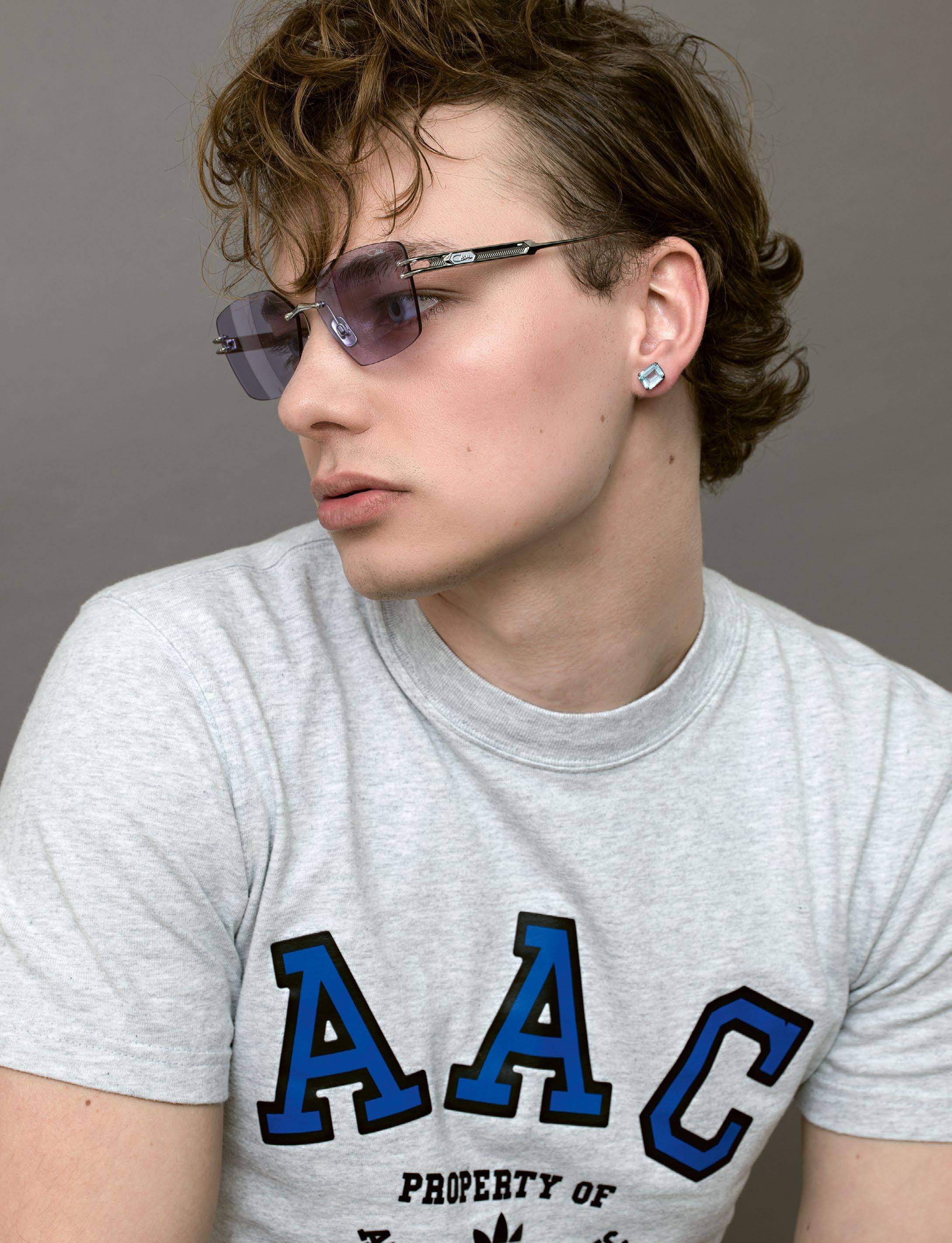
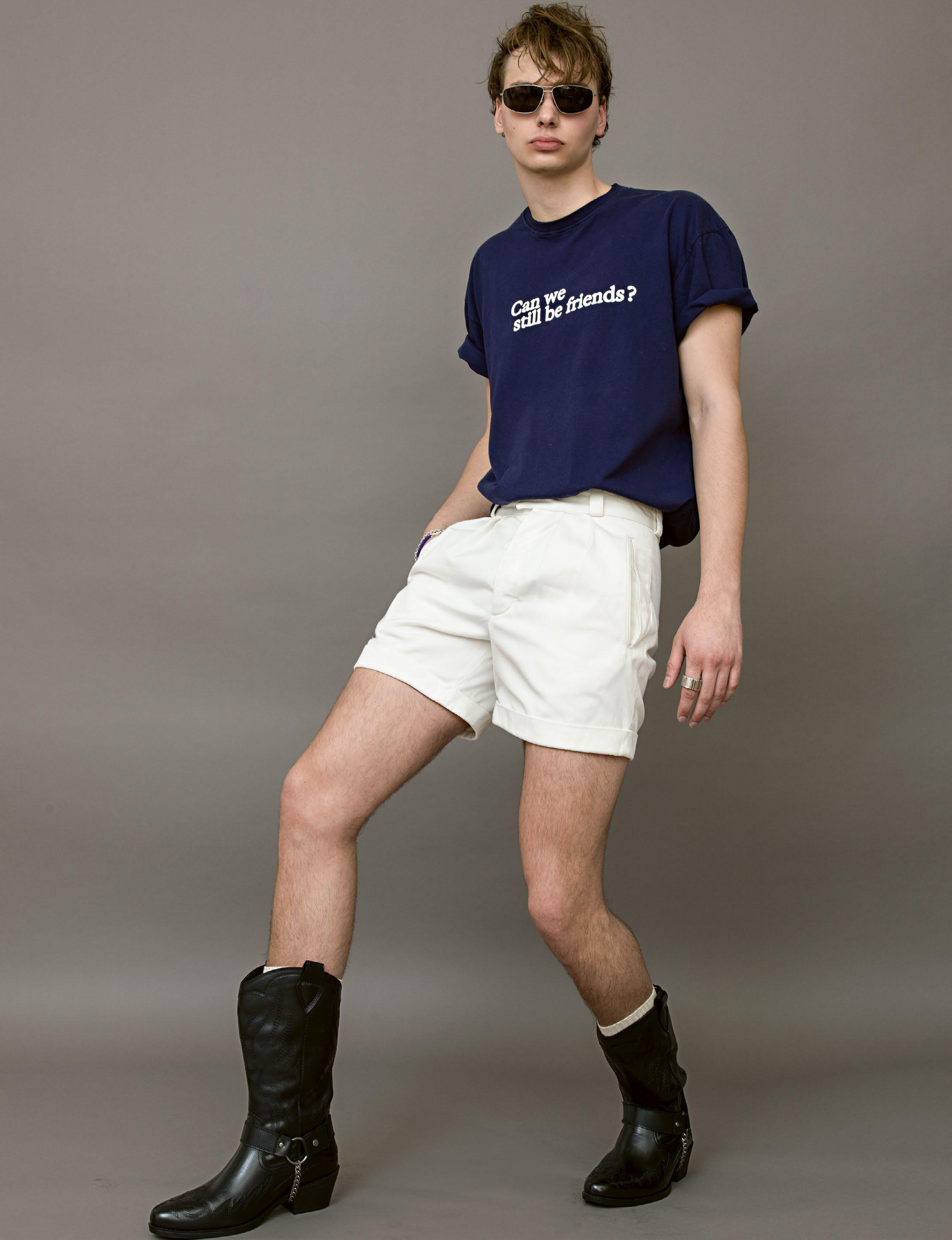
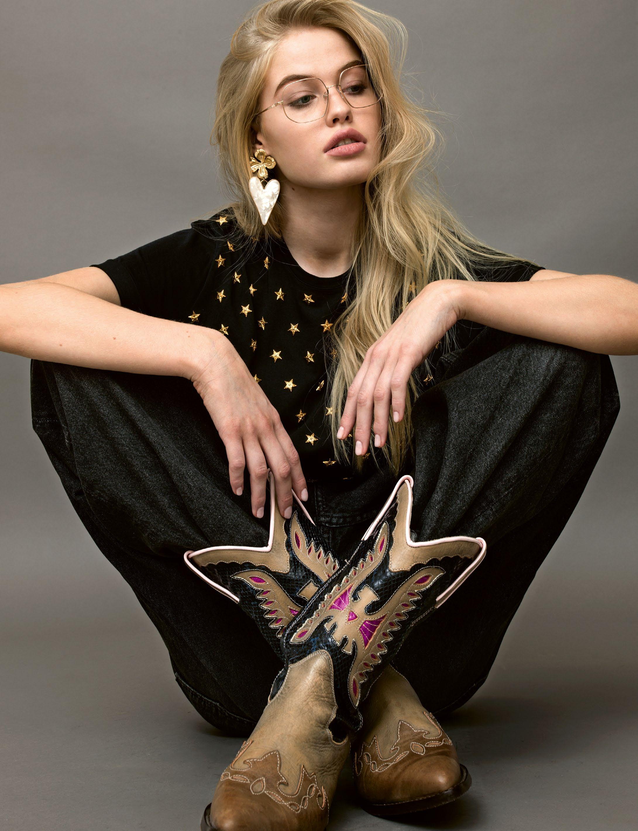
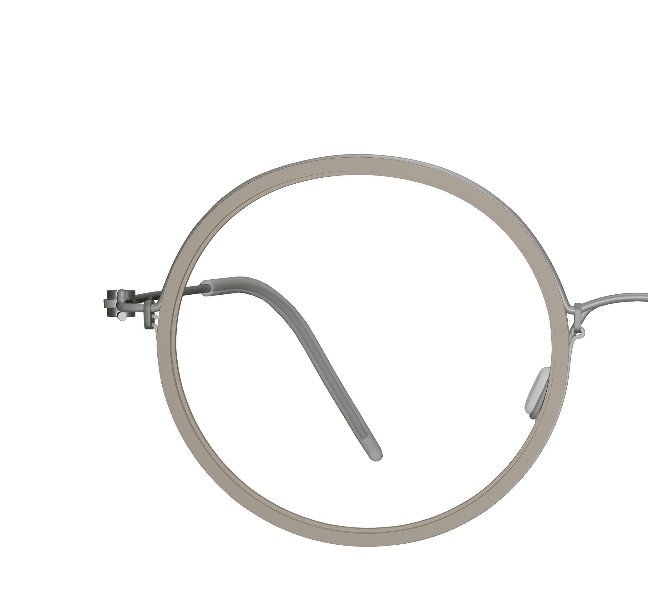
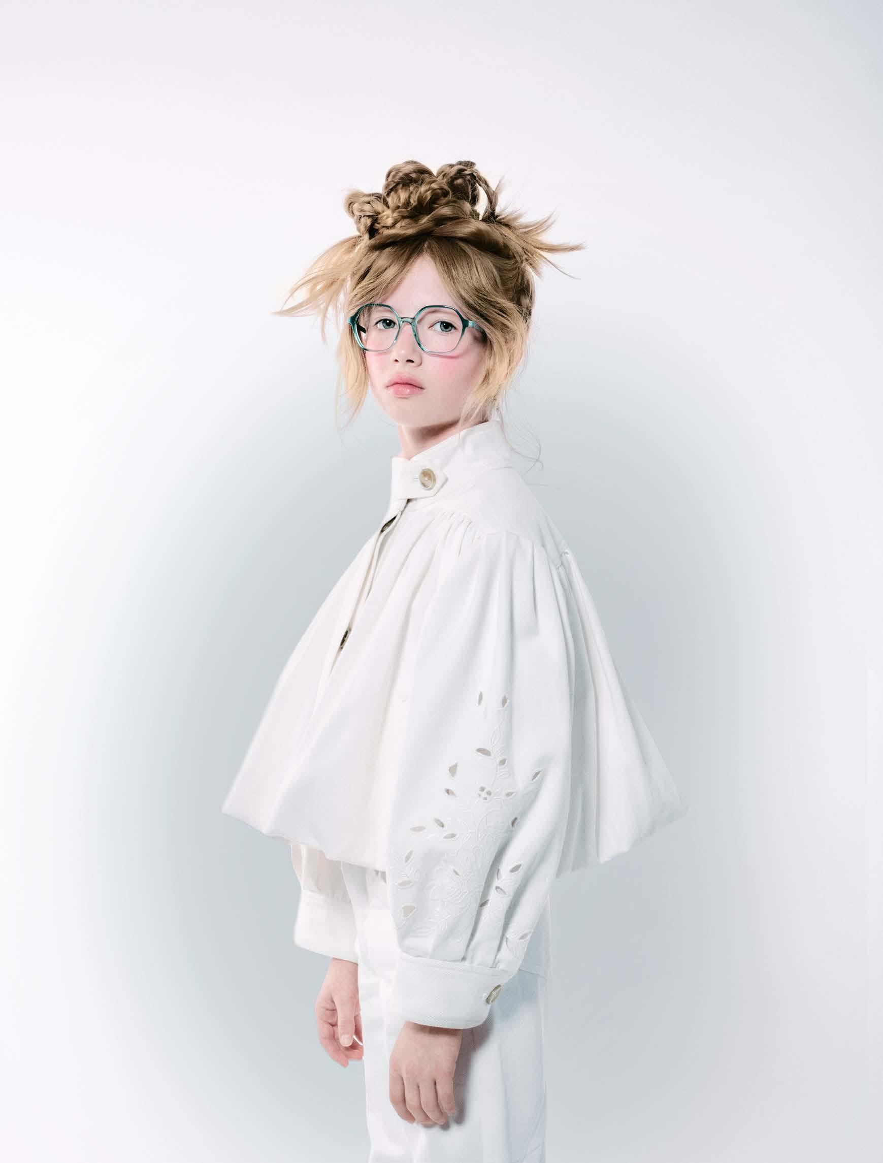
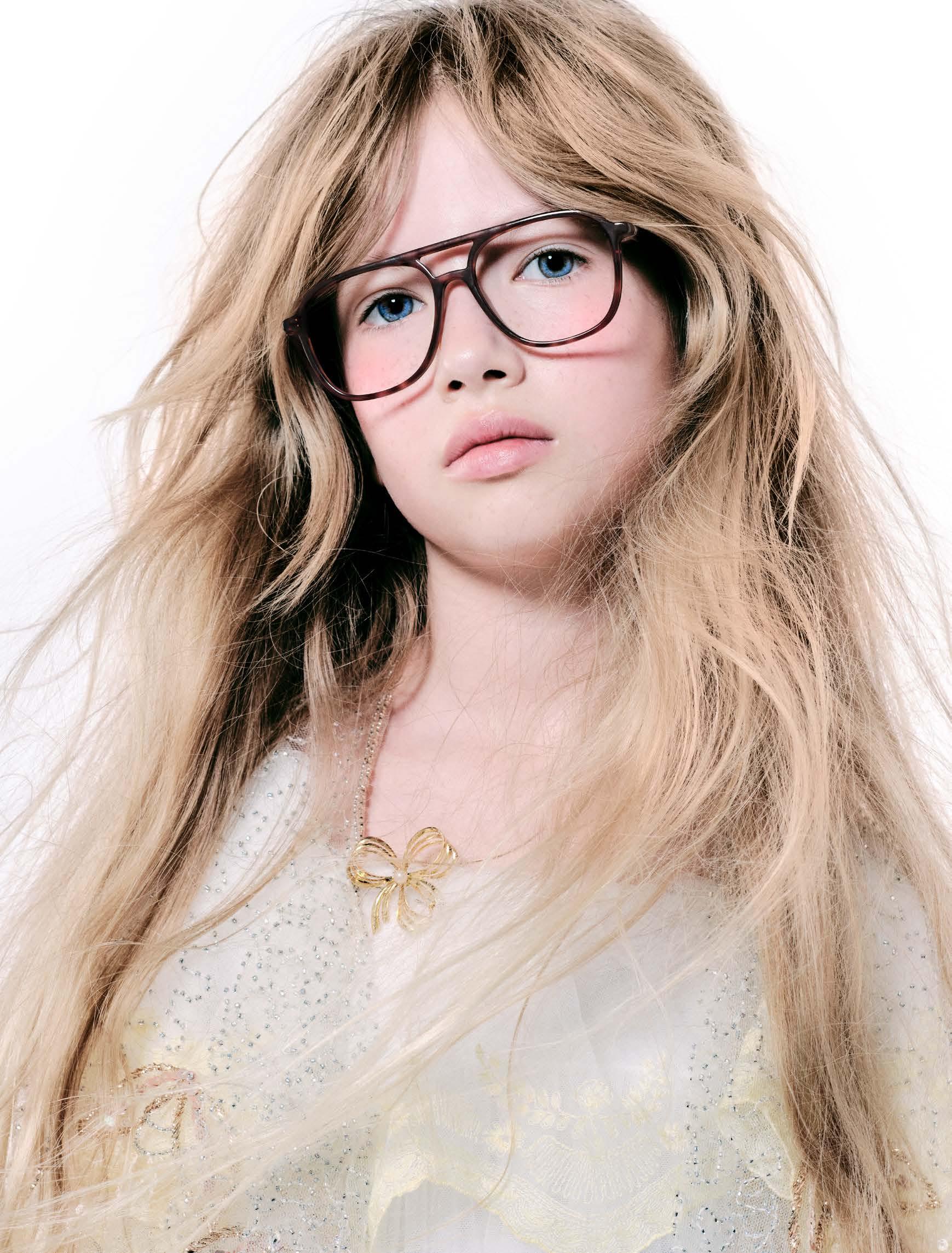
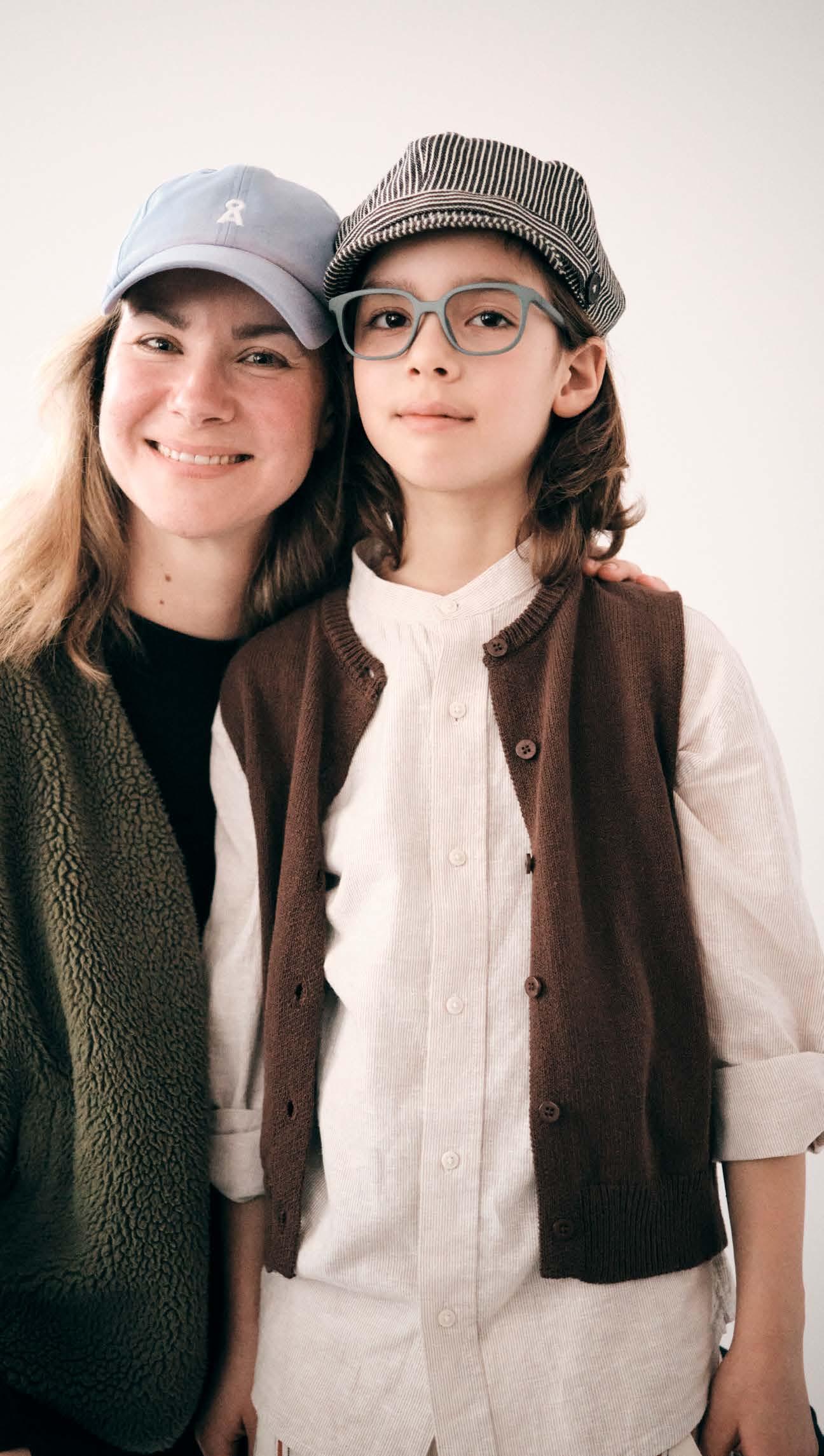
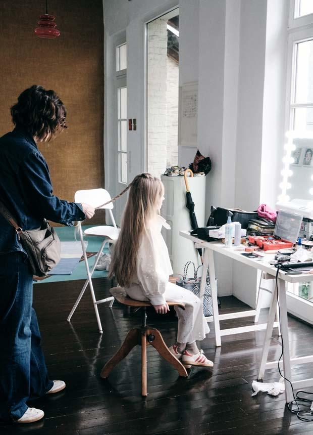
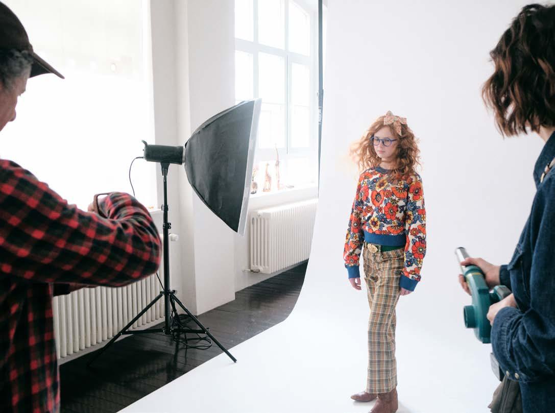
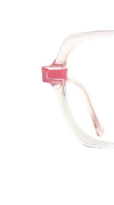
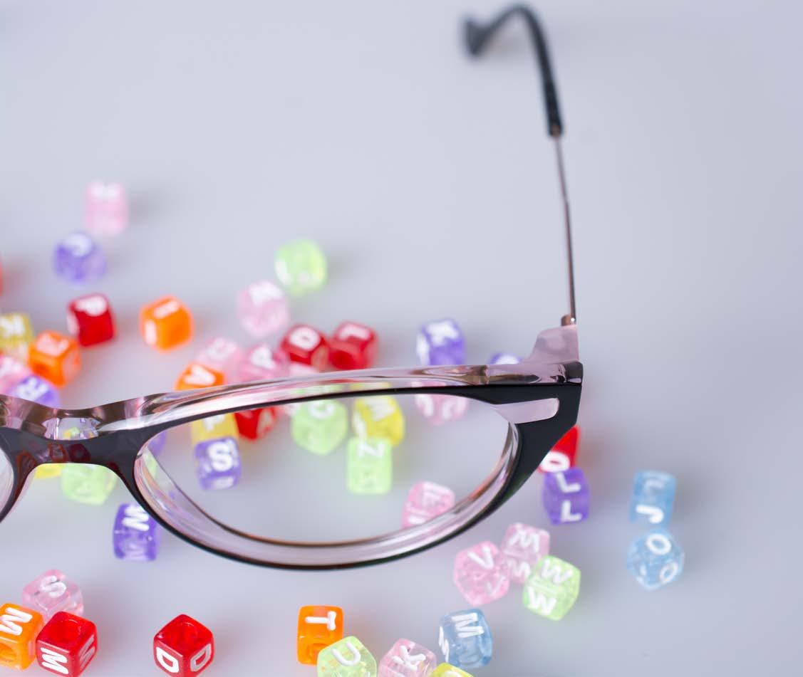
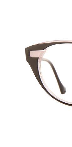
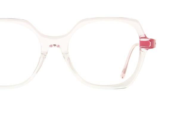
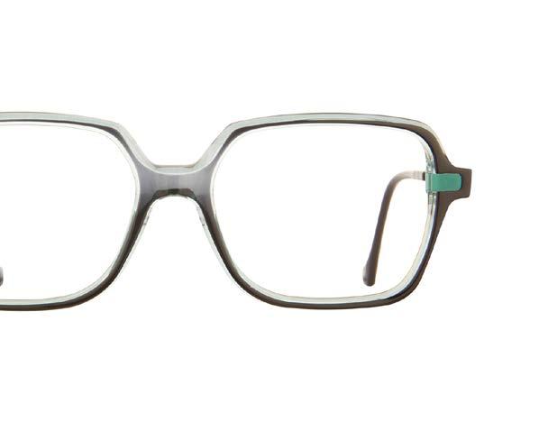
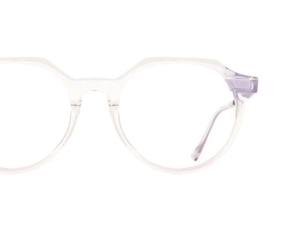
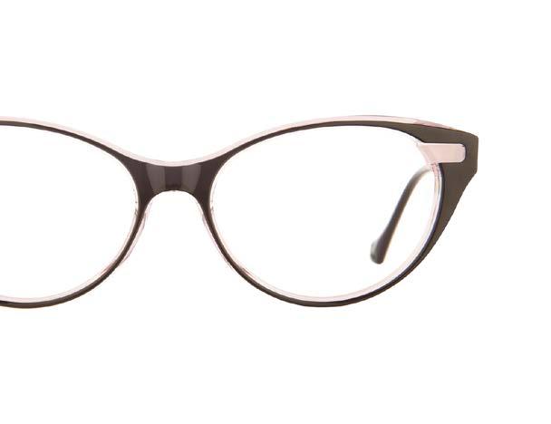
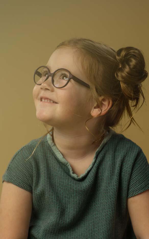
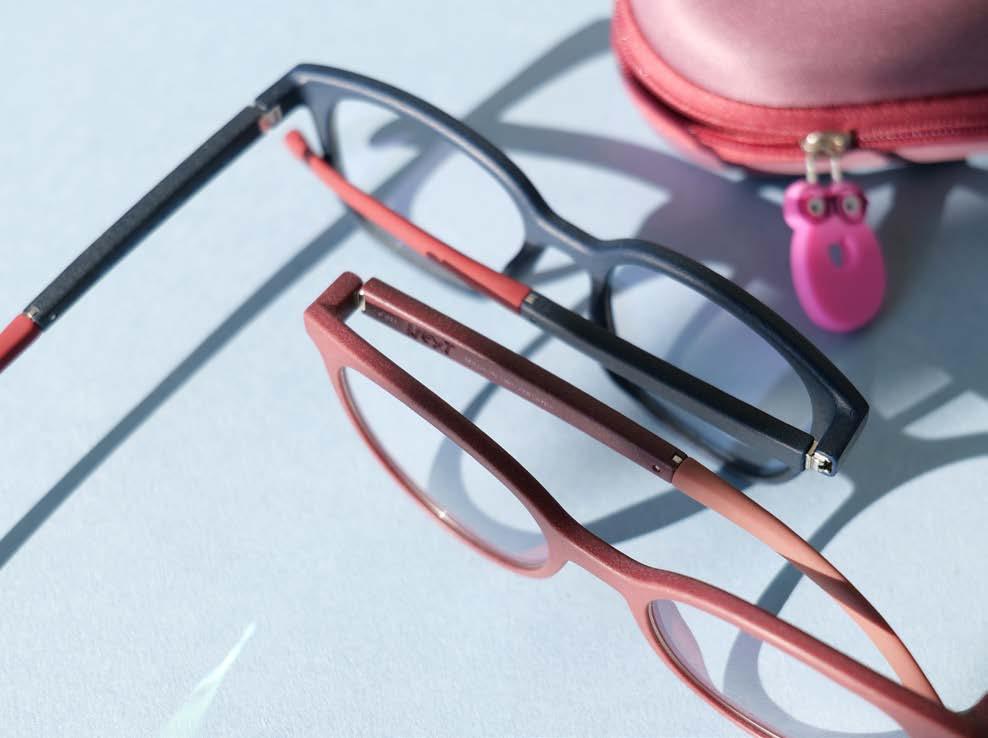
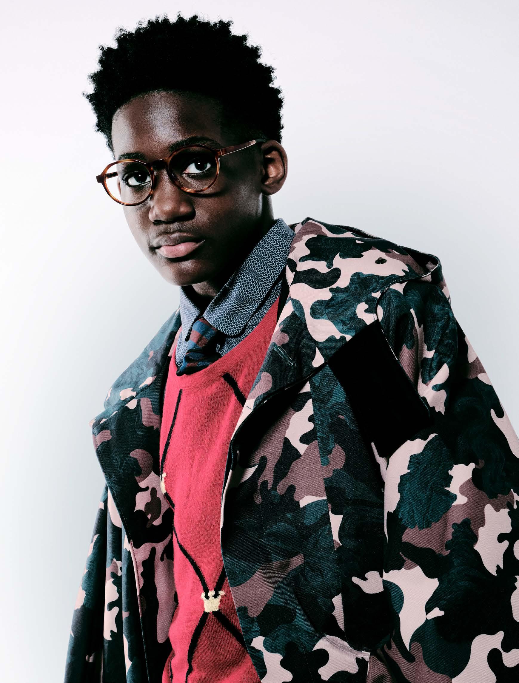
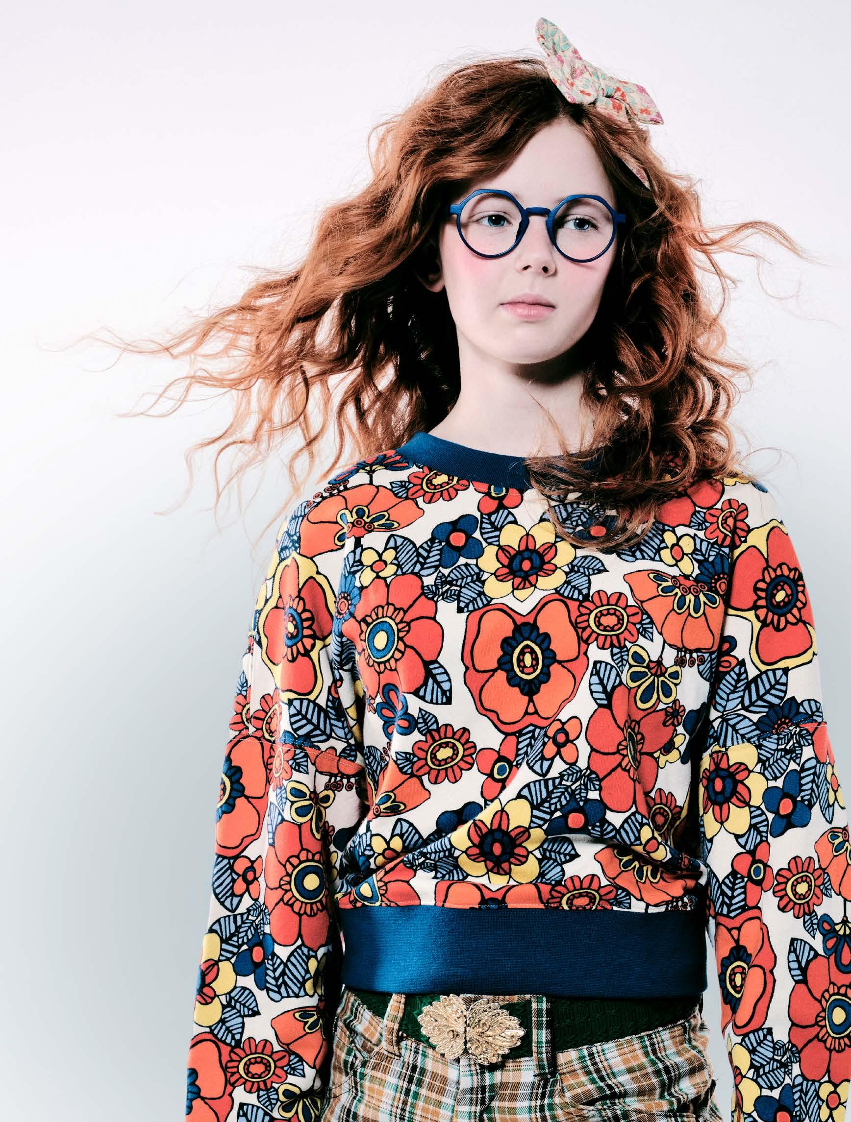
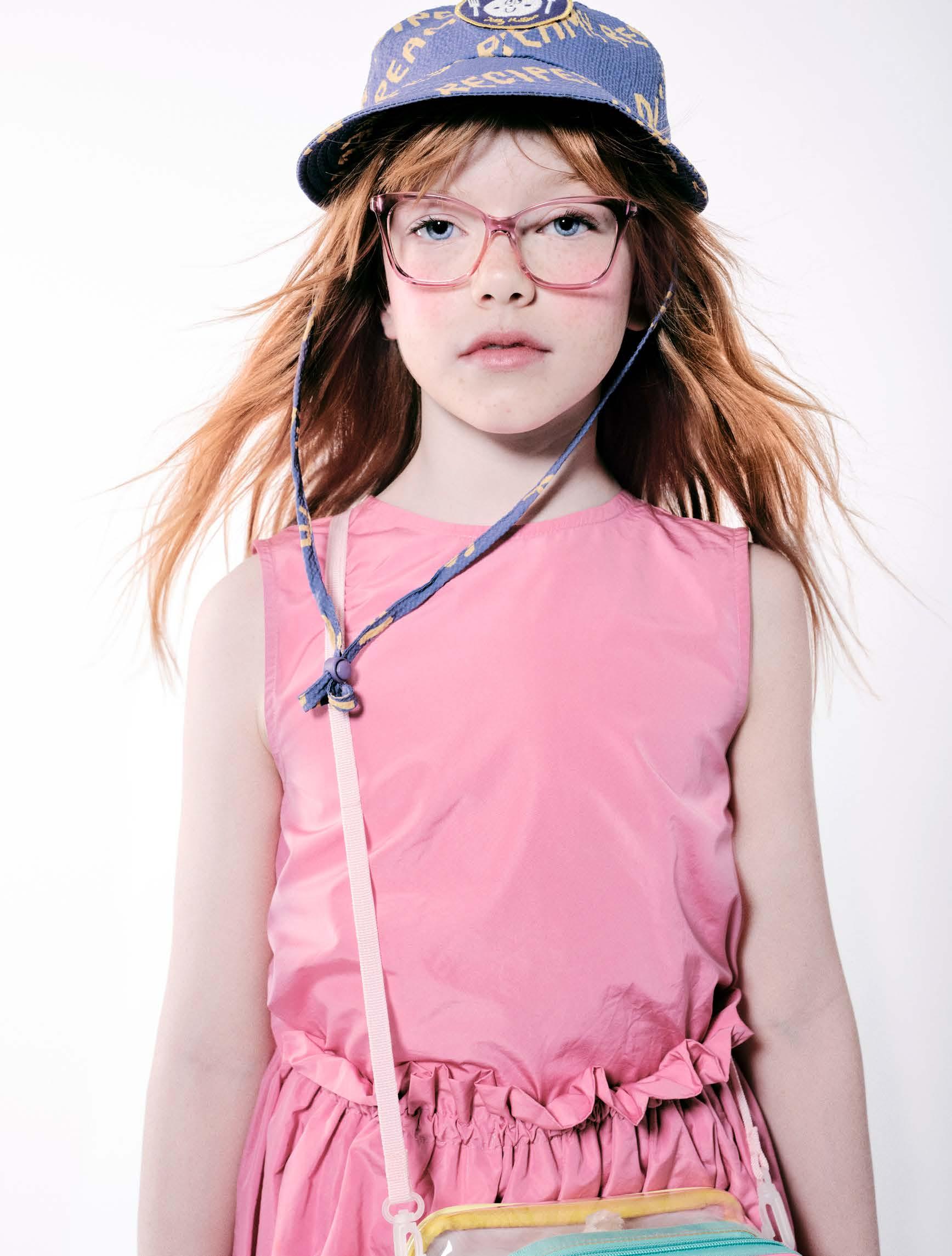
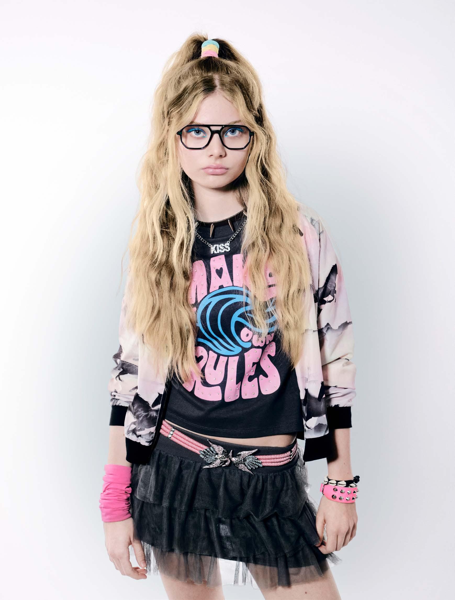
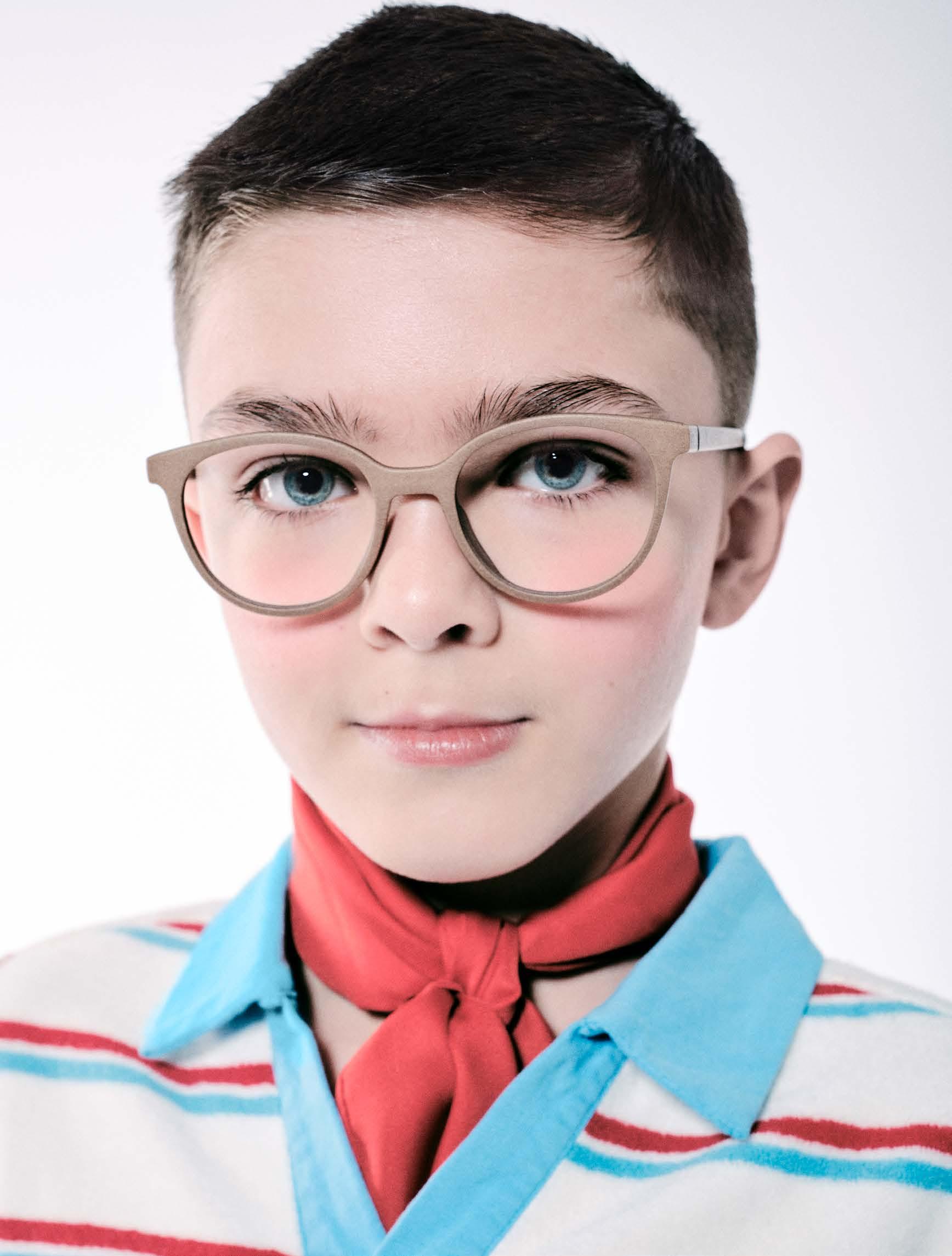
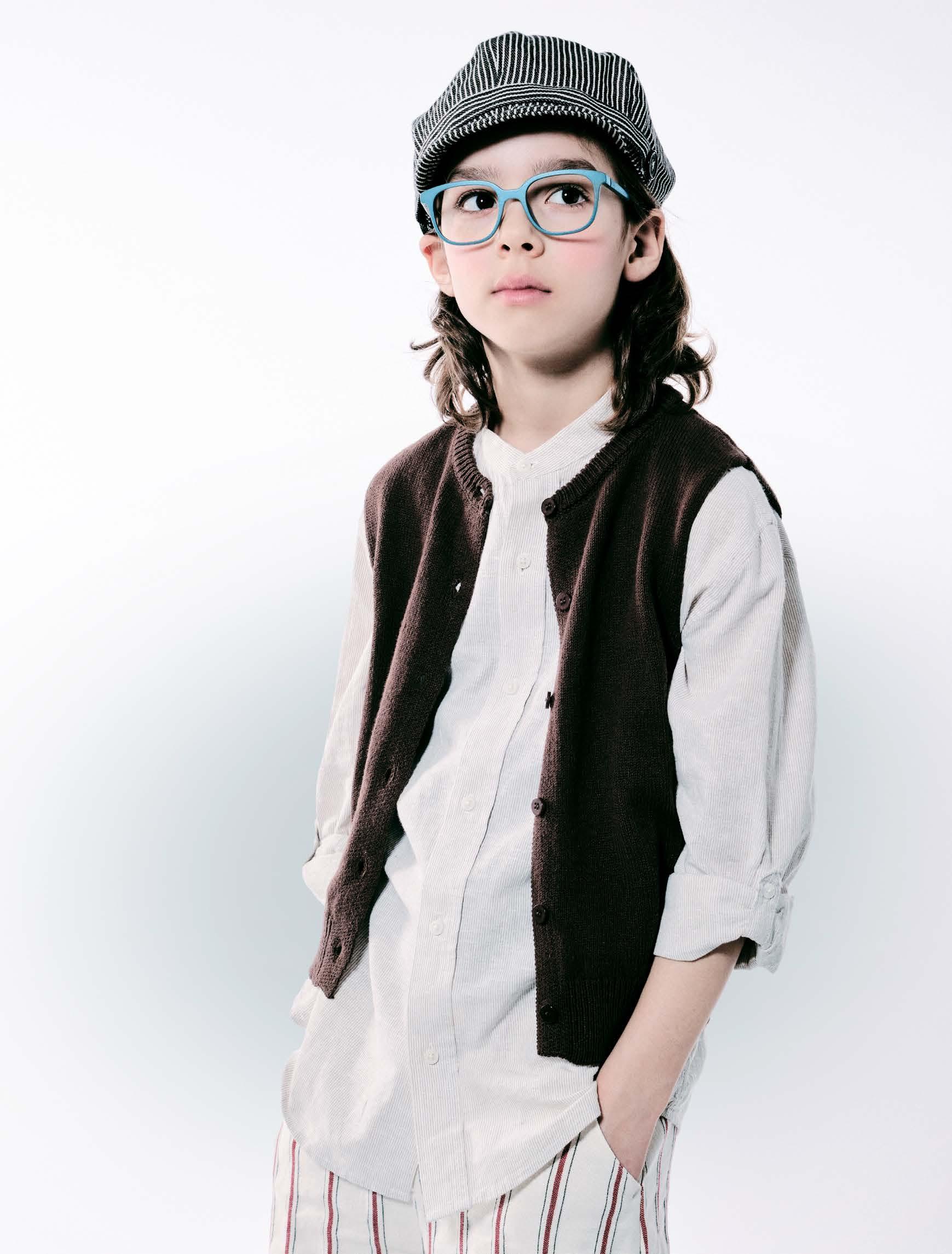
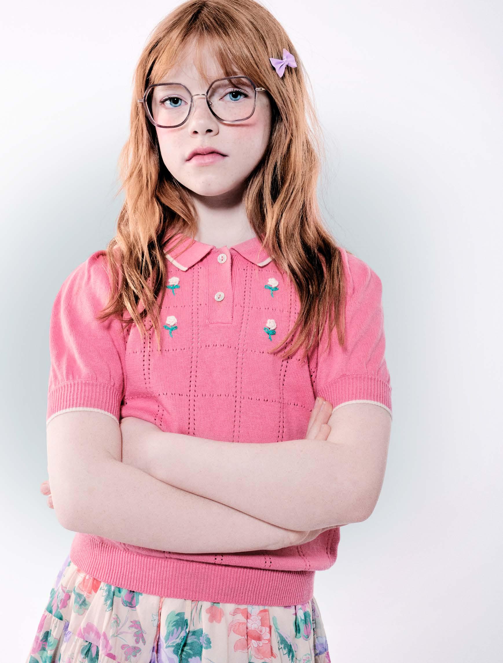
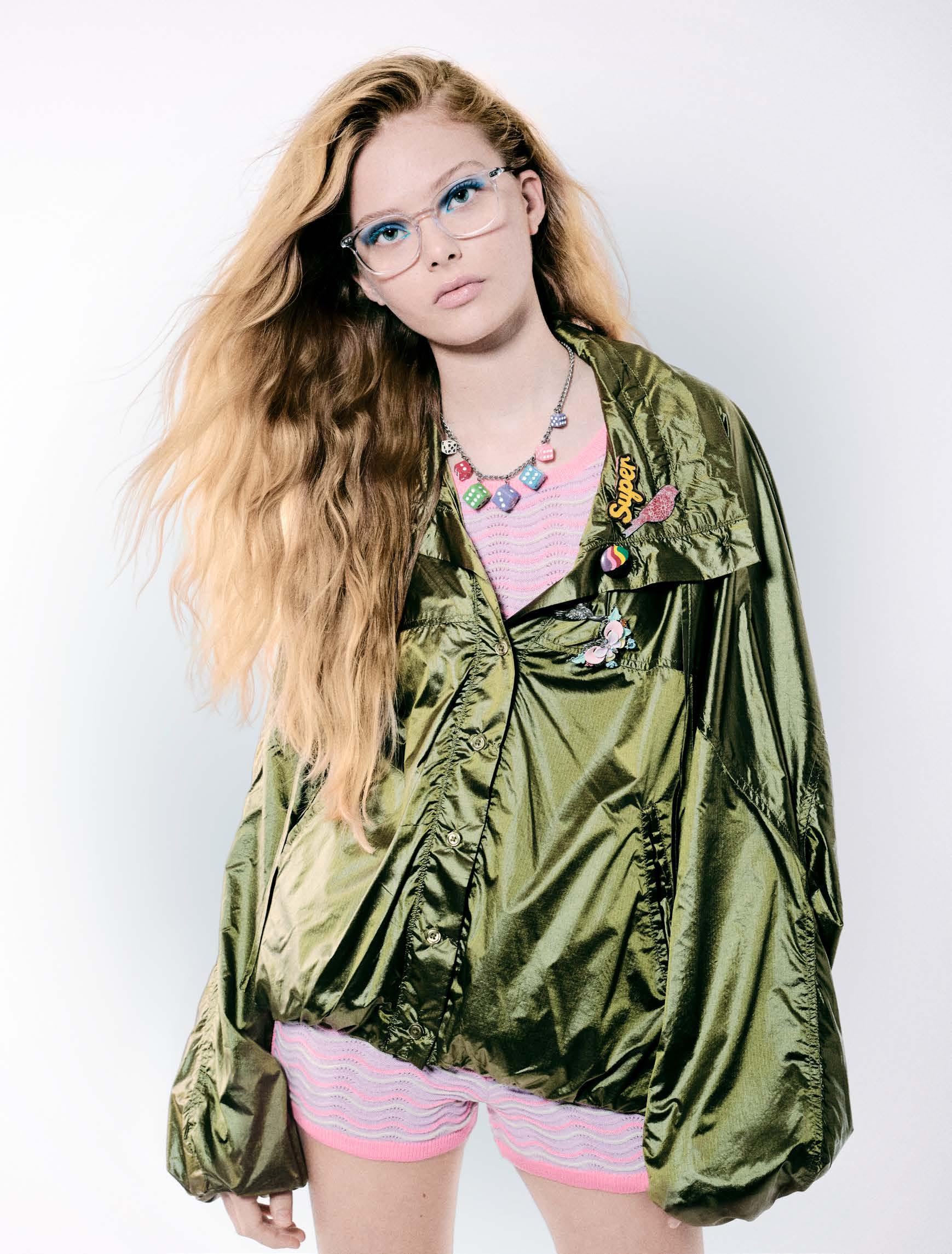
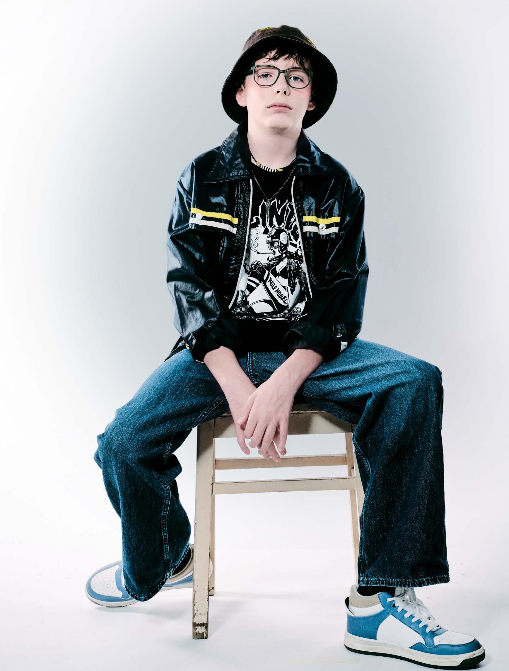
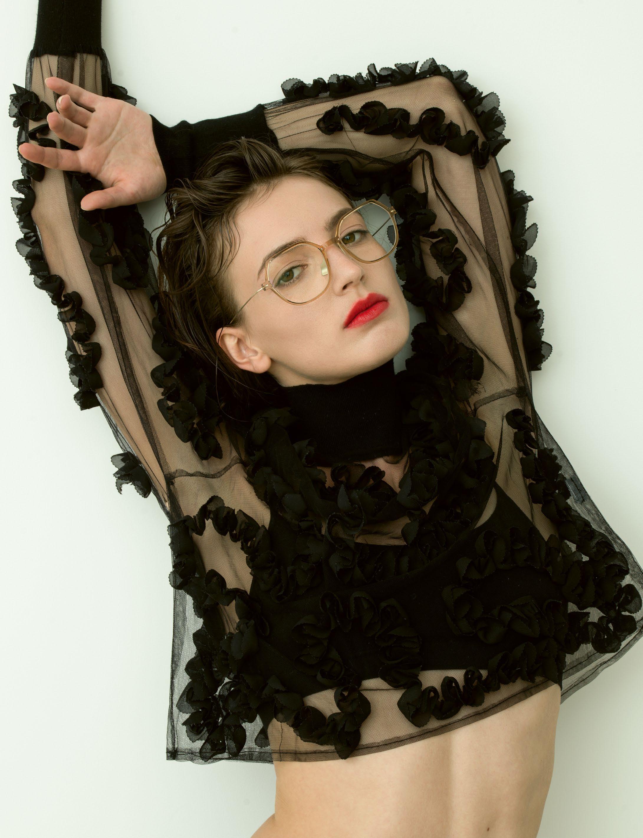
The photos for the new HEIMAT campaign were taken just a few steps away from our Hoffmann atelier in the Volcanic Eifel. There, surrounded by tranquillity, nature and tradition, our passionate artisans craft each pair of glasses in over 280 single steps. From this special place, each of our unique Hoffmann masterpieces find their way out into the world.
HOFFMANN-EYEWEAR.COM
The Right Frame Changes Everything Independent. Swiss. Since 2008
EXCELLENTLY CRAFTED IN ACETATE
A crown for your eyes.
BLACKFIN
Vitra »F1-D1«
EDITOR IN CHIEF
STEFAN DONGUS [Cologne] dongus@spectr-magazine.com m: +49.(0)151.14271817
LAYOUT
CARO ROSS [Cologne] ross@spectr-magazine.com
EDITORIAL STAFF
LINDA KRIEG [Cologne] l.krieg@spectr-magazine.com
HOLGER VON KROSIGK [Cologne] krosigk@spectr-magazine.com
PROOFREADING
PETER ASHFORD [London]
INSA MUTH [Dortmund]
ONLINE EDITOR
CARO ROSS [Cologne] online@spectr-magazine.com
PHOTOGRAPHERS & PRODUCERS
JOANA CLARO [Hamburg]
MERT DÜRÜMOGLU [Dusseldorf]
FELI & PEPITA [Cologne]
ULRICH HARTMANN [Cape Town]
DAVOR JELUSIC [Barcelona]
SACHA TASSILO HÖCHSTETTER [Munich]
ESTELLE KLAWITTER [Dusseldorf]
NARÈNTE [Sardinia]
Impr— –int
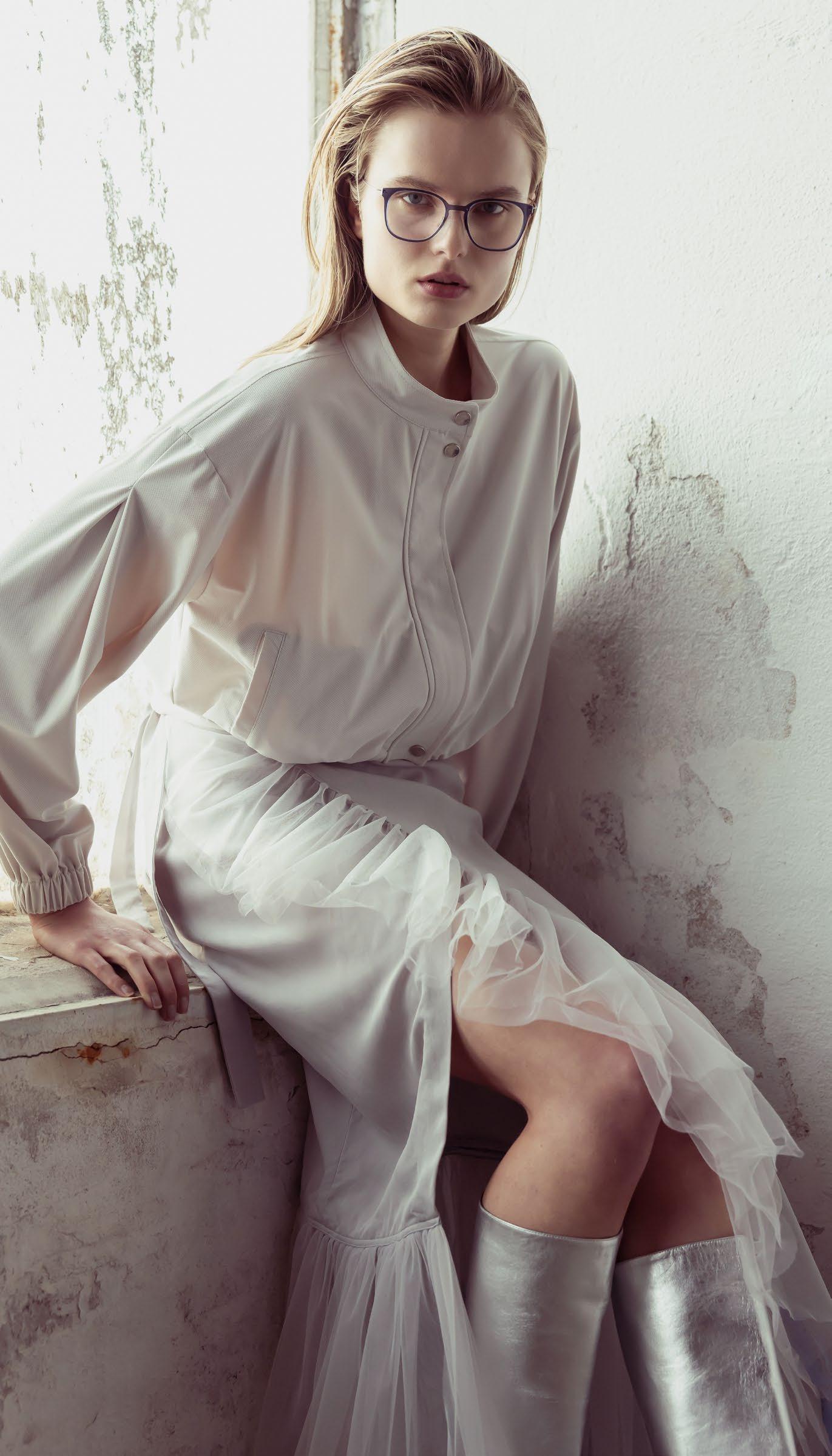
photography : TANJA TREMEL [Hamburg]
hair & make-up : SABINE WICKER at LIGA NORD
fashion editor : JOANA CLARO
assisted by GRACYELA BECKER
model : ALICA JOHANNA at MODEL MANAGEMENT
SPECTR is published three times per year. This magazine and all its contents may not be re-used, distributed or stored in electronic databases in any way without prior written permission from the publishers. All inquiries regarding the usage of copyrighted materials, as well as the reproduction of excerpts in other formats must be directed to the publishers. The opinions reflected in this magazine do not necessarily reflect those of the publishers. All rights reserved.
THE LENS OF TIME Mert Dürümoglu – 15 Years Shaping a Visual Language
OF KOBERG Industrial Poetry [BY OLIVER SPIES]
70 s POWER IN MODERN LIGHTNESS
SILHOUETTE Iconic Shades
MARC O’POLO –THE ART OF CLARITY Spring/Summer 2026 Collection 148
SHARP AFTER DARK Munich Concrete Vision [BY SACHA TASSILO HÖCHSTETTER]
THE SHAPE OF LIGHT
The Vitra Collection Explores the Sculptural Elegance of Ultralight Titanium
[BY ESTELLE KLAWITTER] 90 THE PURSUIT OF LIGHTNESS
BLACKFIN’s Nicola Del Din on Innovation and the Art of Lightweight Eyewear
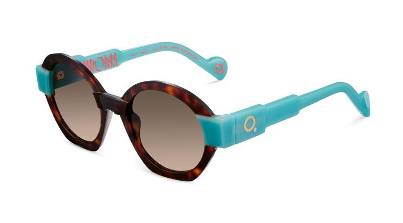
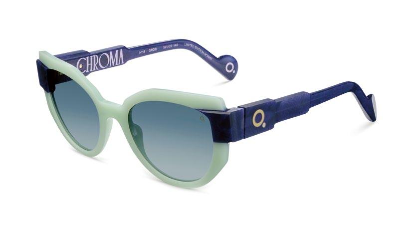
ETNIA BARCELONA CHROM A The Art of Color
SILHOUETTE –TITANIUM IN DIALOGUE
The Guggenheim Partnership and the New Era of Titanium Eyewear
GÖTTI – HAUTE CONTOUR
Sculptural Acetate –Precision in Every Line
RUNWAY The Real Front Row: Berlin
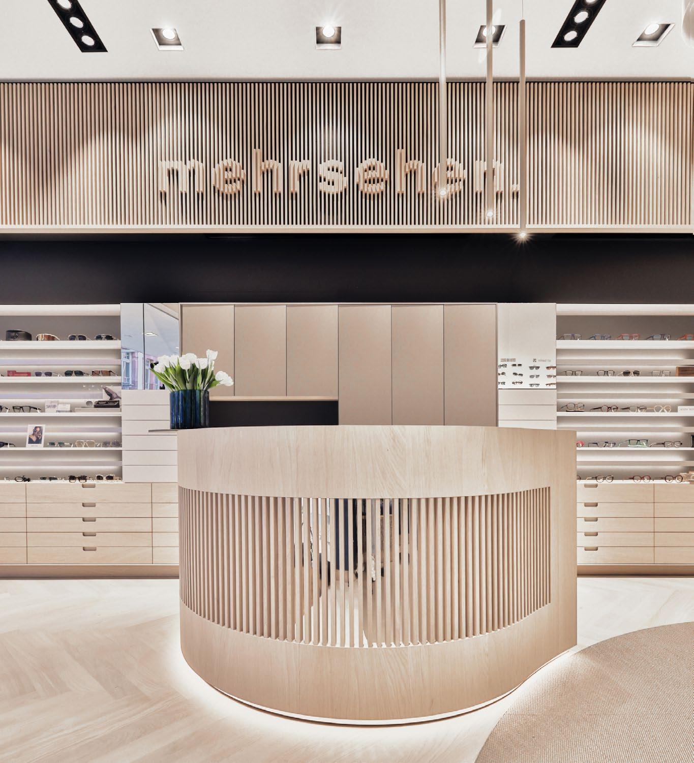
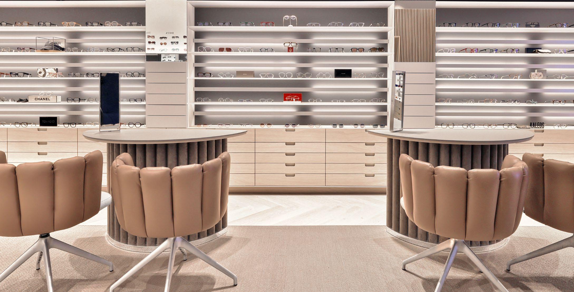
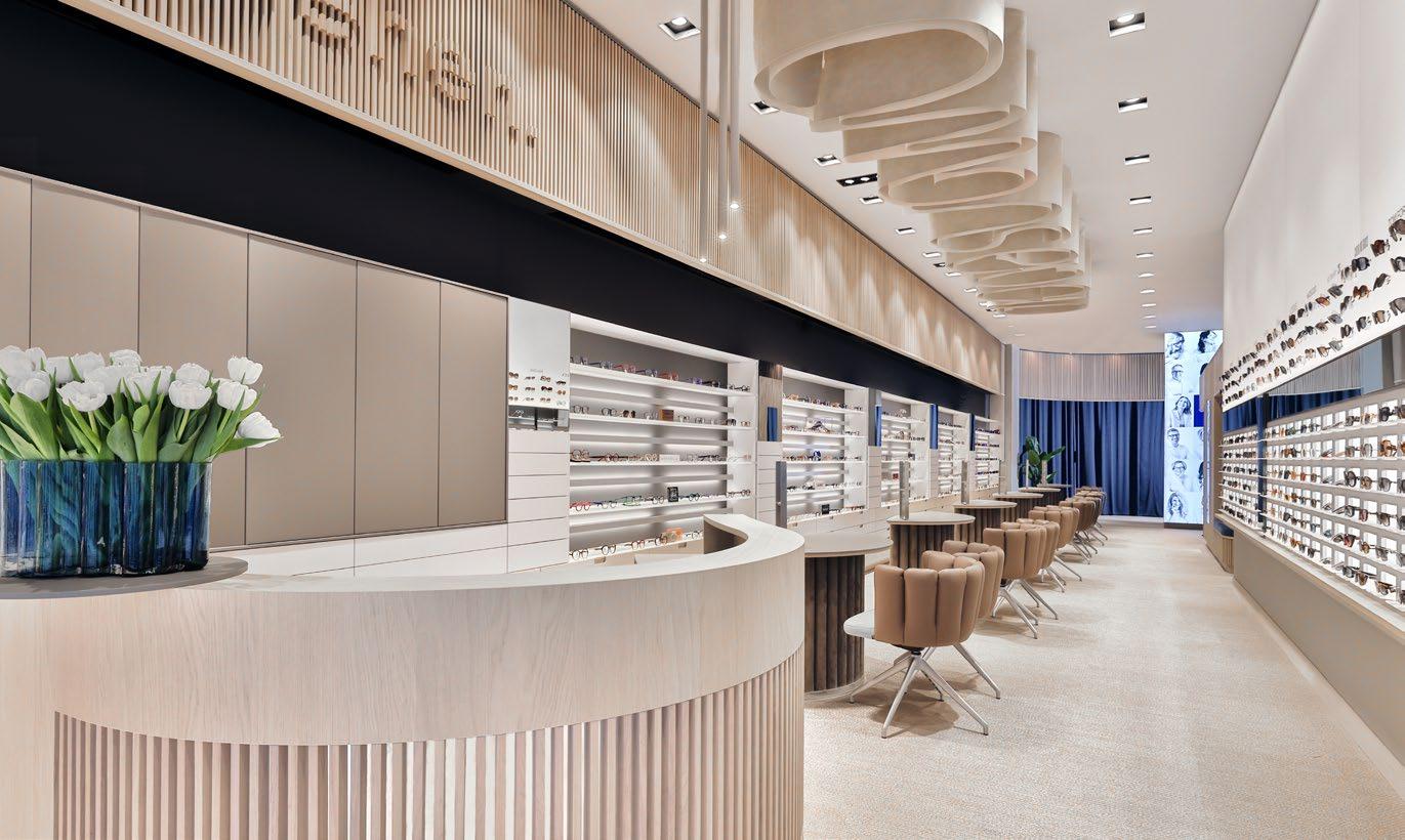
A TOP ADDRESS WITH DEPTH OF VISION AMON mehrsehen in Aschaffenburg 166
CAN WE STILL BE FRIENDS? Urban Aesthetic
[BY ESTELLE KLAWITTER]
INSERTS:
SPECTR YOUNG FACES THE NEW WORLD OF KIDS’ EYEWEAR
SMART CONTENT MODULES INTELLIGENT AUTOMATION FOR OPTICIAN WEBSITES
Luxury Eyewear from Optik Augustin [BY MERT
CALMA BRUTA Modern Styles [BY YULIA PLAKHOTNIKOVA]
Wel— –come to #47
The present is no longer a fixed place. It is a state in transition. Between analogue and digital. Between craft and high-tech. Between identity and staging. Between real and artificial intelligence.
It seems as if things have learned to resist definition. As if they exist, for a moment, in multiple states at once – fluid, layered, open to interpretation. “Only in the eye of the observer do they resolve into form.” – a quiet nod to Schrödinger.
Design moves within this very state of suspension. Eyewear can no longer be clearly placed. It is neither purely functional nor purely fashion. Neither distinctly retro nor distinctly futuristic. It references, shifts, overlaps. Forms emerge from influences that permeate one another, material combinations unite apparent opposites into something new.
The result is not either-or, but a simultaneous coexistence. Possibilities replace certainties. In this in-between, a new aesthetic takes shape. One that is not defined by clear categories, but by the conscious embrace of contradiction. Perhaps that is the true luxury of our time: no longer being fixed. And so the most compelling question is no longer what something is, but what it can be – all at once.
A Manifesto of the In-between Twi— –light
styling & style consultant : JOANA CLARO hair & make-up : ISABEL PETERS at BIGOUDI models : FERIDA at CLAY MANAGEMENT & KRISTINA MOSTOVA at M4 MODEL MANAGEMENT thanks to BORSELSTUDIO.DE
ECHOES OF REAL— –ITY
FEMALE EYEWEAR — ARCHITECTURAL LIGHT STUDIES
Two women, one perspective. Style – in eyewear, in fashion, in the location itself. Or at least, that’s how it feels.
The setting: a modern property in the Mojave Desert near Palm Springs. A monochrome landscape, intense sunlight, warm surfaces, open glass, concrete holding the heat. Light shifts between hard and soft, shaped by the architecture, carving sharp lines into the space – the scene? Almost unreal. Or simply a precise version of itself.
The two protagonists move through this environment – calm, present, naturally connected to their surroundings. Their looks: modern eyewear, shifting between sunglasses and optical statements. Clean forms, strong designs, gaining definition in the light.
Featuring models from ANNE ET VALENTIN, EINSTOFFEN, HOFFMANN NATURAL EYEWEAR, KOBERG, MARKUS T, MASUNAGA, MOREL, SILHOUETTE, and YOU MAWO – a selection that brings together different perspectives without smoothing them out.
A production by Thomas Schmidt that plays with perception: between naturalness and construction, between intuition and concept. Or perhaps, in the end, exactly the other way around.
»Andros 2«trenchcoat & top NORMA
MOREL
»Zafora 4«top INTIMISSIMI blouse & OTHER STORIES skirt P SIDE
MOREL
KAMALI
ANNE ET VALENTIN
On«
blouse PSIDE pants MARC CAIN
ANNE ET VALENTIN »Veliska«
dress RALLEGRATI
bracelets NIJAMU
shoes MANGO
Two« -
SILHOUETTE »Dora
blouse & shorts PSIDE
blazer MARC CAIN
boots BIKKEMBERGS
T
MARKUS
»MIO P1055«dress BARBARA RIZZI
HOFFMANN NATURAL EYEWEAR
»358R H48«jacket FUCHS SCHMITT
skirt BARBARA RIZZI
HOFFMANN NATURAL EYEWEAR
»369R H10«dress BARBARA RIZZI
EINSTOFFEN »Voyante«top & skirt PSIDE
socks KUNERT
heels CHI MIHARA
YOU MAWO »Vema«jacket MASSIMO DUTTI turtleneck & pants MM6 MAISON MARGIELA
MASUNAGA since 1905
»Pizzicato«outfit RALLEGRATI
LOOK »10988«
Look: Essence Of Light —ness
Rimless Minimalism
–Essential Design
photography & casting : NARÈNTE // LUCIO ARU + FRANCO ERRE
hair & make-up : DANIELA DESSÌ
models : DESERT C & ALINA at LA REPRESENTS
Sometimes the greatest impact emerges through radical reduction. This is exactly the principle behind the new rimless 10980 series by LOOK – a collection that brings design back to its most essential form and places vision at the center. Eight lens shapes and eight precisely coordinated colors define a series that understands minimalism not only as a style, but as a philosophy.
For our Collection Shoot, the creative duo Narènte once again staged the new series in Sardinia — a home game for the experienced SPECTR photographers. In familiar surroundings, images of almost spherical elegance were created. The dynamic motion effects form a perfect setting for the ultra-fine constructions of the frames – making their lightness appear even more striking.
In fact, with the 10980 series, almost every technical element seems to visually disappear. The lenses are mounted using a precise pressure system, while the ultra-light XINOX structure enables a total weight of just 3.73 grams. Screwless hinges, hypoallergenic materials, and phthalate-free nose pads underline the uncompromising commitment to comfort and technical perfection.
LOOK
»10985«
»10982«
»10981«
LOOK »10984«
The combination of clear construction, carefully curated colors, and different lens shapes also opens up a wide range of possibilities for individualization. Each frame thus becomes a subtle statement for those who do not see design as decoration – but as a precisely composed essence.
The series is manufactured entirely in Italy, in the historic eyewear district of Belluno. It is here, where craftsmanship, innovation, and design culture have merged for generations, that a collection emerges which elevates minimalism to a new form of luxury.
lookocchiali.it
LOOK
»10983«
»10986«
»10987«
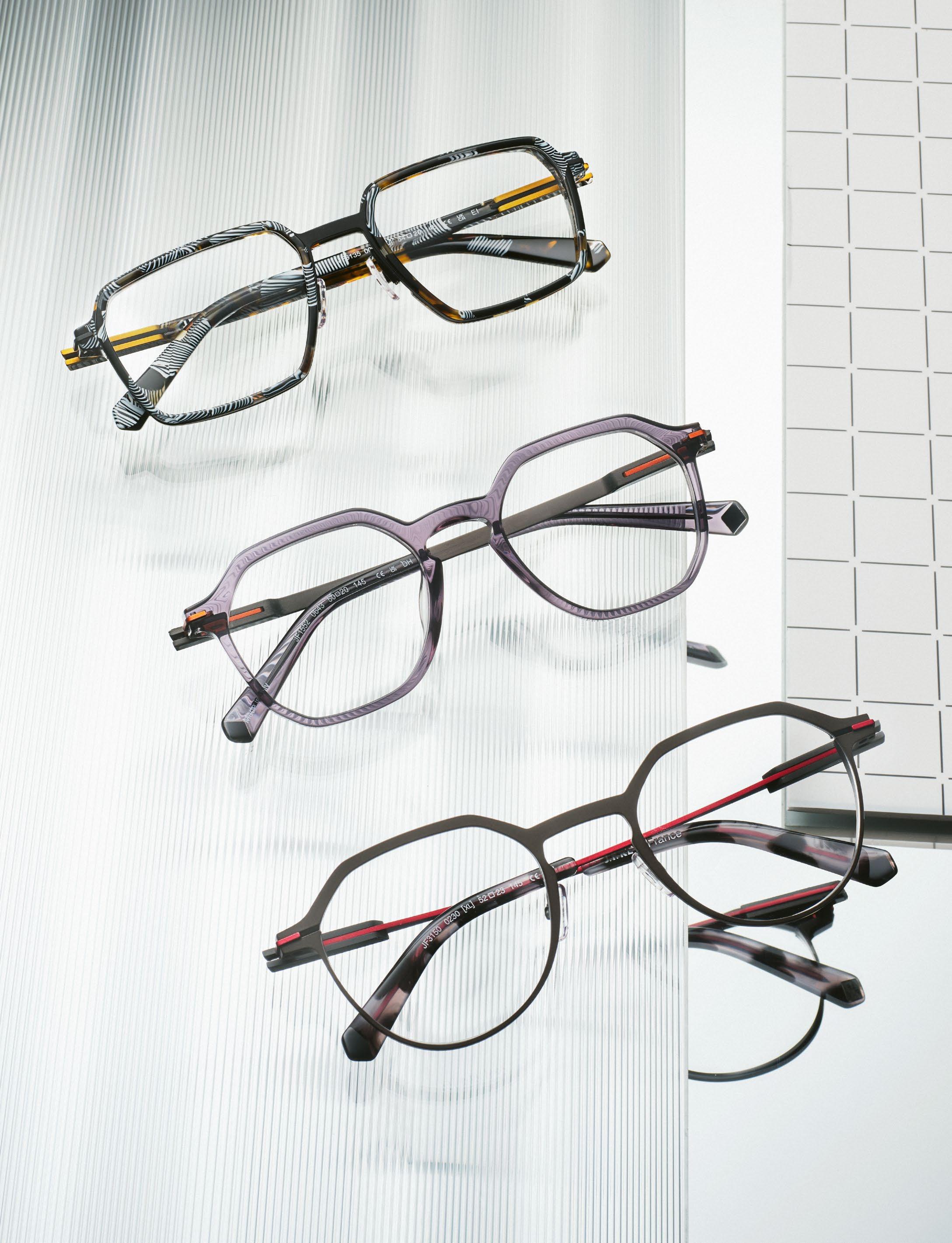
J.F. REY »JF3151«
»JF3122«
»JF3123«
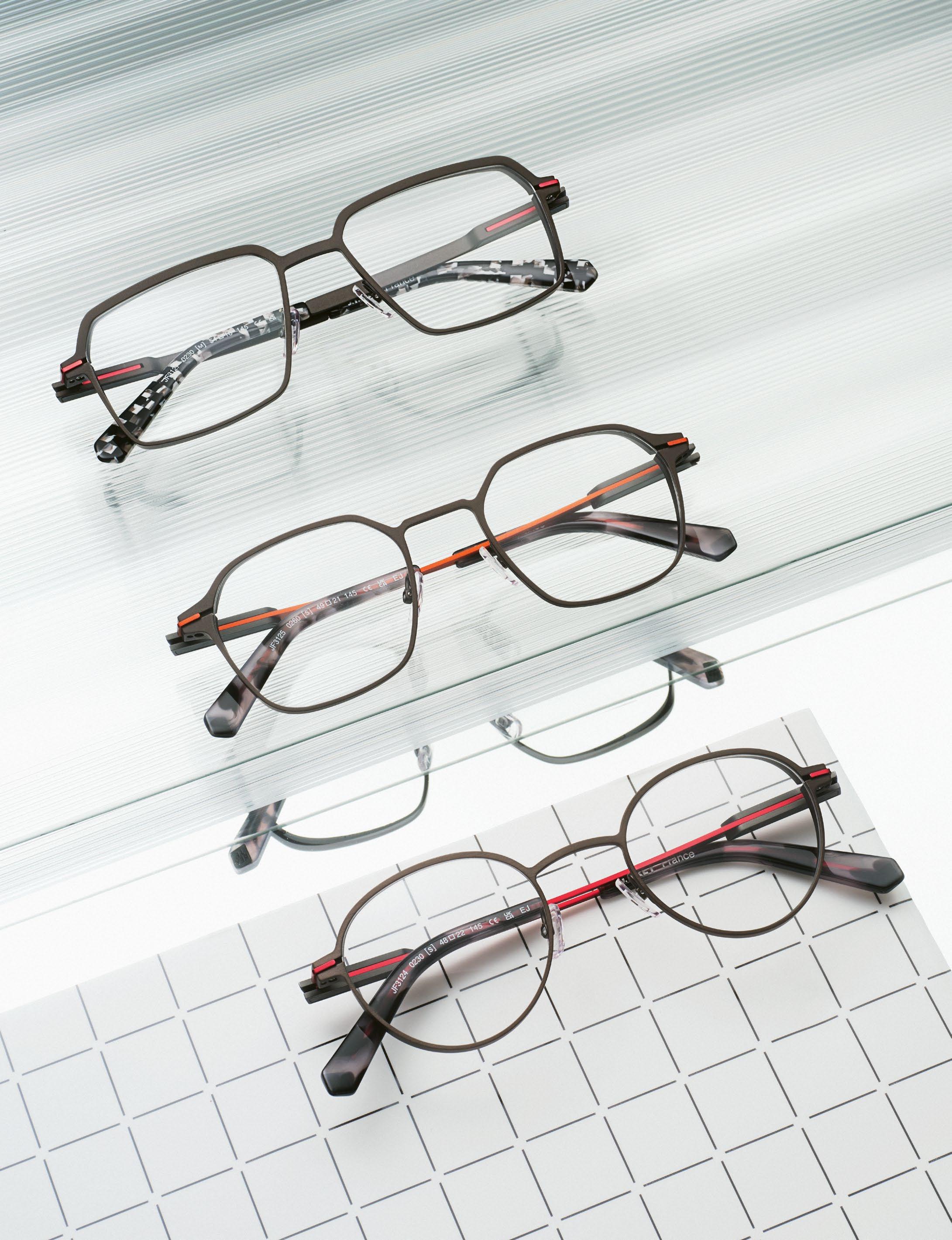
J.F.REY Sledge–The modern Flex Hinge
Where Mechanics become Aesthetic
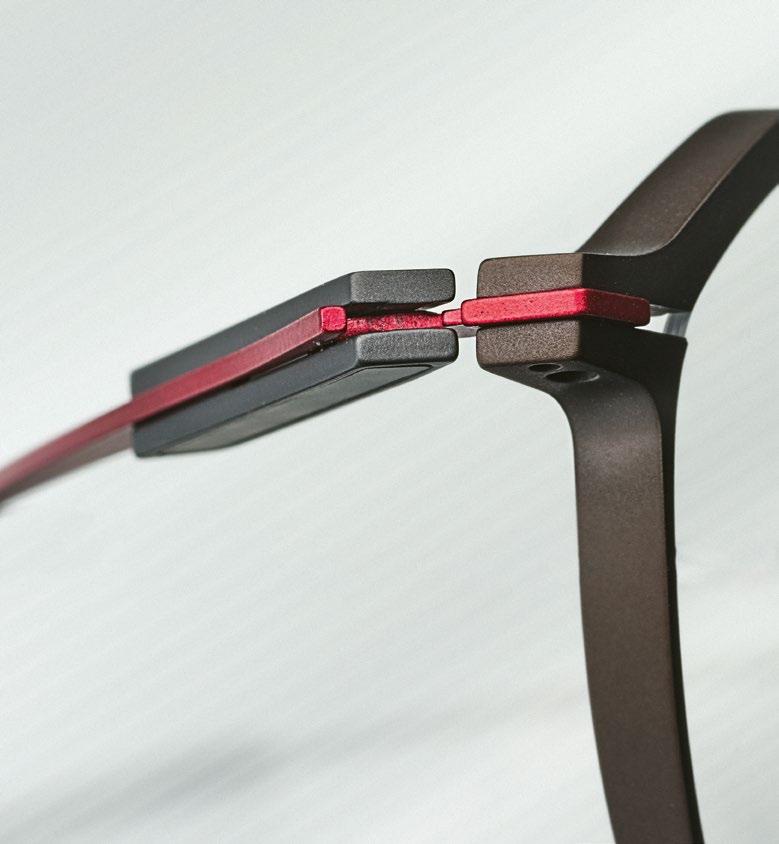
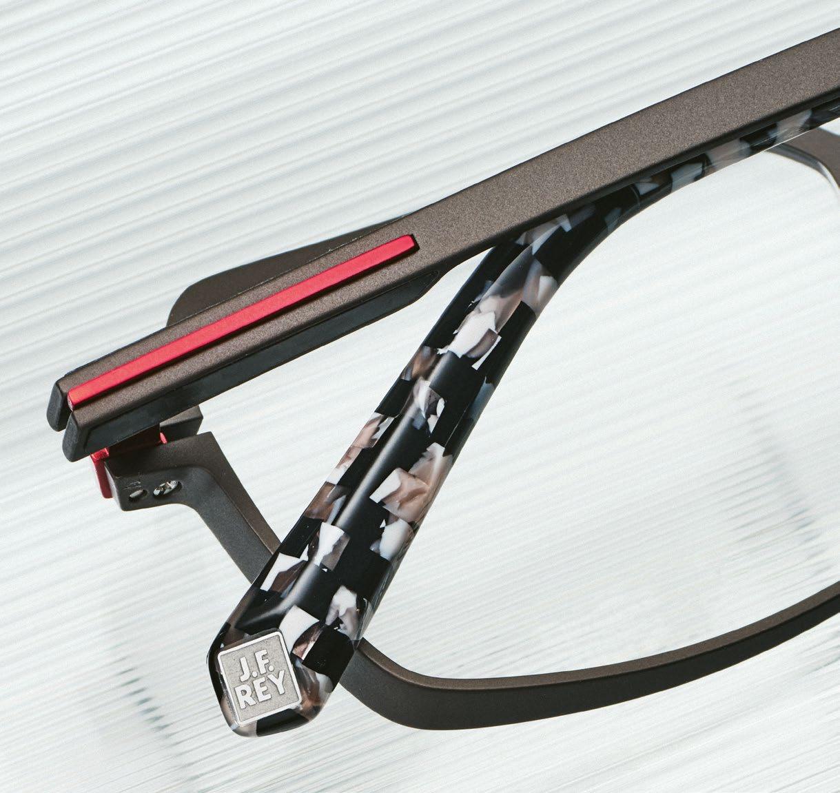
With the SLEDGE collection, J.F. REY translates its uncompromising design DNA into a new realm of technical sophistication. At its core lies an element typically hidden from view: the hinge. Reimagined as an aesthetic leitmotif, it becomes a defining feature of the design language. The patented, screwless SLEDGE flex technology is seamlessly integrated into the temple, combining controlled movement with architectural precision.
The collection explores a compelling duality – titanium and acetate, high-tech innovation and sensual tactility. Grade 5 titanium, renowned in aerospace and medical engineering, meets plant-based acetate and carbon fiber. The result is a refined material composition that balances lightness, durability, and a smooth, satin finish.
Whether expressed through pure titanium constructions, striking combinations of titanium and acetate, or acetate fronts paired with high-performance metal temples, SLEDGE transcends the notion of a conventional collection. It is a manifesto of innovation as an aesthetic language – precisely engineered, built to endure, and shaped with the subtle radicalism synonymous with J.F. REY
We spoke with the design team behind the French premium brand about the vision and technology driving SLEDGE
ORIGIN & VISION
The SLEDGE collection is strongly defined by its innovative hinge technology. What was the original impulse behind the development of this patented flex solution?
The hinge is the most stressed element of eyewear, and we saw it as an opportunity to explore a fresh design perspective. With SLEDGE, we went even further, as we succeeded in turning technology into both a structuring element of the design and a distinctive visual signature of the collection. The hinge design and its mechanism are under international patent. At the beginning, was it more of a technical challenge or a design vision?
It wasn’t a matter of choosing between a technical challenge or a design vision – both emerged simultaneously and fed into each other from the very start. Rather than compromising one for the other, the project evolved through a constant dialogue between technical performance and design aesthetics, each shaping and elevating the other. What strategic significance does SLEDGE hold today within the overall portfolio of J.F. REY?
SLEDGE is the flagship showcase of J.F. REY’s DNA, both technically and aesthetically. It embodies our ongoing innovation and demonstrates how technical research can shape the brand’s visual identity, connecting creativity with engineering.
THE SLEDGE® TECHNOLOGY
The SLEDGE hinge is screwless and concealed within the temple. What technical hurdles did you have to overcome on the way to series production?
SLEDGE is a highly demanding construction, custom-engineered with watchmaking-level precision. The main challenge was controlling the interactions and friction between the moving parts, which can impact finishes and overall functionality. We therefore had to rethink each piece in detail, considering manufacturing techniques and industrial constraints. This led us to refine shapes, adapt certain forms, and add micro-reliefs to better manage contact points. The result is a hinge that delivers smooth flexibility in opening and closing, a refined tactile feel, enhanced comfort, and optimal responsiveness. Why was it important for you not to stage the mechanics visibly, but instead to integrate them architecturally?
We wanted the flex function to be fully integrated into the design structure. This architectural approach not only creates a more minimalistic and sophisticated aesthetic, but also delivers a stronger, more robust mechanical solution. It’s how we differentiate ourselves – by making every detail count.
MATERIALITY & CONSTRUCTION
Grade 5 titanium, surgical stainless steel, carbon fiber, vegetal-origin acetate — according to which criteria do you select the materials for the SLEDGE collection?
We always look for the best performance, durability, and materials that truly enhance technical properties. Beyond that, we aim to connect with an audience sensitive to cutting-edge technology and subtle beauty. Every material is chosen not just for function, but for the story it allows us to tell.
What makes the combination of titanium and acetate so compelling for you, both technically and aesthetically?
Titanium provides precision and technical clarity, while acetate adds color and volume. Together, they create a balance between engineering and sensual appeal. In this collection, we play with
J.F. REY »JF3135«
»JF1552«
»JF3150«
J.F. REY »JF3127«
»JF3125«
»JF3124«
contrasts between the flawless surface of titanium and bold, graphic, or transparent colors, giving depth to the frame through material layering. The composition and distribution of materials create rhythm and visual harmony, bringing the design to life and offering distinctive expressions. The surfaces reveal a distinctly satin, mineral appearance. How is this effect achieved during the production process?
We use sandblasting to create a microtexture that diffuses light and produces a subtle matte or satin finish rather than a mirror-like shine. This contemporary finish highlights the volumes and angles of the frame, giving it an industrial, precise, almost mechanical look while capturing light in a refined way.
DESIGN DNA & AESTHETICS
The integrated metal line in the temple is a strong visual signature element. Was this line function first — or design from the outset?
It started from an aesthetic perspective, which we then made functional, designing the line as a technical element. It embodies the flex function, deliberately highlighted with contrasting tones to make the design both intelligent and elegant. Aesthetics serving function, and function serving aesthetics.
How do you succeed in translating technical precision into an emotional, almost sensual aesthetic?
When proportions, textures, and contrasts are perfectly balanced, even technical objects can feel elegant and tactile. Here, the hinge’s functionality is key, combined with a sensory design approach. It’s about how it feels in hand, the precision of volumes, and the coloring techniques we use. Together, these details turn technical engineering into a personal, emotional experience.
Which target group did you specifically have in mind during the design process?
People who value innovation, craftsmanship, and high-tech contemporary design – those who see eyewear as a thoughtfully engineered design object.
VARIANTS & FUTURE
The collection includes pure titanium models, combinations of titanium and acetate, as well as acetate fronts with metal temples. What creative possibilities does this modular architecture open up for you?
The SLEDGE architecture opens a wide creative territory, and we are already exploring new design expressions for SILMO 2026. For the J.F. REY Design Studio, it has become a real playground – a laboratory where we experiment and develop new directions around the SLEDGE technology.
Is there a model within the line that, for you, most strongly embodies the essence of SLEDGE?
The first series in pure titanium, launched in 2023. It embodies pure minimalism at its finest.
What role does color play in such a technically driven collection? Color is the language of SLEDGE design. It defines the frame’s identity, enhances
volumes and lines, and through contrast – bold along the line and more subtle on the titanium – it turns technical elements into expressive design. What concrete benefits does the wearer experience in everyday life — beyond pure flexibility?
Flexibility is just part of the story. The real value comes when the technology fades and allows the wearer to focus on experience and aesthetics. The frame adapts naturally, feels balanced and comfortable, and becomes an object the wearer grows attached to. This is exactly what we aimed to achieve with SLEDGE
Is SLEDGE conceived as a technological platform — the beginning of a broader innovation architecture? Will we see the SLEDGE hinge integrated into other lines in the future?
SLEDGE is already the evolution of an existing collection, completely revisited with its hinge now integrated into J.F. REY’s premium line. It embodies a new approach to structure and movement, and it may well inspire future designs and innovations. This is precisely the value of the exercise.
Between shoreline traces and dry dunes near Cape Town, a landscape takes shape – defined by heat, contrast, and constant movement. The light is direct, unfiltered, uncompromising.
Two female models move through the scenery – calm, controlled, without performance. Styling is precise, reduced to essentials, with a clear focus on silhouette and impact.
At the center: sunglasses by BARTON PERREIRA, BLACKFIN, CLÉMENCE & MARGAUX, CAZAL, LOOK, MASUNAGA, and SILHOUETTE Each frame absorbs the intensity of the southern hemisphere’s light – translating it into form, material, and expression.
Captured by Ulrich Hartmann, the series resists exaggeration – raw, direct, and visually exact.
DUNES DON’ LIE
LOOK »4673«
MASUNAGA
MASUNAGA | K ≡ »Yugiri«
BLACKFIN
»Iron Harbor«
SILHOUETTE »Dora Three«
BARTON PERREIRA »Robinson«
BARTON PERREIRA »Hartmann«
SILHOUETTE »Dora One«
CAZAL
»MOD 8522«
CAZAL »MOD 686«
CLÉMENCE & MARGAUX
»CMS240 La Luna«
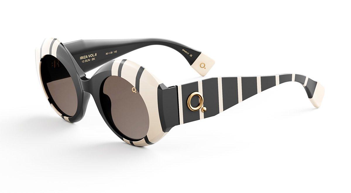
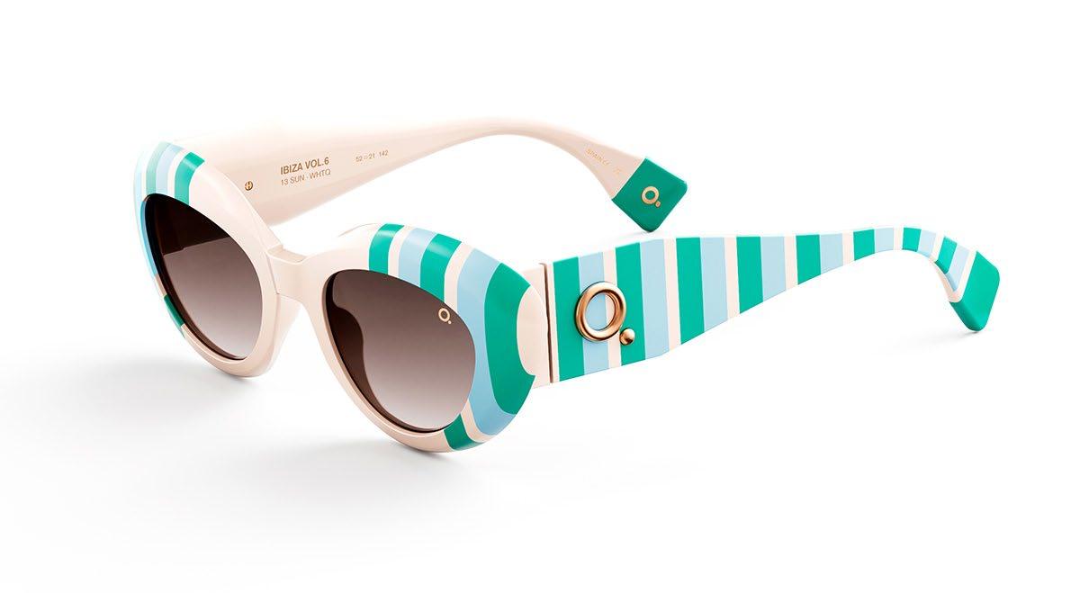
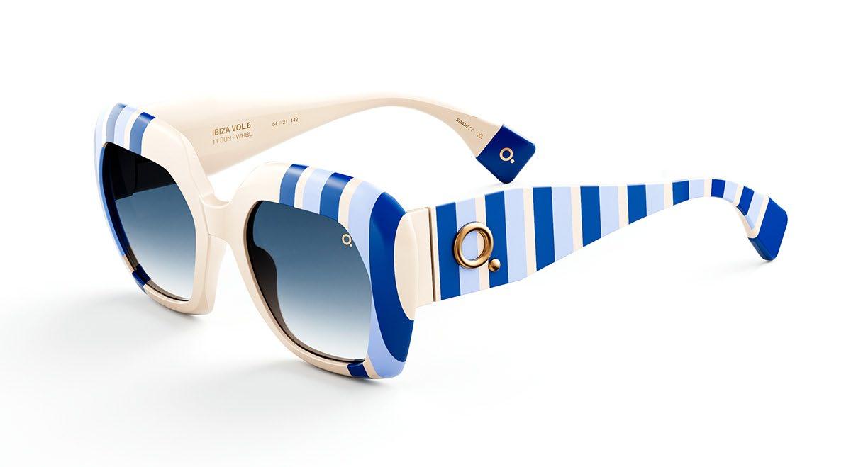
Ibiza Vol.6
A limited-edition capsule inspired by the island’s rhythm, colors and creative spirit
With IBIZA VOL. 6, ETNIA BARCELONA presents the latest edition of its iconic capsule collection – a tribute to an island that has stood for creative freedom, cultural diversity, and a unique way of life for decades. Ibiza is a place of contrasts: Mediterranean calm meets pulsating energy, nature meets nightlife, tradition meets avant-garde creativity. It is precisely these oppositions that form the creative foundation of the current collection.
This season, lines move to the center of the design language. The classic graphic element is reinterpreted and given a modern, dynamic character. Lines structure the frames, create visual movement, and give the models a clear, contemporary aesthetic. At the same time, they establish a rhythm reminiscent of the island’s vibrant atmosphere – from quiet coastal landscapes to legendary nights.
The color world of the collection is also strongly inspired by Ibiza’s natural environment. The intense turquoise of the Mediterranean, the deep blue of the sky, the warm orange tones of sunsets, and the mineral nuances of the rocky landscape are all reflected in the frames. The combination of vibrant pigments and graphic structures gives the models a strong visual presence.
The capsule collection includes three iconic models available in six striking color variations – including orange, black, turquoise, white, and blue. Bold shapes meet contrasting color compositions, underlining the expressive character of the collection. Each frame appears as an independent design object, functioning both as a fashion statement and a functional accessory.
As is typical for the Catalan brand, color once again plays a central role in the design process. It is not used merely as a decorative element, but as a creative tool that shapes identity and conveys personality.
IBIZA VOL. 6 translates the energy of the island into a visual language of color, rhythm, and graphic precision – a collection that interprets summer, freedom, and creative expression through contemporary eyewear.
ETNIA BARCELONA
»Ibiza 12«
»Ibiza 13«
»Ibiza 14«
MARKUS T
Markus T: Rewriting the Origin
»D4 109«
»D4 115«
»D4 107«
A place to be –for employees and customers: the Transparent Factory near Gütersloh.
Redefining the Architecture of DESIGN
Almost three decades after the first collection under the name DESIGN, MARKUS T opens a new chapter – while returning to its roots at the same time. With the new DESIGN collection, the brand is not simply launching another line, but rewriting a central part of its story. Reduction, constructive clarity, and design driven consistently by function – principles that have always defined MARKUS T – are being recalibrated, refined, and translated into a contemporary form.
We speak with founder and designer Markus Temming about origin and evolution, about titanium wire and screwless constructions – and why, for him, style never means standing still.
Markus, with the new DESIGN collection you deliberately revisit a name that stood at the very beginning of your company’s story. Why was now the right moment to return to that origin?
After almost three decades, a certain distance from one’s own beginnings emerges – and that distance is exactly what allows an honest look back. The DESIGN collection was the starting point of MARKUS T. It was never just a product, but a definition of my attitude. Now felt like the moment not to quote that origin nostalgically, but to reconsider it constructively. What interested me was the question: what remains when you remove everything that belongs to a specific moment in time? The new DESIGN collection grew out of precisely that idea.
When you think back to the first DESIGN collection nearly 30 years ago — what attitude or vision defined it at the time?
Back then, it was about reduction and honesty in construction.
I wanted to develop eyewear that was conceived from function. No decorative excess, no disguising of the technology. Titanium wire, screwless, lightweight – that wasn’t an aesthetic trend, but a logical consequence. The constructive idea that form emerges from function was the core. And essentially, it still is today.
In the current DESIGN collection, you don’t replace what has proven itself — you reorganize it. What does this “reordering” mean to you in concrete terms?
For me, reordering doesn’t mean changing something for the sake of change. It means thinking through an existing principle once again. Lines are refined, transitions articulated more clearly, proportions set more deliberately. It is a process of sharpening. The foundation remains – but its structure becomes clearer. For me, that is a very constructive form of evolution.
You speak of sharpened lines, refined proportions, and more precise details. Where does this evolution become most visible?
Above all in the design language. The DESIGN collection feels clearer today and at the same time more confident, because every element is placed more deliberately. This applies to the front, the temples, the transitions – and the hinge as well. The evolution is particularly visible in the more distinctive, bolder models. The shapes are defined more precisely, conceived with greater surface presence, and stronger in expression. They appear more assertive without losing their constructive logic. It is exactly this balance of clarity and design determination that, to me, defines the maturity of the DESIGN collection.
MARKUS T
»D4 100«
»D4 110«
How do you manage the balance between evolving an original and preserving its identity?
By focusing not on style, but on principle. If the constructive foundation is right, the form is free to evolve. Identity emerges from an inner logic, not from a single detail. As long as that logic remains clear, a product can develop without becoming arbitrary. Your brand has always stood for screwless constructions made from titanium wire. Why does this principle remain so central to your brand today?
A screw is simple, imperfect, and not particularly beautiful. It is a quick solution, but it cannot truly reflect the precision of a thoughtfully developed construction. Creating a screwless plug-in connection that is technically reliable while meeting our design standards is complex. That challenge has fascinated us from the very beginning – and it is why we apply this principle consistently across all our collections.
Titanium wire allows for a construction that is light, flexible, and stable at the same time. For me, this is a very direct translation of the idea that technology may be visible, but should never dominate. It is part of the design – not its decoration.
All frames are finished with the in-house patented MSC titanium coating. What role does this technology play in terms of quality, durability, and aesthetics?
Peak simplicity –the DESIGN collection continues to impress today, just as it did back then, with its understated elegance and simple beauty.
The MSC coating is a fundamental part of our quality. In this process, the surface structure of the titanium is deliberately altered –this is how the color effect is created. The layer is extremely thin and virtually immeasurable, yet the color is more than ten times more stable and durable than conventional lacquer. This allows for a precise and long-lasting finish. For me, technology is not an effect, but a means of reliability.
The DESIGN collection comprises 16 frame shapes in nine titanium colors — optionally complemented by colored lens rings. How important is this design diversity within such a clear system?
Very important. A clear system does not mean uniformity. Within a constructive order, diversity can emerge without becoming arbitrary. The different shapes offer distinct characters, while the colors and lens rings introduce accents. What matters is that everything follows a shared underlying principle.
The colored lens rings create subtle yet striking accents. Is this your statement on individualization?
Reduction does not mean abandoning individuality. In the DESIGN collection, the lens rings are an additional element that allows a frame to be personalized – a deliberate, optional accent. The real individuality, however, comes from the choice of frame, shape, and color. The rings complement this system without dominating it.
Production takes place entirely in your factory in Gütersloh-Isselhorst. What does this location mean to you – also in terms of control, precision, and brand identity?
In the beginning, Gütersloh-Isselhorst was actually a coincidence. Back then, we ended up on a converted farmhouse – a quiet place with plenty of room for creativity. As the brand grew, however, the space became too small. That’s when the opportunity arose to take over and renovate a historic distillery in the center of the village.
Our goal was to create a place where people feel comfortable, where inspiration can emerge, and where all stages of production come together under one roof. Today, development and manufacturing both take place here – making us one of the few eyewear manufacturers still producing entirely in Germany. This proximity allows for maximum control over quality and precision while strengthening our brand identity, as idea and execution are directly connected. With our MARKUS T Brand Store, we also maintain direct contact with end customers. This helps us better understand the perspective of our optician partners. For me, this location is not just a production site, but the very center of our brand.
Your design language is considered clear, reduced, and constructive. In your design process, is everything purely driven by function?
I started out as an optician and had a strong technical background from the very beginning. In the early days of MARKUS T, the focus was on engineering – the search for precise, functional solutions. Today, function remains the foundation, but design is equally important. Technology alone is not enough. It is only through the interplay of engineering, proportion, and expression that design with substance emerges. Minimalism is not a stylistic device, but the result of a consistent process. The fact that the DESIGN collection was awarded the Red Dot 2026 confirms this claim.
When you relaunch a collection after nearly 30 years, who are you speaking to? Has the MARKUS T audience changed over time — or has it grown together with the brand?
Both. Our audience has grown with us, and at the same time it has expanded. Because technology and design now naturally merge at MARKUS T, we no longer speak only to people who appreciate constructive precision, but also to those who seek distinctive design combined with visibly thoughtful engineering. We have very loyal customers who share this mindset. At the same time, we continue to evolve creatively. And with every new step, the resonance grows among people who value clarity, substance, and character.
Silhouette Iconic Shades
There are decades that never really pass – the 1970s are one of them. Bold volumes, architectural lines, an effortless sense of presence. With the new Iconic Shades collection, SILHOUETTE captures exactly this spirit and translates it into a radically contemporary design language.
70s Power, Reframed in Modern Lightness
At its center stands a name that still resonates today: Dora Demmel. Her expressive approach to proportion and geometry left a lasting mark on the brand’s design DNA. With »Dora One« to »Dora Four«, four models are now introduced that feel like contemporary artefacts – not as retro quotations, but as confident evolutions of an iconic era.
»Dora One« is a homage to the legendary Sunset model, with its lifted, gently curved top line and defined lower edge. »Dora Two« presents a striking square silhouette with low-set temples – architectural, almost sculptural. »Dora Three« explores a fluid round shape, soft in expression yet distinctly present. The series concludes with »Dora Four«. This model reinterprets the Wayfarer: slimmer, more dynamic, and precisely contoured.
SilhoPure® 3D printing material meets high-tech titanium components.
The color palette underscores the sculptural ambition of the Iconic Shades: Cream Powder, Dark Olive, Mocha Mousse, or Cream Blush convey a sense of subtle opulence. Iconic SILHOUETTE tones such as Apricot and Bright Ivory return with renewed clarity. A yellowbrown gradient lens adds depth – almost like a filter that bathes the world in warm 70s gold.
Technically, the collection remains uncompromisingly modern. Crafted from the innovative SilhoPure® 3D-print material and combined with high-tech titanium elements, the models unite stability with near weightless elegance. The 1:1 Complete Eyewear Concept allows frame and lens to merge into a single entity – functional, aesthetic, and precisely engineered.
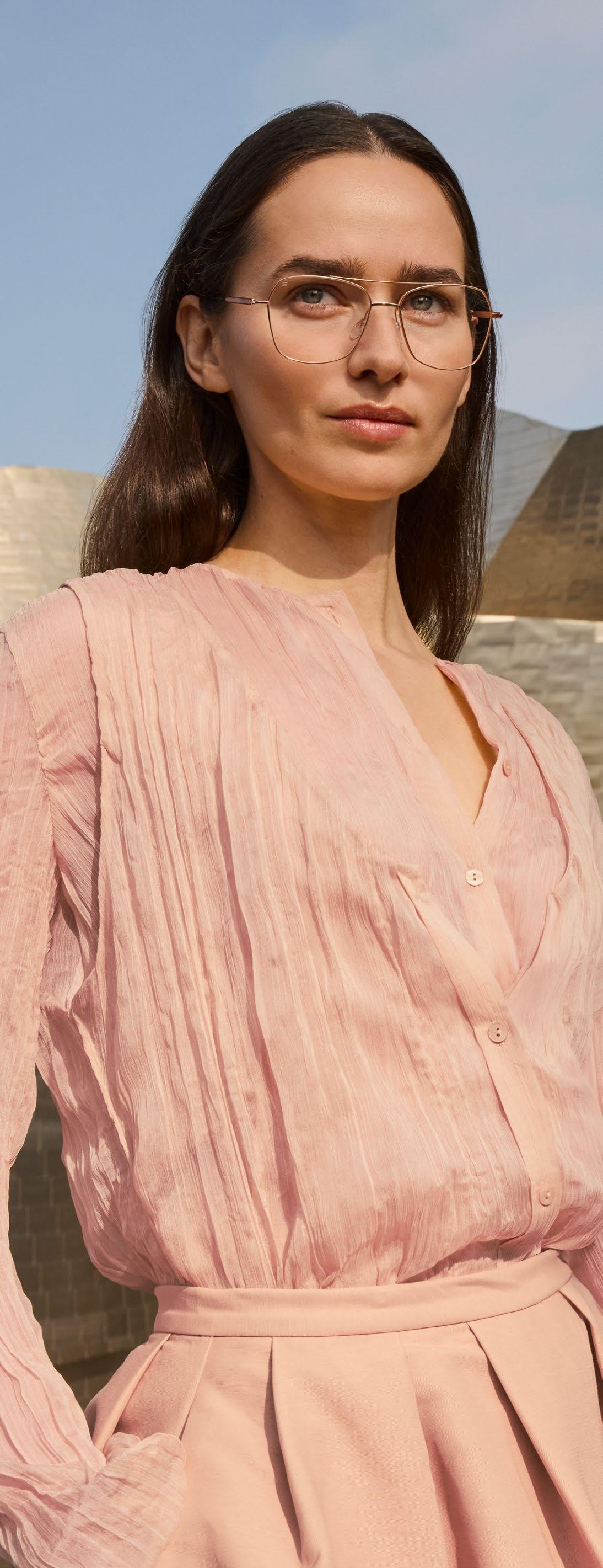
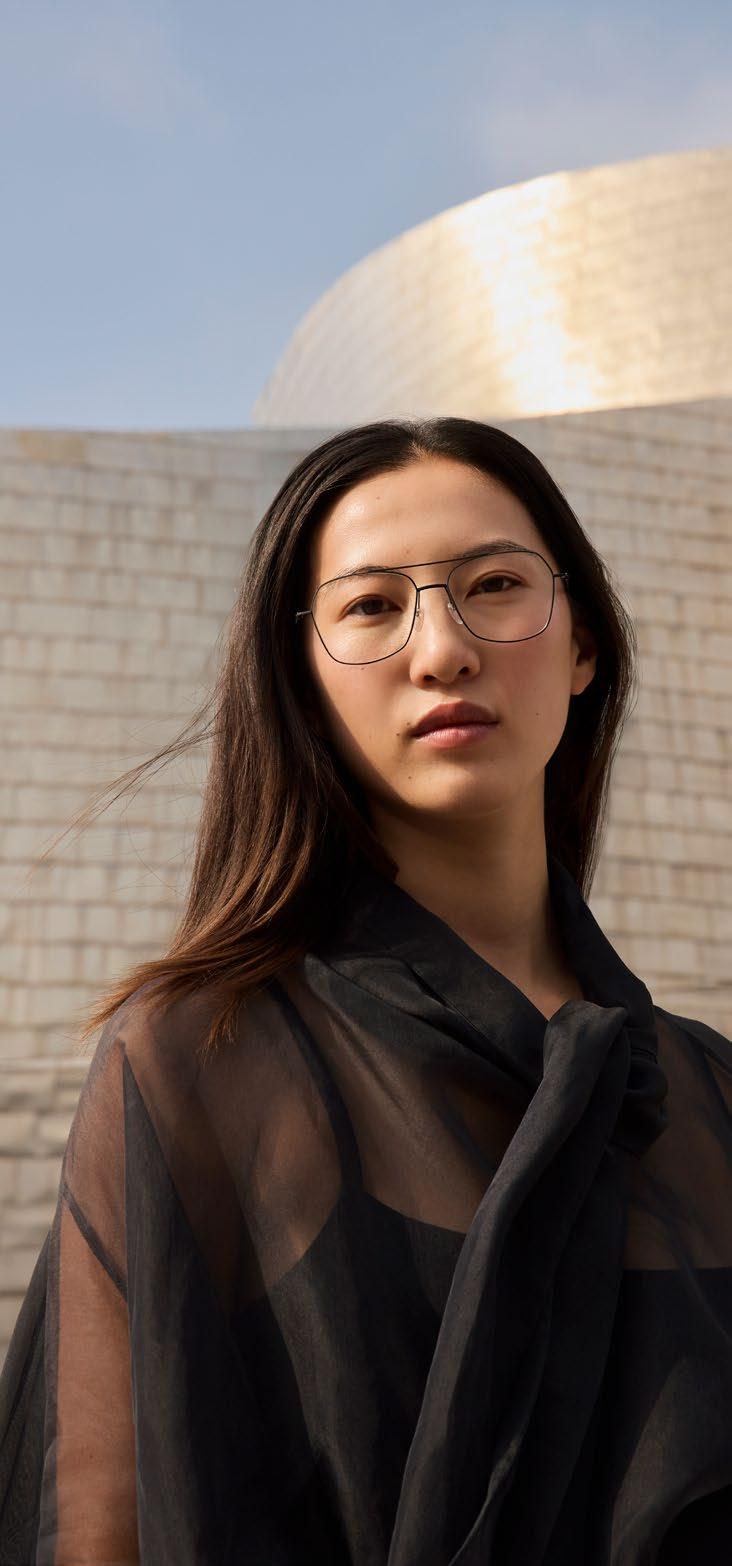
The collection was staged – like the titanium models before it – in front of the Guggenheim Museum in Bilbao.
BLACKFIN Vitra »F6-D1« -
dress STINE GOYA
photography : ESTELLE KLAWITTER
assistant : ROBERTA STEVENSON
art direction & styling : CLAUDIA MELZER
hair & make-up : SANDRA BRAMMER
models : LARA LOUISA & MILAN VUKO at TUNE MODELS
Blackfin: The Shape Of Light
The Vitra collection explores the sculptural elegance of ultralight titanium
Light is the invisible tool of design. It shapes forms, emphasizes lines, and ultimately determines how an object is perceived. In the world of eyewear in particular, light unfolds a special effect: it glides across surfaces, breaks along edges, and brings materials to life.
With the VITRA Collection, BLACKFIN achieves a particularly poetic interpretation of this interplay. The frames appear almost immaterial –as if they were shaped from light itself. Filigree titanium, precise lines, and a radical reduction to the essential create an aesthetic that feels both technical and emotional.
BLACKFIN Vitra
»F2-D1«pullover YOURTURN
pants ROSSI
Vitra
»F7-D1«blouse VINTAGE
bra SCHIESSER
BLACKFIN
Vitra
»F1-D1«shirt JACK & JONES
necklace CHRISTIANE WINK
For BLACKFIN, lightness is not a stylistic device, but part of the brand’s DNA. Titanium allows extremely thin structures while maintaining remarkable stability – a combination that gives the design an almost floating appearance.
The VITRA Collection consistently pushes this idea further. Reduced geometries meet transparent constructions, while fine metallic surfaces subtly reflect the light. Depending on the perspective, new contours, new shadows, and new dimensions emerge. The frames change with every step, every movement, every ray of light.
For our SPECTR Collection Shoot, we captured precisely these fleeting moments. The models of the VITRA Collection enter into dialogue with their surroundings: light draws graphic lines, titanium reflects the atmosphere of the space, and minimalist frames transform into sculptural objects.
It is a visual study of material, precision – and perhaps the most important design element of all: light.
BLACKFIN
BLACKFIN
dress UNDRESS CODE
shirt NEXT ring CHRISTIANE WINK
Vitra »F5-D1«
Vitra
»F5-D1«
The Pursuit Of Light— —ness
BLACKFIN’s
Nicola
Del Din on innovation and the art of lightweight eyewear
Lightness is one of the central promises of modern eyewear. It stands for comfort, technical precision – and not least for a design philosophy that brings reduction and performance into perfect balance. Few materials embody this idea as consistently as titanium.
Yet lightness is about far more than simply minimizing weight.
BLACKFIN interprets the concept of “lightness” in different ways –through ultra-thin structures, technical innovation, and a minimalist aesthetic. In the brand’s own factory in the Italian Dolomites, lightweight frames are created that stand for exceptional precision, innovative construction, and a clear design language.
In our conversation with Nicola Del Din, CEO of BLACKFIN, we explore exactly this topic: the meaning of lightness in the eyewear industry, the potential of titanium as a high-tech material – and how BLACKFIN continues to reinterpret this philosophy across its different collections.
Nicola, lightness is one of the most frequently mentioned buzzwords in eyewear design. What does “lightness” personally mean to you in the context of eyewear?
To me, lightness goes far beyond the mere physical weight of the object on a scale. It is a holistic concept that encompasses aesthetic lightness, perfect fit, comfort, and an overall sense of well-being. I would say it is much more about the sensations experienced by the person wearing the frame rather than just the grams of the product itself.
Over the years, BLACKFIN has established itself as a specialist in titanium. What makes this material so special when it comes to developing eyewear that is both lightweight and high-performing?
Titanium is an incredibly difficult material to work with, one that we have been getting to know intimately since 1990. Its main
photo : BLACKFIN
advantage is extraordinary: it allows us to craft eyewear with ultrathin profiles while maintaining absolute structural resistance and flexibility.
Looking back at your brand’s history: has the meaning of lightness in BLACKFIN’s design philosophy evolved over time?
Absolutely. In the early stages of BLACKFIN, our mastery of titanium allowed us to create frames with bold, significant volumes, amplified by our expert use of color, which were still remarkably lighter than standard metal competitors. Recently, however, our brand and product families have evolved toward a 360-degree concept of lightness. Today, it is a minimalist approach entirely oriented toward the absolute well-being of the wearer. Is it purely about weight – or also about an aesthetic attitude in design?
As I mentioned, it is absolutely not just about weight. It is the eye that reads and perceives the lightness of the product long before the hand even picks it up. It is a visual language made of thin profiles, clean lines, and a specific balance of proportions. When someone looks at a BLACKFIN frame, the immediate perception must be one of effortless grace. The design itself communicates an absence of gravity, creating a psychological comfort that anticipates and enhances the physical one.
Titanium is a highly technical material. How do you manage to combine this technical precision with emotion, style, and a strong design identity?
This is exactly where we succeed in bridging the gap. We merge our cold, high-precision technical approach with the emotion of Italian taste in our shapes. Even more crucially, we infuse emotion through BLACKFIN’s characteristic expertise in color – a highly artisanal process executed entirely in-house.
Today BLACKFIN offers several collections with very distinct characters. In what ways do the individual lines interpret the idea of lightness?
We have been developing our current product families for a few years now with a specific goal: keeping titanium at the center while offering a complete range of looks. In BLACKFIN One and BLACKFIN Atlantic – our bolder lines – titanium frees the design, allowing aesthetic volume with extremely low weight. On the opposite, BLACKFIN Pacific, BLACKFIN Aero, and our latest release, BLACKFIN Vitra, explicitly tell a new story of absolute lightness, highly driven by aesthetic minimalism. It is a clear statement of our evolved product strategy.
Designing extremely lightweight eyewear is technically demanding. What are the biggest challenges when reducing weight without compromising durability and comfort?
Titanium seems explicitly created to withstand extreme chemical and mechanical stress over time without losing performance. The real challenge lies in our desire to excel in micromechanics. We want to offer incredibly thin products that communicate our design ethos through micro-details, all while remaining very resistant.
A key part of your DNA is production in Italy. What role
does in-house manufacturing play when working with a demanding material like titanium?
Claiming to be true experts in the many facets of working this material has not been easy. It took 55 years of company history and 36 years of titanium specialization to reach our current level of excellence. By managing everything strictly in-house, we possess an incredibly deep knowledge that allows us to be exceptionally fast and to provide a level of customer service that is simply impossible for those who outsource production.
Beyond comfort and design, sustainability is becoming increasingly important. What advantages does titanium offer in this context?
Titanium is naturally biocompatible, which gives us a huge head start. We proudly work it while strictly avoiding treatments that are hazardous to the environment or the wearer. But at BLACKFIN, sustainability goes far beyond the material. This is physically demonstrated by our headquarters in the Italian Dolomites, the Black Shelter Sustainable Factory. It is certified not only for energy efficiency but, more importantly, for the quality of life and well-being of the people who work there.
Where do you currently see the most exciting areas of innovation when it comes to lightweight high-performance eyewear?
Given the high-level technical skills we already possess, the most exciting areas of innovation for BLACKFIN lie in pushing the boundaries of design development and engineering unique micromechanical details that will unmistakably characterize the brand.
New digital design and production methods are transforming many industries. How are these developments influencing the work at BLACKFIN?
BLACKFIN has always been an extremely innovative company in terms of technology and digital tools. The current technological evolutions are highly stimulating to us. However, our core philosophy remains unchanged: the human being must always be at the center. Technology must act as a support and a prompter, never as the final decision-maker.
After working with this material for so many years, what still fascinates you most about titanium today?
The most fascinating thing is discovering every single day that we still don't know everything about it. We realize we have reached an incredibly high level of mastery, yet there is still so much to learn. We don’t see this as a problem, but as a thrilling opportunity. We always feel like we are at the beginning of a journey that has many more satisfactions to give us.
And finally: what role will lightness play in the future of BLACKFIN?
We opened this new path of absolute lightness two years ago, and we have been incredibly enthusiastic about it from day one. The recent launch of the new BLACKFIN Vitra line is generating such phenomenal feedback that it confirms our vision: lightness will absolutely play a leading role in the future of BLACKFIN blackfin.eu
BLACKFIN
Vitra »F2-D1«
pullover YOURTURN pants ROSSI
Luxury Eyewear
CURATED AT OPTIK AUGUSTIN
Some things aren’t searched for. You find them – or they find you. The stronger the personal connection to a product, the more likely that is. And that’s exactly what this shoot is about: personality.
The selection was made where expertise meets intuition – at Optik Augustin in Essen. Together with Jari and Stefanie, photographer Mert Dürümoglu curated a collection that doesn’t just aim for premium, but above all for precision.
This is evident not only in the eyewear itself, but also in the details – such as the elaborately designed packaging, which for many models becomes an independent design object. The pieces shown come directly from the Optik Augustin assortment: AKONI, BARCELUNETTES, BRETT, DITA, ESMONT, OLIVER GOLDSMITH, HUG, LEINZ, MYKITA, SATO and THOM BROWNE – each model handpicked, with its own signature and a clear standard.
Staged in the studio, the models – as is typical of Mert – unfold their full impact. Clean compositions meet experimental lighting installations, reflections become part of the design. The images: razor-sharp, almost tangible – with a presence that resonates.
The principles by which Jari and Stefanie make their selections become clear following the shooting pages.
AS INTEN— –DED
photography : MERT DÜRÜMOGLU
assistant : CHRISTIAN HUHN
styling : MIRJANA VUJCIC
hair & make-up : NICOLA WEIDEMANN
model : LILLY SENG at EASTWEST MODELS
post production : MARCEL WENINGER
studio : CUBIC STUDIOS
dp / edit / color : BISHR LAHAM & VIDTURE
ac : JUNIOR KINSLEY OPUNKO
”
“The AKONI »Telesto« stands for hyped, modern design, crafted from high-quality Japanese titanium with exceptionally fine detailing. It is aimed at people who want to wear something special without appearing loud or intrusive. This model is one of several glasses from my own collection.”
AKONI »Telesto«
BARCELUNETTES
»Bellesguard« (7/150)
“The BARCELUNETTES »Bellesguard« is not a classic acetate sunglass, but a high-end model made in Japan from premium Japanese acetate and titanium. Despite fine decorative details, including a platinum finish, it appears incredibly present and bold on the face. The model is limited to 150 pieces worldwide.”
”“BRETT is an incredibly cool eyewear brand with an exciting background story and strong collaborations. The model »Ed Sun CO2« is milled from a single 3 mm thick titanium plate, resulting in a very angular and precise design language. For me, this is the perfect frame for a Porsche — technical, reduced, and confident.”
BRETT »Ed Sun CO2«
“We were particularly excited about the images of the SATO »Arraï-T«, as this model appears extremely strong and distinctive. This model is limited to 350 pieces worldwide, while other SATO models are sometimes released in even smaller quantities. Crafted from highquality Japanese titanium, the frame can feature both gold and platinum finishes at the same time.”
SATO »Arraï-T« (67/350)
THOM BROWNE
»UEO920AG0003«
”“THOM BROWNE eyewear is crafted with high precision in Japanese workshops and stands for the highest level of craftsmanship. This model is a timeless classic that always works. It gives a distinctive look without ever appearing overloaded.”
DITA »Narcissus«
“The DITA »Narcissus« is an absolute classic, crafted from highquality Japanese titanium, and more popular than ever today. It appears very luxurious and present on the face, with a strong and confident expression. When it suits the wearer, this model is highly celebrated by customers.”
”“What stands out most about the ESMONT »Collins« is the incredibly well-thought-out story behind the frame – from the design concept to the overall presentation. The packaging is sensational and underlines the brand’s ambition, just like the use of high-quality Japanese titanium. The model is limited to 150 pieces worldwide, making it particularly exclusive.”
ESMONT »Collins« (31/150)
”“The OLIVER GOLDSMITH »Winston« is a design that clearly returns to the brand’s classic roots. The chunky, bold shape follows the tradition of Oliver Goldsmith and deliberately stands out from the crowd. A frame with strong character and a modern presence.”
OLIVER GOLDSMITH »Winston«
HUG »Dupree«
“The HUG »Dupree« is a cool, boldlooking acetate frame with a very hip shape. The craftsmanship is particularly high-quality, as even the metal core in the temples is gold- or silver-plated depending on the version. These details are exactly what make the frame modern and exceptionally refined.”
”“We love LEINZ eyewear because it is extremely lightweight, features a distinctive design, and is very comfortable to wear. Each model has a clear and unique design language. There is also always a beautiful personal story to tell about Beate and her design vision.”
LEINZ
»Say My Name«
MYKITA × RIMOWA »MR004«
“The MYKITA »Rimowa« is a very cool special collaboration with a clear technical DNA. It has a sporty, dynamic look while being extremely lightweight and comfortable to wear. A model that perfectly combines design and function.”
All But Quiet On The Western Front: Jari and Stefanie’s store is considered one of the top addresses for a discerning clientele – far beyond the borders of Essen.
Optik Augustin — No Standards. Just Style.
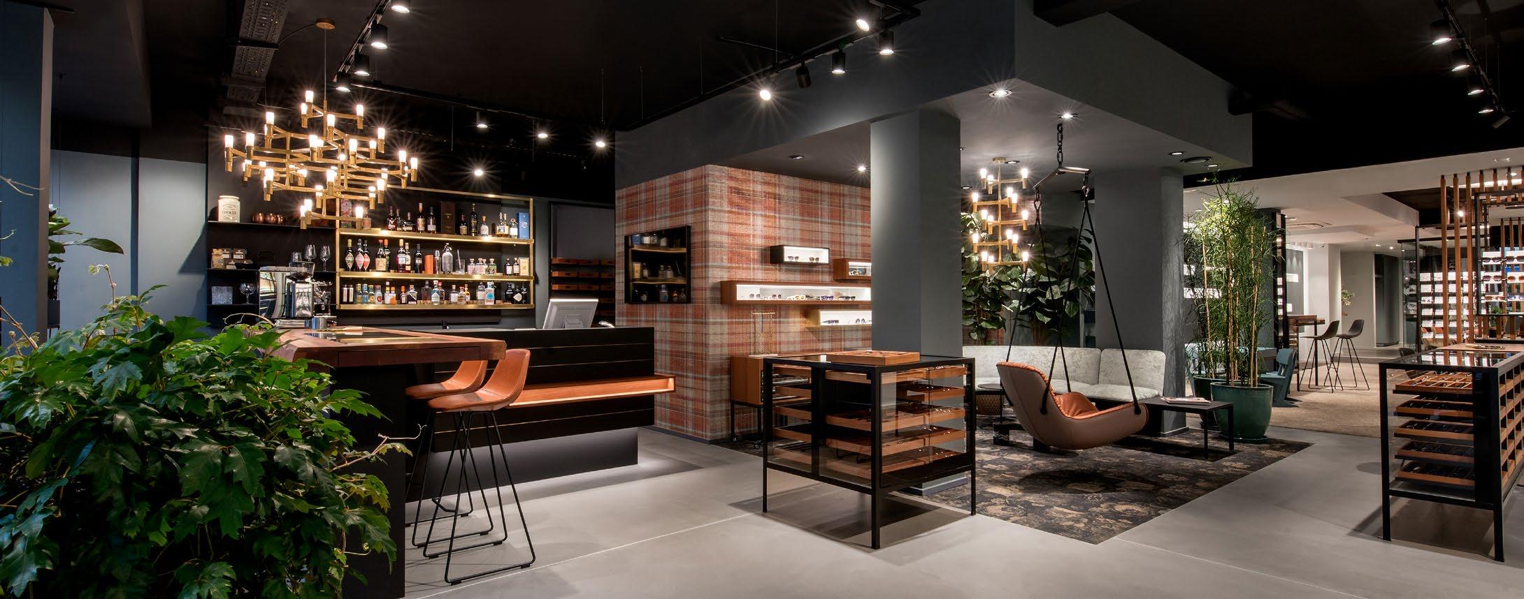
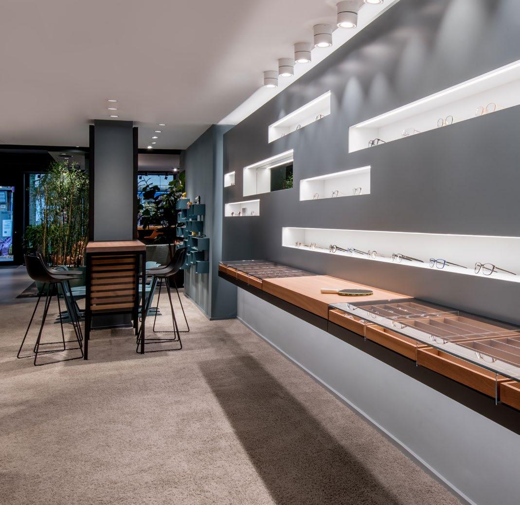
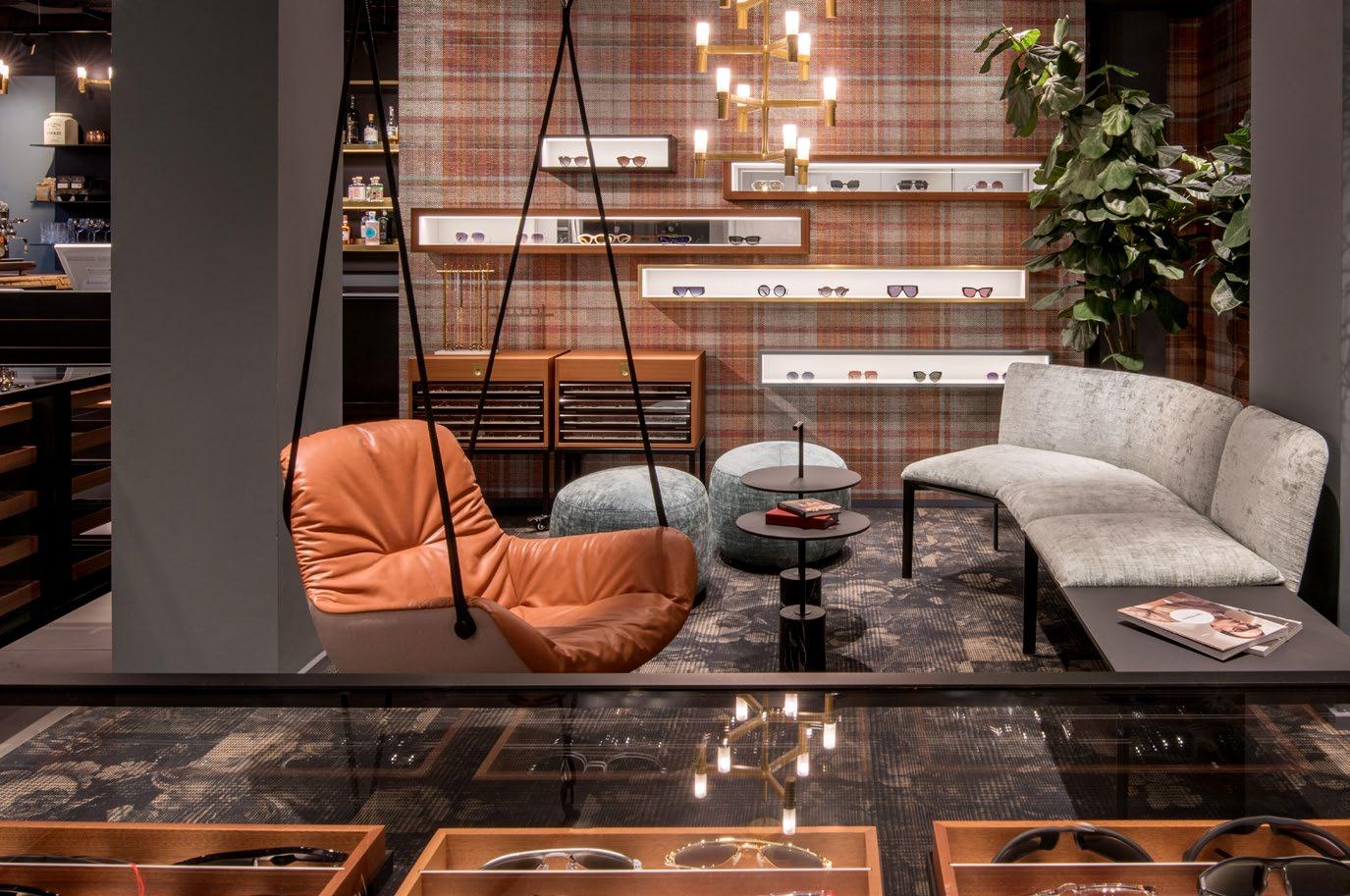
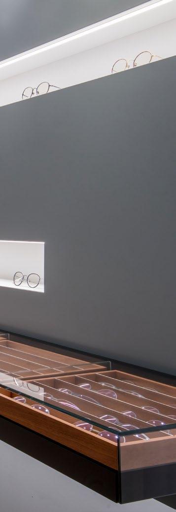
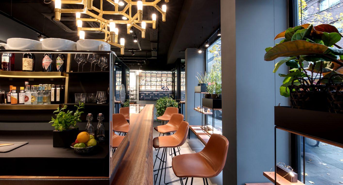
Some optical stores sell glasses. Optik Augustin in Essen stages them. From the very first step inside, it’s clear: this store follows its own rules. Between curated independent brands, an exceptionally refined interior, and a bar serving selected spirits, the atmosphere feels closer to a design boutique or gallery than a traditional optician. Jari and Stefanie Augustin see eyewear as an expression of personality. Every frame in their selection is chosen with intent – guided by a sharp sense for design, craftsmanship, and style.
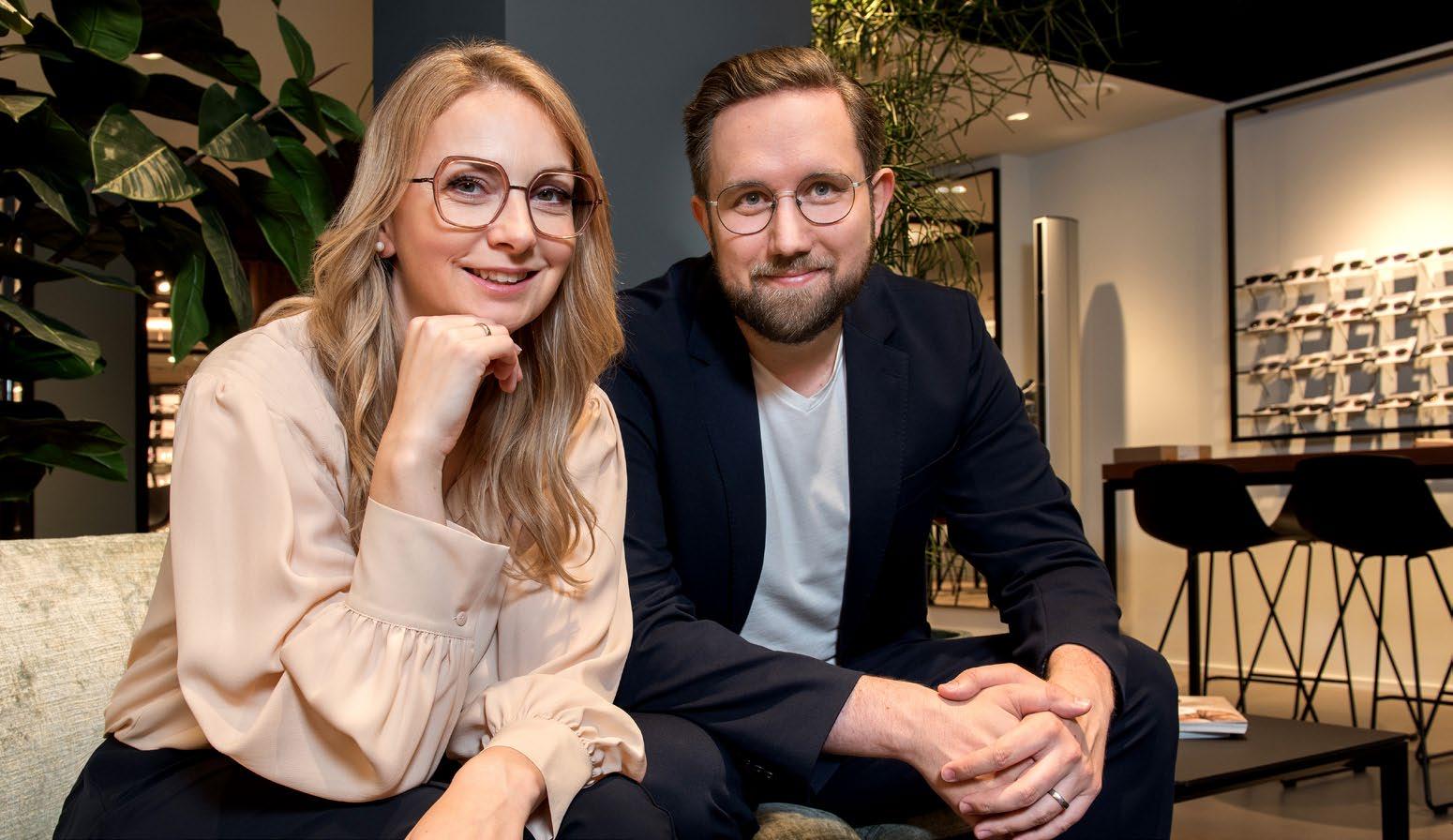
For our curated fashion shooting with photographer Mert Dürümoglu, the two assembled a selection of particularly strong pieces, shaping the visual direction of the story. In conversation, Jari and Stefanie speak about their philosophy, the art of selec ting the right frames for their clients – and why people travel from afar to buy their glasses at Augustin
Curated with Conviction
Hello Jari and Stefanie, the moment you step into your shop, it’s clear that Optik Augustin is not a typical optician. What’s the idea behind your concept?
We deliberately wanted to break away from comparability. That’s why we consistently focus on high-quality independent eyewear. This is reflected throughout the entire store: refined design, a glass screening cube for eye exams, and a bar with selected spirits that makes the purchase more relaxed and emotional. You even have to ring the bell to enter – nothing here is standard.
Has it always been like this? How did Optik Augustin originally come to life – and since when have you been running it together?
Optik Augustin has existed for over 50 years at the same address in Essen. My father founded the store and was very popular with customers. Sadly, he passed away far too early at the age of 66. Since 2015, my wife Steffi and I have been running the business together as the second generation. During the COVID period, we completely rebuilt the store – with many concerns, but great success, for which we are very grateful.
You already mentioned the special atmosphere in your store. What role does the environment play in your customers’ experience?
The environment is essential – our customers feel at ease. Many feel like they are treating themselves to something special. This leads to a high second-pair rate and additional purchases that are gladly accepted. The unique atmosphere – combined with our consistent focus on high-quality independent eyewear and Steffi as a master optician, our strong figurehead –brings customers who sometimes travel over an hour to visit us. Most come with a fixed appointment.
If customers travel from so far away, you must be doing something particularly well, right?
Our high-quality and selective brand portfolio makes the difference. We only carry independent eyewear with strong storytelling, exclusive and not available in chain stores. Often, we are the only ones in the area offering these brands. On top of that comes our personal taste and a clear focus on top quality without prominent logos. We deliberately seek out the best quality in every price segment. All of this together creates a strong appeal that makes long journeys worthwhile. Is there something a frame absolutely needs for you to say: this fits Optik Augustin?
Yes – it must have a strong story, be exclusive, and offer the highest quality in its price category. It has to match our personal taste and work without bold logos. Only then does it truly fit us.
Do you both bring different perspectives into this selection?
Not really different perspectives – we complement each other very well and almost always share the same taste. When we think things through together, new ideas sometimes emerge. The eyewear selection and brand portfolio are primarily my responsibility. Steffi handles many other areas of the business and is happy for me to take care of this part. Eyewear is also an expression of personality. How do you find the ‘right’ frame for a customer?
For us, it’s crucial that the eyewear always matches the individual. When a customer walks in, we usually already have a fitting frame in mind. Very often, the first frame we show is the one they choose. This works because we consciously take time at the beginning to really understand who is in front of us and which shapes, colors, and styles truly suit them. What role does intuition play — and what role does experience?
Intuition plays a major role. Often, the first frame we show ends up in the top three – and frequently it’s the one the customer chooses. Many customers appreciate exactly that and tell us afterward: “The first one felt right immediately.” This accuracy builds trust, leading to strong recommendations and many new clients. At the same time, we use our experience to gently guide customers – especially when trends have shifted. Are there moments in the store when you notice: someone has truly found their frame?
Unfortunately, it’s not always as consistent as one might wish. Every customer reacts differently. Some put on a frame and instantly break into a big smile. Others are very reserved and only say at the very end: “I’ll take this one.” It varies just as much as with any other optician. Eyewear is increasingly seen as a fashion accessory. How do you experience this development in everyday life?
We experience this every day and think it’s great that eyewear has established itself as a true fashion statement. It brings us many new customers. At the same time, many still want a timeless, characterappropriate frame rather than a bold trend piece. The beauty is that we can often combine both. Some who initially had no interest in glasses end up really enjoying them and seeing them as an accessory.
Are there currently shapes, materials, or styles that are particularly in demand?
Yes, thin titanium and metal frames are very popular at the moment – especially delicate granny-style models or round shapes. Classic aviators also perform consistently well. In acetate, bold and chunky models are in demand. 3D-printed frames are also selling particularly well, as they allow for strong, massive looks while remaining lightweight on the face.
For our Curated Fashion Shoot, you selected frames from your portfolio. How did you approach this curation?
Mert Dürümoglu visited us in the store and looked through many frames. He took a large selection that we chose together – mainly pieces that are close to our hearts. Since we genuinely like all of our brands, the selection wasn’t easy. Did you think more in terms of looks and moods or in specific brands and models?
We primarily focused on frames that are personally meaningful to us and that we found particularly exciting for the shoot.
Which brands immediately stood out to you as especially exciting for the shoot?
The red frame from BARCELUNETTES was mentioned several times by Mert afterward – he considered it the best during the shoot. Personally, we were most excited about the images from SATO, which was our little favorite.
If each of you had to choose one frame from your selection that best represents your personal style –which would it be?
For me, it would be the ESMONT »Kadena« – a limited edition (only 200 pieces worldwide). The model stands out with solid sterling silver applications, high-quality Japanese titanium, and a distinctive design language inspired by the Blackbird aircraft. The beautifully crafted individual packaging is another highlight. It’s very rarely found in Germany – and that’s exactly what makes it perfect for me.
Steffi would choose the GÖTTI »Precious Objects« – made from high-quality Japanese titanium with a rose gold finish. GÖTTI is one of our absolute favorite manufacturers. The frame is incredibly durable and lightweight, features a beautiful granny shape, and the exclusive gold finish is a true highlight. It works perfectly for the playground, but also for an elegant wedding.
optik-augustin.de
Through the Lens of Time
Mert Dürümoglu –15 Years Shaping a Visual Language
There are a select few photographers who have not only enriched SPECTR Magazine through their work, but have also shaped it in a lasting way. Mert Dürümoglu is undoubtedly one of them. He has been part of the magazine since its early days – not only as a visual chronicler, but as one of its quiet architects. His visual language is precise, clear, and defined by a subtle atmosphere. Over the years, it has formed an aesthetic that is now inseparably linked to SPECTR.
What defines his work is the delicate balance between product and emotion, between staging and authenticity. Especially in eyewear photography, where reflections, proportions, and materials come with their own unique challenges, he succeeds in creating a visual clarity that never feels sterile – but always tells a story.
Time, then, to turn the perspective around and look behind the camera.
Mert, you’ve been with SPECTR since the early days — but of course there’s a life beyond the magazine. How would you describe yourself as a photographer? Where are your main areas of focus?
I’ve worked across many fields of photography. But to sharpen your own perception, specialization is key – which is why today I primarily see myself as a transportation and lifestyle photographer. Where does your creative focus lie? What does a typical image by you look like?
I wouldn’t really speak of a “typical” image. Over the years, I’ve always tried to approach each series individually. The focus has shifted at times – from color to street style, to overlays, or light and shadow. What matters most to me is precise planning and a clear vision, because in the end all elements have to interlock perfectly.
What are generally the biggest challenges in photography for you?
All the experiences you gather throughout your career flow into every new production. My ambition is always to create
something special or new – in line with the idea of “Latest and Greatest”. How would you define your photographic style today — and how has it evolved over the past 15 years?
In the past, complex visual worlds were carefully planned and executed layer by layer in advance. Today, post-production has taken more of a back seat. I try to realize as much as possible directly “in camera.”
Your visual language has significantly shaped the character of SPECTR. Do you remember your first shoots for the magazine — and how would you describe that time in retrospect?
Back then, alongside the people shoots, I also produced many still-life series for you. In the early issues, there were sometimes up to 50 pages of my work – which was quite a special feeling. Especially because my visual signature was clearly well received.
Are there recurring themes or visual motifs that run like a common thread through your work?
A central theme for me is creating atmosphere through finely balanced color
worlds.
Eyewear is considered a particularly demanding subject. What makes photographing glasses so special — and perhaps challenging — for you? Here too, it’s about balance. Generally, I try to avoid reflections in the lenses. In one series, however, we deliberately added them in post-production to enhance the overall image (“The Closer”). How do you find the balance between staging a product and telling a broader visual story?
Today, the story is the real star – without it, no product works anymore. The visual concept is always at the center. Within that framework, the product must then be staged in the best possible way and create relevance.
How has the visual language in eyewear and fashion photography changed in recent years?
Authenticity is the key term. Images are meant to feel natural, even though a lot of retouching still happens. It’s comparable to the “no-make-up” look – it appears effortless, but is actually highly complex. What role do light and environment
play in your work — especially in the context of eyewear, which reacts strongly to light?
Light is essential for creating mood. At the same time, it has to support the materiality of the frame and make its details visible.
Are there glasses you particularly enjoy photographing — either because the style appeals to you or because they suit models especially well?
As a glasses wearer, figures like Grandmaster Flash, LL Cool J, or Run-D.M.C.
had a strong influence on me. Today, it’s personalities like Pharrell Williams or Ye who wear glasses as true statement pieces.
Looking back on 15 years of collaboration: what has shaped you the most, personally and creatively?
Trust has always been the foundation of our collaboration. Generally, you gave me a lot of freedom – and still, strong results emerged. I’m very grateful for that, because it gave me a lot of space for creative processes.
XOXO, Mert
Sun Of Koberg –
»6069.1036«jacket HOPE
These sunglasses, with their elegant double bridge, are more than just an accessory. Their striking shape frames the face with gentle strength and gives smaller face shapes a beautiful presence.
»6069.1930«
jacket ARKET
A bold, unisex aviator style whose classic design exudes an authentically cool 90s vibe.
KOBERG »6070.1037«blouse PSOPHIA
A classic crown panto in a light color scheme – a statement piece for an expressive, feminine look. The lightcolored frame creates a striking contrast with the dark lenses, giving the model a modern, elegant presence.
Frank Tente on having the courage to be bold and why expressiveness is sometimes the most honest form of design.
The Story behind: “Sun of Koberg”
KOBERG stands for clarity. For reduction. For a design language that never needs to be loud to command presence.
With SUN OF KOBERG, the Westphalian brand now deliberately shifts the tone. The new models are crafted from solid block titanium – boldly milled, sculptural, almost architectural. Precise milling gives the fronts a technical depth and reveals a subtle reference to the steampunk aesthetic of the 1980s: retro-futuristic, powerful, self-assured. High-quality Divel lenses from Italy do more than filter the light – they choreograph it.
Despite this new expressiveness, the collection remains unmistakably KOBERG Slim, lightweight temples, refined acetate tips, and the characteristic colored accent at the hinge create the familiar balance between technical precision and design restraint.
Photographer Oliver Spies translates this industrial aesthetic into a clear visual language. His imagery is defined by light, material, and structure – reduced, focused, intense.
We speak with Frank Tente about the courage to embrace edges — and why expressiveness is sometimes the most honest form of design.
Frank, KOBERG prescription frames tend to be rather purist. Why did you deliberately want to become more expressive with the SUN OF KOBERG collection?
We didn’t simply want to place tinted lenses into existing models. For many wearers, sunglasses are more of a statement than prescription frames. Someone who prefers restraint in their corrective eyewear often dares to go a little further with sunglasses.
The distinctive milling subtly recalls a steampunk aesthetic of the 1980s. Was this reference part of your idea from the beginning?
Subtle is the right word! It’s meant to be a small reminiscence of a cool aesthetic that is both retro and futuristic. We deliberately wanted to take a new stylistic direction and become a little louder and more technical. It’s not meant to be a DIY aesthetic – we’re simply playing a bit with design elements.
How do you manage to preserve the clear KOBERG DNA despite these different design elements?
We felt that our lighter, more delicate
temples would harmonize well with the more expressive center parts. Wide, heavy temples wouldn’t be KOBERG
What role do architecture or industrial design play in your creative process?
They actually play a major role. What interests me most are clear technical solutions. I like it when design follows function – and when that relationship remains visible.
You chose block titanium. Why?
Titanium is an excellent material for eyewear. It’s light, well tolerated, and visually striking and clear. Our production partners also have strong expertise in working with block titanium. And we wanted to show what kind of milling is possible. With our prescription frames, we usually remove material only very subtly in certain areas.
What are the biggest technical challenges when working with solid milled titanium?
Besides the hardness of the material, mainly the color coating. The threedimensional milling creates far more edges – and color doesn’t particularly like edges.
The front appears powerful, while the temples are deliberately slim. How do you develop this balance?
In fact, the temple is still wider than the rim of the frame. And the ratio of five to three millimeters is often perceived as especially harmonious.
The colored accent at the hinge is a typical KOBERG detail. What does this small element mean to you?
The colored accent has been the distinctive design element of KOBERG frames from the very beginning. Initially, the cylindrical, screwless hinge itself was color-accented. Later, with the titanium
frames, we reduced this to a small plate at the transition between the center part and the temple. We don’t want to place a logo on the frames, so the colored accent has become a subtle signature element. You rely on high-quality Divel lenses from Italy. What criteria do you use when selecting your partners?
First and foremost, our partners must meet our quality standards. But it is just as important for us to find partners on equal footing – partners you can rely on. Partners with whom you are happy to embark on a longer journey together. Mirrored or gradient — which tells the more interesting story for you?
We deliberately use mirrored lenses less often. They tend to appear more distant. Gradient lenses, on the other hand, feel more open and interesting.
How important is the interplay between frame color and lens aesthetics to you?
Of course, I want the frame and lens to harmonize perfectly. Only then does the sunglass achieve its refined appearance. That said, our KOBERG sunglasses – like any prescription frame – can easily be fitted with lenses. This means that not only corrective lenses but also entirely different colors or finishes can be used. What does “Made in Germany” mean to you today — quality, attitude, or both?
You can actually achieve good quality almost anywhere – if you are willing to pay for it. But the highest quality is not achieved by performing a final inspection at some point. We want to be involved in the production process itself – and that is simply easier with partners nearby. At the same time, Made in Germany is not a dogma for us. We look for the best possible quality and are happy when it comes from Germany.
How much craftsmanship actually goes into one of these sunglasses?
After the milling of the fronts and temples, a great deal of manual work is required. Even the temple bend of the solid material with its delicate edges requires a lot of sensitivity. Laser-welding the hinges and the decorative plate on the temple, as well as the freehand lacquer finishes, also demand a great deal of skill and experience. The complete final assembly takes place in our eyewear workshop in Münster.
Who did you design this collection for — what do typical KOBERG customers look like?
The typical wearer is someone who has found their own style and does not need validation through a brand logo. They are looking for outstanding quality and longevity in both design and material. The same applies to the female wearer. Is this more expressive line an experiment or the beginning of a new design phase?
How can you already know that? Anja Hungerkamp, who works with us as a freelance designer, has in fact developed new models that are a little more expressive than the previous KOBERG style. If you had to describe the collection in three words — what would they be? Clear, sustainable, high-quality. On a personal note: which model do you yourself prefer to wear — and why?
From the SUN OF KOBERG collection, I prefer the large aviator shape. I like the style of the 1990s. As a prescription frame, I have now chosen a classic acetate panto – something that fits well with Münster. But the new KOBERG acetate models tell quite a different story. Thank you.
koberg-brillen.de
THE 20 YEAR COLLECTION
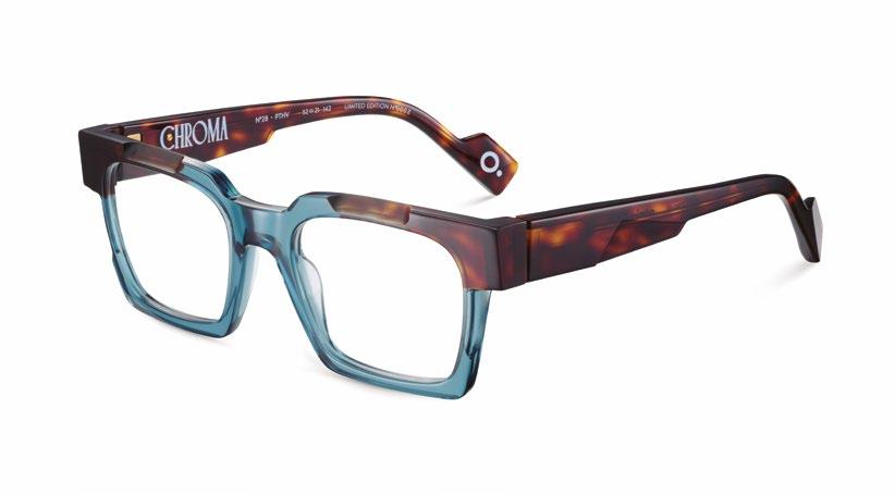
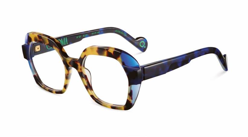
Etnia Barcelona Chroma — The Art of Color
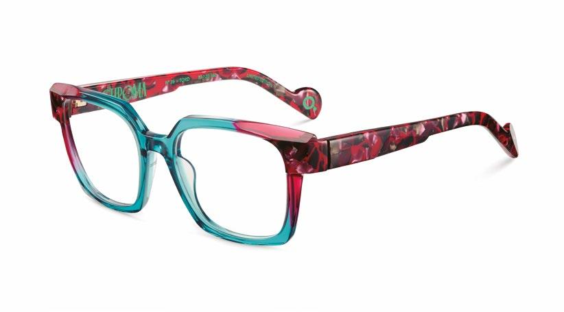
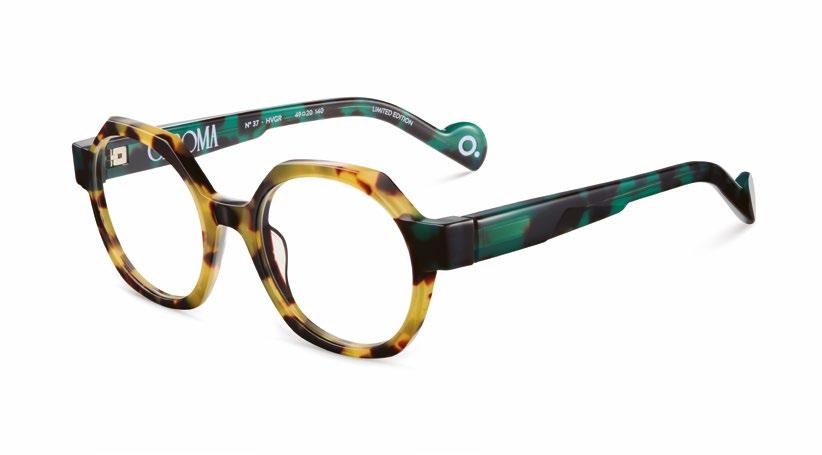
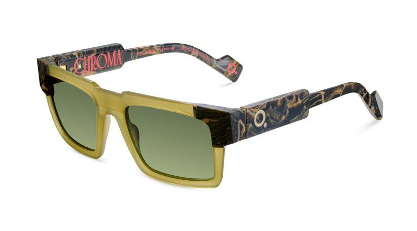
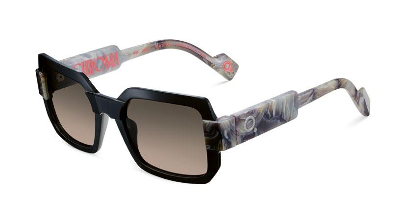
With the Chroma collection SS26, ETNIA BARCELONA once again places the brand’s central element at the forefront: color. For the Spanish brand, it is far more than a design feature – it represents personality, energy, and creative freedom. Under the guiding theme “The Art of Color,” color becomes the starting point of a collection that connects design, materiality, and emotion.
The models play with intense color spectra, unexpected combinations, and strong contrasts. Vibrant pigments and carefully developed palettes give the frames visual depth and turn each pair of glasses into an independent design object. Graphic clarity meets an artistic, almost sculptural design language.
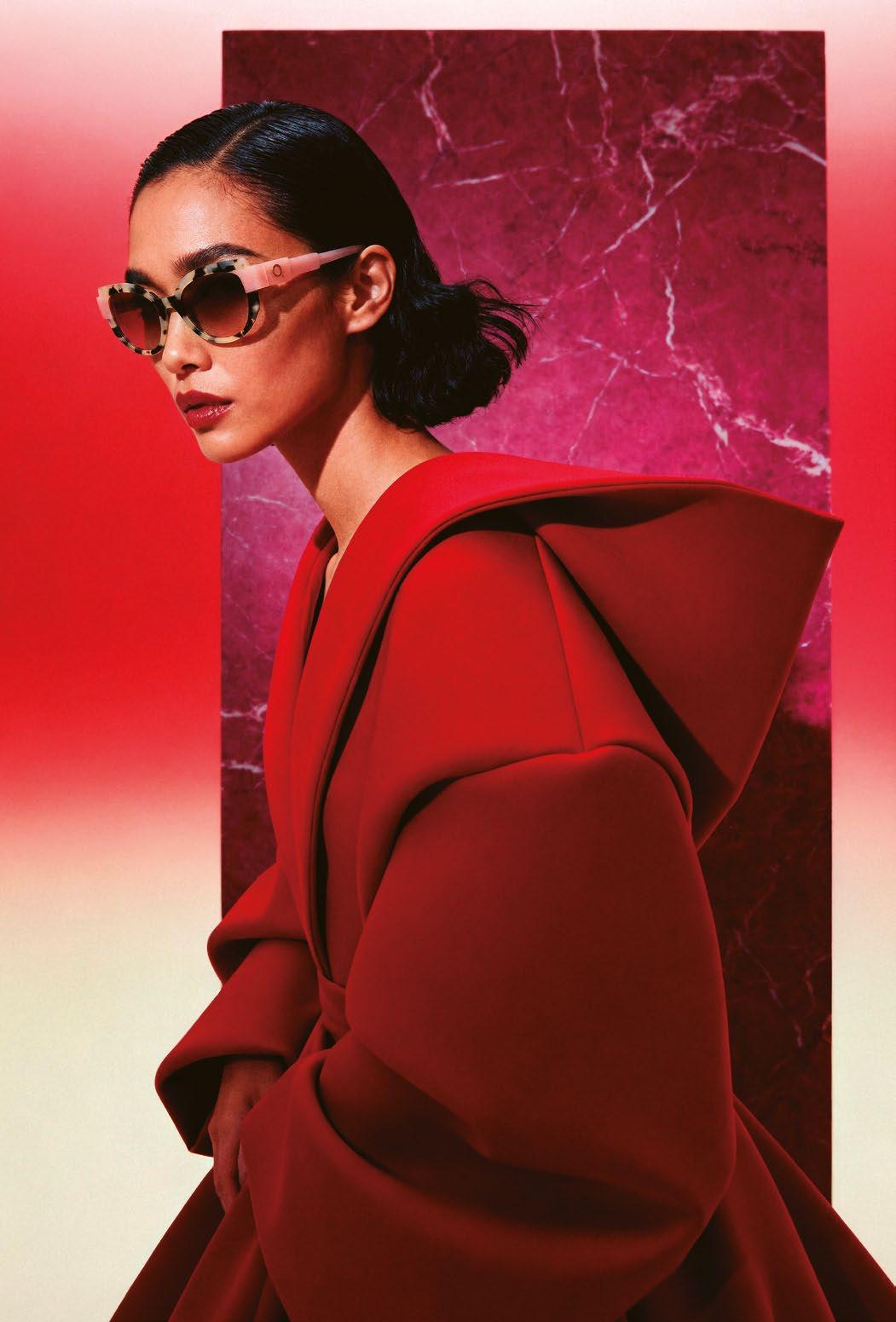
Marble serves as the source of inspiration – with its fragments, massive blocks, and seemingly floating surfaces. This natural material aesthetic is reflected in the acetate frames, whose color gradients and structures evoke geological formations.
The craftsmanship itself also sets visual accents. Precise milling on fronts and temples creates additional dimensions and intensifies the effect of color. Subtle color gradients within these milled areas add depth and movement.
In this way, the Chroma collection becomes an invitation to see color anew: bold, intense, and defined by a distinctive design signature.
etniabarcelona.com
Silhouette: Titanium in Dialogue
The Guggenheim Partnership and the New Era of Titanium Eyewear
If one brand has stood for ultra-light titanium eyewear for decades like almost no other, it is SILHOUETTE. Yet with its threeyear partnership with the Guggenheim Museum Bilbao, the Austrian family-owned company elevates its material expertise to a new cultural level. In front of the iconic architecture of Frank Gehry’s building, clad in 33,000 titanium panels, titanium is not merely staged – it becomes an artistic statement.
What does it mean for an eyewear brand to enter into dialogue with one of the most radical buildings of our time? How do you translate architectural vision into wearable design? And how do the new collections Titanium Reframed and Pure Visionary redefine the material titanium for 2026?
We find the collaboration between SILHOUETTE and the Guggenheim Museum so compelling that we explore it in detail in our Campaign of the Issue – together with Brand Director Atissa Tadjadod. A conversation about cultural responsibility, design DNA, and the future of ultra-light titanium icons.
ARCHITECTURE
Atissa, what fascinated you more at first — the Guggenheim Museum itself or the idea of placing SILHOUETTE within this architectural context?
The Guggenheim Museum Bilbao itself impressed me deeply. This building is not a static structure, but a living sculpture. The 33,000 titanium panels respond to light, weather, movement – they almost breathe. The moment I saw the museum in person, I realized: here, titanium speaks an emotional language. And that is exactly where our story begins.
True! Titanium has been at the core of your brand DNA since the 1990s. Why was now the right moment to stage this material on such a monumental scale?
Titanium has always been a driver of innovation for us. But today it is about more than technology. It is about cultural relevance. Looking toward 2026, we are opening a new chapter – bolder, more architectural, more emotional. We are launching collections in full-rim titanium, and we wanted to give them a stage worthy of their presence. This moment called for a setting that could make the power of this material visible.
And you see that stage in the Guggenheim?
Yes. When we started thinking about how to tell a new story about titanium, the decision to choose the Guggenheim Museum Bilbao as both partner and stage for our communication came very quickly. Designed by Frank Gehry, the museum has stood for radical creativity since 1997. It embodies strength and lightness at the same time – and that same duality defines our designs.
And you committed to a three-year partnership right away. What does this long-term collaboration mean strategically for SILHOUETTE?
SILHOUETTE × GUGGENHEIM –TITANIUM MEETS
It is a clear commitment to pioneering spirit and cultural ambition. We are positioning ourselves not only as an innovation leader in ultra-light titanium eyewear, but as a brand that actively shapes the dialogue between design, architecture, and art.
Where do you see the strongest parallels between Frank Gehry’s design language and your own approach to design?
In the combination of complexity and effortlessness. Gehry’s architecture appears free and organic, yet it is based on the highest level of precision. The design language is never angular, but flowing. That is exactly how we work with titanium: technologically sophisticated, yet effortless in the result.
Architecture works with space and dimension — eyewear with millimeters and grams. How do you translate monumentality into ultra-light frames? Monumentality is a question of attitude, not of size. An ultra-thin titanium sheet, precisely laser-cut and shaped into a flowing line, can convey the same architectural clarity as an iconic façade. In our work, impact is created within fractions of a millimeter.
Is this campaign primarily an aesthetic statement — or does it actually mark a new chapter for SILHOUETTE? It is far more than an aesthetic statement. The campaign marks a strategic moment for SILHOUETTE: we are opening the brand more strongly toward culture, architecture, and international design perspectives. The partnership with the Guggenheim Museum Bilbao provides the stage for that.
What role does cultural engagement play today for a premium eyewear brand? Is product innovation alone still enough?
Innovation and quality remain our foundation – especially in our category. But today, premium also means placing the brand within a cultural context. Partnerships like the one with the Guggenheim Museum Bilbao allow us to present our collections and the material titanium in a new narrative. Many of our innovations are technically very complex, and in
dialogue with architecture and design these topics become more tangible and easier to understand. At the same time, we share a common mindset with the museum: the ambition to think design, innovation, and cultural relevance together.
TITANIUM REFRAMED –THE REINTERPRETATION
With Titanium Reframed, you speak of a “new era.” What exactly is being rethought — construction, silhouette, or attitude?
With Titanium Reframed, we are rethinking everything – construction and attitude. The frames are created from ultra-thin titanium sheets, laser-cut and shaped into a single, harmonious line. It is reduction at the highest technical level. How much architecture is embedded in this collection?
A great deal. Every line follows a clear internal structure. Light, movement, proportion – all of these elements play a role. We wanted to translate architectural clarity into wearable design.
The newly designed bridge and the iconic Snap-Hinge appear subtle, yet they are technically decisive. Why does innovation at SILHOUETTE so often lie in the details?
Especially with ultra-light titanium frames, every detail determines stability, comfort, and longevity. The newly developed bridge complements the classic bridge and opens up additional design possibilities, allowing us to address new audiences seeking a particularly contemporary look. At the same time, we have further optimized our screwless Snap-Hinge. The construction reduces mechanical complexity, increases durability, and simplifies handling for the optician. Innovations like these are often barely visible, yet they make a decisive difference in everyday wear. Titanium is often perceived as cool and technical. With colors like Blue Aura, Green Sage, or Ultraviolet, the material suddenly gains emotionality. Did you intentionally want to infuse titanium with a new emotional dimension through color?
Yes. The new color worlds give titanium a more sensual dimension. Some colors subtly reference the Guggenheim Museum in Bilbao – particularly the way light and sky reflect on the titanium surfaces of the building throughout the day. At the same time, it was important for us to keep the overall palette clear and reduced. Selected models deliberately introduce stronger color accents – offering a possibility for individual style expression. How do you balance technical precision with human expression — without falling into minimalist clichés?
By always thinking about design from the perspective of the wearing experience. Our frames are created from highly precise titanium structures that we deliberately reduce to the essential — without sacrificing function, comfort, or expression. Proportion, line, and color play a decisive role. The result is a design that is technically precise while appearing natural and vibrant on the face.
SILHOUETTE Complete Eyewear stands for the perfect unity of frame and lens. How consistently has this principle been developed further in this collection?
With Titanium Reframed, frame and lens –as with all our collections – are conceived as a precise unit and developed together at our headquarters in Linz. Shape, material thickness, and lens geometry are exactly coordinated. This allows for particularly precise positioning of the lenses in front of the eye, supporting maximum visual clarity and acuity for the wearer.
PURE VISIONARY –REDUCTION AS A STATEMENT
Pure Visionary appears even more purist, almost quieter. Is this collection a conscious reduction or a radical essence?
Pure Visionary is radical essence. Ultrathin titanium, clear lines, no ornament — maximum impact through minimal means. Why full-rim models made from ultrathin titanium now — is this a response to a changing zeitgeist?
On the one hand, we do indeed see a growing demand for clear, defined frames. On the other, it is a deliberate strategic expansion of our portfolio. SILHOUETTE is often associated with rimless eyewear, but overall the brand stands for ultra-light frames and innovative design. With ultra-light full-rim models made from titanium, we are deliberately expanding our offering and responding to current design preferences – without leaving behind our DNA of lightness. For opticians, this means: SILHOUETTE is increasingly evolving into a strong partner with a broad portfolio, ranging from iconic rimless frames to modern full-rim designs. The new bridge almost becomes a design statement. Is function your strongest stylistic device?
Absolutely. Especially in ultra-light titanium frames, every detail serves a functional purpose. The newly developed bridge complements our classic bridge and opens up additional design possibilities for a particularly contemporary look. At the same time, it also shapes the aesthetic of the front: the clear, precise line of the bridge connects the lenses and gives the frame a modern, architectural structure. In this way, a functional element consciously becomes part of the design. Pilot shape and geometric silhouette –two powerful archetypes.
Is this about confidence rather than decoration?
Exactly. These shapes stand for sovereignty. They express themselves from within.
In this context you speak of “quiet confidence.” Is understatement the new understanding of luxury in the premium segment?
In fact, it is. Today, luxury is defined by quality, precision, and attitude – not by loudness. This understanding also defines SILHOUETTE: reduced design, the highest material quality, and a lightness you can feel but hardly see. Finally: if you had to describe the two collections in three terms each — what would they be?
Titanium Reframed: architectural, visionary, iconic. Pure Visionary: reduced, confident, timeless.
Brand Director Atissa Tadjadod
In Love with Titanium –in SILHOUETTE eyewear and at the Guggenheim Museum Bilbao.
KRAFTIES by ANNE & VALENTIN eyewear
Model VASSIA | Blown Emerald
Sculptural Acetate –Precision in every Line
Götti Haute Con–—tour
“Contour, to me, means clarity. A precise line gives a design identity and calm at the same time.”
Sven Götti
“With HAUTE CONTOUR , it is about the conscious interplay of volume and restraint — powerful in form, reduced in expression.”
Sven Götti
GÖTTI
With HAUTE CONTOUR, GÖTTI SWITZERLAND presents a fashion collection devoted entirely to the power of contour. Clear lines, precise curves, and deliberately defined volume shape frames that command presence without appearing loud. Soft transitions allow light to glide across the surface, revealing the depth of the material –a play of reflection, transparency, and substance.
The models appear bold and defined, yet feel pleasantly refined to the touch. This contrast gives the collection its characteristic tension: distinctive shapes with a subtle statement. Four fashion styles –»Howard«, »Hunt«, »Mara«, and »Miri« – each available in three color variations, are offered both as optical frames and as sunglasses.
Crafted from high-quality acetate, each frame is produced through precise handwork. Meticulous polishing creates an individual finish –a process that not only ensures visible brilliance, but also a tangible sense of value. The combination of cutting-edge technology and traditional craftsmanship creates a balance between everyday functionality and a luxurious standard.
»Miri«
»Mara« »Hunt«
»Howard«
GÖTTI
»Mara«
“Craftsmanship is not a decorative element, but the foundation of every good frame. Quality emerges in the process — step by step.”
Sven Götti
Characteristic of HAUTE CONTOUR is its attention to detail: carefully crafted rivets in silver or gold accent the temples. On the inside, the engraved name of the polisher serves as a personal mark of quality. The lenses – available with a refined brown gradient or as tinted sun lenses – also feature a subtle logo engraving, reinforcing the collection’s contemporary character.
The collection unites timeless elegance with uncompromising craftsmanship. Harmonious lines, perfected curves, and a distinctive finish define the design ambition of HAUTE CONTOUR. These are frames that show contour – aesthetically clear, artistically precise, and confidently reduced in their effect.
gotti.ch
ETNIA BARCELONA »Toldrà«
GÖTTI »Hover«
The Real Front Row: Berlin
Off Run –way
CLÉMENCE & MARGAUX
»CMS238 La Milos«
In our editorials, eyewear is often elevated – carefully staged, curated, and refined to perfection. Models, lighting, and styling merge into an idealized image, far removed from everyday reality. Off Runway changes that. In Berlin-Friedrichshain, photographer Ulrich Hartmann captures personalities as they are – no styling, no preparation. Just instinct, character, and the moment.
The result is a quiet truth: Great eyewear doesn’t need the perfect setting. It belongs exactly where it lives – in real life.
NIRVAN JAVAN »Zurich 06:01«
LUNOR »Classic Sun Panatomic«
CUTLER AND GROSS »1416 Square Opticals«
CUTLER AND GROSS »1394 Aviator Sunglasses«
J.F.REY »JF1596«
ETNIA BARCELONA »Verdaguer«
NIRVAN JAVAN
»Zurich 06:01«
SALT. »Ryan«
Olivia & Kasi
Chaeyu
CUTLER AND GROSS »1394 Aviator Sunglasses«jumpsuit ZARA
CALMA
photography : YULIA PLAKHOTNIKOVA [ Barcelona ]
styling : DAVOR JELUSIC
hair & make-up : OLGA GARKOVICH
models : CAMILA & ADA at UNO MODELS
ETNIA BARCELONA »Verdaguer«dress MANGO
ETNIA BARCELONA »Toldrà«shirt MANGO tights PALOMA WOOL
LIGHT, STRUCTURE, AND ATTITUDE UNFOLDING IN BARCELONA
In the spring-warmed streets of Barcelona, a fashion shoot unfolds that plays with color and form, light and expression. Photographer Yulia Plakhotnikova captures fleeting moments where urban precision meets Mediterranean ease. Between clean architectural lines and the Catalan sun, a visual language emerges that feels both reduced and expressive.
Stylist Davor Jelusic works with contrasts: flowing silhouettes meet deliberate accents, while minimalist looks gain sharpness through statement eyewear. The models move naturally through the scenery – calm, selfassured, and with a subtle sense of tension.
At the center are modern frames by CLÉMENCE ET MARGAUX, CUTLER AND GROSS, ETNIA BARCELONA, J.F. REY, GÖTTI, LUNOR, NIRVAN JAVAN, and SALT.. Each frame tells its own story – at times graphic and progressive, at times understated and timeless – forming a visual dialogue about perception, identity, and contemporary style.
Calma Bruta – the raw calm – is a study of perspectives, a pause within light, and a precise statement of contemporary aesthetics.
NIRVAN JAVAN X ALFREDO HÄBERLI
»Zurich 06:01«top ZARA
NIRVAN JAVAN X ALFREDO HÄBERLI »Zurich 06:01«shirt BIMBA Y LOLA hat H&M
GÖTTI »Hover«blouse EIKO AL swimsuit MANGO skirt H&M
SALT. »Ryan«dress H&M
»JF1596«
J.F. REY
top & swimsuit ZARA
CLÉMENCE ET MARGAUX
»CMS238 La Milos«swimsuit & pants ZARA
Unmistakably FLAIR – the way the solid titanium arms are attached to the 3Dprinted front is unique.
Flair: Printed Preci––sion
3D Innovation with Identity
FLAIR »2501«
FLAIR »2500«
When a brand like FLAIR celebrates its 80th anniversary, it does not look back, but resolutely forward. The new 3D-printed collection – consisting of the models »2500«, »2501«, »2502«, and »2503« – impressively demonstrates how high-tech and iconic design DNA merge into a forward-looking unity. For the first time, FLAIR uses 3D printing as a central design element: feather-light, radically reduced, and “Made in Germany.”
The extremely finely 3D-printed fronts made from PA 12 impress with precision, high-quality surfaces, and exceptional color stability. Muted tones emphasize the purist character of the line – subtle, sophisticated, self-assured. They are combined with straight full-titanium temples, creating an elegant tension between additive manufacturing and classic metal expertise.
One unmistakable detail remains the iconic connection of the temples to the front. It gives the models a floating lightness and makes each design instantly recognizable as FLAIR. In total, the series comprises four models, each available in three color variations – precisely proportioned, clear in attitude, and free from decorative excess.
This collection presents 3D printing not as an effect, but as a tool for intelligent luxury: technical, reduced, and rich in identity. For its anniversary, FLAIR demonstrates that innovation and heritage are not contradictions – but the foundation of contemporary premium design.
flair.de
FLAIR
»2503«
FLAIR »2502«
There are collections that are loud. And there are those that resonate through reduction. MARC O’POLO EYEWEAR chooses the latter – and captures the current moment with remarkable precision. Under the campaign title The Art of Clarity, the brand presents Spring/Summer 2026 as a study in visual and design restraint – confident, yet never imposing.
The campaign imagery already makes the intention clear: clarity as an attitude. Protagonists such as Laura Wontorra and Sandro Wagner embody this balance of presence and restraint – a form of modern sovereignty that doesn’t need to be loud to be seen.
Marc O’Polo: The Art Of Clarity
Spring/Summer 2026 Collection
photos : MARC O’POLO
In design terms, this approach translates into a collection focused on structure, materiality, and subtle contrast. At its core is the interplay of acetate and metal – a combination that creates depth without sacrificing lightness. The Modern Blend models in particular demonstrate how layering can be interpreted today: technically precise, visually reduced, yet expressive.
Formally, the line remains consistent: clean silhouettes, balanced proportions, and a dialogue between retro references and contemporary sharpness. The Retro Combi styles pair a defined upper with delicate metal contours – a tension that shapes the entire collection. It is precisely this duality of presence and restraint that defines the look.
Within the sun collection, this attitude is infused with an urban twist. Pilot shapes meet softened square forms, feminine lines contrast with sharper edges. The color palette remains controlled: warm earth tones, muted shades, metallic accents. Nothing feels accidental; everything follows a coherent idea of balance and clarity.
The Art of Clarity is more than a campaign title. It is a design principle – and perhaps a quiet reflection on the present. In a world of visual overstimulation, MARC O’POLO EYEWEAR embraces conscious reduction. And proves that true strength often lies exactly where you least expect it: in clarity.
models : MC B at LOUISA MODELS & CARLA B. at ELF MODEL MANAGEENT
AF— –TER DARK SHARP
FEMALE OPTICAL FRAMES — MUNICH CONCRETE VISION
Between glass, concrete, and clean lines, Munich becomes a controlled visual landscape. Evening hours and targeted flash shape the scene – contrasts emerge, contours sharpen.
Two female models move through the architecture – confident, present, with an effortless sense of ease. Styling is modern and distinctive, deliberately composed with-out excess.
The imagery is clear and direct. Optical frames take the lead: precise lines, bold shapes, unmistakable identity. Designs that demand attention – not made for restraint. Featuring models from ETNIA BARCELONA, IMAGO ULTRALIGHT, J.F. REY, HOFFMANN NATURAL EYEWEAR, KOBERG, MARKUS T, and YOU MAWO
Captured by Sacha Tassilo Höchstetter, the series connects architecture, light, and design into a sharp visual statement –modern, precise, and of the moment.
YOU MAWO »Clark«
J.F. REY »JF1590«
J.F. REY »JF1602«
ETNIA BARCELONA »Guimerà«
MARKUS
»MIO P1051«
IMAGO ULTRALIGHT »Obscura«
The Optician’s Guidance: Learn From The Best
—sehen
A Top Address with Depth of Vision
In the German-speaking optical community, AMON mehrsehen has long been far more than an insider tip. The award-winning store in Aschaffenburg stands out with its striking interior design, a hand-picked brand portfolio, and a service philosophy that goes well beyond the expected. The name goes back to Karl Amon – a well-established figure in the industry. Joining him in recent years: his son-in-law Niklas Müller-Amon. Together, the duo brings to life what defines modern eyewear today – experience meets entrepreneurial drive, high-end technology meets contemporary style consulting. Their shared mission is clear: it’s all about quality, individuality, and a future-ready customer experience.
In conversation with SPECTR, Karl and Niklas talk about their concept, the transformation of the industry, and what a modern optician needs to stay ahead tomorrow.
PEOPLE & STORY
Karl, your name is one of the most established in the German-speaking optical landscape. How did that come about?
karl: From day one, I set the bar very high for myself. I wanted to translate everything our great profession allows us to do into the best possible experience for our customers.
You’re not based in a major city. Which factors were nonetheless decisive for your reputation? Were there specific milestones that shaped your success?
karl: My passion for optics – and later for optometry – paired with a strong focus on service and style are key pillars that helped us build a loyal customer base over the years. A major milestone was in-
troducing designer labels like Alain Mikli, Oliver Peoples and Armani. Our philosophy: special eyewear for special people. The frame should underline someone’s character – and maybe even reveal an unexpected new side. Color, style and type consultation are central to what we do. Wearing glasses should never feel like an obligation, but like a choice. What else?
Two perspectives with a clear view –Karl Amon and Niklas Müller-Amon.
karl: Another factor was introducing one of the first contact lens subscription models in Germany – offering customers better care. A further milestone was integrating optometry, giving customers real peace of mind regarding their eye health. And all of it was always tied to creating a beautiful, inspiring environment.
Niklas, when did you join AMON mehrsehen? What’s your personal background?
niklas: I joined AMON mehrsehen in 2009. After my apprenticeship I went on to complete my Bachelor of Science in Aalen. That’s also where I met my wife Eva (Karl’s daughter), who also studied optics. From 2016 to 2018, I worked for Mykita in Berlin, then started a dual Master’s program – which also brought me back to Aschaffenburg. Since 2022, Karl and I share the management. How do you divide responsibilities on the management level?
niklas: We are the go-to people for a team of 30. So splitting tasks while sharing responsibility is essential. Karl oversees the eyewear segment and our marketing. I’m mainly responsible for contact lenses – an area in which, thanks to our subscription model, we are among the biggest providers in the Germanspeaking market.
Where do you see the strengths of a cross-generational leadership team?
niklas: At the core, we lead the company with a very similar mindset. I greatly benefit from Karl’s decades of experience. At the same time, I bring in new impulses, for example in digital processes.
karl: It has always been important to me that our employees feel good here – and Niklas has fully embraced that principle.
STORE-DESIGN & EXPERIENTIAL OPTICS
You recently rebuilt your store from the ground up. What triggered the redesign?
karl: Since we sell fashion, creating a design-oriented atmosphere has always been a priority for me – and refreshing it at least every ten years. I consciously study hotels and designer stores around the world to stay inspired. Customers should feel comfortable and appreciated the moment they walk in.
Which design ideas were most important in the new concept?
niklas: The new store needed to be a place where both staff and customers feel equally at ease. More space, a calm atmosphere and a focus on air quality were essential. Workflows needed to be intuitive and clearly structured. One important change: moving the reception from the back of the store to directly by the entrance – to offer customers a warm welcome right away.
What is your personal favorite detail in the new store?
karl: There are quite a few – but the nearly three-meter illuminated photo wall of our team is certainly one of them. We had everyone professionally photographed because our employees are the heart and the business card of the company. Customers love the wall. We also used a lot of wood in modern tones and created a very harmonious, refreshing color concept.
The investment was clearly major.
Do customers appreciate it?
karl: Absolutely. We receive heartfelt positive feedback every day about the design and the atmosphere.
What sets your in-store experience apart from other optical stores?
niklas: Essentially three things: Karl introduced optometry more than 20 years ago – a huge added value in preventive eye care. From the beginning, we focused on high-end designer eyewear. And of course our team, which welcomes every
diverse. Alongside strong appreciation for independent labels, many customers also want sunglasses from well-known luxury brands to match their accessories.
How about smart glasses – do customers show interest?
customer warmly and gives truly individual guidance on color, shape and style until we find the perfect frame together.
karl: The frame has to do something positive for the person wearing it – that’s when we know we’ve done our job.
BRAND PORTFOLIO & COLLECTION
Your portfolio is impressive. What is your brand philosophy?
niklas: We love working with independent labels where design and quality are at the center. Brands driven by people who are truly passionate, who value the exchange with us, who appreciate our experience and see us as ambassadors of their work. That means a lot to us. You combine smaller independent labels like HUG or Coblens with big names like Chanel and Dior No contradiction?
niklas: None at all. Our clientele is very
niklas: Yes, absolutely. We receive a lot of inquiries. I’m convinced that smart glasses, similar to smart watches, will become an important segment in the future – without replacing the classic frame. We see it as an added business field.
Which frames or brands work particularly well in a city like Aschaffenburg?
karl: It’s hard to highlight just a few because each brand is unique – just like every customer. Currently, Caroline Abram is very strong with women. And we’re very happy to offer exclusive labels like Jacques Marie Mage, Dita and Chrome Hearts
Which brands are your timeless staples?
niklas: Classics like the Lemtosh from Moscot, for sure. Andy Wolf, You Mawo, Coblens and Mykita also perform consistently well for us.
How often do you revise your portfolio? And what does a brand need to bring to be listed with you?
niklas: We aim for long-term partnerships.
So we don’t constantly overhaul our portfolio.
karl: And the decision to add a new label is never just made by the two of us – we always involve the team. They join us during order appointments in-house or at trade fairs.
CUSTOMER EXPERIENCE & SERVICE CULTURE
Do most of your clients come from Aschaffenburg, or do you also attract people from further afield?
niklas: Naturally, many customers come from the Aschaffenburg area, but we also have clients from Frankfurt, Cologne and Munich. Some even live in the US or in Dubai – and pick up a new pair of glasses every time they visit home.
Those customers likely appreciate your individual consultation. How do you address very specific wishes?
THE ROAD AHEAD
What have been the biggest changes in the optical industry in recent years?
niklas: Optometry. Especially now – with the use of AI – it will become accessible to a much broader audience.
Which factors will be crucial in the future for independent opticians to remain competitive?
niklas: Alongside a strong selection of frames, excellent service is key to building long-term customer relationships. The use of innovative instruments is essential – and above all: optometry. Opticians, especially optometrists, will play a central role in preventive eye care in the future.
karl: From the beginning, color, face type and style have been central to my consultation approach. Only then can a choice be made that truly does something positive for the wearer.
What takes more time in your consultations: technology or style?
niklas: Style, without question. But innovative technology is just as essential – it’s the only way to guarantee thorough preventive eye care. Have customer expectations around service changed?
karl: I don’t think so. Service has always been extremely important, and customer satisfaction holds a very high priority for us. Just like with our brands, we maintain long-standing relationships with our customers. Many have been with us for more than 30 years – and they regularly tell us how much they value our service.
COMMUNICATION & CUSTOMER LOYALTY
Is it still enough today to simply open the store in the morning – or do you need to be more proactive in 2026?
karl: That hasn’t been enough for a long time. We work very strategically and rely deliberately on multiple marketing pillars
– from individually designed, high-effort Christmas cards, two newsletters a year, our own sunglasses flyer and the eye check, all the way to a dedicated cinema spot – plus a significant time investment in social media.
Social media is also very much about personality. How do you manage that?
niklas: Our Instagram channel is actively managed by two team members. It’s wonderful to see our whole team step in front of the camera, enjoy it, and contribute so many ideas.
What brings the most customers into your store?
karl: That’s always hard to measure. But if I had to name two things: definitely customer recommendations – because people ask them about their new glasses all the time. And our service, along with our direct marketing, which shapes our reputation.
Which approaches have proven most effective in turning first-time customers into long-term clients?
karl: First-time visitors receive our full service – from the optometric eye exam, which already impresses many, to our after-sales service. Customers sense our passion for beautiful eyewear in every part of the process – and that usually turns them into loyal clients.
karl: I’d like to add this: innovative development only comes through lifelong learning. Only those who continue to educate themselves will evolve – and with them, the company.
And finally: what advice would you give your “younger self” if you had to start again from scratch?
We both love what we do, and we have a wonderful family. Stay open to change and development – while staying true to yourself. Stay authentic. We would choose this path again, any time.
Thank you both.
amon-mehrsehen.de
LUNOR
»Classic Sun Dodeka«shirt LFDY
shorts ACNE STUDIOS
necklace CHRISTIANE WINK
shoes BERSHKA
socks FALKE
photography : ESTELLE KLAWITTER [ Dusseldorf ]
art director : RAPHAEL KRÄUTERGARTEN
styling : ROLF BUCK assisted by MALINA KUNIEWICZ
hair & make-up : SANDRA BRAMMER
models : JULI FINKE & LOUIS at NO TOYS MODELS
CAN WE STILL BE FRIENDS?
LUNOR »Classic Sun Rund«
LONDON STREET PICKUP
CHRISTIANE WINK
FLAIR »2500«jacket
ADIDAS shirt ANOTHER COTTON
EYEWEAR BEYOND CATEGORIES — URBAN AESTHETIC
It doesn’t take opulent styling to convey a clear attitude – especially not when it comes to something as overused as “authenticity.” The same applies to fashion as it does to eyewear.
“Can we still be friends?” carries a distinct Düsseldorf creative signature. Estelle Klawitter stages her imagery in a reduced, raw, and direct way, guided by a precise eye for detail. Art director Raphael Kräutergarten shapes the bigger picture, while stylist Rolf Buck distills it to its essence.
Two models, one clear presence. The looks: street. T-shirts with bold prints that don’t need explanation. The message is simple –a statement doesn’t require a tailored suit. Sometimes, it works better without one.
And the eyewear selection? Beyond categories. No rigid separation. Sunglasses from BARTON PERREIRA, CAZAL, EINSTOFFEN, LUNOR, and SALT. meet optical frames from BLACKFIN, FLAIR, GÖTTI, and LOOK. Not either-or, but a deliberate choice for both.
FLAIR »2501«
EINSTOFFEN
shirt & earrings GUCCI
LEVI’S cap CARHARTT
BLACKFIN
ELLE MACPHERSON
boots VINTAGE
CAZAL »MOD 9511«shirt ADIDAS earring VINTAGE
BARTON PERREIRA »McNair«
PARIS SOUVENIR
GÖTTI »Alden«shirt VERSACE pants LEVI’S jewelry & boots VINTAGE
D E S I
LOOKKINO
jacket & pants CHLOÉ
»Nil Xinox 3891«
PAPRIKA
»P335 Play«
spectr
YOUNG FACES
”
“Normally, I plan shoots from a distance and leave the execution to the team on site. But this time, I was on set myself. As SPECTR, but also as a mother. My son Tom was part of the shoot, and suddenly a familiar work process turned into a very personal experience.
Your perspective shifts when your own child is in front of the camera. You look more closely, empathise, think less in images and more in moments. What is otherwise professionally thought out takes on a new, immediate dimension: what does it actually feel like – for the children around whom everything here revolves?
Perhaps that is precisely the starting point of this issue: not just to take children into account, but to take them truly seriously –in their perception, their expression and their individuality.”
Linda Krieg, SPECTR Magazine
THE NEW WORLD OF KIDS’ EYEWEAR
From director’s chair to audience member: When SPECTR producer Linda takes her son to the set – and he is promptly cast in one of the leading roles.
WHERE IDENTITY MEETS ENGINEERING –AND KIDS TAKE THE LEAD
Kids’ eyewear has quietly but decisively repositioned itself. What was once considered purely functional has evolved into a distinct segment with a clear attitude — technically precise, design-driven, and emotionally charged. Brands like MANTI MANTI, GÖTTI, ROLF, LOOKKINO, and PAPRIKA illustrate this shift: away from scaleddown adult models toward independent concepts that take children seriously — in their anatomy, their daily lives, and their sense of style.
At the same time, market dynamics are changing. Growth is no longer driven by volume, but by quality and specialization. Topics such as eye health, myopia management, and individualized fitting are making kids’ eyewear more complex — and more valuable. LOOKKINO describes this as a polarization: while entry-level segments stagnate, high-quality, thoughtfully designed products are gaining relevance.
The artists and photographers Feli & Pepita, globetrotters based in Cologne, are known for their distinctive photography and keen sense for storytelling. The central theme of their work is childhood, youth and the transition into adulthood. In addition to SPECTR, they publish their work in international magazines such as Harper’s Bazaar, Marie Claire and VOGUE Their work is exhibited worldwide in solo exhibitions, most recently in New York, Paris and Tokyo, amongst other places.
ENGINEERING MEETS REALITY: EVERYDAY LIFE AS BENCHMARK
Kids’ eyewear has to perform – without compromise. School, sports, playground: everyday life places entirely different demands than adult use. Fit, durability, and comfort take center stage. “Put them on, forget about them, move on,” as ROLF puts it.
Materials play a key role. 3D-printed polyamides, flexible plastics, or sustainable materials such as PA11 derived from castor beans – as used by MANTI MANTI –combine lightness with resilience. At the same time, construction is being rethought: screwless hinges, modular systems, and individually adjustable components ensure that frames don’t work against movement, but with it.
“Our goal is to create eyewear that is fashionable, high-quality, and comfortable.”
PAPRIKA
“Parents buy for rational reasons, children decide instinctively — a good product has to do both.”
LOOKKINO
DESIGN: BETWEEN SELF-IMAGE AND INFLUENCE
Aesthetically, kids’ and adult eyewear are moving closer – at least at first glance. Mini-me aesthetics, reduced shapes, and clean design dominate the pre-teen segment. At the same time, there is still room for expression: color, proportion, and personality play a central role.
MANTI MANTI focuses on “bold shapes, bold colors,” while PAPRIKA works with intense color palettes and laminated acetate structures. ROLF deliberately takes a more restrained approach, thinking beyond short-term trends with clear lines and longlasting concepts.
What has clearly changed: kids are choosing more consciously. They want to recognize themselves in their eyewear – not feel disguised. Or, as GÖTTI puts it: design becomes co-design.
“Whoever wears the glasses gets to decide. After all, it’s an accessory right in the middle of the face.”
photo : MANTI MANTI
image : PAPRIKA
photo & packshots : LOOKKINO
MANTI MANTI
“Kids want to co-create, not just choose.”
GÖTTI
SYSTEM OVER PRODUCT: MODULARITY AND PERSONALIZATION
A defining trend in the segment is increasing personalization. Different sizes, interchangeable elements, flexible adjustments – kids’ eyewear is becoming a system.
At GÖTTI, colors, temple tips, and details can be individually combined. MANTI MANTI approaches modularity through different sizes, lengths, and nose solutions. LOOKKINO sees this as a clear added value for both parents and children: longterm usability meets personal expression.
The classic idea of “growing with the child” is being reinterpreted – less as mechanical extension, more as intelligent adaptability.
DECISION-MAKING: BETWEEN INSTINCT AND REASON
The question of who decides remains complex – and more nuanced than ever. While parents focus on quality, materials, and price, children choose based on feeling. LOOKKINO sums it up precisely: rational versus emotional decision-making.
But the balance is shifting. Children –especially beyond a certain age – increasingly have the final say. And for good reason: eyewear that isn’t liked won’t be worn. Or more simply: the best kids’ glasses are the ones that actually get worn.
“Kids’ eyewear is no longer just a necessity — it’s part of identity.”
ROLF
photo :
ROLF
photo :
GÖTTI
MANTI MANTI »Frida«
coat NORWEGIAN RAIN shirt BEN SHERMAN sweatervest BERNHARD WILHELM
photography : FELI & PEPITA [ Cologne ] assistant : MAÏA VASSEUR styling : PETRA KLAPPROTT hair & make-up : CLAUDIA CREUELS post production : STEPHANIE WENCEK models : ALEKSEJ & STELLA MARIE at LILALAUNE / MOMO AGENTUR, ABIJOY & LINUS at KEOLAS KIDS MODELS, ISABELLA & HELENE at SÖHNE & TÖCHTER MANAGEMENT, TOM & LUNA
MANTI MANTI
»Rio« -
shirt BLUTSGESCHWISTER
hair bow BEBE ORGANIC
MANTI MANTI
MODULAR HIGH-TECH EYEWEAR FOR YOUNG EXPLORERS
MANTI MANTI approaches kids’ eyewear consistently from the child’s perspective –not as scaled-down adult models, but as an independent system. At its core are modularity, sustainable materials, and a clear design philosophy. The collections are created using 3D printing from plant-based materials such as castor oil-based polyamide, making the frames exceptionally lightweight and highly durable.
At the same time, the brand follows a remarkably focused design approach: bold colors, distinctive shapes, and a fit that can be precisely adjusted through sizes, temple lengths, and nose solutions. The result is eyewear that performs effortlessly in everyday life – while offering enough character to be genuinely desired by kids.
LOOKKINO
»Full Nil 3927«
-
shirt & skirt TANGERINE
bag BILLIE BLUSH
hat JELLY MALLOW
LOOK— –KINO
PRECISION EYEWEAR FOR THE NEXT GENERATION
LOOKKINO stands for a thoughtful, systematic approach to kids’ eyewear – technically precise and consistently designed for real-life use. Anatomical fit, stable constructions, and durable materials form the foundation of every collection. The brand covers a broad spectrum – from first-time wearers to the transition into the teenage years.
At the same time, LOOKKINO is expanding the category conceptually: away from a pure product, toward a holistic solution. A wide range of sizes, clear design language, and a balance between function and aesthetics ensure that kids’ eyewear integrates seamlessly into everyday life – as a tool, but also as an expression of personality.
»Acetate Tri-x 5443«
shirt
BILLIE BLUSH jacket & skirt CHICAGO SECOND HAND
GÖTTI »Nalu«shirt THE SUNDAY COLLECTIVE
GÖTTI
INDIVIDUALLY DESIGNED EYEWEAR FOR YOUNG PERSONALITIES
With Dimension Next, GÖTTI translates its design philosophy precisely into the kids’ segment. The collection is based on 3Dprinted polyamide frames, produced in the brand’s own Swiss manufacturing facility –lightweight, flexible, and fully customizable.
The modular approach is particularly defining: colors, sizes, and individual components can be combined and exchanged, actively involving children in the design process. The result is eyewear that not only fits, but also builds a personal connection – between product and wearer, and between function and identity.
GÖTTI »Nilo« -
outfit ZARA KIDS
cap SAINT JAMES
PAPRIKA
»P324 La Louve«
shirt CÈRA UNA VOLTA skirt TANGERINE
PAP— –RIKA
EXPRESSIVE EYEWEAR FOR STYLE-DRIVEN YOUNGSTERS
PAPRIKA deliberately focuses on a target group that has long been underrepresented: children aged 8 to 12. This is a phase where a distinct sense of style begins to emerge – and exactly where the brand positions itself. The designs reference familiar shapes from adult eyewear but translate them into child-appropriate proportions and vibrant color worlds.
Material-wise, the focus is on highquality acetate and modern metal combinations – robust, comfortable, and clearly fashion-driven. PAPRIKA no longer sees kids’ eyewear as merely functional, but as a design statement that evolves alongside the wearer’s age and expectations.
PAPRIKA »P284 Fly-Out«
shirt & shorts
BILLIE BLUSH jacket ZARA
ROLF »Lynx« -
ROLF
RADICALLY REDUCED AND SUSTAINABLE EYEWEAR FOR KIDS
ROLF follows a radically reduced approach – both in construction and design. Kids’ eyewear is made from plant-based materials, lightweight, flexible, and consistently built for durability. Screwless systems and intelligent hinge solutions ensure that the frames adapt to everyday life – not the other way around.
Visually, ROLF remains deliberately restrained. Clean shapes, calm proportions, and a timeless aesthetic take priority. Instead of following short-term trends, the brand pursues a long-term vision: creating eyewear that children enjoy wearing –because it works, because it feels right, and because it naturally becomes part of their daily lives.