
Long-Sharp Gallery Highlights
Palm Beach Modern + Contemporary
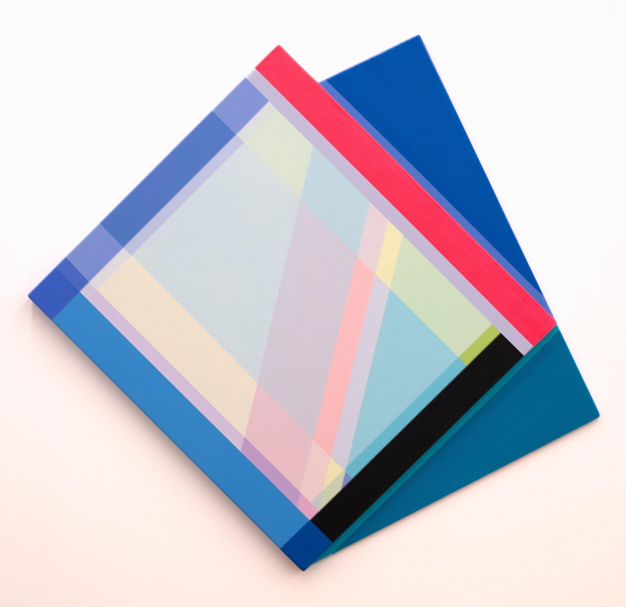
Cover Image(s): Canto © Rachel Hellmann, 2024
[catalogued on p. 57]
Long-Sharp Gallery Highlights
Palm Beach Modern + Contemporary
To view videos of any of the featured works, look for the icon

Line is fundamental to drawing and painting. One of the seven elements of fine art creations (the others: shape, form, value, space, texture and color), line is perhaps the most fundamental. It alone can express emotion, feelings, and more. At Palm Beach Modern + Contemporary 2025, Long-Sharp Gallery’s exhibition, “The Line”, explores how the line’s evolution can be traced through art, fashion, and design.
* This theme will be explored through works by the following artists: Anni Albers, Tarik Currimbhoy, Rachel Hellmann, Julia Ibbini, Roy Lichtenstein, Oliver Marsden, Daniel Mullen, Jason Myers, Cha Jong Rye, and Andy Warhol.

Photograph of Anni Albers by Helen M. Post © The Josef and Anni Albers Foundation, VEGAP, Bilbao, 2017
ANNI ALBERS (1899-1944)
Anni Albers was an influential weaver, textile designer, and printmaker whose sixty-year career advanced weaving as a modernist medium and inspired a reconsideration of textiles as an art form. A retrospective of her work at the Museum of Modern Art in New York in 1949 was the museum’s first solo exhibition dedicated to a textile artist. She is the author of the seminal texts On Designing (1959) and On Weaving (1965).
Born Annelise Fleischmann to an affluent family in Berlin, Albers first studied drawing and painting before attending the Bauhaus, a pioneering and influential German art and design school. To her chagrin, she was enrolled in the only workshop open to female students: weaving. She eventually embraced the medium, creating bold, richly colored, abstract works and experimenting with traditional and synthetic threads, yarns, and fibers. After graduating in 1930, she became the head of the weaving workshop. While at the Bauhaus, she met and married fellow artist Josef Albers (1888-1976).
When the Bauhaus closed under pressure from the Nazi regime, Albers and her husband fled to America in 1933. Albers taught at Black Mountain College, an experimental interdisciplinary school in North Carolina that became an incubator for modernist artistic talent, until 1949. During this time, the Alberses frequently traveled to Mexico, a country that greatly captured their interest and influenced their artwork. In 1950, Josef accepted a position at Yale University, and Albers moved to New Haven, Connecticut.
In 1963, Albers began to focus on lithography and screen printing. Her printmaking practice explored the interplay between dynamic patterns and bold color and textile-related concerns such as pattern, line, knotting, and texture. She continued printmaking and textile design until her death in 1994.
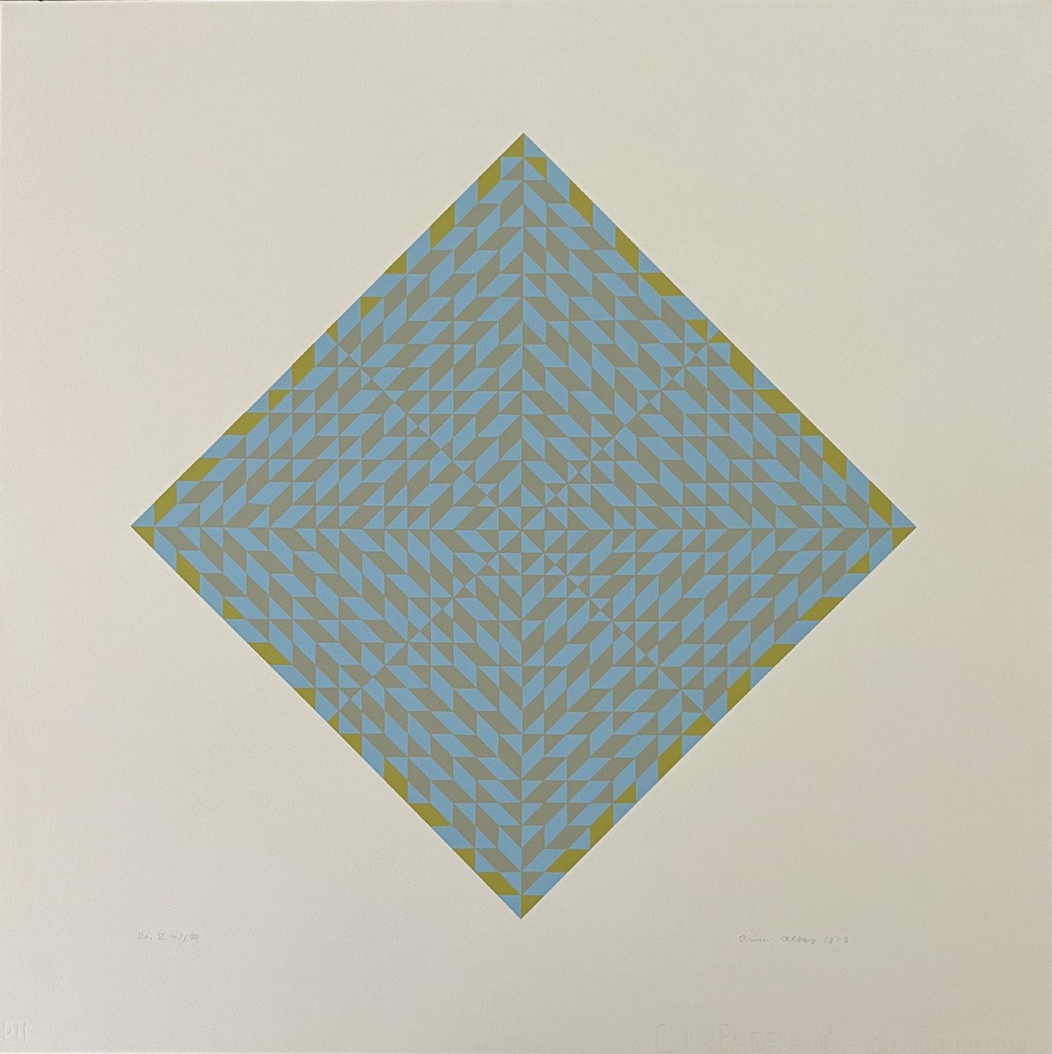
Do V
Year: 1973
Medium: Serigraph on Fabriano paper
Hand signed lower right, titled and numbered lower left
From the edition of 50 plus 10 proofs, this is 37/50
Size: 25.625 x 25.625 in (65 x 65 cm)
Frame size: 29.25 x 29.25 in (74.3 x 74.3 cm)
Provenance:
Edition Domberger
Long-Sharp Gallery
7,500 USD

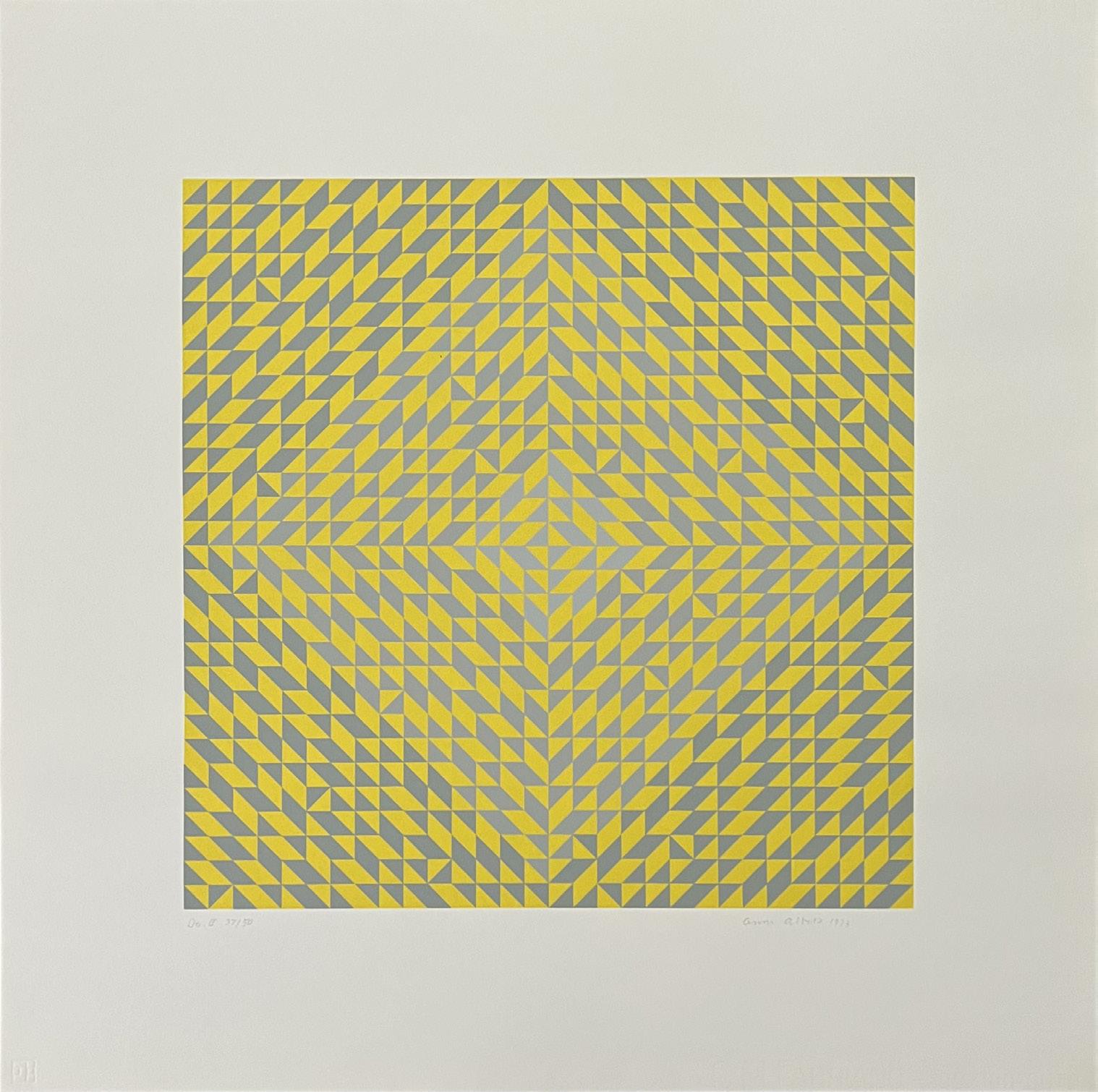
Do II
Year: 1973
Medium: Serigraph on Fabriano paper
Hand signed lower right, titled and numbered lower left
From the edition of 50 plus 10 proofs, this is 37/50
Size: 25.625 x 25.75 in (65.1 x 65.4 cm)
Frame size: 29.25 x 29.25 in (74.3 x 74.3 cm)
Provenance: Edition Domberger Long-Sharp Gallery
7,500 USD Click
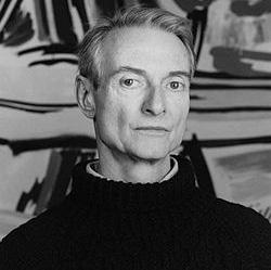
ROY LICHTENSTEIN (American, 1923-1997)
An innovative artist and founder of the American Pop Art movement, Roy Lichtenstein (19231997) is best known for his re-appropriation of the Ben Day dot pattern, a printing process similar to Pointillism, which was initially used in commercial engraving. Alluding to the mechanical technique used in newspapers and comic strips through a use of bold colors, thick lines, and texture and gradient, the artist created works that referenced popular culture by whimsically addressing the gimmicks of their conventions. Hailed ultimately for his style of “paraphrasing” (most notably in the instance of otherwise despised images and subject matter), Lichtenstein remains a pivotal figure of the movement.
The artist created his first portfolio of works in the 1950s, after his studies at the Art Students League of New York. The result was a series of paintings surrounding medieval times, which were rendered in a style reflective of the Swiss-German artist Paul Klee. Lichtenstein’s works would later transition in approach, shifting towards a new style of expressionism that was more inclusive of satire and traditionally reminiscent of American genre cowboys and Indians. It was not until the 1960s, however, that the artist developed his signature style of expression. During this exemplary period in his career, Lichtenstein gained popularity through his trademark use of parody, irony, and cliché. By 1962, he had secured his first solo exhibit at the Leo Castelli Gallery, which was entirely sold out to collectors before the opening night. Lichtenstein’s fame grew exponentially from that point forward.
Roy Lichtenstein was born in Manhattan in 1923. As a boy in New York City, he had a passion for both science and comic books. Upon discovering his interest in art, Lichtenstein began his studies at Parsons School of Design in 1937, and shortly following, studied under Reginald Marsh at the Art Students League. In 1940, Lichtenstein attended Ohio State University; however, his studies were hindered due to his obligations to the US Army during the draft of World War II. During this time, he was greatly influenced by the works of European masters and contemporary artists living in France. Lichtenstein ultimately completed his studies at Ohio State University and thereafter continued his teaching career at different universities. Over the ensuing decades, Lichtenstein continued to hone his craft as a painter, printmaker and sculptor. He passed away in 1997 due to complications from pneumonia. Roy Lichtenstein’s art now hangs in museums around the world, including the Museum of Modern Art and Tate Modern in London.
About this work: Lichtenstein’s creative process is demonstrated through his preparatory work; most of his sketches, drawings, and collages later appear in a painting, print, or other work. In part for this reason, his study drawings are some of the most sought-after pieces in his oeuvre. This work is one of the eight study drawings Lichtenstein created for Modular Painting with Four Panels #3.
Most of Lichtenstein’s modern, modular works were completed between 1967 and 1969. At first glance, works in the Modular Series may appear to diverge sharply from Lichtenstein’s celebrated Pop art of the early 1960s. However, both Pop and modularity share an emphasis on the minimalistic, mechanical processes that Lichtenstein championed.
In addition to Lichtenstein’s exploration of geometrical Art Deco themes, the Modular Series is significant because of an innovation in Lichtenstein’s Ben-Day dot technique. It has been suggested that Lichtenstein experimented with the effect of graduating BenDay dots for the first time in this series.
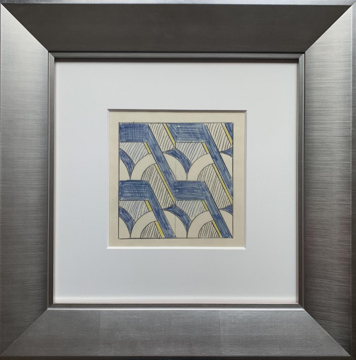
Drawing for Modular Painting with Four Panels #3 (2)
Year: 1969
Medium: Graphite and colored pencils on paper
Image size: 6 x 6 in (15.2 x 15.2 cm)
Sheet size: 10 x 9.875 in (25.4 x 25.1 cm) (Irregular)
Frame size: 18 x 18 in (45.7 x 45.7 cm)
Reference: Online Catalogue Raisonné RL 34926 and 34927
Provenance: Artist
Private Collection (as a gift from the artist)
Long-Sharp Gallery (through a broker for the private collector)
90,000 USD
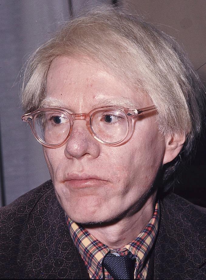
ANDY WARHOL (American, 1928-1987)
Widely considered as one of the most influential artists of the twentieth century, Andy Warhol (1928-1987) is celebrated for his signature depictions surrounding daily objects of mass production. Identified as the first artist to convey the influence of mass media culture on the American life, Warhol created his most prolific works in the 1960s, when the US was quickly becoming a culture built upon television and mass consumerism. Consequently surrounded by a fascination with impactful and lasting images, audiences soon began to reject typical print media to embrace Warhol’s representation of media and commercialism. Throughout his successful career and numerous iconic collaborations, Warhol continued to firmly establish his patented impact of imagery on the development of our environment and identity. His beloved Campbell’s Soup cans and Coke bottles, as well as his silkscreen prints of famous personalities such as Marilyn Monroe and Elvis Presley are still widely celebrated today. Simply, Warhol is regarded as the King of Pop Art. His influence went beyond painting and printmaking.
Warhol founded The Factory in 1962, as a result of his interest in the mass production of his own works. In addition to serving as an industrial setting for his employees to extensively produce the artists’ prints and posters, The Factory also functioned as a performance venue for the Velvet Underground, and a filmmaking studio for his experimental films.
Born “Andy Warhola” in 1928 to Slovak immigrants, Warhol displayed an early talent for drawing and painting. Following high school, he enrolled in Pittsburgh’s Carnegie Institute of Technology, where he studied commercial art. After graduating in 1949, Warhol moved to New York to work as an illustrator for various magazines, such as Vogue and Harper’s Bazaar. He soon became one of New York’s most sought after and successful illustrators, and in 1952, he held his first oneman exhibition at New York’s Hugo Gallery. Warhol quickly became one of the most celebrated commercial artists in New York. His works were featured in every important magazine from Vogue to Harper’s Bazaar. The 1950’s also marked his most prolific period for his illustrating and publishing books – during this period he would go on to publish eight books.
In July of 1968, Warhol narrowly survived an attempt on his life by Valerie Solanis. Solanis, who had worked at The Factory occasionally, shot Warhol multiple times in the chest, proclaiming upon her arrest that he “had too much control over my life.” Throughout the 1970s, Warhol continued to produce art, as well as to expand his entrepreneurial interests through such ventures as founding Interview magazine as well as the opening of a successful nightclub. Warhol died tragically in February 1987 from complications following a gall bladder operation.
“Advertising is communication, persuasion – Andy practiced the art of persuasion as well as anybody.”
- Stephen Frankfurt, Art Director, Young & Rubicam.1
About this work: Imbued with a keen eye, inimitable wit, and an intuitive sense of mass appeal, advertising may have been the perfect microcosm for Andy Warhol. “Warhol’s commercial output in the 1950s lay squarely in the ‘creative’ camp, while also revealing a natural aptitude for understanding the psychological factors at play in consumer desire.”2 Whether illustrating for magazines like Vogue, Harper’s Bazaar, Glamour, or any of the other national publications that eagerly snapped up his designs, Warhol was able to capture and capitalize on the pulse of pop culture. He applied this same savvy to collaborations with famous designers of the era, though perhaps none more vociferously than fashion designer Halston.
The two powerhouse entrepreneurs met in the early 1970s through fashion designer Joe Eula. They became close friends who each influenced the other’s creative practice in unique ways. Halston, for example, used Warhol’s works as inspiration for his designs, including a 1972 dress based on Warhol’s 1964 Flowers canvas. Indeed, the two were so involved in each other’s careers that a book has been written on their friendship and collaborations, Halston and Warhol: Silver and Suede (New York: Harry N. Abrams, 2014).
In 1982, Warhol designed an advertising campaign for Halston’s eponymous brand, including features for menswear, accessories, and fragrance. His relationship to advertising was nothing new; rather, it was an extension of a skill developed in the early days of his career and honed over time.
1 Nicholas Chambers, “Andy Warhol: adman,” in Adman: Warhol Before Pop, ed. Nicholas Chambers (Sidney & Pittsburgh: Art Gallery of New South Wales & The Andy Warhol Museum, 2017), 18.
2 Ibid., 16.
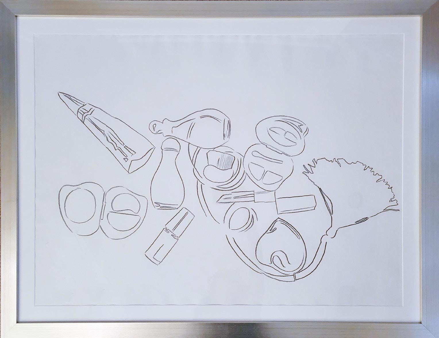
Fragrance and Cosmetics, study for Halston Advertising Campaign Year: 1982
Medium: Graphite on paper
Size: 30 x 40 in (76.2 x 101.6 cm)
Frame size: 36.25 x 45.5 in (92.1 x 115.6 cm)
Provenance:
From the Estate of Andy Warhol (stamp on verso) to the Andy Warhol Foundation for the Visual Arts to Long-Sharp Gallery
Authenticated by the Authentication Board of Andy Warhol Foundation for the Visual Arts (stamp on verso), Foundation archive number (TOP 79.012) on verso in pencil, initialed by the person who entered the works into the Foundation archive.
50,000 USD
Click to view a film
About this work: “For many years, large parts of Andy Warhol’s artistic output in the period between the late 1940s and late 1950s –comprising drawings and commercial and fashion illustrations – have only been accessible to visitors and researchers at The Andy Warhol Museum in Pittsburgh. Although these early works on paper have long been the most marginalized, undervalued and critically neglected component of the artists oeuvre, they demonstrate how fundamental drawing was to Warhol at the beginning of his career. Drawing was his sole method of artistic output and also provided his livelihood.” 1
Upon graduating from Carnegie Mellon with a degree in pictorial design, Andy Warhol moved to New York in 1949 to become a commercial illustrator; he was quickly hired on by the likes of Glamour Magazine, Vogue, and Harper’s Bazaar. According to Simon Doonan’s foreword in Andy Warhol: Fashion: “From his whimsical line drawings of cars to sleek renderings of ladies’ shoes, Warhol’s work became a hit in the fashion world…. [he] sketched hundreds of drawings of shoes, handbags, jewelry, and gloves”. 2
His interest in fashion was not limited to these illustrations and advertisements, however. As the decades went on, Warhol would befriend, collaborate collaborate with, and create portraits of designers including Halston, Yves Saint Laurent, and Diane von Furstenberg. Models, especially in the 1960s, were a new kind of celebrity, and Warhol capitalized on this notoriety. He is recognized as one of the first artists to print his work onto clothing and sell it exclusively to high-profile clientele. Warhol may have captured it best when he said that “[f]ashion wasn’t what you wore someplace anymore; it was the whole reason for going.” This drawing in particular was used as a study for Vogue magazine in 1959.
Click to view a film
1 Brett Littmen, “Dual pursuits: Warhol’s early drawings,” in Adman Warhol before pop, ed. Nicholas Chambers (Sidney & Pittsburgh: Art Gallery of New South Wales & The Andy Warhol Museum, 2017), 35.
2 Simon Doonan, “Foreword” in Andy Warhol Fashion, ed. Simon Doonan (San Francisco: Chronicle Books, 2004), 7.
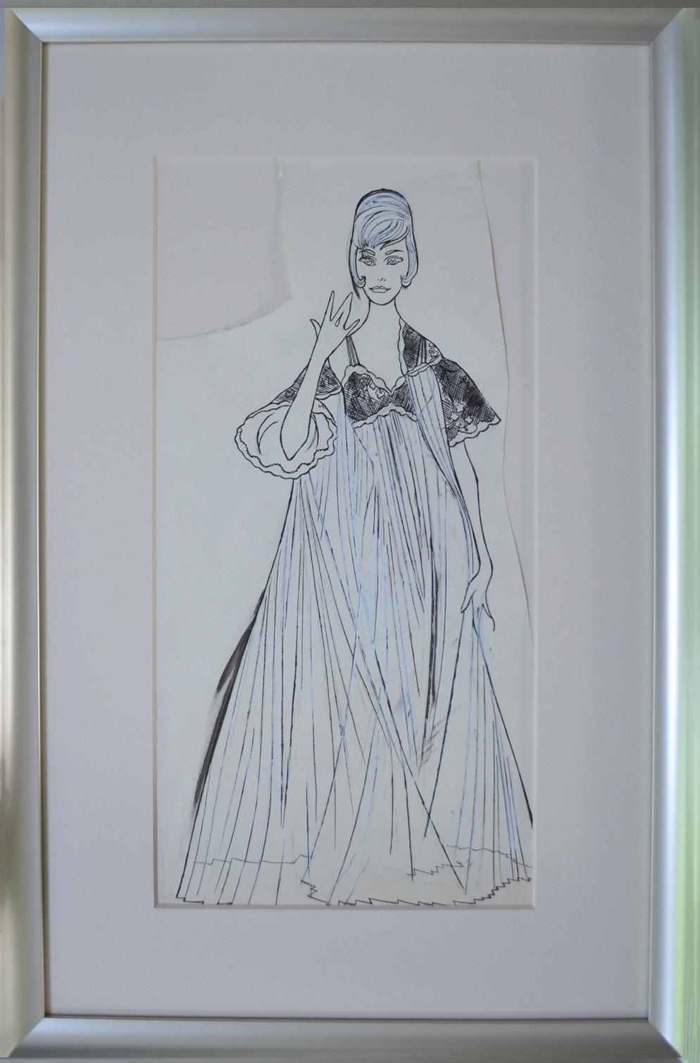
Female Fashion Figure
Year: Circa 1960
Medium: Ink and graphite on paper
Size: 19.5 x 10 in (49.5 x 25.4 cm)
Frame size: 26.75 x 17.75 in (67.9 x 45 cm)
Provenance:
From the Estate of Andy Warhol (stamp on verso) to the Andy Warhol Foundation for the Visual Arts to Long-Sharp Gallery
Authenticated by the Authentication Board of Andy Warhol Foundation for the Visual Arts (stamp on verso), Foundation archive number (ARD 406.006) on verso in pencil, initialed by the person who entered the works into the Foundation archive.
20,000 USD
About this work: Warhol’s brother John recalls Andy’s early desire to be a tap dancer. The first recording of Warhol’s interest in dance is his enrollment – as the only male, no lessin the Modern Dance Club at Carnegie Tech. That summer, in 1948, two of Warhol’s works (“I Like Dance” and “Dance in Black and White”) were chosen for inclusion in a juried show for the Associated Artists of Pittsburgh. [It was this inclusion that tipped off members of the dance club to Warhol’s talent, and relegated him to graphic design for the group instead of actually dancing.] In New York thereafter, he applied for a job as a commercial illustrator at Dance Magazine in 1951; he would contribute numerous drawings to the magazine, including two covers.
When Warhol moved to New York City at the end of the 1940s, it was overflowing with musicians, dancers, and avant-garde performers. Warhol took inspiration from everything. For decades, he was a devoted attendee at theatre performances, concerts, and counterculture events. Works spanning the 1950s to the 1980s reflect this immersion in arts and music: when Warhol was not attending events with Martha Graham or working with Merce Cunningham on the set for his next performance, he was integrating what he had learned from these dancers into his art.
Another inspiration behind Warhol’s early drawings – especially those involving dance and theatre–was photographer Otto Fenn. The two met in 1951, and Warhol became a constant at Fenn’s photography studio, said to have attracted gay creative minds of New York in the 40s and 50s. Warhol helped Fenn with the backdrops for his photography shoots; Fenn’s photos became the foundations for many of Warhol’s early drawings [couples dancing – often in drag].
Warhol’s interest in and integration of dance into his art spanned the years. In the 1960s, when he encountered books published by the Dance Guild purporting to teach dance, Warhol transformed these instructions into his “Dance Diagram” paintings. These paintings (measuring 71.5 x 51.75 inches) were exhibited at the Stable Gallery in New York in 1962, and were installed on the floor of the exhibition space.
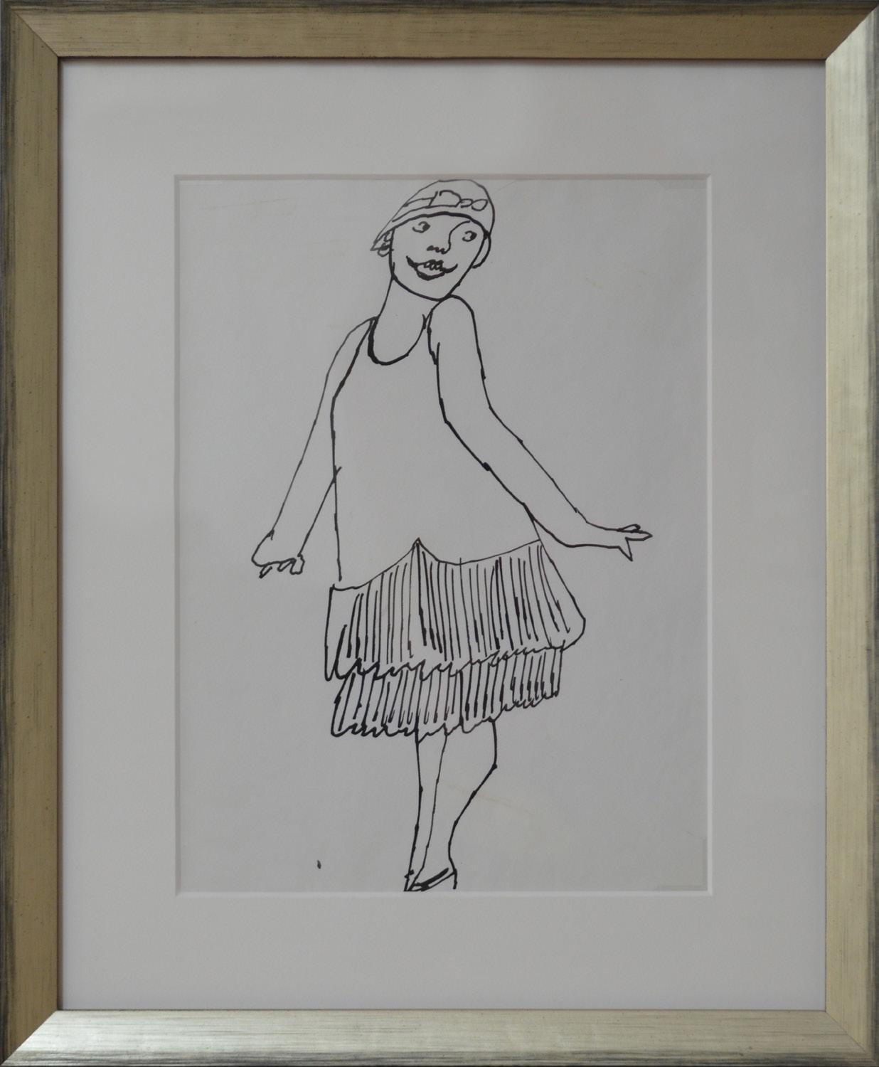
Female Figure
Year: Circa 1955
Medium: Ink on paper
Size: 11 x 8.5 in (27.9 x 21.6 cm)
Frame size: 16 x 13.25 in (40.6 x 33.6 cm)
Provenance:
From the Estate of Andy Warhol (stamp on verso) to the Andy Warhol Foundation for the Visual Arts to Long-Sharp Gallery
Authenticated by the Authentication Board of Andy Warhol Foundation for the Visual Arts (stamp on verso), Foundation archive number (TOP 269.027) on verso in pencil, initialed by the person who entered the works into the Foundation archive.
12,000 USD
About this work: Warhol’s brother John recalls Andy’s early desire to be a tap dancer. The first recording of Warhol’s interest in dance is his enrollment – as the only male, no lessin the Modern Dance Club at Carnegie Tech. That summer, in 1948, two of Warhol’s works (“I Like Dance” and “Dance in Black and White”) were chosen for inclusion in a juried show for the Associated Artists of Pittsburgh. [It was this inclusion that tipped off members of the dance club to Warhol’s talent, and relegated him to graphic design for the group instead of actually dancing.] In New York thereafter, he applied for a job as a commercial illustrator at Dance Magazine in 1951; he would contribute numerous drawings to the magazine, including two covers.
When Warhol moved to New York City at the end of the 1940s, it was overflowing with musicians, dancers, and avant-garde performers. Warhol took inspiration from everything. For decades, he was a devoted attendee at theatre performances, concerts, and counterculture events. Works spanning the 1950s to the 1980s reflect this immersion in arts and music: when Warhol was not attending events with Martha Graham or working with Merce Cunningham on the set for his next performance, he was integrating what he had learned from these dancers into his art.
Another inspiration behind Warhol’s early drawings – especially those involving dance and theatre–was photographer Otto Fenn. The two met in 1951, and Warhol became a constant at Fenn’s photography studio, said to have attracted gay creative minds of New York in the 40s and 50s. Warhol helped Fenn with the backdrops for his photography shoots; Fenn’s photos became the foundations for many of Warhol’s early drawings [couples dancing – often in drag].
Warhol’s interest in and integration of dance into his art spanned the years. In the 1960s, when he encountered books published by the Dance Guild purporting to teach dance, Warhol transformed these instructions into his “Dance Diagram” paintings. These paintings (measuring 71.5 x 51.75 inches) were exhibited at the Stable Gallery in New York in 1962, and were installed on the floor of the exhibition space.
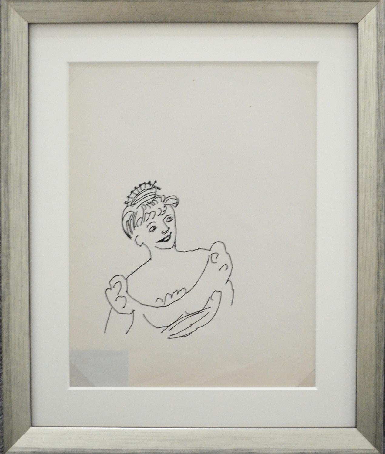
Woman in Costume Dress
Year: Circa 1955
Medium: Ink on paper
Size: 11 x 8.5 in (27.9 x 21.6 cm)
Frame size: 14.625 x 12.125 in (37.1 x 30.8 cm)
Provenance:
From the Estate of Andy Warhol (stamp on verso) to the Andy Warhol Foundation for the Visual Arts to Long-Sharp Gallery
Authenticated by the Authentication Board of Andy Warhol Foundation for the Visual Arts (stamp on verso), Foundation archive number (TOP 269.016) on verso in pencil, initialed by the person who entered the works into the Foundation archive.
12,000 USD
About this work: The cut-out portrait of British-born actress Hermione Gingold is one example of Warhol’s knowledge of and affinity for celebrities of his time. The Andy Warhol Foundation for the Visual Arts has dated this drawing circa 1954. Around this time, Ms. Gingold was performing on Broadway alongside Harry Belafonte in the musical John Murray Anderson’s Almanac 1
Gingold was born in London in 1897. Over her illustrious career, she would star in over two-dozen films and about half as many television shows; she received the Golden Globe for her supporting role in the 1958 film Gigi. She died the same year as Andy Warhol, 1987.
Hermione Gingold is mentioned in the Andy Warhol Diaries as being at an Anti-Defamation League meeting also attended by Warhol on June, 1977.1
1 Pat Hackett, ed. The Andy Warhol Diaries. (New York: Grand Central, 1989), 47. Click to view a film
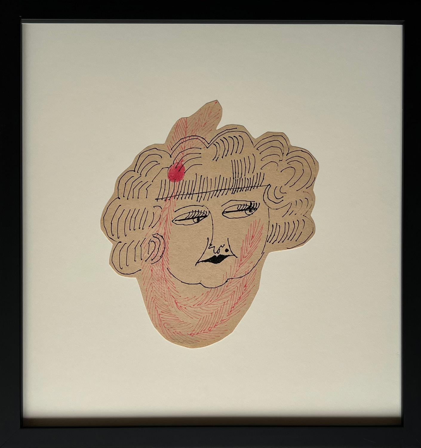
Female Portrait (Hermione Gingold)
Year: Circa 1954
Medium: Ink on paper
Size: 9.125 x 7.875 in (23.2 x 20 cm)
Frame size: 16.25 x 15.5 in (41.3 x 39.4 cm)
Provenance:
From the Estate of Andy Warhol (stamp on verso) to the Andy Warhol Foundation for the Visual Arts to Long-Sharp Gallery
Authenticated by the Authentication Board of Andy Warhol Foundation for the Visual Arts (stamp on verso), Foundation archive number (TOP 230.021) on verso in pencil, initialed by the person who entered the works into the Foundation archive.
25,000 USD
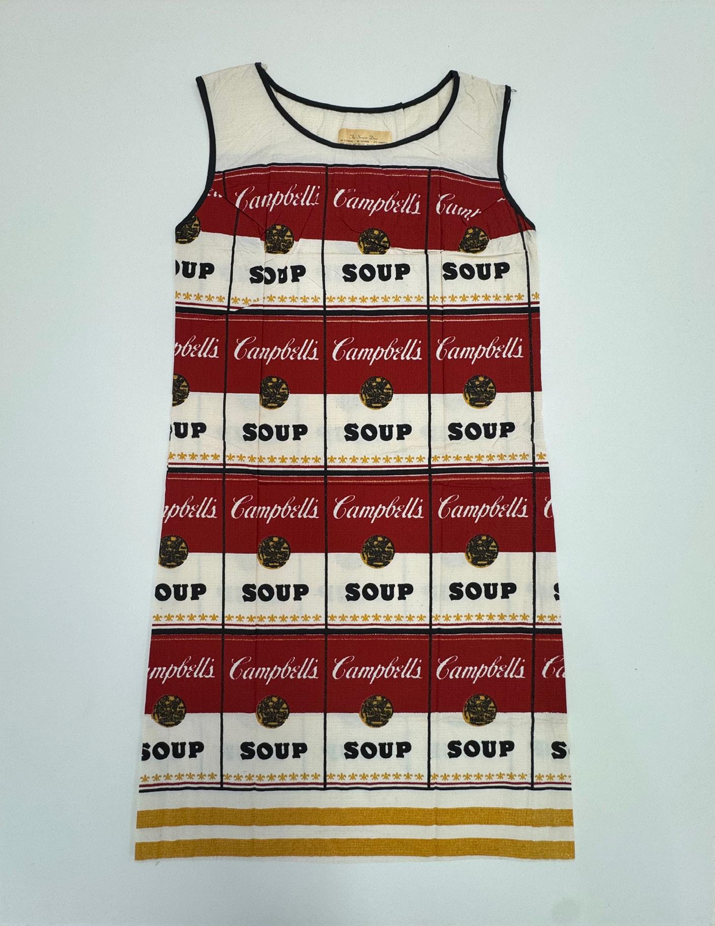
The Souper Dress (with original label at neck)
Year: 1965
Medium: Screenprint in colors on cellulose and cotton A-line dress
Size: 38 x 24 in (96.5 x 61 cm)
Provenance:
From a Distinguished Collection, Palm Beach, FL
22,500 USD
About this work: Russell Means served as the first Director of the American Indian Movement in the 1970s, garnering widespread support in his push to honor the contributions of indigenous groups through his work as a politician and Hollywood actor. Thought to be the result of an introduction to Warhol by the artist’s West Coast representation at Ace Gallery, such portraits of Means present a bright celebrity persona of this pivotal activist.
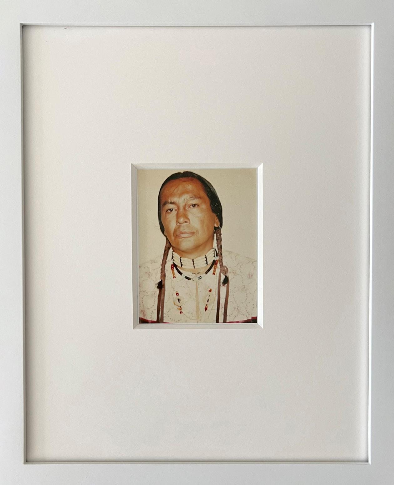
American Indian (Russell Means) Year: 1976
Medium: Unique polaroid print
Size: 4.25 x 3.75 in (10.8 x 8.6 cm)
Frame size: 11 x 8 7/8 in (27.9 x 22.5 cm)
Provenance:
From the Estate of Andy Warhol (stamp on verso) to the Andy Warhol Foundation for the Visual Arts to Long-Sharp Gallery
Authenticated by the Authentication Board of Andy Warhol Foundation for the Visual Arts (stamp on verso), Foundation archive number (FA09.01446) on verso in pencil, initialed by the person who entered the works into the Foundation archive.
22,000 USD
About this work: Flowers would appear interspersed throughout every decade of Andy Warhol’s illustrious career. He penned drawings of flowers as early as the 1950s, studying floral compositions and visiting flower markets with friend Charles Lisanby to purchase flowers to sketch. Paintings of flowers from his 1964 exhibit at the Leo Castelli Gallery are some of his most widely recognized works, and his photographs from the 1970s and 1980s are pervasive. He continued variations with this theme until his death in 1987.
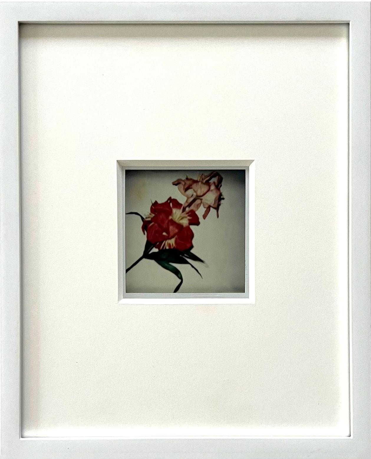
Flowers Year: 1982
Medium: Unique polaroid print
Size: 4.25 x 3.5 in (10.8 x 8.9 cm)
Frame size: 11 x 8.875 in (27.9 x 22.5 cm)
Provenance:
From the Estate of Andy Warhol (stamp on verso) to the Andy Warhol Foundation for the Visual Arts to Long-Sharp Gallery
Authenticated by the Authentication Board of Andy Warhol Foundation for the Visual Arts (stamp on verso), Foundation archive number (FB09.00007) on verso in pencil, initialed by the person who entered the works into the Foundation archive.
17,500 USD
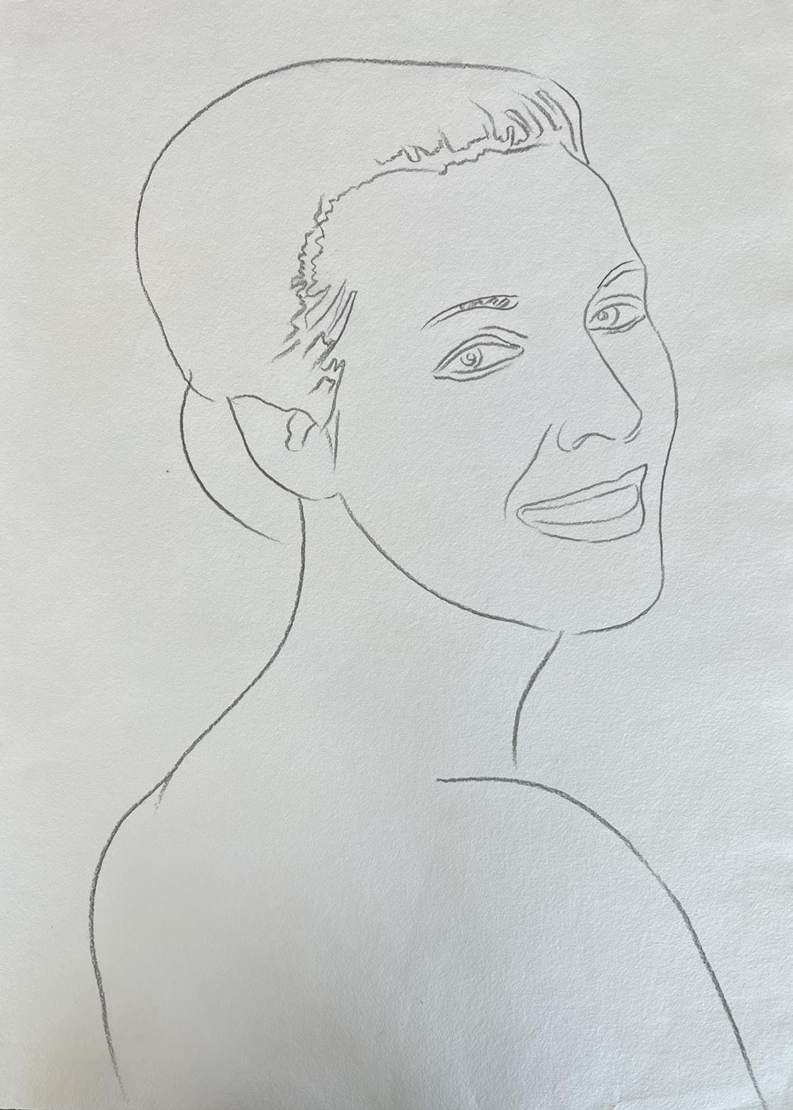
Female Portrait Year: 1982
Medium: Graphite on paper
Size: 31.375 x 24 in (79.7 x 61 cm)
Frame size: 36.25 x 27.25 in (92.1 x 69.2 cm)
Provenance:
From the Estate of Andy Warhol (stamp on verso) to the Andy Warhol Foundation for the Visual Arts to Long-Sharp Gallery
Authenticated by the Authentication Board of Andy Warhol Foundation for the Visual Arts (stamp on verso), Foundation archive number (TOP 114.150) on verso in pencil, initialed by the person who entered the works into the Foundation archive.
40,000 USD
About this work: In 1983, Andy Warhol was commissioned by publisher Ronald Feldman to create a portfolio of screenprints dedicated to endangered animals. This series featured depictions of ten animals, including an orangutan, zebra, rhinoceros, tree frog, and bald eagle, among others. This was not the only project concerning endangered animals that would occupy Warhol’s thoughts. See for example, Warhol’s “Vanishing Animals” project with Kurt Benirshke, which resulted in a book by that name, published in 1986.
To the right is an image of a TP (Trial Proof) from Warhol’s Endangered Species portfolio (Pine Barrens Tree Frog). There were 30 signed and numbered trial proofs of each of the 10 endangered animals portrayed in the suite. Each TP has a different colorway but the same composition as the regular edition.
Click to view a film
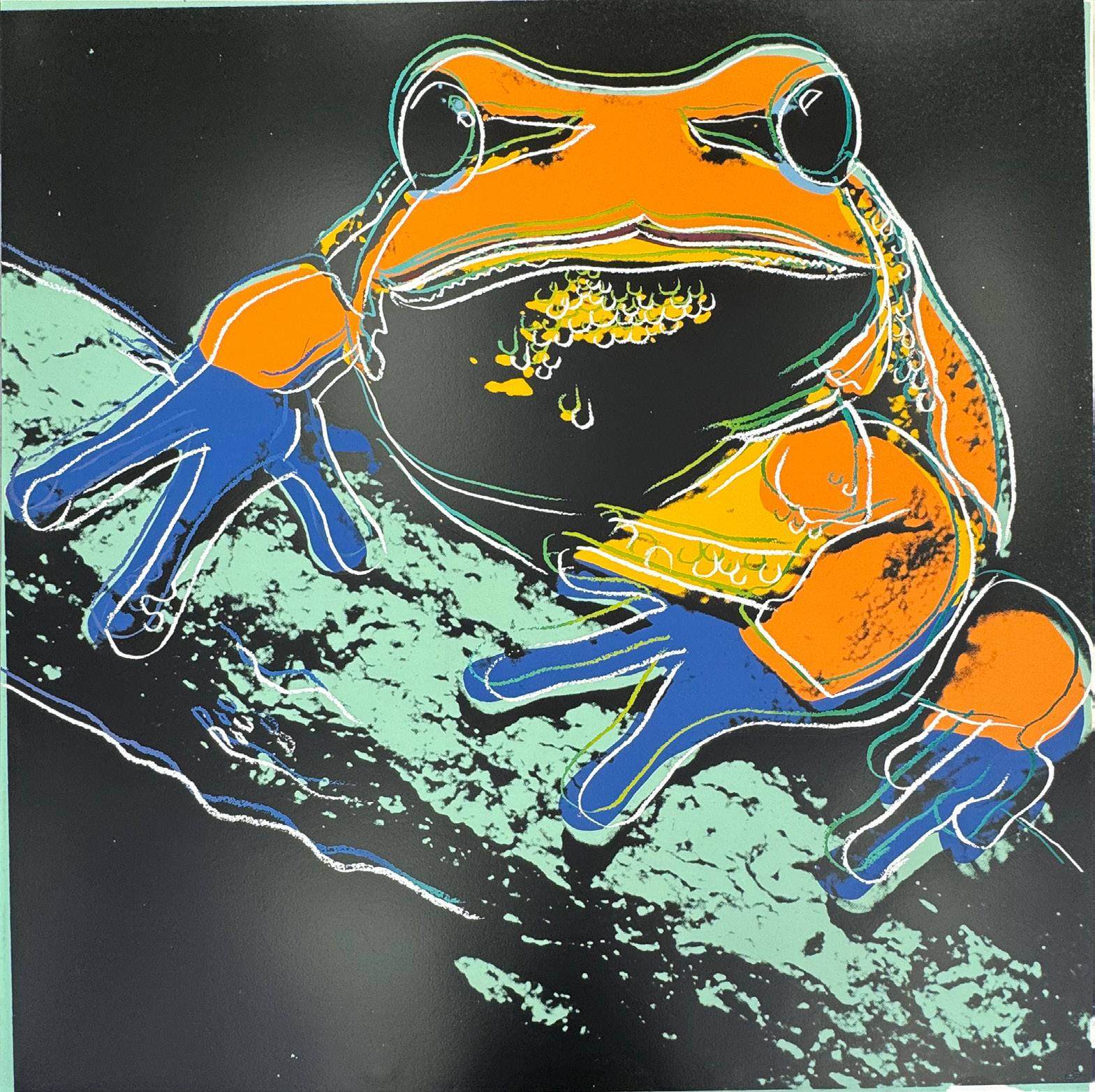
Pine Barrens Tree Frog (TP) (from Endangered Species)
Year: 1983
Medium: Screenprint on Lenox Museum Board Size: 38 x 38 in (96.5 x 96.5 cm)
From an edition of 150, 30 AP, 5PP, 5EP, 3 HC, 10 numbered in Roman Numerals, 1 BAT, 30 TP; this is TP 27/30 Signed, Lower Left
Printer: Rupert Jasen Smith
Publisher: Ronald Feldman Fine Arts, Inc., New York
Reference: FS. II.294 (Endangered Species Edition); FS. 11B.294 (Endangered Species Trial Proofs)
Provenance:
From a Distinguished Collection, Palm Beach, FL
230,000 USD
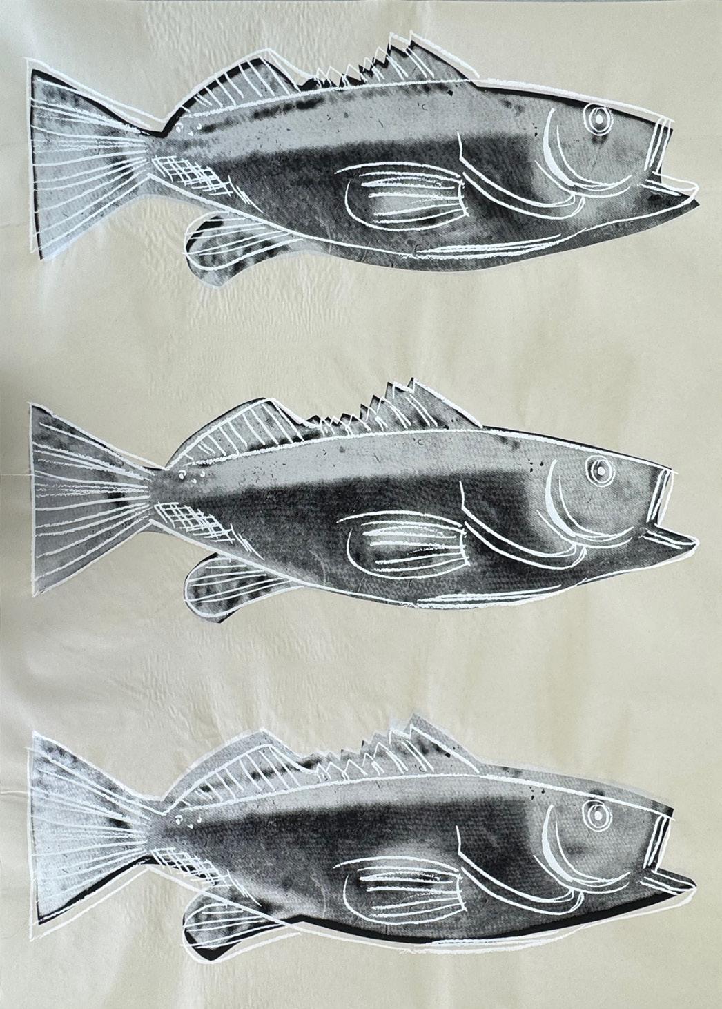
Fish
Year: 1983
Medium: Screenprint on wallpaper
Size: 44 x 30 in (111.8 x 76.2 cm)
Printer: Rupert Jasen Smith
Created as a backdrop for the exhibition “Paintings for Children” at the Bruno Bischofberger Gallery, Zurich, Dec 3, 1983 – Jan 14, 1984.
Publisher: Ronald Feldman Fine Arts, Inc., New York
Reference: FS.IIIA.39
Provenance:
The Estate of Andy Warhol
From a Distinguished Collection, Palm Beach, FL
Authenticated by the Authentication Board of Andy Warhol Foundation for the Visual Arts (stamp on verso), Foundation archive number (UP 89.22) on verso in pencil, initialed by the person who entered the works into the Foundation archive.
22,500 USD
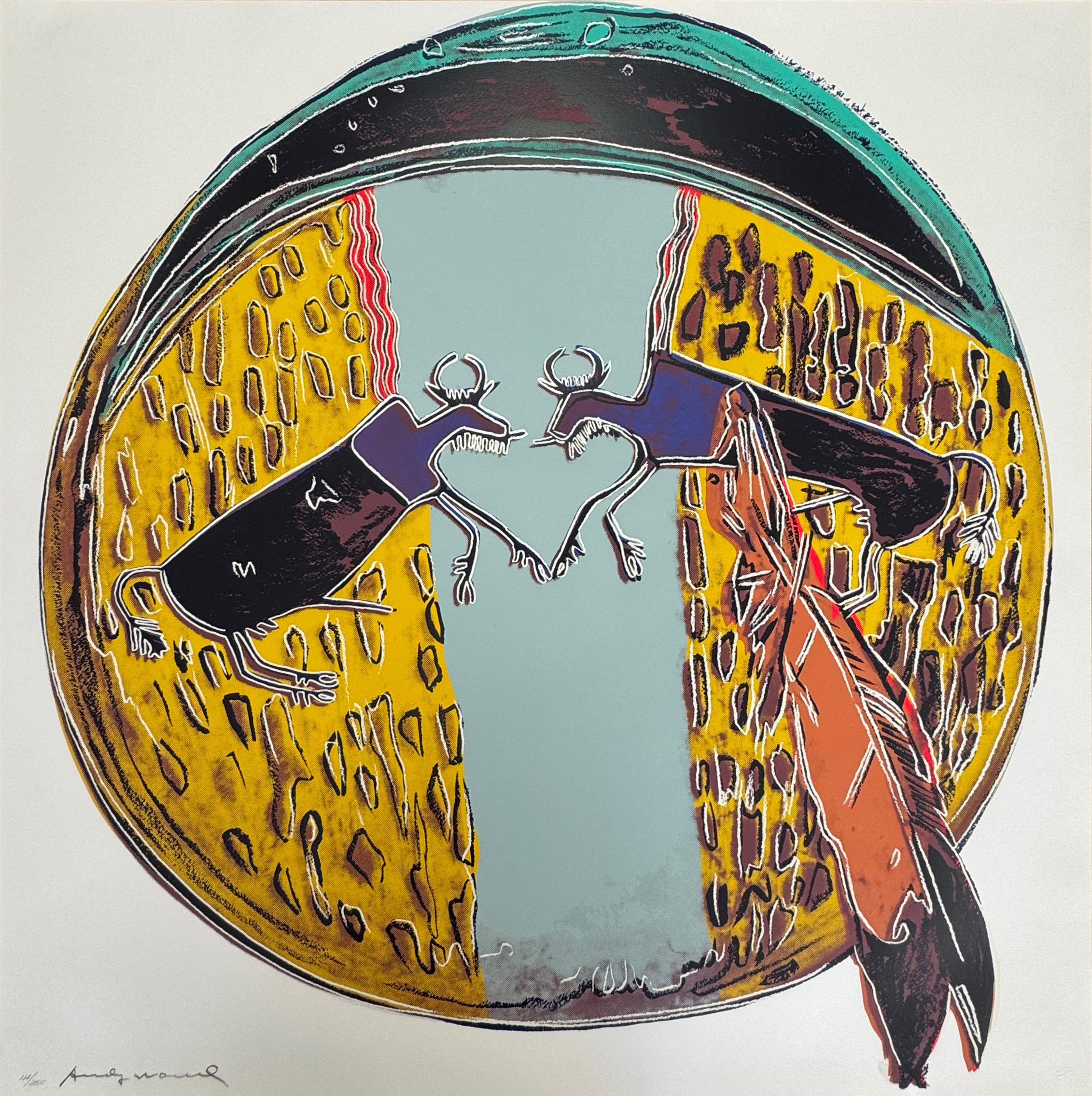
Plains Indian Shield (from Cowboys and Indians)
Year: 1986
Medium: Screenprint on Lenox Museum Board
Size: 36 x 36 in (91.44 x 91.44 cm)
From an edition of 250, 50 AP, 15 PP, 15 HC, 10 numbered in Roman Numerals, this is example 114/250
Signed and numbered in pencil lower left; blindstamped lower right, publisher stamp on reverse
Printer: Rupert Jasen Smith
Publisher: Gaultney, Klineman Art, Inc. New York
Reference: FS II.382
Provenance:
From a Distinguished Collection, Palm Beach, FL
39,000 USD
About this work: Flowers would appear interspersed throughout every decade of Andy Warhol’s illustrious career. He penned drawings of flowers as early as the 1950s, studying floral compositions and visiting flower markets with friend Charles Lisanby to purchase flowers to sketch. Paintings of flowers from his 1964 exhibit at the Leo Castelli Gallery are some of his most widely recognized works, and his photographs from the 1970s and 1980s are pervasive. He continued variations with this theme until his death in 1987.
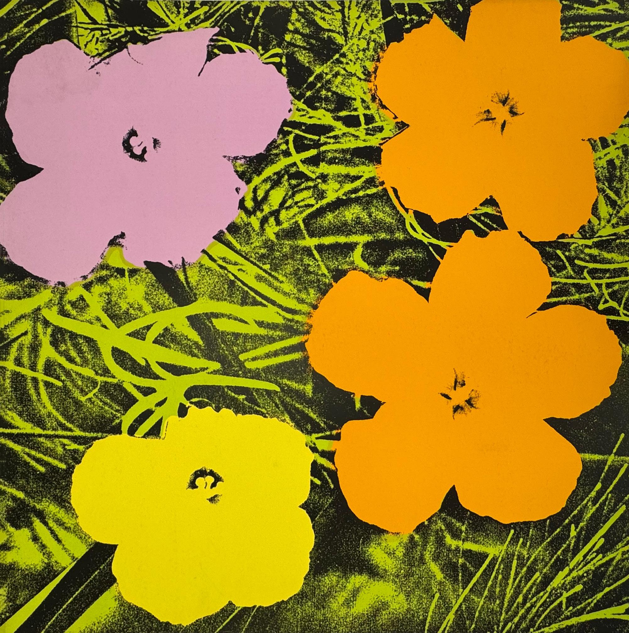
Flowers Year: 1970
Medium: Screenprint on paper
Size: 36 x 36 in (91.44 x 91.44 cm)
From an edition of 250, 26 AP (A-Z); this is an unsigned proof outside the edition
Printer: Aetna Silkscreen Products, Inc, New York
Publisher: Factory Editions, New York
Reference: FS.II.67
Provenance:
From a Distinguished Collection, Palm Beach, FL
Authenticated by the Andy Warhol Foundation for the Visual Arts, Authentication Board. Reference: A151.115.
57,000 USD
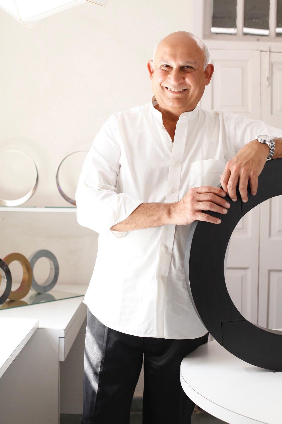
TARIK CURRIMBHOY
(b. 1954)
Classically trained in the arts, industrial design, and architecture, Tarik Currimbhoy is a trifecta of artistic prowess. Having earned a Bachelor of Fine Arts and a Master of Architecture from the Pratt Institute, as well as a Master of Arts from Cornell University, Tarik later went on to teach at both institutions (Drawing at Cornell and Design at Pratt).
In both architecture and sculpture, Tarik searches for tranquility, simplicity and tactility, expressed in purity of both form and material. Inspired by ancient architecture of building blocks resting on each other in tension and compression, Tarik’s sculptures are “stories of structure and gravity”, held together under compression in stone and metal.
Tarik has mastered the juxtaposition of the old and the new, using handcrafting and ancient casting techniques to create sculptures that are modern and minimal in form. His design work has been published internationally and his sculptures may be found across the world in public spaces as well as corporate and private collections.
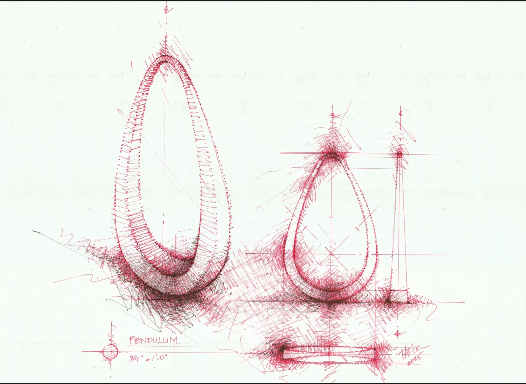
Pendulum (Study)
Year: 2024
Medium: Flair marker and bestine on beinfang paper
Size: 22 x 30 in (55.9 x 76.2 cm)
Provenance:
The artist’s studio
Long-Sharp Gallery
5,000 USD
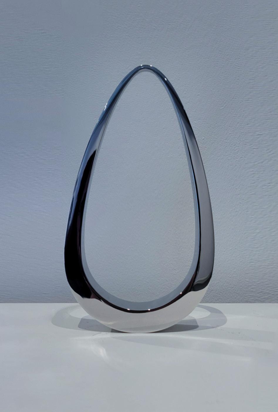
Pendulum Year: 2024
Medium: 316 Stainless steel
Stamped with artist’s initials and edition number on side
From the edition of 11 plus proofs
Size: 10 x 5.375 x 1.25 in (25.4 x 13.65 x 3.175)
Provenance: The artist’s studio
Long-Sharp Gallery
5,000 USD
Click to view a film
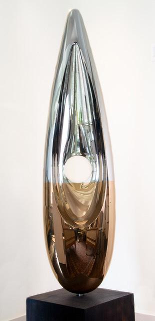
Phoenix (SS/RG) Year: 2024
Medium: Stainless steel and rose gold plating
From the edition of 4 plus proofs; this is 1/4
Size: 72 x 16 x 9 (188.9 x 40.6 x 22.9 cm)
Base: 12 x 12 x 12 (30.5 x 30.5 x 30.5 cm)
Provenance:
The artist’s studio Long-Sharp Gallery
80,000 USD
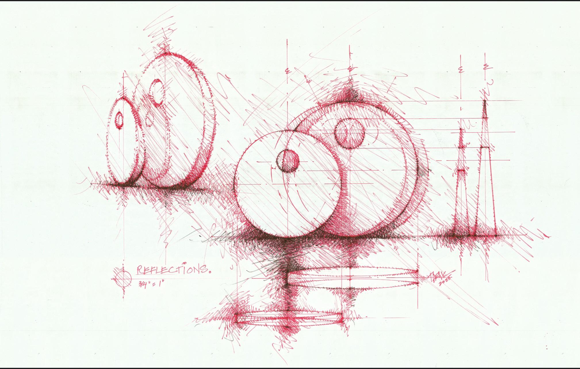
Reflections (Study)
Year: 2024
Medium: Flair marker and bestine on beinfang paper
Size: 22 x 30 in (55.9 x 76.2 cm)
Provenance:
The artist’s studio
Long-Sharp Gallery
5,000 USD
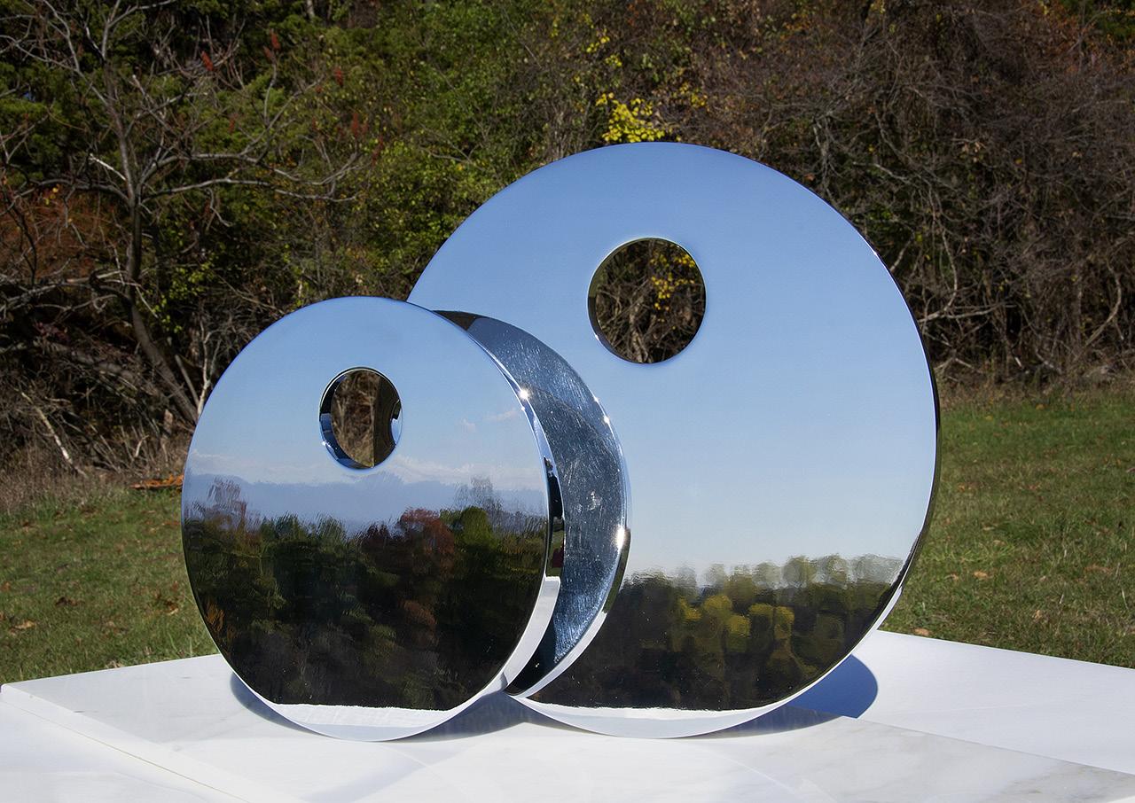
Reflections (small and large)
Medium: 316 Stainless steel
Edition of 30 plus 2 artist’s proofs, this is example 13/30 (for 9”)
Edition of 11 plus 2 artist’s proofs, this is example 5/11 (for 12”)
Stamped with artist’s initials and edition number on side (each)
Size: 9” in diameter and 12” in diameter, respectively
Provenance:
The artist’s studio
Long-Sharp Gallery
8,000 USD (9”)
11,000 USD (12”)
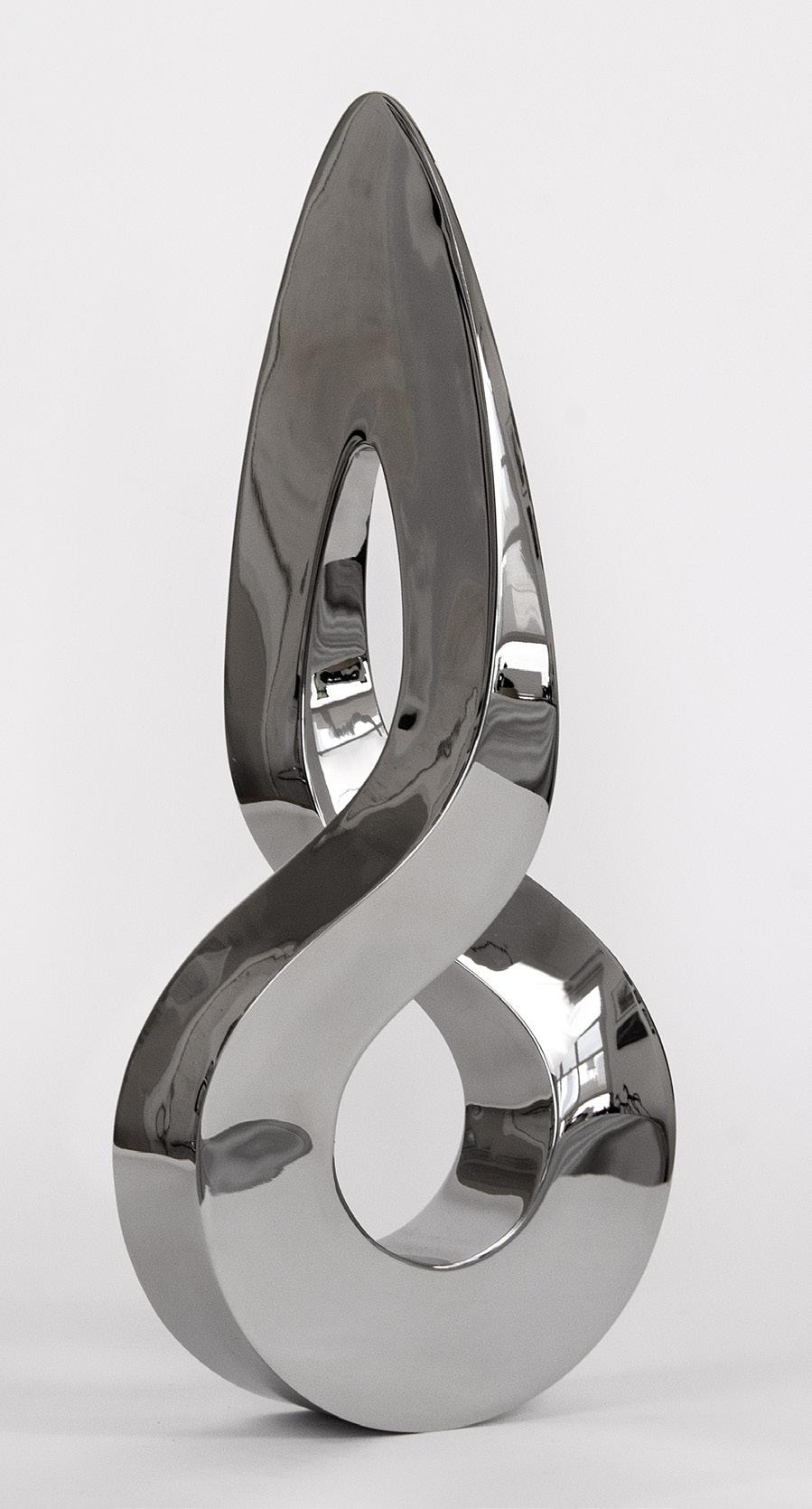
Diya Year: 2024
Medium: 316 Stainless steel
Stamped with artist’s initials and edition number on side
From the edition of 7 plus proofs
Size: 18 x 8 x 2.5 in (45.7 x 20.3 x 6.3 cm)
Provenance: The artist’s studio Long-Sharp Gallery 14,000 USD
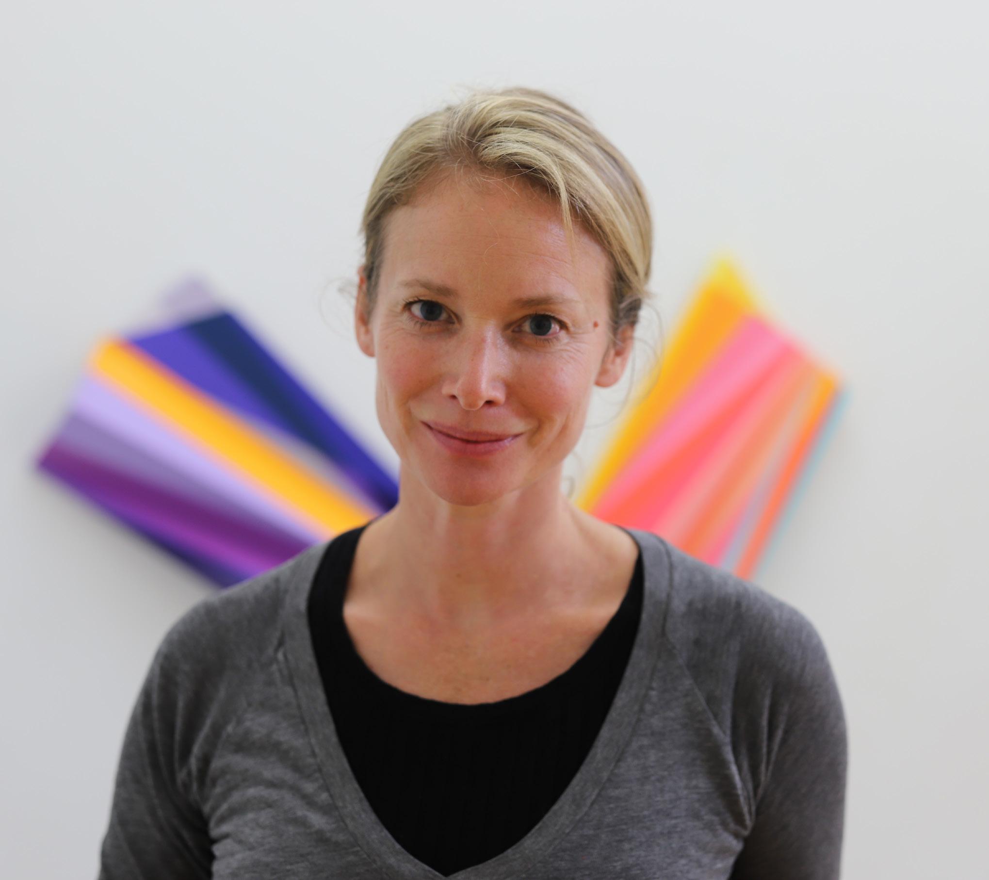
RACHEL HELLMANN
(American, b. 1977)
Rachel Hellmann is a multi-disciplinary artist who is known for her ongoing series of meticulously-crafted geometric sculptures and paintings. Working both three-dimensionally and on paper, the resulting forms explore the way in which the viewer’s perception is disoriented by the distorted sense of gravity caused by the careful interplay of geometry, light, and color.
Rachel Hellmann lives and works in Indianapolis, Indiana. She holds an MFA from Boston University and a B.F.A. from the University of Dayton. Hellmann’s work has been exhibited widely both nationally and internationally at a variety of venues including the Addison Gallery of American Art (Andover, MA), the Zillman Art Museum (Bangor, ME), the Swope Art Museum (Terre Haute, IN), the Cristel DeHaan Fine Art Center (Indianapolis, IN), the Danforth Museum of Art (Framingham, MA), the Elmhurst Art Museum (Elmhurst, Ill) and Zona Maco Art Fair (Mexico City).
Hellmann has been the recipient of the Blanche E. Colman Award for Painting and the Constatin Alajalov Award. In 2015, she was the Edward E. Elson Artist-in-Residence at the Addison Gallery of American Art. She has also been awarded residencies at the Ragdale Foundation (Forest Park, IL), Platte Clove Preserve (Catskills, NY) and Playa (Eastern Oregon).
Hellmann’s work is inlcuded in a number of collections including the Zillman Art Museum, Fidelity Corporation, Dana Farber Cancer Institute, New York Presbyterian Hospital, Morgan Stanley, Cummins Inc, Cleary Gottlieb and the US Embassy in Colombo, Sri Lanka.
Canto Year: 2024
Medium: Acrylic on wood
Size: 40 x 42 x 1.75 in (101.6 x 106.7 x 4.4 cm)
Hand signed, titled, and dated in graphite on verso
Provenance:
The artist’s studio
Long-Sharp Gallery
12,000 USD
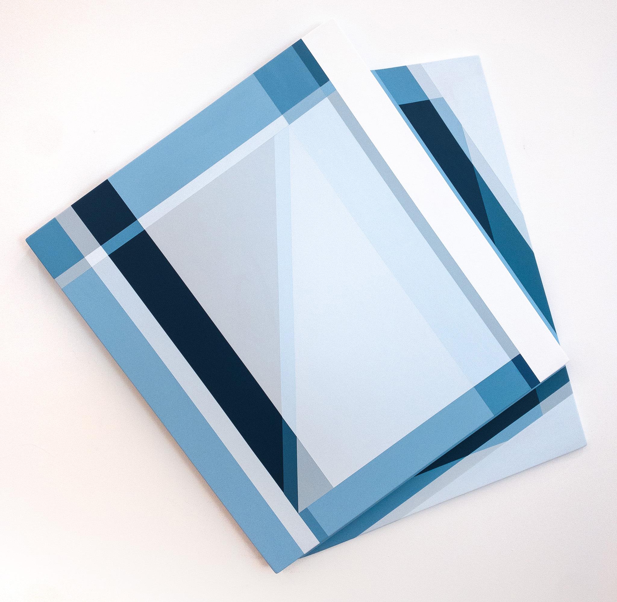
Shift
Year: 2024
Medium: Acrylic on wood
Size: 38 x 40 x 2” (96.5 x 106.7 x 5.1 cm)
Hand signed, titled, and dated in graphite on verso
Provenance:
The artist’s studio
Long-Sharp Gallery
12,000 USD
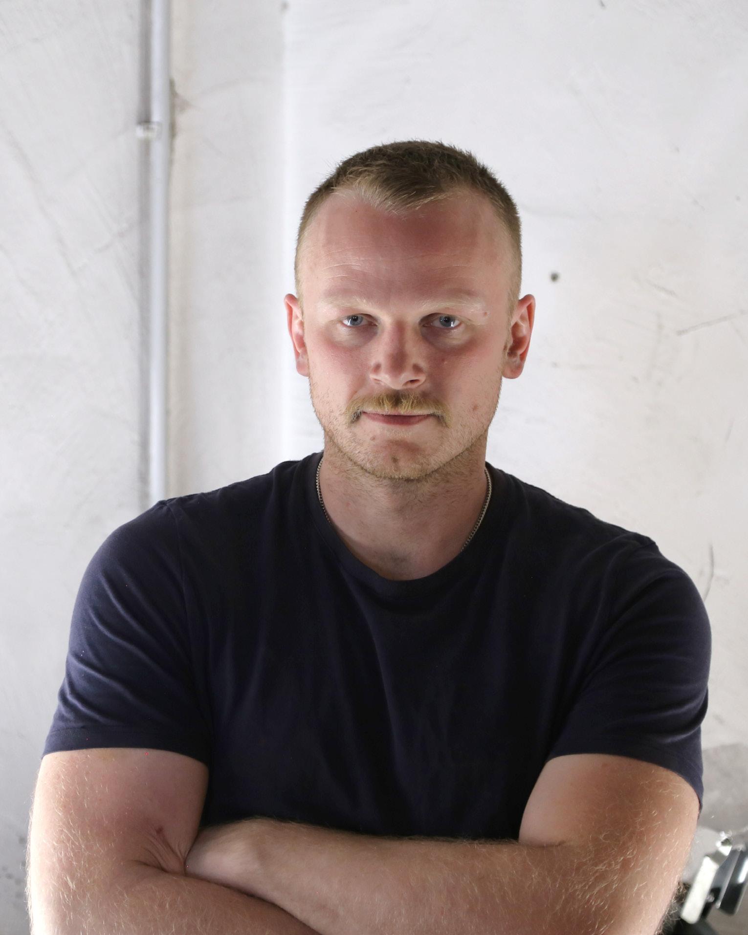
PATRICK HURST
(British, b. 1988)
Patrick Hurst works primarily with metals to create large- and small-scale sculpture. His visual identity revolves around the minimal language of abstraction with a strong connection to geometry.
As Hurst has observed, “there is a strong similarity between the creative mind of the artist and the engineer.” Throughout his practice, Hurst employs manual machining, computeraided design, and industrial manufacturing processes to transform the raw materials for his sculptures into highly-finished, tactile shapes. He is a skilled fabricator with a deep knowledge of and interest in material and process.
The artist applies mathematical laws when conceiving the shapes of his sculptures, and most of his work has a satisfactory sense of proportion derived from Euclidean geometry. He frequently uses mirror-polished surfaces to challenge viewers’ expectations of reality when they encounter their reflections in the artwork. Hurst’s sculptures are therefore informed both by the objective and the subjective realms: the first fueled by science and facts, the second by the emotional response of his audience.
Hurst’s artwork is in part a response to our divisive times. Through application of the universal languages of physics, geometry, and mathematics, Hurst seeks to create opportunities for shared understanding. As Cassie Beadle, curator at Cob Gallery, London, describes: “Hurst’s recent sculptural work seeks to condense and harness the complexities of ancient mathematics, human history, and its experience into pure form – Hurst urges us to question the universalities of human experience.”
Hurst graduated in 2011 from the Cardiff School of Art and Design in Wales, UK with a BA (Hons) Fine Art. After graduation, he returned to his native Cambridge and worked at Kettle’s Yard Gallery, home to an eclectic collection of 20th century British masters, before pursuing his passion for sculpture. His work has been shown at Masterpiece London and Eye of the Collector. The artist now lives and works in Italy.
According to the artist: Water is fundamental to humans; as a species, we are made of fifty to seventy-five percent water. The mirror-polished spheres that compose the works from Hurst’s Water Series suggest bubbles rising in water. In the contemporary world, where people increasingly are inwardly focused and strongly divided on many issues, the bubbles symbolize the elements of our shared humanity rising to the water’s surface. In this way, Hurst’s Water Series strives to represent the common ground in the human experience.
Works in the Water Series are inspired in part by a commencement address by author David Foster Wallace, “This Is Water” (later a published essay of the same name). In the speech, Wallace highlights the importance of choice in how we see and think about our world. He posits that “if you’ve really learned how to think, how to pay attention, then… it will be within your power to experience a crowded, hot, slow, consumer-hell-type situation as not only meaningful, but sacred, on fire with the same force that lit the stars.” That is, in confronting even the most mundane and frustrating parts of contemporary adult life, it is within our power to choose to see “the subsurface unity of all things.”
Hurst also finds inspiration for the Water Series in the disciplines of mathematics and astrophysics; in particular, a principle of quantum mechanics called “von Neumann entropy.” Expressed as a complex mathematical formula, the principle encapsulates the philosophical idea that, without knowing for certain, the unseen world can be more than one thing at the same time. However far-fetched the possibilities may seem, they are not impossible. Viewed through this lens, the “bubbles” in the Water Series represent events occurring within the “water” of our shared experience. They encourage viewers to see their world from new vantage points and, in doing so, to see the marvelous possibilities that exist all at once.
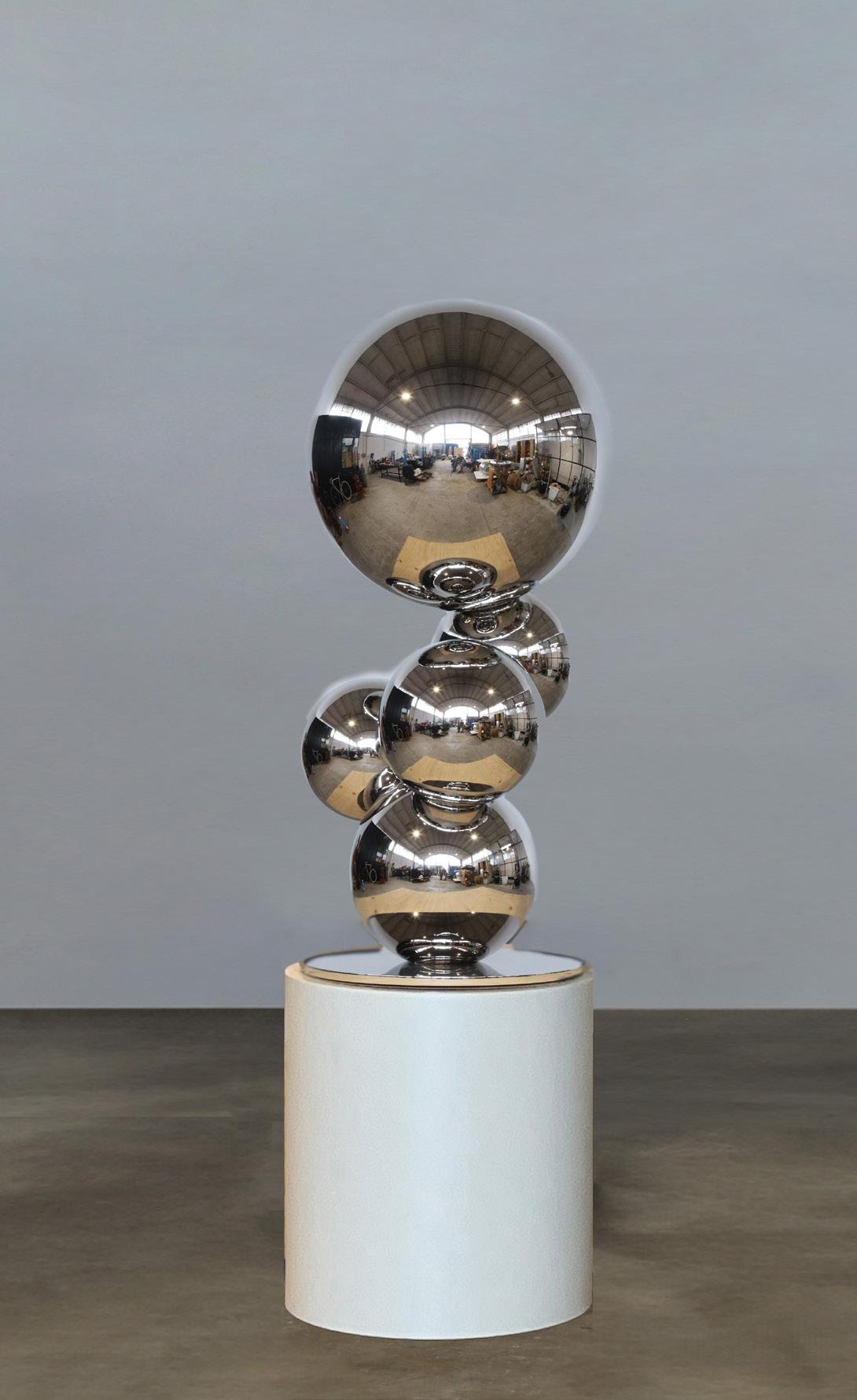
Water VIII
Year: 2024
Medium: 316 Stainless steel on 316 Stainless steel base
From a unique series of 5 plus proofs; this is 1/5
Signature incised on base
Sculpture: 47 x 25 x 25 in (118 x 62 x 62 cm)
Base: 25 x 24 x 24 in (62 x 60 x 60 cm)
Total: 72 x 25 x 25 in (178 x 62 x 62 cm)
Provenance:
The artist’s studio Long-Sharp Gallery
38,500 USD
According to the artist: “The concept of the work is similar to that of a Rorschach inkblot test. A single polyhedron is used like a pixel to assemble an intentionally undetermined and abstract form. It is then the perception of the whole that imbues meaning to the piece.
The work retains a visibly high standard of technical execution, yet has a more textured feel due to the visible welds and soft patina from the rusting steel.
The mirror polished base makes the piece feel as though it passes into the ground; this break in the line of the sculpture is reminiscent of the fold in Rorschach’s inkblot tests.”
Click to view a film
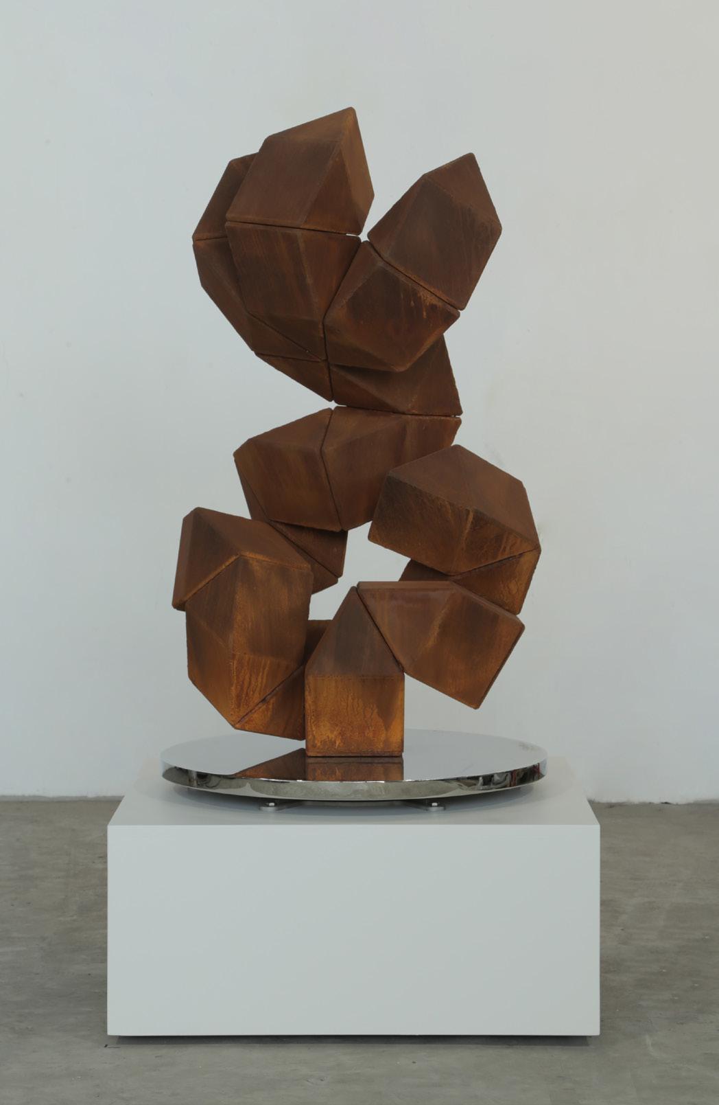
Pixel 4.1 CT Year: 2024
Medium: CorTen steel
From a unique series of 5 plus proofs; this is 1/5
Signature incised on base
Size: 40.9 x 23.6 x 24.4 in (104 x 60 x 62 cm)
Provenance:
The artist’s studio Long-Sharp Gallery
30,000 USD

JULIA IBBINI
(Jordanian & British, b. 1980)
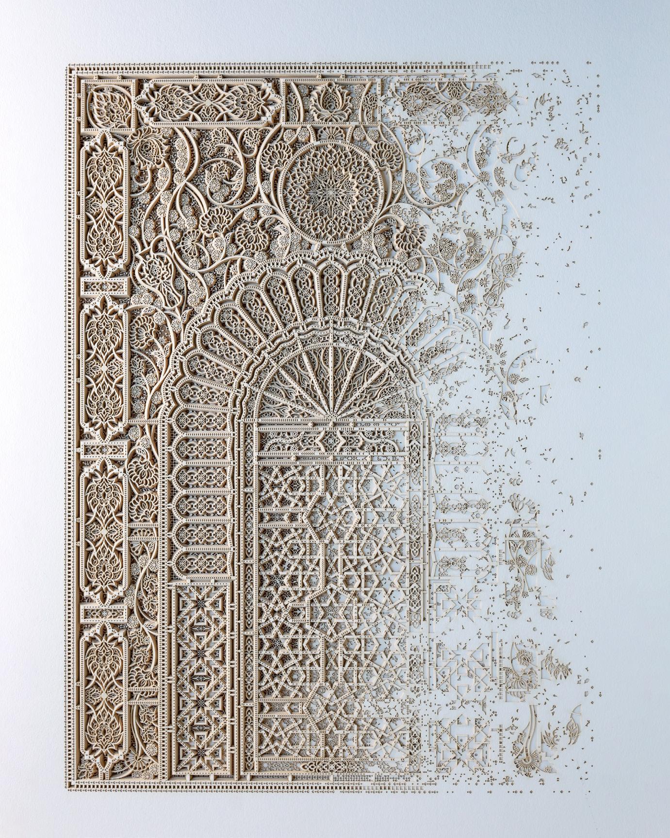
Julia Ibbini is a visual artist and designer with a background in graphics and collage. She earned a BA (Hons) in Visual Communications from the Leeds University College of Art and Design, UK. Her work combines digital design processes and traditional craftsmanship to create highly detailed, visually complex, and delicate pieces that intersect contemporary design, art, and craft.
Studio Ibbini is an ongoing collaboration between Ibbini and Stephane Noyer, a computer scientist and maker with an interest in computational geometry. Ibbini and Noyer have worked on projects together since 2016, traversing analog and digital to create works of extreme intricacy and machined precision, but which remain distinctly human in origin. Studio Ibbini works predominantly with materials such as archival paper, veneer woods, or mother of pearl— selected for their delicate, tactile qualities—that are then layered and meshed together using a complex collaging method. Individual projects take up to a year to complete.
In 2019, Studio Ibbini received the prestigious Van Cleef & Arpels Middle East Designer Prize. Over the last few years, the work has been shown at Sharjah Islamic Arts Festival 2018, Art Basel Miami, LA Art Fair, Tashkeel Dubai and Jeddah 21,39 - 2020.
Studio Ibbini is based in Abu Dhabi in the United Arab Emirates.
According to the artist: “For the ‘Sands of Time’, it’s this idea of a rich visual history evolving and changing into a new narrative through our contemporary perspective and use of technology. Pattern, ornament and symmetry were unfortunate casualties of Modernism and although they are very much alive today, our viewpoint of these visual languages has changed forever.
Some of the patterning used in these pieces is very ancient (early 9th century) and I felt it was important to record it by using it within my pieces in the hope that the ‘language’ as such will continue to live on and evolve.”
Click to view a film
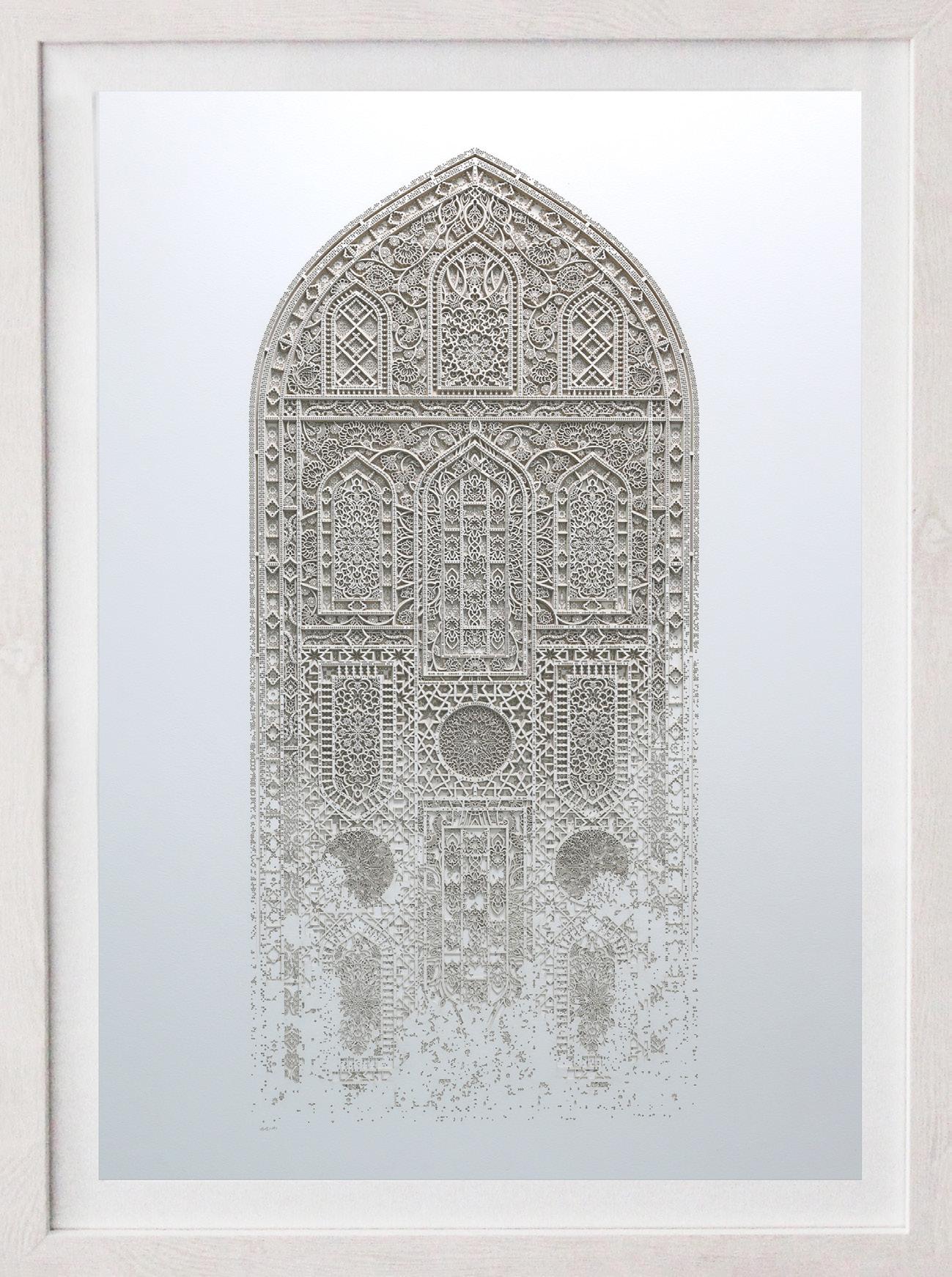
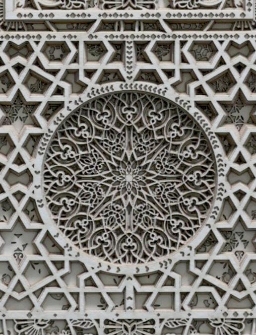
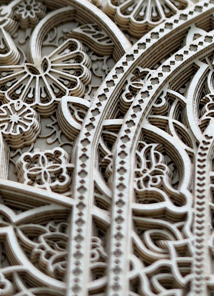
The Sands of Time 7.0
Year: 2024
Medium: Layered papers
Hand signed
Size: 22 x 13.375 in (55.9 x 34 cm)
Frame size: 26 x 17 in (66 x 43.2 cm)
Provenance:
The artist’s studio
Long-Sharp Gallery
4,800 USD
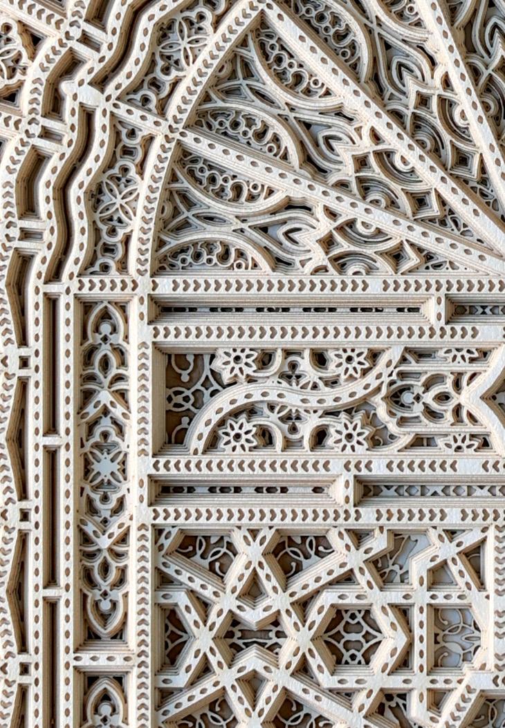
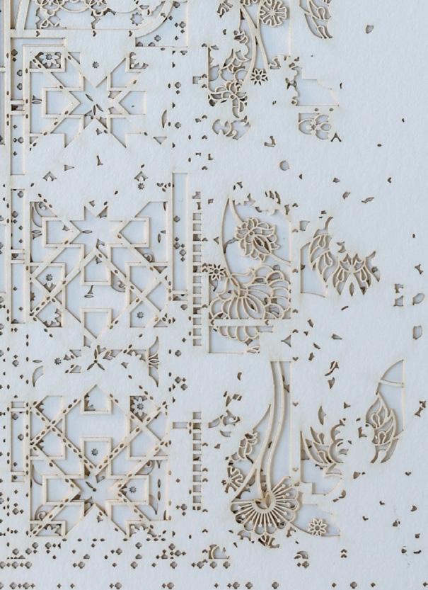
According to the artist: “For the ‘Sands of Time’, it’s this idea of a rich visual history evolving and changing into a new narrative through our contemporary perspective and use of technology. Pattern, ornament and symmetry were unfortunate casualties of Modernism and although they are very much alive today, our viewpoint of these visual languages has changed forever.
Some of the patterning used in these pieces is very ancient (early 9th century) and I felt it was important to record it by using it within my pieces in the hope that the ‘language’ as such will continue to live on and evolve.”
The Sands of Time 8.1
Year: 2024
Medium: Layered laser cut paper
Hand signed
Size: 22 x 13.375 in (55.9 x 34 cm)
Provenance: The artist’s studio
Long-Sharp Gallery
3,200 USD
According to the artist: “For the ‘Sands of Time’, it’s this idea of a rich visual history evolving and changing into a new narrative through our contemporary perspective and use of technology. Pattern, ornament and symmetry were unfortunate casualties of Modernism and although they are very much alive today, our viewpoint of these visual languages has changed forever.
Some of the patterning used in these pieces is very ancient (early 9th century) and I felt it was important to record it by using it within my pieces in the hope that the ‘language’ as such will continue to live on and evolve.”
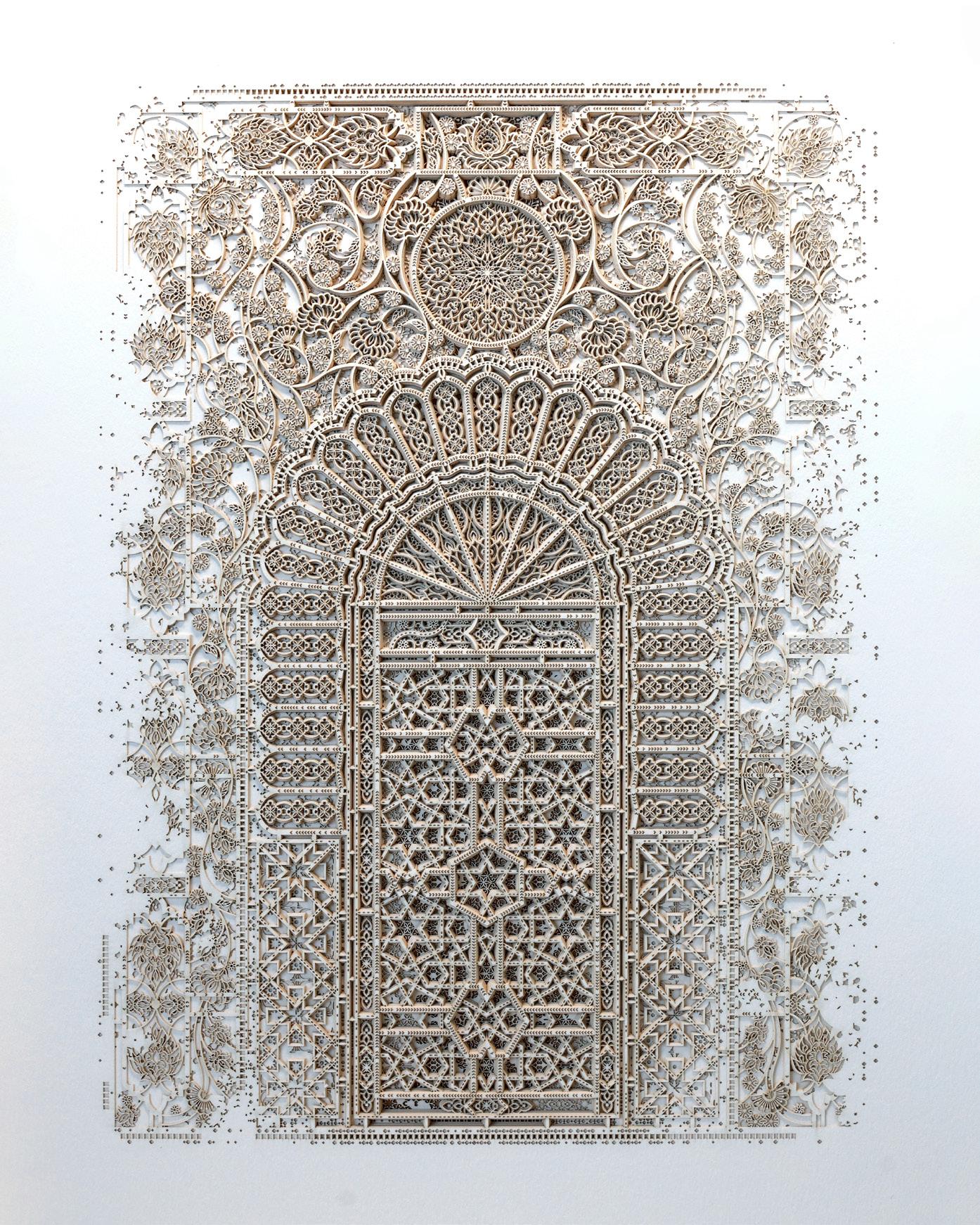
The Sands of Time 8.2
Year: 2024
Medium: Layered laser cut paper
Hand signed
Size: 22 x 13.375 in (55.9 x 34 cm)
Provenance: The artist’s studio
Long-Sharp Gallery
3,200 USD
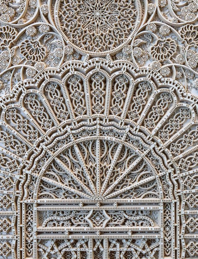
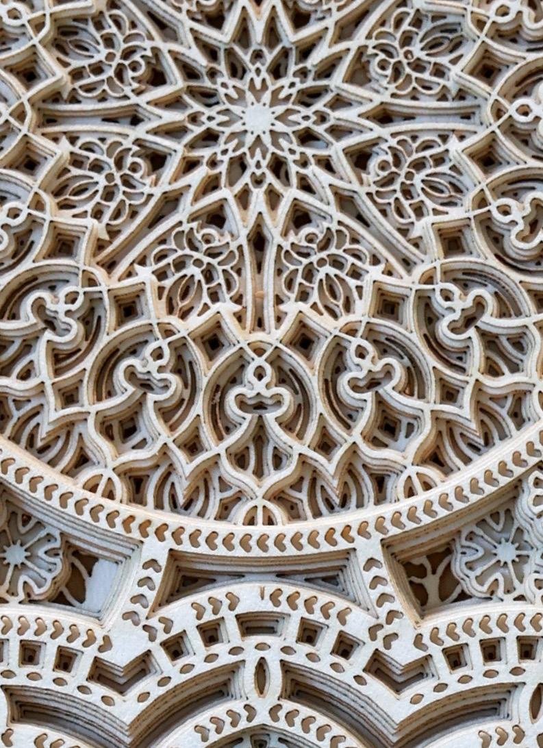
According to the artist: “For the ‘Sands of Time’, it’s this idea of a rich visual history evolving and changing into a new narrative through our contemporary perspective and use of technology. Pattern, ornament and symmetry were unfortunate casualties of Modernism and although they are very much alive today, our viewpoint of these visual languages has changed forever.
Some of the patterning used in these pieces is very ancient (early 9th century) and I felt it was important to record it by using it within my pieces in the hope that the ‘language’ as such will continue to live on and evolve.”
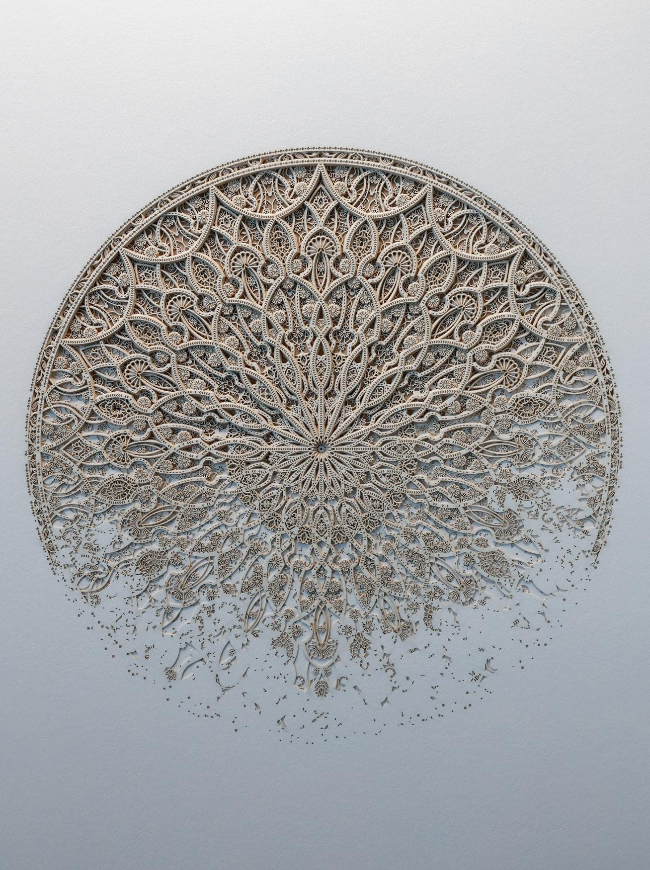
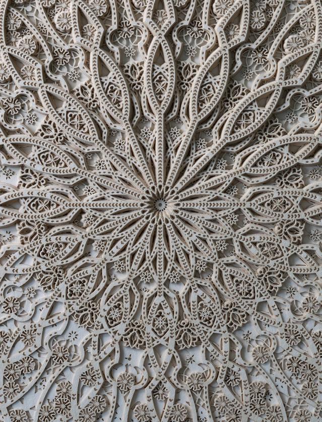
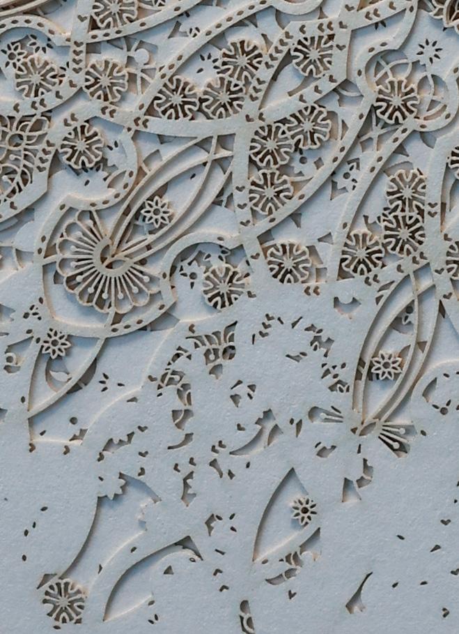
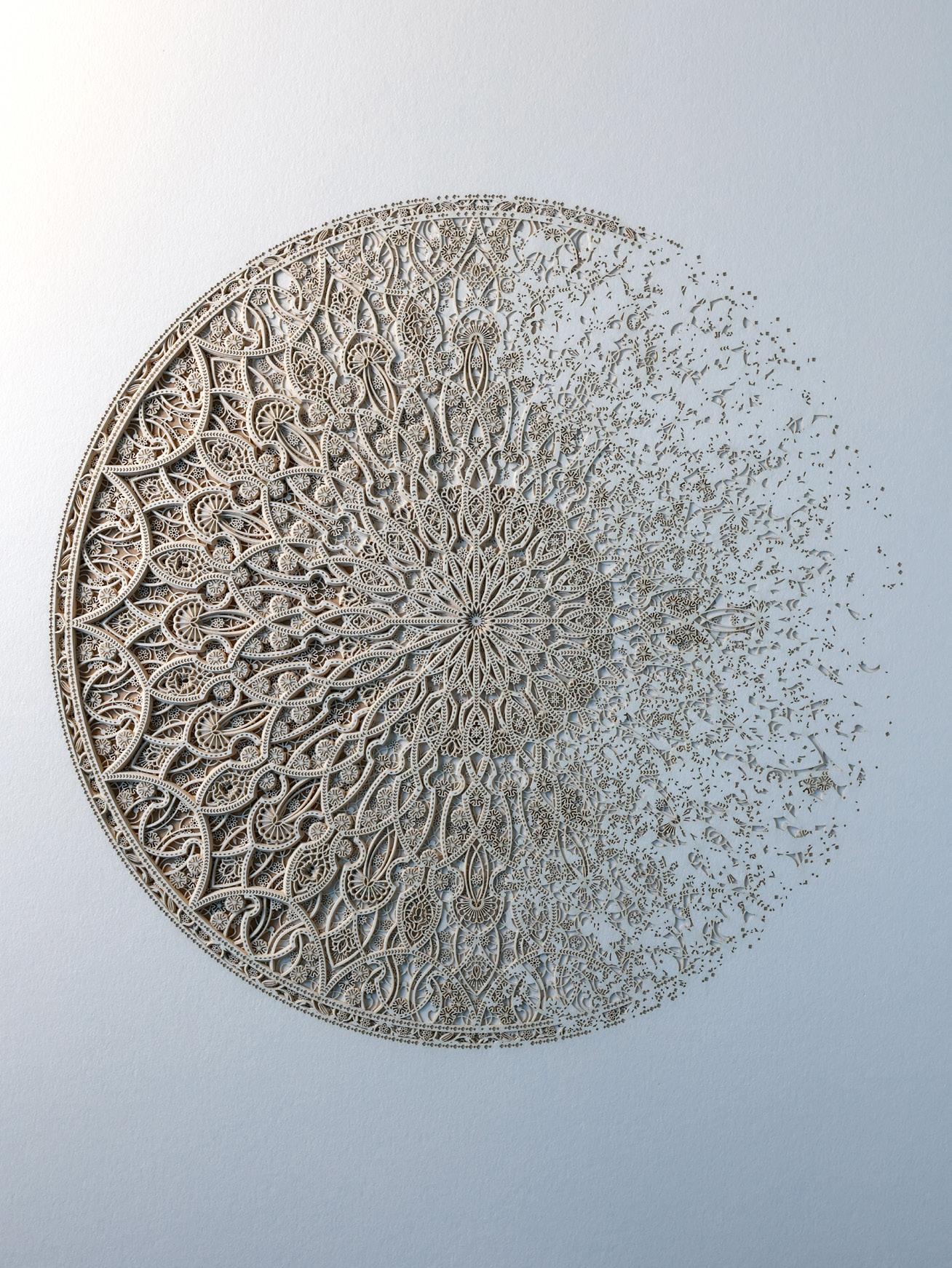
Sands of Time 12.1
Year: 2025
Medium:Layered laser cut paper
Hand signed
Size: 22 x 13.375 in (55.9 x 34 cm)
Provenance: The artist’s studio
Long-Sharp Gallery
3,200 USD
According to the artist: “For the ‘Sands of Time’, it’s this idea of a rich visual history evolving and changing into a new narrative through our contemporary perspective and use of technology. Pattern, ornament and symmetry were unfortunate casualties of Modernism and although they are very much alive today, our viewpoint of these visual languages has changed forever.
Some of the patterning used in these pieces is very ancient (early 9th century) and I felt it was important to record it by using it within my pieces in the hope that the ‘language’ as such will continue to live on and evolve.”
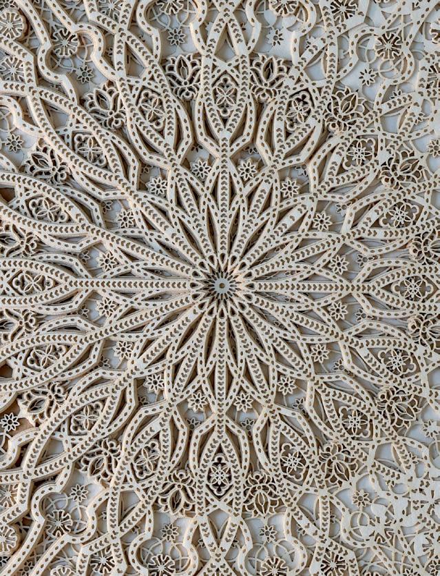
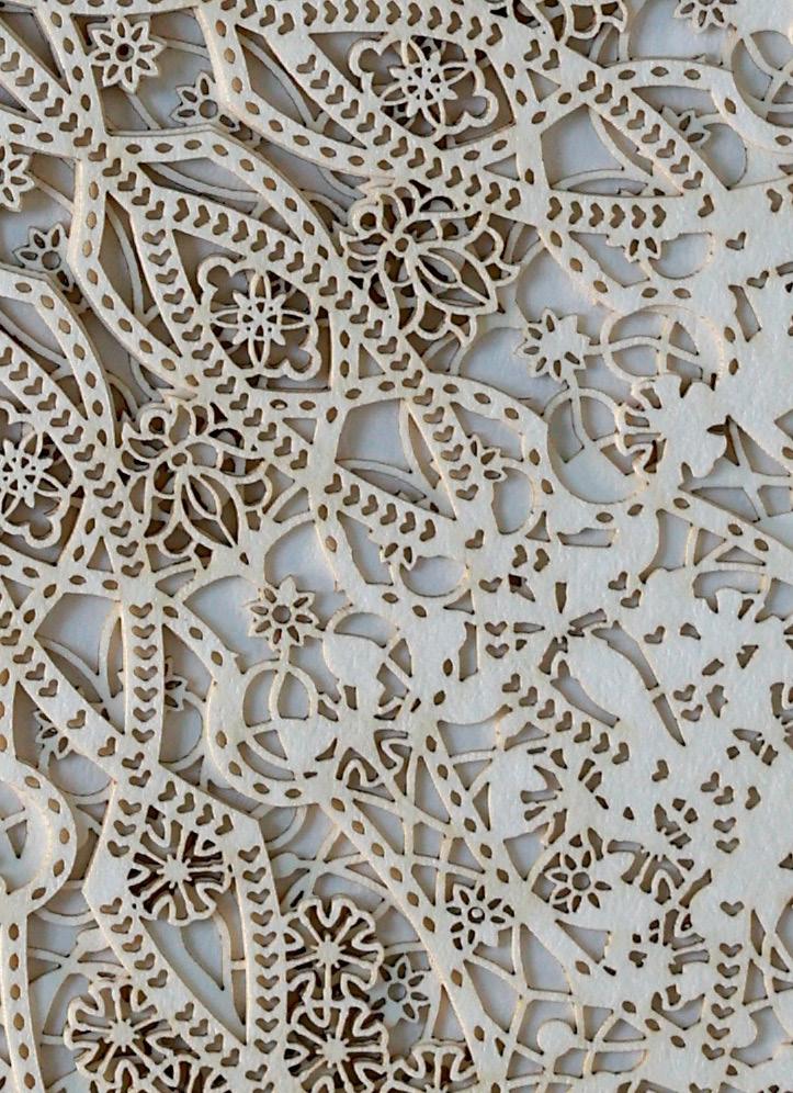
Sands of Time 12.2
Year: 2025
Medium:Layered laser cut paper
Hand signed
Size: 22 x 13.375 in (55.9 x 34 cm)
Provenance: The artist’s studio
Long-Sharp Gallery
3,200 USD
According to the artist: “I wanted to explore the notion of a traditional vessel (typically intended to be utilitarian and simple) and augment and contrast that by introducing abstract structural modifications, complexity, and detail achievable through algorithms and computational geometry. I also sought to push the boundaries of possibilities in terms of medium and chose to experiment in paper due to its beautiful, tactile, delicate qualities.
The build process for the vessels revolves around both a sequential back-and-forth and an interactive collaboration between human and machines.”
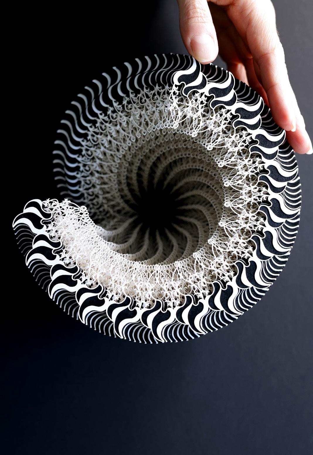
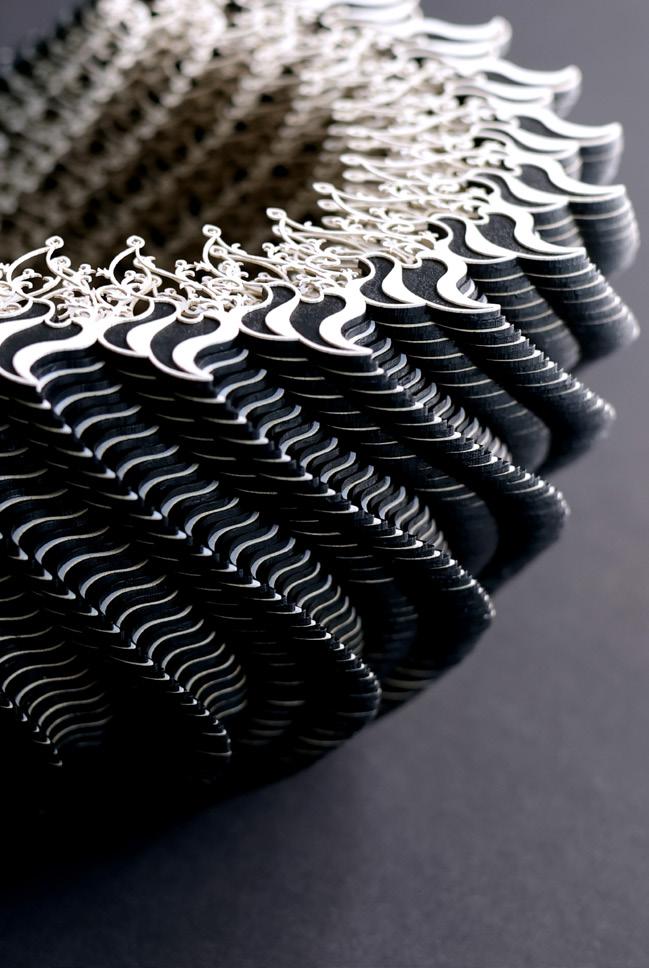
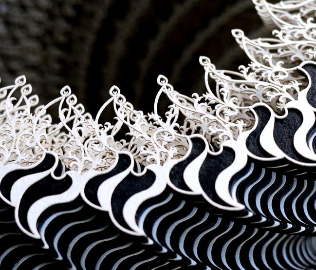
Symbio Vessel 101.16.37133 Year: 2024
Medium: Layered papers and card Size: 4.53 (h) x 7.28 (d) in (11.5 x 18.5 cm)
Provenance: The artist’s studio Long-Sharp Gallery
6,000 USD
According to the artist: “I wanted to explore the notion of a traditional vessel (typically intended to be utilitarian and simple) and augment and contrast that by introducing abstract structural modifications, complexity, and detail achievable through algorithms and computational geometry. I also sought to push the boundaries of possibilities in terms of medium and chose to experiment in paper due to its beautiful, tactile, delicate qualities.
The build process for the vessels revolves around both a sequential back-and-forth and an interactive collaboration between human and machines.”
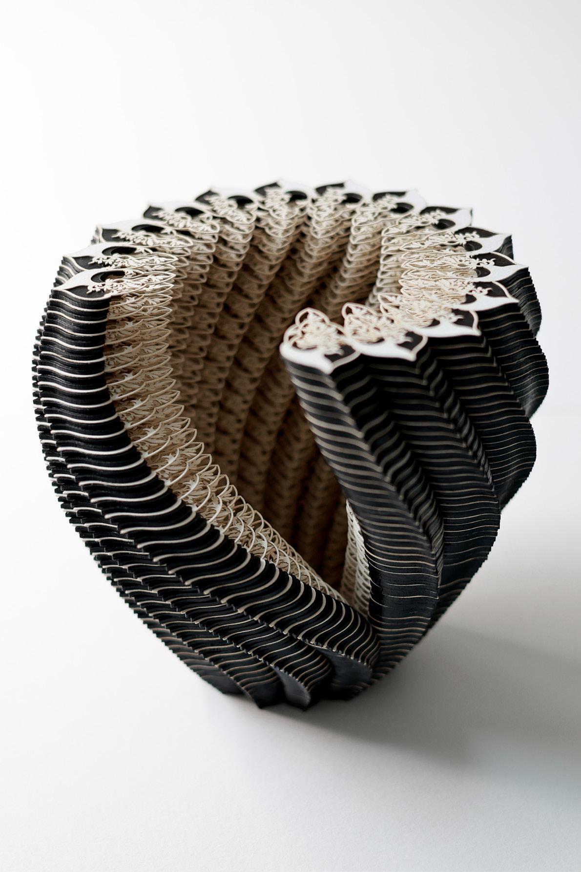
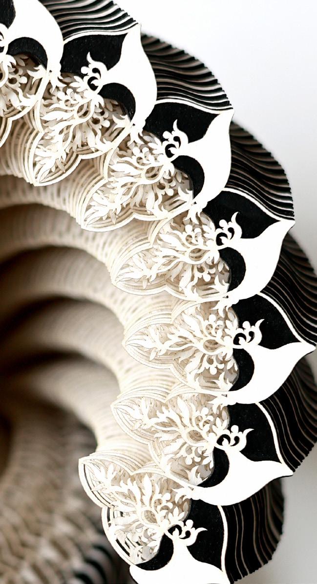
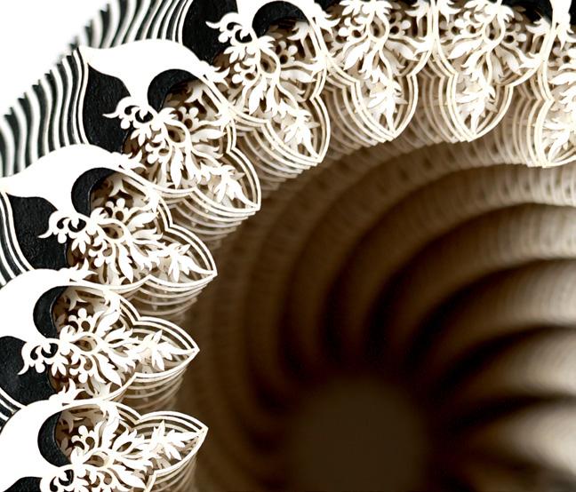
Symbio Vessel 15.135.29309
Year: 2025
Medium: Layered papers and card
Hand signed Size: 5.91 (h) x 6.69 (d) in (15 x 17 cm)
Provenance: The artist’s studio Long-Sharp Gallery
6,000 USD
AMY KIRCHNER
(American, b. 1963)
Working in acrylic and graphite, Amy Kirchner creates large-scale paintings on canvas. Unanchored from the familiar through reduction, form, and color, the work becomes solely unto itself.
Kirchner studied art and advertising at the University of Nebraska. Since graduating in 1985, she has enjoyed a long and successful career in graphic design. Amy worked for an advertising agency in Chicago, Illinois, from 1985 to 1993. In 1993, she moved to Indianapolis where she freelanced for many Indiana-based companies. She currently serves as an art director for the Indiana University Foundation.
Eighteen years ago, Kirchner began to focus on painting. Kirchner paints in silence and sunlight. She paints mood. She paints the space between breaths. In a fast-paced environment she seeks to slow time, offering the viewer a respite.
Long-Sharp Gallery (Indianapolis) began exclusively representing Amy’s work in 2016. Since that time, her works have been exhibited at art fairs in New York (NY), Palm Beach (FL), Chicago (IL), and Palm Springs (CA) as well as solo and group exhibitions with Long-Sharp Gallery in Indianapolis and New York. Since 2016, Kirchner’s paintings have been placed in collections across the United Kingdom and the United States, including a solo exhibition at the Art Museum of Greater Lafayette in 2023.
Amy lives in the Butler-Tarkington area of Indianapolis with her husband, John, (also an artist) and their two dogs. Their daughter, Mary Nell, was born, raised, and educated in Indiana.
According to the artist: “Green, Blue, and Gold Expression creates consistent movement so both forms find balance at the center of the canvas. The dark blue area supports the smaller gold form, and the white arch above supports the center of the composition, giving the painting a feeling of peace and protection.”
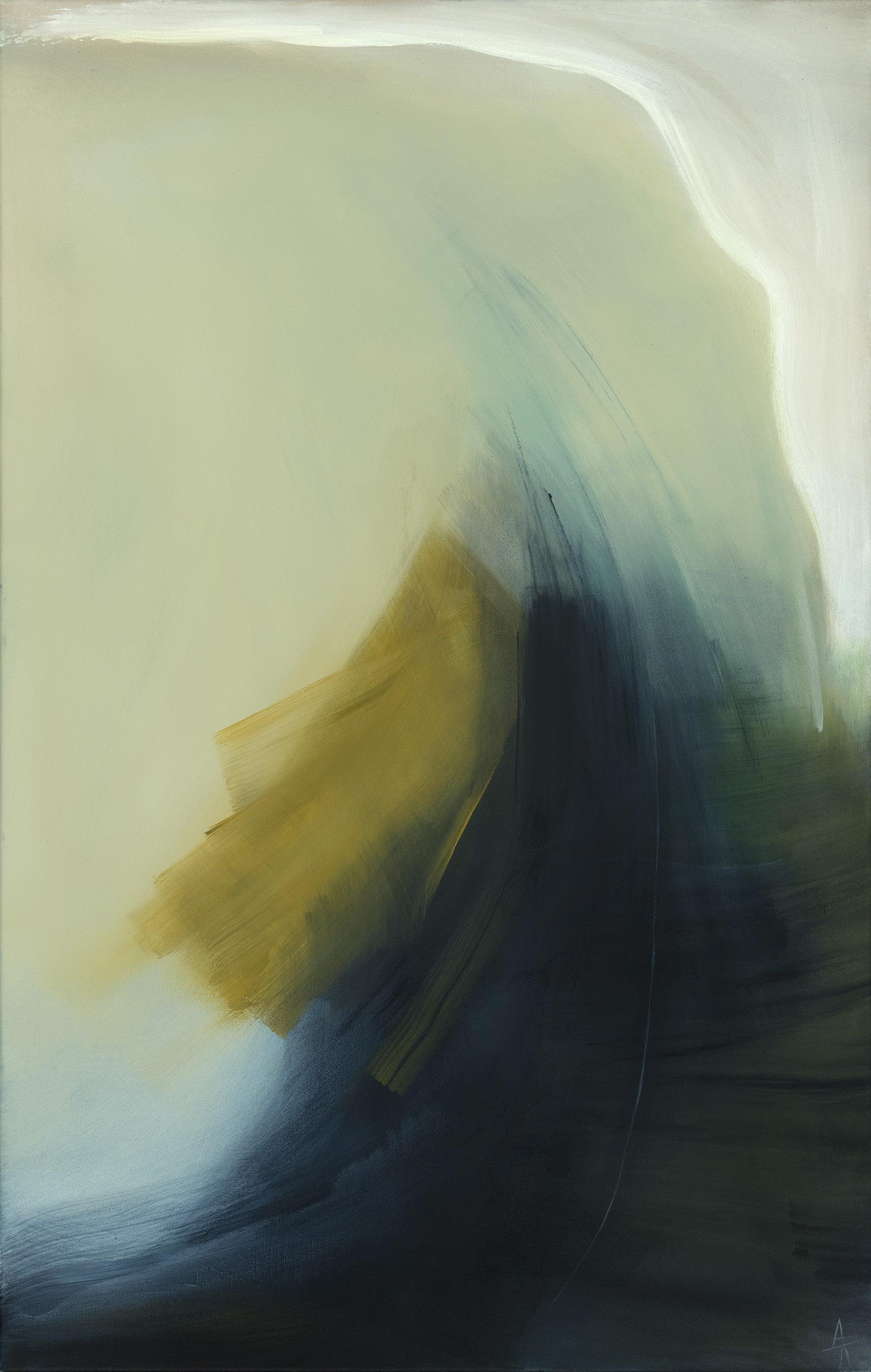
Green, Blue, and Gold Expression
Year: 2023
Medium: Acrylic on canvas
Size: 48 x 30 inches (121.9 x 76.2 cm)
Hand signed and titled on verso
Provenance: The artist’s studio
Long-Sharp Gallery
5,200 USD
According to the artist: “A minimal palette meets a complicated series of strokes in this work, creating upward movement which feels a little tumultuous. I think the painting is held together where the white areas meet the dark. Here, the work organizes itself and creates cohesion and balance.”
Click to view a film
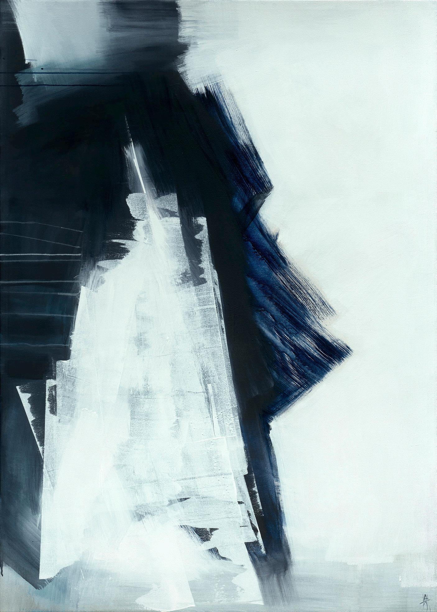
Ascent Year: 2024
Medium: Acrylic on canvas
Size: 48 x 30 inches (121.9 x 76.2 cm)
Hand signed and titled on verso
Provenance: The artist’s studio
Long-Sharp Gallery
5,200 USD
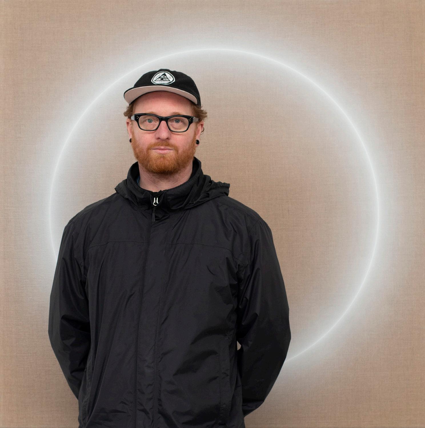
OLIVER MARSDEN
(British, b. 1973)
Oliver Marsden is a British painter whose work seeks to represent the invisible, natural, and physical forces of sound, motion, energy, and gravity. He plays with viewer’s perceptions of color, form, light, and space. His canvasses are imbued with a seductive resonant visual tension, that captures and holds the viewers’ gaze perfectly still while resonating a harmonious energy.
Marsden was born in Reading, UK and studied at Edinburgh College of Art in the mid-nineties. It was here that he began exploring notions of “liquid reality”. Inspired by nature, biological structures, Morphogenesis, David Bohms’ “Implicate order”, Eastern philosophies, and contemporary music, his work achieved a psychedelic minimalism.
After art school, he lived in Miami and New Zealand before returning to Gloucestershire. Damien Hirst noted about Marsden, “Olly Marsden picks up the challenge and makes a kind of science of painting and creates pictures that have nothing to do with Richter or Poons or Bridget Riley or Albers or even Op. They’re about the urge or the need to be a painter above and beyond the object of a painting. They are like sculptures of paintings.”
Marsden’s works can be found in private and public collections, including: Jumex collection, Mexico; David Roberts Foundation, London; Horiuchi Collection, Japan; Kresge Art Museum, Michigan; Murderme Collection, London; Robert Devereux Collection, UK; Royal Bank of Scotland; St James Group, London; and The Weisman Art Foundation, Los Angeles.
About these works: Oliver Marsden paints sound in water. This series of works, his Harmonics, were inspired by a 2003 art studio located above a recording booth. According to the artist: “Loud guitars from the recording booth below vibrated old wooden floorboards which in turn rippled water in a bucket… I watched and imagined paintings of giant liquid speakers.” He eventually created such paintings by setting his canvases spinning, in an effort to capture what he loves about water: “the restless expressive nature of water and how it makes energies visible.”
Click to view a film
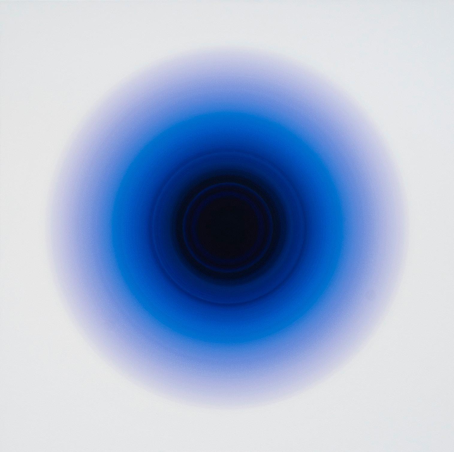
Violet Blue Indien Noir Harmonic
Year: 2024
Medium: Oil on canvas
Signed and titled with unique OMS number (OMS 871) on verso
Size: 47.2 x 47.2 x 1.7 in (120 x 120 x 4.5 cm)
Provenance: The artist’s studio
Long-Sharp Gallery
19,200 USD
About this work: Marsden’s delicate, precise lines in his Halo series are a study in rhythm: body, mind, and machine working in harmony. This series is a search for a balance - as Marsden describes it - a resonant visual tension where the painting begins to sing. Indeed, Marsden describes his Halo works as having voices, some soft and gentle, some loud and bright.
Click to view a film
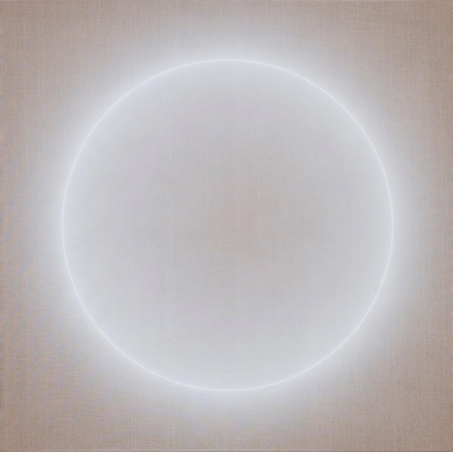
Halo 21.03.23
Year: 2023
Medium: Acrylic on linen
Signed and titled with unique OMS number (OMS 852) on verso
Size: 47.2 x 47.2 x 1.7 in (120 x 120 x 4.5 cm)
Provenance:
The artist’s studio
Long-Sharp Gallery
22,500 USD
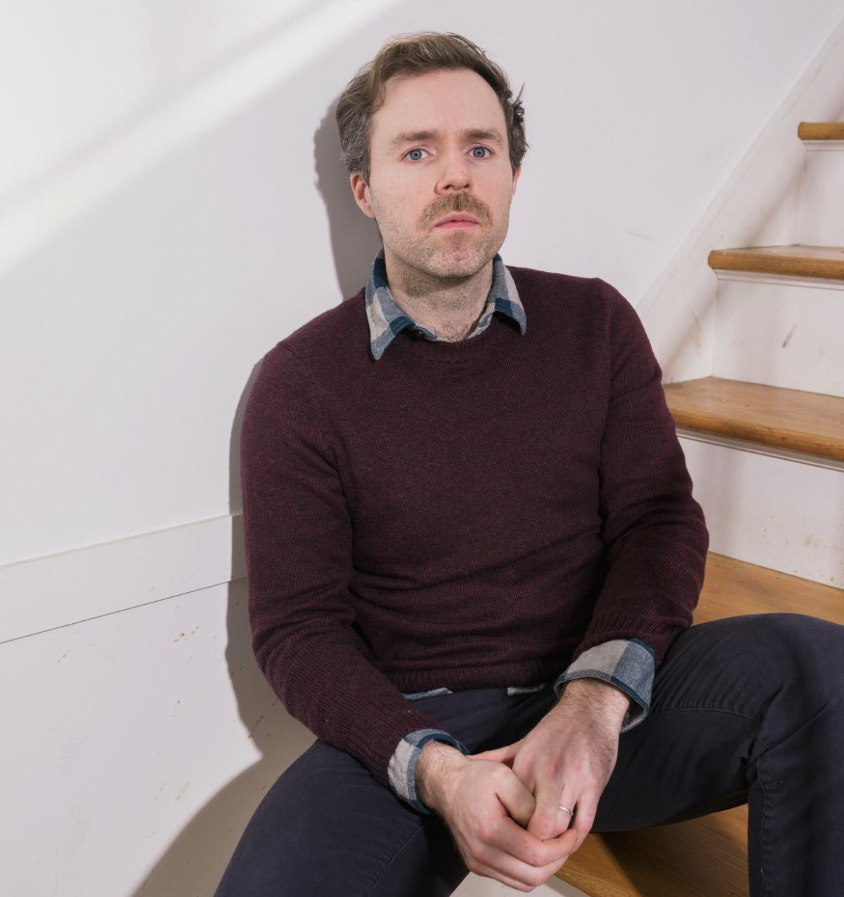
Image courtesy of ArtConnect
DANIEL MULLEN (Scottish, b. 1985)
Rotterdam-based painter Daniel Mullen was born in Glasgow, Scotland in 1985.
Mullen’s works question sensory perception, including light, darkness, form, and color.
Acknowledging that we subsist in an era of mass digitization, his works also explore how our visual and emotional sensitivities might be shifting as we flow between our physical environment and the techno-sphere, aided in part by back-lit digital devices.
With his work, Mullen aims to question these shifting modes of perception through dialectical compositions, expressions of color, light, and darkness. His paintings may appear as digital renderings; however, upon closer inspection, his paintings reveal the materiality by which they are constructed. These works are evidence of time-consuming craftsmanship that does not seek binary perfection, but rather embraces nuance, imperfection, and materiality.
About these works: Daniel Mullen creates optically dazzling works using a process that includes the application of thin, translucent layers of paint on exposed linen. He uses painting as a meditative process of repetitive movement and rhythm, with the brush working as an extension of his person.
According to the artist: “In my work, I’m interested in phenomenology: to perceive something that is not present or at least that which seems undefinable, a space out of reach beyond our perception. Through the act of painting, I try to channel this experience for another viewer beyond my own mind’s eye by seeking to render colour, form and light perceivable.”
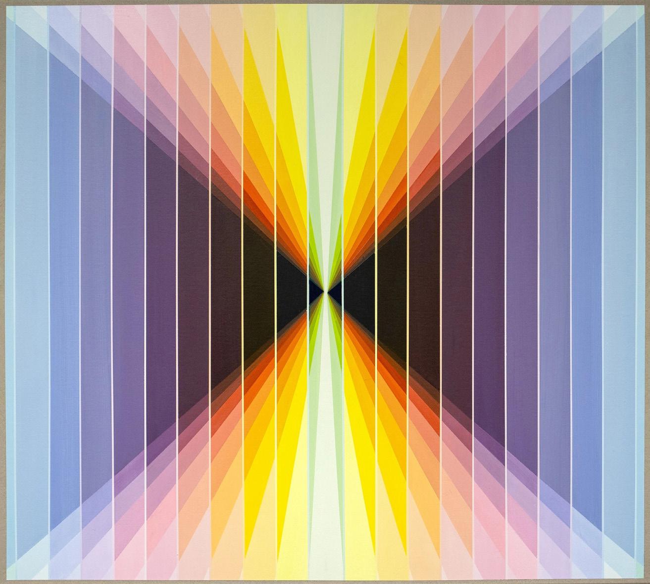
colour interaction No. 1
Year: 2023
Medium: Acrylic on linen
Size: 35.5 x 39.5 in (90 x 100 cm)
Provenance:
The artist’s studio
Long-Sharp Gallery
7,500 USD
Click to view a film
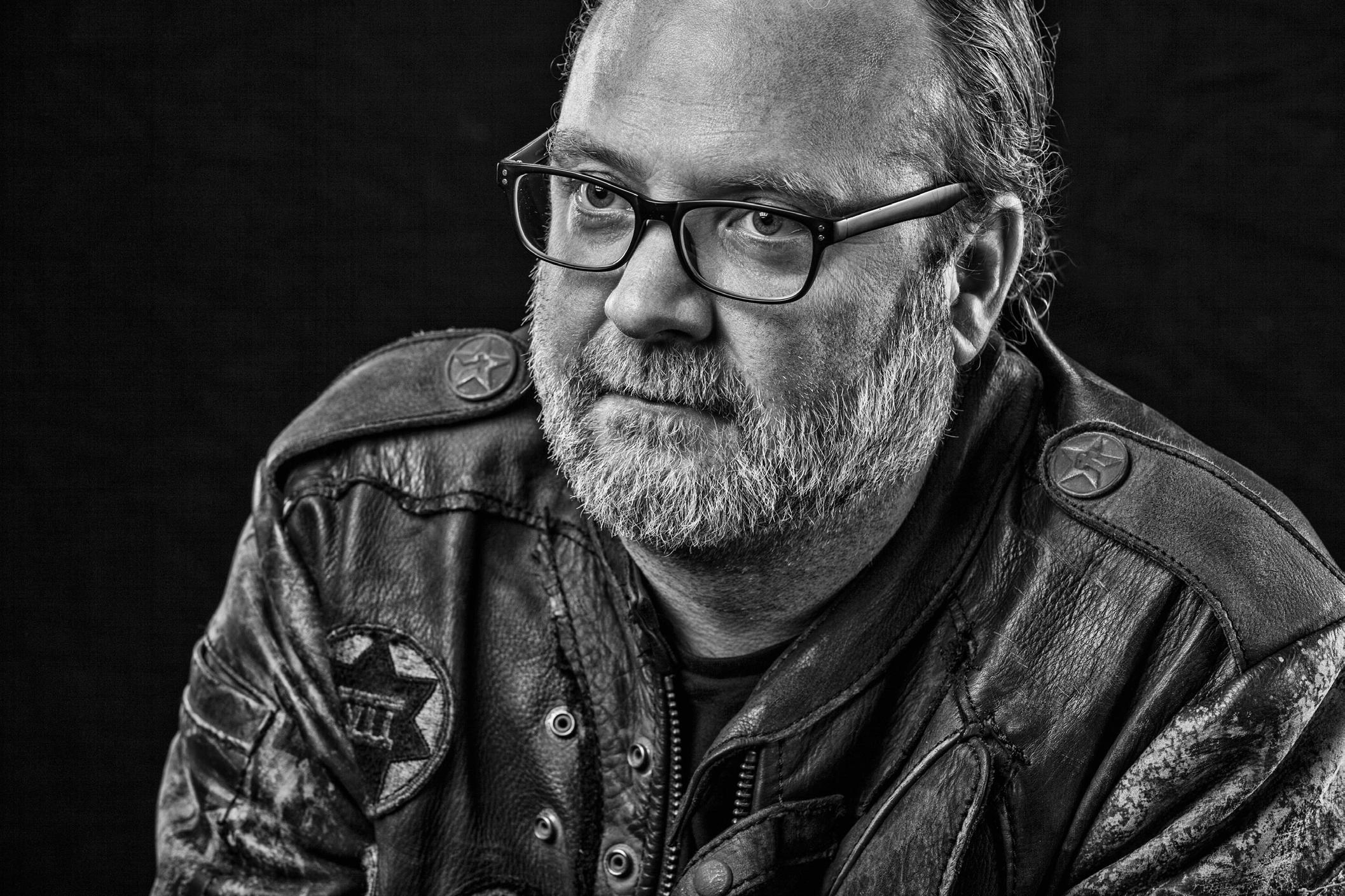
JASON MYERS
(American, b. 1972)
Jason Myers is a prolific multi-disciplinary artist with a breadth of experience working with different media. Over the years, his artistic practice has consistently evolved in both style and technique. His recent body of work is primarily figurative and includes paintings, drawings, prints, digitally manipulated images, and large-scale sculpture and installations.
Myers utilizes a unique combination of traditional artistic and industrial raw materials such as steel, resin, and computer-generated prints. Complex, layered, and exquisitely executed, Myers’s work often questions our current political and socioeconomic environment, reflecting on themes of technology, alienation, greed, wealth, and power.
Myers received his bachelor’s degree from the Kansas City Art Institute (Kansas City, MO) and his MFA from American University (Washington, DC). Forgoing the “typical” trajectory perhaps expected from modern-day artists (a New York studio, numerous assistants), Myers instead opts to work more solitarily from his studios in Indiana and the Netherlands.
With works exhibited across the United States and abroad, Myers’s acclaim has grown in recent years. His solo museum exhibit, STATUS: fluid/dynamic has traveled to both the Polk Museum of Art (Florida) and the Art Museum of Greater Lafayette (Indiana); a solo exhibition in the Lambla Gallery at the University of North Carolina (Charlotte). Myers’s monumental (60-foot tall, 38-ton) steel sculpture, “Trials of Gavin”, was commissioned for the Lowlands Music Festival (Netherlands) and currently towers over the train station in Zwolle, Netherlands. His works are in the permanent collections of several museums, including the Indianapolis Museum of Art (Indiana). In addition, individual works have been featured in museum exhibitions at the Mint Museum of Art (North Carolina), Museum de Fundatie/Kasteel het Nijenhuis (Netherlands), and Cornell Art Museum (Florida).
Myers’ most recent series, Fragility: Embracing the Impermanence and Beauty of Life, debuted at Long-Sharp Gallery Indianapolis which ran concurrently with his third solo museum exhibition at UNC Charlotte, I Am Algorithm curated by Adam Justice, Director of Galleries at UNC Charlotte.
According to the artist: “At its core, a luminous Bitcoin emblem shines brilliantly, symbolizing the decentralized currency’s role in shaping the future of global financial transactions. The luminous centerpiece serves as a beacon of an ever-changing financial landscape. The intricate steel framework reflects the interconnected and resilient nature of the blockchain, with each angular form representing the nodes and pathways of the network. The use of light plays a pivotal role, casting dynamic shadows and creating an interplay of radiance and structure, much like the transparency and complexity of Bitcoin itself. Radiance BTC not only encapsulates the present but also envisions the future, a world in which digital currencies redefine how we think about financial freedom and exchange.”
Click to view a film
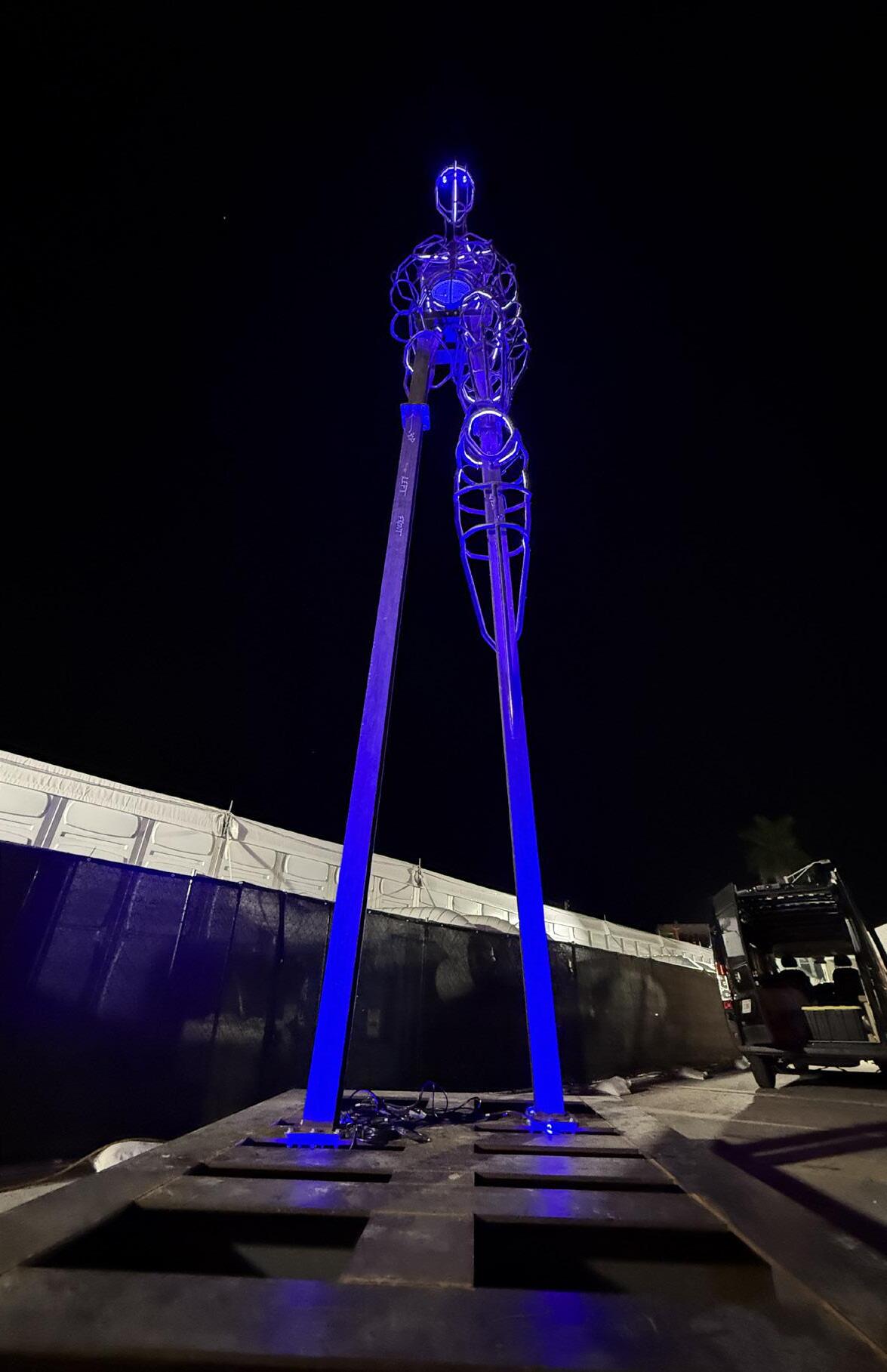
Radiance BTC
Year: 2024
Medium: Carbon steel and lighting elements
Size: 8 feet wide x 12 feet deep x 31 feet high
Gavin - Radiance is the 17th edition in this series of unique sculptures
Provenance: The artist’s studio Long-Sharp Gallery
350,000 USD / 5 BTC
CHA JONG RYE (Korean, b. 1968)
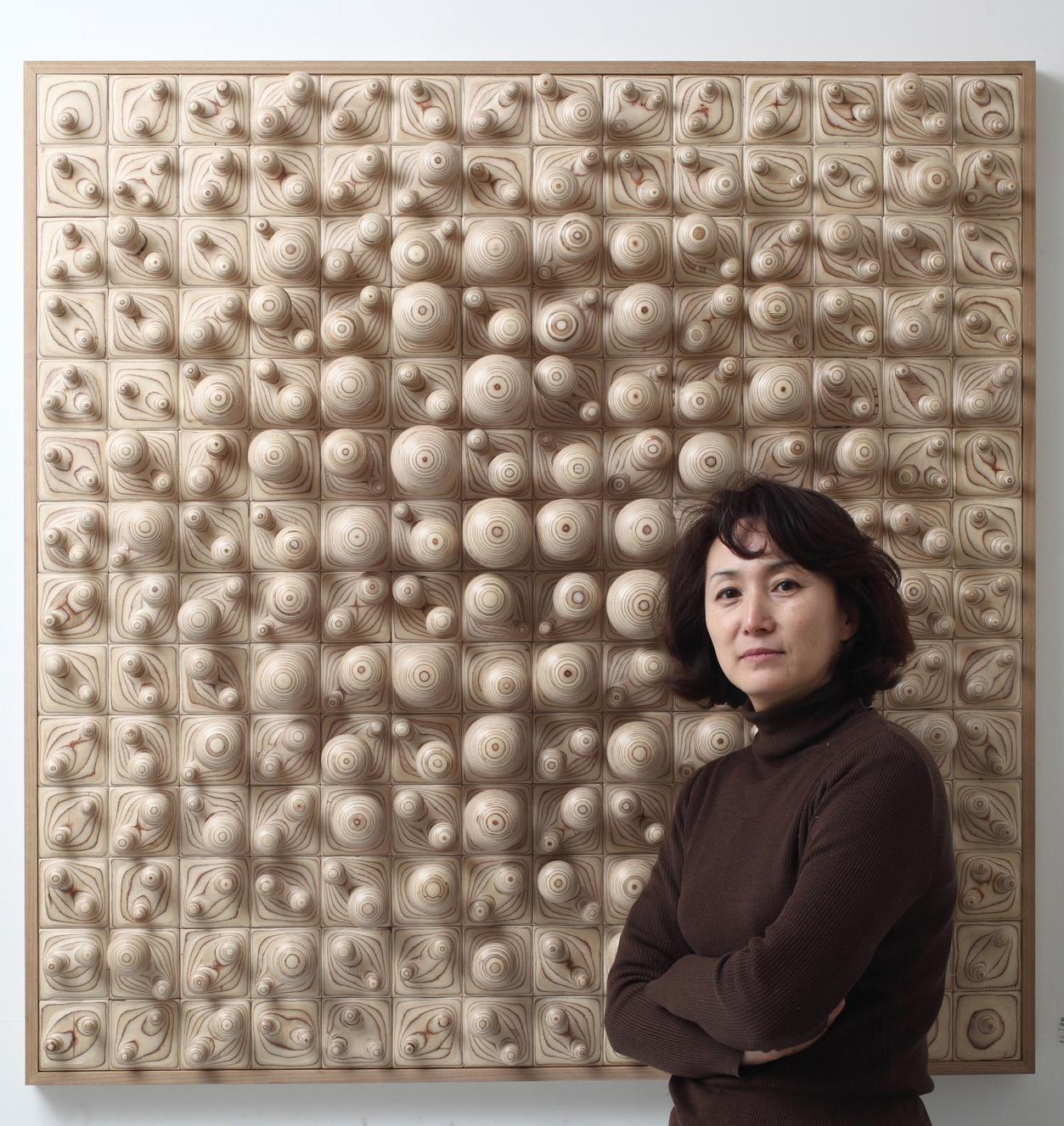
Born in Daejeon, Korea and the recipient of an MFA in Sculpture from Ewha Women’s University in 1996, sculptor Cha Jong Rye (b. 1968) meticulously crafts works which have been featured in exhibits and collections worldwide. Among her solo exhibitions are shows at the Sungkok Art Museum (Seoul, 2011), the Nampo Art Museum (Goheung, 2012), Red Sea Gallery (Singapore, 2015), Bauzium Sculpture Museum (Gosung, Gangwon-do, 2017), and The Center for Art in Wood (Philadelphia, 2018). Selected group exhibitions include the Berkshire Museum (2015), the Nampo Art Museum (2014), and the Kim Chong Yung Museum (Seoul, 2017), among many others.
Using wood as her chosen medium, Jong Rye constructs seamlessly intricate wooden landscapes through her often wall-mounted sculptures. Sanding and layering hundreds of delicate wood boards, her process is intentionally unintentional; rather than executing a predetermined design, she allows herself to discover images in the fluidity of arranging and rearranging the uniquely hand-shaped blocks. The result is a richly textured three-dimensional canvas upon which light and shadow dance, transforming the once-recognizable wood material into entirely abstracted landscapes reminiscent of wrinkled linen or rippling water.
Equally important to her own subjectivity in the creative process is the subjectivity of her audience--the freedom of the viewer to interpret her work from a unique perspective. Jong Rye considers her work to rely on the interaction and communication between viewers and herself, and feels that a sculpture is most complete when a viewer interprets it in a way that is unique from her own understanding. Cha Jong Rye currently works and resides just outside of Seoul, South Korea.
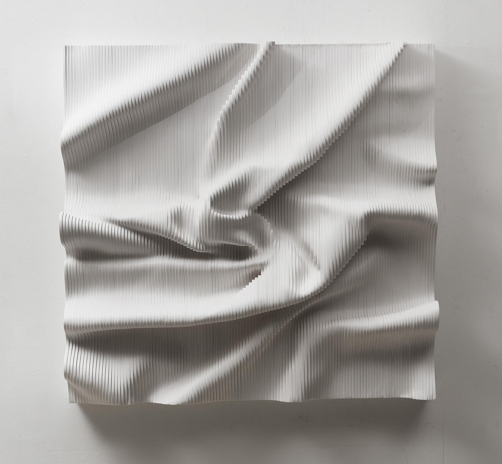
Expose Exposed 240523
Year: 2024
Medium: Fomax
Signature incised on side
Size: 40.5 x 39.375 x 9 in (103 x 100 x 23 cm)
Provenance:
The artist’s studio
Long-Sharp Gallery
30,000 USD
Click to view a film
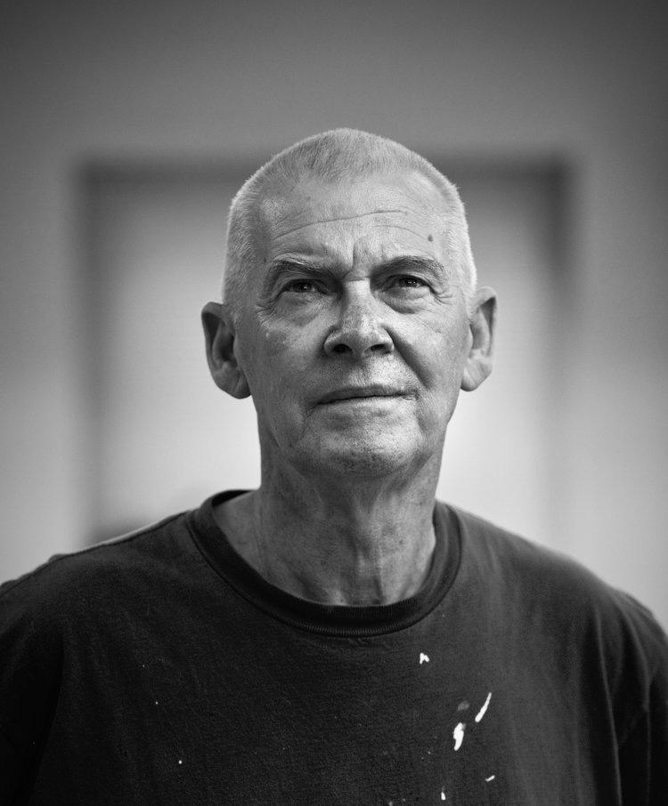
DAVID SPILLER (1942-2018)
A veteran of the British Pop Art movement, David Spiller grew up in its defining period. Juxtaposing pop culture with urban sensibilities, Spiller created his own unique style of fine art that is distinctly “David Spiller.” As Martin Gayford wrote in his catalogue essay for Spiller’s 2008 exhibition at Beaux Arts London:
David Spiller’s pictures are much more than simply messages. A lot of them are also, an art historian might say, complex colour-field abstractions. […] To make works of this type, Spiller uses a technique that is, as far as I know, unique. He ‘floats’ the pigment onto pieces of canvas that he then sews together with incredible neatness and precision, so the final work is a sort of combine, made not with glue, like a collage, but with needle and thread. […] no one has ever, as far as I know, fitted geometrically precise square and oblongs of colour together in this fashion, like a precision-engineered quilt...
David Spiller’s place as an acclaimed artist was not achieved by happenstance. Spiller was trained in fine art and an early student of Frank Auerbach. He studied at the Sidcup School of Art (1957), Beckenham School of Art (1958-1962), and the Slade School of Art (1962-1965). During his distinguished career, Spiller had solo exhibits in over 10 countries (Austria, Belgium, Denmark, England, France, Germany, Holland, Italy, Spain and the United States). His work was exhibited at notable institutions such as the Rattingen Museum and Mannheim Kunstverein (Germany), Museum Van Bommel van Dam and Museum Utrecht (Holland), Museum Espace Belleville and Artcurial (Paris), the Royal West of England Academy (UK), and the Cornell Museum (Florida, US). His work is also in important public and corporate collections which include Hanwon Museum (Seoul), Foundation Carmignac Gestion (Paris), Harley Gallery Welbeck, Collection UCL, Morgan Stanley (Frankfort), and Belgacom Brussels. Important private collections also contain works by the artist; some are available on request.
When asked about his art, Spiller has said “I really want to make paintings that put some magic on the wall. Some of them are straightforward things. Some are wild things. But underneath, it says ‘I love you.’”
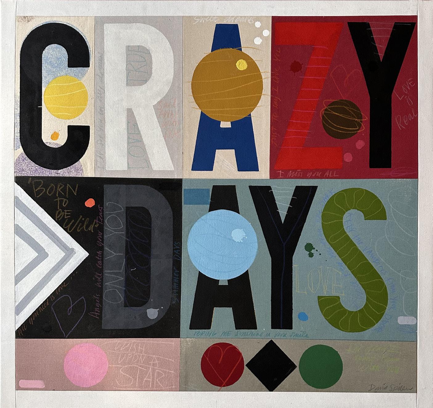
Born to run Year: 2015
Medium: Acrylic and pencil on stitched canvas panels
Hand signed on verso
Size: 33.8 x 35.8 in (86 x 91 cm)
Frame size: 29 x 29 in (73.6 x 73.6 cm)
Provenance:
The artist’s estate
Long-Sharp Gallery
19,500 USD
Click to view a film
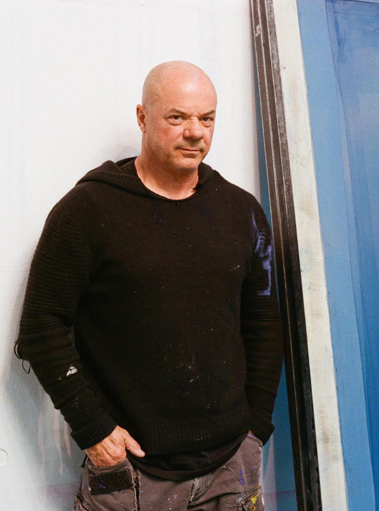
RUSSELL YOUNG
(British-American, b. 1959)
Russell Young, (b. 1959) is a British- American artist best known for examining cultural icons, the nature of fame, and the American Dream through his large-scale silkscreens. His earliest breakthrough was his photography of George Michael for the sleeve of the album Faith in 1987. Young photographed many music stars throughout the 1970s and 1980s, including Bruce Springsteen, Bob Dylan, REM, The Smiths, Diana Ross, and many others. He went on to shoot over 100 music videos during MTV’s height in the 1990s, which brought him to the United States.
Young eventually moved to California, where he began his current practice with his sold-out show Pig Portraits in Los Angeles in 2003. The many series that have followed demonstrate his visceral, analog processes and signature use of diamond dust. He has exhibited across the world, including museum exhibitions at the Modern Art Museum Shanghai, Multimedia Art Museum Moscow, Polk Museum of Art, and the Goss-Michael Foundation.
Young’s work is included in many prominent private and institutional collections including those of Barack Obama, David Bowie, Drake, Angelina Jolie, David Hockney, Brad Pitt, and others, as well as The Getty Collection (Los Angeles) and The White House Collection (Washington, D.C.). Russell Young’s works have crossed the auction block at all the world’s major auction houses, including Sotheby’s, Christie’s, and Phillips.
Russell Young lives and works in California and New York.
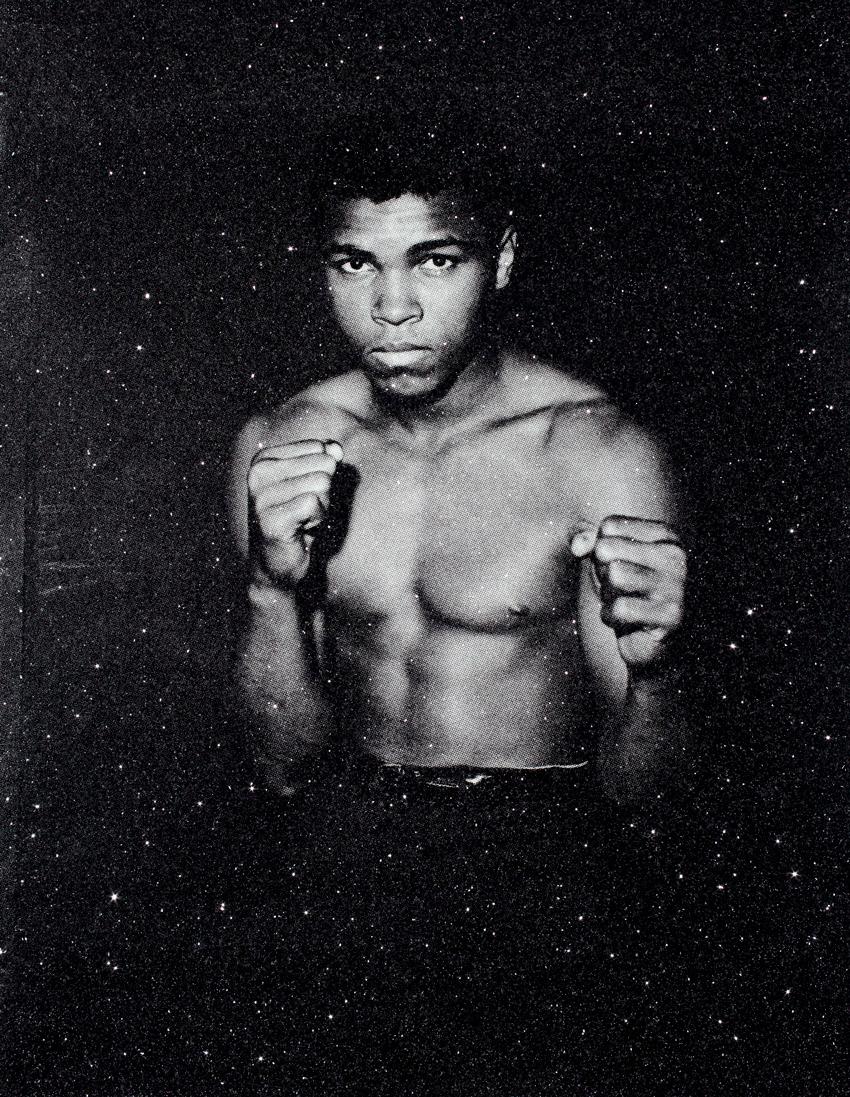
Ali (Ash White)
Medium: Acrylic and enamel screenprint on linen with diamond dust, hand-pulled
Size: 36 x 27.5 in (91.4 x 69.8 cm)
Frame size: 36 x 27.875 in (91.4 x 70.8 cm)
From a series of 10 plus proofs
Signed, dated, and marked with artist’s archive number on reverse
Provenance: The artist’s studio Long-Sharp Gallery
15,000 USD