Graphic Designer specializzata in grafica pubblicitaria e comunicazione visiva. Ho esperienza nella realizzazione di materiali promozionali per attività commerciali, eventi e studi professionali, dalla progettazione del concept alla produzione per stampa e digital. Lavoro con attenzione al brand, agli obiettivi di comunicazione e alle scadenze.
• Progettazione di materiali grafici promozionali per comunicazione offline e online
• Sviluppo layout coerenti con l’identità dello studio
• Preparazione file per la stampa
Concept Artist – Progetto formativo (Ferrari)
• Sviluppo concept visivo e studio del linguaggio estetico del brand
• Progettazione grafica a fini didattici e creativi
Graphic Designer - Evento Culinario
2024
2023
• Sviluppo materiali grafici per la promozione di un evento gastronomico
• Progettazione del concept visivo dell’evento
• Realizzazione contenuti per stampa e social media
Graphic Designer - USSL 8
• Progettazione e realizzazione di pannelli illustrati destinati alle sale d’attesa per adulti e bambini
Graphic Designer - Negozio Tessile
• Ideazione e realizzazione del logo
30° Anniversario
• impaginazione volantini e cartoline celebrative
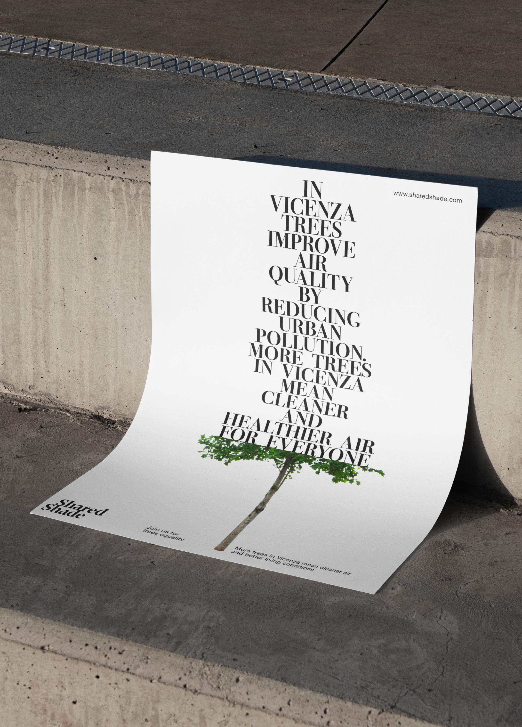
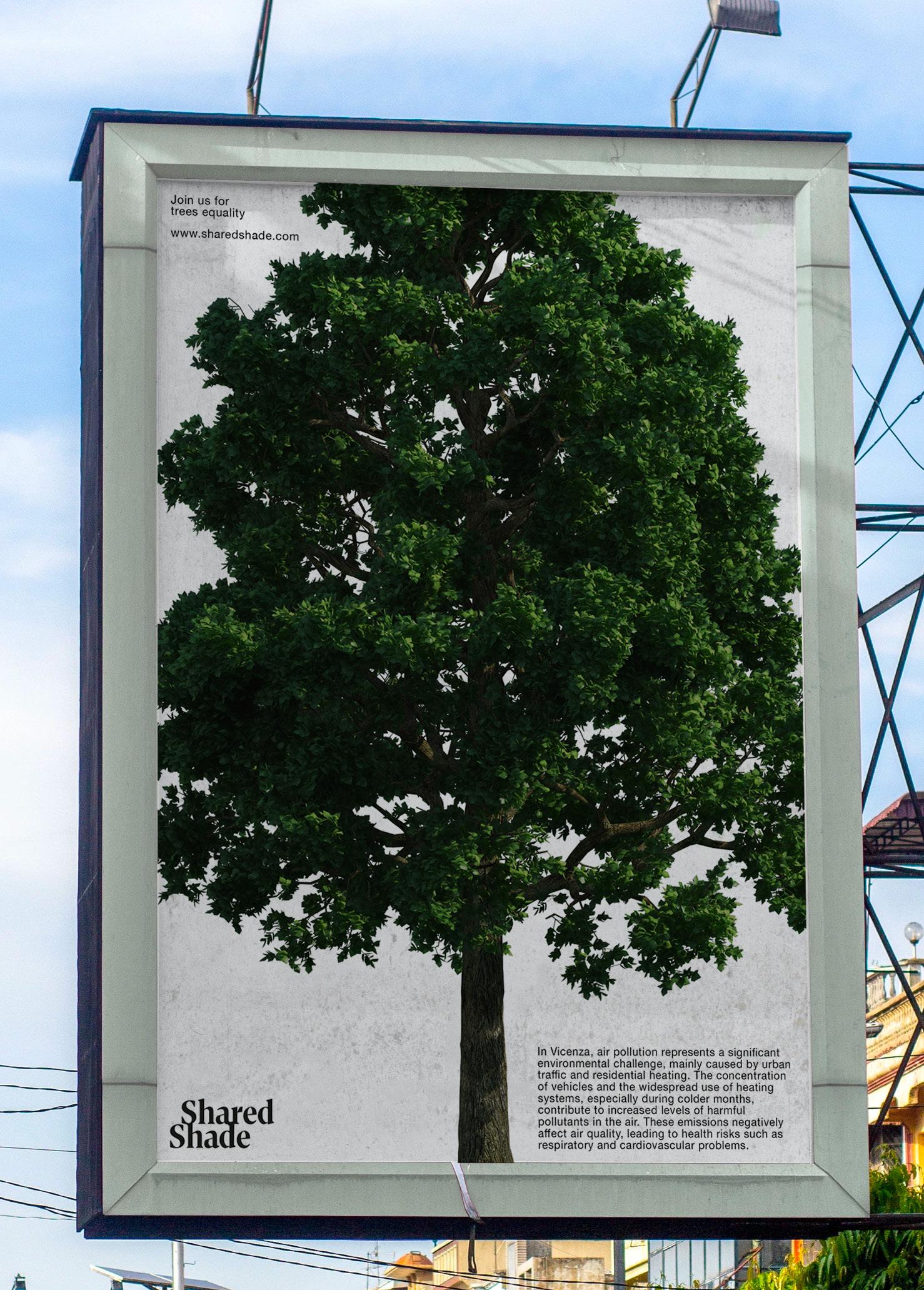
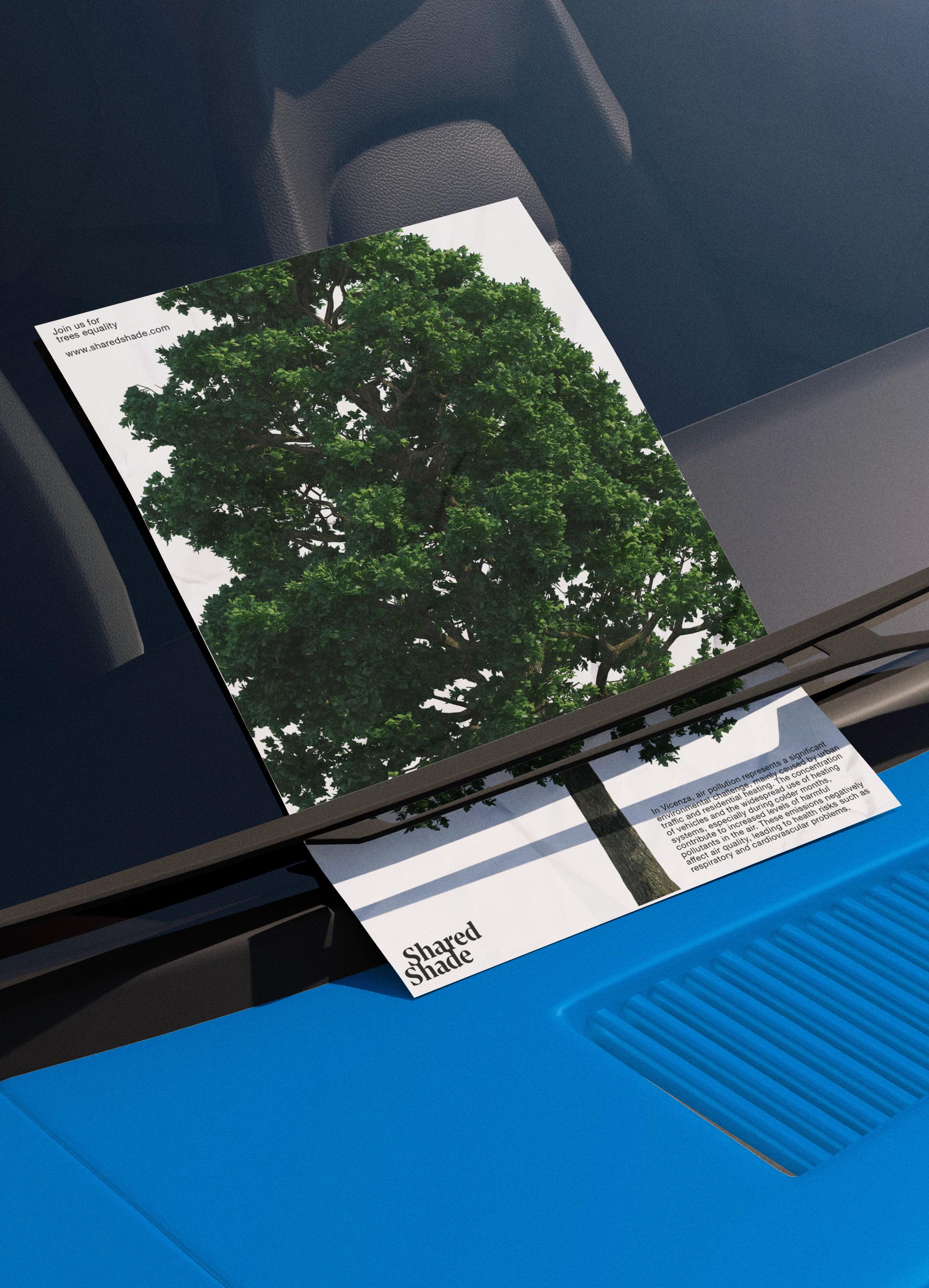
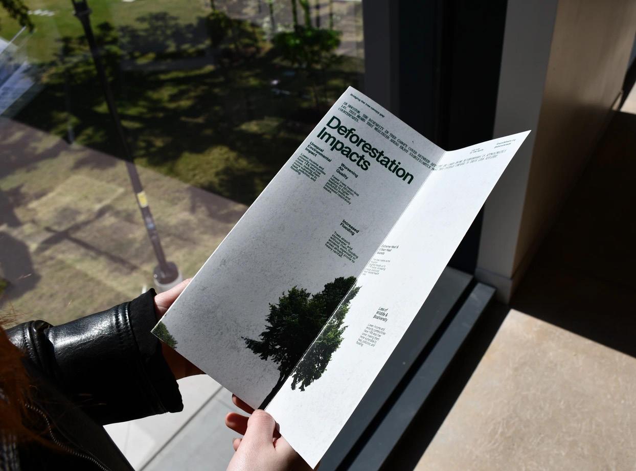
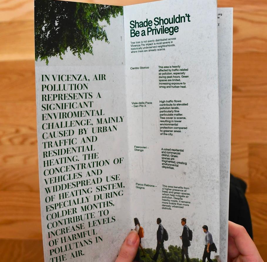
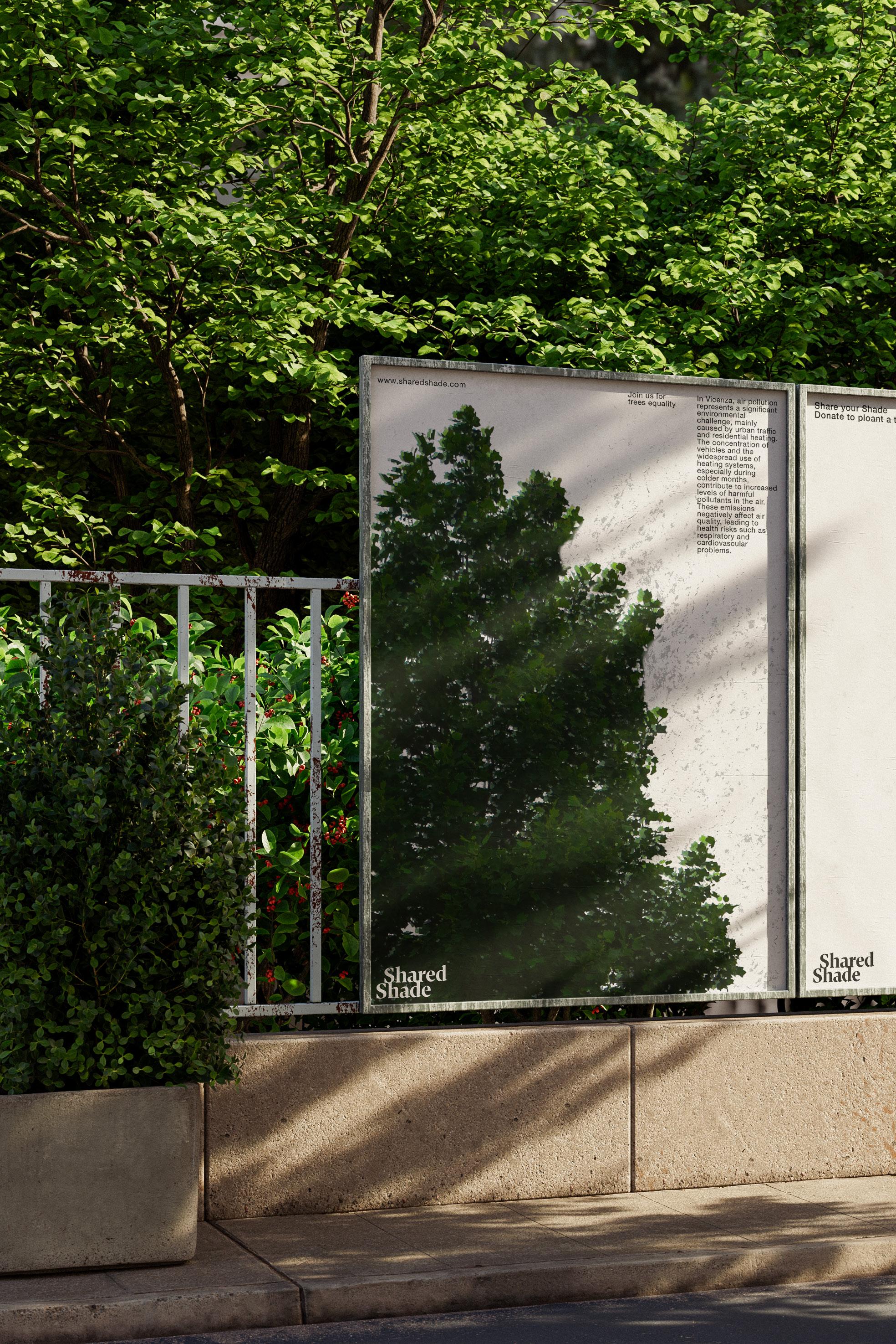
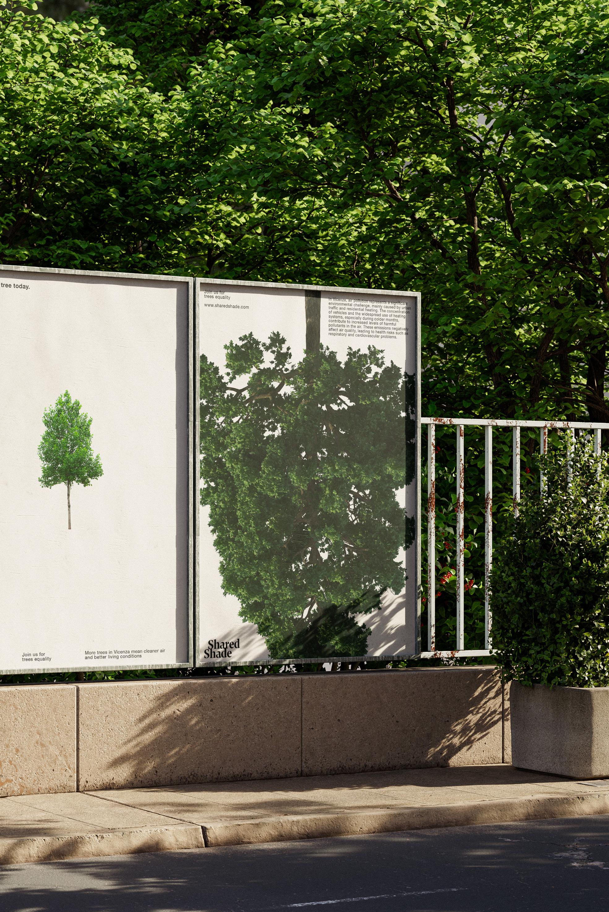
A graphic design project developed to raise awareness about air quality and urban environmental balance in Vicenza. The visual identity adopts a clean, data-driven yet expressive approach, designed to communicate the impact of deforestation and uneven tree distribution on air pollution and public health.
The project highlights how greener areas are often concentrated in wealthier neighborhoods, while lower-income communities face reduced tree coverage and poorer air conditions. Through accessible information and strong visual language, the campaign aims to encourage environmental equity and collective responsibility.
Visual Identity
The connected letterforms reference tree roots and natural growth, reinforcing the project’s relashionship with nature.
Noh Optique font was chosen for it’s precision, clarity, ensuring the typographic structure remanis cohesive and legible
1) Geometric Contruction of the Logo
1) Logo
Noh Optique
Weight & Usage
Noh Optique is a strong and clear typeface. Its bold presence conveys clarity and confidence, making it the perfect base for the logo
BODONI PT VF
Weight & Usage
Bold
The Bold weight is primarly used for titles and statments, reinforcing clarity and hierarchy within the visual system
Neue Haas Grotesk
Weight & Usage
& Usage
Neue Haas Grotesk is used as the secondary typeface for it’s neutrality, clarity and functional character. Netrual design allow content to remain the focus, supporting clear communication without visual noise
4) Subjects
Bold For posters, seeds packaging and brochure
5) Hierarchy 5) Slogan 5) Site 5) Site Introduction Site slides concept
spot
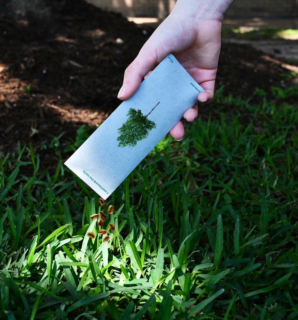
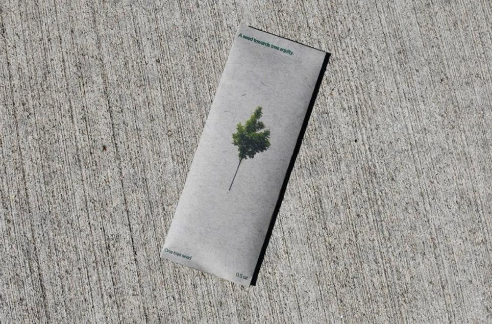
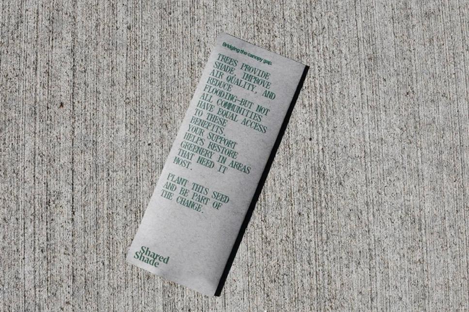
Simple rip-open packaging further expands raw & minimal visual identity.
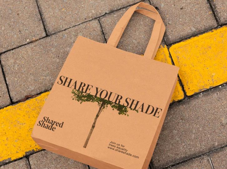
Collateral
Cue
Visual Identity
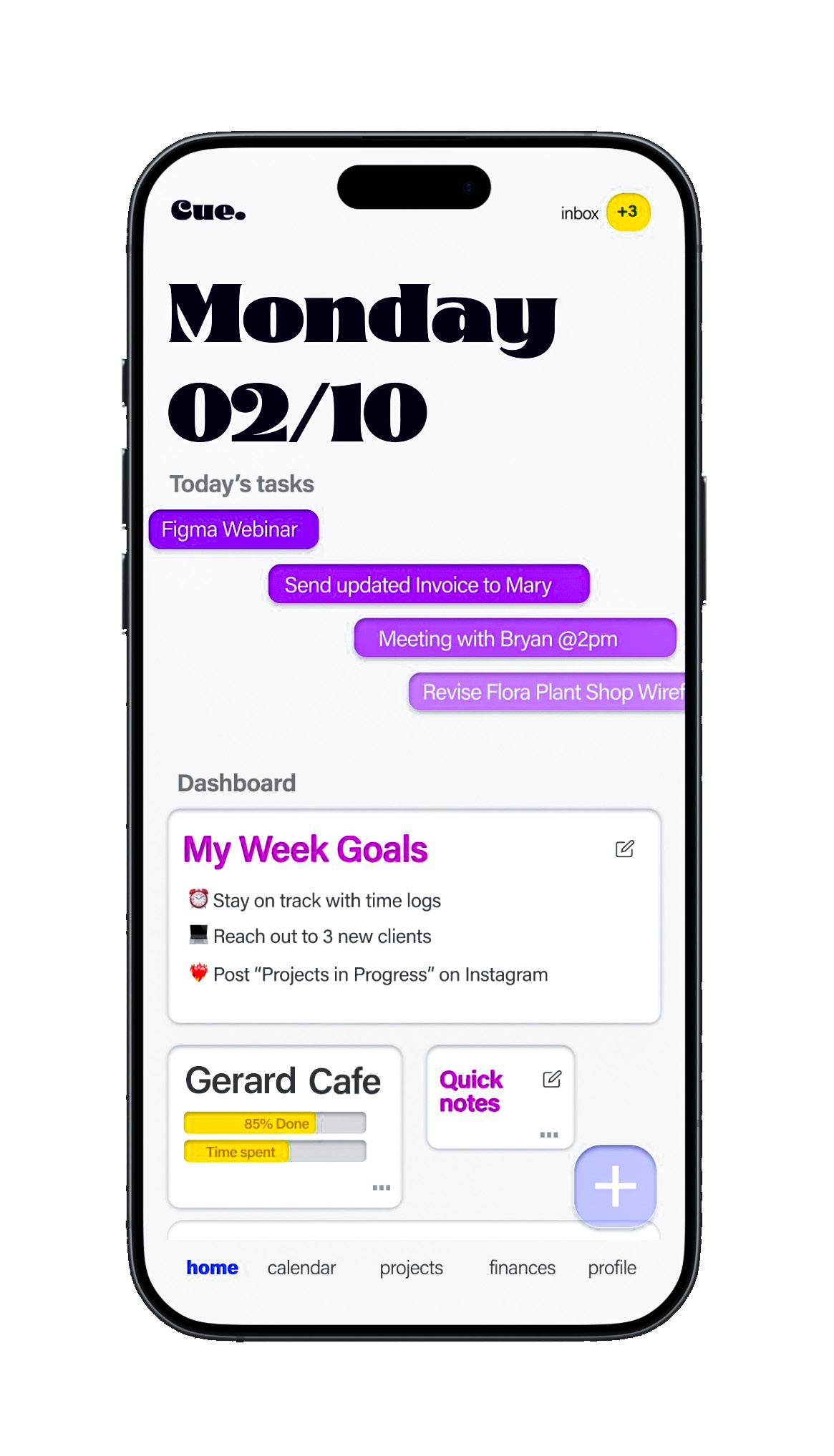
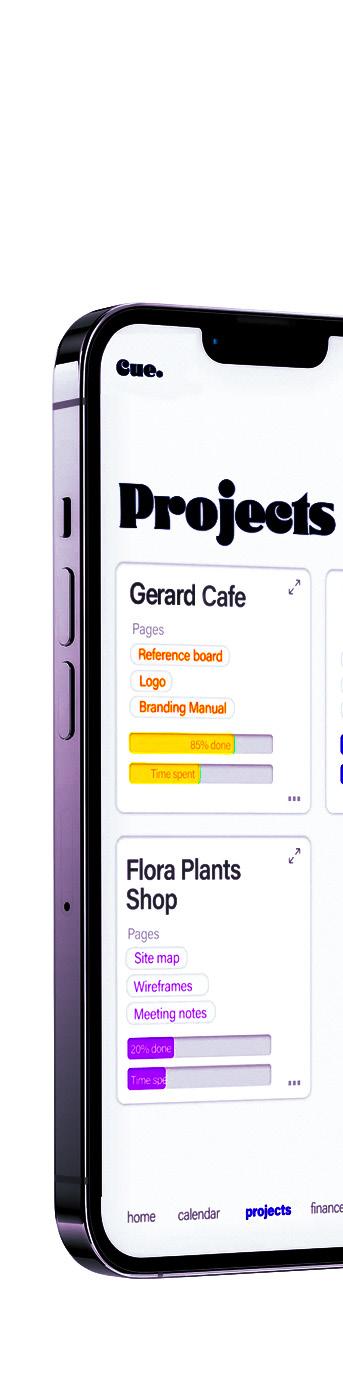
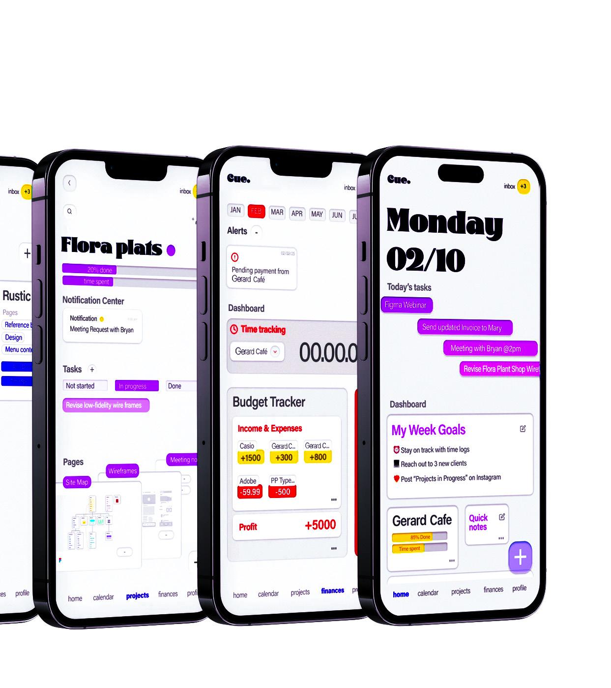
Cue is a concept productivity app designed for freelancers and creatives who need to manage projects, time, and finances in one intuitive space. The app brings together daily tasks, project tracking, budgeting, and time logs into a clean and visually expressive interface.
Cue focuses on clarity and flow: from daily task overviews to detailed project pages, time tracking, and financial summaries. The modular layout allows users to move seamlessly between planning, execution, and monitoring, supporting a more conscious and organized creative workflow.
The result is a functional yet character-driven app concept that balances efficiency with personality, turning productivity into a visually engaging experience.
Visual Identity
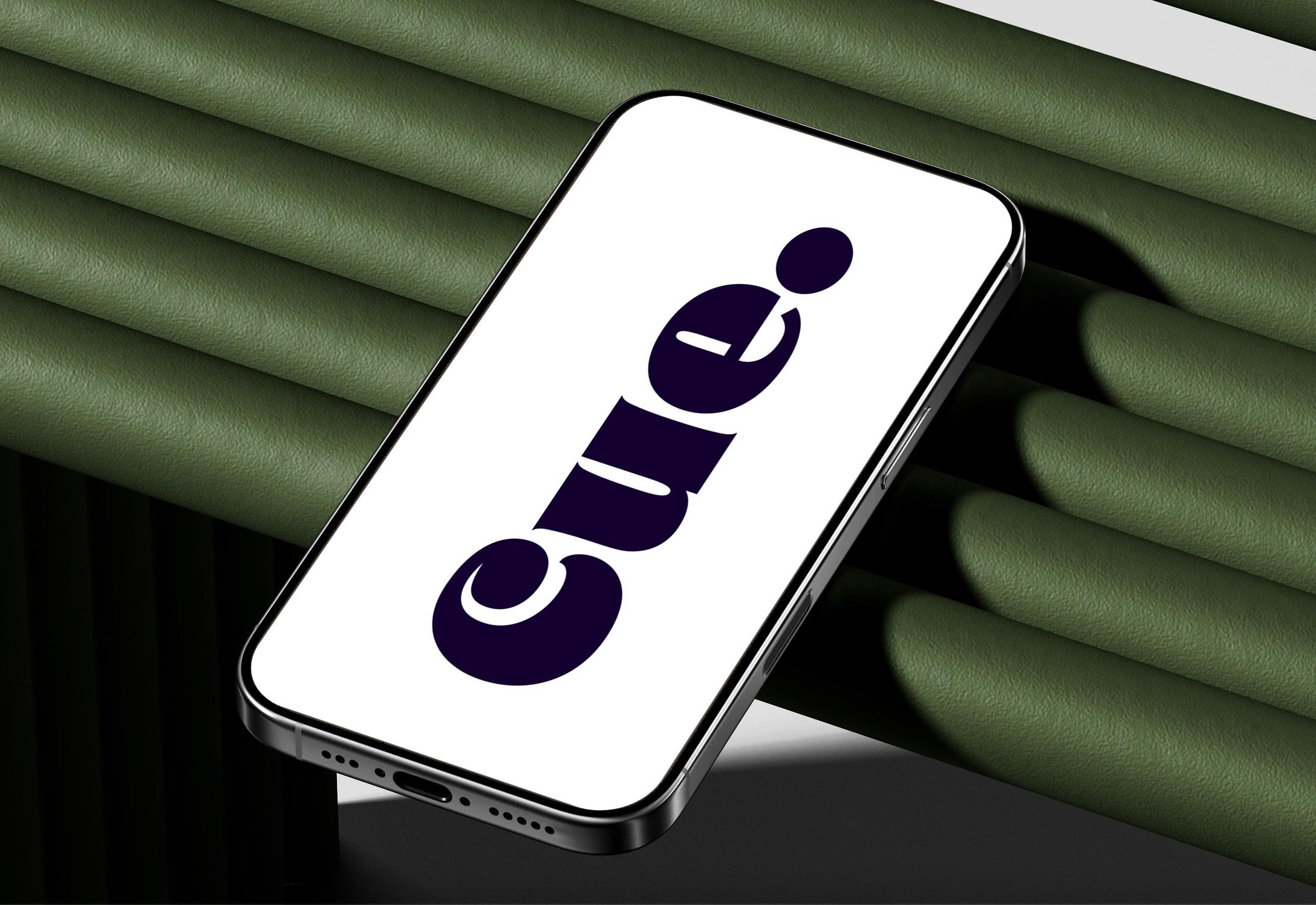
1) Logo
Cue – Stylistic Approach
Visual Identity
The visual identity combines bold typography with soft UI elements to create a strong contrast between structure and flexibility. Large typographic headlines define time and priorities, while color-coded tags and progress bars help users instantly understand project status, deadlines, and workload.
Cue means a signal, a prompt, or a moment that triggers and action. It’s the subtle indication that tells you when to start, what to focus on, or what comes next.
Glodok
Cue helps users stay focused and aware by highlighting what matters, when it matters—turning tasks, time, and projects into simple signals that naturally lead to action.
2) Typography Primary Logo
Glodok is a bold display serif typeface characterized by strong contrasts, sharp details, and expressive letterforms, making it both authoritative and distinctive.
SF Display Pro
Weight & Usage
Weight & Usage Display Light Display Regular
SF Pro Display is a modern sans-serif typeface designed by Apple for IOS devises. Its neutral yet refined character ensures visual balance, making it ideal for supporting content, navigation, and functional UI elements without competing with display typography.
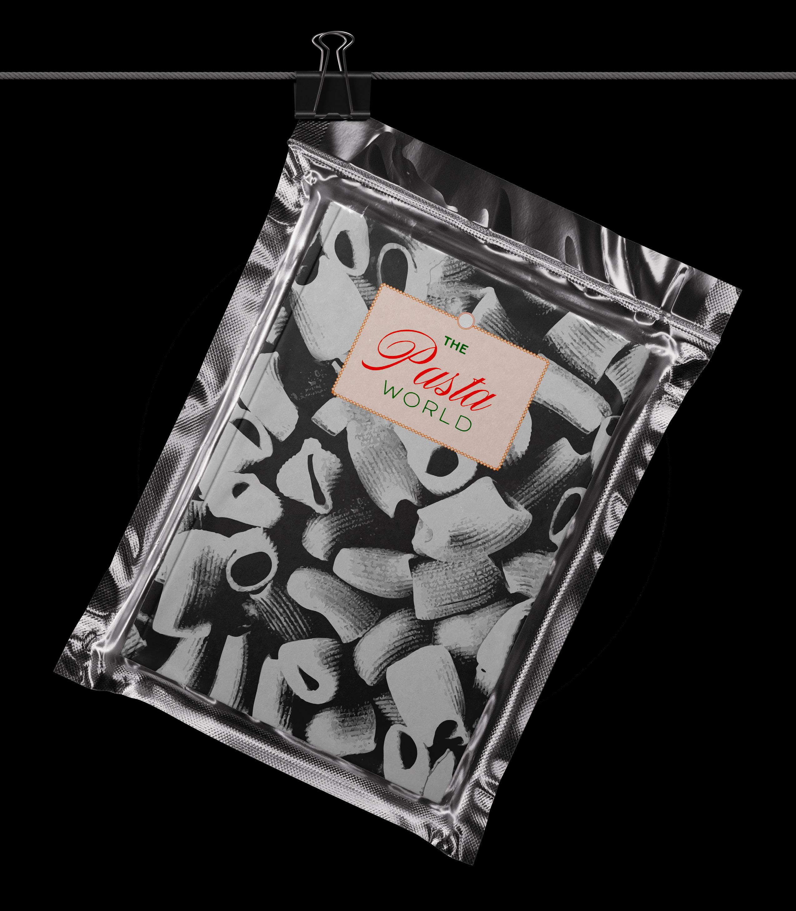
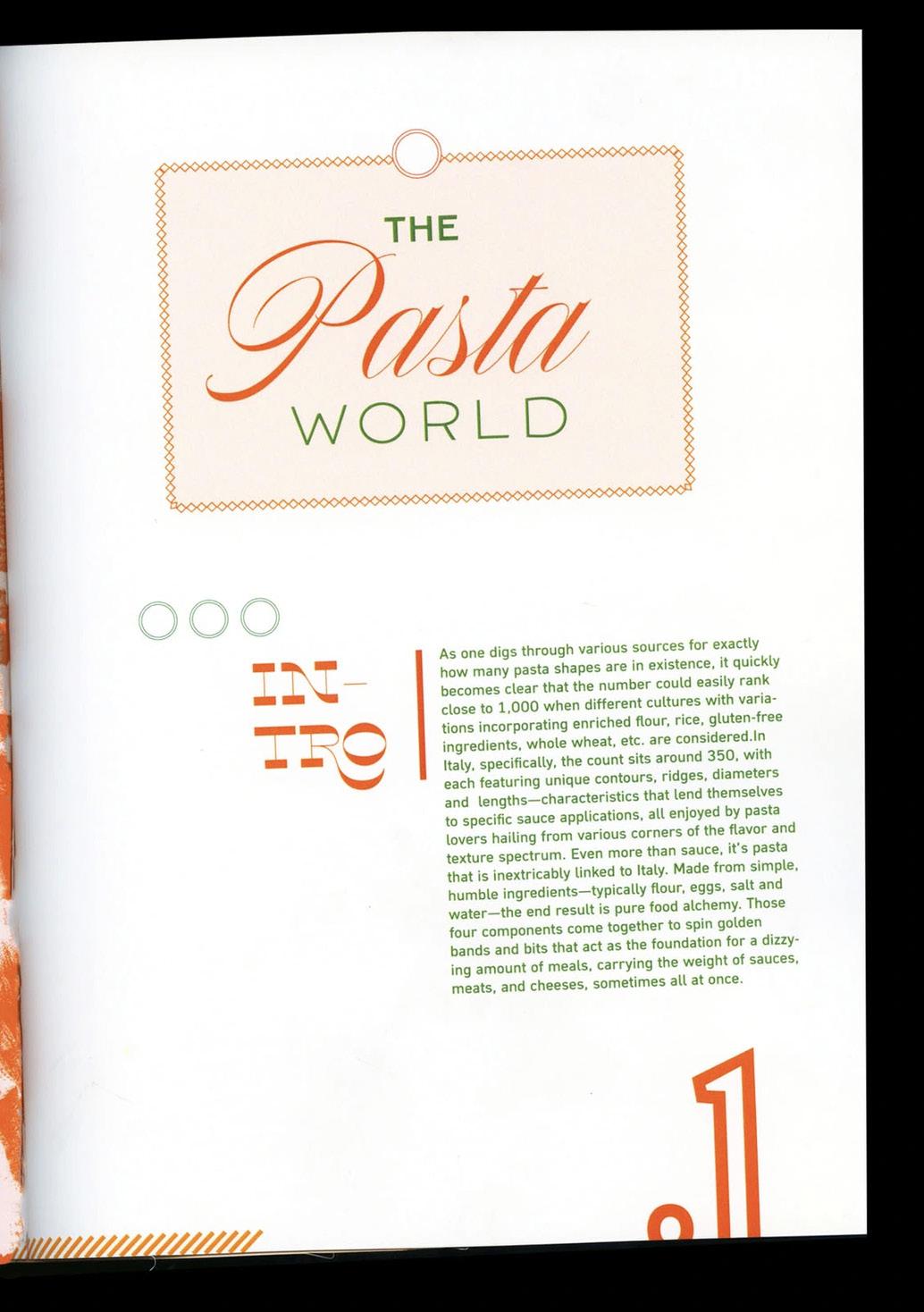
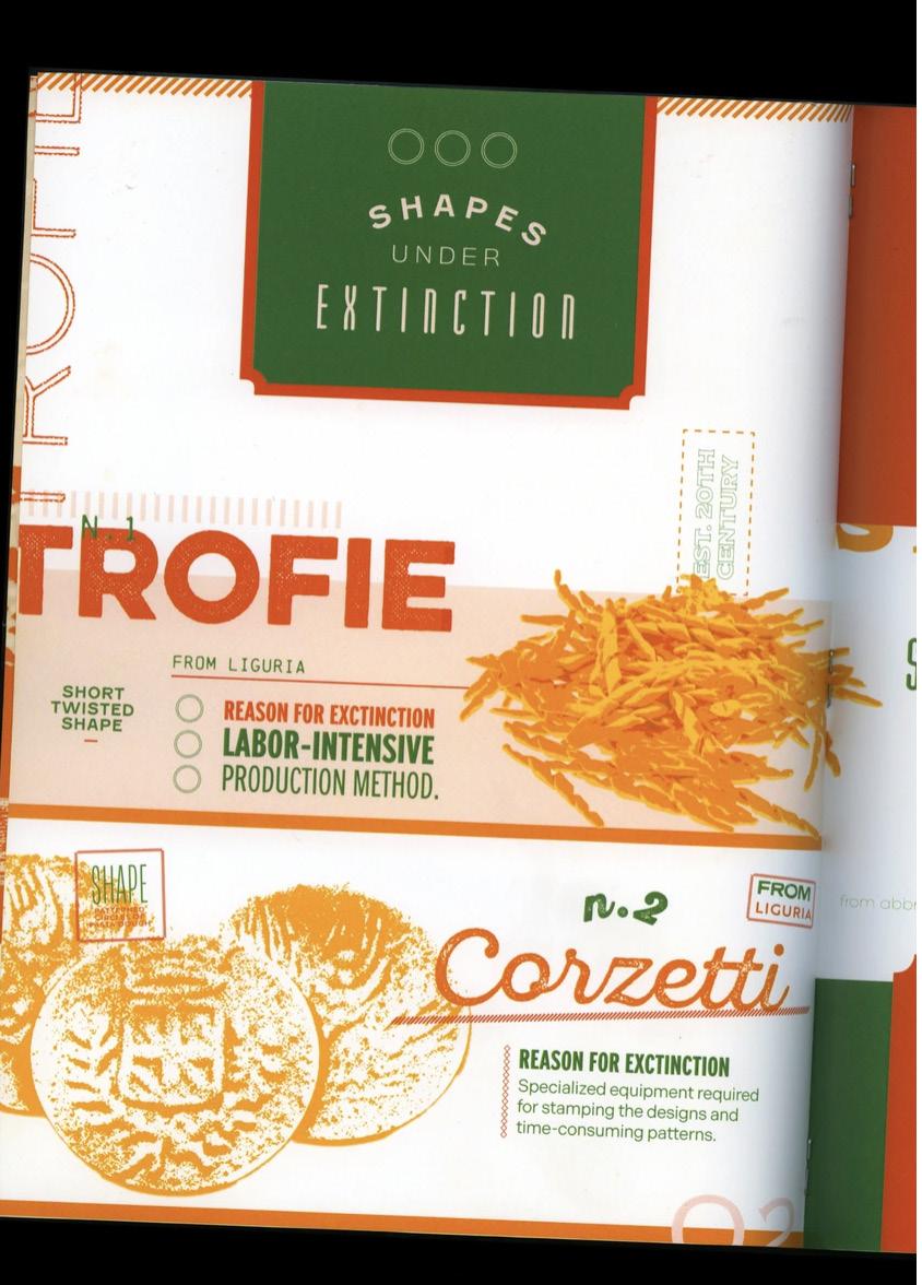
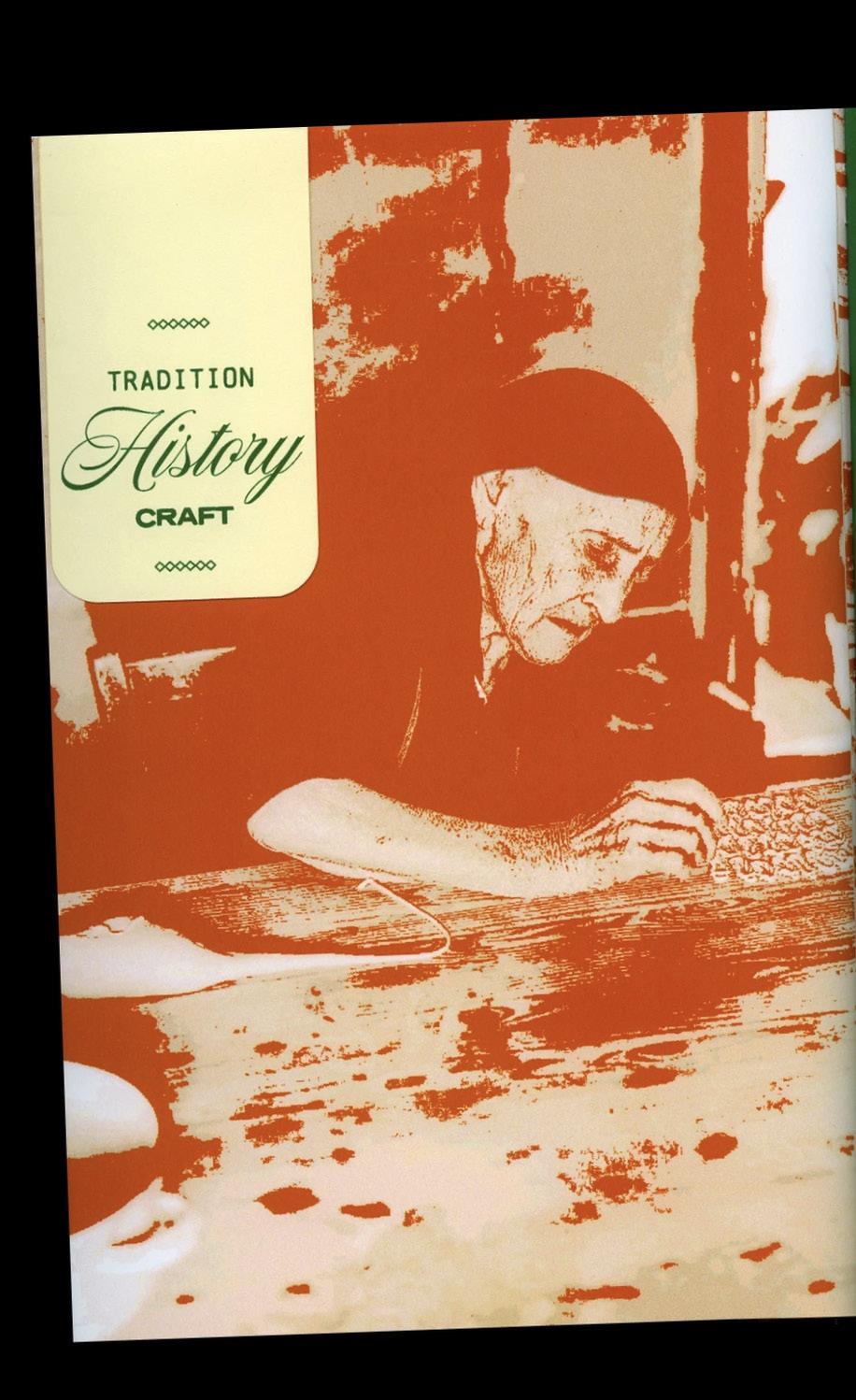
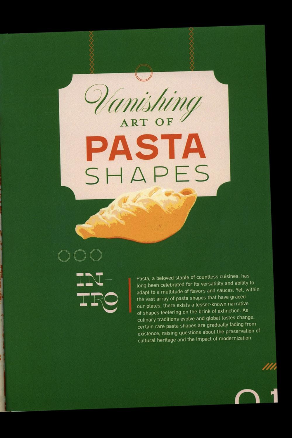
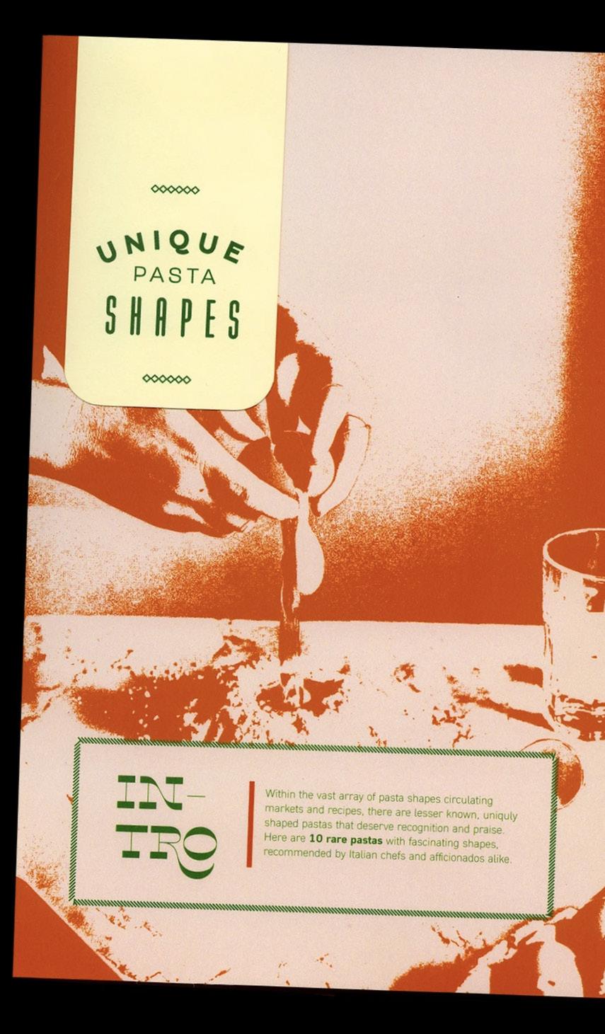
A research-based series of three field guides that explore the history of pasta making, detail the specifications of various pasta types, and shed light on the extinction of rare, intricate pasta shapes.
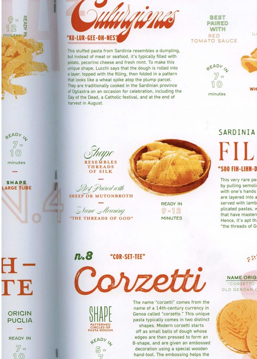
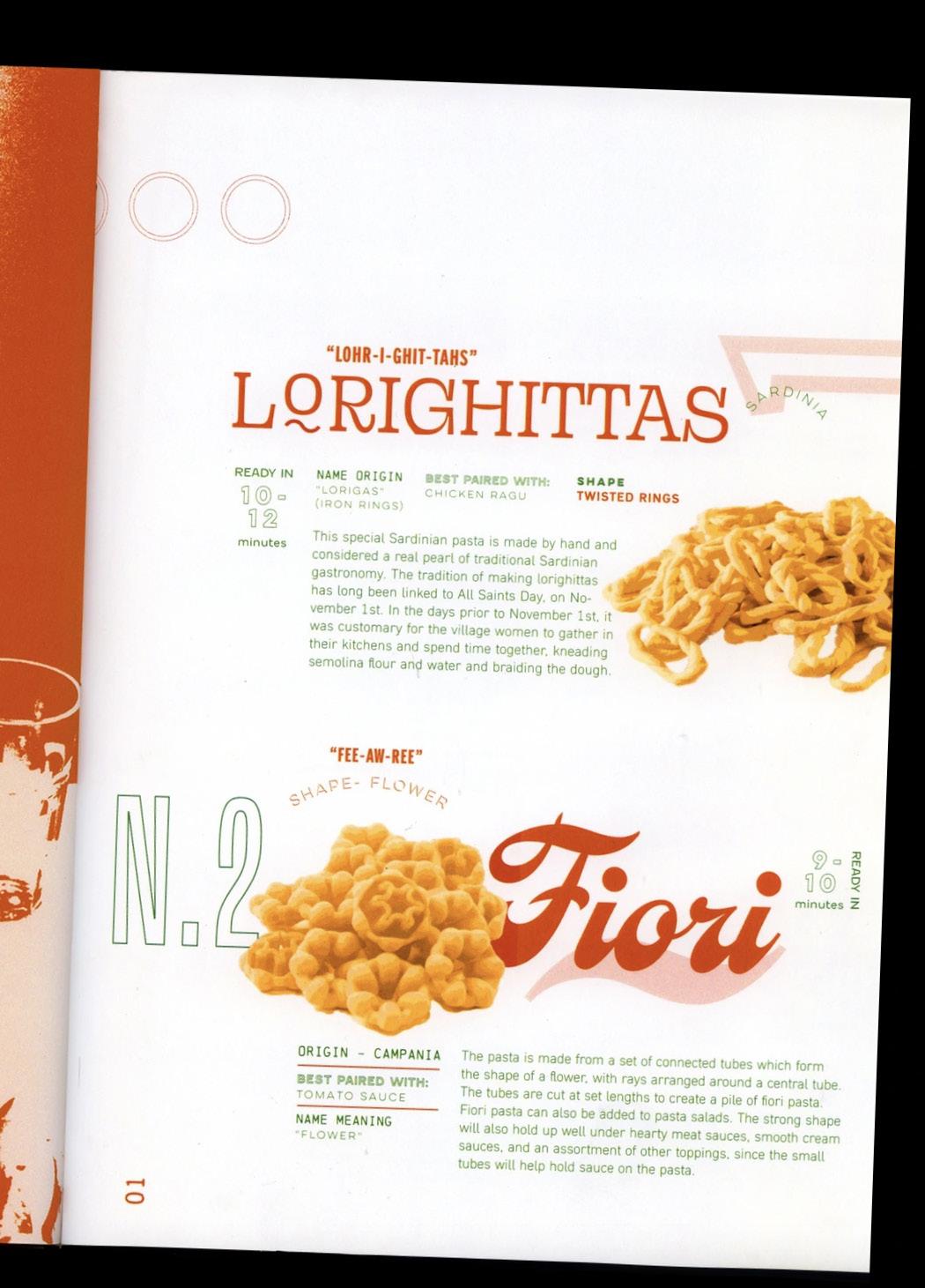
The design celebrates the diversity of pasta by individually branding each shape through typographic exploration, using distinct treatments and typefaces tailored to each form.
The Pasta Field Guide Series combines editorial design with a systematic, almost scientific approach to pasta classification. The typography mixes expressive serif fonts inspired by traditional Italian food culture with clean sans-serif typefaces, creating a balance between heritage and clarity.
Pasta Field Guide Series –
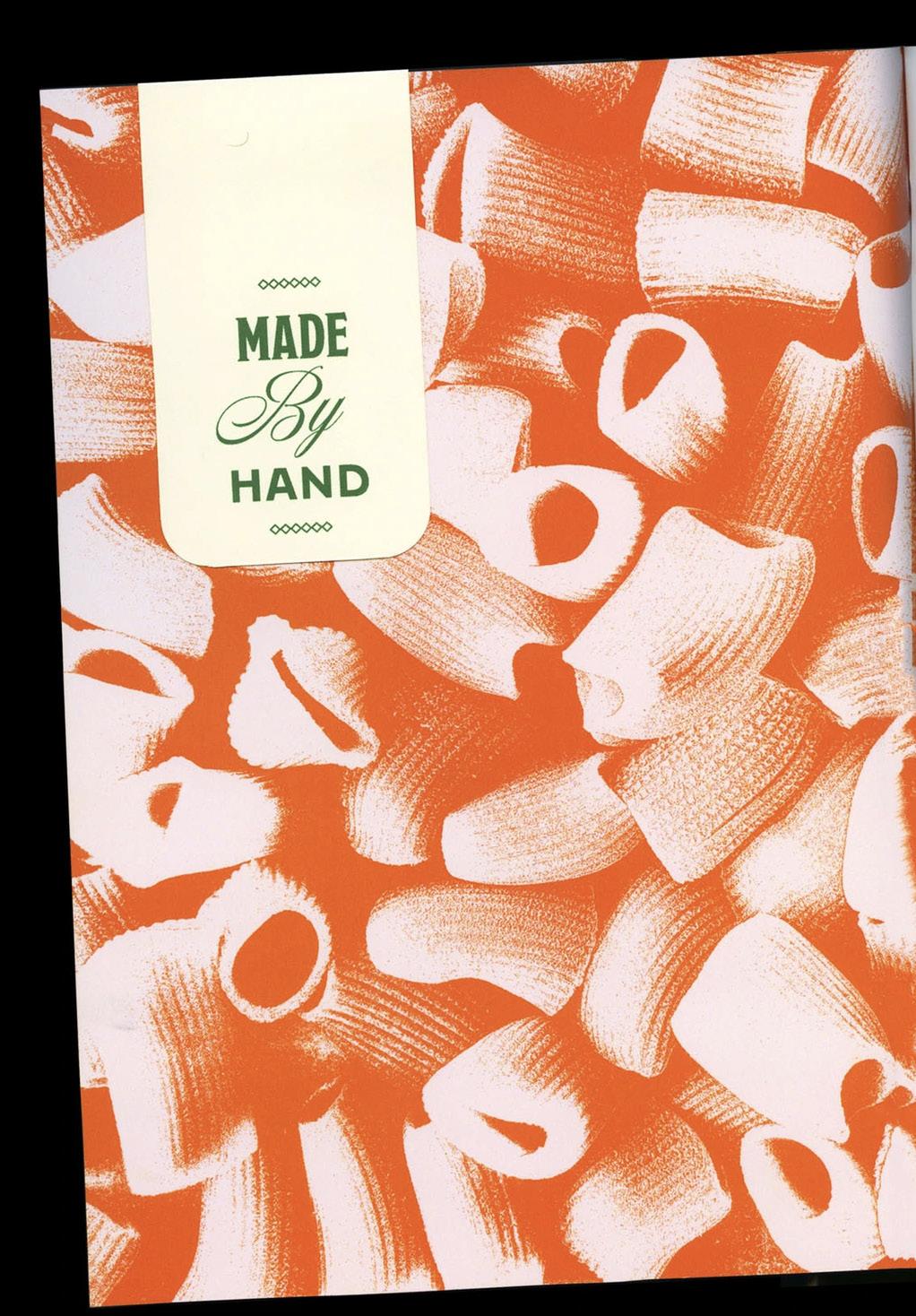
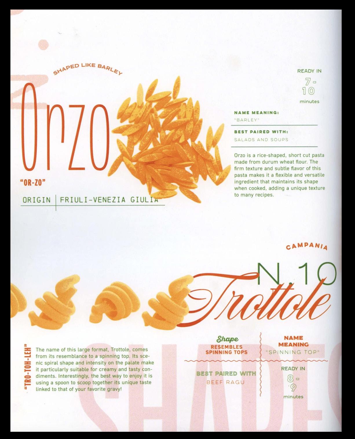
Pasta shapes are treated as graphic specimens: isolated, enlarged, and carefully arranged to highlight form, texture, and function. This minimal and structured use of imagery reinforces the idea of pasta as a designed object rather than just a food product.
The warm color palette, dominated by golden yellows with accents of red and green, recalls durum wheat, Italian landscapes, and culinary tradition. Together, these elements create a contemporary yet culturally rooted visual language that celebrates pasta as both a cultural and graphic subject.
For this project, I chose to use image tracing on different types of pasta as a stylistic decision. This approach allowed me to achieve clean, scalable vector visuals while maintaining a coherent aesthetic. The traced illustrations naturally align with the editorial design language of the Italian pasta guide, enhancing clarity, consistency, and visual identity.