艺术与设计出版联 盟成员杂 志 ART AND DESIGN PUBLISHING HOUSE MEMBER
北京 SKP SKP BEIJING
北京华联 ( SKP ) 百货 有限公司
BEIJING HUALIAN (SKP )
DEPARTMENT STORE CO ., LTD
北京市朝阳区 望 桥 邮 100025
DAWANG BRIDGE , CHAOYANG DISTRICT , BEIJING 100025, CHINA
电话 TEL : +86 ( 10 ) 6530 5888
WWW SKP - BEIJING COM
营业时间 OPENING HOURS: 10:00-22:00
西 SKP SKP XI ’ AN
华联 SKP 陕西 百货 有限公司
HUALIAN SKP (SHAANXI )
DEPARTMENT STORE CO ., LTD
陕西 省西 市碑林区长 北路
邮 710061
CHANG ’ AN NORTH ROAD , BEILIN DISTRICT , XI ’ AN , SHAANXI 710061, CHINA
电话 TEL : +86 ( 29 ) 8573 5888
营业时间 OPENING HOURS: 10:00-22:00
成都 SKP SKP CHENGDU
成都华联 SKP )百货 有限公司
CHENGDU HUALIAN ( SKP )
DEPARTMENT STORE CO ., LTD
成都 市 高 新区 天 府 道北 段
邮 610000
NORTH SECTION OF TIANFU AVENUE , CHENGDU 610000, CHINA
电话 TEL : +86 ( 28 ) 6838 5888
营业时间 OPENING HOURS: 10:00-22:00
武 汉 SKP SKP WUHAN
武 汉华联 SKP )百货 有限公司
WUHAN HUALIAN SKP)
DEPARTMENT STORE CO ., LTD
湖 北省武 汉市武 区 沙湖 道18号
邮 430062
NO .18 SHAHU AVENUE , WUCHANG DISTRICT, WUHAN CITY, HUBEI PROVINCE 430062, CHINA
电话 TEL : +86 27)5961 5888
营业时 间 OPENING HOURS 10:00-22:00
CREATED BY 概念 设 计
MIXT( E ) ÉDITIONS 22, rue Saint-Augustin 75002 Paris France + 33 ( 0 )1 83 95 42 08
CREATIVE DIRECTOR 创意 总监 Christian Ravera
EDITORIAL DIRECTOR 总负责人 Tiziana Humler-Ravera
EDITORIAL BUINESS DIRECTOR 杂志运营总监 Yasmin Kayser
EDITOR IN CHIEF 主编 Nathalie Fraser
PROJECT DIRECTOR / EDITORIAL COORDINATOR / ICONOGRAPHER
项目总监/ 编辑 统 筹 /图像 采 集师 Patrick Hanzo
ART DIRECTOR 美术总监 Bérengère Marcé
PRODUCTION AND CASTING MANAGER 拍 摄 统 筹经 理/选 角指导 Véronique Chaubin / iMAJ Production
PHOTOGRAPHER 摄 影 Arthur Delloye
STYLIST 造型 Céline Laviolette CONTRIBUTORS 撰稿人
Sophie Abriat, Aitor Alfonso, Caroline Boudehen, Nina Boutléroff, Martin Daubigny, Alexandre d’Eymiard, Matthieu Jacquet, Colette Marc, Lionel Paillès, Vincent de Saint-Thibault, Nicolas Salomon, Lucy Zhang
on the calm surface of the pool’s water: a big splash. Painted in 1967 by British artist David Hockney, then already settled in the aesthetically evocative setting of Los Angeles, California, A Bigger Splash is one of the most powerful visual statements of a familiar expression. In his own unique, minimalistic yet colourful style, Hockney manages to capture the feeling of freshness and privilege felt as you dive into water. The sensations are manifold: the joy of escaping the heat. The thrill of leaping into the unknown. The combined shock and pleasure of cold water on the skin. The luck of having access to such an experience. It’s no surprise that Hockney’s painting, along with its two “prequel” works The Little Splash and The Splash, now holds a major role in the canon of modern painting – it is also a work of art that provides an instant connection with the viewer.
ENGLISH TEXT
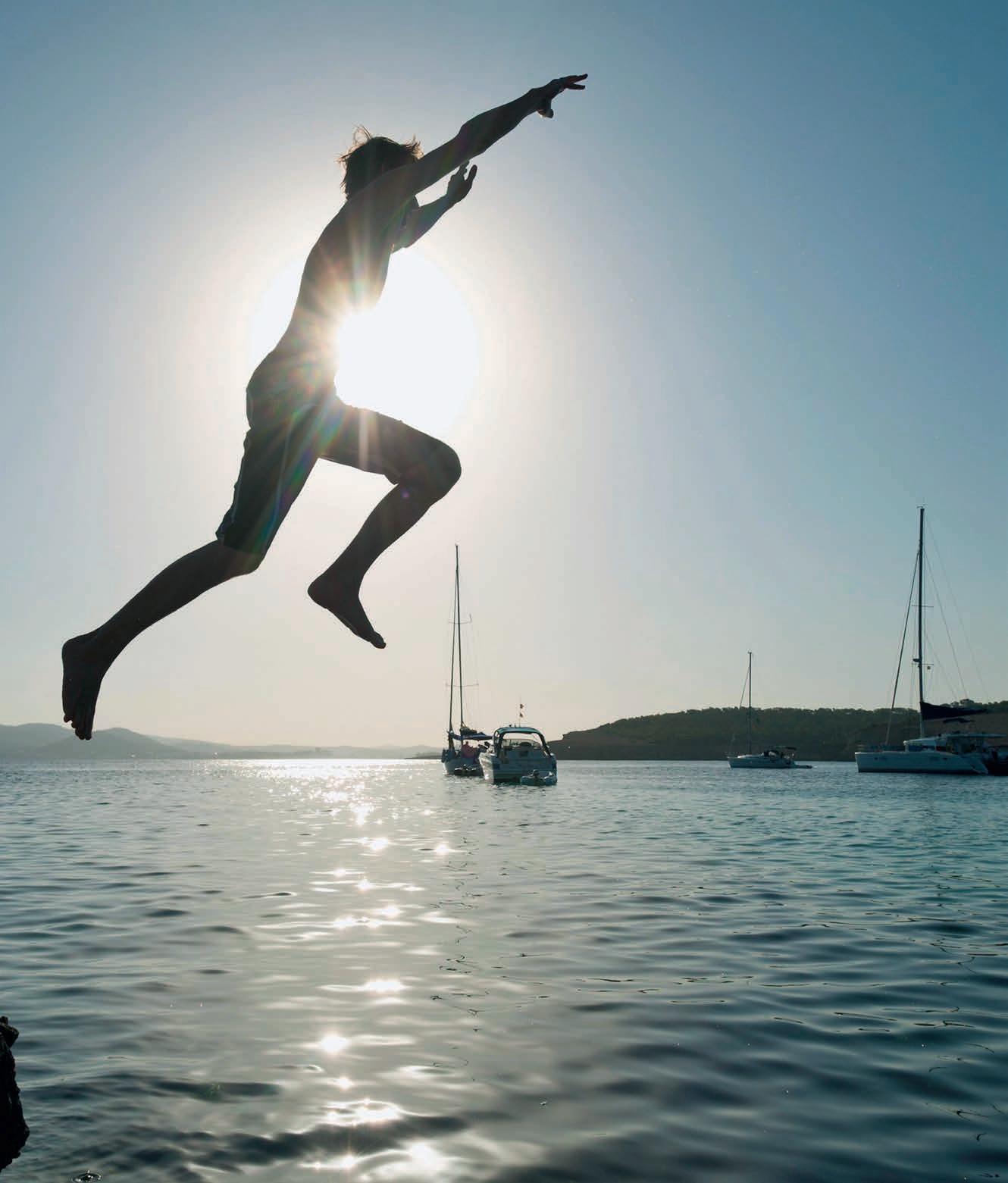
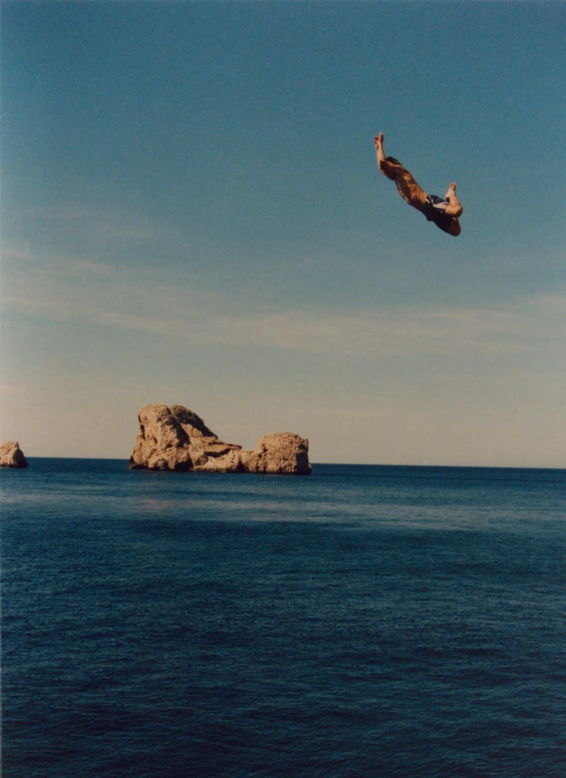
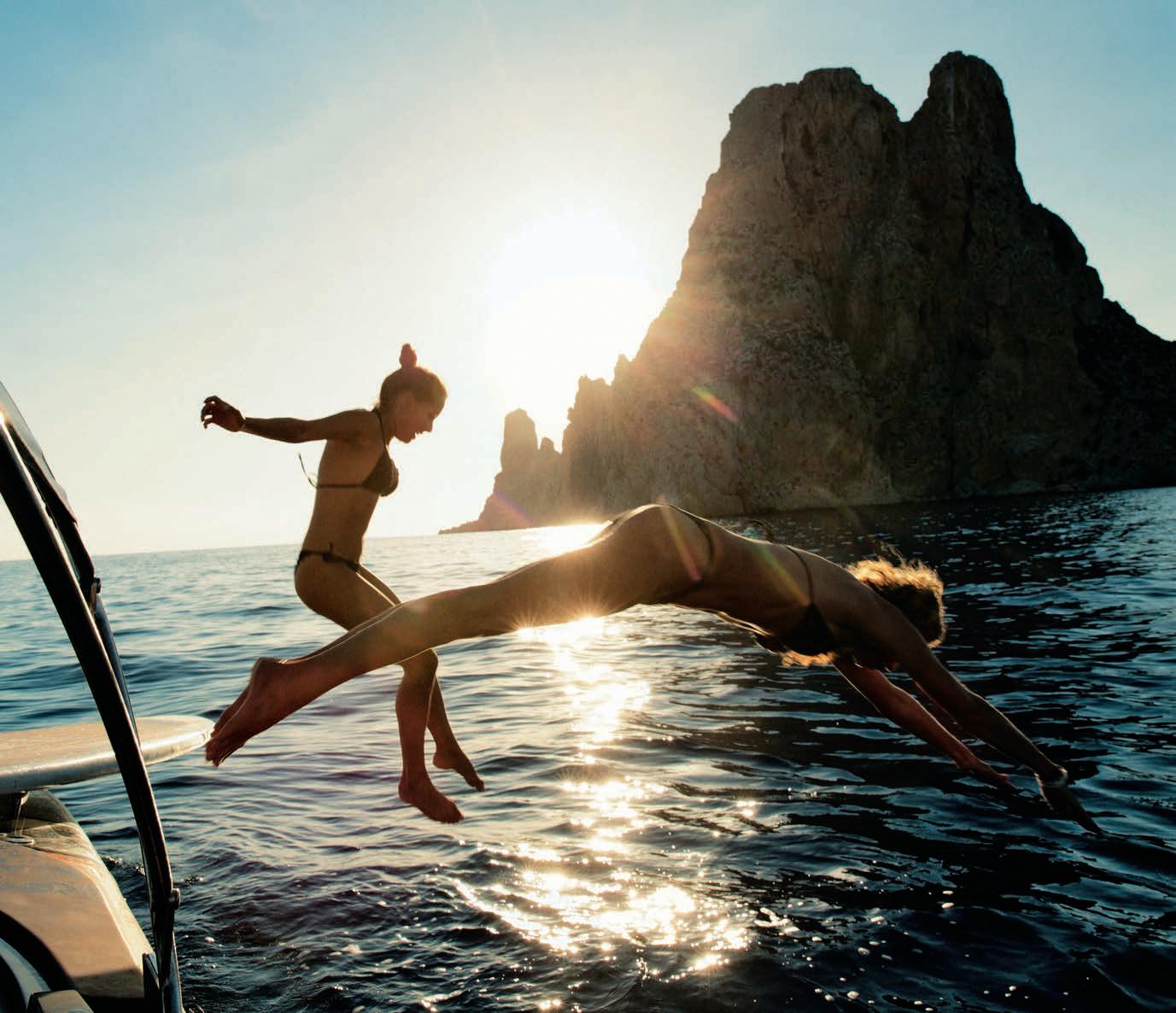
The word itself evokes a feeling of freshness and motion. Cool images, thrilling fashion and nature-inspired lifestyle are some of the sources for the wave of summer feeling expressed in this issue. Come on in, the water is fi ne!
A turquoise expanse of water reflecting a perfect sky. The symmetrical architecture of the ochre building opposite the yellow diving board. The tall shape of the palm trees in the distance. In the middle of the image, the energetic burst of water, a single expanse of motion. The diver is invisible, remains only their effect
We have all experienced the joy of the big splash. As children, leaping into waves, puddles or streams, playing with water and feeling the excitement of a refreshing new sensation. As teenagers, daring each other to leap or jump further or higher, into a lake or river or off a high diving board. As adults, using water as a means of salvation and escape, whether on a seaside vacation, or plunging into the water to shed the stress and heat of a long day. A pool, lake or sea are not even mandatory: the joy of the splash can be experienced in our own bathroom, in a spa or thanks to a conveniently placed fountain. The splash can even be empirical, created through a simple gesture: a spray of cool cologne, a spritz of facial essence, the clunk of an ice-cube in a tall refreshing drink, the fizz of a sorbet on the tongue… Freshness is everywhere, if you look for it – and we increasingly do, as a means of escaping the heat of the everyday. As temperatures rise and our lives become ever more active, the joy of the splash is a welcome pause, whether for a few seconds, or during a well-deserved vacation. We seek to surround ourselves with suggestions of freshness, through our clothes, leisure activities, refreshment choices and beauty purchases. SKP has understood this from the very beginning, offering an oasis of cool energy in the heart of the city. SKP Chengdu goes even further, its sunken layout offering a feeling of space and nature within the city, exemplified by its iconic, selfie-friendly water towers, whose continuous flow offers a visual, aural and sensory feeling of freshness – if the wind is blowing the right way, visitors will enjoy the delightful sensation
of fine drops of water on the skin, a reconnection with powerful memories of childhood…
The modernity of David Hockney’s trademark swimming pools suggest that the passion for splashing is a relatively recent one. Indeed, if public swimming pools were opened in many major cities in the mid-1800s, private pools only became a commodity in the 1950s, as the American architectural suburbia was developed, showcased through the idea of an individual home with all modern commodities, a garden and a pool. However, the notion of bathing goes back to ancient times: the oldest traces of a man-made pool date back to the 3000BC and the Great Bath of Mohenjo-daro, in modern day Pakistan. In the Greek and Roman civilisations, baths were seen as central to everyday life, a place for socialising as well as hygiene and sports – all boys and men learnt to swim and did so regularly. During the Middle Ages, the bathhouse remained a social place, with royalty and nobility seeing the bath as a shared occasion. The same was true in China, where the existence of bathing and bathhouses is also linked with social and cultural traditions – visitors arriving in a family may have been invited to bathe before eating, to refresh themselves after their journey.
These ancient rituals continue to influence un today, speaking to our current desire to reconnect with wellness and to seek an escape – even temporary – from the heat and frenzy of the everyday. This search for space and meaning is evident in our shift towards healthier food and drink choices, and our focus on fashion that is more suited to a varied, active existence, taking us from home to work, to exercise and to play. Here also, SKP takes the lead, with events such as the recent Sweat campaign in SKP Wuhan’s K Avenue, with large-scale boxing and rowing classes to enjoy the endorphin buzz – and subsequent chill-out. If we love the calming, soothing effect of water, the splash is also a vector of excitement. In English, the etymology of the word itself comes from an onomatopoeia, referring to the sound that water makes as it is touched or applied. The term itself comes from Middle English, first noted around 1200. Yet since the mid-20 th Century, the expression “making a splash” refers to the idea of getting noticed or making a statement. Around the time when David Hockney was painting his evocative swimming pools (and making his own splash in the art world), the 1960s were full of bright new talents shifting painting, music and fashion into a new
realm. From The Beatles to the Beach Boys, from Mary Quant to Courrèges, a refreshing new energy was emerging onto the cultural stage. More than a splash, this was a wave of creativity which was to reshape our way of thinking and seeing, influencing artistic fields with a force felt well beyond the 20 th Century.
The idea of a wave carries with it a visual and metaphorical force. It’s no surprise that the wave itself is a strong motif in art – the Lishui pattern is recurrent in printed and embroidered garments throughout the dynasties, from the Ming era onwards, and also appears in Chinese opera costumes. Lishui remains a visual influence in contemporary clothing, even influencing major designers such as John Galliano, who used the motif in some of his Haute Couture designs when he was creative director at Christian Dior in the 1990s and 2000s.
Creative waves continue to make a splash in the fields of art and fashion. Our jaded eyes were given a major refresh this season as a new tide of talents brought a sea change to some of the most established houses in the business. Jonathan Anderson’s highly anticipated debut at Dior showcased a light, airy new feel, as men’s and women’s collections played with tailoring, dimensions and structure. At Chanel, Matthieu Blazy brought energy and intelligence to the codes of Coco’s canon. Elsewhere, Demna’s vision for Gucci, Alessandro Michele’s Valentino, Pierpaolo Piccioli’s Balenciaga, Michael Rider at Celine and former Proenza Schouler duo Jack Mc Collough and Lazaro Hernandez at Loewe all offered a first chapter of exciting adventures to look forward to. The discovery continues into the forthcoming seasons, with first collections from to look forward to from ex-Alaïa mastermind Pieter Mulier at Versace, and a debut at Balmain from Antonin Tron, formerly known for his own label Atlein and its elegant, athletic silhouettes. Interestingly, Tron, a soft-spoken Frenchman, is a keen surfer who often takes long breaks away from the studio to ride the waves of the best international spots. A refreshing attitude in a world often known for its focus on long hours, all work and no play!
This issue of the SKP Magbook offers you the opportunity to immerse yourself in the freshest fashion, lifestyle, art, travel and design. Bright colours and cool textures are there to inspire and invigorate you. Whether literally or creatively, there is no doubt that the best way to transition into summer is to make a splash… So go ahead and jump straight in.
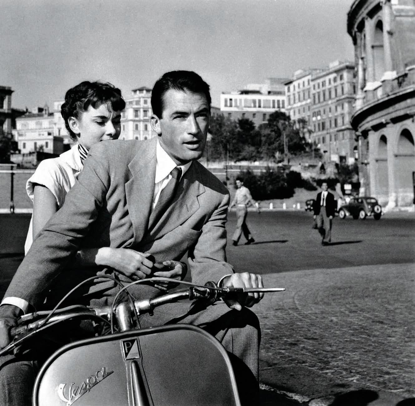
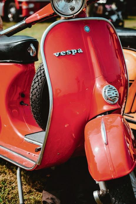
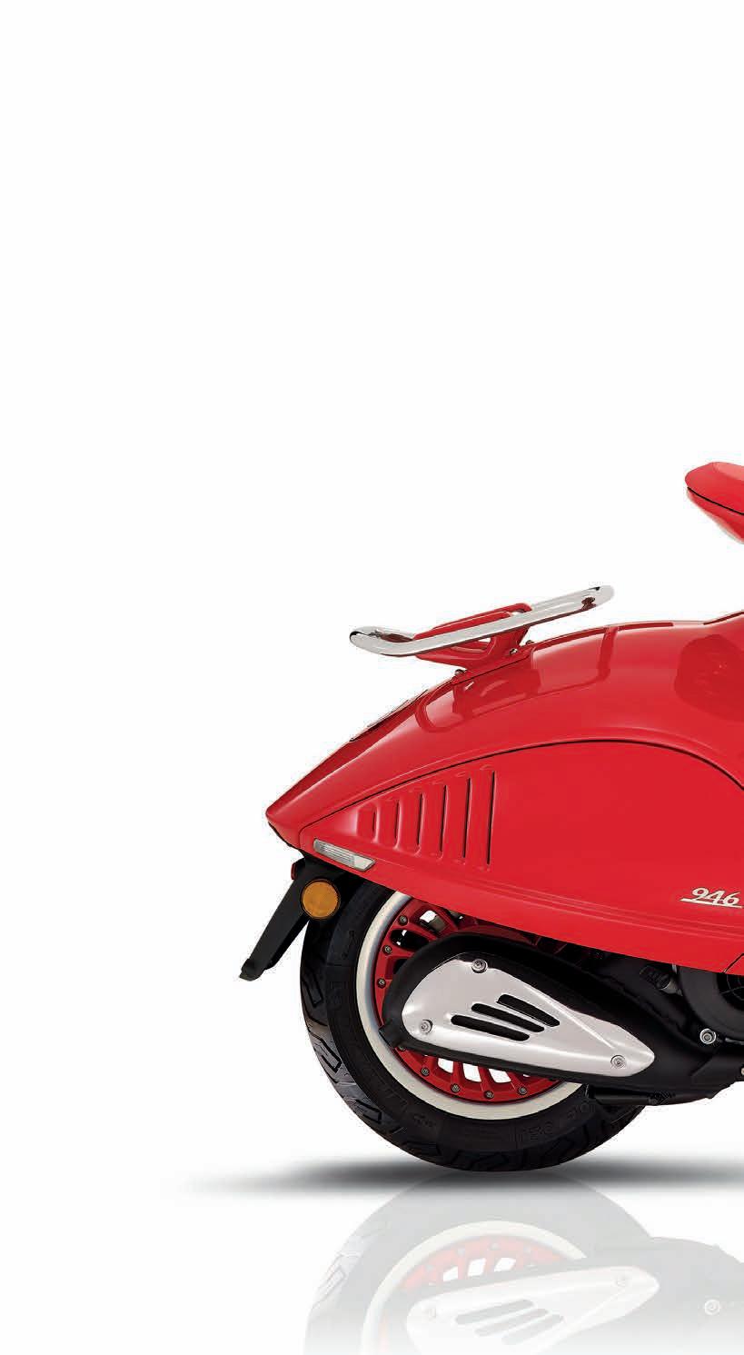
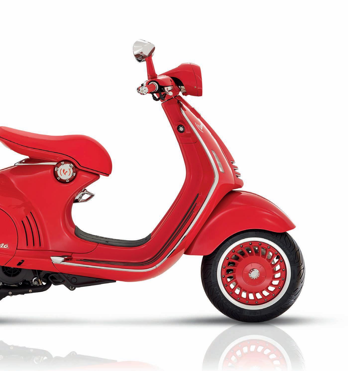
Few objects capture the spirit of an Italian summer quite like the Vespa. With its unmistakable silhouette, it instantly evokes a sense of escape, and the quiet thrill of freedom. One imagines taking the handlebars, gliding solo or en amoureux along the vertiginous curves of the Amalfi Coast, slipping through the lively streets of Rome or Naples, or drifting across the sun-drenched landscapes of Tuscany. Even its name carries a certain poetry. In Italian, Vespa means “wasp” – a word that hums with pizzazz and energy. Conceived in the immediate aftermath of the Second World War, it was originally intended as an accessible means of transport for a country rebuilding itself. Yet the result was quietly revolutionary. Its creator, aeronautical engineer Corradino D’Ascanio, disliked conventional motorcycles, finding them uncomfortable, cumbersome and messy. Drawing on his aviation expertise, he designed an entirely new machine: a clean, self-supporting body without chain transmission, intuitive handlebar gear controls and a front suspension inspired by aircraft landing gear. In April 1946, the first prototype rolled out of the factory in Pontedera. The Vespa was born. Soon it became far more than a mode of transport. During the years of la dolce vita, the Vespa came to embody Italy itself – famously dubbed by foreign correspondents “the country of the Vespa”. Its elegant profile has since appeared in more than two thousand films and television series, from Roman Holiday to the Pixar film Luca Nearly eighty years on, the dream endures. Andiamo al mare! Let’s head to the sea – preferably on a red Vespa, for the most timeless of Italian summers.
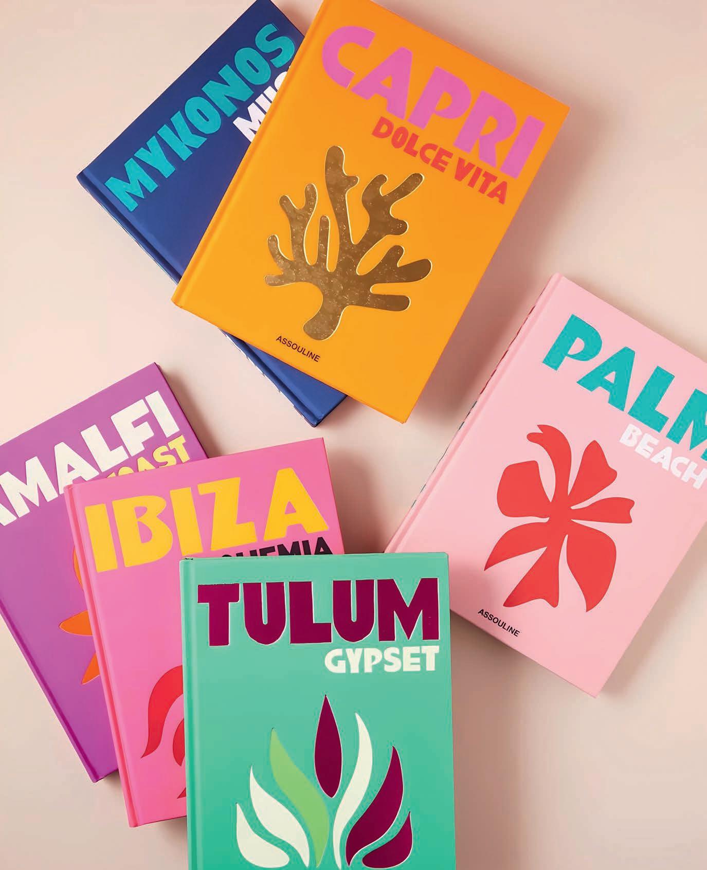
Does Assouline really need an introduction? For more than three decades, the publishing house has set the standard for luxury coffee table books devoted to art, fashion, architecture, design, and travel. Each volume, elegantly bound and impeccably art-directed, is conceived as both a cultural artifact and a design object. The Travel Series embodies this philosophy perhaps more than any other Assouline collection. It transforms the idea of a travel book into something more immersive: a visual journey. When Ibiza Bohemia was published in 2016, it introduced a new editorial approach, one that sought not simply to document a destination, but to capture its atmosphere. Landscapes, iconic figures, traditions, and collective myths come together to reveal the deeper identity of a place. Images and text unfold in dialogue, drawing the reader into a world that feels both intimate and cinematic. The success was immediate. In the years since, the series has grown into a global library of destinations: Mykonos, Capri, Tulum, Marrakech, Saint-Tropez, each volume offering its own portrait of place. With their vibrant covers and playful symbols inspired by the spirit of each location, the books are instantly recognizable. They are meant to be opened, browsed, and displayed, whether in hotel lounges, stylish concept stores, or private libraries. Together, they form something larger than a collection: a cultural atlas of the modern imagination.
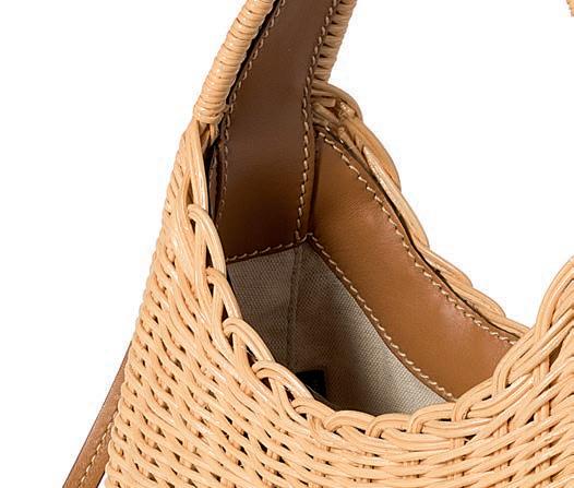
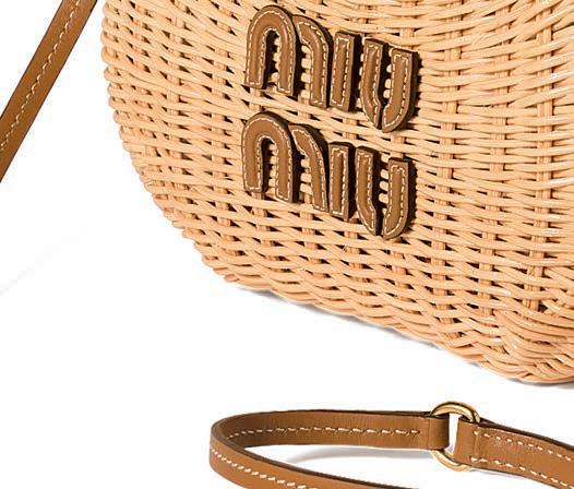
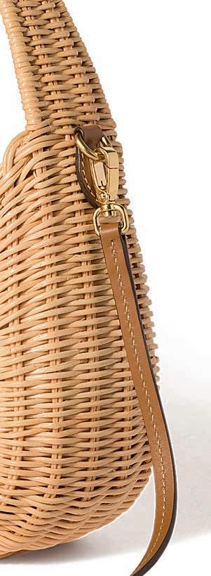
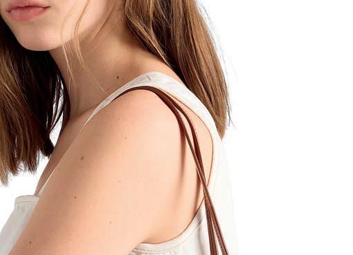
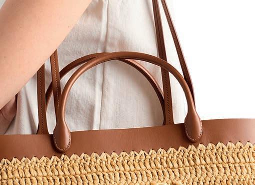
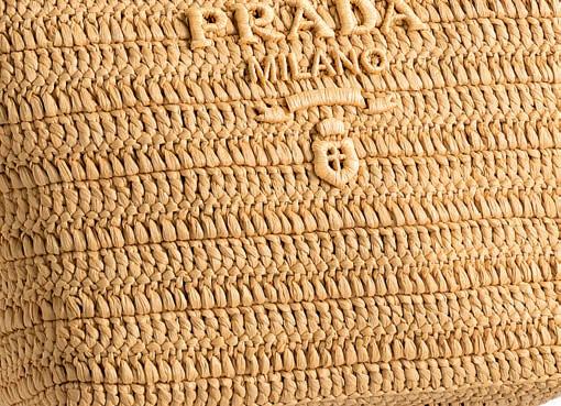
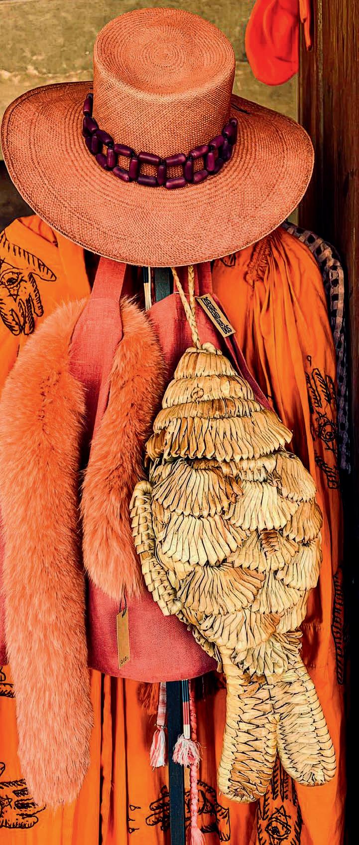
Summer days are light and easy-going, with a palpable sense of freedom. And nothing whispers lightness more than a charming straw or wicker basket swinging from an arm or a hand, ready to welcome the makings of a sunny escapade or a picnic. If wicker baskets were originally seen as utilitarian objects, or a showcase for intricate craftsmanship in many cultures, 20 th Century style icons such as Brigitte Bardot or Jane Birkin, known for their clever capacity to mix couture with casual, adopted the basket as their go-to bag for everyday use.
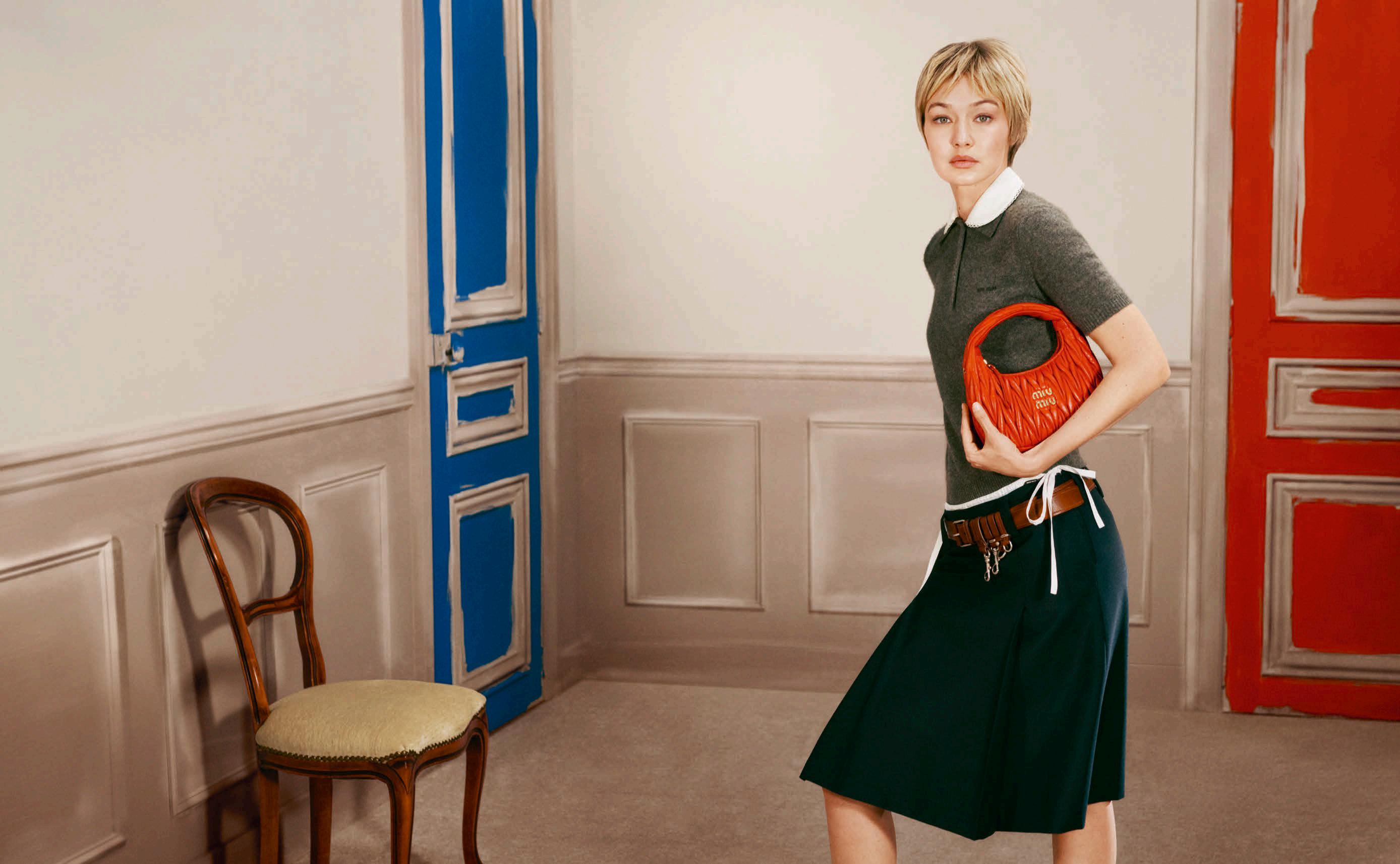
Inspired by these stylish women, designers incorporated the basket into their own collections, adding canvas or leather details, logos and flourishes. This season’s most desirable versions come courtesy of Miu Miu and Prada, whether as openwork totes, flirty bucket baskets or charming miniature versions to bring a hint of summer magic to an evening in the city.
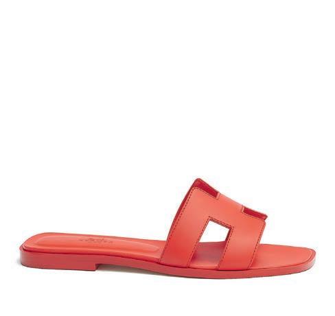
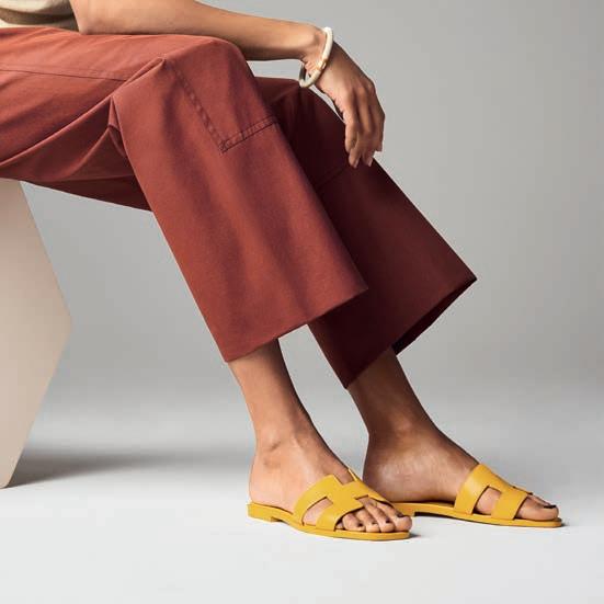
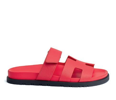
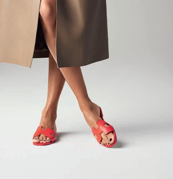
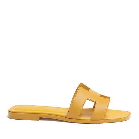
HERMÈS ORAN SANDAL
经典凉鞋
撰文 NATHALIE FRASER ENGLISH TEXT
无论是在 意大利波托 菲 诺 还 是印尼乌布等度假胜地,又或 是 北京和巴黎之类的大都市,只需在 盛夏的街道 或 海 滩 上稍稍 一瞥,就能 看见无数双优雅的脚上都穿着那 款极简却极 具辨 识度的 HERM È S ORAN 凉 鞋。这 款 经典露趾凉 鞋的简洁线 N 条,最早亮 相于 HERM È S 1997年夏季系列。品牌 鞋 履设计师 PIERRE HARDY 受北 非 色彩 与 传统的启 发 ,以大写 字 母H 的 形态为基 础,设计出了这 款平底凉 鞋。他 将这一设计 命名 为 ORAN,该名称取自阿尔及利亚的奥兰市 那里洒满阳 光的街道与 建筑,也悄然融入了这 款 凉 鞋 的设计之中 (值得 提 的是,奥兰市也是另一位传奇时尚 人物 YVES SAINT
LAURENT 的出生地 。)十年后,ORAN凉鞋成为了 HERM È S 最受 欢 迎的设计之一,每 个季度都 会以不同的材质和颜色亮 相 ,并因其百搭而易于收纳的特点深受名人喜爱,也 成为了所 有时尚旅 行 者的挚爱 。这双 鞋 无疑是您最阳光的夏日伴侣
Whether in Portofino or Ubud, Beijing or Paris, a glimpse at the beaches and pavements of any desirable location in the summer months will reveal any number of elegant feet shod in the minimalist yet instantly recognisable Hermès Oran sandals. The pure lines of these slip-on classics were first seen in Hermès’ Summer 1997 collection: inspired by the colours and traditions of North Africa, the house’s footwear designer Pierre Hardy imagined a simple design using the shape of the capital letter H as the basis for a flat sandal. He named the design Oran, after the Algerian city, whose sunlit streets and architecture also influenced the design (as a historical footnote, Oran was also the birthplace of another legendary fashion name, Yves Saint Laurent). A decade later, the Oran sandal is one of the most popular Hermès designs, appearing season after season in a variety of materials and colours. Worn by celebrities and loved by all stylish travellers for their versatility and easy to pack shape, these shoes will become your sunniest companions.
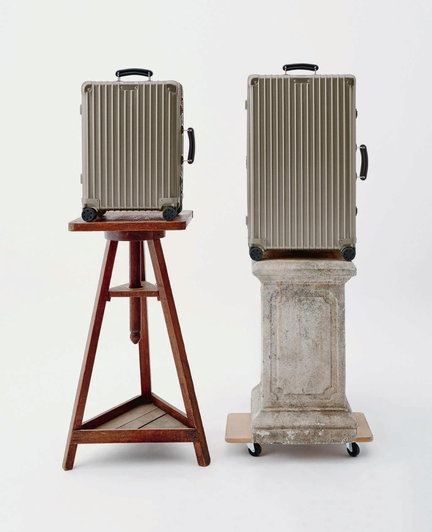
This is not just any suitcase. This is a Rimowa. More than a travel icon, it is a discreet signifier of belonging, the badge of a global tribe that spans the world with intention and style. Since its establishment in 1898, the German house has made innovation its signature, creating objects that are both functional and enduring, designed to accompany a life in motion. As early as the 1920s, Rimowa transformed the luggage industry by introducing aviation-inspired aluminium material into its suitcases. From this came its unmistakable design: an instantly recognizable grooved aluminium shell.
Today, that legacy continues with the Classic collection. Defined by its signature grooves, black leather handles and exposed rivets, the line showcases its distinctive character. This year sees the arrival of a new shade: Titanium. A warm aluminium hue with a soft satin finish, Titanium brings a subtle sophistication, enhancing the purity of the case’s silhouette.
At the turn of the 2000s, the brand once again proved its pioneering spirit with the launch of the first polycarbonate suitcase. A material that continues to evolve each season through limited editions in vibrant, often unexpected hues. As we go to press, this season’s colours remain a closely guarded secret, set to be unveiled in stores at the end of April. Just enough to spark the irresistible urge to start packing for that next escape.
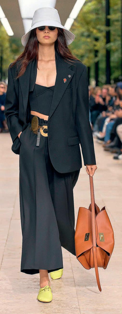
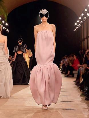
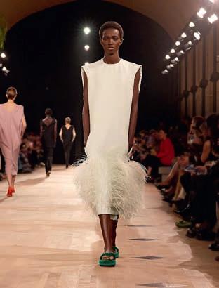
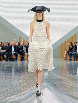
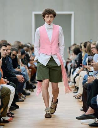
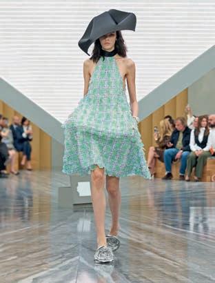
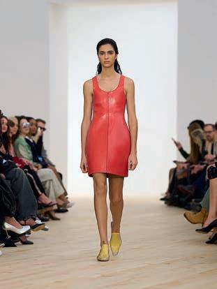
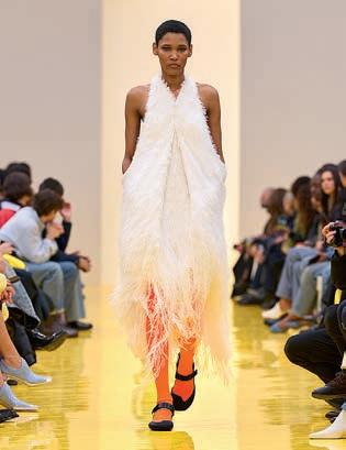
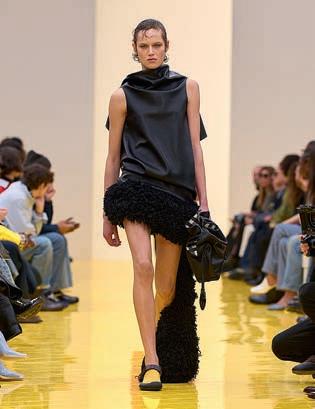
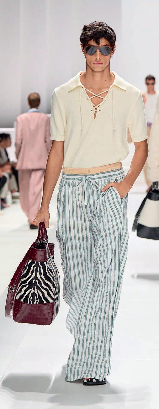
Fashion loves a reset – but rarely has the industry taken such a spectacular plunge. For Spring-Summer 2026, the world’s biggest luxury houses didn’t just refresh their wardrobes, they dove headfirst into a new era. Call it the summer splash: a moment of suspension, of anticipation, just before impact, when everything is about to change.
Throughout 2025, fashion’s perennial game of musical chairs reached fever pitch. In what felt like a full-scale industry reboot, more than a dozen major houses installed new creative directors. Like football transfers or political reshuffles, this high-stakes creative mercato has become an integral part of fashion’s ecosystem. One appointment triggers another, and another, until the domino effect creates a full shift. Pierpaolo Piccioli left Valentino, making way for Alessandro Michele, the man behind Gucci’s maximalist renaissance. Michele himself stepped into a leading role at Balenciaga, replacing Demna, who moved to Gucci. Hedi Slimane exited Celine at the end of 2024, with Michael Rider arriving from Ralph Lauren. Bottega Veneta tapped Louise Trotter, formerly of Carven, to succeed Matthieu Blazy. At Dior, Maria Grazia Chiuri passed the torch on to Jonathan Anderson, who replaced both her and Kim Jones, assuming creative direction across the entire house. Meanwhile, Jack McCollough and Lazaro Hernandez left their own label, Proenza Schouler, to take over Anderson's seat at Loewe.
The message is clear: today’s creative directors are far more than designers. They are storytellers, cultural translators and architects of entire brand universes. Their references – literary, philosophical, artistic – are dissected on social media and amplified across the global press. This isn’t just a changing of the guard. It’s a dive into the unknown. Ten key silhouettes from the Spring-Summer 2026 collections capture this moment perfectly, all charged with the thrill of transformation.
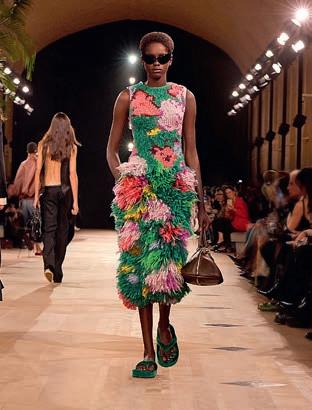
BOTTEGA VENETA BY LOUISE TROTTER – PURE SENSATION
Louise Trotter’s Bottega Veneta was all about touch. Soft woven leather, fluid dresses and earthy colours created silhouettes that moved effortlessly with the body. The effect was intimate rather than dramatic – luxury you feel rather than see. A skirt composed of ultra-fine strips of recycled synthetic materials, embroidered and layered, captured this tactile poetry perfectly.
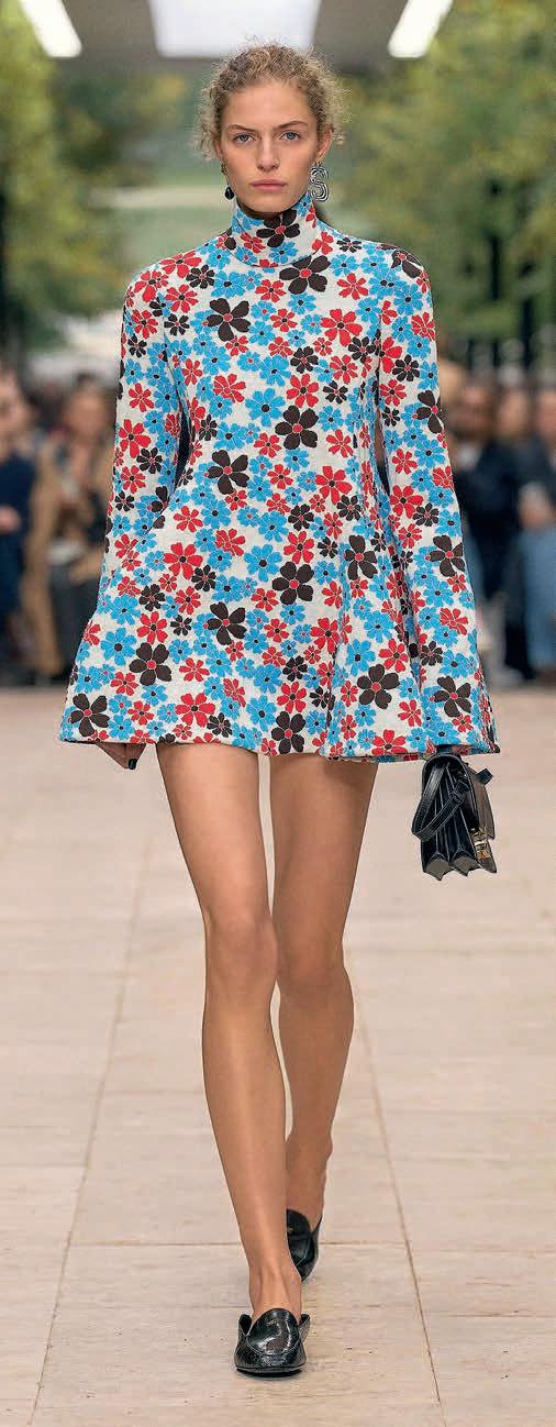
MICHAEL RIDER FOR CELINE – A POP OF ENERGY
Michael Rider’s Celine debut radiated summer energy. The American designer cleverly bridged several eras of the house:
BOTTEGA VENETA.
VALENTINO.
Hedi Slimane’s razor-sharp minimalism, Phoebe Philo’s intellectual cool and the 1960s spirit of founder Céline Vipiana. The result? A crisp trapeze silhouette that feels straight out of the 1960s –but jolted into the present by a saturated red-and-turquoise floral print. Pop, punchy and unexpectedly joyful.
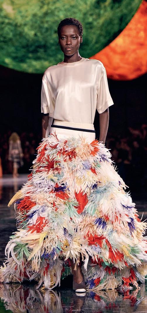
CHANEL BY MATTHIEU BLAZY – THE ELECTRIC MOMENT
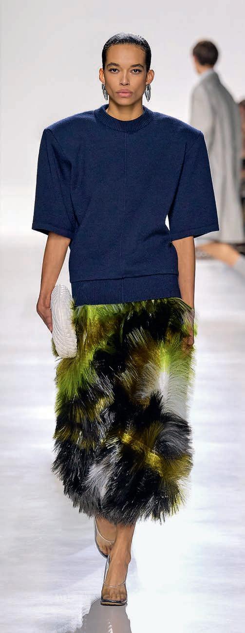
One of the season’s most talked-about fashion images arrived at the close of Matthieu Blazy’s Chanel debut. Canadian model Awar Odhiang, of South Sudanese descent, spun across the runway in a spectacular feather-embroidered maxi skirt trailing a cascade of multicoloured flowers before embracing the designer. The image –that dramatic skirt paired with the simplicity of a white silk T-shirt – instantly went viral. Blazy’s first outing for the house offered a refreshing reinterpretation of Chanel’s DNA, from shirts inspired by Boy Capel, Gabrielle Chanel’s great love, to vibrant new tweeds. The audience rose to its feet. A debut splash if ever there was one.
LOEWE BY JACK MCCOLLOUGH & LAZARO HERNANDEZ – THE SUNLIT EXPERIMENT
For their first Loewe collection, the Proenza Schouler founders brought a radiant energy to the Spanish house. Sculptural volumes, textured fabrics and organic construction gave the impression that the clothes had been shaped by waves and sunlight. Craftsmanship remained central, but was pushed into bold new territory, especially through eye-catching primary colours. Risky? Yes. But thrillingly so.
VALENTINO BY ALESSANDRO MICHELE – MAXIMALIST JOY
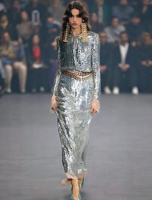
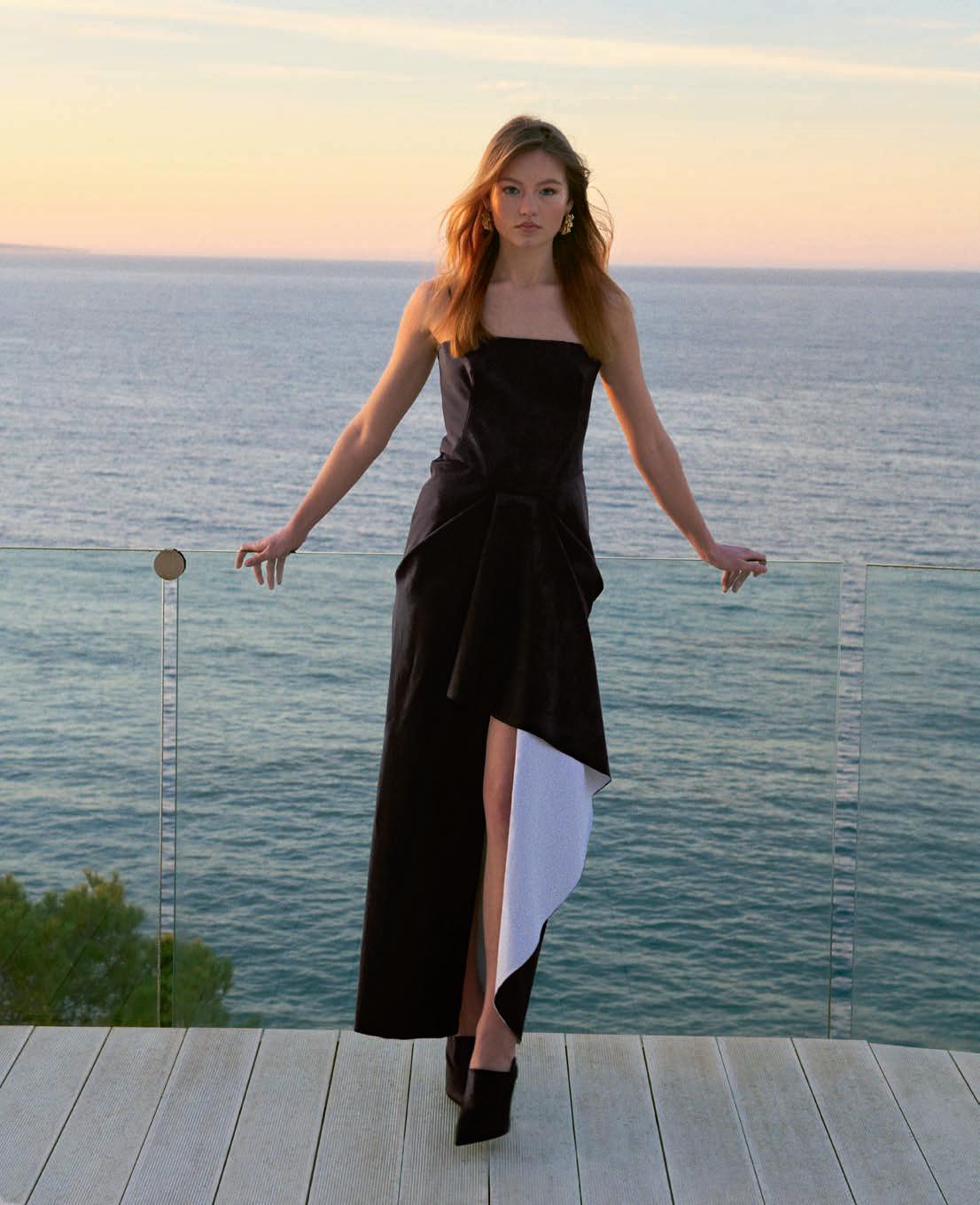
Alessandro Michele doesn’t do subtle – and Valentino is all the better for it. Layer upon layer of embroidery, sequins and dazzling colour transformed the runway into a textile celebration. Draped satin gowns slit high on the leg, cascades of sparkle and lavish florals exploded across the silhouette. Silver, gold, electric red, violet, pink. It was exuberant, unapologetic and irresistibly summer.
BALENCIAGA BY PIERPAOLO PICCIOLI – REFINED IMPACT
Pierpaolo Piccioli’s Balenciaga debut was less about shock than about clarity. Rather than reinventing the house through provocation, he dived straight into its couture heritage. The result was a wardrobe built on precise colour, sculptural volume and quiet elegance. One floral silhouette bloomed across the fabric like a painterly garden: lush, confident, unforgettable.
DIOR BY JONATHAN ANDERSON – AN INTELLECTUAL SPLASH
Jonathan Anderson approached Dior with a sharp conceptual lens. Tailoring was deconstructed, proportions shifted, silhouettes subtly distorted. The Bar jacket was cropped and flared; dresses bloomed outward at the hips; flowers appeared embroidered onto sheer blouses and micro skirts. For menswear, Anderson balanced tradition with irreverence, sketching out a new masculinity that promises to be fluid, intelligent and quietly rebellious.
GUCCI BY DEMNA – FULL DRAMA
Demna brought tension back to Gucci. Oversized volumes, streetmeets-couture hybrids and amplified silhouettes created a bold new visual language. The splash was direct, provocative, theatrical. Yet beneath the drama lay a meticulous construction. Demna’s Gucci introduced a cast of characters, from “Miss Aperitivo” heading out dancing in sequins to “La Diva,” wrapped in a dramatic faux-fur coat.
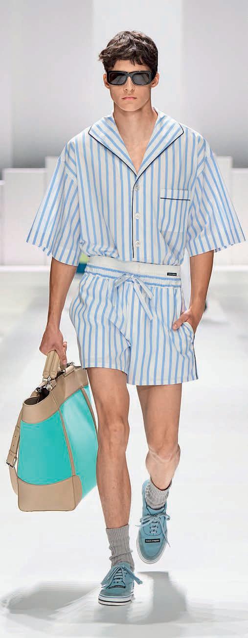
DOLCE&GABBANA – SEASIDE GLAMOUR
At Dolce&Gabbana, the creative direction remains reassuringly unchanged. The house delivered a sophisticated take on beachside elegance, with pyjama-style separates. The runway became a Mediterranean terrace. Sunlight, salt on the skin, a moment suspended between sea and evening cocktails. Behind the effortless look lay a subtle shift toward a softer, more relaxed masculinity.
With this industry-wide reset, fashion celebrates freedom, experimentation – and above all movement. Spring-Summer 2026 marked the moment when the industry collectively dives forward. A splash that feels as poetic as it is strategic.
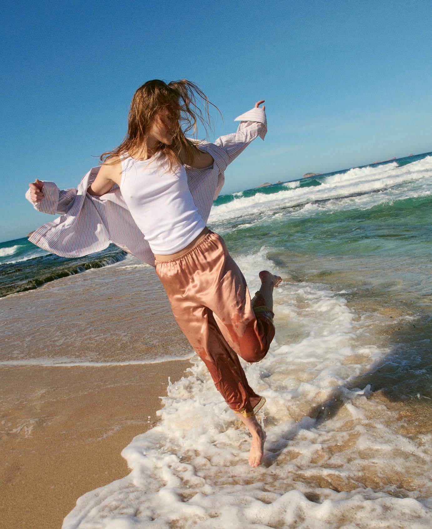
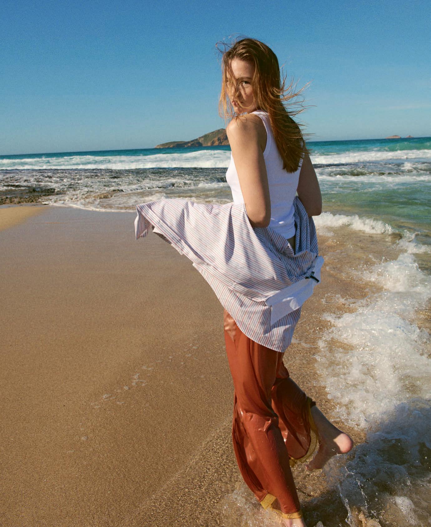
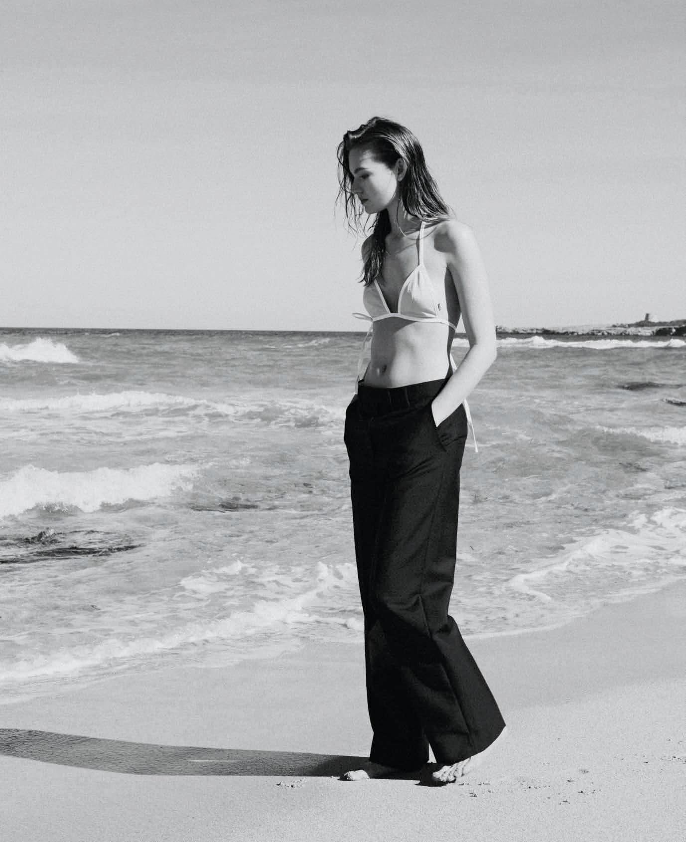
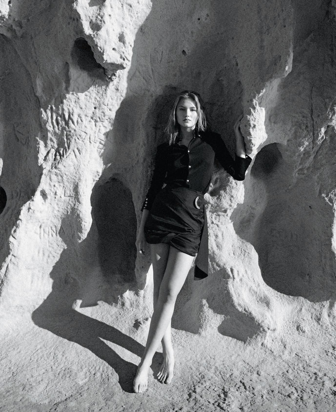
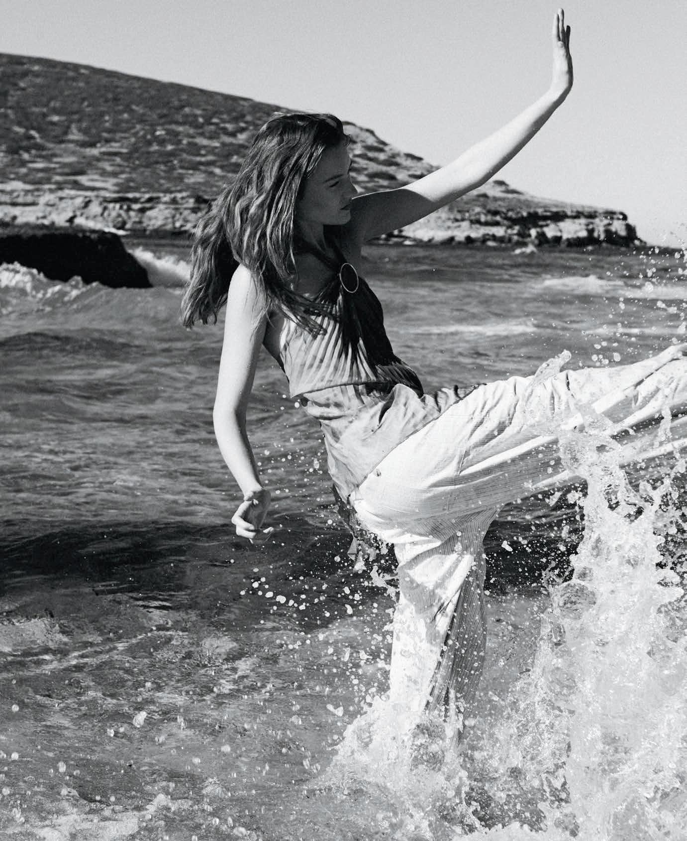
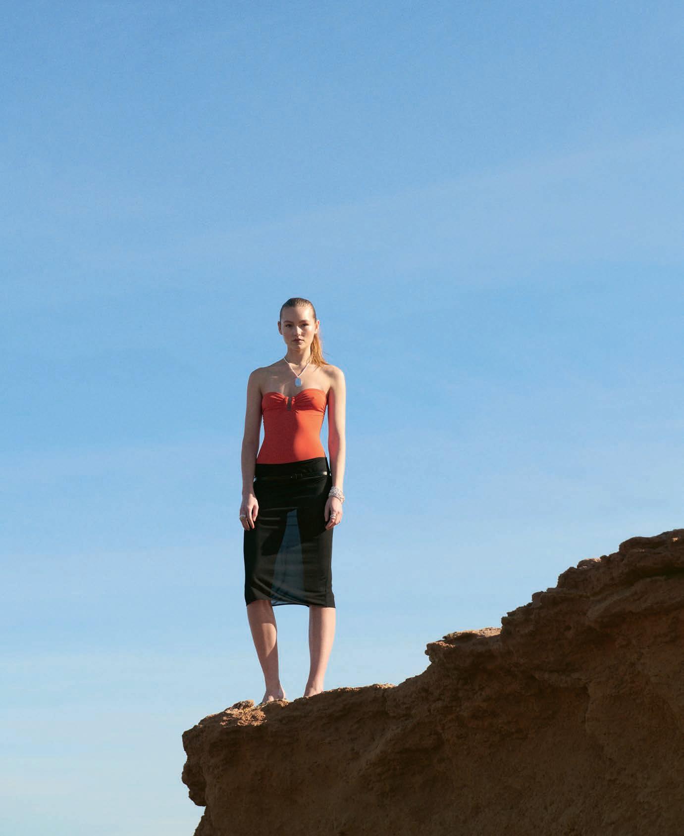
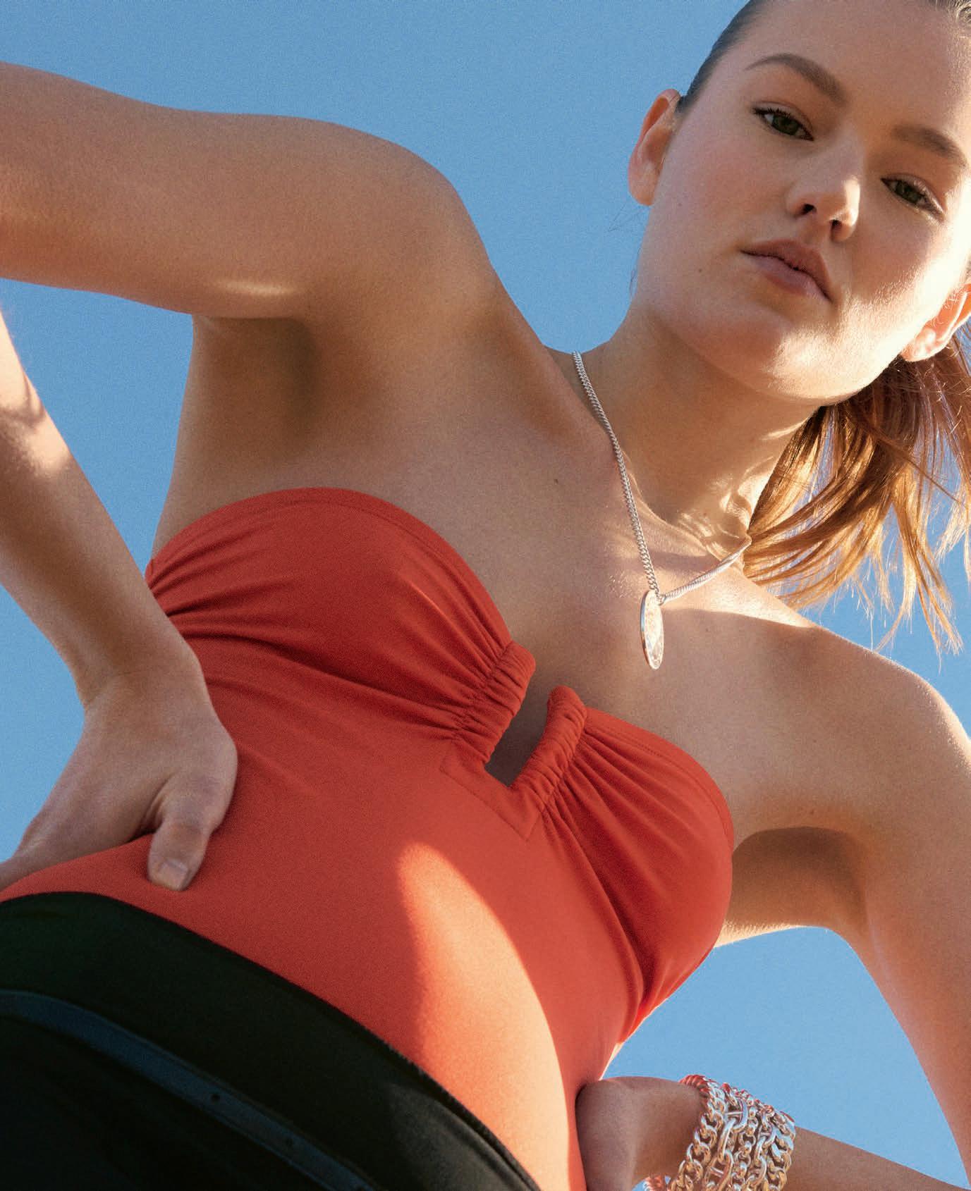
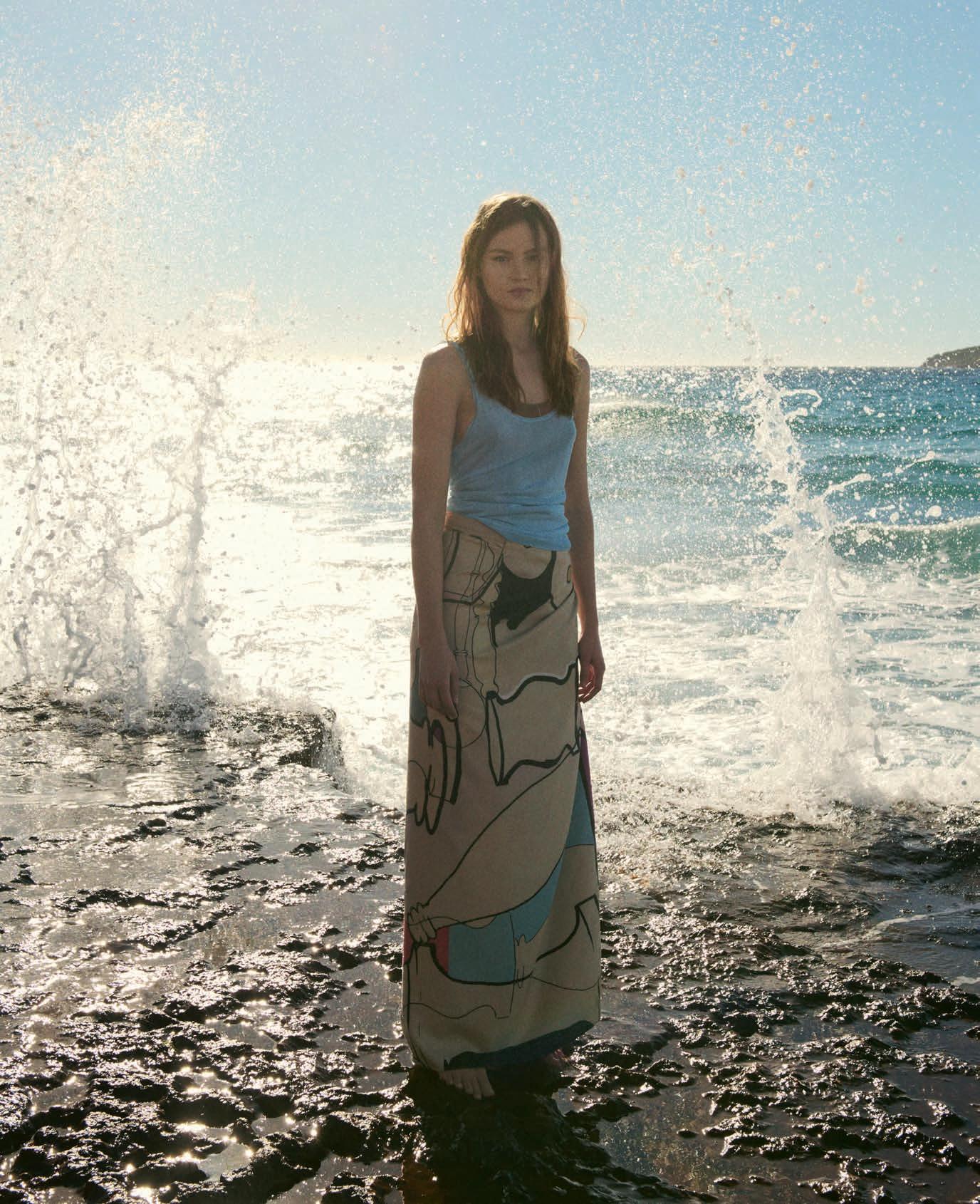
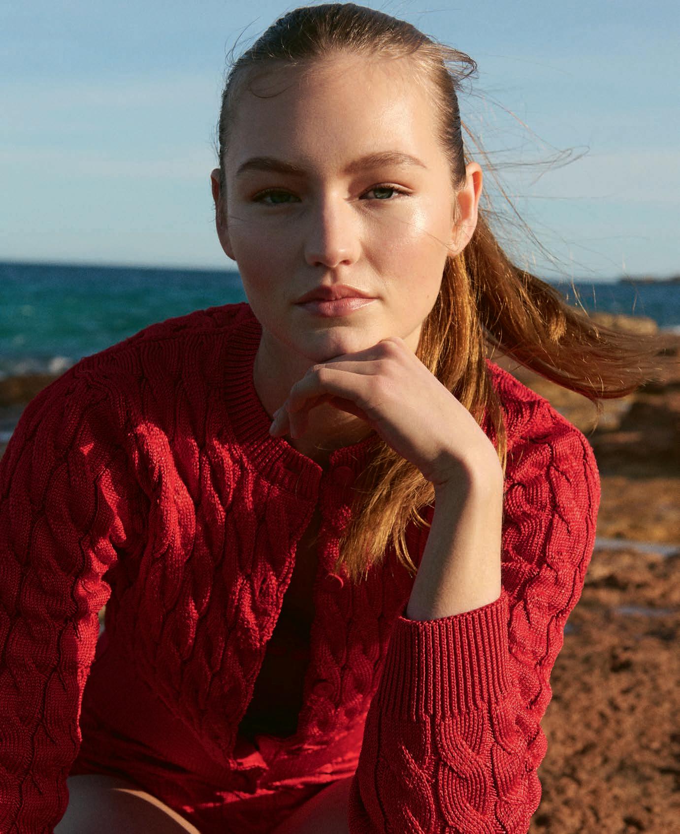
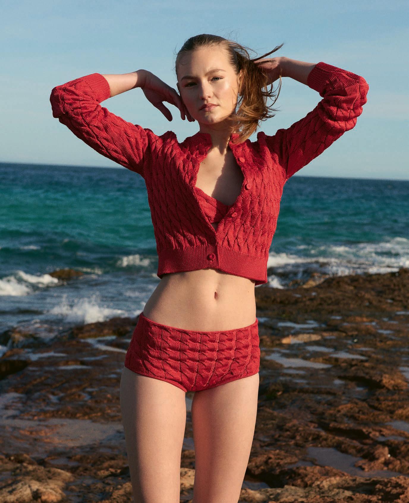
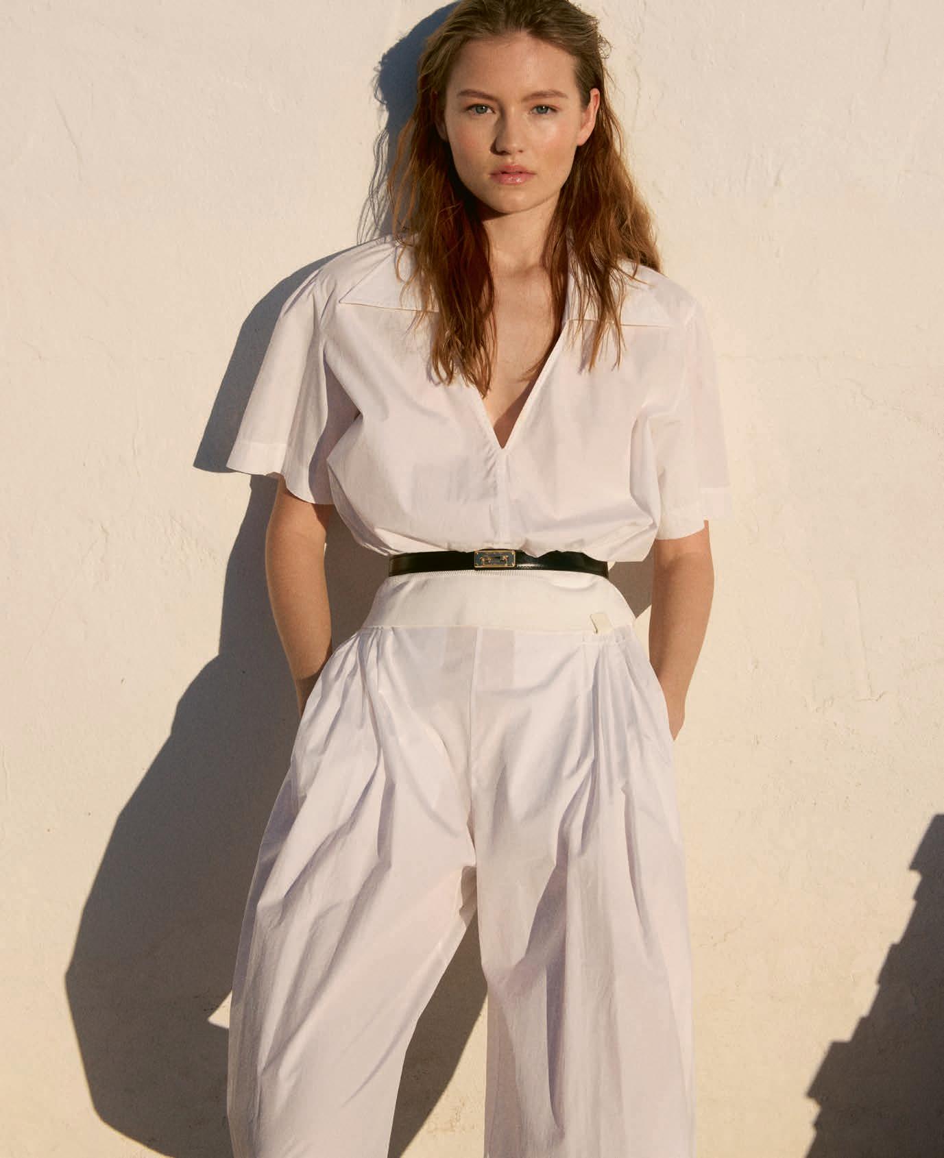
M A KI N G A S PL A SH
浪花飞溅
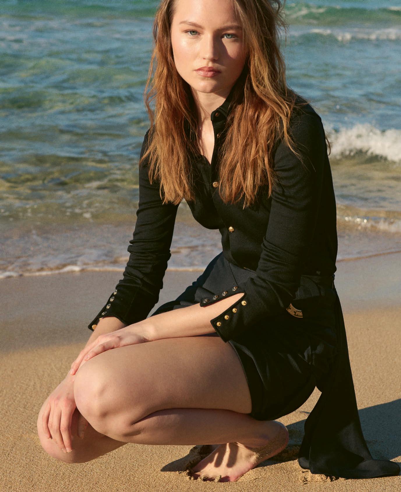
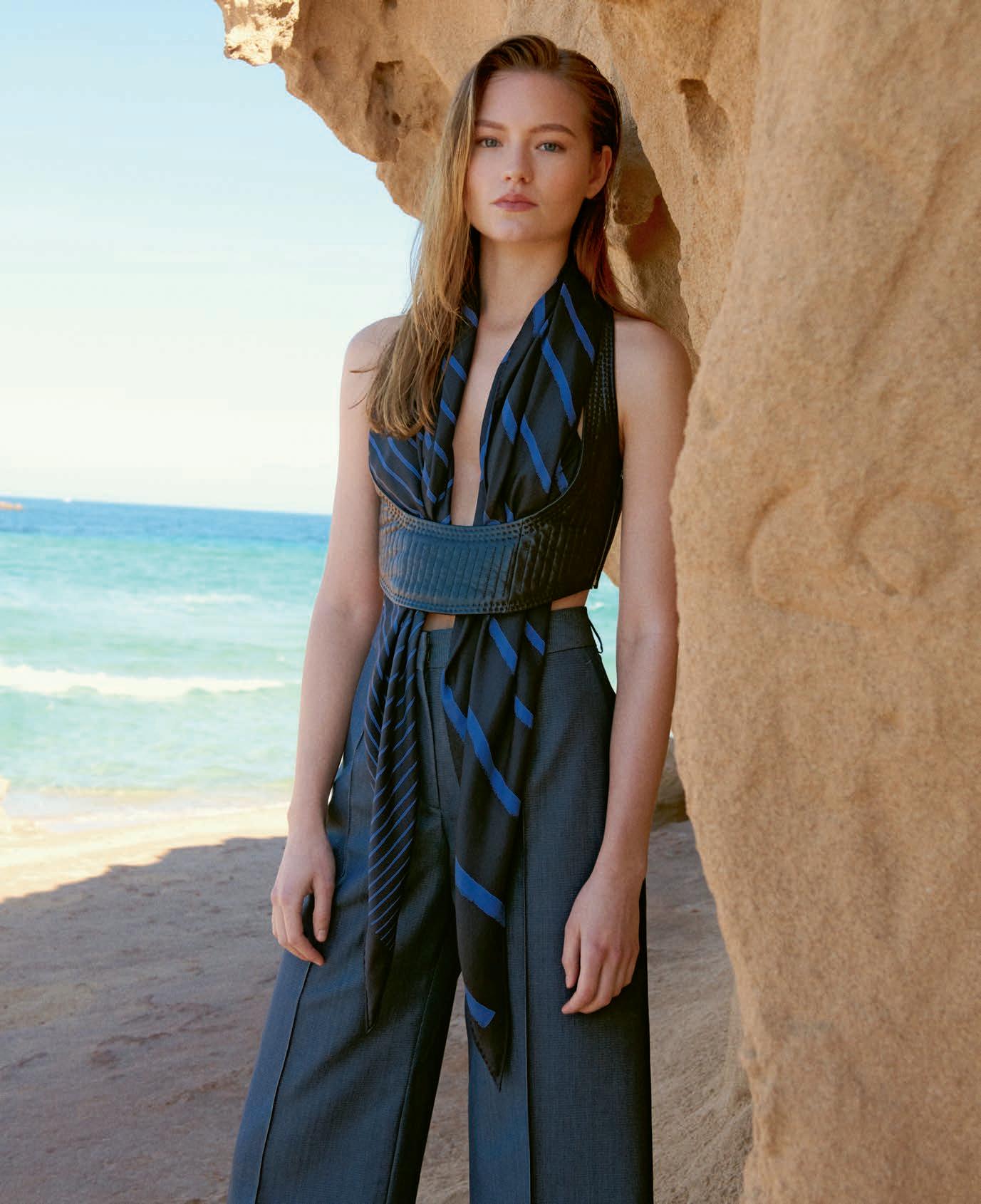
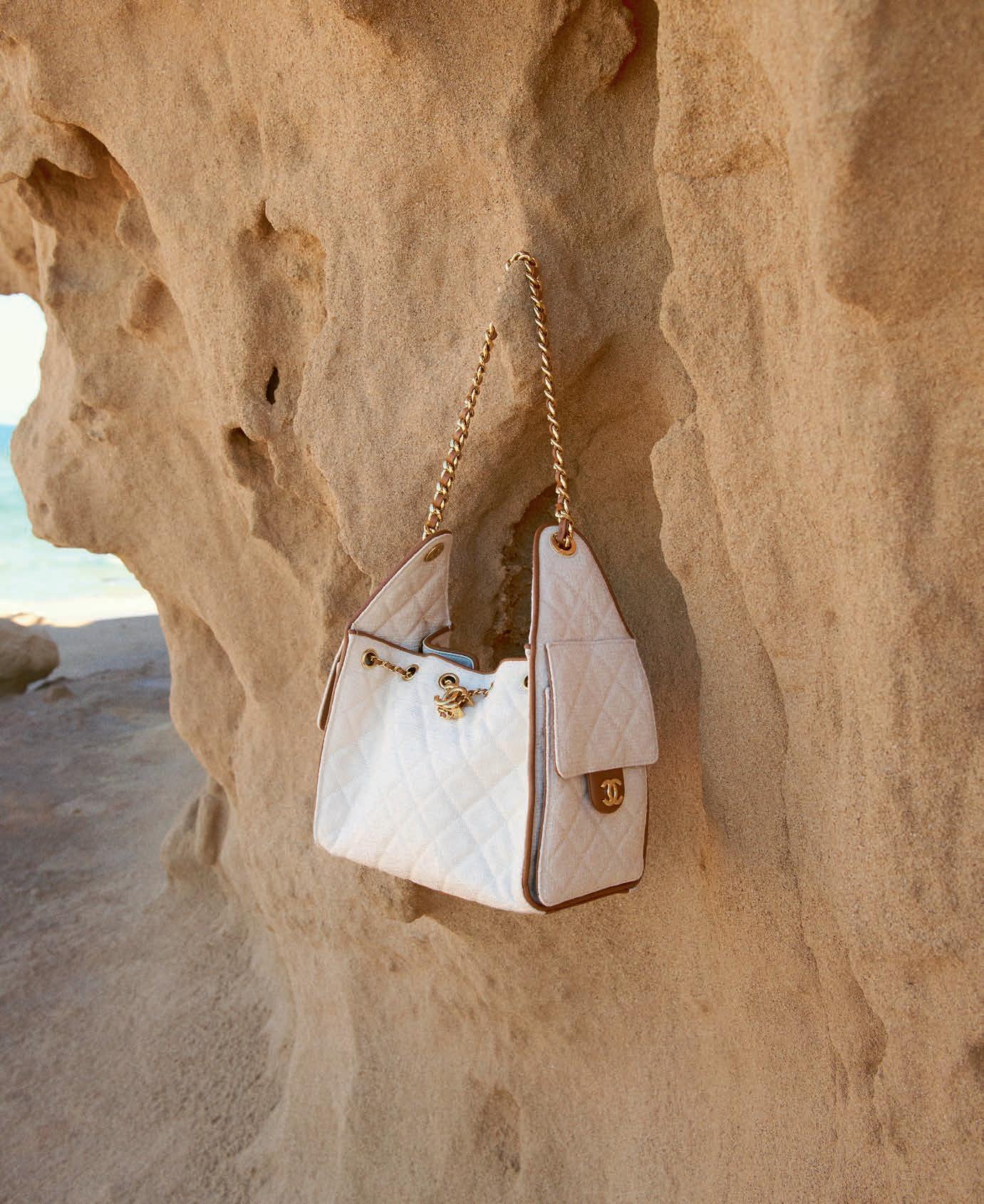
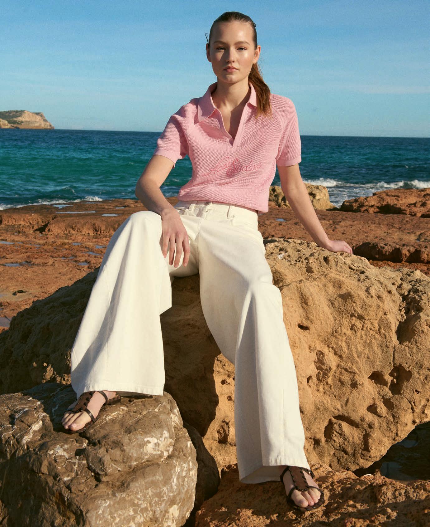
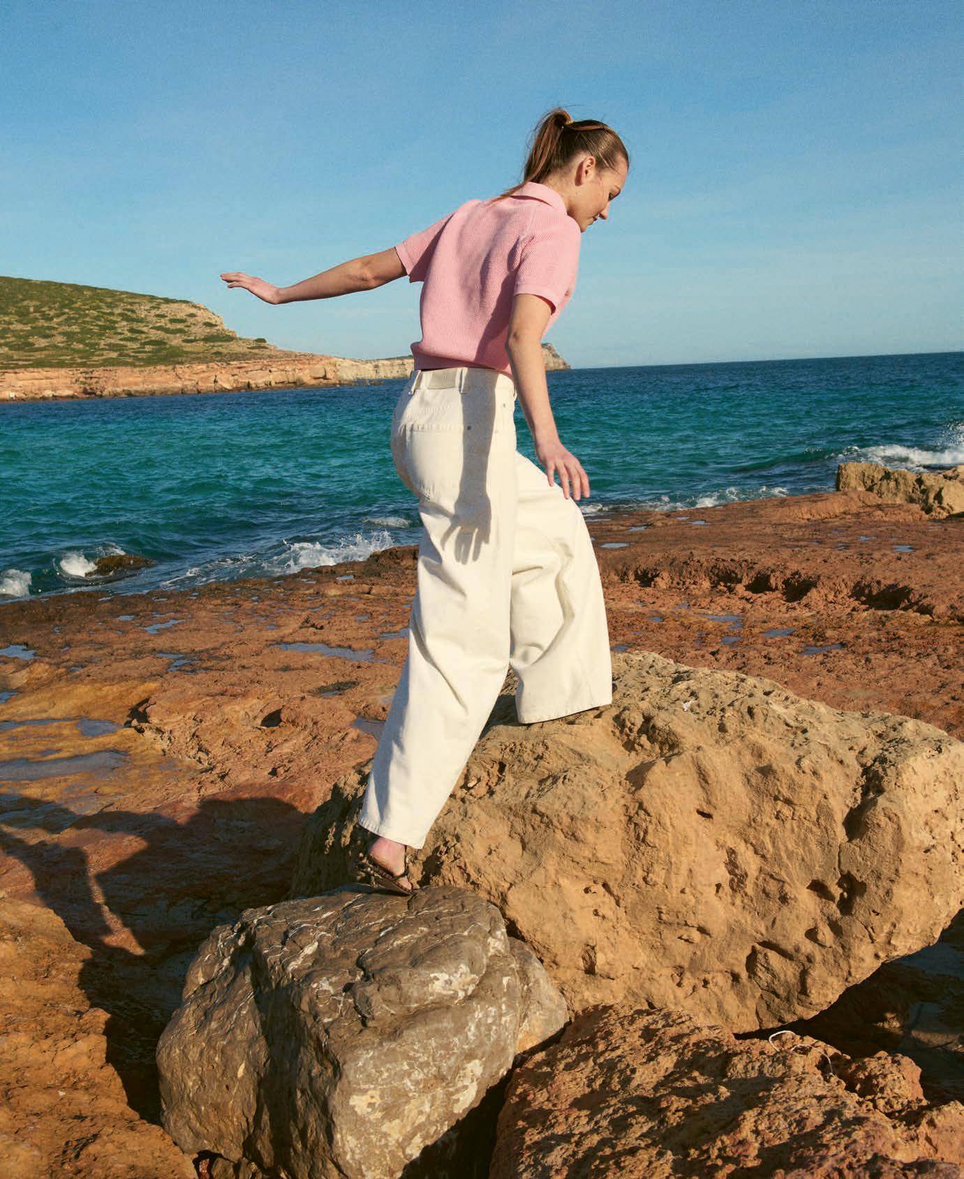
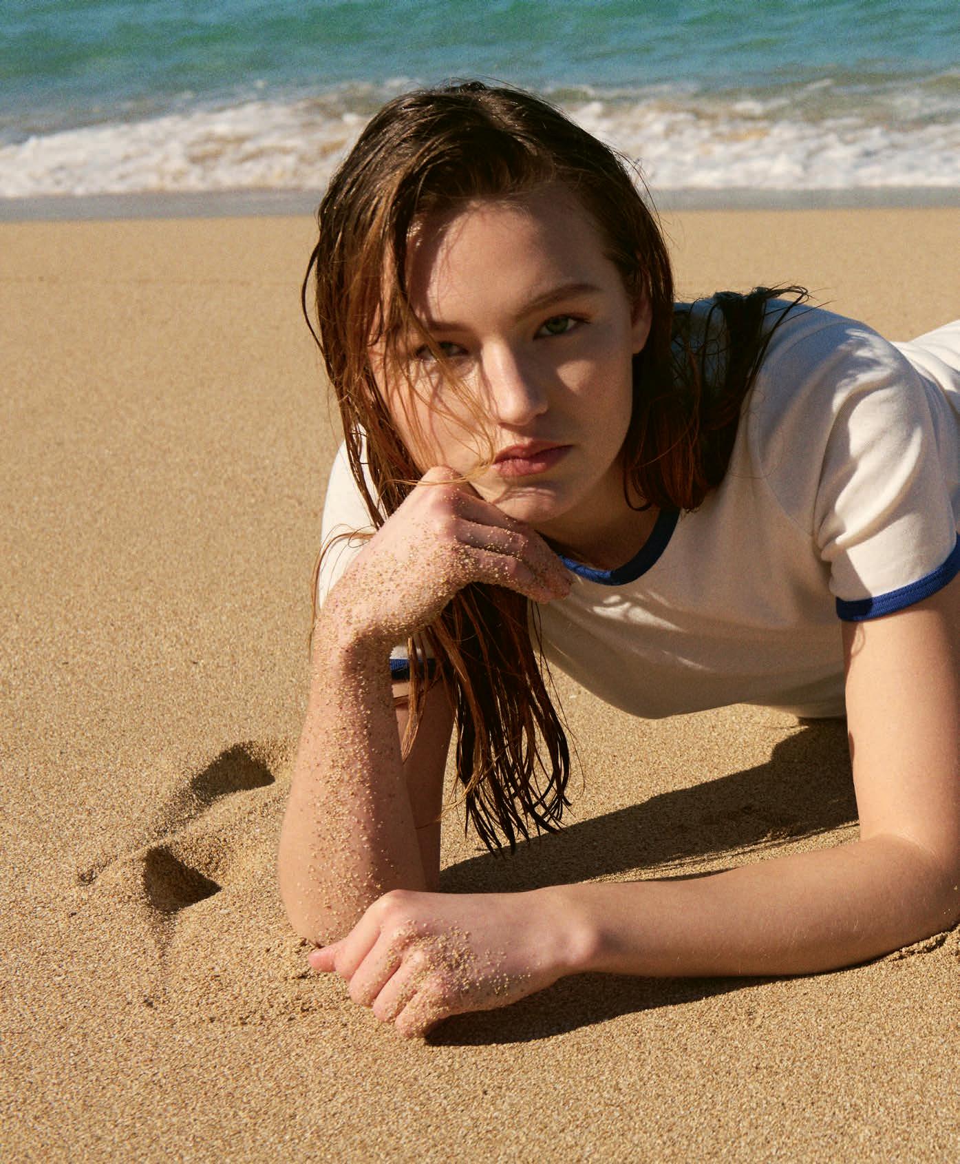
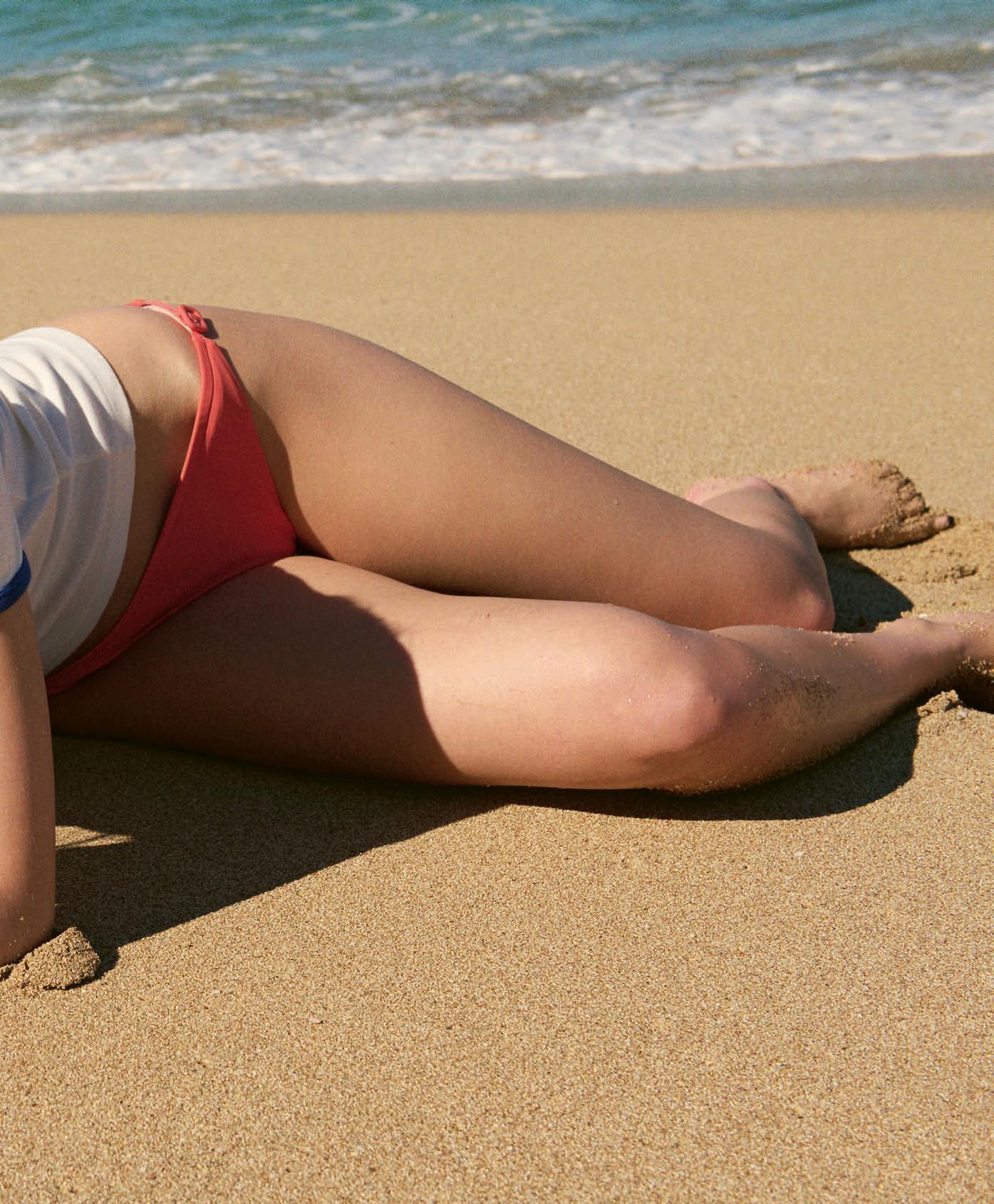
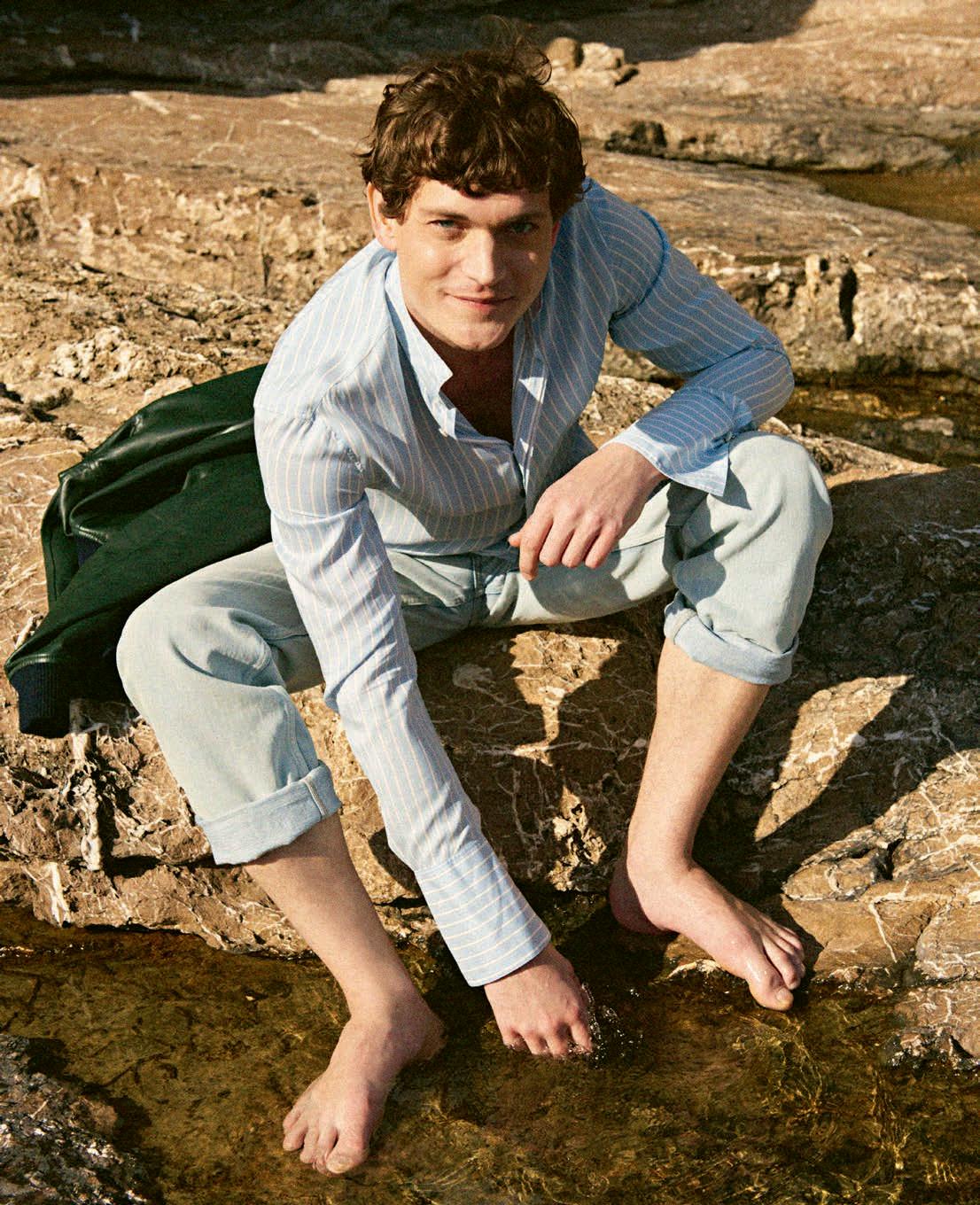
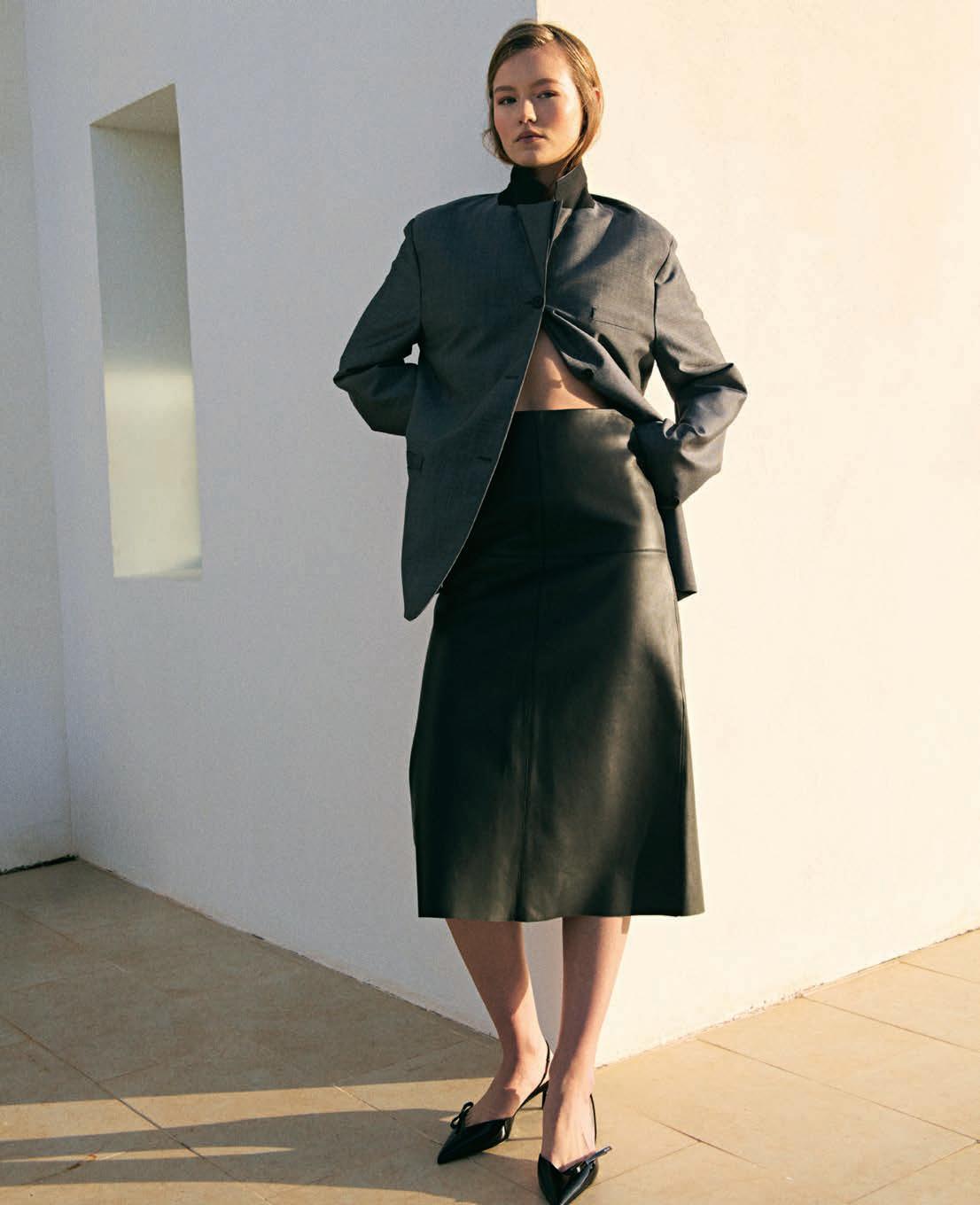
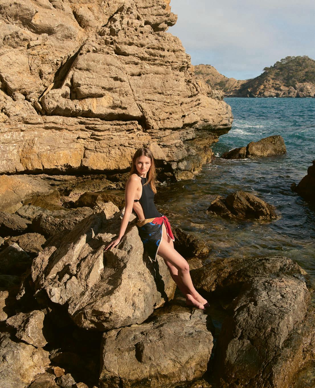
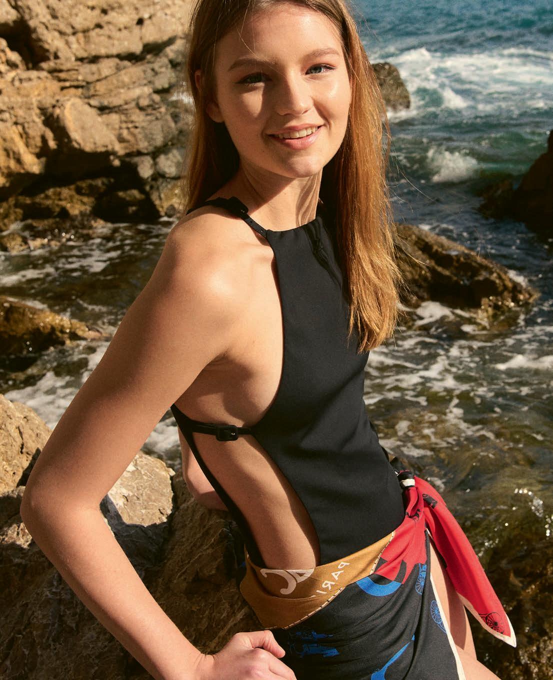
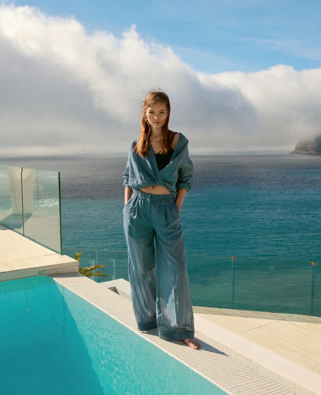
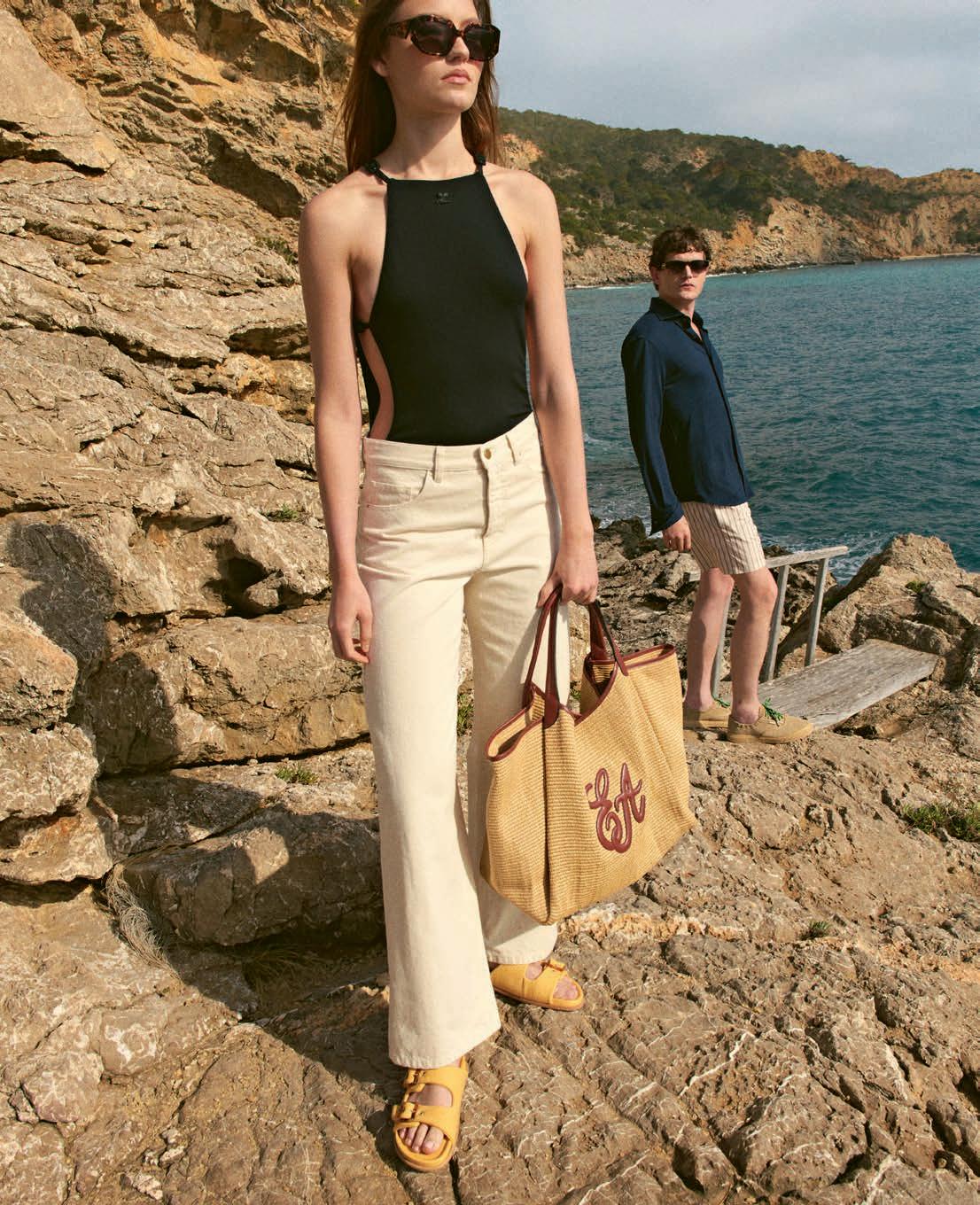
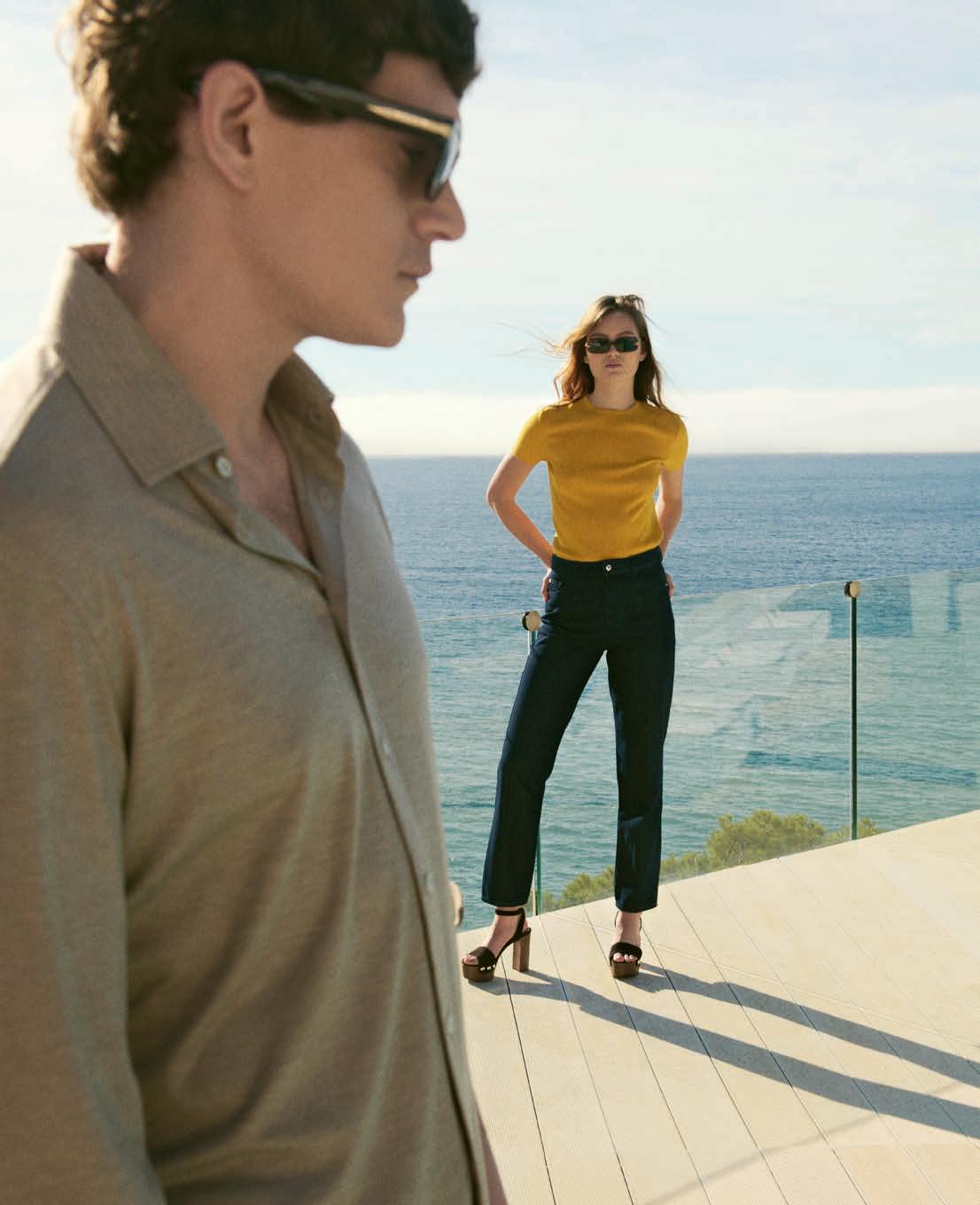
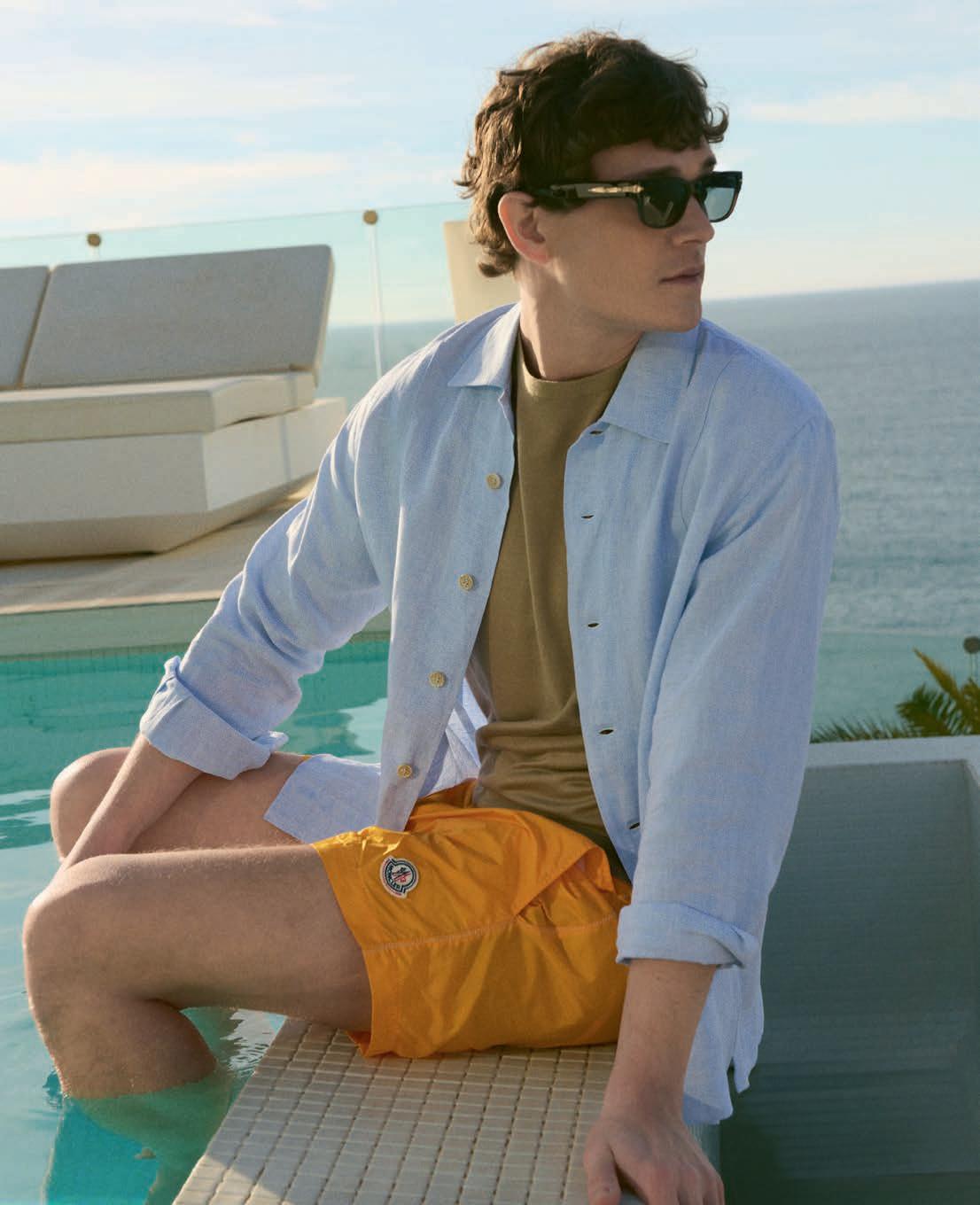
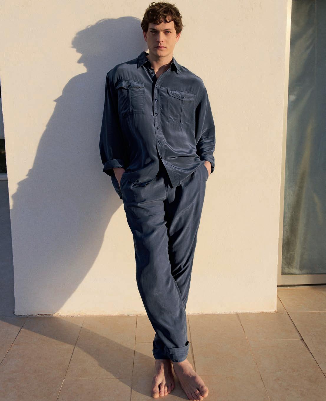
摄影 ARTHUR DELLOYE. 造型 CÉLINE LAVIOLETTE.
衬衫 PAUL SMITH,
无袖上衣 BRUNELLO CUCINELLI, 长裤 ERES.
泳衣、长裤 MIU MIU. 左页:衬衫 PAUL SMITH,
无袖上衣 BRUNELLO CUCINELLI,长裤 ERES.
上衣、半裙 CELINE.
上衣、长裤 HERMES.
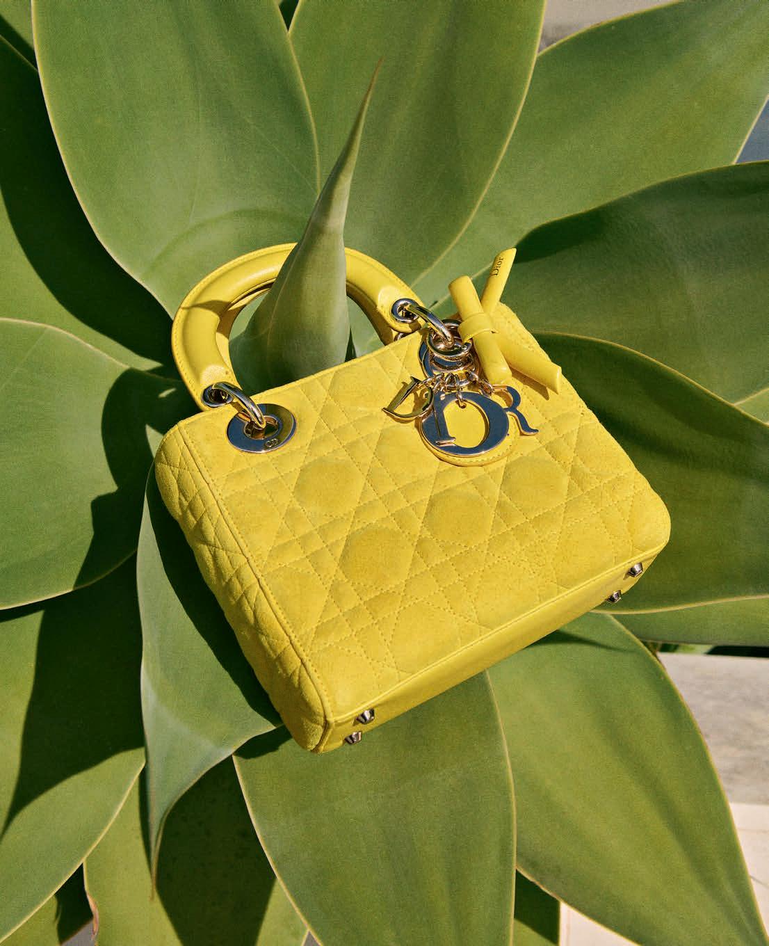
右页:CHANEL 25 手袋 CHANEL.
套头衫 ACNE STUDIOS,
牛仔裤 BRUNELLO CUCINELLI,
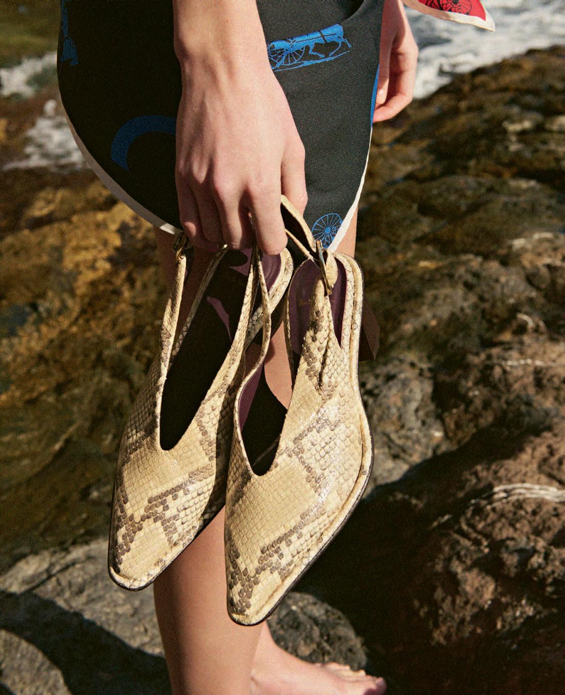
凉鞋 GIANVITO ROSSI.
T恤、泳装 COURREGES.
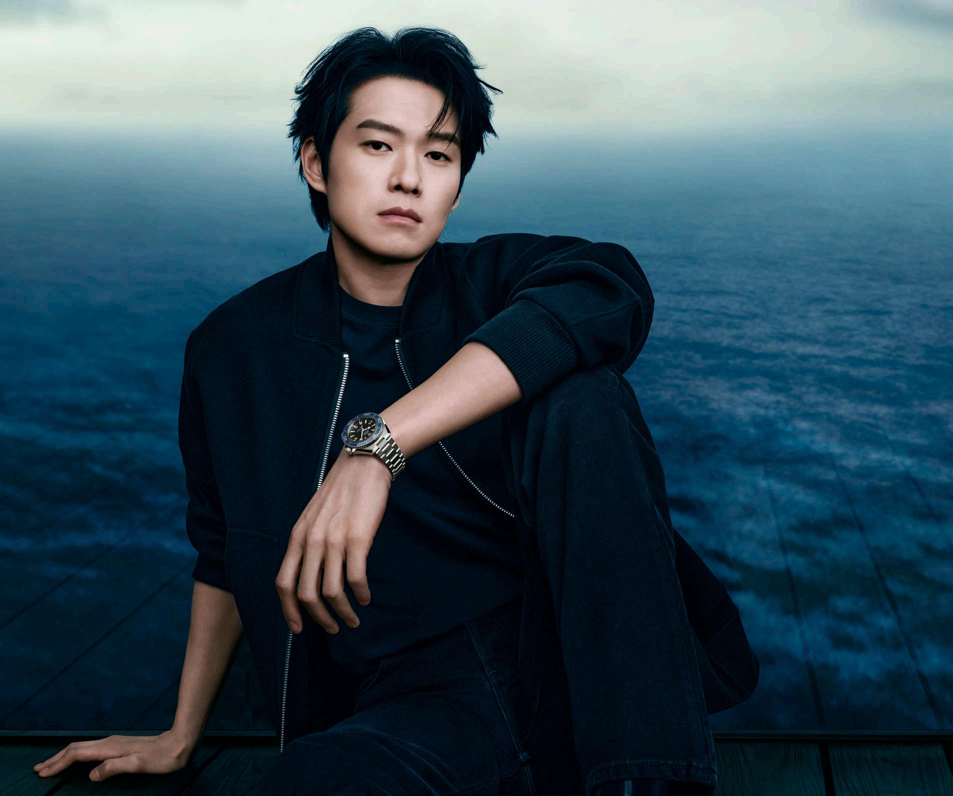
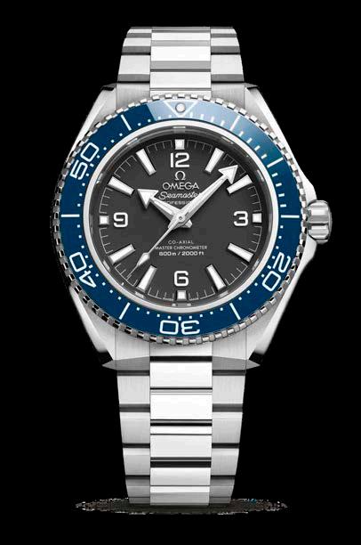
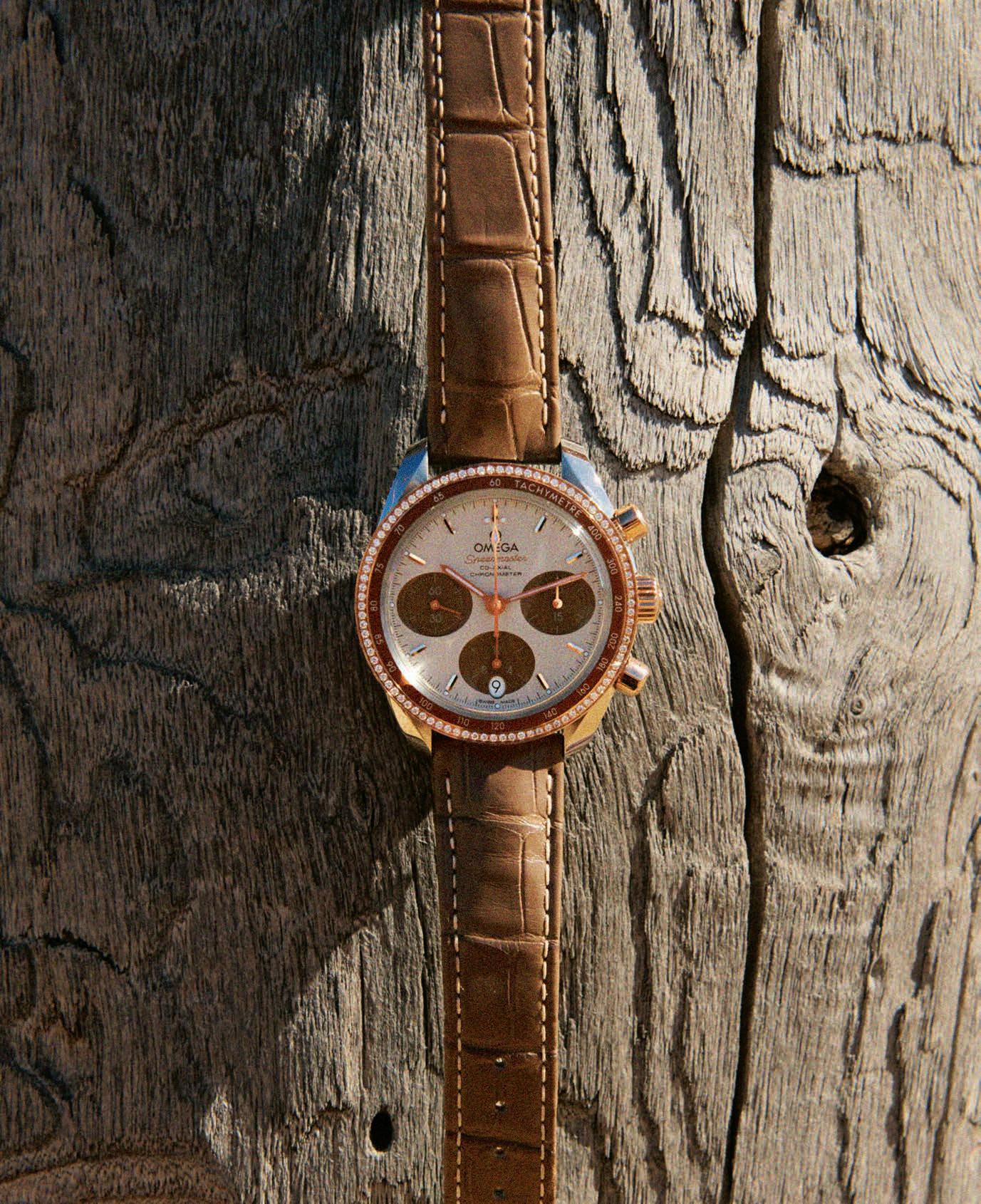
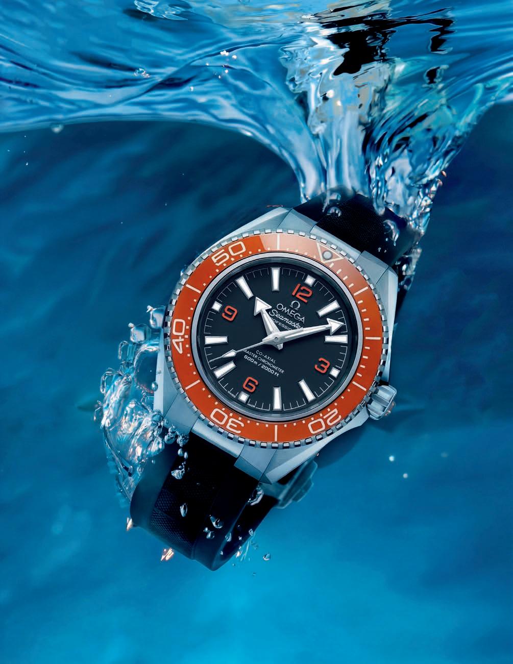
超霸系列镶钻腕表 OMEGA. 右页:上衣 MAX MARA, 长裤 DRIES VAN NOTEN.
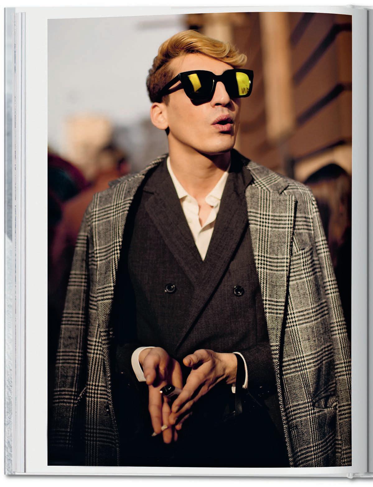
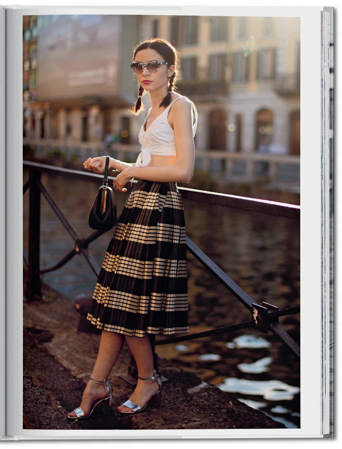
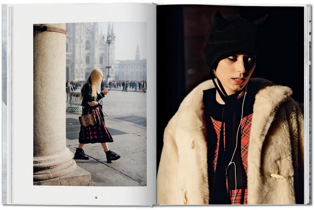
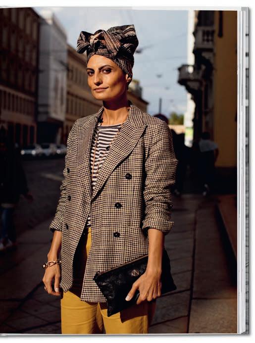
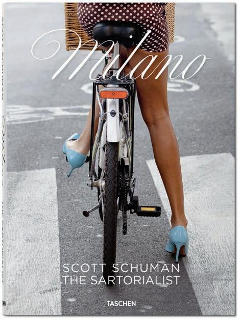
The Parisienne may long have gripped fashion’s imagination, but another European heroine is stepping into the spotlight. In The Sartorialist Milano, legendary streetstyle photographer Scott Schuman turns his lens toward the women of Milan, and the magnetic elegance that defines them.
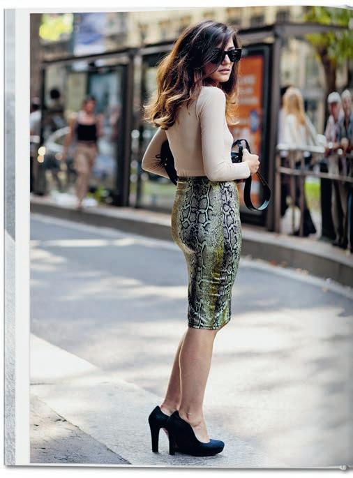
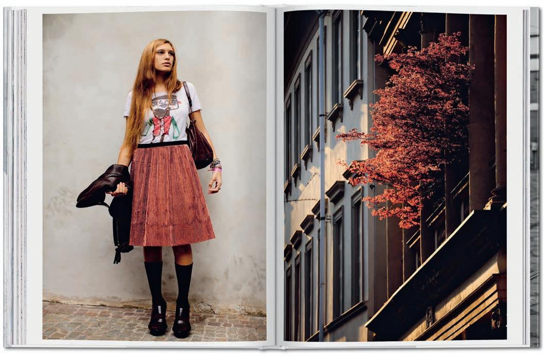
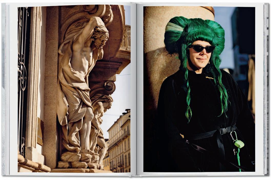
She strides through the city on towering stilettos, wrapped in a snakeskin pencil skirt or swathed in an enveloping fur coat. The Milanese woman, as immortalised by The Sartorialist, has a presence that is impossible to ignore: confident, expressive, and unapologetically chic. Yet Scott Schuman’s latest book, The Sartorialist Milano, is more than a celebration of individual style. It is a love letter to Milan itself: the fashion capital he now calls home. Through his lens, portraits of the city’s inhabitants meet sweeping glimpses of its architecture, creating a visual rhythm between people and place. Warm light spills across stone façades and cobbled streets, illuminating a kind of exuberant elegance that feels uniquely Milanese.
Schuman knows these streets well. Since launching The Sartorialist blog in 2005, the New Yorker has become one of the most influential figures in streetstyle. Long before Instagram transformed fashion imagery, he was travelling the world photographing editors, designers and stylish strangers outside the shows. His pictures helped redefine fashion photography, capturing style not as something staged, but as something lived. This was fashion in motion: spontaneous, democratic and vibrant. A philosophy that echoes Gabrielle Chanel’s famous words: “Fashion does not exist unless it is on the street.”
The book opens with a moving tribute to Giorgio Armani. The legendary designer, who passed away at the end of 2025, contributes a short text reflecting on the city that shaped him: a place defined, in his words, by both “hardness and grace”. It is an apt introduction to the spirit of Milan and the authenticity of its inhabitants, which Schuman captures with effortless intimacy. Across the pages, generations collide in the most stylish way. Young men and women bring bursts of colour and charisma, while elegant older couples and impeccably dressed nonnas embody a lifetime of sartorial confidence. Somewhere between documentary and fashion imagery, in a style not so far removed from the visual language of today’s social media, Schuman’s photographs create a vivid portrait of the present moment.
But what does Milanese style mean today? For Eva Géraldine Fontanelli, founder of Milan’s multi-brand concept store gOOOders, the city’s relationship with fashion has quietly
transformed. “I feel Milan has moved from a fashion culture tied to social status toward something more personal and free,” she explains. “Twenty years ago, people mostly focused on logos and recognisable luxury brands. Today style is built differently, mixing big names with small designers, vintage finds and beautiful artisanal pieces. It’s less about showing off, and more about expressing yourself.”
Still, one iconic figure continues to embody Milanese elegance: the Sciura. The term, deeply rooted in local dialect, describes a woman of a certain age whose look is both perfectly polished and unmistakably confident. The Sciura has become a symbol, immortalised by Schuman’s lens, celebrated on social media through the cult Instagram account @sciuragram, and even inspiring contemporary designers. Demna famously referenced the figure in his first pre-collection for Gucci, while Miuccia Prada’s personal aesthetic evokes a modern reinterpretation, a kind of Sciura 2.0 defined by intellectual tailoring and tactile experimentation.
The original inspiration traces back to Elvira Leonardi Bouyeure, better known as Biki, a defining figure of 1950s Milan. Granddaughter of composer Giacomo Puccini, she dressed Maria Callas and ran a boutique on the legendary Via Monte Napoleone. Her signature look – feminine silhouettes, strands of pearls, impeccable refinement – remains strikingly relevant today. It is this blend of cultivated elegance and strong personality that lies at the heart of Milanese style. With The Sartorialist Milano, Scott Schuman captures that spirit in vivid detail, inviting readers to step inside the inimitable rhythm of Italy’s most fashionable city.
In just over a decade, this unlikely name has become one of fashion’s biggest splashes, led by a charismatic young designer with a strong connection to his own Southern French origins.
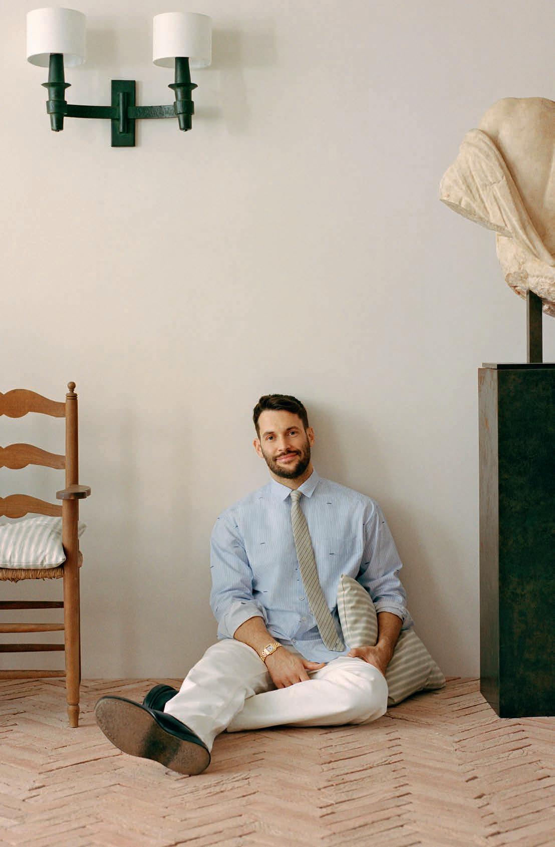
It’s a little-known fact that Simon Porte Jacquemus held one of his very first shows in a swimming pool. This reporter was in attendance at Paris’ Cour des Lions pool in March 2013, when the fledgling designer showed a charming yet concise collection of separates on a handful of models walking in the chlorine-rich atmosphere of a municipal leisure centre. In the thirteen years since that early display, the French designer has dived headfirst into the depths of the fashion world, creating one of the biggest splashes in recent history and going from confidential offcalendar shows to being one of the biggest independent names in the business. Raised near the Mediterranean, the designer has often looked to water and summer as the inspiration for collections which have entered into the fashion lexicon. It’s hardly surprising to learn that a designer known for this iconic flights of whimsy – a love of the outsize and miniature, an instinct for the fantastical – grew up in a particular context. As a child, the young Simon existed in his own world, passionate about dancing and dressing up, surrounded by the love of his grandmother and mother, from whom he created his first-ever design, a skirt made out of curtain fabric. “I was a special child, always happy and smiling, dancing or dressing myself up, always with an obsession for costume,” he recalls of that carefree time. Leaving behind his beloved South to study in Paris, he was also burdened with another loss, as his mother was killed in a car accident. This dual sense of disconnect galvanized the fledging designer into action: working at a Comme des Garçons boutique to pay his rent, he quit his studies and leaped into the creation of his brand, named Jacquemus, his mother’s maiden name. The young designer’s sense of instinct and his fresh take on design quickly got him noticed, with several nominations (and subsequent awards) in the first years of the LVMH Prize. While his early collections displayed youthful looks in white or primary colours, displaying simple, lines, he quickly developed a silhouette which remains today recognizably Jacquemus: figure-hugging shapes and dramatic signature details, from the outsize straw hat to the micro-mini, or the billowing dress with the smallest of bags. His lexicon draws on his eternal, maternal inspiration: the sensual, playful style of Mediterranean women. As his early swimming pool show displayed, Simon Porte Jacquemus also has a flair for the spectacular, knowing how to exploit images and clichés from French – and particularly Southern French – culture and make them
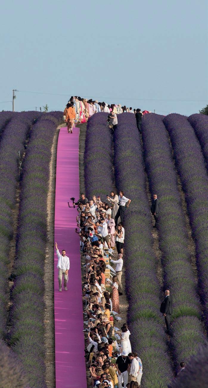
stunning and relevant. Who else could have convinced fashion’s cognoscenti to descend to the lavender fields of Provence in 2019, or to a wheat field outside of Paris in 2020? The context is often central to the message of his shows, which have taken place from Marseille’s Calanques to Versailles’ Grand Canal, Capri’s Villa Malaparte and a Hawaiian beach. The common link between these locations? They have all been close to water, a key influence on the designer and his style, a hybrid of bright and earthy tones, citrus shades and playful, almost dreamlike shapes, inspired by the work of painters such as Miro, whom he collects.
The days of showing in a public swimming pool and buying fabric in a Montmartre market are long gone for the designer, who know functions both as creative director and CEO of a still-independent house, with its HQ near Paris’ historic avenue Montaigne now employing around 300 people. Faced with such a success story, he underlines his connection both with fantasy and reality, stating that “fashion is poetry. It’s a way to tell a story, to say something in this world, because you always send a message with what you wear. I sell poetry. For me, there is no point in fashion if you don’t sell.” Whether with his adorable Chiquito bag, mocked at its launch for its tiny size yet one of the house’s biggest success stories, one of his bag charms in the shape of a lemon or a banana, a sexy Drapeado dress or skirt, or a dramatic draped jacket, his designs remain instantly appealing, an invitation into the wonderful world of Jacquemus. It’s also worth noting that in a market where prices increase constantly, his stores offer a chance to enter the world of a unique designer at a fairly accessible price point, perhaps another reason for the impressive sales figures he achieves both at home and abroad.
The Jacquemus story looks set to rise and rise, with suggestions of new realms to explore – in 2025, he signed a long-term deal with L’Oréal to work on perfume and cosmetic projects – one thing remains certain: the house will remain true to its roots and to Simon’s own. In January of this year, this friend of global celebrities such as Dua Lipa or Kylie Jenner chose his 79-yearold grandmother, Liline, as the house’s first ambassador. In the accompanying statement, Simon Porte Jacquemus underlined the importance of family and transmission, stating that “Jacquemus is above all a story of origins”. And a reminder that the designer loves to create a splash, whether in a swimming pool or elsewhere.
From trail shoes to shell jackets, performance brands are quietly redrawing the boundaries of urban luxury as cycling, trail running, and overall activewear take on new cultural weight in China.
On any given day in Shanghai, the queue outside a purposefully rustic café feels like a weekend gathering for serious hikers: shell jackets in mineral hues, rugged sneakers with sculptural soles, and a cycling helmet clipped to a canvas tote, worn less as equipment than as intent. The unspoken uniform of the city’s style set is no longer silk and shirting alone, but performance and polish in equal measure.
In China today, activewear and cycling gear have graduated from gym aisles to become a new category of lifestyle luxury. This is not about flash logos or shorthand status; it’s about clothing that works just as hard as the life its wearers lead. “Cycling changed how I think about clothes. If I ride along the Huangpu before work, I don’t want to go home and change,” said Li Wei, a 29 year-old strategy consultant living in Shanghai. “There’s also a mindset shift. My friends and I talk about step counts and weekend hikes the way our parents talked about cars or watches,” she added. “Wearing Kolon Sport or similar brands signals that you value health and quality. It’s subtle, but people notice.”
At the centre of this shift are brands that have successfully translated specialist outdoor credibility into urban cultural currency. Names like Salomon, Patagonia and Arc’teryx anchor the moment, but they are joined by others such as Kolon Sport, The North Face, Nike and boutique cycling labels like Rapha and Assos, all of which are woven into the same cultural moment. Cycling has become its own sartorial language. Soome of the above mentioned brands have cultivated near-cult followings in China’s urban centres. Rapha’s refined jerseys and bibs, designed with subtle patterns and technical precision, are worn as readily on café terraces as on weekend group rides. Assos’ Swissengineered kits invite admirers to appreciate fit and performance without shouting brand names. Even luxury houses such as Gucci have joined the conversation with cycling-inspired pieces that nod to sport without forsaking high fashion.
A cultural shift in how leisure is conceived underlies all of these new developments. Cycling, light hiking, camping and weekend excursions have become markers of a lifestyle in pursuit of health, balance and connectivity. Consumers in China increasingly want wardrobes that accommodate this range without a mid-day change of clothes. Performance fabrics with breathable membranes, weather resistance and ergonomic cuts now qualify as invisible luxuries. “When I first arrived, I was surprised how many people were dressed like they were about to climb a mountain, even on a weekday,” says marketing manager Daniel, who moved from France last year and treated activewear as “gym-only, back home.”Since moving to Shanghai, he has
started to build outfits around performance gear, particularly since joining a cycling club. “It feels modern and practical, especially with Shanghai’s unpredictable weather,” he added. “There’s a social element too. Weekend rides, coffee stops, group hikes. The gear becomes part of the conversation. It’s less about being sporty and more about being part of a community that values movement. That’s something I didn’t expect, and now I wouldn’t give it up.”
Fashion houses and cultural crossovers have helped further erase the boundary between mountain and boulevard. Collaborations with labels such as Jil Sander or bespoke takes on iconic silhouettes elevate outdoor pieces into the language of contemporary style. What once was strictly functional now appears on runways and street corners, styled with tailored trousers or layered over cotton shirting. And then there’s social media, a powerful amplifier of trends. On platforms like Xiaohongshu and Douyin, videos and posts under hashtags such as “mountain aesthetic” and “technical wardrobe” garner millions of views, turning onceniche garments into social currency. Discussed in terms of both performance and lifestyle value, these pieces often operate as subtle declarations of taste, choice and aspiration.
The alchemy begins with heritage and performance. Arc’teryx built its reputation on technical shell construction, with GoreTex Pro membranes and designs like the Alpha SV becoming shorthand for uncompromising reliability. In turn, this became a demure yet powerful sartorial statement for men in managerial positions. In internet speaks, bearing the fossilfied creature on one’s left chest was the equivalent of holding a Birkin bag on one’s bent arm. In the city, that heritage translates into an aesthetic of understated capability. Its Veilance line strips away overt branding for architectural tailoring and premium fabrics, aligning neatly with a consumer mindset increasingly drawn to understated luxury.
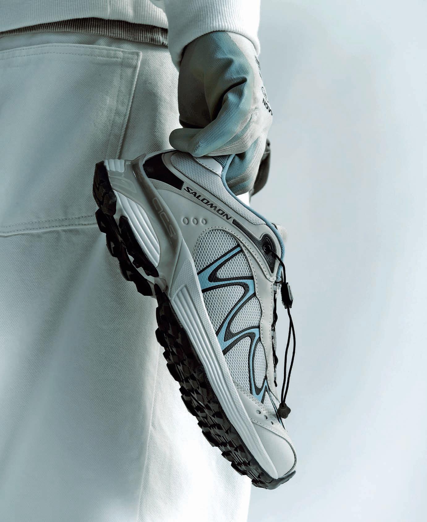
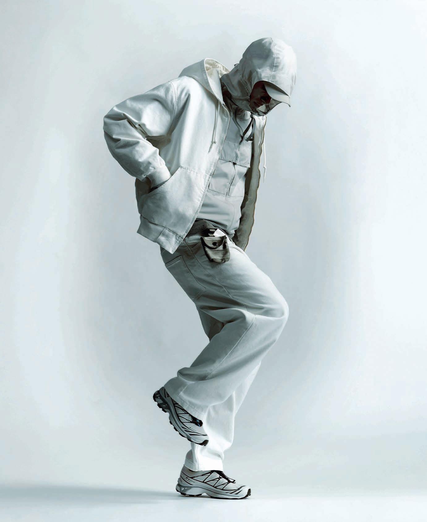
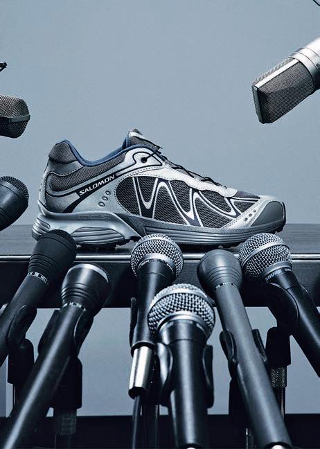
Salomon’s story has been equally compelling, though more kinetic. Originally known for trail running essentials like the XT-6 and ACS Pro, its core technologies – from Contagrip outsoles to Quicklace fastening - have migrated into street-ready incarnations. Its Sportstyle line, alongside collaborations with fashion partners such as MM6 Maison Margiela and concepts seen on European streets, has reframed trail shoes as design objects rather than tools.Patagonia, The North Face and Stone Island have anchored this trend on both sides of the outdoor-into-urban spectrum. Patagonia’s commitment to environmental stewardship and durable materials has resonated deeply with younger Chinese consumers attuned to sustainability. The North Face, with its baffle-quilted Nuptse jackets and versatile shells, has become
a perennial favourite for commuters, travellers and city dwellers alike, blending familiar silhouettes with functional innovation. Stone Island, with its rugged aesthetic that strikes a balance between streetwear envy and nautical finesse, has become the go-to brand for a younger generation of gear aesthetes.
While Western brands capitalized on stories built in the Alps and other mountainous regions, Asia’s homegrown expertise grew just as strong. Take Kolon Sport. This pioneer of nylon and polyester fibres in South Korea built a bridge between extreme conditions and the so-called urban jungle with the learnings from its 20-year-old LTKES line, infusing its technicak expertise into everyday options. Now, its “K:” series marries clean tailoring with premium technical fabrics including Gore-Tex and recycled wools, allowing garments to transition effortlessly from office to trail or gallery. The effect is a quiet, whisked-away elegance: understated, adaptable and unfussy.
Retail strategy reinforces this repositioning. Flagship stores for these brands now populate high-end retail corridors like in Beijing, Shanghai or Chengdu, placing outdoor labels alongside luxury neighbours. Experiential marketing deepens connection: Arc’teryx has hosted mountain classes that explore product technology and alpine skills, while Salomon pop-ups invite visitors to test grip, fit and motion in engaging urban settings. Behind the scenes, strategic capital has strengthened distribution and visibility. When Anta Sports acquired Amer Sports, it bolstered supply chain and retail capabilities for Arc’teryx and Salomon in China, allowing for curated drops and community-centric programming that preserve premium appeal.
Commercial momentum underscores the cultural shift. Reuters reported in March 2025 that while some global markets showed softness, China remained a bright spot for activewear demand, with comparable sales rising 26 percent for a major brand navigating uneven macro conditions, according to Reuters. Meanwhile, Jing Daily noted triple-digit growth in cycling apparel searches on Tmall as urban cycling culture took hold. Coverage of China’s cycling scene in 2025 describes a vibrant ecosystem of clubs, digital communities and fashion influence that elevates attire into an identity marker.
What distinguishes this moment from previous waves of athleisure is seriousness and coherence. Here, performance is not an accidental aesthetic but the foundation. Technical integrity underpins desirability. At the same time, a new, quieter kind of luxury has emerged: one that marries utility with poise, readiness with refinement. Today, the most compelling statement a wardrobe can make is not necessarily about spectacle, but motion – and confidence in where that movement might lead.
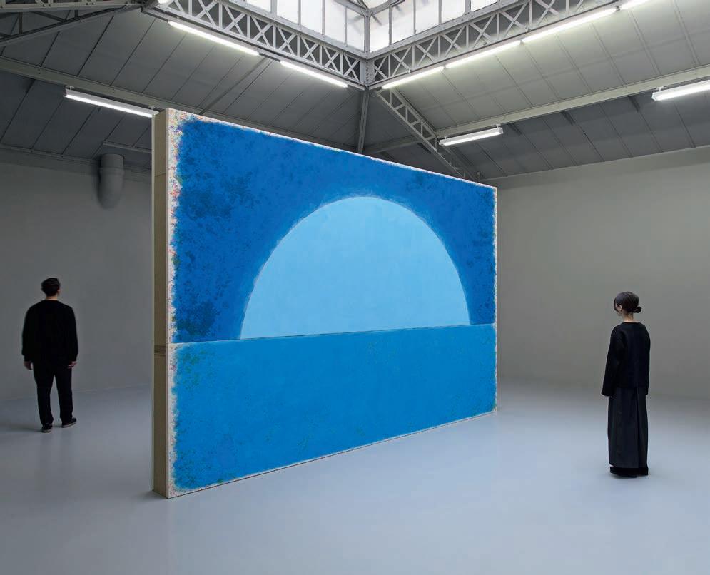
A leading figure of contemporary art, Ugo Rondinone has built a body of work that feels at once luminous and introspective, like summer itself, saturated with light and emotion.
Matter, energy, signal. In Ugo Rondinone’s universe, colour is never merely decorative. It spills beyond form, saturates landscapes and alters our perception of reality. Fluorescent totems rising from the desert, neon rainbows suspended in space, meditative landscapes and monumental figures: together they form a powerful chromatic vocabulary, both exuberant and deeply contemplative. A solar experience.
A POLYMORPHOUS PRACTICE
Born in Brunnen, Switzerland, in 1964, Rondinone belongs to a generation of artists shaped by the legacy of modernism while acutely aware of its limits. Trained at the Hochschule für Angewandte Kunst in Vienna, he developed early on a sensibility rooted in Romantic traditions, nourished by German philosophy, poetry and landscape painting. Yet this romanticism is far from nostalgic. Instead, it is informed by a sharp awareness of contemporary culture, its artifices and contradictions.
Since settling in New York in 1997, Rondinone has cultivated a resolutely transnational practice. Swiss by birth, Viennese by training and a New Yorker by adoption, he has forged a hybrid artistic language, drawing on references that are at once historical and contemporary, popular and erudite. This constant circulation between cultures feeds a body of work that resists categorization and disciplinary boundaries. Sculpture, painting, drawing, photography, video, poetry, sound and architecture all coexist within his practice. Rondinone moves freely between media, working with materials as varied as lead, wood, wax, bronze, stone, stained glass, ink and neon. Through this diversity of forms and materials, he returns to a central question: how do we inhabit the world today? His works explore the ways in which human beings project their emotions, beliefs and desires onto the landscapes around them. In Rondinone’s work, nature is never a simple backdrop. It is a mental space: a mirror of human interiority.
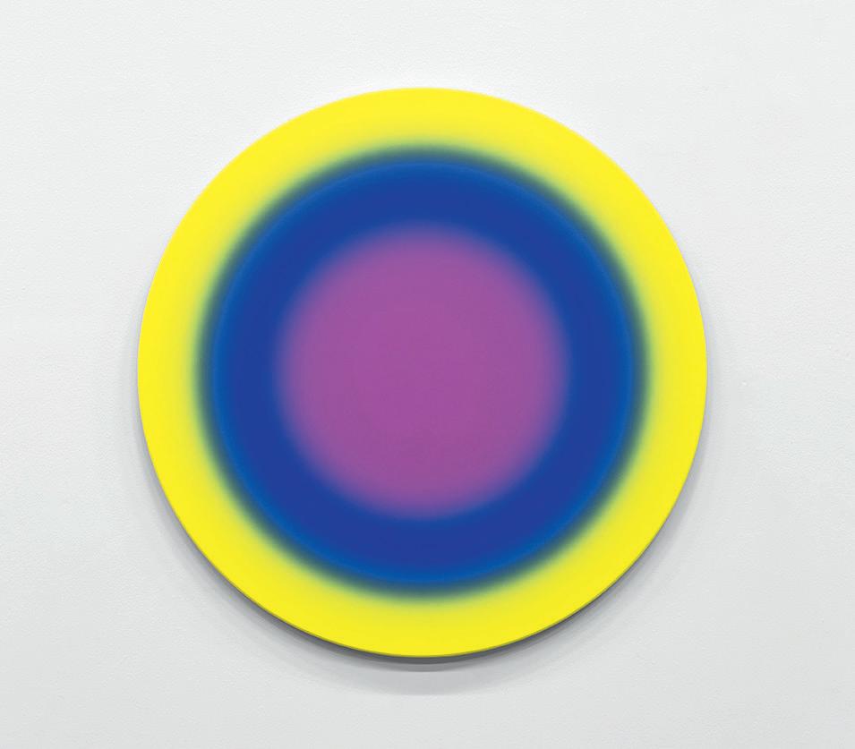
Time is one of the most profound threads running through Rondinone’s oeuvre. From the early 1990s, his circular paintings, dated in German and bearing enigmatic titles, were less about representing time than about producing an experience of it. Their concentric, multicoloured rings generate an almost hypnotic sensation. They do not measure time; they make it felt.
Echoing the philosophy of Henri Bergson, time in Rondinone’s work is lived rather than counted. It unfolds as duration rather than as a sequence of measurable instants: continuous, fluid, experiential.
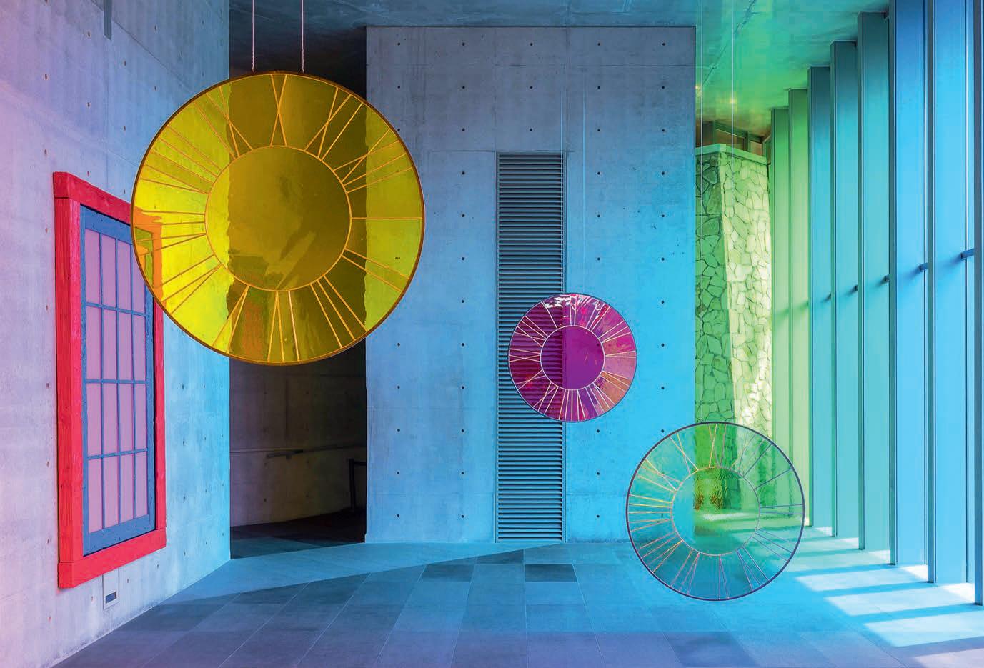
This reflection also takes material form in his installations of clocks stripped of their hands, suspended outside their utilitarian function. Here time is liberated from mechanical measurement and returns to the realm of sensation. It ceases to be a tool of organisation or control and becomes instead a perceptual condition that permeates the aesthetic experience. This relationship with time also informs Rondinone’s approach to landscape. Since 1989, his large series of black ink landscapes have formed the quiet foundation of his practice. These nocturnal scenes, constructed from fragments of memory and observation, never depict a specific site. Instead they evoke mental territories where individual and collective memory overlap. Inspired as much by Romantic painting as by contemporary sensibilities, these landscapes operate as spaces of projection. They summon collective myths and archetypes while reflecting the solitude and melancholy of modern existence. Nature appears here as both a cultural construction and a physical reality.
COLOUR, NATURE AND ARTIFICE
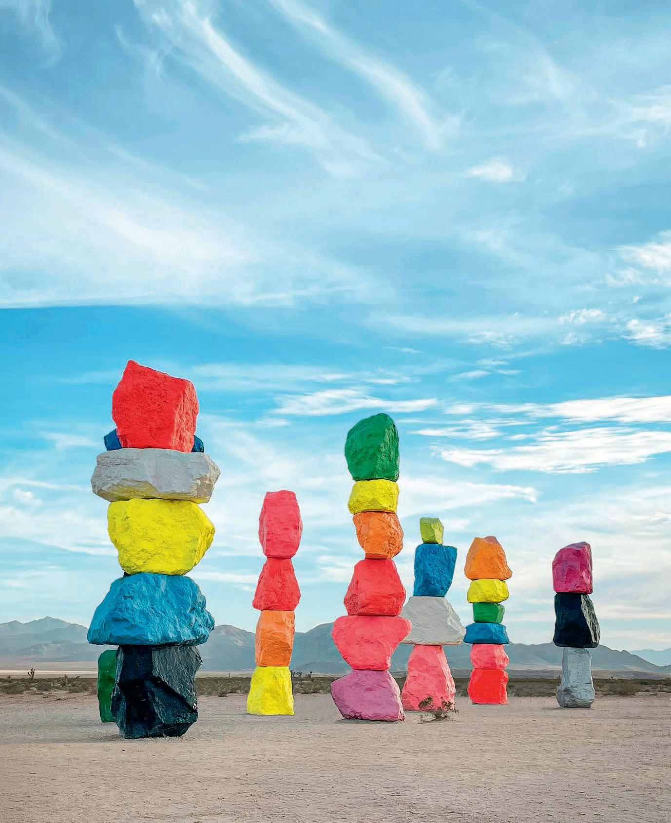
The tension between interiority and monumentality finds one of its most iconic expressions in Seven Magic Mountains (2016–2023). In the Nevada desert, seven towering stacks of boulders painted in fluorescent colours rise like improbable markers within a vast horizontal landscape. The work plays on a series of deliberate contrasts: verticality against horizontality, artificial colour against raw stone, monumentality against fragility. Unlike the land art of the 1960s and 1970s, which often sought a harmonious integration with nature, Rondinone openly embraces the artificiality of human intervention. Colour does not disguise the stone; it amplifies its presence, rendering it almost unreal. These totems can be read as markers of the Anthropocene: the geological epoch defined by the profound impact of human activity on the planet. Rondinone’s interventions in natural landscapes thus reflect both our capacity to transform nature and our enduring dependence on it. Colour becomes a visual splash: part poetic gesture, part warning signal.
This direct relationship to colour runs throughout his practice. Saturated palettes, neon rainbows and fluorescent surfaces engage not only with art history but also with pop culture, fashion and the contemporary urban landscape. Rondinone’s works function as instantly recognizable icons, capable of circulating
between public space and the collective imagination. Neon, that quintessentially industrial, urban material, becomes, in his hands, a vehicle for poetry. Light does not simply illuminate; it shapes emotional space, alters perception and suspends time.
In the blazing Nevada desert, Seven Magic Mountains produces an almost physical visual shock. Colour interacts with sky, dust and heat, transforming the site into an immersive open-air stage. Nature becomes both setting and collaborator, revealing the porous boundary between the natural and the artificial.
BODIES, FIGURES AND STATES OF MIND
In his figurative sculptures, Rondinone explores another dimension of human experience. His life-sized clowns, frozen in ordinary poses, embody a quietly unsettling contemporary melancholy. Figures traditionally associated with entertainment become mirrors of our own vulnerability. Their stillness and isolation evoke a universal fragility: that of the individual confronted with passing time, solitude and the bittersweet absurdity of existence.
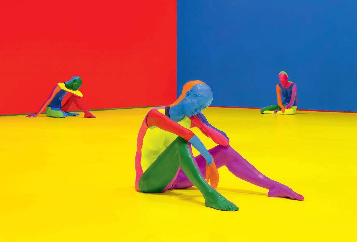
The series nuns + monks (2020) extends this exploration through monumental figures inspired by medieval statuary. Cast in painted bronze, they combine spiritual gravity with a vivid chromatic palette. Suspended between the sacred and the secular, tradition and contemporaneity, these sculptures question the place of spirituality in an image-saturated world, without nostalgia or didacticism. Beneath the apparent exuberance of colour lies an unexpected depth, almost melancholic. The brightest hues coexist with silence, waiting and an acute awareness of time passing.
In Rondinone’s world, summer is not simply a season. It is a suspended moment between fullness and vertigo, when light reaches its peak but shadow is never far away. This ambivalence is one of the most singular strengths of his art. At a time when saturated images flood our screens, Rondinone proposes another kind of visual intensity: slower, more contemplative, yet equally powerful. His works invite us to pause, to inhabit the present moment fully, to feel rather than consume. Across monumental installations and more intimate works alike, Ugo Rondinone constructs a universal interior landscape. He does not represent nature; he transforms it into sensory experience. Rather than opposing the artificial and the natural, he reveals the porous relationship between them. His work acts as a chromatic mirror of our era: brilliant, saturated, unstable, yet profoundly human. Spaces to inhabit, traverse and feel, much like a radiant summer that lingers long in memory.
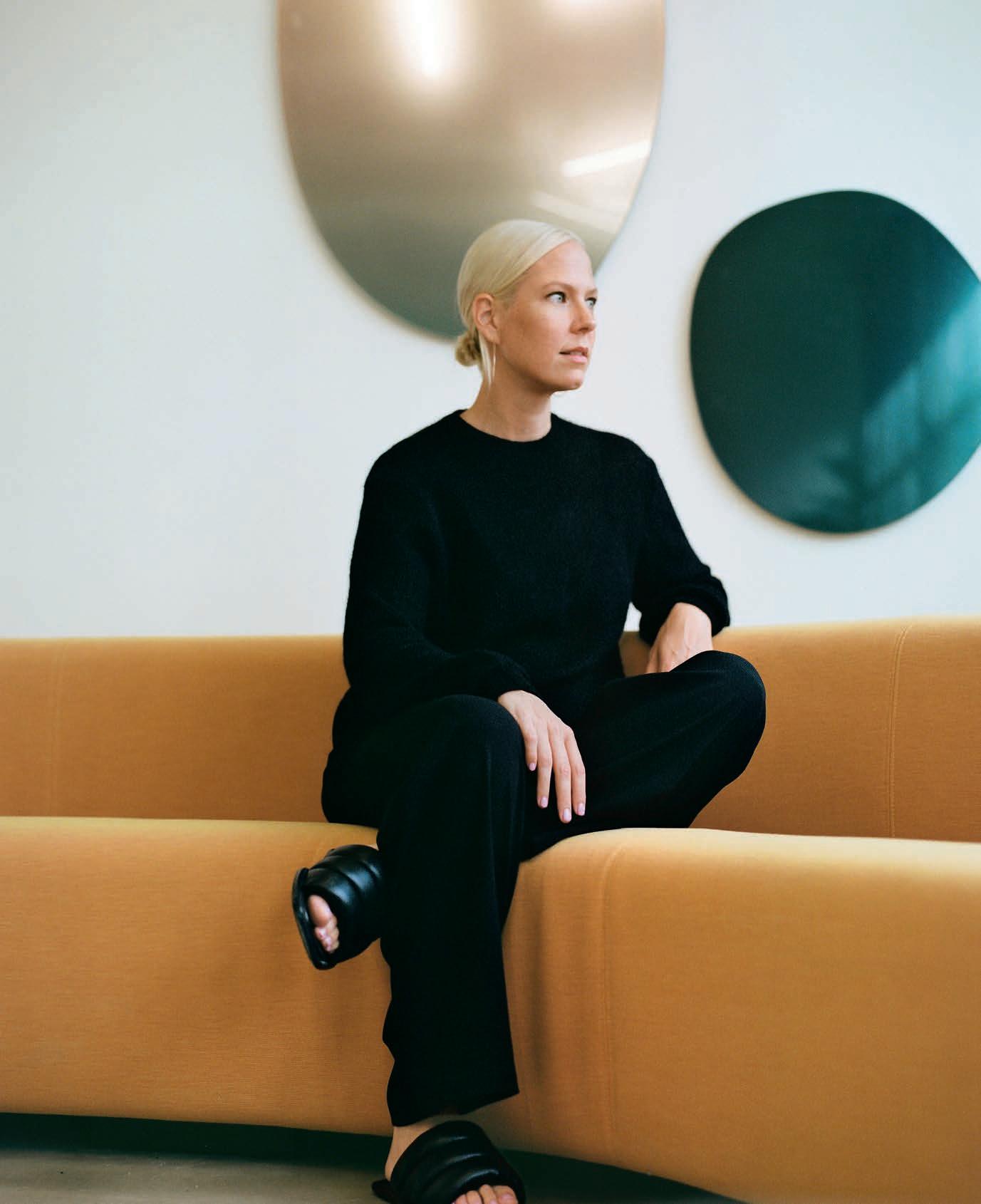
Sabine Marcelis does not simply design objects. She creates moments: fleeting encounters between light, colour and material that seem to suspend time.
The Dutch designer has built a distinctive body of work around a deceptively simple ambition: capturing the ephemeral beauty of natural phenomena and translating it into physical form.Her path to design, however, was far from inevitable. As a teenager growing up in New Zealand, Marcelis imagined a very different future. She dreamed of piloting helicopters, or perhaps dedicating her life to snowboarding. But a sudden health issue forced her to abandon competitive sport and reconsider her trajectory. The shift that followed was almost accidental. “My sister had just finished studying industrial design and invited me to stay with her for a while,” Marcelis recalls. “It looked fun, so I thought I’d try it too.” That decision eventually led her to the Design Academy Eindhoven in the Netherlands, one of Europe’s most influential design schools and the birthplace of experimental movements such as the Dutch collective Droog. The academy’s conceptual approach to design resonated with Marcelis’s instincts, allowing her to develop a practice that sits comfortably between product design, art and spatial installation.
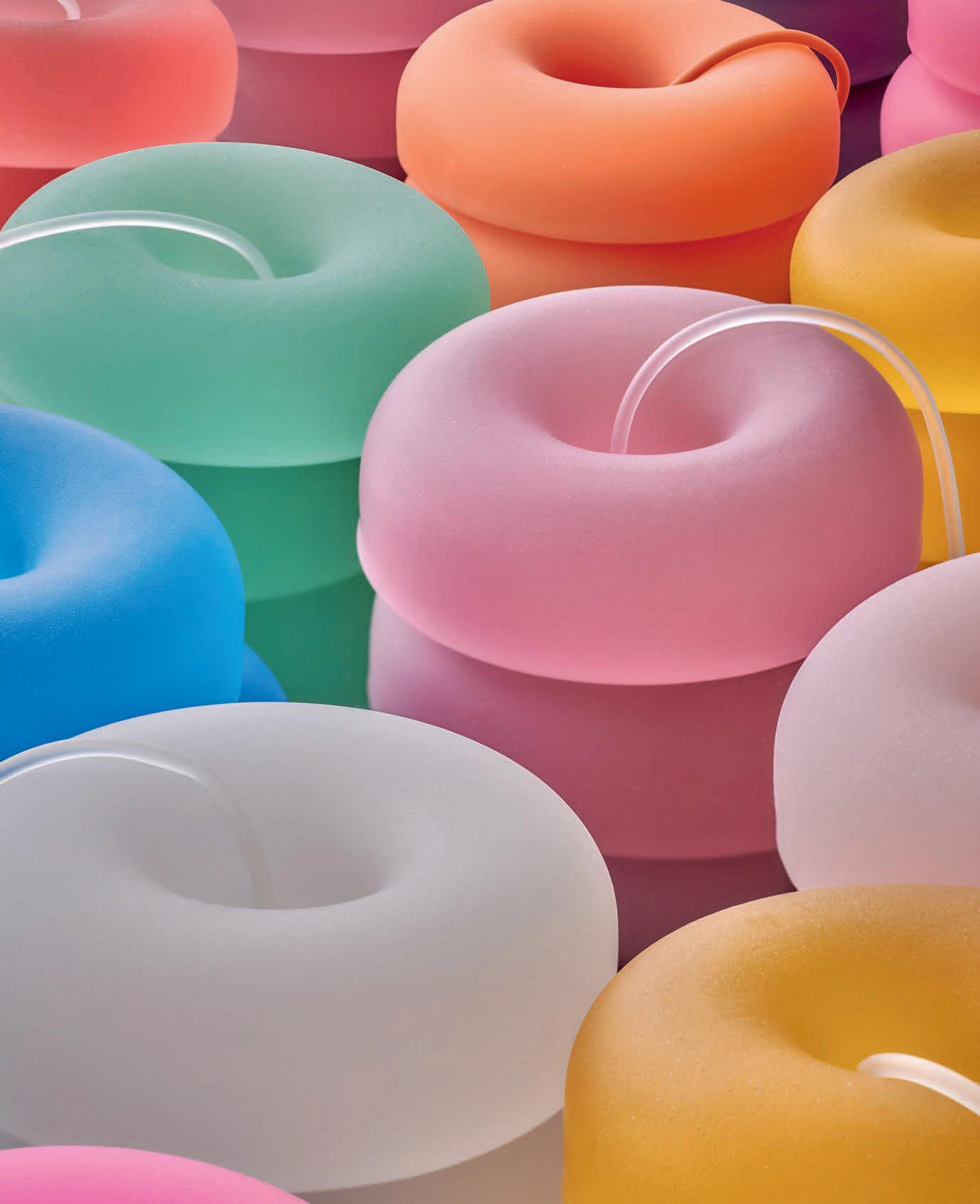
Two decades later, she is widely regarded as one of the most influential designers of her generation. Marcelis’s work has been recognised with numerous international awards, including Elle Deco ’s Young Designer of the Year and International Designer of the Year in 2019, Wallpaper * Designer of the Year in 2020, and Dezeen Designer of the Year in 2024. Her name has also appeared on the coveted AD100 list compiled by Architectural Digest. Yet what sets Marcelis apart is less the list of accolades than the clarity of her visual language. Her objects are built from elemental geometries: cubes, discs, rings, planes. But within these apparently simple forms lies a careful orchestration of colour and transparency. Edges glow softly. Surfaces refract daylight. Gradients shift like liquid pigment. The effect is subtle yet strangely magnetic, as if light itself had acquired volume. Marcelis describes her work as an attempt to capture transient moments that occur naturally in the world. “Nature is undoubtedly the best designer,” she says. “A sunset, a wave, or a rainbow seen from an airplane that forms a perfect circle. Those are fleeting phenomena – and in my work I try to hold on to those moments.”
DESIGNING WITH LIGHT:
The recognizable signature of Marcelis’s work comes from the interplay between material and light. Her preferred materials –resin, glass, mirror, marble, onyx – are chosen for their optical
properties rather than their decorative qualities. “I love materials that have body,” she says. “I’m not particularly interested in wood or textiles. I prefer materials whose properties I can manipulate, where I can play with opacity, reflection and translucency.”
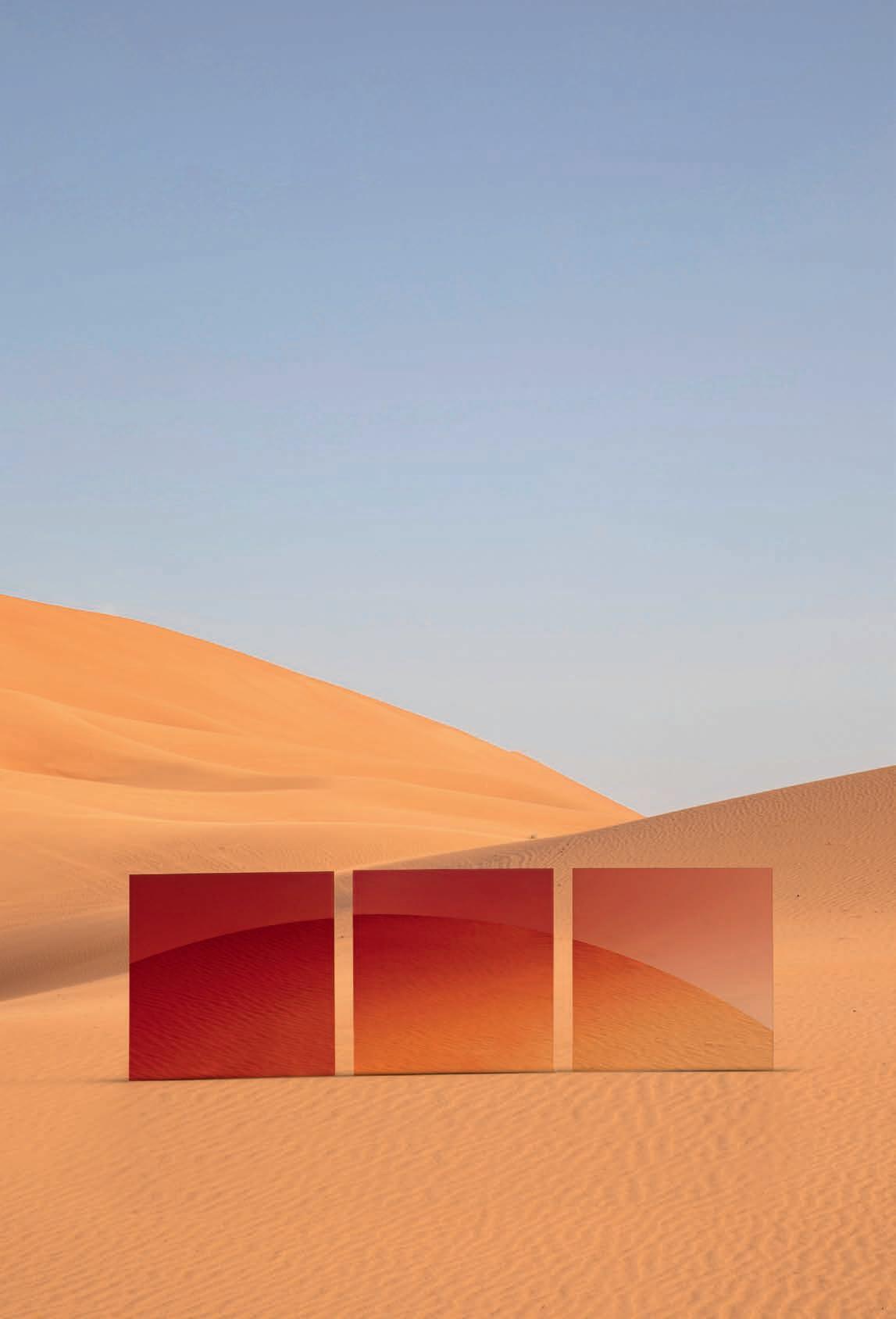
Perhaps the most emblematic example of this approach is the Candy Cube, the object that first brought Marcelis international recognition. Originally created for Céline boutiques during Phoebe Philo’s tenure at the fashion house, the cube is cast in a single block of coloured resin without visible seams. The geometry is absolute, almost austere. Yet the material transforms the form. The resin’s subtle translucency allows light to travel through its edges, creating a soft halo that appears to glow from within. Today the Candy Cube is held in the permanent collections of both the Museum of Modern Art in New York and the Vitra Design Museum. For Marcelis, the piece embodies a broader philosophy of design. “I’m interested in creating elements that are not decorative but whose form is inherently interesting,” she explains. “The cube is simply the most honest way to show what resin can do.” Part of the cube’s appeal lies in its functional ambiguity. It can be used as a stool, a plinth, a table, or simply as a sculptural presence. Marcelis deliberately leaves that interpretation open.
Other works explore different emotional registers. The Boa Pouf, produced by Hem, replaces the cube’s strict geometry with a circular, donut-like form that feels soft and inviting. Meanwhile, the Seeing Glass mirrors, created with Dutch designer Brit van Nerven, transform reflection itself into a design medium. Through layers of tinted glass and subtle gradients, the mirrors filter and distort the reflected image, adding colour and atmosphere to everyday perception.
FROM OBJECT TO ENVIRONMENT
While Marcelis first gained attention through collectible design, her work increasingly operates at architectural and environmental scales. She moves easily between limited-edition pieces for collectors and collaborations with international brands. Over the past decade she has worked with luxury houses such as Fendi, Burberry, Dior and La Prairie, while also collaborating with companies including Renault and Ikea.
But it is in large-scale installations that her fascination with light and space becomes most evident. In 2019 she was invited to present No Fear of Glass at the Mies van der Rohe Pavilion in Barcelona, becoming the first designer ever asked to intervene in the modernist landmark. “It’s such a perfect building that it was quite intimidating,” Marcelis says. When Mies van der Rohe designed the pavilion for the 1929 International Exposition, he had been advised not to use too much glass. Marcelis chose to
reinterpret that constraint. Her installation introduced five new pieces that extended the pavilion’s existing materials – marble, travertine and glass – creating a dialogue between her work and the architecture.
Outside the pavilion, a curved glass fountain completed the installation. Water flowed across monumental glass panels with millimetre precision, creating a perfectly continuous surface.
Achieving the effect required months of experimentation and a Europe-wide search for a manufacturer willing to attempt the technical challenge.
“Many factories told us it was impossible,” she says. “But eventually we found a partner who believed it could be done.”
In Marcelis’s hands, water became yet another medium through which light can be manipulated: a moving, reflective surface that amplifies the sensory experience of space.
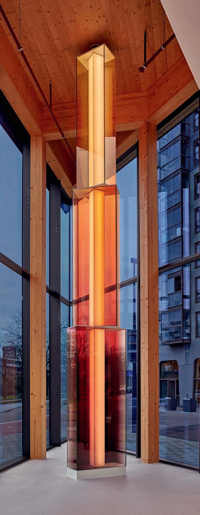
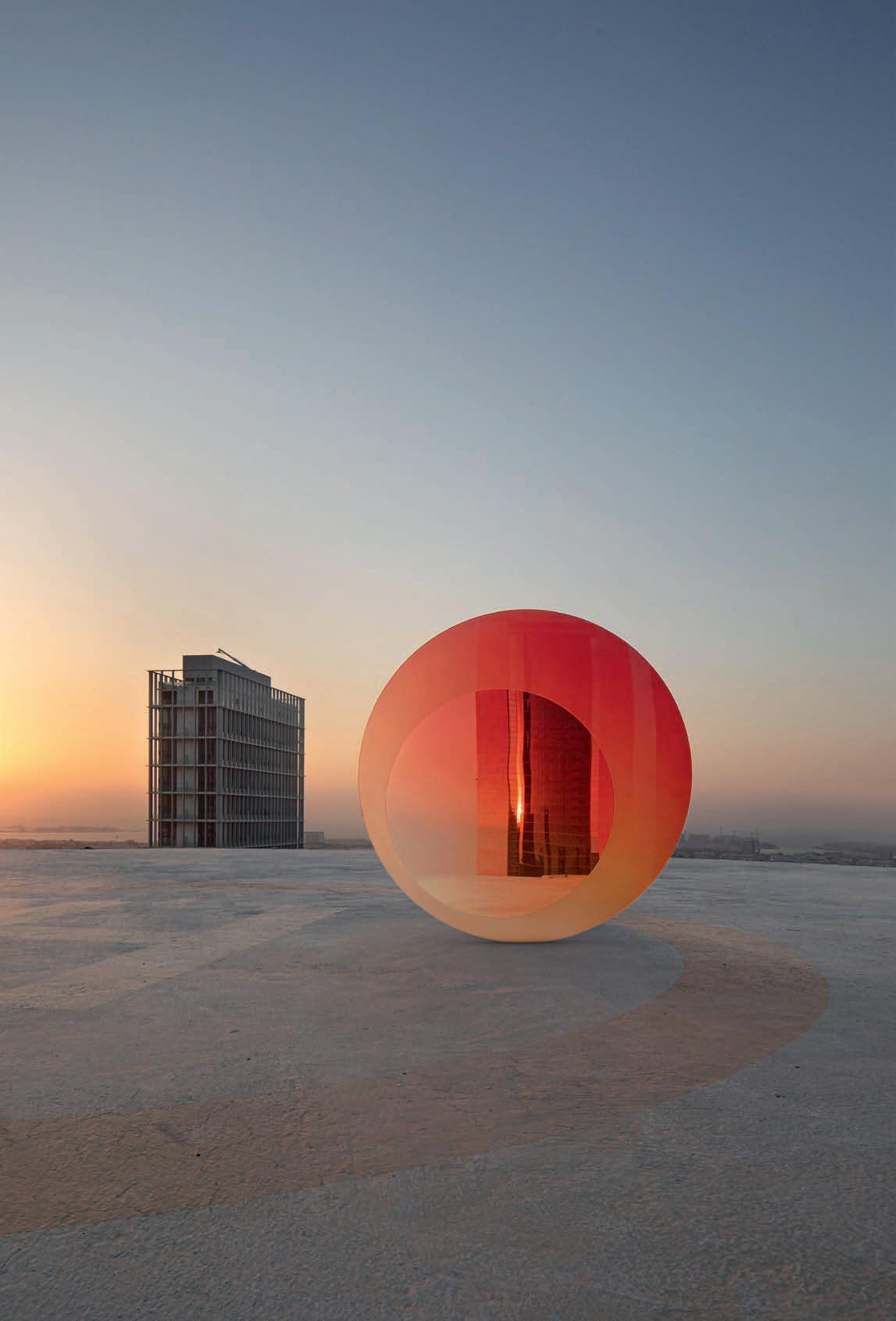
More recently, her installations have begun to incorporate technology. For the 2023 exhibition Forever Is Now III near the pyramids of Giza, Marcelis created RA , a monumental sculpture
named after the Egyptian sun god. The structure integrates solar cells within layered glass panels, allowing it to collect energy during the day and illuminate itself at night. “I’m very interested in integrating technology invisibly into my work,” she explains. “My sundial became a completely autonomous installation. I think that’s the future of public art.”
A DESIGNER’S OBSESSION
Despite the increasingly ambitious scale of her projects, Marcelis remains fascinated by objects that interact directly with the body. When asked what she would most like to design next, her answer comes instantly. “A pair of sunglasses.” The choice feels fitting. After all, few objects engage with light as intimately. But the idea also reveals something personal. “I’m obsessed with sunglasses,” she admits with a laugh. “I don’t spend much money on clothes – I usually wear jeans and a T-shirt – but with sunglasses there’s absolutely no limit. Somehow I always manage to convince myself I need another pair.”
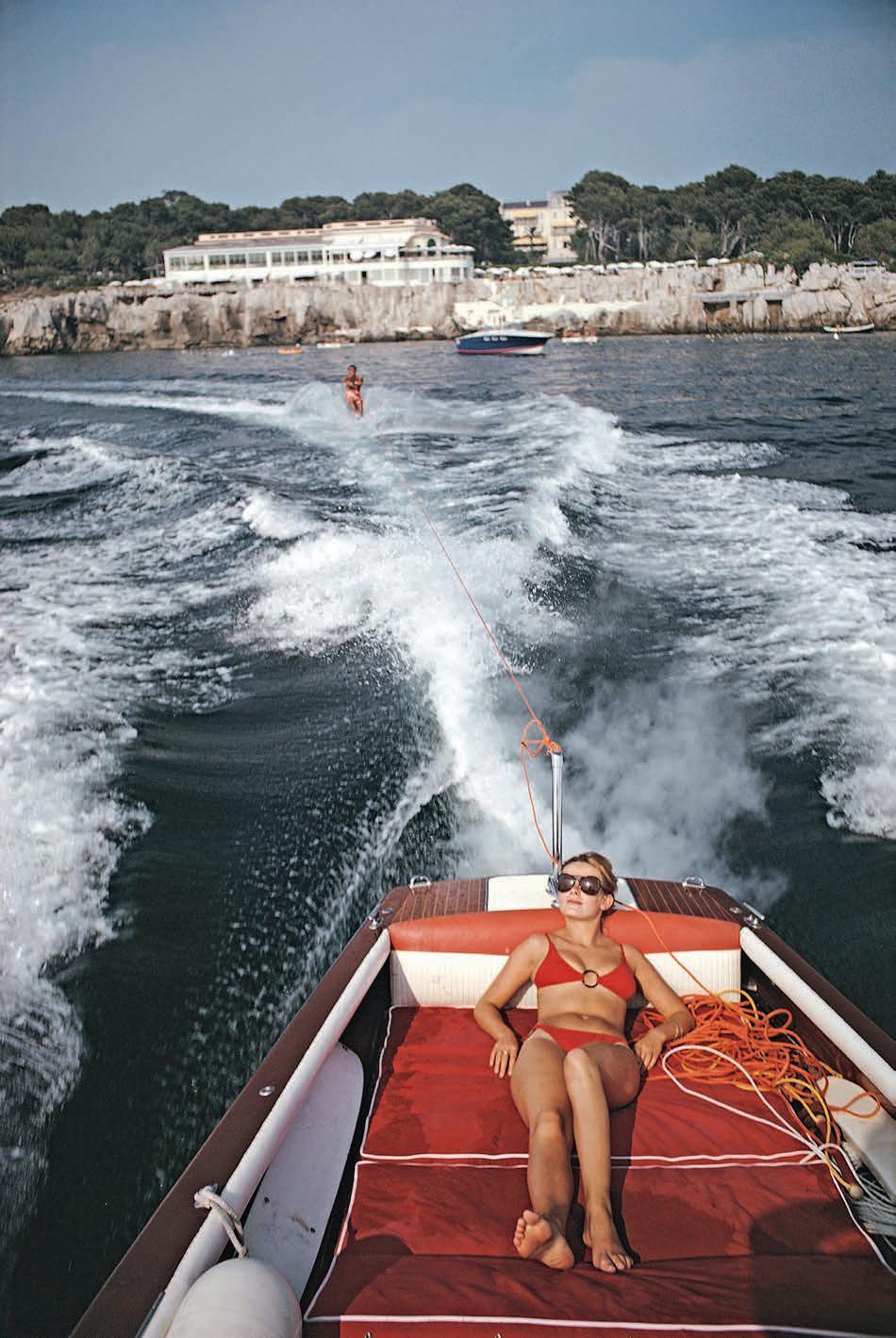
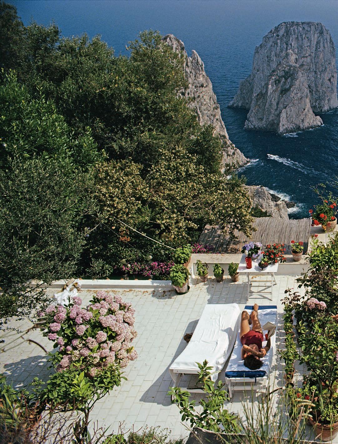
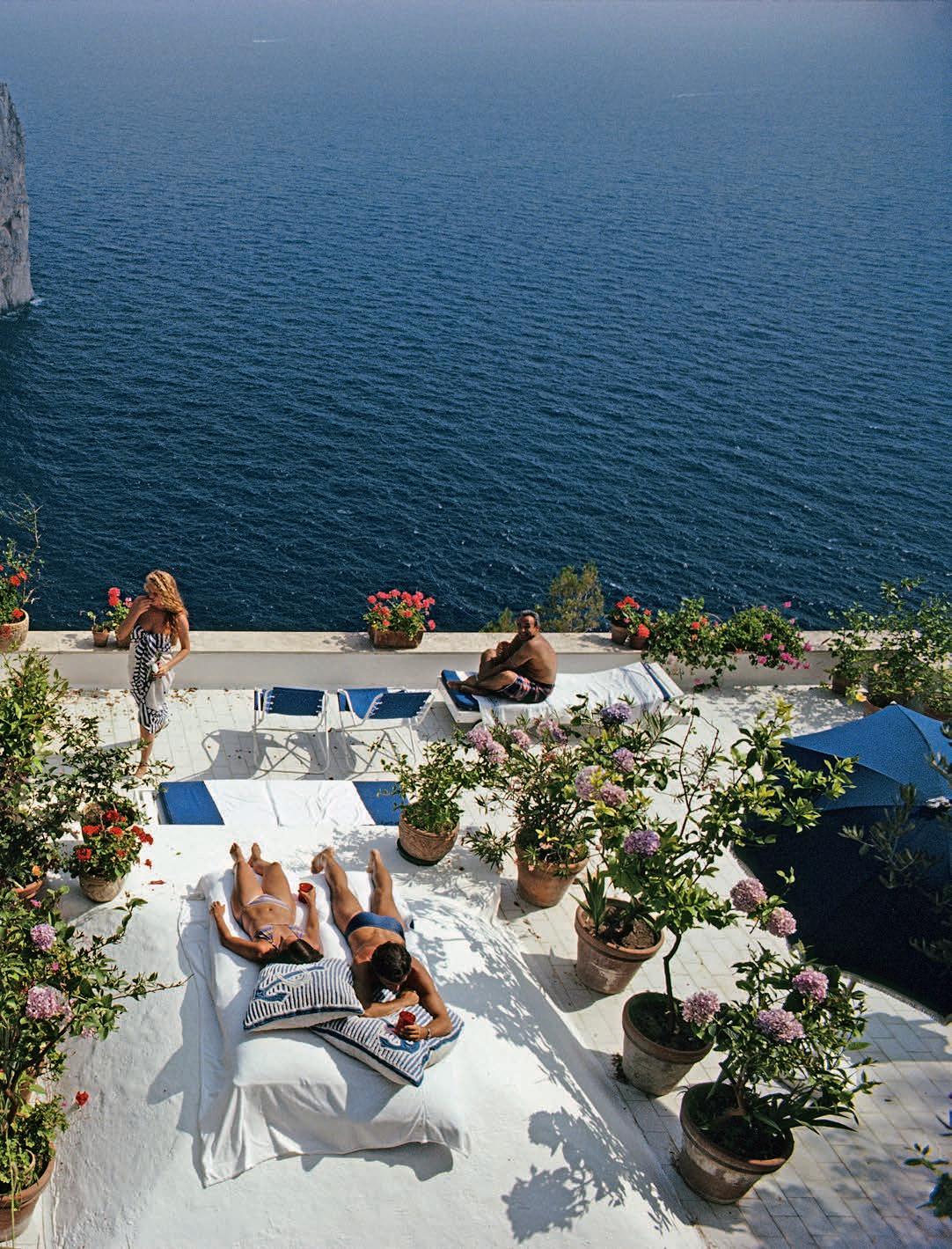
Few photographers have shaped the visual mythology of leisure quite like Slim Aarons. Known for his sunlit images of swimming pools, ski resorts and impeccably dressed holidaymakers, the American photographer captured not only the jet-set glamour of the late 20th Century, but the aspirational mood of an entire era.
Picture a midday scene: a pale green parasol shading a small group of women seated by a pool. Palm trees and clipped hedges frame the immaculate lawn, while the water reflects a cloudless sky. The figures, slender and summer-bronzed, wear light dresses and bright white swimsuits that echo the crisp modernist architecture around them. Aarons’ photographs radiate nostalgia – not simply for a past era, but for a lifestyle few people ever experienced firsthand. Throughout a career that spanned the 1940s to the 1990s, he devoted himself to documenting the leisure of Western high society in the decades following the Second World War. In his world, summer appears endless, worries vanish and elegance is effortless. The appeal of his work lies in a simple promise: it makes you want to be there.
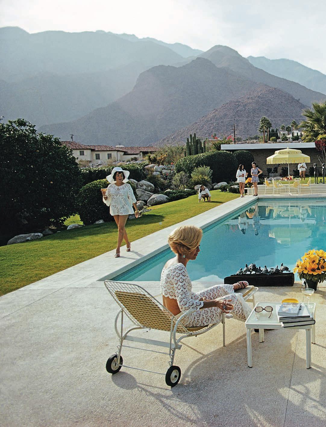
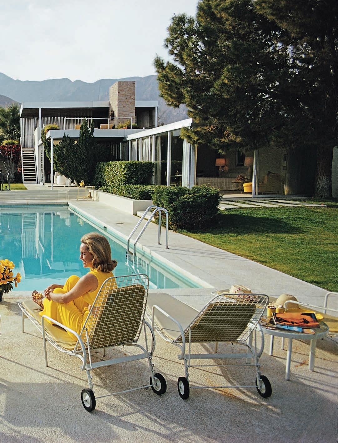
No image captures that idea better than Poolside Gossip (1970), arguably Aarons’ most famous photograph. In it, socialite Nelda Linsk sits in the foreground, her back turned toward the viewer as she chats with model Helen Dzo Dzo. With her flawless blowout and bright yellow outfit, neatly echoing the flowers at her feet, she epitomizes the jet-set lifestyle of the period. The setting is Palm Springs’ Kaufmann Desert House, designed by modernist architect Richard Neutra. Aarons’ frame juxtaposes the clean lines of the villa with the lush hills rising behind it, presenting Palm Springs as both architectural showcase and glamorous playground. Long before it became a celebrity haven, the desert city was already gaining prominence, a reputation Aarons’ widely published photographs would help cement. The photographer once summarized his artistic mission with characteristic simplicity: “Attractive people doing attractive things in attractive places.” But the path that led him there was far from obvious. Born George Allen Aarons in New York in 1916, he discovered photography after joining the U.S. Army in 1939. During the Second World War, he worked as both soldier and reporter, documenting the conflict for the military magazine Yank. His black-and-white images showed bombedout buildings, Allied soldiers in action and frightened children caught in the devastation of war. Those experiences left a lasting impression. After the war, Aarons famously declared that he wanted to photograph “the sunny side of the street.” The tanks, uniforms and ruined cities disappeared from his work. Through connections with filmmaker Frank Capra, photographer
Clarence Sinclair Bull and restaurateur Mike Romanoff, Aarons gained access to Hollywood and the social circles of the wealthy elite. His easygoing manner helped put his subjects at ease, allowing him to photograph figures such as Marilyn Monroe, C.Z. Guest and Grace Kelly. Assignments for Life magazine helped establish his reputation, but it was his work for Holiday, the travel magazine founded in 1946, that brought his photographs to an international audience. In the years following the war, readers hungry for beauty, escape and exotic destinations found exactly that in Aarons’ images. Around this time, he also embraced colour photography: a choice that heightened the seductive quality of the world he portrayed.
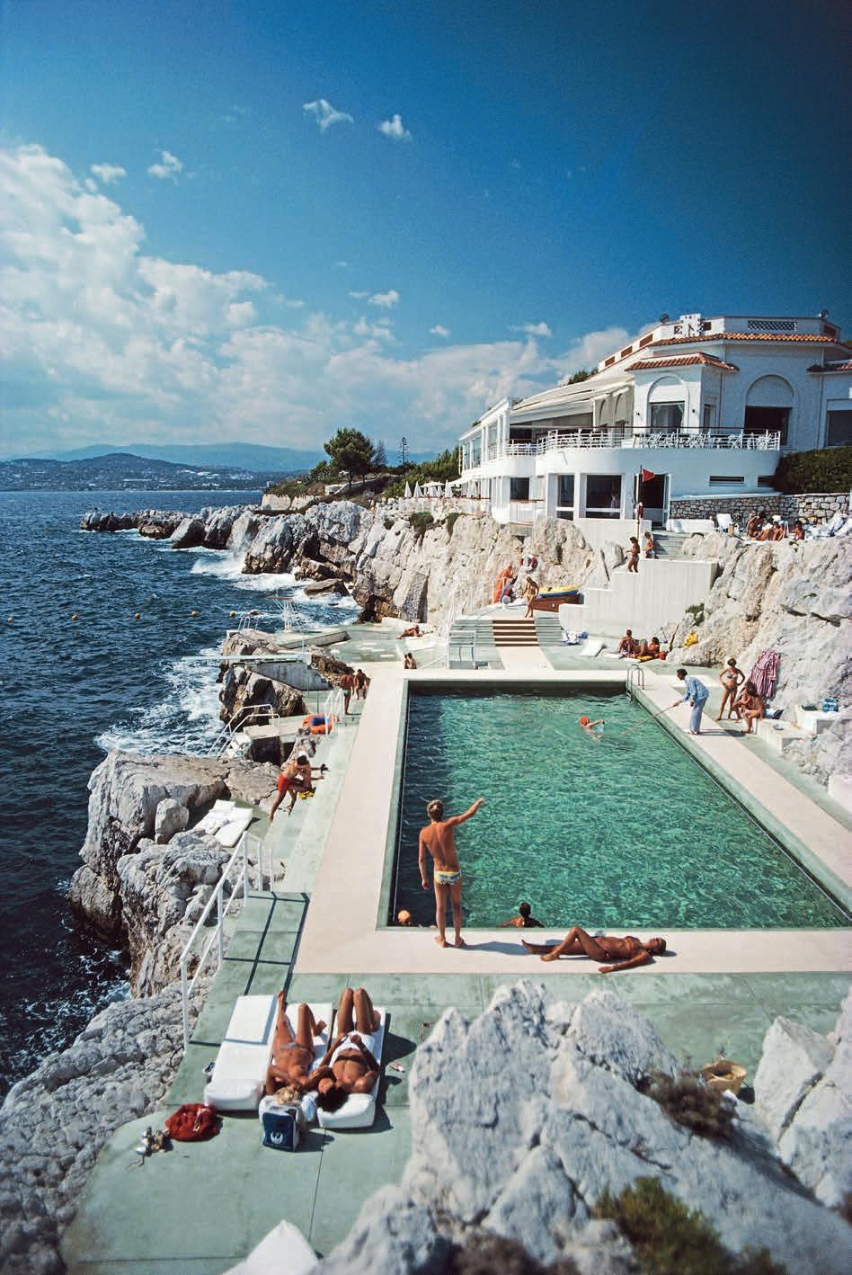
Over the following decades, Aarons travelled widely, from Palm Beach to the Hamptons and across Europe’s most fashionable destinations: the Amalfi Coast, Alpine ski resorts such as Courchevel and St Moritz, and the French Riviera. Through his photographs, places like Saint-Tropez, Cannes, Antibes and Monaco appear as a sequence of cinematic scenes: hillside villas overlooking the sea, legendary hotels such as the Carlton and the Cap-Eden-Roc, and marinas crowded with yachts. Aarons had a talent for crossing the boundary between public and private life. By photographing both the beaches and the gardens of private estates, he offered viewers a rare glimpse into the world behind the gates of the international elite. Despite their carefully composed elegance, his images were often produced with remarkable simplicity. Aarons typically worked alone, without assistants, relying on natural light and photographing his subjects in their own surroundings, usually wearing their own clothes.
Two decades after his death, his influence remains unmistakable.
Alfred Hitchcock is believed to have drawn inspiration from Aarons and his New York apartment when creating the photographer character in Rear Window (1954), played by James Stewart. His 1974 book A Wonderful Time: An Intimate Portrait of the Good Life has become a touchstone for fashion designers including Ralph Lauren and Michael Kors. Echoes of his aesthetic can also be seen in the work of painter David Hockney, whose fascination with California pools and hillside villas parallels Aarons’ imagery. More recently, Jay-Z paid tribute to the photographer when promoting his Monogram brand, recreating several of Aarons’ iconic compositions with director Hype Williams. Shared widely on social media, the campaign demonstrated just how contemporary Aarons’ vision remains. Decades before Instagram codified the visual language of aspirational living, Slim Aarons had already captured its essence: the enduring, universal desire for the good life.
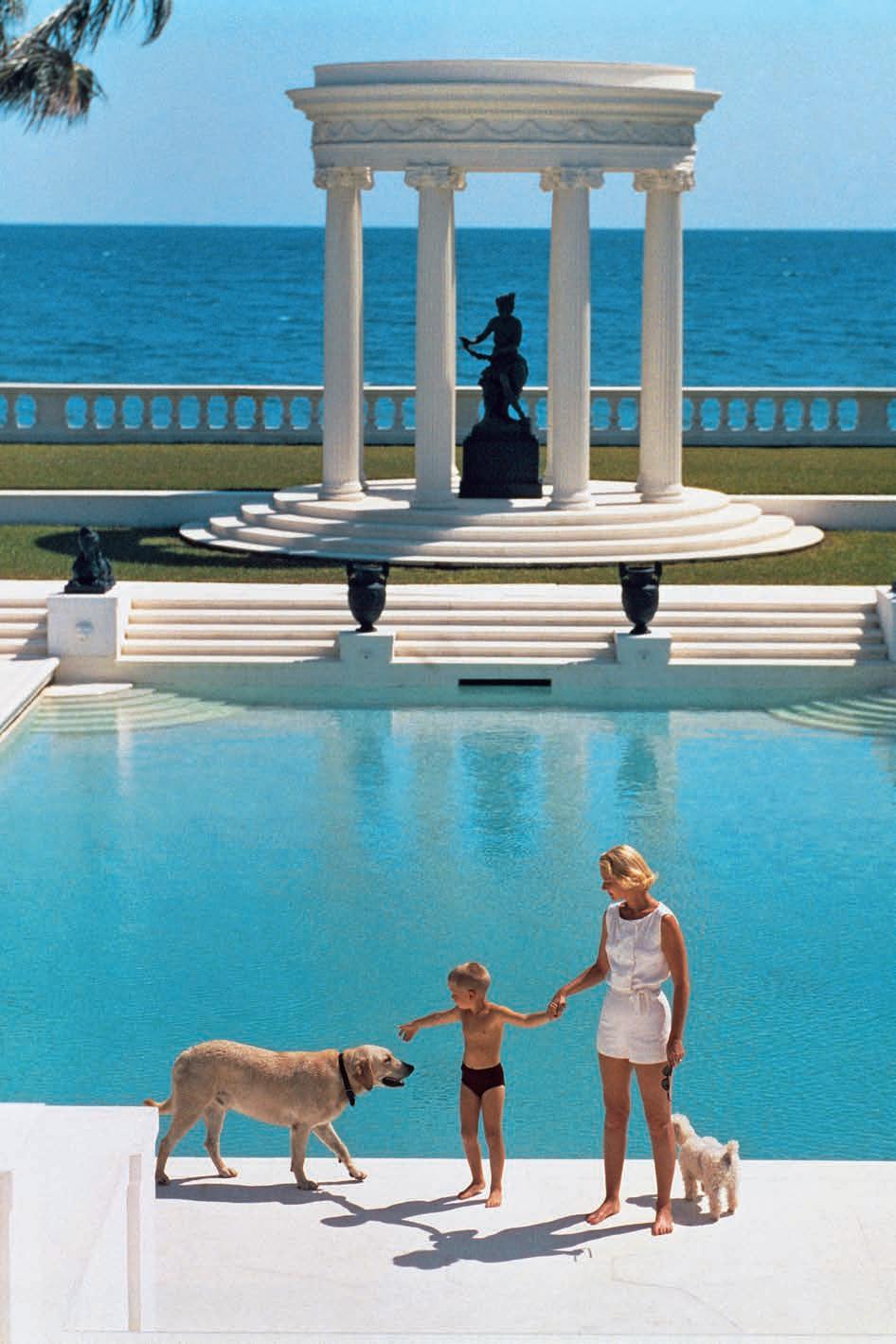
SLIM AARONS 应美国作家 C.Z GUEST 之 邀, 来 到 她位于 棕榈滩 的 豪宅,为 母 子二人 在泳池前定格温馨瞬 间。 此作品收录于 A WONDERFUL TIME:AN INTIMATE PORTRIT OF THE GOOD LIFE 美妙时光: 特写 理 想生 活)。
MESTIZ 在 DANIEL VALERO 的主理下,通过 充满趣味和色彩的创作, 延续并焕新 墨西哥传统编织工艺。
A new generation of designers is reshaping the perception of Mexican craft. Long confined to the realm of heritage and folklore, it is now emerging as one of the most dynamic forces in contemporary design –where material intelligence, social responsibility and bold aesthetics intersect.
Under Mexico’s luminous skies, craft is undergoing a renaissance. Once seen primarily as a repository of tradition, rooted in centuriesold techniques, it is increasingly embraced as a powerful creative language. Here, luxury is defined less by industrial precision than by the presence of the hand, the integrity of raw materials, and the narratives embedded in every object.
This renewed attention has captivated collectors, luxury brands and hospitality groups around the world, all seeking authenticity, cultural depth and enduring beauty. At the forefront of this movement are three studios whose practices embody the evolving spirit of Mexican craft: Fernando Laposse, Caralarga and Mestiz Studio. Their aesthetics differ, yet their philosophies converge, demonstrating that craft today is not only a cultural expression but a platform for innovation, ecological awareness and global dialogue.
FERNANDO LAPOSSE: LAND AS INSPIRATION
Trained at Central Saint Martins in London, Fernando Laposse has become one of the most compelling voices in Mexico’s emerging eco-design movement. His work transforms humble, often overlooked materials into objects of remarkable refinement. Furniture pieces resemble playful, almost mythological creatures, as delicate veneers reveal intricate natural textures. Yet beyond their visual charm lies a deeper ambition: to design systems that regenerate ecosystems whilst also sustaining local communities.
“My interest isn’t only to make beautiful objects,” Laposse explains. “It’s about creating a positive impact on the environment and on the people who produce them.”
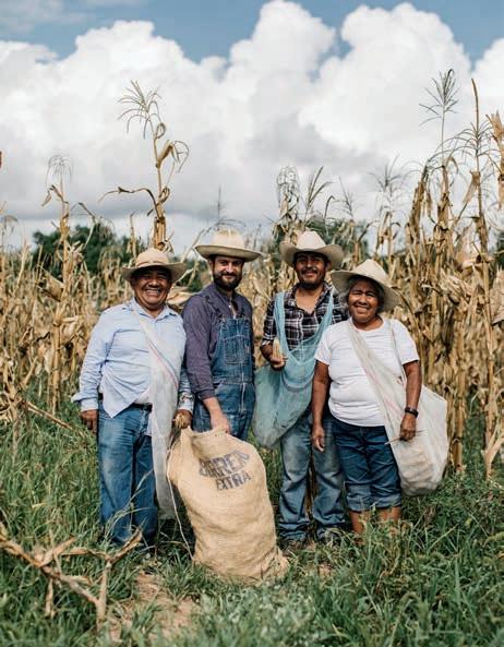
His breakthrough project began with corn, the ancestral crop at the heart of pre-Hispanic civilizations. Through Totomoxtle, Laposse developed a process that transforms corn husks, typically discarded as agricultural waste, into decorative veneers with extraordinary chromatic richness.
Wall coverings, lighting pieces and furniture surfaces reveal the husks’ natural palette, which varies according to corn variety: golden yellows, deep violets, earthy reds and subtle browns. Each sheet becomes a singular surface where design meets agricultural biodiversity.
But Totomoxtle is also a social model. Laposse collaborates closely with an indigenous farming community in Tonahuixtla,
in the Mexican state of Puebla. Farmers keep the corn for food, while the husks are collected and processed locally, creating an additional source of income, and encouraging the preservation of heritage corn varieties threatened by industrial agriculture and GM crops. Over time, the farmers themselves began enriching the project. By reintroducing traditional varieties and experimenting with natural pollination, they developed new hybrids, crosspollinating red and white corn, to produce soft peach tones.
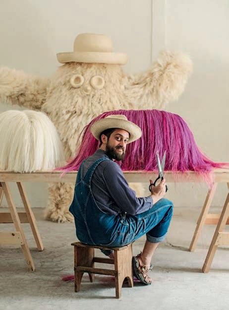
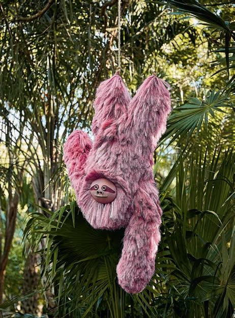
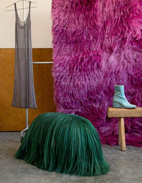
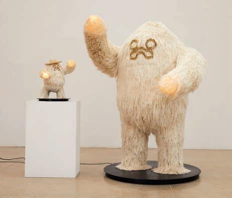
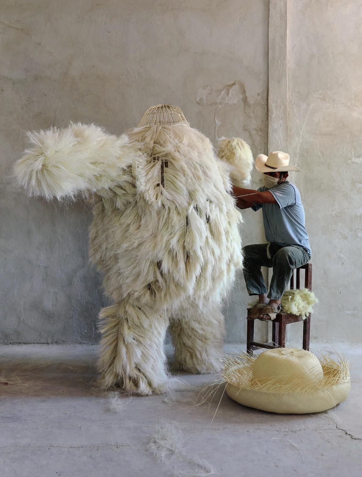
The project has since expanded into a broader ecological system. Working with local communities, Laposse began planting agave, a plant perfectly adapted to Mexico’s climate. Its roots protect agricultural land from erosion during the rainy season while improving soil regeneration. The leaves yield sisal fibres, traditionally woven into ropes. Laposse instead developed a knotting technique that leaves the fibres loose and expressive, almost like horsehair. Using this expressive material, he has created sofas, cabinets, benches and sculptural pieces that resemble fantastical, furry creatures.
These exuberant forms reached an international audience during Miami Art Week 2019, when Laposse unveiled Pink Beasts in the Miami Design District: a vivid installation featuring hammocks, sculptural sloths and tens of thousands of pink pom-poms suspended in public space.
The project also highlighted an ancient dyeing technique using cochineal, the cactus-dwelling insect that produces one of the most intense natural reds. “It’s an incredible indigenous technology,” the designer notes. “Cochineal was domesticated and selected to produce extraordinary pigment. When the insect dies, it’s ground into powder, yielding a red of astonishing intensity.” For Laposse, design ultimately functions as a storytelling device – simple, direct and powerful.“Design has the clarity of simple things,” he says. “It communicates a story that people can understand in minutes.”
CARALARGA: TEXTILE AS SCULPTURE
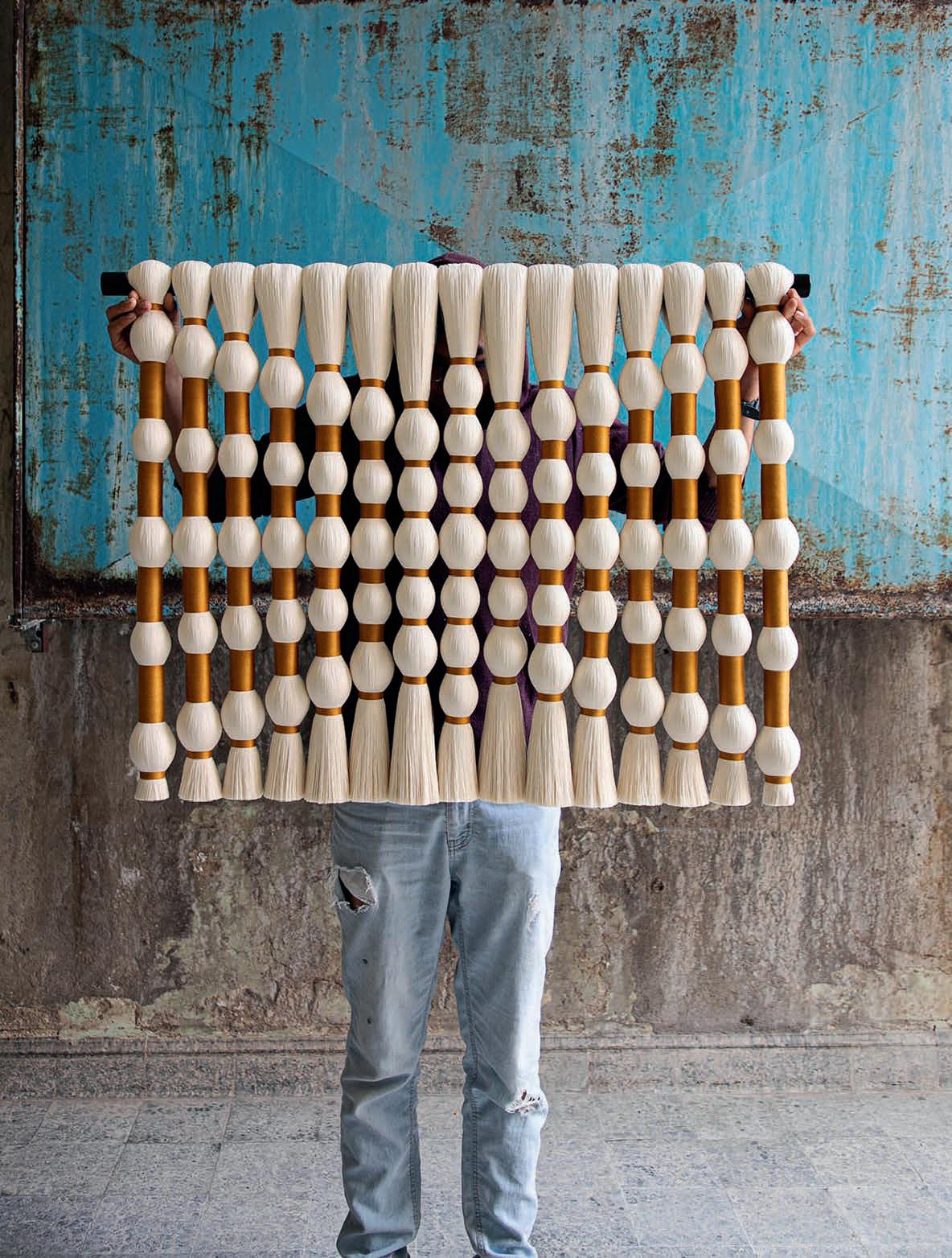
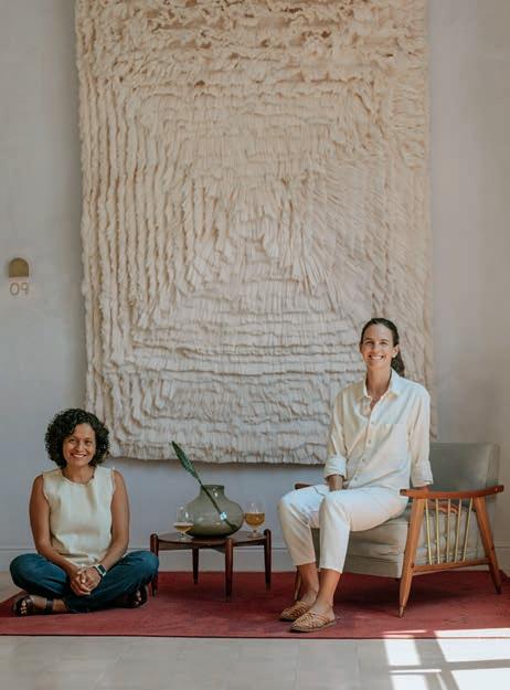
If Laposse’s work emerges from the land, Caralarga approaches craft through the language of textile. Founded by Ana Holschneider, the studio is internationally recognized for transforming humble fibres into monumental, sculptural works – objects that exist somewhere between art, craft and architecture.
Its origins lie in a moment of chance. In the early 2010s, Holschneider and her husband purchased an abandoned textile factory in Querétaro, about 200 kilometres northwest of Mexico City, with the initial idea of opening a brewery. During renovations, Holschneider discovered piles of forgotten materials: cotton threads,
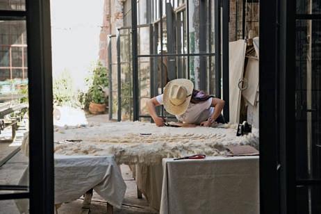
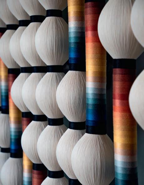
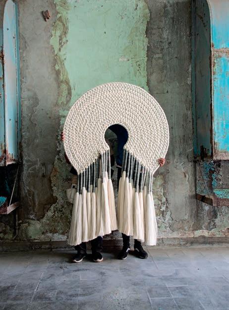
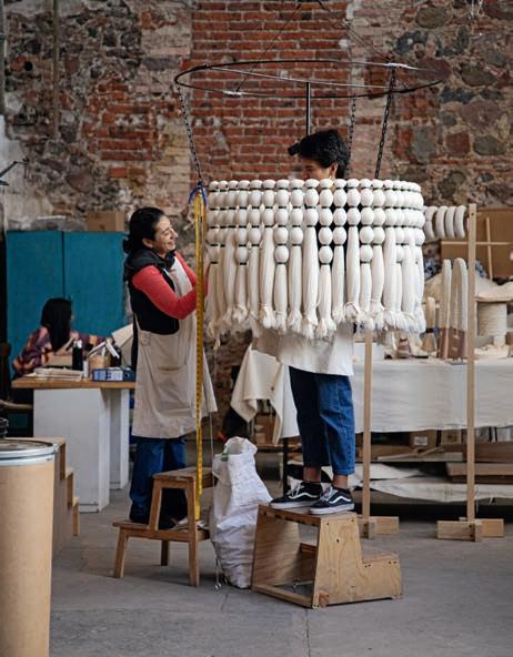
unused fibres and remnants of the building’s industrial past. Captivated by their natural colour and texture, she began experimenting with ways to transform these overlooked materials into jewelry. Together with weaving specialist Socorro Gasca, she developed necklaces, bracelets and earrings made entirely by hand. What began as small accessories soon expanded into ambitious installations – braided rope sculptures, large-scale wall hangings and dramatic lighting pieces. Cotton is often left untreated, preserving its soft, natural tone. The process celebrates irregularities, knots and subtle imperfections, emphasizing the gesture of the artisan. Threads once destined for disposal become objects of striking contemporary presence.
Today, Caralarga’s work appears in boutique hotels, international concept stores, galleries and private interiors around the world.
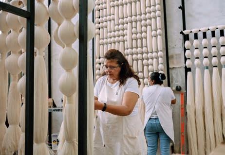
Yet the studio’s ethos extends far beyond aesthetics. Caralarga now employs more than sixty artisans, many of whom were formerly connected to the region’s struggling textile industry. By reactivating local knowledge and providing stable employment, the studio has built a model rooted in circular economy, where waste becomes raw material and craft becomes a catalyst for regional regeneration.
“Through textiles, stories and communities are woven together,” Holschneider explains. “Each artisan leaves something of themselves in the work.” Encouraged by its success in Querétaro, the studio has expanded its collaborative model to other regions, including the Yucatán, where artisans work with natural fibres dyed using traditional pigments – strengthening the relationship between heritage, innovation and sustainability.
MESTIZ STUDIO: CRAFT IN FULL COLOUR
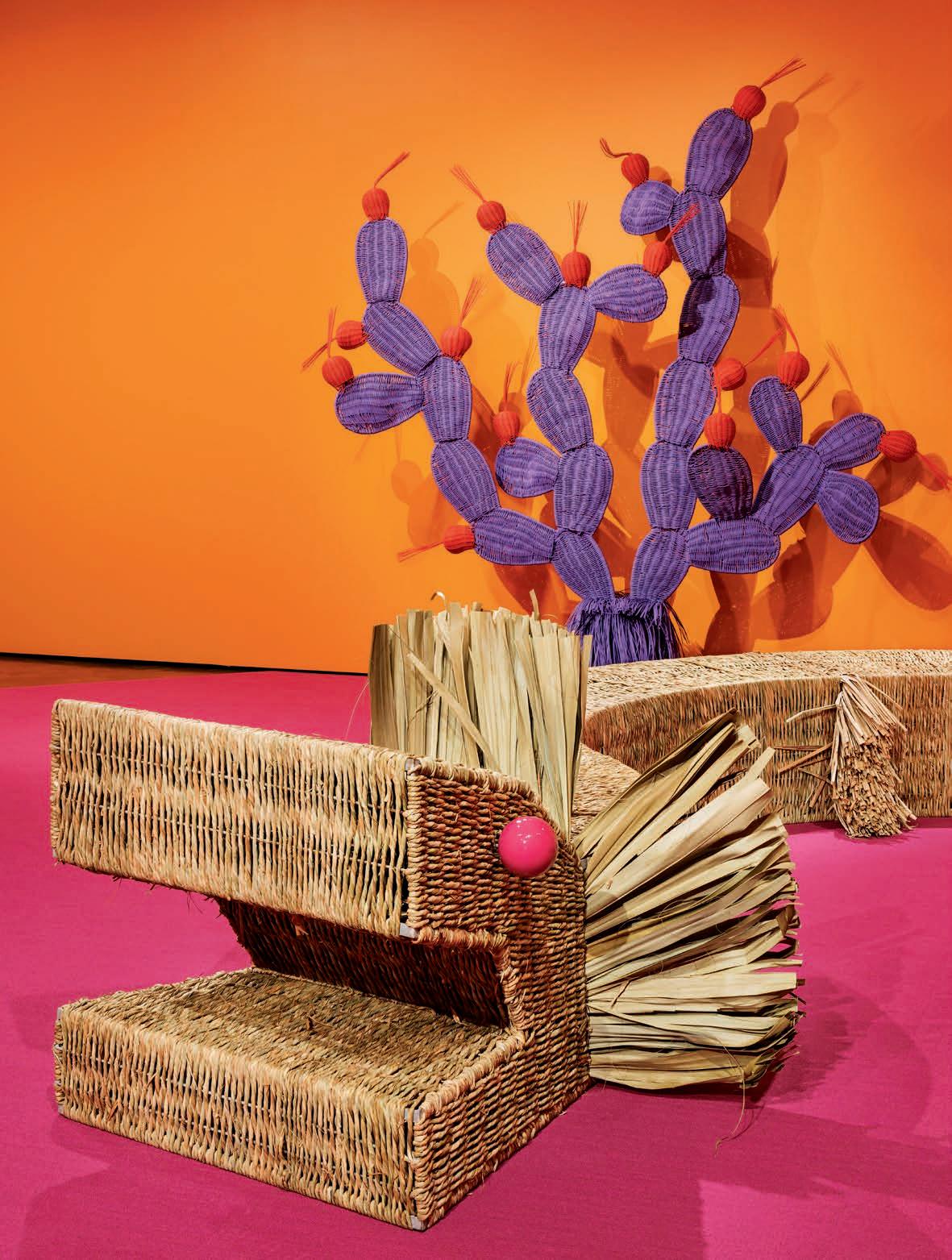
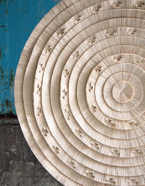
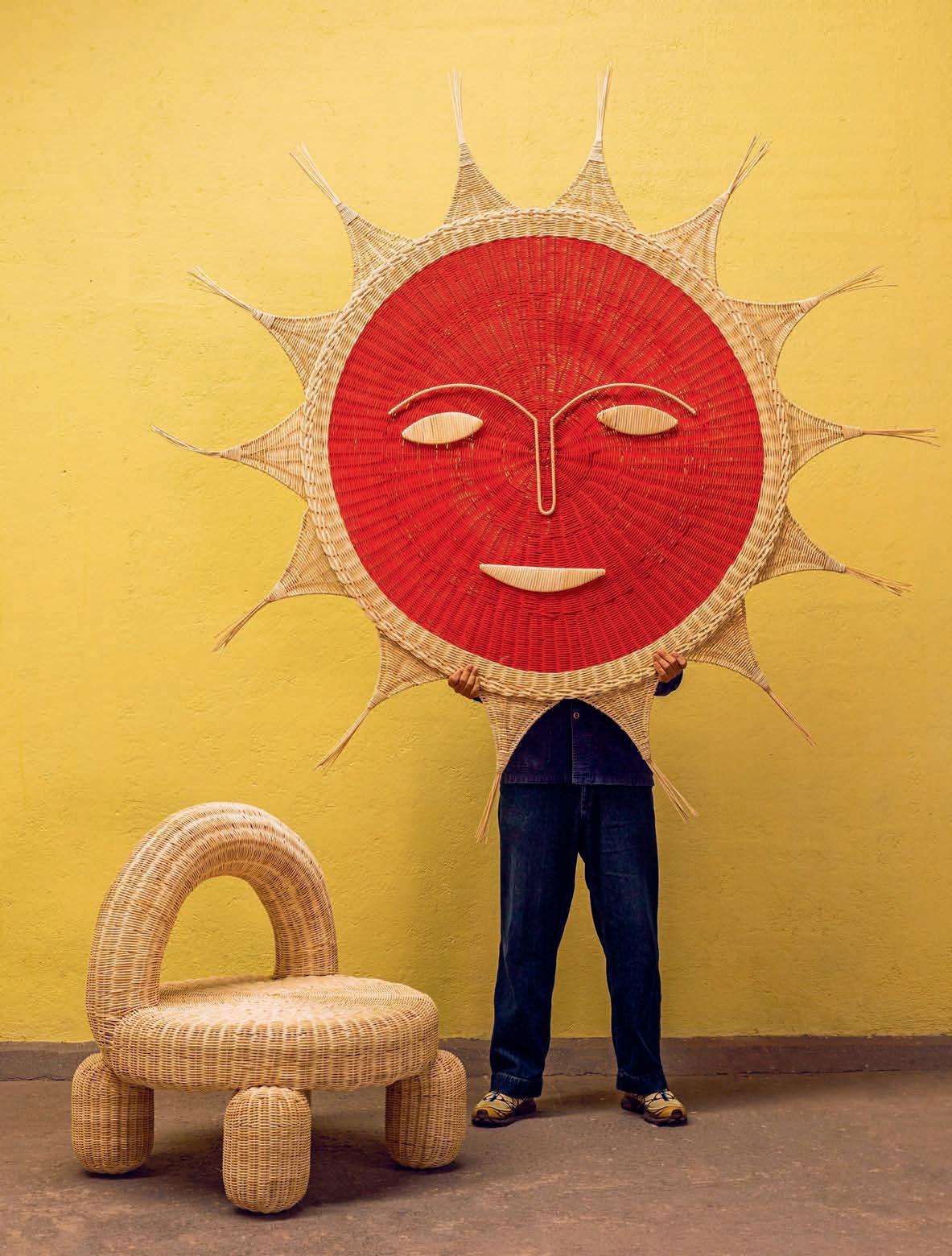
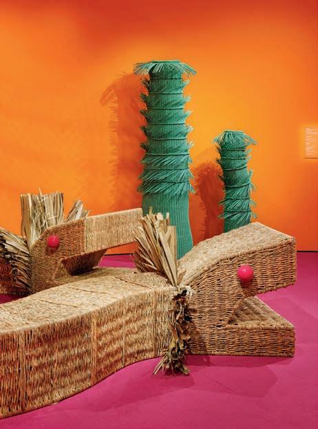
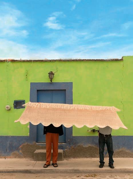
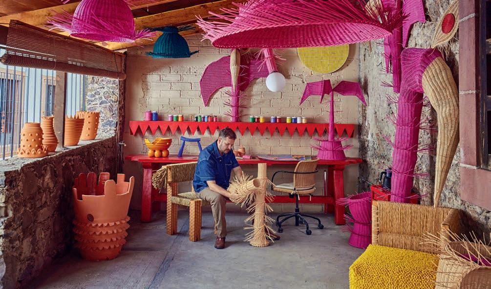
In the historic city of San Miguel de Allende, Mestiz Studio offers yet another interpretation of contemporary Mexican craft: one defined by exuberance, colour and immersive design. Founded by Daniel Valero, the studio explores what he calls “wild objects”: pieces that exist somewhere between functional design and sculptural expression. In Valero’s luminous studio, woven fibre lamps, totemic seating, sunburst mirrors and organic rugs form a vibrant landscape. Proportions are exaggerated, textures amplified and colours saturated, capturing the emotional intensity of Mexico’s landscapes and cultural rituals.
Produced in collaboration with artisans across the country, Mestiz pieces often draw inspiration from local flora, fauna and symbolic forms. Their joyful visual language has attracted international luxury brands seeking immersive environments and distinctive visual storytelling.
Valero has designed window installations for Hermès boutiques, while his collaboration with the tequila house Casa Dragones resulted in a striking installation in Manhattan. Composed of radiant forms evoking agave leaves and solar rays, the work was conceived as a symbolic bridge between New York and San Miguel de Allende. The studio has also partnered with Auberge Resorts Collection, creating woven lamps, sculptural pieces and textile elements for several Mexican properties. Rather than decorative accents, these works function as spatial narratives embedded within reception areas, bars and communal spaces, transforming hospitality into an immersive cultural experience.
Valero frequently collaborates with his partner, interior designer Maye Ruiz, whose spatial sensibility complements his expressive design language. Together they develop environments in which architecture and object design merge seamlessly. Ruiz shapes volumes, light and materials, while Mestiz injects colour, texture and artisanal gesture. Woven lamps descend like vines, sculptural seating becomes part of the landscape, and mirrors punctuate walls like bursts of colour. Their most celebrated project, Mesonia Guesthouse in San Miguel de Allende, embodies this philosophy. Conceived as a total work of design, the space combines custom furniture, monumental objects, vibrant colours and local craftsmanship – blurring the boundaries between hospitality, design and contemporary Mexican living.
Through the practices of Fernando Laposse, Caralarga and Mestiz Studio, Mexican craft emerges not as a nostalgic tradition but as a vibrant laboratory for contemporary design. Across their work runs a shared ambition: to reconcile heritage and experimentation, aesthetics and ethics, creation and responsibility. Craft here is not static – it is evolving, collaborative and globally resonant. As Fernando Laposse succinctly puts it: “Design isn’t only about making the world more beautiful. It’s also about repairing it.”
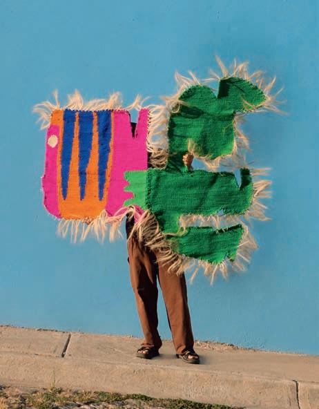
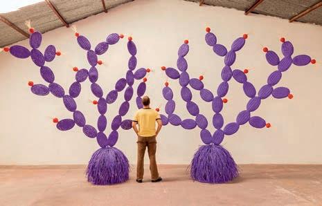
造型夸张、略带超现实主义气息的 LA NOPALERA 西班牙语意为“仙人掌”),是 MESTIZ 以手工编织呈现的创意之作。
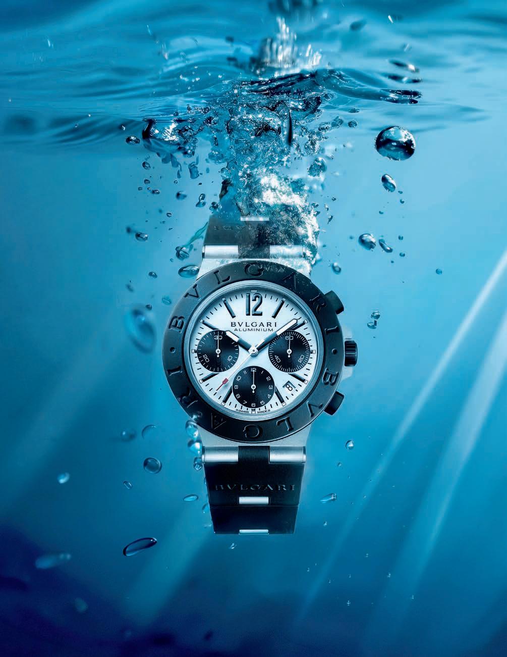
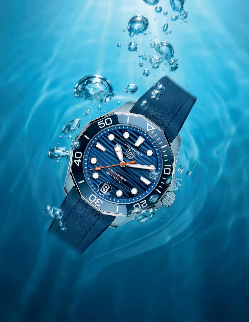
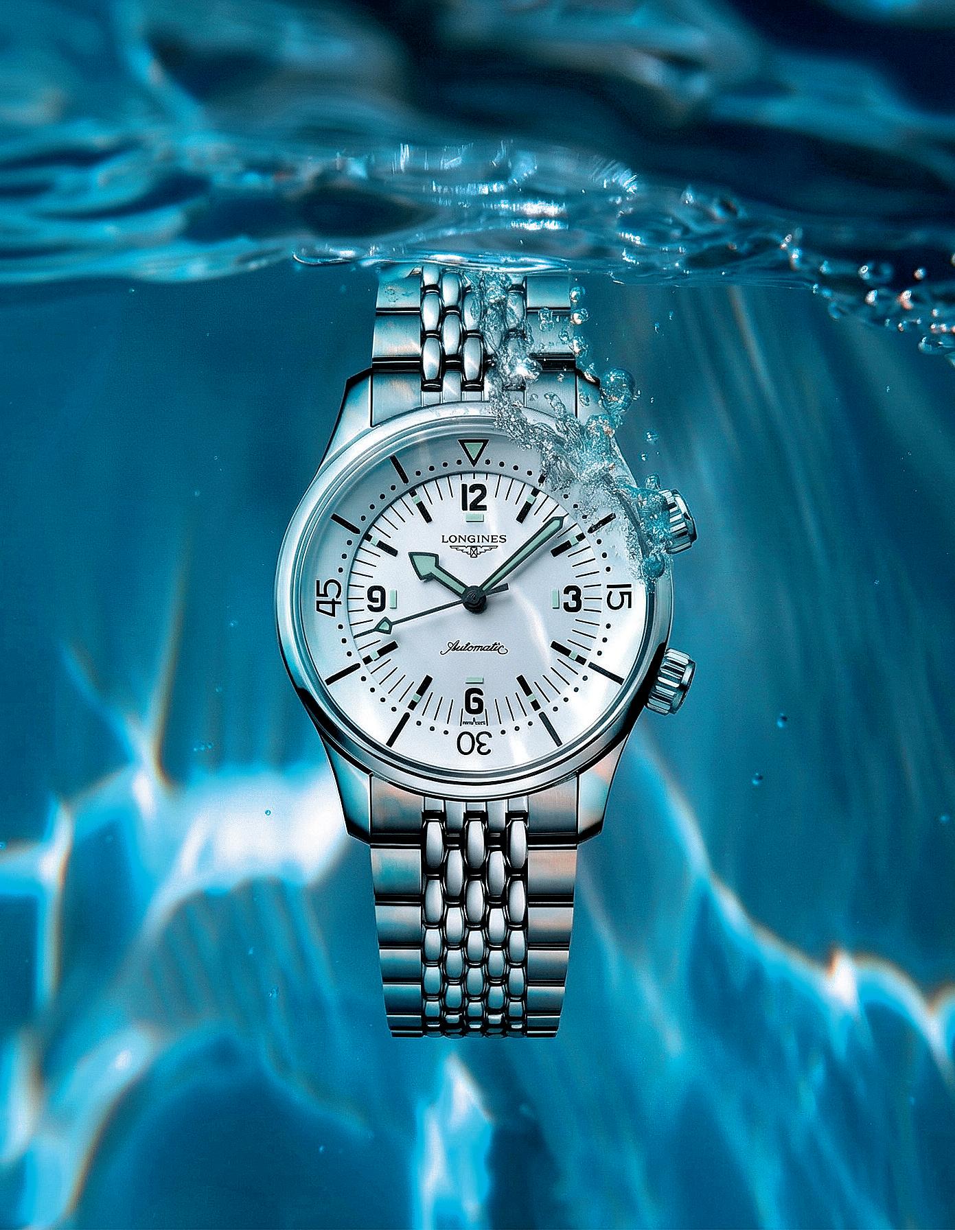
From the stillness of a turquoise lagoon to the mysterious darkness of the open ocean, the diving watch has long symbolized watchmaking’s enduring fascination with the sea.
Originally conceived as a specialized instrument, the diving watch has gradually transcended its technical purpose. Today it occupies a central place in contemporary horology, prized as much for its aesthetic language as for the spirit of exploration it evokes. Its origins, however, stretch further back than one might assume. As early as 1883, a small manufacture in Saint-Imier, Alcide Droz et Fils, filed a patent associating two words rarely seen together at the time: “watch” and “waterproof”. In reality, the device was merely resistant to splashes. True underwater pressure remained well beyond the reach of watchmaking. It would take the rise of seaside leisure after the First World War to accelerate the search for genuine water resistance. Engineers quickly identified the crown as the principal weak point. Early screw-down systems offered partial protection, yet they lacked the crucial element that would ensure a perfect seal: the gasket. Nature provided an unexpected source of inspiration. Engineers studied the membranes of certain shellfish, intrigued by their ability to remain perfectly sealed under pressure. While oysters are typically associated with pearls, one man became fascinated by the resilient membrane that makes them so difficult to open: Hans Wilsdorf.
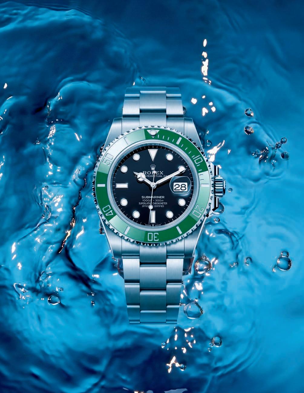
Founder of Rolex, Wilsdorf was relentlessly pursuing a reliable waterproof case. In 1925, he acquired a patent describing a system in which the crown screwed tightly against the case, compressing a rubber gasket. The principle was simple but revolutionary. The Oyster case was born. To prove its reliability, Wilsdorf turned to an unusual ambassador: Mercedes Gleitze, a British swimmer attempting to cross the English Channel. Strapped to her wrist during the attempt was an Oyster watch, exposed for hours to the cold waters and relentless movement of the sea. Though the swim itself would remain controversial, the experiment succeeded brilliantly in another sense: it cemented the reputation of the Oyster as the first truly waterproof watch. For several decades, such watches remained purely functional instruments. Large, highly legible and filled with luminous material,
they were designed to be worn over a diving suit, secured with long leather straps. Elegance was hardly the priority. The postwar era changed everything. The ocean depths became a new frontier not only for scientists but also for a growing community of recreational divers drawn by the promise of encountering the great cetaceans of the deep. Diving watches evolved accordingly. Cases became slimmer, designs more refined and versatility increasingly important. Some divers began wearing them not only underwater, but also in everyday life.
In 1953 Rolex introduced what would become the archetype of the modern diving watch: the Submariner. Water-resistant to 100 metres, it was the first model of its kind aimed at a broader public. Its appeal quickly extended far beyond professional divers. Sceptics initially questioned the usefulness of such specifications for amateurs. Yet simple physics provided the answer. When a diver plunges from a height of around ten metres, the sudden impact of the water generates pressure on the crown comparable to that experienced during a deep dive. In other words, a robust diving watch protects against the unexpected as much as against the extreme.
Beyond recreational diving lies another, far more demanding realm: saturation diving. In these environments, watches must contend with helium, a gas whose molecules are so small that they can gradually penetrate the watch case. During decompression, the pressure trapped inside the watch may exceed the external pressure, risking the sudden expulsion of the crystal. The solution emerged in the 1960s with the introduction of the helium-escape valve. First developed by Rolex, this mechanism allows helium to exit the case safely without compromising its water resistance. Two main versions exist today: manual valves, which the diver opens deliberately, and automatic systems that release pressure once it reaches a critical threshold. For most divers, the feature is unnecessary. Yet it has become a defining element of certain professional dive watches, often visible as a discreet aperture or additional pusher on the side of the case. More than a technical device, the helium-escape valve reflects watchmaking’s ability to transform scientific challenges into elegant mechanical solutions. A small detail, perhaps, but one that speaks volumes about the enduring relationship between horology and the ocean depths.
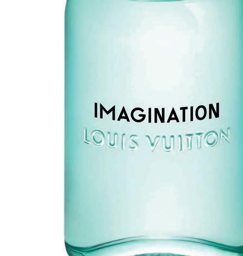
无尽之夏,一场混合着柑橘和 茶香气息的心灵之旅 IMAGINATION(思扬)淡香氛, LOUIS VUITTON.
ENGLISH TEXT
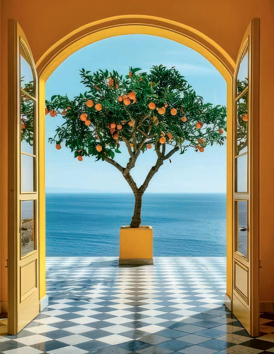
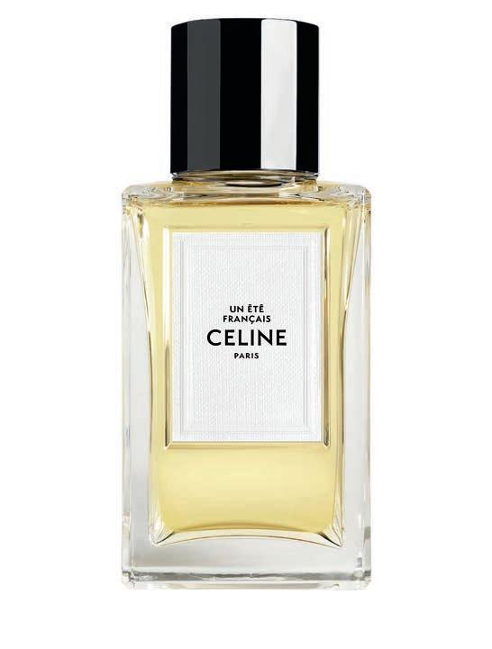
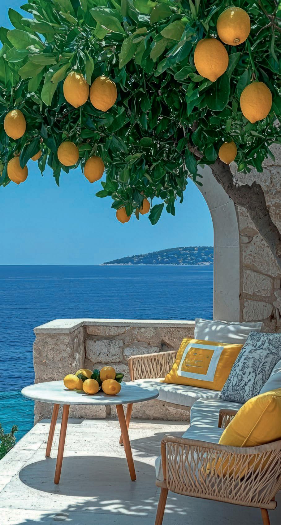
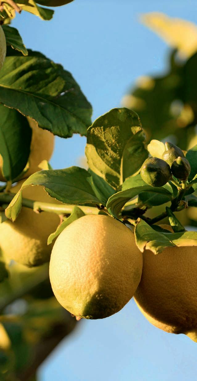
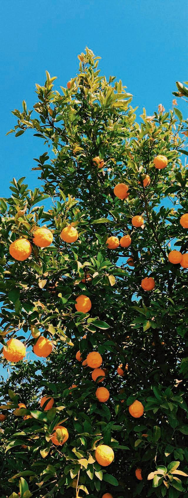
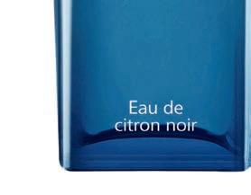
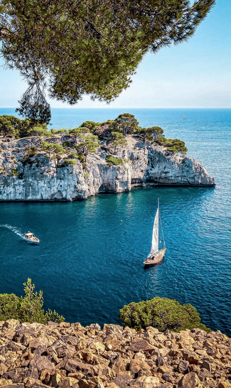
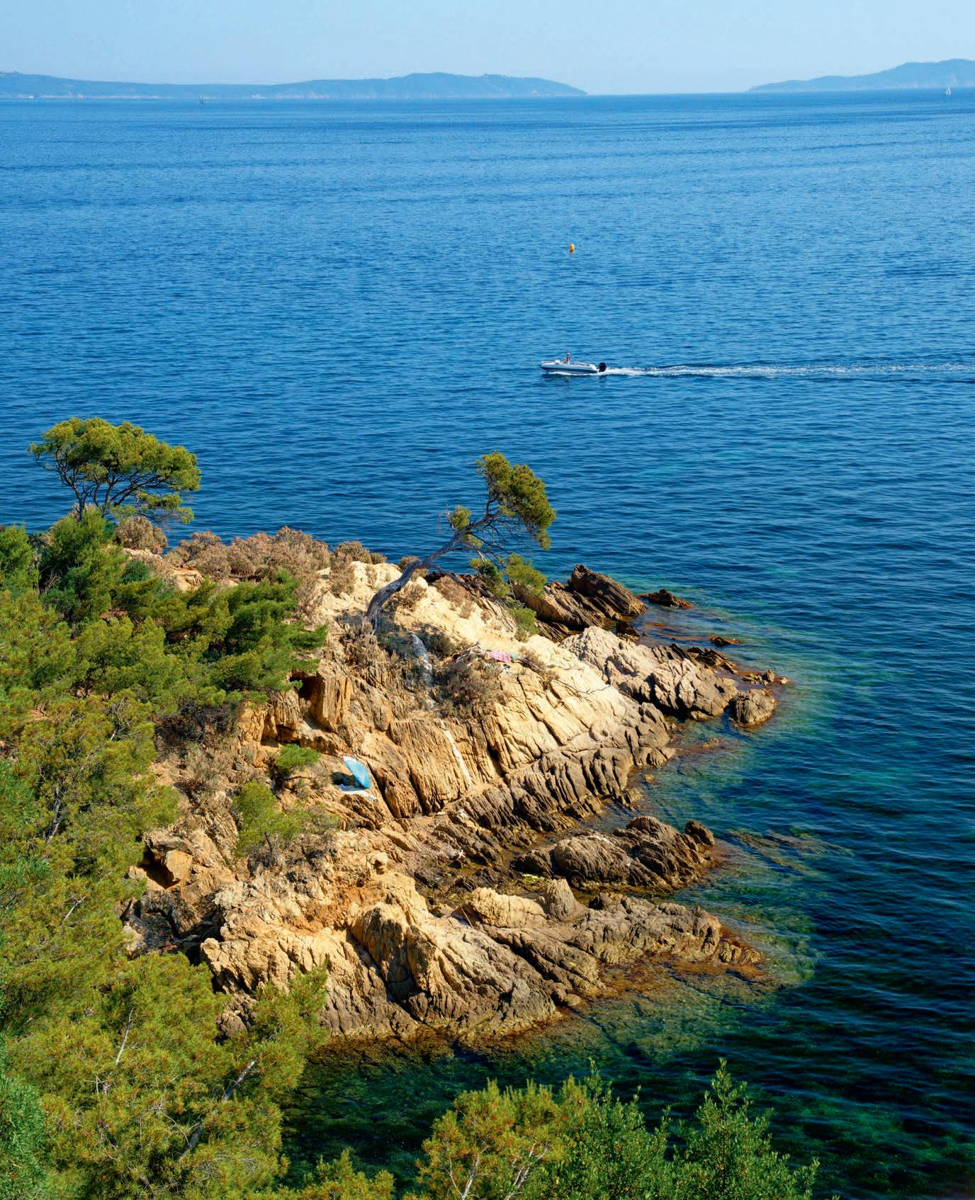
Sun-soaked citrus notes bring a burst of light to perfume, bright, sparkling and irresistibly uplifting. A Mediterranean breeze captured in a bottle.
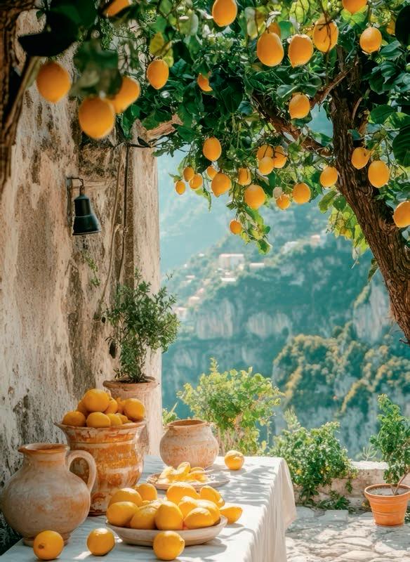
Some fragrances feel like sunshine on skin. A radiant, almost white light edged with citrus – lemon, bergamot, mandarin, blood orange – drifting across the body like a warm breeze off the Mediterranean. Every summer, they return with the same effortless promise: freshness, ease, escape.
One sniff and the scene appears. The dappled shade of a fig tree on a sunlit island. Water brushing softly against stone. A linen curtain billowing lazily in the afternoon heat. Like the languorous worlds of Françoise Sagan’s Bonjour Tristesse or André Aciman’s Call Me by Your Name, these scents stretch time itself, turning the present moment into a sun-drenched pause. This is the true South – not the postcard version, but the one we carry in our emotional memory, a synonym of pure joy. In perfumery, citrus notes, known as the hesperidic family, date back to the very first Eaux de Cologne, created in the 18 th Century. Bergamot from Calabria remains the undisputed star: bright, sparkling, slightly bitter, with a whisper of florality. Sicilian lemon adds a vibrant, zesty sharpness; mandarin glows with sweet, juicy warmth; citron brings a playful, candylike tang. Together they form one of perfumery’s most elegant formulas: deceptively simple notes capable of conjuring endless summers.
Perhaps these scents move us because they map our emotions. Bergamot evokes early light over the Italian Riviera. Lemon recalls the vivid freshness of fruit freshly picked. Mandarin feels like the warmth of sunset on skin. Citron hints at childhood sweetness. Like diving again and again into the cool water of a hidden cove in Cassis, a spray of Buongiorno by Acqua di Parma feels instantly revitalising. And much like a Mediterranean escape that makes time slow down, Orange Bitters Cologne by Jo Malone offers a delicious dash of bitter orange that feels like a holiday in a bottle.
FRESHNESS THAT LASTS
Once dismissed as fleeting eaux, refreshing but short-lived, citrus perfumes are enjoying a renaissance. Thanks to advances in modern perfumery, their once elusive longevity
has been dramatically extended without sacrificing their luminous freshness. Imagination by Louis Vuitton delivers a citrus freshness that lingers beautifully on the skin while adding a subtle sensuality that redefines the genre. Hermès’ L’Eau de Citron Noir takes things further, blending bright citrus with smoky, woody undertones for a surprising depth.
Beyond performance, citrus perfumes also tap into something deeper: our desire for authenticity. Their freshness feels instantly recognizable, as if the bottle captured the simple pleasure of peeling a mandarin or slicing into a lemon. Yet this clarity is anything but simple. Cold-pressed essences, meticulous ingredient selection, and sophisticated extraction techniques all work behind the scenes to create that effortless sparkle. In a world saturated with noise and imagery, citrus fragrances offer a moment of clarity. They suggest movement, lightness, and a quiet optimism. Luxury here is subtle: the brightness of a zest, the softness of white blossoms, the warmth of sunlit skin. Summer, after all, is less a season than a feeling: the slow rhythm of an August evening, pale light filtering through lemon trees, hours stretching lazily ahead.
Citrus may not stop time, but it captures its spirit perfectly. Which is why fragrances like Néroli Portofino by Tom Ford or Cologne Cédrat by Matière Première feel just as right in the depths of winter, gentle reminders that the sun, and happiness, are never too far away.
Sea, sun, citrus and biodiversity: the cuisine of this Argentine chef based in the South of France captivates with its freshness and inventiveness, all set within an idyllic Mediterranean landscape.
On the hillside above Menton, where France leans toward Italy and the Mediterranean stretches out in a sheet of blue, Mauro Colagreco has built one of the most distinctive kitchens in modern gastronomy. His restaurant, Mirazur, sits on a steep slope overlooking the sea, as if suspended between sky and water. On clear days – and there are many of them here – the horizon seems to dissolve into light. Menton enjoys more than three hundred days of sunshine a year, and Colagreco often says that light itself is one of his primary ingredients. For nearly twenty years, the Argentine-born chef has been shaping a cuisine that reflects this landscape: bright, precise, and deeply rooted in the rhythms of the Mediterranean. Mirazur, opened in 2006, now holds three Michelin stars and was named the world’s top establishment in 2019 by the World’s 50 Best Restaurants list. Yet the experience of dining here still begins with something disarmingly simple: the view.
A RESTAURANT THAT LOOKS TOWARD THE SEA:
The name Mirazur literally means “to contemplate the azure.” Sitting in the dining room, where wide glass windows frame the Mediterranean, the meaning becomes clear. The light reflected off the water enters the room and lands, almost theatrically, on the plates. “The sun and the light are part of everything we do here,” Colagreco says. “They influence the products, the colours, even the energy of the dishes.”
In summer, he finds that light in the intensity of a ripe tomato. In spring, it appears in the delicate bitterness of young leaves. In winter, it is captured in citrus. At Mirazur, the climate is not simply scenery:it is the structure upon which the cuisine is built.
THE GARDEN BELOW
The restaurant’s true engine lies just beneath the dining room. Down the steep terraces of the hillside spreads a fivehectare garden, cultivated using permaculture and biodynamic principles. Arranged like an amphitheater facing the sea, the garden provides between sixty and eighty percent of the ingredients used in the kitchen. There are more than 1,500 plant varieties growing here, including over eighty types of tomato. Menton’s pink onions grow beside heritage beans and ancient root vegetables. Edible flowers are harvested by hand. The
citrus collection alone reads like a small encyclopedia: local lemons, citron, bergamot, yuzu, finger limes, kumquats, chinotto oranges and the sculptural Buddha’s hand. “When we started,” Colagreco says, “we were a restaurant with a garden. Today we’ve almost become a garden with a restaurant.” The shift is more than rhetorical. The garden increasingly dictates the rhythm of the kitchen.
COOKING BY THE CALENDAR
Mirazur’s menu follows the biodynamic calendar, which divides days into four categories: Root, Leaf, Flower and Fruit. Each day determines the structure of the tasting menu. On Fruit days, tomatoes or stone fruit might form the backbone of several dishes. Root days highlight garlic, potatoes or carrots. Flower days celebrate edible blossoms, sometimes gathered in the hundreds for a single plate. The system may sound poetic, but it has practical consequences. It determines when ingredients are planted, harvested and served. The result is a cuisine that feels unusually synchronized with the landscape around it. Summer, Colagreco says, is when this tension becomes most vivid. “The Mediterranean is incredibly blue and refreshing,” he explains, “but the sun is also very strong, almost sculptural. That contrast between freshness and intensity is something we try to express in the dishes.”
THE COLOURS OF THE MEDITERRANEAN
One of the most recognizable aspects of Colagreco’s cooking is its colour. His plates often resemble small compositions of Mediterranean pigment: the deep red of tomatoes, the bright saffron orange of shellfish sauces, the luminous yellow of lemons and zucchini, the dark green of herbs, the purple of petals and heritage beets. “Colour comes directly from the garden,” he says. “When we opened in April 2006, everything was green: the green of spring shoots, the promise of abundance. That energy still guides the cuisine.”
Signature dishes reflect this painterly sensibility. Raw cockles arrive with borage flowers on a delicate vinegar custard. San Remo gamberoni are arranged in a rose-like shape atop garden rhubarb and almond milk. Artichoke tartlets are scattered with caper petals. Scorpionfish appears with yellow zucchini emulsion. Even desserts lean toward brightness rather than sweetness: citrus sorbets, nasturtium ice cream, and preparations incorporating pollen and propolis from the restaurant’s beehives.
主厨带领团队,从餐厅花园中 以永续农法栽培的1500种作物中汲取灵感, 以当令食材为基础构思菜单。
ECOLOGY AS CUISINE
Colagreco’s approach extends beyond flavour. Protecting the Mediterranean environment has become central to the Mirazur project. The restaurant prioritizes sustainable fishing practices and works to minimize waste by using every possible part of each fish. In 2022, he was named UNESCO Goodwill Ambassador for Biodiversity, becoming the first chef to receive the distinction. The appointment recognizes his advocacy for what he calls “circular gastronomy”, a system built on soil preservation, marine protection, reduced plastic use and the full utilization of ingredients.
Mirazur even operates its own research unit, bringing together chefs, ethnobotanists and anthropologists to explore ancient crops and sustainable food systems. The restaurant has become, in effect, a working laboratory.
TWENTY YEARS OF LIGHT
In 2026, Mirazur celebrates its twentieth anniversary. To mark the occasion, Colagreco has invited Ferran Adrià, the legendary chef behind Spain’s El Bulli, to collaborate on a special menu reflecting two decades of culinary experimentation. The pairing is symbolic. Both chefs forged their identities along the Mediterranean coast – Adrià in Catalonia, Colagreco on the Franco-Italian Riviera –drawing inspiration from the same elements: sea air, herbs, citrus and the changing quality of light. It is a reminder that while modern gastronomy often celebrates innovation, its most enduring ideas frequently begin with a place.
THE MEDITERRANEAN IN PARIS
Colagreco’s cooking now extends beyond Menton. In Paris, he oversees the menu at Grandcoeur, in the Marais district, where a summer bouillabaisse has become a ritual. The dish arrives in two stages, revisiting the traditional fisherman’s stew from Marseille. “Bouillabaisse began as a practical dish,” Colagreco says. “Fishermen cooked unsold fish in a saffron broth. Over time it became a symbol representing the values of Mediterranean cuisine: sharing, generosity and the sea.”
Bringing it to Paris, he says, is a way of transporting the light and flavours of the South. From Menton to the capital, Colagreco’s cooking carries the same notion: that cuisine can capture not only ingredients, but a landscape, and the light that defines it.
CALA CODOLAR 是伊比萨岛上的另一处迷人岬湾, 同时也是 LOS ENAMORADOS 精品酒店所在地。
一艘由传统渔船改造的休闲艇缓缓驶离 伊比萨港口,坐落于山顶老城区俯瞰着港口的是主教座堂。
右页:始建于16世纪的防御塔 至今仍矗立在城市海岸,俯视着地中海。
ENGLISH TEXT
Ibiza has always thrived on contradiction. Part spiritual refuge, part hedonistic playground, the Balearic island has spent decades perfecting a rare balance between barefoot freedom and polished glamour. It’s this magnetic tension that continues to draw international artists, designers, chefs and travelers every summer.
From the airplane window, Ibiza appears as a brushstroke of green and ochre suspended in the deep Mediterranean blue. For many visitors, that first glimpse already feels strangely familiar. For me, it signals a return. Though I wasn’t born here, Ibiza has gradually become a second home – an annual escape shared with friends, defined by sunlit days and nights that seem to stretch endlessly.
My ritual is the same every time. As soon as I have landed, I leave my bags at the hotel and head straight to Punta Gallera, a rocky cove where natural stone terraces overlook the sea. Standing on a ledge, the horizon opens in front of me. For a moment everything is still. Then I jump. The plunge is brief, exhilarating. The water is shockingly cold, the silence underwater absolute. When I surface, children nearby are laughing as they dive again and again. The holidays have officially begun.
Ibiza is often caricatured alongside Miami or Mykonos, synonymous with extravagant parties, gleaming yachts and superstar DJs. But the island’s allure lies just as much in its quieter rhythms. Days unfold slowly: swimming in luminous turquoise waters, napping beneath umbrella pines, lingering over long lunches, greeting the sunrise with yoga on a terrace. This coexistence of calm and intensity is precisely what makes Ibiza unique. While tourism has grown and the island has undeniably become more sophisticated – larger villas, sharper restaurants, increasingly theatrical nightlife – it has never entirely lost its essence: a relaxed, bohemian elegance that remains central to its identity.
THE HIPPIE LEGACY
Ibiza’s modern mythology began in the 1960s, when young travelers from Northern Europe and America arrived seeking an alternative lifestyle. They rented abandoned fincas, cultivated gardens, made jewellery and handmade clothes, and filled the island with music and colour. Many believed the island possessed a unique energy, often linked to Es Vedrà, the imposing rock rising mysteriously from the sea off the western coast. Said to be one of the most magnetic points on earth, it has long fascinated visitors. That countercultural wave helped
shape Ibiza’s enduring aesthetic: a blend of artistic freedom and Mediterranean simplicity.
Traces of that era remain. At Las Dalias, a Saturday market still brimming with handmade crafts and embroidered fabrics. At Bar Anita, where locals gather for coffee or a glass of herbal hierbas liqueur. Further north, Los Enamorados, created by former fashion stylist Laetitia Zamparelli, offers a stylish mix of boutique hotel, restaurant and design shop overlooking Portinatx harbour. Another beloved address is La Paloma, where lunch is served beneath orange trees in the garden of a restored finca: a quintessential Ibiza moment.
At sunset, locals gather at Puerta del Cielo, a cliffside viewpoint where the fading light over the Mediterranean feels almost cinematic. For chef Boris Buono, who previously worked at Copenhagen’s Noma, the island offered something rarer than professional prestige: freedom. Today his Ibiza Food Studio celebrates seasonal ingredients and intimate dining. Like many who arrive here, he initially came for a short stay. He never left.
THE RISE OF RURAL SLOW LIVING
Ibiza’s beaches are undeniably spectacular: hidden coves carved into cliffs, sculptural rock formations and long stretches of sand brushed by sea breezes. Just offshore lies Formentera, its quieter sister island, where beaches like Ses Illetes offer Caribbean-clear water.
But inland lies Ibiza’s deeper charm. Here the landscape shifts to pine forests, almond groves and vineyards stretching across red earth. Whitewashed fincas appear behind bougainvillea and cactus, blending into the countryside. Long before “slow living” became a global trend, Ibiza had already embraced its own version through agroturismo: restored farmhouses welcoming guests seeking a slower rhythm.
One of the earliest pioneers was Françoise Pialoux, a Parisian who discovered Ibiza while sailing in 1977. She later restored a ruined finca in the countryside and opened Les Terrasses, now one of the island’s most beloved rural retreats. Every summer, travellers gather there for communal dinners beneath the trees, a ritual reflecting the island’s enduring sense of openness.
ENDLESS NIGHTS
If Ibiza is synonymous with nightlife today, its party culture originally grew out of the island’s hippie gatherings: fullmoon celebrations on beaches where people danced barefoot around fires. The transformation began in 1973, when entrepreneur Ricardo Urgell opened Pacha. His vision was
simple: a place where aristocrats, artists, designers and free spirits could share the same dancefloor. The concept proved revolutionary.
Later, the eccentric Pikes Hotel became a legendary hideaway for musicians and artists. Freddie Mercury famously celebrated his 40 th birthday there in 1987. By the 1990s, Ibiza had evolved into the global capital of electronic music. Today the island’s massive clubs host DJs from Carl Cox to David Guetta, drawing thousands of dancers every night. Yet beyond the spectacle, the essence of Ibiza remains surprisingly intact. As British DJ Pete Tong once put it: “Ibiza isn’t just a place. It’s a feeling.” And perhaps that is the island’s true magic: an enduring balance between stillness and exhilaration that keeps enticing people back.
角的 SIX SENSES 坐 拥壮丽海景,主打 自然奢 华 和养生体验 。矗立在悬崖之巅 的经典酒店 HACIENDA NA XAMENA 则以绝美的日落景观闻名。
HOTELS
Bohemian, design-led, nature-immersed or iconic: Ibiza offers a stay for every state of mind.
Los Enamorados is a dreamy, art-filled hideaway by the water, perfect for an intimate escape.
Les Terrasses captures the quiet elegance of a countryside guesthouse, where time slows down.
The Standard brings a lively, designforward energy to the heart of Ibiza Town. Up north, Six Senses blends barefoot luxury, wellness and sweeping sea views. For something truly iconic, Hacienda Na Xamena clings to the cliffs, offering unforgettable sunsets.
Ibiza’s shopping scene reflects its creative spirit.
Jewellery designer Natasha Collis has brought her refined craftsmanship to the island after years in London. For a true bohemian immersion, head to Las Dalias Market, the island’s iconic hippie market.
For a more elevated take on island style, visit World Family Ibiza