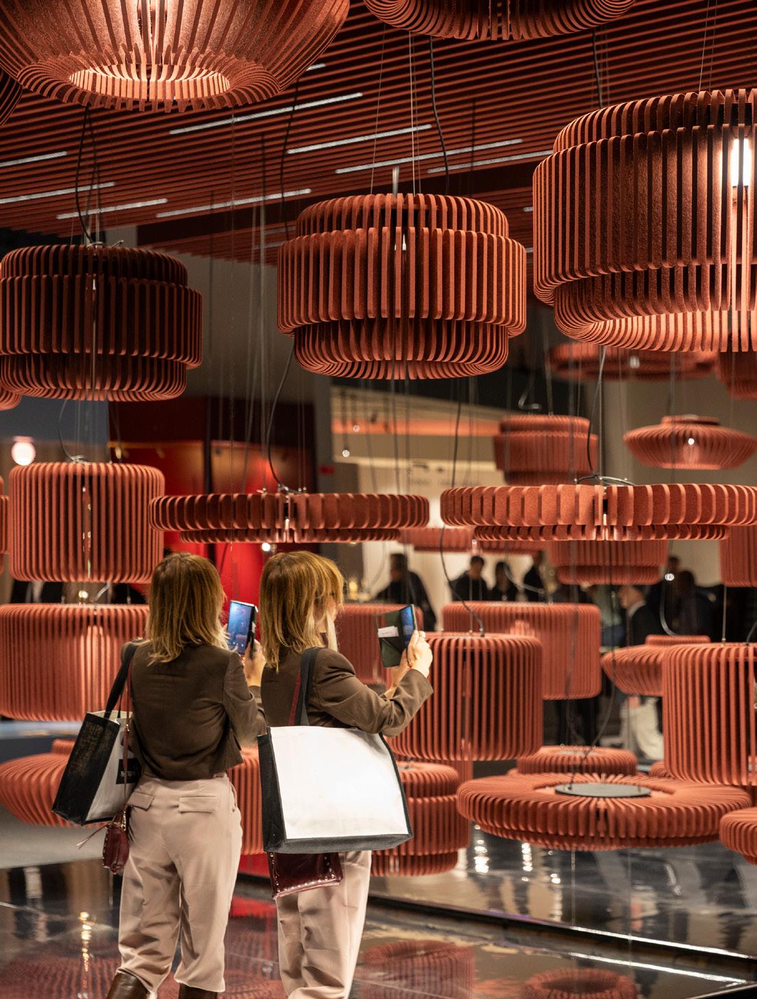
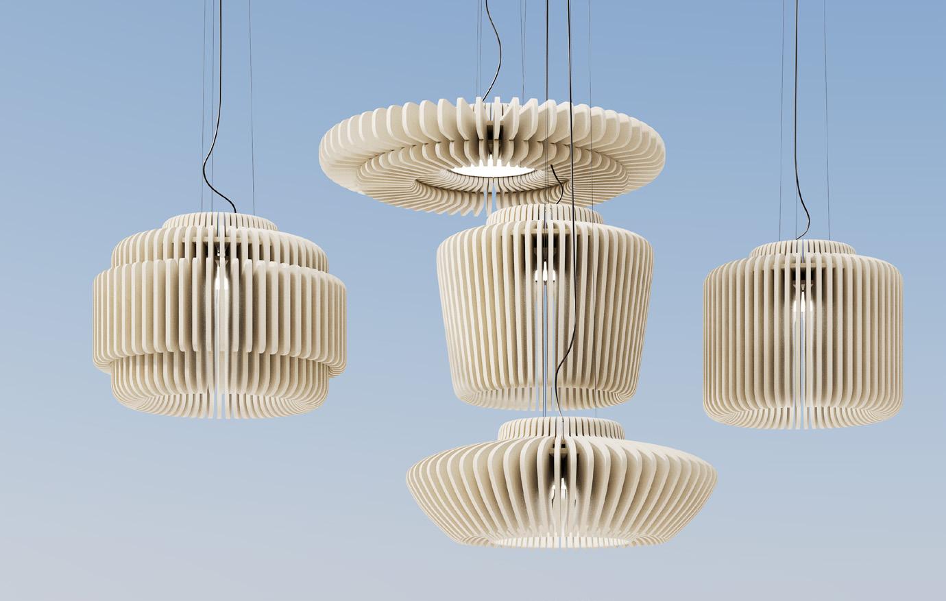


Raya is a collection of sculptural acoustic luminaires where highperformance acoustics, refined illumination, and architectural design converge into one expressive system.
Inspired by the warmth and rhythm of sun rays, each piece is defined by elegant radial slats that soften sound while shaping a sophisticated interplay of light and shadow.
The collection includes five distinct luminaires — Alba, Aurelia, Covo, Helia, and Zora — each designed to bring its own spatial character while delivering exceptional acoustic comfort and high-quality lighting performance.
From intimate hospitality settings to collaborative workplaces and grand public interiors, Raya enhances the atmosphere through glare-controlled illumination and sound-absorbing precision.
More than lighting objects, Raya luminaires act as sculptural architectural elements that define zones, create visual rhythm, and elevate the sensory experience of a space. Their radiating forms introduce warmth, calmness, and quiet sophistication, transforming interiors into environments that not only look beautiful, but also sound and feel exceptional.
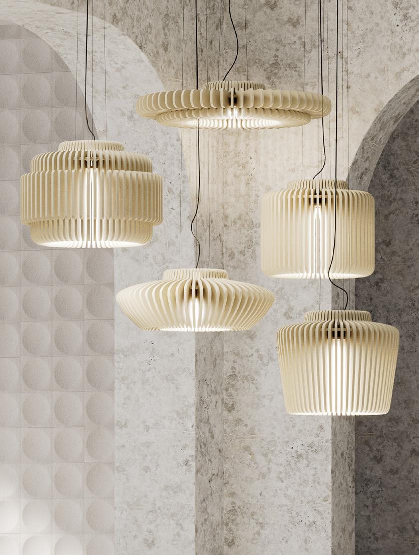
Inspired by the warmth of sun rays, Raya is a collection of acoustic lights defined by elegant radial slats. Each luminaire invites a unique interplay of light and shadow, bringing texture, atmosphere, and quiet sophisticated to any interior. Whether suspended over a table, clustered in a lobby, or used to define zones, Raya shapes the space with its gentle, radiating presence.

12 Upfront Products, projects and people through futurecentric lens.
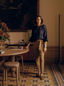
22 Things I’ve Learnt: Morag Morrison Partner at Hawkins\Brown Morag Morrison shares her greatest lessons from a career so far.
24 The Height of Design: Theo Games Petrohilos eo Games Petrohilos, co-founder of Unknown Works, shares the object he sees as the pinnacle of good design.
26 The Ask Principal of Conran and Partners Tina Norden asks: What is a hotel when it’s not just… a hotel?
28 Interview: Pearson Lloyd Tom Lloyd and Luke Pearson on creating opportunities, design philosophy and the future of making.
36 Interview: Alessia Genova, Tihany Tihany Design’s Alessia Genova on luxury as precision, making her mark and designing for ‘wow’.
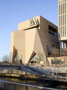
44 Case study: V&A East Inspired by structural tailoring and the Japanese concept of Ma, architects O’Donnell + Tuomey unveil the V&A East Museum, designed for – and with – the people of East London.
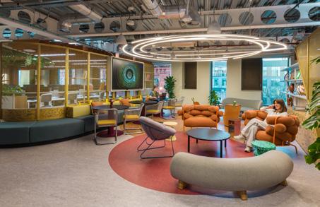
54 Case study: MYO King's Cross At MYO King’s Cross heritage, emerging talent and new tech coalesce in a community-centred working space, designed by SODA Studio.
58 Case study: McLean Quinlan McLean Quinlan’s self-designed Winchester space o ers a view into the studio’s process and the materials used in its work.
64 Case Study: Virgin Media O2 Manchester For telecommunications giant Virgin Media O2, SpaceInvader injects ve oors of premium workplace with Manchester’s DNA.
72 Case Study: Aethos Milano
At Aethos Milan, Astet create a characterful take on luxury for the boutique hotel’s next chapter.
84 Designing for Di erence POoR Collective’s Shawn Adams implores us to not let AI replace next-gen talent.
82 Positive Impact: The Gardeners’ House
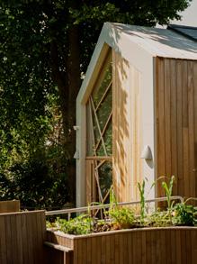
Studio West Architects turns a near-derelict stable into a thriving community centre for e Gardeners' House, Penzance.
90 Fast Forward: Studio McW
Founders and Directors of Studio McW, David McGahon and Greg Walton, on how domestic design shape the future workplace.
100 Events: Mix Awards 2026
We anticipate the most exciting night on the industry calendar, Mix Awards 2026.
102 Events: CDW
e installations, activations, talks and product launches that shone at Clerkenwell Design Week 2026.
106 Mix Talking Point: MDW
We question if Milan Design Week is an industry mainstay or a victim of its own success.
116 The Making Of… IOC
Why Italian manufacturer IOC is more than a product supplier, it's a project partner.
122 Material Matters
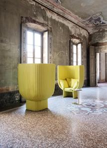
Istanbul design studio Wangan Studio on its top material selections.
124 Material Innovation
Reimagining Sicily’s heritage of citrus production for a circular future, Ohoskin crafts a bio-based leather alternative from orange peel and cactus rinds.
126 Paradoxically Thinking Sage’s Neil Usher explains why six is the magic number when it comes to workplace design strategy.
128 Cover story
We reveal the narrative driving this issue’s cover artwork.

Get in touch
Managing Editor
Harry McKinley harry@mixinteriors.com
Deputy Editor Chloé Petersen Snell chloe@mixinteriors.com
Editorial and Social Executive
Charlotte Slinger charlotte@mixinteriors.com
Editorial Assistant
Ellie Foster ellie@mixinteriors.com
Managing Director
Leon March leon@mixinteriors.com
Account Managers
Stuart Sinclair stuart@mixinteriors.com
Patrick Bowley patrick@mixinteriors.com
Gaia Cafarella gaia@mixinteriors.com
Olivia Biviano olivia@mixinteriors.com
Projects Manager Paul Appleby paul@mixinteriors.com
Head of Operations Lisa Jackson lisa@mixinteriors.com
Advertising and Events
Operations Manager Maria Da Silva maria@mixinteriors.com
Senior Events Manager
Rosie Smith rosie@mixinteriors.com
Production Editor Jonathan Boothby jonny@mixinteriors.com
Art Director Marçal Prats marcal@mixinteriors.com
Founding publisher Henry Pugh
Squire & Partners is an international architecture and interior design studio with a reputation for using storytelling to produce beautifully crafted design. With experience spanning 50 years, the practice has earned an international reputation for architecture informed by the history and culture of where it is placed. It creates distinctive, enduring and thriving buildings and places that are sensitive to their context and connect architecture with community.
squireandpartners.com
To
a


Impact Acoustic is a pioneer in sustainable acoustic solutions, rede ning circular manufacturing through innovation, design and service excellence. e company transforms waste into high-performance acoustic products, setting new standards for environmental responsibility. Its portfolio includes ve groundbreaking materials – ARCHISONIC® Felt, Cotton, Textile, Riftcut and Mycelium – each designed with circularity and performance in mind.
impactacoustic.com
@mix.interiors
Interiors


ere’s something about June that feels, for me at least, like the last urry before a pause. From Salone and CDW to 3daysofdesign and NeoCon, the heavyweight fairs will soon be behind us. By the time Mix Awards rolls around at the end of the month, it feels like something of a closing party on an industry season; a full stop of sorts, or perhaps an exclamation mark.
My inbox still over ows, of course, and deadlines still abound, yet there’s a perceptible shift. e industry exhales. Perhaps it’s the longer evenings. Perhaps it’s the creeping, and sometimes terrifying, realisation that half the year has already gone by in a blur. Either way, summer tends to usher in a period of reassessment – the frantic pace of the year’s rst months giving way to something a little more re ective. It’s something I, and certainly the wider design world, couldn’t do without.
e past few years have, at times, felt like one long exercise in adaptation. We’re still having those conversations about new ways of working; new expectations around sustainability; and, increasingly, new technologies and whether to embrace them, not least AI. I don’t know about you, but somewhere along
the way, ‘pivot’ became less of a strategy and more of a permanent state of being.
Yet what’s striking is how quickly our industry normalises change. e conversations that felt radical just 18 months ago are now standard practice. Progress, it turns out, rarely arrives with much fanfare, it just…happens. Before we even quite notice, the radical becomes the new normal.
Which is why this time of year matters. Summer creates a useful gap between what we’ve been doing and what comes next. It’s a chance to take stock of the ideas that have stuck, the trends that haven’t and some of those assumptions that perhaps deserve revisiting. Because while September has a habit of arriving all at once, bringing with it a fresh wave of launches, events and ambitious plans, the groundwork tends to happen now. So before we collectively disappear behind out-of-o ce messages and LinkedIn posts featuring laptops in suspiciously scenic surroundings, there’s value in embracing the pause. Not necessarily to switch o entirely, but just for long enough to work out what’s worth switching back on again.
Harry McKinley Managing Editor
Design by Studio Webb.
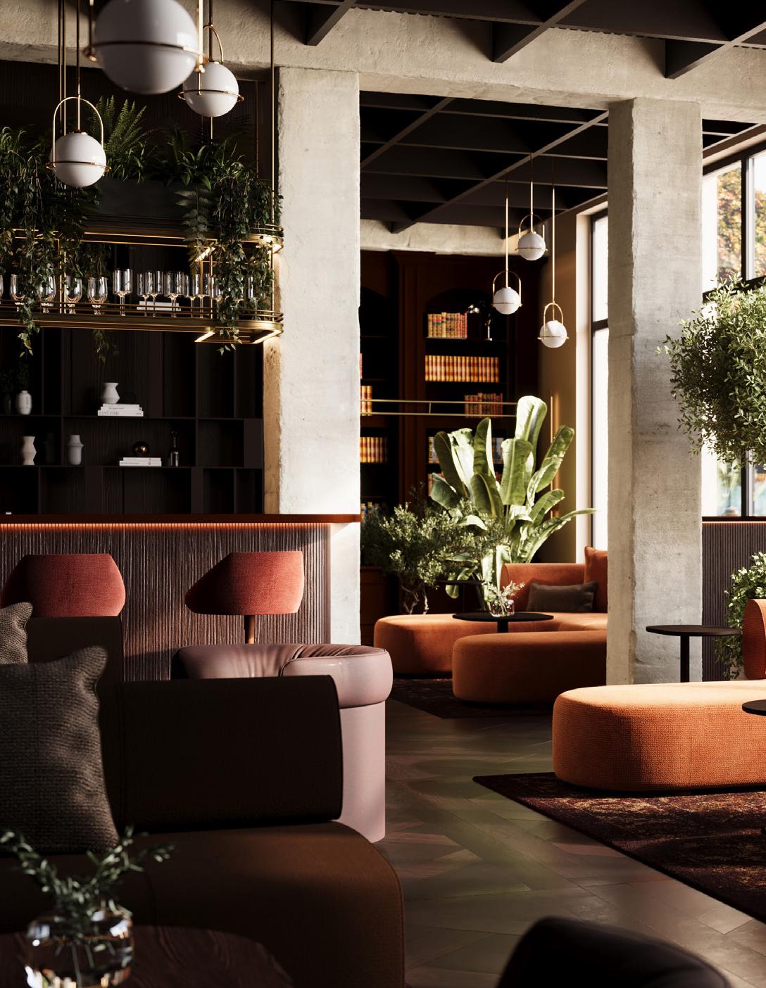

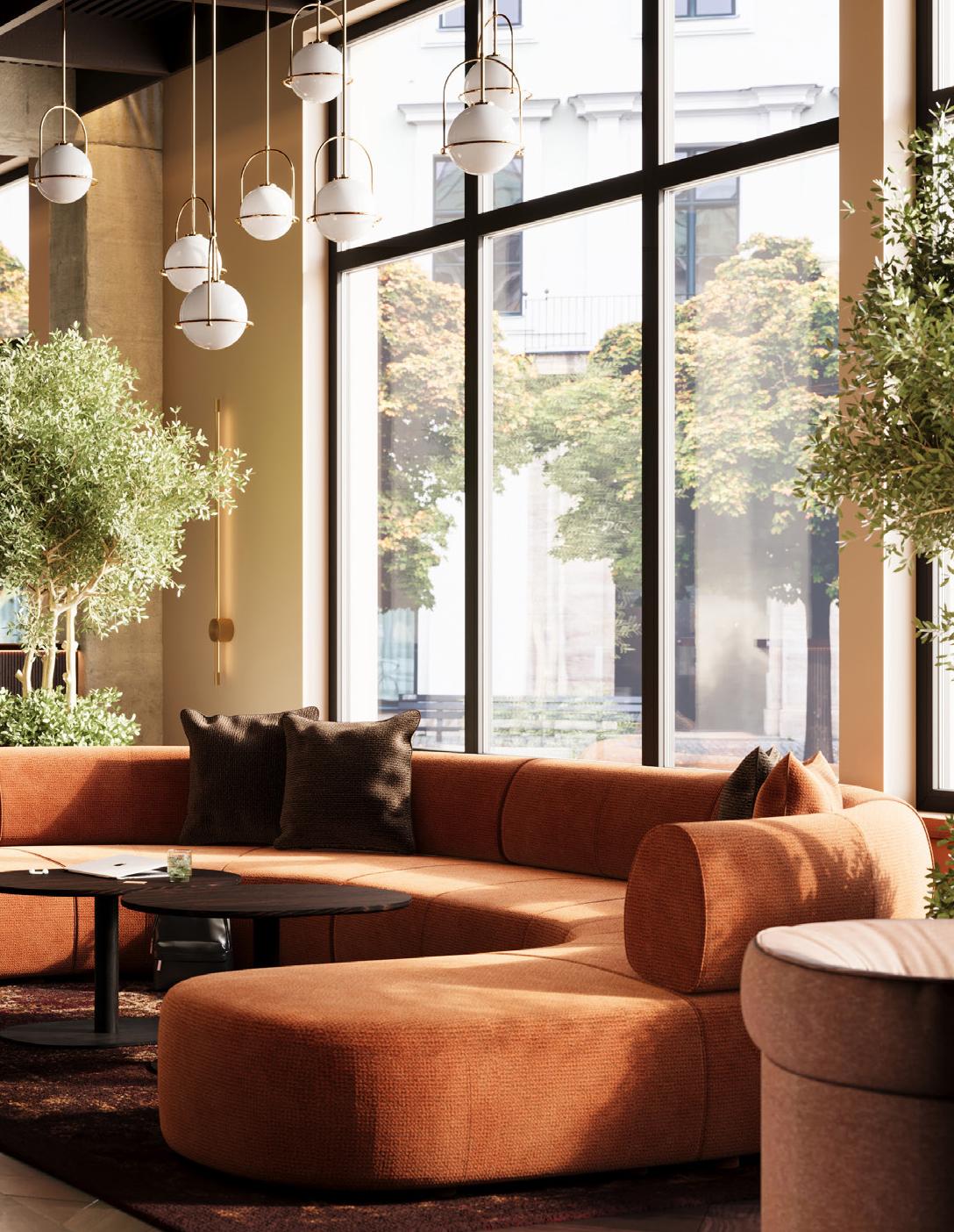
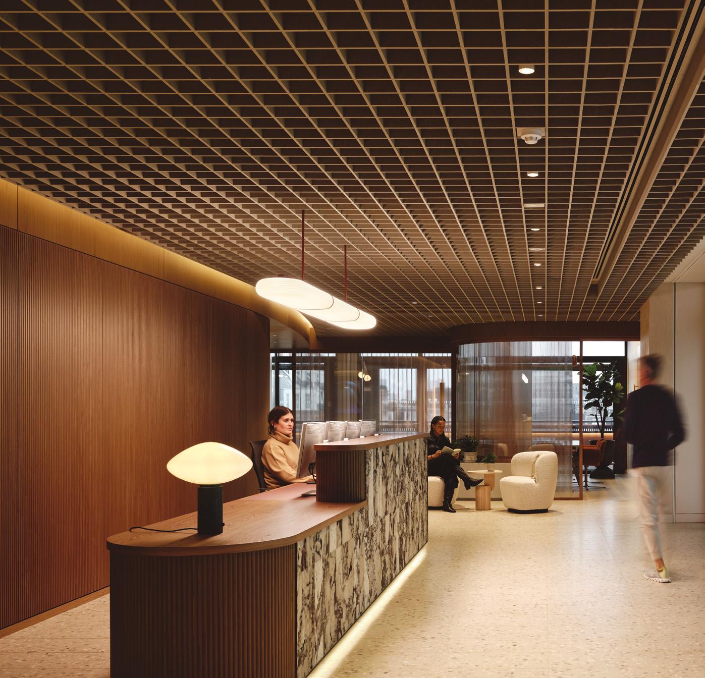
We’re changing the nature of commercial ceilings. Made from a minimum of 80% recycled fibre, the highly adaptable Frontier ™ Acoustic Fins system showcases colour, texture, and geometric elegance to elevate attention, both aesthetically and environmentally.
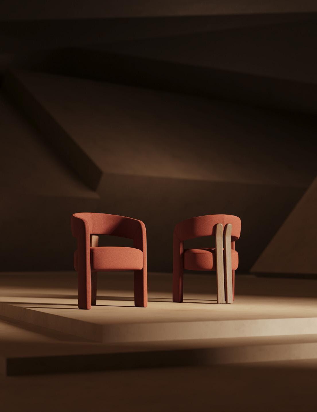
For more than 30 years, Fenabel has created hospitality seating solutions manufactured in Portugal. Its collections combine international contemporary design with generations of woodworking expertise — shaping commercial spaces where people feel welcome, connected, and comfortable.
fenabel.pt fenabel@fenabel.pt
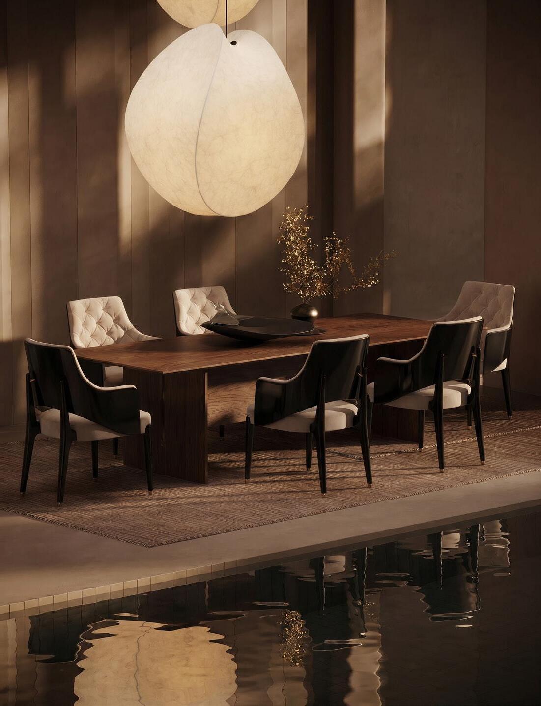
Sentta collaborates with internationally recognised designers to create furniture inspired by culture, architecture, fashion, and contemporary living. Through sculptural forms, refined materials, and meticulous attention to detail, its collections bring character, emotion, and a memorable sense of place to hospitality and residential interiors.
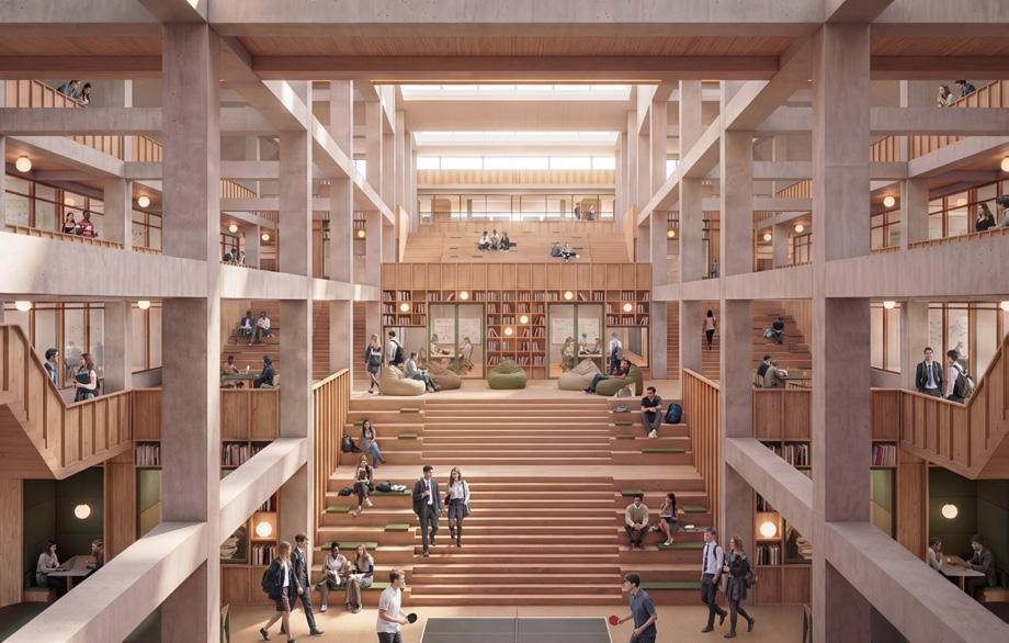
Following the closure of Debenhams and House of Fraser, House of Education proposes an alternative future for Britain’s vacant department stores, using the former House of Fraser at 318 Oxford Street as a test case.
Helmed by Studio Sutton, the project transforms a former retail landmark into a place of shared civic value, exploring how a secondary school and college could be embedded into the heart of London. Economically, the scheme posits a new model for education in city centres, where land values and operating pressures often force schools to the periphery.
By repurposing underused commercial space for long-term public use, the project circuit breaks the dependency on a thriving high street which has, in recent years, been in a state of ux. Retaining as much of the concrete framework as possible, new state-of-the-art learning environs surround a central atrium, de ned by a grand inhabited staircase which supports both circulation and connection. At the building’s extremities,
darker basement levels are repurposed as performance and assembly spaces, where the roof has been overhauled for greenery – playgrounds and gardens providing essential outdoor space within a constricted urban footprint.
Private by day, a series of publicfacing facilities – including the library, auditorium and gym – have also been integrated yet safely separated from principal teaching areas. In this way, House of Education can operate independently beyond standard school hours, generating revenue, supporting operational resilience and keeping the building active well into the evening.
Instead of isolating students behind gates or pushing schools to the urban edge, House of Education supposes learning within the everyday rhythm of the city, resulting in a resilient, open model of education that strengthens both community ownership and the long-term life of a building that could otherwise fall to disrepair.
studiosutton.co.uk
Adjacent to the small Spanish town of El Peral, certi ed seed grower Agrosemillas needed a workplace that would support its transition to an era of tech-driven environmental research – one that also aligned with the agro-industrial landscape the company was founded on.
Enlisting the help of Madrid-based Impepinable Studio, the rst port of call was to look at the site and its immediate surroundings: vast elds of crops, large farm vehicles and logistical infrastructures clearly taking precedent over the scale of people. Climate was another major
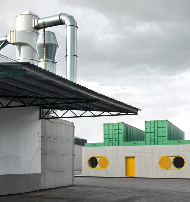
consideration. An area known for its strong seasonal contrasts and episodes of torrential rain, the design team needed to create workspaces capable of supporting intense periods of concentration in a context dominated by weather changes, dust and logistical intensity.
Expressed through the unapologetic use of company colours, the solution was to deliver a building with a clear and repeatable system; hardy enough to resist extreme conditions while facilitating a budding culture of innovation for the company. Complete with a glazed saw-tooth roof pro le, four reused shipping containers –opened along two of their sides – rest on a concrete plinth shared with the adjacent industrial warehouses. Perpendicular, three bands structure the interiors into a gridlike formation, the rst dedicated to open workspaces, another to service areas and a third to meeting rooms and laboratory facilities. From the outside, façades are punctuated by a number of circular openings, sheafed by manually operated shutters that act like switches, allowing the building to open to the land or close itself o from danger and distractions.
anks to Impepinable Studio’s perceptivity, Agrosemilla’s o ce spaces ultimately operate as a precise and restrained mechanism of working infrastructure – an architecture that emerges from agricultural systems, the earth and from the people whose knowledge make the daily running of the company possible.
impepinable.studio
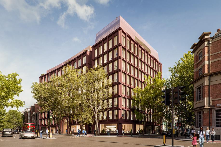
Expected for a 2028 completion, Piercy&Company announces a recordbreaking Clerkenwell workplace, realised in collaboration with Heyne Tillet Steel and Max Fordham on behalf of Global Holdings. Exemplifying how mass timber can be deployed at scale, Xylo is slated to be the UK’s largest all-timber structural o ce building and, once constructed, will stand at nine storeys of superstructure with prefabricated façades.
e project’s environmental agenda is manifest through its materiality. Centred around a fully expressed wood chassis, conventional concrete and steel construction techniques have been pushed aside in favour of an engineering feat that will store an impressive 2,400 tonnes of carbon dioxide. Designed as a kit of
parts, the sustainability envelope will be pushed further by Xylo’s biobased interior architecture, with compressed waste-stone surfaces delineating common areas and a handcrafted reception desk, formed with recycled glass o cuts, accentuating the design team’s circular approach. Breathable natural clay plasters and mineral paints will form the bulk of all nishes, regulating humidity, improving indoor air quality and complementing 360-degree timber elevations.
Working with natural materials at this scale o ers a rare opportunity to reinvent the wheel. It also brings a unique set of challenges, including re performance, water management, acoustics and services distribution – all of which have been seamlessly embedded into the
construction details to allow the building to be appreciated in its most honest form. Beyond reducing embodied carbon, the scheme is conceived as a health-focused workplace where biophilic materials contribute to occupant comfort and wellbeing, positioning the building as one of the healthiest and most sustainable CAT A premises to rent nationwide.
Drawing on the depth, proportion and rhythm of surrounding Victorian and Edwardian masonry, the precast envelope has been developed to improve daylight, thermal comfort and passive environmental strategy, placing Xylo as a robust, climate-resilient model for the future of London’s workplaces.
piercyandco.com
BRING IT TO LIFE
BY IPPOLITO FLEITZ GROUP
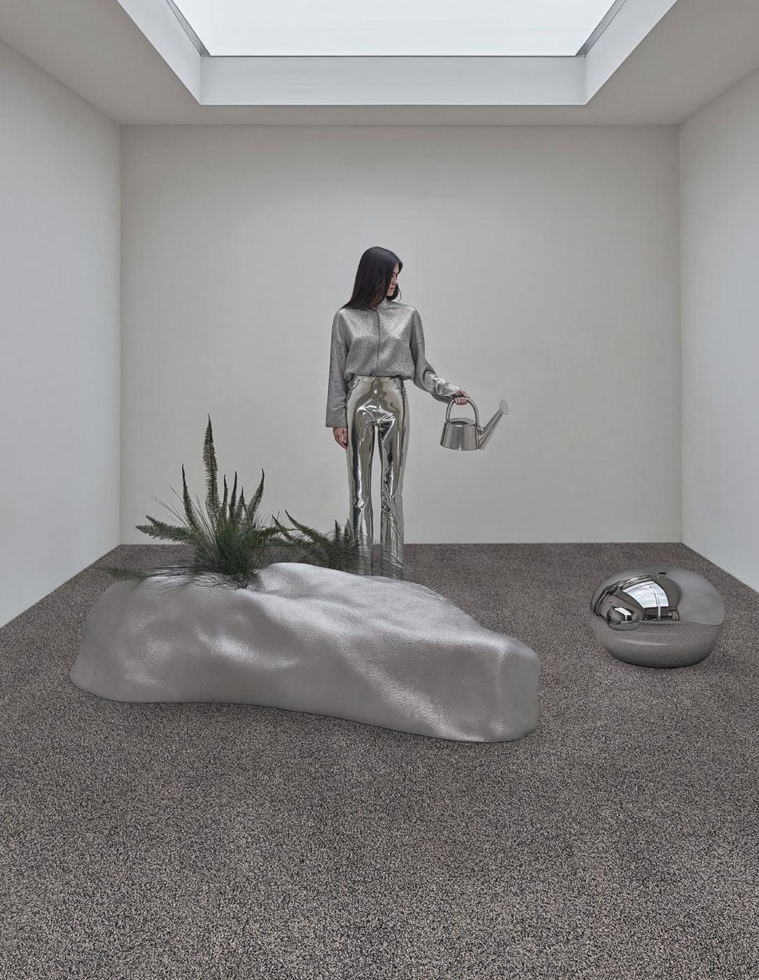
Loud world OFF, Serenity ON. For spaces with clarity, naturalness, and calm. DUO carpets – Only two materials. Easy to separate. Designed for circularity.
What if plastics were not wasteful and inert, but responsive, living companions?
is is the question that Crafting Plastics! – the interdisciplinary studio manifest in responsible smart materials – aims to answer in the form of its latest innovation, Biocolumns, presented at Alcova during Milan Design Week 2026.
Based in Bratislava and Berlin, and founded by Vlasta Kubušová and Miroslav Král, the design team has developed a bioplastic hydroponic system to explore how materials can support plant life while making processes of care visible to the human eye. A perforated vertical structure (that can operate individually or combine into larger con gurations), Biocolumns are designed the assist a variety of plants, spanning edible species such as leafy greens and herbs to ornamental types that require close monitoring.
Using hydroponic cultivation, plants ourish sans soil, their root systems continuously immersed in a nutrient-rich water solution which is oxygenated by an air stone to prevent stagnation and reduce the risk of mould or algae. Although plantbased and biodegradable by nature, the main aspect of Biocolumns’ innovation lies not in material make-up but in their ability to transmit environmental feedback through its external walls. Coated with a pH-reactive indicator, surfaces change colour in real time,
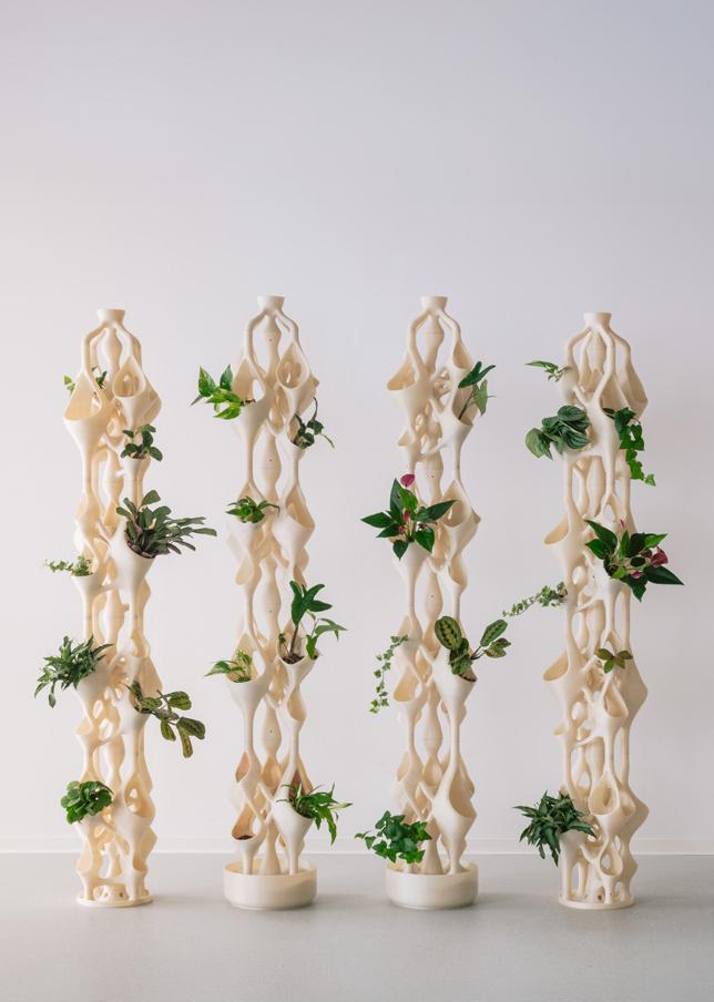
turning pink to purple when acidity levels move beyond the optimal range for indoor plants, making an otherwise invisible process readable, and alerting humans to refresh the water chamber.
By establishing a communicative interface between plants and users, Biocolumns shift the role of materials from passive to responsive, proposing a new approach to interiors where surfaces are not simply static decoration, but animate participants in constant exchange with people and the environment.
craftingplastics.com
LE CHIC BOHÈME COLLECTION
LE CHIC BOHÈME COLLECTION
LE CHIC BOHÈME COLLECTION
BOHEMIAN PATTERNS. LE CHIC LIVING.
BOHEMIAN PATTERNS. LE CHIC LIVING.
BOHEMIAN
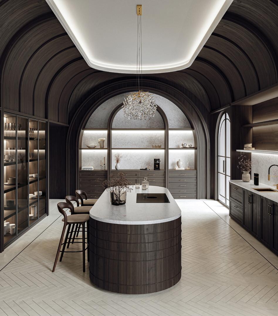
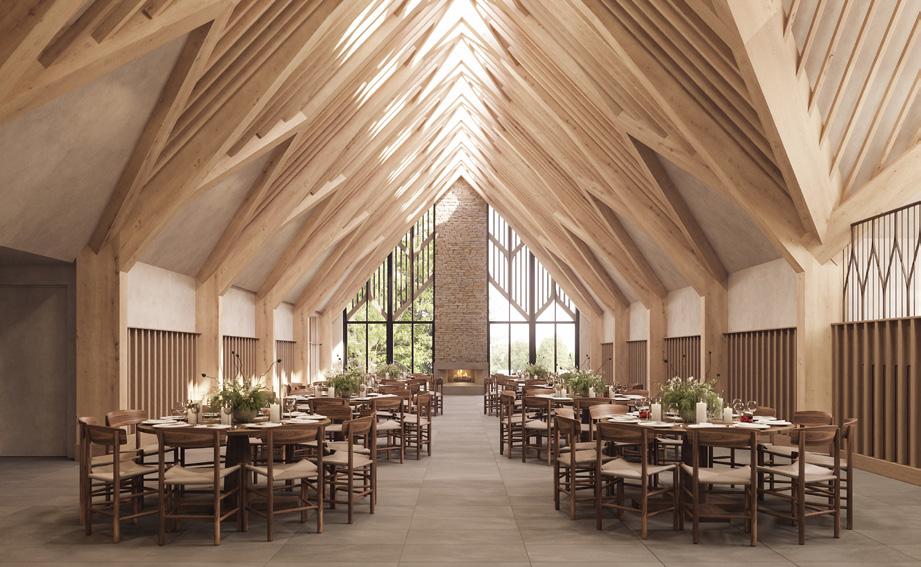
Scheduled to open in early 2027, e Bower at HYLL by Tim Groom Architects is a new purpose-built venue for weddings, gatherings and private dining, located in the 60-acre grounds of Cotswolds hotel, HYLL (featured in issue #241 of Mix Interiors).
Commissioned by HYLL owners Paul Baker and Sarah Ramsbottom, the brief called for particular attention to be paid to atmosphere, challenging the design team to create a 100-person capacity space that felt at once intimate and ceremonial. Another important factor involved the hall’s connection to its pastoral setting, the name ‘ e Bower’ stemming from the Old English term for a sheltered place in nature.
De ned by clarity of form, material honesty and a restrained visual language, mirroring the YOUTH-designed interiors of the main hotel, the proposal combines modernity with a thoughtful response to a rural setting, using local traditions of stone masonry and woodworking as a springboard for the design. is, in combination with subtle nods to ecclesiastical architecture, provides a sleek backdrop for reverence and ceremony; quiet grandeur that avoids the formality typically associated with religious rites of passage.
For the structure, a robust timber frame will embody craft and architectural integrity, while uted stone and delicate archways are set to provide a romantic counterpoint, reinforcing the building’s role as a place of communion and celebration. Choice framed views will be incorporated to honour an area of outstanding natural beauty, while a series of thresholds, arches and roo ights will allow daylight to animate the interior across seasons.
timgroomarchitects.com



Morag Morrison is a partner at Hawkins\Brown, leading on several pioneering interior design projects, over the course of three decades. Her work spans education, technology-led o ce fitouts and art galleries, as well as the conservation of some of Hackney’s most-loved civic buildings, including the restoration of the Grade II listed Hackney Town Hall, an a ordable coworking hotel at Wallis Road and the transformation of Drakes – a 1930s industrial building –under her professional belt. hawkinsbrown.com
“Colour me cerise”
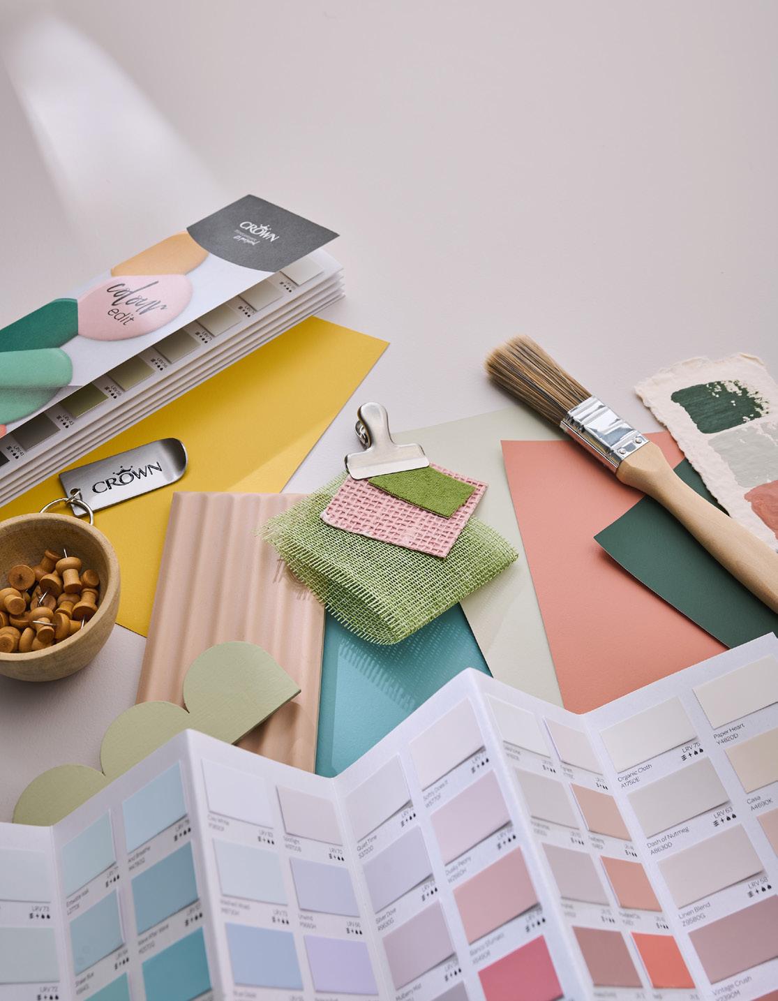
Con dent use of colour is an easy, coste ective and truly transformational way of achieving unique projects. Developing sophisticated palettes of two to three base colours and several neutrals that re ect the setting and a client’s outlook forms the backbone of a scheme that will last beyond the latest colourway trend.
at things di erently
Having studied for a master’s in art and architecture, I know the value of having any artist involved in a project. I have been lucky enough to work with artists on many of my projects. ey bring a di erent way of evaluating a challenge or subject matter and always see things in a way designers don’t expect, coming back with witty and insightful approaches to incorporating visual signi cance to a project. One example is Nicky Hirst, who referenced the Rorschach Inkblot Test in a frit for the main façade of the University of Oxford’s Dorothy Crowfoot Hodgkin Building. She challenged the way we see science.
Di cult team members don’t last for ever
ere is often one controversial or di cult person within a project and they can make life hard for progressing the project. ey often disagree with your proposals or disrupt the process which can be upsetting for more junior team members. e good thing is that in nine out of 10 times they often leave the project before it is complete, and you can usually forget them and their negativity!
Fostering long-term relationships with clients are the most rewarding
Working on a series of projects with one client can be a great experience. You have the opportunity to re ne and develop design approaches based on feedback from end users and the wider client team. Even with conservative clients, you are able to test and push the design approach further with each project and introduce more radical solutions. ese longterm relationships are common when working in the public sector. With London Borough of Hackney, we worked with the same client team over a 12-year period delivering enabling works and then the phased refurbishment of the Town Hall.
Keep to your vision
Re ecting on my most successful projects, I have always had a strong design narrative or concept that we have stuck to. At di cult points on a project, it’s always good to remind the team what you are working towards; what’s our vision and what are our client’s priorities?
A good example of this was when we worked on the refurbishment of the Royal College of Surgeons HQ in Lincoln's Inn Fields where the nal building was not dissimilar to the earliest concept sketch.

Theo Games Petrohilos is a co-founder and director of architecture practice
Unknown Works. From theatres, performance spaces and galleries to commercial, workspace, infrastructure and spaces for science, the studio works internationally on projects varied in scale and typology, with a focus on creating sustainable, culture-led environments.
unknown.works
The why e knife – speci cally the chef’s knife –represents the pinnacle of good design. It solves a fundamental need, is beautiful in form and represents an e cient and cogent execution of meeting need. It’s needed to change so little because it’s perfect. Like any tool, it forms an extension of the human body and ampli es what we are naturally able to do. Marshall McLuhan de ned the fork as an extension of the hand and a knife an extension of our canine teeth and ngernails.
I love the fact that when using a kitchen knife, you must keep hold of the thing you are cutting with your other hand. is, together with your eyes and nose, completes your sensorial understanding of the matter to hand.
The inspiration
I love the fundamental nature of food in our lives and by extension the tools that make it. Just like the tools of architecture, it’s the person who wields the knife who has the responsibility to do good things with it. One should make good buildings – and good food. A good chef’s knife is an expression of cogency, its metal blade fashioned to cut and its handle shaped to receive the hand. It rocks at just the right angle, giving your hand enough space between the handle and the chopping board. It’s not too big or small, not too heavy but also heavy enough. Like all good design, it does what it needs to do so well that it gains a soul.
The impact
Our jaws have become smaller since we lessened our dependence on chewing and our brain function grew beyond that of our animal cousins – in part because we developed a calori c diet. We found

ingenious ways to extract energy from the natural world around us. Fire is at the heart of this, but the proto chef’s knife –the shard of stone – allowed us to select and re ne calorie extraction.
You llet, you pare, you slice, you dice, you julienne, you mince, you chop. e knife is a tool that elevates food beyond ripping things open with your hands and teeth. It frees the user up to delight in a world of taste, texture and complex avours.
I love food. I was taught to cook by my parents – my dad meticulously cutting onions into architectural squares and me watching his ngers getting too close to the blade or my mum slicing and dicing a graphic array of vegetables in her striped apron. My uncle has a collection of penknives that hang in his kitchen –they’ve always fascinated me.
I cook with my girlfriend Hannah, my friends and co-directors Ben and Kaowen, and with our studio team. At Unknown Works, we cook and eat together every day – a vital part of our daily working rhythm and an act of sharing that echoes what we aim to foster with our work.
I use a Japanese knife that one of my best friends brought back for me. I care for it and use it every day.
Timeless looks. Peerless performance.
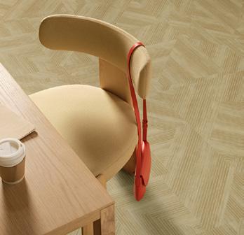
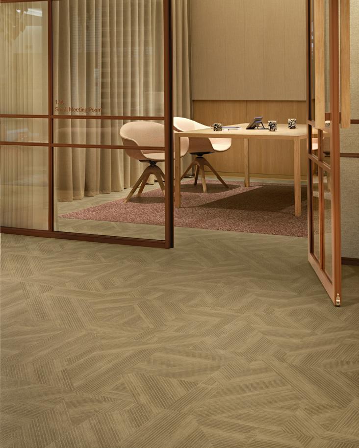
Insightful geometry. Natural warmth. Cut & Form™ brings a crafted, parquet-inspired look to commercial spaces – with durability to match its timeless design.
Angular woodgrain. Modern clarity. Everyday performance. LVT that unites structure and warmth in a way that’s smart and versatile.
Discover more. interface.com/cut&form

It might be the result of our hybrid, multitasking lifestyles or it could be that space is so expensive it needs to work hard to earn its keep – but hotels have become more than hotels over the years. ey are working environments, social spaces, wellbeing destinations, member’s clubs, the list goes on.
e idea of hotels as multipurpose hotel spaces is not new – hotels have always served a multitude of functions even if more related to its core business. e acceleration of this into all sorts of directions was probably started by Ian Schrager, the apparent originator of all hotel reinvention, and developed by Ace Hotels who invited in everyone with a Mac laptop.
Hotels are now hybrid environments at the heart of their locations. Far from it being an outlandish idea as it was not long ago, we are now actively looking to new hotels for the best space to hang out alongside the latest fashionable restaurant o ering.
Cities are recognising the importance of mixed use in their wider urban environment
too, with hotels at the centre. e City of London, long stronghold of mono-cultured o ces, shifted its o cial planning policy to encourage more mixed-use development, particularly in the hospitality sector. Part of that is reinventing disused o ce spaces, reborn as much more interesting hotels, encouraging more varied audiences. But the more important one is recognising that we as humans enjoy a more layered environment that suits our varied daily routines.
With hotels as rm favourites in our lives whether on holiday or not, how do we design hybrid? In this very column I wrote about hybrid and adaptable spaces about four years ago – very much in the vein that if a space tries to be all things to all people it works for nobody. Do you want to be drinking a re ned cocktail next to someone on their laptop?
De nite no past 4pm – if I have a cocktail before that I probably have other worries. Does this ‘hybrid’ concept still work for high-end/lifestyle hotels or has it become distinctly middle market with every branded hotel o ering coworking and kind-of-hip furniture?
e best hotels out there today are far from trying to be hybrid, they are actually trying to be very particular and speci c to attract their own people that way – for whatever they wish to be doing. We enjoy making an environment our own if we like being in them; we will nd a place for our laptop as long as there is a power outlet. What is most exciting about this direction is that it gives us as designers the opportunity to be creative again and work with our clients to invent a unique world for their hotel.
I had the pleasure of staying at Potatohead in Bali this year – a fantastic hotel with very distinct design (if you like the Barbican, you will love this) and very speci c functions for each area that the team uses creatively in di erent ways.
Maybe this is the dawn of a new era of unique and creative hotel design that doesn’t patronise its guests but gives them room to nd the spaces that resonate with them and allow them to colonise them as they wish?
Water conducts heat around 24 times more effectively than air.
Which explains why Billi uses water-cooled heat exchange technology.
And why the joinery doesn't have to accommodate ventilation.
Some technologies age better than others.
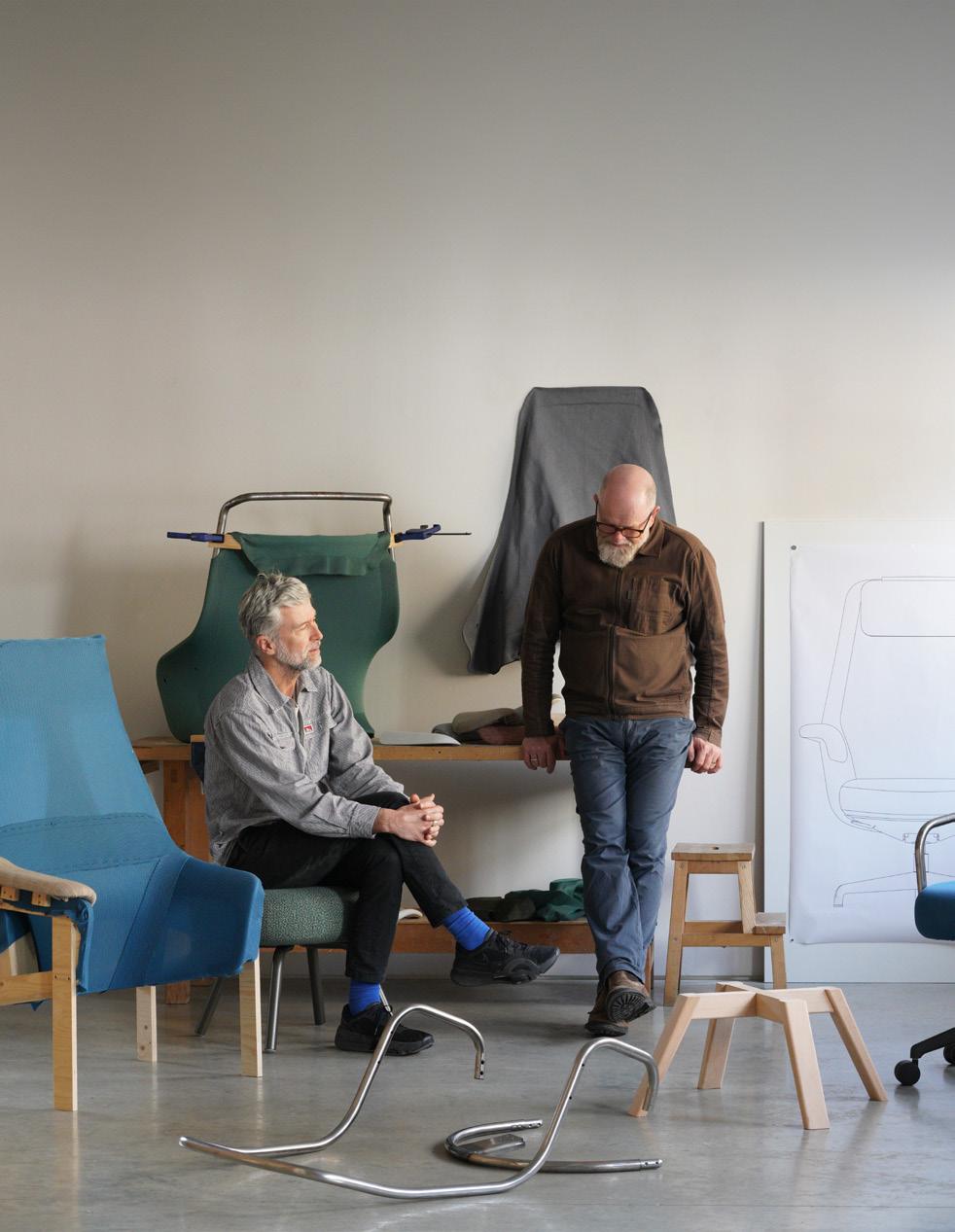
From creating oppo unities to the future of design intelligence, we take a philosophical meander with design heavyweights Pearson Lloyd.
Words: Chloé Petersen Snell
Photography: Cou esy of Pearson Lloyd
You could say that design is beginning to behave less like a discipline and more like a way of reading the world. In which case London-based studio Pearson Lloyd is leading the charge. Last speaking to founders Tom Lloyd and Luke Pearson two years ago, my return visit is not so much a nostalgic re ection on the last 30 years of their eponymous studio and more of a conversation about where the industry is now – and might be heading next. On a sti ingly hot day in May, they talk from their Hackney studio about a practice that continuously shifts from making things, to making sense of them.
Two years ago the pair drew a clear line between design and art – design fundamentally as problem solving – and while ‘solving problems’ remains central to their discipline, we return to the topic just as aware that design is something broader, more ambitious. As Lloyd puts it, problem solving is only part of the design; the more interesting work is unanswered questions before they become briefs.
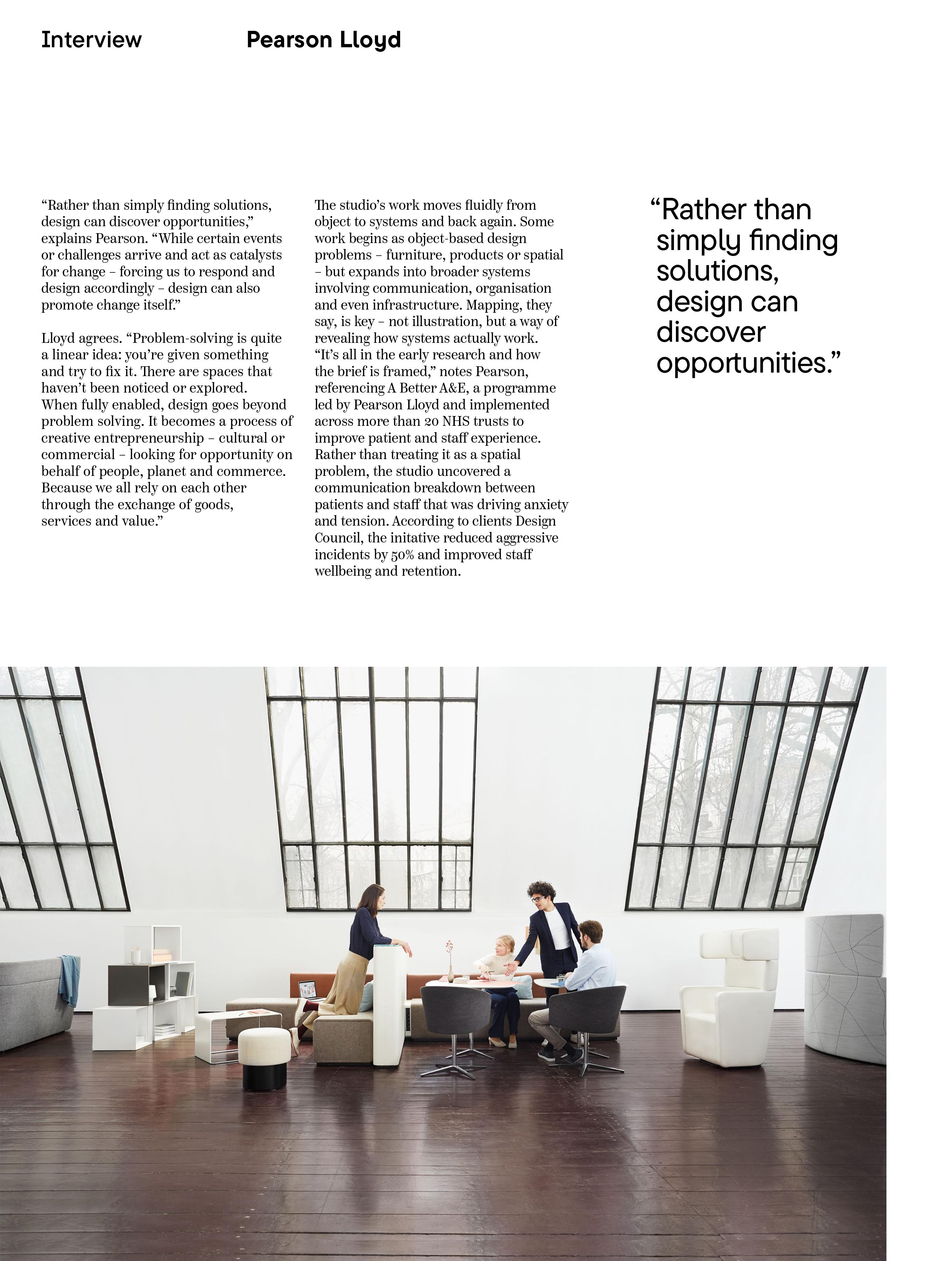
“I think the assumption was that we would treat [A Better A&E] as a spatial project, where we would produce or a ect a product to change behaviour,” Pearson explains. “ e mapping process was a eureka moment. It demonstrated why this was happening, and suddenly we realised that if we could illustrate the problem through mapping, and reverse it, we might have a solution. It became a great example of not quite knowing how physical the solution is to start with – is it systems-based or product-based?”
PARCS for Bene is another example where the brief wasn’t just a product – evolving into a wider systemic intervention. Designed in 2009, it responded to emerging shifts in how workplaces were being informally recon gured for collaboration and focus, helping establish a more exible, hospitality-led model for o ce design.
“[PARCS] came from seeing how architects were working, and from projects Tom and I had been exploring internally,” says Pearson. “We noticed people were recon guring workspaces in a more organic, problem- and outcomeoriented way, using products that weren’t designed for those solutions. By asking why the products didn’t quite solve the problem, we generated a clear brief. Because it hadn’t been done before, the client – and even the sales team – were unsure. But the market understood it immediately, and the project hit the ground running. It wasn’t so much that there was a clear problem to solve; the question was already out there.”
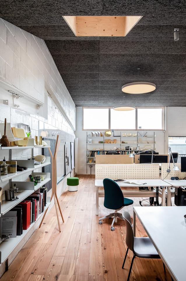
If design is increasingly about reframing problems rather than simply solving them, it quickly turns into something more stubborn. What are things made of and what that means for how we create them – a clear passion for the duo, re ected in their research project Material Change and ongoing practical applications for the likes of Modus and Flokk. “I think we’re going to have to reinvent our material culture,” states Pearson. “We’re still predominantly driven by oil. Polyurethane foam, for example, is not recyclable in any meaningful way, whereas materials like aluminium can be reused again and again.”
Does circularity bring its own problems?
“It becomes an energy and logistics problem: where does the material go and what happens to it next? At the moment we’re shipping waste around the world for reprocessing, which is absolutely crazy. We’ll have to get very, very joined up when materials become scarce.”
Distored pricing is part of the issue, he argues. “Virgin materials are arti cially cheap. We’re not valuing nite resources properly. If we tax that correctly, secondlife materials become economically viable – and then people will innovate, because people are inventive.”
Inventive types themselves, Pearson and Lloyd met in 1991 studying at the Royal College of Art, where their paths crossed thanks to an interest in furniture and industrial design – a pairing that would later de ne their practice founded in 1997. e studio has grown through longterm client relationships and increasingly complex, cross-sector projects from aviation to furniture, and from a duo into an established team. As such, the concept of authorship has fundamentally changed. e pair emphasise their work as an “ecology” of contributors: from long-standing team members, partners, clients, engineers and other stakeholders all shaping outcomes over the last three decades.
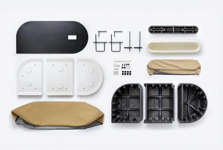
Left:
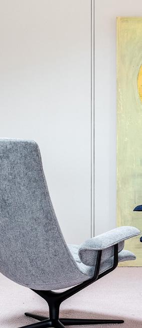
Revo for Profim is a modular seating system design for circularity, using recycled REPP foam that can be disassembled and remoulded at end of life.
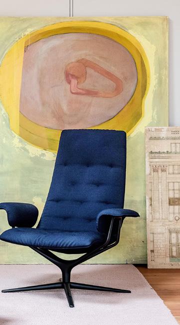
Above: Healey Lounge Chair, Knoll
Right:
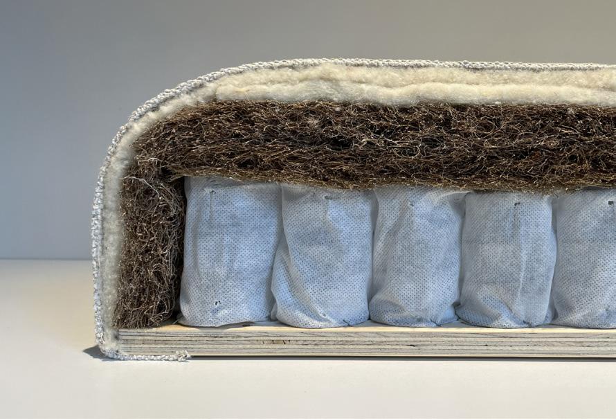
Modus’ Edge Free is a foam-free seating system using all natural materials including coconut fibre and natural wool.
“Partnership already challenges authorship,” says Lloyd. “Luke and I have very rarely done self-initiated work because we love working with clients – the interaction, the brief and the challenge being thrown at us. Collaboration is built into our process from the start.”
“An engineer, for example, may make a key contribution that goes largely unnoticed, yet commercially driven projects can be mispositioned by an engineering error, a cost issue, or even how marketing presents them,” adds Pearson. “One di erence with design is that we’re often involved at the front of a project – nding a gap and building a brief – but also right through to the end, producing the nal narrative and describing what’s important about the project.”
“Pearson Lloyd is an ecology of di erent minds working together,” Lloyd continues. “Luke and I may lead it, but it’s de nitely a collective e ort.”
at collective thinking is increasingly being tested by a new kind of collaborator. As we enter a period where AI can generate entire environments and objects, what becomes the role of the human designer?
“It’s about context and editorship,” says Lloyd. “If AI is a tool like a chisel or paintbrush, you still need someone to use it well. You still need an editorin-chief. Di erent parts of the industry may disappear and the workforce will recon gure, but the talent of humanity will still be needed.”
e studio is using AI as a research and visualisation tool, he adds, but not as a design tool. “ e innovation side is still human.”
For Pearson, it’s both practical and philosophical. “If you look at climate change, understanding weather systems, or nding new medical solutions, humans can only access and process so much data, whereas AI can gather and synthesise on a level we’ve never seen before. On one hand, basic jobs are going to be wiped aside very quickly. On the other, we may see solutions to the most complex problems we’ve never had a chance of solving. e moral control of it is very complex. ere are so many layers and it’s racing ahead at a pace we’re not really in control of.
“But at the same time, we’re furniture designers answering a very big question,” he smiles. “Put simply, it could be a fantastic tool to allow us to go further and deeper, faster, and that's all positive. We’ll still need tables and chairs, because we’ve got bottoms. e fundamentals remain, even if everything around them shifts.”
Ultimately, the studio remains grounded in making. “It’s not really a silver bullet that we’re after,” Pearson re ects. “We’re either managing to push clients further, or they’re gravitating towards these projects because they know we can handle them. Next year we’ve got a series of projects that push the needle a little bit – still making, but modifying the value proposition.”
Approaching thirty years since it was founded, Pearson Lloyd’s practice is grounded in reality, but positive and open to possibility. ere are no existential musings on design as a life-calling; the duo takes a resolutely pragmatic view of their craft. And after our conversation in the summer heat, it feels like the weather is just about the only problem outside of their power to solve.
“The innovation side is still human.”


Tihany Design’s Alessia Genova on luxury as precision, making her mark and designing for ‘wow’.
Words: Dominic Lutyens
Photography: Cou esy of Tihany Design
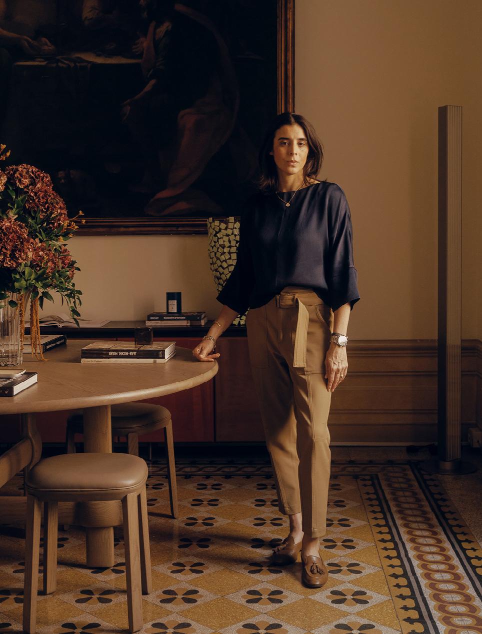
Alessia Genova’s involvement with Tihany Design, the multidisciplinary interior design studio founded by Adam D Tihany in 1978, has a long genesis. Genova, now the practice’s owner and principal, studied interior design at the Politecnico di Milano from 2003 to 2005. She joined the company in 2006 as an intern. In 2007, Adam appointed her a junior designer. She then steadily rose through the ranks, becoming Tihany’s rst ever partner in 2020. “ e role was created after we decided that my next step would be acquiring the rm,” she remembers. “Becoming a partner was a necessary step, ensuring a smooth transition for people inside and outside the studio.”
It took boldness and, well, enthusiasm, over a period of years before she secured the internship, however. “I met Adam at the Salone del Mobile during my rst year at the Politecnico,” she recalls. “I went up to him and told him I wanted to work for him.” Adam was approachable, she remembers. “He gave me his business card and told me to email him. I emailed about every three months while doing my degree until eventually it worked.”
What attracted her to the practice?
“Adam’s theatrical approach to restaurant design,” she says. Adam Tihany founded Tihany Design in 1978 and sold it to Genova in 2024, making his a 46-year



tenure. So when Genova sums up his design approach in one word it could make it sound insubstantial, lightweight. Yet theatricality in design comes in a multitude of guises, including in restaurants alone, with which Tihany’s business was chie y associated for some time after it was established.
“I’d studied his work closely and what struck me most was his project, Aureole, chef Charlie Palmer’s restaurant in Las Vegas.” Here “wine angels” – wine waiters on wires – sailed towards the tower to retrieve bottles. “ is closed in 2023 after 24 years. You saw its fourstorey wine tower as soon as you entered the space. is central part of the design didn't simply decorate the restaurant but became it. is total commitment to a concept was what I wanted to apply in my own work.”
“By the time I started working for Tihany, I’d changed considerably,” she remembers. “When I rst met Adam I’d never travelled beyond Italy, but this encounter inspired an openness to adventure.” While studying in Milan, she spent time studying in Glasgow and Paris for a year. Reading between the lines, her formative exposure to di erent cultures contributed to making her cosmopolitan in preparation for working in an international practice. Today the studio has o ces in New York, Rome and Bangkok with 15, 10 and ve employees respectively.
A further mind-expanding episode for Genova’s career was visiting the Barcelona Pavilion, designed by Ludwig Mies van der Rohe and Lilly Reich for the 1929 International Exposition in Barcelona as a student. “Structurally, there’s almost nothing in the Pavilion – horizontal and vertical travertine planes, onyx, water, steel columns, a single sculpture – yet it’s
one of the most a ecting interiors I’ve entered. It proved to me that luxury is not about accumulation but precision. It’s about the courage to subtract until only what is essential remains.” is highly formative experience crystallised her philosophy of interior design that endures to this day: “I stood in the building and understood that a space can be abstract yet completely emotional. at lesson underpins everything I do, even when a project is rich and layered.”
On joining Tihany, her rst objective was to get under the skin of Adam’s approach: “When you begin your career in a studio, your rst client is the founder. You learn his or her language, way of seeing. Adam’s standard was extraordinarily high.” How would she de ne this? “Precision, storytelling, the conviction that every space must be tailored to its speci c client. ese were the foundations I built on.”
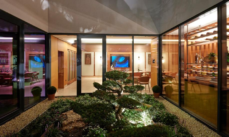
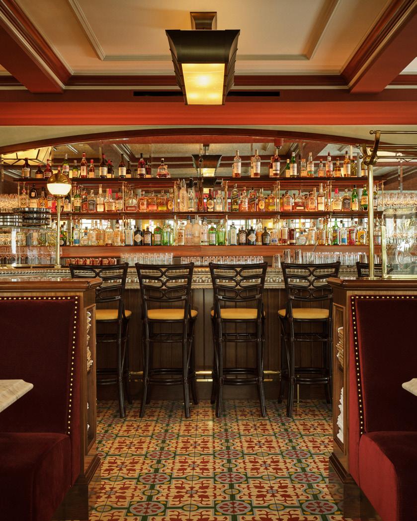
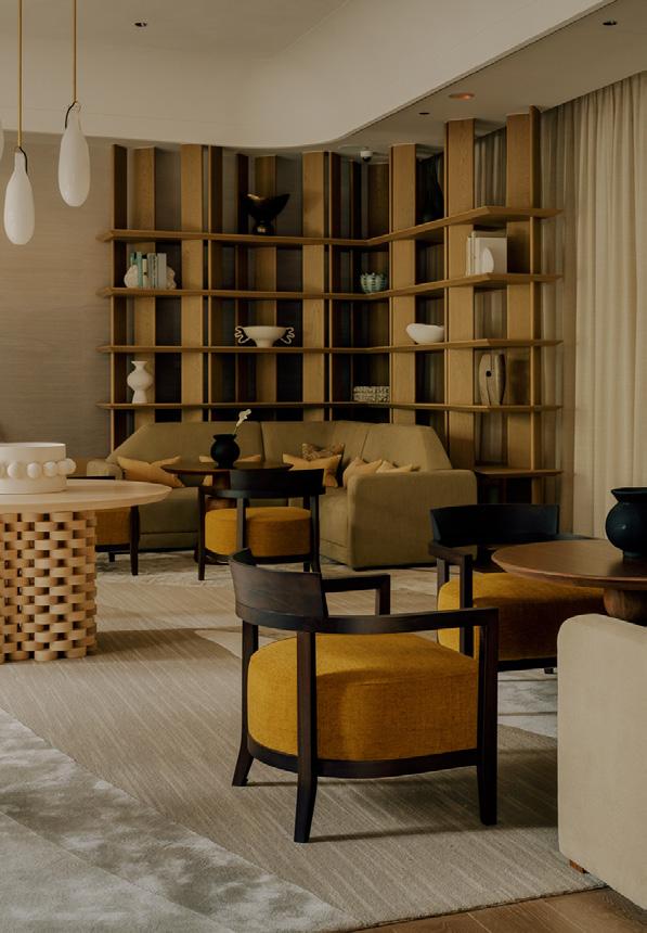
I wonder if the young Genova’s computer skills were an asset for Tihany when she joined. “ e computer knowledge I acquired at the Politecnico surely added value for the rm. Back then, CGIs were not even close to the quality of today’s visuals. I’d spend days creating and adjusting images in Photoshop. It was something we still talk about at the studio today.”
Asked to de ne the ethos of Tihany under her tenure, she says, “It’s fuelled by an international quest for discovery. Our ethos is to look beyond borders for creative inspiration. We have a multicultural team from across the world.” Yet Genova’s formative in uences were decidedly Italian. e Politecnico gave her a good grounding in interior design: “You’re taught to justify every decision, proportion, structure.... You learn the rules of the game, then you can play with creativity. Two professors shaped me. One was Andrea Branzi, a radical in the truest sense.” She speaks with a certain awe of this legendary gure who co-founded avant-garde collective Archizoom in 1966 and was a member of 1980s design group Memphis. “He pushed you to question what design was for – not how to make something beautiful, but why beauty matters. e other professor was Fulvio Irace, a scholar of Italian modernism. He gave me a deep literacy in architectural history and criticism and the conviction that you cannot design without understanding what came before you.”
And Genova’s Italian roots have irrevocably shaped her approach to design: “You’re formed by what you’re exposed to – in my case the proportion of a Renaissance doorway or cut of a jacket in a Milan showroom. at Italian eye for quality is not something I consciously apply. at said, working globally for nearly two decades has taught me that every project must be informed by its history and culture.”
“Every project must be informed by its history and culture.”
Tihany bills itself as focusing ‘on luxury hospitality design’ and Genova aims to elevate the hospitality experience. How does she achieve this? “It’s emotion rst, then everything else follows. Anyone can spend money on expensive materials. What genuinely elevates an experience for customers is impossible to fake. You want to create the feeling that the space was made for them.” An impactful interior elicits an immediate, visceral response, she adds: “It’s when a guest walks in and says ‘Wow!’. at one word, unguarded and instinctive, means emotion arrived before any thought, which is exactly how it should be.”
Functionality is also key to the success of a project: “What determines whether a luxury hotel works is largely invisible:
the planning, the relationship between back of house and front of house, the logic of circulation, the e ciency of service. When those things are right, a guest moves through a space feeling e ortlessly cared for.”
I ask her about her design methodology: “ is begins with a discussion with the client. I want to understand their personality. If I don’t understand who I’m designing for, I cannot design anything with lasting appeal. e next stage is understanding the guests – what they hope to experience in a new venue. She stresses that her design process is both organic and empirical. “At this point in the process, the concept emerges. I never start a project with pre-formed ideas, then apply them.”
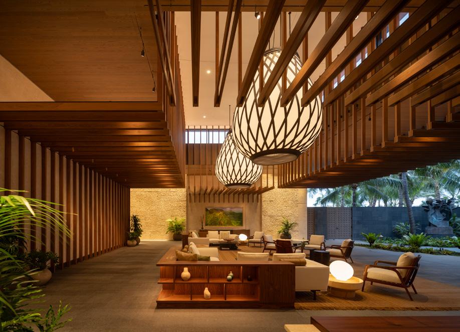
Functionality is the key consideration when it comes to restaurants, Genova explains: “All great chefs share an absolutely clear vision of how to operate a restaurant. ey know what they need: the ow of service, the relationship between kitchen and dining room, how a dish will be presented to diners, what the room should sound like at full capacity. at operational intelligence is a gift to a designer because it gives you something real to work with.” Even so, Tihany makes interventions in restaurants to add character. e wine tower in Aureole ful lled a function as a storage unit but its main impact was visual – its theatrical presence was conceived by Adam. And Tihany made a clever intervention when revamping Amber, a restaurant at the Landmark Mandarin Oriental Hong Kong that he originally designed. One idea was to add subtly serpentine banquettes whose curves allow guests to face in opposite directions, giving di erent groups of diners a degree of privacy.
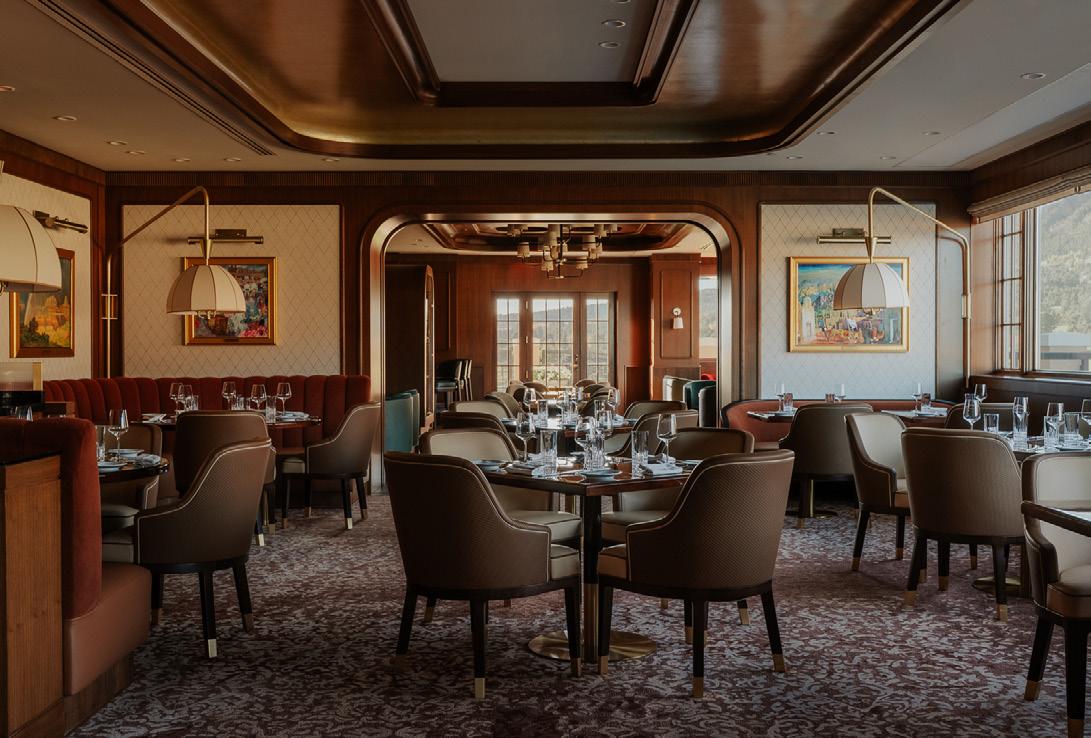
Our conversation roves over several other key projects, for example the Penrose Room at e Broadmoor resort in Colorado Springs. Storytelling drove its design: its interiors re ect the contrasting, individual tastes of wealthy, well-travelled husband and wife Spencer and Julie Penrose, American philanthropists who founded e Broadmoor in 1918. ese juxtapose two archetypal examples of North American taste: on the one hand, the Europeaninspired East Coast re nement cultivated by Julie, on the other a more rugged aesthetic ri ng o Spencer’s outdoorsy, sporty, polo-playing persona, resulting in a hybrid décor that is unique and original. Like fellow American sophisticates, novelist F Scott Fitzgerald and his wife, Zelda, Julie and Spencer summered on the French Riviera. e club interior has a suitably Jazz Age look and Spencer’s horsey personality is re ected in bar stools upholstered in conker brown tooled leather seats. A private dining room called e Jade Ore re ects Julie's cosmopolitan personality with its tableware by Italian brand Ginori 1735
“Space should identify the needs of the client rather than of the designer.”
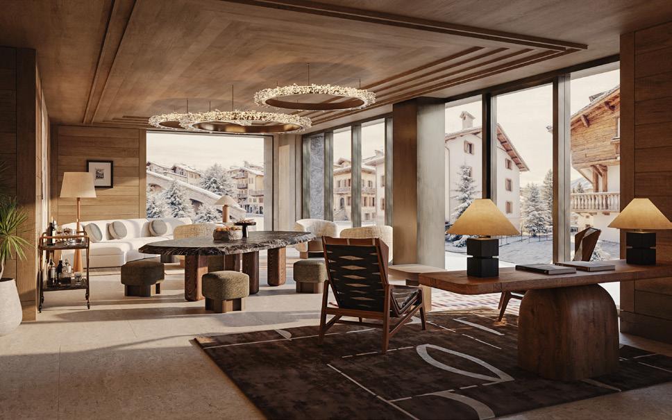
Another project, Hotel Bellevue Cortina, draws on the glamorous 1950s and 1960s lifestyle of Cortina d’Ampezzo in the Dolomitic Alps in northern Italy. e resort hosted the Winter Olympics in 1956 and was a playground of the aristocracy and movie stars. Views of its mountain setting in uenced the hotel’s markedly mid-century inspired design. “Vistas of the Dolomites inspired a palette of earthy neutrals and mineral tones, which also reference the Bianco Antico stone from Italy’s Veneto region,” says Genova. “ e organic forms of its bespoke furnishings echo the contours of the mountains.”
Meanwhile, Tihany Design created the interior of Zero Bond, a private members’ club at Wynn Las Vegas along with its restaurant Sartiano’s, open to the public, in close collaboration with ToddAvery Lenahan and the Wynn Design & Development team. Here, too, the décor was in uenced by mid-century design,
speci cally that of mid-century Milanese architect Piero Portaluppi. Portaluppi collaborated with designer Gio Ponti. Mid-century Italian elegance is conjured up through an abundance of terrazzo, brass and bronze accents. Unusually, art by famous artists, such as Modigliani, Chagall and Renoir hang on some walls, and is for sale to members.
Overall the change of ownership at Tihany from Adam to Alessia appears not to have caused any rupture in its identity, although Genova is subtly putting her stamp on its style. “What has shifted over the years is the freedom to bring myself to the foundation laid by Adam,” she says. “Today I share his philosophy – that each project must be custom-made and that space should identify the needs of the client rather than of the designer. Within that I feel I can also express a sensibility that is genuinely mine, one rooted, inescapably, in being Italian.”
Words:
Charlotte Slinger
Photography: Hu on+Crow
Inspired by structural tailoring and the Japanese concept of Ma, architects O’Donnell + Tuomey unveil the V&A East Museum, designed for – and with –the people of East London.
Back in Mix 237, we were invited behind the curtains of Sadler’s Wells East, the latest location for the prestigious dance and performing arts school in Queen Elizabeth Olympic Park. Home to some of the country’s most renowned arts and educational centres, including the BBC, London College of Fashion and University College London, this growing cultural quarter (collectively known as East Bank) is something of a legacy project for Mayor of London Sadiq Khan. is issue, we’re returning to visit the newest addition and its sixth haven for the arts, the V&A East Museum.
O'Donnell + Tuomey
Ten years in the making, Dublin-based architect O’Donnell + Tuomey won a V&A design competition back in 2015 with a masterplan created alongside London-based practice Allies and Morrison. Joining its sister site, the V&A East Storehouse – which opened its vast archival spaces and the David Bowie Centre last spring – has been conceived as an open, inclusive venue that pays homage to craft, local makers and real community. And while all the buildings in East Bank are connected by walkable, waterside public realm, this would be the only building created entirely for
community access; with all ve oors of gallery space open to the public. It was therefore key that the museum be truly accessible to those who live, work and study in the four Olympic boroughs – at least a third of whom are young people from Black and global majority backgrounds. “It was really important for us that it was a distinctive, bold, identi able building, but at the same time one that was welcoming, inviting and porous – both externally and internally,” explains Jen McLachlan, V&A East Project Director. “We wanted a framework, a kind of canvas, that local designers and artists could continue to respond to for decades to come.”
e storehouse and the museum share this same vision, with the former envisioned as the ‘back of house’ (storing 5000 years of rare archival objects) and the latter a public-facing hub for visitors who may not typically feel at ease in the often-exclusive world of the arts. Physically encapsulating this is an 18 ft brass sculpture at the museum’s waterfront entrance by omas J. Price – his largest to date – which depicts a young woman, dressed casually in jeans, smartphone in hand, looking towards the horizon. “ omas' work, when you situate it elsewhere, makes a statement – but what's interesting to me is that here, she doesn't make a statement,” says McLachlan. “She is entirely re ective of the people that we are looking to attract into this museum and who you will nd in West eld.”
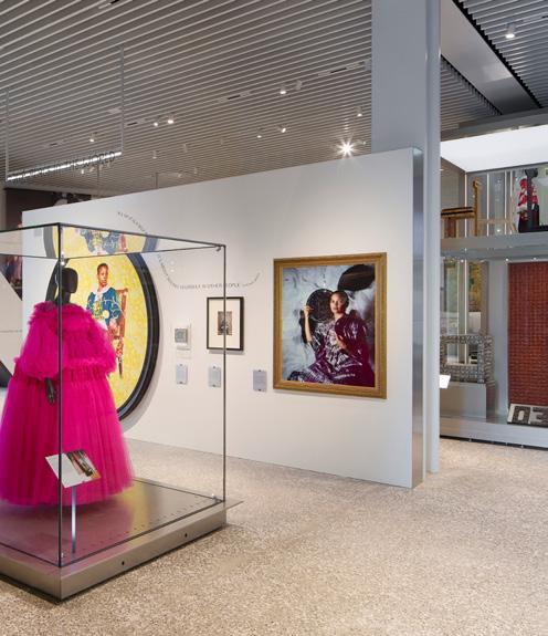
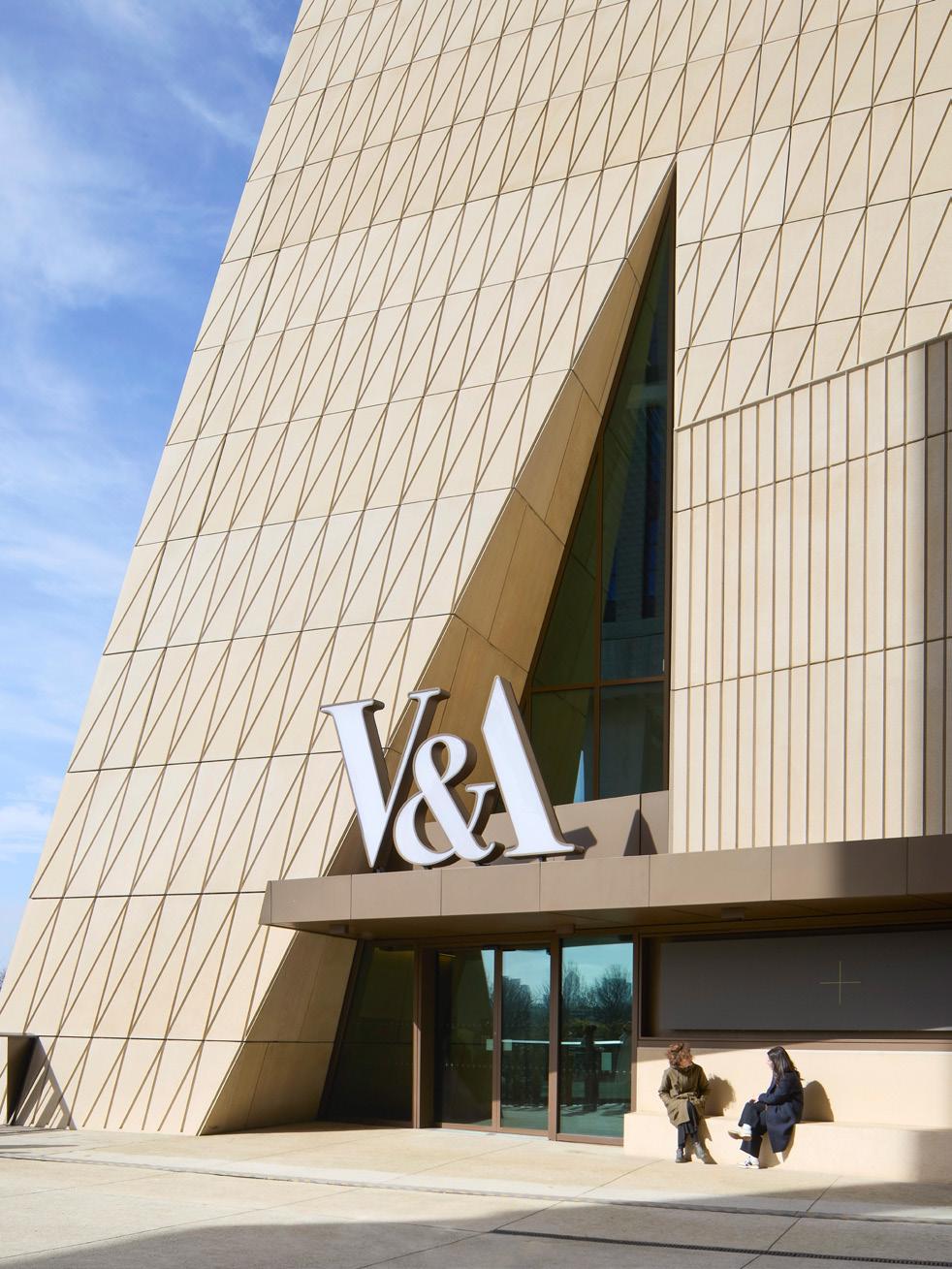
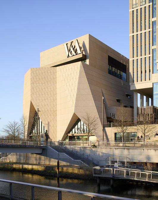
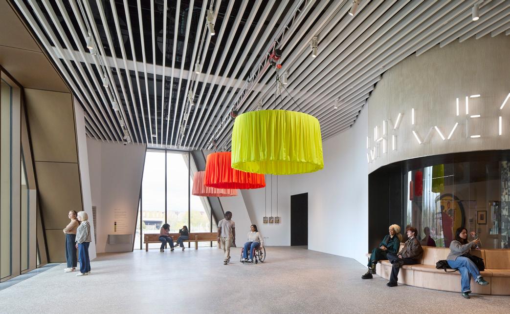
To create the building’s origami-like façade, O’Donnell + Tuomey opted for precast slabs in a warm, almost creamy beige, with intricate birds’ mouth details, no open joints and triangular grooves that echo the ‘V’ and ‘A’ shapes of the museum logo. Similarly, triangular cuts into the building allow light to ood inside, while integrated benches create a permeable façade that extends into the public realm. “We don't have traditional security guards or typical ticket desks,” adds McLachlan. “We recruit locally, and then we upskill our house team. We're looking to remove as many barriers as possible to access, so you don’t feel like you have to pass thresholds to get inside.”
Despite its geometric silhouette, however, the building’s core concept was inspired by fashion and textiles. After seeing a Vermeer painting in Dublin’s National Gallery depicting the billowing sleeves of a woman’s blouse, and later a sculptural piece of Balenciaga couture at the storehouse, founders Sheila O'Donnell and John Tuomey became interested in the “unseen mastery of internal structuring” – a focus on the space between volumes that underpins the ancient Japanese concept of Ma, translating to ‘gap’ or ‘pause’. Far from negative space, then, the
“We wanted a framework, a kind of canvas, that local designers and a ists could continue to respond to for decades to come.”
“It's spatially quite complex, but materially more reserved.”
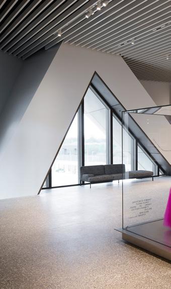
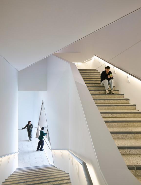
museum’s circulation areas became an integral part of the design when viewed through this lens; due to its smaller footprint, visitors experience the building vertically, traversing ve oors of ‘blank canvas’ gallery space up to a green roof terrace with sweeping views of the city. Wide, light- lled staircases are therefore centred around a hardworking core, neatly housing practical facilities like toilets, lifts and ventilation. “It's a much whiter building than what we typically design, unlike the red brick and industrial character of Sadler’s Wells,” explains Eimear Hanratty, Associate Director at O’Donnell + Tuomey. “It's spatially quite complex, but materially more reserved –so, as John likes to say, it can be the tree that the birds come and nest in.”
An ethos of transparency also guided the interior architecture, with long sightlines cut into these stairwells and windows punctuating the walls between galleries. Benches tucked into alcove windows o er places to dwell between exhibitions, with these more informal spaces to ‘hang’ suggested by the V&A’s Youth Collective: a paid programme enabling young people aged 18–24 to develop their creative practice while contributing to
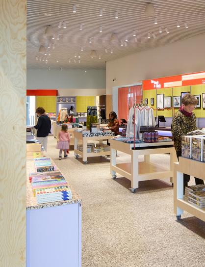
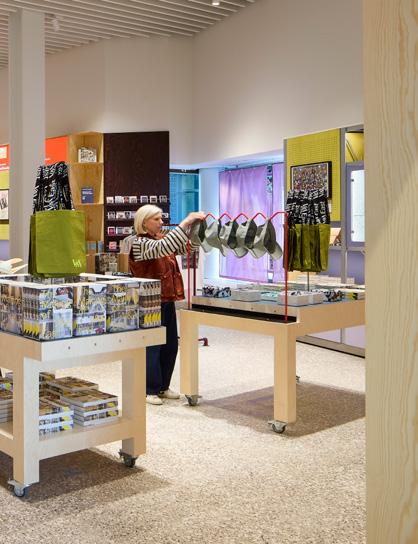
the museum’s design and programming. In one of the free permanent galleries, Why We Make, exhibition designers JA Projects also consulted the Youth Collective to emulate spaces that young East Londoners already felt comfortable in, such as high streets, parks and shopping centres – pairing interactive making stations with display stands inspired by wooden market pallets and the familiar glossy tiles of pie and mash shops. Way nding by Fieldwork Facility incorporates LED tickers in a nod to Tube signage, while retail spaces (designed by Studio Mutt) support local makers and feature exible, recon gurable units to host workshops and pop-up events. “What we've observed is that, while some people say young people are all about the digital and virtual, we actually get the sense that the communities we're building these spaces for are really hungry for community, engagement and the space to connect,” says McLachlan. “It's not one or the other, it’s both, and.”
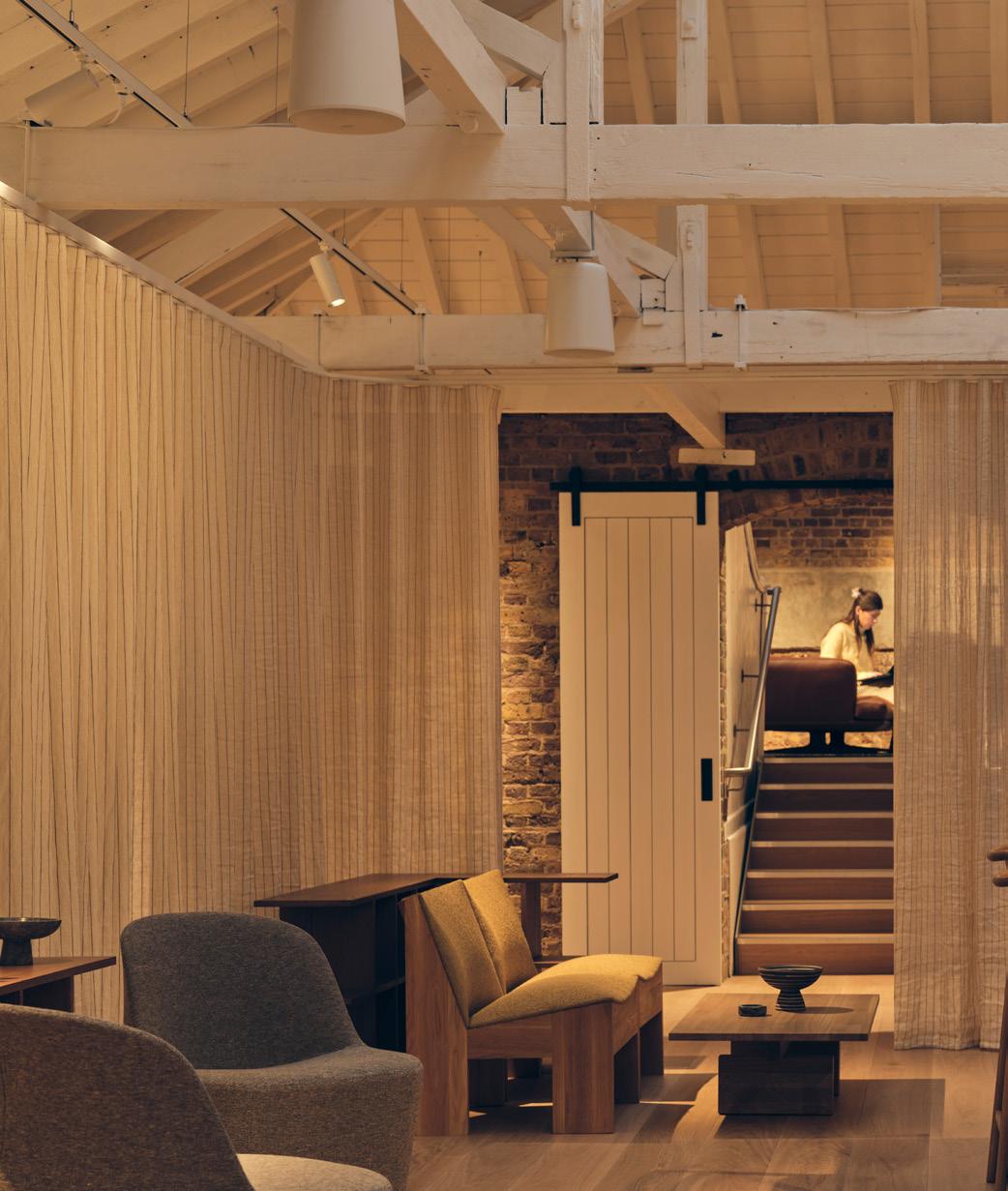
At MYO King’s Cross, heritage, emerging talent and new tech coalesce in a communitycentred working space, designed by SODA Studio.
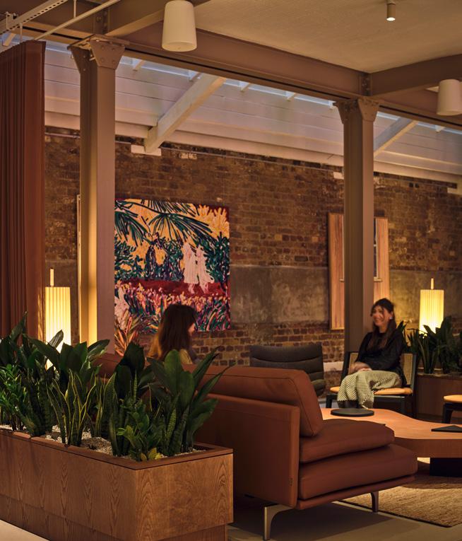
Image on previous page:
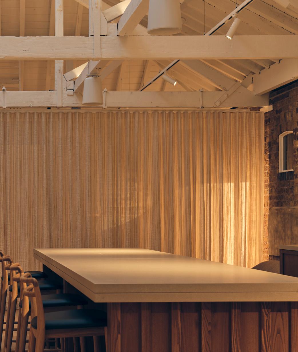
A communal workspace with curtain partitions
Above:
SODA Studio has been evolving how coworking spaces should look and feel over the last few years with an understated, practical and hospitalityinspired approach. e practice’s previous work includes Clockwise in Bremen, Liberty House for the O ce Group in London and, again in the capital, MYO Victoria, the latter being the exible working brand for developer Landsec.
At the latest MYO iteration at London’s King’s Cross, SODA has evolved that signature style yet further with adaptability, tech evolution, wellness priorities and heritage constraints to deal with.
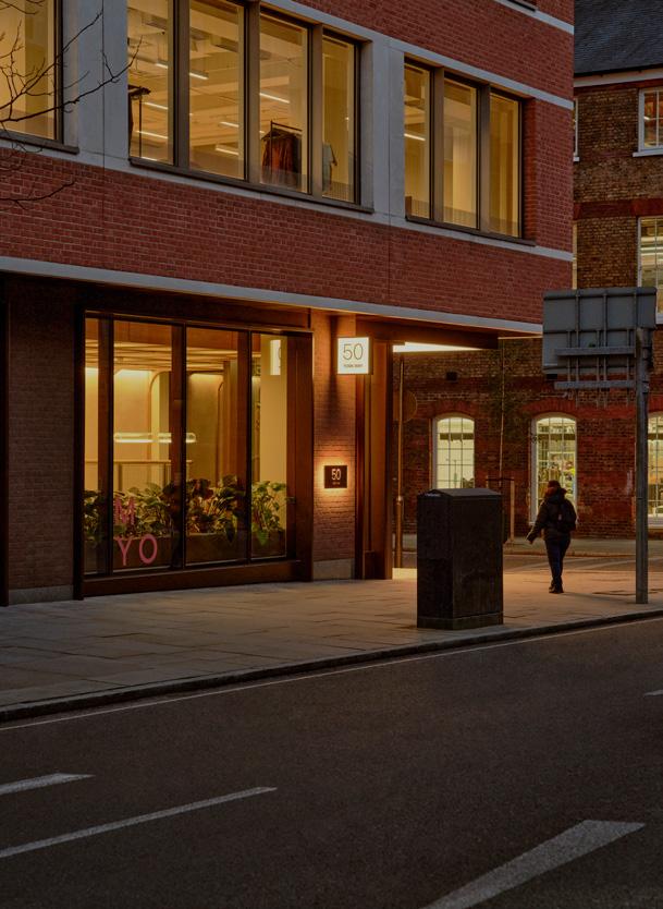
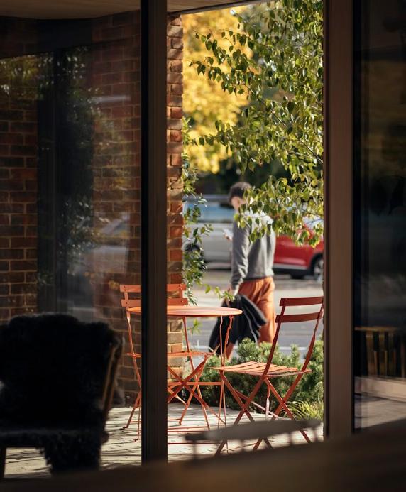
ere is still a branded presence on the corner of York Way, a couple of minutes’ walk from King’s Cross station while the main entrance is just around the corner on Trematon Walk. SODA has recon gured this, introducing pockets of planting and outdoor seating to make it more inviting both for MYO tenants, visitors and local residents alike, in line with Landsec’s desire to bring joy to the people who live near or work in their spaces.
With a MYO a few stops down the Victoria Line already under their belts, “there was a push to be bolder within the brief, which kept it interesting,” begins SODA director Russell Potter with associate Will Browne continuing to set the scene, explaining how the scheme is composed of e Printworks and Glasshouse
buildings plus e Stables. “ ere wasn’t a strong connection between them before and the new main entrance provides an intersection particularly for the communal spaces.”
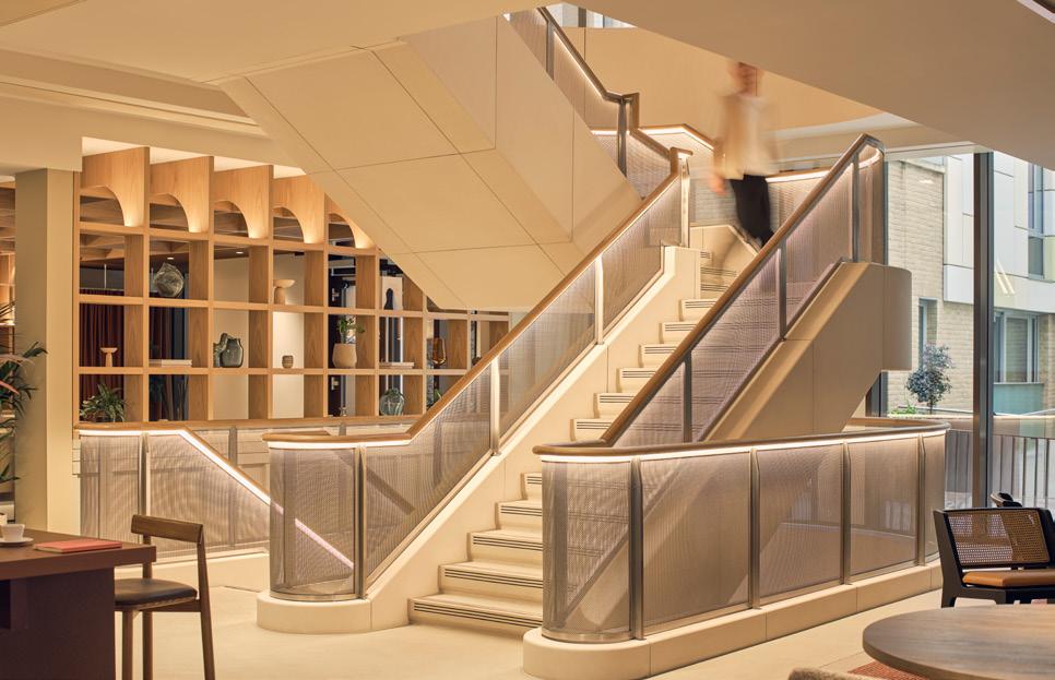
As well as the timber grid in the reception ceiling, a design motif found in several guises around the scheme, probably the most striking structural enhancement is the bespoke Jesmonite staircase. is connects the front of house breakout zones from below the ground and rst oors, making the central part of project the interconnected, undisputed heart of the project. “ e steel structure, which is cantilevered, feels quite monolithic so we contrasted that with the Jesmonite panels and chamfered handrails,” Browne explains. e stair also brings light in to the deepest part of the plan.
SODA Studio
“There was a push to be bolder within the brief, which kept it interesting.”
Made for people.
Descending onto the lower ground oor, there’s a calm, subtly lit feel to the communal areas, a touch of the ‘Gen Z working under low light aesthetic’ if you will. Soft grey tones with the odd hint of green and peach along with wooden furniture and further timber underfoot are a design response to the desire to make this a decompression zone away from the private o ces.
While there are some familiar contemporary manufacturer names, a Carl Hansen CH20 chair here, a wonderfully comfortable Minotti chair with a pattern like TV static there, SODA has also introduced some up and coming designers into the speci cation mix.
“One of the key things we wanted to do was reach out to the wider community and so that’s how we ended up contacting Central St Martins and then narrowed that down to the Material Futures course,” says Potter.
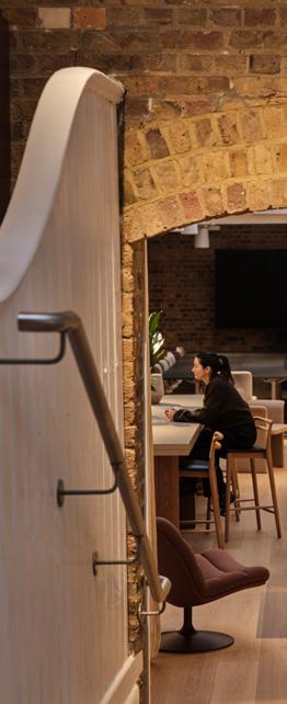
“Pa nering with emerging local creatives was a central concept.”
is course explores sustainable approaches to design and reuse and SODA worked with the emerging designers on ideas to rework materials stripped from the original buildings. And so, alongside the usual Scandinavian and Italian manufacturers, there are sculptural stools and co ee tables by Byron. Teo, meanwhile, has developed ‘hyper wood’, an intriguing looking recycled cardboard, which has been cleverly bonded.
“Partnering with emerging local creatives was a central concept and seeing their contributions seamlessly integrated into the nal space is incredibly rewarding,” Browne adds, with Potter keen to stress this far from a tokenistic, one o installation in one corner of the space but rather a paid-for project with several pieces around the scheme and the collaboration extended into an ongoing seasonal rotation of student artwork.
As we all know, some of the most fruitful conversations happen before or after a meeting and so there are places to perch
outside meeting rooms and also opposite lifts: no space is wasted here. And inside, as tech is constantly evolving, as is our desire to look our best in meetings, so the lighting and cable management must t the bill too – out with strip lighting, in with pendant lighting.
As we head to the gym, yoga studio and wellness rooms, Browne explains how “wellness is a growing priority as o ces become a place where you can socialise and experience time away from work.” e gym is the envy of any members of budget high street tness brands – all Technogym equipment and Clayworks on the walls with blush and cream and more grey tones in the changing rooms.
e rst oor features a spacious lounge and tea point space, with Valchromat kitchen surfaces forming what Browne describes as “quite a generous natural square.” Access to the outdoors comes courtesy of terraces throughout the building, culminating in a rooftop bar on the uppermost oor.
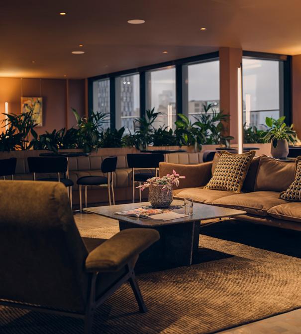
Sightlines here have truly harnessed the London skyline, which takes in all the usual suspects from nearby St Pancras station and St Paul’s cathedral to the BT Tower, the Shard and e Gherkin. Design details do not disappoint, from the o -kilter swirls of the ooring to the bio-based tiles on the bar and a West End bar-level of high stools and lounge seating to drink in those views.
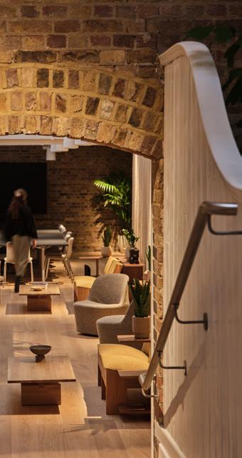
At e Stables, a Grade II-listed building, usage has gone from equine to events. Arrival is signaled by a rust-coloured reception desk and adjacent wall clad in Velox. e Stables’ heritage status meant no messing with the original fabric, for instance “the joinery sits slightly o the brick,” says Browne.
“ e design language is slightly di erent here too,” he continues. “It’s more of a classical feel.” ere’s exposed brickwork in the auditorium and meeting room suite above, paired with tiles and carpeting and timber ooring respectively, plus what Potter calls “quite tech-heavy AV that hits all the buttons of a modern workplace.”
MYO King’s Cross is a further subtle iteration of SODA’s previous o ce design work, upping the aforementioned tech ante, incorporating the client’s demand for wellness facilities in a seamless fashion and answering the brief to shape the places MYO locates in – in this case elevating the King’s Cross area’s workspace o er yet further.
Left: Exposed industrial beams energise with artwork
SODA Studio
Topcret, Havwoods, Zandur, Solid Wood Flooring Company, Interface, Mass Concrete, Chaunceys, JHS, Mosa, Domus, Forbo, Bolon, Marazzi, Jaymart, e Floor Gallery, Grestec, Crucial Trading, Pentagon
Rawside, Workstories, Herman Miller, Form & Re ne, Koplus, Lapalma, Matiazzi, VG&P, Andreu World, Sancal, New Works, Expormim, Kasthall, Vitra, Howe, L.Ercolani, Flexform, Minotti, CS Rugs, Ar ex, &Tradition, Fredericia, Your Workspace, Davison Highley, Pedrali, Audo, Carl Hansen, Fogia, T.O.N, Zanotta, CSM Custom.
Mundy, Amron, Durlum, Viroc, Clayworks, Meshtec, Abet Laminati, Hi Macs, Rimex.
Santa & Cole, Flos, Frandsen, Tala, Lucent, Optelma, e Light Lab, Marset, &Tradition, Vibia, Las Sola, DCW Editions, Delta Light, Juniper, Pholc, Filix Lighting, Phos, Light Projects, Light Graphix, IP44.
Yarn Collective, Kvadrat, Tibor, Maharam, Komfort, London Wall, Dulux, Crown Paints, rislington, Muirhead.
CSM Custom pieces by Alara Sipahioglu, Byron Clark and Teodoro Rava.

Words: Natasha Levy
Photography:
Jim Stephenson
McLean Quinlan’s self-designed Winchester space o ers a view into the studio’s process and the materials used in its work.
Image on previous page:
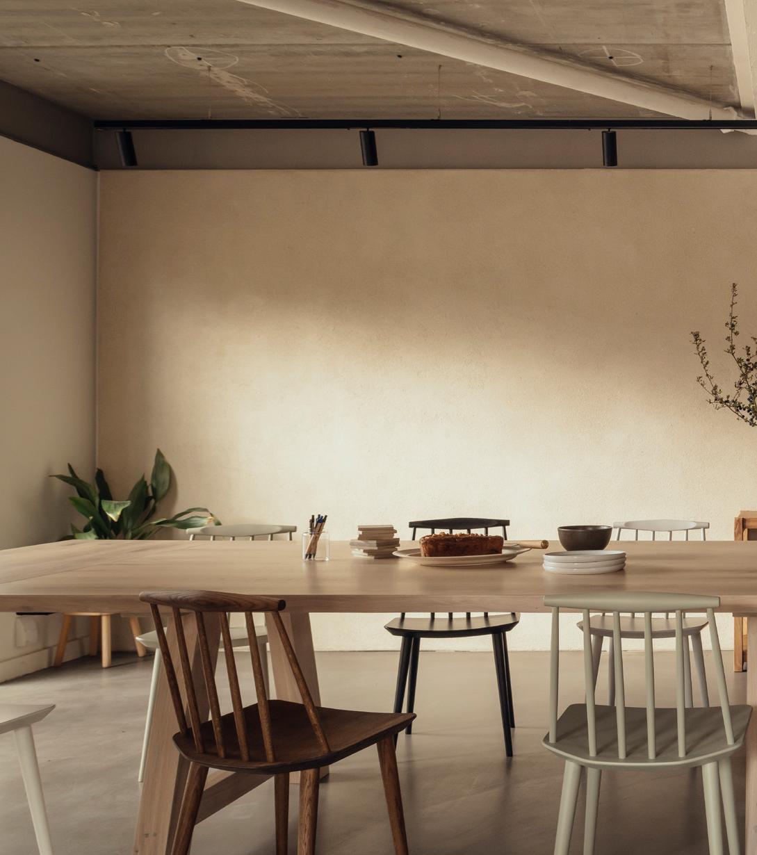
A banquet table for dining and meeting
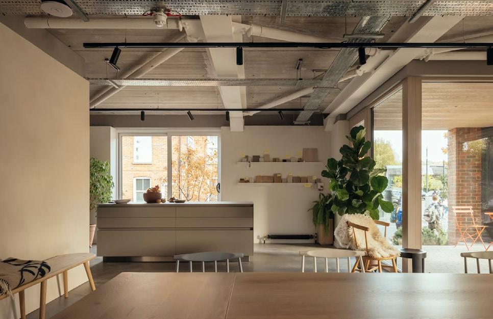
Left: A kitchen island and dining space
Above right: Outdoor seating
Below right: A material library for discussing options with clients
Collaborating with an architect is a kind of alchemy; it requires a meeting of minds, alignment of aesthetic tastes and the client taking a small leap of faith that their concept can be made reality. “It's a trust thing,” a rms Emily Johnson, senior architect at McLean Quinlan, “a client comes to you and says, ‘design me something’, but they have no idea what they're going to get at the end.” In a bid to demystify this experience, the practice has created a studio within their Winchester o ce where clients can gain an insight into McLean Quinlan’s creative process and the details that go into a project.
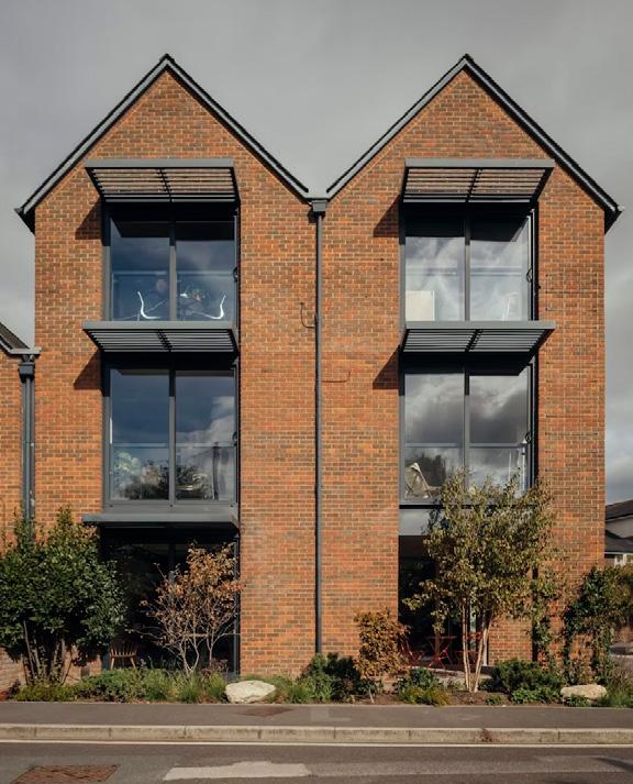
e studio is located on the ground oor of the o ce, a three storey brick building with a double-gable roof where McLean Quinlan has been based since 2015 (the practice also has a small base in London that’s overseen by director
Fiona McLean). When the team moved in they initially only occupied the second oor, but they eventually ended up taking over the rst oor, and then the ground oor, which became available in late 2024. Up until that point it had been host to a recruitment company and was irrefutably drab in appearance: imagine unsightly wallpaper, a suspended ceiling and a clunky oor plan divided by a glass wall. “It was not pretty and needed some love,” adds Johnson.
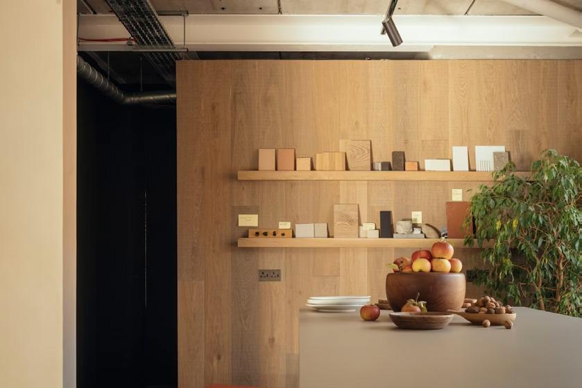
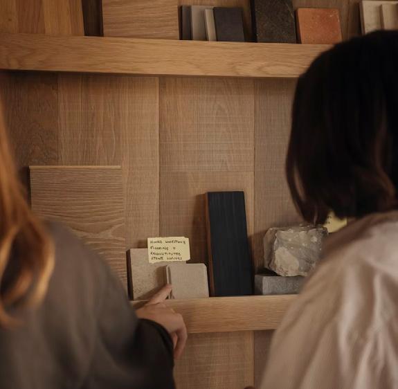
e space was completely stripped back and redecorated to create the open-plan studio as we see it today. In signature McLean Quinlan-style, it’s been nished with textured plaster surfaces and timber panelling. en, forming the focal point of the space is what the practice calls a ‘project wall’; a series of slender shelves displaying a variety of materials and
fabrication options. O ering everything from fragments of brushed copper to slices of oak wood and slabs of honed limestone, the wall acts as a mood board where McLean Quinlan can show o triedand-tested palettes from past projects, or play around with samples to develop new schemes. Perhaps, most importantly, the wall also gives clients a 360 perspective of what their nished building could look like, honing in on design details while also revealing how they’ll correspond with one another at large. “We see things as a whole building and we want every room to work together, that’s what we nd pleasing. If something disrupts that, it’ll be pretty obvious on that shelf,” explains Johnson. “It's a valuable thing to have as a practice. We can have you here in our o ce and show you basically everything that will be in your building – you don't have to go anywhere else to try and piece it together.”
Below left: A library niche with chairs for reading
Opposite page left: Material swatches
Having tactile samples instead of a plethora of catalogues also helps clients discern a project’s materiality at a deeper level. “Manufacturers give us these [samples] to show clients because they want people to understand how their products work and whether they’re right for them,” says Johnson. “Some clients have the total ability to put it all in your hands and say, ‘I know what kind of products you have and I'm super happy with that.’ But others need more hand holding, so having this space gives us the opportunity to walk clients through it.”
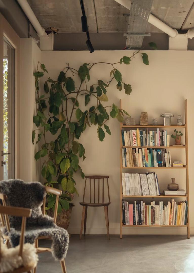
Just beyond the project wall is a large kitchen island where visiting clients can gather for introductions and refreshments. e xture is meant to be a more relaxed, homelier alternative to a formal reception desk that would typically mark the entrance of practice o ces. Potted plants and bookshelves have additionally been dotted around to amplify the domestic feel.
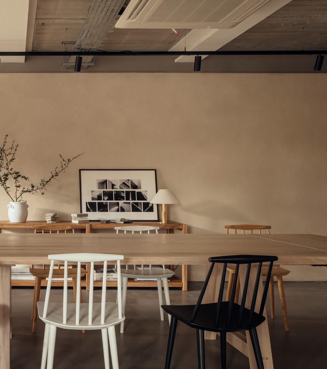
e other side of the studio accommodates a lengthy oak dining table that can seat up to 20 people. is piece of furniture – along with the lights which are set on ceiling tracks – can be moved around to suit di erent events hosted by the studio, whether that be parties, exhibitions, or
intimate dinners. “Day-to-day we love using the space for ourselves, quite sel shly,” Johnson also admits, who says the McLean Quinlan team will venture down to the studio from the white-painted workspaces upstairs to have sta lunches, workshops and meetings. Its separation from the o ce proper also makes it an ideal space for quiet, focused work or private conversations.
Access to and from the studio is granted via a vestibule, where the practice has placed a foldout table and chairs. Brick stepping-stones then wind through a landscaped plant bed towards the street. “ e external planting that we did has helped people perceive that space and see it as something interesting now,” says Johnson. “It opened up that corner and made us a bit more public.” at’s the thing about the studio; as well as inviting people into the McLean Quinlan sphere, the space enables the practice to reach out and connect – laying the grounds for further successful collaborations.
For telecommunications giant Virgin Media O2, SpaceInvader injects five floors of premium workplace with Manchester’s DNA.
Words: Ellie Foster
Photography: Andrew Smith
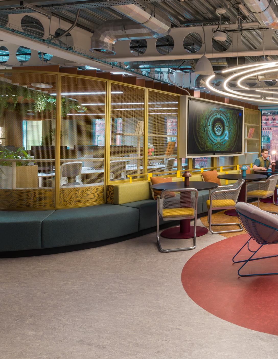
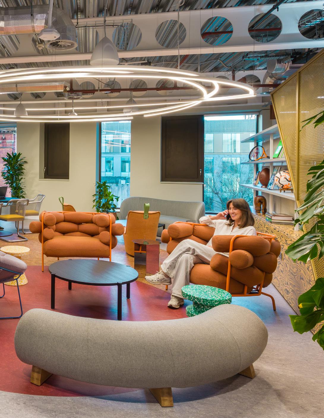
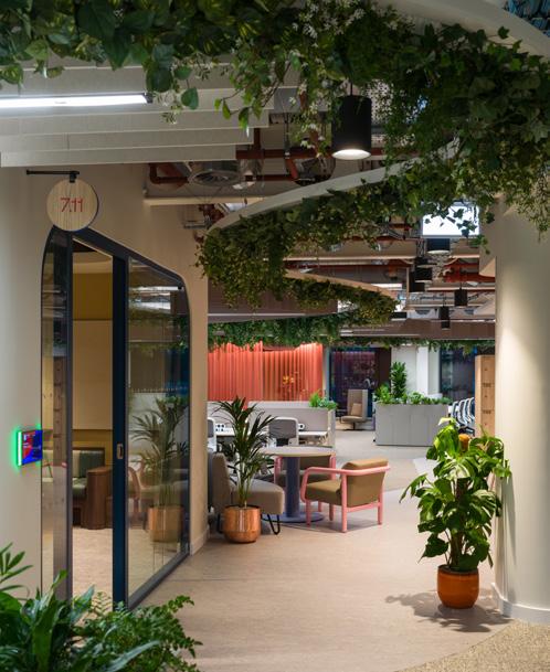
Image on previous page:
The Accidental Meeting Point on the Sports floor
Above left:
The 'Ribbon of Oxygen'
Below right:
The teapoint on the Pop floor
If asked to think about your typical call centre, images of rickety headsets, scratchy carpet and popcorn ceiling tiles might be the rst to spring to mind.
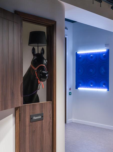
Situated on a Wythenshawe industrial estate, this is not far o what Virgin Media O2 Manchester’s former premises looked like, Concord House representing a practical yet outdated HQ for the brand’s northern contingent. e only chink in convention? Hamish – a lifesized horse lamp (Front for Moooi, 2006) who, since joining, had become the bearer of a shifting rotation of seasonal décor and a long-standing member of the customer support team.
Long overdue a change, Virgin Media O2 Manchester made the move to Island in December 2025, occupying 50,000 sq ft of its premium workspace, and joining a throng of other technologically minded businesses on John Dalton Street. For the tout, Overbury entrusted SpaceInvader with the design, asking the studio to transform the development’s uppermost
oors into a new typology of call centre –one that not only championed a globally recognised brand image, but incorporated the city’s personality into its visual schema.
“Being rooted in Manchester gave us an authentic understanding of the city’s culture and character,” remarks Bethany Gibson, associate designer at SpaceInvader and the project lead on Virgin Media O2 Manchester’s new home. She goes on to explain that the blueprint for Manchester came from previous outposts in Scotland and London; interiors infused with Glasgow and Paddington’s respective ‘DNA.’
First, SpaceInvader looked to sta to determine exactly what comprised Manchester’s unique genetic code. rough a series of cocreation sessions, ve common threads emerged – music, venues, sports, pop culture, and science and industry – which, once concreted, were assigned a storey. Backed by ‘guinea pig’ projects north and south, Gibson
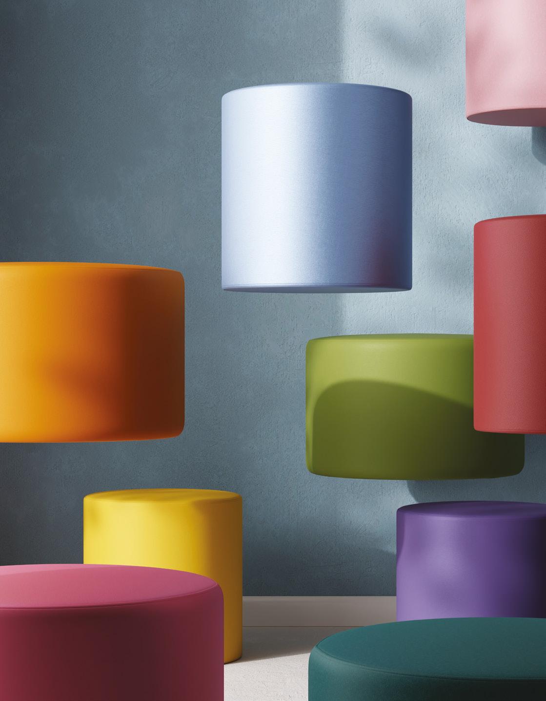
From subtle neutrals to expressive hues, Ultrafabrics delivers over 400 colour options that are thoughtfully designed to give creatives the freedom to specify with confdence — and without compromise.
Below:
The bleacher staircase occupies the Music floor
Right:
A recreational reading spot neighbours the wellness room
comments on the e cacy of this design methodology: “ ematic design strengthens orientation and engagement and, by giving every oor an identity, employees can move through spaces with local character, supporting feelings of familiarity and belonging in a large organisation.”
ough operating on oors ve through to nine, the project journey – somewhat surprisingly – begins at level eight, chosen for its picture window views over Deansgate and St Albert’s Square. Out of the lift lobby and through the rst ‘portal’ (a way nding system devised with the client’s in-house branding team), the space immediately identi es itself as the music oor, with speaker-shaped tiles sprayed O2-blue and overlayed with the number eight. Beyond, sta and visitors
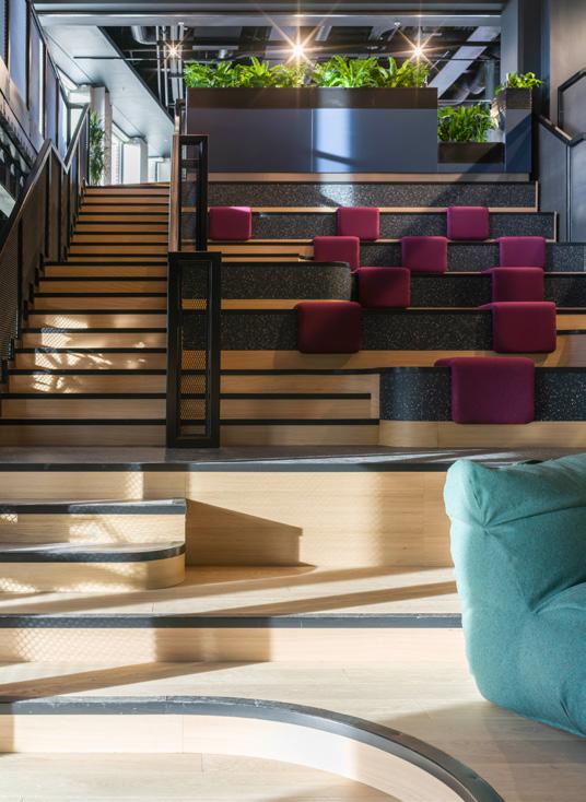
are greeted by a front desk, waiting area and three client-facing meeting rooms; all neatly organised under a showstopping 120-person bleacher staircase.
Rounding the corner, Gibson explains how the stair concept, though subtle, is intrinsically tied to Manchester’s musical legacy as well as the narrative force behind the entire oorplate. “ e rst scribbles we made of the staircase were inspired by sheet music and how the notes might look if you connected them. at's where the organic shape of the base and steps came from.” With Glaswegian teams having to make the pilgrimage south to attend company events, the integration of a ‘town hall’ gathering spot was a rmly baked-in aspect of the brief, o ering a melodious solution to a once geographic problem.
Above, the Apollo oor unfolds as a sprawling mezzanine, dedicated to dining as well as the institutions that saw e Smiths, e Stone Roses and Happy Mondays cut their teeth. “ e working café upstairs was inspired by the curves of e Ritz and e Apollo so there are a lot of circles and arches which aim to soften [the industrial elements of the architecture],” Gibson states, referring to the oxbow meanders of bookable booth seating and Virgin Media O2’s brand colours, reimagined in heritage hues. Between a self-catering kitchen and a WELL-approved canteen, the oor’s portal nods to O2 Apollo’s original signage – long Art Deco curves of stained glass forming the digit nine.

“Giving every floor an identity suppo s feelings of familiarity and belonging in a large organisation.”
Lift going down: the ‘call’ oors – ve, six and seven – required an entirely di erent approach, each 10,000 sq ft expanse working hard to accommodate customer service representatives, corporate teams, tea points, decompression rooms, meeting spaces (ranging from 1-to-1 pods to fullblown conference suites), multi-faith rooms and returning parent facilities. As the levels needed to correspond to sports, science and industry, and pop culture, a question arose around how the design team could stay true to its creative vision, while simultaneously making sound economic and environmental judgements. “We were very purposeful about where feature FF&E was positioned, balancing impactful statement pieces with repeatable [layouts] across the oors.” Gibson responds, stating that the CAT A elements earlier installed by EPR Architects –including open so ts, lighting and adapted MEP equipment – were painstakingly retained to reduce waste.
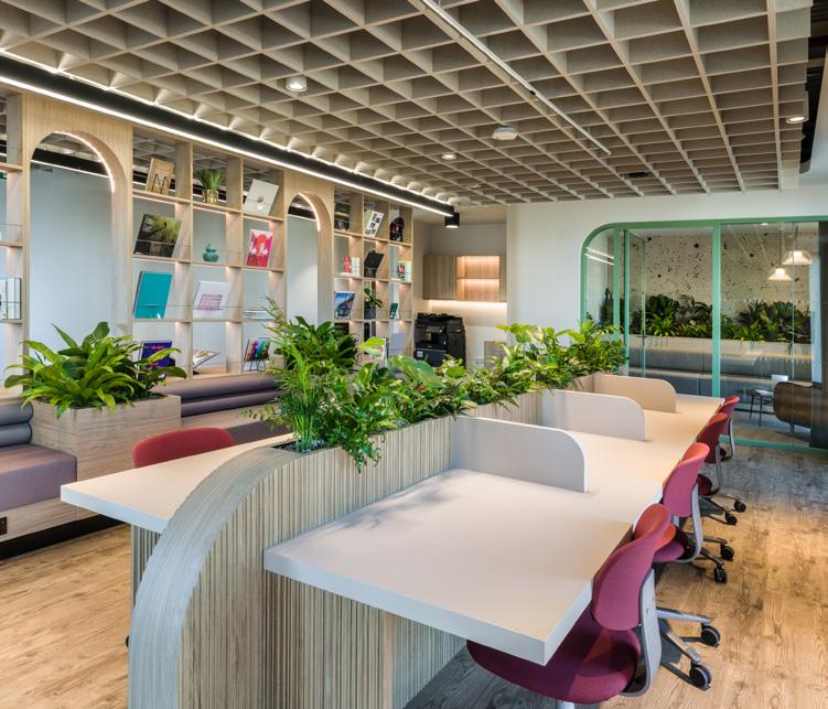
Echoed across all three oors, several spatial modalities were ne-tuned before themed details were applied. Accidental Meeting Points (AMPs) would come in the form of playful, high-energy lounges, located near portals and tea points, and designed for spontaneous interaction; ‘huddle’ spaces manifest as fabric-ringed dens would be primed for collaborative work; and, nally, the ‘Ribbon of Oxygen’ – a mixture of real and faux biophilic elements by I Want Plants, would calmly guide phone and virtual assistants to the oor’s traditional work stations.
For the AMPs and refreshment-making facilities in particular, SpaceInvader teamed up with Day 2 Furniture to procure the bric-a-brac that would nod to each cultural identity, sparking conversation and moments of nostalgia for Virgin Media O2 employees. “We wanted to create di erent kinds of energy zones to accommodate neurodiverse needs and to encourage people from di erent teams to get to know each other.”
Flooring
Granorte
EGE Carpets
Tarkett
Furniture
DeadGood
Rawside
Naughtone
Orangebox
Normann Copenhagen
Pedrali
Sancal
Lintex
Allermuir
&Tradition
Flokk - HAG
Vitra
Muuto
Bene
Boss Furniture
PlanQ
Bla Station
Surfaces
Durat
Tarkett
Paperstone
Egger
Alpi Vaneers
Smile Materials
Formica
Vescom
Kvadrat
Camira
Crown Paints
Sunbury Design
UltraFabrics
Homapal
Caesarstone
Autex Acoustics
Organoid
Lighting
LightForms
XAL
Santa & Cole
Muuto
Wastberg
Louis Poulsen
Audo Copenhagen
Tom Dixon
New Works
HAY
Other
Radii Planet
At sports level, metal mesh chairs are reminiscent of tennis courts, paying homage to Fred Perry’s achievements in the 30s, where twin paintings of legendary players – just one of the many artworks selected from an internally ran competition – touches on Manchester’s reputation as a football epicentre. On the science and industry oor above, a largescale mural by artist Andrew Wolfenden presents employees with joyful depictions of factory chimneys, and ombre carpets have been chosen speci cally to resemble oil dripping o steel. One up, in pop world, birthday sprinkle-esque recycled countertops by Smile Materials de ne the tea point, whilst a standout light xture (forming the X O, square and triangle icons of a game controller) illuminates silvery burnt ply surfaces.
“From beginning to end, this project had its end users at its heart,” John Williams, Director of SpaceInvader enthuses. “ e initial cocreation and senior leadership team sessions allowed for a thorough understanding of requirements, so that we could create a scheme that seamlessly combined brand and local identities.”
Seldom do customer-facing workers get a say in how they want their workplace to look or operate, presumably, due to high turnover and part-time contracts deterring operators from investing in the workplace. anks to SpaceInvader and its collaborators, Virgin Media O2 Manchester has become a true marker of how participatory design can rede ne the types of workplaces that are so often overlooked.
And what became of Hamish might you ask? Hamish now occupies his own private stable on the eighth oor of Island, assisting the reception sta with their day-to-day tasks.

Words: Harry McKinley
Photography: PION Studio
At Aethos Milan, Astet create a characte ul take on luxury for the boutique hotel’s next chapter.
For designers, architects and creatives Milan, occupies a regular listing on the calendar; the city around which we coalesce once a year for its fabled design week. Yet once the installations have been disassembled and the bunting withdrawn, this cultural capital remains a colourful and dynamic destination – rivalling Italy’s actual capital not through architectural grandeur or a depth of history, but through its restless spirit of reinvention. Where Rome can occasionally feel like a frozen-in-time open-air museum, Milan is de ned by its propensity for change.
e Navigli district is an apt example. Once somewhat gritty, it has become a posterchild for gentri cation – now ripe with galleries, hip bars and swish independent stores. Having become one of Milan’s most desirable neighbourhoods, property prices have ballooned and tourists throng its streets. It’s here that Aethos – the growing boutique hotel and members’ club group – has made it Milanese home; Aethos Milan recently undergoing a redesign led by the Barcelona-based Astet Studio.
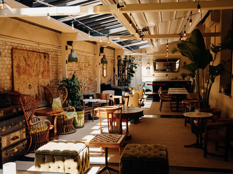
Boutique hotel refurbishments often begin with a cleaning of the slate, but Aethos Milan presented a di erent challenge. e property already had a distinct identity, with guestrooms that felt individual rather than standardised and public spaces that had developed their own atmosphere, their own patina, over time. e task for Astet then, was not to start over, but to bring greater cohesion to what was already there. And so the hotel has reopened with 35 reimagined guestrooms, refreshed social spaces and a renewed Doping Bar. e evolution also comes with a new ve-star rating, emphasising not just an elevation in design, but a shift in positioning.
For Astet co-founder Ala Zreigat, the starting point was understanding what made the existing hotel worth preserving.
“One of the strongest qualities of the hotel was that every room had its own personality and identity before the intervention,” he explains.
Rather than erasing that individuality, the design team focused on creating a clearer overall narrative, “unifying the guestrooms under an ‘Aethos Milan’ aesthetic.”
at balance between consistency and character runs throughout the project. e wider design story is rooted in Milan itself. So while many contemporary hospitality
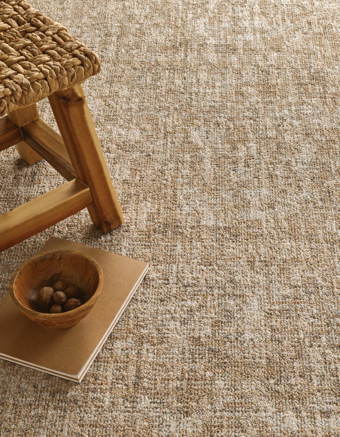
Sometimes the most powerful design speaks the least.
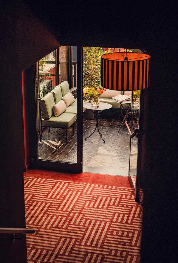
“Every room had its own personality and identity.”
Left: Circulation spaces lead to outdoor terraces
Above right: A guest suite with intergreated shelving
Below right: Private balcony with planting
schemes borrow from international luxury cues, Aethos Milan looks closer to home, drawing on architectural and material references that feel purposefully speci c to the city. e project references the work of architect Piero Portaluppi and the material richness associated with classic Milanese interiors. As Zreigat explains, “more speci cally [the design] draws from the rationalist geometries of Portaluppi and the timeless elegance of Milanese marble, creating a dialogue between history and modernity.”
e result is a hotel that says something of place without relying on obvious visual shorthand; with a strong emphasis on curation. “ e project is deeply connected to the Navigli district, one of Milan’s most vibrant and layered neighbourhoods,” says Zreigat. “It’s known for its mix of creativity, history, nightlife and residential charm, and the hotel re ects this.”
roughout, those references to traditional Milanese interiors appear in the use of stone, dark timber tones, brass accents and vintage furnishings – combined with an eclectic, even whimsical, approach to styling that helps the spaces feel lived in rather than formally composed.
e guestroom redesign is where many of the most visible interventions can be found. “We introduced a more cohesive language through custom-designed elements such as the layered headboards, wardrobes, minibars and material palette, while keeping and curating many of the original vintage pieces already present in the hotel,” says Zreigat.
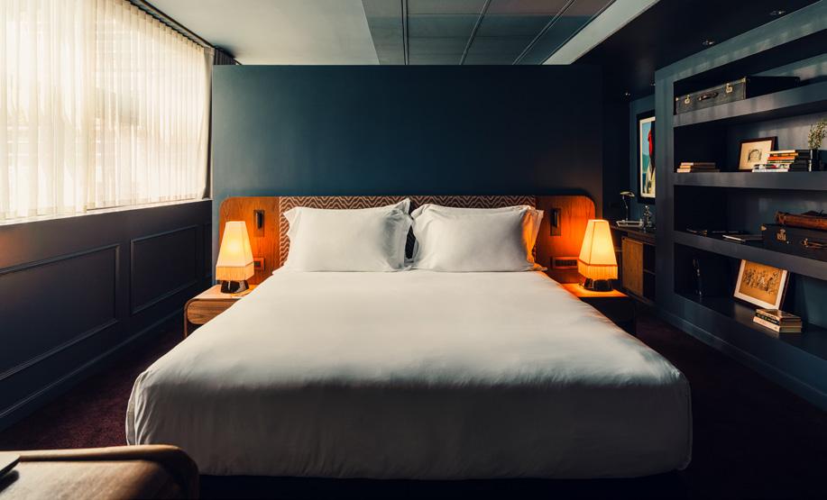
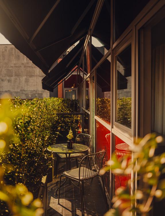
Several of these elements have become recurring signatures throughout the rooms. ose layered headboards create a stronger architectural backdrop to the beds, while sculptural minibars function as focal points within the interiors. e wardrobe design introduces a more unexpected moment: integrated artworks are concealed behind hanging rails and revealed through use, part of Astet’s ambition to create an “almost cabinet-of-curiosities atmosphere throughout the property.”
Colour plays an important role in distinguishing di erent room types. “ e standard guestrooms are lighter and fresher, built around warm cream tones,” Zreigat continues, “while the suites are bolder and more dramatic, featuring a deep blue palette combined with lilac carpeting that creates a water-like e ect across the oor.”
is use of colour is closely tied to the design’s wider material strategy. roughout the hotel, surfaces and nishes have been selected not for pristine perfection but for their ability to age gracefully; that show “the beauty of time passing.” Stone, timber, metals and textured fabrics appear throughout, creating layers of visual and tactile lushness.
While the guestrooms received the most extensive revamp, public spaces also bear Astet’s ngerprints. e main focus of the latest phase was Doping Bar, an established destination within the hotel. Rather than pursue rampant change, the design team chose to build on what already worked – “enhancing and re ning rather than completely transforming,” says Zreigat.
e bar now extends more naturally into a redesigned courtyard, introducing a stronger outdoor element. Ceramic ooring, pergolas, soft textiles and warm lighting help shape the atmosphere, while a sculptural multi-tier fountain acts as an anchor for social gatherings and that allimportant aperitivo culture.
e hotel’s rebranded restaurant, Cima, though renovated during an earlier phase, adopts a serene and more restrained character. “Conceived as a Mediterraneanstyle brasserie with pure lines and a calmer atmosphere, the idea was to create a neutral and relaxed space where guests could feel at home,” notes Zreigat.
Across the project, that interplay between sumptuousness and restraint, old and new, individuality and cohesion gives Aethos Milan its personality. For Zreigat, the nished hotel provides something increasingly rare within luxury hospitality: “Aethos Milan o ers intimacy and a character-driven alternative to traditional luxury hotels.” Or, as he puts it more simply, “it feels less like a conventional hotel and more like stepping into a private Milanese world.”
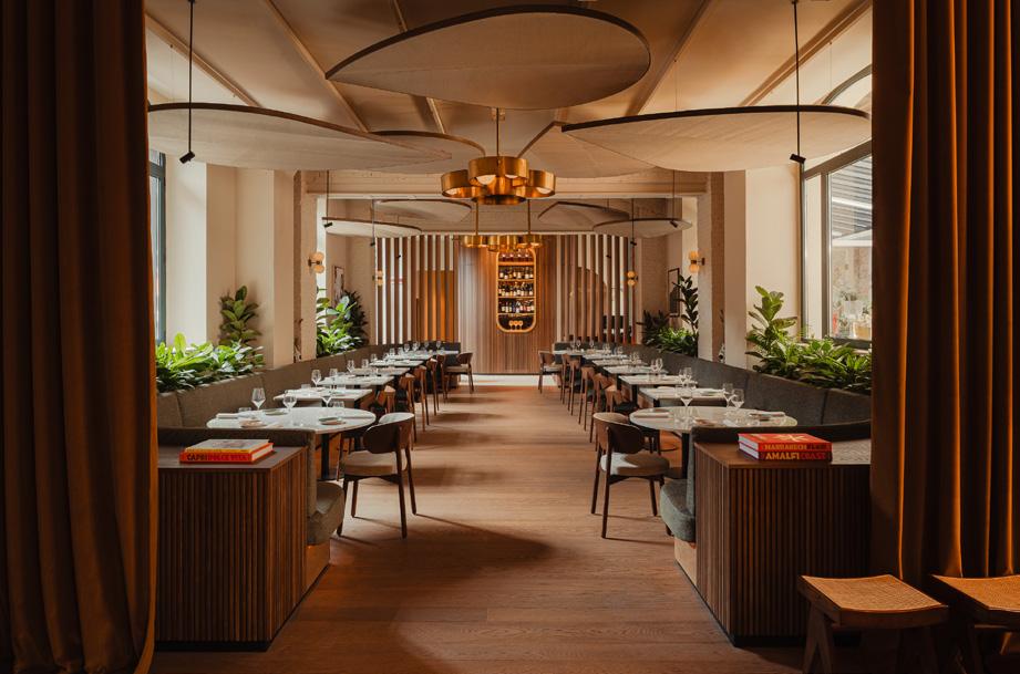

Shawn Adams is an architect, writer and lecturer. He is also cofounder of the sociallyminded design practice POoR Collective.
poorcollective.com
It’s no secret that arti cial intelligence is replacing many junior roles across the creative industries. While AI is accelerating production and increasing e ciency, it is also eroding the entrylevel opportunities within which young designers have traditionally developed their skills. is shift presents a signi cant challenge for the future of the design profession.
For decades, the journey into design was shaped through repetition and practice.
Junior designers rarely start their careers by leading projects or developing highlevel concepts. ey prepared presentations, edited Photoshop les and produced renders. While these tasks may have appeared mundane, they were never meaningless.
rough repetition, junior designers developed technical competence. rough observation, they cultivated taste and judgment. By working alongside experienced practitioners, they learned how to think critically, communicate ideas and understand the nuances of the design process.
Today, AI is transforming design production at a pace few could have imagined just a few years ago. Entire mood boards, diagrams, visual
concepts and renders can now be generated in seconds. Tasks that once took hours can be completed with a simple prompt. While this has brought signi cant gains in e ciency, it has also reduced opportunities for many junior designers, whose entry-level roles are increasingly being replaced by automated tools.
As a result, many rms are deciding not to hire junior sta . But if junior designers are no longer needed for entry-level production work, where will the next generation learn their craft? e answer is not to reject AI outright. at would be unrealistic given the direction of technological change. ese tools are here to stay and will continue to reshape the industry.
Instead, design rms should actively explore how junior sta can help implement AI in the design process. Young designers are often among the most adaptable and technologically uent members of a team, making them well placed to experiment with new tools, work ows, and methods of production. Instead of viewing AI as a replacement for junior roles, studios should see it as an opportunity to rede ne them. Entry-level designers can play a vital role
in developing prompts, testing outputs, and identifying opportunities for e ciency, helping teams integrate AI in ways that enhance creativity rather than diminish it.
e goal should not be to remove young designers from the process, but to adapt the nature of their contributions. By combining technological uency with mentorship, critical thinking, and design education, studios can ensure that AI becomes a tool that supports the development of future talent rather than undermining it.
While AI may transform the mechanics of design, it should never come at the expense of the next generation. e future of the design industry depends on a continuous pipeline of skilled, critical and creative practitioners. If studios fail to create opportunities for young designers, they risk creating a signi cant skills gap in the years ahead. e profession cannot rely solely on AI-driven productivity gains while neglecting the development of the people who will lead future projects. Without meaningful opportunities for young designers to learn, experiment and grow, the industry risks sacri cing its future talent pipeline in pursuit of shortterm e ciency.

The new podcast in which we explore how the inner worlds of designers, architects and creatives shape the world around us.
Listen and subscribe on Spotify and Apple Podcasts.
Words:
Katie Treggiden
Photography:
Jill Barnard
Studio West Architects turns a near-derelict stable into a thriving community centre – The Gardeners’ House in Penzance – employing clever design to promote wellbeing, sustainability and community cohesion.
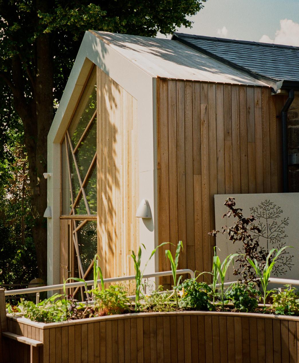
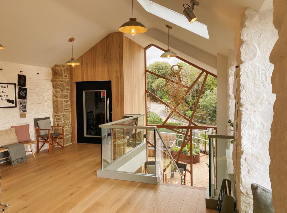
Image on previous page: A sensory garden marks the entrance
Above:
Framed views of Morrab Gardens from the mezzanine level
Architect Neil Wall describes it as "the highlight of my career”, director Miki Ashton calls the nine years from conception as “a joy” and, within months of opening, it is lled with laughing children, volunteers who love being there, foraged gifts from the head gardener and more than the occasional dog. Given that the words ‘community centre’ all too often evoke peeling paintwork, drafty buildings and plastic stacking chairs, what sets e Gardeners' House in Penzance, Cornwall, apart?
Converted from a near-derelict former stable in Penzance’s Morrab Gardens, it’s a building that few people even noticed – apart from, that is, founder of the Hypatia Trust, Melissa Hardie. She saw past the fact the crumbling former home of the head gardener was largely
held together with ivy – and Grade II listed – and hatched a plan to renovate it, for the garden’s volunteers and as an environmental education centre and archive for the Hypatia Trust. As the brief evolved, it became even more: a hub for creativity, wellbeing and nature connection; as recognised by a recent ‘highly commended’ in the Civic Trust Awards. “ e key principles [of the award] focus on a better built environment that is sustainable, accessible and community-focused,” says Wall, of Studio West Architects. “ e Gardeners’ House achieves all of these in abundance.”
And it achieves these things for a few reasons, not least because of the team Hardie recruited. Both Ashton and Wall have been on board from day one and, despite the project taking almost
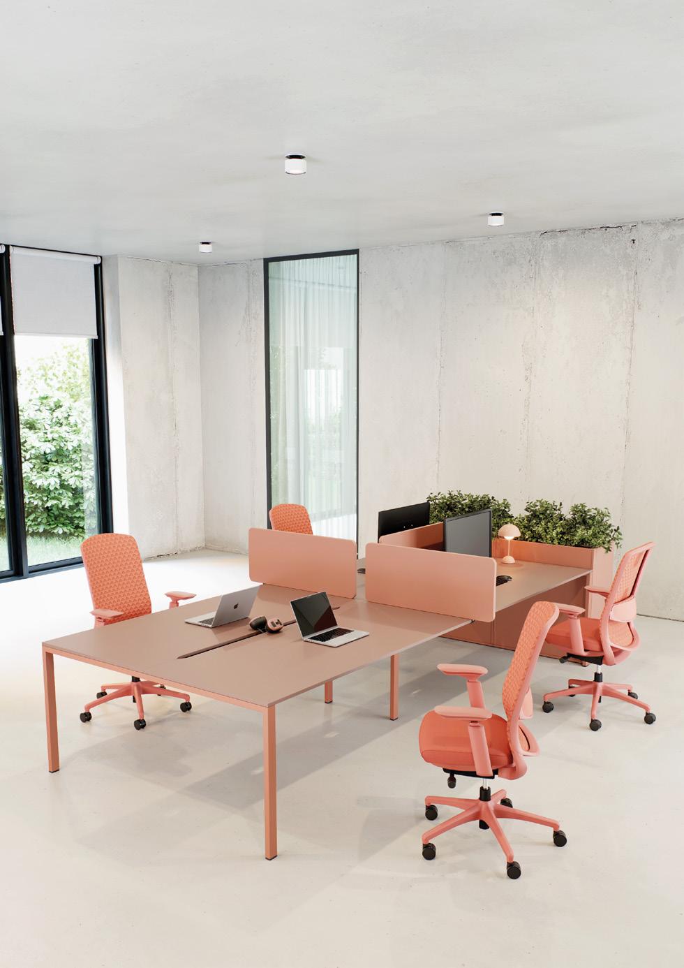
a decade, both look back on it fondly. “We spent a lot of time giggling," smiles Ashton. “Of course, there were exhausting moments, but there were more highs than lows. We wouldn’t have got here without the dedication of the entire team, who stuck with us all the way through.”
Another reason is, of course, investment. e initial funding application to the Heritage Lottery Fund failed because it didn’t contain enough provision for selfsu ciency. Going back to the drawing board, extending the building to create more space for revenue-generating activities and obtaining amended planning and listed building consents, not only secured funding, but diversi ed the communities they serve. “Now I love watching di erent people using it, seeing how they use the spaces di erently
and how comfortable they all are,” says Ashton. But it was more than just nancial investment. roughout funding ebbs and ows, and part-time, full-time and above-and-beyond work, there has been an investment of care.
“We did it all on quite a reasonable budget,” says Ashton. “It cost more in the time it takes to really think things through.” She’s talking about tiny details, such as coat hooks and display pegs that look as good when they’re in use as when they’re not, a re escape with bright yellow rubber ooring (“highly functional and also joyful,” she smiles) and a ‘lab’ with an entire wall of sinks, each with a wooden ‘lid’, turning it into useable counter space because “you can never have enough sinks.”
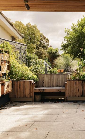
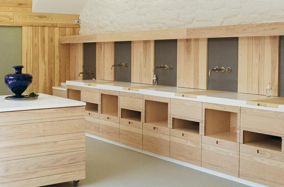
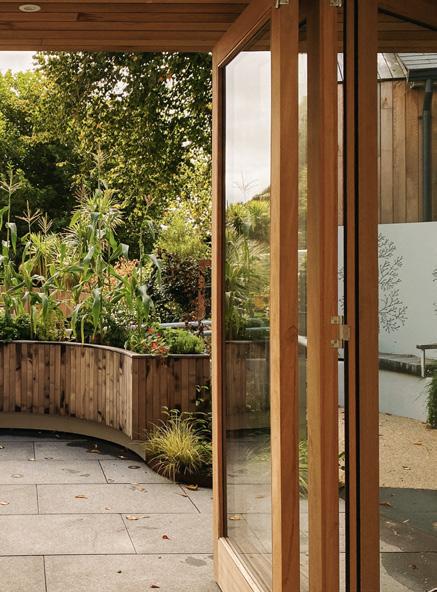
It all speaks of a deep understanding of, and dedication to, the people who now ll these spaces; spaces that comprise a sensory garden with self-contained ‘workshop’, reception and shop, a large exible ‘lab’ for school groups, workshops and classes, a generous multipurpose mezzanine, a ‘living archive’ for the studio – used for everything from lm screenings to baby yoga – as well as a sta room and a full-sized kitchen, in addition to the micro-kitchens and oor-to-ceiling storage cupboards that are tucked into every available corner.
It works because it evolved out of a series of design decisions that put sustainability, accessibility and community at their heart. Hot water and under oor heating are provided by solar tiles and six underground bore holes. And, despite the stone walls having to remain exposed both internally and externally due to the listing status, the team achieved an EPC A Rating. A platform lift brings wheelchair
“Better built environment that is sustainable, accessible and community focused.”
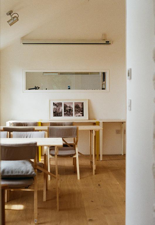
“An ambitious heritage renovation that somehow feels like it has always been here.”
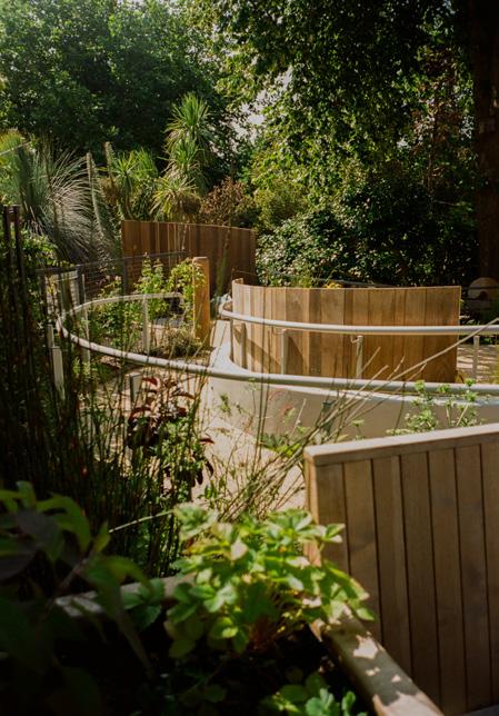
users right to the centre of the building, the toilets are accessible, generous and well designed, and the whole building was redesigned to make space for a fully accessible sensory garden. It is also aesthetically beautiful – an ambitious heritage renovation that somehow feels like it has always been here; warm, light- lled spaces populated with tactile, natural materials; large windows with views of the Morrab Garden’s tropical planting and the sea beyond and the ‘nature window’ – the gable end of the building, glazed to evoke the angularity of branches. As for evidence of its success? at comes not just from the Civic Trust Award, but from laughing children, happy volunteers, foraged gifts and more than the occasional dog.
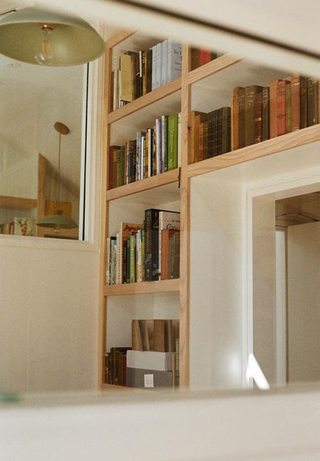
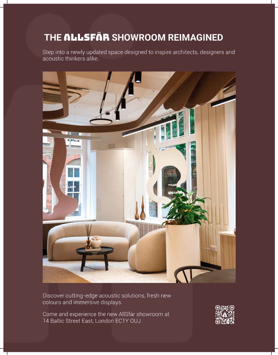
Words: David McGahon and Greg Walton, Founders and Directors, Studio McW
Photography: Claudia Padrosa
Why tomorrow’s workplace design isn’t about replicating the home, it’s about applying what the home has always understood.
We've never been truly convinced by a hard line between residential and commercial design. e questions we ask at the start of every project remain the same: how is a space going to be used? How should it make people feel? How can it support the routines and behaviours of daily life? ese questions aren't tied to a single typology and instead assert that all spaces should be rooted in humancentred principles.
When we set about designing our own studio in London, we made a conscious decision not to design an o ce.
We designed a home for our work. What this con rmed to us was how readily the principles we apply daily in residential design translated to the workplace.
is isn't an argument for making the o ce cosier so people will stay later, but one for making it more considered, more human and more honest about what people actually need from the space where they spend the majority of their waking hours. In an era of hybrid working, the o ce has to o er something that makes the act of coming in feel worthwhile.
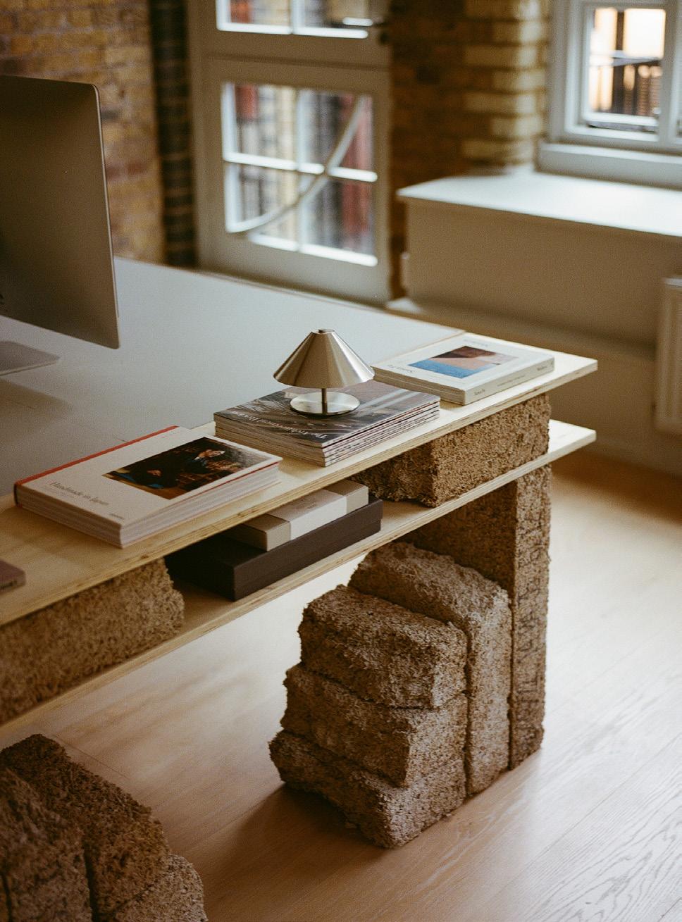
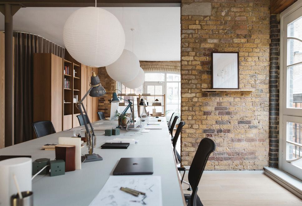
e pandemic forced the modern workplace to justify itself. Millions of people discovered that the clinical o ces they had quietly tolerated were not, in fact, indispensable. e workplace is no longer competing with other o ces; it is competing with the best aspects of home. Comfort, autonomy, and a sense of self have been neglected by o ces in favour of e ciency. Organisations that continue to prioritise density alone will lose out to those that focus on how a space is experienced.
e o ce still serves a purpose that home cannot fully replace, it’s an environment especially suited to mentorship, collaboration and the spontaneous conversations that often move ideas forward. We grew up in practices learning
by proximity, sitting close enough to overhear and absorb the informal exchanges and decisions that happen naturally in a shared space. is kind of ambient learning is di cult to replicate remotely, and it is particularly important for junior team members. If asking people to make a deliberate choice to come into the o ce, the environment has to o er something worth the journey, and for this it can look to domestic design principles.
A well-designed home understands that our needs shift throughout the day. It provides di erent settings for di erent activities: a quiet corner to concentrate, a table to gather around and informal spaces where conversation happens naturally. It supports both routine and spontaneity.
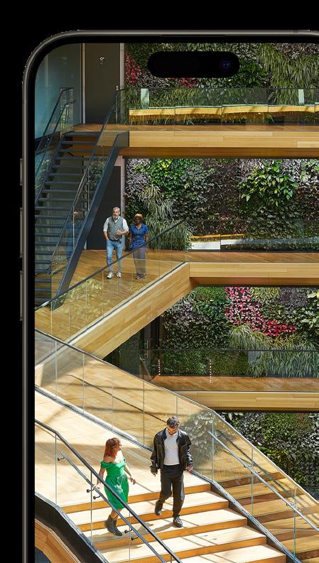
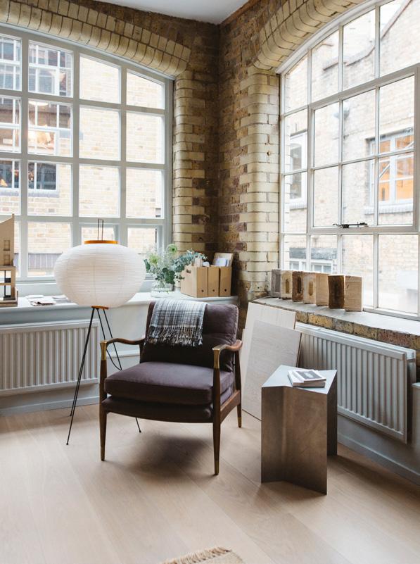
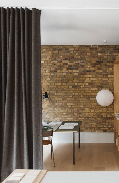
Our studio occupies 80 sqm in a former warehouse in Shoreditch. It is not a large space, but constraint in residential design is rarely viewed as a limitation and rather as an instruction. Some of the most resolved domestic architecture in London exists precisely because a small Victorian terrace demanded that every decision work hard.
e layout employs a broken-plan strategy drawn from our residential work, using non-permanent domestic gestures such as joinery, curtains and changes of level to create a hierarchy of settings and soft thresholds that allow for a variety of use and experiences throughout the day. We introduced small compressions in the plan, the moments where people naturally meet as they move between spaces, the unremarkable places where the most human conversations happen.
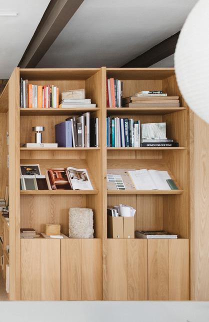
“A well-designed home understands that our needs shi throughout the day. It provides di erent settings for di erent activities.”
Natural textures, soft lighting, muted palettes are not trends in domestic interiors but are constants because they have a genuine e ect on the nervous system. When applied to the workplace, these qualities can have a signi cant impact on comfort and concentration thus improving performance. ey communicate that the people using the space are valued.
We have seen this in our own studio. Although our team has the exibility to work from home, several people now choose to come in more often than they need to. Not because of policy or expectation, but because the environment supports the way they want to work. at, to us, is the real measure of successful workplace design.
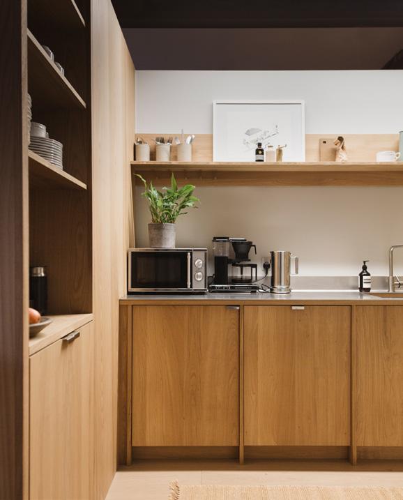
We are conscious that we are a small practice and the question of whether any of this scales – whether a ve-hundred person organisation in a twenty- oor building can genuinely apply the principles of residential design – is a fair one. However, hotels have built an entire industry on domestic design at scale. e question is not whether it is possible, but whether the will exists to ask di erent questions of the brief.
e fundamental shift required is this: to stop asking what a workplace needs to do and start asking how it needs to feel. Feeling is not soft. Feeling is what makes the di erence between a space people tolerate and a space they choose. In an era when the commute must be earned, that is not a peripheral consideration, it is the whole point.
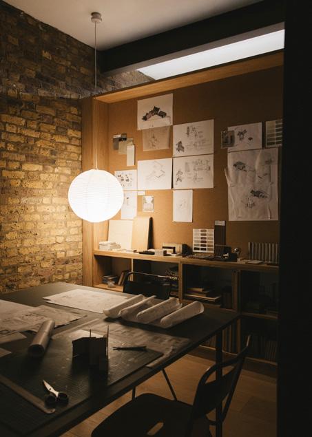
Studio McW was established by David McGahon and Greg Walton. Based in London and operating across the UK, the practice boasts a talented young team that works on a diverse range of projects, including high-end private residential and mixed-use developments. Known for its storytelling approach to design, Studio McW’s projects feature unexpected architectural details and a focus on natural materials, showcasing a strong sense of craftsmanship.
studiomcw.co.uk
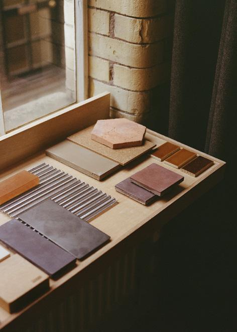
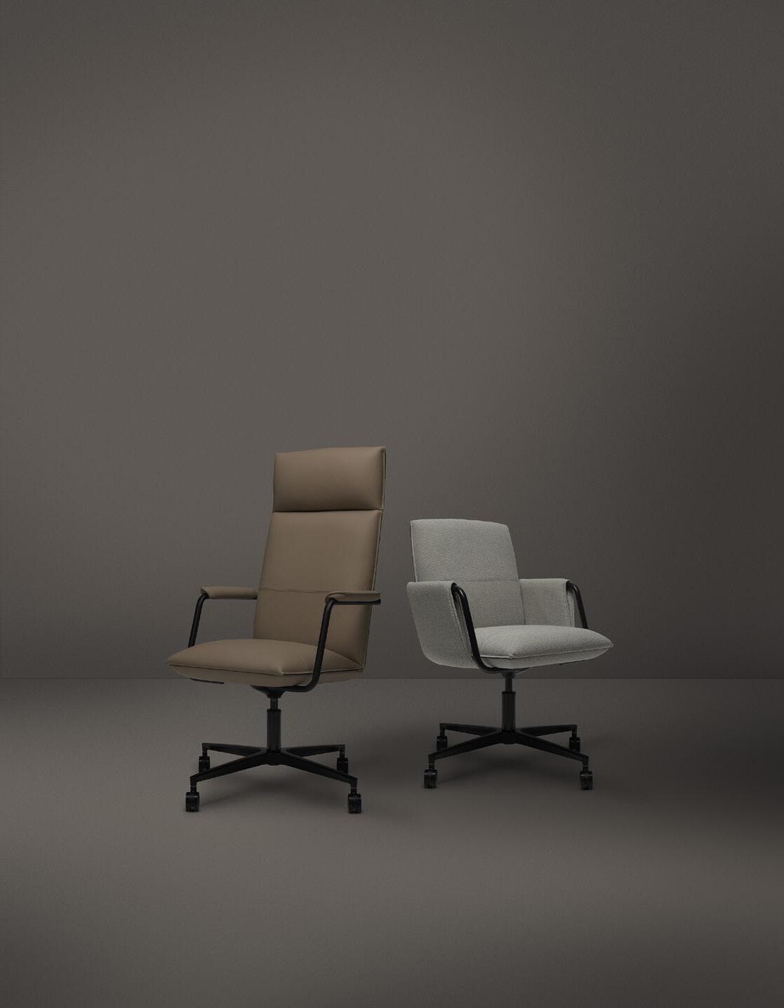
25 June 2025







25 June 2025
Evolution London
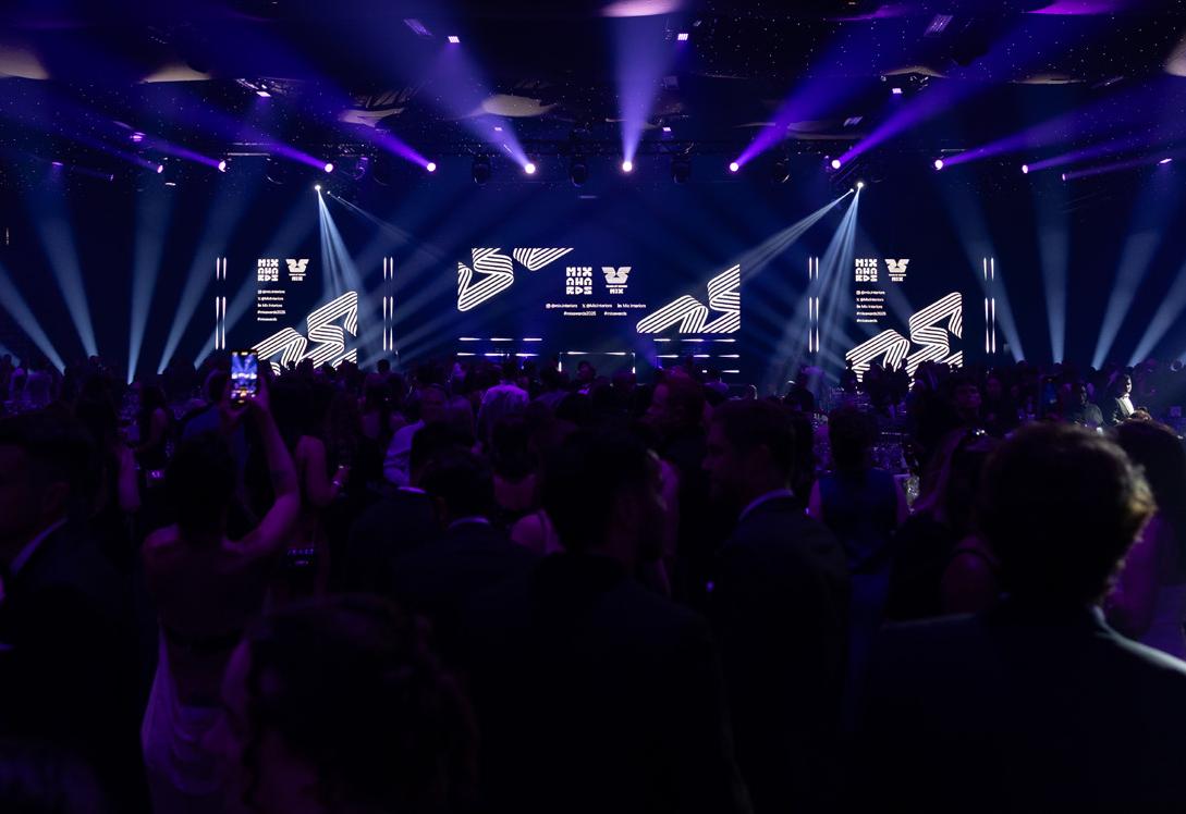
Our much anticipated, industry-leading awards programme will return to London on Thursday 25 June for another unforgettable summer celebration, o ering industry friends old and new the chance to connect, network and celebrate together.

When and where:
Thursday 25th June 2026
Evolution Battersea, London
New for 2026:
With a record-breaking number of entries across 27 categories, 2026 saw the addition of two new categories to re ect evolving industry dynamics – Project of the Year: Fast Forward, dedicated to accepting in-progress projects or bold concept work showcasing future-facing, highly innovative ideas – and Project of the Year: Identity, focused on spatial branding and celebrating spaces that masterfully execute a strong visual and cultural identity.
Entertainment:
With a hard-earnt reputation as design’s biggest night – this year we’ve assembled another powerhouse party lineup, with live brass, gospel-style house anthems and disco into the wee hours, featuring:
Brass Rascals – turning the traditional brass band on its head, with drum and bass and UK garage through a line-up of horns, drums and an MC.
House Gospel Choir (HGC) – a vocal collective bridging the gap between handsin-the-air gospel music and a nightclub dance oor. Expect classic club anthems and incredible live vocals.
e Little Disco – glitter-soaked dance oor joy from the masterminds behind Mix Awards favourites La Discothèque.
Crazy P – long-standing party starters bringing a signature blend of disco, house and funk to the Mix Awards after-party.
Trophies this year are designed by MASS Concrete – 2026 Trophy Sponsor.
Don’t miss out on the celebration of the year – secure final remaining tickets via the QR code above.
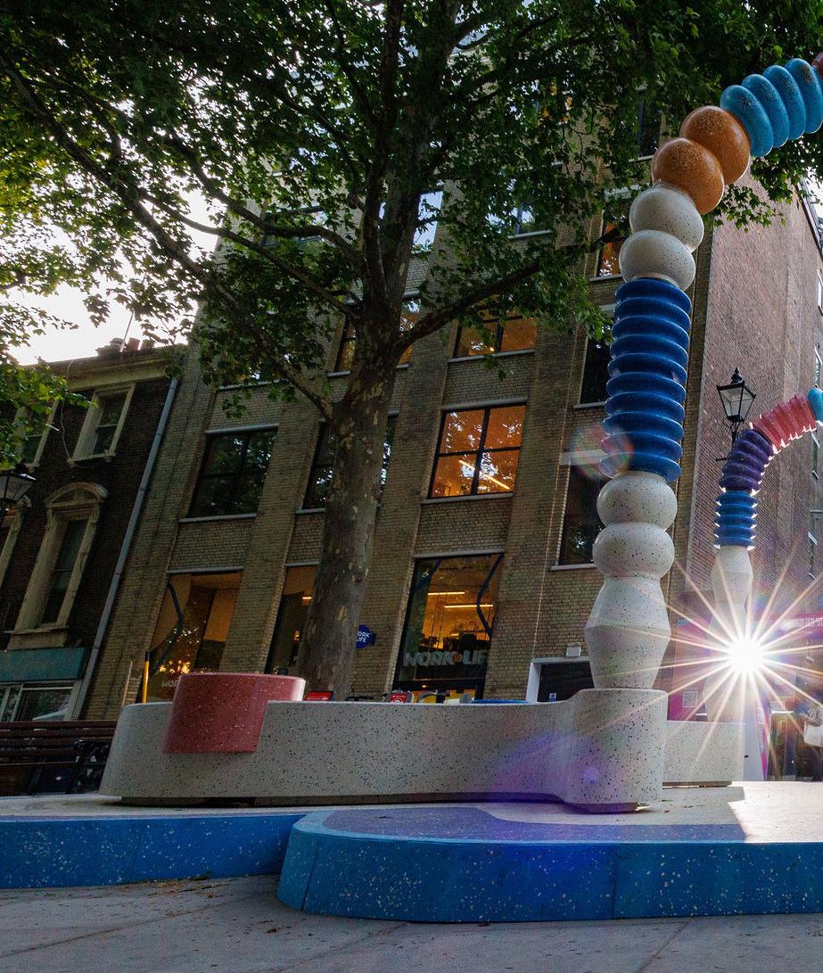
Taking place 19-21 May, Clerkenwell Design Week (CDW) celebrated its 15th edition to date, with myriad industry figureheads pouring into EC1 for three days of design discovery. Over the course of the event, CDW organisers – alongside pa icipating showrooms and exhibition collaborators – rolled out an itinerary of installations, talks and product launches, with themes such as neurodiverse design, innovations from Europe and reimagining waste being prevalent threads throughout.
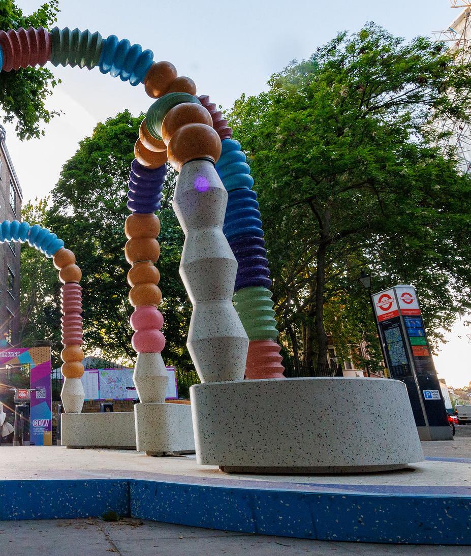
Introduced for 2026, Design Interventions tasked emerging and established designers alike to submit proposals for installations that touched on this year’s overarching themes, the chosen few appearing at various locations around the event’s showground. Two additional venues were also added to this year’s roster, including e Luxury Edit in Haberdashers Hall (a curated showcase of high-end contemporary design brands from across the globe) and the Museum of the Order of St John at St John’s Gate which served as the temporary setting for INTERIORS FROM SPAIN – an ambitious platform spotlighting contemporary Spanish design.
In Brewhouse Yard, visitors were invited to explore and contemplate Brew House – a site-speci c installation concealing an environmental agenda. Designed by Studio Egret West, the pavilion was built from 600 ‘brew bricks,’ repurposing 300 kg of waste co ee grounds collected from London cafés to demonstrate how food waste can not only challenge but enhance standard building practices.
At St John’s Gate, Design Intervention Foundations in Flow also drew upon recycled matter – namely polycarbonate corrugated panels, acrylic and disused tiles – which were assembled into an open-air seating area that paid homage to Clerkenwell’s historic wells and subterranean waterways.
Another major installation o ering moments of pause and re ection, e Fountain of Technicolour Beads by One Bite Design and stone manufacturer Leigei raised awareness for Colour Vision De ciency (commonly known as colour blindness), exemplifying how design can be both accessible and considered on a visual level.
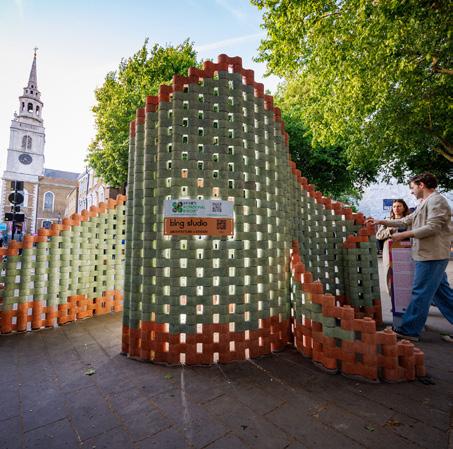
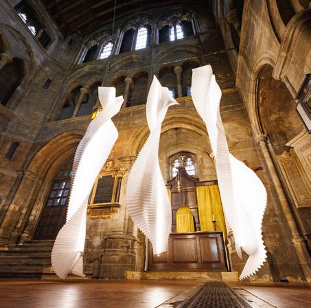
Formed for fexibility. Designed for everywhere.
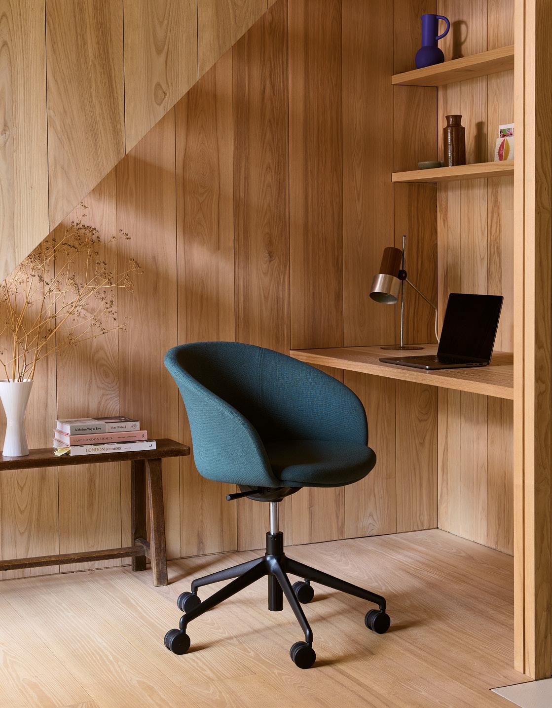
Designing for the people-centred workplace
Alongside showroom launches from ABI Interiors, Social Spaces and Reddie, CDW 2026 featured a wealth of interactive events for ticket holders to enjoy, ranging from craft workshops and ice cream trucks to spaces shaped by sound and QR code-activated trails.
With European design at the forefront, Re-Design: Projects that Regenerate Spaces, Ideas, Objects and Relationships comprised an exclusive masterclass with architect Giulio Cappellini, celebrating Italian Design Day (Wednesday 20 May) and activating e Italian Collection at Haberdashers Hall.
Meanwhile, in the bustle of St John’s Square, Colebrook Bosson Saunders captured the spirit of summer with its Rolling Minds Van, serving soft serve ice cream to the masses before signposting to new tech-led product collection in its e Sans exhibition space.
As for hands-on experience, Impact Acoustic organised a series of bookable workshops, providing guests behind-thescenes insights into its acoustic cotton tile-making process. At the brand’s pop-up lab, ticket holders explored the material up close, experimenting with a range of surfaces and custom colour compositions, before being given the chance to tessellate their creations into a wider mosaic.
Dotted around Farringdon, French designer Alexane Quender unveiled her commissioned project BinSight Benches – ve communal seats made entirely out of waste considered too di cult to recycle by local authorities. Inset with a QR code, each bench linked to a questionnaire which asked visitors to identify the type of discarded matter each bench was made from, turning a functional object into an education in circularity.
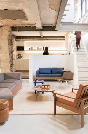
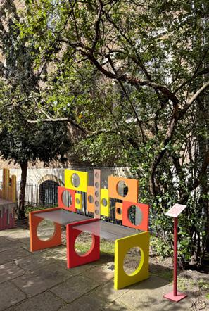
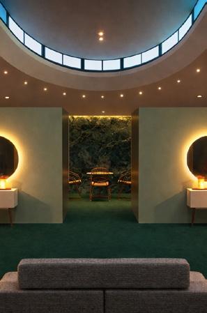
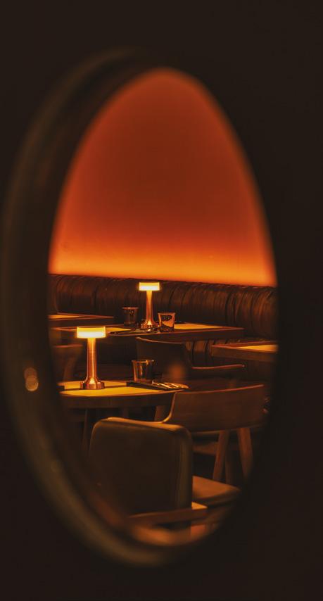
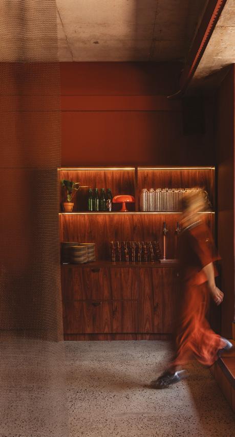
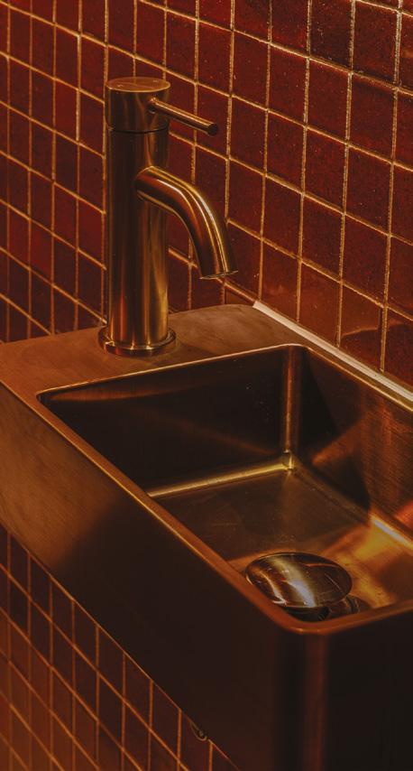
Welcoming collections from Spain, Italy, Norway, Germany and Austria, this year’s CDW included the most wideranging showcase of European design the festival has staged. Alongside e Italian Collection, with many Italian brands featuring as part of the new 2026 venue, e Luxury Edit, contemporary Spanish design was equally lauded as 27 brands appeared at three major venues, including Museum of the Order of St John.
Amongst the featured showrooms, Egger UK, Milliken and Tarkett in particular spotlighted the product collections that place neurodiversity and wellbeing front and centre.
Debuting at CDW 2026, standout products came in the form of Smile Materials’ new Smile Minerals Recycled Solid Surfaces, representing the world’s rst 100% recycled and 100% recyclable solid surface in a category where 55% recycled content has long been the accepted ceiling. Also making a splash, architecture studio Snøhetta and Ege Carpets presented Matter (a carpet tile collection breaking free from repetition through codedriven craft), while the Bolete Armchair by Patricia Urquiola for Andreu World brought a mushroom-inspired seating option to the commercial market.
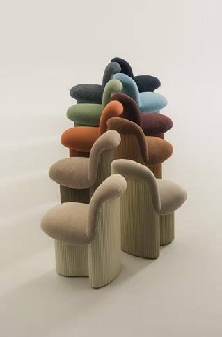
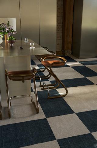
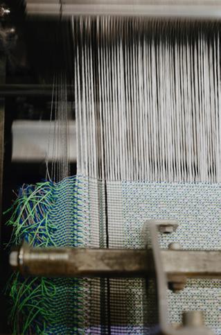
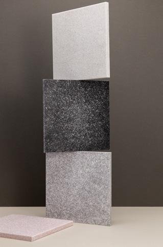
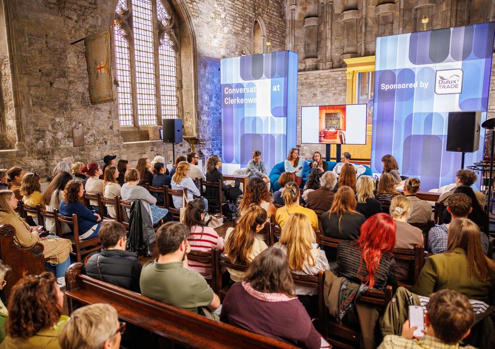
Touching on the industry’s most pressing subjects spanning diversity, inclusion and health, ve distinct talks programmes brought fresh design perspectives to the international stage, with special guests including furniture designer Lara Bohinc, architect Michael Anastassiades, Niall McLaughlin of the eponymous studio and retail expert Mary Portas all o ering their unique standpoints.
Curated by Katie Richardson, the talks’ primary forum Conversations at Clerkenwell, was this year hosted inside the atmospheric Church of Design, amongst stage artwork design by Leigh Bagley inspired by brand partner Dulux Trade’s Colour of the Year Palette. Chaired by Mix Managing Editor Harry McKinley, Designing Dining was the panel title and central topic of discussion for key speakers Dale Atkinson, founding director of Rosendale Design, Samuel Hosker of North End and Archer Humphryes’ Julieann Humphryes, who gathered on Tuesday 19 May to explore the convergence of gastronomy in the context of design and architecture.
Words: Charlotte Slinger
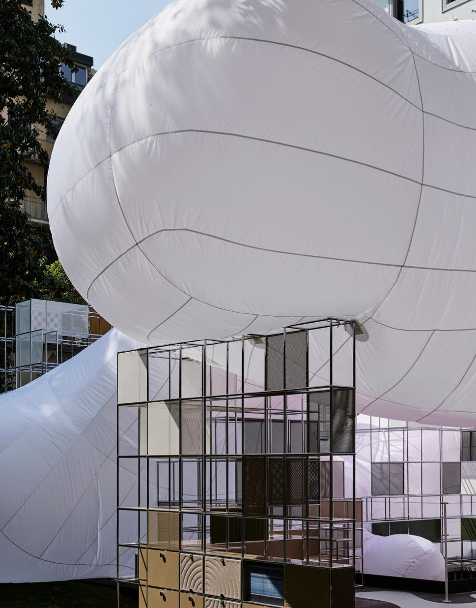
Milan Design Week: industry mainstay or a victim of its own success?
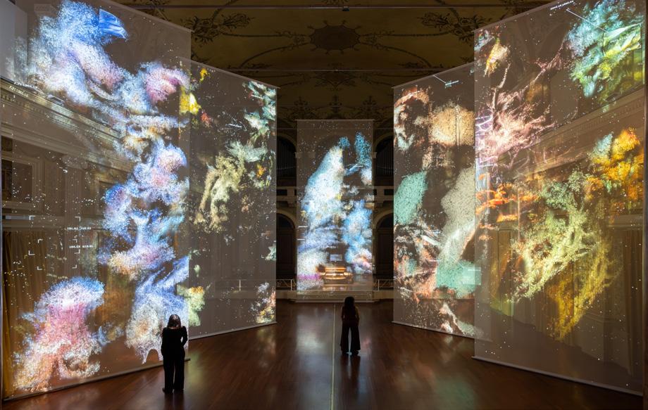
Since the very rst edition of Salone del Mobile back in 1961, its evolution from a furniture fair platforming Italian craftsmanship to an industry-shaping event on the global design calendar has rendered it almost unrecognisable.
Founded by 13 furniture makers from the Federlegno-Arredo timber trade association, this inaugural edition 64 years ago was an instant success: the fair showcased work by 328 Italian brands and drew around 12,000 visitors to Milan’s Palazzo dell'Arte, many of whom travelled from other European cities. In the decades to come, these gures would, of course, be dwarfed as the event grew, with this year’s attendance over six decades later reaching 1,900 participating brands, 167 countries and 316,342 visitors.
Realising the fair’s early potential as a meeting point for European designers, it wasn’t long before showrooms throughout the city began to open their doors during the week of Salone del Mobile, with
these fringe events expanding and later crystallising into the o cial Fuorisalone programme by 1991 – what we now know collectively as Milan Design Week.
is potted history said, it’s no secret that the world’s biggest design event has come under scrutiny as it grows further from its seemingly humble (although arguably, somewhat romanticised) roots as a fair whose only goal was to exalt the virtues of Italian furniture. And indeed, depending on your place in the industry – designer, manufacturer, architect or journalist –some visitors no longer prioritise attending Salone at all, placing the more artistic installations in design districts like Brera, 5VIE, Isola and Alcova higher on their hit list. Something in the zeitgeist also seems to be shifting, in that an interest in architecture, product design and material innovation is increasingly being seen as a marker of ‘cool’, or a barometer of someone’s cultural capital. And while this
is arguably a good thing for the industry, one perhaps inevitable side e ect is crowds of in uencers queuing outside historic palazzos merely to snap content. However, this surface-level engagement of lming, posting and moving onto the next attraction can admittedly be applied to industry professionals, too – symptomatic not only of tight schedules and the logistics of navigating bustling crowds, but of a broader pressure felt across every avenue of our digitally-mediated world: the attention economy. Some installations this year were actively created as a counterbalance to this, such as Snøhetta and USM’s ‘Renaissance of the Real’, where Swiss artist Annabelle Schneider in ated a soft, pillowy cocoon around the modular skeleton of the USM Haller collection. Visitors were welcomed with a warm towel, subtle sound frequencies, di used light and vinyl listening sessions, o ering them ‘a temporary refuge to breathe, listen and simply be present’.
Left: Glass block installation "Over and Over and Over and Over". Image: Lorenzo Fraschetti
Right: Salone Raritas, DRAGA & AUREL.
Image: Saverio
Lombardi Vallauri
e economy in its traditional sense also can’t be ignored; the city is one of the fashion capitals of the world, known for its high-end retail stores, and now extortionate ights, hotel prices and Airbnb bidding wars are beginning to squeeze out those who would typically make the journey to design Mecca – not helped by an unstable market disrupted by global a airs. Despite this, the ‘brandi cation’ of Milan Design Week continues, with luxury fashion labels seemingly everywhere: from Louis Vuitton’s Objets Nomades, Prada Frames and Armani/Casa to Lightful by Bottega Veneta, the Miu Miu Literary Club and MARNI’s much-photographed takeover of café Cucchi. Luxury didn’t just come in the form of fashion houses, either, with installations by tech giant Samsung and a slew of automotive brands including Geely, e Garage Club, Audi x ZHA, Lexus and Range Rover. e second iteration of Mito Design Connections
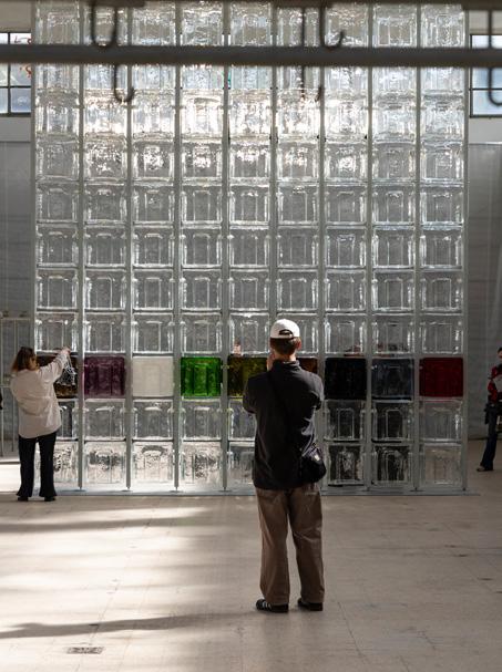
also con rmed the sheer scale and cost of this pivotal week in April, which can increasingly exclude smaller, independent studios – the initiative encouraging visitors to stay in Turin to avoid surge pricing. Still, many of those braving Milan proper are opting to truncate their stays from a full week to two or three days packed tight with meetings, dinners and press previews, with RVSPs now nonnegotiable. Capturing this growing sense of exclusivity, in her newsletter Schmatta, design writer Leonora Epstein rather aptly described it as “the rare event where you can experience profound FOMO, even if you’re actually there”.
Among the curated Instagram ‘dumps’ following this year’s fair, London-based design studio 2LG echoed this sentiment, describing how Milan Design Week can feel like “the eternal party you aren’t invited to, or wanted at.” Catching up with founders Jordan Cluroe and Russell
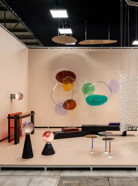

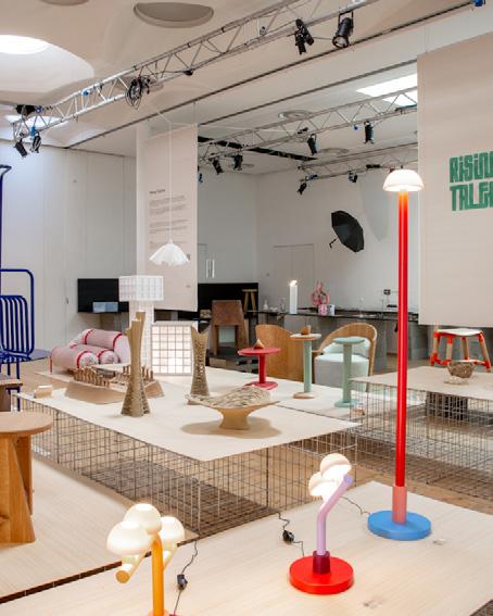
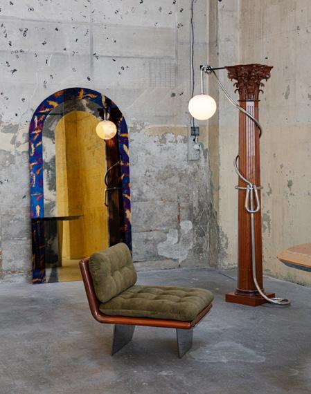
Design Festival 2026, Archivi FuturiRising Talents. Image: Anwyn Howarth
Anwyn Howarth Whitehead, the duo wrestles with the reality of the event against the weight and seriousness of the global scene.
“Going to the big design shows, of which Milan is still the most important in the world, has become a double-edged sword: both a highly valuable way to connect with other creatives and brands, and an overwhelming creativity killer that can make you feel stuck or shut out,” says Whitehead. “ ese shows used to re ll the creative pool with new concepts and a positive sharing of ideas. Now, increasingly, they can feel like a bombardment, with (at times) pointless newness and a futile chase to claim ground before the next big thing takes hold. Is it a scrabble to be seen, or to grab territory and visibly own it before you can be copied (or told you’ve copied others)? at’s not how it used to feel.”
It therefore seems that many are seeking out more meaningful experiences and truly unique products among the headline installations and throngs of crowds – this year’s line for Artemest’s L’Appartamento, for instance, snaking once again down the street. And this is arguably where those skipping the more commerciallyminded Salone del Mobile go wrong: SaloneSatellite consistently platforms emerging designers under 35 and the latest developments in sustainability (such as bio-leather alternative Ohoskin, featured in this issue’s Material Innovation). Also re ecting this desire for something truly novel was Salone Raritas, a new pavilion showcasing a curated selection of rare, collectible items. Dedicated exhibitions that o ered a more considered deep dive into certain topics and studios additionally proved popular as a counterpoint to surface-
level installations, with the Triennale Milano hosting Alphabet, a monographic exhibition of Barber Osgerby’s career, and charting A Chronicle of Danish Design with furniture brand Fredericia. “Small scale shows featuring emerging designers, perhaps out of necessity and sheer grit, lit the way with meaning. Meaningful design has legs and brings hope; whether that meaning is about community or new materiality, this is where we felt lled up rather than drained,” Whitehead agrees. “ e successes we saw in Milan came from investing time in community, where mutual support and growth can be found, as you share the risk and resources. Slow and steady is the way forward, perhaps not only in the way we make things, but also in the way we must repair what’s been broken in our industry.”
DeepSoul redefines material at its deepest level.

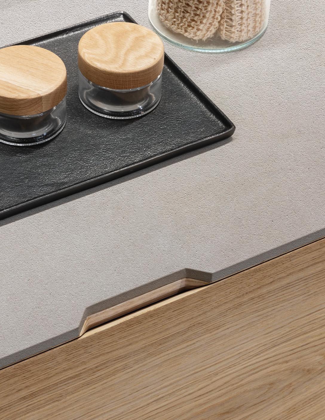

Why Italian brand IOC is more than a product supplier, it's a project pa ner.
y:
ere is a revealing detail at the centre of IOC’s story. Before visitors discover the furniture collections, workplace systems or acoustic solutions that lie within the company’s headquarters in Giussano, north of Milan, they encounter the building that houses them. It’s a piece of Italian design history: a structure designed in the 1970s by architect Angelo Mangiarotti, one of the most in uential gures of post-war Italian architecture. More than simply a corporate headquarters, it signals something important about IOC’s identity. is is not a company that arrived at workplace
design through furniture alone. Its roots lie equally in architecture, engineering and manufacturing.
at distinction has shaped IOC’s development over the past three decades, helping the company build a signi cant presence in North America through collaborations with leading architects and designers, while arguably remaining slightly more under the radar in Europe. As the business begins to expand its pro le across the continent, however, it carries with it a proposition that feels increasingly relevant: a combination of Italian
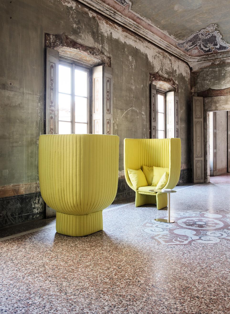
manufacturing culture, technical expertise and project-management capability developed through some of the world’s most complex workplace environments.
“Our origins are still very present in the way we think and work,” says Luca Pepori, President of IOC USA. “Although the company operates internationally and manages complex workplace projects, there is still a very strong tailor-made mentality behind every solution.”
at mindset stretches back much further than the company’s formal founding in 1992. IOC’s wider family history begins in the 1930s in Brianza, one of Italy’s most important furniture-manufacturing districts. What started as an artisan workshop evolved into industrial production in the 1970s before becoming IOC – International O ce Concept –under the leadership of Marcello Pepori (today’s president) and Angelo Meroni.
e trajectory re ects a broader story about Italian manufacturing itself: the ability to scale production without losing sight of craftsmanship. While many manufacturers speak about this balance, IOC’s business model arguably depends on it – the company best understood not just as a furniture brand but as a workplace specialist. Its expertise spans executive and operational furniture, architectural partition systems, acoustic products and other bespoke workplace solutions. Perhaps most importantly, these disciplines are developed together rather than as separate product categories.
“What distinguishes IOC is the balance between design culture, engineering expertise and project exibility,” says Pepori. “We bring together aesthetic research with a strong technical and architectural approach.” And that architectural emphasis is visible throughout the business.
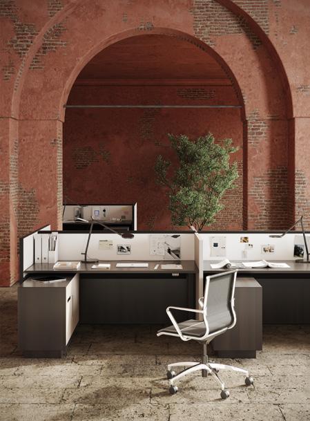
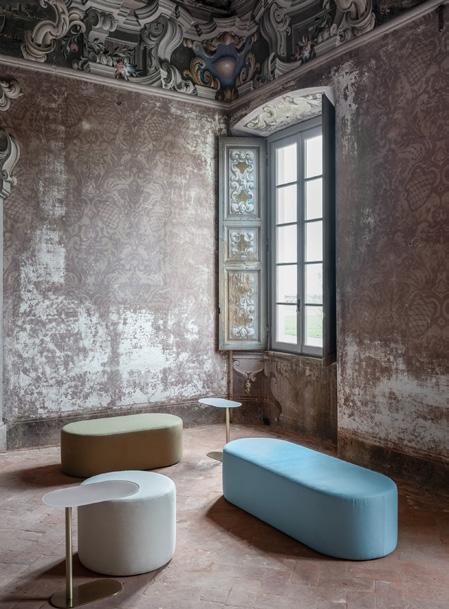
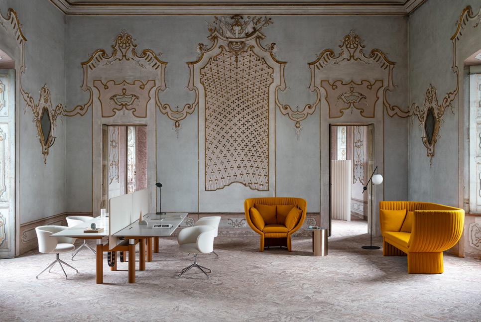
“One of IOC’s strengths is the ability to integrate sophisticated engineering.”
While many manufacturers focus primarily on standalone products, IOC has spent decades developing integrated workplace systems. Partition walls, acoustic solutions and furniture collections are conceived as part of a wider spatial ecosystem; an approach that re ects the changing nature of workplace design, where performance increasingly depends on the interaction between architecture, acoustics, technology, furniture and, of course, the user.
e company’s manufacturing infrastructure supports this ambition. IOC oversees much of its production internally, from woodworking and nishing to advanced aluminium processing. Aluminium, in particular, has become one of the company’s de ning competencies. e material sits at the core of many of its partition and workplace systems, allowing the development of highly engineered components that maintain a re ned, elegant appearance.
“One of IOC’s strengths is the ability to integrate sophisticated engineering,” says Pepori. “Technical detailing, pro les, junctions and movement systems are carefully studied to ensure precision, exibility and durability.”
at attention to detail may not even be immediately visible to end users. But nor is it arguably intended to be. Like much of the best engineering, its success lies in disappearing into the nished environment – quietly delivering an experience that is seamless.
It’s a philosophy that can also be seen in IOC’s product development suite. e Brera25 collection for example, developed with Gensler as product design consultant, illustrates the company’s approach particularly well. Designed for executive environments, the collection combines re ned materials including wood veneers, metal, glass and leather with hyperfunctional features such as electrically height-adjustable work surfaces. Rather than treating technology as an bolt-on, Brera25 integrates performance.
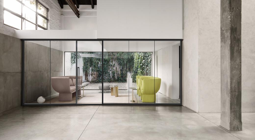
“IOC design is essentially about balance.”
Elsewhere, more recent collections demonstrate an increasing focus on workplace wellbeing and behavioural change. e Ghisolfa acoustic seating collection by Ra aella Mangiarotti responds directly to contemporary demands for privacy and concentration within open-plan environments. Highbacked sofas and armchairs create informal rooms within rooms, combining acoustic performance with a softer, more residential aesthetic. Products such as Isola, Gioia and the Corvetto and Guastalla tables similarly re ect the shift towards workplaces that accommodate multiple modes of work, from focused concentration to informal collaboration.
ere’s a clear thread connecting them all. IOC’s design language tends towards restraint rather than spectacle. e emphasis is on proportion, material quality and usability rather than visual overstatement.
“IOC design is essentially about balance,” says Pepori. “Balance between architecture and furniture, between aesthetics and function, between technical rigour and emotional quality.”
at ethos has found expression in projects ranging from corporate headquarters to universities, particularly in North America. e New York Times Headquarters remains one of the company’s landmark references, demonstrating its ability to contribute to large-scale, architecturally ambitious environments. Such projects require far more than product supply; they demand coordination across design, engineering, logistics and installation. is ability to operate as a project partner rather than ‘simply’ a manufacturer has become one of IOC’s most vital di erentiators.
“We manage projects from concept to installation, acting as a true project partner rather than only a furniture supplier,” Pepori explains.
In practice, that means working closely with architects and clients to develop customised responses rather than prescribing standard solutions. It’s a process that re ects the company’s broader culture: industrially sophisticated, but fundamentally collaborative.
at spirit is perhaps best understood through IOC Studio, the company’s recently unveiled showroom and experience space designed by Milanbased practice Migliore+Servetto. Located within the Mangiarotti headquarters, the 400 sq m environment functions less as a traditional showroom and more as a narrative exploration of the company’s capabilities.
Material archives, prototypes, engineering components and nished products sit alongside immersive installations exploring the company’s international projects. One display showcases more than 250 aluminium pro les, e ectively turning the technical language of manufacturing into an
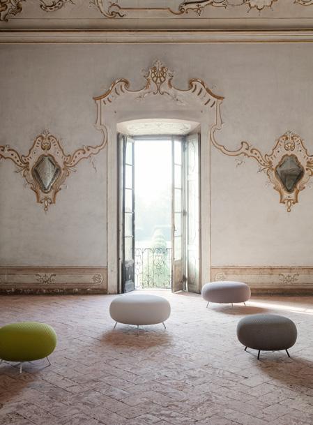
exhibition piece. And it’s a gesture that feels symbolic. For many years, IOC’s expertise has existed largely behind the scenes, embedded within the success of mammoth architectural and workplace projects. As the company increases its visibility across Europe, it is beginning to tell that story more explicitly.
e timing appears well judged. As workplaces continue to evolve, designers increasingly require partners capable of navigating complexity. Acoustics, adaptability, sustainability, wellbeing and technology are now inseparable from questions of aesthetics. e companies best positioned to respond are often those operating between disciplines and IOC has spent much of its history demonstrating its aptitude in that space. It’s not just a product manufacturer, not solely an engineering company and not a design rm alone. Instead, it occupies the increasingly valuable territory where all three overlap.
Ioc.it
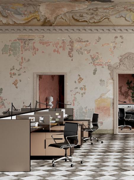
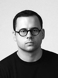
Kutay Yorulmaz is Co-Founder and Interior Architect at Wangan Studio – an Istanbul-based interior architecture practice working across architecture, interiors, product, brand and experience design. With o ces opening in Paris and London, the studio brings a precise material sensibility to projects across scales and geographies.
wangan.studio

ere is a poetry in the ancient technique of lost-wax casting, which we are currently exploring for the central bar element in our upcoming cafe project; developed in collaboration with Mehmet Birtane – founder of Studio Birtane. By carving the initial form in wax and melting it away to make room for molten metal, the process captures a eeting moment. For a high-interaction surface like a bar, it completely rejects the sterile precision of modern machine-milling. Instead, it yields organic imperfections that mature beautifully over time.
Glass is often celebrated for its transparency, but we nd its true power lies in its mass and ability to distort. In our recent clinic project, we explored solid cast glass blocks to construct undulating, structural volumes that rede ne the traditional boundaries of clinical spaces. Moving away from standard at glass partitions, these heavy blocks transform light into a soft, di used glow while maintaining a sense of privacy.
ere is a captivating element of unpredictability in the Raku- red ceramics of Studio Neue. e process bypasses industrial control. Once the glazed piece is pulled glowing hot from the kiln, it is plunged into an airtight reduction chamber lled with combustible materials. e resulting thermal shock fractures the glaze, allowing the trapped smoke to bleed into the newly formed ssures. What we love about this material is that the smoke permanently inks the geography of the cooling process. It turns a static wall cladding or decorative surface into a time stamped artifact.

We are deeply drawn to the architectural potential of heritage crafts, which led us to deconstruct traditional Turkish woven textiles – speci cally Maraş Aba and Kutnu – for a bespoke lighting installation. Rather than treating these hand-woven fabrics as upholstery, we suspended and layered them to act as light di users. When backlit, the dense, structural wool of the Aba and the rhythmic stripes of the Kutnu come alive. It translates historical weaving techniques into a contemporary spatial experience, catching light within the loose threads to create a warm glow that humanises large-scale interiors.
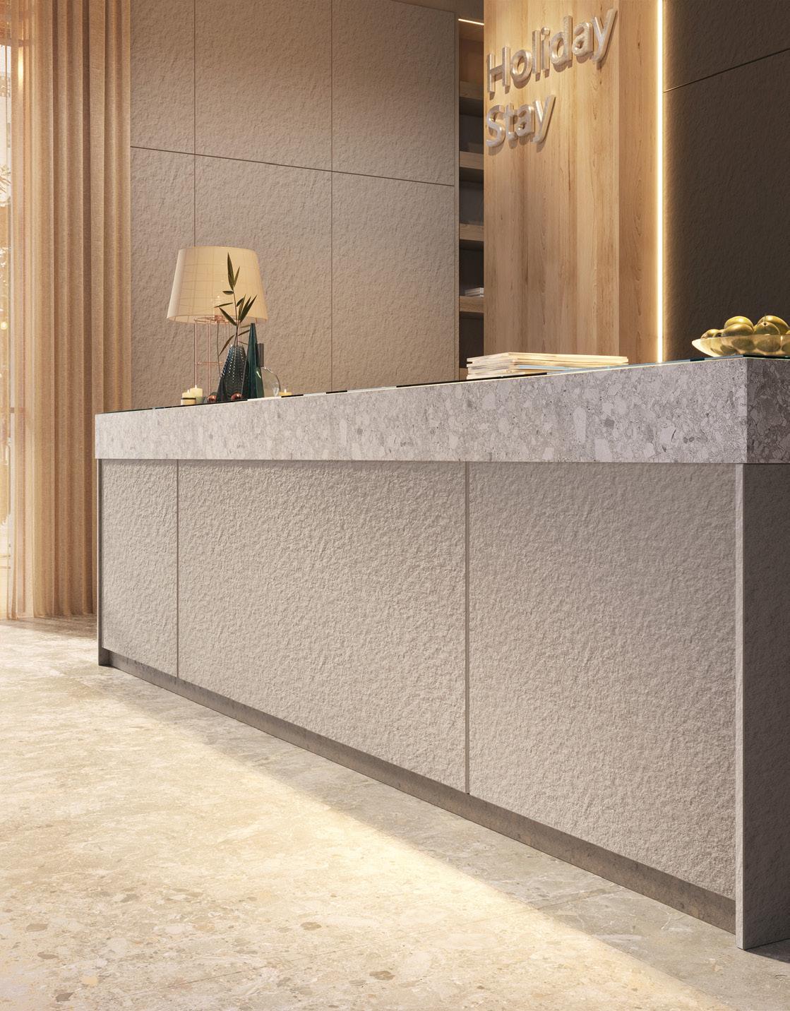
Material Innovation
Sicily’s heritage
of citrus production for a circular future, Ohoskin
cra s a bio-based leather alternative from orange peel and cactus rinds.
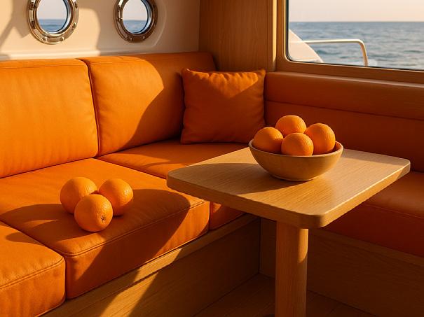
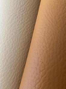
A staple of Sicilian agriculture for over a millennium, oranges, lemons, tangerines and even the region’s famous prickly pear have become synonymous with the Mediterranean island, thanks to its fertile soil and lush orchards. is rich heritage is what inspired Adriana Santanocito to launch her own material studio, Ohoskin – which exhibited its bio-based leather alternative at SaloneSatellite during this year’s Milan Design Week. “Growing up in Sicily, I was surrounded by citrus production, but also by what remains after processing – every year, large amounts of byproducts are generated, creating a real challenge for disposal,” says Santanocito.
“At the same time, my background in fashion and material innovation pushed me to think about performance, not just sustainability. Ohoskin was born at the intersection of these two worlds: giving new life to existing resources while creating a material that could meet the standards of design, fashion and industry.”
Rooted in this circular approach, the studio repurposes what is currently seen as agricultural waste from processing Sicilian oranges and cacti – namely, the peel and rinds, which amount to as much as 1.3 million tonnes annually. is is
then blended with second-generation, recycled biopolymers and natural resins to create a durable leather alternative –entirely made and sourced in Sicily, using a coating process that is also powered by sustainable energy.
When bringing this ambitious concept to life, one of the biggest challenges Santanocito faced was nding the right balance between sourcing all natural ingredients and maintaining industrial performance. “ ere is often an expectation that materials should be fully bio-based, but the reality is that durability and scalability require a more pragmatic approach,” she explains. “At the same time, this is also the greatest reward. When you see [your] material perform at a high technical level and be adopted by brands across di erent industries, you realise that this approach can truly rede ne how materials are designed and used.” Already supplying the bio-based leather to brands across furniture, fashion and the automotive sector, the next step for Ohoskin is scale – with Santanocito hoping to expand the studio globally, using its replicable process to help global partners introduce more circular, planetforward manufacturing models.

e question that torments every workplace strategist, other than when they might get paid, is how many types of worksetting for a scheme is enough? For those weaned on activity-based working, from Luchetti and Stone’s seminal 1985 paper, it can be a daunting challenge.
While we have fortunately moved on from the rst o ce I worked in (coincidentally, during the year of publication of the paper) which had just private o ces, meeting rooms and a galley tea point complete with teaspoon tied to the wall, I once witnessed the exasperation of a designer from being directed by the strategists to include a worksetting for 27 distinct activities. By the end of the conversation, I shared his anxiety. I’m sure the eventual occupants of the space did, too, however much change management was deployed.
Naturally, the instinctive answer to the opening question will be ‘it depends’, as every organisation varies in its ‘why’ and ‘how’, and often varies within the organisation
between locations, too. Hence the need for workplace strategy, to understand and respond to the speci c needs.
But if we’re talking about an o ce, we might reasonably conclude there’s a limit to the variations on the theme of o ce work. Key factors are likely to be the outcome required, and the people (number, role, preferred workstyle) and kit (type, functionality and applications) involved in delivering it.
Yet at what point in determining work activities that need to be enabled do we get into nuances that serve no purpose and merely confuse? ree may not be the magic number in this instance, but is there a standard number of types of worksetting we can optimise around, that will account for the ways work is performed today and how it may change in future?
We can then ponder whether we start with trying to understand an organisation’s work activities to determine the settings required, or with a standard pack of worksettings
based on experience to determine whether they will work for the organisation, focusing on the marginal cases. Purists will argue for the former, as it’s often deemed that strategy that starts with a blank piece of paper and develops through enquiry is of higher value than that derived from rich seams of practice. Even though it’s the years of practice that determines the right to start with a blank piece of paper and ask questions.
Amble through a variety of recently completed workplaces and there’ll unlikely be a worksetting that surprises. e aesthetic and form applied to the function may vary (in fact, we hope it does) and the name be di erent, but essentially the building blocks are the same. It’s because we know, through years of creating workplaces, that people do six things in an o ce. It follows that six worksettings types will su ce as a minimum and will work in most organisations.
What are the six things? You make the list. It’s not rocket science. It’s not magic, either.
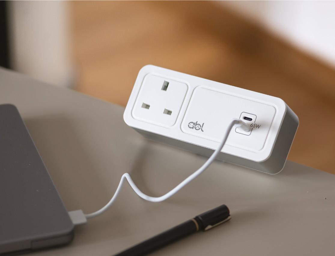
For the past 25 years at Mix Interiors, no two covers have been alike. Each issue, we hand over the reins to a di erent designer and manufacturer to collaborate on a unique piece of a work – bringing their distinct style and expe ise to life.
Squire & Partners is an international architecture and interior design studio with a reputation for using storytelling to produce beautifully crafted design. With experience spanning ve decades, the practice has earned an international reputation for architecture informed by the history and culture of where it is placed. It creates distinctive, enduring and thriving buildings and places that are sensitive to their context and connect architecture with community.
squireandpartners.com
Founded in 2019 by Sven Erni and Je rey Ibañez, Swiss pioneers Impact Acoustic creates acoustic solutions that are uncompromisingly sustainable. e company has driven industry change in recent years through high-performance products made from groundbreaking circular materials, including the innovate ARCHISONIC® Felt, Mycelium and even tofu. Inspiring this issue’s cover is RAYA, an acoustic lighting collection de ned by radial slats that echo the warmth of the sun’s rays. Available in four complementary forms – Aurelia, Alba, Covo and Helia – the lights can be used collectively or alone to create a re ned interplay of light and shadow.
impactacoustic.com
For Mix Interiors Issue 244, Squire & Partners has collaborated with Impact Acoustic to place its RAYA acoustic light collection at the heart of the design. Exploring the collection’s botanical, radial forms, natural materiality and precision engineering, the studio uses storytelling rooted in the interplay of light and shadow to marry celestial light with botanical geometry.
In addition to the main cover, ‘Day,’ three other designs have been developed: Night, Sunset and Forest. Scan the QR to reveal the alternative covers and bring the radial blades to life, accompanied by a celestial audio soundscape by Tom Middleton, Senzomi.


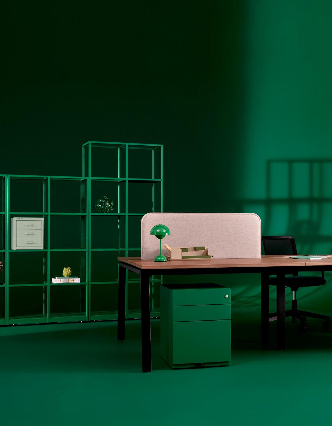

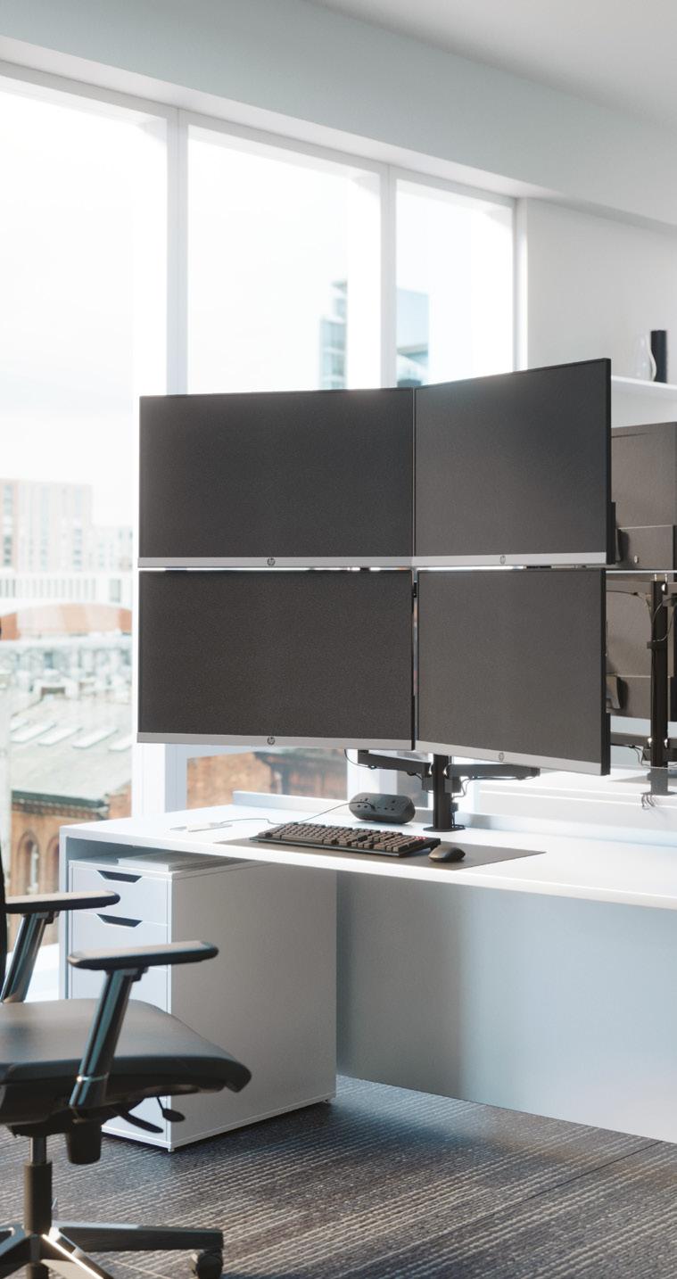
Arbour –the dynamic, pole based mulitiscreen system, designed to transform the way you work and play.