Interior Design
PORTFOLIO Selected Projects Michael Bailey
1
Background.
About.
My current focus is on designing spaces that respond to how people actually live in them — not just how they look, but how they’re used, moved through and experienced day to day. I’m interested in the small decisions that shape a space’s character: how light falls across a surface, how a layout guides movement, how material and detail create a sense of calm or care. For me, meaningful design starts with understanding the person who’ll inhabit the space, and working outward from there building rooms that feel considered rather than just designed.
My work explores the relationship between people, place, and materiality — with a particular focus on community-driven design, sustainable strategies, and the role of detail in shaping spatial experience. Graduating from Newcastle University, I developed a foundation in design thinking that runs through every scale I work at, from conceptual sketch to detailed construction. section. For me, each stage of drawing — hand, model, or technical — is a way of thinking through a problem, not just recording a solution. Education
Newcastle University — BA (Hons) Architecture, 2:1, 2021–2025
Current Focus.
Academic Awards
Bury Grammar School — Henry Taylor Design Award 2020 Published First Class Dissertation
Skills
AutoCAD, Revit, SketchUp, InDesign Physical Model Making & Fabrication UK Driving Licence
Growing up travelling gave me an early appreciation for culture and architecture, and a year in Japan changed how I think about both. My days there were built around movement, time outdoors and a trip to the local onsen, and I began to notice how much the buildings around me supported that way of living. My focus now is health-centred architecture and interiors: spaces that respond to the individual and their daily routine, rather than asking people to adapt to them. I’m interested in how light, material and the way we move through a building can support rest, activity and recovery. Photography is how I study this, looking at how people, place and movement shape lived experience.
Contact Information: Manchester, United Kindom Baileymichaelj04@gmail.com +44 7538 677241 michael-bailey-8960a9257
2
Selected Works.
Designing Hirafu 188
|5
Warmth in Light
|7
Warmth in Texture
|9
Layered Neutrals
|10
Alpine Lodge, Japenease Hand
|12
Moving Between Spaces
|15
Slowing Down: The Onsen
|16
3
Designing Hirafu 188 This portfolio begins with the project that shaped my approach to interior design. In Niseko, I was lead designer on the opening of Hirafu 188, a new 300 sqm flagship store and the central hub for five surrounding stores. With several hundred thousand pounds of stock to accommodate, the design had to be as functional as it was refined. The brief called for a space that was straightforward to operate and comfortable to move through. As a hub, the store had to supply the wider network efficiently, so I planned separate access points into the stock rooms. Staff can restock different areas of the floor without crossing the main customer routes, which keeps movement clear on both sides. On the shop floor, I prioritised open, generous circulation, using curved counters and rails to guide customers between zones, with generous space around each brand for the product to be presented. Higher-value stock shaped the detailed decisions. Lighting positions were planned around the merchandise, particularly the real fur jackets and other expensive pieces, so that texture and colour read accurately and each item is shown to its best. The store also needed to reflect the standard of the high end designer brands it carries. Large windows frame Mount Yotei and bring the landscape into the interior, while warm timber slats, low-level lighting and a restrained, dark palette keep the focus on the collections. Seeing the space go from an empty shell to a working store taught me that a design is ultimately judged by how it performs in daily use, not only by how it looks. That principle informs everything in this portfolio and work that I’m incredibly proud of.
4
5
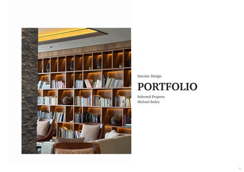
Warmth in Light This page draws on the interiors of the Ritz-Carlton and Park Hyatt in winter, where soft, low light and warm yellow tones make the spaces feel comforting against the cold outside. In both hotels, light is used almost like a material of its own. Instead of bright, even lighting, these spaces rely on warm lamps, wall sconces, and hidden cove lighting that cast a golden glow over timber panelling, brass details, and upholstered furniture. It gives the rooms a calm, intimate feel rather than a formal, corporate one — somewhere you naturally want to slow down. Colour does a lot of the work here too. Warm yellows and ambers, next to dark wood and muted gold, remind me of candlelight or late afternoon sun, colours that feel safe and familiar. In winter especially, this warmth balances out the cold outside, making the space feel sheltered and inviting to guests and locals. This came through clearly in the library in the Ritz-Carlton lobby. Hidden lighting inside each shelf casts a soft amber glow across the timber, bringing out the grain and giving depth to what would otherwise be a plain grid of shelving. Next to the dark leather armchairs, the light doesn’t just brighten the wood — it brings it to life, turning a simple wall into one of the most inviting parts of the room.
6
7
Warmth in Texture Building on from Warmth in Light, I looked to Japan’s high end hospitality interiors, where warmth shows up in a different way. The brass tones in the mirror and the copper facade over the kitchen both catch the light in a similar way, giving off that same warm glow. It’s a small thing but it makes a real difference, even a hard, geometric shape or a purely functional space ends up feeling warmer and more inviting just from the colour and the way it reflects light. From here I moved my attention to Seoul, specifically this staircase within Zaha Hadid’s Dongdaemun Design Plaza. Its sweeping, futuristic form is offset by timber that grounds the space, softening the building’s geometry into something tactile and warm. Without it, the staircase would feel almost sculptural rather than usable, and the timber brings it back to human scale, making it feel approachable and lived-in rather than something to just admire from a distance. That’s something I always notice when I step into a new space - how approachable it feels, and how naturally I move through it. A staircase like this could feel intimidating, all sharp curves and scale, but the timber changes that completely. It slows the space down and makes you want to walk it rather than just look at it. For me that’s a big part of what makes design work, not just how striking a space looks but whether it actually invites you in and feels good to move through.
8
9
Layered Neutrals Moving over to the residents side of the Park Hyatt Niseko, where I spent most of my time, the atmosphere changed. The public areas were busier and more theatrical, while this side felt quieter and more considered. It was the part of the hotel I kept coming back to. What I noticed first was how the lounge is organised. The bar runs along one side and leads the eye down a long axis to a residence entrance at the far end, but the seating sits back from that, on the other side of the room. The thing that holds the two together is the mirror. It’s set into the wall above the banquette, and its frame is the same pale oak as the timber columns either side, so it reads as part of the building rather than something hung on it. In it you see the far side of the room, the ceiling plane, the lamps and a vase of blossom on the bar, so the lounge appears to carry on beyond the wall. That does a lot for this fairly narrow space. The reflection doubles the depth, and it brings in daylight from the glazing on the opposite side, so the seating gets light without a window behind it. The mirror is also about as wide as the banquette below it, so the leather seat and the framed reflection line up as one composed wall. The dark steel glazing, the stone panel frame all meet cleanly, which is why so few materials can feel this rich. Coming from an architecture background, this is what I find most interesting about a refined interior. It comes from proportion, edges and the way materials meet, rather than from adding more. I want to carry that into my own work: a limited palette, with the interest coming from texture and how the spaces are arranged.
10
11
Alpine Lodge, Japenease Hand Moving through the residents’ side of the hotel, what struck me most was the height. The ceilings are tall, yet the rooms never feel cold or empty. I was fortunate enough to meet one of the interior architects behind the hotel, and he helped me understand why. The brief was to bring together the warmth of a classic alpine lodge and traditional Japanese craftsmanship, so the building feels sheltered against the cold and still belongs to Hokkaido. Two ideas sit behind that. The first is planning from the inside out, with large glass facades framing the mountain views so the landscape becomes part of the interior. The second is a focus on natural, tactile materials: timber, stone and carpets that echo traditional Japenease textiles, alongside work by nearby local artists. You can see both in these two rooms. In the lounge, the ceiling is dark timber, which pulls the top of the room down, and the pale oak frame around the large white panel marks out a room within the space. The dark cabinetry with lit shelving on the right adds another layer of warmth without taking attention from the seating. The dining room does the opposite. Floor-to-ceiling glazing frames the snowy slope outside, and the glossy ceiling reflects the daylight and the lantern-style pendants, so the height feels light rather than heavy. The long dark table sits low beneath it all and keeps the room settled. With ceilings this tall, materials matter even more. They are what stop the scale from feeling cold. Nothing here is decorated: a small set of natural materials, good light and the view of Mount Yotei and snowy Hokkiado behind do the work. What I take from this is how a tall space can feel comfortable without being made smaller. Break it into zones, keep the furniture low and grouped, and let the material and the view do the rest. It’s an approach I want to bring into my own residential work. 12
13
Moving Between Spaces You don’t usually notice a staircase until it’s a good one. This one I noticed straight away. Looking down the stairwell, you can see the whole design in one view: pale oak panelling up the walls, a glass balustrade, and a thin dark steel handrail tracing the route from top to bottom. The materials are kept to a small set, and they work together. The walls and treads sit in the same pale tone, so the stair feels like part of the building rather than something added to it. The vertical panelling gives your eye something steady to follow and adds rhythm to the climb, and the height never feels cold. The glass keeps the void open, so you can see down through the building as you go, and the steel gives a single line to follow. Even the light is quiet, with a soft glow along the rail rather than anything bright overhead. It slows you down without asking you to. By the time you reach the top, you’ve been through a small experience of its own, not just a change of floor. A stair is usually treated as leftover space, but here it’s designed with the same care as the rooms it connects. It shows how a building can change the pace at which you move through it, and the onsen is where I felt that most clearly. What I liked about this space is how minimalist it is. A long counter built from stone and timber runs into the room. Behind it, a dark timber frame sets the whole thing into the wall like a picture, with a plain pale panel in the middle and a thin line of light running along the stone shelf on the right. The materials are few, and each one is allowed to be seen: the grain of the oak, the veining in the stone, the soft edge of the bowl. It’s the same idea as the rest of the spread. When you take away the clutter, the space asks you to slow down and look.
14
15
Slowing Down: The Onsen Of all the places I spent time in Japan, the onsen taught me the most about how architecture and especially interior design can change the pace of a day. Nothing about it is elaborate. You undress, wash, and step into hot water, in a room designed to have very little going on in it. That simplicity is deliberate. This was the local onsen I went to most days. The window is one large frame divided by a single thin mullion, and it does all the work. It holds the view like a picture: Mount Yotei in the evening light, snow along the stone edge of the outdoor pool, bare trees and a line of cables. Inside, the dark ceiling and the still water in the foreground keep the room quiet, so your attention goes out through the glass. The sky is reflected in the indoor water, which doubles the view. I’d usually just sit there, like the two bathers in the photo, and not do anything at all. That’s what the room is for. The interior wall on the facing page shows the other half of the experience, which is texture. It is rough, dark and uneven, with the tie holes left showing and one clean vertical joint running through it. In a space where you are barefoot, warm and surrounded by steam, you feel surfaces as much as you see them. A hard, heavy wall next to soft water and hot air makes you more aware of your own body, and that is part of why time seems to slow down. The whole experience is built from a few things: a framed view, a limited palette of stone, water and concrete, and the change from rough surfaces to soft warmth. It is a way of designing for stillness that I want to bring into my own work, and I think it applies to homes and bathrooms as much as to bathhouses.
16
17