5 minute read
IN THIS ISSUE
Design the total spatial experience from the first moment of encounter to the last moment of interaction.
Bachelor’s Degree (BS) Spatial Experience Design
Master’s Degree (MS)
Spatial Experience Design
Furniture, Lighting and Fixtures Design
Irene Lee
Alex Brokamp

Surviving and Thriving
At press time, the United Nations estimates that two million people have fled the war in Ukraine. The European Union predicts that the total number of refugees could climb to seven million, which would make it comparable to the crises created by the civil war in Syria and the failed revolution in Venezuela. As the world once again debates who gets let in and who gets left out, I wonder why there isn’t an institution to succor refugees independent of parochial politics. 2022 Metropolis Future100 honoree Danny Ortega and his classmate Anna Lim—both graduate architecture students at the University of Pennsylvania’s Weitzman School of Design— have imagined just such a space in their No Nation Embassy (“Future Feeling,” p. 114, and this month’s cover). By dematerializing building elements and creating moments of surprise, they seem to ask if architecture can better represent human rights if it eschews the marble-and-glass machismo of nationalism.
This is the kind of provocation offered over and over again by this year’s Metropolis Future100, the top North American architecture and interior design graduates of the class of 2022.
Two hundred and thirty-seven students were nominated for this year’s list by their instructors and mentors. In selecting the final 100, Metropolis’s reviewers—SANDOW Design Group EVP and design futurist AJ Paron, executive editor Sam Lubell, editorial project manager Lauren Volker, and I—were especially sensitive to the fact that this cohort had a hybrid or virtual education unlike any generation before them.
But rather than have to make concessions for the disruptions these students have endured in the past two years, we found ourselves marveling at their ability to channel the difficult experience into design solutions. A number of students grasped architecture’s role in helping people deal with loss—University of Pennsylvania graduate students Dario Sabidussi and Yuxuan Xiong (“Designing for Death,” p. 96) showed how this new generation is rethinking memorials and funerary facilities. Antidotes to social isolation abound in this year’s portfolios as well, with graduates designing community spaces that celebrate diversity rather than flatten people’s differences—see Drexel University student Pooja Kalavagunta’s Shosh Center for Afghan Refugees or Kent State University student Sombre Carleton’ s ABA Autism Center (“Building Community,” p. 120).
These brave young architects and interior designers deserve your support and encouragement as they embark on their careers. We invite you to get to know them in the pages of this issue and on metropolismag.com/future100.
Our focus on learning continues with a series of stories on design for education (p. 127). From elementary schools (“Creative Spaces for Creative Learning,” p. 128) to higher education campuses (“Let’s Get Together,” p. 138), these buildings are sites for experimentation in both architecture and pedagogy. Here’s hoping they continue to nurture the courage and ingenuity we will need to thrive in the face of mounting ecological, political, and social challenges. —Avinash Rajagopal, editor in chief
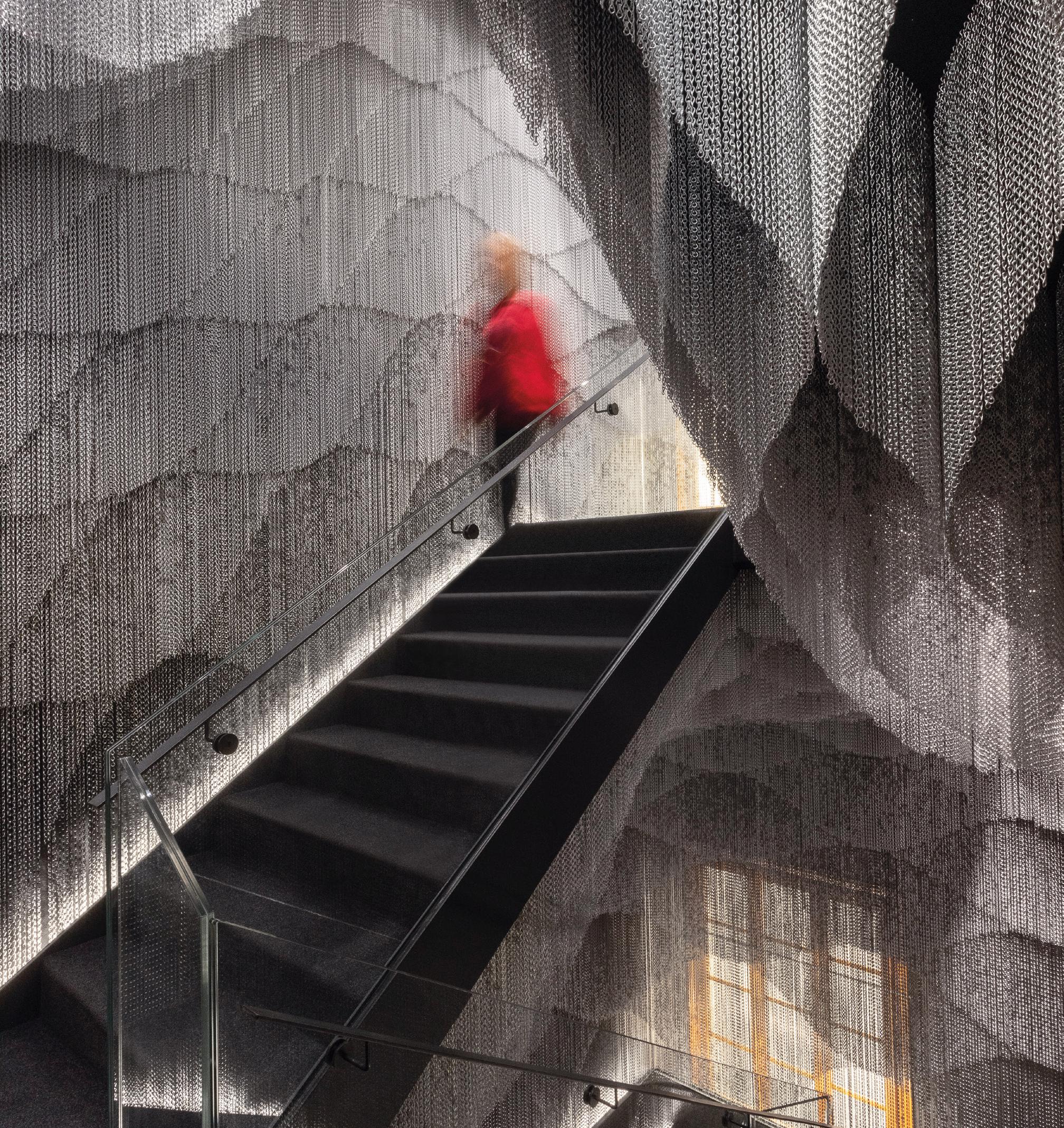
Kengo Kuma’s architectural intervention on Gaudí ’s Casa Batlló
info@kriskadecor.us kriskadecor.com
PHOTOGRAPHY: JORDI ANGUERA , BARCELONA .

The Japanese architect has covered the new 8-story staircase of the modernist building with a second skin of aluminum chain links.
What’s Next for Color
Two trend experts share how they forecast for the future.
Every designer wishes they had a way of knowing what the future will look like, how we will live, how we will work, and how we will want the spaces we occupy to make us feel five, ten, or even twenty years from now.
Looking to the future is an essential part of designing spaces that are meant to stand the test of time, but it’s not always an easy task. Trends appear and disappear constantly and divining the future of design from its ever-changing present is a full-time job— just ask Sue Wadden, an expert trend forecaster and director of color marketing at Sherwin-Williams.
Each year, Wadden and her team assemble the Colormix® Forecast, a collection of forecast hues that describe the zeitgeist of color. They scour the design world for inspiration and insight, evaluating research, interviewing architects, designers, and stylists, and travelling to trade shows around the world. They also look beyond paint trends, paying attention to product design, industrial coatings, fashion, flooring, and architecture.
This year, the team saw that the design world is at an inflection point. “Designers and architects are at the forefront of this sea change we are all living through,” Wadden says. With that in mind, her team built a collection of palettes that incorporates of-themoment design trends and opens space for a discussion of what’s next in design. It’s called MODE, a collection of four unique palettes: Method, Opus, Dreamland, and Ephemera, each signifying a macro trend or aesthetic direction that design will take in the future.
Method presents a selection of natural neutrals and warm hues that represent sustainability and the idea of the natural home. Opus is a maximalist palette with darker hues and dramatic jewel tones. Dreamland represents the digital shift, with some filtered colors and cooler color temperatures. The final palette, Ephemera, captures our nostalgia, taking cues from the sixties, seventies, and eighties, while updating them for a new generation of designers.
Further refining these colors into palettes that professionals can apply to hospitality, new residential, healthcare, education, and multi-family settings is the job of Emily Kantz, fellow forecaster and Sherwin-Williams color marketing manager, who oversees development of the Commercial Colormix® Forecast. “For hotels, we selected deeper moodier shades to capture a more dramatic backdrop for guests to enjoy,” she says, “whereas for offices, we wanted to encourage designers to create workspaces that have that sense of comfort and security while being away from home with a palette full of warm neutrals and rich earth tones.”
Most thought leaders would agree that sustainability, technology, and the residentialcommercial convergence are growing movements in design. But how will those translate into the aesthetics of architecture and interior design? That’s what sets the Colormix® Forecast apart—the Sherwin-Williams team invests research, time, and their passion for color into distilling trends, themes, and notions into palettes that inspire. The result is a tool that allows designers not only to stay on top of current trends, but to focus on creating experiences that are relevant, essential, and timeless.

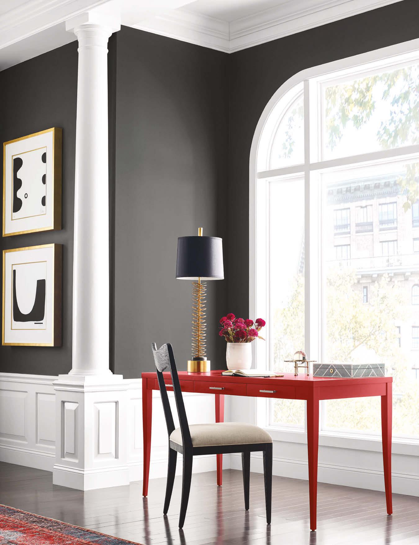
Opus features darker hues and dramatic jewel tones for designers looking to make a statement.


