e Sga t
i
n
S
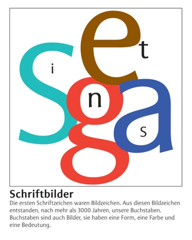
Schriftbilder
Die ersten Schriftzeichen waren Bildzeichen. Aus diesen Bildzeichen entstanden, nach mehr als 3000 Jahren, unsere Buchstaben. Buchstaben sind auch Bilder, sie haben eine Form, eine Farbe und eine Bedeutung.
Schriftbilder Aus Form, Farbe und Rhythmus der Schriftzeichen ergit sich ein typografisches Gesamtbild.
SignaSetSignaSetSignaSetSignaSet SignaSetSignaSetSignaSetSignaSet SignaSetSignaSetSignaSetSignaSet SignaSetSignaSetSignaSetSignaSet SignaSetSignaSetSignaSetSignaSet SignaSetSignaSetSignaSetSignaSet SignaSetSignaSetSignaSetSignaSet SignaSetSignaSetSignaSetSignaSet SignaSetSignaSetSignaSetSignaSet SignaSetSignaSetSignaSetSignaSet SignaSetSignaSetSignaSetSignaSet SignaSetSignaSetSignaSetSignaSet SignaSetSignaSetSignaSetSignaSet SignaSetSignaSetSignaSetSignaSet SignaSetSignaSetSignaSetSignaSet
Schriftbilder Die Kombination von Buchstaben als Signet, Logo, Wortmatke
SW
Schwarz Weiss Buchverlag
VADIANA Kantonsbibliothek St. Gallen GGG Stadtbibliothek Basel
UpDate Fitness
Schriftbilder Das typografische Gesamtbild, bestehend aus Layout, Schrifttype, Spacing, Zeilendurchschuss und Zeilenfall, ist bestimmend für eine gute Lesequalität.
Signa Set The result of continuous practice in pursuit of perfection, Team’77 presents Signa in a digitalized version. With a unique warmth and finesse, Signa Set can be seen as an evolution of modernist typography with organic inflections. Placing first in the Bobst Graphic’s Lettre d’Or 1978 competition, Signa was originally developed for phototypesetting technology by the legendary Team’77 (André Gürtler, Christian Mengelt, and Erich Gschwind). As Team’77 had witnessed the transition from metal type to its dematerialization first-hand, they knew how to leverage the technology effectively. Signa was created in perfect accordance with the technology of the time and has, now, been skillfully revitalized and adapted for contemporary typesetting. A transition from mid-century archetype to the 1970s, Signa Set is a typeface with a substantial rigor yet is infused with a certain fluidity in its ductus. Reminiscent of calligraphy, Signa Set has subtle flares at the end of its strokes, a characteristic that gives the typeface a certain charm. The design gestures that are brought together in Signa Set make it perfectly suited for elegant headlines and for embellishing compositions, while also being highly effective for extended text layouts, as Signa Set’s family comprises weights and its accompanying italics. Published by Optimo Type Foundry www.optimo.ch/typefaces/signa_set