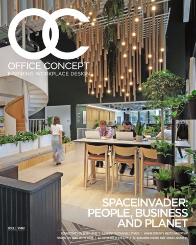
ISSUE | V18N2
SPACEINVADER: PEOPLE, BUSINESS AND PLANET CONNECTIVITY ON EVERY LEVEL | A STRONG SUSTAINABLE STANCE | WHERE SERENITY MEETS INNOVATION FINDING THE LIGHT IN THE DARK | AT THE HEART OF THE CITY | RE-IMAGINING VISITOR AND TENANT JOURNEYS
OFFICE CONCEPT PUBLISHER’S NOTE
BEYOND SPACE, TOWARD CULTURE Workplaces today must embody empathy, clarity, and resilience—balancing people, performance, and planet. Design has the power to inspire connection, creativity, and a deeper sense of belonging.
S
paceInvader shows how the language of design can turn the ordinary into the extraordinary—shaping workplaces into places of purpose, connection, and transformation. Overbury Offices unfolds in light and tactility, where surfaces and forms choreograph collaboration with quiet confidence. Stopford House reveals how renewal can honour heritage while embracing responsibility, its Brutalist shell softened into a workplace of dignity and openness. Eden rises as a living testament to sustainability, a building where biophilia becomes architecture. And The Nest at Glasshouse proves that even the most constrained environments can be reborn into cocoons of calm, focus, and creativity. The narrative continues with Aldermore Offices, where design becomes identity made visible, shaping spaces that speak of purpose and belonging. At 40 Spring Gardens, the rhythms of light guide each passage with grace and poise. Domestic & General embraces the realities of hybrid work, weaving colour, adaptability, and neighbourhoods into an environment that feels both agile and human. And at One Piccadilly Gardens, design takes on a civic role, a confident expression of welcome, wellness, and community at the heart of work life. In parallel, the products featured here reflect the same commitment to adaptability and care. Kettal’s PI system brings modular clarity shaped for change, its sustainable framework designed to evolve with the workplace. Haworth’s ergonomic solutions show how comfort and culture can coexist in balance. And refined pieces such as Sedus’ se:mission and Boss Design’s Uma demonstrate how elegance and responsibility can be distilled into the smallest details of daily working life. Together, these narratives affirm that the workplace is not a backdrop but a living framework—where culture is not only reflected, but continually created.
Kenneth Khu k.k@kenneth-media.com
006
MYNT by VITRA
Create, innovate. Design.
www.kettal.com
OFFICE CONCEPT
014
016
052
062
074
008
CONTENTS
012
006
PUBLISHER’S NOTE BEYOND SPACE, TOWARD CULTURE
0 12
ENTRÉE
018 020 032 042 052 062 074 084 096 10 6 116
WORKPLACE DESIGN CONNECTIVITY ON EVERY LEVEL A STRONG SUSTAINABLE STANCE WHERE SERENITY MEETS INNOVATION FINDING THE LIGHT IN THE DARK AT THE HEART OF THE CITY RE-IMAGINING VISITOR AND TENANT JOURNEYS A MOMENT FOR WHOLESALE CHANGE A COHESIVE COMMUNITY CULTURE RATIONAL, INTUITIVE AND RESPONSIVE UNLOCKING INTERIOR POTENTIAL
SE:MISSION by SEDUS
COURIER by VITRA
126 128 134 14 0
020
032
042
128
134
140
FITTING INTERIORS ELEVATED FLOW IN MOTION SPATIAL HARMONY UNFOLDED ROOTED IN PURPOSE
WAVE by BRUNNER
UMA by BOSS DESIGN
OFFICE CONCEPT
Editorial MANAGING EDITOR Kenneth Khu DEPUTY EDITOR Pang Yin Ying EDITOR Christine Lee
084 DOMESTIC & GENERAL BY SPACEINVADER
Design ART DIRECTOR Eric Phoon SENIOR DESIGNER Sandy Liew Contributors WRITERS Adele Chong, Lily Wong, Amelia Cross WORKPLACE DESIGN SpaceInvader Sales & Marketing SENIOR SALES MANAGER Edmond Lee SALES EXECUTIVE Kelvin Ong
K+N BALANCE.CONFERENCE by KÖNIG + NEURATH
Publication PUBLISHER Kenneth Khu
CONTENTS & PARTNERS
Enquiries ADVERTISING advertising@officeconceptdesign.com EDITORIAL submit@officeconceptdesign.com SUBSCRIPTION subscribe@officeconceptdesign.com Website officeconceptdesign.com
106 MUSE, RIVERSIDE HOUSE BY SPACEINVADER
Contact KENNETH MEDIA SDN BHD 4, Jalan Hopea U15/28B Elmina West, Seksyen U15 40170 Shah Alam, Selangor, Malaysia. T: +603 5038 3022 Photo Credits COVER: SPACEINVADER SECTION OPENER: WORKPLACE DESIGN SPACEINVADER FITTING INTERIORS HAWORTH
ENGAGE WITH US @office-concept-design-magazine @officeconceptdesignmagazine
Printer PERCETAKAN IMPRINT (M) SDN BHD No.538, Jalan 20 Taman Perindustrian Ehsan Jaya, Kepong 52100 Kuala Lumpur, Malaysia Magazine OC | Office Concept Design magazine is published three times a year and is circulated throughout the Asia-Pacific region. Opinions expressed are those of the contributors and not necessarily endorsed by the publisher.
010
116 CENTRAL HOUSE, HARROGATE BY SPACEINVADER
Copyright Notice All rights, including copyright, in the content of this publication are owned by Kenneth Media Sdn Bhd, Malaysia. You are not permitted to copy, broadcast, download, store in any medium, transmit, show or play in public, adapt or change any in any way the content of this publication for any other purpose whatsoever without the prior written permission of Kenneth Media Sdn Bhd, Malaysia.
PUBLISHED BY
H+R ISSUE 29
ONE STEP, ONE VIEW
FOUR SEASONS HOTEL SUZHOU | CHINA BY AVALON COLLECTIVE
THE ORCHARD TRAIL EXPERIENCE AN ELEGANT FUSION OF THE REGION’S AGRICULTURAL HERITAGE AND VIBRANT MODERN RETAIL ENERGY, OFFERING TODAY’S TRAVELER A RICH EXPERIENCE OF PLACE, PURPOSE, AND TRANQUILITY. JOURNEY THROUGH WATER CAPTURING THE CITY’S REFLECTIONS, FOUR SEASONS HANGZHOU INVITES GUESTS TO EMBRACE ITS TRANQUIL WATERWAYS, BLENDING BEAUTY, STILLNESS, AND IMMERSION INTO AN UNFORGETTABLE HANGZHOU MOMENT. A CONTEMPORARY OCEANIC RETREAT A REIMAGINED EXPERIENCE INVITES GUESTS INTO THE ISLAND’S PRISTINE NATURAL SURROUNDINGS, SEAMLESSLY BLENDING MODERN DESIGN WITH SERENE BEAUTY. TAKE A TOUR > HOTELRESORTDESIGN.COM
OFFICE CONCEPT
1
2
012
ENTRÉE
3
1
2
3
WAVING FORM, SILENT ELEGANCE
GRACE IN PURE LINE
PURE FORM, QUIET PRESTIGE
The Brunner wave table marries sweeping sculptural grace with quiet ingenuity. Designed by Jehs + Laub, it upends the convention of conference furniture: slender steel legs, sheathed in magnetically attachable wavy panels, carry oversized tops as if floating above. Cable pathways remain hidden yet easily accessible, while cladding can be recoloured or replaced without tools in moments. Whether linear or curved, wave moves effortlessly into refined settings, where function and artistry merge in seamless, enduring harmony.
In the slender silhouette of courier, Ronan Bouroullec distils form to its elegant essence: a curved oak veneer top flowing seamlessly from slim aluminium legs, its profile recalling the serif of classic typography. Described as a “naked solution,” it is pared-back yet exacting, a discreet sanctuary for work, thought and quiet memory. Light in spirit yet enduring in presence, courier introduces sculptural calm, poetic balance and quiet clarity into the evolving landscape of contemporary workspace design, inspiring focus and refined simplicity.
In the refined presence of se:vision, Sedus offers a purist landscape for the executive workspace. The desk’s clean lines and seamless integration with storage create a distinguished harmony — every bevelled edge, cable channel and optional modesty panel feels considered and precise. Whether finished in subdued whites or rich walnut tones, se:vision balances individuality and coherence; the desk and its companion storage become one composed statement of quiet authority, architectural poise, and enduring, timeless craftsmanship.
BRUNNER-GROUP.COM
VITRA.COM
SEDUS.COM
OFFICE CONCEPT
1
2
2
014
ENTRÉE
3
1
2
3
DYNAMIC COMFORT REDEFINED
CURATED COCOON OF COMFORT
SUBTLE POISE IN MOTION
Vitra’s Mynt, designed by Erwan Bouroullec, redefines everyday ergonomics with quiet precision. Its patented mechanism responds intuitively to body weight, allowing the seat to tilt forward or back independently of the backrest, promoting healthier, more active postures. Offered with either oak veneer or a cushioned seat on an aluminium base, Mynt merges the clarity of a studio chair with the performance of a task chair. Durable, repairable and adaptable, it sets a progressive benchmark for contemporary workspaces.
Boss Design’s Mila collection — sofa, armchair and high-back single seat — promises an oasis of calm, next-level comfort and a true place of sanctuary. A sculpted plywood surround wraps soft, layered foam cushions, forming a protective silhouette that feels both architectural and plush. Its versatility allows high- and low-back units to be combined into dynamic, user-focused zones. Sustainable by intent, with minimal core materials and easy reupholstery, Mila defines zones where wellbeing, focus and design integrity coexist seamlessly.
The K+N BALANCE.CONFERENCE chair turns meeting rooms into thoughtfully designed spaces. Its clean, timeless silhouette is complemented by a whisperingly intuitive rocking mechanism — engaged via a single lever that adjusts both height and seat position. Upholstery and star-base finishes offer a palette of subdued elegance, while replaceable leather or fabric armrests add personalised comfort. This chair achieves understated composure, balancing form with intuitive function for focused collaboration and refined communication.
VITRA.COM
BOSSDESIGN.COM
KOENIG-NEURATH.COM
OFFICE CONCEPT
1
2
2
016
ENTRÉE
3
1
2
3
ORGANIC EXECUTIVE COMFORT
ZONES OF QUIET CLARITY
THE REFINED MEETING HOST
Boss Design’s Uma redefines executive seating with a sculptural silhouette and considered ergonomics. Built with BioPUR® foam, it reduces environmental impact by up to 75%, combining sustainable intent with a lightweight steelskeleton base. Offered in both high- and mid-back versions, Uma’s refined proportions and upholstery echo the Paloma family, creating a cohesive, elevated aesthetic. Designed for leadership spaces, its customisable details and understated presence project authority while ensuring lasting comfort in contemporary workplaces.
INSIDE.10 elevates open-plan workspaces with subtle, purposeful separation. Crafted entirely from PET fleece, its screens are acoustically effective and visually soft, delivering privacy without isolation. Whether mounted behind desks, used tangentially or as angled enclosures, INSIDE.10 adapts effortlessly. Bench workstations gain division without compromise. Eco-conscious in material and discreet in presence, it shapes zones that respect collaboration and focus, setting new standards of balance and adaptability in the modern office.
se:mission redefines conference seating with elegant restraint and intuitive engineering. Its DuoMotion mechanism and flexible backrest respond subtly to movement, encouraging support and comfort through meetings. Available in three backrest heights and a palette of fabric, leather, and veneer choices, it accommodates individuality. Crafted sustainably—with modular components, no glue, and recycled plastics— se:mission balances ergonomic refinement with environmental responsibility, inviting users to sit, connect, and stay.
BOSSDESIGN.COM
KOENIG-NEURATH.COM
SEDUS.COM
018
WORKPLACE DESGN BY SPACEINVADER
AGENTS OF POSITIVE CHANGE COMBINING KEEN COMMERCIAL UNDERSTANDING WITH GREATLOOKING, USER-FOCUSED DESIGNS, SOCIAL AWARENESS, A WILLINGNESS TO LEARN - AND A COMMITMENT TO THE WELLBEING OF END-USERS AND THE PLANET.
S
paceInvader is a multi-award-winning British interior design agency, now considered to be one of the UK’s premier consultancies. Based in Manchester in the North-West of England, the company was originally founded in 2009 by Director/Owner John Williams and started life as a commercial sector specialist, working on building refurbishments for landlords and office interiors schemes for end-user tenants before developing its offer further into the hotel and hospitality, stadia, retail, education and community-based sectors, as well as the growing market in developer-led private residential schemes. The agency has won or been nominated for over 80 creative awards to date for its leading-edge projects. SpaceInvader offers clients a real commercial understanding of the best use of space, attained through working closely with developers and agents, as well as bringing a true user-focused understanding through research of the changing social needs, habits and attitudes of those who will use any particular space. The consultancy’s work also embodies a commitment to the wellbeing of end-users and the planet via a four-pronged sustainability approach. The first element of these focuses on materials and the supply chain. The second focuses on health and wellbeing, including a strong natural and biophilic approach and a commitment to accessibility and inclusivity. The third is a commitment to combatting climate change through minimal energy use and a whole-lifeapproach to materiality, including high-durability levels in all FF&E specifications, low through-life maintenance and the design of furniture and materials for easy reconfiguration
and disassembly. Finally, a commitment to ethics and equality means prioritising local suppliers and ensuring a sense of location and locality. Founder John Williams is a senior industry figure with decades of experience both working within architects’ practices and through his founding and leadership of his own 15-year-old company. John’s personable, affable, down-to-earth approach is a cornerstone of the company’s success, as is his great belief in design and what it can achieve. John is a member of the BCO and a BritList-nominated designer. In 2024, he was an awards judge for the inaugural Next Generation Awards, launched by CIUK, and is a regular panellist and commentator at events and Round Tables across the design, property, hospitality, stadia and workplace sectors – from MIX Interiors and Material Source to SBVLive, Clerkenwell Design Week, Meet Up North and DARC Thoughts. John has been profiled by Design Insider, for whom he is a Design Ambassador and by FX, as part of the magazine’s ‘Radical Thinking’ series. Design Week interviewed John about the ‘Turning Points’ in his career in 2024, and, in 2025, published his insights into successful client services. He has additionally contributed thought leadership on subjects ranging from workplace and hospitality trends to the impact of AI, the importance of regenerative design and the impact of data-driven offices for FX, Architecture Magazine, Insider NW, Work in Mind, Natwest Business Hub, Be the Business, Material Source, MIX Interiors, Designerati, DARC and Hotel Designs.
SPACEINVADERDESIGN.CO.UK
020
OVERBURY OFFICES
CONNECTIVITY ON EVERY LEVEL ENSURING THE WORKSPACE FOR ONE OF THE UK’S BEST-KNOWN FIT-OUT COMPANIES EMBODIED THE SPIRIT OF COLLABORATION AND EXEMPLIFIED THE CLIENT’S CAPABILITIES AND COMMITMENT TO QUALITY.
OVERBURY OFFICES 4,200 SQFT | MANCHESTER, UNITED KINGDOM | DESIGN CONSULTANCY
OVERBURY OFFICES 022 THIS PHOTO: A bespoke kidney-shaped desk for the company’s admin team reflects the project’s organic shaping throughout.
Photo Credits: Andrew Smith at SG Photography
S
paceInvader welcomed the commission to design Overbury’s new offices in Manchester, UK. The client, part of Morgan Sindall Group PLC, is renowned for excellent customer service and commitment to quality. Overbury’s previous offices were not far away, having occupied 4,200 sq ft in the Zenith building on Manchester’s Spring Gardens. The company wanted to stay in the area, but to have more space following a recent period of growth, and chose to re-locate to a 6,867 sq ft space in Chancery Place on Brown Street, in the heart of the city’s old financial district. For SpaceInvader, also Manchester-based, it was clear this would be a client business truly open to conceptual design ideas, with a requirement for exceptionally high standards. The success of the final outcome is a testament to the collaborative design and delivery partnership between the two companies.
TOP: View back towards reception seating and drinks station.
BOTTOM: Close-up of dramatic ceiling feature with metallic-finish circle at its centre.
OFFICECONCEPTDESIGN.COM
OVERBURY OFFICES 024
‘With the offices set to embody Overbury’s quality commitment and values, we knew that everyone who walked through the door needed to understand instantly what Overbury was all about’ SpaceInvader Founder John Williams explained. ‘Far from being a pressure, this meant the project was a real joy, because we were working not only with a client but with a wider team for whom everything was possible - and with everyone very much on their game.’ The design concept for the new offices, responding to Overbury’s strong business values, was based on the idea of ‘connection’ and was made up of four strands: • connecting to Manchester and reflecting the city’s culture and identity. • connecting the Overbury team through a culture of collaboration, enabled by technology. • connecting to nature, relating to sustainable design, a feeling of serenity and the promotion of staff wellbeing, as well as incorporating the inspiring shape of Overbury’s well-known nautilus shell brand identity. • connecting using contrast through layers, textures and structures that would bind the scheme together, with dark and light tones adding drama and interest.
TOP: A curved ceiling seating nook in reception area allows for ad-hoc meetings and for visitors to catch up with work.
BOTTOM: The bespoke central table in the studio area allows for displays to be laid out clearly for client presentations.
THE LIGHTING FEATURE PROVIDES INSTANT DRAMA AND SETS THE SCENE FOR A SPACE BRIMMING WITH ORGANIC CURVES AND ROUNDED EDGES. THE CITY OF MANCHESTER, MEANWHILE, IS ALL AROUND, WITH THE OFFICES OFFERING AN INCREDIBLE VIEW OVER THE CENTRE FROM FULL-HEIGHT WINDOWS THAT BORDER THE SPACE.
THIS PHOTO: The curved-edge ceiling cut-out is reflected in the identical shaping of the rug beneath the board table.
OFFICECONCEPTDESIGN.COM
OVERBURY OFFICES 026
THE STRONGEST EMBODIMENT OF THE LATTER CAN BE SEEN IMMEDIATELY ON ENTRY TO THE 13TH FLOOR OFFICES, WHERE THE WELCOME AREA CEILING HAS BEEN DESIGNED WITH A DARK-SPRAYED, CUT-OUT AREA IN THE SHAPE OF A NAUTILUS SHELL, WHOSE SPIRALLING LINES WHICH MIMIC THE SHAPE OF THE BEAUTIFUL SHELL ARE DESIGNED IN SOLID METAL, INSET WITH LIGHTS AND ACOUSTIC BAFFLES.
THIS PHOTO: Touchdown space, directly accessible from reception.
TOP: Wayfinding and spaces leading off from touchdown area.
MIDDLE: Main open plan office area featuring bespoke overhead acoustic baffles with inset lighting.
BOTTOM: Entrance to the Town Hall space, planned around the corner ‘viewing window’ with exceptional views over Manchester and beyond.
OFFICECONCEPTDESIGN.COM
OVERBURY OFFICES 028
THE SPACE PLAN NEEDED TO INCORPORATE: A GOOD SOCIAL SPACE FOR CLIENT AND TEAM EVENTS AND ENTERTAINMENT; A PRAYER AND FIRST AID ROOM; A RETURNING-PARENT ROOM; A QUIET AND ENCLOSED LIBRARY SPACE; A WELLNESS-FOCUSED DECOMPRESSION AREA; TWO 6-PERSON TRAINING ROOMS AND LOCKERS FOR STAFF USE.
THIS PHOTO: The ceiling here is a further iteration of the nautilus shell treatment, as per the reception.
The strongest embodiment of the latter can be seen immediately on entry to the 13th floor offices, where the welcome area ceiling has been designed with a dark-sprayed, cut-out area in the shape of a nautilus shell, whose spiralling lines which mimic the shape of the beautiful shell are designed in solid metal, inset with lights and acoustic baffles. At its centre is a circle in a metallic finish - Hompal by Formica. The lighting feature provides instant drama and sets the scene for a space brimming with organic curves and rounded edges. The city of Manchester, meanwhile, is all around, with the offices offering an incredible view over the centre from full-height windows that border the space. When it came to space-planning, the move allowed for a shift in terms of working culture, with a variety of settings possible thanks to the additional space available. This included a touchdown area, where team members, so often out on site, can drop into at a moment’s notice to catch up on admin and meetings, as well as lots of booth areas and nooks where people could take calls, as well as rooms for people to be part of online meetings.
TOP: Rounded cabinetry, planting and a bespoke banquette combine with round caféstyle tables to create a space for relaxation.
BOTTOM: A suite of meeting rooms is arranged along the circulation corridor, along with personal locker provision for staff.
OFFICECONCEPTDESIGN.COM
OVERBURY OFFICES 030
Additionally, the space plan needed to incorporate: a good social space for client and team events and entertainment; a prayer and First Aid room; a returningparent room; a quiet and enclosed library space; a wellness-focused decompression area; two 6-person training rooms and lockers for staff use. The main board room was to have sliding doors that could open when needed into the creative design studio space, where materials and samples for current projects could be laid out and displayed. As well as the interior design, SpaceInvader was commissioned to create the project’s wayfinding designs, designing signage and glazing manifestation concepts based on organic shapes that integrated perfectly with the interiors scheme.
TOP: A corridor corner was a perfect opportunity to position an inset banquette seat.
BOTTOM: The scheme allows for a wide variety of work settings.
“ WITH THE OFFICES SET TO EMBODY OVERBURY’S QUALITY COMMITMENT AND VALUES, WE KNEW THAT EVERYONE WHO WALKED THROUGH THE DOOR NEEDED TO UNDERSTAND INSTANTLY WHAT OVERBURY WAS ALL ABOUT. ” John Williams, Founder - SpaceInvader
THIS PHOTO: Corner seating and adjacent walkways.
OFFICECONCEPTDESIGN.COM
032
STOPFORD HOUSE
A STRONG SUSTAINABLE STANCE RESPECTING A BRUTALIST ARCHITECTURAL ICON, WHILST PROPOSING A STRATEGY OF MODERNISATION THROUGH RE-USE AND REFURBISHMENT TO HELP CREATE A FUTURE-FACING WORKPLACE INSPIRED BY ART AND TEXTILES
STOPFORD HOUSE 72,505 SQFT | STOCKPORT, UNITED KINGDOM | DESIGN CONSULTANCY
STOPFORD HOUSE 034 THIS PHOTO: The space plan for each floor was tested many times with multiple departments to ensure everything would function optimally post-completion.
Photo Credits: Andrew Smith at SG Photography
T
his project saw the complete refurbishment of Stopford House for Stockport Council by Manchester-based designers SpaceInvader, with the scheme going on to win both the Corporate Workplace Award at the BCO (British Council of Offices) North Awards and the Fit-Out Project of the Year at the Sustainable Design Awards in 2023. Stopford House is a key asset in Stockport Council’s workplace estate and was purpose-built in 1975 to accommodate a wide range of Council services. The Brutalist-style, 6-storey building, which has a net internal area of 72,505 sq ft, features concrete external panelling that matches the council’s Neo-Wren Town Hall building directly opposite. When the Council came to SpaceInvader in late 2020 to carry out an initial workplace strategic review, this included assessing the building’s current and ongoing fitness for purpose. After a thorough examination of the building’s structure, services and space, the consultancy recommended a strongly sustainable stance for the future, proposing a strategy of modernisation through re-use and refurbishment rather than building anew. This route would not only save costs, but be much more sustainable, ensuring the project’s embodied carbon would also be kept as low as possible.
TOP: Lift lobbies retain concrete shell.
OFFICECONCEPTDESIGN.COM
STOPFORD HOUSE 036
‘This was a fantastic project to work on’, John Williams, Founder of SpaceInvader commented. ‘A major upgrade to the building was needed, in order to provide a future-facing workplace for the council’s own team, as well as the best possible spaces and services for the community the council serves, but it was a real joy to be able to celebrate this building’s beautiful existing brutalist architecture and seek every possible way of re-using the building’s fabric with a less-is-more, circular economy approach, adding interventions only where necessary.’
The new workplace strategy informed the design and fit-out of the space, whilst firmly embracing sustainable principles. The building was stripped back to reveal key architectural features, whilst improvements were made operationally to make the building more sustainable. The new strategy ensured that peak in-office days and differing work types could all be accommodated. With staff both emerging from the pandemic and needing to get used to radically new ways of working, the new layout now supports both a collaborative philosophy and a healthy social culture, whilst at the same time, mindfulness spaces and quiet rooms were built into the design to encourage colleagues to take a moment as needed and to promote wellbeing within the Council team.
MIDDLE: Breakout seating overlooking the Town Hall.
BOTTOM: Office settings are a mixture of focused and collaborative working.
THE NEW WORKPLACE STRATEGY INFORMED THE DESIGN AND FIT-OUT OF THE SPACE, WHILST FIRMLY EMBRACING SUSTAINABLE PRINCIPLES. THE BUILDING WAS STRIPPED BACK TO REVEAL KEY ARCHITECTURAL FEATURES, WHILST IMPROVEMENTS WERE MADE OPERATIONALLY TO MAKE THE BUILDING MORE SUSTAINABLE.
THIS PHOTO: A large teapoint upon entry to the South side of the floorplate.
OFFICECONCEPTDESIGN.COM
STOPFORD HOUSE 038
THE DESIGN TEAM LOOKED FOR INSPIRATION TO ARTIST LS LOWRY’S PAINTINGS OF STOCKPORT DURING THE HEIGHT OF ITS TEXTILE INDUSTRY AND SIMILARITIES WERE DRAWN FROM THE MUTED GREY BACKDROPS OF THE PAINTINGS, SIMILAR TO THE CONCRETE BASE BUILD OF STOPFORD HOUSE, WITH POPS OF TERRACOTTA, TEAL AND YELLOW FINISHES ADDING ANOTHER LAYER TO THE STOCKPORT-INSPIRED RED BRICK PALETTE.
THIS PHOTO: Quiet rooms are facing exposed architectural features around the windows.
‘The interiors concept was driven by the building and surrounding site and took inspiration from Stockport’s textile history, in particular the contrasts between soft, woven textiles and the built up, hard environment of the factories that produced them’ John Williams commented. ‘The relationship between Stopford House’s Brutalist building and the unique patterns and repetition this has to offer was also explored, feeding into the ‘Textile Towns’ concept with a unified relationship created between patterns found in this type of architecture and the patterns found in woven textiles.’ The workspace sought to celebrate a sense of touch through texture, pattern and textile in order to create a connected experience for its users. The interior colour palette, meanwhile, is heavily inspired by the Stockport landscape, as well as art and textiles. The design team looked for inspiration to artist LS Lowry’s paintings of Stockport during the height of its textile industry and similarities were drawn from the muted grey backdrops of the paintings, similar to the concrete base build of Stopford House, with pops of terracotta, teal and yellow finishes adding another layer to the Stockport-inspired red brick palette.
TOP: Flexible project space helps to break up the floorplate.
BOTTOM: Informal meeting spaces are set amongst the office.
OFFICECONCEPTDESIGN.COM
STOPFORD HOUSE 040
Cllr Malcolm Allan, Cabinet Member for Finance and Resources at Stockport Council commented: “Our Stopford House refurbishment project is an example of us investing in our workforce. We know that our people are our best asset - and having a great place to work is important for team morale, productivity and an organisation that has ambition running through its core. Stopford House is also part of our drive to become a more sustainable council, and the building was designed with the climate central to its features. Thank you to Overbury and SpaceInvader for their hard work in creating such a fantastic space for our colleagues to work from.”
TOP: Flexible collaboration space equipped with AV and flexible seating.
BOTTOM: Training rooms with flexible furniture to change configurations where required.
“ STOPFORD HOUSE IS PART OF OUR DRIVE TO BECOME A MORE SUSTAINABLE COUNCIL, AND THE BUILDING WAS DESIGNED WITH THE CLIMATE CENTRAL TO ITS FEATURES. THANK YOU TO OVERBURY AND SPACEINVADER FOR THEIR HARD WORK IN CREATING SUCH A FANTASTIC SPACE FOR OUR COLLEAGUES TO WORK FROM. ” Cllr Malcolm Allan, Cabinet Member for Finance and Resources at Stockport Council
THIS PHOTO: North Wing teapoint with a mixture of dining settings.
OFFICECONCEPTDESIGN.COM
EDEN 042
WHERE SERENITY MEETS INNOVATION HOW A BRIEF TO ‘FLOURISH’, SET WITHIN A NEW-BUILD OFFICE THAT IS ONE OF THE UK’S MOST ENVIRONMENTALLYFRIENDLY BUILDINGS, TOOK FORM IN A DYNAMIC NEW SOCIAL HUB AND CO-WORKING SPACE.
EDEN 115,000 SQFT | NEW BAILEY, UNITED KINGDOM | DESIGN CONSULTANCY
EDEN 044 THIS PHOTO: The stunning lighting installation in the ground floor space, visible to all passers-by, was a collaboration between SpaceInvader and lighting designers Light Forms.
Photo Credits: Pip Rustage
S
paceInvader created a stunning social hub on the ground and mezzanine floors of Eden, New Bailey - a newly-build £36m office building in Salford one of the UK’s most environmentally-friendly buildings. The 115,000 sq ft development - aimed at ‘businesses who are serious about protecting the planet’ – was created by The English Cities Fund (ECF), a strategic partnership between master developer Muse, together with Legal & General and Homes England, the government’s housing and regeneration agency. Eden forms part of New Bailey, ECF’s wider £1bn, 50-acre Salford Central mixed-use regeneration masterplan. The ground-breaking, 12-storey building was designed by architecture firm Make and is a LETI Pioneer project, created to achieve net zero operational carbon and to champion sustainability, resource efficiency and wellbeing at every level. The building incorporates highefficiency air source heat pumps and photovoltaic panels to generate on-site electricity, whilst its highly-insulated façade is now Europe’s largest green wall, entirely fed by harvested rainwater and devised to absorb air pollution, enhance biodiversity, reduce urban temperatures and provide thermal benefits.
TOP: Eden, New Bailey - one of the UK’s most environmentally-friendly buildings.
BOTTOM: The structure is made of recycled tubes and suspended rods, with bespoke LED fittings.
OFFICECONCEPTDESIGN.COM
EDEN 046
The brief to SpaceInvader for the new social hub – comprised of 3,067 sq ft of ground floor space and a further 1,130 sq ft on the mezzanine level - was that it should be a cohesive offer, embodying both the needs of tenants and the local community and that it should harmonise with the building’s exterior and sustainable credentials. The key to achieving the required cohesion was to make the space busy and active through a series of amenity provisions, offering local-operator F&B, co-working and collaboration areas, alongside wellness and retail/ events spaces available to the local community. Along with a strong sustainability narrative, the interior spaces also needed to achieve a sense of balance for users through mindfulness, offering a strong wellbeing sensibility and good quality food and drink. The key design concept was ‘flourish’, which was directly inspired by the external façade’s live planting, and relating to both sustainability and the wellbeing of all who use the building. When it came to sustainability, the designers sought to feature a selection of reclaimed, low VOC and carbon-conscious materials.
TOP: Lounge seating beyond cafe.
BOTTOM: An elevated platform opposite entrance has been created from re-used Junckers recycled gym flooring and sits adjacent to the stair.
THE KEY TO ACHIEVING THE REQUIRED COHESION WAS TO MAKE THE SPACE BUSY AND ACTIVE THROUGH A SERIES OF AMENITY PROVISIONS, OFFERING LOCAL-OPERATOR F&B, CO-WORKING AND COLLABORATION AREAS, ALONGSIDE WELLNESS AND RETAIL/EVENTS SPACES AVAILABLE TO THE LOCAL COMMUNITY. ALONG WITH A STRONG SUSTAINABILITY NARRATIVE, THE INTERIOR SPACES ALSO NEEDED TO ACHIEVE A SENSE OF BALANCE FOR USERS THROUGH MINDFULNESS, OFFERING A STRONG WELLBEING SENSIBILITY AND GOOD QUALITY FOOD AND DRINK.
THIS PHOTO: Approach to cafe space, now operated by local firm Spice & Grind.
OFFICECONCEPTDESIGN.COM
EDEN 048
THE LIGHTING DESIGN THROUGHOUT, CREATED IN PARTNERSHIP WITH LIGHT FORMS, NEEDED TO HELP CREATE A VARIETY OF ZONES WITH DIFFERENT MOODS FOR TASK-ORIENTED WORK OR RELAXATION. LIGHTING IS ALSO A MAJOR FEATURE OF THE GROUND FLOOR SCULPTURAL INSTALLATION. THE SCULPTURAL PIECE WAS INSPIRED BY CLOSE-UP PHOTOS OF CARBON RODS AND CONSISTS OF RECYCLED CARDBOARD TUBES AND SUSPENDED RODS WITH A BESPOKE-DESIGNED LED FITTING.
THIS PHOTO: The café space holds the key values of the building and is an area for giving back to the occupants and the local community by encouraging social interaction.
The various spaces within the amenity offer include co-working, meeting, presentation and lounge areas; sustainable F&B and an accent throughout on nature, biophilia, social connection and contemplation. Cycling and shower facilities are incorporated to encourage more active travel into work, whilst an elevated area - ‘The Canopy’ - offers a serene environment for contemplation and wellbeing, incorporating a treatment room and fullsize wellness/fitness studio. The mezzanine canopy area, accessed via the rear platform, is a place to escape from the bustling ground floor. This area is a low sensory threshold, with colours, textures, lighting and smells that are quieter and softer to create a calming atmosphere. A canopy effect in the mezzanine is created via planting in the ceiling and a self-replenishing water station encourages users to bring their own water containers.
TOP: All furniture was carefully chosen on the basis of sustainable credentials.
BOTTOM: Artworks wall, featuring natureinspired imagery selected by SpaceInvader.
OFFICECONCEPTDESIGN.COM
EDEN 050
Planting includes troughs and plants known for climbing, which will create a green wall over time by wrapping around the balustrade. The canopy space also incorporates a treatment room and a full-size studio, featuring a sustainable and adaptable vinyl floor, to cater for a variety of wellness-related activities and treatments. The latter can also be booked as a presentation space, with a joinery unit that allows for yoga mats and small stools to be stored out of sight, embodying the scheme’s approach to adaptable spaces. A darker palette throughout the mezzanine area reflects this calm and meditative atmosphere, inspired by the concept of a tree house. The lighting design throughout, created in partnership with Light Forms, needed to help create a variety of zones with different moods for task-oriented work or relaxation. Lighting is also a major feature of the ground floor sculptural installation. The sculptural piece was inspired by close-up photos of carbon rods and consists of recycled cardboard tubes and suspended rods with a bespoke-designed LED fitting. When entering the space, sculptural elements, such as the tubular ceiling feature and the curved, white-clad staircase to the rear, emphasise drama and scale. The arrival sequence then flows naturally from one space to another, with the sculptural ceiling guiding visitors through the main thoroughfare.
TOP: A bookable meeting space leads off the main amenity space, affording users a more contained, quiet and private area for discussion.
BOTTOM: The mezzanine canopy area is a place to escape from the bustle of the ground floor.
THE CANOPY SPACE ALSO INCORPORATES A TREATMENT ROOM AND A FULL-SIZE STUDIO, FEATURING A SUSTAINABLE AND ADAPTABLE VINYL FLOOR, TO CATER FOR A VARIETY OF WELLNESS-RELATED ACTIVITIES AND TREATMENTS. THE LATTER CAN ALSO BE BOOKED AS A PRESENTATION SPACE, WITH A JOINERY UNIT THAT ALLOWS FOR YOGA MATS AND SMALL STOOLS TO BE STORED OUT OF SIGHT, EMBODYING THE SCHEME’S APPROACH TO ADAPTABLE SPACES.
THIS PHOTO: Full-size studio for wellness actitivies.
OFFICECONCEPTDESIGN.COM
NEST AT GLASSHOUSE
FINDING THE LIGHT IN THE DARK
052
HOW A LOWER-GROUND SPACE SURMOUNTED LIMITED NATURAL LIGHT BY MAKING A VIRTUE OF ITS COSINESS, WHILST ITS FEEL WAS TRANSFORMED USING LIGHTING AND BIOPHILIA
NEST AT GLASSHOUSE 1,425 SQM | ALDERLEY PARK, UNITED KINGDOM | DESIGN CONSULTANCY
NEST AT GLASSHOUSE 054 THIS PHOTO: Lounge seating outside the formal meeting rooms.
Photo Credits: Andrew Smith at SG Photography
D
evelopers Bruntwood SciTech invited SpaceInvader to consider the best usage for a lower ground space within the newly redeveloped ‘Glasshouse’ building at world-leading life science and innovation campus, Alderley Park, in the North West of England. The lower-ground floor, which originally offered 1,425 sq m of open space, presented a challenge however, with only one glazed area facing out onto a sunken garden. ‘Rather than giving us a brief, our client simply asked, ‘What can be done here?’ John Williams, SpaceInvader Director/Founder explained. ‘Our response was to find the light within the dark and seek to transform the feel completely. At the same time, we realised we could also make a virtue of its safe and cosy feeling of enclosure, creating a kind of hideaway that tied in with some elements of the rest of the building for the sake of integrity, but which was also distinctly individual.’ The plan for the new ‘Nest’ space was to create two small, dedicated work suites that could be rented out to smaller-scale tech companies, whilst the rest of the space would be designed as a collaboration and co-working area, open to everyone in the wider building.
TOP: Glasshouse main entrance.
BOTTOM: Entry to Nest at Glasshouse.
OFFICECONCEPTDESIGN.COM
NEST AT GLASSHOUSE 056
The glazed wall on the space plan had to be allocated to the rentable suites from a sales perspective. Suite 1 glazing therefore, at the north of the plan, runs along 18.3m of the plan, whilst glazing down the left wall runs across Suites 1 and 2 and measures 24.8m. Functionality was high on the client agenda for the whole space, which needed to hit the mark on acoustics and the offer of a variety of zones, including comfortable destination tables and eye-catching feature lighting, as well as joinery pieces which incorporate planting and plenty of places for people on laptops to move around in. Lighting design was key to the success of the scheme, with the designers taking inspiration from the hospitality sector in terms of creating atmosphere where there is a low level of natural daylight, whilst pairing this with a practical mindset, to make sure users could work easily in any part of the space. As well as diffused light created by track lighting, other key elements included light panels; curved lighting features; backlit planting; dramatic wall-to-floor lights and curved suspended lights.
TOP: Chairs here are upholstered in a textile created from recycled naval suits.
BOTTOM: Quiet rooms with fluted glazing.
THE SCHEME ALSO FEATURES A SELECTION OF ART PRINTS CREATED BY SPACEINVADER BRANDING AND GRAPHICS ASSOCIATE JENNY CROSSLAND, DESIGNED TO EXPAND ON THREE THEMES: MODERNISM / PLANTS / DATA, ALL OF WHICH REFLECT BOTH THE DESIGN TREATMENT AND THE TECH TEAMS USING THE SPACE.
THIS PHOTO: Entrance to Yoga Room at rear of wellbeing lounge.
OFFICECONCEPTDESIGN.COM
NEST AT GLASSHOUSE 058
LIGHTING DESIGN WAS KEY TO THE SUCCESS OF THE SCHEME, WITH THE DESIGNERS TAKING INSPIRATION FROM THE HOSPITALITY SECTOR IN TERMS OF CREATING ATMOSPHERE WHERE THERE IS A LOW LEVEL OF NATURAL DAYLIGHT, WHILST PAIRING THIS WITH A PRACTICAL MINDSET, TO MAKE SURE USERS COULD WORK EASILY IN ANY PART OF THE SPACE.
THIS PHOTO: Timber display wall within Yoga Room.
The scheme also features a selection of art prints created by SpaceInvader Branding and Graphics Associate Jenny Crossland, designed to expand on three themes: Modernism / Plants / Data, all of which reflect both the design treatment and the tech teams using the space. Meeting room requirements were for one 6-person room, which could potentially be configured to be part of Suite 2 if required, a Suite 1 meeting room, a boardroom and three 8-person meeting rooms. There also needed to be two teapoints and six Teams Rooms with low-lighting, where people could also work in peace and privacy if they wished, with the spaces offering extensive acoustic protection, as well as relief from sensory overload for neurodiverse workers. A final requirement of the brief was for a Yoga Studio and wellness space.
TOP: A 6-person meeting room, which has the potential to be be configured to be part of the Suite 2 office, if required.
BOTTOM: One of three 8-person meeting rooms in the scheme.
OFFICECONCEPTDESIGN.COM
NEST AT GLASSHOUSE 060
‘Our overall design approach’, commented Mollie Ruttle, Interior Designer on the project, ‘was to design a space that immediately felt serene and uplifting when you entered it, through the incorporation of great lighting and biophilic cues, whilst also making the best use of natural daylight. Our client wanted to create a designliterate space for people who appreciate high-quality interiors, with an added focus on wellbeing. We looked to use clean lines, with a less-is-more approach, plus bespoke joinery with radius corners for softness and visual interest, including curved timber rafts, alongside materials such as reflective steel and natural timbers.’
TOP: Boardroom.
BOTTOM: A curved ceiling raft houses hanging planting in the second co-work area.
“ OUR RESPONSE WAS TO FIND THE LIGHT WITHIN THE DARK AND SEEK TO TRANSFORM THE FEEL COMPLETELY. AT THE SAME TIME, WE REALISED WE COULD ALSO MAKE A VIRTUE OF ITS SAFE AND COSY FEELING OF ENCLOSURE, CREATING A KIND OF HIDEAWAY THAT TIED IN WITH SOME ELEMENTS OF THE REST OF THE BUILDING FOR THE SAKE OF INTEGRITY, BUT WHICH WAS ALSO DISTINCTLY INDIVIDUAL. ” John Williams, Founder - SpaceInvader
THIS PHOTO: A high-work bench at one end of the co-working area is a bespoke metal unit.
OFFICECONCEPTDESIGN.COM
ALDERMORE OFFICES 062
AT THE HEART OF THE CITY CONTEMPORARY WORKING PRACTICES AND SUSTAINABILITY CAME TOGETHER IN THIS SCHEME WHOSE AESTHETIC INSPIRATION CAME FROM THE DRAMATIC AND VARIED LANDSCAPES OF THE AFRICAN CONTINENT.
ALDERMORE OFFICES 25,683 SQFT | LONDON, UNITED KINGDOM | DESIGN CONSULTANCY
ALDERMORE OFFICES 064 THIS PHOTO: A stair leads up to the 24th floor, where a welcome area features rich amber and soft olive tones used, along with fresh and light natural textures.
Photo Credits: Andrew Smith at SG Photography
F
or corporate client Aldermore, the brief was to design a 25,683 sq ft office interior in Broadgate, London, within one of the City of London’s most dynamic neighbourhoods. Contemporary working practices were to be enabled in the new scheme, including a greater emphasis on team wellbeing, with space allocated to both a dedicated wellbeing area and new quiet zones. One of the most enjoyable and unusual aspects of the scheme, however, was the brief to integrate Aldermore’s parent company FirstRand Group’s African ownership and culture into the look and feel. The scheme also focused on best practice usage of the existing fit-out from a sustainability point of view. The existing fit-out wasn’t to be wasted. On an aesthetic level, the prevalence of the colour grey and the lack of vibrancy in the existing scheme were distinctly offmessage, which meant that what was retained and what needed to go became a matter of fine judgment. Another challenge which had to be solved was the unusual floorplate shape of the building, which included pointy ends to spaces in a number of meeting rooms.
TOP: Reception desk, featuring African marble desktop and rear planting wall.
OFFICECONCEPTDESIGN.COM
ALDERMORE OFFICES 066
When it came to the strong sustainability remit for the scheme, the SpaceInvader design team, working closely with contractor CBRE Global Workplace Solutions, retained the majority of the existing ceilings, apart from areas that had been lowered. A lot of the existing flooring was also retained, except in areas where new feature carpets needed to be added. A number of decorative lighting elements were also kept in situ, because of the ceiling retention, but only as long as they integrated well with the scheme’s new rafts and linear features. Totally new elements include a new gantry over the desking areas, which features a rippling water texture, with this space inspired by the landscape of Africa’s great lakes.
TOP: Client lounge with Boss Amelia chairs and Bla Station Jack tables.
BOTTOM: Client lounge, featuring Sancal La Isla island sofa.
“ THE BUILD-AND-BURN ERA IS OVER, THANK GOODNESS, AND THE BEST CONTEMPORARY APPROACH IS ABOUT TAKING THE TIME AND CARE TO ASCERTAIN THE OPTIMUM NEXT STEP FOR EVERYTHING THAT HAS BEEN INHERITED RATHER THAN SELECTED. ” John Williams, Director/Founder - SpaceInvader
THIS PHOTO: Client lounge with Muuto Relate laptop table and Boss Amelia chairs in background.
OFFICECONCEPTDESIGN.COM
ALDERMORE OFFICES 068
WHEN IT CAME TO THE STRONG SUSTAINABILITY REMIT FOR THE SCHEME, THE SPACEINVADER DESIGN TEAM, WORKING CLOSELY WITH CONTRACTOR CBRE GLOBAL WORKPLACE SOLUTIONS, RETAINED THE MAJORITY OF THE EXISTING CEILINGS, APART FROM AREAS THAT HAD BEEN LOWERED. A LOT OF THE EXISTING FLOORING WAS ALSO RETAINED, EXCEPT IN AREAS WHERE NEW FEATURE CARPETS NEEDED TO BE ADDED.
THIS PHOTO: Touchdown desks, featuring Frovi Relic Cloud desk and Boss Coza chairs.
‘Here, as with many projects in the contemporary workplace field, demolition and refurbishment have to be undertaken with great care’, John Williams, SpaceInvader Founder, explained of the agency’s approach. ‘The build-and-burn era is over, thank goodness, and the best contemporary approach is about taking the time and care to ascertain the optimum next step for everything that has been inherited rather than selected. At the same time, the final scheme needs to look impeccable and be completely bespoke to each client and their brand ethos, so it’s about being ethical and tactical at the same time. It makes the design work a lot more complicated at the outset in many ways, but personally I think those parameters are a genuine part of the joy of being a designer. It’s in our nature to want to make people’s lives better, whilst reducing or eradicating any potential harm to the environment.’
TOP: Collaboration space featuring Brunner Lift Active table and Crona Up stools.
BOTTOM: Floor 24 collaboration space.
OFFICECONCEPTDESIGN.COM
ALDERMORE OFFICES 070
A new gym, showers and a multi-faith and ablutions room were also added to the new scheme, with all washrooms completely refurbished. Once it was decided which elements might usefully stay or be re-used elsewhere on the scheme, it was time for a complete overhaul of the look and feel. It was also decided not to pursue the simple application of corporate colours in a 3D setting, but to create instead a palette based around African landscapes instead, allowing warmer colours and materials to infuse the scheme. The team looked to the dramatic and varied landscapes of the African continent for aesthetic inspiration, which found expression in the scheme’s colour palette, along with textures, patterns, forms, artwork and lighting. The scheme also features planting species originally found in Africa, all set within a warm and earthy overall palette with a bold edge. Six different landscapes were chosen as the inspiration for different areas, from the Savannah, the Sahara Desert and the Great Lakes to Johannesberg, the Namib Desert and the Rainforest.
TOP: Floor 24 meeting booths, featuring Hue furniture from Naughtone, set beneath lighting with acoustic sound-absorbing properties.
BOTTOM: Boardroom, featuing Brunner tables and Fina chairs.
THE TEAM LOOKED TO THE DRAMATIC AND VARIED LANDSCAPES OF THE AFRICAN CONTINENT FOR AESTHETIC INSPIRATION, WHICH FOUND EXPRESSION IN THE SCHEME’S COLOUR PALETTE, ALONG WITH TEXTURES, PATTERNS, FORMS, ARTWORK AND LIGHTING. THE SCHEME ALSO FEATURES PLANTING SPECIES ORIGINALLY FOUND IN AFRICA, ALL SET WITHIN A WARM AND EARTHY OVERALL PALETTE WITH A BOLD EDGE.
THIS PHOTO: Open plan work space, level 24.
OFFICECONCEPTDESIGN.COM
ALDERMORE OFFICES 072
SIX DIFFERENT LANDSCAPES WERE CHOSEN AS THE INSPIRATION FOR DIFFERENT AREAS, FROM THE SAVANNAH, THE SAHARA DESERT AND THE GREAT LAKES TO JOHANNESBERG, THE NAMIB DESERT AND THE RAINFOREST.
THIS PHOTO: Town Hall furniture includes Brunner Pivot tables and A-Chairs.
A lot of research was undertaken into different regions of Africa, working together with planting specialists Plant Plan, so that planting was chosen to reflect relevant plants for each area of the design also. Whilst species were selected that were native to Africa, such as the date palm, the team also had to select very carefully to ensure these were plants that would also thrive indoors.
TOP: Team room close-up including Vitra Tyde 2 table and Boss Coza chairs.
BOTTOM LEFT: Library area with wraparound timber cladding.
BOTTOM RIGHT: Brightly-coloured washrooms featuring terracotta and sea-blues.
OFFICECONCEPTDESIGN.COM
40 SPRING GARDENS
RE-IMAGINING VISITOR AND TENANT JOURNEYS
074
A REFINED AND ELEGANT DESIGN CONCEPT, THAT SPEAKS OF THE BUILDING’S UPMARKET LOCATION BUT ALSO CENTRES ON THE IDEA OF CHANGE, IN THE FORM OF NATURAL SEASONAL AND DAYTIME TRANSITIONS.
40 SPRING GARDENS 45,800 SQFT | MANCHESTER, UNITED KINGDOM | DESIGN CONSULTANCY
40 SPRING GARDENS 076 THIS PHOTO: Rather than crowding the space with co-working set-ups, the idea was to retain a sense of airy calm.
Photo Credits: Andrew Smith at SG Photography
O
ffice building 40 Spring Gardens is located at the heart of Manchester’s central business district and forms part of the Aviva Manchester Hub, a group of five linked city centre properties developed by Aviva Investors. SpaceInvader was part of the team tasked with transforming these properties over recent years, ensuring they continue to offer tenants the very best in contemporary design and workplace thinking. The design refresh covered all the building’s common parts, re-imagining the visitor and tenant journey from on-street presence through a spacious ground floor atrium and reception to the lounge area at its rear. The remit also took in the building’s lift lobbies and interiors, back-of-house facilities and a brand-new bike storage and shower / bathroom facility, constructed on previous basement car parking space to encourage greener commuting. The design team additionally carried out a Cat A refurbishment of several floors of office space within the 9-storey building.
TOP: Hanging light installation by IIII, with each pendant selected and arranged by SpaceInvader.
OFFICECONCEPTDESIGN.COM
40 SPRING GARDENS 078
For the concept, SpaceInvader sought to give the space a new lease of life and reflect its prestigious address in some style, as 40 Spring Gardens is surrounded by buildings of historic stature, including a number of listed buildings, and is located at the centre of an area once home to Manchester’s banking industry and which now houses high-end hotels and designer retail outlets, as well as future-facing offices. Research at the outset revealed that, in the Middle Ages, the site was home to natural springs. This natural past, combined with the development’s address, inspired a refined and elegant design concept, that speaks of the building’s upmarket location but also centres on the idea of change, in the form of natural seasonal and daytime transitions. This fed into the scheme’s lighting design, which mimics circadian rhythms, and associations with freshness and new growth, applied to the space through texture, form and colour palette.
TOP: View of lounge from above.
BOTTOM: The atrium’s glass ceiling creates generous light ingress into the lounge area below.
THIS PHOTO: Natural light floods into the rear lounge space from the glass ceiling above.
OFFICECONCEPTDESIGN.COM
40 SPRING GARDENS 080
THE DESIGN REFRESH COVERED ALL THE BUILDING’S COMMON PARTS, RE-IMAGINING THE VISITOR AND TENANT JOURNEY FROM ON-STREET PRESENCE THROUGH A SPACIOUS GROUND FLOOR ATRIUM AND RECEPTION TO THE LOUNGE AREA AT ITS REAR. THE REMIT ALSO TOOK IN THE BUILDING’S LIFT LOBBIES AND INTERIORS, BACK-OF-HOUSE FACILITIES AND A BRAND-NEW BIKE STORAGE AND SHOWER / BATHROOM FACILITY, CONSTRUCTED ON PREVIOUS BASEMENT CAR PARKING SPACE TO ENCOURAGE GREENER COMMUTING.
THIS PHOTO: The brand-new cycle-and-shower basement area is more industrial in feel.
The visitor journey begins externally with a newlyredesigned entrance, where the inset door area is internally-clad in a corrugated metal panel system, introducing a stylish vertical line design language continued throughout the atrium space via different wall coverings and acoustic installations. The atrium interior was stripped out and redesigned. Rather than crowding the space with co-working set-ups, the idea was to retain a sense of airy calm. Live sculptural planting features changing inset plants to underscore the idea of seasonal transition, whilst the dramatic lighting here changes throughout the day from warm and golden in the morning and at dusk to cooler and whiter in the middle of the day. One of the project’s standout features is its central hanging lighting installation by llll, seen immediately on entry. The fluid forms of this contemporary chandelier – with each pendant element selected and arranged by the SpaceInvader team - reflect the design intent perfectly and feature fabric panels edged with tuneable white LEDs, which also change colour temperature throughout the day, mimicking circadian rhythms.
TOP: Visual interest is provided by the ceiling light feature and an artworked rear-wall bicycle in a frame.
BOTTOM: New signage and wayfinding throughout.
OFFICECONCEPTDESIGN.COM
082
40 SPRING GARDENS
New speed gates lead guests from reception into the rear lounge space, where natural light floods in from the glass ceiling above. A lounge seating area is inspired by the ‘golden hour’ lighting concept with lots of gold and yellow tones, arranged on a circular rug with a rippling texture. To the left of the space, four seating booths sit within soft, curved arches in a space that formerly housed a dedicated staircase to the first floor, taken out to create a more generous floorplan. The booth interiors are clad in acoustic panelling, repeating the fine vertical lines, whilst the rear wall is made up of backlit panels set within a joinery framework featuring a laminate by Egger. The lift lobby area features a new pale timber laminate wall surround, referencing the scheme’s elegant natural theme, whilst the lift interior features a leaf-pattern manifestation. The same materials are used for the backof-house bathrooms, whilst the brand-new cycle-andshower basement area is linked in design terms, though also hardier and more industrial in feel. The space features strong graphics, including floor stripes in black and white, interesting lighting arrangements and cycle cages made of metal mesh, painted dark gold.
TOP: The lift lobby area features a new pale timber laminate surround.
BOTTOM: The project included a Cat A refurbishment of several floors of the 9-storey building.
LIVE SCULPTURAL PLANTING FEATURES CHANGING INSET PLANTS TO UNDERSCORE THE IDEA OF SEASONAL TRANSITION, WHILST THE DRAMATIC LIGHTING HERE CHANGES THROUGHOUT THE DAY FROM WARM AND GOLDEN IN THE MORNING AND AT DUSK TO COOLER AND WHITER IN THE MIDDLE OF THE DAY.
THIS PHOTO: New bathrooms with showers for cycle users.
OFFICECONCEPTDESIGN.COM
DOMESTIC & GENERAL 084
A MOMENT FOR WHOLESALE CHANGE AN OPPORTUNITY TO UPLIFT THE FACILITIES FOR LEADING APPLIANCE CARE SPECIALIST DOMESTIC & GENERAL PRACTICALLY AND AESTHETICALLY, AS WELL AS INCREASING COLLABORATION SPACE AND INTEGRATING THOSE WHO WORK REMOTELY.
DOMESTIC & GENERAL 36,000 SQFT | WIMBLEDON, UNITED KINGDOM | DESIGN CONSULTANCY
DOMESTIC & GENERAL 086 THIS PHOTO: Dramatic flooring, lighting and the new ceiling grid provide a high-impact sense of arrival into the welcome lounge.
Photo Credits: Gary Britton
T
he UK’s leading appliance care specialist Domestic & General was happy with the location of its existing Wimbledon head offices – but, when the building’s lease renewal coincided with the arrival of the Covid-19 pandemic and lockdown, the opportunity arose for a full review of the way the office was being used, along with a consideration of potential future workplace needs. Domestic & General recognised this might be a moment for wholesale change - though only if their team were likely to share in and feel ownership of that vision. Workplace remodelling therefore began very much from the ground up, with in-depth conversations with the internal Domestic & General team. CBRE, who manage the space for Domestic & General, brought in awardwinning designers SpaceInvader to interpret the wealth of employee data generated to envisage and space-plan a new workplace interior.
TOP: Kitchen and breakout space, fifth floor.
BOTTOM: Fifth floor breakout.
OFFICECONCEPTDESIGN.COM
DOMESTIC & GENERAL 088
As the programming was tight, the creative process took place at unusual speed, with a highly-experienced core team at SpaceInvader working hard to design a new interior that signalled a complete change of culture, moving from a fairly rigid traditional office set-up to agile and flexible working with fewer desk spaces, as well as from a white interior towards a bold and colourful hospitality sensibility, featuring new tones, textures and materials. “Both Domestic & General and CBRE were exceptionally brave and decisive on this project” John Williams, Founder of SpaceInvader commented. “They embraced the moment and the whole vision, just as proposed.”
TOP: Fifth floor six-person meeting room.
BOTTOM: Fifth floor barista bar sits behind a communal work table with trailing overhead plants.
WORKPLACE REMODELLING THEREFORE BEGAN VERY MUCH FROM THE GROUND UP, WITH IN-DEPTH CONVERSATIONS WITH THE INTERNAL DOMESTIC & GENERAL TEAM. CBRE, WHO MANAGE THE SPACE FOR DOMESTIC & GENERAL, BROUGHT IN AWARD-WINNING DESIGNERS SPACEINVADER TO INTERPRET THE WEALTH OF EMPLOYEE DATA GENERATED TO ENVISAGE AND SPACE-PLAN A NEW WORKPLACE INTERIOR.
THIS PHOTO: Breakout space including inset wall booths, with the interior painted in one of several greens chosen for the scheme’s colour palette.
OFFICECONCEPTDESIGN.COM
DOMESTIC & GENERAL 090
GETTING THE COLOUR SCHEME RIGHT WAS ALSO A PRIORITY AT THE OUTSET. SPACEINVADER DIDN’T WANT TO REPLICATE THE BRAND IDENTITY COLOURS TOO AGGRESSIVELY IN A NON-RETAIL ENVIRONMENT, PREFERRING TO CELEBRATE THE COMPANY IDENTITY INSTEAD THROUGH ITS VALUES AND ETHOS.
THIS PHOTO: Fourth floor lockers and communal workbench.
The brief was to adapt and refurbish the workplace to support a new hybrid working approach, with team members spending 2-3 days per week in the office post-pandemic and the rest of the week either WFH or remote-working. There was a strong HR focus too, with the new scheme helping retain existing staff and attracting new, potential candidates. A major driver was to create reasons for people to want to return to the office. This meant uplifting the facilities both practically and aesthetically, as well as increasing collaboration space and integrating those who might be working remotely. Investment in good collaboration technologies became key. To help develop the collaborative culture outlined in the brief, SpaceInvader created neighbourhood typologies inspired by three concept threads – Societal, Analog and Principle.
TOP: Fourth floor kitchenette, breakout and coat storage area.
BOTTOM: Fourth floor ‘railway carriages’ by Spacestor.
OFFICECONCEPTDESIGN.COM
DOMESTIC & GENERAL
• Societal referred to ‘coming together’, whether for a meeting, event, training or even just lunch. Such spaces would be collaborative with a strong focus on wellbeing. • Analog referred to the way the floor is designed, with interchangeable settings. These are agile spaces and can be configured in many different ways. • Principle settings, meanwhile, whilst typical in terms of function, were not to be viewed as lesser, but as a solid base upon which to build. These would be designed using classic work settings with a more timeless feel.
092
Getting the colour scheme right was also a priority at the outset. SpaceInvader didn’t want to replicate the brand identity colours too aggressively in a non-retail environment, preferring to celebrate the company identity instead through its values and ethos. The final palette was new and bespoke, employing and blending a colour band of mint, emerald and sea foam green.
TOP: Tech floor meeting room with write-on walls
BOTTOM: Meeting rooms with both traditional sitting and new standing tables directly outside.
THE SPECIFICATION OF ALL PRODUCTS AND MATERIALS WAS CONSIDERED IN TERMS OF ENVIRONMENTAL CREDENTIALS TO ENSURE THE SCHEME FOLLOWED A SUSTAINABLE DEVELOPMENT APPROACH, WITH THE MOST ENVIRONMENTALLY-FRIENDLY MATERIAL OR PRODUCT CHOICE SELECTED.
THIS PHOTO: Tech Bay, with interesting floor and wall surfaces off-setting the lower ceiling in this area.
OFFICECONCEPTDESIGN.COM
DOMESTIC & GENERAL 094
IN THE WIDER CONTEXT, THE SCHEME TOOK PLACE AGAINST A FULL LANDLORD REFURBISHMENT OF THE BUILDING AND, TOGETHER WITH THE SPECIFICATION OF NEW M&E, MEASURES WERE TAKEN TO REDUCE THE CARBON FOOTPRINT OF THE OFFICE GOING FORWARD.
THIS PHOTO: Second floor breakout and collaboration lounge.
The specification of all products and materials was considered in terms of environmental credentials to ensure the scheme followed a sustainable development approach, with the most environmentally-friendly material or product choice selected. CBRE and Domestic & General also collaborated to repurpose the old office desks, chairs and furniture items, with items redistributed through the Waste to Wonder scheme to Mokwe Development Association in Cameroon and FAST Romania. In the wider context, the scheme took place against a full landlord refurbishment of the building and, together with the specification of new M&E, measures were taken to reduce the carbon footprint of the office going forward. The final scheme is a well-considered office for agile working with spaces to suit all team members’ differing needs, including separate set-ups for the digital teams’ alternative ways of working; fully flexible conference space to adapt to endless combinations of people and a dedicated meeting floor equipped with touchdown desks to allow areas for employees to use between meetings.
TOP: Second floor tech bar.
BOTTOM: Second floor team bays and breakout zone.
OFFICECONCEPTDESIGN.COM
ONE PICCADILLY GARDENS
A COHESIVE COMMUNITY CULTURE 096
AN INVITING, DYNAMIC SPACE PROMOTING A SENSE OF WELCOME, WELLBEING, FLEXIBILITY AND COLLABORATION IN A SCHEME THAT MATCHED ITS BUILDING FABRIC IN CHARACTER AND PRESENCE
ONE PICCADILLY GARDENS 59,000 SQFT | MANCHESTER, UNITED KINGDOM | DESIGN CONSULTANCY
ONE PICCADILLY GARDENS 098 THIS PHOTO: Entrance to One Piccadilly Gardens.
Photo Credits: Andrew Smith at SG Photography
S
paceInvader has transformed the look of one of Manchester’s landmark developments at One Piccadilly Gardens for client LGIM Real Assets (Legal & General). The well-known building, originally designed by architects Allies and Morrison and developed in 2003 by Argent, faces onto the Gardens with high-impact red-brick frontage. The building is comprised of retail on the ground floor and office space above and was sold to Europa Capital in 2011 before being purchased by Legal & General in 2014. The brief to SpaceInvader for the new interiors of the six-storey, Grade A office building was to transform its look and feel into a more inviting, dynamic space that promoted a sense of welcome, wellbeing, flexibility and collaboration, via a scheme that would match the building fabric in terms of character and presence.
TOP: The double-height reception space features a bespoke reception desk with anodised brass details and a grey marble-finish front, set in an existing alcove.
BOTTOM: Reception rear wall featuring concealed LED lighting and petrified moss panels.
OFFICECONCEPTDESIGN.COM
ONE PICCADILLY GARDENS 100
SpaceInvader were commissioned by Legal & General for the concept stage of the project and then novated across to commercial interior design, build and delivery specialist ADT Workplace for the construction delivery stage. The scheme’s project managers were Paragon. The full scope of interior design works covered the entrance, reception and atrium areas, a new upper basement bike store with adjacent changing rooms and shower space, the building’s lift core and circulation areas and a refreshed design for the non-tenanted office spaces on the third and fourth floors. SpaceInvader also designed the scheme’s wayfinding. At the heart of SpaceInvader’s concept was the idea of creating a new community culture for One Piccadilly Gardens, featuring a series of attractive spaces for people to sit, relax, meet and collaborate. The mix of people coming in and using these areas is diverse, including tenants, their clients, prospective tenants and other visitors. The new design sought to create moments for pause and reflection as well as places for catching up and ad hoc encounters. Alluding to the site’s rich history, the design also needed to be timeless, with a non-exclusive appeal catering to a wide user and age-range demographic.
TOP: Ground floor corridor and lift lobby.
BOTTOM: Stairs clad in a dark marble tile with inset LED lighting to the balustrade.
AT THE HEART OF SPACEINVADER’S CONCEPT WAS THE IDEA OF CREATING A NEW COMMUNITY CULTURE FOR ONE PICCADILLY GARDENS, FEATURING A SERIES OF ATTRACTIVE SPACES FOR PEOPLE TO SIT, RELAX, MEET AND COLLABORATE. THE MIX OF PEOPLE COMING IN AND USING THESE AREAS IS DIVERSE, INCLUDING TENANTS, THEIR CLIENTS, PROSPECTIVE TENANTS AND OTHER VISITORS.
THIS PHOTO: Approach to entrance of Garden Pavilion within atrium space.
OFFICECONCEPTDESIGN.COM
ONE PICCADILLY GARDENS 102 THIS PHOTO: Black-stained timber frame to centrally-located, square-box Garden Pavilion.
The main challenge for the entrance was that it was quite hidden and so this area has been transformed by the creation of a new, hanging biophilic light installation above the entrance, set within a rectilinear LED light, which extends the full breadth of the passageway and is clearly visible from either direction of approach. Inside the building, SpaceInvader sought to create cohesion in the new reception design through a statement interior making good use of existing structure. The double-height reception space was therefore completely re-arranged, with strong and dramatic finishes playing on ideas of light and dark, with black-stained timber wall cladding and strong inset pops of terracotta. The atrium features a brand new feature area – a centrally-located, square-box garden pavilion. Placing a pavilion within the atrium space makes a once-barren space habitable and invites tenants and visitors to use a space situated in the lightest part of the building for informal meetings or collaboration. The new pavilion is
TOP: Garden Pavilion interior with upholstered booth seating.
BOTTOM: New grid ceiling either painted grey or with new rafts to break up uniformity.
OFFICECONCEPTDESIGN.COM
ONE PICCADILLY GARDENS 104
made of framed structure clad in black-stained timber, set within the building’s light-well. Planting along the back wall ensures the first floor’s tenant (a bank) remains private, whilst generous hanging planting creates the feeling of an outdoor space. SpaceInvader also stripped out the building’s 3rd and half the 4th floor and put in new raised access flooring. The overall directive was to leave scope for Cat B tenants to have a say on floor finishes, whilst creating enough features to boost the Cat A design. Cat A finishes included removing an existing grid ceiling and painting the new largely-exposed ceiling dark grey with new rafts to break up the uniformity, with all ventilation either integrated into the rafts or relocated to the core and perimeter, concealed within a bulkhead detail. Suspended linear lights were integrated into the ceiling, whilst the central band features recessed spotlights and linear lights.
TOP: Bike store in upper basement space.
BOTTOM: Laundry facilities.
THE ATRIUM FEATURES A BRAND NEW FEATURE AREA – A CENTRALLY-LOCATED, SQUARE-BOX GARDEN PAVILION. PLACING A PAVILION WITHIN THE ATRIUM SPACE MAKES A ONCE-BARREN SPACE HABITABLE AND INVITES TENANTS AND VISITORS TO USE A SPACE SITUATED IN THE LIGHTEST PART OF THE BUILDING FOR INFORMAL MEETINGS OR COLLABORATION.
THIS PHOTO: Minimal design treatment in sand and grey.
OFFICECONCEPTDESIGN.COM
106
MUSE, RIVERSIDE HOUSE
RATIONAL, INTUITIVE AND RESPONSIVE THOROUGH RESEARCH AT THE PROJECT OUTSET ESTABLISHED THE BRIEF AND KEY OBJECTIVES FOR THIS SCHEME, WHICH INCLUDED PRIORITISING SUBSTANCE OVER STYLE, WHILST PROVIDING A GREAT-LOOKING SHOP WINDOW
MUSE, RIVERSIDE HOUSE 540 SQM | SALFORD, UNITED KINGDOM | DESIGN CONSULTANCY
MUSE, RIVERSIDE HOUSE 108 THIS PHOTO: The intent was to allow the Muse team to move to an agile way of working.
Photo Credits: Andrew Smith at SG Photography
A
workplace scheme for national urban regenerator Muse Developments at Riverside House in Salford was the winner of the Fit Out of Workplace category at the BCO Northern Awards 2020. The 540 sq m scheme was designed by SpaceInvader, for whom this constituted a third BCO Northern Awards title in the space of three years. Riverside House, built in the 1860s, is a Grade II-listed building, adjacent to the old railway goods yard at New Bailey in Salford and located directly alongside the River Irwell. The building was locally listed but had stood in ruins for a number of years, before being acquired by the English Cities Fund for re-development. The main building structure was heavily damaged and the decision was taken by the fund to retain and repair the existing brick façade and construct a new, four-storey CAT A office with a brand-new structure. Muse then took the decision to relocate to Riverside House and signed a lease agreement with the fund.
TOP: The new scheme provides different places to work to suit the varying needs of the team.
BOTTOM: New four-storey addition to the building.
OFFICECONCEPTDESIGN.COM
MUSE, RIVERSIDE HOUSE 110
SpaceInvader had previously worked with Muse on a number of residential projects and the developer had enjoyed the company’s process and approach. A thorough initial research stage was undertaken by SpaceInvader at the project’s outset to establish the brief and key objectives, which included prioritising substance over style, whilst at the same time providing a great-looking shop window and incorporating a new approach to ways of working that would promote collaboration and foster mutual appreciation, awareness and recognition within the Muse team. ‘We really needed to understand the thinking of the senior team and so interviewed the firm’s project managers, office director and central staff’, John Williams, Founder of SpaceInvader explained. ‘The process was very open, thorough and also two-way. Muse were as interested in the thinking behind our questions as we were in their answers. The great thing was we’d covered everything in such depth that by the time we got to space-planning that there couldn’t have been any other solution. The final designs were entirely rational, as well as being intuitive and responsive.’
TOP: The ceiling feature has fully-controllable LED luminaires to compliment or contrast with the external environment.
BOTTOM: The two floors were addressed differently in terms of function and atmosphere.
SUSTAINABILITY AND WASTE REDUCTION WERE ALSO MAJOR AIMS OF THE PROJECT, WHILST THE CONCEPT ALSO NEEDED TO REFLECT THE BUILDING’S PROXIMITY TO WATER AND NATURE - WITH VIEWS, BIOPHILIA AND OUTDOOR DECKING ALL KEY. AT THE TIME OF APPOINTMENT, THE MUSE TEAM HAD SET DESKS AND NO FACILITY FOR AGILE WORKING, THOUGH THERE WAS PLENTY OF AMBITION SURROUNDING HOW BEST TO PROGRESS TO EMBODY A COMPANY DEVELOPING OFFICE SPACE FOR OTHERS THAT WAS ALSO ITSELF AT THE FOREFRONT OF OPTIMUM PRACTICE.
THIS PHOTO: The riverside location was also key to the design, with direct views afforded by this terrace area.
OFFICECONCEPTDESIGN.COM
MUSE, RIVERSIDE HOUSE 112
THE RIVERSIDE LOCATION WAS ALSO KEY TO THE DESIGN. VIEWS OF THE RIVER FROM RIVERSIDE HOUSE AND THE RIVER’S EFFECT ON THE SURROUNDING CITY ARE AT THE HEART OF THE CONCEPT. NOT ONLY DOES THE RIVER AFFECT PEOPLE, BUT ALSO THE BUILT ENVIRONMENT, WITH NATURAL MATERIALS WHICH MAKE UP THE RIVERBED INFLUENCING THE SURROUNDING CITY.
THIS PHOTO: Horizontal layering inspired by the strata that make up the Irwell riverbed.
Sustainability and waste reduction were also major aims of the project, whilst the concept also needed to reflect the building’s proximity to water and nature with views, biophilia and outdoor decking all key. At the time of appointment, the Muse team had set desks and no facility for agile working, though there was plenty of ambition surrounding how best to progress to embody a company developing office space for others that was also itself at the forefront of optimum practice. The intent for the new office was to allow the Muse team to move to an agile way of working, where desks were not allocated to individuals. Desks would be clear at the end of each day, with belongings stored in a locker. The overarching rationale was to provide colleagues with different places to work better suited to their tasks, whilst encouraging improved collaboration. By identifying the differing needs of all colleagues, the team was given options of where to work, knowing also this may change again in the future as the business and the demographic of future employees evolve.
TOP: A landscape of moveable furniture and partition options supports wider working practices.
BOTTOM: Live planting reflects the importance of biophilic design within the workplace.
OFFICECONCEPTDESIGN.COM
114
MUSE, RIVERSIDE HOUSE
The riverside location was also key to the design. Views of the river from Riverside House and the river’s effect on the surrounding city are at the heart of the concept. Not only does the river affect people, but also the built environment, with natural materials which make up the riverbed influencing the surrounding city. The fit-out also makes reference to that, by keeping an underlining industrial aesthetic throughout. The project was about celebrating Salford as well as showing what the company can do for its own tenants, whilst the water outside, its movement, colours and the wildlife it attracts, particularly kingfishers, informed the colour scheme. The designers looked to the various strata of the riverbed to create a sense of horizontal layering, using tones of red from the local sandstone bed, combined with industrial textures to ensure a unique and sophisticated finish.
MIDDLE: Location-specific artworks feature throughout.
BOTTOM: Encouraging collaboration was key to the project.
“ THE PROCESS WAS VERY OPEN, THOROUGH AND ALSO TWO-WAY. MUSE WERE AS INTERESTED IN THE THINKING BEHIND OUR QUESTIONS AS WE WERE IN THEIR ANSWERS. THE GREAT THING WAS WE’D COVERED EVERYTHING IN SUCH DEPTH THAT BY THE TIME WE GOT TO SPACE-PLANNING THAT THERE COULDN’T HAVE BEEN ANY OTHER SOLUTION. THE FINAL DESIGNS WERE ENTIRELY RATIONAL, AS WELL AS BEING INTUITIVE AND RESPONSIVE. ” John Williams, Founder of SpaceInvader
THIS PHOTO: The company sought to embody best practice as a shop window for its own tenant clients.
OFFICECONCEPTDESIGN.COM
CENTRAL HOUSE 116
UNLOCKING INTERIOR POTENTIAL CREATING NEW PLACES FOR PEOPLE TO APPRECIATE FULLY AN EXISTING, FOUR-STOREY BUILDING THROUGH LONGER DWELL TIMES, AS WELL AS FUTURE-PROOFING A POPULAR, FULLY-TENANTED PROPERTY THROUGH TIME-SENSITIVE INVESTMENT.
CENTRAL HOUSE, HARROGATE 168,000 SQFT | NOTH YORKSHIRE, UNITED KINGDOM | DESIGN CONSULTANCY
CENTRAL HOUSE 118 THIS PHOTO: Clusters of large-scale pendants add drama to the open and welcoming entrance space.
Photo Credits: David Lindsay
A
three-year CAT A project, designed by SpaceInvader, to reinvigorate the public and common areas of Central House in Harrogate, Noth Yorkshire. Central House, owned by property group CEG, is a four-storey building providing local companies with 168,000 sq ft of office space, car parking and associated facilities. When SpaceInvader was first instructed, this popular building on Harrogate’s Otley Road was already fully tenanted, with flexible floorplates offering suites from 1,000 to 11,400 sq ft. This meant that the refurbishment scheme wasn’t primarily about attracting new or particular target tenants, but about unlocking the potential of the interior, creating new places for people to dwell and appreciate the building, as well as future-proofing by time-sensitive investment.
TOP: Two podium points replace the classic, monolithic reception.
BOTTOM: Front window area seating.
OFFICECONCEPTDESIGN.COM
CENTRAL HOUSE 120
SpaceInvader’s remit was the complete modernisation of the building’s core and common areas, encompassing the ground floor reception area, featuring a café and breakout spaces; creating strong indoor-outdoor links, and refurbishing the linking ground floor corridors and toilets. On the first and second floors, SpaceInvader also updated the lift lobby area and toilet facilities, whilst on the lower ground floor, showers and changing rooms have been installed for those cycling to work to chime with and further encourage the green travel impetus. Part of the scope was also to unlock the scheme’s potential for landscaping and, for this, SpaceInvader introduced Urban Wilderness to the project, with a brief to create and retain a strong inside-outside connection as well to design as an easy-maintenance landscaping scheme for the property owners.
TOP: The servery front treatment has an honest and pared-back aesthetic.
BOTTOM: The 40-cover café is open to all – including workers in neighbouring buildings.
“ CENTRAL HOUSE IS AN INCREDIBLY POPULAR OFFICE DESTINATION. SPACEINVADER’S DESIGN WILL MAKE IT ALL THE MORE APPEALING TO BUSINESSES WANTING SPACE THAT WILL HELP TO ATTRACT AND RETAIN THE BEST TALENT. WITH OCCUPANT SATISFACTION AND WELLBEING ACTING AS A KEY DRIVER FOR THE PROJECT, WE HAVE PROVIDED NEW FACILITIES AS WELL AS INNOVATIVE SPACES WHICH WILL ENCOURAGE COLLABORATION, WHERE STAFF CAN EAT, MEET, DRINK AND WORK IN A HEALTHY AND PRODUCTIVE ENVIRONMENT. ” Oliva Hughes, Investment Manager at CEG
THIS PHOTO: An additional meeting or bookable dining area with a bi-fold internal door and a high-quality AV system offers two additional tables of ten covers.
OFFICECONCEPTDESIGN.COM
CENTRAL HOUSE 122
THE INTERIOR DESIGN APPROACH WAS EXPRESSED THROUGH A MATERIALS PALETTE OF CONCRETE AND TIMBER, BLACK AND WHITE FURNISHINGS AND THE OCCASIONAL USE OF MUTED COLOUR, TOGETHER WITH A MONOLITHIC POURED CONCRETE FLOOR AND PLENTY OF INTERNAL PLANTING. COPPER IS A STRONG MATERIAL FEATURE IN THE GROUND FLOOR SPACE, USED FOR THE ZIG-ZAG FRONTS OF THE WELCOME PODIUMS, TABLE LEGS ON THE LONGER TABLES AND THE METALLIC SPRAY FINISH TO THE HOOP PENDANT LIGHTING.
THIS PHOTO: Freestanding furniture in the lounge area includes cofffee and incidental tables by Naughtone.
The interior design approach was expressed through a materials palette of concrete and timber, black and white furnishings and the occasional use of muted colour, together with a monolithic poured concrete floor and plenty of internal planting. Copper is a strong material feature in the ground floor space, used for the zig-zag fronts of the welcome podiums, table legs on the longer tables and the metallic spray finish to the hoop pendant lighting. Perforated eco-board is another visually effective material used for the low-level timber acoustic wall panelling, whilst vertical bulkheads feature white CNC-cut ribbed panelling with radial edges to soften the look. Soft furnishing, meanwhile, such as cushions, as well as coloured glass table lamps, follow a nature-inspired palette of cream, stone, moss greens, baby pink and rusty reds. The ground floor has been treated as a single space with no defined, traditional reception, replaced by two podium points to the right of the main entrance and a back-of-house area for CCTV. The space is open and welcoming and the new café, to the immediate left of the main entrance and clearly visible through the external glazing, gives the space instant appeal for both tenants and those working in nearby office buildings.
TOP: - Room detail - meeting-dining space.
BOTTOM: Bi-fold doors onto the courtyard, with a 10m and a 4m elevation, can open up completely.
OFFICECONCEPTDESIGN.COM
CENTRAL HOUSE 124
The café is open to all and has 40 covers, with a servery counter and kitchen prep area. A neon-light ‘Kitchen at Central House’ signage-artwork behind the counter draws the eye, whilst the servery front is in top-lit trapezoidal metal sheeting - a simple and costeffective treatment, as well as offering an honest and pared-back aesthetic. An additional meeting or bookable dining area, available for all tenants, with a bi-fold internal door and a high-quality AV system, offers two additional tables of ten covers. When not in use, the space can be fully opened up for co-working usage. Oliva Hughes, Investment Manager at CEG, said: “Central House is an incredibly popular office destination. SpaceInvader’s design will make it all the more appealing to businesses wanting space that will help to attract and retain the best talent. With occupant satisfaction and wellbeing acting as a key driver for the project, we have provided new facilities as well as innovative spaces which will encourage collaboration, where staff can eat, meet, drink and work in a healthy and productive environment.”
TOP: The cafe’s toilets are hospitality-venue fit-out style.
SPACEINVADER’S REMIT WAS THE COMPLETE MODERNISATION OF THE BUILDING’S CORE AND COMMON AREAS, ENCOMPASSING THE GROUND FLOOR RECEPTION AREA, FEATURING A CAFÉ AND BREAKOUT SPACES; CREATING STRONG INDOOR-OUTDOOR LINKS, AND REFURBISHING THE LINKING GROUND FLOOR CORRIDORS AND TOILETS. ON THE FIRST AND SECOND FLOORS, SPACEINVADER ALSO UPDATED THE LIFT LOBBY AREA AND TOILET FACILITIES, WHILST ON THE LOWER GROUND FLOOR, SHOWERS AND CHANGING ROOMS HAVE BEEN INSTALLED FOR THOSE CYCLING TO WORK TO CHIME WITH AND FURTHER ENCOURAGE THE GREEN TRAVEL IMPETUS.
THIS PHOTO: The courtyard features improved seating and lighting for extensive fine weather use.
OFFICECONCEPTDESIGN.COM
OFFICE CONCEPT
FITTING INTERIORS
126
WORKPLACE SOLUTIONS
DISCOVER THE RIGHT FIT & BALANCE WITH CAREFUL MATERIAL SELECTION
Haworth – Workplace Furniture Case Study
128
CASE STUDY - WORKPLACE FURNITURE HAWORTH
ELEVATED FLOW IN MOTION FROM CASCADING COLLABORATIVE VOIDS TO ERGONOMIC WORKSTATIONS AND QUIET RETREAT PODS, PIXELPLUS’S REVITALISED HQ INVITES MOVEMENT, INTERACTION, AND WELLBEING ACROSS FIVE METICULOUSLY CURATED FLOORS.
THIS PHOTO: Poppy and Maari chairs with Intuity Park Bench desk create a light, agile setting for everyday team connection.
HAWORTH 130
CASE STUDY - WORKPLACE FURNITURE
“ THE REDESIGN HAS SIGNIFICANTLY IMPROVED HOW OUR EMPLOYEES WORK AND INTERACT. OUR PREVIOUS OFFICE’S LACK OF CONFERENCE ROOMS MADE FINDING SPACE FOR BUSINESS COLLABORATION CHALLENGING. NOW, WITH VARIOUS CONFERENCE ROOMS TAILORED TO DIFFERENT NEEDS, MEETINGS ARE MORE EFFICIENT AND CAN BE CONDUCTED FREELY, ENHANCING OVERALL PRODUCTIVITY. ” PixelPlus
THIS PHOTO: Maari paired with the Tibas desk forms a compact, focused corner that feels open, natural, and effortless.
P
ixelPlus’s newly transformed headquarters in Gyeonggi-do, South Korea, is a masterstroke of spatial storytelling—an environment that balances structure with spontaneity, and innovation with human comfort. Led by Yeonmi Architect and Dawon ID&C, the project featured workspace solutions by Haworth, supplied through Danima International. The redesigned office is no longer a static container for work; it has evolved into a dynamic ecosystem that empowers employees through intuitive design and sensory engagement. The centrepiece of this transformation is the VOID: a striking, multi-storey atrium that slices through three floors, cascading light and energy across collaborative zones. Landscaped elements flow through cascading plazas, while plush lounges and Cabana Lounge settings create tactile invitations for casual interaction. Openest Sprig tables, arranged across flexible groupings, accommodate impromptu teamwork or solitary focus. The VOID is more than an architectural feature—it is a pulse point for movement, dialogue, and creative synergy. Throughout the office, Haworth’s ergonomic innovation shapes the everyday. Each of the 176 workstations is equipped with HAT Elements heightadjustable desks and Fern chairs that support natural
TOP: Cabana Lounge introduces a soft, cocoon-like retreat—ideal for casual meetings or moments of quiet reflection.
BOTTOM: Fern Executive and HAT Elements height-adjustable desk with HushHybrid pod support posture, privacy, and focused individual work.
OFFICECONCEPTDESIGN.COM
CASE STUDY - WORKPLACE FURNITURE
HAWORTH
posture and promote healthy movement. Together, they reduce fatigue and allow individuals to personalise their work rhythm. Nearby HushHybrid acoustic pods serve as serene retreats, shielding users from ambient noise and visual distractions. This integration of adaptability, privacy, and comfort speaks to a nuanced understanding of modern productivity. Meeting culture has also been transformed. Previously constrained by a lack of rooms, PixelPlus now boasts 11 purpose-designed spaces—ranging from intimate lounges to a boardroom and full-scale conference areas. Outfitted with Intuity tables and Very conference chairs, these rooms promote openness and efficiency, encouraging cross-functional collaboration in spaces attuned to task and tone. Even the cafeteria reflects this design continuity. Maari stools and Very Wire chairs bring a sense of ease and cohesion, echoing the workplace’s ergonomic language in a relaxed social setting. It’s a space where design and community intersect—where employees can gather, recharge, and reconnect. Across 21,847 square metres, this headquarters is more than a functional upgrade—it is a sensory experience in motion. Haworth’s tailored solutions bring form and feeling together, elevating the PixelPlus workspace into a dynamic, human-centric environment that evolves with the people who use it.
132
HAWORTH.COM
TOP: Toto chairs offer adaptable comfort, moving easily between training, meetings, and informal group sessions.
BOTTOM: Fina Soft chairs bring subtle elegance and long-lasting comfort to the boardroom, enhancing concentration and professional ease.
TOP: The Planes table anchors shared space with clarity—ideal for working sessions, light collaboration, or spontaneous exchanges.
BOTTOM: Fern Executive with HAT Elements allows for ergonomic personalisation, encouraging movement and focus throughout the workday.
OFFICECONCEPTDESIGN.COM
134
MODULAR WORKPLACE SYSTEM KETTAL
SPATIAL HARMONY UNFOLDED ATTUNED TO THE RHYTHMS OF WORK, KETTAL’S PI COLLECTION CREATES MODULAR, SENSORY-RICH ENVIRONMENTS THAT ADAPT WITH GRACE—BALANCING COMFORT, CLARITY, AND HUMAN SCALE.
THIS PHOTO: A fully enclosed PI configuration creates a quiet, focused workspace—visually open yet acoustically balanced for deep concentration.
KETTAL MODULAR WORKPLACE SYSTEM
I
136
n the shifting landscape of modern work, adaptability is no longer optional—it’s fundamental. The PI collection by Kettal Studio rises to meet this demand through a beautifully resolved system of modular components that shape space not just by function, but by feel. At the heart of PI is a quiet architectural logic— anchored by its orthogonal H-frame, which gives form without imposition. From this minimal structure unfolds a constellation of partitions, ceilings, storage modules, media walls, and accessories, each designed to connect fluidly. This is modularity redefined: not just parts that move, but parts that move with purpose. Whether creating individual focus areas or open collaborative zones, PI offers freedom without disorder—supporting growth, reorganisation, and day-to-day rhythm changes with effortless precision. More than a system, PI is an experience. Acoustic panels made from recycled PET soften the ambient noise of open-plan offices. Surfaces are warm, matte, and inviting to the touch. Lighting is integrated, responsive, and consciously unobtrusive—tuned to human presence and comfort. Even power access is seamless. Every element speaks to intentionality, from the structural lines to the small functional details.
TOP: An open, minimalist configuration of PI by Kettal Studio shapes a collaborative zone that balances structure with spatial openness.
BOTTOM: Modular components are shown in a flexible configuration—highlighting how spatial layouts can easily adapt to evolving workplace needs.
DESIGNED FOR THE EVOLVING WORKPLACE, PI BY KETTAL STUDIO OFFERS A MODULAR FRAMEWORK THAT ADAPTS FLUIDLY—SUPPORTING CLARITY, COMFORT, AND COLLABORATION WHILE MAINTAINING A REFINED BALANCE BETWEEN OPENNESS AND ENCLOSURE, STRUCTURE AND FREEDOM, MATERIAL HONESTY AND SPATIAL EXPRESSION.
THIS PHOTO: Flexible modules create structured focus zones along the corridor— balancing openness, privacy, and team adaptability with ease.
OFFICECONCEPTDESIGN.COM
KETTAL MODULAR WORKPLACE SYSTEM 138 TOP: A seamless expression of how PI by Kettal Studio enhances workplace environments— supporting both privacy and shared interaction within an open layout.
This attention to materiality also signals PI’s commitment to sustainability. Constructed with recycled and recyclable materials, the system is designed to evolve—avoiding the premature obsolescence that plagues conventional office infrastructure. With a focus on long-term use, every module serves as part of an enduring, adaptive workspace. The result is an eco-friendly solution that’s as elegant as it is responsible. Where PI truly excels is in its ability to reduce downtime. Its intuitive click-and-work configuration means that spaces can be redefined in minutes—without contractors, noise, or disruption. Need to expand a team or pivot a space for hybrid meetings? Reconfiguring is fast, smooth, and fully in-house. It’s a time-saving solution that keeps pace with the velocity of business. Yet PI never compromises on atmosphere. It brings clarity without coldness, structure without rigidity. It feels light, breathable, and human. In every arrangement, it supports a workplace that is more responsive, more considered, and more aligned with the way people actually work. PI by Kettal isn’t furniture—it’s a living framework. A spatial system built not to fill space, but to give it meaning. KETTAL.COM
BOTTOM LEFT TO RIGHT: Modular configurations highlight the system’s adaptability—accommodating varied functions from individual focus and team meetings to casual gathering zones.
OFFICECONCEPTDESIGN.COM
CARPETS INTER CASE STUDY – CARPET TILE FLOORING 140
ROOTED IN PURPOSE A BIOPHILIC-INSPIRED OFFICE FOR BRAC ENTERPRISES IN DHAKA PAIRS SOCIAL IMPACT WITH SUSTAINABILITY—FEATURING CARPETS INTER’S ECOSOFT CARPET TILES FOR TEXTURE, TONE, AND WELLBEING.
THIS PHOTO: EcoSoft carpet tiles establish a natural visual rhythm, creating a grounded and calming tone across the workplace interior.
CARPETS INTER CASE STUDY – CARPET TILE FLOORING 142 THIS PHOTO: Natural hues and modular patterns define work zones intuitively, promoting openness, wellbeing, and visual continuity.
Design & Implementation: Insignia Studio Photo Credits: Dolon
I
n the heart of Mohakhali, Dhaka, BRAC Enterprises’ new office space is more than just a place to work—it is a reflection of their unwavering mission: social empowerment through purposeful innovation. Designed to inspire, connect, and energise, the environment harmoniously blends contemporary functionality with the calming influence of nature. At its very base, anchoring this vision, are Carpets Inter’s EcoSoft Carpet Tiles in Inhale IN08 Scent and IN04 Ozone. From the first step inside, the carpet defines the space with quiet confidence. Soft gradients of green and grey ripple across the floor, conjuring images of shaded woodland paths and morning mist. These natural tones do more than please the eye—they create a grounded atmosphere that supports both focused thinking and collaborative energy. Thoughtfully selected for both their visual and performance qualities, these tiles bring a heightened sense of calm and continuity to the workplace. Built on Carpets Inter’s award-winning EcoSoft backing, the tiles offer exceptional acoustic performance and underfoot comfort—vital in dynamic, open-plan environments. Their texture and tactility deliver a sensory experience that aligns perfectly with the office’s biophilic design cues, echoing elements of moss, stone, and leaf. It’s a visual rhythm that enhances the surrounding material palette while encouraging movement and flow.
TOP: Biophilic elements and tonal flooring introduce softness and harmony into the shared workspace, encouraging focus and interaction.
BOTTOM: Green-patterned carpet tiles layered over grey flooring echo natural textures, enhancing acoustic comfort and intuitive circulation throughout the space.
OFFICECONCEPTDESIGN.COM
CARPETS INTER CASE STUDY – CARPET TILE FLOORING
Natural light floods the space, where verdant planting, timber accents, and modern furnishings co-exist with subtle elegance. Here, the carpet tiles serve as a unifying layer, balancing the organic with the architectural. The modular design allows for flexibility and precision, all while maintaining a visual softness that reinforces the workplace’s welcoming spirit. This is not simply an office—it is a space for purpose, where every material tells a story and every detail is chosen with intention. For a team dedicated to social and economic transformation, the setting needed to echo those values. And it does—quietly, beautifully, and authentically. For Carpets Inter, being part of this journey is a privilege. Our contribution is not just in product, but in creating foundations for spaces where progress is nurtured, and meaningful work can thrive—one thoughtfully placed tile at a time.
144
CARPETSINTER.COM
TOP: Ceiling panels and soft flooring finishes enhance spatial clarity and acoustic balance in the open-plan working environment.
BOTTOM: Carpet tiles provide a flexible foundation for collaboration, ideally suited to open-plan areas and adjacent meeting rooms.
DESIGNING WITH PURPOSE MEANS EVERY MATERIAL TELLS A STORY—CARPETS INTER’S ECOSOFT TILES INTRODUCED WARMTH, ACOUSTIC CLARITY, AND BIOPHILIC RHYTHM, CREATING A GROUNDED WORKSPACE WHERE COLLABORATION, WELLBEING, AND MEANINGFUL PROGRESS NATURALLY COME TOGETHER.
THIS PHOTO: Ceiling panels and greypatterned carpet tiles enhance spatial clarity and acoustic comfort in the open-plan working environment.
OFFICECONCEPTDESIGN.COM