1 minute read
Latest PEPSI rebranding is a return to form


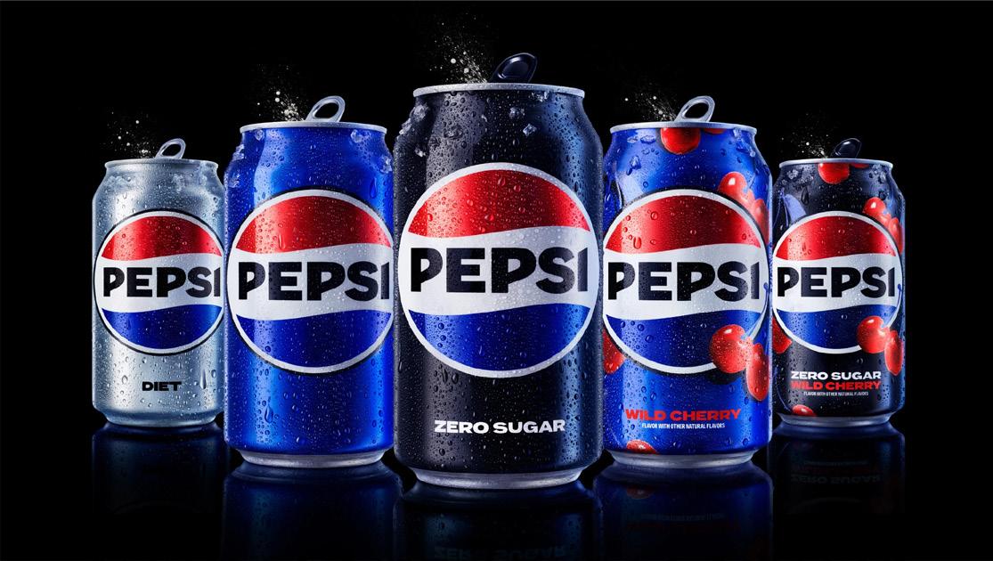
To mark its 125th anniversary, Pepsi has unveiled its first major rebrand since 2008. Gone is one of the more divisive designs of the past 15 years, with classic Pepsi branding coming back with a modern twist.
What’s changing?
Advertisement
Form
The slanted ‘globe’ of 2008 is gone and the iconic Pepsi globe is being returned to resemble the flattened version used in the late 1980s and 1990s.
The ‘PEPSI’ wordmark is placed back where it belongs, moving back to the central white stripe of the logomark.
Typeface
The bold new custom typeface and uppercase “PEPSI” wordmark is designed to reflect the brand’s “confidence and unapologetic mindset”.
Colour
PepsiCo is introducing electric blue and black to the brand’s traditional colour scheme, creating a bold contrast with vibrancy and modernity.
The “PEPSI” name reappears in black, echoing its 1950-1986 predecessor. And a slim black edge now frames the logo lockup. This increased use of black in the logo highlights the Pepsi Zero Sugar range, reinforcing the company’s commitment to its main growth driver.
Motion
The digital age is transforming the way people interact with brands and products. Pepsi’s new visual identity responds to this evolution by introducing movement and animation into their visual system. Known as the ‘Pepsi Pulse’, this represents “the ripple, pop and fizz” of Pepsi-Cola and “brings the rhythm and energy of music” to the brand’s motion graphics.
Why?
The new visual identity draws from Pepsi›s heritage and commits to the company›s Zero Sugar goals, creating a bold and “unapologetically current” look. Movement and animation have been incorporated, with the «Pepsi pulse». The new visual system can be used in both physical and digital spaces, from retail shelves to the metaverse.

When