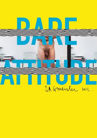
BARE
ATTITUDE 1
“SOME PEOPLE SAID,
BUT I HAVE NO DESIRE TO DO THAT. I REALLY LIKE DESIGN AND I’M GOING TO STAY WITH IT.”
S
agmeister, whose motto is “Style=Fart”, replaces style with attitude. With his humorous “bad-boy” persona, his designs display With apparent ease, Sagmeister morphs, taking on various skins, from graphic designer, conceptual typographer, and even performance artist. His work has been seen from album covers, to posters, and even second floor buildings. He is bold and is not afraid to bare himself out there, literally.
disoriented images, bold determination,
and pure obsession.
< Dust jacket and folios of the book, Things I Have Learned in My Life So Far
3
S
agmeister plays with optical imagery and invention. With many pieces of work he enjoys the idea of placing two faces on top of another to show different attitudes when a simple cover is removed from the original image. Sagmeister believes that the concept of beauty in design is back. He sees design as being a process and an obsession that takes time, and if time isn’t well spent, then it isn’t beauty. According to Stefan, 99% of ugly things have been made by someone who didn’t give a shit. ^ Set the Twilight Reeling, album cover, New York, 1995 > Made You Look book cover, New York, 2001 > Mountain of Madness album cover, NY, 1995
“Made You Look” This book, written by Peter Hall and designed by Sagmeister, is a design book on Stefan himself. Sagmeister included handwritten excerpts from his diary and comments throughout the book that even included the “bad” work he has done. However, it is the cover that grabbed everyone’s attention. An image is published with a red transparent slip case that allows you to remove it, showing that the mood of the calm sitting dog progresses into aggression.
“Mountains of Madness” “Set the Twilight Reeling” This CD cover for Lou Reed was designed to respond to Reed’s transformation from a “dark prince” into a more “positive person”. Sagmeister wanted to transform the artists face from what he once was into what he is now. Using his most famous technique of jewel case tint over the image, Sagmeister was afraid that the design was too similar to other pieces, but the fans loved it, especially Reed.
An album cover designed for H.P. Zinker, creates a schizo persona. When this album is removed from the transparent red case the facial expression changes. The task of the design was to show “angst and schizophrenia in bigcity life”. The concept for the design came from a man that started yelling obscenities at nobody in particular. Sagmeister wanted to show the difference between the looks. The result is one with a calm looking man in the ruby red case versus the agressive looking man when the top sleeve is removed.
5
B Launching his New York studio, Sagmeister’s invitation was of himself standing nude in an office setting displayed with two paragraphs. Each of these paragraphs imply that on the left image it was taken prior to working for himself and on the right it was taken after the launch of his own studio. This was the beginning of displaying himself to the world and the fun he would make of it. He quotes, “It takes bigger balls to open your own place”.
etween self portraits and promotions, Sagmeister bares himself out to the public, literally. He plays with text and courage to display exactly what he wants to show. With this determined attitude he is able to push any idea of design conventions out the window and completely reinvent them under his own rules.
^ Invite photograph from book Made You Look, 2001
“TYPOGRAPHY TO BLADE”
“OVER” For a short typographic film that displayed the text, “OVER TIME I GET USED TO EVERYTHING AND START TAKING IT FOR GRANTED”,Sagmeister dangled precariously out of an upper-story window of the Empire State Building. Police and even the FBI scrambled with nets below as they believed he was a suicide jumper. As he hung out, he held a sign that read “Over”. This was a true experience of events that Stefan had learned in his life.
^ “OVER” displayed for Typographic film, 2008 > Happiness Breakdown, Happy Show, Paris, 2012 > AIGA Poster Design, 1999
“HAVING GUTS ALWAYS HAS WORKED OUT FOR ME!”
In the 1999 poster for AIGA, Stefan emerges to reflect the ordeals, or as he puts it,“the anxious periods, the fighting and the pain”, of the design profession. Wanting to design on himself, Stefan decided to grab a razor and create text on his own skin. Unable to perform the cutting himself, he had a “skilled surgeon”, or the design intern, to perform the task. Each letter and cut had to be minimal but deep enough to be legible through the flesh. The poster signaled a turning point away from aspiration of digital perfection and more towards a designer’s personal mark.
7
F
rom his own personal handwriting to images of nudes and headless chickens, Sagmeister is not afraid to cut things in half or exploit them. He uses humor in even the most serious cases, because he believes with humor there is happiness and with happiness people are able to engage more and open their minds and eyes and see more of the message.
^ Jambalaya, American Institue for Graphic Arts, National Conference poster, New Orleans, 1997
How Happy Are You? Filling the entire Institute of Contemporary Art’s (ICA) second-floor, Sagmeister’s galleries and ramp, activate the in-between spaces of the museum. The Happy Show offers visitors the experience of walking into Stefan Sagmeister’s mind as he attempts to increase his happiness via mediation, cognitive therapy, and mood-altering pharmaceuticals. Through interactive digital and analog typographic investigations of his “rules to live by” the audience can appreciate his common adult humor throughout the floor, even including the elevators.
^Elevator, Happy Show, Los Angeles, 2012 > Fresh Dialogue, AIGA, Design Lecture Poster, New York, 1996
AIGA’s 1997 Biennial Conference Poster In this design the main subject is a chicken with his head cut off. It was a pro bono task that had Stefan beginning the project in an “information architecture” approach to organize all the data. It wasn’t until he saw all the information needed that made him design the poster in a chaotic way. “I decided it might be more interesting for readers if the poster were also chaotic, as well as fun for us to do”.He believes design that is driven by style is foolish, hence his slogan, “style=fart”.
“Fresh Dialogue” In this design, it pictures two opposing tongues which was the task to symbolize a design lecture. Both tongues, photographs of cow tongues from a meat market, allowed this pro bono job by Sagmeister to call out for an adventurous humorous response. This was designed for designers, so he chose a metaphor of wagging tongues. It was a huge move for Sagmeister during this time of high demand in synthetic and digital design. Here he kept it organic with the light pink coloring and unorganized hand lettering that he was so commonly known for.
9
^ The 4 A’s, Advertising Agencies Association Accredited, Dinner Program, Hong Kong, 1997 > Blue, Fashion Stores, Advertising Campaign, Vorarlberg, Austria
11
Sources:
BlogSpot http://3.bp.blogspot.com/-zP4hu35e7QQ/ T5pW1vR95PI/AAAAAAAAADg/QawwrpwC5pE/s1600/
Twilight-Cover.jpg Google Image https://fiuassets-2-syitaetz61hl2sa.stackpathdns.com/static/ use-media-items/16/15237/full-600x598/5ab8e2c5
/R-388245-1245224567.jpeg?resolution=0 ImprovisedLife https://www.improvisedlife.com/cms/wp-content/ uploads/2015/06/sagmeister-Every-Exit-yellow-blog. sandglaz.com_.jpg Pinimg 1. https://i.pinimg.
com/736x/5e/de/2f/5ede2f312ae88af3351c5274e9b2db80-happy-show-the-happy.jpg 2. https://i.pinimg.com/ originals/91/64/66/916466696961dd922b91914016e44304. jpg 2. https://i.pinimg.com/originals/ c9/76/12/c976125351cf13b1678d3c3abead54f6.
jpg AIGA Over.png Icaphila http://icaphila. org/uploads/oms/custom_field/file/17319/large_
large_Stefan_Sagmeister_cat.jpg Sagmeister and Walsh 1. 016b73ccf1814cff1f8ec44952a45e91. jpg 2. https://sagmeisterwalsh.com/_image/ x800/0775cdecd49bf383f03b84ec0fd43509.jpg 3. https://sagmeisterwalsh.com/_image/x800/ e78042b3c8fc5e307c2fcd23b2ef1490.jpg Book “Sagmeister: Made You Look”
Replacing style with his own attitude, it is no wonder why this designer has become so successful. With his humorous “bad-boy” persona, his designs have told so many stories through disoriented images, bold determination, and pure obsession. He is daring and makes his own rules and admires mistakes. He is Stefan Sagmeister and he does what he wants and succeeds at it. He bares himself out there for everyone.
< Birthday Party Invitation, New York > Stefan Sagmeister self portrait
13
Designed and written by Jade Binette Composed in Courier created by Howard “Bud” Kettler, Adrian Frutiger, 1955 and DIN Condensed ParaType (ParaGraph) in 1997
Printed from 80# Copyright © 2018 Jade Binette Portland, Maine, Maine College of Art