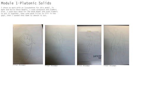
Module 1-Platonic Solids I chose to work with an Icosahedron for this model. To make and build these models, I used cardstock and Elemers Glue. I used bass wood for the wood model and used Elemers to put it together, then used wood filler to fill in the gaps, then I sanded that down to smooth it out.
First Attempt
Final Attempt
First Attempt
Final Attempt
First Attempt
Final Attempt
Section Drawing of an Icosahedron
First Idea of Body Sketch
First Idea of Body Sketch
Final Idea of Body Sketch
First Wood Model
Final Wood Model
Final Wood Model
Final Project
Project 1-Sutractive Space
Construct a single room in a flat and expansive sunlit meadow that can be used for solitary meditation, writing , or small scale art production. I learned the vaule of using space to my advantage.
Project 1-Sutractive Space
Project 5-Precedent Study This was a group project and me and my partner picked the Smith House.
White, abstract structures overflowing with visual juxtapositions, exploiting the harmonious contrast between the man-made and the natural, green landscape. These minimalistic, Modern buildings are what Richard Meier is renowned for. He is an American architect who values “distilling architecture down to its sensory essence” through pure space and volume connected by structure and surface: the set for an exhibition of light and shadow.
Exterior Color Palette
13’10-1/2”
30’1-1/2”
6’1-1/4”
9’10”
3’9-3/4”
10’5” 13’-5”
Studio
13’3-1/2”
SEC
2’10” 7’2”x10’10” 27’4-3/4”
4’3-1/2”
30’10-3/4” Bedroom
14’1” 16’3”x9’3”
9’0” Bedroom
Bedroom
3’-10”
Bath
8’9-1/4”
17’7-3/4”
9’0”
5’1-1/4”
5’11-1/2”
3’-1”
5’1-1/4”
7’5-1/4” 9’0”
45’10”
NW
8’4”x2’8”
7’7”x9’4”
The simple color palette, particularly the whiteness of the structure, reflects and refracts the landscape surrounding it, allowing the audience to perceive the changes of color during the day, as well as the changes of color during the seasons.
8’6”
6’11”x7’10”
Despite the structure’s simplistic color palette, the bold use of white accentuates a connection to the environment through its reflective and refractive complexion. It allows the viewer to perceive the beautiful changes of color during the day, and the changes of color throughout Long Island Sound’s seasons. The dwelling has an unassuming facade, with small windows residing on a relatively opaque white elevation. The solid front contradicts the building’s transparency in the back, where expansive sheets of glass windows feature the stunning views of the ocean in various shades of blue. The interior spaces mirror the outer aspects with stark white walls occasionally adorned with a sprinkling of colorful, minimalistic artwork and wooden floorboards. The furniture further embraces this sense of modernism with natural color palettes, giving focus to the structural components of the building.
13’10-1/2”
31’7-1/2”
5’10-1/4”
7’1-3/4”
SE
30’1-1/2”
5’2-1/4”
9’7”
6’5-1/4”
24’7-1/4”
10’0-1/2”
Traditionally houses enclose their private rooms in the rear; however, the Smith House’s private areas are programmatically situated towards the entrance, forcing visitors to view the intimate parts of the home before they have reached the public portions. This unique form of separating the structure brings mystery and surprise to the simplistic, white box.
Circulation Structure-Walls Structure-Windows
7’4-1/4”
SE
Meier was commissioned to design a weekend home on the rocky, sloping site of Long Island Sound by Carole Smith in 1965. Encompassed by dense evergreens and the Atlantic Ocean, the architect’s trademark objective of visually expressing the relationship between the man-made and the environment was possible. Influenced by the Modernism of Le Corbusier’s work in the 1920-30s, Meier created a vertical, white box.
Although seemingly unassuming in the front, with an opaque facade adorned by a small accompaniment of glass openings, the back contains vast sheets of glass that line the walls, offering a beautiful view of the ocean below.
Key:
38’8-1/4”
11’-10”
SMITH HOUSE
13’-1”
Living Room
2’11”x3’10”
2’11”x3’10”
3’0”x5’3”
SEC
Terrace
27’-0”
Bath
30’10-3/4”
9’8-1/4”
14’2”
Master Bedroom 13’9”
3’0”x2’11”
Lobby
3’-10”
Entrance
1’4”x1’3”
8’9-1/4”
9’-0”
10’-8”
6’-0”
9’-0”
17’2-3/4”
1’4”
4’10-1/4”
13’7-3/4”
9’0”
1’10”
3’0-1/2”
40’11-1/4”
8’1”
NW
8”x3’11”
8”x3’11”
Key:
Direction of Light Most to Least Light
Works Cited Badalge, Keshia. “AD Classics: Smith House / Richard Meier & Partners.” ArchDaily, ArchDaily, 28 Feb. 2018, www.archdaily.com/889769/ad-classics-smith-house-richardmeier-and-partners. Hanley, William. “Growing Up in Richard Meier's Smith House: New Photography of a Masterpiece.” SURFACE, 4 Mar. 2018, www.surfacemag.com/articles/richard-meiersmith-house/. Lewis, Roger K. “ANOTHER LOOK AT THE 'NEW YORK FIVE'.” The Washington Post, WP
Due to the expansive windows, an abundance of natural light seeps through the back of the house, and to further support Meier’s preference toward Modernism, there is little ornamentation. The furnishings that remain maintain a minimalistic approach with a simple color palette and contemporary form.
Private Public
4’2-3/4”
N
10’11-3/4”
Smith House Site Plan
25’8-3/4”
3’9-3/4”
28 Feb. 2018, www.dezeen.com/2018/02/26/richard-meier-1960s-smith-house-capturednew-photographs-mike-schwartz-50th-anniversary/#/.
10’-6”
Porch
9’1-1/2”
Dining Room 2’9-1/4”
“Modernism.” Architecture.com, RIBA, www.architecture.com/explore-
13’3-1/2”
Studio
SEC
2’11”
7’2”x10’10”
architecture/modernism#:~:text=Modernism%20in%20architecture&text=It%20was%20
27’5” 5’1” 6’5”x5’3”
Living Room 36’3”
associated%20with%20an,and%20the%20elimination%20of%20ornament.&text=The%2
16’3”x9’3”
Bedroom Kitchen
8’1”
9’-0”
7’2”x6’1”
0style%20became%20characterised%20by,asymmetrical%20compositions%2C%20and
Terrace
21’6-1/2” Bath
Lewis, Roger K. “ANOTHER LOOK AT THE ‘NEW YORK FIVE’.” The Washington Post, WP Company, 12 Dec. 1992, www.washingtonpost.com/archive/realestate/1992/12/12/ another-look-at-the-new-york-five/7a9a59ab-4543-4075-95a7f4f4e635e208/.
McKnight, Jenna. “Richard Meier's 1960s Smith House Captured in New Photographs.” Dezeen,
5’4-1/4”
25’2-1/2”
10’4-1/4”
www.washingtonpost.com/archive/realestate/1992/12/12/another-look-at-the-new-york-
7’-4”
9’6”
The Smith House is a wonderful example of Meier’s work, truly encompassing all of his design philosophies, and the building itself is unconventional yet manages to possess all traditional qualities that would make a building liveable or a home.
Company, 12 Dec. 1992,
five/7a9a59ab-4543-4075-95a7-f4f4e635e208/.
25’8-1/2”
SE
9’10-1/2”
1’10”
1’10”
9’-0”
5’-1”
13’10-3/4” NW
5’-1” 41’11-1/4”
7’1-3/4”
%20minimal%20ornamentation.
9’0” 8’4”x2’8”
Dining Room
Smith House Section Drawing
13’11”x5’2”
Dining Room 7’7”x9’4”
Porch 6’11”x7’10”
8’6”
Interior Color Palette
LACEY OXFORD & MEAGAN ROBERSON
Pogrebin, Robin. “5 Women Accuse the Architect Richard Meier of Sexual Harassment.” The New York Times, The New York Times, 13 Mar. 2018, www.nytimes.com/2018/03/13/arts/design/richard-meier-sexual-harassmentallegations.html.
Project 6-Curator House
This project was to be inspired by the group project we did and the way I did that was making the private rooms in the back and public in the front with the view.
SEAGRAVES ARCHITECT DATE: 12/12/1960 MEAGAN ROBERSON I chose to modify my house to Mr. and Mrs. Riddle who are pelaton instructors and are retired and meal planning healthy meals and snacks for the weeks in advance. Universal design was used to guide my adaptations becuase all though my couple isn’t handicapped there parents could need to come live with them until they could get them into a permanent home. The view from the sun deck is an beautiful view of Old Main and that was something I didn’t want to get rid of or block so I kept all the windowns in the back so you could always have that view from no matter where you are in the house.
UP
UP
FIRST FLOOR DEMO PLAN
DN
DN
SECOND FLOOR DEMO PLAN
UP
3' - 2"
3' - 7 7/16"
UP
0' 3' 6'
9'
Scale = 3/16"=1'0"
FIRST FLOOR NEW PLAN
DN
DN
0' 3' 6'
9'
Scale = 3/16"=1'0"
SECOND FLOOR NEW PLAN
NORTH-SOUTH SECTION
EAST-WEST SECTION
DETAIL PLANS & ELEVATIONS
3' - 2"
3' - 10 23/32"
DETAIL PLANS & ELEVATIONS
PERSPECTIVE
PERSPECTIVE
Biophilia
---
Meagan Roberson
PentHouse
---
“Bio” is latin for Life and “philia” is for love. Those words are a true statement of how I went about designing my spaces for aging in place and the young. The three sets of buildings are based on buildings in Poland and I was tasked with trying to find a design that could not only help with the young but the old as well. I wanted to create a spaces for the assisted where I could bring the outside in. I wanted to have some varitey though so I made the penthouses more minimalist with a custom builtin for the tv and for septeration from the rest of the are but still being able to see through to the other side. My gym is inside but has outside vibes with grass flooring.
1065 SF
-
---
-
---
Standard(Double) -
---
---
1176 SF
UP
-
DN
UP
- Yoga -
-
Standard(Double)
---
---
1172 SF
Residence Type
- Gym
3rd Floor plans 0'
2'
4'
Hotel Services
Residence Type
16'
8'
1"= 10'-0"
Adjacency Key
Live Work
-
Penthouse
-
Not Adjacency
Adjacency
Penthouse
Nearby Not Adjacency
Kitchen
Not Related
Adjacency Key
Live Work
Adjacency
Restaurant & Bar
Nearby
Standard
---
-
Adjacency
Penthouse
-
Adjacency Key
Reception Desk
Nearby Not Adjacency
Standard
Not Related
Not Related
Assisted Living
Grand Hall
Assisted Living
Common Area
Manager’s Office
Common Area
Hotel
Hotel Rooms
Hotel
---
---
-
5' - 2"
---
Room Room
Room
23 SF Room
281 SF
Room
Room
71 SF
69 SF
78 SF
Residence Type
Room
25 SF Room
283 SF
76 SF
-
Kitchen
Queen Suites
Live Work
Queen Suites
Live Work
Grand Hall
King suites
-
Residence Type
Hotel Services
King suites
---
-
Reception Desk
Common Area
Adjacency Nearby
Common Area
Penthouses
Adjacency Nearby
23' - 6"
23' - 2"
24' - 3"
29' - 0"
Adjacency Nearby
10' - 11"
10' - 11"
10' - 11"
10' - 11"
Penthouses
Standard
-
Standard Hotel Rooms
UP UP
DN DN
Restaurant &bar
- ---
-
-
445 SF
437 SF
403 SF
10' - 4"
10' - 4"
13' - 8"
Assisted Living
Assisted Living Managers Office
10' - 4"
Room
10' - 4"
Room
10' - 4"
Room
25' - 8"
Standard
---
-
Third Floor: Option 1
Floor 1: Option 1
-
Learning Rooms
0'
2'
4'
2nd Floor plans
1"= 10'-0"
Floor 1: Option 1 Learning Rooms
Grand Hall
Restaurant &bar
16'
8'
Hotel Rooms
Dining
Dining
Outdoor Play Space
Gathering/Play Space
Gathering/Play Space
Manager’s Office
Live Work
Outdoor Play Space
-
Adjacency
-
Nearby
PT & Massage Room
---
Front Desk
PT & Massage Room
Adjacency
Adjacency
Nearby
Nearby
Outside Terrace
Café/Kitchen
Café/Kitchen
Front Desk
Front Desk
16' - 8"
Public Restrooms
Public Restrooms
Live/Work
Standard
-
-
DN
DN
DN
DN
Common Area
---
-
-----
Common Area
Exercise Gym With Locker Room
Assisted Living
DN
Assisted Living
DN
DN
Fourth Floor: Option 1 Kitchen
Restaurant & Bar
Grand Hall
Grand Hall
Reception Desk
Hotel Queen
Hotel Queen
Hotel Queen
Hotel Queen
Meeting Hall Learning Room
20' - 0"
312 SF
312 SF
312 SF
308 SF
Front Desk
Roof Garden Access
PT & Massage Room
Dining Hall
Kitchen
Level 1 0' - 0"
UP UP
LEVEL 1
4' - 3"
-
UP
Standard (single)
-
UP
DN
---
-
607 SF
Standard
Penthouse
-
DN
Learning Room
Exercise Gym With Locker Room
Exercise Gym With Locker Room
506 SF
3' - 10"
3' - 11"
Standard
Diagrams/Concept/ Research
-
Hotel King 42' -SF 8" 956
0'
2'
4'
-
---
Hotel Queen
Hotel Queen
Hotel Hotel Queen Queen
358 SF
358 SF
358358 SF SF
-
Learning Room
Learning Room
Learning Room
506 SF
506 SF
506 SF
23' - 0"
---
Learning Room 22' - 0"
508 SF
16'
8'
1"= 10'-0"
1st Floor plans -
-
Long Section Bldg AB
UP
---
---
UP
UP
UP
UP
UP
0' - 0"
UP
Level 1 0' - 0"
14' - 0"
23' - 0"
Chapel
250 SF
-
-
-
UP
10' - 3"
17' - 3"
UP
-
40 SF
22' - 5"
---
A107
Assisted Living
-
Restaurant & Bar
10' - 8"
40 SF
3377 SF
2
1 A107
10' - 3"
P.B. 10' - 3"
P.B.
---
8580 SF
UP
Common Area
---
14' - 0"
14' - 0"
14' - 0"
14' - 0"
14' - 0"
14' - 0"
14' - 0"
- Grand Hall
0'
2'
4'
16'
8'
1"= 10'-0"
Long Section Bldg C
Ground Floor plans -
-
-
Penthouse
Live/Work
-
-
-
---
-
-
- Yoga -
-
-
-
---
-
- Grand Hall
0'
2'
4'
8'
-
A107 -
Assisted Living
--Standard
-
Hotel - Queen
-
10' - 3"
Kitchen
1458 SF
2
- Gym
16'
1"= 10'-0"
-
Site plans
Level 2 12' - 0"
315' - 0"
350 SF
UP
-
Level 4 32' - 0"
Level 3 22' - 0"
Outside Terrace
508 SF
-
Level 5 44' - 0"
Assisted Living
72' - 0"
956 SF
PT & Massage Room
Entrance
Hotel
24' - 3 1/8"
Hotel King
Adjacency Nearby
n/ tio k ep es Rec nt D Fro
Stairs
Front Desk
PT & Massage Room
Adjacency Nearby
Common Area
Elevator
---
Elevator
-
PT & Massage Room
Stairs
Kitchen
Manager’s Office
-
Second Floor: Option 1
Cross Section Bldgs AB/C
17' - 3"
Reception Desk
Hotel - Queen
-
UP
ASSISTED LIVING N E U T R A L
C O L O R S
Nature
Materials & Lighting
0'
2'
4'
8'
Scale = 1”-10’ 0”
0'
Perspective
Elevations
---
A107
2'
4'
Assisted Living
0'
-
2
A107
Floor Plan & RCP
4'
2'
Section
8'
8'
HOTEL - QUEEN N E U T R A L
C O L O R S
Nature
Materials & Lighting
0'
2'
8'
4'
Scale = 1”-10’ 0”
0'
2'
4'
Perspective
Elevations
Floor Plan & RCP
Section
-
Hotel - Queen
---
-
-
8'
LIVE - WORK
Minimalist
Materials & Lighting
0'
2'
0'
8'
4'
2'
4'
Elevations
Floor Plan & RCP
Section
-
Live/Work
Perspective
-
---
---
DN
Scale = 1”-10’ 0”
8'
PENTHOUSE
Minimalist
Materials & Lighting
0'
2'
8'
4'
Scale = 1”-10’ 0” 0'
2'
4'
Elevations
Floor Plan & RCP
Section
Penthouse
Perspective
-
-
---
8'
STANDARD
Minimalist
Nature
Materials & Lighting
0'
2'
4'
8'
Scale = 1”-10’ 0”
Standard
0'
-
Perspective
Elevations
Floor Plan & RCP
Section
-
2'
4'
8'
Minimalist
Materials, Furniture, Lighting
GRAND HALL
Perspective
Elevations
Perspective
Sections
---
- Grand Hall
Floor Plan
Reflected Ceiling Plan
GYM
Nature
Materials, Furniture, Lighting
Perspective
Elevations
Perspective
Sections
Floor Plan
Reflected Ceiling Plan