G
E R M A R I A A L E J A N D R A
C
O M M U N I C A T I O N S D E S I
N

Presentation
Stuff that I like and I do better
0.1 0.2 0.3 0.4 0.5
Hatsu
Logistic, design and publicity about Hatsu brand.
Mini Bar
Luxury MiniBar design.
SmartB
Smart watch-bracelet design.
This font is unique and elegant due to its serifs and stroke contrast, while also providing seriousness thanks to its formal and traditional appearance.
This font is the perfect companion for my texts thanks to its simplicity and readability due to its clean, legible, and adaptable design.
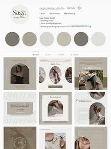
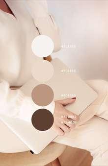
My duty as a communications designer is to craft visually and graphically appealing messages that effectively resonate with the audience. To accomplish this, I must thoroughly understand the needs and desires of those who will encounter my designs, meticulously select the appropriate visual and graphic elements, and ensure that everything aligns with the brand or organization's identity.
Staying updated on design trends and technological tools is imperative to ensure that my communications remain impactful and relevant in an ever-evolving landscape.
My foremost objective is to transfer clear and memorable messages through the potent medium of design.
Hello, I'm Maria Alejandra, a Communications Designer in love with creating content, environments, and passionate about playing with colors.
As a designer I have areas that I specialize in and I would like to tell you what they are
The circular logo represents the globalization and international trade of the export brand. Using a globe, it symbolizes its global presence and commercial connections. The intertwined route lines represent the smooth trade exchanges between different locations. With a minimalist approach, the logo is clear and versatile. The choice of colors can highlight the energy and vitality of international operations. In summary, the logo conveys the brand's identity and values on a global level.
For the desig nt tells me that their inte an and to bear the stam cultural and artisanal root e colors of the Colombian flag as a tribute to its national identity, and I chose organic shapes that reflect the land and the traditional process of panela production.
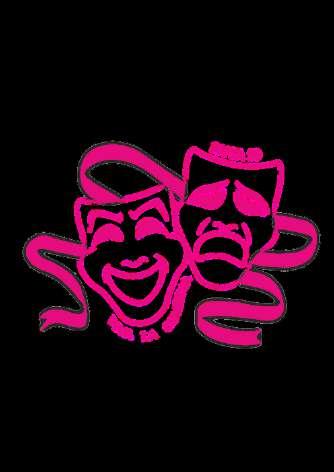
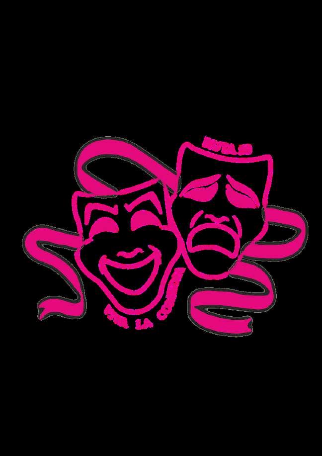
For the logo of th up, it was designed with th nd ribbons to capture the emo lays they would represent. It reflects the youthful energy and passion for theater of the group, identifying them as committed and passionate actors. I chose fuchsia as the logo color as it is their favorite color, and I created a simple design but true to the symbols of theater, drama, and the contrast between laughter and sadness according to the group's wishes.
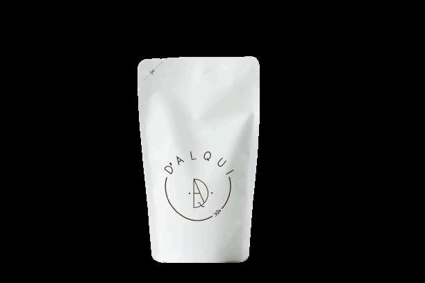
This is a realistic visual representation of the product packaging with its logo applied. It allows visualizing how the packaging will look in real life, including details such as shape, size, and colors. The Dalqui logo is prominently displayed, consistent with the brand's identity. The main purpose is to help designers and clients make informed decisions about the product design before its physical production.
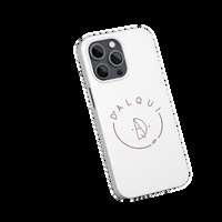
Cell phone cases that promote the DALQUI brand logo, ideal for its employees and employers.
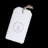
If DALQUI expands its line to clothing, putting the logo on the labels strengthens the brand and creates a sense of unity among those who wear it, this is a demonstration of how it would look
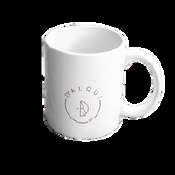
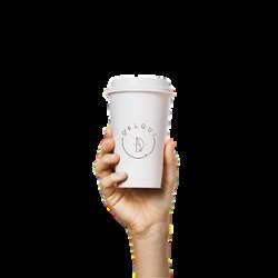
Mock-ups of coffee cups with the DALQUI logo are an effective way to promote the brand on everyday products, creating greater visibility and brand recognition among consumers.
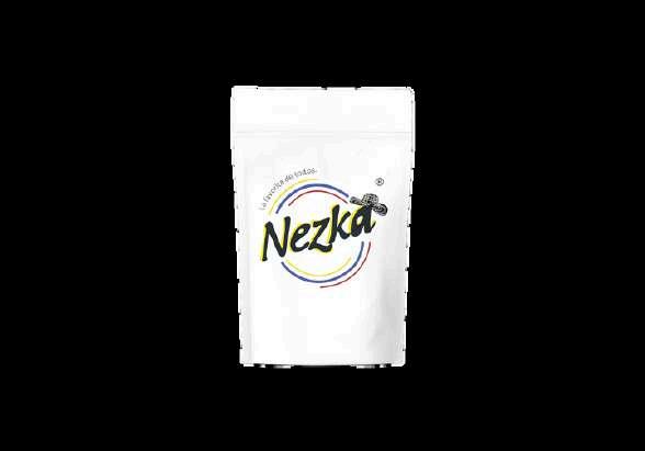
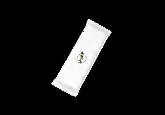
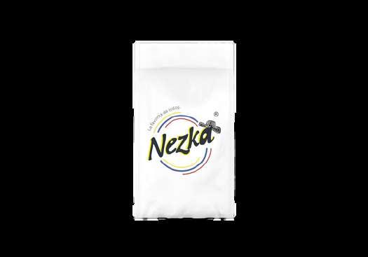
packaging for the nd NEZKA, incorporating alistic preview of how the These mock-ups allow on of the final design, with the brand identity ed decision-making about the product before its physical production.
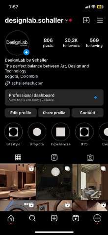
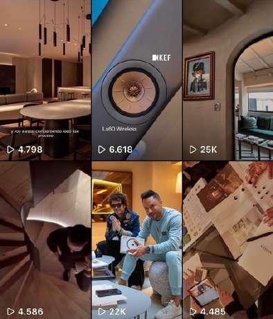
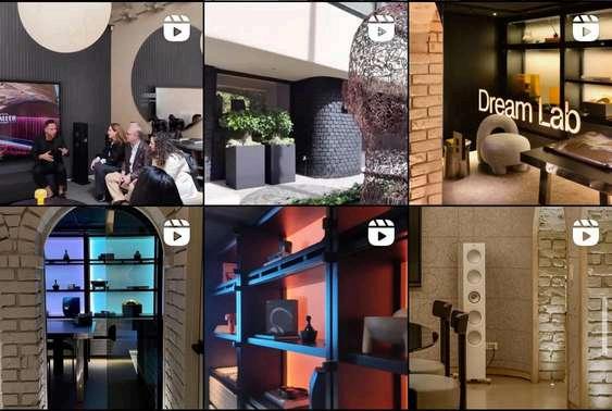
During my time as a Community Manager, I have played an integral role in creating its visual identity, including logo design, video editing, photo and video shooting, and content grid planning. Similar to my previous experience at Design Lab By Schaller, I have used these skills to build a strong connection with the audience across various digital platforms, generating increased engagement and brand loyalty.
Design &Technology Company Design Lab By Schaller
I N S T A G R A M L O O K A N D F E E L
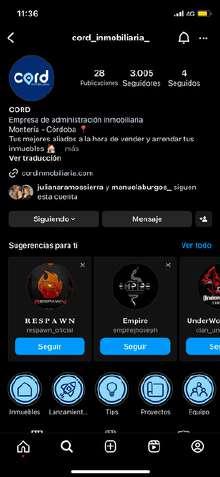
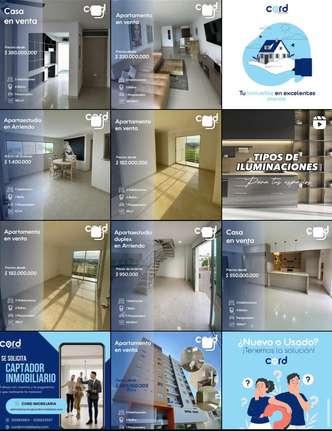
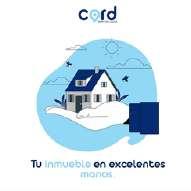
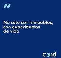
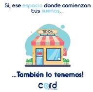
In my final years as a design student, I've discovered a talent for graphic design and social media content management. With this skill, I've become a community manager for various entrepreneurial and corporate brands. One of them is this real estate management company called cord, where properties are sold and rented. With my skills applied to this real estate page, I sought to establish a graphic identity for the brand and foster a connection with users through it.

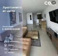

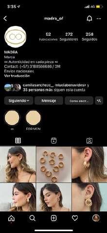
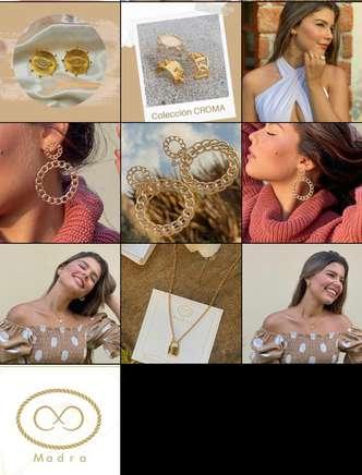
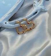
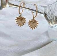
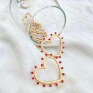
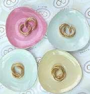
As a Community Manager at MADRA, an accessories startup, I've been responsible for creating the brand's visual identity, including logo design and product photography. Through social media strategies, I've successfully increased follower engagement and loyalty, contributing to MADRA's success in the fashion and accessories market.
Accesories start-up
I N S T A G R A M L O O K A N D F E E L
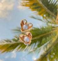
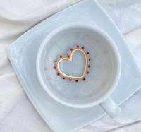
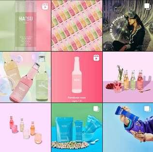
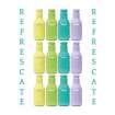
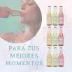
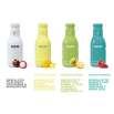
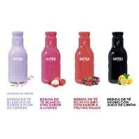
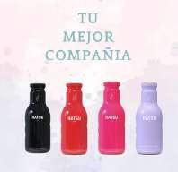
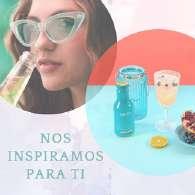
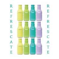
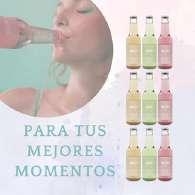
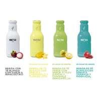
Hatsu is a brand that is always looking up to create a narrative universe and a brand full of colors and emotions, which not only sells drinks, but also shares experiences and provides well-being to people. We seek to improve part of the instagram's feed and content of Hatsu brand, without losing its colorful essence that identifies it so much.
I N S T A G R A M ' S F E E D
E F O R E



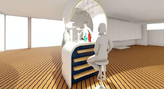
In this image I show the render of an ideal or possible space to locate the minibar, interacting with the users and with the products (wine bottles for example) that go inside it.
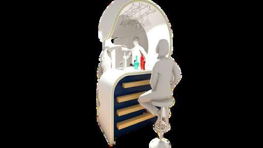
is a clear representation of a personalized minibar for users who want to have one in their home, office, or any type of interior or exterior environment, since by managing a basic and modern aesthetic at the same time, it allows the product to combine with any accessory that have around you.
Smart-B is a smart watch created to help people measure how many calories they burn daily or during physical activity, keep track of seconds, minutes and hours, set alarms, know the time, measure BPM, water resistance, and 24-hour battery life, also it have replaceable handles, without the need to be distracted by other applications that other smart watches in this range have, so that you can focus on your daily tasks and activities.
This project is an alternative where the adage "less is more" is applied, since it is a simple product, which comes with specific utilities that promote concentration in daily activities, satisfying the necessary desires of the user.
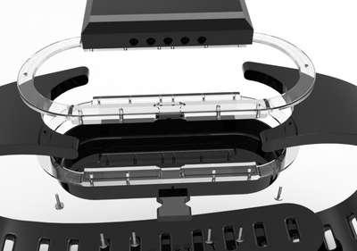
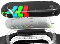
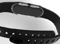
At the beginning, I identified different styles of various smart watches that inspired me to create Smart-B according to my style and under specific needs required by the user.
The concept that is sought to be implemented with this product is to promote minimalism and simplicity in technological accessories that often complicate the user's life, and thereby realize that "less is more".
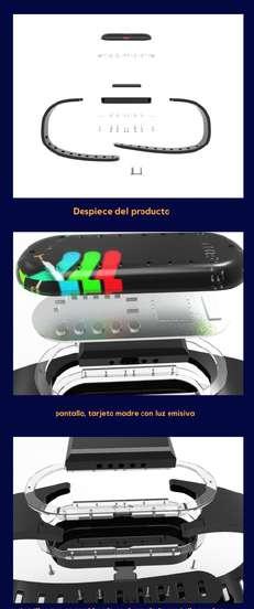
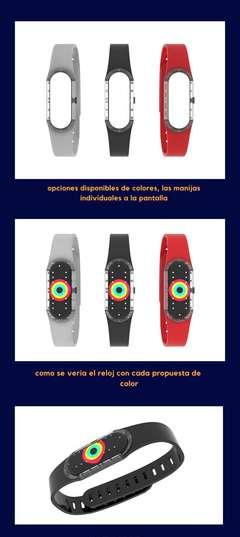
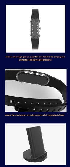
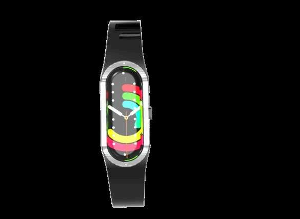
Minimalism is not only well represented in interior design environments, it is also important to take it into account in technological products, not only for its elegant and subtle aesthetics but also for its simple and easy handling of the product.
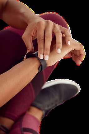
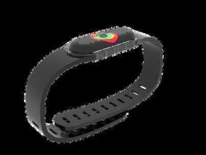
Each tone, shape and color has its own intention, with which each work and product is transmitted with passion, according to each taste... these are my tastes, my way of seeing the art of design and what I want to convey with it is joy and passion in the identity of each brand, product or page that wants to come alive and reach others.