Zoom Tan | Zoom Fit
This book has been assembled as a study in possibilities, not as a presentation of final answers. The images are intended to test direction, mood, brand expression, and customer experience within a consistent planning framework, so the real value is not in any single rendering, but in what can be learned by seeing many variations side by side.
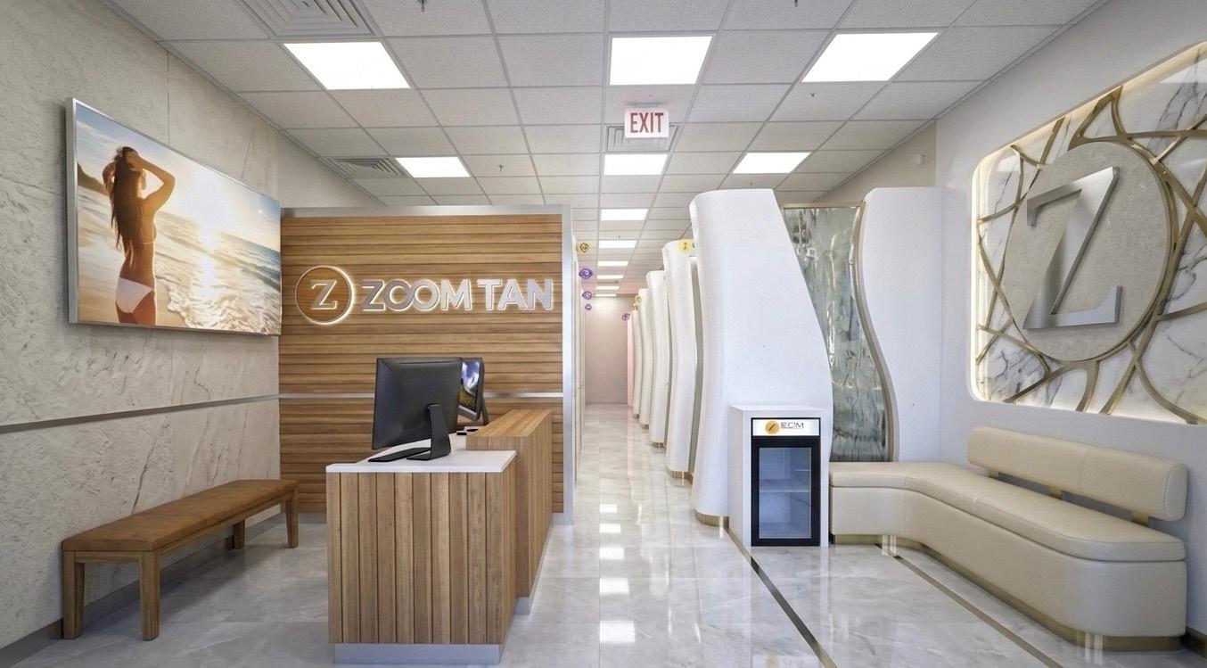
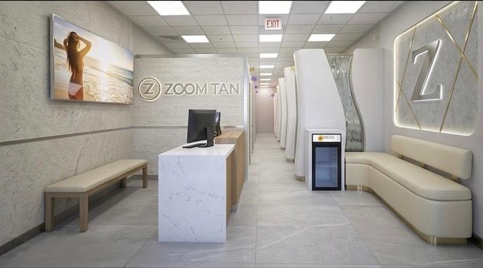
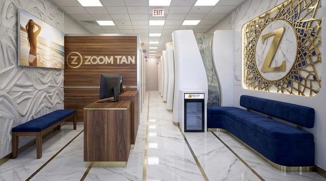
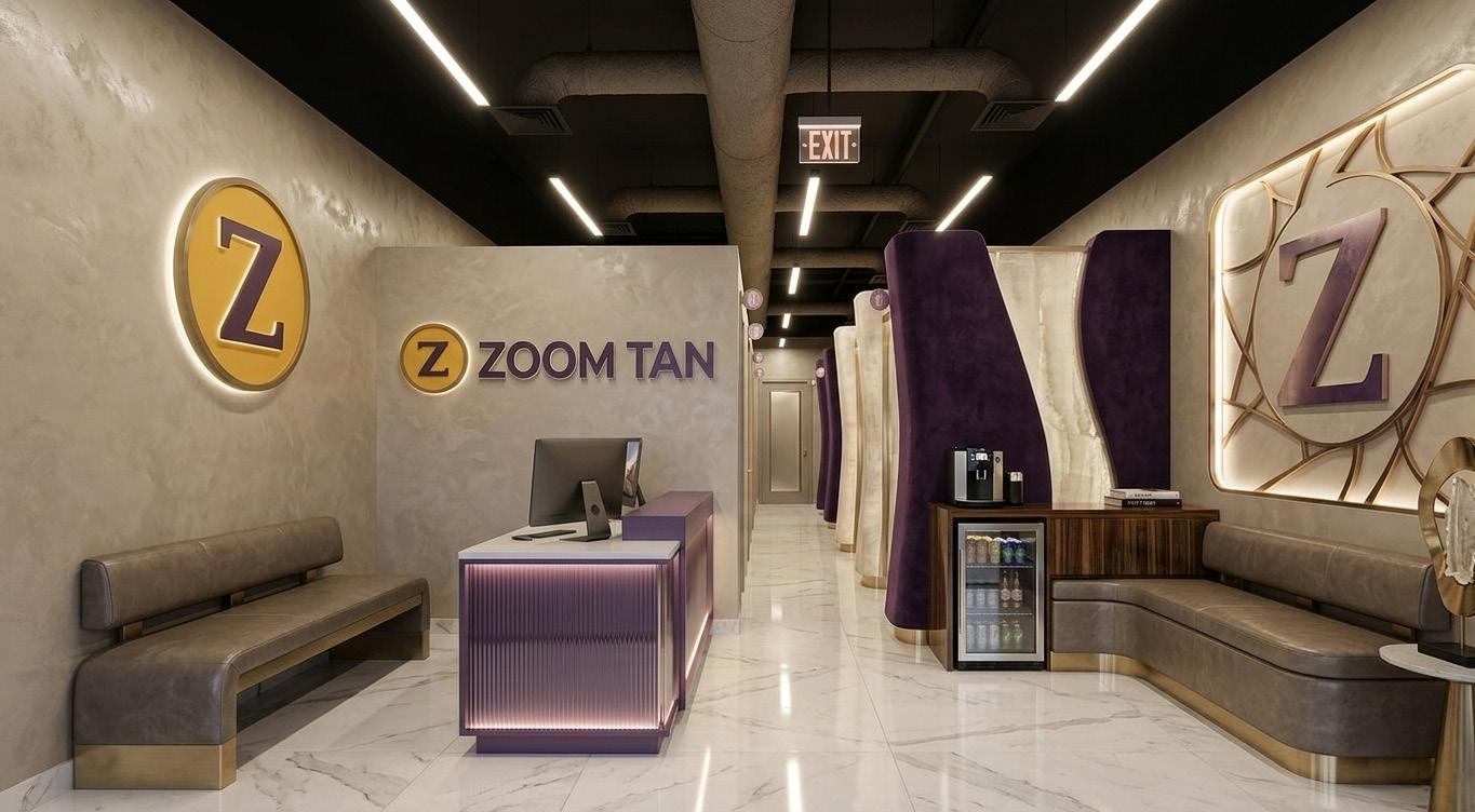
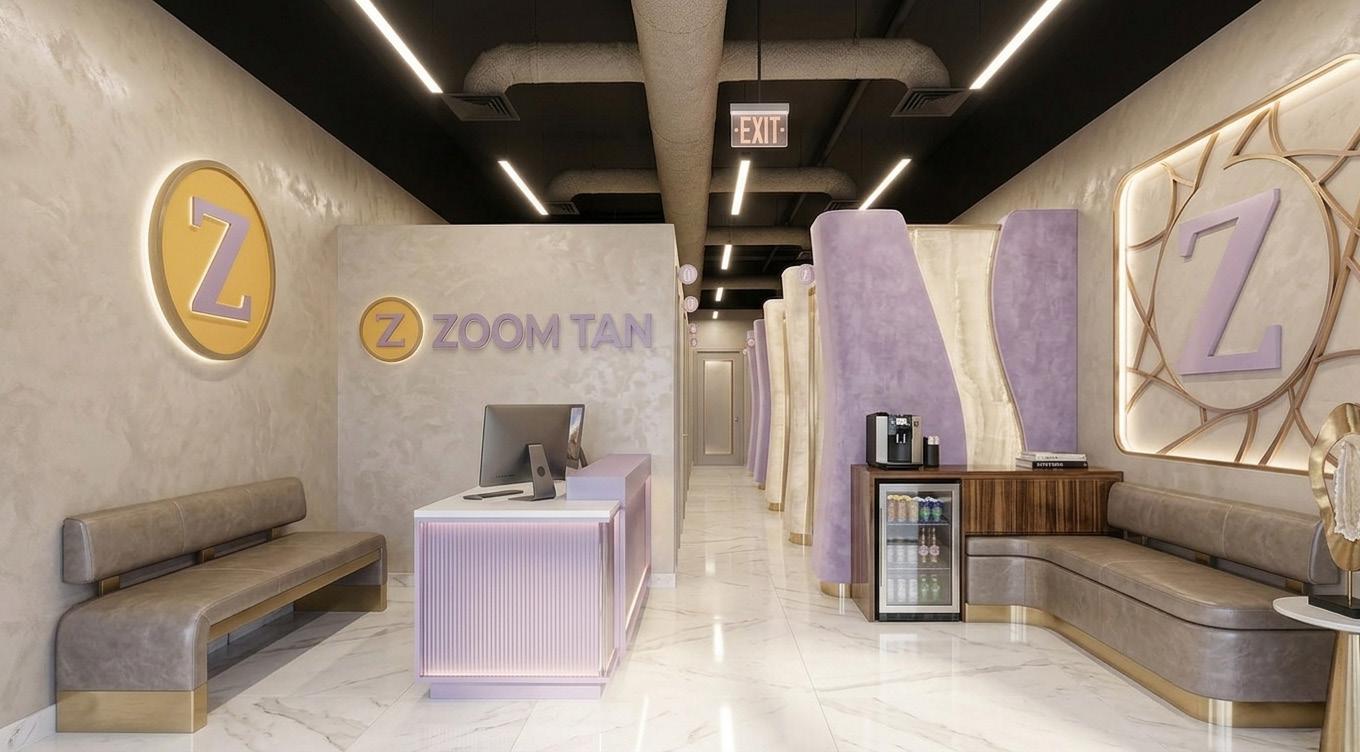
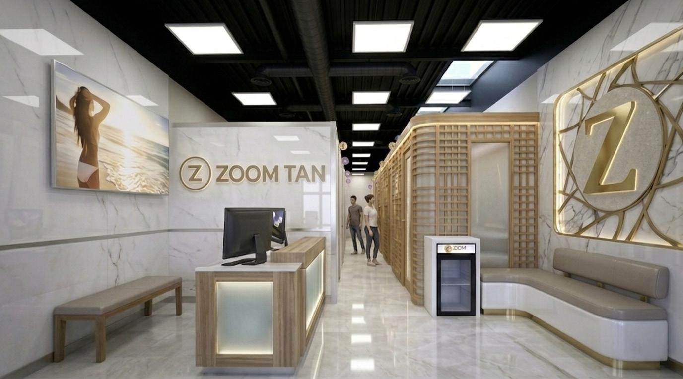
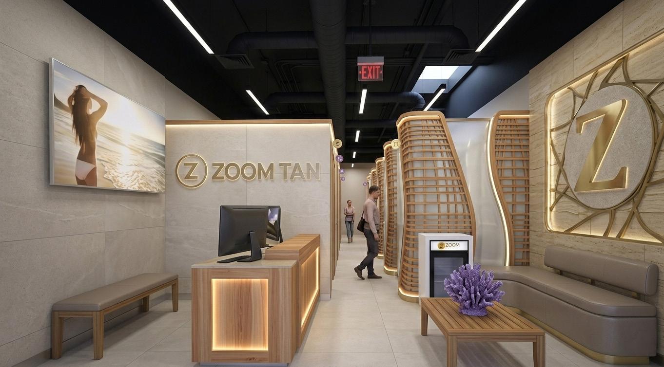
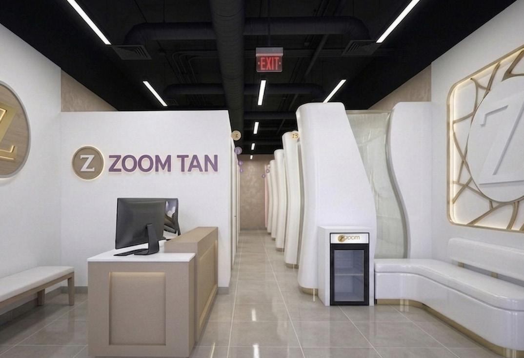
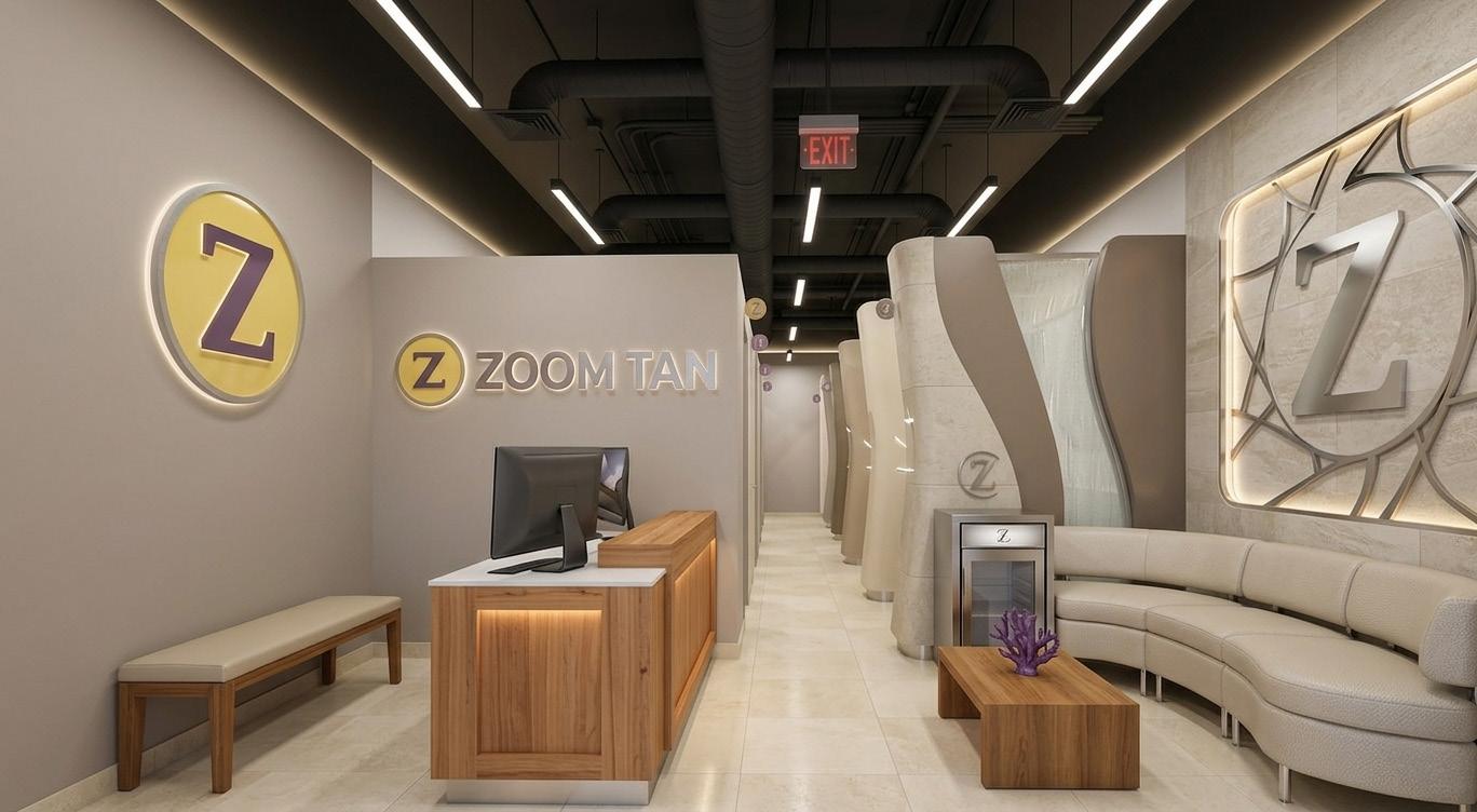
By repeating the same basic spatial structure from image to image, the differences become easier to read. The compact reception point, the branded feature wall, the waiting zone, the hero lifestyle image, and the linear run of tanning rooms remain familiar enough that changes in material, color, lighting, and form can be evaluated clearly and honestly.

Purpose of the studies
The purpose of these studies is to broaden the conversation before narrowing it. Rather than beginning with one safe answer too early, the book opens up a range of design attitudes so the strongest ideas can reveal themselves over time through comparison.
That process matters because good prototype design is rarely about choosing one image exactly as shown. It is about identifying the parts that feel most right, most on-brand, and most buildable, then refining those ideas into a simplified solution that can be executed intelligently and repeated successfully.
What the images test
Each image is asking a slightly different question. Some test a more monumental identity, where the brand feels polished, elevated, and almost hospitality-driven; others explore a more relaxed coastal sensibility, using lighter palettes, warmer woods, softer stones, and brighter spatial energy that connect more directly to tanning, wellness, and sun-oriented lifestyle branding.
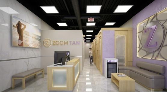
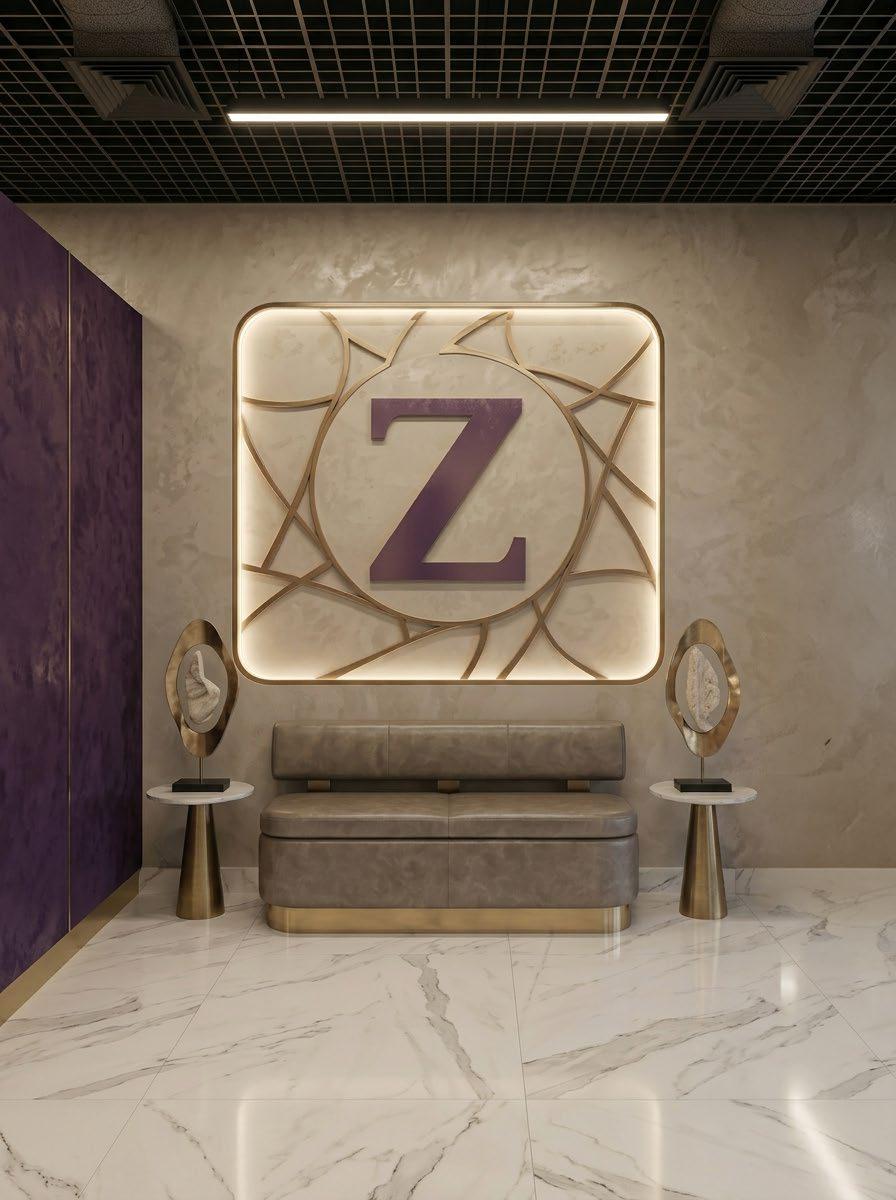
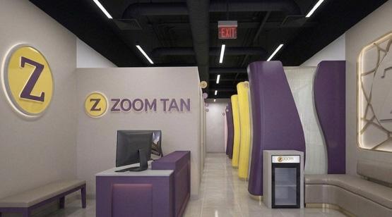
Other variations test how far the environment can shift in tone without losing recognition. The studies look at the effect of stronger contrast, richer color, cleaner modern surfaces, softer natural textures, and different levels of emphasis placed on the “Z” itself as a logo, as a piece of wall art, and as an architectural feature.
Design and budget
It is important to understand that the material language shown in these studies should not be read as a literal shopping list. Some of the images intentionally lean elegant, refined, and aspirational because they are meant to communicate the highest expression of the brand visually, not to suggest that every surface must be executed with premium cost in the final build.
In practice, many of these effects can be achieved through smart substitutions. Stone can become porcelain or wallcovering, specialty finishes can be simulated through laminate systems or decorative panels, and metal-like details can often be simplified into economical trim strategies that preserve the look without carrying the same expense.
For that reason, the right way to read these images is as design direction rather than fixed construction instruction. The exercise is meant to establish the visual identity first, then shape that identity into a prototype that aligns with budget, rollout practicality, maintenance, and long-term brand consistency.
Themes that remain constant
Even as finishes and moods shift, several core themes remain consistent throughout the book. The front of house is treated as a high-impact branded moment; the corridor is clear and legible; the seating and waiting area are integrated into the design language rather than treated as leftover space; and the brand mark is given real architectural presence instead of being reduced to signage alone.
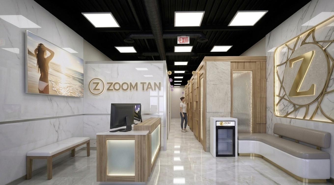

Just as importantly, the work stays connected to a coastal sensibility. The recurring beach imagery, the bright and reflective materials, the clean procession of rooms, and the balance between wellness, glamour, and accessibility all help root the brand in an experience tied to sun, confidence, and personal presentation.
How this book should be read
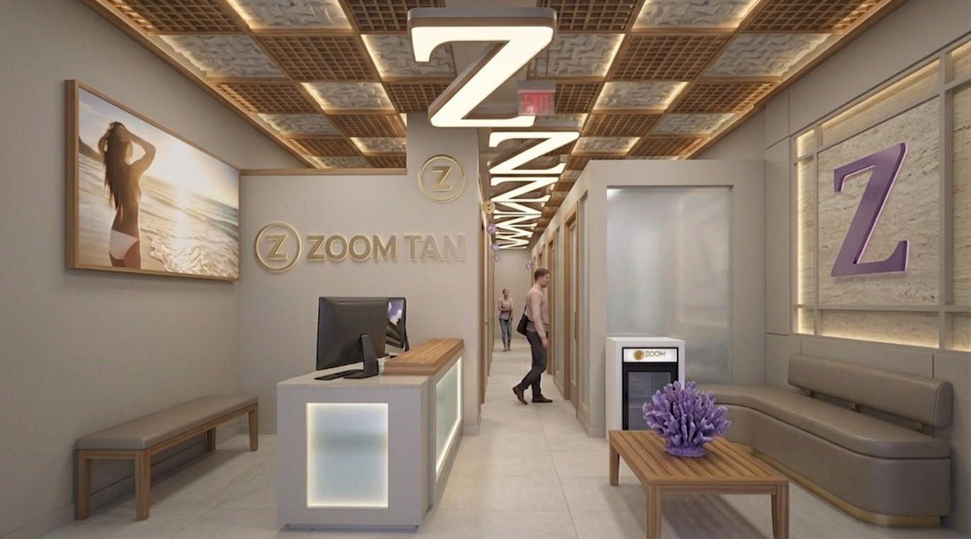
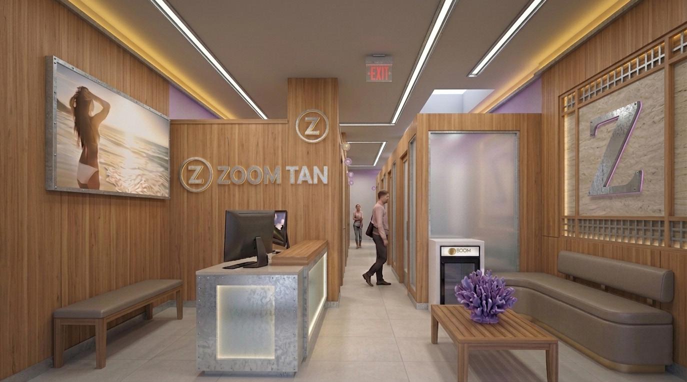
This book should be read as a filter, not a verdict. The goal is not to decide which rendering wins in total, but to observe what qualities repeat themselves as the most compelling: which lighting approach feels strongest, which material palette feels most authentic, which version of the logo wall carries the right amount of presence, and which overall atmosphere feels most aligned with the future of Zoom Tan and Zoom Fit.
Once those patterns become clear, the next step is not complexity but editing. The strongest ideas can then be distilled into a more focused, simplified, and costconscious prototype that captures the ambition of the brand while remaining practical to build and repeat.