
1 minute read
Color Texture & Materials

from 1960's Pop Art

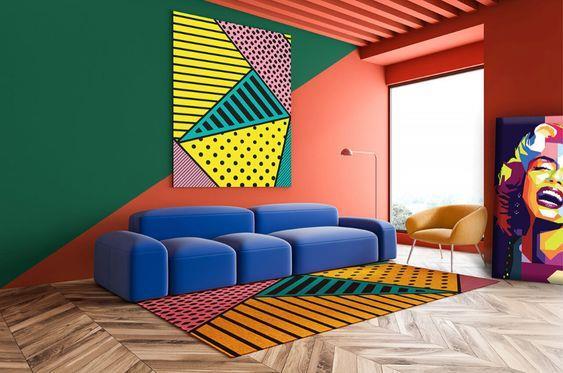
Color: This era was known for the bright vivid colors used. The design was free and strong, with the presence of red, orange and yellows and when looking at these colors, we can easily distinguish the design.
Advertisement

Texture: As for the texture, it was mainly glossy and smooth surfaces which added a futuristic look to the space.
Materials: Finishing materials frequently have a glossy, reflective surface. Silk or synthetic textiles are often used, as well as LEDs, disco balls, and rhinestones which can all be used as decorations. Steel and chrome were frequently mixed with other materials to produce inventive designs because of their durability and slick appearance.
Characteristics
Using pictures from the media:
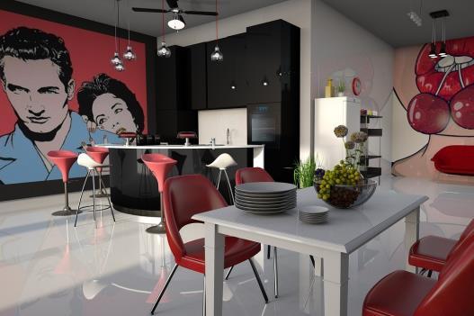
The use of recognized imagery from American popular culture is what makes Pop Art the most recognizable.
Elevating everyday objects:
Pop Art elevates everyday objects, like soup cans, to the level of fine art. When painters incorporated materials or imagery from daily life into their fine art throughout the 1950s and 1960s, they gave priority to the common and cliche.
Repetition:
Pop artists frequently used the same image multiple times. While Roy Lichtenstein painted Ben-Day dots to resemble the appearance of printed comic strip images, Andy Warhol created his artwork using screen printing, a method employed in mass production.
Bold Colors:
Bold primary colors like vivid red, dazzling yellow, and royal blue were used by pop artists. Along with neon and fluorescents, they also used unusual colors that are not seen in nature. The goal of pop art was to capture the viewer's attention right away.

